how to make a good presentation - university of alaska ... · pdf filehow to make a good...
TRANSCRIPT

How to make a good presentationNicole Mölders
References:http://www.rogerdarlington.co.uk/Presentation.htmlhttp://www.rogerdarlington.me.uk/Speech.html

Get technical details
• Think about the presentation beforehand: Do not– start thinking about what you're going to say the day before or while travelling to the event
– clarify with conveners/advisor exactly what is required of you
– Make sure you will have the facilities you will require• Do use PowerPoint
– it is so convenient– ensures that your presentation has a clear structure– Ensure that there is something for your listeners to take home

Get info you need for tech details
• Be very clear about how much time you have– stick to that time in preparing and delivering your presentation
– Not more than 1 slide per minute– A 15 minute talk has actually only 10‐12 min because of time required for questions
– It is very difficult to 'cut' a PowerPoint presentation at the event itself while talking
– It is a great mistake to run out of time

Figure out to whom you will speak to find the right level/do the right prep
• Be very clear about which audience you have– Adapt the talk to their pre‐knowledge and level of understanding
• Be very clear about how large a room you have– Large conference halls require larger fonts in text and figures, and thicker lines in graphs
– Rule of thumb: if you print out your slide, put it on the floor and you are still able to read it you are fine for any seminar room smaller or equal in size of Akasofu 401

What do you want to be the THM?
• Be very clear about your key message– Ensure that everything in your presentation is both consistent with, and supportive off your key message
– Slides must support your conclusions– Be able to articulate the message in a phrase or a sentence – Use that phrase or sentence in one of your first slides, and/or one of your last
• E‐mail your presentation to the event organizers/upload your slides in advance if possible– Ask them to load it onto a laptop, run it through, check that it looks fine, and confirm that with you
– If not, have it on your laptop, a jump drive anddownloadable in your email box/on your webpage
Handouts – only if possible! Never if you have not published the stuff yet!
• Make copies of your slides available if it is safe/possible– Not all grants allow this (check with advisor for applicable policy)– Pros:
• Listeners can take notes simply by annotating the slides when they have them beforehand
• Helpful if you show detailed tables or graphs with lots of figures• Helpful when room is larger than anticipated/said for people in the back
– Cons: • You may lose the element of control, surprise• People may pay less attention as they may flip through the slides or try to fit notes at a certain place
• Makes it easier fro others to steal your ideas
Layout/design must look professional
• Ensure that the slides look good– Use suitable pictures or illustrations that are very effective– Use a consistent format and typeface and readable colors (no
yellow)– Give each slide the logo of your organization– Use chronological numbers– Avoid distracting or varying backgrounds– Often people feel more comfortable with white on dark than
dark with white background– Do not use all capital letters– Use readable font type– Use appropriate font size for the room– Use appropriate colors

Example why to avoid yellow
-2-10123456
-23 -19 -16 -13 -10 -7 -4 -1 2 5 8 11 14 17 20 23
temperature (oC)
CSEE
(g/s
tart)
PM (g/start) CO (g/start) NOx (g/start) HC (g/start) CO2 (g/start)
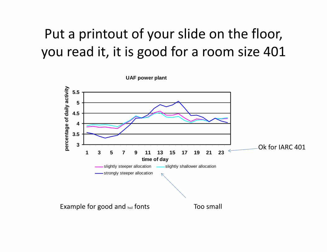
Put a printout of your slide on the floor, you read it, it is good for a room size 401
UAF power plant
3
3.5
4
4.5
5
5.5
1 3 5 7 9 11 13 15 17 19 21 23time of day
perc
enta
ge o
f dai
ly a
ctiv
ity
slightly steeper allocation slightly shallower allocationstrongly steeper allocation
Too small
Ok for IARC 401
Example for good and bad fonts

Don’t dilute your message by a distracting background
• WRF/Chem is a fully coupled meteorology & chemistry model
• Run with 7km grid increment
• 3 month peak tourist season spanning 5/20/2006 – 8/20/2006
• Run without (REF) and with (SEM) a ship emission inventory created for the Gulf of Alaska

Nobody reads overcrowded slides
Slide Structure - Bad
This page contains too many words for a presentation slide. It is not written in point form, making it difficult both for your audience to read and for you to present each point. Although there are exactly the same number of points on this slide as the previous slide, it looks much more complicated. In short, your audience will spend too much time trying to read this paragraph instead of listening to you.
From : www.iasted.org/conferences/formatting/Presentations‐Tips.ppt
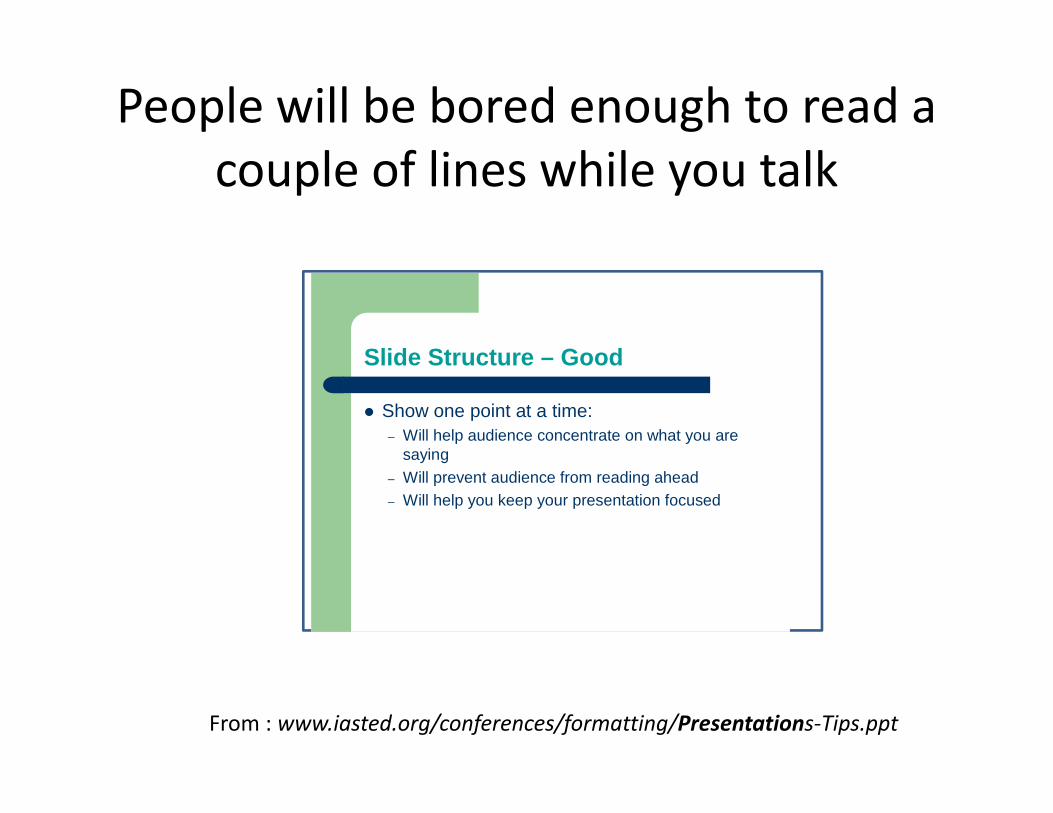
People will be bored enough to read a couple of lines while you talk
From : www.iasted.org/conferences/formatting/Presentations‐Tips.ppt
Slide Structure – Good
Show one point at a time:– Will help audience concentrate on what you are
saying– Will prevent audience from reading ahead– Will help you keep your presentation focused

Exercise on fontsWHY TO AVOID ALL CAPITALS?
– THIS IS VERY HARD TO READ• Mix of small and capital letters is much easier to read• Playing with shadows, color, underline plus italic may cause problems for readers
• This font size is impossible to read. Who can read this has eyes like a hawk!
• Is this font type is unsuitable?– No!
• This font type is acceptable• This font type is acceptable• What about this font color?
– problematicTHM: Use one font only, italics only for quotes, all capital letters for abbreviations (e.g. ABL), color to highlight, shades only in headers, better not at all

Font size must be adjusted to room size
• Use at least an 18‐point font• Use different size fonts for main points and secondary points
• this font is 32‐point– the main point font is 28‐point– the title font is 44‐point
• Use a standard font like Times New Roman, Calibri (this font type) or Arial

Exercise: What is wrong with these figures for a talk?
1. Too small fonts, too thin lines2. Color would help readability3. Badly scanned in4. Not self‐explaining

Use of color can be helpful if done right
• Cool: blue& green – Best for backgrounds {appear to recede away from us into the background}
• Warm: orange& red– Best for objects in the foreground (such as text) {appear to be coming at us}
• Harmonizing: Adjacent colors e.g. green& yellow • Contrasting = complementary: Separated by another color
• Clashing: Colors that are directly opposite, e.g., yellow on blue (trick to get attention used in commercial ads)
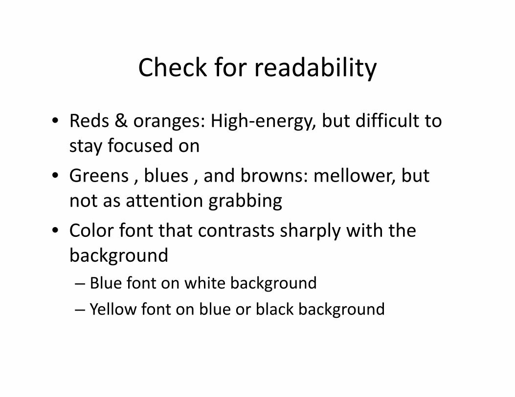
Check for readability
• Reds & oranges: High‐energy, but difficult to stay focused on
• Greens , blues , and browns: mellower, but not as attention grabbing
• Color font that contrasts sharply with the background – Blue font on white background – Yellow font on blue or black background

Be aware of the color blinds
• Avoid – Color for decoration {distracting & annoying}
– Different color for each point – Different color for secondary points
• Red‐green combinations {7 % of the population are red‐green color blind}
– Glaring colors – White font on light green, light blue or pale yellow background
– Usually cannot read this…
74 or 21?
Normal people would see green‐blue line, I see a green line
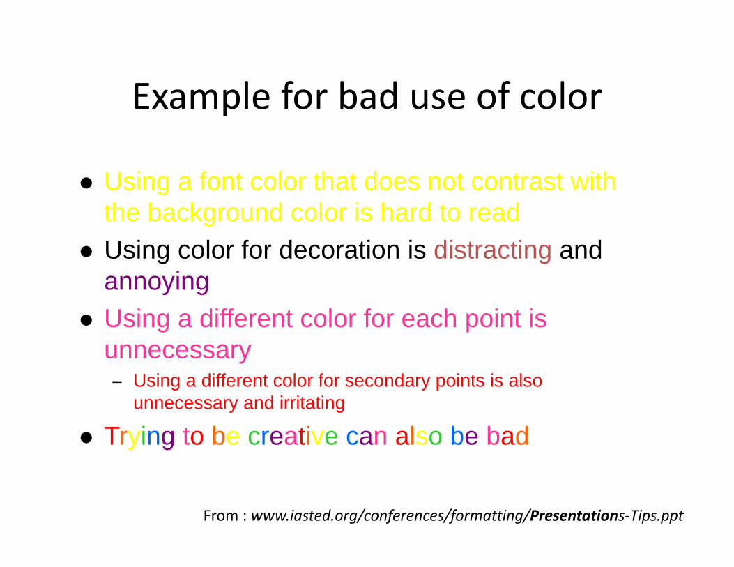
Example for bad use of color
Using a font color that does not contrast with the background color is hard to read
Using color for decoration is distracting and annoying
Using a different color for each point is unnecessary– Using a different color for secondary points is also
unnecessary and irritating
Trying to be creative can also be bad
From : www.iasted.org/conferences/formatting/Presentations‐Tips.ppt

Use tools of powerpoint to retain attention
• Use the “Slide show” ‐ “animations” ‐”custom”‐ option
• Same animation for entire presentation• Simple & quot; Wipe Left‐to‐Right & quot; is good

Do not look like an old guy discovering powerpoint
• Do not use– Distracting animation – Move" or "Fly" {too tedious& slow} – (used in many presentations today)
• When using animation show one point at a time– Audience concentrate on what you are saying – Prevent audience from reading ahead – Keep your presentation focused – Do not use several different animations within a talk

Title slide should give info on what to expect and who contributed
• First slide should announce the title of your presentation– (event and date,) your name and position, organization, co‐authors
– Acknowledgements– Make the title catchy to catch the interest of your audience
Examples for catchy titles:• "Is this the end of the climate as we have known it?“• "The Slow Arrival of Global Warming“• “Air pollution in Alaska – homemade and imported”
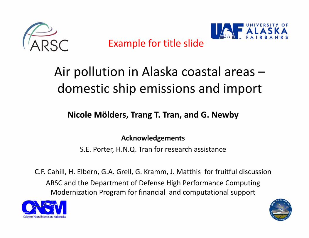
Air pollution in Alaska coastal areas –domestic ship emissions and import
Nicole Mölders, Trang T. Tran, and G. Newby
AcknowledgementsS.E. Porter, H.N.Q. Tran for research assistance
C.F. Cahill, H. Elbern, G.A. Grell, G. Kramm, J. Matthis for fruitful discussionARSC and the Department of Defense High Performance Computing Modernization Program for financial and computational support
Example for title slide

UNIVERSITY OF ALASKA FAIRBANKS
24
Investigations on the role of N2O5 dry deposition
Nicole Mölders, William R. Simpson, Trang T. Tran, Patrick Joyce
AcknowledgementsG.A. Grell, G. Kramm, H.N.Q. Tran, K. Leelasakultum, K. Brunner, E. Jackson, T. Fathauer for fruitful discussion
NSF for financial support
ARSC for computational support
Example: if you have to use a corporate identity background

Structure and outline to grab interest
• second slide should seize the attention of your audience, i.e. why it is important (motivation)– Central proposition of your presentation– Conventional wisdom that you wish to challenge– Relevant or witty quote from a leader in your field– Can be amusing or controversial or both

Various environmental changes have been observed in AK
• Recent bird and fish population and species decreases in AK coastal waters
• Observations show increases in atmospheric sulfate aerosol SO2concentrations
• Oceanic pH‐values decrease in the bottom waters inshore of the sill along the Seward line
Tuxedni 59.9925N 152.6656W
0.01
0.1
1
10
6/12/2
001
2/9/20
0230
/05/20
0324
/02/20
0420
/11/20
0417
/08/20
0514
/05/20
068/2
/2007
5/11/2
007
Sulfa
te c
once
ntra
tion
( gm
-3)
From Mölders et al. (2011)
Example for 2nd slide

Outlines will lead to a “starving” audience
• Next slides should set out the structure of your presentation– No outline please! Instead
• Present goal of the study• Research hypothesis• Experimental design, methodology used• Review previous research (key papers only)
– Default structure should consist of three themes that you intend to examine (45min talk)
– For a very short presentation (15‐20min), only one topic!

Header should be the body of the talk/summary (THM) of the slide
• Each theme should be the subject of a small number of slides– A good working assumption is three slides for each theme– Less than two and it is not substantial enough to be a separate
theme– More than five and it should probably be broken up into two
themes• Each slide should have a clear heading summarizing the
key results shown in the slide– No questions despite they may win attention!
• Each slide should normally contain – Around 25‐35 words (Exception: quotes)– An illustration
• Avoid tables if possible
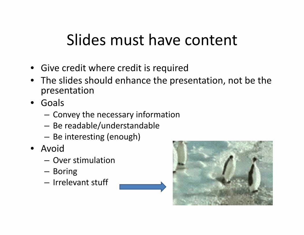
Slides must have content• Give credit where credit is required• The slides should enhance the presentation, not be the presentation
• Goals– Convey the necessary information – Be readable/understandable – Be interesting (enough)
• Avoid– Over stimulation – Boring– Irrelevant stuff

Slides should help to tell the story
• New information • Novel discovery • Answers an interesting question • Describe important ideas • Concise & to the point

Slides should speak for themselves
Your slides should make sense and should be useful to someone who was not present at your presentation
• Each bullet point should consist of an intelligible phrase– Avoid just keywords that are meaningless on their own– Avoid complete sentences
ExampleDo use “Examine on increasing trends of sulfate aerosol concentrations" rather than simply “Examine" or “sulfate concentrations" or "It is necessary to examine the reasons for the observed increasing trends of sulfate aerosol concentrations in remote coastal Alaska sites“

Use visual aids
• Make appropriate use of figures, diagrams, color, movies– Break up text with
illustrations– A picture/diagram is worth
a thousand words– A movie helps convey
complex material that would require long to explain
https://encrypted‐tbn3.gstatic.com/images?q=tbn:ANd9GcQYmmbXnTvEhpKpplForuxVFI57saNEcYjkyMCMQOVO‐utrgKPA

Example: Illustrating long‐range transport

Example of a good diagram
Modified after Mölders and Kramm (2007)

Example of good graphMM5 sim
ulated
fluxes of sen
sible heat
Night Day Night Day Night

Exercise: Why is this a bad graph?
1. Minor gridlines are unnecessary2. Font is too small3. Colors are illogical4. Title is missing5. Shading is distracting
From : www.iasted.org/conferences/formatting/Presentations‐Tips.ppt
At “The End” wrap up
• The last slide should summarize your results and conclusions
• You want to leave your audience with the take home message (=conclusions), i.e.– No “Thank you” slide!– No “Questions” or “?” slide! Your talk should have answered the question that you addressed!
– Do not put acknowledgements here!

Conclusions must be justified
• Conclusion must be – Effective & strong – Supported by your previous slides
• Conclusion slides– Bring people back if they zoned out – Summarize the main points presented – Suggest future research (only if you won that grant already and are close to doing the final analysis for that paper)
– Your audience is likely to remember your last words (that is why it should be the last you show)

Final check is required
• Spelling & grammar check
• If possible, check the slides from the back of the room you will present in
• If English is not your first language– Have someone else check your presentation

Suggested further reading
• http://www.slideshare.net/hiratufail/how‐to‐make‐good‐presentation