some new tools for visualising multi-way sensory data
TRANSCRIPT

www.elsevier.com/locate/foodqual
Food Quality and Preference 19 (2008) 103–113
Some new tools for visualising multi-way sensory data
T. Dahl a, O. Tomic b,*, J.P. Wold b, T. N�s b,c
a Department of Informatics, University of Oslo, Norwayb Matforsk, 1430 As, Norway
c Department of Mathematics, University of Oslo, Norway
Received 15 November 2006; received in revised form 13 July 2007; accepted 14 July 2007Available online 20 July 2007
Abstract
In this paper we propose some new plots for three-way analysis of sensory data. One of the plots is called ‘‘Manhattan plot” and offersan alternative way of presenting explained variances, while the ‘‘Hiding plot” provides information about how the different axes in theconsensus space are related to the original measurements. Correlation loadings plots exhibit correlations between the common scoresacquired from the consensus matrix and the variables in the original multi-way data. For the computation of the consensus matriceswe propose a new tool that bridges Generalised Canonical Analysis and Tucker-1 by defining intermediate combinations of the two. Thisis accomplished by altering a parameter in a more general model that covers these two methods. Three-way sensory profiling data fromcheese are used as input for this general model to compute consensus matrices at different values for the parameter. External validation ispointed out as a useful tool for indicating which of the two statistical methods is most appropriate for computing a consensus matrixrepresenting all assessors.� 2007 Elsevier Ltd. All rights reserved.
Keywords: Sensory profiling; Descriptive sensory analysis; Multi-way data; Visualisation; Hiding plot; Manhattan plot; GCA; Tucker-1
1. Introduction
In descriptive sensory analysis (sensory profiling) anumber of sensory assessors give intensity values for anumber of objects and a number of sensory attributes. Thisgives rise to a so-called three-way data table with assessors,attributes and objects as the three ways or dimensions. Inmany cases, the first of these dimensions is eliminated priorto further data analysis by averaging over assessors. Thisapproach simplifies further analysis, but also makes itimpossible to obtain information about individual differ-ences among the assessors. The effect of doing so may leadto reduced insight and also reduced capabilities for panelmonitoring and improvement. Therefore, there is a needfor methods that can analyse all dimensions simultaneously(N�s & Risvik, 1996). Typical examples of such methods
0950-3293/$ - see front matter � 2007 Elsevier Ltd. All rights reserved.
doi:10.1016/j.foodqual.2007.07.001
* Corresponding author. Tel.: +47 64970252; fax: +47 64970333.E-mail address: [email protected] (O. Tomic).
used today for sensory profile data are PARAFAC(Smilde, Bro, & Geladi, 2004), the three Tucker methods(Tucker, 1964, 1966), Procrustes rotation (Gower, 1975;TenBerge, 1977) and generalised canonical analysis(GCA, Carroll, 1968; Van der Burg & Dijksterhuis,1996). The advantage of these methods is that they provideinformation about relationships among assessors, amongattributes and among samples/objects at the same timeand link these dimensions to each other. All these methodsare based on some type of data compression where thefocus is to capture the main information in as few dimen-sions as possible.
One problem with these methods, however, is that theyare quite complex. Even though they are based on datacompression they provide a lot of different results whichcan be quite difficult to understand for a practitioner.Therefore, various types of plotting methods have beeninvented for the purpose of simplifying presentation ofthe results. These methods are useful and visualise manydifferent structures of the data, but as will be shown here

104 T. Dahl et al. / Food Quality and Preference 19 (2008) 103–113
there are also various aspects of three-way data that needmore careful investigations than these tools can provide.
In this paper the focus will be on plotting methods forthe three-way methods Tucker-1 and GCA, but some ofthe ideas presented can possibly also be extended to othermethods. Tucker-1 and GCA may look quite different,but it is shown in Dahl and N�s (2006) that they can beformulated within the same framework and can be consid-ered as two special cases of a more general model. We willpropose some new plots and show how these can be usefulfor visualising important information that is not alreadycovered by other types of plots. These aspects are primarilyrelated to how the so-called common scores (or consensus
components) are linked to the original intensity measure-ments. Secondly it will be shown how these plotting meth-ods can be used to help deciding which of the methods,Tucker-1 or GCA, that is most useful in a practical context.External validation towards design variables will be usedfor deciding which method seems to be the mostappropriate.
2. Theory
2.1. Tucker-1, GCA and their relationship
In this paper we will assume that the sensory panel con-sists of I assessors who give intensity scores for K attributesand J samples. Several choices are available for analysingsuch three-way data, but in this paper we will give mainattention to the Tucker-1 and GCA methods. These twomethods are flexible and are easy to compute. Tucker-1as used here is based on the idea of approximating the indi-vidual intensity matrices by a small set of common scores(the consensus matrix) multiplied by individual loadingsmatrices indicating how the scores relate to the originalmeasurements. In mathematical terms this corresponds tofinding the common scores matrix T and the individualloadings matrices Pi that satisfy the least squares criterion
minP i ;T T T¼I
X
i
X i � TP Ti
�� ��2 ð1Þ
It can be shown that this is identical to using a regular PCAon the unfolded matrix of individual intensity matrices. Itis well known that the consensus components T of theTucker-1 methods can be found as the eigenvectors of
ZTucker ¼X
i
X iX Ti ð2Þ
corresponding to the largest eigenvalues.GCA on the other hand tries to identify a consensus
matrix T that satisfies the criterion.
minP i ;T T T¼I
X
i
kX iP i � Tk2 ð3Þ
where as before T is a consensus matrix. In other words,GCA tries to find linear combinations of the data that fitas closely as possible to the common scores matrix T. It
should be mentioned that in its original formulation,GCA is introduced as a method that maximises the sumof squared correlations between linear combinations ofthe original matrices and the common scores T. The twoformulations give the same result. The solution to thisproblem can be found as the eigenvectors of the equation
ZGCA ¼X
i
X i X Ti X i
� �þX T
i ð4Þ
where ‘+’ indicates the Moore–Penrose inverse. In Dahland N�s (2006), a new method called Ridge GCA wasintroduced which contains the two methods above as spe-cial cases. The method is based on finding the eigenvectorsof
ZRidge ¼X
i
X i ð1� aÞX Ti X i þ aI
� �þX T
i ð5Þ
Tucker-1 is obtained by setting a equal to 1 and GCA is ob-tained by setting a equal to 0. In other words, even if thetwo methods are developed quite differently, they can beseen as two elements of the same class of techniques. Eq.(5) highlights some of the differences between the twomethods. In particular, if Eq. (5) is reformulated using sin-gular value decomposition (Dahl & N�s, 2006), the GCAmethod weighs the contributions from the different direc-tions in space according to their variability before the prin-cipal components are computed. Tucker-1 on the otherhand does not incorporate such weights. This means thatfor GCA also directions in space with small variability willcontribute. This emphasises that GCA is a method that fo-cuses on correlations while Tucker-1 is a method focusingon explaining variance only. The continuums of methodsin Eq. (5) represent compromises between the two ex-tremes. The best setting of a can be obtained by cross val-idation or external validation as will be discussed below.
2.2. Plots for visualising results from Tucker-1 and GCA
For both methods one ends up with a matrix of commonscores T and matrices of individual loadings represented bythe Pi. Tucker-1 describes the relations between the objectsin the data set, while GCA describes how the commonscores are related to the original measurements. Tucker-1is vital for understanding similarities and dissimilaritiesamong the objects while GCA is important for understand-ing what these differences are in terms of original measure-ments and also for understanding the individual differencesamong the assessors.
In the following we will describe some established andsome new plots for visualising results from Tucker-1 andGCA.
2.2.1. Common scores plot
For the common scores matrix T, the usual plottingtechnique is the regular score plot. This is simple and wellestablished and is obtained by just plotting the columns ofT, the so-called consensus components, versus each other.
T. Dahl et al. / Food Quality and Preference 19 (2008) 103–113 105
Usually, the first 2–3 consensus components are sufficientfor capturing the most important information in the sen-sory data.
2.2.2. Joint correlation loadings plot for all assessors
For the individual loading matrices Pi one can use theregular loadings plot or alternatively the correlation load-ings plot, where correlations between the consensus com-ponents and the original variables are shown. Thecorrelation loadings can be shown either for each assessorseparately or for all assessors simultaneously in the sameplot. If the number of assessors is large and/or the numberof attributes is large, it can, however, easily become ratherdifficult to extract relevant information from this type ofplot. It is therefore in most cases necessary, as will be pro-posed here, to highlight either assessors or attributes thatone is particularly interested in. In this paper we proposeto use the correlation loadings plot because of its directinterpretation in terms of correlations between commonscores and individual combinations of attribute and asses-sor. Various types of highlighting will be considered andillustrated.
2.2.3. Manhattan plots
In addition to visual inspection of the two plots men-tioned above, one is usually interested in knowing howmuch of the variability for each attribute and each assessorthat can be explained by the principal components or con-sensus components T. For instance this is important inorder to know which of the assessors or attributes thatare most or least related to the common informationobtained by the other attributes and assessors. This cangive valuable information about agreement and lack ofagreement among the assessors as will be illustrated below.For this purpose we here propose to plot
hikaðX ;UÞ ¼Pa
r¼1ðuTr xikÞ2
kxikk2ð6Þ
where U is the matrix of normalised scores T (note that inthis paper T is already normalised so U = T), the i symbo-lises assessor number, k is the attribute number and a
is the number of components (see definitions in Table 1).Note that 0 6 hika 6 1. The hika denotes the cumulativelyexplained variance of the assessor and attribute combina-tion i, k by the first common components of T. Note also
Table 1Terms and definitions for Eq. (6)
Term Definition
hika Cumulatively explained variance of attribute k for assessor i aftera principal/consensus components
X Matrix holding sensory scores that are projected onto basis U or T
U/T Basis on which matrix X is projected onto; matrix holdingprincipal/consensus components
ur rth column vector of U/Txik Vector holding sample scores of attribute k of assessor i
r Number of principal/consensus component
that the same idea can in principle be extended to any basisdescribed by T, meaning that a matrix X can be projectedonto any matrix T as long as the number of objects in X
and T is the same. In our example described below thismeans that the data Xi of one assessor can be projected ontoits own base or principal components Ti instead of a consen-sus matrix T that is based on all assessors. The formula thusrepresents a generalisation of the regular explained vari-ances used in PCA. The values in Eq. (6) can be presentedin different ways. For the Manhattan plot (called so becauseof its characteristic shape) we chose different shades of greyto display the amount of explained variance. Another op-tion, depending on the users preferences, could be differenttypes of colour instead of shades of grey.
Examples of Manhattan plots are given in Figs. 1 and 4.As can be seen a separate Manhattan plot is obtained foreach of the assessors, but it is also possible to use the samemethod for each attribute separately. A dark colour indi-cates that only a little portion of the variance has beenexplained, a light colour that it has been well explained.The extreme points are ‘‘black” (0% explanation) and‘‘white” (100% explanation). In Fig. 1, the Manhattan plotis applied to present the explained variances from PCA foreach assessor separately as an alternative to (scree plots)curves as in Fig. 2. When the number of attributes is high,we believe that the Manhattan technique may be easier touse. This is exemplified by comparison of the Manhattanplot of assessor A and its explained variances of eachattribute in Fig. 1 and the corresponding curves in Fig. 2.In Fig. 4 the Manhattan plot is based on the Eq. (6) usingthe consensus matrix T computed by the Tucker-1 method.
2.2.4. Hiding plot
Another important piece of information that one isoften interested in, and which is not covered by any ofthe plots above, is how the individual principal compo-nents Ti (obtained by individual use of PCA for each asses-sor) are related to the common scores T. One may forinstance be interested in questions like: ‘‘Are the first fewconsensus components of T constituted from high-varianceor low-variance components of the original profiles?.”Although the Manhattan plot also focuses on explainedvariance, this type of information can not be read directlyout of that type of plot. This type of information is partic-ularly important when comes to considering both Tucker-1and GCA and also in making decisions about which ofthem to use. The ‘‘Hiding” plot is a bar plot of principalcomponent variances for each of the individual matricestopped with a curve illustrating the projection coefficientsof a common scores component vector ta onto the individ-ual principal component matrices Ti. These hiding plotcomponents are obtained by
hia ¼ T Ti ta
�� ��2 ð7Þ
where again i is assessor and a stands for component num-ber of the common scores matrix T. Note that this notation

Assessor A
PC
2 4 6 8 10 12
1
2
3
4
5
6
Assessor B
PC
2 4 6 8 10 12
1
2
3
4
5
6
Assessor C
PC
2 4 6 8 10 12
1
2
3
4
5
6
Assessor D
PC
2 4 6 8 10 12
1
2
3
4
5
6
Assessor E
PC
2 4 6 8 10 12
1
2
3
4
5
6
Assessor F
PC
2 4 6 8 10 12
1
2
3
4
5
6
Assessor G
PC
2 4 6 8 10 12
1
2
3
4
5
6
Assessor H
PC
2 4 6 8 10 12
1
2
3
4
5
6
Assessor I
PC
2 4 6 8 10 12
1
2
3
4
5
6
Assessor J
PC
2 4 6 8 10 12
1
2
3
4
5
6
Assessor KP
C
2 4 6 8 10 12
1
2
3
4
5
6
Assessor L
PC
2 4 6 8 10 12
1
2
3
4
5
6
Fig. 1. Twelve Manhattan plots, one for each assessor, based on PCA individually for each assessor. Each Manhattan plot in this example is based on 13attributes (horizontal axis) and six principal components (vertical axis). Attribute 1 (most left) to attribute 13 (most right) and PC 1 (top) to PC 6 (bottom).Dark colour indicates that only a little portion of the variance for that attribute has been explained, a light colour indicates that it has been well explained(black: 0% expl. variance, white: 100% exp. variance).
Fig. 2. By applying PCA on the data of assessor A using 6 principalcomponents the results appear as follows: each line represents thecalibrated explained variance of one attribute. Four attributes haveexplained variances of lower than 40% after PC1: sweet flavour (39.2%),salt flavour (5.7%), bitter flavour (37.0%) and fattiness (15.4%). Thiscomplies with the Manhattan plot of assessor A in Fig. 1 (see attribute 7,8, 9 and 13).
106 T. Dahl et al. / Food Quality and Preference 19 (2008) 103–113
means that the vector hia is formed by squaring each ele-ment of the vector T T
i ta. The length of the vector hia isdependent on the number of columns in the matrix Ti fo-cused on in the analysis. These values can be plotted di-rectly together with explained variances for theircorresponding components as shown in Figs. 9 and 13.In these plots the values of hia are interpolated andsmoothed to form continuous curves. The explained vari-ances for the different components are presented as bars.In the plots in Figs. 9 and 13, the scale on the vertical axisis defined by the values of the squared singular values fromthe PCA. The hiding plot values are scales such that thehighest peak has the same height as the height of the high-est bar in the plot.
3. Example
3.1. Problems considered and data used
Sensory profiling data used in this paper are based onmeasurements of one cheese type (Norvegia) that wasexposed to light through plastic films of different colours

T. Dahl et al. / Food Quality and Preference 19 (2008) 103–113 107
at different levels of oxygen. Being a dairy product, thecheese contains the natural and light sensitive compoundsriboflavin, porphyrins and chlorins which play an impor-tant role in photo-induced oxidation. The photodegrada-tion of these molecules is often correlated with thesensory attributes of oxidized odour, sun flavour and acidicflavour (Wold et al., 2005).
The cheeses were exposed to light according to an exper-imental design with the following two design variables:amount of remaining oxygen after packaging (referred toas ‘oxygen level’ in this paper) and exposure to differenttypes of light (‘type of light exposure’). For the first designvariable the levels of remaining oxygen were chosen at 0%and 1%. For the second design variable there were sevenlevels: exposure to light through coloured plastic films(red, yellow, green, blue and violet), exposure to lightthrough transparent plastic film and storage in a darkroom, i.e. no light exposure. This results in 14 cheese sam-ples (Table 2) that were evaluated by means of sensory pro-filing. Time of light exposure was 36 h.
The sensory panel, consisting of 12 assessors, used 13attributes (Table 3) to describe the cheeses. Of the 12 asses-sors, nine were trained (marked with the letters A–I in thispaper) and three untrained (letters J–L). The samples were
Table 2Overview of the cheese samples from the experimental design
Sample number Oxygen level (%) Type of light exposure
1 0 Blue2 0 Violet3 0 Green4 0 Yellow5 0 Red6 0 Transparent7 0 Dark/no light exposure8 1 Blue9 1 Violet10 1 Green11 1 Yellow12 1 Red13 1 Transparent14 1 Dark/no light exposure
Table 3List of sensory attributes for the tested cheese samples
Attribute number Attribute
1 Intensity of odour2 Acidic odour3 Sun odour4 Rancid odour5 Intensity flavour6 Acidic flavour7 Sweet flavour8 Salt flavour9 Bitter flavour10 Sun flavour11 Metallic flavour12 Rancid flavour13 Fattiness
presented to the sensory panel and tested in two random-ised replicates. An ANOVA of the raw data with effectfor sample, assessor and interaction was performed, withrandom assessors and fixed samples. The results showedthat the effect for assessor was significant at 5% for all attri-butes (p = 0.000 for each attribute). The effect for samplewas significant at 5% for all attributes, except attribute ‘fat-tiness’ with p = 0.102 (this was natural since the samecheese raw material was used in the whole experiment).For 8 of the 13 attributes (attributes 1–4, 6, 10–12 as inTable 3) interaction for assessor and sample was signifi-cant. For the purpose of multivariate analysis with GCAand Tucker-1 the two replicates for each assessor are aver-aged. It should be noted that the two replicates could alsohave been used separately ending up with a data set of dou-ble size. This type of setup is of interest when focus is onvariability within each assessor. For the purpose of thepresent paper we have decided to focus on between assessorvariation.
3.2. Preliminary PCA
The first analysis performed on the sensory profilingdata set was a PCA (with assessor-wise standardised vari-ables/attributes) for each assessor separately. The resultsare presented in Manhattan plots in Fig. 1. As can be seen,assessor J and L, two of the untrained assessors, have amuch lower explained variance for most of the attributes.This conforms to the amount of explained variance aftera certain number of PC’s. After two PC’s the respectiveexplained variance for these two assessors is 54.8% and46.8%, whereas it is 63.9% or higher for the remainingassessors. Assessor J and L are also the only assessors withless than 90% explained variance after 6 PC’s, whereas theother assessors have 94.2% or more for the same number ofPC’s. This may indicate a smaller amount of systematicvariability, or in other words more noisy data for assessorsJ and L than for the remaining assessors in the panel.Another way to display the amount of explained variancein each variable is given in Fig. 2. By comparing the plotin Fig. 2 with the corresponding Manhattan plot, onecan see that the Manhattan plot can be a valuable alterna-tive for visualisation of variance in data. Comparing the fit-ted and validated explained variance (N�s, Isaksson,Fearn, & Davis, 2002) of the fully cross validated PCAmodel of each assessor supports the conclusion that theuntrained assessor J and L have less systematic variabilitythan the remaining assessors in the panel.
3.3. Common scores
3.3.1. Tucker-1
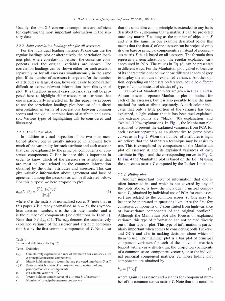
The common scores T of consensus components 1 and 2from Tucker-1 analysis are shown in Fig. 3. Consensuscomponent 1 explains 32% of the variance in the dataand is spanned by samples 7 and 14 on one side versusthe remaining samples on the other. These two samples
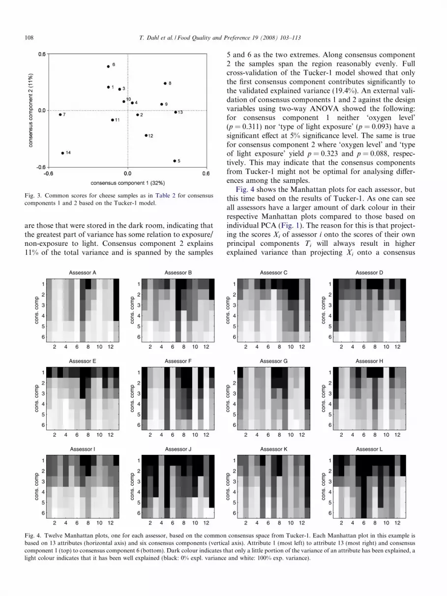
Fig. 3. Common scores for cheese samples as in Table 2 for consensuscomponents 1 and 2 based on the Tucker-1 model.
108 T. Dahl et al. / Food Quality and Preference 19 (2008) 103–113
are those that were stored in the dark room, indicating thatthe greatest part of variance has some relation to exposure/non-exposure to light. Consensus component 2 explains11% of the total variance and is spanned by the samples
cons
. com
p
Assessor A
2 4 6 8 10 12
1
2
3
4
5
6
cons
. com
p
Assessor B
2 4 6 8 10 12
1
2
3
4
5
6
cons
. com
p
Assessor E
2 4 6 8 10 12
1
2
3
4
5
6
cons
. com
p
Assessor F
2 4 6 8 10 12
1
2
3
4
5
6
cons
. com
p
Assessor I
2 4 6 8 10 12
1
2
3
4
5
6
cons
. com
p
Assessor J
2 4 6 8 10 12
1
2
3
4
5
6
Fig. 4. Twelve Manhattan plots, one for each assessor, based on the commonbased on 13 attributes (horizontal axis) and six consensus components (verticcomponent 1 (top) to consensus component 6 (bottom). Dark colour indicates tlight colour indicates that it has been well explained (black: 0% expl. variance
5 and 6 as the two extremes. Along consensus component2 the samples span the region reasonably evenly. Fullcross-validation of the Tucker-1 model showed that onlythe first consensus component contributes significantly tothe validated explained variance (19.4%). An external vali-dation of consensus components 1 and 2 against the designvariables using two-way ANOVA showed the following:for consensus component 1 neither ‘oxygen level’(p = 0.311) nor ‘type of light exposure’ (p = 0.093) have asignificant effect at 5% significance level. The same is truefor consensus component 2 where ‘oxygen level’ and ‘typeof light exposure’ yield p = 0.323 and p = 0.088, respec-tively. This may indicate that the consensus componentsfrom Tucker-1 might not be optimal for analysing differ-ences among the samples.
Fig. 4 shows the Manhattan plots for each assessor, butthis time based on the results of Tucker-1. As one can seeall assessors have a larger amount of dark colour in theirrespective Manhattan plots compared to those based onindividual PCA (Fig. 1). The reason for this is that project-ing the scores Xi of assessor i onto the scores of their ownprincipal components Ti will always result in higherexplained variance than projecting Xi onto a consensus
cons
. com
p
Assessor C
2 4 6 8 10 12
1
2
3
4
5
6
cons
. com
p
Assessor D
2 4 6 8 10 12
1
2
3
4
5
6
cons
. com
p
Assessor G
2 4 6 8 10 12
1
2
3
4
5
6
cons
. com
p
Assessor H
2 4 6 8 10 12
1
2
3
4
5
6
cons
. com
p
Assessor K
2 4 6 8 10 12
1
2
3
4
5
6
cons
. com
p
Assessor L
2 4 6 8 10 12
1
2
3
4
5
6
consensus space from Tucker-1. Each Manhattan plot in this example isal axis). Attribute 1 (most left) to attribute 13 (most right) and consensushat only a little portion of the variance of an attribute has been explained, a
and white: 100% exp. variance).
T. Dahl et al. / Food Quality and Preference 19 (2008) 103–113 109
matrix T, which in this case were the scores of the Tucker-1model. Even though the Manhattan plots of all assessors inFig. 4 have a larger amount of dark colour, one can seethat assessor J and L are still those that have the most ofit. This, again, confirms the results form Fig. 1 that asses-sors J and L are those who differ most from the consensushaving more noisy data than the rest of the panel.
3.3.2. GCA
During the computation of the GCA solution it wasdetected that the solution appeared to be unstable. Differ-ent versions of Matlab (v.6.5, v.7.1 and v.7.2) were usedwith the same code and the solutions were very different.The reason for this is that when the number of variablesis close to the number of objects, the matrix in Eq. (4)becomes very close to the identity and eigenvectors of suchmatrices are very unstable. The exact GCA solution wastherefore not considered further in this paper. Instead weconsidered solutions very close using small values of a(a = 0.001) in Eq. (5). It should be noted that in those caseswhere the number of attributes is not close to the numberof samples, the consensus matrices for a = 0.001 anda = 0 are practically identical. Therefore, in our examplewith the cheese samples, we can consider the consensusmatrix at (a = 0.001) to be a valid representation of theGCA method. As a check GCA was also computed foronly 9 of the variables in the setup and in this case the solu-tion was very stable, as could be expected.
3.4. Correlation loadings based on Tucker-1
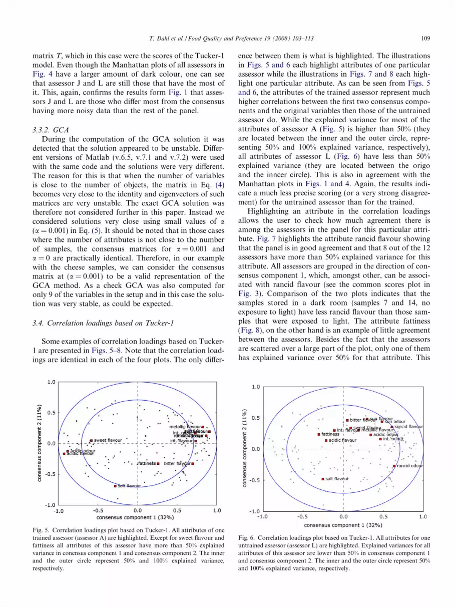
Some examples of correlation loadings based on Tucker-1 are presented in Figs. 5–8. Note that the correlation load-ings are identical in each of the four plots. The only differ-
Fig. 5. Correlation loadings plot based on Tucker-1. All attributes of onetrained assessor (assessor A) are highlighted. Except for sweet flavour andfattiness all attributes of this assessor have more than 50% explainedvariance in conensus component 1 and consensus component 2. The innerand the outer circle represent 50% and 100% explained variance,respectively.
ence between them is what is highlighted. The illustrationsin Figs. 5 and 6 each highlight attributes of one particularassessor while the illustrations in Figs. 7 and 8 each high-light one particular attribute. As can be seen from Figs. 5and 6, the attributes of the trained assessor represent muchhigher correlations between the first two consensus compo-nents and the original variables then those of the untrainedassessor do. While the explained variance for most of theattributes of assessor A (Fig. 5) is higher than 50% (theyare located between the inner and the outer circle, repre-senting 50% and 100% explained variance, respectively),all attributes of assessor L (Fig. 6) have less than 50%explained variance (they are located between the origoand the inncer circle). This is also in agreement with theManhattan plots in Figs. 1 and 4. Again, the results indi-cate a much less precise scoring (or a very strong disagree-ment) for the untrained assessor than for the trained.
Highlighting an attribute in the correlation loadingsallows the user to check how much agreement there isamong the assessors in the panel for this particular attri-bute. Fig. 7 highlights the attribute rancid flavour showingthat the panel is in good agreement and that 8 out of the 12assessors have more than 50% explained variance for thisattribute. All assessors are grouped in the direction of con-sensus component 1, which, amongst other, can be associ-ated with rancid flavour (see the common scores plot inFig. 3). Comparison of the two plots indicates that thesamples stored in a dark room (samples 7 and 14, noexposure to light) have less rancid flavour than those sam-ples that were exposed to light. The attribute fattiness(Fig. 8), on the other hand is an example of little agreementbetween the assessors. Besides the fact that the assessorsare scattered over a large part of the plot, only one of themhas explained variance over 50% for that attribute. This
Fig. 6. Correlation loadings plot based on Tucker-1. All attributes for oneuntrained assessor (assessor L) are highlighted. Explained variances for allattributes of this assessor are lower than 50% in consensus component 1and consensus component 2. The inner and the outer circle represent 50%and 100% explained variance, respectively.

Fig. 7. Correlation loadings plot based on Tucker-1. Attribute ‘rancidflavour’ is highlighted for all assessors. The assessors are grouped togetherindicating that the panel agrees well for this attribute. Except assessors D,I, J, and L, all assessors have more than 50% explained variance for thisattribute in consensus component 1 and consensus component 2. Theinner and the outer circle represent 50% and 100% explained variance,respectively.
Fig. 8. Correlation loadings plot based on Tucker-1. Attribute ‘fattiness’is highlighted for all assessors. The assessors are spread over a large partof the correlation loadings plot, with all but assessor H having less than 50% explained variance for this attribute in consensus component 1 andconsensus component 2. This indicates that there is little agreement amongthe assessors for this attribute or that there is, in fact, little differencebetween the samples. The inner and the outer circle represent 50% and100% explained variance, respectively.
110 T. Dahl et al. / Food Quality and Preference 19 (2008) 103–113
indicates either that the assessors need more training forthe attribute fattiness or that, which is more likely, therereally is little difference between the samples for thisattribute. Since all samples (1–14) are cheeses from thesame production batch (same fat content for all samples)treated only with different light exposure, the latter is prob-ably true. This is also in agreement with the ANOVAabove.
3.5. How do the assessors contribute to the consensus space?
The hiding plot in Fig. 9 tells us how the different asses-sors relate to the Tucker-1 consensus scores in Fig. 3. Firstof all it is clear from the explained variances for the individ-ual PCA’s that two of the untrained assessors (assessor Jand L) have a much lower explained variance than the rest(vertical bars). This is in good correspondence with theresults in Figs. 1 and 4. In addition, one can see that con-sensus component 1 (full line in each Hiding plot) is dom-inated by the first PCA components for assessors A–I andassessor K. For assessor J principal components 1 and 6are the most important while for assessor L, principal com-ponents 1, 3, 6 and 10 are almost equally dominant. Thisindicates that most assessors (all trained and oneuntrained) agree on the most dominant factor. For the sec-ond component (dotted line in each Hiding plot), however,the situation is much more complex. The information inconsensus component 2 is taken from various levels ofdominance for the different assessors. For instance forassessor C, the third component is the most dominantwhile for assessor G, components number 6 is the mostimportant. This is an indication that there is a lot of dis-agreement as to what is the second most important phe-nomenon. This, again, complies with the low validatedexplained variance of consensus component 2 (0.7%) com-pared to the calibrated explained variance (11.5%) in thecross-validated Tucker-1 model.
The same exercise was not repeated for the GCAbecause of the instability reported above, however modelsextremely close to GCA were validated, as can be seen inthe next section.
3.6. External validation of the consensus components
In order to find the best compromise between GCA andTucker-1 we let a in Eq. (5) gradually change from 0 (GCAconsensus matrix) to 1 (Tucker-1 consensus matrix) andused the two first consensus components as responses inan ANOVA with the two design variables as explanatoryvariables. GCA was not computed. Instead a dense set ofa-values were used in the neighbourhood of 0. In all thesecases, the model was stable.
The F values for these tests are presented in Figs. 10 and11 for the design variables ‘oxidation level’ and ‘type oflight exposure’, respectively. The dotted horizontal linesindicate the 5% significance level for each design variable.For both design variables, it seems that values arounda = 0.2 yield the best results in terms of relation betweenthe consensus matrix and the design. From a = 0.2 the F
values for consensus component 1 of both design variablesdecrease steadily towards the Tucker-1 solution. Towardsthe GCA solution the F values decrease somewhat beforethey drop off sharply at a � 0.07. For consensus compo-nent 2 the F values are relatively stable for both designvariables in the range between 0.1 and 0.9 for a. Near theGCA-solution F values drop to almost 0, indicating that
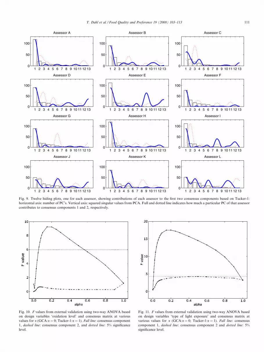
Fig. 10. F values from external validation using two-way ANOVA basedon design variables ‘oxidation level’ and consensus matrix at variousvalues for a (GCA:a = 0; Tucker-1:a = 1). Full line: consensus component1, dashed line: consensus component 2, and dotted line: 5% significancelevel.
Fig. 11. F values from external validation using two-way ANOVA basedon design variables ‘type of light exposure’ and consensus matrix atvarious values for a (GCA:a = 0; Tucker-1:a = 1). Full line: consensuscomponent 1, dashed line: consensus component 2 and dotted line: 5%significance level.
1 2 3 4 5 6 7 8 9 10 11 12 130
50
100
Assessor A
1 2 3 4 5 6 7 8 9 10 11 12 130
50
100
Assessor B
1 2 3 4 5 6 7 8 9 10 11 12 130
50
100
Assessor C
1 2 3 4 5 6 7 8 9 10 11 12 130
50
100
Assessor D
1 2 3 4 5 6 7 8 9 10 11 12 130
50
100
Assessor E
1 2 3 4 5 6 7 8 9 10 11 12 130
50
100
Assessor F
1 2 3 4 5 6 7 8 9 10 11 12 130
50
100
Assessor G
1 2 3 4 5 6 7 8 9 10 11 12 130
50
100
Assessor H
1 2 3 4 5 6 7 8 9 10 11 12 130
50
100
Assessor I
1 2 3 4 5 6 7 8 9 10 11 12 130
50
100
Assessor J
1 2 3 4 5 6 7 8 9 10 11 12 130
50
100
Assessor K
1 2 3 4 5 6 7 8 9 10 11 12 130
50
100
Assessor L
Fig. 9. Twelve hiding plots, one for each assessor, showing contributions of each assessor to the first two consensus components based on Tucker-1:horizontal axis: number of PC’s. Vertical axis: squared singular values from PCA. Full and dotted line indicates how much a particular PC of that assessorcontributes to consensus components 1 and 2, respectively.
T. Dahl et al. / Food Quality and Preference 19 (2008) 103–113 111

Fig. 12. Common scores for cheese samples as in Table 2 for consensuscomponents 1 and 2 for a = 0.2.
112 T. Dahl et al. / Food Quality and Preference 19 (2008) 103–113
in this range consensus component 2 has very little or norelation at all to the two design variables.
At a = 0.2, the consensus components 1 and 2 explain24% and 9% of the variance in the data, respectively(Fig. 12). At 0% oxygen level samples were ranked (lowestscore to highest score) the following way along consensuscomponent 1: ‘dark’ (sample 7), ‘blue’ (sample 1), ‘red’(sample 5), ‘green’ (sample 3), ‘yellow’ (sample 4), ‘trans-parent’ (sample 6) and ‘violet’ (sample 2). The rankingwas almost identical at 1% oxygen level: ‘dark’ (sample14), ‘red’ (sample 12), ‘blue’ (sample 8), ‘green’ (sample10), ‘yellow’ (sample 11), ‘transparent’ (sample 13) and‘violet’ (sample 9) with ‘blue’ and ‘red’ switching ranks.This indicates that ‘type of light exposure’ has a very sim-ilar effect at both oxygen levels for consensus component 1at a = 0.2. Moreover, samples at 1% oxygen level havehigher scores along consensus component 1 than their cor-responding samples at 0% (e.g. samples 1 and 8 or 2 and 9,etc.), with the only exception being level ‘dark’ (samples 7and 14). This suggests that the design variable ‘oxygenlevel’ also leads to systematic variability in consensus com-ponent 1 at a = 0.2.
1 2 3 4 5 6 7 8 9 10 11 12 130
50
100
Assessor A
1 2 3 4 5 6 70
50
100
Asses
1 2 3 4 5 6 7 8 9 10 11 12 130
50
100
Assessor D
1 2 3 4 5 6 70
50
100
Asses
1 2 3 4 5 6 7 8 9 10 11 12 130
50
100
Assessor G
1 2 3 4 5 6 70
50
100
Asses
1 2 3 4 5 6 7 8 9 10 11 12 130
50
100
Assessor J
1 2 3 4 5 6 70
50
100
Asses
Fig. 13. Twelve hiding plots, one for each assessor, displaying contribution ofaxis: number of PC. Vertical axis: squared singular values from PCA. Full and dto consensus components 1 and 2, respectively.
The hiding plot for a = 0.2 (Fig. 13) revealed that thereis somewhat larger disagreement between the assessorsthan it was the case with the Tucker-1. For Tucker-1 the
8 9 10 11 12 13
sor B
1 2 3 4 5 6 7 8 9 10 11 12 130
50
100
Assessor C
8 9 10 11 12 13
sor E
1 2 3 4 5 6 7 8 9 10 11 12 130
50
100
Assessor F
8 9 10 11 12 13
sor H
1 2 3 4 5 6 7 8 9 10 11 12 130
50
100
Assessor I
8 9 10 11 12 13
sor K
1 2 3 4 5 6 7 8 9 10 11 12 130
50
100
Assessor L
each assessor to the first two consensus components for a = 0.2: horizontalotted line indicate how much the particular PC of that assessor contributes

T. Dahl et al. / Food Quality and Preference 19 (2008) 103–113 113
main contribution from all assessors to consensus compo-nent 1 was PC1 from the individual principal components.At a = 0.2 the main contribution shifted from PC1 to PC2for four assessors (assessor D, E, H and I) and from PC1 toPC3 for assessor C. Also, contribution to consensus com-ponent 2 changed somewhat for all assessors. This showsthat this solution also selects information from the lessimportant PCA dimensions for some of the assessors.
Note that also for the compromise at a = 0.2, the corre-lation loadings can be obtained as usual by computing cor-relations between the scores and the original variables toreveal properties of the sensory properties and the samplesfor the configuration that fits best to the experimentaldesign behind the data.
4. Conclusions
Manhattan, hiding and correlation loadings plots pro-vide alternative ways of visualising multi-way sensory data.Manhattan plots can be utilised as a screening tool thatvisualises explained variances of all attributes over a num-ber of consensus components for each assessor. This is anadvantage over scatter plots (plotting one attribute ofone assessor against that of another) or other plots basedon multivariate methods showing only two principal/con-sensus component at a time. Manhattan plots thus providea more complete overview over the assessors’ performancesthan many other standard plots do. This gives practitionersa valuable tool that helps them to quickly visually identifyassessors that evaluate the tested samples differently bycomparing the patterns in the Manhattan plots with eachother. Hiding plots are much more complex and thus notconvenient for screening purposes. Hiding plots provide,nonetheless, important and detailed insight about howthe information from individual assessors contributes tothe panel consensus. This can be interesting for theadvanced user or statistician. By studying the plots thor-oughly, one can detect whether the consensus is based oncommon contributions by most of the assessors or ratherrandom contributions. This allows the user to concludeto which degree the applied method for finding consensuscomponents is suitable or not. The correlation loadingsplot is a valuable tool for visualising the performance ofboth, individual performance of assessors and the panelas a whole according to how the tested samples are distrib-uted along the chosen consensus components. By focusingon a specific assessor it is possible to identify noisy attri-butes for that assessor, whereas focusing on a specific attri-bute the amount of agreement between assessors for that
attribute can be revealed. This allows the practitioner tovisually identify which assessors or attributes are deviatingand should be subject to further training or more detailedinvestigation. Common scores, which are computed withmethods that provide consensus matrices, allow the userto investigate how the tested samples relate to each other.Finally, external validation using instrument measurementsprovides useful insight into which consensus matrixappears to be the most appropriate according to the exper-imental design and thus the most suitable for further study.
Acknowledgements
We would like to thank the Norwegian Research Coun-cil for financial support of the PanelCheck project (Matrf-osk, 2005). The plots presented in this paper will beimplemented in the open source software PanelCheck inthe near future (http://www.matforsk.no/panelcheck).
References
Carroll, J. D. (1968). Generlisation of canonical analysis to three or moresets of variables. Proceedings of the 76’th convention of the American
Psychological Association, 3, 227–228.Dahl, T., & N�s, T. (2006). A bridge between Tucker-1 and Carroll’s
generalised canonical analysis. Computational Statistics and Data
Analysis, 50(11), 3086–3098.Gower, J. C. (1975). Generalized Procrustes Analysis. Psychometrica,
45(1), 3–24.Matforsk, A. S. The PanelCheck project. http://www.matforsk.no/
panelcheck.N�s, T., & Risvik, E. (Eds.). (1996). Multivariate analysis of data in
sensory science. Elsevier.N�s, T., Isaksson, T., Fearn, T., & Davis, T. (2002). A user-friendly guide
to multivariate calibration and classification. Chichester, UK: NIRpublications.
Smilde, A., Bro, R., & Geladi, P. (2004). Multi-way analysis. Chichester,UK: Wiley.
TenBerge, J. M. F. (1977). Orthogonal procrustes rotation for two ormore matrices. Psychometrica, 42, 267–276.
Tucker, L. R. (1964). The extension of factor analysis to three-dimensionalmatrices. In N. Frederiksen & H. Gulliksen (Eds.), Contributions to
Mathematical Psychology (pp. 110–182). New York: Holt, Rinehart &Winston.
Tucker, L. R. (1966). Some mathematical notes on three-mode factoranalysis. Psychometrica, 31, 279–311.
Van der Burg, E., & Dijksterhuis, G. (1996). Generalised canonicalanalysis of individual sensory profiles and instrumental data. In T.Naes & E. Risvik (Eds.), Multivariate analysis of data in sensory
science. Elsevier.Wold, J. P., Veberg, A., Nilsen, A., Iani, V., Petras, J., & Moan, J. (2005).
The role of naturally occurring chlorophyll and porphyrins in light-induced oxidation of dairy products. A study based on fluorescencespectroscopy and sensory analysis. International Dairy Journal, 15,343–353.