visualising virtual learning environments: case studies of the website exploration tool
TRANSCRIPT
Visualising Virtual Learning Environments:Case Studies of the Website Exploration Tool
V. Pascual-CidUniversitat Pompeu Fabra &
Barcelona Media - Innovation CentreBarcelona, Spain
L. VigentiniThe University of Edinburgh
Edinburgh, [email protected]
M. QuixalBarcelona Media - Innovation Centre
Barcelona, [email protected]
Abstract—In this paper we describe the long term evaluationof the Website Exploration Tool (WET), an exploratory systemfor visualising web data, through the assessment of two VirtualLearning Environments (VLE). VLEs provide log files thatcan be studied with web mining techniques to understandthe behaviour of the students and consequently improve thepedagogy. However, statistical metrics are not always easy tointerpret for the educators, which suggests the need to developnovel approaches for the easy discovery of usage patterns. Theintegration of WET in the assessment process of two VLEsgave us the opportunity to conduct long-term case studiesthat supported the evaluation of the visual approaches usedin our tool. Our main contributions are the description of thebenefits of such approaches for the analysis of VLEs as well asrecommended features for supporting this task, and a summaryof the main findings from our case studies.
Keywords-Infovis evaluation, Virtual Learning Environ-ments, Web Mining
I. INTRODUCTION
Ramsden [1] suggested that integrated monitoring ofstudent experience is an essential component and a minimumstandard of online learning provision. In fact, usage accessdata could be valuable for instructors to gain a betterunderstanding in how students use the online resourcesand evaluate how effective they might be. However, inpractice, it is rare that teachers use such data to inform theirteaching or pedagogical goals, preferring traditional face-to-face interaction or feedback evaluation forms at the endof the teaching term. This is strikingly different from thegrowing trends in e-commerce in which the use of advancedanalysis and visualisation techniques to explore usability andeffectiveness of web material has become a cornerstone ofbusiness strategy to understand customers’ behaviour.
The lack of applied examples of web usage miningin education is partially caused by the clunky interfacesimplemented in VLEs to access and view data, and partiallyby the difficulty of finding the expertise in data miningamong teachers and instructors. There is certainly a needto make available simple and intuitive tools to improvepedagogy and students experience. Furthermore, typical webanalytics approaches and applications to study web usage
data are tailored for the business needs and highly focused onkey performance indicators (KPIs) [2]. When considering aclosed-access system within an educational setting, in whichthe VLE is either complementing the course material in ablended delivery of instruction or provides the interactivespace in which teaching occurs, as in distance learning, theKPIs used in business models loose meaning as usabilityand students experience are central.
In previous work [3], [4] WET was introduced as a visualtool enabling to explore web data through interactive visualrepresentations of the structure and usage of a site. WETallows to dynamically adjust parameters to be observed viadifferent views and tools adding a visual dimension to aidweb usage mining. Furthermore, a key feature of WET,which is not available in traditional log analysis tools, is thepotential to include meta-information to the logs and addthis to the visualisations. In an effort to go beyond classicalwebsite evaluation, we integrated the system in the analysisprocess of two projects that sought the assessment of twodifferent e-learning spaces.
The research presented in this paper has two main goals:the first is to explore the potential and the benefits of a visualmining tool in educational online provision of content usingstandard VLEs. The second is to provide further evidencesin support of the usefulness of WET in exploratory dataanalysis providing a detailed evaluation of this tool withtwo long-term case studies.
This paper is organised as follows: Section II provides areview of current techniques for analysing VLEs as well asvisualisation methods applied in web analysis. Section IIIdescribes the main features of WET while Section IVintroduces the methodology of our evaluations. Section Vprovides a detailed description on how we integrated WETin the assessment of the AutoLearn and e-STUB projects,as well as the main findings to demonstrate the usefulnessand potential of the tool. Section VI includes a discussion onthe benefits of WET in the assessment of VLEs and suggestsimprovements in the design of visual web mining systems.
2010 14th International Conference Information Visualisation
1550-6037/10 $26.00 © 2010 IEEE
DOI 10.1109/IV.2010.31
149
Information Visualisation
1550-6037/10 $26.00 © 2010 IEEE
DOI 10.1109/IV.2010.31
149
2010 14th International Conference Information Visualisation
1550-6037/10 $26.00 © 2010 IEEE
DOI 10.1109/IV.2010.31
149
II. STATE OF THE ART
The web based nature of VLEs makes data mining tech-niques suitable to gather information from web server logsthat contain trails of student and teacher activity withinthe platform [5], [6]. Specifically, web mining techniques,which include the analysis of the structure, content and usageof a site, can be used to discover and model the successof pedagogical strategies and ease of use of the learningplatform.
Early attempts to use web server logs to explore studentsbehaviour using online learning material have been reportedin different studies with various degrees of success. Forexample, Ingram [7] used logs to evaluate utility and us-ability of instructional websites. Crook and Barrowcliff [8]carefully logged students engagement to demonstrate thevalue of ubiquitous computing on campus. Hardy and col-leagues [9] monitored students access to material providedvia a VLE across different disciplines to identify useful be-haviour patterns. However, these studies provide a snapshotview of usage, and much like web analytics, give only adescriptive overview of activity.
There are many web analytics tools that generate a widevariety of metrics such as number of page views or averagetime spent by the users on the site that help to understandwebsite usage. However, these statistics usually providelittle insight into usage due to the lack of adequate andcomprehensible visualisations that may potentially assist theprocess of making sense of the vast amount of data available.Information Visualisation (infovis) techniques have beenapplied in an attempt to overcome such problem. The mostcommon approach has been the usage of node-link diagramswhere nodes represent content pages and edges representlinks among them. Different layouts have been used forrepresenting either the organisation of the website or theroutes followed by the users when navigating through thesite [10], [11], [12], [13].
In fact, a few cases can be found demonstrating theapplications of these techniques into the e-learning domain.For example, [14] used a file-navigation-like tree for digginginto the details of student session. [15] implemented theDMASC tool, which provided fine-grain details of the pathsof individual users through the learning space.
However, the evaluation of information visualisation sys-tems provides a number of challenges which has captured re-searchers interest for several years. Although the evaluationof specific techniques can be usually tackled by analysingusers’ performance times and error rates through predefinedtasks, the exploratory and interactive essence of infovis sys-tems makes it difficult to evaluate their effectiveness and theusefulness of the visual outputs with classical methods suchas controlled and artificial experiments [16]. In that sense,Perer and Shneiderman stated that “telling the users whichtasks to carry out is incompatible with discovery” [17].
In [18] Plaisant challenged researchers to reformulate theirevaluations to capture the exploratory nature of infovissystems and later contributed to the Multi-dimensional In-depth Long-term Case Studies (MILC) [19] in the attempt toovercome some of these issues. This methodology enablesto conduct more naturalistic evaluation procedures withqualitative assessment based on the observation of real userswith real tasks using the target tool during a long period oftime.
III. THE WEBSITE EXPLORATION TOOL
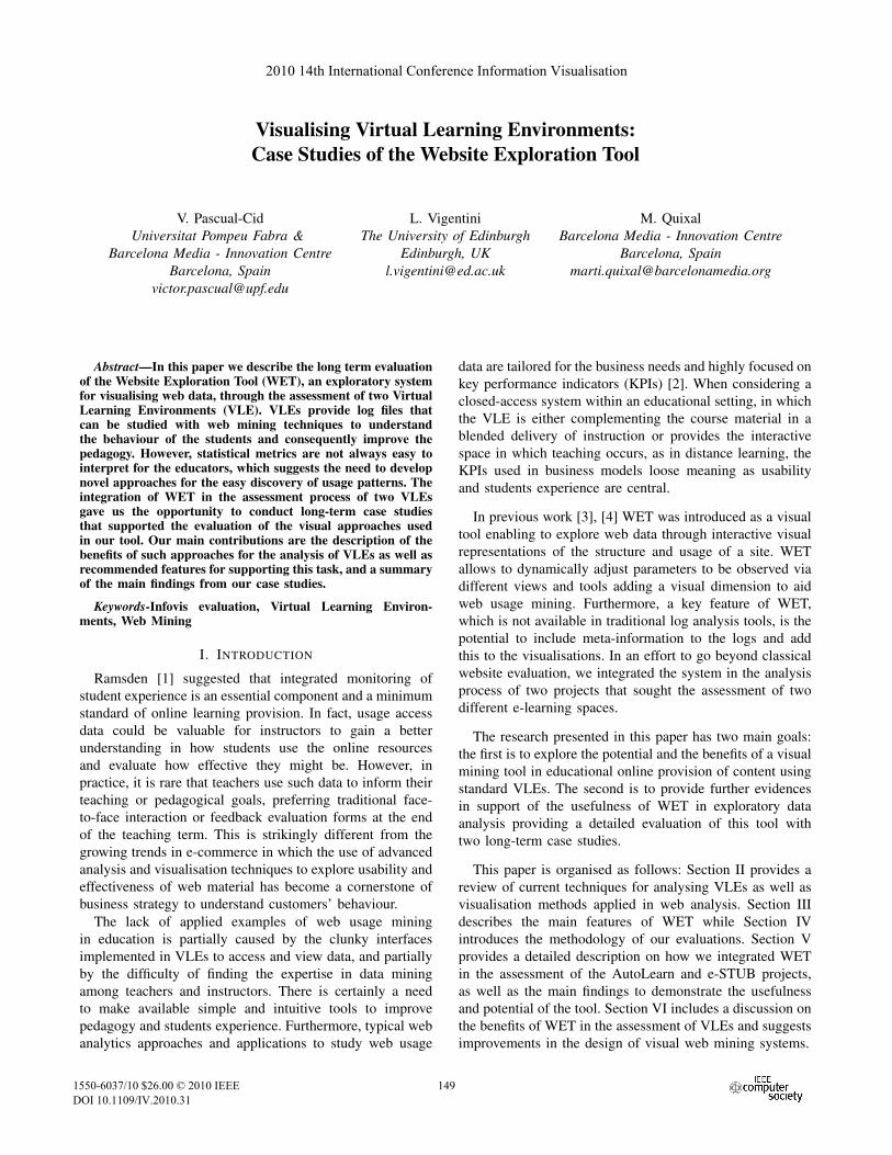
The WET system consists of a web mining module and avisualisation system. The former is based on a database thatholds the data regarding structure and usage. New metricscan be incorporated through the development of SQL queriesenabling the system to capture the results, and generate aXML file. The visualisation system (Figure 1) is responsiblefor interpreting the XML file and provides an interactiveenvironment for exploring the data. The system incorporatesthree main coordinated views: a hierarchical representationof the website structure showing the shortest paths from theroot node to every content on the site (top left image), avisualisation of the most common paths performed from alanding page also represented as a hierarchy [4] (top rightimage), and a graph visualisation showing an aggregationof all user paths (bottom image). Both hierarchical visu-alisations can be displayed using a radial tree or a treemapmetaphor, while the graph representing the navigation of theusers in the site uses a force directed layout.
The system also enables to map different metrics withvisual attributes such as colour, shape and size, and providesdynamic filtering tools to reduce the amount of informationto be displayed. Further details of the functionalities of thesystem can be found in [3] and [4].
Figure 1. The WET interface provides a set of coordinated visualisations,a menu that allows the customisation of the visualisations and chartsrepresenting page visits over time.
150150150
IV. EVALUATION METHODOLOGY
To validate the usefulness of the visualisations and themining system of WET, we conducted two case studieswith real scenarios in which WET was used by at leastone analyst per project in the assessment of two e-learningplatforms. As indicated earlier, the need of visualisationtools in education is demonstrated by the fact that in bothcases, the first engagement followed an expression of interestfrom the project leaders in using visualisation tools to aidtheir assessment.
Following the guidelines proposed in [19] and [20], themain steps that we applied in the MILC evaluation can besummarised as follows:
1) Initial interview and experiment setup: a first interviewenables the user and the evaluator to define the goalsof the analysis according to the capabilities of thesystem. Such goals will be used afterwards to assessthe success of the analysis process.
2) Training: an extensive training must be provided to theparticipants so they can understand the functionalitiesof the system.
3) Early use: participants install the tool in their work-place and get the required datasets formatted accord-ingly to the needs of the system. Continuous contactwith the evaluator occurs to accommodate the tool tothe needs of the user.
4) Mature use: it is expected that most of the outcomeof the analysis should come during this phase, wherethe participant is already skilful with the tool andhas a better idea of the type of analysis that can beperformed. Ethnographic type-of observations shouldbe performed.
5) Outcome: a final interview must be conducted toreview the findings and compare them with the goalsdefined in the initial meeting. Participants shouldprovide thoughts and conclusions about the potentialof the system as well as suggest improvements forfuture designs.
During the analysis process, participants were encouragedto annotate and provide feedback about their findings orfrustrations, as well as to capture images or recordingswhen discovery occurred. Moreover, the proximity with theparticipants of the AutoLearn project gave us the opportunityto install a screencast tool that video recorded all the analysissessions.
The interviews, communication and analysis tracking ofthe e-STUB project was performed entirely online throughvoice calls (Skype) and IM sessions using Google Wave.The latter was particularly interesting because it allowsfor a seamless combination of real-time and asynchronousexchanges.
V. CASE STUDIES
We hereafter describe the projects that incorporated theVLE assessment with WET as well as discuss a subset ofthe main insights gathered with our tool. Due to space con-straints we will only introduce the most important findingsin each case study.
A. AutoLearn
AutoLearn is a VLE to learn English or German asa foreign language developed using Moodle; AutoLearnincorporates automatic correction facilities that go beyondspell and grammar checking based on Natural LanguageProcessing techniques. The main goal of the project was tostudy the use of automatically generated feedback in real-life instruction environments, which adds machine-learnerinteraction to the existing teacher-learner and learner-learnerinteraction. To what concerns our work, the project soughtthe evaluation of the usability of the platform to understandstudents satisfaction and to assess the pedagogical andlinguistic aspects of the courses.
AutoLearn was used in 7 institutions across Europe,managing a total of 28 courses taken by 610 students duringtwo periods of respectively 4 and 2 months. The wholeproject was divided into two phases: the first testing phasewas dedicated to the implementation of the learning systemin the first 13 courses. During this stage analysts aimed atimproving the system through the application of an iterativeevaluation-development methodology.
WET was used as the main tool in the explorative analysisof quantitative data extracted from log files. The lack ofexperience of the analysts in the web mining field generatedno primary hypothesis, which emphasised the need of anexploratory tool for the discovery of outliers and behaviouralpatterns.
1) Data Integration: Although WET incorporates au-tomatic tools for importing data from the most commonweb server log files, the existence of proxies in someschools prevented the user identification through classicalmethods of log file analysis [21]. Hence, we ported theMoodle database, which incorporates its own usage datawith identified users, into the WET mining system.
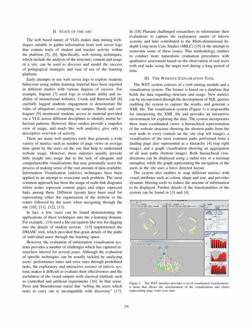
We generated a hierarchy based upon the main structureof the project that can be seen in Figure 2. The providedstructure had nodes representing assignments in the out-ermost ring of the hierarchy, enabling a histogram likevisualisation when mapping the nodes’ height with exercise-based statistics. Such histogram gets visually integrated withthe hierarchy of the platform, which enabled the discoveryof patterns and outliers, as can also be seen in Figure 2.
The developed quantitative metrics were based on thetime spent per exercise, number of visits and number ofinteractions per assignment. The last one was especiallyinteresting as it provided a measure of the number of timesthat a user interacted with the automatic correction module.
151151151
Regarding categorical data, the analysts identified everynode based on its type, differentiating quizzes, assignments,resources and automatically corrected exercises.
2) Early Use: At the end of the testing phase, weprovided the analyst with an XML file containing aggregateddata from the 244 students that participated in 13 courses.WET incorporated a radial tree as well as a treemap toanalyse the hierarchical structure of the platform, both ofthem with the same interaction capabilities such as dynamicfiltering and visual mapping of metrics. We observed thatanalysts felt more comfortable with the radial tree thanwith the treemap as the hierarchical structure pops up moreclearly. Moreover comparing bar heights was easier thancomparing the treemap squarified areas. At the time of thisanalysis there were no users’ paths visualisations in WET,which limited the data exploration to the comparison of thedifferent metrics with the visualisation of the structure ofthe project.
During the analysis, each quantitative metric was mappedaccordingly onto the height of the nodes, while colour wasused to distinguish between categorical values such as levelof the course (Intermediate or Advanced), language (Germanor English) or type of exercise (quiz, assignment, resourceand automatically corrected exercise). Such mapping en-abled the discovery of a usage pattern that revealed a decayin the visits as the lesson advanced, as can be seen inFigure 2. In a more detailed analysis, it was also discoveredthat there was a different slope considering students fromadvanced courses with intermediate ones.
This finding encouraged the analysts to develop and inte-grate more usage related metrics to compare in the secondround of the project.
Figure 2. Hierarchy of AutoLearn structure. Leafs of the tree representcourse exercises, that can be mapped according their specific quantitativeand categorical metrics.
3) Mature Use: The recorded analysis sessions allowedus to observe a dramatic improvement in task performance,proof of the learning curve of the analyst. When prompted,the analyst said: “I already knew how to use the tool, soI went straight to visualise what I wanted to see”. Weobserved that the analyst developed a clear explorationstrategy that followed the Information Seeking Mantra [22]:a very first overview of the whole structure using size andcolour according to specific metrics helped to detect outliersand trends. Then, most relevant courses were filtered andexplored in more detail.
In this phase analysts found more examples that supportedthe findings made in the early stage regarding exercise visits.
4) Outcome: Analysts discovered a very common be-haviour pattern that involved the absence of use of di-rect links between exercises within a course. Images fromFigure 3 make apparent a pattern referred by one of theanalysts as the “flower visualisation”. In the images, themain node represents the home page of the course, whilesurrounding coloured nodes represent the different exercisesin the course. As can be seen, users tend to move backand forth between the exercises instead of moving from oneexercise to the other. This pattern was interpreted as a signthat each activity was in principle self-contained and that all,at least most of, the materials needed to answer the questionsposed by the teacher could be answered without the needto navigate around. This interpretation is supported by adecision made after the first testing phase, which implied thatall activities including reading and listening comprehensionactivities had to be so implemented that learners could haveaccess to either the audio, the video or the text as well asto the questions in one single screen.
In the final interview with the analysts, it was argued thatthe explorative capabilities of the tool and the “easy wayto represent the hierarchical structure of the project” helpedthem in the process of generating new hypotheses whichin the long term allowed them to perform a deeper analysis.Their main findings were also contrasted and confirmed withthe qualitative analyses performed during the project.
We also noticed an extensive usage of image editing toolsfor annotating relevant screenshots after every discovery inorder to incorporate them in the analysis report. This factstrongly suggested the need to incorporate basic annotationtools to the system, which at the same time may stimulatethe collaborative analysis.
The final report of the project incorporated images ex-tracted from WET to show the findings. More details aboutgathered insight from the analysis of AutoLearn may befound in [23].
B. e-STUB project
The main goals of the e-STUB project (exploration ofStudents Tracking and User Behaviour) was to analysein detail how students used online resources provided in
152152152
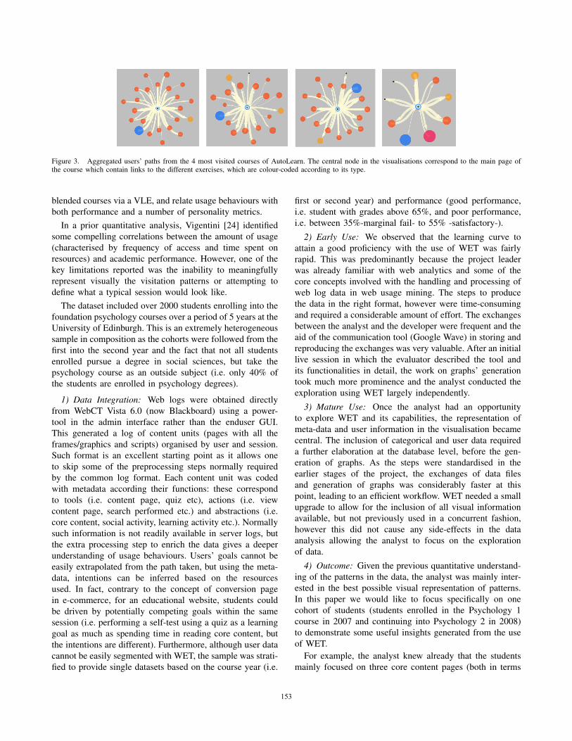
Figure 3. Aggregated users’ paths from the 4 most visited courses of AutoLearn. The central node in the visualisations correspond to the main page ofthe course which contain links to the different exercises, which are colour-coded according to its type.
blended courses via a VLE, and relate usage behaviours withboth performance and a number of personality metrics.
In a prior quantitative analysis, Vigentini [24] identifiedsome compelling correlations between the amount of usage(characterised by frequency of access and time spent onresources) and academic performance. However, one of thekey limitations reported was the inability to meaningfullyrepresent visually the visitation patterns or attempting todefine what a typical session would look like.
The dataset included over 2000 students enrolling into thefoundation psychology courses over a period of 5 years at theUniversity of Edinburgh. This is an extremely heterogeneoussample in composition as the cohorts were followed from thefirst into the second year and the fact that not all studentsenrolled pursue a degree in social sciences, but take thepsychology course as an outside subject (i.e. only 40% ofthe students are enrolled in psychology degrees).
1) Data Integration: Web logs were obtained directlyfrom WebCT Vista 6.0 (now Blackboard) using a power-tool in the admin interface rather than the enduser GUI.This generated a log of content units (pages with all theframes/graphics and scripts) organised by user and session.Such format is an excellent starting point as it allows oneto skip some of the preprocessing steps normally requiredby the common log format. Each content unit was codedwith metadata according their functions: these correspondto tools (i.e. content page, quiz etc), actions (i.e. viewcontent page, search performed etc.) and abstractions (i.e.core content, social activity, learning activity etc.). Normallysuch information is not readily available in server logs, butthe extra processing step to enrich the data gives a deeperunderstanding of usage behaviours. Users’ goals cannot beeasily extrapolated from the path taken, but using the meta-data, intentions can be inferred based on the resourcesused. In fact, contrary to the concept of conversion pagein e-commerce, for an educational website, students couldbe driven by potentially competing goals within the samesession (i.e. performing a self-test using a quiz as a learninggoal as much as spending time in reading core content, butthe intentions are different). Furthermore, although user datacannot be easily segmented with WET, the sample was strati-fied to provide single datasets based on the course year (i.e.
first or second year) and performance (good performance,i.e. student with grades above 65%, and poor performance,i.e. between 35%-marginal fail- to 55% -satisfactory-).
2) Early Use: We observed that the learning curve toattain a good proficiency with the use of WET was fairlyrapid. This was predominantly because the project leaderwas already familiar with web analytics and some of thecore concepts involved with the handling and processing ofweb log data in web usage mining. The steps to producethe data in the right format, however were time-consumingand required a considerable amount of effort. The exchangesbetween the analyst and the developer were frequent and theaid of the communication tool (Google Wave) in storing andreproducing the exchanges was very valuable. After an initiallive session in which the evaluator described the tool andits functionalities in detail, the work on graphs’ generationtook much more prominence and the analyst conducted theexploration using WET largely independently.
3) Mature Use: Once the analyst had an opportunityto explore WET and its capabilities, the representation ofmeta-data and user information in the visualisation becamecentral. The inclusion of categorical and user data requireda further elaboration at the database level, before the gen-eration of graphs. As the steps were standardised in theearlier stages of the project, the exchanges of data filesand generation of graphs was considerably faster at thispoint, leading to an efficient workflow. WET needed a smallupgrade to allow for the inclusion of all visual informationavailable, but not previously used in a concurrent fashion,however this did not cause any side-effects in the dataanalysis allowing the analyst to focus on the explorationof data.
4) Outcome: Given the previous quantitative understand-ing of the patterns in the data, the analyst was mainly inter-ested in the best possible visual representation of patterns.In this paper we would like to focus specifically on onecohort of students (students enrolled in the Psychology 1course in 2007 and continuing into Psychology 2 in 2008)to demonstrate some useful insights generated from the useof WET.
For example, the analyst knew already that the studentsmainly focused on three core content pages (both in terms
153153153
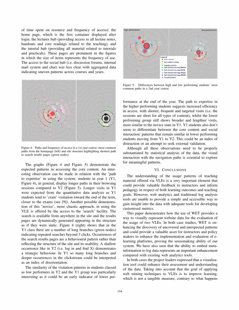
of time spent on resource and frequency of access): thehome page, which is the first container displayed afterlogin, the lectures hub (providing access to all lecture notes,handouts and core readings related to the teaching), andthe tutorial hub (providing all material related to tutorialsand practicals). These pages are prominent in the figuresin which the size of items represents the frequency of use.The access to the social hub (i.e. discussion forums, internalmail system and chat) was less clear with aggregated dataindicating uneven patterns across courses and years.
Figure 4. Paths and frequency of access in a 1st year course; most commonpaths from the homepage (left) and site structure highlighting shortest pathto search results pages (green nodes).
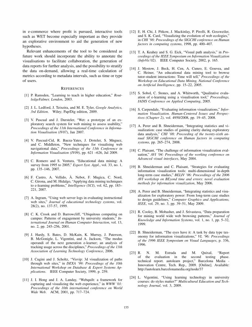
The graphs (Figure 4 and Figure 5) demonstrate theexpected patterns in accessing the core content. An inter-esting observation can be made in relation with the ’pathto expertise’ in using the system: students in year 1 (Y1,Figure 4), in general, display longer paths in their browsingsessions compared to Y2 (Figure 5). Longer visits in Y1were expected from the quantitative data analysis as Y1students tend to ’cram’ visitation toward the end of the term,closer to the exams (see [9]). Another possible demonstra-tion of this ’novice’, more chaotic approach, in using theVLE is offered by the access to the ’search’ facility. Thesearch is available from anywhere in the site and the resultspages are dynamically generated appearing in the structureas if they were static. Figure 4 (right) shows that in theY1 class there are a number of long branches (green nodes)indicating repeated searches beyond 3 clicks. Occurrences ofthe search results pages are a behavioural pattern rather thanreflecting the structure of the site and its usability. A shallowoccurrence like in Y2 (i.e. log in and find X) demonstratesa strategic behaviour. In Y1 so many long branches anddeeper occurrences in the clickstream could be interpretedas an index of disorientation.
The similarity of the visitation patterns in students classedas low performers in Y2 and the Y1 group was particularlyinteresting as it could be an early indicator of lower per-
Figure 5. Differences between high and low performing students’ mostcommon paths in a 2nd year course.
formance at the end of the year. The path to expertise inthe higher performing students suggests increased efficiencyin access, with shorter, frequent and targeted visits (i.e. thesessions are short for all types of content), whilst the lowerperforming group still shows broader and lengthier visits,more similar to the novice state in Y1. Y1 students also don’tseem to differentiate between the core content and socialinteraction: patterns that remain similar in lower performingstudents moving from Y1 to Y2. This could be an index ofdistraction or an attempt to seek external validation.
Although all these observations need to be properlysubstantiated by statistical analysis of the data, the visualinteraction with the navigation paths is essential to explorefor meaningful patterns.
VI. CONCLUSIONS
The understanding of the usage patterns of teachingmaterial offered via VLEs is a very important element thatcould provide valuable feedback to instructors and informpedagogy in respect of both learning outcomes and teachinggoals. However, web analytics and traditional log analysistools are unable to provide a simple and accessible way togain insight into the data with adequate tools for developingcustomised metrics.
This paper demonstrates how the use of WET provides away to visually represent website data for the evaluation ofthe usage of two VLEs. In both case studies, WET is en-hancing the discovery of uncovered and unexpected patternsand could provide a valuable asset for instructors and policymakers to enhance the implementation and evaluation of e-learning platforms, proving the sensemaking ability of oursystem. We have also seen that the ability to embed meta-information to log data represents an important enhancementcompared with existing web analytics tools.
In both cases the project leaders expressed that a visualisa-tion tool could enhance their assessment and understandingof the data. Taking into account that the goal of applyingweb mining techniques to VLEs is to improve learning,which is not a tangible measure, contrary to what happens
154154154
in e-commerce where profit is pursued, interactive toolssuch as WET become especially important as they providean explorative environment to aid the generation of newhypotheses.
Relevant enhancements of the tool to be considered asfuture work should incorporate the ability to annotate thevisualisations to facilitate collaboration, the generation ofdata reports for further analysis, and the possibility to stratifythe data on-demand, allowing a real-time calculation ofmetrics according to metadata intervals, such as time or typeof users.
REFERENCES
[1] P. Ramsden, “Learning to teach in higher education,” Rout-ledgeFalmer, London, 2003.
[2] J. L. Ledford, J. Teixeira, and M. E. Tyler, Google Analytics,3rd Edition. Wiley; Pap/Dig edition, 2009.
[3] V. Pascual and J. Dursteler, “Wet: a prototype of an ex-ploratory search system for web mining to assess usability,”Proceedings of the 11th International Conference in Informa-tion Visualisation (IV07), Jan 2007.
[4] V. Pascual-Cid, R. Baeza-Yates, J. Drsteler, S. Mnguez,and C. Middleton, “New techniques for visualising webnavigational data,” Proceedings of the 13th Conference inInformation Visualisation (IV09), pp. 621 –626, Jul 2009.
[5] C. Romero and S. Ventura, “Educational data mining: Asurvey from 1995 to 2005,” Expert Syst. Appl., vol. 33, no. 1,pp. 135–146, 2007.
[6] F. Castro, A. Vellido, A. Nebot, F. Mugica, C. Nord,C. Girona, and M. Hidalgo, “Applying data mining techniquesto e-learning problems,” Intelligence (SCI), vol. 62, pp. 183–221, 2007.
[7] A. Ingram, “Using web server logs in evaluating instructionalweb sites,” Journal of educational technology systems, vol.28(2), no. 137-57, 1999.
[8] C. K. Crook and D. Barrowcliff, “Ubiquitous computing oncampus: Patterns of engagement by university students,” In-ternational Journal on Human Computer Interaction, vol. 13,no. 2, pp. 245–256, 2001.
[9] J. Hardy, S. Bates, D. McKain, K. Murray, J. Paterson,B. McGonigle, L. Vigentini, and A. Jackson, “The modusoperandi of the next generation e-learner; an analysis oftracking usage across the disciplines,” Proceedings of the 13thAssociation of Learning Technology Conference, 2006.
[10] J. Cugini and J. Scholtz, “Visvip: 3d visualization of pathsthrough web sites,” in DEXA ’99: Proceedings of the 10thInternational Workshop on Database & Expert Systems Ap-plications. IEEE Computer Society, 1999, p. 259.
[11] J. I. Hong and J. A. Landay, “Webquilt: a framework forcapturing and visualizing the web experience,” in WWW ’01:Proceedings of the 10th international conference on WorldWide Web. ACM, 2001, pp. 717–724.
[12] E. H. Chi, J. Pitkow, J. Mackinlay, P. Pirolli, R. Gossweiler,and S. K. Card, “Visualizing the evolution of web ecologies,”in CHI ’98: Proceedings of the SIGCHI conference on Humanfactors in computing systems, 1998, pp. 400–407.
[13] T. A. Keahey and S. G. Eick, “Visual path analysis,” in Pro-ceedings of the IEEE Symposium on Information Visualization(InfoVis’02). IEEE Computer Society, 2002, p. 165.
[14] J. Mostow, J. Beck, H. Cen, A. Cuneo, E. Gouvea, andC. Heiner, “An educational data mining tool to browsetutor-student interactions: Time will tell,” Proceedings of theWorkshop on Educational Data Mining, National Conferenceon Artificial Intelligence, pp. 15–22, 2005.
[15] S. Sobol, C. Stones, and A. Whitworth, “Qualitative evalu-ation of e-learning using a visualisation tool,” Proceedings,IADIS Conference on Applied Computing, 2005.
[16] S. Carpendale, “Evaluating information visualizations,” Infor-mation Visualization. Human-Centered Issues and Perspec-tives (Chapter 2), vol. 4950/2008, pp. 19–45, 2008.
[17] A. Perer and B. Shneiderman, “Integrating statistics and vi-sualization: case studies of gaining clarity during exploratorydata analysis,” CHI ’08: Proceeding of the twenty-sixth an-nual SIGCHI conference on Human factors in computingsystems, pp. 265–274, 2008.
[18] C. Plaisant, “The challenge of information visualization eval-uation,” AVI ’04: Proceedings of the working conference onAdvanced visual interfaces, May 2004.
[19] B. Shneiderman and C. Plaisant, “Strategies for evaluatinginformation visualization tools: multi-dimensional in-depthlong-term case studies,” BELIV ’06: Proceedings of the 2006AVI workshop on BEyond time and errors: novel evaluationmethods for information visualization, May 2006.
[20] A. Perer and B. Shneiderman, “Integrating statistics and visu-alization for exploratory power: From long-term case studiesto design guidelines,” Computer Graphics and Applications,IEEE, vol. 29, no. 3, pp. 39–51, May 2009.
[21] R. Cooley, B. Mobasher, and J. Srivastava, “Data preparationfor mining world wide web browsing patterns,” Journal ofKnowledge and Information Systems, vol. 1, no. 1, pp. 5–32,1999.
[22] B. Shneiderman, “The eyes have it: A task by data type tax-onomy for information visualizations,” VL ’96: Proceedingsof the 1996 IEEE Symposium on Visual Languages, p. 336,1996.
[23] R. N. M. Estrada and M. Quixal, “Reportof the evaluation in the second testing phase.technical report. autolearn project,” Barcelona Media -Innovation Centre, Tech. Rep., 2009. [Online]. Available:http://autolearn.barcelonamedia.org/node/37
[24] L. Vigentini, “Using learning technology in universitycourses: do styles matter?” Multicultural Education and Tech-nology Journal, vol. 3, 2009.
155155155