ontology-based information visualisation
TRANSCRIPT

5. Ontology-based Information Visualisation
Christiaan Fluit1 – [email protected] Marta Sabou1, 2 – [email protected]
Frank van Harmelen1, 2 – [email protected] 1) Aidministrator Nederland BV, Amersfoort. http://www.aidministrator.nl 2) Faculty of Sciences, Vrije Universiteit Amsterdam
5.1 Introduction The Semantic Web is an extension of the current World Wide Web, based on the idea of exchanging information with explicit, formal and machine-accessible descriptions of meaning. Providing information with such semantics will enable the construction of applications that have an increased awareness of what is contained in the information they process and that can therefore operate more accurately. This has the potential of improving the way we deal with information in the broadest sense possible, e.g. better search engines, mobile agents for various tasks, or even applications yet unheard of. Rather than being merely a vision, the Semantic Web has significant backing from various institutes such as DARPA, the European Union and the W3C, which all have formed current and future Semantic Web activities. In order to be able to exchange the semantics of information, one first needs to agree on how to explicitly model it. Ontologies are a mechanism for representing such formal and shared domain descriptions. They can be used to annotate data with labels (metadata) indicating their meaning, thereby making their semantics explicit and machine-accessible. Many Semantic Web initiatives emphasize the capability of machines to exchange the meaning of information. Although their efforts will lead to an increased quality of the application’s results, their user interfaces often take little or no advantage of the increased semantics. For example, an ontology-based search engine could use its ontology when evaluating the user’s query (e.g. for query formulation, disambiguation or evaluation), but it could also use it to enrich the presentation of the resulting list to the end user, e.g. by replacing the endless list of hits with a navigation structure based on the semantics of the hits. Aidministrator is a software provider in the market of information and content management. One of Aidministrator’s core products is Spectacle. It facilitates the creation of information presentations that meet the needs of end users, e.g. a personalised navigation that reduces the need for search and enables people to find information in a few clicks. Spectacle establishes this using the semantics of the information that can be provided by the Semantic Web. Therefore, Spectacle can be used to construct user interfaces that take advantage of the Semantic Web. In this chapter we will present one of Spectacle’s key components called the Cluster Map, which is used for the visualisation of ontological data. First, we will give a description of Spectacle and its use of ontologies in section 2. We will also explain

the contents of the Cluster Map visualisation and the user interface that facilitates its dynamic exploration. Section 3 presents three real-life case studies in which visualisation plays different roles. These two sections naturally lead to a discussion in section 4 on how the visualisation can support several user tasks, such as analysis, search and navigation. An overview of related work, a summary and some considerations for future work conclude this chapter.
5.2 Spectacle The Spectacle system creates an Exploration Context out of information sources, providing users a convenient way to find and explore information. This takes into account the user’s task, perspective, personal preferences, etc. This does not only mean that the right information should be delivered to the right user, but also that it needs to be presented (structured, formatted, …) in the right way. Spectacle is used both to disclose the content of databases and document repositories as well as the semantics of information from existing Semantic Web resources. Roughly speaking, Spectacle can present information in two different ways. First, it can create hypertext interfaces, containing selected content, design and an appropriate navigation structure, based on the semantics of the information. Additionally, it can present the information in entirely novel ways, e.g. by graphical visualisation, which is the topic of this chapter. A key benefit of the first approach is that it allows for an easy and flexible presentation of the same information in different ways, for each of the envisioned tasks or user types. Furthermore, it has all the usual benefits of a generated web site and takes advantage of the expressivity and flexibility provided by Semantic Web standards such as RDF (Lassila and Swick 1999) and RDF Schema (Brickley and Guha 2000). A benefit of the second approach is that it has the potential of offering insights and kinds of information access which are not possible with “conventional” publishing methods such as web sites. Which presentation mechanism should be used depends entirely on the problem at hand, Spectacle allows to select the mechanism (or combination of mechanisms) that is the most beneficial for that problem.
5.2.1 Ontologies in Spectacle Spectacle builds on light-weight ontologies that describe a domain through a set of classes (concepts) and their hierarchical relationships. Also known as taxonomies, such ontologies are frequently used in several domains (biology, chemistry, libraries) as classification systems. Information architects consider taxonomies as basic building blocks, representing the backbone of most web sites. Non-formal taxonomies are already widely used in web applications for product classification (e.g. Amazon) or web-directories (e.g. Yahoo, Open Directory Project (ODP)). Taxonomies are also part of Semantic Web standards such as RDF and Topic Maps.

Due to the specialization relationship that is encoded in the hierarchy, the set of objects in a subclass is a subset of its superclass. The set of subclasses of a class is incomplete when their union does not contain all the objects of the superclass. Classes that share instances are overlapping if no specialization relationship holds between them. These characteristics are very common for taxonomies. However, they are difficult to show satisfactorily with normal textual representation techniques. Our visualisation offers an alternative in this matter.
5.2.2 Cluster Map Basics The Cluster Map visualizes the objects of a number of selected classes from a hierarchy, organized by their classifications. The Cluster Map in Fig. 5.1. shows a collection of job offers organised according to a very simple ontology. Each small yellow sphere represents an offer. The big green spheres represent ontology classes, with an attached label stating their name and cardinality. Directed edges connect classes, and point from specific to generic (e.g. IT is a subclass of Job Vacancies). Balloon–shaped edges connect objects to their most specific class(es). Objects with the same class membership are grouped in clusters. Our example contains six clusters; two of them represent overlaps between classes.
Fig. 5.1: An example Cluster Map.
The organisation of the graph is computed using a variant of the well-known spring-embedder algorithm (Eades, 1984). On the one hand the class and cluster nodes repel each other. On the other hand the edges, connecting two classes or clusters to their classes, produce an attractive force between the connected nodes; i.e. they work as “springs”. The layout algorithm has been optimised for this particular kind of graph, both qualitatively (using the semantics of the graph to obtain a more insightful visualisation) and quantitatively (obtaining a layout fast enough to permit interactive usage).

The added value of our visualisation lies in its expressivity. The classes and their relationships (the vocabulary of the domain) are easy to detect. Also, it is immediately apparent which items belong to one or multiple classes, which classes overlap (e.g. Technology and Management) and which do not (IT and Management). The cardinality of classes and clusters is visible: the top class has the most objects, Technology shares more objects with IT than with Management. The subclasses of the root class are incomplete as their union does not cover the superclass: some members of Vacancies were not further classified. Another interesting aspect of the visualisation is that geometric closeness in the map is related to semantic closeness. This is a consequence of the graph layout algorithm. Classes are semantically close if they share many objects. Indeed, the more objects two classes share, the closer they are represented. Objects are semantically close if they belong to the same class(es). Indeed, objects with the same class membership are clustered. The Cluster Map visualisation is highly configurable. Several colour schemes support different tasks: e.g. display each class using a unique colour (Fig. 5.3.) or indicate cluster relevance using colour brightness (Fig. 5.6.). Filters can reduce the complexity of the visualisation, e.g. by removing all clusters representing the overlap of less or more then n classes, or all clusters with cardinality above or below a certain threshold. The scalability of the visualisation can be improved by displaying a cluster as a single graphical entity with its cardinality indicated (Fig. 5.5.).
5.2.3 User Interaction A Cluster Map can be used as a static information visualisation, as will be shown in section 3. However, additional benefits are obtained when viewing it in the interactive Cluster Map viewer. The interface of this viewer has been designed to stimulate the user to explore the information shown. Fig. 5.2. shows a screen shot of the viewer. At the left side we see the class hierarchy from which the user can select an arbitrary combination of classes to display in the graph panel at the right. A class is added to the visualisation by selecting the check box next to it, which immediately updates the graph. The contents of the map can also be changed by double-clicking on certain parts of the graph. Depending on a user preference, a double-click on a class either results in the class being expanded or collapsed or in the whole visualisation being replaced with a visualisation of its subclasses, providing a way to semantically zoom in the information. There are several ways to explore the contents of a given graph. Moving the mouse pointer over objects in the graph shows information about them in the status bar (see Figure 2). Clicking on a class or cluster highlights related nodes and edges, giving a good overview of how its objects are distributed over the graph. Additionally, details about the individual objects such as a name and a URI are shown in a table that pops up at the bottom of the screen. One can also select on one or more classes in the tree at the left side. As a result, the currently visualised objects of the selected classes are highlighted. This makes it very easy to see how these selected classes relate to the currently visualized classes, without having to add them to the map. Finally, the filters

described above can be applied and adapted dynamically, meaning that the visualisation is updated immediately.
Fig. 5.2: A screen shot of the Cluster Map viewer.
Often a user will want to explore several graphs, each showing a slightly different set of classes. During this interaction the user constructs a mental map of the information in the visualisation (Eades et al., 1991). A number of provisions have been made to assist the user with adapting his mental map over time. When the user adds or removes classes, the system automatically calculates a layout for the new graph, reusing the layout of the old graph as much as possible. The transition of one graph to the next is animated, clearly showing the structural changes between the two graphs. During the animation, objects that appear or disappear in the graph fade in or out respectively, while objects that remain in the graph are translated to their new position. The interface provides back and forward buttons like a web browser so that the transitions can be repeated forwards and backwards. All these provisions help the user to transform his mental map. Additionally (or perhaps consequently), the animation has proven very helpful when explaining the visualisation to new users. Note that this interface adheres to Shneiderman’s Visual Information-Seeking Mantra (Shneiderman, 1996) of “overview first, zoom and filter, then details-on-demand”.
5.3 Cases As we have seen, Cluster Maps contain a large amount of information. Furthermore, several strategies exist for applying them on a data set. This section demonstrates three real-life case studies where different visualisation strategies were used.
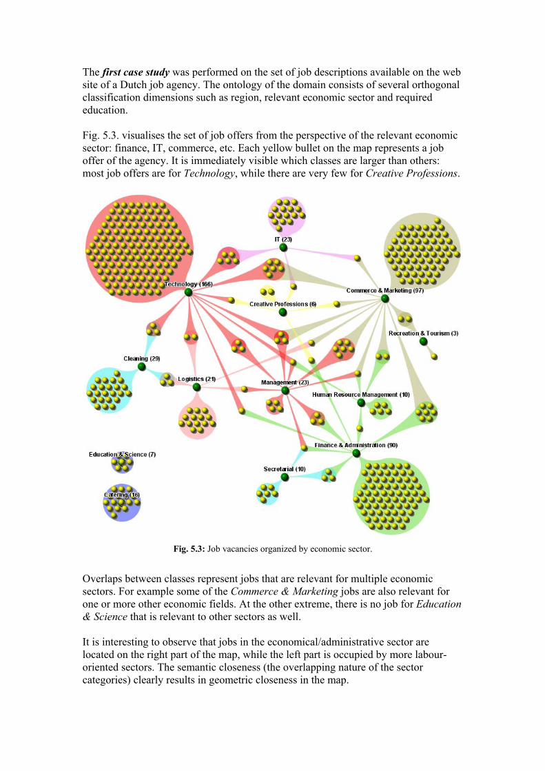
The first case study was performed on the set of job descriptions available on the web site of a Dutch job agency. The ontology of the domain consists of several orthogonal classification dimensions such as region, relevant economic sector and required education. Fig. 5.3. visualises the set of job offers from the perspective of the relevant economic sector: finance, IT, commerce, etc. Each yellow bullet on the map represents a job offer of the agency. It is immediately visible which classes are larger than others: most job offers are for Technology, while there are very few for Creative Professions.
Fig. 5.3: Job vacancies organized by economic sector.
Overlaps between classes represent jobs that are relevant for multiple economic sectors. For example some of the Commerce & Marketing jobs are also relevant for one or more other economic fields. At the other extreme, there is no job for Education & Science that is relevant to other sectors as well. It is interesting to observe that jobs in the economical/administrative sector are located on the right part of the map, while the left part is occupied by more labour-oriented sectors. The semantic closeness (the overlapping nature of the sector categories) clearly results in geometric closeness in the map.

Fig. 5.4. visualises the same data set but from a totally different perspective, namely the region of the job. Since this classification criterion is largely orthogonal to the previous one, the organisation of the map is completely different. It is clearly visible that some regions offer more jobs than others, with most jobs being offered in Gelderland. Overlaps of classes represent jobs related to multiple regions.
Fig. 5.4: Job vacancies organized by region.
An interesting observation is that the visualisation more or less reflects the geography of The Netherlands. This is due to the fact that neighbouring provinces are more likely to share jobs, i.e. to be semantically related. This results in them appearing next to each other on the visualisation. The second case study is a comparative analysis of the web sites of two major Dutch banks, to see if they differ in their offerings. We used a simple ontology containing various bank-related topics. Both data sets were visualised according to this ontology (see Fig. 5.5.). A comparison of the two visualisations reveals that one site is larger than the other. Also, the visualisation suggests that the profiles of the two banks differ. The first bank seems to be oriented towards labour-related issues, while the second focuses on investment. This proven by both the cardinality of the two major classes (Labour for the first bank, Investment for the second) and their influence on the other activities (for example the overlap between Investment and Enterpreneurs is larger for the second bank even when normalized to the cardinality of the classes).

Fig. 5.5: Two bank web sites visualized using the same ontology.
For the third case study we used the web site of a travel agent, containing a separate page for each holiday offer. An ontology described this domain from perspectives such as geographical location and properties of the accommodation (number of rooms, number of persons, quality). The role of the ontology in the visualisation was different: while in the previous cases we viewed the data only from a single perspective, here we wish to determine the relevance of data items with respect to characteristics from different perspectives. This results in a query having as terms classes from the ontology. Suppose that we are interested in all the 3 stars, 2 rooms and 4 persons accommodations in the French Loire. The classes in the ontology that correspond to these criteria are visualised in the left part of Fig. 5.6. The perfect result would be represented as a cluster that connects to all four classes. However, no item in the data set satisfies all our requirements, there is no overlap between all the classes of interest.
Fig. 5.6: Visualisations of two consecutive query result sets.

Our scenario is well known in electronic commerce: when searching for a product, a customer selects a set of values that are of interest. If the query does not fully succeed then either a “no matches” message or a long list of partial matches is shown. The customer gets neither a clear overview of the results nor suggestions for further exploration. As a result he often abandons the site. The ideal situation would be that the customer is guided to alternatives that would come close to his needs. With our visualisation the customer has the opportunity to analyse alternative solutions, in terms of his original query. In our example, there is a holiday destination that fulfils all the requirements except the three star accommodation. Also, in the case that the destination is not so important, there exists one holiday offer with the required accommodation properties, but which is not in Loire. These might be interesting options for the customer. (Note the use of colour brightness to identify the relevance of a cluster). Another possibility is to refine the query by using the ontological nature of the data. Although no matching destinations were found in the Loire, there is still a chance that destinations with these characteristics will exist in a broader class, i.e. the whole of France. Visualising again the classes of interest but now in combination with France instead of Loire, there is now exactly one destination that matches completely (see the right side of Fig. 5.6.).
5.4 Uses of Ontology-Based Visualisation So far we have demonstrated the properties and expressiveness of our visualisation. In what follows we will discuss how our maps support three information seeking tasks: data analysis, querying and navigation.
5.4.1 Analysis A user analyses a data set in order to get a better insight in its characteristics, to get a global understanding of the collection and to discover unexpected patterns. The static version of the Cluster Map (i.e. the image itself) already contains information that can be used for analysis. The classes and their hierarchy provide an understanding of the domain of the data set. The way instances are classified results in class characteristics such as incompleteness and overlaps, showing class relations at instance level. The cardinality of classes and clusters supports a quantitative analysis. Interpreting this information, one can already derive some domain specific observations. The strategy used to obtain a static Cluster Map plays an important role. Different strategies support different analysis scenarios, as shown in the previous section:
1. Analysis within a single domain In this case a data set is visualised from one or more perspectives, giving insight in the collection. One of our case studies investigated characteristics of a set of job offers by visualising it according to region or relevant economic sector.
2. Comparison of different data-sets Data sets can be compared by visualising them using the same ontology. We have compared two banks by imposing the same ontology on their web sites and analysing the two visualisations.
3. Monitoring By analysing a data set at different points in time provides insight in the way it evolves. For example one could monitor the site of a bank over time and see how its activities evolve (expand/interconnect/…).
The Cluster Map viewer (described in section 2.3) makes analysis an interactive and explorative process. The overview, zoom and filter facilities offered by the user interface qualitatively enhance the analysis process.
5.4.2 Querying The goal of a query task is to find a narrow set of items in a large collection that satisfy a well-understood information need (Marchionini, 1995). We will show the benefits of using the Cluster Map viewer in the four stages of the search task (Shneiderman, 1998). Query formulation – the step of expressing an information need through a query is a difficult task. Users encounter difficulties when having to provide terms that best describe their information need (vocabulary problem). Furthermore, combining these terms in simple logical expressions using “AND” and “OR” is even more complicated. See (Shneiderman, 1996) for a demonstration of this problem. In the viewer the classes that describe the domain of a data set are explicitly shown, making the vocabulary choice much easier. There is no need to specify Boolean expressions as they are already visible on the map. Initiation of action – Classes selected in the left panel become terms of a query. The search is launched at a mouse-click. Review of results – the results of the query are graphically presented to the user. For n selected classes the following is shown:
1. the union of the classes (disjunction of all query terms) 2. all intersections of the selected classes (conjunction of some query terms) 3. (as a particular case of 2), the intersection of all classes (conjunction of all
query terms) – if it exists. Note that the results of simple Boolean expressions are intuitively shown in the map. If the user wants a disjunction of the terms he will analyse all the presented objects. As an added value he will see how the corresponding classes overlap. A more interesting (and probably more frequent) case is when users want the conjunction of the terms. In that scenario, two extreme situations can happen:
1. the result set is too large (under-specification) 2. the result set is empty (over-specification)
If the result set is empty, the user can at least find objects that partially satisfy the query. The degree of relevance of certain clusters is suggested by their colour: the more relevant the darker the shade of the colour (see Fig. 5.6.). In the travel agent

scenario there were two destinations that were interesting if the customer dropped one requirement (quality of accommodation/ location). This is a form of query relaxation. Refinement – according to the conclusions of the result interpretation, the user can narrow or broaden the scope of his search by refining the query. If the result set is too large, the user can replace some classes with more specific subclasses. Imagine that in the travel agent scenario the customer would like to go to France and that the system returns a huge cluster that satisfies all the criteria. Instead of looking at each returned object, the customer can refine his query to use a more specific class, for example Loire. This would narrow the scope of the query and return a smaller set of options. At the other extreme, in case of an empty set, some classes can be replaced by their superclass. We have demonstrated such a case for the travel agent scenario: the search for a vacation in Loire was empty for the given settings, however one destination was found in France. Note that both narrowing and broadening the scope of the query are possible due to the ontological nature of the domain description. The viewer facilitates choosing more specific or more general classes.
5.4.3 Navigation Cluster Maps can be used for graphical navigation. We have employed them as image maps in Spectacle-generated web sites based on ontological data. Two navigation scenarios were implemented, as described below. In the first scenario, the Cluster Map is used in addition to another, more traditional navigational structure (a textual tree). It plays the role of a site map that is invoked by the user when needed. It presents an overview of the whole data set: it shows the most important classes, their relations and instances. An interesting aspect is the way the data is accessed: one can access a whole class (click on a class) or an overlap of interest (click on a cluster). The result is a representation of the contents of the selected entity in the form of a textual list. Entries in this list present extra information about the data items as well as a link to the actual data. The role of the map is to facilitate a quick understanding of the available content and to provide quick access to individual items. In the second scenario, the Cluster Map is always present as the only navigation facility. Maps gradually present deeper levels of the ontology: the user starts at the top of the ontology and can navigate towards more specific topics by clicking the classes of interest (diving into the information). At any point, the map shows the current class, its parent and its subclasses. For the current class, its elements are also presented in a textual list. This hierarchical browsing facilitates a levelled understanding of the data. In section 5.3 we have already demonstrated that the interactive Cluster Map viewer fulfills Shneiderman’s Visual Information-Seeking Mantra. We can say the same for the interfaces created for navigation using the Cluster Map. For the first navigation scenario, the users get an overview of the content, then they can zoom in into a certain

class/cluster, and access the detailed data. In the second scenario a top-level overview of the data allows zooming in into more specific classes until the objects of interest are identified and can be accessed.
5.5 Related Work Recently, many visualisations have been developed for web resources (see (Dodge, 2001) for an extensive overview). Differences exist between these approaches and the Cluster Map regarding the information that is visualised and the supported tasks. Well-known examples of visualisations of web resources are the Hyperbolic Tree (Lamping et al., 1995) for the navigation of large trees and The Brain (http://www.thebrain.com) for navigating graphs. Usually these visualisations focus on syntactic structures such as link structures. This of course has some semantics, but this is often very implicit and ad hoc. Additionally, the data structure used by these tools is often a tree or at least tree-like (it is arguable whether The Brain is really suited for navigating arbitrary graphs). Of course one could use other, more semantic input data, e.g. as is done for the WebBrain (http://www.webbrain.com), an application of The Brain on top of the Open Directory project (ODP), or the AquaBrowser (Veling, 1997) which visualises concept graphs. The main difference with our visualisation is that these systems primarily display the abstract structure, i.e. the instances are not an inherent part of the graph but are displayed separately (usually as a textual list). A correlation between two concepts has to be explicitly made in the abstract structure in order to be shown, whereas in our visualisation many class characteristics become immediately apparent because the instances are part of the visualisation. There are other visualisation systems that do mix abstract structures and instances, such as the Self-Organizing Map (Kohonen, 1997) and ThemeScape (http://www.aurigin.com). These systems extract conceptual characteristics of large document sets, which is clearly outside of our scope. Although scalable to very large document sets, the organization of the documents may sometimes seem arbitrary; the user has very little knowledge about why the data is organized in that particular way. Our system circumvents this because the graph structure shown is the main organization principle. Finally, there are visualisations that show both abstract and instance data at the same time with an explicit organization criterion, such as Antarcti.ca’s Visual Net (http://www.antarcti.ca), which has also been applied to the ODP (http://maps.map.net). This visualisation can also scale to large taxonomies and document sets, but has no intrinsic way of dealing with overlapping classifications, which frequently occur in classification systems such as Yahoo or the ODP. Concerning the tasks that are supported, a difference between our approach and most other approaches and techniques is that they primarily focus on navigation tasks, whereas our scope is much wider. That is not to say that they cannot be used for other tasks as well, only that the focus of their developers is on navigation tasks. The

visualisation mechanisms that offer support for the analysis tasks mainly focus on showing aspects of the information infrastructure, not the information itself.
5.6 Future Work Although the Cluster Map is already a very useful visualisation component, many research and development issues are still open. This list gives a quick impression:
1. Improvements for showing larger amounts of classes in a single image. 2. Refining the options for extending and semantically exploring the graph. 3. Adding a time dimension to the visualisation, for supporting monitoring tasks. 4. Refining the animation in order to better aid transforming the mental map. 5. Extend the interactive viewer so that it can use more expressive ontologies
such as RDF schemas, Topic Maps or other types of Semantic Web ontologies. Such a viewer could for example operate on top of Semantic Web repositories, such as Aidministrator’s Sesame (Broekstra et al., 2001).
5.7 Summary This chapter has demonstrated an elegant way to visually represent ontological data. We have described how the Cluster Map visualisation can use ontologies to create expressive information visualisations, with the attractive property that classes and objects that are semantically related are also spatially close in the visualisation. Furthermore, the available user interface provides many benefits. We have shown that a number of diverse information seeking tasks can be supported with this approach, and the real-life usability has been demonstrated by a number of case studies. Since ontologies are expected to play a crucial role in realizing the infrastructure of the Semantic Web, we expect that these visualisations will become an important tool for various kinds of search and analysis tasks.
Acknowledgements The authors would like to thank all their colleagues at Aidministrator for their support during the development of the Cluster Map as well as for their input on this chapter.
References Brickley D, Guha R (2000) Resource Description Framework (RDF) Schema Specification 1.0. Candidate recommendation, World Wide Web Consortium. Broekstra J, Harmelen F, Kampman A (2001) Sesame: an architecture for storing and querying RDF data and schema information. To appear in: Semantics for the WWW, MIT Press. Dodge M, Kitchin R (2001) Atlas of Cyberspace. Addison-Wesley, London. Eades P (1984) A heuristic for graph drawing. Congressus Numerantium 42:149-160.

Eades P, Lai W, Misue K, Sugiyama K (1991) Preserving the mental map of a diagram. In: Proceedings of the International Conference on Computational Graphics and Visualization Techniques (COMPUGRAPHICS ’91), pp. 34–43. Kohonen, T (1997) Self-organizing maps. Springer-Verlag, Berlin Heidelberg New York. Lamping J, Rao R, Pirolli P (1995) A focus+context technique based on hyperbolic geometry for visualising large hierarchies. In: ACM conference on human factors in Software (CHI ’95), pp. 401–408. Lassila O, Swick R (1999) Resource Description Framework (RDF): Model and Syntax Specification. Recommendation, World Wide Web Consortium. Marchionini G (1995) Information seeking in electronic environments. Cambridge University Press, Cambrigde, UK. Shneiderman B (1998) Designing the user interface. Addison-Wesley, Menlo Park, pp. 509-551. Shneiderman B (1996) The eyes have it: a task by data type taxonomy for information visualizations. In: Proceedings of the 1996 IEEE symposium on visual languages (VL ’96), pp. 336-343. Veling A (1997) The Aqua Browser: visualisation or large information spaces in context. Journal of AGSI 3: 136–142.