visual design for the celebration of 50th anniversary of nid
DESCRIPTION
Visual design for the occasion & celebration of 50th anniversary of National Institute of DesignTRANSCRIPT

1
For the occasion & celebration of
50th anniversary of NID
Visual Language

Visual Design for 50 yrs of NIDProcess Documentation
Kanchan DhankaniSemester 4 PGDPD Graphic DesignNID 2008-2009 Batch
Guide:Anil Sinha
CONTENTS
Background 1
Project proposal 2
Investigating spaces 5
Survey 20
NID spaces 21
Mind maps 26
Design criteria 28
Concept 30
Design development 33
Extending concept 40
Explorations 47
Feedbacks 48
Installations at different places 52

4
Why this project
Background
As I have already done a project on space installation in
Germany I saw a scope to implement similar expressive space
experience in Indian context
The exchange program and the trip of Europe give me an
exposure to a variety of spaces this made me more sensitive
towards space design.
There is a lot of scope in giving an experience through space
design. A few examples of striking space design I came across
in Europe are shown here.
Giant “I Amsterdam” Letters
Bauhaus Berlin Germany
National gallery Berlin Germany
Art gallery Hannover Germany
Space design project at FHH Hannoer University
This project was my first experience in space design.
I studied how the weather change plays a role in
minds and moods. Similarly spaces can be consciously
designed to give a particular experience . Here I choose
a fire exit’s counter space to give an experience of day
dreaming and end less thoughts running at the back
of the mind. Connections of different levels are build
which influences the subconscious mind.

Giant “I Amsterdam” Letters
These public sculpture letters are in coordination with
Amsterdam’s current motto and city marketing campaign.
The concept “I amsterdam” was created by KesselsKramer
(advertising agency). The letters travel throughout the city,
current location: Museumplein (Museum Square), in front of
the Rijks Museum.
1

2
Project Proposal
Kanchan Dhankani
Semester 4, PG graphics 2008
Email: [email protected]
Phone: 9277102096
Guide: Prof. Anil Sinha
Project title: Visual design for the occasion & celebration of fiftieth anniversary of National Institute of Design.
Introduction: The National Institute of Design (NID) is internationally acclaimed as one of the foremost multi-disciplinary institutions in the field of design education and research.NID had been set up looking at the industrial design education being imparted in Bauhaus and Ulm in Germany. It is known for its pursuit of design excellence to make “Designed in India, Made for the World” a reality.In the year 1961 the Government of India set up the National Institute of Design as an autonomous national institution for research, service and training in Industrial Design and Visual Communication.We are indeed privileged to be witnessing the Golden Jubilee year of NID from November 3, 2010. The celebrations to mark this occasion would commence from November 2010 and continue till November 2011. This would be an excellent opportunity to reflect on fifty years of NID’s contribution towards India’s development through the Institute’s forays into design education, research and training.This would be an opportunity to celebrate and acknowledge the importance of design and design-oriented professions. An occasion to honor all those who played significant role in transforming NID into a premier design institute.
Scope of working direction• This occasion calls for an visual design with which we can spread the Values and the Pride of NID • This will be the design language that celebrates golden jubilee of NID throughout the year 2010-20011• This project aims to enhance the experience of environment
Location: NID Paldi campus
Occasion: 50th anniversary
Target audienceAnyone who visits or passes by the location
3
Need
• This project would find the most fitting way to connect with all those who were associated with NID and honor the visionaries who played a significant role in transforming NID into a premier design institute.
• Visual design of the event will become a part of the environment to communicate and announce the celebration of the prestigious occasion.
• The vibes of this event must reach out in the city of Ahmedabad to celebrate the prestigious moment together and value its asset.
Expected learning:Understanding and analyzing factors, which build identity of an educational institutionLearn to translate set of values evolved with 50 years of NID existence in to visual design.Understanding the dynamics of space.
Methodology and strategy:• Information collection• Interviews & survey• Realizing spirit, values and impressions of NID• Brainstorming and generating alternate design concepts• Design development • Design evaluation/validation• Selected approach• Presentation & documentation
Student’s sign Guide’s sign DateKanchan Dhankani Anil Sinha

4
Structure
• Information collection
• Interviews & survey
• Realizing spirit, values and impressions of NID
• Brainstorming and generating alternate design concepts
• Design development
• Design evaluation/validation
• Selected approach
• Presentation & documentation

5
Investigating spaces in India
I was looking out for striking and conscious space designs in India. I began with Universities,
then searched for architects and installation artists works.
Places considered • Architecture College Chandigarh
• Nrityagram dance village Bangalore
• Sir JJ. Institute 75yrs Mumbai
• Sprouts Installation Delhi
• Open hand Monument Chandigarh
• Gateway of India gate Mumbai
• IIM New campus Ahmedabad
• Kankaria Lake Ahmedabad
• AMA University Ahmedabad
Open hand Monument Chandigarh
Architect : Le Corbusier

It is also meant to convey the symbolic message
“Open to give, open to receive”.
There is probably no city emblem in the world
quite like this one. ‘Open to give and open to
receive’ presumes an open mind.
Rising 85 feet high from a sunken trench, a giant
hand in metal sheets is designed to rotate like a
weather cock.
6
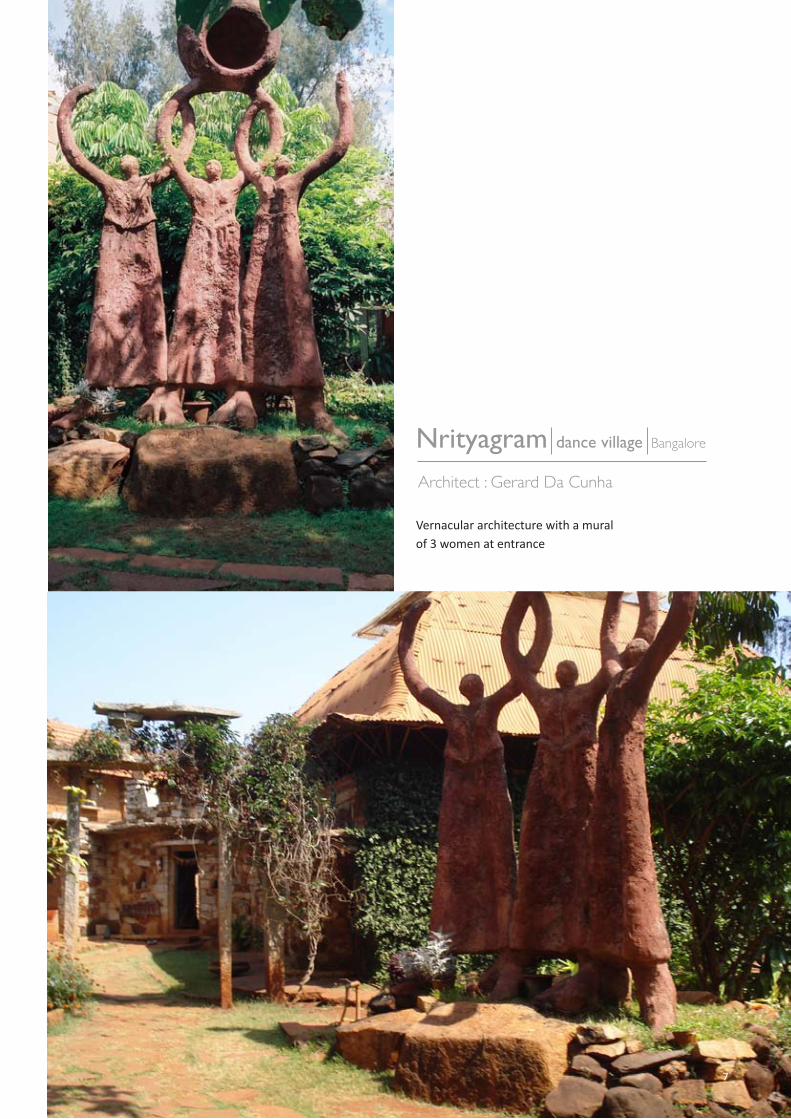
Nrityagram dance village Bangalore
Architect : Gerard Da Cunha
Vernacular architecture with a muralof 3 women at entrance
7

Sprouts Installation Delhi
Designer : Vibhor Sogani
Concept visualization and models
Vibhor has been working on large
installations in various materials. Public
Art and Urban Installations in Public
spaces and Traffic round-abouts are his
new areas of fascination.
One of his creations, ‘SPROUTS’, a
40 feet high installation, is currently
being installed in the 6 acres of greens
which lies between the flyovers at
AIIMS crossing, Delhi. This project is in
collaboration with Jindal Stainless Ltd.
8

9
Entrance mural shows Le corbusier modular system
Architecture College Chandigarh
Architect : Le Corbusier

Students interaction with this space
Le Corbusier explicitly used the golden ratio in his Modulor system for the
scale of architectural proportion. He saw this system as a continuation of the
long tradition of Vitruvius, Leonardo da Vinci’s “Vitruvian Man”, the work of
Leon Battista Alberti, and others who used the proportions of the human
body to improve the appearance and function of architecture. In addition to
the golden ratio, Le Corbusier based the system on human measurements,
Fibonacci numbers, and the double unit.
10

11
Gateway of India gate Mumbai
Design team : Architect George Wittet
First Major Event
The passing of the First Battalion of theSomerset Light Infantry. They were the last troops of the British to leave India after independence.
The ceremony was conducted on 28th Feb 1948.
After the review feedback I got a focus on what kind of places I must focus on.
The main idea behind the construction of the Gateway of India
was to celebrate the visit of King George V and Queen Mary
to Bombay. Sir George Sydenham Clarke, the then Governor
of Bombay, laid down the foundation stone of the monument
in March 1911. However, his plan was approved in 1914 and
the reclamations at Apollo Bundar got completed in 1919.
Designed by George Wittet, an architect, Gateway of India took
approximately 4 years (1920 to 1924) to get fully completed
Investigating ‘eventful spaces’
My project needs an inquiry of spaces which are related to
celebrations of event full spaces. Therefore Gateway of India
makes it more appropriate place for research.

Students paint Ram and Sita on college walls
The students of JJ School of Applied Arts have intelligently
weaved the story of Ramayana with college life and painted
it on the walls of their college. The paintings are actually part
of the 75th year anniversary of JJ School of Applied Arts which
falls on February 19, 2010.
The paintings have eight to 10 main stories
Sir JJ. Institute 75yrs Mumbai
Concept by : Rahul Gaikwad & Yadnyee Gaikwad(alumni of the college)
12

13

CEPT University Ahmedabad
Simple flash lights highlighting trees is what builds a different environment in CEPT campus.
14

15
AMA University Ahmedabad
Architect : Bimal Patel

Mural - Illuminated mural
Illuminated inside view
16

17
View from the main road
Other interesting spaces in AMA
18
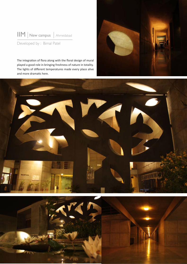
IIM New campus Ahmedabad
Developed by : Bimal Patel
The integration of flora along with the floral design of mural played a good role in bringing freshness of nature in totality.The lights of different temperatures made every place alive and more dramatic here.

Kankaria lake development project changed the complete experience of the place. The colourfull light play on the long stretch of the lake gave a good make over. The place looks more happening, full of life, maintained and uplifted the standards of every thing around.
Kankaria Lake Ahmedabad
Developed by: AMC
19

20
Standing with Interesting space Designs in AhmedabadWhat does NID communicate through its space ?
SURVEY
1) Do you think the exterior of NID (entrance façade) features the spirit of NID?
MAXIMUM NOWHY?• Because it is not as vibrant as the people inside and looks too stiff• Doesn’t give a clue of what this institute is all about•There is nothing especially done to draw attention and communicate any message
2) Would you prefer a change on NID façade? (boundary wall, Main gate, NID mural etc spots seen before entering NID)If you want to change then what change?
MAXIMUM YESMurals by the students or something more colourful
3) In what ways do you contribute towards making of your own environment? ( personal space like your room, work place etc)
add posters, add colour, sometimes spray paint my boxes and belongings to match, Put up pieces of my work, cleanliness, Painting, arranging furniture etc.
4) How do you perceive NID environment
very safe, like large spaces, lots of design information in the air.the indiscipline adds to the design discipline, Very culturally rich, and thanks to all the greenery -close to nature

NID Paldi campus Ahmedabad
Exterior
21

22Spaces made by students
Interior

The brick red & orange colour compliments the natural environment
Campus The brick red & orange colour compliments the natural environment in the campus
23

Observation
• MiscommunicationBranding of reliance fresh is overpowering
• OpportunityThis space has a potential to project our statement very strongly and impactfully
Boundary walls
24

25
NID MAIN GATE
INSTITUTE
HOSTELentrance gate
high potential
moderate potential
less potential
MIDDLE GATE
views

26
Visual language
for
Golden jubilee
Mind maps

27

28
Mood board

29
Design criteria
The external façade must be lively, welcoming and expressive but The exposed brick wall compliments the architecture inside.
Therefore the exposed brick should be maintained for the visual continuity.

30
‘Originating from a white beam splitting in spectrum’ is what I connect to NID
Design at NID is like Diverging in different directions & converging with ideas
The Multi disciplinary, vibrant and active features of NID
Concept
VI
BG
YO
R

31

32
Design Development
Projection
Approximately
6 inches
18 inches
45 inches
Current dimension
18 inches
23 inches
Proposed extension
35 inches
23 inches

33
The mesh • Sun rays• Illusion of closing and opening• Movement• A filter• When the light will be projected these lines will cut the light and form distinct beams
Responsive environment • The campus is alive its breathing through these holes
• The lights will be giving response by slowly becoming dim to bright
• The lights will look as responsive as the pupil of our eyes. A very subtle but attractive movement

34

35
Main Gate
Middle GateRendered wall
NID campus plan

Continuity
Places where there is no Hume pipes in the walls we can still maintain continuity by giving an illusion like shown in the picture.The location shown in the picture must be given a fresh look and has to be more highlighted as it this is the most prime spot of NID facade.
36

Divergence &Convergence
Inspiration
Form
Newton was the first to prove that white light is made up of all the colors that we can see.
Newton believed that all the colors he saw were in the sunlight. He thought he then should be able to combine the colors of the spectrum and make the light white again. To test this, he placed another prism upside-down in front of the first prism. The band of colors combined again into white sunlight.
Current structure
Proposed structure
37
38
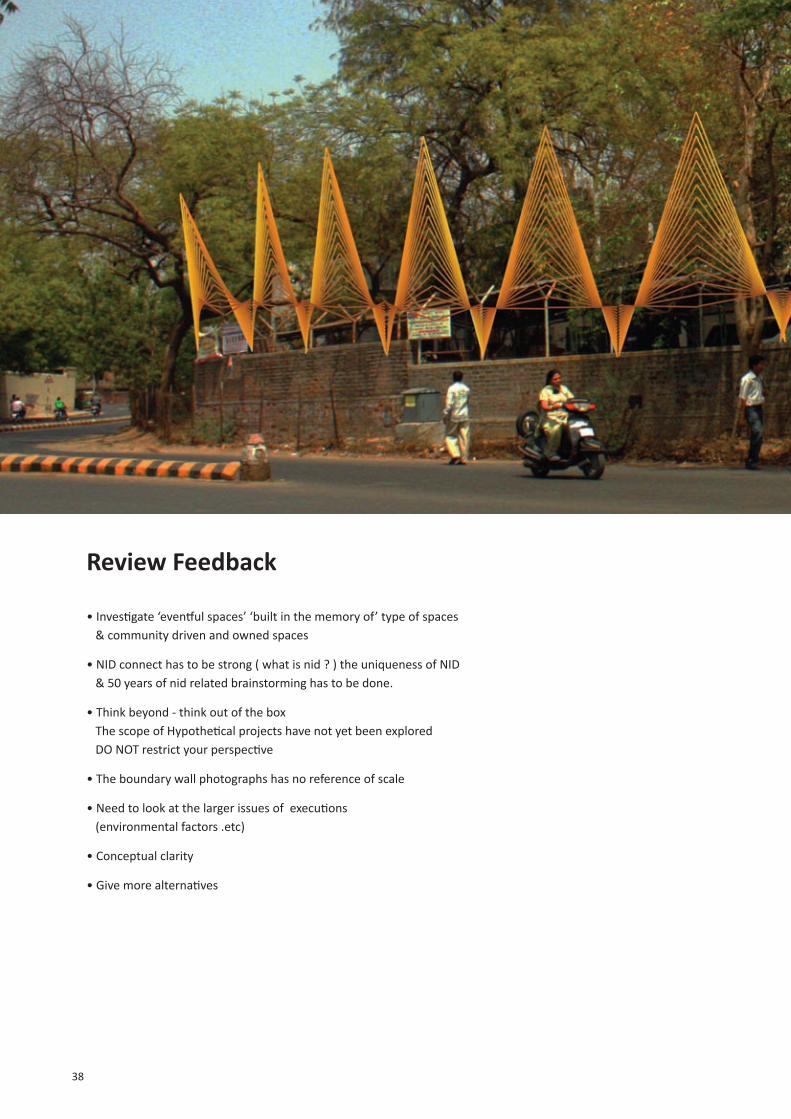
Review Feedback
• Investigate ‘eventful spaces’ ‘built in the memory of’ type of spaces & community driven and owned spaces
• NID connect has to be strong ( what is nid ? ) the uniqueness of NID & 50 years of nid related brainstorming has to be done.
• Think beyond - think out of the box The scope of Hypothetical projects have not yet been explored DO NOT restrict your perspective
• The boundary wall photographs has no reference of scale
• Need to look at the larger issues of executions (environmental factors .etc)
• Conceptual clarity
• Give more alternatives

39
Main Gate
Middle GateRendered wall
NID campus plan

40
Extending concept
In one word what is NID about? A brainstorm with people was done. From the brainstorm the word “sharpening” clicked. I feel this describes to its best what this institutes major roll is. NID sharpens mind, skills, imagination, creativity and prepares one to become professionals.
The word “sharpening” was taken forward to develop a concept.Taking sharpening as a key word, brainstorm with pictures was done and it took shape of this mood board

41
Mo
od
bo
ard
- s
harp
en
ing

Concept table
Pencil being a common element between education and design was constantly on my mind. A pencil gives first face or form to any idea on paper. Let it be from any discipline, a pencil gives shape to any idea, imagination and innovation. It is definitely a tool to be given respect and honor.
From the mood board I chose different ways / meanings of sharpening and tried to show it through pencil. For example: to show FOCUS the pointed tip of the pencils top view was shown.
Then I analyzed what message is evolving out of each situation. For example: when the pencil is sharpened using a knife the stroke, force are the words coming in mind. For each situation, I jotted down those words and prepared the concept table.
42

Sharpening process
Pencil shavings :by-product of sharpening
Connecting with Ahmedabad
Connecting identity with trees
Dynamic logo
Art tools
Industrial Communication
Explorations
The chisel point
The needle point
The bullet point
The standard point
The art of sharpening pencils
43

At first I had selected the sharpening process (taking the sharpener as it is a universal tool)But soon I realized that this concept wont work as in design field using sharpener isn’t the right technique of sharpening pencils.
The pencil shavings being the by-product of the sharpening process were also given importance. I tried to connect the various forms of the pencil shavings with the Ahmedabad road’s contour. This is to claim that parallel with the sharpening process NID has developed Ahmedabad’s outlook and this road of development will continue going further nation wide and world wide.
Drawbacks of this concept1. Using sharpener is not the correct method for designers2. Pencil shavings are usually seen as waste3. The pencil goes shorter and shorter as we keep sharpening
All these points could take the communication is undesired directions and therefore there is need to have a stronger base.
Selection Process
44

45
Going back to concept table
From the sharpening table I picked up 4 sharpening methods Focus, chisel, sharpening and abrasive Focus and the chisel talks about the personal development (mind and skills), whereas sharpener and the abrasive wheel refers to the approach towards design (global and detailed approach).
Focus: mind clarity and focused aimsChisel: personal skills Sharpener: Universal, global approachAbrasive wheel: Fine refinements, detailed approach
These symbols can be used for installations.This concept can be taken further to build visual identity.

46
Selection
H E A DHEARTHAND
The pencil stands for communication design and the circular saw stands for Industrial design.• The character of pencil: hexagon long bold sharp lead• The character of saw : soft edged, movement in clockwise direction, • The logo is set in continuous act of sharpening
When appeared in web of any digital media or even installation the saw will rotate in clockwise directionThis makes the logo dynamic.
The pencil has been positioned up straight to project confidence, support and strong this also gives balance to the unit.
‘Head, Heart and Hand’ interpretation evolved with this unitWhereThe saw is the head, the pencil is hand and heart is what we put in to giving life to ideas creation and imagination.
Out of the four I further boiled down to one method that is the “Abrasive Wheel”. This is because it not only talks about sharpening but also symbolizes the 2 disciplines of design - communication design and industrial design

47
Explorations
HEADHEARTHAND
H E A DHEARTHAND
H E A DHEARTHAND
5020

48
• The turner looks like a flower
• The dates 1961 2010-2011 is complex to understand
• Integration of 2010-2011 must be done to minimize the information
• The turner can be made more simpler by minimizing its teeth
Feedbacks
Teeth were reduced
Integration of 2010-2011
Flipped in clockwise direction

49
• Dynamic
• Strong statement
• Futuristic aims
• It is dynamic as the logo is visualized in 3d and has been
designed to set in motion where ever possible.
for example the circular saw with the number 1961 will be
rotating in digital medias and in 3d installation.
Logo development

50
Basic colour scheme
Clolour
The clolours of celebrationsEven the colour scheme has been given for all the visible and non visible sides of the pencil The six sides of pencil is coloured in color wheel order with 3 primary and 3 secondary colours. 3 positions are freezed where the center colours are primary colours these three can be used for print media.For print media we get a set of 3 colour schemes which can be used for different types of communication for example Local, national and international communication or students, staff and guests

51
Connecting identitywith trees

52
Installations at different places

53
Installationsalong the pathway

54

The visual design of 50 years of nid can be used and placed in different ways inside or outside the campus. The word of design education will be spread. This theme can be further extended and made to suite different medias maintaining its visual language.

Visual Design for 50 yrs of NID
Process Documentation
Kanchan Dhankani
Semester 4 PGDPD Graphic Design
NID 2008-2009 Batch
Guide:
Anil Sinha