principles of machine learning - github of machine learning lab 2 – regression overview in this...
TRANSCRIPT

Principles of Machine Learning Lab 2 – Regression
Overview In this lab, you will train and evaluate a regression model. Like classification, regression is a supervised machine learning technique in which a set of data with known labels is used to train and test a model. Whereas classification predicts whether or not a label falls into one class or another, regression predicts a real numeric value for the label. In this lab you will use the data set provided to predict the demand in a bicycle rental system. The steps in this process include:
• Explore the data set.
• Create a linear regression model.
• Evaluate the model using both computed metrics and visualization.
What You’ll Need To complete this lab, you will need the following:
• An Azure ML account
• A web browser and Internet connection
• The lab files for this lab
Note: To set up the required environment for the lab, follow the instructions in the Setup Guide for this course.
Exploring the Data In this lab you will work with a dataset that contains records of bike rentals.
Visualize the Source Data The bike rentals data set is provided as a sample data set in Azure Machine Learning.
1. If you have not already done so, open a browser and browse to https://studio.azureml.net. Then
sign in using the Microsoft account associated with your Azure ML account.
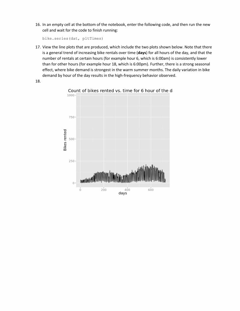
2. Create a new blank experiment, and give it the title Bike Regression.
3. In the list of experiment items, expand Saved Datasets and Samples, and then drag Bike Rental
UCI dataset to the experiment canvas.
4. Visualize the output of the dataset and review the columns it contains. Note that these include
various columns containing temporal and meteorological information for each hour, starting at

00:00 on January 1st 2011. Additionally, the dataset includes the hourly count of bike rentals by
casual and registered customers, with the total hourly rentals recorded in the cnt column.
Your goal with this dataset is to create a regression model that uses the temporal and
meteorological features to accurately predict the cnt label for each hour.
Cleanse the Data The data requires some cleansing before you can explore it and use it in a regression model. You will do this using a combination of built-in Azure ML modules and custom script, which you can implement in R or Python. Follow the steps for your preferred language below.
Cleanse the Data Using R 1. Add an Execute R Script module to the experiment and place it alongside the bike rental
dataset. Then select the Execute R Script module, set the R Version to the latest available
version of Microsoft R Open, and replace the existing R code in the code editor window of the
Execute R Script module with the following code. You can copy and paste this code from
SetDayOfWeek.R in the lab files folder for this lab.:
set.day.of.week <- function(){
library(dplyr)
## First day in the dataset is Sunday
data.frame(weekday= c(0, 1, 2, 3, 4, 5, 6),
dayOfWeek = c("Sun", "Mon", "Tue", "Wed", "Thr", "Fri", "Sat"),
stringsAsFactors = FALSE)
}
df <- set.day.of.week()
maml.mapOutputPort('df')
This code creates a data frame that contains the numeric days of the week (0 to 6) and their equivalent names (Sun to Sat)
2. Add a Join Data module to the experiment and place it below the dataset and Execute R Script module. Then connect the output from the dataset to the left input of the Join Data module, and connect the left output of the Execute R Script module to the right input of the Join Data module as shown here:
3. Select the Join Data module and in the properties pane, set the following properties:
• Join key columns for L: Select the weekday column.
• Join key columns for R: Start with no columns and include weekday (you will need to type this).
• Match case: Selected
• Join type: Left Outer Join
• Keep right key columns in joined table: Not selected

4. Add a second Execute R Script module to the experiment, below the Join Data module; and connect the output from the Join Data module to its left-most input.
5. Select the Execute R Script module you just added, and replace its default script with the following code (which you can copy and paste from SetDays.R): set.days <- function(df){
df[,'days'] = as.integer(df[, 'instant']/24)
df
}
df <- maml.mapInputPort(1)
df <- set.days(df)
maml.mapOutputPort('df')
This code adds a column named days that contains an integer value indicating the elapsed days from the first record in the dataset.
6. Save and run the experiment, and then visualize the Results dataset (left) output of the Execute R Script module to verify that the days column has been added.
7. Add a Select Columns in Dataset module to the experiment, under the most recently added Execute R Script module, and connect the left output of the Execute R Script module to its input.
8. In the properties of the Select Columns in Dataset module, select all columns excluding the following ones:
• instant
• dteday
• weekday
• atemp
• casual
• registered 9. Add a Normalize Data module to the experiment, and connect the output of the Select Columns
in Dataset module to its input and set its properties as follows:
• Transformation method: ZScore
• Use 0 for constant columns when cached: Unselected
• Selected columns: temp, hum, and windspeed. 10. Verify that your experiment looks like this:

11. Save and run the experiment.
Clean the Data using Python 1. Add an Execute Python Script module to the experiment and place it alongside the bike rental
dataset. Then select the Execute Python Script module, set the Python Version to the latest
available version of Python, and then replace the default Python script with the following code, which you can copy and paste from the SetDayOfWeek.py file in the lab files folder for this module:
def day_of_week():
import pandas as pd
## First day in the dataset is Sunday
days = pd.DataFrame([[0, 1, 2, 3, 4, 5, 6],
["Sun", "Mon", "Tue", "Wed", "Thr", "Fri", "Sat"]]).transpose()
days.columns = ['weekday', 'dayOfWeek']
return days
def azureml_main():
return day_of_week()
This code creates a data frame that contains the numeric days of the week (0 to 6) and their equivalent names (Sun to Sat)
2. Add a Join Data module to the experiment and place it below the dataset and Execute Python Script module. Then connect the output from the dataset to the left input of the Join Data module, and connect the left output of the Execute Python Script module to the right input of the Join Data module as shown here:
3. Select the Join Data module and in the properties pane, set the following properties:
• Join key columns for L: Select the weekday column.
• Join key columns for R: Start with no columns and include weekday (you will need to type this).
• Match case: Selected
• Join type: Left Outer Join
• Keep right key columns in joined table: Not selected 4. Add a second Execute Python Script module to the experiment, below the Join Data module;
and connect the output from the Join Data module to its left-most input. 5. Select the Execute Python Script module you just added, and replace its default script with the
following code (which you can copy and paste from SetDays.py):
def set_days(df):
import pandas as pd
df['days'] = pd.Series(range(df.shape[0]))/24
df['days'] = df['days'].astype('int')
return df
def azureml_main(df):

return set_days(df)
This code adds a column named days that contains an integer value indicating the elapsed days from the first record in the dataset.
6. Save and run the experiment, and then visualize the Results dataset (left) output of the Execute Python Script module to verify that the days column has been added.
7. Add a Select Columns in Dataset module to the experiment, under the most recently added Execute Python Script module, and connect the left output of the Execute Python Script module to its input.
8. In the properties of the Select Columns in Dataset module, select all columns excluding the following ones:
• instant
• dteday
• weekday
• atemp
• casual
• registered 9. Add a Normalize Data module to the experiment, and connect the output of the Select Columns
in Dataset module to its input and set its properties as follows:
• Transformation method: ZScore
• Use 0 for constant columns when cached: Unselected
• Selected columns: temp, hum, and windspeed. 10. Verify that your experiment looks like this:
11. Save and run the experiment.
Visualize the Data Now that you have performed some initial data cleansing, you can explore the day visually and try to
determine any relationship between the features in the dataset and the number of bike rentals. You can
visualize the data using R or Python.

Visualize the Data Using R 1. Add a Convert to CSV module to the experiment and connect the output of the Normalize Data
module to its input. Then run the experiment. 2. Right-click the output of the Convert to CSV module and in the Open in a new workbook
submenu, click R.
3. In the new browser tab that opens, at the top of the page, rename the new workbook Bike
Rental Visualization.
4. Review the code that has been generated automatically. The code in the first cell loads a data
frame from your experiment. The code in the second cell uses the head command to display the
first few rows of data.
5. On the Cell menu, click Run All to run all of the cells in the notebook, and then view the output.
6. On the Insert menu, click Insert Cell Below to add a new cell to the notebook.
7. In the new cell, enter the following code (which you can copy and paste from BikeVisualize.R):
numCols <- c("temp", "hum", "windspeed", "hr")
bike.scatter <- function(df, cols){
require(ggplot2)
for(col in cols){
p1 <- ggplot(df, aes_string(x = col, y = "cnt")) +
geom_point(aes(alpha = 0.001, color = "blue")) +
geom_smooth(method = "loess") +
ggtitle(paste('Count of bikes rented vs. ', col)) +
theme(text = element_text(size=16))
print(p1)
}
}
catCols <- c('season', 'yr', 'mnth', 'hr', 'holiday', 'workingday',
'weathersit', 'dayOfWeek')
bike.box <- function(df, cols){
require(ggplot2)
for(col in cols){
p1 <- ggplot(df, aes_string(x = col, y = 'cnt', group = col)) +
geom_boxplot()+
ggtitle(paste('Count of bikes rented vs. ', col)) +
theme(text = element_text(size=16))
print(p1)
}
}
pltTimes = c(6, 8, 10, 12, 14, 16, 18, 20)
bike.series <- function(df, tms){
require(ggplot2)
ylims = c(min(df$cnt), max(df$cnt))
for(t in tms){
temp = df[df$hr == t, ]
p1 <- ggplot(temp, aes(x = days, y = cnt)) +
geom_line() +
ylim(ylims) +
ylab('Bikes rented') +
ggtitle(paste('Count of bikes rented vs. time for', t, 'hour of
the day')) +
theme(text = element_text(size=16))

print(p1)
}
}
histCols <- c("temp", "hum", "windspeed", "cnt")
bike.hist <- function(df, cols){
require(ggplot2)
for(col in cols){
p1 <- ggplot(df, aes_string(x = col)) +
geom_histogram() +
ggtitle(paste('Density of', col)) +
theme(text = element_text(size=16))
print(p1)
}
}
bike.hist.cond <- function(df, tms){
require(ggplot2)
# require(gridExtra)
par(mfrow = c(2,4))
for(i in 1:length(tms)){
temp = df[df$hr == tms[i], ]
p <- ggplot(temp, aes(x = cnt)) +
geom_histogram() +
ggtitle(paste('Density of bike rentals at time',
as.character(tms[i]))) +
theme(text = element_text(size=16))
print(p)
}
# grid.arrange(grobs = p, ncol = 3)
par(mfrow = c(1,1))
}
This code defines some functions that you will use to create plots of the data.
8. Ensure that the cursor is in the cell containing the function definitions above, and then on the
Cell menu, click Run and Select Below (or click the button on the toolbar).
9. After the code has finished running, in the new empty cell at the bottom of the notebook, enter
the following code, and then run the new cell and wait for the code to finish running:
bike.scatter(dat, numCols)
Tip: The code may take a few minutes to run. While it is running, asymbol is displayed at the
top right under the R logo, and when the code had finished running this changes to a O symbol
10. View the plots that are produced.
Tip: Click the grey bar on the left edge of the output pane containing the plots to see all of the
output in the main notebook window.
11. In the first two scatter plots (shown below), note that the number of bike rentals (cnt) rises as
temperature (temp) rises. Conversely, bike rentals tend to drop as humidity (hum) rises.

12. Review the other scatterplots, noting the apparent effect (or lack thereof) that the numeric
features appear to have on the number of bike rentals.
13. In an empty cell at the bottom of the notebook, enter the following code, and then run the new
cell and wait for the code to finish running:
bike.box(dat, catCols)
14. View the boxplots that are produced, which include the two boxplots shown below. Note that
there are significant differences in bike rental demand by hour of the day (hr) – Most rentals

occurring during commute hours, and very few rentals in the early hours of the morning.
However, the day of the week (dayOfWeek) appears to make little difference to the number of
bike rentals. Sunday has the lowest median, but the difference is well within the range of the
middle two quartiles.
15. Review the other boxplots, noting the apparent effect (or lack thereof) that the categorical
features appear to have on the number of bike rentals.
16. In an empty cell at the bottom of the notebook, enter the following code, and then run the new
cell and wait for the code to finish running:
bike.series(dat, pltTimes)
17. View the line plots that are produced, which include the two plots shown below. Note that there
is a general trend of increasing bike rentals over time (days) for all hours of the day, and that the
number of rentals at certain hours (for example hour 6, which is 6:00am) is consistently lower
than for other hours (for example hour 18, which is 6:00pm). Further, there is a strong seasonal
effect, where bike demand is strongest in the warm summer months. The daily variation in bike
demand by hour of the day results in the high-frequency behavior observed.
18.

19. Review the other line plots, noting the trends for bike rentals at each hour of the day.
20. In an empty cell at the bottom of the notebook, enter the following code, and then run the new
cell and wait for the code to finish running:
bike.hist(dat, histCols)
21. View the histograms that are produced, which include the plot shown below. Note that the
normalized temperature values tend to most commonly be between -1 and +1, indicating that
there are only a few occasions with extreme low or high temperatures.

22. Review the other histograms, noting the density of the numeric features and the cnt label.
23. In an empty cell at the bottom of the notebook, enter the following code, and then run the new
cell and wait for the code to finish running:
bike.hist.cond(dat, pltTimes)
24. View the histograms that are produced, which show the density of bike rentals conditioned by
hour. Note that for some hours, there are multi-modal distributions that indicate that the
number of bike rentals for each hours is not always consistent, and some other factors may be
involved. For example, the plot below shows two clear peaks for bike rentals at 6:00am – at this
time of day there are commonly around 25-30 rentals, or 100-125 rentals.

25. Review the other histograms, noting the distribution of bike rentals for each hour.
26. Save the notebook and return to the Azure ML experiment.
Visualize the Data Using Python 1. Add a Convert to CSV module to the experiment and connect the output of the Normalize Data
module to its input. Then run the experiment. 2. Right-click the output of the Convert to CSV module and in the Open in a new workbook
submenu, click Python 3.
3. In the new browser tab that opens, at the top of the page, rename the new workbook Bike
Rental Visualization.
4. Review the code that has been generated automatically. The code in the first cell loads a data
frame from your experiment. The code in the second cell displays the data frame in the console.
5. On the Cell menu, click Run All to run all of the cells in the notebook, and then view the output.
6. On the Insert menu, click Insert Cell Below to add a new cell to the notebook.
7. In the new cell, enter the following code (which you can copy and paste from BikeVisualize.py):
num_cols = ["temp", "hum", "windspeed", "hr"]
def bike_scatter(df, cols):
import matplotlib.pyplot as plt
import statsmodels.nonparametric.smoothers_lowess as lw
## Loop over the columns and create the scatter plots
for col in cols:
## first compute a lowess fit to the data
los = lw.lowess(df['cnt'], df[col], frac = 0.3)
## Now make the plots
fig = plt.figure(figsize=(8, 6))
fig.clf()

ax = fig.gca()
df.plot(kind = 'scatter', x = col, y = 'cnt', ax = ax, alpha =
0.05)
plt.plot(los[:, 0], los[:, 1], axes = ax, color = 'red')
ax.set_xlabel(col)
ax.set_ylabel('Number of bikes')
ax.set_title('Number of bikes vs. ' + col)
return 'Done'
cat_cols = ['season', 'yr', 'mnth', 'hr', 'holiday',
'workingday', 'weathersit', 'dayOfWeek']
def bike_box(df, cols):
import matplotlib.pyplot as plt
## Loop over the columns and create the box plots
for col in cols:
fig = plt.figure(figsize=(8, 6))
fig.clf()
ax = fig.gca()
df.boxplot(column = 'cnt', by = col, ax = ax)
ax.set_xlabel(col)
ax.set_ylabel('Number of bikes')
ax.set_title('Number of bikes vs. ' + col)
return 'Done'
plt_times = [6, 8, 10, 12, 14, 16, 18, 20]
def bike_series(df, tms):
import matplotlib.pyplot as plt
lims = (min(df.cnt), max(df.cnt))
for t in tms:
fig = plt.figure(figsize=(8, 6))
fig.clf()
ax = fig.gca()
df[df.hr == t].plot(kind = 'line', x = 'days', y = 'cnt',
ylim = lims, ax = ax)
plt.xlabel("Days from start")
plt.ylabel("Bikes rented")
plt.title("Bikes rented by day for hour = " + str(t))
return 'Done'
hist_cols = ["cnt", "temp", "hum", "windspeed"]
def bike_hist(df, cols):
import matplotlib.pyplot as plt
## Loop over columns and plot histograms
for col in cols:
fig = plt.figure(figsize=(8, 6))
fig.clf()
ax = fig.gca()
df[col].hist(bins = 30, ax = ax)
ax.set_xlabel(col)
ax.set_ylabel('Density of ' + col)
ax.set_title('Density of ' + col)

return 'Done'
def bike_hist_cond(df, col, by):
import matplotlib.pyplot as plt
df = df[df.hr.isin(by)]
## Plot conditioned histograms
fig = plt.figure(figsize=(10, 8))
ax = fig.gca()
df[[col, 'hr']].hist(bins = 30, by = ['hr'], ax = ax)
return 'Done'
This code defines some functions that you will use to create plots of the data.
8. Ensure that the cursor is in the cell containing the function definitions above, and then on the
Cell menu, click Run and Select Below (or click the button on the toolbar).
9. After the code has finished running, in the new empty cell at the bottom of the notebook, enter
the following code, and then run the new cell and wait for the code to finish running:
%matplotlib inline
bike_scatter(frame, num_cols)
Tip: The code may take a few minutes to run. While it is running, asymbol is displayed at the
top right under the Python logo, and when the code had finished running this changes to a O
symbol
10. View the plots that are produced.
Tip: Click the grey bar on the left edge of the output pane containing the plots to see all of the
output in the main notebook window.
11. In the first two scatter plots (shown below), note that the number of bike rentals rises as
temperature (temp) rises. Conversely, bike rentals tend to drop as humidity (hum) rises.

12. Review the other scatterplots, noting the apparent effect (or lack thereof) that the numeric
features appear to have on the number of bike rentals.
13. In an empty cell at the bottom of the notebook, enter the following code, and then run the new
cell and wait for the code to finish running:
bike_box(frame, cat_cols)
27. View the boxplots that are produced, which include the two boxplots shown below. Note that
there are significant differences in bike rental demand by hour of the day (hr) – Most rentals
occurring during commute hours, and very few rentals in the early hours of the morning.
However, the day of the week (dayOfWeek) appears to make little difference to the number of
bike rentals. Sunday has the lowest median, but the difference is well within the range of the
middle two quartiles.

14. Review the other boxplots, noting the apparent effect (or lack thereof) that the categorical
features appear to have on the number of bike rentals.
15. In an empty cell at the bottom of the notebook, enter the following code, and then run the new
cell and wait for the code to finish running:
bike_series(frame, plt_times)
28. View the line plots that are produced, which include the two plots shown below. Note that there
is a general trend of increasing bike rentals over time (days) for all hours of the day, and that the
number of rentals at certain hours (for example hour 6, which is 6:00am) is consistently lower
than for other hours (for example hour 18, which is 6:00pm). Further, there is a strong seasonal
effect, where bike demand is strongest in the warm summer months. The daily variation in bike
demand by hour of the day results in the high-frequency behavior observed.

16. Review the other line plots, noting the trends for bike rentals at each hour of the day.
17. In an empty cell at the bottom of the notebook, enter the following code, and then run the new
cell and wait for the code to finish running:
bike_hist(frame, hist_cols)
18. View the histograms that are produced, which include the plot shown below. Note that the
normalized temperature values tend to most commonly be between -1 and +1, indicating that
there are only a few occasions with extreme low or high temperatures.

19. Review the other histograms, noting the density of the numeric features and the cnt label.
20. In an empty cell at the bottom of the notebook, enter the following code, and then run the new
cell and wait for the code to finish running:
bike_hist_cond(frame, 'cnt', plt_times)
21. View the histograms that are produced, which show the density of bike rentals conditioned by
hour. Note that for some hours, there are multi-modal distributions that indicate that the
number of bike rentals for each hours is not always consistent, and some other factors may be
involved. For example, the plot below shows two peaks for bike rentals at 6:00am – at this time
of day there are commonly around 25-30 rentals, or 100-125 rentals.
22. Save the notebook and return to the Azure ML experiment.

Creating and Evaluating a Regression Model Now that you have explored the data, you are ready to create a regression model.
Create a Regression Model 1. Add a Split Data module to the experiment, and connect the output of the Normalize Data
module to its input (bypassing the conversion to CSV, which was only required to load the data
into a Jupyter notebook).
2. Set the properties of the Split Data module as follows:
• Splitting Mode: Split Rows
• Fraction of rows in the first output dataset: 0.7
• Randomized split: Selected
• Random seed: 123
• Stratified split: False
3. Add a Linear Regression module to the experiment and place it next to the Split Data module.
Then set its properties as follows:
• Solution method: Ordinary Least Squares
• L2 regularization weight: 0.001
• Include intercept term: Not selected
• Random number seed: 123
• Allow unknown levels in categorical features: Selected
4. Add a Train Model module to the experiment; and connect the output of the Linear Regression
module to its left input, and the left output of the Split Data module to its right input. Then
configure its properties to select the cnt column as the label column.
5. Add a Score Model module to the experiment and connect the output of the Train Model
module to its left input, and the right output of the Split Data module to its right input.
6. Verify that the bottom half of your experiment looks like this:
7. Save and run the experiment.
8. When the experiment has finished, visualize the output of the Score Model module and select
the Scored Labels column. This contains the predictions. Compare some of the values in this
column to the actual label values in the cnt column.

9. Note that many of the predicted values are close to the actual values. However, there are errors
(or residuals), indicating that the model often fails to predict an accurate label value.
Evaluate the Model Now that you’ve created and scored a model, you can view some statistics and visualizations to evaluate
its performance.
1. Add an Evaluate Model module to the experiment, and connect the output of the Score Model
module to its left input. This built-in module provides common evaluation metrics that you can
use to judge the performance of a model.
2. Save and run the experiment. Then, when the experiment has finished running, visualize the
output of the Evaluate Model module and note the following:
• The Mean Absolute Error and Root Mean Squared Error are metrics that estimate the
accuracy of the model. They indicate the estimated number of bike rentals over or
under the actual value the predicted label is. In this case, the values are quite high, and
the model may predict a number of bike rentals that is over or under the actual amount
by 100 or more.
• The Relative Absolute Error and Relative Squared Error are higher than desirable – for
an effective model, these should be around 0.1 or 0.2.
• The Coefficient of Determination is a figure that represents the amount of variance that
is explained by the model. For an effective model, this should be closer to 1 than to 0.
These metrics show that the model is not performing optimally, so you will now look at some
visualizations to further explore the model’s performance. You can accomplish this with R or
Python.
Visualize Residuals with R 1. Add an Edit Metadata module to the experiment and connect the output of the Score Model
module to its input.
2. Configure the properties of the Edit Metadata module as follows:
• Column: Select the Scored Labels column
• Data type: Unchanged
• Categorical: Unchanged
• Fields: Unchanged
• New column names: predicted
3. Add an Execute R Script module to the experiment and connect the output from the Edit
Metadata module to its left-most input.
4. Replace the default script in the Execute R Script module with the following code, which you can
copy and paste from BikeEvaluate.R in the lab files folder for this module:
bikes<- maml.mapInputPort(1)
bikes[order(bikes$days, bikes$hr),]
## Time series plots showing actual and predicted values
times <- c(6, 8, 10, 12, 14, 16, 18, 20)
ts.bikes <- function(t, df){
require(ggplot2)
temp <- df[df$hr == t, ]

ggplot() +
geom_line(data = temp,
aes(x = days, y = cnt)) +
geom_line(data = temp,
aes(x = days, y = predicted), color = "red") +
ylab("Number of bikes rented") +
labs(title = paste("Bike demand at ",
as.character(t), ":00", spe ="")) +
theme(text = element_text(size=16))
}
lapply(times, ts.bikes, bikes)
## Compute the residuals
resids <- function(df){
library(dplyr)
df <- mutate(df, resids = predicted - cnt)
}
box.resids <- function(df){
## Plot the residuals by hour
require(ggplot2)
df <- resids(df)
df$fact.hr <- as.factor(df$hr)
print(str(df))
ggplot(df, aes(x = fact.hr, y = resids)) +
geom_boxplot( ) +
ggtitle("Residual of actual versus predicted bike demand by
hour")
}
box.resids(bikes)
hist.resids <- function(t, df){
## Plot the residuals by hour
require(ggplot2)
df <- resids(df[df$hr == t, ])
print(str(df))
ggplot(df, aes(resids)) +
geom_histogram( ) +
ggtitle(paste("Histogram of residuals for hour =",
as.character(t)))
}
lapply(times, hist.resids, bikes)
5. Ensure that the bottom half of your experiment looks like this, and then save and run it:

6. When the experiment has finished running, visualize the R Device (right) output of the Execute
R Script module.
7. View the line plots, which show actual bike rentals in black, and predicted bike rentals in red for
several hours of the day. In particular, note from the following plot that the model consistently
underestimates the number of bike rentals at 8:00am:

8. Note from the following boxplot that there are high negative residuals for the peak periods of
bike rental in the day (around 8:00am and 6:00pm), confirming that the model is significantly
under-predicting for these times.

9. Review the histograms, and note that the distribution of residuals for 8:00am is multi-modal
with several peaks. This, combined with the fact that you observed multi-modal distributions for
bike rentals by hour earlier when exploring the data may indicate that the model is failing to
capture some other aspect of hourly bike rental variance – perhaps the hourly patterns for
working days is different from holidays and weekends:
Visualize Residuals with Python 1. Add an Edit Metadata module to the experiment and connect the output of the Score Model
module to its input.
2. Configure the properties of the Edit Metadata module as follows:
• Column: Select the Scored Labels column
• Data type: Unchanged
• Categorical: Unchanged
• Fields: Unchanged
• New column names: predicted
3. Add an Execute Python Script module to the experiment and connect the output from the Edit
Metadata module to its left-most input.
4. Set the Python version to the latest version of Python, and replace the default script in the
Execute Python Script module with the following code, which you can copy and paste from
BikeEvaluate.py in the lab files folder for this module:
def ts_bikes(df, times):
import matplotlib
matplotlib.use('agg') # Set backend
import matplotlib.pyplot as plt
for tm in times:
fig = plt.figure(figsize=(8, 6))
fig.clf()

ax = fig.gca()
df[df.hr == tm].plot(kind = 'line',
x = 'days', y = 'cnt', ax = ax)
df[df.hr == tm].plot(kind = 'line',
x = 'days', y = 'predicted', color =
'red', ax = ax)
plt.xlabel("Days from start")
plt.ylabel("Number of bikes rented")
plt.title("Bikes rented for hour = " + str(tm))
fig.savefig('ts_' + str(tm) + '.png')
return 'Done'
def resids(df):
df['resids'] = df.predicted - df.cnt
return df
def box_resids(df):
import matplotlib
matplotlib.use('agg') # Set backend
import matplotlib.pyplot as plt
df = resids(df)
fig = plt.figure(figsize=(12, 6))
fig.clf()
ax = fig.gca()
df.boxplot(column = ['resids'], by = ['hr'], ax = ax)
plt.xlabel('')
plt.ylabel('Residuals')
fig.savefig('boxes' + '.png')
return 'Done'
def ts_resids_hist(df, times):
import matplotlib
matplotlib.use('agg') # Set backend
import matplotlib.pyplot as plt
for tm in times:
fig = plt.figure(figsize=(8, 6))
fig.clf()
ax = fig.gca()
ax.hist(df.ix[df.hr == tm, 'resids'].as_matrix(), bins = 30)
plt.xlabel("Residuals")
plt.ylabel("Density")
plt.title("Histograms of residuals for hour = " + str(tm))
fig.savefig('hist_' + str(tm) + '.png')
return 'Done'
def azureml_main(df):
df = df.sort(['days', 'hr'], axis = 0, ascending = True)
times = [6, 8, 10, 12, 14, 16, 18, 20, 22]
ts_bikes(df, times)
box_resids(df)

ts_resids_hist(df, times)
return df
5. Ensure that the bottom half of your experiment looks like this, and then save and run it:
6. When the experiment has finished running, visualize the Python Device (right) output of the
Execute Python Script module.
7. View the line plots, which show actual bike rentals in blue, and predicted bike rentals in red for
several hours of the day. In particular, note from the following plot that the model consistently
underestimates the number of bike rentals at 8:00am:

8. Note from the following boxplot that there are high negative residuals for the peak periods of
bike rental in the day (around 8:00am and 6:00pm), confirming that the model is significantly
under-predicting for these times.
9. Review the histograms, and note that the distribution of residuals for 8:00am is multi-modal
with several peaks. This, combined with the fact that you observed multi-modal distributions for
bike rentals by hour earlier when exploring the data may indicate that the model is failing to
capture some other aspect of hourly bike rental variance – perhaps the hourly patterns for
working days is different from holidays and weekends:
Summary In this lab, you have created and evaluated a regression model. The model shows potential, but requires
significant improvement. You could start to improve the model by identifying and removing outliers, and

exploring the idea that working day bike rental demand follows a different pattern to that of holidays
and weekends (watch the demonstrations in the module for this lab to see an approach for doing this –
the R and Python code files are provided in the lab folder, so you can try it for yourself if you feel like a
challenge!)
Later modules in this course will discuss further model improvement techniques, which could be applied
to this model in order to predict demand for rental bikes more accurately