the journal of the asian arts society of australia
TRANSCRIPT
VO
LUM
E 2
5 N
O.
1 M
ar
ch
20
16
the journal of the asian arts society
of australia
TAASA Review
3 Editorial
Josefa Green
4 CHaNG’aN: a CoSMoPolitaN CaPital oN tHE SilK road
Cao Yin
7 iNSPiratioN FroM tHE PaSt: traCiNG MotiFS aNd PattErNS iN FUStat tEXtilE FraGMENtS
Liz Williamson
10 illUStratEd BooKS oF tHE QiNG iN CELESTIAL EMPIRE at tHE Nla
Nathan Woolley
12 tHE GrEGorY PHotoGraPHS oF CHiNa iN tHE NatioNal liBrarY CollECtioN
Olivier Krischer
14 lUNar laNtErNS: WElCoMiNG iN tHE YEar oF tHE MoNKEY iN SYdNEY
Claudia Chan Shaw in conversation with Josefa Green
16 CHiNESE iNK aNd BrUSH PaiNtiNG – a PraCtitioNEr’S PErSPECtiVE
Jane Evans
18 rEViEWiNG aSiaN Food iN 1970S aUStralia: taaSa Qld aWard WiNNiNG rESEarCH
at tHE UNiVErSitY oF QUEENSlaNd
Gael Newton and Alison Vincent
21 tHE CEraMiC WorKS oF YEUNG-aN JaNG at MaaS
Min-Jung Kim
24 tHE FaBriC oF iNdia: aN EXHiBitioN at tHE V&a
Gill Green
26 iN tHE PUBliC doMaiN: PrINTS BY DaDaNG chrISTaNTO IN ThE charLES DarWIN
UNIVErSITY arT cOLLEcTION
Joanna Barrkman
27 BooK rEViEW: ThE rOOTS OF aSIaN WEaVING
Gill Green
28 JoYCE BUrNard: CElEBratioN oF a liFE
Sandra Forbes and Philippa Sandall
29 rECENt taaSa aCtiVitiES
30 taaSa MEMBErS’ diarY: March - MaY 2016
31 WHat’S oN: March - MaY 2016
Compiled by Tina Burge
C o N t E N t S
Volume 25 No. 1 March 2016
2
ViSit tHE taaSa WEBSitE, WWW.taaSa.orG.aU to aCCESS WaYS oF SEarCHiNG
iNForMatioN PUBliSHEd iN tHE taaSa rEViEW SiNCE itS BEGiNNiNGS iN 1991.
HorSE laNtErN, DESIGNED BY QIaN (JUSTIN) JIaN hUa, MarTIN PLacE, SYDNEY, cOLOUrED
FaBrIcS WITh INTErNaL LIGhTING. cOUrTESY cITY OF SYDNEY. SEE PP14-15 IN ThIS ISSUE.
taaSa rEViEW
THE ASIAN ARTS SOCIETY OF AUSTRALIA INC. Abn 64093697537 • Vol. 25 No. 1, March 2016 ISSN 1037.6674 registered by australia Post. Publication No. NBQ 4134
editoriAL • email: [email protected]
General editor, Josefa Green
PUBliCatioNS CoMMittEE
Josefa Green (convenor) • Tina burge Melanie Eastburn • Sandra Forbes Charlotte Galloway • Marianne Hulsbosch Ann MacArthur • Jim Masselos • Ann Proctor Sabrina Snow • Christina Sumner
dESiGN/laYoUt
Ingo Voss, VossDesign
PriNtiNG
John Fisher Printing
Published by The asian arts Society of australia Inc. PO Box 996 Potts Point NSW 2011 www.taasa.org.au
Enquiries: [email protected]
www.facebook.com/taasa.org
TAASA Review is published quarterly and is distributed to members
of The asian arts Society of australia Inc. TAASA Review welcomes
submissions of articles, notes and reviews on asian visual and
performing arts. all articles are refereed. additional copies and
subscription to TAASA Review are available on request.
No opinion or point of view is to be construed as the opinion of
The asian arts Society of australia Inc., its staff, servants or agents.
No claim for loss or damage will be acknowledged by TAASA
Review as a result of material published within its pages or
in other material published by it. We reserve the right to alter
or omit any article or advertisements submitted and require
indemnity from the advertisers and contributors against damages
or liabilities that may arise from material published.
all reasonable efforts have been made to trace copyright holders.
taaSa MEMBErSHiP ratES
$80 Single (Australia and overseas)$90 Dual (Australia and overseas)$95 Libraries (Australia and overseas)$40 Concession (full-time students under 26, pensioners
and unemployed with ID, Seniors Card not included)
adVErtiSiNG ratES
TAASA Review welcomes advertisements from appropriate companies, institutions and individuals. Rates below are GST inclusive.
Back page $850Full inner page $725Half page horizontal $484Third page (vertical or horizontal) $364Half column $265Insert $300
For further information re advertising, including discounts for regular quarterly advertising, please contact [email protected]
tHE dEadliNE For all artiClES
FOr OUr NEXT ISSUE IS 1 aPrIL 2016
tHE dEadliNE For all adVErtiSiNG
FOr OUr NEXT ISSUE IS 1 MaY 2016
E d i t o r i a l
Josefa Green, Editor
3
t a a S a C o M M i t t E E
In this first TAASA Review for 2016, we offer a taste of the variety of exhibitions which will be on show over the next months.
Two related exhibitions in Canberra are being held at the National Library of Australia and at China in the World, ANU. Celestial Empire: Life in China, 1644–1911 at the NLA presents a selection of works produced under China’s last imperial dynasty drawn equally from the collections of the NLA and the National Library of China. Curator Nathan Woolley’s article focuses in particular on the illustrated books on show.
At CIW at ANU, we can view images of 1930s China taken by Stanley O. Gregory, who worked in HK and China in the 1920s and 30s, printed in large-format for the first time from original negatives in the NLA collection. In his article for the TR, Olivier Krischer uncovers an interesting research trail which raises questions about the dating and even the authorship of some of these photographs.
April will see an exhibition of more than 130 outstanding art works from Xi’an and its adjacent areas entitled Tang: treasures from the Silk Road capital at the Art Gallery of NSW. This is a truly major event, offered together with a symposium and lecture series. The curator of the exhibition, AGNSW’s Cao Yin, describes how the Tang capital Chang’an became a focal point for the development of the Tang dynasty’s cosmopolitan culture.
Far more modest in size, though not in quality, is a display until end June of the newly acquired contemporary ceramic pieces of Korean Yeung-an Jang at the Museum for Applied Arts & Sciences (Powerhouse Museum). There is a fascinating link between this exhibition and the AGNSW’s Tang exhibition: as Min-Jung Kim, Curator of Asian Arts & Design at MAAS points out, the Korean celadon tradition in which Yeung-an Jang is immersed was initially influenced by the Yue greenware kilns in Zhejiang Province, China, which produced some of the finest celadons during the Tang period.
We took advantage of Gill Green’s recent visit to London to commission an account of a major textile exhibition at the V&A, The Fabric of India, the first major exhibition to explore handmade textiles from India from the 3rd century to the present, with over 200 objects. While this exhibition has ended, it has left an important legacy in its scholarly catalogue which Gill discusses in her review.
Liz Williamson gives us an account of her recent UNSW residency in Paris, researching historic Indian textiles in French and UK museums. This residency was intended to provide a resource and reference for both her own studio work and for planned projects with textile artisans in India. In her article, Liz shares some of the results of her research on the Fustat fragments held at the Musée Guimet: a group of Indian textiles excavated in the early 1900s from various Middle Eastern sites which take their name from Fustat, an old capital of Egypt.
London based Jane Evans, honorary co-president of the Chinese Brush Painters Society, gives us a personal practitioner’s account of how she came to study traditional Chinese brush painting techniques while a resident of Manila, Philippines, and how she works with this genre to produce paintings combining her western approach with her Chinese brush painting training.
We are also pleased to publish an edited version of the essay by PhD student Alison Vincent which won the TAASA QLD prize for best essay addressing Asian art at the 19th annual University of Queensland School of Communication and Arts postgraduate Work in Progress (WiP) Conference. The TAASA award was generously offered by TAASA Convenor in Queensland, James MacKean, and was judged and presented by Gael Newton, who has provided an introduction to Alison’s essay.
This March TR closely follows the Lunar New Year celebrations. To mark the 20th Chinese New Year Festival in Sydney, 12 monumental lanterns representing the zodiac animals were displayed in key positions throughout Sydney, a number of which were artist commissioned by the City of Sydney’s first Festival curator, Claudia Chan Shaw. You can read the results of my conversation with her in the Lunar Lanterns article.
And finally, a variety of offerings. Curator Joanna Barrkman describes two prints by Dadang Christanto in Charles Darwin University’s Art Collection. Gill Green reviews The Roots of Asian Weaving: The He Haiyan Collection of Textiles and Looms from Southwest China by Eric Boudot and Chris Buckley. And very sadly, an obituary which celebrates the life of long time TAASA stalwart and Indian textile expert Joyce Burnard, by Sandra Forbes and Philippa Sandall.
GiLL Green • PrESIDENT
Art historian specialising in Cambodian culture
Ann ProCtor • VIcE PrESIDENT
Art historian with a particular interest in Vietnam
todd SundermAn • TrEaSUrEr
Former Asian antique dealer, with a particular interest in Tibetan furniture
dy AndreASen • SeCretAry
Has a special interest in Japanese haiku and tanka poetry
SioBHaN CaMPBEll
Lecturer, Indonesian Studies, Sydney University with an interest in Balinese art
BEV dUNBar
Has an interest in Asian artefacts and textiles, particularly from Southeast Asia, as well as European medieval icons
JoSEFa GrEEN
General editor of TAASA Review. Collector of Chinese ceramics
BoriS KaSPiEV
Private collector of Asian art with a particular interest in the Buddhist art of the Himalayan region
JilliaN KENNEdY
Former lecturer, Asian Studies, with an interest in Vietnamese ceramics
MiN-JUNG KiM
Curator of Asian Arts & Design at the Powerhouse Museum
JaMES MaCKEaN
Collector of oriental ceramics
NataliE SEiz
Assistant Curator, Asian Art, AGNSW with an interest in modern/contemporary Asian Art
CHriStiNa SUMNEr
Former Principal Curator, Design and Society,Powerhouse Museum, Sydney
SaNdY WatSoN
Collector of textiles with an interest in photography and travel
MarGarEt WHitE
Former President and Advisor of the Friends of Museums, Singapore, with special interest in Southeast Asian art, ceramics and textiles
taaSa aMBaSSador
JaCKiE MENziES
Emeritus Curator of Asian Art, Art Gallery of NSW. President of TAASA from 1992 – 2000
StatE rEPrESENtatiVES
AUSTRALIAN CAPITAL TERRITORY
MElaNiE EaStBUrN
Curator of Asian Art, National Gallery of Australia
QUEENSLAND
tarUN NaGESH
Assistant Curator, Asian Art, QAGOMA
SOUTH AUSTRALIA
JaMES BENNEtt
Curator of Asian Art, Art Gallery of South Australia
VICTORIA
Carol CaiNS
Curator Asian Art, National Gallery of Victoria International
4
rade and travel along the famous ‘Silk Road’ that crossed the Eurasian continent
was severely interrupted for almost four centuries after the fall of the Eastern Han dynasty in 220 CE plunged much of the eastern end of the region into wars and chaos. Only with the rise of the Sui (581-618) and Tang (618-907) dynasties did China reunite. The return of stability enabled safer movement for merchants across central Asia, and the revival of prosperity along these trading routes.
As the start and terminus of the trade routes linking the civilisations of East and West, Chang’an or present day Xi’an in Shaanxi Province emerged as the great capital of the Sui and the Tang. It became the symbol of the two empires’ cultural splendour, and a source of pride to Chinese ever since. Between the 7th and 10th centuries, the centre grew to occupy 84 square kilometres and become home to an astonishing population of more than one million residents. That many of them had journeyed from afar helped to nurture a cosmopolitan Tang civilisation. The infusion of new ideas, flowing along both land and maritime trading routes, lifted traditional Chinese civilisation to a new ‘Golden Age’.
To help illustrate those achievements, from 9 April to 10 July 2016, the Art Gallery of NSW has assembled an exhibition of more than 130 art works from Xi’an and its adjacent areas entitled Tang: treasures from the Silk Road capital. For this, the first exhibition on Tang
China in Australia, a group of well-preserved objects from 11 museums and cultural institutions will offer glimpses of some key Tang-era artistic achievements ranging from architecture, mural painting and sculpture to metallurgy, ceramics and jade works.
A universal projection on the earth Chang’an’s grand size and precise layout are remarkable. Basing its plans on historic comprehensive theories and guidelines for capital city building such as Zhou Li ‘Kaogong ji’ (Rites of Zhou, record of the scrutiny of crafts), Yuwen Kai (555-612), the city’s planner and designer, conceived an orthogonal layout with a symmetrical design. The locations chosen for the major structures were not only anchored historically, they were also the result of divinatory, astrological and numerological guidance. Yuwen closely followed Chinese geomancy, commonly known as fengshui, and by adopting this cosmo-magical Chinese tradition, the new ruler could lay claim to the legitimacy of his dynasty. Chang’an was designed as an ideal centre for the ‘son of Heaven’ to carry out his ‘mandate of Heaven’. It was meant to be a projection of the universal order onto the Earth.
The perfectly symmetrical layout of the city along a central axis, known as Zhuque Jie (Vermillion Street), was combined with a system to divide regions within the walls. The 13 rows of fang (residential units) running from north to south symbolised the 12 months
of the year plus one leap month, according to the lunar calendar. The four columns of fang situated south of the Imperial City were a reference to the four seasons.
The Palace City, Imperial City and Outer City This vast capital city was composed of three major components: the Palace City, Imperial City and Outer City. Three palace complexes, homes and offices for the sovereigns, were built and converted throughout the nearly 300 year reign of the Tang. The original Palace City was in the central north.
The second compound was the Daming Palace outside the north wall on the east side of the city, becoming the new political centre of the empire from the mid-7th century, and the base for 16 Tang sovereigns. The last palace complex added to Chang’an was the Xingqing Palace in the east, which was converted from residences occupied by Emperor Xuanzong (685-762) and several of his brothers in 713. Within each of these three palace complexes were large numbers of basilica where emperors were crowned and conducted their day-to-day state duties, and a series of pavilions, gates and gatehouses where heroic generals and loyal ministers were rewarded and honoured through memorial services. These spaces hosted a number of rituals such as the New Year and winter-solstice ceremonies, as well as state banquets to reward officials and to receive foreign guests and their tributes.
T
C H a N G ’ a N : a C o S M o P o l i t a N C a P i t a l o N t H E S i l K r o a d
Cao Yin
Ta a S a r E V I E W V O L U M E 2 5 N O . 1
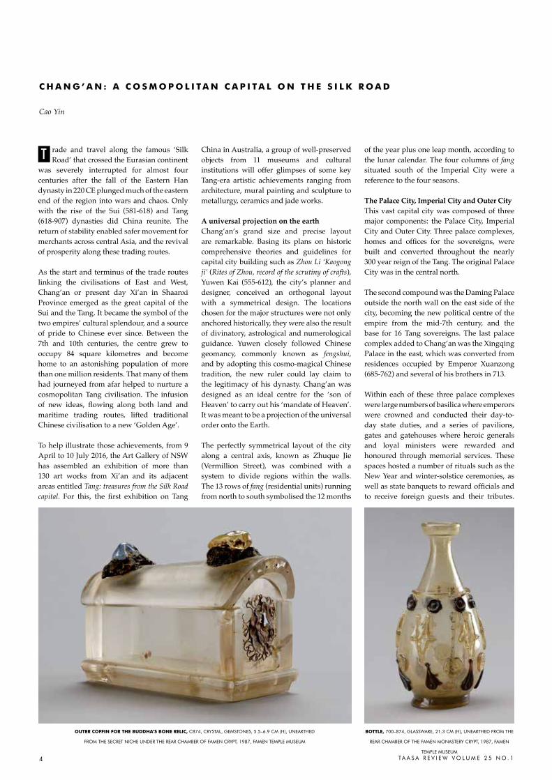
oUtEr CoFFiN For tHE BUddHa’S BoNE rEliC, c874, crYSTaL, GEMSTONES, 5.5–6.9 cM (h), UNEarThED
FrOM ThE SEcrET NIchE UNDEr ThE rEar chaMBEr OF FaMEN crYPT, 1987, FaMEN TEMPLE MUSEUM
BottlE, 700–874, GLaSSWarE, 21.3 cM (h), UNEarThED FrOM ThE
rEar chaMBEr OF ThE FaMEN MONaSTErY crYPT, 1987, FaMEN
TEMPLE MUSEUM
5Ta a S a r E V I E W V O L U M E 2 5 N O . 1
There were halls where imperial libraries held vast collections, scholars conducted research, and where royal family members and high-ranking officials were trained. Lakes and ponds were created for the entertainment of emperors, empresses and concubines.
These palaces were also the sites of many bloody coup attempts by different factions of princes and princesses and their supporters, which at times included eunuchs and military forces. The most famous plot was known as the ‘Xuanwu Gate Incident’, when on 4 June 626 Prince Li Shimin (598–649) led his army to attack and kill the Crown Prince Li Jiancheng (589–626) and Prince Li Yuanji (603–626). By August, Li Shimin had forced his father, Emperor Gaozu (566-635), to abdicate and became Emperor Taizong, the great consolidator of the Tang Empire.
Less turbulent than the Palace City, though no less influential, was the Imperial City. Positioned to the immediate south of the original palace complex, it served as the central administrative district, hosting the head offices of key central government ministries.
Surrounding the Palace and Imperial Cities was the Outer City, the residential quarters divided into square or rectangular wards (li or fang), which occupied more than 60% of the entire city of Chang’an. This area housed the residences of officials and commoners, markets and religious structures. Each ward had its own administrative officials and
guards, almost like separate towns – but they were far from independent.
The management of the wards was as rigid as their layout at the beginning of Tang dynasty. Each day at dawn and dusk, drums were sounded at the southern entrance to the Palace City, and these were then echoed by drums on the main street of each ward – a routine vividly described by Tang-era poet Li He (790–816): ‘Drums at dawn rumbling like thunder, hastening the sun, Drums at dusk rumbling like thunder, calling out the moon’ (Peng et al 1960: 4435). Those who violated the curfew were punished, and leave was only issued by ward officials for urgent matters.
To the Outer City’s north was the Imperial Park, used for hunting and sports such as polo, and at the south-east corner spread the imperial and public leisure parks, which included the Qujiang Pond and Furong Garden.
A cosmopolitan metropolisEmperor Taizong once said: ‘As I am the Master under the heaven, I do not differentiate between Chinese and siyi [people from the four directions outside China], and would support them all. I will make the unsettled ones settled, unhappy ones happy’ (Wang et al 1989: 35). It could also be argued that the Li family, the Tang dynasty’s founders, may have had sympathy towards outsiders because their clan were descendants of non-Chinese nobles from the north. However the city’s openness
originated, we know that this vast walled capital of a powerful united empire fostered an atmosphere of confidence that encouraged the tolerance of different religious beliefs and an open mindedness towards cultures from many parts of the world.
In addition to traditional Chinese Daoism and Buddhism introduced to China around the first century from India, three new religions were introduced to the capital from the West via Central Asia along the Silk Road. They were Zoroastrianism, Manichaeism and Nestorianism, and their arrival would have made Chan g’an a fascinating venue for the worship of all manner of gods.
However, Buddhism was by any measure the most popular religion in Chang’an. Royal and noble patronage of Buddhism played a key role in its rise in the Tang era, and has left us two iconic structures: the Great Wild Goose Pagoda and the Small Wild Goose Pagoda. Buddhist rites were incorporated into a series of annual ritual ceremonies by the imperial court, and attended by a great number of Chang’an residents, as recorded in detail by the Japanese monk Ennin in his diary written during his visit to Chang’an between 840 and 845. The most elaborate Buddhist event was the veneration of an important Buddha relic, when a finger bone believed to belong to Shakyamuni Buddha and housed at the Famen Monastery was transferred six times to either of the two Tang capitals, Chang’an or Luoyang, at intervals of about 30 years.
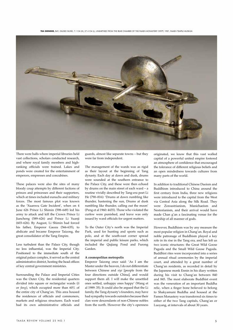
tEa GriNdEr, 869, GILDED SILVEr, 7.1 cM (h), 27.4 cM (L), UNEarThED FrOM ThE rEar chaMBEr OF ThE FaMEN MONaSTErY crYPT, 1987, FaMEN TEMPLE MUSEUM
6 TA A S A R E V I E W V O L U M E 2 5 N O . 1
The rapid development of Buddhism during the Tang dynasty was also partly due to the movement of a large number of monks to and from India, many travelling overland through Central Asia via the various Silk Road routes. Most famous is the monk Xuanzang (602–64) whose pilgrimage to the Buddha’s homeland became the storyline for one of China’s classics, Journey to the West, widely known in the West as Monkey.
In addition to monks and priests, Chang’an witnessed the comings and goings of thousands of foreigners, either soldiers from defeated tribes and kingdoms early in the dynasty, or foreign dignitaries such as the Tibetan envoys who were welcomed with banquets and concerts by Empress Wu Zetian in 702. Both Japan and Korea sent large numbers of students and diplomats to learn about the government, culture and religions of the Tang. Exotic goods, costumes and music arrived from Vietnam, Cambodia and Burma in Southeast Asia, India, Central and West Asia, and even the remnants of the Eastern Roman Empire. Figures with clearly non-Chinese features and foreign costumes found across Tang-era art forms represent only a small sample of multiculturalism in the capital city.
Luxury life style of the Chang’an-siders The exotic goods brought to the capital for either tribute or trade stimulated the Tang elite’s pursuit of what has been recently described as ‘the rich, the gorgeous and the
scintillating’ (Zhao 2012: 257). These inspired new ideas and technology, which in turn shaped the lifestyle and aesthetics of the Tang era.
Gold and silver wares displaced traditional bronzes and jade as the materials of greatest value. By the mid-8th century, after a period of influence from Sasanian Persian, Sogdiana and Byzantine styles, Chinese artisans completed the sinicisation of gold and silver vessel production, establishing unique and distinctive Chinese features. The exquisite set of imperial tea wares discovered at Famen Monastery not only demonstrates advanced goldsmith technique, but also tells the story of the daily habit of tea drinking being elevated to an art form during the Tang.
The ceramic industry was another area to experience innovation under the Tang. Many pieces took on strong and robust characteristics that can be taken as a reflection of the high Tang’s confident spirit. Its famous sancai (three colour) wares, capture the vividness of Tang-era fashion and it has been suggested that their motifs are a result of direct contact with Central Asia and the influence of the textile industry (Watt 2004 and Fang 2010 respectively).
Tang potters continued the tradition of nan qing bei bai, meaning ‘celadon wares from the south and white wares from the north’. The secret of one of the great ceramic achievements of the Tang period – mise or ‘secret colour’ greenware
from the Yue kilns in Zhejiang province – was revealed when a dozen or so pieces were found in the crypt at the Famen Monastery during its excavation in 1987, together with documents revealing their origins.
In today’s world, the presence of a Chinatown – known in Chinese as a Tang Ren Jie (Tang people’s street) – is often a mark of a city’s cultural diversity. More than a millennium ago, it was Chang’an, the base of the great Tang Empire that could rightly claim to be the largest cosmopolitan capital of the world.
cao Yin is curator, chinese art at the art Gallery
of NSW.
rEFErENCESFang Yi, 2010. ‘Preliminary study on the relationship between Tang
sancai and the textile printing and dying crafts’, Gugong bowuyuan
yuankai, Beijing, no 2
Peng Dingqiu et al, 1960. ‘Drums in the street of the officials’ in
Complete poetry of the Tang, Zhonghua Book co. Edition, Beijing
Wang Qinruo et al, 1989. Outstanding models from the storehouse
of literature, vol 170, Zhonghua Book co. Edition, Beijing
Watt James, 2004. China: dawn of a golden age, 200–750 AD,
Metropolitan Museum of art, New York, and Yale University Press,
New haven
Zhao Feng, 2012. ‘Silks in the Sui, Tang, and Five dynasties’, in
Chinese Silks, Dieter Kuhn and Zhao Feng (eds), Yale University
Press, New haven and London; Foreign Languages Press, Beijing
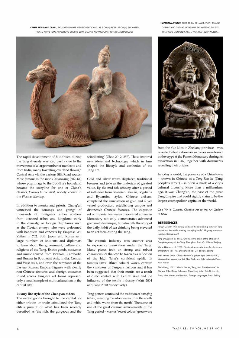
CaMEl ridEr aNd CaMEl, 742, EarThENWarE WITh PIGMENT caMEL: 48.2 cM (h); rIDEr: 55 cM (h), EXcaVaTED
FrOM LI XIaN’S TOMB aT PUchENG cOUNTY, 2000, ShaaNXI PrOVINcIaL INSTITUTE OF archaEOLOGY
HaYaGriVa StatUE, c800, 88 cM (h), MarBLE WITh rEMaINS
OF PaINT aND GILDING IN ThE haIr, EXcaVaTED aT ThE SITE
OF aNGUO MONaSTErY, XI’aN, 1959, XI’aN BEILIN MUSEUM
7TA A S A R E V I E W V O L U M E 2 5 N O . 1
You can’t escape the past in Paris, and yet what’s so wonderful about it is that the past and present intermingle so intangibly that it doesn’t seem to burden.Allen Ginsberg, American poet 1950s.
aris has some of the world’s notable decorative arts museums with valuable
archives of historic, ethnic and contemporary fashion and textiles for museum exhibitions, design reference and research. These provided the starting point for my research into Indian textiles during a residency at the Cité Internationale des Arts from 3 July to 28 September 2015.
Along with many other institutions in Australia and internationally, the University of New South Wales (UNSW) has an apartment in the Cité for academic staff and postgraduate research scholars undertaking research in Paris. It is located on the edge of the Marais, in walking distance from renowned museums and galleries such as the Pompidou Centre, Institut du Monde Arabe and Musée National Picasso - Paris. I was fortunate to have the UNSW apartment for the 2015 European summer, a wonderful time to spend in this beautiful city full of the past intermingled with the contemporary.
The Cité has 270 studio apartments for residencies and its arts community includes visual artists, musicians, composers, sculptors, designers, writers, curators and photographers. Cité residents create a lively artistic environment with regular concerts and open studio exhibitions. I heard classical music concerts by performers from France and Germany, jazz from Japan, rap from Mauritania and a beautiful concert of eastern European folk lullaby songs (voice only); resident open studios provided a similar diverse offering of artist/design practice based work and during my stay I saw recent work from Israel, Japan, Australian, USA and Canada.
The research I proposed for this residency centered on collections of historic Indian textiles in French and UK museums and built upon my previous historical research. During recent visits to India, I had been interested in the way textile motifs have evolved while maintaining certain social and cultural associations. Projects undertaken with various artisan groups have added to this
understanding while assisting them to realise new designs which not only allow them to reach new markets whether local, national or international but also to understand different ways of designing.
In April 2015 before I left for Paris, the outcome of such a project was exhibited at Barometer Gallery in Sydney. Titled Alanakar, this Hindi word captured the essence of the project as it translates as ‘tracery, adornment or decoration’, while metaphorically representing visual enhancement or value adding. The aim of the project was to engage with an artisan community in West Bengal, India, renowned for its aari embroidery, to develop a new range of designs. The aari technique employs a hook instead of a needle to create chain stitch, French knots and aari stitch embroidery while the fabric is stretched taut over a large frame.
For this exhibition, drawings of structures and woven interlacing were translated
into aari embroidery. The embroidered pieces integrated pattern, line and motif into the tracery of natural colour in the handwoven and dyed textiles. The outcome meshed traditional artisan expertise with contemporary designs to enhance their design knowledge and pointed to potential new directions for this artisan group.
The Cité residency afforded me an opportunity to conduct research to extend the Alanakar project by researching specific Indian textiles held in museum archives. These would provide a resource and reference
P
i N S P i r a t i o N F r o M t H E Pa S t: t r a C i N G M o t i F S a N d Pa t t E r N S
i N F U S t a t t E X t i l E F r a G M E N t S
Liz WilliamsonCité iNtErNatioNalE dES artS, ParIS BUILDINGS
aND GrOUNDSPhOTO: LIZ WILLIaMSON
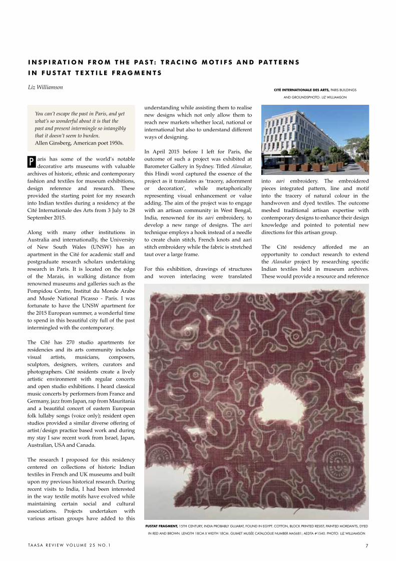
FUStat FraGMENt, 15Th cENTUrY, INDIa PrOBaBLY GUJaraT, FOUND IN EGYPT. cOTTON, BLOcK PrINTED rESIST, PaINTED MOrDaNTS, DYED
IN rED aND BrOWN. LENGTh 18cM X WIDTh 18cM. GUIMET MUSéE caTaLOGUE NUMBEr Ma5681; aEDTa #1540. PhOTO: LIZ WILLIaMSON
8 TA A S A R E V I E W V O L U M E 2 5 N O . 1
for new work, both my own studio work and for planned projects with block printers in Gujarat and embroiders in West Bengal.
Before leaving Sydney I had arranged to view textiles held by the Musée des Arts Asiatique Guimet in Paris. This renowned museum houses the Riboud textile collection. Donated to the museum in 1990 and 2003, the collection was formed by the Association for the Study and Documentation of Textiles Asia (AEDTA) founded in 1979 by Krishna Riboud. Her bequest meant that the museum now possesses one of the largest collections of Asian textiles in Europe. The costumes and textiles, mostly dated from the 15th to the early 20th centuries, are mainly of Indian and Chinese origin with some examples from Indonesia and Japan. The Riboud archive includes examples of the most significant Indian textiles, namely Jain embroideries, Mughal fabrics (velvets, carpets, samit and lampas weaves), telia rumals, ikats, tie dye fabrics, embroidered and woven Kashmiri shawls, kantha embroideries from West Bengal, Baluchari saris, export chintzes and patola. My original aim was to look at the Guimet holdings of kantha embroidery, Kashmiri shawls, samit and lampas woven textiles as well as researching examples of its so-called Fustat textiles. This proved to be too ambitious so I focussed on the Fustat fragments.
Immediately on arrival I started to examine these pieces. The museum archive allowed photography, time to sketch motifs and shapes, record colours and the characteristics of the cloth. I had a lot to observe and document; it proved to be the beginning of a fascinating study over the following three months.
The Fustat fragments, a group of Indian textiles excavated in the early 1900s from various sites in the Middle East, take their name from one site, Fustat, an old capital of Egypt located near the present capital of Cairo. Ruth Barnes in her extensive research into these fragments notes that the Fustat area was a refuse disposal site for centuries and the ‘frequently disturbed surface’ makes dating specific excavation finds difficult (1997:28).
The manufacture of the majority of these fragments has been attributed to Gujarat, India from where they were traded to Egypt from between the 9th and 17th centuries. Their subsequent survival was due to the dry climate whereas similar textiles of this age have not survived in India’s warm tropical climate. Consequently, these fragments are some of the oldest surviving Indian textiles in the world. The most well-known examples were purchased in the Cairo markets, then donated to or acquired by museums with textile, Asian or archaeological collections.
The Fustat textiles are assumed to have been traded for general domestic apparel and furnishing use. Guy refers to a study of Jewish documents from Fustat that record the contents of an archival storehouse: ‘…in medieval Middle-Eastern society, Indian cotton textiles were relatively inexpensive utilitarian items for use as garments and as household furnishings by the lower levels of society.’(1998:46). They are characteristically rather coarse hand woven cotton cloth, woven from hand spun yarn, then mordanted and/or resist printed and dyed. Many of the fragments have remains of stitching threads, seams and pleats indicating use. Edges cut or ripped have frayed and there are sections where the fibres have worn or disintegrated over time. Of the samples examined, most are smaller than A4 size and appear to have been cut or to have been a remnant.
The predominant colours of Fustat fragments are indigo blue, Indian madder red and the natural cotton colour of the undyed and resist sections of the designs. The cloth is dyed in combinations of blue and white, red and white, plus patterns with all three colours together. The resist substances, possibly wax or a mud and lime paste, appear to have been either hand drawn onto the cloth, or printed using a simple block or stamp to resist the indigo dye. Alum and iron mordants were used to bond the madder to the cotton fibre because if no mordant is applied, the madder
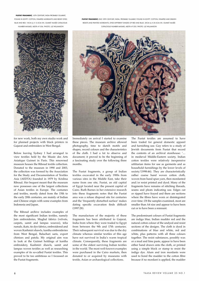
FUStat FraGMENt, 16Th cENTUrY, INDIa PrOBaBLY GUJaraT;
FOUND IN EGYPT. cOTTON, STaMPED MOrDaNTS aND rESIST DYED,
BLUE aND rED. 10cM (L) X 13.5cM (W). GUIMET MUSéE caTaLOGUE
NUMBEr Ma5683; aEDTa #1356. PhOTO: LIZ WILLIaMSON
FUStat FraGMENt, END 18Th cENTUrY, INDIa, PrOBaBLY GUJaraT, FOUND IN EGYPT. cOTTON, STaMPED aND DraWN
rESISTS aND PaINTED MOrDaNTS, DYED DIFFErENT ShaDES OF rED aND BLUE. 20cM (L) X 20.5cM (W). GUIMET MUSéE
caTaLOGUE NUMBEr Ma5682; aEDTa #1355. PhOTO: LIZ WILLIaMSON

9TA A S A R E V I E W V O L U M E 2 5 N O . 1
would neither ‘take’ in the dye bath nor would the dye be permanent. In addition cloth first dyed in indigo will not take the madder dye unless alum has been applied.
The Fustat fragments provide vital evidence of the Indian dyer’s highly developed skills, indicating the sophistication of manufacturing and design aesthetics being used on apparently every day textiles produced in India at that time. The fragments examined all had strong, solid colours, offering excellent examples of the durability of these colours, and their analysis has furthered an understanding of early resist and mordant dye technologies.
In terms of motifs, patterns and design, John Guy writes, in relation to similar Fustat fragments in the collection of the Ashmolean Museum in Oxford, that their dating ‘…concurs with stylistic comparisons which may be drawn with western Indian painting and sculpture especially in plant formations and to architecture references to stone screens, mosques and tombs in Gujarat.’ (1998:42).
I’ll describe three of the fragments examined in the Guimet at the beginning of my research. The fragment shown in the image on p7 is a textile fragment from 15th century India, probably made in Gujarat but found in Fustat. This cotton piece, block printed resist and painted mordant, was dyed in two shades of Indian madder - red and brown. As Valérie Bérinstain writes: ‘…this piece is particularly interesting first from a technical aspect and second for its iconography based on eight sacred geese or hamsas around a floral motif (lotus).’ (Bérinstain, V. in Riboud (ed) 1987: 19).
The circular motif to which Bérinstain refers was common in India in the Gupta period (approx. 4th – 6th century) and appears at Ajanta cave no.1 dated to the 6th century. The interesting technical aspect noted by Bérinstain above, is the application of two ways of applying the mordant to the cloth, by block and brush in the one design. Before the mordant was applied, an outline of the motifs was stamped by block printing using a resist paste – this was done to prevent the mordant from adhering to the motif outline. The two mordants (iron and alum) were applied to the cloth but the resist paste prevented the mordants from affecting the motif outlines. The cloth was then immersed in an alizarin (Indian madder) dye bath. Where the iron mordant had been applied, the resultant colour was dark brown; where alum had been applied, the resultant colour was red.
The Guimet fragment shown in the image on p8 (L) is described as a 16th century Fustat
textile fragment probably from Gujarat, India. It is also made of cotton with a stamped mordant and resist dyed, blue and red design. The design is essentially indigo blue and white with an Indian madder (red) and white border. To create this piece, the cloth would have first been dipped into indigo with the central white pattern and border covered with a wax resist material. After removing the wax by immersing into boiling water, alum was applied with blocks to the border before dyeing in an alizarin madder bath. Thus the red colour penetrated only those areas where the alum mordant had been applied.
The third fragment illustrated (p8 on the right) is dated from the end of the 18th century, Indian again probably from Gujarat, found at Fustat, Egypt. It is a cotton fabric, stamped and drawn resist and painted mordant, dyed different shades of red and blue. Bérinstain writes: this fragment ‘…is decorated with sophisticated patterns and is of a later date. The ornamentation consists of elaborate medallions with floral stems of blackish-blue ground. The blue dye appears to have been applied with a brush. A few items in the collection of the Musée de Cluny apparently made use of the same technique.’ (Bérinstain, V. in Riboud (ed) 1987: 22).
My research on Fustat fragments continued at the Musée des Arts Décoratifs in Paris, the Victorian & Albert Textiles Study Centre, Clothworkers Centre, London and at the Jameel Centre, Ashmolean Museum, Oxford. Several of the V&A fragments are on permanent display in the Nehru Gallery while others featured in the recent Fabric of India exhibition. The Newberry Collection at
the Jameel Centre with over 1000 fragments is one of the largest and formed the basis of Ruth Barnes’ extensive research (1997).
The residency gave me the opportunity to be immersed in natural dyes, resists, mordants, traditional motifs, colours and patterns. A deeper understanding of the manufacturing and trading context for these textiles has informed my ongoing teaching and research projects in India. Over the coming months, I’ll develop new designs based on my sketches of motifs, hamsas and repeating patterns for interpretation by skilled artisans in Gujarat and West Bengal, in block print and embroidery respectively. Although the Gujarati printers are familiar with the Fustat style of pattern, my version will offer a different perspective in taking inspiration for the past to give a new interpretation. Liz Williamson is a weaver who first visited India
in 1976. Since 2001 she has returned regularly to
conduct projects, undertake research and teach.
her work has been exhibited nationally and
internationally and is held in numerous collections.
Williamson is an associate Professor, UNSW art &
Design, UNSW, Sydney.
rEFErENCESBarnes, ruth, 1997. Indian Block Printed Textiles in Egypt: the
Newberry Collection in the Ashmolean Museum, Vol 1 and 2,
Oxford clarendon Press, UK
Bérinstain, Valérie in riboud, Krishna (ed), 1987. Quest of Themes
and Skills – Asian Textiles, Marg Publications, Bombay, India
Guy, John, 1998. Woven Cargoes: Indian Textiles in the East,
Thames and hudson, London, UK
ronald, Emma, 2007. Ajrakh: patterns & borders, anokhi Museum
of hand Printing, aMPh Publications, ahmedabad, Gujarat, India
liz WilliaMSoN (l) at HEr oPEN StUdio IN ParIS, 27 SEPTEMBEr 2015. PhOTO: LEahLaNI JOhNSON
10 TA A S A R E V I E W V O L U M E 2 5 N O . 1
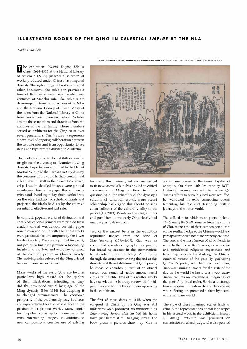
illUStratioNS For ENCoUNtEriNG SorroW (liSao tU), XIaO YUNcONG, 1645. NaTIONaL LIBrarY OF chINa, BEIJING
he exhibition Celestial Empire: Life in China, 1644–1911 at the National Library
of Australia (NLA) presents a selection of works produced under China’s last imperial dynasty. Through a range of books, maps and other documents, the exhibition provides a tour of lived experience over nearly three centuries of Manchu rule. The exhibits are drawn equally from the collections of the NLA and the National Library of China. Many of the items from the National Library of China have never been overseas before. Notable among these are plans and drawings from the archives of the Lei family, whose members served as architects for the Qing court over seven generations. Celestial Empire represents a new level of ongoing collaboration between the two libraries and is an opportunity to see items of a type rarely exhibited in Australia.
The books included in the exhibition provide insight into the diversity of life under the Qing dynasty. Imperial works printed in the Hall of Martial Valour of the Forbidden City display the concerns of the court in their content and a high level of skill in their execution: sharp, crisp lines in detailed images were printed evenly over fine white paper that still easily withstands handling today. Such works drew on the elite tradition of scholar-officials and projected the ideals held up by the court as essential to effective and just rule.
In contrast, popular works of divination and cheap educational primers were printed from crudely carved woodblocks on thin paper now brown and brittle with age. These works were produced for consumption by the lower levels of society. They were printed for profit, not posterity, but now provide a fascinating insight into the lives and everyday concerns of the common people in Chinese society. The thriving print culture of the Qing existed between these two extremes.
Many works of the early Qing are held in particularly high regard for the quality of their illustrations, inheriting as they did the developed visual language of the Ming dynasty (1368–1644) but adapting it to changed circumstances. The economic prosperity of the previous dynasty had seen an unprecedented level of exuberance in the production of printed works. Many books for popular consumption were adorned with entertaining images. In addition to new compositions, creative use of existing
texts saw them reimagined and rearranged to fit new tastes. While this has led to critical assessments of Ming practices, including questioning of the reliability of the dynasty’s editions of canonical works, more recent scholarship has argued this should be seen as an indicator of the cultural vitality of the period (He 2013). Whatever the case, authors and publishers of the early Qing clearly had many styles to draw upon.
Two of the earliest texts in the exhibition reproduce images from the hand of Xiao Yuncong (1596–1669). Xiao was an accomplished writer, calligrapher and painter, but found no success in the examinations he attended under the Ming. After living through the strife surrounding the end of this dynasty and the establishment of Qing power, he chose to abandon pursuit of an official career, but remained active among social circles of the elite. Few of his written works have survived; he is today renowned for his paintings and for the two volumes appearing in the exhibition.
The first of these dates to 1645, when the conquest of China by the Qing was still underway. Xiao produced his Illustrations on Encountering Sorrow after he fled his home town just before it fell to Qing forces. The book presents pictures drawn by Xiao to
accompany poems by the famed loyalist of antiquity Qu Yuan (4th–3rd century BCE). Historical records recount that when Qu Yuan’s efforts to serve his lord were rebuffed, he wandered in exile composing poems lamenting his fate and describing ecstatic journeys to the other world.
The collection to which these poems belong, The Songs of the South, emerge from the culture of Chu, at the time of their composition a state on the southern edge of the Chinese world and perhaps considered not quite properly civilized. The poems, the most famous of which lends its name to the title of Xiao’s work, express vivid and uninhibited religious experiences and have long presented a challenge to Chinese canonical visions of the past. By publishing Qu Yuan’s poetry with his own illustrations, Xiao was issuing a lament for the strife of the day as the world he knew was swept away. Xiao’s pictures are marvellous imaginings of the poems’ spiritual realm. Spirits and strange beasts appear in extraordinary landscapes, while offerings are presented to them by people of the mundane world.
The style of these imagined scenes finds an echo in the representations of real landscapes in his second work in the exhibition. Scenery of Taiping Prefecture was produced on commission for a local judge, who also penned
T
i l l U S t r a t E d B o o K S o F t H E Q i N G i N C E L E S T I A L E M P I R E a t t H E N l a
Nathan Woolley

11TA A S A R E V I E W V O L U M E 2 5 N O . 1
the introduction. Xiao presents images of 43 sites around three counties where he grew up. In its bold illustrations, Xiao displayed his own technique adapted from existing painting traditions. The features of the natural landscape are heavy and forceful, dominating the man-made structures. Each illustration is accompanied by a poem, exemplifying the close ties between painting and printing in the period. This distinctive work had a lasting influence, its images even providing inspiration to artists in Japan after copies of this book found their way across the sea. Illustrations from the work were also later adopted into Wang Gai’s Painting Manual of the Mustard Seed Garden, perhaps the most influential guide on painting ever produced in East Asia, the first section of which appeared in 1679 (Szeto 1999; Shin 2006).
Engagement with the Chinese landscape was one means of drawing the rich traditions of the past into the cultural pursuits of the present. For any person trained in the literary tradition, sites throughout China were encrusted with voices from the past. As a result, journeys through space were a means of travelling through time, an opportunity to seek out past associations and to add one’s own voice to them. This was particularly true for waterways: having long been a key means of transport, places along the banks of rivers and canals hosted the reflections of visitors passing by for millennia.
Over a decade, the painter Zhang Bao (1763–1832) published six records of journeys under the title Images from a Drifting Raft, each comprising a set of illustrations of sites along his route. They resonate with the travels of contemporaries as well as knowledge of the past.
The first documents a journey from Zhang’s hometown of Nanjing to the capital along the Yangzi River and up the Grand Canal. He starts with an image of Nanjing’s pleasure quarter around the Qinhuai Stream, which marks his parting from family and friends. This at once draws the informed reader
into Nanjing’s rich history as capital under dynasties of the distant past and vibrant cultural centre in more recent decades.
As he departs, Zhang passes the Stone Citadel and Swallow Rock—two locations often celebrated in prose and verse—and then spends a night moored near Guazhou, a staging post for travel on the Yangzi in texts from at least a thousand years previously. The reader can then follow Zhang’s journey past the Golden Isle, which hosts a Buddhist temple near Zhenjiang, and from there up the Grand Canal past Yangzhou, across the Yellow River and to his arrival outside the walls of the capital. Following as it does a well-used itinerary but recorded in Zhang Bao’s images and verse, the account is at once personal and universal. It is not difficult to imagine the work stirring memories in the mind of many Qing readers of their own journeys through renowned landscapes as well as through the Chinese literary tradition (Stuer 2013).
Zhang Bao’s work as whole can be taken as an idealized meditation on the worldly leisure of the cultural elite: the journey for private or official purposes, the parting and meeting with friends, the visiting of historical sites. The prefaces by Zhang and his associates comment on the significance of travel, the value of observation for the cultivation of the individual, and the geography of the empire. The work presents marvellous vignettes of China as experienced under the Qing. The illustrations reflect a simplification and refinement of drawing for the printed page
and proved influential. For example, many of Zhang’s compositions reappeared in another celebrated work published later in the 19th century Wild Swan on the Snow written by the bannerman Lincing (1791–1846).
The careful understated refinement of the images in such elite works stands in marked contrast to the lively illustrations playing across the pages of ghost stories, morality books and romances produced for popular consumption. Yet the diversity of print culture is but one aspect of Qing life highlighted in the exhibition Celestial Empire.
Celestial Empire: Life in China, 1644 –1911 will be shown at the NLA, Canberra from 2 January – 22 May 2016.
Nathan Woolley is curator at the NLa and historian
in the australian centre on china in the World at the
australian National University.
rEFErENCEShe Yuming, 2013. Home and the World: Editing the “Glorious
Ming” in Woodblock-Printed Books of the Sixteenth and Seventeenth
Centuries, harvard University asia center, cambridge, Mass.
Shin Seojeong, 2006. “Illustrations of Taiping Prefecture (1648):
a printed album of landscapes by the seventeenth-century literati
artist, Xiao Yuncong (1596–1673)”, PhD dissertation, University
of Maryland
Stuer, catherine, 2013. “reading the World’s Landscape in Zhang
Bao’s Images of the Floating Raft, 1833”, in Rethinking visual
narratives from Asia: Intercultural and comparative perspectives,
edited by alexandra Green, hong Kong University Press, hong
Kong, pp 77–94.
Szeto Yuen-kit, 1999. “Xiao Yuncong (1596–1669) and his
Landscape Paintings”, MPhil dissertation, University of hong Kong
iMaGES FroM a driFtiNG raFt (FaNCHa tU), ZhaNG BaO, GUaNGZhOU: ShaNGGU ZhaI, 1822. NaTIONaL LIBrarY OF chINa, BEIJING
PaiNtiNG MaNUal oF tHE MUStard SEEd GardEN
(JiEziYUaN HUazHUaN), WaNG GaI ET aL., NaNJING, 1679.
NaTIONaL LIBrarY OF chINa, BEIJING
12 TA A S A R E V I E W V O L U M E 2 5 N O . 1
ast year, when the Centre on China in the World (CIW) organised the exhibition
China & ANU: Diplomats, Adventurers, Scholars, it revealed the diplomatic and academic connections with China that pervaded the establishment of Australia’s only national university. However, while this institutional history showed the foresight of some in government, public service and academia, I was surprised to discover how many ‘ordinary’ exhibition visitors had far-reaching family connections to Asia before World War II. The CIW’s current exhibition Photographs of 1930s China by Stanley O. Gregory showcases a selection of rarely seen images of China, while also sharing the story of Gregory, one such British man and his family, who lived for decades in Hong Kong and Shanghai before migrating to Australia in the 1940s.
Conceived to complement the National Library’s Celestial Empire exhibition, Photographs of 1930s China features 21 large format black and white prints on cotton rag paper, made especially for the exhibition from a set of roughly 350 negatives in the Stanley Gregory papers at the NLA. Acquired in 1969, following the passing of Stanley’s wife Dorothy (then resident in Canberra), the Gregory Papers include Stanley’s letters to Dorothy in China and Australia, a brief diary of his earlier travels in Russia in 1922-23, as well as a neat notebook titled ‘Recollections of Internment’, describing various aspects of his experience in two Japanese POW camps in Shanghai between 1943-1945, grouped in short thematic chapters. Together, they reveal a fascinating life, but also a rare personal account of day-to-day life for a long-term European resident of Shanghai in the 1930s.
Perusing the images, I was initially struck by their technical competence and a ‘faded elegance’ (Worswick and Spence 1978: 146) that seemed to eschew signs of modern Chinese life. Many of them depict canal towns near Shanghai, including Hangzhou and Suzhou, and well-known Beijing scenes, featuring a familiar cast of peddlers and donkeys, monks and temples. Less common were the rather candid and empathetic images of farmers and life along the canals.
Based on these impressions, I enlisted the generous help of Andrew Gosling to produce a biographical timeline of Stanley Gregory, and Gael Newton to consider photography in
Shanghai at the time. With help from Stanley’s children and their families, who remain today in Canberra and Brisbane, it was thus possible to establish a fairly clear picture of Stanley and his wife Dorothy’s lives in Hong Kong and Shanghai from the 1920s to early 1940s. Yet the Gregory collection of images was more difficult to unravel.
Born in London in 1902, Stanley Oswald Gregory was raised in Letchworth Garden City, a pioneering example of urban planning that sought to counter the negative effects of industrialised towns. He attended St Christopher’s Theosophical School, whose Quaker principles encouraged students to be actively involved in the school’s organisation. Combining this sense of freedom and responsibility, in 1922-23 Stanley spent a year in Soviet Russia, where he assisted Quaker-led famine relief in the southern town of Buzuluk, but also ventured as far east as Tashkent and Samarkand—richly recorded in a photo album that remains with the family.
In 1924, Stanley secured a position in Hong Kong with Kelly & Walsh, eminent publishers and booksellers with outlets since the 1880s in Shanghai, Hong Kong, Yokohama and Singapore. In 1931, Gregory returned to England, becoming engaged to Dorothy Priestly, and within a year of his return was promoted to manager of the ‘K&W’ Shanghai branch, where the young couple would soon start to raise a family. Both committed Quakers, from the late 1930s Stanley and Dorothy were also heavily involved in relief
work for some of the thousands of Chinese and European refugees who continued flocking to Shanghai.
In 1941, Dorothy left Shanghai under Japanese bombardment, taking the children to join relatives in Queensland; Stanley was unsuccessful in securing passage. In January 1943, when the occupying Japanese forces called on foreign residents to report for internment, Stanley became a prisoner of war, spending time in both the Pudong and Lunghua camps. In his handwritten ‘Recollections of Captivity’ (dated March 1945) he mused that the internees may have been better catered for—with regular food and fuel—than those (mostly Chinese)
L
t H E G r E G o r Y P H oto G r a P H S o F C H i N a i N t H E N at i o N a l l i B r a r Y C o l l E C t i o N
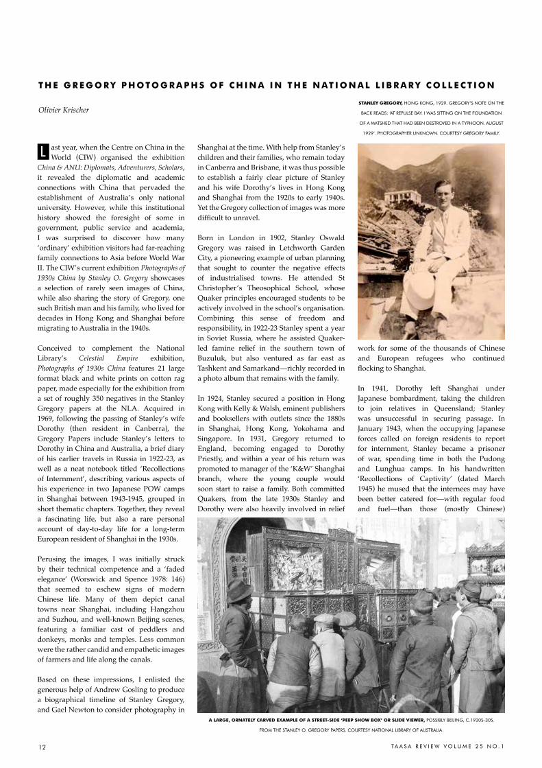
Olivier Krischer StaNlEY GrEGorY, hONG KONG, 1929. GrEGOrY’S NOTE ON ThE
BacK rEaDS: ‘aT rEPULSE BaY. I WaS SITTING ON ThE FOUNDaTION
OF a MaTShED ThaT haD BEEN DESTrOYED IN a TYPhOON. aUGUST
1929’. PhOTOGraPhEr UNKNOWN. cOUrTESY GrEGOrY FaMILY.
a larGE, orNatElY CarVEd EXaMPlE oF a StrEEt-SidE ‘PEEP SHoW BoX’ or SlidE ViEWEr, POSSIBLY BEIJING, c.1920S-30S.
FrOM ThE STaNLEY O. GrEGOrY PaPErS. cOUrTESY NaTIONaL LIBrarY OF aUSTraLIa.
13TA A S A R E V I E W V O L U M E 2 5 N O . 1
outside the camps living with rampant inflation and increasingly scarce supplies. Following the Allied victory, Stanley finally arrived in Australia on Christmas Day 1945, reuniting with Dorothy and the children in Hobart before taking a position at Angus & Robertson’s in Sydney.
But what of the photographs? I was surprised to hear the family did not remember Stanley as a photographer in Australia. Given his work for such a prominent publisher of illustrated books, it seemed plausible these earlier negatives might have been part of the Kelly & Walsh inventory—indeed most bore some kind of partially visible catalogue number. The family photo albums do show that Stanley actively photographed Hong Kong island and the Kowloon hinterland in the 1920s, sometimes pictured with a folding ‘vestpocket’ camera in hand, or slung across his chest—just the type of camera for the postcard-sized negatives in the Gregory papers. The exhibition therefore assumed the images were most probably taken by Gregory in the mid-1930s. While the Gregory papers make only passing mention to photography, these date mostly from the later 1930s, when the Gregorys were involved in Shanghai refugee work, which may have eclipsed any photographic pursuits.
Then, as this TAASA article deadline loomed, low and behold: Stanley’s son, Chris, located examples of Kelly & Walsh postcards featuring images from among the NLA negatives. Meanwhile, at the National Library, I found Juliet Bredon’s Chinese New Year Festivals (Kelly & Walsh, 1930), signed ‘To mother, for Christmas, 1930. Stanley’—almost certainly one of the handful of books included in the original 1969 NLA acquisition. Juliet Bredon was the niece of Robert Hart, the illustrious Inspector-General of China’s Imperial Maritime Custom Service (1863 to 1911). More importantly, this publication features illustrative duotone vignettes decorating page corners which in many cases are the same or similar to images from the Gregory negatives. Other Kelly & Walsh publications featuring examples include Bredon’s authoritative Peking (first edition 1920). Making matters more complicated, Bredon’s images are attributed either to ‘friends’ or to a certain ‘A. J. Waller’, who remains unknown.
Further images matching NLA negatives from the Gregory papers are found in the lavish publications of Donald Mennie, including his most famous work The Pageant of Peking (Kelly & Walsh, 1920). Mennie was the very successful director of the Shanghai pharmaceutical company A.S Watson & Co., which also advertised photographic development and enlargement services, and
is known to have co-published photo books with Kelly & Walsh in the 1920s. He too was later interned at Lunghwa, where he died in 1944. Yet, no mention of Mennie has appeared in the Gregory papers.
All this further research work suggests that our exhibition title (and the NLA catalogue entry) requires some updating! At least some of the Gregory negatives date from 1920, some possibly earlier. And many baffling (and fascinating) questions remain. In not a few cases, the NLA negatives are in fact slightly different to images in the Bredon and Mennie publications, or on K&W postcards, apparently taken a moment earlier or later. Some of the published images are in a different format to the NLA negatives, suggesting two photographers, or two cameras, at the same site. While Mennie seems to have worked in large format, possibly persisting with the old wet-plate process, the NLA negatives were produced with medium format roll film. Moreover, despite these published examples of the images, many of the NLA negatives are clearly amateur studies, suggesting the possibility of a more amateur hand such as Gregory’s.
While further research into the Gregory collection is needed, the significance of these images and Gregory’s experience in China continues to grow. For one thing, while images such as Mennie’s were printed using photogravure, heightening the soft pictorialist effect, the Gregory negatives offer a rare look behind such contrived images. Reproduced in digital print for this exhibition, his images, especially of daily life, are strikingly crisp and immediate.
Much of this country’s experience of Asia and its arts has been woven from such complex migrations and journeys, so many of which remain even now barely known—and even when their histories have found their way into the national collection.
This article, and the exhibition, have greatly benefitted from the research of Andrew Gosling, Gael Newton and Christopher Gregory in particular. Christopher Gregory and Ann Argyle and their families have been most supportive throughout, sharing much additional material.
Dr Olivier Krischer is a postdoctoral research fellow
and curator at the australian centre on china in the
World, australian National University.
rEFErENCESBredon, Juliet, 1930. Chinese New Year Festivals, Kelly & Walsh,
Shanghai.
Bredon, Juliet, 1920. Peking: An Historical and Intimate Description
of its Chief Places of Interest, Kelly & Walsh, Shanghai
Kent, richard K. ‘Early Twentieth-century art Photography in
china: adopting, Domesticating, and Embracing the Foreign’,
Trans Asia Photography Review, vol. 3, issue 2, Spring 2013.
Mennie, Donald, 1921. The Pageant of Peking: comprising sixty-six
Vandyck photogravures of Peking and environs from photographs,
2nd edition, Kelly & Walsh, Shanghai
Mennie, Donald, 1926. China North and South, a. S. Watson &
co., Shanghai
Newton, Gael, 2016. ‘Kelly & Walsh and the Shanghai Photographic
Scene’, australian centre on china in the World, canberra http://
ciw.anu.edu.au/events/gallery/stanley_gregory/kelly_and_walsh.pdf
Sima, William, 2015. China & ANU: Diplomats, Adventurers,
Scholars, aNU Press, canberra
Worswick, clarkand Spence, Jonathan, 1978. Imperial China:
Photographs, 1850-1912, Pennwick Publishing, New York
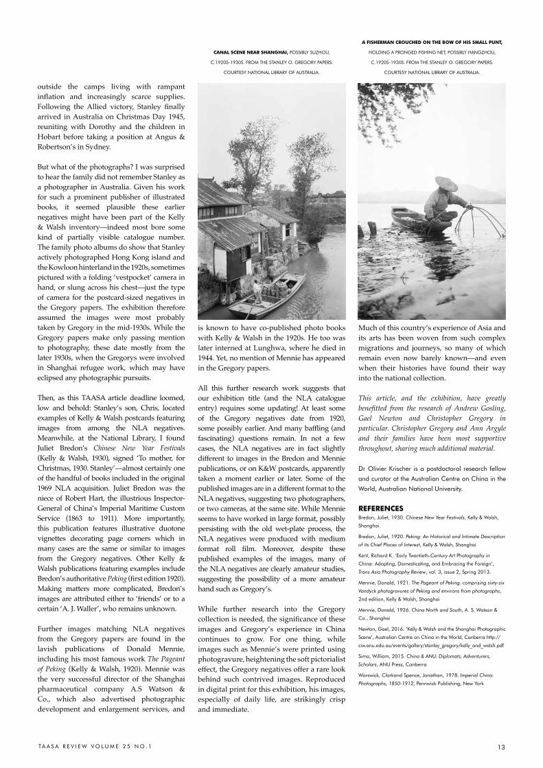
CaNal SCENE NEar SHaNGHai, POSSIBLY SUZhOU,
c.1920S-1930S. FrOM ThE STaNLEY O. GrEGOrY PaPErS.
cOUrTESY NaTIONaL LIBrarY OF aUSTraLIa.
a FiSHErMaN CroUCHEd oN tHE BoW oF HiS SMall PUNt,
hOLDING a PrONGED FIShING NET, POSSIBLY haNGZhOU,
c.1920S-1930S. FrOM ThE STaNLEY O. GrEGOrY PaPErS.
cOUrTESY NaTIONaL LIBrarY OF aUSTraLIa.
14 TA A S A R E V I E W V O L U M E 2 5 N O . 1
rom 6 – 14 February, 12 spectacular giant lanterns representing animal signs of the
Chinese Zodiac occupied some of Sydney’s major locations as part of this year’s Sydney Chinese New Year Festival. Marking its 20th anniversary, this was an ambitious project orchestrated by Claudia Chan Shaw, the first specialist curator appointed by the City of Sydney in the festival’s history. It marks the dramatic evolution of the CNY festival from a small community based event to a major tourist drawcard attracting an estimated 600,000 visitors to more than 80 events across the city over 16 days and nights - the largest celebration of Lunar New Year outside mainland China.
Claudia Chan Shaw comments about how thrilled she was to be selected as curator for this project, allowing her to give expression to both her personal cultural ties with Chinese New Year and her passionate identity with the city of Sydney through a family association which goes back to the gold rush days. Her conception for Lunar Lanterns was to transform the traditional Chinese lantern display into something uniquely reflecting ‘Sydney in summer’: a bright and happy playfulness appropriate to the year of the monkey.
For this year’s festival, six lanterns were commissioned from various artists for the signs of the monkey, dragon, ox, horse, tiger and rabbit. A five metre high lantern representing the goat was gifted by Sydney’s sister city, Guangzhou and displayed in Chinatown. The remaining five lanterns were drawn from past displays, refurbished and in some cases, radically re-imagined. The intention is to commission lanterns symbolising these remaining five zodiac signs for next year’s festival, creating a full set of artist created lanterns over the two year period.
I was especially curious about how Claudia went about selecting the artists for each particular zodiac sign. She says they were ‘100% hand-picked’: being familiar with each artist’s work, she had a clear vision of who to commission for each sign. For example, Laurens Tan is known for the playfulness of his multidisciplinary work, often toylike in style and encompassing animation and sculpture. The monkey sign was the obvious choice for him and he has created, in her words, a ‘playful and delightful’ eight metre high installation – in prime position alongside
the Opera House, of course - representing the three wise monkeys sitting on a pencil.
The artist’s statement explaining this symbolism states: ‘From the traditional meaning of the three wise monkeys, our vision of the world is limited by what we’re told and by what we choose to accept. The monkeys are thrust forward on the pencil, the instrument used to write our future and destiny.’
Fan Dongwang was for Claudia the only person to create the dragon lantern. He is known to be an expert on dragons, having depicted them often in large scale acrylic paintings and sculptures. Placed to protect the gateway to the city on the Sydney harbour foreshore, Fan Dongwang has stated that the dragon is a crucial symbol of Chinese culture, in the past representing the emperor’s unchallenged power and authority but now also a powerful symbol of Chinese nationhood. He says:
‘The dragon represents the emerging Chinese cultural identity in today’s world. By cropping the dragon’s body and focusing solely on its head, I have adopted a Western postmodern form of fragmentation. This differs to the Chinese approach that emphases the wholeness of the image. I have mixed traditional Chinese three dimensional carving
techniques and blended it with Western pop art colour palettes….’ For the magical celestial ox, Claudia approached artist Tianli Zu, perhaps familiar to readers from her portrait of Edmund Capon, a finalist entry in the 2015 Archibald prize competition. She felt that Tianli’s versatility and innovative approach made her ideal to work on this difficult brief. The resulting concept came with a bang – a two
F
l U N a r l a N t E r N S : W E l C o M i N G i N t H E Y E a r o F t H E M o N K E Y i N S Y d N E Y
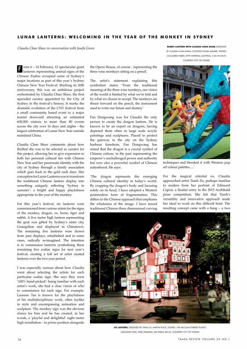
Claudia Chan Shaw in conversation with Josefa Green raBBit laNtErN WitH ClaUdia CHaN SHaW, DESIGNED
BY cLaUDIa chaN ShaW, cUSTOMS hOUSE SQUarE, SYDNEY,
cOLOUrED FaBrIc WITh INTErNaL LIGhTING, 2.5M (h) Each.
cOUrTESY cITY OF SYDNEY
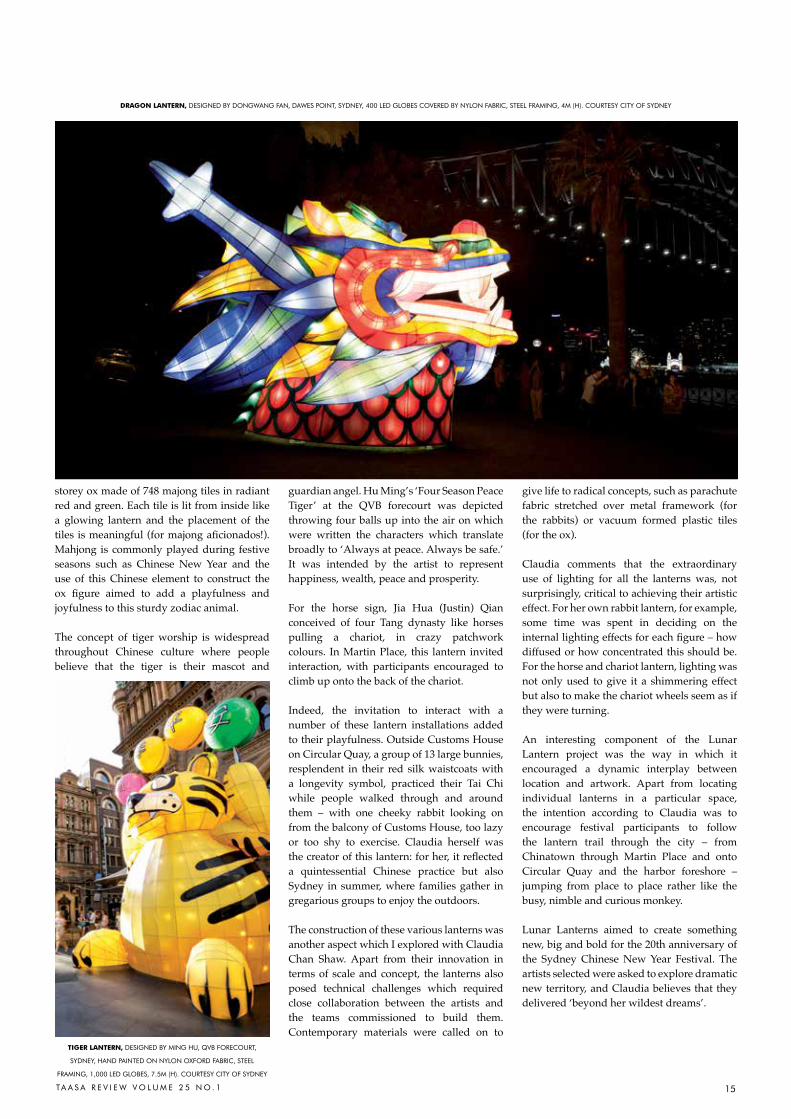
oX laNtErN, DESIGNED BY TIaNLI ZU, MarTIN PLacE, SYDNEY, 748 VacUUM FOrMED PLaSTIc
MahJONG TILES, STEEL FraMING, LED PIXELS, 8M (h). cOUrTESY cITY OF SYDNEY
15TA A S A R E V I E W V O L U M E 2 5 N O . 1
tiGEr laNtErN, DESIGNED BY MING hU, QVB FOrEcOUrT,
SYDNEY, haND PaINTED ON NYLON OXFOrD FaBrIc, STEEL
FraMING, 1,000 LED GLOBES, 7.5M (h). cOUrTESY cITY OF SYDNEY
storey ox made of 748 majong tiles in radiant red and green. Each tile is lit from inside like a glowing lantern and the placement of the tiles is meaningful (for majong aficionados!). Mahjong is commonly played during festive seasons such as Chinese New Year and the use of this Chinese element to construct the ox figure aimed to add a playfulness and joyfulness to this sturdy zodiac animal.
The concept of tiger worship is widespread throughout Chinese culture where people believe that the tiger is their mascot and
guardian angel. Hu Ming’s ‘Four Season Peace Tiger’ at the QVB forecourt was depicted throwing four balls up into the air on which were written the characters which translate broadly to ‘Always at peace. Always be safe.’ It was intended by the artist to represent happiness, wealth, peace and prosperity.
For the horse sign, Jia Hua (Justin) Qian conceived of four Tang dynasty like horses pulling a chariot, in crazy patchwork colours. In Martin Place, this lantern invited interaction, with participants encouraged to climb up onto the back of the chariot.
Indeed, the invitation to interact with a number of these lantern installations added to their playfulness. Outside Customs House on Circular Quay, a group of 13 large bunnies, resplendent in their red silk waistcoats with a longevity symbol, practiced their Tai Chi while people walked through and around them – with one cheeky rabbit looking on from the balcony of Customs House, too lazy or too shy to exercise. Claudia herself was the creator of this lantern: for her, it reflected a quintessential Chinese practice but also Sydney in summer, where families gather in gregarious groups to enjoy the outdoors.
The construction of these various lanterns was another aspect which I explored with Claudia Chan Shaw. Apart from their innovation in terms of scale and concept, the lanterns also posed technical challenges which required close collaboration between the artists and the teams commissioned to build them. Contemporary materials were called on to
give life to radical concepts, such as parachute fabric stretched over metal framework (for the rabbits) or vacuum formed plastic tiles (for the ox).
Claudia comments that the extraordinary use of lighting for all the lanterns was, not surprisingly, critical to achieving their artistic effect. For her own rabbit lantern, for example, some time was spent in deciding on the internal lighting effects for each figure – how diffused or how concentrated this should be. For the horse and chariot lantern, lighting was not only used to give it a shimmering effect but also to make the chariot wheels seem as if they were turning.
An interesting component of the Lunar Lantern project was the way in which it encouraged a dynamic interplay between location and artwork. Apart from locating individual lanterns in a particular space, the intention according to Claudia was to encourage festival participants to follow the lantern trail through the city – from Chinatown through Martin Place and onto Circular Quay and the harbor foreshore – jumping from place to place rather like the busy, nimble and curious monkey.
Lunar Lanterns aimed to create something new, big and bold for the 20th anniversary of the Sydney Chinese New Year Festival. The artists selected were asked to explore dramatic new territory, and Claudia believes that they delivered ‘beyond her wildest dreams’.
draGoN laNtErN, DESIGNED BY DONGWaNG FaN, DaWES POINT, SYDNEY, 400 LED GLOBES cOVErED BY NYLON FaBrIc, STEEL FraMING, 4M (h). cOUrTESY cITY OF SYDNEY
16 TA A S A R E V I E W V O L U M E 2 5 N O . 1
great many of the members of the Chinese Brush Painters Society that I meet in my
capacity as their honorary co-president came to Chinese brush painting from an interest in Chinese culture. For me, however, it was the other way around. I was living in Manila and wanted to find a practical painting course, preferably one that took place in air-conditioned premises – by no means a given in the mid-1970s. The best course available was at the Chinese Artists’ Guild with Professor Chen Bingsun. So, albeit with misgivings about the relevance to me, a westerner, of Chinese painting, I signed up. I soon discovered that the Chinese have spent over 2,000 years developing an amazingly versatile painting medium. I realised that, if I mastered the brush, ink and paper, I could make this medium my own. Professor Chen once told me that he enjoyed having European students because the fusion of two ancient cultures could create something exciting and new.
Modern painters working in the brush painting genre still follow the six principles of painting set out by Xie He (479 to 501 CE):
1 rhythmic vitality through harmony of spirit
2 using brush strokes to create structure3 naturalistic drawing4 naturalistic colours5 good composition6 copying the masters
Innovation has been slow in this painting tradition. This is especially true where the gongbi technique is followed, a refined painting technique using highly meticulous brush strokes to achieve exact and realistic detail, often highly coloured. In contrast, the xieyi tradition, which emerged particularly during the Song dynasty (960 to 1279 CE), focuses on capturing the essence of what is depicted with boldly free and expressive brush strokes. Respect for the masters means that painters have tended to look back to sometimes quite distant eras for techniques, which they subtly alter, claiming the antiquity of their methods to authenticate them.
Professor Chen gave his students a thorough grounding in both gongbi and xieyi techniques. Each subject and technique had to be mastered before you were allowed to move on to the next. Later, I also studied at the Philippine Chinese Art Center with Hau Chiok and Sy Chui Hua,
both Lingnan painters. The Lingnan school was founded by a group of Chinese painters from the Guangdong region in the 19th and early 20th century who wanted to go back to looking at nature itself, rather than at paintings of nature. My work is heavily influenced by Lingnan techniques and I am naturally a freestyle painter. I much prefer the xieyi approach of the literati (or scholar) painters to their subjects. However, I do not think I would have got as much out of my Lingnan training had Professor Chen not given me such a good foundation.
Over centuries, Chinese painters have evolved ways of showing perspective that differ from vanishing point perspective adopted by Western artists during the Renaissance. With a Chinese landscape, the viewer may not be carried into the painting by the perspective but may have to walk through it mentally. Landscapes should have qi – a starting point, cheng - a continuation, zhuan - a turning point and he - a completion.
Various conventions are used to help the eye to travel through the picture - common ones are tree branches or a bridge. Some paintings have the main focus of interest in the centre of the picture but, more often, the eye is carried in a diagonal or a zigzag line up the painting. The elements of a Chinese painting are not necessarily all viewed from the same angle. As one moves around the scene, you may see trees and people from the side but buildings from above.
In my landscape paintings I normally use western perspective. However, I frequently alter my viewpoint and I am conscious of a desire to provide a path through a picture, as you may see in my painting Our neighbours’ house.
Rather than a concern to be innovative and individualistic in their brush strokes, Chinese brush painters, even in more recent times, follow a distinctive system of strokes passed from master to pupil through many generations.
It is impossible to overemphasise the importance of brush strokes in a Chinese painting. They define the medium in a way that is not true of western painting. Technique in Chinese painting is not hidden, because the artist wants the subject or the idea behind the work to predominate. In Chinese brush painting, subject and technique are inextricably linked - using brush strokes to create structure was Xie He’s second principle. Only by mastering technique can the artist transcend it, subjecting it to his or her expression rather than being ruled by it. The idea that the total effect of the painting is what matters is western. While modern Chinese painters have been influenced by a western way of looking at and interpreting the world, there is no sign of diminishing emphasis on brush work in this painting tradition.
The nature of the materials used by the Chinese painter is very closely bound up
A
C H i N E S E i N K a N d B r U S H Pa i N t i N G – a P r a C t i t i o N E r ’ S P E r S P E C t i V E
Jane Evans
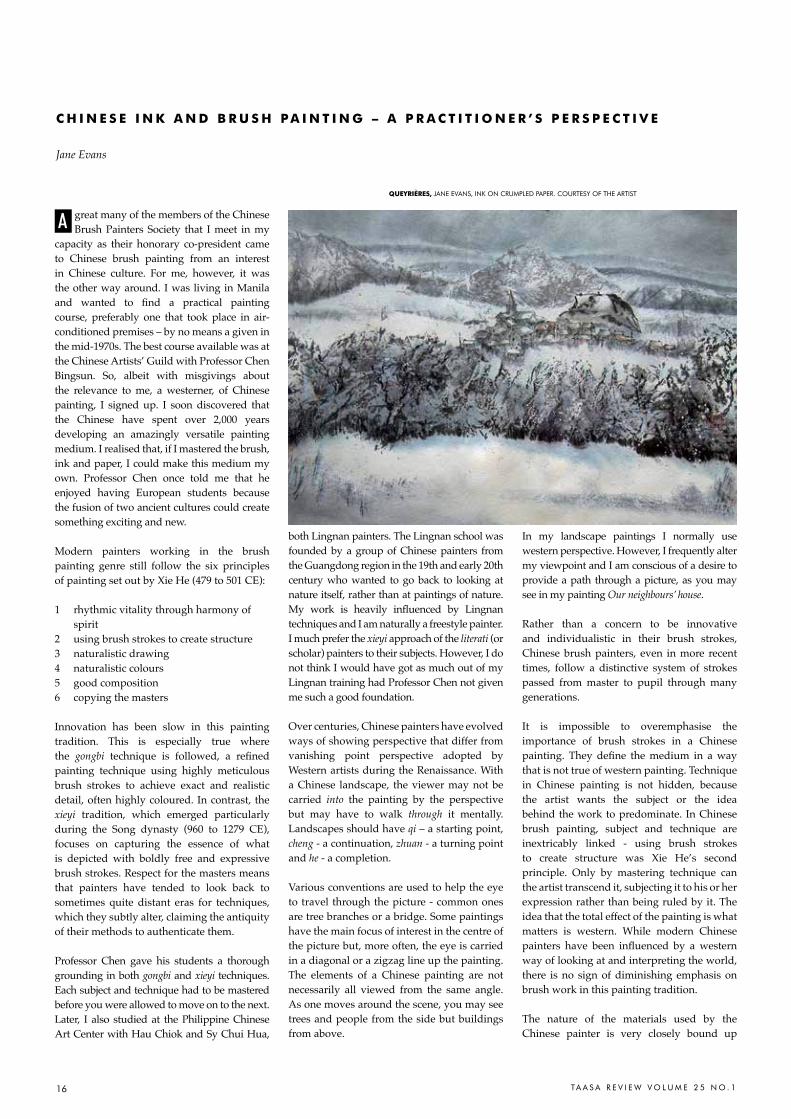
QUEYrièrES, JaNE EVaNS, INK ON crUMPLED PaPEr. cOUrTESY OF ThE arTIST
17Ta a S a r E V I E W V O L U M E 2 5 N O . 1
with what is produced. The Chinese talk of the ‘four treasures’ of painting: the ink stick, the ink stone, the paper and the brush. Colour is not included. Even freestyle painters, who use colour in place of ink to create shape and texture, nearly always also use ink too, using it to hold their composition together.
There are many sorts of Chinese painting paper. Some is sized, but freestyle painters prefer unsized, absorbent paper. Strokes begun and finished on the paper are blunt, for a tapered effect the stroke needs to be continued into the air. Strokes done slowly spread; a crisp stroke must be executed fast. Thus the immediacy of the impact of a freestyle Chinese painting and the demand for the ‘life force’ not to be broken is, at least partly, demanded by the paper. Completing a painting ‘in one breath’ is a practical as well as a philosophical necessity.
Because of its absorbency and strength, the paper lends itself to experimentation. Modern Chinese painters have used a variety of substances as resists; alum, milk and acrylic medium provide varying degrees of resistance. Texture can be applied to paper by painting another surface, canvas or the back of hardboard for example, with ink or colour and pressing the paper onto it. Many painters use sponges to apply paint and ink.
because the wash is the final stage of a painting, a picture can be begun by damping the paper, screwing it up and carefully unfolding it. This creates ridges and dips that give texture if ink is lightly brushed over the surface. How you fold or screw up the paper will alter the texture. Redamping the paper to apply the wash eases out the ridges and any that remain can be removed when the painting is stretched at the backing stage. Once a painting has been backed, you can add details in pastel or apply gold, silver or copper leaf. My brush painting Queyrières has achieved some of its effects through using a crumpled paper technique.
As with any painting medium, Chinese brush painting techniques can be used for more abstract images. Another of my paintings Duomo Florence illustrates my interest in combining western themes with Chinese painting techniques.
In all my work I try to experiment with the way we see the world around us, which changes constantly as we look. I endeavour to combine my western approach and my desire to be original with my Chinese brush painting training. I aim to remain true to the importance of technique and the need to seek out the essential nature of my subject.
Jane Evans read archaeology and anthropology at
cambridge University. She studied chinese brush
painting at the chinese artists’ Guild and at the
Philippine chinese art center in Manila. Jane has
exhibited widely and runs classes and workshops in
Britain and abroad. her four books and many articles
have played a major role in popularising chinese
painting techniques in Europe and the USa. She is
honorary co-President of the chinese Brush Painters
Society. See more of Jane’s work at www.janeevans.
co.uk.
oUr NEiGHBoUrS' HoUSE, JaNE EVaNS, INK ON PaPEr. cOUrTESY OF ThE arTIST
dUoMo FlorENCE, JaNE EVaNS, cOLOUrED INK ON PaPEr.
cOUrTESY OF ThE arTIST
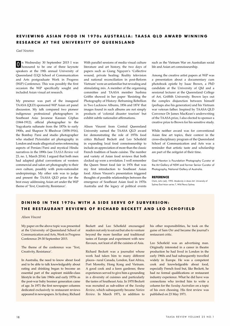
18 TA A S A R E V I E W V O L U M E 2 5 N O . 1
n Wednesday 30 September 2015 I was honoured to be one of three keynote
speakers at the 19th annual University of Queensland (UQ) School of Communication and Arts postgraduate Work in Progress (WiP) Conference. This was possibly the first occasion the WiP specifically sought and included Asian visual art research.
My presence was part of the inaugural TAASA (QLD) sponsored WiP Asian art panel discussion. My talk compared two pioneer indigenous professional photographers in Southeast Asia: Javanese Kassian Céphas (1844-1912), official photographer to the Yogyakarta sultanate from the 1870s to early 1900s, and Shapoor N Bhedwar (1858-1916), the Bombay Parsi and studio photographer who studied Pictorialist art photography in London and made allegorical series referencing aspects of Persian/Parsi and mystical Hindu narratives in the 1890s (see TAASA Review vol 23, no. 1, March 2014). I argued that both men had adapted global conventions of western commercial and salon art photography to their own culture, possibly with proto-nationalist underpinnings. My other role was to judge and present the TAASA QLD prize for the best essay addressing Asian art under the WiP theme of ‘Text, Creativity, Resistance’.
With parallel sessions of media visual culture literature and art history, the two days of papers such as Giang Nguyen’s ‘Collective wound, private healing: Reality television and national reconciliation in post-Reform Vietnam’ were an unfamiliar but revealing and stimulating mix. A member of the organising committee and TAASA member Sushma Griffin showed in her paper ‘Resisting the Photography of History: Reframing Rebellion in Two Lucknow Albums, 1856 and 1874’ that images found in such albums are not simply products of ‘colonial disaster tourism’ but exhibit subtle nationalist affirmations.
Alison Vincent from Central Queensland University earned the TAASA QLD award for demonstrating the role of 1970s food critics Richard beckett and Leo Schofield in expanding local food connoisseurship to include an appreciation of more than the classic French tradition of haute cuisine. The number and variety of Asian food reviews that both clocked up were a revelation. I well remember the Queen Street food fair in 1976 that was my first introduction to Southeast Asian food. Alison Vincent’s presentation triggered thoughts of possible relationships between the emergence of Southeast Asian food in 1970s Australia and the legacy of political events
such as the Vietnam War on Australian social life and Asian art connoisseurship.
Among the creative artist papers at WiP was a presentation about a documentary cum photobook epistle by Isaac Brown, a PhD candidate at the University of Qld and a sessional lecturer at the Queensland College of Art, Griffith University. brown lays out the complex disjunction between himself (perhaps also his generation) and his Vietnam war veteran father. Inspired by TAASA QLD Convenor Dr James MacKean’s underwriting of the TAASA prize, I also elected to sponsor a creative prize to Brown for his sensitive study.
While neither award was for conventional Asian fine art topics, their context in the cross-disciplinary program of the Queensland School of Communication and Arts was a reminder that artistic taste and scholarship are part of the zeitgeist of their time.
Gael Newton is Foundation Photography curator at
the art Gallery of NSW and former Senior curator of
Photography, National Gallery of australia.
rEFErENCEclark, John (ed), 1993. Modernity in Asian Art. University of
Sydney East asian series 7, Wild Peony Sydney
O
r E V i E W i N G a S i a N F o o d i N 1 9 7 0 s a U S t r a l i a : t a a S a Q l d a W a r d W i N N i N G
r E S E a r C H a t t H E U N i V E r S i t Y o F Q U E E N S l a N d
Gael Newton
d i N i N G i N t H E 1 9 7 0 s W i t H a S i d E S E r V E o F S U B V E r S i o N :
t H E r E S t a U r a N t r E V i E W S o F r i C H a r d B E C K E t t a N d l E o S C H o F i E l d
Alison Vincent
My paper on the above topic was presented at the University of Queensland School of Communication and Arts, Work in Progress Conference 29-30 September 2015.
The theme of the conference was ‘Text, Creativity, Resistance’.
In Australia, the need to know about food and to be able to talk knowledgeably about eating and drinking began to become an essential part of the aspirant middle-class lifestyle in the late 1960s and early 1970s as the post-war baby boomer generation came of age. In 1971 the first newspaper columns dedicated exclusively to restaurant reviews appeared in newspapers. In Sydney, Richard
beckett and Leo Schofield encouraged readers not only to eat out but also to venture beyond the more familiar and traditional tastes of Europe and experiment with new flavours, not least of all the cuisines of Asia.
Richard Beckett was a journalist whose work had taken him to many different places– rural Canada, London, East Africa, Port Moresby, Hong Kong and Vietnam. A good cook and a keen gardener, these experiences served to give him a grounding in a diversity of cuisines and particularly the tastes of Southeast Asia. In 1970 Beckett was recruited as sub-editor of the Sunday Review, which subsequently became Nation Review. In March 1971, in addition to
his other responsibilities, he took on the guise of Sam Orr and became the journal’s restaurant critic.
Leo Schofield was an advertising man. Originally interested in a career in theatre production he had lived in London in the early 1960s and had subsequently travelled widely in Europe. He was a competent cook and knowledgeable about food, especially French food but, like Beckett, he had no formal qualifications or restaurant industry experience. What he did have was connections who invited him to write a column for the Sunday Australian on a topic of his own choosing. His first review was published on 23 May 1971.
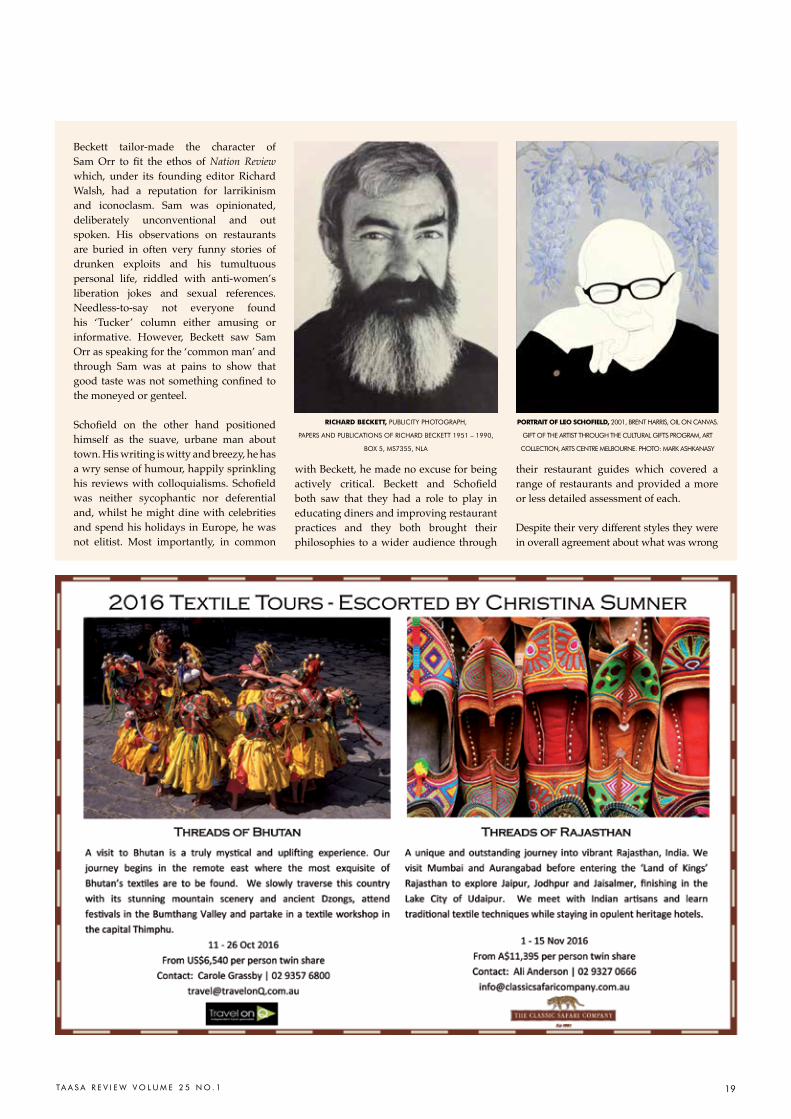
19TA A S A R E V I E W V O L U M E 2 5 N O . 1
Beckett tailor-made the character of Sam Orr to fit the ethos of Nation Review which, under its founding editor Richard Walsh, had a reputation for larrikinism and iconoclasm. Sam was opinionated, deliberately unconventional and out spoken. His observations on restaurants are buried in often very funny stories of drunken exploits and his tumultuous personal life, riddled with anti-women’s liberation jokes and sexual references. Needless-to-say not everyone found his ‘Tucker’ column either amusing or informative. However, Beckett saw Sam Orr as speaking for the ‘common man’ and through Sam was at pains to show that good taste was not something confined to the moneyed or genteel.
Schofield on the other hand positioned himself as the suave, urbane man about town. His writing is witty and breezy, he has a wry sense of humour, happily sprinkling his reviews with colloquialisms. Schofield was neither sycophantic nor deferential and, whilst he might dine with celebrities and spend his holidays in Europe, he was not elitist. Most importantly, in common
with Beckett, he made no excuse for being actively critical. beckett and Schofield both saw that they had a role to play in educating diners and improving restaurant practices and they both brought their philosophies to a wider audience through
their restaurant guides which covered a range of restaurants and provided a more or less detailed assessment of each.
Despite their very different styles they were in overall agreement about what was wrong
riCHard BECKEtt, PUBLIcITY PhOTOGraPh,
PaPErS aND PUBLIcaTIONS OF rIcharD BEcKETT 1951 – 1990,
BOX 5, MS7355, NLa
Portrait oF lEo SCHoFiEld, 2001, BrENT harrIS, OIL ON caNVaS.
GIFT OF ThE arTIST ThrOUGh ThE cULTUraL GIFTS PrOGraM, arT
cOLLEcTION, arTS cENTrE MELBOUrNE. PhOTO: MarK aShKaNaSY
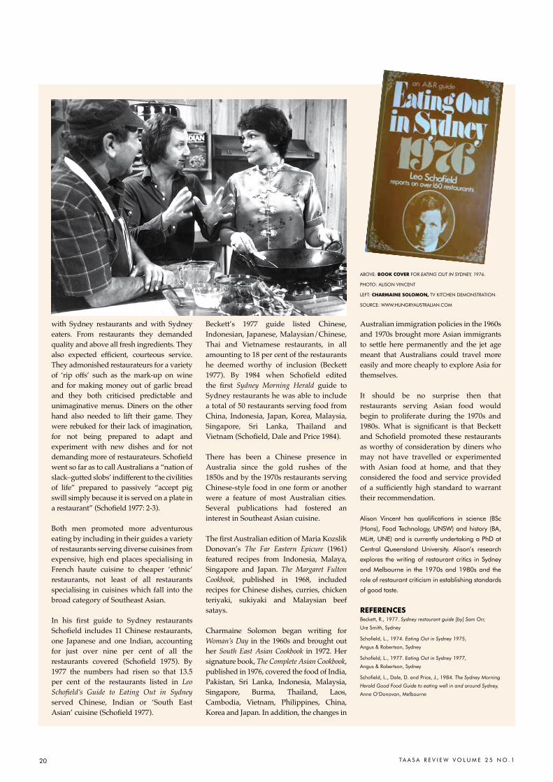
20 TA A S A R E V I E W V O L U M E 2 5 N O . 1
with Sydney restaurants and with Sydney eaters. From restaurants they demanded quality and above all fresh ingredients. They also expected efficient, courteous service. They admonished restaurateurs for a variety of ‘rip offs’ such as the mark-up on wine and for making money out of garlic bread and they both criticised predictable and unimaginative menus. Diners on the other hand also needed to lift their game. They were rebuked for their lack of imagination, for not being prepared to adapt and experiment with new dishes and for not demanding more of restaurateurs. Schofield went so far as to call Australians a “nation of slack–gutted slobs’ indifferent to the civilities of life” prepared to passively “accept pig swill simply because it is served on a plate in a restaurant” (Schofield 1977: 2-3).
Both men promoted more adventurous eating by including in their guides a variety of restaurants serving diverse cuisines from expensive, high end places specialising in French haute cuisine to cheaper ‘ethnic’ restaurants, not least of all restaurants specialising in cuisines which fall into the broad category of Southeast Asian.
In his first guide to Sydney restaurants Schofield includes 11 Chinese restaurants, one Japanese and one Indian, accounting for just over nine per cent of all the restaurants covered (Schofield 1975). by 1977 the numbers had risen so that 13.5 per cent of the restaurants listed in Leo Schofield’s Guide to Eating Out in Sydney served Chinese, Indian or ‘South East Asian’ cuisine (Schofield 1977).
Beckett’s 1977 guide listed Chinese, Indonesian, Japanese, Malaysian/Chinese, Thai and Vietnamese restaurants, in all amounting to 18 per cent of the restaurants he deemed worthy of inclusion (Beckett 1977). by 1984 when Schofield edited the first Sydney Morning Herald guide to Sydney restaurants he was able to include a total of 50 restaurants serving food from China, Indonesia, Japan, Korea, Malaysia, Singapore, Sri Lanka, Thailand and Vietnam (Schofield, Dale and Price 1984).
There has been a Chinese presence in Australia since the gold rushes of the 1850s and by the 1970s restaurants serving Chinese-style food in one form or another were a feature of most Australian cities. Several publications had fostered an interest in Southeast Asian cuisine.
The first Australian edition of Maria Kozslik Donovan’s The Far Eastern Epicure (1961) featured recipes from Indonesia, Malaya, Singapore and Japan. The Margaret Fulton Cookbook, published in 1968, included recipes for Chinese dishes, curries, chicken teriyaki, sukiyaki and Malaysian beef satays.
Charmaine Solomon began writing for Woman’s Day in the 1960s and brought out her South East Asian Cookbook in 1972. Her signature book, The Complete Asian Cookbook, published in 1976, covered the food of India, Pakistan, Sri Lanka, Indonesia, Malaysia, Singapore, Burma, Thailand, Laos, Cambodia, Vietnam, Philippines, China, Korea and Japan. In addition, the changes in
Australian immigration policies in the 1960s and 1970s brought more Asian immigrants to settle here permanently and the jet age meant that Australians could travel more easily and more cheaply to explore Asia for themselves.
It should be no surprise then that restaurants serving Asian food would begin to proliferate during the 1970s and 1980s. What is significant is that beckett and Schofield promoted these restaurants as worthy of consideration by diners who may not have travelled or experimented with Asian food at home, and that they considered the food and service provided of a sufficiently high standard to warrant their recommendation.
alison Vincent has qualifications in science (BSc
(hons), Food Technology, UNSW) and history (Ba,
MLitt, UNE) and is currently undertaking a PhD at
central Queensland University. alison’s research
explores the writing of restaurant critics in Sydney
and Melbourne in the 1970s and 1980s and the
role of restaurant criticism in establishing standards
of good taste.
rEFErENCESBeckett, r., 1977. Sydney restaurant guide [by] Sam Orr,
Ure Smith, Sydney
Schofield, L., 1974. Eating Out in Sydney 1975,
angus & robertson, Sydney
Schofield, L., 1977. Eating Out in Sydney 1977,
angus & robertson, Sydney
Schofield, L., Dale, D. and Price, J., 1984. The Sydney Morning
Herald Good Food Guide to eating well in and around Sydney,
anne O’Donovan, Melbourne
aBOVE: BooK CoVEr FOr EATING OUT IN SYDNEY, 1976.
PhOTO: aLISON VINcENT
LEFT: CHarMaiNE SoloMoN, TV KITchEN DEMONSTraTION.
SOUrcE: WWW.hUNGrYaUSTraLIaN.cOM
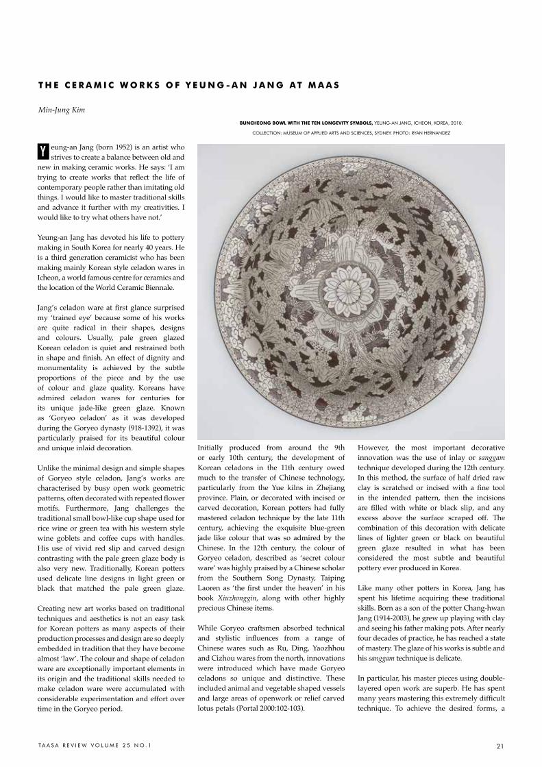
21TA A S A R E V I E W V O L U M E 2 5 N O . 1
eung-an Jang (born 1952) is an artist who strives to create a balance between old and
new in making ceramic works. He says: ‘I am trying to create works that reflect the life of contemporary people rather than imitating old things. I would like to master traditional skills and advance it further with my creativities. I would like to try what others have not.’
Yeung-an Jang has devoted his life to pottery making in South Korea for nearly 40 years. He is a third generation ceramicist who has been making mainly Korean style celadon wares in Icheon, a world famous centre for ceramics and the location of the World Ceramic Biennale.
Jang’s celadon ware at first glance surprised my ‘trained eye’ because some of his works are quite radical in their shapes, designs and colours. Usually, pale green glazed Korean celadon is quiet and restrained both in shape and finish. An effect of dignity and monumentality is achieved by the subtle proportions of the piece and by the use of colour and glaze quality. Koreans have admired celadon wares for centuries for its unique jade-like green glaze. Known as ‘Goryeo celadon’ as it was developed during the Goryeo dynasty (918-1392), it was particularly praised for its beautiful colour and unique inlaid decoration.
Unlike the minimal design and simple shapes of Goryeo style celadon, Jang’s works are characterised by busy open work geometric patterns, often decorated with repeated flower motifs. Furthermore, Jang challenges the traditional small bowl-like cup shape used for rice wine or green tea with his western style wine goblets and coffee cups with handles. His use of vivid red slip and carved design contrasting with the pale green glaze body is also very new. Traditionally, Korean potters used delicate line designs in light green or black that matched the pale green glaze.
Creating new art works based on traditional techniques and aesthetics is not an easy task for Korean potters as many aspects of their production processes and design are so deeply embedded in tradition that they have become almost ‘law’. The colour and shape of celadon ware are exceptionally important elements in its origin and the traditional skills needed to make celadon ware were accumulated with considerable experimentation and effort over time in the Goryeo period.
Initially produced from around the 9th or early 10th century, the development of Korean celadons in the 11th century owed much to the transfer of Chinese technology, particularly from the Yue kilns in Zhejiang province. Plain, or decorated with incised or carved decoration, Korean potters had fully mastered celadon technique by the late 11th century, achieving the exquisite blue-green jade like colour that was so admired by the Chinese. In the 12th century, the colour of Goryeo celadon, described as ‘secret colour ware’ was highly praised by a Chinese scholar from the Southern Song Dynasty, Taiping Laoren as ‘the first under the heaven’ in his book Xiuzhonggin, along with other highly precious Chinese items.
While Goryeo craftsmen absorbed technical and stylistic influences from a range of Chinese wares such as Ru, Ding, Yaozhhou and Cizhou wares from the north, innovations were introduced which have made Goryeo celadons so unique and distinctive. These included animal and vegetable shaped vessels and large areas of openwork or relief carved lotus petals (Portal 2000:102-103).
However, the most important decorative innovation was the use of inlay or sanggam technique developed during the 12th century. In this method, the surface of half dried raw clay is scratched or incised with a fine tool in the intended pattern, then the incisions are filled with white or black slip, and any excess above the surface scraped off. The combination of this decoration with delicate lines of lighter green or black on beautiful green glaze resulted in what has been considered the most subtle and beautiful pottery ever produced in Korea.
Like many other potters in Korea, Jang has spent his lifetime acquiring these traditional skills. Born as a son of the potter Chang-hwan Jang (1914-2003), he grew up playing with clay and seeing his father making pots. After nearly four decades of practice, he has reached a state of mastery. The glaze of his works is subtle and his sanggam technique is delicate.
In particular, his master pieces using double-layered open work are superb. He has spent many years mastering this extremely difficult technique. To achieve the desired forms, a
Y
t H E C E r a M i C W o r K S o F Y E U N G - a N J a N G a t M a a S
Min-Jung KimBUNCHEoNG BoWl WitH tHE tEN loNGEVitY SYMBolS, YEUNG-aN JaNG, IchEON, KOrEa, 2010.
cOLLEcTION: MUSEUM OF aPPLIED arTS aND ScIENcES, SYDNEY. PhOTO: rYaN hErNaNDEZ
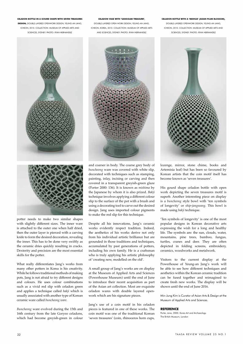
22 TA A S A R E V I E W V O L U M E 2 5 N O . 1
potter needs to make two similar shapes with slightly different sizes. The inner ware is attached to the outer one when half dried, then the outer layer is pierced with a carving knife to form the desired decoration, revealing the inner. This has to be done very swiftly as the ceramic dries quickly resulting in cracks. Dexterity and precision are the most essential skills for the potter.
What really differentiates Jang’s works from many other potters in Korea is his creativity. While he follows traditional methods of making pots, Jang is not afraid to try different designs and colours. He uses colour combinations such as a vivid red slip with celadon green and applies a technique called bakji which is usually associated with another type of Korean ceramic ware called buncheong ware.
Buncheong ware evolved during the 15th and 16th century from the late Goryeo celadons, which had become greyish-green in colour
and coarser in body. The coarse grey body of buncheong ware was covered with white slip, decorated with techniques such as stamping, painting, inlay, incising or carving and then covered in a transparent greyish-green glaze (Porter 2000: 136). It is known as mishima by the Japanese by whom it is also prized. Bakji technique involves applying a different colour slip to the surface of the pot with a brush and using a decorating tool to carve out the desired design. Jang uses imported colour pigments to make the red slip for this technique.
Despite all his innovations, Jang’s ceramic works evidently respect tradition. Indeed, the aesthetics of his works derive not only from his individual artistic brilliance but are grounded in those traditions and techniques, accumulated by past generations of potters, including his own family. He is a craftsman who is truly applying his artistic philosophy of ‘creating new, modelled on the old’.
A small group of Jang’s works are on display at the Museum of Applied Arts and Sciences (Powerhouse Museum) until the end of June to introduce their recent acquisition as part of the Asian art collection. Most are exquisite celadon wares with double layered open-work which are his signature pieces.
Jang’s use of a coin motif in his celadon pieces is featured in one of these works. The coin motif was one of the traditional Korean ‘seven treasures’ (coin, rhinoceros horn cups,
lozenge, mirror, stone chime, books and Artemisia leaf) but has been so favoured by Korean artists that the coin motif itself has become known as ‘seven treasures’.
His gourd shape celadon bottle with open work depicting the seven treasures motif is superb. Another interesting piece on display is a buncheong style bowl with ‘ten symbols of longevity’ or ship-jangseang. This bowl is made using bakji technique.
‘Ten symbols of longevity’ is one of the most popular designs in Korean decorative arts expressing the wish for a long and healthy life. The symbols are: the sun, clouds, water, mountains, pine trees, bamboo, fungus, turtles, cranes and deer. They are often depicted in folding screens, embroidery, ceramics, woodworks and metalwork.
Visitors to the current display at the Powerhouse of Yeung-an Jang’s work will be able to see how different techniques and aesthetics within the Korean ceramic tradition can be fused together and reimagined to create fresh new works. The display will be shown until the end of June 2016.
Min-Jung Kim is curator of asian arts & Design at the
Museum of applied arts and Sciences.
rEFErENCEPorter, Jane, 2000. Korea Art and Archaeology.
The British Museum, London
CEladoN BottlE iN a GoUrd SHaPE WitH SEVEN trEaSUrES
dESiGN, DOUBLE-LaYErED OPENWOrK DESIGN, YEUNG-aN JaNG,
IchEON, 2010. cOLLEcTION: MUSEUM OF aPPLIED arTS aND
ScIENcES, SYDNEY. PhOTO: rYaN hErNaNDEZ
CEladoN VaSE WitH ‘SaNGGaM trEaSUrE’,
DOUBLE-LaYErED OPEN WOrK DESIGN, YEUNG-aN JaNG,
IchEON, KOrEa, 2010. cOLLEcTION: MUSEUM OF aPPLIED arTS
aND ScIENcES, SYDNEY. PhOTO: rYaN hErNaNDEZ
CEladoN BottlE WitH a ‘MEiHUa’ (aSiaN PlUM BloSSoM),
DOUBLE-LaYErED OPENWOrK DESIGN, YEUNG-aN JaNG,
IchEON, 2010. cOLLEcTION: MUSEUM OF aPPLIED arTS aND
ScIENcES, SYDNEY. PhOTO: rYaN hErNaNDEZ
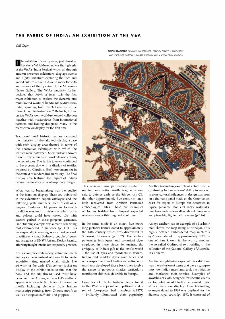
24 TA A S A R E V I E W V O L U M E 2 5 N O . 1
he exhibition Fabric of India, just closed at London’s V&A Museum, was the highlight
of the V&A’s ‘India Festival’ which all through autumn presented exhibitions, displays, events and digital initiatives exploring the ‘rich and varied culture of South Asia’ to mark the 25th anniversary of the opening of the Museum’s Nehru Gallery. The V&A’s publicity further declares that Fabric of India ‘…is the first major exhibition to explore the dynamic and multifaceted world of handmade textiles from India, spanning from the 3rd century to the present day’. Featuring over 200 objects, it drew on the V&A’s own world-renowned collection together with masterpieces from international partners and leading designers. Many of the pieces were on display for the first time.
Traditional and historic textiles occupied the majority of the allotted display space with each display area themed in terms of the decorative techniques with which the textiles were patterned. Short videos showed present day artisans at work demonstrating the techniques. The textile journey continued to the present day with a display of textiles inspired by Gandhi’s khadi movement set in the context of modern Indian history. The final display area featured the impact of India’s decorative mastery on contemporary design.
What was so breathtaking was the quality of the items on display. These are published in the exhibition’s superb catalogue and the following plate numbers refer to catalogue images. Centuries old pieces in top-notch condition conjured up visions of what courts and palaces could have looked like with patrons garbed in these gorgeous garments. One stunning example was a man’s silk riding coat embroidered in ari work (pl. 111). This was especially interesting as an expert ari work practitioner visited Sydney a couple of years ago as a guest of UNSW Art and Design Faculty, affording insight into its contemporary practice.
Ari is a complex embroidery technique which employs a hook instead of a needle to create exquisitely fine, massed chain stitch. The ari work of the early 17th century jacket on display at the exhibition is so fine that the hook and the silk thread used must have been hair thin. Adding to the jacket’s aesthetic appeal was its eclectic choice of decorative motifs including elements from Iranian manuscript painting, from Chinese motifs as well as European daffodils and poppies.
This reviewer was particularly excited to see two rare cotton textile fragments, one said to date as early as the 8th century CE, the other approximately five centuries later, both recovered from Arabian Peninsula archaeological sites. These are examples of Indian textiles from Gujarat exported westwards over this long period of time.
In the same mode is an intact, five metre long pictorial banner dated to approximately the 14th century which was discovered in Sulawesi, Indonesia (pl. 157). The surface patterning techniques and colourfast dyes employed in these pieces demonstrate the antiquity of India’s gift to the textile world – the use of dyes and mordants in textiles. Indigo and madder dyes gave blues and reds respectively and Indian expertise with mordants developed those basic dyes to give the range of gorgeous shades particularly manifest in chintz, so desirable in Europe.
Examples of chintz fashion items found in the West – a jacket and petticoat and a set of four-poster bed hangings (pl.174) - brilliantly illuminated their popularity.
Another fascinating example of a chintz textile confirming Indian artisans’ ability to respond to cross cultural influences in design was seen on a dramatic panel made on the Coromandel coast for export to Europe but decorated in typical Japanese motifs of rocky waterfalls, pine trees and cranes – all in vibrant blues, reds and pinks highlighted with creams (pl.176).
An eye catcher was an example of a Kashmir map shawl, the map being of Srinagar. This highly detailed embroidered map in ‘bird’s eye’ view, dated to approximately 1875, is one of four known in the world, another, the so called Godfrey shawl, residing in the collection of the National Gallery of Australia in Canberra.
Another enlightening aspect of this exhibition was the inclusion of items that gave a glimpse into how Indian merchants took the initiative and marketed their textiles. Examples of swatches of cloth designed for specific clients or for what would today be termed trade shows were on display. One fascinating example dated to 1869 was destined for the Siamese royal court (pl. 159). It consisted of
t H E F a B r i C o F i N d i a : a N E X H i B i t i o N a t t H E V & a
Gill GreentEXtilE FraGMENt, GUJaraT, INDIa 15Th -16Th cENTUrY, PrINTED aND MOrDaNT
aND rESIST-DYED cOTTON, IS.74-1972 ©VIcTOrIa aND aLBErT MUSEUM, LONDON
T
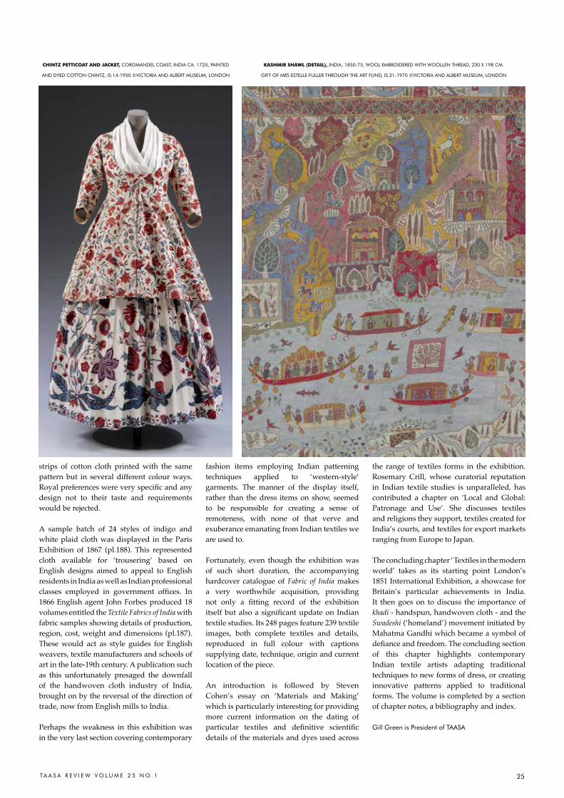
25TA A S A R E V I E W V O L U M E 2 5 N O . 1
strips of cotton cloth printed with the same pattern but in several different colour ways. Royal preferences were very specific and any design not to their taste and requirements would be rejected.
A sample batch of 24 styles of indigo and white plaid cloth was displayed in the Paris Exhibition of 1867 (pl.188). This represented cloth available for ‘trousering’ based on English designs aimed to appeal to English residents in India as well as Indian professional classes employed in government offices. In 1866 English agent John Forbes produced 18 volumes entitled the Textile Fabrics of India with fabric samples showing details of production, region, cost, weight and dimensions (pl.187). These would act as style guides for English weavers, textile manufacturers and schools of art in the late-19th century. A publication such as this unfortunately presaged the downfall of the handwoven cloth industry of India, brought on by the reversal of the direction of trade, now from English mills to India.
Perhaps the weakness in this exhibition was in the very last section covering contemporary
fashion items employing Indian patterning techniques applied to ‘western-style’ garments. The manner of the display itself, rather than the dress items on show, seemed to be responsible for creating a sense of remoteness, with none of that verve and exuberance emanating from Indian textiles we are used to.
Fortunately, even though the exhibition was of such short duration, the accompanying hardcover catalogue of Fabric of India makes a very worthwhile acquisition, providing not only a fitting record of the exhibition itself but also a significant update on Indian textile studies. Its 248 pages feature 239 textile images, both complete textiles and details, reproduced in full colour with captions supplying date, technique, origin and current location of the piece.
An introduction is followed by Steven Cohen’s essay on ‘Materials and Making’ which is particularly interesting for providing more current information on the dating of particular textiles and definitive scientific details of the materials and dyes used across
the range of textiles forms in the exhibition. Rosemary Crill, whose curatorial reputation in Indian textile studies is unparalleled, has contributed a chapter on ‘Local and Global: Patronage and Use’. She discusses textiles and religions they support, textiles created for India’s courts, and textiles for export markets ranging from Europe to Japan. The concluding chapter ‘ Textiles in the modern world’ takes as its starting point London’s 1851 International Exhibition, a showcase for Britain’s particular achievements in India. It then goes on to discuss the importance of khadi - handspun, handwoven cloth - and the Swadeshi (‘homeland’) movement initiated by Mahatma Gandhi which became a symbol of defiance and freedom. The concluding section of this chapter highlights contemporary Indian textile artists adapting traditional techniques to new forms of dress, or creating innovative patterns applied to traditional forms. The volume is completed by a section of chapter notes, a bibliography and index.
Gill Green is President of TaaSa
KaSHMir SHaWl (dEtail), INDIa, 1850-75, WOOL EMBrOIDErED WITh WOOLLEN ThrEaD, 230 X 198 cM.
GIFT OF MrS ESTELLE FULLEr ThrOUGh ThE arT FUND, IS.31-1970 ©VIcTOrIa aND aLBErT MUSEUM, LONDON
CHiNtz PEttiCoat aNd JaCKEt, cOrOMaNDEL cOaST, INDIa ca. 1725, PaINTED
aND DYED cOTTON chINTZ, IS.14-1950 ©VIcTOrIa aND aLBErT MUSEUM, LONDON

26 TA A S A R E V I E W V O L U M E 2 5 N O . 1
ne recent acquisition to the Charles Darwin University Art Collection is
a limited edition print created in 2003 by Dadang Christanto during a period when he lectured in Visual Arts at Charles Darwin University, Darwin (1999-2003).
In keeping with Christanto’s artistic practice, in which he revisits scenes of terrible crimes, this untitled print was his response to the horrific bali bombing in 2002 that killed 202 people, shocking both Balinese and Australians alike. The intensity of the thick, pointed black lines etched in the foreground conveys something of the destructive explosion of the bomb when detonated. The dismembered bodies scatter and eerily float in mid-air. Thick, flowing, painterly daubs of red ink contribute to this representation of mayhem, chaos and bloodshed, evoking the moment of the bomb’s impact.
The work complements another print by Christanto held in the CDU Art Collection. This print, also untitled, features the iconic head that Christanto repeatedly used in a series of works featured in his exhibition The Unspeakable Horror presented at Bentara Budaya, Jakarta in 2002. The image of the solitary head, smeared with blood, became a metaphor in Christanto’s art and installations that pays homage to the silent witness of
crime and man’s inhumanity. The head, as the repository of memory, was rendered by Christanto with elegance and simplicity. Using another single red line, he evoked trauma and pain through the vibrant, fresh, flowing blood. The face in this print can be considered to be either that of the artist or one face of the countless others who have suffered and survived similar trauma.
Christanto’s childhood experiences during the ‘killing times’ in Java, 1965-66, whereby state imposed military violence ‘disappeared’ thousands of Indonesians of Chinese background and purported Communist sympathisers, including his father, shaped his life and subsequent art practice. His art alludes to the personal and collective memory, both of this specific chapter in modern Indonesian history as well as to other forms of systemic violence perpetuated on innocent people. By depicting the witness, and by implication the victim, Christanto strives to pay homage to their memory and experience. His art seeks to make the invisible become visible and the forgotten to be remembered.
Christanto, who was born in Tegal, Java, Indonesia in 1957 studied art at the Yogyakarta Institute of Art. In 1999 he moved to Australia and lived in Darwin for three years. In collaboration with Basil Hall (Editioning
Manager at Northern Editions Printmaking Workshop and Lecturer in Printmaking at CDU’s School of Art, 1996-2002), Christanto made several prints. Adapting his fluid, signature drawing technique to a new medium resulted in these simple yet evocative etchings. Dadang Christanto continues his practice as an independent artist based in brisbane and is an adjunct academic at Griffith University. His art is held nationally in major public collections in Australia and overseas.
The Charles Darwin University Art Collection consists of more than 3,000 works of art. The focus of the Collection is works of art that are created by artists who reside in the Northern Territory or have connections with Northern Australia. The collection is displayed on CDU campuses and in exhibitions presented at the CDU Art Gallery, Casuarina campus, Darwin. See http://www.cdu.edu.au/
Joanna Barrkman is the curator, art collection and art
Gallery, charles Darwin University. She most recently
co-edited Textiles of Timor: Island in the Woven Sea
with roy W. hamilton, Fowler Museum, UcLa Press.
She is currently a doctoral candidate at aNU.
rEFErENCEKengerian tak terucapkan (The Unspeakable Horror), 4-14 July,
2002, Bentara Budaya, Jakarta, curated by hendro Wardhani
O
i N t H E P U B l i C d o M a i N : P r I N T S B Y D a D a N G c h r I S Ta N TO I N T h E
c h a r L E S D a r W I N U N I V E r S I T Y a r T c O L L E c T I O N
Joanna Barrkman
Far lEFt:
UnTITLEd, DaDaNG chrISTaNTO,
2001, ETchING ON hahNEMUhLE
PaPEr, 21 X 16.5cM [IMaGE];
39.5 X 35.5cM [PaPEr], WOrKShOP
PrOOF, EDITION OF 20, PrINTEr
PrESUMED: MONIQUE aUrIcchIO,
cOLLaBOraTOr: BaSIL haLL, GIFTED
BY ThE arTIST aND NOrThErN
EDITIONS PrINTMaKING STUDIO,
2002, charLES DarWIN UNIVErSITY
arT cOLLEcTION
lEFt:
UnTITLEd, DaDaNG chrISTaNTO,
2003, ETchING ON hahNEMUhLE
PaPEr, 31 X 28 cM [IMaGE];
53 X 41 cM [PaPEr], EDITION
NUMBEr: 10/10, PrINTEr
PrESUMED: MONIQUE aUrIcchIO,
cOLLaBOraTOr: BaSIL haLL,
acQUIrED BY ThE cDU
FOUNDaTION, 2015, charLES
DarWIN UNIVErSITY
arT cOLLEcTION
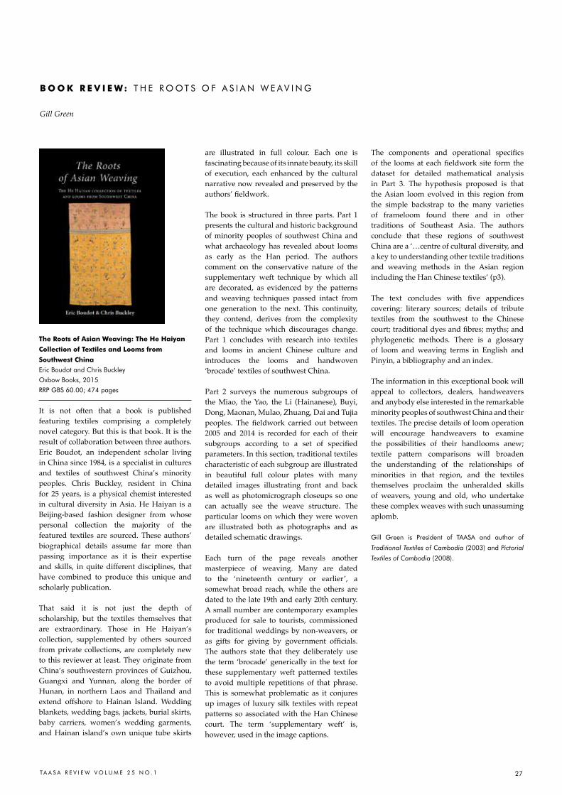
27Ta a S a r E V I E W V O L U M E 2 5 N O . 1
the roots of asian Weaving: the He Haiyan
Collection of textiles and looms from
Southwest China
Eric Boudot and chris Buckley
Oxbow Books, 2015
rrP GBS 60.00; 474 pages
It is not often that a book is published featuring textiles comprising a completely novel category. But this is that book. It is the result of collaboration between three authors. Eric Boudot, an independent scholar living in China since 1984, is a specialist in cultures and textiles of southwest China’s minority peoples. Chris Buckley, resident in China for 25 years, is a physical chemist interested in cultural diversity in Asia. He Haiyan is a Beijing-based fashion designer from whose personal collection the majority of the featured textiles are sourced. These authors’ biographical details assume far more than passing importance as it is their expertise and skills, in quite different disciplines, that have combined to produce this unique and scholarly publication.
That said it is not just the depth of scholarship, but the textiles themselves that are extraordinary. Those in He Haiyan’s collection, supplemented by others sourced from private collections, are completely new to this reviewer at least. They originate from China’s southwestern provinces of Guizhou, Guangxi and Yunnan, along the border of Hunan, in northern Laos and Thailand and extend offshore to Hainan Island. Wedding blankets, wedding bags, jackets, burial skirts, baby carriers, women’s wedding garments, and Hainan island’s own unique tube skirts
are illustrated in full colour. Each one is fascinating because of its innate beauty, its skill of execution, each enhanced by the cultural narrative now revealed and preserved by the authors’ fieldwork.
The book is structured in three parts. Part 1 presents the cultural and historic background of minority peoples of southwest China and what archaeology has revealed about looms as early as the Han period. The authors comment on the conservative nature of the supplementary weft technique by which all are decorated, as evidenced by the patterns and weaving techniques passed intact from one generation to the next. This continuity, they contend, derives from the complexity of the technique which discourages change. Part 1 concludes with research into textiles and looms in ancient Chinese culture and introduces the looms and handwoven ‘brocade’ textiles of southwest China.
Part 2 surveys the numerous subgroups of the Miao, the Yao, the Li (Hainanese), Buyi, Dong, Maonan, Mulao, Zhuang, Dai and Tujia peoples. The fieldwork carried out between 2005 and 2014 is recorded for each of their subgroups according to a set of specified parameters. In this section, traditional textiles characteristic of each subgroup are illustrated in beautiful full colour plates with many detailed images illustrating front and back as well as photomicrograph closeups so one can actually see the weave structure. The particular looms on which they were woven are illustrated both as photographs and as detailed schematic drawings.
Each turn of the page reveals another masterpiece of weaving. Many are dated to the ‘nineteenth century or earlier’, a somewhat broad reach, while the others are dated to the late 19th and early 20th century. A small number are contemporary examples produced for sale to tourists, commissioned for traditional weddings by non-weavers, or as gifts for giving by government officials. The authors state that they deliberately use the term ‘brocade’ generically in the text for these supplementary weft patterned textiles to avoid multiple repetitions of that phrase. This is somewhat problematic as it conjures up images of luxury silk textiles with repeat patterns so associated with the Han Chinese court. The term ‘supplementary weft’ is, however, used in the image captions.
The components and operational specifics of the looms at each fieldwork site form the dataset for detailed mathematical analysis in Part 3. The hypothesis proposed is that the Asian loom evolved in this region from the simple backstrap to the many varieties of frameloom found there and in other traditions of Southeast Asia. The authors conclude that these regions of southwest China are a ‘…centre of cultural diversity, and a key to understanding other textile traditions and weaving methods in the Asian region including the Han Chinese textiles’ (p3).
The text concludes with five appendices covering: literary sources; details of tribute textiles from the southwest to the Chinese court; traditional dyes and fibres; myths; and phylogenetic methods. There is a glossary of loom and weaving terms in English and Pinyin, a bibliography and an index.
The information in this exceptional book will appeal to collectors, dealers, handweavers and anybody else interested in the remarkable minority peoples of southwest China and their textiles. The precise details of loom operation will encourage handweavers to examine the possibilities of their handlooms anew; textile pattern comparisons will broaden the understanding of the relationships of minorities in that region, and the textiles themselves proclaim the unheralded skills of weavers, young and old, who undertake these complex weaves with such unassuming aplomb.
Gill Green is President of TaaSa and author of
Traditional Textiles of Cambodia (2003) and Pictorial
Textiles of Cambodia (2008).
B o o K r E V i E W: T h E r O OT S O F a S I a N W E a V I N G
Gill Green
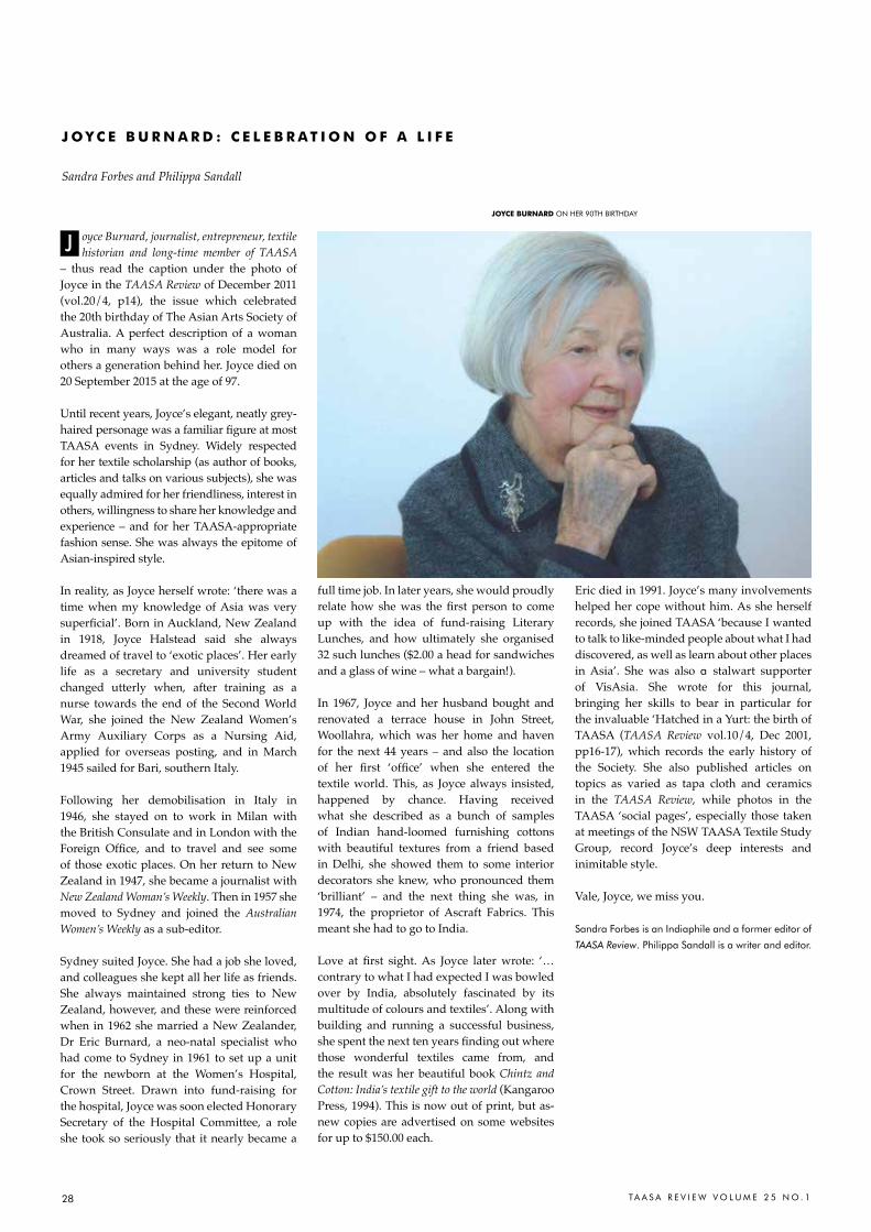
28 TA A S A R E V I E W V O L U M E 2 5 N O . 1
oyce Burnard, journalist, entrepreneur, textile historian and long-time member of TAASA
– thus read the caption under the photo of Joyce in the TAASA Review of December 2011 (vol.20/4, p14), the issue which celebrated the 20th birthday of The Asian Arts Society of Australia. A perfect description of a woman who in many ways was a role model for others a generation behind her. Joyce died on 20 September 2015 at the age of 97.
Until recent years, Joyce’s elegant, neatly grey-haired personage was a familiar figure at most TAASA events in Sydney. Widely respected for her textile scholarship (as author of books, articles and talks on various subjects), she was equally admired for her friendliness, interest in others, willingness to share her knowledge and experience – and for her TAASA-appropriate fashion sense. She was always the epitome of Asian-inspired style.
In reality, as Joyce herself wrote: ‘there was a time when my knowledge of Asia was very superficial’. born in Auckland, new Zealand in 1918, Joyce Halstead said she always dreamed of travel to ‘exotic places’. Her early life as a secretary and university student changed utterly when, after training as a nurse towards the end of the Second World War, she joined the New Zealand Women’s Army Auxiliary Corps as a Nursing Aid, applied for overseas posting, and in March 1945 sailed for Bari, southern Italy.
Following her demobilisation in Italy in 1946, she stayed on to work in Milan with the British Consulate and in London with the Foreign Office, and to travel and see some of those exotic places. On her return to New Zealand in 1947, she became a journalist with New Zealand Woman’s Weekly. Then in 1957 she moved to Sydney and joined the Australian Women’s Weekly as a sub-editor.
Sydney suited Joyce. She had a job she loved, and colleagues she kept all her life as friends. She always maintained strong ties to New Zealand, however, and these were reinforced when in 1962 she married a New Zealander, Dr Eric Burnard, a neo-natal specialist who had come to Sydney in 1961 to set up a unit for the newborn at the Women’s Hospital, Crown Street. Drawn into fund-raising for the hospital, Joyce was soon elected Honorary Secretary of the Hospital Committee, a role she took so seriously that it nearly became a
full time job. In later years, she would proudly relate how she was the first person to come up with the idea of fund-raising Literary Lunches, and how ultimately she organised 32 such lunches ($2.00 a head for sandwiches and a glass of wine – what a bargain!).
In 1967, Joyce and her husband bought and renovated a terrace house in John Street, Woollahra, which was her home and haven for the next 44 years – and also the location of her first ‘office’ when she entered the textile world. This, as Joyce always insisted, happened by chance. Having received what she described as a bunch of samples of Indian hand-loomed furnishing cottons with beautiful textures from a friend based in Delhi, she showed them to some interior decorators she knew, who pronounced them ‘brilliant’ – and the next thing she was, in 1974, the proprietor of Ascraft Fabrics. This meant she had to go to India.
Love at first sight. As Joyce later wrote: ‘… contrary to what I had expected I was bowled over by India, absolutely fascinated by its multitude of colours and textiles’. Along with building and running a successful business, she spent the next ten years finding out where those wonderful textiles came from, and the result was her beautiful book Chintz and Cotton: India’s textile gift to the world (Kangaroo Press, 1994). This is now out of print, but as-new copies are advertised on some websites for up to $150.00 each.
Eric died in 1991. Joyce’s many involvements helped her cope without him. As she herself records, she joined TAASA ‘because I wanted to talk to like-minded people about what I had discovered, as well as learn about other places in Asia’. She was also a stalwart supporter of VisAsia. She wrote for this journal, bringing her skills to bear in particular for the invaluable ‘Hatched in a Yurt: the birth of TAASA (TAASA Review vol.10/4, Dec 2001, pp16-17), which records the early history of the Society. She also published articles on topics as varied as tapa cloth and ceramics in the TAASA Review, while photos in the TAASA ‘social pages’, especially those taken at meetings of the NSW TAASA Textile Study Group, record Joyce’s deep interests and inimitable style.
Vale, Joyce, we miss you.
Sandra Forbes is an Indiaphile and a former editor of
TAASA Review. Philippa Sandall is a writer and editor.
J o Y C E B U r N a r d : C E l E B r a t i o N o F a l i F E
Sandra Forbes and Philippa Sandall
JoYCE BUrNard ON hEr 90Th BIrThDaY
J
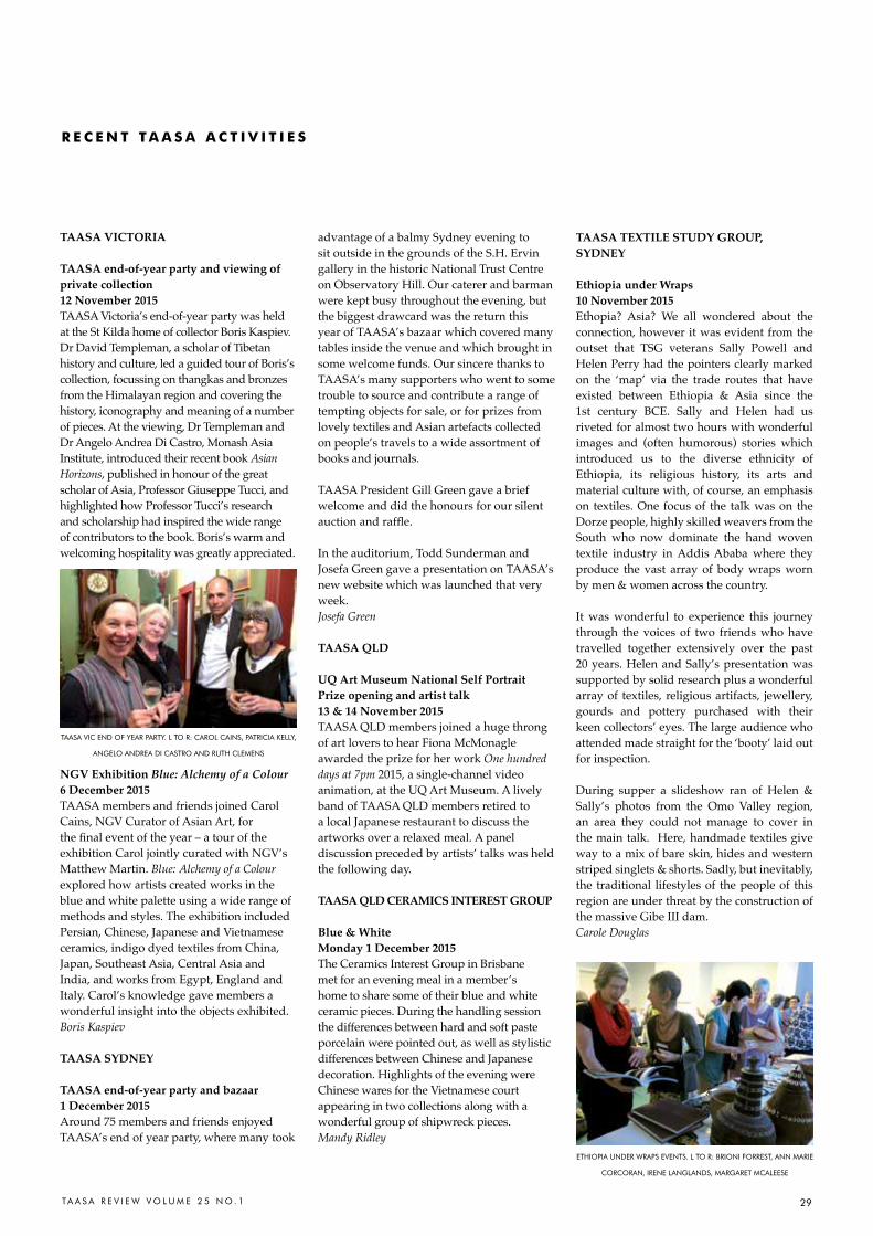
TA A S A R E V I E W V O L U M E 2 5 N O . 1 29
TAASA VICTORIA
TAASA end-of-year party and viewing of private collection12 November 2015TAASA Victoria’s end-of-year party was held at the St Kilda home of collector Boris Kaspiev. Dr David Templeman, a scholar of Tibetan history and culture, led a guided tour of Boris’s collection, focussing on thangkas and bronzes from the Himalayan region and covering the history, iconography and meaning of a number of pieces. At the viewing, Dr Templeman and Dr Angelo Andrea Di Castro, Monash Asia Institute, introduced their recent book Asian Horizons, published in honour of the great scholar of Asia, Professor Giuseppe Tucci, and highlighted how Professor Tucci’s research and scholarship had inspired the wide range of contributors to the book. Boris’s warm and welcoming hospitality was greatly appreciated.
NGV Exhibition Blue: Alchemy of a Colour6 December 2015TAASA members and friends joined Carol Cains, NGV Curator of Asian Art, for the final event of the year – a tour of the exhibition Carol jointly curated with NGV’s Matthew Martin. Blue: Alchemy of a Colour explored how artists created works in the blue and white palette using a wide range of methods and styles. The exhibition included Persian, Chinese, Japanese and Vietnamese ceramics, indigo dyed textiles from China, Japan, Southeast Asia, Central Asia and India, and works from Egypt, England and Italy. Carol’s knowledge gave members a wonderful insight into the objects exhibited.Boris Kaspiev
TAASA SYDNEY
TAASA end-of-year party and bazaar1 December 2015Around 75 members and friends enjoyed TAASA’s end of year party, where many took
advantage of a balmy Sydney evening to sit outside in the grounds of the S.H. Ervin gallery in the historic National Trust Centre on Observatory Hill. Our caterer and barman were kept busy throughout the evening, but the biggest drawcard was the return this year of TAASA’s bazaar which covered many tables inside the venue and which brought in some welcome funds. Our sincere thanks to TAASA’s many supporters who went to some trouble to source and contribute a range of tempting objects for sale, or for prizes from lovely textiles and Asian artefacts collected on people’s travels to a wide assortment of books and journals.
TAASA President Gill Green gave a brief welcome and did the honours for our silent auction and raffle.
In the auditorium, Todd Sunderman and Josefa Green gave a presentation on TAASA’s new website which was launched that very week.Josefa Green
TAASA QLD
UQ Art Museum National Self Portrait Prize opening and artist talk13 & 14 November 2015TAASA QLD members joined a huge throng of art lovers to hear Fiona McMonagle awarded the prize for her work One hundred days at 7pm 2015, a single-channel video animation, at the UQ Art Museum. A lively band of TAASA QLD members retired to a local Japanese restaurant to discuss the artworks over a relaxed meal. A panel discussion preceded by artists’ talks was held the following day.
TAASA QLD CERAMICS INTEREST GROUP
Blue & WhiteMonday 1 December 2015The Ceramics Interest Group in Brisbane met for an evening meal in a member’s home to share some of their blue and white ceramic pieces. During the handling session the differences between hard and soft paste porcelain were pointed out, as well as stylistic differences between Chinese and Japanese decoration. Highlights of the evening were Chinese wares for the Vietnamese court appearing in two collections along with a wonderful group of shipwreck pieces. Mandy Ridley
TAASA TEXTILE STUDY GROUP, SYDNEY
Ethiopia under Wraps 10 November 2015Ethopia? Asia? We all wondered about the connection, however it was evident from the outset that TSG veterans Sally Powell and Helen Perry had the pointers clearly marked on the ‘map’ via the trade routes that have existed between Ethiopia & Asia since the 1st century BCE. Sally and Helen had us riveted for almost two hours with wonderful images and (often humorous) stories which introduced us to the diverse ethnicity of Ethiopia, its religious history, its arts and material culture with, of course, an emphasis on textiles. One focus of the talk was on the Dorze people, highly skilled weavers from the South who now dominate the hand woven textile industry in Addis Ababa where they produce the vast array of body wraps worn by men & women across the country.
It was wonderful to experience this journey through the voices of two friends who have travelled together extensively over the past 20 years. Helen and Sally’s presentation was supported by solid research plus a wonderful array of textiles, religious artifacts, jewellery, gourds and pottery purchased with their keen collectors’ eyes. The large audience who attended made straight for the ‘booty’ laid out for inspection.
During supper a slideshow ran of Helen & Sally’s photos from the Omo Valley region, an area they could not manage to cover in the main talk. Here, handmade textiles give way to a mix of bare skin, hides and western striped singlets & shorts. Sadly, but inevitably, the traditional lifestyles of the people of this region are under threat by the construction of the massive Gibe III dam. Carole Douglas
r E C E N t t a a S a a C t i V i t i E S
TaaSa VIc END OF YEar ParTY. L TO r: carOL caINS, PaTrIcIa KELLY,
aNGELO aNDrEa DI caSTrO aND rUTh cLEMENS
EThIOPIa UNDEr WraPS EVENTS. L TO r: BrIONI FOrrEST, aNN MarIE
cOrcOraN, IrENE LaNGLaNDS, MarGarET McaLEESE
30 TA A S A R E V I E W V O L U M E 2 5 N O . 1
TAASA IN NSW
TAASA TEXTILE STUDY GROUPThe TSG meets in the Annie Wyatt Room at the S.H Ervin Gallery, Observatory Hill in Millers Point from 6 – 8pm. Light refreshments provided. $15 members, $20 non-members. The venue is close to Wynyard station and parking is available on site. Enquiries to Marianne Hulsbosch: [email protected].
Tuesdays 8 March Sandy Watson: The Arts & Culture of the KaTu Peoples of Laos - an illustrated travelogue Tuesday 10 MayGill Green: A visit to the new Museum of Traditional Textiles, Siem Reap, Cambodia
TAASA CERAMICS STUDY GROUP
Lecture: Inside a Collector’s Head Thursday 10 March 2016, 6 – 8pmSH Ervin Gallery, Observatory Hill, SydneyWhy do collectors collect? Our guest lecturer Dr Shirley Mueller’s background in neurology and psychiatry made her curious about her own collecting choices. Shirley explores neuroeconomics, the new science behind big buying decisions, illustrating her talk with specific examples from her collection – one of the most important private holdings of Chinese export porcelains in the USA.Cost: $15 members, $20 non-members. Light refreshments available.
TAASA IN VICTORIATour of the Warhol | Ai Weiwei exhibitionSunday 6 March, 2-3.30pm
A special guided tour at the NGV for TAASA members of this major international exhibition of more than 300 works. Cost: $23.40. RSVP [email protected] by 1 March 2016. Tour of textile exhibition Threads of AsiaSaturday 23 April, 2-4pmJoin a special guided tour with textiles expert, embroiderer and Guild member Lesley Uren of an exhibition Threads of Asia drawn from the collection of the Victorian Embroiderers Guild. The exhibition includes traditional and contemporary Asian embroideries, covering accessories and garments from China, Japan and other Asian countries. Embroidery House, 170 Wattletree Road, Malvern, preceded by lunch at 12pm. Lunch venue tba. Cost $10, excluding lunch. RSVP [email protected] by 15 April. TAASA Study Day: Japanese woodblock prints – traditional and contemporaryFriday 20 May, 10.30am – 4pmFrom 10.30am to 12pm, join NGV Curator of Asian Art, Wayne Crothers, for a private examination in the NGV’s viewing room of the 300 year tradition of Ukiyo-e (woodblock prints). After lunch nearby (venue tba) we will visit the Richmond studio of contemporary Japanese print maker Ema Shin. Ema has held solo exhibitions in Japan and Korea, and has been selected for numerous international group exhibitions. From 2-4pm, she will talk about her work and contemporary Japanese print making. Cost: $20, not including lunch or transport. $25 non-members. RSVP essential, limited numbers: [email protected] by 29 April.
Further information on TAASA Victoria events: Boris Kaspiev on 0421 038 491.
TAASA IN QUEENSLAND
TAASA QLD CERAMICS INTEREST GROUP
Japanese pottery traditions - old and newTuesday 15 March at 7pmMembers are invited to bring pieces for discussion and identification .The event is to be held at a member’s home at St Lucia, starting with a light meal. Cost $10. RSVP: [email protected]
Thursday 19 May at 6pmPrivate exhibition viewing: Holding Possibility at Percolator GalleryMembers are invited to a private viewing of Kerry Holland’s exhibition of ceramics and paintings, entitled Holding Possibility showing at the Percolator Gallery, 134 Latrobe Terrace, Paddington. Cost $10. Followed by dinner at a nearby Thai restaurant (own cost). RSVP: [email protected]
TAASA QLD TEXTILE INTEREST GROUP
Exhibition opening: The Compulsive Collector: Batik, Tampan, Tapis.Sunday 13 March, 3 - 5pmMembers are invited to the opening of a special exhibition, The Compulsive Collector: Batik, Tampan, Tapis, organised by Janet De Boer at Gallery 159, 159 Payne Road, The Gap, Brisbane. See What’s On for details. This is a free event. RSVP: [email protected]
taaSa MEMBErS’ diarY
M a r c h - M aY 2 0 1 6
ISLAMIC INFLUENCES IN ASIAN ARTS AND CULTURE
TAASA Monday Night Lecture Series 2016Venue: Sydney Mechanics School of Arts, 280 Pitt St SydneyAll events 6-8pm. Drinks & refreshments served. Please visit TAASA’s website for further details. www.taasa.org.au.
Monday 4 April 2016Life was a picnic in the spring: Palace Architecture and the Pursuit of Pleasure in the Ottoman ‘Tulip Era’ 1718-1730. Dr Susan Scollay FRAS: an independent art historian who specialises in the Islamic world, with a focus on the art and architecture of the Ottoman Empire.
Monday 2 May 2016View from the Shore: the impact of globalisation on the art and culture of Indonesia during the Age of SpicesJames Bennett: Curator of Asian Art at the Art Gallery of the South Australia and co-curator of the recent widely acclaimed exhibition Treasure ships: Art in the age of spices.
Monday 6 June 2016 The artistic and cultural relationship between Venice and the Islamic worldDr Stefano Carboni: Director and CEO, Art Gallery of Western Australia
Monday 1 August 2016 An Archaeologist in Shangri la: Exploring the early history of Kashmir Prof Alison Betts: Professor of Silk Road Studies, University of Sydney
Monday 5 September 2016tbaMatt Cox: Assistant Curator, Asian Art, AGNSW
Cost & bookingMembers $25 per lecture, $30 non-members booking confirmation to Jillian Kennedy. Email: [email protected], Tel: 029958 7378Bookings and payment in advance essential. No refunds.Payment by EFT:The Asian Arts Society of AustraliaBSB: 012-003, Account No. 2185-28414. Please provide name.Pay by credit card via TAASA website www.taasa.org.au.
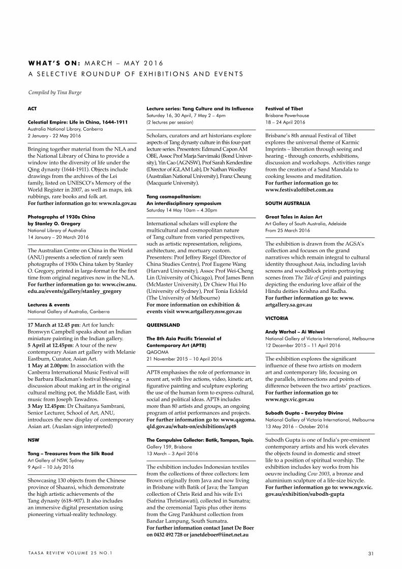
31TA A S A R E V I E W V O L U M E 2 5 N O . 1
W H a t ’ S o N : M a r c h – M aY 2 0 1 6
a S E L E c T I V E r O U N D U P O F E X h I B I T I O N S a N D E V E N T S
Compiled by Tina Burge
aCt
Celestial Empire: life in China, 1644-1911australia National Library, canberra2 January - 22 May 2016
Bringing together material from the NLA and the National Library of China to provide a window into the diversity of life under the Qing dynasty (1644-1911). Objects include drawings from the archives of the Lei family, listed on UNESCO’s Memory of the World Register in 2007, as well as maps, ink rubbings, rare books and folk art. For further information go to: www.nla.gov.au
Photographs of 1930s China by Stanley o. GregoryNational Library of australia14 January – 20 March 2016
The Australian Centre on China in the World (ANU) presents a selection of rarely seen photographs of 1930s China taken by Stanley O. Gregory, printed in large-format for the first time from original negatives now in the NLA.For further information go to: www.ciw.anu.edu.au/events/gallery/stanley_gregory
lectures & eventsNational Gallery of australia, canberra 17 March at 12.45 pm: Art for lunch: Bronwyn Campbell speaks about an Indian miniature painting in the Indian gallery.5 April at 12.45pm: A tour of the new contemporary Asian art gallery with Melanie Eastburn, Curator, Asian Art.1 May at 2.00pm: In association with the Canberra International Music Festival will be Barbara Blackman’s festival blessing - a discussion about making art in the original cultural melting pot, the Middle East, with music from Joseph Tawadros.3 May 12.45pm: Dr Chaitanya Sambrani, Senior Lecturer, School of Art, ANU, introduces the new display of contemporary Asian art. (Auslan sign interpreted)
NSW
tang – treasures from the Silk roadart Gallery of NSW, Sydney9 april – 10 July 2016
Showcasing 130 objects from the Chinese province of Shaanxi, which demonstrate the high artistic achievements of the Tang dynasty (618–907). It also includes an immersive digital presentation using pioneering virtual-reality technology.
lecture series: tang Culture and its influence Saturday 16, 30 april, 7 May 2 – 4pm (2 lectures per session) Scholars, curators and art historians explore aspects of Tang dynasty culture in this four-part lecture series. Presenters: Edmund Capon AM OBE, Assoc Prof Marja Sarvimaki (Bond Univer-sity), Yin Cao (AGNSW), Prof Sarah Kenderdine (Director of iGLAM Lab), Dr Nathan Woolley (Australian National University), Franz Cheung (Macquarie University). tang cosmopolitanism: an interdisciplinary symposium Saturday 14 May 10am – 4.30pm
International scholars will explore the multicultural and cosmopolitan nature of Tang culture from varied perspectives, such as artistic representation, religions, architecture, and mortuary custom.Presenters: Prof Jeffrey Riegel (Director of China Studies Centre), Prof Eugene Wang (Harvard University), Assoc Prof Wei-Cheng Lin (University of Chicago), Prof James Benn (McMaster University), Dr Chiew Hui Ho (University of Sydney), Prof Tonia Eckfeld (The University of Melbourne)For more information on exhibition & events visit www.artgallery.nsw.gov.au
QUEENSlaNd
the 8th asia Pacific triennial of Contemporary art (aPt8)QaGOMa21 November 2015 – 10 april 2016
APT8 emphasises the role of performance in recent art, with live actions, video, kinetic art, figurative painting and sculpture exploring the use of the human form to express cultural, social and political ideas. APT8 includes more than 80 artists and groups, an ongoing program of artist performances and projects.For further information go to: www.qagoma.qld.gov.au/whats-on/exhibitions/apt8
the Compulsive Collector: Batik, tampan, tapis. Gallery 159, Brisbane13 March – 3 april 2016
The exhibition includes Indonesian textiles from the collections of three collectors: Iem Brown originally from Java and now living in Brisbane with Batik of Java; the Tampan collection of Chris Reid and his wife Evi (Safrina Thristiawati), collected in Sumatra; and the ceremonial Tapis plus other items from the Greg Pankhurst collection from Bandar Lampung, South Sumatra. For further information contact Janet De Boer on 0432 492 728 or [email protected]
Festival of tibetBrisbane Powerhouse18 – 24 april 2016
Brisbane’s 8th annual Festival of Tibet explores the universal theme of Karmic Imprints – liberation through seeing and hearing - through concerts, exhibitions, discussion and workshops. Activities range from the creation of a Sand Mandala to cooking lessons and meditation. For further information go to: www.festivaloftibet.com.au
SoUtH aUStralia
Great tales in asian artart Gallery of South australia, adelaideFrom 25 March 2016
The exhibition is drawn from the AGSA’s collection and focuses on the grand narratives which remain integral to cultural identity throughout Asia, including lavish screens and woodblock prints portraying scenes from The Tale of Genji and paintings depicting the enduring love affair of the Hindu deities Krishna and Radha. For further information go to: www.artgallery.sa.gov.au
ViCtoria
andy Warhol – ai WeiweiNational Gallery of Victoria International, Melbourne12 December 2015 – 11 april 2016
The exhibition explores the significant influence of these two artists on modern art and contemporary life, focusing on the parallels, intersections and points of difference between the two artists’ practices. For further information go to: www.ngv.vic.gov.au
Subodh Gupta - Everyday divineNational Gallery of Victoria International, Melbourne13 May 2016 – October 2016
Subodh Gupta is one of India’s pre-eminent contemporary artists and his work elevates the objects found in domestic and street life to a position of spiritual worship. The exhibition includes key works from his oeuvre including Cow 2003, a bronze and aluminium sculpture of a life-size bicycle. For further information go to: www.ngv.vic.gov.au/exhibition/subodh-gupta