subliminal messages in aids communication: color and pattern
TRANSCRIPT

Subliminal Messages
in AIDS
Communication: Color and Pattern
byDonna Pido, Ph.D.
1996 (?)

Introduction
Designers are constantly concerned with the effectiveness of their products. For
industrial and craft designers, the product either sells or it doesn’t, giving
immediate but sometimes costly feedback. Graphic designers in the advertising
industry find out how effective their work is when sales of the client’s product
change for better or for worse. In the health education field, the designer’s
feedback is usually more subtle and takes longer to come through. Often funding patterns make it impossible for the
designer or the agency commissioning the design inputs to go back and test impacts. Medically trained clients are a difficult lot for designers to work with because they know that they are always right and they tend not to be sensitive to nuances in communication. But for the graphic
designer, those nuances make the difference between success and failure.

The social marketing of behavior options for better health is done through in Information, Education and Communication Materials, known as IEC. These can be anything from pop music, to
theater, to T shirts, and other print materials. In the Age
of AIDS, the communicative and persuasive qualities of IEC materials can no longer be a matter of guesswork. The designer’s ability to communicate effectively can be a matter of life
and death.
There are several vehicles for message delivery in IEC materials. Among these are composition, text, image and color. Within each category of message delivery, there may be several levels in message transmission both direct and indirect. In addition to the direct and open messages
delivered in IEC materials, there is a variety of subliminal possibilities that can either
reinforce and verify or mitigate and contradict the directly delivered messages. Materials developers often neglect consideration of
subliminal messages in favor of the more direct aspects of images and text.
This study focuses on the use of color and pattern to deliver subliminal messages. It is based on extensive archival and field study of African color systems and the
symbolism associated with color in African cultures. It includes the findings of long term observation of the use of color by
Kenyans. Hypotheses regarding the meaning of color and pattern were tested with a limited sample during development of the JISIMAMIE Campaign and other materials pretests.
Findings indicate that, in spite of extensive social, cultural and generational change in Kenya, the fundamental symbolism of color
remains intact and is an important factor in viewers’ interpretation of IEC messages
regarding STD/HIV/AIDS.

This article begins with a description of a generalized system of meaning for basic colors in “Subsaharan” African cultures. It goes on to a discussion of simple value patterns and their universal visual interpretation.
Subliminal color messages in selected IEC materials are then analyzed
accordingly. The analysis reveals that, if the assumptions are correct, then these materials are contradicting their verbal and pictorial messages with conflicting use of color.
Several tests of subliminal color messages were built into the pretest of
the JISIMAMIE materials. Three of these and their results are described.

A cultural universal in Africa from the Sahara to the Cape, is the division of colors into three basic categories, black, white and red.
Grays, bluish purples and all blues are in the BLACK category Very pale and relatively pale colors are in the WHITE category
Pinks, oranges and browns are in the RED category

Black/Blue stands for the cool, God, good health, well being, safety and optimistic hope of a
positive outcome in situations of uncertaintyRed/Brown stands for the hot, dry, illness, trouble, danger, bad news and negative
outcome in situations of uncertainty.

Green and yellow are additional colors with minor or no symbolic significance
Colors of the same or different hues can be called black and white depending on their
contrast or relative saturation

Kenyans tend to -
Wear black, blue or gray when they want things to turn out well,
Paint doors and windows blue,
Deliver bad news in red.

Quite apart from cultural interpretations of color, graphic designers apply the following visual principles:
Light spots on a dark ground expand and look beautiful.
BUT pale spots on a skin colored ground can look like a disease.
Dark spots on a light ground contract and look like blemishes.
Red spots on any ground can look like a disease.

If the above described understanding of colour and pattern is correct, then the use of spotted patterns can give messages regarding the health and disease status of people portrayed in IEC materials.
Dressing people in blue or setting messages and images in blue, gray or black should indicate a positive message about their health or the healthy qualities of the activity portrayed or invoked. Using red and spotted patterns may tell the viewer subliminally, below the level of conscious understanding, that the person or activity represented is somehow unhealthy, defective and risky.
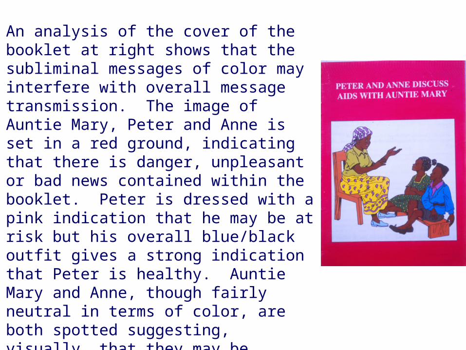
An analysis of the cover of the booklet at right shows that the subliminal messages of color may interfere with overall message transmission. The image of Auntie Mary, Peter and Anne is set in a red ground, indicating that there is danger, unpleasant or bad news contained within the booklet. Peter is dressed with a pink indication that he may be at risk but his overall blue/black outfit gives a strong indication that Peter is healthy. Auntie Mary and Anne, though fairly neutral in terms of color, are both spotted suggesting, visually, that they may be unhealthy.
The booklet contains very sound information for young children about HIV/AIDS, yet its cover interferes with message delivery through colour and pattern symbolism.

Using the red/black(blue) dichotomy as an analytical tool, the subliminal messages of the poster at right indicate strong contradiction. The image portrays two people gradually dying after a sexual encounter. It is neutral in placing responsibility on either of the victims. The colouration does not attribute more or less responsibility for infection to either gender. However the colouration does present conflicting messages about health and illness. Each of the two characters is dressed in healthy blue with unhealthy red accessories. The proportions of red and blue on their bodies do not change as they become ill and die. The entire image is set in a blue ground indicating that there is nothing wrong or amiss, and that, in fact, the whole environment of the story portrayed is one of pervasive well being.
The verbal messages presented in Kiswahili and English are contradictory in colouration. Tumia Mpira/Use Condoms and Ukimwi Huua/Aids Kills are presented in alternating red and black. Tumia Mpira and AIDS Kills , through their red colour, both indicate danger while Ukimwi Huua and Use condoms, imply well being, safety and good health through black.

The Photograph of the young man, above, was used on an AIDS-oriented calendar as one in a series of images illustrating AIDS related themes. This image was intended to portray abstinence. Pretest respondents felt that the young man was being antisocial by remaining alone in his cube. But they also felt that the predominant bluish/grayish surroundings conveyed a message of calm, peaceful safety for the young man.

Poster images and the comic book cover image overleaf illustrate unintended gender bias as well as mitigation of messages through color. In the poster at right, the husband/father is being admonished verbally to use condoms to protect his wife and children from AIDS. However, his blue/gray coloration indicates that he is healthy while the red and yellow spotted coloration of his wife’s dress give the strong subliminal message that she is dangerous and diseased. Even their small daughter is dressed in a partially red outfit while the son at least has blue shorts and black shoes.

The group of people on the poster at left, seated under a tree, includes a mixture of colors and patterns for both males and females. However, only males are wearing black/blue/grey while the most prominently seen females are dressed in spots including red on a light ground.

The image at left is taken from the cover of a comic book for adults. The two charactersrepresented are a married couple who have been endangered by the husband’s behaviour while thewife has remained faithful. Here the man is shown to be healthy and the faithful wife diseased,thus contradicting their actual characteristics in the story.
It was images like these, done by male artists and subliminally portraying females as dangerous ordiseased, that suggested a need for a gender bias test.

Testing became possible during the design phase of the JISIMAMIE Campaign
JISIMAMIE materials were a set of posters, booklets, leaflets, comic books and a badge aimed at six target audiences in Nyanza Province, Kenya. They were developed in a series of workshops including Ministry of Health staff, some target audience participants and consultant. They were pretested extensively in Nairobi and throughout Nyanza Province in 1997. Pretest samples were selected from the relevant target audiences for each material and from Ministry of Health staff. In this way, reports were received regarding self image as well as professional judgment on the materials
Three materials among the JISIMAMIE set offered good opportunities to test colour and gender bias. These were the health workers’ badge, a poster for youth out of school and a poster for commercial sex workers (CSW’s).

The image on the badge represents a male and female equally. Since the same image was repeated on circles of six different colors, the only test was for color preference. About 50 health workers, both male and female were asked to choose the badge they liked best. The overwhelming preference of both male and female health workers was the darker blue badge with the sky blue second. The choices of other colors were insignificant.

The image of a young man and woman holding condoms also presented the two genders equally without any pictorial or verbal interference in the viewers’ evaluation of either gender. The target audience pretest sample was small: 10 males and 10 females. Respondents were asked to look at the two images shown here without text and to choose the one they liked better. All of the males chose the man in blue and woman in red. All of the females chose the woman in blue and the man in red.

When asked why, all of the respondents said that their choice just looked better or that they liked it better for no particular reason. This was the only pretest in the JISIMAMIE set that yielded 100% agreement among all respondents. Each gender preferred, if given the choice, to see itself as healthy and the opposite gender as unhealthy or dangerous.
Commercial sex workers are very sensitive about the way they are represented. During materials development and pretest, they were the most articulate of all the target groups as to how they wanted to be seen. They wanted to be brown, a bit fat, healthy looking, and nicely dressed. They were acutely sensitive to stereotypical images of their profession so they wanted their dresses to cover their knees. Knowing of the social stigma attached to them, they wanted to look as “normal” as possible.

The materials developers decided to test the validity of the light spots on dark ground and dark spots on light ground idea using an image of a senior CSW. Pretest respondents were shown images similar to the ones above in which the woman wears a patterned dress, light on dark in one image and dark on light in the other. A majority of some 40 target audience respondents rejected both patterns.

In the final image the woman wears a solid colored dress to reflect her wholeness.
The reasons varied, but prominent among them was the notion that the spotted/flowered pattern made the woman look blemished, or mitigated.

A body of well known and published information has been drawn from the fields of Art History, Anthropology and Graphic Design. This information has been applied as a set of assumptions in the observational analysis of health communication materials in Kenya. This observational analysis has, in turn, revealed message confusion and gender bias in materials intended for Information, Education and Communication about Sexually Transmitted Diseases, and HIV/AIDS

A limited test of the assumptions was carried out in the course of pretesting materials forthe JISIM AM IE Campaign, and an AIDS calendar for 1998. Results verify the tenacity ofAfrican colour symbolism in association with health. They also point to the association ofcertain kinds of pattern with infirmity or defect.
These results indicate that materials developers and graphic designers may need toreassess the attention being paid to subliminal messages in IEC imagery.
The overall conclusion of this study is that more extensive testing of the assumptions madehere and of other information regarding African culture, symbolism and esthetics is neededin order to refine message delivery at the subliminal level. It is up to the designcommunity to aim high for effective communication and to refine our knowledge andunderstanding of the messages we are sending.

BibliographyBerlin, Brent, and Paul Kay
1969 Basic Color Terms. Berkeley: University of California Press
De Grandis, Luigina1986 The Theory and Use of Color. New York: Harry Abrams
Fraser, Douglas ed.1974 African Art as Philosophy. New York: Interbook
Klumpp, Donna (Pido)1987 M aasai Art and Society. PhD Thesis, Columbia University, New York, UM I
Pido, D. 1997a Consultant Report on JISIM AM IE for Kenya Belgium STD Control
Programme1997b Consultant Report on AIDS Calendar Pretest for Kenya Belgium STD
Control Programme
Thompson, Robert F.c1976 An Esthetic of the Cool. African Arts. Vol IX #2 Spring
Turner, Victor1967 The Forest of Symbols. Ithaca: Cornell University Press
1975 Revelation and Divinationin Ndembu Ritual. Ithaca: Cornell University Press