package design - cengage
TRANSCRIPT
01 understand the purpose of package design
02 learn about the package design process
03 be aware of sustainable design practices
04 appreciate the special role of audio package design
objectives
Package Design15
What is the PurPose of Package Design?If you saw an attractive package on display in a store, would you pick it up? An appealing package design can seduce you into purchasing a brand, at least once. Well-designed packag-ing can make a commodity (think tea, coffee, rice, eggs) look special. Conversely, poorly designed packaging can make a superior product look inferior. Poorly engineered packaging can infuriate the customer just as well-engineered packaging can facilitate the use of a product and increase brand loyalty.
Besides promoting a brand, packaging is functional; it encases and allows access to a product by means of a pour spout, flap, clasp, drawstring, or other device. Package design involves the complete strategic planning and designing of the form, structure, and appearance of a product’s package, which func-tions as casing, promotes a brand, presents information, and becomes a brand experience. It is a specialized area of graphic design, since package designers must be knowledgeable about a range of construction and technical factors. Familiarity with and knowledge of materials and their qualities—such as glass, plastic, paperboard, paper, and metal—and with manufactur-ing, safety, display, recycling, regulatory management, and quality standards, as well as printing, are necessary. Package designers work in collaboration with brand identity design-ers, marketing executives, product developers, manufacturers, industrial designers, and packaging engineers. Designers may also work as part of a group to develop the basic shape of the package, materials, and structure.
Project scoPe anD kinD: Package Design, BranDing, anD ProDuct DeveloPmentMost often, package design is one part of an integrated brand-ing program whose marketing strategy may feature a variety of
marketing initiatives, including promotions, product launches, and advertising. Think of a sub-brand for Pepsi (such as Diet Pepsi-), General Mills (such as Cheerios-), and 3M (such as Scotch-) and you can understand how the package design is part of an entire branding program from logo to mobile apps.
When package design is part of a brand identity program, other formats may include logo, visual identity, signage, gift cards, van graphics, and more, as shown in Case Study: All Seasons Wild Bird Store.
In Figure 15-1, Wal-Mart wanted to “up the style-quotient” of No Boundaries, its chief youth brand. The project’s scope included naming, identity, style guidelines, and packaging.
For Liz Earle Naturally Active Skincare (Figure 15-2), Turner Duckworth, London, designed an identity and several prod-ucts under the brand. “The idea contained within the iden-tity is that the logo combines a plant that turns into a flower made up of molecular diagrams to communicate the meeting of nature with science,” explains Turner Duckworth.
45529_ch15_ptg02_hr.indd 377 1/21/13 11:37 AM
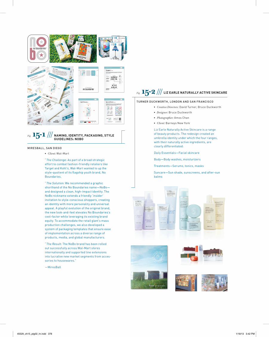
Fig. 15-1 /// naming, iDentity, Packaging, style guiDelines: noBo
MiresBall, san Diego
• Client:Wal-Mart
“TheChallenge:Aspartofabroadstrategicefforttocombatfashion-friendlyretailerslikeTargetandKohl’s,Wal-Martwantedtoupthestyle-quotientofitsflagshipyouthbrand,NoBoundaries.
“TheSolution:WerecommendedagraphicshorthandoftheNoBoundariesname—NoBo—anddesignedaclean,high-impactidentity.TheNoBonicknameextendsafriendly‘insider’invitationtostyle-consciousshoppers,creatinganidentitywithmorepersonalityanduniversalappeal.Aplayfulevolutionoftheoriginalbrand,thenewlook-and-feelelevatesNoBoundaries’scool-factorwhileleveragingitsexistingbrandequity.Toaccommodatetheretailgiant’smassproductionchallenges,wealsodevelopedasystemofpackagingtemplatesthatensureeaseofimplementationacrossadiverserangeofproducts,media,andglobalmanufacturers.
“TheResult:TheNoBobrandhasbeenrolledoutsuccessfullyacrossWal-Martstoresinternationallyandsupportedlineextensionsintolucrativenewmarketsegmentsfromacces-soriestohousewares.”
—MiresBall
Fig. 15-2 /// liz earle naturally active skincare
Turner DuckworTh, lonDon anD san Francisco
• Creative Directors:DavidTurner,BruceDuckworth
• Designer:BruceDuckworth
• Photographer:AmosChan
• Client:BarneysNewYork
LizEarleNaturallyActiveSkincareisarangeofbeautyproducts.Theredesigncreatedanumbrellaidentityunderwhichthefourranges,withtheirnaturallyactiveingredients,areclearlydifferentiated:
DailyEssentials—Facialskincare
Body—Bodywashes,moisturizers
Treatments—Serums,tonics,masks
Suncare—Sunshade,sunscreens,andafter-sunbalms
45529_ch15_ptg02_hr.indd 378 1/18/13 3:42 PM
If package design is part of a broader branding program, the design team meets with the brand identity designers or design director to ensure everyone works from the same core strategic platform. In addition, a package design project may be one in a line of products (think carbonated beverages in several flavors, diet and regular, caffeinated and caffeine-free). Thus, the team needs to examine the brand architecture, form/flavor differ-entiation, and identity standards. For most types of packaging, mandatory information—such as nutritional information or ingredients—must be included and considered when design-ing to comply with industry and federal regulations. Other issues, such as printing specs, structural specs, functional data (usage, durability, tamper resistance, and more), sustainable design, and copy are all addressed at the outset.
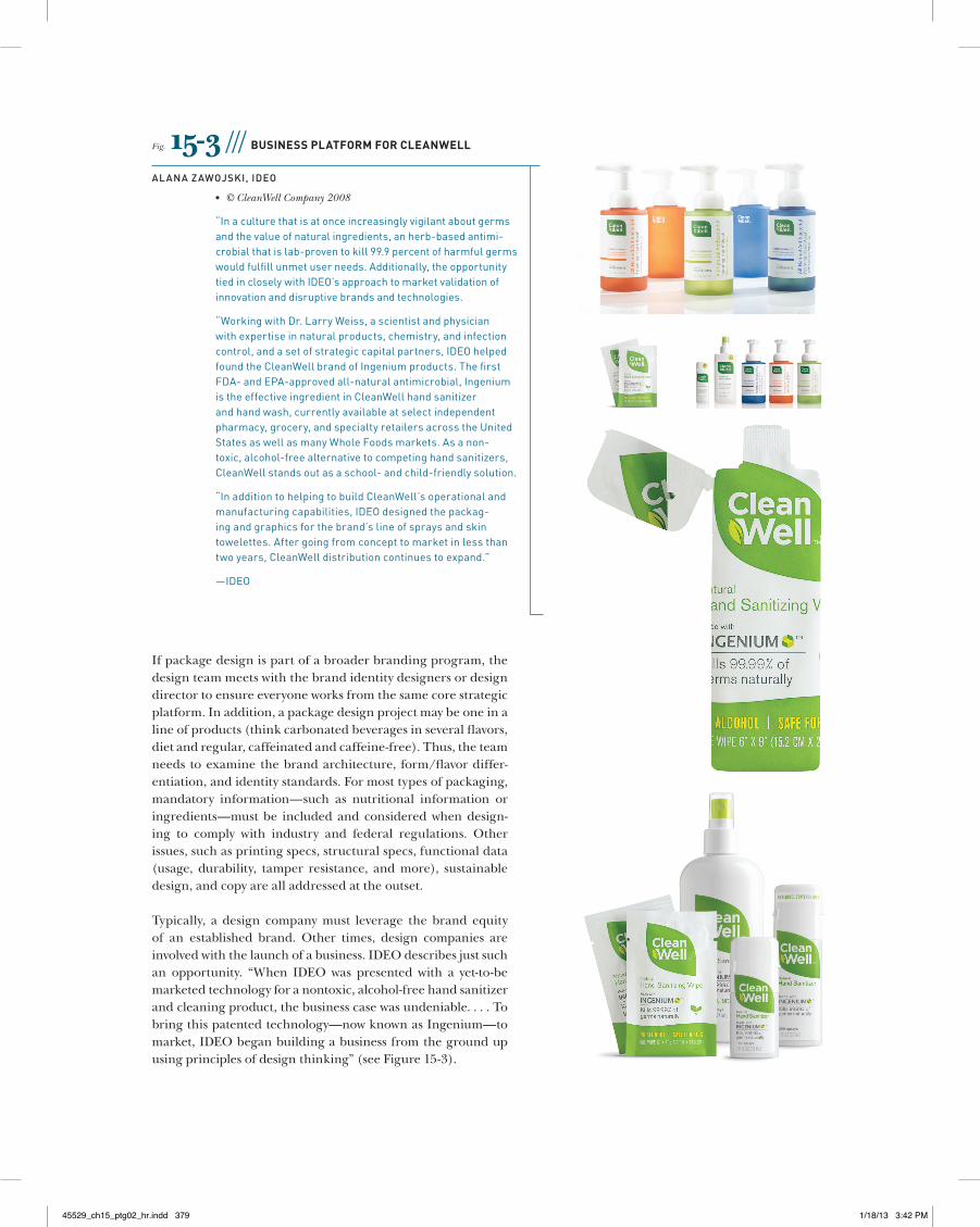
Typically, a design company must leverage the brand equity of an established brand. Other times, design companies are involved with the launch of a business. IDEO describes just such an opportunity. “When IDEO was presented with a yet-to-be marketed technology for a nontoxic, alcohol-free hand sanitizer and cleaning product, the business case was undeniable. . . . To bring this patented technology—now known as Ingenium—to market, IDEO began building a business from the ground up using principles of design thinking” (see Figure 15-3).
Fig. 15-3 /// Business Platform for cleanWell
alana Zawojski, iDeo
• © CleanWell Company 2008
“Inaculturethatisatonceincreasinglyvigilantaboutgermsandthevalueofnaturalingredients,anherb-basedantimi-crobialthatislab-proventokill99.9percentofharmfulgermswouldfulfillunmetuserneeds.Additionally,theopportunitytiedincloselywithIDEO’sapproachtomarketvalidationofinnovationanddisruptivebrandsandtechnologies.
“WorkingwithDr.LarryWeiss,ascientistandphysicianwithexpertiseinnaturalproducts,chemistry,andinfectioncontrol,andasetofstrategiccapitalpartners,IDEOhelpedfoundtheCleanWellbrandofIngeniumproducts.ThefirstFDA-andEPA-approvedall-naturalantimicrobial,IngeniumistheeffectiveingredientinCleanWellhandsanitizerandhandwash,currentlyavailableatselectindependentpharmacy,grocery,andspecialtyretailersacrosstheUnitedStatesaswellasmanyWholeFoodsmarkets.Asanon-toxic,alcohol-freealternativetocompetinghandsanitizers,CleanWellstandsoutasaschool-andchild-friendlysolution.
“InadditiontohelpingtobuildCleanWell’soperationalandmanufacturingcapabilities,IDEOdesignedthepackag-ingandgraphicsforthebrand’slineofspraysandskintowelettes.Aftergoingfromconcepttomarketinlessthantwoyears,CleanWelldistributioncontinuestoexpand.”
—IDEO
45529_ch15_ptg02_hr.indd 379 1/18/13 3:42 PM
naTional BranDs Versus sTore BranDsNational brands are products and services that are promoted and distributed nationally and often globally. If we examine one category—the beverage category—some national brand com-panies include Coca-Cola, Pepsi, and Cadbury Schweppes. Wal-lace Church was called on to “revitalize the Ocean Spray brand positioning, redesign its entire family of beverages, and launch an entirely new sub-brand, Juice & Tea.” Not only was it tasked with retaining all of the brand’s positive equities and visual cues, but Ocean Spray also desired to see significant changes in shelf impact, appetite appeal, and form/flavor differentiation. In the Case Study: Ocean Spray Juices, you can see how the package design looked before Wallace Church’s redesign.
Besides carrying national brands and boutique labels, retail store chains often offer their own branded products, called store brands, retailer brands, and private label brands. The model for store brands usually is either a house of brands, where each product is named and branded individually, or a branded house, where all products fall under one name, such as Wait-rose supermarkets in England, Scotland, and Wales. Turner Duckworth wanted its designs to reflect Waitrose’s values: “Effective, with style. Sales with wit. Originality with relevance” (Figure 15-4).
Package Design ProcessFive Phases of the Design Process:
Orientation Analysis Conception Design Implementation
During the first two phases of the design process, the client and design team define the problem, establish goals, and determine the project scope (project may include several brand extensions or sub-brands). They conduct any neces-sary research, including marketing and competitive audits, scrutinizing the competition, and understanding the target
audience, which may include focus groups, interviews, in-store observations, any other market research, and market intercep-tions (speaking to consumers in stores at the shelves). The team clarifies brand positioning (functional and emotional benefits, brand personality, specific features) and set strategy.
concePtual DesignThe concept underlying the package design solution must be relevant to the audience, on strategy with the broader brand identity. Any concept, visualization, and composition for a package design solution must make sense for the product cat-egory as well as be appealing and compelling to its audience, make an emotional connection with people, and of course, have on-shelf impact. Can the package design for a floor care appliance make an emotional connection with people? Inter-pret the sound of falling snow? Yes. BVD’s solution for Electro-lux (Figure 15-5) helped create demand with a waiting list for this limited edition vacuum cleaner.
The Psychology oF Package DesignPeople are often drawn to package design for emotional rather than rational reasons, such as price or ingredients. In The Cul-ture Code, Clotaire Rapaille offers startling insights into how Americans feel about products and why they buy as they do. For example, Rapaille theorizes Americans equate coffee with home, where perhaps as children they awoke to the aroma of morning coffee brewing. Therefore, following this argument, one should incorporate the concept of home into coffee pack-age design, branding, and advertising. As you will see by the examples in this chapter, there are many routes for developing a solid design concept for package design.
According to Louis Cheskin, a mid-twentieth-century market-ing innovator, people “transfer their perception of a package to the product it contains,” which he termed “sensation trans-ference.” That is, “The package is the product.” The aesthet-ics of the package design greatly affect our perception of the product’s value.
45529_ch15_ptg02_hr.indd 380 1/18/13 3:42 PM
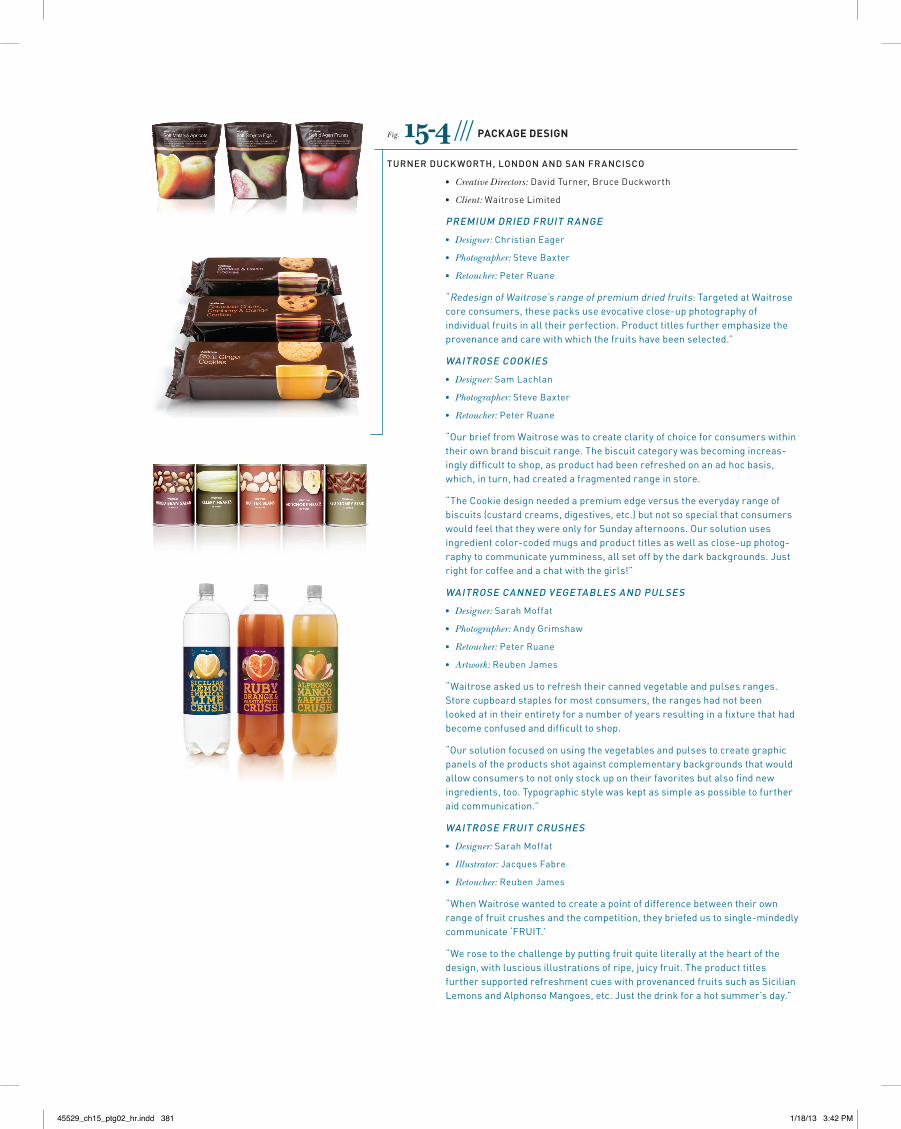
Fig. 15-4 /// Package Design
Turner DuckworTh, lonDon anD san Francisco
• Creative Directors:DavidTurner,BruceDuckworth
• Client:WaitroseLimited
PreMiuM DrieD FruiT range
• Designer:ChristianEager
• Photographer:SteveBaxter
• Retoucher:PeterRuane
“RedesignofWaitrose’srangeofpremiumdriedfruits:TargetedatWaitrosecoreconsumers,thesepacksuseevocativeclose-upphotographyofindividualfruitsinalltheirperfection.Producttitlesfurtheremphasizetheprovenanceandcarewithwhichthefruitshavebeenselected.”
waiTrose cookies
• Designer:SamLachlan
• Photographer:SteveBaxter
• Retoucher:PeterRuane
“OurbrieffromWaitrosewastocreateclarityofchoiceforconsumerswithintheirownbrandbiscuitrange.Thebiscuitcategorywasbecomingincreas-inglydifficulttoshop,asproducthadbeenrefreshedonanadhocbasis,which,inturn,hadcreatedafragmentedrangeinstore.
“TheCookiedesignneededapremiumedgeversustheeverydayrangeofbiscuits(custardcreams,digestives,etc.)butnotsospecialthatconsumerswouldfeelthattheywereonlyforSundayafternoons.Oursolutionusesingredientcolor-codedmugsandproducttitlesaswellasclose-upphotog-raphytocommunicateyumminess,allsetoffbythedarkbackgrounds.Justrightforcoffeeandachatwiththegirls!”
waiTrose canneD VegeTaBles anD Pulses
• Designer:SarahMoffat
• Photographer:AndyGrimshaw
• Retoucher:PeterRuane
• Artwork:ReubenJames
“Waitroseaskedustorefreshtheircannedvegetableandpulsesranges.Storecupboardstaplesformostconsumers,therangeshadnotbeenlookedatintheirentiretyforanumberofyearsresultinginafixturethathadbecomeconfusedanddifficulttoshop.
“Oursolutionfocusedonusingthevegetablesandpulsestocreategraphicpanelsoftheproductsshotagainstcomplementarybackgroundsthatwouldallowconsumerstonotonlystockupontheirfavoritesbutalsofindnewingredients,too.Typographicstylewaskeptassimpleaspossibletofurtheraidcommunication.”
waiTrose FruiT crushes
• Designer:SarahMoffat
• Illustrator:JacquesFabre
• Retoucher:ReubenJames
“WhenWaitrosewantedtocreateapointofdifferencebetweentheirownrangeoffruitcrushesandthecompetition,theybriefedustosingle-mindedlycommunicate‘FRUIT.’
“Werosetothechallengebyputtingfruitquiteliterallyattheheartofthedesign,withlusciousillustrationsofripe,juicyfruit.TheproducttitlesfurthersupportedrefreshmentcueswithprovenancedfruitssuchasSicilianLemonsandAlphonsoMangoes,etc.Justthedrinkforahotsummer’sday.”
45529_ch15_ptg02_hr.indd 381 1/18/13 3:42 PM
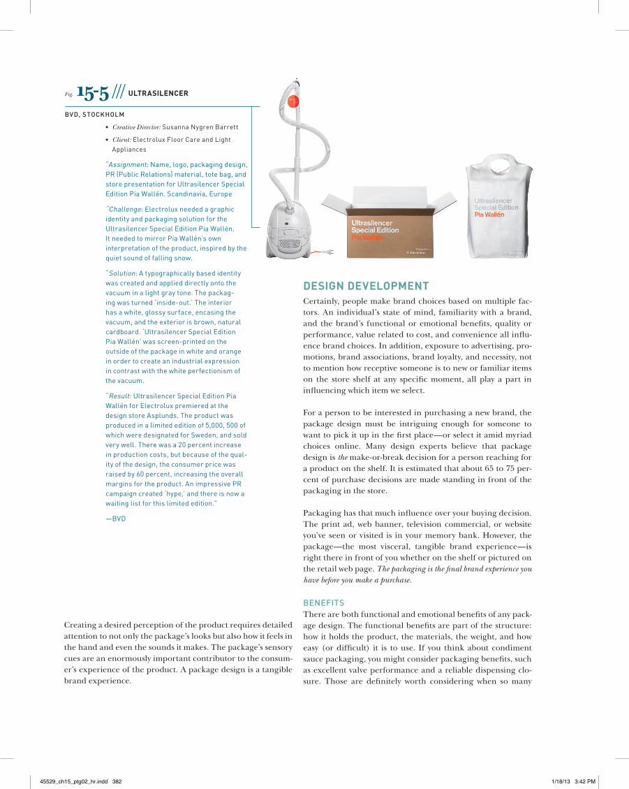
Fig. 15-5 /// ultrasilencer
BVD, sTockholM
• Creative Director:SusannaNygrenBarrett
• Client:ElectroluxFloorCareandLightAppliances
“Assignment:Name,logo,packagingdesign,PR(PublicRelations)material,totebag,andstorepresentationforUltrasilencerSpecialEditionPiaWallén.Scandinavia,Europe
“Challenge:ElectroluxneededagraphicidentityandpackagingsolutionfortheUltrasilencerSpecialEditionPiaWallén.ItneededtomirrorPiaWallén’sowninterpretationoftheproduct,inspiredbythequietsoundoffallingsnow.
“Solution:Atypographicallybasedidentitywascreatedandapplieddirectlyontothevacuuminalightgraytone.Thepackag-ingwasturned‘inside-out.’Theinteriorhasawhite,glossysurface,encasingthevacuum,andtheexteriorisbrown,naturalcardboard.‘UltrasilencerSpecialEditionPiaWallén’wasscreen-printedontheoutsideofthepackageinwhiteandorangeinordertocreateanindustrialexpressionincontrastwiththewhiteperfectionismofthevacuum.
“Result:UltrasilencerSpecialEditionPiaWallénforElectroluxpremieredatthedesignstoreAsplunds.Theproductwasproducedinalimitededitionof5,000,500ofwhichweredesignatedforSweden,andsoldverywell.Therewasa20percentincreaseinproductioncosts,butbecauseofthequal-ityofthedesign,theconsumerpricewasraisedby60percent,increasingtheoverallmarginsfortheproduct.AnimpressivePRcampaigncreated‘hype,’andthereisnowawaitinglistforthislimitededition.”
—BVD
Creating a desired perception of the product requires detailed attention to not only the package’s looks but also how it feels in the hand and even the sounds it makes. The package’s sensory cues are an enormously important contributor to the consum-er’s experience of the product. A package design is a tangible brand experience.
Design DeveloPmentCertainly, people make brand choices based on multiple fac-tors. An individual’s state of mind, familiarity with a brand, and the brand’s functional or emotional benefits, quality or performance, value related to cost, and convenience all influ-ence brand choices. In addition, exposure to advertising, pro-motions, brand associations, brand loyalty, and necessity, not to mention how receptive someone is to new or familiar items on the store shelf at any specific moment, all play a part in influencing which item we select.
For a person to be interested in purchasing a new brand, the package design must be intriguing enough for someone to want to pick it up in the first place—or select it amid myriad choices online. Many design experts believe that package design is the make-or-break decision for a person reaching for a product on the shelf. It is estimated that about 65 to 75 per-cent of purchase decisions are made standing in front of the packaging in the store.
Packaging has that much influence over your buying decision. The print ad, web banner, television commercial, or website you’ve seen or visited is in your memory bank. However, the package—the most visceral, tangible brand experience—is right there in front of you whether on the shelf or pictured on the retail web page. The packaging is the final brand experience you have before you make a purchase.
BeneFiTsThere are both functional and emotional benefits of any pack-age design. The functional benefits are part of the structure: how it holds the product, the materials, the weight, and how easy (or difficult) it is to use. If you think about condiment sauce packaging, you might consider packaging benefits, such as excellent valve performance and a reliable dispensing clo-sure. Those are definitely worth considering when so many
45529_ch15_ptg02_hr.indd 382 1/18/13 3:42 PM
people complain about ease of squeeze or leaky dispensers. That type of functional attribute appeals to us on a rational level, whereas color, visuals, and texture appeal to us on an emotional level.
The shape of most soda bottles makes holding and pouring easier. However, for each brand or product, subtle shaping distinctions have more to do with emotional than functional benefits. The form of a soda bottle, shampoo bottle, box of tea, individual tea bag, box of cereal, or candy mint container each contributes to its brand personality, appeal, sensuality/tactility, and ultimately, to the relationship to the user. Do you think you could identify the shape or form of certain distinc-tive packaging without any of the graphics?
All that a package is—visuals, form, color, typography, materi-als, and textures—will be understood as a total unit by each person. Almost every shopper who looks at a package sees the complete package rather than the separate visual or tactile ele-ments. However, each visual component has more of an effect on the individual than one realizes. Some visual components “cue” the viewer more than others.
Color plays a major role in cueing people as to flavor, scent, type, and contents of a particular product packaging. Color can also send a signal about status and quality. With only sec-onds (or a couple of minutes at most) to make a purchasing decision in a supermarket or drugstore, color, visuals, and type must all work together to communicate brand essence and information. Dan Olson, creative director at Duffy & Partners, Minneapolis, says: “So much of food packaging is about appe-tite appeal. We don’t want our potatoes green or our ketchup blue, and the package shouldn’t miscue the experience of the product by incorporating inappropriate colors.”
Photography or illustrations on packaging play two impor-tant roles: they are cues that convey information and create an emotional connection. Visual language can communicate
product attributes, such as “refreshment” or “taste” as well as emotional benefits, such as “exhilaration” or “satisfaction.” For example, a spry woman depicted on a nutritional supplement signals “health” or the image of a ski slope on an oral hygiene product signals “fresh.”
Package copy includes brand name, product name, pertinent and required information, and a tag line or descriptor, which communicates the emotional and functional benefit of the brand. The typography communicates on a denotative and connotative level, ideally working with all the visual elements to establish the appropriate message.
clariTy oF iDenTiFicaTion anD inForMaTionWith so many brands on a store shelf, how will a shopper find a particular one? First, a package design needs to be interest-ing enough for someone to notice it. Sound familiar? This is true for most graphic design. Usually, when someone notices a package, he or she also is considering other products in the category, on the same shelf, or in the same aisle and giving roughly twenty seconds to all in consideration. Then, if the package holds the person’s interest, the shopper begins to scan it for information.
Many eye-tracking studies have been conducted on how peo-ple “read” a package. A clear visual hierarchy with a dominant visual or typographic treatment as the entry point will draw you into the composition. Then your eyes will go to the next ele-ment of emphasis in hierarchical order and so on. Orchestrat-ing flow and rhythm will aid the composition and hierarchy. The clearer the cues and the more coherent the organization, the easier it will be to read the composition. Psychologically, people tend to be attracted most by imagery. As mentioned earlier, people often project all of the visual attributes of the package onto the value of the product.
The visual hierarchy should not only ensure order, it should ensure a logical order. Some information is more immediately
45529_ch15_ptg02_hr.indd 383 1/18/13 3:42 PM
critical to a shopper in the few seconds in front of a shelf, and the designer must understand that communication hierarchy, referred to as package architecture. As a shopper yourself, you know that you hunt for particular information on packaging, such as flavor, scent, size, quantity, or compatibility. If someone isn’t shopping for a specific brand but scanning for a product descriptor such as flavor, form, or variety, how will he or she notice that information? How will someone be able to distin-guish among brand extensions, between flavors, ingredients, or choices within a category such as tea, motor oil, or baby food?
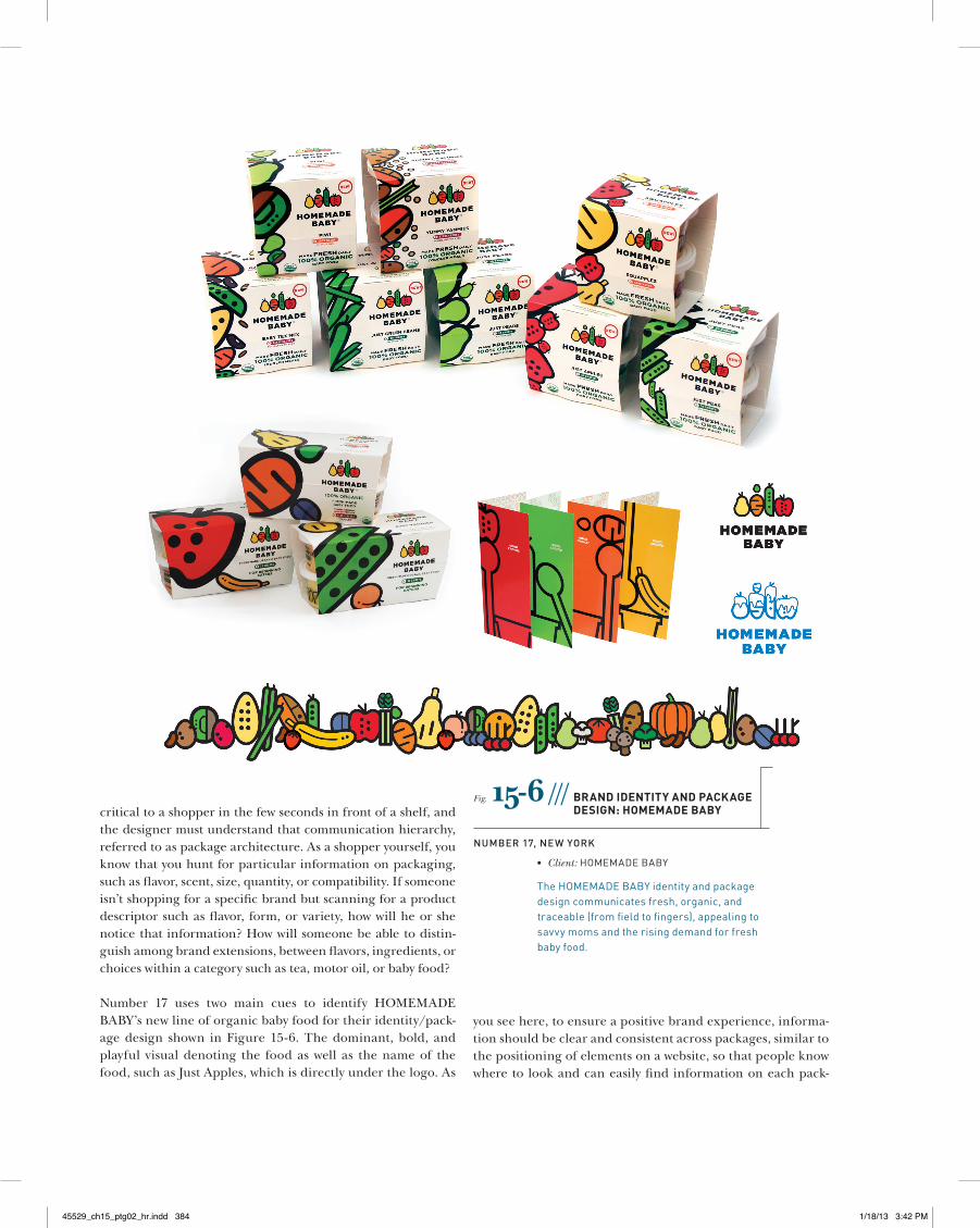
Number 17 uses two main cues to identify HOMEMADE BABY’s new line of organic baby food for their identity/pack-age design shown in Figure 15-6. The dominant, bold, and playful visual denoting the food as well as the name of the food, such as Just Apples, which is directly under the logo. As
Fig. 15-6 /// BranD iDentity anD Package Design: homemaDe BaBy
nuMBer 17, new york
• Client:HOMEMADEBABY
TheHOMEMADEBABYidentityandpackagedesigncommunicatesfresh,organic,andtraceable(fromfieldtofingers),appealingtosavvymomsandtherisingdemandforfreshbabyfood.
you see here, to ensure a positive brand experience, informa-tion should be clear and consistent across packages, similar to the positioning of elements on a website, so that people know where to look and can easily find information on each pack-
45529_ch15_ptg02_hr.indd 384 1/18/13 3:42 PM
age. Color is an important design element in the packaging of products like food, toiletries, and beverages, often conjuring up key associations and used to designate flavor or fragrance choices. Color differentiates choices (such as flavor or scent) and can also unify a product line.
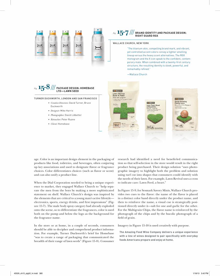
When the Dial Corporation needed to bring a unique experi-ence to market, they engaged Wallace Church to “help sepa-rate the men from the boys by making a more sophisticated statement on shelf. Wallace Church’s design was inspired by the elements that are critical to a young man’s active lifestyle—electronics, sports, energy drinks, and first impressions” (Fig-ure 15-7). The male body spray category had already exploded onto the scene, so to differentiate the fragrances, color is used both on the pump and below the logo as the background for the fragrance name.
In the store or at home, in a couple of seconds, consumers should be able to decipher and comprehend product informa-tion. For example, Turner Duckworth’s brief for Homebase “was to create a range of packaging that communicated the breadth of their range of lawn seeds” (Figure 15-8). Consumer
research had identified a need for benefit-led communica-tion so that self-selection in the store would result in the right product being purchased. Their design solution “uses photo-graphic imagery to highlight both the problem and solution using turf cut into shapes that consumers could identify with the needs of their lawn. For example, Lawn Revival uses a cross to indicate care: Lawn Feed, a heart.”
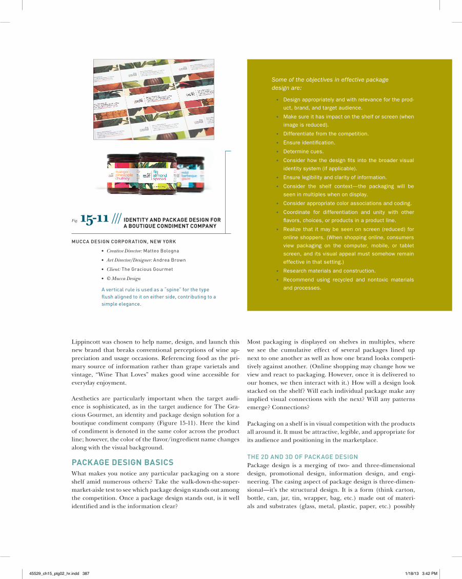
In Figure 15-9, for Sesmark Savory Minis, Wallace Church pro-vides two cues to the flavor: the name of the flavor is placed in a distinct color band directly under the product name, and then to reinforce the name, a visual cue is strategically posi-tioned directly under it—salt for one and garlic for the other. For the Multigrain Chips, the flavor name is reinforced by the photograph of the chips and by the bucolic photograph of a field of grain.
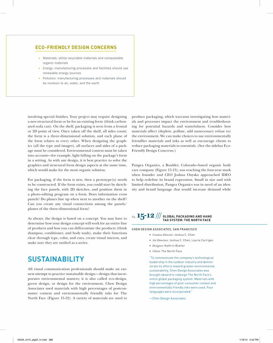
Imagery in Figure 15-10 is used creatively with purpose.
the amazing food Wine company delivers a unique experience with a line of wines designed to pair specifically with everyday foods americans prepare and enjoy at home.
Fig. 15-7 /// BranD iDentity anD Package Design: right guarD rgX
wallace church, new york
“Thetitaniumskin,compellingbrandmark,andvibrant,yetcontrolledaccentcolorsconveyalightersmellinglineupversustheheavyscentalternatives.TheRGXmonogramandtheXiconspeaktotheconfident,contem-porarymale.Whencombinedwithatwenty-firstcenturystructure,theresultingidentityissleek,powerful,andremarkablyrefined.”
—WallaceChurch
Fig. 15-8 /// Package Design: homeBase ltD—laWn seeD
Turner DuckworTh, lonDon anD san Francisco
• Creative Directors:DavidTurner,BruceDuckworth
• Designer:MikeHarris
• Photographer:DavidLidbetter
• Retoucher:PeterRuane
• Client:Homebase
45529_ch15_ptg02_hr.indd 385 1/18/13 3:42 PM
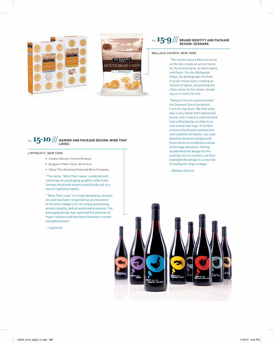
Fig. 15-9 /// BranD iDentity anD Package Design: sesmark
wallace church, new york
“ThetwelveSavoryMinispicturedontheboxcreateanactiveframeforthebrandname,productname,andflavor.FortheMultigrainChips,thephotographofafieldofgrainmovesbackcreatinganillusionofspace,yetpushingthechipsclosertotheviewer,tempt-ingustoreachforone.
“WallaceChurchrevolutionizedtheSesmarklineofproductsfromthetopdown.Wetookwhatwasaverydatedandfragmentedbrand,andcreatedasophisticatedandunifieddesignarchitecture,withaboldnewlogo.Tofurtherenhancethebrand’swholesomeandhealthfulattributes,weusedbeautifulduotonebackgroundillustrationstoestablishasenseofheritageandplace.Havingestablishedthedesignfortheexistinglineofcrackers,wethenextendedthedesigntoanewlineofmultigrainchipsinbags.”
—WallaceChurch
Fig. 15-10 /// naming anD Package Design: Wine that loves
liPPincoTT, new york
• Creative Director:ConnieBirdsall
• Designers:PeterChun,AlineKim
• Client:TheAmazingFoodandWineCompany
“Thename,‘WineThatLoves,’combinedwithcontemporarypackaginggraphicseffectivelyconveysthebrandessenceandstandsoutinaseaoftraditionallabels.
“‘WineThatLoves’isinhighdemandbyconsum-ersandhasbeenrecognizedasaninnovationinthewinecategoryforitsuniquepositioning,productquality,andstrongbrandpresence.Thepackagingdesignhascapturedtheattentionofmajorretailersandhasbeenfeaturedinnumer-ouspublications.”
—Lippincott
45529_ch15_ptg02_hr.indd 386 1/18/13 3:42 PM
Lippincott was chosen to help name, design, and launch this new brand that breaks conventional perceptions of wine ap-preciation and usage occasions. Referencing food as the pri-mary source of information rather than grape varietals and vintage, “Wine That Loves” makes good wine accessible for everyday enjoyment.
Aesthetics are particularly important when the target audi-ence is sophisticated, as in the target audience for The Gra-cious Gourmet, an identity and package design solution for a boutique condiment company (Figure 15-11). Here the kind of condiment is denoted in the same color across the product line; however, the color of the flavor/ingredient name changes along with the visual background.
Package Design BasicsWhat makes you notice any particular packaging on a store shelf amid numerous others? Take the walk-down-the-super-market-aisle test to see which package design stands out among the competition. Once a package design stands out, is it well identified and is the information clear?
Most packaging is displayed on shelves in multiples, where we see the cumulative effect of several packages lined up next to one another as well as how one brand looks competi-tively against another. (Online shopping may change how we view and react to packaging. However, once it is delivered to our homes, we then interact with it.) How will a design look stacked on the shelf? Will each individual package make any implied visual connections with the next? Will any patterns emerge? Connections?
Packaging on a shelf is in visual competition with the products all around it. It must be attractive, legible, and appropriate for its audience and positioning in the marketplace.
The 2D anD 3D oF Package DesignPackage design is a merging of two- and three-dimensional design, promotional design, information design, and engi-neering. The casing aspect of package design is three-dimen-sional—it’s the structural design. It is a form (think carton, bottle, can, jar, tin, wrapper, bag, etc.) made out of materi-als and substrates (glass, metal, plastic, paper, etc.) possibly
Fig. 15-11 /// iDentity anD Package Design for a Boutique conDiment comPany
Mucca Design corPoraTion, new york
• Creative Director:MatteoBologna
• Art Director/Designer:AndreaBrown
• Client:TheGraciousGourmet
• © Mucca Design
Averticalruleisusedasa“spine”forthetypeflushalignedtoitoneitherside,contributingtoasimpleelegance.
Some of the objectives in effective package design are:
• Design appropriately and with relevance for the prod-
uct, brand, and target audience.
• Make sure it has impact on the shelf or screen (when
image is reduced).
• Differentiate from the competition.
• Ensure identification.
• Determine cues.
• Consider how the design fits into the broader visual
identity system (if applicable).
• Ensure legibility and clarity of information.
• Consider the shelf context—the packaging will be
seen in multiples when on display.
• Consider appropriate color associations and coding.
• Coordinate for differentiation and unity with other
flavors, choices, or products in a product line.
• Realize that it may be seen on screen (reduced) for
online shoppers. (When shopping online, consumers
view packaging on the computer, mobile, or tablet
screen, and its visual appeal must somehow remain
effective in that setting.)
• Research materials and construction.
• Recommend using recycled and nontoxic materials
and processes.
45529_ch15_ptg02_hr.indd 387 1/18/13 3:42 PM
involving special finishes. Your project may require designing a new structural form or be for an existing form (think carbon-ated soda can). On the shelf, packaging is seen from a frontal or 2D point of view. Once taken off the shelf, all sides count; the form is a three-dimensional solution, and each plane of the form relates to every other. When designing the graph-ics (all the type and images), all surfaces and sides of a pack-age must be considered. Environmental context must be taken into account—for example, light falling on the package’s form in a setting. As with any design, it is best practice to solve the graphics and structural form design aspects at the same time, which would make for the most organic solution.
For packaging, if the form is new, then a prototype(s) needs to be constructed. If the form exists, you could start by sketch-ing the face panels, with 2D sketches, and position them in a photo-editing program on a form. Does information cross panels? Do planes line up when next to another on the shelf? Can you create any visual connections among the panels/planes of the three-dimensional form?
As always, the design is based on a concept. You may have to determine how your design concept will work for an entire line of products and how you can differentiate the products (think shampoo, conditioner, and body wash), make their functions clear through type, color, and cues, create visual interest, and make sure they are unified as a series.
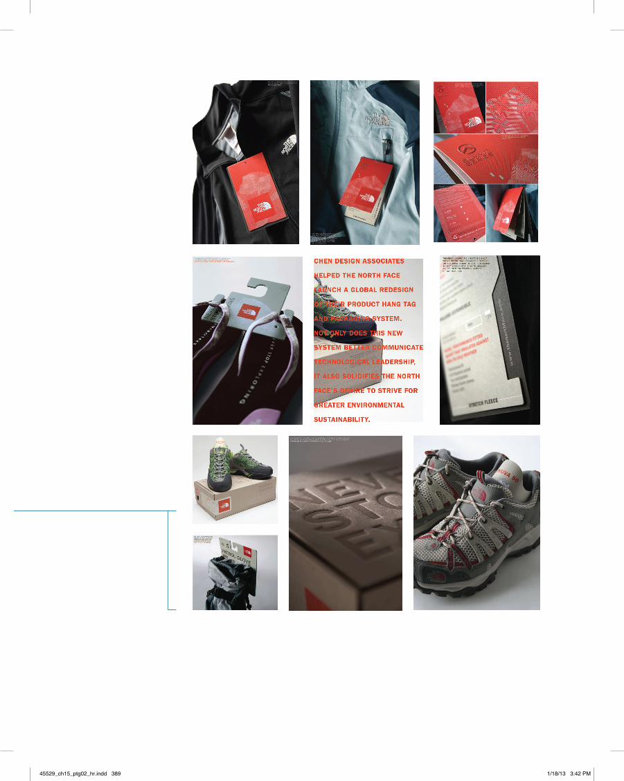
sustainaBilityAll visual communication professionals should make an ear-nest attempt to practice sustainable design—design that incor-porates environmental matters; it is also called eco-design, green design, or design for the environment. Chen Design Associates used materials with high percentages of postcon-sumer content and environmentally friendly inks for The North Face (Figure 15-12). A variety of materials are used to
produce packaging, which warrants investigating how materi-als and processes impact the environment and troubleshoot-ing for potential hazards and wastefulness. Consider how materials affect (deplete, pollute, add unnecessary refuse to) the environment. We can make choices to use environmentally friendlier materials and inks as well as encourage clients to reduce packaging materials to essentials. (See the sidebar Eco-Friendly Design Concerns.)
Pangea Organics, a Boulder, Colorado–based organic body care company (Figure 15-13), was reaching the four-year mark when founder and CEO Joshua Onysko approached IDEO to help redefine its brand expression. Small in size and with limited distribution, Pangea Organics was in need of an iden-tity and brand language that would increase demand while
eco-frienDly Design concerns
• Materials: utilize recyclable materials and compostable
organic materials
• Energy: manufacturing processes and facilities should use
renewable energy sources
• Pollution: manufacturing processes and materials should
be nontoxic to air, water, and the earth
Fig. 15-12 /// gloBal Packaging anD hang tag system: the north face
chen Design associaTes, san Francisco
• Creative Director:JoshuaC.Chen
• Art Directors:JoshuaC.Chen,LaurieCarrigan
• Designer:KathrinBlatter
• Client:TheNorthFace
“Tocommunicatethecompany’stechnologicalleadershipintheoutdoorindustryanddemon-strateitseffortstowardgreaterenvironmentalsustainability,ChenDesignAssociateswasbroughtaboardtoredesignTheNorthFace’sentireglobalpackagingsystem.Materialswithhighpercentagesofpost-consumercontentandenvironmentallyfriendlyinkswereused.Fourlanguageswereincorporated.”
—ChenDesignAssociates
45529_ch15_ptg02_hr.indd 388 1/18/13 3:42 PM
45529_ch15_ptg02_hr.indd 389 1/18/13 3:42 PM
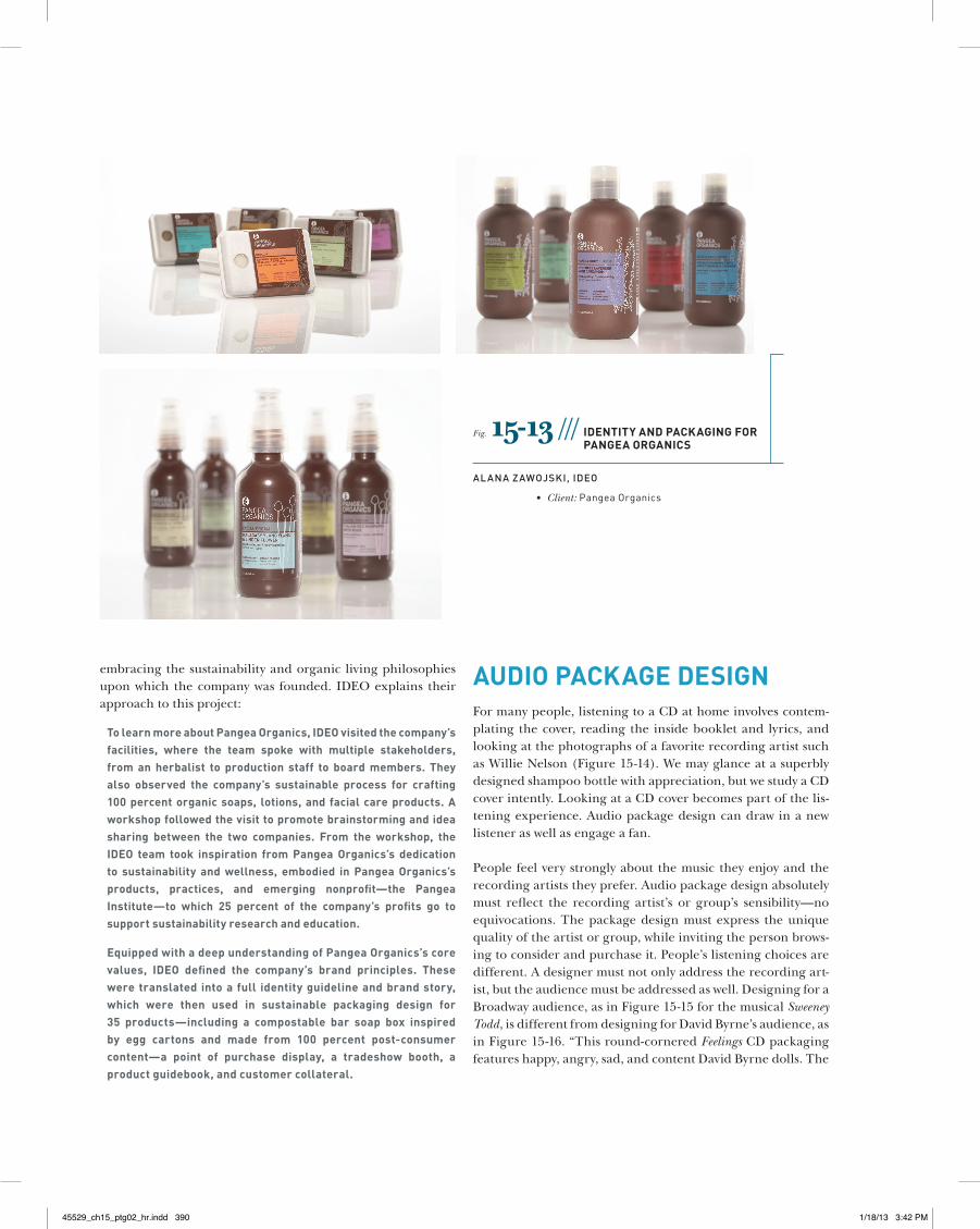
embracing the sustainability and organic living philosophies upon which the company was founded. IDEO explains their approach to this project:
to learn more about Pangea organics, iDeo visited the company’s facilities, where the team spoke with multiple stakeholders, from an herbalist to production staff to board members. they also observed the company’s sustainable process for crafting 100 percent organic soaps, lotions, and facial care products. a workshop followed the visit to promote brainstorming and idea sharing between the two companies. from the workshop, the iDeo team took inspiration from Pangea organics’s dedication to sustainability and wellness, embodied in Pangea organics’s products, practices, and emerging nonprofit—the Pangea institute—to which 25 percent of the company’s profits go to support sustainability research and education.
equipped with a deep understanding of Pangea organics’s core values, iDeo defined the company’s brand principles. these were translated into a full identity guideline and brand story, which were then used in sustainable packaging design for 35 products—including a compostable bar soap box inspired by egg cartons and made from 100 percent post-consumer content—a point of purchase display, a tradeshow booth, a product guidebook, and customer collateral.
auDio Package DesignFor many people, listening to a CD at home involves contem-plating the cover, reading the inside booklet and lyrics, and looking at the photographs of a favorite recording artist such as Willie Nelson (Figure 15-14). We may glance at a superbly designed shampoo bottle with appreciation, but we study a CD cover intently. Looking at a CD cover becomes part of the lis-tening experience. Audio package design can draw in a new listener as well as engage a fan.
People feel very strongly about the music they enjoy and the recording artists they prefer. Audio package design absolutely must reflect the recording artist’s or group’s sensibility—no equivocations. The package design must express the unique quality of the artist or group, while inviting the person brows-ing to consider and purchase it. People’s listening choices are different. A designer must not only address the recording art-ist, but the audience must be addressed as well. Designing for a Broadway audience, as in Figure 15-15 for the musical Sweeney Todd, is different from designing for David Byrne’s audience, as in Figure 15-16. “This round-cornered Feelings CD packaging features happy, angry, sad, and content David Byrne dolls. The
Fig. 15-13 /// iDentity anD Packaging for Pangea organics
alana Zawojski, iDeo
• Client:PangeaOrganics
45529_ch15_ptg02_hr.indd 390 1/18/13 3:42 PM
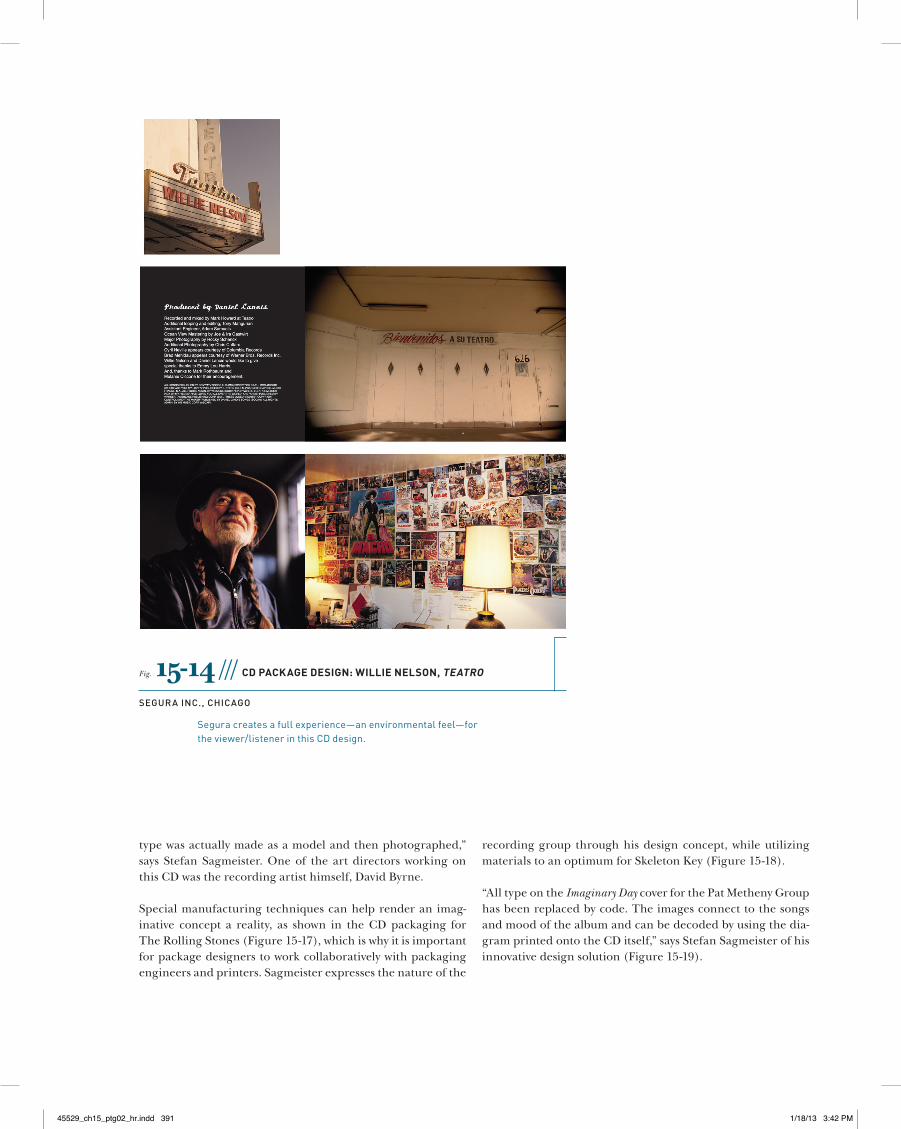
Fig. 15-14 /// cD Package Design: Willie nelson, teatro
segura inc., chicago
Seguracreatesafullexperience—anenvironmentalfeel—fortheviewer/listenerinthisCDdesign.
type was actually made as a model and then photographed,” says Stefan Sagmeister. One of the art directors working on this CD was the recording artist himself, David Byrne.
Special manufacturing techniques can help render an imag-inative concept a reality, as shown in the CD packaging for The Rolling Stones (Figure 15-17), which is why it is important for package designers to work collaboratively with packaging engineers and printers. Sagmeister expresses the nature of the
recording group through his design concept, while utilizing materials to an optimum for Skeleton Key (Figure 15-18).
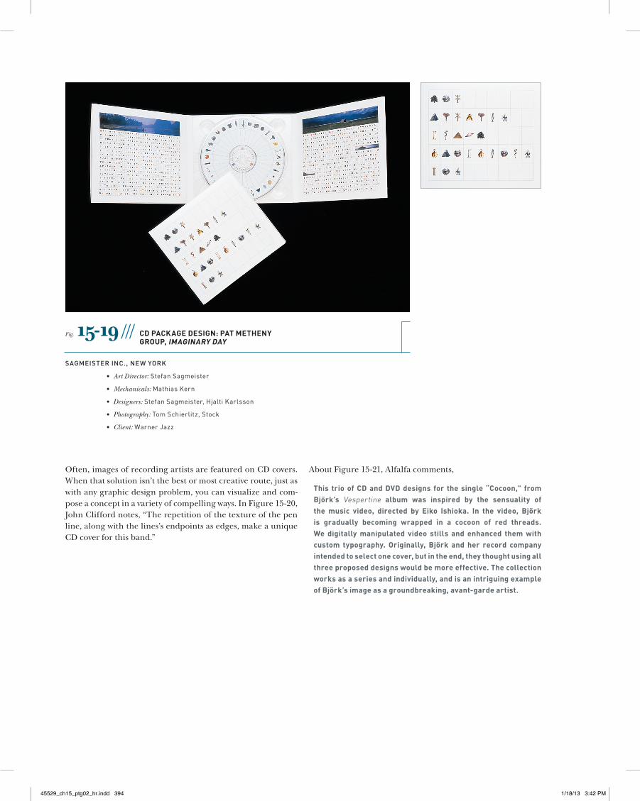
“All type on the Imaginary Day cover for the Pat Metheny Group has been replaced by code. The images connect to the songs and mood of the album and can be decoded by using the dia-gram printed onto the CD itself,” says Stefan Sagmeister of his innovative design solution (Figure 15-19).
45529_ch15_ptg02_hr.indd 391 1/18/13 3:42 PM
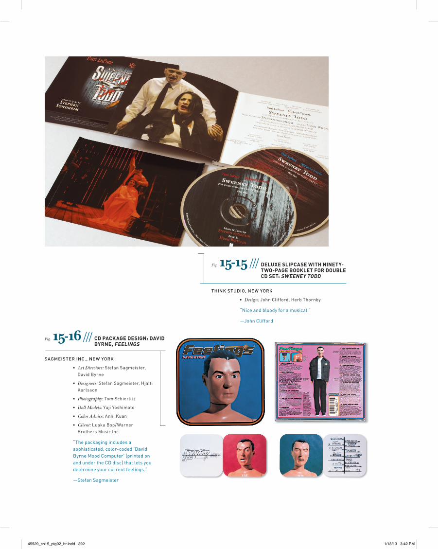
Fig. 15-15 /// DeluXe sliPcase With ninety-tWo-Page Booklet for DouBle cD set: sWeeney toDD
Think sTuDio, new york
• Design:JohnClifford,HerbThornby
“Niceandbloodyforamusical.”
—JohnClifford
Fig. 15-16 /// cD Package Design: DaviD Byrne, feelings
sagMeisTer inc., new york
• Art Directors:StefanSagmeister,DavidByrne
• Designers:StefanSagmeister,HjaltiKarlsson
• Photography:TomSchierlitz
• Doll Models:YujiYoshimoto
• Color Advice:AnniKuan
• Client:LuakaBop/WarnerBrothersMusicInc.
“Thepackagingincludesasophisticated,color-coded‘DavidByrneMoodComputer’(printedonandundertheCDdisc)thatletsyoudetermineyourcurrentfeelings.”
—StefanSagmeister
45529_ch15_ptg02_hr.indd 392 1/18/13 3:42 PM
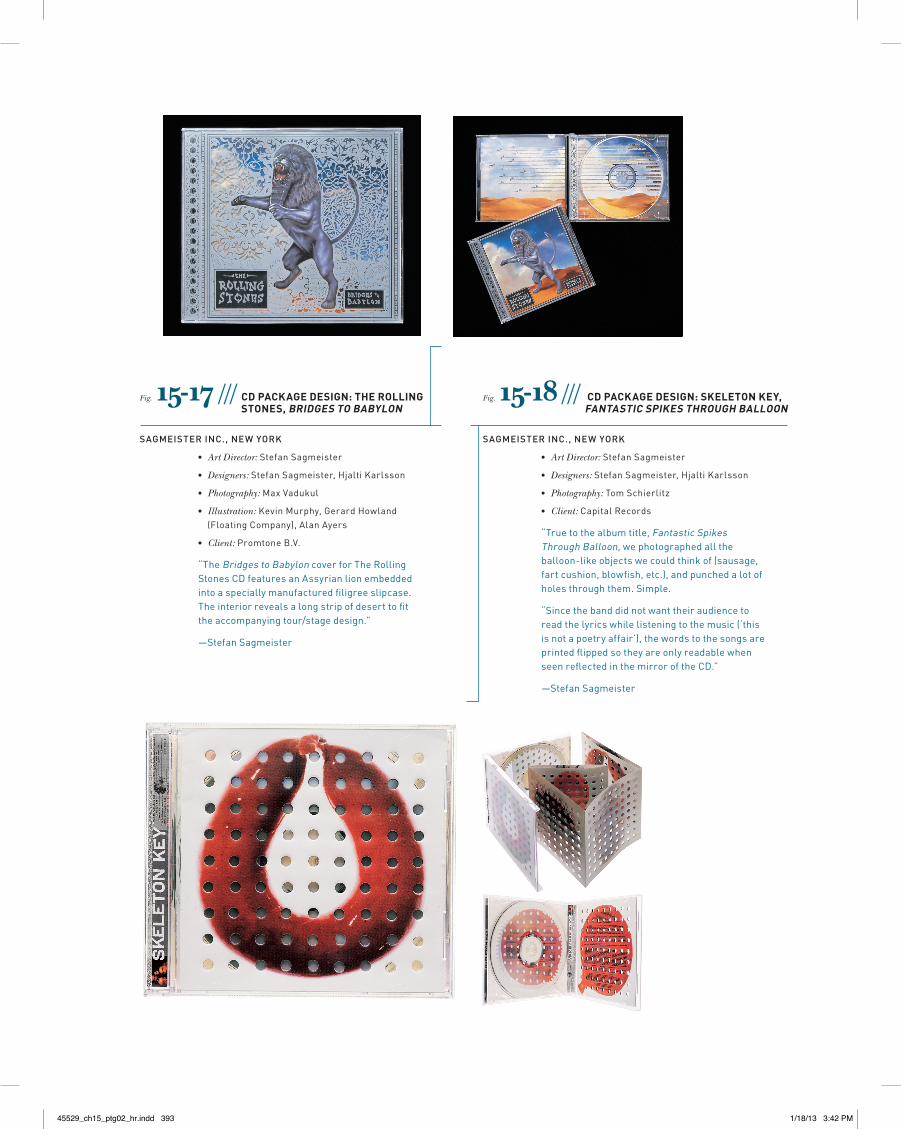
Fig. 15-17 /// cD Package Design: the rolling stones, BriDges to BaBylon
sagMeisTer inc., new york
• Art Director:StefanSagmeister
• Designers:StefanSagmeister,HjaltiKarlsson
• Photography:MaxVadukul
• Illustration:KevinMurphy,GerardHowland(FloatingCompany),AlanAyers
• Client:PromtoneB.V.
“TheBridgestoBabyloncoverforTheRollingStonesCDfeaturesanAssyrianlionembeddedintoaspeciallymanufacturedfiligreeslipcase.Theinteriorrevealsalongstripofdeserttofittheaccompanyingtour/stagedesign.”
—StefanSagmeister
Fig. 15-18 /// cD Package Design: skeleton key, fantastic sPikes through Balloon
sagMeisTer inc., new york
• Art Director:StefanSagmeister
• Designers:StefanSagmeister,HjaltiKarlsson
• Photography:TomSchierlitz
• Client:CapitalRecords
“Truetothealbumtitle,FantasticSpikesThroughBalloon,wephotographedalltheballoon-likeobjectswecouldthinkof(sausage,fartcushion,blowfish,etc.),andpunchedalotofholesthroughthem.Simple.
“Sincethebanddidnotwanttheiraudiencetoreadthelyricswhilelisteningtothemusic(‘thisisnotapoetryaffair’),thewordstothesongsareprintedflippedsotheyareonlyreadablewhenseenreflectedinthemirroroftheCD.”
—StefanSagmeister
45529_ch15_ptg02_hr.indd 393 1/18/13 3:42 PM
Often, images of recording artists are featured on CD covers. When that solution isn’t the best or most creative route, just as with any graphic design problem, you can visualize and com-pose a concept in a variety of compelling ways. In Figure 15-20, John Clifford notes, “The repetition of the texture of the pen line, along with the lines’s endpoints as edges, make a unique CD cover for this band.”
About Figure 15-21, Alfalfa comments,
this trio of cD and DvD designs for the single “cocoon,” from Björk’s Vespertine album was inspired by the sensuality of the music video, directed by eiko ishioka. in the video, Björk is gradually becoming wrapped in a cocoon of red threads. We digitally manipulated video stills and enhanced them with custom typography. originally, Björk and her record company intended to select one cover, but in the end, they thought using all three proposed designs would be more effective. the collection works as a series and individually, and is an intriguing example of Björk’s image as a groundbreaking, avant-garde artist.
Fig. 15-19 /// cD Package Design: Pat metheny grouP, imaginary Day
sagMeisTer inc., new york
• Art Director:StefanSagmeister
• Mechanicals:MathiasKern
• Designers:StefanSagmeister,HjaltiKarlsson
• Photography:TomSchierlitz,Stock
• Client:WarnerJazz
45529_ch15_ptg02_hr.indd 394 1/18/13 3:42 PM
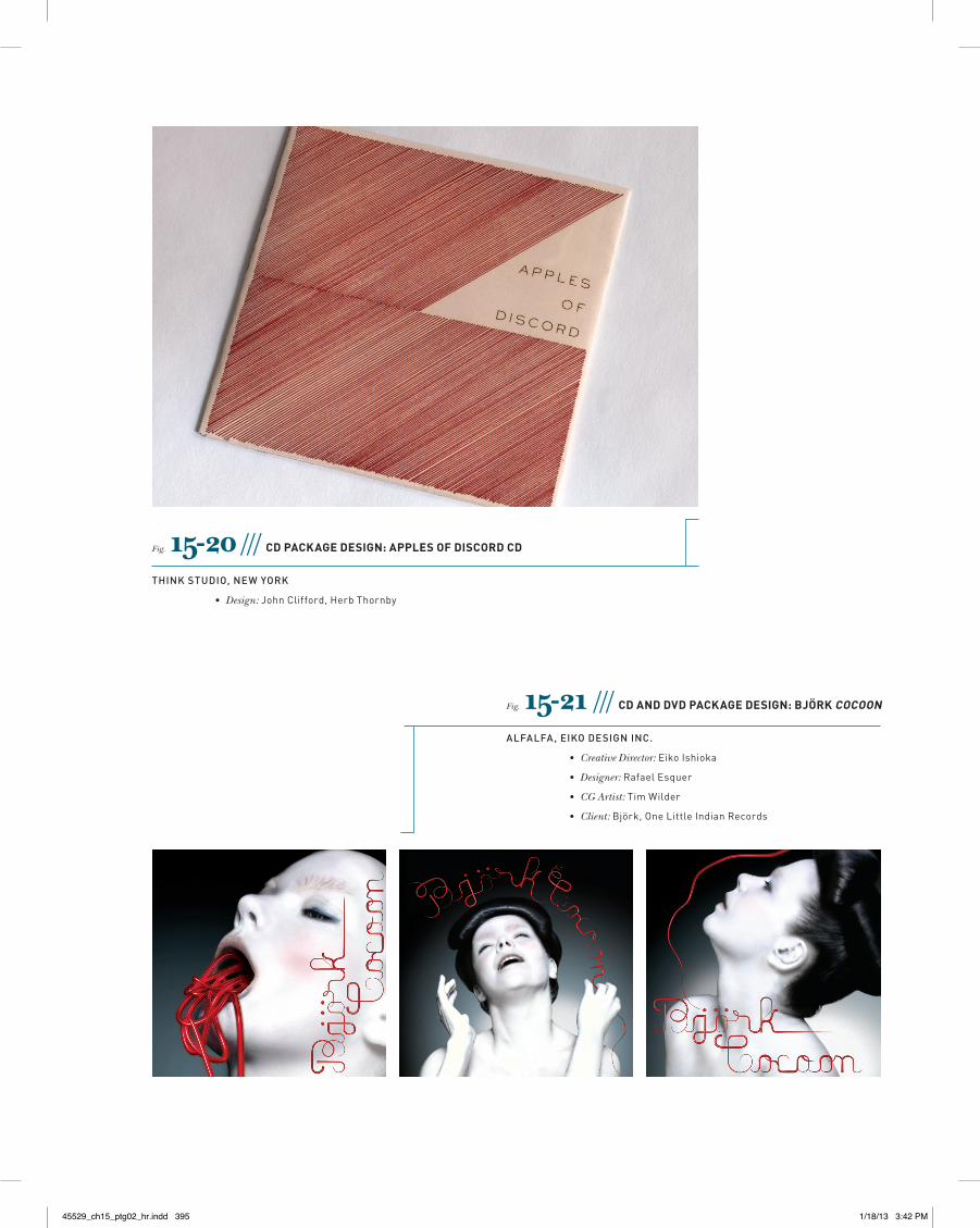
Fig. 15-20 /// cD Package Design: aPPles of DiscorD cD
Think sTuDio, new york
• Design:JohnClifford,HerbThornby
Fig. 15-21 /// cD anD DvD Package Design: Björk cocoon
alFalFa, eiko Design inc.
• Creative Director:EikoIshioka
• Designer:RafaelEsquer
• CG Artist:TimWilder
• Client:Björk,OneLittleIndianRecords
45529_ch15_ptg02_hr.indd 395 1/18/13 3:42 PM
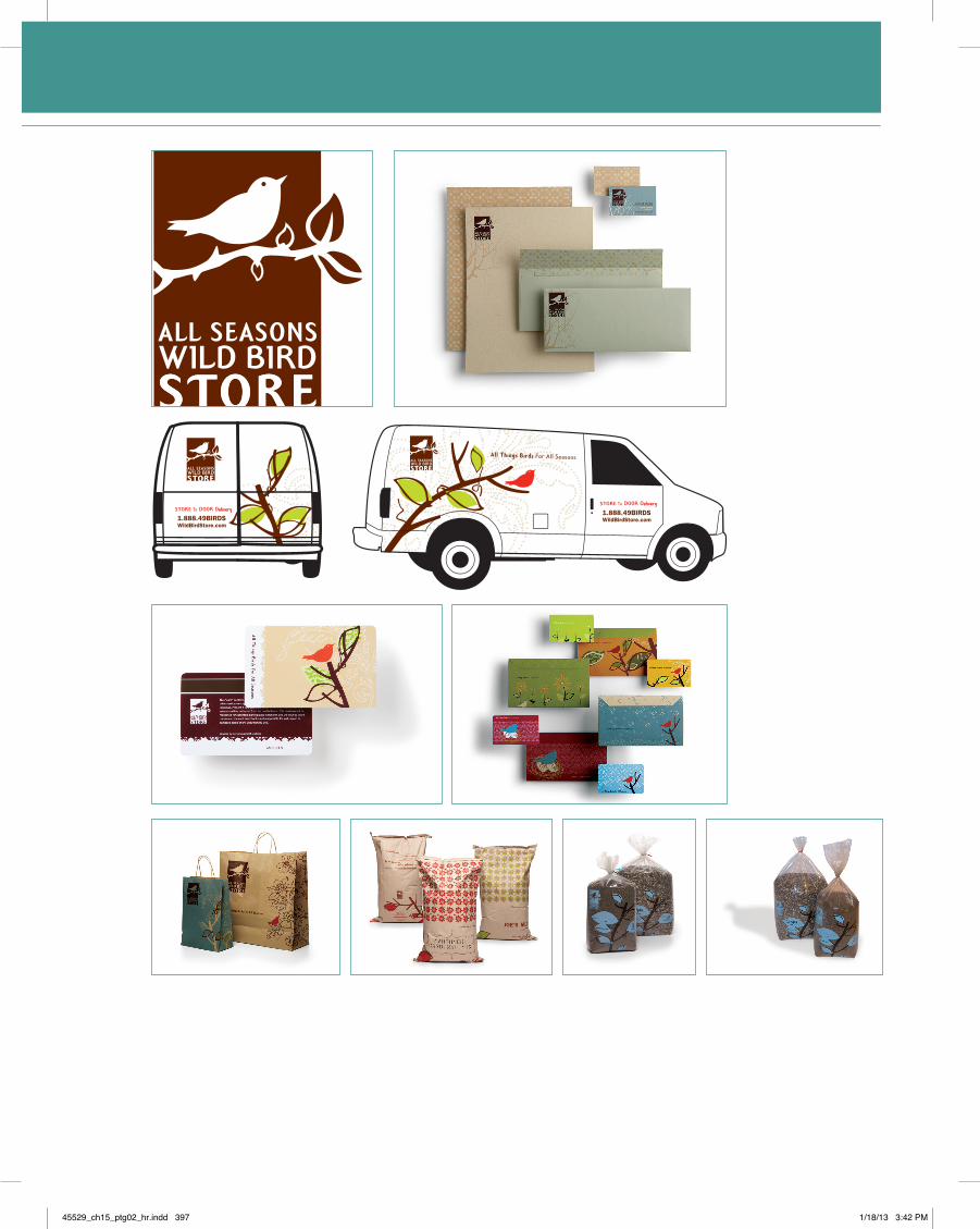
all seasons Wild Bird storeIMAGEHAUS,Inc.
logo anD iDentity systemThe client needed a logo that would speak to its name and create a consistent, compel-
ling brand around it. The logo is vintage modern inspired and the design reinforces the
name of the brand incorporating the “All Seasons.”
store gift carDsThe objective of this project was to elevate the brand. The audience is bird lovers and
those shopping for bird lovers. The challenge was to increase perceived value of the
Wild Bird Store gift card program. Unique gift card designs allow customers to make
a personal choice. The gift card holders also create a nice presentation and increase
perceived value.
shoPPing BagsThe purpose of this work was to create shopping bags that reflected the Wild Bird Store’s
new identity. The solution is simple and fresh using the Wild Bird Store’s graphic ele-
ments and vibrant colors.
store BagsThe objective was to create unique packaging for the Wild Bird Store’s private label bird-
seed, which was unique but followed the new look and feel we had created. Bird lovers
needed to be drawn in by the design and then purchase for the quality. These designs
convey the Wild Bird Store brand while linking to the “seasonal” aspect of the product
through a distinct color palette. These are displayed in a retail environment at All Sea-
sons Wild Bird Store.
—IMAGHAUS, Inc.
case stuDy: all seasons WilD BirD store / imagehaus, inc.
iMagehaus, inc., MinneaPolis
• Creative Director:JayMiller
• Designer:ColleenMeyer
• Client:AllSeasonsWildBirdStore
case study
45529_ch15_ptg02_hr.indd 396 1/18/13 3:42 PM
45529_ch15_ptg02_hr.indd 397 1/18/13 3:42 PM
ocean spray juices WallaceChurch
Design ProBlemThe exponential growth of the beverage market in recent years had expanded Ocean
Spray’s competitive set well beyond breakfast juice drinks to include carbonated bever-
ages and even bottled water. Accompanying this growth were dramatic changes in the
visual language used by leading brands to communicate emotional benefits and product
attributes such as “taste,” “refreshment,” and “premium.” While the Ocean Spray iden-
tity and package design remained familiar to its core audience (sophisticated moms), its
emotional relevance, appetite appeal, and shopability were beginning to wane.
Wallace Church was called on to revitalize the Ocean Spray brand positioning, redesign
its entire family of beverage SKUs [stock-keeping units] (Base Cranberry, Cranberry Light,
100% Premium Juice, Ruby, and White Cranberry), and launch an entirely new sub-brand,
Juice & Tea. The challenge: retain all of the brand’s positive equities and visual cues while
significantly increasing shelf impact, appetite appeal, and form/flavor differentiation.
main communications oBjectiveThe signature “wave” at the bottom of the labels has been retained and updated to le-
verage the product’s refreshment cues. To this end, a soft, gradated blue sky has been
added to the background as well. The top of each bottle features the familiar Ocean
Spray logo while the bold, luscious fruit illustrations have been evolved significantly to
better express the product’s intense flavor and increase appetite appeal. A system of
curved banners, consistently placed on every label, is used to segment sub-brands and
flavors (the new Juice & Tea sub-brand is positioned slightly differently, with a gradated
green background and green banner).
Finally, to perceptually distinguish the brand from the competition, Wallace Church
sought to communicate Ocean Spray’s authentic New England heritage. The addition of
the lighthouse logo at the top of each banner neatly captures the spirit of Cape Cod and
provides the brand with a sense of place. The new brand design gives more than 100
SKUs, of varying sizes and shapes, one cohesive identity, while clearly differentiating all
sub-brands and flavors.
—Wallace Church
Before & after
45529_ch15_ptg02_hr.indd 398 1/18/13 3:42 PM
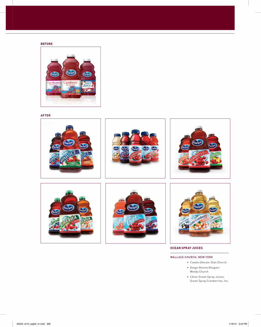
Before
after
ocean sPray juices
wallace church, new york
• Creative Director:StanChurch
• Design Director/Designer:WendyChurch
• Client:OceanSprayJuices,OceanSprayCranberries,Inc.
45529_ch15_ptg02_hr.indd 399 1/18/13 3:42 PM
rounder records VisualDialogue
ProBlemRounder Records is an independent label specializing in music ranging from reggae to
bluegrass, blues to folk, and a few genres that defy categorization. With every release
it’s important to have the design reflect the character of the featured artist and the
music they create.
solutionVisual Dialogue looks at these CD covers as basically 43⁄4 inch square ads. Using just
a few elements—photo, artist’s name, and title—we create covers that engage the
desired audience while also giving a sense of the music. The end result is a visually
distinctive and memorable identity that lasts for years.
—Fritz Klaetke
case study
45529_ch15_ptg02_hr.indd 400 1/18/13 3:42 PM
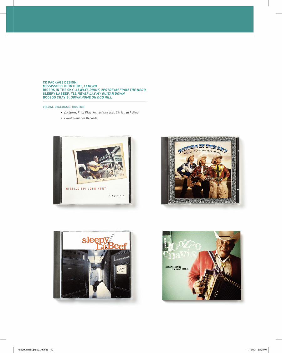
cD Package Design:mississiPPi john hurt, legenDriDers in the sky, alWays Drink uPstream from the herDsleePy laBeef, i’ll never lay my guitar DoWnBoozoo chavis, DoWn home on Dog hill
Visual Dialogue, BosTon
• Designers:FritzKlaetke,IanVarrassi,ChristianPalino
• Client:RounderRecords
45529_ch15_ptg02_hr.indd 401 1/18/13 3:42 PM
ExercisesandProjectsGo to GDSOnline for more exercises and projects.
Exercise15-1Color
Did you know that ancient civilizations may have held the belief that chocolate has magical powers? When was sugar first added to chocolate? Does chocolate have medicinal benefits? Research the history of chocolate.
Create three different color palettes that would be appropri-ate for a Chocolate Café identity aimed at women ages 15–54. At least one of the palettes should not be based on the actual color of chocolate.
Project15-1Chocolate Café Brand IdentityDesign Brief
> Project: Chocolate Café Brand Identity and Package Design
> Product: Crème Chocolate Café or Coco Café and Bookstore
01. What are we trying to accomplish?
◊ Create consumer awareness
◊ Create compelling and distinctive brand identity and package design
02. Who are we trying to influence?
◊ Women, ages 15–54
◊ who are chocolate lovers
◊ who enjoy coffee shop/café or bookstore café atmospheres
◊ who indulge in luxury brands
03. What do they think now?
◊ I love chocolate and I’m willing to pay luxury prices for it.
◊ I enjoy spending leisure time with friends in a café environment.
04. What do we want them to think?
◊ This is a great way to enjoy chocolate.
05. Why should they think this way?
◊ Because this chocolate café . . .
◊ has made eating chocolate more social.
◊ is bringing the same type of coffeehouse environment to chocolate.
◊ has a sophisticated looking brand identity.
06. How will this be communicated?
◊ Identity design and package design
◊ Formats: logo, signage, package design, store environ-ment, uniforms
Note that this package design could include several components: cups, bags, takeout boxes, and packaged goods (such as chocolates, cookies, hot cocoa). Be aware of texture and color palette especially. Optional: Include seasonal packaging or specialty items beyond the basic group. Additionally, design the environment of the café.
07. What is the tonality of the communication?
◊ Chic; a rich food experience
If you have your own strategy, you may expand or change any of it, but you will need to rewrite the brief.
45529_ch15_ptg02_hr.indd 402 1/18/13 3:42 PM
CHOCOLATECAFéBRANDIDENTITYCONCEPT
Suggested point of departure for concept and art direction provided by Prof. Rose Gonnella, Executive Director of the Robert Busch School of Design, Kean University:
What approach will you take to communicate a sense of sophis-tication and richness (perhaps even of the exotic)? Think in terms of comparisons. For instance, make an association to ancient cultures that developed the use of cocoa, compare with European cultures that manufacture the world’s best, or simply relate to gold and the color of chocolate itself.
RESEARCH
Read about chocolate. Have a chocolate tasting party. Survey people about their chocolate tastes. Talk to friends about chocolate and see what leads they might give you.
ART
> Color—select a palette of three or five colors that will com-municate the idea of sophistication, richness, and/or the exotic. The color choices should be based on your research.
> Texture—select a pattern/texture that will tactilely compel the viewer. Chocolate is a sensory experience, and the iden-tity should be as well.
> Type—as always, the typeface(s) should be in an appropri-ate voice and complementary to the imagery.
45529_ch15_ptg02_hr.indd 403 1/18/13 3:42 PM