geospatial interpolation and mapping of tropospheric ozone pollution using geostatistics
TRANSCRIPT
Int. J. Environ. Res. Public Health 2014, 11, 983-1000; doi:10.3390/ijerph110100983
International Journal of
Environmental Research and Public Health
ISSN 1660-4601 www.mdpi.com/journal/ijerph
Article
Geospatial Interpolation and Mapping of Tropospheric Ozone Pollution Using Geostatistics
Swatantra R. Kethireddy 1, Paul B. Tchounwou 2,†,*, Hafiz A. Ahmad 3,†,
Anjaneyulu Yerramilli 1,† and John H. Young 1,†
1 Trent Lott Geospatial and Visualization Research Center, College of Science Engineering and
Technology, Jackson State University, Mississippi E-Center, 1230 Raymond Rd, Jackson,
MS 39204, USA; E-Mails: [email protected] (S.R.K.);
[email protected] (A.Y.); [email protected] (J.H.Y.) 2 NIH RCMI Center for Environmental Health, Jackson State University, 1400 JR Lynch Street,
P.O. Box 18750, Jackson, MS 39217, USA 3 Department of Biology, Jackson State University, 1400 JR Lynch Street, Jackson, MS 39217, USA;
E-Mail: [email protected]
† These authors contributed equally to this work.
* Author to whom correspondence should be addressed; E-Mail: [email protected];
Tel.: +1-601-979-2153; Fax: +1-601-979-2058.
Received: 14 November 2013; in revised form: 17 December 2013 / Accepted: 19 December 2013 /
Published: 10 January 2014
Abstract: Tropospheric ozone (O3) pollution is a major problem worldwide, including in
the United States of America (USA), particularly during the summer months. Ozone
oxidative capacity and its impact on human health have attracted the attention of the
scientific community. In the USA, sparse spatial observations for O3 may not provide a
reliable source of data over a geo-environmental region. Geostatistical Analyst in ArcGIS
has the capability to interpolate values in unmonitored geo-spaces of interest. In this study
of eastern Texas O3 pollution, hourly episodes for spring and summer 2012 were selectively
identified. To visualize the O3 distribution, geostatistical techniques were employed in
ArcMap. Using ordinary Kriging, geostatistical layers of O3 for all the studied hours were
predicted and mapped at a spatial resolution of 1 kilometer. A decent level of prediction
accuracy was achieved and was confirmed from cross-validation results. The mean
prediction error was close to 0, the root mean-standardized-prediction error was close to 1,
OPEN ACCESS
Int. J. Environ. Res. Public Health 2014, 11 984
and the root mean square and average standard errors were small. O3 pollution map data
can be further used in analysis and modeling studies. Kriging results and O3 decadal trends
indicate that the populace in Houston-Sugar Land-Baytown, Dallas-Fort Worth-Arlington,
Beaumont-Port Arthur, San Antonio, and Longview are repeatedly exposed to high levels
of O3-related pollution, and are prone to the corresponding respiratory and cardiovascular
health effects. Optimization of the monitoring network proves to be an added advantage for
the accurate prediction of exposure levels.
Keywords: tropospheric ozone (O3); geostatistical analysis; prediction; interpolation;
spatial resolution; visualization; Geographical Information Systems (GIS)
1. Introduction
Air pollution is a spatial and temporal phenomenon. In the past few decades, though high levels of
ozone (O3) pollution have been recorded in intense traffic areas and industrialized cities, their
characteristics and impacts were also observed in rural areas. Therefore, O3 pollution could be
trans-boundary in nature [1]. Recently, as more sensitive instrumentation to monitor O3 concentrations
is in use, it became clear that O3 pollution is not limited to urban environments but can extend to
regional and global scales in the troposphere [2,3]. Due to wind flow, fluctuations in atmospheric
conditions, and regionally varying temperatures, O3 precursors in the troposphere cross states to
remote areas within a short time. Morris et al. have conducted a study to demonstrate the impact of
Alaskan and Canadian forest fires on O3 levels in Houston, Texas. They were able to establish the
relation using the National Aeronautics and Space Administration (NASA) Goddard trajectory model,
Earth Probe satellite data, Moderate Resolution Imaging Spectroradiometer (MODIS) Terra data, and
in situ measurements [3]. Another study by Stutz et al. used Differential Optical Absorption
Spectroscopy (DOAS) measurements to study the vertical distributions of O3, NO2, and NO3 near
Houston, TX. They concluded that the chemistry in polluted areas is strongly altitude dependent in the
lowest 100 meters of the nocturnal atmosphere [4]. Recently, a research conducted by Banta et al. has
exploited the capabilities of O3-profiling differential absorption lidar (DIAL) to map O3 pollution in
Houston; the analysis was useful for documenting meteorological ingredients needed to accurately
predict high pollution events [5]. A field campaign study by Cohan et al. concluded that the reduction
in NOX and highly reactive volatile organic compounds had large contributions on ozone levels, which
declined by 40–50% [6]. Visual understanding of O3 pollution, its nature, behavior and interaction with
populations and the environment are of high interest in this context and are crucial from a geospatial
and health perspective. Although dispersion of pollutants in the troposphere is a complex process,
researchers are making considerable efforts to simplify this complexity in a number of ways and
understand the characteristics of their distribution over time [7]. A paper published by Brody et al.
suggests that the public perceptions of air quality in Texas are driven not by the actual air quality
measurements, and instead the perceptions are formed by factors such as sense of place, neighborhood
setting, source of pollution, and socioeconomic characteristics. The authors used a GIS-based spatial
and statistical approach to examine localized patterns of air quality perception in Texas [8].
Int. J. Environ. Res. Public Health 2014, 11 985
Ground level O3 studies are of great interest among environmental scientists and air quality
professionals as well as among regulatory agencies [9–11]. Effective decision making has a large
impact on public health, and an accurately predicted pollution map is a significant source of information
for the decision maker. The map accuracy depends on a reliable dense network of monitors in a study
region and the model parameters used to produce a statistically valid pollution map [12]. In contrast to
the present study, Anjaneyulu et al. have successfully employed a WRF/Chem model to simulate
urban microscale surface ozone levels for Jackson, MS at 1 kilometer spatial resolution [13].
Technological and scientific advances have led to development of geospatial platforms in which
certain tools and extensions allow us to study the spatio-temporal changes of geo-environmental
phenomena. ArcGIS 10.1 was developed by ESRI® (Environmental Systems Research Institute,
Redlands, CA, USA). Geostatistical tools in ArcGIS help to exploit the statistical properties of data,
understand, interpret, and make decisions based on the analysis [14]. The main advantage is visual
understanding of analysis which gains the attention of the map user. Moroko et al. pointed out that
robust understanding of ongoing phenomenon is only possible when data are exploited, analyzed, and
mapped by suitable techniques [15]. It has been reported that geostatistical analysis can assess potential
environmental hazards by interpolating the possible flow and direction of air pollution, biohazard
releases, and any potential harmful waste that may be introduced into areas of human habitation [16].
A unique quality of this study was to use the multi-disciplinary approach of geospatial visual analytics,
geostatistics, and atmospheric science to address the problem of Texas state air pollution. The main
objectives of this study are to: (1) analyze and map the selected hourly episodes of O3 concentrations
for spring and summer 2012 over eastern Texas; (2) predict and validate O3 concentrations for
unmonitored geo-spaces; and (3) measure the intensity of O3 pollution in the study area.
2. Experimental Section
2.1. Description of the Study Area
Texas, the second largest state in the US, is located in the south central region. It has a land area of
261,231.7 square miles with a population of 25,145,561 according to the 2010 census [17]. It is the
number one total energy producer in the nation and the sixth in total energy consumed per capita as of
2010 [18]. Due to increased urbanization and industrial activities (crude oil refineries, chemical and
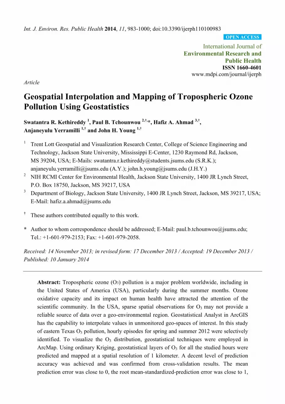
coal fired power plants), the state is very prone to air pollution. Figure 1 represents the State of Texas
showing the spatial distribution of its cities which are mainly concentrated in the eastern part. During
the last decade, Texas recorded bad air quality in 2011 [19]. A review of TAMIS-Texas Air Monitoring
Information System data indicated that a similar trend during the summer of 2012, despite stringent
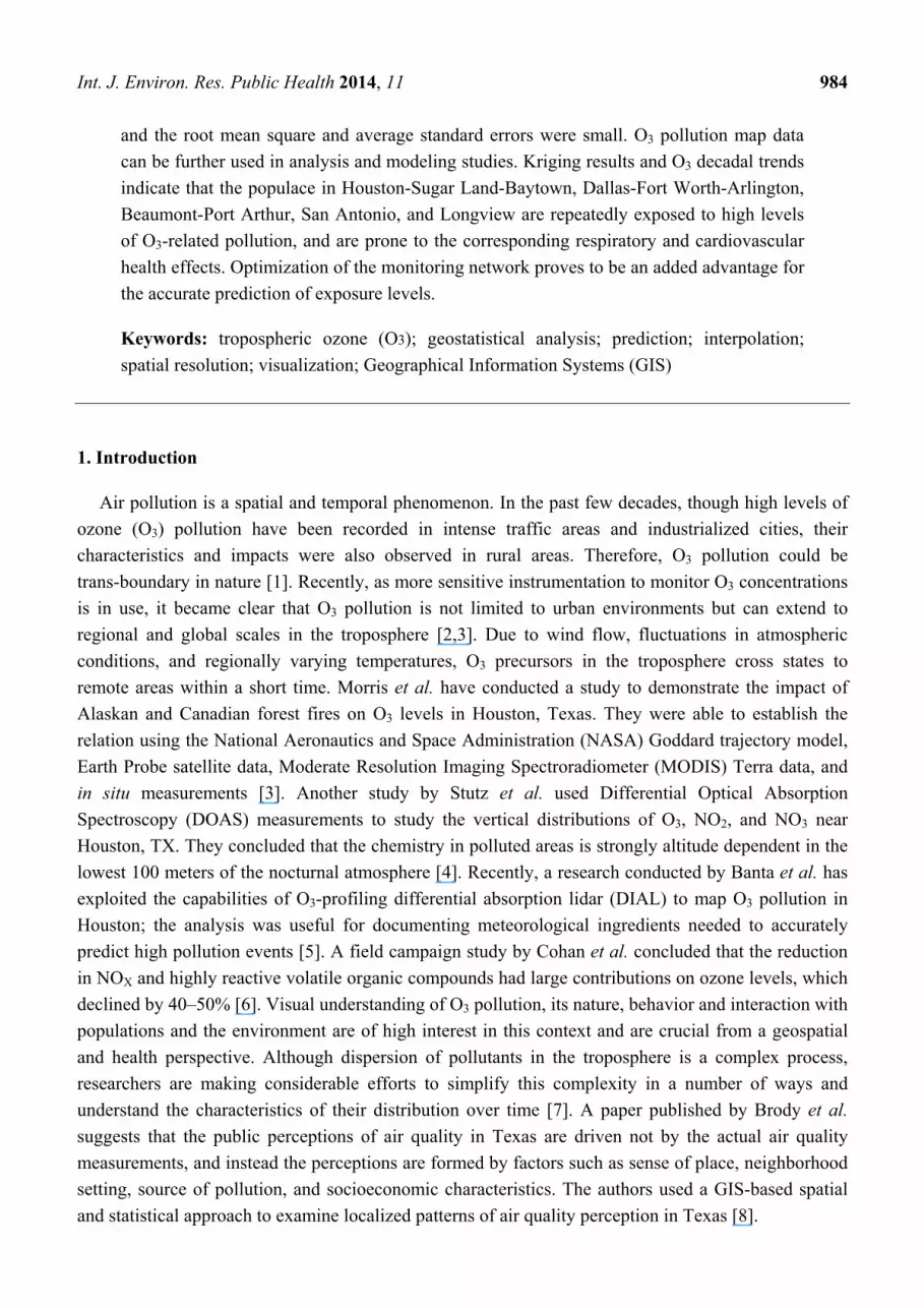
laws and air pollution regulations. The state has 80 to 100 O3 sampling stations (numbers may vary
due to maintenance problems). Texas has heavy traffic, and shares a boundary with Mexican states (air
pollutants have no boundaries). As air pollution is mostly an urban phenomenon, most of the sampling
stations are scattered around the eastern part of the state, and in major cities such as Dallas, Houston,
Austin, and San Antonio. Therefore, the air quality is of major concern in this region. Pollution
monitoring stations are non-uniformly distributed on the ground and O3 sampling stations are sparse in
Int. J. Environ. Res. Public Health 2014, 11 986
the western half of state (Figure 2). In order to obtain significant and statistically meaningful results,
geostatistical analysis and interpolation were carried out only in the eastern half of state.
Figure 1. Location of Texas and its cities.
Figure 2. Location of O3 sampling stations in Texas.
Int. J. Environ. Res. Public Health 2014, 11 987
2.2. Data Sources and Software
Hourly O3 pollution data were obtained from the TAMIS. The raw data were initially preprocessed
and converted into a database file (DBF) using Microsoft Access software and then imported into
ArcGIS for analysis and mapping. Data were integrated with geographical reference information which
is a critical requirement for geospatial data. Background map data were obtained from ESRI® ArcGIS
online resources and Texas hill shade map data were obtained from the Texas Water Development
Board website.
2.3. Methodology
Geostatistics functionality applies to regionalized phenomena both natural and manmade. It assumes
the phenomena that occur in Nature to be spatially dependent or correlated. Miller reported that
Tobler’s first law of geography is the core of spatial interpolation and geostatistical analysis [20].
Samples taken at nearby locations are expected to have more similar values than samples taken farther
apart, Tobler said that everything is related to everything else [21]. A few examples are ocean salinity
and air pollution. In the United States, thousands of O3 monitoring stations are scattered throughout the
States. In most cases they are distributed in urban areas. In practicality, it is impossible to establish
stations in each place of interest due to economic considerations and other restrictions. But quantification
at unmeasured locations is important to understand how intense the pollution is. Geostatistical
techniques assume the existence of spatial correlations in sampled values of O3. Spatially correlated
values not only facilitate optimal mapping of the pollution in the entire area but also provide valuable
information about the air quality of that area. The objective of spatial interpolation is to predict the air
pollution of a region by estimating the concentrations at unmeasured locations based on values at
measured locations. Diem advised that O3 mapping projects must report spatial scale, provide the
spatial resolution of the produced map, include a scale bar, and present the statistical accuracy of the
generated map [10]. ArcGIS Geostatistical Analyst allows us to create a statistically valid prediction
surface along with prediction uncertainties from a limited number of data points [14].
Kriging is a geostatistical method first used in mining and geological engineering in the 1950s [22].
Since then, it has been used in air quality studies [7,23–25]. Fraczek et al. said that the intensity of
phenomenon can be accurately predicted and estimated by the Kriging technique. The main advantage
of using Kriging in spatial interpolation is its ability to calculate the uncertainty of prediction which is
useful in decision making. A Kriging Interpolation model predicts surfaces better than other models
when data are checked for outliers and errors [14]. If the data follow a normal distribution, Kriging is
the best unbiased method of predicting a surface [14]. However, spatial prediction does not require the
data to be normally distributed, because Kriging is the best linear unbiased method of predicting a
surface [26].
2.3.1. Exploration of Spatial Data
Whenever mean and median values appear close to each other, it may be evidence of normality in
the data. For better understanding the data, ArcGIS offers a set of tools by which we can explore the
distribution, identify global trends, and calculate the spatial auto correlation in the data. Two tools that
Int. J. Environ. Res. Public Health 2014, 11 988
were used to check outliers and normality of O3 data are: (1) Histogram, (2) Normal Quantile-Quantile
(QQ) plot:
(1) Use of histogram to represent the distribution:
O3 values were split into ten classes (X-Axis values were redrawn to a scale of 10). In each
class, the frequency was represented by the height of the bar.
(2) Use of QQ plot to compare the data distribution to the standard normal distribution:
Data are said to be normal if they follow a “45°” straight line. For all the studied hours, QQ
plots were drawn in which quantiles of O3 data were plotted against the quantiles of the
standard normal distribution.
2.3.2. Global Trends in Data
Plotting the values in three dimensional spaces provides location based information about the data.
In trend analysis graphs, the height of each vertical line is the measured value at that particular location.
Data values were represented as perpendicular planes in North-South and the East-West planes. Two
best fit polynomials were drawn for thorough understanding, one in the north-south (blue line) and the
other in East-West (green line) direction. A U shaped curve in polynomials indicates the presence of a
trend, if any. If there were no trends, the blue and green lines would appear flat in 3D space.
2.3.3. Spatial Correlation in Data
The Kriging method uses semivariance to measure spatial correlation in sampled values. A
semivariogram measures the strength of statistical correlation in measured values as a function of
distance. It assumes the values that are close to each other in space are more alike. The existence of
spatial dependence in a dataset can be found by small semivariance in data points that are close to each
other and larger semivariances in data points that are farther apart [21]. Semivariance is computed by
the following equation:
ᵢ (1)
where is semivarience between known data points, xi and xj, separated by a distance h, and z is
the attribute value. For all the studied hours of semivariogram plots, the difference squared between
values of each pair of locations was plotted on the y-axis and the distance separating each pair of those
measurement values was plotted on the x-axis. The equation to calculate average semivariance is:
∑ ᵢ ᵢ ² (2)
where is the average semivariance between sample points separated by distance h, n is the
numbers of pairs of sample points, and z is the attribute value.
Int. J. Environ. Res. Public Health 2014, 11 989
2.3.4. Cross Validation
The objective of cross validation is to determine how well the model has predicted unknown values
(unmonitored areas). The method sequentially omits a data point and calculates the predicted value
from the remaining database for that particular location. The difference between measured and
predicted values is called prediction error. Statistics are calculated on prediction errors, and the
accuracy of produced pollution maps is assessed based on standard criteria. The accuracy of predicted
values depends on three parameters [14] including unbiased predictions, accurate standard errors, and
closeness of predicted values to measured values.
3. Results and Discussion
3.1. Normality and Checking for Errors
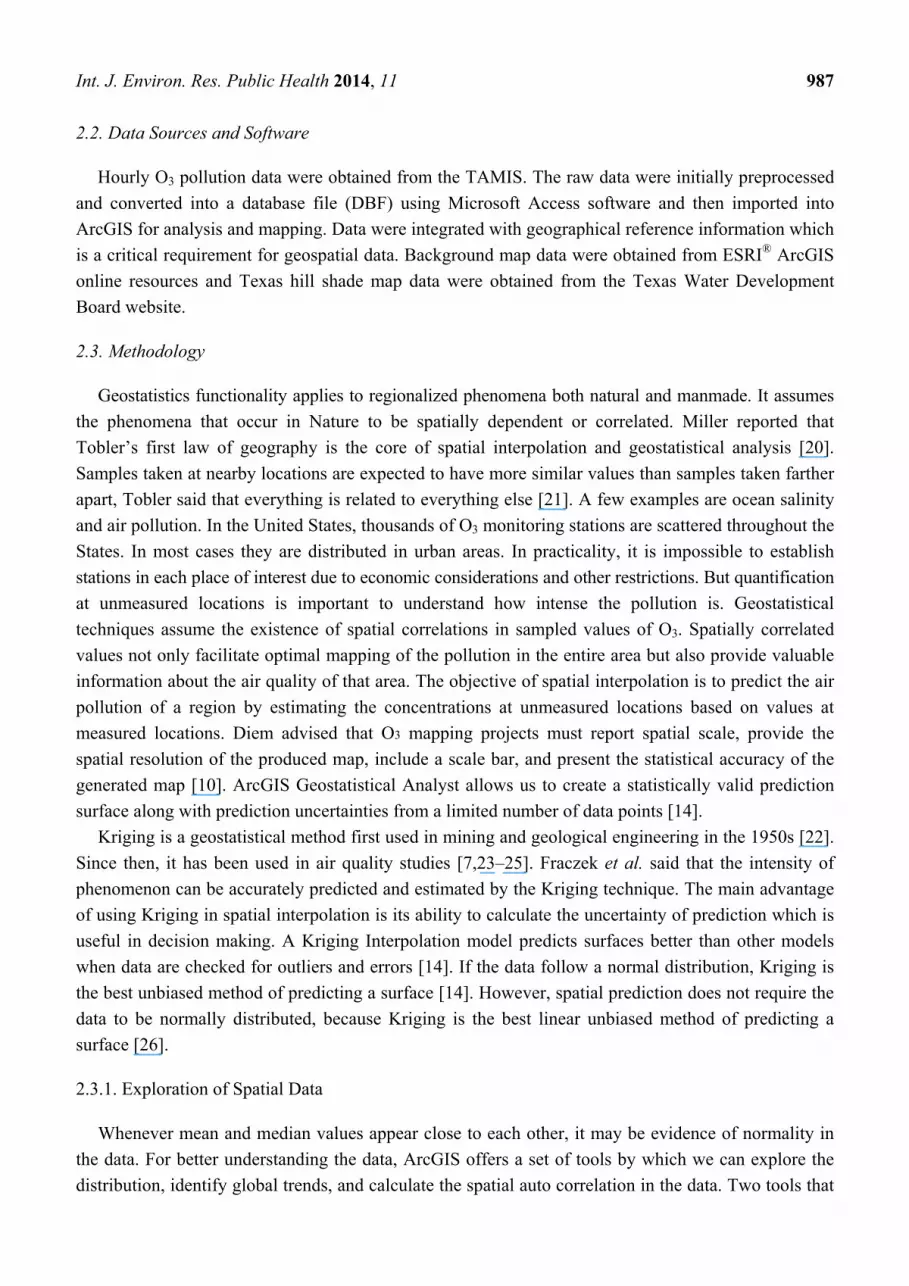
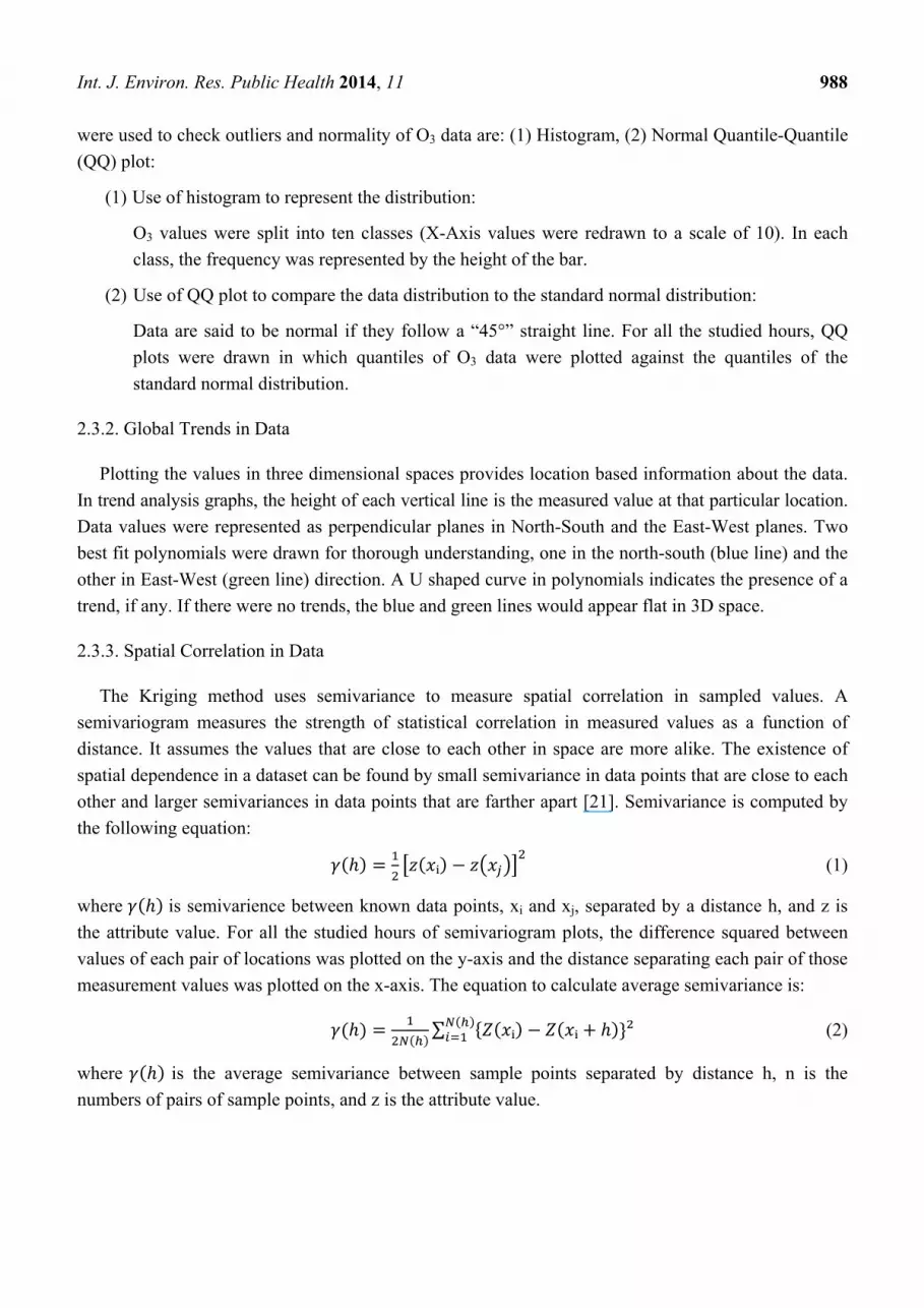
3.1.1. Histogram
From the data presented in Figure 3, the distribution of O3 concentrations was insignificantly
skewed either right or left. Normality is indicated not only by the histograms but also by the closeness
of mean and median values of ozone concentrations presented in Figure 3. There was a low frequency
of high concentration values. For all the studied hours of spring and summer 2012 days, a noticeable
fact is that the highest O3 concentrations (>0.08 ppmv) clustered on the right side of histogram were
always in urban areas (North-East and South-East regions of the State). Except For 21 July 2012 at
2:00 pm, high frequency values that fell between 0.55 ppmv and 0.75 ppmv were randomly distributed
throughout the Eastern part of the state.
Figure 3. Representation of O3 data for the studied hours.
Dataset 10
Frequency 10-1
0.2 0.29 0.38 0.47 0.56 0.66 0.75 0.84 0.93 1.02 1.120
0.38
0.76
1.14
1.52
1.9
Dataset : 25March2012 2:00pm Attribute: O3 ppmDataset 10
2
Frequency 10-1
4.47 4.87 5.27 5.66 6.06 6.46 6.86 7.26 7.66 8.06 8.450
0.48
0.96
1.44
1.92
2.4
Dataset : 24April2012 2:00pm Attribute: O3 ppm
Dataset 10
Frequency 10-1
0.55 0.6 0.65 0.7 0.75 0.81 0.86 0.91 0.96 1.01 1.060
0.56
1.12
1.68
2.24
2.8
Dataset : 17May2012 2:00pm Attribute: O3 ppmDataset 10
Frequency 10-1
0.34 0.43 0.52 0.61 0.7 0.79 0.88 0.97 1.06 1.15 1.240
0.44
0.88
1.32
1.76
2.2
Dataset : 25June2012 3:00pm Attribute: O3 ppm
Count: 72 Mean: 0.0682 Std. Dev.: 0.0615 Skewness: -0.062 Kurtosis: 4.257
Count: 81 Mean: 0.065 Std. Dev.: 0.00632 Skewness: 0.170 Kurtosis: 4.288
Count: 82 Mean: 0.0727 Std. Dev: 0.010 Skewness: 0.883 Kurtosis: 3.499
Count: 79 Mean: 0.070 Std. Dev: 0.0157 Skewness: 1.032 Kurtosis: 4.356
Int. J. Environ. Res. Public Health 2014, 11 990
Figure 3. Cont.
3.1.2. Quantile-Quantile Plot
The other way of studying and understanding the data is by normal QQ plots; data points appear
close to the “45°” line and close enough to indicate normality. Deviations from a straight line have
been observed at the lowest and highest O3 values. During data exploration and analysis, it was
visualized and clearly understood that the highest O3 values (>0.08 ppmv) fell in the North-East, and
South-East regions; details are presented in Table 1. Ozone pollution is mostly confined to them and
distributed in and around those regions. In the case where data are not normally distributed, different
types of data transformation techniques (Box-Cox, logarithmic, and arcsine) can be applied to make
them normal [27].
Table 1. Regions of Eastern Texas in which concentrations of O3 > 0.08 ppmv for the
studied hours.
25 March 2012 at 2:00 pm
24 April 2012 at 2:00 pm
17 May 2012 at 2:00 pm
25 June 2012 at 3:00 pm
21 July 2012 at 2:00 pm
20 August 2012 at3:00 pm
Dallas/Fort Worth, Houston, and Beaumont
Houston and Dallas/Fort Worth
Houston, Austin, Dallas/Fort worth, San Antonio, Beaumont, and Corpus Christi
Dallas/Fort Worth, Houston
Dallas/Fort Worth Dallas/Fort Worth, Houston, and San Antonio
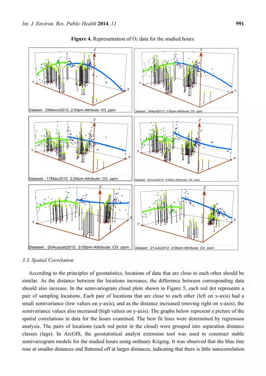
3.2. Global Trend Analysis
Careful observation of polynomials presented in Figure 4 indicates that the lines start at low values
and then increase in trend as they move to the North-East region. Except for 20 August 2012 at 3:00
pm, the trend of the blue line always increases as it moves from South to North. Except for 25 March
2012 at 2:00 pm and 24 April 2012 at 2:00 pm, the green polynomial increases as it moves East and
then decreases from the center of the domain, indicating more O3 pollution in the North Central region
for those hours. Table 1 lists the areas more vulnerable to O3 pollution where monitoring activities
have already been implemented.
Dataset 10
Frequency 10-1
0.14 0.23 0.31 0.4 0.48 0.57 0.66 0.74 0.83 0.92 10
0.4
0.8
1.2
1.6
2
Dataset : 21July2012 2:00pm Attribute: O3 ppm
Dataset 10
Frequency 10-1
0.35 0.42 0.49 0.56 0.63 0.7 0.77 0.84 0.91 0.98 1.060
0.38
0.76
1.14
1.52
1.9
Dataset : 20August2012_3:00pm Attribute: O3_ppm
Count: 68 Mean: 0.047 Std. Dev: 0.017 Skewness: 0.863 Kurtosis: 3.526
Count: 67 Mean: 0.071 Std. Dev: 0.012 Skewness: 0.009 Kurtosis: 3.846
Int. J. Environ. Res. Public Health 2014, 11 991
Figure 4. Representation of O3 data for the studied hours.
3.3. Spatial Correlation
According to the principles of geostatistics, locations of data that are close to each other should be
similar. As the distance between the locations increases, the difference between corresponding data
should also increase. In the semivariogram cloud plots shown in Figure 5, each red dot represents a
pair of sampling locations. Each pair of locations that are close to each other (left on x-axis) had a
small semivariance (low values on y-axis), and as the distance increased (moving right on x-axis), the
semivariance values also increased (high values on y-axis). The graphs below represent a picture of the
spatial correlations in data for the hours examined. The best fit lines were determined by regression
analysis. The pairs of locations (each red point in the cloud) were grouped into separation distance
classes (lags). In ArcGIS, the geostatistical analyst extension tool was used to construct stable
semivariogram models for the studied hours using ordinary Kriging. It was observed that the blue line
rose at smaller distances and flattened off at larger distances, indicating that there is little autocorrelation
XX
YY
ZZ
Dataset : 25March2012_2:00pm Attribute: O3_ppm
XX
YY
ZZ
Dataset : 24April2012 2:00pm Attribute: O3 ppm
XX
YY
ZZ
Dataset : 17May2012 2:00pm Attribute: O3 ppm
XX
YY
ZZ
Dataset : 25June2012 3:00pm Attribute: O3 ppm
XXYY
ZZ
Dataset : 20August2012 3:00pm Attribute: O3 ppm
XXYY
ZZ
Dataset : 21July2012 2:00pm Attribute: O3 ppm

Int. J. Environ. Res. Public Health 2014, 11 992
in O3 data at larger distances. Because of their wide application to environmental data analysis [14],
omnidirectional stable semivariogram models were constructed using optimal parameter values
(nugget, range, partial sill, and shape). However, there are several other types of semivariogram
models (circular, spherical, exponential, and Gaussian etc.) that could be used depending on how well
they fit the data.
Figure 5. Spatial autocorrelation in O3 data for the studied hours.
25 March 2012 at 2:00 pm
24 April 2012 at 2:00 pm
17 May 2012 at 2:00 pm
Int. J. Environ. Res. Public Health 2014, 11 993
Figure 5. Cont.
25 June 2012 at 3:00 pm
21 July 2012 at 2:00 pm
20 August 2012 at 3:00 pm
Ozone pollution maps are presented in Figure 6. The maps were originally raster files that were
later exported to jpeg images with a spatial resolution of 1 kilometer. To facilitate the analysis and
other processing, actual results were stored in a gesostatistical (GA) layer. For the purpose of better
visual understanding and producing maps of smaller cell sizes (1,000 meters spatial resolution), GA
layers were later exported into raster file formats. Data presented in Figure 6 indicate that the predicted
concentration of O3 were maximal in urban regions and also extended to suburban and rural areas. The
possible reason for this observation could be attributed to more anthropogenic emissions (vehicular
traffic and industrial emanations) in urban areas. This indicates that the urban population is relatively
more exposed to O3 pollution than the rural population. The higher concentrations of O3 were observed
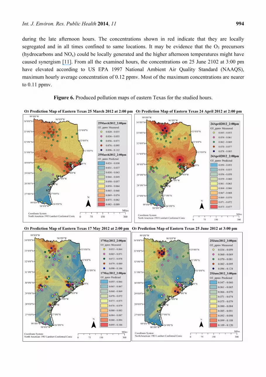
Int. J. Environ. Res. Public Health 2014, 11 994
during the late afternoon hours. The concentrations shown in red indicate that they are locally
segregated and in all times confined to same locations. It may be evidence that the O3 precursors
(hydrocarbons and NOx) could be locally generated and the higher afternoon temperatures might have
caused synergism [11]. From all the examined hours, the concentrations on 25 June 2102 at 3:00 pm
have elevated according to US EPA 1997 National Ambient Air Quality Standard (NAAQS),
maximum hourly average concentration of 0.12 ppmv. Most of the maximum concentrations are nearer
to 0.11 ppmv.
Figure 6. Produced pollution maps of eastern Texas for the studied hours.
O3 Prediction Map of Eastern Texas 25 March 2012 at 2:00 pm O3 Prediction Map of Eastern Texas 24 April 2012 at 2:00 pm
O3 Prediction Map of Eastern Texas 17 May 2012 at 2:00 pm O3 Prediction Map of Eastern Texas 25 June 2012 at 3:00 pm
Int. J. Environ. Res. Public Health 2014, 11 995
Figure 6. Cont.
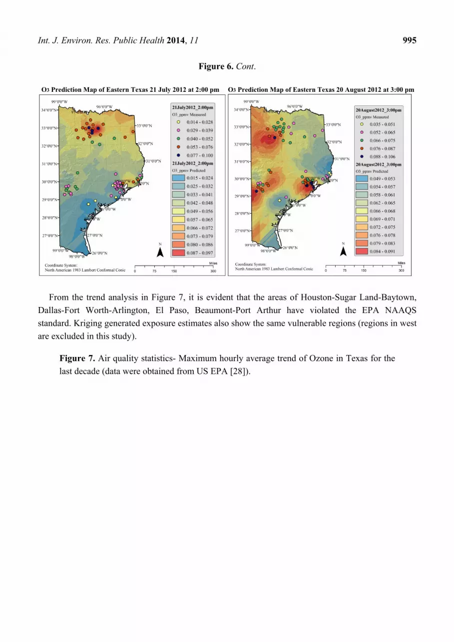
O3 Prediction Map of Eastern Texas 21 July 2012 at 2:00 pm O3 Prediction Map of Eastern Texas 20 August 2012 at 3:00 pm
From the trend analysis in Figure 7, it is evident that the areas of Houston-Sugar Land-Baytown,
Dallas-Fort Worth-Arlington, El Paso, Beaumont-Port Arthur have violated the EPA NAAQS
standard. Kriging generated exposure estimates also show the same vulnerable regions (regions in west
are excluded in this study).
Figure 7. Air quality statistics- Maximum hourly average trend of Ozone in Texas for the
last decade (data were obtained from US EPA [28]).
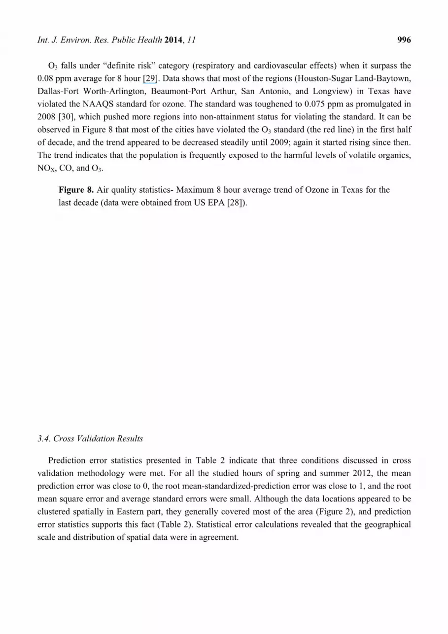
Int. J. Environ. Res. Public Health 2014, 11 996
O3 falls under “definite risk” category (respiratory and cardiovascular effects) when it surpass the
0.08 ppm average for 8 hour [29]. Data shows that most of the regions (Houston-Sugar Land-Baytown,
Dallas-Fort Worth-Arlington, Beaumont-Port Arthur, San Antonio, and Longview) in Texas have
violated the NAAQS standard for ozone. The standard was toughened to 0.075 ppm as promulgated in
2008 [30], which pushed more regions into non-attainment status for violating the standard. It can be
observed in Figure 8 that most of the cities have violated the O3 standard (the red line) in the first half
of decade, and the trend appeared to be decreased steadily until 2009; again it started rising since then.
The trend indicates that the population is frequently exposed to the harmful levels of volatile organics,
NOX, CO, and O3.
Figure 8. Air quality statistics- Maximum 8 hour average trend of Ozone in Texas for the
last decade (data were obtained from US EPA [28]).
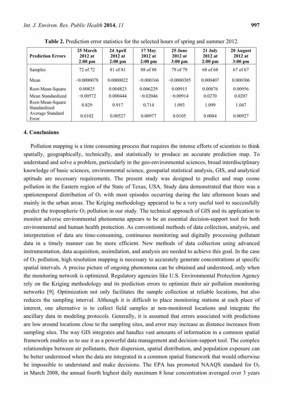
3.4. Cross Validation Results
Prediction error statistics presented in Table 2 indicate that three conditions discussed in cross
validation methodology were met. For all the studied hours of spring and summer 2012, the mean
prediction error was close to 0, the root mean-standardized-prediction error was close to 1, and the root
mean square error and average standard errors were small. Although the data locations appeared to be
clustered spatially in Eastern part, they generally covered most of the area (Figure 2), and prediction
error statistics supports this fact (Table 2). Statistical error calculations revealed that the geographical
scale and distribution of spatial data were in agreement.
Int. J. Environ. Res. Public Health 2014, 11 997
Table 2. Prediction error statistics for the selected hours of spring and summer 2012.
Prediction Errors 25 March
2012 at 2:00 pm
24 April 2012 at 2:00 pm
17 May 2012 at 2:00 pm
25 June 2012 at 3:00 pm
21 July 2012 at 2:00 pm
20 August 2012 at 3:00 pm
Samples 72 of 72 81 of 81 88 of 88 79 of 79 68 of 68 67 of 67
Mean −0.0000078 0.0000022 −0.000166 −0.0000385 0.000407 0.000306
Root-Mean-Square 0.00825 0.004823 0.006229 0.00915 0.00876 0.00956
Mean Standardized −0.00572 0.000444 −0.02046 −0.00914 0.0270 0.0207 Root-Mean-Square Standardized
0.829 0.917 0.714 1.093 1.099 1.047
Average Standard Error
0.0102 0.00527 0.00977 0.0105 0.0084 0.00927
4. Conclusions
Pollution mapping is a time consuming process that requires the intense efforts of scientists to think
spatially, geographically, technically, and statistically to produce an accurate prediction map. To
understand and solve a problem, particularly in the geo-environmental sciences, broad interdisciplinary
knowledge of basic sciences, environmental science, geospatial statistical analysis, GIS, and analytical
aptitude are necessary requirements. The present study was designed to predict and map ozone
pollution in the Eastern region of the State of Texas, USA. Study data demonstrated that there was a
spatiotemporal distribution of O3 with most episodes occurring during the late afternoon hours and
mainly in the urban areas. The Kriging methodology appeared to be a very useful tool to successfully
predict the tropospheric O3 pollution in our study. The technical approach of GIS and its application to
monitor adverse environmental phenomena appears to be an essential decision-support tool for both
environmental and human health protection. As conventional methods of data collection, analysis, and
interpretation of data are time-consuming, continuous monitoring and digitally processing pollutant
data in a timely manner can be more efficient. New methods of data collection using advanced
instrumentation, data acquisition, assimilation, and analysis are needed to achieve this goal. In the case
of O3 pollution, high resolution mapping is necessary to accurately generate concentrations at specific
spatial intervals. A precise picture of ongoing phenomena can be obtained and understood, only when
the monitoring network is optimized. Regulatory agencies like U.S. Environmental Protection Agency
rely on the Kriging methodology and its prediction errors to optimize their air pollution monitoring
networks [9]. Optimization not only facilitates the sample collection at reliable locations, but also
reduces the sampling interval. Although it is difficult to place monitoring stations at each place of
interest, one alternative is to collect field samples at non-monitored locations and integrate the
ancillary data in modeling protocols. Generally, it is assumed that errors associated with predictions
are low around locations close to the sampling sites, and error may increase as distance increases from
sampling sites. The way GIS integrates and handles vast amounts of information in a common spatial
framework enables us to use it as a powerful data management and decision-support tool. The complex
relationships between air pollutants, their dispersion, spatial distribution, and population exposure can
be better understood when the data are integrated in a common spatial framework that would otherwise
be impossible to understand and make decisions. The EPA has promoted NAAQS standard for O3
in March 2008, the annual fourth highest daily maximum 8 hour concentration averaged over 3 years
Int. J. Environ. Res. Public Health 2014, 11 998
is set to 0.075 ppm. However, the metro cities of Houston-Sugar Land-Baytown, Dallas-Fort
Worth-Arlington, Beaumont-Port Arthur, San Antonio, and Longview in Texas have severely suffered
from O3 pollution. EPA again reconsidered the O3 8 hour standard in order to protect public health and
welfare, and the new final rule is set to amend the O3 standard to 0.070 ppm [31]. The new rule may
push more regions in Texas into non-attainment status.
Acknowledgments
This research was made possible in part by a grant from the National Institutes of Health
(Grant No. 2G12RR013459, and NIH-NIMHD Grant No. 8G12MD007581) and in part by a grant
from the U.S. Department of Education Title III Historically Black Graduate Institutions
(Grant No. P031B90210-12) at Jackson State University (JSU). We thank the Texas Air Monitoring
Information System for providing pollutant and geospatial data. We thank Debra Sue Pate, Psychology
Department, Jackson State University for her assistance. We would like to also extend gratitude to
Samuel Jones Jr., university physician at JSU for his contribution to this project.
Conflicts of Interest
The authors declare no conflict of interest.
References
1. Cross-State Air Pollution Rule; U.S. EPA: Washington, DC, USA, 2011. Available online:
http://www.epa.gov/airtransport/index.html (accessed on 15 November 2012).
2. Cooper, O.R.; Parrish, D.D.; Stohl, A.; Trainer, M.; Nédélec, P.; Thouret, V.; Cammas, J.P.;
Oltmans, S.J.; Johnson, B.J.; Tarasick, D.; et al. Increasing springtime ozone mixing ratios in the
free troposphere over western North America. Nature 2010, 463, 344–348.
3. Morris, G.A.; Hersey, S.; Thompson, A.M.; Pawson, S.; Nielsen, J.E.; Colarco, P.R.;
McMillan, W.W.; Stohl, A.; Turquety, S.; Warner, J.; et al. Alaskan and Canadian forest fires
exacerbate ozone pollution over Houston, Texas, on 19 and 20 July 2004. J. Geophy. Res. 2006,
111, doi:10.1029/2006JD007090.
4. Stutz, J.; Alicke, B.; Ackermann, R.; Geyer, A.; White, A.; Williams, E. Vertical profiles of NO3,
N2O5, O3, and NOX in the nocturnal boundary layer: 1. Observations during Texas Air Quality
Study 2000. J. Geophy. Res. 2004, 109, doi:10.1029/2003JD004.
5. Banta, R.M.; Senff, C.J.; Nielsen-Gammon, J.; Darby, L.S.; Ryerson, T.B.; Alvarez, R.J.;
Sandberg, S.P.; Williams, E.J.; Trainer, M. A bad air day in Houston. Bull. Amer. Meteorol. Soc.
2005, 86, 657–669.
6. Zhou, W.; Cohan, D.S.; Henderson, B.H. Slower ozone production in Houston, Texas following
emission reductions: Evidence from Texas Air Quality Studies in 2000 and 2006. Atmos. Chem.
Phys. Discuss. 2013, 13, 19085–19120.
7. Moral García, F.J.; González, P.V.; Rodríguez, F.L. Geostatistical analysis and mapping of
ground-level ozone in a medium sized urban area. Int. J. Civil Environ. Eng. 2010, 2, 71–82.
Int. J. Environ. Res. Public Health 2014, 11 999
8. Brody, S.D.; Mitchell Peck, B.; Highfield, W.E. Examining localized patterns of air quality
perception in Texas: A spatial and statistical analysis. Risk Anal. 2004, 24, 1561–1574.
9. Developing Spatially Interpolated Surfaces and Estimating Uncertainty; U.S. EPA: Washington,
DC, USA, 2004. Available online: http://www.epa.gov/airtrends/specialstudies/dsisurfaces.pdf
(accessed on 10 December 2012).
10. Diem, J.E. A critical examination of ozone mapping from a spatial-scale perspective. Environ.
Pollut. 2003, 125, 369–383.
11. Daum, P.H.; Kleinman, L.I.; Springston, S.R.; Nunnermacker, L.J.; Lee, Y.-N.; Weinstein-Lioyd, J.;
Zheng, J.; Berkowitz, C.M. Origin and properties of plumes of high ozone observed during the
Texas 2000 air quality study (TexAQS 2000). J. Geophy. Res. 2003, 109,
doi:10.1029/2003JD004311.
12. Fraczek, W.; Bytnerowicz, A. Automating the Use of Geostatistical Tools for Lake Tahoe Area
Study. ArcUser 2007. Available online: http://www.esri.com/news/arcuser/0807/ga_network.html
(accessed on 19 December 2013).
13. Yerramilli, A.; Dodla, V.B.; Desamsetti, S.; Challa, S.V.; Young, J.H.; Patrick, C.; Baham, J.M.;
Hughes, R.L.; Yerramilli, S.; Tuluri, F.; Hardy, M.G.; Swanier, S.J. Air Quality Modeling for
Urban Jackson, Mississippi Region Using a High Resolution WRF/Chem Model. Int. J. Environ.
Res. Public Health 2011, 8, 2470–2490.
14. Geostatistical Analyst Tutorial; Environmental Systems Research Institute: Redlands, CA, USA,
2012; pp. 1–57.
15. Maroko, A.; Maantay, J.A.; Grady, K. Using geovisualization and geospatial analysis to explore
respiratory disease and environmental health justice in New York City. Geospatial Analysis of
Environmental Health; Maantay, J.A., McLafferty, S., Eds.; Springer: New York, NY, USA, 2011;
pp. 39–66.
16. ArcGIS™ Geostatistical Analyst: Statistical Tools for Data Exploration, Modeling, and Advanced
Surface Generation; An ESRI White Paper; Environmental Systems Research Institute: Redlands,
CA, USA, 2001.
17. U.S. Department of Commerce, Economics and Statistics Administration, U.S. Census Bureau.
2010 Census: Texas profile. Available online: http://www.census.gov/geo/www/2010census
(accessed on 5 November 2012).
18. U.S. Energy Information Administration. State Energy Data System: Texas State Energy Profile.
2010. Available online: http://www.eia.gov/beta/state/print.cfm?sid=TX (accessed on 24 October
2012).
19. The New York Times. 2011 Proving to be a Bad Year for Air Quality in Texas. Available online:
http://www.nytimes.com/2011/12/11/us/2011-proving-to-be-a-bad-year-for-air quality.html?_ r=0
(accessed on 24 October 2012).
20. Miller, H.J. Tobler’s first law and spatial analysis. Ann. Assoc. Amer. Geograph. 2004, 94, 284–289.
21. Tobler, W.R. A computer movie simulating urban growth in Detroit region. Econ. Geogr. 1970,
46, 234–240.
22. Chang, K.T. Introduction to Geographic Information Systems, 4th ed.; McGraw-Hill Publishers:
New York, NY, USA, 2008; pp. 326–356.
Int. J. Environ. Res. Public Health 2014, 11 1000
23. Moral, F.J.; Rebollo, F.J.; Valiente, P.; López, F.; De la Peńa, A.M. Modelling ambient ozone in
an urban area using an objective model and geostatistical algorithms. Atmosph. Environ. 2012, 63,
86–93.
24. Fraczek, W.; Bytnerowicz, A.; Legge, A. Optimizing a monitoring network for assessing ambient
air quality in the Athabasca oil sands region of Alberta, Canada. In Alpine Space-Man and
Environment, Global Change and Sustainable Development in Mountain Regions; Innsbruck
University Press: Innsbruck, Austria, 2009; Volume 7, pp. 127–142.
25. Wong, D.W.; Yuan, L.; Perlin, S.A. Comparison of spatial interpolation methods for the estimation
of air quality data. J. Expos. Analysis Environ. Epid. 2004, 14, 404–415.
26. Negreiros, J.; Painho, M.; Aguilar, F.; Aguilar, M. Geographical information systems principles
of ordinary kriging interpolator. J. Appl. Sci. 2010, 10, 852–867.
27. Johnston, K.; Ver Hoef, J.M.; Krivoruchko, K.; Lucas, N. Exploratory spatial data analysis. In
Using ArcGIS™ Geostatistical Analyst; Environmental Systems Research Institute: Redlands, CA,
USA, 2003; Chapter 4, pp. 81–112.
28. Air quality statistics report; U.S. EPA: Washington, DC, USA, 2013. Available online:
http://www.epa.gov/airdata/ad_rep_con.html (accessed on 26 November 2013 ).
29. Sexton, K.; Linder, S.H.; Marko, D.; Bethel, H.; Lupo, P.J. Comparative assessment of air
pollution-related health risks in Houston. Environ. Health Persp. 2007, 115, 1388–1393.
30. National Ambient Air Quality Standards (NAAQS); U.S. EPA: Washington, DC, USA, 2012.
Available online: www.epa.gov/air/criteria.html#3 (accessed on 26 November 2013).
31. Regulatory Impact Analysis: Final National Ambient Air Quality Standard for Ozone; U.S. EPA:
Washington, DC, USA, 2011. Available online: http://www.epa.gov/glo/pdfs/201107_OMBdraft-
OzoneRIA.pdf (accessed on 27 November 2013).
© 2014 by the authors; licensee MDPI, Basel, Switzerland. This article is an open access article
distributed under the terms and conditions of the Creative Commons Attribution license
(http://creativecommons.org/licenses/by/3.0/).