dmu brand guidelines june 2017
TRANSCRIPT

BRAND GUIDELINES June 2017
22
CONTENTS
The future of DMU 3
Our brand idea 4
Bringing the brand to life 5
Our logo 6
The origin of our logo 7
Logo versions 8
Clear zones and minimum sizes 9
Logo placement 10
Logo sizes 11
Using our logo 12
Partnership logos 13
Standard sizes 14
Using the logo correctly 16
Our overall look and feel 17
Lead photography 18
Supporting photography 19
Abstract photography 22
Typography 24
Formats and finishing 27
Brand in use 28-32

3
THE FUTUREOF DMUThe Strategic Framework 2015-2020, developed through extensive consultation across the university, sets out DMU’s priorities. It underpins these branding guidelines, and every element of the DMU experience.
Our MissionWe are a scholarly community committed to public good. We have an unrivalled ability to challenge convention. We create impact.
Our VisionBy 2020, our unsurpassed commitment to the public good and transformational scholarship will position us as the definition of a 21st-century global university.
Our ValuesCreative | Professional | Pride Respect | Transformational
3

4
NEVER SURRENDER TO CONVENTION These guidelines will help us spotlight the DMU difference in everything we say, show and do.
We have to communicate worldwide with authenticity and personal respect, and with vividness and conviction, showing that we know our students. They expect from us the adventure in language and design that speaks to creativity and innovation, to cultural energy, to prestige and heritage.
The DMU difference is unique and distinctive in a competitive HE marketplace and we present the outstanding experience we offer through our brand idea. As always, your knowledge and judgment will be vital to the successful delivery of our ideas. This guide is your touchstone.
Our brand idea...

5
Bringing the brand to life simply means we can share effectively all the detail, and all the excitement, of everything we do – big or small, international or domestic – and in a way that is distinctively DMU. We want to forefront the brand idea, of ‘Never surrender to convention’, with examples that show it as an authentic, natural expression of life at DMU.
DMU’s Student Experience Strategy was shaped by our students. It is an institution-wide programme entirely based on enhancing every aspect of student life. It exemplifies our brand idea because it shows how students are active co-creators, with staff, of their university experience.
DMUfreedom is our equality and diversity charter. It challenges convention by calling on each one of us to think and act differently, and in allowing us all the freedom to be ourselves.
#DMUglobal is our signature international programme. Every student can be part of it, and enrich their learning, broaden their horizons and develop skills valued by employers. Fifty per cent of DMU students are set to take part in #DMUglobal activities.
Square Mile India is a natural development of our Square Mile and #DMUlocal programmes. It expands the international and public good opportunities our students embrace, enhancing employment opportunities, and crucially also channels research into living, breathing communities, benefitting all involved. This is something that is distinctly ours.
Our graduates show a spirit of adventure shaped by teaching and research which continually innovates. For example, Dr Kathleen Richardson, a senior research fellow in the ethics of robotics at DMU, has looked into the future and spoken out about sex robots and their potential negative impact on human relations. Her work exemplifies our shared mission to raise awareness of DMU’s academic excellence and its fresh take on the world.
BRINGING THE BRAND TO LIFE 5

6
The DMU logo is a key part of our identity, helping to form the character of our overall visual approach. It is unique and should be respected and celebrated. It should never be altered in any way and remain the only logo used to represent the university and its activities.
OUR LOGO
6

7
THE ORIGIN OF OUR LOGO
Leicester was one of England’s most important cities during the tumultuous transition from the medieval to the modern world. Its coat of arms, granted by Elizabeth I, harks back to the Medieval Earls of Leicester, of whom the university’s namesake, Simon de Montfort, is the most famous.
Like the university, the DMU logo is contemporary, yet with a distinguished history. It carries powerful associations: courage, strength, a voice that carries a willingness to stand apart, an instinct to live together. Pride and the lion go together. It is why the logo demands our respect.
Born from the marriage of Leicester’s Victorian art and technical schools, DMU’s predecessor institutions have all used these devices as a connection to the city’s past.
In honouring Simon De Montfort, we are responding to his appetite for change, his disruptive energy and desire to make a mark in life and history. We are proud of our home city’s place in English history, and excited to be shaping its place and future on the global stage.
This excellent example of making history by not surrendering to convention imbues our logo with a significance that few other brands can claim.
8
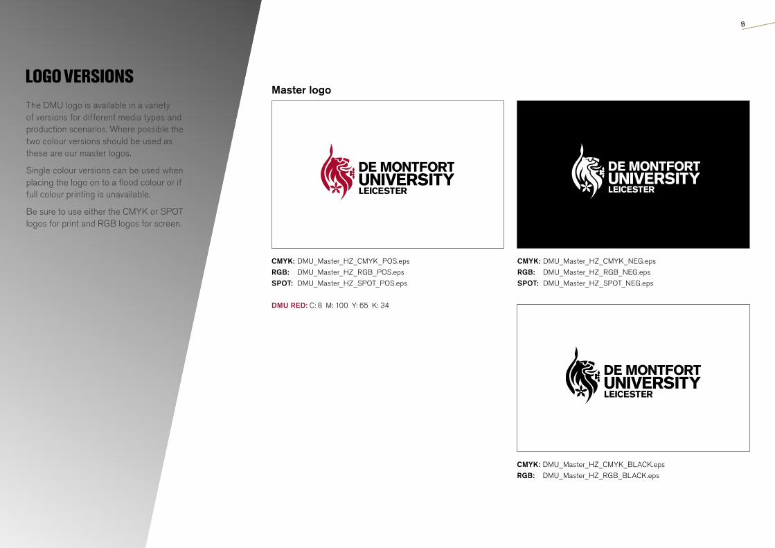
LOGO VERSIONSThe DMU logo is available in a variety of versions for different media types and production scenarios. Where possible the two colour versions should be used as these are our master logos.
Single colour versions can be used when placing the logo on to a flood colour or if full colour printing is unavailable.
Be sure to use either the CMYK or SPOT logos for print and RGB logos for screen.
CMYK: DMU_Master_HZ_CMYK_POS.epsRGB: DMU_Master_HZ_RGB_POS.epsSPOT: DMU_Master_HZ_SPOT_POS.eps
DMU RED: C: 8 M: 100 Y: 65 K: 34
Master logo
CMYK: DMU_Master_HZ_CMYK_BLACK.epsRGB: DMU_Master_HZ_RGB_BLACK.eps
CMYK: DMU_Master_HZ_CMYK_NEG.epsRGB: DMU_Master_HZ_RGB_NEG.epsSPOT: DMU_Master_HZ_SPOT_NEG.eps

9
CLEAR ZONES AND MINIMUM SIZESTo ensure the DMU logo remains clearly visible and has room to breathe, it should be surrounded by a proportional amount of space free of other graphic elements. The ‘u’ in University is used as the clearance zone.
To ensure the legibility of the DMU logo it should not be produced any smaller than the sizes shown above.
A version of the logo has been created especially for smaller use. Use this for extra clarity and stand-out.
20mm (120px)

10
LOGO PLACEMENTThe DMU logo should always be anchored to a corner of the page. The preferred position for the logo is in the top left corner and should be placed here wherever possible. However, when the layout of the communication means this is not possible it should always be anchored to one of the remaining corners. For online/email applications the logo should always be positioned in the top left corner.
Preferred logo position

11
LOGO SIZESTo ensure our logo is clear and legible on all our communications it should be used at the these minimum sizes depending on the scale of the media. Where necessary, the logo can be produced larger than the specified sizes but never smaller.
A1: 841 x 594 mmLogo width: 140mm
A2: 594 x 420 mmLogo width: 100mm
A3: 420 x 297 mmLogo width: 70mm
A4: 297 x 420 mm DL: 297 x 99 mm
Logo width: 50mm
A5: 210 x 148 mm Logo width: 37mm
A1
A2
A3
A4
A5

12
USING OUR LOGOOur logo is our badge of honour. It should be produced consistently in order to create maximum recognition. For this reason it should be treated with respect and shouldn’t be altered in any way, regardless of creative justification.
DO always use an unaltered, horizontal two-colour logo wherever possible
DO use the most appropriate version on top of an image, ensuring the logo is not obscured and the image is not too busy
DO use the ‘mono’ versions of the logo when placing onto a coloured background
DON’T squash or stretch the logo DON’T change the colours in the logo DON’T alter the typeface in the logo
DON’T crop the logo in any wayDON’T use on top of a busy image, ensure the the logo has not been obscured in any way.
DON’T alter the relationship of the elements DON’T rotate or use the logo on an angle

13
PARTNERSHIP LOGOSSometimes we need to lock up our logo with one of our partners. In these situations the aim is to create an equal weighting between the two marks. The lock-ups work best when there are some lines of alignment between the two logos, but these lines aren’t fixed. Use your eye, follow your instinct.
Partner logos should be positioned in accordance with the examples on the right. In addition, use a fine rule to split the two logos.
Use a 0.5mm keyline at this size, and scale up accordingly.
Use the DMU exclusion zone to determine the space between, which should be two times the letter U of DMU.
Note: The DMU logo always appears above or to the left of the partner logo.

14
STANDARD SIZES
Note: Formats have been reduced and are NOT shown to scale.
For consistency, the DMU logo should be used at the sizes specified beneath the standard literature formats shown opposite. These sizes are applicable to both portrait and landscape.
The measurements apply to the width and height of the whole logo. For reference, the logos have been placed within the relevant format’s grid for positional guidance.
Minimum sizeTo avoid legibility issues, the DMU logo should not be used any smaller than 30mm x 13mm.
Format:
Logo size:
Exclusion zone:
Format:
Log size:
Exlusion zone
A0 (841mm x 1189 mm)
180mm x 75mm
35mm2
A1 (594mm x 841 mm)
135mm x 55mm
25mm2
Format:
Logo size:
Margin:
Columns:
Rows:
Gutter:
Exlusion zone
A3 (297mm x 420mm)
65mm x 28mm
12mm
16
30
4mm
10mm2
Format:
Logo size:
Exclusion zone:
A2 (420mm x 594mm)
96mm x 41mm
41mm2

15
Format:
Logo size:
Margin:
Columns:
Rows:
Gutter:
A6 (105mm x 148mm)
30mm x 13mm
5mm
6
10
4mm
Format:
Logo size:
Margin:
Columns:
Rows:
Gutter:
Exlusion zone
A5 (148mm x 210mm)
37mm x 16mm
8mm
10
16
4mm
10mm2
Format:
Logo size:
Margin:
Columns:
Rows:
Gutter:
Exlusion zone
A4 (297mm x 420mm)
44mm x 19mm 42%
11mm
12
22
4mm
10mm2

16
USING THE LOGO CORRECTLY
The following examples show our logo used correctly against different backgrounds.
Wherever possible, use the DMU logo in its true form — red lion and black text.
Coloured backgrounds Always use the version that gives maximum contrast and visibility.
The logo should never be positioned on a busy area of an image. It should also be positioned in an area free from distracting background clutter.
Digital use When placed on the web, the logo must not be stretched via HTML or CSS. Logos should always be scaled down within the appropriate design software. Logos for digital use should be sourced from the marketing team in the relevant file format and not copied from online sources. The logo must not be animated or separated in any way.
Logo placement The preferred position for the DMU logo is in the top left hand corner. Only, if critical to the design, can the logo be placed in one of the other four corners of the page.

17
Our visual personality is critical to the delivery of the DMU brand idea. The photography in this section provides a clear guide on how to deliver appropriately evocative imagery, and how to adjust visuals to appeal to different audience needs. DMU communications always lead with big, dynamic images, breaking the expected conventions of higher education.
Images should be bold and impactful and should meet at least one, if not all, of the characteristics on the following page. Careful cropping can help to make images even more powerful. We use photography and abstract images never illustration or icons.
OUR OVERALL LOOK AND FEEL
MAKE AN IMPACT
17
18
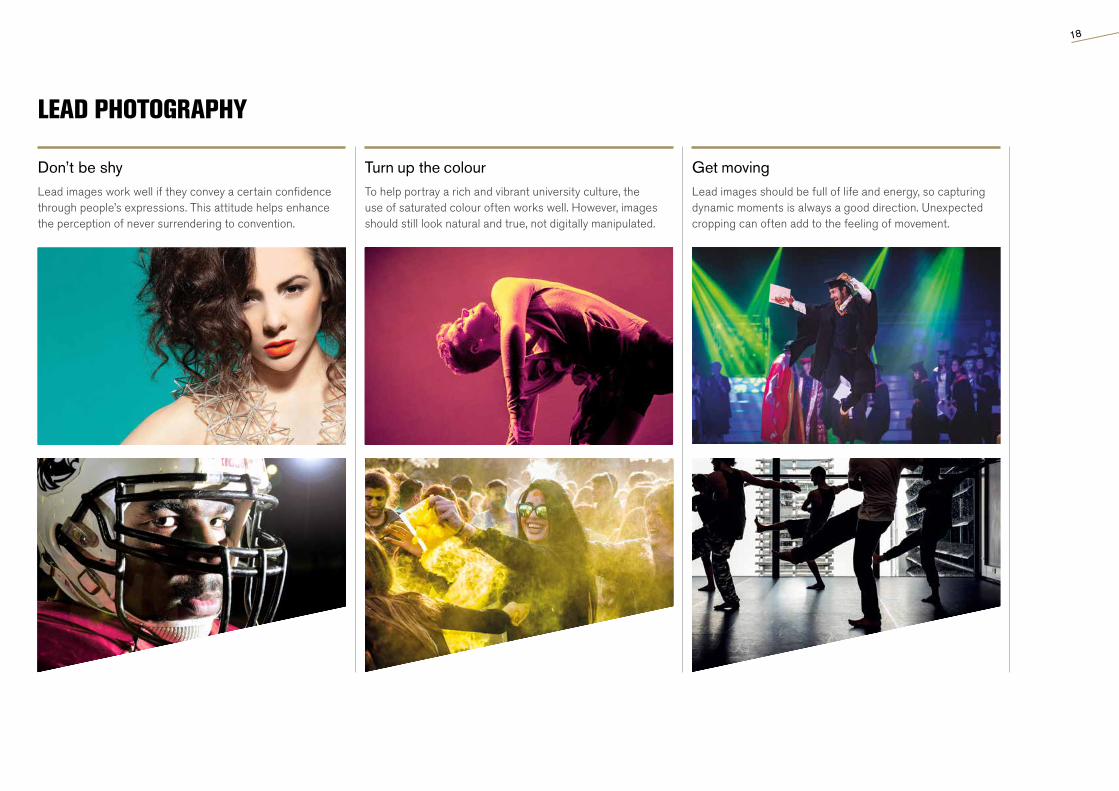
LEAD PHOTOGRAPHY
Turn up the colourTo help portray a rich and vibrant university culture, the use of saturated colour often works well. However, images should still look natural and true, not digitally manipulated.
Don’t be shyLead images work well if they convey a certain confidence through people’s expressions. This attitude helps enhance the perception of never surrendering to convention.
Get movingLead images should be full of life and energy, so capturing dynamic moments is always a good direction. Unexpected cropping can often add to the feeling of movement.

19
Our supporting photography exists to present the university and our students in the most natural way possible, providing a snapshot of life at DMU.
Supporting images should feel like a realistic window into what it looks and feels like to be part of DMU. They should never be heavily posed or overly contrived.
SUPPORTING PHOTOGRAPHY
TRUE TO LIFE

20
SUPPORTING PHOTOGRAPHY
Capture a momentImages should be candid, capturing a moment in time. People can be looking at the camera but it should always feel natural and believable, not awkward and posed.
Find interesting perspectivesShots from unusual angles or unexpected points of view can help add a sense of style to our communications, adding to the candid nature of our images.
Show students fully engagedOf course we want our students to look happy in our photographs but this doesn’t always mean they have to be smiling. Someone concentrating can work equally well.

21
SUPPORTING PHOTOGRAPHY
Celebrate our facilitiesShowing students in the context of the university helps to highlight the wide range of facilities at DMU. These images should aim to be dynamic, and always full of life.
Use a short depth of fieldAdding to the idea of capturing a candid moment, a short depth of field can help images feel more natural. It can also become a stylistic theme throughout our photography.
Maintain a natural toneImages shouldn’t be overly manipulated, saturated or contrasted. In order that our images feel like real moments, the tone should be consistent and as natural as possible.

In certain situations, where neither lead nor supporting images are appropriate, we can use abstract, textural images instead.
This approach allows us to change the pace of communications and helps to reinforce the perception that, at DMU, we see things differently.We would not use illustrations or icons.
ABSTRACT PHOTOGRAPHY
LOOK CLOSER
22
23
ABSTRACT PHOTOGRAPHY
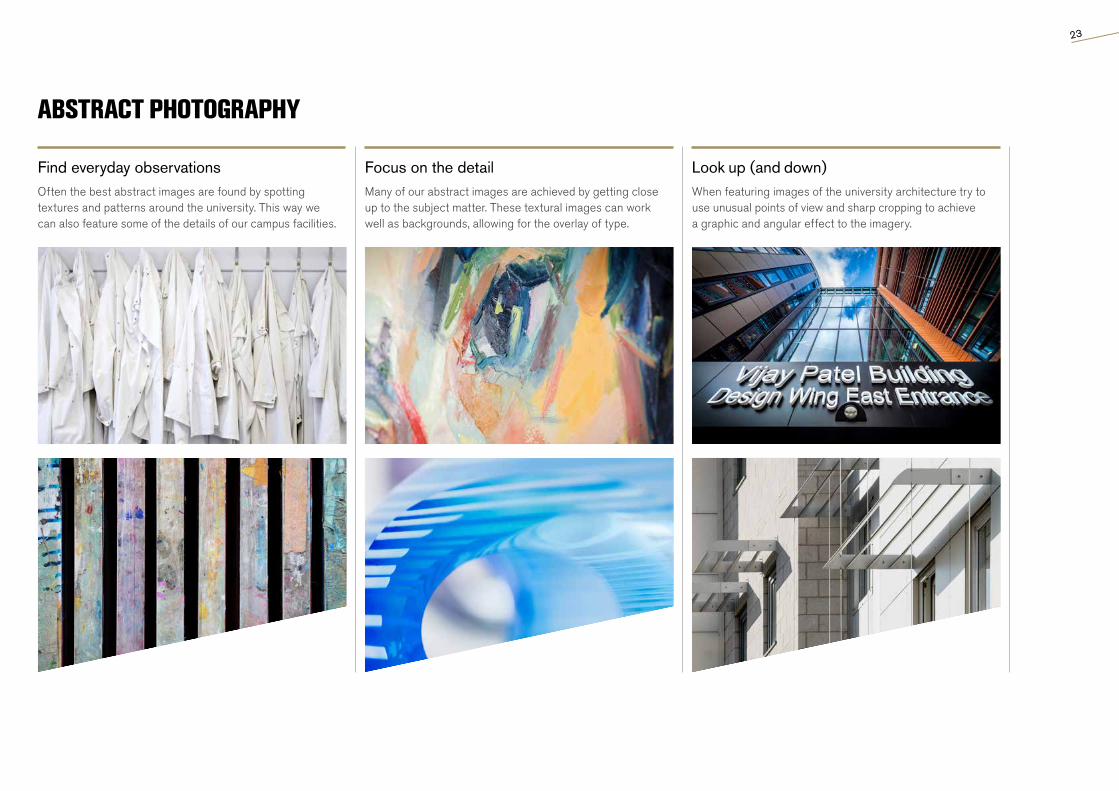
Focus on the detailMany of our abstract images are achieved by getting close up to the subject matter. These textural images can work well as backgrounds, allowing for the overlay of type.
Find everyday observationsOften the best abstract images are found by spotting textures and patterns around the university. This way we can also feature some of the details of our campus facilities.
Look up (and down)When featuring images of the university architecture try to use unusual points of view and sharp cropping to achieve a graphic and angular effect to the imagery.

24
AKZIDENZ GROTESK
We always ensure our messaging gets straight to the point. Therefore, it’s important that the typeface we use reflects this no-nonsense, no-jargon approach.
Our type family is Akzidenz Grotesk Pro.
TYPOGRAPHY
ABCDEXTRABOLDCONDENSED FGHIJKLMNOPQRSTUVWXYZ
Akzidenz Grotesk Extra Bold Condensed is our headline font. We use it because it is confident and impactful. It should always be used with -20 tracking and manual kerning to ensure good letter spacing.

25
TYPOGRAPHYWhen setting body copy we use three weights of Akzidenz Grotesk. Light and Regular should be used for the majority of cases. It’s usually a good idea to use Regular if type is being printed white out of a dark background. Medium and bold should be used sparingly for standfirsts and highlighting important words.
Light Akzidenz Grotesk LightABCDEFGHIJKLMNOPQRSTUVWXYZ abcdefghijklmnopqrstuvwxyz 1234567890?!@£$%&*
Point Size: Body copy should always be set at 10pt where possible and always between 8pt (min) and 12pt (max)
Leading: +3 over point size
Tracking: 0 (-5 for line fitting)
Kerning: Metrics/Auto
Line length: Max 70 characters
Regular Akzidenz Grotesk RegularABCDEFGHIJKLMNOPQRSTUVWXYZ abcdefghijklmnopqrstuvwxyz 1234567890?!@£$%&*
MediumBold
Akzidenz Grotesk MediumABCDEFGHIJKLMNOPQRSTUVWXYZ abcdefghijklmnopqrstuvwxyz 1234567890?!@£$%&*
Akzidenz Grotesk BoldABCDEFGHIJKLMNOPQRSTUVWXYZ abcdefghijklmnopqrstuvwxyz 1234567890?!@£$%&*
Alternative typeface In design situations where Akzidenz Grotesk cannot be sourced, such as internal documents, emails or web, then the alternative font Arial can be used instead.
In exceptional circumstances such as Graduations (see page 52) we have a unique font to reflect the corporate nature and prestigious nature of the event.
Please contact the Brand and Corporate Marketing team for access to the font.

26
Akzidenz Grotesk Extra Bold Condensed and Akzidenz Grotesk Bold are our headline fonts. We use them because they are confident and impactful. They should always be used with -20 tracking and manual kerning to ensure good letter spacing.
Our headlines are intended to create impact and communicate the message immediately. Therefore, they should usually be big and bold.
In a market saturated with conventional, standardised communications, our rotated 12 ̊allow us to express our approach and stand out from the crowd.
The angle can be employed to add an unexpected dynamic element to our layouts. However, it should always be used thoughtfully and sparingly to ensure maximum effect.
TYPE IN USE: HEADLINES
12 DEGREE ANGLE
Example 1 - Akzidenz Grotesk Extra Bold Condensed Example 2 - Akzidenz Grotesk Bold

27
FORMATS AND FINISHINGOur brand idea ‘Never Surrender to Convention’ can influence our decision making at all stages of the communications process. Employing unconventional formats and special finishing techniques is a good example of showing a different way of looing at things, while adding to the value of the marketing we produce.
FormatsWhen creating pieces of communication for DMU, the format can help to make it stand out from the crowd. A traditional booklet can open up to reveal a poster. A prospectus can open up to reveal a series of smaller course booklets.
It’s always worth considering unusual formats to add interest but they should never get in the way of the communication.
FinishingFinishing techniques can include die cutting or spot UV, as well as foiling and metallic inks. They help to add a premium feel to our communications and display an attention to detail. Finishing techniques should be used sparingly and will be considered on a case-by-case basis.
Paper stock and GSMCovers - Minimum stock weight 300GSM - 500GSM Inners - Minimum stock weight 120GSM - 180GSM
We recommend using silk papers to create a premium feel. You may use uncoated stock for inner pages but avoid using it for covers. Avoid using glossy stock.

28
RECRUITMENTThe following pages show how the brand is used in a variety of contexts. They show a consistency of style and tone but also a degree of flexibility depending on format and purpose.

29
CORPORATE
EXCELLENTIA et STUDIUM
UNIVERSITY ALMANACAcademic Year 2016/17
EXECUTIVE, GOVERNANCE AND LEGAL SERVICES

30
STAFF FACING
31
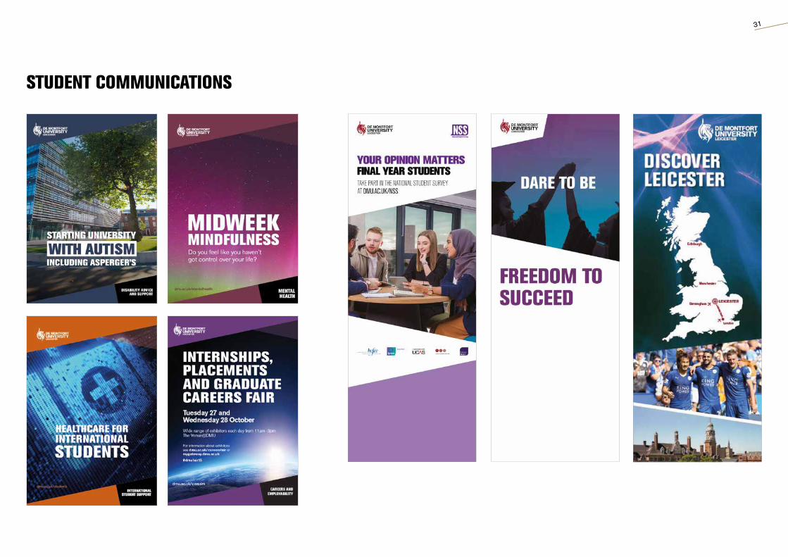
STUDENT COMMUNICATIONS

32
DIGITAL AND WEB TEMPLATES
Email banners Website banners
MPUs
Skyscraper banners

33
STAY IN TOUCHDe Montfort UniversityBrand and Corporate Marketing Department
T: (0116) 250 6580E: [email protected]