carnival brand guidelines gocarnival -...
TRANSCRIPT
CARNIVAL CRUISE LINES – BRAND GUIDELINES
Little known fact: Humans have a genetic need for fun. This goes for you, our travel partners.
That's why as a brand, we need to be, above all, fun. We need to be social, participatory and spontaneous. And while we take fun
seriously, we certainly don't take ourselves seriously. Because we you think about it, our job is to consistently deliver fun,
memorable vacations to our guests - with a smile. So it's only natural to present that same beaming face to the world.
After all, we're a world leader in all things fun. And we want to stay that way.
FUN FOR ALL ALL FOR FUN
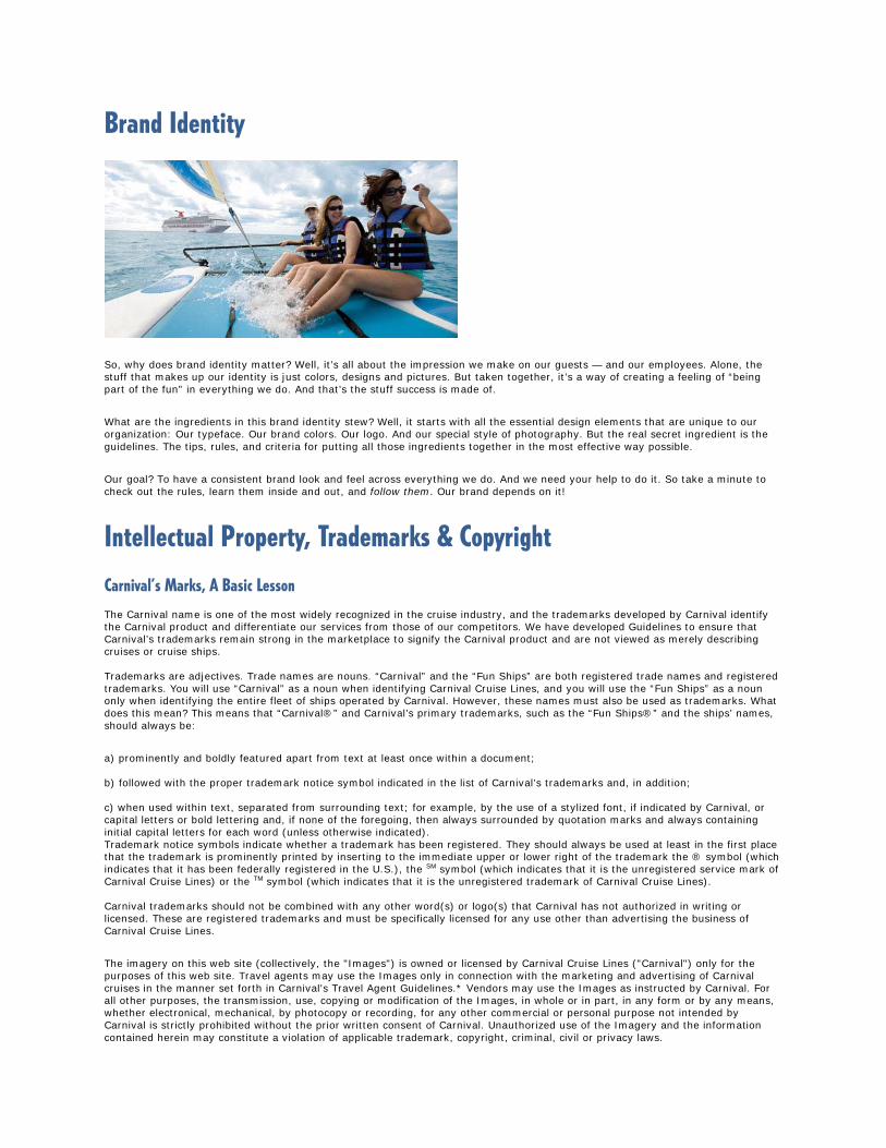
Brand Identity
So, why does brand identity matter? Well, it’s all about the impression we make on our guests — and our employees. Alone, the stuff that makes up our identity is just colors, designs and pictures. But taken together, it’s a way of creating a feeling of “being part of the fun” in everything we do. And that’s the stuff success is made of.
What are the ingredients in this brand identity stew? Well, it starts with all the essential design elements that are unique to our organization: Our typeface. Our brand colors. Our logo. And our special style of photography. But the real secret ingredient is the guidelines. The tips, rules, and criteria for putting all those ingredients together in the most effective way possible.
Our goal? To have a consistent brand look and feel across everything we do. And we need your help to do it. So take a minute to check out the rules, learn them inside and out, and follow them. Our brand depends on it!
Intellectual Property, Trademarks & Copyright Carnival’s Marks, A Basic Lesson The Carnival name is one of the most widely recognized in the cruise industry, and the trademarks developed by Carnival identify the Carnival product and differentiate our services from those of our competitors. We have developed Guidelines to ensure that Carnival’s trademarks remain strong in the marketplace to signify the Carnival product and are not viewed as merely describing cruises or cruise ships. Trademarks are adjectives. Trade names are nouns. “Carnival” and the “Fun Ships” are both registered trade names and registered trademarks. You will use “Carnival” as a noun when identifying Carnival Cruise Lines, and you will use the “Fun Ships” as a noun only when identifying the entire fleet of ships operated by Carnival. However, these names must also be used as trademarks. What does this mean? This means that “Carnival®” and Carnival’s primary trademarks, such as the “Fun Ships®” and the ships’ names, should always be:
a) prominently and boldly featured apart from text at least once within a document; b) followed with the proper trademark notice symbol indicated in the list of Carnival’s trademarks and, in addition; c) when used within text, separated from surrounding text; for example, by the use of a stylized font, if indicated by Carnival, or capital letters or bold lettering and, if none of the foregoing, then always surrounded by quotation marks and always containing initial capital letters for each word (unless otherwise indicated). Trademark notice symbols indicate whether a trademark has been registered. They should always be used at least in the first place that the trademark is prominently printed by inserting to the immediate upper or lower right of the trademark the ® symbol (which indicates that it has been federally registered in the U.S.), the SM symbol (which indicates that it is the unregistered service mark of Carnival Cruise Lines) or the TM symbol (which indicates that it is the unregistered trademark of Carnival Cruise Lines). Carnival trademarks should not be combined with any other word(s) or logo(s) that Carnival has not authorized in writing or licensed. These are registered trademarks and must be specifically licensed for any use other than advertising the business of Carnival Cruise Lines.
The imagery on this web site (collectively, the "Images") is owned or licensed by Carnival Cruise Lines ("Carnival") only for the purposes of this web site. Travel agents may use the Images only in connection with the marketing and advertising of Carnival cruises in the manner set forth in Carnival's Travel Agent Guidelines.* Vendors may use the Images as instructed by Carnival. For all other purposes, the transmission, use, copying or modification of the Images, in whole or in part, in any form or by any means, whether electronical, mechanical, by photocopy or recording, for any other commercial or personal purpose not intended by Carnival is strictly prohibited without the prior written consent of Carnival. Unauthorized use of the Imagery and the information contained herein may constitute a violation of applicable trademark, copyright, criminal, civil or privacy laws.
Fun Ships®
a) This trademark should always be used prominently within the text at least once in all ads and promotional material. Please leave enough visual space to allow this trademark to stand out clearly and distinctly. b) Since ‘‘Fun Ship®” is not a noun, it should not replace the name of a Carnival ship and should not be used in the possessive form. This means you may refer to ‘‘Fun Ship®” cruise services or to the ‘‘Fun Ship®” CARNIVAL FANTASY® services, but you may not refer to [a] [a Carnival] [the] [your] ‘‘Fun Ship®”. References to a ‘‘Fun Ship®” cruise, or your ‘‘Fun Ship®” experience or “Fun Ship” accommodations, for example, are permissible. c) The words “Fun Ships®” must always be in quotes when used in copy.
Identity Basics
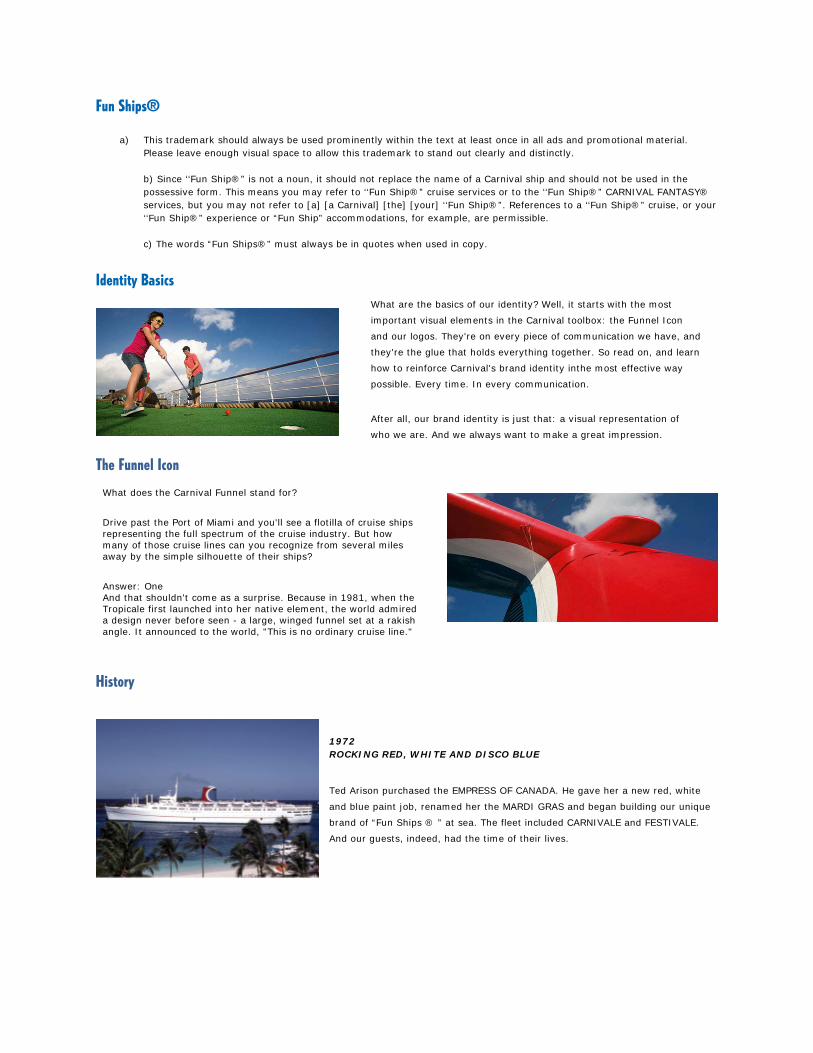
The Funnel Icon
History
1972 ROCKING RED, WHITE AND DISCO BLUE
Ted Arison purchased the EMPRESS OF CANADA. He gave her a new red, white
and blue paint job, renamed her the MARDI GRAS and began building our unique
brand of “Fun Ships ® ” at sea. The fleet included CARNIVALE and FESTIVALE.
And our guests, indeed, had the time of their lives.
What are the basics of our identity? Well, it starts with the most
important visual elements in the Carnival toolbox: the Funnel Icon
and our logos. They're on every piece of communication we have, and
they're the glue that holds everything together. So read on, and learn
how to reinforce Carnival's brand identity inthe most effective way
possible. Every time. In every communication.
After all, our brand identity is just that: a visual representation of
who we are. And we always want to make a great impression.
What does the Carnival Funnel stand for?
Drive past the Port of Miami and you'll see a flotilla of cruise ships representing the full spectrum of the cruise industry. But how many of those cruise lines can you recognize from several miles away by the simple silhouette of their ships?
Answer: One And that shouldn't come as a surprise. Because in 1981, when the Tropicale first launched into her native element, the world admired a design never before seen - a large, winged funnel set at a rakish angle. It announced to the world, "This is no ordinary cruise line."
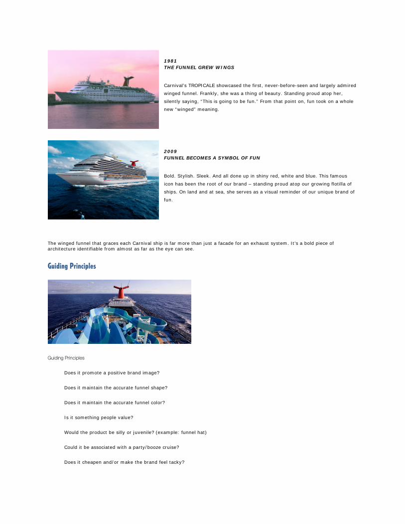
1981 THE FUNNEL GREW WINGS
Carnival’s TROPICALE showcased the first, never-before-seen and largely admired
winged funnel. Frankly, she was a thing of beauty. Standing proud atop her,
silently saying, “This is going to be fun.” From that point on, fun took on a whole
new “winged” meaning.
2009 FUNNEL BECOMES A SYMBOL OF FUN
Bold. Stylish. Sleek. And all done up in shiny red, white and blue. This famous
icon has been the root of our brand – standing proud atop our growing flotilla of
ships. On land and at sea, she serves as a visual reminder of our unique brand of
fun.
The winged funnel that graces each Carnival ship is far more than just a facade for an exhaust system. It's a bold piece of architecture identifiable from almost as far as the eye can see.
Guiding Principles
Guiding Principles
Does it promote a positive brand image?
Does it maintain the accurate funnel shape?
Does it maintain the accurate funnel color?
Is it something people value?
Would the product be silly or juvenile? (example: funnel hat)
Could it be associated with a party/booze cruise?
Does it cheapen and/or make the brand feel tacky?
DON’Ts:
Never alter color. (with exception of black & white and 2-color options)
Never alter shape.
Don’t use as decor design element. (example: door knob)
Don’t use with alcoholic beverages. On certain souvenir items it’s okay to have the Funnel printed on the glass.
Limit the use of the Funnel logo on items such as napkins, sugar packets and coasters. (The consumer doesn’t need to see the brand on every item. We want the logo to be valued and not oversaturated.)
Don’t use it in sub-brand logos.
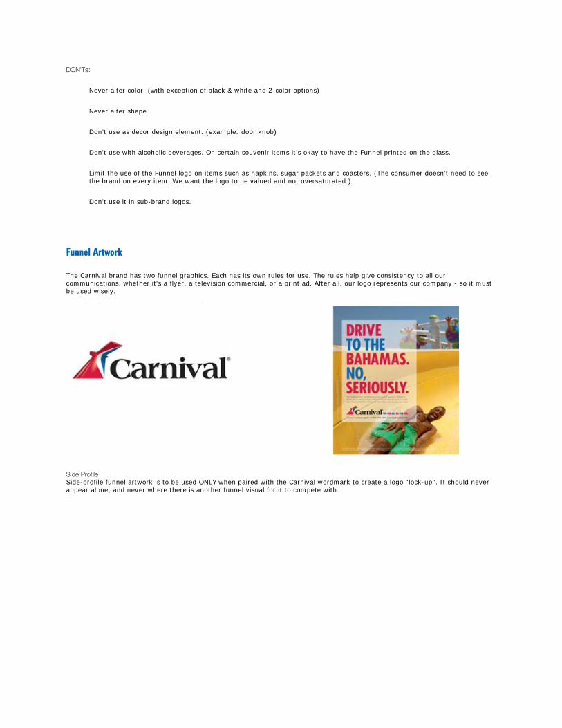
Funnel Artwork
The Carnival brand has two funnel graphics. Each has its own rules for use. The rules help give consistency to all our communications, whether it's a flyer, a television commercial, or a print ad. After all, our logo represents our company - so it must be used wisely.
Side Profile Side-profile funnel artwork is to be used ONLY when paired with the Carnival wordmark to create a logo "lock-up". It should never appear alone, and never where there is another funnel visual for it to compete with.
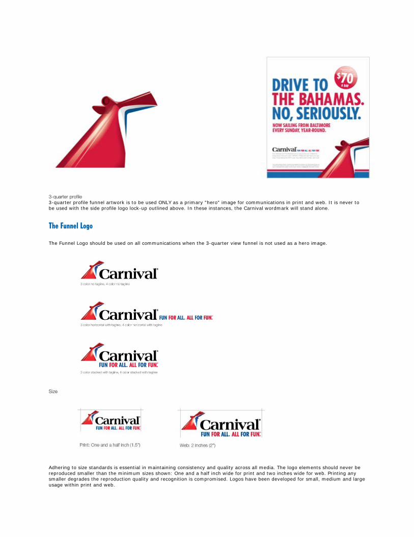
3-quarter profile 3-quarter profile funnel artwork is to be used ONLY as a primary "hero" image for communications in print and web. It is never to be used with the side profile logo lock-up outlined above. In these instances, the Carnival wordmark will stand alone.
The Funnel Logo
The Funnel Logo should be used on all communications when the 3-quarter view funnel is not used as a hero image.
Size
Adhering to size standards is essential in maintaining consistency and quality across all media. The logo elements should never be reproduced smaller than the minimum sizes shown: One and a half inch wide for print and two inches wide for web. Printing any smaller degrades the reproduction quality and recognition is compromised. Logos have been developed for small, medium and large usage within print and web.

Clear Space
Maintaining a minimum clear space around the logo allows it to be seen readily and without interference. When layout space allows, use more clear space around the logo to enhance visibility and a clean, uncluttered appearance.
Guiding Principles
The clear space is the area that surrounds the graphic lock-up and should remain free of visual distraction (i.e., imagery, typography, graphic elements, etc.). The minimum required clear space around the logo must be X, as shown. (X is equal to the height of the C in the logotype.)
Logo Color Options
The full color version of our logo is the most widely used treatment and therefore the most recognizable. While there are one-, two- and three-color versions available for use, the full color version should be used whenever possible. Color versions of the logo should be carefully managed to promote consistent logo appearance.
For reverse applications, white is used in the logotype instead of black. The Pantone and CMYK color formulations are specified in the artwork files and should never be altered for any reason.
Guiding Principles
The reverse logo version has been slightly modified from the positive logo artwork.
Placing the four or three-color positive logo color treatment on a bright white background is preferred, whenever possible.
Separate logo artwork files are provided for solid Pantone and CMYK color reproduction in typical printing methods.
Color screen-tints should never be used in the logo.
Choosing the appropriate logo format for use should be based on the background color on which it will be applied.
Logo components, appearing in full-color, black or white, must contrast the background color on which they appear to ensure clear readability and recognition.
Materials requiring the use of only one color the “One-Color” version is acceptable using either the Carnival Blue or black.
Avoid using the logo on backgrounds that have a mid-value range color.
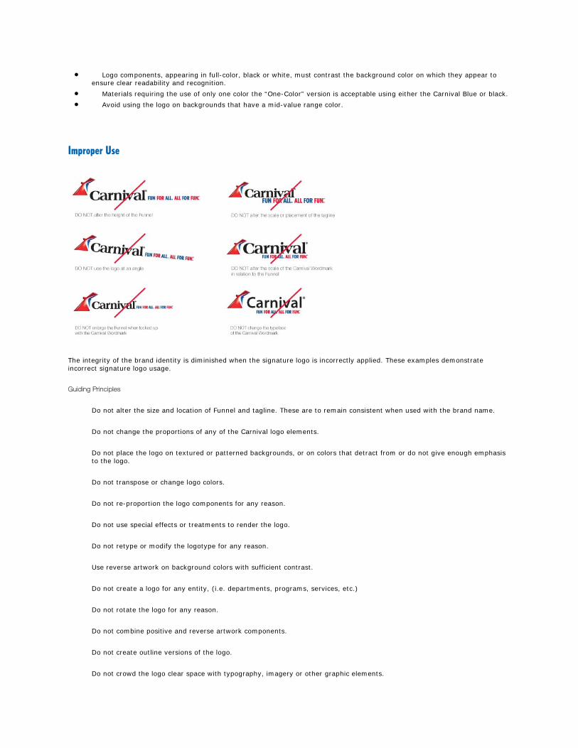
Improper Use
The integrity of the brand identity is diminished when the signature logo is incorrectly applied. These examples demonstrate incorrect signature logo usage.
Guiding Principles
Do not alter the size and location of Funnel and tagline. These are to remain consistent when used with the brand name.
Do not change the proportions of any of the Carnival logo elements.
Do not place the logo on textured or patterned backgrounds, or on colors that detract from or do not give enough emphasis to the logo.
Do not transpose or change logo colors.
Do not re-proportion the logo components for any reason.
Do not use special effects or treatments to render the logo.
Do not retype or modify the logotype for any reason.
Use reverse artwork on background colors with sufficient contrast.
Do not create a logo for any entity, (i.e. departments, programs, services, etc.)
Do not rotate the logo for any reason.
Do not combine positive and reverse artwork components.
Do not create outline versions of the logo.
Do not crowd the logo clear space with typography, imagery or other graphic elements.

Do not place the logo in an expressed shape that results in a crowded or awkward logo staging.
Do not outline any logo component, only use approved reverse artwork on dark background colors.
Tagline Use
Fun for all. All for fun. Apart from being a simple anagram, what does it mean? What does our new tagline stand for? Quite simply, it is the living spirit of Carnival. A rallying cry. It’s our DNA. It’s based on a fundamental truth. That it is the inalienable birthright of every man, woman and child to have as much fun as they possibly can while we’re all together on this Earth. And everything we do as a company, we do in the name of fun. So say it loud and say it proud. Fun for all. All for fun.
Guiding Principles Always use the provided logos for both the Funnel Logo and Carnival Wordmark Logo. This will assure correct placement of the tagline with the Wordmark and Funnel. Do not change the proportions of any of the tagline elements.
Do not transpose or change colors of the typography.
Carnival Wordmark Logo
We believe that the Carnival wordmark is ownable and has a long association with the brand. It conveys a sense of Fun and is a positive asset for Carnival. The wordmark is to be used on all communications that the 3-quarter view Funnel is used as a hero image.

Size
Adhering to size standards is essential in maintaining consistency and quality across all media. The logo elements should never be reproduced smaller than the minimum sizes shown: One and a quarter inch wide for print and one and a half inches wide for web. Printing any smaller degrades the reproduction quality and recognition is compromised.
Clear Space
Maintaining a minimum clear space around the logo allows it to be seen readily and without interference. When layout space allows, use more clear space around the logo to enhance visibility and a clean, uncluttered appearance.
Guiding Principles
The clear space is the area that surrounds the graphic lock-up and should remain free of visual distraction (i.e., imagery, typography, graphic elements, etc.). The minimum required clear space around the logo must be X, as shown. (X is equal to the height of the C in the logotype.)
Color
Carnival Red and Carnival Blue, the principle Carnival colors, should be used as the dominant color signal in all communication materials. Consistent use of the Carnival colors will create a visual identity that is bright, unique and instantly recognizable to our audience.
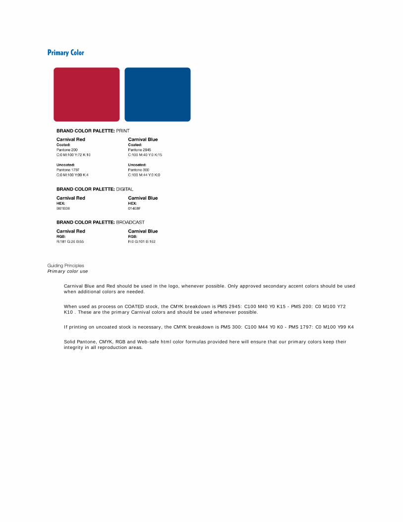
Primary Color
Guiding Principles Primary color use
Carnival Blue and Red should be used in the logo, whenever possible. Only approved secondary accent colors should be used when additional colors are needed.
When used as process on COATED stock, the CMYK breakdown is PMS 2945: C100 M40 Y0 K15 - PMS 200: C0 M100 Y72 K10 . These are the primary Carnival colors and should be used whenever possible.
If printing on uncoated stock is necessary, the CMYK breakdown is PMS 300: C100 M44 Y0 K0 - PMS 1797: C0 M100 Y99 K4
Solid Pantone, CMYK, RGB and Web-safe html color formulas provided here will ensure that our primary colors keep their integrity in all reproduction areas.
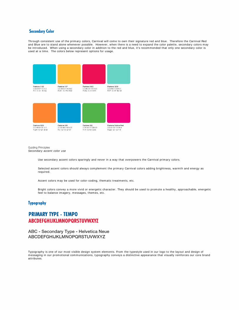
Secondary Color
Through consistent use of the primary colors, Carnival will come to own their signature red and blue. Therefore the Carnival Red and Blue are to stand alone whenever possible. However, when there is a need to expand the color palette, secondary colors may be introduced. When using a secondary color in addition to the red and blue, it's recommended that only one secondary color is used at a time. The colors below represent options for usage.
Guiding Principles Secondary accent color use
Use secondary accent colors sparingly and never in a way that overpowers the Carnival primary colors.
Selected accent colors should always complement the primary Carnival colors adding brightness, warmth and energy as required.
Accent colors may be used for color-coding, thematic treatments, etc.
Bright colors convey a more vivid or energetic character. They should be used to promote a healthy, approachable, energetic feel to balance imagery, messages, themes, etc.
Typography
Typography is one of our most visible design system elements. From the typestyle used in our logo to the layout and design of messaging in our promotional communications, typography conveys a distinctive appearance that visually reinforces our core brand attributes.

Primary Typography
Secondary Typography
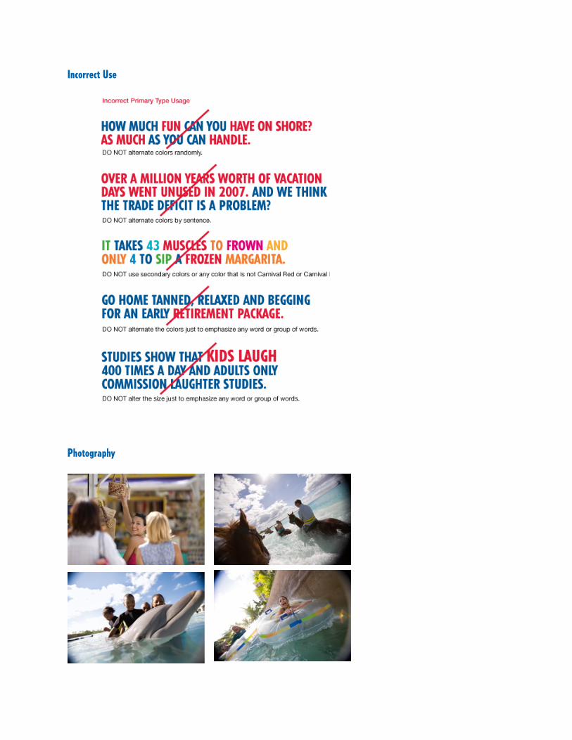
Incorrect Use
Photography

Carnival photography has so much to tell our customers about the carnival experience. Since our photography place a major role in our promotional materials it is one of the first points of contact our customers have with the Carnival brand experience. Therefore, it is considered a most important brand identity element. When shooting or selecting photography for any application, careful consideration must be given to the subject matter and communication quality to ensure reinforces our brand positioning and desired attributes. We have three thematic categories–ships, destinations and passengers–that address the majority of our photography needs. Any photo requirement causing you to go outside the approved categories must be reviewed with the Marketing Department prior to production to determine if the desired image is appropriate. Following are important factors to consider when art directing new photography or selecting stock photography for Carnival communication materials. Subject matter must be related to the key message in a direct and visually balanced way. Illustrative or photographic style must reflect sophisticated, contemporary and professional image qualities. Keep brand characteristics in mind when planning and choosing imagery, subject matter, settings, etc. Reflect a regional tone–avoid generic/staged imagery, whenever possible. Ship Photography Ship photography should capture the magnificence of our vessels–a fleet of fun and adventure. Composition and camera angle should be used to not only emphasis the sheer size and capacity of the ship, but also the spirit of onboard activities or place¬–awesome! Destination Photography Destination photography should reflect a strong sense of place–subject, lighting and camera angle should draw the viewer in–appealing to the senses–feel the warmth of the sun, smell the ocean breeze, hear the calming break of waves or the excitement of activities–imagine! Passenger Photography Passenger photography should convey a high-degree of mood and spirit–whether it’s quiet relaxation on the promenade deck or dancing the night away in a local club–capture the moment! Carefully consider naturally present props, settings, backgrounds and lighting to create interesting and believable compositions. Avoid a staged or forced appearance–it’s all about capturing the natural mood or character of the passenger in the most desirable setting–be there!
Ship Photography
Ship Photography Ship photography should capture the magnificence of our vessels–a fleet of fun and adventure. Composition and camera angles should be used to not only emphasize the sheer size and capacity of the ship, but also to capture the spirit of onboard activities or place– awesome!
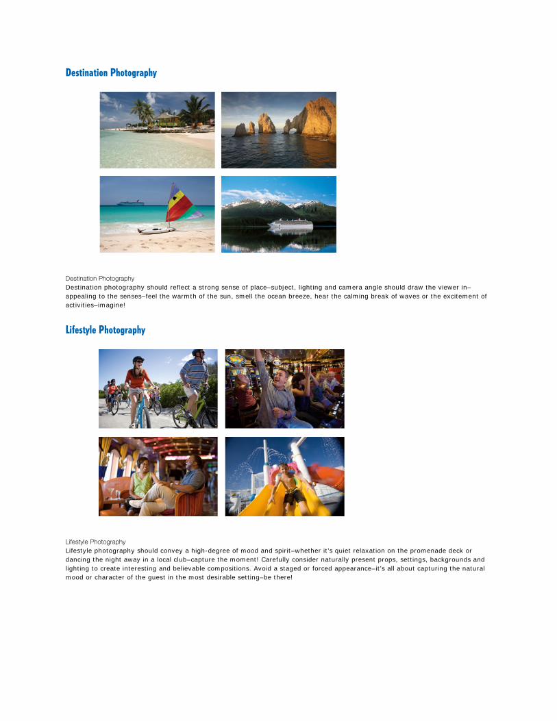
Destination Photography
Destination Photography Destination photography should reflect a strong sense of place–subject, lighting and camera angle should draw the viewer in–appealing to the senses–feel the warmth of the sun, smell the ocean breeze, hear the calming break of waves or the excitement of activities–imagine!
Lifestyle Photography
Lifestyle Photography Lifestyle photography should convey a high-degree of mood and spirit–whether it’s quiet relaxation on the promenade deck or dancing the night away in a local club–capture the moment! Carefully consider naturally present props, settings, backgrounds and lighting to create interesting and believable compositions. Avoid a staged or forced appearance–it’s all about capturing the natural mood or character of the guest in the most desirable setting–be there!

Voice
The Carnival brand has a unique voice all its own. It can be fun and/or funny, even informative and educational.
Sure humor, is part of our brand voice, but it's not a mandate in every execution. So, what's our brand of humor all about? Carnival humor is witty and clever and never sophomoric, crude or slapstick. It's conversational, accessible and appeals to the mainstream. And if it's completely hilarious, well, that never hurts.
General Information / Punctuation Rules “Fun Ship” cannot be used as a noun, except when referring to the entire fleet: Correct: The “Fun Ships”of Carnival Incorrect: CARNIVAL FANTASY is one of our most popular “Fun Ships” An exception to rule: It is OK to use “Fun Ship” preceding a ship name: the “Fun Ship” CARNIVAL DREAM. All legal symbols – ® (registration), SM (service mark) or TM (trademark) – are used the first time a proper name appears in Carnival materials. Note: An exception to this rule is that we repeat the appropriate symbol in “important” places such as a heading. The word “the” does not precede ship names. The word “The” is part of the proper name of The Bahamas; lower-case “the” is used with the Caribbean, the Mexican Riviera, etc. Carnival does not use hyphens when referring to the length of their cruises. Example: 4 day cruise Note: We never separate a number from the word “day” at the end of a line in copy. Ampersand (&) vs. “And”: Multiple cruise lengths use the ampersand (&) separating numbers in the use of HEADS/SUBHEADS ONLY. Example: 4, 5 & 6 day cruises Multiple cruise lengths use the word “and” separating numbers in BODY COPY: Example: 4, 5 and 6 day cruises Multiple destinations always use the word “and” separating the names IN BOTH HEADS AND BODY COPY: Example: …such southern gateways as Galveston, New Orleans and Mobile

Miscellaneous Descriptive Copy Treatment
Use the phrase “per guest” (as opposed to “per person”). This rule applies to text and disclaimers only as we no longer include “per guest” in price points.
Exotic vs. exotic: Capitalize Exotic when it is used as the name of an itinerary (e.g., Exotic Western Caribbean).
Cruises-To-Nowhere is written with initial caps on all three words, with hyphens connecting the words.
ocean-view: Hyphenate this term when not referring specifically to the room category.
mini golf: treated as two lower-case letters
web site: treated as two words, lower case.
The preferred descriptor for on board shows is “spectacular stage shows”.
Super Saver: This is written as two words, with initial caps.
Fare Code: written as two words, both words with initial caps. Note: For Fare Codes which contain the number one, we need to use 1 to make it obvious that the code includes a number and not the letter el.
T-shirt (not tee-shirt or t-shirt)
Internet Café: Written as two capitalized words with an accent on the letter “e” in “Café.”
seaview bistro: A generic phrase, with lower-case letters, used when referring to the lido restaurant whenever we do not use the proper name of the restaurant. Note: There is a Seaview Bar & Grill on CARNIVAL SENSATION, and this name is to be treated as a proper name and capitalized.
Transatlantic: Transatlantic should be capitalized wherever it appears.
waterslide: is written as one word since the naming of Carnival’s Twister Waterslide
Circle “C” (for children 12-14) is not described as a new program but rather as an expansion of the existing Camp Carnival program.
Sliding Sky Dome is the new term replacing retractable glass roof. It is considered a proper name and should have initial caps.
wireless Internet access is used when referring to Wi-Fi service; laptop is used when referring to portable/notebook computers
onboard cell phone service is used when referring to cellular communications
When referring to Carnival’s Total Choice Dining, we refer to “abundant choices” (as opposed to “unlimited”)
Staterooms & Accommodations: Stateroom will be used when referring to a specific category; accommodations will be used when referring to all staterooms on a ship.
Onboard vs. On board
Following is an explanation of the difference between onboard (one word) and on board (two words):
When used as an adjective describing a noun, with the noun following, it is one word: Example: There are many onboard activities for you to enjoy. (In this case, onboard is an adjective modifying the noun activities.)
In all other circumstances on board is used as two words: Example: You can do whatever pleases you once you get on board.
To put it another way, you can have onboard fun or you can have fun on board. And: Our ships have onboard cell phone service or you can use your cell phones while on board.

General Graphics Guidelines
We never break names of ships and we try to avoid breaking proper names.
Sometimes, because of space constraints, proper names need to be broken out over two lines. This is acceptable if absolutely necessary, but a single word (with the appropriate legal symbol) should never be left alone.
Example: If Carnival’s Twister Waterslide TM cannot fit on one line, at least the Twister Waterslide TM portion of the name should be kept together to avoid Waterslide TM being all by itself.
This rule applies specifically to single words followed by a legal symbol (as in the example above) but should also apply to any single word of a proper name, whether or not it includes a legal symbol.
Never break words at the end of a line (not even hyphenated words).
Do not use “widows” (words by themselves on the last line). This is a not a concern with bulleted copy but is to be avoided, if possible.
The possessive “Carnival’s” precedes several proper names. These names include Carnival’s Total Choice Dining, Carnival’s Seaside Theatre, Carnival’s Twister Waterslide, Carnival’s Vacation Guarantee and Carnival’s Cruise Vacation Protection Plan. Proper names should always be written in full, although some exceptions have been made to this rule by sometimes referring to the Vacation Guarantee or the Cruise Vacation Protection Plan without the “Carnival’s” prefix.
Web Addresses
Carnival web addresses do not require the www. prefix. Examples: carnival.com carnival/cruise.ca (Canada)
When used in body copy, in most cases web addresses are to be in bold type.
Try to avoid ever breaking up web addresses unless absolutely necessary. And, then, in a logical place such as after a forward slash.
Exclamation points should be used with discretion in copy; They should not be used in headlines and subheads unless specifically approved by Carnival.
Price Points
Price points in Carnival ads are preceded with “from” (lower case). None of Carnival’s ads include the word “cruise.” All prices are followed by an asterisk (*) and will be cross-referenced with a disclaimer.
Newspaper ads include the cruise lengths and destination. The word “Day” has initial-cap “D” only.
Example: 6, 7 & 8 Day Caribbean from $229*
For magazine ads, include the cruise lengths and price point only, without destinations. The word “DAY” is in all caps. Example: 3, 4 & 5 DAY from $249*
Note: The examples above are for content only and do not reflect the actual treatment of the information.
Disclaimer Treatment
For collateral pieces: Whether there is just one symbol or more than one, all lines should be indented after the first line so that the initial words following each symbol align. (In the case of a double asterisk, there needs to be a space after the single asterisk in order to accomplish this.)
Example *These cruises will call on Belize... **On January 14, 2007...
For ads and direct mail pieces: the general rules of punctuation apply in that all lines following the first line return to the left margin in alignment with the asterisk.
Example *Rates are per guest, double occupancy, capacity controlled and cruise only. Government taxes/fees...
Note: In the case of multiple symbols used in ad and direct mail disclaimers, each symbol will appear in front of the sentence being referenced.
Taxes/Fees in disclaimers: Effective January 2007, the range for taxes/fees was changed to $21-$136. For specific regions (other than Alaska), the range is $21-$86 and the CARNIVAL SPIRIT/Alaska range is $114-$136. Note: We do not use spaces before and after the hyphens.
Language to Be Avoided
Use positive language and refrain from any language that can be construed as negative, such as “Don’t wait another minute or you’ll miss out on…”.
formal – the main dining room is referred to as “main restaurant,” not “formal dining room”
“party ship” connotations – Avoid presenting any Carnival ship as a party ship.
supper club: In order to encourage use of the supper club by all, communications should emphasize the pampering aspect of the supper club by saying something along the lines of “You’ll be uniquely pampered in the cozy setting of this steakhouse-style restaurant.”
Mega “Fun Ship” – Any ship over 101,000 GRT (e.g., the Conquest-class ships) has been referred to as a Mega “Fun Ship”; however, this terminology should be used sparingly.
“The ship’s” – Avoid using this in copy. (Example: The ship’s Pizzeria….)
Use of “story,” “deck” and “level”:
In the cruise industry, the many levels of a ship are referred to as decks. When referring to a feature of the ship (e.g., supper club) that is not all contained on one level, it is best to avoid describing it as “2-story.” (However, it is OK to use “story” when referring to the atrium (e.g., 11-story atrium).
You may use the term “level” in some instances, as in “…three-level spa offering 40,000 square feet of pampering… when describing the entire spa area on CARNIVAL SPLENDOR.
Ship class – Refrain from using the ship class as a descriptor in consumer pieces. Example: “Our most elegant Spirit-class ship…”
Legal Requirements
When using corporate names for organizations other than Carnival, it is important to add the appropriate registration symbol to satisfy legal requirements. Note: Certain corporations use the legal symbol every time their name appears.
The current approved copyright line is:
© 2010 Carnival Cruise Lines. All rights reserved. Ships’ Registry: The Bahamas and Panama.
Note: The Ships’ Registry information above refers to the entire fleet. This will adjust based on specific ships referred to in the copy and may reflect The Bahamas or Panama only. And ship’s (singular possessive) or ships’ (plural possessive) is subject to change as well.
All three lines making up the © information ideally would all fit on one line. If this is not possible, we need to take care to divide the elements at logical points. As examples, taking each sentence separately:
© 2010 Carnival Cruise Lines. – There is no place where this line could ever be broken.

All rights reserved. – We can break these words over two lines, if necessary
Ships’ Registry: The Bahamas and Panama. – This can be broken (but do not separate “The”and “Bahamas” over two lines), and we would try not to separate “Ships’” from “Registry.”
For any enquiries or assistance with regards to brand guidelines please contact Isabel Holmes on 0207 940 4460 or email [email protected]