design literacy: understanding graphic design
TRANSCRIPT


Design Literacy: Understanding Graphic Design
Second Edition
Steven Heller
DL2 00 07/13/04 2:51 PM Page i

© 2004 Steve Heller
All rights reserved. Copyright under Berne Copyright Convention, UniversalCopyright Convention, and Pan-American Copyright Convention. No partof this book may be reproduced, stored in a retrieval system, or transmitted inany form, or by any means, electronic, mechanical, photocopying, recording,or otherwise, without prior permission of the publisher.
08 07 06 05 04 5 4 3 2 1
Published by Allworth PressAn imprint of Allworth Communications, Inc.10 East 23rd Street, New York, NY 10010
Cover design and page composition by James VictoreTypography by Sharp Des!gns, Inc.
library of congress cataloging-in-publication dataHeller, Steven.Design literacy : understanding graphic design / Steve Heller. — 2nd ed.p. cm.Includes bibliographical references and index.1. Graphic arts—History. 2. Commercial art—History. I. Title.NC998.H45 2004741.6—dc222004009936
Printed in Canada
DL2 00 07/13/04 2:51 PM Page ii

Dedicated to Dr. James Fraserfor his Wisdom, Knowledge, and Generosity
DL2 00 07/13/04 2:51 PM Page iii

PERSUASION
3] Simplicissimus PosterThomas Theodore Heine
6] Neue JugendJohn Heartfield
9] NieTadeusz Trepkowski
11] Paper Bombs
14] The Peace Symbol
17] Mushroom Clouds
22] Black Power/White PowerTomi Ungerer
25] End Bad Breath Seymour Chwast
29] Men With No LipsRobbie Conal
31] Grapus PostersGrapus
34] Glasnost Posters
37] Cigarette Advertisements
39] Religious Tracts
43] RacismJames Victore
48] Ashcroft . . . You’re Next!Micah Wright
MASS MEDIA
53] Jugend and Simplicissimus
55] PM and AD
58] Picture Magazines of the 1930s
66] DirectionPaul Rand
69] Dell Mapbacks
71] Book Covers Edward Gorey
75] PortfolioAlexey Brodovitch
77] Industrial DesignAlvin Lustig
80] HolidayFrank Zachary
82] VogueAlexander Liberman
Contents
DL2 00 07/13/04 2:51 PM Page iv
85] ScopeWill Burtin
88] Herald TribunePeter Palazzo
90] Life
94] EsquireHenry WolfRobert BentonSam Antupit
98] SeventeenCipe Pinelas
101] Eros and Avant GardeHerb Lubalin
103] Push Pin GraphicSeymour ChwastMilton Glaser
106] Evergreen and RampartsKen DeardorfDugald Stermer
111] East Village Other
113] Rolling StoneFred Woodward
115] MAD Parodies
118] Zap Comix
124] SpyStephen Doyle
126] Culture Tabloids
130] The FaceNeville Brody
134] EmigreRudy VanderLansZuzana Licko
137] RawFrançois Mouly Art Spiegelman
141] Beach CultureDavid Carson
144] ColorsTibor Kalman
TYPE
151] Blackletter
154] Bauhaus and the NewTypography
157] Typography for Children
161] PeignotA. M. Cassandre
163] Cooper BlackOswald Cooper
167] American Typography of the 1960s
169] Hand LetteringJoost Swarte
172] Mrs EavesZuzana Licko
DL2 00 07/13/04 2:51 PM Page v
177] Pussy GaloreTeal TriggsLiz McQuistonSian Cook
181] Acme Comics LetteringChris Ware
186] Template GothicBarry Deck
189] Manson/MasonJonathan Barnbrook
LANGUAGE
195] S lodí jez̆ dováz̆í c̆aj kávuKarel Teige
198] Depero: FuturistaFortunato Depero
201] Westvaco InspirationsBradbury Thompson
204] Lorca: Three TragediesAlvin Lustig
207] Decorative Book JacketsW. A. Dwiggins
211] Merle Armitage’s Books Merle Armitage
215] About U.S.Lester BeallBrownjohn Chermayeff GeismarHerb LubalinGene Federico
217] Ha Ha Ha: He Laughs BestWho Laughs LastLou Dorfsman
219] Going OutGene Federico
221] Man with the Golden ArmSaul Bass
224] The Area Code(Parenthesis)Ladislav Sutnar
227] Swiss PostersArmin Hofmann
232] Modern PaperbackCovers
237] Bestseller Book JacketsPaul Bacon
243] The Bald SopranoRobert Massin
248] Electric CircusIvan Chermayeff
251] Blues Project Victor Moscoso
253] Best of JazzPaula Scher
256] Basel Kunstkredit 1976/77Wolfgang Weingart
259] CranbrookKatherine McCoy
DL2 00 07/13/04 2:51 PM Page vi

264] The Discrete Charm of the BourgeoisieYuri Bokser
267] Radical Modernism Dan Friedman
269] Generic Design
IDENTITY
277] FlightE. McKnight Kauffer
281] Postage Stamps
283] McGraw Hill PaperbackCoversRudolf DeHarak
286] DylanMilton Glaser
288] NeXTPaul Rand
292] Dr. StrangelovePablo Ferro
295] Restaurant FlorentM&Co.
297] Disney World SignageSussman/Preja
301] The Public Theater PostersPaul Davis
303] The Public TheaterPaula Scher
307] Altria Logo
INFORMATION
315] Ripley’s Believe It or Not!
318] Catalog Design ProgressLadislav Sutnar
320] The Medium Is theMassageQuentin Fiore
323] New York City SubwayMapVignelli and Associates
ICONOGRAPHY
329] The Swastika
333] Heroic Icons
339] 1939/1940 New York World’s Fair
343] Air Corps U.S. ArmyJoseph Binder
346] Shooting Targets
348] Darkie Toothpaste
351] Does It Make Sense?April Greiman
353] JambalayaStefan Sagmeister
DL2 00 07/13/04 2:51 PM Page vii

STYLE
361] Novelty Typefaces
364] Japanese Movie Tickets
367] The Great Gargantua and PantagruelW. A. Dwiggins
370] Vanity Fair and FortuneCoversPaolo Garretto
373] ArtoneSeymour Chwast
376] The LoverLouise Fili
379] French PaperCharles Spencer Anderson
382] PropagandaArt Chantry
COMMERCE
389] Show Cards
391] Razor Blade Labels
394] Japanese MatchboxLabels
397] Priester Match PosterLucian Bernhard
400] Golden Blossom HoneyGustav Jensen
402] Advertising Fans
404] Billboards of the 1930s
406] Comic Strip Ads
409] The First Record AlbumAlex Steinweiss
411] Cheap ThrillsR.CrumbBob Cato
415] Dust Jackets of the 1920sand 1930s
417] Advertising Stamps
419] Atoms for PeaceErik Nitsche
422] WolfschmidtGeorge Lois
426] NYNEXChiat/Day/Mojo
DL2 00 07/13/04 2:51 PM Page viii

Acknowledgments
Design Literacy would be but a figment if not for the remarkable supportand encouragement from Tad Crawford, the publisher of Allworth Press.Thanks also to Nicole Potter, senior editor, Monica Rodriguez, assistanteditor, and to James Victore, designer of this and my other Allworth Pressbooks.
Thanks again to Karen Pomeroy, who collaborated with me on thefirst Design Literacy, and who made invaluable contributions to a few of theessays retained for this revision.
Many of the essays in this book appeared in slightly differentforms in design magazines. Much gratitude goes to the editors of theseperiodicals for their wisdom, expertise, and enthusiasm. Thanks to MartinFox, former editor-in-chief, and Joyce Rutter Kaye, current editor-in-chief,at Print Magazine; Julie Lasky, editor at I.D.; Rick Poynor, former editor,and John Walters, current editor, at Eye; Hans Dieter Reichert, editor atBaseline, and Emily Potts, editor at Step. Also thanks to CarolineHightower, former director, and Ric Grefe, current director, of theAmerican Institute of Graphic Arts, for their counsel when I was editor ofAIGA Journal of Graphic Design.
Finally, I also dedicate this book to all my past, present, and future students. —SH
ix
DL2 00 07/13/04 2:51 PM Page ix

DL2 00 07/13/04 2:51 PM Page x

Introduction
Design Literacy Revised, Revisited, Redux
In the first edition of Design Literacy, the introduction read:
There is now a realization that graphic design is not as ephemeral asthe paper it is printed on. Certain advertisements, posters, packages,logos, books, and magazines endure as signposts of artistic, commercial,and technological achievement and speak more about particular epochsor milieus than fine art. Many objects of graphic design are preservedand studied as more than mere historical wallpaper. Curiously, though,the makers of these objects—graphic designers—have tended to undervalue the historical significance of artifacts found in their ownbackyards. Those who claim visual literacy are often ignorant when itcomes to understanding and appreciating the objects that are imprintedwith the language of their own practice.
Despite the encouraging increase in design commentary and history inclassrooms, on blogs, and in magazines, the core presumption remains:Those who claim visual literacy are often ignorant, etc. So, as I stated then,and remain committed to now, this second edition of Design Literacy:Understanding Graphic Design serves as an alternative to the omnibus compilations that reduce graphic design to just so much visual noise, andexamines a variety of individual objects, focusing on their significance inthe broader histories of graphic design and popular culture.
Although graphic design can be defined as critical masses of form and style that shift according to the dictates of the marketplace, anunderstanding of a singular work or genre of works analyzed throughobjective and subject criteria can be useful in determining how individualdesigners have made graphic design function over time.
Rather than conventional case studies, which trace the process ofcreation and production, the essays here address rationales, inspirations, andhistories of an eclectic collection of vintage and contemporary objects in allmedia. Each essay represents a unique occurrence that is influenced by andrelates to other manifestations of the design culture. Here, objects are notviewed as fetishes (at least, I try not to present them as such), but asexpressions of specific commercial or artistic needs, solutions to distinctproblems, and even demonstrations of unique personalities.
Moreover, these so-called object lessons are alternatives to suchpedagogical conventions as the “great master” principle, which addresses the
xi
DL2 00 07/13/04 2:51 PM Page xi

maker within a canon or pantheon; the “great movement” principle, whichattributes certain characteristics to a school or ideology; or the “great style”principle, which categorizes design according to period, fashion, or trend(all of which I adhere to in other writings as the need demands). Thesemethods are not invalid, but I contend that understanding the object incontext removes graphic design from a purely formal arena and moves it toa cultural and political one.
In the first edition I selected work by many well-known designers,while for Design Literacy (continued), more anonymous work wasrecognized, in addition to those with clear provenance. In this revisededition there is a balance between known and unknown. Most of theseessays examine single works or related multiples, though a few focus onlarger genres when one piece alone does not tell a complete enough story.For instance, see the essays on cigarette advertisements for women (page37), religious tracts (page 39), or modern paperback book covers (page 232).
Some objects have already been elevated to the design pantheon,such as A. M. Cassandre’s Peignot typeface (page 161), Saul Bass’s graphicsfor Man with a Golden Arm (page 221), or Milton Glaser’s Dylan poster(page 286). Other inclusions are only marginally noticed, if noticed at all, indesign history, such as Robbie Conal’s Men With No Lips poster (page 29),Art Chantry’s Propaganda poster (page 382), or the East Village Other (page111). A few were selected because they are icons of their respective eras, likethe peace symbol (page 14); others because they are curious designs that arebarely footnotes in graphic design texts, like razor blade labels (page 391).
With artifacts that span the twentieth century—from LucianBernhard’s 1906 Priester Match poster to Paula Scher’s 1996 New YorkPublic Theater posters—the essays in this book are best read as sidebarsalong a historical timeline. Nevertheless, the material is not organizedchronologically, but thematically, according to the role the object has playedin culture and commerce.
Sections include “Persuasion” (design in the service of control andinfluence); “Mass Media” (design as popular communication); “Language”(design as different idioms and vocabularies); “Identity” (design assignature); “Information” (design as guidepost and pathway); “Iconography”(design as symbol); “Style” (design as aesthetics and fashion); and“Commerce” (design as marketing tool). For this revision an additional section called “Type” bridges style, language, iconography, etc. Admittedly,some of the essays in one section overlap with another section, which ishow design operates in the world anyway. Yet here, each object was selectedfor its respective category to provide a window on how these specificthemes are served.
Wherever possible the designers are quoted, but Design Literacy is
DL2 00 07/13/04 2:51 PM Page xii

by no means a verbatim account of their respective processes. These essayscombine analysis and critique, aided by the makers’ descriptions but notsolely based on their revelations. Moreover, this book includes commentarythat sometimes echoes the canon, and at other times challenges it. The goalis to provide a viable foundation for understanding a process that will aid indeveloping literacy for design language(s).
I admit that reading this book will not provide a cure-all for design illiteracy. True design literacy requires a practical and theoreticalunderstanding of how design is made and how it functions as a marketplacetool as well as a cultural signpost, which takes years of learning and experience to acquire. The title Design Literacy refers to sharing commonknowledge—certain facts, impressions, and opinions—about graphic designand its broader cultural affiliations, but this is not a textbook about how orwhat to make. By way of confession, the title more precisely reflects a personal journey. Although I hope that the book will be used to increaseknowledge, the essays collected here began as stepping stones in my owneducation—how I became design literate, not only regarding the language(s)of design but regarding the legacy, the individuals, and objects too.
This revision includes a majority of essays from Design Literacy, alesser number from Design Literacy (continued), and a fair number of newpieces. The decision concerning what to write about is based entirely on myinterest in (and passion for) objects that I have continuously researched overmany years as part of larger histories or profiles I’ve written for magazinesand books. The selection of what to include was based either on what Ibelieve to be an important work by a significant practitioner (an archetype orparadigm of a particular genre), or simply on what sparks my curiosity.
Milton Glaser said of the first Design Literacy, “It is all meat andno potatoes,” suggesting that my sidebar approach lacked the intellectualsubstance necessary to glue the essays together. According to Glaser, thefirst book was flawed because it did not make cohesive links between oneobject (or essay) and another. Rather than accept these stories as self-contained units, as they were intended, my esteemed critic wanted a moredefinitive overview that used the selected objects and themes as support for grand conclusions. My rationale for not doing that was simple: Conven-tional graphic design history has already been written as a linear narrativeflowing from one movement, period, or style to another, and this is just oneapproach of many. The problem for me is that not all design fits snugly intowell-organized categorical berths. Moreover, this book is a compliment tothe late Philip B. Meggs’s A History of Graphic Design and Richard Hollis’sGraphic Design: A Concise History, rather than being a linear narrative.
I realize, however, that some themes covered in both DesignLiteracy and Design Literacy (continued) are not recognized as part of the
DL2 00 07/13/04 2:51 PM Page xiii

graphic design canon, and that it is a stretch on my part to inject them into serious design discourse. Another designer whom I greatly admire said of the last volume that he strongly objected to seeing untutored ornaïve design—such as anonymous shooting targets and raunchy 1960s underground newspapers—covered in the same venue, and with the samereverence, as highly professional work by (for example) Paul Rand, WillBurtin, or Saul Bass. Yet what better way to examine comparative merits ofvisual communication than to look seriously, and respectfully, at all formson the design spectrum—high or low—if they reveal something importantabout the nature of what we do.
Since graphic designers draw inspiration from both professionaland unprofessional sources, there is no reason to limit this only to hautedesign. I believe that common show cards (page 389), produced by jobprinters during the 1920s and 1930s, are as integral to the history of thisfield as the 1960s award-winning West magazine. Recognized and forgottenobjects are equally valid in the course of discovery. Incidentally, theselections in this book are not driven by any specific ideology (e.g., Modernor Postmodern), which also accounts for the eclecticism of objects, ideas,and individuals presented here.
Design Literacy (Second Edition) is not merely my third (and final?)chance to correct flaws that certain critics found in the preceding volumes.Although I respect their viewpoints and accept the notion that a lesseclectic, more thematically unified book has distinct virtues, I have electednot to shift my perspective this time around. Rather, as the title indicates,this continues my fascination for and inquiry into a variety of designedthings and the ideas supporting them. Incidentally, this revision is not ahellbox (an arcane, hot, type term for a trash bin) of what was cut from thetwo previous books. In fact, many things from the first two books arenowhere to be found in this version.
To borrow Milton Glaser’s descriptive and appetizing analogy,those readers who are looking for a full-course meal might still be hungryafter reading Design Literacy (Second Edition). Which is fine, because thereis not one book or writer that will provide all the nourishment needed toachieve design literacy. For those who are happy with sizeable helpings offresh insight, please feast on this revision.
Many of these essays are adapted from articles, essays, and reviews previously published in Print,
EYE, U&lc, Baseline, Step, and I.D. magazines and the AIGA Journal of Graphic Design;
others were written expressly for this volume.
DL2 00 07/13/04 2:51 PM Page xiv

DL2 00 07/13/04 2:51 PM Page xv

DL2 01 07/13/04 2:51 PM Page xvi

PERSUASION
DL2 01 07/13/04 2:51 PM Page 1

DL2 01 07/13/04 2:51 PM Page 2

3Simplicissimus Poster
Thomas Theodore Heine
A red bulldog stares menacingly through stone-coldwhite eyes. A broken chain hangs from its neck. Withsharp, spiky teeth it eagerly waits to attack unsuspectingfools, nitwits, and government buffoons.
Beware! This is not just some rabid canine, butthe most unyielding watchdog ever conceived. Born notof flesh and blood, but of ink and brush, this bulldog wasthe embodiment of a nation’s anger, the charged graphicemblem of Simplicissimus, one of the most biting,satirically critical magazines ever published. Its color wasa flag, and its breed symbolized the snarling editorial policy of the weekly tabloid. Founded in 1896 in Munich,Germany, by a cadre of artists and writers that includedThomas Mann, Simplicissimus was fervently antibourgeoisand unrepentantly Volkish (populist) in its rejection of materialism andmodernization.
Simplicissimus, or der Simpl, as it was known, assailed GermanKaiser Wilhelm II and his ministers, the Protestant clergy, military officers,government bureaucracy, urbanization, and industrialization while it lionized the peasant farmer and worker. The red bulldog symbolized theVolk, or common people, who were portrayed in the magazine’s cartoonsand caricatures as feisty opponents to the ruling class, even if in reality thiswas an exaggerated view.
The authorities used stern measures to muzzle the dog, but despitefrequent censorship and periodic arrests, this illustrated tabloid rarelymissed an appearance. When it was finally confiscated by the police, theblack, red, and white poster on which the bulldog stood poised remindedfriend and foe alike that der Simpl would not be chained up for long. Rowsof these posters—designed in 1897 by Thomas Theodore Heine (1867–1948), a cartoonist and co-editor of Simplicissimus—were hung for monthsat a time and were replenished regularly with fresh ones. Bans, on the otherhand, lasted only a week or two and usually attracted more new readersthan they discouraged.
This was the power of Simplicissimus, the name borrowed from afifteenth-century literary character, Simplicus Simplicissimus, who actedthe fool around the aristocracy while tricking them into exposing their folly
DL2 01 07/13/04 2:51 PM Page 3
and corruption. This was Heine’s reason for designing a somewhat comicbulldog mascot instead of a more frightening graphic icon.
The red bulldog was just one weapon in der Simpl ’s graphic arsenal. There were other mascots, though none as versatile. Whether itwas the angry version from Heine’s poster or other, more comical iterations(including one of the bulldog urinating on the leg of an official), anyonelooking for relief from Wilhelmian oppression could find an ally, at leastonce a week on paper, under the sign of the bulldog.
Der Simpl vehemently critiqued the status quo until the advent ofWorld War I when it was conscripted as a tool of German propaganda.Even in its patriotic form it was biting, proving that humor could be effectively used for the wrong causes. After the war, during the 1920s andearly 1930s, it resumed its critical stance attacking Italian fascism and theemergence of first German Freikorps (paramilitary right-wing militias) andlater Nazism. During this era the Volk were no longer portrayed as heroes.Working and peasant class romanticism was replaced by foreboding andcynicism—a logical response to a devastating and horrific war. The Kaiserhad abdicated prior to the war’s end and was replaced by the WeimarRepublic, the doomed democratic experiment that der Simpl reluctantly critiqued for its deficiencies and the incompetencies of its leadership. Thered bulldog continued as the mascot, however, and Simplicissimus remaineda social watchdog until 1933 when the Nazis came to power and made itinto their lap dog.
Der Simpl is remembered for its golden age, from 1896 to 1914, whenit published hundreds of strident political and social caricatures and cartoonsattacking anything that suggested social and political folly. Few other journalshad such a profound influence, not only on public opinion, but also ongraphic style. The late 1890s was an era of artistic revolution, and der Simpl,together with its cousin the cultural journal Jugend, introduced to polemicalgraphics a variant of French art nouveau called Jugendstil. German Jugendstilwas more rectilinear than curvilinear, rejecting the floreated decoration sopopular in France. Emphasizing chiaroscuro values and bold economicalbrush strokes, der Simpl ’s artists departed from common academic verities; inturn they practiced a proto-expressionistic art.
Simplicissimus was one of the unrecognized tribunes of early modernism. The red bulldog exemplifies modern simplicity. Drawing in the manner of a woodcut, Heine used white paint to cut away extraneouslines, leaving only the most descriptive features and penetrating expressionbehind. Heine’s was the prototypical modern logo. In subsequent iterationsthe red bulldog was further geometricized, suggesting the roots of the late1970s-era corporate logo.
DL2 01 07/13/04 2:51 PM Page 4

In its day Heine’s Simplicissimus poster was a radical departurefrom typically fussy placards layered with excessive ornamentation and multiple colors. The red bulldog set against black was the antecedent of the German Sachplakat (or object poster) introduced by designer LucianBernhard eight years later in Berlin. Bernhard’s posters were characterizedby a single object set against a flat color with only a bold headline toidentify the brand being advertised.
Heine’s red bulldog poster was arguably inelegant. The sans-seriflogo of the magazine der Simpl was more refined than the poster lettering.Heine’s lettering was crudely hand drawn (on those versions of the posterwhere the ten pfenning price was included, it was downright messy).Yet the poster was a totality. The lettering suggested immediacy and complemented the bulldog’s tense, frozen stance. This is perhaps one ofHeine’s most brilliant, persuasive, and iconographic works; what followedwere mere cartoons.
DL2 01 07/13/04 2:51 PM Page 5

Neue Jugend
John Heartfield
The Malik Verlag was established inMarch 1917 in the critical period beforethe fall of Imperial Germany and thebirth of the Weimar Republic. Thispolitically active German socialist publisher of periodicals, portfolios,broadsheets, and books of fiction andnonfiction—whose first periodical wasentitled Neue Jugend, or New Youth—isthe trunk of the historical tree of whichAmerican alternative publishing of the1960s was only a branch and from whichelements of contemporary graphic designhave surely grown. Its leading graphistes,George Grosz and John Heartfield(1891–1968) are known, studied, andappreciated today; but the Malik Verlagas an entity is virtually unknown, though
it played a major role in German left-wing politics, literature, and thegraphic style of the Weimar period.
In 1915 before Malik Verlag was conceived, John Heartfield’sbrother, the poet Weiland Herzfeld, was introduced to George Grosz and“fell in love” with his drawings. “Grosz felt that was an inappropriateresponse,” wrote Herzfeld in The Malik Verlag 1916–1947 (Goethe House,New York). “He told me: ‘. . . Herzfeld, my works are worthless. Whateveryou and I and any other incompetent people think of them is completelyinconsequential. . . . If my drawings were of some value they would be paidfor accordingly. . . .’ His comments were the final impetus for the foundingof the periodical Neue Jugend with Herzfeld as editor.” The journal becamean outlet for Grosz’s political satires and “for all those who encounteredopposition to their political ideas and lack of understanding by the public,”continued Herzfeld. “We beg all European artists and intellectuals who areneither senile nor submissive to join us as contributors . . . ,” states the callfor contributors, which appealed to the cream of the German left. Manyrose to the occasion with scabrous attacks against the ailing government.
Neue Jugend, then a quarto-sized monthly, was almost immediately
6
DL2 01 07/13/04 2:51 PM Page 6

banned in the autumn of 1916, and Weiland Herzfeld was coincidentallycalled to the Western Front. While he was away, in the spring of 1917,Heartfield resumed publishing Neue Jugend in its larger, newspaper format.Always the clever subversive, Heartfield had found a way to circumvent theban by making the journal into a prospectus—an advertisement, essentially—for a portfolio of George Grosz drawings. Since this Neue Jugend was notstrictly a publication the censors were befuddled.
During the war years all new journals and publishing houses needed a license, granted only when “pressing need” existed. While no suchneed existed for Heartfield and Herzfeld’s left-wing publishing venture,they dreamed up a plan that would confuse the bureaucrats. Heartfield slylystated in the application for the founding of the Malik Publishing Housethat German writer Else Lasker-Schüler’s novella “Der Malik” (whichtranslated from Turkish meant not only “prince,” but also, fittingly, “robberchief,”) had appeared in installments in Neue Jugend. “To complete its publication (keep in mind Neue Jugend had been banned), and for that reason only, a publishing house was needed,” recalled Herzfeld. Theauthorities did not immediately catch on, granted the license, and theMalik Verlag proceeded instead to publish two George Grosz portfoliosand two issues of a thinly disguised Neue Jugend.
The publication’s design was an amalgam of variegated typefaces,elaborate surprints, and various geometric color blocks. Work on this journal marked an artistic turning point for Heartfield, who had destroyedall his more formal work and embraced anti-art as a means for social protestand propaganda. In 1915 Heartfield changed his name from Herzfeld toprotest German militarism. He became a charter member of the Berlin dadagroup, whose members included George Grosz, Hannah Höch, RaoulHausmann, Otto Dix, and Herzfeld. Heartfield originally adopted the titledada-monteur, eschewing the term artist in favor of monteur, which means“machinist,” in an angry rejection of bourgeois art. He later changed to photomonteur because he believed that photography was the vanguard of anew art that would inevitably displace painting altogether.
The look of the new Neue Jugend was different, but the contentcontinued in the style of the original monthly and, with its satire and pacifist stance, was just as outrageous in the eyes of the regime.Publication was summarily ceased in June 1917, but the journal existed justlong enough for Heartfield to initiate the typographic revolution thatwould subsequently influence the New Typography. Neue Jugend was also astepping stone for other German dada publications. The one-shot tabloid,Jedermann sein eigner Fussball (“everyman his own football,” 1919), whichincluded the first political photomontage created by Heartfield—a fan with
DL2 01 07/13/04 2:51 PM Page 7
the leaders of the new Weimar government superimposed—is a classic dadadocument. Two ongoing sister publications, Die Pliete (1919–1922) and DerGegner (1919– 1922), designed by Heartfield with drawings by Grosz, werethe agitational arm of the German communist party, which, like themembers of the dada group and Spartakus Bund, fought against theemerging right wing, the Nazis.
Heartfield is remembered today for his strident anti-Nazi photomontages for the Arbeiter Illustierte Zeitung (AIZ), but as art directorfor the Malik Verlag he was an innovative jacket and cover designer. Hisgraphic imprimatur formed the visual personality of the publishing houseand, moreover, was the model for kindred publishers active during the1920s.
Under Heartfield’s direction the Malik Verlag was a wellspring ofavant-garde graphic design. They were influenced by Russian and Italianfuturism, yet introduced Germans to typographic experiments that werelater brought to fruition by Russian constructivists, Dutch de Stijl, andGerman dadaists.
DL2 01 07/13/04 2:51 PM Page 8

9Nie
Tadeusz Trepkowski
Tadeusz Trepkowski’s (1914–1956) 1953 Nie(Polish for “no”) was the first Polish posterto make an impact on American designers.The ruins of a devastated city framed within the silhouette of a falling bomb, inits graphic way, was as expressive of thehorrors of World War II as the numbingphotographs of carnage published in Lifeand other American magazines. Anyonewho saw multiples of this poster hangingin rows on what remained of Warsaw’sstreets understood that Nie was more thanan antiwar image, it was a testament to theredemptive power of art.
From the vantage point across the Atlantic, Poland had resisted the occupying Nazis only to be subsumed bythe Soviets. From here, Poland was a prisoner behind the Iron Curtain, its artsdictated by the constraints of socialist realism. Nie, the first glimpse thatmany in the West had of powerful Polish poster graphics, was also the firstsign that Polish art was alive. Later, thanks to conspicuous exposure inGraphis and the English-language Poland magazine, Americans learnedthat the Polish poster was not only alive, but was flourishing in ways thatfar exceeded their own graphic arts.
It is ironic that a nation under the thumb of a repressive ideologycould produce a graphic style of such high quality and integrity. ToAmerican designers, the Polish poster was the epitome of expressive and stylistic freedom. In the United States, graphic artists and designershad fundamental freedom, but even the most renowned were slaves toclient whim and prejudice. American business imposed fashions designedto sell products in the competitive marketplace. Few deviated from theseconventions; experimentation was suspect. This isn’t to say that Americandesign was uninspired, but the Polish poster was poetry, seemingly unfettered by agendas of state.
DL2 01 07/13/04 2:51 PM Page 9

Are artists inspired by the idea that visual language can subvertthe tunnel vision of the state? The Polish posters that surfaced in theUnited States suggested that either the authorities were looking the otherway, or artists, like Trepkowski, were brilliant subversives. The surrealimages these artists created were the means to circumvent the stricturesagainst free expression and, at the same time, invent new methods ofdiscourse. Trepkowski’s Nie poster was a humanist call to sanity, and mostPolish posters were designed for cultural events that did not have to sell toconsumer groups, please the chairmen of major corporations, or appeal tothe special interests. They did, however, have to fool a regime that wassuspicious of individual expression.
DL2 01 07/13/04 2:51 PM Page 10

Paper Bombs
It is usual in modern warfare for aggressors todrop leaflets warning civilian and soldier alike to capitulate before the onset of massive destruction. At the beginning of the Gulf War,the Coalition Central Command in Qatarreported that it had saturated battle zones withliterally millions of missives exhorting hostiletroops to surrender at once. In the face of anoverwhelming Air Force raining death from thesky, one might assume that a word from the wisewould be sufficient. But these are not merelyinvitations to a survival party. Leaflets are theordinance of psychological warfare, the purposeof which is to instill paralytic fear that willseverely reduce an enemy’s fighting capabilities.
Paper bombs are not as intelligent assmart bombs, nor as cagey as more sophisticatedpropaganda, but they are powerful in subtleways. Leafleting is the art of artlessness,designed to convey a straightforward message without artifice or conceit—and the message contains two viable options: live or die. However, in addition to cautionary leaflets that offer the enemy safe haven frominescapable carnage, there is a genre of missive designed simply andspecifically to undermine a battle-weary soldier’s morale.
This variety is especially virulent when aimed at exhausted troops who, caught in quagmires during prolonged engagements, are moresusceptible to doubt, despair, and free thought. Given the indescribableanxiety of battlefield encounters, after the initial adrenalin rush wears off,even the toughest veteran can be psychologically vulnerable, so the UnitedStates Army (and doubtless military forces everywhere) has long conductedtraining programs that teach soldiers to fight the crippling effects of emotional assault.
During the Cold War, when U.S. troops were always on the ready but experienced little direct combat, the Defense Department’sPsychological Warfare Division produced simulated enemy leaflets thatwere routinely dropped during maneuvers in an effort to show troops what
11
DL2 01 07/13/04 2:51 PM Page 11

they might expect under real conditions. The leaflets on these pages wereamong those produced for extended maneuvers involving the 505thAirborne Division (c. 1955) and include four types of messages:
1. Leaflets dropped by U.S. forces on the enemy. One states, “You are facingthe mightiest nation on earth. The United States Army has neverbeen defeated. Behind us lies the enormous power of American production. This war can have only one outcome, your total defeat.”Another proclaims, “We have gathered our strength. MassedAmerican forces now begin to roll forward. You are retreating beforethe best-trained, best-equipped, most powerful military machine thatthe world has ever seen. We will drive you back into the sea. Yourdestruction is only a matter of time.”
2. Leaflets dropped by the simulated “Aggressor” on the U.S. Army. In onethat reproduces the self-assured U.S. leaflet quoted above, the enemycounters with defiant rhetoric: “crushed: U.S. Forces, WhatHappened?” and on the flip side offers its own plan for capitulation.Among these leaflets is an ersatz dollar bill with the headline“Attention: This Is a Safe Conduct Pass” that guarantees that all“aggressor soldiers” treat surrendering troops “with courtesy andrespect.”
3. Leaflets distributed by the Aggressor designed to demoralize U.S. troops byfocusing on their daily deprivations. One reads, “You could be in towntonight. Yes, you could be enjoying yourself. . . instead of beingholed up.” Another leaflet showing a sexy devil of a girl reads,“Here’s a Real Hot Offer. You Can Have It Made: Plenty of yourbuddies are in the Aggressor Rest Camp. There’s no reason why youtoo cannot enjoy a hot meal without sand in your tray, a warm bed,and recreational activities . . .”
4. Leaflets designed by the Aggressor to terrorize U.S. troops. One reads,“The Aggressor Is Stalking you Day and Night . . .” and anotherstates, “With every tick of the clock, with every passing minute, theAggressor plunges deeper into your lines.”
Crudely printed on cheap paper, usually in black and white,the typography and art is certainly competent but undistinguished.Nonetheless, the imagery is suitably menacing. Illustrated in a pulp comicbook style, the Aggressor is not given any explicit national characteristics(i.e., Soviet or Chinese), but has a curiously alien demeanor. Perhaps it isthe helmet, the most distinctive accessory of any combat uniform, with itsprotruding steel top-piece, or the European-styled collar patches (neither of
DL2 01 07/13/04 2:51 PM Page 12
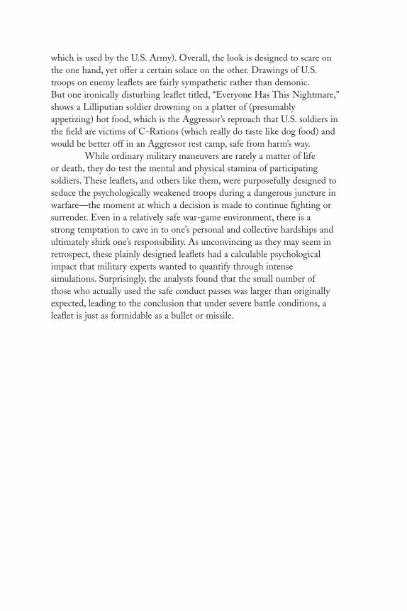
which is used by the U.S. Army). Overall, the look is designed to scare onthe one hand, yet offer a certain solace on the other. Drawings of U.S.troops on enemy leaflets are fairly sympathetic rather than demonic.But one ironically disturbing leaflet titled, “Everyone Has This Nightmare,”shows a Lilliputian soldier drowning on a platter of (presumably appetizing) hot food, which is the Aggressor’s reproach that U.S. soldiers inthe field are victims of C-Rations (which really do taste like dog food) andwould be better off in an Aggressor rest camp, safe from harm’s way.
While ordinary military maneuvers are rarely a matter of life or death, they do test the mental and physical stamina of participating soldiers. These leaflets, and others like them, were purposefully designed toseduce the psychologically weakened troops during a dangerous juncture inwarfare—the moment at which a decision is made to continue fighting orsurrender. Even in a relatively safe war-game environment, there is a strong temptation to cave in to one’s personal and collective hardships andultimately shirk one’s responsibility. As unconvincing as they may seem inretrospect, these plainly designed leaflets had a calculable psychologicalimpact that military experts wanted to quantify through intense simulations. Surprisingly, the analysts found that the small number of those who actually used the safe conduct passes was larger than originallyexpected, leading to the conclusion that under severe battle conditions, aleaflet is just as formidable as a bullet or missile.
DL2 01 07/13/04 2:51 PM Page 13

The Peace Symbol
There was probably no more galvanizing or polarizing emblem during the 1960s than the peacesymbol—an upside-down, three-pronged, forklikemark in a circle, which symbolized the anxiety andanger of the Vietnam era. Although the basic formhad roots in antiquity, it was popularized during themid-1950s when H-bomb testing prevailed. Thesymbol was (re)designed in 1954 by an obscureEnglish textile designer named Gerald Holtom for use by England’s Campaign for Nuclear Disarmament (CND). Yet some sources claim thatthe sign, also known as the peace action symbol,
was designed in 1958 for the British World Without War Council for use at the first annual Aldermaston Easter Peace Walk to promote world disarmament. It later debuted in the United States in 1962 in the cautionaryscience-fiction film about the tragic effects of nuclear testing, The Day the Earth Caught Fire, and within a few years was adopted for use as anantiwar insignia.
The symbol is supposed to be a composite semaphore signal forthe letters N and D (nuclear disarmament), but its basic form also derivesfrom an ancient runic symbol, a fact that casts some doubt on the NDtheory. According to an article in a 1969 issue of WIN (Workshop in Nonviolence) magazine, sponsored by the War Resisters League (one of the1960s foremost anti–Vietnam War activist groups), the peace sign derivesfrom an initial iteration of a white circle on a black square. This was followed by various versions of Christian crosses drawn within the white sphere, which in turn evolved into the ND form. Referring to theAldermaston march, WIN asserts that for subsequent demonstrations anND badge was “devised and made by Eric Austen,” whose research into theorigins of symbolism underscored that the basic forklike symbol, or what he called the “gesture of despair” motif, was associated throughout ancienthistory with the “death of man,” and the circle with the “unborn child.”The reason for calling the upside-down fork a “gesture of despair” derivesfrom the story of Saint Peter, who was crucified upside down in Rome ina.d. 67 on a cross designed by Emperor Nero, known thereafter as the“Nero Cross” or the “sign of the broken Jew.”
14
DL2 01 07/13/04 2:51 PM Page 14

Few who wear the peace symbol as jewelry today are probablyaware of its legacy as a once-controversial emblem. Rather, it seems like aquaint artifact of the 1960s, not unlike psychedelic designs or bell-bottoms.Currently, it is used as a generic insignia for a variety of fashionable (ifpseudo-) antiestablishment issues. In truth the symbol is anything butgeneric, and its origin is still controversial.
During the 1930s, decades prior to the nuclear disarmament andanti–Vietnam War movements but on the precipice of fascist dominance in Europe, the symbol was first devised by the English philosopher and socialist Bertrand Russell as an attempt “to depict the universal convergence of peoples in an upward movement of cooperation.” Duringthe late 1950s Russell was the chairman for the CND, present at numerousdisarmament demonstrations and protests against English involvement inNATO at the very time the symbol was adopted as the CND emblem. It istherefore probable that Russell introduced to the organization the basicsign from which Holtom created his final design.
Russell was a former member of the Fabian Society (a fellowshipof English socialists), which prompted the right-wing journal AmericanOpinion to link the peace symbol, like the antiwar movement in general,to a broad communist conspiracy of world domination. “It is not at all surprising that the Communists would turn to Russell to design their‘peace sign,’” states a 1970 article in this journal, which continues: “AMarxist from his earliest youth, he greeted the Russian Revolution with thedeclaration: ‘The world is damnable. Lenin and Trotsky are the only brightspots. . . .’” The journal further describes Russell as an active anti-Christianwho was well aware that he had chosen an “anti-Christian design longassociated with Satanism.” In fact, the basic form, which appears bothright-side up and upside down as a character in pre-Christian alphabets,was afforded mystical properties and is in evidence in some pagan rituals.Right-side up it represents “man,” while upside down it is the fallen man.Referred to in Rudolf Koch’s Book of Signs as “the Crow’s foot” or “witch’sfoot,” it was apparently adopted by satanists during the Middle Ages.
The Nazis routinely adopted runic forms for their official iconography, such as the SS runes (the insignia of Hitler’s personal bodyguard). Indeed the Nazi iconography calls the crow’s foot Todersune,or “death rune.” Paradoxically, in a right-side-up position it was frequentlyused on death notices, gravestones of SS officers, and badges given to theirwidows. Not unlike the swastika itself, this runic symbol has positive andnegative implications depending on its orientation. The downward versionmight be interpreted as death and infertility, while the upward version symbolizes growth and fertility.
DL2 01 07/13/04 2:51 PM Page 15

Signs and symbols are easily transformed to mean good or evildepending on how they are sanctioned and applied over time—and whoaccepts said usage. Whatever satanic associations the crow’s foot may havehad (or still has), when Bertrand Russell “designed” this symbol he imbuedit with more positive virtues of life and cooperation. Once adopted by theCND (and later by scores of other antiwar, ecology, civil rights, and peaceand freedom groups), its meaning was forever changed to protest in theservice of humanity.
DL2 01 07/13/04 2:51 PM Page 16

Mushroom Clouds
Spectators described the first atomic bomb blaston July 16, 1945, at the Trinity Site in Jornadadel Muerto, New Mexico, as “unprecedented,”“terrifying,” “magnificent,” “brutal,” “beautiful,”and “stupendous.” Yet such ordinary wordsfailed to truly convey the spectacle because, asThomas F. Farrell, an official of the LosAlamos Laboratory, later explained to the press,“It is that beauty the great poets dream aboutbut describe most poorly and inadequately.”
What the inarticulate scientists andmilitary personnel in attendance had witnessedwas an unparalleled event: a thermal flash ofblinding light visible for more than 250 milesfrom ground zero; a blast wave of bone-meltingheat; and the formation of a huge ball ofswirling flame and mushrooming smokemajestically climbing toward the heavens. Whilethe world had known staggering volcaniceruptions and devastating manmade explosions, and often throughout historysimilar menacing shapes have risen into the sky from catastrophes below, thismushroom cloud was a demonic plume that soon became civilization’s mostfoul and awesome visual symbol—the logo of annihilation.
The mushroom cloud was nightmarishly ubiquitous, especially for children growing up during the late 1940s and throughout the 1950s,the relentless testing period of the nuclear age when the U.S. and theUSSR ran their arms race on deserted atolls and in underground caverns.Newsreel accounts of Pacific ocean test sites and Cold War films warningof atomic attacks were not the only sources of trepidation. The U.S.government issued scores of official cautionary pamphlets, and the massmedia published countless histrionic paperbacks, pulp magazines, comicbooks, and other periodicals that fanned the flames of thermonuclear anxiety. For this child of the atomic era, who was never totally accustomedto the frequent Conelrad (emergency network) warnings on TV and duck-and-cover drills at school, mushroom cloud patterns wallpapered mydreams for an excessive number of impressionable years.
17
DL2 01 07/13/04 2:51 PM Page 17

Dreading the unthinkable was underscored by knowing the real.Everyone was taught about the historic shock-and-awe displays launchedrespectively on August 6 and 9, 1945, when two A-bombs destroyed theJapanese cities and incinerated citizens of Hiroshima and Nagasaki. Thiswas not some H. G. Wellsian prediction or pulp science fiction apparition.The furies unleashed by these weapons left indelible scars on conscienceand consciousness just as the blast’s scorching heat literally etched darkshadows of vaporized humans onto the naked ground.
Paradoxically, though, the world’s first atomic bomb, christenedLittle Boy, was as unprepossessing as its name was innocuous. It looked like an “elongated trash can with fins,” said a crewmember of the EnolaGay, the b-29 that carried the Hiroshima bomb. To force Japan intoaccepting unconditional surrender, Little Boy and Fat Man (the plutoniumimplosion bomb dropped on Nagasaki) each deposited the power of over12,500 tons of TNT and left a residue of radiation for years to follow.
The Hiroshima mushroom, small when compared to subsequenthydrogen blasts, looms large in the litany of terror because it was the first.“The city was hidden by that awful cloud, boiling up, mushrooming, terribleand incredibly tall,” recalled Col. Paul Tibbets, pilot of the Enola Gay. “Ifyou want to describe it as something you are familiar with, a pot of boilingblack oil,” related one of his crew. “The mushroom itself was a spectacularsight, a bubbling mass of purple-gray smoke, and you could see it had a redcore in it and everything was burning inside,” said the tail gunner, RobertCaron. “As we got farther away, we could see the base of the mushroom, andbelow we could see what looked like a few-hundred-foot layer of debris andsmoke.” And still another witness said the mushroom was “this turbulentmass. I saw fires springing up in different places like flames shooting up on a bed of coals. It looked like lava or molasses covering the whole city.”Japanese accounts from the ground told of a blinding flash of light (pika inJapanese) and a deafening roar of sound (pika-don, or flash boom), yetoutside the city limits, the sky was a beautiful golden yellow.
Americans greeted the bombings as a necessary means toward an inevitable end. Notwithstanding, when told of the bombing, Dr. J.Robert Oppenheimer, the scientist directly responsible for the Los AlamosA-bomb development teams, expressed guarded satisfaction, for he understood the power of what had been unleashed. A month earlier, afterwatching the triumphal first blast at the Trinity Site, he quoted from theBhagavad Gita: “I am become Death, the destroyer of worlds . . .” He wasplagued by guilt until his death in 1964. Nonetheless, the bombs weremade, the atom was weaponized, and uranium and plutonium were stockpiled. Days after the first blasts, an additional Fat Man was being
DL2 01 07/13/04 2:51 PM Page 18

shipped to a U.S. airbase for its final Tokyo destination until PresidentHarry S Truman, citing despair over the enormous number of casualties,decided to spare the city and its inhabitants.
After Hiroshima and Nagasaki, propagandists did not wait long to put a happy face on the ghastly new weapon and incorporate the mushroom cloud into popular iconography. The bomb itself (in itsvarious unexceptional physical manifestations) was not iconic enough for widespread use as a modern emblem, but the mushroom cloud was monumentally omnipotent. Since the United States could smash andharness the atom (and with it, smash and harness Imperial Japan) themushroom cloud initially represented superhuman accomplishment. Itsymbolized righteousness rather than wickedness.
But not everyone embraced this view. Only a few months after the end of war, one early opponent, former U.S. Navy Lieutenant RobertOsborn, an artist whose wartime assignment was drawing cartoons fortraining and safety brochures, published a cautionary manual of a differentkind. This time, rather than teach sailors and pilots survival techniquesunder battle conditions, his book, titled War is No Damn Good, tried to savelives through condemnation of all armed conflict—especially the nuclearkind. While serving in the Navy, Osborn believed he had seen all thecarnage imaginable, and supported the end result. But after viewingpictures from Hiroshima and its atomic aftermath, he realized the meanswere not beyond reproach, and as an artist he could not remain silent.Thus he created the first protest image of the nuclear age—a drawing of asmirking skull face on a mushroom cloud, which transformed this atomicmarvel into a symbol of death. Although it was not the most profoundstatement, it was the most poignant of the few antinuclear images producedin the wake of World War II. For its prescience, it has earned a place in thepantheon of oppositional graphics.
But even Osborn’s satirical apocalyptic vision pales before actualphotographs and films of A-bomb and H-bomb blasts that were made ofthe many tests over land and under sea. One film is remarkable for the real-time eruption from a gigantic plasma bubble (like an enormous womb)into a gaseous fireball from which the mushroom cloud emerges. Othersare incredible for the sheer enormity of the cloud compared to nearbybuildings or ships. Detonations at sea routinely produced the best photoops because the immense upward thrusting water column, the base of themushroom, was so surreal. Seen from the air, the blast produced undulatingsurf that radiated for miles, churning up the otherwise calm sea. Theseimages are horrific and hypnotic, and like cosmic fireworks, they were asfascinating as they were terrible.
DL2 01 07/13/04 2:51 PM Page 19

Early in the atomic age the mushroom cloud also devolved intokitsch. Government and industry promoted “our friend, the atom” with avariety of molecular-looking trade characters and mascots. By 1947 therewere forty-five businesses listed in the Manhattan phone book alone thatused the word “atomic” in their name, and none had anything to do withmaking bombs. In 1946 the cereal maker General Mills published an ad incomic books that was illustrated with a mushroom cloud, offering childrenan “Atomic ‘Bomb’ Ring” if they sent in a Kix cereal box top. The ringfeatured a secret compartment and a concealed observation lens thatallowed the holder to look at flashes “caused by the released energy ofatoms splitting like crazy in the sealed warhead atom chamber.” A savvyFrench bathing suit designer, Louis Reard, took the name “bikini” from theMarshall Islands—where two American atom bombs were tested in 1946—because he thought that the name signified the explosive effect that the suitwould have on men. Another designer, Jacques Heim, created his own two-piece bathing suit, called “The Atome,” which he described as “the world’ssmallest bathing suit.” Designers of everything from alarm clocks tobusiness logos soon adopted an “atomic style.”
Comic book publishers made hay out of mushroom mania.Atomic blasts, like auto accidents, caught the eye of many comic readersand horror aficionados. Just as real photos and films of atomic tests seducedviewers, fantastic pictorial representations of doomsday bombs blowing uplarge chunks of earth tweaked the imagination. The sheer enormity of thesefictional blasts, especially when seen on earth from space, raised the level ofterror many notches. Similarly, B-movies in the nuke genre, with all thoseempty cities laid barren by radioactive poison, exploited the “what if ”voyeurism that people still find so appealing. Books and magazine storiescovered a wide nuclear swath. Novels like Fail Safe and On the Beach (bothmade into films) speculated on the aftermath of a nuclear attack and thustriggered fear (and perhaps secretly promoted disarmament too). But to sellthese books, paintings of mushroom clouds were used in ridiculous ways.The cover for On the Beach, for example, is absurdly prosaic, showing awoman standing on a seaside cliff directly facing a mushroom cloud whilewaiting for her lover to return from his submarine voyage to no man’s land.By current standards—even for mass-market paperback covers—this isdumb, yet effective.
An intelligent, though more frightening, mushroom cloud display is the montage of nuclear blasts at the end of the satiric film Dr.Strangelove, accompanied by the mournful lyrics, “We’ll meet again/Don’t know where/Don’t know when.” In quick succession, a dozen or sodetonations, taken from real test film footage, flash by to illustrate a
DL2 01 07/13/04 2:51 PM Page 20

fictional “doomsday machine” triggered when only one bomb falls to earth.Although this chain reaction is not real, it plays to fears that many laypeople and some scientists had that the U.S. and the USSR each createdsuch demonic devices. In that spirit, during the 1950s, the Atomic Scientistsof Chicago and the Federation of American Scientists, in their magazinetitled The Bulletin of the Atomic Scientists, adopted a “Doomsday Clock” thatthey intended to symbolize the world’s proximity to self-destruction—asurreal but reasonable presumption.
Absurdity reigned during the nuclear age and afterward. In 1995,the fiftieth anniversary of the end of World War II, the United StatesPostal Service planned to issue a postage stamp showing the Hiroshimaatomic mushroom cloud with the words: “Atomic bombs hasten war’s end,August 1945.” The Japanese government protested, and the stamp wascanceled. For the mushroom to be so commemorated would be an affrontto the memory of those killed, but would also serve to legitimize thisendgame trademark rather than underscore that the mushroom cloud isand will remain the world’s most wicked icon.
DL2 01 07/13/04 2:51 PM Page 21

Black Power/White Power
Tomi Ungerer
From time to time circumstance fosters theclimate for a radical cartoonist to emerge fromthe ranks—one who shocks the senses and at thesame time redefines the form. When Alsatian-born Tomi Ungerer’s (b. 1930) work premiered inthe United States in the mid-1950s, it was ashock to complacency, not because his raggedline and farcical ideas showed a clear rejection ofthe sentimental and romantic realism publishedin most mainstream magazines andadvertisements, but because his satire exposedfolly that native-born cartoonists were afraid totouch, or even see. Writing in Graphis, ManuelGasser said of Ungerer’s audacity: “one cannothelp noticing that he is a grown-up child.Children have a habit of coming out with thetruth, even when it is least opportune.”
Truth underscores Ungerer’s 1967 posteron race relations in America entitled BlackPower/White Power. First conceived in 1963 as
the cover of Monocle, a short-lived satiric journal published in New York,this topsy-turvy image of a white man eating a black man’s leg as the blackman does the same to the white, was an acerbic, if unpopular, critique ofthe dangers within the burgeoning civil rights movement. Like a child voidof propriety and manners, Ungerer naïvely, though harshly, looked at bothsides of the color line and found that white and black militants were threatsto a movement that most liberals of the day were unwilling to criticize. Thecartoon was a pox on both their houses. By the time Ungerer published thecartoon as a poster (reportedly over a quarter of million were produced)tension between militant and nonviolent segments of the movement hadbecome frighteningly evident.
Ungerer never felt restrained from making strong political commentary even if it offended those purportedly on his own side. Self-censorship was never an issue, and the absence of taboos in his workresulted in drawings that eschewed the clichés and universal symbols thatneutralized most graphic commentaries. Being an outsider, an immigrant,
22
DL2 01 07/13/04 2:51 PM Page 22

and peripatetic wanderer allowed him to see through the artifice ofAmerican politics and society, and underscored his vision.
Born in Strasbourg, Alsace, Ungerer grew up under French ruleand German occupation. “It gave me my first lesson in relativity andcynicism—prison camps, propaganda, bombings . . . all to culminate in anapotheosis of warfare. My taste for the macabre certainly finds its rootshere,” he explained. Ungerer lacked any formal art training but found solacein his art. Before embarking on a career, though, he joined the camel corpsof the French Army in Africa, from which he was discharged for ill health.At the age of twenty-four, however, he came to the United States to be afreelance illustrator. He ultimately produced various children’s books forHarper and Row. His most significant, Crictor, published in 1957, was thefirst children’s book to feature a boa constrictor (then taboo) as its maincharacter.
During the 1950s, Ungerer did not have outlets for his personalwork, so he filled many sketchbooks with surreal cartoons. His UndergroundSketchbook, which took him many years to get published, was a repositoryfor biting comic commentaries about sex, war, death, and love. Heeventually turned his attention from the general human condition torealpolitik. He rejected any semblance of idealism, especially in terms ofwar: “Some wars are necessary evils,” he once wrote, “but Vietnam wasstupid.” His drawings and self-published posters were savage indictments ofthat war’s brutality. There is the feeling in looking at sketches and postersshowing soldiers brutally forcing Vietnamese to metaphorically swallow theAmerican way of life, that everyone was had by the lies and duplicity ofgovernment and its leaders. “Because America is a gutless country,” heargued. “I do a political drawing because of a need I have. Out of anger.”But posters with the conceptual intensity of Black Power/White Power, bornof pure emotion, ultimately became historical essays on the mechanisms oflife. “I am not really an artist, I am a thinker. I just use my drawings as atool to make my thoughts accessible.”
An artist this mercurial might be expected to have a limited cultfollowing, but to his surprise Ungerer became the wunderkind of Americaneditorial and advertising art. He was given hundreds of commissions,notably a series of billboards for the New York State Lottery with theheadline “Expect the Unexpected,” showing absurd and ironic vignettes asonly Ungerer could make them. This headline and Ungerer’s ideas wereeventually adopted by the Village Voice, New York’s leading alternativenewspaper, for its own advertising campaign. But the methods of thecommercial world eventually soured Ungerer, and in 1970 he severed hisrelations. “My intention was to get away from Madison Avenue and its
DL2 01 07/13/04 2:51 PM Page 23

gold-medal-sucking bogeymen. After thirteen years of hard work I haddeveloped an allergy to the media,” he said about turning exclusively tographic and written commentary—the activity he had been subsidizingthrough commercial fees. Taking on the occasional commission, during the1970s and 1980s he remained a prolific visual essayist on the comédiehumaine.
DL2 01 07/13/04 2:51 PM Page 24
25End Bad Breath
Seymour Chwast, Designer
The Vietnam War polarized the American peoplelike no other conflict since the Civil War.Domestic battles between hawk and dove, rightand left, and young and old were passionatelywaged in the media and on the streets, throughwords, music, and pictures. The nightly newsbarrage of film and video directly from Vietnambattlefields impressed the horrific image of thiswar on America’s consciousness and inspired theprodigious amount of protest posters aimed atleaders and policies. Not since after World War I,when pacifist organizations on both sides of theAtlantic launched what was called a “war againstwar,” have artists and designers produced as manytestaments of conscience.
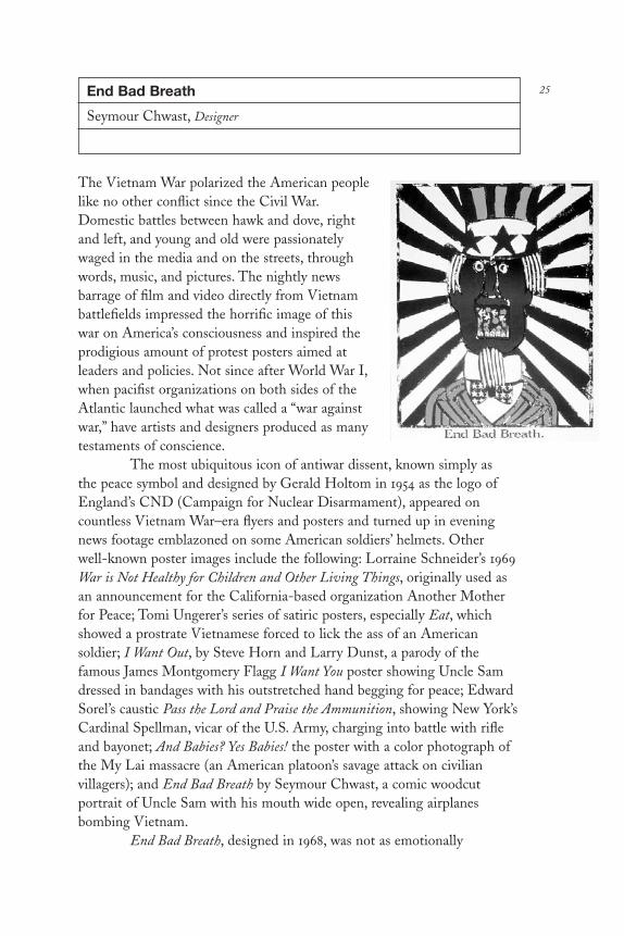
The most ubiquitous icon of antiwar dissent, known simply as the peace symbol and designed by Gerald Holtom in 1954 as the logo ofEngland’s CND (Campaign for Nuclear Disarmament), appeared oncountless Vietnam War–era flyers and posters and turned up in eveningnews footage emblazoned on some American soldiers’ helmets. Other well-known poster images include the following: Lorraine Schneider’s 1969War is Not Healthy for Children and Other Living Things, originally used asan announcement for the California-based organization Another Motherfor Peace; Tomi Ungerer’s series of satiric posters, especially Eat, whichshowed a prostrate Vietnamese forced to lick the ass of an Americansoldier; I Want Out, by Steve Horn and Larry Dunst, a parody of thefamous James Montgomery Flagg I Want You poster showing Uncle Samdressed in bandages with his outstretched hand begging for peace; EdwardSorel’s caustic Pass the Lord and Praise the Ammunition, showing New York’sCardinal Spellman, vicar of the U.S. Army, charging into battle with rifleand bayonet; And Babies? Yes Babies! the poster with a color photograph ofthe My Lai massacre (an American platoon’s savage attack on civilianvillagers); and End Bad Breath by Seymour Chwast, a comic woodcutportrait of Uncle Sam with his mouth wide open, revealing airplanesbombing Vietnam.
End Bad Breath, designed in 1968, was not as emotionally
DL2 01 07/13/04 2:51 PM Page 25

wrenching as War Is Not Healthy . . . or And Babies? But through comicsurrealism—the juxtaposition of a typical mass-market advertising slogan,the familiar characterization of American patriotism, and the childlikerendering of an air raid—the poster spoke eloquently of the criminal andbanal that was American Southeast Asia policy. It suggested that behindthe façade of Americanism, this nation was keeping the peace by engagingin an unjust war in a distant land.
Furious that President Lyndon Baines Johnson ordered AmericanB-52s to bomb Hanoi in order to pound the North Vietnamese leader, HoChi Minh, into a humiliating submission, Chwast, like others within thegrowing antiwar movement, believed that the immorality of such increasedU.S. intervention would have disastrous effects on both nations. This alsoforced Chwast to explore ways in which a solitary citizen might somehowinfluence government policy. A poster, a mere one-sided sheet of printedpaper, could not have the same destructive power as even an infinitesimalfraction of the napalm used to defoliate the Vietnamese countryside, but itcould have a curative effect. Short of acts of civil disobedience, which wereincreasingly frequent during the late 1960s, a poster was the best means forChwast to express his own growing frustration. And just maybe, throughits visibility and recognition, the poster might reinforce the antiwar stanceof others.
End Bad Breath was not the first antiwar visual commentary thatChwast, who cofounded Push Pin Studios in 1956, had created for publicconsumption. Nor was it the first time he was involved in antigovernmentprotests. In the early 1950s Chwast was a member of SANE, a group thatadvocated and demonstrated for nuclear disarmament and included thesupport of artists and designers. SANE was the first well-organizedpostwar effort in the United States to build grassroots support againsttesting of the atomic and hydrogen bombs. In 1957, a few years beforeAmerican advisers were deployed in Vietnam, Chwast wrote, illustrated,and self-published The Book of Battles, a collection of woodcuts thatironically represented historic battle scenes not as heroic but banal events. The small, limited-edition book was in the tradition of artists’commentaries that dated back to the seventeenth century and includedJacques Callot’s collection of prints The Miseries and Disasters of War(1633–1635), depicting the horrors of the Thirty Years’ War; Francisco Goya’s prints Disasters of War (1810–1820), about the Napoleonic occupationof Spain; and Pablo Picasso’s 1937 painting Guernica, memorializing thebombardment of a defenseless Spanish town.
But Chwast’s effort was even more consistent with a genre ofantiwar fables, exemplified in The Last Flower (1939) by James Thurber,
DL2 01 07/13/04 2:51 PM Page 26

with its childlike drawings and terse text that served as a cautionary parableon the nature of armed conflict, and War is No Damn Good (1946) by RobertOsborn, the first antiwar book of the nuclear age, the first time that themushroom cloud is transformed into a death’s head. In this same spiritChwast used a simple visual lexicon to show centuries of warfare’s futilerecurrence.
In the early 1960s American military advisers were sent toVietnam, followed by a limited number of ground troops. In 1964, just priorto the launch of massive U.S. buildups, Chwast designed his first protestposter, War is Good Business, Invest Your Son, the slogan based on a buttonthat he had seen. During this early stage of the burgeoning “alternativeyouth culture,” head shops as well as poster and button stores were poppingup in so-called bohemian districts like the East and West Village of NewYork City and catering to a rebellious clientele. Wearing political and socialstatements on their clothing was fashionable, and buttons became one wayof publicly expressing antiestablishment points of view. In addition to theubiquitous peace sign and buttons with slogans like I Am an Enemy of thePeople and Frodo Lives (a reference to J. R. R. Tolkien’s The Hobbit), War isGood Business . . . touched a very raw nerve among draft-age baby boomers.
Chwast borrowed the slogan for use on his darkly colored (blues,purples, and reds) poster, which included nineteenth-century decorativewoodtypes and old engravings of a mother and a soldier. It looked akin toone of those vintage call-to-arms broadsheets that summoned civilians intobattle in the days when war was a heroic exercise. Chwast sold the idea toPoster Prints, one of the leading commercial poster and button outlets,where it was retailed among an array of cheaply printed movie, rock-and-roll, and protest posters. Although it appeared decorative, War is GoodBusiness . . . was by no means benign. Without employing such frighteningimages as dismembered bodies and napalmed children, the poster cautioned that war (and particularly the Vietnam conflict) exacted the most costly price.
By the time that the United States had committed total man- and firepower to the Vietnam quagmire, LBJ decided not to run for asecond term as president (acknowledging public dissension). Nonetheless,he continued to aggressively pursue the war, which had gathered suchmomentum that it was not about to be concluded at that time. End BadBreath acknowledged the frustration Chwast—and many Americans—felt over the inevitability of an out-of-control war.
End Bad Breath was distributed through Poster Prints, and—compared to the other inventory of celebrity and psychedelic posters—itwas fairly strident. But Chwast admits it was by no means an innovation.
DL2 01 07/13/04 2:51 PM Page 27

“This was the kind of illustration method that was being done in thosedays,” he explains. “Little people on shoulders, things in mouths—So Ididn’t break any new ground.” The woodcut, which Chwast chose to usebecause of its sudden-death immediacy, was not new, either. It was themedium of choice for German expressionist artists, many of whom weremembers of left-wing political parties during the early twentieth century.Anyway, novelty was less important to Chwast than effectiveness, and theposter did have an impact “if only as an icon for those of us who hadalready made up our minds about the war,” Chwast comments. “But it certainly didn’t change any minds.”
Chwast does not harbor any false illusion that his, or any, postermade a difference in the eventual outcome of the Vietnam War. But whentaken as one piece of ordinance in a larger arsenal, its impact is very sig-nificant. It may not have had the same widespread exposure as the nightlynetwork news broadcasts (which arguably changed Americans’ perceptionsmore than anything else); it may not have been as influential as rock songslike Country Joe and the Fish’s “Fixin’ to Die Rag.” But it was a mnemonicrepresentation of government folly that underscored deep-seated dissentand an effective component of the larger antiwar campaign. It was alsoubiquitous in graphic design magazines and competition annuals, whichpresumably helped to raise the awareness, if not stimulate the activism, ofthose in the design profession.
DL2 01 07/13/04 2:52 PM Page 28

29Men With No Lips
Robbie Conal
The notice Post No Bills was coined inmid-nineteenth-century England toprevent the hangers of illegal placards fromlittering London’s otherwise dreary streets.By law, the Post No Bills notice had toappear approximately every four feet alonga wall or hoarding for it to be considered aplacard-free surface; but even the threat offine or arrest didn’t daunt the erstwhileposterist in the performance of his duty.Since then, Post No Bills has become aninvitation to engage in the act of posting.Once the only method of displayingadvertisements and proclamations forthose without access to mass media,postering is still the cheapest and mostdefiant means of reaching the public.
Few have challenged posting ordinances more than Venice,California–based artist/activist Robbie Conal (b. 1944). As the leader of anational band of agitators, he has flown coast to coast armed with rolls ofincendiary paper to supply an army of poster snipers. In reality, this army isa loose network of urban poster guerrillas who in the wee hours of themorning plaster their respective cities and towns with messages thataddressed a variety of social ills. Since the mid-1980s, Conal has produced,at his own expense, an average of three posters a year on subjects hebelieves mass media has failed to cover.
Conal’s first foray into confrontational street art was an enigmaticthough provocative poster titled Men With No Lips, an attack on formerPresident Ronald Reagan’s cabinet, whose tight-lipped responses to publicinquiry obfuscated the dismantling of social welfare programs at home andthe undermining of sovereign governments abroad. This poster, originallydesigned to fit standard traffic light switching boxes—the most ubiquitousunofficial poster surface in Los Angeles—was simultaneously hung onbuilding walls, hoardings, and lampposts in New York and Chicago. Ahybrid of fine art and agitprop, Men With No Lips was often mistaken for a
DL2 01 07/13/04 2:52 PM Page 29

rock band advertisement. Yet after a few sightings the intent of the messageto tweak Americans’ hearts and minds out of complacency became clear.
Conal admitted his decision to become a postermaker was part ofa “plot to escape from the friendly confines of the art establishment,” whichhe joined as a painter after majoring in psychedelic drugs in college duringthe late 1960s. He called his brand of agitprop “infotainment,” andadmitted that the last thing he wanted to do as a nonsanctioned publicartist on social issues was to be deadly serious. “I knew that people on thestreet would ignore the humorless message on their way to work in themorning, and besides, I had a sardonic twist to my sensibility. So taking alittle lesson from advertising, I thought I would just pique people’s interest.I wasn’t interested in telling them what to think as much as getting them tothink along with me, and giving them a little chuckle, too,” he explained.
Conal’s social activism stems from being a “red-diaper baby” raisedon the “upper left side” of New York City by parents who were labororganizers. “The apple doesn’t fall too far from the tree,” he said. Althoughhe spent a few years trying to reconcile the often rocky relationshipbetween art and politics, Conal eventually discovered a process of paintingand postermaking whereby he could publicly express his indignation onissues such as Iran-Contra, women’s reproductive rights, and censorship.
His second poster titled Women With Teeth was the opposite ofMen With No Lips. “Considering myself something of a feminist, I figured Ishould give [women] equal time and image,” he said. The series includedportraits of Nancy Reagan, Margaret Thatcher, Jeanne Kirkpatrick, andJoan Rivers (whom Conal felt had traded in her alternative culturebirthright for an establishment pedigree); these also sprang up around thenation thanks to the increasing number of volunteer snipers he and hisfriends had recruited. The response was gratifying. “There was a lot ofsilent resentment on the streets,” he reasoned, “so when stuff startedshowing up in this subversive way, I think it was like a voice for a lot ofpeople who had been silent. This grass-roots little yelp had become achorus.”
The theme of accountability runs through Conal’s work. And so his third poster titled Speak, which featured Conal’s expressionisticrendering of Iran-gate principal Colonel Oliver North, was a mammothwanted poster. Conal regretted that he did not have enough money to printtwo others in the series, Hear and See, featuring portraits of PresidentRonald Reagan and his security aide, John Poindexter, but he did succeedat getting Speak hung in some of the most visible locations around thecountry, including site-specific Washington, D.C.
DL2 01 07/13/04 2:52 PM Page 30

31Grapus Posters
Grapus
The Paris student revolution of May 1968was one of the most dramatic politicalevents in a decade noted for its tumult. Ina modern-day storming of the Bastille, acoalition of more than ten million studentsand workers mounted the barricades toprotest Charles de Gaulle’s agingconservative government. By the end ofthe year the nation was paralyzed bystrikes and demonstrations. In contrast tothe social protest concurrently hittingmany nations, this whirlwind insurgencyactually shook the system, provokingsubstantive though temporary concessions.
Intellectuals and workers werebrought to the battlements by their sharedinterest in social reform and by theirindignation at the repression—mostaggressively represented by theparamilitary National Police who were brought in to squelch the proteststhrough violence. Both groups were further induced by the daily barrage ofcritical posters designed by the Atelier Populaire to inform and mobilizethe populace. This group of disparate painters, graphic artists, and artstudents produced hundreds of iconic, one-color, brush-and-ink postersthat were pasted all over Paris and became an indelible symbol of thepopular uprising. In keeping with the character of collectivism, these paperbullets were unsigned by any individual. Yet by the end of the briefstruggle, three of the most vociferous practitioners did become known, ifnot individually at first, at least as the graphic arts collective called Grapus,which later devoted itself to making graphic design for the communistparty, labor unions, and the public interest.
The original principals of Grapus were Pierre Bernard, GérardParis-Clavel, and François Miehe. Each studied in Poland at a differenttime under master poster artist Henryk Tomaszewski, where anappreciation for anarchic design was nurtured. After leaving Poland,Bernard worked for the magazine Jeune Afrique and Paris-Clavel at a
DL2 01 07/13/04 2:52 PM Page 31

fashion studio. The trio came together in May 1968 at the École Nationaledes Arts Decoratifs, where Miehe was a student and one of its politicalleaders. The revolution was just beginning. For three weeks they workedtogether in the Atelier Populaire No. 2, where each morning an assemblydecided on the day’s subjects. In the afternoon they designed the postersthat by evening were printed and then sniped on the Paris walls.
By month’s end the May Revolution was over for the AtelierPopulaire. Hastily called national elections offered expedient solutions.“We were disappointed by the result of the elections,” said Pierre Bernard, “but for ourselves this invitation to the political discussion wasunforgettable.” Such an electrifying month encouraged the trio to pursuethe idea of influencing society through graphic arts. Despite France’svenerable satiric arts tradition, French poster art was comprised ofmundane product advertisements—even the best ones said nothing aboutsociety. Although nothing paralleled the Polish energy in the realms ofpolitics or culture, Bernard was adamant. “We wanted to speak on the wallsabout cinema, theatre, poetry, history as had been done in Poland, andabout politics as we had seen in the Cuban magazines,” he said. “Weneeded a new type of client.”
Among the most profound changes in government was theappointment of the author André Malraux as minister of culture. Malrauxestablished a new school, the Institut de l’Environment, to consolidatearchitects, urban planners, and industrial and graphic designers in commoncause. Bernard and Gérard were awarded two-year scholarships by theinstitute to research and analyze the propaganda images of the PopularFront (1936) and the Coup d’Êtat de Gaulle (1958). They studied linguisticsand the arts of persuasion, and learned the importance of semiology inrelation to form. They graduated, ironically, right before the school wasclosed for being, as the government ruled, a breeding ground for Marxistagitation. Realizing that scholarly pursuit was not going to affect societyanyway, Grapus was founded to take an activist role in design. Based on theteachings of the institute and on the practice of collectivism as a means torender and disseminate ideas, they strove “to make the best image for thebest politics in a materialist way,” said Bernard.
The name Grapus is a nonsense word for graphics, but also refersto crapules staliniennes, “Stalinist scum,” what the Grapus founders were atone time called by fellow leftists for being too rebellious. In its infancy themembers of Grapus tried to work for the communist party and laborunions while they earned money working for advertising agencies. “Aftersome months,” recalled Bernard, “the two activities could not co-exist. Youcannot simultaneously have two heads, two hearts, and two lunches with
DL2 01 07/13/04 2:52 PM Page 32

two different persons.” Hence they dedicated themselves solely to socialconcerns. Yet convincing these normally suspicious groups to place boththeir trust and limited funds with this fledgling studio was difficult.Moreover, the Grapus style, a distinctive marriage of graffiti and collagemade into colorful abstractions, was spurned by the communists as notbeing “strictly significant.” Rather than a tired socialist realism, Grapus wasinterested in “making posters with strong metaphors to speak about humanbeings with blood, muscle, and smile,” said Bernard. “We quoted Picasso,Léger, and Eluard as examples to follow. And we were proud of [this] newideology.” Calligraphy was used because handwriting was a symbolic meansfor the viewer to participate in the process. The reason for this was, asBernard explained, “to find the tone of truth—you cannot lie when youwrite with your hand.” Although the party did not say no to Grapus’sefforts, they certainly resisted.
Grapus decided to remain independent, not tied to any party orgroup. Although they agreed with the goals of communist and labororganizations, they also keenly understood the lessons of history regardingideology and the function of art. Without total independence it would beimpossible to argue their own goals of quality, emotion, and aesthetics.Each time they proposed a design, they had to fight for this color or thattypographic choice. Grapus’s approach to polemical art was stern but notpedantic, strong but refreshingly and surprisingly festive. Because ofGrapus’s nonconformity, “Sometimes they [the party] considered us asterrorists,” said Bernard.
Grapus’s philosophy was based on an interpretation of Marxismthat was flexible enough to conform to changes in political climate, andthat often put them at odds with more doctrinaire groups. Ultimately, theysplit with the communist trade union over methodology and tactics. “Todayeach of us can say, ‘I have not changed,’” Bernard admitted, “but we cannotsay that together.”
DL2 01 07/13/04 2:52 PM Page 33

Glasnost Posters
When Mikhail Gorbachevassumed power in 1985 thewords glasnost, perestroika,and demokratia were notuttered. After a few yearsthey became the mostcharged words of anylanguage: glasnost, “newopenness”; perestroika,“economic reform”; anddemokratia, “popular rule.”Ultimately, PremierKhruschev’s admonition
“We will bury you” was replaced by “Do you want fries with that?”Glasnost posters were early manifestations of the flurry of social
and political change that preceded the fall of the Soviet Union. Printed onflimsy paper, these posters expressed the frustrations and fears of a nationlong under communist oppression. But the beginnings of change in Sovietgraphics began much earlier than the Gorbachev years. The evolution ingraphic design slowly gathered momentum towards the end of Khruschev’sreign and continued through the early 1980s during the Brezhnev years.
When Gorbachev finally emerged as leader of the nation, Russiawas still “the evil empire.” Glasnost was not proclaimed overnight. But interms of graphics the thaw had started. By 1985, when glasnost, perestroika,and demokratia were announced to the world, the initial evidence of thisnew graphic excitement emerged—or rather exploded—in the BalticRepublics of Latvia, Estonia, and Lithuania, where poster artists hadalready been exploring new methods of graphic presentation. Most of thesenew posters, which owe a debt to the Polish poster, were done for localcultural and performing arts events that had historically allowed artistsmore freedom.
In 1986 a new genre, the protest poster, was displayed at a Latvianpolitical poster exhibition. Laimonis Chenberg of Riga had designed aposter called Perestroika? showing two saucepans with different coloredcovers. The symbolism, though seemingly obscure, was rather pointed.Chenberg challenged authority by visually suggesting that if the
34
DL2 01 07/13/04 2:52 PM Page 34

government could not achieve the simplest task, that of matching the rightcover to the right saucepan, could perestroika really succeed? For the firsttime in decades an artist publicly questioned official policy. “For the firsttime in a long time, the artist had the right, and he took it immediately,to communicate his own view of the world and its problems,” wrote acontemporary critic. It further signaled a “new orientation in politicalposter art,” and triggered a chain reaction that was felt even in Moscow.
Glasnost posters were “called to life by a revolution from aboveand supported by the powerful mass movement from below,” wrotehistorian Anna Suvorova. Unmentionable social ills were being addressed,including compassion for the handicapped, drug and alcohol addiction,prostitution, and AIDS. Governmental abuses were subject to criticism,including the bloated bureaucracy and remnants of Stalinism. “All theposters created by perestroika/demokratia in the setting of glasnost havethe same distinction: a peculiar ‘distrust’ of the word,” continued Dr.Suvorova. Slogans that defined the social realist posters of the past wererejected due to a “visual scheme and a plastic flow”—the very same artisticattributes that were once deemed bourgeois baggage. Compared torevolutionary posters of 1917 the perestroika posters lacked some of thespontaneity, drive, and mobilizing emotion, but, claims Suvorova, made upfor it with logic and irony. With perestroika the poster became intellectualand therefore demanded that the viewer perceive unfamiliar images andcodes, such as aphorism and grotesquery, to show the problems inherent inSoviet society. One Russian observer noted, “The poster nowadays iscontradictory; it’s not always precise and understandable for everybody.”
This was a time of painful reappraisal of ingrained Soviet valuesand a shattering of old stereotypes. It was also a period of great peril.Immediately before the fall of the USSR glasnost was pronounced dead,perestroika was called a myth, and the term demokratia was considerablydownplayed in official circles. Although the environment was moreconducive to the publication of some sanctioned controversial posters, theunion poster publishing house, Plakat, in Moscow, was still managed by oldparty functionaries who imposed constraints and limited production basedon prejudice and fear.
There were still taboos. Glasnost and perestroika posters weretolerated as long as they did not criticize the Premier. Gorbachev shutdown and fired the editor of Ogony, one of the leading publications in thecountry, for criticizing his effectiveness. Many poster artists, most of whomwere under age forty, did not trust the system.
“There is freedom of speech. But what’s more important, ifglasnost holds up, the Russians will continue to have freedom after they
DL2 01 07/13/04 2:52 PM Page 35

speak,” wrote the comedian Yakov Smirnoff in a 1989 New York Timesop-ed article. In the end, what happened shook the world. The shortperiod during which glasnost posters were designed marked a crack in theIron Curtain that grew larger until it shattered. Today these glasnost posterimages are a monument to the power of polemical art to change the courseof history.
DL2 01 07/13/04 2:52 PM Page 36

37Cigarette Advertisements
Women have come a long way from thepresuffrage era when it was unladylike tosmoke. Taken up as a cause célèbre, women’sright to cigarettes was a smokescreen in thestruggle for more fundamental rights. On theway to achieving first-class citizenship, womenbecame first-class tobacco consumers. And ifwomen were going to smoke, reasoned thetobacco industry, then why not encouragethem to smoke a lot? By 1910 advertisementshinted that smoking was a right—by the 1920sit was a duty.
No expense was spared by LuckyStrike in recruiting female customers. Topromote the image of sophistication a series of1930s magazine ads featured stylized paintingsof women decked out in evening finery. In “OKMiss America! We thank you for your patronage” a woman wearing a revealing, low-cut satin gown is so above the fray that she isn’t evenholding a Lucky, but the implication is that she had just finished a satisfyingsmoke. In the haughty “I do” advertisement a sultry bride pauses for arelaxed smoke and gives her vow to the cigarette of choice. Cigarettes weremarketed as fashion accessories, but these ads, which ran during the GreatDepression, were not targeted exclusively to women of means. Using smokeand mirrors, cigarette advertising suggested the promise of a better life.
Advertising wizards also made cigarettes seductive to women byinvoking the ideal. High culture was used in one sales pitch that borrowedHenry Wadsworth Longfellow’s “First a Shadow Then a Sorrow,” toannounce Lucky Strike’s diet plan. “Avoid that future shadow,” the copysuggested, “by refraining from over indulgence. If you would maintain themodern figure of fashion.” Under an idealized color painting of a youngwoman haunted by the shadow of a double chin, the copy read: “We do notrepresent that smoking Lucky Strike Cigarettes will bring modern figuresor cause the reduction of flesh. We do declare that when tempted to doyourself too well, if you will ‘Reach for a Lucky’ instead, you will thus avoidover indulgence in things that cause excess weight and, by avoiding overindulgence maintain a modern, graceful form.”
DL2 01 07/13/04 2:52 PM Page 37

Cigarettes were a staple for Depression-weary and later war-tornAmericans. Yet despite the claim of weight control, they offered no viablehealth inducements. Even tobacco manufacturers acknowledged thatfrequent product usage resulted in coughing, throat irritation, and raspysounding voices. The last was, however, promoted as sexy. To deflect publicattention away from what the industry viewed as minor physical ailments,cigarette advertising exploited certain perceived health benefits, includingincreased vigor and stamina. Camels asserted that “Smokers everywhere areturning to Camels for their delightful ‘energizing effect’ . . . Camels neverget on your nerves. . . .” Lucky Strike took the homeopathic route withtheir motto “It’s toasted.” A typical ad read “Everyone knows that sunshinemellows—that’s why the ‘toasting’ process includes the use of UltraViolet Rays . . . Everyone knows that heat purifies and so ‘toasting’—thatextra secret process—removes harmful irritants that cause throat irritationand coughing.” By the late 1930s Lucky Strike had added the following tagline to its motto, “sunshine mellows—heat purifies.”
Men played a role in cigarette advertising for women. They ranthe agencies, produced the images, and wrote the copy that created thecommercially correct woman. But in men’s club fashion they also made funof their own ludicrous stereotypes. In “Shanghaied by a Silly Salt? . . . Lightan Old Gold” the Esquire magazine pinup artist Petty’s voluptuous gal ishit upon by a licentious old gent, but the copy positions Old Gold as hersaving grace: “When a retired skipper proves he is anything but retiring bydropping anchor alongside of you . . . don’t let him scuttle your wholeevening. Offer him an Old Gold . . . he’ll welcome it like a breeze in thedoldrums . . . while you breeze gracefully away.”
Movie stars and starlets frequently appeared as spokespersons. In a1943 advertisement, Betty Grable, star of the movie Pinup Girl, is shown ina soldier’s barracks, reinforcing the idea that Chesterfield is overseas “Withthe boys. . . .” In the same spirit, Joan Bennett, dressed in her Women’sVolunteer Army uniform, lit up “His cigarette and mine,” another in aseries of Chesterfield testimonials. To soldiers, cigarettes were as valuable asrations; to the tobacco industry the war was a boon. Ads invoked the imageof American boys, exploited the image of American girls, and portrayedcigarettes to be as American as apple pie. After the war, men became activerole models in ads targeted to women.
The cigarette ads created during the Great Depression and WorldWar II targeted women with one purpose: to seduce by appealing to theirpatriotism and sense of fashion. While the stylistic manner of thisseduction has changed since these ads were first printed, the method is stillthe same: appeal to weakness, bolster myth, and massage fantasy.
DL2 01 07/13/04 2:52 PM Page 38
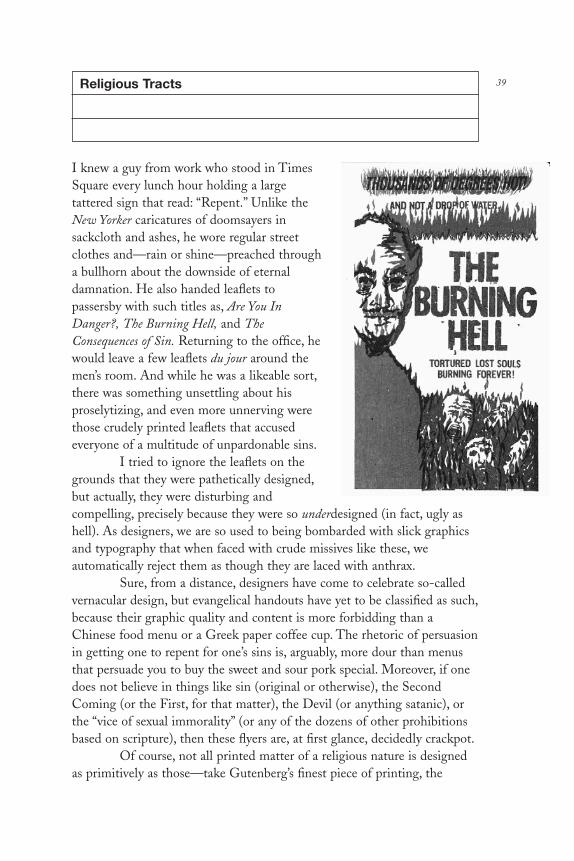
39Religious Tracts
I knew a guy from work who stood in TimesSquare every lunch hour holding a largetattered sign that read: “Repent.” Unlike theNew Yorker caricatures of doomsayers insackcloth and ashes, he wore regular streetclothes and—rain or shine—preached througha bullhorn about the downside of eternaldamnation. He also handed leaflets topassersby with such titles as, Are You InDanger?, The Burning Hell, and TheConsequences of Sin. Returning to the office, hewould leave a few leaflets du jour around themen’s room. And while he was a likeable sort,there was something unsettling about hisproselytizing, and even more unnerving werethose crudely printed leaflets that accusedeveryone of a multitude of unpardonable sins.
I tried to ignore the leaflets on thegrounds that they were pathetically designed,but actually, they were disturbing andcompelling, precisely because they were so underdesigned (in fact, ugly ashell). As designers, we are so used to being bombarded with slick graphicsand typography that when faced with crude missives like these, weautomatically reject them as though they are laced with anthrax.
Sure, from a distance, designers have come to celebrate so-calledvernacular design, but evangelical handouts have yet to be classified as such,because their graphic quality and content is more forbidding than aChinese food menu or a Greek paper coffee cup. The rhetoric of persuasionin getting one to repent for one’s sins is, arguably, more dour than menusthat persuade you to buy the sweet and sour pork special. Moreover, if onedoes not believe in things like sin (original or otherwise), the SecondComing (or the First, for that matter), the Devil (or anything satanic), orthe “vice of sexual immorality” (or any of the dozens of other prohibitionsbased on scripture), then these flyers are, at first glance, decidedly crackpot.
Of course, not all printed matter of a religious nature is designedas primitively as those—take Gutenberg’s finest piece of printing, the
DL2 01 07/13/04 2:52 PM Page 39

Mainz Bible, and the Celtic illuminated manuscript The Book of Kells, forinstance. But the specimens that I’ve collected in the subway around TimesSquare and elsewhere in New York share a crudeness that can only bedescribed as a common visual language—one that appeals to those whoembrace the “Word.” Meanwhile, those who produce these in largequantities truly believe that they will be read regardless of their physicalattributes—indeed, the more austere, the more righteous.
Some leaflets are, however, better designed than others, and a fewprofessional ones are clear exceptions to the rule. Chick Publicationsproduces the most widely distributed and professional of all religioushandouts. Hundreds of these small comic book–sized gospels andtestimonies are drawn and written by Jack Chick, and follow a standardizedformat that has become so well known that the booklets have already beenparodied. But despite the comic form, these publications are no jokingmatter. According to Chick’s Web site (Mr. Chick refused to beinterviewed for this article, and instead I was referred to www.chick.com for“all I needed to learn”), his career as “a publisher for Christ” began overforty years ago when a missionary broadcaster from the Voice of China andAsia told him that multitudes of Chinese people had been won tocommunism through mass distribution of cartoon booklets. Jack felt that“God was leading him to use the same technique to win multitudes to theLord Jesus Christ.” Thinking that what worked for communism wouldwork for Christianity, he subsequently produced hundreds of comics,presumably for a young audience, of such parables as The Loser (“He wasafraid of everything. But God changed Gideon from a loser to a greatleader”), Party Girl (“A young woman’s brush with death reveals Satan’s plotfor her destruction”), and Sin Busters (“Nobody can keep the TenCommandments. Jesus is the only way to heaven”). Chick’s conventionaldrawing style was at first considered sacrilegious in evangelical circles, butthis master of dramatic narrative has managed to become ubiquitous in thegospel tract business over the years. The comics are issued on a frequentschedule and sold in bulk inexpensively through the Web site. Copies ofeach edition (often in various translations) are printed in the millions, andbuyers are encouraged to distribute them on the streets for free.
Chick’s pamphlets are the most ambitious, yet other exceptions tothe usual fare include The Bridge to Life, produced by a company called“Navpress, A Ministry of Navigators,” because it adeptly employssophisticated typography as well as graphic smarts. This small booklet iscomprised of step-by-step diagrams that effectively show man traversingthe proverbial abyss of sin toward the precipice of salvation. Similarly, thefull-color High Alert: Security Risk published by Preach the Word Ministries
DL2 01 07/13/04 2:52 PM Page 40

Inc., which features photographs of the World Trade Center before andunder attack, appears to be designed by a skilled Photoshop artist, as doesThe Time Is Now by the American Bible Society and Is Jesus the Messiah? byChosen People Ministries (also known as Jews for Jesus). Each is repletewith contemporary typefaces and Photoshop effects.
Given that the computer makes it so easy to produce proficientlayouts, why are the majority of these grassroots missives so primitive?
“Simple,” says “John,” a clean-shaven, twenty-three-year-oldproselytizer who recently handed me There Is No Water in Hell in the TimesSquare subway station. Published by Old Paths Tract Society, the handoutwas a blurrily printed four-page, two-color (red and blue) testimony thatseemed like it had been set with hellboxed (no pun intended) discarded hottype. “My friends and I don’t have computers, and if we did, I wouldn’tknow how to make a pamphlet look any better than this,” he said. In fact,John buys his tracts in bulk from the publisher at $4 per thousand anddistributes them on his own. Similarly, Agnes, a fortyish-year-old African-American woman, handed me a pamphlet titled Now Is the Time to Act, NotLater On!, an even coarser folded-over, four-page tract with a vintage lineillustration that looked as if it werre photocopied from the early twentieth-century Bible. When I asked her, “Why does this look so faded?,” her replywas: “This is what my pastor gives me and it’s the best we can do.” Thistract was also published by Old Paths Tract Society, one of a handful ofresources that supply congregations around the nation.
As these societies go, the one that produces what one might callthe typical or “standard” design is the Fellowship Tract League (motto:“All tracts free as the Lord provides”). These are the pamphlets that myformer workmate used to hand out and leave in the bathroom, of which my favorite was The Burning Hell: Tortured Lost Souls Burning Forever. Itfeatured a rather expressive line drawing on the cover, printed in red andblack, of Satan looming large, overseeing lost souls trapped in hell andengulfed by flames. Of all the four-pagers I received—including theintimidatingly titled No Escape and It Is Finished by Hope Tract Ministry,which basically said there is no hope for any of us—The Burning Hell is themost memorable. While definitely crude, it is decidedly honest. Satan isnot some hokey horror-film apparition, but a convincing human form whoembodies the banality of evil. The lost souls are not merely comiccaricatures, but rather you and me (or maybe just me). And curiously, theabundance of red flame does not come off as kitsch, but rather as a startlinggraphic device with iconic impact.
While the Fellowship Tract League flyer touched a chord withthis infidel, another tract supplier, Bible Helps, is the purveyor of most
DL2 01 07/13/04 2:52 PM Page 41

evangelical stereotypes. Its Homosexuality, Is It Really—Natural? Sinful?Curable? and The Vice of Sexual Immorality are the quintessential no-frillsaccusation leaflets. These pamphlets exude damnation simply through their8-point, text-packed typesetting. They telegraph an attitude that, since youare going to hell anyway, you don’t need legible text. Indeed, most of theseflyers seem to begin with the same creepy theme (which is supported by theminimal graphics) that evil runs rampant in our lives, and we are all terriblepeople. Out of all the leaflets I was handed, only one showed any hope:“God loves to hear and answer our prayers!” Otherwise, the vast majorityare relentless, perversely preoccupied with the personal and societalconsequences of sin.
Although graphic design has long played a strategic role in the“corporate” branding of many organized religions, the grassroots print sideof evangelical proselytizing is clearly stripped down to the bare bones. Thegraphic vocabulary is so void of substance and style that perhaps theirdesigns are the sins in need of forgiveness.
DL2 01 07/13/04 2:52 PM Page 42

43Racism
James Victore
A New York street poster hasgot to grab viewers by thethroats and knock them ontheir asses. Otherwise it’s asuseless as yesterday’snewspaper and as forgettableas most theater, movie,fashion, and cabaret postershung daily. In the competitionfor city scaffolds, longevity ismeasured by days, sometimeshours. A memorable poster must stand out in the crowd and also leavethe viewer with a mental “cookie” that prompts Pavlovian recognition—atough order, given the multitude of stylish bills posted these days. Yet oneof the most startling posters in recent memory did leave a potent after-burn. This violently rendered scrawl of the word “racism” not only eclipsestrendy designs but is a strident commentary on an onerous theme. Theposter is the word itself with a menacing metamorphosed C shaped like amouth with fangs, outlined in red and poised to consume the other lettersin the word. Created by New York designer James Victore (b. 1962), it is asymbol of racial hatred that forces the viewer to feel the violence that theword conjures.
During the summer of 1993, Victore, like millions of other NewYorkers, was disquieted by race riots that erupted between Hasidic Jewsand their African-American neighbors in Crown Heights, Brooklyn. Theintensity of this atavistic behavior was alarming, but so was the voyeurismof television news viewers. Victore believed that nightly press coverage hadcaused people to misconstrue the essence of racism. The physical spectaclewas the main attraction, not the deep-seated issues leading up to thehostility. Victore felt that the only upside of such a tragedy should be thepublic’s heightened awareness of what causes racism in the first place, butthis was not the case. “I was troubled that the word was so overused that itno longer meant anything,” he explains. “In the press, everybody wastalking about racism-racism-racism. But nobody really knew what it meant.So I had this idea to show [the word] eating its young, and created a posteras simply as I could.”
DL2 01 07/13/04 2:52 PM Page 43

Rarely is a poster more effective than live TV coverage, butVictore’s Racism added a critical dimension to the event. If Victore nevercreated another polemic after this, he should be satisfied that he made acontribution to contemporary visual iconography. But this was not the firstnor would it be the last of his visual commentaries. Although it is astandard against which his future work will be fairly or unfairly judged, it isone of many memorable images that he has created in a little over a decadesince becoming a graphic designer.
In 1992, Victore designed and produced his first polemical poster,Celebrate Columbus—or what he calls the Dead Indian—to commemorate thefive-hundredth anniversary of the “discovery” of America by ChristopherColumbus. “My reason for doing the poster,” he explains, “was because, atthe time, everybody in media was saying that from one man’s accidentaldiscovery we are such a great nation.” Victore suspected that the hooplaaround the celebration, which was being criticized by Native American andother human rights groups, demanded further scrutiny, and he wanted to addhis voice to revelation of, in his own words, “what I like to call the ‘pox-infested blanket story,’ the genocide of indigenous peoples by the Americangovernment. I wasn’t trying to throw a stone through anybody’s window. Ijust wanted to inject the notion that there’s always another side, which atthat time was getting lost. The whole revisionist, nationalistic view wasgetting stronger and stronger. I wanted to offer a small counterpoint.”
Using his rent money Victore printed three thousand two-colorposters, which showed a vintage photograph of a Native American warrior,whose noble face he drew over graffiti-style in black marker to look like askull. With a couple of volunteers, he illegally pasted about two thousandcopies on walls and scaffolds around New York. He also obtained theaddresses of Native American groups in the United States and Canada andmailed them tubes containing twenty posters each. For all his effort,Victore’s first stab at advocacy went mostly unappreciated. A request for anappointment with a Native American organization in Washington, D.C.,was ignored. “I left the posters on their porch with a note and got noresponse at all.” Meanwhile, back in New York, the police tore down asmany posters as they could so as not to mar the celebration, yet enoughremained intact on Columbus Day to have something of an impact. “Iwitnessed few people actually looking and reading,” he acknowledges.Although it was a small return, he was encouraged.
At the time, Victore veered somewhat from commercial worktoward an indy sensibility. It is axiomatic that new ideas rarely emerge fromtried-and-true venues, so Victore hooked up with kindred renegades. Hehad met two bartender/actors who founded the Shakespeare Project,
DL2 01 07/13/04 2:52 PM Page 44

dedicated to performing Shakespeare in public spaces presumably as theBard had originally intended. The payment involved was negligible, butVictore was given carte blanche with the posters, which he renderedwithout a hint of Shakespearean pastiche. Instead, as for HenrykTomaszewski’s theater posters, Victore rendered everything from image totype by hand to give a mood of immediacy and serendipity. At the sametime that he did posters for Macbeth, Twelfth Night, Taming of the Shrew,and Romeo and Juliet, he produced Racism and had copies of them snipedaround town together. Racism made an indelible impact on some, butVictore claims that the poster had much more recognition in professionalcompetitions and design annuals (to which he submitted the work to give itadded visibility) than on the street. Nevertheless, he was not deterred.
The first two posters were done on his own, but, accepting theadage about strength in numbers, Victore helped found a small alternativegraphics collective along the lines of the Atelier Popular, the graphics armof the 1968 French student uprising. Victore and five other young NewYork designers joined together to fund, conceive, and produce critical street graphics. Traditional Family Values was the first project done underthe auspices of the group (although entirely his own concept) and his third poster. Designed to coincide with the 1994 Republican NationalConvention, it was an attack on right-wing U.S. Senator Jesse Helms’s callfor a return to so-called family values as a euphemism for his stands onantihomosexual and antiabortion rights. The image was an appropriated1950s-era framed photograph of a real family of Ku Klux Klan members—Mom, Dad, the kids, and the Imperial Dragon—which, down South, whenit was taken, was as natural as depriving “niggras” of their rights. But in the1990s it served as a dark satiric commentary on these new objects ofprejudice, not just in the South but all across America.
The second group project, The Baby Bottle, showed a typical bottlewith measuring markings down the side that read “Whitey,” “Towel Head,”“Kike,” “Gook,” and other bigoted aspersions about race and ethnicity; itwas not done for a special occasion but, rather, as a reminder in thetradition of cautionary and instructive schoolroom posters. As Victorenotes, the message was “not to hand down to our children prejudice andhatred through casual remarks.” Using a baby bottle was an apt symbol tosuggest the matter-of-fact feeding of healthy and unhealthy ideas tochildren who accept any and all nourishment. The poster, however, did nothave the splash the group had hoped for. Nor did it grab proverbial heartsand minds.
Victore admits that although the group was able to get moreposters onto the street, “the collaborative didn’t work as well as I had
DL2 01 07/13/04 2:52 PM Page 45

hoped. It was too easy to work together because somebody had an idea, andeverybody else said ‘Yes.’” Without more of an internal dialectic, the groupdynamic was less about pushing and shoving each other to better solutionsthan about consensus. So it was disbanded.
By this time Victore realized that producing his own posters at hisown expense was also counterproductive. He mailed hundreds out (andmany of them were hanging in offices all over town), but he decided thatthe most effective way to achieve saturation was to convince an appropriategroup to sponsor the work. Of course, balancing the artist’s want with thesponsor’s needs is tricky, even when the work is done for free, and Victorequickly learned that pro bono arrangements do not always result in theholiest of marriages. He complains, “Groups of this kind don’t (for lack of abetter term) understand the tool of the poster and the power that it couldpotentially have.” But after a few failed relationships he found the perfectclient for one of his sharpest posters in the venerated NAACP (NationalAssociation for the Advancement of Colored People), which was trying toshed its moderate civil-rights image and regain its activist aura.
The NAACP had produced a documentary film called DoubleJustice, about the racism inherent in the death penalty, and asked Victore todesign its promotional mailer. Instead of using film stills he decided to do alarge rendering of a child’s stick-figure hangman game, where players guessletters that comprise a word, and for every wrong guess a body part is hungfrom a scaffold—simultaneously presenting both an innocent children’spastime and a terrifying symbol (when presented in the context of racism).The word that Victore used was “nigger;” the poster shows three letters: g,g, and r. “I got the idea for the hangman game when I was in the elevatorleaving the meeting,” Victore recalls. “I ran to my bartender, who was theguy from the Shakespeare Project, and said, ‘What do you think?’ He said,‘James, it’s brilliant; they’ll never take it.’ But they took it.” The elegantlysimple poster was mailed to a list of the NAACP Legal Defense andEducation Fund, Inc., lawyers who help people on death row. It was alsosent to school teachers along with the video. “The last thing that I hadheard from them (which was a while ago now) was that they got a call from[former U.S. Supreme Court] Justice Blackmun’s office to obtain copies,”says Victore. “So it was in Justice Blackmun’s office just before he reversedhis opinion on the death penalty.”
The hangman poster (titled Racism and the Death Penalty) was thefirst of two posters for the NAACP that confront racially biased capitalpunishment. The second, The Death Penalty Mocks Justice, is a white-on-black drawing of a skull with a stuck-out tongue in the form of anAmerican flag. Here Victore resorted to known clichés (something that he
DL2 01 07/13/04 2:52 PM Page 46

has managed to avoid in his other work), but he argues that in this instanceit is the most effective means for getting the point across. “I could havecome up with something more intellectual or some offbeat imagery, but theproblem was that, for the people I was speaking to, I think it would havebeen too coy or too design-y. This was also for the NAACP, and it wasgoing to go to lobbyists and lawyers and teachers, and without being triteor belittling, I want to speak in really simple forms and get an idea acrossin a gestalt manner, whether it’s through your heart or your intellect orwhatever.”
Victore has a litany of peeves, many of which revolve around livingin New York. Over the past few years the city has become inundated with“official” signs (dos and don’ts) bolted on lampposts, addressing the basicetiquette of living with millions of other people. Consistent with this trend,he did one titled Use Mass Transit, a bold gothic headline jammed togetherwith childlike drawings of cars and trucks. Another poster, Just Say No!shows the severed head of Mickey Mouse with his eyes Xed out comic-style, which addresses Victore’s assertion that New York is “being touristedto death. New Yorkers are becoming just like the great silverback gorillaswho will now come down and will eat out of your hand.” Victore believesthat the Disneyfication of New York (the widespread colonization of TimesSquare and other city venues by Walt Disney Company hotels, theaters,and retail malls) is one of the city’s root evils. In the vortex of New York’sofficial celebration of Disney’s civic improvements, this poster is a reminderthat it is all a branding scheme.
DL2 01 07/13/04 2:52 PM Page 47

Ashcroft . . . You’re Next!
Micah Wright
You may think you’ve seen Micah Wright’sposters before, possibly in World War IIhistory books or period movies, because hepilfers actual vintage posters and retrofitsthem with caustic new slogans. Forexample, there’s one of a Statue of Libertypointing her accusing finger (originallydesigned as an attack on Nazism), with theupdated headline, “You, Stop AskingQuestions! You’re Either With Us or YouAre With the Terrorists,” while anothershows a classic Uncle Sam in rolled-upshirtsleeves (originally anti-Japanesepropaganda) with the headline,“Ashcroft . . . You’re Next! Break OurConstitution, I Break Your Face,” and yetanother shows attacking GIs (originally aD-Day message) bearing the words
“Attack Attack Iraq: Another War Will Surely Pull Us Out Of Recession!”Scores more featured on http://homepage.mac.com/leperous/PhotoAlbum1.htmlprompt a nostalgic twinge, yet hit a current nerve about homeland securityand the second war in the Gulf.
Wright is a writer for television, film, animation, and comics, andrecently has become an “amateur graphic designer.” While he admits hislimitations—“I usually work with a skilled artist on my mainstream mediawork because realizing on paper whatever image is in my head (via my ownhands) is a skill I am sorely lacking”—thanks to user-friendly graphicsprograms, he is now the producer of a new kind of old-time agitprop.
Since Wright started his “propaganda project” on June 10, 2002, hehas made about twenty digital posters per month. Drawing from a plethoraof World War II propaganda posters and the occasional advertising image(e.g., by A. M. Cassandre), he writes new slogans (many under the auspicesof the satiric “Ministry of Homeland Security”) and slightly alters theimages. “Sometimes I do this with real paint, other times with Photoshop,depending on the difficulty of the image retouching,” he explains. “It’sgiven me a sense of accomplishment that simply art-directing other artists
48
DL2 01 07/13/04 2:52 PM Page 48

never has.” Although it may appear easy to parody a kitsch image, Wrightstates, “It’s never enough to just start with a great poster . . . Sometimes Ihave to struggle with a striking image for weeks to find the perfect newsstory to attach to it, or it might take a while to wrangle the perfect turn ofphrase to substitute on the poster.”
It took him six months, for instance, to figure out what to do withthe famous Rosie the Riveter We Can Do It poster. “I just knew I didn’twant to waste that poster on a tag line that didn’t make me laugh,” herecalls, “and a conceptual breakthrough came one day when I was up lateand it suddenly struck me that it looks like Rosie is not only rolling up hersleeve, but could also be giving someone the international ‘up yours’ move.From that realization, it was a short jump to ‘Up Yours, Bush! I’m KeepingMy Right to Choose!’”
Wright wants people to see the posters and laugh, but surprisingly(and unintentionally), they’ve started selling too. Wright claims over150,000 people have visited the Web site since last August, and says he hassold 1,260 copies of different images, which are offered as prints, T-shirts,and coffee mugs. He further notes that two thousand people have sent himletters, and of that number, “probably 1,900 are extremely positive . . .people are genuinely pleased to see someone who believes in the ‘verboten’—e.g., that Bush is a moron, that Ashcroft is pushing us all toward an EastGerman–style snitchocracy, and that the current administration is usingOsama as the boogeyman to scare people into voting for them.” The otherone hundred are, he says, “the most vituperative, hate-filled, ill-educatedpsychotics you’d never care to meet.”
DL2 01 07/13/04 2:52 PM Page 49

DL2 02 07/13/04 2:52 PM Page 50

MASS MEDIA
DL2 02 07/13/04 2:52 PM Page 51

DL2 02 07/13/04 2:52 PM Page 52

53Jugend and Simplicissimus
In 1896 not one but two revolutionary periodicals wereintroduced in Kaiser Wilhelm’s Germany. Jugend codifieda distinctly modern graphic style, and Simplicissimustranslated it into graphic social commentary. Bothsignaled a rebellion of youth against court-sanctionedromanticism and dehumanizing industrialization. Jugend,published by Dr. Georg Hirth, gave a voice and a nameto Jugendstil, or “youth style,” and Simplicissimus, editedby Albert Langen and Thomas Theodore Heine(1867–1948), harnessed the graphic power of this newmovement as a polemical tool.
Jugend, a Munich weekly published from 1896 to1926, was the principal outlet for the dissemination ofJugendstil art and literature. Its fanciful cover illustrationsand changing logotypes defined a style that was built onthe rejection of the familiar and antiquated. Jugendstildismantled entrenched artistic conventions, includingclassical approaches to rendering. It replaced realism withabstraction and rococo embellishment with curvilineardecoration. Jugend revealed a French influence (some ofits artists emulated Henri Toulouse-Lautrec), but wasnevertheless quite German in its adoption of gothiclettering and imagery. Page layout was often dictated bythe complexity of the illustration, causing untoldheadaches for the printer whose job it was to rag the typeto conform to the curvilinear designs.
Satire was the fuel that fired the profoundly influentialSimplicissimus, also a Munich weekly published from 1896 to 1944. Co-edited by Th. Th. Heine, a poster artist and cartoonist, Simplicissimus, alsoknown as der Simpl, was at once the progenitor of a new graphic style and athorn in the side of the Kaiser (who saw to it that the artists were harassedand imprisoned more than once). Although der Simpl’s covers were not asadventuresome as those of Jugend, it nonetheless pioneered a graphic stylethat influenced other pictorial journals throughout Europe. Most imageswere given full-page display, accompanied only by a caption and headline.Der Simpl ’s stable of contributors included modern cartoonist Bruno Paul
DL2 02 07/13/04 2:52 PM Page 53

(1874–1968), whose woodcut-like brush-and-ink drawings were said to have influenced the German expressionists, and Eduard Thony (1866–1950),who lampooned the Junker—or military aristocracy—with such beguilingsubtlety that even his victims admired the work. Issues such as politicalcorruption, religious hypocrisy, and militarist stupidity were assailed, whilethe virtues of the Volk, or peasant class, were extolled in beautifullyproportioned, stylized vignettes, and caricatures.
Jugendstil was a component of a short-lived but exuberant pan-European cultural episode that began in the late nineteenth century andended before the outbreak of World War I. It was similarly practiced inParis as art nouveau, in England as the arts and crafts movement, Scotlandas the Glasgow school, Italy as Liberty, Austria as the secession, andCzechoslovakia as the Bohemian secession. Each nation imbued the stylewith its own social and political characteristics, but there was also a sharedvisual language rooted in a rejection of all things sentimental. Art nouveauinveighed against parochial nationalistic movements while promoting theinternational exchange of ideas. It refused to acknowledge any distinctionbetween the “fine and lesser arts” and was both decorative and expressive.
Art nouveau was influenced by the simplicity of traditionalJapanese design. Its practitioners swore allegiance to the natural object andcultivated an appreciation of symbolism. Theirs was a lexicon of sinuous,naturalistic, curvilinear forms. Jugendstil combined these organic impulseswith a geometric edge. Pervasive in Jugendstil design was what one criticcalled “fantastical melancholy,” communicated through Teutonic wit andfolkloric symbology. Jugendstil took nourishment from William Morris’sarts and crafts movement in England but did not reject all industrial things, which it instead sought to cover with decorative motifs. Jugendstilartists rejected traditional typography, choosing instead to render uniqueornamental typefaces that worked harmoniously with an image. Brushedletterforms were used on posters and advertisements, while a few eccentricfaces, notably those by Otto Eckmann, became emblems of the era.
Exponents of Jugendstil believed in the ideal that good designcould change the world. While it had an impact, this was an unrealizedgoal that came to an abrupt end prior to World War I. Today Jugendstil is astylistic reminder of rebellion against the status quo. The magazines Jugendand Simplicissimus were its clarions. Although it might seem tame in thepostmodern epoch, Jugendstil possessed a quality that transcended themoment and continues to influence contemporary illustration and design.
DL2 02 07/13/04 2:52 PM Page 54

55PM and AD
The Composing Room of New York was no mere typeshop. It was the vortex of progressive design activity fromthe late 1930s to the 1960s. No other type businesspromoted itself more aggressively, or so determinedlyadvanced the art and craft of type design, and in theprocess made such a significant contribution to practiceand history. What began as a campaign to attracttypesetting business from advertising agencies and bookand magazine publishers evolved into one of the mostambitious educational programs that the field has everknown. It initiated type clinics, lecture series, single andgroup exhibitions, catalogs, and one of America’s mostinfluential graphic arts periodicals, PM (ProductionManager), later called AD (Art Director), publishedbimonthly between 1934 and 1942.
The program, conceived and sustained foralmost forty years by The Composing Room’s cofounder,Dr. Robert Lincoln Leslie (1885–1986), was rooted ingraphic arts traditions yet was motivated by his personalwillingness to identify and promote significant newapproaches even if they rejected tradition. What madeThe Composing Room so profoundly influential, inaddition to being a recognized leader in quality hot-metaltype and eventually photo-typesetting, was a commitmentto explore design approaches with a blind eye towardstyle or ideology. Despite his own preference for classicalpractice, “Doc” Leslie (he was a licensed physician) or“Uncle Bob,” as he was affectionately called, gave youngdesigners a platform on which to strut their stuff.
Leslie assumed that a well-informed professional—indeed anenlightened one—would be a more discerning customer and so in a cornerof his shop he created a graphic arts salon. Regularly frequented byLadislav Sutnar, Alvin Lustig, and Herbert Bayer, this salon put his typeshop at the center of what would now be called “design discourse,” but thenwas practical design talk. The Composing Room’s unparalleled efforts toelevate the level of graphic arts and typography may have been driven by
DL2 02 07/13/04 2:52 PM Page 55

commercial priorities but nonetheless formed a solid foundation for thecelebration and documentation of graphic design.
In 1934 Leslie founded PM: An Intimate Journal for ProductionManagers, Art Directors, and their Associates, initially as a house organ. Withits co-editor Percy Seitlin, a former newspaper man, this small-format (six-by-eight-inch) “journal” developed into the leading trade publication andoutlet for traditional and progressive work, an American Gebrauchsgrafik orArts et Métiers Graphiques (the latter published by the Deberny and PeignotFoundry in Paris, which also employed publications and exhibitions tofurther the French graphic arts). PM explored a variety of print media,covered industry news, and developed a strong slant towards moderntypography and design. It was also the first journal to showcase the newEuropean immigrants and included illustrated profiles on Herbert Bayer,Will Burtin, Joseph Binder, M. F. Agha, as well as native-grown modernsLester Beall, Joseph Sinel, Gustav Jensen, and Paul Rand. In 1939 the namePM was sold to Ralph Ingersol, who started New York’s only ad-less dailynewspaper and called it PM, so the magazine changed its name to AD,which coincidentally reflected a creative realignment within the professionfrom production managers to art directors—marking a gradual shift fromcraft to art.
Each AD cover featured an original image and redesigned logo.E. McKnight Kauffer’s was characteristically cubistic; Paul Rand’s wasplayfully modern; Lucian Bernhard’s was suitably gothic; and MatthewLeibowitz’s prefigured new wave in its dada-inspired juxtaposition ofdiscordant decorative old wood types. Although the articles were notcritical analyses, they were nevertheless well-written trade pieces pepperedwith interesting facts and anecdotes. A news column, titled “ComposingRoom Notes by R. L. L.” provided an account of commercial arts from avendor’s perspective. For sixty-six issues PM and AD documented a nascentprofession as it grew out of a journeyman’s craft.
Three years after starting PM, Doc Leslie took over a small roomin The Composing Room shop that, with the addition of a display case andbright lights, was transformed into the PM Gallery, the first exhibitionspace in New York dedicated to graphic design and its affinities. PercySeitlin described the premiere exhibition: “A young man by the name ofHerbert Matter had just arrived in this country from Switzerland with abagful of ski posters and photographs of snow-covered mountains. Alsocame camera portraits and varied specimens of his typographic work. Wedecided to let him hang some of his things on the walls and give him aparty. . . . The result was a crowd of almost bargain-basement dimensions,and thirsty too. Everyone was excited by the audacity and skill of Matter’s
DL2 02 07/13/04 2:52 PM Page 56
work.” The magazine and gallery were symbiotic. Often a feature in onewould lead to an exhibition in the other or vice versa. Doc Leslie believed“that there was an enthusiastic audience for a showcase featuring the workof artists-in-industry; and, furthermore, that the audience was larger thanwe had originally thought it ever could be.”
In April–May 1942 the editors ran this note: “AD is such a smallsegment of this wartime world that it is almost with embarrassment,and certainly with humility, that we announce the suspension of itspublication . . . for the duration,” wrote editors Leslie and Seitlin. “Thereasons are easy to understand: shortage of men and materials, shrinkage of the advertising business whose professional workers AD has served,and all-out digging in for Victory. . . .” The magazine did not resumepublishing after the war but left a documentary record of an importantperiod when American and European designers began to forge aninternational design language.
DL2 02 07/13/04 2:52 PM Page 57

Picture Magazines of the 1930s
Photography records the gamut of feelings written on the human face,the beauty of the earth and skies that man has inherited, and thewealth and confusion man has created.
—Edward Steichen, Time magazine (1961)
Photography changed how the world was recorded.Likewise the “picture magazine” changed how the worldwas seen. The photojournalist Edward Steichen referredto this genre as a “major force in explaining man to man.”But just as the invention of the photograph in the earlynineteenth century made representational paintingobsolete, during the past thirty years the spontaneity and immediacy of that other revolutionary medium,television, has made the picture magazine ananachronism.
Yet before television, picture magazines withrotogravure pages awash with halftones, printed withluminescent inks on velvety paper, were veritable eyes onthe world. Photography may have been static, but, whenedited like a motion picture and narratively paced to tell astory, the images of never-before-recorded sights offeredaudiences the same drama—and more detail—than anynewsreel. Innovative editors at the leading magazinesadvanced revolutionary storytelling ideas that altered theway photography was used and perceived. With theadvent of faster films and lightweight cameras,photography was freed from the confines of the studio;photographers were encouraged to capture realities thathad been previously hidden in the shadows.
As photography evolved from singledocumentary images into visual essays, the forms andformats of presentation changed as well. From the mid-nineteenth to the early twentieth century, the picturemagazine evolved from a repository of drawn andengraved facsimiles of daguerreotypes into albums of real
58
DL2 02 07/13/04 2:52 PM Page 58

photographs. With new technology in place, innovation was inevitable.Soon sequences of integrated texts and images, designed to capture andguide the eye, were common methods of presenting current events of social,cultural, and political import.
While photojournalism (though not officially referred to as such)had been practiced since 1855, when Roger Fenton made historyphotographing the Crimean War, the ability to reproduce photographs wasreally possible only after 1880, when Stephen H. Horgan’s invention of thehalftone was tested at the New York Daily Graphic and ultimately improvedupon by the New York Times. Moreover, prior to 1880, cameras were so largeand heavy that they impeded candid or spot news coverage. That is, untilthe Eastman Kodak Company reduced the camera to a little box, whichlaunched a huge amateur photography fad in Europe and America (andencouraged publication of amateur photography magazines). These pictureswere often informal; they were the turn-of-the-century equivalent ofPolaroid’s instant pictures in the 1960s and of digital snaps today—immediate photographic gratification.
Professionally speaking, the most important technological advanceoccurred in Germany after World War I. In 1925, two compact cameras,the Ermanox and the Leica, were marketed to professional shooters.These cameras made unobtrusive photography possible while providing anexcellent negative for crisp reproduction. The Leica was the first smallcamera to use a “roll” of film (actually, standard motion-picture film) andwas fitted with interchangeable lenses and a range finder. The Ermanoxwas equally efficient, although it used small glass plates, which were soonsuperseded by film. The small camera became merely an extra appendage,freeing the shooter to make quick judgments.
One of the chief beneficiaries of this new technology was theweekly Berliner Illustrierte Zeitung, then the most progressive of the earlypicture magazines, whose photographers elevated candid photography tohigh art and viable journalism. BIZ captured the artistic tumult andpolitical turmoil of the 1920s and bore witness to extraordinary globalevents in a way unlike any other picture magazine. Its photographers—precursors of the now-pesky paparazzi—reveled in shooting candid poses of the famous and infamous. And in concert with a new breed of “photo”editor they set standards for the picture magazine built on whatphotographer Erich Salomon called Bildjournalismus, or photojournalism.In the decades that followed, BIZ was a model for imitators and a point ofdeparture for innovators.
Erich Salomon fathered the candid news picture for BIZ anddubbed himself “photojournalist.” Although a lawyer by profession, once he
DL2 02 07/13/04 2:52 PM Page 59

was bitten by the camera bug, he devoted his life to photography. By forceof will, tempered by an acute understanding of the social graces, he securedentrance to the halls of government, homes of the powerful, and hideawaysof the well-to-do. He devised intricate ways to capture the rich and famousunawares on film, and he published these photographs with impunity. Hebusted the formal traditions that the high-and-mighty found acceptableand brought mythic figures down to size. Today these images, collected inbooks, are vivid documents of his times.
When Salomon began shooting in the late 1920s, Kurt Szafranskiwas appointed editor-in-chief of BIZ and its sister publication, themonthly Die Dame. Both magazines were part of the House of Ullstein,Germany’s largest periodical publisher. Salomon was already working inUllstein’s promotion department when photography became his obsession.He showed Szafranski his now-famous candid pictures of exhausteddelegates to the League of Nations and was immediately awarded acontract to work for BIZ. Szafranski also employed other pioneers ofphotojournalism—Martin Munkacsi, the action photographer, and AndréKertész, then a travel photographer.
Szafranski and his colleague, Kurt Korff (both of whom eventuallymoved to Life magazine in New York), were early experimenters with theessay approach—a form that required a variety of pictures and concisecaptions linked together to build impact and drama. According to theprinciple of the “Third Effect,” when two pictures are brought together andpositioned side by side, each picture’s individual effect is enhanced by thereader’s interpretative powers. This juxtaposition was sometimes possiblewith disparate images but usually required thematic pictures reproduced inradically different scales. Sometimes, it would be accomplished with seriousconceptual photographs; at other times, novelty pictures—such as a starkclose-up of a horse’s head next to, say, a close crop of a similarly featuredhuman’s head—made a comic statement. Yet for all their innovation, BIZ’sphotographic essays were usually strained juxtapositions of pictures, notstories in the truest sense. The key to success—the integration of image,idea, and words—was frequently lost amid poor and ineffectual layouts.
Münchener Illustrierte Presse, a popular Bavarian picture magazine,however, took the photograph and ran with it. Its editor and art directorwas a young Hungarian émigré named Stefan Lorant, who, before leavinghis native Budapest in his early twenties, was already an accomplishedphotographer and film director. He decided to settle in Munich rather thanAmerica or England because he was fluent in German. Fortuitously, he fellinto the job as assistant to the editor of MIP and, owing to his remarkableenergy and ambition, was very soon afterward named its photo editor.
DL2 02 07/13/04 2:52 PM Page 60

Lorant was inspired by Berliner Illustrierte Zeitung, yet he also understoodthat it had failed to use photographs as effective narrative components.
Over the course of a few years, he guided MIP into a realm ofunique photographic endeavor. Partly through intuition, partly through basicinquisitiveness, he discerned exactly what was wanted of a picture journaland directed photographers to follow his vision. Lorant convinced ErichSalomon to contribute to MIP and also sought out new talents who, as hesaid, “not only took beautiful pictures but who had similar curiosity andjournalistic savvy.” An elite corps was assembled, including Felix H. Man,Georg and Tim Gidal, Umbo, Kurt Hubschmann, and Alfred Eisenstaedt(who was later hired by Henry Luce to shoot for Life magazine).
Lorant said that he encouraged photographers “to travel and shoot as many pictures as possible” so that he could mold an essay.Editorial space was no object; a good feature story would run for as manypages as warranted. Lorant, who was an admitted autocrat, designed thelayouts himself. Although the basic layout conventions already existed,Lorant introduced certain design tropes, including what might be criticizedtoday as excessive use of geometric borders, overlapping photographs, andsilhouettes. But despite a tendency to fiddle, he acknowledged that hismost successful layouts were those where he left pictures alone. He believedthat when astutely edited and dramatically cropped, one striking picturereinforced the next and so furthered the narrative. He was partial tophotographs that emphasized pure human expression. And one of his most famous assignments was sending Felix H. Man to spend a day withMussolini in Rome. The photos—an exclusive—were extraordinary exposés of a day in the life of the duce in the course of his mundane acts of power. Lorant’s layout focused on two key, though contrasting, features:Mussolini’s rarely seen, relaxed body in the context of his charged imperialsurroundings.
Although MIP was not devotedly partisan, total objectivity in aWeimar Germany fraught with dissonant ideologies and political violencewas difficult. MIP ’s picture exposés often focused on the darker side ofNazi rallies and leaders. It wasn’t surprising, therefore, that Lorant wassummarily imprisoned when Adolf Hitler assumed power in 1933. Had itnot been for the persistence of his wife, a well-known German actress atthe time, in obtaining his release (and the fact that he was still a Hungariancitizen), Lorant’s future would have been bleak. After being released, heemigrated to England, wrote a bestselling book entitled I Was Hitler’sPrisoner, and launched two new picture magazines: the Weekly Illustrated in1934 and Picture Post in 1938. Between these two publishing milestones,Lorant also founded Lilliput, a humor magazine to rival the venerable
DL2 02 07/13/04 2:52 PM Page 61

Punch. After the war he emigrated to the United States, where he editeddocumentary picture books.
During the late 1920s and 1930s, the impact of GermanBildjournalismus had spread to many of the world’s capitals, but none moreso than Paris. Paris Match was arguably the most popular picture magazine,but the newsweekly VU, founded in 1928 and edited by Lucien Vogel, aphotographer and publisher of La Gazette du Bon Ton and Jardin des Modes,was the most innovative in terms of the picture essay. Vogel had alwaysbeen interested more in politics than in fashion and was fascinated by thepower of photography to document (indeed, comment upon) currentevents. The early issues of the magazine had an erratic mix of politics,sports, culture, and spot news as well as carrying book excerpts about theadventures of Babar the Elephant by Vogel’s brother-in-law, Jean deBrunhoff. But in later years photographers like André Kertész, RobertCapa, and Brassaï provided memorable reportage. Capa’s most famousphotograph, which depicted a Spanish loyalist soldier in midfall who hadbeen hit by a fascist’s bullet, was originally published in VU.
Vogel believed that graphic design was critical to the success of hismagazine. VU ’s logo was designed by French poster artist A. M. Cassandrewhile Charles Peignot, proprietor of the Deberny and Peignot Foundry,consulted on interior typography. A Russian émigré, Irene Lidova, was thefirst art director; beginning in 1933, her layout assistant was anotherRussian, Alexander Liberman. He assumed her position a few years later(and subsequently became the art director of Vogue and the creative directorof all Condé Nast publications until his retirement in 1995).
Vogel knew the trick of how to make pictures tell a story. One ofhis pioneering efforts was the double-truck spread, for which a strongphotograph was greatly enlarged to mammoth proportions. Pacing photosfrom large to small to huge to small again provided impact and surprise.Vogel had a profound influence on Liberman, who later finely tuned thejournalistic photo essays in VU. He ascribed his ability to freely manipulatepictures to the fact that “there was no cult of photography at that time.”He could edit photographs and design layouts without the kind ofinterference from egotistic photographers that is often tolerated today. Hefurther spent long periods ensconced in the darkroom, projecting photosonto layout sheets, cropping and juxtaposing images. He also played withphotomontage. Eventually, he took responsibility for VU ’s covers. Vogelwould often make rough sketches that Liberman would execute viaphotomontage (signing them “Alexandre”).
By 1936, Vogel’s left-wing leanings had a profound effect on VU ’soverall content (essays excoriating the fascists became more frequent), and
DL2 02 07/13/04 2:52 PM Page 62

the magazine’s bias was alienating advertisers as France was turning morevociferously toward the right. Owing to diminishing capital, Vogel wasforced to sell the magazine to a right-wing businessman who keptLiberman on as managing editor for a year. Ultimately Liberman could nottolerate VU ’s new political orientation. After his departure, the quality ofVU ’s photographic essays declined.
Photography as both information and propaganda medium didnot go unnoticed by manipulators of thought and mind. ThroughoutEurope, and especially in Germany, the picture magazine was used to winthe hearts and minds of certain constituencies. Among the most influentialof these was the socialist/communist-inspired Arbeiter-Illustrierte Zeitung(Worker’s Illustrated News), which began in 1921 as an offshoot of SowjetRussland im Bild (Soviet Russia in Pictures), designed to propagate apositive image of the Bolshevik workers’ paradise. AIZ was edited by WilliMünzenberg, who was a fervent supporter of the Russian Revolution andsaw the picture magazine as a vehicle for aiding German workers in theirstruggle against capitalism.
When AIZ began, obtaining photographs that addressed workers’concerns from the leading picture agencies was difficult. Münzenbergdeveloped a strategy to encourage societies of amateur photographers whowould, in turn, become photo correspondents. In Hamburg, in 1926, heestablished the first Worker Photographer group, which grew into anetwork of viable shooters throughout Germany and the Soviet Union.He further founded a magazine called Der Arbeiter Fotograf (The WorkerPhotographer), which offered technical and ideological assistance.
Bertolt Brecht once wrote Münzenberg that “the camera can lie justlike the typesetting machine. The task of AIZ to serve truth and reproducereal facts is of immense importance, and, it seems to me, has been achievedsplendidly.” Actually, while the photographs in AIZ were objective accountsof workers’ triumphs, the layouts often served to heroicize (and thereforepoliticize) the activities covered. Except for its ideological orientation, AIZwas really no different than the Nazi counterpart, the Illustrierte Beobachter(founded in 1926), which employed similar photojournalistic conventions.But when the Nazis assumed power in 1933, AIZ was deemed contraband.
Three years earlier (1930), John Heartfield, who was then artdirector and copublisher of the Malik Verlag, had begun doing satiricphotomontages (a marriage of dada and caricature) that graphically rippedthe façade off Nazi leaders and functionaries. Montage was key to AIZ inthe years of the Nazi ascendancy because, with the Worker PhotographerMovement in Germany officially crushed, obtaining usable (socialist)imagery was impossible. Only through photomontage—the ironic
DL2 02 07/13/04 2:52 PM Page 63
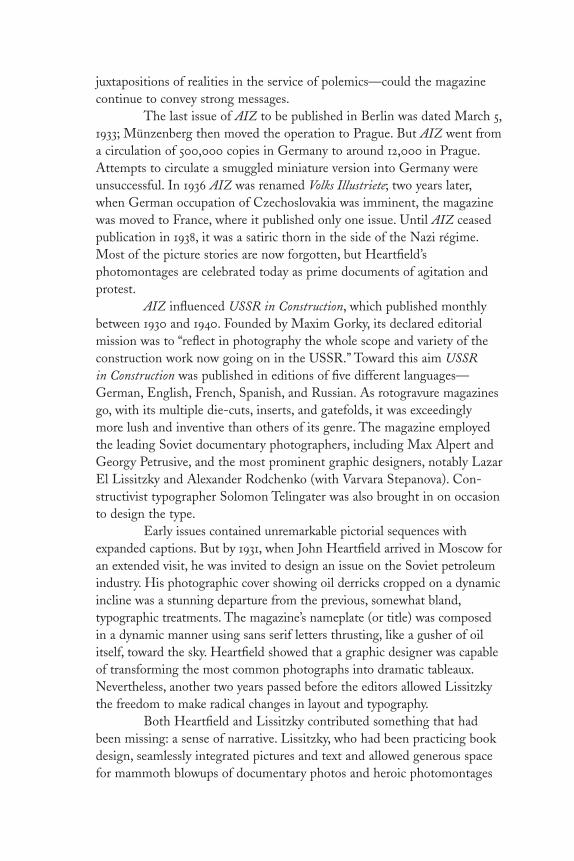
juxtapositions of realities in the service of polemics—could the magazinecontinue to convey strong messages.
The last issue of AIZ to be published in Berlin was dated March 5,1933; Münzenberg then moved the operation to Prague. But AIZ went froma circulation of 500,000 copies in Germany to around 12,000 in Prague.Attempts to circulate a smuggled miniature version into Germany wereunsuccessful. In 1936 AIZ was renamed Volks Illustriete; two years later,when German occupation of Czechoslovakia was imminent, the magazinewas moved to France, where it published only one issue. Until AIZ ceasedpublication in 1938, it was a satiric thorn in the side of the Nazi régime.Most of the picture stories are now forgotten, but Heartfield’sphotomontages are celebrated today as prime documents of agitation andprotest.
AIZ influenced USSR in Construction, which published monthlybetween 1930 and 1940. Founded by Maxim Gorky, its declared editorialmission was to “reflect in photography the whole scope and variety of theconstruction work now going on in the USSR.” Toward this aim USSR in Construction was published in editions of five different languages—German, English, French, Spanish, and Russian. As rotogravure magazinesgo, with its multiple die-cuts, inserts, and gatefolds, it was exceedinglymore lush and inventive than others of its genre. The magazine employedthe leading Soviet documentary photographers, including Max Alpert andGeorgy Petrusive, and the most prominent graphic designers, notably LazarEl Lissitzky and Alexander Rodchenko (with Varvara Stepanova). Con-structivist typographer Solomon Telingater was also brought in on occasionto design the type.
Early issues contained unremarkable pictorial sequences withexpanded captions. But by 1931, when John Heartfield arrived in Moscow foran extended visit, he was invited to design an issue on the Soviet petroleumindustry. His photographic cover showing oil derricks cropped on a dynamicincline was a stunning departure from the previous, somewhat bland,typographic treatments. The magazine’s nameplate (or title) was composedin a dynamic manner using sans serif letters thrusting, like a gusher of oilitself, toward the sky. Heartfield showed that a graphic designer was capableof transforming the most common photographs into dramatic tableaux.Nevertheless, another two years passed before the editors allowed Lissitzkythe freedom to make radical changes in layout and typography.
Both Heartfield and Lissitzky contributed something that hadbeen missing: a sense of narrative. Lissitzky, who had been practicing bookdesign, seamlessly integrated pictures and text and allowed generous spacefor mammoth blowups of documentary photos and heroic photomontages
DL2 02 07/13/04 2:52 PM Page 64

across spreads and gatefolds. Juxtaposing unaltered and manipulated imagestold the story of Stalin’s “glorious” régime and the progress that technologyand industry brought to the post-revolutionary Soviet Union. Gradually,USSR in Construction evolved a style of visual rhetoric characteristic ofsocialist realism. Maxim Gorky introduced USSR in Construction, pushedthe boundaries of this genre, and became a paradigm of pictorialpropaganda later used in magazines published in fascist Italy and NaziGermany. Indeed many of his tropes—overlapping pictures, multipleduotones on a spread, mortised inserts—have ultimately been used incommercial catalogs and corporate annual reports. Maxim Gorkyintroduced the concept of “romantic realism,” which addressed the idyllicfuture of the state. But the magazine folded during the war years andreturned afterward in a smaller size and with more mundane layouts.
Photography is a uniquely viable medium (and inexhaustible artform); as practiced in these pioneer picture magazines, the journalisticphoto essay is all but extinct (except in coffee-table art books). Despite theattempts of such contemporary magazines as Double Take and Blind Spot,the photography magazine, that weekly window of news and views, is ananomaly today.
DL2 02 07/13/04 2:52 PM Page 65
Direction
Paul Rand
“He favors Le Corbusier’s underlyingphilosophy . . . his avoidance of ornament,his dependence upon masses, proportions,and inherencies for success in the solutionof a problem,” exclaimed the October–November 1938 issue of PM magazine ofPaul Rand (1914–1996), at twenty-fouryears old the leading American proponentof functional design. “Artistic tricks divertfrom the effect that an artist endeavors toproduce, and even excellent elements, suchas bullets, arrows, brackets, ornate initials,are, at best, superficial ornamentationunless logically and reasonably employed,”Rand explained. But at that time thesegraphic accoutrements were consideredsoothing to most clients. So how did Randsucceed in expressing himself, andotherwise change conventional practice?
The answer can be found in a series of covers designed for Directionmagazine between 1939 and 1943.
Rand was reared in the commercial art bullpens of New York and understood the needs of American commerce. He never intended to be a radical, but from the outset of his career he had an instinctiveunderstanding of modern painting, a passion for popular art, and a flair forwedding the two. He was harshly critical of the lack of quality in Americandesign practice, and believed that even the most common aspects ofeveryday life could be enriched by an artist’s touch.
Although he was enthused by the new currents in art and design,he refused to mimic or follow them blindly. Rand insisted that it was notonly wrong but also “uneconomical from the aesthetic point of view”merely to borrow or separate from context without understanding thefactors that brought an original into being. He further gave credence to Le Corbusier’s dictum that it is necessary to understand history, “and hewho understands history knows how to find continuity between that which was, that which is, and that which will be.” PM concurred: “Rand is
66
DL2 02 07/13/04 2:52 PM Page 66

unhampered by traditions. . . . He has no stereotyped style because everytask is something new and demands its own solution. Consequently, thereis nothing labored or forced about his work.”
Rand’s artistic awakening came in the late 1920s at the New YorkPublic Library where he explored the stacks and pored through volumes of Commercial Art, the British trade journal that published articles on theEuropean avant-garde practitioners, including expatriate E. McKnightKauffer. He had a second epiphany at a little magazine store adjacent to the Brooklyn Academy of Music, where in 1929 he bought his first issue ofGebrauchsgrafik, the most influential German advertising arts magazine everpublished. It was in this periodical that Rand learned about the practice of,and the term, graphic design.
By 1938 Rand had produced enough noteworthy design that hecaught the eye of Marguerite Tjader Harris, the daughter of a wealthyConnecticut munitions manufacturer. She was intent on having Randdesign covers for Direction, an arts and culture magazine that she publishedon a shoestring, which featured articles by Le Corbusier, Jean Cocteau, andother avant-gardists. She offered Rand no recompense, but plenty offreedom and, ultimately, a couple of original Le Corbusier drawings. ButRand had another motive, “In a country that was used to decorative work,the common sense way to have what I was doing accepted was to do it forfree,” he explained.
More than any other project, the Direction covers exemplified thetimelessness that Rand attributed to the most significant art and design.“When I designed a cover of Direction, I was really trying to compete withthe Bauhaus. Not with Norman Rockwell,” clarified Rand. “I was workingin the spirit of Van Doesburg, Léger, and Picasso. It was not old fashioned.To be old fashioned is, in a way, a sin.”
Each Direction cover illustrated a particular theme or point ofview; the first, and his most politically astute, showed a map of Czecho-slovakia torn in half, representing the nation’s evisceration by the Nazis.Contrasted with an E. McKnight Kauffer Direction cover showing arealistic hand impaled by a Nazi dagger, Rand’s abstract depiction wasboth subtle and eloquent. Rand avoided conventional propagandistic toolsin favor of imagery he believed would serve as both art and message. His1940 “Merry Christmas” cover was a visual pun that substituted barbedwire for gift wrap ribbon. Rand photographed real barbed wire against awhite background lit to pick up the shadows. Little red circles made by ahole punch represented spilled blood. The barbed wire was a strikingmnemonic symbol for oppression. “It pinpoints the distinction betweenabstract design without and abstract design with content,” he insisted.
DL2 02 07/13/04 2:52 PM Page 67

“You can be a great manipulator of form, but if the solution is not apt, it’sfor the birds.”
The surprising juxtaposition of visual elements and universalsymbols was born of necessity. Messages had to be conveyed quickly andefficiently. Since there was no budget for materials he often usedhandwriting instead of type for many of the covers. He even piecedtogether the stenciled masthead (a precursor of the stenciled IBM logo,perhaps) from letters in type catalogs. His images were often assembledfrom various elements. “Collages don’t imitate reality,” he stated. “Themachine aesthetic dictated that you don’t do things by hand anymore.”Nevertheless, the Direction covers did not slavishly conform to such modernprinciples, and hand drawing was used on occasion.
Rand was the first to confess that these breakthrough covers werenot entirely unique. “I never claimed that this was great original stuff,” heconfided. “Other guys in Europe were doing this kind of thing.” But eventhough he admitted to paying homage both to Picasso and the surrealist artmagazines Verve and Minotaur, Rand created a unique visual vocabulary—and a collection of memorable magazine covers—that was unlike anythingbeing done in the United States at that time, or for a long time after.
DL2 02 07/13/04 2:52 PM Page 68

69Dell Mapbacks
Paperback cover art was at its high—or low, dependingon your point of view—from the 1940s to early 1950swhen a dozen or so New York–based reprint publisherswere in fierce competition. Of all of them the Dell Book“look” was the most distinctive. Dell’s innovation was thecolorful locator maps that positioned each book in thecity, street, house, even room in which the plot developed.The series was referred to as Mapbacks, and for little lessthan a decade, before the maps were replaced withconventional blurbs, they were among the most popularline of mysteries, thrillers, and romances on the market.
The Dell Publishing Company was founded as apulp house in 1922 by George Delacorte, Jr., a twenty-eight-year-old who built an amazingly profitable businessby publishing pulps, mass market magazines, and comicbooks. Delacorte was an astute observer of popular trends.Noting the success of Pocket Books he decided to startDell Books around 1941. By 1943 the first editions werereleased. To limit his liability and ensure efficientproduction, he entered into a partnership with WesternPrinting and Lithographing Company of Racine, Illinois,one of America’s largest commercial printers, whose staffselected titles, created art, and printed Dell Books whileDelacorte distributed them.
Dell Books competed successfully because theircovers—initially promoting crime stories by ElleryQueen, Rex Stout, Michael Shyne, and Brett Halliday,among others—had sexual allure. Although many of the wartimepaperbacks used romantic realism to present seductive scenes, Dell usedsurrealism to suggest racy content. Sex was used, disavowed, and then usedagain as a marketing tool. The ebb and flow of sexual imagery wasnevertheless arbitrary. Rather than using market surveys, the publishersdecided on their own about how much was too much. To transcend thesaucy and hard-boiled pulp aesthetic perpetuated in Delacorte’s magazinedivision, Dell’s Racine-based art director, William Strohmer, and hisassistant, George Frederiksen (who also painted a number of the covers),
DL2 02 07/13/04 2:52 PM Page 69
turned to expressionistic art that used dramatic symbolism to suggest thetheme or plot. The leading staff artist, Gerald Gregg, had adopted variousDali-esque conceits—fragmented body parts and floating objects—whichhe rendered in airbrush. His distinctive symbolic style was enhanced by theairbrush’s smooth, continuous tones and the artist’s preference for brightcolors.
A lot of the lettering in the 1940s paperbacks resembled splashpanels of comic books. Dell’s lettering, exclusively hand drawn by BernieSalbreiter, owes more to movie titles. In Paperbacks, U.S.A.: A GraphicHistory, 1939–1959 (Blue Dolphin Enterprises, 1981), Piet Schreuders writesthat in popular culture paperbacks fit somewhere between the comics andB-movies: “American paperbacks have had a close relationship with theHollywood film . . . the film noir and the psychological thriller.” Gregg’scover art for Crime for a Lady, a back view of a tiny trench-coated manwhispering into an oversized woman’s ear, is a comic book clichéreminiscent of B-movie posters from the 1930s and 1940s.
Dell’s covers were sometimes crude and often simple. Thesimplicity of their imagery may have had something to do with the factthat most Dell artists never read the manuscripts. They were given titlesand an oral summary of the contents, a process that was bound to result ina reliance on clichés. Although the cover concepts were based onsummaries, the back covers, Dell’s exclusive “cartographic fantasies”required a close reading to determine what part of the plot would bedepicted and then rendered (almost exclusively) by Dell’s in-house map-maker, Ruth Belew. Dell used maps as a standard feature from 1943 to 1951.They were based on the scene-of-the-crime diagrams found in tabloidnewspapers.
The style that distinguished Dell Books for less than a decadeended around 1951 when the art department moved from Racine to NewYork. Romantic realism was prevailing in illustration, especially formagazines, and Dell’s New York art director, Walter Brooks, championedthe sexy realism of Robert Stanley, one of Dell’s leading realist artists. Hemodernized the overall look by adopting sans-serif lettering and replacingmaps with blurbs. These changes did not hinder sales, but they ended aspecial era in posterlike paperback art.
DL2 02 07/13/04 2:52 PM Page 70

71Book Covers
Edward Gorey
The public knows him for his animated titles forthe PBS television series Mystery! and the sets andcostumes for the Broadway productions EdwardGorey’s Dracula and The Mikado. Through hisnumerous books and theatrical productions,Edward Gorey (1925–2000)—illustrator, author,playwright, theater and ballet set designer—hascarved out a unique place in the world of arts andletters. The imaginary tableaux in his books andstage plays are replete with turn-of-the-centuryappointments (lace curtains in windows, marblemantelpieces, four-poster beds, vases of aspidistras,and ornate funeral urns) and peopled by a cast ofeccentric and sinister gents, dames, and tykes aswell as a menagerie of autochthonous hippos, birds,alligators, bats, and cats. Through his macabrecrosshatched drawings and staccato linguisticrhythms, Gorey (the name is certainly appropriate)has created a world that transcends all sense of timeand place. His surreal black humor is literally a study in light and dark inwhich the unspeakable is spoken, the unthinkable is thought, and thehorrific—murder, mayhem, and unexplained disappearances—is comic.
In 1953, he published his first book, The Unstrung Harp, an oddthirty-page tale illustrated in a satiric Edwardian manner, about the trialsand tribulations of the mythical author Clavius Frederick Earbrass, apathetic figure in a fur coat who lives alone in a stately house full ofportraits and statuettes that look exactly like him. That same year, heaccepted a position in the art department of Anchor/Doubleday, where hedid pasteups and lettering. He also designed about fifty book covers beforeleaving in 1960. These illustrated covers comprise a small but significantchapter in the history of paperback cover design and in the legacy of thewhite-bearded, fur-coated man who made them.
All but forgotten today, these covers established a visualpersonality for a company that was founded to reprint many of the world’sclassic texts, some of which were previously published in paperback versionsduring the late 1930s and 1940s, when virtually all mass-market books were
DL2 02 07/13/04 2:52 PM Page 71

adorned with prurient covers designed to pander to the voyeuristic reader.Then the style was to cover such literary classics as Tolstoy’s War and Peaceor Dostoyevsky’s Crime and Punishment with bosomy damsels in distress,but by the late 1940s, cooler, more rational heads prevailed. In the 1950s,certain paperbacks aimed at serious readers were given more sophisticatedcover art by such modern designers as Alvin Lustig, Paul Rand, Rudolphde Harak, and Leo Lionni. Gorey’s covers for Anchor/Doubleday were notorthodox modern design but they were astute interpretations of the texts,handsomely designed, and smartly composed.
Gorey’s involvement began inauspiciously. He had knownDoubleday editors Barbara Zimmerman and Jason Epstein from his days atHarvard. He visited New York just before Christmas of 1952, when theywere starting Anchor Books, and did a few freelance covers for them. Inturn they offered him a job in their small art department. “At first I turnedit down,” Gorey recalls, “because I didn’t want to live in New York. . . . Somuch for that. I realized that I was starving to death in Boston and tookthe job the next year.”
Gorey was born in Chicago, where he graduated from high schoolin 1942. He applied to the University of Chicago, Carnegie Tech (as it was known as in those days), and Harvard. “I went to this kind of fancy,intellectually (so to speak) reputable private school in Chicago, so in thosedays it was fairly easy to be admitted to Harvard,” he explains. “I couldn’tget in now if I crawled on my hands and knees from here to Cambridge.”After he was discharged from the army in January of 1946, he received hisacceptance to Harvard and attended on the GI Bill. “So I trotted off tomajor in French, without bothering to discover whether they had aparticularly good French department or not.”
At that time Gorey was drawing pictures, “if that’s what you wantto call it,” he quips about his seeming lack of motivations, “with the intentof nothing at all, I assure you. I’ve never had any intentions about anything.That’s why I am where I am today, which is neither here nor there, in aliteral sense.” So he took the job in the publishing-house art department,which, he admits, wasn’t too taxing. “In fact, when I saw some of thepasteups that other people did, I thought that these well-known artists [likeBen Shahn and others who did covers] really were all thumbs. I never hadmuch patience with having to redo other people’s pasteups, which lookedlike they’d just flung the lettering on the page.”
In addition to this menial work, he designed covers. His first,Lafcadio’s Adventures by André Gide, revealed Gorey’s aptitude for classicaldrawing with an idiosyncratic twist. The style was rooted in nineteenth-century representationalism but was not so easily pigeonholed into aspecific time frame. His second cover was what he describes as “a kind of
DL2 02 07/13/04 2:52 PM Page 72

tacky little drawing of the Globe Theater from the air, which I foundsomeplace and copied for a book on Shakespeare by Mark van Doren.” Inaddition to the linear drawing style, Gorey’s finished lettering looked asthough it were a comp or a sketch of hand lettering that approximated realtype. At that time, paperbacks either had calligraphic or typeset covers, butGorey’s style was betwixt and between: “I was stuck with hand lettering,which I did very poorly, I always felt—but everybody seemed to like it,” hesays. In fact, when he published his own books, all except the first werehand-lettered in the manner of his earlier book jackets.
Gorey was not the first to employ hand-drawn letters. Paul Rand initiated the practice because typesetting was too expensive anddeducted from his overall fee; hand lettering ultimately became a definingcharacteristic of his book-cover design. Gorey was not concerned with thecosts; rather, “I didn’t really know too much about type in those days, and it was simply easier to hand-letter the whole thing than to spec type.Eventually, though, I did a lot of things that weren’t hand-lettered, as far asbook jackets were concerned.” But lettering became a trademark of his ownwork, and he also rendered it for other designers who, he says jokingly,“were even less competent in lettering than I was.”
In addition to his regular diet of French literature, he also enjoyedreading British novels and had an admiration for British book-jacketillustration, which influenced his overall style. A voracious reader his entirelife—“I was much better-read than most of the people who were doingartwork”—Gorey did not, however, do a lot of preparation for his covers.“I was usually handed the assignment, and there would be some littleparagraph summarizing the plot,” he explains. It rarely mattered anyway,since his style was so individual that the covers themselves did not illustratethe respective plots as much as they evoked moods.
Gorey developed stylistic and compositional conceits that recurthroughout this work. “There were certain kinds of books where I followeda routine,” he admits, “such as my famous landscape, which was mostly sky so I could fit in a title. Things like A Hero of Our Time by MikhailLermontov, Victory by Joseph Conrad, and The Wanderer by Henri Alain-Fournier tend to have low-lying landscapes, a lot of sky, sort of odd colors,and tiny figures that I didn’t have to draw very hard.” He also maintained amuted and earthy color palette—rather surprising, given that paperbackconvention demanded covers that were miniposters, able to grab a reader’seye in an instant. Explaining his palette, he says, “It was partly because youhad to keep it to three [flat] colors, plus black. I guess I could have pickedbright reds or blues, but I’ve never been much for that. My palette seems tobe sort of lavender, lemon yellow, olive green, and then a whole series ofabsolutely no colors at all.” One of these so-called no-color covers was
DL2 02 07/13/04 2:52 PM Page 73

Gorey’s interpretation for Kafka’s Amerika, which shows a Goreyesquecharacter—an almost-skeletal silhouette standing on the closely croppeddeck of a ship entering New York harbor. With only a hint of pink in theclouds, this otherwise-dark, lugubrious image is not the typical prequel forKafka’s critical vision of America but rather a snapshot of every newimmigrant’s fears upon entering a strange land.
For someone who professed not to know where he was goingprofessionally, Gorey’s covers reveal a skillful and unique sense ofcomposition. He created not only a strong identity for Anchor but alsomemorable icons for the books themselves, regardless of his opinion abouttheir contents. Notable is his work for the Henry James novels published byAnchor, which Gorey insists was “all a mistake” because this is one author“whom I hate more than anybody else in the world except for Picasso. I’veread everything of Henry James, some of it twice, and every time I do it Ithink, ‘Why am I doing this again? Why am I torturing myself?’ Everybodythought how sensitive I was to Henry James, and I thought, ‘Oh sure, kids.’If it’s because I hate him so much, that’s probably true.”
Most of Gorey’s work was illustrative, but for a few books hedesigned only lettered covers (what he insists on calling “tacky hand-lettering”). One such was Kierkegaard’s Either/Or. The reason, he admitted,was fairly simple. “Was I planning to sit down and read Kierkegaard at thatpoint? No, I wasn’t! And it wouldn’t have helped if I had, I’m sure. Iprobably would have been completely paralyzed.”
Gorey left Anchor in 1960 when Jason Epstein started the Looking-Glass Library with Celia Carroll. “The idea was that it was going to do forchildren’s books what Anchor had done for the parents,” he explains. “Thebooks were not paperbacks but rather paper-over-boards, and it was reallyquite a good series. Well, the paper was perfectly dreadful, but, then, thepaper for everything in those days was perfectly terrible.” Gorey illustrated afew books, including War of the Worlds (“the less said about those, thebetter”); he was both art director and an editor. The books conformed toGorey’s taste in nineteenth-century British literature, including Spider’s Palaceby Richard Hughes and Countess Kade by Charlotte M. Young. After twoyears the imprint folded and Gorey moved more into his own realms.
The drawings for his stories and books (many of which areanthologized in his three Amphigorey collections or archived at the GothamBook Mart in New York City) are rooted in the visual language thatdeveloped while designing covers for Anchor/Doubleday. These covers are,therefore, artifacts from both a transitional period in paperback history andthe formative years of Gorey’s unique career.
DL2 02 07/13/04 2:52 PM Page 74

75Portfolio
Alexey Brodovitch
Portfolio, published between 1949 and 1951,was the model of a twentieth-century graphicand industrial arts magazine. It elevateddesign and set the standard of magazinelayout that few publications then or nowcould equal. “The format itself should be agraphic experience,” editor Frank Zacharyexplained. The hefty nine-by-twelve-inchperiodical designed by Alexey Brodovitch(1898–1971) incorporated special inserts,including shopping bags, wallpaper, andthree-dimensional glasses. And publisherGeorge Rosenthal, Jr., spared no expense inbuying the best paper and the best ofeverything else.
“Then we decided to selladvertising,” recalled Zachary. “Well, wehated the ads we got. So we said, ‘Hell, we’re not going to mar ourbeautiful magazine with crummy ads.’ We were terribly idealistic.” Void of such visual encumbrances, Portfolio was a hybrid, part book and partmagazine. A subscription cost twelve dollars a year for four issues and a few thousand people subscribed. Rosenthal handled the finances, whileZachary developed the writers. He also collected all the photographs andillustrations for the stories.
Convention dictated that magazine covers be pictorial. But thefirst issue of Portfolio was like no other; it was type design, transparentprocess-color squares printed over the Portfolio logo which was dropped outof black. Like a main title for a motion picture, the cover introduced thecinematic interior. Brodovitch, the acclaimed art director for Harper’sBazaar, who introduced the new photography to fashion magazines, pacedhis layouts as though they were storyboards for films. The key to successwas dynamic juxtapositions: big and small, bold and quiet, type andpictorial. Brodovitch splayed comps out on the floor, mixing and matching,moving pages and entire stories around as needed.
Zachary planned the issues with Brodovitch at his office atHarper’s Bazaar. “We got along very well because I let him have his head,”
DL2 02 07/13/04 2:52 PM Page 75

Zachary recalled. “But he was no prima donna. He worked in the most fantastic way. For example, I would come in, say, at seven o’clock in theevening with the idea of how many pages we had for an issue, and howmany would be devoted to each story. I would come back [the next day],and Holy Christ, there was this magnificent layout. He used the photostatmachine like a note pad. He would get stats of every photo, often differentsizes of the same piece, in tiny increments that might vary from a quarterinch to an inch, or from an inch to two inches, and so on. You would seehim surrounded by all these stats. But as he put them down, my God, all of a sudden a spread materialized beautifully proportioned, everything inscale, with just the right amount of white space, type and picture mass. Ilearned so many nuances of art directing just from watching him.”
Portfolio premiered in late 1949 and lasted for only three issues.During this time, Zachary was also editor of Jazzways, a one-shotmagazine on the folkways of jazz. The cover was designed by Paul Randand among the interior photographers was Berenice Abbott. In additionZachary and Rosenthal published paperback photo albums under the Zebra Books imprint. These were the first of their kind to present goodphotojournalistic portfolios for just twenty-five cents. The titles includedMurder Incorporated, the first book on the Mafia; Life and Death inHollywood, a pre–Kenneth Anger look at the foibles of the glitter capital;and Naked City, the first collection of pictures by famed New York streetphotographer Weegee. Each sold between 150,000 and 250,000 copies withall profits poured back into Portfolio.
The third and last issue of Portfolio was its most beautiful. Tounderscore Brodovitch’s concept of this magazine as analog to film, thecover for #3 was the image of a film strip. But the dream of an ad-lessmagazine had turned into a nightmare. Financial problems did not weakenZachary’s resolve to publish (he even approached Henry Luce, publisher ofTime and Life, to buy the magazine). But in 1951 the prime financial backer,George Rosenthal, Sr., decided to summarily kill Portfolio rather than incurfurther losses. Had it continued who knows what impact Portfolio wouldhave had on magazines of the era. More than fifty years have passed andthis special magazine is a landmark of design history.
DL2 02 07/13/04 2:52 PM Page 76

77Industrial Design
Alvin Lustig
A design icon doesn’t come along every day. To be so considered it must not onlytranscend its function and stand the test oftime, but also must represent the time inwhich it was produced. The cover of IndustrialDesign, Vol. 1, No. 1, February 1954, was notjust the emblem of a new publishing venture,but a testament to one man’s modernism; oneof the last works created by Alvin Lustig(1915–1955), who suffered an untimely deathfrom diabetes in 1955 at the age of forty.
Despite failing vision, Lustig wasdeeply involved in the design of the first twoand nominally with the third issues of themagazine as art editor, art director, and artconsultant, respectively. He saw his role as theframer of ideas that were visual in nature.Although he never had the chance to develop his basic design conceptsfurther, he left behind a modern design icon, the cover, and a format thatcontinued to define the magazine for years after.
Industrial Design was the brainchild of publisher Charles Whitney,who also published the successful Interiors. In 1953 he was convinced by hisfriend and advisor George Nelson that the time was right to introduce aspecialized periodical devoted to practitioners of this burgeoning field.Interiors already featured its own industrial design column that had evolvedinto a discrete section, which Whitney realized had commercial potential asa spin-off. Interiors was also so beautifully designed that Industrial Designcould have no less than the visual panache of a coffee table book/magazine,replete with foldouts and slipsheets, not unlike the legendary designmagazine Portfolio, published between 1949 and 1951. To accomplish this an eminent art director was sought. This was the age of great magazine art directors—including Alexey Brodovitch, Alexander Liberman, OttoStorch, Cipe Pineles, and Alan Hurlburt—and Whitney fervently believedthat a magazine’s design would be the deciding factor in its success. HenceLustig was entrusted with considerable authority to design the magazine ashe saw fit.
DL2 02 07/13/04 2:52 PM Page 77
On the editorial side, however, Whitney decided to take acalculated risk by promoting two young Interiors associate editors to co-editors of Industrial Design. Jane Fisk (now Jane Thompson of thearchitectural firm Thompson and Wood in Cambridge) and Deborah Allen may have been inexperienced in the field of industrial design butnevertheless had a clear plan to introduce a distinctly journalistic sensibilityinto professional publishing that emphasized criticism and analysis ratherthan the puff pieces common to the genre. As it turned out, this became apoint of philosophical contention between the designer and editors.
If they had a choice the editors would have preferred an artdirector who, as Thompson explained, “would have been in the trencheswith us,” a team player with journalistic instincts rather than a distantpresence with a formalist sensibility. Because Lustig designed the initialdummy and subsequent two issues in his own studio and returned with thecompleted layouts to the editorial offices, he had made certain assumptionsabout the presentation of content that were often inconsistent with theeditors’ vision. “We did not want the words to be gray space, we wantedthem to have meaning,” recalled Thompson about wanting morespontaneous design responses to the material. But instead of beingjournalistically intuitive, Lustig imposed his formal preconceptions anddesigned the magazine as he would a book.
Blocks of text type were indeed used as gray matter to frame anabundance of precisely silhouetted photographs. But if there was a problemit was more in the editors’ minds than Lustig’s design. While it was not asjournalistically paced as say, Life magazine, Industrial Design wasrespectfully, indeed elegantly neutral, allowing for a wide range of materialto be presented without interference. Moreover, it was what Whitneywanted, so the editors reconciled themselves to building the magazine’seditorial reputation through informative features written by authors notpreviously associated with trade publishing.
Thompson nevertheless hated the first cover with its tight gridand silhouetted photographs. Instead she wanted to disrupt the designpurity with a few well-composed coverlines. She further favored aconceptual method of intersecting photography and text, resulting in aneditorial idea, not a pure design. Lustig thought coverlines would sully the design and intersecting ideas would be too contrived. Years later,Thompson grudgingly admitted that maybe Lustig’s judgment was wiser:“He wanted to make a strong simple statement, which he believed (perhaps erroneously since Industrial Design did not have to compete on the newsstand) had to stand up against the covers of the elegant fashionmagazines.” Lustig’s design set the standard for future covers, and his
DL2 02 07/13/04 2:52 PM Page 78

successor, Martin Rosensweig, continued to produce covers for a few yearsafterward that more rigidly adhered to the same formal practices.
Despite these creative tensions, the early issues of Industrial Designreveal a shift in the nature of professional publishing from a trade tocultural orientation that was in no small way underscored by Lustig’sclassically modern design.
DL2 02 07/13/04 2:52 PM Page 79

Holiday
Frank Zachary
When it began in the 1930s, Holidaymagazine was clean and orderly, but itslayout was made with a cookie cutter.In 1955 Frank Zachary (b. 1919), formereditor of Portfolio, who had learned artdirection from Alexey Brodovitch,changed all that. Zachary began asphoto editor, but when he worked withpictures he made layouts that were notjust picture spreads in the conventionalsense, but cinematic presentations inthe Brodovitch tradition. Noting adramatic difference, Holiday’s editor,Ted Patrick, offered Zachary the job ofart director. “Jesus, Ted,” respondedZachary to the offer, “I’m okay, but whydon’t you try to get Brodovitch? He’sthe real master.” Zachary introducedPatrick to Brodovitch, but the two didnot hit it off.
Zachary knew little about typography, but he did have experiencelaying out the pictures in Zebra Books—small thematic pictorial mass-market paperbacks—that taught him the importance of scale. He sawhimself as a journalist, not a designer per se, more interested in using thephotograph to tell the story than to prettify a page. “I learned the picture isthe layout. If you have a great picture, you don’t embellish it with big type.You make it tight and sweet,” he said. Soon he developed a cadre oftalented photographers who brought life to the magazine through thematicpicture essays. Among them were Arnold Newman, Tom Hollyman, JohnLewis Stage, Robert Phillips, Fred Maroon, and Slim Aarons, many ofwhom followed Zachary years later when he became editor-in-chief ofTown and Country.
Photography was the heart of Holiday, illustration was its soul.Zachary rejected the prevailing sentimental illustrative approaches used inmost American magazines; he eyed European artists, specifically fromEngland and France, for their surrealistic comic vision. “Frank brought
80
DL2 02 07/13/04 2:52 PM Page 80

sophisticated illustration to American magazines,” recalled a colleague.“Other art directors brought powerful or clever images, but Frank broughtan unprecedented sophistication. Of course it came from Europe since inthe early 1950s there weren’t too many Americans practicing sophisticatedpen work.”
Through Holiday, the artists Ronald Searle, Andre François,Roland Topor, Domenico Gnoli, George Guisti, and Edward Gorey (oneof the few native Americans) were given latitude to develop their ownpicture essays and portfolios. Zachary avoided the reigning stars—“thatwould be too easy,” he argued—but rather discovered his own galaxy. Inmost cases the artists transformed themselves in this environment. “Frankgave me a lot of firsts,” recalled Ronald Searle. “From around 1959 to 1969he gave me all the space one could dream of, the chance to fill it with color,the freedom to travel, and what proved to be the last of the great venues forreportage. Off to Alaska! Cover all of Canada! Bring me ten pages on thedirty bits of Hamburg! No expense spared. The years of travel for Frankgave me experience that cannot be bought. There was only one problem, healways called me ‘Arnold’ instead of Ronald. Then he probably alwayscalled [photographer] Arnold Newman ‘Ronald,’ so it balanced out.”
Zachary developed what he called “environmental portraiture,”common in contemporary magazines but unique in the early 1950s. “Iwould say to a photographer, ‘If a guy is a multimillionaire painter, I wantto see a whole lot of his paintings in the background and on top of that Iwant to see his castle in the background, too.’ A photographer just couldn’twalk in and take a picture of a subject; he had to assemble the componentsof the subject’s life,” explains Zachary. An example of environmentalportraiture is a photograph for a special issue of Holiday on New York Cityshowing highways and parks czar and power-broker Robert Mosesstanding omnipotently on a red girder over the East River. The shotillustrates Zachary’s willingness to expend a tremendous amount of effortto photograph one perfect image. That is what defined his remarkable artdirection.
DL2 02 07/13/04 2:52 PM Page 81

Vogue
Alexander Liberman
For Alexander Liberman (1912–1999), theRussian-born art director of Vogue andlater editorial director of Condé Nast from1942 to 1995, design was a means. Makingelegant layouts was never an end. Nor wasit his métier. “Elegance was [Alexey]Brodovitch’s strong point,” Libermanexclaimed in the authorized biographyAlex: The Life of Alexander Liberman(Alfred A. Knopf, 1995), “The page lookedvery attractive. But in a way, it seemed tome that Brodovitch was serving the samepurpose that [M. F.] Agha [art director ofVogue] had served, which was to make themagazine attractive to women—notinteresting to women.” Liberman wantedto break the design obsession, “so Idefended a more journalistic approach—
rougher lettering, no white space, crowded pages, messier layouts.” Some ofthe more elegant layouts in Vogue throughout the 1950s (the ones that arecelebrated in the Art Directors Club annuals) were either designed by hisassociate Pricilla Peck or produced in spite of himself because Vogue’seditor-in-chief, Edna Chase, was not interested in messy layouts. “He wastilting at windmills,” argued biographers Dodie Kazanjian and CalvinTompkins about his preference for tabloid-styled typography.
Liberman became a layout man in 1933 for VU, the illustratedFrench weekly, where he worked with photojournalists such as AndréKertész, Robert Capa, and Brassaï. They had not yet become the greatphotographers or as Liberman said: “There was no cult of photography atthat time.” But with them he learned how to effectively lay out tension-packed visual essays. In 1940 Lucien Vogel, the creator of VU, had come to America to work with Condé Nast and urged the publisher to bringLiberman to America as well. Upon arriving he did layouts for Vogue (at fiftydollars a week), until one day Agha unceremoniously fired him. “That wason Friday,” Liberman recalled. “On Monday Condé Nast asked to see me,not knowing I had been fired. I brought my gold medal [which he received
82
DL2 02 07/13/04 2:52 PM Page 82
for an exhibition design in the Paris World’s Fair of 1937], and we talked.”At the time Nast was fighting against the clichés of fashion presentation,such as obscure typography and strange handwritten titles. Nast admired thenewly started Life magazine and wanted Vogue to be more modern, in fact,more like a newsmagazine. “So when he learned from Vogel that I had beeninvolved with a newsmagazine he was very excited . . .” continued Liberman.“He said ‘a man like you must be on Vogue.’ He asked Agha to come in andsaid ‘I want Liberman on Vogue.’ Since Condé was an absolute monarch,Agha never told him he had fired me.”
Liberman’s success was further guaranteed not just because Nastvalued the young Liberman’s judgment, but also because he was takenunder the wing of the former editor of Vanity Fair, Frank Crowninshield,who, since the demise of his own magazine had been the fine artsconsultant editor of Vogue. One day during Liberman’s first month on thejob he was playing with a Horst photograph of a girl in a bathing suit lyingon her back balancing a beach ball on her feet. He substituted the O inVogue for the ball, which had no fixed logo in those days. “Crowninshieldhappened to be walking through the art department . . . he stopped to lookat Alex’s design, which impressed him enormously,” wrote Kazanjian andTompkins. “‘There’s a genius in the art department,’ he told Nast.”
In those days fashion plates were photographed in their hats and“royal robes.” The main Vogue pages were created in Paris and arrived in NewYork entirely laid out. When Liberman was appointed Vogue’s art director in1942 he rebelled against Parisian dominance. “I had always resented the fussy,feminine, condescending approach to women by women’s magazines,” heasserted. “I thought it was important to shake up this rather somnolentsociety. If we had to show hats, I tried to mix hats with contemporary life.”He also introduced art into fashion photography, and had Cecil Beatonphotograph a model in front of some Jackson Pollock paintings. He admiredthe lack of artifice in photographs by portraitists Nadar, Atget, and AugustSander. “Fortunately, Irving Penn came into my life,” Liberman boasted. “Heworked as an assistant with me in the art department on design and layoutuntil one day I said, ‘Why don’t you go and take the picture.’”
Clarity and strength of communication are what interestedLiberman. He admitted that graphic design for its own sake wasmeaningless, and was never so “sensitized to type” that a sixteenth of amillimeter spacing mattered. He rejected fancy typefaces and in 1947changed the logo of Vogue from an elegant Bodoni to Franklin Gothic,which he claims until then was only used in newspapers. “I thought it hadstrength and looked modern. All the captions and the titles were set inFranklin Gothic, which was then revolutionary in women’s publications.”
DL2 02 07/13/04 2:52 PM Page 83

“[I]mperfection was the essence of what Liberman was lookingfor—the breakthrough from fantasy and artifice into the here-and-now,”wrote Kazanjian and Tompkins. “It was the antidote to the ‘visions ofloveliness’ that Mrs. Chase and generations of Vogue readers cherished—visions that Alex wanted to banish forever from the pages of Vogue, in partbecause he felt that they were demeaning to women. Vogue was not reallyabout fashion, he always said; it was about women.”
Like Brodovitch, Liberman focused his creative energy onphotography; he encouraged many women photographers to enter a fieldlargely dominated by men. Liberman urged Vogue’s editors to publishphotographs of Dachau concentration camp by Lee Miller, a former modelwho learned photography from Man Ray. “Nobody realizes that Voguepublished them,” he related. “But for me this was practically a justificationfor being on Vogue.” For Liberman the lessons of Lee Miller’s and CecilBeaton’s war photography changed the style of fashion photography. Newsphotography in general and the emergence of a daring paparazzi forced arethinking at Vogue that exceeded the boundaries of visual presentation.“I’ve always felt that Vogue was one of the strong pioneers fordemocratization, for women’s rights, and for breaking down false culturalvalues,” asserted Liberman.
Like Brodovitch, Liberman shared the belief that cinematic pacingwas the visual backbone of a magazine. However, Brodovitch sawphotography as an art form while Liberman believed that “photographs . . .were documents—momentary glimpses of something that could be printedin ink on a magazine page and eventually discarded. That was theirfunction and their fate,” wrote Kazanjian and Tompkins. Liberman madelayout sequences the way a film is cut, trying to communicate moodsthrough narrative imagery. “I hate white space because white space is an oldalbum tradition,” he charged. “I need to be immersed in the subject matter.”
Liberman’s approach has been subjected to harsh criticism fromother designers who argue that his contempt for design has lowered thestandards of magazine layout. But his anti-design fervor was sincere, andhis disgust for anything that was visually flabby and antediluvian influencedall the magazines he touched. The most significant change in Vogue fromthe 1960s to the 1980s was its shift from bold elegance to strikingsensationalism. Reversed type and other strong typographic devices (such astorn edges and screaming headlines) borrowed from the sensationalist presswere used to accentuate motion, catch the eye, and communicate themessage. “Much bolder type is intended for faster communication,”explained Liberman. “White space does not exist, but a certain power, adaring has emerged that wasn’t there even when I first used FranklinGothic. In retrospect it seems dainty.”
DL2 02 07/13/04 2:52 PM Page 84

85Scope
Will Burtin
Bacteriology is about as interesting tographic designers as typography is tobacteriologists. But for graphic designerWill Burtin (1908–1972), German-born sonof a French chemist, learning to understandmolecular biology, endocrinology, andbacteriology was like working with a classiccut of Didot or Bodoni. Making suchcomplex data accessible to himself andothers was as pleasurable as designing anelegant page of text. The role of the graphicdesigner, he wrote in Print (May 1955), wasto increase the average man’s understanding“between what the reading public knowsand what it should know.”
His professional life was, therefore,devoted to designing the kind ofinformation that decorative designers reject as humdrum. Indeed suchtechnical material might have remained forever ignored by aesthetics,relegated to dry textbooks, if Burtin had not become the champion ofbeautiful functionality. As design consultant for the Upjohn Company—one of America’s largest producers of pharmaceuticals—from 1948 to 1971,he made functional design as attractive as any book or poster. Burtinrefused to shy away from complexity, rather he interpreted it and then castit in an accessible light. This was evident in the layouts and covers hedesigned while art editor for Scope, Upjohn’s scientific house organ.
Burtin, who left Hitler’s Germany in 1939 after being ordered todesign posters for the Nazis, adopted Thomas Jefferson’s dictum, “To learnhow to keep learning is the mark of civilized man.” He believed thatdesigners had to know about more fields than just design, and among theones he embraced, science was integral to every area of human activity.Science, the exploration and prediction of phenomena, is the holy grail ofcivilization, and for the sake of clarity scientists reduce time, space, andthought into abstract symbols. “The designer stands between theseconcepts, at the center, because of his unique role as communicator . . .interpreter, and inspirer,” Burtin wrote in Graphis #4 (1949).
DL2 02 07/13/04 2:52 PM Page 85

In this sense Burtin and Upjohn were the perfect match. Hisgraphics for their advertisements, catalogs, and Scope were rooted insimplicity and directness with emphasis on the message. But Burtin imbuedeach piece with unique attributes that identified the work as his own.“Integration” was his mantra. It was also the defining trait of his graphicsignature. “In designing booklets, posters, ads, exhibits, and displays, Inoticed that the integration of job components towards a dramatic end-product asked for a measure of discipline difficult to define,” he wrote. Buthe defined it as the marriage of order and instinct—learning everythingthere is about a particular subject and then allowing instinct to drive thedesign. In 1948 he designed an exhibition for the AD Gallery, entitled“Integration: New Discipline in Art,” which demonstrated how he, and byextension others, clarify scientific information for general consumption.“Understanding of space and time relations is a main requirement in visualorganization. In printed design images are superimposed on paper surfaces.The spaces inside and between letters, between lines of type, theirrelationship to illustration, are vital factors, which determine the eye’saccess to the basic information,” he explained in terms that added ascientific dimension to graphic design.
Preoccupation with the graphic communication of scientificphenomenon and theory dominated Burtin’s practice. As art director ofFortune from 1945 to 1949 he developed a vocabulary for conveyinginformation through the design of charts, maps, graphs, and diagrams thatmade complex data discernible and understandable. Ladislav Sutnar notedin Visual Design in Action (Hastings House, 1961) that Burtin developed twobasic approaches: The purist, where charts and diagrams were compressedinto a two-dimensional projection, with color used to facilitateunderstanding; and the dramatized approach, the grouping of visual datawith poster-like impact as in a chart describing how cosmic ray trajectoriesbombarded the earth. For this Burtin used airbrush to transform aphotograph of the globe into a scientific diagram so concise and beautifulthat it functioned both as art and information. This was the foundation onwhich he built even more intricate, yet no less accessible, graphics for Scope.
“Who said that science cannot achieve beauty,” Burtin argued inPrint. “What nonsense, that art cannot contain scientific truth! It is human limitation, deficiency of understanding, that make one or the othernot do what they can do.” Much like Leonardo da Vinci, Burtin assertedthat art was the queen of sciences, a means of obtaining knowledge andcommunicating it to all generations. Being a designer was being a scientist.Design was about clarity, not sterility, and Scope was the embodiment ofthis goal. Originally designed by Lester Beall, Scope already had a modern
DL2 02 07/13/04 2:52 PM Page 86
format; its type was elegant and the graphics were sprinkled with signpoststhat guided the viewer through a hierarchy of information. Burtin took thisto an even greater level of virtuosity. Edited for physicians, Scope wasintended to improve the understanding of modern therapeutics, establishgoodwill, and help sell Upjohn’s products, yet Burtin gave it entry pointsthat allowed access to the average reader, as well. It is no wonder thatBurtin’s mastery at translating tough scientific concepts—the ability totransform technical language into visual symbols—afforded readers a cleargrasp of the material.
For the professional reader, arcane medical articles were notcluttered with dreary text boxes and drab flow charts. “The choice offormat was . . . of great importance, not only to give the new journal thedistinction we wished it to have but to appeal appropriately to thephysician,” explained Burtin in Print. The house organs already in existenceran the gamut in design from the most conservative to the most modern,and from those that used design sparingly to those that were highly andalmost flamboyantly ornamental. Since conservatism was inappropriate fora journal devoted to a rapidly progressing science, contemporaneousness ofdesign seemed mandatory but frivolousness seemed out of place. Burtin’sdesigns were conceptually acute and couched in an idiom that was scientificin its clarity. His use of photographs of microscopic imagery gave the workan abstract quality that suggested modern art. And in the modern spirit,design was not used for its decorative effect but as an integral part of thescientific presentations. Even the covers of Scope were designed not only tobe attractive, but also to suggest the content. Inspired by contemporary art,the visually poetic collages and montages echoed formal elements ofmodern plastic art. In so doing Burtin developed a visual method thatinfluenced how the pharmaceutical industry approached advertising andpromotion for years to follow.
DL2 02 07/13/04 2:52 PM Page 87

Herald Tribune
Peter Palazzo
Good newspaper design was rare in 1963. Most dailieswere composed by a makeup desk, not an art director ordesigner. At the end of the day or night after the “lock-up,” as it was called, a more or less logically orderednewspaper was printed and delivered. The New YorkHerald Tribune was the exception to that rule.
Founded in 1924, the Trib was as drab as the“Old Gray Lady,” the New York Times. Then, in 1963 itwas miraculously transformed into something modern.It sported a livelier front page—not a typicalpresentation of news stories set in monotonous straightvertical columns, but a menu of appetizing world,national, and local events. It ran a unique summary ofthe paper’s contents on the front page: a column offlush left/ ragged right type with Bodoni subheads thatintroduced as many as eight separate items stretchingdown the left side of the page. Slightly wider columnsand gutters throughout the paper made it more legiblewhen contrasted to the tightly packed, eight-columnNew York Times. The headline typefaces were moreconsistent than in other newspapers. The photographswere noticeably larger, too. And most importantly, therewere many clearer entry points into stories.
The Trib’s makeover gave it a visualcohesiveness that allowed smooth navigation throughthe mass of information. It was a counterpoint to thescreaming headlines and seemingly arbitrary layouts ofthe tabloids. The design was actually so “friendly,” thatreaders initially complained that they couldn’t take itseriously. But that didn’t last long.
The new Trib was the work of Peter Palazzo (b. 1932), anadvertising and publications designer who shoved American newspapersinto the late twentieth century by enhancing news presentation throughjournalistic design. Not a single design element was superfluous, each was asignpost that guided the reader through the traffic of a daily newspaper.Prefiguring today’s information glut, the Trib announced that design wouldhave to play a meaningful role in the communication of ideas.
88
DL2 02 07/13/04 2:52 PM Page 88

The daily Herald Tribune was revolutionary, but the rebirth of theSunday paper was even more remarkable. The Trib’s Book World and NewYork magazine were the prototypes of the modern newspaper supplement.Although the Sunday New York Times was stuffed with various sections andsupplements, its makeup lacked a defining character. Conversely, Palazzo’sBook World was typographically elegant—even to the untutored eye. Herejected the Times’s bland visual diet of famous works of art and stockauthor’s photographs in favor of imaginative illustrations by contemporaryillustrators. These portraits, caricatures, and conceptual spots were entrypoints providing access to the sometimes dense literary criticism. They alsosynthesized, galvanized, and made accessible complex ideas. Although theblack-and-white line made them reminiscent of nineteenth-century bookillustrations (e.g., Tenniel’s for Alice in Wonderland), they were not nostalgicinterpretations of bygone themes.
The original New York magazine published as the Sundaysupplement of the Trib was another milestone. There had been magazinesupplements in most Sunday newspapers dating back to the early 1900s.But New York’s seamless marriage of editorial and visual ideas wasunprecedented. It gave birth to both the “new journalism” (first-personreportage) and a new graphic journalism (smartly packaged informationand visual essays). Typified by generous white space (unusual innewspapers), elegantly unobtrusive Caslon typography, gritty photography,and conceptual illustration, New York was a “slick” magazine on newsprint.Its covers defined a new fashion: many of the images were ordinary yet feltextraordinary through cropping and scale. The covers were single imagesoften of a typical New York scene, rather than illustrating a story inside. Atypical cover, a close-up of an everyday parking meter, was simple,memorable, and so New York. The celebration of the mundane object wasconsistent with trends in pop art.
Palazzo also transformed the “fronts” of all the other Sunday newssections so that they were designed like magazines. Photographs andillustrations were large, but rooted in good news judgment. Each sectionhad a distinct look, while conforming to the whole. Palazzo orchestrated apresentation that neither fought with nor trivialized the news.
Unfortunately the new Trib did not last long. In 1963 a cripplingnewspaper strike forced an unhappy merger between three papers, the Trib,the New York World, and the Journal American, resulting in the WorldJournal Tribune. Although rooted in the design principles of the Trib, thetrifurcated daily failed to garner a sizable audience and did not survive forlong. In its wake, the New York Times began its makeover, and othernewspapers followed suit. Yet in the beginning the New York Herald Tribunestood alone but influenced many.
DL2 02 07/13/04 2:52 PM Page 89

Life
Life magazine was born during a period ofsweeping social and political change, andquickly became the eyes and conscience of itscontinually expanding readership. Fewmagazines captured the world through such apowerful lens. No other picture magazine—certainly neither Look nor Colliers—could guide(or mold) the average American’s perceptions of the world, nation, and neighborhood. Life’sphoto essays alternately celebrated individualcourage, attacked tyranny, praised technologyand science, and focused on the trivial,superficial, and ephemeral sides of life.Publisher Henry R. Luce describedphotography as “a new language, difficult, as yetunmastered, but incredibly powerful”—the most
important machine age communications medium because it offered anobjective window on the world. Yet Life’s pictures were mastered andmanaged by photo editors who saw the importance of manipulatinggesture and nuance. Before television no other medium reached as manyindividuals at once; and for decades no magazine stamped the collectiveconsciousness with as many indelible images.
For all its influence, however, Life was not an original idea. Evenits title belonged to a fifty-seven-year-old New York humor magazinewhose publisher greedily held on to it until declining sales forced him tosell its name for $92,000 in 1936. The buyer was thirty-eight-year-oldHenry R. Luce, cofounder of Time and Fortune. By the early 1930s the idea of starting an American picture magazine was definitely in the air.Publishers like Condé Nast and the Cowles Brothers (who published thefirst issue of Look a month after Life’s premiere) were contemplating theirown. Luce aspired to develop a suitable theater for photographs long beforehe founded Life. Fortune was the inadvertent rehearsal. With Fortune Lucewanted to make the “most beautiful magazine in the world,” but not aphotography magazine per se. Nevertheless a key component of Fortune’svisual personality was striking still-life and journalistic photographs byMargaret Bourke White, Erich Salomon, and Edward Steichen.
90
DL2 02 07/13/04 2:52 PM Page 90

The first complete, though unprinted, total dummy of what would become Life was produced in February 1936; it was designed to be asixteen-page picture supplement for Time. The contents included features onskating champion Sonja Henie, Mexican politics, Czech president EduardBenes, young Katharine Hepburn, the queen of England, and a variety ofother views. This was the first clear definition of what would become Life.
The dummy was not greeted with praise. Paul Hollister, a topadvertising executive at Macy’s and self-described graphics expert, wasdisappointed with the design of the dummy. When he received a copy hehad the temerity to write Luce a harsh critique: “It is inconceivable thateven an avowed dress-rehearsal just for ‘fun’ should have turned out so farshort . . . Great God—that a magazine should make even a tentative peeklooking like this. . . . The dangerous thing is you have good raw material; itmust not be butchered.” Instead of earning Luce’s rancor, Hollister’s candorearned him the job of revamping the dummy. “My task,” he later related“was to make a better pattern of each page, conforming to a total ‘basicformat’ character: to ‘sell’ each page for itself, each picture within thatpattern; to suggest changes of pace; to clean up margins and gutters; toeliminate sloppy disturbances and tricks from the page.” After spending theten days of his vacation cutting and pasting, he delivered an accordion-folded dummy that when spread out revealed the entire format at a glance.Luce did not respond for two weeks, but when he did he invited Hollisterto lunch and reportedly said in front of his executives: “Good! Now wehave an editorial prospectus! Now we have a basic format. . . . Now what dowe do?” Hollister’s reply was a profoundly condescending characterizationof art directors:
What you do is get an art director and put him at a drawing board. Puttire tape over his mouth, because whatever he has to state should drain offthrough his fingers onto paper. Never let an art director talk.
On a table at his left put your basic format dummy for reference.On a table at his right feed him batches of photographs, with a notesaying you want one, two, four, eight—any number of pictures you need,for each batch, and any suggestions you have for playing up any particularangles of the picture story.
So he makes layouts from the pictures.If they are right, you pat him on the head. If they have strayed from
the mood of the basic format, you take a small hammer, which you havechained to the wall for the purpose, rap him smartly over the skull, pointseverely to the basic format dummy—cry “No, no, no! Naughty!” He thenrepents and makes the layout right, or you get yourself a new art director.
DL2 02 07/13/04 2:52 PM Page 91
At Hollister’s urging Howard Richmond, Macy’s chief designer,became the first art director of Life. With Richmond on the layout board,the second dummy was published for the week ending September 25, 1936.The content and design were closer to what would become Life’s trademarkdesign until the 1960s: a loose grid noted for varied and often unattractivegothic typography. There appeared to be a conscious rejection of designnuances in favor of a jumbled tabloid look. And yet the layout seemed to beappropriate for the stark black-and-white photography on disturbingsubjects, such as: “Hitler Speaks,” about the pageantry of a NurembergRally; “Cotton Pickin’,” about the squalid conditions of Southern blacklaborers; and “Seen in Catalonia,” about the horrors of the Spanish CivilWar. Reviews came in quickly, and many were harsh even within the Timeranks. One executive wrote a memo to Luce saying that if the potential fora picture magazine existed this dummy was not it. “I found that I knew nofurther facts nor had I added to my visualized sense of the scene. . . . Ithink any reader would finish the dummy in half an hour or less.” Anothercritique came from commentator Dorothy Thompson who called themagazine “unmodern,” and said that she expected something that wouldburst upon the eye “with the sort of inevitableness which has always beenyour [Luce’s] genius.”
Luce was not deterred. Richmond was given the job to design in amatter of days what became one of the most emblematic magazine coversin the world. Yet it was a freelance artist/illustrator, Edward Wilson, whosuggested that the cover always be a black-and-white photo, a full bleed onall sides. Richmond added the sans serif logo dropped out of a red rectanglepositioned in the upper left corner of the cover. After much discussionamong Time’s executives it was decided that a stationary logo was betterthan a movable one and it became the most identifiable design element ofLife. Richmond also recalled taking a photostat and putting it on red paperwith the paper extending over the picture. Luce liked it. The red wasagreed to because Luce believed that if it worked for Time, it would belucky for Life.
The first issue of Life, not unlike the rehearsal dummy, was aphoto album rather than a well-paced collection of sophisticated photoessays in the tradition of the Berlin or Munich illustrated weeklies. Thischanged within the next two years as Life’s picture editors andphotographers became more confident about their missions. But althoughthe stories and editing became tighter, the quality of the design betrayed aconscious effort not to rise above basic functionalism. It could be arguedthat the matter-of-fact format allowed the photographs the room tobreathe. That the no-style design style was actually consistent with Life’s
DL2 02 07/13/04 2:52 PM Page 92

style of photography, which rejected artifice (i.e., photographers likeEdward Weston or André Kertész were never to be found in Life). But itcould also be argued that Life’s graphic neutrality was an impediment to itsbeing a truly superb magazine.
Life’s influence on America was greater than anyone, even Luce,ever imagined. Life’s mix of truly remarkable photo essays (particularlyleading up to and during World War II) by masters of photojournalism andterse writing style proved to be a winning combination. Life’s editors under-stood the importance of packaging a picture story with the right balance ofwords. Life’s caption and headline style—with its emphasis on clear, simplefacts—guided the reader’s interpretations of the evidence supplied in thephotographs so that there was scant ambiguity. Life was not merely awindow, but a clearinghouse for information that only pictures could convey.
DL2 02 07/13/04 2:52 PM Page 93

Esquire
In revoking Esquire’s second-class mailingprivileges the Postmaster General of the UnitedStates charged that the magazine was obsceneand that its content was not “information of apublic character.” Although this sounds like thekind of detour around the First Amendmentthat Senator Jesse Helms might try, this actionwas actually taken in 1943 against a ten-year-oldmagazine whose reputation for taboo breakingwas at that time more accidental than deliberate.Publisher David Smart never intended forEsquire to be revolutionary when he founded itin 1933, but rather to serve as a deluxe men’scompanion of literature, fashion, art, andwomen. It was the latter, specifically the sultry“pinups” painted by Alberto Vargas, creator of
the Vargas Girl, that prompted the official action. Esquire immediatelyappealed its case to the Supreme Court, which in 1946 ruled that thePostmaster General had no discretion to withhold any privileges simplybecause it failed to live up to some vague standards of public morality.Justice William O. Douglas wrote that such an act would be “a power ofcensorship abhorrent to our traditions.”
This wasn’t the last time Esquire ignited public controversy orchallenged public taste. Indeed for many of its almost six decades Esquirehas been an American publishing institution without equal in the realms ofart and literature, and sometimes politics. It has been alternately atrendsetter and bellwether. It has at times rocked the foundations ofpropriety, challenged cultural traditions, and has itself been shaken underthe pressures of public opinion.
Henry Wolf (b. 1925) was hired as graphics editor of Esquire in1952, five months after he joined the promotion art department as a juniordesigner. He was twenty-six, one of the youngest design stewards at anynational magazine. Not only his age but also his elevation from the chorusline, or art bullpen, to a leading role on the masthead was the stuff ofpublishing industry legend. Arnold Gingrich, Esquire’s founding editor—who set the tone of the magazine in the 1930s with an entertaining mixture
94
DL2 02 07/13/04 2:52 PM Page 94

of high literature and a touch of salaciousness—had returned to thecompany after resolving a major disagreement with publisher David Smartthat had forced the former’s temporary retirement. Since Gingrich left inthe early 1940s, Esquire had taken a nose-dive, becoming ostensibly a girliemagazine with some mediocre fiction and fashion sections. When hereturned, Esquire’s layout was tawdry, replete with crass novelty letteringand sentimental cosmopolitan-styled illustration. He sought to cure itsmost superficial ills with a bright new talent.
Wolf took a year or two to get the magazine the way he liked it.The first big changeovers included conceptual photographic covers (shot byDan Wynn and Ben Somoroff ), streamlining of the rather horsy Esquiremasthead (by Ed Benguait, who was in the art bullpen) into a distinctivelogotype, introduction of simple interior typography, and development of astable of expressive illustrators (including Tom Allen, Robert Weaver, TomiUngerer, Rudy de Harak, R. O. Blechman, and others). “Still,” he lamented,“I couldn’t get rid of the girlie gatefold for some time because Gingrichdidn’t want to lose that part of his audience.”
Gingrich’s tastes molded Esquire and influenced the young Wolf.“I do a magazine I’d like to get in the mail,” stated the dapper man-about-town in an interview with Edward R. Murrow. “I like fishing, I like cars, Ilike some girls.” He also appreciated what his editors and art director liked,and so gave Wolf as many as eight pages in each issue to present whateverhe wanted. In the late 1950s Esquire was not just a collection of randomstories and features, but an entity with a massive “editorial sandwich” aswell. While some vestiges of the past remained, such as the girlie pics andgag cartoons, during Wolf ’s tenure the editorial mix changed considerably.Wolf ’s interests in high and low culture was manifest in exciting photoshoots by some of America’s most promising image makers. Indeed allwriters and artists wanted to be showcased in Esquire. Ben Shahn andRichard Lindner did illustrations for one-hundred-and-fifty and seventy-five dollars.
Wolf left in 1958 and was replaced by his assistant, a youngcartoonist and writer, Robert Benton (b. 1932), who later became anAcademy Award–winning director (Kramer vs. Kramer). Benton was artdirector during a period of “fun anarchy.” Gingrich was loosening control,and two editors, Harold Hayes and Clay Felker, were in a face-off for theeditorship. For most of Benton’s tenure no one was really in charge,allowing him freedoms that otherwise might have been impossible. Bentonis credited by many of those with whom he worked for evolving editorialillustration to its next conceptual stage. Robert Andrew Parker, for instance,walked in from off the street with a series of “Imaginary War” paintings
DL2 02 07/13/04 2:52 PM Page 95

that Benton rushed into print. Milton Glaser recalls that “Benton wasinventive and funny, and gave a very special stamp to the magazine duringhis period. It differed from Henry’s Esquire not in terms of design but onthe literary side. He had great ideas for stories that he and [writer] DavidNewman [later his movie collaborator] were always generating. To a largeextent they formed the backbone of Esquire’s character at that time.”Benton and Newman’s most lasting contribution was Esquire’s “DubiousAchievement Awards.” Each year the “Dubies” laid waste pompous,hypercritical, and scandalous public figures with biting wit and needle-sharp truth, sometimes just bordering on libel.
Around 1963 Harold Hayes won the hard fought editorship ofEsquire. About the same time Benton left to begin his movie career. DavidNovember was brought in as graphics editor to, as one observer puts it, “dothe mechanicals for Harold.” In practice, Hayes, a rather astute editor, wasdoing the art direction—and doing it poorly. The magazine was beginningone of its slides when Sam Antupit (b. 1932) was introduced to Hayes.Antupit had previously been Wolf ’s assistant at Harper’s Bazaar and Show,and was working at Push Pin Studios when outgoing editor Clay Felker,whom he knew casually, asked if he would like to be art director of Esquire.Antupit took the job with the proviso that he have full control of the visualcontent of Esquire. The only caveat to which Antupit did not object wasthat George Lois (b. 1931)—whose agency Papert Koneig Lois was doinginnovative advertising at the time—would conceive and design the covers.“It didn’t bother me,” admitted Antupit “because there was so much to doanyway. And Harold made a really good political point: . . . every editor feltthat his or her articles were the best in the magazine and that they shouldbe featured on the cover. Hayes said that it was up to him to decide whichwas the most important and not anybody else. But he couldn’t do thatwithout alienating his editors. So here was the perfect thing. An outsiderread all the manuscripts and picked the one he wanted to illustrate on thecover. Sometimes he didn’t pick Harold’s lead. The Andy Warhol soup canthing was not the main featured article, but it was one of the best coversGeorge ever did.”
George Lois’s Esquire covers produced from 1962 to 1971 are iconsof graphic art, publishing, and American history. Many collaborations withphotographer Carl Fischer took an average of three days to produce and areconsidered among the most memorable propaganda imagery in anymedium. Harnessing the technique of photo manipulation, Lois andFischer’s covers equal the acerbity and acuity of pioneer Germanphotomontagist John Heartfield. The trenchant coverlines were written by
DL2 02 07/13/04 2:52 PM Page 96

Hayes and Lois together. “Half the sentence would be said by one, andthen the other would interrupt and finish it,” recalled Antupit.
But Antupit did not sit on the sidelines. His first act was toreformat Esquire. He standardized all the column widths and made roomfor illustration. His goal was to let a reader open the magazine anywhereand know that it was Esquire. The type was understated by today’sstandards, but playful. He consistently used many new illustrators(including one student per issue) because, he said, “the same few old handswere used to excess by most national magazines, thus creating a visualsameness.” But there was a fine line between the Esquire look and that ofother magazines. One of Antupit’s proudest accomplishments was a storyon the building of the Verrazano Narrows Bridge (linking Brooklyn toStaten Island) with dramatic photographs by Bruce Davidson. The photoessay was so strong that Gay Talese was assigned to write an accompanyingtext. Despite their power, Antupit said, “It started out being twelve pages,but that was too much. To have all photography without text was no longerEsquire. It was Life or Look.”
During the late 1960s Esquire covered the social and politicalrevolutions of the era. While many of its covers announced stories aboutpolitical folly and changing mores, its sardonic parodies, DubiousAchievement Awards, campus supplements, and other features underscoreda commitment to a generation of “New Left” constituents. For a while,under Harold Hayes, Esquire even seemed to shed its male focus for a moreecumenical stance. But contrary to appearances Hayes was no radical. AsAntupit said, “Harold would get a lot of his ideas from Time magazine.Here we’re all going to openings and talking with writers and getting cutby the leading edge, and Harold’s reading Time. . . . He was never a flamingactivist.” But he had an “absolute genius” for putting the wrong writer withthe right idea. “Sending Genet and Beckett to the Democratic Conventionwas brilliant. I think Harold just wanted us to keep everybody off balance,”said Antupit.
DL2 02 07/13/04 2:52 PM Page 97

Seventeen
Cipe Pineles
The announcement for “An Evening withOne of the Best,” a lecture series in the late1980s sponsored by the Art Directors Club ofNew York, promised to be an illuminatingconversation with six veteran advertising artdirectors and graphic designers. The title ofthe evening was not false advertising, but theevent was more than a little tainted. Theparticipants were all men. Once upon a time,few would have raised an eyebrow at this, butwhen these evenings were held in the late1980s, women had already become themajority gender, if not in advertising, then in graphic design. One woman who shouldhave definitely been invited to participate wasCipe Pineles (1910–1995). As art director of
Glamour, Overseas Woman, Seventeen, and Charm, the Viennese-bornPineles had as much, if not more, influence on publication design andillustration in America as any member of the Art Directors Club.
In 1948 Pineles became the first female member of the New YorkArt Directors Club (founded in 1921) and was eventually the first womaninducted into the Art Directors Hall of Fame. That she broke the sexbarrier was indeed the reason for receiving a two-column obituary (with aphotograph) in the New York Times, an honor usually reserved forindividuals who have made lasting lifetime achievements. Although Pineleswould have vehemently denied that this was an accomplishment on whichto hang a legacy, it certainly was significant at a time when men—youngand old—jealously guarded the gates to the exclusive sanctum. Pineles wasproposed for membership in the late 1930s but was repeatedly turned downuntil, the story goes, her first husband, William Golden (she was alsomarried to Will Burtin) refused to join, saying that he wanted no part of amen’s club. Pineles was admitted the next day.
As a Pratt graduate, Pineles started looking for work in the early1930s, landing a job with Contempora, a consortium of internationallyrenowned designers, artists, and architects, where she designed modishfabric designs and displays. In 1933 she was hired as an assistant to Dr. M.
98
DL2 02 07/13/04 2:52 PM Page 98

F. Agha, art director of Vanity Fair and Vogue, where, as a novice atpublication design, she received an invaluable education from this brillianttaskmaster. “We used to make many versions of the same feature. If we did,let’s say, twenty pages on beauty with twenty different photographers wemade scores of different layouts in order to extract every bit of drama orhumor we could out of that material. Agha drove us to that because he wasnever happy with just one solution. And he was right too. We learned thatmagazine design should never play second fiddle to advertising,” Pinelesexplained. Five years later she was appointed art director at Glamour, a poorrelation to Vogue, targeted at women who couldn’t afford the high cost ofdress-up. Pineles was told that while money was no object at Vogue, atGlamour she’d have to do whatever she could on a meager budget. Shemade the proverbial silk purse, but was so indignant over Condé Nast’sdemeaning posture over this magazine that she left Glamour in 1944 tobecome art director of Overseas Woman, an army magazine for Americanservicewomen stationed abroad. From there she moved to Seventeen, amagazine that defined the teenage market for girls.
“That was the best job I had because the editor was attuned to theaudience, and no matter what anybody else did, she and I knew that forseventeen-year-olds the subjects had to be done in a special way,” Pinelesrecalled. She personalized her art direction in the sense that if she showed acape, she chose the model, the accessories, and the atmosphere in whichthe garment was presented. Often, she also conceived the issue’s theme.“Subject to the collaborative process with editors, art assistants, and artists,my personality was pervasive but not obtrusive.”
As art director she transformed American illustration from asaccharine service to an expressive art. “I avoided illustration that wasweighed down by cliché or convention, and encouraged that which wasunique to the editorial context,” Pineles said. She launched the illustrationcareers of the likes of Seymour Chwast and Robert Andrew Parker (whosework was then showing in art galleries) and commissioned illustration frompainters Ben Shahn, Jacob Lawrence, Kuniyoshi, Raphael Soyer, andRobert Gwathmey. She was convinced that the magazine’s audience ofteenage girls was intelligent enough to appreciate sophisticated art and soshe gave her artists unprecedented freedom. The convention in the late1940s and 1950s was for art directors to give the illustrator rather detailedinstructions of what passage or sentence to illustrate. Rather than force herartists to mimic the text, Pineles allowed them to paint what they felt. “If it was good enough for their gallery then it was good enough for me,” sheexplained. The artists also made her design differently. “My sense ofmagazine pacing was altered because I had to separate one artist from
DL2 02 07/13/04 2:53 PM Page 99

another by distinctly different stories. And I was forced to use differenttypography than I had been used to so as not to compete with theillustration.”
Her photographic sense was equally unconventional. Pineles foundfashion to be a fascinating subject, and was interested in the effect it had onthe way people felt about themselves. But she despised the haughtiness ofVogue’s fashion photography and urged Seventeen’s photographers to focuson real life situations. “Make the models look normal,” she charged.
Type was as important as image. Pineles developed soundtypographic principals on which Seventeen was based. “Changing thetypeface for the headlines or the body type were outside manifestations.Although they would make the reader think that the magazine hadchanged, but actually, in order to make substantial alterations the contentshad to be tackled from the outset,” she explained. Nothing was formulaic.Type was designed according to the same expressive mandates asillustration, and her layouts had a timeless quality.
As an art director, Pineles described herself as personallyresponsible for interpreting in visual terms the contents of a publication,from appointing photographers and artists to certain features, to decidingto use many typefaces or just one. “But most important is the talent toharness it and create momentum so that the reader will keep turning thepages.”
DL2 02 07/13/04 2:53 PM Page 100

101Eros and Avant Garde
Herb Lubalin
Few graphic designers embody the aesthetics of theirtimes as totally as Herb Lubalin (1918–1981). Fromthe late 1950s to the early 1970s he was Americantypography. He built a bridge between modernismand eclecticism, joining rational and emotionalmethodologies in the service of commerce. Hisconceptual typography made letters speak and wordsemote. He was a pioneer of photo-typography andpromoted the practice of smashing and overlappingletters. He liberated white space from the orthodoxmoderns by refusing to follow the edict that “less ismore.” He experimented in the marketplace, not theacademy, and once his radical approaches to type andpage design surfaced in design annuals and showsthey were thoroughly accepted and ultimatelyturned into fashion.
“We’ve been conditioned to read theway Gutenberg set his type, and for fivehundred years people have been readingwidely-spaced words on horizontal linesGutenberg spaced far apart. . . . We readwords, not characters, and pushing letterscloser or tightening space between linesdoesn’t destroy legibility; it merely changesreading habits,” Lubalin once wrote. He basedhis own approach upon the ideas of earliertwentieth-century type/image-makers, such asKurt Schwitters and Lazar El Lissitzky, andthen further married type and image into a single composition. Lubalin’swork was very much of his time, and his understanding of the impact of thenew technologies on contemporary perception was visionary. In 1959 heargued before an assembly of typographers that television had begun to havean influence on the way that type was read, and likened this kinetic qualityto the speed with which type shoots by on advertising on the sides of buses.He reasoned that in this environment smashing letter forms together andincluding images in a rebus-like manner made type easier to decipher.
DL2 02 07/13/04 2:53 PM Page 101

Lubalin had a tremendous impact on the practice of Americanand European graphic design for a generation. His hothouses were Erosand Avant Garde, which he art directed and designed. The former wasAmerica’s first unexpurgated celebration of erotica, the quintessence ofmagazine pacing and composition at the time (despite its high designmerits, its publisher, Ralph Ginzburg, was convicted and imprisoned forpandering through the U.S. Mail). The latter was a slightly more acceptableexpression of the social and cultural flux within American society asinfluenced by the antiwar movement, civil rights, and the alternative NewLeft and youth cultures. A hybrid that crossed a magazine with a literaryjournal, Avant Garde lived up to its name. It was square (the size of a recordalbum) in shape not in content, and featured illustration and photographsthat busted the verities of 1950s sentimental and romantic commercial art.Both publications were alternatives to mainstream design conventions, butnot in the raucous and anarchic sense, like the underground andpsychedelic graphics of the same era.
Although Lubalin was soft-spoken, almost painfully shy whenaddressing people, he spoke loudly through design. His headlines forarticles and advertisements were signs that forced the reader to halt, read,and experience. Story titles were tweaked and manipulated to give Lubalinjust the right amount of words or letters to make an effective composition.The graphic strength of “No More War” (originally an advertisement forAvant Garde’s antiwar poster competition), which featured block lettersforming the pattern of an American flag with a bold black exclamationpoint at the end, became an icon of the Vietnam war epoch. Lubalin rarelymissed the opportunity to make his own variant of concrete poetry. Makingwords into sculptural forms was one of his typical mannerisms.
Some of the smashing and overlapping was contrived, and theconceit ultimately became self-conscious. But since Lubalin was itsinventor, even the excesses must be viewed in the light of one who wastesting the limits of form. For example, the Avant Garde typeface has beenmisused by a generation of designers who could not master Lubalin’sdistinctive ligatures. Lubalin played with and modernized these historicletter forms, but releasing the family of ligatures to the public as the keycharacteristic of the font was a mistake. In most other hands, Avant Gardebecame a silly novelty face; in Lubalin’s, it was a signature.
Lubalin pushed design sometimes beyond the ken of hiscontemporaries. With few exceptions his experiments were conductedunder marketplace conditions, which at once provided certain safeguardsand made taking liberties all the more difficult. Lubalin’s was not design fordesign, but design for communication.
DL2 02 07/13/04 2:53 PM Page 102

103Push Pin Graphic
Seymour Chwast, Milton Glaser, Reynold Ruffins, Edward Sorel
In 1953 when the first Push Pin Almanack waspublished it would have been impossible topredict that its four principle contributors,Seymour Chwast (b. 1931), Milton Glaser (b.1929), Reynold Ruffins (b. 1930), and EdwardSorel (b. 1929), would develop a graphic stylethat challenged the prevailing ethic offunctionalism imported from Europe (during theBauhaus immigration), practiced by someleading American corporate and advertisingdesigners, and manifest in work by exponents ofthe Swiss International Style. Yet when that firstfour-inch-by-nine-inch compilation of facts,ephemera, and trivia illustrated with woodcutsand pen-and-ink drawings was mailed out as apromotion for these freelancers, other New Yorkdesigners and art directors began to take serious notice. Indeed the PushPin Almanack brought in so much work from book, advertising, and film-strip clients that the four Cooper Union classmates decided to leave theirday jobs and start Push Pin Studios, the major proponent of illustrativedesign in America.
The Almanack, originally conceived by Chwast and Sorel as abimonthly promotional piece, was consistent with emerging historicistdesign trends. Victorian, fat letter type had previously been revived for usein advertising during the 1930s, fell out of favor in the 1940s, and wasrevived again in the 1950s when Otto Storch, art director of McCall’s beganusing Victorian woodtype and ornament for editorial layouts. Indeed a tastefor things old fashioned was returning, apparently as a reaction to what wasperceived as cold, humorless modernism. “It was called the Push PinAlmanack,” Chwast said in a 1990 interview, “because it was a quaintname—and quaintness was popular in those days.”
The contents were usually tidbits excerpted from books andperiodicals and illustrated in styles that evoked the past. Each issue relatedto seasonal themes and included a few articles written especially for theAlmanack on graphic design topics. Although it might be compared to WillBradley’s early 1900s Chap Book and other printer’s keepsakes, the Push Pin
DL2 02 07/13/04 2:53 PM Page 103

Almanack was a special publication in the early 1950s, since mostcommercial artists who advertised their services to the trade were doing itin very straightforward, unimaginative ways. The Push Pin Almanack was aparadigm of conceptual acuity.
Six issues of the Almanack were published before the studio wasstarted and two after. The printing of three thousand copies and thetypesetting were basically done for free (or at cost) in exchange fordesigning and publishing the supplier’s ad in the Almanack. Otheroperating expenses were paid for through the sale of small ads sold afterthe first issue.
The narrow Almanack format was, however, creatively limiting.Wanting more freedom to explore different themes and graphicapproaches, the Almanack was transformed into the Push Pin MonthlyGraphic, which began as a broadside, printed in black and white on onesheet (usually newsprint). While the elegant and emblematic logo wasdesigned by Glaser in a variant of German Fraktur, each studio memberconceived at least one of his own issues, as well as combining their talentswhen the theme called for it. Themes were not exclusively design oriented.There were issues on railroading, dada, and War and Peace. The subjectsreflected the variegated interests of their makers. Chwast remembersconceiving an issue chronicling his first trip to Italy, which includedphotographs and drawings, and Glaser developed an issue on Italiansculpture. In these issues the Push Pin members further developed theirinterest in historical styles in a contemporary context.
The response to the Graphic went beyond immediate commercialsuccess. It was historically significant in that it exerted an extraordinaryinfluence on individual designers, and so the entire field. To this day,designers who were beginning their careers in the late 1950s and early 1960srecall how excited they were when a new issue arrived in the mail. For PushPin included designers with varying talents sharing a distinctivemethodology—a passion for what today would be called mass popularculture—who had an ability to translate their particular vocabulary of formsinto mass communication (and selling) tools. They did so through amarriage—long rejected by the modernists—of drawing and typography.The Push Pin Monthly Graphic (and the subsequent Push Pin Graphic,renamed because they could never keep to the monthly publishingschedule) proved that designer/illustrators were not simply pairs of handsdoing the bidding of a client divorced from the total context, but werecreatives capable of developing ideas in totality. And Push Pin’s work wasnot simply derivatively decorative, but originally witty.
Beginning as a newsprint tabloid, the Push Pin Graphic eventually
DL2 02 07/13/04 2:53 PM Page 104

came in a variety of sizes and shapes, evolving into discrete books andbooklets on a variety of subjects, usually six times per year. The mostmemorable issues were on art deco automobiles (what Chwast referred toas “Roxy” style), “The Kings and Queens of Europe,” “Rhymes by EdwardLear,” “The Push Pin Book of Dreams,” “Good and Bad,” “The Kiss,”“Rock and Roll,” a collection of wooden targets (Paul Davis’s first signifi-cant work as a junior member of Push Pin), and Chwast’s tour de force,“The South,” a series of classic (and often racist) Southern stereotypes asbackdrops for photographs of slain civil rights leaders. To heighten thepolemic, a die-cut bullet hole pierces through the heads of the civil rightsworkers until in the last picture,. The bullet hole shatters the calm of animage representing the Old South, which is inset against a backdrop of thecivil rights march on Washington. This poignant and caustic commentarywas one of the few Push Pin Graphic’s with such an overt political message.
By the mid-1970s, the contributions made by Push Pin Studioshad become part of the mainstream and the Push Pin Graphic had lost someof its innovative spark. To rejuvenate himself and expand into differentrealms of design, Glaser left Push Pin in 1975 and founded his own designfirm. Chwast kept the Push Pin name and in 1976 decided to revamp theGraphic into a standard, nine-by-twelve-inch magazine format printed infull color. Chwast’s goal was to make it commercially viable by rigorouslyselling advertising and subscriptions. He printed eleven thousand copies ofeach issue and eventually garnered around three thousand subscribers at therate of fifteen dollars yearly (mostly designers in the United States andabroad who were not on the complimentary mailing list). Interest was high,but as a commercial property, the Graphic was losing money at a prodigiousrate. Nevertheless, as a magazine it continued for four years and twenty-two issues.
Despite a seeming abundance of advertisements from graphic arts suppliers (mostly designed by Chwast and given in return for theirservices), financial pressures ultimately took their toll. “The All New Crime Favorites” issue was the last Push Pin Graphic, and perhaps notcoincidentally it was the least interesting of all the issues. In all, eighty-sixissues were published from 1953 to 1980, and ran the gamut from silly toprofound. In its early incarnation the Push Pin Graphic had an incalculableinfluence on the conceptualization of graphic design and provided otherfirms and studios a model, and indeed a medium, to show their conceptualskills. But taken as a whole, the eighty-six issues show the evolution of asignificant graphic style (and its makers) that not only eclecticized Ameri-can graphic design, but also changed the style and content of Americanillustration.
DL2 02 07/13/04 2:53 PM Page 105

Evergreen and Ramparts
Ken Deardorf and Dugald Stermer
Few American magazines can claim to be agents ofchange. Most, even the once ubiquitous Life magazine,are reporters or chroniclers of their time and place.Others like Vogue, Bazaar, and even Rolling Stone havesupported, cultivated, and propagated fashions, styles,and trends, but did not invent them. Most magazinesare lightning rods, not lightning.
Among a generation weaned on World WarII and raised on the sour milk of McCarthyism,the late 1950s and early 1960s was a period of intensecultural and political reevaluation. In the 1960s thenew bohemians began to push the boundaries ofpropriety through sexual and cultural expression intwo magazines. Ramparts on the West Coast andEvergreen on the East were the clarions of newaesthetics, politics, and morality. Ramparts was thevoice of the political left and Evergreen was the voiceof the cultural left. The former re-introducedmuckraking to American journalism, the latterintroduced banned authors’ controversial texts. Theformer exposed CIA involvement in Americancolleges and universities, the latter revealed the eroticside of the American subculture.
In terms of design these were not 1960sversions of 1920s constructivist, futurist, or dadamanifestoes—the more raucous undergroundnewspapers of the late 1960s are a more accurate visualanalog. Yet in content these magazines were no less
radical than the political and cultural progressive journals of the 1920s.Ramparts and Evergreen conformed to appropriate design verities, withlegibility the most important. “I never wanted a magazine where the designoverpowered the content,” asserted Fred Jordan, Evergreen’s managingeditor from 1957 to 1971. Similarly, Dugald Stermer (b. 1936), Ramparts’s artdirector from 1964 to 1970, explained that a classical design format, ratherthan an anarchic approach, “lent more credibility to what must haveseemed then like the hysterical paranoid ravings of loonies.” The signifi-
106
DL2 02 07/13/04 2:53 PM Page 106

cance of Ramparts and Evergreen to the history of design is not as formgivers but as conduits for various graphic forms in the service of politicsand culture.
Evergreen Review was founded in 1957 as a quarterly literarymagazine that published writers and poets whom its parent company,Grove Press, was already publishing in books. In 1952 Grove Press was asmall, insignificant New York publishing house which was bought byBarney Rossett, a sympathizer of alternative politics and aficionado ofradical literature whose tastes were influenced by progressive Europeanwriters. Grove was the first to publish Henry Miller’s Tropic of Cancer,William Burroughs’s Naked Lunch, and Samuel Beckett’s Waiting for Godotin America. Each book challenged America’s puritanical values andintellectual standards; for in those days descriptions of the sexual act wereveiled, and four-letter words were forbidden by the major publishinginstitutions. Rossett busted taboos and thwarted convention.
Evergreen began in a quarto format, at first publishing Grove’sauthors and expanding outward. Fred Jordan administered to theunillustrated layout of the quarterly and a few years later the bimonthly.In the late 1950s he used art photographs, including pictures by RobertFrank, as the primary illustration, and eventually he introduced ribaldcartoons by one of Grove’s author/artists, Tomi Ungerer, the black humoristfrom Alsace-Lorraine who became the golden boy of American illustrationin the 1960s. In 1964, with issue #32, Rossett relaunched the magazine as amonthly, called it simply Evergreen (from a tree that grows in the grove),and filled it with stories and art designed to provoke the establishment.Evergreen was the vortex of cultural flux. “We printed subway and wallposters showing covers of the magazine with the tagline, ‘Join the Under-ground,’” recalled Jordan.
That same year, 1964, Dugald Stermer was hired as art director forRamparts. Founded in 1962, Ramparts was published by Edward Keating, alawyer who had sunk a private fortune into a magazine that he described ashaving an anticlerical, liberal Catholic bias. Those early issues of Ramparts,which Stermer says was named for the “Ramparts We Watched,” lookedlike a college literary magazine, with its unrelated typefaces, amateurishillustrations, and unsophisticated layouts. Ramparts was not a threat to thebody politic. Keating was not an America basher, but rather a concernedcitizen who saw aspects of America turning sour.
Ramparts was the “soft wing” of the left. This began to change in1964 when Warren Hinckle III, then Ramparts’s brash promotion director,and Howard Gossage, a veteran San Francisco advertising man (who was alsoon the Ramparts advisory board), gradually took control away from Keating.
DL2 02 07/13/04 2:53 PM Page 107

Hinckle was named editor and Bob Scheer, a budding young investigativejournalist, was hired as foreign editor. The former, who was not allied withany political movement or ideology, was a muckraker in the Hearst traditionand viewed sacred cows as moving targets; the latter, who maintained ahealthy skepticism of all “isms,” uncovered and sourced the earliest storiesabout CIA involvement in the Vietnam War and on American collegecampuses just prior to the emergence of a national antiwar movement. WithHinckle’s taste for muck and Scheer’s remarkable news instinct, Rampartsbegan to publish hot national stories ignored by most national media.
One of Ramparts’s most inflammatory stories was the confessionsof a Green Beret who quit over the secret war in Vietnam. In fact,Ramparts drew stories from other disaffected government and militarypersonnel whose consciences were bothering them, but who at that time—afew years before the Pentagon Papers story broke in the New York Times—could not sell their stories to the newspapers. The mainstream press wasskeptical of such antigovernment attacks and more or less followed an“America Right or Wrong” stance. Stermer recalls that the goal ofRamparts was to “just raise hell.”
Evergreen and Ramparts were two sides of the same coin. Theywere competitors only in that they appealed to the same audience, butenjoyed a rather a large crossover of readers and subscribers. Bothmagazines were sold on newsstands in the largest metropolitan areas, andgiven such visibility there was a mandate to look inviting.
Ramparts’s design was based on classical, central axis book design.Stermer used Times Roman, with dingbats and Oxford rules to accentpages. At the time using book design for a magazine format was unique,and subsequently influenced the formats of Rolling Stone (which in factcopied Stermer’s grid for its first issues) and New York magazine. Being anillustrator, Stermer had a healthy respect for conceptual illustration andcommissioned quality work by known artists despite the magazine’spauper-like fees. He lured Edward Sorel into Ramparts by offering him amonthly visual column—Sorel’s Bestiary, where the likenesses of famouspeople were portrayed as satiric animals in acute attacks on sacred cows. Hecommissioned Push Pin Studios, including founders Seymour Chwast andMilton Glaser. Robert Grossman did one of his best Johnson caricaturesfor Ramparts. Paul Davis did a number of covers, including one of SouthVietnamese doyenne Madame Nhu as a cheerleader for Michigan State,where it was asserted in a Ramparts investigative report that the CIA wasrecruiting operatives for clandestine work in Vietnam. Stermer also hiredBen Shahn out of virtual retirement to do a portrait of the early antiwarsenator William Fulbright. In the 1960s Shahn was under attack by the art
DL2 02 07/13/04 2:53 PM Page 108

establishment for being a propagandist. Stermer also commissionedNorman Rockwell to paint a portrait of Bertrand Russell. As art directorStermer also had a say in the editorial direction, which allowed him leewayin developing stories and features, including a memorable photo essay onthe American town that endured the most Vietnam casualties.
Likewise, Ken Deardorf (b. 1935), Evergreen’s art director oflongest duration from 1967 to 1972, designed an airy, economical formatthat relied on art and photography to define the magazine’s visualpersonality. Deardorf did not have the same editorial power as did Stermerto assign articles and graphic features, but given a commodious workingrelationship with his editors, he was master of Evergreen’s visual persona.While it did not overtly resemble Ramparts, Deardorf admits he owes adebt to Ramparts’s elegance and simplicity.
Deardorf was not an illustrator, but like Stermer, he had a healthyrespect for conceptual illustration. Evergreen used many of the same artists,including Robert Grossman, Edward Sorel, Seymour Chwast, and PaulDavis, who created one of the most highly charged visual icons of the1960s—the Che Guevara cover. Deardorf had a policy of trying out at leastone new artist per issue. One such newcomer was Brad Holland who didsome of his earliest editorial work for Evergreen, including an illustrationfor the premiere publication of “Viva Vargas” by Woody Allen, the story onwhich the film Bananas was based.
Ramparts’s investigative stance required strong political covers,such as the John Heartfield-like photomontages by Carl Fischer, who atthe same time was collaborating with George Lois on Esquire covers.Evergreen did more erotic than political covers. Rossett, the sole arbiter ofcovers, was convinced that the cover, not the content, sold the magazine.Given that much of Rossett’s groundbreaking legal precedents werethrough the publication and litigation of sexually sensitive material, andthat he believed that sex was a key political issue, it is logical that much ofthe visual material in Evergreen was indeed sexual. Fred Jordan added thatthe left in the mid- to late-1960s was not yet in tune with the nascentwomen’s movement or above sexual exploitation. It wasn’t until the end ofthe 1960s that the feminist movement began to exercise some control overleft-wing publishing. At Evergreen Jordan cited the resignation in the late1960s of two important male contributors over sexploitation; and Stermeradmitted, even though Ramparts was not overtly exploitive and ran somestories about the feminist movement, they had a blind spot, too. “Thefeminists had no reason to trust us,” he admitted.
Rossett was no stranger to government censorship and litigation,and Evergreen was enjoined and seized, more than once, owing to its sexual
DL2 02 07/13/04 2:53 PM Page 109

content. One case involved the Nassau County district attorney’s injunctionagainst a 1964 issue citing pornographic content. According to thecomplaint, a confidential informant employed at the bindery “observed blackand white photographs in the magazine which showed the nude humanform, possibly male and female, but reputed by fellow workers to be twofemales; and that the forms portrayed various poses and positions indicatingsexual relations. My informant further stated having read portions of theprinted material . . . [that it consisted] of four-lettered obscene language.” Infact, the pictures were shot through a can of Vaseline and were barely visibleto the reader much less the informant, who was a part-time employee of thebindery and whose husband was a retired police officer.
Ramparts was no stranger to legal hassles, either. The mostthreatening was the time Dugald Stermer arranged a 1967 cover shoot withCarl Fischer that showed his and three other Ramparts staffers’ handsholding their burning draft cards—a symbolic gesture of nonviolentresistance against the war that broke at least two federal laws. The statutethat was broken was known as the Disrespect Law, referred also to theburning of money or the flag. Since the disrespect was towards the symbolitself, Stermer determined that it didn’t matter whether the cards were realor facsimiles, and so decided to burn the real thing. Not surprisingly an actof such defiance, commonly perpetrated in street demonstrations and nowcodified on the cover of a national magazine, forced the government toimpanel a federal grand jury to investigate a possible indictment. WhileStermer and Scheer initially wanted to fight the case as a freedom of thepress issue, their counsel, Washington lawyer and football team ownerEdward Bennett Williams refused to let his clients risk imprisonment andpersuaded them to plead not guilty should an indictment be handed down.In the end, however, Williams pulled strings with his friend LyndonJohnson, one of the bitterest of Ramparts’s enemies, to squash theinvestigation. In the end, the cover was a powerful emblem of Vietnamprotest.
Ramparts and Evergreen have not published for almost threedecades, but to look back at them now is not an exercise in nostalgia.They should not be seen merely as documents of the 1960s, but asmonuments of activist publishing, where the writing, art, and design werebrought together to make a revolution.
DL2 02 07/13/04 2:53 PM Page 110

111East Village Other
Robert Hughes once described the weekly pasteupnight at the East Village Other (EVO) as “a dadaexperience.” The year was 1970, and none of thosewho were toiling into the wee hours of the morningat one of America’s first 1960s-era undergroundpapers (founded in 1965) knew what he was talkingabout. “Dada was the German anti-art, political-artmovement of the 1920s,” he explained in a nasalAustralian accent. “And this is the closest thing I’vecome to seeing it recreated today.”
Hughes, the new art critic for Timemagazine, was as welcome as any other weeklyobserver. Pasteup night at EVO was open toanybody who came up to the dimly lit second floorloft above Bill Graham’s Fillmore East, a formerLoews Theater on Second Avenue and Sixth Streetjust next door to Ratner’s famous dairy restaurant. In the 1920s and 1930sthe Lower East Side neighborhood was the heart of New York’s YiddishTheater. Since 1967 (the Summer of Love) it was referred to in the press asthe “East Village,” the hippie capital of the East Coast.
Starting at 8:00 p.m. and lasting until dawn, the volunteer layoutstaff, under the watchful eye of EVO’s seventeen-year-old, self-appointedart director Stephen Cohen took the jumble of counterculture journalismand anti-establishment diatribe that was the paper’s editorial meat andthrew it helter-skelter onto layouts that bore a curious resemblance to thedigital typography done in Ray Gun during the 1990s. Anyone could join inwhether they had graphic design experience or not, yet many of the gadflylayout artists were usually too stoned to finish. Corrections for their pageswere often waxed at the office and cut-in during the long subway ride tothe printer in Brooklyn.
The pasteup night was a 1960s tribal ritual. The plentiful jointsand acid tabs were advance payments for a good night’s work. The artdirector routinely emerged from the editor’s office around 8:30 p.m. with ashoebox full of the stuff, as well as with the night’s layout assignments,which included at least three pages of “intimate” classifieds. The layoutcrew would help themselves to the grass and manuscripts, find their tables,
DL2 02 07/13/04 2:53 PM Page 111

select their decorative ruling tapes, benday and transfer-type sheets, andsettle down to design pages.
The East Village Other premiered in 1965 and quickly evolved from aneo-beat community organ into an alternative culture clarion. It was amongthe first to publish the masters of underground comix, including R. Crumb,Spain, Kim Deitch, and others. Intentionally or not, it borrowed graphictechniques from dada and surrealism. The cover of one early issue was aphotomontage (in the manner of German satirist John Heartfield) of aserpent emerging from the battle fatigues of America’s commanding generalin Vietnam, William Westmoreland. For irrepressible irreverence, for doggedantiestablishmentarianism nothing could match the East Village Other. As atestament, it was declared contraband by the United States armed forces.
As for its graphic design, EVO was resolutely formless. While ithad an anchored editorial page, the features and regular columns wereunfettered by aesthetic or functional rules. The layout staff of between fiveand ten people on any given Thursday were all erstwhile amateurs withouta clue how to create consistent design even if they wanted to. This hadbeen true since its inception, but occasionally a professional would wanderin, someone who knew the ways of the grid and central axis composition,who would attempt to insert a “correct” page into the anarchic mélange.But rather than bring order to the chaos, in the end, all approaches werethrown into the stew that was EVO.
In the final years of EVO during the early 1970s, the biggestinfluence on the layout sessions was the work of a veteran animator, FredMogubgub who drew obsessively intricate designs for the covers (includingthe masthead) and some inside pages. He usually indicated that they beprinted as a split fountain (the gradual mixing of two colors from top andbottom of the page) going from unreadable yellow to garish orange tobright red. Mogubgub’s quirky, detailed, comic style for Seven-Up and Bit-O-Honey television spots had changed the look of animated commercialsin the early 1960s, but he left Madison Avenue to pursue an unrealized filmcareer. Along the way he had altered the style of EVO.
By 1972 the East Village Other’s circulation, which in its heydayhovered around seventy-five thousand, had plummeted to five or sixthousand. It was kept afloat only by the sex advertisements and classifieds.Indeed this was consistent with the general demise of the undergroundpress. The issues of EVO printed on cheap newsprint are difficult to findthese days—they were either discarded or have turned to dust. The few thatremain, however, represent a remarkable period of counterculturepublishing, naïve design, and youthful exuberance that marked a trulydemocratic period (prefiguring zines and the World Wide Web) whencheap communications were available to many.
DL2 02 07/13/04 2:53 PM Page 112

113Rolling Stone
Fred Woodward
When he was thirty years old Mick Jaggerpredicted that nothing could be moreembarrassing than singing “Satisfaction” atage fifty. Today the elder rocker eats thosewords. “Satisfaction” has become such aclassic that it remains in the Stones’sconcert repertoire. Likewise, in the 1960sfew would have imagined that RollingStone magazine would still be publishingafter all the other counterculture rockmagazines had folded. But having enduredrock music’s various fads, Rolling Stone iseditorially vigorous and smartly designed.Like the Rolling Stones, Rolling Stone isan institution that sets standards.
Rolling Stone has changedthrough the years, though not as a slave tofashion. In each of its incarnations, during the tenures of art directors JohnWilliams (1967–1968), Robert Kingsbury (1968–1974), Mike Salisbury(1973–1974), Tony Lane (1974–1976), Roger Black (1976–1978), MaryShanahan (1978– 1982), Derek Unglass (1982–1987), and Fred Woodward(1987–present), the magazine has steered its own course through designfashions and trends. When it premiered in 1967, psychedelia prevailed inRolling Stone’s home town of San Francisco, but the only concession to thispopular style was the hand-drawn logo designed by psychedelic posterartist Rick Griffin (which was replaced in 1976). The rest of the magazineappeared in classical dress, down to the Oxford rules framing each page.When compared to the anarchic layout of most other undergroundnewspapers Rolling Stone was not alternative, it was progressive.
When the magazine approached middle age in the late 1980s,Fred Woodward (b. 1953) decided to reprise many of the classic designcharacteristics that had been allowed to atrophy over time, such as NicolasCochin type, Oxford rules, and woodtypes. This was not nostalgia. RollingStone’s design direction does not retreat into the past for safe and easyanswers, but rather builds upon imaginative typography and iconicphotography. What distinguishes Rolling Stone from most other magazines
DL2 02 07/13/04 2:53 PM Page 113

is that its layouts are based on ideas—playful, historical, andunconventional—not knee-jerk responses to the latest computer font or trick.
Wit and play are hallmarks of Rolling Stone’s pages, especially in alayout like “Big Shot.” While it helps to have a great photograph, not everydesigner would have taken advantage of the opportunity to use the biginner tube as a mnemonic element. The type is not particularly elegant—it’s kind of horsy, but in the right proportions to all the other elements onthe page. Moreover, the dot on the i is just silly enough to be brilliant—by echoing the tube it anchors the type. This is not serendipity, but planned play.
Two decades ago Rolling Stone’s key competitors were Circus,Creem, and Rock; they more or less covered the same subjects from differentperspectives. The others approached rock and roll as fashion. So did Rolling Stone, to a degree, but it was also a forum for news, reviews, andcommentary. Rolling Stone’s format underscored the writing. The othersemphasized pictures. As the others died, Rolling Stone matured into middleage, though it would be erroneous to say that its format is aimed only at alate thirty- or forty-something audience. In the argot of today, it is age-unspecified.
Nevertheless, not every rock and roll aficionado wants news andanalysis when squibs and gossip will do. Not every music fan cares aboutdesign elegance, in fact some say it’s an anachronism. Some anachronism.Rolling Stone remains true to Alexey Brodovitch’s vision of magazine designand his “astonish me!” principle that layouts should be well modulated formaximum impact and readability. Rolling Stone’s graphic persona at oncerebelled against and defined a late 1960s design aesthetic, and, over time,evolved into something classic. Rolling Stone has aged well because itseditors appear to understand what its readers want, and its designers realizethat serving them needn’t be about flagrantly busting convention. Unlikemost magazines, Rolling Stone has known when to reinvent itself, and whilerepresenting a field that is mired in fashion, it has avoided its traps.
DL2 02 07/13/04 2:53 PM Page 114
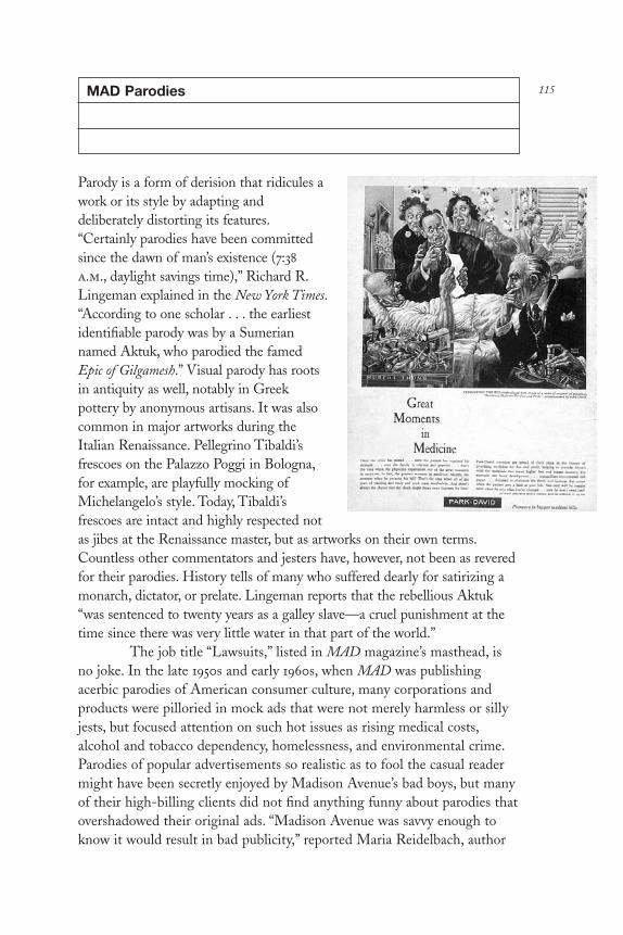
115MAD Parodies
Parody is a form of derision that ridicules awork or its style by adapting anddeliberately distorting its features.“Certainly parodies have been committedsince the dawn of man’s existence (7:38a.m., daylight savings time),” Richard R.Lingeman explained in the New York Times.“According to one scholar . . . the earliestidentifiable parody was by a Sumeriannamed Aktuk, who parodied the famedEpic of Gilgamesh.” Visual parody has rootsin antiquity as well, notably in Greekpottery by anonymous artisans. It was alsocommon in major artworks during theItalian Renaissance. Pellegrino Tibaldi’sfrescoes on the Palazzo Poggi in Bologna,for example, are playfully mocking ofMichelangelo’s style. Today, Tibaldi’sfrescoes are intact and highly respected notas jibes at the Renaissance master, but as artworks on their own terms.Countless other commentators and jesters have, however, not been as reveredfor their parodies. History tells of many who suffered dearly for satirizing amonarch, dictator, or prelate. Lingeman reports that the rebellious Aktuk“was sentenced to twenty years as a galley slave—a cruel punishment at thetime since there was very little water in that part of the world.”
The job title “Lawsuits,” listed in MAD magazine’s masthead, isno joke. In the late 1950s and early 1960s, when MAD was publishingacerbic parodies of American consumer culture, many corporations andproducts were pilloried in mock ads that were not merely harmless or sillyjests, but focused attention on such hot issues as rising medical costs,alcohol and tobacco dependency, homelessness, and environmental crime.Parodies of popular advertisements so realistic as to fool the casual readermight have been secretly enjoyed by Madison Avenue’s bad boys, but manyof their high-billing clients did not find anything funny about parodies thatovershadowed their original ads. “Madison Avenue was savvy enough toknow it would result in bad publicity,” reported Maria Reidelbach, author
DL2 02 07/13/04 2:53 PM Page 115

of a history of MAD. The magazine was, however, never sued for itsparodies of print ads, but it was sued for its song parodies that pairedfamous tunes to ridiculous lyrics. “The suit charged that the parodies were‘counterparts’ to the originals since they could be sung to the tunes of theoriginal,” continued Reidelbach. Although two New York State courtsagreed with MAD that the spoofs were indeed parody, and that “parody andsatire are deserving of substantial freedom—both as entertainment and as aform of social and literary criticism,” MAD’s publisher, William Gaines,realized it was prudent to have a lawyer on permanent retainer to block andtackle any potential litigants.
Such are the vagaries of parody, that MAD took precautions toprevent charges of trademark infringement by routinely altering the namesof products (i.e., Crest toothpaste became Crust) while keeping theidentifiable characteristics of a product or institution through mimicry of apackage, logo, or ad format. One of MAD’s classics is a 1961 parody of thedrug company Parke Davis’s once ubiquitous Great Moments in Medicinecampaign. Each ad featured a detailed painting of a warm-hearted healertending to the sick and infirm. MAD lampooned the campaign by showinga doctor (holding back a smirk) presenting his inflated bill to the horrifiedpatient and family members around the sick bed. The caption read“Presenting the Bill, reproduced here, is one of a series of original oilpaintings, Practicing Medicine for Fun and Profit . . .” The tag line read:“Park-David . . . pioneers in bigger medical bills.”
MAD’s spirit was later adopted by Topps Bubble Gum for theirextraordinarily successful, yet decidedly sophomoric Wacky Packs, a send-up (aimed at preteens) of well-known supermarket products, featuringpernicious puns on famous brand names. “Rather than a negative parody,”argued Wayne Small, a marketing analyst, “Wacky Packs actuallyreinforced brand names in the minds of children.” Nevertheless, under thethreat of legal actions Topps made a number of out-of-court settlementswith offended corporations. Indeed, consistent with the Reaganadministration’s support of big business, during the 1980s the courtsenforced stricter rules against defaming corporate (as opposed toindividual) reputations.
Parody is a tricky and dangerous art for two primary reasons.First, because it involves fidelity to the original work. Second, because as an instrument of criticism and entertainment parody can infringe onintellectual property. Since parody is “a form of derision,” even benignparodies are bound to get somebody’s head out of joint. Moreover, the lawis somewhat vague in its definition of what constitutes a violation ofintellectual property rights, and what action is taken depends on the
DL2 02 07/13/04 2:53 PM Page 116

perception and inclination of the victim. Serious parody, no matter howbiting, is more acceptable than that which is irresponsible or libelous.Parodying well-known images or icons not to satirize the host formdirectly, but to make additional commentary is common among graphicdesigners. As a graphic design tool parody makes sense only when therelationship, or visual pun, between the original and the new work iscomprehensible. A successful parody is one that exploits the original styleand character of a work for the purpose of making humorous and insightfulcommentary. A good parody makes sense; a bad one, none.
DL2 02 07/13/04 2:53 PM Page 117

Zap Comix
Back in 1968, underground comix attacked theperemptory values of a conservative society thatless than a decade earlier had imposed strictrules of conduct on its youth. During the earlyto mid-1950s, at the height of the social andpolitical purges known as McCarthyism,Congress was engaged in an investigative frenzyto root out Communists in government andadverse influences on the culture at large. Theybelieved that American kids—the offspring of avictorious postwar nation—were susceptible toforces of evil filtered into the collectiveunconscious through such inflammatory mediaas comic books. Threatened with governmentregulations and fearing diminished profits, thecomics industry agreed to police itself throughthe Comics Code Authority, which, like the film
industry’s Hays Office, applied strict watchdog standards to any and allcontent prior to bestowing its seal of approval. Any deviation from its listof standards (which prohibited gratuitous violence, sex, and disrespecttoward authority) was met with swift punitive measures, notably banningdistribution to all stores in which the majority of comic books were sold.
Pressure on the creators, manufacturers, distributors, and retailersof comic books resulted in products that upheld prescribed Americanvalues. Neutering comics did not hinder sales; instead, restrictionsfomented rebellion over time. After almost a decade of a predictableSuperman, puerile Archie, and tiresome Sgt. Rock, a generation of Americankids became teenagers, with pent-up inhibitions that demanded venting.During the late 1960s, the busting of strictures emerged in youthmovements that were expressed through political radicalism, civildisobedience, hallucinogenic experimentation, free love, and raucous rockand roll. Virtually overnight (after fermenting for a decade), Americanculture was transformed by a youth culture that reclaimed art, writing,music, and, ultimately, comic books from the guardians of propriety.
Thirty years ago, Zap #1 was the spearhead of the comic bookrevolution. The 1998 release of Zap #15 marked the comic’s extraordinary
118
DL2 02 07/13/04 2:53 PM Page 118

longevity; it is still published, once every two years. Before Zap, earlyunderground comics appeared in such underground newspapers as NewYork’s East Village Other and its sister publication, the Gothic Blimp Works,where R. Crumb, Kim Deitch, Gilbert Shelton, S. Clay Wilson, and SpainRodriguez launched assaults on convention. To describe the effect of thiswork as inspirational would understate the incredible power of such ferventtaboo busting on a generation weary of trite comic superheroes andsuperboobs. While these undergrounds looked like comics and read likecomics, in fact they were “com-mix,” a combination of a conventional visuallanguage (that is, the panel and balloon motif that dates back to the latenineteenth century) and scabrous story- and gag-lines heretofore bannedfrom mainstream comic books.
Zap began as a co-mix of artists bound together by their collectivecontempt for conventional mores, yet their various individual perspectivesallowed them to showcase a number of themes through different forms anddistinct characters. Among Zap’s earliest contributors, founder R. Crumbwas known in the counterculture for his string of bizarre, ribald, and racycharacters, including Fritz the Cat, Mr. Natural, Angelfood McSpade,Dirty Dog, and Schuman the Human; Victor Moscoso and Rick Griffinwere progenitors of the vibrating, psychedelic rock-concert posters thattook San Francisco and the world by storm; and S. Clay Wilson was knownfor living out his perverse fantasies through dark comic figures.
Zap #1 featured Crumb’s work exclusively as a vehicle for theartist to pay homage to pre-code comics and to communicate hisadmittedly deranged view of conventional life. Under the caustic advisory“Fair Warning: For Adult Intellectuals Only,” Crumb introduced a selectionof tales that had spiritual roots in MAD magazine’s irreverent satire. Butwhile MAD eschewed sex and politics, Crumb reveled in it. Among hisearliest stories, we find “Whiteman,” a tale of “civilization in crisis;” “Mr.Natural Encounters Flakey Foont,” a jab at spirituality; “Ultra SuperModernistic Comics,” a tweak at high art; and his now classic “Keep onTruckin’,” an absurdly funny slapstick. In retrospect, these comics seemtame when compared to later underground raunchiness. But, at the time,even comical gibes at frontal nudity, recreational drug use, and racialstereotyping (for example, Angelfood McSpade, a bug-eyed Africancannibal, sold a product called “Pure Nigger Hearts”) tested the toleranceof accepted standards.
When Zap #1 premiered, Victor Moscoso and Rick Griffin wereamong the most prominent graphic artists of the San Francisco rock-and-roll ballroom scene. A year earlier, Wes Wilson, Stanley Mouse, Griffin,and Moscoso launched a graphic style that undermined prevailing
DL2 02 07/13/04 2:53 PM Page 119

modernist notions of formal rightness by introducing vibrating color,illegible lettering, and vintage graphics to posters that were complexassemblies of type and image, designed to be read while high. Always theexperimenter, Moscoso, who had been interested in serial imagery when hewas a painter studying at Yale in the early 1960s, was beginning to playwith skewed sequential photographs for use as a Christmas card for an oldhigh school friend, the animator and film title designer Pablo Ferro. Also in an experimental mode, Griffin had done a poster send-up on the SanFrancisco Chronicle’s comics section. After seeing this poster, which was “likeDisney on LSD,” Moscoso recalls, “it turned me in the direction ofcartoons as opposed to photos.”
At first, Moscoso was hesitant to devote himself to comic strips.He was already spending the better part of a week designing two andsometimes three rock posters, which were printed on good paper andtherefore more tangible than the underground tabloids printed on cheapnewsprint and destined for landfill. “Why should I do something that’sgoing to be thrown away?” he asks rhetorically. Instead Moscoso andGriffin together created a series of posters for Pinnacle Productions in LA, promoting Janis Joplin and Big Brother, B. B. King, and PG&E.
“At the bottom [of the strip] were three comic panels, which Rickdrew,” Moscoso says about the inspiration that gave them the idea to do acomic magazine combining their talents through alternating panels. “I did a template for each of us on eight-by-five-inch cards,” he says about theformat. “We were using a Rapidograph at the time, and, since we each hadthe same template, we’d start drawing anything that came into our mind ina box and alternately put one next to the other in a nonlinear fashion sothat the development would be purely visual.”
Originally, the comic was just going to include Moscoso andGriffin’s collaborative artwork. “We were already doing our respectivedrawings when we saw Zap #1 [after] Crumb had started selling it onHaight Street,” Moscoso recalls. “Crumb asked us to join because headmired Griffin’s cartoon poster. In fact, Crumb did a comic strip in Zap #1, which was a direct bounce off that poster. So he asked Rick, andRick said, ‘Moscoso and I are already working on this stuff.’ So he invitedboth of us to join in.” Crumb also asked S. Clay Wilson, who offered up aribald comic-strip drug fantasy titled “Checkered Demon.” With this,Moscoso and Griffin decided to shelve their collaboration, and each didtheir own strips.
Given the quartet’s respective popularity on the two coasts(Moscoso and Griffin on the West, and Crumb and Wilson on the East),Zap #2 was an immediate success. However, despite their hippie (“mine is
DL2 02 07/13/04 2:53 PM Page 120

yours”) roots, Moscoso wanted to ensure equitable distribution of profitsand copyright. “After having been burned so much in the poster business,”he says about his intellectual property travails, wherein he was denied therights to many of his images, “I set up a publishing deal with Print Mint,which was a distributor of my and Rick’s posters already. When Zap #2came out, here’s Moscoso and Griffin and these two new guys, Crumb andWilson, in the same stores where Rick and I were selling very well.” Theposter and head shops that had sprung up in hippie strongholds of bigcities and college towns allowed independent distributors a network thatbypassed the Marvels, DCs, and all the other Comics Code Authoritypublishers. By the time Zap #3 and #4 were published, sales were as high as50,000 copies each for the first printing. (Subsequent printings increasedthat number into the six-figure range.) Originally, half of the profits afterexpenses were earmarked for the distributor, and half for the artists. In themeantime, however, the Print Mint changed ownership; after some unfairdealings on their part, Moscoso renegotiated with Last Gasp (thedistributor of Zap today).
The first two issues of Zap were fairly innocuous compared to Zap#3, the special 69 issue (“because it was 1969,” explains Moscoso). Rockingthe boat with its risqué content that lived up to its “Adults Only” advisory,#3 was spiritually akin to Tijuana bibles (the cheaply produced, sexuallyexplicit eight-page comics imported to the United States from Mexicoduring the 1930s and 1940s). This issue was sandwiched between twoseparate front covers designed by Wilson and Griffin, respectively; it couldbe read front to back and back to front. The hinge was in the middle, aMoscoso-designed turnaround center spread that featured drawings ofDaisy and Donald Duck engaged in comic-book hanky-panky.
At the same time that Zap #3 was in the works, Crumb revealed aset of photocopied pages that he had originally prepared for what was to bethe first Zap. Unfortunately, he had given the artwork to a publisher whodisappeared with the originals before publication. “Fortunately, Crumb hadxeroxed the pages, including the covers,” recalls Moscoso. He continues: “Inthose days, the xeroxes picked up the line, but not the solid black. SoCrumb had to fill in all the solids.” Moscoso and Griffin agreed that, sinceCrumb had this entire comic book together, he should publish it just as itwas, without the other contributors, and they would call it Zap #0. Theonly thing he changed from the original was the cover. “We didn’t veryoften ask each other for advice,” says Moscoso about the time that Crumbasked for him for his thoughts about a drawing showing a man floating in afetal position with an electric wall cord plugged into his derriere. “I lookedat it and I said, ‘It don’t look right, Robert. The guy is in a fetal position
DL2 02 07/13/04 2:53 PM Page 121

with electricity surrounding him, so to have the cord go into his ass doesn’tmake as much sense as if it went into his umbilical cord.’ And he actuallytook my advice.”
Not to diminish Crumb’s major contributions to Zap orunderground comix in general, Moscoso credits S. Clay Wilson withinspiring the contributors to feistily bust taboos. “First Wilson comes outwith the ‘Checkered Demon,’ then ‘Captain Piss Gums and his PervertedPirates,’ in which he is drawing my worst fantasies! Frankly, we didn’t reallyunderstand what we were doing until Wilson started publishing in Zap. Imean, he’s not a homosexual, yet he’s drawing all these homosexual things.He’s not a murderer, yet he was murdering all these people. All the thingsthat he wasn’t, he was putting down in his strips. So that showed us that wewere, without being aware of it, censoring ourselves.”
Once the self-imposed constraints were lifted, the Zap artists, whonow included Spain Rodriguez and Robert Williams, began to explore theirown addled fantasies. “Each one of us started looking at our own workasking, ‘How far out can we go along the model that Wilson had set up?’The only thing was it had to be our individual stories. I, for one, was notgoing to do ‘Captain Piss Gums.’ Instead, I had Donald and Daisy eatingeach other in the ’69 issue because I was getting back at Walt Disney! Imean, I love Walt Disney. But here Mickey and Minnie have nephews, butnobody fucked. So this was my chance.”
In this sense, Zap quickly became an arena to test the SupremeCourt’s “community standards” doctrine, which allowed each community to define pornography in relation to the local consensus. As on the edge asit was, Zap #3 was unscathed. Zap #4, on the other hand, stretched thosestandards beyond the limit and was, therefore, enjoined by the SanFrancisco police. The seeds of discontent were born in features includingthe explicitly titled “A Ball in the Bung Hole,” by Wilson, “Wonder Wart-Hog Breaks Up the Muthalode Smut Ring” by Shelton, and “SparkySperm” by Crumb, which was placed between front and back covers of adancing penis. But the strip that forced the police’s hand was Crumb’s “JoeBlow,” featuring Dad, Mom, Junior, and Sis in a satire of the incestuous all-American family. Or, as Moscoso explains: “You can cut off a guy’s penisand devour it (as in ‘Heads-Up’ by Wilson), you can even chop people upinto little pieces, but you can’t have sex with your children.” The Zap artiststhought they “could knock down every taboo that there was.” Instead, thepolice busted City Lights bookstore in San Francisco, and, in New York,Zap #4 was prohibited from being sold over the counter.
Nevertheless, after paying a fine, City Lights proprietor and poetLawrence Ferlinghetti continued to sell the contraband and subsequent
DL2 02 07/13/04 2:53 PM Page 122

issues without incident. Predictably, the attention caused Zap’s reputationand sales to rise. As for the artists, “I never did an incest story,” saysMoscoso, “and Crumb never did an incest story again, as far as I know . . .not for Zap. However, we did not self-censor. . . . It was just after a whilewe got it out of our systems.”
Although subsequent issues were spared legal harassment, theywere no less explicit than the offending issue. By the 1970s the raunchfactor in underground comics was commonplace, and, with the liberalcourt’s First Amendment rulings, it was fruitless to expend legal energy incracking down on them. Moreover, Zap seemed to serve a purpose inventing the urges of a generation that needed to push boundaries. In fact,Zap is today a textbook study of how fringe ideas are no longer mysteriousor threatening when they are unleashed. In Zap #7, for example, Spainintroduced “Sangrella,” which serves as a paean to sadomasochistic lesbianeroticism with a sci-fi twist, addressing the extremes of such weirdfetishism. In retrospect it is little more than a ribald jab at the sexlessness ofsuperheroes. In Zap #8 Robert Williams’s “Innocence Squandered” is lessprurient than it is a satiric commentary on how pornography is adjudicatedin the courts. Actually, by Zap #11, although sexual references proliferate,the strips became more experimental in terms of form and content. In thisissue Crumb’s “Patton,” about the great blues performer Charley Patton, isa masterpiece of comic strip as documentary. In the same issue Spain’s “LilyLitvak: The Rose of Stalingrad” transforms a little-known historical factinto a comic strip that is kindred to the heroic comic books of the WorldWar II era. And in Zap #13 even Gilbert Shelton turned his attention fromfantasy to real life in “Graveyard Ghosts,” a brief tour of Père LachaiseCemetery in Paris.
Thirty years, fifteen issues, and (according to distribution figures)millions of copies later, Zap has not changed all that much. The samecontributors, minus Griffin (who died in 1995), are still pumping out anissue every two years. During a period in American history when politicalultraconservatives are blaming the 1960s for all social ills, it is interesting to note that even in maintaining its consistency, Zap is not the wellspringof radical raunch that it once was. American tolerance for the abhorrentwas long ago stretched beyond Zap’s boundaries. “The fact that we’re evenstill selling these things actually is remarkable,” Moscoso admits. “Thesethings should have gone by the wayside a long time ago, by all logicalstandards. But there are people who still read this crap! Not bad for a pieceof trash. Really.”
DL2 02 07/13/04 2:53 PM Page 123

SPY
Stephen Doyle
I am not a maniac about knowing who cutwhat face or if it’s true to the originaldrawing,” said Stephen Doyle (b. 1956), thecofounder of Drenttel Doyle Partners in NewYork, who in 1986 also designed the format ofthe original SPY magazine and supervised itsfirst four issues. “I am a maniac aboutlegibility and whether something is interestingenough to be set into type in the first place.With all the expense involved in typesettingone better be damn sure that a manuscript isworthwhile.” Doyle described himself as a“translator” who believes in the power oftypography to induce readers to read.
This may seem disingenuous comingfrom the designer who has promotedtypographic anarchy in SPY, the New
York–based satiric journal of culture and politics that defined the 1980swhile it pilloried its leading players. But if Doyle encouraged the use offour-point text type and bled copy blocks off the page, it was consistentwith a faithfulness to content. When articles in SPY were composed inmultiple text faces of varying weights—some on excruciatingly tightcolumn widths—Doyle was simply responding to the demands of themagazine. “SPY had many different voices,” Doyle explained, “so we keptflipping type styles to reflect that. The editors liked sidebars so we usedthem everywhere and even gave the sidebars their own sidebars. We let thetype be the messenger for the manuscript. So the type misbehaved becausethe manuscripts misbehaved. It was as though we let the writers design themagazine.”
Doyle’s design respected the content and rejected decoration for itsown sake. In SPY every visual element had a purpose. “SPY was like amagazine in therapy,” Doyle continued. “It was so much about the processof making magazines that we let it all show.” SPY ’s frenetic pace was areflection of media-blitzed America, but Doyle based its visual persona on avariety of personal precepts, too. “I have a theory,” he said, explaining whymuch of the type is set small enough to require a microscope. “People will
124
DL2 02 07/13/04 2:53 PM Page 124
read what they want to no matter how big or small the type. And while Idon’t believe in obscuring a message, through scale changes, one cannevertheless have a little fun with it.” Doyle took a lot of heat for hisLilliputian preferences, but never repudiated himself. For SPY ’s firstanniversary party Doyle even designed an invitation with the necessaryinformation set in two-point Granjon italic in the form of an exclamationpoint—he included a magnifying glass. “I wouldn’t have done that with alot of copy,” he admitted, “But some things just call out for it.”
A few years after it premiered, the SPY style was mimicked byother magazines, usually in instances where the subjects didn’t merit it.Doyle reacted by turning down the volume. Doyle’s typography is not reallyabout misbehaving. As he has pointed out, the inspiration for the originalSPY was not the urban environment or deconstructionist architecture, but a1540 polyglot Bible where each language is set in a different typeface.
DL2 02 07/13/04 2:53 PM Page 125

Culture Tabloids
Tabloids developed their malodorousreputation because of the gutter journalismpracticed by their earliest proponents inBritain and the United States. It wasn’t untilafter 1900 that the term tabloid, whichoriginally connoted a newspaper half the sizeof a standard broadsheet (about the size oftoday’s New York Times), became synonymouswith the lurid and scandalous. In 1919 twocousins, Joseph Medill Patterson and RobertRutherford McCormick, began publishingthe New York Daily News. Its reduced, tabloidsize was immediately successful, being easierto hold and read on New York’s sardine-packed subways. The Daily News was assuredeven greater circulation by its unbridledpreoccupation with sex and violence,conveyed by screaming headlines and fullfront-page halftones. It became the largest-
selling tabloid in America and spawned many competitors. One of thesewas Bernarr Macfadden’s Daily Graphic, which entered into anunprecedented circulation war, giving its readers the most reprehensibledisplays of gutter publishing ever practiced. Despite, or because of this,tabloid mania flourished in the 1920s until loud outcries from the protectorsof the public’s morals tempered, somewhat, the rumor, sex, and gore.
Recently, there has been a more benign reason for publishing atabloid: economy. Printers could offer publishers twice the product for halfthe price. For this reason a tabloid explosion began in the mid-1960s,coinciding with the free-speech movement and subsequent rise of youthculture. Low-budget underground or counterculture papers appearedaround the country and abroad. Anarchic drug, sex, and political weeklies,like the San Francisco Oracle, the Los Angeles Free Press, and the EastVillage Other, were in the vanguard of this movement. They were cheaplyproduced, inexpensively sold (average twenty-five cents), and widely read.They were records and totems of their times.
The tabloids’ design was governed by a marked lack of money and
126
DL2 02 07/13/04 2:53 PM Page 126

technology, and administered by naïfs, who, armed with press-type, bendayand patterned Letraset screens, ruling tapes, Addressograph phototype,freebie photographs, and raunchy comix, produced raw but expressivenongraphic design. Despite the differences in approach, the instinctiveunderground layout practiced then and the mannered culture tabloid designof today are remarkably similar.
Underground papers began declining in the late 1960s. A newgenre of alternative “sex-culture” papers (many published by theunderground papers themselves to make money) stole a fickle audience thatpreferred nudity to profundity. The underground tabloids finally died in themid-1970s with the end of Vietnam War, the resignation of Richard Nixon,and as the “me” decade was taking hold. At the same time, a national papershortage resulted in the decrease of the standard tabloid size and anincrease in production costs. Moreover, many of those involved inunderground publishing either were irrevocably burned out, or simply grewup and became interested in more conventional lives and livelihoods.
Those designers who used the underground press as a kind ofgraduate school—including Roger Black of Rolling Stone and RonnCampisi of Fusion—wed the street-smart design and exuberance theylearned with conventional design practices while working for moreestablishment journals. Hence, during the mid-1970s a second wave ofcounter-culture tabloids emerged, such as the Real Paper, Boston Phoenix,and Chicago Reader, among others, which were neither raw nor anarchic,but rather found solace in convention. Indeed, the only editorial differencefrom regional consumer magazines like New York, was that the tabloidsappealed to a slightly younger, but nevertheless upwardly mobile readership.In terms of their design and editorial bent, these publications were upbeat,yet somewhat staid blends of New York’s Village Voice, the New York Reviewof Books, and Rolling Stone. Their purpose was to educate, inform, andotherwise provide readers with reviews and calendar features.
Slightly before the second wave crested, the granddaddy of newtabloids, Andy Warhol’s Interview, appeared. In the early 1970s a fewavant-garde artists gave vent to their ego needs by publishing artsy, gossip-filled magazines. That Warhol’s was the only one to survive was a tribute toa basically sound idea: interviews with movie stars, glitterati, and eccentricpersonalities otherwise ignored by the establishment press, and a forum forfashion-conscious writers. The first issues were quarterfold formats, withlackluster design and no exceptional visual personality. But Interviewquickly developed a constituency and, during the late 1970s, a distinctivelook when Richard Bernstein was commissioned to do regular full-colorcover portraits. Interview developed into an odd but enjoyable amalgam of
DL2 02 07/13/04 2:53 PM Page 127

W, Vogue, and Harper’s Bazaar, spiced with a dash of People. Its gossipy toneappealed to culture vultures, those maturated groupies who thrived onavant-gardism. Interview became a safe haven for the Jekylls and Hydes ofsociety called Yuppies, who were squeaky clean by day and down and dirtyat night. Interview’s interior is minimally designed, like a hip New YorkReview of Books, to allow for maximum photographic impact, and so as notto compete with its advertising. Nevertheless, it has influenced theappearance of many subsequent culture tabs.
By the late 1970s, boomers born in the late 1950s and early 1960swere clamoring for their own cultural voices. On the West Coast, punk wasthe predominant attitude and style. Its proponents in Los Angeles spawneda neo-underground tabloid called Slash, a raucous blend of type, image,and neo-underground comix (cartoonist Gary Panter was the leadingpractitioner), and perfected what has been called the “ransom note” style of cut-and-paste design (somewhat related to futurist experiments in theteens). In San Francisco, a bizarre publishing diversion, Wet: The Magazineof Gourmet Bathing, ingeniously wed the 1970s sexual preoccupation withfashion-conscious nihilism cut, of course, with tongue-in-check, ribald wit.Wet ’s art director practiced an ad hoc, gridless approach to layout (at leastfor the first year, after which Wet changed design and editorial format anddropped bathing from its title). Wet signaled a post-underground obsessionwith esoterica.
On the East Coast, Fetish, a similarly arcane culture tab, waspublished and designed by David Sterling and Jane Kosstrin. But Fetishwas a linchpin of sorts. Its content was not sex or drug oriented, but was asomewhat rarefied exploration of “the man/object matrix in contemporaryculture” (translation: articles on art, architecture, and design against anavant-garde backdrop). Although its design was once described as amarriage of underground and Condé Nast fashion-magazine sensibilities, itmade a purposeful departure from ad hoc gridless design, to a controlled,yet playful, anarchy (or “new wave” design). Also on the East Coast, newwave/ punk music and its offshoots gave rise to tabloids like the New YorkRocker and the East Village Eye (apparently a reference to the East VillageOther’s eye logo). Both had a random and skewed approach to layout thatresembled their underground forerunners, but without the naïve integrity.
Although it seemed that the underground aesthetic was notentirely dead and the torch had only changed hands, the truth was thatalternative culture had changed. Politics was no longer operative, ratherinterest in material culture was dominant. The antiestablishmentism, sonaively practiced by the underground, was codified by a new group ofdesign-literate practitioners. Outrageousness became an end in itself,
DL2 02 07/13/04 2:53 PM Page 128

manifest in the design clichés of the period—a Mad Max, Road Warrior,post-Holocaust vision of life wed to a skewed 1930s modernism. It quicklyemerged as a distinctly identifiable style, easy prey for style merchants, theentrepreneurs who learned from the 1960s that even the most sincere youthculture can be a profitable commodity. Punk was co-opted andcommercially packaged as new wave. A domino effect began, in which aplethora of new wave products—from clothes to watches to records—created a need for eye-catching advertising, which in turn created demandupon publishers for outlets.
In Los Angeles, the surge in chic, trendy, and not altogetheruninspired new wave–styled publicity for boutiques, restaurants, andgalleries fostered the tabloid Stuff, ostensibly an elegant supermarkethandout whose only editorial content (save for a few insignificant textpages) was its paid advertising. Indeed, some of the ads were designed with more zest, imagination, and panache than a lot of conventionalgraphic design. On the East Coast, similarly focused “square” tabloid/magazines, including Details, Paper, and the full-sized tabloid, New YorkTalk, were merely editorial environments for advertising. As a rule theseEast Coast periodicals ran “soft” feature stories, picture spreads, andrandom items covering their cultural milieu. Although each masthead listeda considerable number of contributing writers, it is fair to say that thewriting would not overtax the average reader. At best it would entertainand at worst, separate one page of ads from the next. Still, thesepublications should not be totally dismissed as fluff.
A famous photograph taken by Berenice Abbott in the early 1930sshows a packed newsstand in midtown Manhattan with more than onehundred different magazines for sale (most for about a nickel, as comparedto today’s average three-dollar cover price). Despite the varied photographs,illustrations, and titles on their covers, many of the publications look alike.Graphic style is a visual indication of a cultural period. Many of themagazines in Abbott’s photograph are in the deco mold—then thedominant style. Although style represents a period, it does not always statecontent. In every period there are manifestations that define the dominantattitude and those that copy it. That many of today’s culture tabs look thesame is simply a signpost of a design-conscious and technologicallyadvanced period. Some of the publications discussed here will be forgotten,like the hundreds of me-too undergrounds published during the late 1960sand early 1970s. Others will make a lasting contribution to (rather thanmerely being a reflection of ) the visual culture and the culture as a whole.
DL2 02 07/13/04 2:53 PM Page 129

The Face
Neville Brody
Neville Brody (b. 1957) was weaned on the dada-inspired nihilism of Britishpunk in the 1970s. But The Face, his first important magazine design, wasno neo-punk tabloid, but a slick, youth culture magazine that combined a1920s avant-garde sensibility with contemporary style. The magazinefocused on music, film, nightlife, art, dance, and the lifestyle of Britain’s hipculture. Brody was twenty-four when he joined The Face, bringing hisrebellious punk sensibility to a larger, consumer-oriented venue. In NickLogan, editor and publisher, Brody found a sympathetic collaborator.Logan never undertook any market research, preferring to trust hisinstincts. He gave Brody great freedom to invent the visual structure of themagazine, even to the extent of moving the masthead logo all over thecover (including sideways). Budget limitations and tight deadlines (Brodywould design forty pages in as many hours) were offset by on-the-spot,risk-taking decisions on design and editorial content that would beimpossible in a larger publishing house.
In 1976 Brody entered the Royal College of Printing expressly tolearn enough about visual communication to use it for his own ends.
130
DL2 02 07/13/04 2:53 PM Page 130

Although he rejected fine art as elitist, his early work centered on images,and when he used typography it was in a similar, illustrative way. A decidedcontrarian (if a teacher approved of his work, he redid it), Brody found acatalyst and a philosophical home in the anticommercialism of the punkmovement. Just out of school, he joined designers like Barney Bubbles,Malcolm Garrett, and Peter Saville in designing record sleeves. He firstworked for the design studio Rocking Russian, then for Stiff and FetishRecords, two of the most popular independent record labels in Britain. Setup by Jake Riviera, a friend of Bubbles, Stiff Records was a freewheelingenvironment where outrageousness not only applied to sleeve design, butalso to marketing schemes. Stiff once printed a sleeve with the wrong bandon the cover hoping fans would then buy the corrected version. Brodyrelished the creative freedom but became disenchanted with thecommercial manipulation.
Brody’s first few issues of The Face were image oriented. “I hatedtype,” he once confessed. In fact, in school he dismissed type as incrediblyboring. This admission belies the fact that under Brody’s art direction, TheFace was a wellspring of typographic quirkiness. Brody presented text in astraightforward manner but surrounded it with compelling imagery,headlines, lead decks, and subheads. He soon realized he could extract asmuch emotive energy from the typography as from the imagery. Inspired bythe work of Russian constructivist Alexander Rodchenko, Brody began touse heavy rules and hand-drawn, sans-serif typefaces, and to craftletterforms that functioned like emblems and crests. Typefaces were customdesigned for headlines; letters were truncated, squashed, lopped off andblurred; fonts were mixed within a word; icons replaced letters withinwords, and headlines combined with symbols and functioned like corporatelogos. “I had no respect for the traditions of typography, because I had nounderstanding of them,” Brody explained.
As his confidence grew, Brody used the magazine as a virtual stage allowing himself more freedom to question the very core of visualexpression. He reframed the magazine as an ongoing dialogue with thereadership where idiosyncratic graphic signposts and icons, which may haveinitially appeared incomprehensible to the reader, gained meaning throughconsistent application over a series of issues. Brody, uninhibited by the edgeof the page, treated the magazine as a continuum where what happened onpage five connected to what happened on page fifty-five. He re-examinedthe use of page numbers, considering symbols instead. Regarding thecontents page of a magazine he said, “You decide to have a contents page toact as a key—it’s an advert for the magazine, a second cover, equivalent tothe back of a book jacket where you read the blurb.”
DL2 02 07/13/04 2:53 PM Page 131
In 1984 the contents page logo in issue #50 was a banner-likeemblem with mixed-font typographic forms. The letterforms weresideways, but were drawn in such a way that when looking at themstraightforwardly the Ts became pluses, the E became an M and C doubledas a lower case N, introducing multiple interpretation. From issue #51through #55 Brody incrementally deconstructed the graphic elements withinthe logoform as well as the exterior shape itself, until only abstract glyphsin a strong rectangular shape were left. In deconstructing the contents pagelogo over several issues he tested the limits of readability and the strengthof continuity.
The Face was unorthodox, but not anarchic. “Everything in TheFace was reasoned; every single mark on the page was either an emotiveresponse or a logical extension of the ideas,” said Brody. It was theinterweaving of two narratives, one visual and one textual on a griddedplane. Brody’s headlines became objects, like in the February 1985 issue acustom-designed M for the opening spread of an article on Madonnabecomes in the March issue the W to lead into an article on Andy Warhol.It was not a joke, or a response to a budget cutback, but a visual analog ofthe way Warhol appropriated imagery. The grid was a simple system tocomplement the complexity and innovation Brody brought to it, yetdefinitive enough to convey unity.
Brody envisioned a magazine that would inspire other designersto ask more questions, not provide a crib sheet for quick graphic solutions.“Essentially, I think I failed. My ideas were weakened into style. The verything I used in order to get the ideas across—a strong personal style—wasthe thing that defeated reception of the ideas,” Brody lamented in 1990,years after leaving the magazine. The Face ultimately did become a styleguide. In 1986 he moved on to Arena, also edited by Logan, who,disregarding market failures of larger publishing houses, like Cosmo Manfor Condé Nast, decided it was time for a magazine that targeted a maleaudience. Arena was a more sophisticated version of The Face, a consumer-oriented quarterly publication featuring upscale people-watching fashion,sports, and travel in addition to the mainstay lifestyle articles that hadworked for The Face.
Frustrated with the appropriation of his work, Brody decided tostop designing “the new thing.” After the first two issues of Arena, whichresembled The Face, he returned to classic modernist methods. He usedHelvetica and chose typefaces like Garamond Light Condensed and KabelBold for headlines and cover lines. Photographic quality was paramount.This was a postmodern homage to the Swiss school, yet it was not Swiss,but rather “Swiss Tech,” the marriage of Swiss-influenced typography and
DL2 02 07/13/04 2:53 PM Page 132

futurist composition. But critics and imitators were not far behind, andgraphic style in Britain edged toward this neo-modernism.
By 1988 Brody’s career reached a turning point. The publicationof The Graphic Language of Neville Brody, written by Brody and hiscollaborator Jon Wozencroft, coincided with an exhibition of his work atLondon’s Victoria and Albert Museum. Both were misinterpreted as self-congratulatory hoopla. Almost immediately afterwards, Brody, sufferingfrom a severe case of overexposure, stopped getting British work, whichtriggered a financial crisis. At the age of thirty, the man who had beencalled the first graphic design superstar needed to regroup. He found newclients in Japan and Europe. He immersed himself in digital technology.Testing entrepreneurship, he became a partner in FontWorks, the Britisharm of FontShop, the international font-distributor started by ErikSpiekermann. In 1991 he launched the experimental type magazine Fusewith Wozencroft as editor. A quasipromotional tool for FontShop, eachissue of Fuse presented a set of typefaces in a digital format organizedaround a theme, background material on the fonts and their designers,printed style sheets, and an editorial essay.
In Fuse #10, Brody introduced Freeform, a collection of abstractshapes. It was designed with the articulation of a typeface, it had a certainrhythm, coloring, and repetition, but it abandoned the consensual meaningof the alphabet in favor of pure emotional impact. Freeform was criticizedfor its illegibility and dependence on a personal visual language. Brodyexplained, “It’s moving from representational to expressive typography. Ithink the parallel with what happened in painting is absolutely precise. . . .Putting desktop technology in the hands of the nondesigner liberates thedesigner from the necessity of representation in the same way that thecamera liberated the artist.”
From The Face, whose typographic idiosyncrasies prefigured themodern digital revolution, to Fuse, which attempts to describe theintersection of the linguistic and the pictorial, Brody has been unwaveringin his quest for a new visual sensibility based on ideas. Always morecomfortable with questions than answers he asked, “In the West, theRoman and Greek alphabets provide the basis of the consciously designedletterform, but you can carry this further back to the ancient Egyptians’use of hieroglyphs or even to ritualistic markings in caves. At what pointdoes true typography begin?”
DL2 02 07/13/04 2:53 PM Page 133

Emigre
Rudy VanderLans and Zuzana Licko
Deconstructivist typography, an idea more orless inspired by linguistic theory, had acomplicated birth and many midwives.During the 1970s Basel designer WolfgangWeingart developed a system of typographicreordering as an alternative to the dominantNeue Grafik or international style. On thesurface his radical approach was chaotic,yet underneath it was built on a structure of hierarchical logic. Many of Weingart’sexponents were schooled in academicmodernism and found that this new methodreleased them from old strictures. Themodern method was becoming unresponsiveas shifts in technology, economy, and politicsbegan to unhinge the canonical absolutes.
The spread of electronic media andcomputer technology began to suggest, if notdefine, new ways to present information.
With new interactive media, graphic design could no longer be onedimensional. As traditional methods of designing books and magazineswere challenged, visionary American designers like April Greiman and DanFriedman found new ways of busting the grid. Harnessing the primitivecharacteristics of electronic media and making strengths out oftechnological weakness resulted in new methods that, over time, evolvedinto a language. The use of multiple layers of discordant typefacesintegrated with imagery became, on the one hand, a commentary on theinformation deluge, and, on the other, a signpost that underscored newperceptual pathways. A similar discordant eruption in typography tookplace in the late 1890s, the Victorian era—the chaotic, nascent period ofcommercial design when job printers purposely mixed different typefacestogether in the service of fashion and function.
In 1983, a year before the introduction of the Macintoshcomputer, Rudy VanderLans (b. 1955) and Zuzana Licko (b. 1961), theformer Dutch and the latter Czech, founded an alternative culturemagazine they called Emigre. What started as a cousin of the 1960s
134
DL2 02 07/13/04 2:53 PM Page 134

underground newspaper developed into the clarion of digital typographyand design. The first Macintosh and its primitive default faces inspiredEmigre’s founders to focus on design. VanderLans called it “a culturalforce,” rather than a passive observer. Emigre Graphics (later EmigreFonts), the type business, became a pioneer in typeface design, and Emigre,the magazine, propagated the faith. Emigre Fonts introduced some of theearliest and quirkiest dot-matrix and, as the technology improved, high-resolution digital typefaces. Emigre magazine showcased the leadingproponents and exponents of a new typography that wed youthful rebellion,evolutionary imperatives, and intellectual curiosity into type and pagedesigns that challenged the canonical rules. These designers sought to reach audiences that were either disinterested in, or turned off by orthodox modern approaches, and they developed visual codes that forcedreevaluation of conventional type design.
As Emigre challenged the status quo it earned the ire of certainproponents of classic modernism. Massimo Vignelli referred to the newtypography as “garbage,” and in “The Cult of the Ugly” (Eye, No. 3, Vol. 9) I(Steven Heller) called it a “blip in the continuum of graphic design history.”This antipathy was not entirely a knee-jerk reaction to the new, but it didreveal an inevitable generational schism. On the surface trends and fashionswere being scrutinized, while underneath lurked discomfort with change.
Once released from the safe haven of the laboratory the tensionbetween young and old ignited. Progress in art and design is certain, butthe baton is rarely passed smoothly. Action and reaction in design are asnatural as the changing tides, and just as necessary. Arguments forcepractitioners of all ages to assess and defend. Stasis, the hobgoblin ofcreativity, is invariably disrupted. The approaches promoted by Emigreencouraged a reevaluation of old methods and aesthetics in the light of anew technological era. They became touchstones for progress but,paradoxically, also provided templates for mimicry.
It is axiomatic that when a progressive method becomes popularits edges are smoothed. By the time the avant-garde enters the massconsciousness many of its successful experiments have already beendiluted, reduced to little more than style. In fine art the acceptance ofradical approaches into the mainstream may mean victory for theirproponents, but ultimately the most progressive forms are neutered toappeal to a larger audience. The outsider in graphic design is even moreof a contradiction. The commercial nature of design necessitates thatwhat’s outside be brought inside or become irrelevant. Regardless of howdetermined Emigre was to forge new directions, they were incapable ofpreventing appropriation.
DL2 02 07/13/04 2:53 PM Page 135

The cultural feeding frenzy that overtook the Emigre “style” waspredictable. What Emigre initiated was co-opted by scores of mainstream,cultish manifestations—from magazines to MTV. The ethos furtheroutgrew its experimental stage and became the “cool” or “hip” way tocommunicate. But this should not diminish Emigre’s impact or significance.
VanderLans and Licko, while launching a business, took thenecessary, courageous leaps that pioneers must take. Emigre was not just thestandard-bearer of the new design style, but was, and continues to be, thebearer of standards for experimental digital typography. Through the shiftfrom hot metal to phototype and even to computer type, although themechanics of type had changed frequently, the fundamental nature of typehad remained constant. While other serious type designers initially adaptedtraditional methods to the digital medium, Emigre pushed the boundaries.VanderLans and Licko were not satisfied to follow tradition, and ultimatelythey created a tradition of their own.
DL2 02 07/13/04 2:53 PM Page 136

137RAW
Françoise Mouly and Art Spiegelman
Françoise Mouly (b. 1955) and ArtSpiegelman (b. 1948) were married in 1982.Within a few months they gave birth to apublishing business which they namedRaw Books and Graphics. It wasconsigned to a corner of their loft in Man-hattan’s SoHo district, where it quicklygrew into a healthy concern. Mouly, anative of Paris, had been an architecturestudent at the Ecole des Beaux-Arts andworked as a colorist for Marvel Comics inNew York; Spiegelman, a native NewYorker, was an underground comic stripeditor and artist with a unique analyticalapproach to comic page construction. Thecomics brought them together; andbecause they agreed that viable outlets didnot exist in America for the kind ofexperimental work that interested them,they decided to fill the void left by the demise of underground comix in themid-1970s by starting a publishing venture that would somehow provide aforum for new and radical forms. This entrepreneurial commitment thrustthem into the roles of publisher and editor, and more reluctantly into beingthe virtual foster parents to a group of artists whose unconventional stylesand approaches were given little encouragement in mainstream publishingcircles. Within a few years RAW magazine, the flagship of Raw Books andGraphics, had enlivened a moribund field.
The reasons for starting Raw Books and Graphics were compel-ling. “There was no place worth appearing in,” Spiegelman said. “Therewere magazines interested in me, but they wanted me to bend myself out ofshape to do comics that would be fitting for them.” Mouly had already single-handedly published The SoHo Map and Guide, an ambitious first projectthat sold advertising space to SoHo merchants. Now she wanted to learnprinting, so they bought a used multilith press and rebuilt it in their loft.
“The real genesis of RAW,” admitted Spiegelman, “was Françoise’sgoading it into existence, because it had a certain logic after she began
DL2 02 07/13/04 2:53 PM Page 137

getting involved in publishing. That meant setting up a makeshiftdistribution system so that things she printed could get around, which shedid. And then her being ready to take on something more ambitious. For awhile it seemed that might be books rather than the magazine, but theadvantage after we did the first issue of RAW (which we swore we wouldnever do again) was that we’d already set up something we could build on.A book is always another book and requires a whole new constituency to begathered each time. The magazine gave us a core of readers.” The SoHoMap and Guide provided enough capital to publish a first issue, and themakeshift distribution Mouly had set up eventually paid them enough tokeep going without further infusions of outside capital.
In a way, RAW evolved from Spiegelman’s anthology Breakdowns,at least in adapting the book’s expansive dimensions (eleven by fourteeninches), which enabled him to print his strips at almost their original size.There were other reasons for the new magazine’s format, too. “RAW startedat a time when there were a number of large-size cultural tabloids, such asWet, Fetish, Skyline, and Interview,” recalled Spiegelman. “The only thingthey had in common was the fact that they were ‘new wave,’ with a largesize and a new sensibility. So whether it was fashion, architecture, art, orpolitics, they sat next to each other on the newsstand. Whatever vestigialmarketing sense I had said that if we did comics as a large-size thing, theycould sit next to the architecture magazines and nobody would say ‘whereshould the comic book go?’”
From the outset, Spiegelman and Mouly wanted a three-letter title in the tradition of MAD. They went through many ideas beforesettling on RAW, which for them meant “having vital juices intact” ratherthan untamed or aggressive. To this they added a new, enigmatic subtitlewith each issue, among them, “The Graphix Magazine for DamnedIntellectuals,” “The Graphix Magazine of Abstract Depressionism,” “TheGraphic Aspirin for War Fever,” and “The Graphix Magazine that Over-estimates the Taste of the American Public.” By comic book standards,RAW’s premiere issue was tame: every element was purposefully designed.But in the beginning RAW’s design was a disquieting mix of what seemedlike trendy new wave detailing, and, by modernist graphic design standards,a comic book heavy-handedness. Every page had an obtrusive runninghead, an inelegant rule with a panel in which the artist’s name appeared,and a page number dropped out of a circle. Although this became RAW’ssignature design element, when it was first introduced it appeared adistracting conceit. Each contents page was an artwork in its own right,with overprints, drop-outs, and other design details that echoed the punkgraphic aesthetic of the time.
DL2 02 07/13/04 2:53 PM Page 138

RAW #1 was printed on heavy white paper and included a smallcomic book by Spiegelman called “Two-Fisted Painters” (one of his manystrips devoted to exploring and satirizing the comic form). The front coverhad a color panel pasted on it to give Spiegelman’s stark black-and-whiteillustration another dimension and to compensate for the lack of full-colorprinting. “A lot of attention was paid to its objectness,” said Spiegelman,who was creative consultant for Topps Bubble Gum Company during thatperiod, and has always harbored a fetish for novelty that he translated intothe magazine. Though many of the strips were visually raw compared tothose of slick mainstream comics, their surreal and heady unpredictabilityforced the reader to take notice. By RAW #5, which Spiegelman and Moulyagree was the most challenging issue, the various mixtures of typography,art, and novelty were so well integrated that RAW ’s style was decidedly itsown. RAW had become a genre.
“It was never meant to be a long-lived project,” sighedSpiegelman, revealing his characteristic angst. “It was meant to be ademonstration of how something could be in a better world, and ended uphaving its own logic and momentum; it began, more or less, steering usrather than us steering it. And I think that’s still true.” That momentumwas generated in part by the RAW artists, who were being given a venue inwhich to grow and were not eager to give it up. “Once everything was setup,” continued Spiegelman, “it was just as easy to feed it as to kill it.”
RAW certainly did fulfill a need. It became a veritable mecca forquirky and visionary artists and storytellers from all over the world. Fromthe initial five thousand print run, subsequent runs increased incrementallyto almost twenty thousand by RAW #8, the last of the large-format issues.Among the relative newcomers were Gary Panter, who already had a cultfollowing for his Jimbo strip, which appeared in a West Coast punkmagazine called Slash; Charles Burns, who had only ever published spotillustrations before sending his meticulously drawn translations of 1950shorror and love clichés to RAW for consideration; Jerry Moriarty, who wasteaching at the School of Visual Arts in New York and barely gettingpublished before RAW picked up his “Jack Survives,” a surrealistic view ofthe banal; and Mark Beyer, with his art brut tales about depression anddeath. Other homegrown discoveries included Drew Friedman, BenKatchor, and Mark Newgarden.
Spiegelman and Mouly also published the cream of the Europeancomic strip artists, including the brilliantly designed strips of Joost Swartefrom Holland and Ever Meulen from Belgium; the explosive graphicfantasies of Pascal Doury and the noir storytelling of Jacques Tardi, bothfrom France; and the seductive comicalities of the Spaniard Javier Mariscal.
DL2 02 07/13/04 2:53 PM Page 139

In his effort to separate RAW from underground comix, Spiegelmanfeatured the masters of the genre and published new stories by RobertCrumb, Kim Deitch, Justin Green, and Bill Griffith. He wanted to providea forum for illustrators, too, but most of those he invited failed to produce.The notable exception was Sue Coe, who provided some of the moststrident polemical visual commentary in RAW, as well as two RAW One-Shot books, How to Commit Suicide in South Africa, a visual indictment ofthe effects of apartheid, and X, a paean to Malcolm X.
In the time since Raw Books and Graphics was conceived, moreRAW-inspired magazines were published. RAW itself has been seriouslyanalyzed for pushing the limits of the form, and for reviving the nascentintelligence of the American comic strip. This cottage publishing entitythat Spiegelman and Mouly invested their hearts into has, arguably, donemore to awaken Americans to the integrity of the comic strip than all theefforts of comics writers, artists, and producers since comic strips began inthe American newspapers almost one hundred years ago.
DL2 02 07/13/04 2:53 PM Page 140

141Beach Culture
David Carson
Good magazine design is not simplya process of imposing tried and trueformulas, but one of creating formatsthat complement an editorialviewpoint. Yet much magazinedesign is tried and true becausepublishers want to be safe.Advertisers prefer it that way.
On rare occasions magazinedesigners rise above the designclichés imposed by marketingexperts, and when an intrepiddesigner does take the plunge noticemust be taken. Every so often amagazine captures the Zeitgeist. Inthe mid-1970s Wet: The Magazine ofGourmet Bathing, with its premierecover showing two photographs,taken ten years apart, of a motherand her daughters sitting naked in a bathtub, marked a shift from“underground press” politics to cult fetishism. In the early 1980s Emigre,with its alternative cross-cultural coverage and raucous type design,suggested a new wave was about to crest. In 1990 Beach Culture, a journal ofWest Coast watersports, became the cult magazine of the moment when itsurfaced in design competitions and annuals nationwide. Its primaryaudience was surfers, but it became the benchmark of 1990s design. Its soledesigner, David Carson (b. 1956), transformed the magazine into a showcasefor radical typography and design tomfoolery.
Beach Culture was full of design indulgences and technologicaltrickery, but it also included striking photography and illustration bytalented artists, such as Geof Kern, Marshall Arisman, Milton Glaser, MattMahurin, and Henrik Drescher. As a chaotic pastiche of typographic excessit was often unreadable, but conventional readability was not necessarily avirtue given its context. Beach Culture catered to an audience that was ableto navigate the visuals and text. No one ever said a surfing magazine shouldlook mainstream. But neither was there a demand that it be cutting edge.
DL2 02 07/13/04 2:53 PM Page 141

Certainly most other surfing magazines were void of distinguished design.Since surfing is such a specialized activity and writing about it is arcane,one would hardly have expected a surf magazine to be typographicallyinnovative or risqué.
Beach Culture was born out of a two-hundred-page annualadvertorial called Surf Style that included puff pieces about the productsadvertised therein. Carson embraced the publisher’s idea to make Surf Styleinto a real magazine. This former design intern at Surfer publications,former art director of Skateboard magazine and Musician, had studiedtypography with designer Jean Robert in Switzerland and learned about thepower of vernacular forms and how type could be made expressive throughabstraction. After the premiere issue of Beach Culture many advertisersdropped out, confused by its odd mix of beach and culture, yet enough ofthem remained to continue publishing. Carson seized the opportunity;following in the footsteps of contemporary design progressives, such asWolfgang Weingart, Rudy VanderLans, Rick Valicenti, and Neville Brody,he began his own expedition into new—and often illegible—realms ofvisual presentation. Carson’s spin on typographic anarchy was different thanhis predecessors. He not only infused his pages with wit and irony, but alsoaccepted that a magazine page is ephemera.
In one issue he ran a story in three conventional columns of type,but rather than reading the traditional way, vertically down, it readhorizontally across with each sentence jumping from one column to thenext. “Usually, I take my design cue from the story or art,” said Carson, “butthis time I just did it to have fun. Once the reader caught on I’m sure theyhad fun too.” On another page Carson designed the page numbers to belarger than the main headline, a joke in itself, but when the editor changedthe order of the pages, he kept the original number on the page because, heexplained, “I just happened to like it there.” In the final issue (of a total ofsix) the page numbers were eliminated and jump-lines simply said“continued.” These hijinks forced the reader to find his or her own way.
Initially, Carson used the newest Emigre typefaces. “I wanted touse whatever was totally new and untried,” he explained. However, hebecame more dependent on existing typefaces and published a “Special NoEmigre Font Issue” (a reference that went over the heads of most surfers).“Emigre faces were becoming like clip art, too identifiable, too dated,” heexplained. “Beach Culture was trying to be fresh, and I was using typefacesthat were appearing everywhere because they were hip and cool; it was justtoo easy.”
Carson went further to make design that was difficult for hisreaders and writers. “In the beginning there were some writers who were
DL2 02 07/13/04 2:53 PM Page 142

real upset that their stories were too hard to read, but I found after a fewissues that the very same writers who complained about crazy design werealso upset if their article was not given that kind of treatment.” Giving anarticle his special attention signaled that it was important. By the finalissue, Carson had taken this premise to the extreme by obliterating mostheadlines. Letterforms were overlapped, overprinted, smashed, andotherwise covered by black, mortised, random bands abstracted to the pointof incomprehensibility. Carson was designing for the code-busters to makesense of it all.
DL2 02 07/13/04 2:53 PM Page 143

Colors
Tibor Kalman
Critics argue that Benetton’s highly visible,captionless double-truck ads and billboardsfeaturing, among other images, a dying AIDSpatient, war-weary refugees, and an Angolanrebel soldier nonchalantly holding a humanbone, are sensationalist ploys to manipulatepublic perception. And for what? To sellsweaters? Yet Benetton claims that its motivein publishing such imagery is not just togarner the most publicity for the leastpossible PR dollar (although this certainly hasbeen the effect), but to use their position as asuccessful business to communicate strong, ifunpopular, messages about society and theworld.
Productless advertisements are notnew. During World War II, Americancorporations showed support for the wareffort through institutional advertising that
wed patriotism to corporate identity. Since the 1960s, Mobil Oil haspropagated corporate citizenship through editorial ads on op-ed pages. Inthe 1980s Esprit, Kenneth Cole, and Ben and Jerry’s devoted advertisingand packaging space to promote social and environmental causes. But inthe 1990s Benetton went a step further with a compelling campaign createdby advertising director Olivero Toscani that attached the Benetton logo to aseries of sensitive issues. What began as “The United Colors of Benetton,”a product-based series of ads showing multicultural kids and promotingethnic and racial harmony, evolved into captionless double-truckjournalistic photographs of the kind mentioned above, which ultimatelybegot Benetton’s own magazine, Colors.
Colors is not a fashion or style magazine in the “downtown,”experimental, post-punk tradition; nor is it an institutional or corporatehouse organ. Rather its editorial focus is dedicated to presenting a harshlyrealistic, though often humorous, world view. Tibor Kalman (1949–1999),editor-in-chief of Colors from 1990 to 1995, characterized the magazine as across between National Geographic, Life, and The Face.
144
DL2 02 07/13/04 2:53 PM Page 144

The primary reason for starting Colors, noted Kalman, was thatToscani was unhappy with the magazines in which he advertised; “Hewould get insane when Vogue and Vanity Fair had the audacity to turndown Benetton ads because they crossed the line from being safely elegantto strongly editorial.” Toscani wanted a magazine that would build uponwhat he was already attempting to do through advertisements, and Kalman,who had been working with him on researching the photographs, wanted amagazine that would do nothing less than “change the world.” Hence thebilingual (English and Italian) Colors was “The first magazine for the globalvillage,” said Kalman, “aimed at an audience of flexible minds, young peoplebetween fourteen and twenty, or curious people of any age.”
Colors is ostensibly a visual magazine because no matter how gooda translation of text is, some meaning or nuance is always lost. An imageneeds no translation. The magazine further intended to be “nomadic andfocus on subcultures and tribes,” and its design has been just as “nomadic.”Under Kalman’s tutelage Colors did not adhere to a single format. Eachissue had a different graphic configuration (although the same gothictypefaces were repeated); the first three had radically different sizes andshapes. “It was not tied to any one environment.” Kalman explained. Andsince he believed that most magazines trade on despair, he wanted Colors tobe naïve enough to look at the world in an optimistic way. That proved tobe a real challenge.
In its often disturbingly vivid coverage of such themes as deadlyweapons, street violence, and hate groups, Colors offered a disquietingcontrast to the publisher’s own fashion products. Even the way it wasprinted, on calendered pulp paper, which soaked up ink and muted thecolor reproductions, went counter to the brightly lit Benetton shops withhappy clothes in vibrant colors. Colors was not Benetton’s darker alter ego,but it did serve to “contextualize,” as Kalman defined it, Toscani’sadvertising imagery. Indeed the basis for much of the criticism leveled atBenetton’s advertising campaign had been the absence of context. Withouta caption or explanatory text the images appeared gratuitous—shockingyes, but uninformative. The campaign signaled that Benetton had somekind of a social conscience, but the ads themselves failed to explain what itwas. With Colors the advertisements appear as teasers for a magazine thattook stands on issues of war and peace, love and hate, power and sex.
Colors explored themes routinely ignored by the mainstream press,such as “How Much?” a story about how much money entrepreneurs payfor human body parts throughout the world, and “What’s Sexy?” acompendium of what turns people on around the world. Colors’ fourth, andmost charged, issue was devoted to racism and expressed the need for
DL2 02 07/13/04 2:53 PM Page 145

tolerance and coexistence in the world. By avoiding sappy clichés andtimeworn stereotypes, Kalman’s brief editorial set the stage for a conflictingcatalog of bitterness and hope: “We don’t usually dwell on the bad news.And racial violence is definitely bad news. But this issue of Colors is abouthow race affects our lives and how racism can take many forms, not all asobvious as those we’ve presented here. These pictures are our way ofshowing the problem quickly and bluntly. It will take us longer to show youthe solutions.”
Like a serum that employs disease to immunize the body, Colorsturned racist to fight racism. A feature titled “Who Are You?” spokethrough a racist’s voice to spew hundreds of slurs, epithets, and obscenitiesused by different ethnic and racial groups to describe their neighbors andenemies. In “So, What’s the Difference?” the racist ploy of comparing anddistinguishing physical characteristics was co-opted by using photographsof various kinds of ears, noses, and hair to show that physical differencesare, in fact, endemic to humanity. In a stark photograph of two bleedingfingers, one black and the other white, the message that there is nofundamental difference is made vivid. In the same feature people fromaround the world were asked to describe difference within their variousnative and adopted cultures: “For the time being, I’m the only Ibo boy inHungary. The people I work for love me for being an Ibo,” replied a youngboy; “I do not belong to a race. I am Egyptian. In my country it makes nodifference what color you are or where you come from. The main differencehere is rich and poor,” said another. A disturbing feature, “How to ChangeYour Race,” examined various cosmetic means of altering hair, lips, noses,eyes, and, of course, skin color to achieve some kind of platonic ideal.“What if . . .” was a collection of full-page manipulated photographsshowing famous people racially transformed: Queen Elizabeth and ArnoldSchwarzenegger as black; Pope John Paul as Asian; Spike Lee as white; andMichael Jackson’s already altered features are further given a Nordic caste.“Race is not the real issue here,” Kalman noted. “Power and sex are thedominant forces in the world.”
But not everyone was pleased. A man in a Rolls Royce wasarrested in London after smearing black paint over Benetton’s storewindows. He told the police that it was in retaliation for Benetton’sirreverence towards the Queen. In Japan, twenty-five thousand copies ofColors were burned because authorities were afraid that the feature onepithets would seriously offend Japanese people, and they feared reprisalsagainst Benetton’s Japanese employees.
The racism issue of Colors touched raw nerves. It also proved thatdesign in the service of a strong message could influence people. The
DL2 02 07/13/04 2:53 PM Page 146

problem was, people do not always want to be influenced in such ways.Numerous Benetton store owners were reluctant to offer the magazine;some adamantly refused. Colors was volatile and unpredictable. It was thefirst official organ of a mainstream corporation not to be dictated bydemographic surveys or bottom-line policy. The magazine mirrored thepassions of its editors and contributors rather than the marketplace andoffered readers challenging ideas rather than safe clichés.
DL2 02 07/13/04 2:53 PM Page 147

DL2 03 07/13/04 2:53 PM Page 148

TYPE
DL2 03 07/13/04 2:53 PM Page 149

DL2 03 07/13/04 2:53 PM Page 150

151Blackletter
“Lettering is an active and vitallyneedful civilizing factor and mustfrom henceforth play a much greaterpart in our life. . . . It will help tovitalize individual capacities and hencefurther the development of the wholeof our future civilization,” proclaimeda 1936 editorial titled “Writing andLettering in the Service of the NewState” in Die Zeitgemässe Schrift, amagazine devoted to students oflettering and calligraphy. The statewas the Third Reich and the letteringwas Fraktur, the traditional Germanblackletter that had lost favor duringthe Weimar Republic years when theNew Typography challenged itsdominance. Yet by 1933 the Nazis, whoassailed modern sans serif type as“Judenlettern,” brought Fraktur backwith a vengeance. Such was the influence of Adolf Hitler over every aspectof German life that lettering and typography were harshly scrutinized byparty ideologues.
Joseph Goebbels, Nazi minister for propaganda andenlightenment, initially decreed that blackletter be returned to its rightfulplace representing German Kultur. So in the early years of the Reich,blackletter became the official Volksschrift (lettering of the German people).However, they who decreeth also taketh away. After registering complaintsabout Fraktur’s illegibility (purportedly from Luftwaffe pilots who couldnot read tail markings), Martin Bormann, Hitler’s secretary, forbade the useof Fraktur in 1941 and ordered all official documents and schoolbooks to bereprinted. Overnight, blackletter became “Judenlettern,” and roman typemade a triumphant return. Although blackletter continues to evoke thespirit of Nazi authoritarianism, this summary fall from grace only adds tothe historical confusion.
DL2 03 07/13/04 2:53 PM Page 151

Blackletter, as Paul Shaw and Peter Bain state in the introductionto their catalog for the exhibition Blackletter: Type and National Identity (theCooper Union, April 1998), is shrouded in mystery, mystique, andnationalism. The polar opposite of the geometrically based roman,blackletter, they explain, “is often misleadingly referred to as Old Englishor gothic [and] is an all-encompassing term used to describe the scripts ofthe Middle Ages in which the darkness of the characters overpowers thewhiteness of the page.” It is based on the liturgical scripts found inGutenberg’s 1455 Mainz Bible and precedes Nicolas Jenson’s earliest romanalphabet by fifteen years. Blackletter developed throughout German-speaking Europe during the fifteenth century in four basic styles: textura(gotisch), rotunda (rundgotisch), schwabacher, and Fraktur. It has beenreinterpreted in various manifestations and styles. The essays and time linesthat comprise Shaw and Bain’s catalog trace the dialectic betweenblackletter and roman and set the stage for the even more fascinatingideological issues inherent in the history of the type form.
Blackletter was always much more than an alphabetic system.The most illuminating essay in Blackletter, Hans Peter Willberg’s “Frakturand Nationalism” offers a vivid narrative of blackletter’s ideologicaldevelopment. Prior to the Napoleonic wars, for example, tensions betweenthe German states and France inflamed virulent nationalism, whichencouraged official recognition of Fraktur as the German type, bestowingupon it the same passionate allegiance as a national flag. Throughout thenineteenth and twentieth centuries, blackletter symbolized the best andworst attributes of the German states and nation. In the 1920s JanTschichold (a leftist who briefly changed his name to Ivan in solidaritywith the Bolsheviks) denounced “broken type” as nationalistic, whileRudolf Koch, who also designed the sans serif Kabel as well as his ownversion of Fraktur, supported, to quote Willberg, “the ‘German Way ofBeing,’ which manifested itself in the ‘German Way of Writing.’” Otherconsiderations, such as rationalism versus romanticism, later entered thedebate for and against blackletter. The German left used Fraktur almost as much as the right, yet the type has been criticized most for being “Nazi-letters.”
Given the negative perception of blackletter, one might presumethat, after the Nazis’ defeat in 1945, the type would have forever fallen intodisrepute. But, as Yvonne Schemer-Scheddin explains in her essay, “BrokenImages: Blackletter between Faith and Mysticism,” an astute analysis ofpast and present usage, the type was retained by those businesses for whomconservative or traditional values could best be symbolized through Fraktur(including those in the fields of gastronomy and beer production as well as
DL2 03 07/13/04 2:53 PM Page 152

newspapers, for their mastheads) and as a fetish for those loyal to neo-Naziideologies. Since German federal law forbids any display of the swastika,blackletter continues to serve a ritualistic and symbolic role for extremists.At the same time, not all blackletter revivals are the property of skins orneo-fascists. Contemporary typographers from Jonathan Barnbrook, toZuzana Licko, to Michael Worthington have reinterpreted blackletter in avariety of ways, and their quirky alphabets adorn gothic novels, heavy-metal CDs, and countless magazine and television advertisements for hipproducts. Probably most young designers have not even considered theramifications of blackletter. Despite its ancient history, does blackletter’sshort stint as the face of evil shroud or inhibit its continued application?Indeed, this type, and type in general, is not just a vessel but a catalyst ofmeaning, message, and ideology, and as such, it poses questions stillunanswered.
DL2 03 07/13/04 2:53 PM Page 153

Bauhaus and the New Typography
Walter Gropius, founder ofthe Staatliches Bauhaus—the state-funded school ofarts and crafts—in Weimar,Germany, began hisrevolutionary school “not topropagate any style, system,dogma, formula, or vogue,but simply to exert arevitalizing influence ondesign.” The Bauhaus wasborn in 1919. Germany hadjust lost a devastating worldwar. A fragile new republic
had been established with its constituent assembly in Weimar, but despitethe hopes of the Weimar Republic, the nation was in economic turmoil.The Bauhaus derived its strength from the social ferment, but ultimatelysuffered from the relentlessly belligerent political environment. For theBauhaus to have been closed down only months after the Nazis came topower in 1933 suggests that it was a radical political institution at odds notonly with German tradition, but also with Adolf Hitler’s nationalistideology. In fact, though the Bauhaus was built as a “Cathedral ofSocialism” on a foundation that included Marxist theories about art andindustry, politics per se was not primary.
The Bauhaus was established to help save the German economyby preparing a new generation of artists and artisans to deal effectively withthe increasing demands of industrialization and its profound impact onsociety and culture. Gropius and his Bauhaus faculty sought to end thedesigner/craftsman’s “alienation” from labor, and were dedicated to theconcept of the “unified work of art—the great structure, bringing togetherthe artist, producer, and consumer in holy union.”
At the outset the Bauhaus resolved to reform society througheducation. It would democratize art by removing the distinction between“fine” and “applied” art, and by making art responsive to people’s needs. Theearliest Bauhaus manifesto offered a program that was, however, difficult tomaintain given the complexities of German life. Plagued by outside critics
154
DL2 03 07/13/04 2:53 PM Page 154

and internal dissent, this so-called spiritual stage of the Bauhaus lasted onlyuntil 1923, replaced during its second phase (1923–1925) by new teachingmethods based on quasi-scientific ideas and a machine age ethic. The thirdphase began when, in 1925 (continuing roughly until 1928), the Weimargovernment withdrew financial support, forcing the school to relocate toDessau. It was there that Gropius built his Bauhaus school building—amonument to functionalism in which outward visual form is organicallyrelated to its internal function. It was in Dessau, too, that the workshop wastransformed into a kind of laboratory program, and where, during a shortspurt of economic growth, the school, having tailored its teachings to thedemands of industry, developed products that rightfully represented aBauhaus style. In 1928 Gropius retired leaving the Bauhaus to HannesMeyer (a devout socialist) who was removed in 1931. The directorship nextwent to Mies Van der Rohe, who moved the school one more time before itspermanent closing to an old telephone factory in Berlin.
Before its demise the Bauhaus was one of the most influentialdesign institutions in the world in the fields of architecture, furniture,fixtures, textiles, scenic design, typography, and advertising. Its studentswere taught to think of themselves not as divorced from society, but asintegral to it. Typographers, for example, were not aesthetic specialists norservice-oriented craftspersons, but practitioners of communications open toall possibilities—from abstract to conventional materials.
The Bauhaus typography workshop contributed ideas collectedunder the banner of the New Typography, the movement of progressivetypographers and advertising artists who rebelled against antiquated tenetsof design. This was a philosophy, not a style, based on the dictum that“form follows function,” in which typography became a virtual machine forcommunication. The modern movement of the 1920s, though a rebelliousone, reconciled contemporary and classical values by rejecting timewornverities in favor of timeless utility. Functionalism was the hallmark ofBauhaus typography.
For decades, a tension has existed in typography betweenrationalism and expressionism, or rather objective versus subjectiveaesthetics. Jan Tschichold, who helped codify the New Typography in 1925and eventually returned to traditional methods, wrote in his decidedlyconservative The Form of the Book: “The aim of typography must not beexpression, least of all self-expression. . . . In a masterpiece of typography,the artist’s signature has been eliminated. What some may praise aspersonal styles are in reality small and empty peculiarities, frequentlydamaging, that masquerade as innovations.” Yet despite this admonition,Tschichold was the chief proselytizer for a movement that attacked visual
DL2 03 07/13/04 2:53 PM Page 155

redundancy that was the byproduct of traditionalism. His doctrine ofasymmetry literally stood type on its ear in an effort to garner greaterattention. His predilection for sans-serif over serif faces was based on whathe and other modernists believed were objective truths. Yet critics accusedthem of perpetrating myths to support their assertions of legibility. Perhapsthe Dutch typographer Gerard Unger is correct, writing in Emigre #23,“Tschichold’s preference for sans-serifs . . . was based upon emotionalconsiderations.”
The Bauhaus and the New Typography busted the conventions of placement and layout and eliminated ornament and symmetricalcomposition. In place of the classical page appeared “constructed” sans-seriftypefaces and bold black and red rules designed to fragment the page andcontrol the eye. During the 1920s the New Typography was viewed as anextraordinary departure from commonplace design. Ultimately, though,even it became yet another set of rules against which to rebel.
DL2 03 07/13/04 2:53 PM Page 156
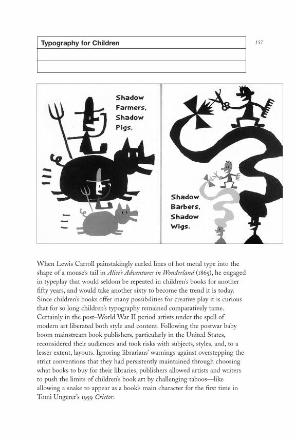
157Typography for Children
When Lewis Carroll painstakingly curled lines of hot metal type into theshape of a mouse’s tail in Alice’s Adventures in Wonderland (1865), he engagedin typeplay that would seldom be repeated in children’s books for anotherfifty years, and would take another sixty to become the trend it is today.Since children’s books offer many possibilities for creative play it is curiousthat for so long children’s typography remained comparatively tame.Certainly in the post–World War II period artists under the spell ofmodern art liberated both style and content. Following the postwar babyboom mainstream book publishers, particularly in the United States,reconsidered their audiences and took risks with subjects, styles, and, to alesser extent, layouts. Ignoring librarians’ warnings against overstepping thestrict conventions that they had persistently maintained through choosingwhat books to buy for their libraries, publishers allowed artists and writersto push the limits of children’s book art by challenging taboos—likeallowing a snake to appear as a book’s main character for the first time inTomi Ungerer’s 1959 Crictor.
DL2 03 07/13/04 2:53 PM Page 157

As for design, in the nineteenth century a page of text wasroutinely set as a tightly leaded block, sometimes relieved by an initial capor spot illumination. Picture and alphabet books, though graphically moreexciting, were nonetheless typographically subdued to avoid distracting thechild. For a brief period during the 1920s children’s books were transformedby the modern revolution. Lazar El Lissitzky’s suprematist classic, Of TwoSquares (designed in Vitebsk in 1920 but first published in Berlin in 1922),which was based on his famous political poster, Beat the Whites with the RedWedge, was the first break from traditional children’s layout and content.According to N. Khadzhiev in a 1962 essay “El Lissitzky Book Designer”(reprinted in El Lissitzky, Thames and Hudson, 1968), it was the first timethat the artist applied the revolutionary typographic language that he wouldlater use in adult-oriented ads and brochures. Of Two Squares used onlysymbolic abstract forms, or what Lissitzky called “elementary means,”rather than representational narrative devices. Lissitzky wrote that heintended to engage all children in a thrilling game: “Don’t read the story,take paper sticks, your building bricks, and put it together, paint it, buildit.” The book flows like a comic strip or film. “All the frames are linked by the uninterrupted movement of simple related figures in a sequencewhich ends in the final chord of the red square,” explained N. Khadzhiev.“The words move within the fields of force of the figures as they act: theseare squares, universal and specifically plastic forces are brought forthtypographically.”
Of Two Squares inspired Kurt Schwitters, Käte Steinitz, and TheoVan Doesburg’s The Scarecrow (Aposs-Verlag, 1925), in which the letters B,O, and X are characters of the comic story about a pitiful scarecrow who isunable to scare anything and runs afoul of a farmer. These witty typecaseanthropomorphisms, a shift from naturalism to symbolism in children’siconography, tested the limits of visual and textual comprehension. Like OfTwo Squares, The Scarecrow was originally derived from adult typographicexperiments, in this case Schwitters’s own Merz nonsense poems. TheScarecrow was certainly in Lissitzky’s mind when in 1929 he designed hissecond children’s book, Addition, Subtraction, Multiplication, Division, inwhich capital letters were transformed into bodies and limbs of a factoryworker, farmer, and Red Army soldier, each a symbolic component of Sovietsociety used as mnemonic tools to teach arithmetic. “This is how to useletters to put together every kind of arithmetical method—try it yourself!”Lissitzky commanded his readers. This book, however, was never publishedand only the dummy remains. Following Lissitzky’s inspirational path, PietZwart created Het Boek Van PTT in 1938 to inform children about theDutch postal, telephone, and telegraphic company (PTT). Full-color
DL2 03 07/13/04 2:53 PM Page 158

photomontages, three-dimensional objects, and necklaces of typographicmaterial were combined in an anarchic but decidedly transparent step-by-step instructional guide that was as playful as it was sophisticated.
This typographic revolution did not, however, make an impact onthe conventions of children’s book publishing because the books were notprinted in large enough quantities and generally landed on the shelves ofcollectors rather than children. James Fraser, editor of Phaedrus: An Annualof Children’s Literature Research, said there was also a lack of interest in theseavant-garde experiments among average readers: “I used to find ex-librarycopies of the avant-garde experiments in surprisingly very good condition,while copies of the standard text and picture books were tattered andworn.” Indeed for substantive change to have occurred a radical shift inadult design conventions would have been necessary, which even during the1920s when experimental design was at is zenith did not affect thechildren’s book genre. Educators maintained rigid standards over howchildren were to be taught, and children’s librarians generally decided whichbooks were suitable to that task. Adults determined the conventions thatgoverned the content and design of picture books for prereaders,picture/story books for young readers, and illustrated novels for olderreaders. Illustration was either realistic or fanciful, typography wasstraightforward and legible—any deviation from these norms was termedinappropriate. Neil Postman writes in The Disappearance of Childhood(Delacorte Press, New York, 1982) that “a particular form of information,controlled by adults, was made available in stages to children in what wasjudged to be psychologically assimilable ways.” Until the advent oftelevision (and now, increasingly, digital media) the printed book was thevessel in which this information was stored and distributed; its presentationhas, therefore, always been controlled by adult assumptions about what bestsuited children. Left unchallenged, many assumptions were further adoptedas marketing truths.
By the late 1930s children’s book design was in a few instancesinfluenced by the New Typography in the form of sans-serif typefaces inasymmetrical compositions. In The Noisy Book (Harper Brothers, 1939) byMargaret Wise Brown, machine-inspired Futura set with skewed linebreaks approximated the sounds of household appliances and largermachines. Yet during the 1940s and 1950s forums of the American Instituteof Graphic Arts codified standards of legibility for children’s books towhich most publishers adhered. Readability was vigilantly preserved, andchange in children’s book typography during the early postwar era wasmarked by little more than the occasional switch from typefaces like Jansonor Garamond to Futura or Akzidenz or Grotesque rather than adoption of
DL2 03 07/13/04 2:53 PM Page 159

constructivist, dadaist, and futurist experimental typography. Picture bookswere usually composed of classical book types that were rarely integratedinto the art. Even an avant-garde masterpiece like Bruno Munari’sAlfabeteire (Giulio Einaudi, editor, 1960), with illustrations that are dada-like collages of “found” letters, the sans-serif body text is discretely set apartfrom the images.
Yet certain anomalies did influence the field: Funny Folks fromGardentown (Whitman, 1938) by Tony Fraioli sidestepped typographicconvention with quirky hand-drawn letterforms that complemented hiswitty anthropomorphic drawings of fruits and vegetables set against blackbackgrounds (which, incidentally, librarians considered lugubrious). Hand-drawn letterforms subsequently became more common (although blackbackgrounds have not). Cursive lettering for The Story of Babar, the LittleElephant (1933) was once criticized for being inaccessible to young readerswho were unable to decipher script. Yet referring to this and even earliercursive books dating back to the late nineteenth century, James Frasersuggested that “brighter children tried to puzzle it out or asked adults tohelp with difficult words until they got it.” Over time, handwriting becamea common means to teach script. Typewriter type, another un-childlikeletterform, was associated with the adult world until Typewriter Town (E. F.Dutton, 1960) by William Jay Smith, a playful experiment using thetypewriter characters to create images. Influenced by Lewis Carroll’smouse’s tail, it was also consistent with contemporary typewritten concretepoetry for adults. In Little 1 (Harcourt Brace, 1962) by Paul and Ann Rand,typewriter type was boldly used to complement the improvisational collagesand rhythmic text. As an integral part of the book’s visual personality it alsomade typewriter type more acceptable.
From the 1950s to the 1980s children’s book design was largelyovershadowed by developments in children’s book art. Even books byprogressive artists Maurice Sendak, Tomi Ungerer, and Leo Lionni did notunhinge typographic convention. “Typography should be seen and notheard, because reading is functional and should not be tampered with,” saidLionni, whose more than forty books are set only in Century Schoolbook.He insisted that the defining element of a picture book is the picture, notthe type. “The picture is the story, the type conveys the narrative.” Yet thisbegan to change in the late 1980s when type design became more integralto the entire children’s book as the author/illustrator became more of anactive participant in the design process and the computer forced thewidespread reevaluation of typographic principles in all print media. In thelate 1970s, experimental typography gave adult-oriented printcommunications more playful veneers; constructivist, futurist, and dadaist
DL2 03 07/13/04 2:53 PM Page 160

161Peignot
A. M. Cassandre
Once upon a time Paul Rand used threestylish lowercase letters on a posterpromoting winter sports. This solitary word,ski, was the first time that the typefacePeignot was used in the United States. It was1938 and it was the last time Rand would everuse it, but Peignot became one of the mostpopular letterforms of the 1930s and 1940s. Itwas an emblem of the age, a reflection of theParisian moderne style.
Peignot, designed by poster artist A. M. Cassandre (1901–1968), still hascurrency as a display letter and is sometimesused to evoke the art deco period of the late1920s to mid-1930s. Peignot was a quirkysans-serif face notable for its thick and thinbody and the use of upper-case letters in itslowercase form. The typeface is famous forboth its style and versatility, and its designer is well known for hissignificant contributions to the history of the poster, but little is knownabout the man for whom the face was named, Charles Peignot, or hisinfluential Parisian type foundry, Deberny & Peignot. This is a case wherethe typeface is more than a mere letterform, it is a monument.
The history of graphic design usually focuses on the artists whoproduced the most visible and viable work, not the so-called vendors.While Cassandre’s designs are celebrated, the catalyst or patron whoencouraged, published, and paid for the work goes largely unheralded. Thisis the fate of Charles Peignot, who at one time employed Cassandre andother leading European designers including Herbert Matter, AlexeyBrodovitch, and Charles Loupot. Peignot was to modern graphic designwhat Ambroise Vollard was to modern printmaking. He was not simply themanager of a successful type business, he was the embodiment of Frenchtypography for more than five decades. An arbiter of taste, a courageousexperimenter, an adventuresome publisher, Peignot brought what one of hiscollaborators, the type designer Maximillen Vox, calls a “Gallic-Roman”design attitude (rooted in constant change) to the Anglo-Saxon world.
DL2 03 07/13/04 2:53 PM Page 161

Hence, Peignot’s legacy is a virtual timeline of typography, technology, andmodern graphic design.
In the 1920s the future of an international typography rested inGerman experiments. Paul Renner had designed his seminal Futura, thegeometric sans-serif that became the emblem of modernity. Understandingthis, Cassandre and Peignot began investigations that led step by step tothe Peignot typeface (named by Cassandre). The face was the offspring oftwo spiritual parents: the Bauhaus and the Renaissance. After many falsebirths, Cassandre and Peignot concluded that it would be pretentious tothink of creating a completely new face and decided to work alongtraditional lines, while at the same time avoiding copies of what had beendone. “Copying the past does not create a tradition,” wrote Peignot.Cassandre had the idea of going back to the origins of letterforms. “Wasthere not something to be learnt from the semi-uncials of the MiddleAges?” queried Cassandre. “The idea of mixing the letterforms of capitalsand lowercase seemed to us to contain the seed of new developmentswithin traditional lines.” The result was a mixture of letters, which Peignotknew would take the public some time to adjust to.
In 1937 Peignot was launched in a spectacular way as the “official”typeface of the World Exhibition in Paris. It had been chosen by Paul Valéryfor inscriptions on the two towers of the Palais de Chaillot. A fabricatorproduced cardboard stencils for making complete alphabets, and these wereused for many mural inscriptions on the exhibition stands. The response tothe type was overwhelming. And like a proud father, Peignot kept tabs onits use to such an extent that weeks after Paul Rand’s Ski poster was issued,Rand received a telegram of thanks, signed Charles Peignot.
DL2 03 07/13/04 2:53 PM Page 162
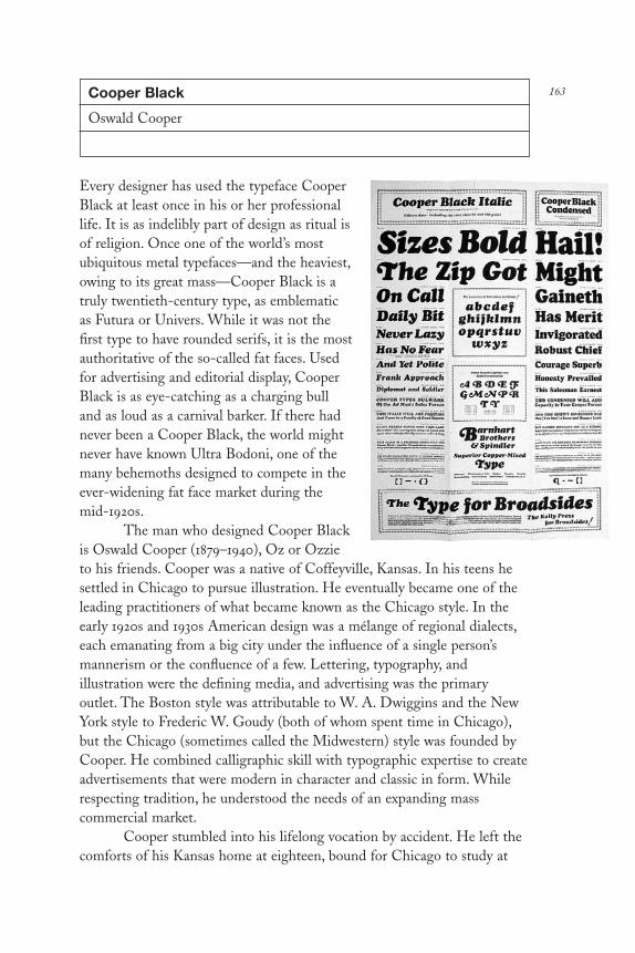
163Cooper Black
Oswald Cooper
Every designer has used the typeface CooperBlack at least once in his or her professionallife. It is as indelibly part of design as ritual isof religion. Once one of the world’s mostubiquitous metal typefaces—and the heaviest,owing to its great mass—Cooper Black is atruly twentieth-century type, as emblematicas Futura or Univers. While it was not thefirst type to have rounded serifs, it is the mostauthoritative of the so-called fat faces. Usedfor advertising and editorial display, CooperBlack is as eye-catching as a charging bulland as loud as a carnival barker. If there hadnever been a Cooper Black, the world mightnever have known Ultra Bodoni, one of themany behemoths designed to compete in theever-widening fat face market during themid-1920s.
The man who designed Cooper Blackis Oswald Cooper (1879–1940), Oz or Ozzieto his friends. Cooper was a native of Coffeyville, Kansas. In his teens hesettled in Chicago to pursue illustration. He eventually became one of theleading practitioners of what became known as the Chicago style. In theearly 1920s and 1930s American design was a mélange of regional dialects,each emanating from a big city under the influence of a single person’smannerism or the confluence of a few. Lettering, typography, andillustration were the defining media, and advertising was the primaryoutlet. The Boston style was attributable to W. A. Dwiggins and the NewYork style to Frederic W. Goudy (both of whom spent time in Chicago),but the Chicago (sometimes called the Midwestern) style was founded byCooper. He combined calligraphic skill with typographic expertise to createadvertisements that were modern in character and classic in form. Whilerespecting tradition, he understood the needs of an expanding masscommercial market.
Cooper stumbled into his lifelong vocation by accident. He left thecomforts of his Kansas home at eighteen, bound for Chicago to study at
DL2 03 07/13/04 2:53 PM Page 163

the Frank Holme School of Illustration. There he was inspired by hislettering teacher, Frederic W. Goudy, to pursue a broader practice. Goudy,the most prolific of all American type designers and director of Holme’stypographic department, befriended Oz and helped him earn his tuition byassigning him jobs setting type for correspondence course booklets. Thiswas a happy career move since Cooper had realized that he wasn’t verygood at drawing pictures but had a real knack for the lettering arts. Soonhe was appointed as a lettering teacher.
While teaching at Holme, Cooper met a young man, Fred Bertsch,who ran an art-service agency next door to the school. Bertsch lovedCooper’s work and in 1904 they entered into the perfect partnership;Bertsch, a consummate salesman, and Cooper, the gifted artist, formedBertsch & Cooper with the goal of establishing a full-service typeshop,including typesetting, layout, copywriting, and design. But opening atypeshop was expensive even then; and while they had plenty of ambition,money was in short supply. As a small studio Bertsch & Cooper based itsinitial reputation on hand lettering for small local jobs and later largenational campaigns. Eventually, their financial success allowed them toopen the full-service shop they had dreamed of, which gave Cooper theopportunity to test his other talents. “Cooper, of course, had brilliantcapacities as a craftsman in the field of printing and of advertising layout,”wrote typographer Paul Standard in The Book of Oz Cooper (The Society ofTypographic Arts, Chicago, 1949). “But in his endowment was also a giftfor language, and through its discipline a power of clear and forthrightexpression . . . his text sought to persuade, not stampede.”
The quality of Cooper’s lettering was equal to the strength of hiswriting. Cooper’s letterforms were not simply novelties, but “lessons instructural form, in free and friendly balance,” wrote Standard. Coopercreated as many new designs as he could, yet he had an instinctual distrustof things superficially modish and conceptually strained. “Types toodexterous, like tunes too luscious,” he once waxed, “are predestinated [sic]to short careers. If William Caslon had improved his types as much as theyhave since been improved by others they would not have endured, for sleekperfection palls on the imperfect persons who buy and use type.”
Actually, Cooper stumbled into type design almost as accidentally ashe did lettering. His first type was drawn and cut, unbeknownst to Cooperand without his permission, in 1913 by one of Morris Fuller Benton’s staffartists at American Type Foundry (ATF). Cooper had routinely createdcustomized lettering in advertisements for one of Bertsch & Cooper’s largestclients, the Packard Motor Car Company. The ads were so widely seen thatthe lettering caught Benton’s eye. Type pirating was a fact of life and ads
DL2 03 07/13/04 2:53 PM Page 164

were neither signed nor attributed to any artist. Benton immediately orderedthe type redrawn and founded in metal, and called it Packard. But Bentonwas also a man of integrity; when he learned that the original was designedby Cooper he paid a fee and attributed the design to him.
Shortly afterward, Barnhart Brothers & Spindler Type Foundry(BB&S), America’s second largest, approached Cooper to design acomplete family based on his lettering. Cooper did not immediately acceptthe offer, reasoning that he was first a lettering artist, not a type designer,and he was very busy with his own business. Bertsch, however, was not onlyCooper’s partner but his biggest promoter and worked feverishly to getCooper into the limelight. Bertsch called Cooper the “Michelangelo oflettering,” and urged him to accept BB&S’s offer. In 1918 Cooper’s firsttypeface was released, named Cooper, and later renamed Cooper Old Style.
In the early 1900s typefaces were vigorously marketed to printersand type shops, often through ambitious type specimen sheets designedwith the same artistic flourish as period sheet music. BB&S wasparticularly aggressive and succeeded in popularizing Cooper’s first normal-weight roman (Cooper). They further made it the basis for a continuingfamily. The second in the series was the famous Cooper Black, the mostnovel of early-twentieth-century super-bolds. BB&S declared that CooperBlack was “the selling type supreme, the multibillionaire sales type, it madebig advertisements out of little ones.” Cooper responded that his inventionwas “for far-sighted printers with near-sighted customers.” Owing to itsnovelty, it caused commotion in certain conservative circles. “The slug-machine makers thundered against the black ‘menace.’ But the trend wason—the advertising world accepted the black in a thoroughgoing way andthe orders rolled up in a volume never before known for any type face,”wrote a type seller of the day.
Other related type designs followed in quick succession in whatbecame known as “the black blitz.” Cooper Italic was described by Cooperas “much closer to its parent pen form than the roman.” Cooper Hilite was made by the simple expedient of painting a white highlight on a black proof of Cooper Black, with patterns cut and matrices engravedaccordingly. “It’s good for sparkling headlines; it cannot be crowded like theblack, but must have plenty of ‘air,’” wrote Cooper. Cooper Black Italic wascompleted in 1926 to cash in on the swell in sales of Cooper Black. CooperBlack Condensed was designed shortly afterward to have twenty percentless heft and be generally more useful. A complete metal font of CooperBlack weighed almost eighty-three pounds (thank heavens for transfertype) and strained the back of many a typesetter, so the condensed versionwas thought to save on costly chiropractor bills.
DL2 03 07/13/04 2:53 PM Page 165

Cooper’s designs initiated trends, but he refused to take part in “theitch of the times.” Nor was he a fan of what in 1928 he called “the balmywing of modernism.” However, his last face, designed in 1929 for BB&S,originally called Cooper Fullface and later changed in ATF catalogs toCooper Modern, was, in fact, consistent with the dominant styles. Of thisface Cooper wrote, “This style, lately revived by the practitioners of the‘modernistic’ typography, has created a demand for display letters thatcomport well with it—letters that reflect the sparkling contrasts of Bodoni,and that carry weight to meet the needs of advertisers, Cooper Fullface issuch a letter.”
In the 1930s Cooper curtailed his type design, and before his deathin 1940 he turned his attention to protecting what he had created. Fightingfor copyright protections for himself and all designers, he tried to convincethe government that patents should be awarded for typefaces. He chidedhis colleagues about copying, too. Copying is shameful, he argued: “Towork in the style of current trends or past periods is all right, but do it inyour own way. Study the work of the leaders, but never have another’s workbefore you when you are trying to create. There was never a greatimitator—not even in vaudeville. The way to become a master is bycultivating your own talent.”
DL2 03 07/13/04 2:53 PM Page 166
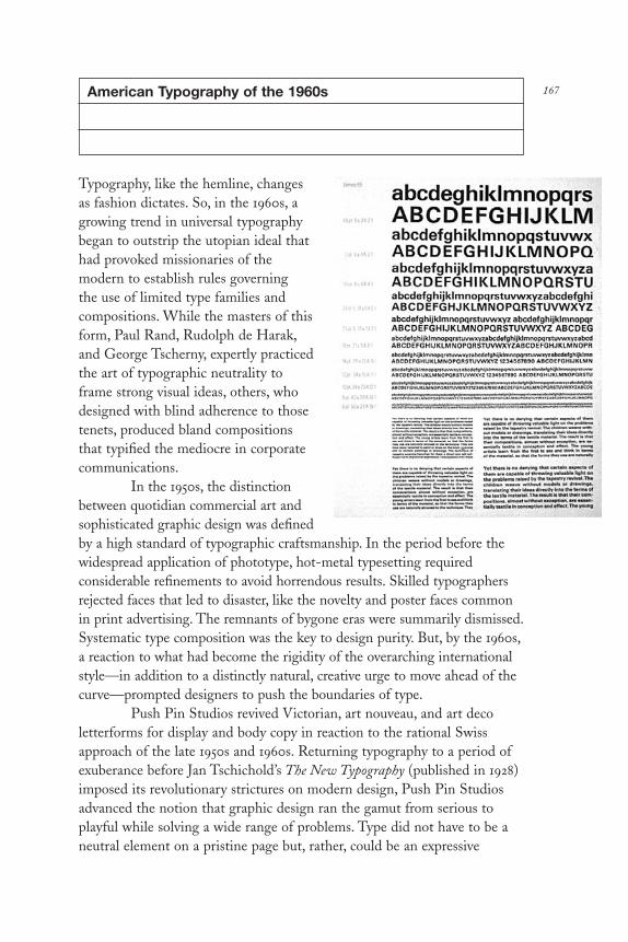
167American Typography of the 1960s
Typography, like the hemline, changesas fashion dictates. So, in the 1960s, agrowing trend in universal typographybegan to outstrip the utopian ideal thathad provoked missionaries of themodern to establish rules governing the use of limited type families andcompositions. While the masters of thisform, Paul Rand, Rudolph de Harak,and George Tscherny, expertly practicedthe art of typographic neutrality toframe strong visual ideas, others, whodesigned with blind adherence to thosetenets, produced bland compositionsthat typified the mediocre in corporatecommunications.
In the 1950s, the distinctionbetween quotidian commercial art andsophisticated graphic design was definedby a high standard of typographic craftsmanship. In the period before thewidespread application of phototype, hot-metal typesetting requiredconsiderable refinements to avoid horrendous results. Skilled typographersrejected faces that led to disaster, like the novelty and poster faces commonin print advertising. The remnants of bygone eras were summarily dismissed.Systematic type composition was the key to design purity. But, by the 1960s,a reaction to what had become the rigidity of the overarching internationalstyle—in addition to a distinctly natural, creative urge to move ahead of thecurve—prompted designers to push the boundaries of type.
Push Pin Studios revived Victorian, art nouveau, and art decoletterforms for display and body copy in reaction to the rational Swissapproach of the late 1950s and 1960s. Returning typography to a period ofexuberance before Jan Tschichold’s The New Typography (published in 1928)imposed its revolutionary strictures on modern design, Push Pin Studiosadvanced the notion that graphic design ran the gamut from serious toplayful while solving a wide range of problems. Type did not have to be aneutral element on a pristine page but, rather, could be an expressive
DL2 03 07/13/04 2:53 PM Page 167
voice—a means of giving the written word character and nuance. This was made possible by the shift toward phototypesetting, which, in turn,encouraged typographic revivals. So by reintroducing passé commercial art styles and reviving forgotten letterforms, Push Pin introduced anindividualistic typographic language rooted more in graphic ornament thanprecisionist grids.
Late modern typography, distinguished by the clean and simplecompositions of both classical and modern typefaces, was changing thelook of advertising from chaotic to eloquent and at the same time was moreexpressive too. Through Westvaco’s Inspirations, Bradbury Thompsonpromoted “talking type.” By tweaking traditional letterforms into visualpuns, typeset words became both verbal and visual. This concept wasfurther pursued by Robert Brownjohn, who imbued letters with sound andmotion, making them visual components of a word or phrase. IvanChermayeff made otherwise static type appear kinetic in a printprefiguration of today’s on-screen typography. The letterform as pun wasfurther tested in advertising layout by Gene Federico, Lou Dorfsman, andHerb Lubalin. With precision, Federico made type and image into totalcompositions. Dorfsman used type not only to convey a message but also tobe part of rebuslike compositions. Lubalin exploited the type-as-sound ideaand further explored the sculptural eccentricities of letterforms to theircommunicative advantage. He demonstrated that the shape of letterssignified as much as their content; he would set excruciatingly tight lines oftext, smashing bodies together as if to animate the forms. For thesedesigners, typography was, in fact, illustration, sometimes complementingand often substituting for pure imagery.
As type directors and graphic designers were convinced to switch tophototype, typography became more stylistically and compositionally eclectic.The large variety of typefaces available on Typositor made typographicexperimentation more commonplace. Although the grid was still a sacrosanctelement of modern design, the liberties that designers were taking wasbeginning to affect the dominant ways of working. And, with the advent ofpsychedelic typography in the late 1960s, characterized by radical opticalexaggerations in historical faces from the Victorian and secessionist periods,it appeared that the language of typography was in for a reevaluation.
Typography in the 1960s was transitional, a word that connotesflux but not necessarily instability. The classical or orthodox modernsestablished a true standard for “good typography,” but standards ultimatelybeg to be challenged. The critical response of the revivalists and eclecticistswas an alternative that became yet another style. Bridging these groupswere those individuals who took from both extremes to create a designlanguage that became the quintessential expression of the times.
DL2 03 07/13/04 2:53 PM Page 168

169Hand Lettering
Joost Swarte
Style is not a four-letter word,yet it does imply superficiality,conformity, and a foolishenslavement to fashion. Themoderns condemned theseattributes as detrimental toclear and efficientcommunication. And althoughthe postmoderns reveled instylisms, they insisted thattheirs were not merely fads orfancies but rather necessary stimulants to ensure more engagingcommunications. The pendulum swings, and today the naysayers warn thatobvious style must be avoided because it relegates the designer to a prisonof the ancient or recent past. Hence, style is condemned as a tool ofobsolescence.
However, style is also a signature that need not be insincere orbankrupt. It can also be a cue for an underlying visual persona born ofcomplex aesthetic and conceptual issues. Remember, graphic design is asmuch about signaling a message to a receiver in a unique, sometimesidiosyncratic, way as it is about neutrally conveying ideas and information.When style is efficiently used, it serves as an identifier and entry point. Atits most successful, style modifies language as an accent indicating fromwhere and perhaps from whom the message derives.
As style goes, the graphic narratives and distinctive hand-letteredtypography by Dutch designer, illustrator, and cartoonist Joost Swarte (b. 1947) is a tapestry of twentieth-century influences as viewed through avisionary’s lens. Swarte’s style draws directly from one of the century’s mostornamental epochs, between the 1920s and 1930s, when art moderne (or artdeco) reigned supreme as a commercial alternative to utopian modernism.But Swarte’s interpretation of these fundamental modernistic attributes,among them rectilinear letterforms and ziggurat/sunburst printers’ornaments, are adapted as elements of a personal vocabulary. Swarte’sroutine references to the past are so consistent that his ownership isundeniable. Despite déjà vu among those who know the origin of his mostcommon hand-lettered faces, over the course of his development they have
DL2 03 07/13/04 2:53 PM Page 169

become inextricably wed to his own hand. Letters that were used over halfa century ago are revived not simply for the sake of pastiche but rather toexpress his own aesthetically playful urges.
Swarte’s is a seamless weave of both moderne and comic influences.His work is multidimensional and relies on letterforms to complement hisnarrative drawings. Regarding the latter, the influence of the simplelinearity of the cartoon character Tintin by the Belgian artist Hergé is mostapparent. “In the beginning I drew in Hergé’s style to study how he did itand I found it suited me well because I could draw so many details inarchitecture and objects,” explains Swarte, with a nod to his passion forbuildings and ephemeral design objects. Swarte coined the term “clear line”to describe Hergé’s approach and his own. Yet he is quick to affirm that theline alone is only a means to achieve an end.
Swarte uses lettering and line drawing like personal speech. Hissingular vision emerges through a combination of dramatic, witty, andabsurd comic images within a total narrative. As a designer, he enjoysartifacts of the past, but as storyteller he starts from zero. And where hediverges from his main influence is clear in this statement: “Hergé tries totake the reader to the real world, I take the reader into my world.”
The galaxies for Swarte’s world are comic strips, children’s books,record covers, posters, wine labels, shopping bags, ex libris, magazinecovers, postage stamps for the PTT (the Dutch postal service), andarchitectural interiors. He has published his own comics magazinesincluding Tante Leny (Aunt Leny), and Vrij Nederland (Free Netherlands);in addition, he served as a contributor to Submarine (a Belgiancounterculture journal), Charlie (a French humor paper), Humo (the BelgianTV and radio guide), the Dutch comics magazine Jippo, and RAW, throughwhich he was introduced to the American public. Whether a publicationcontains an exclusive collection of his work or the occasional contribution,there is no mistaking a “Swarte” for the work of any other artist. Stylecombined with conceptual mastery are his virtues.
Swarte’s style is ultimately secondary to the tales he tells. Sixstories originally published in Charlie, for example, are collected in the 1979book Modern Art, of which the title story is a satire on the nature of styleand art. It stars Anton Makassar, one of Swarte’s cartoon alter egos aboutwhom Swarte says: “As always with comics, you invent your character outof your character so that parts of yourself come out of a character inextremo.” Another Swarte stand-in is the character Jopo de Pojo (he chosethe name because it sounded so pleasing), who reflects Swarte’s shy andisolated side, while Makassar (named after the city in Indonesia) suggeststhe artist’s self-proclaimed professorial side. “He is a bit of an inventor. He
DL2 03 07/13/04 2:53 PM Page 170

always comes up with crazy ideas, and is proud of himself. That’s me, too.”The third part of the personality puzzle is Pierre Van Ganderen (which,translated, means “of simple mind”). “He is a working man who does whathe has to do, who is a bit childish and sometimes naïve.”
Swarte is not wed to conventional cartoon situation comedies but,rather, varies his story lines as much as he pushes the technical boundariesto transcend any hint of nostalgia. For example, although the adventures ofMakassar resemble 1920s comic artist George McManus’s “Bringing UpFather,” it is clearly synthesis not revival. “A young artist must grow out ofthe past to build up a solid background,” he says. “But one must find one’sown way out of nostalgia and stop looking too much over the shoulder.”When 1930s type design and early-twentieth-century cartooning converge,a certain timelessness is evoked. Of Swarte’s mastery, Art Spiegelman,former RAW editor/publisher, explains that he “has a refined visualintelligence wed to a sense of humor and history. He experiments within atradition, and is always trying things that are so daring yet made so simplethat by the time they are accomplished it looks so easy that it betrays thecourage involved.”
Every part of Swarte’s lettering and drawing is meticulouslyrendered. His clear line may be reduced to the necessary strokes, but his images are flooded with ideas. Ironically, in an era when coarse,expressionistic art brut is in vogue, Swarte’s circumspect precisionism isoften called retro. Yet attention to detail is not stylistic conceit, it istimeless.
DL2 03 07/13/04 2:53 PM Page 171

Mrs Eaves
Zuzana Licko
For those who experienced firsthand the digital-type revolution that beganin the mid-1980s, it was nothing short of liberating. For the first time sinceGutenberg, the means of creating complete alphabets for repeated text anddisplay application was not limited to rarefied specialists but was availableto anyone possessing a little beige box called a Macintosh—anyone, that is,inclined toward letter design. At first the characters made for the computerscreen were blocky and bitmapped, as if they were boxes inked on graphpaper, which indeed they were in the digital sense. The constraints imposedby nascent computer software, seventy-two-dot-per-inch computer screens,and dot matrix printers gave rise to letterforms that were both functionaland aesthetically limited. Nonetheless, the very idea that designers couldcompose and create their own type spurred an initial frenzy for customalphabets that ranged from sublime to ridiculous.
172
DL2 03 07/13/04 2:53 PM Page 172

One of the pioneers of the new fontography is Zuzana Licko (b. 1961), who started designing typefaces in 1985 for use in Emigre, thehomespun culture tabloid founded in 1983 by her husband Rudy Vander-Lans (b. 1955), a former page designer for the San Francisco Chronicle.Designing on the early Macintosh before the advent of sophisticated page-layout programs, WYSIWYG, and Hypercard was itself a feat of ingenuity,but seeing beyond computer limitations required a vision born of thatproverbial mother—necessity. Licko’s plunge into the design of coarse-resolution type was prompted by a need to overcome the conformity ofMac default faces and to create a distinct identity for the fledglingmagazine (not, at that time, recast as the clarion of postmodern graphicdesign, which is its legacy today). What Emigre became for graphic designculture is underscored by Licko’s contribution to the history of digital-typefounding; the Emigre venture proved trailblazing on two fronts. Licko’searly designs—including her initial typefaces (c. 1985) called Emperor,Universal, Oakland, and Emigre—further helped launch the unique typebusiness Emigre Graphics (later Emigre Fonts), which spawned today’sindy digital-type industry.
Licko’s education in graphic design and typography (she received aB.A. from the University of California at Berkeley) included one course incalligraphy, which, as she recalls, “was nightmarish” because the instructorinsisted that calligraphy could be done properly only with the right hand.Licko has what she calls “the gift of being left-handed,” and so she did herhomework assignments with her left hand while pretending to use her rightduring class time. She admits that “the results were awful!” and, ultimately,she rejected calligraphy entirely. Nevertheless, Licko recalls that she marveledat the functional beauty of typefaces while studying graphic design. “I wasblown away when I realized the power that typeface designs have on atypographic piece of design. Without touching the layout, [just] change thetypeface design, and voilà! you have a completely different design.”
However, the process of designing typefaces remained a mysteryuntil Licko laid hands on her first Macintosh. “As it turns out, bitmap fontswere the perfect place for me to start learning about type design because Ilove the building-block approach,” she says, referring to the puzzlelike way inwhich letterforms were constructed by linking squares (or bits) together.From that moment on, her experience and skill with more sophisticatedtypeface designs evolved at a pace commensurate with the Macintosh’s abilityto produce more complex font programs. However, when she began using hernew Macintosh for Emigre, mastering the new tool, not sophistication, wasthe primary issue. She continues: “As graphic designers, we enjoyed thenewfound ability to test and implement the faces directly within our design
DL2 03 07/13/04 2:53 PM Page 173

work.” Of course, the results were primitive and decidedly of the moment.Yet, at the moment, few could predict whether or not Mac-generated bitmaptype would slowly wear thin. Eventually, a new standard emerged.
Within what then seemed like the blink of an eye, theintroduction of high-resolution PostScript outline technology enabledLicko to develop several high-resolution designs based upon her earlierbitmaps, including faces called Matrix, Citizen, and Lunatix. Althoughthese were based fundamentally on classical forms, given the computer’slimited memory, Licko had to compensate by limiting the characteristics ofeach face to the bare essentials. Thus even the most traditional-lookingface, such as Matrix, retained sharp edges that gave it the appearance of astone inscription on the one hand and a novelty form on the other.
For Licko, overall appearance was less important than how a facefunctioned within technological constraints. Her mission at the time was towork within limitations, which meant that her faces took on certaincharacteristics endemic to the computer, which, in turn, caused an alternateappearance in layouts that used the faces. Incidentally, in 1999, she revisitedand successfully reworked some of her early bitmap ideas through newfonts called Base 9 and Base 12, which offer compatible screen and printerfonts to solve the current dual need of low-resolution screen display andhigh-resolution printing with an integrated typeface design.
Licko’s inspiration usually comes from the particular medium thatshe’s involved with at any given time (and the needs posed by thatmedium). “I search out a problem that needs to be addressed or a uniqueresult that a production method can yield, such as my early experimentswith bitmaps, and later purely geometric forms.” The results were faces thathave become emblematic of the digital epoch. “My latest interest increating somewhat more traditional text faces,” she continues, “is a result ofEmigre magazine’s increased publishing of in-depth articles, which requirefonts appropriate for lengthy text setting.”
Having one’s own magazine to design typefaces for offers untoldadvantages. Most type designers create faces on commission for apublication or an institution, with little opportunity to make certain thatthey are truly seaworthy; some produce speculative faces for others tosample, thus ceding control of the typography. But with the opportunity toactually flow new type into a vessel such as Emigre for testing in layouts by asympathetic designer (in this case, VanderLans), Licko has been allowed tocheck the tolerance of her work under the stress of real-world conditions. Inturn, Emigre has been the ultimate proving ground and specimen sheet.
For the first decade, when Emigre was a hothouse, Licko (andother designers) showcased often quirky work. But when the size of Emigre
DL2 03 07/13/04 2:53 PM Page 174

decreased with the thirty-third issue (winter 1995) from a luxurious tabloidto a standard magazine format, and when the content switched from highlyvisual to heavily text, a changed occurred for Licko and Emigre. Lickorelays: “We needed a typeface appropriate for lengthy text setting; thispresented the opportunity to take on the challenge of doing a revival.” ForLicko, this was uncharted territory.
Revivals are common fare for most type designers, and the classicsare fair game for update, renovation, or rehabilitation. Type designers—acritical lot to say the least—are always finding flaws in original designs that“drive them crazy.” In Licko’s case, she became fascinated with Baskerville,the popular alphabet by the English founder John Baskerville (1706–1775),who influenced the “modern” designs of Didot and Bodoni but had hiswork severely criticized during and after his lifetime for being what typehistorian D. B. Updike referred to in Printing Types (Harvard, 1922) as“sterile.” “From personal experience, I could sympathize,” Licko wrote inher 1996 introduction to her own revival of Baskerville, the typeface MrsEaves (named after Sarah Eaves, the live-in housekeeper who becameBaskerville’s wife and later ran his printing business).
Originally revived in 1917 (owing to an interest by Bruce Rogers)and later reissued by Monotype and Deberny & Peignot, Baskerville oftenplays second fiddle to Caslon. But Licko selected it for its familiarity aswell as for its formal features. “Since Baskerville is a neutral and well-known design,” she explains, “it allowed me significant leeway in theinterpretation, while retaining the familiarity of a classic.” Baskerville wasalso chosen because it is the ultimate transitional typeface, the categorybetween old-style and modern types. Licko states: “I ruled out old-stylemodels for the idiosyncratic reason that I’m personally not attracted totypefaces which are reminiscent of calligraphic influences (probably for theopposite reason why calligraphers tend to dislike bitmap or geometricdesigns).” She adds that “an old style would not have been a natural choice,given my experience and sensibilities.” Her subsequent revival was Bodoni,but for Emigre’s first-ever text revival, Licko wanted to avoid the austerityof the thick and thin strokes of early modern design.
Revivals are curious beasts. A designer is usually faced with thedilemma of either making minor adjustments or radical renovation.Arguably, the former is what the originator might have done if technologyor other factors were different; the latter challenges the dotted line betweenfealty and reinvention. Licko says that there are no conventional limitationsbecause every type designer brings his or her own perceptions to aparticular face. And, about her own effort, she admits: “Perhaps somewould say that Mrs Eaves is far removed from Baskerville’s basic model and
DL2 03 07/13/04 2:53 PM Page 175

may question it being a true revival. The fact that Mrs Eaves is not aslavish replica is one of the reasons why we chose an original name, ratherthan calling it Emigre Baskerville.”
Revivals are, of course, about critical reevaluation and thenchange—in perception, typographic needs, or technology. Licko notes that“the idea of fixing, or improving, a classic is relative to usage. Sometypefaces are more appropriate for certain uses than others and some mayhave a wider use than others, but there is no absolute measurement fortypeface designs that calculates good versus bad.” The fixing done to aclassic typeface that makes it suitable for one use may make it less suitablefor another. Moreover, adds Licko, “A revival also exemplifies theidiosyncrasies of the type designer doing the revival. If two designers do arevival of the same typeface, each designer’s interpretation will be unique,based upon . . . relative sensibilities, vision, and skill.”
With Mrs Eaves, Licko’s point of departure was one of the mostcritiqued characteristics of Baskerville’s original—the sharp contrastbetween stems and hairlines, which naysayers in his day believed was ahindrance to legibility. Licko wanted to understand the criticism, if not aswell disprove it, so she opted to “explore the path not taken. After all, thesharp contrast evidenced in Baskerville was new at the time of its creationdue to recent developments in printing and papermaking technologies. Inhis pursuit of ‘perfect’ printing, John Baskerville developed ultrasmooth andbrilliant white papers, as well as intensely black printing ink.” Ultimately,Licko’s analysis forced her to conclude that she should retain the overallopenness and lightness of the face. So she reduced the x-height, relative tothe cap-height, which gives Mrs Eaves the appearance when set of beingone point-size smaller than it really is. In roman, bold, italic, small, andpetite caps, Mrs Eaves is a very readable face that is also quite elegant, notunlike a hot-metal impression. It turned out to be one of Emigre’s best-selling font packages ever.
Crossing over from “original” to revival, Licko learned anunexpected lesson. “I’ve found that doing a revival is in many ways easierthan designing a typeface from scratch. Because the fine details, which canbe very time-consuming, are prescribed by the model, there are fewerstumbling blocks in the development.” Of course, she continues to pursuenew designs as a means of exploring the unexplored. But her subsequentrevivals have given her the opportunity to study and better understand thedetails that she would never fully appreciate by merely observing, studying,or using the typeface. In light of Mrs Eaves, Licko asserts: “In subtle ways,a revival forces me to accept certain design decisions that I would not havemade myself, to integrate a different way of thinking.”
DL2 03 07/13/04 2:53 PM Page 176

177Pussy Galore
Teal Triggs, Liz McQuiston, and Sian Cook
During the late 1960s, when thefeminist movement was in fulltilt, two women writers knownfor their satiric essays in Bitch, aNew York–based undergroundnewspaper that they edited,decided that the Englishlanguage was the principal toolof male oppression againstwomen. Therefore, theirpublication would not includeany word that had a gender-specific prefix or suffix, such as“man” or “son.” Instead, theneutral word “one” wassubstituted so that the word“person” became “perone,” andthe word “woman” (which theydeemed was most subjugated ofall words) became “woperone.” They applied the new spelling to commonnongendered words as well, like “many” (peroney), “season” (seapone), and“manifold” (peronefold), which forced readers to examine the so-calledmasculine dominance in the English language. However, the editorsultimately admitted that these linguistic alterations were unwieldy in theirown writing, and after an issue or two they reverted back to standard spellings.
The point, however, was clear. Woperones were afforded second-class citizenship in ways that were matter-of-factly ingrained from birth inthe minds of both genders. And although certain habits, such as writtenlanguage, were not going to change overnight—or as easily as the popularacceptance of the alternative Ms. instead of Miss or Mrs. (which, in fact,did not happen overnight)—it was important to expose cultural and societalabsolutes that were prejudicial and detrimental toward women. Even if thespelling experiment was just a satiric exercise that reached a small numberof readers of an arcane alternative newspaper, it was a good lesson in howarchetypes and stereotypes are retained through inertia. It was also anindication that other confrontations were in the offing.
DL2 03 07/13/04 2:54 PM Page 177

Gender issues have not been ignored by the graphic designprofession—which prior to the 1980s was predominantly a men’s club andtoday is weighted more toward women in designer and design managementroles. Yet, although female graphic designers have increased their overallpresence and individual prestige within the field, few have used their designand communications skills to redefine or restructure visual language. Theeditors of Bitch realized that while it was not easy to alter basic lexicons, itwas important to raise fundamental issues about gender inequities that hadbeen simmering below the surface for ages.
Toward this end, yet with greater determination to make asubstantive (and educational) impact, members of a design collective inEngland called the Women’s Design and Research Unit (WD+RU)—founded in 1994 and including Teal Triggs (b. 1957), Liz McQuiston (b. 1952), and Sian Cook (b. 1962)—sought means of addressing continuinginequities within the design field. They targeted the once-arcane yet newlydemocratized digital realm of font design as both a forum and medium foraltering values and perceptions. They decided to create a font comprised ofsymbolic pictographs and word-bites that were engaged by usingconventional keyboard strokes. This, they hoped, would be an effective wayto both enter and engage the consciousness of users.
The resulting font, Pussy Galore, named after the bombshell heroine of James Bond’s Goldfinger film and memorably played by the actressHonour Blackman, was begun in 1994 and completed in early 1995 (althoughit continues to be somewhat open-ended in terms of final form). It wascommissioned by Jon Wozencroft, the editor of Fuse (the experimental-typemagazine published by FontShop International), for publication in Fuse 12:Propaganda (winter 1994), but only a portion of the entire typeface waspublished at that time due to a variety of technical reasons.
Pussy Galore, the fictional character, was what McQuiston andTriggs call a “femme fatale with a mission,” who maximized her sensualendowment as a tool of power rather than subservience. “She waswonderfully sexy and at the same time strong and in control,” says Triggs.“We hope by appropriating Pussy Galore as a term and typeface title that itwill get people to think twice not only about its use but also about otherwords that usually denote [the] negative. . . concerning women. We alsowanted to use language which celebrated women—hence the ambiguity ofthe term.”
So, whatever contemporary or nostalgic images or ideas that PussyGalore evokes in the minds of beholders—cocksmanship or Blackman’ssexual omnipotence—the font offers unique independent frames ofreference that reveal numerous myths about women. In this way, Pussy
DL2 03 07/13/04 2:54 PM Page 178

Galore is a “conceptual typeface” designed to help explore the roots ofmisconceptions about women propagated through contemporaryvocabularies of Western culture. As Triggs explains in Baseline: Issue 20(1995), “Pussy Galore is an ‘interactive tool’ which invites response andurges you to talk back, challenge, and reassess, not only [about] howwomen have been constituted by language, but also the structure oflanguage itself.”
Pussy Galore is not, however, a typical typeface—in fact,“typeface” may be the preferred description because it functions in relationto a keyboard but an inaccurate one because Pussy Galore bares no relationto a conventional alphabet. Rather, it is a clever commingling of OttoNeurath’s Isotype system of the 1930s and a sampling of printer’s cuts anddingbats. The pictographs and word pictures that comprise the PussyGalore font are fragments of narrative that individually serve as stop signsand, when fashioned together, as vehicles for various archetypes andstereotypes.
The keyboard is employed to create pathways in order for the userto make references and associations with the characters of the font. Itacknowledges the conventions of language (e.g., vowels, consonants, upperand lower case) and uses shift, option, and normal keys to launch functionsthat allow for additional layers of exploration. For example, conventional“level one” keyboarding of any word will render a string of ideologicalstatements (graphic picture boxes that frame such words or sayings as“sisters,” “rights,” “grrrls,” “mother,” “power,” “Thelma & Louise”).Progression through each additional keyboard level takes the user through ajourney into what Triggs describes as a multilayered web of associations andrepresentational sets of ideas about women, such as the following:
Level 1 normal = empowerment of womenLevel 2 shift = ugly stereotypesLevel 3 option = personal choicesLevel 4 shift+option = vulgar and sexual language
The complex layering of messages embedded in this font,including fragmented line drawings of the female anatomy, gives users thechance to make serendipitous juxtapositions through random access orspecific polemical statements by deliberate applications. Asterisks appear on selected icons/words indicating additional strata of information, such as textual quotes or images-sequences, which are accessed through otheroperating programs contained in the disc’s suitcase. Accessing thesealternative strata, the user is allowed to highlight, among other things, a
DL2 03 07/13/04 2:54 PM Page 179

selection of “Hidden Heroines” who have made important contributions toart, design, and film. In addition, other elements are likely to appearthroughout, including a witty animated sequence of women’s hands rangingfrom a revolutionary raised fist to a diamond-clad glove. Humor is aneffective mediator in the communication of Pussy Galore’s decidedlyideological messages.
Although Pussy Galore was created for an experimental designvenue, it is not intended for a visual elite of sophisticated graphic designersalone. The digital nature of the font is accessible to anyone with aminimum of computer savvy. It serves both as a graphics tool for those whochoose to integrate some or all of its forms into layouts or as a game ofdigital hide-and-seek for those who choose to uncover all the hiddenmessages. “Through the user’s ‘personalization’ of the typeface,” Triggsadds, “Pussy Galore’s aim of embracing democratization is underscored,removing any reliance upon ‘artistic’ sophistication which might render italien to popular use.” The “letterforms” have indeed been created as simpleshapes or pictograms for the user to reconstruct or redesign, and thepossibilities are numerous: Through certain keyboard configurations apicture of Eve’s snake might be juxtaposed to a floppy “dumb blonde”hairdo. Likewise, strings of characters or words develop accidentallydepending on the user, “but each connection is heavily charged withmeaning and value,” says Triggs. “In this way technology is used to helpusers assemble their own visual languages, bringing to the typeface uniqueexperiences, individual prejudices, and interpretations.”
It is not likely that Pussy Galore will be bundled with the iMac orany other personal computer, at least not in the near future. But there is noreason why it should not be. Although conventional wisdom might arguethat an essay in the World Book Encyclopedia (which is bundled on manycomputers) on feminism is a more straightforward method of conveyingfactual information, Pussy Galore’s interactivity ultimately invites morequestions and presumably greater engagement in the issues it raises. Whatbegan as an attempt to challenge typographic principles in an experimentalcontext has become a model of how new media encourages novel methodsof communication. “The old gal has fared really well!” Triggs concludes.“We are really surprised that Pussy Galore has taken on a life of its own.What is really satisfying is when we get correspondence from students inNew Zealand, Brazil, Mexico, and the United States who want to explorefurther the ideas we propose in research essays and in their own use of thetypeface. We always said if we reached just one student/designer, the wholeproject was worthwhile!”
DL2 03 07/13/04 2:54 PM Page 180

181ACME Comics Lettering
Chris Ware
Chris Ware is a scribe’s scribeand the producer of suchcontemporary illuminatedmanuscripts as JimmyCorrigan: The Smartest Kid onEarth, Rocket Sam, Big Tex,and the Rusty Brown comicstrips, as well as the ACMENovelty Library comic books.Cloistered away in his Chicagostudio, Brother Ware spendsuntold hours meticulouslylettering countless covers,splash panels, and dialog boxeswith such panache that evensimple conjunctions like “and,”“thus,” “later,” and “meanwhile” are imbued with the import reserved formore expressive bon mots. Like most comic artists, Ware is a compulsiveletterer, but unlike most, he is also an artful typographer who, for over adecade, has refined a unique typographic language that bridges comic artand graphic design.
During the 1990s, when a surfeit of stylishly distressed and oftenfoolishly stylish digital fonts were routinely issued, Ware crafted some ofthe most artful alphabets and colorful letterforms seen in print, most ofthem for his own comic books, but occasionally for less obvious venues too.One of these was the 2001 “Summer Reading” special issue of the New YorkTimes Book Review (under my humble art direction), for which heredesigned the otherwise immutable masthead, rejecting all traces of thestandard Bookman typeface to conform to the visual character of the comicstrip that began on the cover and continued inside. The only residue on thecover of official “Times style” was the Old English Times logo anchored tothe masthead, which Ware re-lettered to match a much older version of thelogo rather than the contemporary one.
This was not, however, arrogance or hubris on his part. In fact,Ware is one of the most sincerely unassuming artists I have ever known.Instead, he is so devoted to the most arcane details of vintage commercial art
DL2 03 07/13/04 2:54 PM Page 181

that he actually knew that the earlier Old English version (long obsolete) hadan iota more calligraphic flourish than the newer, ever-so-slightly streamlinedversion. Yet more importantly, he put in the extra effort (which isconsiderable when one is on a tight deadline) to render these intricate lettersby hand. And that’s not all. Throughout the interior of the Book Review,Ware used an original, quirkily curvilinear abstract display lettering style thattransformed the publication from its usual literary look into a typographiccarnival that transported the unaware readers some-WARE-else.
Indeed, Ware’s comics are so conceptually astute andcompositionally engaging that they cannot fail but connect with theiraudience. Among the key attributes of this connection, his sympatheticallymelancholy characters ( Jimmy, Rusty, and Quinby the Mouse amongthem), his nostalgically futuristic worldscapes, and his genius for conveyingsubtle time shifts in two-dimensional space are all components ofcompelling narrative. But it does not take a design critic to realize that hisingenious typography is equally (perhaps more) essential in enabling accessto an eccentric comic world that could otherwise be opaque. Ware’s variouslettering and typographic compositions, though they will never be mistakenfor the neutrality of Helvetica or Univers, exude a curiously universal allureand a timely timelessness, like that of a personal signature. Yet one will behard-pressed to find any of his custom (and nameless) faces in digital typefoundry specimen books.
Although Ware’s comics are receiving wide exposure these days(his critically praised 2000 book Jimmy Corrigan: Smartest Kid on Earthremained a bestseller two years after its release, and he was featured as theonly comics artist in the 2002 Whitney Museum Biennial in New York),his lettering is not for sale. Rather than being commercial property, his typeis a personal signature and each typographic confection stems from aprivate obsession. “A type company asked me to do some fonts a whileback,” Ware explains, “but I realized that seeing my lettering appear onbillboards and annual reports would be about the most horrifying thingimaginable. Besides, I don’t really think of my lettering as ‘fonts’; it’s moreor less circumstantial to the page on which it appears, and I try to let myinstincts shape how it looks.”
In addition to instincts, however, Ware is inspired by Victorian,art nouveau, and a multitude of nineteenth- and early twentieth-centurycommercial display styles, specifically from old sheet music, magazines,advertisements, record labels, and fruit and cigar labels. “I steal constantlyfrom all sorts of things,” he admits, “especially when something emotionallyaffects me, either for reasons of color, composition, letter style; sometimesit’s even something as simple as the ascender and descender width relative
DL2 03 07/13/04 2:54 PM Page 182

to each other. I’m sure that if I’d taken a class about this stuff, I’d knowmuch better why it all works the way it does, and I wouldn’t have to fumblearound in the dark so much.” Yet fumble, fiddle, or fidget, Ware has raisedhis lettering beyond mere pastiche into realms of reincarnation. Ware is averitable born-again “show card” letterer who, back before computers andphotostats, effortlessly rendered one-of-a-kind lettering for signs, windows,and displays.
Of course, all comic strip artists worthy of the art must be skilledletterers. But Ware acquired his skill long after he had been doing a regularstrip for the student newspaper in Austin. “Up to that point, I’d sort ofconsidered type and lettering secondary to storytelling, some kind ofadditive decoration, at best a sort of ‘mood setter,’ at worst, simply titles andlogos,” he explains. But once he began studying early twentieth-centurynewspaper strips (as well as later R. Crumb comix) Ware realized that theolder-style lettering radiated what he calls “a warmth and a humanity thatcontemporary lettering didn’t, and that it had a potential as a primary‘expressive element,’ if I can say that without sounding too academic.”
He was smitten by the hand-done quality of the old methods, andhe decided to learn the craft (or what he calls “the disposition, or whateverit was that made this old lettering so great”) himself. Since he had self-consciously eliminated all words from his own comics for a number of years(“to try and communicate everything through gesture and rhythm,” heexplains), Ware was now ready to bring words back into them. “I wanted toget to the point where my lettering was as or more important than thepictures were, as second nature as drawing—that a font or a type stylewould come to me as naturally as a word would come to a writer; that Iwould ‘feel’ the type the same way I did the pictures and the words; i.e.,that the cartooning would be of a whole, like a writer’s ‘voice.’”
Ware allows that it was a tall order. “But I started to realize thatcomics were really more of a visual language rather than simply rows ofpictures with words tacked on top of them,” he says. “And I had an inklingthat perhaps by taking more of a typographic approach to the entiremedium rather than a purely artistic—or even worse, illustrative—one, Imight arrive at something formally that made a more direct emotional hitthan I had up to then.”
Ware lacked formal lettering training, so for many years he’d teachhimself by copying examples from old Speedball manuals, the bibles ofcommercial show card writing from the 1920s through the 1950s. Yet thedesired effect was elusive. “I always gave up in disgust, sensing thatsomehow there was something missing in the instructions,” he says, “I justcouldn’t get the hang of it from those stupid pen-stroke diagrams.” So
DL2 03 07/13/04 2:54 PM Page 183

Ware devoted increasingly more attention to display lettering, trying tolearn how to use a ruler and a ruling pen. By his own account he struggledon hopelessly, until one day, shortly after moving to Chicago, he found abox of original advertising lettering art for a small novelty concern, the Val-Mor Company, in an old novelty store named Uncle Fun.
The store’s owner, Ted Frankel, had briefly worked for Val-Morbefore it went out of business, and had retained a stack of original signdrawings that he one day presented to Ware. “I don’t think there was agreater single effect on me than this one benevolent gift of dusty oldBristol board,” Ware happily sighs. Meanwhile, from this Holy Grail heinstantly understood exactly how the lettering process worked, whatmaterials were used—ruling pens and brushes—and how letterers evenedout the bottom of their letters with white ink. The problems he had beenwrestling with in his own strips suddenly “clicked” in his mind. “There wasa clarity, as well as a humanity, to this old type—I thought it wasunbelievably beautiful; it glowed with a care and respect for the reader.Most importantly, though, it suggested to me how I might approach my‘drawing,’ or more specifically, cartooning, and I began to refine mymethods to reflect a more typographic approach.”
To this day, Ware equivocates that his cartooning is not drawingper se: “It’s more like typography, a mechanical sort of ‘picture lettering,’which is why I guess some people hate it and say that my stuff isunemotional. I think it’s probably the same sort of approach that DanClowes and Charles Burns have taken—their stuff was a real inspiration,obviously, along with Ernie Bushmiller—though I doubt they wereanywhere near as ridiculously self-conscious about it.” Self-conscious ornot, describing his drawings as typography underscores the essence of hisunique comic characters. While they do not necessarily have the overtemotionality of a Clowes (Ghost World) or the satirically goofy personas of aCrumb, they are imbued with graphic power that makes them mnemonic.His characters Jimmy and Rusty, for example, are akin to early twentieth-century trade characters, logos that adhere to the memory and evokeemotion and recognition. The characters are typographic not simplybecause they are geometrically rooted, but because they are vessels formeaning. Hey, but that’s enough ethereal analysis for now. Technicallyspeaking, Ware’s typography relies on an incredible facility for achievingperfection.
What separates Ware’s lettering from that of so many of today’stypographers and some type designers, too, is fealty to the hand.Everything is hand-drawn on Bristol board with pen, brush, and ink—excepting, of course, the blocks of typeset text he occasionally uses, which
DL2 03 07/13/04 2:54 PM Page 184

are pasted on the originals, or assembled in Quark (like the introductorypages for the comics, etc.). Regarding the claim in the first paragraph ofthis article that he spends untold hours lettering, Ware quantifies that,saying, “On an average strip, the actual balloon lettering usually takes anhour or two, the ‘logo,’ an hour or two. The whole strip takes about fortyhours. The cover of the last issue [of ACME Novelty Comics] took aboutthree weeks.” And that is because he rendered what he refers to as “super-fancy engraving lettering” that “I’ve pathetically tried to imitate in thecomic books sometimes, that’s more of just a personal challenge to see if Ican do it, to see if I can get that sense of delicacy and care into my stuff—which I never do.”
The sheer virtuosity of Ware’s lettering should belie his effacingmodesty. But when asked to explain why he is so painstakingly perfectwhile Crumb’s work, for instance, is so rough-hewn, the answer suggestshis motivating force: “He’s a good artist and I’m not.” But he quickly adds,“I don’t know—I used to cartoon much more loosely, with a crow quill, andstill do in my sketchbook, though I want the fictional stories I do, at least,to have a distance to them—a sort of mechanical clarity—that I can’t getfrom just a pen.”
Over the years Ware has focused on expanding his letteringrepertoire. His self-published journal The Rag-Time Ephemeralist, devotedto a passion for arcane turn-of-the-century American music, is exquisitelylettered and accurately typeset (with lots of Cooperplate and LatinCondensed) to suggest late nineteenth-century magazines like Phrenologyor Frank Leslie’s Monthly. It is a masterpiece of typographic history. And itis this love of history that keeps Ware interested in pursuing type. Butwhen pressed as to why exactly he renders a new logo for his weekly RustyBrown comic strip, he doesn’t extol the virtues of art or history. He’s got amore practical motive: “I do a different one every week, just to keep thingslively, and to keep in practice.”
DL2 03 07/13/04 2:54 PM Page 185

Template Gothic
Barry Deck
If period typefaces such as Broad-way from the 1920s, Helveticafrom the 1960s, or Avant Gardefrom the 1970s had been designedat any other time in history,would they have been as symbolicof their times? Or were they suchtotal products of their eras thatthe question is moot? WhenWilliam Caslon designed his onlysans-serif typeface back in theearly 1800s, it was considered anaesthetic monstrosity. Had it beencreated in the 1920s, however,when geometric sans-serif facesstood for progressive ideals, itwould have been acceptedwithout question. Typefaces, likeautomobile and clothing design,contribute to the Zeitgeist. Butwhat makes the character of a
particular type so endemic? “The process by which particular typefacescome to embody the look, mood, and aspirations of a period is mysteriousand fascinating,” wrote Rick Poynor in Eye (No. 6, Vol. 2, 1992).
Timing may not be everything, but it does have a lot to do withwhy typefaces appeal to the public’s taste at any given moment. It certainlyexplains why CalArts graduate Barry Deck’s (b. 1962) Template Gothic(1990), a vernacular-inspired yet futuristic-looking typeface, became themost emblematic font in an epoch replete with emblems. At the time ofTemplate Gothic’s inception graphic design was experiencing technologicalshifts that altered methods and mind sets. Modernism was beingchallenged by a growing number of heretics opposed to its dogma;universality had become the hobgoblin of cultural diversity; and Swiss-influenced typography had become cold and trite. Template Gothic was onedesigner’s attempt to explore alternative influences that were more or lessdeemed taboo. “The design of these fonts came out of my desire to move
186
DL2 03 07/13/04 2:54 PM Page 186

beyond the traditional concerns of type designers,” Deck explained in Eye(No. 6, Vol. 2, 1992), “such as elegance and legibility, and to producetypographical forms which bring to language additional levels of meaning.”
Some designers hold the traditional approach as sacrosanct as anyreligious doctrine. “Type is rigid and implacable,” wrote Frederic W. Goudyin Typologia (1921). But others see the past as a foundation upon which tobuild new traditions. “We’ve had five hundred years of movable type now wehave mutable type,” conceded Matthew Carter in Fine Print on Type (1990).This mutable type requires mutable typographic rules. As Katherine McCoywrote in Design Quarterly (No. 148, 1993), “Gone are the commercial artist’sservant role and the Swiss designer’s transparent neutrality. . . . Forms areappropriated with a critical awareness of their original meaning andcontexts. This new work challenges its audience to slow down and readcarefully in a world of fast forward and instant replay. . . .”
After twenty years of grid-locked design, reappraisal was inevi-table. Rudy VanderLans and Zuzana Licko of Emigre had already openedup the laboratory doors, while academic hothouses, such as Cranbrook andCalArts, were encouraging students to push the boundaries. Conventionaltypeface design reprised or adapted historical models while strictly adheringto the tenets of balance and proportion. Conversely, the “new” typographystarted from zero. Without the benefit of precedent to guide them, typedesigners sought more eccentric influences both from exotic and mundanesources. Template Gothic was literally taken off the wall. “There was a signin the laundromat where I do my laundry,” Deck said. “The sign was donewith lettering templates and it was exquisite. It had obviously been done bysomeone who was totally naïve.” Although the stencil was itselfprofessionally designed, manufactured, and commonly sold in stationerystores, the untutored rendering of the ad hoc laundry sign exemplified acolloquial graphic idiom that many designers viewed as a foreign language.
Designers have for a long time dug up and collected visual detritusfrom the street as a kind of deep background. Even the modernsappreciated old hand-painted signs as quaint artifacts from an era beforesophisticated design methods brought light and order to the world. Giventhe postmodern ethos for revaluation, many of these same artifacts wereelevated to monuments of visual culture. In much the same way that theTrajan Column in Rome provided the ancient inscriptions for thesubsequent design of roman letters, the template inscriptions thatinfluenced Deck were the basis for a distinct alphabet. Deck did not simplymimic the original, he built an aesthetic principle that challenged theprevailing concerns about legibility and accessibility.
Perhaps the best reason for Template Gothic’s success was that it
DL2 03 07/13/04 2:54 PM Page 187

evoked the present and the future. A composite of low- and high-tech, itcombined the vernacular traits of the mass-produced stencil and thefuturistic character of early computer lettering. At the time it was releasedit captured the conscious and unconscious needs of designers to break fromthe recent past. In addition, Template Gothic is a curiously workable—user-friendly—mélange of irregular, tapering strokes, thick and thin bodies,and inconsistent weights, or what Deck called the “distortive ravages ofphotomechanical reproduction.” Conceptually playful and experimentallyserious—purposefully imperfect—Template Gothic is a postmoderndiscourse on the standards and values of typographic form. It is also adistinguished display and text face with tremendous versatility.
DL2 03 07/13/04 2:54 PM Page 188

189Manson/Mason
Jonathan Barnbrook
On the surface, the spiky roman typefaceManson, reminiscent of medievalinscriptions and replete with crucifix-ated Ts and Os, exudes a kind ofmysterious Gregorian atmosphere. ButJonathan Barnbrook’s typeface is morethan a family of quirky letterforms, it isa case study of how and why typefacesare named, and the relationship that auser has to both the name and face.Christened after mass-murderer CharlesManson, according to Barnbrook inEmigre (No. 23, 1992), this is merely a“different way of looking at the namingof a typeface.” Shortly after it wasintroduced, Manson was criticized notfor its form, but its name. One of theletters to Emigre read: “In a time ofrandom violence, individual, organized,and institutionalized, why are you naming a typeface after Charles Manson?As part of our media culture, in fact a well-respected one, what kind ofhumor are you projecting? What kind of responsibility are you neglecting?This is no subtle joke. We are shocked at your inhumanity and callousness.”
Although Barnbrook’s description of Manson in Emigre did notsufficiently address the reason for celebrating this particular criminal, hedid offer this: “While reading the word Manson, associations with otherwords such as mason and mansion might be evoked, names that do notrelate somewhat to the elegant look of the typeface. The surname Charlesalso sounds quite sophisticated. But then you realize that it’s the name of amass murderer and you re-assess your attitude to the typeface.” Barnbrook’sdoublespeak may not do justice to his seductive medievalized Romanderived from his 1991 design of Exocet, based on a primitive Greek stonecarving. Nevertheless, taken at his word, this is not merely a novel orgratuitously named typeface, but rather a test of what motivates someone to choose a particular type.
The name Manson forces the user to address a fundamental
DL2 03 07/13/04 2:54 PM Page 189

relationship. What, for instance, does the face signify? Aesthetics aside, whywould someone buy a font with such a namesake? Apparently the name ismore experimental than the typeface design itself, for it tests the limits ofsignification and association. While most typeface names are comparativelybenign, something called Manson cannot avoid conjuring up images ofviolence and criminality, in the same way that Nixon conjures deceptionand deceit. Given this name, the quirky letters are no longer just the distantrelations of ancient Greek inscriptions, but are kissing cousins of theswastika tattoo carved into Manson’s forehead or the words Helter Skelterthat were drawn in blood on the walls of Sharon Tate’s home.
Bowing to criticism, however, and thereby eschewing the issuesthat Barnbrook initially sought to raise, the 1995 Emigre Fonts catalogincluded a specimen of Manson renamed Mason; perhaps suggesting theOrder of Masons, which itself has a cultist underpinning, or theethnocentric comedian Jackie Mason, who has a large cult following, ormore likely it refers to a stone mason, from whence the inscriptions derived.But despite revisionist nomenclature, the name Manson not only sticks, butalso gives the face an aura, if not a meaning, that it would not have had if itwere originally called Mason. As proof, two recent book jackets for TheDeath of Hitler and The Violence of Our Lives: Interviews with AmericanMurderers used Manson/Mason for what critics of this nomenclature wouldassert were the wrong reasons: to signify and/or dignify violence. Althoughonly designers who know the name, not the average reader, will actually getthe reference, the impetus to use this face was its name, which when linkedto these specific titles reinforces the idea that this typeface representsviolence.
Typefaces are given names either to define otherwise abstractletterforms according to purpose (e.g., News Gothic), or to celebrate theface’s maker or inspiration (e.g., Benguiat), or to sell a particular fashion(e.g., Cubist Bold). In the 1930s, A. M. Cassandre named his transitionalsans-serif Peignot after Charles Peignot, the design impresario who helpedlaunch his career; Frederic Goudy called one of his numerous type designsDeepdeen after his rural New York State retreat. And Milton Glaser calledhis popular display face, originally used on his Dylan poster, Baby Teethbecause of the physical relationship to a baby’s pearly whites (yet it couldeasily have been called Stairstep for the same reason). The majority ofclassical text faces are named after their designers: Garamond, Bodoni,Firmin Didot, Baskerville, Caslon, Gill, Cooper, and Bernhard are themajor street signs of typography. Naming a face after its creator is one wayto ensure immortality, or at least notoriety.
DL2 03 07/13/04 2:54 PM Page 190

DL2 03 07/13/04 2:54 PM Page 191

DL2 04 07/13/04 2:54 PM Page 192

LANGUAGE
DL2 04 07/13/04 2:54 PM Page 193

DL2 04 07/13/04 2:54 PM Page 194

195S lodí jez̆ dováz̆í c̆aj kávu
(With the Ship that Carries Tea and Coffee)
Karel Teige
The modern design movementwas born in Western Europeand Russia, but didn’t staythere for long. During theperiod of creative fermentbetween the world wars,Poland, Hungary, andCzechoslovakia also becamecapitals of the new design andNew Typography. Even withthe rise of totalitarianism,which brought the engines ofprogressive expression inGermany and the Soviet Union to a grinding halt—squelching Russianconstructivism and productivism in the early 1930s and closing the Bauhausin Germany in 1933—avant-gardists continued to work freely in Warsaw,Budapest, and Prague. Hitler and Stalin had not begun their respectiveoccupations of these autonomous states until the late 1930s, allowing a brief respite for avant-garde art and design to develop before the war andpostwar repression.
After World War I, Prague, Czechoslovakia’s capital, was thecrossroads for exponents of the new cultural “isms.” The progressivemovement of longest duration was a group called Devetsil, a confederationof left-wing writers, artists, sculptors, photographers, filmmakers, andtypographers. They were known unofficially as the Czech Bauhaus, eventhough they were more diverse philosophically and methodologically thantheir German counterparts.
No one can trace where the name Devetsil actually came from.(In Czech the word is a pun on two roots: a botanical term meaning “spiky butterbur” and a mathematical term meaning “nine forces.”) Nor is it known how many people were active members. Like other twentieth-century design “isms,” Devetsil wed art to technology in an effort to uniteform and function. In this respect, it was informed by the sociopoliticalideology manifest in the USSR that spread throughout Europe during the1920s. Devetsil’s leader, Karel Teige (1900–1951) was a prolific writer, poet,critic, painter, designer, and typographer whose visual models included
DL2 04 07/13/04 2:54 PM Page 195

constructivism and surrealism. An ardent socialist, he developed a conceptcalled ars una, a modernist reprise of the nineteenth-century movement tointegrate art into every aspect of life. In the 1920s he devoted himself totypography and “pictorial poetry,” producing, editing, and designing booksfirst in a constructivist and later in a surrealist spirit.
Teige promoted strict typographic standards consistent with thoseof the European avant garde. Elementary, unadorned geometric formsdevoid of any bourgeois decorative vestiges made communications morefunctional. In his early work, from around 1922, Teige used one basic device,a black circle, which was both eye-catching and a “word symbol”representing the avant-garde’s larger rejection of archaic and contemporarysuperficial design trends. “The relationship between Teige’s theoretical workand his typographic rules can be demonstrated by the circle,” wrote KarelSrp (“Karel Teige and the New Typography,” Rassenga, 1965). It representeda variety of things, a sun, a ball, a human head. “According to Teige theneutral geometric forms did not lose their identification with man. . . .Teige’s functionalism was strongly anthropocentric.” Therefore, the circlewas not merely an abstract image on a page. Teige believed that abstractpaintings were decorative, and therefore circles should never be used inpainting because it was form without sense. The circle used in a book orjournal cover, however, was endemic to the structure and meaning of text.Teige concurred with El Lissitzky’s notion that the modern book should belooked at before it is read, but reading was the ultimate functional goal.
Of his many book and book jacket designs the title pages and“illustrations” for S lodí jez̆ dováz̆í c̆aj a kávu (With the Ship that Carries Teaand Coffee, 1927) by Konstantin Biebl is a unique application of constructivistform for its combination of elementary graphic devices and pastel palette,an example of how kindred designers in different parts of the worldreinterpreted the language of modern design based on their own requisites.
Devetsil members longed to travel to exotic lands, and asspokesman for the movement, Teige announced, “The most wonderfulthing would be to live in a fast train coach.” Since Bohemia does notborder on an ocean the members were ostensibly landlocked. Only Biebldared make a long journey over land and sea to Ceylon, Sumatra, and Java.His book, a wanderer’s travelogue in poetic verse, was not, however,illustrated with conventionally nostalgic or romantic pictures of distantplaces, but rather abstractly, in dynamic compositions using typecasematerials, similar to El Lissitzky’s typecase illustrations in For the Voice,Mayakovsky’s book of socialist poems.
In Teige’s 1927 essay, “Modern Type” (which echoed similarmanifestoes by Lazar El Lissitzky and Lásló Moholy-Nagy), he argued for
DL2 04 07/13/04 2:54 PM Page 196

a radical shift in general standards, rejecting tedious layout techniques for dynamic typographic forms. He brought Bauhaus sobriety toCzechoslovakia, and though he would later be inspired by the raucoustypographic and collage antics of German dada, his constructivistvocabulary inspired many young designers to leave tradition behind.
DL2 04 07/13/04 2:54 PM Page 197

Depero: Futurista
Fortunato Depero
Redefining the spiritual andmaterial world fell to visionaries,“men of talent and memorablefools,” who led the shock troopsof modernism. Inspired to action,the Italian Fortunato Depero(1892–1960) cosigned the “FuturistReconstruction of the Universe,”a manifesto aimed at worldrenewal by “cheering it up”through the overhaul of everydayobjects—interior decoration,clothing, publicity, mass
communications, postal art. Depero was a significant part of the late firstand second stages of Italian futurism, an early and exceedingly influentialEuropean avant-garde movement that altered the process of artisticproduction and the role of the artist in society. Futurism’s founder, poetF. T. Marinetti, proclaimed in the 1909 Futurist Manifesto (published in theParisian newspaper, Le Figaro): “United, we must attack! We must createwith absolute faith in the imperishable richness of the earth! There can beno nostalgia! No pessimism! There’s no turning back! Boldly, let usadvance! Forward! Faster! Farther! Higher! Let us lyrically renew our joy inbeing alive!”
Marinetti espoused a permanent artistic and political revolution.He rejected traditionalism in favor of “the new religion of speed,”mythologizing the machine—the automobile and later the airplane—as atotem of the modern spirit. Technology, though somewhat primitive in Italy,was the savior of mankind, and futurism was the avant-garde of the masses.
At age twenty-four, Fortunato (meaning good luck) Depero wasalready artistically formed, with a distinct stylistic personality. While heshared Marinetti’s belief in “art action,” Depero was engaged inconsiderably more playful pursuits. And, although he followed themovement’s political dictates, his personal politics were based onaesthetics. “In Depero one rediscovers applied art, the happening, kineticart, dadaist provocation, abstract painting: to sum up, a heritage of somany new directions of art,” wrote Italian art historian Giorgio Ruggeri.
198
DL2 04 07/13/04 2:54 PM Page 198

Much of Depero’s design prefigures today’s postmodern and new waveeclecticism in its form and color.
Depero was an indefatigable proponent of futurism. He wrote fornewspapers, promoted the futurist book, founded and directed the machineart magazine Dinamo, organized personal exhibitions, and worked in thetheater as a set and costume designer. He was commissioned by Diaghilevto make a set and costumes for Le Chant du Rossignol. He invented an“onomalanguage,” a free word, free sounding, expressive verbal rigamarole.He represented the futurists at the 1925 Paris exposition of moderndecorative and industrial art, exhibiting his life-sized mechanical men. Heproduced futurist radio programs. He decorated cabarets, bars, restaurants,and dance halls. With his wife Rossetta, he opened the Casa d’Arte Futuristin Rovereto, Italy, where he made wooden constructions, furniture, andcostumes for a mass clientele. He designed futurist clothing, vests, andjackets. And in 1923 he moved to New York for three years where on WestTwenty-third Street he opened Depero’s Futurist House, selling everythingfrom paintings to advertising graphics, and propagating the futurist “style”to a culture that thought of all European modernism as “futurist.”
Depero triumphed with book design and production. During the1920s the “book-object” was seriously practiced as a futurist art form—the marriage of futurist layout and typographical experimentation. For the1927 Biennale Internazionale delle Arti Decorative in Monza, Italy, Deperodesigned a book pavilion built entirely out of giant block letters. It was agrand architectural achievement, but not as historically important as hisbolted art catalog, which, along with Tulio D’Albisola’s famous tin bookFuturist Words Set Free: Tactile Thermal Olfactory, is emblematic of futuristapplied arts. Depero: Futurista, as it was called, is a lavish compendium ofhis own design work (including many advertisements he had designed forCampari) covering the years 1913 through 1927. Depero was predisposed to an “Aztec deco” sensibility that was influenced by set-back skyscrapers.Depero’s use of bright colors and collaged colored papers was a startlingcontrast to the rather conservative realism that then held sway.Reproduced in letterpress, it was bound, in machine age fashion, by twostainless steel bolts.
By 1927 Depero was recognized as an innovator. His synthesis ofdynamic and expressionistic graphic forms was undeniably original. Hereconciled craft, fine, and applied arts; and, believing that productadvertising was the means to stimulate a dialogue with the public, he tookon commissions in Italy, including a highly visible series for Campari. Inthe 1932 manifesto, “The Art of Advertising,” Depero announced, “The artof the future will be powerfully advertising art.” And he continued that “All
DL2 04 07/13/04 2:54 PM Page 199

last centuries [sic] art was advertising oriented.” The suggestion being thatthe paintings of the past, exalting war, religion, and even love, wereinstruments of sales. Depero believed that the artist’s individualityexpressed as a selling tool was the best means to stimulate artistic dialoguewith the public. Therefore, he would only work for clients (such asCampari) who gave him license. With such assignments he deliberatelyused the product as the source of his own iconography, inspiring, hebelieved, “a new pictorial taste for the image.”
DL2 04 07/13/04 2:54 PM Page 200

201Westvaco Inspirations
Bradbury Thompson
A graphic designer’sinfluence is notmeasured by how manyacolytes mimic his styleor by how many awardshe has won, but ratherby what he alone hascontributed to the visuallanguage. Since suchjudgments are subjective,the criteria used todetermine influencemight be an answer tothe question: If the particular designer had never existed, would the field beworse off? To be more specific, if a young man from Topeka, Kansas, by thename of Bradbury Thompson (1911–1995), had not left his job designinghigh school yearbooks, and had not come to New York City in the late1930s, would a significant chapter of American graphic design history havebeen written?
If not for Thompson, Westvaco Inspirations, which in the 1930swas a paper company’s spiritless promotional brochure, might never havebecome the bible of graphic design and textbook for a generation. IfThompson was never a magazine art director (Mademoiselle, Art News,and others), book, postage stamp, or advertising designer; if all he everaccomplished during his fifty-year career was to design and edit sixty issuesof a periodical that he transformed into a journal of modern layout andtypography—including special issues devoted to such themes as “Type as aToy,” “Primitive Art as Modern Design,” and the phonetic “Monalphabet”(which eliminated the need for separate upper- and lowercase letters)—hisplace as a pioneer of American graphic design would still be locked in forthe ages.
In 1938 Thompson left the American heartland without a clue thathe would eventually become the art director and designer for some veryinfluential magazines, or a teacher at Yale University, or one of the chiefdesigners for the United States Postal Service. He just came East to workfor one of those fabled art directors in the big city that he had read about
DL2 04 07/13/04 2:54 PM Page 201

in design magazines he found in the Topeka library. From the outset he hada curiously modernist bent (curious because conservative middle Americawas not a conducive environment for modern thinking).
Westvaco Inspirations was a compendium of what Thompsonbelieved to be the best of contemporary practice. Inspirations reported onthe prevailing ethos, aesthetic, and philosophy of graphic design. But it wasmore. Thompson promoted his vision, which wed the European modernspirit to a respect for classical heritage. “My early interest in type camefrom the humanist typographers,” explained Thompson, “the classic typesof Europe from the fifteenth, sixteenth, and seventeenth centuries. Later,Vanity Fair [art directed by M. F. Agha] influenced me in the use of sans-serif type—especially Futura.” His appreciation for unadorned layoutfurther evolved from studying the behemoth fashion magazines of the1930s, while his graphic adventurism came from an intimate knowledge ofprinting and its potential. Thompson was never inhibited by low-budgetconstraints nor primitive technologies. His belief in the rightness of formwas less about ideological purity than an interest in the most effectivemeans to communicate information.
Thompson liberally borrowed from all arts—painting andsculpture, photography and drawing, realistic and abstract—to prove thelimitless possibilities of the design process. One of his most well-knowndesigns, an Inspirations spread titled “Kerr-choo-oo,” presents type that isnot read as a word but as sound. Although inspired by Apollinaire’sCalligrammes and F. T. Marinetti’s Parole in Liberta, it was decidedlyAmerican in its wit.
Inspirations brought classical, modern, and eclectic sensibilitiestogether in the form of a manifesto, not the rabble-rousing kind thatemanated from futurism or dada, but a soft-spoken kind—whichcharacterized Thompson to a T—that sought to teach rather than preach.Thompson was not radical, but modern in the catholic sense: anything waspossible within his aesthetic parameters; anything was doable as long asquality was the goal. Thompson’s experiments were, moreover, rooted interra firma—the real world. Inspirations was a progressive’s introduction tonew ideas about graphic forms and their applications in the marketplace,not the clouds. Everything presented in the publication (including hisconvention-busting Monalphabet) was appropriate within the conventionof visual communications.
The qualities that made Inspirations unique were rooted in itsconventional production. The constraints of letterpress printing and hotmetal composition stymied creative activity, but Thompson maximized thelimitations, pushed the boundaries, and tested the resilience of design. One
DL2 04 07/13/04 2:54 PM Page 202

of the single most important lessons he taught through the example ofInspirations was that type could be made expressive, emotive, personal, andstill be part of a tasteful composition. “There is no creative aspect ofgraphic design more enjoyable or rewarding than the indulgence in play,”he once wrote.
Thompson was also smitten by French and German poster art ofthe 1930s, which integrated type and image as one entity. He saw theseword and picture compositions as the signpost to future design possibilities.“In working on Westvaco Inspirations I just naturally applied all theseforms,” he explained. Yet he did not merely mimic existing forms.
Thompson never possessed a style per se, rather an attitude. Hismagazine layouts were void of artifice, but decidedly modern. His bookdesign was based on classical models. How did he reconcile the twosensibilities? “Appropriateness,” he explained. “You can’t get away fromtradition, if you want to bridge past, present, and future.”
DL2 04 07/13/04 2:54 PM Page 203

Lorca: Three Tragedies
Alvin Lustig
The 1953 paperback cover for Lorca: ThreeTragedies designed by Alvin Lustig (1915–1955) is a masterpiece of symbolic acuity,compositional strength, and typographicingenuity. It is also the basis for a greatmany contemporary book jackets andpaperback covers. The American bookjacket designers’ preference, in the late1980s and 1990s, for fragmented images,minimal typography, and rebus-likecompositions can be traced directly to thestark black-and-white cover for ThreeTragedies. This and other distinctivejackets and covers designed by Lustig forNew Directions transformed thephotograph into a tool for abstractionthrough the use of reticulated negatives,photograms, and setups.
Lustig’s approach developedfrom an interest in photomontage originally practiced by the Europeanmoderns, and particularly the American expatriate E. McKnight Kauffer.When Lustig introduced this technique to American book publishing inthe late 1940s, book covers and jackets were predominantly illustrative andrather decorative, with an abundance of hand-lettered novelty faces. TheLorca cover was a grid of five symbolic photographs tied together in poeticdisharmony. Before this type of cover was introduced, European art-basedapproaches were not even considered by American publishers. Perhaps theywere thought foolhardy in a marketplace where hard-sell marketingconventions were rigorously adhered to. Or, just as likely, the leading bookjacket designers of the day were ignorant of such methods.
Lustig rejected the typical literary solution that summarized abook through one generalized image. “His method was to read a text andget the feel of the author’s creative drive, then to restate it in his owngraphic terms,” wrote James Laughlin, the publisher of New Directions, in“The Book Jackets of Alvin Lustig” (Print, Vol. 10, No. 5, October 1956).Laughlin hired Lustig in the early 1940s giving him the latitude to
204
DL2 04 07/13/04 2:54 PM Page 204

experiment with graphic forms. New Directions’ eccentric list of reprintedcontemporary classics, which featured authors such as Henry Miller,Gertrude Stein, D. H. Lawrence, and James Joyce, was a proving groundfor Lustig’s visual explorations and distinctive graphic poetry. Whileattaining higher sales was always an issue, Lustig believed that he shouldnot “design down” to the reader. Although mindful of the fundamentalmarketing precept that a book jacket must attract and hold the averagebook buyer’s roving eye, Lustig crossed over into taboo marketing territorywith his introduction of abstract images and small, discreetly typeset titles,influenced by the work of Jan Tschichold and other European moderns.
Lustig’s first jacket for Laughlin, a 1941 edition of Henry Miller’sWisdom of the Heart, eclipsed the previous New Directions books, whichLaughlin described as jacketed in a “conservative, ‘booky,’ way.” At the timeLustig was experimenting with nonrepresentational constructions madefrom slugs of hot metal typographic material, suggesting the influence ofarchitect Frank Lloyd Wright, with whom he studied for three months atTaliesin East. While decidedly unconventional, some years later Laughlinnoted that this particular jacket “was rather stiff and severe. . . . It scarcelyhinted at the extraordinary flowering which was to follow.”
Laughlin was referring to the series of New Directions NewClassics that Lustig designed from 1945 to 1952. With few exceptions, theNew Classics seem as inventive today as they were when they first appearedalmost fifty years ago. Lustig had switched over from typecase compositionsto drawing distinctive symbolic “marks” that owed more to the work ofartists like Paul Klee, Joan Míro, and his friend Mark Rothko, than to any accepted commercial style. Although Lustig rejected painting as “toosubjectivized” and never presumed to paint or sculpt himself, he borrowedliberally from modern painting and integrated the abstract sensibility intohis total design.
Each of his New Classic jackets is a mix of expressionistic andanalytical forms—sophisticated doodles, really—that interpret rather thannarrate the novels, plays, and poetry. For Franz Kafka’s Amerika, Lustigused a coarsely rendered five-pointed star divided in half by red stripes andout of which emerges childlike squiggles of smoke—a reference to Kafka’sintemperate critique of a mythic America. For E. M. Forster’s The LongestJourney, he used stark black bars that suggest a labyrinthian maze. It doesnot illustrate the author’s romantic scene; instead the symbolism alludes tothe emotive tension of the story. “In these as in all Lustig’s jackets theapproach is indirect,” wrote C. F. O. Clarke in Graphis (No. 23, 1948), “butthrough its sincerity and compression it has more imaginative power thandirect illustration could achieve.”
DL2 04 07/13/04 2:54 PM Page 205

The New Classics succeeded where other popular literary series,including the Modern Library and Everyman’s Library, had failed. EachNew Classics jacket had its own character, yet Lustig maintained unitythrough formal consistency. However, at no time did his style overpowerthe book. Lustig’s jacket designs for New Directions demandedcontemplation; they were not quick-fix visual stimulants.
Lustig was a form-giver, not a novelty maker. The style he chosefor the New Classics was a logical solution to the specific design problem.The New Classics did not become his signature style any more than hisearlier typecase compositions did, for within the framework of modernismLustig varied his approach, using the marketplace as his laboratory. “I haveheard people speak of the ‘Lustig Style,’” wrote Laughlin in Print, “but notone of them has been able to tell me, in fifty words or five hundred what itwas. Because each time, with each new book, there was a new creation. Theonly repetitions were those imposed by the physical media.”
Lustig’s design appeared revolutionary (and so unacceptable) to the guardians of tradition entrenched at the AIGA and other book-dominated graphic organizations, but he was not the radical that criticsfeared. He stressed the formal aspects of a problem, and in matters offormal practice he was devout to a fault. In “Contemporary Book Design”(Design Quarterly, No. 31. 1954) he wrote, “The factors that produce qualityare the same in the traditional and in the contemporary book. Wherein,then lies difference? Perhaps the single most distinguishing factor in theapproach of the contemporary designer is his willingness to let the problemact upon him freely and without preconceived notions of the forms itshould take.”
Lorca: Three Tragedies exemplified Lustig’s versatility and was,moreover, one of many covers for New Directions that tested theeffectiveness of inexpensive black-and-white printing as it pushed theboundaries of accepted modern design. For with this and other photo-illustrations (done in collaboration with photographers because he did nottake the photographs himself ), Lustig customized the modern visuallanguage to fit his preferences. Of course, he was not alone. Paul Randproduced art-based book jackets, but Lustig’s distinction, wrote Laughlin inPrint, “lay in the intensity and the purity with which he dedicated hisgenius to his idea vision.” While the others may have been graphicproblem-solvers, Lustig was a visual poet whose work was rooted as muchin emotion as in form.
DL2 04 07/13/04 2:54 PM Page 206
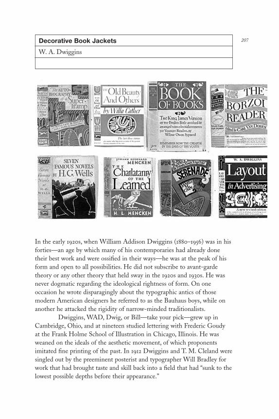
207Decorative Book Jackets
W. A. Dwiggins
In the early 1920s, when William Addison Dwiggins (1880–1956) was in hisforties—an age by which many of his contemporaries had already donetheir best work and were ossified in their ways—he was at the peak of hisform and open to all possibilities. He did not subscribe to avant-gardetheory or any other theory that held sway in the 1920s and 1930s. He wasnever dogmatic regarding the ideological rightness of form. On oneoccasion he wrote disparagingly about the typographic antics of thosemodern American designers he referred to as the Bauhaus boys, while onanother he attacked the rigidity of narrow-minded traditionalists.
Dwiggins, WAD, Dwig, or Bill—take your pick—grew up inCambridge, Ohio, and at nineteen studied lettering with Frederic Goudy at the Frank Holme School of Illustration in Chicago, Illinois. He wasweaned on the ideals of the aesthetic movement, of which proponentsimitated fine printing of the past. In 1912 Dwiggins and T. M. Cleland weresingled out by the preeminent posterist and typographer Will Bradley forwork that had brought taste and skill back into a field that had “sunk to thelowest possible depths before their appearance.”
DL2 04 07/13/04 2:54 PM Page 207

But Dwig did not follow the rules. His longtime friend andcollaborator Dorothy Abbe once said that he had arrived at his owndetermination of fine printing, and it differed very considerably from thatof Goudy, Updike, and Rogers. While these stalwart keepers of the classicalrejected mass production as anathema to fine design, during the course ofhis life Dwig witnessed the passing of individual craftsmanship and thesubstitution of bigger, faster machines in all phases of typesetting andprinting. He saw no reason why new technologies should not producequality work, and he proposed that photoengraving, for example, madecalligraphy more widely available, which would increase popularappreciation of good design.
Dwiggins practiced advertising design, type design, book design,and marionette design. He even designed a working puppet theater in his clapboard studio across the street from his home in Hingham,Massachusetts. But to appreciate Dwig’s obsessions for work and thereforehis contributions, one must know that he was driven to accomplish asmuch as possible before succumbing to the dire prediction of an earlydeath. “He was handicapped by the clock and the calendar,” says abiographical notation. Diagnosed with diabetes, an often fatal disease atthat time (1922), Dwiggins exhibited an intense drive to get on with life.Dorothy Abbe explained: “He resolved thenceforth to satisfy himself.” Ayear later Dwig announced to the world: “Me I am a happy invalid and ithas revolutionized my whole attack. My back is turned on the more banalkind of advertising and I have canceled all commissions and am resolutelyset on starving. . . . I will produce art on paper and wood after my ownheart with no heed to any market.” However, fate intervened: Insulin soonbecame available, giving Dwiggins another thirty-three years of life.
Tossing aside his lucrative advertising accounts, he concentratedon the not-so-profitable business of book design and page ornament. Hisearliest book commissions were from the Harvard University Press, forwhom he designed the now-rare volume Modern Color (1923), and fromAlfred A. Knopf, for whom, beginning in 1924 and continuing for almosttwo decades, he designed 280 books of fiction and nonfiction as well asalmost fifty book jackets. “Bill enabled us to produce a long series of tradebooks that for interest and originality of design are unequaled,” writes Mr. Knopf.
In addition to his uniquely composed (and sometimes illustrated)title pages, two features characterized his design: The text was alwaysreadable, and the bindings (and especially the shelf backs) were adornedwith his calligraphic hand lettering and neo-Mayan ornament. Every pieceof lettering and typography—down to the minutest graphic detail—was
DL2 04 07/13/04 2:54 PM Page 208

rendered by hand; given the extant physical evidence, many were donewithout a single mistake (when mistakes did occur, he simply redrew themrather than touching up the errors). Dwiggins’s calligraphic display letters, amarriage of classical typefaces and invented scripts, set the standard forKnopf ’s books and influenced many other publishers, who employed Dwigor one of his many imitators.
Book jackets, however, fell into the category of advertising thatDwiggins initially wanted to avoid. Yet, due to his special relationship with Mr. Knopf, when asked, he did them. Nevertheless, his method was a form of denial. He refused to pictorially illustrate most covers, as was the common practice, but rather applied Dwigginsian ornament andcalligraphic lettering. Hence, there was a great formal similarity between allhis jackets. The image area of his most common jacket format was cut inhalf, with the title on top and a subtitle or other type below. Sometimes heused an excessive amount of ornamentation, but only with his self-authoredbooks did he ever use a drawing. A typical approach—found in his jacketfor Willa Cather’s Lost Lady, which includes a hand-lettered title andbyline and characteristic Dwigginsian ornament printed in pink, green, andbrown—is something like a souped-up title page. Compared to thedesigners of many of the lettered jackets of his day, Dwiggins had a uniqueflair, wedding balance and harmony with quirkiness. The jackets rarelyevoked the plot or theme of the book but were essentially decoration—a“dust wrapper” in the purest sense of the word. One of his most alluringjackets—for James M. Cain’s Serenade (1937), the design of which is abouquet of abstracted flora—is akin more to beautiful wrapping paper thanan advertisement for the book.
Given the choice, Dwiggins preferred using his hands to makethings; hand lettering was more satisfying than type design. He did notbegin to design complete type alphabets until 1929, when, at the urging ofC. H. Griffith, marketing director for the Mergenthaler LinotypeCorporation, he designed his first typeface for continued reading. He didnot attempt to replicate his calligraphy. In fact, the initial undertaking (thefirst of eighteen typefaces), had no relationship whatsoever to his lettering.Metro Black was a uniform sans serif letter that Dwiggins designedbecause he saw a need for a strong gothic that did more for displayadvertising than Futura and other European gothics. Ironically, Dwig neverused this typeface on any book jacket.
“There are few American designers whose work can be revisitedafter decades with more pleasure and instruction,” an admirer wrote aboutDwiggins a decade after his death. When viewing examples of his printedwork or the original drawings that surface at exhibitions, much of Dwig’s
DL2 04 07/13/04 2:54 PM Page 209

work stands up not as nostalgia, but for its invention. Even the bookjackets, which are stylistically locked in time, could, with some typographicmodifications, be used today. By the 1950s, however, with the advent of theinternational style and the sweeping success of corporate modernism, Dwigwas virtually ignored. Moderns, who tended to disclaim as crasscommercial art anything that preceded modern design, eschewed Dwigginsfor being folksy, arts-and-craftsy, and, of course, passé.
Though he challenged tradition, he attempted to reform the oldschool not abolish it. Curiously, his work, including the book jackets, isgaining appreciation among makers of so-called distressed type; evenEmigre Fonts sells Dorothy Abbe’s book of Dwig’s stenciled ornaments,the same decorations used in his book and book-jacket design.
DL2 04 07/13/04 2:54 PM Page 210

211Merle Armitage’s Books
Merle Armitage
Merle Armitage (1893–1975) taught himself to design sets and costumes forthe theater in New York. Next he became a theatrical impresario, managingconcert tours for Will Rogers, Martha Graham, and Igor Stravinsky. Laterhe segued into the role of publicity and advertising director for Diaghilev’sBallet Russe before cofounding the Los Angeles Grand Opera Association,followed by a stint as manager of the Philharmonic Auditorium in LosAngeles, where he presented concerts with conductor Leopold Stokowskiand the first staging of Porgy and Bess by composer George Gershwin—allbefore his thirtieth birthday.
An avid attraction for the arts, and especially modern artists likePicasso, Klee, Kandinsky, et al., inspired his ultimate and total immersioninto typography and book design, often for books he authored, edited, orpublished about progressive artists of his time, many of whom became hisfriends. Armitage mined everything from his early career as inspiration forauthorship and book design. However, he is perhaps best known for hisbook design (especially among book art aficionados), although he isconsiderably less celebrated than his modern contemporaries. Although hisbooks are seriously collected today and his writings are occasionally cited,owing to his stylized “period” typography (which even he admitted became“outmoded”), he is nonetheless rarely taught as an exemplar or discussed asa member of the orthodox modern clan. Many of his over one hundred
DL2 04 07/13/04 2:54 PM Page 211

books evidence a formal bridge between celebrated classicists, like BruceRogers and T. M. Cleland, with modernists like Herbert Bayer, Paul Rand,and Alvin Lustig. In terms of current design history, however, Armitage’swork is a rather wobbly bridge.
Rand grumbled that Armitage “overdid it,” referring to hissignature mammoth type treatments, usually on double-page title pages(which he “invented”), extremely generous margins, and often widely leadedserif body texts. Other orthodox moderns further accused him of beingmodernistic. Armitage considered himself modern, however, and evenadmitted with just a hint of false modesty in A Rendezvous with the Book(George McKibbin & Son, 1949), a treatise on book design, that each one ofhis books was “unsuccessful.” Yet there was a caveat: “I believe, [they were]failures in the right direction . . . for they represent attempts to speak toreaders in a contemporary language of design . . . and to close the gap whichnow exists between the written word and the manner of its presentation.”
The alleged ham-fisted typographical treatments thatcharacterized Armitage’s design were resolutely contemporary—the resultof a mission to demolish antiquated tenets and reflect his time. He angrilywrote that the books of his era were “anonymous among their fellows andare becoming comparatively impotent as a means of communication.”Referring to the book field in general, he wrote, “the grand escalator thathas brought us all up from darkness and slavery into light and freedom,has, in our time, lost its leadership, and is uncertain of its function and itsdirection.” Sure, his prose often provided as much melodrama as his type,yet he was convinced that mediocrity had so contaminated book designthat what he called “the stammering books of today” had to be totallycleansed. So, mustering self-taught skill and homegrown bravado, he tookit upon himself to stem the tide, transform the medium, and leave asignificant body of work, even if it doesn’t always pass the test of time.
Born in Mason City, Iowa, in 1893, the son of a cattle rancher,Armitage’s passion for design may not appear to be genetic, but it definitelyconsumed him throughout his entire life. He developed a keen ability formaking type reflect the Zeitgeist when, as an impresario for progressivecomposers and musicians, he found himself habitually disappointed thatthe circulars and posters advertising his concerts misrepresented his clients’avant-garde practices. He deplored ersatz William Morris and otherantique graphic forms used to promote the likes of Anna Pavlova, GeorgeGershwin, or Igor Stravinsky. Thus, “the duties of writing copy anddesigning printed material for these attractions were therefore added to mygeneral responsibility of building careers,” he wrote in A Rendezvous.Armitage replaced run-of-the-mill and inappropriate graphics with modern
DL2 04 07/13/04 2:54 PM Page 212

sans serif typefaces, custom-made hand letters, and bold pictorial images.He imbued in each book a certain monumentality that underscored thewords and enhanced the pictures.
He soon realized that the French were more successful in“marketing” the works of contemporary artists because they publishedbeautiful and intelligent books explaining the theory that underscoredprogressive art. This astute observation encouraged Armitage to create(and often write) his own books, to both enlighten the public and fostergreater appreciation for the new vanguard. “My aim was a synthesis oftext, picture and design . . . a revealment of the general attitude expressedby the subject.” In practice, this meant books that were contemporary inform, structure, and pacing, that served to mirror their subjects’ uniquesensibilities. “The book must be an outward expression of its content,” hewrote, not reflexive reproductions of Olde English, Renaissance, or otherperiod styles.
When Wassily Kandinsky first exhibited at a gallery in Hollywoodin 1939, Armitage was asked to write an essay that explained theunprecedented work to a befuddled public. And when requests for the essayturned into a small deluge, the publisher E. Weyhe (New York) invitedArmitage to design a slender book called So-Called Abstract Art, which notonly shed light on the idea of abstraction, but did so with stark typographythat echoed the new artistic sensibility. Similarly, with his self-publishedMartha Graham (1937), Armitage developed a typographic scheme andpictorial pacing using dramatically lit photographs that became the visualidentity for this visionary dancer. “Taking Martha Graham on her firsttranscontinental tour convinced me that she was the greatest dancer of ourtime,” wrote Armitage in Merle Armitage, Book Designer (University ofTexas Press, 1956). “Through subtle handling I attempted to make the book‘dance’ in a most contemporary manner.”
For his 1938 memorial book George Gershwin (Longmans, Greenand Co.), Armitage infused the project with what he called “some of thevitality, color, and excitement that were so manifest in this great Americancomposer.” He later followed up with a second book on his friend titledGeorge Gershwin (Duell, Sloan and Pearce, 1958), with a simple sans serif“GG” on the cover, which included the art that influenced the composerand he in turn influenced.
New approaches to book design coincided with moderninnovations in other arts; for Armitage, Frank Lloyd Wright, Serge deDiaghilev, and Raymond Loewy were among the leading progenitors.He wrote that what men like Loewy had done for the machine must besimilarly applied to publishing. Of course, the streamlined aesthetic
DL2 04 07/13/04 2:54 PM Page 213

developed by Loewy and other industrial designers in the 1930s was asconcerned with veneer as with function, and that was echoed in Armitage’swork, too. Nonetheless, even given his typographic excesses, on the wholeArmitage’s books goosed book design out of complacency. He wasunforgiving when in came to “publishers who purchase manuscripts theyhave never read and assign them to designers who will never read them,” hewrote. To the contrary, he conceived of a book as a whole entity, not thesum of disparate parts. In fact, the publishing convention that dictated (andstill dictates) an artificial division between cover and interior designersprompted Armitage to assert, “We read that ‘dust wrapper and title pagehave been designed by so and so’ . . . but a Cadillac advertisementproclaiming, ‘front fenders and steering wheel have been designed by soand so’ would be an impossible absurdity.” While jackets on many of hisown books were usually more neutral than the startling cover or interiortypography, everything was designed as one totality, and thus evoked anunmistakable identity.
Designers throughout the late 1920s and 1930s copied the elegant calligraphic scripts and Mayan-influenced decorations of W. A.Dwiggins, yet few if any pilfered Armitage’s style. Perhaps his approachwas just too idiosyncratic or maybe too horsy for some. Whatever thereason, his distinctive method was exclusive to the few independentpublishers—including the famed Ward Ritchie Press in Los Angeles, whichalso published Alvin Lustig’s early type-case experiments—who realizedthat book design had to reflect the times. Consequently, his personalfingerprint is the explicit graphic force of his type and the prominence hegives to illustrations, art, and photographs.
Despite Armitage’s preference for modern aesthetics rooted inwhat he called the “tension” of demonstrative letter and color combinations(i.e., black and red and some yellow were his favorites), he did not promotea single method or ideology. “No system is readily at hand to solve theproblem; it is not a matter of formulas,” he wrote. “‘Modern’ is notsomething you can put on or take off as you would a hat.” But it issomething that has various interpretations and his, while at odds with otherModern practitioners, was for type to emote rather than stay neutral.Armitage’s timely books were designed to be unashamedly theatrical, justlike the concerts and plays he promoted so successfully on the big stage.
DL2 04 07/13/04 2:54 PM Page 214
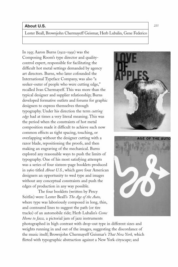
215About U.S.
Lester Beall, Brownjohn Chermayeff Geismar, Herb Lubalin, Gene Federico
In 1955 Aaron Burns (1922–1991) was theComposing Room’s type director and quality-control expert, responsible for facilitating thedifficult hot metal settings demanded by agency art directors. Burns, who later cofounded theInternational Typeface Company, was also “aseeker-outer of people who were cutting edge,”recalled Ivan Chermayeff. This was more than thetypical designer and supplier relationship; Burnsdeveloped formative outlets and forums for graphicdesigners to express themselves throughtypography. Under his direction the term cuttingedge had at times a very literal meaning. This wasthe period when the constraints of hot metalcomposition made it difficult to achieve such nowcommon effects as tight spacing, touching, oroverlapping without the designer cutting with arazor blade, repositioning the proofs, and thenmaking an engraving of the mechanical. Burnsexplored any reasonable ways to push the limits oftypography. One of his most satisfying attemptswas a series of four sixteen-page booklets producedin 1960 titled About U.S., which gave four Americandesigners an opportunity to wed type and imageswithout any conceptual constraints and push theedges of production in any way possible.
The four booklets (written by PercySeitlin) were: Lester Beall’s The Age of the Auto,where type was laboriously composed in long, thin,and contoured lines to suggest the path (or tiretracks) of an automobile ride; Herb Lubalin’s ComeHome to Jazz, a pictorial jam of jazz instrumentsphotographed in high contrast with drop-out type in different sizes andweights running in and out of the images, suggesting the discordance ofthe music itself; Brownjohn Chermayeff Geismar’s That New York, whichflirted with typographic abstraction against a New York cityscape; and
DL2 04 07/13/04 2:54 PM Page 215

Gene Federico’s discourse on the Love of Apples, an exercise to see howclose he could touch slugs of type without using a razor blade. “I wanted totry something where I used metal type in extreme ways without having tocut it—without cutting up proofs or playing with stats,” explained Federico.“For some time I had known that if you stacked title gothics they wouldhave a different look than traditional types. So the whole book was basedon that simple idea.”
The designers’ motivations for solving the problem of fillingsixteen pages were different, but each followed his own muse, not a client’s.Beall, who was coming to the end of his career as a designer of corporateidentity, was interested in returning to his early inspirations, whichborrowed from dada and surrealism. His “essay” was concerned with thetension between typographic precision and a free-form environment.Lubalin, who was beginning to have influence on contemporary typographywith visual puns and type-pictures, was attempting to bust through theconfines of hot metal (which he would later do with phototype).Brownjohn Chermayeff Geismar, which had been doing conceptual designin a modern idiom since the late 1950s and was about to split up, leavingRobert Brownjohn on his own, was seeking the nexus of art and design.“Ours was impossible typesetting and useless prose,” added Chermayeff.“But it was also an attempt to use typography as paint, and to explorerelationships that were based on texture not language. We were doing noless than what David Carson is doing today. However, for us to becompletely irresponsible required a sympathy with language.” In addition tooverlapping and layering through intricate film processes that were madeinto engravings, this typeplay mixed numbers with letterforms to makewords. For Federico, an advertising art director with a special interest intype, Love of Apples was an excuse for a poetic polemic about nature’sbeauty being radically altered, as is exemplified by the line: “When we, inbusiness, industrial America, began to get smart about apples, we packagedthem and packaged them and packaged them until the apple itself becamethe package,” which he illustrated with a photograph of an apple with astring tied around it.
About U.S. is one of modern American design’s most importantartifacts, both as a chronicle of the end of hot metal and as a clarion ofimpending photo composition. It is also one of the first public displays ofconceptual and expressionistic typeplay that would alter advertising andeditorial practice in the 1960s and usher in the method (or style) of designknown as the Big Idea—noted for witty copywriting wed to smartconceptual typography, illustration, and photography. About U.S. is asnapshot of the moment when type first talked.
DL2 04 07/13/04 2:54 PM Page 216

217Ha Ha Ha: He Laughs Best Who Laughs Last
Lou Dorfsman
The Columbia BroadcastingSystem (CBS) was theforemost American televisionnetwork from the 1950s to the1980s. No other network hadsuch intelligent news andentertainment programming,nor had earned such publicconfidence. During its goldenyears, the “CBS eye” was aproud emblem that stood for areputation of service andquality built by William Paley, founder and former CEO, and later, FrankStanton, former chief of the broadcast division. Yet even inherently greatprogramming required an equally great corporate image, an identity born ofmemorable graphics and compelling advertising. It can be argued that ifnot for the originality of its promotion CBS would have had to slug it outmuch harder against ABC and NBC, whose advertising rarely reached thesame heights.
CBS management understood the value of a strong graphicidentity, which is why in 1937 Paley hired William Golden, who created thevenerable CBS trademark, and why after Golden’s death in 1959 Paley andStanton named Lou Dorfsman (b. 1918), then the promotion art director of the radio division, to take his place. Dorfsman earned the job throughinspired trade advertising designed to sell advertisers on the viability ofradio at a time when television was decidedly the more compelling market.
Dorfsman was the engine that drove the company’s mostsuccessful advertising campaigns, and ultimately its entire graphic designprogram. He wrote much of his own copy and practiced the art of visualpersuasion with rare wit. What his ads lacked in typical hyperbole wasmade up for in uncommon intelligence. He never lowered himself or hiscompany to hard-sell tactics. He was a master of the Big Idea, a conceptualstrategy characterized by understatement, self-mockery, and irony, andnoted for clean design and strident copywriting wed to intelligentillustration and photography. In the more than forty years that Dorfsmanmanaged CBS’s visual identity there is not a single example where he used
DL2 04 07/13/04 2:54 PM Page 217

a typeface as novelty or decoration simply to grab attention, or abused aphotograph, painting, or drawing merely for shock value. The audience wasnever treated as visually illiterate, and by making the public feel good aboutCBS’s intrusion into their lives, Dorfsman instilled a pride of viewing.
Among the ads that still resonate—indeed could be reprised todaywithout changes—“Ha, Ha, Ha: He laughs best who laughs last” iseconomical yet eye-catching. The word ha grows larger according to theNeilson’s ratings response to the comedy shows of the three televisionnetworks, turning into the largest Ha, which represents CBS’s highstanding. Without the benefit of a hard-sell slogan or sensational image,but by harnessing the power of irony, Dorfsman let type alone to do thepersuading. For an ad entitled “Worth Repeating, CBS News” Dorfsmanused bold, disproportionately large quotation marks sitting majesticallyupon a pedestal of copy. These curiously abstract marks have greatershouting range than any single line of type or picture. “Dominate,” a seriesof four advertisements used to convince potential advertisers that CBSenjoyed dominance in the ratings, was an example of “talking type.” Onceagain, without the benefit of an image, Dorfsman used four words—“Captivate!” “Elucidate!” “Fascinate!” “Exhilarate!”—each set in a differenttypeface with an exclamation point dotted with the CBS eye. The copysuggested the range of CBS’s programs in a market it totally controlled. Yetanother exemplar was a soft-sell idea entitled “A Glossary of TelevisionTerms,” an illustrated lexicon of words such as fish bowl, one shot, and audio,that were introduced to the public through television. Cleverly illustrated,this compendium of trivia captured the interest of even the casual reader.After holding the reader’s attention it smartly climaxed with the word“Leadership: The quality invariably associated with the CBS TelevisionNetwork.”
These ads did more than remind, inform, and persuade potentialclients of the network’s virtues, they increased the recognition of CBS bygiving it a uniform identity, which in turn underscored the value of itscorporate culture. Rarely were any of Dorfsman’s designs, even the moredecorative logos and trademarks, lacking an idea. In fact, if an idea was notreadily apparent, he went to great lengths to concoct one. WithoutDorfsman CBS would have had its eye, but with him the eye became themost positive logo in America.
DL2 04 07/13/04 2:54 PM Page 218

219Going Out
Gene Federico
Good graphic design was long an exception to the rule in Americanadvertising. Beginning at the turn of the century, copywriters were allowedto rein over designers and nuances of type and image were secondary to thehard sell of a product or message. Unlike European advertising of the sameperiod, which was aggressively visual and pictorially innovative, in Americait was virtually inconceivable that an art director would be much more thana glorified layout man subservient to the needs of the text. This changed inthe 1930s when the advertising pioneer Earnest Elmo Calkins discoveredthat the effective marriage of word and picture could produce startlingresults. Prefiguring the “creative team” and creative revolution by more thanthree decades, he brought copywriters and designers together, forging acreative union. By 1939, when Gene Federico (b. 1918), a twenty-one-yearold Pratt Institute graduate with a special interest in typography, enteredthe advertising field, a few exceptional designers had already begun tochange the look (and often the content) of mainstream advertising, pavingthe way for a distinctly American modern style.
DL2 04 07/13/04 2:54 PM Page 219

“Lester Beall opened my eyes to the idea that type could be usedto emphasize the message,” Federico said about one of Americanadvertising’s leading modern typographers. “One of his ads had the greatline, ‘To Hell With Eventually. Let’s Concentrate On Now.’ The e ineventually was very large and now was the same size. The simplemanipulation of these letterforms allowed the reader to immediatelycomprehend the message.” Federico’s method was also based on theintegration of text and image. He always worked intimately with acopywriter and played with the nuances of language. He looked for thosesimple elements in copy that expressed or emoted, and suggested that whena designer doesn’t read the copy to catch the sound of the words, he or sheruns the risk of misconstruing the typography. “If the rhythm of the wordsis disregarded, the copy is likely to be broken incorrectly,” he continued.
Federico was more concerned with attitude than with style.Despite Lou Dorfsman’s assertion that he was the prince of Light LineGothic (admittedly one his favorite typefaces), few of his ads conformed to a single formula or evoked stylistic déjà vu. Nevertheless, one trait wasdominant; his love of type. Letters served as sculptural forms placed on oragainst an image. Type both communicated messages and evoked a timeand place.
Federico’s series of advertisements for Woman’s Day, whichappeared in the New Yorker magazine in 1954 and were targeted at mediabuyers, typified his rhythmic sensitivity. One of the most well known hadthe catch-line “Going Out,” and showed a photo of woman riding a bicyclewith wheels made from the two Futura Os in the headline—a visual pun inthe modern tradition. The goal of the ad was to persuade potentialadvertisers that three million-plus devoted readers went out of their way tobuy this check-out counter magazine. The ads apparently did well for theclient, but more importantly proved the power of persuasive visualsimplicity in a field that often erred on the side of overstatement.
DL2 04 07/13/04 2:54 PM Page 220

221Man with the Golden Arm
Saul Bass
There are two Hollywoods. One, the land offantasy and glitz. The other, the land offormula and convention. It was into thelatter that Bronx-born Saul Bass (1920–1996) arrived in 1945 intent on producingunconventional advertising for the movieindustry. But the odds were against him. Inthose days Hollywood promotion was miredin formula. Convention dictated the lookand feel of posters, foyer cards, and ads.Romantic realism was a conceptual andaesthetic panacea, and the common postershowed something for everybody whether itwas in the movie or not—bits of romance,action, drama, and, of course, unblemishedportraits of the stars.
Bass, who had read and wasinfluenced by Gyorgy Kepes’s Language ofVision (1944), became a reductionistdesigning in a modern idiom. When he worked in the New York office ofWarner Brothers, he toyed with the picture and text components of movieads, mostly playing with scale, which was the only latitude he was allowed.Of course, it was a dead end. “I could only carry it so far, because the otheringredients had to be there,” he recalled in Graphic Design America (HarryN. Abrams, 1989). So he packed up for Hollywood and went to work forBuchanan & Co., the agency that handled Paramount Pictures. Finally, in1949 he designed his first breakthrough ad for The Champion, KirkDouglas’s seminal motion picture.
The ad was totally black with a tiny halftone and a little letteredscrawl below it. It took up about an inch and a half in the center of thepage. In contrast to cluttered conventional ads, it was a real eye-opener. Itwas also the auspicious beginning of what evolved into Bass’sexpressionistic approach to Hollywood publicity, the precursor of theinnovative advertising and film title sequences that he created first for OttoPreminger and, later, for Alfred Hitchcock.
In 1954 Bass designed the titles for Preminger’s Carmen Jones,
DL2 04 07/13/04 2:54 PM Page 221

which were decidedly unique compared to the mundane letteringsuperimposed over backgrounds common in Hollywood movies at thattime. In 1955 he made a bolder leap with the print advertising for The Manwith the Golden Arm, which eschewed a picture of its star, Frank Sinatra, infavor of a pattern of black bars that framed a primitive woodcut-likerendering of a crooked arm. Theater owners were not pleased with theabsence of the one-two punch of star portrait and heroic vignette. But oneincident tells the story of Bass’s subsequent success: “[Preminger] wassitting with his back to me—he didn’t know I was there—talking on thephone, obviously to an exhibitor somewhere in Texas,” Bass recalled inGraphic Design America. “The exhibitor was complaining about the ads andsaying that he wanted to have a picture of Sinatra. . . . And I heard Ottosay to him, ‘Those ads are to be used precisely as they are. If you changethem one iota, I will pull the picture from your theater.’ And hung up onhim.” Rather than hype the film, the graphic reduced the plot, the story ofa tormented drug addict, to an essence—a logo really—that evoked thefilm’s tension.
Jumping at the opportunity to animate this simple graphic form asthe title sequence for the film, Bass created a series of moving white bars ona black screen, which was transformed into an abstract ballet of erraticshapes. After a few moments the bars metamorphosed into the arm. “Therewas a tendency, when I did the title for The Man with the Golden Arm tothink it worked because it was ‘graphic,’” Bass explained in Print (1960)“but that was incidental. If it worked, it was because the mood and feelingit conveyed made it work, not because it was a graphic device.”Nevertheless, by creating a graphic symbol that was effective for use in boththe print campaign and the opening title sequence, Bass had introduced anew design form.
Actually, he returned to the essence of motion pictures beforesound, Technicolor, Cinemascope, and other pyrotechnic advances uppedthe ante of filmmaking. Movies began as a purely visual medium. “We’vecome full circle,” Bass once explained, “[we] went to a theatrical stageapproach with inordinate reliance on dialogue, and now we’re back again to a greater reliance on the visual, but in a way that is more real and morecurrent with our lives today.” Not surprisingly, Bass was often called uponto direct certain sequences within films where the visual scheme was moreimportant to moving the story along than the dialog.
The Man with the Golden Arm was more than a fine piece ofabstract animation. It was Bass’s first movie within a movie, and it had lessto do with specific aesthetics of design than a sense of the story (a key traitin Bass’s later work). Yet it was not an independent effort; he believed that
DL2 04 07/13/04 2:54 PM Page 222

all aspects of a movie should fit together like pieces of a puzzle. “In everytitle I’ve done, I’ve been very conscious of the fact that the title has aresponsibility to the film, that it is there to enhance the film, to set it up, togive it a beginning—and not to overpower and preempt it,” he asserted inPrint. For Bass the title was only the beginning of something, never thething itself.
He continued making title sequences for four decades, many asmemorable as the films themselves. And his work evolved from “mood-setting” animation into what he called “metaphorical live action” in Walk onthe Wild Side (1962), where a black cat and a white cat meet, have a fight,and then part, as a metaphor for New Orleans street life. Later hepioneered the film prologue with John Frankenheimer’s Grand Prix (1966),for which Bass traveled around the world directing camera crews in theshooting of racing sequences.
Forty years after challenging the studio’s conventions and taboos,creative movie title sequences are facts of motion picture history. Indeedevery designer who has ever designed film titles owes a debt to Bass. As acoda to the breadth of his influence, in 1995 director Spike Lee paiddubious homage when he copied Bass’s logo for Anatomy of Murder as theprint graphic for his own film, Clockers. Although Bass did not appreciatethe larceny, it vividly illustrated the extent of Bass’s contribution to themovie industry.
DL2 04 07/13/04 2:54 PM Page 223

The Area Code (Parenthesis)
Ladislav Sutnar
If recognized at all, graphic designersearn cultural kudos for work that has adirect impact on society. Yet even underthese circumstances the world is usuallyoblivious. Which is why Ladislav Sutnar(1897–1976), a Czech modernist graphicand product designer who emigrated tothe United States in 1939 and worked inNew York until his death, has notreceived even a modicum of credit for aunique graphic innovation that has hadfar-reaching effect. Although it may wellbe considered arcane, his invention wasthe parentheses around Americantelephone area code numbers when thesystem was introduced in the early 1960s.
Sutnar is not credited for theappearance of the area code because the
concept was so integral to the design of the Bell System’s new callingapparatus that it was instantly adopted as part of the vernacular. Moreover,Ma Bell never offered or gave Sutnar credit; for this company, graphicdesigners—like the functional graphics they produced—were invisible.Nonetheless, Sutnar’s other contributions to information architecture, thecommissions that brought him to the Bell System’s attention in the firstplace, are milestones not only in graphic design history but of design forthe public good. Sutnar developed logical and hierarchical graphic systemsfor a wide range of American businesses that clarified and made accessiblevast amounts of complex, often ponderous information. He took on thethankless job of transforming routine business data into digestible andunderstandable forms.
Before most designers focused on the need for informationorganization, Sutnar was in the vanguard, driven by the missionary modernbelief that good design applied to the most quotidian products had abeneficial, even curative effect on society. In his role as a pioneer ofinformation design and progenitor of the current trend in informationarchitecture, Sutnar’s sophisticated data-management programs, which
224
DL2 04 07/13/04 2:54 PM Page 224

he designed during the late 1950s and early 1960s for America’stelecommunications monopoly, allowed customers to scan directories moreefficiently. The Bell System was engaged in the technological upgrade of itshuge network, and Sutnar’s brand of functional typography and way-finding iconography made public access to both emergency and regularservices considerably easier while providing Bell with a distinctive identity.But in the history of graphic design, Saul Bass received more attention forhis late-fifties/early-sixties redesign of the Bell System logo, which hadlittle direct consequence for the public, than Sutnar did for making user-friendly graphic signposts. In recent years information architect RichardSaul Wurman has also utilized Sutnar’s model in developing the CaliforniaBell telephone directories known as “smart pages.”
Although it was a small part of the overall graphic system, theparenthesis was one of Sutnar’s signature devices, among many used todistinguish and highlight various kinds of information. From 1941 to 1960,as the art director of the F. W. Dodge Sweet’s Catalog Service, America’sleading distributor and producer of trade and manufacturing catalogs,Sutnar developed an array of typographic and iconographic navigationaltools that allowed users to efficiently traverse seas of data. His icons areanalogous to the friendly computer symbols used today and were inspired,in part, by El Lissitzky’s iconographic tabulation system in Mayakovsky’s1923 book of poems, For the Voice. In addition to designing grid and tab systems, Sutnar made common punctuation, including commas, colons, andexclamation points, into linguistic traffic signs by enlarging and repeatingthem, which was similar to the constructivist functional typography of the1920s. These were adopted as key components of Sutnar’s distinctiveAmerican style.
While he professed universality, he nevertheless possessed graphicpersonality that was so distinctive from others practicing the internationalstyle that his work did not even require a credit line, although he almostalways took one. Nevertheless this graphic personality was based onfunctional requisites not indulgent conceits and so never obscured hisclients’ messages (unlike much of the undisciplined commercial artproduced during the same period).
“The lack of discipline in our present day urban industrialenvironment has produced a visual condition, characterized by clutter,confusion, and chaos,” writes Allon Schoener, curator of the 1961 LadislavSutnar: Visual Design in Action exhibition, which originated at theContemporary Arts Center in Cincinnati, Ohio. “As a result the averageman of today must struggle to accomplish such basic objectives as beingable to read signs, to identify products, to digest advertisements, or to
DL2 04 07/13/04 2:54 PM Page 225

locate information in newspapers, books, and catalogues. . . . There is anurgent need for communication based upon precision and clarity. This isthe area in which Ladislav Sutnar excels.” If written today, this statementmight seem like a critique of current design trends, but in 1961, it was atestament to progressivism. Sutnar introduced the theoretical constructsthat for him defined “good design” in the 1940s, when such definitions wererare in American commercial art. Design was one-third instinct and two-thirds market convention, and the result was eclectic at best, confused atworst. Such ad hoc practice was anathema to Sutnar, who was stern aboutmatters of order and logic, fervently seeking to alter visual standards byintroducing both American businessmen and commercial artists to “thesound basis for modern graphic design and typography,” which he asserts inhis book Visual Design in Action (Hasting House, 1961) is “. . . a directheritage of the avant-garde pioneering of the 1920s and 1930s in Europe. Itrepresents a basic change that is revolutionary.”
Sutnar synthesized European avant-gardisms, which he says“provided the base for further extension of new design vocabulary and newdesign means” into a functional commercial lexicon that eschews“formalistic rules or art for art’s sake.” While he modified aspects of theNew Typography, he did not compromise its integrity in the same way thatelements of the international style became mediocre through rote usageover time. “He made Constructivism playful and used geometry to createthe dynamics of organization,” observes designer Noel Martin, who in the1950s was a member of Sutnar’s small circle of friends. Despite a strictbelief in the absolute rightness of geometric form, Sutnar allowed varietywithin his strictures to avoid standardizing his clients’ different messages.Consistency reigned within an established framework, such as limited typeand color choices as well as strict layout preferences, but within thoseparameters a variety of options existed in relation to different kinds ofprojects, including catalogs, books, magazines, and exhibitions as well asthe Bell System’s instructional materials.
In the field of information design, it is arguable that contemporarymissionaries Edward Tufte and Richard Saul Wurman are really justcarrying the torch that Sutnar lit decades before. Many design students,either knowingly or not, have borrowed and applied his signature graphicsto a postmodern style. Nevertheless, Sutnar would loathe being admiredonly as a nostalgic figure. “There is just one lesson from the past thatshould be learned for the benefit of the present,” he wrote in 1959, as ifpreempting this kind of superficial epitaph. “It is that of the painstaking,refined craftsmanship which appears to be dying out.”
DL2 04 07/13/04 2:54 PM Page 226
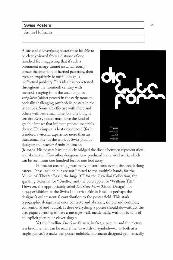
227Swiss Posters
Armin Hofmann
A successful advertising poster must be able tobe clearly viewed from a distance of onehundred feet, suggesting that if such aprominent image cannot instantaneouslyattract the attention of harried passersby, theneven an exquisitely beautiful design isineffectual publicity. This idea has been testedthroughout the twentieth century withmethods ranging from the unambiguoussachplakat (object poster) in the early 1900s tooptically challenging psychedelic posters in thelate 1960s. Some are effective with more andothers with less visual noise, but one thing iscertain: Every poster must have the kind ofgraphic impact that intimate printed materialsdo not. This impact is best experienced (for itis indeed a visceral experience more than anintellectual one) in the work of Swiss graphicdesigner and teacher Armin Hofmann (b. 1920). His posters have uniquely bridged the divide between representationand abstraction. Few other designers have produced more vivid work, whichcan be seen from one hundred feet or one foot away.
Hofmann created a great many poster icons over a six-decade-longcareer. These include but are not limited to the multiple hands for theMunicipal Theater Basel, the huge “C” for the Cavellini Collection, thespiraling ballerina for “Giselle,” and the bold apple for “William Tell.”However, the appropriately titled Die Gute Form (Good Design), for a 1954 exhibition at the Swiss Industries Fair in Basel, is perhaps thedesigner’s quintessential contribution to the poster field. This starktypographic design is at once concrete and abstract, simple and complex,conventional and radical. It does everything a poster should do—attract theeye, pique curiosity, impart a message—all, incidentally, without benefit ofan explicit picture or clever slogan.
Yet the headline Die Gute Form is, in fact, a picture, and the pictureis a headline that can be read either as words or symbols—or as both at asingle glance. To make this poster indelible, Hofmann designed geometrically
DL2 04 07/13/04 2:54 PM Page 227

precise yet thoroughly novel letterforms that are so harmonious whencomposed into the three words and then partially obliterated that theyphenomenally retain their readability. The viewer is indeed asked to take asecond or two to decode the lettering, but once accomplished, the mysteriousbeauty and overt significance of the poster is obvious.
I have used many words in the above paragraph to explain whatHofmann so effortlessly achieved with just a few strategic marks on paper,which just goes to underscore the very essence of his achievement.
Hofmann is a master of eloquent economy, not the coldstereotypical reductionism associated with the 1950s- and 1960s-eracorporate variation of the Swiss Style (which is used on generic packages,traffic tickets, and business forms), but rather a graceful complex simplicitythat combines purely aesthetic and distinctly functional values. While hisgraphic language, comprised of radical shifts in scale (never superfluous),precisionist type arrangement (at no time predictable), and stark symbolism(by no means clinical), is rooted in what is referred to as “Swissrationalism,” it is nonetheless imbued with a particular personal dialectunderscored by emotion. I have often heard critics of orthodox Swissdesign who call it unrepentantly cold and formulaic, but Hofmann bothdefies and transcends this tunnel view.
Die Gute Form is anchored on a rigid grid, yet the armature isinvisible to the naked eye thanks to the resolute fluidity of Hofmann’stypography. The same is true with his other purely typographical posters,wherein custom designed letterforms are constructed with sculpturalcharacter to be both conventionally read and intimately experienced. Templeand Tea House in Japan (1955), Wood as Building Material (1955), and KarlGeiser (1957) have more personality and actually tell more story with only afew smartly stacked, constructed, and interconnected words than mostpictorial narratives. As with Die Gute Form, Hofmann has produced in theseposters abstract entities that are immediately recognizable as both patternand word. When each individual poster is viewed in a repeating sequence ona wall or display case, the viewer experiences the aesthetic virtues—adramatic arrangement of form—but when viewed individually, the message isclearly readable as a conventional missive.
The drama Hofmann could achieve with just a few words is evenmore intense when he uses only two letters. Indeed, one of Hofmann’srecurring leitmotifs is the employ of two bold capitals—a Modernistmonogram—for a series of art exhibition posters at the Kunsthalle Basel.Each exhibition features two curiously and sometimes harmoniouslymatched artists, and so for the poster, Hofmann has two immense initialssharing the same bill, such as “CL” for Fernand Leger and Alexander Calder
DL2 04 07/13/04 2:54 PM Page 228
(1957), “SJ” for David Smith and Horst Janssen (1960), and “KJ” for FranzKline and Alfred Jensen (1960). The monogram motif is an elegant idea thattransforms the traditional art poster into a kind of linguistic game. Ratherthan predictably reproduce two representative pieces of the artists’ art,resulting in a clash of styles, Hofmann makes the initials of the two exhibitedartists into a trademark that not only “brands” the exhibit but forces theviewer to play along in a sport of deciphering. Since these curatorial pairingsof representation and abstraction are surprising, Hofmann’s solutions weresurprising too. Which, actually, is not very surprising.
Hofmann’s work repudiates routine. When seen as an entire body,there are the inevitable consistencies that reveal Hofmann’s style, butnothing in his oeuvre—certainly at the time he began his string ofemblematic designs in the early 1950s—was in any way customary. Indeed,nothing supports this claim better than his collected theater posters forStadt Theater Basel, to which the designer gave an indelible identity duringthe late 1950s and 1960s. These are not the typical theater bills laden withtitillating teasers or obligatory credits, nor are they sensational or romanticdepictions of the company’s theatrical offerings. Hofmann’s posters aresymbolic summations and iconic interventions that serve to introduce theaudience to dramatic or musical fare while offering a visual challenge.Rather than give only the facts, these posters require that the audienceinterpret the meanings of the images. It is not a complicated puzzle but thequestions posed by such pictures as a huge ear and eye (for the 1961 season),a laughing clown (for the 1960 season), or a scowling/maniacal face (for the1967 poster) demand that the audience interact with the stimuli rather thanremain passive receivers.
Passivity is not what Hofmann demands of his viewer, nor is itpart of his own visual vocabulary. One need only to look at (and later read, of course) his classic Graphic Design Manual: Principals and Practice(Reinhold Publishing, 1965) to understand that Hofmann’s design ispurposefully animated, requiring that the viewer’s eye navigate variouspathways that he’s carved through his field of type and image. I’ve alwaysfelt that his otherwise static work is equally suited to paper or screen, and Iventure that if he were starting his career over again today, motion mightvery well be his key occupation. If there is any doubt that Hofmann’s staticimagery is not jumping madly—though logically—around a mental screen,simply scan the multiple rows of geometric layout options reproduced in hishandbook. Then look at his posters together on a wall or turn the pages ofthis book (paying special attention to the posters for GewerbemuseumBasel) to experience unbridled kinetic energy and cinematic power.
Hofmann has designed type and image for the print medium
DL2 04 07/13/04 2:54 PM Page 229

throughout the better part of his life, so naturally he would not exactlychoose to describe his work in terms of its relationship to film. But it isnonetheless clear that a distinct kinetic sensibility has contributed tomaking posters that transcend the inert confines of the medium. It is alsothe trait that makes his work so unequivocally modern.
Of course, “modernism” is an imprecise term that connotes theradical overhaul of artistic standards by mid-twentieth-century avant-gardeartists, and Hofmann is certainly influenced by the great advances of thistime. Yet Hofmann’s modernism, like his friend Paul Rand’s, is a uniquelypersonal interpretation that reflects more than the ideological requisites ofthe key movements and schools. Rand was known for playful humor thatironically acknowledged the comic strips and show card advertisements thatwere positive and negative influences on him while growing up inBrooklyn, New York, as well as the imported dada and Bauhaus notions of form and content to which he was later exposed. Hofmann, born inWinterhur, Switzerland, in 1920, studied graphic art in a different aestheticand philosophical environment in Zurich under Alfred Willimann and didnot have the exact same influences as Rand, yet the play instinct bound toEuropean modernism was (and is) every bit as intense. Nonetheless, unlikeRand, there is a hushed quality to Hofmann’s play, as evidenced in his colorpalette, which rarely changes from black and white or red and white.
His most stunningly playful and playfully serious series of postersfor the Gewerbemuseum Basel and the Herman Miller Collection (1962)use abstraction in the same way that Jackson Pollack dripped paint:expressively. Hofmann’s amorphous shapes and solid color fields shake andwiggle, thrust and parry, lunge and recede, in a kind of expressionisticimprovisation. The Helvetica type, however, is an anchor of consistencythat keeps these posters from being too anarchic. And yet I see these asfree-form posters, like no others that come close to being an independentgenre of expression—neither fine nor applied art—a theory I suspect thatHofmann, the quintessential applied artist, might refute.
Hofmann’s posters collectively epitomize mid-century modernismnot because ornament is rejected and mechanical methods (i.e.,photographs) are used in place of hand-drawn decoration or illustration,but because they touch the soul of their times. I know that it is probablydifficult to look at large typefaces in black and white and sometimes red, orbold geometries, or crisp photographs, and then conjure the word “soul.” Irealize that Hofmann’s work might better be characterized as a kind ofwell-ordered clinical beauty, but there is also something so incrediblysoulful in the posters for Stadt Theater Basel 1958 Season (1958) andBrahms Requiem (1986) that it is hard not to use the word or be
DL2 04 07/13/04 2:54 PM Page 230

accordingly moved. I marvel at their formal purity, yet also feel thedesigner’s passion for the material.
And although as a writer of manuals and teacher at Basel Schoolof Design and Yale University, Hofmann established standards andformulas for design, it seems apparent from the work of his most ablestudents that he did not simply preach the gospel of standardization as acatechism for all design. He gave his students tools and a solid armature onwhich to build classical or “timeless” typography, but he also imparted asense of passion (or soul). Hofmann could not produce the work found inthis collection—posters that not only formally stand the test of time butalso continue to resonate with viewers such as me on an emotional level—without a total commitment to his art and design. So, in addition to hisexpert ability to manipulate type and image, this soul is what gives thiswork and his legacy its impact.
DL2 04 07/13/04 2:54 PM Page 231

Modern Paperback Covers
Back in high school during the late 1960s, existentialismfed a ravenous adolescent appetite for self-indulgentdespair, and the covers of two angst-ridden paperbackbooks, Nausea by Jean-Paul Sartre and The Stranger byAlbert Camus, did for me what religious iconographytriggers in devotees. Only, rather than provide spiritualuplift, each cover made me melancholic. Book coversshould, of course, create an intellectual bond with a reader,but rarely do they tap as deeply into a psyche as these did.
In the 1950s and 1960s, during the nascent periodof what in the United States was (and still is, for thatmatter) called “quality paperback publishing,” many coversfor so-called serious fiction and nonfiction were designedas signposts that grabbed the eye and sparked theimagination. They further branded the identity ofindividual books more profoundly than most hardcoverjackets, which were so predictably formulaic that littleroom was left for the reader’s personal interpretation.
The covers of Nausea and The Stranger werecleverly symbolic and disturbingly mysterious. Nausea,designed by Ivan Chermayeff, is a high-contrast, double-exposed black-and-white photograph of a dyspeptic man,which so keenly illustrated the title that over four decadeslater, the original is still in print. The cover for The Stranger,with a surreal line drawing by Leo Lionni of abstract faces,was a perfect evocation of anonymity and loneliness.(However, it is no longer in print.) Both of these coversdefined existentialism, yet merely hinted at the books’contents. When compared to most hardcover jackets, with
their turgid literal illustrations, or mass-market paperback covers withtawdry sensationalist vignettes, the vast majority of quality paperback coversexhibited a high degree of subtlety, sometimes cut with wit, that demandedthe reader’s interpretive participation.
The designers and illustrators most identified with this genre,including Chermayeff, Lionni, Paul Rand, Alvin Lustig, Milton Glaser,Seymour Chwast, and Rudolph deHarak, were encouraged by their
232
DL2 04 07/13/04 2:54 PM Page 232

respective publishers and art directors to inject Modernist notions ofminimalism, abstraction, and symbolism to signal a more serious publishinggenre. And so, they challenged entrenched marketing conventions thatproscribed such minute details as type size and color palette.
Following World War II, the mass-market paperback industrydecreed that appealing to the “masses” meant that cover art must reduce allcontent, even William Shakespeare’s most emotional dramas, to romanticor sentimental pulp realism with movie matinee typography. On the otherhand, quality paperbacks—initially developed by Anchor Books in 1947 as avehicle for reprinting classics and serious out-of-print books on betterpaper and with sturdier bindings—sought a new market of college studentsas well as earnest general readers. Consequently, quality paperback coversrequired an urbane visual language that included abstract illustrations andspare modernist typography—a scheme that elevated books but did notrarify them.
Arthur A. Cohen, an audacious twenty-three-year-old cofounderof Noonday Press (in 1951) and of Meridian Books (in 1954), noted, “Itwould have been quite easy for me—in deference to the conventions of thepublishing industry—to have resisted the seductions of ‘good design.’” Hewas referring to the widespread tendency among established hardcoverpublishers to squander book jacket real estate with mediocre designsolutions that sensationalized rather than edified. So, Cohen commissionedAlvin Lustig (and after he died in 1955, Elaine Lustig) to design themajority of the Noonday and Meridian covers in a modern manner, whicheffectively raised the overall level of design for most quality paperbacks.
Cohen had proclaimed, “Paperbound publishing seems destined toobliterate cloth trade publishing as we presently know it.” And the“paperbound book revolution” of the late 1950s and early 1960s, while notan absolute overthrow of old standards, was a sea shift in the publishingindustry’s customs that exerted unprecedented influence on Americans’reading habits. College students, for example, could now afford their ownportable classics (and received what Cohen called “a paperback education”).Many important books once relegated to out-of-print purgatory hadanother shot at immortality. Some publishers also originated new titles asquality paperbacks rather than first launch them in hardcover, which madeinnovative design and typography even more essential.
As a leader in paperback books, the English publisher Penguinintroduced a much-celebrated though inflexible typographic format,designed in 1946 by Jan Tschichold, that replaced design excess withSpartan solemnity. While this established a strong identity, the Penguinscheme nonetheless reduced all titles, regardless of content, to a single
DL2 04 07/13/04 2:54 PM Page 233

typography with limited color. Cohen wrote that this “simple and oftenpainfully boring design” had one virtue: “Everyone who can see and readknows that two swathes of blue bisected by a white area containing the titleand author means Penguin.” In a market where all publishers hawk books“with clamor and stridency, the soft-sell conservatism of Penguin Bookscommunicates an impression of solidity, impassableness, and confidence.”Yet for his own books, Cohen avoided what he called Penguin’s “monolithicconservatism” as well as the greater tendency for repetitive fashion. Asmuch as he objected to Penguin’s “stoic self-discipline,” he also refused tosuccumb to “sleek photographs which look as though they were cut out ofterribly chic New Yorker advertisements, woodcuts which become soimportant in the jacket that typography becomes an afterthought, andclichés which go on endlessly.” Cohen’s vision of the quality paperbackrelied strongly on an exclusive look defined by modernist graphic design.
Alvin Lustig, who in the late 1940s introduced surrealphotomontage and abstract glyphs (influenced by Paul Klee and Miró) toNew Directions Books’ hardcover jackets, switched over to using eclecticnineteenth-century wood and metal typography for Meridian and Noondaypaperback covers. Akin to earlier typography by Lester Beall, Lustig’s bookcovers’ typography were a mix of slab serifs and railroad gothics, sometimespaired with antique engraver’s scripts and often set against unusual flatcolor backgrounds, including rich purples, oranges, and maroons, somewith contrasting bars and stripes.
Simplicity was a virtue, since these books had to withstand strongvisual competition in bookstores from bestseller book jackets, children’sbooks, and in some cases record album covers and greeting cards. Ratherthan try to out-shout the more flamboyant designs, Lustig’s goal, heexplained in a collection of unpublished notes, “was to create the effect of aspecial object which is only incidentally a book.” The method of displayrequired viewing all the books together face-out on shelves and “would bevery important in creating the proper isolation and emphasis for the books.”He further noted that the titles were purposely kept small rather than try to“compete with the large lettering of hardcover book jackets and thus losetheir sense of quality.” But most important in Lustig’s overall plan, “Thedesigns, although non-representational, would have an emblematic characterand would possess overtones of a traditional sense of order. They wouldstrive for freshness and a rather unclassifiable quality rather than try to seemeither modern or traditional in the usual sense of those words.”
For graphic designers of the 1950s and 1960s, quality paperbackswere what CD packages are today—wellsprings of a certain kind of designinnovation that was perhaps best characterized by a statement made at the
DL2 04 07/13/04 2:54 PM Page 234
1957 AIGA symposium on the role of the designer (reported in Publisher’sWeekly): “Books of today are read today. So let’s not design for all eternity.”And one of the foremost quality paperback publishers at the time wasVintage Books, with covers ministered by art director Harry Ford andproduction manager Sidney Jacobs. Paul Rand was commissioned to designVintage covers that paradoxically stand the test of time because he employedabstract forms, expressive collages, and witty sketches that were dictated notby fashion but by modernist preference for play and economy. His coverswere mini-posters that interpreted rather than illustrated content.
By the mid- to late 1950s, when the golden age of modernistVintage covers was produced by Rand, Lionni, Chermayeff, Ben Shahn,Bradbury Thompson, George Guisti, and others, most bookstores hadbecome used to displaying more quality paperbacks than a few years earlier,when Lustig’s covers were virtually the only ones on the shelves. Thismeant that cover design could not afford to be as uniform as in Lustig’sgraphic scheme, and eclectic solutions were increasingly more common.
Ivan Chermayeff—who in his student days was an assistant toLustig and followed through on some covers and designed other originalcovers—also made formidable contributions to modern and eclectic design.In addition to Nausea, he explored the range of photomontage for NewDirections’ covers. He composed others for art director Frank Metz atSimon & Schuster using typographic puns, including the Art of DramaticWriting, where exclamation points are substituted for all the instances ofthe word “is.” Wordplay was an effective way of illustrating otherwise un-illustratable ideas by making titles of the books into word games. In thisway, Chermayeff made the cover into a laboratory for his developing work.
Likewise, Rudolph deHarak experimented with the nearly 350paperback covers created for McGraw-Hill Paperbacks during the early tomid-1960s. His basic systematic format, based on a rigid Swiss-inspiredgrid, was a tabula rasa where symbolic and allegoric imagery interpreted awide range of nonfiction themes including philosophy, anthropology,psychology, and sociology. The format offered deHarak a control withwhich to test limits of conceptual art and photography as he introducedapproaches inspired by dada, abstract expressionism, and op-artmovements. The McGraw-Hill covers, which epitomized a late-modernistpurism, were subsequently copied by many other paperback cover designersat various publishers.
In 1964 Milton Glaser, Push Pin Studios cofounder, was given theenviable assignment to develop a series of contemporary illustrated coversfor a popular mass-market paperback line of Shakespeare’s plays. Artdirector Bill Gregory wanted the Signet Shakespeare series to have
DL2 04 07/13/04 2:54 PM Page 235

interesting covers, and as Glaser recalls, “They made an impact partiallybecause they were done in sequence, and could be grouped together in-store.” But there was another, more arcane breakthrough, explains Glaser:“At the time, hardcovers were not usually printed in process color, but thepaperbacks could exploit full color.” So he framed a subtly colored inkdrawing of Shakespeare’s characters on a white field with a color band on top to identify the books and hold the logo.
Glaser understood that “the form of address had to be moreillustrative, and it was my presumption that it couldn’t be abstract ortypographical. But it could still stand out and didn’t have to be banal-looking, like most mass-market books.” The cover illustrations helpedpopularize Shakespeare’s works, and the affordability of these books madeSignet a mainstay in high school and college classes.
Following Signet’s lead, during the mid-1960s, other mass-marketpaperback publishers reprinted serious literature and nonfiction, andadopted more sophisticated design and illustration for new markets. LikeGlaser, Push Pin Studios cofounder Seymour Chwast employed an eclecticarray of graphic styles on covers for a wide variety of themes and authors.“Paperbacks provided creative opportunities,” Chwast recalls. “I was nottold what to do, just given the parameters and a free hand.” Accordingly,each style was integrally matched to the subject: “If it was something aboutthe South Seas, for instance, I’d do a primitive drawing.” For The Plague,another of Albert Camus’s lugubrious existential dramas, Chwastintroduced a stark woodcut painted in an expressionist manner. “I couldn’tdo anything too fancy,” he says about the morose visage that spoke directlyto Camus’s angst. For a biography of the mystic Gurdjieff, he blendedMiddle Eastern–inspired calligraphy with his eclectic, personal style.Chwast’s variegated designs signaled that anything was possible in thisgenre.
When mass-market paperbacks were first introduced during the1940s, the publishing industry shamelessly acknowledged that they wereephemeral and destined for the junk heap. Although the advent of qualitypaperbacks did not immediately change prevailing attitudes toward thegenre’s overall disposability, the quality of graphic design signaled moreserious (and perhaps more durable) content, and this did have a positiveimpact on readers. Hardcover books will always be more prestigious, butduring the 1950s and 1960s the quality paperback cover as a wellspring ofinnovative modern design—and even as icon—surpassed hardcover jacketdesign in freedom and ingenuity. Ultimately paperback covers earned therespect that the designers brought to them, and influenced the state of allbook jacket and cover art today.
DL2 04 07/13/04 2:54 PM Page 236

237Bestseller Book Jackets
Paul Bacon
“If I was born to do something,” states Paul Bacon,“it was to design book jackets.” And that’s exactlywhat he did for about fifty years. But not just any oldjacket for any old book. Although he did his share ofobscure titles, his jackets have adorned some of themost prestigious bestsellers of the second half of thetwentieth century. In fact, Bacon can be said to haveinvented the bestseller jacket as we know it: Hisdesigns have been emblems for such eminent worksas E. L. Doctorow’s Ragtime, William Styron’sSophie’s Choice, Philip Roth’s Portnoy’s Complaint,Joseph Heller’s Catch-22, Ken Kesey’s One Flew Overthe Cuckoo’s Nest, James Cavell’s Shogun, and RobertCaro’s The Power Broker. And while each of thesecovers was distinctively designed, they all sharedthree traits that in the early 1960s fused intosomething known as the “Big Book Look”: large title,large author’s name, small symbolic image.
The “look” had its inception in 1956, whenBacon was commissioned by Simon & Schuster’s art director, Tom Bevins, to design the jacket forCompulsion by Meyer Levin, a roman à clef abouttwo young men who systematically plan and carryout the cold-blooded murder of a young boy to see ifthey can get away with the crime. The publisherknew that the highly publicized real-life killing ofBobby Franks by Loeb and Leopold wouldpopularize the novel, but was uncertain how to devisea jacket that would be suggestive without being lewd,and evoke a sense of mystery without resorting toclichés. Bacon sketched out a number of ideas untilhe came up with the rough, hand-scrawled word“Compulsion,” which he positioned at the top of the jacket, taking up afifth of the space, while below it, an empty taupe rectangle bled off thefield, and below that, at the bottom, was scrawled “a novel by MeyerLevin.” Sparse and dramatic—yet Bacon felt something was missing.
DL2 04 07/13/04 2:54 PM Page 237

That “something” became two small, nervously drawn figuresprinted in red, running on the vacant expanse upward toward the title.Although the cover calls to mind Saul Bass’s 1955 expressionistic film posterfor The Man With The Golden Arm, it was more likely influenced by the jazzalbums Bacon had designed starting in the late 1940s. Whatever theinfluences, the book became a huge bestseller and the jacket, displayedeverywhere, caught the publishing industry’s attention.
Other publishers lost no time contacting Bacon to request similarjackets for their potential bestsellers. But few of them really understoodwhat made Compulsion so successful. Bacon remembers, “I’d get calls thatstarted like this: ‘We have a book we’d like you to do, and it’s calledDarkness on the Highway at High Noon, and it’s set in Tulsa, Oklahoma,’ orsomething like that, and I’d say, ‘Wait a minute; what you like aboutCompulsion is that big, powerful one-word title.’ But it’s hard to dissuadepeople from their titles. Nonetheless, I took the jobs, and I started to workfor literally everybody.”
Bacon estimates he designed about 6,500 jackets from the late1940s through early 2000 for all the major houses—but most consistentlyfor Simon & Schuster for over forty years. The Baconesque approachbecame pervasive throughout the trade book world, yet his signature stylewas not always instantly recognizable because Bacon characteristicallysubordinated ego to function. He explains: “I’d always tell myself, ‘You’renot the star of the show. The author took three and a half years to write thegoddamn thing and the publisher is spending a fortune on it, so just backoff.’” Robert Gottlieb, an editor at Simon & Schuster during the 1950s andlater editorial director at Knopf for twenty-one years who often workedwith Bacon, comments, “He had a bestseller look but he came up withother looks as well, some of which helped books become bestsellers.”
In fact, when you look at Bacon’s jackets en masse, you realize thatyou’re looking at a history of late twentieth-century commercial book coverdesign, a virtual legacy of eclectic lettering, illustration, and typographyprior to the digital revolution. Bacon was, after all, a product of an era ofhand-drawn lettering, handmade illustration, and type that was cut andpasted in order to achieve precise spacing. While this sounds archaic in atime when layered Photoshop imagery is the order of the day, Bacon’s workwas appealing precisely for its handcrafted precision (as well as minorimperfections) and spot-on conceptual acuity that evoked the story ratherthan an isolated passage.
Born in Ossining, New York, in 1923, Bacon grew up in UnionBeach, New Jersey, attended Arts High School in Newark, and started hisjacket career by accident in New York after he was discharged from the
DL2 04 07/13/04 2:54 PM Page 238

Marine Corps in 1946. Unable to get into the course he wanted at NewYork’s Art Students League, he took a job with the former promotion artdirector of Fortune, Hal Zamboni, who had started his own Bauhaus-influenced studio in Manhattan. Bacon was given a $30-a-week job makinglaborious scratchboard drawings of, among other mundane items, bottles ofpills for advertisements. However, from doing such tasks he developed abetter-than-average drawing style, along with a certain stylistic flair.
At the time, a friend’s father—who had written a book titledChimp on My Shoulder, about venturing into Africa to round up monkeysfor the Dennis Roosevelt Chimpanzee Farm in Florida—asked Bacon todo the illustrations. The witty, impressionistic drawings were, Bacon recalls,“pretty good for a novice”—good enough that the art director for E. P.Dutton, the book’s publisher, requested that he do the jacket, too. Thejacket, a photograph with type, is “nothing to send to the Hall of Fame,but it got me started,” he says.
But Bacon’s real passion was jazz, certified by his membership inthe Newark Hot Club, a hyper-serious bunch of fans that included AlfredLion and Frank Wolff, founders of the legendary Blue Note Records.Bacon had known the two before the war and soon started designing 10"album covers for their label. He simultaneously wrote record reviews forThe Record Changer magazine, edited by Bill Grauer and Orrin Keepnews,who eventually started Riverside Records, for which Bacon also designedalbums. Today, many jazz aficionados know Bacon exclusively for hiscontemporary-looking record sleeves.
But record albums alone did not insure a viable living, and duringthe early 1950s, Tom Bevins at Simon & Schuster gave Bacon a quirkygrouping of titles to work on, including an album of cartoons from Punchand some science fiction novels. It wasn’t until the Compulsion jacket,however, that Bacon realized that books were going to be his lifelongvocation. The S&S advertising people liked the idea of using an icon or alogo on a jacket as opposed to the conventional treatments of just type orliteral illustration. And Bacon discovered he was good at “findingsomething that would be a synthesis graphically of what the story wasabout.” Moreover, since he had had no formal training in illustration, hefelt free to explore in this realm. “I was not encumbered by having to workfrom models,” he says. “Many of the things I did, I just did strictly frommemory and without any reference at all. Unless I needed somethingspecific, like a German airplane or something—then I’d look it up. But itwas very liberating to realize that I didn’t have to do something that lookedlike Norman Rockwell did it.”
If he was decidedly not Rockwellian, neither was he a follower of
DL2 04 07/13/04 2:54 PM Page 239

the modernist principles pioneered by Paul Rand, Alvin Lustig, and LeoLionni, who imbued their work with theories of European art. WhileBacon admired these designers, he points out that as the book covers theydid were generally for “heady” works of criticism, analysis, and literaturewith small print runs, they could do virtually anything they wanted withlittle interference. His orientation, on the other hand, being resolutelycommercial (heavy-hitter books with big runs), required that he navigatearound sales and advertising people and countless others with numerousopinions.
This he did—with the help of staunch supporters like FrankMetz, art director at Simon & Schuster for over forty years, and HarrisLewine, iconoclastic art director at Harcourt Brace and various otherhouses. Having editors as allies was also a plus; Robert Gottlieb, forexample, when he was at Knopf, not only kept the merchandising people atbay, but kept authors at a distance too. According to Bacon, writers makeliteral suggestions that result in dumb illustrations. He recalls one occasionwhen Norman Mailer managed to get through to him. “Mailer was verydiffident,” Bacon remembers. “He called me ‘Mr. Bacon.’ We both sort ofbowed and scraped to each other. And it turned out that what he wanted—he actually loved the jacket—was to know if a very tiny postage stamp ofhis girlfriend could go somewhere on the front. As it turned out, there wasno way it could hurt, so I said, ‘Sure, why not?’”
Bacon didn’t do thumbnails or multiple sketches—just oneiteration of any idea. But he was accommodating. “If people didn’t likesomething about a Cole Porter tune, he just tore it up,” he says. “And I didthe same thing with the jackets.” For the 1961 publication of Joseph Heller’sclassic Catch-22, he did as many as eleven versions. “I did a jacket that justsaid ‘Catch-22’ in very large lettering, and underneath, I can almostremember how [the subtitle Heller wrote] goes: ‘A novel wildly funny anddead serious about an Assyrian malingerer who recognized the odds.’Gottlieb liked it but didn’t do it. Then I did one that had [the protagonist]Yossarian bull’s-ass naked, but with his back to you, saluting as a flight ofplanes went over. I liked that one. Then I did the finger. Then I did acouple of modifications of those. Then at some point I came up with thelittle guy that I tore out of a piece of paper, representing Yossarian in fullflight from everything.” The finished jacket doesn’t conform to any ofBacon’s other book jackets, but it became a true icon, which makes it atypical Bacon after all.
Bacon designed most of the jackets for Heller’s other books, anassociation that Heller once commented on: “The coverage of my life as anauthor, from Catch-22 to Closing Time thirty-three years later, may be
DL2 04 07/13/04 2:54 PM Page 240

unique in publishing; in my case, Paul Bacon did it for me, and I’ve beenlucky and glad!”
The cover for Philip Roth’s Portnoy’s Complaint (1969) was alsocharacteristically uncharacteristic. Though the vast majority of Bacon’scovers are built on some conceptual idea or image, this one consisted solelyof pure type against a yellow background; no fancy touches, except for theswash capitals in the title and author’s name. Asked why he avoided hissignature conceptual image, Bacon says it was because of the difficulty inportraying the book’s most prominent element: masturbation. But also, “Incolor, it was just so simple and raw,” and this was one of the things “Istarted to do for books like Sophie’s Choice that were strictly lettering covers,which in some ways I suppose was a coward’s way out. But it just seemedappropriate for these enormously complicated books.” Given the epic plotsof Sophie’s Choice and Ragtime, Bacon felt that attempting to do anythingother than a solution that proclaimed, “Important book—read it!” wouldnot work. “I guess that’s kind of a dumb thing to say, but it was at the backof my mind,” he admits.
Ragtime, with its Victorian sheet music–inspired, hand-letteredtitle, was not only symbolically astute; it also indelibly evoked the book’scharacter. About his increasing use of illustrated lettering, Bacon explainsthat he didn’t try to be “too accurate in a time sense” and did not, as a rule,go after a face that was used during the period of the story. He simplywould write the title and author’s name out to see what they looked like inupper- and lowercase and in caps, and then see if there was some interestingfeature, like a double consonant, that could be manipulated. “I did all thatstuff by hand and I wonder why I didn’t go crazy,” he comments. E. L.Doctorow himself says of the Ragtime cover, “I believe it’s a classic of bookjacket design—simple and immensely evocative at the same time.”
No trend follower, Bacon confides that he did what seemedfeasible at the time. “I had a feeling for the art directors and the editors of agiven house,” he says. “If they had certain prejudices or if they were goingto be resistant to something I had in mind, I wouldn’t waste my time withit, even if I thought it was fundamentally good.” Yet he was so highlyregarded that editors often would just send him a manuscript with themandate to “figure it out” for himself. Except that every so often, Baconwould get a note saying, “Please, no swastika,”—this because he had beenjustifiably dubbed “King of the Swastika,” having done many books aboutWorld War II that incorporated the Nazi emblem.
To Bacon, a successful jacket is one that the reader makes senseof. “If after you’ve read the book, you then look at the jacket and say, ‘Iwonder why he did that,’ that doesn’t make it for me,” he states. These
DL2 04 07/13/04 2:54 PM Page 241

days, ambiguity is much more frequent in book jackets, which may explainwhy Bacon’s past and recent work seem dated to some. While the “BigBook Look” is not precisely obsolete, it is no longer a design code forreaders, who today are drawn to fragmented and vague pictorial jacketswith skewed type.
Time and fashion have changed, and Bacon has officially retiredfrom the book jacket business, though he still gets calls for assignments. Hehas returned to designing his first passion, jazz albums. “I certainly believethat anything in the arts is a track meet, and when you run 10 flat andsomebody else can run 9.8, your day is done. To some extent, that happenedto me,” he admits, adding, “I still like the last things I designed—they’regood—but they’re not competitive in that multigrained way that the thingsbeing done now are.” There’s another reason, too. “I was seventy-eight lastDecember—I’m too goddamn old,” Bacon says. “But I’m lucky, in onesense. I got phased out by myself and by publishing at the same time.”
DL2 04 07/13/04 2:54 PM Page 242
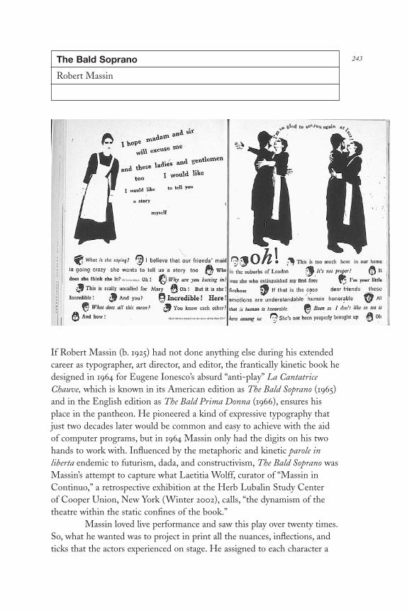
243The Bald Soprano
Robert Massin
If Robert Massin (b. 1925) had not done anything else during his extendedcareer as typographer, art director, and editor, the frantically kinetic book hedesigned in 1964 for Eugene Ionesco’s absurd “anti-play” La CantatriceChauve, which is known in its American edition as The Bald Soprano (1965)and in the English edition as The Bald Prima Donna (1966), ensures hisplace in the pantheon. He pioneered a kind of expressive typography thatjust two decades later would be common and easy to achieve with the aidof computer programs, but in 1964 Massin only had the digits on his twohands to work with. Influenced by the metaphoric and kinetic parole inliberta endemic to futurism, dada, and constructivism, The Bald Soprano wasMassin’s attempt to capture what Laetitia Wolff, curator of “Massin inContinuo,” a retrospective exhibition at the Herb Lubalin Study Center of Cooper Union, New York (Winter 2002), calls, “the dynamism of thetheatre within the static confines of the book.”
Massin loved live performance and saw this play over twenty times.So, what he wanted was to project in print all the nuances, inflections, andticks that the actors experienced on stage. He assigned to each character a
DL2 04 07/13/04 2:55 PM Page 243

specific typeface that represented a personal voice, and the type wascombined with photos of the actors that were taken using high-contrastfilm. Through this process they were literally transformed into black-and-white symbols that replaced their typewritten names in the original script.The layout of the book is akin to a large storyboard used to block out a film,but rather than typing the dialogue neatly underneath the images—as wasthe custom—the text was integrated throughout. In this sense there is also afaint resemblance to a comic strip without speech balloons. Stage directionswere replaced by the actual gestures and movements of the actor/icons as thetype spewed from their respective personages across the pages in varyingsizes and configurations. The dueling dialogue became increasingly chaoticas more actors appeared on the stage/page.
Massin’s graphic interpretation was conceptually in sync withIonesco’s existential satire of language and logic, but technically speaking itwas a big mess. Every element was not only arduously composed andpasted up (remember the days of glue and photo-mechanicals?), but it wasalso produced in three different versions for the French, English, andAmerican editions. Even more extraordinary was the way in which Massindistorted the type to distinguish soft and loud conversation. He stretchedthe text (which today is a simple keyboard operation) by transferring thetype onto soft rubber—using three dozen condoms, to be exact—which hepulled and tugged to bend and warp, then photographed the result as lineart. It was hard enough doing this for the original French edition, but healso had to do iterations for two separate English translations. The endresult, however, was a tour de force of interpretative typography.
At the time it was published and for almost a decade thereafter,The Bald Soprano was a veritable textbook that influenced many designers,especially those working with minimal budgets. In fact, I am well aware of one such influence on mid- to late-1960s American “underground”newspapers. Under the constraints of working with primitive materials,high-contrast (or Kodalith) film eliminated the need for costly halftonesbecause veloxes (or paper prints) could be directly pasted upon themechanical, reducing the expense of negative stripping. As evidence ofMassin’s impact, my very own tattered copy of The Bald Soprano, whichremains on my bookshelf, was “borrowed” from the chief art director of oneof these papers. Stylistically speaking, Massin’s method further introducedboth a noir aesthetic to eclectic underground design and a kinetic dynamismfound in the purposeful, if messy, clash of type and image on a single page.
In addition to this influence, The Bald Soprano also directlyinspired a small group of book artists working with pictorial narratives—most notably the work of American typographer and performance artist
DL2 04 07/13/04 2:55 PM Page 244

Warren Lehrer, who added color, textures, and even more chaotictypographic interplay to the Massin model. In recent years neo-expressionist and deconstructive typographers have furthered the “type-as-voice” idea. But Massin’s work, despite the ignorance of many artists anddesigners who perhaps unknowingly stand upon his shoulders, remains thehallmark of these typographic contortions.
Massin’s second significant work, Letter and Image, is anencyclopedic anthology of illustrated and expressive letterforms that tookhim fifteen years to compile and edit, and incidentally was one of the firstvolumes to address the history of eclectic type before the widespread,postmodern interest in design history starting in the 1980s. When firstpublished in America by Van Nostrand, the book was a fixture on manydesigners’ bookshelves, though few actually made the connection betweenthis and The Bald Soprano. Dover Books had long published clip-artcollections of lost and found passé typographic specimens, but Letter andImage was the first treatise to provide the historical context and intellectualunderpinning to truly understand how metaphoric letterforms in Westernculture developed into distinct languages that were more than mereaccessories to pictures.
Moreover, “the publication provided an alternative to therationalist history of typography propagated by the Bauhaus-influencedModernists,” writes Latetia Wolff. And though many who bought the bookdid so to “borrow” ideas (as I did), the anthology of over one thousandexamples, including Apollinaire’s Calligrammes (the wellspring of expressivetypography), Medieval illuminations, and sign, graffiti, advertisement, andpackage lettering, articulately describes the holy marriage of the pictorial-letterform and its roots. Massin was not the only designer of his time to beinterested in this relationship—certainly in America, Push Pin Studiosprefigured postmodern pastiche by decades—but he was the first to codifythe history, if not the tenets, of what might be labeled “typographicpictorialism.” Therefore, what Jan Tschichold did for the New Typography,Massin did for a new eclecticism through Type and Image.
The word “pastiche” means imitation, takeoff, or spoof, and theconnotations are not always positive. The modernists abhorred pastiche asnostalgic artifice, but Massin built a vocabulary (not simply a style) on thereapplication of vintage graphic forms, which he applied to books and bookcovers when he was art director for several postwar French book clubs,including Club Français du Livre and Club du Meilleur Livre, amongothers. Some designers argue that even the most classical texts and theircovers should be reinterpreted in a contemporary design idiom. But Massin,whose interest in classical letters dated back to his boyhood when he learned
DL2 04 07/13/04 2:55 PM Page 245

engraving from his father, a stone engraver, believed that pastiche “alwaysextracts the essential character of a period, thus acknowledging the course ofgraphic history,” writes Wolff. For Massin, matching the content andcontext of a book was more than a problem-solving exercise; it was hisresponsibility to readers to afford them a comfortable reading environment.Arguably, all his bookwork is concerned with the reader’s relationship toliterature, rather than how design must sell a product.
Massin was never taught design—either form or history—yet hedeveloped a fervent ethic concerning the role of type and image as a vesselof meaning. Nonetheless, he did not have a fixed ideology (Modernist orotherwise) or methodology rooted in a single truth. “I had no methods,because I didn’t attend courses at the specialized schools,” he relates. Butwhat did govern his work was curiosity, which caused him to practicedesign, in part, was the experimental manipulation of form and theexploration of materials. In his role as book designer and art director, hecontinually played with new binding materials, “like linen cloth, gunny,silk, velvet, wood, etcetera,” he says about what he uses to transform aconventional cover and pages into a tactile object. During the 1950s,designing for book clubs (which routinely published high-quality limitededitions) gave Massin an opportunity to produce livre-objects (bookobjects), but even he acknowledges that after some time the tropes becameless interesting to members.
Furthermore, by the late 1950s, mass distribution of trade booksthroughout France had reached prewar efficiency and the book clubs werenot as popular. In 1958 Massin joined Gallimard as the first art director.Prior to this, the printer created all the cover, jacket, and interior designs.In return for a freehand, Massin offered to design everything using anexclusive typographic standard. Over the next twenty years he produced adistinct visual character through individual books and various series forEditions Gallimard. During this time, Wolff notes, “The book jacketreplaced the decorative hardcover of the club era, following a modelexplored earlier by Italian and American publishers of popular literature.Again, French publishers were stylishly late.” But Massin was not a slave tohis or any other’s style. Sure, some of his late jackets were similar to theAmerican bestseller look (devised by Paul Bacon and featuring a big bylineand title with a small illustration), but Massin’s strength was with series,and his ability to at once have uniformity and surprise within a continuousimprint. His most visible was the Gallimard Folio series.
In less than six months he redesigned over three hundred covers inone pop, using the same format with changing elements. (He eventuallydesigned over one thousand covers in all.) The type was Baskerville Old
DL2 04 07/13/04 2:55 PM Page 246

Face on a white background for about one-third of the cover image, with aunique illustration filling the rest of the space. For the illustrations, he hiredthe best: Andre François, Folon, Ronald Searle, and Roland Topor, amongover two hundred others. But each series had its own character. “Myfavorite period is the first age of typography,” he injects, “Garamond andVenetian Italic—and Didot too.” So, for Gallimard’s Soleil Collection, eachcover was a simple setting of Didot on a flat color background—nothingthat would drive the fashions of the day, but the formal subtlety thatunderlined the classical nature of the texts was a perfect fit.
Massin is more than a book designer; he is intimately involvedwith the organism of books, and it has made him acutely aware of howwriting functions in the world. Therefore, it came as no surprise that by1979, after leaving Gallimard Editions, he was offered an editorship atHachette, France’s other leading publisher. In recent years the concept ofdesigner as author or auteur has been debated and critiqued in somegraphic design circles, yet decades earlier, Massin accomplished the feat.Under the imprint Atelier Hachette/Massin, he conceived, often wrote,edited, researched, and designed various books on popular culture. Andlater he became a publisher as well, with Proust—a selection of excerptsfrom A la recherché du temps perdu conceived as a hypertext. He alsopublished a volume of Robert Doisneau’s elegant photographs of Frenchstreet life, and is currently working with the Emile Zola family to bringZola’s rare photographs into public view.
In 1989, L’ABC du Métier, an illustrated biography of Massin’s owncollected work, was published in France. As he states, it is a “résumé of acareer, where is demonstrated the interaction of different arts.” Despite therequisite reprise of a lifetime’s artifacts, it is not only a retrospective, butalso a chronicle of a self-taught artist and artisan who markedly influencedattitudes of graphic design. Yet most practicing designers have never heardof Massin. A few recent articles about The Bald Soprano in the design presshave only served to spotlight one of the twentieth century’s most significanttypographic artifacts, not the breadth of the designer’s contributions. Notuntil the exhibition at the Herb Lubalin Study Center did I understandthat The Bald Soprano is only one appendage in an entire body of design.
DL2 04 07/13/04 2:55 PM Page 247

Electric Circus
Ivan Chermayeff
In the mid- to late 1960s, the East Village in Manhattan, especially St. Mark’s Placebetween Third Avenue and Avenue A, wasthe epicenter of the East Coast hippiemovement. Bars, coffee houses, dance andconcert halls, and headshops, with names likePsychedelicatessen and Peace Eye, mixedpolitics, drugs, and rock and roll with art andculture. Alternative theaters, like ChannelOne, radiated a kaleidoscope of sounds. OnSecond Avenue and Sixth Street the FillmoreEast, the East Coast branch of Bill Graham’srock palace, headlined a youthful GratefulDead, Jefferson Airplane, and Janis Joplin.Psychedelia stimulated by drugs like LSDand peyote was transplanted from Haight-Ashbury and acquired a New York accent.
On the West Coast, VictorMoscoso, Wes Wilson, Rick Griffin, andother rock poster artists translated music intoimages. Encrypted by hand, nearly illegible
type became a signpost, a code that conveyed the message to the young andconfounded the Establishment. Hallucinogens slowed the passage of timeand rendered it plastic. They transmogrified sensory modes. Feel orange!Taste purple! The psychedelic posters spoke the same undulating dialect inholistic compositions whose chromatic vibrations nonetheless tookadvantage of Albers’s color theory.
The Electric Circus was a popular rock club in an old Ukrainiansocial club with a huge dance floor. Chermayeff (b. 1932) and Geismar (b.1931) first designed the interior of the club then the poster announcing itsgrand opening on June 28, 1967, with words strung together in a stream-of-consciousness, “. . . darling daughters sweet mothers dance black lightdynamite acrobats astrologers jugglers freaks clowns escape artists. . . .”Chermayeff was intrigued by the rambling, poetic language written by theowners of the club. Did the words describe the entertainment inside orinvite the neighbors in by name?
248
DL2 04 07/13/04 2:55 PM Page 248

Although not as visually elaborate as Moscoso’s posters, theElectric Circus’s kinetic typography nevertheless reverberated with visualcues that fused form and content and added impact to the word-picturesjarred loose by the colorful language. Chermayeff ’s jiggly, hyperventilatingalphabet wed word to image, too. At the same time, other designers likeGene Federico, Lou Dorfsman, and Herb Lubalin coaxed typeset wordsinto visual and verbal configurations and took new liberties that theintroduction of widespread phototypesetting afforded in the 1960s.
Chermayeff and Geismar met as students at Yale in the mid-1950s while doing research for papers on typeface design. In the spring of 1957 they teamed up with Robert Brownjohn to form BrownjohnChermayeff Geismar. Brownjohn had studied with Moholy-Nagy at theChicago Institute of Design and Chermayeff worked with Alvin Lustig inNew York. They called themselves a design office instead of an art studio,which signaled a new professionalism based on problem solving andutilization of broad aesthetic resources. In those early years, beforeBrownjohn left the firm in 1960, the partners found inspiration in sortiesto Coney Island and other urban hinterlands, immersing themselves in thesumptuousness of street vernacular. In text accompanying a photographicessay formalizing what he and his friends discovered, Brownjohn wrote,“everything of interest in this wide-open area of social uplift [the city] has been done by dead men or by amateurs, or vandals or politicians oraccident or neglect or dirty old men or the makers of big, busy neon signs”(“BJ”, Eye, Vol. 4, No. 1).
The alphabet for the Electric Circus poster began as an explorationof typographic expression in hot metal composition. In a booklet titledThat New York, designed as an experiment for the Composing Room,Brownjohn, Chermayeff, and Geismar pushed the limits of typographicinvention. They explored type as texture, stretched and distorted words andletterforms, created incongruous typographic hybrids, and layered words tothe point of illegibility. If all this sounds vaguely familiar, “This and otherworks utilizing rubber stamps, wrong fonts, and fragmented letterspreceded David Carson by thirty-five years,” observed Ivan Chermayeff.
For the title, That New York, the designers began with a sans seriftypeface whose letterforms were overlapped and manipulated on film, inboth positive and negative formats. The effect was a double-exposed image.New letterforms appeared—the A, O, and R had double counterforms andadditional legs, and the N, Y, W, and K had new spiky protuberances. Usingall capital letters afforded maximum play in the interstices with additionalstrokes added for vibrational energy.
In 1959 the firm designed the jacket for the book Toward a Sane
DL2 04 07/13/04 2:55 PM Page 249

Nuclear Policy. The type on the cover is stacked with uppercase sans-serifletterforms, one word per line. The top word, Toward, is printed twice withthe second imprint offset dramatically from the first. Each of the followingwords is gradually more off register, culminating with the word Policy,which stands alone. The overlapping letters hint at the later-developedalphabet. But Chermayeff dismisses the Sane cover as an antecedent, sayingthe solution was purely conceptual and achieved through overprinting andnot through the manipulation of films at all.
The alphabet was designed for the That New York booklet in1960. Although it appeared in an advertisement entitled “Modern Bankingis Electronic Banking” in Fortune magazine in 1961, it wasn’t until it wasapplied to the Electric Circus poster in 1967 that it found its proper place.Chermayeff said it was “the first totally appropriate client to come up totake advantage of it.” The poster won awards and was published often. Ofcourse, it helped to have a client who intended it as an image builder forthe club, not a ticket sales generator, and who neither expected or neededdirect results. Although not born of the radical fringe, the Electric Circusposter nonetheless established an image for a club in the heart of NewYork hippiedom and stands as a bridge between alternative andestablishment cultures.
DL2 04 07/13/04 2:55 PM Page 250

251Blues Project
Victor Moscoso
Victor Moscoso’s psychedelic Blues Project posteris as illegible today as it was in 1967 when it, andscores of other vibrating rock posters advertisingthe San Francisco rock scene, first appeared. It isalso as electrifying. Moscoso’s posters did forgraphic design what bands like the GratefulDead, Jefferson Airplane, and Big Brother andthe Holding Company did for rock music:turned up the juice and broke all the rules.
During the mid-1960s San Franciscowas the vortex of the counterculture. The hippiesprevailed, hallucinogenic drugs were plentiful,and rock and roll knew no bounds. Brooklyn-raised, Spanish-born Victor Moscoso (b. 1939)stumbled into this milieu and became a definingforce in the distinctly American design genreknown as the psychedelic poster. Characterizedby illegible typefaces, vibrating colors, and antique illustrations, psychedeliawas a rebellious visual language created to communicate with an exclusivecommunity. Within a year, however, it was usurped by entrepreneurs whoturned it into a trendy commercial style that appealed to a new market ofyouthful consumers. Before ceding the field to the so-called culture vultures,Moscoso created some of the most emblematic images of the 1960s, ofwhich the Blues Project poster is one classic.
Most of the more than sixty posters Moscoso designed during afrenetic eight months in 1967 rejected publicity photos in favor of foundimages. For the Blues Project poster he used a vintage photograph of a nudeSalomé. Following her contour, he hand-lettered the concert information ina typeface that Moscoso called Psychedelic Playbill (an adaptation of aVictorian woodtype). Because he drew the letters out of negative space(whiting out all the areas between the bodies of the letterforms rather thandrawing them directly), they look as if they have been carved onto the page.The figure was printed in bright orange against an acid green background;the lettering was printed in process blue. The slightly off-register trappinggave the letters a three-dimensional look in addition to the vibratingsensation produced by the juxtaposition of similar chromatic values.
DL2 04 07/13/04 2:55 PM Page 251

The Blues Project poster defined a Moscoso style. Other leadingcontemporary poster artists, including Wes Wilson, Rick Griffin, and theteam of Mouse and Kelly, had distinct visual personalities, but Moscoso’suse of vibrating color was the most emblematic of the group. His brand ofchromatic vibration was surprisingly derived from strict modern principles.Moscoso was schooled at Cooper Union in New York and Yale in NewHaven before migrating west, and he credited his Yale professor JosephAlbers, a master of modernism, for this key discovery. Likening Albers’sfamous Color Aid paper exercises to the futility of learning algebra in highschool, Moscoso admitted that color theory drove him crazy, but ultimatelyproved to be an invaluable resource. “Albers’s impact really didn’t show untilthe psychedelic poster . . . when I found myself in a situation where all Ihad to do was reach back to my dusty shelf, so to speak, and pull out whatI had learned.”
Compared to rock posters by Rick Griffin and Mouse and Kelly,each of whom practiced an obsessively precisionist, macabre comic style,Moscoso was a master of simplicity. Despite what appeared to be layers ofgraphic complexity, his visuals were strategically composed and purposefullydesigned. While being stoned may have added to the enjoyment of the BluesProject poster, the design was not drug-induced chaos. Moscoso was a highlydisciplined rebel. He consciously rejected all the rules he learned during histime at college when he admired Paul Rand, won a cash prize for designinga roman alphabet based on the Trajan inscription, and rendered ChanceryCursive and Caslon from memory just for kicks. But the Blues Project posterwas indicative of a complete understanding of balance, proportion, andcolor. The poster may not directly conform to any modernist theory, but itwas influenced by contemporary design thinking.
Moscoso’s first rock poster for The Family Dog dance hall, apicture of a gargoyle on the top of Notre Dame with psychedelic typeoverprinting the image, was an admitted flop. “I had seven years of college—I could have been a doctor,” he said about the process of self-reevaluationthat resulted in a creative epiphany. He realized that none of the self-taughtposter artists were encumbered by the rules of good design, so Moscosoreversed everything he had formally learned. The rule that a poster shouldtransmit a message simply and quickly became how long can you engage theviewer in reading the poster? Five, ten, twenty minutes? “Don’t use vibratingcolors” became “use them whenever you can and irritate the eyes as much asyou can.” “Lettering should always be legible” was changed to “disguise thelettering as much as possible and make it as difficult as possible to read.”Moscoso called this “a world turned upside down.” But by acting on theseideas he created a body of work that altered the language of a generation.
DL2 04 07/13/04 2:55 PM Page 252

253Best of Jazz
Paula Scher
With the Best of Jazz poster, Paula Scher(b. 1948) introduced young American designersto forgotten design languages and inadvertentlyunlocked the floodgates for unknowingdesigners to pilfer historical artifacts asdecontextualized scrap. With the Reaganpresidency in 1980 national sentiment turnedtoward nostalgic and old-fashioned feel-goodgraphics that fed a longing for past innocence.This provided, consciously or not, a fertileenvironment for a new wave of historicalderivation in design, which ultimately becameknown as “retro.” For a generation of designersand consumers disconnected from their visualpast, the Best of Jazz poster appeared fresh andunprecedented.
Early in her career, Scher was inspiredby Push Pin Studios’ reprise of passé styles such as Victoriana, art nouveau,and art deco. She turned to type from illustration shortly after coming toNew York, citing a self-assessed inability to draw well. As an art director atCBS Records from 1975 to 1982, Scher commissioned conceptual illustratorsand combined their surrealist styles with eclectic and often historictypography that echoed the illustration. The effect was a holisticintegration of type and image in the manner of nineteenth-century posters.
In the late 1970s, the record industry hit the skids economically—sales slumped, costs soared, and inflation took its usurious bite. “I could nolonger put all of our money into imagery,” Scher stated in an interview inMixing Messages (Princeton Architectural Press, 1996), “so the type cameforward.” About that same time Russian constructivism was being revisitedin books and exhibitions. Scher, who had long collected and admired oldgraphic styles, quickly assimilated the revolutionary language.
Scher may have begun the Best of Jazz poster with ananthropological dig through the Russian avant-gardists’ visual vocabulary,but she ended up with a distinctive tapestry woven of personal affinities,problem-solving pragmatism, and New York derring-do. The letterformsare not Cyrillic, but, oddly enough, nineteenth-century sans-serif
DL2 04 07/13/04 2:55 PM Page 253

woodtypes borrowed from old Victorian type catalogs. The Russian artistshad located their constructions in the weightlessness of white space even asthey concretized that same space as a formal element. Scher, conversely,confines this poster within a border then packs it with a feverish riff ofletterforms that energize the surface plane and metaphorically mimic theimprovisational nature of jazz itself.
Scher borrowed the constructivist’s strong geometric composition,thrusting diagonals, and signature colors: red and black. High contrast isapparent between the bold, black capitals that spell out BEST and thesmaller, busier typography. Overlapping colors, surprints, and knockoutsmake the most of the limited color palette. These elements may explainwhy the poster was popularly perceived as constructivist, but there was alsoan unmistakable resemblance to Victoriana in the tightly packed, nearlycluttered arrangement of type, the woodtype typography itself, and theslant toward ornamentation. Although it was a hybrid of two historicalforms, the result was fresh-faced, decidedly contemporary, and, yet, eerilyfamiliar, much like a child whose genetic code descends from but ultimatelytranscends that of its parents.
Effectively reinterpreting historical style is harder than it looks. Tocreate unique graphic imagery inspired from the past involves juggling anumber of currents: the inspiration and historical context of the originalwork; the resonance of the source material in its original time frame andthe interpretations it might be given when restaged in a contemporarysetting; and the designer’s own personal style and taste. But where are theboundaries when designers treat past aesthetic vocabularies as a storehouseof motifs to be used willy-nilly for their gratuitous impact on contemporaryaudiences? Far from any universal agreement, historical appropriationranges from the clearly ethical—inspiration, influence, homage,reinterpretation, quotation, and parody—to the blatantly unethical—mimicry, copying, imitation, and plagiarism.
Some of Scher’s historically inspired inventions have veeredperilously close to copying an original, as with the 1986 Swatch advertisingparody of Herbert Matter’s 1938 poster for the Swiss Tourist Bureau. Withtongue in cheek, Scher assembled most of the same visual elements asMatter did, with the notable addition of a hand and wrist wearing twoSwatch watches, which are, not incidentally, made in Switzerland. Thecapricious nature of the product dramatized in the monumental style ofMatter’s poster created a humorous juxtaposition and sense of absurditythat appealed to Scher’s wit. It was a chance to play with the 1950s this-will-change-your-life type of advertising. In an interview with Dick Coyneof Communication Arts (May/June 1986), Scher explained, “Whether or not
DL2 04 07/13/04 2:55 PM Page 254

people get the joke or understand the basis of it—I hope they do—that’sthe fun for us [Scher and then-partner Terry Koppel], and one reason whywe both love to design.” They acknowledged Matter in a credit line at thebottom of the ad.
Historical reprise has been a mixed blessing. At once it serves toeducate designers about history, making them more open to learn aboutpast eras and epochs, but also sanctions easy formal solutions devoid oforiginality. While some critics argue that overt borrowing from the pasttends to trivialize both past and present by promoting rote design, othersargue that the introduction of these reprises serves to enliven the field byoffering more creative options. Where history is intelligently absorbed theresults are invisible. Where history is used effectively as a model, a sense ofappropriateness is usually apparent. But where history is just a cut-and-paste procedure, the result is almost always a cliché.
DL2 04 07/13/04 2:55 PM Page 255

Basel Kunstkredit 1976/77
Wolfgang Weingart
“By itself, typography is as boring as hell,”stated Wolfgang Weingart, the man whostood Swiss typographic design on its head.“What makes it exciting is how you interpretit.” The tenets of Swiss design, later theInternational Typographic Style, emergedfrom the traditions of the Bauhaus, the NewTypography of the 1920s and 1930s, and deStijl. Sans-serif typography and objectivephotography—photographs that do notseduce or make exaggerated claims—werepositioned on an underlying mathematicalgrid of verticals and horizontals in aharmonic relationship derived from objectiveand functional criteria.
Switzerland’s neutrality in WorldWar II provided a sanctuary for pioneeringdesigners Max Bill and Theo Balmer tocontinue their explorations begun at the
Bauhaus. A booming postwar economy heightened industry’s demand for publicity and the rationalist design ethic prospered, spreading toGermany, Basel, and Zurich, and eventually to the design community atlarge. Emil Ruder and Armin Hofmann began teaching at the AllegemeineGewerbeschule (Basel School of Design) the same year, 1947, establishingtheir own version of typographic principles based on a correct balancebetween form and function, the sanctity of readability, and the belief in anabsolute and universal graphic expression.
After a three-year apprenticeship as a hand typesetter with a smallprinter in Stuttgart, Wolfgang Weingart met Armin Hofmann by chance in1963 when he inquired about his and Ruder’s classes at the School ofDesign in Basel. Although he studied briefly with both teachers a year later,Weingart considers himself an educational orphan, a failed student ofRuder’s and underexposed to the teachings of Hofmann, who left for Indiashortly after Weingart arrived. “I had a special understanding with Ruderand he let me use the workshops whenever I wanted,” Weingart said in aninterview in Eye (April 1991).
256
DL2 04 07/13/04 2:55 PM Page 256
In this pristine academic environment, the perpetually restlessWeingart began to question: Why does type need to be flush left andragged right? Why do paragraphs need to be indented? He didn’t want toreject all that came before, just expand it. In 1968 the Advanced Course forGraphic Design was started, and Weingart was offered a position on thetypography faculty. His contributions to graphic design’s lexicon areconsiderable: wide letterspacing, layering of photographic and typographicimagery, solid bands and blocks of reversed type, grids implied thenviolated, underlining, unconventional mixing of type sizes and weights,diagonal type, and using geometric shapes and typographic units asillustrative devices—all elements that would later be adopted ascontemporary mannerisms. Is Weingart pleased? Hardly. He wouldcondemn this list as “design cream” that has been skimmed off and used asdisembodied fragments by designers who don’t think for themselves. “Inever intended to create a ‘style,’” Weingart said. He did intend to discovera new visual attitude and method of experimentation based on a solidteaching foundation.
Weingart’s posters for the Basel Kunstkredit (art fair) documenthis investigations. The 1976/77 poster is a hallmark of typographic andspatial play, and visual proof of his philosophy that typography exists in atriangular relationship between the design idea, typographic elements, andprinting technique. Photographic fragments of a building and interiorarchitecture allude to illusionistic space, a snippet of reality. The cameralens image is photographic, too, but frontal and flattened in space. Forcontrast Weingart used the tools of print technology, enlarged halftone dotsand moiré patterns, as aesthetic elements to interrupt the reading of the“reality” of the photographic images and reinforce the true nature of theposter—ink on paper.
Diagonals draw the viewer into the space, both through theperspective of the architectural references and the directional nature of thegeometric shapes. Graphic devices, grids, and solid blocks of typography areembedded in the graphic imagery, sometimes overlapping other images,other times tucked behind. The effect is one of layering, or put another way,of spatial dialogue between illusionistic three-dimensionality and the two-dimensional activity of the surface. The result is disorienting, complicated,and dynamic, but it is not chaotic. A solid vertical and horizontal axisunderpins the geometric thrusts and girds against the photographic allusionsto spatial depth, reminding the viewer of the surface plane. Weingarttinkered with visual pathways, tested readability by partially obscuringletterforms, and left the viewer with a nonlinear, holistic conglomeration.
Weingart is not a theorist, but a practitioner for whom technology
DL2 04 07/13/04 2:55 PM Page 257

is the ultimate challenge. He embraced it as both a partner and a friend,garnering techniques from his own investigations and experiments. Hepioneered sandwiching and juxtaposing film positives in the darkroom toform a seamless union between imagery, typography, and technology, atechnique that prefigured the computer. He acknowledged the computer has“speeded things up,” but with an ironically peevish attitude for an allegedtechnophile. He still maintains that basically “there’s nothing it can do thatcan’t be done by hand or film montage. It hasn’t produced a new visuallanguage.”
As a teacher, Weingart’s influence radiates beyond his own oeuvre.In 1972 he organized a lecture tour through Switzerland, Germany, and theUnited States, illustrating his threefold manifesto to expand typographicalternatives through syntactic, semantic, and pragmatic considerations.Prophetically, he concluded his remarks by confessing his programcompletely neglected the study of texts, which would find full flower in thenext decade’s passion for semiotics, the study of signs and sign function.Early students like April Greiman, Willi Kunz, and Dan Friedman, afterstudying with Weingart in Basel, returned to the United States to teachand practice. This extended spirit of aggressive exploration eventuallycoalesced as the new wave in America.
Weingart’s style was appropriated during the late 1980s and early1990s. At first he said imitation was a stimulant, an incentive to keep onestep ahead. Now he says, “My work is a quarry. People see a stone they like,appropriate it and work it until there’s nothing left.” He still teaches but nolonger designs. He is far from distraught, though. “No, I had to stop, inorder to let the things that I produced sink in, and wait until the next, realexplosion comes, so that designers in the new decade can copy me again.”
DL2 04 07/13/04 2:55 PM Page 258

259Cranbrook
Katherine McCoy
Accused of being a cloisteredatmosphere polluted by its ownfreedoms, the graphic design program atthe Cranbrook Academy of Art wascertainly in the forefront of designcriticism from the late 1970s through the1990s. One might expect to find guerrillatheoreticians lobbing graphic cherrybombs at mainstream modernism, but,in fact, Cranbrook’s influence did notcome from launching manifestoes; itdeveloped by creating a stimulatingenvironment where graphicexperimentation altered the conventionalpractice of graphic design. According toKatherine McCoy (b. 1945), chairwomanof the graphic design program from 1971to 1995, the work done during that timecan be loosely organized into three“clusters of concerns”: the expansion of modernism’s formal language(1971–1979), a short middle phase characterized by “high formalism”(1980–1981), and a third, poststructuralist stage (1982–1995). Criticismnotwithstanding, Cranbrook’s explorations served as fodder for rigorousdiscourse that helped define and expand the profession during the 1980s.
Although Cranbrook embraced the Bauhaus notion of unitybetween art and industry, as early as 1940, when Charles Eames becamechairman of the department of industrial design and Eero Saarinen andHarry Bertoia were on the faculty, Cranbrook had replaced the rigidity ofBauhaus ideology with a more complex, eclectic approach in whichpersonal directions were encouraged. It was in this context that Katherineand Michael McCoy became co-chairs of the design department in 1971. Inwhat started out as a part-time position, Katherine was responsible for two-dimensional design and Mike the three-dimensional design of furniture,interiors, and products.
How did the institution that Paul Goldberger described in theNew York Times Magazine (April 1984) as “part artist’s colony, part school,
DL2 04 07/13/04 2:55 PM Page 259

part museum, and part design laboratory” become an experimental cruciblefor American typography during the 1970s and 1980s without a plan, muchless a manifesto? In this unstructured environment the focus and impetusfor learning came directly from the students, who were highly motivatedself-starters. “We always encouraged students to read,” explained McCoy(Eye, No. 16, Vol. 4). McCoy kept an ever-expanding departmentbibliography, but texts were not assigned; students were encouraged toresearch, ruminate, and formulate with an eye to developing their ownconceptual strategies. Cross-fertilization was a way of life betweendepartments (art, photography, and architecture) and people. Studentsworked cheek by jowl in studios with faculty and each other as dorm roomsand cafeterias became laboratories for high-spirited discussions.
McCoy was reluctant to describe the evolution at Cranbrook as aprogression. It was more like spontaneous combustion, but there was anoverarching philosophy that confronted graphic design’s traditionaldilemma—form versus content—head on. “Form is not the enemy ofcontent, and form can become content as well as a container of content,”she explained. For McCoy, her 1989 Cranbrook Design poster symbolizesthis reconciliation and pluralism. Visually, word pairs stretch the length ofthe poster anchored to the center, their dialectic reinforced by color andlayout. Layered beneath the word pairs are collaged image-fragments ofstudent work, echoing the bilateral symmetry with two-dimensionaldesign projects on the left and three-dimensional projects on the right.The deepest information layer is the See-Read-Text-Image diagram thatunites the poster formally, and semantically suggests multiple interactionsbetween the elements.
To structure the phases during her tenure at Cranbrook, McCoyused a simplified communication model based on a 1949 linear-progressionschematic developed by Shannon & Weaver. Although Shannon’s modelwas later replaced by more sophisticated ones, “the sender › message ›receiver” chain identified the core elements of communication as a basiclinear interaction. McCoy, whose background is in industrial design, cameto Cranbrook as a problem-solver and modernist. In the early years,1971–1980, the program focused on the message part of Shannon’s equation,expanding the modernist notion of the transparent designercommunicating a clear and precise message to an audience. The entirelineage of Swiss work was examined, from Karl Gerstner and early Müller-Brockmann, Hans Neuberg and Emil Ruder to the later “high Swiss” ofRuedi Rüegg, Odermatt & Tissi, and Wolfgang Weingart’s “manneredSwiss.” Despite this thoroughness, the Swiss vein was just one of manybeing explored at the time.
DL2 04 07/13/04 2:55 PM Page 260

As a result of working with Ed Fella, a self-taught commercialartist with a highly personalized graphic style, McCoy’s modernisttendencies expanded to include an understanding and sympathy for the“low end” of commercial art and the vernacular. McCoy brought Fella into the program at Cranbrook to participate formally in critiques andinformally in spontaneous interactions with students. This sparkedinvestigation into other commercial vernaculars and books like RobertVenturi and Denise Scott Brown’s Learning from Las Vegas.
In 1978, Visible Language, a scholarly journal devoted to exploringthe role and properties of written language, dedicated a volume tocontemporary French literary aesthetics and engaged Cranbrook in acollaborative effort to design the volume, titled “French Currents of theLetter.” Daniel Libeskind, head of Cranbrook’s architecture department,worked with McCoy and select students, giving them a crash course inFrench linguistic theory.
Deconstructionism, a term that would later become Cranbrook’salbatross, is a part of poststructuralism, which, in turn, is a response tostructuralism, an earlier movement in French literary theory. Led byFerdinand de Saussure, structuralism posited that signs, rather than being isolated elements with self-contained meanings, are culturallyinterdependent parts of an overall network whose meaning is derived fromthe relationships between the parts. Deconstructionism was introduced tothe United States through the writings of Jacques Derrida, which weretranslated into English in the late 1970s. Derrida suggested that a culturalconstruction, such as an idea, a value, or a sentence can be disassembled, ortaken apart, and decoded—its parts examined for “meaning.” The parts canbe reassembled into another whole that may, then, take on a differentmeaning. The rearrangement of the parts into various wholes opens a wayof exploring the complex nature of signs and moves communications intothe complicated landscape of multimeaning, layered contexts, thus markinga shift from binary, yes–no signification to a more subjective,multidimensional interpretation of meaning.
For the Visible Language project, McCoy and students RichardKerr, Alice Hecht, Jane Kosstrin, and Herbert Thompson created atypographic analog to the text. The essays began with traditional layouts.Progressively the space between the words and lines was expanded andfootnote material was repositioned to interact unconventionally with thetext. The final essays appeared to be pages of floating words visuallypunctuated by black horizontal bands of marginalia that so dislodgedconventional reading order that the viewer was forced into alternativereading patterns. Vertical and diagonal pathways opened up, causing words
DL2 04 07/13/04 2:55 PM Page 261

and phrases to reassemble themselves through new juxtapositions thatjarred conventional meanings. It offended almost everyone, drawing rageand ridicule from designers still committed to the modernist canon ofsimplicity, legibility, and problem solving.
The investigation of formalist expression culminated in 1980–1981with the high formalist phase. Here the emphasis shifted, in Shannon’smodel, from the message to the sender. The classic student exercise intypography, to take a semantically neutral message like a weather report orrecipe and explore its presentation through typographic and compositionalvariations, had evolved into what became known as the “label” exercise.After some classic warm-ups, the projects started with a Yellow Pages ad ora product label that was subjected to visual analysis, typographic variations,and most controversially, subjective interpretations of the original object orad. The designer was no longer just a translator, but a commentator,partner, and participant in the delivery of the message.
The third, poststructuralist phase (1983–1995) grew out of arestlessness and dissatisfaction with mannered formalist manipulations.Although the Visible Language project in the late 1970s touched ondeconstructionism, it wasn’t until the mid-1980s, with the classes of 1985/87and 1986/88, that an active interest in linguistic theories really flourished.Driven by student inquisitiveness, McCoy called this period the “theory-of-the-week-club—structuralism, poststructuralism, deconstruction,phenomenology, critical theory, reception theory, hermeneutics, letterism,Venturi vernacularism, postmodern art theory.” McCoy resisted, askedquestions, and challenged both students and theories. As Jeffery Keedy, astudent at the time, recalled (Eye, No. 16, Vol. 4) that McCoy kept saying,“But what does it look like? How you do make it work as a design tool?”She admitted to being skeptical at times, but always remained committedto the mutual search, if not the mutual conclusions.
In the poststructuralist period at Cranbrook, the emphasis inShannon’s model of communication changed again, now from sender toreceiver. The traditional notion that text was to be read (a linear, encoded,left-brained activity) and images were to be seen (a holistic, experiential,right-brain activity) was questioned. Text became cross-functional and tookon an expanded capability to communicate beyond its functionality, movinginto the realm of the illustrative (type as image), atmospheric, or expressive.Similarly, images could be “read,” sequenced, and combined to form morecomplex information patterns.
Concepts like multiplicity, layers of embedded information,viewer-controlled text and imagery, and nonlinear progression, which werecharacteristics of Cranbrook’s experimental design in the late 1980s, have
DL2 04 07/13/04 2:55 PM Page 262

become bywords of multimedia, the new graphic design frontier. McCoysaw graphic design as a pluralistic activity, one in which the components ofShannon’s model still apply, but no longer in a linear fashion. Theimperative was for integration and cross-functioning of all the elements. “Ithink this approach fits modern society because the contemporary world issubtle and complex. Simple black-and-white dualisms no longer work.”
Is graphic design graduate school a hermetically sealed researchand development laboratory or a pseudoprofessional environment withtraining wheels? Those who would attack Cranbrook for being the formerneed to consider the impact on the design profession of alumni likeLorraine Wild, Nancy Skolos, Tom Wedell, Lucille Tenazas, and JefferyKeedy. Cranbrook didn’t intend to launch a revolution in theory-basedgraphic design. In fact, Katherine McCoy didn’t even want to teach. Sowhy did she stay for twenty-four years? “Because it is such a flexiblesituation. . . . If you want change you can change. The only realrequirement from the administration is that you attract good students and produce strong graduates who find their way in the profession.”
DL2 04 07/13/04 2:55 PM Page 263

The Discreet Charm of the Bourgeoisie
Yuri Bokser
On August 19, 1991, the day that hard-lineRussian communists ousted MikailGorbachev in the famous short-lived coup,Yuri Bokser, a thirty-seven-year-old Russianposter artist, boarded an Aeroflot jet at NewYork’s Kennedy International to return to hisbesieged Moscow knowing that he might bearrested. Bokser—one of Moscow’s leadingfilm-poster designers, who also designedunpublished political posters critical ofLenin, Stalin, and Gorbachev—had justfinished a short stay in New York where hereceived assignments from the New YorkTimes and Rolling Stone. Warned againstreturning home, he had little choice: his wifeand children had been left behind becausetemporary entry visas to the United Stateswere difficult to get in those days, and hislife’s work was there, too.
Bokser, born in Tashkent in 1954into a Jewish family with roots deep in the
Russian soil, had drawn cartoons for exported Soviet magazines that hadlooser restrictions than internally distributed media, but he wanted to dosomething more meaningful, like posters. “This was impossible because Icould not make the kinds of posters that the official publishing houseswould print,” he once recounted. “I made two or three attempts at that andfailed miserably.” It was not his plan to become a nonconformist, butthrough the underground artists at the Moscow Art Institute he had seenPolish magazines like Projekt, the Swiss Graphis, and some Americandesign journals. “I was inspired by the freedom in that work, and also inAmerican art in general,” he said.
Bokser made his first unofficial poster around 1981, a few yearsbefore perestroika (the new openness) took hold. It was for rock-musicianfriends and was printed in a small quantity. “But after that I didn’t makeanother poster for a long time,” he recalled. Bokser’s first success camewhen Reklamfilm, the USSR’s oldest film promotion company, changed
264
DL2 04 07/13/04 2:55 PM Page 264

leadership when its chief art director was caught taking kickbacks fromartists. His replacement decided to use new artists. Bokser was the first ofthe newcomers, then, one by one, came his friends. Nevertheless, having anart director who was sympathetic to expressive and symbolic art—surreal,allegorical imagery with hidden references and meanings—did notimmediately change the way things were done. “It was very difficult in thebeginning because Reklamfilm had to get permission to print each posterfrom the department of film distribution, which demanded that everythingbe conventional.” Ironically, the films did not have to sell or make money,so in any other context more freedom would have been possible.
Bokser’s breakthrough came when an editor at Reklama Cine didwhat Bokser referred to as “a very strange thing” by printing a smallquantity of one of his formerly prohibited posters. The image for LuisBuñuel’s The Discreet Charm of the Bourgeoisie, showing a slice of salami inthe shape of a heart, was exhibited both in- and outside of the USSR—thefirst time since the constructivist art of the 1920s that such a symbolictreatment had replaced the official Russian pedantic representation. Thepublic response was so positive that it encouraged a shift in the policy ofthe film distribution department. As if by waving a magic wand, a newstyle of conceptual film posters, which owed more to the Polish tradition ofillustrative poster art than to Russia’s constructivist legacy, were produced atprodigious rates. Each of the regular Reklamfilm artists produced betweentwenty and thirty posters annually. For a few years, the posters were printedin quantities that exceeded one hundred thousand and could be seeneverywhere, providing a festive atmosphere to the otherwise drab Sovietcityscapes.
Bokser was not, however, content just to do film posters. Heturned to social art that rejected the style known as socialist realism, whichhe argued was really “socialist romanticism.” His satiric jabs at the Sovietestablishment, especially the failings of perestroika, became well known. “Iwas skeptical about perestroika almost from the beginning,” he explained atthe time. “It quickly became merely a new slogan. Of course, it’s better thanStalinism.” Indeed under Gorbachev the promised freedoms were rationed;the majority of Bokser’s social commentaries were prohibited from beingprinted by the official publishing house and in many instances could noteven be shown in exhibitions. Leaders of the Artists Union, to whichBokser belonged, would not allow certain critical representations of Leninand, especially, Gorbachev to hang since they feared losing their positions.“In our country it is normal,” he said. “I do not feel offended by thesepeople. I can understand the pressures brought to bear.” Yet Boksercontinued to do unpublished critical works for a small coterie of friends.
DL2 04 07/13/04 2:55 PM Page 265

Bokser insisted that he was always free to do his work as long ashe did not expect the controversial works to be published. But he alsoadmitted that exercising total freedom in the USSR was never easy. So heremained true to the ideals of reform, despite the fact that the inevitableshift to a market economy proved deleterious to his art. Shortly afterreturning to Moscow in 1991, he wrote that “there has been less workduring the past two years, and I am afraid that the great cinema period ofSoviet posters will be over. With capitalism everything depends on money,including film. And now the film distributors want Rambo movies andRambo-styled posters, which is really socialist romanticism all over again.My fellow artists and I deceived the system for five years. Now, someyounger artists will come along and do the Rambo posters, but not us.”
DL2 04 07/13/04 2:55 PM Page 266

267Radical Modernism
Dan Friedman
Like “Ultrasuede,” the term“radical modern” sounds like adubious synthetic, or worse,another arcane subdivision in analready pretentious taxonomy ofart that includes such updates asneo-dada and postexpressionism.But even if one is skeptical about new and improved artmovements, the terminologyshould not get in the way ofappreciating Dan Friedman’s(1946–1995) graphic design, which, infused with his self-defined principlesof radical modernism, is neither synthetic nor pretentious.
Radical modernism originated as a twelve-point manifesto at theAIGA’s 1989 “Dangerous Ideas” conference in San Antonio, Texas, whereFriedman proposed the unfashionable idea that modernism—as developedin 1920s Europe before evolving into a corporate language—remains thebasis for socially relevant and formally diverse design. What he calls “radicalModernism” is “a reaffirmation of the idealistic roots of our modernity,adjusted to include more of our diverse culture, history, research, andfantasy.” Rather than turning to postmodernism, Friedman calls for a post-corporate modernism that rejects cold universal systems and clichédsolutions. Radical Modernism (Yale University Press, 1995), a monographpublished months before his death at the age of fifty, is a manifesto thatcritiques modernism’s failures and perpetuates—indeed celebrates—itstriumphs. But most important, it is a record of a stimulating body ofcontemporary work that convincingly blurs the traditional boundariesbetween art and design.
Friedman, who was schooled in both the science-based rationalismof Germany’s Ulm school and the intuitive logic of Wolfgang Weingart’sconvention-busting typography program at the Basel school, rejected theInternational Typographic Style that dominated American design in the1960s and early 1970s. As a teacher at Yale and the State University of New York at Purchase during the early 1970s, he introduced students tolinguistic and perceptual theory as a way to expand design thinking.
DL2 04 07/13/04 2:55 PM Page 267

Friedman challenged corporate modernism in both theory and practice bycreating an oeuvre that adapted original modern humanist ethics whiletranscending the functional blandness that had turned the youngergeneration against it.
By the late 1970s he began to propose the idea of having studentsmake “dysfunctional” messages in order to measure the true limits ofcommunication, a method that has had exponents in many other designinstitutions. He wrote, “[G]raphic designers should work past some rathernaïve positions. It may be an illusion that the newest orientation totypography is automatically better and has more layers of meaning thanprevious experiments that were either more or less concerned withformalistic possibilities. It may also be an illusion that the new digitaltechnology . . . has a higher authority and represents a kind of progress,considering that technological progress has often caused some erosion ofhuman values.”
Friedman wed formalism to activism. Whether for an AIDSproject or for a cultural institution, his work displayed a passion for playwith color, composition, and contrast. He was deeply motivated by thespiritual. “Landscapes have always been a theme in my work because theysuggest a source for transcendental reflection,” he wrote. His nongraphicdesign, including furniture and sculpture, appear most naturally toincorporate activism, formalism, spiritualism—and eccentricity. Friedman’stour de force was his own apartment in an otherwise nondescript postwarbuilding on lower Fifth Avenue in New York, which he regularlyredecorated with abstract forms and bright cartoon-like colors inspired by East African art contrasted with elements of the New York street.
Graphic designers who practice fine art are usually separatists,preferring not to taint one with the other. Apart from the physicaldifferences, Friedman’s art and design are compatible, if not in application,then in spirit. Even his most visible corporate campaign for Citibank,created in 1975 while working for Anspach Grossman Portugal, is evidenceof his artistic evolution that followed. In this campaign, he adapts andsynthesizes the experimental typography introduced at Basel, the resultbeing a refreshingly lighthearted image for a conservative corporation.After the success of Citibank, Friedman could easily have made pseudo-experimental work for corporate clients, had he not realized its limitations.Instead, he decided to veer toward the margins “to avoid being eaten up bythe center.”
DL2 04 07/13/04 2:55 PM Page 268

269Generic Design
There’s an old garment centerjoke that goes like this: Moe, acoat manufacturer suffering froma steep decline in business, is soconsumed by despair that hejumps from his twentieth-floorledge. Plummeting to the ground,he chances to look into thewindow of his competitor a fewfloors below, and shouts up to hispartner, “cut velvet!”
One does not have to bea coat-maker to know that the fashion industry is predicated on mimicry.What a hot designer originates today is invariably “knocked off ” tomorrow.In fact, all mass-market, ready-to-wear manufacturers dutifully follow stylesand colors that have been deemed au currant in the fashion press. Moerealized a tad too late that velvet was the next big fashion code.
Similarly, most mass-market product packages are graphicallydesigned to conform to specific codes or “trade dress” established by leadingcompanies and then copied by all others within that genre until the nextbig thing emerges. All cereal boxes look like cereal boxes; all pain relieverslook like pain relievers; all laundry detergents look like laundry detergents,and all lottery tickets look like lottery tickets, because producers agree thatPavlov was right—dogs and consumers are behaviorally conditioned torespond to recurring stimuli. Woof, woof.
Therefore, major alterations to mass-market packages are ascautiously watched as Saddam’s weapons of mass destruction, since newand novel tropes could easily disrupt consumers’ mass buying habits. Thismeans that we should not underestimate the power of graphic design andtypography in moving the masses, yet it also underscores that originality isnot always welcome in consumer culture.
Most consumer products are market-tested to the hilt before beingreleased into the nation’s malls. In the 1950s, the Container Corporation of America, duly celebrated for producing some of the most progressivelymodernist institutional advertising in the country, was also largely responsiblefor establishing some of the mass graphic codes still used today. Its
DL2 04 07/13/04 2:55 PM Page 269

researchers developed pseudo-scientific devices for testing an averageconsumer’s ability to recognize packages at certain distances, identify anddistinguish logos, and retain various visual impressions of a product’s identity.One such invention was a shadow box that opened and closed at incrementalspeeds to test the time needed to hook a customer with a particular productimage. Since this required considerable time and money, it was obvious toless enterprising companies that the cheaper route was to simply copy CCA’sresearch rather than invest in its own. Widespread genre code mimicrystarted with the rationale that spending money on research and developmentwas unnecessary when their product was already a knock-off, and those samedollars would be better spent promoting the brand instead.
Inventing a brand mythology is essential to the success of anyproduct, which means a knock-off could easily be touted as an originalthrough an effective ad campaign. Whether, for example, Tostitos, Chipitos,or Nachos* lead the current salsa chip marketing bonanza is reallyunimportant. Whoever and whichever company initially designed thecolorful Mexican rectilinear motifs and stereotypical cha-cha-like letteringimprinted on the originator’s bags probably understood that every otherproduct in the genre would ultimately adopt the same look. Customers mightask for a brand by name, but are easily duped into buying whatever lookssimilar and familiar. Redundant design is a strategy that enables rivals totrespass on another’s market share. Although promotion blitzes emphasizeunique qualities of each chip, using common graphic characteristics onpackages doubtless confuses most consumers at the point of sale.
Confusion is, therefore, one of the strategies for capturing buyers’hearts and minds.
Take another classic example: At most supermarket checkoutcounters, buyers are confronted with the confluence of gothic headlines incolored boxes and overprinting photographs of celebrities. The tabloidweeklies—the Star, the Globe, the Examiner, and National Enquirer—comeoff as a congealed blob of typefaces and imagery, and even their mastheadsare ostensibly the same—set in gothic faces, either as white dropped out ofred or red on white. Each periodical is also bathed in yellow, which onnewsprint apparently has the same allure for Homo sapiens as bananas formonkeys. This sameness rests on the idea that while waiting on asupermarket line, customers in a weakened state don’t really care which oneor how many of these periodicals they buy—one is as good as the next andall are better than one.
*Actually, it was probably Fritos. Remember, the currently defunct Frito Bandito gave the cornchip the allure of Mexico.
DL2 04 07/13/04 2:55 PM Page 270

Nonetheless, unique brands should theoretically maximize theiruniqueness to corner their respective markets. But try telling that to themakers of all those pregnancy tests. About a year or two ago, a clever TVcommercial for one of the leading tests showed a woman at home waitingfor her test results; sitting next to her on the couch is presumably herhusband, but he is actually a delivery boy whom she hugs profusely uponlearning she is pregnant. Okay, so I don’t remember the brand. (In fact, itwasn’t an ad for a home pregnancy test at all, but for a dot-com deliverysystem.) The point is that it was more distinctive than the package itself,which follows rather lackluster conventions: white box with a red or pinkairbrushed hue overall, with a photograph of two or more of the testingdevices situated in the lower right-hand corner of the box. (Why they areall in the same place, I have no idea.) Eschewed are drawings or photos ofbabies, because the testing stick apparently has more allure. The logos forE.P.T., First Response, and Confirm are set in different typefaces, but thegeneral “trade dress” takes generic to a new level of mediocre sameness.
If you’re wondering, however, why babies are totally absent on aproduct devoted to making them, perhaps it is because the baby is a big “if ”at this juncture and suggests false advertising—but it might also be becausethey appear in abundance on many leading brands of toilet tissue. Charmin,SoftPak, Quilted Northern, and Angel Soft packages all use different colorsand typeface combinations, but each features an infant or toddler to suggestthe quintessential softness of this essential product. Of course, there arededicated wipes for babies (on which infants are also featured), but theheated battle for toilet tissue market share demands that these youngcombatants appear as an ersatz seal of approval—and anyone who has everused the sandpaper-coarse Scott Tissue knows why a baby is not on thatparticular package.
One expects certain products like toothpaste, denture cream, andeven preground coffee to have repetitive packaging tropes since they aresold in supermarkets, where competition demands they conform to therespective genres that people are used to. What’s more, the huge amount ofadvertising dollars invested in promoting them efficiently impresses thebrand name on the consumer, making the package design slightly lesscritical. Yet, a surprising but no less derivative product, is the common roadatlas. Although sold in bookstores, where the time for browsing andcontemplation is usually longer than in supermarkets, most atlases areimbued with the same fundamental properties. Sure, all atlases look thesame anyway—a map is a map—yet the covers for different publishers,which could be more creatively designed, are all bathed in that supermarkettabloid yellow. Rand McNally apparently launched the yellow trend, and
DL2 04 07/13/04 2:55 PM Page 271

Hagstrom, Arrow, and American Map have followed suit, perhaps to signalto the consumer that they are each as authoritative as the original. And thisis also a key reason for institutional mimicry. Not only does an inferiorproduct want to look as superior as the big guys, but even a distinctly goodproduct that wants to cut into the market of the big guys must play by theleader’s rules.
Nowhere is this more obvious than blue jeans design. Aside fromthe denim material, the single most familiar design characteristic on allpopular brands is the leather belt-loop label with the brand’s “branded”logo. Originally created by Levi’s in the late nineteenth century, this pieceof real or ersatz cowhide is such a common genre accessory that everymanufacturer from Armani to Old Navy (and all the mid-range brands inbetween) wouldn’t think of producing jeans excluding the identifyingaccoutrement. And customers are so used to this as endemic to the jeansgestalt that unless they are antisocial (and anti-branding) snobs, they wouldnot buy a pair without the label.
So, what does the law say about this plethora of mimicry? Trade-mark infringement is frowned upon, while trade dress is accepted. Forexample, no other fast food restaurant can use McDonald’s Golden Arches,yet another can refashion its red and orange color palette or secondarytypefaces in ways that might be similar yet not the exact same as theoriginal. (Even the name could be changed to McDoodle’s, as long as it iswell over six degrees of separation from the original.) In the land of freemarkets and mandatory competition, companies are allowed considerableleeway in how they conform to the trade dress of a particular genre. Andthis does not only apply to major mass-market goods; the moresophisticated or subtle design of so-called boutique products like specialtybottled waters and expensive packaged foods are continually impinged (butnot infringed) upon. Although designers and design competitions celebrateoriginality, the fact is that many producers could care less. Indeed, howoften have you heard a client say, “I want my product to look just like thisone”? And, you know, it would make perfect sense to Moe.
DL2 04 07/13/04 2:55 PM Page 272

DL2 04 07/13/04 2:55 PM Page 273

DL2 05 07/13/04 2:55 PM Page 274

IDENTITY
DL2 05 07/13/04 2:55 PM Page 275

DL2 05 07/13/04 2:55 PM Page 276

277Flight
E. McKnight Kauffer
Edward (“Ted”) McKnightKauffer (1890–1954) was oneof Europe’s most prolificand influential advertisingartists of the 1920s and1930s, certainly as innovativeas his more celebratedFrench counterpart, A. M.Cassandre. In England,where he lived and worked,Kauffer brought advertisingart into the twentiethcentury, yet in America onlya few knew of the Montana-born expatriate’s achievements.
Kauffer was sent abroad at the behest of Professor JosephMcKnight (the young man’s mentor from whom he took his middle name).If he had not gone he might never have become a poster artist and graphicdesigner, and if he had not been introduced to Ludwig Hohlwein’s postermasterpieces in Munich and attended the Academie Moderne in Paris, hislife would have taken a much different turn. Before crossing the Atlantic hestopped in Chicago where he was profoundly influenced by the ArmoryShow, the landmark exhibit that gave Americans their first exposure to theburgeoning European avant-garde—it had opened first in New York andthen Chicago to critical, if not dismissive, reviews. Kauffer didn’t knowwhat to make of the unprecedented Picassos, Cézannes, Duchamps, andMatisses on view: “I didn’t understand it. But I certainly couldn’t dismissit,” he wrote some years later. Eventually, these paintings would inspire hisown benchmark work entitled Flight (1916), which in 1919 was adapted as aposter for the London Daily Herald with the title Soaring to Success! TheEarly Bird, the first cubist advertising poster published in England.
The art capitals of Europe beckoned, but the clouds of warloomed, and in 1914 Kauffer became a refugee with just enough money inhis pocket to return to America. Instead of sailing straight home, however,he discovered England, and with it a tranquillity he had not experienced inAmerica. “I felt at home for the first time,” he wrote. Kauffer volunteeredto serve in the British army but was ineligible because he was an American
DL2 05 07/13/04 2:55 PM Page 277
citizen. Instead he did a variety of menial jobs while waiting for paintingcommissions to come along.
At this time Kauffer met John Hassall, a leading English posterartist, which led to a meeting with Frank Pick, the publicity manager forthe London Underground Electric Railways. Pick was responsible for themost progressive advertising campaign and corporate identity program inEngland. He had the vision to both unify the Underground’s graphicsystem and diversify its publicity, thus making it more efficient andappealing. He commissioned Edward Johnston to design an exclusive sans-serif typeface and logo for the Underground (both are still in use) as well asEngland’s finest artists to design posters for its stations. Kauffer’s firstUnderground posters, produced in late 1915, were landscapes rendered ingouache or poster paints advertising picturesque locales. These and his 140subsequent Underground posters, spanning twenty-five years, evidenceKauffer’s evolution towards modernism.
During his first year in England, Kauffer became a member of theLondon Group, a society of adventuresome painters who embraced cubism.He refused to abandon painting for his new advertising career, but ratherquestioned the growing schism between fine and applied art. “He could seeno reason for conflict between good art work and good salesmanship,”wrote Frank Zachary in Portfolio #1. In fact, he was dismayed by theinferior quality of English advertising compared to work being done on thecontinent. During the 1890s there had been a period in which the “artposter” flourished in England, exemplified by Pride and Nicholson (knownas the Beggarstaff Brothers), yet this flicker of progressivism was soonsnuffed out by nostalgic fashions. Although Kauffer’s earliest posters werepicturesque, they were hardly sentimental; he intuitively found the rightbalance between narrative and symbolic depiction in prefigurations of hislater abstract images.
It is likely that Kauffer saw the first exhibit of the vorticists in1916, and that this avant-garde movement of British futurists, whoworshipped the machine, had an impact on his own work. Flight, in itsminimalism and dynamism, echoed the vorticist’s obsession with speed as ametaphor for the machine age. This is “Kauffer’s major work,” wroteKauffer biographer Hayward Haworth-Booth, “[and] also the finest invention of his entire career.” The image departed just enough from directquotation of cubist form as to become the basis for a personal visuallanguage. “He had a child-like wonder and admiration for nature,”continued Haworth-Booth referring to how Kauffer based this image noton imagination, but his first-hand observation of birds in flight. However,Flight might not have become an icon of modern graphic design if Kauffer
DL2 05 07/13/04 2:55 PM Page 278

had not submitted it in 1919 to Colour magazine, which regularly featured a“Poster Page” where unpublished maquettes were reproduced free-of-chargeas an inducement for businessmen and advertising agents to employtalented poster artists. The poster was seen as one means of helpingEngland get back on a sound commercial footing after the war. Flight wasbought by Francis Meynell, a respected English book publisher and printerwho organized a poster campaign for the Labour newspaper, the DailyHerald. Meynell interpreted that the soaring birds represented hope, andKauffer’s novel design somehow suggested renewal after the bloody worldwar. The poster was hung everywhere, and soared its maker into the publiceye. Kauffer soon received commissions to design campaigns for majorEnglish wine, clothing, publishing, automobile, and petroleum companies,most notably Shell Oil and Shell Mex.
Kauffer argued that nonrepresentational and geometrical patterndesigns “can effect a sledge hammer blow if handled by a sensitive designerpossessing a knowledge of the action of color on the average man orwoman.” He believed that the artist’s job was to foster an appreciation ofdiverse visual stimuli that transcended the conventional marketing tricks.Nevertheless, even Kauffer had to lead clients by the hand: “In most casesit has not been possible to give me full freedom,” he wrote, “and my clientshave gone step by step rather than by leaps, but by this slow process wehave argued and discussed each advance until our opposite points of viewhave reached a synthesis, and it is because of this mutual understandingthat I confidently expect England to progress to international distinction,not because of myself but through the new talent that is making way inmany directions. . . .” His own productivity is evidence that certainbusinessmen appreciated the communicative power of unconventionalform, but even in such a receptive milieu (particularly when compared toAmerican advertising) there were hostile critics who referred to Kauffer’sabstract designs as “McKnightmares.”
Despite these occasional barbs, critics realized that Kauffer madesignificant inroads in the applied arts, first in the application of cubist form,and then after 1923 when he realized that vorticism no longer offered viablecommercial possibilities and he entered his so-called jazz style, in which hecreated colorful, art moderne interpretations of traditional form. In 1927 hetook a three-day-a-week job at Crawfords, the largest advertising agency inEngland, which lasted two years and marked the end of his jazz style andthe move towards modernist photomontage, influenced by German andRussian advertising of the time. Kauffer expanded on this revolutionaryvocabulary, and in his own work he replaced diagonal with rectilinearlayouts, crushed his type into parallelograms, used positive/negative
DL2 05 07/13/04 2:55 PM Page 279

lettering frequently, and most importantly took up the airbrush to achievethe streamlined effect that characterized his work of the 1930s. Kauffer wasfurther involved with the popular new medium of photomurals, anddeveloped the “space frame” to give an illusion of multiple vantage pointson a single picture plane.
Kauffer was called the “Picasso of advertising design.” CriticAnthony Blunt wrote: “Mr. McKnight Kauffer is an artist who makes oneresent the division of the arts into major and minor.” And in theintroduction to the 1937 Museum of Modern Art exhibition catalog ofKauffer’s posters, Aldous Huxley praised Kauffer’s primary contribution tomodern design: “Most advertising artists spend their time elaboratingsymbols that stand for something different from the commodity they areadvertising. Soap and refrigerators, scent and automobiles, stockings,holiday resorts, sanitary plumbing . . . are advertised by means ofrepresentations of young females disporting themselves in opulentsurroundings. Sex and money—these would seem to be the two maininterests of civilized human beings. . . . McKnight Kauffer prefers the moredifficult task of advertising products in terms of forms that are symboliconly of these particular products. Thus, forms symbolical of mechanicalpower are used to advertise powerful machines; forms symbolical of space,loneliness, and distance to advertise a holiday resort where prospects arewide and houses are few. . . . In this matter McKnight Kauffer reveals hisaffinity with all artists who have ever aimed at expressiveness throughsimplification, distortion, and transposition. . . .”
DL2 05 07/13/04 2:55 PM Page 280

281Postage Stamps
No longer are postage stamps staid icons ofofficialdom, they are outlets for exceptionaldesign, striking imagery, hilarious wit, evenbiting satire. Yet no other form of graphicdesign is as sacrosanct or more indicative ofa nation’s character. With the exception of anational flag no other official design is morepoliticized. Postage stamps are more thanmere currency, they are a nation’s signboard.They commemorate the most importantissues and events, and they are potentinstruments for propaganda when they carry messages designed to influence, inspire,and move.
What appears on stamps is usuallydetermined by committees. In the UnitedStates a citizens advisory panel comprisingexperts in various areas of popular culture,sports, and art advise the Postmaster General on what stamps to issue.Special interest groups are known to lobby as vociferously for stamprecognition as for congressional legislation. Stamps are the most widelyrecognized collectible, and in certain nations the field of stamp collectingis a major industry. The postal agencies of larger nations have becomeveritable stamp dealers either to supplement their national budgets or tosubsidize their postal services. In countries where the postal service isprivatized, such as the Netherlands, brisk sales can mean the differencebetween profit and loss.
Designing postage stamps is not easy. With the eyes of a nationfocused on the result, these images are intensely scrutinized. When theCroatian artist Boris Bucan designed his nation’s first air mail stamp he cameunder fire. Since this breakaway Yugoslav republic had very few commercialairplanes, he designed a stamp that showed a paper airplane against a bluesky. Although the stamp was published, his sarcasm went unappreciated bycountrymen who petitioned for its recall. Conversely, there were few if anynotes of displeasure when the Dutch designer Rick Vermullen, of HardWerken Design in Rotterdam, designed a preprinted paid postcard for the
DL2 05 07/13/04 2:55 PM Page 281

Royal PTT Nederlands on which he included a picture of himself in a comicpose. Vermullen was commissioned to design a stamp that somehowrepresented the users of such cards. After conducting research, he determinedthat ninety-five percent of preprinted postcards were used by sweepstakesplayers and contestants to enter quizzes and games. He therefore decided toshow a quiz master (Mr. Vermullen himself ) standing over a TV screen thatprojects the seventy-cent value of the stamp in large numerals. The seven isdecked out like a crossword puzzle, while the zero is a dart board,representing a game of chance. The quiz master holds up two prizes: in onehand money and the other hand flowers. The image is printed outside of theformal stamp area, giving it the appearance of a coupon.
The Royal PTT Nederlands is one of the most progressive postal agencies. Back in the early 1930s its visionary director, Jean FrançoisVan Royen, commissioned avant-garde designers Piet Zwart and PaulSchuitema to create advertisements and stamps that transcendedconvention by employing their distinctive use of typofoto (collage and NewTypography). Under Paul Hefting, art director of the art and designdepartment, the PTT continues to push the limits of the postage stamptradition in terms of marketing, management, and design. Since the PTTwas privatized less than a decade ago, emphasis has been placed onincreasing the amount of stamp sales by creating designs that people arecompelled to buy for utilitarian and aesthetic reasons.
In addition to the conventional postage stamps, PTT encouragesdesigners to take unique approaches to commemorative, cautionary, andinformation stamps. They lead the way in commissioning internationallyknown graphic artists to extend the boundaries. French designer andformer principal of Grapus design collective Pierre Bernard designed aseries of Red Cross stamps; British designer Neville Brody designed stampsfor a national flower exhibition; Belgian cartoonist Ever Mullen designed aseries of child welfare stamps; and American Robert Nakata of StudioDumbar in Den Haag designed stamps commemorating 150 years of travelon the Dutch railways. Nakata’s design is indicative of the creative licenseafforded by the PTT. To suggest the idea of travel, Nakata used the famousKiss by Rodin to signify both arrival or farewell. To ground this metaphorbehind the sculpture the roof of a railway station platform is visible.
To stimulate sales to collectors and users stamps must elicitintellectual or emotional responses. That distinctive stamps are designedannually indicates that the world’s postal services understand that thepublic has tastes that can be served by stamps. That many of these aredesigned by inventive graphic designers proves that this art for the massesis by no means crass.
DL2 05 07/13/04 2:55 PM Page 282

283McGraw-Hill Paperback Covers
Rudolph de Harak
If modernism imposes coldness and sterility,as critics have argued, then Rudolph deHarak (b. 1924) must have done somethingwrong. A devout modernist, his work forpublic and private institutions has beenuncompromisingly human. For proof take 127John Street, a typically modern skyscraper inNew York City’s financial district. Before deHarak designed its entrance-level façade itexuded all the warmth of glass and steel on awinter’s day. But with the installation of histhree-story-high digital clock (composed ofseventy-two square modules with numeralsthat light according to hour, minute, andsecond), the mysterious neon-illuminatedtunnel leading to the lobby entrance, and thebright canvas-covered permanent scaffoldsthat serve as sun decks, 127 John Street wastransformed from a modern edifice into a playground.
De Harak’s innovative addition to the John Street buildingenlivened a faceless street; likewise his inspired exhibition designs formuseums and expositions have transformed didactic displays into engagingenvironments. Dedicated to the efficient communication of information, heused detail the way a composer scores musical notes, creating melodies ofsensation to underscore meaning. His exhibits were indeed symphonies thatboth enlightened and entertained. His exploded diesel engine, thecenterpiece of the Cummins Engine Company Museum in Columbus,Indiana, in which virtually every nut and bolt of this complex machine wasdeconstructed in midair, was evidence of the designer’s keen ability forextracting accessible information from even the most minute detail. Andyet while his exhibition design explored the rational world, his graphicdesign uncovered the subconscious.
Although de Harak deliberately employed neutral typography toanchor his design, the hundreds of book jackets, record covers, and postershe created between the opening of his design office in 1952 and its closingin 1990, are evidence that throughout his career he expressed emotion
DL2 05 07/13/04 2:55 PM Page 283
through type and image. While not the raw expressionism of the mostfashionable designers of the 1990s, de Harak employed abstract form everso subtly to unlock alternative levels of perception. He related this practiceto abstract expressionism, which in the early 1950s he wholeheartedlyembraced, and while this may be difficult to see amid his orthodox,systematic design, the nearly four hundred McGraw-Hill paperbacks hedesigned in the early 1960s bring this relationship into clear focus. DeHarak’s rigid grid was, in fact, a tabula rasa on which both rational andeccentric imagery evoked ideas. The subjects of these books—philosophy,anthropology, psychology, and sociology, among them—offered de Harak aproving ground to test the limits of conceptual art and photography. At thesame time he experimented with a variety of approaches inspired by dada,abstract expressionism, and, ultimately, op-art.
His on-the-job research helped push the design practice towardsan art-based theory. With one eye on the international typographic style,the other was focused on pushing the bounds of letterform composition.Following in the tradition of poetic typography of the 1920s, de Harakimposed his own levels of legibility through experimentation with variousforms of letter and word spacing.
He built his typographic scheme on Berthold’s Akzidenz Groteskfrom Berlin. This bold European typeface effectively anchored de Harak’sdesign and gave him a neutral element against which to improvise with agrowing image repertoire. His early experiments, including fifty coversdone for Westminster records, were the basis for the decidedly modernbook jackets that he designed for Meridian Press, New Directions, HoltRinehart and Winston, and Doubleday. And all the approaches hedeveloped during the late 1950s led to his opus, the McGraw-Hillpaperback covers that became laboratories for his experiments with color,type, optical illusion, photography, and other techniques. More important,these covers would define his design for years to follow.
McGraw-Hill paperbacks were emblematic of 1960s design. Atthis time the international typographic style and American eclecticism werethe two primary design methodologies at play in the United States. Theformer represented Bauhaus rationalism, the latter 1960s exuberance. DeHarak was profoundly influenced by the exquisite simplicity of the greatSwiss modernist Max Bill, but as an American he wanted to find a vehiclefor reconciling these two conflicting sensibilities. Just as he resisted thehard-sell approach in advertising, he also rejected the eclectic trend to maketypography too blatantly symbolic. “I never saw the need to put snowcapson a letterform to suggest the cold,” he offered as an example of theextreme case. Instead he worked with a limited number of typefaces, at first
DL2 05 07/13/04 2:55 PM Page 284

Franklin Gothic and News Gothic, preferring it over Futura, thenAkzidenz Grotesk, and ultimately Helvetica. De Harak believed thatHelvetica gave him all the color, weight, and nuance he required to expressa variety of themes and ideas.
The McGraw-Hill covers were pure visual communication.Since de Harak did not allow for anything extraneous, each element was fundamental. Yet as economical as the covers were, each was also amarriage of expressionistic or illusionistic imagery and systematictypography, the same repertoire of elements that de Harak would use inother graphic work where he was known for reducing the complex withoutlessening meaning.
DL2 05 07/13/04 2:55 PM Page 285

Dylan
Milton Glaser
Bob Dylan arrived in New York in January1961 at the age of twenty-one. In five yearshe produced seven albums and came tosymbolize a generation caught between theunprecedented consumer prosperity thatfollowed World War II and the Cold War’schilling rhetoric of mutually assureddestruction. The 1960s generation adoptedDylan, projecting onto him its collectivehope and cynicism. On July 29, 1966, it wasreported that while riding his motorcycleon the back roads in Woodstock, NewYork, the back wheel locked, and BobDylan was thrown over the handlebars andseriously injured. Rumors abounded. Somethought he was dead, and some thought itwas a ruse to cover up a recovery from anoverdose. Whatever the truth, the wordsand the music stopped.
After six months without any newDylan material, Columbia Records was in
a nervous panic. To fill the gap, Columbia unilaterally decided to issue agreatest hits album pieced together from previous album cuts. Creativedirector Bob Cato and art director John Berg had a dramatic, backlit photoby Roland Scherman of a closely cropped profile of Dylan playing theharmonica, his wild hair bathed in a corona of light. Dylan had previouslyrejected it as cover art. But because he was in breach of contract, Dylancould no longer control what his recording studio did.
It was further decided to include a free poster in each new greatesthits album. Columbia decided to use the Scherman photographic profile onthe album cover, but needed someone to design the poster. The Schermanprofile triggered Berg’s memory of Milton Glaser’s (b. 1929) playful andinventive silhouettes that captured the essence of gesture and contentthrough minimal means.
The hallmark of Glaser’s work was an aggressive mining of visualartifacts and archetypes from diverse and unexpected sources. In addition to
286
DL2 05 07/13/04 2:55 PM Page 286

silhouettes, Glaser was working with black-ink contour lines, creating flatshapes and enriching them with adhesive color films, echoing the simpleiconography and directness of comic books. He was interested in Islamicminiatures and was intrigued by the psychedelia emerging from the WestCoast. Long before postmodernism, Glaser understood that design isessentially a vernacular language, and he delighted in discovering obscuretypographic forms. On a trip to Mexico City he was so captivated by theletterforms on a small advertisement for a tailor that he photographed thesign and returned home to invent the remainder of the alphabet, whichbecame the typeface Baby Teeth.
When the request came from Berg to design the poster of Dylan along with a package of pictorial reference, including copies of theScherman photograph, it didn’t strike Glaser as anything extraordinary—and time was short. So he did what he was already doing, rather effortlesslyand entirely intuitively.
First, the memory of a powerful icon surfaced, a self-portrait byMarcel Duchamp—a profile torn from a single piece of colored paper andplaced on a black background. Dylan’s hair became an inductive mélangeof Persian-like forms. Dylan’s name, executed in Glaser’s own Baby Teethtypeface, rested in the bottom right corner of the poster, a warm brownagainst a black background, unusual in its subtlety. The geometricletterforms contrasted sharply with the mellifluous hair and sinuousprofile. Glaser admitted to being consciously intrigued by the notion ofopposites: the hard, reductive edge of Dylan’s profile contrasts with theexpressive nature of the hair; bright, whimsical color reverberates off thedense, solid black.
In the original sketch (his only sketch), Glaser positioned aharmonica in front of Dylan’s mouth, as in Scherman’s photograph. WhenBerg saw the sketch, Glaser recalled, he said “Simplify, simplify.” What hemeant was, “Get rid of the harmonica.” Eliminating the harmonica createda white negative space nearly equal to the black silhouetted profile. Thisincreased the visual vibration of the whole piece and focused moreattention on the “coastline” of Dylan’s profile. Glaser went directly to finish.Six million Dylan posters were printed and included in the album, makingit the single most reproduced image Glaser ever created, aside from his I ♥ NY™ campaign.
DL2 05 07/13/04 2:55 PM Page 287
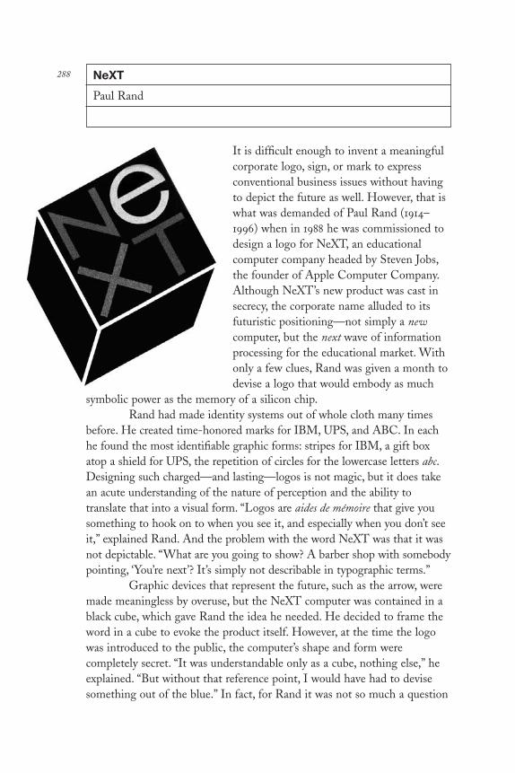
NeXT
Paul Rand
It is difficult enough to invent a meaningfulcorporate logo, sign, or mark to expressconventional business issues without havingto depict the future as well. However, that iswhat was demanded of Paul Rand (1914–1996) when in 1988 he was commissioned todesign a logo for NeXT, an educationalcomputer company headed by Steven Jobs,the founder of Apple Computer Company.Although NeXT’s new product was cast insecrecy, the corporate name alluded to itsfuturistic positioning—not simply a newcomputer, but the next wave of informationprocessing for the educational market. Withonly a few clues, Rand was given a month todevise a logo that would embody as much
symbolic power as the memory of a silicon chip.Rand had made identity systems out of whole cloth many times
before. He created time-honored marks for IBM, UPS, and ABC. In eachhe found the most identifiable graphic forms: stripes for IBM, a gift boxatop a shield for UPS, the repetition of circles for the lowercase letters abc.Designing such charged—and lasting—logos is not magic, but it does takean acute understanding of the nature of perception and the ability totranslate that into a visual form. “Logos are aides de mémoire that give yousomething to hook on to when you see it, and especially when you don’t seeit,” explained Rand. And the problem with the word NeXT was that it wasnot depictable. “What are you going to show? A barber shop with somebodypointing, ‘You’re next’? It’s simply not describable in typographic terms.”
Graphic devices that represent the future, such as the arrow, weremade meaningless by overuse, but the NeXT computer was contained in ablack cube, which gave Rand the idea he needed. He decided to frame theword in a cube to evoke the product itself. However, at the time the logowas introduced to the public, the computer’s shape and form werecompletely secret. “It was understandable only as a cube, nothing else,” heexplained. “But without that reference point, I would have had to devisesomething out of the blue.” In fact, for Rand it was not so much a question
288
DL2 05 07/13/04 2:55 PM Page 288

of having a reference point as using that reference point. “The clientmentioned the cube to me when I was given the problem, and I’m sure theother designers who worked on the logo must also have heard about it,”Rand presumed.
The NeXT logo was successful in part because the cube wassymbolically related to the product itself, but Rand insisted that the shapewas only important in sparking the idea. “Some reference was made to itbeing like a child’s block,” he continued. “I really think that is one of itsvirtues and part of its charm. However, the logo is not designed to becharming, it is designed to identify.”
Before the logo could do the job, however, Rand had to sell themark to Jobs. For this he had a pronged strategy. The first was to presentonly one logo. This underscored his own confidence in the solution anddeflected indecision on the part of the client. The second was to “speak”only through a presentation booklet that concisely explained the rationaleand showed the applications of the logo. Jobs had seen all the timewornfuturistic clichés—arrows, clouds, lightning bolts—in the book. However,he was unprepared for Rand’s twenty-page book, entitled “The Sign of theNext Generation of Computers for Education . . .”
From the beginning of this limited (fifty copies), Platonicdocument, Rand announced his premise: “What should a logo for NeXTlook like?” he asked in text set in Caslon, which led into a concise narrativethat condensed decades of communications history into ten minutes ofreading time.
First he introduced the concept of type itself: “Choosing atypeface as the basis for the design of a logo is a convenient starting point.Here are two examples: Caslon and Bifur. Caslon is an alphabet designed as far back as 1725 by William Caslon. It appears to be a good choicebecause it is both elegant and bookish, qualities well suited for educationalpurposes. . . .” He described the nature of his faces, their quirks and virtues,and concluded by admitting, “Attributing certain magical qualities toparticular typefaces is, however, largely a subjective matter.”
Next he defused the client’s need to sample a variety of typefaces:“One reason for looking at a number of possible typefaces is to satisfy one’scuriosity. Another, and perhaps more meaningful one, is to study therelationship of different letter combinations, to look for visual analogies,and to try to elicit ideas that the design of a letter or group of letters mightinspire.” He offered some examples that were intended to pique the reader’sinterest, and offered this warning: “Personal preferences, prejudices, andstereotypes often dictate what a logo looks like, but it is needs, not wants,ideas, not type styles which determine what its form should be. . . .”
DL2 05 07/13/04 2:55 PM Page 289

Then Rand took a representative typeface and set it in caps toexplain why this particular iteration was unsuccessful: “Set in all capitals,the word NEXT is sometimes confused with EXIT, possibly because theEXT grouping is so dominant. A combination of capitals and lowercaseletters alleviates this problem.” And after winning the argument, heprovided a textbook example of a more successful application: “Here aresome possibilities which explore the use of lowercase letters. The e isdifferentiated so as to provide a focal point and visual contrast among thecapital letters which, otherwise, consist only of straight lines. Happily the ealso could stand for: education, excellence, expertise, exceptional,excitement, e = mc 2, etc.”
This brief lesson in typographic style segued into an explanationof how a mark should function: “Ideally, a logo should explain or suggestthe business it symbolizes, but this is rarely possible or even necessary.There is nothing about the IBM symbol, for example, that suggestscomputers, except what the viewer reads into it. Stripes are now associatedwith computers because the initials of a great computer company happen tobe striped. . . .” And then he introduced the idea underlying his version ofNeXT: “A logo takes on meaning, only if over a period of time it is linkedto some product or service of a particular organization. What is essential isfinding a meaningful device, some idea—preferably product-related—thatreinforces the company name. The cube, in which the computer will behoused, can be such a device because it has visual impact, and is easy toremember. Unlike the word next, it is depictable, possesses the promise ofmeaning, and the pleasure of recognition.”
Understanding that questions would arise concerning theapplication of the cube, Rand talked about versatility: “This idea in no way restricts its application to any one product or concept. The three-dimensional effect functions as an underscore to attract the viewer’sattention.” Once established that the cube was the appropriate form, Randaddressed the basic structure of the logo: “Splitting the logo into two linesaccomplishes several things: it startles the viewer and gives the word a newlook, thus making it easier to separate from common usage. And even moreimportantly, it increases the letter size two-fold, within the framework ofthe cube. For small space use, a one line logo would have been too small tofit within this same framework.” Rand showed that readability was notaffected because the word was too simple to be misread. “Moreover, peoplehave become accustomed to this format with such familiar four-letter wordcombinations as love.”
He concluded his primer with a down-to-earth analysis: “Theadaptation of this device to miniaturization—tie tacks, charm bracelets,
DL2 05 07/13/04 2:55 PM Page 290

paper weights, stickers, and other promotional items is endless. It lendsitself as well to large-scale interpretation—signs, exhibits in the shape ofcubes, in which the actual exhibit is housed, as well as exhibit stands. Forprinted matter, its infinite adaptability and attention-compelling power isself-evident.”
Upon presentation, Rand did not utter a word, he just sat silentlywatching as Jobs read. “The book itself was a big surprise,” Jobs recalled. “Iwas convinced that each typographic example on the first few pages was thefinal logo. I was not quite sure what Paul was doing until I reached the end.And at that moment I knew we had the solution. . . . Rand gave us a jewel,which in retrospect seems so obvious.” Moreover, as it turned out, Rand’suser-friendly teaching aid underscored Jobs’ own commitment to theprocess of education.
DL2 05 07/13/04 2:55 PM Page 291

Dr. Strangelove
Pablo Ferro
As an attack on Cold-warhysteria, there was no morebiting comedy than StanleyKubrick’s 1964 doomsday film,Dr. Strangelove: Or How ILearned to Stop Worrying andLove the Bomb, in which anoverzealous U.S. general, JackD. Ripper, launches an A-bomb attack against theUSSR. This send-up ofnightmare scenarios depictedin the nuclear dramas Fail Safeand On the Beach fiercely
lampooned the era’s hawkish fanaticism, suggesting that the world wasclose to the brink of the unthinkable.
The film’s frightening absurdity is established in the very first frameof the main title sequence designed by Pablo Ferro. As the ballad “Try aLittle Tenderness” plays in the background, a montage of B-52 bombersengage in midair coitus with their refueling ships, underscoring the subplotthat sexuality is endemic to all human endeavor, especially the arms buildup.Surprinted on these frames, the film’s title and credits are full-screen graffiti-like scrawls comprised of thick and thin hand-drawn letters, unlike anyprevious movie title. The sequence brilliantly satirizes the naïve pretense thatAmerica was protected from nuclear attack by oversexed flying sentries. Italso contrasts beautifully with the film’s concluding montage, edited by Ferro,which shows atomic bombs rhythmically detonated to the accompanyinglyric, “We’ll meet again, don’t know where, don’t know when. . . .”
This was not the first time that a movie title sequence addednarrative dimension to a film. During the brief history of modern filmtitles, which began with Saul Bass’s 1954 Carmen Jones, a handful ofdesigners (among them, Maurice Binder, Steven Frankfurt, and RobertBrownjohn) established film identities by compressing complex details intosigns, symbols, and metaphors. By the time that Ferro made his 1964 debut,the stage (or rather the screen) had already been set for ambitious artistry.Although the Dr. Strangelove titles were a distinct departure from Bass’s
292
DL2 05 07/13/04 2:55 PM Page 292

animated, geometric forms in the German expressionist manner, they wereconsistent with the experimental film-within-a-film concept that gave titlesequences momentary independence while serving the practical needs of amotion picture. Moreover, this film launched the long career of Pablo Ferroas title designer, trailer director, and feature filmmaker.
Yet, before he started designing film titles, the Cuban-born Ferro(b. 1935), who had emigrated to New York City when he was twelve yearsold—quickly becoming a huge film fan and aficionado of UPA cartoons—had earned a reputation for directing and editing scores of televisioncommercials.
After graduating from Manhattan’s High School of Industrial Art,Ferro began working at Atlas Comics in 1951 as an inker and artist in theEC-horror tradition. A year later he began learning the ropes as an animatorof UPA-styled cartoons and worked for top commercial studios, includingAcademy Pictures, Elektra Films, and Bill Stern Studios (where, amongother things, he animated Paul Rand’s drawings for El Producto cigars). In1961 he founded the creative production studio Ferro Mogubgub Schwartz(later changed to Ferro Mohammed Schwartz, Mohammed being a mythicalpartner invented only to retain the cadence of the studio name). As aconsummate experimenter, Ferro introduced the kinetic quick-cut method ofediting, whereby static images (including engravings, photographs, and penand ink drawings) were infused with speed, motion, and sound.
In the late 1950s most live-action commercials were shot with oneor two stationary cameras. Conversely, Ferro took full advantage of stop-motion technology as well as shooting his own jerky footage with ahandheld Bolex. Unlike most TV commercial directors, Ferro maintained astrong appreciation and understanding for typography such that in the late1950s he pioneered the use of moving type on the TV screen. He had apreference for using vintage woodtypes and Victorian gothics not onlybecause they were popular at the time but because they were vivid ontelevision. In 1961 he created an eclectic typographic film sequence forJerome Robbins’s stage play Oh Dad, Poor Dad, Mamma’s Hung You in theCloset and I’m Feeling So Sad, an innovative approach that, similar to a filmtitle sequence, preceded the opening curtain and announced the differentacts within the performance.
After seeing Ferro’s commercials, Kubrick hired him to direct theadvertising trailers and teasers for Dr. Strangelove and convinced him toresettle in London (Kubrick’s base of operations until he died there in March1999). Ferro was inclined to be peripatetic anyway; ever anxious to bypassalready-completed challenges, he agreed to pull up stakes on the chance thathe would get to direct a few British TV commercials, which he did.
DL2 05 07/13/04 2:55 PM Page 293
The black-and-white spot that Ferro designed for Dr. Strangeloveemployed his quick-cut technique—using as many as 125 separate images ina minute—to convey both the dark humor and the political immediacy ofthe film. At something akin to stroboscopic speed, words and images flewacross the screen to the accompaniment of loud sound effects and snippetsof ironic dialogue. At a time when the bomb loomed large in the fears ofthe American public (remember, Barry Goldwater ran for presidentpromising to nuke China) and the polarization of left and right—East andWest—was at its zenith, Ferro’s commercial was not only the boldest andmost hypnotic graphic on TV but also a sly, subversive statement.
Dr. Strangelove was key to Ferro’s eventual shift from TV to film.And working with Kubrick was the best possible introduction to the movieindustry, since this relationship allowed Ferro to bypass the stultifyingHollywood bureaucracy. Ferro was free to generate ideas, and Kubrick wassufficiently self-confident to accept (and sometimes refine) them. Forexample, once the sexual theme of the opening title sequence was decidedupon, Kubrick wanted to film it all using small airplane models (doubtlessprefiguring his classic spaceship ballet in 2001: A Space Odyssey). Ferrodissuaded him and located the official stock footage that they used instead.Ferro further conceived the idea to fill the entire screen with lettering(which, incidentally, had never been done before), requiring the setting ofcredits at different sizes and weights, which potentially ran counter to legalcontractual obligations. Kubrick supported it regardless. On the other hand,Ferro was prepared to have the titles refined by a lettering artist, butKubrick correctly felt that the rough-hewn quality of the hand-drawncomp was more effective. So Ferro carefully lettered the entire thinghimself with a thin pen. Yet only after the film was released did he noticethat one term was misspelled: “base on” instead of “based on.” Oops! Inci-dentally, Kubrick insisted that Ferro take “front credit” rather than “backcredit,” a rare and significant movie industry protocol.
Ferro’s work is not always immediately identifiable, although hehas reprised his signature style from Dr. Strangelove a few times since 1964.Stop Making Sense, the Talking Heads concert film (1984), The AddamsFamily: Family Values (1993), and Men in Black (1997) all employ hisdistinctive hand lettering. But Ferro is less concerned with establishing apersonal identity than he is with creating titles that support the movie theyframe. Ferro defines each problem according to the ethos of the specificfilm; hence, titles for The Thomas Crown Affair (1968), with its quick cutsand innovative multiple-screen technique, or Midnight Cowboy (1969), withits lyrical narrative sequencing, are individual works born of the same visionand purpose—to introduce another artist’s work.
DL2 05 07/13/04 2:55 PM Page 294

295Restaurant Florent
M&Co.
In 1986 a chef named Florent Morlet openedan inexpensive French restaurant in NewYork City’s unsavory meatpacking district.Without any investors and little capital, herented a funky old luncheonette that hadrecently gone out of business. His intent wasto remain unpretentious (and still appeal toan exclusive clientele), yet RestaurantFlorent did require the basic promotionalmaterials, such as menus, business cards, anda sign. For these graphics he hired M&Co.,a New York firm known for experimentalcommercial art. Tibor Kalman (1949–1999),M&Co.’s creative director, suggested thatFlorent keep all the fixtures, furniture,utensils, and the sign that the previousgreasy spoon had left behind. “Let therestaurant design itself,” said Kalman.
The menu designed itself too. Kalman decided that to beconsistent with the restaurant’s overall ambiance the menu should look likea printer had thrown it together. He would have gone to a place where theyprint typical Greek coffee shop menus, “but we felt that the result wouldn’tbe quite as effective as what a job printer might do, because those otherprinters are imitating designed things,” he explained. Instead the menulooks as though it had been pieced together in a few hours using randomtype from a letterpress type case. Nevertheless, it took two months todesign. “If we weren’t trained designers it would have taken less time,” saidKalman. “The difference between something really wonderful and reallyhorrible is very close.”
M&Co. designed Florent’s first announcement using a mundaneexterior photograph of the restaurant (the kind used for common dinerpostcards). For the second they made an original design and printed it on acoarse chipboard paper stock. Kalman decided to illustrate the idea of arestaurant through little pictographs lifted straight from the ManhattanYellow Pages. The result was a kind of rebus with a chair representing therestaurant, a truck representing the address, a gun representing New York
DL2 05 07/13/04 2:55 PM Page 295

City, and an old Bell Telephone Company logo representing, well youknow. “Our vocabulary was based on dumb, really obvious, generic imagesused for most commercial advertising,” explained Kalman. But the goal wasnot nostalgia. In fact, Kalman insisted that the difference between nostalgia(or kitsch) and appropriation is ultimately how the finished product isfiltered through the designer. Nuance is the key.
Early versions of advertisements for Florent employed quirkyiconography, too. One showed a raw steak, another a simple salt shaker(both had the restaurant’s name but no address or phone number). AsRestaurant Florent’s popularity increased additional funds were availablefor larger ads. M&Co. created a different ad every week, all orchestrated tocreate a distinct mythology. Inexpensive stock photos and studio shots offound objects conveyed a variety of ideas, the most emblematic of whichwas a common three-dimensional menu board left over from the greasyspoon days, complete with misspellings of the day’s specials. Others showedarrows pointing to the shirt of a customer, humorously indicating whatspecials had been spilled that day, a parody of an ecological chart. The mostfashionably design-conscious ad used words in the manner of dadaisttypography of the 1920s to illustrate Florent’s food and drink menu.
Many restaurants and businesses have consistent identitycampaigns, but Restaurant Florent stands out for two reasons: it was apioneering effort in vernacularization (the return to commonplace elementsof commercial art), and it was a successful performance of various talentsbrought together as a repertory producing the equivalent of scripted andimprovisational graphic design.
DL2 05 07/13/04 2:55 PM Page 296

297Disney World Signage
Sussman/Preja
Walt Disney World in Orlando, Florida, isnot a Mickey Mouse operation. It is as largeas San Francisco and as diverse as NewYork’s five boroughs. By comparison itreduces the original Disneyland in Anaheim,California, founded in 1955, to the status ofmere amusement park. Disney World is theescapist capital of the world with attractionslike the Magic Kingdom, a fantasy themepark modeled after Disneyland; Walt DisneyVillage and Pleasure Island, a mammothresort and shopping mall; Epcot Center, aworld’s fair–scaled projection of the future;and UA/MGM Studio, a Hollywood movieset come to life. These realms are separatedby large greenbelts and connected by anorth-south axial highway and arterial roadsystem, which like any interstate requiresprecise way-finding management. Butprecision is only one concern of Michael D. Eisner, Walt Disney Inc.’schairman and chief executive officer.
Eisner’s widely publicized strategy of growth brought with it a Medicean patronage of art and architecture. His commissions topostmodern architects Michael Graves, Frank Gehry, and Arata Isozakireflected a commitment to the unique and unusual. Paul Goldberger,architecture critic of the New York Times, called Disney Inc. “a corporatepatron like no other.” Hence, the commission given to Sussman/Preja andCompany—the creators of the carnival-modern graphics of the 1984 LosAngeles Summer Olympics—to design Disney World’s road signs, buses,and gateways underscored Disney’s commitment to distinctive design,down to the smallest detail.
In 1986 Eisner thrust Walt Disney Inc. into a developmentalfrenzy that included expansion of its film, publishing, and resort operationsin the United States and Europe. Unlike most American cities ofcomparable size, where poor planning has ruined skylines and made ingressand egress confusing at best, Disney believed in coordinated development.
DL2 05 07/13/04 2:55 PM Page 297

A responsibility for the total comfort of visitors, both in the attractions andon the roads, meant that as Disney World grew, a new environment thatfacilitated mobility and identified Disney World as an integral andaccessible entity was needed.
“In the beginning our signage was like everywhere else in thecountry,” said Eisner about their original “liver-colored” road signs that alsoserve as the National Park Service standard. But beyond his apparentpreference for nonconformity, Eisner admitted, “I drove myself aroundDisney World but routinely got lost. If I couldn’t find my way, who could?”The desire for a contemporary look, plus the development of new hotelsand attractions were good enough reasons for Eisner’s decision to changethe entire system. But he also offered a more fundamental rationale:“When Walt Disney World was originally built, the Magic Kingdom wasup at the extreme north of our property. I’m told that the [developmentgroup] felt that if they signed at the beginning of the property, kids wouldget so excited about going to the Magic Kingdom they’d be frustrated tofind a fifteen minute drive ahead of them.” With the new growth it nolonger took fifteen minutes to get to a Disney attraction, making a uniformsignage system not only more appealing but, in fact, quite necessary.
Based on their success with the graphics program for the 1984Summer Olympics, Deborah Sussman (b. 1931) and Paul Preja (b. 1930) ofSussman/Preja and Company were invited to propose ideas. When theywere awarded the commission, Wing Chao, senior vice president ofplanning, architecture, and engineering of Disney Development (thedivision administering to all areas other than the design of the thematicattractions) had one simple request: “I wanted their wildest ideas andcraziest notions. They shouldn’t hold anything back.” Sussman was glad tooblige. “We showed them a hundred ideas for the one that got built, butthat was part of the fun,” she said.
Understanding how the signs could be more efficiently used waskey to an effective design solution. Sussman took charge of the designteam, Preja led the analytical phase, Scott Cuyler did much of the initialcreative work, Robert Cordell was the in-house project manager for allDisney work, and Debra Valencia worked on the typography during therefinement stage. April Greiman, a frequent collaborator with Sussman/Preja, consulted on various aspects of the signage. The design problem wasalso opened to other designers in their office.
At the outset the designers needed to be familiar with the rathercomplex layout of Disney World. “We didn’t know what Epcot was,”admitted Sussman. “Or that the Magic Kingdom was essentially the sameas Disneyland. Or what Pleasure Island was and how it related to the
DL2 05 07/13/04 2:55 PM Page 298

Magic Kingdom.” Indeed most outsiders are also unaware that thesediverse attractions fall under one umbrella. After their initial research wascompleted, Sussman issued a statement that became the blueprint for hervision. In it she said, “there is the world and then there is Disney World,”suggesting the scope and limits of the problem.
The first planning decision was to simplify the signagerequirements yet attend to every complex detail. “We decided to establisha series of discrete districts, similar to boroughs,” Sussman said about theinitial stage, “which affected how many of the previous signs we couldeffectively eliminate. Instead of having to erect a separate sign for everycomponent of Disney World, we could group them into discretecategories that were headed by these districts. That, of course, affectedthings like size, typography, and nomenclature. Before this, every signbegan with ‘Walt Disney World,’ followed by the name of the attractionand other pertinent information. It was like reading a long menu—by thetime you get to the end you forget what the other entrées were. Similarly,by the time you’ve finished reading the road sign [if you can read it at all]what you probably remember is the heading. That indicates a tremendousamount of redundancy.”
The new plan reduced the number of messages under the districtname, which then was eliminated on the signs nearer to the attraction. Ahierarchy of signs was established and designed accordingly; it includedlarge highway signs, secondary message markers (like what frequency toturn the car radio to for Disney World’s exclusive channel), off-highwaydirectionals, and so on. The next step involved the three basic aestheticcomponents: color, typography, and form. “We agreed with the Disneypeople who felt that they had enough images in Disney World already,”Sussman continued. “But we did, however, want to evoke the spirit ofDisney. Our challenge was how to do it without imitating or, as FrankGehry said ‘co-opting, or being co-opted by’ these famous Disney icons.Our answer was to look at the simplest vocabulary possible.”
Sussman selected Univers type because of its numerous size andweight variations. As for color, “Mickey is black and white, plus red andyellow. Yet from these colors you can’t make a whole signing system—atleast we didn’t think that we could,” she said. Ultimately green wasintroduced, as well as purple for its playful spirit. As for form, Sussmanplayed around with various cut-paper configurations, and Scott Cuylerdevised the angular post used for some of the highway signs, which took ona kind of postmodern, or Disney Deco, flavor. But in the end it wasMickey’s profound influence that made the difference. Without literallylooking like Mickey Mouse, the addition of a black circle (in which
DL2 05 07/13/04 2:55 PM Page 299

directionals were placed) onto the otherwise rectangular signboards becamean indispensable graphic signature. “It worked immediately,” Sussman saidabout the simple yet brilliant composition. “And when we made the signsthat had two circles, it was unmistakably Mickey.”
The concept went to Eisner for final consideration, who, accordingto Sussman, said upon first glance “‘If I had to make a decision today, I’dsay yes.’ But since this was a major commitment, he wanted to test it outwhile looking at some other ideas.” Eisner loved the colors, and evensuggested they be copyrighted so that no one else could use them. But healso wanted to know what else could make the signs “more Disney.” Anobvious suggestion was to put Mickey’s hand in the black circle in place ofthe arrow. “We tried it out as a full scale, on-site sign,” Sussman explained,“but we felt strongly that it didn’t work. The hand just does not want tobecome an arrow.” Since Eisner liked the idea, Sussman was a little worriedthat he would insist on going with it. “But,” she said, “when we showed itto him he admitted that we were right.” Another option was to use asilhouette of a Disney character or part of one sticking out of a diagonalsign for off-highway use. However, the feeling at Disney was that visitorswould either steal them or stop to have their pictures taken next to them,which would ultimately impede the flow of traffic. In the end they decidedon one special series of highway messages featuring Mickey on threesequential overhead signs spread over a few miles. The first showed twoyellow gloved hands reaching over the sign, Kilroy style; in the second, tworound black ears peeked up; and finally, in the third, Mickey’s smiling facepeered over.
Like an old Burma Shave sign, these teasers span Disney World’smain highway. Elsewhere, other signs of all descriptions, even thecommonplace markers indicating stop, yield, and speed, are set atopcolorful stanchions and pylons that are not only efficient, but also playfullydecorative. How have the signs fared with the public? “They have gottengood response,” Eisner said proudly. “I don’t know whether it’s becausepeople now know where they’re going or that they really like the look.”In creating an environment that reflects its time, communicates a purpose,and defines a corporation that since its inception has devoted itself tocelebrating the imagination, Sussman/Preja joined other architects anddesigners who transformed Disney World into a festival of late twentieth-century design.
DL2 05 07/13/04 2:55 PM Page 300

301The Public Theater Posters
Paul Davis
The revolution was already in full swing when, inthe late 1950s, Paul Davis (b. 1938) entered thefray. Some renegade illustrators and art directorshad already begun to revolt against the saccharinerealism and sentimental concepts in most Ameri-can magazines and advertising. Although Daviswas not among this first wave, he was swept up byit. By the early 1960s he had developed a distinctvisual style—a unique confluence of primitive andfolk arts—that brought a fresh, American look toillustration. In a relatively short time he wasamong the most prolific of the new illustrators,and his style had a staggering impact on the field.
Davis developed an interest in Americanprimitive painting and folk art as well as in thehand-lettered wooden signs that definedeighteenth- and nineteenth-century Americancommerce. “An artist of the caliber of [thenineteenth-century Pennsylvania primitive]Horace Pippin, whom I still think is one of themost undervalued American painters, was makinghonest observations of American life,” he saidabout the search for a native culture. “The 1950swere a particularly nationalistic time, especially in the arts. People weretalking about what is American. Europe was still the acknowledged leaderin the arts, and many people did not believe that Americans even had aculture.” In 1959 Jasper Johns showed his flag paintings for the first time.They were unmistakably American. Davis remembered going to theWhitney Museum biennial exhibitions where Larry Rivers and RobertRauschenberg were shocking people with their new American visions.
One of Davis’s many stylistic evolutions occurred between the late1960s and early 1970s with a cover for the left-wing arts and politics journalEvergreen. He rendered a religious depiction of Cuban revolutionaryErnesto “Che” Guevara, whose exploits in South America had becomemythologized by the American New Left. In this image Davis eschewedthe Early American conceit for a synthesis of Italian religious art and
DL2 05 07/13/04 2:55 PM Page 301

socialist realism. “I was trying to make the image of a martyr,” said Davisabout this artifact of the era. “I didn’t realize the potency of the symbol atthe time. But when the cover and later the poster appeared, Evergreen’soffices were firebombed [by Cuban émigrés].”
With this image he began a formal shift from the stiffness andmotionlessness of his primitives to a more photographic sensibility. “I triedto erase the traces of American primitive art because it was becoming atrap,” he admitted. “I wanted to rid my work of all the elements that referredto other styles. And within a year or two after this, I had eliminated a lot ofself-consciousness from my work.” Soon Davis began to “depend more onthe beauty of objects,” and depicted scenes rather than ideas.
Davis’s most significant contribution to American graphic designis his theater posters. His rendition of Hamlet and subsequent posters forJoseph Papp’s New York Shakespeare Festival done during the mid-1970schallenged the conventions of contemporary theater advertising. First, theywere not encumbered by the usual bank of “ego” copy. “Those early postersdidn’t say anything: No Joe Papp; No Shakespeare Festival; No actors. Ididn’t even sign them at first (and only self-consciously used my initialswhen I first began to do so). The only lettering was the title of the play and the name of the theater, though we realized later that it wouldn’t hurtto mention that this was, in fact, a Shakespeare Festival production andbegan to include a logo.” Second, without mimicking style, Davis’s postersreferred to the late nineteenth-century European tradition of poster art,which was ignored by contemporary posterists.
His Public Theater posters were stark, employing a central imagewith simple type either stenciled or silkscreened directly on the artwork (ashe did on Hamlet in collaboration with art director Reinhold Schwenk) orseamlessly integrated into the composition (as with the Three Penny Opera).“The history of the Shakespeare Festival posters says a lot about the waythe posters are used,” he said. “I have often made comments in the postersabout the way posters look on walls and in the environment in which theyare hung. Many of my posters for the festival have had that self-consciousquality about being a poster.” One example, For Colored Girls Who HaveConsidered Suicide When the Rainbow Is Enuf, showed the main figure withthe title lettering scrawled on a tiled subway wall where, in fact, the posterwas intended to be hung. The third, and final challenge to conventionaltheater posters was his basic methodology. Davis read the play, went to therehearsals or readings, and talked to the actors and directors. “They seemedto think,” he said, “that I was doing this revolutionary thing by actuallyreading the scripts.”
DL2 05 07/13/04 2:55 PM Page 302

303The Public Theater
Paula Scher
Paula Scher (b. 1948) is not a native NewYorker, but she has acquired the self-assured, sarcastic, and abrupt elocutions ofone. Scher believes that the best way tocommunicate to New Yorkers is to shout.“What better way to get a message acrossthan for someone to yell something like‘I’m pregnant!’ down a corridor; it’s betterthan the Internet,” she said. And this isexactly how she designs for The PublicTheater. She shouts with type—boldly andunmistakably.
Scher’s posters for The Public’s1995 season, only a component of a largershouting campaign, have been included invirtually all the design annuals and shows,but one has to be a New Yorker (or at leastfrom the environs) to truly appreciate theimpact of The Public’s language on thepublic. This is not the typically benignillustration sandwiched between layers ofbilling and flowery hyperbole. Rather,Scher’s cacophony of disparate woodtypes, silhouetted photos, and bright,flat colors is more akin to the two-color rag bond or oak tag bills producedby job printers or run off at Kinko’s to advertise circuses, county fairs, prizefights, and dance bands—the kind that are stapled and wheat pasted everytime the New York sanitation authority’s back is turned. Scher’s scheme,inspired by today’s street graphics and yesterday’s Victorian playbills, waspurposefully designed to appeal to a broad audience, from the inner city tothe outer boroughs, especially those who have not been attracted to thetheater before and for whom the typical “Broadway style” of advertisingsays exclusion.
Scher’s street-based campaign supported the vision of The Public’screative director, George C. Wolfe, the director of such plays as The ColoredMuseum, Angels in America, and Jelly’s Last Jam. After taking over in 1993,three years following the death of impresario Joseph Papp, The Public’s
DL2 05 07/13/04 2:55 PM Page 303

director for more than twenty years, Wolfe has completely reshaped theinstitution—its season, staff, lobby, advertising, and mission—to be moreinclusive of those persons and communities for whom theatergoing has notbeen an option. “I want to have the kind of plays in The Public where thewhole building becomes a giant snapshot of where America is,” he said inhis rapid, syncopated cadence. Although Papp, who coined the name ThePublic Theater, welcomed the public during his significant tenure, andintroduced a diversity of plays and playwrights, such as David Rabe, CarylChurchill, Miguel Pinero, Ntozake Shange, David Mamet, and George C.Wolfe, the theater’s traditional audience was still essentially what one criticdescribed as “uptown white.” Wolfe, on the other hand, wanted totalinclusivity. “I want to take populist culture and elevate it, and bring elitistculture to a populist level,” he stated with missionary zeal. So to changeboth the perception and the reality, as an adjunct to producing plays thataddressed the experiences and lore of African-Americans, Hispanics,Asians, and gays, Wolfe dramatically changed The Public Theater’sdistinctive visual persona, which for twenty years had been based on PaulDavis’s iconic painterly posters. “I was looking for someone who could giveThe Public an in-your-face unity,” he continued. “I wanted somethingcombustible and dynamic.”
Scher’s debut was somewhat of an improvisation. The day shelearned that she and her Pentagram/New York team had been selected, shewas also informed that Wolfe immediately needed to begin advertising TheNew York Shakespeare Festival, The Public’s long-running, free summerperformances of Shakespeare in Central Park. With little time, Scher hadto create a coherent scheme that not only advertised the plays, but alsosignaled both the beginning of Wolfe’s era and the Shakespeare Festival’srelationship to the whole Public institution, comprising Central Park’sDelacorte Theater, five separate theaters in The Public’s headquarters in theold Jacob Astor Library, its Broadway productions, and additional publicevents, which, Wolfe explained, “were originally tied together by Papp’spersonality,” but now required an organized system. Rather than ponder thevirtues of one design scheme over another, Scher was forced to create whatwould become The Public’s visual identity based on one of its manycomponent parts. Nevertheless, she turned a necessity into a blessing. Theidea to focus solely on typography as the organizing principle was aresponse to Wolfe’s mandate to “cleanse the visual palate” and therebyeschew illustration entirely. Wolfe liked Scher’s earlier Victorian- andconstructivist-inspired compositions done in more or less appropriatecontexts, but nothing could have been a better fit than this assignment; forhere she could revive her favorite Victorian woodtypes—the ones that can
DL2 05 07/13/04 2:55 PM Page 304

be seen from a block or more away—on real playbills, posters, andbillboards, not as mere pastiche, but as functional design elements.
The Shakespeare Festival graphics were based on a simple format.Key words like free and live were greatly enlarged, satisfying Wolfe’s desireto address the public in a direct, no-nonsense manner, like sale signs insupermarket windows. Likewise, enlarged fragments of the titles of plays setin bold gothics, like the words wives for The Merry Wives of Windsor andgents for Two Gentlemen of Verona, drew attention to a linguistic mystery andprovided a distinct contemporary identity that Evan Shapiro, director ofmarketing for The Public, said was like giving a news report rather than anad spiel. “The approach is not complacent,” he added, “it says we’re here,come see us, or we’re coming to get you.” The typographic posters wereplaced on telephone stalls around New York, hung in commuter railroadstations in the environs, and on a few select billboards. They were intendedto draw passersby into a visual game of deciphering the meaning of thewords. If they missed on the first try, the ads were positioned close enoughthat on second glance the message was revealed. Flyers and handbills withthis ersatz call-to-arms typography were also sniped around town in a blitzof paper promotion that is typically New York.
Language by its very nature is a communal thing, and Wolfe and Scher, who have their own personal shorthand, believed that thesyncopated sounds formed by the truncated titles and phrasescommunicated through bold type, dark rules, and bright colors woulddevelop into a conversation between the people of New York and ThePublic Theater.
The cornerstone of The Public persona was its logo, acombination of Scher’s visual/linguistic elements that shouted the wordpublic, which was spelled out in a sampling of black woodtype letters inweights ranging from heavy to light set against a white field; the words Theand Theater are there, but subordinate to the dominant word/idea. Inaddition to the main logo, Scher designed round logos, or what Wolfecalled “tokens” (The Public is built over the Astor Place subway station) forindividual theaters. The next level in the hierarchy of communication wereaccordion-folded flyers that when completely unfolded (to a length ofaround two feet) revealed the entire season’s programs in a typographicarray reminiscent of Victorian theater bills, a sharp contrast to the usuallyquiet treatments of most mainstream theatrical subscription materials.
An exception to the pure typography rule were the posters for theindividual plays, many of which included photographs—such as theemblematic silhouette of tapmaster Savion Glover on the poster for thattongue-twisting titled musical, Bring in da Noise, Bring in da Funk, which
DL2 05 07/13/04 2:55 PM Page 305

sandwiched him between a jumble of letterforms, somewhat akin to a wallof graffiti.
Wolfe wanted his posters to be like old LP album covers, andScher, who designed albums for CBS Records in the 1970s, has certainlyobliged by making them very graphic. But while most of her posters owe aspiritual debt to street graphics, they do not look like anything else on thestreet. One needs only to look at construction hoardings where snipedposters for Blade to the Heart and The Diva Is Dismissed were hung; bothhad the allure of untutored street graphics, but stood noticeably apart. TheBlade poster, for example, featured an enlarged process-color photo of aboxer in a typical fighting stance with the large dots of the color platesknocked out of register in a pun on the punch drunk nature of the play’sprotagonist. The Diva poster showed the huge face of Jennifer Lewis,whose one-person show this was, with a kinetic propeller of type comingfrom her open mouth. The forms were somewhat vernacular, and thereforebeckoned, but it was the subtle wit that gave them resonance and fosteredmemorability.
DL2 05 07/13/04 2:55 PM Page 306

307Altria Logo
When the Philip MorrisCompany changed itscorporate name in January2003 to Altria, it introducedan abstract logo that isdiametrically different fromits former heraldic coat of arms, still used on itscigarette packages. Since big business is so reverent toward logos—especially venerated ones—to reinvent an entirely new corporate identityraises a flag, which is exactly what Philip Morris has done in its battleagainst negative public perception.
In fact, the new logo, a colorful mosaic grid conceived by LandorAssociates, New York, looks incredibly similar to the 1994 “Earth Flag” by aDanish designer, Torben Skov, for a conference in Ostend, Belgium. It isalso reminiscent, in concept though not form, to the post-apartheid SouthAfrican flag, with clashing colors symbolizing the nation’s diverse tribes.Likewise, Altria’s luminescent grid represents Philip Morris’s branddiversity, from its cigarette line (Marlboro, Virginia Slims, Benson &Hedges, Parliament, Chesterfield, English Ovals, L&M, and dozens ofothers in the U.S. and Europe) to Miller Brewing Co. and Kraft Foods(Cheez Whiz, Kool-Aid, Maxwell House, Oscar Mayer, Sanka, Tang,Velveeta, and more).
The logo is inspired (if one squints) by a display of varied packages.Nonetheless, compared to the imperial lions framing Philip Morris’s originalmonogram, this contempo symbol is fairly generic and applicable to scoresof different companies, which vividly shows how graphic abstraction canmake even the most simplistic concept into a mark of authority.
And yet, Altria’s logo is actually more similar to one of thosevibrating pixelated distortions used on Court TV or 60 Minutes toobliterate a witness’s or whistle-blower’s face than it is to a national flag. Itis therefore designed more to camouflage than to illuminate, which is notsurprising, since one of the jobs of CI (corporate identity) is to hide orremove stains from a questionable corporate image.
Ever since smoking was officially deemed hazardous and addictiveby the Surgeon General, Philip Morris’s tobacco divisions have cast long
DL2 05 07/13/04 2:55 PM Page 307

dark shadows over both its more benign product lines and its aggressivecultural philanthropy. According to www.identityworks.com, a Web site thatreviews new CI programs, this switch from emphasizing Philip Morris’smore negative possessions, regardless of how profitable, to its moreacceptable corporate assets was overdue: “At long last, management acceptedthe obvious need to distinguish the corporate brand from its tobaccobusinesses.” Or, as the official corporate literature opines: “The name ‘PhilipMorris’ is truly a tobacco name—a name associated with a remarkablehistory as a leader in that industry, both in the United States and around theworld. But we also have come to own a number of companies that are nottobacco-based . . . Altria Group will clarify its identity as what it is: a parentcompany to both tobacco and food companies that manages some of theworld’s most successful brands.” As articulate as the above may be, andhowever naïve I may sound, something is still disturbing about an identityintended to conceal complicity in one of society’s most dreaded health risks.
Incidentally, the name “Altria” derives from the Latin word altus,meaning “high,” which the corporate literature states, “connotes anenterprise that aims for peak performance and constant improvement. Ourgoal is that, over time, the name also will reflect the seven attributes thatwe believe define who we are and how we grow our businesses:performance; marketing excellence applied by our consumer packagedgoods companies; commitment to responsibility; financial strength;innovation; compliance and integrity; and dedication to people.” So,reading between the lines, to distance itself from secondary smoke andother related issues, this corporation selected ecclesiastical Latin forrepositioning itself, because it is both enigmatic and spiritual.
Many other corporations have likewise adopted Latin- or Greek-sounding names not only because they are attempting to concoct newmythologies for themselves, but also because everyday English words andnames are becoming something of an endangered species. The diminishingpool of common identifiers that are available for use as trademarks is theresult of two trends, according to Frank Martinez, a trademark andintellectual property lawyer: “First is the growing practice of filingapplications to federally register a trademark based upon a bona fideintention to use the trademark sometime in the future. Corporations like toknow that they own the right to use the proposed trademark prior todevoting valuable resources to building a brand.”
The second reason grows directly out of the emphasis trademarklaw places on the “distinctiveness” of a trademark: “The made-up businessname is considered ‘fanciful’ or ‘arbitrary,’ and is considered ‘inherentlydistinctive’ by the U.S. Patent and Trademark Office.” As competition gets
DL2 05 07/13/04 2:55 PM Page 308

fiercer in a dwindling economy, Martinez predicts we should expect anincrease in unusual business and product names, “since the success of a newproduct may be directly related to the novelty of its trademark.”
This concept is not, however, a novel one. Almost a century agoKodak was an invented “inherently distinctive” name, which still soundsand looks good today. But the problem with Altria is that its made-up-nesshas a false ring. Today, there are myriad strained product and businessnames that start with “A” and end with “A,” like Acura, Altima, Achieva,Adapta, and Accela. Or names like Maxima and Previa, which sound likeRussell Crowe’s buddies in the movie Gladiator. Then there are names likeConsignia—a reinvented title for England’s Royal Mail that wasabandoned shortly after its introduction—which sounds like a medicine forstopping flatulence. It also turns out the Altria is not entirely originaleither. In 2002, a Denver venture capital firm called Altria Group LLCtried to legally enjoin Philip Morris from instituting the change, but lost itscase because trademark law doesn’t ban company names that sound alikeunless the similar names would cause confusion among consumers.
Made-up names are not, however, a priori bad, notes BrianCollins, Senior Partner, Executive Creative Director of the BrandIntegration Group at Ogilvy & Mather: “I truly hated Verizon at first. Itsounded too desperate. But at some point, I started thinking the name wassorta okay—maybe even good.” Of course, names get their real meaningfrom what they represent, and Verizon has become a successful brand(despite a clumsy logo now seen on countless phone booths and stalls)because it efficiently serves its clientele.
But back to Altria: Collins was originally suspicious of the Altrianame, though he now says, “In all of the advertising work they’ve done tolaunch the new name, they’ve actually gone out of their way to say itrepresents the two divisions of the Phillip Morris Company. They are notreally hiding behind anything, as Phillip Morris remains the name of theirbig flagship tobacco company, [which] they have made very clear.” Hefurther believes that the graphic identity is a memorable, fair representationof a giant company that is in several different businesses. “The logo is adistillation of the colors of their many, varied brands. I think the identity isbeautiful and powerful—especially when it’s animated.”
Granted, the color grid is alluringly hypnotic when morphing onthe computer screen, yet on the printed page it is just vague and clumsy, inlarge part because the Altria logotype is not integrated into the mark andsits untethered to one side, as if it were a typographic afterthought. Whenused on the four magazine advertisements, created by Leo Burnett USAthat launched Altria—which feature pleasing, though enigmatic, color
DL2 05 07/13/04 2:55 PM Page 309

photographs of (respectively) a tree, a bridge, an architectural column, and awaterfall—the grid appears like a misplaced scrap of paper, something adesigner or printer neglected to remove from the layout before sending itoff to press.
But the copy on the print ads is not ambiguous. For example, theone with the tree reads, in part: “From these branches grow many brandseach worth a billion dollars or more, like Marlboro, Nabisco, and OscarMayer. Along with hundreds of other household names such as Altoids,Parliament, Post, and Ritz.” The cageyness of the ad is the nonchalantinclusion of cigarettes with lunchmeats and breath mints. Likewise, thelogo blends the products together in one chromatic blur under theinscrutable name. The ads are not aimed at the general public, whocertainly know the difference between butts and bologna, but rather atinvestors, who doubtless need to be encouraged to feel more comfortableabout supporting a company that in addition to processed food marketshazardous and addictive products. During these times of raised healthawareness, it is easier to feel ethically sanguine about earning dividendsfrom something called Altria (which sounds curiously like “altruist”) thansomething called Philip Morris. And that is the real inspiration behind thename and logo change.
DL2 05 07/13/04 2:55 PM Page 310

DL2 05 07/13/04 2:55 PM Page 311

DL2 06 07/13/04 2:56 PM Page 312

INFORMATION
DL2 06 07/13/04 2:56 PM Page 313

DL2 06 07/13/04 2:56 PM Page 314

315Ripley’s Believe It or Not!
Before its transformationinto a corporate theme park,New York’s Times Squarewas the world’s largest andgaudiest carnival midway.Replete with dazzling lights,boisterous barkers, andfrightening freak shows, theGreat White Way was ahugely popular attractionwith a reputation thatspanned the globe. Until the1960s, Ripley’s Believe It orNot! Museum was one of themost famous of TimesSquare’s destinations. Fordisplayed in a dark andcavernous dungeon one floorbelow street level on teamingBroadway, illuminated by faint colored spotlights, were myriad odditiesguaranteed to raise hackles and tickle funny bones. Shrunken heads fromAfrica, human skulls pierced with hundreds of nails, stuffed vampire batswith demonic eyes, South American birds with multiple wings, anddomestic canines with extra legs and tails were all splendiferously on view.The world’s weirdest phenomena were presented with such sublimeverisimilitude that the visitor could only believe it . . . or else.
Walt Disney discovered gold in Anaheim, California, in the early1950s, but he was not the first to get rich through cartoon creation. Duringthe 1940s, Robert Leroy Ripley gave his name to, and earned riches from, achain of enticingly titled Odditoriums inspired by his popular cartoon,“Ripley’s Believe It or Not!,” a daily diet of odd and entertaining factoids(before that word was coined) which ran in hundreds of Americannewspapers, to the delight of millions.
Ripley had a lifelong passion for rooting out the bizarre and thegrotesque, as well as the rare and the uncommon, which he discoveredwhile on globetrotting expeditions that took him to 198 different countries
DL2 06 07/13/04 2:56 PM Page 315

and across a total of 585,000 miles in the course of forty years. Ripley wasdubbed the “Modern-Day Marco Polo” by the Duke of Windsor. UnlikeMr. Polo, he recorded his findings in crayon using the common realisticcartoon style. But despite this tame presentation, Ripley’s comic wasdecidedly surreal in its plumbing of the unusual. All irony was curiouslysuppressed as it tested the public’s capacity to believe the incredible. Andbelieve they did.
The cartoon was imbued with a distinct character, both from thelettering and from the drawing styles. Moreover, Ripley’s signature, whiletypical of the way contemporary cartoonists signed their works, was apowerful brand: The flourish or end-line after the “Y” gave it a particularlywitty look. The “logo” for Believe It or Not!, reminiscent of the typefaceCooper Bold with a shadow, was an unmistakable identifying mark as well.Real type was never used for body text—only a somewhat crude, speedballhand-lettering. And the drawings, done in pen and ink and grease crayon,were also somewhat primitive. Nonetheless, the overall graphic impact wasimpeccable. Together, all the elements got the message across and gave thework a singular personality. Had the cartoon looked any different—had theoverpoweringly garish red been a soothing yellow—it might not havesucceeded as it did.
A self-taught artist, Ripley sold his first drawing in 1907 to theAmerican humor magazine Life when he was only fourteen. Nonetheless,he was a natural-born athlete who dreamed of pitching in Major Leaguebaseball. A freak injury during his first professional game brought an end tohis career, so he quickly turned to cartooning for his livelihood and landeda job as a sports cartoonist for the San Francisco Chronicle. Ever peripatetic,he moved to New York, where he worked on the sports desk of the NewYork Globe. In 1918, while drawing sports cartoons, he created a featurecalled “Champs and Chumps,” a comic sampler of individual athletic highsand lows and odd sporting feats. His editor, however, rejected the title astoo limiting, and ultimately Ripley settled for the more encompassing“Believe It or Not!” The cartoon was such an overnight sensation that soonafter its debut, he decided to expand the scope. The cartoon ultimatelydeveloped into a regular radio show on which he would regale his audiencewith exotic discoveries and fantastic claims. Eventually, Ripley turned totelevision.
Ripley reveled in oddities and lived the life of an eccentric. Amillionaire a few times over, he filled his houses and apartment with artifactsfrom Europe, Asia, and South America. A colleague once said “the mostcurious object in the collection is probably Mr. Ripley himself.” Among hismany quirks, he is said to have drawn his comic strips, while holding them
DL2 06 07/13/04 2:56 PM Page 316

upside-down; he did so every morning without fail. He dressed in thebrightest colors and most sensational patterns, and wore bat-wing ties andtwo-toned spat shoes. He collected automobiles as though they were toys,but never learned to drive. Even though he often used complicatedrecording equipment for his broadcasts, apparently he was afraid to use atelephone for fear he would be electrocuted. A non-swimmer, he owned anodd assortment of boats, including dugout canoes and even an authenticChinese sailing junk. Such were the rewards of cartooning that many otherswere inspired to seek riches plying the same trade.
Believe It or Not! became such a common household phrase thatits potential as an advertising tool was well exploited. The tremendousamassed backlog of cartoons was licensed for virtually any promotional use. For a modest fee, Ripley’s unmistakably recognizable graphics werefrequently used to represent everything from auto parts manufacturers tocoffee shops.
Ripley’s Believe It or Not! is an American cultural icon that hasbeen exported around the world. Although the cartoon has ceased, themuseums and Odditoriums continue to draw in crowds in the UnitedStates in Florida, Texas, and Missouri, as well as in Juarez, Mexico;Queensland, Australia; Lancester, England; Kyonggi-do, Korea; Chonburi,Thailand; and others. Today, Ripley’s is quaint given how the media offersexposure to the weird and the ridiculous, but where else can one learnabout “The Island Made of Soap,” “The Hardest Working Stenographersin the World,” or “The Accidental Soap Bubble by which Ibn Al Haitamof Iraq Discovered the Science of Optics”?
DL2 06 07/13/04 2:56 PM Page 317

Catalog Design Progress
Ladislav Sutnar
Even before the advent ofthe “information age” therewas information. Masses ofit begging to be organizedinto accessible andretrievable packages. In the1930s American industrymade an initial attempt tointroduce strict designsystems to business, but theGreat Depressiondemanded that the focus beon retooling factories andimproving products, whichspawned a new breed of
professional: the industrial designer. In Europe the prototypical industrialdesigner had already established himself, and the graphic design arm of themodern movement was already concerned with access to information as afunction of making the world a better place. The mission to modernizeantiquated aspects of European life led directly to efficient communicationsexpressed through typographic purity. This revolutionary approach todesign began simultaneously in Germany, Russia, and Holland, and sweptthrough Eastern Europe as well. Ladislav Sutnar (1897–1976), a graphic,product, and exhibition designer, led the charge in Czechoslovakia yearsbefore emigrating to the United States.
Sutnar was such an enthusiastic propagandist for industrializationthat he was introduced to Karl Lönberg-Holm, the publicity director of theSweet’s Catalog Service, the largest American industrial catalog publisher,who instantly arranged for Sutnar to become his art director. Löndberg-Holm quickly became the other half of Sutnar’s brain. Their collaboration was to information design what Gilbert and Sullivan were tolight opera or Rogers and Hammerstein were to the Broadway musical.Together they composed and wrote Catalog Design (1944) and CatalogDesign Progress (1950). The former introduced a variety of radical systematicdepartures in catalog design, the latter fine-tuned those models to showhow complex information could be organized and, most importantly,
318
DL2 06 07/13/04 2:56 PM Page 318

retrieved. More than forty years after its publication, Catalog DesignProgress is still an archetype for functional design. Sweet’s Catalog Servicewas a facilitator for countless, disparate trade and manufacturingpublications that were collected in huge binders and distributed tobusinesses throughout the United States. Before Sutnar began its majorredesign around 1941, the only organizing device was the overall binding,otherwise chaos reigned. Lönberg-Holm had convinced his boss, ChaunceyWilliams, the president of F. W. Dodge, to order an entire reevaluationfrom logo (which Sutnar transformed from a nineteenth-century swashedword, Sweets, to a bold S dropped out of a black circle), to the fundamentalstructure of the binder (including the introduction of tabular aids), to theredesign of individual catalogs (some of which were designed by Sutnar’sin-house art department).
Sutnar was one of the first designers to design double spreadsrather than single pages, an aspect of his methodology that is so commontoday that in retrospect the fact that it was an innovation could easily beoverlooked. A casual perusal of Sutnar’s designs for everything fromcatalogs to brochures from 1941 on, with the exception of covers, reveals apreponderance of spreads on which his signature navigational devices forcethe users to follow logically contiguous levels of information. Throughthese spreads Sutnar was able to harness certain avant-garde principles andtherefore injected visual excitement into even the most routine materialwithout impinging upon accessibility. While his basic structure wasdecidedly rational, his juxtapositions, scale, and color were rooted inabstraction. Underlying Sutnar’s modern mission was the desire tointroduce aesthetics into, say, a plumber’s life.
DL2 06 07/13/04 2:56 PM Page 319

The Medium is the Massage
Quentin Fiore
The Medium is the Massage by MarshallMcLuhan and Quentin Fiore (b. 1920) is thetouchstone of media lore and doctrine from the1960s. It was required reading for everyoneconcerned with what McLuhan dubbed the“electric age,” or how technology in general,and new communications media specifically,would alter people’s lives. McLuhan was aphilosopher and prognosticator whose booksThe Mechanical Bride, The Gutenberg Galaxy:The Making of Typographic Man, andUnderstanding Media: The Extensions of Man,explored the evolution of technology and itseffects on the way mankind thinks, acts, andreacts. He was revered by some, attacked byothers. Critics called him a fake, charlatan, andsavant, arguing that his ideas were simplistic,obtuse, and contradictory. McLuhan counteredthat contradiction was endemic tocontemporary life; contradiction was themetaphor for television, a medium that allowed
a person to ponder two or more ideas at one time.McLuhan believed that the invention of printing had shattered
community by destroying the oral tradition. He argued that writing andreading were solitary acts that conflicted with tribal unity, memory, andimagination. Electronic media, television mostly, was destined to return usto a global village, allowing individuals once again to take an active role inthe communications process. Media were extensions of human activity(e.g., the wheel was an extension of the foot). Television, he insisted, wouldallow for greater individual participation.
Was this genius or hocus-pocus? Critic Marvin Kitman referred tothis book as “The Tedium is the Message.” Indeed The Medium is theMassage’s contents by McLuhan and graphics by Fiore came under harshcriticism. But this should not eclipse the historic nature of Fiore’s work.
The Medium is the Massage (the title comes from mass-age, a double-entendre used to underscore McLuhan’s notion that media are so
320
DL2 06 07/13/04 2:56 PM Page 320

pervasive that they work people over like a masseuse) was the first book forthe television age. New York Times critic Eliot Freemont Smith wrote thatthe large format of the hardcover took on “the aspect of a TV screen.”Fiore, who initiated the project with the help of Jerome Agel, a bookpackager, designed it as a kinetically flowing collection of word bites andiconic images set in economical (Helvetica) type. He underscoredMcLuhan’s ideas with what might be called a series of literary billboards—double-page spreads with large call-outs and blurbs. McLuhan describedthem (perhaps sarcastically) as “collide-oscopic interfaced situations.”
The Massage heralded a number of firsts: the first time that apaperback preceded the hardcover version into the marketplace; the firsttime such cinematic visual pacing was applied to American book design;the first book coordinated by a “producer,” Jerome Agel, who takes creditfor orchestrating its “sound and music.” And although not a first, mostimportant, was the close conceptual relationship between the designer andwriter—like those of Lazar El Lissitzky and Vladimir Mayakovsky, JohnHeartfield and Kurt Tucholsky, Guylas Williams and Robert Benchley.Although the collaborators were not in constant contact during the creationof the book, Fiore was in tune with McLuhan’s thinking so that theconcrete presentation of McLuhan’s often complex (and contradictory)ideas was made accessible.
Fiore was born in New York in 1920. He had been a student ofGeorge Grosz at the Art Students League and of Hans Hoffman at theHoffman School. He was a devotee of classical drawing, papermaking, andlettering and began his career before World War II as a letterer for graphicdesigner Lester Beall (for whom he designed many of the modern displayletters used in ads and brochures before modern typefaces were available inthe United States) and for Condé Nast, Life, and other magazines (wherehe hand-lettered headlines for editorial and advertising pages). He leftlettering to become a graphic designer, and for many years designed all theprinted matter for the Ford Foundation in a modern but not rigid style.Since he was interested in the clear presentation of information, he waswell suited as a design consultant to various university presses, and later toBell Laboratories (for whom he designed the numbers for one of HenryDryfuss’s rotary dials). In the late 1960s he also worked on Homefax, anearly telephone facsimile machine developed (but never marketed) at RCA/NBC, where he coordinated an early electronic newspaper.
Fiore predicted the widespread use of computer-generated design,talking computers, and home fax and photocopy technologies. He alsopredicted the applications of the computer in primary school educationlong before its widespread use, and accordingly in 1968 he designed two
DL2 06 07/13/04 2:56 PM Page 321

hundred computer-like “interactive” books for school children to helpincrease literacy skills. McLuhan’s philosophy was a logical extension ofFiore’s own practice.
The second coproduction with McLuhan was, by Fiore’s ownadmission, less successful than The Massage. War and Peace in the GlobalVillage: An Inventory of Some of the Current Spastic Situations that Could BeEliminated with More Feedforward was assailed by one critic as a crankish,repetitive, and disjointed tome in which McLuhan’s puns had become anervous tic. McLuhan based his book on the bewildering idea that war is aresult of the anxiety aroused when changing metaphors in perception fail toyield up familiar self-images. Fiore’s design was a mosaic of disparateimagery and text, which struggled with little success to reign in McLuhan’shumorless meanderings. Fiore next worked on a book with BuckminsterFuller, entitled I Am a Verb, which could be read from front to back andback to front. Each is emblematic of the times.
Jerry Rubin’s Do It! was also designed in the manner of TheMedium is the Massage. Although universally panned by the critics, itbecame a bible of the 1960s. Fiore worked directly with the former yippieleader, typographically emphasizing certain ideas in a manner vaguelyreminiscent of the dadaists and futurists. Photographs were also used asicons and exclamation points and strewn through the text to add sight andsound to an idea or pronouncement. Fiore was as anarchic as possible whilestill working within the constraints of bookmaking. His design was aheadof its time, but he believed that the methods he adopted were simply themost appropriate ways to convey the information. “They were just jobs,each requiring special treatment,” he said.
DL2 06 07/13/04 2:56 PM Page 322

323New York Subway Map
Vignelli and Associates
At the end of a meeting in the early1990s where Vignelli and Associatespresented a comprehensive redesignof the subway train interiors for theNew York Transit System, one ofthe members of the selectioncommittee asked, “Mrs. Vignelli,you once said in your book [Design:Vignelli] that it is not pleasant towork with the Transit Authority.Why do you want to be involved ina project like this again?” Withouthesitating Lella Vignelli responded,“Because we are sociallyresponsible.” The unpleasantnessreferred to was the design of theNew York City subway map in1970, one of Vignelli and Associates’most well-known and difficultachievements.
In 1965 Massimo Vignelli (b. 1931) moved to the United Statesfrom Italy and cofounded Unimark with Bob Noorda, a Dutch graphicdesigner and former art director at Pirelli in Milan. In the early 1960sNoorda designed informational graphics for the Milan subway system,which helped Unimark get the job to create signage for the New YorkSubway in 1966, and which later led to designing the map.
Vignelli’s training as an architect in Italy in the mid-1950s and hisstudy with the Swiss graphic designer Max Huber made him a veteran ofthe grid. In those early years Vignelli also began a long-lasting friendshipwith Umberto Eco, author of The Name of the Rose, and one of the topsemioticians in the world. “We were analyzing everything according to asemiotic grid. It was just natural for us, like the ABCs.” Semiotics is thestudy of symbology, the notion that every sign (word, letter, image, number,etc.) is arbitrary and has meaning only when it represents an idea or thing.Vignelli sees the semiotic grid as a relationship between semantics (themeaning of the information), syntactics (its visual representation), and
DL2 06 07/13/04 2:56 PM Page 323
pragmatics (the effect of the sign on the receiver). It’s a closed-loop systemto make sure a design clearly and consistently represents the propermessage and that the audience receives that message as intended.
For Vignelli the semiotic grid is the sine qua non of communicationdesign and the perfect tool to untangle the jumble the subway system hadbecome by the 1960s. The IRT, BMT, and IND had grown sporadically into714 miles of track with some 465 stations. The signage project began with ananalysis of the traffic flow to identify points of decision and levels ofinformation. From that, Vignelli devised a modular system of signs eachdesigned as individual units, like the letters of an alphabet, which were thenhung together to form informational sentences. Mathematical precision andrationality informed every part of the system from the prefabricated signs inlengths of one, two, four, or eight feet, to the typography that was similarlymodulated with the smallest type on the informational panels one-half thesize of the type on the directional panels, and that one-half the size of thetypography on the station identification signs.
Vignelli wanted to hang the signs from thick black support barsthat he believed would unify the information. This echoed his earlier workfor the Piccolo Teatro (1964) in Milan, a poster that featured his signaturestyle of tightly spaced sans-serif typography and introduced the concept of“information bands,” information separated by wide black rules, whichbecame characteristic of his designs in the following years. The TransitAuthority never installed the black support bars, but rather painted blackbars across the tops of the panels.
In 1971 Massimo Vignelli left Unimark and with his wife Lellaestablished Vignelli and Associates and Vignelli Designs in New York.Lella was named president of Vignelli Designs, the branch of the firmresponsible for product and furniture design. Vignelli and Associates wascommissioned to design a map for the subway system that would untanglethe web of train lines on the existing one. Vignelli had initially envisionedan interrelated system of maps: an overall system map, a geographic mapindicating the relationship of the subway to the geography, a detailedneighborhood map to re-orient the traveler upon arrival at a newdestination, a pocket map, and what Vignelli called a “verbal map”—intended for the main stations that featured written directions from point A to point B in language that Mama would use, “Take train #6 to 59thStreet, transfer to train RR and get off at Times Square.” Pointing out that50 percent of the population is verbally oriented and 50 percent is visuallyoriented, Vignelli’s verbal map directly addressed the needs of the public.Although one was implemented in Grand Central Station, the verbal maps
DL2 06 07/13/04 2:56 PM Page 324

were shelved, along with the neighborhood and geographic maps, victimsof budgets and bureaucracy.
But the overall system map and the pocket map survived.Researching and learning from previous underground system maps, likeBeck’s London Underground map, Vignelli, too, organized his subway mapon a grid, orienting the “spaghetti work” of the railways to the verticals,horizontals and forty-five-degree angles of the page. Each line had adifferent color, bright primary colors, and either a number or letterdesignation appearing at the beginning, at the end, and at intervals alongthe route. Every station was listed. Every stop had a dot. A dot on the lineindicated the train stopped at that station. No dot, no stop. The web oflines dominated the background of white abstracted land masses, with thesurrounding waters a mid-range gray, and parks designated with geometricforms in a darker shade of gray. The map was distorted, with the central,more congested areas larger and the outlying areas truncated. Vignelli usedlayering, separation, and color to differentiate the planes of information.This system of representation clarified what was important to the traveler:how to go from point A to point B. The map bypassed the literal andfocused on the relationships inherent in the information and at the sametime exemplified the essence of orthodox modernist principles.
Soon after the system map was put into effect, the official at theTransit Authority who originally commissioned Vignelli and Associatesretired. His replacement called for a new map. He criticized the Vignellimap for lacking reference to the natural geography: the water was not blue, the parks were not green. Vigorous campaigning to retain the award-winning map eventually failed to convince this new official who, as Vignellidescribed, “had the knife by the handle.” The map was replaced in 1979.
DL2 06 07/13/04 2:56 PM Page 325

DL2 07 07/13/04 2:57 PM Page 326

ICONOGRAPHY
DL2 07 07/13/04 2:57 PM Page 327

DL2 07 07/13/04 2:57 PM Page 328

329The Swastika
Few symbols have had as muchimpact on humankind as theswastika. No other knownsymbol in the primitive orcivilized world is as old; scholarsargue that it predates theEgyptian ankh (the symbol for“life”). No other mark hasturned up in so many distantand different cultures,suggesting an enormousmigration or diaspora of peoplesjoined by a common belief orunderstanding. Yet no symbol inrecent memory elicits such fearand loathing while at the sametime such reverence and respect. Arguably not even the Latin (or Christian)cross exerts as much raw emotional power throughout the world today.
This hooked cross, also referred to as a sun-wheel, which gets its name from the Sanskrit word svastika, meaning “well being,” “goodfortune,” and “luck,” and resembles the Indian mystic figure svastikaya, a“sign of benediction,” was adopted by Adolf Hitler in the summer of 1920as the emblem of the nascent National Socialist Workers Party (the Nazis).Refashioned by Hitler to maximize its inherent graphic power, the Haken-kreuz (the German word for hooked cross), emblazoned on armbands andflags, represented this nationalistic political and social movement. Fromthat moment, this venerable symbol was forever associated with the mostheinous crimes perpetrated by man.
“The fact that an ignominious fanatic placed a swastika on hisbattle flag is insufficient reason for ignoring this symbol’s historicsignificance,” wrote Henry Dreyfuss in Symbol Sourcebook: An AuthoritativeGuide to International Graphic Symbols. He suggested that the swastika mustnot be totally rejected because it was co-opted by a madman and embracedby a blind nation. Indeed, the swastika has not entirely lost all of its formermystic significance. It is still employed in rituals in some Eastern and FarEastern cultures. But more important, as the single most charged symbol of
DL2 07 07/13/04 2:57 PM Page 329

the twentieth century its history should not be overlooked by designerswho can learn valuable lessons from how and why it was used.
Before 1920 the swastika’s symbolism was convoluted, but was atall times benign. Even in the United States it was indigenous to cavedwellers—one was found in the excavation of a prehistoric tomb in what isnow Ohio. During the nineteenth century certain native American tribesembroidered the mark on blankets and ceremonial attire, and decoratedpottery and ceramics with it. It was adopted as a ubiquitous design motifand was still in currency until a few years after the Nazis came to power inGermany in 1933. The swastika as a good luck symbol was adopted byAmerican merchants and manufacturers on packaging, wrappers, and inadvertising. It was frequently used as an architectural ornament, and wasalso popular as an ornament or border in prewar typeface books. Theswastika was as common a graphic design motif in the 1920s and 1930s asthe lozenge, leader dot, and sawtooth rule are in contemporary design.
Hitler was a wannabe architect, painter, and dabbler in commercialarts, but as leader of his movement he was the quintessential art director too.His understanding of symbolism, propaganda, and design is clear uponreading excerpts from Mein Kampf (“my struggle”), in which—though it waswritten in stupifyingly formal prose replete with euphemisms and epithetsthat enforce his own self-styled heroism—he convincingly argued the needfor a powerful symbol/emblem/logo for his nascent party. “The lack of suchsymbols,” he wrote, “had not only disadvantages for the moment, but it wasunbearable for the future. The disadvantages were above all that the partymembers lacked every outward sign of their belonging together, while forthe future it was unbearable to lack an emblem that had the character of asymbol of the movement and that as such could be put up in opposition tothe communists.” Hitler recalled the first time he witnessed a largecommunist party rally, where he saw a sea of red on flags, scarves, andflowers among the one hundred thousand in attendance. “I personally couldfeel and understand how easily a man of the people succumbs to thesuggestive charm of such a grand and massive spectacle,” he wrote.
It is uncertain who actually suggested that the swastika be adoptedby the Nazis—Hitler likes to take the credit—but its redesign as the partyemblem and flag are documented fairly well in Mein Kampf: “Suggestionswere made from all sides which, however, were better meant than they weresuccessful,” wrote Hitler. “For the new flag had to be as much a symbol ofour own fight as, on the other hand, it had to have an effect as great as thatof a poster. . . . In hundreds of thousands of cases, an effective emblem cangive the first impetus for the interest in a movement.” Hitler’s brief coloranalysis in Mein Kampf read like a term paper on semiotics: “White is not a
DL2 07 07/13/04 2:57 PM Page 330

color that carries people away. It is suitable for associations of chastevirgins, but not for the overpowering movement of a revolutionary time. . . .[Black] is also not thrilling enough. . . . White and blue was out of thequestion, despite the wonderful effect from the aesthetic point of view, asthe color of a German individual state and of a political orientationdirected at particularistic narrow-mindedness that did not enjoy the best ofreputations. . . . [Black, white, and red] this color composition . . . is themost resplendent harmony that exists.”
Hitler was never satisfied with the results of his open competitionto design the flag, in which all party members were invited to take part: “Ihad to reject, without exception, the numerous designs that in those dayswere handed in by circles of the young movement and that mostly hadplaced the swastika on the old flag. I myself—as leader—did not want tocome forth immediately with my own sketch, as it was quite possible thatsomeone else would produce one that was just as good or even better.” Infact, according to Nazi lore the form that the party adopted was ostensiblydesigned by Dr. Friedrich Krohn, a dentist from Starnberg whom Hitlernever acknowledged by name in Mein Kampf, but about whose design hewrote, “[it] was not bad at all, and besides that approached my own designvery closely, except that it had the mistake that the swastika was composedin a white circle with curved hooks. Meanwhile, I myself, after innumerableattempts, had put down a final form: a flag with a background of red, witha white circle, and in its center, a black swastika. And this then was kept.”
Although Hitler gave credit to a Munich goldsmith, Herr Füss,for designing the party’s badge (similar in design to the flag) he neglectedto credit Wilhelm Deffke, a leading German logo and trademark designerfor having refined and stylized a version of the swastika before 1920.According to a former assistant, Deffke was branded a “cultural bolshevist”by the Nazis, but in a recent biographical note on her employer she wrote:“Deffke came across a representation of the ancient Germanic sun-wheelon which he worked to redefine and stylize its shape. Later this symbolappeared in a brochure which he had published, [the Nazis] chose it astheir symbol but reversed it. . . . Needless to say, this was done without any thought of copyright or compensation to the ‘cultural Bolshevist.’ InSeptember 1935, this symbol was incorporated into the Third Reich’s flag.It is ironic that the design chosen for the national emblem and the rulingparty was rediscovered and refined by a man whom the regime laterpersecuted. . . .”
The swastika would not have been adopted if Hitler did not wantit, nor would it have been applied so effectively. Even the most vociferousopponents of Nazism agree that Hitler’s identity system is the most
DL2 07 07/13/04 2:57 PM Page 331

ingeniously consistent graphic program ever devised. That he succeeded intransmuting an ancient symbol with such a long-lasting historicalsignificance into one that was even more indelible is attributable to hismastery of the design and propaganda processes. Yet, the Nazi emblem’sgood design does not redeem the corruption of a party and a nation thatembraced it. “As National Socialists we see our program in our flag,” wroteHitler in Mein Kampf. “In the red we see the social idea of the movement,in the white the national idea, in the swastika the mission of the fight forthe victory of the idea of creative work which in itself is and always will beanti-Semitic.”
Hitler’s death and Germany’s defeat in 1945, twenty-five years afterthe symbol was adopted, may have stopped the Nazis’ crimes againsthumanity, but no amount of cleansing can wash the blood off the swastika.Unless the history of the Nazi era (1933–1945) is totally rewritten—and thedanger of that is ever present—the swastika will remain forever the mostpowerful logo of the age, the manifestation of evil and hate.
DL2 07 07/13/04 2:57 PM Page 332

333Heroic Icons
Despite the resurgence of heroworship after 9/11, heroic iconographyhas long adorned canvas and posterfor reasons as varied as patriotismand paternalism, valor and ego.“Hero” is, after all, the highest ofhuman distinctions, a status to whicheveryone, at least subconsciously,aspires. The true hero is born with oracquires real virtues, while thesynthetic hero is a composite of theseideal attributes. But in either case, theheroic image has considerable swayover public perception, which makesit such a commanding propagandatool. Paradoxically, a real hero is notalways ideally heroic in appearance orstature, so designing heroes thatconform to accepted modelsnecessitates creating symbolic beingsthat are bigger and bolder than life.
In heroic art, the diminutive Napoleon was depicted as taller,while the impuissant Hitler was stronger than nature had originallyintended. The exaggerating lens is routinely used to elevate rulers andwarriors, as well as sports and media stars. Micheal Deaver, RonaldReagan’s chief “image maker,” once explained that placing the formerpresident in heroic light relied, quite literally, on effective lighting tosmooth out the gnarled parts and give an aura to his countenance.
Lights, camera, hero! Indeed, filmmakers routinely create larger-than-life, live-action characters whose heroic personas the publicunquestioningly embraces simply because of a few special effects. But thegrandest fictional heroes—the superhero comics variety—are not made offlesh and blood at all, but paper, ink, and myth. Take Superman, created in1939 by Joe Seigel and Jerry Shuster, a pair of Depression-era American Jewswho, having learned about the Aryan Superman, wanted to show that not allsupermen were Nazis. By imbuing him with otherworldly superhuman
DL2 07 07/13/04 2:57 PM Page 333

powers to defeat evil and bullies (not unlike those Nordic myths that gaverise to Nazism), they tapped into the universal desire for invincible heroes touphold, in this case, “Truth, Justice, and the American Way.”
It is no mystery why the powerless conjure white knights,demigods, or supermen to defeat their foes; similarly, it is expected that thepowerful will consolidate real strength through heroic manifestation too.“The chief business of the nation, as a nation,” wrote H. L. Mencken, thepetulant American critic and journalist, “is the setting up of heroes, mainlybogus.” And the job of the illustrator and graphic designer in this particularbusiness is to bolster false heroes with graphic façades.
Whether in the service of democracy or dictatorship, during thetwentieth century, artists and graphic designers have been responsible forthe lion’s share of hero-mongering. They have painted the paintings, drawnthe drawings, and designed the icons that impress a leader’s likeness onmass consciousness. Heroism relies on establishing credible myths thatsustain heroic legend. In the West heroic figures are, in addition, the moralequivalent of commercial trade characters, and function on a similar level.A heroic figure must at once prompt recognition, engender response, andforge indelible bonds.
The depiction of Uncle Sam is a good example. As he appeared in1917 on recruitment posters created by the American illustrator JamesMontgomery Flagg, he was the Armed Forces’ rendition of the Campbell’sSoup Kids, Armour Meat Man, and Aunt Jemima. Flagg himself was themodel for the famous “I Want You” poster, but he purposely exaggeratedhis naturally rugged features for heroic affect. To truly be inspiring, a heroicfigure must start with a human visage, and in 1914 Alfred Leete designedthe first of such modern images: “Britons [Lord Kitchener] Wants you”poster, with a silhouette of England’s highest-ranking general as pitchman,pointing his finger directly at the viewer. Kitchener was a real person, butLeete transformed him into a romantic symbol.
While Flagg’s rendering of Uncle Sam was not yet a real part ofthe American consciousness, he was a composite of the historical UncleSam and his own heroic visage. Similarly, in 1917, 1919, and 1920respectively, the Italians, Germans, and Russians issued recruitment posterswith the exact same “I Want You” motif showing renderings of idealizedsoldiers beckoning the viewer to follow the leader into war.
Nations use heroic representation to unite their citizenry behindan idea or ruler. Democracies heroicize the common man; dictatorshipsworship leaders. But both engage in necromancy through representations offallen heroes because there is no better way to capture hearts and mindsthan to promote heroic martyrs. In Nazi Germany, “the fallen become part
DL2 07 07/13/04 2:57 PM Page 334

of the ‘eternal German,’” wrote historian George L. Mosse in Masses andMan (Howard Fertig, 1980), and “those who preserve their basic naturefrom all contamination with the passage of time.” The Nazis called this“heroic sacrifice,” and the idealized images of men and boys giving theirlives for the leader were almost as common as the swastika itself. Thosewho heroically sacrifice for any nation or ideal pass on their souls for whatis presumed to be a greater good, and are thus afforded the equivalent ofsainthood, with the visual tribute that comes with it.
But from where does the heroic image derive? Clearly, portrayalsin stone of Greek gods and Roman centurions, as well as Renaissancepaintings of noble kings and princes in robes and armor riding upon theirnoble steeds gave rise to the paradigm. And official court portraits ofseventeenth-, eighteenth-, and nineteenth-century monarchs alsoinfluenced the modern stereotype. Frankly, it does not take a genius tocreate a heroic image. A hero is one who rises above the ordinary and musttherefore appear to be extraordinary. Hence, age-old and contemporaryvisual lexicons of heroism are essentially the same the world over, barringfashionable styles that connote specific periods. Realism is the primarymethod, and this approach involves romanticizing and ultimately beatifyingthose depicted in such a way that after the warts are removed and themuscles are fleshed out, what remains is a heroic shell.
Soviet Socialist Realism was, however, more than a shell; it was ashroud. Instituted in the late 1920s as reaction to abstract Revolutionary artthat was deemed suspiciously perplexing to the masses, it became theofficial language for representation of a system based on a sacrificingproletariat. Official images—realistic painting or photomontage—showedan elevated stature and forward-looking visage. At the 1939 New YorkWorld’s Fair, “Joe Worker,” as he was known to Americans—a huge statueof a laborer with muscular, rolled-up shirt-sleeved left arm raised to theheavens, holding a red star—stood atop the monolithic Soviet pavilion,representing the heroism of the state and its people. Inside hung scores ofblemish-free portraits of Marx, Engels, and Lenin, and the mostomnipresent of all, the nation’s absolute leader, Joe Stalin. Yet in the annalsof hero depiction, Stalin was clearly outdone by Adolf Hitler, BenitoMussolini, and later Mao Tse-Tung.
The Führer Principal (or cult of the leader) on which Hitlerfashioned his rule demanded the distribution of a ubiquitous image, thoughit varied from firm to benevolent, from statesman to god. In fact, oneposter portrays him as a Nordic knight replete with armor and flag. Hitlerwas omnipotent in multi-storied billboards and wallet-sized snapshots.Borrowing his guise from Imperial Roman history, he made sure his face
DL2 07 07/13/04 2:57 PM Page 335

was engraved in profile on countless stamps (for which he received a hero’sroyalty every time one was used in occupied countries). But he was not thesole hero.
The master German poster artist Ludwig Hohlwein, whoseMunich style (or Holhweinstil) eventually dominated German advertisingthroughout the late 1920s, 1930s, and into the 1940s, created the mosteffective heroic realism. His depictions of Nazi Youth and SS Police weregiven monumental stances and lit to accentuate their grandeur. He did notengage in negative stereotypes, preferring to mythologize rather thandemonize. But he did set a standard against which Nazi poster iconographymust be judged. It is difficult to say definitively that Hohlwein inventedNational Socialist (or Nazi) Realism, but his work was the paradigm. In a1933 issue of Gebrausgraphik, he stated how such art must operate in theservice of his nation:
Today, art, as a cultural factor, is more than ever called upon to take aleading place in building up and conserving cultural values. It must takeits place in the front ranks of the legion, which Europa has gathered topreserve her individuality against the onslaughts from the East. Art is the best possible disturbing agent for ideas and intellectual tendencies.Commercial art is doubly effective in this sense for it stands in the veryforefront, giving form and expression to the daily panorama and forciblydominating even those who would ordinarily remain impervious to artisticinfluences. May the best among us realize fully the significance of what is at stake and their own responsibility and may labor creatively and withconviction at the preservation of our cultural civilization and itsrestoration to perfectly healthy conditions.
Nazi heroic realism recalled ancient Rome, but it owed a debt toItalian Fascism, which had taken its cues from Caesar. No one was moreubiquitous than Mussolini—and not just in his embellished regalia, butshirtless for the world to see. Hitler wouldn’t dare show his chest in public,even if it were magically grafted onto a perfect Aryan body. When it cameto propagating the heroic image of the Italian leader throughout society,Mussolini had no reservations about being the virile Roman man, and withthe graphic bravado unequaled by any national figure, his bald visage becamethe logo for his regime. Even when reduced to its most elemental form, theround, usually helmeted and domed head, protruding lip, and searing eyesformed the quintessential icon—the biggest of “Big Brothers.” Which iswhy, after his capture and execution, his beaten body dangling from thehangman’s scaffold was an indelibly powerful symbol against his regime.
DL2 07 07/13/04 2:57 PM Page 336

Every period creates unique heroic imagery conforming to specificevents and needs. America’s most famous monument to heroism, the WorldWar II memorial at Arlington, Virginia, sculpted by Felix De Weldon, wasbased on a photo of a flag-raising after the bloody battle with Japanesetroops for Iwo Jima. Just two days after the photo was published, theUnited States Senate called for a national monument modeled on thepicture. Thousands of ordinary Americans wrote the President appealingfor a monument, and a clay replica was sculpted within seventy-two hours.Although commemorating a real event, the original image was nonethelessre-posed by the photographer to achieve the most dramatic stance, andlater the monument itself was based on a recreation in the sculptor’s studio.Certainly one reason for such image management was to capture the mostopportune moment. But the monument’s theme, “Uncommon Valor Was aCommon Virtue,” like most heroic sentiment, is best expressed through theabsence of gore, and while heroes arise from adversity, revealing theseconditions does not make for the most effective heroic image. Imageryshowing the dead and wounded—heroes all—from that awful day’s battlewould have never become the indelible icon that it did. Arguably, the mosteffective heroic depictions are sanitized.
Whether called Socialist Realism, National Socialist Realism,Heroic Realism, or just plain Realism, the design of heroic imagery iscarried out with similar components for the same effect. While the Chinesecertainly have a unique visual culture, when Mao’s regime prevailed overthe Nationalists, the official art of Communist China was SocialistRealism. On the one hand, Mao appeared on everything glowing like abeacon of hope, the father of his nation. On the other, soldier, worker,peasant—men and women—were cleansed of every blemish in sanctifiedposters and banners that heralded the glories of the nation. Chinesepropaganda art also transformed people of all Third World nations—fromCuba to Africa—into heroes of an international people’s revolution.
Indeed the Third World—Palestine, Vietnam, Angola,Mozambique—was ripe for heroic representation. And in the 1960s, therewas no more recognizable heroic figure than Che Guevara, the Cubanrevolutionary, whose Christ-like visage adorned stamps and posters, flagsand billboards as the exemplar of people’s revolt in countries outside Cuba.Even in the United States, an avowed enemy of Cuba, the Che myth wasperpetuated by the Left through iconography—and notably Americanillustrator Paul Davis’s 1968 iconic portrait of Che as cover and poster forthe left-wing magazine Evergreen Review (which prompted the bombing ofthe magazine’s offices by anti-Castro loyalists).
Davis, in fact, made his method of heroic depiction into a style
DL2 07 07/13/04 2:57 PM Page 337

that he applied to more benign figures and events. For another cover ofEvergreen Review, he celebrated presidential candidate Robert F. Kennedyin much the same iconic way as he had rendered Che. But for the mostpart, in the United States, heroic imagery is often dubiously employed inthe service of commerce rather than politics. Some illustrators have createdpersonal styles on heroic conceits of Nazi and Socialist realism applied tothe idolatry of movie, music, and athletic stars. Sometimes this is ironic, butnot always. How many times has the classic “Atlas balancing the world”image been used to represent everything from soft drinks to continuingeducation programs (among others)? Heroic depiction is simply tooeffective to relegate entirely to parody and satire—especially since audienceshave been perpetually susceptible to its allure.
Artists and designers filter heroism through their subjective lenses,but the photographer captures it through an objective one. While this doesnot imply the absence of prejudice or of predisposition for heroicstereotypes, it means that photographers on the field generally record realheroism in all its nuances. War photographer Don McCullin’s pictures fromVietnam, for example, vividly revealed the essence of men under fire—themeeting of bravery and fear. And in the photographs shot by Magnumphotographers in the aftermath of the 9/11 terrorist attacks on the WorldTrade Center (New York September 11, Magnum Photos/PowerhouseBooks), Steve McCurry records a lonely hero, a New York City fireman,stalwartly climbing a ladder over the devastation of Ground Zero. This andother such photographic images are real life.
However cynical one may be about the manipulating power ofheroic imagery, after the attacks on Washington and New York, it is clearthat the new heroes—the rescuers—needn’t be designed or improved upon.The set pieces of this current wave of heroic imagery have not been re-posed or composed with artificial lights. The photographs of Ground Zeroare candid and true. Sure, out of this new hero-imagery old clichés willdoubtless emerge, but for now the real images will also prevail. Over ahundred years ago, Elbert Hubbard, the founder of the Roycroft Arts &Crafts Community, wrote, “The heroic man does not pose; he leaves thatfor the man who wishes to be thought heroic.”
DL2 07 07/13/04 2:57 PM Page 338

3391939/1940 New York World’s Fair
“Sometimes at night I lie awakein the dark and try to recapturethe vision and the sound of theWorld of Tomorrow,” wroteMeyer Berger in 1940, shortlyafter the World’s Fair closed. “Itry to remember how the pastellighting glowed on MadMeadow in Flushing: softgreens, orange, yellow, and red;blue moonglow on the greatPerisphere and on the ghostlysoaring Trylon. I think with asense of sweetened pain of nightswhen I sat by Flushing River andsaw the World of Tomorrowreflected on its onyx surface, infull color, and upside down. . . . ”
The 1939/1940 New York World’s Fair was an extraordinaryexperience for the reported fifty million visitors who passed through itsfuturistic gates and gazed at its majestic centerpiece, the Trylon andPerisphere. It was the most ambitious international exposition since thephenomenal Crystal Palace housed the first New York World’s Fair in 1853.Not just a trade show, it was endowed with mythic qualities; it was the“Fair of the Future,” the “World of Tomorrow,” and the “Dawn of a NewDay.” It was a masterpiece of showmanship, the epitome of stagecraft—areal-life Land of Oz indelibly etched in the memories of those whoattended and in the imaginations of those who did not. It was more than acollection of exhibits; it was a wellspring of innovation in corporate identityand promotion.
In 1935 the fair’s 121 incorporators decided to put an end to adecade of municipal malaise, marked by the stock market collapse andsubsequent economic depression, with the most elaborate demonstration ofscientific, technological, and human ingenuity that the world had ever seen.As the guidebook announced: “This Fair of Tomorrow is a promise for thefuture built with the tools of Today, upon the experience of Yesterday.”
DL2 07 07/13/04 2:57 PM Page 339

Towards this end New York’s park and highway czar, RobertMoses, gave his blessing. The fair corporation took as its site the oncebeautiful tidal basin of the Flushing River, which had been turned into afestering bog and ash dump by one Fishhooks McCarthy and his BrooklynAsh Removal Company. Miraculously it was transformed into FlushingMeadow, the park of the future. Heralded as a “scientific victory,” it was themost ambitious environmental reclamation project of its time.
Consistent with the theme committee’s precept that “supercivilization . . . is based on the swift work of machines, not on the arduoustoil of men,” the fair was a mélange of provocative, often symbolicallydesigned pavilions (some representing architecture parlante, or billboardarchitecture—a building whose exterior look revealed its interior purpose,such as the Aviation Building shaped like a dirigible hanger) that wereorganized into thematic zones covering all aspects of human activity inwhich man and machine were somehow wed: Transportation, Productionand Distribution, Communications, Community Interests, Government,Business Systems, Food, Medicine and Public Health, Science andEducation, and Amusement.
Democracity, the Fair’s central theme exhibit, designed by HenryDreyfuss, was an idealized projection of America in 2039, aninterdependent network of urban, suburban, and rural areas. Viewed fromtwo moving circular galleries, the viewer was given a bird’s-eye view ofCenteron, a perfectly planned, modern, riverside metropolis that couldaccommodate a million people but, in fact, had no inhabitants because itwas used exclusively as the hub of commerce, education, and culture.The mellow yet authoritative voice of H. V. Kaltenborn in a recordednarration, underscored by music written by William Grant Still andconducted by Andre Kostelanetz, told visitors about a population that livedin commodious high-rises amidst suburban garden developments, orPleasantvilles, and in light-industrial communities and satellite towns calledMillvilles, rimmed by fertile and profitable farming zones or greenbelts—all linked, of course, by modern express highways and parkways. “This isnot a vague dream of a life that might be lived in the far future,” wroteRobert Kohn, chairman of the Fair’s Board of Design, “but one that couldbe lived tomorrow morning if we willed it so.”
Democracity was suitably housed in the Perisphere, an enormouswhite futuristic temple that also served as the fair’s indelible, architecturaltrademark. Designed by Wallace K. Harrison and J. Andre Foulihoux—who had also been involved in the design of Rockefeller Center—thePerisphere was the largest “floating” globe ever built by man: 180 feet indiameter and eighteen stories high, twice the size of Radio City Music
DL2 07 07/13/04 2:57 PM Page 340

Hall. The theme center emerged after more than one thousand sketchesand models, and despite its new forms, the design was not withoutprecedents, including Bauhaus and constructivist references.
Each hour more than eight thousand spectators entered thePerisphere through the Trylon, a triangular obelisk 610 feet high, largerthan the Washington Monument, ascending on the two largest escalatorsever built to a 65-foot-high bridge that led directly into this visionaryextravaganza. Six minutes later they would exit down the Helicline, an 18-foot-wide ramp with a stainless steel underbelly. Ironically, this futuristictrademark was built with common steel and clothed in the imperfectmaterials of the day, including gypsum board that would flake and crack,and required continual maintenance. Even Harrison commented that “inmany ways, it was more beautiful when it was just steel.”
Selling the public on modernity, and more importantly on comingto see it incarnate in Flushing Meadow, was a task as monumental asbuilding the Fair itself. No sales pitch was as persuasive as the one extolledby the view from the Perisphere as visitors left Democracity. That firstelevated view of the fairscape was a stunning advertisement for therightness of the future—or so the planners hoped. Laid before Mr. andMrs. Average American in all its colorful splendor was the World ofTomorrow today. Equivalent to more than 370 city blocks, it included morethan two-hundred modern and moderne buildings curiously laid outaccording to a nineteenth-century beaux-arts rond-point system of radiatingstreets and fanlike segments extending like spokes from a central hub.
The Fair vividly represented and profoundly utilized the new,distinctly American field of industrial design. Industrial designers wereindustry’s predominant form-givers, whose “faith was . . . based on moralconviction,” wrote historian Francis V. O’Connor, “that the public good wasto be attained by the universal adoption of a certain rightness of form in allmatters from the design of cities to the styling of pencil sharpeners.” Thelighting stanchions, monumental fixtures, and most of the kinetic exhibitswere imaginatively designed by these gifted proponents of the newstreamline aesthetic. Among them were Raymond Loewy, Walter DorwinTeague (who was an original member of the design board), HenryDreyfuss, Donald Desky, Egmond Arens, Russell Wright, Gilbert Rohde,and Norman Bel Geddes.
Loewy, who before establishing himself as an industrial designerwas a commercial artist following the dominant moderne style, conceived ofthe Chrysler Corporation and Transportation exhibits; Teague, who wasalso a skilled but pedestrian commercial artist, designed seven exhibitsincluding those for Kodak, U.S. Steel, Consolidated Edison, DuPont,
DL2 07 07/13/04 2:57 PM Page 341

National Cash Register, and Ford; Desky applied surrealism to theCommunications exhibit and Russell Wright did likewise for Food. Of allthese, however, the most memorable was the brainchild of a one-timescenic designer, Norman Bel Geddes. His theatrical extravaganza forGeneral Motors, called Futurama, was housed in architect Alfred Kahn’sseven-acre-square streamline monument, and was the most ambitious andvisionary multimedia educational entertainment built for any fair.
The Fair was also the most crassly merchandised event the worldhad ever known. Among the thousands of souvenirs were toys and games,ranging from kazoos to paint sets, all emblazoned or molded in the shapeof the Trylon and Perisphere. Despite the predominance of cheaplymanufactured trifles, the fair committee insisted in their press releases thatthe quality of these articles was guaranteed by the “artistic prominence andskill of their designers.”
The efforts of the World’s Fair’s planners should not be dismissedas merely a vain effort to predict the future. Despite its failures, the1939/1940 New York World’s Fair was not an empty metaphor, but rather acolorful, though temporary, beacon of hope. The Trylon and Perispheresymbolized the real world of tomorrow for a nation about to enter a stormof conflict and gave its visitors the stuff of memories that neither war nortime could erase.
DL2 07 07/13/04 2:57 PM Page 342

343Air Corps U.S. Army
Joseph Binder
The modern poster had its start inParis a few years before Viennesedesigner Joseph Binder (1898–1972)was born. Yet he became one of itslater pioneers, introducing a cubist-inspired style that employed sharpedges of color to define forms. Binderemigrated to the United States in thelate 1930s. His long-runningcampaign for A&P Coffee (1939) andemblematic posters for the New YorkWorld’s Fair (1939) and particularlythe U.S. Army Air Corps (1941)defined a modern American graphicstyle.
Binder rejected any directinfluence from his contemporaries:“I always worked alone—no one everinfluenced me,” he claimed. But hewas inspired by industrial progress.He was born in Vienna a year after the secessionists disrupted thecomplacency of the bourgeois art establishment. His hometown became awellspring of modern art and design. At the beginning of the twentiethcentury the influence of industry was reflected by the contemporaryAustrian architects Otto Wagner, Joseph Maria Olbrich, Josef Hoffmann,and Adolf Loos. Nourished in this environment, Binder was instinctivelydrawn to and understood the requisites of posters. “We live in moderntimes of life and mind. Everything moves faster today,” he wrote in anunpublished memoir. “In poster design we need the same speed to put themessage across effectively.”
Binder opened a design studio in Vienna in the early 1920s. It waslarge because the original drawings for the six-foot-four-inch by twelve-foot-seven-inch posters had to be produced in actual size and covered awhole wall. From 1925 to 1929 he was a freelance designer for the JuliusMeinl Company, Vienna’s leading importer of coffee, tea, and relatedproducts, for whom he created advertising, trademarks, and labels. His
DL2 07 07/13/04 2:57 PM Page 343

unifying vision, dubbed the Meinl style, was celebrated by the leadingdesign publications, the Studio and Gebrauchsgraphik.
Binder believed that style was a transmission code. He developedan emblematic hard-edged style that he encouraged others to freely mimic.“I am here to introduce this style,” he announced at a lecture in New YorkCity in 1938. “In the short weeks I am [here] I want to furnish anexplanation of exactly what ‘modern commercial art’ means.” But at thetime his mission was difficult. American advertising was governed bycopywriters who preferred the word to the image and distrusted moderngraphic approaches. Binder’s first major assignment for the J. WalterThompson advertising agency was a successful, albeit lackluster, series ofbillboards for Ballantine’s beer, and many of his early Americanassignments were to comp experimental ideas that never saw the light ofday. Undaunted by the reluctance of American business, Binder eventuallysecured some profitable accounts.
Among his most well-known commissions, the Air Corps U.S.Army poster, which won first prize in a Museum of Modern Artcompetition, signaled a new utilization of space. Noteworthy for itsminimal imagery and simple graphic forms, today it is dated only by thesilhouettes of propeller-driven aircraft. A yellow wing set against a grayishblue sky offsets the red, white, and blue Air Force logo. The entire image isstylized to ensure memorability. Binder did not self-consciously try to “beof his time,” a trap that many lesser stylists fall into, but his works arenevertheless clearly tied to their epoch.
Binder built his design philosophy on the fundamental idea that“the artist should contribute to the development of the modern styleinstead of indulging in realistic representation of past periods and vainattempts to imitate the works of former times.” He believed that the newindustrial style was descended from painting, but its function was “toconvey the essence of the advertising message in the shortest and mostimpressive way. . . . It is the artist’s task to transfer the clear andconstructive shape of the objects as he sees them to the two-dimensionalsurface. . . . Realism should be left to photography. The artist must notcompete with the camera. . . . Therefore the artist must abandon realisticrepresentation and take up styling.” Modern design was, therefore, not incompetition with technology, but enhanced what the machine couldachieve.
Stylization was chiefly based on geometric forms—which isnecessary for reducing and abstracting any object from a tree to a humanhead. “Every form in nature has a very strong and definite construction forit has ‘grown,’” Binder wrote. “Every plant has gradually and organically
DL2 07 07/13/04 2:57 PM Page 344

developed. . . . The fine artist renders in his picture the atmosphere andpictorial value of a pine or a palm. But the designer must understand itsproportions and emphasize its natural construction. On the other hand, hemust reduce the complicated details of the object which make the picturedistinct.” Binder also believed that color was an important aspect of styling,and taught his students that the artist must “surpass the optical effects ofnature with a limited number of colors.”
Binder wed cubist form and Bauhaus theory, and wrote frequentlyabout these issues. On shapes: “The sphere and cube are selected as theywill simplify the possibilities in design. [As artists we] like to bring thevisible world into rules, as scientists have always done. A design will bemost attractive when it gives the essentials in a concentrated form.” Oncolor: “The same concerns the use of color. Planes of pure color are placedside by side, characteristic of the object. The perspective must not upset thebalance. Light and shade must be kept simple.” On perspective: “If we drawperspective as it appears in nature, then the effect is too weak. We muststrengthen this effect. This will be obtained by simplifying, for which twopossibilities can be applied; the orthogonal or the parallel perspective.”On proportion: “The individual differences between similar forms aredetermined by proportion. Height and width create opposites.” And onsurprise: “[Everyone will say that they] saw a blue cow. Such are theenormous possibilities not yet explored. What is small render large, andvice versa. Space adds legibility.”
Today Binder’s works may appear dated, but his method is anappropriate learning tool. In 1964 the psychologist Rollo May, Binder’slongtime friend, summed up his practice: “Most artists have an antagonisticpoint of view toward Western society and its civilization. Binder’s work hasthe feeling of relationship with modern sciences. . . . Binder always had apositive point of view toward modern science and technical development inrelation to his aims in artistic achievement . . . where all establishedconceptions are stripped from word until the essence of the word isclarified. I feel it is this essence in Binder’s art which is so apparent.”
DL2 07 07/13/04 2:57 PM Page 345

Shooting Targets
One need not be a marksman toappreciate the simple beauty ofshooting targets. For function andutility they are among the mostperfectly designed graphic forms;nothing could be more economicalthan the black concentric circlessurrounding a bull’s-eye. If thearchetypal target did not date back toantiquity it would epitomize themodern marriage of form andfunction—as designed by a Bauhausmaster perhaps. The fact is, no form ismore modern than geometric form. Acircle is a circle, an oval is an ovalwhenever it is produced.
The target was a visually eye-catching device used in Russianconstructivist ads and posters duringthe 1920s. In the 1930s Westernadvertising-arts magazines referred to“scoring a bull’s-eye” with stark,
modern graphics. Such mainstream products as Odol, Tide, and LuckyStrike use targets on their packages. And the vivid geometric formcontinues to be used in contemporary design and illustration. However, thestandard shooting target was not originally, nor has it been subsequently,designed by any individual designer. Its formal attributes were born ofnecessity. In ancient times the targe, as it was called, was a light circularshield protecting the foot soldier from arrows. The shooting target, whichsimulated that shield, was made from a bundle of wood formed into andpainted with circles and hung from a tree or easel.
Jasper Johns transformed the target into pop art in 1960, and today antique dealers sell shooting gallery targets as naïf art. Yet targetshave primarily served a utilitarian function. Wade Jackson who oversees thefirearms training program at the FBI Academy in Quantico, Virginia, said,“the target is a tool that helps perfect the fundamentals of marksmanship.”
346
DL2 07 07/13/04 2:57 PM Page 346
In the 1930s and 1940s the classic FBI target was a cartoon version of thestereotypical criminal; a pug-faced, Caucasian male of undetermined ethnicorigin aiming his pistol at point-blank range. The central shooting area ofthis target, from the chin to the diaphragm, was lightly shaded to guide theshooter’s aim to that part of the body where he could effect what lawenforcement terms a “cessation of voluntary activity.” In the 1980s the “FBISilhouette,” an outline of a male torso that stands upright either at attentionor with one hand on hip, replaced the caricature and has been more or lessofficially adopted by most American law enforcement organizations. Scoringnumerals are positioned along contoured rings, akin to a topographic map,indicating the various hit zones resulting in “rapid incapacitation.”
“The numbers on the targets,” explained Agent Jackson, “areworked out in ballistic workshops where scoring agenda take the arbitrarynature out of the process.” But it is not necessary for a target to be a humanfigure. “The fundamentals of marksmanship,” Jackson asserted, “will getyou where you want regardless of the target itself.” Actually, in the 1980sthe FBI switched to the FBI-Q, or the so-called “Coke bottle,” a simplerendering of a thin neck and fat body that eschewed human resemblancebut provided a proper hit zone. Jackson speculated that since there is noFBI design department dedicated to target research, the redesign of the FBI-Q and Federal Firearms QIT (Quick Incapacitation Target) wasprobably the work of “one persuasive guy in the organization.”
Targets are designed to be ripped, torn, and shot apart. In thissense even the basic circular target evokes an eerie quality that is difficult todetach from its graphic grace and elegance. Yet it is this very tensionbetween the target’s form and function that makes it so intriguing, indeedhypnotic. In the hands of a marksman it is an efficient tool, but in the eyesof the designer a target is harmony and balance.
DL2 07 07/13/04 2:57 PM Page 347

Darkie Toothpaste
Darkie was the bestselling toothpaste throughout Asia.Manufactured in Hong Kong and Taiwan by Hawley &Hazel, part-owned by the Colgate-Palmolive Company,its leadership was challenged in 1990 not by a new andimproved competitor, but by the Interfaith Center onCorporate Responsibility, which argued that thetrademark of a grinning black minstrel promoted racialstereotyping. Spokespersons for Colgate-Palmoliveinitially insisted that the product name and design werenot offensive to Asian people. However, the companyultimately gave in to mounting protest from the West andordered Hawley & Hazel to change the image. Theredesign featured a young, well-dressed black man in atop hat and a new name, Darlie.
An American visiting a Far Eastern metropolismight well be shocked by the sight of billboards showingthe original smiling, bug-eyed minstrel advertising Darkietoothpaste. Since the mid-1960s Americans have becomesensitive to derogatory stereotypes. Yet these deep-seatedimages have been difficult to extinguish even here. Racialand ethnic stereotypes have no higher purpose than tosimplify, dehumanize, and degrade people, yet many suchstereotypes have been used for mass market productidentification, advertising, and as trade character mascots.Although the Darkie controversy occurred continentsaway, it recalled a period in American history whenstereotypical images of Jews, Irish, Italians, Chinese, andAfrican and Native Americans were exploited bymanufacturers and merchants to sell products.
From the cigar-store Indian to the Gold Dust Twins (twocomical African pygmies who were trademarks for a leading detergent),stereotypes have pervaded popular art. The practice has all but ceased, butvestiges of benign racist trade characters remain, including Aunt Jemima,the former plantation mammy who over the years has been transformedinto a housewife, and the Cleveland Indians logo, the comic heathen withthe foolish grin.
348
DL2 07 07/13/04 2:57 PM Page 348

In the early twentieth century, ethnic and racial trade characterswere accepted symbols of national brand campaigns. A 1915 issue of thetrade journal the Poster reported that among American housewives, themost popular, indeed friendly, brand identifiers were the Armour MeatCompany and Cream of Wheat chefs, both black men, and Aunt Jemima,precisely because of the customer’s identification with them as warmcharacter trademarks. Today Aunt Jemima is so positively engrained in thepopular subconscious that rather than retire her entirely, her handlers havetaken the bandanna off and given her a mainstream persona.
Stereotyping was common from the end of the Civil War throughthe 1890s, when the population expanded in urban areas and more goodsand services were required to feed and clothe them. Enterprise andcompetition grew at a fast pace; numerous advertising techniques wereemployed to make a large consumer base aware of mercantile options. Theearliest forms were typographic space ads, bills, and broadsides composedby job printers. Then, as printing technology improved and color printingbecame economically feasible, more specialized commercial artists tookresponsibility for the design of advertising, including trade cards, posters,and collateral ephemera. Racial and ethnic caricature was one of the mostcommonly practiced graphic leitmotifs. Comic physiognomic distortion wasused with impunity for both political and social satire, and as entertainmentin forms such as Currier and Ives print series Darktown, Judge’s Blackville,Puck’s mildly Jewish humor book Pezneez (a transliteration of business in aYiddish dialect), to name a few. Comic artists, including Thomas Worth, F.W. Opper, R. F. Outcault, F. M. Homrath, A. B. Frost, and E. W. Kemble,also developed character trademarks to sell soaps, patent medicines, writinginks, and washing machines. Racial stereotyping in the service of commercewas a benign graphic convention not intended to deride, or so the artistsmay have believed. It was a right-of-passage, a tax levied upon all entrantsto the melting pot.
The process might be called democratic. Every major immigrantgroup was indiscriminately pilloried by caricaturists—a curious badge ofdistinction. Ultimately, however, most immigrant groups were allowed toenter the mainstream, stereotype in tow. Often the groups themselves usedsimilar self-caricatures in their own media. But not so for African andNative Americans. Stereotypes of the Native American “heathen” or “noblesavage” continued unabated, while African Americans were saddled withvarious slave images (Uncle Tom, Mammy, etc.). The black minstrel image,the birth of black face, was so popular that white performers would put onburnt cork to entertain in theaters that otherwise restricted black people.
The grain of truth on which stereotypes were developed made
DL2 07 07/13/04 2:57 PM Page 349

racial and ethnic caricature both dangerously insipid and useful tomerchants. Blacks, for example, were used to identify certain food staplesbecause on the plantation they were either cooks or picked similar crops inthe field. Playing off skin color, they were also used to advertise soapproducts, like the Pears Soap ad showing a black child being scrubbed sothoroughly that he turned white. Images of the “noble savage” adornedpatent medicines and tobaccos, the former because they were hyped asIndian remedies and the latter because Indians grew the weed. Althoughthe noble savage was not as denigrating as other racial caricatures, it was,nevertheless, a false stereotype that oversimplified the plurality of NativeAmerican tribes and nations. While caricatured Jews, Italians, and Irishwere not as gainfully employed as trademarks, they appeared often on “soft-sell” trade cards that showed generic vignettes on the front side withmore specific advertising copy on the back, and were given away withmerchandise. Usually in these often comical scenes, hooked-nosed Jewswere shown with pawnshop balls, Italians were organ grinders, and Irishhad simian characteristics.
Some historians argue that racial and ethnic stereotypes representearly indigenous American humor. With the different waves ofimmigration each new group threatened the previous one, making hostilityinevitable. Humor was a means of letting off steam. By extension, productidentification was an even more widespread means of assimilation. Yet overa long period of use graphic symbols come to represent certain truths. Suchis the case with racial and ethnic stereotypes. Artists who simplify, distort,and exaggerate physical or behavioral characteristics have significantlyinfluenced popular perception. Early American myths of race and ethnicitydeveloped, in part, from the popular arts. While contemporary graphicartists and designers are more inclined to understand the ramifications oftheir work, the lessons of the not-so-distant past underscore the potentialpower of graphic design. The Darkie controversy proved that the strengthof stereotypes must not be underestimated.
DL2 07 07/13/04 2:57 PM Page 350

351Does It Make Sense?
April Greiman
Design Quarterly #133 (1986) was noordinary magazine. Althoughdisguised as a common thirty-two-page magazine format, upon opening,the issue unfolded accordion styleuntil, when finally extended andopened, it metamorphosed into asingle-page poster, measuringapproximately two by six feet. DesignQuarterly, then edited by MildredFriedman, was a publication of theWalker Art Center in Minneapolisdirected toward the internationaldesign community. Each issue focusedon a single theme, and, in 1985, DesignQuarterly invited April Greiman (b. 1948), a pioneer of computer-generated design, to design an issue of the magazine about her work.
Instead she transformed the magazine into a poster, a life-sizedigitized, nude self-portrait. Greiman’seyes are closed and her left breast is cloned onto the right side of her body. Another close-up of her head, this one with eyes wide open, projectsfrom the vertex of her feet under the heading “the spiritual double.”Superimposed type and image ideograms were dispersed over the surface ofthe poster, and photographs of dinosaurs, outer space, hieroglyphs, formulas,weather pattern symbols, and disembodied miniature hands performingmysterious acts all orbit around the meditative, naked Greiman. A tallystick, simultaneously suggesting a time line and growth chart, underscoresthe length of the poster and emphasizes the physicality of the oversizedpage. In addition, time line entries mark major scientific innovations,including “Electricity 1831,” “Relativity Theory 1905,” and “Man on theMoon 1969” as well as “Birth of April Greiman 1948.” The scale below thehash marks reads in ticker tape fashion: “proton·neutron·electron·moron·
DL2 07 07/13/04 2:57 PM Page 351

milli·micro·nano·pico·kilo·mega·giga·tera·order·chaos·play·dream·dance·makesounds·feel·don’t worry·be happy.”
The reverse side renders tales of dreamlike narrations in floatingtext boxes, a Zen koan, ambiguous, large-scale photographs, and anagonizing step-by-step record of the process of working with the newcomputer technology.
Flight of fancy or logic puzzle? Did it make sense?Greiman’s poster was a compendium of the preceding decade—a
nation bloodied by the Vietnam War saw the rise of feminism, Easternreligion, consciousness-raising, spiritual awakening, and reinvigorated interestin Jungian archetypes and dream symbology. It was also a formalistautobiography. Graphically, designers grew restless with the absolute orderand clarity of the reigning classic Swiss modernism. In the early 1970sGreiman studied with Wolfgang Weingart and Armin Hofmann at the BaselSchool of Design in Switzerland where a spirited climate of innovation andresearch nourished inventive typographic experiments: extreme leading,wide letterspacing, typographic weight changes mid-word, alternative textdivisions—pushing typographic expression toward the personal, expressive,and, occasionally, humorous. Technically, Does It Make Sense? was dazzling.
As director of visual communications at CalArts in 1982, Greimanhad early access to state-of-the-art video and digitizing equipment formerlyused by Nam June Paik. The Macintosh computer was introduced in 1984.By 1986 the collage in Does It Make Sense? involved no conventional paste-up; it was composed and assembled as a single document in MacDraw andprinted out as it was designed on screen, tiled out on 81⁄2" × 11" sheets ofbond paper. It was a feat only dreamed of until then—the ability to bypassconventional paste-up production methods. The text function of theMacDraw program for the first time allowed direct composition of text inrelation to the digitized video images.
Before Does It Make Sense? bit-mapped type and imagery had beenan anathema to designers; the computer was arcane, expensive, andunfriendly. With its publication, the design world was challenged to takeanother look. Decontextualized images, thematically mixed texts, apparentnon sequiturs, floating text blocks, typography set in mirror image, humor,and personal juxtapositions were all recontextualized and revoiced asGreiman’s own in a pyrotechnic meld of form and content. It was renderedcoherent by the digital medium.
The personal computer would eventually open opportunities fornew levels of authorship for designers. Although the role and legitimacy ofpersonal expressiveness in graphic design is still being evaluated, Does ItMake Sense? is a touchstone: the creation of self-referential statements andcompositions through the medium of professional graphic design
DL2 07 07/13/04 2:57 PM Page 352

353Jambalaya
Stefan Sagmeister
Design organizations are the short-order cooks of printed ephemera, andthe posters and flyers that they produce announcing myriad events—fromcompetitions to conferences—are the graphic designers’ equivalent of twoeggs, bacon, and side of whiskey down. Served up at such a prodigiouspace, design for designers could constitute its own industry within anindustry. Since members of these organizations are asked to donate theirtalents, their payback is a license to experiment. But despite the latitudes indesigning for designers, one requisite is absolute: the need to visuallyrepresent design itself. Can anything be more mundane?
Unfortunately, unique solutions to this problem have diminishedas clichés have risen. And the most common of these are the tried-and-true, including light bulbs, pencils, T squares, drawing tables, loupes, andcomputer monitors—as well as combinations thereof, such as pencils withlight bulbs as erasers, or computer monitors with light bulbs on the screen,or light bulbs with pencils for filament. Add to this a lexicon of somewhat
DL2 07 07/13/04 2:57 PM Page 353
more abstract symbols—like babies (birth of ideas), rainbows (variety ofideas), sunbursts (the dawn of ideas), and picture frames (framing ideas)—and it is reasonable to conclude that design creativity is difficult torepresent creatively.
As Mies van der Rohe once said, being original is not as importantas being good. But to be good under these circumstances a designer mustfind alternative ways to express the nature of design without resorting tohackneyed concepts. This, of course, is the very essence of creativity: creatingsomething unexpected. However, surprise is not always a virtue. Sometimes itcan be as cloying as a cliché and as annoying as any distraction. Effectivesurprise—the kind that does not merely shock but influences perception andunderstanding—is not as simple as shouting Boo! in a dark room.
Stefan Sagmeister (b. 1962), a native of Austria with a New Yorkdesign studio, encountered this problem when he was commissioned todesign a mail-poster announcing Jambalaya, the 1997 AIGA NationalConference in New Orleans. Although designers covet such assignmentsfor the visibility and prestige afforded them within the design community,the requirement to pack both an iconic image and an enormous amount ofinformation onto the front and back of the missive creates challenges thatoften limit license. Information architects may be stimulated by theproblem of clarifying layers of names, times, and places, but often theresults, though well ordered, are too reductive to be stimulating. Finding abalance between clarity and the unexpected is difficult. And since thisparticular AIGA conference situated in the mecca of Mardi Gras was averitable gumbo of speakers and events, the pressures to accommodate andinnovate weighed heavy. Sagmeister’s art school training taught himdiscipline, but his instinct demanded raucousness.
After starting his own New York studio in 1994, Sagmeister, whoworked for two years at the Leo Burnett advertising agency in Hong Kongand later for eight months at M&Co. in New York, earned attention forCD covers for the Rolling Stones, David Byrne, Lou Reed, and others thatwere conceptually startling and eschewed stylistic consistency. “Style =Fart” reads a banner over Sagmeister’s desk, which for him means thattrendy surface alone is hot air. Instead of adhering to contemporaryconceits, Sagmeister builds his design on ideas that, although quirky andcontentious, are very logical, ultimately producing work that grabs the eyeand disrupts the senses while satisfying his own atavistic need to agitate.
When considering the metaphors for this AIGA poster,Sagmeister made lists of various design references and New Orleans clichés—everything, he notes, “from silly jambalaya recipes to stupid Mississippisteamboats. And I hated them.” But when the conference coordinator gave
DL2 07 07/13/04 2:57 PM Page 354

him a list of the eighty participants speaking in eight different auditoriumsover three days, Sagmeister says, in his lilting Viennese cadence, “itsounded like one big happy chaos that had everybody running around likeheadless chickens.” This reference to domestic fowl was the egg thathatched into an idea. Indeed, a picture of a couple of headless chickenswith its reference to voodoo ritual was just the perfect off-center illustrationthat Sagmeister needed as the focus for a wealth of information on a densebut dynamic poster.
The probability that such an image would be offensive to some,including the client, did not really concern Sagmeister, who prostrates himself to avoid making things good, clean, and ordinary—or what he dis-misses as “nice design.” “There is so much of this well-done, competentlydesigned fluff around,” he observes, “that doesn’t bother anybody, doesn’tannoy anyone, and is rightfully ignored.” He refers to design in which formrather than concept prevails and ornamental layering triumphs—like slickpaper-company promotions where designers are engaged in orgies ofstylistic excess. “Tons of this stuff was given away by paper manufacturersin New Orleans,” he chides, “gorgeously produced beautiful fluff designedby people who have no opinions on nothing whatsoever.”
Sagmeister objects to experimental work that is really dysfunc-tional. While some may apply the word “experimental” to Sagmeister’sown work, he insists his design solutions are built on equal parts intuition,play, and the desire to rise above the mundane. For example, he oncedefiantly designed the logo, labels, and shopping bags for Blue, a chain of blue-jeans outlets in Austria, using only gold and black. Sagmeistermaintains that he has no interest in hiding in a laboratory while his workis tested; rather, he is on a crusade to pump untried ideas into the realworld. The Jambalaya poster was one way of announcing that he was anenemy of the safe and sanctioned.
“I refused to do it in any of the ‘hot’ mannerisms, like Euro-techno, the new simplicity, or tiny type in boxes,” he explains. In fact, hisreal influence comes from a Swiss outsider artist named Adolf Wölfli, whoin the 1920s covered his own imagery with bits and pieces of found detritus.Sagmeister acknowledges that at the time he was given the AIGA posterassignment, he was also working on album covers for the Rolling Stonesand the Pat Metheny Group, which demanded very exacting effort. TheStones cover required months of tiresome research and the Metheny coverinvolved creating very intricate visual codes. As a respite, he says, “I washappily and mindlessly doodling.”
In addition to the headless chickens, which were deliberatelycomposed so that they would emerge as the poster was unfolded, the front
DL2 07 07/13/04 2:57 PM Page 355

and back of the piece is comprised of hundreds of small labels featuring thehandwritten names (and self-portraits) of the conference speakers. Somewere pasted ad hoc on top of the image on the front side, while the rest(along with all the registration information and sender’s reply coupon) wereaffixed willy-nilly on a board that was photographed and used as the backside. Sagmeister asked all the participants to sign their names in ballpointpen or draw comic portraits. Naturally, scores of mistakes were made,which, after copyediting, were corrected in a rather unorthodox manner.“Some of the corrections were done directly on the poster while on thephone with the client,” Sagmeister says, explaining how he crossed outwords and phrases and replaced them with his own handwriting. Ratherthan leave empty space, Sagmeister wrote additional text as much toenhance the chaotic nature of the poster as to offer conference lore. “I hid alot of small inside jokes and stories all over the poster, and I actually talkedto a number of people who read the whole thing start to end.” In fact, nowit can be told: One of the small hidden images, Sagmeister confesses, “is aphotograph of my testicles (I told the client that it was a picture of amonkey’s knee).”
When the poster arrived in AIGA members’ mailboxes, it causedthe stir that Sagmeister had hoped for. Some recipients were enraged thatthe AIGA, long the keeper of America’s modernist design tradition,condoned such abhorrent, anarchic work. National headquarters in NewYork received a few letters of protest, and even a membership was canceled.But positive sentiments far exceeded the dissent. Viewed as an enticementfor prospective conferees to register for an event that promised to broadenthe design discourse, the poster served its purpose well. It effectivelypromoted AIGA’s Mardi Gras and signaled that the event was not just astaid congress of self-important old-timers. But most the “headless chickenposter,” as it has come to be known, proved that when designing fordesigners nothing is worse than resorting to clichés.
DL2 07 07/13/04 2:57 PM Page 356

DL2 07 07/13/04 2:57 PM Page 357

DL2 08 07/13/04 2:57 PM Page 358

STYLE
DL2 08 07/13/04 2:57 PM Page 359

DL2 08 07/13/04 2:57 PM Page 360

361Novelty Typefaces
Goudy Stout was designed in1930 by Frederic W. Goudy,one of America’s otherwiseforemost type designers.Why the equivocation?Because Goudy Stout was afrivolous typeface. “In amoment of typographicweakness I attempted toproduce a ‘black’ letter thatwould interest thoseadvertisers who like thebizarre in their print. It wasnot the sort of a letter I caredfor . . . ,” admitted Goudy.
Even luminariesblunder when they succumb to the unpredictable tastes of the marketplace,consequently a rather long list of talented designers have perpetratedtypographic crimes and misdemeanors, placing many ill-advised typefacesinto currency. Among them are Hermann Zapf ’s Sapphire, Emire Reiner’sFloride, Morris F. Benton’s Hobo, J. Hunter Middleton’s Plastica, A. M.Cassandre’s Acier Noir, and Roger Excoffon’s Calypso.
Benton’s Hobo, which has been on typositor for many years, hasaged poorly. When issued by the American Type Foundry and Intertype inthe early 1920s, Hobo had fashionable characteristics that made it a viableadvertising display face. Its vertical strokes and curved bars with thevariation of stress on different letters gave it a quirky character and eyeappeal; the elimination of all lowercase descenders saved on space. In theright designer’s hands Hobo isn’t half bad as a decorative alphabet, but usedincorrectly, which is usually the case, the results are abominable.
With all the elegant typefaces extant, why are so many of the uglyspecialty faces used? Or more to the point, why were they designed in thefirst place?
Typography is a handmaiden to commerce, and as Goudy sug-gested, pleasing the client is at least one of the typographer’s raisons d’être.Decorative, ornamented, or novelty typography dates back to the early
DL2 08 07/13/04 2:57 PM Page 361

nineteenth century and the Industrial Revolution. Commerce wasexpanding its boundaries. A primitive form of print advertising replacedthe tradesman as the primary hawker of goods. In Printing Types: AnIntroduction (Beacon Press, 1971) Alexander Lawson wrote: “Early in thenineteenth century English type founders produced a variety of embellishedtypes designed to emphasize their unique characteristics for the singlepurpose of attracting attention. Fat faces, grotesques, and Egyptians—decorative types when compared to the romans that had undergone butminor changes since fifteenth-century Italy—were not flamboyant enoughfor the new requirements of advertising display.”
Type founders discovered that virtually any unusual design wouldbe purchased by job printers for advertising, broadsides, and packages.Initially the ornamented types were inline or outline versions of the Didotand Egyptian styles, but designers soon switched from altering existingfaces to creating more unique and outlandish inventions. Letterformsmimicked the appearance of Gothic architecture, and were intricatelydesigned with filigree like that applied to cast-iron machinery. Type echoedthe Victorian’s penchant for extravagant decoration.
Some of these alphabets were reproduced from letters in ancientmanuscripts, but most were conceived by artists and produced at greatexpense. A somewhat arcane, but nevertheless important, distinction mustbe made between ornamented typefaces and the so-called fancy faces. Sincedesigners of the latter were prone to derive inspiration more from commonsign painters than from monastic scripts, fancy faces did not resemble bookillumination, but rather vernacular lettering.
Concerning fashions in typefaces, an 1879 issue of the TypographicAdvertiser offered the following: “We change, tastes change, fashionschange. The special furor is now for bric-a-brac—antique pots and platters,Japanese oddities, and Chinese monstrosities. But fashion’s rule is despotic,and so, yielding to her commands, we have prepared and show in thisnumber some oddities to meet the taste of the times. . . . As printers nodoubt desire to be in fashion, we trust they will approve our course bysending in orders for them, that their patrons also may catch theinfection . . . ”
The infection eventually disappeared. As the Victorian era came toan end the passion for extreme ornament faded. A renewed interest intypography of classic origin contributed to the demise. In The Practice ofTypography (1900), Theodore Low De Vinne offered this eulogy: “Printershave been surfeited with ornamented letters that did not ornament and diddegrade composition, and that have been found, after many years of use,frail, expensive, and not attractive to buyers.” However, De Vinne further
DL2 08 07/13/04 2:57 PM Page 362

noted that “more changes have been made in the direction of eccentricitythan in that of simplicity. Fantastic letters were never in greater request, butthey rarely appear as types in books. To see the wildest freaks of fancy onemust seek them not in the specimen books of type founders, but in thelettering made for displayed advertisements and tradesman’s pamphlets.”Although traditional typographers now eschewed ornament, a new breed ofprofessional, the commercial artist, was creating hand-drawn, often one-of-a-kind, novelties for use on a plethora of printed matter.
At the turn of the century, designers working in the art nouveaustyle rejected the nineteenth-century excesses, but replaced it with “floriatedmadness,” which was eventually rejected by those designers who sought yetanother style. The vogue for the decorative letter was somewhat eclipsedduring the 1920s by the canon of purity and functionalism espoused by theBauhaus and described by Jan Tschichold in his book The New Typography(1928). However, despite the proliferation of functional sans-serif types likeFutura, advertisers required eye-catching type to appeal in an increasinglycompetitive market.
During the 1920s and 1930s, the era of art moderne, a multitude of quirky types were issued by the major German, American, English,Dutch, and French type foundries and promoted through extravagant typespecimen sheets. Many of these faces symbolized modernity.
Type design has traditionally been based on past models, andtypographers today are archaeologists digging through antique typebooksfor faces suitable for revival or adaptation. While the revivalists pay homageto the past, the computer mavens are looking towards the future. But thefuture of quirky typography is déjà vu. Primitive, low-resolution bitmapforms have offered numerous possibilities for quirky typography equalingthe worst produced during the nineteenth and early twentieth centuries,but in the right designer’s hands, there is also an unlimited variety offascinating concoctions.
DL2 08 07/13/04 2:57 PM Page 363

Japanese Movie Tickets
Design is a religion for the Japanese. Even the mosteveryday objects are imbued with elegance. Economy is a sacrament. And this may explain the ferventembrace of European modernism by Japanese designersduring the early 1920s. The Japanese fascination withthings Western is not just a late twentieth-centuryphenomenon. The Bauhaus and Russian Constructivistideas were taught in art schools and universities bygraphic artists, architects, and painters who had studiedin the Western capitals. They translated the documentsof modernism, including F. T. Marinetti’s FuturistManifesto (published in 1909 in Suburu), and filteredthese works into popular and commercial cultures.Modernism as substance and style developed over twodecades through the design of magazines, books, logos,posters, and even movie tickets.
From the Meiji era (1868–1912) to the present,Western aesthetics have influenced Japanese popular artsin various ways. James Fraser, coauthor of Japanese Modern(Chronicle Books, 1996), notes that the Japanese peoplevalue anything new that came by way of the sea.“Modernist ideas came thick and fast in ships (andplanes) . . . Some designers were successful in assimilatingand transforming Western design concepts and style thatwere perceived as being modern. Others appropriatedWestern styles badly . . .” Devout Japanese modernsadvanced the “form follows function” ethic in publicationsthat echoed their European counterparts, while the
opportunistic commercial artists simply appropriated the surface, void of itsutopian doctrines. The principal purveyor of the new graphic style was amultivolume manual titled The Complete Commercial Artist, published by theAssociation of Commercial Artists. This manual provided art directors anddesigners with templates for copying both modern and modernisticapproaches. Different volumes were devoted to posters, logos, shop signs anddisplay windows, advertisements, and package design. It encouragedcommercial artists to reject the traditional for the nouveau. Owners of stores
364
DL2 08 07/13/04 2:57 PM Page 364

and shops, and designers who worked for them, found theoretical guidanceand practical models. In addition to examples of orthodox modernism, TheComplete Commercial Artist reproduced many pieces by the exemplars ofEuropean art deco or “commercial modernism,” including Lucian Bernhard,A. M. Cassandre, Jean Carlu, and others. Their respective works were icons.In fact, overt copying of their most well known designs was encouraged.
The most visible manifestation of Western influence was inadvertising posters for the major Japanese retailers. The MitsukoshiDepartment Store established a design department in 1909, and almostimmediately adopted cubism as a house style. It continued to foster amodernistic sensibility for decades following. Shiseido Company Ltd.,known for its cosmetics, was a major proponent of the new style in postersand packages that employed stylized illustrations of the sleek (and void ofethnicity) deco women. Advertisements for the Tokyo Subway Company,South Manchurian Railway, Japan Tourist Bureau, and Minori CigaretteCompany, among other major businesses, also employed artists whounderstood the Western idioms.
It took more ingenuity to adapt, or modernize, Japanese typecharacters to the model of Europe’s New Typography, but designers andtypographers invented ways to streamline traditional forms. They evendeveloped Futura-like equivalents. The airbrush was a prime method ofgiving characters the illusion of motion so common in contemporary Westernletterforms. And Japanese type specimen books included many pages ofWestern “novelty” alphabets alongside Japanese characters that were similarlycomposed. In fact, many of these hybrid decorative character sets look asthough they could have been designed today by digital fontographers.
During the 1920s and 1930s, as it was preparing for war, Japan wasa thriving commercial nation with Western trading partners. So, aside fromthe indigenous designers’ formalist fascination with modern designmethods, commercial imperatives demanded that popular graphics be morecosmopolitan, if not universal. The decorative European style ultimatelywon over stoic modernism, and was used for every kind of visualcommunication, large and small. Movie tickets are perhaps the mostsurprising of all the ephemeral media to be seriously (and ambitiously)designed. Yet they provided the perfect venue.
The advertising industry was booming in pre-war Japan, andbusiness leaders understood that every empty structure, object, and materialwas a potential conveyer of an advertising message. Movies were so popularin Japan that there was no more efficient way to reach a filmgoer than theimprinting of messages on tickets. It is unclear who started this practice,but printing companies acted as advertising agents, so probably the leading
DL2 08 07/13/04 2:57 PM Page 365

ticket printer in Tokyo developed the idea and sold space to advertisers,thus developing two sources of income.
Japanese movie tickets of this type were produced in the late 1930sin standardized formats that different theaters could use, regardless of whatthey were showing. The illustrations on the front side did not attempt toreflect the movie at all, but were personality portraits or vignettes with noliteral significance. They were colorful and pleasing to the eye, andconformed to the dominant styles of the day. The ticket-taker snipped off a small corner to validate the ticket, leaving unsullied the main, full-colorimage and the one or two color advertisement on the reverse side.Moviegoers were encouraged to retain their tickets as receipts for possibleprizes—a good advertising ploy.
DL2 08 07/13/04 2:57 PM Page 366
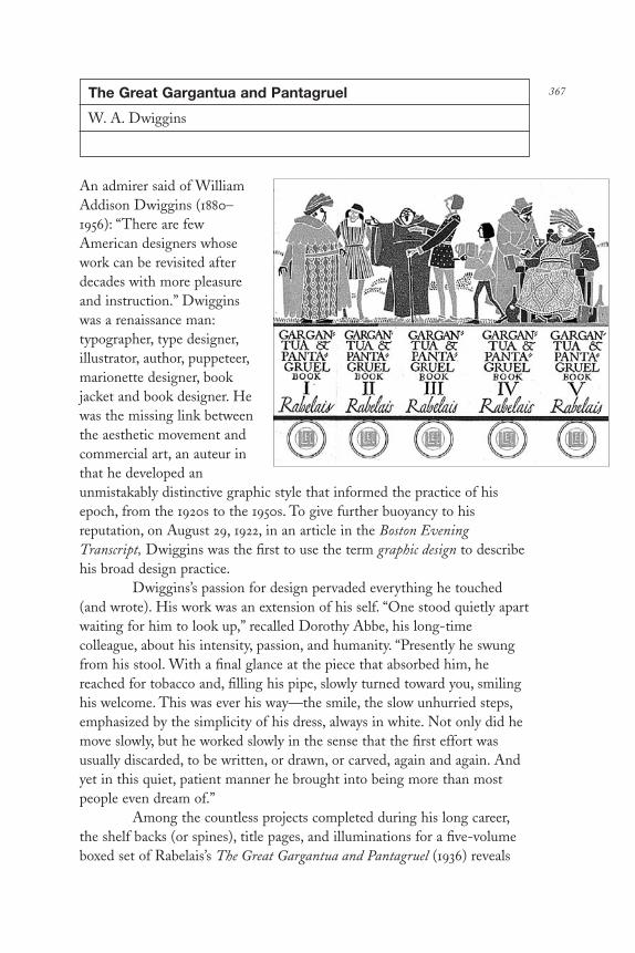
367The Great Gargantua and Pantagruel
W. A. Dwiggins
An admirer said of WilliamAddison Dwiggins (1880–1956): “There are fewAmerican designers whosework can be revisited afterdecades with more pleasureand instruction.” Dwigginswas a renaissance man:typographer, type designer,illustrator, author, puppeteer,marionette designer, bookjacket and book designer. Hewas the missing link betweenthe aesthetic movement andcommercial art, an auteur inthat he developed anunmistakably distinctive graphic style that informed the practice of hisepoch, from the 1920s to the 1950s. To give further buoyancy to hisreputation, on August 29, 1922, in an article in the Boston EveningTranscript, Dwiggins was the first to use the term graphic design to describehis broad design practice.
Dwiggins’s passion for design pervaded everything he touched(and wrote). His work was an extension of his self. “One stood quietly apartwaiting for him to look up,” recalled Dorothy Abbe, his long-timecolleague, about his intensity, passion, and humanity. “Presently he swungfrom his stool. With a final glance at the piece that absorbed him, hereached for tobacco and, filling his pipe, slowly turned toward you, smilinghis welcome. This was ever his way—the smile, the slow unhurried steps,emphasized by the simplicity of his dress, always in white. Not only did hemove slowly, but he worked slowly in the sense that the first effort wasusually discarded, to be written, or drawn, or carved, again and again. Andyet in this quiet, patient manner he brought into being more than mostpeople even dream of.”
Among the countless projects completed during his long career,the shelf backs (or spines), title pages, and illuminations for a five-volumeboxed set of Rabelais’s The Great Gargantua and Pantagruel (1936) reveals
DL2 08 07/13/04 2:57 PM Page 367

his virtuosity. In this book Dwiggins wed respect for tradition with passionfor the new. In Dwiggins’s work, the classics served as foils for acontemporary decorative vocabulary that synthesized medieval, oriental,and Mayan visual forms. Although his motifs are described as art moderne(art deco), they were only remotely related to this machine ageinternational style. Actually, Dwiggins developed a distinctive manner thatwas later adopted by other purveyors of commercial style. Dwiggins did notconform to the times, rather the times conformed to him.
The Limited Editions Club publication of The Great Gargantuaand Pantagruel is certainly one of the finest on Dwiggins’s own shelf. Evenwhen compared to the unique spines he designed for numerous otherclassics, these exuded a certain magic through their composition. Everyaspect of the books’ conception, production, and manufacture from thedeep green color of the cloth bindings and slipcase to the conceptual acuity of the lighthearted illustrations to the composition of neo-baroqueornament to the curvaceous hand lettering on the title and chapter breaksmade this a readable confection. Over time it has become a kind offetishistic design artifact.
George Macy, the irascible publisher of the Limited EditionsClub, commissioned a three-volume set; Dwiggins urged him to divide thetext into five separate volumes (The Great Gargantua and Pantagruel waswritten as five books under one cover). This number gave Dwiggins theopportunity to create a virtual stage on which the characters in the bookscould play. Dwiggins tied the five volumes together through the spineillustrations. Separately each spine had its own integrity, but together theybecame a frieze of the book’s leading characters. Dwiggins further createdindividual title pages, which he precisely hand lettered in pen and ink inactual-size layouts, often in more than one version, as if titles for a play orfilm. Title page design was a time-honored part of bookmaking, andDwiggins respectfully played with the medium by busting through the rigidconstraints. Inside the books he designed vignettes that illuminated thetext, but not in the conventional mimicry of a passage or line. Personallyinscribed on the flyleaf of Dorothy Abbe’s copy Dwiggins wrote: “Althoughthe . . . vignettes might be considered gothic I tried to avoid a gothicovertone in this book.” He succeeded in designing a book that, though setin another time, was not merely relevant, but vital.
In Hingham, Massachusetts, far from the capitals of commercialart and design, Dwiggins remained an iconoclast for his entire life. But fewmavericks were ultimately as influential. He inspired imitators, yet nonewere able to recreate his panache. Dwiggins was the quintessential designerand experimenter of his time. “Modernism is not a system of design—it is a
DL2 08 07/13/04 2:57 PM Page 368

state of mind . . . a natural and wholesome reaction against an overdose oftraditionalism,” he wrote. “The graphic results of this state of mind areextraordinary, often highly stimulating, sometimes deplorable.” Dwigginspushed the boundaries when necessary, while standing for tradition. Heonce wrote that he lived for a single purpose: “the game is worth the risk.”
DL2 08 07/13/04 2:57 PM Page 369

Vanity Fair and Fortune Covers
Paolo Garretto
Paolo Garretto (1903–1983) was a prolificcartoonist, caricaturist, and poster artist whoworked for magazines from the mid-1920s to thelate 1940s. During his peak in the mid-1930s,every week at least one major periodical orposter hoarding featured an image that heproduced. For Vanity Fair, just one of hisprimary outlets, he designed more than fiftycovers and was known as one of Vanity Fair’sgraphics triumvirate, which also included MiguelCovarrubias and William Cotton.
Although he was friends with VanityFair’s legendary art director M. F. Agha (1896–1978), Garretto was originally commissioned in1930 by one of the magazine’s editors, ClaireBooth Brokaw (later Claire Booth Luce). Hiscaricatures for Vanity Fair were uniquely styledand defined the times when they were made.Overtly influenced by cubism and futurism, hisstyle grew more out of a naïve instinct thanpremeditated borrowing. Which came first, adominant style or a personal one? Garretto was aleader not a follower. His covers for Fortune, thelegendary finance magazine that pioneeredposter-like covers, veered from caricature/designto pure design in an illustrative mode. Thesewere grand visual statements.
Garretto’s graphic approach was basedon simplification of primary graphic forms intoiconic depictions and loose but poignantlikenesses. Vibrant, airbrushed color was histrademark, and he also experimented with
different media to create exciting new forms, including experiments withcollage and modeling clay that proved fruitful. Without his superbdraftsmanship, what is now pigeonholed as deco styling would surely havebeen a superficial conceit, but his conceptual work was so acute, and his
370
DL2 08 07/13/04 2:57 PM Page 370

decorative work was so well crafted that he eschewed these pigeonholes.Writing in a 1946 issue of Graphis, Orio Vergani described Garretto’singenuity this way: “Once the constructive theme of his images is discoveredGarretto proceeds to the invention of the media necessary for executingthem. I believe he has painted, or rather, constructed his images witheverything: scraps of cloth, threads of rayon, with the bristles of his shavingbrush, with straw, strips of metal and mill board, with iron filings and sulfur,tufts of fur and wings of butterflies. His colors are born of a strange alchemyof opposed materials in the light of an artificial sun, he seeks for thesquaring of shade as others have sought for the squaring of the circle.”
Garretto was born in Naples, Italy, in 1903 but had a peripateticchildhood because of his father, a scholar and teacher who traveled extensively.When he was twelve years old his family moved to Philadelphia where, beforehe mastered English, he would communicate with his teachers throughdrawings. At the outbreak of World War I he returned to Italy and moved toFlorence because his father was a reserve officer in the army. After the war,and amid the throes of great social upheaval, the family moved to Rome—ahotbed of cultural activity and political revolution. In Rome, Garretto wouldgo nightly to the Caffe Aragno where the intelligentsia assembled; there hewould sketch portraits on the marble table tops. One portrait of F. T.Marinetti, the founder of futurism, and another of the thespian Pirandelloserved to get him a job doing cartoons for a local newspaper.
The postwar years were marred by struggles between communistsand fascists. Garretto hated the bolsheviks, he said, somewhat romantically,for the murder of the Czar and particularly his little son Prince Alexei. But,closer to home, the bolsheviks had attacked his father at a veterans rally,beaten him, and stole his medals. Although his father “turned the othercheek and forgave his enemies,” Garretto was not so forgiving. At the ageof eighteen he joined the Vanguardists, the fascist youth organization. Inthose days fascism was an antiestablishment movement and an alternativeto communism. Although he has since renounced those years as childishfolly, at the time he was committed to the cause. He even designed thefascist uniform (because he said that he disliked the disheveled look of thefascist partisans). And when Mussolini saw him and a few of his friends ina formation dressed in their spiffing splendor, Il Duce appointed Garrettoone of his personal bodyguards. And a great honor it was too until helearned that the position was for life. The elder Garretto, who wasadamantly opposed to Paolo’s involvement with the fascists, eventuallyhelped obtain a permanent discharge, allowing him to go back to school,earn his architectural degree, and ultimately travel to England, where hebecame a sought-after caricaturist.
DL2 08 07/13/04 2:57 PM Page 371

At age twenty-two Garretto received steady work from Dorland,Europe’s largest advertising agency. His work was published regularly in theeight major British pictorial magazines, including the Tattler and IllustratedNews, and frequently appeared in the major German weeklies. In Paris,where he had married, opened a studio in his apartment, and eventuallysired a son, he was commissioned to do numerous advertising projects.One such was the result of a meeting with Alexey Brodovitch, who was artdirector for the department store Trois Quartiers. He was also asked tobecome a member of Alliance Graphique, a loosely knit advertisingcooperative that included poster artists A. M. Cassandre, Jean Carlu, andCharles Loupot, for whom Garretto did an Air France campaign.
By the 1930s his friendship with publisher Condé Nast was soclose that this corporate chauvinist allowed Garretto to work for thecompetition. In the meantime the war broke out and Garretto wanted toreturn to Paris to be with his wife and child. Being Italian he was notallowed to cross the border, and after various attempts at entry he returnedto New York. In 1941 Garretto was interned in the United States with otherGerman, Italian, and Japanese enemy aliens. He was eventually deported,having agreed to an FBI proviso that he not make any anti-Americanartwork for the duration of the war. This was certainly a little far-fetchedand unenforceable, but he did refuse to do caricatures for the Nazis withwhom he had no sympathy. Moreover, his stylized but critical caricatures ofMussolini and Hitler did not make him very popular among party officials.In 1944 he was assigned to Budapest to develop a literacy project so that“defeated and conquered peoples” could learn the Italian language throughpictures. But when Italy capitulated to the Allies later that year, he wasinterned as an enemy alien in Hungary for the duration of the war.
After the war he continued to make political and social caricature;he also did fine art in the same style. Paul Rand, who called Garretto amaster of illustration, hired him to render the Dubonnet man. Hecontinued to do caricatures well into the 1970s, but he stopped working forAmerican magazines in the 1940s because after the war, he said, the artdirectors who knew him had changed or died and his kind of design waseclipsed by photography. In 1982 Lloyd Ziff, then design director for thenewly revived Vanity Fair, located Garretto at his home in Monte Carloand asked him to do some covers. He did a few, but they were rejected bythe editors in favor of a contemporary caricaturist whose drawing wasinfluenced by Garretto’s style. Although he was active until his death at theage of eighty-six, Garretto never altered the style that defined his time.
DL2 08 07/13/04 2:57 PM Page 372

373Artone
Seymour Chwast
The curvilinear style known as artnouveau in France and Jugendstil inGermany was revived by Push Pin Studiosduring the early 1960s and prefigured thepostmodern reappraisal of passé forms bywell over a decade. Push Pin, founded in1955 by Seymour Chwast (b. 1931), MiltonGlaser, Edward Sorel, and ReynoldRuffins, was a pioneer of stylisticsampling, known for combining traits ofVictorian, arts and crafts, art nouveau, andart deco approaches with contemporarytypography and illustration thatunderscored the influential “Push Pinstyle.” This approach was a model forother American designers interested indecorative form and, as a byproduct,fostered a return of drawing to the designprocess. The prevailing modern ethosrejected historicism as quaint andunresponsive to contemporary business needs. But Push Pin’s eclecticismwas based on the idea that historical form could be revitalized and givencurrency with certain mass media, including book and record covers,advertising, magazines, and package design. There is probably no betterexample of the appropriateness of this method of historical quotation thanSeymour Chwast’s 1964 design of the Artone Studio India ink package, thelogo of which was the basis for his display typeface called Artone, releasedthat same year by Photolettering Inc.
In 1963 Push Pin Studios was commissioned to repackage theArtone ink carton by the new owner of the art supply company, a WallStreet businessman named Louis Strick. Since his company was small,Strick rejected costly market research and customer profiles. Rather, he leftthe problem entirely in the hands of Chwast and Glaser (then the tworemaining principals of Push Pin). As was often their procedure, each madesketches independently and only later came together for reaction andcritique. “We’d talk about it, do our own ideas, and then talk about it
DL2 08 07/13/04 2:57 PM Page 373

again,” Chwast recalled. Glaser’s proposals are lost and his ideas forgotten,but Chwast recalled doing a few variants on his best sketch showing a largea, which, though not directly copied from an existing alphabet, echoed thefluid art nouveau/Jugendstil lettering he had seen in vintage issues ofJugend, the turn-of-the-century German art and satire magazine. In fact,the letterform was based more on the idea that “marks had to be simpleand straightforward,” than on replicating art nouveau conceits.
The curvilinear a was contrasted by a delicate, lightline banknotescript used to communicate the other pertinent information. Unlike typicalart nouveau/Jugendstil packages known for a preponderance of floriddecoration, Chwast favored an unencumbered box. The only decoration wasthree rows of nine smaller a’s—designed with a Zen-like simplicity—onthe box top. Chwast insisted that using the a by itself was not a radical ideasince making a simple, identifiable mark on a package was a proven way ofestablishing the identity for a product. “I knew it had to be something withgraphic impact,” he said. “In contrast to Winsor-Newton [a competingbrand], which took a different approach by having full color paintings ontheir packages.”
Printed on a white background, the a was the most identifiableelement. In addition to being the first letter in the alphabet, and thereforememorable in its own right, its curved form was at the same timereminiscent of the Artone ink bottle and a drop of ink. Chwast, however,had acted entirely on blind intuition since he admitted that he did not evenrealize the strong symbolic relationship until another member of the studiopointed it out to him before the client ever saw it. “Somebody said ‘its sortof like an ink drop,’ and I thought that was a pretty good way to sell theidea to the client.”
Chwast used an existing script as the secondary typeface butrealized it would be useful for future advertising and promotional purposesto have a complete alphabet and a set of numerals. So he sketched out thecapitals, lower case, and numerals over the course of one week and had adesigner in the studio render the finished drawings. Chwast said the a waseasy, while the idiosyncratic nature of some of the other letters made themmore difficult to work out. After the design was resolved, it was offered toPhotolettering Inc. as a display face and was immediately accepted. Yet apotential problem having to do with fashion arose in Chwast’s mind. “Theart nouveau thing had reached its peak [by 1964],” Chwast recalled, “and Ithought it might be too late to put this alphabet on the market.” He waswrong. Artone became very popular, if not overused. It was so popular thatat least two pirated versions were issued by other phototype houses. Andthe pioneer psychedelic poster artist Victor Moscoso credits Artone
DL2 08 07/13/04 2:57 PM Page 374

specifically, and Chwast generally, as influencing his own distinctive style of design.
Chwast used the upper- and lowercase alphabet on the Artonecounter display box and eventually applied it to other projects, includingposters and book covers. Strick was not troubled that his logo was beingreused as a commercial alphabet because it furthered his product’s identity.By the 1970s the popularity of the Artone alphabet was on the wane, but itcontinues to be emblematic of an era of graphic design when eclecticismwas at its peak.
DL2 08 07/13/04 2:57 PM Page 375

The Lover
Louise Fili
According to marketing wisdom, the bookjacket designed by Louise Fili (b. 1951) forThe Lover by Marguerite Duras could neverpropel the book to the bestseller list. Thevignetted portrait of a young woman setagainst a soft-hued background and titledwith delicate typography that casts a gentleshadow was bound to fail the rule that ajacket must strike the viewer’s eye from abookshelf ten feet away.
But The Lover, Duras’s memoir ofbeing a fifteen-year-old French schoolgirlwho becomes the lover of a Chinese financierin prewar Indochina, did become a bestseller.Tales of forbidden sexuality may becommercially appealing, but Duras’s story,like its jacket, is subtle and more complicatedthan it appears. It is filled withcontradictions. She recalls the past withknowledge of the future, creating a tableau ofmemories superimposed one on another like
double-exposed film. The prose is spare and unerotic, yet the words triggerimaginative pictures of this girl-woman who at fifteen struggles with sexualawakening amid cultural and familial taboos.
For the jacket, Fili chose a deceptively simple composition thatcharacterized the writer’s mix of the intangible and the real. Thephotograph was of the author at precisely her age in the memoir. Althoughthe head-on pose is direct and engages the viewer, Duras’s half-smile isenigmatic and elusive. The jacket’s muted tones and feathered backgroundadded emotional subjectivity to the photograph’s apparent objectivity. Thethin-stroke typography complemented the spareness of the composition,but its shadow suggested weight and presence. Published by Pantheon in1985, The Lover’s success was a vindication of Fili’s artful style, whichmarketing people often criticized as too low key to be commercially viable.Readable or not at ten feet, it stood out because of its understatedcountenance, not in spite of it.
376
DL2 08 07/13/04 2:57 PM Page 376

Since the 1960s, consolidations and takeovers in the bookpublishing industry have increased competition for shelf space and putgreater emphasis on the marketing and promotion of books. Book jacketand cover design in the 1960s was typified by Paul Bacon’s jackets thatfeatured large type for titles and author’s names and small, illustrated scenesintended to summarize the book.
In the mid to late 1970s Fili—then art director at Pantheon—and others departed from modernist aesthetics and approached theirdesigns as miniposters with integrated type and image in the spirit of thelate nineteenth-century advertising posters. They researched typographicstyles of the past and drew inspiration from movements like futurism,Jugendstil, and constructivism, incorporating them into contemporarywork. This style, called “retro,” was similar to postmodernism in itseclecticism and reliance on past motifs; postmodernism, however, drewmore from Greek, Roman, and Renaissance sources. Fili’s work wasdistinguished by a conceptual underpinning and an ability to set a moodappropriate for literature that superseded postmodernism’s tendency towarda cut-and-paste pastiche of passé forms.
At Pantheon, a trade division of Random House that publishedfiction and popular nonfiction titles that leaned toward the academic, Filiwas given a comparatively small list of books, which allowed her to designmost of the covers herself. Initially little attention was paid to her covers,just like those of the other designers before her. She soon realized whatgreat opportunity for change lay in this environment where no one hadhigh expectations. Fili recalled a comment made to her by an art directorcolleague, “You’re lucky. My editors have bad taste; yours have no taste.”
How did she create an environment conducive to innovation andinspired design? “Slowly, very slowly.” Fili recalled. “I set out to educatethem, albeit very slowly and continuously, with incremental changes andinnovations: matte laminations, unusual paper stocks, different types ofphotography and illustration, and, of course, experimentation with type.”She broke new ground graphically but always spent less than any of hercolleagues, so no one complained.
By 1985, when The Lover was published, Fili had used hundreds oftypefaces devised from reinventions or interpretations of existing typefacesthat were either outdated, overlooked, or from a different era. In Fili’shands they came alive. Her long-time love of letterforms found a home atPantheon, where for Fili the best part of designing jackets was that “everyday I could use a different typeface.” Since college she had frequentlytraveled to Europe to collect all types of printed ephemera, to photographsignage, and to study poster and type design. She clipped faces from old
DL2 08 07/13/04 2:57 PM Page 377

printing manuals and saved even just a few letters from old books orposters if they caught her eye.
When it came time to design, Fili drew tissue after tissue untiljust the right letterforms evolved to capture the particular mood oremotional tone of the book. Then, she hunted for a typesetter who carriedthe typeface. “Usually no one did, so I had to start from scratch and rebuildit, letter by letter, for my needs,” Fili told illustrator Dugald Stermer in anarticle in Communication Arts magazine (September/October 1986). Withthe typeface reconstructed or redesigned, she then hired a professional torender the new letterforms (this was before Fontographer). Occasionally, aswas the case with The Lover, the title and author’s name were renderedexactly as they would appear on the jacket, complete with any specialeffects like the shadow. She has altered the stress, weight, slant, or width oftypefaces to achieve an unusual effect. Her combinations of letterforms andjuxtapositions of type styles within a single composition were rarely safe,but the unexpected combinations resulted in work that while respectful of abook’s content nevertheless projected a highly intuitive, expressive style.
Considered tame by today’s standards, which, thanks to thecomputer, present custom typography and unexpected visual juxtapositionsas the norm, Fili’s jackets and covers nevertheless opened the door forfurther innovation. In the late 1980s art director Carol Carson anddesigners Barbara de Wilde and Chip Kidd for Alfred A. Knopf, and, later,Michael Ian Kaye for Farrar, Straus, & Giroux in particular have expandedthe ways books present themselves in the marketplace. Unusual materialsand textures have transformed books into intimate objects. Imagery madeof visual fragments, quirky typography, and aggressive compositions havepushed the limits of conceptual interpretation, occasionally providing onlytangential clues to the content of the book. Over the eleven years she wasat Pantheon, Fili’s precisionist covers, with their typographic sensitivity andconceptual illustration, moved beyond mimicking content.
DL2 08 07/13/04 2:57 PM Page 378

379French Paper
Charles Spencer Anderson
Some call the current trend in revivalistdesign postmodern, vernacular, or retro;Charles Spencer Anderson (b. 1958) oncecalled it bonehead, a word that conjures upgoofy cartoon characters and self-mockingly describes a design mannerismthat draws heavily on 1930s and 1940sstock commercial art. But Anderson’sdesign is anything but goofy. Sentimental?Maybe. Nostalgic? Possibly. Silly? Attimes. But ironic is more to the point. Hisis a highly polished graphic style that hasevolved into a distinct dialect rooted inAmerican vernacularism. Rather than atrendy trope intended to exploit a popularfashion for quaint pastiche, this is aconsistent formal vocabulary, featuring alexicon of repeatedly used images,typefaces, and dingbats, which signifiesboth an attitude in contemporary designand this designer’s particular obsession with pop visual culture. What beganas parody is raised to the level of art, much in the same way that pop artistsof the 1960s elevated the artifacts of commercial culture to icon status.
Anderson’s long-running campaign for the French Paper Companyborrowed the iconography of early commercial printing and incorporated itinto witty rebus-like compositions that critiqued the mindless ubiquity ofthese once anonymous materials by placing them in a comic light. Ifpostmodernism is a reappreciation of passé forms as a critical commentaryof modernism, then Anderson’s approach is the humorous arm of thisgraphic design movement. His quotation of common visual advertisingclichés and sampling of gothic commercial typography uncovered a lostaesthetic that had been dismissed as artless by the masters of orthodoxmodern visual communications. By the 1960s the cartoony printer’s cuts andtrade characters that would later form the corpus of Anderson’s work hadsunk to the nadir of graphic achievement and were repudiated by modernformalists whose mission was to raise the level of visual beauty and literacy.
DL2 08 07/13/04 2:57 PM Page 379

Although Anderson did not set out to be a counter-revolutionary,he discovered the graphic integrity woven into the crude innocence oftime-worn vernacular images, appreciated them for their nonsensicalqualities, and promulgated their use as design imagery. Here the variouselements of the French Paper campaign, including paper specimens thatwere developed as toys, playing cards, and other graphic playthings,exploited the more camp characteristics for the purpose of engaging theviewer in a distinct visual world. Since Anderson was not of a generationthat fought the war to make the world safe for universal design, he did notharbor the same aesthetic prejudices as these designers. For him,discovering artifacts in old printing catalogs, type manuals, and otherindustrial ephemera was like uncovering a Pharaoh’s tomb. Yet Andersondid not merely display his archaeological finds, he revived their componentsby distorting, reshaping, and otherwise transforming vintage iconographyinto a distinct style that was applied to a range of packages, brochures,books, posters, advertisements, and products.
Anderson’s bonehead style began in the mid-1980s when PresidentRonald Reagan made nostalgia into national policy. It was a time when, ascritic Natalia Ilyin writes, “nostalgia twisted truth out of its socket” byforcing the public to accept the false simplification of a vague, mythic past.The earliest iterations of Anderson’s design were consistent with retrotrends, but it was not the graphic design analog of, say, the nostalgic TVshow Happy Days. Anderson’s was never a totally nostalgic conceit aimed atexploiting that momentary fad. On the contrary, much like the folkloristwho discovers lost or forgotten stories that tell grand tales, Anderson’simages became the basis for multiple narratives. While the style was usedto promote the wares of companies like French Paper, Urban Outfitters,and the Turner Network, among others, it simultaneously told a story ofcommercial design itself.
Anderson and his design staff position products, establish allure,and attract audiences through precisionist designs. It is noteworthy thatsuch an identifiable design signature succeeded in a field where mostgraphic designers avoid a single specific stylistic mannerism. But Andersondoes not practice monolithic design. Within a proscribed framework thereis formal and conceptual range. Over the years much of the vintageadvertising sampling has been replaced by original still-life photographsand conceptual illustration, which allows Anderson to communicate withvarious voices. Still, Anderson’s work is governed by an aesthetic that rulesthe color palette and conceptual thrust. His spirit is equal parts irony,history, and the down and dirty visual effluvia of the twentieth century.
DL2 08 07/13/04 2:57 PM Page 380

Through the flagship CSA Archive Catalog of Stock Art,Anderson has both reintroduced and laid claim to many of the forgottenartifacts of American commercial printing, and in doing so he has made aragtag collection of random forms into a regiment of disciplined artworks.Or put another way, he has made a variety of generic visual idioms into anaccessible design lexicon. In popularizing these forms Anderson has alsocontributed to the continuum of design by building on what designer ArtChantry referred to as American commercial folk art—the anonymousartifacts of the commercial era. In the original forms that Anderson drawsupon the customer was never aware of the human hand, the images justmatter-of-factly materialized in newspapers, “shocards,” and flyers. InAnderson’s work, however, the presence of the artist/designer is alwaysapparent, and it is this intervention that makes his appropriation (andultimate invention) into a commentary of sorts on the state of design, pastand present.
DL2 08 07/13/04 2:57 PM Page 381
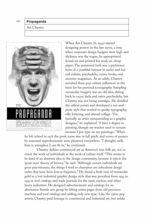
Propaganda
Art Chantry
When Art Chantry (b. 1954) starteddesigning posters in the late 1970s, a timewhen corporate design budgets were high andslickness was the vogue, he appropriatedfound art and printed his work on cheappaper. The untutored look was a preferenceborn of a youthful interest in surfer and hotrod culture, psychedelia, comic books, andmonster magazines. As an adult, Chantryrevisited these pop culture influences as thebasis for his personal iconography. Samplingvernacular imagery was an old idea, datingback to 1920s dada and 1960s psychedelia, butChantry was not being nostalgic. He distilledthe salient points and developed a cut-and-paste style that reveled in quirky typography,silly lettering, and absurd collage. “I’mbasically an artist masquerading as a graphicdesigner,” he explained. “I have a degree inpainting, though my teacher used to screambecause I put type on my paintings.” When
he left school in 1978 the punk scene was in full pitch, and scores of postersby seasoned unprofessionals were plastered everywhere. “I thought, well,here is someplace I can fit in,” he continued.
Chantry defines commercial art as America’s true folk art, not somuch the work of individuals as the work of culture itself. “This seems tobe kind of an aberrant idea to the design community, because it rejects the‘great man’ theory of history,” he said. “Although certain individuals aregreat practitioners, the things I tend to champion are subculture designstyles that have been lost or forgotten.” He found a fresh vein of vernaculargold in a lost industrial graphic design style that was prevalent from 1945 to1955 in tool catalogs and trade journals for the steel, nuclear, and otherheavy industries. He designed advertisements and catalogs for analternative Seattle arts group by lifting entire pages from old precisionmachine and tool catalogs and adding only new type. Like the 1960s popartists, Chantry paid homage to commercial and industrial art, but unlike
382
DL2 08 07/13/04 2:57 PM Page 382

them he did not merely sanctify these lost artifacts of popular culture; herecycled them as functional graphic designs.
The crude quality achieved by craftsmen isolated from inter-national design movements held great appeal for one who regularlyundermined the canon. Years before the vernacular became an official 1980sgraphic style, and before the progressive design academies affixed culturaltheories to such things, Chantry became a design archaeologist. “I un-earthed the work of naïfs and then tried to ape it,” he admitted. “Ultimatelyit became part of my general vocabulary and all of a sudden my languageexpanded.” Other “outlaw” or anti-canonical styles, such as tattoos and “theHallmark card idea of what hippie stuff looked like in the 1960s” informedhis work, too.
A large number of Chantry’s posters for alternative theatercompanies in Seattle were done amidst considerable competition because ashe put it, “everyone here seems to be a graphic designer. So it becomes asupply and demand thing; prices are usually low and quality must be high.”One of his most memorable projects was the design for a small run of threehundred posters for Propaganda, a production of the New City TheatreCompany, one of Seattle’s most avant-garde independent groups. Althoughthe play opened in 1990 to lukewarm reviews and closed soon afterward,the poster left an indelible image. For this low-budget job, Chantry took aphotograph of a man’s tormented face from a 1950s clip-art book. It wasenlarged and flopped, and printed over itself twice to give the sense of threedimensions. The cheapest way to print it was on a web offset newspaperpress, and therefore Chantry produced the original artwork on a smallerscale than the finished, ordering the printer to enlarge it five times to giveit an even cruder surface. The poster symbolized the plot of the script butavoided a literal interpretation. “I rejected the billboard school of posterdesign which says the message should be given and received immediately.I don’t think that anyone is going to go to the play based on the posteranyway,” Chantry said.
Generally, Chantry comes up with a concept and sells it to theclient as an idea. “I became acquainted with the work of the late RobertBrownjohn [Brownjohn Chermayeff Geismar] who during the early 1960swas such a brilliant conceptualist that he could sell ideas to his clients overthe telephone. He believed that if it wasn’t good enough to talk it out, thenit wasn’t good enough to take to completion. I try to get so well versed withthe client’s needs that my concepts fit the problem, and I too can verbalizethem before putting them to paper,” he explained. If a client demands amore visible interpretation, Chantry sketches things out, but most of hiscomposition is done in the mechanical stage. That’s where he does his best
DL2 08 07/13/04 2:57 PM Page 383

work because his art is the mechanical. “When I depart from the directhands-on approach my work gets somewhat rote and sterile, but being thatthe mechanical is only a step away from reproduction it is closer to freshthan other methods,” he said referring to the nineteenth-century method ofworking directly on the litho stone.
When Chantry began he did not have access to typesettingfacilities, so he generated type by photocopying it from books, cutting itout letter by letter, and pasting it into place with glue sticks. Each earlyproject, therefore, had its own personality. Some were image heavy/typelight and others were all type, enabling him to learn about the expression ofdifferent letterforms. “When I make type decisions that interplay with animage it is usually based on gut reaction. I might scan all my old typebooks—or comic books and things like that—until I find something thatjust feels right. I try to avoid type that clashes with my image.”
Sooner or later, the immediate advertising function ceases and aposter becomes an artifact. Understanding this, Chantry has designedcertain posters, Propaganda included, that change over time—inks that fadeto reveal other aspects of the work, papers that deteriorate quickly.Sometimes they included thematic ideas that changed with time. “I wouldlove for my posters to have an archaeological function, so that twenty yearsfrom now, when people are researching certain aspects of this culture theywill be able to refer to my posters for reference to a historical moment.”
DL2 08 07/13/04 2:57 PM Page 384

DL2 08 07/13/04 2:57 PM Page 385

DL2 09 07/13/04 2:58 PM Page 386

COMMERCE
DL2 09 07/13/04 2:58 PM Page 387

DL2 09 07/13/04 2:58 PM Page 388

389Show Cards
The show card (or sho-card) was thequintessential form of early commercial art.It embodied essential design attributes of balance, harmony, and proportion that enabledunsophisticated designers, primarily job printers,to produce effective advertising. But even suchmodern pioneers as El Lissitzky, Jan Tschichold,E. McKnight Kauffer, Herbert Bayer, and PaulRand adhered to the same design truth associatedwith the show card: Primary colors and sans seriftypefaces resulted in eye-catching design.
Starting in the late nineteenth century,the show card was a piece of bristol board onwhich a letterer or artist would draw or paint amessage or image. The quantities that wereproduced were invariably limited. Eventuallyshow cards were printed on multilith presses,and stereotype plates were designed by artservice agencies, which distributed to printingcompanies large and small. Standard show cardswere produced by printers and sign makers, whoinserted their own wood and metal types intothe empty mortised sections on the printingplate.
Various styles filled sample books, butaround 1920 the now classic format was initiatedby Empire Litho, a printing firm in Massachu-setts, and was quickly adopted by job printersthroughout the nation. These predominantlytype-based posters printed against one or twostark primary colors became the most ubiquitousmedium of advertising for all kinds of regionalevents, including county fairs, vaudeville andmovies, prize fights, square dances, and politicalcampaigns.
DL2 09 07/13/04 2:58 PM Page 389

Functional design was essential: gothic type, flat colors, andsometimes the split-fountain technique—where two colors at the top andbottom of the card mix in the middle to give a multichromatic effect. Theoccasional stock line cut or halftone might be used for decoration, and avariety of eye-catching borders were required. “The border demands fullconsideration in card design,” wrote F. A. Pearson in the 1925 edition of“Ticket and Showcard Designing.” “Its effect is that of a frame round apicture. It limits attention within its bounds.” In addition, bull’s-eyes,stripes, and other geometric patterns, not unlike Russian constructivist and Bauhaus compositions, guided the viewer’s attention to the message.
The genre has been both parodied and used as inspiration forcontemporary work. Paula Scher’s New York Public Theater posters, forexample, with their bold gothics of varying sizes set against yellow or redbackgrounds, are admittedly influenced by the show card. In its originalform, it is still used for carnivals, circuses, auctions, and concerts. Theclassic show card has survived shifts in trend and fashion because it is theessence of good design.
DL2 09 07/13/04 2:58 PM Page 390

391Razor Blade Labels
Some celebrities collect paintingsand others, sculptures. Aga Kahn,Persian billionaire and husband to1940s movie star Rita Hayworth,was a razor blade wrappercollector. Given his untold wealth,he could have anything in theworld—in fact, each year he wasliterally presented with his weightin gold and diamonds—yet inaddition to cars, homes, and art, he was inexplicably drawn to the graphicsof an inexpensive, everyday commodity. Filling scores of bulging albumswith blade wrappers from around the globe, he amassed what may be thelargest collection of its kind (part of which is currently held by theWolfsonian Institution in Miami, Florida). But he was not alone. Duringthe 1920s, 1930s, and 1940s, razor blade wrappers were among the mostsought-after ephemerally designed objects of consumer culture. And it issafe to say that even with the thousands that Aga Kahn amassed, he didnot collect them all.
The safety razor and blade was more convenient than thestraightedge and strop, and caused fewer cuts, too. So, since theintroduction of the double-edge blade in the late nineteenth century, andits widespread adoption during the twentieth, every industrial country priorto the age of multinational conglomerates produced its own unique brands.Nonetheless, the product was always based on the same form. The classicdouble-edge blade—made from thinly stamped steel and designed withslots on the front that could be snugly sandwiched between the tight-fittinglayers of the razor—had not changed during much of the century, until theadvent of the double- and triple-blade cartridges of today’s “super razors.”At the outset, therefore, little distinguished one blade from the next,although Swedish steel was a grade above German steel, which wasthought to be more durable than Italian steel. Yet in truth, most were madeat the same few foundries and exported to hundreds of companies thatpackaged and distributed them.
The key factor that distinguished one blade from another was thebrand name and the package design. Like cigarettes, razor blades were
DL2 09 07/13/04 2:58 PM Page 391

impressed with heroic, romantic, ironic, and nonsensical mnemonic names,such as Mac’s Smile, Merlin, Super Gam, 7 o’Clock, Tre Teste, Carezza,Honor, Stormo, and Eclipise. Each was adorned with a mini-posterdesign—sometimes bold novelty typography, other times drawings ofelegant men, sensuous beauties, and goofy mascots. The blades themselveswere made from white, blue, and gold steel, and were differentiated fromeach other with such superlatives as “extra,” “superior,” and “super extra,”although the same traits were really common to all. A few were touted asflexible, and at least one was said to be “magic.”
In the early days of what is now called branding, any verbal andvisual trick was used to capture attention. Once purchased, a good cleanshave would presumably ensure the customer’s loyalty.
Why were there so many brands and wrappers? Well, during the1920s and 1930s when these packages were current, razor blades were fairlyeasy and inexpensive to produce, so one company could issue half a dozenmini-brands in the hope of hitting big with just one. Every basic safetyrazor model accepted the same double-edge blades, which would last for between five and ten shaves before turning dull, thus adding to thewidespread need to replenish supplies. Since consumers were notnecessarily loyal to any one blade—except in the United States andEngland, where Gillette was long a major brand—it was incumbent onproducers to distribute enough new products to maintain the sense ofnovelty that seduced most buyers.
Blades are Lilliputian, so manufacturers had to find visible meansto attract the consumer. The most common sales devices were easel-backpoint-of-purchase displays (or “risers”) on which tiny individual boxescontaining five to ten blades were attached to cardboard hooks. Thesecountertop “standees” were colorful, eye-catching, and cheap. Anothercommon form was the countertop box with die-cut panels that, when raisedoff the surface of the box, highlighted the logo or trademark of the product.
Blade packs were anonymously designed by commercial artists inprinting plants that specialized in this and other forms of consumerpackaging. The format was obviously proscribed, but within the limitations,anything was possible. Color was a requisite, and many blade wrapperswere printed with metallic inks or multiple primary hues. Simplicity wasthe watchword for obvious reasons, yet a few brands—such as Apollo No.10, a German blade—were designed with an engraving of the Greek godframed by classical filigree, and Lama Italia, an Italian brand, hadNovocento-styled graphic iconography. Most of the wrappers were ascolorful as posters and as visually spirited as book jackets.
DL2 09 07/13/04 2:58 PM Page 392

Trademarks were necessary for promoting the leading brands—and some not-so-famous ones, too. The Gillette Blue Blade companyinvested all its equity in a simple package, colored in two shades of bluewith a stark black-and-white photograph of the founder, Englishman KingC. Gillette (captioned with his signature). This remained the company’sdesign for well over fifty years. For the Italian product Tre Teste, threelook-alike, stylishly coifed female heads float above the brand name.Souplex, a German product, features the happy, well-fed face of a burghermortised inside a circle. One brand even used a topsy-turvy head as amascot—turn it one way he is unshaven; turn the other way and the face isclean as a baby’s behind.
Blade wrappers range from commercially sophisticated toamateurishly naïve. A case in point is the Hamburg Ring Blade (made inGermany), featuring a distortedly drawn ocean vessel heading on a collisioncourse with a life preserver that bears the brand name. By current standardsthis, and indeed all the specimens from this timeframe, are quaint. Today,packages have scant personality but a lot of marketing surveys to back themup. Many fewer products are on the market, while those that remain haveheaps of high-visibility brand recognition. These vintage wrappers anddisplays are not, however, simply nostalgic artifacts; they are remnants froma time when a recognizable package design could shave a few customers offthe competition.
DL2 09 07/13/04 2:58 PM Page 393

Japanese Matchbox Labels
Don’t ask me whycollecting matchbox labelsis called “phillumeny.” It isnot in most dictionaries yet,but just type the word intoan Internet search engine,and entries abound withphillumeny Web sitesreplete with colorfulmatchbox labels assembledby presumably obsessivephillumenists.
Personally, I donot fit this obsessive profile. However, I do admit to collecting my fairshare of these so-called light boxes for their exquisite craft and artistry, aswell their particular wit and beauty. And I suspect that these are somereasons why they are so popular among the truly avid collectors. But theother reason people are obsessive about collecting them, I suspect, is that somany were produced over the span of almost two centuries—in more thana score of nations, which resulted in an extraordinary variety of designs—that the utter quantity gives the genre incredible allure. Of all the minorpopular arts, matchbox-label design was certainly one of the most major.And out of all the countries that produced matchboxes, the Japanese wereat the top of the form.
Modern matchbox labels follow the invention of the safety match,in 1844, when Swedish chemist Gustaf Erik Pasch developed aphosphorous compound that was stable but would combust when frictionwas applied on contact. The first matchboxes were designed with a smallstrip of striking material on its narrow side. Pasted on the wider top was arelatively intricate woodblock design, or an illustration printed with thebrand name and reference to the country of origin (e.g., “Made in Japan”).Matches became profitable export businesses for Sweden, Thailand, Russia,Italy, and Japan, to name a few, as each produced its own graphics, whichwere both unique and universal.
During the early twentieth century, matchbox art from around theworld began to share many of the same graphic conceits, among them
394
DL2 09 07/13/04 2:58 PM Page 394

comic animals, imaginary coats of arms, intricate ornamentation, andportraits of real and mythical beings. These were common naturalisticimages for a good many packages before the age of pseudo-scientificbranding. Matchboxes made at the turn of the century used English as the common language, indicating the broad scope of international trade.But each nation also maintained a distinct iconographic accent thatrevealed its unique visual heritage and national preoccupations (e.g., thesamurai or Mt. Fuji for Japan).
Japan’s match industry was exceptionally prodigious, and thedesigns produced were various, plentiful, and consistent with the earlytwentieth-century expansion of the nation’s heavy industries. Commercialart played an important role, in general, as it developed brand recognitionand sales for new industrial products. It put Japanese graphic designers atthe forefront of what is now called “branding.” The designers were clearlyinfluenced by imported European styles such as Victorian and art nouveau,and later by Art Deco and the Bauhaus, which were introduced throughJapanese graphic arts trade magazines and incorporated into the design ofmatchbox labels during the late 1920s and 1930s. Western graphicmannerisms were harmoniously combined with traditional Japanese stylesand geometries from the Meiji period (1868–1912), typified by both theirsimple and complex ornamental compositions. Since matches were a bigexport industry, and the Japanese dominated the markets in the UnitedStates, Australia, England, France, and even India, matchbox designexhibited a hybrid typography that wed Western and Japanese styles into anintricate mélange. The domestic brands, however, were routinely designedin a more reductive—though typically Japanese—manner, solely usingKanji characters.
In Japan, matchboxes were a mainstay of daily, vernacular culture.Safety matches became an important staple in part because they satisfied aprimal social need (fire), and because of the nation’s substantial lumberindustry, which supplied a near endless supply of material. The largestJapanese match manufacturers, including Shungen & Co., Mitsui & Co.,Seiryukwan, and Koyoukan Binnaka Seizo, from Osaka, Koshi, andHimeji, Japan, were all well known, but the artists who created theirrespective designs were purposely kept in the shadows—like mostcommercial artisans in other quotidian fields.
Anonymity was the fate for those who produced the most vibrant,as well as the most ephemeral, products of the Japanese popular arts.Nonetheless, certain manufacturers were known for certain styles designedto appeal to different aesthetic tastes. Nisshinsha’s labels often featured acentral “trademark” (a rabbit suggesting good luck) or a vignette (two-
DL2 09 07/13/04 2:58 PM Page 395

winged cherubs framing a globe), while Shiyosegumi Seizo’s labels wereheavily typographic, with tiny images integrated into the overall design. Butfor the most part, the labels followed a standard template that wasdeveloped in the late nineteenth century and was maintained for decades.
Phillumenists explain that the extraordinarily large number ofdiverse matchbox labels had to do with the sophisticated marketing ruse ofcultivating a collector’s mentality among their consumers. This kind ofthinking is not unlike the strategy for selling razor blades (where one brandissued various collectible packages and wrappers) or cigarettes (whereserially collectible cards were incentives).
During this period, matchboxes were sold indiscriminatelythrough all kinds of stores and vendors as a necessity not just for lightingthe ubiquitous smoking materials, but also for routinely igniting fires inovens, grills, and heaters. Not until the 1930s were matchboxes andmatchbooks—the newer, more compact invention—produced as vehiclesspecifically to promote and advertise restaurants, shops, and businesses. Infact, the comparatively early stage of Japanese matchbox manufacturing anddesign seemed bent on making its profit by satisfying the public’s desire forthe purity of their design. Back then, the only thing that these labelspromoted were their matchboxes.
DL2 09 07/13/04 2:58 PM Page 396

397Priester Match Poster
Lucian Bernhard
The Priester Match poster is so startlingthat it grabs the viewer’s eye in aninstant. Of course, the aim of all goodadvertising is to make the unmemorablememorable by mythologizing thecommonplace products of daily life.However, before the Priester Matchposter first appeared on the Berlin posterhoardings in 1906, most advertising wasornate and wordy. The persuasivesimplicity of the Priester poster was rareindeed. Moreover, no one had yet heardthe name of its eighteen-year-old creator,Lucian Bernhard (1883–1972), or thegenre of advertising he invented, whichbecame known as the Sachplakat, orobject poster.
Bernhard’s early object postersare ubiquitous in poster anthologies. Themost striking excel in terms of their graphic eloquence, simplicity, andstrength. The method he defined, and the style that ultimately emerged, waspredicated on an unadorned, bold-outlined, centered representation of theproduct being advertised, like a typewriter, spark plug, or piano, placedagainst a flat color background of forest green, bright purple, or deep orange.The lettering was reduced to a few words, usually the brand name alone. Theobject in the Sachplakat, rendered much like a woodcut, grabbed the attentionof passersby as it aesthetically and unambiguously hawked its message. Thevirtue of this invention was that viewers didn’t have to navigate throughtedious selling copy, confusing graphics, or other visual distractions. Theimage was clear, concise, and downright pleasing to the tired eye.
Bernhard’s formative years coincided with the explosion of artnouveau in France and Jugendstil in Germany. Munich was the center ofthe “radical” German graphic arts, but he decided to settle in Berlin wherethe wonders of industrial production and commercialism were manifest.Like most turn-of-the-century industrial capitals, Berlin bustled withvehicular traffic, was bathed in electric lights and signs, and exalted in the
DL2 09 07/13/04 2:58 PM Page 397

progress of the industrial age. Berlin businesses routinely sponsored postercompetitions as a means of identifying new talent for the expandingadvertising industry. When Bernhard was around sixteen he decided toenter a competition sponsored by the Priester Match company and judgedby some of the leading promoters of the burgeoning poster movement. Twohundred Marks (about $50) would be awarded to the winner, but moreimportant, the winning entry would be printed and pasted around Berlin.Bernhard jumped at the opportunity, and, with little time to produce hisentry, he reportedly made some crucial, instinctive design decisions.
Using paint and brush, he laid down a brown/maroonbackground—an unusual choice at that time; most posters used either blackor bright primaries—on which he rendered an ashtray with a pair ofwooden matches along the side. Seeing that the ashtray needed someadditional graphic device to balance the composition, he drew in a cigar.Logically, from the cigar wafted smoke, and from the smoke, what else, buta few scantily clad Jugendstil dancing girls. The ashtray needed grounding,so he painted in a checkered tablecloth. At the top of the poster in blockletters he rendered the word Priester. The original sketch does not exist, butwhat a mélange it must have been. Nevertheless, proud of his work, heshowed it to his mentor at the time, a political caricaturist, whocongratulated Bernhard on the wonderful cigar poster. Bernhardimmediately realized his error and proceeded to remake the poster bypainting out the cigar, then the smoke, then the ashtray, then thetablecloth, leaving only a pair of red matches with yellow tips and thebrand name, Priester, in gothic lettering. He met the competition deadlinewithout a moment to spare.
Upon seeing it for the first time, the judges, feeling it was tooempty, threw it unceremoniously into the garbage can, where it would haveremained had not the most important judge arrived late. Burly, bald, andjocular, Ernst Growald was the sales manager for the Hollerbaum andSchmidt lithography firm, which was widely admired as Berlin’s leadingadvertising poster printer—a kind of proto-advertising agency. Growaldwas a man of unique vision who understood the critical role thatadvertising could play in Germany’s expanding economy. He also had goodtaste, and, not seeing any other noteworthy entries on the judges table,turned his wayward eyes to the artwork in the trash. Removing it, he hungit on the wall, and was reported to have exclaimed: “This is my first prize.This is genius!” Bernhard won the contest. With Growald as agent andbroker, Bernhard never again wanted for paying work.
The Priester poster was a great success for the company, too. In ahighly competitive marketplace the message was so simple that it
DL2 09 07/13/04 2:58 PM Page 398
emblazoned the brand in everyone’s memory. By chance, Bernhard tappedinto the power of simplicity and created a paradigm of modernfunctionality. Later Bauhaus inventions were hardly more reductive. Hemodeled much of his subsequent work on that poster, and though many ofhis designs were good, he never really surpassed Priester for ingenuity. Andwhy should he? The Sachplakat was not merely a style, it was a tool forspreading the word. It would become dated over time, but only in the sameway that one tool might be superseded by a better tool.
As the one who discovered Bernhard, Growald felt he had theright (and certainly he had Bernhard’s permission) to encourage others towork in this manner. He formed a loose-knit “school” of kindred artistsknown as the Berliner Plakat. Some members followed Bernhard to theletter; others veered off in their own directions, adding a touch of humor ora typographical flourish. As a charter member, indeed the school’s foremostinnovator, Bernhard became involved with many of what was also known asthe Plakatstil (poster style).
Bernhard’s Sachplakat might very well be credited with providingthe model of objectivity that was ultimately adopted later by the progressivesegments of the advertising industry. In the 1930s dramatic still lifephotography, responding to the call for a machine art for a machine age,heroicized the industrial product in much the same way that Bernhardcelebrated mere matches, spark plugs, and gear shafts. Photographers tookBernhard’s notion a step beyond the sentimentality endemic to the drawnor painted image and were therefore even more modern in the formalsense. But Bernhard also prefigured pop art in his popularization of theobject. The success of the Priester Match poster rested on figurativelyrubbing two sticks together that ignited a new methodology. WithoutBernhard’s pioneering effort, it is possible that objectivity as method andstyle would have taken much longer to catch on.
DL2 09 07/13/04 2:58 PM Page 399

Golden Blossom Honey
Gustav Jensen
In promotional advertisements Gustav Jensen(1898–1942?) called himself a “Designer toIndustry.” He designed some of the mostappealing packaging and advertising of the late 1920s and early 1930s. “His peers calledhim a Designers’ Designer,” recalled PaulRand, who, in his early twenties, fruitlesslytried to get a job at Jensen’s one-man studio.Rand later borrowed Jensen’s beaux-arts stylebefore developing his own modern vocabulary.Jensen developed the elegant identity forCharles of the Ritz and other stylishcompanies, but his most enduring design wasthe packaging for Golden Blossom Honey,which has kept virtually the same label forsome fifty years.
Enigma shrouds Gustav Jensen’s life.He is known to have been born in Copen-hagen, Denmark, in 1898; his father was abanker and lawyer, and his mother came from a
long line of ministers. He studied philosophy at the University ofCopenhagen, but with his deep bass voice he wanted instead to become anopera singer. He developed an interest in architecture, however, andarchitecture somehow led to an absorption in art, and art caused him topursue aesthetic beauty in typography and printed design. Jensen produced a large body of work for companies like General Motors, Westvaco,DuPont, Edison, American Telephone and Telegraph, Morrel Meats,Gilbert Products, and more. He brought a special elegance to a marketplaceobsessed with fashionable conceits. Although making purely functionalmerchandise was not his primary concern, Jensen believed that the designerhad a responsibility to provide the public with appealing products. “Thepublic,” he wrote, “is being imposed upon all the time, given stones forbread; the kind of bread we artists can give the public is hard sincere workstraight from ourselves. Never mind what the style racketeers say.”
Jensen’s approach was decorative but not ornate. His work ischaracterized by economically applied textures derived in part from the
400
DL2 09 07/13/04 2:58 PM Page 400

Weiner Werkstatte (Vienna Workshop) and the Glasgow School, whoseproducts were imported through Danish retailers. Jensen was a proponentof neither the modern nor the moderne: he did not believe in functionalismas an end in itself. Utility is what designers begin with, he said. “The usefultools of civilization come first and then beauty is added. If a thing is tosatisfy modern man, it must be beautiful as well as useful.” But for Jensen,beauty could be separated from function and simply please the mind and allits mysterious senses. Advertising, he suggested, is only useful when it isbeautiful, and Jensen took great pains to see that the many small newspaperads he designed were eye-catching in the most provocative ways. Thisaesthetic requirement was apparent in much of his work, even everydaypackaging, as exemplified by the Golden Blossom Honey container with itstypographic purity and decorative personality.
Jensen based his process on elimination; it was simple butexhaustive. PM magazine noted that “he does not make one sketch only, hemakes hundreds.” Jensen’s individuality was expressed as much in the visiblestyle of his wares as in his overall approach. One friend wrote about himthis way: “Gustav Jensen has a grand vision. He is a man who has thecourage of his own convictions. A lover of everything in nature, he isimpatient with fakes, fads, and fashions; he is extremely sensitive to beautythat is noble and poetic; and he is a master of design.”
In the 1930s his packaging filled the annuals. But during the war,owing in part to a cessation in the manufacture of nonessential goods, hewas underutilized. Nevertheless he continued as a one-man studio, makingdesign and sculpture until he died in the early 1940s.
DL2 09 07/13/04 2:58 PM Page 401

Advertising Fans
Portable, collapsible, anddurable. Before airconditioning, handheld fanswere a necessity. In the hotterclimes neither man nor womanwould be caught without one.During the late nineteenth andearly twentieth centuries fansbecame the ideal vehicle foradvertisements. The fan hadtwo sides—perfect fordisplaying two messages atonce—one aimed at the holder
and the other, the beholder. It could be argued that the advertising fanprefigured promotional T-shirts and shopping bags.
Advertising fans were used in many commercial cultures. In theUnited States they were common in the South, promoting social events,local businesses (undertakers were among the most frequent users ofadvertising fans), and political parties. Certain job printers specialized infans and offered a variety of standard shapes and stock designs, but nonewas as widely used as the fattened oval on a wooden stick given out by localmerchants for free on unbearably hot summer days. Like all Americanadvertising of the time, however, the typical American advertising fan wasessentially utilitarian; devoid of artistic flourish, it conveyed a messageclearly and simply.
Compared to French fans of the same period, the Americanspecimens were dreary. Compared to French publicity in general, Americaappeared to be a backwater rather than a bustling commercial culture andthe world’s most progressive industrial nation. The French were alwaysahead of Americans in the marriage of art and commerce, and this was trueof their advertising fans, often designed by famous designers to complementtheir poster campaigns for France’s most prestigious industries.
The exact year that advertising was first placed on fans is notknown, but the earliest advertising fan has been traced to 1880 when astylish specimen, like those fashion accessories from the time of Louis XIV,was imprinted with a romantic scene and swash type that announced a
402
DL2 09 07/13/04 2:58 PM Page 402

French industrial exposition. The French pioneered a variety of formats foradvertising fans that ranged from the classic folded and gathered form to asplayed peacock-like version called a “Jenny Lind” and the coccarda printedon very thin vellum and glued to two sticks, which when pulled apart andjoined in a 360-degree turn revealed a brilliant circle of color. Otherclassically based formats included the fontage, a folded half oval, and thepalmette, a smallish boxy-shaped pleated type; both were attached tofoldable spokes. Conversely, the poor-man’s fan was usually either a piece ofcardboard pasted on a stick or a single piece of die-cut cardboard thatformed a handle and paddle.
In France, fans were the premium of choice for manufacturers andbusinesses, notably the department store Galleries Lafayette, whichcomplemented each seasonal merchandise campaign with a new fan muchthe way Bloomingdales does with its thematic shopping bags. Most of thestore’s fan designs from the 1920s and 1930s were rendered in the elegantmoderne style popularized in Paris at the 1925 Exposition Internationale desArts Décoratifs et Industriels Modernes. The liquor industry regularlyemployed advertising fans to complement its various other means ofproduct promotion. Fans for Amer Picon, St. Raphaël, Cognac Sorin,Amourette, and other well-known brands and distilleries were distributed,usually during the summertime, to customers at myriad French cafés. Aprofusion of colorful fluttering was often seen along the boulevards on thehottest days of the year.
While some mimicked famous posters, notably A. M. Cassandre’swell-known Dubonnet sequence, Dubo, Dobon, Dubonnet, most fans werecustom designed for a specific purpose. Some were quite painterly, showingan elegant vignette or highly stylized characterizations. Usually the frontshad a strong image while the backs were reserved for selling copy; somefans had different images on front and back. Common visual themesincluded romantic and nostalgic scenes from the eighteenth and nineteenthcenturies, but the most common, indeed the most beautiful images wererendered in the contemporary art moderne style. The rays of the unfoldedfan provided the ideal canvas for art moderne, which used radiant lightingpatterns borrowed from cubism as the basis for many decorative motifs.
DL2 09 07/13/04 2:58 PM Page 403

Billboards of the 1930s
Since their inception, critics have assailed billboards as a blight on theAmerican landscape. Although legislation has been passed limiting them,outdoor advertising is much too important for business to be outlawedentirely. Moreover, billboard art is the cornerstone of America’s posterhistory. Before radio and television, the billboard—strategically situated onroadways, buildings, and city streets—was the primary mass-advertisingvehicle. Although many were produced by anonymous studio artists,leading illustrators and designers such as Lucian Bernhard (Rem coughsyrup, Amoco gasoline), N. C. Wyeth (Coca Cola), Otis Shepard(Doublemint gum), A. M. Cassandre (Ford motors), and others appliedtheir talents. Today, some of these mammoth images are important artifactsof the material culture.
The earliest recorded leasing of outdoor signboards in the UnitedStates occurred in 1870; they were on a fence around a post office underconstruction in New York City. Noting the increased need for advertisingmedia, in 1872 the printing firm of Kissam and Allen began to lease its ownposter panels. Soon poster-stands (as the billboard was first called) dottedthe landscape. In 1891 a standard printed sheet (28" × 42") was offered incombinations ranging from one to twenty-four-sheets. And in 1912 thestandard twenty-four-sheet poster (8' 10" × 19' 8") was the industry choiceas the preferred size for its “Double A” poster panels—the ones still used
404
DL2 09 07/13/04 2:58 PM Page 404

today. Initially, billboards were sold by solicitors or agents often connectedto a printing firm. In the 1920s advertising agencies assumed responsibility.From a handful of independent suppliers grew the Outdoor AdvertisingAssociation, which soon became the regulatory group employing inspectorsto check on the construction and distribution of panels and the appearanceof posters. By 1917, $350,000,000 was spent on outdoor advertising. By themid-1920s, twice that amount. But according to critics, the quality of theAmerican twenty-four-sheet poster was generally inferior to the smaller yetmore innovative English, French, and German posters.
During the 1920s and 1930s, the golden years of American outdooradvertising, artistry was of secondary importance. Both the artist anddesigner in American advertising (where copywriters were the kings) wereless important than in Europe (where the image was dominant). Starkcommunication, the need to steal viewers’s attention for only a split second,dictated the look of billboards. The most successful combined art andmessage and conformed to historian Hamilton King’s dictum that a postershould “seize a moment, exploit a situation with one daring sweep [of lineand color] . . . all that can be told of a tale in the passing of an instant. It isdramatic and imaginative, yet it is saliently sincere.”
Reeling from the Great Depression, American industry began itsuphill drive to repair the damage during the 1930s. The twenty-four-sheetbillboard became a symbol of this recovery. Aesthetics improved as somedesigners became more involved with the creative process. Advertisersaccepted the seductive powers of modernistic imagery to sell their wares.And rather than a blight, billboards heralded the new industrial age,fostered a new consumerism, and symbolized a brighter future.
DL2 09 07/13/04 2:58 PM Page 405

Comic Strip Ads
In 1933 Charles Chaplin wrote about thecomic strip in society: “In a troubled worldsuch as is the one in which we live, comicstrips have become a powerful force todivert the public: to such a degree, in fact,that newspaper circulation depends largelyupon their popularity. A comic artist is,therefore, lost if he does not reflect thepublic mind and appeal to the masses.” Atthe same time cultural critic Gilbert Seldeswrote: “The comic strip is the mostdespised art form, yet with the exception ofthe movies it is also the most popular.”
The comics offered diversionsfrom daily life. They offered new heroesand antiheroes, spoke new languages anddialects, and fueled the imagination in waysunequaled by any other mass form. “Thereadership of the comics is one of theamazing phenomena of our contemporarysociety . . . ,” wrote advertising analyst
Harvey Zorbaugh. “Readership surveys indicate that every week more than sixty million adult men and women pore over the Sunday comicsupplement.” Everyone identified with comic characters—kids dressed like Buster Brown and parents named their babies Snookums after thecharacter in The Newlyweds. Comic characters were like real people. In thelate 1920s and 1930s, as comics became less comical and more dramatic(e.g., Mary Worth), they also hit hard and hit home on the basic themes ofhuman nature.
The comic strip has always been a democratic form. Its word/image construction invites easy access and is, therefore, an ideal vehicle forpromoting ideas. Not surprisingly, during the 1930s—and lasting well intothe 1950s—the comic strip was used to sell products as diverse as vegetableshortening, laundry detergent, acne medicine, breakfast cereal, light bulbs,toothpaste, towels, and automobiles. A few of the ads were penned by themasters themselves, but most were produced by anonymous copyists or
406
DL2 09 07/13/04 2:58 PM Page 406

acolytes working in advertising bullpens and art-service studios. Thequality ranged from primitive comics to highly polished renderings topanels of photographs with speech balloons. Although the majority of thetexts were written by hack copywriters, some were entertaining. Who canforget the famous Charles Atlas body-building ads where a weakling ishumiliated, loses the girl, eats sand, and ultimately takes the Atlas courseand gets revenge?
No one knows who conceived the first comic strip ad, but thecomic strip was ignored by advertisers for almost three decades. Only afterthe pollster George Gallup released a report in 1930, at the height of theGreat Depression, that ninety percent of all Americans read the comics andcomic pages, did advertisers begin to use the form. In 1935 M. C. Gaines,manager of the color printing department of the McClure NewspaperSyndicate, wrote in PM magazine: “As a result of [the] discovery that thecomics enjoy the widest appeal of all newspaper features, it is estimatedthat close to $1 billion worth of space has been filled with advertising of thecomic strip type. . . . Color comic advertising has proven so profitable that,in the opinion of one of the country’s foremost research authorities, there isa possibility that newspapers will be forced to print comics in color severaltimes a week.”
Evidence of the appeal of comic strip advertising was significant.In 1932, six months after initiating a comics advertising campaign to boostfailing sales of its Grape Nuts cereal, General Foods announced anunprecedented surge in profits. Soon afterward, J. Walter Thompson’sadvertising agents requested comic strip ads for all their accounts,regardless of the appropriateness. The 1930s became known in advertisingcircles as “the balloon talk period.” In a contemporary advertising tradejournal a columnist wrote: “Psychologically the use of the comic techniqueis sound . . . Pictures [are] one of the best attention getting devices. . . .Simple human interest material, based on basic wants, holds interest andthe brevity with which the story must be told [says] the reader is not askedto concentrate too long to get the story.” Moreover, wrote RolandMarchand in Advertising the American Dream: Making Way for Modernity1920–40 (University of California Press, 1985), comic strip formats, likeradio commercials, gave print advertisements a time dimension. Viewersalso identified with the true story melodramas and real people testimonialsso common in strips. No wonder advertisers hopped on the soap operabandwagon when the living comic strip premiered in the mid-1930s.
To introduce the section on comic strip advertising in theFourteenth Annual of Advertising Art (1935) the editor wrote that this newform “has been the complete overthrow of the government of advertising
DL2 09 07/13/04 2:58 PM Page 407

by conventional rule. With the aplomb of Ignatz Mouse tossing a brick atKrazy Kat, continuity and comic strips have impudently tossed asideadvertising tradition, become legitimate and frequently astonishinglyeffective expressions. . . .”
Despite mass appeal and financial success, critics railed againstcomics, and serious advertising men deplored the comics’ frivolity, childishescape, and otherwise degraded standards. Certain advertisers believed thatthe comic strip craze marked the nadir of an honorable profession, acatering to mindlessness. Despite advancements in advertising media, theGreat Depression ultimately caused advertisers to try any scheme to selltheir wares. “The cumulative effect of a decade of radio had crushed thevision of advertising as a broad educational force that would lift consumersto higher aesthetic tastes and intellectual pursuits,” wrote RolandMarchard.
The critics could not, however, squelch the comics frenzy and wereforced into the realization that the American people were not interested inhigh-brow advertising techniques. The consumer wanted a message thatcould be quickly and easily understood. The comic strip may have erred onthe side of puerility, but until the mid-1950s, when television stole itsthunder, comic strip ads were a mainstay of American advertising.
DL2 09 07/13/04 2:58 PM Page 408

409The First Record Album
Alex Steinweiss
Alex Steinweiss created the firstrecord albums with original coverart in the late 1930s. What seemscommonplace today wasrevolutionary back then, whenheavy shellac seventy-eight rpmrecords were packaged inunadorned cardboard covers withcraft paper sleeves bound inside.The title of the album was usuallyembossed on the cover’s front andspine, and on rare occasions analbum might include areproduction of a famouspainting. Steinweiss’s art was bothoriginal and stylish, conformingto contemporary French and German poster fashions where symbolic formsand metaphors expressed the message. Rather than a portrait of therecording artist, Steinweiss believed, and the management of ColumbiaRecords concurred, that provocative graphic symbols would stimulate theaudience’s interest in the music. According to a 1939 article in Newsweek,sales of the first illustrated album cover rose over 800 percent.
“I tried to get into the subject,” Steinweiss explained in aninterview, “either through the music or the life and times of theartist/composer. For example, for a Bartok piano concerto I took theelements of the piano—the hammers, keys, strings—and composed them ina contemporary setting. Since Bartok is Hungarian, I also put in thesuggestion of a peasant figure.” For the album La Conga Steinweiss paintedan enlarged pair of hands playing on a stylized conga drum. For Gershwin’soriginal recording of Rhapsody in Blue he placed a piano on a dark blue fieldilluminated only by the yellow glow of a lone street lamp. The moody scenecaptured both the music and the city.
Steinweiss’s designs maximized the limited image space. All thecharacteristics of a large poster were brought to the forefront: strong centralimage, eye-catching typography or lettering, and contrasting colors. At thetime the illustrated album cover was first introduced, record stores, which
DL2 09 07/13/04 2:58 PM Page 409

were often sections near the record players in appliance stores, comprisedshelf upon shelf of dreary album spines facing outward (they were calledtombstones in the trade). Steinweiss’s albums not only brightened up thesurroundings, but the imagery also provided focal points for the consumer.Merchants began to display albums as objects of art, and listeners relatedthe music to this art. Steinweiss inspired other record companies to useevocative covers, but until after World War II his were definitely the mostdistinctive.
For its formal strength and emotional force the most memorablewas his cover for Songs of Free Men by Paul Robeson—a slave’s chainedhand holding a knife resonated as a symbol of freedom and heroism. OtherEuropean-inspired, though decidedly original, designs included hisconstructivist Eddy Duchin album and the cubist Le Sacre du Printemps. Inaddition to stylistic sampling, Steinweiss used classical typefaces, though heoften complemented (or contrasted) them with a contemporary noveltyface. For the cover for La Bohème he used an ornamental circus letterbecause it spoke to the frivolous nature of the opera. By the 1950s, with theadvent of Swiss modernism, which proffered economical design, and theincreased use of photography, Steinweiss’s illustrative work looked dated.But for a moment in design history his invention pushed packagingconventions into an entirely new design genre.
DL2 09 07/13/04 2:58 PM Page 410

411Cheap Thrills
R. Crumb and Bob Cato
A standing ovation at theFillmore East, New York’spremier music hall during the late1960s, was reserved for rock-and-roll royalty. The Fillmore hostedthe best bands of the age, andFillmore audiences were jaded,demanding, and sometimes rudein the bargain. On one occasion,early in their career, the membersof the band Sly and the FamilyStone were shouted off stagebecause the audience could notwait a second longer for theevening’s headliner, Jimi Hendrix,who received one of the longestand loudest ovations ever. That is,with the exception of the time in fall 1968 when Janis Joplin announced tothe assembled fans that the cover for Cheap Thrills, the recent Big Brotherand the Holding Company album, was illustrated by undergroundcartoonist R. Crumb. The audience went wild as a slide of the image filledthe huge screen behind her.
Back then, Crumb (b. 1943) was as popular as any rock star. Hiscartoon inventions, Fritz the Cat, Mr. Natural, Honeybunch Kominsky, theKeep on Truckin’ chorus line, and scores of raucous and ribald comixpublished in underground newspapers such as the Bee, East Village Other,and Gothic Blimp Works had earned him hero status throughout youthculture. He was in the vanguard of artists who forever busted the timidityand mediocrity that had been enforced since the mid-1950s by theindustry’s self-censoring organ, the Comics Code Authority. Through acombination of zany raunch and artful acerbity wed to unequaled pen-and-ink draftsmanship, Crumb’s drawings of big-hipped hippie chicks,bug-eyed nerdy guys, and weird average-American white folk engaged inextraordinary (if unspeakable) acts pounded at the propriety and sanctity ofan aged establishment. No wonder the union of Joplin and Crumb (whowere born in the same year) was greeted with ecstatic delight when it was
DL2 09 07/13/04 2:58 PM Page 411

made public. There is no telling how many records were sold from thatnight’s debut, but, musically, it was Big Brother’s best album andgraphically it was the most memorable cover art of the generation.
The Cheap Thrills cover was an ersatz comic strip with panelsradiating from a central circle. Like illustrated liner notes, each panelcontained a cartoon reference to either Joplin, Big Brother, or a song on thealbum. For the cut “I Need a Man to Love,” Crumb has a zaftig Janis (hissignature female archetype) almost bursting out of her tight clothes,fetchingly strewn on a bed. For “Ball and Chain,” Joplin’s classic tour deforce, the same character drags along a leg iron attached to a ball and chain,as if in an endless search for the right man. For “Summertime,” Joplin’smasterful cover of the old standard, Crumb uses a dubious caricature of ablack woman, a throwback to vintage racist mammy cartoon images fromthe nineteenth century, holding a wailing baby with cartoon tears radiatingaround its head. Separately, each panel is a slapstick gag in the comictradition; together they form a curiously hypnotic, multi-image narrativethat in retrospect visually reflects the San Francisco music scene of the day.
Aside from Crumb’s bawdy humor, what made this album coversuch an icon was its good timing. Produced at a moment when culturalinnovations were introduced at a fast and furious pace, this was thepinnacle of 1960s exuberance and invention, just prior to its neutering andcommodification by marketers and entrepreneurs. Which is not to say thatmarketers and entrepreneurs were not already maneuvering in the wings—they were. But even the consumer outlets—FM radio, the record industry,head shops, and so on—seemed not to be constrained by market orconventions and were willing to take risks that went beyond “mostadvanced yet acceptable.” For an all-too-brief moment, youth-hippie-alternative culture was in a state of grace when everything seemed new andunfettered. Music and art were rebellious, expressive, and instinctive.Formulas, clichés, and stereotypes had yet to exert a viselike grip oncreativity. Crumb’s cover for Cheap Thrills was not just a calculating effortto win market share; it was the marriage of two artists and two art formsthat truly spoke to the gut of the same audience without pretense orconceit. Joplin’s music was raw emotion; Crumb’s art was pure wit.
Nevertheless, Cheap Thrills was a product of a well-establishedmusic industry. In the wake of the mid-1960s British pop invasion, theAmerican music establishment responded to the popular groundswelltoward psychedelic and folk rock emanating from San Francisco by quicklysigning as many top local bands as possible ( Jefferson Airplane, GratefulDead, Country Joe and the Fish, and more). It churned out albums (insteadof 45s, the standard music medium of the preceding generation), and with
DL2 09 07/13/04 2:58 PM Page 412
albums came a need for eye-catching cover art that telegraphed theeccentricity of the new rock. In competition with the visionary psychedelicposters that advertised San Francisco’s music palaces, simple photographsof band members were no longer sufficiently engaging to attract recordbuyers by the late 1960s. With the art-based collage on the Beatles’Revolution in 1966 and the elaborate fantasy photograph on Sgt. Pepper’sLonely Hearts Club Band in 1967, concept album art became a viablealternative to studio photography. Record company art director/designerswere unleashed to test the limits of conceptual presentation.
The veteran Bob Cato (1923–1999) was among the moreconceptually astute. During ten years as an art director and, subsequently, asthe vice president of creative services for CBS/Columbia Records, workingwith such decidedly contrasting musicians as Leonard Bernstein, the Band,Glenn Gould, and Johnny Mathis, Cato developed or directed the creationof some of the most memorable record-album covers of the 1960s. As astudent of and assistant to the legendary art director and designer AlexeyBrodovitch, Cato cut his art directorial teeth on the fashion magazineHarper’s Bazaar, where Brodovitch had transformed editorial and fashiondesign with his innovative mixture of white space, elegant typography,photography, and modernist art. The former New York Times advertisingcolumnist Randall Rothenberg says that these “were characteristics thatwould also define Cato’s own work during the next several decades.”
Many of Cato’s album covers featured his own photography, butfor others he enlisted some of the era’s most influential painters, designers,and photographers, among them Andy Warhol, Robert Rauschenberg,Francesco Scavullo, and Irving Penn. But Cato did more than just conceiveand execute album covers. “He was also intimately involved in theconception and even the naming of the recordings themselves,” saysRothenberg. One of these was Cheap Thrills.
As was customary at CBS, Joplin came to see him about the designof her record. Originally, Cato wanted to shoot the group in a fabricated“hippie pad,” but Big Brother balked at the pretentious set. Instead, bothJanis and Cato agreed that Crumb’s artwork was a perfect way to give thealbum a look sufficiently raw to match the music. Crumb worked withoutinterference. Joplin wanted a title that was synonymous with her life and theepoch in which she lived, insisting that the album be called “Sex, Dope, andCheap Thrills.” Given her soaring popularity, CBS records executives weretempted to give in. Nevertheless, “the title didn’t seem quite right to me,”Cato wrote years later in an unpublished memoir. “It said too much, gaveaway too much. Besides, even in the 1960s, the recording business was still abusiness, and there was only so much you could get away with.”
DL2 09 07/13/04 2:58 PM Page 413

Cato, who was no novice when it came to taming celebrity egos,calmly suggested to Joplin that the words “sex” and “dope” on the coverwould limit the record’s radio airplay, recommending that she use only thelast two words of this phrase for the title. Joplin demurred. “Well, I’vealways settled for cheap thrills, anyway,” she said. With Crumb’s comicsplash panel at the top, Cheap Thrills the record went on to become one ofthe biggest-selling rock albums of all time.
DL2 09 07/13/04 2:58 PM Page 414

415Dust Jackets of the 1920s and 1930s
In 1833 the first book jacket was used byLongmans & Co., a British publisher, toprotect books from the corrosive effects ofdust and light. The heavy paper wrappedaround the cloth binding was meant to bediscarded after purchase. Such was theignominious beginning of what in the 1920sand 1930s became a unique artist’s medium.For its first fifty years the dust jacket was aplain paper wrapper usually with a windowcut out to reveal the title and author’s name.The binding of the average trade book(which included the spine and front andback covers) was occasionally stamped orembossed with a modest filigree or vignettefor decoration. In the late 1890s decorationwas introduced with more regularity. Thedesigns of Aubrey Beardsley, in England,and Will Bradley, in America, werereproduced on book covers as a kind of miniature poster. Soon, in order toincrease advertising and eye appeal, publishers also printed on the paperjacket, and by the turn of the century the dust jacket had become thepublishing industry’s standard promotional tool.
Veteran book designers, however, considered the dust jacket anunwanted appendage. In the classical tradition it was not an intrinsic partof a book’s design, which only included the cover, binding, and interiorpages. Many esteemed book designers did not design the jackets for theirbooks, but rather passed that dubious assignment on to a “specialist”—usually a layout artist trained in the requisites of commerce. As late as the1950s the jacket was viewed as the unwanted stepchild. “It could be arguedthat the jacket is part of the book, [a jury of book critic/practitionersincluding Herbert Bayer, Merle Armitage, and Sidney Jacobs] feels thatthis is a temporary and fallacious point of view,” wrote Marshall Lee inBooks for Our Times (Oxford University Press, 1951). “One need onlyconsider the absurdity of having one expensive cover designed that willpermanently conceal another! Either the jacket is a temporary protection
DL2 09 07/13/04 2:58 PM Page 415
and sales device meant to be torn from the book the moment it is sold or itis an indispensable cover. If the latter were true, the logical procedurewould be to dispense with the costly, unseen binding design. The jacketthen becomes the binding, and the function of both binding and jacket willbe the same.”
Dust jackets were the low end of graphic design practice, taintedby their association to crass advertising departments. As mini billboards,they followed the principles of mass marketing applied to packaging. Dustjackets were ephemera and readers habitually discarded them before bookswere entombed on the bookshelf. Moreover, during the 1920s and 1930s,trade book jackets were illustrated by taking a key sentence or word andrendering it verbatim as a monumental vignette in either a sentimentallyrealistic or fashionably stylized (art deco) manner. The lettering was usuallydone by hand in the au courant novelty style of the time. The sole purposeof the jacket was to attract and hook a reader (similar to the movie postersof the era). The pictorial representation often had little to do with thebook’s essence. Even the classics sometimes acquired contemporary imageryand design motifs in order to eschew any hint of mustiness. It might havebeen false advertising, but the disparity between the author’s intent and theartist’s interpretation was accepted for marketing reasons. “This techniqueof allegory,” wrote historian Stephen Greengard in The Journal of Decorativeand Propaganda Art (No. 7, Winter 1988), “does not require the artist to readthe book itself, merely to distill from its pages a high impact visual whichmay be apprehended at a single glance.”
“It seems ironic,” wrote Greengard, “so many great, importantideas, the products of the finest minds of humanity, [were] wrapped inpieces of whimsical, brilliantly colored paper.” During the 1920s and 1930s,in addition to providing protection, promotion, and genre identification,the design of book jackets made a variety of fiction and nonfiction booksappealing and accessible to broad audiences. The old saying “you can’t tell abook by its cover,” is usually true, but the cover piqued interest. In somecases the cover was the best part of the book.
DL2 09 07/13/04 2:58 PM Page 416

417Advertising Stamps
Common wisdom holds that a poster mustlure the eye from a distance of five cityblocks (or a quarter of a mile) away andbuild to a visual crescendo at five feet. Thismeans that a successful poster must not onlyfunction in its original size, but also, giventhe prescribed distance, at the size of apostage stamp.
Between the turn of the centuryand the late 1920s when the Sachplakat, orobject poster (a German poster genre thatemployed minimal lettering and a simpleimage of a product), was at its peak, themost effective posters were those that couldbe printed both enlarged and reducedwithout sacrificing any essential visualinformation. Lucian Bernhard was themaster of this form. His stark, colorfulimages for Priester Matches, Adler Typewriters, and Osram Lightbulbswere equally suited for mammoth or Lilliputian reproduction. Hollerbaumand Schmidt, Bernhard’s selling agent and printer, realized the businesspotential inherent in this versatile medium and began printing small,adhesive-backed poster stamps as a service to their advertising customers.
Sure, the term poster stamp is a contradiction. But semantics aside,what began as a means to earn greater printing revenues became a popularand—like the poster itself— collectible method of increasing advertisingexposure during an epoch when modern advertising was in its infancy.Poster stamps were affixed to all manner of things where posters would notfit. Ultimately the genre became a thriving international industry withthousands of original designs and miniaturized reprises produced annually.
A wide range of products and messages were advertised on thesetiny perforated manifestoes. Insurance agencies, hotels, electric companies,banks, tobacco, food, clothing, and manufacturing companies were amongthe most prolific users. The aesthetic quality was surprisingly high becausemany stamps began as larger posters or point-of-purchase displays, andquite a few were designed by well-known artists. But there was another
DL2 09 07/13/04 2:58 PM Page 417

interesting quality: at this scale even the most clichéd image was curiouslytransformed into a striking miniature. Even trite ideas were made new inthis form.
English, French, German, Austrian, and American stamps frombetween 1910 and 1930 are fragments of commercial history that chronicleas effectively as any official commemorative stamp the burgeoning of freetrade and market capitalism. Stamps for light bulbs, lamps, and appliances,for instance, reveal the unrelenting push by industry for electrification ofthe private home. Stamps for automobiles prefigure the huge budgets laterexpended on major advertising campaigns.
However, owing to strict postal regulations that legislated whatwas allowed on mailing envelopes and the rise in high-visibility advertisingoutlets, by the late 1930s the production of commercial advertising stampswas virtually abandoned. In the postwar years junk mail replaced theadvertising stamp as the favored means of invading the consumer’s privacyand consciousness. Given the poor quality of these pesky missives, theLilliputian poster stamps re-emerge from the attic of advertising history as infinitely more appealing.
DL2 09 07/13/04 2:58 PM Page 418

419Atoms for Peace
Erik Nitsche
General Dynamics was one of thewellsprings of design innovation. Formed in 1953 as the parent for a number ofmanufacturing firms that catered to thedefense needs of the United States, GeneralDynamics’ products included atomic-powered submarines, electric motors forships, the B-58 supersonic jet bomber, andthe commercial 880 jet transport. It alsosponsored research in electronics,astronautics, aerodynamics, hydrodynamics,and nuclear physics. In the mid 1950snuclear energy was thought to herald thenew age, and General Dynamics’ president,John Jay Hopkins, believed that hiscompany should be positioned in thepublic’s mind as a purveyor of peace.General Dynamics would benefit allmankind through its scientific research, andcommunicating this message was one of thepresident’s primary goals.
Hopkins understood that a skilled graphic designer couldsuccessfully forge and promote General Dynamics’ image, and so hiredErik Nitsche (1908–1998), a Swiss, who had freelanced in the United Statessince the 1930s, away from the ad agency that originally had the GeneralDynamics account. Working from his own studio in New York, Nitschehad been responsible for some early ads and promotional materials thatwed abstract imagery to functional typography, which gave GeneralDynamics its progressive image. Hopkins gave Nitsche complete freedomto build a total graphic identity from scratch. He served as art directorbetween 1955 and 1960 and his identity program—which included posters,advertisements, and annual reports—was a unique mix of modernism andindividualism.
In the spring of 1955 Nitsche was given the first major assignmentto design an exhibit that would have far-reaching implications for thecompany. General Dynamics had agreed to attend the International
DL2 09 07/13/04 2:58 PM Page 419

Conference on the Peaceful Uses of Atomic Energy in Geneva,Switzerland, in August of that year. Hopkins wanted a display that wouldstand apart from the other mammoth technology firms, including GeneralElectric, Union Carbide, and Westinghouse. As builders of the Nautilus,the first atomic submarine, and with contracts to produce the first atomic-powered airplane, General Dynamics had the perfect showpieces. Yet theyhad nothing to show. The Nautilus design was so top secret that Nitschewas only given a vague description of its ultimate design. In the absence ofan actual product he had to devise a symbol. Pursuing the idea of “Atomsfor Peace” he used graphics to convey the message.
Framing the exhibit, the initial corporate clarion was a series of sixmultilingual posters with either abstract or symbolic images—in English,Russian, German, French, Hindi, and Japanese—designed specifically forthose nations where atomic energy was being used for peaceful purposes.Strongly influenced by Paul Klee since childhood, Nitsche turned togeometric forms and intersecting color planes to symbolize this new energysource. But the principle icon for the most memorable poster was not likeKlee at all, but rather a painting of a huge nautilus shell from which shotout a sleek submarine. The Nautilus, named after Jules Verne’s fictionalvessel in Twenty Thousand Leagues Under the Sea, was not presented as amissile of war, but as a missive of peace. On some of the posters a text fromIsaiah read: “They shall beat swords into plowshares, and their spears intopruning hooks: nation shall not lift up sword against nation, neither shallthey learn war anymore.” Isaiah’s testament was, of course, dramatic, yetironic in light of the ship’s prime mission as a defensive weapon (preservingthe peace).
The poster campaign was well received and Nitsche wascommissioned to produce what amounted to three different series oftwenty-four images. Hopkins wanted to acquaint the public “with the spiritof discovery that motivates the corporation’s diverse developments.” And soNitsche’s work soon influenced General Dynamics’ total corporate style,including the otherwise staid annual reports, which he turned into kineticdisplays of visual imagery. Nitsche’s crowning achievement, however, wasthe design of a mammoth book of corporate history entitled DynamicAmerica. With its tip-ins and foldouts, Dynamic America was an exhibitionbetween boards, a fast-paced visual document of the nation’s military andindustrial history that intersected with the development of GeneralDynamics Company from its roots in 1880 as Electro Dynamic.
Nitsche’s book design was a lesson in economy. He favoreddynamic silhouettes and vignettes of historical artifacts, giving the book adidactic quality. Nitsche knew how to make historical engravings and
DL2 09 07/13/04 2:58 PM Page 420

paintings appear timeless. His typography was clean and crisp, a marriageof classical and modern approaches. A progenitor of information design, hevirtually invented the modern time line, giving the reader textual and visualinformation in parallel strips. He further focused on key pieces of visualinformation through frequent scale changes and juxtapositions. Theamazing thing about this book is that if the type were removed, it wouldreveal a perfect visual narrative.
DL2 09 07/13/04 2:58 PM Page 421

Wolfschmidt
George Lois
George Lois (b. 1931), the agentprovocateur of advertising’s CreativeRevolution of the 1960s, didn’t forcevodka down America’s throat, but from1960 to 1963 he put Wolfschmidt oneveryone’s lips. The breakthrough adcampaign, which he conceived and artdirected, featured a Wolfschmidt bottlebantering with fruits and vegetables. Itchanged consumers’ perceptions andraised the sales of a lackluster brand.Lois had served up the perfect mix ofhumor with a wit chaser.
Advertising was seriousbusiness back in the 1950s. Despitetrailblazing ads by Paul Rand in the1940s and Helmut Krone’s VWcampaign starting in the late 1950s, realwit was about as common in national adcampaigns as sophisticated typography
(which was pretty scarce). Goofy cartoons and comic strips were routinelyused, but the humor was usually corny or slapstick. In addition, the design ofmost ads was dreadful. Liquor advertising was even more dour than most,mainly because tried-and-true conventions were slavishly followed—such asshowing a bottle and shot glass set against pictures of men drinking withbusiness associates. By the early 1960s the ubiquitous cocktail party sceneappeared and women were added, but they never held drinks.
Anyway, there is nothing inherently funny about liquor. In the1950s consumers remained loyal to a particular brand either because ofperceived prestige or because their cronies preferred it. In liquor advertisinga vintage whiskey, its bottle labeled with the heraldic marks of a venerabledistillery, had more appeal than some rotgut without heritage. And since itwas inappropriate to show guzzlers in advertisements, the bottle becamethe emblem of consumer allegiance. Even when so-called image advertisingdid not offer enough of a competitive edge—when, for instance, flavor wasemphasized in the copy instead—the bottle icon was always prominent.
422
DL2 09 07/13/04 2:58 PM Page 422

The goal of all liquor advertising was to get the consumer to identify withthe label and, therefore, order the brand by name.
Advertising conventions were ostensibly the same for vodka andthe darker liquors, but there was one essential difference: vodka has verylittle taste. So the advertising challenge was how to distinguish oneflavorless drink from another. The solution boiled down to concept, whichwas also the key distinction between conventional and Creative Revolutionadvertisements. The latter introduced the so-called Big Idea, whichdispelled the notion that advertising was simply hucksterism. The newtheory went that advertising was best when it was also entertaining. Andone of the earliest campaigns to prove this hypothesis was created in themid 1950s for Smirnoff vodka, which on the strength of its creativeadvertising owned seventy percent of the market for almost a decade, farsurpassing Wolfschmidt’s meager 8- to 10-percent share.
Smirnoff ’s clever catch-line “Leaves You Breathless” signaled thatit was okay for noontime drinkers to guiltlessly imbibe. Smirnoff vodka,unlike scotch and gin, which caused tell-tale whiskey breath, was touted astasteless and, therefore, undetectable. Sales soared on the strength of theclaim alone, but to further get the message across, the advertising employedsmartly elegant, conceptual photography by Irving Penn and Ben Somoroff,who photographed the campaign at different times. Each was typically shotagainst a white seamless backdrop, adding a modern aura, in which bothcelebrities and fantasy characters—including Marcel Marceau in one adand a Minotaur in another—enticed the reader to stop, look, and read theminimal copy below. The requisite Smirnoff bottle was, however, reducedand placed unobtrusively next to the text as a mnemonic device.
Smirnoff ’s advertising went unsurpassed for many years. Despitethe campaign’s success, other leading distillers remained conservative intheir own advertising. Joseph E. Seagram & Sons, Inc., one of America’sforemost distilleries, was resigned to the fact that its own brand, Wolf-schmidt vodka, would forever trail behind. But in 1960 Samuel Bronfman,Seagrams’ hard-nosed founder and chief executive, turned the failing brandover to his twenty-eight-year-old son, Edgar, as a test of his ability—or onemight say, a rite of passage. The younger Bronfman was left on his own tosink or swim. But as fate would have it, he met George Lois, a twenty-eight-year-old former Doyle Dane and Bernbach art director who, confi-dently, had just opened his own agency, Papert Koenig Lois ( Julian Koenigwas the writer on the team that conceived the Volkswagen “Think Small”campaign) in the Seagrams building on Park Avenue in New York.
When Bronfman approached him, Lois (with Koenig) had justdeveloped the Allerest brand name and print advertising campaign for
DL2 09 07/13/04 2:58 PM Page 423

Pharmacraft Laboratories, which was partially owned by the Bronfmanfamily, and was hungrily looking for a new project with which to launch hisagency and reputation. “It hit me like a shot,” Lois recalled, “Smirnoff saidit had no taste, so I simply said Wolfschmidt did have taste. Smirnoff ’s wasaimed at the lunch crowd, I aimed Wolfschmidt at the party crowd.”
Lois boasted that in one day he devised the entire campaign. Hepaired a life-size Wolfschmidt bottle (to both satisfy and satirizeconventional wisdom) with an assortment of fruits and vegetables—oranges, tomatoes, celery, etc.—in comic banter. The first ad, however, wasa photograph of a bunch of indistinguishable shot glasses with a headlinethat asked which one was the Wolfschmidt? The answer was “the one withtaste,” of course. But the now famous second ad that really launched thecampaign showed a bottle saying to a ripe tomato, “You’re some tomato. . . .We could make a difference. . . .” in a kind of playboy cadence that mightseem sexist today but by early 1960s standards was racy, erotic, and unheardof in national advertising. The ad premiered in Life magazine andsubsequently in other key outlets. And just one week later a third ad wasreleased with the bottle saying: “You sweet doll, I appreciate you. I’ve gottaste. I’ll bring out the real orange in you. I’ll make you famous. Kiss me.”And the orange responded: “Who was that tomato I saw you with lastweek?” This was the first time that an ad referred back to a previous ad, andit set the serial tone for all future ads. “It was an underground thing to do,”continued Lois. “It couldn’t be more direct, but it had real style.”
The Wolfschmidt campaign was also what Lois called “a puristpiece of design.” It was not only minimalist layout and typography in themodern tradition, but also, and at the time more importantly, it wasstoryboarded entirely by Lois himself, which was unheard of in advertisingcircles. Before the Creative Revolution took hold in the mid-1950s mostadvertising—with the exception of Paul Rand’s work at Weintraub Agencythroughout 1940s—was devised by copywriters, who gave precise roughs toart directors, who then supervised the final sketches. Even in the early yearsof the Creative Revolution, when copywriters and art directors workedmore or less together, ads were roughed out by art directors and thenprecisely painted or comped by bullpen sketch artists. Clients were used toseeing finished paintings. But in one fell swoop Lois changed all that bydoing the entire presentation on his own, from sketches to comp. The brashyoung Lois also broke another taboo: he sold his ideas directly to the clientwithout going through an account executive.
Yet history would be different if young Bronfman had showed hisfather the first couple of ads before they ran. Lois thinks that “old Sam”probably would have balked or killed them entirely. Luckily, the action in
DL2 09 07/13/04 2:58 PM Page 424

the stores was immediate. “They tickled people,” he said. “They were talkedabout at parties.” And since orders came rolling in, the elder Bronfmanallowed the rest of the campaign to proceed, even though, according toLois, “Massa Sam never laughed.” In fact, Lois recalled when showing himan ad in the series headlined “Taste my screwdriver” he seemed stunned.“For California,” Lois explained.
Decades before Absolut ruled vodka, Wolfschmidt absolutelyowned the market. This was not only a testament to the power of smartadvertising, it was one hundred percent proof that wit and humor couldcapture market share. Ultimately, even conservative distilleries began usinghumor in their ads. Lois notes that the first woman appeared in a primaryrole in a 1961 Ronrico Rum ad. It featured an eighty-one-year-old “AuntAgatha,” holding a glass of the liquor. “It was a very funny concept,” herecalled, “but got the Daughters of the American Revolution up in arms.”
The Wolfschmidt campaign continued for three years andincluded ten different print ads and a couple of posters. However, itabruptly ended, according to Lois, in a dispute when Edgar Bronfmanacquired a handful more Seagram brands and did not award any of the newaccounts to Papert Koenig Lois. Julian Koenig was furious and summarilypulled the agency off the Wolfschmidt account. It was the end of thatrelationship, but Lois left behind a remarkable legacy that set the standard,not only for a genre of liquor advertising practiced today, but for helping toinaugurate a period in advertising history when wit and humor were thestate of the art.
DL2 09 07/13/04 2:58 PM Page 425

NYNEX
Chiat/Day/Mojo
The average infantry soldier’s lifeexpectancy is twelve seconds on abattlefield. New York City’s streetsmight not be as dangerous as abattlefield, but the average life of anadvertising poster is certainlycomparable. Bills illegally posted onconstruction scaffolding are routinelydefaced within hours. Postings on legalhoardings fare only slightly better; fewremain unscathed until the end of theirofficial display periods. This limited lifeexpectancy demands that advertisersoften think like military strategists; theymust hold as many key positions aspossible, accept massive casualties, andreinforce when needed. For a campaignto succeed it must totally capture thehearts, minds, and discretionary incomeof consumers.
Street posters continue to be the first wave in advertisingcampaigns for such industries as entertainment, clothing, and consumables.An intensive saturation campaign can be extremely effective in piquing theinterest of an often jaded urban public. But what has made the war forconsumers and against the vandals and the citigoths a bit easier to win arethe protected bus shelters with illuminated display capabilities that havebeen on New York’s streets for nearly two decades. This kind of shelter wasdeveloped in Paris decades ago, but until its introduction to New York inthe late 1970s, street advertising was limited to large exposed billboards andillegal hoardings. Today more than three thousand shelters throughout NewYork provide a relatively secure space for more than six thousand posters.And six thousand illuminated posters have had a decisive impact not onlyon the public’s consciousness, but also on advertising designers, as well.
Bus shelters have given certain advertising agencies the impetus to counter mediocre mass-market poster concepts and therefore alterstandards. During the past several years shelters have also contributed to a
426
DL2 09 07/13/04 2:58 PM Page 426

resurgence in the time honored “tease-and-reveal” posters—an image thatruns without words for two weeks and then with words for another two, ormore. The most innovative example from this renaissance has been nynex’s1995 series for the New York Yellow Pages Business Directory, created byChiat/Day/Mojo and based on various riddle/puns of arcane Yellow Pageentries.
The fulcrum of this year-long campaign was a series of quirkyphotographs, such as one of a blue rabbit and another of Barbie and Kenwearing nurse and doctor outfits, originally posted without text (not eventhe nynex logo), then replaced by another poster with the same image andalso a caption and the slogan, “If it’s out there, it’s in here: nynex.” Thecaption was a painfully forced pun. For example, the blue hare illustrated“Hair Coloring” and the nurse Barbie and doctor Ken illustrated “PlasticSurgeons.”
The degree to which the pun strained was actually the mark of itssuccess. The initial posting of the first billboard displayed a huge bluerabbit in repose; the second posting showed rectangular portions of thesame rabbit missing; and the final posting showed all but a small portion ofthe rabbit’s head and ears with the title “Hair Removal.” The printcampaign, which also appeared as television commercials directed byGodley and Creme, ran in bimonthly cycles with six different conceptspresented throughout the year, offering the public a titillating game of wits.
nynex’s campaign, which echoed the Big Idea advertisingconcepts of the 1960s, was built on a simple premise: when smartly applied,even dumb humor has incalculable appeal, and the more esoteric the better.Although the sport of deducing the riddle could easily have backfired byoverwhelming the message itself, the year-long barrage of ubiquitousposters and commercials gave the nynex Yellow Pages total recognitionamong consumers.
The graphic design in this series was transparent. Like masterfulserial ads that came before it—Levy’s Jewish Rye Bread and Volkswagen—the nynex campaign was photographed and filmed for TV against a whiteseamless backdrop. The idea was the only focal point. The single line ofsans-serif typography echoed a heading in the Yellow Pages and waseffectively balanced with the nynex logo. The campaign totally dominatedthe New York streetscape, but its handlers knew when to stop. Asdelightful and provocative as it was, it ceased before it became trite.
DL2 09 07/13/04 2:58 PM Page 427

DL2 09 07/13/04 2:58 PM Page 428

429Bibliography
Ades, Dawn. Photomontage. London: Thames and Hudson, 1986.Aldersey-Williams, Hugh. New American Design. New York: Rizzoli, 1988.Barron, Stephanie, and Maurice Tuchman, eds. The Avant-Garde in Russia
1910–1930. Cambridge and London: MIT Press, 1980.Beirut, Michael, William Drenttel, Steven Heller, and DK Holland, eds. Looking
Closer: Critical Writings on Graphic Design. New York: Allworth Press, 1994.Beirut, Michael, William Drenttel, Steven Heller, and DK Holland, eds. Looking
Closer 2: Critical Writings on Graphic Design. New York: Allworth Press, 1997.Berger, John. Ways of Seeing. New York: Vintage International, 1985.Blackwell, Lewis. 20th Century Type. New York: Rizzoli, 1992.Blackwell, Lewis, and David Carson. The End of Print. San Francisco: Chronicle
Books, 1995.Blauvelt, Andrew. “Desperately Seeking David.” Emigre, #38. 1996.Broos, Kees, and Paul Hefting. Dutch Graphic Design: A Century. Cambridge: The
MIT Press, 1993.Bruinsma, Max. “Studio Dumbar: Enigma Variations.” EYE, Vol. 5, No. 19. 1995.Burdick, Anne. “Decoding the Monster.” Emigre, #23. 1992.Carter, Rob. American Typography Today. New York: Van Nostrand Reinhold, 1989.Celant, Germano, Mildred Constantine, David Revere McFadden, Joseph Rykwert.
Design: Vignelli. New York: Rizzoli, 1990.Chermayeff, Ivan. “Designing in Tongues: What’s so Universal about the Visual
Language?” AIGA Journal of Graphic Design, Vol. 12, No. 2. 1994.Chwast, Seymour, Steven Heller, eds. The Left-Handed Designer. New York: Harry
N. Abrams, 1985.———. Cranbrook Design: The New Discourse. New York: Rizzoli, 1990.Cullen, Moira. “Tibor Kalman.” EYE, Vol. 5, No. 20. 1996.Dooley, Michael. “Defending Joe Camel, Sort Of.” Print, L:IV. 1999.Farrelly, Liz. “Rick Valicenti: One from the Heart.” EYE, Vol. 2, No. 6. 1992.Freeman, Judi. The Dada & Surrealist Word-Image. Cambridge and London: MIT
Press, 1989.Friedman, Dan. Dan Friedman: Radical Modernism. New Haven and London: Yale
University Press, 1994.Friedman, Mildred, ed. Graphic Design in America: A Visual Language History.
Minneapolis and New York: Walker Art Center and Harry N. Abrams, 1989.Glaser, Milton. Milton Glaser Graphic Design. Woodstock New York: Overlook
Press, 1973.
DL2 09 07/13/04 2:58 PM Page 429

Glauber, Barbara, ed. Lift and Separate: Graphic Design and the Vernacular. NewYork: Herb Lubalin Study Center of Design and Typography, 1993.
Gottschall, Edward M. Typographic Communications Today. Cambridge,Massachusetts, London, England: MIT Press, 1989.
Greiman, April. Design Quarterly, #133. Cambridge, Mass. and London, England:MIT Press for Walker Art Center, 1986.
Greiman, April. Hybrid Imagery. New York: Watson-Guptill, 1990.Greiman, April. “Information Texture.” Octavo, 86.1. 1986.Heller, Steven, and Anne Fink. Covers & Jackets. Glen Cove, New York: PBC
International Inc., 1993.Heller, Steven, and Julie Lasky. Borrowed Design: The Use and Abuse of Historical
Form. New York: Van Nostrand Reinhold, 1993.Heller, Steven, and Karen Pomeroy. Designing with Illustration. New York: Van
Nostrand Reinhold, 1990.Heller, Steven. Innovators of American Illustration. New York: Van Nostrand
Reinhold, 1986.Heller, Steven. “Alex Steinweiss: For the Record.” Print, XLVI:II. New York: 1992.Heller, Steven. “Dr. Leslie’s Type Clinic.” EYE, Vol 4, No. 15. 1994.Heller, Steven, and Barbara Kruger. “Smashing the Myths.” AIGA Journal of Graphic
Design, Vol. 9, No. 1. 1991.Heller, Steven. “Alvin Lustig: Born Modern.” EYE, Vol. 3, No. 10. 1993.Heller, Steven. “Big Ideas that Build the American Art Director.” EYE, Vol. 6, No.
22. 1996.Heller, Steven. “Oz Cooper: Telling and Selling.” EYE, Vol. 2, No. 7. 1992.Heller, Steven. “Sutnar.” EYE, Vol. 4, No. 13. 1994.Heller, Steven. “Mapbacks: High End of a Low Art.” Print, XLVIII:III. New York:
1994.Heller, Steven. “Street Theater” Print, L:III. New York. 1996.Heller, Steven. “Commercial Modern: American Design Style 1925–1933.” Print
XLIX:V. New York. 1995.Heller, Steven. “Life: Magazine of the Century.” Print XLVII:III. New York. 1994.Heller, Steven and Gail Anderson. American Typeplay. New York: PBC
International, Inc., 1994.Heller, Steven and Seymour Chwast. Graphic Style: From Victorian to Postmodern.
New York: Harry N. Abrams, Inc., 1988.Henrion, FHK. Top Graphic Design. Zurich: ABC Verlag, 1983.Hollis, Richard. Graphic Design: A Concise History. London: Thames and Hudson,
1994.Homans, Katy. “BJ. Robert Brownjohn: The Ultimate Conceptualist Reassessed.”
EYE, Vol. 1, No. 4. 1991.Jacobs, Karrie. “Barbara Kruger.” EYE, Vol. 2, No. 5. 1991.
DL2 09 07/13/04 2:58 PM Page 430
Julier, Guy. The Thames and Hudson Encyclopaedia of 20th Century Design andDesigners. London: Thames and Hudson, 1993.
Kinross, Robin. Modern Typography: An Essage in Critical History. London: HyphenPress, 1992.
Kruger, Barbara. Remote Control. Cambridge and London: MIT Press, 1993.Kruger, Barbara, and Kate Linker. Love for Sale: The Words and Pictures of Barbara
Kruger. New York: Harry N. Abrams, 1990.Labuz, Ronald. Contemporary Graphic Design. New York: Van Nostrand Reinhold,
1991.Lears, Jackson. Fables of Abundance. New York: Basic Books, 1994.Livingston, Alan and Isabella. Dictionary of Graphic Design and Designers. London:
Thames and Hudson, 1992.Lupton, Ellen. Mixing Messages. New York: Princeton Architectural Press, 1996.Lupton, Ellen. “The Academy of Deconstructed Design.” EYE, Vol. 1, No. 3. 1991.Lupton, Ellen, and J. Abbott Miller. “Deconstruction and Graphic Design: History
Meets Theory.” Visible Language, 28.4. 1994.Margolin, Victor, ed. Design Discourse. Chicago and London: University of Chicago
Press, 1989.———. “Massimo Vignelli vs. Ed Benguiat.” Print, XLV:V. 1991.McCoy, Katherine. “American Graphic Design Expression.” Design Quarterly, #148.
1990.McCoy, Katherine. “The Evolution of American Typography.” Design Quarterly,
#148. Walker Art Center and MIT. 1990.Meggs, Phil. A History of Graphic Design (Second Edition). New York: Van Nostrand
Reinhold, 1992.Meggs, Philip B. Type and Image. New York: Van Nostrand Reinhold, 1989.Miller, Abbott J. “Quentin Fiore: Massaging the Message.” EYE, Vol. 2, No. 8. 1993.Nöth, Winifred. Handbook of Semiotics. Bloomington and Indianapolis: Indiana
University Press, 1990.Pachnicke, Peter, and Klaus Honnef, eds. John Heartfield. New York: Harry N.
Abrams, Inc., 1992.Poynor, Rick and Edward Booth Clibborn. Typography Now: The Next Wave.
Cincinnati, Ohio: F & W Publications, 1992.Poynor, Rick. The Graphic Edge. London: Booth-Clibborn Editons, 1993.Poynor, Rick. “Pierre Bernard.” EYE, Vol. 1, No. 3. 1991.Poynor, Rick. “Jon Barnbrook.” EYE, Vol. 4, No. 15. 1994.Poynor, Rick. “American Gothic.” EYE Vol. 2, No. 2. 1992.Poynor, Rick. “Remove Specific and Convert to Ambiguities.” EYE, Vol. 5, No. 20.
1996.Poynor, Rick. “David Carson Revealed.” I.D., Vol. 42, No. 6. 1995.Poynor, Rick. “Katherine McCoy.” EYE, Vol 4, No. 16. 1995.
DL2 09 07/13/04 2:58 PM Page 431

Poynor, Rick. “Neville Brody Faces the Future.” I.D., Vol. 41. 1992.Poynor, Rick. “Neville Brody.” EYE, Vol. 2, No. 6. 1992.Rand, Paul. Paul Rand: A Designer’s Art. New Haven and London: Yale University
Press, 1985.Rea, Peter. “Dan Friedman.” EYE, Vol. 4, No. 14. 1994.Remington, R. Roger and Barbara J. Hodik. Nine Pioneers in American Graphic
Design. Cambridge and London: MIT Press, 1989.Rock, Michael. “Fuse: Beyond Typography.” EYE, Vol. 4, No. 15. 1994.Schwemer-Scheddin, Yvonne. “Interview with Wolfgang Weingart.” EYE, Vol. 1,
No. 4. 1991. London.Scotford, Martha. “Cipe Pineles: The Tenth Pioneer.” EYE, Vol. 5, No. 18. 1995.Scott, Douglass. “Bradbury Thompson, Designer and Teacher.” Print, L:III. 1996.Shapiro, Ellen. “No More War.” Print, L:IV. 1996.Smith, Terry. Making the Modern: Industry, Art, and Design in America. Chicago:
University of Chicago Press, 1993.Snyder, Gertrude and Alan Peckolick. Herb Lubalin: Art Director, Graphic Designer
and Typographer. New York: American Showcase Inc., 1985.Spencer, Herbert, ed. The Liberated Page. San Francisco: Bedford Press, 1987.Stermer, Dugald. “Louise Fili.” Communication Arts, September/October 1986.Tufte, Edward R. Envisioning Information. Connecticut: Graphics Press, 1990.Varnedoe, Kirk and Adam Gopnik. High and Low: Modern Art Popular Culture.
New York: The Museum of Modern Art, 1990.Thompson, Bradbury. Bradbury Thompson: The Art of Graphic Design. New Haven
and London: Yale University Press, 1988.Thrift, Julia. “Rudy Vanderlans.” EYE, Vol 2, No. 7. 1992.Vanderlans, Rudy. “Second Wind.” Emigre, #24. 1992.Vanderlans, Rudy. “A Telephone Conversation between Rudy Vanderlans and David
Carson.” Emigre, #27. 1993.VanderLans, Rudy and Zuzana Licko with Mary E. Gray. Emigre: Graphic Design
into the Digital Realm. New York: Van Nostrand Reinhold, 1993.Weingart, Wolfgang. “How Can One Make Swiss Typography? Theoretical and
practical typographic results from the teaching period 1968–1973 at the Schoolof Design, Basel.” Octavo, 87.4. An International Journal of Typography.London: 1987.
Weingart, Wolfgang. “Graphic Design in Switzerland.” Emigre, #14. 1990.Whitford, Frank, ed. The Bauhaus: Masters & Students by Themselves. Woodstock,
New York: Overlook Press, 1993.Wozencroft, Jon. The Graphic Language of Neville Brody. New York: Rizzoli, 1988.Wye, Deborah. Thinking Print. New York: The Museum of Modern Art, 1996.
DL2 09 07/13/04 2:58 PM Page 432

433Index
AAarons, Slim, 80Abbe, Dorothy, 208, 210, 367, 368Abbott, Berenice, 76, 129About U.S. (Seitlin), 215–216ACME comics lettering, 181–185AD (Art Director), 55–57AD Gallery, 86advertisements, 219–220. See also billboards;
posters; specific publicationsfor Altria, 309–310Benetton and, 144–147Bernhard and, 397–399Chwast and, 373–374cigarette, xii, 37–38, 391comics as, 406–408Depero on, 199–200fans as, 402–403for films, 221–223generic design and, 269–272in Japan, 364–366Jensen’s, 400–401liquor, 422–425with mushroom clouds, 20in New York, 426–427poster stamps, 417–418postering as, 29–30racism in, 348–350razor blade, 391–393for Restaurant Florent, 295–296Scher’s, 254–255shooting targets in, 346television, 217–218typography and, 168
Advertising the American Dream: Making Wayfor Modernity (Marchand), 407–408
African Americans, 41, 43, 304, 348–350Agel, Jerome, 321The Age of the Auto (Beall), 215Agha, M. F., 56, 82–83, 98–99, 99, 370agitprop, 29–30, 48AIGA. See American Institute of Graphic ArtsAIZ. See Arbeiter Illustierte ZeitungAlain-Fournier, Henri, 73Albers, Joseph, 252Alex: The Life of Alexander Liberman
(Kazanjian/Tompkins), 82Allen, Deborah, 78Allen, Tom, 95Allen, Woody, 109Alliance Graphique, 372Alpert, Max, 64Altria logo, 307–310
American Institute of Graphic Arts (AIGA),159, 206, 235, 353–356
American Type Foundry (ATF), 164, 166, 361Amerika (Kafka), 71, 74, 205Anchor/Doubleday, 71–72, 74Anderson, Charles Spencer, 379–381Another Mother for Peace organization, 25antiwar movement, 102antiwar symbols, 14–16, 25–28Antupit, Sam, 96–97Apollinaire, Guillaume, 202, 245Arbeiter Illustierte Zeitung (AIZ), 8, 63–64area code parenthesis, 224–226Arena, 132Arens, Egmond, 341Arisman, Marshall, 141Armitage, Merle, 211–214, 415art and crafts movement, 54, 154, 373art bullpen, 94, 95art deco, 105, 161, 365, 395. See also art
moderne stylePush Pin and, 167, 253, 373
Art Directors Club, 82, 98art moderne style, 169, 279, 363, 368Art News, 201art nouveau, 4, 54, 363, 395, 397
Push Pin and, 167, 373–374Scher and, 253Ware and, 182
Artone ink carton, 373–375Ashcroft, John, 48–49Association of Commercial Artists, 364Atelier Hachette/Massin, 247Atelier Populaire, 31, 32, 45Atget, Eugene, 83atomic age, 17–21, 26, 292, 419–421Atomic Scientists of Chicago, 21au courant novelty style, 416Austen, Eric, 14Avant Garde, 101–102
BBacon, Paul, 237–242, 246, 377Bain, Peter, 152The Bald Soprano (Massin), 243–247Balmer, Theo, 256Barnbrook, Jonathan, 153, 189–190Barnhart Brothers & Spindler Type Foundry
(BB&S), 165–166Basel School of Design
Friedman at, 258, 267, 268Greiman at, 258, 352
DL2 09 07/13/04 2:58 PM Page 433

Hofmann at, 231, 256, 352Weingart at, 134, 256, 258, 267, 352
Baskerville, John, 175–176Bass, Saul, xiv
Bell System logo and, 225films and, 221–223, 292–293The Man with a Golden Arm, xii, 221–223,
238Bauhaus, 67, 162, 197, 284, 395
New Typography and, 154–156, 195, 256theory, 230, 259, 345, 363, 364, 390, 399
Bayer, Herbert, 55, 56, 389, 415Bazaar, 106Beach Culture, 141–143Beall, Lester, 56, 86, 215–216
influence of, 220, 234, 321Beardsley, Aubrey, 415the Beatles, 413Beaton, Cecil, 83, 84beaux-arts style, 341, 400Beckett, Samuel, 107Bel Geddes, Norman, 341–342Belew, Ruth, 70Bell Laboratories, 321Bell System, 224–226Benchley, Robert, 321Benes, Eduard, 91Benetton, 144–147Benguait, Ed, 95Bennett, Joan, 38Benton, Morris Fuller, 164–165, 361Benton, Robert, 95–96Berg, John, 286Berger, Meyer, 339Berliner Illustrierte Zeitung (BIZ), 59–60Berliner Plakat group, 399Bernard, Pierre, 31–33, 282Bernhard, Lucian, 5, 56, 365, 404
Priester Match poster, xii, 397–399, 417Bertoia, Harry, 259Bertsch, Fred, 164, 165Bevin, Tom, 237, 239Beyer, Mark, 139Bhagavad Gita, 18Bible Helps (company), 41–42Biebl, Konstantin, 196Big Brother, 120, 412–413Big Idea, in design, 216, 217, 423Bill, Max, 256, 284billboards, 144, 305, 404–405, 426
Binder’s, 344Darkie toothpaste, 348heroes on, 335, 337in New York, 426–427Ungerer’s, 23
bin Laden, Osama, 49Binder, Joseph, 56, 343–345Binder, Maurice, 292Bitch, 177–178BIZ. See Berliner Illustrierte ZeitungBlack, Roger, 113, 127
blackletter, 151–153Blackman, Honour, 178Blackmun, Justice Harry, 46Blechman, R. O., 95Blunt, Anthony, 280blurbs, 69, 70, 131, 321Bokser, Yuri, 264–266Bond, James, 178bonehead style, 379–380Book of Signs (Koch), 15Book World, 89books, 243–247, 320–322, 367–369. See also
specific booksArmitage on, 211–214children’s, 157–160covers, xii, 20, 69–74, 232–236, 283–285Depero on, 199jackets, 190, 204–210, 237–242, 246,
249–250, 376–378, 415–416Lissitzky on, 196on nuclear age, 20, 292RAW One-Shot, 140
Books for Our Times (Lee), 415–416The Book of Battles (Chwast), 26The Book of Kells, 40Bormann, Martin, 151Boston Evening Transcript, 367Bradley, Will, 103, 207, 415Brassad (photographer), 62, 82Brecht, Bertolt, 63Britain. See EnglandBrodovitch, Alexey, 77
Cato and, 413Liberman and, 82, 84on magazine design, 114Peignot, Charles, and, 161Portfolio and, 75–76, 80
Brody, Neville, 130–133, 142, 282Brokaw, Claire Booth (later Claire Booth
Luce), 370Bronfman, Samuel and Edgar, 423–425Brooks, Walter, 70Brown, Denise Scott, 261Brown, Margaret Wise, 159Brownjohn Chermayeff Geismar, 215–216,
249–250Brownjohn, Robert, 168, 216, 249, 292, 383Brunhoff, Jean de, 62Bubbles, Barney, 131Bucan, Boris, 281Burnett, Leo, 309, 354The Burning Hell: Tortured Lost Souls Burning
Forever pamphlet (Hope TractMinistry), 39, 41
Burns, Aaron, 215Burns, Charles, 139, 184Burrough, William, 107Burtin, Will, xiv, 56, 85–87, 98Bushmiller, Ernie, 184buttons, protest, 27
DL2 09 07/13/04 2:58 PM Page 434

CCain, James M., 209Calder, Alexander, 228Calkins, Earnest Elmo, 219calligraphy, 33, 73, 151
by Dwiggins, 208–209Licko on, 173, 175
Callot, Jacques, 26Campaign for Nuclear Disarmament (CND),
14–16, 25Campisi, Ronn, 127Camus, Albert, 232, 236Capa, Robert, 62, 82Carlu, Jean, 365, 372Carmen Jones (Preminger), 221–222, 292Caro, Robert, 237Caron, Robert, 18Carroll, Celia, 74Carroll, Lewis, 157, 160Carson, Carol, 378Carson, David, 141–143, 216, 249Carter, Matthew, 187cartoons, 19, 40, 316
in Simplicissimus, 3–5Ungerer’s, 22–24, 107
Caslon, William, 164, 186, 289Cassandre, A. M., 48, 365, 372
billboards by, 404Dubonnet fans by, 403type and, xii, 161, 190, 361VU logo by, 62
Catalog Design Progress (Sutnar/Lönberg-Holm), 318–319
Catch-22 (Heller), 237, 240Cather, Willa, 209Cato, Bob, 286, 413–414CBS. See Columbia Broadcasting SystemCD covers, 354Chantry, Art, xii, 381, 382–384Chao, Wing, 298Chaplin, Charles, 406Chase, Edna, 82, 84Che Guevara, Ernesto, 109, 301–302, 337–338Cheap Thrills, 411–414Chenberg, Laimonis, 34–35Chermayeff, Ivan, 168, 215–216, 232, 235,
248–250Chick publications, 40children, typography for, 157–160Chosen People Ministries ( Jews for Jesus), 41Christians, 14–15, 39–42Chwast, Seymour, 99
Artone ink carton by, 373–375book covers by, 232, 236The Book of Battles, 26posters by, 25–28Push Pin Studios and, 103–105, 108, 236Ramparts/Evergreen and, 108, 109
CIA (Central Intelligence Agency), 106, 108cigarette advertisements, xii, 37–38, 391Clarke, C. F. O., 205
Cleland, T. M., 207, 212Clowes, Dan, 184CND. See Campaign for Nuclear DisarmamentCocteau, Jean, 67Coe, Sue, 140Cohen, Arthur, 233–234Cohen, Stephen, 111collages, 33, 68, 282collectivism, 31–32Collins, Brian, 309Colors, 144–147Colour, 279Columbia Broadcasting System (CBS),
217–218, 306, 413Columbia Records, 286, 409, 413Columbus, Christopher, 44Come Home to Jazz (Lubalin), 215comics. See also cartoons
as advertisements, 406–408lettering, ACME, 181–185nuclear age and, 20RAW’s relationship to, 137–140religious tracts as, 40splash panels of, 70Swarte and, 170–171
comixCrumb’s, 119–123, 183, 184, 185, 411in tabloids, 127underground, 112, 118–123, 137, 140Zap, 118–123
commerce, xii, xiii, 362Commercial Art, 67Communication Arts, 254–255, 378communism, 8, 15, 31–33, 40, 118The Complete Commercial Artist (Association of
Commercial Artists), 364–365The Composing Room, 55–56, 215, 249Compulsion (Levin), 237, 238, 239computers
electronic media and, 134–136Fiore and, 321–322Greiman and, 134, 351–352Licko’s type design on, 172–176NeXT logo, 288–291religious tracts design on, 41Wright’s poster design on, 48
Conal, Robbie, xii, 29–30Condé Nast, 62, 82–83, 128
Fiore and, 321Garretto and, 372on Glamour, 99
Conrad, Joseph, 73constructivism, 8, 226, 364, 390
Teige and, 195–196typography and, 159, 160, 377
Container Corporation of America (CCA),269–270
Contempora consortium, 98Cook, Sian, 177–180Cooper, Oswald, 163–166Cordell, Robert, 298
DL2 09 07/13/04 2:58 PM Page 435

corporate identity, 307–308Cotton, William, 370Covarrubias, Miguel, 370Coyne, Dick, 254Cranbrook Academy of Art, 187, 259–263creative revolution, 219, 423–424Crictor (Ungerer), 23, 157Crime and Punishment (Dostoyevsky), 72crime story authors, 69Crowninshield, Frank, 83crow’s foot symbol, 15–16Crumb, Robert
Cheap Thrills and, 411–414comix and, 119–123, 183, 184, 185, 411EVO and, 112, 119, 411
CSA Archive Catalog of Stock Art, 381cubism, 277–279, 345, 370culture
politics and, 106–110, 124–125, 128tabloids, 126–129, 138
Cuyler, Scott, 298, 299Czechoslovakia, 54, 195–197
Dda Vinci, Leonardo, 86dadaism, 104, 230
EVO and, 111, 112publications, 7–8typography and, 159, 160, 197
Daily Graphic, 126Daily Herald, 279D’Albisola, Tulio, 199Dali, Salvador, 70Darkie toothpaste, 348Davidson, Bruce, 97Davis, Paul, 105
Ramparts/Evergreen and, 108, 109,337–338
theater posters by, 301–302, 304de Gaulle, Charles, 31de Harak, Rudolph, 72, 95, 167book covers by, 232, 235, 283–285de Saussure, Ferdinand, 261de Stijl art movement, 8, 256De Vinne, Theodore Low, 362–363De Weldon, Felix, 337de Wilde, Barbara, 378Deardorf, Ken, 109death penalty, 46–47Deaver, Michael, 333Deberny and Peignot Foundry, 56, 62, 161, 175Deck, Barry, 186–188deconstructionism, 261–262Deffke, Wilhelm, 331Deitch, Kim, 112, 119, 140Delacorte, George, Jr., 69–70Dell Publishing Company, 69–70Depero, Fortunato, 198–200Der Arbeiter Fotograf, 63“Der Malik” (Lasker-Schüler), 7
der Simple, 3–5, 53–54Derrida, Jacques, 261Design Quarterly, 187, 351Desky, Donald, 341, 342Devetsil group, 195–196Diaghilev, Serge de, 199, 211, 213Die Dame, 60dingbats, 108, 179, 379Direction, 66–68Disasters of War (Goya), 26Disney World signage, 297–300Dix, Otto, 7Doctorow, E. L., 237, 241Doisneau, Robert, 247Dorfsman, Lou, 168, 217–218, 220, 249Dostoyevsky, Fëdor Mikhailovich, 72Doubleday, 71–72, 74, 284Douglas, Justice William O., 94Douglas, Kirk, 221Doury, Pascal, 139Dover Books, 245Doyle Dane and Bernbach, 423Doyle, Stephen, 124–125Dr. Strangelove (Kubrick), 20–21, 292–294Drescher, Henrik, 141Dreyfus, Henry, 329, 341Dubonnet
fans, 402–403man, 372
Duchamp, Marcel, 287Dunst, Larry, 25Duras, Marguerite, 376–378Dwiggins, W. A., 163, 214
book jackets by, 207–210The Great Gargantua and Pantagruel and,
367–369Dynamic America, 420–421
EE. P. Dutton, 239Eames, Charles, 259East Village Other (EVO), xii, 111–112, 126,
128, 411Eastman Kodak Company, 59Eckmann, Otto, 54Eco, Umberto, 323Eisenstaedt, Alfred, 61Eisner, Michael D., 297–300El Lissitzky, Lazar, 64, 101, 389
books and, 158, 321For the Voice and, 196, 225
Emigre Fonts, 135, 142, 173, 176Abbe on Dwiggins and, 210
Manson/Mason type and, 190Emigre magazine, 134–136, 141, 156, 173–175,
189Empire Litho, 389Engels, Friedrich, 335England
art and crafts movement in, 54
DL2 09 07/13/04 2:58 PM Page 436

book covers in, 233–234CND of, 14–16, 25The Face in, 130–133posters in, 277–280queens of, 91, 146tabloids in, 126Women’s Design and Research Unit
(WDRU), 178Enola Gay (airplane), 18Epstein, Jason, 72, 74Eros, 101–102erotica, 102, 106, 109–110Esquire, 38, 94–97Evergreen, 106–110
Che Guevara in, 109, 301–302, 337–338EVO. See East Village OtherExcoffon, Roger, 361existentialism, 232expressionism, 4, 30, 70, 155, 235. See also
postexpressionismBass and, 221, 238de Harak and, 235, 284, 285Depero and, 199Ferro and, 293German, 28, 54Hofmann and, 230Lustig and, 205
Eye, 186–187, 256
FF. W. Dodge Sweet’s Catalog Service, 225,
318–319The Face, 130–133fans
advertising, 402–403Heartfield’s dada, 7–8
Farrar, Straus, & Giroux, 378Farrell, Thomas F., 17fascism, 4, 15, 336, 371. See also neofascism
photojournalism and, 62, 65FBI (Federal Bureau of Investigations),
346–347Federation of American Scientists, 21Federico, Gene, 168, 216, 219–220, 249Felker, Clay, 95–96Fella, Ed, 261Fellowship Tract League, 41feminism, 109, 177–180, 352Fenton, Roger, 59Ferlinghetti, Lawrence, 122Ferro, Pablo, 120, 292–294Fetish, 128, 138films, 178
about nuclear age, 14, 17, 19–21, 292–294Bass and, 221–223, 292–293Ferro and, 120, 292–294Japanese movie tickets, 364–366NAACP’s, 46Portolio as analog to, 75–76posters, xii, 221–223, 238, 264–266
of Vietnam War, 25Fiore, Quentin, 320–322First Amendment, 94, 123Fischer, Carl, 96, 109, 110Fisk, Jane. See Thompson, JaneFlagg, James Montgomery, 25, 334flyers, 25, 39–42, 305, 353, 381folk art, American, 381, 382Folon, Jean-Michel, 247FontShop/FontWorks, 133For the Voice (Mayakovsky), 196, 225Ford, Harry, 235formalism, 259, 262, 268Forster, E. M., 205Fortune, 86, 90, 250, 370Foulihoux, J. Andre, 340Fourteenth Annual of Advertising Art, 407–408Fraioli, Tony, 160France
advertising fans in, 402–403art nouveau in, 4, 54posters in, 31–32, 203, 409
François, Andre, 81, 247Frank Holme School of Illustration, 164, 207Frank, Robert, 107Frankel, Ted, 184Frankenheimer, John, 223Frankfurt, Steven, 292Fraser, James, 159, 160, 364Frederiksen, George, 70freedom of press, 110French Paper Company, 379–381Friedman, Dan, 134, 258, 267–268Friedman, Drew, 139Friedman, Mildred, 351Fulbright, William, 108Fuller, Buckminster, 322functionalism
Bauhaus and, 155, 363Jensen on, 401Life and, 92Push Pin Graphic and, 103Teige and, 196
Fuse, 133Füss, Herr, 331futurism, 8, 278
Depero and, 198–200Garretto and, 370, 371typography and, 159, 160, 377
Futurist Manifesto (Marinetti), 198, 364
GGaines, M. C., 407Gaines, William, 116Gallimard, 246–247Gallup, George, 407Garrett, Malcolm, 131Garretto, Paolo, 370–372Gebrausgraphik, 67, 336, 344Gehry, Frank, 297, 299
DL2 09 07/13/04 2:58 PM Page 437

Geismar, Tom, 248–249General Dynamics, 419–421General Mills, 20Germany, 195. See also Nazism; Weimar
Republicart and crafts movement in, 154blackletter type in, 151–153photojournalism in, 59–64politics and, 6–8, 53–54posters in, 3–5, 203, 409
Gershwin, George, 211, 212, 213, 409Gerstner, Karl, 260Gidal, Georg and Tim, 61Gide, André, 72Gingrich, Arnold, 94–95Ginzburg, Ralph, 102Glamour, 98, 99Glaser, Milton, xiii, xiv
Beach Culture and, 141on Benton, 96book covers by, 232, 235–236Dylan poster, xii, 190, 286–287Push Pin Studios and, 103–105, 108,
235–236, 373–374Glasgow School, 54, 401Glover, Savion, 305Gnoli, Domenico, 81Godley and Creme, 427Goebbels, Joseph, 151Goldberger, Paul, 259–260, 297Golden Blossom Honey, 400–401Golden, William, 98, 217Goldwater, Barry, 294Gorbachev, Mikhail, 34–35, 264–265Gorey, Edward, 71–74, 81Gorky, Maxim, 64–65Gossage, Howard, 107The Gothic Blimp Works, 119, 411Gottlieb, Robert, 238, 240Goudy, Frederic W., 163, 164
Dwiggins and, 207, 208on type, 187, 190, 361
Goya, Francisco, 26Grable, Betty, 38Graham, Bill, 111, 248Graham, Martha, 211, 213graphic design, xi–xiv
codes, 269–270collective, 45–46as idioms and vocabularies, xii, 42, 68role in organized religion, 42as symbol, xii, 14–16, 17–21
Graphic Design: A Concise History (Hollis), xiiiGraphic Design America (Harry N. Abrams),
221, 222Graphic Design Manual: Principals and Practice
(Hofmann), 229Graphis, 9, 85, 205, 264, 371Graphis #4, 85Grapus design collective, 31–33, 282Graves, Michael, 297
Great Depression, 37–38, 318, 405, 407–408The Great Gargantua and Pantagruel (Rabelais),
367–369Green, Justin, 140Greengard, Stephen, 416Gregg, Gerald, 70Gregory, Bill, 235Greiman, April, 134, 258, 298, 351–352Griffin, Rick, 113, 119–121, 123, 248, 252Griffith, Bill, 140Griffith, C. H., 209Gropius, Walter, 154, 155Grossman, Robert, 108, 109Grosz, George, 6–8, 321Grove Press, 107Growald, Ernst, 398–399Guernica (Picasso), 26Guisti, George, 81, 235Gutenberg, Johann, 39–40, 152, 172Gwathmey, Robert, 99
Hhand lettering, 68, 73, 169–171handwriting, 33, 68, 160. See also calligraphyHarcourt Brace, 240Harper’s Bazaar, 75, 96, 128, 413Harris, Marguerite Tjader, 67Harrison, Wallace K., 340, 341Harvard University Press, 208Hassall, John, 278Hausmann, Raoul, 7Hawley & Hazel, 348Haworth-Booth, Hayward, 278Hayes, Harold, 95–97Hayworth, Rita, 391Heartfield, John, 321
Neue Jugend and, 6–8photojournalism and, 63–64photomontages and, 7–8, 96, 109, 112
Hecht, Alice, 261Hefting, Paul, 282Heim, Jacques, 20Heine, Thomas Theodore, 3–5, 53Heller, Joseph, 237, 240–241Helms, Jesse, 45, 94Hendrix, Jimi, 411Henie, Sonja, 91Hepburn, Katharine, 91Herald Tribune. See New York Herald TribuneHergé (artist), 170heroic icons, 333–338Herzfeld, Weiland, 6–7Hinckle, Warren, III, 107–108Hirth, Georg, 53A History of Graphic Design (Meggs), xiiiHitchcock, Alfred, 221Hitler, Adolf, 61, 85, 92
Garretto’s caricatures of, 372as hero, 333–336influence of, 151, 154
DL2 09 07/13/04 2:58 PM Page 438

swastika and, 15, 329–332Ho Chi Minh, 26Hoffman, Hans, 321Hoffmann, Josef, 343Hofmann, Armin, 227–231, 231, 256, 352Höh, Hannah, 7Hohlwein, Ludwig, 277, 336Holiday, 80–81Holland, Brad, 109Hollerbaum and Schmidt, 398, 417Hollis, Richard, xiiiHollister, Paul, 91–92Hollyman, Tom, 80Holt Rhinehart and Winston, 284Holtom, Gerald, 14, 15, 25Homefax, 321Hope Tract Ministry, 41Hopkins, John Jay, 419–420Horgan, Stephen H., 59Horn, Steve, 25House of Ullstein, 60Hubbard, Elbert, 338Huber, Max, 323Hubschmann, Kurt, 61Hughes, Richard, 74Hughes, Robert, 111Hungary, 195Hurlburt, Alan, 77Huxley, Aldous, 280
II Was Hitler’s Prisoner (Lorant), 61IBM logo, 288, 290iconography, xii, 327–356identity, xii, 275–310Illustrierte Beobachter, 63Ilyin, Natalia, 380In Paperbacks, U.S.A.: A Graphic History
(Schreuders), 70Industrial Design, 77–79information, xii, 312–325Ingersol, Ralph, 56Institut de l’Environment, 32Interiors, 77–78International Typeface Company, 215International Typographic Style, 256, 267Interview, 127–128, 138Ionesco, Eugene, 243, 244Isotype system, 179Isozaki, Arata, 297Italy, 54, 65
Depero in, 198–199Garretto, 371, 372Vignelli in, 323
JJackson, Michael, 146Jackson, Wade, 346–347Jacobs, Sidney, 235, 415
Jagger, Mick, 113James, Henry, 74Janssen, Horst, 229Japan
atomic bombs on, 18–19, 21matchbox labels in, 394–396movie tickets, 364–366
Japanese Modern (Fraser), 364jazz, 215, 253–255Jazzways, 76Jefferson, Thomas, 85Jensen, Alfred, 229Jensen, Gustav, 56, 400–401Jobs, Steven, 288–289, 291John Paul, Pope, 146Johns, Jasper, 301, 346Johnson, Lyndon Baines, 26, 27, 108, 110Johnston, Edward, 278Joplin, Janis, 120, 411–414Jordan, Fred, 106–107, 109journalism, 89. See also photojournalismThe Journal of Decorative and Propaganda Art
(Greengard), 416Joyce, James, 205Jugend, 4, 53–54, 374Jugendstil (youth style), 4, 53–54, 374, 377,
397–398Julius Meinl Company, 343–344Junker (military aristocracy), 54
KKafka, Franz, 71, 74, 205Kahn, Aga, 391Kahn, Alfred, 342Kalman, Tibor, 144–146, 295–296Kaltenborn, H. V., 340Kandinsky, Wassily, 211, 213Katchor, Ben, 139Kauffer, E. McKnight, 56, 67, 204, 277–280,
389Kaye, Michael Ian, 378Kazanjian, Dodie, 82–84Keating, Edward, 107Keedy, Jeffry, 262, 263Kelly (poster artist), 252Kennedy, Robert F., 338Kepes, Gyorgy, 221Kern, Geof, 141Kerr, Richard, 261Kertéz, André, 60, 62, 82, 93Khadzhiev, N., 158Khruschev, Nikita, 34Kidd, Chip, 378Kierkegaard, Sören Aabye, 74King, B. B., 120King, Hamilton, 405Kingsbury, Robert, 113Kirkpatrick, Jeanne, 30Kissam and Allen, 404Kitman, Marvin, 320
DL2 09 07/13/04 2:58 PM Page 439

Klee, Paul, 205, 211, 234, 420Kline, Franz, 229Knopf, Alfred A., 208–209, 378Koch, Rudolf, 15, 152Koenig, Julian, 423, 425Kohn, Robert, 340Kosstrin, Jane, 128, 261Kostelanetz, Andre, 340Krohn, Friedrich, 331Krone, Helmut, 422Kubrick, Stanley, 292–294Kuniyoshi, 99Kunz, Willi, 258
LLandor Associates, 307Lane, Tony, 113Langen, Albert, 53Language of Vision (Kepes), 221languages, xii, 179, 195–272Lasker-Schüler, Else, 7The Last Flower (Thurber), 26–27Laughlin, James, 204–206Lawrence, D. H., 205Lawrence, Jacob, 99Lawson, Alexander, 362Le Corbusier, 66–67leaflets, 11–13, 39–42Lee, Marshall, 415–416Lee, Spike, 146, 223Leete, Alfred, 334Leger, Fernand, 67, 228Lehrer, Warren, 245Leibowitz, Matthew, 56Lenin, Nikolai, 264, 265, 335Lermontov, Mikhail, 73Leslie, Robert Lincoln, 55–57Letter and Image (Massin), 245lettering. See also blackletter
ACME comics, 181–185hand, 68, 73, 169–171
Levin, Meyer, 237Lewine, Harris, 240Lewis, Jennifer, 306Liberman, Alexander, 62–63, 77Liberty movement, 54Libeskind, Daniel, 261Licko, Zuzana, 153
Emigre and, 134–136, 173–175type design by, 134–136, 172–176VanderLans and, 173, 174, 187
Lidova, Irene, 62Life, 60, 78, 83, 90–93, 106
advertisements in, 424Fiore and, 321Luce as publisher of, 61, 76, 90–93photography in, 90–93, 97Ripley and, 316WWII and, 9, 92, 93
Limited Editions Club, 368
Lindner, Richard, 95Lingeman, Richard R., 115Lionni, Leo, 72, 160, 232, 235, 240liquor advertisements, 422–425Loewy, Raymond, 213–214Logan, Nick, 130, 132Lois, George, 96–97, 109, 422–425Lönberg-Holm, Karl, 318–319Longfellow, Henry Wadsworth, 37Look, 90, 97Looking-Glass Library, 74Loos, Adolf, 343Lorant, Stefan, 60–61Lorca: Three Tragedies, 204–206Loupot, Charles, 161, 372Love of Apples (Federico), 216The Lover (Duras), 376–378Lubalin, Herb, 101–102
Come Home to Jazz, 215Study Center, 243, 247on type, 168, 249
Luce, Henry, 61, 76, 90–93Lustig, Alvin, 55, 214, 240
book covers by, 72, 232–235Chermayeff and, 249Industrial Design and, 77–79Lorca: Three Tragedies and, 204–206
MMacfadden, Bernarr, 126Macy, George, 368MAD parodies, 115–117, 119, 138Mademoiselle, 201Madonna (singer), 132magazines, 32, 68, 80, 113–114. See also specific
magazinespicture, 58–65, 90–93
Mahurin, Matt, 141Mailer, Norman, 240Malcolm X, 140Malik Verlag, 6–8, 63Malraux, André, 32Man, Felix H., 61Man Ray, 84Mann, Thomas, 3Manson, Charles, 189–190The Man with a Golden Arm (Bass), xii,
221–223, 238Mao Tse-Tung, 335, 337map, New York’s subway, 323–325Mapbacks, Dell, 69–70Marceau, Marcel, 423Marchand, Roland, 407–408Marinetti, F. T., 198, 202, 364, 371Mariscal, Javier, 139Maroon, Fred, 80Martin, Noel, 226Martinez, Frank, 308–309Marx, Karl, 335Marxism, 32, 33
DL2 09 07/13/04 2:58 PM Page 440
Mason, Jackie, 190Massin, Robert, 243–247masthead, stenciled, 68matchbox labels, Japanese, 394–396Matter, Herbert, 56–57, 161, 254–255May, Rollo, 345Mayakovsky, Vladimir, 196, 225, 321McCall’s, 103McCarthy, Fishhooks, 340McCarthyism, 106, 118McCormick, Robert Rutherford, 126McCoy, Katherine, 187, 259–263McCoy, Michael, 259McCullin, Don, 338McCurry, Steve, 338McGraw-Hill Paperbacks, 235, 283–285McLuhan, Marshall, 320–322McManus, George, 171McNight, Joseph, 277M&Co., 295–296, 354McQuiston, Liz, 177–180media
on Columbus, 44electronic, computers and, 134–136mass, xii, 17, 29, 51–147Vietnam War and, 25
The Medium is the Massage (McLuhan/Fiore),320–322
Meggs, Philip B., xiiiMeinl, Julius, Company, 343–344Mencken, H. L., 334Meridian Books, 233, 234, 284Metz, Frank, 235, 240Meulen, Ever, 139Meyer, Hannes, 155Meynell, Francis, 279Michelangelo, 115Mickey Mouse, 297, 299–300Middleton, J. Hunter, 361Miehe, François, 31–32Miller, Henry, 107, 205Miller, Lee, 84Míro, Joan, 205, 234The Miseries and Disasters of War (Callot), 26Mixing Messages, 253Mobil Oil, 144modernism, 4, 233, 240, 267–268. See also
postmodernismArmitage and, 212–214Cranbrook and, 259Dwiggins on, 368–369Hofmann and, 230in Japan, 364–366pastiche and, 245–246
Mogubgub, Fred, 112Moholy-Nagy, László, 196, 249Monalphabet, 201, 202monogram motif, 228–229Moriarty, Jerry, 139Morris, William, 54, 212Moscoso, Victor, 119–123, 120–121, 248–252,
374Moses, Robert, 81, 340Mosse, George L., 335Mouly, Françoise, 137–140Mouse, Stanley, 119, 252movie tickets, 364–366movies. See filmsMüchener Illustrierte Presse (MIP), 60–61Mullen, Ever, 282Müller-Brockmann, Josef, 260Munari, Bruno, 160Munkacsi, Martin, 60Murrow, Edward R., 95mushroom clouds, 17–21, 27musicians, 411–414. See also CD covers; jazz;
record album covers; rock and roll;specific individuals
Mussolini, Benito, 61, 335, 336, 371–372Müzenberg, Willi, 63–64
NNAACP (National Association for the
Advancement of Colored People),46–47
Nadar, Felix, 83Nakata, Robert, 282Naked Lunch (Burrough), 107Napoleon Bonaparte, 333Native Americans, 44, 348–350NATO, 15Nausea (Sartre), 232, 235Nautilus (atomic submarine), 419–420“Navpress, A Ministry of Navigators” company,
40Nazism, 4, 9, 85. See also Hitler, Adolf;
swastikaanti-, 8blackletter type and, 151–153Direction and, 67iconography for, 15–16photojournalism and, 61, 63–64
Nelson, George, 77neofascism, 153Neuberg, Hans, 260Neue Grafik (international style), 134Neue Jugend, 6–8Neurath, Otto, 179New Classics books, 205–206New Directions books, 204–206, 234, 235, 284New York
NYNEX Yellow Pages, 426–427subway map, 323–325theater posters, Scher’s, xii, 303–306, 390Victore’s posters in, 43–47, 426–427World’s Fair, 335, 339–342, 343
New York Daily Graphic, 59New York Daily News, 126New York Globe, 316New York Herald Tribune, 88–89New York magazine, 89, 108, 127
DL2 09 07/13/04 2:58 PM Page 441

New York Times, 59, 264on MAD, 115Magazine, 259–260New York Herald Tribune v., 88–89Pentagon Papers in, 108Pineles in, 98Review of Books, 127, 128, 181–182
New Yorker magazine, 220, 234Newgarden, Mark, 139Newman, Arnold, 80, 81Newman, David, 96newspapers
politics and, 6–8tabloid, 70, 88, 126–129, 270underground, xiv, 106, 111–112, 113, 119,
134–135, 411white space in, 89
Newsweek, 409The New Typography (Tschichold), 167, 363NeXT logo, 288–2919/11 terrorist attacks, 333, 338Nitsche, Erik, 419–421Nixon, Richard, 127, 190Noonday Press, 233, 234Noorda, Bob, 323North, Oliver, 30November, David, 96nuclear age, 14–21, 19–21, 26–27, 292–294. See
also atomic age
OO’Connor, Francis V., 341Odermatt & Tissi, 260Olbrich, Joseph Maria, 343Old Paths Tract Society, 41Oppenheimer, J. Robert, 18Osborn, Robert, 19, 27Outdoor Advertising Association, 405Overseas Woman, 98, 99Oxford rules, 108, 113
Ppacifism, 25Packard Motor Car Company, 164–165Paik, Nam June, 352Palazzo, Peter, 88–89Paley, William, 217pamphlets, 17, 40–42, 363Panter, Gary, 139Pantheon, 376–378paper bombs, 11–13paperback photo albums, 76Papert Koenig Lois, 423–425Papp, Joseph, 302, 303–304Paris Match, 62Paris World Exhibition, 162Paris-Clavel, Gerard, 31–32Parke Davis, 116Parker, Robert Andrew, 95–96, 99
parodies, MAD, 115–117Pasch, Gustaf Erik, 394pastiche, 245–246, 377, 379Patrick, Ted, 80Patterson, Joseph Medill, 126Patton, Charley, 123Paul, Bruno, 54Pavlova, Anna, 212peace symbol, xii, 14–16, 25, 27Pearson, F. A., 390Peck, Pricilla, 82Peignot, Charles, xii, 62, 161–162, 190Pen, Irving, 413Penguin Books, 233–234Penn, Irving, 83, 423People, 128persuasion, xii, 1–49Peter, Saint, 14Petrusive, Georgy, 64Philip Morris Company, 307–310Phillips, Robert, 80photo typesetting, 55, 249photoengraving, 208photography, 218, 322. See also specific
publicationsadvertising and, 423on books, 204–206Heartfield’s, 7–8heroes and, 337, 338nuclear age and, 19object, 256picture magazines and, 58–65in tabloids, 127, 129
photojournalism, 58–65, 76, 82photomontages, 62–64
on book covers, 234, 235Heartfield’s, 7–8, 96, 109, 112Kauffer’s, 204
photomurals, 280phototype, 136, 167, 168Picasso, Pablo, 26, 67, 68, 74, 211picture magazines, 58–65, 90–93Pineles, Cipe, 77, 98–100Pinnacle Productions, 120Pippin, Horace, 301Pirandello, Luigi, 371The Plague (Camus), 236PM (Production Manager), 55–57
Gaines in, 407Gallery, 56on Jensen, 401on Rand, 66–67
Pocket Books, 69Poindexter, John, 30Poland, 9–10, 32, 34, 195, 265Poland (magazine), 9politics, xii
culture and, 106–110, 124–125, 128Germany and, 6–8, 53–54newspapers and, 6–8posters and, 3–5, 22–36
DL2 09 07/13/04 2:58 PM Page 442

Pollock, Jackson, 83Portfolio, 75–76, 77, 80Portnoy’s Complaint (Roth), 237, 241Poster, 349Poster Prints, 27posters. See also Sachplakat; show cards; specific
individualsas advertisements, 29–30Air Corps U.S. Army, 343–345And Babies? “Yes Babies!, 25–26as antiwar symbols, 25–28Basel Kunstkredit, 256–258Best of Jazz, 253–255Black Power/White Power, 22–24Blues Project, 251–252cigar, 398Cranbrook Design, 259, 260demokratia, 34–36Die Gute Form, 227–228Does It Make Sense?, 351–352Dylan, xii, 190, 286–287Electric Circus, 248–250End Bad Breath, 25–28in England, 277–280film, xii, 221–223, 238, 264–266Flight, 277–279in France, 31–32, 203, 409Germany and, 3–5, 203, 409glasnost, 34–36Grapus, 31–33I Want Out, 25I Want You, 25, 334Jambalaya, 353–356Men With No Lips, xii, 29–30in New York, 43–47, 426–427Nie, 9–10ordinances for, 29Pass the Lord and Praise the Ammunition, 25perestroika, 34–36from Poland, 9–10, 32, 34, 265Priester Match, xii, 397–399, 417Propaganda, xii, 382–384protest, 25–28Racism, 43–47rock and roll, 27, 119, 120, 248–252Rosie the Riveter, 49in Russia, 34–36, 264–266, 346Shakespeare, 302, 304–305Simplicissimus, 3–5Ski, 161, 162Speak, Hear and See, 30stamps, 417–418Swiss, 227–231, 254–258theater, xii, 43, 45, 229, 230, 301–306, 324,
382–384, 390War is Good Business, Invest Your Son, 27War is Not Healthy for Children and Other
Living Things, 25–26Women With Teeth, 30
postexpressionism, 267Postman, Neil, 159
postmodernism, 377, 379poststructuralism, 259, 261–262The Power Broker (Caro), 237Poynor, Rick, 186The Practice of Typography (De Vinne),
362–363Preach the Word Ministries, Inc., 40–41Preja, Paul, 297–300Preminger, Otto, 221–222Pride and Nicholson, 278Print, 86, 206, 222, 223Print Mint, 121Printing Types: An Introduction (Lawson), 362Projekt, 264Proust, Marcel, 247PTT (Dutch postal service), 158, 170,
281–282, 282Punch, 61, 239punk, 382
The Face and, 130–131RAW and, 138, 139tabloids and, 128, 129
Push Pin Graphic, 103–105Push Pin Studios, 96, 103–105
art nouveau and, 167, 373–374Glaser and, 103–105, 108, 235–236posters by, 26Ramparts and, 108typography and, 167–168, 245, 253
Pussy Galore type, 177–180
RRabelais, François, 367–369race relations, 22–24racism, 43–47, 144–147, 348–350The Rag-Time Ephemeralist, 185Ragtime (Doctorow), 237, 241Ramparts, 106–110
Rand, Paul, xiv, 56, 240, 389advertisements by, 422, 424book covers by, 72, 232, 235book jackets by, 206books by Ann and, 160Direction and, 66–68Garretto and, 372on hand lettering, 68, 73Hofmann and, 230Jazzways and, 76NeXT logo by, 288–291posters by, 161, 162typography and, 167, 252
Random House, 377Rauschenberg, Robert, 301, 413Raw Books and Graphics, 137, 140RAW magazine, 137–140, 170Ray Gun, 111razor blade labels, xii, 391–393Reagan, Nancy, 30Reagan, Ronald, 29–30, 116, 253, 333, 380Reard, Louis, 20
DL2 09 07/13/04 2:58 PM Page 443

record album covers, 239, 242, 306, 355,409–414
The Record Changer, 239Reidelbach, Maria, 115–116Reiner, Emire, 361religious tracts, xii, 39–42Renner, Paul, 162Restaurant Florent, 295–296retro style, 377, 379Richmond, Howard, 92Ripley’s Believe It or Not! Museum, 315–317Rivers, Joan, 30Rivers, Larry, 301Riviera, Jake, 131Robbins, Jerome, 293Robert, Jean, 142Robeson, Paul, 410rock and roll, 113–114, 118, 119
posters, 27, 119, 120, 248–252Rockwell, Norman, 67, 109, 239Rodchenko, Alexander, 64, 131Rodin, François Auguste René, 282Rodriguez, Spain, 112, 119, 122Rogers, Bruce, 175, 208, 212Rogers, Will, 211Rohde, Gilbert, 341Rolling Stone magazine, 106, 108, 113–114,
127Rolling Stones (band), 113, 354, 355romantic realism, 65, 70Rosensweig, Martin, 78–79Rosenthal, George, Jr., 75, 76Rossett, Barney, 107, 109Roth, Philip, 237, 241Rothko, Mark, 205Rubin, Jerry, 322Ruder, Emil, 256, 260Rüegg, Ruedi, 260Ruffins, Reynold, 103, 373Ruggeri, Giorgio, 198Russell, Bertrand, 15–16, 109Russia, 34–36, 63, 264–266, 346. See also
Soviet UnionU.S. arms race with, 17, 21
SSaarinen, Eero, 259Sachplakat (German object poster), 5,
397–399, 417Sagmeister, Stefan, 353–356Salbreiter, Bernie, 70Salisbury, Mike, 113Salomon, Erich, 59–60, 61, 90San Francisco Chronicle, 120, 173, 316Sander, August, 83SANE (nuclear disarmament group), 26Sartre, Jean-Paul, 232Saville, Peter, 131Scavullo, Francesco, 413Scheer, Bob, 107–108
Schemer-Scheddin, Yvonne, 152Scher, Paula, xii, 253–255, 303–306, 390Scherman, Roland, 286–287Schneider, Lorraine, 25–26Schoener, Allon, 225–226Schreuders, Piet, 70Schuitema, Paul, 282Schwarzenegger, Arnold, 146Schwenk, Reinhold, 302Schwitters, Kurt, 101, 158science, 85–87, 351Scope, 85–87Searle, Ronald, 81, 247secession, 54, 168, 343Seigel, Joe, 333Seitlin, Percy, 56–57, 215Seldes, Gilbert, 406semiotics, 323–324Sendak, Maurice, 160Seventeen, 98–100sex, 69–70, 121–123, 126–128, 376. See also
eroticaShahn, Ben, 72, 95, 99, 108–109, 235Shakespeare, William, 44–45, 46, 73
book covers, 233, 235–236posters, 302, 304–305
Shanahan, Mary, 113Shannon & Weaver, 260, 262–263Shapiro, Evan, 305Shaw, Paul, 152Shelton, Gilbert, 119, 122, 123Shepard, Otis, 404shooting targets, xiv, 346–347show cards, xiv, 183, 389–390Shuster, Jerry, 333Signet Books, 235–236Simon & Schuster, 235, 237, 238, 239, 240Simplicissimus magazine, 3–5, 53–54Sinatra, Frank, 222Sinel, Joseph, 56Skolos, Nancy, 263Skov, Torben, 307Slash, 128, 139Small, Wayne, 116Smart, David, 94, 95Smirnoff, Yakov, 35–36Smith, David, 229Smith, Eliot Freemont, 321Smith, William Jay, 160socialist realism, 335–337socialist romanticism, 265, 266The SoHo Map and Guide (Mouly), 137–138Somoroff, Ben, 95, 423Sophie’s Choice (Styron), 237, 241Sorel, Edward, 25, 103, 108, 109, 373Soviet Union, 63–65, 195, 264–266Sowjet Russland im Bild, 63Soyer, Raphael, 99Spartakus Bund (dada group), 8Spellman, Cardinal, 25Spiegelman, Art, 137–140, 171
DL2 09 07/13/04 2:58 PM Page 444

Spiekermann, Erik, 133split fountain printing, 112, 390Spy, 124–125Srp, Karel, 196Stage, John Lewis, 80Stalin, Joseph, 64, 264, 265, 335stamps, 281–282. See also PTT
with mushroom cloud, 21poster, 417–418Swarte’s, 170Thompson, Bradbury, and, 201
Standard, Paul, 164Stanley, Robert, 70Stanton, Frank, 217Steichen, Edward, 58, 90Stein, Gertrude, 205Steinitz, Kate, 158Steinweiss, Alex, 409–410Stepanova, Varvara, 64Sterling, David, 128Stermer, Dugald, 106–110, 378Still, William Grant, 340Stokowski, Leopold, 211Storch, Otto, 77, 103The Stranger (Camus), 232Stravinsky, Igor, 211, 212Strick, Louis, 373Strohmer, William, 70structuralism, 261–262. See also
poststructuralismStudio, 344Stuff, 129style, xii, 359–384. See also specific stylesStyron, William, 237subway map, New York, 323–325Surf Style, 142surrealism, 23, 26
of Dell Mapbacks, 69Gorey’s, 71in magazines, 68, 80of nuclear age, 19, 21in posters, 10Teige and, 196
Sussman, Deborah, 297–300Sutnar, Ladislav, 55, 86
area code parenthesis and, 224–226Catalog Design Progress, 318–319
Suvorova, Anna, 35Swarte, Joost, 139, 169–171swastika, 15, 153, 241, 329–332, 335Swiss International Style, 103Swiss posters, 227–231, 254–258Szafranski, Kurt, 60
Ttabloids, 70, 88, 126–129, 138, 270Tardi, Jacques, 139Teague, Walter Dorwin, 341Teige, Karel, 195–197television, 101, 271, 320–321. See also
Columbia Broadcasting SystemTelingater, Solomon, 64Tenazas, Lucille, 263That New York (Brownjohn Chermayeff
Geismar), 215, 249–250Thatcher, Margaret, 30theater, 71, 199, 211
posters, xii, 43, 45, 229, 230, 301–306, 324,382–384, 390
Thompson, Bradbury, 168, 201–203, 235Thompson, Herbert, 261Thompson, J. Walter, 344, 407Thompson, Jane (Fisk, Jane), 78Thony, Eduard, 54Thurber, James, 26–27Tibaldi, Pellegrino, 115Tibbets, Paul, 18Time magazine, 76, 90–92, 111Tolstoy, Lev Nikolaevich, 72Tomaszewski, Henryk, 31, 45Tompkins, Calvin, 82–84Topor, Roland, 81, 247Topps Bubble Gum Company, 116, 139Toscani, Olivero, 144–145totalitarianism, 195Toulouse-Lautrec, Henri, 53Toward a Sane Nuclear Policy (Brownjohn
Chermayeff Geismar), 249–250Town and Country, 80“trade dress,” 269, 271trademarks, 308–309
razor blade, 392–393Trepkowski, Tadeusz, 9–10Triggs, Teal, 177–180Tropic of Cancer (Miller), 107Truman, Harry S., 19Tscherny, George, 167Tschichold, Jan, 152, 205, 389
on typography, 155–156, 167, 233, 245,363
Tucholsky, Kurt, 321Tufte, Edward, 226type, xii, 149–190. See also specific
individuals/publicationsAkzidenz Grotesk, 284, 285Artone, 373–375Avant Garde, 102Baby Teeth, 190, 287Baskerville, 175–176, 190, 246Benguiat, 190Bernhard, 190Bifur, 289Bodoni, 83, 85, 88, 163, 166, 175, 190Bookman, 181Caslon, 89, 164, 175, 186, 190, 252, 289Chancery Cursive, 252Cooper, 163–166, 190, 316Cubist Bold, 190Deepdeen, 190Didot, 85, 175, 190, 247Emigre, 142, 173
DL2 09 07/13/04 2:58 PM Page 445

Emperor, 173Fraktur, 104, 151–152Futura, 159, 162, 163, 202, 209, 219, 220,
285, 363Garamond, 190, 247Gill, 190gothic, 83, 84, 186–188, 190, 220, 285Helvetica, 182, 186, 230, 285, 321Hobo, 361hot-metal, 55, 136, 167, 216Manson/Mason, 189–190Metro Black, 209Mrs Eaves, 172–176Nicolas Cochin, 113novelty, 361–363Oakland, 173Old English, 181–182Peignot, xii, 161–162, 190Pussy Galore, 177–180roman v. blackletter, 151–152sans-serif, 152, 156, 159–160, 162, 186,
363talking, 168, 218Times Roman, 108typewriter, 160Univers, 163, 182, 299Universal, 173Victorian style, 103, 134, 168, 251, 254,
293, 362typofoto, 282Typographic Advertiser, 362typography. See also specific
individuals/publicationsadvertisements and, 168Brody on, 131–133for children, 157–160constructivism and, 159, 160, 377dadaism and, 159, 160, 197devices, 84futurism and, 159, 160, 377Lubalin and, 101–102Massin on, 243–247New, 7, 135, 151, 154–156, 159, 195, 245,
256, 282, 3651960s, 167–168periodicals on, 55–57Push Pin Studios and, 167–168, 245, 253Rand and, 167, 252Tschichold on, 155–156, 167, 233, 245,
363Weingart on, 256–258
Typositor, 168
UUmbo (Otto Umbehr), 61Uncle Sam, 25, 48, 334Underground Sketchbook (Ungerer), 23Unger, Gerard, 156Ungerer, Tomi, 95
billboards by, 23
books by, 23, 157, 160Evergreen and, 107posters, 22–24, 25
Unglass, Derek, 113United States (U.S.)
advertising fans in, 402, 404–408arms race with Russia, 17, 21book covers in, 232–236government pamphlets, 17military leaflets, 11–13Nie poster’s influence in, 9–10Postmaster General of, 94, 281swastika in, 330
The Unstrung Harp (Gorey), 71Updike, D. B., 175, 208Upjohn Company, 85–87USSR in Construction, 64–65
VValencia, Deborah, 298Valéry, Paul, 162Valicenti, Rick, 142Val-Mor Company, 184Van der Rohe, Mies, 155, 354Van Doesburg, Theo, 67, 158van Doren, Mark, 73Van Nostrand, 245Van Royen, Jean François, 282VanderLans, Rudy, 134–136, 142
Licko and, 173, 174, 187Vanguardists, 371Vanity Fair, 83, 145, 202, 370–372Vargas, Alberto, 94Venturi, Robert, 261, 262Vergani, Orio, 371Vermullen, Rick, 281–282Victore, James, 43–47Victorian style, 373
influence on matchbox labels, 395Push Pin and, 167, 253Scher and, 303–305type, 103, 134, 168, 251, 254, 293, 362
Vignelli, Lella, 323–325Vignelli, Massimo, 135, 323–325Village Voice, 23, 127Vintage Books, 235Visible Language, 261–262Visual Design in Action (Sutnar), 86, 226Vogel, Lucien, 62–63, 82Vogue, 62, 82–84, 106, 128
advertising in, 145Agha and, 82–83, 99photography in, 83–84, 100
Volk (common people/peasant class), 3–4, 54Volks Illustriete, 64Volkswagen advertisements, 422, 423, 427Vollard, 161Vox, Maximillen, 161VU magazine, 62–63, 82
DL2 09 07/13/04 2:58 PM Page 446

WWagner, Otto, 343Waiting for Godot (Beckett), 107War and Peace (Tolstoy), 72, 104War is No Damn Good (Osborn), 19, 27War of the Worlds (Wells), 74Ward Ritchie Press, 214Ware, Chris, 181–185Warhol, Andy, 96, 127, 132, 413wars, 26, 59, 92. See also antiwar movement;
antiwar symbols; World War I; WorldWar II
Cold, 11, 17leaflets during, 11–13Vietnam, 14–15, 23, 25–28, 102, 108–110,
112, 127, 338, 352Weaver, Robert, 95Web sites, 40, 48, 49, 308Wedell, Tom, 263Weimar Republic, 4, 6, 7–8, 61, 154–155Weiner Werkstatte, 400–401Weingart, Wolfgang, 134, 142, 260, 267
Basel Kunstkredit poster, 256–258at Basel School of Design, 134, 256, 258,
267, 352Wells, H. G., 18, 74West (magazine), xivWestern Printing and Lithographing
Company, 69Westmoreland, William, 112Weston, Edward, 93Westvaco Inspirations, 168, 201–203Wet: The Magazine of Gourmet Bathing, 128,
138, 141Weyhe, E., 213White, Margaret Bourke, 90white space, 76, 82, 84, 89, 101Whitney, Charles, 77–78Wild, Lorraine, 263Wilhelm II, Kaiser, 3, 4, 53Willberg, Hans Peter, 152Williams, Chauncey, 319Williams, Edward Bennett, 110Williams, Guylas, 321Williams, John, 113Williams, Robert, 122, 123Willimann, Alfred, 230Wilson, Edward, 92Wilson, S. Clay, 119–122
Wilson, Wes, 119, 248, 252WIN (Workshop in Nonviolence), 14Wolf, Henry, 94–96Wolfe, George C., 303–305Wolff, Laetitia, 243, 245–246Wolfli, Adolf, 355Woman’s Day, 219–220women, xii, 37–38. See also feminismWoodward, Fred, 113–114Worker Photographer movement, 63World Journal Tribune, 89World War I (WWI), 4, 54, 59World War II (WWII), 9
advertising during, 144atomic bomb and, 17–21books after, 233cigarette ads and, 38Life and, 9, 92, 93memorial, 337Switzerland and, 256Wright’s posters and, 48–49
World’s Fair, New York, 335, 339–342, 343Worthington, Michael, 153Wozencroft, Jon, 133Wright, Frank Lloyd, 205, 213Wright, Micah, 48–49Wright, Russell, 341, 342Wurman, Richard Saul, 225, 226Wyeth, N. C., 404Wynn, Dan, 95
YYellow Pages ads, 262, 295, 426–427Young, Charlotte M., 74
ZZachary, Frank, 75–76, 80–81, 278Zamboni, Hal, 239Zap comix, 118–123Zapf, Hermann, 361Zebra Books, 76, 80Ziff, Lloyd, 372Zimmerman, Barbara, 72Zola, Emile, 247Zorbaugh, Harvey, 406Zwart, Piet, 158, 282
DL2 09 07/13/04 2:58 PM Page 447

Please write to request our free catalog. To order by credit card, call 1-800-491-2808 or send a check or money orderto Allworth Press, 10 East 23rd Street, Suite 510, New York, NY 10010. Include $5 for shipping and handling for thefirst book ordered and $1 for each additional book. Ten dollars plus $1 for each additional book if ordering from Canada.New York State residents must add sales tax.
To see our complete catalog on the World Wide Web, or to order online, you can find us at www.allworth.com.
BooksfromAllworthPress
Allworth Press
is an imprint
of Allworth
Communications,
Inc. Selected titles
are listed below.
American Type Design and Designers by David Conseugra (paperback, 9 × 11, 320 pages, $35.00)
Teaching Graphic Designedited by Steven Heller (6 × 9, 304 pages, $19.95)
The Education of a Graphic Designeredited by Steven Heller (paperback, 63⁄4 × 97⁄8, 288 pages, $18.95)
The Education of an Illustratoredited by Steven Heller and Marshall Arisman (paperback, 63⁄4 × 97⁄8, 288 pages, $19.95)
The Education of an E-Designeredited by Steven Heller (paperback, 63⁄4 × 97⁄8, 352 pages, $21.95)
The Education of a Design Entrepreneuredited by Steven Heller (paperback, 63⁄4 × 97⁄8, 288 pages, $21.95)
Graphic Design Historyedited by Steven Heller and Georgette Balance (paperback, 63⁄4 × 97⁄8, 352 pages, $21.95)
Texts on Typeedited by Steven Heller and Philip B. Meggs (paperback, 63⁄4 × 97⁄8, 288 pages, $19.95)
Editing by Design, Third Editionby Jan V. White (paperback, 81⁄2 × 11, 256 pages, $29.95)
The Elements of Graphic Design: Space, Unity, Page Architecture, and Typeby Alexander White (paperback, 61⁄8 × 91⁄4, 160 pages, $24.95)
Citizen Designer: Perspectives on Design Responsibilityedited by Steven Heller and Véronique Vienne (paperback, 6 × 9, 272 pages, $19.95)
Inside the Business of Graphic Design: 60 Leaders Share Their Secrets of Successby Catharine Fishel (paperback, 6 × 9, 288 pages, $19.95)
Looking Closer 4: Critical Writings on Graphic Designedited by Michael Bierut, William Drenttel, and Steven Heller (paperback, 63⁄4 × 97⁄8,304 pages, $21.95)
DL2 09 07/13/04 2:58 PM Page 448