vogue as an example of effective fashion magazine covers
TRANSCRIPT

i
Vogue as an Example of Effective Fashion Magazine Covers
Kiefer Hackney
Graphic Communication Department
College of Liberal Arts
California Polytechnic State University
2014

ii
Abstract
In this study, my objective was to determine what cover design elements contrib-
ute to the success of Vogue, the world’s leading women’s fashion magazine. I found that
color, fonts, layout, and photography all work together to make a cover that both catches
the reader’s eye and gives the reader information about the magazine’s contents. I was
able to narrow this down through extensive research on the background of women’s fash-
ion magazines and, specifically, the history and future of Vogue.
In order to find out what is different about Vogue’s printed magazine covers com-
pared to other fashion magazines and discover how the techniques they use have helped
them take the lead in the magazine industry, I surveyed 60 women between the ages of 20
and 40 and asked them a series of basic, demographic questions, followed by a compari-
son of variations on a traditionally Vogue-looking magazine cover.
Through my research I was able to find that women, in general, are drawn to the
simple beauty that makes Vogue so appealing. The women surveyed appeared to agree
that the “best” cover was the original, traditionally-Vogue cover with simple fonts, color,
layout, and photography.
This research will interest designers of magazine covers because it will show them
which techniques work and specifically, on what audiences. By figuring out how to catch
a readers attention, the magazine industry may be able to maintain their significance and
continue to be successful for decades to come.

iii
Table of Contents
Abstract .. . . .. . . .. . . .. . . .. . . .. . . .. . . .. . . .. . . .. . . .. . . .. . . .. . iTable of Contents .. . . .. . . .. . . .. . . .. . . .. . . .. . . .. . . .. . . .. . . .. . iiList of Figures. . . .. . . .. . . .. . . .. . . .. . . .. . . .. . . .. . . .. . . .. . . .. . iii
I. INTRODUCTION.. . . .. . . .. . . .. . . .. . . .. . . .. . . .. . . .. . . .. . . .. . 1Why Does It Matter? . . .. . . .. . . .. . . .. . . .. . . .. . . .. . . .. . 2Variation . .. . . .. . . .. . . .. . . .. . . .. . . .. . . .. . . .. . . .. . . .. . 3Importance . . . .. . . .. . . .. . . .. . . .. . . .. . . .. . . .. . . .. . . .. . 4
II. LITERATURE REVIEW .. . . .. . . .. . . .. . . .. . . .. . . .. . . .. . . .. . 5Photo .. . . .. . . .. . . .. . . .. . . .. . . .. . . .. . . .. . . .. . . .. . . .. . 6
Trends .. . . .. . . .. . . .. . . .. . . .. . . .. . . .. . . .. . . .. . 7Typography & Color . . . .. . . .. . . .. . . .. . . .. . . .. . . .. . . .. . 7
Mastheads . .. . . .. . . .. . . .. . . .. . . .. . . .. . . .. . . .. . 8Layout . . . .. . . .. . . .. . . .. . . .. . . .. . . .. . . .. . . .. . . .. . . .. . 9
Brazil . .. . . .. . . .. . . .. . . .. . . .. . . .. . . .. . . .. . . .. . 9III. RESEARCH METHODS AND PROCEDURES . . . .. . . .. . . .. . 11
Data Collection Plan . . . .. . . .. . . .. . . .. . . .. . . .. . . .. . . .. . 12Data Analysis Plan .. . . .. . . .. . . .. . . .. . . .. . . .. . . .. . . .. . 13
IV. RESULTS` . .. . . .. . . .. . . .. . . .. . . .. . . .. . . .. . . .. . . .. . . .. . . .. . 14General Information . . . .. . . .. . . .. . . .. . . .. . . .. . . .. . . .. . 15
Vogue . .. . . .. . . .. . . .. . . .. . . .. . . .. . . .. . . .. . . .. . 15Cover Preferences . . .. . . .. . . .. . . .. . . .. . . .. . . .. . 15Result Charts . . .. . . .. . . .. . . .. . . .. . . .. . . .. . . .. . 17
V. CONCLUSIONS . .. . . .. . . .. . . .. . . .. . . .. . . .. . . .. . . .. . . .. . . .. . 20Deviations . .. . . .. . . .. . . .. . . .. . . .. . . .. . . .. . . .. . 21
Further Research. . .. . . .. . . .. . . .. . . .. . . .. . . .. . . .. . . .. . 21Importance .. . . .. . . .. . . .. . . .. . . .. . . .. . . .. . . .. . 22
REFERENCES. . .. . . .. . . .. . . .. . . .. . . .. . . .. . . .. . . .. . . .. . . .. . 23APPENDICESA: Survey . . . .. . . .. . . .. . . .. . . .. . . .. . . .. . . .. . . .. . . .. . . .. . . .. . 26B: Women’s Fashion Magazine Design Guide .. . . .. . . .. . . .. . . .. . 28

iv
List of Figures
1. Then and now cover girls Kate Moss: November, 1997 Scarlett Johannson: October, 2006. . .. . . .. . . .. . . .. . . .. . . .. . . .. . . .. . . .. . 7
2. Early Vogue fonts . .. . . .. . . .. . . .. . . .. . . .. . . .. . . .. . . .. . . .. . . .. . 8
3. U.S. Vogue color palette.. . . .. . . .. . . .. . . .. . . .. . . .. . . .. . . .. . . .. . 8
4. Fashion magazine layouts . . .. . . .. . . .. . . .. . . .. . . .. . . .. . . .. . . .. . 9
5. June 2013, Vogue Brazil . . . .. . . .. . . .. . . .. . . .. . . .. . . .. . . .. . . .. . 9
6. Some editions of Vogue display photographs of model’s faces, whereas others feature three-quarter body images. With each style, the layout remains consistent. . .. . . .. . . .. . . .. . . .. . . .. . . .. . 10
7. Font variation .. . . .. . . .. . . .. . . .. . . .. . . .. . . .. . . .. . . .. . . .. . . .. . 16
8. Photo variation . . . .. . . .. . . .. . . .. . . .. . . .. . . .. . . .. . . .. . . .. . . .. . 16
9. Layout variation . . .. . . .. . . .. . . .. . . .. . . .. . . .. . . .. . . .. . . .. . . .. . 16
10. Color variation.. . . .. . . .. . . .. . . .. . . .. . . .. . . .. . . .. . . .. . . .. . . .. . 16
11. Original version . . .. . . .. . . .. . . .. . . .. . . .. . . .. . . .. . . .. . . .. . . .. . 16
12. Color vs. Layout . . .. . . .. . . .. . . .. . . .. . . .. . . .. . . .. . . .. . . .. . . .. . 17
13. Font vs. Layout . . . .. . . .. . . .. . . .. . . .. . . .. . . .. . . .. . . .. . . .. . . .. . 17
14. Font vs. Original . . .. . . .. . . .. . . .. . . .. . . .. . . .. . . .. . . .. . . .. . . .. . 17
15. Original vs. Photo. .. . . .. . . .. . . .. . . .. . . .. . . .. . . .. . . .. . . .. . . .. . 17
16. Photo vs. Font .. . . .. . . .. . . .. . . .. . . .. . . .. . . .. . . .. . . .. . . .. . . .. . 18
17. Font vs. Color .. . . .. . . .. . . .. . . .. . . .. . . .. . . .. . . .. . . .. . . .. . . .. . 18
18. Original vs. Color . .. . . .. . . .. . . .. . . .. . . .. . . .. . . .. . . .. . . .. . . .. . 18
19. Original vs. Layout .. . . .. . . .. . . .. . . .. . . .. . . .. . . .. . . .. . . .. . . .. . 18
20. Photo vs. Color . . . .. . . .. . . .. . . .. . . .. . . .. . . .. . . .. . . .. . . .. . . .. . 19
21. Photo vs. Layout. . .. . . .. . . .. . . .. . . .. . . .. . . .. . . .. . . .. . . .. . . .. . 19

1
Chapter One
Introduction and Purpose of Study

2
It is interesting that women’s fashion magazine covers all look somewhat similar.
They use similar iconic fonts, muted colors, beautiful photographs, and a general layout
that features a large masthead, image as a focal point, and text surrounding the image.
Yet, one magazine stands out from the others; Vogue. “Vogue magazine is the gold stan-
dard of all magazines that target stylish and sophisticated women.” (“History of Vogue,”
2012).
Why is Vogue the most recognizable and successful fashion magazine worldwide?
What is it about their magazine covers and style that is unique from other fashion maga-
zines? This research explored how and why Vogue has managed to make its way to the top
of the industry. It will compare the similarities and differences between Vogue and other
fashion magazines. This research will narrow down what Vogue does differently and how
this has positively influenced their success in the magazine industry. According to Monk
(2009), “Vogue is very successful in attracting its audience, resulting in continual high
readership.” Many women’s fashion magazines, such as Elle, Harper’s Bazaar, Vanity
Fair, and Marie Claire market to the same audience as Vogue, but have not made the
same impression.
Why Does it Matter?
The printed magazine industry is declining, so every penny invested into produc-
tion must be carefully thought out to maximize profit. In Vogue’s September 2013 issue,
there were 665 pages of advertisements, yet their sales have dropped 10.4% (Dee, 2013).
Printed magazines may be suffering, but these magazines are still being viewed online. As
the digital magazine industry grows, it is more important than ever that printed covers
are eye-catching. The printed cover of a magazine has an impact on a customers likeli-
hood to purchase it, so the audience must be kept in mind in the design process. There
should be strength in creativity and composition in order to attract the eye and tell a
story (Acebedo, 2013). Colors, fonts, cover lines, and magazine identity also play a role in
catching the reader’s attention and getting someone to purchase the magazine.

3
Variation
When it comes to sophisticated, high-fashion magazines, such as Vogue, simplic-
ity and muted colors are a trend. U.S. Vogue uses significantly more white on its covers
compared to French or Italian Vogue. (Labarre, 2012). Even though the magazines are
under the same name, their covers vary drastically. The colors, content, and models may
change, but Vogue has a consistent look on each of its variations. This consistency has
contributed to Vogue’s success because it is a recognizable and iconic identity. As Brown
(2013) comments, “Remember, when you feel thoroughly annoyed by pushing out the
same content, that’s the same time you have just made a decent impression in the mar-
ket.”
In the beginning, “The focus of Vogue was on the traditions of high society, and
fashion was only mentioned when giving advice on what was appropriate to wear to an
occasion.” (“History of Vogue, 2012). Now, with an audience of 12.5 million internation-
al readers and 31.1 million international monthly unique users, Vogue must be able to
appeal to a vast majority of people and backgrounds. (“Conde Nast,” 2013) Other fashion
magazines, such as Elle, have the advantage of a much smaller audience and can there-
fore adjust their content to appeal to a more specific demographic. (“Elle media kit”,
2013).
Since taking over in 1988, editor-in-chief, Anna Wintour has worked hard in
protecting the magazine’s status and reputation among fashion publications. To do this,
she has focused on new and more accessible ideas of fashion that apply to a wider audi-
ence. This has allowed Wintour to keep circulation high while discovering new trends that
anyone could conceivably afford. (“Fashion model directory”, 2013). Vogue has became
the champion of women’s fashion publications because of its effective printed covers and
dedication to its audience. By using consistency, it appeals to a wide demographic that
spreads to all the corners of the world.

4
Importance
This research will interest designers of magazine covers because it will show them
which techniques work and specifically, on what audiences. By figuring out how to catch
a readers attention, the magazine industry may be able to maintain their significance and
continue to be successful for decades to come. I am interested in this research because
I see myself working in the magazine industry as a designer. I would like to work for a
magazine with a similar audience to Vogue and hope to apply my research in my career. I
like seeing how photography, typography, layout, and color all work together to enhance
or detract from something.

5
Chapter Two
Literature Review

6
What has made Vogue the most popular and recognizable women’s fashion mag-
azine in the world? (“Top 10,” 2013). Former magazine editors, Ita Buttrose and Paula
Joye agree that a successful magazine cover contains colors that please the reader, an
interesting photograph, and not too many cluttered cover lines. (Buttrose, 2011). Sim-
plicity, interesting content, and inspiration from successful past covers can also lead to
success. (Loveridge, 2013). Perhaps this explains why Vogue has continued to use a very
simple and repetitive cover layout for 150 years. Vogue uses beautiful and relatively sim-
ple photography, typography, and color on all of their covers.
Some women’s magazines, such as Seventeen use much more vibrant colors,
explosive fonts and formatting, with their photography subjects in much bolder clothing.
(Caroline, 2013). This is because they are marketing toward a younger audience. Accord-
ing to a Vogue media plan done by Carrie Kotalik, the median Vogue magazine reader’s
age is 32.9 and women make up 92% of the total audience. (Kotalik, 2011). Typography,
photography, colors, and layout all contribute to the success of a magazine. This is the
first thing a reader will see, so it must draw their attention and make them want to buy it.
While Vogue’s first full-color photographic cover was printed in July of 1932, it
was not until mid-1939 that Vogue made the jump to using photographs on their covers
as opposed to illustrations. (“Vogue prints,” 2013). This was an innovative move for the
time. For research purposes, I will focus on the time after Vogue incorporated photo-
graphs into their covers (“Cover browser,” n.d.) Vogue has been around for 130 years
as of December 2013, with no sign of slowing down. What began as an upscale weekly
journal that aimed to appeal to only high society women and gentlemen, has become an
exclusive women’s fashion magazine that is published in over 23 countries and serves as
a “cornerstone of fashion and culture for its millions of devoted readers.” (“History of
Vogue,” 2012).
Photo
Vogue covers have transitioned from iconic fashion models on the covers, to now

7
being mainly actresses, singers, and other ce-
lebrities. (See figure 1). Speaking on the top 10
faces that are most frequently seen on Vogue’s
cover, Nora Crotty says, “It’s interesting to
note that every woman on the list is a model (as
opposed to the actresses/musicians who tend
to grace the glossy nowadays)–but it’s pretty
alarming how little variety there is here.”
(Crotty, 2012).
Up until the early-2000s, Vogue featured mostly models on their covers. Among
the most popular were Lauren Hutton, Kate Moss, Gisele Bündchen, and Karen Graham.
(“Familiar Faces,” 2012). Most of these names may not even be recognized by some of
Vogue’s readers today. More recent cover girls have been actress, Emma Stone, and music
icons, Beyoncé, Lady Gaga, and Adele.
Trends.
Because most women’s fashion magazines made the transition from model covers
to celebrity covers, it is difficult to say who started it, or why. Perhaps, because celebrities
are more easily recognized by the general public they would increase the likelihood of a
purchase.
Elle and Marie Claire magazines seem to consistently have their models photo-
graphed at three-quarter length, while Vogue tends to switch it up each month. Perhaps,
the discontinuity of their cover photographs keep readers interested and engaged year-
round. Some of their images are just of faces, others are of a group of people, and many
of them are the popular three-quarter length photographs.
Typography & Color
It was not until about 1945 that Vogue settled on the iconic font that they use
today for their title. Up until this time, the “Vogue” title was usually displayed in a
Fig. 1: Then and now cover girlsKate Moss: November, 1997Scarlett Johannson: October, 2006“Cover browser,” n.d.

8
decorative font or stylized design that reflected
the cover art. (See fig. 2). Because this font is so
recognizable, it can be partially concealed by the
cover’s photograph without masking the maga-
zine’s identity.
Even after settling on a font, Vogue still
varies the color of their masthead month-to-
month (“Cover browser”, n.d.). Each Vogue cover typically features three different fonts;
the masthead font, a bold, colored, sans-serif article title font, and a neutral, serif font
that is used for sub-headings. While these styles definitely vary issue to issue, they are
relatively consistent. As Vogue has developed and settled into its iconic style, their fonts
and colors have grown and adapted as well.
Mastheads.
The color of the masthead and article titles is usually either drawn from a color
that appears in the main photograph, or it is a color that contrasts the background. In a
fascinating study conducted by British artist, Arthur Bruxton, the most prominent colors
from every cover of U.S. Vogue
(ever) were sampled and stacked
into vertical columns. (See fig. 3).
The color palettes for American
and British Vogue feature a lot of
white and bright colors, and are
interestingly much lighter than
those of Italian and French Vogue. (Labarre, 2012).
Predictable masthead font and placement with varied color seems to be what all
women’s fashion magazines have settled on. Some magazines, like Elle and Vogue vary
their masthead color quite greatly, while Harper’s Bazaar general keeps its color fairly
Fig. 2: Early Vogue fonts“Cover browser,” n.d.
Fig. 3: U.S. Vogue color paletteLabarre, 2012
9
consistently black or white.
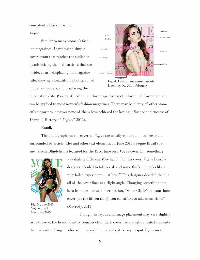
Layout
Similar to many women’s fash-
ion magazines, Vogue uses a simple
cover layout that reaches the audience
by advertising the main articles that are
inside, clearly displaying the magazine
title, showing a beautifully photographed
model, or models, and displaying the
publication date. (See fig. 4). Although this image displays the layout of Cosmopolitan, it
can be applied to most women’s fashion magazines. There may be plenty of other wom-
en’s magazines, however none of them have achieved the lasting influence and success of
Vogue. (“History of Vogue,” 2012).
Brazil.
The photographs on the cover of Vogue are usually centered on the cover and
surrounded by article titles and other text elements. In June 2013’s Vogue Brazil’s is-
sue, Giselle Bündchen is featured for the 121st time on a Vogue cover, but something
was slightly different. (See fig. 5). On this cover, Vogue Brazil’s
designer decided to take a risk and some think, “it looks like a
very failed experiment… at best.” This designer decided the put
all of the cover lines at a slight angle. Changing something that
is so iconic is always dangerous, but, “when Gisele’s on your June
cover (for the fifteen time), you can afford to take some risks.”
(Mavrody, 2013).
Though the layout and image placement may vary slightly
issue to issue, the brand identity remains clear. Each cover has enough repeated elements
that even with changed color schemes and photographs, it is easy to spot Vogue on a
Fig. 4: Fashion magazine layouts Hackney, K. 2014 February
Fig. 5: June 2013, Vogue BrazilMavrody, 2013

10
shelf. (See fig. 6). After almost 75 years
with a repetitive look, Vogue has paved the
way for other women’s fashion magazines.
“Over a century after the magazine’s aus-
picious debut, Vogue’s covers continue to
compel and influence.” (Kazanjian, 2011).
Elle, which was founded in the U.S. in
1985, and Marie Claire, founded in 1937,
two of Vogue’s closest competitors, both
use similar layouts for their covers. They
may have modeled their look off Vogue.
Vogue is successful because the editors and designers have perfected their covers.
Through examining examples of photography, typography, color, and how they all work
together to create a consistent and iconic cover, I have realized that Vogue really does do
it best. Vogue’s choices are more successful because they are carefully planned to not
only be consistent with the previous issues, but also to embrace current and future styles.
Other women’s fashion magazines create a very similar image, but with their iconic brand
spread consistently worldwide, all others fall short. Vogue is a leader and a trend-setter
for other magazines. This does not only mean they predict fashion trends in advance, but
they have also created a magazine empire all carefully branded to look nearly identical.
Vogue is able to reach out to a very broad audience, and is therefore able to cover
more ground. With U.S. Vogue appealing to 32.9-year-olds, they have also branched out
with teenVogue and other varieties worldwide. Readers are attracted to the recognizable
branding and know, without opening the magazine, that they can expect quality and
consistency each month. Vogue has become the most recognizable and iconic women’s
fashion magazine in the world through years of carefully crafted covers and unique, yet
consistent design.
Fig. 6: Some editions of Vogue display photographs of model’s faces, whereas others feature three-quarter body images. With each style, the layout remains consistent.“Cover browser,” n.d.

11
Chapter Three
Methodology

12
The goal of this study was to explore the successful techniques used on Vogue’s
magazine covers and discover what they do differently from other women’s fashion
magazines. Vogue dominates the fashion magazine industry and is the most iconic and
recognizable worldwide. The combination of photography, color, and typography used
by Vogue designers has set them apart from other magazines. This study intended to find
out what makes an ideal magazine cover by using Vogue as a successful example. The
objective of this study was to:
Find out what is different about Vogue’s printed magazine covers compared to
other fashion magazines and how the techniques they use have helped them take the lead
in the magazine industry.
Data Collection Plan
This research explores various factors that contribute to creating a magazine
cover, such as: colors, typography, photography, and layout. Information was collected
using two methods; a survey instrument (Appendix A), and a collection of data using an
inconsistent observer method. For this, any data retrieved from a participant that pro-
vided inconsistent results, the data was removed from my observation. The survey was
administered to a group of sixty women ages 20-40, because the average reader’s age is
32.9 years. These women were approached in various areas of San Luis Obispo, CA and
in San Francisco, CA and the survey was administered via iPad and printed data.
In the first survey, participants were asked questions and about their magazine
reading habits. Included were questions about their magazine subscriptions, interest in
fashion magazines, and significance of an interesting or eye-catching magazine cover.
Using the inconsistent observer method, I showed participants a group of similar
magazine covers. Each cover varied slightly from the previous and these variations were in
isolated areas, including; typography, color, layout, and photography. In order to deter-
mine which elements were preferred by the reader, I asked them to pick a favorite from
random pairs of the covers until each cover was shown.

13
Data Analysis Plan
The results from these two collection methods were quantified and noted, and all
inconsistent observers were thrown out in order to maintain legitimacy and consistency.
The names of the participants remain anonymous but all relevant demographic informa-
tion will be included in results. This data was used to determine what the magazine cover
preferences are for 20-40 year old women and to see how this information relates to the
techniques used by Vogue, the fashion industries most successful magazine. The results
were presented in graphs next to each of the varied magazine cover designs.

14
Chapter Four
Results

15
General Information
Sixty women were surveyed between the ages of 20 and 40 in order to better
understand the preferences of Vogue’s main audience. 38 of the women surveyed were
between 20- and 24-years old; five were between 25- and 29-years old; eight were between
30- and 34-years old; and nine were between 35- and 39-years old.
93.3% of the women surveyed preferred reading printed magazines to digital
magazines, the other 6.7% had no preference, and none of them reported digital as their
preferred reading method. About half (48.3%) of the women have subscriptions to one
or more magazines, while the other 51.7% women do not currently subscribe to any mag-
azines. 81.6% of the sixty women were from somewhere in the state of California, while
the other 18.4% reside in another area of the United States.
Vogue
Of the women surveyed, only 41.7% of them have purchased a printed edition of
Vogue in the last six months to a year. 65% of the women reported that fashion is a genre
of magazine that they are most likely to purchase.
Cover preferences.
The primary reason for this research was to discover trends within magazine cover
preferences for women aged 20-40. These covers include a traditionally “Vogue-looking”
cover and four separate versions, each varying slightly from the original: variation of
color, variation of fonts, variation or layout, and variation of photo. To conduct research,
each woman was shown two variations of the magazine cover side-by-side and asked to
choose their favorite of the two. This was done repeatedly until all 10 combinations of
covers had been compared. Results from this research can be seen on page 17.

16
For some of the comparisons, the preferences were unanimous amongst the wom-
en I surveyed, with others, they seemed to be split down the middle. Fairly consistently,
the photo variation was not preferred; while the original cover was always the preference
in each comparison.
original version
photo variationfont variation
color variation
layout variationfigure 7
figure 11figure 10
figure 9figure 8

figure 14
figure 15
figure 12
figure 13
12. In the color vs layout variation compar-ison there is not a huge split seen, survey participants did not lean strongly either way. Based on results from other compar-isons, participants did not seem to prefer either of these variations.
13. In the font variation vs original variation comparison there is a slight preference to the changed fonts. This surprised me because the original version was the majority in every other comparison.
17
14. When the font and layout variations were compared, neither took a strong lead. One survey participant comment-ed that the font variation was difficult to catch without a close look. I think that readers are overall more comfort-able with a traditional magazine layout.
15. The original version was a clear lead in this comparison. The photo varia-tion featured much more white space and also shows the model’s entire body instead of just her upper half which seems to please most readers.

18
figure 16
figure 17
figure 18
figure 19
16. Again, participants showed their dislike for the photo variation when it was compared to the font variation. This untraditional photo style seemed to be the participants’ least favorite variation.
17. To my surprise, participants liked the color variation much more than I had expected. Here, the split between font and color variations was exactly 50/50. It appears that there was no preference.
18. The original version comes out on top when compared to the color vari-ation. Though the layout and photo remained the same, participants pre-ferred the colors scheme that was more consistent with the main image.
19. An obvious favorite here, the origi-nal version was favored greatly over the layout variation. One participant stated that the layout variation looked unbal-anced and like, “something is missing.”

19
figure 20
figure 21
21. When compared to the layout vari-ation, however, participants preferred the photo variation. Perhaps this leads back to the comment about the unbal-anced feeling of the change in layout.
20. Again, the photo variation is clearly not favored; this time, compared to the color variation. According to partici-pants, the photo on the photo variation cover seemed to represent an image you would see inside a magazine, and not on the cover.

20
Chapter Five
Conclusions

21
Through my research I was able to find out what is different about Vogue’s print-
ed magazine covers compared to other women’s fashion magazines and how the tech-
niques they use have helped them take the lead in the industry.
From the information collected through this survey, I can conclude that the age-
range of women that are most likely to purchase and read Vogue magazine are partial to
the qualities that are commonly associated with Vogue’s printed magazine covers. When
the original cover was compared to a variation, it was always chosen by the majority of
the women surveyed. One survey participant said, “It is pretty obvious what you are do-
ing here, I can tell which cover you want me to choose because it is clearly the most pleas-
ing design.” While, my intention was to prove that the original cover was the fan-favorite,
this survey participant was actually referring to the color variation, which I thought was
quite amusing.
While their style is not always completely unique from other women’s fashion
magazines, it is Vogue’s consistency and recognizability that has helped them remain the
top women’s fashion magazine worldwide.
Deviations
There are some deviations from this conclusion, however, fewer than half (41.6%)
of the 60 women surveyed said that they read Vogue. Ideally, I would have liked all par-
ticipants to have been Vogue-readers. Also, for the comparison between the original cover
and the color variation, the results differed by only six votes, with the original in the lead.
The original cover follows Vogue’s model of making font color choices that complement
the colors used in the main image.
Further Research
To an extent, my research supports my hypothesis that Vogue’s audience would
prefer the most traditional-looking cover, however, I would like to see further data collect-
ed. I believe this research could benefit from expanding the pool of women and surveying
a sample of 200 in order to get a fair idea for preferred qualities on Vogue magazine covers.

22
Perhaps, more cover variations could be created in order to pinpoint exactly what
it is that the women like or dislike about Vogue’s traditional look. Survey participants
could also be asked to answer further questions about each cover; i.e. What do you like
about this cover?, What do you dislike about this cover?, Does this cover look “Vogue” to
you?, etc. I also think that the magazine design industry would benefit from expanding
this research to other magazine audiences, such as men and children, or other genres of
women’s magazines.
Importance
Now, more than ever, the printed magazine must catch the readers’ attention and
get them to make a purchase. The printed magazine industry is on the decline, and one
of the main things that sets it apart from digital and online versions is the cover. Howev-
er, my survey uncovered that a majority (93.3%) of magazine readers prefer printed to
digital magazines. One participant said, “There is something about a tangible magazine
that doesn’t exist in the digital world...like the ability to tear out a picture or a recipe
that you liked.” In stores, magazine covers are often what draws us to buy or read them.
Whether it is the main image, cover titles, or another element, getting the reader to pick
it up is the first step. The magazine design industry could use this research to discover
what it is exactly that helps make the sale.
Based on my research, I was able to develop a design guide for Women’s Fashion
magazine covers (Appendix B). I intended for this guide to be useful to designers, espe-
cially new designers, in the women’s fashion magazine industry. In this guide, I expand-
ed upon the four elements that I discovered to be the most important when it comes to
designing a magazine cover: photo, color, layout, and typography. Each of these elements
represent an important part of a cover and they all work together to create something
meaningful and eye-catching.

23
List of References

24
Acebedo, E. (2013). A guide on how to design a magazine cover that will stand out. Re-
trieved from: http://naldzgraphics.net/design-2/how-to-design-magazine-cover/
Buttrose, I. & Joye, P. (2011 July). What makes magazine covers successful and what
makes them flop? Retrieved from: http://channelnine.ninemsn.com.au/Blog.aspx?&blo-
gentryid=948889&showcomments=true
Caroline, D. (2013). What makes a best-selling magazine cover? Retrieved from: http://
www.divinecaroline.com/entertainment/what-makes-best-selling-magazine-cov-
er?page=3
Cover browser: Vogue. (n.d.) Retrieved from: http://www.coverbrowser.com/covers/
vogue
Crotty, N. (2012 August). Here are the 10 models who have covered Vogue the most. Re-
trieved from: http://fashionista.com/2012/08/here-are-the-10-model-who-have- covered-
vogue-the-most/
Dee, B. (2013 August). Fashion magazines list USA: Newsstand sales declining, digi-
tal edition sales on the rise. Retrieved from: http://www.fashiontimes.com/articles/
399/20130807/fashion-magazines-list-usa-newsstand-sales-declining-digital-edition-rise.
htm
Fashion’s familiar faces: The women who have most often graced the cover of Vogue.
(2012). Retrieved from: http://www.vogue.com/magazine/article/fashions-familiar-fac-
es-the-women-who-have-most-often-graced-the-cover-of-vogue/#1
Fashion Model Directory. (2013 September). Retrieved from: http://www.fashionmodel-
directory.com/magazines/vogue-usa/
Garrod, J. (2011 February). Jack Garrod’s AS media blog. Retrieved from: http://enor-
fasgarrodj.blogspot.com/2011/02/in-what-ways-does-your-media-product.html
History of the invincible Vogue. (2012). Retrieved from: http://serenitystitchworks.
com/art-and-design-information/history-of-the-invincible-vogue-magazine/
Kanzanjian, D. (2011). Vogue, the covers. New York, NY, Abrams.
Kotalik, C. (2011 August). Vogue media plan & case review. Retrieved from: http://s3im-
ages.coroflot.com/user_files/individual_files/437102_0bIXQmuVT8hsOasq8hutqEYUg.

25
Labarre, S. (2012 May). Seeing fashion history, by reducing 130 years of Vogue into
colors. Retrieved from: http://www.fastcodesign.com/1669917/seeing-fashion-history-
by-reducing-130-years-of-vogue-into-colors#4
Loveridge, R. (2013 September). 5 tips for successful magazine covers. Retrieved from:
http://mcmurrytmg.com/articles/5-tips-successful-magazine-covers
Mavrody, N. (2013 May). Gisele Bünchen covers Vogue Brazil’s June 2013 ‘body issue’.
Retrieved from: http://www.thefashionspot.com/buzz-news/forum-buzz/300831-gisele-
bundchen-vogue-brazil-cover-june-2013/
Orr, G.(2013 February). Not just a magazine, Vogue strikes a deal. Retrieved from:
http://www.independent.co.uk/life-style/fashion/features/not-just- a-magazine-vogue-
strikes-a-deal-8478980.html
Top 10 fashion magazines. (2013). Retrieved from: http://www.allyoucanread.com/
top-10-fashion-magazines/
Vogue prints its first full-color photographic cover. (2013). Retrieved from: http://www.
condenast.com/about-us/heritage/1932/vogue-prints-its-first-full-color-photographic-
cover

26
Appendix A
Survey Questions

27
Basic Survey Questions
What age range do you belong to?:
-under 20 -20-24 -25-29 -30-34
-35-39 -40-44 -45+
Where are you from?:
-Northern California -Central Coast, CA
-Southern California -other ___________
When was the last time you bought a magazine?:
-within the 2 weeks -within the last month
-within the last 3 months -within the last 6 months
-within the last year -over a year ago
-never
Was this magazine printed or digital?
-print -digital -other __________
Do you prefer print or digital?
-print -digital
-no preference -other __________
Are you subscribed to any magazines? If so, how many?
-yes -no
What genre of magazine are you most likely to buy?
-art/photography -electronics/computers -fashion -teen
-cooking/home goods -music -health/fitness -sports
-travel -other ___________
Do you read Vogue?
-yes -no
Have you purchased a printed issue of Vogue? (If yes, when?)
-yes, within the last six months -yes, within the last year
-no, but I read it online -no, I do not read Vogue
Magazine Cover Survey Questions
Which do you prefer? -compare 2 covers
Variations: -Photo -Color -Type -Layout

28
Appendix B
Women’s Fashion Magazine Design Guide

A
E
C
D
F
B
E
E
A masthead selling line
main image cover line(s)
model credit main cover lineB
C
D
E
F

MASTHEAD: » mastheads should be consistent
on each edition in order to es-tablish a branded identity for the magazine.
» this element should be large and centered near the top of the cover
» a masthead should be a recog-nizable element that remains obvious even if covered by part of the main image
» color of the masthead should be cohesive with the main image
main image » should feature a very recog-
nizable and fashionable man or woman dressed in the latest styles
» this should be a photograph of just the model’s face, or around three-quarters of their body
» it is very important that the background of the main image be subtle or plain so that it does not distract from any text ele-ments on the cover
» any photographic manipulation techniques that alter body shape and color should be kept to a minimum
» a common technique that is seen on many magazine covers is the intentional action of leaving the left third of the photo some-what empty. This is to increase legibility, as we read from left to right
model credit » some readers may not recognize
the model, and for others, the model may be a selling point;
therefore, it is critical that the model is credited on the cover and that some kind of interest-ing story ties in to their appear-ance on the cover
selling line » often the reason why someone
might pick up a magazine to begin with is the selling line; therefore, it should captivate and interest the reader from the very beginning.
» font choices should be minimal, at a maximum of three separate font families per cover
» it is typical to use a SANS SER-IF, serif, and an alternated (ital-ic or bold) version of one of these two
» the masthead is an unrelated el-ement that usually appears in a different fontface
cover line(s) » similar to the selling line, cover
lines give the reader more in-formation about the magazine’s contents
» the style of the cover line should be consistent with the rest of the magazine
» the color of selling and cover lines should either be drawn from the main image or work well with the color scheme of the main image
main cover line » the main cover line is the largest
line on the magazine cover » similar to the selling line, the
main objective of this is to draw readers in
Kiefer Hackney© 2014
A
B
C
D
F
E