roc curve and classification matrix for binary choice professor thomas b. fomby department of...
TRANSCRIPT

ROC Curveand
Classification Matrixfor Binary Choice
Professor Thomas B. FombyDepartment of Economics
SMUDallas, TX
February, 2015
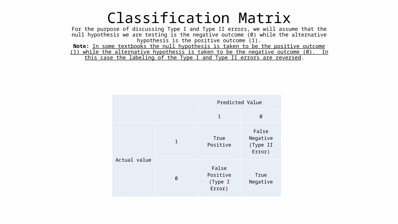
Classification MatrixFor the purpose of discussing Type I and Type II errors, we will assume that the null hypothesis
we are testing is the negative outcome (0) while the alternative hypothesis is the positive outcome (1).
Note: In some textbooks the null hypothesis is taken to be the positive outcome (1) while the alternative hypothesis is taken to be the negative outcome (0). In this case the labeling of the
Type I and Type II errors are reversed.
Predicted Value
1 0
Actual value
1 True Positive False Negative(Type II Error)
0 False Positive(Type I Error) True Negative
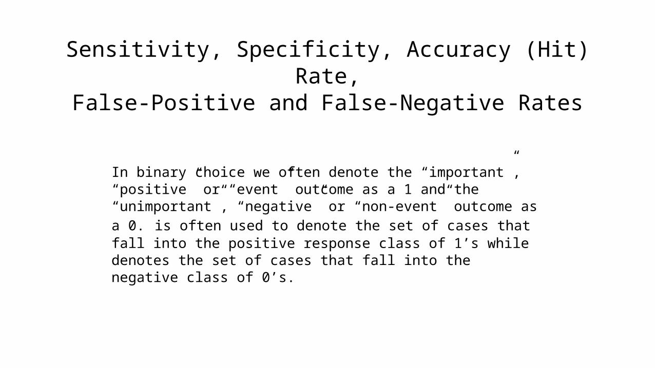
Sensitivity, Specificity, Accuracy (Hit) Rate,False-Positive and False-Negative Rates
In binary choice we often denote the “important”, “positive” or “event” outcome as a 1 and the “unimportant”, “negative” or “non-event” outcome as a 0. is often used to denote the set of cases that fall into the positive response class of 1’s while denotes the set of cases that fall into the negative class of 0’s.
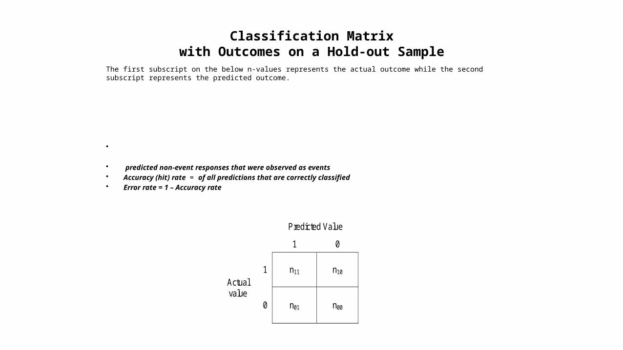
Classification Matrixwith Outcomes on a Hold-out Sample
The first subscript on the below n-values represents the actual outcome while the second subscript represents the predicted outcome.
• • predicted non-event responses that were observed as events• Accuracy (hit) rate = of all predictions that are correctly classified• Error rate = 1 – Accuracy rate
Predicted Value
1 0
Actual value
1 n11 n10
0 n01 n00
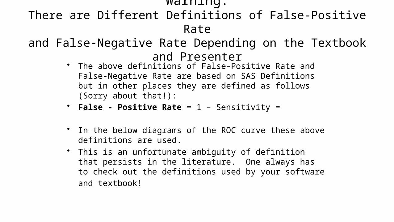
Warning:There are Different Definitions of False-Positive Rate
and False-Negative Rate Depending on the Textbook and Presenter
• The above definitions of False-Positive Rate and False-Negative Rate are based on SAS Definitions but in other places they are defined as follows (Sorry about that!):
• False - Positive Rate = 1 – Sensitivity =
• In the below diagrams of the ROC curve these above definitions are used.
• This is an unfortunate ambiguity of definition that persists in the literature. One always has to check out the definitions used by your
software and textbook!
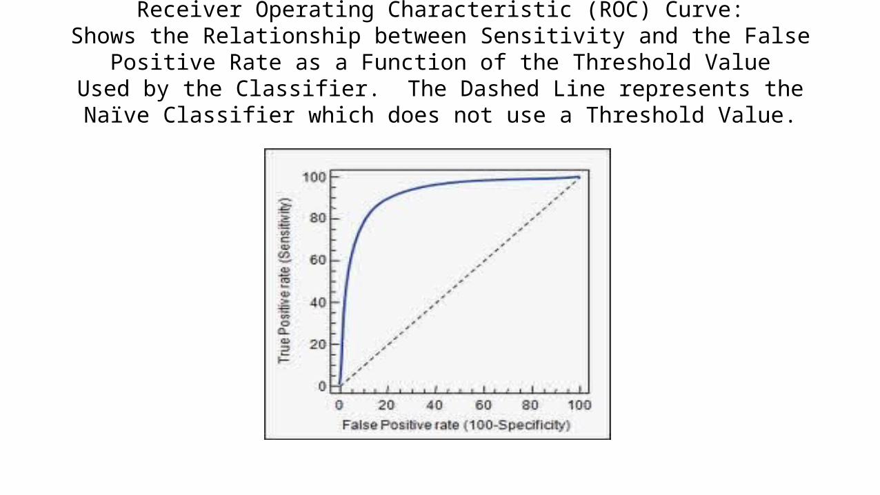
Receiver Operating Characteristic (ROC) Curve:Shows the Relationship between Sensitivity and the False Positive Rate as a
Function of the Threshold ValueUsed by the Classifier. The Dashed Line represents the Naïve Classifier which
does not use a Threshold Value.

Tracing Out the ROC Curvefor One Classifier as a Function of Threshold (Cutoff Probability)
Note: A Perfect Classifier Would Produce the Point (0,1.0) in the ROC Diagram (upper left-hand corner).Strict Threshold means a high cutoff probability for classifying a case as a “success” (y = 1).
Lax Threshold means a low cutoff probability for classifying a case as a “success” (y=1).If a case has a probability greater than the threshold, we classify the case as a success (y=1).
Otherwise, we classify the case as a failure (y=0).In the below graph we have the following equivalent terms.FPF = False Positive Fraction = FPR = False Positive Rate.TPF = True Positive Fraction = TPR = True Positive Rate.
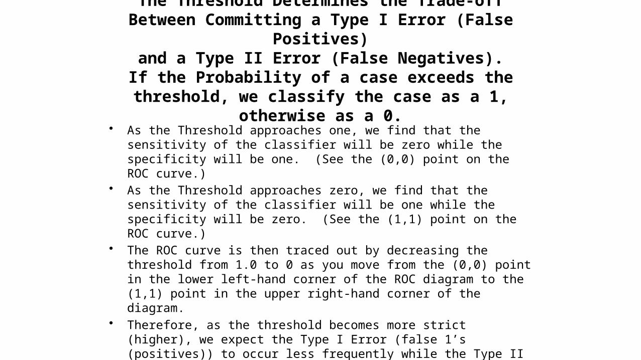
The Threshold Determines the Trade-offBetween Committing a Type I Error (False Positives)
and a Type II Error (False Negatives).If the Probability of a case exceeds the threshold, we
classify the case as a 1, otherwise as a 0.
• As the Threshold approaches one, we find that the sensitivity of the classifier will be zero while the specificity will be one. (See the (0,0) point on the ROC curve.)
• As the Threshold approaches zero, we find that the sensitivity of the classifier will be one while the specificity will be zero. (See the (1,1) point on the ROC curve.)
• The ROC curve is then traced out by decreasing the threshold from 1.0 to 0 as you move from the (0,0) point in the lower left-hand corner of the ROC diagram to the (1,1) point in the upper right-hand corner of the diagram.
• Therefore, as the threshold becomes more strict (higher), we expect the Type I Error (false 1’s (positives)) to occur less frequently while the Type II Error (false 0’s (negatives)) would occur more frequently. Of course, with a lax (low) threshold you would expect the Type I Error to be more prevalent and the Type II Error to be less prevalent.
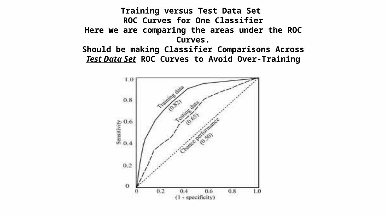
Training versus Test Data Set ROC Curves for One Classifier
Here we are comparing the areas under the ROC Curves.Should be making Classifier Comparisons AcrossTest Data Set ROC Curves to Avoid Over-Training
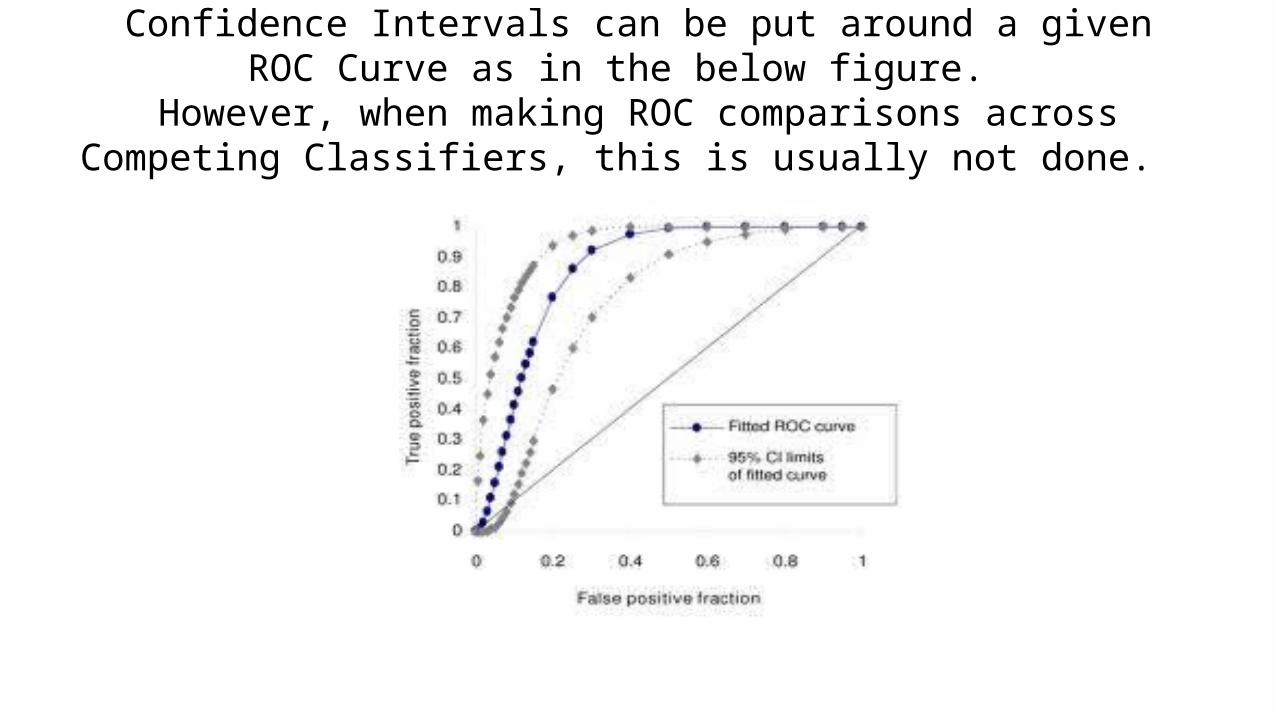
Confidence Intervals can be put around a givenROC Curve as in the below figure.
However, when making ROC comparisons acrossCompeting Classifiers, this is usually not done.
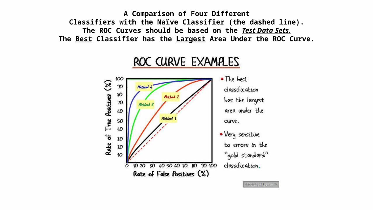
A Comparison of Four DifferentClassifiers with the Naïve Classifier (the dashed line).
The ROC Curves should be based on the Test Data Sets.The Best Classifier has the Largest Area Under the ROC Curve.

Euclidian Distance Comparisonof ROC Curves
• Another way of comparing ROC curves is to compare the minimum distance between the perfect predictor point (0,1) with a point on the ROC curve of the classifier.

A Euclidian Distance Measure• Let be a point on a ROC Curve. The minimum distance ROC point, , is the point on the
ROC Curve that is closest (in Euclidian distance) to the “ideal” classifier point, (0,1). This distance is given by
.• A measure of the “goodness” of a classifier via its ROC curve that has been proposed is
.
W is a positive weight such that and represents the user’s view of the
relative cost (W) of False Negatives (Type II Errors) versus the cost (1 – W) of False
Positives (Type I Errors). In the absence of any knowledge on these relative costs one
can choose W = 0.5 ( in the belief that the two costs are approximately equal to
each other. Obviously, this measure varies from (the worst possible classifier with
FPR = 1 and TPR = 0) to a perfect classifier when d = 0 and . So the closer the
measure is to one, the better the classifier is by this measure. • Then comparing across classifiers, the classifier with the maximum over all classifiers
when scored over the TEST DATA SET is the preferred classifier.
Caveat of the Measure
• The measure of classifier accuracy seems to be a little less satisfying than the area measure since the ROC curve characterizes the classifier performance for all possible values of the Threshold, not just the Threshold, say , that is implied by the minimum Euclidian distance point on the ROC Curve. Who is to say that the implied Threshold, , of the minimum distance point, , is the optimal threshold point for the problem at hand? Optimal threshold values can only be determined when there is information available on the Payoff Matrix or at least one is willing to focus on maximizing the accuracy (hit) rate.