poster step by step
TRANSCRIPT
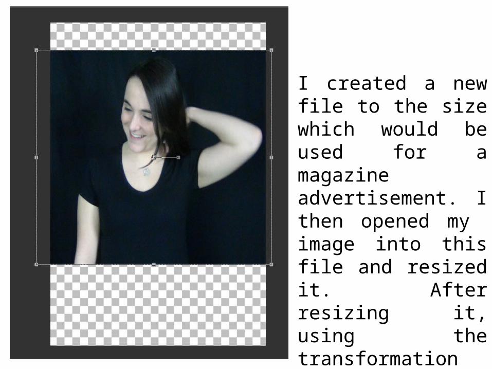
I created a new file to the size which would be used for a magazine advertisement. I then opened my image into this file and resized it. After resizing it, using the transformation tool, I then repositioned it into my desired place.

I then browsed the effects section of Corel Paint Shop Pro X2 to see which would be most conventional for my product. I then used the ‘Convert to Black and White’ option to edit my picture.
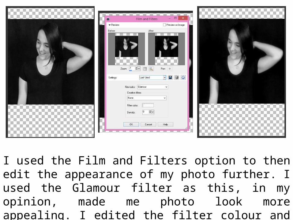
I used the Film and Filters option to then edit the appearance of my photo further. I used the Glamour filter as this, in my opinion, made me photo look more appealing. I edited the filter colour and Density to create my desired look.
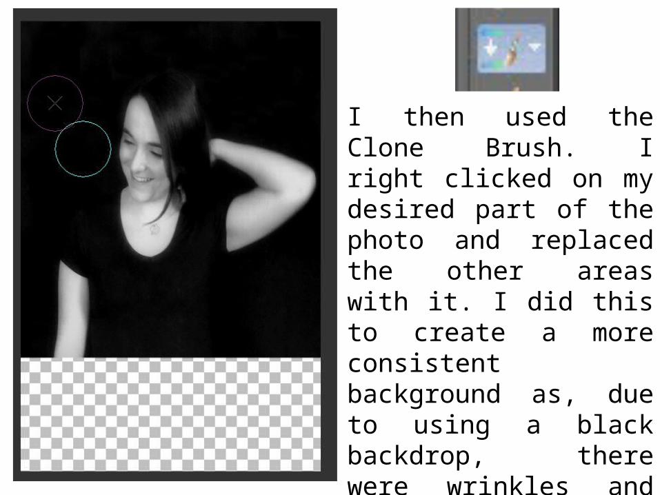
I then used the Clone Brush. I right clicked on my desired part of the photo and replaced the other areas with it. I did this to create a more consistent background as, due to using a black backdrop, there were wrinkles and inconsistencies in the background. I also did this to create a background at the bottom of the image.
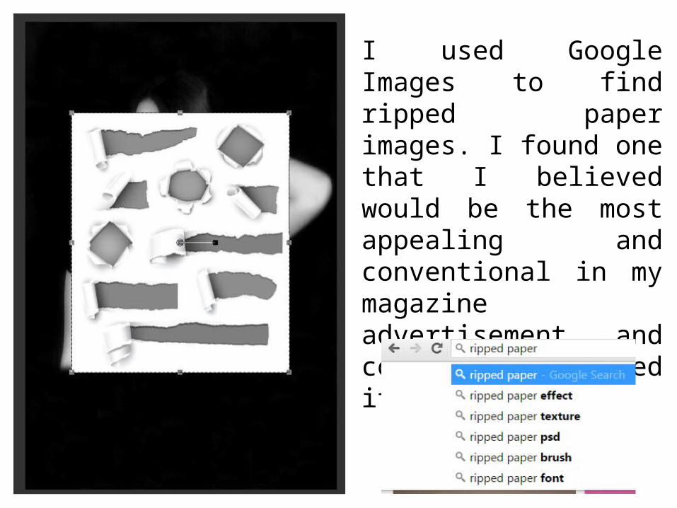
I used Google Images to find ripped paper images. I found one that I believed would be the most appealing and conventional in my magazine advertisement and copied and pasted it into my work.
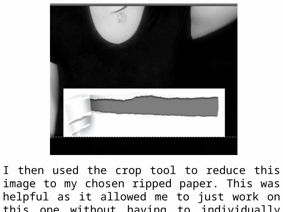
I then used the crop tool to reduce this image to my chosen ripped paper. This was helpful as it allowed me to just work on this one without having to individually delete the others.
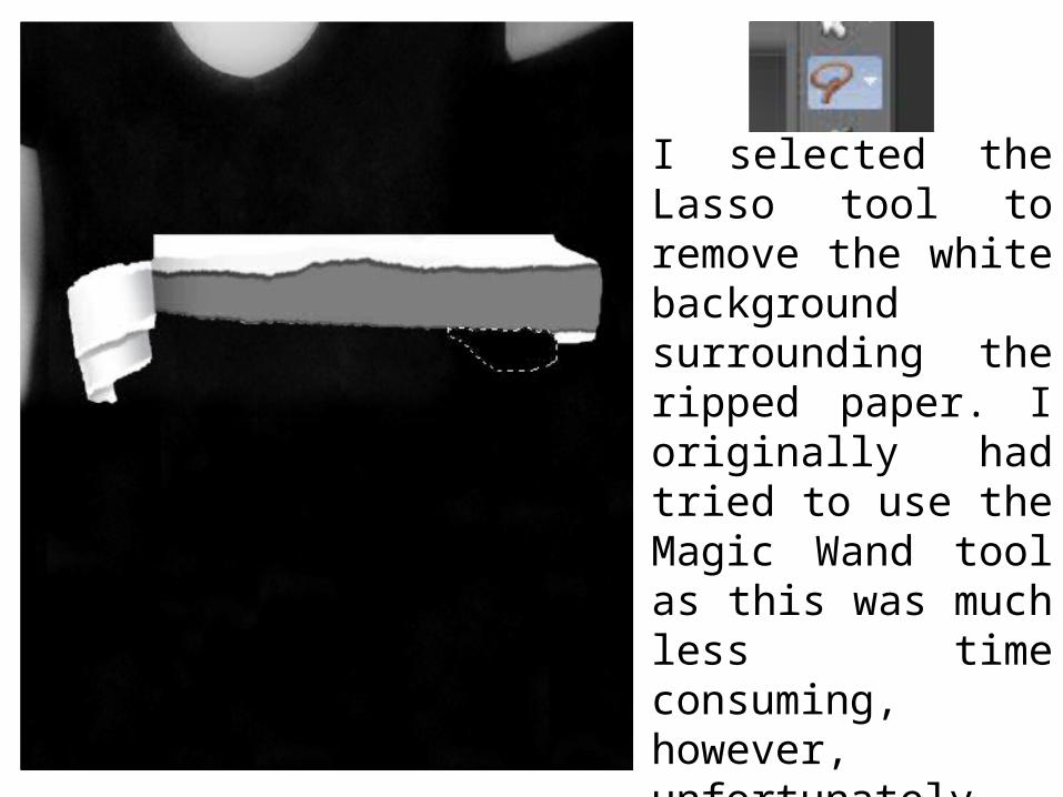
I selected the Lasso tool to remove the white background surrounding the ripped paper. I originally had tried to use the Magic Wand tool as this was much less time consuming, however, unfortunately, it selected parts of the image that I did not want to remove.
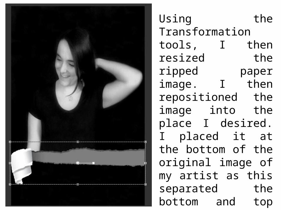
Using the Transformation tools, I then resized the ripped paper image. I then repositioned the image into the place I desired. I placed it at the bottom of the original image of my artist as this separated the bottom and top smoothly without my audience being able to notice that I had created the background myself.

I used fontspace.com to find my chosen font (My Underwood Font) and typed up the album name. I then chose my desired colours and resized the text.
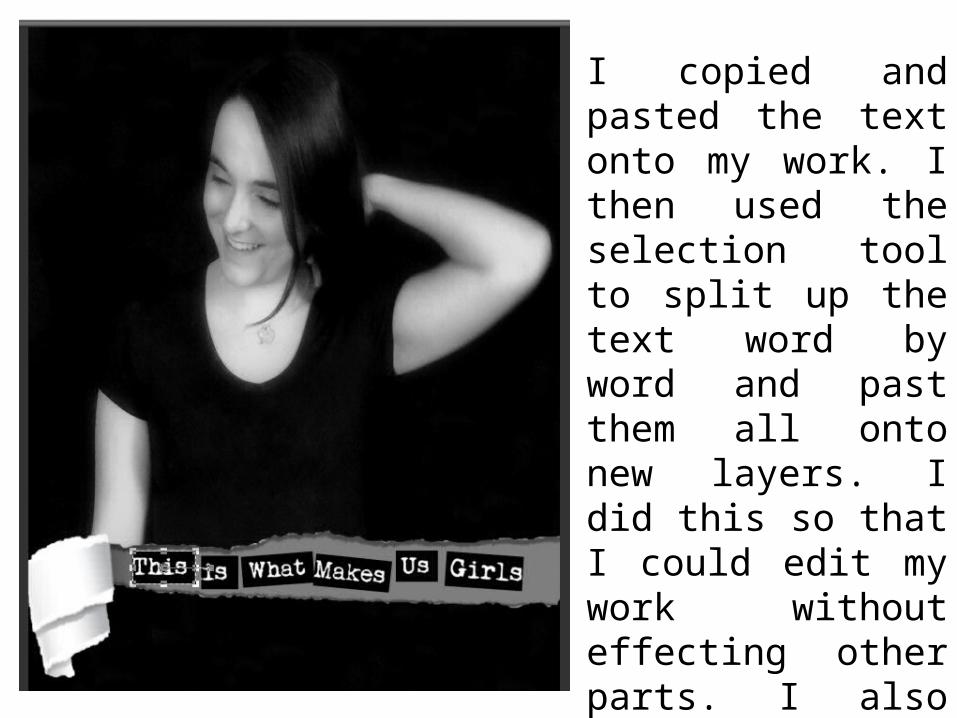
I copied and pasted the text onto my work. I then used the selection tool to split up the text word by word and past them all onto new layers. I did this so that I could edit my work without effecting other parts. I also always duplicated my layers so that, if a mistake was made, I always had a back up.
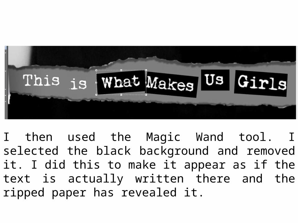
I then used the Magic Wand tool. I selected the black background and removed it. I did this to make it appear as if the text is actually written there and the ripped paper has revealed it.
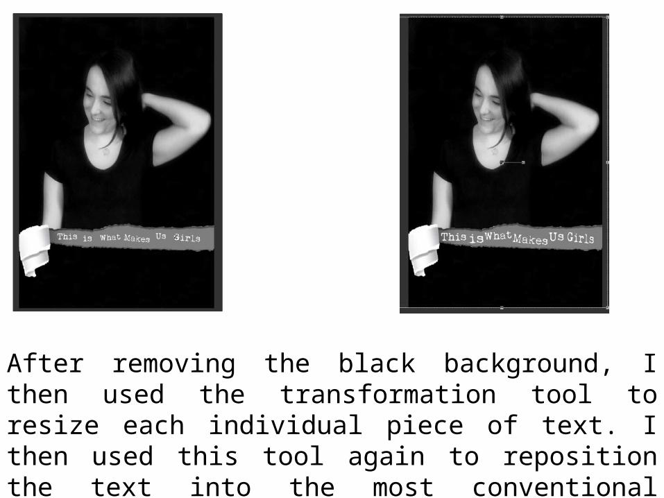
After removing the black background, I then used the transformation tool to resize each individual piece of text. I then used this tool again to reposition the text into the most conventional places.
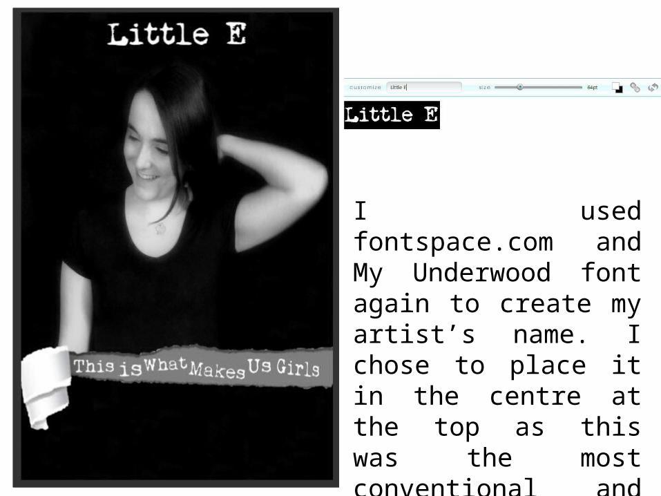
I used fontspace.com and My Underwood font again to create my artist’s name. I chose to place it in the centre at the top as this was the most conventional and appealing place.
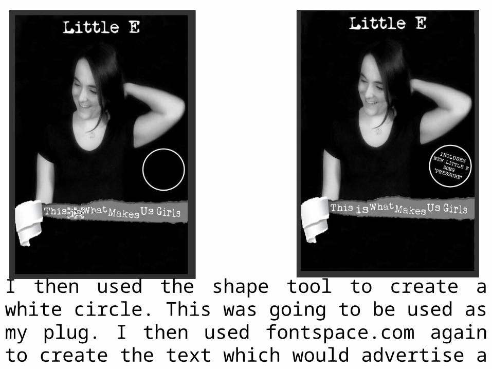
I then used the shape tool to create a white circle. This was going to be used as my plug. I then used fontspace.com again to create the text which would advertise a single from my artist’s album.

Using fontspace.com one more time, I created the text which would be placed at the bottom of my magazine advertisement. This informed my audience of what I was advertising, when it was going to be released, how they could purchase it and where.
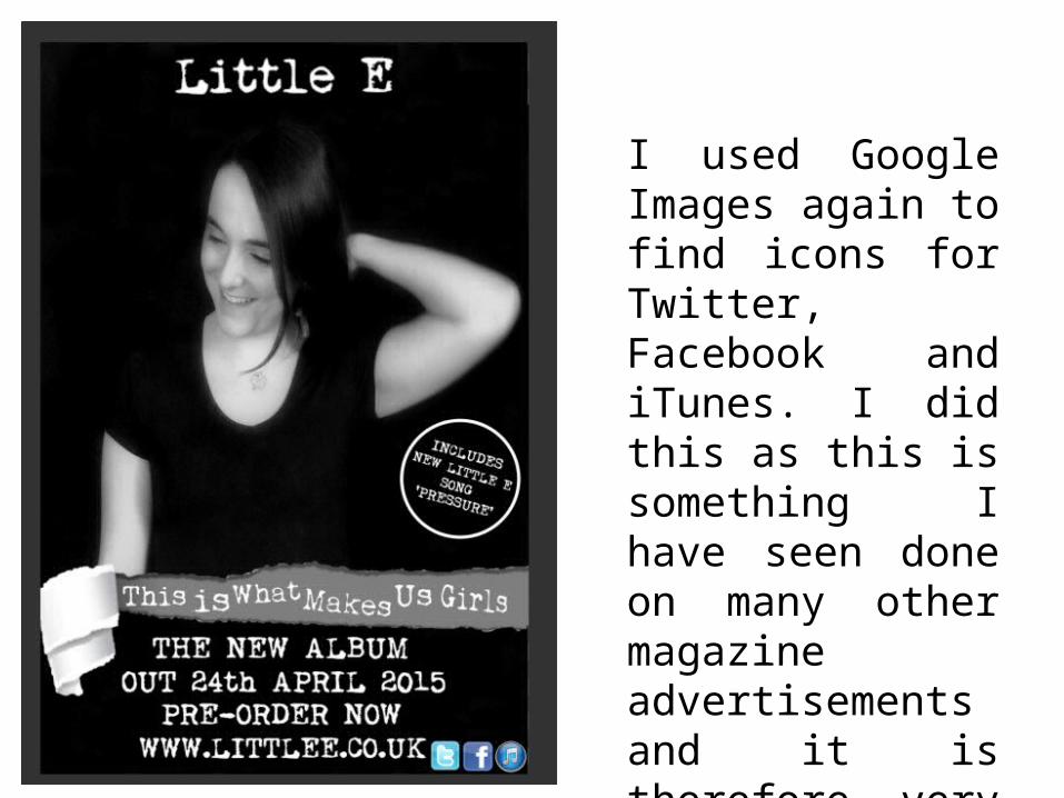
I used Google Images again to find icons for Twitter, Facebook and iTunes. I did this as this is something I have seen done on many other magazine advertisements and it is therefore very conventional for my audience.