poisson models for person-years and expected rates
TRANSCRIPT

Poisson models for person-years and expected rates
Elizabeth J. Atkinson Cynthia S. Crowson Rachel A. Pedersen Terry M. Therneau
Technical Report #81
September 3, 2008
Copyright 2008 Mayo Foundation


Contents
1 Introduction 21.1 Motivation . . . . . . . . . . . . . . . . . . . . . . . . . . . . . . . . . . . . . . . . . . . 21.2 Data for examples . . . . . . . . . . . . . . . . . . . . . . . . . . . . . . . . . . . . . . . 31.3 Person-years . . . . . . . . . . . . . . . . . . . . . . . . . . . . . . . . . . . . . . . . . . . 31.4 Examining population event rates . . . . . . . . . . . . . . . . . . . . . . . . . . . . . . . 61.5 Using Poisson regression to model rates . . . . . . . . . . . . . . . . . . . . . . . . . . . 81.6 Relating Cox and rate regression models . . . . . . . . . . . . . . . . . . . . . . . . . . . 9
2 Relative Risk Regression (multiplicative model) 112.1 Basic models . . . . . . . . . . . . . . . . . . . . . . . . . . . . . . . . . . . . . . . . . . 112.2 Dividing follow-up time into pieces . . . . . . . . . . . . . . . . . . . . . . . . . . . . . . 12
2.2.1 Graphical displays . . . . . . . . . . . . . . . . . . . . . . . . . . . . . . . . . . . 142.2.2 Hypothesis testing . . . . . . . . . . . . . . . . . . . . . . . . . . . . . . . . . . . 16
2.3 Direct standardization . . . . . . . . . . . . . . . . . . . . . . . . . . . . . . . . . . . . . 172.3.1 Direct standardization to a cohort . . . . . . . . . . . . . . . . . . . . . . . . . . 202.3.2 Confidence intervals for direct standardization to a cohort . . . . . . . . . . . . . 21
3 Additive models 223.1 Motivation and basic models . . . . . . . . . . . . . . . . . . . . . . . . . . . . . . . . . 223.2 Excess risk regression . . . . . . . . . . . . . . . . . . . . . . . . . . . . . . . . . . . . . 243.3 Direct standardization . . . . . . . . . . . . . . . . . . . . . . . . . . . . . . . . . . . . . 27
3.3.1 Direct standardization to a cohort . . . . . . . . . . . . . . . . . . . . . . . . . . 283.3.2 Confidence intervals for standardized rates . . . . . . . . . . . . . . . . . . . . . 29
4 Summary 29
5 Appendix 325.1 SAS code for the examples . . . . . . . . . . . . . . . . . . . . . . . . . . . . . . . . . . . 32
5.1.1 Code for section 1.6 Relating Cox and rate regression models . . . . . . . . . . . 325.1.2 Code for section 2.1 Relative risk regression - basic models . . . . . . . . . . . . 335.1.3 Code for section 3.1 Additive models - basic models . . . . . . . . . . . . . . . . 33
5.2 Expected rates . . . . . . . . . . . . . . . . . . . . . . . . . . . . . . . . . . . . . . . . . 345.2.1 Expected rates in S-Plus . . . . . . . . . . . . . . . . . . . . . . . . . . . . . . . . 345.2.2 Creating expected rates in S-Plus . . . . . . . . . . . . . . . . . . . . . . . . . . . 345.2.3 Expected rates in SAS for survival analysis . . . . . . . . . . . . . . . . . . . . . 375.2.4 Expected rates in SAS for person-years analysis . . . . . . . . . . . . . . . . . . . 37
5.3 S-Plus functions . . . . . . . . . . . . . . . . . . . . . . . . . . . . . . . . . . . . . . . . 385.3.1 pyears2html . . . . . . . . . . . . . . . . . . . . . . . . . . . . . . . . . . . . . . . 385.3.2 poisson.additive . . . . . . . . . . . . . . . . . . . . . . . . . . . . . . . . . . . . . 385.3.3 addglm . . . . . . . . . . . . . . . . . . . . . . . . . . . . . . . . . . . . . . . . . 39
5.4 A closer look at differences between gam and glm . . . . . . . . . . . . . . . . . . . . . . 40
1

1 Introduction
1.1 Motivation
In medical research we are often faced with the question of whether, in a specified cohort, the observednumber of events (such as death or fracture) is more than we would expect in the general population.If there is an excess risk, we then wish to determine whether the excess varies based on factors suchas age, sex, and time since disease onset.
Statistical approaches to this problem have been studied for a long time and there is a well-described set of methods available (see, for instance, overviews in the Encyclopedia of Biostatistics[6]). An interesting aspect of the methods, and the primary subject of this report, is that many of thecomputations are very closely related to Poisson regression models. Powerful modern software, such asthe generalized linear models functions of S-Plus (glm), SAS (genmod), or other packages, allow us todo these “specialized” computations quite simply via creation of datasets in the appropriate format.This report summarizes several of these computations, and is also a compendium of various tricks andtechniques that the authors have accumulated over the years.
At the outset, however, we need to distinguish two separate kinds of questions about event rates,as the approaches herein deal only with one of them. Consider all of the subjects in a population witha particular condition, e.g. exposure to Lyme disease as measured by the presence of an antibody.Interest could center on two quite different questions:
• Prospective risk: a set of subjects with the condition has been identified; what does their futurehold?
• Population risk: what is the impact of the condition on the population as a whole? This includesall subjects with the condition, whether currently identified or not.
A big difference between these questions is what to do with cases that are found post-hoc, for instancepatients who are found to have the antibody only when they develop an adverse outcome known tobe related to Lyme disease, or cases found at autopsy. Analysis for population questions is muchmore difficult since it involves not only the cases found incidentally, but inference about the numberof subjects in the population with the condition of interest who have not been identified.
The methods discussed here only apply to the prospective case. We might think of prospective riskas the therapist’s question, as they advise the patient currently in front of them about his/her future.Interesting questions include
• Short term. What is the risk for the short term, say 30 days? This question is important, but wemust be quite careful about implying causality from any association that we find. We might findmore joint pain in Lyme disease patients simply because we look for it harder, or a particularlab test might only be ordered on selected patients.
• Long term. What is the long term risk for the patient? Specific examples of questions are:
– Do patients with diabetes have a higher death rate than the general population? Has thisrelationship changed over time? Are there different relationships for younger versus oldersubjects? Does this relationship change with disease duration?
– Has the rheumatoid arthritis population experienced the same survival benefits as the gen-eral population?
– Multiple myeloma subjects are known to experience a large number of fractures. Does thisexcess fracture rate occur before or after the diagnosis of multiple myeloma? Is this excessfracture rate constant after diagnosis?
– Do patients with MGUS (monoclonal gammopathy of undetermined significance) havehigher death rates than expected? Is the excess mortality rate constant, or does it risewith age? How is the amount of excess related to gender, obesity, or other factors?
Each of these items are actual medical questions that have been addressed in studies at Mayo, workedon by members of the Division of Biostatistics, and several are used as examples in this report.
2

AgeTime < 35 35–45 45–55 55–65 65–75 75+
0–1 month 0 0 0 .082 0 01–6 month 0 0 0 .416 0 06–12 month 0 0 0 .236 .266 0
1–2 yr 0 0 0 0 1 02–5 yr 0 0 0 0 2.49 05+ yr 0 0 0 0 0 0
Table 1: Person-years analysis for one person who entered the study at age 64.3 and died at age 68.8. Eachcell contains the number of person-years spent in that category.
1.2 Data for examples
There are three datasets used for the examples in this report.
• The lung dataset is standardly available with S-Plus and includes prognostic variables from 228Mayo Clinic patients with advanced lung cancer [8]. The main endpoint is survival, and in thisparticular dataset the status variable is coded as 1=alive, 2=dead. The follow-up time rangesfrom 5 to 1022 days, and the sex variable is coded as 1=male, 2=female. The variable ph.ecog isthe physician assigned ECOG performance score, which is a measure of physical disability andranges from 0 (fully active) to 4 (totally confined to a bed or chair).
• Monoclonal gammopathy of undetermined significance (MGUS) is detected from the serum pro-
tein electrophoresis (SPE) test, which is ordered by a physician for a number of reasons. It isoften, in fact, an exploratory test when the root cause for a patient’s condition is unclear. Thedataset data.spe contains records of all 1,384 Southeastern Minnesota residents who were diag-nosed with MGUS at Mayo Clinic between 1960 and 1994, plus the 21,910 subjects with negativeSPE test results for the same region from June 1985 through 1994. (The electronic laboratoryrecords only reach back to 1985).
• The data.mgus dataset includes the subjects diagnosed with MGUS and is a subset of data.spe.It contains the sex, age and date of diagnosis, region of residence, follow-up time, and statusat last follow-up for 1,384 Southeastern Minnesota residents who were diagnosed with MGUSat Mayo Clinic between 1960 and 1994 [7]. These patients have, on average, over 15 years offollow-up.
1.3 Person-years
Tabular analyses of observed versus expected events, often called “person-years” summaries, are veryfamiliar in epidemiological studies. Table 1 is an example, and shows how a subject may contributeto multiple cells within a person-years table. In this case, the results have been stratified both bypatient age and by the time interval that has transpired since detection of MGUS. This table includesthe follow-up for a female who is age 64.3 at diagnosis of MGUS and is followed for approximately 4.5years. She contributes 0.082 years (1 month) to the “0-1 month” cell as a 55-65 year old. During the“6-12 month” cell she contributes person-years to two different age groups.
This concept can be applied to all the females from the mgus data, as shown in Table 2. We can learna lot from this table, but it is not always easy to read. We immediately see that making those underage 35 into a separate group was unnecessary; very few people are diagnosed with MGUS before age45. Looking across the rows, we see considerable early mortality in these patients: in the first monthafter detection there were 20 observed deaths, but only 2.0 expected events. This 10-fold increase islikely an artifact of detection, i.e. it is likely attributable to people who came to Mayo for a serious orlife-threatening condition and were found to have MGUS incidentally. Such individuals are not dyingof MGUS, but of the causes that underlie their visit.
3

AgeTime < 35 35–45 45–55 55–65 65–75 75+ Total
3 13 44 100 201 2700.2 1.1 3.5 7.9 16.3 21.7 50.7
0–1 1 0 2 5 4 8 20month .0001 .0014 .011 .063 .314 1.58 2.0
9675.1 0 179.1 79.1 12.7 5.1 10.12 13 43 97 202 270
0.8 5.1 17.4 38.8 78.9 106.8 247.81–6 0 0 0 2 5 18 25
month .0004 .0065 .055 .312 1.525 7.81 9.70 0 0 6.4 3.3 2.3 2.62 12 42 94 195 272
1.0 5.9 19.4 43.5 89.7 129.3 288.86–12 0 0 0 4 3 9 16
month .0005 .0076 .061 .345 1.709 9.35 11.50 0 0 11.6 1.8 0.96 1.42 11 40 86 182 288
2.0 10.2 35.9 76.7 158.7 267.4 550.91–2 0 0 1 5 8 21 35yr .0011 .0133 .112 .611 2.947 19.50 23.2
0 0 8.9 8.2 2.7 1.1 1.52 10 39 85 178 318
4.5 23.1 77.7 183.3 408.5 762.3 1459.42–5 0 0 2 3 8 70 83yr .0029 .0303 .237 1.389 7.467 57.80 66.9
0 0 8.4 2.2 1.1 1.2 1.21 6 26 68 140 294
0.1 22.7 73.8 189.8 409.6 928.9 1624.95–10 0 0 0 4 19 119 142yr .0001 .0294 .235 1.442 7.630 80.94 90.3
0 0 0 2.8 2.5 1.5 1.60 1 9 35 74 173
0.0 5.1 42.3 146.3 269.4 712.4 1175.410+ 0 0 1 0 13 88 102yr 0 .0069 .127 1.083 4.946 62.15 68.3
0 7.9 0 2.6 1.4 1.53 15 57 147 298 466 631
8.7 73.1 270.1 686.2 1431.1 2928.8 5398.0Total 1 0 6 23 60 333 423
0.01 0.1 0.84 5.2 26.5 239.1 271.9196.1 0 7.2 4.4 2.3 1.4 1.6
Table 2: Rates analysis for female patients with MGUS. Each cell contains five values: 1) the number of subjectscontributing to the cell, 2) the total number of person-years of observation in the cell, 3) the number of deaths,4) the expected number of deaths based on the Minnesota population, and 5) a risk ratio. A given patient willcontribute to multiple cells during her follow-up.
4

The values in Table 2 were produced using the following code in S-Plus.
## Create desired grouping of the follow-up person-years
> cuttime <- tcut(rep(0, nrow(data.mgus)),
c(0, 30, 182, c(1, 2, 5, 10, 100)*365.25),
labels=c(’0-1 mon’, ’1-6 mon’, ’6-12 mon’, ’1-2 yr’,
’2-5 yr’, ’5-10 yr’, ’10+ yr’))
## Create desired grouping of age
## Note - the first argument defines the age at which people enter the study.
## The tcut function then categorizes person-years according to the
## specified age groups throughout follow-up. The age categories
## and baseline age are in days but the labels are in years.
> cutage <- tcut(data.mgus$age,
c(0, 35,45,55,65,75, 110)*365.25,
labels=c(’<35’, ’35-45’, ’45-55’, ’55-65’, ’65-75’, ’75+’))
## Divide follow-up by age and time categories
> pyrs.mgus <- pyears(Surv(futime, status) ∼ cuttime + cutage +
ratetable(age=age, year=dtdiag, sex=sex), data=data.mgus,
ratetable=survexp.mn, subset=(sex==’female’), data.frame=T)
## Create nice HTML version of the table
> pyears2html(pyrs.mgus)
## Make sure variables are summarized correctly
## Person-years ’off table’ > 0 generally indicates a problem
> summary(pyrs.mgus)
Total number of person-years tabulated: 5397.977
Total number of person-years off table: 0
Matches to the chosen rate table:
age ranges from 29.9 to 96 years
male: 0 female: 631
date of entry from 12/15/1960 to 11/29/1994
## Look at the dimensions of the expected data
> summary(survexp.mn)
Rate table with dimensions:
age: time variable with 110 categories
sex: discrete factor with legal values of (male, female)
year: time variable with 4 categories (interpolated)
The tcut command creates time-dependent categories especially for the pyears computation. Itsfirst argument is the starting point for each person; for the cuttime variable (time since diagnosis ofMGUS) each person starts at 0 days. As a person is followed through time, they dynamically move toanother category of follow-up time at 30, 182, etc. days. The pyears function breaks the accumulatedperson-years into cells based on cutage and cuttime. The created intervals are of the form (t1, t2],meaning that the cutpoints are included on the right end of each interval.
The survexp.mn rate table is a special object containing the daily death rates for Minnesota res-idents by age, sex, and calendar year; the variable names of ‘age’, ‘sex’, and ‘year’ can be foundby summary(survexp.mn). Other rate tables may include different dimensions. For instance, thesurvexp.usr rate table is also divided by race. By default, the pyears function assumes that yourdataset, data.mgus in the above example, contains both the variables found in the model statementand the variables found in the rate table, and that the latter are on the right scale (e.g. days ver-sus years). If the variable names are not in your dataset you can still do the analysis by calling theratetable function as part of your formula. In this particular dataset ‘year’ is named ‘dtdiag’. Sincethe Minnesota rate table contains daily hazards, this means that age should be in days, and that the
5

‘year’ argument should be a Julian date (number of days since 1/1/1960) at which the subject begantheir follow-up. The variable sex should be coded as (“male”, “female”). Any unique abbreviation ofthe character string, ignoring case, is acceptable, as is a numeric code of (1, 2). Correctly matchingthe variables of the rate table is one of the more fussy aspects of the pyears and survexp routines, andit is easy to make an error. Be very careful as well to use only the starting values of your variables(follow-up time at baseline, baseline age, etc.) when using tcut. The pyears function returns twocomponents whose primary purpose is data checking, shown in the last 4 lines of the example. Thesummary component shows how subjects mapped into the rate table at the start of their follow-up, andofftable shows the amount of follow-up time that did not fall into any of the categories specifed bythe formula.
An HTML version of the table can be produced using the pyears2html function. The local MayoSAS procedure personyrs produces such tables directly, but unfortunately the result is not compactenough to fit nicely into this report. Additionally, the SAS procedure is not set up to use the standardexpected death rate tables and instead expects a dataset with user-defined expected event rates [2].See the Appendix for the location of pyears2html code (section 5.3.1) and for information on how tocreate rate tables in S-Plus and SAS (section 5.2).
1.4 Examining population event rates
Often it is useful to first examine the event rate data before comparing it to expected rates. Using theSPE data, we’ll look at the observed death rates, ignoring the first 2 years of follow-up after the SPEtest since the early increase in observed to expected deaths is most likely an artifact of detection. Hereis S-Plus code and output, dividing the subjects into 5 year age groups. Note that in this example theratetable option is not used so there are no expected rates in the output.
## Cut time into 0-2 years of follow-up vs 2+ years
> cuttime3 <- tcut(rep(0, nrow(data.spe)), c(0, 730, 36500),
labels=c("0-2", "2+"))
## A fairly coarse age grouping is used (note: age is in days)
> cutage3 <- tcut(data.spe$age, c(0,seq(45,95, by=5),110)*365.25,
labels=c(’<45’, paste(9:17 *5, ’-’, 10:19 *5, sep=’’), "95+"))
## Here, no expected rates are requested
> pyrs.spe3 <- pyears(Surv(futime, status) ∼ cutage3 + sex + mgus + cuttime3,
data=data.spe, data.frame=T)$data
## create an event/person-years ratio
> pyrs.spe3$rate <- pyrs.spe3$event/pyrs.spe3$pyears
## look at the first 5 observations with follow-up of 2+ years
> pyrs.spe3[pyrs.spe3$cuttime3==’2+’,][1:5,]
cutage3 sex mgus cuttime3 pyears n event rate
49 <45 female 0 2+ 10453.166 1522 36 0.003443933
50 45-50 female 0 2+ 5497.853 1642 24 0.004365341
51 50-55 female 0 2+ 6989.339 2039 28 0.004006101
52 55-60 female 0 2+ 8512.571 2475 81 0.009515339
53 60-65 female 0 2+ 10209.962 3001 128 0.012536775
Figure 1 shows the rates from the output table (pyrs.spe3) plotted on a log scale versus age; itappears that the log of the rates is nearly linear in age, with a small upward curving component. Figure2 shows these same rates plotted on the arithmetic scale versus age; here the relationship definitelycurves upward, and needs at least a quadratic component. Whatever the relationship, informationfrom the oldest age category will be highly influential on the fit. Depending on the dataset, analysis of
6

Age
Dea
th r
ate
50 60 70 80 90
0.00
50.
050
0.50
0
ff f
ff
f
f
f
f
f
f
f
mm
m
mm
m
m
m
m
mm
m
F F
F
F
FF
F
FF F
F
M
M
M MM
M
M
MM
M
MfmFM
Negative, femaleNegative, malePositive (MGUS), femalePositive (MGUS), male
Figure 1: Death rates (plotted on a log scale) versus age for patients who had an SPE. Note that two pointswith rates of zero do not appear on the logarithmic plot.
Age
Dea
th r
ate
50 60 70 80 90
0.0
0.1
0.2
0.3
0.4
0.5
f f f f f f ff
f
f
f
f
m m m m m mm
m
m
m
m
m
FF F F F
F FF
FF F
F
MM
MM M M M
M
MM
M
MfmFM
Negative, femaleNegative, malePositive (MGUS), femalePositive (MGUS), male
Figure 2: Death rates (plotted on the arithmetic scale) versus age for patients who had an SPE.
7

the log of the rates (multiplicative scale) or of the rates without a transformation (additive scale) maylead to a better model. In this case, analysis of the log rates appears to provide a simpler descriptionof the age relationship.
##### CODE TO CREATE FIGURE 1 #####
## Approximate centers of the intervals
> tmp.age <- (seq(40, 95, by=5)+2.5)
## Create a T/F variable that indicates cells with follow-up of 2+ years
> ok <- pyrs.spe3$cuttime3 == "2+"
## Transform the data from 1 column of rates to a matrix with 4 columns
## The 4 columns correspond to: female/mgus=0, male/mgus=0, female/mgus=1, male/mgus=1
> tmp.y <- matrix(pyrs.spe3$rate[ok], ncol=4)
> matplot(tmp.age, tmp.y, log=’y’, type=’b’, lty=1:4, col=1,
pch="fmFM", xlab="age", ylab="Death rate")
> key(corner=c(0,1), points=list(pch="fmFM"), lines=list(lty=1:4),
text=list(c("Negative, female", "Negative, male", "Positive (MGUS), female", "Positive (MGUS), male")))
Plot code for Figure 2 is similar to Figure 1 above, except with log=‘n’ (not shown).
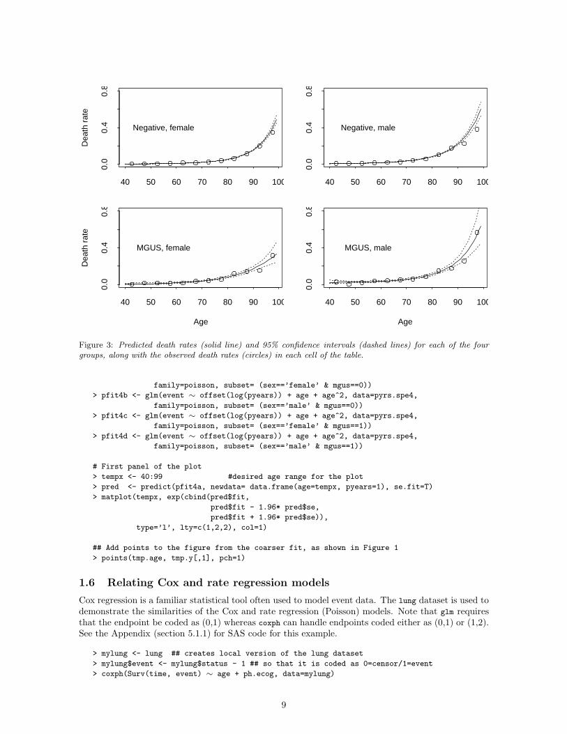
1.5 Using Poisson regression to model rates
To display the raw data (as in Figure 2), the person-years were lumped together in 5-year age groupsas a way to control the noise (some single years of age don’t include any people). Finer divisions oftime, such as single year of age, work better for modeling.
Poisson models are commonly used to model incidence or person-year rates. As is pointed outby Berry [4], incidence data do not strictly follow the assumptions of a Poisson probability model.Using the example of the probability of death with 150 years of follow-up - the y variable, “numberof events”, is in this case deterministically 1. He then shows that Poisson based statistical modelingis still correct, a forerunner of the modern and more general argument for this fact which is basedon counting processes and martingales [1]. Thus, modeling of rates along with hypothesis tests andconfidence intervals can be based in generalized linear models [9].
Figure 3 shows the raw data from Figure 2 along with predicted death rates from Poisson regressionmodels with quadratic age terms. The predicted death rates are obtained for a range of ages and for adummy person-years value of 1, and are much smoother than the raw values. The dummy value of 1“fools” the predict function into returning event rates rather than the number of events (which is they variable for the Poisson model). This works because E(number of events) = rate*time. Note thatthe same results could be obtained by fitting one model with the appropriate set of interactions, butfitting 4 separate models is often easier to plot. In this example log(pyears) is used as the offset term,as will be described in the next section.
##### CODE TO CREATE FIGURE 3 #####
## Finely divide age for the fit (single year intervals)
> cutage4 <- tcut(data.spe$age, 365.25*c(0,seq(35,100),110), labels=c(’<35’, 35:99, ’100+’))
> pyrs.spe4 <- pyears(Surv(futime, status) ∼ cutage4 + sex + mgus + cuttime3,
data=data.spe, data.frame=T)$data
> pyrs.spe4 <- pyrs.spe4[pyrs.spe4$cuttime3 == ’2+’,] # keep follow-up of 2+ years
## assign a numeric value to each age group for plotting and modeling
> pyrs.spe4$age <- (34:100)[as.numeric(pyrs.spe4$cutage4)]
## fit Poisson models
> pfit4a <- glm(event ∼ offset(log(pyears)) + age + age^2, data=pyrs.spe4,
8
Dea
th r
ate
40 50 60 70 80 90 100
0.0
0.4
0.8
Negative, female
40 50 60 70 80 90 100
0.0
0.4
0.8
Negative, male
Age
Dea
th r
ate
40 50 60 70 80 90 100
0.0
0.4
0.8
MGUS, female
Age
40 50 60 70 80 90 1000.
00.
40.
8
MGUS, male
Figure 3: Predicted death rates (solid line) and 95% confidence intervals (dashed lines) for each of the fourgroups, along with the observed death rates (circles) in each cell of the table.
family=poisson, subset= (sex==’female’ & mgus==0))
> pfit4b <- glm(event ∼ offset(log(pyears)) + age + age^2, data=pyrs.spe4,
family=poisson, subset= (sex==’male’ & mgus==0))
> pfit4c <- glm(event ∼ offset(log(pyears)) + age + age^2, data=pyrs.spe4,
family=poisson, subset= (sex==’female’ & mgus==1))
> pfit4d <- glm(event ∼ offset(log(pyears)) + age + age^2, data=pyrs.spe4,
family=poisson, subset= (sex==’male’ & mgus==1))
# First panel of the plot
> tempx <- 40:99 #desired age range for the plot
> pred <- predict(pfit4a, newdata= data.frame(age=tempx, pyears=1), se.fit=T)
> matplot(tempx, exp(cbind(pred$fit,
pred$fit - 1.96* pred$se,
pred$fit + 1.96* pred$se)),
type=’l’, lty=c(1,2,2), col=1)
## Add points to the figure from the coarser fit, as shown in Figure 1
> points(tmp.age, tmp.y[,1], pch=1)
1.6 Relating Cox and rate regression models
Cox regression is a familiar statistical tool often used to model event data. The lung dataset is used todemonstrate the similarities of the Cox and rate regression (Poisson) models. Note that glm requiresthat the endpoint be coded as (0,1) whereas coxph can handle endpoints coded either as (0,1) or (1,2).See the Appendix (section 5.1.1) for SAS code for this example.
> mylung <- lung ## creates local version of the lung dataset
> mylung$event <- mylung$status - 1 ## so that it is coded as 0=censor/1=event
> coxph(Surv(time, event) ∼ age + ph.ecog, data=mylung)
9

coef exp(coef) se(coef) z p
age 0.0113 1.01 0.00932 1.21 0.23000
ph.ecog 0.4435 1.56 0.11583 3.83 0.00013
> summary(glm(event ∼ offset(log(time)) + age + ph.ecog, data=mylung,
family = poisson))
Coefficients:
Value Std. Error t value Pr(>|t|)
(Intercept) -7.10610011 0.575199157 -12.3542 0.0000
age 0.01097865 0.009242255 1.1879 0.2361
ph.ecog 0.38716948 0.114240374 3.3891 0.0008
## Note: the mylung dataset has one observation per person.
## It is not necessary to aggregate the data using a call to pyears before modeling.
Notice how closely the coefficients and standard errors for the Poisson regression, which uses thenumber of events for each person as the y variable, match those of the Cox model, which is focusedon a censored time value as the response. In fact, if the baseline hazard of the Cox model λ0(t) isassumed to be constant over time, the Cox model is equivalent to Poisson regression.
One non-obvious feature of the Poisson fit is the use of an offset term. This is based on a clever“sleight of hand”, which has its roots in the fact that a Poisson likelihood is based on the number ofevents (y), but that we normally want to model not the number but rather the rate of events (λ).Then
E(yi) = λiti
=(
eXiβ)
ti
= eXiβ+log(ti) (1)
We see that treating the log of time as another covariate, with a known coefficient of 1, correctlytransforms from the hazard scale to the total number of events scale. An offset in glm models isexactly this, a covariate with a fixed coefficient of 1.
The hazard rate in a Poisson model is traditionally modeled as exp(Xβ) (i.e. the inverse linkf(η) = eη) rather than the linear form Xβ, for essentially the same reason that it is modeled that wayin the Cox model: it guarantees that the hazard rate (the expected value given the linear predictors)is positive. The exponentiated coefficients from the Cox model are hazard ratios and those from thePoisson model are known as standardized mortality ratios (SMR).
A second reason for modeling exp(Xβ), at least in the Cox model case, is that for acute diseases(such as death following hip fractures or myocardial infarctions) the covariates often act in a multi-plicative fashion, or at least approximately so, and the multipicative model therefore provides a betterfit. Largely for these two reasons: that the underlying code works reliably and the fit is usually ac-ceptable, the multiplicative form of both the Cox and rate regression (Poisson) models has become thestandard.
Recently there has been a growing appreciation that it is worthwhile to summarize a study not justin terms of relative risk (hazard ratio or SMR) but in terms of absolute risk, the absolute amount ofexcess hazard experienced by a subject. An example is provided by the well-known Women’s HealthInitiative (WHI) trial of combined estrogen and progestin therapy in healthy postmenopausal womenwith an intact uterus. After 5 years, there was a 26% increase in the risk of invasive breast cancer(hazard ratio 1.26, 95% CI 1.0 to 1.6) among women who were in the active treatment group ascompared to placebo [11]. It has been suggested that the results of the WHI trial should have beenreported in absolute as well as relative risk terms [10]. Thus, WHI investigators should also haveemphasized that the annual event rates in the two arms were 0.38% and 0.30%, respectively, leadingto an increased case incidence of only 8 per 10,000 patients per year. Given other benefits of the
10

treatment, such as a reduction in hip fracture, a patient might take a very different view of “26%excess” and “< 1/1000 excess”.
Consequently, this report explores the fit of excess risk (additive) models as well as relative risk(multiplicative) models. In many cases, excess risk models may provide information that is comple-mentary to the relative risk models, in others they may provide a more succinct and superior summary.Both types of models can be fit using Poisson regression, but the data setup and fitting process forexcess risk models is somewhat more involved and certainly far less well known.
2 Relative Risk Regression (multiplicative model)
2.1 Basic models
Relative risk regression is simply modeling the observed events, adjusting for the appropriate expectedevent rates. In this case, we’ll use Poisson regression to further explore the MGUS data. In its simplestform, this can be written as
E(yi) =(
λage,sexeXiβ
)
ti
= (λage,sexti) eXiβ
= Λi,age,sex,t eXiβ
= eieXiβ
= eXiβ+log(ei)
In the above formula, λage,sex is the appropriate population hazard rate for a particular age and sexcombination (that of the ith subject), and ei is the expected number of events over the time periodof observation for the subject, or, more accurately, the cumulative hazard Λi(ti) for the person. Inreality, the baseline hazard changes over the follow-up time for a subject, as they move from oneage group to another, and computing it directly from the rate tables is a major bookkeeping chore.However, keeping track of these changes and computing a correct total expected number of events foreach person is precisely what is done by the pyears and survexp functions in S-Plus and the %ltp macroin SAS. See the Appendix (section 5.2) for more information about rate tables in S-Plus and SAS.
Per the above formulation, the coefficients β in this model describe the risk for each subject relativeto that for the standard population. Programming wise, the only change from the usual Poissonregression is the use of log(expected) instead of log(time) as the offset. The use of an offset treatsthe log of the expected as another covariate, with a known coefficient of 1.
For uncomplicated data, the S-Plus survexp and SAS %ltp (life table probability) functions arethe easiest to use. Each of these returns the survival probability Si(t) = exp[−Λi(t)], from which theexpected number of events Λi can easily be extracted. We will base our expected calculations on theMinnesota life tables. See the Appendix (section 5.1.2) for SAS code for this example.
> expected <- -log(survexp(futime ∼ 1, data=mgus, ratetable=survexp.mn, cohort=F))
> pfit <- glm(status ∼ sex + offset(log(expected)), data=mgus, family=poisson)
Problem in .Fortran("glmfit",: subroutine glmfit: 2 Inf value(s)
in argument 5
> range(expected)
[1] 0.000000 3.394291
## Try again, this time subsetting the data with futime>0
## Also remove the intercept to print separate estimates for males & females
> pfit <- glm(status ∼ -1 + sex + offset(log(expected)), data=mgus,
family=poisson, subset=(futime>0))
Coefficients:
Value Std. Error t value Pr(>|t|)
female 0.4421053 0.04862130 9.0928 0
male 0.4365223 0.04311289 10.1251 0
11

In this analysis we needed to confront an issue that is not uncommon in these studies: two of thesubjects have an expected number of events of 0. Upon further examination, these are two peoplewho were diagnosed with MGUS on the day of their death. Simple relative survival is not a validtechnique when such cases are included. The model is attempting to compare the mortality experienceof the enrolled subjects to that of a hypothetical control population, matched by age and sex, drawnrandomly from the total population of Minnesota. It recognizes, correctly, that the probability of sucha control’s demise at the instant of enrollment is zero, i.e., infinitely unlikely, which leads to infinitevalues in the likelihood. The problem extends beyond day 0. In this dataset there are 16 subjects whodie within 1 week of MGUS detection; for all of these it is almost certain that MGUS was detectedbecause the patients were at an extreme risk of death. We must exclude those with futime=0, butperhaps we should also exclude those with very small follow-up times.
The analysis above shows that for both males and females, the death rate is significantly worsethan that for an age-, sex- and calendar-year matched population. Rates are 55% greater than theMinnesota population at large (exp(0.44) = 1.55). Note that because we have removed the intercept(using the -1 coding), we have coefficients for both males and females. This allows us to visuallycompare the coefficients and also to obtain the correct standard error term for each gender. In theage range of this study (mean age = 71) the population death rate for males is substantially higherthan that for females; it is interesting that the excess death rate associated with a MGUS diagnosis isalmost identical for the two groups.
To explore this further, we will look at a second dataset that allows an estimate of detection bias,i.e., how much of this increase is actually due to MGUS, and how much might be due to the diseasecondition that caused the patient to come to Mayo. We also want to look at time trends in the rate:is the MGUS effect greater or less for older patients, for times near to or far from the diagnosis date,and for different calendar years?
2.2 Dividing follow-up time into pieces
Normally, relative risk models will include one or more variables that vary over the time span of thepatient. These include the naturally time-dependent ones of age and calendar year (which the relevantrate tables also include), but may include categorical time-dependent variables such as the initiationof a particular treatment.
When creating data for a tabular display such as Table 2 one has to break time into moderatelylarge chunks in order to simplify the display. When setting the data up for regression, we may still wantto use broad categories for any variable that is to be treated as discrete categories in the model, i.e.,using a class (SAS) or factor (S-Plus) statement. For variables that we wish to look at continuously,the divisions should be much finer.
There are two basic ways to create this division. The first is to preprocess the data, dividing eachperson into multiple (start time, end time] observations. This approach is often used in the creationof datasets for a Cox model. A second is to use the person-years routines to do the division for us andthis approach is shown below.
As pointed out earlier, the very early deaths in the MGUS data present us with a chicken-and-egg problem: did the MGUS have an impact on the death rate, or did a state of severe disease causedetection of MGUS? Monoclonal gammopathy is detected from the serum protein electrophoresis (SPE)test, which is ordered by a physician for a number of reasons. It is often an exploratory test whenthe root cause for a patient’s condition is unclear. We’ll now use the data.spe dataset that includesall subjects for whom SPE was ordered, both those with a positive result (MGUS) and those witha negative test. For this discussion we will ignore the possibility of a calendar year effect – a morecomplete analysis did not find one – and use all the available data. If there is a short term medicalimpact of MGUS over and above a mere selection effect (i.e. the type of patient on whom this test isordered is very ill), we will be able to see it in the difference between the negative and positive SPEresults.
12

### First we create the pyrs.spe dataset
> cuttime <- tcut(rep(0, nrow(data.spe)), c(0:23 *30.5, 365.25*2:10, 36525),
labels=c(paste(0:23, ’-’, 1:24, ’ mon’, sep=’’),
paste(2:9, ’-’, 3:10, ’ yr’, sep=’’), ’10+ yr’))
> cutage <- tcut(data.spe$age, 365.25*c(0,40:95,110),
labels= c("<40", paste(40:94, ’-’, 41:95, sep=’’), "95+"))
## Save the dataset for further analysis
> tmpfit <- pyears(Surv(futime, status) ∼ cuttime + cutage + sex
+ mgus + ratetable(age=age, sex=sex, year=dtdiag),
data=data.spe, ratetable=survexp.mn, data.frame=T)
## Double check that the pyears, ages, sex distribution, and dates all look ok.
> summary(tmpfit)
Total number of person-years tabulated: 225416
Total number pf person-years off table: 0
Matches to the chosen rate table:
age ranges from 24 to 103.8 years
male: 10324 female: 12970
date of entry from 12/15/1960 to 11/29/1994
## From here forward we only use the data portion
> pyrs.spe <- tmpfit$data
## Create 2 new variables based on the midpoint of each of these
## categories (such as cuttime= "0-1 mon" and cutage="<40 ")
## The use of as.numeric is a handy trick - it indicates which year
## or age group (1st, 2nd, etc.) each observation is in. The square brackets
## list a dxtime of (0 + .5)/12 + .5 = 0.0417 for every line that includes
## the first cuttime category (0-1 mon).
> pyrs.spe$dxtime <- c((0:23 + .5)/12, 2:10 + .5)[as.numeric(pyrs.spe$cuttime)]
> pyrs.spe$age <- c(39:95 + .5)[as.numeric(pyrs.spe$cutage)]
## Look at the first 4 observations in this new dataset
> pyrs.spe[1:4,]
cuttime cutage sex mgus pyears n expected event dxtime age
0-1 mon <40 female 0 113.0650 1408 0.067 3 0.0417 39.5
1-2 mon <40 female 0 109.2649 1326 0.065 0 0.1250 39.5
2-3 mon <40 female 0 107.4415 1298 0.064 1 0.2083 39.5
3-4 mon <40 female 0 106.0999 1278 0.063 0 0.2917 39.5
As before, we use the tcut command to create time-dependent cutpoints for the pyears routine.We’ve created follow-up time intervals of zero to 1 month, 1 to 2 months, etc. for the first 2 years,then yearly up to 10 years after the SPE test. For the age variable we have used 1 year age groupingsfrom age 40 up to age 95. Notice one other constraint of rate tables: since the Minnesota rate tableuses units of hazard/day, all time variables in the dataset must be in days. The default behavior forthe pyears function is to create a set of arrays, however the data.frame=T argument produces insteada dataset useful for further analysis. In the final data frame, the ‘cuttime’ and ‘cutage’ variables arecategorical variables which is a result of using tcut and pyears. The last 2 lines create a numeric valuefor each category which will be more useful for subsequent models and plots.
13

CAUTION - COMMON MISTAKES:1) When using tcut, make sure that the input value reflects the beginning of your timeperiod or age period. For follow-up, you usually start at time 0. DO NOT use your finalfollow-up time in tcut. If you have variables that reflect the start and stop time for eachindividual, make sure the age listed is the age at the start time.2) All time and age variables MUST be in the same units (in the previous example, days).You will run into problems if you have age in years and follow-up time in days. Additionally,these units need to match the units used in your rate table. For example, when the summaryshows that age ranged between 0 and 0.3 years, it is a good clue that you used years andthe program expected days.
We then fit generalized additive models (gam) using the gam function. Generalized additive modelsare simply an extension of the generalized linear models that are often used for Poisson regression. Gammodels allow the fitting of nonparametric functions, in this case the smoother function s, to estimaterelationships between the event rate and the predictors (age and dxtime). Again we use log(expected)
as an offset to describe the risk for each subject relative to that for the standard population. Foursubsets are fit, broken up by male/female and MGUS/Negative.
> fit3.1 <- gam(event ∼ offset(log(expected)) + s(age) + s(dxtime),
data=pyrs.spe, family=poisson,
subset=(sex==’female’ & mgus==0))
> fit3.2 <- gam(event ∼ offset(log(expected)) + s(age) + s(dxtime),
data=pyrs.spe, family=poisson,
subset=(sex==’male’ & mgus==0))
> fit3.3 <- gam(event ∼ offset(log(expected)) + s(age) + s(dxtime),
data=pyrs.spe, family=poisson,
subset=(sex==’female’ & mgus==1))
> fit3.4 <- gam(event ∼ offset(log(expected)) + s(age) + s(dxtime),
data=pyrs.spe, family=poisson,
subset=(sex==’male’ & mgus==1))
See the Appendix (section 5.4) for a discussion of differences between gam and glm.
2.2.1 Graphical displays
Plots of the relative death rates are shown in Figure 4 (versus time) and Figure 5 (versus age). Theeffects shown in the figures are very interesting. The most surprising aspect of the curves is the notablelack of a major effect of gender in the SPE negative patients (this is tested in the next subsection).This lack of a gender effect will make subsequent modeling much simpler and more compact. If wewere not adjusting for overall population death rates, gender would be one of the largest effects, dueto the female longevity advantage.
Figure 4 shows that there is a time-dependent selection effect (i.e. risk associated with beingselected to have SPE) that decays rapidly over the first two years. It says in effect that anyone whohas recently had an SPE ordered has a relatively high risk of death, independent of the outcome ofthat test. It perhaps reflects on the type of patient for which a physician would order that test. Figure5 shows a large and decreasing age effect, for both positive and negative SPE outcomes, but with asubstantially higher death rate for MGUS patients.
We need to state two caveats with respect to the figures. First, recognize that this is a curvefor subjects with specified covariate values and it is not representative of the entire experience of thecohort. In order to get a representative plot of the entire cohort we’ll need to do something calleddirect standardization (see section 2.3). Second, we have no particular reason to assume that the ageand diagnosis time effects would be perfectly independent in this dataset; a complete analysis is neededto look further at interactions of the two effects.
14

Time from SPE test
Rel
ativ
e de
ath
rate
1.5
2.5
5.0
10.0
2/12 6/12 1 2 4 6 8 10
Negative, femaleNegative, malePositive (MGUS), femalePositive (MGUS), male
Figure 4: The estimated selection effect for male and female patients who are 67-68 years old (≈ 67.5 years)with positive and negative SPE. To spread out the earlier times the x-axis is on a square root scale. Note thatthe y-axis is on the log scale.
Age
Rel
ativ
e de
ath
rate
1.5
2.5
5.0
10.0
40 50 60 70 80 90
Negative, femaleNegative, malePositive (MGUS), femalePositive (MGUS), male
Figure 5: The estimated age effect for a patient with 17-18 months (≈ 1.375 years) of follow-up with positiveand negative SPE. The y-axis is on the log scale.
15
##### CODE TO CREATE FIGURE 4 #####
## Note: age=67.5 corresponds to the middle age group (67-68 year olds)
> newdata1 <- expand.grid(age = 67.5, dxtime=seq(0,10,length=50), expected=1)
> pred1 <- cbind(predict(fit3.1, newdata=newdata1, type=’response’),
predict(fit3.2, newdata=newdata1, type=’response’),
predict(fit3.3, newdata=newdata1, type=’response’),
predict(fit3.4, newdata=newdata1, type=’response’))
> matplot(sqrt(newdata1$dxtime), pred1, type=’l’, col=1, lty=1:4, axes=F, log=’y’,
xlab="Time from SPE test", ylab="Relative death rate", ylim=c(1,12))
> axis(1, sqrt(c(2/12, 6/12,1,2,4,6,8,10)),
c("2/12", "6/12","1","2","4","6","8","10"), crt=0, srt=0)
> axis(2, c(1.5, 2.5, 5, 10), srt=90, crt=90)
> box()
> legend(sqrt(2), 8, c("Negative, Female", "Negative, Male","MGUS=Positive, Female",
"MGUS=Positive, Male"), lty=1:4, bty="n")
## Figure 5 uses this set of predicted values
## Note: dxtime=1.375 corresponds to the middle time interval (17-18 months)
> newdata2 <- expand.grid(age = seq(40,90,length=50), dxtime=1.375, expected=1)
> pred2 <- cbind(predict(fit3.1, newdata=newdata2, type=’response’),
predict(fit3.2, newdata=newdata2, type=’response’),
predict(fit3.3, newdata=newdata2, type=’response’),
predict(fit3.4, newdata=newdata2, type=’response’))
Plot code for Figure 5 is similar to Figure 4 above (not shown).
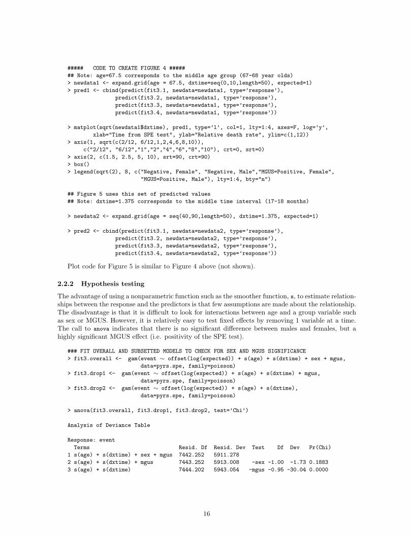
2.2.2 Hypothesis testing
The advantage of using a nonparametric function such as the smoother function, s, to estimate relation-ships between the response and the predictors is that few assumptions are made about the relationship.The disadvantage is that it is difficult to look for interactions between age and a group variable suchas sex or MGUS. However, it is relatively easy to test fixed effects by removing 1 variable at a time.The call to anova indicates that there is no significant difference between males and females, but ahighly significant MGUS effect (i.e. positivity of the SPE test).
### FIT OVERALL AND SUBSETTED MODELS TO CHECK FOR SEX AND MGUS SIGNIFICANCE
> fit3.overall <- gam(event ∼ offset(log(expected)) + s(age) + s(dxtime) + sex + mgus,
data=pyrs.spe, family=poisson)
> fit3.drop1 <- gam(event ∼ offset(log(expected)) + s(age) + s(dxtime) + mgus,
data=pyrs.spe, family=poisson)
> fit3.drop2 <- gam(event ∼ offset(log(expected)) + s(age) + s(dxtime),
data=pyrs.spe, family=poisson)
> anova(fit3.overall, fit3.drop1, fit3.drop2, test=’Chi’)
Analysis of Deviance Table
Response: event
Terms Resid. Df Resid. Dev Test Df Dev Pr(Chi)
1 s(age) + s(dxtime) + sex + mgus 7442.252 5911.278
2 s(age) + s(dxtime) + mgus 7443.252 5913.008 -sex -1.00 -1.73 0.1883
3 s(age) + s(dxtime) 7444.202 5943.054 -mgus -0.95 -30.04 0.0000
16

Standardizationmethod
Indirect Direct
Question How many events would my studypopulation have had if their eventrate was the same as the referencepopulation?
How many events would the referencepopulation have had if their event ratewas the same as my study population?
Procedure Event rates in reference populationare applied to the study population.
Event rates in the study populationare applied to the reference population
Reference populationdata needed
Age/sex stratified event rates Age/sex stratified population sizes
Table 3: Standardization Approaches
## Note: exp(beta) for sex = standardized mortality ratio for sex
> coef(fit3.overall)
(Intercept) s(age) s(dxtime) sex mgus
2.011728 -0.01748245 -0.05069637 -0.02734728 0.1947402
> exp(coef(fit3.overall)[4])
sex
0.9730233
It is also possible to test whether the smoother function is different from a simple linear or quadraticfit for the term. The example below tests for the difference between a linear age term and the smoother.In this case there is significant evidence that the smoother is better at explaining the age relationship.
> fit3.lin <- gam(event ∼ offset(log(expected)) + age + s(dxtime) + mgus,
data=pyrs.spe, family=poisson)
> anova(fit3.drop1, fit3.lin, test=’Chi’)
Analysis of Deviance Table
Response: event
Terms Resid. Df Resid. Dev Test Df Dev Pr(Chi)
1 s(age) + s(dxtime) + mgus 7443.252 5913.008
2 age + s(dxtime) + mgus 7446.090 6044.867 1 vs. 2 -2.84 -131.86 0
2.3 Direct standardization
The observed/expected ratios shown in Table 2 are referred to as indirect standardization or, morecommonly, standardized mortality ratios (SMR). Another statistic of interest, although less used, isreferred to as direct standardization. A good tutorial on both of these and other suggestions alongwith an extensive bibliography can be found in Inskip [6]. Whereas the indirect method asks whatthe event count would be in the study population (i.e. the event rates in the reference population areapplied to the study population), if it had the rates of the parent or reference group, the direct methodasks what the event count would be in the parent population, if it had the rates of the sample (i.e.the event rates in the study population are applied to the reference population). For the former weneeded the age/sex stratified rates for the reference population of interest. For the latter we need theage/sex stratified reference population sizes (Table 3).
Direct standardization is often used to compare the average event rates for two or more studies,particularly when they were assessed on different populations, e.g. white/black, or different geographicregions, e.g. Olmsted county/Sweden. Because the underlying populations may not have the sameage/sex structure, it is not fair to directly compare the overall study average rates from one to theother. For instance, if one study had significantly younger enrollees, then we would expect that the
17

overall death rate would be lower. By normalizing them to a common population structure, the ratesbecome comparable.
In direct standardization it is important to recognize the implication of using different standardpopulations. For instance, if you want to make some statement about a diseased population, you maywant to standardize to the overall age and sex distribution of that diseased population. Often diseasedpopulations are weighted more heavily in the older ages, so standardizing to the US population wouldgive extra weight to the younger ages where there may not be as much information. It might be moreappropriate and informative to use the overall age and sex structure of diseased subjects as a reference.Likewise, if you have an age- and sex- stratified sampling of the population and you want to makegeneralizations to the entire US population, then you would want to standardize to the US population.
The expected number of events in the parent population is a simple sum
D = RF,35−39NF,35−39 + RM,35−39NM,35−39 +
RF,40−44NF,40−44 + . . . + RM,95−100NM,95−100
where R are the death rates estimated from the study and N the population sizes in the referencepopulation. Reference rates are usually expressed per 100,000, or (100000 D)/
∑
i,j Ni,j , where i isthe sex and j is the age group.
One shortcoming of direct standardization is that covariates are limited – you can only includein the model those variables that are known for the parent population, which is usually age and sexgroups, and sometimes race. Compare this to the examples, where test status and time since diagnosisboth played a role. An advantage to direct standardization is that it can often be calculated from apublished paper, without access to the raw data, allowing us to compare our work to other results.
When doing direct standardization, there are three advantages to using a model for the predicteddeath rates rather than the table values:
• The values for certain age groups may be erratic due to small sample size. The smoothingprovided by the model stabilizes them.
• We can use finer age groupings. To see why coarse age groupings could be a problem, consider,for example, that we had two samples to be compared, with 10 year age groupings. In one samplethe mean age within the 45-55 year age group might be 48, and in the other 52. This could biasthe comparison of the studies.
• Estimates of the direct age-adjusted value and its variance can be obtained from the fitted model,as shown below.
There is also one major disadvantage to using a Poisson fit: the chosen model has to fit the data well.The estimates in our example would not be particularly good if we had used only a linear term for age,particularly in the tails. Figure 3, which is purposely plotted on arithmetic rather than logarithmicscale, clearly shows that the direct adjusted value depends very heavily on the predictions in the righthand tail.
The direct age adjusted value and its variance can be computed as follows. Assume that we wantto standardize the rates for females with MGUS to the age 35 to 100 US population using a modelthat includes age and age2. From the Poisson regression fit (using glm) we have the coefficient β andvariance-covariance matrix Σ (i.e. coef(pfit4c) and summary(pfit4c)$cov, respectively). If we let Xbe the predictor matrix for the integer ages at which we need the prediction, each row of X beingthe vector (1, age, age2), then r = exp(Xβ) is the vector of predicted rates, and T =
∑
wiri is theexpected number of total events where wi is the vector of population weights, and T/N will be thedirect-adjusted estimate, where N is the total population. (Alternatively, use the proportions wi/N
as the weights.) The variance matrix of Xβ is XΣX ′, and the first-order Taylor series approximationgives RXΣX ′R as the variance for r, where R is a diagonal matrix with Rii = ri. The variance of Tis then w′RXΣX ′Rw.
The code below will calculate the direct age-adjusted estimate and its standard error, for the femaleMGUS group. Note that this approach will not work using gam models, since in that case we do nothave an explicit variance matrix. See the appendix (section 5.4) for more details.
18

## As calculated earlier in section 1.5:
> pfit4c <- glm(event ∼ offset(log(pyears)) + age + age^2, data=pyrs.spe4,
family=poisson, subset= (sex==’female’ & mgus==1))
> us.white <- sas.get(’/usr/local/sasdata’,’us_white’)
> us2000 <- us.white$p2000[us.white$sex==’F’ & us.white$age>=35 &
us.white$age <= 100]
> USweights <- us2000*100000/sum(us2000)
> ages <- 35:100
> tempx <- cbind(1, ages, ages^2)
> rhat <- c(exp(tempx %*% pfit4c$coef)) #predicted female rates
> rvar <- (tempx %*% summary(pfit4c)$cov.unscaled %*% t(tempx)) # variance
> wrhat <- rhat * USweights #weighted rates
> fest <- sum(wrhat) #rate per 100,000
> fstd <- sqrt(wrhat %*% rvar %*% wrhat) #SE of the rate
> cat(’The direct adjusted estimate is:’,round(fest), ’deaths per 100,000 +/-’,round(fstd), fill=T)
The direct adjusted estimate is 2677 deaths per 100,000 +/- 256
## SIMILAR RESULTS USING ns() INSTEAD OF age, age^2
## create datasets subsetted to female MGUS patients
> pyrs.femaleMGUS <- pyrs.spe4[pyrs.spe4$sex==’female’ & pyrs.spe4$mgus==1,]
## define knots for the ns() function
> age.range <- c(35,100)
> ns.age <- ns(pyrs.femaleMGUS$age, knots=c(55,65,75), Boundary.knots=age.range)
## fit model
> agefit3.3 <- glm(event ~ offset(log(pyears)) + ns.age, family=poisson, data=pyrs.femaleMGUS)
## create age variable to include at each time point (with ns)
> PopAge <- ns(35:100, knots=c(55,65,75), Boundary.knots=age.range)
> newdata <- cbind(rep(1,nrow(PopAge)), PopAge)
> Rhat <- c(exp(newdata %*% coef(agefit3.3)))
> weighted.Rhat <- matrix(Rhat*USweights,nrow=1)
> Rvar <- newdata %*% summary(agefit3.3)$cov.unscaled %*% t(newdata)
> FinalEstimate <- sum(weighted.Rhat)
> FinalStd <- sqrt(weighted.Rhat %*% Rvar %*% t(weighted.Rhat))
> cat(’The direct adjusted estimate is:’,round(FinalEstimate),
’deaths per 100,000 +/-’, round(FinalStd),fill=T)
The direct adjusted estimate is: 2874 deaths per 100,000 +/- 440
We could get the vector piri directly as a prediction from the model, along with the standard errorof each element, but since predict does not return the full variance-covariance matrix, this does notgive the variance for T , the sum of the vector.
> sum(USweights*predict(pfit4c, type=’response’,
newdata=data.frame(age = ages, pyears = 1)))
2677
One caution regarding direct standardizing to a population is that the resulting estimates oftenrepresent a substantial extrapolation of the dataset. For instance, in the MGUS example above only5/1384 subjects are aged < 30 years with none under 20 years. Standardization to the entire US pop-ulation aged 20–100 years requires estimated rates at each age, many of which have no representativesat all in the study subjects! Even in using the age 35–100 year subset that we chose for the examples,
19

Time from SPE test
Rel
ativ
e de
ath
rate
2/12 6/12 1 2 4 6 8 10
1.5
2.5
5.0
10.0
Negative, femaleNegative, malePositive (MGUS), femalePositive (MGUS), male
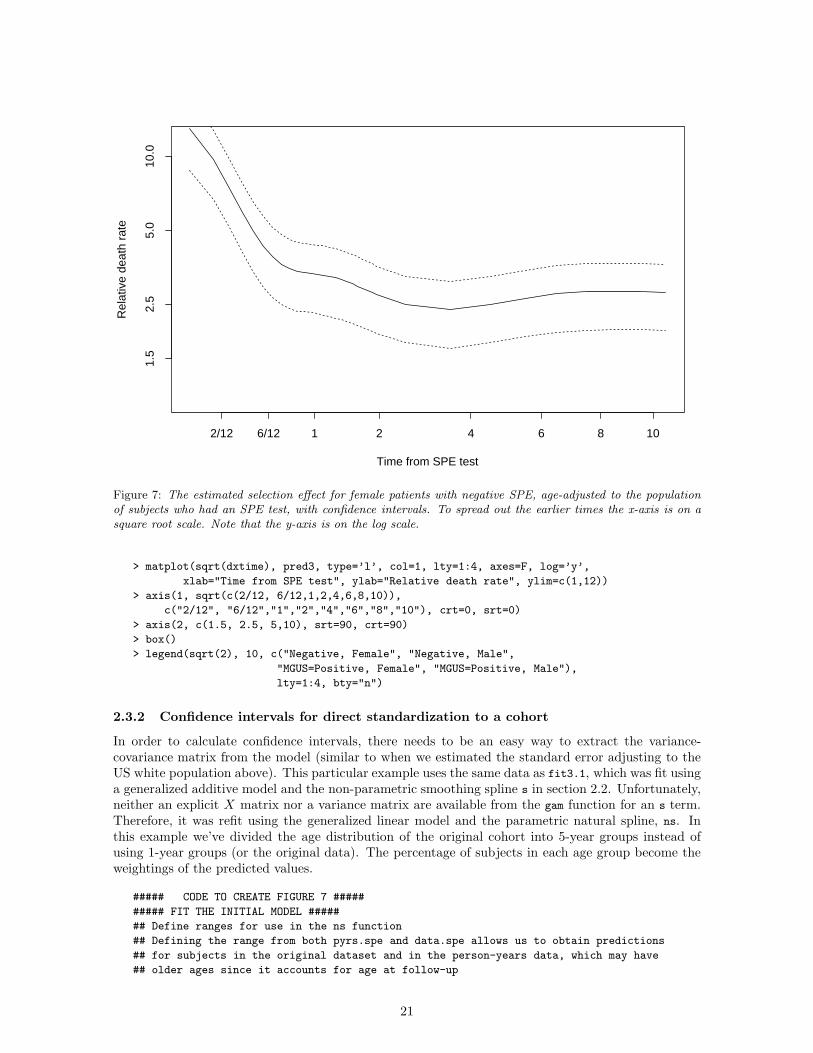
Figure 6: The estimated selection effect for male and female patients with positive and negative SPE, age-adjusted to the population of subjects who had an SPE test. To spread out the earlier times the x-axis is on asquare root scale. Note that the y-axis is on the log scale.
14% of US female population was in the 35–39 age group, and hence this age group contributed 14%of the weight in the final estimate, but only 1.2% of the female study subjects were in this age and sexgroup.
2.3.1 Direct standardization to a cohort
In addition to standardizing to an external population such as the US population, it is possible tostandardize to the study population. For instance, standardizing to a cohort’s baseline age distributioncan be done by averaging the curves of all the subjects in the cohort. Figure 4 shows the predictedcurve for a given age and Figure 6 shows the age-adjusted average predicted curve for the cohort ofsubjects who had an SPE test ordered. As expected, the curves have the same shape as before, butthe adjusted curves have slightly different intercepts.
##### CODE TO CREATE FIGURE 6 #####
> pop.ages <- sort(data.spe$age/365.25)
> n.ages <- length(pop.ages)
> dxtime <- seq(0,10,length=50)
> newdata3 <- data.frame(expand.grid(age=pop.ages, dxtime=dxtime, expected=1))
## Need to do averaging for each dxtime
> tmp1 <- tapply(predict(fit3.1, newdata=newdata3, type=’response’), newdata3$dxtime, mean)
> tmp2 <- tapply(predict(fit3.2, newdata=newdata3, type=’response’), newdata3$dxtime, mean)
> tmp3 <- tapply(predict(fit3.3, newdata=newdata3, type=’response’), newdata3$dxtime, mean)
> tmp4 <- tapply(predict(fit3.4, newdata=newdata3, type=’response’), newdata3$dxtime, mean)
> pred3 <- cbind(tmp1, tmp2, tmp3, tmp4)
20
Time from SPE test
Rel
ativ
e de
ath
rate
2/12 6/12 1 2 4 6 8 10
1.5
2.5
5.0
10.0
Figure 7: The estimated selection effect for female patients with negative SPE, age-adjusted to the populationof subjects who had an SPE test, with confidence intervals. To spread out the earlier times the x-axis is on asquare root scale. Note that the y-axis is on the log scale.
> matplot(sqrt(dxtime), pred3, type=’l’, col=1, lty=1:4, axes=F, log=’y’,
xlab="Time from SPE test", ylab="Relative death rate", ylim=c(1,12))
> axis(1, sqrt(c(2/12, 6/12,1,2,4,6,8,10)),
c("2/12", "6/12","1","2","4","6","8","10"), crt=0, srt=0)
> axis(2, c(1.5, 2.5, 5,10), srt=90, crt=90)
> box()
> legend(sqrt(2), 10, c("Negative, Female", "Negative, Male",
"MGUS=Positive, Female", "MGUS=Positive, Male"),
lty=1:4, bty="n")
2.3.2 Confidence intervals for direct standardization to a cohort
In order to calculate confidence intervals, there needs to be an easy way to extract the variance-covariance matrix from the model (similar to when we estimated the standard error adjusting to theUS white population above). This particular example uses the same data as fit3.1, which was fit usinga generalized additive model and the non-parametric smoothing spline s in section 2.2. Unfortunately,neither an explicit X matrix nor a variance matrix are available from the gam function for an s term.Therefore, it was refit using the generalized linear model and the parametric natural spline, ns. Inthis example we’ve divided the age distribution of the original cohort into 5-year groups instead ofusing 1-year groups (or the original data). The percentage of subjects in each age group become theweightings of the predicted values.
##### CODE TO CREATE FIGURE 7 #####
##### FIT THE INITIAL MODEL #####
## Define ranges for use in the ns function
## Defining the range from both pyrs.spe and data.spe allows us to obtain predictions
## for subjects in the original dataset and in the person-years data, which may have
## older ages since it accounts for age at follow-up
21

> age.range <- range(c(pyrs.spe$age, data.spe$age/365.25))
> dx.range <- range(pyrs.spe$dxtime)
## create ns for fitting the original model
> ns.age <- ns(pyrs.spe$age, knots=c(55,65, 75), Boundary.knots=age.range)
> ns.dxtime<- ns(pyrs.spe$dxtime, knots=c(.25, 1,2, 5), Boundary.knots=dx.range)
> glmfit3.1 <- glm(event ∼ ns.age + ns.dxtime + offset(log(expected)), family=poisson,
data=pyrs.spe, subset= (sex == "female" & mgus==0))
##### PREDICTION SET-UP #####
## look at each unique dxtime in the pyrs dataset
> UniqueNsDxtime <- ns(unique(pyrs.spe$dxtime),knots=c(.25,1,2,5), Boundary.knots=dx.range)
> N.dxtime <- nrow(UniqueNsDxtime)
## figure out baseline age distribution of cohort and the proportion
in each age group
> AgeWeights <- table(cut(data.spe$age/365, breaks=seq(20,105,5), left.include=T))/N
> N.age <- length(AgeWeights)
## create age variable to include at each time point (with ns)
> PopAge <- ns(seq(20,100,5)+2.5, knots=c(55,65,75), Boundary.knots=age.range)
## initialize storage space for final results (at each unique dxtime)
> finalRhat.vector <- rep(NA, N.dxtime)
> finalStd.vector <- rep(NA, N.dxtime)
##### CALCULATE FOR EACH DXTIME #####
> for(i in 1:N.dxtime) {newdata.temp <- as.matrix(data.frame(expected=rep(1,N.age), ns.age=PopAge,
ns.dxtime=UniqueNsDxtime[rep( i,N.age),]))
Rhat.temp <- c(exp(newdata.temp %*% coef(glmfit3.1)))
weightedRhat.temp <- matrix(Rhat.temp*AgeWeights,nrow=1)
Rvar.temp <- newdata.temp %*% summary(glmfit3.1)$cov.unscaled %*% t(newdata.temp)
finalRhat.vector[i] <- sum(weightedRhat.temp)
finalStd.vector[i] <- sqrt(weightedRhat.temp %*% Rvar.temp %*% t(weightedRhat.temp))
}
##### PLOT RESULTS #####
> finalResults <- cbind(finalRhat.vector, finalRhat.vector + 1.96*finalStd.vector,
finalRhat.vector - 1.96*finalStd.vector)
> matplot(unique(pyrs.spe$dxtime), finalResults, type=’l’, col=c(1,2,2))
3 Additive models
3.1 Motivation and basic models
There are many cases where an additive hazard model
E(yi) = λiti
= (Xiβ)ti (2)
makes more sense, from a medical or biological point of view, than a multiplicative model. Forinstance, it is known that MGUS patients have about a 1%/year risk of conversion to overt plasma cellmalignancy. Since this event rate is constant over time, it may be reasonable to assume the covariates
22

of interest have a constant effect on the event rate. In the additive model, covariate effects are modeledon the event rate scale (e.g. 1 year increase in age confers an additional 0.2 absolute increase in thedeath rate per year). This model may not fit well if the event rate changes dramatically over time, suchas the death rate following myocardial infarction (MI) which is quite high in the first few days afterMI, but much lower later on. In this case it would not make sense to assume age has the same effecton the event rate both early on and later following an MI, and a multiplicative model may provide abetter fit.
The main reason that the additive model is not commonly used is technical. Namely, for somechoices of β, equation 2 can predict a negative hazard for some subjects, e.g., the dead coming backto life. The Poisson likelihood involves a log(λ) term, which is numerically undefined for a negativevalue. Even if the true MLE estimates are positive, if the iterative procedure ever flirts with a badchoice for β, a missing value is generated which quickly propagates, and the fitting program will fail.Programs which regularly fail get little use. Luckily, failure can be almost completely avoided by useof a modified link function.
We wish to use an identity function for the inverse link f(η) = η, but also ensure that f(η) > 0for all values of η. A second consideration is that we would like f to be smooth, with a continuousfirst derivative, since discontinuities tend to confuse the Newton-Raphson fitting algorithm used in theunderlying code for generalized linear models. We have found the following to work well in practice:
f(η) = 0.5 ∗ (η +√
η2 + ǫ2)η = f−1(µ) = µ − ǫ2/(4µ)f ′(µ) = 1 + ǫ2/(4µ2)
This is a hyperbolic function whose asymptotes are the 45◦ line for η > 0 and the x axis f(η) = 0 forx < 0. The value of ǫ controls how tightly it hugs the corner and the default value for ǫ is set to 0.01.Choosing this is the only problematic part of the procedure: one wants a strictly additive model tohold for as much of the data as possible, and thus a small value of ǫ, yet not so small a value as tocreate round-off errors. In particular, small values of ǫ along with large negative values of the linearpredictor η can lead to some observations having an extremely large weight, and in turn a subsequentlack of convergence. In this case, you may want to choose a slightly larger value for ǫ. For the lung
dataset the constrained link function is not necessary; death rates for all subsets of age and ECOGscore are far enough away from zero that no problems arise. See the Appendix (section 5.3.2) for moredetails regarding the link function.
To fit this model, we must pre-multiply each element of the X matrix by time. This is doneautomatically using the addglm function instead of the usual glm function. Details about the addglm
can be found in the Appendix (see 5.3.3). In this case, the final additive model for our earlier exampleusing the lung data (Section 1.5) becomes
> summary(addglm( event ∼ age + ph.ecog, time=time,
data=lung, family=poisson.additive))
Coefficients:
Value Std. Error t value Pr(>|t|)
(Intercept) -4.846495e-04 1.153262e-03 -0.4202 0.6747
age 3.259046e-05 1.931485e-05 1.6873 0.0929
ph.ecog 9.345934e-04 2.675068e-04 3.4937 0.0006
See the Appendix (section 5.1.3) for SAS code for this example.The coefficients of the fit correspond to the intercept, age, and physician ECOG score effects. The
value of the last coefficient indicates that each 1 point increase in ECOG score confers an additional.00093 ∗ 365.25 = .34 absolute increase in the per year death rate. Note that death rates can exceed1.0, for instance, when average survival is less than a year.
In rare cases better starting estimates may be required. The specification of initial values forthe glm function in S-Plus is unusual; rather than expecting starting guesses for the coefficients β, itexpects guesses for the vector of estimated predicted values y. This makes choosing starting values
23

very easy: the default is to use the observed data y as the vector of starting values. An optimisticassumption that the final fit will be perfect. However, if there are observations with 0 observed events,this strategy must be modified since it would lead to log(0) in the likelihood. By default, the startingvalue of 1/6 is used in this case, but for some datasets, this may not be good enough, e.g. many zerosand many covariates. A solution in such a case is to first fit a multiplicative model, and then use thepredicted values from that model as starting estimates for the additive one.
## Fit a multiplicative model to get starting values
> fitm <- glm(event ∼ offset(log(time)) + age + ph.ecog,
data=lung, family=poisson)
## Use starting values from model above to fit additive model
> fita2 <- addglm(event ∼ age + ph.ecog, time=time,
data=lung, family=poisson.additive,
start=predict(fitm, type="response"))
> summary(fita2)
Coefficients:
Value Std. Error t value Pr(>|t|)
(Intercept) -4.846495e-04 1.153262e-03 -0.4202 0.6747
age 3.259046e-05 1.931485e-05 1.6873 0.0929
ph.ecog 9.345934e-04 2.675068e-04 3.4937 0.0006
Finally, while multiplicative models give consistent answers regardless of how finely or coarselythe person-years are partitioned, this is not the case for additive models. One problem with thehyperbolic link function is that it is not invariant to subdivision of the data. Predicted values for eachobservation are computed near the expected number of events for the observation. When the data isfinely subdivided, the expected number of events is close to zero for each observation and the predictedvalues lie on the curved region near the origin of the hyperbolic link function. An easy way to seeif there is a problem is to compare the total number of observed events in the dataset to the totalnumber of events predicted by the model. If these do not closely agree, try dividing the person-yearsless finely or using a smaller ǫ in the link function. Another simple way to identify a problem withthe fit is to compare sum(predict(fit, type=’link’)) to sum(predict(fit, type=’response’)), whichwould be the same for an exactly linear model.
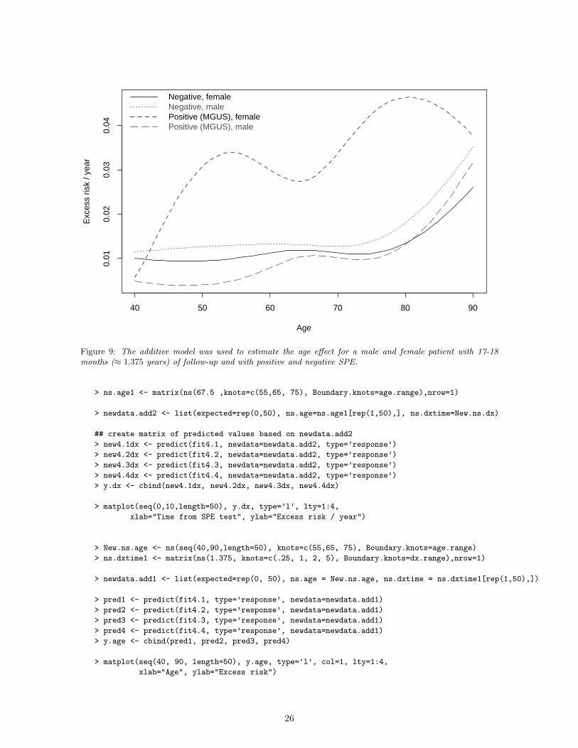
3.2 Excess risk regression
Excess risk regression can be used to model the observed events after adjusting for the expected eventrates using the additive model framework. This can be written as
E(yi) = (λage,sex + Xiβ) ti
= λage,sexti + (Xiβ)ti
= Λi,age,sex,t + (Xiβ)ti
= ei + (tiXi)β (3)
As before, λage,sex is the appropriate population hazard rate for a particular age and sex combination(that of the ith subject), and ei is the expected number of events over the time period of observationfor the subject, or, more accurately, the cumulative hazard Λi(ti) for the person.
Let us return to the MGUS example of the prior section, and examine it in terms of excess risk.Unfortunately, the pre-multiplication of each variable by time makes the smooth terms of gam modelsless useful. The smoothness constraints should be based on the covariates, e.g. s(age) ∗ time. This isnot a form that the gam routine is designed to handle, and is not the same as s(age ∗ time). Because of
24

Time from SPE test
Exc
ess
risk
/ yea
r
0 2 4 6 8 10
0.0
0.05
0.10
0.15
0.20
0.25
Negative, femaleNegative, malePositive (MGUS), femalePositive (MGUS), male
Figure 8: The additive model was used to estimate the selection effect for male and female patients who are67-68 years old (≈ 67.5 years) with positive and negative SPE.
this issue, we will make use of natural splines. With natural splines you can either specify the degreesof freedom or specific knots. The choice of knots was, in this case, based on trial and error.
## Define ranges for use in the ns() function
## Defining the range from both pyrs.spe and data.spe allows us to later
## obtain predictions for subjects in the original dataset and in the
## person-years data, which may have older ages since it accounts
## for age at follow-up
> age.range <- range(c(pyrs.spe$age, data.spe$age/365.25))
> dx.range <- range(pyrs.spe$dxtime)
> ns.age <- ns(pyrs.spe$age, knots=c(55, 65, 75), Boundary.knots=age.range)
> ns.dxtime<- ns(sqrt(pyrs.spe$dxtime), knots=sqrt(c(.25, .5, 2, 5), Boundary.knots=dx.range)
> fit4.1 <- addglm(event ∼ offset(expected) + ns.age + ns.dxtime,
time=pyears, data=pyrs.spe, family=poisson.additive,
subset=(sex==’female’ & mgus==0))
# similarly, fit 4.2, 4.3, and 4.4 for the other subsets as in prior examples
As shown in equation 3 the offset for the fit is the number of expected events. The addglm codeuses time as a multiplier for the covariates, which in this case is the person-years (called pyears in thedataset). Because the time variable for the fit is in years, the coefficients of the fit represent excesshazard per person-year.
To draw the plots, we first create natural spline versions of age and follow-up time using the samesettings for knots and Boundary.knots, and then use these to obtain predicted values from the model.
##### CODE TO CREATE FIGURES 8 & 9 #####
> New.ns.dx <- ns(seq(0,10,length=50), knots=c(.25, 1, 2, 5), Boundary.knots=dx.range)
25
Age
Exc
ess
risk
/ yea
r
40 50 60 70 80 90
0.01
0.02
0.03
0.04
Negative, femaleNegative, malePositive (MGUS), femalePositive (MGUS), male
Figure 9: The additive model was used to estimate the age effect for a male and female patient with 17-18months (≈ 1.375 years) of follow-up and with positive and negative SPE.
> ns.age1 <- matrix(ns(67.5 ,knots=c(55,65, 75), Boundary.knots=age.range),nrow=1)
> newdata.add2 <- list(expected=rep(0,50), ns.age=ns.age1[rep(1,50),], ns.dxtime=New.ns.dx)
## create matrix of predicted values based on newdata.add2
> new4.1dx <- predict(fit4.1, newdata=newdata.add2, type=’response’)
> new4.2dx <- predict(fit4.2, newdata=newdata.add2, type=’response’)
> new4.3dx <- predict(fit4.3, newdata=newdata.add2, type=’response’)
> new4.4dx <- predict(fit4.4, newdata=newdata.add2, type=’response’)
> y.dx <- cbind(new4.1dx, new4.2dx, new4.3dx, new4.4dx)
> matplot(seq(0,10,length=50), y.dx, type=’l’, lty=1:4,
xlab="Time from SPE test", ylab="Excess risk / year")
> New.ns.age <- ns(seq(40,90,length=50), knots=c(55,65, 75), Boundary.knots=age.range)
> ns.dxtime1 <- matrix(ns(1.375, knots=c(.25, 1, 2, 5), Boundary.knots=dx.range),nrow=1)
> newdata.add1 <- list(expected=rep(0, 50), ns.age = New.ns.age, ns.dxtime = ns.dxtime1[rep(1,50),])
> pred1 <- predict(fit4.1, type=’response’, newdata=newdata.add1)
> pred2 <- predict(fit4.2, type=’response’, newdata=newdata.add1)
> pred3 <- predict(fit4.3, type=’response’, newdata=newdata.add1)
> pred4 <- predict(fit4.4, type=’response’, newdata=newdata.add1)
> y.age <- cbind(pred1, pred2, pred3, pred4)
> matplot(seq(40, 90, length=50), y.age, type=’l’, col=1, lty=1:4,
xlab="Age", ylab="Excess risk")
26

> key(corner=c(0,1), lines=list(lty=1:4), text=list(c("Negative, female", "Negative, male",
"Positive (MGUS), female", "Positive (MGUS), male")))
The story told by the additive model, as shown in Figures 8 and 9, is quite different than that fromthe multiplicative model (Figures 4 and 5). Excess risk, as a function of time from diagnosis, is not thesame for males and females, nor for positive and negative SPE results, and the effect is essentially donewithin one year instead of two. The age effect is nearly zero, except for age ≥ 80, as opposed to thesteady decline of the multiplicative model. These differences must be viewed with some caution, sincegeneralized additive models can sometimes be unstable with respect to the assignment of an effect toa particular term, especially if the two terms are somewhat correlated, as age and follow-up time mustbe.
If we return to Table 2, and look at the bottom margin, we see the same effect. Combining thefirst two age groups, the risk ratios are 9.1, 7.2, 4.4, 2.3 and 1.4, similar to the pattern of Figure 5.The yearly excess risks are .011, .019, .025, .023, and .032, respectively, which is instead a somewhatupward trend. Note that risk ratio=events/expected and excess risk=(events - expected)/person-years. The effect in Figure 9 for MGUS males is much sharper at the far right. There are severalpossible explanations for this. For instance, the oldest age groups have a much smaller fraction of theirperson-years during the first year after diagnosis and so miss the initial period effect.
Again, the major limitation with Figures 8 and 9 is that values are presented for specified valuesof age and follow-up time (dxtime). Direct standardization is necessary to better understand the effecton the cohort as a whole.
3.3 Direct standardization
The computation of direct rates is nearly identical to that for the multiplicative model. In particular,r = Xβ, so that T =
∑
wiri has the variance w′XΣX ′w.In this example we standardized the death rates from our data to the age- and sex-specific distri-
bution of the US whites over age 35 in the year 2000.
## See Multiplicative example in Section 2.3 for dataset definitions
> Add3.3 <- addglm(event ~ ns.age, time=pyears, family=poisson.additive,
data=pyrs.femaleMGUS)
## create age variable for each age value
> PopAge <- ns(35:100, knots=c(55,65,75), Boundary.knots=age.range)
> newdata.add <- cbind(rep(1,nrow(PopAge)), PopAge)
## Need to transform values back (instead of using exp as was done for the multiplicative)
> inv.linkFunction <- function(eta, a=.02) { .5*(eta + sqrt(eta^2 + a^2)) }
> Rhat.add <- c(inv.linkFunction(newdata.add %*% coef(Add3.3)))
> weighted.Rhat.add <- matrix(Rhat.add*USweights,nrow=1)
> Rvar.add <- newdata.add %*% summary(Add3.3)$cov.unscaled %*% t(newdata.add)
> FinalEstimate.add <- sum(weighted.Rhat.add)
> FinalStd.add <- sqrt(t(USweights) %*% Rvar.add %*% USweights)
> cat(’The direct adjusted estimate is:’,round(FinalEstimate.add),
’deaths per 100,000 +/-’, round(FinalStd.add),fill=T)
The direct adjusted estimate is: 3274 deaths per 100,000 +/- 431
The final answer is similar to the multiplicative model that uses the ns function to describe the agerelationship.
27

Time from SPE test
Exc
ess
risk
/ yea
r
0 2 4 6 8 10
0.0
0.05
0.10
0.15
0.20
0.25
Negative, femaleNegative, malePositive (MGUS), femalePositive (MGUS), male
Figure 10: The additive model was used to estimate the selection effect for male and female SPE positive andnegative patients age-adjusted to the population of subjects who had an SPE test.
3.3.1 Direct standardization to a cohort
Obtaining predictions from additive models which are directly standardized to the cohort is similar tothe technique used for the multiplicative models in section 2.3.1. Notice that Figure 10 is similar toFigure 8 except that the intercept of each curve has changed slightly.
##### CODE TO CREATE FIGURE 10 #####
> pop.ages <- sort(data.spe$age/365.25)
> n.ages <- length(pop.ages)
> N <- n.ages*50
> pop.ns.age <- ns(pop.ages, knots=c(55,65,75), Boundary.knots=age.range)
> pop.ns.dx <- ns(seq(0,10,length=50), knots=c(.25, 1, 2, 5), Boundary.knots=dx.range)
## create temporary dataset for prediction
> newdata.add3 <- list(expected=rep(0,N), ns.age=pop.ns.age[rep(1:n.ages, rep(50,n.ages)),],
ns.dxtime=pop.ns.dx[rep(1:50,n.ages),])
> ind.dxtime <- rep(1:50,n.ages)
> add1 <- tapply(predict(fit4.1, newdata=newdata.add3, type=’response’),ind.dxtime, mean)
> add2 <- tapply(predict(fit4.2, newdata=newdata.add3, type=’response’),ind.dxtime, mean)
> add3 <- tapply(predict(fit4.3, newdata=newdata.add3, type=’response’),ind.dxtime, mean)
> add4 <- tapply(predict(fit4.4, newdata=newdata.add3, type=’response’),ind.dxtime, mean)
> predadd3 <- cbind(add1,add2,add3,add4)
> matplot(dxtime, predadd3, type=’l’, col=1, lty=1:4,
xlab="Time from SPE test", ylab="Relative death rate")
> legend(6, .25, c("Negative, Female", "Negative, Male","MGUS=Positive, Female",
"MGUS=Positive, Male"), lty=1:4, bty="n")
28

3.3.2 Confidence intervals for standardized rates
The procedure for estimating confidence intervals for additive models is similar to that for multiplicativemodels (see section 2.3.2). The appropriate variance-covariance matrix and link function are neededin order to estimate the confidence intervals. The following example estimates a confidence intervalfor females without MGUS.
##### THE INITIAL MODEL (from before) #####
> fit4.1 <- addglm(event ∼ offset(expected) + ns.age + ns.dxtime, data=pyrs.spe,
time=pyears, family=poisson.additive, subset=(sex==’female’ & mgus==0))
##### PREDICTION SET-UP (Same as for the multiplicative model) #####
## look at each unique dxtime in the pyrs dataset
> UniqueNsDxtime <- ns(unique(pyrs.spe$dxtime),knots=c(.25,1,2,5), Boundary.knots=dx.range)
> N.dxtime <- nrow(UniqueNsDxtime)
## figure out baseline age distribution of cohort and the proportion in each age-group
> AgeWeights <- table(cut(data.spe$age/365, breaks=seq(20,105,5), left.include=T))/N
> N.age <- length(AgeWeights)
## create age variable to include at each time point (with ns)
> PopAge <- ns(seq(20,100,5)+2.5, knots=c(55,65,75), Boundary.knots=age.range)
## initialize storage space for final results (at each unique dxtime)
> finalRhat.vector <- rep(NA, N.dxtime)
> finalStd.vector <- rep(NA, N.dxtime)
## Create the appropriate inverse link function for the additive model
## Note: for the multiplicative model, exp is the inverse link of log
> inv.linkFunction <- function(eta, a=.02) { .5*(eta + sqrt(eta^2 + a^2)) }
##### CALCULATE FOR EACH DXTIME #####
> for(i in 1:N.dxtime) {newdata.temp <- as.matrix(data.frame(ns.age=PopAge,
ns.dxtime=UniqueNsDxtime[rep(i,N.age),]))
Rhat.temp <- c(inv.linkFunction(newdata.temp %*% coef(fit4.1)))
weightedRhat.temp <- matrix(Rhat.temp*AgeWeights,nrow=1)
Rvar.temp <- newdata.temp %*% summary(fit4.1)$cov.unscaled %*% t(newdata.temp)
finalRhat.vector[i] <- sum(weightedRhat.temp)
finalStd.vector[i] <- sqrt(weightedRhat.temp %*% Rvar.temp %*% t(weightedRhat.temp))
}
##### PLOT RESULTS (results not shown) #####
> finalResults <- cbind(finalRhat.vector, finalRhat.vector + 1.96*finalStd.vector,
finalRhat.vector - 1.96*finalStd.vector)
> matplot(unique(pyrs.spe$dxtime), finalResults, type=’l’, col=c(1,2,2))
4 Summary
The classic methods for event rate data based on person-years tables can all be cast into the frameworkof Poisson regression models, using the appropriate offset terms and contrasts of the coefficients. Thestandard methods, in fact, correspond to a regression where all predictors are categorical variables.An advantage of the regression framework is the ability to use continuous predictor variables, and thusto model the event rates in a smooth way. The resultant estimates may also be more stable in smallsamples.
29

Multiplicative Scale
Dea
th R
ate
(per
100
,000
p−
y)
15
1050
500
Non−Smokers Smokers
•
•
•
•RR=1.3
RR=2.8
Lung Cancer Death RatesHeart Disease Death Rates
Additive Scale
Dea
th R
ate
(per
100
,000
p−
y)
050
010
0015
00Non−Smokers Smokers
•
•
•
•Excess Risk=324
Excess Risk=82
Figure 11: This two-panel figure shows the excess death risk due to smoking for lung cancer and heart disease.The panel on the left uses the log scale and summarizes the risk between smokers and non-smokers using therelative risk (as in the multiplicative model). The panel on the right uses the arithmetic scale and summarizesthe risk using excess risk (as in the additive model).
It is often unclear whether an additive or a multiplicative model is most appropriate. Investigatorsoften pose their questions in terms of relative risk because multiplicative models are common andfamiliar, even when they may be more interested in an additive model, which gives estimates of excessrisk. Extra care is required in fitting additive models to avoid negative rates.
The difference between the additive and multiplicative fits is partly one of definition. If one has2 groups with observed/expected ratios of 3/1 and 30/20 the relative risk for the first group is twicethat for the second, but in terms of excess events the second group is 5 times the first. This is anold issue, for which the debate on the effect of smoking on lung cancer and heart disease forms afamiliar example. Berkson quoted the lung cancer death rate for individuals aged 65-69 years as 45per 100,000 person-year for non-smokers and 127 per 100,000 person-year for smokers [3]. Similarlythe heart disease death rates for this age group were 1115 per 100,000 per year for non-smokers and1439 per 100,000 per year for smokers. In terms of relative risk the effect of smoking on lung canceris larger than the effect on heart disease (127/45=2.8 for lung cancer deaths and 1439/1115=1.3 forheart disease deaths). If you examine excess risk however, the effect on heart disease is far largersince heart disease is much more common (127-45=82 excess deaths per 100,000 per year for lungcancer and 1439-1115=324 excess deaths per 100,000 per year for heart disease). From a public healthperspective the latter may be more important since more people are affected. Figure 11 shows theserates expressed on a log scale and an arithmetic scale. As previously noted, there has been a growingappreciation that it is worthwhile to summarize a study in terms of absolute risk as well as relativerisk in order to provide adequate risk information to inform medical decisions.
The other major difference between the additive and multiplicative models is, of course, that onemay fit better than the other for a particular dataset, giving a more parsimonious model. As is pointedout in many textbooks, if two covariates x1 and x2 fit the data without an interaction on one of thescales, then they will require an interaction term on the other. For example, when examing death ratesfollowing MI, covariates for epoch (< 30 days after MI or ≥ 30 days after MI) and their interactions
30

Age
Pre
dict
ed D
eath
Rat
e
20 40 60 80 100
0.0
0.05
0.15
0.25
Additive, Spline fitMultiplicative
Figure 12: Predicted death rates for female MGUS patients using an additive (thinner line) and a multiplicata-tive (thicker line), along with the observed death rates (circles) in each cell of the table.
with covariates of interest can be used to allow for a change in covariate effects during periods of highand low event rates in the additive model framework.
It may be true that neither model fits better than the other. For example, Figure 12 showspredictions from an additive and a multiplicative model for the female MGUS patients. There is verylittle difference between the predictions from these two models.
##### CODE TO CREATE FIGURE 12 #####
> pyrs.spe4[1:4,]
cutage4 sex mgus cuttime3 pyears n event age
264 <35 female 0 2+ 2208.7221 607 5 34
265 35 female 0 2+ 583.9240 641 3 35
266 36 female 0 2+ 655.2916 707 2 36
267 37 female 0 2+ 712.4292 757 2 37
##### ADDITIVE MODEL #####
> ns.age5 <- ns(pyrs.spe4$age, knots=c(55,65, 75), Boundary.knots=age.range)
> pfit5c <- addglm(event ~ ns.age5, data=pyrs.spe4,
time=pyears, family=poisson.additive, subset= (sex==’female’ & mgus==1))
> PopAge <- ns(seq(20,100,5)+2.5, knots=c(55,65,75), Boundary.knots=age.range)
> newdata.add5 <- list(expected=rep(1,N.age), pyears=rep(1,N.age), ns.age5=PopAge)
> pred5c <- predict(pfit5c, newdata=newdata.add5, type=’response’)
> plot(seq(20,100,5)+2.5, pred5c, type=’l’, xlab=’Age’, ylab=’Predicted Death Rate’)
##### MULTIPLICATIVE MODEL #####
> multfit4c <- glm(event ~ offset(log(pyears)) + ns.age5, data=pyrs.spe4,
family=poisson, subset= (sex=="female" & mgus==1))
31

> lines(20:100, predict(pfit4c, type=’response’,
newdata=data.frame(age=20:100, pyears=1)),col=2,lwd=3)
## ADD POINTS (pyrs.spe3 has courser age groupings)
> pyrs.spe3[1:4,]
cutage3 sex mgus cuttime3 pyears n event
1 <45 female 0 0-2 3390.979 2016 31
2 45-50 female 0 0-2 1375.092 1046 15
3 50-55 female 0 0-2 1691.297 1264 29
4 55-60 female 0 0-2 1956.830 1437 38
> tmp.age <- seq(40, 95, by=5) + 2.5
> ok <- pyrs.spe3$cuttime3=="2+" & pyrs.spe3$sex=="female" & pyrs.spe3$mgus==1
> tmp.y3 <- pyrs.spe3$event[ok]/pyrs.spe3$pyears[ok]
> points(tmp.age, tmp.y3, pch=1)
> key(corner=c(0,1), lines=list(lwd=c(1,3)),
text=list(c(’Additive, Spline fit’,’Multiplicative’)), col=1:2)
5 Appendix
5.1 SAS code for the examples
5.1.1 Code for section 1.6 Relating Cox and rate regression models
In SAS, proc phreg is used to fit Cox models and proc genmod with log link and Poisson distributionis used to fit Poisson regression models.
proc phreg data=lung;
title3 ’Cox regression modeling survival time with age and ph_ecog’;
model time_yrs * status(1) = age ph_ecog / ties = efron;
[edited output of fit]
Analysis of Maximum Likelihood Estimates
Parameter Standard Hazard
Variable DF Estimate Error Chi-Square Pr > ChiSq Ratio
age 1 0.01128 0.00932 1.4654 0.2261 1.011
ph_ecog 1 0.44349 0.11583 14.6592 0.0001 1.558
proc genmod data=lung;
title3 ’Poisson regression modeling events with age and ph_ecog’;
model event=age ph_ecog
/ dist = poisson
link = log
offset = ln_time;
[edited output of fit]
Analysis Of Parameter Estimates
Standard Wald 95% Confidence Chi-
Parameter DF Estimate Error Limits Square Pr > ChiSq
Intercept 1 -7.1061 0.5752 -8.2335 -5.9787 152.62 <.0001
age 1 0.0110 0.0092 -0.0071 0.0291 1.41 0.2349
ph_ecog 1 0.3872 0.1142 0.1633 0.6111 11.49 0.0007
Scale 0 1.0000 0.0000 1.0000 1.0000
32

5.1.2 Code for section 2.1 Relative risk regression - basic models
In SAS, the %ltp macro returns the survival probability, from which the expected number of eventscan easily be obtained. The use of noint provides separate estimates for males and females. To testwhether the ratio of observed to expected events is different for males and females, remove the noint
option.
%ltp(data=mgus, pop=mn_t, birthdt=birth_dt, firstdt=mgus_sp, time=futime, sex=sex);
data mgus; set mgus;
expected= -1*(log(_ltp));
***since some expected values=0, define ln_expected where expected>0***;
if expected>0 then ln_expected=log(expected);
proc genmod data=mgus(where=(futime>0));
title3 ’Poisson regression model of gender, predicting events with no intercept’;
class sex;
model status=sex
/ dist = poisson
link = log
offset = ln_expected
noint;
[edited output of fit]
Analysis Of Parameter Estimates
Standard Wald 95% Conf Chi-
Parameter DF Estimate Error Limits Square Pr > ChiSq
Intercept 0 0.0000 0.0000 0.0000 0.0000 .
sex f 1 0.4423 0.0486 0.3470 0.5376 82.74 <.0001
sex m 1 0.4367 0.0431 0.3522 0.5212 102.59 <.0001
Scale 0 1.0000 0.0000 1.0000 1.0000
Note that SAS and S-Plus differ slightly due to a minor difference in the expected calculation to adjustfor leap years.
5.1.3 Code for section 3.1 Additive models - basic models
In SAS, proc genmod can be used to fit additive models. This example uses the hyperbolic link function.The pscale option can be used to take overdispersion into account. Accounting for overdispersion isthe default in S-Plus, but in SAS the dispersion parameter is set to 1 by default. Note that the noint
option is required for additive models.
proc genmod data=lung;
title3 ’Additive Poisson regression - lung data w/ time*(X matrix)’;
title4 ’Defining link and inverse link functions’;
if _MEAN_=0 then mean=0.167;
else mean=_MEAN_;
lfun = mean - ((0.02**2)/(4*mean));
ifun = 0.5*(_XBETA_ + sqrt(_XBETA_**2 + (0.02**2)));
fwdlink link = lfun;
invlink ilink = ifun;
33

model event= time ecog age_ch
/ dist = poisson
noint pscale;
ods output ParameterEstimates=newlink1;
[edited output of fit]
Prob
Parameter DF Estimate StdErr LowerCL UpperCL ChiSq ChiSq
Intercept 0 0.00000E+00 0.00000E+00 0.0000 0.0000 .
time 1 -4.84681E-04 1.71025E-03 -0.0038 0.0029 0.08 0.7769
ecog 1 9.34680E-04 3.72909E-04 0.0002 0.0017 6.28 0.0122
age_ch 1 3.25899E-05 2.80024E-05 -0.0000 0.0001 1.35 0.2445
Scale 0 1.43363E+00 0.00000E+00 1.4336 1.4336 _ _
5.2 Expected rates
5.2.1 Expected rates in S-Plus
In S-Plus the call to survexp or pyears involves both a dataset and a population rate table. Populationrate tables can be stratified in an arbitrary way; before using a rate table one must verify its structure.
> print(survexp.mn)
Rate table with dimensions:
age: time variable with 110 categories
sex: discrete factor with legal values of (male, female)
year: time variable with 4 categories (interpolated)
This shows that the survival table for Minnesota is stratified by age, sex, and calendar year. Thetable is based on decennial census data for 1970-2000, but is expanded to individual calendar years bylinear interpolation. When invoking one of the routines, it is assumed that the user’s dataset containsthese three variables, with exactly these names, and the correct definitions. In this case, age mustbe in days and year must be a date coded as the number of days since 1/1/1960 (which is what SASautomatically does). The variable ‘sex’ must be a character string or factor with the specified levels(“male”, “female”).
5.2.2 Creating expected rates in S-Plus
Most of this report uses the US or Minnesota survival rates. This is a set of detailed instructions onhow to build a rate table in S-Plus for those instances where your event of interest is not death. Inthis particular example, we look at the incidence rates of clinically diagnosed vertebral compressionfractures [5]. The rates per 100,000 person-years are shown in Table 4 separately for men and women.
The daily hazard table for the computer program could, presumably, be created using either oneof these two formulae applied to a rate (r) per 100,000 person-years:
− log(1 − 10−5r)/365.24
or10−5r/365.24 .
For rare events, these two forms will give nearly identical answers. For larger rates, the properchoice depends on whether the rate is computed over a population that is static and therefore depletedby the events in question, or a population that is dynamic and therefore remains approximately thesame size over the interval. The first formula applies to the standard population rate tables, thesecond formula may more often apply in epidemiology. In this particular example we will use thesecond formula.
There are two reasons for using 365.24 instead of 365.25 in our calculations. First, there are 24leap years per century, not 25. Second, the use of 0.25 led to some confusing S-Plus results when we
34

Age Group Men Women< 35 21 735–44 4 2145–54 47 8255–64 64 26565–74 148 54675–84 449 106785+ 1327 1214
Table 4: Incidence of clinically diagnosed vertebral compression fractures among Rochester, MN residents,1985-1989. The age- and sex-specific rates are expressed per 100,000 person-years.
did detailed testing of the functions, because the S-Plus round function uses a nearest even numberrule, i.e., round(1.5) = round(2.5) = 2. In actual data, of course, this small detail won’t matter a bit.Despite this, 365.25 is often used.
## READ IN (OR ENTER) YOUR INCIDENCE RATES
> inc.rates <- data.frame(age.gp=c(’0-34’,’35-44’,’45-54’,’55-64’,’65-74’,’75-84’,’85+’),
.mrate.=c(21, 4, 47, 64, 148, 449, 1327),
.frate.=c(7, 21, 82, 265, 546, 1067, 1214))
## CREATE A DAILY HAZARD
> qvalue <- c(inc.rates$.mrate., inc.rates$.frate.)/100000
> exp.vertfx <- qvalue/365.24
There are several other important pieces of information in a rate table, which are coded as a vectorof attributes. The most important are:
factor: identifies whether a dimension is time-varying (such as age) or fixed (such as sex or race)
dimid: the variable labels for each dimension
cutpoints: for the time-varying dimensions, the breakpoints between the rows.
The actual dimensions of a rate table are arbitrary, although age and sex are the most common.Rate tables can have any number of dimensions: the survexp.usr table has age, sex, calendar year,and race.
In this particular example there are age-groups (7 levels) and sex (2 levels). People need to movethrough the age-groups throughout their follow-up whereas sex is fixed and people should not movethrough the sexes. Therefore, the factor is set to 0 for age and 1 for sex. The cutpoints are in termsof days instead of years. All dimensions that involve cutting need to be on the same scale (all in daysor all in years). The summary function for the pyears object is a quick way to see if age is codedcorrectly. The call to is.ratetable checks to see if the created object meets some basic checks and isconsidered a legal ratetable object.
35

> attributes(exp.vertfx) <- list(
dim = c(7,2),
dimnames = list(inc.rates$age.gp,
c(’male’,’female’)),
dimid = c(’age’,’sex’),
factor = c(0,1),
cutpoints=list(c(0,seq(35,85,10))*365.24,
NULL),
summary = function(x) {paste("age ranges from", format(round(min(x[,1])/365.24 ,1)),
"to", format(round(max(x[,1])/365.24 ,1)),
" male:", sum(x[,2]==1), " female:", sum(x[,2]==2)) },class = ’ratetable’
)
> is.ratetable(exp.vertfx, v=T)
Sometimes it is good to check that everything is working correctly. The following code createssome fake data, then checks to see if the results match what is expected for the rate table. Note thatthe data.frame option returns the results in terms of a data frame, which may be easier to use insubsequent analyses.
## Test rate table to make sure it is correct - create some fake data with 10 days of follow-up
## Make sure that the variables age and sex are in the dataset
> fakedata <- data.frame(sex=c(1,1,2), days2event=c(10,10,10),
event=c(0,1,0), age=c(37,57,62)*365.24)
> fakedata$tage <- tcut(fakedata$age, 365.24*c(0,seq(35,85,10)))
> fakedata$tfutm <- tcut(rep(0, length(fakedata$days2event)), c(0,20,100))
> fit.test <- pyears(Surv(days2event, event) ∼ tfutm + tage + sex,
data=fakedata, ratetable=exp.vertfx, data.frame=T)
## What is expected vs what is seen:
## 1 male with 10 days in the 35-44 age category
## 1 male with 10 days in the 55-64 age category
## 1 female with 10 days in the 55-64 age category
> 10*exp.vertfx[2,1] - fit.test$data$expected[1]
[1] 0
> 10*exp.vertfx[4,1] - fit.test$data$expected[2]
[1] 0
> 10*exp.vertfx[4,2] - fit.test$data$expected[3]
[1] 0
## Make sure everything was originally coded in days
> summary(fit.test)
Call:
pyears(formula = Surv(days2event, event) ~ tfutm + tage + sex, data = fakedata,
ratetable = exp.vertfx, data.frame = T)
Total number of person-years tabulated: 0.08213552
Total number pf person-years off table: 0
Matches to the chosen rate table:
age ranges from 37 to 62 male: 2 female: 1
36

5.2.3 Expected rates in SAS for survival analysis
The SAS macro %survexp allows the user to access various rate tables, including MN T = MinnesotaTotal for 1970-2000. As in S-Plus, the dataset includes one observation for each age 0-109 and for eachsex (M,F) for a given year. Only decade data can be entered and the macro does linear interpolationbetween decades. The population dataset must contain the variables:
• POP = 3-5 character population name, as USER.
• YEAR = decade specification such as 1980 (maximum of 10 decades).
• SEX = sex recorded as (M,F)
• RACE = 2 character race (or other covariate) (must not be missing)
• AGE = numeric age from 0 to 109.
• Q = probability of dying before next birthday (may be set to missing)
• HAZARD = daily hazard for this age, sex, race, and year. That is:
hazard = −log(1 − q)/365.24
= irate/100, 000/365.24
where irate is the annual incidence rate per 100,000.
5.2.4 Expected rates in SAS for person-years analysis
Creating datasets containing the expected rates in the right format for the SAS personyrs procedureis relatively straight-forward. Unlike in S-Plus, you cannot add and use other variables (such as race)in the rate table. The variables needed in the dataset are:
• CALYRB = 4 digit numeric variable containing the first calendar year to which the rate applies.The unique CALYRB values must match those used later in the calyrint statement in thepersonyrs procedure. Set this variable to missing if there are no calendar year restrictions.
• AGEB = integer numeric variable containing the first year of age to which the rate applies.These values must be identical to those defined in the ageyrint statement in the personyrs
procedure.
• MRATE , FRATE = these two numeric variables contain the expected annual event rate perratemult for males and females.
data expected;
input ageb mrate frate ;
calyrb = .;
datalines;
00 21 7
35 4 21
45 47 82
55 64 265
65 148 546
75 449 1067
85 1327 1214
;
Now use the expected counts with the same fake data that is used in the S-Plus example. In SASwe must have age in years, a start date (using dummy 1/1/1900 since we are just testing this and have1900 entered in our expected counts as calendar year). We also need number of days to event for thosewith an event (which is missing for those where no event occurred).
37

data fakedata;
input sex days2lfu event age;
start_dt=mdy(1,1,1900);
if event=1 then days2event=days2lfu;
if sex=1 then sex_char=’M’; else if sex=2 then sex_char=’F’;
datalines;
1 10 0 37
1 10 1 57
2 10 0 62
;
proc print data=fakedata;
title3 "Looking at dataset ’fakedata’ for analysis"; run;
You need to check in the correct follow-up subset and the age/sex categories to see that you getthe results that you expect. Note that sex must be coded M/F and age must be in years.
proc personyrs data=fakedata
tolastfu ratesdata=expected ratemult=100000;
varnames sex=sex_char
zerodt=start_dt
ageyrz=age
daysevt=days2event
dayslfu=days2lfu;
ageyrint 0 35 to 85 by 10;
fuyrint 0 20 100;
tables fuyr*ageyr*sex / p py o e rr;
title3 ’Person years results on fake data with created expected rates’;
5.3 S-Plus functions
5.3.1 pyears2html
The pyears2html function is available from the Mayo website at: http://www.mayo.edu/biostatistics.
5.3.2 poisson.additive
Initially we created a Poisson link function for additive families that had a failsafe for predictedvalues that are too small, but it didn’t have a continuous derivative function, which can cause someconvergence problems.
f(η) =
{
η η > ǫ
ǫeη/ǫ−1 η < ǫ
The improved Poisson link function has a shape that is quite similar to the initial one, but becauseit is hyperbolic it has a continuous derivative. Both of these options are available in the function listedbelow where the original is called “exponential” and the newer link is called “hyperbolic”. In addition,there is a “positive” option which only uses positive values of η.
poisson.additive <- function(link=c("hyperbolic", "exponential", "positive"),
a=.01) {link <- match.arg(link)
if (link == ’hyperbolic’) {# Hyperbolic function with asymptotes of y=0 for eta<0, and y=eta for
# a > 0. a/2 is the value at eta=0
# The substitute function replaces the character "c" with the current
# value of a, before the expression within is evaluated (defined).
# Kind of like a "text editor on-the-fly".
38

# Note that "a" is epsilon in the link function formulas
lfun <- substitute(function(mu) mu - c/(4*mu),
list(c=a^2))
ifun <- substitute(function(eta) .5*(eta + sqrt(eta^2 + c)),
list(c=a^2))
dfun <- substitute(function(mu) 1 + c/(2*mu)^2,
list(c=a^2))
name <- ’Hyperbolic’
}else if (link==’exp’) {
# Linear for eta > a,
# Exponential for eta < a: a* exp(eta/a -1), which matches
# both value and first derivative.
lfun <- substitute(function(mu) ifelse(mu>c, c, 1 + log(mu/c)),
list(c=a))
ifun <- substitute(function(eta) ifelse(eta>c, eta, c*exp(eta/c -1)),
list(c=a))
dfun <- substitute(function(mu) ifelse(mu>c, 1, c/mu),
list(c=a))
name <- "Exponential extension"
}else {
# positive only option - truncated at 0. Gives infinite likelihood if any
# observation with non-zero count gets a negative eta
name <- "Discontinuous"
lfun <- function(mu) pmax(0,mu)
ifun <- function(eta) pmax(0, eta)
dfun <- function(mu) ifelse(mu>=0, 1, .1)
}
make.family("Poisson", # Need this exact spelling, so glm uses dispersion=1
list(names=name,
link = lfun,
inverse= ifun,
deriv = dfun,
initialize = expression({if(length(dimy <- dim(y)) > 1) {
if(dimy[2] > 1)
stop("multiple responses not allowed")
else y <- drop(y)
}else y <- as.numeric(y)
mu <- y + 0.167 * (y == 0)})),glm.variances[, ’mu’])
}
5.3.3 addglm
The addglm function is available from the Mayo website at: http://www.mayo.edu/biostatistics. Itsprimary purpose is to simplify the model statement. The two fits listed below produce the same results.
39

eta
’Exp
onen
tial’
piec
ewis
e lin
ear
func
tion
−2 −1 0 1 2
0.0
0.5
1.0
1.5
2.0
eta
’Hyp
erbo
lic’ c
ontin
uous
func
tion
−2 −1 0 1 20.
00.
51.
01.
52.
0
Figure 13: The left plot depicts the inverse link function f(η) the “exponential” solution and the right plotdepicts the “hyperbolic” solution. It has the added benefit that f is smooth with a continuous first derivative.Unless η is near zero, there will be little difference in the results.
### Code using glm function
> fit2 <- glm( event ~ -1 + time + I(time*age) + I(time*ph.ecog),
data=lung, family=poisson.additive)
> summary(fit2)
Coefficients:
Value Std. Error t value Pr(>|t|)
time -4.846495e-04 1.153262e-03 -0.4202 0.6747
I(time * age) 3.259046e-05 1.931485e-05 1.6873 0.0929
I(time * ph.ecog) 9.345934e-04 2.675068e-04 3.4937 0.0006
### Code using addglm function
> fit <- addglm(event ~ age + ph.ecog, data=lung, time=time, family=poisson.additive)
> summary(fit)
Coefficients:
Value Std. Error t value Pr(>|t|)
(Intercept) -4.846495e-04 1.153262e-03 -0.4202 0.6747
age 3.259046e-05 1.931485e-05 1.6873 0.0929
ph.ecog 9.345934e-04 2.675068e-04 3.4937 0.0006
40

5.4 A closer look at differences between gam and glm
The generalized linear model glm has the form
g(E(y|x)) = β0 + β1xi1 + β2xi2 + · · · + βpxip
V ar(y) = ΦV (E(y))
where g is the link function, V is the variance function, and Φ is a constant. The error terms areallowed to be non-Gaussian, and it is possible to have a non-constant variance. Different error modelsare handled by a reparameterization to induce linearity. The variance of y is allowed to depend on theexpected value of y rather than remain constant.
The generalized additive model gam has the form
g(E(y|x)) = α0 + f1(x1) + f2(x2) + · · · + fp(xp)
V ar(y) = ΦV (E(y))
where g is the link function, V is the variance function, Φ is a constant and f1, . . . , fp are functions.Therefore g(E(y|x)) is modeled as a sum of functions of the predictors. The predictor functionsf1, . . . , fp can be parametric functions (equivalent to a generalized linear model) or nonparametricfunctions based on smoothers (e.g., loess (lo), spline smoothers (s)).
The advantage of using a nonparametric smoother is that the user doesn’t need to specify nodesor degrees of freedom. These functions are great as an exploratory tool. The disadvantage is that itis difficult to calculate confidence intervals for model predictions. In that case, it is easier to use thegeneralized linear model and parametric splines (e.g. ns, bs) or polynomial fits (e.g. poly).
The S-Plus language automatically uses predict.gam when used with a gam model and predict.glm
when used with a glm model. Trying to use the inappropriate summary or prediction method cancause a whole host of problems, as illustrated by the following examples.
> tmp <- data.frame(age=c(20,40,60), dxtime=c(0,0,0), expected=c(1,1,1))
## gam model with linear terms for age and dxtime
> test <- gam(event ∼ age + dxtime + offset(log(expected)), family=poisson, data=pyrs.spe,
subset=(sex==’female’ & mgus==0))
## glm model with linear terms for age and dxtime
> test2 <- glm(event ∼ age + dxtime + offset(log(expected)), family=poisson, data=pyrs.spe,
subset=(sex==’female’ & mgus==0))
## glm model trying (INCORRECTLY) to use s(age)
> test3 <- glm(event ∼ s(age) + dxtime + offset(log(expected)), family=poisson, data=pyrs.spe,
subset=(sex==’female’ & mgus==0))
## gam model using s(age) showing true impact
> test4 <- gam(event ∼ s(age) + dxtime + offset(log(expected)), family=poisson, data=pyrs.spe,
subset=(sex==’female’ & mgus==0))
## Correct - predict.gam used with a gam fit
> predict.gam(test, newdata=tmp, type=’response’)
1 2 3
3.936414 2.906844 2.146558
## WRONG, only use predict.glm with glm fits and predict.gam with gam fits
> predict.glm(test, newdata=tmp, type=’response’)
1 2 3
51.23453 18.29896 8.555364
41

## Values match predict.gam with gam model
> predict.glm(test2, newdata=tmp, type=’response’)
1 2 3
3.936414 2.906844 2.146558
## Note that this assumes a linear modeling of age, not s(age)
> predict.glm(test3, newdata=tmp, type=’response’)
1 2 3
3.936414 2.906844 2.146558
## Using gam shows the true (large) influence of using s(age)
> predict.gam(test4, newdata=tmp, type=’response’)
1 2 3
18.77012 5.685526 2.289967
42

References
[1] P. K. Andersen, O. Borgan, R. D. Gill, and N. Keiding. Statistical Models Based on Counting
Processes. Springer-Verlag, New York, 1993.
[2] E. J. Bergstralh, K. P. Offord, J. L. Kosanke, and G. A. Augustine. Personyrs: A SAS procedurefor person year analyses. Technical Report 31, Department of Health Sciences Research, MayoClinic, 1986.
[3] J. Berkson. The statistical study of association between smoking and lung cancer. Proceedings of
the Staff Meetings of the Mayo Clinic, 30:319–348, 1955.
[4] G. Berry. The analysis of mortality by the subject-years method. Biometrics, 39:173–184, 1983.
[5] C. Cooper, E. J. Atkinson, W. M. O’Fallon, and L. J. Melton. Incidence of clinically diagnosedvertebral fractures: A population-based study in Rochester, Minnesota, 1985-1989. JBMR, 7:221–227, 1992.
[6] H. Inskip. Standardization methods. In P. Armitage and T. Colton, editors, Encyclopedia of
Biostatistics, volume 6, pages 4237–50. Wiley, 1998.
[7] Robert A. Kyle, Terry M. Therneau, S. Vincent Rajkumar, Janice R. Offord, Dirk R. Larson,Matthew F. Plevak, and L. Joseph Melton III. A long-term study of prognosis in monoclonalgammopathy of undetermined significance. New England J Medicine, 346:564–569, 2002.
[8] C. L. Loprinzi, J. A. Laurie, H. S. Wieand, J. E. Krook, P. J. Novotny, J. W. Kugler, J. Bartel,M. Law, M. Bateman, N. E. Klatt, A. M. Dose, P. S. Etzell, R. A. Nelimark, J. A. Mailliard, andC. G. Moertel. Prospective evaluation of prognostic variables from patient-completed question-naires. J Clin Oncology, 12:601–607, 1994.
[9] P. McCullagh and J.A. Nelder. Generalized Linear Models. Chapman and Hall, London, 1989.
[10] A. Patel, R. Norton, and S. MacMahon. The HRT furor: getting the message right. Med J Aust,177:345–346, 2002.
[11] J.E. Rossouw, G.L. Anderson, R.L. Prentice, A.Z. LaCroix, C. Kooperberg, M.L. Sefanick, R.D.Jackson, S.A. Beresford, B.V. Howard, K.C. Johnson, J.M. Kotchen, J Ockene, and WritingGroup for the Women’s Health Initiative I. Risks and benefits of estrogen plus progestin inhealthy postmenopausal women: principle results from the Women’s Health Initiative randomizedcontrolled trial. J Amer Med Assoc, 288:321–333, 2002.
43