interactive color palette tools - computer - brown university
TRANSCRIPT
Feature Article
Interactive ColorPalette Tools
64 May/June 2004 Published by the IEEE Computer Society 0272-1716/04/$20.00 © 2004 IEEE
Color is one of the basic building blocks ofimage creation, yet many computer-based
methods for selecting and working with colors remainunchanged from the time of their invention twodecades ago. Although some advanced color tools areavailable for specific tasks, such as color correction, vir-tually none exist to help users select a set of colors and
work with them effectively.The barriers to developing useful
color tools are significant. Color issubjective—culture, prevailing fash-ions, and individual preference canall affect the perceived quality of acolor decision.1,2 Because no agreed-on syntax exists, as with text, a“color spellchecker” isn’t possible. Inaddition, color is an unusually inter-disciplinary field and requires achallenging integration of conceptsfrom diverse areas.3
When using color in composi-tions, users routinely ask questions,such as
� What goes with this color?� What is a good background or text color?� What are two (or several) colors that look well
together?� How can I get a color that is a blend of this green and
blue?� How would my design look if I added some purple
to it?� How would my composition look if all the colors were
more subdued or lighter?� These colors are close to what I want; how can I get
some palettes similar to this one?� Can I find a color like brown by searching for it by
name?� How can I arrange my swatches so that all the reds are
near each other or all the dark colors are together?
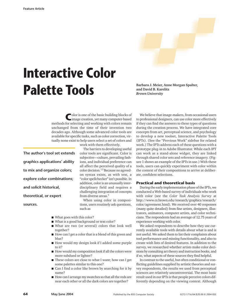
We believe that image-makers, from occasional usersto professional designers, can use color more effectivelyif they can find the answers to these types of questionsduring the creation process. We have integrated coreconcepts from art, perceptual science, and psychologyto develop a new toolset, Interactive Palette Tools(IPTs). (See the “Previous Work” sidebar for relatedwork.) The IPTs address each of these questions with aprototype plug-in to Adobe Illustrator. While each IPTcan work as a stand-alone widget, they are linkedthrough shared color sets and reference imagery. (Fig-ure 1 shows an example of the IPTs in use.) With thesetools, users can quickly experiment with color withinthe context of their compositions to arrive at deliber-ate, confident selections.
Practical and theoretical basisDuring the early implementation phase of the IPTs, we
conducted a Web-based survey of individuals who workwith color (see the Color Task Analysis Survey athttp://www.cs.brown.edu/research/graphics/research/color/agreement.html). We received over 40 responses(many quite detailed) from fine artists, designers, illus-trators, animators, computer artists, and color techni-cians. The respondents had an average of 12.75 years ofexperience working with color.
We asked respondents to describe how they use cur-rently available tools with details about what is and isnot useful. We asked them to list their complaints abouttool performance and missing functionality, and also tocreate wish lists of desired features. In addition to thesurvey, we researched whether artists make color deci-sions by consulting art theory and instruction books, andif so, what aspects of these sources they find helpful.
In contrast to the useful, but often conditional or con-flicting guidelines supplied by artistic theories and sur-vey respondents, the results we used from perceptualsciences are relatively uncontroversial. The most basicresult used in our IPTs is that people perceive colors dif-ferently depending on the viewing context. Although
Barbara J. Meier, Anne Morgan Spalter, and David B. KarelitzBrown University
The author's tool set extends
graphics applications’ ability
to mix and organize colors;
explore color combinations;
and solicit historical,
theoretical, or expert
sources.
this has long been an importanttenet of artistic color theory, scien-tific experimentation also supportsthis conclusion. A tool that displayscolors in isolation or in groupingsunrelated to an image will fail toprovide all the necessary informa-tion to make a color choice, and itcan also significantly mislead theuser. We addressed this issue by pro-viding both solid and gradient back-ground options in our IPTs, and bygiving users control over swatchshape, position, and scale (the lackof which was a subject of complaintin our survey).
Interactive Palette ToolsWe developed the following set of
IPTs to address real-world needs.
IEEE Computer Graphics and Applications 65
Previous WorkMost existing computer-based color tools date
back to paint programs from the early 1980s.Basic features include methods to select colorsfrom a list of names or swatches, create newswatches, and save selections for use later. Weexpand on current tools using swatches andpalettes as the basic building blocks for exploringhow color selections behave in relative quantities,locations, juxtapositions, and frequencies.
Initially, the industry described colors withhardware-related, but unintuitive, RGBcoordinates. In 1978, Alvy Ray Smith introducedthe hue-saturation-value (HSV) color space1 andmore recently proposed the hue-whiteness-blackness (HWB) space, which both offer moreintuitive ways of choosing colors. We believe thatperceptually based spaces such as Munsell orCIELAB2 might be easier to work with, and we usesuch spaces for creating swatch sets with our dial-a-color tool.
More sophisticated color pickers display choicesin the form of a color wheel or slice, which isuseful to artists and designers familiar with thispresentation. However, almost none let usersidentify commonly used geometries that describecolor relationships such as complements or triads.One exception is Hot Door’s Harmony, a plug-infor Adobe Photoshop. Although a move in theright direction, Harmony is limited in that itconfines color selection to a planar slice of HSVspace. Our dial-a-color IPT allows both nonplanarcombinations and a selection of color spaces withwhich to work.
Our gradient mixer borrows ideas fromElectronic Art’s Studio 8 (which is no longeravailable). Studio 8 provided a mixing area inwhich users could hand blend in a painterlyfashion.
Several applications offer Pantone-based orother standardized palettes, which are especiallyuseful for translating designs to other media.Some provide palettes linked with designs, such aspresentation graphics templates in MicrosoftPowerPoint. Our color sets, based on graphicdesign and fine art, augment those already incommon applications.
At the other end of the spectrum, some systemsgenerate functional color sets for specificapplications such as map making,3,4 or by usingalgorithmic or expert and intelligent systems,5-7
but these systems give the user little control. Ourtools address the middle ground between theautomated research systems and predeterminedcommercial solutions.
References1. A.R. Smith, “Color Gamut Transform Pairs,” Proc. ACM
Siggraph, ACM Press, 1978, pp. 12-19.2. M.D. Fairchild, Color Appearance Models, Addison-Wes-
ley, 1998.3. M.A. Harrower and C.A. Brewer, “ColorBrewer: An
Online Tool for Selecting Color Schemes for Maps,”The Cartographic J., vol. 40, no. 1, pp. 27-37.
4. C. Ware, Information Visualization: Perception for Design,Morgan Kaufmann, 1999.
5. L. Bergman, B. Rogowitz, and L. Treinish, “A Rule-BasedTool for Assisting Colormap Selection,” Proc. Visual-ization, IEEE CS Press, 1995, pp. 118-125.
6. L. Lavendel and T. Kohler, “The Story of a Color Advi-sor,” Proc. 6th Society for Imaging Science and Technol-ogy/Society for Information Display (IS&T/SID) ColorImaging Conf., IS&T/SID, 1998, pp. 228-232.
7. J. Mackinlay, “Automating the Design of Graphical Pre-sentations of Relational Information,” ACM Trans.Graphics, vol. 5, no. 2, Apr. 1986, p. 110.
1 The IPTs inaction duringcreation of animage.
Gaugin Digital Image © The Museum of Modern Art/Licensed by SCALA/Art Resource
This collection of tools will help designers choose anduse colors effectively. They enhance the process of work-ing with color and help users feel more confident thatthey have explored the possibilities thoughtfully insteadof making uninformed guesses.
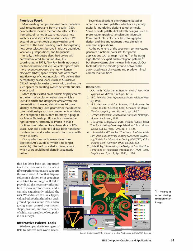
Palette browserThe IPTs are coordinated through a palette browser
(see Figure 2) that displays named palettes. In our imple-mentation, a drop-down arrow lets the user hide or showeach associated palette. Large swatch sets are displayedon multiple lines.
Survey respondents indicated using palette books(such as Walch and Hope2) to find color sets without hav-ing to create them from scratch. The palette browser isn’ta new idea, but existing versions are often tied to a par-ticular task such as creating presentation slides. Weenhanced our version with the nudger feature, palettesorting by theme color, and corresponding referenceimagery available in the image and composition tools.
With the nudger, users can modify all colors in apalette simultaneously, making them lighter or darker, ormore or less saturated. We make these calculations inthe hue-saturation-brightness (HSB) color space.
A palette displays swatches inthe order in which the user definesthem, unless the user chooses tosort the swatches by a user-select-ed theme color. In the latter case,the closest match to the themecolor displays first, followed by theother colors in ascending hueorder.
Our browser shares a problemcommon with many grid-basedrepresentations in that it displaysswatches at a constant size, out ofcontext, and against a constantbackground—all of which can mis-lead users. We envision the brows-er as a way to quickly find anapproximate palette that users canmanipulate in another IPT that isfree of these limitations.
Image and composition toolsThe image IPT displays an image
that uses a palette in the palettebrowser. Images are typically of art-works, natural objects, or pho-tographs. Users can searchseparately in the image IPT to bringup related browser palettes.
Many survey respondents men-tioned using reference imagery asa starting point for choosing col-ors because a composition pro-vides more information aboutcolor use than a palette displayedas a swatch grid. In an image,users can view how colors appearin different size areas, quantities,
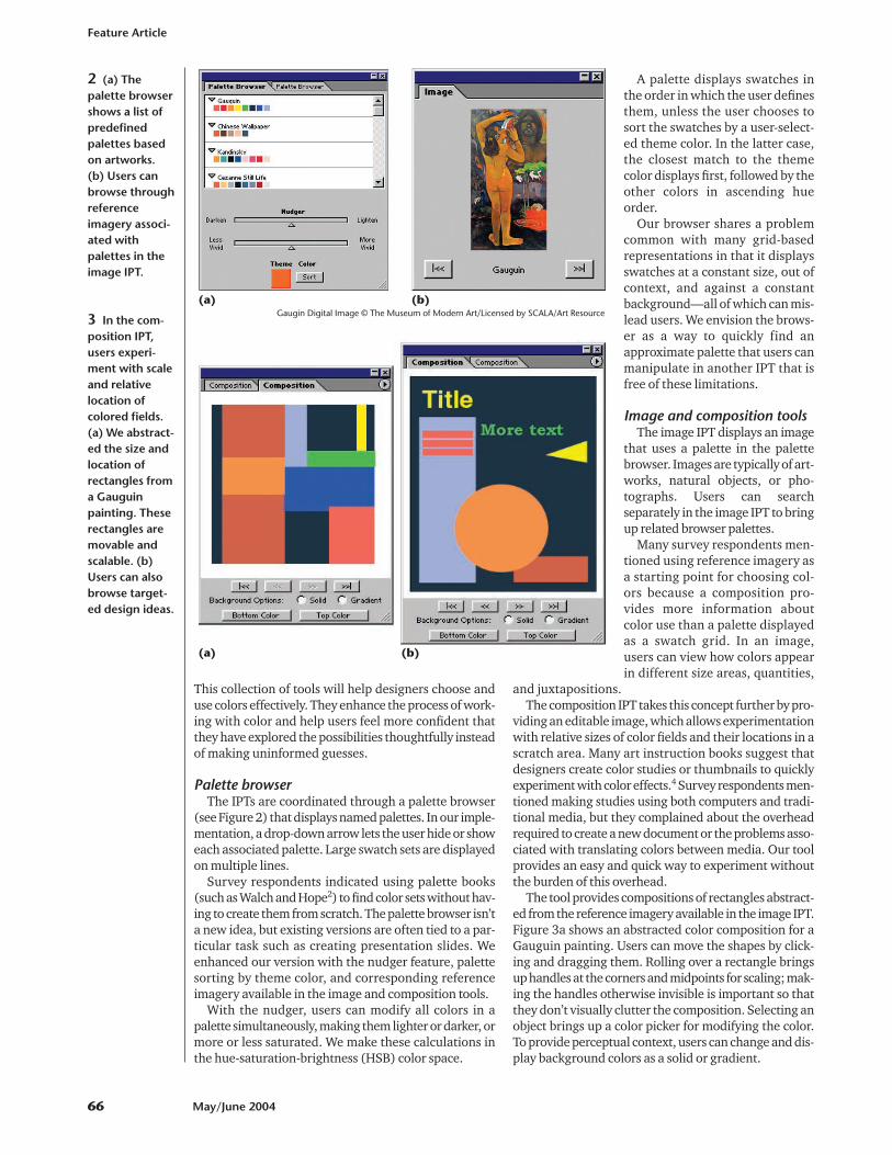
and juxtapositions.The composition IPT takes this concept further by pro-
viding an editable image, which allows experimentationwith relative sizes of color fields and their locations in ascratch area. Many art instruction books suggest thatdesigners create color studies or thumbnails to quicklyexperiment with color effects.4 Survey respondents men-tioned making studies using both computers and tradi-tional media, but they complained about the overheadrequired to create a new document or the problems asso-ciated with translating colors between media. Our toolprovides an easy and quick way to experiment withoutthe burden of this overhead.
The tool provides compositions of rectangles abstract-ed from the reference imagery available in the image IPT.Figure 3a shows an abstracted color composition for aGauguin painting. Users can move the shapes by click-ing and dragging them. Rolling over a rectangle bringsup handles at the corners and midpoints for scaling; mak-ing the handles otherwise invisible is important so thatthey don’t visually clutter the composition. Selecting anobject brings up a color picker for modifying the color.To provide perceptual context, users can change and dis-play background colors as a solid or gradient.
Feature Article
66 May/June 2004
2 (a) Thepalette browsershows a list ofpredefinedpalettes basedon artworks. (b) Users canbrowse throughreferenceimagery associ-ated withpalettes in theimage IPT.
3 In the com-position IPT,users experi-ment with scaleand relativelocation ofcolored fields.(a) We abstract-ed the size andlocation ofrectangles froma Gauguinpainting. Theserectangles aremovable andscalable. (b)Users can alsobrowse target-ed design ideas.
(a) (b)
(a) (b)
Gaugin Digital Image © The Museum of Modern Art/Licensed by SCALA/Art Resource
We present designs of specifictypes of art and graphic work, suchas the poster design in Figure 3b.Using arrows below the image, adesigner can rapidly scroll throughcompositions associated with dif-ferent palettes (with the outerarrows) or through different func-tion-targeted compositions createdwith one palette (with the innerarrows). Some survey respondentsdiscussed the difficulty of translat-ing a predefined palette to an actualcomposition. This tool helps bridgethat gap, eliminating tedious trialand error.
Choosing a drawing order for therectangles was an implementationissue with the composition IPT. Weexperimented with drawing theselected object on top. However,without a method for putting oneobject under another—which would have complicatedthe simple interface—the user couldn’t change thebackground object’s color without obscuring the otherrectangles. We settled on a fixed drawing order, whichworks for most quick experiments.
At this point, the targeted designs aren’t editable,which might be a future improvement. Also, it could behelpful to assign different colors from the same palette tothe various elements of these designs because a particu-lar palette can be used in many ways. We also consideredproviding a way to assign colors randomly or to rotatethrough the palette. However, we chose to offer only pre-determined assignments that use color effectively, whichmight not be the case with random assignments.
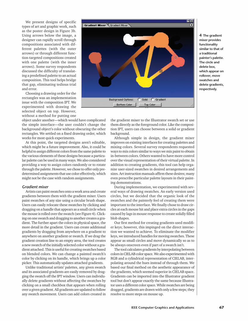
Gradient mixerArtists can paint swatches onto a work area and create
gradients between them with the gradient mixer. Userspaint swatches of any size using a circular brush shape.Users can easily relocate these swatches by clicking anddragging on a handle that appears as a small circle whenthe mouse is rolled over the swatch (see Figure 4). Click-ing on one swatch and dragging to another creates a gra-dient. The further apart the colors in physical space, themore detail in the gradient. Users can create additionalgradients by dragging from anywhere on a gradient toanywhere on another gradient or swatch. If we drag thegradient creation line to an empty area, the tool createsa new swatch of the initially selected color without a gra-dient attached. This is useful for creating swatches basedon blended colors. We can change a painted swatch’scolor by clicking on its handle, which brings up a colorpicker. This automatically updates attached gradients.
Unlike traditional artists’ palettes, any given swatchand its associated gradients are easily removed by drag-ging the swatch off the IPT window. Users can individu-ally delete gradients without affecting the swatches byclicking on a small checkbox that appears when rollingover a given gradient. All gradients are updated to followany swatch movement. Users can add colors created in
the gradient mixer to the Illustrator swatch set or usethem directly as the foreground color. Like the composi-tion IPT, users can choose between a solid or gradientbackground.
Although simple in design, the gradient mixerimproves on existing interfaces for creating palettes andmixing colors. Several survey respondents requestedways to mix colors similar to ways we mix paint to obtainin-between colors. Others wanted to have more controlover the visual representation of their virtual palette. Inaddition to creating gradients, this tool can help orga-nize user-sized swatches in desired arrangements andsizes. Art instruction manuals affirm these desires; manyeven prescribe particular palette layouts in their paint-ing demonstrations.
During implementation, we experimented with sev-eral ways of drawing swatches. An early version usedcircles, but we decided that the organic look of theswatches and the painterly feel of creating them wereimportant to the interface. We finally chose to draw cir-cles at each mouse hit and place extra circles in the gapscaused by lags in mouse response to create solidly filledblob shapes.
Our first method for creating gradients used modifi-er keys; however, this impinged on the direct interac-tion we wanted to achieve. To eliminate the modifierkeys, we introduced handles for moving swatches. Theseappear as small circles and move dynamically so as tobe always onscreen even if part of a swatch isn’t.
The tool calculates gradients by interpolating betweencolors in CIELAB color space. We also experimented withRGB and a cylindrical representation of CIELAB, inter-polating around the hues instead of through them. Webased our final method on the aesthetic appearance ofthe gradients, which seemed superior in CIELAB space.Gradients can be imported into the Illustrator gradienttool but don’t appear exactly the same because Illustra-tor uses a different color space. While swatches are beingdragged, gradients are drawn with only a few steps; theyresolve to more steps on mouse up.
IEEE Computer Graphics and Applications 67
4 The gradientmixer providesfunctionalitysimilar to that ofa traditionalpainter’s palette.The circle anddelete box,which appear onrollover, moveswatches anddelete gradients,respectively.
The final interface issues we encountered concernedthe drawing order of swatches and gradients. We choseto place the most recently drawn gradients on top butbelow the lowermost swatch, so those swatches alwaysappear on top of everything. Where the user clicked anddragged on the two swatches determines the beginningand end of a gradient. If users move swatches in partic-ular ways, a portion of the gradients might be obscuredwhen the swatches are drawn on top.
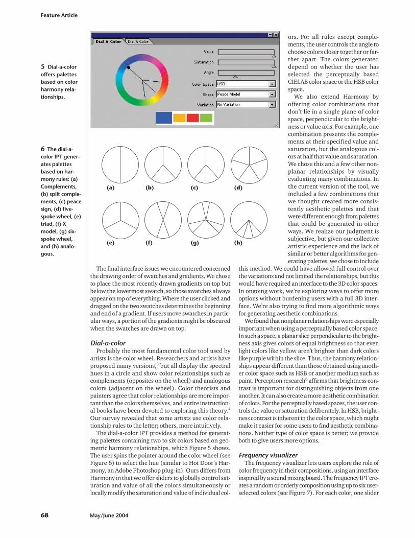
Dial-a-colorProbably the most fundamental color tool used by
artists is the color wheel. Researchers and artists haveproposed many versions,5 but all display the spectralhues in a circle and show color relationships such ascomplements (opposites on the wheel) and analogouscolors (adjacent on the wheel). Color theorists andpainters agree that color relationships are more impor-tant than the colors themselves, and entire instruction-al books have been devoted to exploring this theory.4
Our survey revealed that some artists use color rela-tionship rules to the letter; others, more intuitively.
The dial-a-color IPT provides a method for generat-ing palettes containing two to six colors based on geo-metric harmony relationships, which Figure 5 shows.The user spins the pointer around the color wheel (seeFigure 6) to select the hue (similar to Hot Door’s Har-mony, an Adobe Photoshop plug-in). Ours differs fromHarmony in that we offer sliders to globally control sat-uration and value of all the colors simultaneously orlocally modify the saturation and value of individual col-
ors. For all rules except comple-ments, the user controls the angle tochoose colors closer together or far-ther apart. The colors generateddepend on whether the user hasselected the perceptually basedCIELAB color space or the HSB colorspace.
We also extend Harmony byoffering color combinations thatdon’t lie in a single plane of colorspace, perpendicular to the bright-ness or value axis. For example, onecombination presents the comple-ments at their specified value andsaturation, but the analogous col-ors at half that value and saturation.We chose this and a few other non-planar relationships by visuallyevaluating many combinations. Inthe current version of the tool, weincluded a few combinations thatwe thought created more consis-tently aesthetic palettes and thatwere different enough from palettesthat could be generated in otherways. We realize our judgment issubjective, but given our collectiveartistic experience and the lack ofsimilar or better algorithms for gen-erating palettes, we chose to include
this method. We could have allowed full control overthe variations and not limited the relationships, but thiswould have required an interface to the 3D color spaces.In ongoing work, we’re exploring ways to offer moreoptions without burdening users with a full 3D inter-face. We’re also trying to find more algorithmic waysfor generating aesthetic combinations.
We found that nonplanar relationships were especiallyimportant when using a perceptually based color space.In such a space, a planar slice perpendicular to the bright-ness axis gives colors of equal brightness so that evenlight colors like yellow aren’t brighter than dark colorslike purple within the slice. Thus, the harmony relation-ships appear different than those obtained using anoth-er color space such as HSB or another medium such aspaint. Perception research6 affirms that brightness con-trast is important for distinguishing objects from oneanother. It can also create a more aesthetic combinationof colors. For the perceptually based spaces, the user con-trols the value or saturation deliberately. In HSB, bright-ness contrast is inherent in the color space, which mightmake it easier for some users to find aesthetic combina-tions. Neither type of color space is better; we provideboth to give users more options.
Frequency visualizerThe frequency visualizer lets users explore the role of
color frequency in their compositions, using an interfaceinspired by a sound mixing board. The frequency IPT cre-ates a random or orderly composition using up to six user-selected colors (see Figure 7). For each color, one slider
Feature Article
68 May/June 2004
5 Dial-a-coloroffers palettesbased on colorharmony rela-tionships.
(a) (b) (c) (d)
(e) (f) (g) (h)
6 The dial-a-color IPT gener-ates palettesbased on har-mony rules: (a)Complements,(b) split comple-ments, (c) peacesign, (d) five-spoke wheel, (e)triad, (f) Xmodel, (g) six-spoke wheel,and (h) analo-gous.
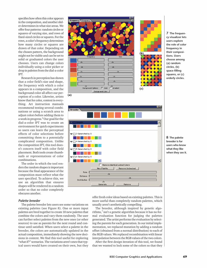
specifies how often this color appearsin the composition, and another slid-er determines in what size areas. Weoffer four patterns: random circles orsquares of varying size, and rows offixed-sized circles or squares. For therows, a color’s frequency determineshow many circles or squares aredrawn of that color. Depending onthe chosen pattern, the backgroundmight not be visible and can be set tosolid or graduated colors the userchooses. Users can change colorsindividually using a color picker ordrop in palettes from the dial-a-colorIPT.
Research in perception has shownthat a color field’s size and shape,the frequency with which a colorappears in a composition, and thebackground color all affect our per-ception of a color. Likewise, artistsknow that for color, context is every-thing. Art instruction manualsrecommend testing several combi-nations or using a scratch area toadjust colors before adding them toa work in progress.4 Our goal for thedial-a-color IPT was to create anenvironment for quick experimentsso users can learn the perceptualeffects of color selections beforecommitting them to a potentiallycomplicated composition. Unlikethe composition IPT, this tool does-n’t concern itself with color fieldplacement. Both tools create thumb-nails or representations of colorcombinations.
The order in which the tool ren-ders the random shapes is importantbecause the final appearance of thecomposition must reflect what theuser specified. To achieve this, weuse an algorithm that ensuresshapes will be rendered in a randomorder so that no color completelyobscures another.
Palette breederThe palette breeder lets users see some variations on
existing palettes (see Figure 8). One or more inputpalettes are bred together to create 10 new palettes thatcombine the colors and vary them randomly. The usercan further select palettes from the new ones (or othersources) to use as parents for the next round and con-tinue until satisfied. When users select a palette in thebreeder, the colors are automatically updated in theactual composition, immediately showing the new deci-sions in context. We find this tool useful for exploring“what if?” scenarios. The variations aren’t ones that typ-ical users would have created on their own, but they
offer fresh color ideas based on existing palettes. This ismore useful than completely random palettes, whichusually aren’t aesthetically compelling.
The breeder, although inspired by genetic algo-rithms,7 isn’t a genetic algorithm because it has no for-mal evaluation function for judging the palettesgenerated. The artist performs the evaluation by select-ing the parents for each generation. In our initial imple-mentation, we replaced mutation by adding a randomoffset (obtained from a normal distribution) to each ofthe RGB values. We replaced recombination with linearinterpolation between the RGB values of the two colors.
After the first design iteration of this tool, we foundthat we wanted to lock some of the colors so that they
IEEE Computer Graphics and Applications 69
7 The frequen-cy visualizer letsusers explorethe role of colorfrequency intheir composi-tions. Userschoose among(a) randomcircles, (b)space-fillingsquares, or (c)orderly circles.
(a)
(b)
(c)
8 The palettebreeder is forusers who knowwhat they likewhen they see it.
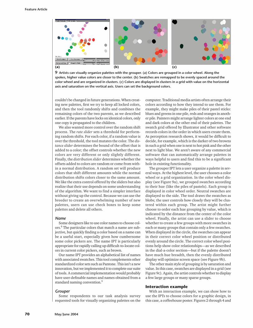
couldn’t be changed in future generations. When creat-ing new palettes, first we try to keep all locked colors,and then the tool randomly shifts and combines theremaining colors of the two parents, as we describedearlier. If the parents have locks on identical colors, onlyone copy is propagated to the children.
We also wanted more control over the random shiftprocess. The rate slider sets a threshold for perform-ing random shifts. For each color, if a random value isover the threshold, the tool mutates the color. The dis-tance slider determines the bound of the offset that isadded to a color; the offset controls whether the newcolors are very different or only slightly different.Finally, the distribution slider determines whether theoffsets added to colors are random or come from with-in a normal distribution. A random set will producecolors that shift different amounts while the normaldistribution shifts colors closer to the same amount.We like the extra control offered by the sliders but alsorealize that their use depends on some understandingof the algorithm. We want to find a simpler interfacewithout giving up the control. Because we can use thebreeder to create an overwhelming number of newpalettes, users can use check boxes to keep somepalettes and delete all others.
NameSome designers like to use color names to choose col-
ors.8 The particular colors that match a name are sub-jective, but quickly finding a color based on a name canbe a useful start, especially given how cumbersomesome color pickers are. The name IPT is particularlyappropriate for rapidly calling up difficult-to-locate col-ors in current color pickers, such as brown.
Our name IPT provides an alphabetical list of nameswith associated swatches. This tool complements otherstandardized color sets such as Pantone. This isn’t a newinnovation, but we implemented it to complete our suiteof tools. A commercial implementation would probablyhave user-definable names and names obtained from astandard naming convention.9
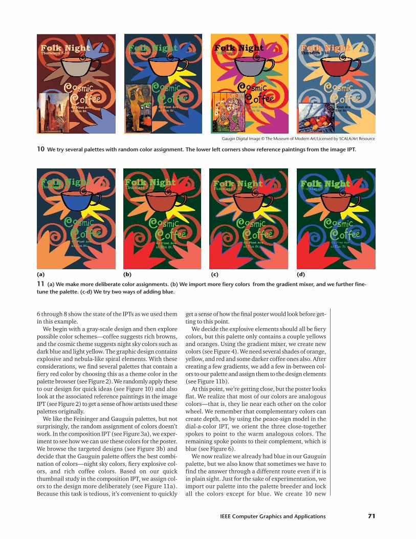
GrouperSome respondents to our task analysis survey
requested tools for visually organizing palettes on the
computer. Traditional media artists often arrange theircolors according to how they intend to use them. Forexample, they might make piles of their pastel sticks:blues and greens in one pile, reds and oranges in anoth-er pile. Painters might arrange lighter colors at one endand dark colors at the other end of their palettes. Theswatch grid offered by Illustrator and other softwarerecords colors in the order in which users create them.As perception research shows, it would be difficult todecide, for example, which is the darker of two brownsin such a grid when one is next to hot pink and the othernext to light blue. We aren’t aware of any commercialsoftware that can automatically arrange palettes inways helpful to users and find this to be a significanthole in existing functionality.
The grouper IPT lets a user organize a palette in sev-eral ways. At the highest level, the user chooses a colorwheel or a grid organization. In the color wheel dis-play (see Figure 9a), we grouped swatches accordingto their hue (like the piles of pastels). Each group isdisplayed in color wheel order. Neutral swatches aredisplayed to the side. The tool draws the swatches asblobs; the user controls how closely they will be clus-tered within each group. The artist might furtherchoose to order each hue grouping by value, which isindicated by the distance from the center of the colorwheel. Finally, the artist can use a slider to choosewhether to create a few groups with more swatches ineach or many groups that contain only a few swatches.When displayed in the circle, the swatches can appearin their correct color wheel position or distributedevenly around the circle. The correct color wheel posi-tions help show color relationships—as we describedin the dial-a-color section—but if the palette doesn’thave much hue breadth, then the evenly distributeddisplay will optimize screen space (see Figure 9b).
The other main style of grouping is by saturation andvalue. In this case, swatches are displayed in a grid (seeFigure 9c). Again, the artist controls whether to displaya few large groups or many sparse groups.
Interaction exampleWith an interaction example, we can show how to
use the IPTs to choose colors for a graphic design, inthis case, a coffeehouse poster. Figures 2 through 4 and
Feature Article
70 May/June 2004
(a) (b) (c)
9 Artists can visually organize palettes with the grouper. (a) Colors are grouped in a color wheel. Along thespokes, higher value colors are closer to the center. (b) Swatches are remapped to be evenly spaced around thecolor wheel and are organized in clusters. (c) Colors are displayed in clusters in a grid with value on the horizontalaxis and saturation on the vertical axis. Users can set the background colors.
6 through 8 show the state of the IPTs as we used themin this example.
We begin with a gray-scale design and then explorepossible color schemes—coffee suggests rich browns,and the cosmic theme suggests night sky colors such asdark blue and light yellow. The graphic design containsexplosive and nebula-like spiral elements. With theseconsiderations, we find several palettes that contain afiery red color by choosing this as a theme color in thepalette browser (see Figure 2). We randomly apply theseto our design for quick ideas (see Figure 10) and alsolook at the associated reference paintings in the imageIPT (see Figure 2) to get a sense of how artists used thesepalettes originally.
We like the Feininger and Gauguin palettes, but notsurprisingly, the random assignment of colors doesn’twork. In the composition IPT (see Figure 3a), we exper-iment to see how we can use these colors for the poster.We browse the targeted designs (see Figure 3b) anddecide that the Gauguin palette offers the best combi-nation of colors—night sky colors, fiery explosive col-ors, and rich coffee colors. Based on our quickthumbnail study in the composition IPT, we assign col-ors to the design more deliberately (see Figure 11a).Because this task is tedious, it’s convenient to quickly
get a sense of how the final poster would look before get-ting to this point.
We decide the explosive elements should all be fierycolors, but this palette only contains a couple yellowsand oranges. Using the gradient mixer, we create newcolors (see Figure 4). We need several shades of orange,yellow, and red and some darker coffee ones also. Aftercreating a few gradients, we add a few in-between col-ors to our palette and assign them to the design elements(see Figure 11b).
At this point, we’re getting close, but the poster looksflat. We realize that most of our colors are analogouscolors—that is, they lie near each other on the colorwheel. We remember that complementary colors cancreate depth, so by using the peace-sign model in thedial-a-color IPT, we orient the three close-togetherspokes to point to the warm analogous colors. Theremaining spoke points to their complement, which isblue (see Figure 6).
We now realize we already had blue in our Gauguinpalette, but we also know that sometimes we have tofind the answer through a different route even if it isin plain sight. Just for the sake of experimentation, weimport our palette into the palette breeder and lockall the colors except for blue. We create 10 new
IEEE Computer Graphics and Applications 71
10 We try several palettes with random color assignment. The lower left corners show reference paintings from the image IPT.
(a) (b) (c) (d)
11 (a) We make more deliberate color assignments. (b) We import more fiery colors from the gradient mixer, and we further fine-tune the palette. (c-d) We try two ways of adding blue.
Gaugin Digital Image © The Museum of Modern Art/Licensed by SCALA/Art Resource
Feature Article
72 May/June 2004
palettes with different blues and quickly apply these toour composition. We could also have just kept editingthe one blue in our palette using sliders, but we havefound that the occasional random experiment canbroaden our view and keep us from picking the samecolors over and over. We choose one of the blues andexperiment with applying it to different elements inthe design, but nothing seems to work. We like theblue outline on the explosions (see Figure 11c), butimagine the blue would be on the inside at the hottestpoint, such as on a lit match. The blue spirals competetoo much with other elements (see Figure 11d). To tryout more ideas, we plug our palette into the frequen-cy visualizer (see Figure 7). We adjust the sliders tomimic our composition and then start playing with theblue size and frequency.
Finally, we like the look of the small blue dots so muchthat we choose to add them to our design, and we’re fin-ished (see Figure 1).
Discussion and conclusionsWe realize that some methods used in our tools could
be simulated with existing software. For instance, a usercould create a gradient in a document and then choosea color from it. However, we found that tedious setupprocesses for working with color aren’t generally under-taken in everyday usage.
In our experience with using the tools, we foundthat most people use a subset of the tools tailored totheir work style or project needs. We developed manytools, some with overlapping functionality, to accom-modate these different styles. Some IPTs solve prob-lems that a good designer could solve—for example,finding the complement to orange or finding the bestblue. But for less experienced users or when expertusers are stuck, the IPTs provide a quick visual prob-lem-solving approach. It’s nearly always easier to eval-uate and modify an existing solution than create onefrom scratch.
Our prototype implementation has limited real-worldusefulness at this time. For example, we can’t drag-and-drop swatches between IPTs due to limitations of theIllustrator plug-in architecture. We hope to resolve thislimitation in updated versions.
In our implementation, we want to remove the limitson the number of colors or swatch sets on which the IPTscan operate at once. We envision new IPTs, based forexample, on perceptual depth cues or textures. We alsobelieve tools for picking colors from a 3D color spacecould be improved.
In our IPTs, we provide tools based on methods usedin traditional media, and we’ve begun to explore thepotential for color tools that are only possible on thecomputer. We believe the type of exploration promotedby our tools will become an integral part of the creativeprocess for all types of users. �
AcknowledgmentsWe thank Adobe Systems for supporting this work and
Maureen Stone for her insightful comments on an earlydraft.
References1. J. Gage, Color and Culture: Practice and Meaning from Antiq-
uity to Abstraction, Univ. of Calif. Press, 1993.2. M. Walch and A. Hope, Living Colors: The Definitive Guide
to Color Palettes Through the Ages, Chronicle Books, 1995.3. G.K. Werner et al., eds., Color Vision: Perspectives from Dif-
ferent Disciplines, Walter de Gruyter, 1998.4. C. Le Clair, Color in Contemporary Painting, Watson-Gup-
till, 1991.5. J. Itten, The Elements of Color, Van Nostrand Reinhold,
1970.6. C. Ware, Information Visualization: Perception for Design,
Morgan Kaufmann, 1999.7. K. Sims, “Artificial Evolution for Computer Graphics,” Proc.
ACM Siggraph, ACM Press, 1991, pp. 319-329.8. J. Bourges, Color Bytes, Chromatics Press, 1997.9. K.L. Kelly and D.B. Judd, Color: Universal Language and Dic-
tionary of Names, Nat’l Bureau of Standards Special Publi-cation 440, Dec. 1976.
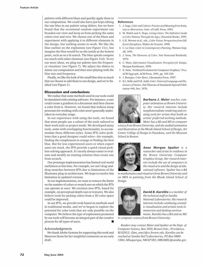
Barbara J. Meier teaches com-puter animation at Brown Universi-ty. Her research interests includenonphotorealistic rendering and cre-ating tools for artists that build onartists’ preferred working methods.Meier has a BA and MS in computer
science from Brown University, and she studied animationand illustration at the Rhode Island School of Design, ArtCenter College of Design in Pasadena, and the MuseumSchool in Boston.
Anne Morgan Spalter is aresearcher and artist in residence inthe Brown University ComputerGraphics Group. Her research inter-ests include the use of computers inthe visual arts and the design of edu-cational software. Spalter has a BA
in mathematics and visual art from Brown University andan MFA in painting from the Rhode Island School ofDesign.
David B. Karelitz is a member ofthe technical staff at SandiaNational Laboratories. His researchinterests include combining scientif-ic visualization and artistic tools inimmersive and desktop environ-ments. Karelitz has a BA and an MS
in computer science from Brown University.
Readers may contact Meier and Spalter at the Dept. ofComputer Science, Box 1910, Brown Univ., Providence,RI 02912; {bjm, ams}@cs.brown.edu. Karelitz can bereached at Sandia Nat’l Laboratories, PO Box 5800-1360, Albuquerque, NM 87185; [email protected].