gov.uk - a teardown of the british government's self-service journey
TRANSCRIPT

A teardown of the British government’s
magical customer support journey.
We went downthe rabbit hole

The British government has an amazing self-service website
called
GOV.UK

It won them awards...

Their design process is well-documented, and widely
admired.
‘Every superfluous page we create is onemore dead end for an angry, frustrated,confused user ’ - @GovUK team seekingthe irreducible core
Tom Loosemore@tomskitomski

Home Page

Homepage features a BIG search bar - this encourages users to search first

Popular articles are featured here, so they are easily accessible.
Ben Terrett, Director of Design, stated that these articles are chosen strictly by data. The articles with the most pageviews get featured.

Note: there’s no visible contact information on the front page. This is because GOV.UK wants to funnel me down closer to my category first, and hopefully find an answer before I contact them.

Unfortunately, you need to type all the way through and click enter to search.
Predictive or auto-complete search would give the user confidence that they’re had searched for the right thing
Let’s searchfirst...

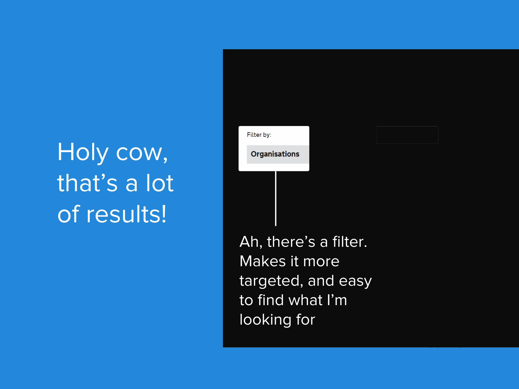
Holy cow,that’s a lotof results!
Holy cow,that’s a lotof results!
Ah, there’s a filter.Makes it moretargeted, and easyto find what I’mlooking for

That’s better

Search results include a concise explanation of what the article will help me do, in real terms (not just intro text)

I didn’t find what I was looking for, so back to browsing….

Keywords under the titles add some helpful context, so I can identify my topic
of choice

While the categories are clearly grouped, there’s a lot of them. Could they narrow it down at all?

Let’s click

Browsing doesn’t pigeonhole you into one topic, so it’s easy to go in another direction if you’ve made a mistake

Articles are arranged A-Z, which doesn’t make a lot of sense - how will I know what my question starts with?
They could try and “promote” most popular/helpful questions in a category by featuring them at the top.
By using the 80/20 rule - 80% of users will be helped by 20% of the content - they can make it much easier for the majority of their users to get help.

Still with us? Hmm?
OK, good?

Let’s look at an article!

Article is broken down into segments and steps (so you know what you’re getting)
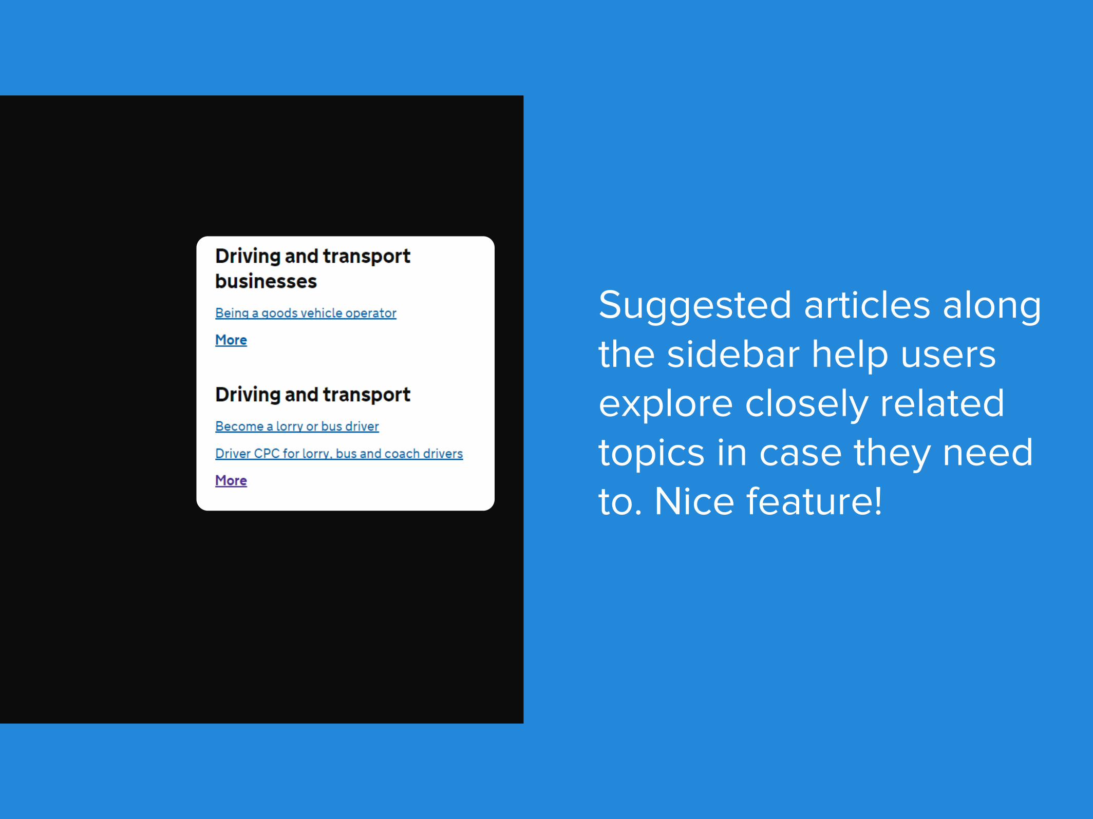
Suggested articles along the sidebar help users explore closely related topics in case they need to. Nice feature!

Gov.uk often links out to o�-site resources, which is unusual. Most people want to keep their visitors around as long as possible.
BUT using the best possible resource to solve problems more e�ciently, is selfless.
They’re providing great value to the visitor by making it as easy as possible to solve a problem, no matter what.
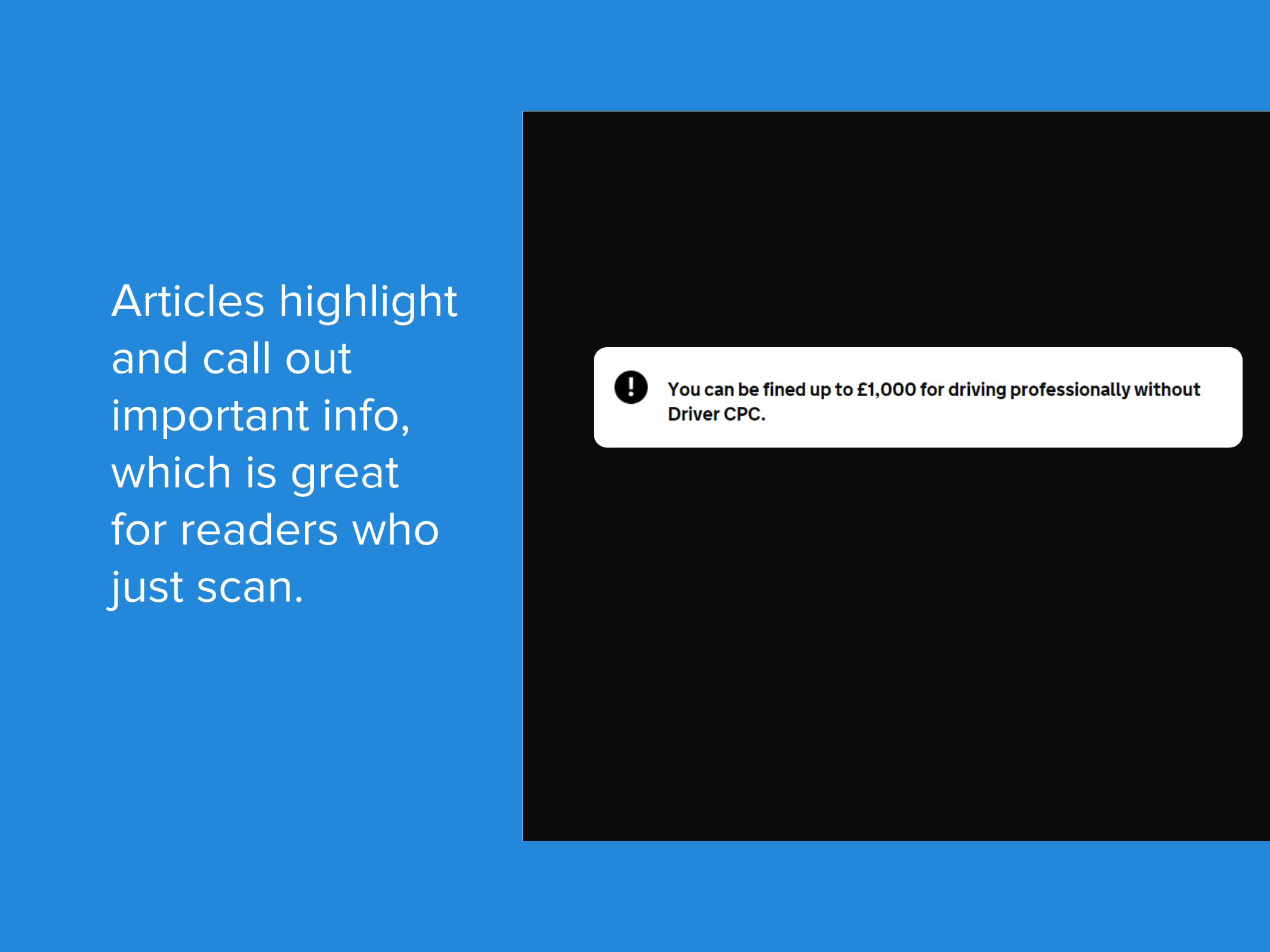
Articles highlight and call out important info, which is great for readers who just scan.

All articles are up to date
Users are able to report issues with pages so the writers can audit

Cool Feature - Self-Assessment
From GOV.UK’s design principles:
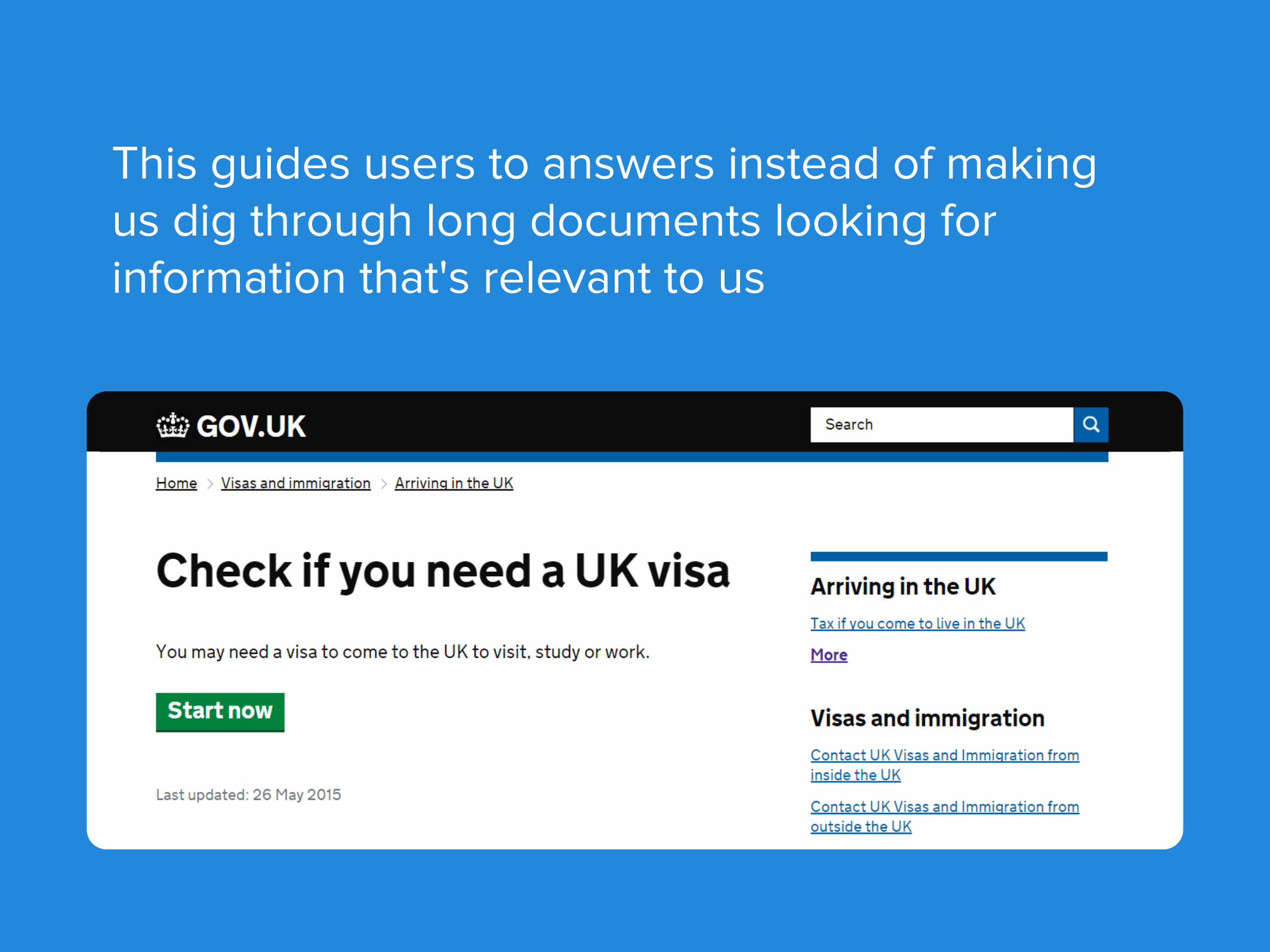
This guides users to answers instead of making us dig through long documents looking for information that's relevant to us

Convenient! I can change my answers as needed, go a step back or start over

A clear answer that means something to me!
Links for next steps are provided!

Cool feature - BETA tags!
From GOV.UK’s design principles:

BETA in action:
...always be iterating. Users love to seeimprovements happening!

Contact information is only provided when needed for next steps

Even a search for contact information funnels us to other articles that may be able to help
This saves the time of both the visitor and the employees taking calls

Unfortunately, the next step still forces the user to filter further, adding a click and a decision point to their journey — at this point, they could probably just have a list.
...especially since it’s the same number.

P.S. While clicking through their entire site, I did get invited to take a short survey!
You can tell a lot of feedback went into the design, and they are continuing to improve.

Find them here
Final thoughtsGOV.UK made an amazing site for their users to
easily get help by sticking to their forward thinking design principles.
It’s worth bookmarking the design principles that guided this project.
Truly impressive!

There’s morewhere that came
from.

Learn more about how to build an awesome self-service help center!
Subscribe to our Blog