fringe branding com
DESCRIPTION
fringe and company, salon, designTRANSCRIPT
BRAND MANUAL2011
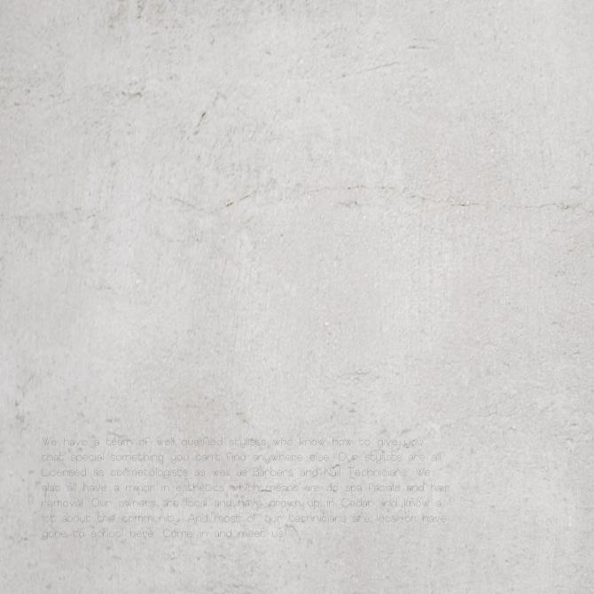
We have a team of we l l qua l i f ied sty l i sts who know how to g ive you that spec ia l someth ing you can ’t f ind anywhere e lse . Our sty l i sts are a l l L icensed as cosmeto log ists as we l l as Barbers and Na i l Techn ic i ans . We a lso a l l have a minor in esthet ics wh ich means we do spa fac ia l s and ha ir remova l . Our owners are loca l and have grown up in Cedar and know a lot about the commun ity . And most of our techn ic i ans are loca l or have gone to schoo l here . Come in and meet us !

Tagl ine font Europe Underground L ight


TypographyThis typography was specif ical ly chosen because of it ’s forward and modern ap-pearance. The curve of the letters show energy whi le the straight edges give it the sophistication that it needs.
Europe Underground Regulara b c d e f g h i j k l m n o p q r s t u v w x y zA BCD E FG H I J K LMNO PQ RS T U VWX YZ
1 2 3 4 5 6 7 8 9 0
Europe Underground Lighta b c d e f g h i j k l m n o p q r s t u v w x y zA B C D E F G H I J K L M N O P Q R S T U V W X Y Z
1 2 3 4 5 6 7 8 9 0
Europe Underground Ligh ta b c d e f g h i j k l m n o p q r s t u v w x y zA B C D E F G H I J K L M N O P Q R S T U V W X Y Z1 2 3 4 5 6 7 8 9 0
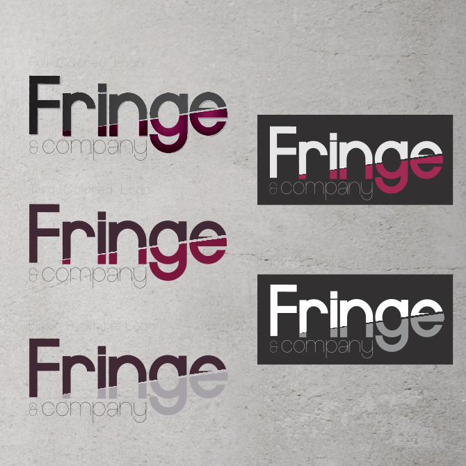
Pr imary Typography
Accent Typography


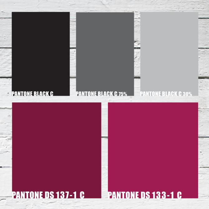
Color SchemeFringe and Company, uses a very contemporary and cut-ting edge color scheme. The black grounds and enhance the contrasting color purple . The two purples represent the l i fe and the energy of both the cl ient and the salon. This salon caters to a trendy and fashion forward market.


PhotographyFringe targets a specif ic market. The photography is based on a very intimate form of portraiture. The desistance from the model is taken one to four feet away, in order to capture as much detai l of the hair as possible .The back drops are kept very simple and neutral (white, black, gray, ect) so pose as a distraction.


Components of the photographsIn order for the photographs to have the right feel to them the make up needs to be done a specif ic way. The eyes should be smoky and soft whi le the cheek bones and jaw need to be extenuation. The l ipstick used has a neutral color pal let .