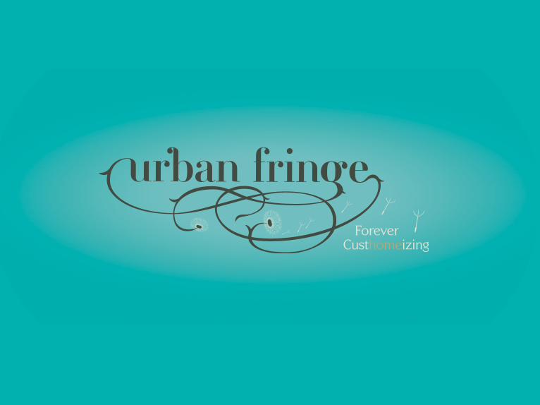
urban fringe
DESCRIPTION
This is a brand manual for a friends home based business that I made.TRANSCRIPT


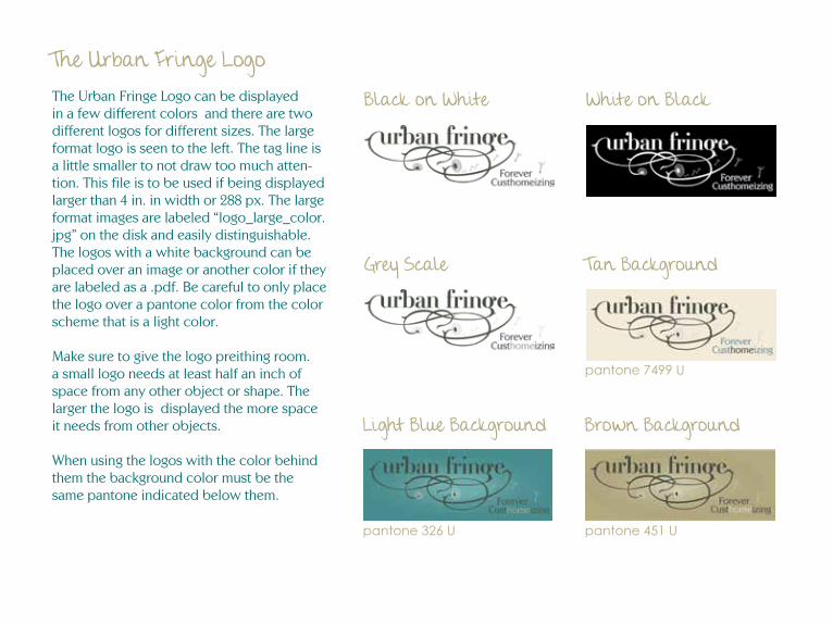
The Urban Fringe LogoThe Urban Fringe Logo can be displayed in a few different colors and there are two different logos for different sizes. The large format logo is seen to the left. The tag line is a little smaller to not draw too much atten-tion. This file is to be used if being displayed larger than 4 in. in width or 288 px. The large format images are labeled “logo_large_color.jpg” on the disk and easily distinguishable. The logos with a white background can be placed over an image or another color if they are labeled as a .pdf. Be careful to only place the logo over a pantone color from the color scheme that is a light color.
Make sure to give the logo preithing room. a small logo needs at least half an inch of space from any other object or shape. The larger the logo is displayed the more space it needs from other objects.
When using the logos with the color behind them the background color must be the same pantone indicated below them.
Black on White White on Black
Grey Scale Tan Background
Light Blue Background Brown Background
pantone 7499 U
pantone 326 U pantone 451 U

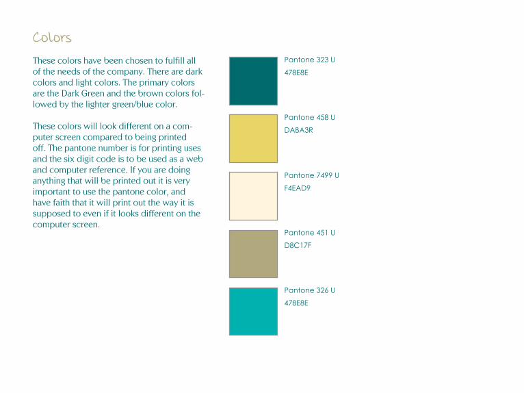
ColorsThese colors have been chosen to fulfill all of the needs of the company. There are dark colors and light colors. The primary colors are the Dark Green and the brown colors fol-lowed by the lighter green/blue color.
These colors will look different on a com-puter screen compared to being printed off. The pantone number is for printing uses and the six digit code is to be used as a web and computer reference. If you are doing anything that will be printed out it is very important to use the pantone color, and have faith that it will print out the way it is supposed to even if it looks different on the computer screen.
Pantone 323 U
478E8E
Pantone 458 U
DABA3R
Pantone 7499 U
F4EAD9
Pantone 451 U
D8C17F
Pantone 326 U
478E8E
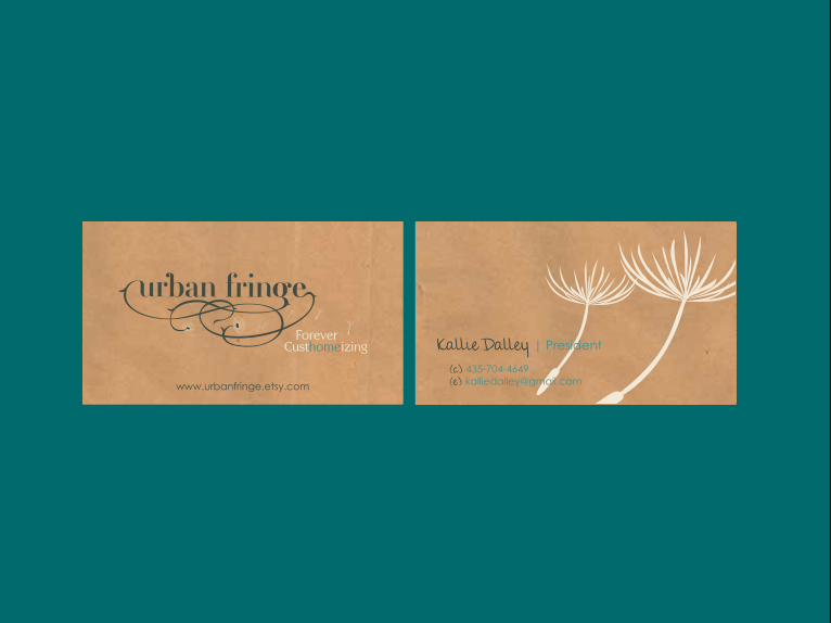
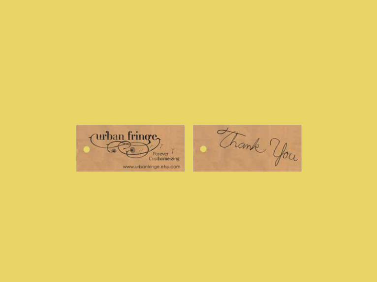
Custhomeizing Forever
www.urbanfringe.etsy.com
Kallie Dalley | President
(c) 435-704-4649(e) [email protected]
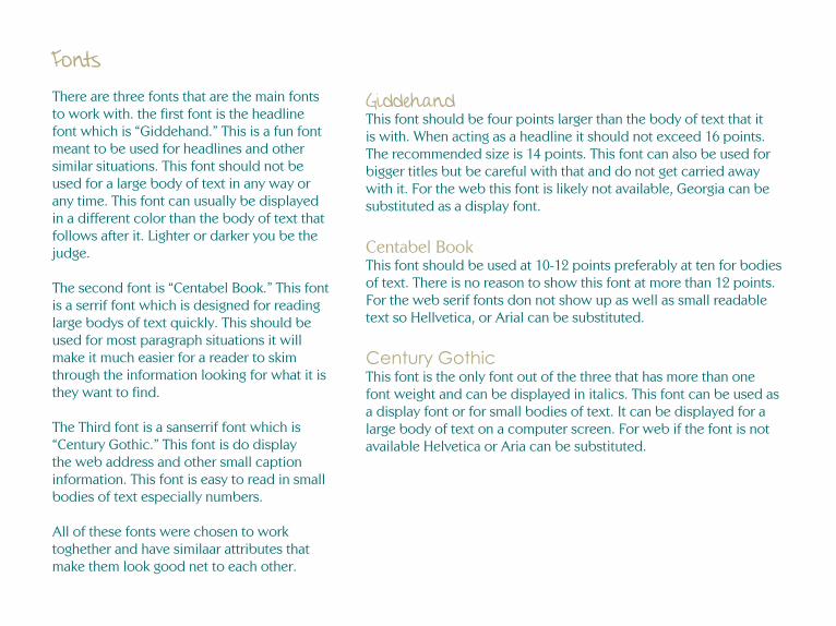
FontsThere are three fonts that are the main fonts to work with. the first font is the headline font which is “Giddehand.” This is a fun font meant to be used for headlines and other similar situations. This font should not be used for a large body of text in any way or any time. This font can usually be displayed in a different color than the body of text that follows after it. Lighter or darker you be the judge.
The second font is “Centabel Book.” This font is a serrif font which is designed for reading large bodys of text quickly. This should be used for most paragraph situations it will make it much easier for a reader to skim through the information looking for what it is they want to find.
The Third font is a sanserrif font which is “Century Gothic.” This font is do display the web address and other small caption information. This font is easy to read in small bodies of text especially numbers.
All of these fonts were chosen to work toghether and have similaar attributes that make them look good net to each other.
GiddehandThis font should be four points larger than the body of text that it is with. When acting as a headline it should not exceed 16 points. The recommended size is 14 points. This font can also be used for bigger titles but be careful with that and do not get carried away with it. For the web this font is likely not available, Georgia can be substituted as a display font.
Centabel BookThis font should be used at 10-12 points preferably at ten for bodies of text. There is no reason to show this font at more than 12 points. For the web serif fonts don not show up as well as small readable text so Hellvetica, or Arial can be substituted.
Century GothicThis font is the only font out of the three that has more than one font weight and can be displayed in italics. This font can be used as a display font or for small bodies of text. It can be displayed for a large body of text on a computer screen. For web if the font is not available Helvetica or Aria can be substituted.
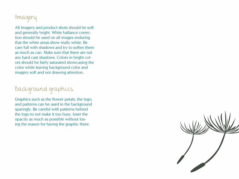
IImageryAll Imagery and product shots should be soft and generally bright. White ballance correc-tion should be used on all images enduring that the white areas show really white. Be care full with shadows and try to soften them as much as can. Make sure that there are not any hard cast shadows. Colors in bright col-ors should be fairly saturated showcasing the color while leaving background color and imagery soft and not drawing attention.
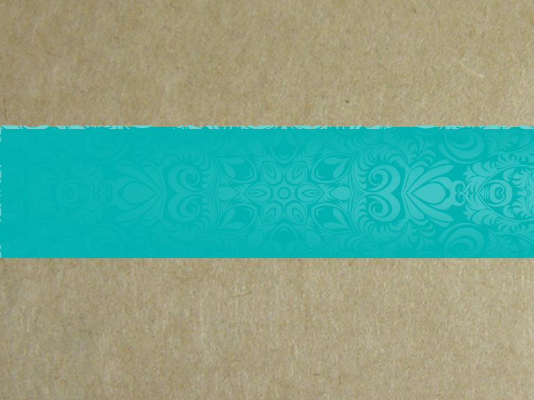
Background graphicsGraphics such as the flower petals, the logo, and patterns can be used in the background sparingly. Be careful with patterns behind the logo to not make it too busy. loser the opacity as much as possible without los-ing the reason for having the graphic there.

TaglineThe logo should rarely be displayed without the tag line. The only time it is for the logo to be displayed with out the tag-line is when the logo is embroidered on a shirt, hat or other type of clothing. If the logo is used as a background element it does not need the tag line with it.
Whenever the logo is used in an ad or banner for the website, on business cards or just about anywhere else it needs to have the tag line with it.
The tag line should not need to be changed colors there is a version of the logo for any color situation and the tag line is all ready the color it needs to be.
There are two different sizes of the tag line compared to the logo the smaller tag line is on the large format logo which is meant to be displayed larger. Which is anything over four inches. The file is labeled large so there should be no confusion here.
Hang TagsSince this company is based on selling on etsy.com people expect it to be handmade and personal. As the tag line signifys this is custome made and personal. The tag needs to reflect this.
The tag will be personally made. Cut squares from recycled paper, like a brown paper bag. or thin cardboard. Use a stamp of the logo and web address, the stamp will leave a unique mark and the viewer will be able to tell that it is stamped individually and not printed. On the back personally write thank you and even a little note about the item the consumer purchased. Make it personal. Maybe about the process of making it or how much you like it and why, even if it is just two sentences. This will creat more of a connection between the consumer and the product and Urban Fringe.
The tag can be attached with a string or actually tacked to the object with needle and thread.