sonification and managerial decision making
TRANSCRIPT

Sonification and Managerial DecisionMaking
Katie Legere
July 2014
Management 898: MSc Research Project
Katie Legere
Queen’s School of Business
Supervisor: Dr. Brent Gallupe
2
Acknowledgements
I would like to express my deepest gratitude to my advisor,
Dr. Brent Gallupe for agreeing to supervise me and allowing
me to pursue this stream of research.
I would also like to thank Dr. Yolande Chan who has provided
unceasing support and encouragement to me in my pursuit of
the MSc in Management Information Systems and who I think of
as a mentor.
Additionally, I would like to thank Dr. Ahmed Hassan of the
School of Computing at Queen’s University for suggesting to
me the initial concept of sonification.
Finally I would like to thank my husband for his complete
confidence in me, his love and respect, and his unwavering
support of all of my endeavors.

Table of Contents
Introduction..............................................5Literature Review.........................................9Theoretical development..................................13Human Information Processing.................................13Information Overload.........................................14Auditory perception..........................................15
Methodology..............................................17Sonification Process.....................................21Tentative Design Suggestion..................................21Process Model................................................24
Expected Results and Contribution........................27Prototype Development....................................28Overview.....................................................28Requirements.................................................30Development of the Visual Interface..........................31Room Booking Data..........................................31Library Reference Statistics...............................40
Development of the Audible Interface - Sonification..........47Background Rhythms – Differentiating the Two Data Sets.....49Sonification of Room Booking Statistics....................50Sonification of Reference Statistics.......................56
User Training, Testing and Feedback......................68Results..................................................69Conclusions..............................................74Possible Limitations and Future Possibilities............76Contribution to Research.................................76Appendix A – Training and Testing Script.................79Appendix B – Interview Results...........................88References...............................................97
4

Table of Figures
Figure 1: Effect on Decision Making of Audible Interface. 16
Figure 2: Vaishnavi’s Methodology........................19
Figure 3: Conceptual Framework...........................23
Figure 4: Process Model..................................25
Figure 5: Dials Example..................................34
Figure 6 Column Chart showing bookings...................35
Figure 7 Line Chart showing bookings.....................36
Figure 8 Line Chart Showing Trends.......................39
Figure 9: 3D Pie Charts..................................45
Figure 10: Horizontal Display............................46
Figure 11: Vertical Display..............................47
Figure 12 Dial Visualization to be Sonified..............51
Figure 13: Visual Dashboard..............................64
5

Introduction
While access to information is important for planning
strategy in an organization, advances in information
technology (IT) have enabled an explosion in the sheer
amount of data generated (Badrakhan 2010). Creating new ways
of making this data available and understandable to users
has become an important field of research.
There has been much work done on visualization methods to
help managers sift through the ever-growing amount of
information available to them. The creation of visual
‘dashboards’ allows organizations to track key performance
indicators and may bring critical events to attention
allowing preventative action or signaling an investment
opportunity (Allio 2012). Non-profit groups are also
increasingly using dashboards, as funders attempt to impose
private sector methodologies to increase effectiveness,
calibrate impact and gauge return on investment (Allio
6
2012). When managers’ attention is quickly drawn to an area
of information being monitored, rapid decisions regarding
problem areas may be made. Thus, dashboards help to enforce
consistency, monitor performance, and assist in planning and
communication.
However, these tools often have drawbacks. They require the
focused attention of the individual using them and they
assume that the user is not visually impaired or otherwise
occupied. Common complaints are that the sheer number of
indicators tracked is often too numerous for managers to
comprehend visually and that poor design of dashboards often
compounds this problem (Allio 2012). Although the accurate
representation of data visually has been shown to improve
decision-maker’s efficiency and effectiveness allowing them
to separate important information from ‘noise’ (Tegarden
1999), as far as we know, little research seems to have been
done on the potential of using auditory signals to convey
information to aid in organizational decision making. Both
sound and vision are complimentary modes of communication,
7
and their simultaneous use may increase the bandwidth of
available information (Gaver 1989). Therefore, the addition
of an auditory element could augment the design of a
dashboard, allowing the user’s attention to be drawn more
quickly to areas of sudden change or interest.
Experiments have shown that the use of dual sensory modes
reduces cognitive processing load and that mixing auditory
and visual modes of presentation is more effective than
using a single visual mode (Mouvasi 1995). Results of
studies have shown that even short musical sounds outside of
a musical context are capable of conveying meaning and
information (Painter 2011) and much research exists showing
how the application of everyday sounds can augment visual
depictions of software artifacts and user actions (Conversy
1998).
Sonification is most commonly described as the “use of non-
speech audio to convey information” (Hermann and Ritter
1999). By transforming data and relations into sound,
8
sonification has been shown to aid in software program
comprehension (Hussein et al 2009). The concept of using
sonification to interpret large amounts of data in real time
is a relatively recent one, however the concept of gathering
information through sound is hardly new. Instruments such as
stethoscopes have been in use by medical practitioners for
hundreds of years and assist in the diagnoses of dangerous
illnesses that might otherwise go undetected to an untrained
ear (Barrass and Kramer 1999). Another example familiar to
many is that of the Geiger counter, a device measuring
radiation levels and transmitting information through a
visual interface as well as audibly through clicks (Hunt
2011). As the amount of information available to
organizations increases, new ways of analyzing and
understanding the data must also appear in order that
meaningful information can be drawn from it. While familiar
techniques such as visualization through graphs and charts
have existed for some time, sonification should now also be
explored. Sonification takes advantage of people’s innate
ability to detect subtle differences in sounds and perceive
9

cycles, rhythms, patterns and short events by listening,
even allowing data to be monitored while the listener is
doing something else. You have only to imagine stepping off
a curb and hearing the sudden honk of a horn to know the
almost unconscious alertness we have built into our daily
routine. Most data observation techniques require those
monitoring the system to have their attention focused on the
visual output. Sonification allows for the diversification
of interaction modalities between users and information
(Diaz-Merced et al. 2012) increasing accessibility by
employing our highly developed hearing as an option as well
as a complement to visualization techniques in understanding
data. Traditionally, the use of sound in interfaces has been
in the form of alert noises, which can be irritating or
annoying (Gaver 1989). As the goal of this project is to
convey information audibly and it would be counterproductive
to have users ‘turn it off’ to avoid annoyance, Keller’s
categorization of Musical Sonification (Keller 2003) in
which data elements are mapped to sound in such a way as to
be considered ‘musical’ and pleasant to the listener is
10
used. In their research applying the concept of sonification
to software engineering data, McIntosh et al (2014) showed
that it was possible to map parameters of data, such as
individual developers, commit times and modules to musical
elements in such a way as to create a pleasing musical
depiction of the development process of a piece of software
without loss of information. Unlike the sonification used by
screen-readers and GPS systems which translate information
into human speech and require a knowledge of the language
used for understanding, this mapping translates data into
musical notes and sounds and so does not require a knowledge
of language.
Although, to the best of our knowledge, no research as yet
exists applying the concept of sonification to augment the
visual information conveyed by a dashboard in order to
improve managerial decision making, this has significant
potential value as a future stream of research.
11
To this end the question asked is: How can sonification
improve managerial decision making in organizations?
The rest of the paper is as follows. First, some of the
literature surrounding the use of sound to enhance visual
displays and convey information is reviewed. Next, the
theoretical concepts underpinning this research, drawing
from the areas of human information processing, cognitive
overload and auditory perception are outlined. Then, the
design science approach is defined and described and its
advantages and desirability for guiding the system
development is outlined. This is followed by a discussion of
sonification and the use of a method that maps parameters to
sound. Three hypotheses surrounding the augmentation of a
graphical display with musical sound are introduced and the
creation of a prototype system dashboard as a proof of
concept is proposed. This prototype will present a system
dashboard in which the visual interface is augmented by an
auditory component to show the possibilities that
sonification may offer. User training and testing of the
12

prototype is conducted and the results in terms of the
stated hypotheses are presented. Finally some possible
limitations and the potential contribution of this research
to the field is outlined.
Literature Review
Several areas of research literature offer useful
information regarding the visual display of information and
the use of sound as enhancement. Here, some of the research
behind the use of visual dashboards is outlined, as well as
the use of sound as a monitoring device or to convey
information that is graphically difficult or awkward to
display.
Senior management in organizations, facing an explosion of
market data increasing in complexity and diversity, mention
at least four factors driving the need for dashboards
(LaPointe 2005). These factors include: the increasing
demand for accountability in an era where companies are
13

trying to keep costs down while increasing their profits,
cross department integration in performance reporting and
the allocation of resources, the need for better
organization of the many pieces of data relevant to the
decision making process and the potential for managerial
biases in information processing for decision making
(Pauwels et al 2009).
Simply defined, a dashboard is a set of indicators displayed
together serving to monitor some set of key metrics which
communicate a firm’s performance much like the ways in which
a car’s dashboard conveys information regarding speed, fuel
levels, battery consumption etc. (Clark et al 2006). One of
the key benefits of a dashboard, though, is the reduction of
a number of metrics to a single visual display thus lowering
the complexity involved (Pauwels et al 2009). Ambler (2003)
suggests restricting the metrics displayed to the user to
those which show variation over time, without being too
volatile to be reliable, and to those which increase
explanatory power and serve as leading indicators of
14
financial results. Creating an interface that allows
individuals to see the ‘big picture’ of a company’s metrics
allows users to make more effective decisions by relying on
measureable data and metrics of key performance indicators
and is a benefit of dashboards to organizations (Dover
2004). Properly implemented, dashboards provide relevant
overviews of business performance data and allow proactive
responses for resource allocation and the adjustment of
operating activity displayed in one place. Without tools
such as dashboards, organizations must rely on multiple
people and information sources to understand business and
this disparity of information may lead to wasted time and
the delayed diagnosis of and response to problems (Dover
2004).
Despite the recognition of the need for dashboards to
monitor organizations’ performance, there are criticisms as
well. A common criticism is that dashboards are crowded with
a multitude of indicators that don’t measure the information
contributing to strategic success and that the sheer volume
15

of indicators tracked is overwhelming (Allio 2012).
To combat people’s limited attention span and working memory
for diagnostic activities, Bremser (2013) proposed
visualization techniques that tap into people’s knowledge
from other facets of life to lower cognitive overload. His
research uses traffic light icons to provide cues signaling
variations from performance measure target values with a red
light indicating a significant deviation and thus drawing
the greatest attention.
Another option not yet thoroughly explored in research as
far as can be told, is the addition of sound to augment a
visual dashboard and aid the decision making process in
organizations.
Conversy (1998), in his study using sound to monitor
background activities, lists several advantages of sound
over visual displays. Unlike visual items such as graphs or
meters, sound does not take up any screen space. This is
16
important for not contributing further to the distraction
and visual confusion felt by managers when confronted by
visually dense dashboards. His work also points out that
humans can focus on one sound while hearing another
simultaneously and can forget a sound but become aware of it
again as it changes. His work employed auditory icons,
which associate objects such as files or windows from the
computer world and the actions associated with those objects
to everyday sonic representations of them and their
interactions. He created sounds, such as an object being
dragged into the trash, that are still with us today.
Likewise, Gaver (1998), in his auditory perception theory
states that humans analyze auditory events as cues to what
is going on around them and attribute meaning to those
events. Sanches and Valderrama (2013), created a
sonification of EEG signals based on musical composition
structures to create a musical representation of the signals
generated by the human brain for monitoring and analysis of
sleep and epileptic data.
17

The idea of using sound to augment visual displays is not an
entirely new one. Gaver (1989) claims that sound can be used
to convey information that is graphically difficult or
awkward to display and that, because we are familiar with
using sound in everyday life, listening can complement
looking, a conclusion also reflected in other studies. For
example, the possibilities of using tone, volume and rhythm
to assist in the visualization of errors was suggested by
Fisher (1994) while Francioni, Albright, & Jackson (1991)
found that sound can be used to enhance visual portrayal in
certain kinds of parallel programming behavior. By using
sound to augment visualization, Rabenhorst et al. (1990),
demonstrated that users were better able to concentrate on
visual input. Auditory representations of graphic interfaces
were also shown to aid sighted computer users performing
eye-busy tasks such as driving, performing maintenance on an
airplane, or inspecting a manufacturing plant (Mynatt,
1997).
18
Doshi et al (2009) couple auditory cues with a large
windshield display to provide context-sensitive alerts based
on the state of a vehicle driver and demonstrate significant
improvements in the communication of information to the
driver while minimizing distraction. In their work using 3-
dimensional auditory displays to convey information in
aviation, Bronkhorst et al. (1996) found that auditory
displays lowered search time as much as did those using
radar when compared with tactical displays in a flight
simulator. They also found that when audio was combined with
radar a further reduction occurred. Lancaster and Casali
(2000) found that the use of bimodal displays allowed
pilots to improve performance in measures of workload,
message acknowledgement, and head-down time over those using
only a visual display.
To summarize, the work on visual dashboards has explored the
use of visualization techniques designed to lower cognitive
load and attract the user’s attention to areas of immediate
concern. Work on adding auditory signals to visualization
19
has been shown to aid users and the resulting auditory icons
are with us today. Creating a sonified dashboard to aid
managerial decision-making for organizations could further
this work.
Theoretical development
Detailed in the following section, the theoretical
underpinnings for this research is outlined, drawing upon
human information processing theory and auditory theory in
particular and focusing on the challenges created by
information overload.
Human Information Processing
Human information processing issues have been studied in
several research fields, most notably that of cognitive
psychology (Huitt 2003). This field deals with how
information is stored in and retrieved from memory. Areas
such as human computer interaction draw heavily on the ideas
of human information processing (Proctor and Vu 2006).
Wilson (2000, p. 50) defines information use behaviour as
20
“the physical and mental acts involved in incorporating the
information found into the person’s existing information
base”. Information processing for business decision makers
conceptualizes those decision makers as actors who acquire
and interpret information cues. This suggests that the
recognition and use of those cues is the essence of
information processing for business decision makers
(Salvolainen 2007). In Huitt’s (2003) discussion of sensory
memory he cites two important ideas that act to ‘put’
information into short-term memory. Those are the level of
‘interestingness’ and the recognition of a familiar
‘pattern’. Basically, he states that if a stimulus is
interesting, it is more likely to elicit a response and, if
it activates a known pattern, individuals are more likely to
pay attention to it. This suggests that the use of musical
sounds may be used to trigger this stimulus and lessen
information overload.
Information Overload
21
The sheer increase in information and options available to
decision makers may lead to information overload and
seriously impair or inhibit user decision making abilities
(Herbig 1994). Decision makers may not, due to sheer volume,
be able to locate what they need most or may overlook what
might be critical (Farhoomed 2002). As far back as 1980,
studies into information overload suggested the need for a
more careful selection of information available within an
organization especially in regards to information-dependent
jobs (O’Reilly 1980) and propose that choice behaviour in
decision makers can be modeled using relatively few
informational cues (Daws & Corrigan 1974).
Auditory perception
Munkong (2008) defines perception as “the process by which
people sense, select, organize, and interpret information
(e.g., in sight, sound, and touch) to form a subjectively
meaningful picture of the world so as to identify, retrieve,
and respond to the information”. This relates it very much
22

to cognition and the idea of information processing. The
auditory perception system is a highly complex functional
neural system capable of perceiving and processing diverse
stimuli in changing environments (Munkong 2008). The
perception of music is processed as sound within the
auditory cortex and includes a complex analysis of spectro-
temporal structure rather than the passive relaying of
information (Harms et al. 1998). The brain processes several
important aspects of music, pitch, timbre and rhythm or
metre. The psychoacoustic perception of pitch, involves the
ordering of sounds on a frequency-related scale. The
frequencies themselves are mapped in the auditory cortex to
create the perception of pitch (Stewart 2006). A sequence of
pitches over time is used to construct melody. The
coincident presence of multiple melodies creates harmony and
the coincident presence of multiple pitches creates a chord.
The perceptual property that makes it possible for people to
distinguish between the sounds of different instruments is
referred to as timbre while less studied are the parts of
the brain which analyze the temporal organization of music,
23
rhythm or metre (Stewart 2006). The use of an auditory
interface to augment a purely visual one has been suggested
as a means of reducing clutter in the visual display (Gaver
1989) and that reduction in clutter might serve to reduce
the number of informational cues as suggested by Daws &
Corrigan (1974) and reduce information overload.
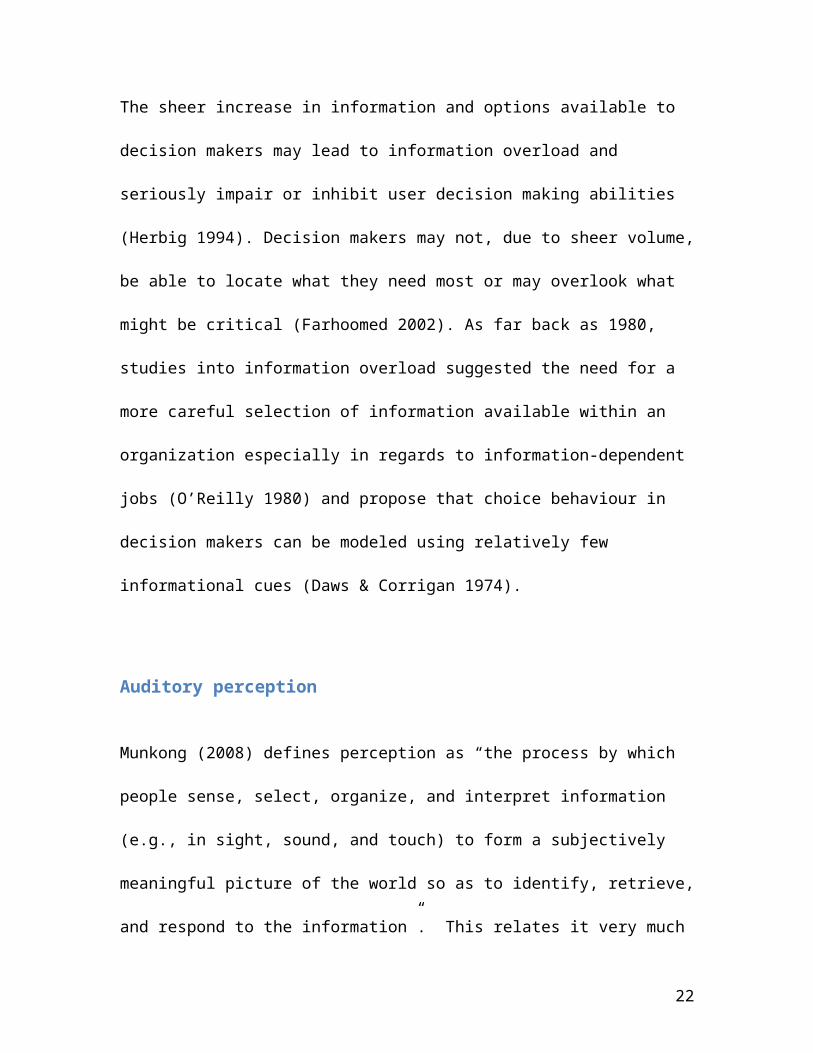
Supplying tools that allow the decisions to occur when they
are needed can improve the decision-making process. By
augmenting a visual dashboard with sound it is theorized
that the user’s attention will be drawn more quickly to
areas that need attention and that users can monitor trends
even when they are not actively looking at the interface
(see Figure 1 below).
24
Figure 1: Effect on Decision Making of Audible Interface
In order to explore and test this theory the use of design
science as a research tool is proposed.
In the following section of the paper design science is
defined and described as well as its use as a methodology to
outline the strategy for the creation of a prototype that
augments a visual display with a musical sonification of the
data.
25
Methodology
A design science methodology is followed in this project.
Using a design science approach allows the creation of an
artifact that is then used to explore and test the theory
that augmenting a visual interface with sound can improve
the decision-making process. The process of creating the
artifact, designing the functional requirements and then
being able to analyze the usability through user feedback
and reflection will allow conclusions that are meaningful
and based on a scientific approach to be drawn regarding the
research question. As there are few examples of dashboards
augmented by sound commonly used it would not make sense to
follow methodologies such as case study or survey. In the
future however, if this kind of dashboard becomes common,
those methodologies might prove useful in evaluating the use
of such a tool.
Merriam-Webster (2014) defines design as: “to plan and make
(something) for a specific use or purpose” and thus
26
inherently involves the creation of some new artifact.
Traditionally, professional schools such as architecture,
business, education and law were all primarily concerned
with the process of design (Simon 1996) and the fields of
computer science and engineering commonly use a variety of
different design methodologies. Design sciences, along with
natural sciences and human sciences, are considered one of
the major categories of the systematic study of knowledge
(Gregor 2009) and are concerned ‘‘not with how things are,
but with how they might be” (Simon 1996).
There has been increasing motivation in the field of
Information Systems since the early 2000s to return to a
methodology which allows the exploration of the IT behind IS
(Orlikowski and Iacono 2001). Hevner et al (2004) stated
that “the challenge for design-science researchers in IS is
to inform managers of the capabilities and impacts of the
new IT artifacts”.
Design science itself is knowledge, which takes the form of
27
constructs, techniques and methods for creating artifacts
satisfying a set of functional requirements. Therefore,
design science research is that which creates this knowledge
using the design of novel or innovative artifacts, analysis
of their use and performance and reflection and abstraction
in order to improve and understand information systems
behaviour (Vaishnavi 2012). Design science’s contribution to
research lies in its contribution to the understanding of a
phenomenon or set of behaviours that are interesting to the
research community (Gregor and Hevner 2013, Wilson 2002). It
is an important point to note that design science
researchers study not only the artifact and its impact, but
also the incremental process of its creation (Simon 1996).
The project follows the methodology set out by Vaishnavi
(2012) shown in figure 2 below which outlines a number of
process steps and their outputs and describes the flow of
knowledge related to these steps.
28

Figure 2: Vaishnavi’s Methodology
Step one involves the awareness of an interesting problem,
either directly from the field studies or from a reference
discipline. The description of this problem and suggested
criteria for its evaluation becomes part of the proposal for
new research that is considered the output of this process.
In this project it is suggested that information overload is
a barrier to decision making in organizations.
Step two, ‘suggestion’, follows from the proposal. This is
29
the fundamentally creative part in which an attempt is made
to solve the problem and in which new functionality is
envisioned based on a new configuration of existing or new
and existing elements to form a tentative design. In this
project it is suggested that the addition of a musical
sonification of the visual data displayed in a dashboard may
assist in decision making in organizations.
Step three is the development stage in which, depending on
the artifact to be produced, software development, languages
and tools may be used to further develop and implement the
tentative design arrived at in stage two. This project
creates a system dashboard that is enhanced by a musical
sonification of the data using elements such as a MySql
database, php as a programming language, javascript and the
Google Charts API for the visualization of the data and
tools such as Finale used to create the sonification of the
data.
Step four involves the evaluation following the suggested
30

criteria laid out in the awareness of problem phase. This
section will contain a sub section looking at the proposed
hypotheses and tentatively explaining any deviations from
expectations in the behaviour of the artifact.
The output of steps three and four contribute to knowledge
by generating an understanding of what didn’t work according
to the theory that could only have come from the act of
constructing the artifact.
The final step is the conclusion in which the results are
written up as knowledge gained, which might become the basis
for future research.
In the ‘build and evaluate’ cycle of the artifact’s
construction, outlined in steps three and four above, the
guidelines outlined by Hevner et al (2004) shown in table 1
below are applied:
31
Sonification ProcessTentative Design Suggestion
The usual approach to the representation of data as sound is
through parameter mapping. Data elements are mapped to
particular elements of sound such as pitch, duration, and
timbre. Besides allowing for ease of production, this
mapping allows for a more holistic, multivariate view of
32

these data as one can listen to many different dimensions at
the same time (Hermann & Ritter 1999).
The main purpose of the augmented dashboard is to provide
users with a single point for monitoring data to facilitate
decision making in regards to staffing needs and facilities
management in an organization. It also allows them a mixed
mode of monitoring through the application of sonification
to the visual interface. From the literature reviewed
several main features necessary to make such a system
successful have been identified.
First, the system must show information meaningful for
decision-making in a timely manner. This information should
be driven by data gathered from the actual use of the system
and updated on a regular basis. This information must be
shown by the use of a few key metrics in a simple visual
interface so as not to contribute to information overload.
33
Second, the system must apply domain knowledge to make sense
of the information gathered as vast amounts of data,
collected through the use of the system to achieve a
suitable level of granularity.
Third, the system should provide an alternate mode of
monitoring data through the use of an auditory
representation of the data portrayed so that users are
offered another modality of interaction with the system.
The conceptual framework (Figure 3) outlines the major
components and relationships inherent in the system. The
conceptual model includes three modules in a web-server
client environment. MySql databases, which are central to
all these modules, allow storage and persistence of data.
34
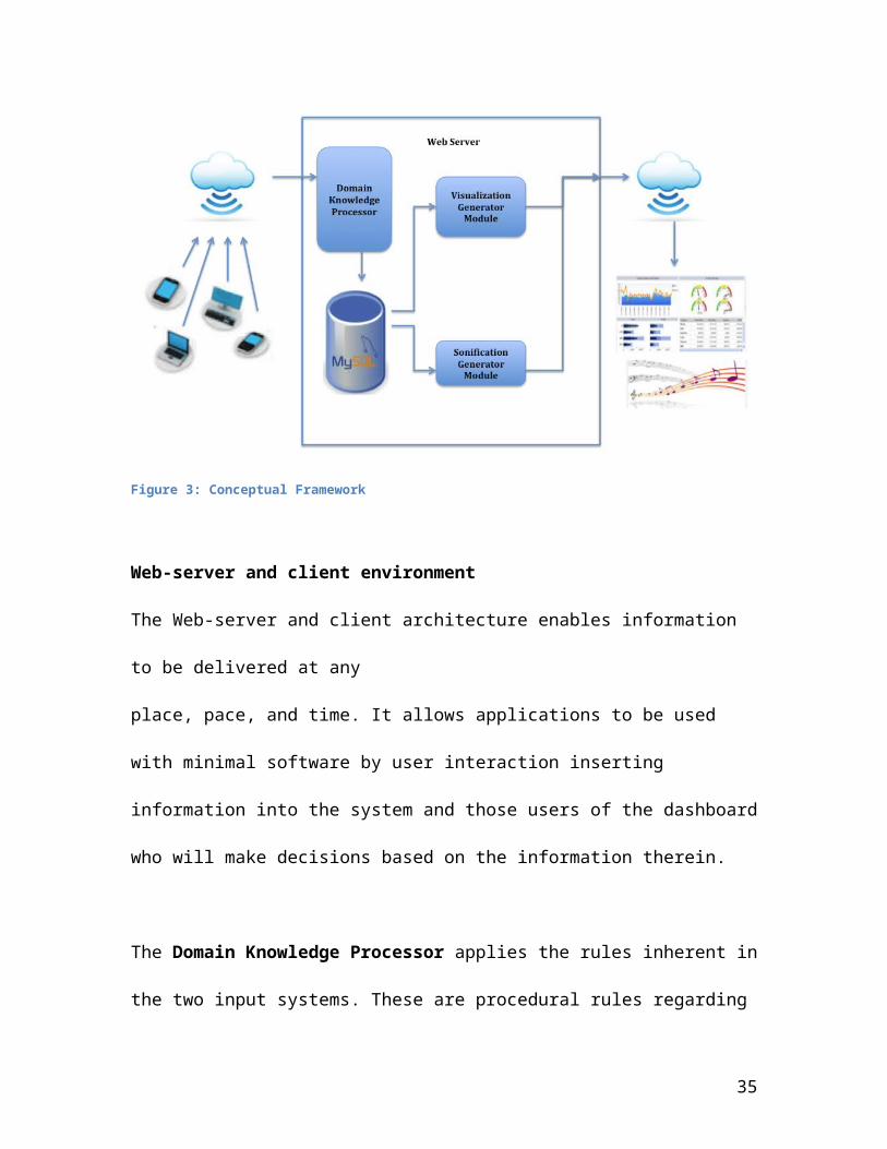
Figure 3: Conceptual Framework
Web-server and client environment
The Web-server and client architecture enables information
to be delivered at any
place, pace, and time. It allows applications to be used
with minimal software by user interaction inserting
information into the system and those users of the dashboard
who will make decisions based on the information therein.
The Domain Knowledge Processor applies the rules inherent in
the two input systems. These are procedural rules regarding
35
the system use such as: who can use the systems, what types
of information may be tracked and when the systems are
available for use. The data resulting from the application
of domain knowledge processing is then stored in the mySql
database.
The Visualization Generation module uses procedural rules
and tools to map the data collected by the system to
graphical output for the users visual interface.
The Sonification Generation module uses parameter mapping to
map data elements to musical parameters of timbre, pitch and
rhythm to produce a sonified representation of the visual
data.
As all components of databases, user interface,
visualization, and sonification need to be incorporated into
an automated web-based environment the comprehensive
conceptual framework is needed to assist with the building
of the sonified dashboard.
36
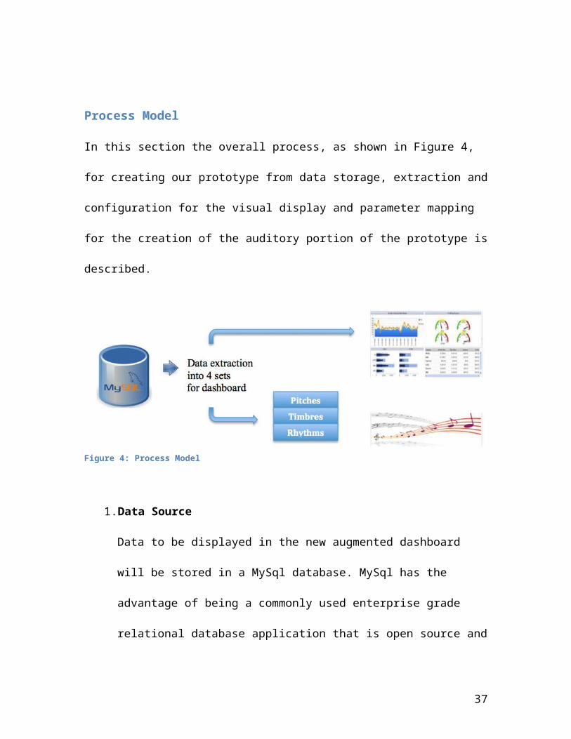
Process Model
In this section the overall process, as shown in Figure 4,
for creating our prototype from data storage, extraction and
configuration for the visual display and parameter mapping
for the creation of the auditory portion of the prototype is
described.
Figure 4: Process Model
1.Data Source
Data to be displayed in the new augmented dashboard
will be stored in a MySql database. MySql has the
advantage of being a commonly used enterprise grade
relational database application that is open source and
37
easily installed on a machine for testing and
development.
2. Extraction
The second step is the extraction of the data into the
four sets chosen to create the visual display on the
dashboard.
3. Configuration of output visual display
4. Mapping of the data parameters to elements of sound.
5. Creation of auditory portion of display.
Through the above process it is hoped that each of the three
following hypotheses will be demonstrated.
First, in order for this use of sound to improve decision-
making, it is important that its presence not be irritating
or annoying to users. An interface that produces sounds that
users consider unpleasant would simply be turned off
immediately and would, therefore, not assist in decision-
making. Therefore, the first hypothesis addresses the issue
38
of mapping data elements to elements of sound to create an
interface that users will not find unpleasant.
H1 Data elements may be mapped to elements of sound in
order to convey information to users through an audible
interface in such a way that it is pleasing to the
listener.
Second, to aid in decision-making, the information contained
in the visual dashboard must be able to be represented
audibly so that users’ attention is immediately drawn to a
change in the data. Because this is audible, users will be
able to monitor it while not actively looking at the
interface and so be alerted to changes that require a
decision. Therefore, the second hypothesis involves the
mapping of data to sound to create a meaningful audible
interface.
H2 Information represented in a dashboard may be
represented audibly so that a user can monitor it while
he or she is occupied with another task.
39
Finally, users must be able to understand the information
that they are receiving through the audible interface in
order that they can use that information for decision-
making. Therefore, the third hypothesis involves the need
for the audible information to reflect the data displayed by
the visual interface.
H3 The graphical information may be represented audibly
without a loss of richness.
Expected Results and Contribution
Following from the design science methodology previously
discussed, the first expected contribution of this project
is the discovery, development, and discussion of an
interesting research question. While research has shown that
visual dashboards can aid organizations in the tracking of
key indicators and bring critical events to attention more
quickly they are often criticized for trying to convey an
amount of information too complex for managers to understand
40

visually (Allio 2012). Drawing on research in auditory
perception and human information processing, it is suggested
that augmenting a visual dashboard with an auditory
representation of this information could allow the user’s
attention to be drawn more quickly to areas of sudden change
or interest. Therefore, the research question is, “how can
sonification improve managerial decision making in
organizations?” To this end a visual dashboard will be
created and augmented with a musical sonification of the
information to be conveyed realized through the process of
parameter mapping. A set of testing data for the project
will be created and stored in a MySql database that is
polled at intervals for updates simulating a managerial
dashboard. This data is then divided into the sections that
form the various visual displays appearing on the dashboard.
Each of the sections is mapped to both a visual display and
to musical sounds. Coincident to the visual display, the
musical auditory representation is rendered, creating a
musical sonification of the data and allowing information to
be monitored without direct attention being paid to the
41
dashboard. This will realize the second and fundamentally
creative part of the design science methodology in which an
attempt is made to solve the problem and in which new
functionality is envisioned based on a new configuration of
existing or new and existing elements to form a tentative
design. This stage will involve the development of software,
using high-level languages and tools to further develop and
implement the tentative design arrived at in stage two.
During the process of design, the three proposed hypotheses
will be assessed through analysis of the prototype’s use and
performance as well as through reflection and abstraction
helping to improve and understand information systems
behaviour (Vaishnavi 2012).
The contribution to research involves the summation of the
generated knowledge regarding what did and didn’t work
according to theory. That this knowledge could only have
come from the act of constructing the artifact is an
important part of the design science methodology and
42
contributes to the further understanding of a phenomenon
interesting to the research community.
Prototype Development
Overview
The context of this research is a large library at a
Canadian university. Decision-making in libraries has many
parallels to that in any other business. Questions of
facility management and staffing are equally relevant in
both contexts. For facilities such as study and meeting
rooms, usage must be managed so that there are enough
available to those requiring them while at the same time not
leaving rooms empty, taking needed space away from common
areas and collection space. Timely access to information is
also necessary for decisions surrounding issues of personnel
management. While there need to be enough staff available to
assist library users with questions, fiscal restraint
mandates that this number be kept to an optimal minimum so
that budget monies may be spent wisely. These decisions must
43
be supported by usage data collected by the library through
applications designed to administrate such systems as room
booking and reference statistics tracking. Being able to
gauge the usage of study rooms booked by students, staff and
faculty in a timely manner would allow library
administration to make decisions regarding facility
management in a more agile way and utilize available
resources more efficiently. Understanding what the areas and
times are where rooms are either in short supply or sitting
empty could allow for a more flexible allocation of those
facilities. Having this information displayed clearly in a
single location would aid decision-makers, allowing them to
base decisions on concrete data and trends. Similarly, being
able to assess the relative busyness of the reference desks
in the individual library units will allow more flexible
decision making regarding staffing. By showing usage and
trends in a library dashboard administration can access and
monitor metrics through a single dynamic point to instead of
relying on static data collected through surveys and annual
reports. The application of sonification as an augmentation
44
to the visual dashboard developed may allow the monitoring
of information without the requirement of having users
attention focused on the visual display thus improving the
process of managerial decision making. The artifact being
developed is a visual dashboard showing room booking
statistics in the various library units as well as data
received from the library unit’s reference desks (decision
regarding choice of key indicators for dashboard made: April
27, 2014), augmented by the sonification of the data
elements involved.
The next section of this paper reflects the process of
developing the prototype dashboard. This process took place
during the period April 25, 2014 to June 25, 2014 using
library data gathered through two applications for the
period of September, 2013 to March, 2014. The requirements
are outlined and a detailed description of each stage of
development including each of the decisions made and their
rationale, as well as issues and challenges encountered
during the development cycle and the ways in which these
45
issues were resolved is elucidated. Finally there is
discussion of the process of obtaining user feedback
regarding the finished prototype and the results of the
testing are presented.
Requirements
To avoid information overload, the data displayed must be
meaningful and useful to the dashboard’s users. The display
should show the booking status of the rooms in the various
library units as a percentage of the rooms in that unit that
are booked at the present time. It should also show the
historical data for the units so that this information may
help in future facility planning. This information must be
shown in a way that users can understand at a glance.
The dashboard was developed on a MacBookPro running Mac OSX
version 10.6.8. with a 2.4 GHZ InterCore i5 processor and 4
GB 1067MHz DDR3 memory. (decision regarding development
environment made April 27, 2014). While there are many
environments available for development of the dashboard this
46
was chosen for several reasons. First, the library
environment for which this is being developed is compatible
with this architecture so there will be little or no
adaptation required to change from a testing into a
production environment. Secondly, this is a familiar
environment for myself as developer to work in and so allows
a quicker set-up time for the development process.
Development of the Visual Interface
Room Booking Data
Room Booking Dials
To assist in decision making for facilities management, the
first of the key indicators chosen for display on the visual
dashboard is the usage of study and meeting rooms in the
various library units. Data for this section of the
application was harvested from the Queen’s University
Library’s webrmbk (roombooking application) database on
April 16, 2014. This is the only source of information
regarding the use of the study and meeting rooms and
47
comprises data dating back several years since the
application’s development and forward into the 2014-2015
academic year. On the same date, the decision was made not
to bring over data identifying users as this information is
not necessary for the dashboard’s interface and could create
an unnecessary security risk.
Because of the choice made that the development environment
be as similar to the actual production environment as
possible, harvested data was stored in a mySql database in
the webserver’s documents directory on the MacBookPro using
phpMyAdmin as the administration interface for database
development.
The database webrmbk was created with three tables: sections,
rooms, and booked. Data for the sections table is identical to
that in the library database and contains records for the
individual library units storing the units’ names and IDs.
Data for the rooms table is also identical to that in the
library database housing the roomID, number, sectionID (library
48
location of the room), capacity, features, and a flag indicating
if the rooms had been blocked from use. The data in the
booked table was taken from the library’s booked_archive table
and contains booking data from January 6, 2014 to April
16th, 2014 (the data of harvesting). This date range was
chosen as it is large enough to show usage statistics over
half of the university year and sufficient for the purpose
of the prototype dashboard. This data represents just over
13,000 records containing the information regarding room
bookings that started and ended during that time period. It
contains the userID, roomID, start and end times of the actual
booking, description of room use and the time the booking
was made. This data was chosen because it allows the
information about room usage and trends to be drawn from the
contents of the tables in the development environment for a
large enough time period to show its usefulness for decision
making.
An interface was developed using HTML as the display markup
language, php (version 4) as the dynamic programming
49

language for querying the database and bringing back
information and javascript to query the Google Chart Tools
API used to display the dials and graphs. HTML is the most
commonly used language to convey information over the web
and both it, php and Javascript are used in the library’s
production environment so the transition from development to
production implementation would be an easy one.
In keeping with the general design elements commonly found
in dashboards a combination of several visual displays were
considered. Dials provide an easy ‘at-a-glance’ view of data
and are the logical choice for the display of present room
usage. Graphic displays such as thermometer style
temperature gauges were considered but, as Google Chart
Tools offer an easy implementation of the dial gauges, dials
were chosen as the display mode used to indicate the
percentage of rooms that are presently being used in each
library. No dial will be shown for location that have no
rooms available for booking (as in the case of the Education
50
building) as it would be misleading to suggest that there
could be usage statistics.
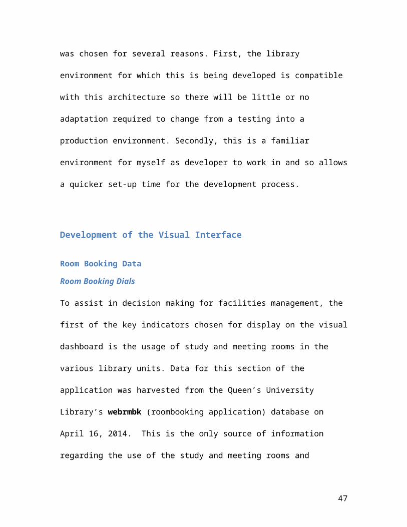
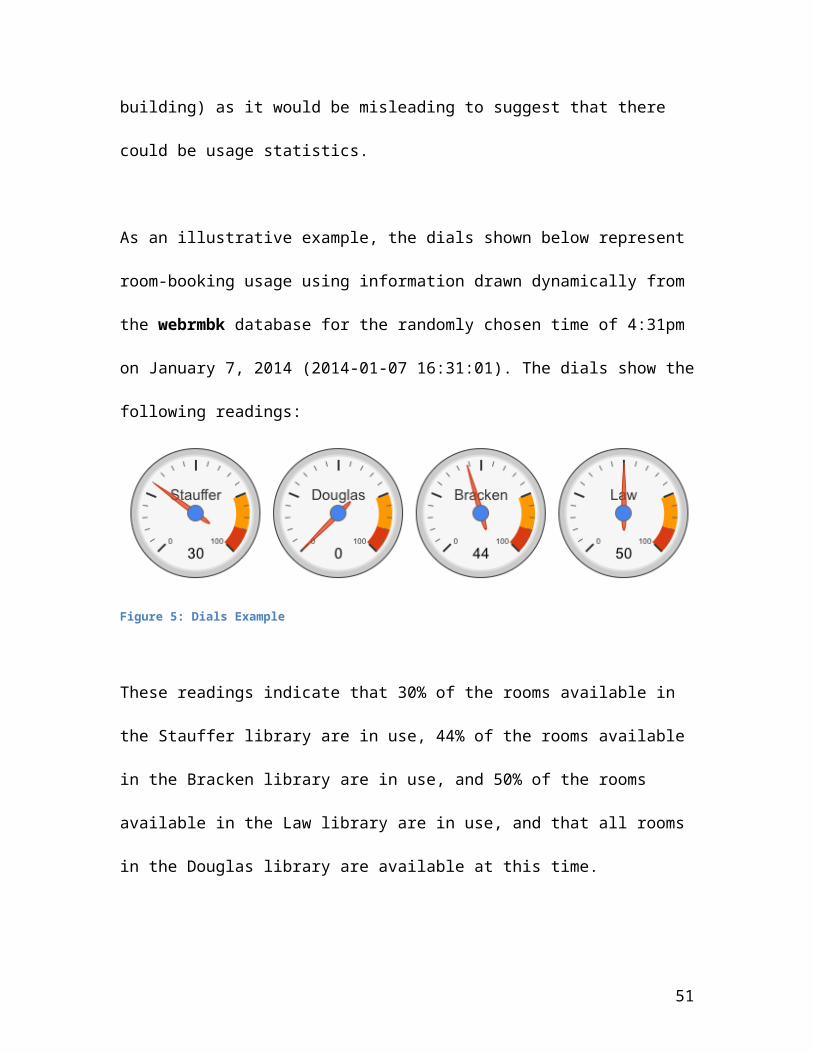
As an illustrative example, the dials shown below represent
room-booking usage using information drawn dynamically from
the webrmbk database for the randomly chosen time of 4:31pm
on January 7, 2014 (2014-01-07 16:31:01). The dials show the
following readings:
Figure 5: Dials Example
These readings indicate that 30% of the rooms available in
the Stauffer library are in use, 44% of the rooms available
in the Bracken library are in use, and 50% of the rooms
available in the Law library are in use, and that all rooms
in the Douglas library are available at this time.
51
Timely access to information like this could allow
administrators to open up more rooms for booking or put
underused rooms to other uses. Without a dynamic system such
as a dashboard monitoring this information, it is more
difficult to make decisions regarding facilities usage in a
timely, responsive fashion.
Room Usage Trends Over Time
While it is important to see current usage data for
decision-making purposes, being able to see trends over time
is also helpful. A view of data that shows peak usage
periods as well as periods where there was relatively little
activity is useful in making decisions regarding facilities
management. In periods where it can be seen that there is
historically little usage, rooms may be opened up for use by
a broader population and in periods of traditionally high
usage a different allocation strategy might be chosen or
additional rooms made available. If trends show a steadily
declining or growing direction in room usage over time then
52
decisions regarding future facilities management may be made
with the assurance that they are based on current data.
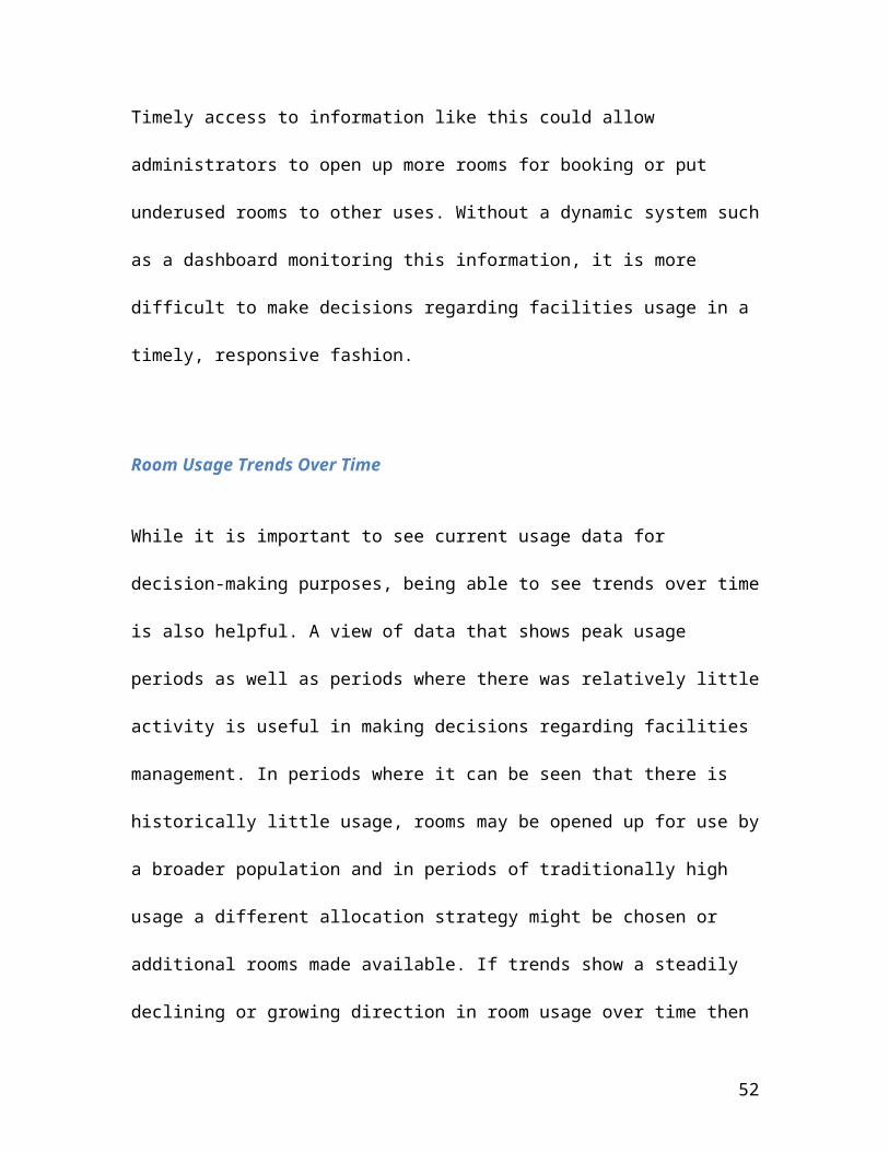
Visually representing trends over time may be done by using
any of a variety of graphing tools. Column charts, bar
charts and line charts all allow the visualization of data
belonging to multiple groups. When relatively small changes
exist, line graphs are preferable to column and bar graphs
because they allow a more obvious comparison between
different groups. As one can see from the examples below
(using made up data), the line chart allows the user to see
trends for the individual groups more easily then does the
bar chart.
53

Figure 6 Column Chart showing bookings
Figure 7 Line Chart showing bookings
Therefore the decision was made on May 12, 2014 to portray
the library’s room usage over a period of several months
using a line graph. The development database contains data
from January 1, 2014 to April 5, 2014 so, for the purposes
of the dashboard development, showing room usage data in the
various libraries over time, the percentage of total hours
that the rooms were booked in each unit each month in
relation to the percentage of hours the library was open in
that period is shown. It is also possible to show this data
in more finely grained detail and create a graph showing the
usage on a bi-weekly basis instead of monthly, however the
54

change in code required to accommodate this implementation
is negligible so the prototype was developed using the
monthly model.
It was relatively straightforward to calculate the number of
hours that rooms were booked in the individual library units
using many of the same functions previously used to show the
percentage of rooms booked related to the total rooms
available. There was an unforeseen problem, however, when it
came time to calculate the number of hours that each library
was open in that same period. This data had not initially
been imported into the database and the library hours
traditionally had been represented as static html pages
manually updated on the library website. Fortunately, the
library, in the fall of 2013, had implemented a new system
for storing and displaying hours on its website and this new
system stored library hours information in a database on the
library server. Therefore the decision was made, on May 13,
2014, to import the additional hours information from the
library’s database into the development webrmbk database.
55
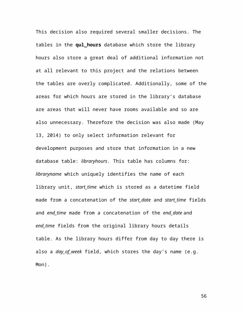
This decision also required several smaller decisions. The
tables in the qul_hours database which store the library
hours also store a great deal of additional information not
at all relevant to this project and the relations between
the tables are overly complicated. Additionally, some of the
areas for which hours are stored in the library’s database
are areas that will never have rooms available and so are
also unnecessary. Therefore the decision was also made (May
13, 2014) to only select information relevant for
development purposes and store that information in a new
database table: libraryhours. This table has columns for:
libraryname which uniquely identifies the name of each
library unit, start_time which is stored as a datetime field
made from a concatenation of the start_date and start_time fields
and end_time made from a concatenation of the end_date and
end_time fields from the original library hours details
table. As the library hours differ from day to day there is
also a day_of_week field, which stores the day’s name (e.g.
Mon).
56

There are, of course, implications in creating a new table
rather than importing the entire qul_hours database. If the
library adopts the application, changes will have to be made
in order to work with the more complicated table structure
presently in place for the library hours. That said, there
is a move underway to simplify that structure and the
changes may have to be made in any case. To mitigate
concerns over implementation, the sql written to harvest the
data has been preserved so that it may create a view of the
library data that the rest of the dashboard application can
draw on.
Using the new libraryhours table and searching for the hours
that the law library is open between January 1, 2014 and
January 31, 2014 one finds that the library was open for a
total of 376 hours. Of this total number of hours, one
finds from the webrmbk database that the law library
reported 133 hours of booked time. This indicates that, of
the total hours that the Law library has rooms available in
57
the month of January, those rooms were booked 35% of that
time.
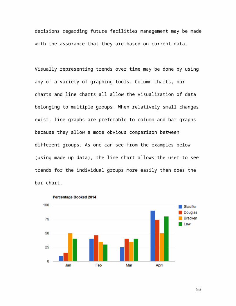
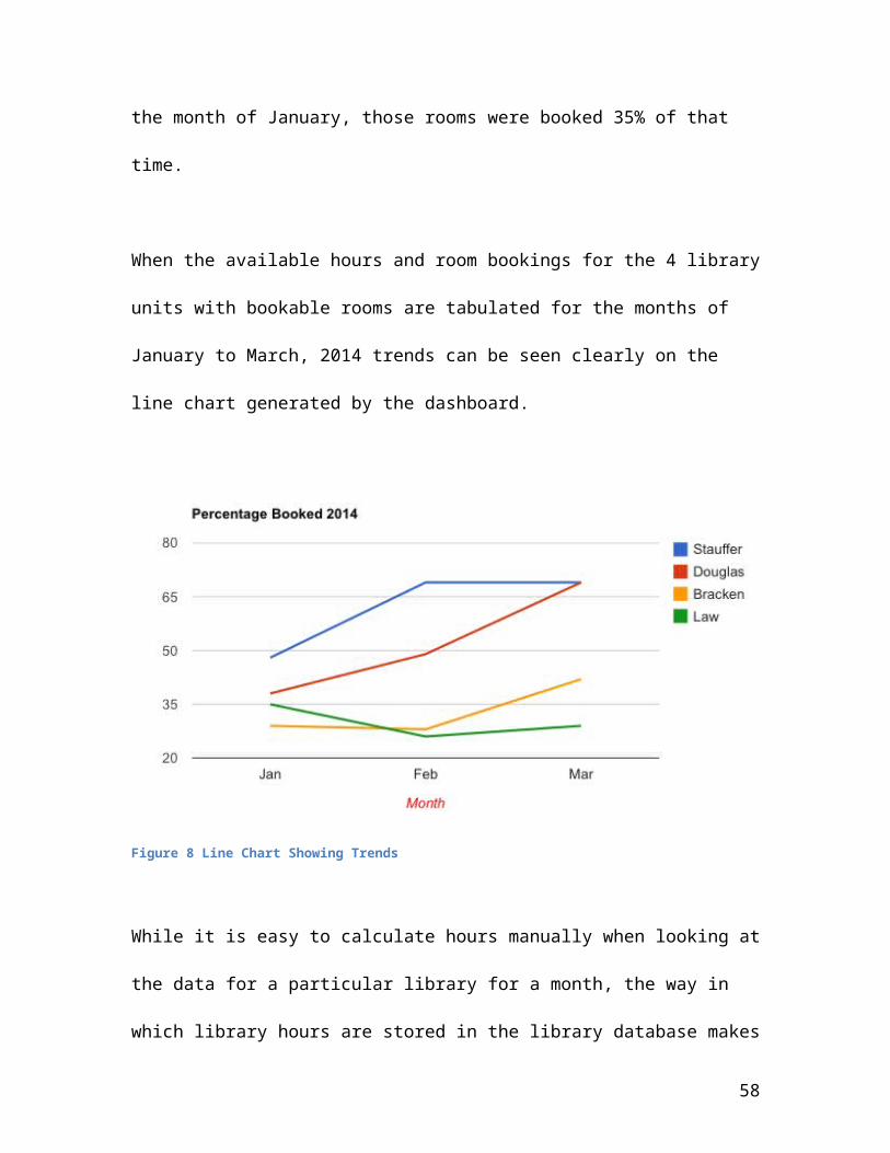
When the available hours and room bookings for the 4 library
units with bookable rooms are tabulated for the months of
January to March, 2014 trends can be seen clearly on the
line chart generated by the dashboard.
Figure 8 Line Chart Showing Trends
While it is easy to calculate hours manually when looking at
the data for a particular library for a month, the way in
which library hours are stored in the library database makes
58
automatic calculation far more difficult. Library employees
from the individual units enter the data themselves and
there is both a wide variation in the way in which the hours
are entered and a high degree of error in the data that
exists within the database. This became apparent when
attempting to extract library hours programmatically for the
various units. The original plan was to find the regular
hours for a month and then subtract hours for days such as
holidays, which were exceptions and, had the data conformed
to the format intended by the application, this should have
worked perfectly. The high degree of error and variation
however existing in the database meant that a different plan
was required to extract the data.
Therefore the decision was made on May 20th, 2014 to rewrite
the existing extraction program. Instead of calculating
regular hours and subtracting exceptions the hours for each
day of the month for each unit were calculated, adding them
together to calculate a monthly total.
59
Library Reference Statistics
Overview
While access to trends and timely information regarding room
booking metrics is important for making decisions regarding
facilities management and allocation, access to information
representing reference inquiries is also vital for decisions
that pertain to issues of staffing. Staff time and
availability are important concerns when making up schedules
and, while it is important to have staff members available
to answer reference inquiries, care must be taken that staff
time is not wasted and that staff also have sufficient time
in their working day to complete the other work associated
with their positions.
The library tracks reference statistics using a customized
version of an open-source program, libstats, obtained from
the internet (https://code.google.com/p/libstats/ )
written in php using a MySQL database. This makes it a
perfect fit for the dashboard application. While the
60
existing refstats application only allows the manual
creation of reports on a monthly/yearly basis, the dashboard
will provide library administrators with the ability to see,
at a glance, the breakdown of user types, reference question
types and relative busyness of the various library units as
well as trends in the quantity and type of reference
questions across the library units over time.
Development
As was done in the case of the roombooking statistics
portion of the dashboard, data for this section of the
application was harvested from the Queen’s University
Library’s database, using the tables from the refstats
(reference statistics tracking application) database. This
is the only source of information regarding reference
inquiries across the various units of the library and
comprises data dating back several years since the
application’s development to the present. On May 23, 2014,
the decision was made to bring over the entire reference
statistics database as it contains no information which
61
could be a security concern for the library and the
structure and data of the existing application which is
stable and robust and will, most likely, continue to be used
in its present state for the foreseeable future which means
that a live implementation of the developed dashboard with
the existing application would be an easy one. Because of
the choice that the development environment be as similar to
the actual production environment as possible, harvested
data was again stored in a mySql database in the webserver’s
documents directory on the MacBookPro using phpMyAdmin as
the administration interface for database development.
The refstats database contains 16 tables, each pertaining to
an aspect of reference statistics. The tables which will be
used to generate the data required for the visual dashboard
are stored in 7 of the existing 16 tables in the database
so, for interests of space and applicability the only tables
described are the ones actually pertinent to the dashboard
side of the application. The most basic table is libraries
62
which lists the various libraries and contains an id, a full
name for the library
Example: ‘Bracken Health Sciences Library’
and a short name for the library
Example: ‘Bracken’
The locations table represents sub-locations within the
various libraries
Example: Reference desk within Stauffer Library
and contains an id field, a location name and description.
The patron_types table contains information describing the
four types of patrons using the reference facilities and
contains an id field, the patron_type
i.e. Student, Fac/Staff, Community and ‘n/a’
and a textual description field. There are two tables
pertaining to the types of questions asked, a question_types
table which again has a field for the id as well as fields
for the question_type
example : ‘Basic’ or ‘Facilitative’
a textual description field
example: “A request for factual information or a request for substantive
63
information on a single subject which can be easily and quickly provided”)
and a textual field examples
example
(a) Giving assistance with the library catalogue (how to find a
book title, journal title).
(b) Giving factual information from the use of reference
(c) Giving simple instruction in using QCAT, journal indexes and
other electronic resources)
The question_format table contains fields for question_format_id,
question_format
Examples: In-person, Phone, Email and IM/Chat
And a textual field description
Examples: A person asks for help in person
There is also a table time_spent_options which contains a field
for the time_spent_id, and the field time_spent which is the
description for the different time options for reference
questions
Examples: 0-9 minutes, 10+ minutes, ‘n/a’
The questions table contains the actual data gathered through
the application. It has a question_id field, a library_id field
64

which connects it to the libraries table, a location_id field
which connects it to the locations table, a question_type_id
field which connects it to the question_types table, a
timespent_id field which connects it to the time_spent table, a
patron_type_id field which connects it to the patron_types table,
a question_format_id field which connects it to the
question_format table, a question_date field which tracks the
date and time of the question, a client_ip field which tracks
the ip of the user, question and answer fields (sporadically
populated) for the optional tracking of questions asked and
their answers and a date_added field which tracks the date
and time an entry was made.
Reference Category Visualization
There are several visualization possibilities available to
show the breakdown of user types, reference question types
and relative busyness of the various library units. While
data can be displayed in a tabular format, this might
increase the cognitive load of the user by requiring him/her
65
to distinguish the different elements. Cognitive load may be
decreased through the use of a familiar visualization method
such as a pie chart. A pie chart is a circular graph showing
the relative contribution that different categories
contribute to an overall total amount. Each wedge of the
circle represents one category’s contribution, making the
graph resemble a pie that has been cut into different sized
slices. Every 1% contribution that a category contributes to
the total corresponds to a slice with an angle of 3.6
degrees. Pie charts are generally used to depict percentage
or proportional data and show the percentage represented by
each category next to the corresponding slice. They are
considered best for displaying data for a relatively small
number of categories as this makes it easier for the eye to
distinguish between the relative sizes of the different
sectors. With this in mind, the decision was made on May
24th, 2014 to show the breakdown of user types, reference
question types and relative busyness of the various library
units over a given period of time using pie charts.
66
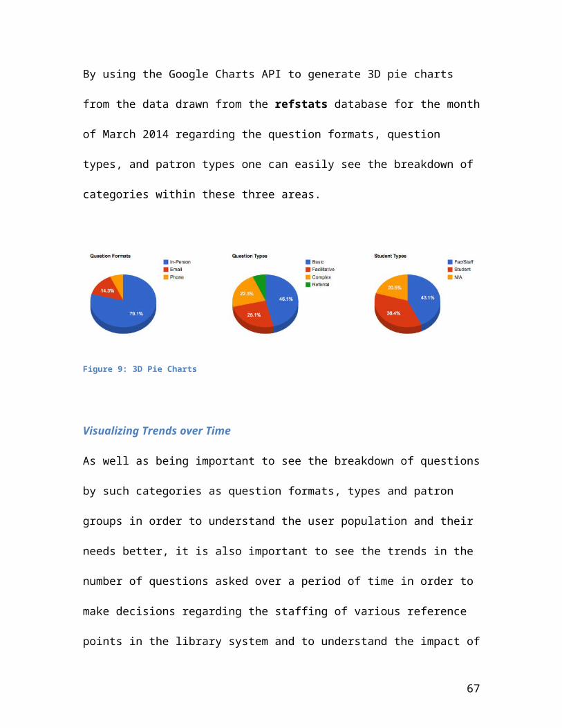
By using the Google Charts API to generate 3D pie charts
from the data drawn from the refstats database for the month
of March 2014 regarding the question formats, question
types, and patron types one can easily see the breakdown of
categories within these three areas.
Figure 9: 3D Pie Charts
Visualizing Trends over Time
As well as being important to see the breakdown of questions
by such categories as question formats, types and patron
groups in order to understand the user population and their
needs better, it is also important to see the trends in the
number of questions asked over a period of time in order to
make decisions regarding the staffing of various reference
points in the library system and to understand the impact of
67

such affiliations as the Queen’s Learning Commons and the
Teacher Resource center on the relative busyness of library
facilities.
Again, the choice of a line chart provides the most useful
way of representing the variation in numbers of questions
asked over a period of time so the decision was made, on May
27th, 2014, to use a line chart to represent trends in the
numbers of questions asked over the preceding six months.
Visual Screen Layout
68
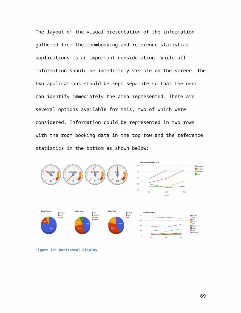
The layout of the visual presentation of the information
gathered from the roombooking and reference statistics
applications is an important consideration. While all
information should be immedistely visible on the screen, the
two applications should be kept separate so that the user
can identify immediately the area represented. There are
several options available for this, two of which were
considered. Information could be represented in two rows
with the room booking data in the top row and the reference
statistics in the bottom as shown below:
Figure 10: Horizontal Display
69
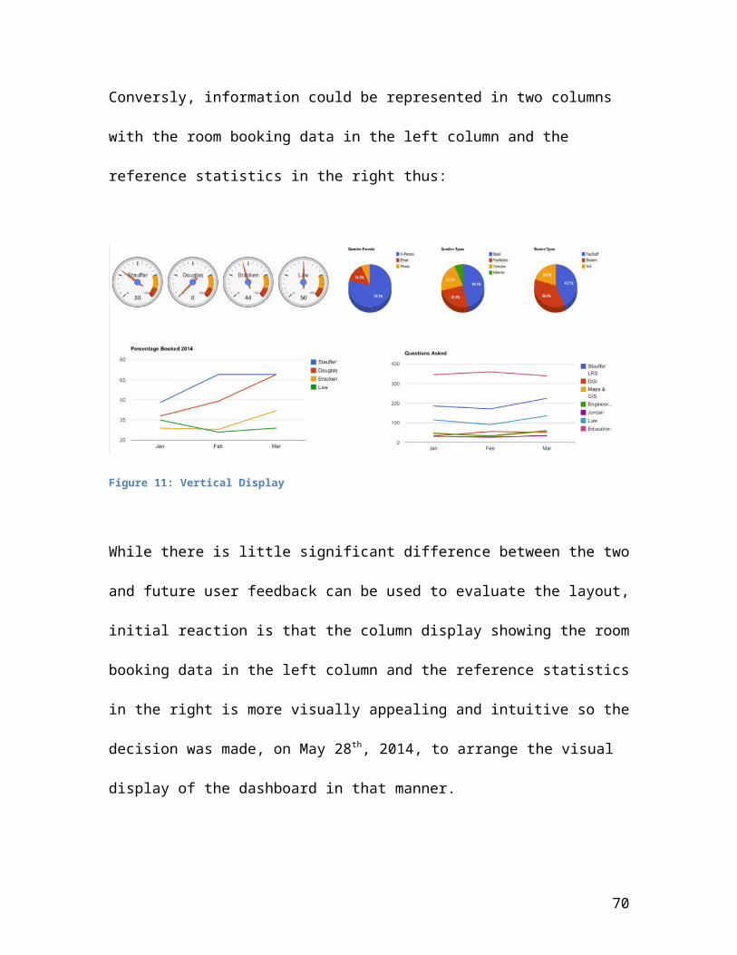
Conversly, information could be represented in two columns
with the room booking data in the left column and the
reference statistics in the right thus:
Figure 11: Vertical Display
While there is little significant difference between the two
and future user feedback can be used to evaluate the layout,
initial reaction is that the column display showing the room
booking data in the left column and the reference statistics
in the right is more visually appealing and intuitive so the
decision was made, on May 28th, 2014, to arrange the visual
display of the dashboard in that manner.
70
Development of the Audible Interface - Sonification
The next stage in the development of the dashboard involves
the mapping of the data elements gathered for the visual
display described in the preceeding sections to elements of
sound in order to create a ‘sonified’ version of the visual
display. In order that the sound interface is as clear to
the user as the visual one, a equal amount of care must be
taken in the choice of sounds and their arrangement
musically as was done in the choice of graph types and their
physical arrangement on the screen.
Just as one cannot see every data element simultaneously and
differentiate between them, one also cannot hear every data
element simultaneously and gather meaningful information.
Therefore the decision was made, on May 29th, 2014, to
convey the sounds associated with the two applications in a
linear manner such that the sonification of the roombooking
data will occur first, followed by that of the reference
statistics. The two sections will then cycle, first one and
71
then the other. So that the user will be able to tell which
one he or she is hearing at the moment, they will be further
differentiated by each having a unique rhythmic background.
It is also important that the sounds heard by the listener
not be annoying or irritating as this would most likely
cause the listener to turn off the sonification portion of
the interface and, thus, render it useless. The challenge
posed by this is to create a sonification of the data and
augment the visual interface while using a rhythmic
background to differentiate the portions of the data
presented audibly to the listener while not creating an
atmosphere that is distractingly noisy. The Canadian
television weather network provides us with an example of
the use of repetitious background music behind a purely
visual depiction of the weather forecast. While their music
is not meant to convey any information, it does provide a
constantly repeating set of sounds, which seem not to be
found irritating or annoying.
72
Background Rhythms – Differentiating the Two Data Sets
Therefore on June 1, 2014 the decision was made to follow
their lead using two sets of mild background drumbeats which
would then repeat during the sonification of the data from
each section of the visual interface. Because Finale, a
music editing program, will be used to create the sample
auditory interface files and it allows the easy importing of
sound files stored as .mid (midi files), the midi format was
chosen on June 1, 2014 as that desired for the background
music themes. Finale was chosen as the music creation and
editing platform because of the familiarity in its use as a
music notation tool.
The midi loops used were downloaded from the Midi Drum Files
website (http://mididrumfiles.com/free-samples/) on June 2,
2014 and consists of Latin34time1.mid and Jazz12.mid. The
background percussion loop chosen for the room booking
statistics is Latin34time1.mid and that for the reference
statistics is Jazz12.mid. The rationale behind the choices
is completely based on musical discretion and estimation of
73
them being rhythms that a listener could easily tell apart
but would not find annoying to hear repeated. To create
additional sonifications or augment the interface to allow
the user to personalize the style nature sounds or loops of
other musical styles could also be provided in future
development. For the purposes of this project the decision
was made to use the two loops as background for the two
applications providing statistics to the dashboard. These
two loops were clipped using MidiEditor (downloaded from
midieditor.sourceforge.net on June 2, 2014) so that they would
each produce an 8 bar section that could then repeat as
desired. The edited midis were imported into two new
Finale .mus documents. The document room booking contains
the sonification for the portions of the display
representing room booking statistics and the document refstats
contains the sonification for the portions of the display
representing reference statistics.
Sonification of Room Booking Statistics
Sonification of the Dials
74
With the background music chosen and the Finale files set up
the next step was to create a sonification of the portion of
the visual display represented by the dials showing the
percentage of rooms booked in each library at a particular
date and time. Because the dials show a percentage it was
decided on June 3, 2014 that this information could be
conveyed audibly to a user by first playing a tone and then
a tone that was the same (to convey 100%) or a lower tone to
convey a lower percentage. The concept of an octave is a
common one in western music, indicating the interval between
one musical pitch and another with half or double its
frequency. This musical distance, again in western music,
may be divided into a series of tones or semi-tones with 12
semitones in an octave. While this does not divide perfectly
into one hundred, a portion of a semi-tone can be rounded to
the nearest semi-tone and thought of as roughly 10% of an
octave. If the amount of one hundred percent (all rooms
booked) is represented as the note C1 above ‘middle C’ and
the amount of zero percent (no rooms booked) as the note
‘middle C’ then a sonic representation of the percentage of
75

rooms booked can be created. Therefore the decision was made
on June 3, 2014 to represent the percentage of rooms booked
in this manner. Several additional considerations also
exist. The user should know what the ‘comparison note’ (100
percent or C1) is prior to hearing the note representing the
percentage actually booked. The easiest way to do this is to
play that ‘comparison note’ prior to playing the data value
note. The user must also know which is the ‘comparison note’
so that he/she can differentiate between the reference point
and the data value note. Finally, listeners must be able to
differentiate between the notes representing the reference
tone and libraries so that they can tell which data values
they are hearing. Therefore, the decision was made to map
the reference tone to a bell playing the note C1 and the
libraries to unique instrument timbres. As there are four
distinct libraries, the decision was made on June 3, 2014 to
map them to individual woodwind timbres: Stauffer to Flute,
Douglas to Clarinet, Bracken to Oboe and Law to Bassoon.
76
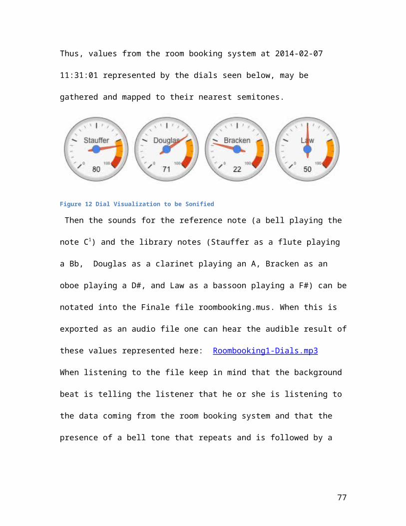
Thus, values from the room booking system at 2014-02-07
11:31:01 represented by the dials seen below, may be
gathered and mapped to their nearest semitones.
Figure 12 Dial Visualization to be Sonified
Then the sounds for the reference note (a bell playing the
note C1) and the library notes (Stauffer as a flute playing
a Bb, Douglas as a clarinet playing an A, Bracken as an
oboe playing a D#, and Law as a bassoon playing a F#) can be
notated into the Finale file roombooking.mus. When this is
exported as an audio file one can hear the audible result of
these values represented here: Roombooking1-Dials.mp3
When listening to the file keep in mind that the background
beat is telling the listener that he or she is listening to
the data coming from the room booking system and that the
presence of a bell tone that repeats and is followed by a
77
note played on an instrument is representing the percentage
of rooms in use at a particular unit.
Sonification of Room Usage Over Time
Using the same background music, which represents the
portion of data from the room booking application, for the
audible representation of the data showing the patterns of
room usage over time is a logical choice since the listener
will be expecting any patterns of sound which occur over one
of the two basic rhythms to emulate the data from that
application. Thus, on June 9th, 2014, it was decided that
the midi background ‘Latin34time1.mid’ would continue
playing in the sonified interface as the portrayal of the
library’s room usage over a period of several months. This
was visualized for the dashboard using a line graph and the
sonification uses the same input data now mapped to musical
sounds to show trends in the individual libraries. While it
would be possible to show these trends together, mapping the
library units to the same instruments used for the audible
representation of the dials, and having those instruments
play their parts coincidently, we felt that, while this
78

might sound pleasing to the listener, some information might
be lost by their juxtaposition. Thus on June 9th, 2014 it
was decided that, while the same data would be used as was
in the visual interface, and the same instruments (Stauffer
as a flute, Douglas as a clarinet, Bracken as an oboe, and
Law as a bassoon) would be used to represent the library
units as were used in the creation of the sonification of
the dials showing percentage of rooms booked in each unit,
the data would be conveyed audibly one instrument at a time
rather than all together. In this way a user who recognizes
the instrument playing will have no trouble understanding
that the data represents that individual library and by
recognizing the background rhythm that this data comes from
the room booking system.
Audibly representing trends over time can be done in a
straightforward manner by mapping the time period to a beat
or bar number with each consecutive time period representing
a new beat or a new bar. This required another musical
decision that was made by trying several different options
79
and then judging which best conveyed the information from
the system in a musically pleasing manner. Additionally, the
data values representing the actual percentage of rooms
booked were represented along this timeline by mapping them
to higher pitches representing higher values and lower
pitches representing lower values. Because pitch values for
values representing 100 percent and 0 percent were already
chosen, the decision was made on June 9, 2014, that those
values would be used in the audible representation of the
line chart showing percentage of rooms booked over several
months. Thus the development continued with the premise
that the percentage of rooms booked will be mapped to the
percentage of the 12 semitones of the octave between middle
C and C1, the C above middle C. While this does not divide
perfectly and in order to use musical notation to represent
these values, partial values were again rounded to the
nearest semi-tone. While the numbers are no longer exact
they still serve to show trends over time audibly to the
listener.
80
Therefore, using the values for percentage of bookings for
the Douglas library from January to the end of March 2014,
the following values and notes were derived: January showed
38% of rooms booked which maps to an F, February shows 49%
of rooms booked and maps to an F# and March shows 69% of
rooms booked and maps to a G#. The resulting rising tones
played by the clarinet (representing Douglas library) show
an increase in the percentage of rooms booked. After trying
options using longer note values to represent the time
period it was found that the longer values made it more
difficult to see the trend of the data values. Therefore,
the decision was made June 10, 2014 to show each note as a
quarter note value to represent the timeline so the first
quarter note would represent January, the second, February
and the third, March. Following this plan, the resulting
sounds representing the line chart showing the percentage of
rooms booked in each library can be heard here:
Roombooking2-lineChart.mp3
81
In order for the user to be cued that the audible data is
moving from one section of the interface to another, the
decision was made, on June 10, 2014, to separate the two
with two bars of the plain rhythmic pattern before beginning
the next section. Thus the entire sonified portion of the
room booking display can be represented to the user thus:
Roombooking-combined.mp3
An Alternate Option – varying the instrument family
It is conceivable that a user, unfamiliar with the unique
sounds of the individual instruments in the woodwind family,
might have some difficulty knowing which is which and being
able to tell what instrument he or she should be listening
to for each library unit. Thus the decision was made on,
June 11th, 2014, to create another sonification similar to
the first two representing the room booking statistics that
uses the sounds of instruments from different families.
This should allow user tests to be conducted to see if users
can differentiate between instruments of different families
more easily than they can between members of the same
82
instrument family (in this case, the woodwind family). This
sonification continues to use the same rhythmic background
as the previous two and continues to use a bell as the
reference note and map the same values to pitches. The only
variable manipulated in this sonification was the instrument
sounds used. Previously, the instruments were: flute for
Stauffer, clarinet for Douglas, oboe for Bracken and bassoon
for Law. In the second sonification, flute for Stauffer,
French horn for Douglas, cello for Bracken, and piano for
Law were used. The new sonification representing the
percentage of rooms booked in each individual library at a
fixed time can be heard here: Roombooking1-Dials-son2.mp3
and the sonification representing the percentage of rooms
booked in each individual library over a period of several
months can be heard here: Roombooking2-lineChart-son2.mp3.
The combined file representing the second sonification
option for the room booking statistics can be heard here:
Roombooking-combined-son2.mp3 .
83
It was felt that it would be interesting, when obtaining
user feedback on the interface, to see if there is a
preference between the two sonification options or an
impression that one is more usable than the other. It would
also be interesting and valuable for future exploration and
development to see if there are differences in training time
between the two options and if there might be differences
between the impressions of sighted users and those visually
challenged. It is possible that the visually challenged user
will be more sensitive to differences in timbre and pitch
though practical experience and will take less time to
become attuned to the auditory portion of the interface.
Sonification of Reference Statistics
Creating the sonification for the reference statistics
portion of the visual display called for some new
considerations. First, the user/listener must be immediately
aware immediately that he/she is hearing something different
– that is the data from the reference statistics application
instead of that of the room booking application. This was
84

done, as described earlier, by changing the underlying
rhythm of the section. For the reference statistics section
the Jazz12.mid sound was used as the background rhythm. Thus
users should immediately know they are hearing data from a
new application.
Following the basic method used for the development of the
sonification of the line graph representing the percentage
of rooms booked over several months several of the
parameters in the previous sonification of the graph
representing the numbers of reference questions asked in the
various units over a six month period could be used. There
are differences between these two graphs however, so some
additional considerations needed to be kept in mind. First
and foremost, the data values in the reference statistics
graph do not represent a percentage, as did those from room
bookings. Rather they measure the number of questions asked.
These numbers vary from a low of 1 (December, Maps & GIS)
to a high of 519 (November, Education) . Obviously if these
were reduced to the 12 semitones representing a one octave
85
range there is likely to be such a small gradation between
two months that the trends would become audibly
unnoticeable. However, because the data points were not
being compared with any reference note signifying 100% there
was no real need to keep within the one octave range.
Therefore another method may be used. Most musical
instruments have at least a three octave usable range
yielding a total of 36 semitones to choose from. Thus, if
the data value is divided by 20 and rounded up to the
nearest semitone the values can remain within the range of
all instruments. This should yield an audible change between
the values allowing users to hear the rising or falling
trends.
Thus, when using the values for Stauffer LRS (Learning and
Research Services), the data yielded: Oct. 240, Nov. 222,
Dec. 45, Jan. 193, Feb. 175, and Mar. 236 which map to: 12 –
Bb2, 11 – A1, 2 – C1, 10 – G#1, 9 – G1, 12 – Bb2. Using the
instrumentation from the second sonification, Stauffer was
represented by the flute and the sound of the above note
86
mapping is: refstats-flute-stauffer.mp3 The falling and
rising of the pitches denoting the falling and rising trends
in numbers of reference questions asked are clearly audible.
When this was compared with the numbers from Education (now
represented by the violin) it yielded the following
sonification: refstats-violin-education.mp3 and again, not
only can one hear the rising and falling of levels but one
can also hear that the levels in the Education library are
higher than those in Stauffer LRS suggesting the need for
more staff to made be available there.
Thus it was decided to use this mathematical mapping of
values to pitches and create the sonification of the line
graph denoting the numbers of reference questions asked in
the various library units across a period of six months.
Because there are more library units tracking their
reference statistics than there are with rooms available for
booking, there were new instruments required. The
instrumentation for this sonification became: flute for
Stauffer LRS, clarinet for Maps & GIS, oboe for DGI, trumpet
87
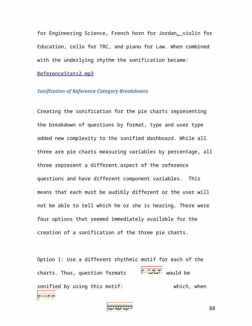
for Engineering Science, French horn for Jordan, violin for
Education, cello for TRC, and piano for Law. When combined
with the underlying rhythm the sonification became:
ReferenceStats2.mp3
Sonification of Reference Category Breakdowns
Creating the sonification for the pie charts representing
the breakdown of questions by format, type and user type
added new complexity to the sonified dashboard. While all
three are pie charts measuring variables by percentage, all
three represent a different aspect of the reference
questions and have different component variables. This
means that each must be audibly different or the user will
not be able to tell which he or she is hearing. There were
four options that seemed immediately available for the
creation of a sonification of the three pie charts.
Option 1: Use a different rhythmic motif for each of the
charts. Thus, question formats would be
sonified by using this motif: which, when
88
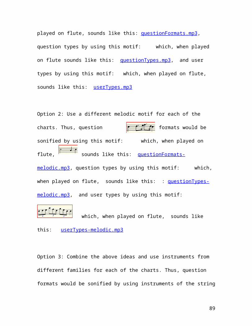
played on flute, sounds like this: questionFormats.mp3,
question types by using this motif: which, when played
on flute sounds like this: questionTypes.mp3, and user
types by using this motif: which, when played on flute,
sounds like this: userTypes.mp3
Option 2: Use a different melodic motif for each of the
charts. Thus, question formats would be
sonified by using this motif: which, when played on
flute, sounds like this: questionFormats-
melodic.mp3, question types by using this motif: which,
when played on flute, sounds like this: : questionTypes-
melodic.mp3, and user types by using this motif:
which, when played on flute, sounds like
this: userTypes-melodic.mp3
Option 3: Combine the above ideas and use instruments from
different families for each of the charts. Thus, question
formats would be sonified by using instruments of the string
89

section playing a unique rhythmic and melodic motif,
question types by using instruments from the woodwind family
playing a unique rhythmic and melodic motif, and user types
by using those from the brass family playing a unique
rhythmic and melodic motif.
To show the percentage amount represented the same method
used for the dials in the room booking could be followed
which was expected to increase the continuity and
familiarity across the application. While this would work
easily for the first option it would be slightly more
problematic to apply to a melodic motif option. Another
option would be to use dynamics (volume levels) to signify
the percentage, making larger percentages louder than
smaller ones. Because it was felt that that has the
potential to be more intrusive and annoying for the listener
this was discarded as an usable option.
Thus it was decided on June 14th, 2014 to develop the
sonification for the pie charts using the third option
90
because it would allow the most audible differentiation
between the three different data visualizations while still
using the familiar method of showing percentages and the
familiar rhythmic background that indicates to the user that
the information portrayed is from the reference statistics
application.
Question Formats
To show the breakdown by question format, three instruments
from the string section were needed. As the highest
percentage would be shown by the highest note and following
the convention that pie charts always show the largest
percentage ‘first’ on the right side of the chart it was
decided that the instruments would be ordered by range with
the highest range first. To ensure that the numbers shown on
the pie charts were generally representative of the
percentage size data was averaged over the six months and it
was found that, in general, the same user groups/question
formats/question types were generally the highest valies.
91
Thus a violin represents In-Person questions, a viola represents
Email questions, and the cello represents phone questions. The
combination sounds like this: question-formats-opt3.mp3
Question Types
To show the breakdown by question type, four instruments
from the woodwind section were needed. As the highest
percentage should be shown by the highest note and the
convention that pie charts always show the largest
percentage ‘first’ on the right side of the chart it was
decided that the arrangement of the instruments by range
with the highest range first would be kept. Thus a flute
represents ‘Basic questions’, an oboe represents
facilitative questions, a clarinet represents complex
questions and the bassoon represents referral questions. The
combination sounds like this: question-types-opt3.mp3
User Types
92
To show the breakdown by user type, three instruments from
the brass section are needed. Still arranging the
instruments by range with the highest range first, trumpet
represents ‘Faculty/Staff’ users, a French horn represents
student users, and the trombone represents the ‘N/A’
category. The combination sounds like this: user-types-
opt3.mp3. While the user group numbers seemed to have the
most variance the range chosen to represent 100% is not out
of any of the chosen instruments playable range so it should
not matter if the percentages vary.
Combining the sonifications of each of the pie charts
representing percentages of question formats, question
types, and user types produced this sonification: pie-
charts-combined-opt3.mp3
An Alternate Option – using Rhythmic Variation instead of Melodic
It is possible that, by using a melodic interpretation in
the sonification, the data would seem to show a shape that
93
it is not meant to. This might prove more confusing to
users who have been accustomed to interpreting the rise and
fall in pitch with an increase and the increase in data
values. Therefore, on June 19th, 2014, it was decided to
create an alternative sonification for the pie charts that
used option 1, the rhythmic motif and instruments from
different families for each of the charts. This then avoids
the possibility of conveying to the user a variance in data
that is not meant. The sonifications produced by this method
are:
1. Question Formats: question-formats-opt3-m2.mp3
2. Question Types: question-types-opt3-m2.mp3
3. User Types: user-types-opt3-m2.mp3
User feedback should give an indication if this
representation of data is more or less meaningful than the
previous method.
The combined sound files from this method yielded this
sonification of each of the pie charts representing
94
percentages of question formats, question types, and user
types: pie-charts-combined-opt3-m2.mp3.
Combined Reference Statistics Sonification
This leaves two possible sonifications of the portion of the
dashboard showing the reference statistics drawn from the
library’s application.
The first begins with the melodic sonification of the pie
charts representing percentages of question formats,
question types, and user types followed by the sonification
of the line graph representing the trends in numbers of
questions asked over a six month period in each of the
library units. It sounds like this: refstats-all-m1.mp3
The second representation begins with the rhythmic
sonification, using instruments from the different families
to set them apart aurally, of the pie charts representing
percentages of question formats, question types, and user
95

types followed by the sonification of the line graph
representing the trends in numbers of questions asked over a
six month period in each of the library units. It sounds
like this refstats-all-m2.mp3
Complete Sonification of the Dashboard
Users opening or refreshing the url showing the visual
representation of the dashboard will see this screen:
Figure 13: Visual Dashboard
and will hear one of the following four sonifications which
all represent the data shown visually in a slightly
different way musically:
96

1. Sonification1.mp3 – This sonification begins with the
background pattern the user will associate with the data
gathered from the room booking application. It opens with
the sonification representing the percentage of rooms
booked in each individual library at a fixed time using
the instruments: flute for Stauffer, clarinet for
Douglas, oboe for Bracken and bassoon for Law. Next
follows the sonification representing the percentage of
rooms booked in each individual library over a period of
several months, using the same background pattern as was
used in the dials. After this has completed the user
hears the background beat change to signal the move to
the reference statistics data and the melodic
sonification of the pie charts representing percentages
of question formats, question types, and user types
followed by the sonification of the line graph
representing the trends in numbers of questions asked
over a six month period in each of the library units.
2. Sonification2.mp3 – This sonification begins with the
background pattern the user will associate with the data
97
gathered from the room booking application. It opens with
the sonification representing the percentage of rooms
booked in each individual library at a fixed time with
the variable manipulated in this sonification being the
instrument sounds used. In this variation flute was used
for Stauffer, French horn for Douglas, cello for Bracken,
and piano for Law. Next follows the sonification
representing the percentage of rooms booked in each
individual library over a period of several months, using
the same background pattern as was used in the dials.
After this has completed the user hears the background
beat change to signal the move to the reference
statistics data and the rhythmic sonification of the pie
charts representing percentages of question formats,
question types, and user types, using instruments from
the different families to set them apart aurally,
followed by the sonification of the line graph
representing the trends in numbers of questions asked
over a six month period in each of the library units.
98
3. Sonification3.mp3 - This sonification begins with the
background pattern the user will associate with the data
gathered from the room booking application. It opens with
the sonification representing the percentage of rooms
booked in each individual library at a fixed time using
the instruments: flute for Stauffer, clarinet for
Douglas, oboe for Bracken and bassoon for Law. Next
follows the sonification representing the percentage of
rooms booked in each individual library over a period of
several months, using the same background pattern as was
used in the dials. After this has completed the user
hears the background beat change to signal the move to
the reference statistics data and the melodic
sonification of the pie charts representing percentages
of question formats, question types, and user types
followed by the sonification of the line graph
representing the trends in numbers of questions asked
over a six month period in each of the library units.
4. Sonification4.mp3 - This sonification begins with the
background pattern the user will associate with the data
99
gathered from the room booking application. It opens with
the sonification representing the percentage of rooms
booked in each individual library at a fixed time with
the variable manipulated in this sonification being the
instrument sounds used. In this variation flute was used
for Stauffer, French horn for Douglas, cello for Bracken,
and piano for Law. Next follows the sonification
representing the percentage of rooms booked in each
individual library over a period of several months, using
the same background pattern as was used in the dials.
After this has completed the user hears the background
beat change to signal the move to the reference
statistics data and the rhythmic sonification of the pie
charts representing percentages of question formats,
question types, and user types, using instruments from
the different families to set them apart aurally,
followed by the sonification of the line graph
representing the trends in numbers of questions asked
over a six month period in each of the library units.
100

User feedback gathered from the testing of the separate
components should indicate which of the four options is
considered the most useful.
As noted above, work on the prototype spanned the two-month
period of April 25th to June 25th 2014. It began with setting
out requirements and criteria for selecting the data to be
displayed in the visual interface in order to present data
to aid decision making in regards to facilities management
and staffing at the Queen’s University library. Drawing
actual data from the library database allowed the project to
display information that is relevant to library management
in such a way that they would be able to make decisions from
live information in a timely manner. During this process
issues of poor data quality were encountered, which required
the rethinking of original calculation plans. Re-writing a
section of the code used to calculate hours resolved this
issue but required extra time and a less streamlined
approach. Decisions were also made, in some cases, not to
duplicate the library’s database structure. Information such
101
as user data unnecessary to the project was omitted to
reduce any security risks and a simplified version of the
library’s hours database was created to deal with the large
amount of unnecessarily detailed information stored by the
library. Once the visual interface was complete data
elements were mapped to musical sounds to create the audible
portion of the interface. During this phase of development
several options were explored portraying the sounds in
different ways and alternatives created to be evaluated
during the user testing and feedback stage. As evaluation
is an important step in the design science methodology, the
final stage in the project involved user training, testing
and feedback.
User Training, Testing and Feedback
Four individuals were interviewed over a two-week period in
sessions 30 minutes long. The sessions took place in a group
study room booked in the Stauffer library as it was a
convenient location for all of those involved. The four
102
individuals represented users drawn from a variety of
different contexts. User A is a person interested in
computer music composition and would thus be familiar with
the concept of creating musical sounds on a computer and
interpreting those sounds. User B works in the library but
has little expertise in computers or music. User C works in
library systems and is also a musician and user D works in
the Accessibility Lab at Queen’s University and would be
expected to have some feedback on the applications usability
for visually impaired users.
The users were greeted and told that the interviewer would
be following an interview script so that each session would
cover all of the components to be tested. It was also
explained that the session would take about 20 minutes and
there would be time following that for comments and more
general feedback. The interviewer then followed the ‘User
testing script’ found in Appendix A. The answers given by
each of the individuals are included in Appendix B.
103
Results
For this project, a prototype system dashboard for library
room booking and reference statistics was created. To
explore the research question, “How can sonification improve
managerial decision making in organizations?” this visual
dashboard was augmented with a musical sonification of the
information to be conveyed realized through the process of
parameter mapping. A set of testing data for the project was
drawn from the library database for these applications and
stored in a MySql database which, when live, would be polled
at intervals for updates managerial dashboard. This data was
then divided into the sections that form the various visual
displays appearing on the dashboard. Each of the sections
was mapped to both a visual display and to musical sounds.
Coincident to the visual display, the musical auditory
representation is rendered, creating a musical sonification
of the data and allowing information to be monitored without
direct attention being paid to the dashboard. This realized
the second and fundamentally creative part of the design
104

science methodology in which an attempt is made to solve the
problem and in which new functionality is envisioned based
on a new configuration of existing or new and existing
elements to form a tentative design. This stage involved the
development of software, using high-level languages and
tools to further develop and implement the tentative design
arrived at earlier. Through the process of obtaining user
feedback, analysis of their use and performance, as well as
through reflection and abstraction, the three proposed
hypotheses are assessed. These hypotheses are:
H1 Data elements may be mapped to elements of sound so
as to convey information to users through an audible
interface in such a way that it is pleasing to the
listener.
H2 Information represented in a dashboard may be
represented audibly so that a user can monitor it while
he or she is occupied with another task.
105
H3 The graphical information may be represented audibly
without a loss of richness.
While the number of users for this test of concepts was
small, users for the testing and feedback portion were
selected for their diversity in order to combat the
possibility of selecting only one type of user whose
characteristics made them naturally better than others at
understanding the interface. It was suggested that perhaps
musicians would find the interface easier than non-musicians
so there were both musician and non-musicians chosen. It was
also thought that library employees would have some
advantage due to their familiarity with the data conveyed.
Therefore the group included both library employees and non-
library employees. Finally there was a possibility that
those with a high degree of computer skills would have an
advantage so the group contained both those with high skill
levels and those with lower levels. Each of the users was
given the same scripted training and testing questions
designed to test aspects of the three proposed hypotheses.
106
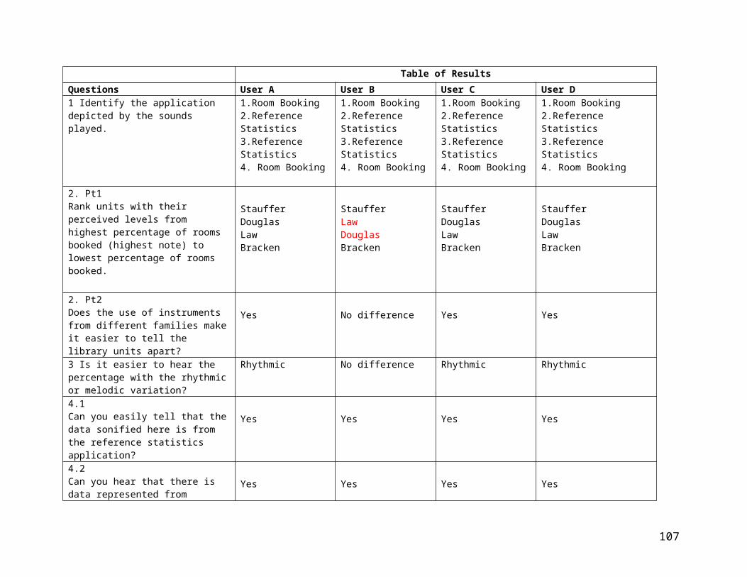
Table of ResultsQuestions User A User B User C User D1 Identify the application depicted by the sounds played.
1.Room Booking2.Reference Statistics3.Reference Statistics4. Room Booking
1.Room Booking2.Reference Statistics3.Reference Statistics4. Room Booking
1.Room Booking2.Reference Statistics3.Reference Statistics4. Room Booking
1.Room Booking2.Reference Statistics3.Reference Statistics4. Room Booking
2. Pt1Rank units with their perceived levels from highest percentage of rooms booked (highest note) to lowest percentage of rooms booked.
StaufferDouglasLawBracken
StaufferLawDouglasBracken
StaufferDouglasLawBracken
StaufferDouglasLawBracken
2. Pt2Does the use of instruments from different families makeit easier to tell the library units apart?
Yes No difference Yes Yes
3 Is it easier to hear the percentage with the rhythmicor melodic variation?
Rhythmic No difference Rhythmic Rhythmic
4.1Can you easily tell that thedata sonified here is from the reference statistics application?
Yes Yes Yes Yes
4.2Can you hear that there is data represented from
Yes Yes Yes Yes
107

different library units?4.3How many library unit areas are represented?
7 7 7 5
4.4 aCan you hear the rising and falling of levels representing the numbers of questions asked?
Yes Yes Yes Yes
4.4 bAre the levels (and thus thenumbers of questions asked) in the Education library higher or lower than those in Stauffer LRS?
Higher Higher Higher Higher
108
As can be seen in the table of results, the type of user
made little or no difference in the degree to which they
could draw conclusions from the auditory interface. All
users clearly could tell without looking at the dashboard if
they were listening to data from the room booking or
reference statistics application. All could tell which
library had the highest and lowest percentage of rooms
booked and three of the four could rank all of the libraries
from lowest to highest perfectly. As suspected, most users
found it easier to tell the library units apart if the
instruments representing them came from different families
and that using the rhythmic option rather than the melodic
one made it easier to hear the percentages represented by
the pie charts. Other than one user, who miscounted the
number of units represented in the graph of reference
statistics, all users could hear the rising and falling of
levels visualized in the graphs and infer the correct
information from what they heard.
109
Users were also asked for their comments regarding the
usability of the sonified interface and encouraged to give
any feedback they could. Three of the four users, including
the user who commonly works with students with accessibility
issues, volunteered that they felt the sonification would be
an asset for those with visual disabilities.
User D said:
This would be useful and more usable for low vision users and the blind as
they have more highly developed senses of hearing. I don’t think they
would have as much difficulty as I did. This might be useful also for more
auditory learners as I found myself not wanting to look at the interface, as
it was distracting.
[User D]
User B also added:
I think it could be really useful as an aid to accessibility. We have to make
all the things we do visually more accessible.
[User B]
While User C also mentioned accessibility, his personal work
choice would most likely result in him turning it off. While
he did not find it annoying to listen to, his habit of
110
turning off sound would mean that the addition of sound to
the visual interface would not enhance his decision-making.
I think it would be useful as an aid to accessibility but I like to work in a
very quiet space so I would probably turn it off. I turn all my alerts off
when I’m working because it is distracting. [User C]
None of the users though found the sonification annoying to
listen to and one was even humming the line graph after the
interview.
Conclusions
The research supports the three proposed hypotheses.
Hypothesis 1 states that data elements may be mapped to
elements of sound in such a way as to convey information to
users through an audible interface in such a way that it is
pleasing to the listener. The development of the prototype
clearly shows that it is possible to map data elements to
musical sound in so that users can draw information from
what they hear. While ‘pleasing’ is clearly a subjective
term, none of the participants in the user feedback portion
111
of the development found what they were hearing annoying.
The creation of the auditory interface required design
decisions to be made specifically for this purpose though
and the selection of annoying or grating sounds could have
changed the results greatly. Although none of the users
found the interface unpleasant to listen to, one volunteered
that, because he likes to work in a completely quiet
environment, he always has the sound off on his computer.
For those like him, alerts that draw attention to areas of
interest would have to be more visual than audible.
Hypothesis two states: Information represented in a
dashboard may be represented audibly so that a user can
monitor it while he or she is occupied with another task.
The evidence indicates that the prototype demonstrates this
and the results of the user testing support that even users
with very little experience using the dashboard are able to
understand what they are listening to.
112
The prototype and results of the user testing also support
hypothesis 3, which proposes that the graphical information
may be represented audibly without a loss of richness. Even
after a very short training session lasting minutes, users
can identify levels, and hear trends in the sonified data.
The fact that the information these users received audibly
was meaningful to them even after very little experience
suggests that the augmentation of the visual interface would
improve decision-making by allowing users to receive
information aurally while not actually looking at the
interface.
In our research it was suggested that augmenting a visual
dashboard with an auditory representation of this
information could allow the user’s attention to be drawn
more quickly to areas of sudden change or interest. These
results show that this is indeed the case and we conclude
that sonification can improve managerial decision making in
organizations by representing data in such a way that it can
be monitored while the user is not looking at the screen,
113

providing timely data in a variety of different ways, and
can provide an accessible option for those with a visual
disability.
Possible Limitations and Future Possibilities
There are several possible limitations to this research.
The user testing involved only four people and, although
every effort was made to select users that had different
characteristics, four is a very small sample and there may
be other ways in which the sample biases the results.
Testing the interface with a much larger and more diverse
group could yield richer results.
The sonification itself involved many musical decisions
documented in the development portion of this paper. While
there were options suggested and explored there are
countless others that could have been chosen and may have
yielded different results. Further research could focus on
one portion of the interface and explore other possible
114

mappings of data to sounds to see the effects of making
different decisions.
Contribution to Research
This research project began by asking how musical
sonification could improve managerial decision-making. The
results indicated that data elements may be mapped to
elements of sound in a sound-enhanced, visual dashboard in
such a way as to convey information to users through an
audible interface in such a way that it is pleasing to the
listener. The results also indicated that information
represented in a dashboard may be represented audibly so
that a user can monitor it while he or she is occupied with
another task. Finally, the results showed that the graphical
information may be represented audibly without a loss of
richness, allowing users to understand the information that
they are receiving through the audible interface in order
that they can use that information for decision-making.
115
The contribution to research involves the summation of the
generated knowledge regarding what did and didn’t work
according to theory. That this knowledge could only have
come from the act of constructing the artifact is an
important part of the design science methodology and
contributes to the further understanding of a phenomenon
interesting to the research community. Following from the
design science methodology discussed earlier in the paper,
the first contribution of this project is the discovery and
discussion of an interesting research question. While
research has shown that visual dashboards can aid
organizations in the tracking of key indicators and bring
critical events to attention more quickly they are often
criticized for trying to convey an amount of information too
complex for managers to understand visually (Allio 2012).
Drawing on research in auditory perception and human
information processing, a prototype is suggested and
developed to show that augmenting a visual dashboard with an
auditory representation of this information is possible and
116
allows the user’s attention to be drawn more quickly to
areas of sudden change or interest.
During the creation of this prototype we ran into issues of
data quality, which effected our development and required
changed in the proposed method of handling the information.
Questions of mapping and usability also arose. It was
wondered if users would be able to hear the differences
between the data elements if the instruments were all from
the same family or should instruments from different
families be used? To help answer these questions options
were explored and user testing conducted to see what the
answer was. Through the construction of this dashboard
prototype is has been shown that musical sonification is an
interesting research area that could yield new ways of
conveying information.
117
Appendix A – Training and Testing Script
Thanks for agreeing to take part in the user-feedback
portion of my project.
The session will be broken down into two parts for each
component, a brief ’training session’ where I show you the
visual interface and explain how the sonification works
followed by a session where you listen to that portion of
the sonification and describe your impressions.
What I don’t expect is that you will become a expert on
interpreting the sounds you hear in this short session but I
do anticipate that, even in this short time, you will be
able to hear the differences between the sounds and that
your impression of the sounds will allow you to draw
conclusions about the data conveyed by the visual interface.
118
Component 1 – The visual interface shows data gathered by
two different applications, room booking and reference
statistics. Users should be able to tell which set of data
they are listening to.
Training session
The first set of data we show in the visual dashboard is
that from the room booking application. We show the
percentage of rooms booked in each library now and the
trends in booking over a three-month period.
The visual interface looks like this:
119
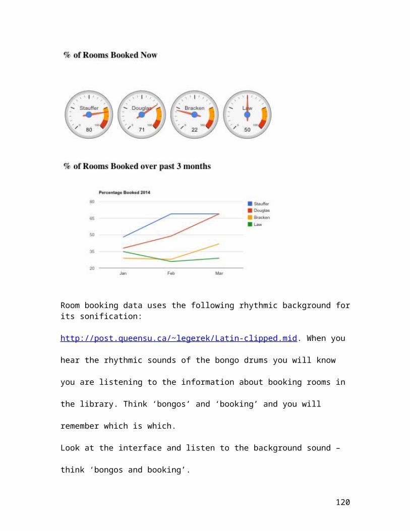
Room booking data uses the following rhythmic background forits sonification:
http://post.queensu.ca/~legerek/Latin-clipped.mid. When you
hear the rhythmic sounds of the bongo drums you will know
you are listening to the information about booking rooms in
the library. Think ‘bongos’ and ‘booking’ and you will
remember which is which.
Look at the interface and listen to the background sound –
think ‘bongos and booking’.
120
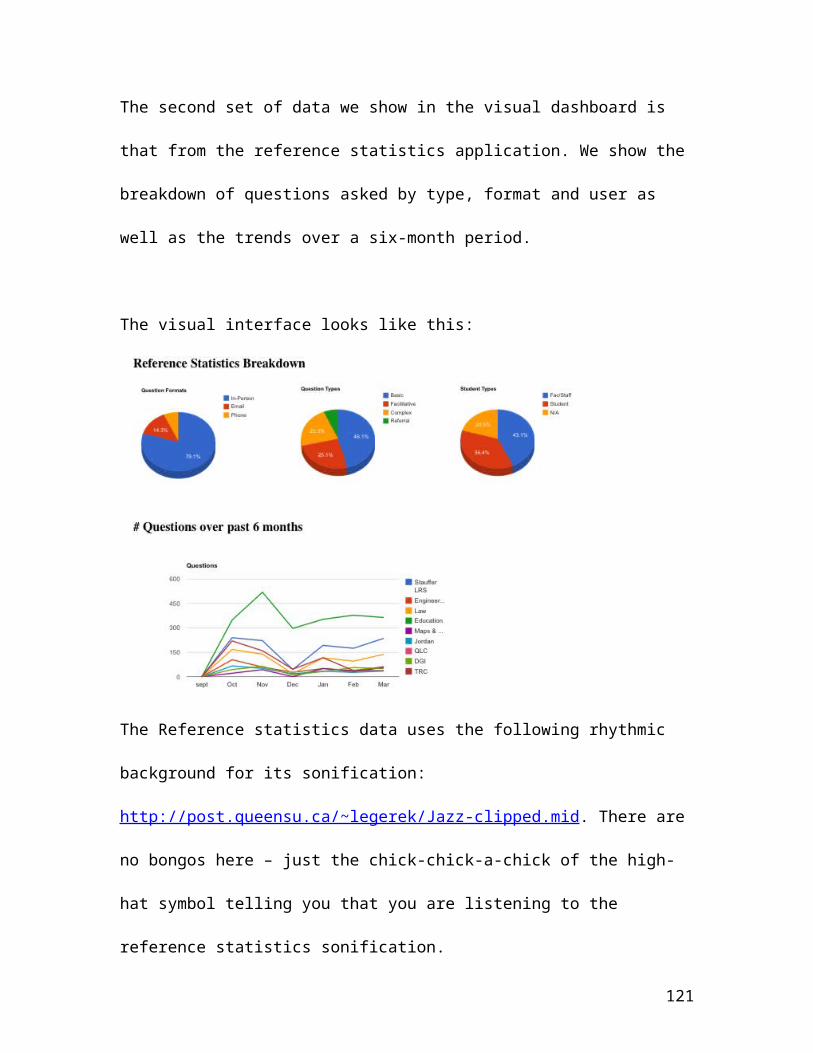
The second set of data we show in the visual dashboard is
that from the reference statistics application. We show the
breakdown of questions asked by type, format and user as
well as the trends over a six-month period.
The visual interface looks like this:
The Reference statistics data uses the following rhythmic
background for its sonification:
http://post.queensu.ca/~legerek/Jazz-clipped.mid. There are
no bongos here – just the chick-chick-a-chick of the high-
hat symbol telling you that you are listening to the
reference statistics sonification.
121
Look at the interface and listen to the background sound –
that ‘chick-chick-a-chick’ is the reference questions data.
Now listen to the following 4 sounds and tell me which
application they come from, room booking or reference
statistics.
1. ____________________________
2. ____________________________
3. ____________________________
4. ____________________________
Sonification of percentage of rooms booked
Component 2 – The visual interface includes a set of dials
that show the percentage of rooms booked in each of the four
library units with bookable rooms. Users should be able to
tell that they are listening to data from different library
units, possibly remember which library is which, although
this many be something that would require more experience
122
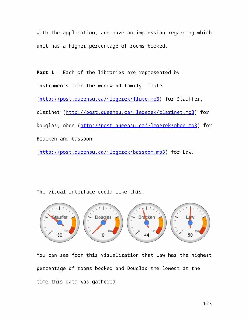
with the application, and have an impression regarding which
unit has a higher percentage of rooms booked.
Part 1 – Each of the libraries are represented by
instruments from the woodwind family: flute
(http://post.queensu.ca/~legerek/flute.mp3) for Stauffer,
clarinet (http://post.queensu.ca/~legerek/clarinet.mp3) for
Douglas, oboe (http://post.queensu.ca/~legerek/oboe.mp3) for
Bracken and bassoon
(http://post.queensu.ca/~legerek/bassoon.mp3) for Law.
The visual interface could like this:
You can see from this visualization that Law has the highest
percentage of rooms booked and Douglas the lowest at the
time this data was gathered.
123
In the sonification of the dials
http://post.queensu.ca/~legerek/Roombooking1-Dials.mp3,
taken at a different point in time than the visualization
shown above, you can hear the ‘background bongos’ telling
you that it is from the room booking application. You can
also hear a bell playing a note that corresponds to 100% of
the rooms being booked. If, for instance, all the rooms were
booked in a library, that bell tone and the note played by
the next instrument would be the same. Because there is less
than 100% of the rooms booked in Stauffer you can hear that
the flute note following the bell is lower.
Now I will play the sonification of the room booking dials
three times to see what things you can hear. Listen the
first two times and then, the third time, label the units
with their perceived levels 1-4 from highest percentage of
rooms booked (highest note) to lowest percentage of rooms
booked.
124

Stauffer: ______ Douglas: ______ Bracken: _______ Law:
__________
Part 2 – it was surmised that users without musical
knowledge might have greater trouble distinguishing between
members of the same instrument family (woodwinds in the
case) and that it might be easier for them if the
instruments came from different families. In the second
sonification each of the libraries are represented by
instruments from the different families: flute
(http://post.queensu.ca/~legerek/flute.mp3) for Stauffer,
French horn (http://post.queensu.ca/~legerek/horn.mp3) for
Douglas, cello 9 http://post.queensu.ca/~legerek/cello.mp3)
for Bracken and piano
(http://post.queensu.ca/~legerek/piano.mp3) for Law.
Listen to these two sonifications:
http://post.queensu.ca/~legerek/Roombooking1-Dials.mp3
http://post.queensu.ca/~legerek/Roombooking1-Dials-son2.mp3
125
Does the use of instruments from different families make it
easier to tell the library units apart?
Yes ____________ No _______________
Component 3 – sonification of Pie Charts
The visual interface displays a set of pie charts each
representing the breakdown by percentage of question types,
question formats and user types.
These were sonified using different instrument families for
each chart and showing the percentage again in reference to
a bell tone. To further differentiate them from the dials
though they were each assigned a melodic motif. It was
theorized that the melodic movement might prove confusing to
the user so a second option was created only varying the
rhythm. Users should be able to tell that they are listening
to reference statistics data (by recognizing the background
beat) and that that data is from different library units
(because they produce different sounds), but it is unknown
126
if the use of a melodic variant will make it more difficult
to tell if the levels are higher or lower.
1. Listen to the two sonifications and tell me if you think
it is easier to hear the percentage with the rhythmic or
melodic variation.
Option 1 Melodic
Option 2 Rhythmic
Component 4 – sonification of line graphs (reference
statistics)
The visual interface displays a line graph showing the
number of questions asked in each of the library units
tracking reference statistics. Users should be able to tell
that they are listening to reference statistics data (by
recognizing the background beat) and that that data is from
different library units (because they produce different
sounds), and have an impression regarding the trend over
time.
The visual interface looks like this:
127

You can see from the lines on the graph that the number of
questions asked rises and falls over the six months with the
number of questions spiking in the Education library in
November before falling again as the enrolled teacher
candidates leave for their school placements.
In the sonification of the line graph, you will hear the
background rhythm telling you that it is from the reference
statistics application. You can also hear the falling and
rising of the pitches denoting the falling and rising trends
in numbers of reference questions asked in, for example,
Stauffer (represented by the flute) here: refstats-flute-
stauffer.mp3
128

Listen to the sonification of the entire graph:
http://post.queensu.ca/~legerek/ReferenceStats2.mp3
1. Can you easily tell that the data sonified here is from
the reference statistics application?
Yes ______________ No _________________
2. Can you hear that there is data represented from
different library units (because they produce different
sounds)?
Yes _____________ No ______________
3. Listen again and, without looking at the visualization,
try to guess how many library unit areas are represented.
________________ library units.
4. Listen again to the Stauffer example (represented by the
flute) here: refstats-flute-stauffer.mp3 . Now listen to the
section with the data from Education (now represented by the
violin): refstats-violin-education.mp3
129
a) Can you hear the rising and falling of levels
representing the numbers of questions asked?
Yes ____________ No _____________
b) Are the levels (and thus the numbers of questions asked)
in the Education library higher or lower than those in
Stauffer LRS?
Higher ____________ Lower _____________
Appendix B – Interview Results
User A
User A is a computer music specialist working at the School
of Music at Queen’s University. He had no previous
interaction with or knowledge of the project or any
interaction with Queen’s Library except as a user.
Component 1:
130

Listen to the following 4 sounds and tell me which
application they come from, room booking or reference
statistics.
1. Room booking
2. Reference Statistics
3. Reference Statistics
4. Room booking
Component 2 – Part 1
Listen to the sonification of the room booking and label the
units with their perceived levels 1-4 from highest
percentage of rooms booked (highest note) to lowest
percentage of rooms booked.
Stauffer: 1 Douglas: 2 Bracken: 4 Law: 3
Part 2
Listen to the two sonifications. Does the use of instruments
from different families make it easier to tell the library
units apart? Yes
Component 3
131

1. Listen to the two sonifications and tell me if you think
it is easier to hear the percentage with the rhythmic or
melodic variation. Rhythmic
Component 4
1. Can you easily tell that the data sonified here is from
the reference statistics application? Yes
2. Can you hear that there is data represented from
different library units? Yes
3. Listen again and, without looking at the visualization,
try to guess how many library unit areas are represented.
7 library units.
4. Listen again to the Stauffer example (represented by the
flute) Now listen to the section with the data from
Education (now represented by the violin.
132
a) Can you hear the rising and falling of levels
representing the numbers of questions asked? Yes
b) Are the levels (and thus the numbers of questions asked)
in the Education library higher or lower than those in
Stauffer LRS? Higher
Comments following the interview:
I’m not sure a person who wasn’t a musician would be able to tell the different
levels apart in the line graphs. Perhaps adding more rhythmic complexity, as the
levels got higher would make that easier.
[User A]
User B
User B is an employee at the Queen’s library. She had no
previous interaction with or knowledge of the project. She
uses a computer but doesn’t consider herself to be highly
skilled and does not play any music.
Component 1:
133
Listen to the following 4 sounds and tell me which
application they come from, room booking or reference
statistics.
1. Room booking
2. Reference Statistics
3. Reference Statistics
4. Room booking
Component 2 – Part 1
Listen to the sonification of the room booking and label the
units with their perceived levels 1-4 from highest
percentage of rooms booked (highest note) to lowest
percentage of rooms booked.
Stauffer: 1 Douglas: 3 Bracken: 4 Law: 2
Part 2
Listen to the two sonifications. Does the use of instruments
from different families make it easier to tell the library
units apart? No difference
Component 3
134
1. Listen to the two sonifications and tell me if you think
it is easier to hear the percentage with the rhythmic or
melodic variation. No difference
Component 4
1. Can you easily tell that the data sonified here is from
the reference statistics application? Yes
2. Can you hear that there is data represented from
different library units? Yes
3. Listen again and, without looking at the visualization,
try to guess how many library unit areas are represented.
7 library units.
4. Listen again to the Stauffer example (represented by the
flute) here. Now listen to the section with the data from
Education (now represented by the violin.
135
a) Can you hear the rising and falling of levels
representing the numbers of questions asked? Yes
b) Are the levels (and thus the numbers of questions asked)
in the Education library higher or lower than those in
Stauffer LRS? Higher
Comments following interview:
I think that the different families didn’t make a difference to me because I
had just heard the first example several times and was familiar with it. I
think that the more someone used it them more they would know.
I think it could be really useful as an aid to accessibility. We have to make
all the things we do visually more accessible.
[User B]
User C
User C is an employee at the Queen’s library. He had no
previous interaction with or knowledge of the project. He is
technically skilled, knowledgeable about the library systems
and a musician.
136
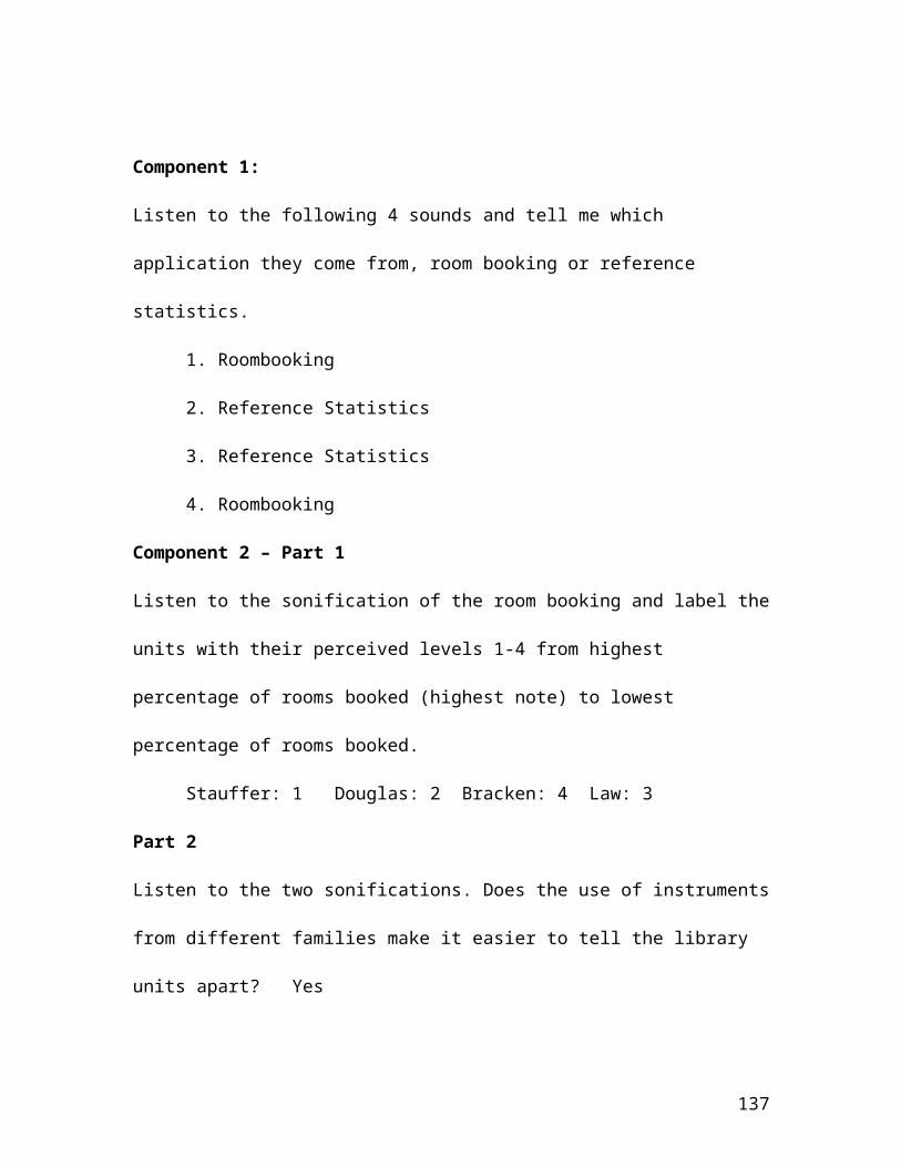
Component 1:
Listen to the following 4 sounds and tell me which
application they come from, room booking or reference
statistics.
1. Roombooking
2. Reference Statistics
3. Reference Statistics
4. Roombooking
Component 2 – Part 1
Listen to the sonification of the room booking and label the
units with their perceived levels 1-4 from highest
percentage of rooms booked (highest note) to lowest
percentage of rooms booked.
Stauffer: 1 Douglas: 2 Bracken: 4 Law: 3
Part 2
Listen to the two sonifications. Does the use of instruments
from different families make it easier to tell the library
units apart? Yes
137
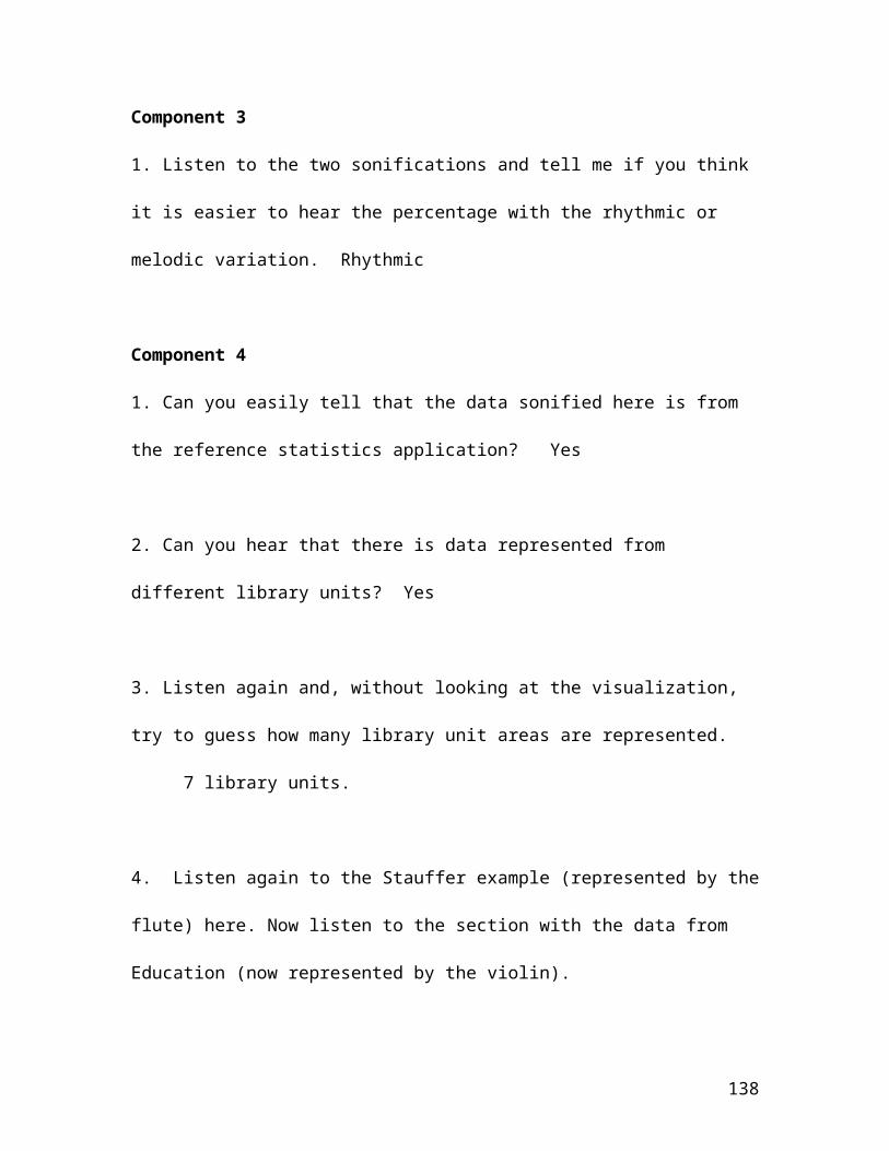
Component 3
1. Listen to the two sonifications and tell me if you think
it is easier to hear the percentage with the rhythmic or
melodic variation. Rhythmic
Component 4
1. Can you easily tell that the data sonified here is from
the reference statistics application? Yes
2. Can you hear that there is data represented from
different library units? Yes
3. Listen again and, without looking at the visualization,
try to guess how many library unit areas are represented.
7 library units.
4. Listen again to the Stauffer example (represented by the
flute) here. Now listen to the section with the data from
Education (now represented by the violin).
138
a) Can you hear the rising and falling of levels
representing the numbers of questions asked? Yes
b) Are the levels (and thus the numbers of questions asked)
in the Education library higher or lower than those in
Stauffer LRS? Higher
Comments following the interview:
I think it would be useful as an aid to accessibility but I like to work in a
very quiet space so I would probably turn it off. I turn all my alerts off
when I’m working because it is distracting. [User C]
User D
User D is an employee at Queen’s, working in the Adaptive
Technology center. She had no previous interaction with or
knowledge of the project. She has some familiarity with the
reference statistics application but is not a musician. She
had a great deal of experience with the use of adaptive
technologies.
139
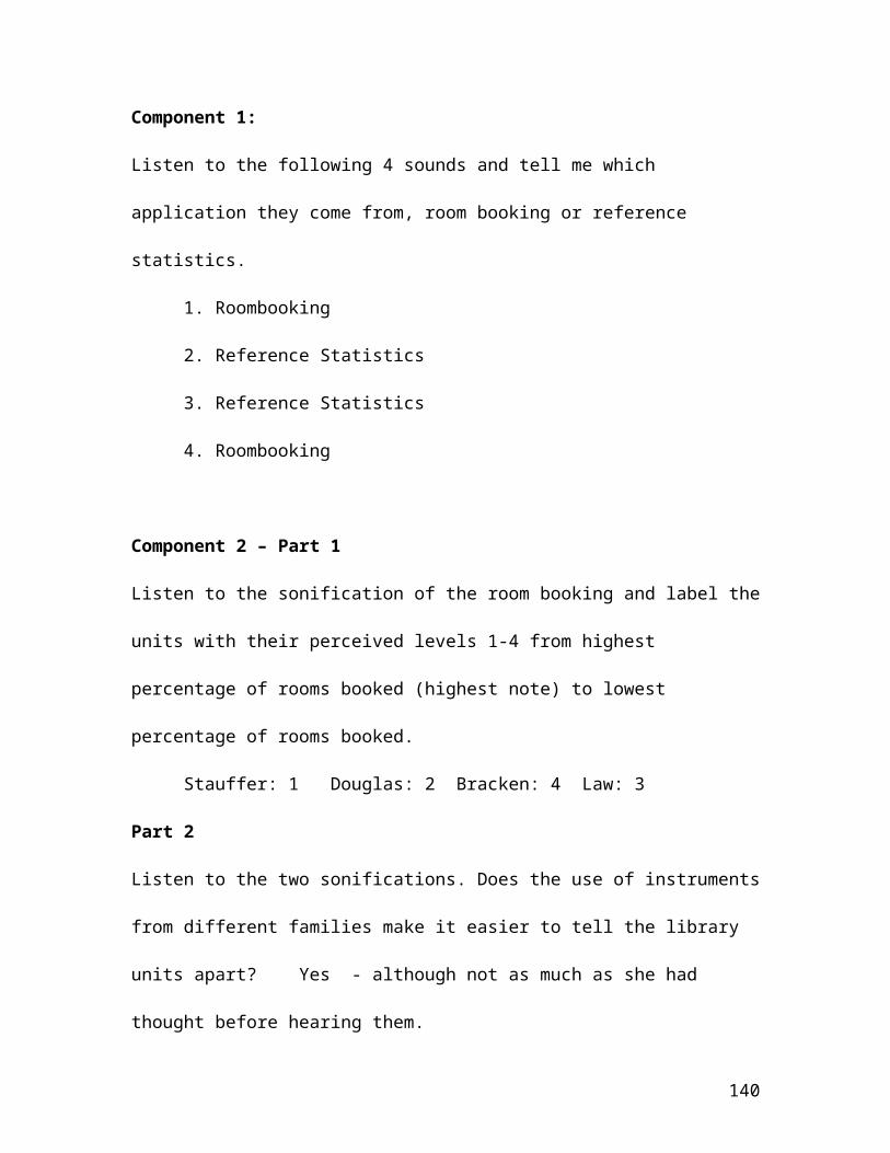
Component 1:
Listen to the following 4 sounds and tell me which
application they come from, room booking or reference
statistics.
1. Roombooking
2. Reference Statistics
3. Reference Statistics
4. Roombooking
Component 2 – Part 1
Listen to the sonification of the room booking and label the
units with their perceived levels 1-4 from highest
percentage of rooms booked (highest note) to lowest
percentage of rooms booked.
Stauffer: 1 Douglas: 2 Bracken: 4 Law: 3
Part 2
Listen to the two sonifications. Does the use of instruments
from different families make it easier to tell the library
units apart? Yes - although not as much as she had
thought before hearing them.
140
Component 3
1. Listen to the two sonifications and tell me if you think
it is easier to hear the percentage with the rhythmic or
melodic variation. Rhythmic
Component 4
1. Can you easily tell that the data sonified here is from
the reference statistics application? Yes
2. Can you hear that there is data represented from
different library units? Yes
3. Listen again and, without looking at the visualization,
try to guess how many library unit areas are represented.
5 library units.
4. Listen again to the Stauffer example (represented by the
flute) here: refstats-flute-stauffer.mp3 . Now listen to the
141

section with the data from Education (now represented by the
violin): refstats-violin-education.mp3
a) Can you hear the rising and falling of levels
representing the numbers of questions asked? Yes
b) Are the levels (and thus the numbers of questions asked)
in the Education library higher or lower than those in
Stauffer LRS? Higher – User remarked that she could hear
the wider fluctuation more than if the total range was
higher.
Comments following the interview:
This would be useful and more usable for low vision users and the blind as
they have more highly developed senses of hearing. I don’t think they
would have as much difficulty as I did. This might be useful also for more
auditory learners as I found myself not wanting to look at the interface, as
it was distracting.
[User D]
142
References
Allio, M. K. (2012). Strategic dashboards: designing and deploying them to improve implementation. Strategy & Leadership,40(5), 24-31.
Ambler, Tim (2003), Marketing and the Bottom Line, 2nd ed.London: Financial Times Prentice Hall.
Badrakhan, B. 2010. “Data, data, everywhere”. Electrical Wholesaling, 91(1)
Barrass, S. and Kramer, G 1999. “Using Sonification” Multimedia Systems, ISSN 0942-4962, 01/1999, 7,(1)
Bronkhorst, Adelbert W., JA Hans Veltman, and Leo Van Breda."Application of a three-dimensional auditory display in a flight task." Human Factors: The Journal of the Human Factors and Ergonomics Society 38.1 (1996): 23-33.
Clark, B. H., Abela, A. V., & Ambler, T. (2006). Behind the wheel. Marketing Management, 15(3), 18.
Conversy, S. (1998, April). Wind and wave auditory icons formonitoring continuous processes. In CHI 98 Conference Summary on Human Factors in Computing Systems (pp. 351-352). ACM.
Dawes, R. M., & Corrigan, B. (1974). Linear models in decision making. Psychological bulletin, 81(2), 95.
design. 2014. In Merriam-Webster.com. Retrieved March 7, 2014 http://www.merriam-webster.com/dictionary/design
Diaz-Merced, W. L., Candey, R. M., Brickhouse, N., Schneps, M., Mannone, J. C., Brewster, S., & Kolenberg, K. (2011).
143
Sonification of Astronomical Data. Proceedings of the International Astronomical Union, 7(S285), 133-136.
Doshi, Anup, Shinko Yuanhsien Cheng, and Mohan M. Trivedi. "A novel active heads-up display for driver assistance." Systems, Man, and Cybernetics, Part B: Cybernetics, IEEE Transactions on 39.1 (2009): 85-93.
Dover, C. (2004). How Dashboards Can Change Your Culture-Wouldn't it be nice if you had all the indicators of your business's progress right in front of you like your car's front panel display? Accounting dashboards. Strategic Finance, 86(4), 42-48
Farhoomed, Ali F., and Drury, Don H. (2002). Managerial Information Overload. Communications
Fisher, P. (1994). Animation and sound for the visualizationof uncertain spatial information. Visualisation in Geographical Information Systems, John Wiley & Sons, Chichester, 181-185.
Francioni, J. M., Albright, L., & Jackson, J. A. (1991, December). Debugging parallel programs using sound. In ACM SIGPLAN Notices (Vol. 26, No. 12, pp. 68-75). ACM.
Gaver, W. W. (1989). The SonicFinder: An interface that usesauditory icons. Human-Computer Interaction, 4(1), 67-94.
Gregor, S. (2009, May). Building Theory in the Sciences of the Artificial. In Proceedings of the 4th international conference on design science research in information systems and technology (p. 4). ACM.
Gregor, S., & Hevner, A. R. (2013). POSITIONING AND PRESENTING DESIGN SCIENCE RESEARCH FOR MAXIMUM IMPACT. MIS Quarterly, 37(2).
Harms, M. P. (1998). Time courses of fMRI signals in the inferior colliculus, medial geniculate body, and auditory
144
cortex show different dependencies on noise burst rate. Neuroimage, 7, P-0365.
Hermann, T., & Ritter, H. (1999). Listen to your data: Model-based sonification for data analysis. Advances in intelligent computing and multimedia systems, 8, 189-194.
Hevner, A., March, S., Park, J., and Ram, S. "Design Sciencein Information Systems Research," MS Quarterly (28:1), 2004, pp. 75-105.
Huitt, W. (2003). The information processing approach to cognition. Educational Psychology Interactive . Valdosta, GA: Valdosta State University. Retrieved [2014-03-05] from, http://www.edpsycinteractive.org/topics/cognition/infoproc.html
Hunt, H, Neuhoff JG. 2011. The Sonification Handbook, Berlin: Logos Verlag
Hussein, K., Tilevich, E., Bukvic, I. I., & Kim, S. (2009, May). Sonification design guidelines to enhance program comprehension. In Program Comprehension, 2009. ICPC'09. IEEE 17th International Conference on (pp. 120-129). IEEE.
Keller's Definitions, 2003, Private Communicationhttp://cse.ssl.berkeley.edu/impact/vos/beginners.html
Lancaster JA, Casali JG . Investigating pilot performance using mixedmodality simulated data link. Hum Factors 2008; 50: 183 – 93.
LaPointe, P. (2005). Marketing by the dashboard light. Marketing NPV/Association of National Advertisers.
McIntosh, S., Legere, K., & Hassan, A. E. Orchestrating Change: An Artistic Representation of Software Evolution
145
Mousavi, S. Y., Low, R., & Sweller, J. (1995). Reducing cognitive load by mixing auditory and visual presentation modes. Journal of educational psychology, 87(2), 319.
Munkong, R., & Juang, B. H. (2008). Auditory perception and cognition. Signal Processing Magazine, IEEE, 25(3), 98-117.
Mynatt, E. D. (1997). Transforming graphical interfaces intoauditory interfaces for blind users. Human–Computer Interaction, 12(1-2), 7-45.
O'Reilly, C. A. (1980). Individuals and information overloadin organizations: is more necessarily better?. Academy of management journal, 23(4), 684-696.
Orlikowski, W. J., & Iacono, C. S. (2001). Research commentary: Desperately seeking the “IT” in IT research—A call to theorizing the IT artifact. Information systems research, 12(2), 121-134.
Painter, J. G., & Koelsch, S. (2011). Can out‐of‐context musical sounds convey meaning? An ERP study on the processing of meaning in music. Psychophysiology, 48(5), 645-655.
Pauwels et al 2009 - Pauwels, K., Ambler, T., Clark, B. H., LaPointe, P., Reibstein, D., Skiera, B., ... & Wiesel, T. (2009). Dashboards as a Service Why, What, How, and What Research Is Needed?. Journal of Service Research, 12(2), 175-189.
Proctor, R. W., & Vu, K. P. L. (2006). The cognitive revolution at age 50: has the promise of the human information-processing approach been fulfilled?. International Journal of Human-Computer Interaction, 21(3), 253-284.
Rabenhorst, D. A., Farrell, E. J., Jameson, D. H., Linton Jr, T. D., & Mandelman, J. A. (1990, August). Complementary
146
visualization and sonification of multidimensional data. In Electronic Imaging'90, Santa Clara, 11-16 Feb'102 (pp. 147-153). International Society for Optics and Photonics.
Savolainen, R. (2009). Information use and information processing: comparison of conceptualizations. Journal of Documentation, 65(2), 187-207.
Sanchez, A., & Valderrama, M. (2013, April). Sonification ofEEG signals based on musical structures. In Health Care Exchanges (PAHCE), 2013 Pan American (pp. 1-1). IEEE.
Simon, H. A. (1996). The sciences of the artificial. MIT press.
147