rapid prototyping of adaptable user interfaces
TRANSCRIPT
1
Rapid Prototyping of Adaptable User Interfaces
ASTERIOS LEONIDIS1, MARGHERITA ANTONA1 AND CONSTANTINE STEPHANIDIS
1,2
1 Institute of Computer Science Foundation for Research and Technology - Hellas (FORTH)
Heraklion, Crete, GR-70013 GREECE [email protected]
2
Department of Computer Science University of Crete, GREECE
Abstract
User Interface Adaptation has been proposed in recent years as a means to achieve personalized accessibility and usability of user interfaces. Related user interface architectures, as well as a variety of related development method and tools, have also been elaborated. Admittedly, however, despite the recognized validity of the approach, which has been proved in practice in a series of prototype systems, the wider adoption and uptake of user interface adaptation approaches is still limited. One of identified obstacles is the complexity intrinsic in designing such interfaces, and the need of radically revising the current user interface design practice to account for (i) the alternative designs required for adaptation, (ii) the parameters involved in driving adaptations (i.e., selecting among alternatives at a given point during interaction), and (iii) the logic of adaptation at run-time. This paper proposes a two-fold tool-based support strategy for user interface adaptation development, based on: (i) an adaptation development toolkit and related widget library which directly embeds lexical level adaptations into common interactive widgets, and (ii) embedding such a library in a common integrated development environment, thus allowing designers to define and view alternative adaptations at design time, and create adaptable user interfaces through traditional prototyping. The above approach has been implemented in the domain of adaptable applications for older users, producing tools which are currently in use in the development of a large suite of interactive applications in various domains. The approach presented in this paper is claimed to be the first and so far unique supporting rapid prototyping of adaptable user interfaces, thus minimizing the divergence between typical development practices and user interface adaptation development.
1. Introduction
Early user interfaces were based on the ability of the user to adapt to a given system.
This was mainly due to the fact that early interfaces had to be taken as de facto,
restricting their users to make convenient changes to the style, presentation and
behavior of a given interface.

2
A radical change in this pattern has recently emerged with the introduction of
customization in user interfaces: the computationally empowered environment can
adapt itself, at various degrees, to its ‘inhabitants’, thereby reducing drastically the
amount of effort required from the user’s part.
Some popular examples include the desktop adaptations in Microsoft Windows XP,
offering, for example, the ability to hide or delete unused desktop items. Microsoft
Windows Vista and Seven (7) also offer various personalization features of the
desktop based on personal preferences of the user, by adding helpful animations,
transparent glass menu bars, live thumbnail previews of open programs and desktop
gadgets (like clocks, calendars, weather forecast, etc.). Similarly, Microsoft Office
applications offer several customizations, such as toolbars positioning and
showing/hiding recently used options. However, adaptations integrated into
commercial systems need to be set manually, and mainly focus on aesthetic
preferences. In terms of accessibility and usability, for instance to people with
disability or older people, only a limited number of adaptations are available, such as
keyboard shortcuts, size and zoom options, changing color and sound settings,
automated tasks, etc.
On the other hand, research efforts in recent years have elaborated more
comprehensive and systematic approaches to user interface adaptations in the context
of Universal Access and Design for All [26]. The Unified User Interfaces
methodology was conceived and applied [23] as a vehicle to efficiently and
effectively ensure, through an adaptation-based approach, the accessibility and
usability of UIs to users with diverse characteristics, supporting also technological
platform independence, metaphor independence and user-profile independence. In
such a context, automatic UI adaptation seeks to minimize the need for a posteriori
adaptations and deliver products that can be adapted for use by the widest possible
end user population (adaptable user interfaces). This implies the provision of
alternative interface instances depending on the abilities, requirements and
preferences of the target user groups, as well as the characteristics of the context of
use (e.g., technological platform, physical environment). The main objective is to
ensure that end-users are provided with the most appropriate user interface instance at
run-time, based both on group or individual characteristics.
The scope of design for diversity is broad and complex, since it involves issues
pertaining to context-oriented design, diverse user requirements, as well as adaptable
3
and adaptive interactive behaviors. This complexity arises from the numerous
dimensions that are involved, and the multiplicity of aspects in each dimension. In
this context, designers should be prepared to cope with large design spaces to
accommodate design constraints posed by diversity in the target user population and
the emerging contexts of use in the Information Society. Therefore, designers need
accessibility knowledge and expertise. Moreover, user adaptation must be carefully
planned, designed and accommodated into the life-cycle of an interactive system,
from the early exploratory phases of design, through to evaluation, implementation
and deployment.
A variety of tools have been implemented to support user interface adaptation design
and development for several platforms, and a series of applications in diverse domains
have been developed to validate the theoretical approach and its supporting tools,
including web browsers [24], web-based information systems [25], on-line
communities [1] and games [7]. Besides offering an indisputable proof of the overall
validity of the adaptation-based approach, these efforts on the other hand have
highlighted differences with respect to mainstream design practices and difficulties in
conducting adaptation design in concrete developments.
In particular, design for adaptation requires specialized knowledge of accessibility
and usability requirements for diverse target user groups, and involves the
identification of relevant design parameters, the design of alternative interface
instances, and the elaboration of an interface adaptation logic [19]. With respect to
development, UI adaptation implies a significant overhead, as using current
development methods and tools it would be necessary to develop various alternatives
for each widget, create an adaptation logic and implement the user interface in such a
way that the logic’s rules are executed at run-time (by activating/deactivating
widgets’ alternatives) [20]. Admittedly, this divergence from current UI design and
development practices hinders the wider adoption of UI adaptation design behind the
research community. In this context, one of the main obstacles encountered concerns
the need to prototype alternative interaction widgets and define their adaptation logic.
The work reported in this paper introduces a framework for building accessible and
self-adapted user interfaces in terms of context of use and user requirements, while
hiding design knowledge and adaptation-related complexity from the designers and
the developers. This is achieved by: (i) embedding design knowledge directly in
enhanced interaction widgets capable of adapting themselves according to an

4
adaptation logic, (ii) making such widgets available through a mainstream integrated
design environment, augmented with new features supporting previewing adaptations
at design time. In this context, user interface adaptation is achieved at run-time, but
also previewed at design -time, thus making it possible for designers and developers
to view different user interfaces instances before completing the development.
This paper is structured as follows. Section 2 presents the background of the current
work, focusing on the one hand on currently available prototyping environments, and
on the other hand on user interface adaptation and related existing supporting tools.
A brief introduction regarding User Interfaces concepts and an outline of Interface
Adaptation main concepts is provided along with the User Interfaces for All theory.
Section 3 describes the context in which the proposed solutions have been designed
and developed and are currently being validated, namely the OASIS project, which
aims at developing a suite of interactive applications for the elderly to be used through
alternative devices. Section 4 presents the Adaptation Development Toolkit and its
two main components, which respectively handle the adaptation logic and the
interactive widgets. Section 5 discusses the integration of the widgets library into the
popular NetBeans GUI builder, and illustrates an example of use of the provided
facilities. Section 6 concludes the paper by summarizing the main results and their
anticipated benefits and suggesting future work.
2. Background
2.1 User Interface prototyping In the context of design, iterative prototyping can be considered as the process of
receiving feedback by end users for facilitating the iterative design of a system.
Usually, an iterative user interface design process initiates with the production of low-
fidelity prototypes and continues with higher-fidelity prototypes. The use of
prototypes in the design phase aims at allowing the designers to test some emerging
ideas for the design in question. While evaluating a prototype, the designers can
identify functional requirements, usability problems and performance issues that can
be dealt with at once and before the implementation phase [16]. Two forms of
prototyping representation can be distinguished: offline and online.
Offline prototypes (also called paper prototypes) include paper sketches, illustrated
storyboards, cardboard mock-ups and videos. Their advantages are that they are quick

5
and inexpensive to be created usually in the early stages of design, with tools that
everyone knows how to use, and are thrown away when they have served their
purpose. In [17] the importance of paper prototyping is described based on experience
from its successful employment during the development lifecycle of a commercial
project. The author among the main disadvantages of high fidelity prototypes
identifies (i) the uneven distribution of time spent on prettifying the prototype instead
of exploring new ideas, (ii) the necessity for the prototype to be complete before
evaluation, as even a minor fault may lead to evaluation’s failure. Online prototypes
(also called software prototypes) include computer animations, interactive video
presentations, programs written with scripting languages, and applications developed
with interface builders. The cost of producing online prototypes is usually higher and
may require skilled programmers to implement advanced interaction techniques,
however they are usually more effective in the later stages of design, when the basic
design strategy has been decided. Their main advantages are that users can manipulate
them online, cover more tasks/functions and look and feel more like the final product.
However, they are more expensive and time-consuming to build as they require
knowledge of the prototyping tool.
Façade tools allow the creator to specify input behavior next to the drawings and text,
something which is not possible with pencil and paper. These prototypes look and feel
like the actual application. Explanatory prototypes are drawings of prospective
layouts of the system. They are usually very detailed - concerning typography, color
schemes, navigation and graphic elements. The tool most commonly used to produce
such prototypes is Microsoft PowerPoint. PowerPoint is widely known, and users are
familiar with it, while changes can be done quickly with higher precision than if
drawn by hand. However, prototypes created through façade tools can not evolve to
implemented user interfaces.
On the other hand, user interface builders provide graphical environments for user
interface prototyping, usually following a WYSIWYG (“What You See Is What You
Get”) design paradigm. Available WYSIWYG editors offer graphical editing facilities
that allow designers to perform rapid prototyping visually. Such editors may be
standalone or embedded in integrated environments (IDEs), i.e., programming
environments which allow developing application functionality for the created
prototypes directly. Commonly used IDEs are Microsoft Visual Studio [11], NetBeans
[14], and Eclipse [1]. GUI builders usually offer to designers libraries (toolkits) of

6
ready-to-use interactive widgets (e.g., Swing [29], SWT [15], .NET [12]). IDEs are
very popular in application development because they greatly simplify the transition
from design to implementation, thus speeding up considerably the entire process,
while also supporting look-and-feel consistency through the availability of common
sets of UI widgets. However, no currently available tool integrates adaptable widgets,
nor provides any support for developing user interface adaptations. Therefore,
prototyping alternative design solutions for different needs and requirements using
prevalent prototyping tools may become a complex and difficult task if the number of
alternatives to be produced is large and no specific support is provided for structuring
and managing the design space. The work reported in this paper aims at addressing
this issue by providing appropriate prototyping facilities.
2.2 User interface adaptation The notion of automatic software adaptation reflects the capability of software to
adapt during runtime based on the individual end-user, as well as the particular
context of use, by delivering a most appropriate user interface instance.
In [22] the importance of prioritizing the end user’s goals, needs and wishes, as
illustrated in the human-centered design process, is highlighted. Despite standards
existence that describe the major UCD tasks, the authors identify the major challenges
and obstacles in integrating usability and UCD in software engineering lifecycle and
emphasize the need to further define the ways towards that goal. The interpretation of
usability’s meaning given by the various development groups (UI specialists vs. core
developers) and their conflicting opinions regarding the importance of user interface
versus core functionality are among the unresolved issues arising during integration.
In the area of user interface adaptation and migration various approaches have been
proposed, with [5], [2], [9], [13] and [4] being some distinctive representatives. In [5]
the notion of interface plasticity is introduced, where the user interface is aware of the
context and reacts to its changes. For that to be achieved, a reference framework is
proposed that abstracts the development lifecycle into four interrelated levels and
every context change triggers UI adaptation driven by relationships of translation
between these layers.
In [2] the plasticity model is exploited to enable dynamic UI migration among various
heterogeneous devices. In [9] a User Interface Description language is presented

7
which is aimed at describing context-sensitive user interfaces with various levels of
details, where graph transformations are used to define an executable mapping
mechanism between UI fragments.
In [13] a framework that facilitates system’s use even if an I/O device fails is
proposed, using weighted and prioritized alternative I/O routes between the various
components. In [4] a complete framework to support multimodal interfaces is
presented. It is based on the WWHT scheme (where, which, how, then) which not
only facilitates the selection of the best-fit option for the current conditions but also
takes into consideration evolution of the UI and adapts the modalities used for
information presentation through a rule-based system that facilitates the refinement or
mutation of the interface. Content is selected at design time individually for each case,
but the authors suggest that interface polymorphism could address that issue and
towards that they propose some potential adjustments of their architecture to
incorporate that technique.
The Unified User Interface Development methodology provides a complete
technological solution for supporting universal access of interactive applications and
services, through a principled and systematic approach towards coping with diversity
in the target user requirements, tasks and environments of use [23]. The notion of a
unified user interfaces originated from research efforts aiming to address the issues of
accessibility and interaction quality for people with disabilities [27]. A unified user
interface comprises a single (unified) interface specification that exhibits the
following properties:
1. It embeds representation schemes for user- and usage-context- parameters and
accesses user- and usage-context- information resources (e.g., repositories,
servers), to extract or update such information.
2. It is equipped with alternative implemented dialogue artifacts appropriately
associated to different combinations of values for user- and usage-context-
related parameters. The need for such alternative dialogue patterns is identified
during the design process, when, given a particular design context, for differing
user- and usage-context- attribute values, alternative design artifacts are deemed
as necessary to accomplish optimal interaction.

8
3. It embeds design logic and decision making capabilities that support activating,
at run-time, the most appropriate dialogue patterns according to particular
instances of user- and usage-context- parameters, and is capable of interaction
monitoring to detect changes in parameters.
As a consequence, a unified user interface realizes:
• User-adapted behavior (user awareness), i.e., the interface is capable of
automatically selecting interaction patterns appropriate to the particular user.
• Usage-context adapted behavior (usage context awareness), i.e., the interface is
capable of automatically selecting interaction patterns appropriate to the particular
physical and technological environment.
From a user perspective, a unified user interface can be considered as an interface
tailored to personal attributes and to the particular context of use, while from the
designer perspective it can be seen as an interface design populated with alternative
designs, each alternative addressing specific user- and usage-context- parameter
values. Finally, in an engineering perspective, a unified user interface is a repository
of implemented dialogue artifacts, from which the most appropriate according to the
specific task context are selected at run-time by means of an adaptation logic
supporting decision-making [20].
At run-time, the adaptations may be of two types:
a) adaptations driven from initial user- and context- information known prior to
the initiation of interaction, and
b) adaptations driven by information acquired through context and interaction
monitoring.
The former behavior is referred to as adaptability (i.e., initial automatic adaptation)
reflecting the interface’s capability to automatically tailor itself initially to each
individual end-user in a particular context. The latter behavior is referred to as
adaptivity (i.e., continuous automatic adaptation), and characterizes the interface’s
capability to cope with the dynamically changing or evolving user and context
characteristics.
The concept of unified user interface is supported by a specifically developed
architecture [27]. This architecture consists of independent communicating
components, possibly implemented with different software methods and tools.

9
Briefly, a user interface capable of adaptation behavior includes: (i) information
regarding user and context characteristics (user and context profile), (ii) a decision
making logic and (iii) alternative interaction widgets and dialogues.
The storage location, origin and format of user-oriented information may vary. For
example, information may be stored in profiles indexed by unique user identifiers,
may be extracted from user-owned cards, may be entered by the user in an initial
interaction session, or may be inferred by the system through continuous interaction
monitoring and analysis. Additionally, usage-context information, e.g., user location,
environment noise, network bandwidth, etc, is normally provided by special-purpose
equipment, like sensors, or system-level software. In order to support optimal
interface delivery for individual user and usage-context attributes, it is required that
for any given user task or group of user activities, the implementations of the
alternative best-fit interface components are appropriately encapsulated.
Upon start-up and during runtime, the software interface relies on the particular user
and context profiles to assemble the user interface on the fly, collecting and gluing
together the constituent interface components required for the particular end-user and
usage-context. In this context, runtime adaptation-oriented decision-making is
engaged, so as to select the most appropriate interface components for the particular
user and context profiles, for each distinct part of the user interface. The role of the
decision-making in UI adaptation is to effectively drive the interface assembly
process by deciding which interface components need to be selectively activated. The
interface assembly process has inherent software engineering implications on the
software organization model of interface components. For any component (i.e., part of
the interface to support a user activity or task) alternative implemented incarnations
may need to coexist, conditionally activated during runtime due to decision-making.
In other words, there is a need to organize interface components around their
particular task contexts, enabling them to be supported in different ways depending on
user and context parameters. This contrasts with traditional non-adapted interfaces in
which all components have singular implementations.
The unified user interface development method is not prescriptive regarding how each
component is to be implemented [27]. For example, the alternative ways of
representing user-oriented information may be employed. Also, the method does not
affect the way designers will create the necessary alternative artifacts (e.g., through
prototyping).

10
2.3 Components and Tools for user interface adaptation
In the context of various research efforts, a variety of components and tools have been
developed to facilitate the development of user interfaces capable of adaptation
behavior. These include facilities for specifying decision-making rules, adaptation
design tools and adaptable widget toolkits.
2.3.1 Decision Making for UI adaptation
The Decision Making Specification Language (DMSL, [21]) is a rule-based language
specifically designed and implemented for supporting the specification of adaptations.
The decision-making logic is defined in independent decision “if…then…else”
blocks, each uniquely associated to a particular dialogue context. The individual end-
user and usage-context profiles are represented in the condition part of DMSL rules
using an attribute values notation. Three types of design parameters values are
allowed: (i) enumerated, i.e., values belong to a list of (more than two) strings
specified by the designer; (ii) boolean, i.e., values True or False; and (iii) integer,
which are specified by supplying minimum and maximum bounds of an integer range
allowed as a value. Value ranges define the space of legal values for a given attribute.
The language is equipped with three primitive statements: (a) dialogue, which initiates
evaluation for the rule block corresponding to dialogue context value supplied; (b)
activate, which triggers the activation of the specified component(s); and (c) cancel,
which, similarly to activate, triggers the cancellation of the specified component(s).
These rules are compiled in a tabular representation that is executed at run-time.
Figure 1 provides an example of DMSL rule. The representation engages simple
expression evaluation trees for the conditional expressions.
1 If
[Elderly user’s age = 1 or 2 or 3] or [Elderly user’s life situation = 2 or 3] or [Elderly user’s computer literacy level = 0] or [Vision impairment = 1 or 2 or 3]
Then
Resolution 640*480 pixels
2 If
[Elderly user’s life situation =1] or [Elderly user’s computer literacy level = 1]
Then Resolution 800*600 pixels
Figure 1. An example of DMSL rule

11
The decision-making process is performed in independent sequential decision
sessions, and each session is initiated by a request of the interface assembly module
for execution of a particular initial decision block. In such a decision session, the
evaluation of an arbitrary decision block may be performed, while the session
completes once the computation exits from the initial decision block. The outcome of
a decision session is a sequence of activation and cancellation commands, all of which
are directly associated to the task context of the initial decision block. Those
commands are posted back to the interface assembly module as the product of the
performed decision-making session.
DMSL is a simple developer-friendly language which has been extensively used in a
number of applications [21]. To facilitate its employment, the MENTOR design tool
has been developed [1]. MENTOR allows the automatic generation of DMSL rules
from dialogue design, through: (i) encoding declarations (signatures) of design
parameters attributes and related value spaces; (ii) creating profiles of adaptation
conditions, (iii) encoding compact task hierarchies including adaptation nodes; and
(iv) attaching adaptation profiles to the adaptation nodes in the hierarchy.
Additionally, MENTOR provides automated verification mechanisms for the created
adaptation logic. It also allows attaching design prototypes for the necessary
alternative to the hierarchy nodes. However, it does not provide prototyping facilities
to create such designs. Thus, design alternative to be included in MENTOR design
spaces need to be elaborated through other means, e.g., prototyping combined with
guidelines compliance and user centered protocols.
2.3.2 User Interface Adaptation Toolkits
User interface adaptation necessitates alternative interaction artifacts to be created.
This can be achieved through adaptation toolkits for dynamically generating the
interface instance that is more appropriate for a specific user in a specific context of
use. Such toolkits consist of collections of alternative interaction elements mapped to
specific user and context parameters. The automatic selection of the appropriate
elements is the key for supporting a large amount of alternative interface
instantiations.
An example of such tool is EAGER [6], a development toolkit for adaptive Web
applications. EAGER is build over ASP.NET, providing adaptation-enabled ready to
use dialogs. By means of EAGER, a developer can produce Web portals that have the
ability to adapt to the interaction modalities, metaphors and UI elements most
12
appropriate to each individual user, according to profile information containing user
and context specific parameters.
The ASK-IT toolkit [18] is another example, targeted to facilitate the implementation
of adaptation-aware user interfaces for mobile services. UI widgets supported by this
toolkit encapsulate all the necessary information and are responsible for requesting
and applying the relative decisions. The Toolkit employs DMSL to allow UI
developers to turn hard-coded values of lexical attributes to adapted UI parameters
specified in an external preference file. The main advantage of this type of toolkits is
that they embed diversity design knowledge, thus relieving designers from the need of
acquiring extensive accessibility expertise. Additionally, from a development point of
view, the UI Implementation is entirely relieved from adaptation-related
conditionality, as the latter is collected in a separate rule file. However, neither
EAGER nor the ASK-IT toolkit is integrated into a development environment, thus
making their use more complex with respect to traditional interaction toolkits.
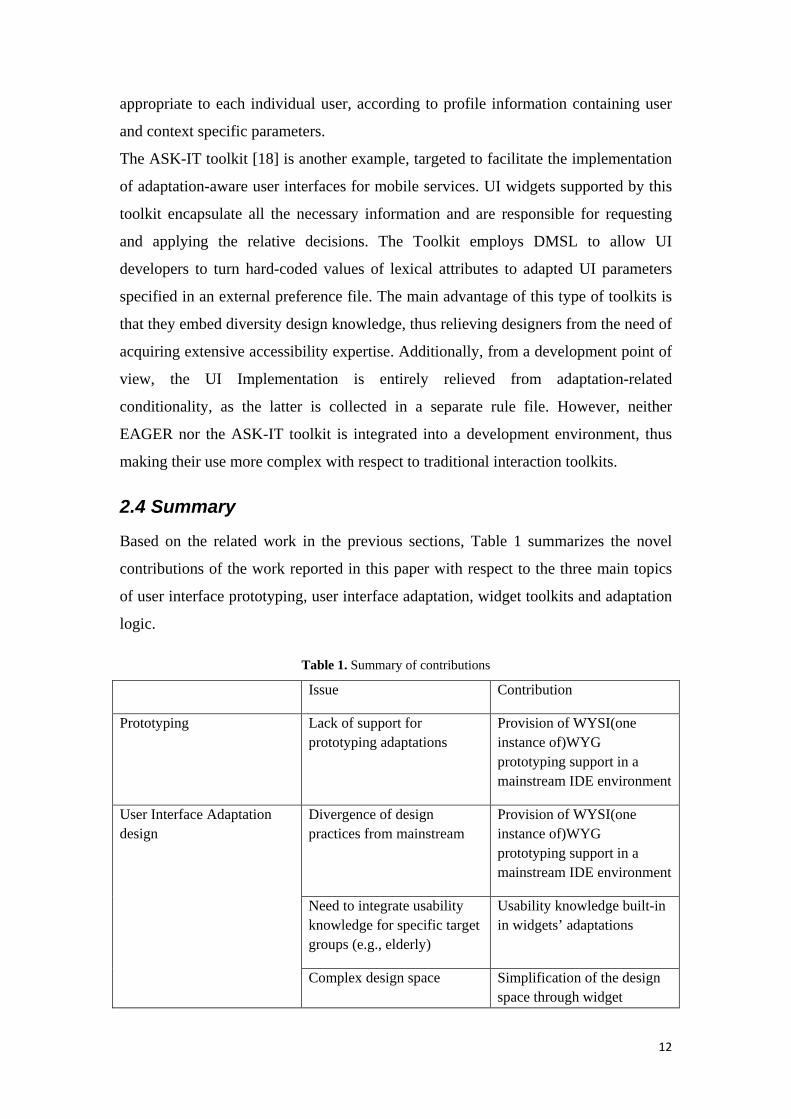
2.4 Summary
Based on the related work in the previous sections, Table 1 summarizes the novel
contributions of the work reported in this paper with respect to the three main topics
of user interface prototyping, user interface adaptation, widget toolkits and adaptation
logic.
Table 1. Summary of contributions
Issue Contribution
Prototyping Lack of support for prototyping adaptations
Provision of WYSI(one instance of)WYG prototyping support in a mainstream IDE environment
User Interface Adaptation design
Divergence of design practices from mainstream
Provision of WYSI(one instance of)WYG prototyping support in a mainstream IDE environment
Need to integrate usability knowledge for specific target groups (e.g., elderly)
Usability knowledge built-in in widgets’ adaptations
Complex design space Simplification of the design space through widget

13
abstraction
Widget Toolkits Need to produce design alternatives
Alternative designs built in widget library
Lack of prototyping support for design alternatives
Provision of WYSI(one instance of)WYG prototyping support in a mainstream IDE environment
Adaptation logic Need to define adaptation logic
Adaptation logic of widget attributes predefined
Easy modification and addition of new adaptation rules
3. The OASIS approach to User Interface adaptation
The requirements for the work presented in this paper emerged in the context of
OASIS1
3
, an Integrated Project of the EC 7th FP in the area of eInclusion that aims at
increasing the quality of life and the autonomy of elderly people by facilitating their
access to innovative web-based services. OASIS aims at creating an open reference
architecture, which allows not only for a seamless interconnection of Web services,
but also for plug-and-play of new services. 12 initial services have been selected for
prototype development, grouped into three main categories considered vital for the
quality of life enhancement of the elderly: Independent Living Applications,
Autonomous Mobility, and Smart Workplaces Applications [ ]. These applications
are intended to be available through three different technological platforms, namely
tablet PC, PDA and mobile phone.
Developing application GUIs for the older population presents significant challenges,
as special requirements are imposed not only by the physical characteristics of this
part of the population, such as vision impairments and memory loss, but also by their
unfamiliarity with technology. The variety of OASIS applications and the diversity of
target devices make the designers’ task more complex, and the need for tools that
inherently support GUI adaptation becomes imperative. In order to support the
1 OASIS stands for “Open architecture for Accessible Services Integration and Standardisation” (see also the Acknowledgment section).

14
development of the OASIS applications, an adaptation development toolkit has been
elaborated, based on the unified user interface concept and development
methodology, for simplifying to the maximum possible extent the design and
implementation of self-adapted user interfaces and hiding any adaptation-related
complexity. Such an approach allows to design adaptable user interfaces suitable for
older users without requiring in-depth design knowledge regarding the specific target
user population. On the other hand, from a technical point of view, the OASIS
adaptation development toolkit practically supports developers by ensuring
maintainability (single point modification automatically affects the entire OASIS
system without the need for manual propagation), scalability (extension support
through plug-ins) and usability (decision-making complexity and adaptation
mechanism are encapsulated into every widget). In particular, such a tool:
• facilitates the development of interactive applications and services for
different platforms;
• provides various accessibility components that can be used across a range of
interaction devices;
• enables the personalization of interactions, as well as automatic tailoring-to-
device capabilities and characteristics;
• facilitates the rapid prototyping of adaptable interfaces for a range of
supported devices.
This paper focuses on how the Adaptation Development Toolkit supports user
interface adaptability. However, the adopted approach can also support user interface
adaptivity, provided that interaction monitoring data are available to drive dynamic
adaptations.
The development of the OASIS adaptation development toolkit is based on the
following process: (i) identification of the UI aspects that could be conditionally
adjusted and the discrete dimensions that are correlated with the adaptation decisions
(user- and context- related parameters); and (ii) the definition of each UI component’s
alternatives according to the requirements posed by each adaptation dimension. These
alternatives are then encoded into a rule set, loaded by a rule inference engine,
evaluated and finally propagated from the concept layer to the actual presentation
layer. The followed process for identifying and encoding user adaptations addressing
the needs of the older population is described in more details in [8].

15
The Decision Making Specification Language (DMSL) engine and run-time
environment [21] are employed as a powerful rule definition mechanism. Scalability
is promoted by utilizing external rule files while relieving the actual UI
implementation code by any adaptation-related conditionality. An Adaptable Widget
Library is provided which encapsulates all the necessary complexity for supporting
adaptation (from evaluation request to decision application). Such Library has been
integrated into NetBeans to facilitate developers in transparently building self-
adaptable interfaces.
4. The Adaptation Development Toolkit
The Adaptation Development Toolkit (see Figure 2) consists of the two main
components: the DMSL Server and the Adaptable Widget Library. The DMSL server
is divided into the DMSL Engine Core and the DMSL Proxy. The Core is responsible
for loading and evaluating the rules, while the Proxy acts as a mediator between the
Core and external “clients”, by monitoring incoming connections, processing the
requests and invoking the appropriate core methods.
The Adaptable Widget Library is a set of UI components, primitives and complex,
that utilizes the DMSL Server facility to support adaptation. This relieves developers
of the responsibility to manually adapt any widget attributes by offering a common
“adapt” method. Each widget encloses a list of its adaptation attributes and when
instructed to adapt itself, evaluates each attribute and applies the corresponding
decision. Considering that the DMSL Server is a remote component in OASIS
applications, network connectivity is an essential precondition for the overall process.
To address this issue, a fail-safe mechanism has been developed to minimize the side
effects of potential connectivity loss, where the “last” known configuration is stored
and maintained locally to facilitate “static” user interface generation without
supporting on-the-fly adaptation.
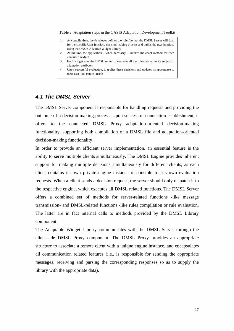
The embedded adaptation process is outlined in Table 2.

16
Adaptive Widget Library
DMSL Server
DMSL Engine Core
DMSL Proxy
(Web Service)
1. User Profile 2. Adaptation Parameters (User- or Context- Attributes)
Adaptation Decisions
User Interface Implementation
• Developers utilize the above widgets to realize every application interface
• Adaptation-aware Widgets relieve
developers of the responsibility to manual adapt any widget attributes.
• Developers only have to invoke the adapt
method which automatically adapts component attributes to meet specific attributes
Panel
Button
Image
Utilize
Result
Figure 1: The OASIS Adaptation Platform
17
Table 2. Adaptation steps in the OASIS Adaptation Development Toolkit
4.1 The DMSL Server
The DMSL Server component is responsible for handling requests and providing the
outcome of a decision-making process. Upon successful connection establishment, it
offers to the connected DMSL Proxy adaptation-oriented decision-making
functionality, supporting both compilation of a DMSL file and adaptation-oriented
decision-making functionality.
In order to provide an efficient server implementation, an essential feature is the
ability to serve multiple clients simultaneously. The DMSL Engine provides inherent
support for making multiple decisions simultaneously for different clients, as each
client contains its own private engine instance responsible for its own evaluation
requests. When a client sends a decision request, the server should only dispatch it to
the respective engine, which executes all DMSL related functions. The DMSL Server
offers a combined set of methods for server-related functions -like message
transmission- and DMSL-related functions -like rules compilation or rule evaluation.
The latter are in fact internal calls to methods provided by the DMSL Library
component.
The Adaptable Widget Library communicates with the DMSL Server through the
client-side DMSL Proxy component. The DMSL Proxy provides an appropriate
structure to associate a remote client with a unique engine instance, and encapsulates
all communication related features (i.e., is responsible for sending the appropriate
messages, receiving and parsing the corresponding responses so as to supply the
library with the appropriate data).
1. At compile time, the developer defines the rule file that the DMSL Server will load for the specific User Interface decision-making process and builds the user interface using the OASIS Adaptive Widget Library
2. At runtime, the application – when necessary – invokes the adapt method for each contained widget
3. Each widget asks the DMSL server to evaluate all the rules related to its subject to adaptation attributes
4. Upon successful evaluation, it applies these decisions and updates its appearance to meet user and context needs

18
4.2 The Adaptable Widget Library
The Adaptable Widget Library contains a set of adaptation-aware User Interface
components designed to satisfy the needs of each target device –Swing-based
components for PC, AWT-based components for Windows Mobile devices. Each
widget in the Adaptable Widget Library inherently supports adaptation in a way
transparent to developers, who can use them as “traditional” UI building blocks.
The Adaptable Widget Library instantiates a common look and feel across OASIS
applications. The implemented adaptations are meant to address the interaction needs
of older users, and follow specific guidelines which have been encoded into DMSL
rules [8]. This approach is targeted to novice developers of adaptable user interfaces
and to the specific needs of the OASIS project. The Adaptable Widget Library is the
solution proposed to relieve developers from the task of re-implementing or
modifying their applications to integrate adaptation-related functionality.
The developed widgets are built in a modular way that facilitates their further
evolution, by offering the necessary mechanism to support new features addition and
modifications. Therefore, more experienced developers can use their own adaptation
rules to modify the adaptation behavior of the interactive widgets.
The Library’s implementation using the Java programming language ensures the
development of portable UIs that can run unmodified with the same look regardless of
the underlying Operating System. Apart from OS independence, the proposed
framework offers a solution that targets mobile devices running Windows Mobile.
Java is available in such devices; however, its evolution relies on external vendors and
follows the PC version by two generations.
The proposed framework (as depicted in Figure 3) utilizes functionality available in
the PCs since Java v1.5 (current version is 1.6) while mobile devices support up to
Java v1.4. The next Java update for the mobile devices, where SWING support will
be added, will directly make the library available for these devices as well. In the
meanwhile, a limited library version was developed based on Java AWT to facilitate
the development of Adaptable UIs for mobile devices. Given the Library’s modular
architecture, only a minimal portion of software had to be re-implemented for the port
to be achieved.Despite devices’ low hardware capabilities and Java’s AWT
heavyweight nature, where external modifications are limited as the majority of the
presentation attributes are directly manipulated by the OS, the mobile version of the

19
Adaptive Widget Library offers a rich set of adaptation features, such as color and
size adaptation.
Figure 2: The Adaptation scheme consists of the: (i) Adaptive Widget, (ii) the Adaptation Engine and (iii) the runtime environment
4.2.1 Look and Feel
The OASIS project aims to promote usability by offering a unified user interface
through a common look & feel for all its applications. A consistent Look and Feel
facilitates users in learning and using applications more efficiently, and is often used
to characterize products’ suites or families (in the case of OASIS, the entire set of
OASIS applications). In the case of OASIS, a common look and feel has been
developed and reported in a style guide [10]. However, in many cases look and feel
flexibility is essential to meet specific application needs or adhere to commercial
standards. Besides introducing a common look & feel, the Adaptable Widget library
provides the necessary mechanisms to support alternative look and feels either for the
entire environment (i.e., skins) or for individual applications.
For that to be achieved, every widget initially follows the general rules to ensure that
the common look and feel invariant will be met, and then applies any additional
presentation directives declared as “custom” look and feel rules. A “custom” rule
could affect either an individual widget (e.g., the OK button that appears in the
confirmation dialog of a specific application) or a group of widgets; therefore, entire
applications can be fully skinned since their widgets inherently belong to a group

20
defined by the application itself (e.g., all the buttons that belong to a specific
application).
The look and feel implementation of the Adaptable Widget Library is based on the
Synth [28] technology originally introduced in Java JDK 5.0. The Synth technology
has been adopted in the Adaptable Widget Library for several reasons. First of all,
being a native Java feature, Synth ensures stability and minimal usage overhead.
Furthermore, Synth’s concept of holding alternative styles in external XML files
instead of hard-coding, in combination with adopted adaptation approach, establishes
a modular foundation that ensures maintainability, limits side effects and offers
numerous extensibility points. In addition, Synth besides offering the necessary
mechanisms to support global and local adaptations, is likely to continue being used
in the future, as Java relies on it and will keep updating it. In particular, in Java’s
upcoming release (JDK 7.0, scheduled for 2010) the cross-platform Look and Feel
technology “Nimbus” is entirely based on Synth technology.
4.2.2 Adaptable Widget Library Architecture
The core components of the Adaptable Widget Library are the Adaptable Widget API,
the UI Widgets and the auxiliary Utility classes.
Every adaptable widget (as depicted in Figure 4) in AWL extends the relevant
primitive Java component (i.e., AdaptableButton extends Java’s Swing JButton) to
provide its typical functionality, while the adaptation-related functionality is exposed
via a straightforward API, the AdaptableWidget API. The API declares one main and
two auxiliary methods: the adapt and the get(/set)Function methods. Application
developers can apply adaptation by simply calling the adapt method. This zero-
argument method is the key method of the whole API, as it encapsulates the essential
adaptation functionality and every adaptation-aware widget implements it
accordingly. The global adaptation process includes firstly the evaluation of the
respective DMSL rules that define the appropriate style and size, and then their
application through Synth’s region matching mechanism.
For a local look and feel to be applied, the adapt method additionally utilizes the
function getter method. The function attribute can be set manually by the
designer/developer, and is used on the one hand to decide whether and which
transformations should be applied, and on the other hand define the group (i.e., all the
buttons appear in the Main Navigation bar) or the exact widget (i.e., the OK button in

21
a specific application) where they should be applied utilizing Synth’s name matching
mechanism.
Figure 3: Adaptable Widget’s conceptual model
4.2.3 Adaptable Widgets
The Adaptable Widgets currently implemented in the Library include label, button,
check box, list, scrollbar, textbox, text area, drop-down menu, radio button, hyperlink,
slider, spinner, progress bar, tabbed pane, menu bar, menu, menu item, and tooltip.
Complex widgets such as date and time entry are currently under development.
Adaptable widget attributes include background color/image, widget appearance and
dimensions, text appearance, cursor’s appearance on mouse over, highlighting of
currently selected items or options, orientation options (Vertical or Horizontal),
explanatory tooltips, etc. These attributes are tightly coupled with the internal state of
the widget, thus any change in its internal state is reflected in the “look” as well (e.g.,
when the user clicks on a button its state changes from idle to pressed and its
appearance reflects that change). The “feel” aspect of each widget inherits the
characteristics of the native widgets available in the Java framework and supports
casual activities (mouse hover, mouse click, key pressed, etc.).
Table 3 shows some of the available widgets. Adaptable attributes for each widget are
summarized in Appendix I. All widgets in the Library also include a text description
which allows easy interoperation with speech-based interfaces, thus offering also the
possibility to deploy a non visual instance of the developed interfaces.
Table 3. Widget alternatives in the Adaptation Development Toolkit
Button Alternatives

22
Scroll Bar Arrow Button
Alternatives
Check Box Alternatives
List Alternatives
Scrollbar Alternatives
Textbox Alternatives
Text area Alternatives
Drop Down Menu
Alternatives
Radiobutton Alternatives
23
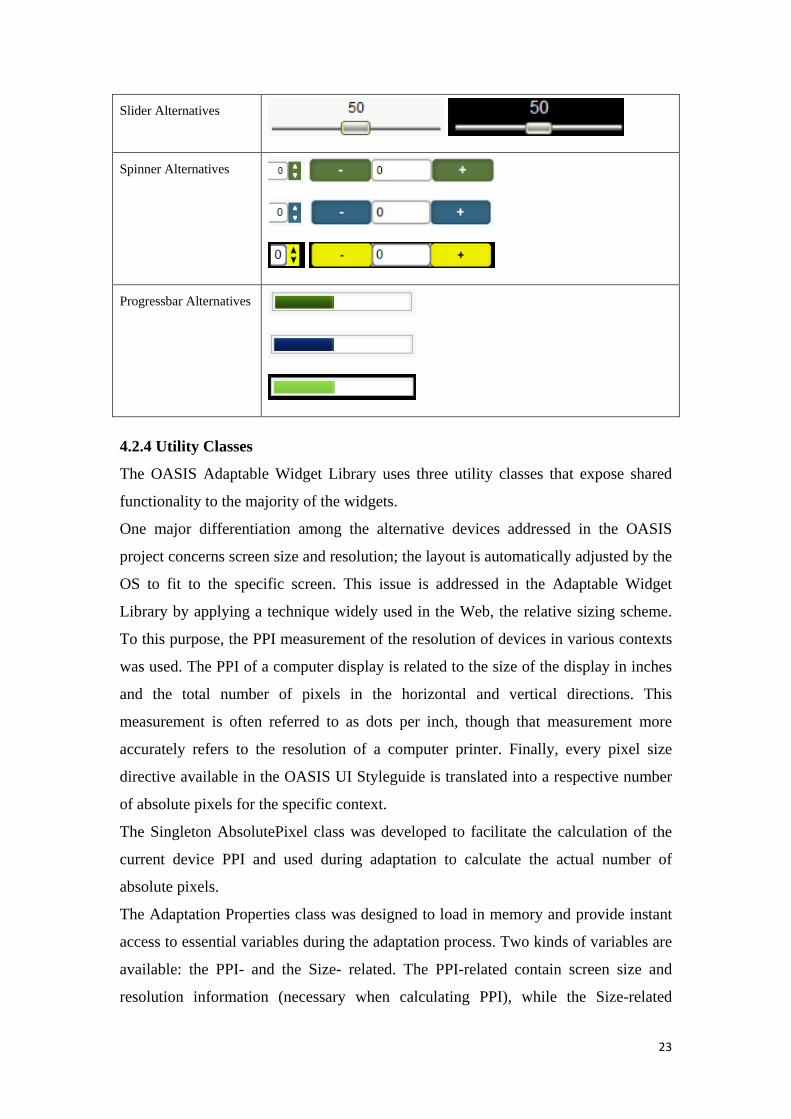
Slider Alternatives
Spinner Alternatives
Progressbar Alternatives
4.2.4 Utility Classes
The OASIS Adaptable Widget Library uses three utility classes that expose shared
functionality to the majority of the widgets.
One major differentiation among the alternative devices addressed in the OASIS
project concerns screen size and resolution; the layout is automatically adjusted by the
OS to fit to the specific screen. This issue is addressed in the Adaptable Widget
Library by applying a technique widely used in the Web, the relative sizing scheme.
To this purpose, the PPI measurement of the resolution of devices in various contexts
was used. The PPI of a computer display is related to the size of the display in inches
and the total number of pixels in the horizontal and vertical directions. This
measurement is often referred to as dots per inch, though that measurement more
accurately refers to the resolution of a computer printer. Finally, every pixel size
directive available in the OASIS UI Styleguide is translated into a respective number
of absolute pixels for the specific context.
The Singleton AbsolutePixel class was developed to facilitate the calculation of the
current device PPI and used during adaptation to calculate the actual number of
absolute pixels.
The Adaptation Properties class was designed to load in memory and provide instant
access to essential variables during the adaptation process. Two kinds of variables are
available: the PPI- and the Size- related. The PPI-related contain screen size and
resolution information (necessary when calculating PPI), while the Size-related

24
contain the information regarding the minimum relative sizes that should be applied to
some components when integrated into the NetBeans IDE. The latter facilitates the
design/development process, as it automatically applies the necessary sizes at the
earliest possible stage, the design time, relieving the designers/developers from
manually calculating the relevant size. Moreover, the Adaptable Widget Library takes
into account the current context of use, therefore the UI will be proportionally scaled
on a pc and on a laptop to provide the same size-ratio.
Finally the client-side DMSL Proxy, namely the DMSLConnector simplifies the
process of establishing and maintaining a connection with the DMSLServer through
the server-side DMSL Proxy component, by taking care of all the necessary
initialization tasks.
5. Interaction Prototyping
In order to facilitate the employment of the proposed approach into real life
applications towards rapid development of adaptable UIs, the Adaptable Widget
Library has been integrated into the NetBeans GUI Builder (version 8.0 and above,
see Figure 3). The choice of NetBeans was based on a thorough survey to identify the
most suitable available IDEs candidates to incorporate the Adaptable Widget Library
into their GUI Builders. NetBeans was preferred to Eclipse, which offers almost
equivalent facilities, because it is better supported and more extensible, as its GUI
Builder offers the essential mechanisms that facilitate the integration of custom
widgets. The library’s integration into the NetBeans built-in tool offers prototyping
functionalities such as live “UI” preview at design time, as well as automatic
application of specific sizing directives according to the OASIS styleguide. Moreover,
NetBeans facilitates the implementation of the application’s logic associated with the
UI, thus offering not only a prototyping tool but a complete framework supporting the
entire application development life cycle (design, development and maintenance)
from a high-fidelity prototype to a final application.
5.1 AWL Architecture and IDE Integration
The NetBeans GUI Builder contains a Palette that displays all the available widgets,
initially only Java’s built-in widgets, while the designers/developers, experienced or
not, are familiar with its straightforward ‘drag and drop’ functionality to add widgets
on a “screen”. The Common Palette content is a two-level hierarchy, where the top-

25
most level is Categories and the Category children are Items. It is possible to select
(highlight) items in the palette panel using a mouse or keyboard and then
inserted/dropped into an editor that supports the palette. The palette content can come
from two different sources:
• Folders and files hierarchy defined in XML layer, where folders under
palette's root folder represent categories, files in category folders are palette
item. This way of creating of palette content is more convenient for module
developers as very little extra coding is required to setup a palette
• An arbitrary hierarchy of generic Nodes, where the children of palette's root
Node are categories and the children of a category Node are palette items. This
approach is more flexible when the palette content must change dynamically
(e.g. according to cursor position in editor window) however more coding may
be needed to setup the Node hierarchy.
Figure 4: AWL’s Palette integration scheme
The items of the Palette should adhere to the JavaBean specification [30] using Beans
binding specification (JSR 295) and comes with pre-installed Swing and AWT
components including the respective visual menu designer. JavaBeans are reusable
software components for Java that can be manipulated visually in a builder tool.
Practically, they are classes written in the Java programming language conforming to
particular programming conventions. They are used to encapsulate many objects into
a single object (the bean), so that they can be passed around as a single bean object
instead of as multiple individual objects. A JavaBean is a Java Object that is
serializable, has a nullary constructor, and allows access to properties using getter and
setter methods.

26
Consequently, the AWL integration into NetBeans was achieved by implementing
every AWL widget as a JavaBean and then inserting it in the Palette. Since, every
AWL widget (as depicted in Figure 5) extends a native Java GUI component, the
editor used in is the Swing/AWT editor that is natively supported by the NetBeans
Palette.
5.2 Prototyping Process
To prototype a user interface, the designer will create the application’s main window,
i.e., a new JFrame Form, and will add the common containers (e.g., menu panels,
status bar, header) by placing AdaptivePanels where appropriate. The necessary
widgets (e.g., menu buttons, labels, text fields) will then be dragged from the Palette
and dropped into the design area of the builder as shown in the Figure 6 below.
Figure 5: AWL Integration into NetBeans IDE
To customize widgets, the typical process is to manually set the relevant attributes for
each widget using the designer’s “property sheets”. To apply the same adjustment to
other widgets, one can either copy/paste them or iteratively set them manually. In the
adaptation-enabled process, using the function attribute, the process is slightly
different. First, one needs to set the function attribute, then define the required style
(e.g., colors, images, fonts), and finally to define the rule (in a separate rule file) that
maps the newly added style to the specific function. Whenever the same style should
be applied, it is sufficient to simply set the function attribute respectively (CSS-like).
27
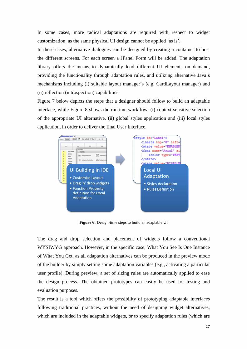
In some cases, more radical adaptations are required with respect to widget
customization, as the same physical UI design cannot be applied ‘as is’.
In these cases, alternative dialogues can be designed by creating a container to host
the different screens. For each screen a JPanel Form will be added. The adaptation
library offers the means to dynamically load different UI elements on demand,
providing the functionality through adaptation rules, and utilizing alternative Java’s
mechanisms including (i) suitable layout manager’s (e.g. CardLayout manager) and
(ii) reflection (introspection) capabilities.
Figure 7 below depicts the steps that a designer should follow to build an adaptable
interface, while Figure 8 shows the runtime workflow: (i) context-sensitive selection
of the appropriate UI alternative, (ii) global styles application and (iii) local styles
application, in order to deliver the final User Interface.
Figure 6: Design-time steps to build an adaptable UI
The drag and drop selection and placement of widgets follow a conventional
WYSIWYG approach. However, in the specific case, What You See Is One Instance
of What You Get, as all adaptation alternatives can be produced in the preview mode
of the builder by simply setting some adaptation variables (e.g., activating a particular
user profile). During preview, a set of sizing rules are automatically applied to ease
the design process. The obtained prototypes can easily be used for testing and
evaluation purposes.
The result is a tool which offers the possibility of prototyping adaptable interfaces
following traditional practices, without the need of designing widget alternatives,
which are included in the adaptable widgets, or to specify adaptation rules (which are

28
predefined). Through the prototyping tool, it is also possible to preview how
adaptations are applied for the defined user profiles. However, more expert designers
can easily modify the DMSL adaptation logic, which is stored independently, and
experiment with new adaptations and with different look and feels. Finally, the overall
approach also allows implementing, besides widget appearance adaptations more
complex forms of adaptation (e.g., dialogue adaptation) by prototyping alternative
dialogues and defining the related adaptation logic.
Figure 7: Run-time steps to deliver adapted UI
5.3 A working example
The aim of this section is to present a concrete example of use of the Adaptable
Widget Library through the NetBeans GUI builder to develop a small application,
namely an address book targeted to elderly users. This application has been developed
as an example and is not part of the OASIS application suite, but is very similar to
OASIS applications in both purpose and complexity. The aim of this development,
which was conducted by a beginner UI designer with no previous experience in user
interface adaptation, was to obtain a preliminary assessment of the extent to which the
provided Adaptive Widget Library and prototyping facilities can be easily adopted by
designers, as well as to elaborate a full-scale example useful for other developers in
the context of the project.

29
Figure 9 illustrates the design in the NetBeans GUI builder. First of all, a new
application window was instantiated by creating a new JFrame form. Then, an
AdaptivePanel was added into that JFrame as the main container panel, named
“MainContainer”, to host the rest of the widgets. As a subsequent step, the screen of
the designed application was divided into two panels: the left one displays the list of
names in the catalogue, whereas the right one contains a dialogue which allows
entering data for each name in the address book. This was achieved by creating two
additional AdaptivePanel instances on the left and right part of the screen
respectively. The left AdaptivePanel, on its turn, contains a four-item menu which is
instantiated through a MainNavigationBar widget, with four MainMenuButton
instances.
Figure 8: Designing an adaptive elderly-friendly address book in NetBeans IDE

30
Below the menu, the catalogue of the address book is displayed. It was obtained by
adding four AdaptivePanel instances, one for each column in the catalogue. On the
right hand side of the screen, the AdaptivePanel contains three subpanels and some
additional widgets, namely two labels and a text box.
The first panel includes an image panel displaying a picture of the person whose data
are being displayed, and an adaptive label indicating her or his name. The second
panel is divided in two columns (using the Java’s grid layout), where the first column
contains labels and the second one contains the adaptive widgets which support user
input of the necessary data (AdaptiveTextField, AdaptiveComboBox). An
AdaptiveTextField was chosen over an AdaptiveTextbox as the most appropriate
input for a single line text input widget where the user should type the desired name.
An AdaptiveCombobox was added as a single selection Drop Down menu to provide
input regarding occupations of people in the address book, whose available options
were manually set via the relevant NetBeans built-in properties sheet. Finally, the last
panel displays three adaptive buttons for Save, Delete and Cancel commands
respectively.
The non-interactive AdaptiveLabels have as default text “AdaptiveLabelX”, which
was then replaced by the designer with the appropriate text for each case. The default
text of any widget is similar to “AdaptiveWidgetTypeX”, where WidgetType is
Button, Label, etc. and X is an automatically generated number indicating that this is
the Xth widget of this type added to the UI. The designer can replace this text with a
most expressive one by either hitting F2 or selecting “Edit Text” on the widget’s
right-click pop-up menu.
Regarding the Look & Feel profiles, two alternatives were defined suitable for sighted
and visually-impaired users respectively, while the resulted UI could switch between
them according to user’s characteristics. Considering L&F customization, instead of
having hard-coded customizations through property sheets, which eliminates any
adaptation capabilities, customizations were achieved through the function attribute.
The widgets that required customization were all the instances of AdaptivePanel,
where the background image should change to provide adequate contrast. For that to
be achieved, the function attribute of every AdaptivePanel was set to the appropriate
value, the relevant style was defined to declare which image should be painted as the

31
background of this area, and the DMSL rule was defined to map this style with the
appropriate value function. Figure 10 presents the alternatives Look & Feels created.
Figure 9: (a) Address book for sighted users (b) Address book for users with visual impairment
After completing the development, the involved designer reported that no major
difficulties arose, and that the few differences with respect to the standard prototyping
process he was accustomed to were very easy to grasp. He also stated that he liked to
possibility of easily viewing during prototyping the results of the adaptation, and
commented that this feature may be particularly useful in case of more complex
developments, because it allows to immediately verifying the effects of any
adaptation rule. The time taken to complete the development was approximately 4
hours.
6. Discussion and Conclusion
This paper has presented a novel approach to supporting the development of adaptable
user interfaces by embedding adaptation knowledge and logic directly into interactive
widget, thus hiding adaptation-related complexity in the development process and
minimizing the divergence with respect to mainstream development practices.
The proposed approach is claimed to offer the following benefits:
• From a design point of view, it supports the possibility of embedding
accessibility and diversity-related design knowledge into libraries of widgets,
thus relieving designers from the need of acquiring in-depth related expertise
and to design their own adaptations
• From an implementation point of view, the proposed approach makes
adaptation completely transparent, eliminating the need of implementing
adaptation rules. On the other hand, it also offers extensibility as both the

32
presentation styles and the adaptation logic are stored in external application-
independent files. Both global and local adaptations can be applied. Multiple
dialogues can be activated on demand. The approach is also independent from
where and how user and context profiles are stored in a system’s architecture.
Overall, the main benefit is claimed to be that the proposed approach does not impose
any overhead for the design and development of adaptable user interfaces with respect
to conventional practices.
An instantiation of the proposed approach has also been presented, elaborated in the
context of the OASIS project to facilitate the design of a suite of applications in
various domains targeted to the older users’ population. In this context, an Adaptation
Development Toolkit has been developed which includes an Adaptable Widget
Library (specifically designed to suit the adaptation needs of elderly users), as well as
a complete adaptation platform to support the run-time automatic adaptation of each
widget according to predefined user profiles and rules. To further facilitate the
practice of developing adaptable GUIs, the Adaptable Widget Library has been
integrated into the NetBeans GUI builder. The result is claimed to be the first and so
far unique tool which supports rapid prototyping of adaptable user interfaces, with the
possibility of immediately preview adaptation results.
No extensive formal evaluation was performed, as the tool user interface does not
substantially differ from the NetBeans environment. Following in-house expert
assessment of the offered prototyping facilities, the tool has been employed in the
context of an advanced Human Computer Interaction course at the University of
Crete, with the objective of introducing post-graduate students to the basics of
developing self-adapting user interfaces. The students had no previous experience in
using NetBeans and in developing adaptable user interfaces. The exercise involved
designing the user interfaces for a hypothetical home control system for able-bodied
users as well as users with vision problems (e.g., cloudy vision, spots in the field of
vision, trouble discerning colors), color blindness, and tremors in upper limbs.
For the purposes of the exercise, the students were not provided with the Adaptable
Widget Library, instead they were asked to define their own adaptations and the
related rules. The tool was well accepted by the students (18 in total), who also
provided positive comments, focusing in particular on the fact that the tool allowed
them to apply well-known development practices and quickly view the results of their
designs. Additionally, the students provided several suggestions for improvement,

33
concerning in particular the addition of a layout manager, handling automatic resizing
through rules, and of a rule editor.
As a subsequent step, the developed prototyping tool and the Adaptable Widget
Library have been distributed to the OASIS consortium for the implementation of the
OASIS applications. Besides offering a large-scale validation of the proposed
approach and of the provided tools, the accumulated experience and feedback will
allow solving any potential problem and introduce new features based on developers’
requirements.
Future development work will expand the widget library with complex widget and
create alternative look and feels. Future research work will concern the integration in
the prototyping environment of a facility for editing and validating the DMSL
adaptation logic, based on typical editing functionality for programming languages,
thus making easier the implementation, modification and update of custom
adaptations.
Acknowledgments Part of this work has been conducted in the context of the Integrated Project ICT-
OASIS “Open architecture for Accessible Services Integration and Standardization”,
funded by the European Commission under the 7th Framework Programme (Grant
Agreement 215754, 1/1/2008 - 31/12/2011). OASIS targets to utilize ICT and other
key technologies in order to provide holistic services to older people to support their
physical and psychological independence, stimulate their social or psychological
engagement and foster their emotional well being. In doing so, OASIS thus addresses
key areas of their activities encompassing: independent living and socializing,
autonomous mobility, and flexible work-ability. We would like to thank all OASIS
partners. In particular we would like to thank Jan-Paul Leuteritz and Vivien Melcher
from FhG-IAO for their work on the OASIS style guide and adaptation parameters
and rules.

34
References 1. Antona, M., Savidis, A., & Stephanidis, C. (2006). A Process–Oriented Interactive
Design Environment for Automatic User Interface Adaptation. International
Journal of Human Computer Interaction, 20 (2), 79-116.
2. Balme, L., Demeure, A., Barralon, N., Coutaz, J. & Calvary, G. (2004).
CAMELEON-RT: A Software Architecture Reference Model for Distributed,
Migratable, and Plastic User Interfaces. Lecture Notes in Computer Science 3295,
291-302.
3. Bekiaris, E. , Bonfiglio, S. (2009). The OASIS Concept. In C. Stephanidis (Ed.)
Universal Access in Human-Computer Interaction. Volume 6 of the Proceedings
of the 13th International Conference on Human-Computer Interaction (HCI
International 2009), San Diego, CA, USA, 19-24 July, pp. 202–209. Berlin
Heidelberg: Springer, LNCS.
4. Bellik, Y. Jacquet, C., Rousseau, C. (2010). Two Frameworks for the Adaptive
Multimodal Presentation of Information. Multimodality in Mobile Computing and
Mobile Devices: Methods for Adaptable Usability, 166 - 196.
5. Calvary, G., Coutaz, J., Thevenin, D., Limbourg, Q., Bouillon, L. &
Vanderdonckt, J. (2003). A Unifying Reference Framework for multi-target user
interfaces. Interacting with Computers, 15 (3), 289 - 308.
6. Doulgeraki, C., Partarakis, N., Mourouzis, A., & Stephanidis, C. (2009).
Adaptable Web-based user interfaces: methodology and practice. eMinds, Vol 1,
No 5 (2009), http://www.eminds.hci-
rg.com/index.php?journal=eminds&page=article&op=download&path[]=58&path
[]=33
7. Grammenos, D., Savidis, A., & Stephanidis, C. (2007). Unified Design of
Universally Accessible Games. In C. Stephanidis, (Ed.) Universal Access in
Human-Computer Interaction: - Intelligent and Ubiquitous Interaction
Environments. – Volume 6 of the Proceedings of the 12th International
Conference on Human-Computer Interaction (HCI International 2007), Beijing,
P.R. China, 22-27 July (pp. 607-616). Berlin Heidelberg: Springer (LNCS).
8. Leuteritz, J.-P., Widlroither, H., Mourouzis, A., Panou, M., Antona, M., Leonidis,
S. (2009). Development of Open Platform Based Adaptive HCI Concepts for
Elderly Users. In C. Stephanidis, (Ed.), Universal Access in Human-Computer

35
Interaction - Intelligent and Ubiquitous Interaction Environments. – Volume 6 of
the Proceedings of the 13th International Conference on Human-Computer
Interaction (HCI International 2009), San Diego, CA, USA, 19-24 July, pp. 684-
693. Berlin Heidelberg: Springer LNCS.
9. Limbourg, Q., Vanderdonckt, J., Michotte, B., Bouillon, L., Florins, M. &
Trevisan D. (2004). Proceedings of the ACM AVI'2004 Workshop “Developing
User Interfaces with XML: Advances on User Interface Description Languages”,
55 - 62.
10. Melcher, V., Leuteritz, Leonidis, A. (2009) Innovative UI elements and dialogues
- OASIS Interface Guidelines. OASIS project internal report.
11. Microsoft. (2007). An Overview of Microsoft® Visual Studio® 2008, White
Paper. http://www.microsoft.com/downloads/details.aspx?FamilyID=17319eb4-
299c-43b8-a360-a1c2bd6a421b&displaylang=en
12. Microsoft (2009). The .NET Framework. http://www.microsoft.com/NET/
13. Navarre, D., Palanque, P., & Basnyat, S. (2008). A Formal Approach for User
Interaction Reconfiguration of Safety Critical Interactive Systems. Proceedings of
the 27th international conference on Computer Safety, Reliability, and Security,
373-386.
14. NetBeans. (2009). NetBeans IDE 6.8 Release Information.
http://netbeans.org/community/releases/68/
15. Northover, S., Wilson, M. (2004). SWT: The Standard Widget Toolkit, Volume 1.
Addison-Wensley Professional.
16. Preece J., Maloney-Krichar D., (2003). Online communities: Focusing on
sociability and usability. In J. Jacko & A. Sears (Eds.), The Human-Computer
Interaction Handbook – Fundamentals, Evolving Technologies and Emerging
Applications (pp. 596-620). Mahwah, New Jersey: Lawrence Erlbaum Associates.
17. Rettig, M. (1994). Prototyping for tiny fingers. Communication ACM, 37(4), 21 -
27.
18. Savidis, A., Leonidis, A., Lilis, I., Moga, L., Gaeta, E., Villalar, J.L., Fioravanti,
A. & Fico, G., (2004). Self-configurable User Interfaces. ASK-IT Deliverable -
D3.2.1.
19. Savidis, A., Stephanidis, C. (2004). Unified User Interface Design: Designing
Universally Accessible Interactions. International Journal of Interacting with
Computers.

36
20. Savidis, A., Stephanidis, C. (2004). Unified User Interface Development:
Software Engineering of Universally Accessible Interactions. Universal Access in
the Information Society, 3 (3) (Managing Editor: Alfred Kobsa, University of
California, Irvine, USA).
21. Savidis, A., Antona, M., Stephanidis, C. (2005). A Decision-Making Specification
Language for Verifiable User-Interface Adaptation Logic. International Journal of
Software Engineering and Knowledge Engineering, 15 (6), 1063-1094
22. Seffah A., Gulliksen, J., Desmarais, M., (2005). An Introduction to Human-
Centered Software Engineering: Integrating Usability In The Development
Process. Human-Computer Interaction Series, 8, 3 - 15.
23. Stephanidis, C. (2001) The concept of Unified User Interfaces. In C. Stephanidis
(Ed.), User Interfaces for All - Concepts, Methods, and Tools. Mahwah, NJ:
Lawrence Erlbaum Associates, pp. 371-388 (ISBN 0-8058-2967-9).
24. Stephanidis, C., Paramythis, A., Sfyrakis, M., & Savidis, A. (2001). A Case Study
in Unified User Interface Development: The AVANTI Web Browser. In C.
Stephanidis (Ed.), User Interfaces for All - Concepts, Methods, and Tools (pp.
525-568). Mahwah, NJ: Lawrence Erlbaum Associates.
25. Stephanidis, C., Paramythis, A., Zarikas, V., Savidis, A. (2004). The PALIO
Framework for Adaptive Information Services. In A. Seffah & H. Javahery (Eds.),
Multiple User Interfaces: Cross-Platform Applications and Context-Aware
Interfaces (pp. 69-92). Chichester, UK: John Wiley & Sons, Ltd.
26. Stephanidis, C. (Ed.), Salvendy, G., Akoumianakis, D., Bevan, N., Brewer, J.,
Emiliani, P.L., Galetsas, A., Haataja, S., Iakovidis, I., Jacko, J., Jenkins, P.,
Karshmer, A., Korn, P., Marcus, A., Murphy, H., Stary, C., Vanderheiden, G.,
Weber, G., & Ziegler, J. (1998) Toward an Information Society for All: An
International R&D Agenda. International Journal of Human-Computer
Interaction, 10 (2), 107-134.
27. Stephanidis, C., Emiliani, P.L. (1999). Connecting to the Information Society: a
European Perspective. Technology and Disability Journal, 10 (1), 21-44.
28. Sun Microsystems. (2010). The Synth Architecture.
http://java.sun.com/docs/books/tutorial/uiswing/lookandfeel/synth.html
29. Sun Microsystems. (2009). Trail: Creating a GUI With JFC/Swing.
http://java.sun.com/docs/books/tutorial/uiswing/

37
30. Sun Microsystems (2010). JavaBeans Concept.
http://java.sun.com/docs/books/tutorial/javabeans/whatis/index.html
31. Vogel, L. (2009). Eclipse Java IDE.
http://www.vogella.de/articles/Eclipse/article.html
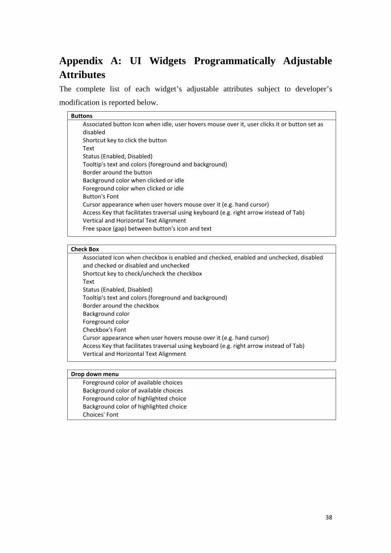
38
Appendix A: UI Widgets Programmatically Adjustable Attributes The complete list of each widget’s adjustable attributes subject to developer’s
modification is reported below. Buttons
Associated button Icon when idle, user hovers mouse over it, user clicks it or button set as disabled Shortcut key to click the button Text Status (Enabled, Disabled) Tooltip's text and colors (foreground and background) Border around the button Background color when clicked or idle Foreground color when clicked or idle Button's Font Cursor appearance when user hovers mouse over it (e.g. hand cursor) Access Key that facilitates traversal using keyboard (e.g. right arrow instead of Tab) Vertical and Horizontal Text Alignment Free space (gap) between button's icon and text
Check Box
Associated Icon when checkbox is enabled and checked, enabled and unchecked, disabled and checked or disabled and unchecked Shortcut key to check/uncheck the checkbox Text Status (Enabled, Disabled) Tooltip's text and colors (foreground and background) Border around the checkbox Background color Foreground color Checkbox's Font Cursor appearance when user hovers mouse over it (e.g. hand cursor) Access Key that facilitates traversal using keyboard (e.g. right arrow instead of Tab) Vertical and Horizontal Text Alignment
Drop down menu
Foreground color of available choices Background color of available choices Foreground color of highlighted choice Background color of highlighted choice Choices' Font
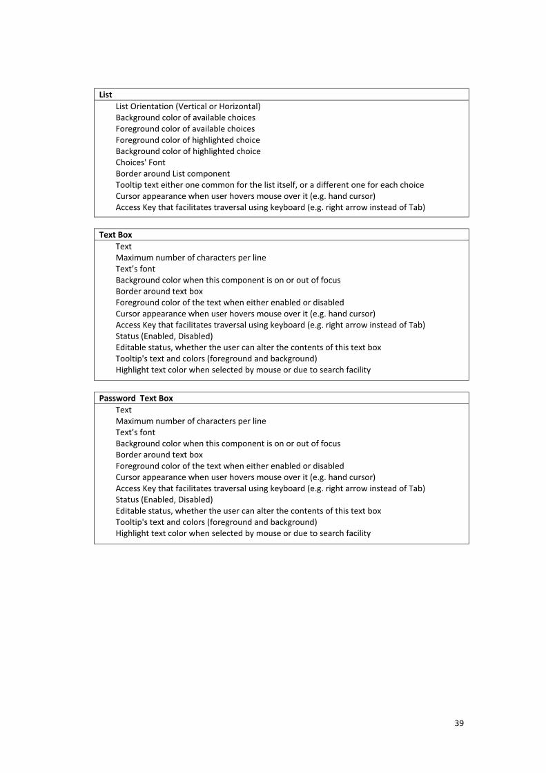
39
List List Orientation (Vertical or Horizontal) Background color of available choices Foreground color of available choices Foreground color of highlighted choice Background color of highlighted choice Choices' Font Border around List component Tooltip text either one common for the list itself, or a different one for each choice Cursor appearance when user hovers mouse over it (e.g. hand cursor) Access Key that facilitates traversal using keyboard (e.g. right arrow instead of Tab)
Text Box
Text Maximum number of characters per line Text’s font Background color when this component is on or out of focus Border around text box Foreground color of the text when either enabled or disabled Cursor appearance when user hovers mouse over it (e.g. hand cursor) Access Key that facilitates traversal using keyboard (e.g. right arrow instead of Tab) Status (Enabled, Disabled) Editable status, whether the user can alter the contents of this text box Tooltip's text and colors (foreground and background) Highlight text color when selected by mouse or due to search facility
Password Text Box
Text Maximum number of characters per line Text’s font Background color when this component is on or out of focus Border around text box Foreground color of the text when either enabled or disabled Cursor appearance when user hovers mouse over it (e.g. hand cursor) Access Key that facilitates traversal using keyboard (e.g. right arrow instead of Tab) Status (Enabled, Disabled) Editable status, whether the user can alter the contents of this text box Tooltip's text and colors (foreground and background) Highlight text color when selected by mouse or due to search facility

40
Text Area Text Maximum number of characters per line Text's Font Background (focused, not focused) Border around text box Foreground color of the text when either enabled or disabled Cursor appearance when user hovers mouse over it (e.g. hand cursor) Access Key that facilitates traversal using keyboard (e.g. right arrow instead of Tab) Status (Enabled, Disabled) Editable status, whether the user can alter the contents of this text box Tooltip's text and colors (foreground and background) Highlight text color when selected by mouse or due to search facility Maximum number of lines Type of text Wrapping when text area is not wide enough
Radio Buttons
Text Foreground color when radio button is selected or not Background color when radio button is selected or not Border around radio button Radio button's text Font Cursor appearance when user hovers mouse over it (e.g. hand cursor) Status (Enabled, Disabled) Tooltip's text and colors (foreground and background) Foreground color when disabled Associated Icon when radio button is enabled and selected, enabled and unselected, disabled and selected or disabled and unselected Shortcut key to select the radio button Foreground and Background color when radio button is on or off Focus
Hyperlink / Label
Text Foreground color when Enabled Background Color is inherited by parent container Hyperlink's Font Tooltip's text and colors (foreground and background) Cursor appearance when user hovers mouse over it (e.g. hand cursor) Border around Hyperlink Status (Enabled, Disabled)

41
Table Row height and margin between rows Foreground and Background color of currently selected cell Show grid (horizontal, vertical lines) Column width Border around Table Cells Background Color of Table Cell Tooltip's text and colors (foreground and background) Tooltip's text and colors (foreground and background) of headers Background color of the table Foreground color of the table Text's Font
Slider
Slider's Orientation (Horizontal or Vertical) Minimum value that user could select using slider Maximum value that user could select using slider Label for each discrete slider value (e.g. Start - End, 0 - 100 etc.) Visibility status of labels, major and minor ticks Background Color of slider component Status (Enabled, Disabled) Border around slider component Tooltip's text and colors (foreground and background) Cursor appearance when user hovers mouse over it (e.g. hand cursor) Major and minor Tick spacing (e.g. every fifth tick should be large - major-, while any other should be small -minor- Major and minor Tick spacing Foreground Color of ticks (little vertical lines below slider) Visibility status of the track Invert start with end (e.g. on vertical orientation start is the top of the slider while end is the bottom) Snap to ticks (limit user's selection only to ticks, e.g. when user slides cursor to 4.6, cursor should automatically be "attracted" to 5)
Spinner
Background and Foreground Color Border around spinner Cursor appearance when user hovers mouse over it (e.g. hand cursor) Status (Enabled, Disabled) Text's Font Tooltip's text and colors (foreground and background)
Menu bar Background color
Menu
Background color is inherited by Menu Bar Foreground color Text Border around Menu Associated Icon when menu is opened and closed or enabled and disabled
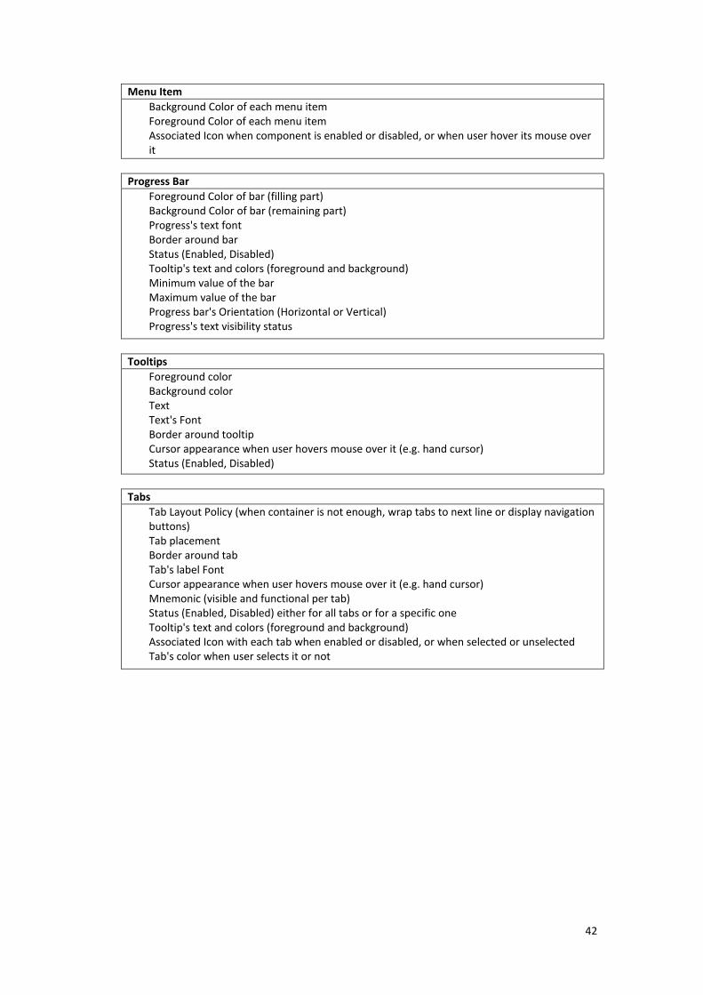
42
Menu Item Background Color of each menu item Foreground Color of each menu item Associated Icon when component is enabled or disabled, or when user hover its mouse over it
Progress Bar
Foreground Color of bar (filling part) Background Color of bar (remaining part) Progress's text font Border around bar Status (Enabled, Disabled) Tooltip's text and colors (foreground and background) Minimum value of the bar Maximum value of the bar Progress bar's Orientation (Horizontal or Vertical) Progress's text visibility status
Tooltips
Foreground color Background color Text Text's Font Border around tooltip Cursor appearance when user hovers mouse over it (e.g. hand cursor) Status (Enabled, Disabled)
Tabs
Tab Layout Policy (when container is not enough, wrap tabs to next line or display navigation buttons) Tab placement Border around tab Tab's label Font Cursor appearance when user hovers mouse over it (e.g. hand cursor) Mnemonic (visible and functional per tab) Status (Enabled, Disabled) either for all tabs or for a specific one Tooltip's text and colors (foreground and background) Associated Icon with each tab when enabled or disabled, or when selected or unselected Tab's color when user selects it or not