mujime copy
TRANSCRIPT
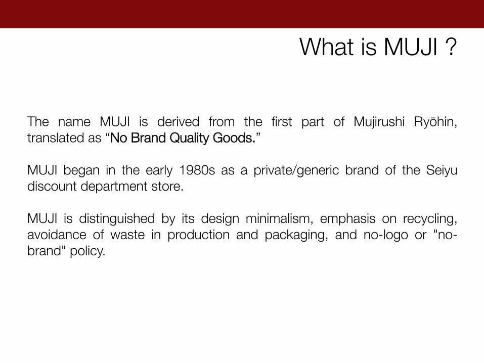
The name MUJI is derived from the first part of Mujirushi Ryōhin, translated as “No Brand Quality Goods.” MUJI began in the early 1980s as a private/generic brand of the Seiyu discount department store. MUJI is distinguished by its design minimalism, emphasis on recycling, avoidance of waste in production and packaging, and no-logo or "no-brand" policy.
What is MUJI ?
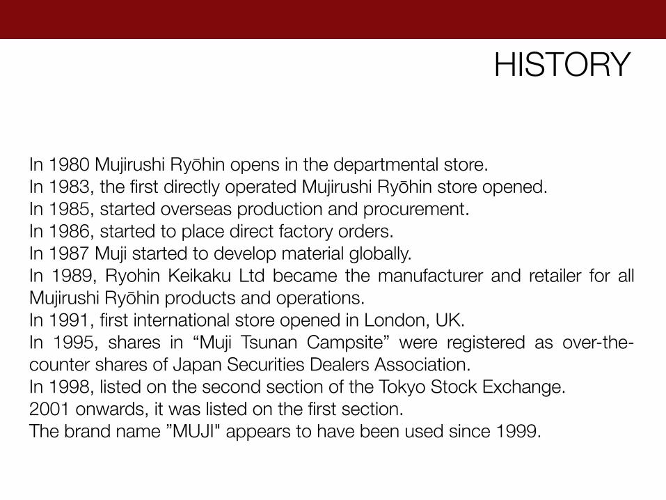
In 1980 Mujirushi Ryōhin opens in the departmental store. In 1983, the first directly operated Mujirushi Ryōhin store opened. In 1985, started overseas production and procurement. In 1986, started to place direct factory orders. In 1987 Muji started to develop material globally. In 1989, Ryohin Keikaku Ltd became the manufacturer and retailer for all Mujirushi Ryōhin products and operations. In 1991, first international store opened in London, UK. In 1995, shares in “Muji Tsunan Campsite” were registered as over-the-counter shares of Japan Securities Dealers Association. In 1998, listed on the second section of the Tokyo Stock Exchange. 2001 onwards, it was listed on the first section. The brand name ”MUJI" appears to have been used since 1999.
HISTORY

IKKO TANAKA
Ikko Tanaka (January 13, 1930 – January 10, 2002) was a well-known Japanese graphic designer. The characteristic of his designs is a blending of deeply rooted Japanese traditions with western modernism to produce contemporary visual expression. Tanaka studied art at the Kyoto City School of Fine Arts. He worked at the Sankei Shinbun, and subsequently established his first design studio in Tokyo, the Ikko Tanaka Design Studio, in 1963. He has received several awards, published several books, has curated and designed exhibitions throughout Japan. Tanaka articulated the MUJI vision and appearance, and he provided ideas and prototypes that visualized the design strategy. He worked as MUJI's art director until 2001.
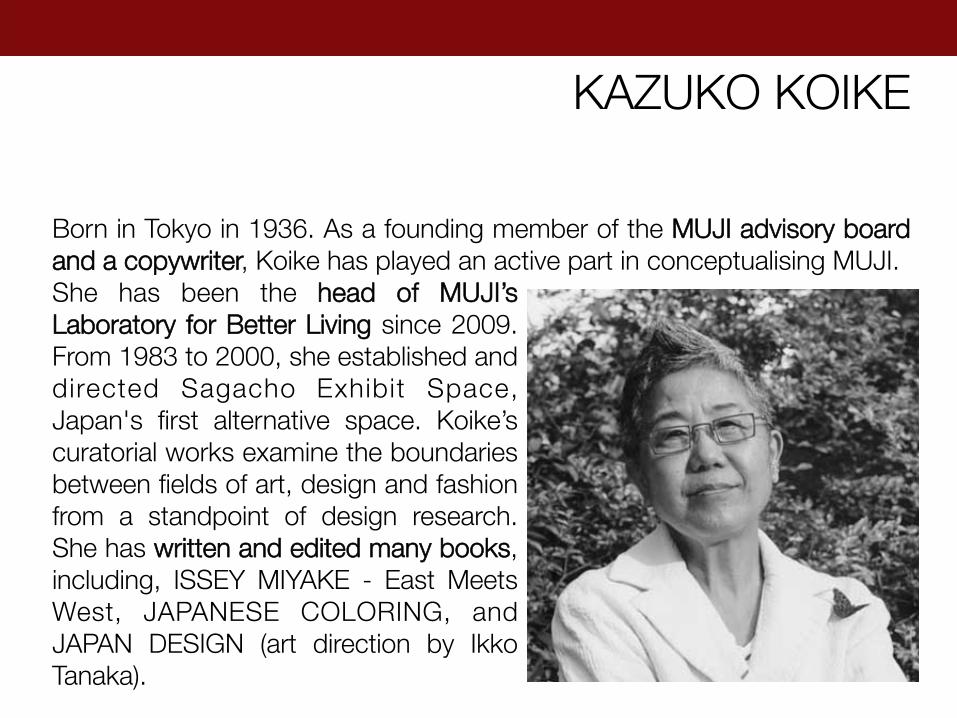
KAZUKO KOIKE
Born in Tokyo in 1936. As a founding member of the MUJI advisory board and a copywriter, Koike has played an active part in conceptualising MUJI. She has been the head of MUJI’s Laboratory for Better Living since 2009. From 1983 to 2000, she established and directed Sagacho Exhibit Space, Japan's first alternative space. Koike’s curatorial works examine the boundaries between fields of art, design and fashion from a standpoint of design research. She has written and edited many books, including, ISSEY MIYAKE - East Meets West, JAPANESE COLORING, and JAPAN DESIGN (art direction by Ikko Tanaka).

MUJI products are not attributed to individual designers. MUJI has stated that some of its products have been the works of famous international designers, although it does not disclose which ones. There are, however, some designers who made their involvement public.
DESIGNERS

NAOTO FUKASAWA
Naoto Fukasawa is a Japanese industrial designer, born in Yamanashi Prefecture in 1956. He graduated from Tama Art University in 1980. He has authored such books as An Outline of Design (TOTO) and co-authored others such as The Ecological Approach to Design (Tokyo Shoseki). In the past, he has won over fifty awards, including the American IDEA Gold Award, the German if Gold Award, the British D&AD Gold Award, the Mainichi Design Award and the 5th Oribe Award.
ENZO MARI
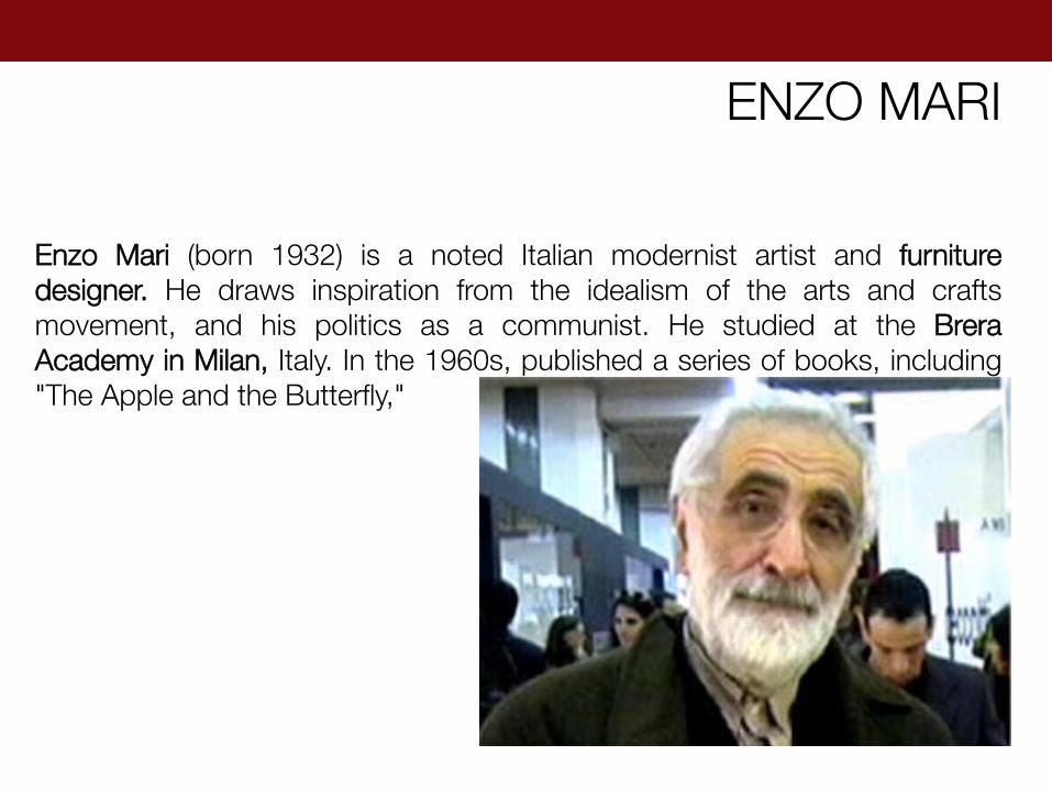
Enzo Mari (born 1932) is a noted Italian modernist artist and furniture designer. He draws inspiration from the idealism of the arts and crafts movement, and his politics as a communist. He studied at the Brera Academy in Milan, Italy. In the 1960s, published a series of books, including "The Apple and the Butterfly,"
KONSTANTIN GRCIC
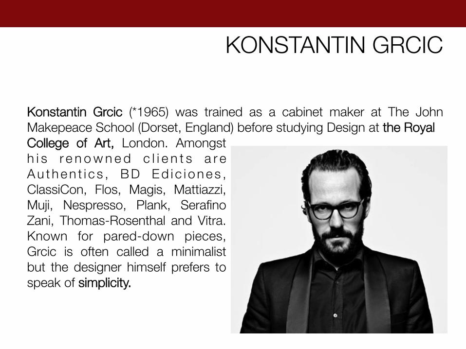
Konstantin Grcic (*1965) was trained as a cabinet maker at The John Makepeace School (Dorset, England) before studying Design at the Royal College of Art, London. Amongst h i s r e n o w n e d c l i e n t s a r e A u t h e n t i c s , B D E d i c i o n e s , ClassiCon, Flos, Magis, Mattiazzi, Muji, Nespresso, Plank, Serafino Zani, Thomas-Rosenthal and Vitra. Known for pared-down pieces, Grcic is often called a minimalist but the designer himself prefers to speak of simplicity.

JASPER MORRISON
Jasper Morrison, born 1959 in London, studied at the Royal College of Art in London. He pursued further studies at the Hochschule der Künste in Berlin on a fellowship. In 1986 he founded his own design studio in London. He became a leading figure of "New Simplicity", a movement that advocated a more modest and also more serious approach to design. In addition to furniture, he has also created lamps, home accessories, textiles, a tram system for the city of Hanover, Germany, and a bus shelter for the Vitra Campus in Weil am Rhein.

Kenya Hara (born 1958) is a Japanese graphic designer and an art curator. Hara is the art director of MUJI since 2001 and has designed the opening and closing ceremony programs of the Nagano Winter Olympic games 1998. Kenya Hara has published “Designing Design”, in which he elaborates on the importance of “emptiness” in both the visual and philosophical traditions of Japan, and its applications to design.
KENYA HARA
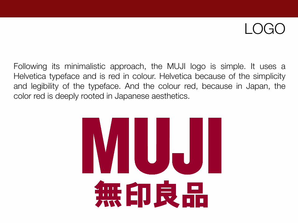
Following its minimalistic approach, the MUJI logo is simple. It uses a Helvetica typeface and is red in colour. Helvetica because of the simplicity and legibility of the typeface. And the colour red, because in Japan, the color red is deeply rooted in Japanese aesthetics.
LOGO
Generally speaking, things are not good for us; too many or too valuable and we are corrupted. But we all need some things and to some extent we are defined by our choices of those things. We may reveal to others in our choice of things that our taste is good, bad, expensive, cheap, modest, flashy, snobbish or no taste at all. MUJI concept is to make things as well and as cleverly as possible at a reasonable price, for the thing to be ‘enough’ in the best sense of the word, and this kind of ‘enough’ is good for you because it removes status from the product/ consumer equation and replaces it with satisfaction.
So, how can MUJI be good for you?
There is an old Japanese saying that goes "Eat in measure and defy the doctor.” The deeper meaning of the proverb lets us know the key to a healthy life is to eat an adequate or fit amount; and hints that by exercising a little self-restraint, if we reduce our measure from 100% to say 80%, rather than a joyless exercise in excessive self-control, we will create a joyful, balanced and healthy life. MUJI has always been dedicated to the pursuit of adequacy, of designing products that are truly fit for their purpose. The Japanese word for craftsmanship is monozukuri, and we have put it at the very heart of our products; MUJI does not aim to make just adequate products, but products imbued with craftsmanship. We have taken a rather minimalist approach, always asking such questions as: "Is this necessary?" or "Is this going too far?"
PRODUCT FITNESS 80
We constantly question if we have used excessive materials; whether products are overpackaged, or are their sizes and weights too much; can we reduce waste in the ordering, manufacturing or transportation of products? LESS IS MORE. MUJI constantly exercises self-restraint in the design and manufacture of its products; it can be frustrating reducing an item to its essentials, but with practice it becomes natural and even enjoyable. MUJI hopes that as a world society, we will choose a sustainable path for the greater benefit of our Mother Earth and all her people. "Product fitness 80" reflects MUJI's willingness to educate ourselves by reviewing our own "adequacy" (fitness) now, and is our message to the world.
PRODUCT FITNESS 80
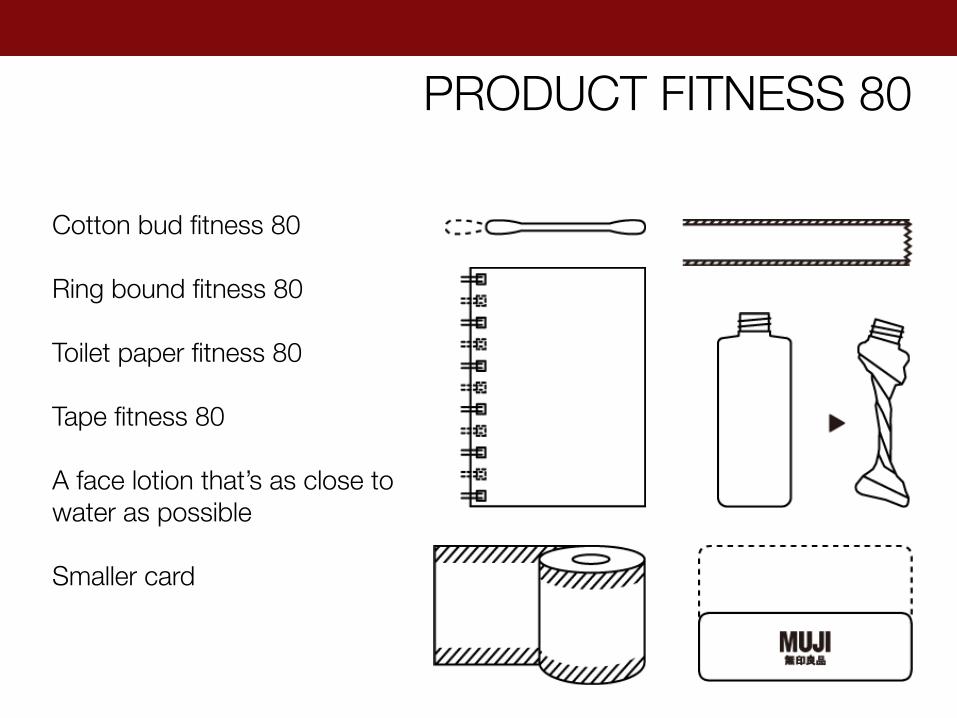
Cotton bud fitness 80 Ring bound fitness 80 Toilet paper fitness 80 Tape fitness 80 A face lotion that’s as close to water as possible Smaller card
PRODUCT FITNESS 80
• MUJI is known for its distinctive design, which is continued throughout its more than 7,000 products.
• MUJI product design, and brand identity, is based around the selection of materials, a streamlined manufacturing processes, and minimal packaging.
• MUJI products have a limited colour range and are displayed on shelves with minimal packaging, displaying only functional product.
• MUJI's no-brand strategy also means its products are attractive to customers who prefer unbranded products for purely aesthetic reasons.
MUJI PRODUCTS
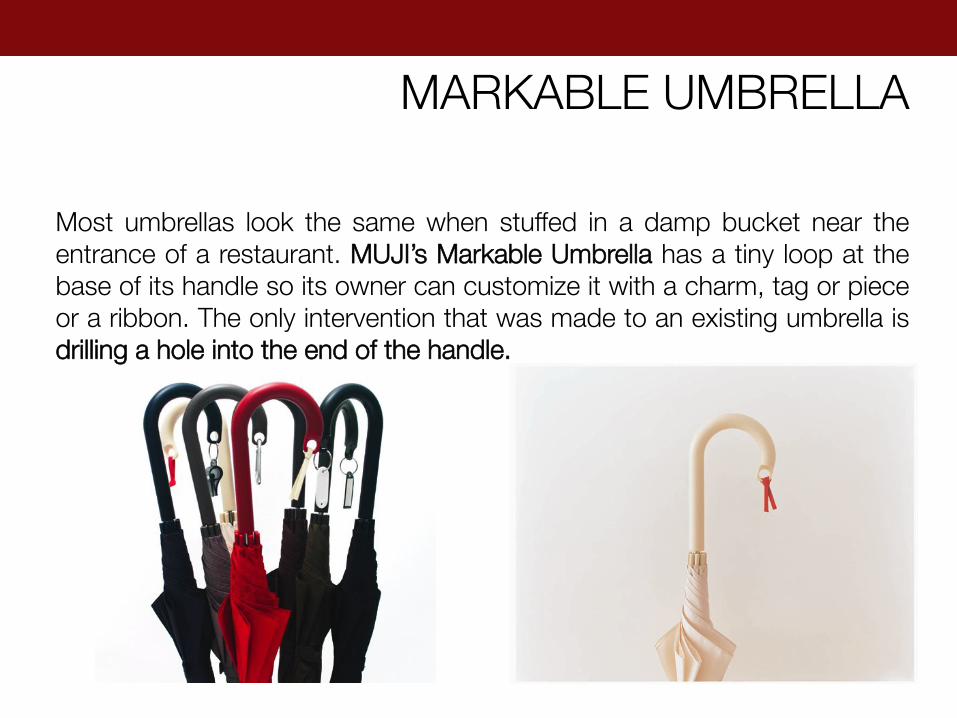
Most umbrellas look the same when stuffed in a damp bucket near the entrance of a restaurant. MUJI’s Markable Umbrella has a tiny loop at the base of its handle so its owner can customize it with a charm, tag or piece or a ribbon. The only intervention that was made to an existing umbrella is drilling a hole into the end of the handle.
MARKABLE UMBRELLA

MUJI’s famous Good Fitted socks were designed with a right angle for a better, more snug fit that’s less likely to bunch up inside shoes.
GOOD FITTED SOCKS
ASH CHAIR
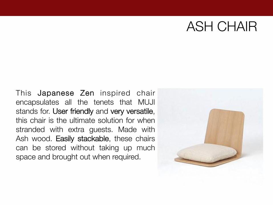
This Japanese Zen inspired chair encapsulates all the tenets that MUJI stands for. User friendly and very versatile, this chair is the ultimate solution for when stranded with extra guests. Made with Ash wood. Easily stackable, these chairs can be stored without taking up much space and brought out when required.
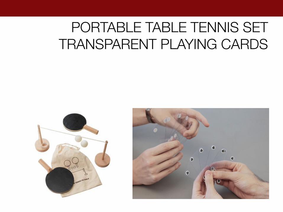
PORTABLE TABLE TENNIS SET TRANSPARENT PLAYING CARDS
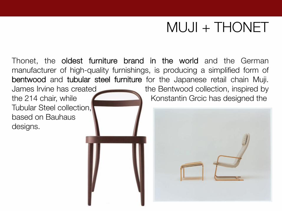
MUJI + THONET
Thonet, the oldest furniture brand in the world and the German manufacturer of high-quality furnishings, is producing a simplified form of bentwood and tubular steel furniture for the Japanese retail chain Muji. James Irvine has created the Bentwood collection, inspired by the 214 chair, while Konstantin Grcic has designed the Tubular Steel collection, based on Bauhaus designs.
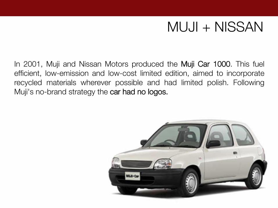
MUJI + NISSAN
In 2001, Muji and Nissan Motors produced the Muji Car 1000. This fuel efficient, low-emission and low-cost limited edition, aimed to incorporate recycled materials wherever possible and had limited polish. Following Muji's no-brand strategy the car had no logos.

MUJI + LEGO
MUJI and LEGO have partnered to create new 'LEGO bricks and paper' kits, a DIY toy set that lets users construct 3D animals and other figures, including functioning spinning tops and toy airplanes. Users can also invent their own custom shapes by cutting and punching paper to use with the LEGO pieces, consisting of regular and jointed LEGO blocks and caps to permit the secure fastening of paper inbetween.

PACKAGING
When packaging products, MUJI seeks not to adorn them but rather to highlight their natural colours and shapes. For this reason, MUJI uses bulk packaging and place products in plain, uniform containers. Faithful to our philosophy of simplicity, this approach is also in keeping with their policy of conserving resources and reducing waste. Thus, all MUJI products appear on store shelves in simple packaging bearing only product-related information and a price tag.
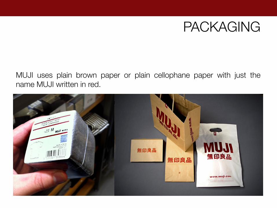
PACKAGING
MUJI uses plain brown paper or plain cellophane paper with just the name MUJI written in red.
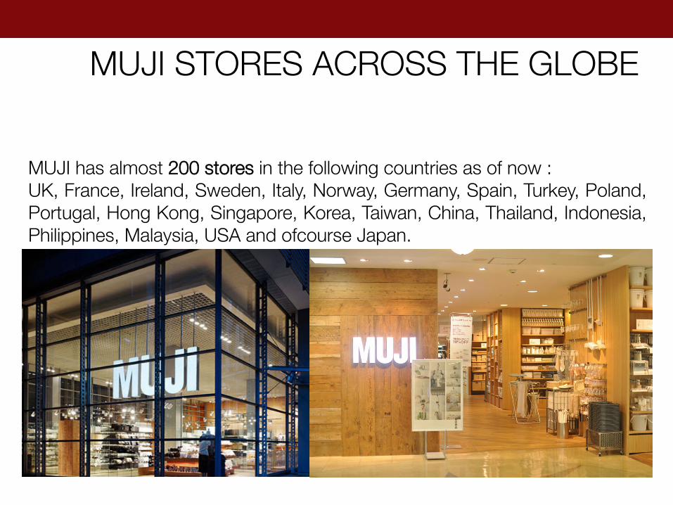
MUJI STORES ACROSS THE GLOBE
MUJI has almost 200 stores in the following countries as of now : UK, France, Ireland, Sweden, Italy, Norway, Germany, Spain, Turkey, Poland, Portugal, Hong Kong, Singapore, Korea, Taiwan, China, Thailand, Indonesia, Philippines, Malaysia, USA and ofcourse Japan.
In 2006 Muji held its first international design competition, “Muji Award 01”. It involves taking a view of the world, learning from the wisdom of the predecessors, discovering the benefits of something that has been used for a long period of time and translating these ideas into the design of products that are consistent with our current lifestyle. MUJI is hoping to recieve timeless and convincing designs from around the world. These are the prize winning entries from MUJI Award 2003.
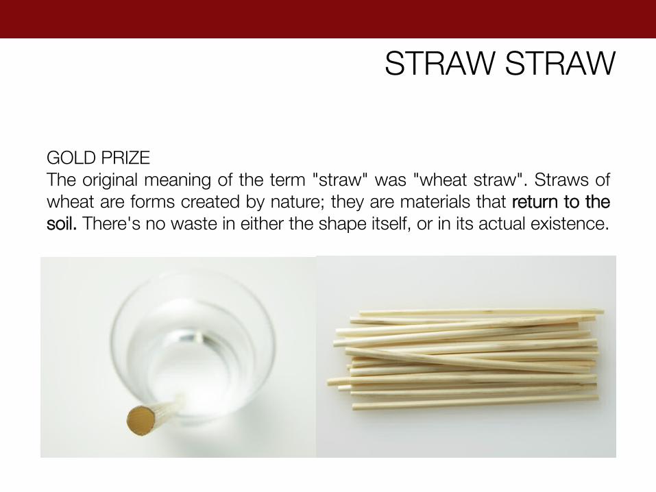
STRAW STRAW
GOLD PRIZE The original meaning of the term "straw" was "wheat straw". Straws of wheat are forms created by nature; they are materials that return to the soil. There's no waste in either the shape itself, or in its actual existence.
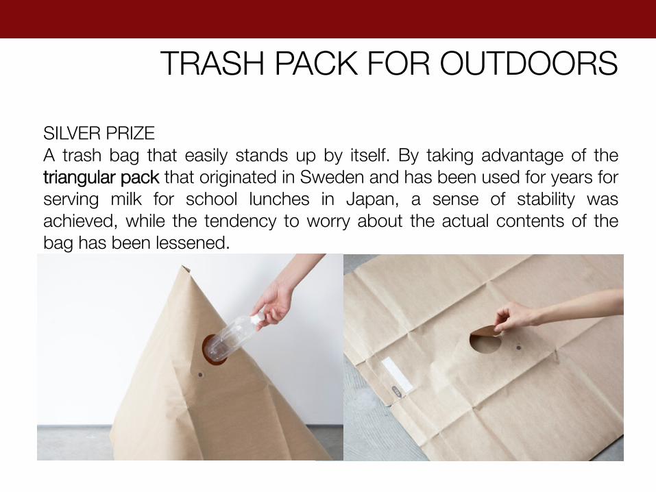
TRASH PACK FOR OUTDOORS
SILVER PRIZE A trash bag that easily stands up by itself. By taking advantage of the triangular pack that originated in Sweden and has been used for years for serving milk for school lunches in Japan, a sense of stability was achieved, while the tendency to worry about the actual contents of the bag has been lessened.

TACHIA MAT
BRONZE PRIZE There is a small town in the middle city of Taiwan called "Tachia. "Tachia Mat" is redesigned from the ordinary Tachia straw mat, makes it into a fitted bed sheet that covers the mattress entirely, instead of the traditional one-piece type that simply sits on top of the bed. Today energy-saving is considered as a critical issue, and "Tachia Mat" is definitely a product that will bring a fresh and cool aura. Comparing to the machine-made mats, the material of "Tachia Mat" is much more flexible and foldable since it's handmade.
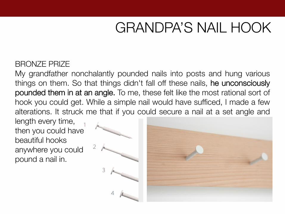
GRANDPA’S NAIL HOOK
BRONZE PRIZE My grandfather nonchalantly pounded nails into posts and hung various things on them. So that things didn't fall off these nails, he unconsciously pounded them in at an angle. To me, these felt like the most rational sort of hook you could get. While a simple nail would have sufficed, I made a few alterations. It struck me that if you could secure a nail at a set angle and length every time, then you could have beautiful hooks anywhere you could pound a nail in.
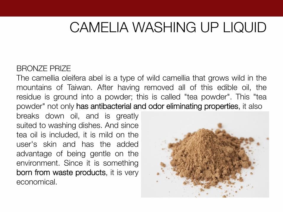
CAMELIA WASHING UP LIQUID
BRONZE PRIZE The camellia oleifera abel is a type of wild camellia that grows wild in the mountains of Taiwan. After having removed all of this edible oil, the residue is ground into a powder; this is called "tea powder". This "tea powder" not only has antibacterial and odor eliminating properties, it also breaks down oil, and is greatly suited to washing dishes. And since tea oil is included, it is mild on the user's skin and has the added advantage of being gentle on the environment. Since it is something born from waste products, it is very economical.

SECOND SKIN
BRONZE PRIZE "Second Skin" is a double layered with 2 different textured sides - the outer layer being waterproof and protective, the inner layer being soft and gentle. It has the ability to transform itself and help you adapt to any situations - Use as a Towel, Changing Room, bag or Waterproof Poncho.
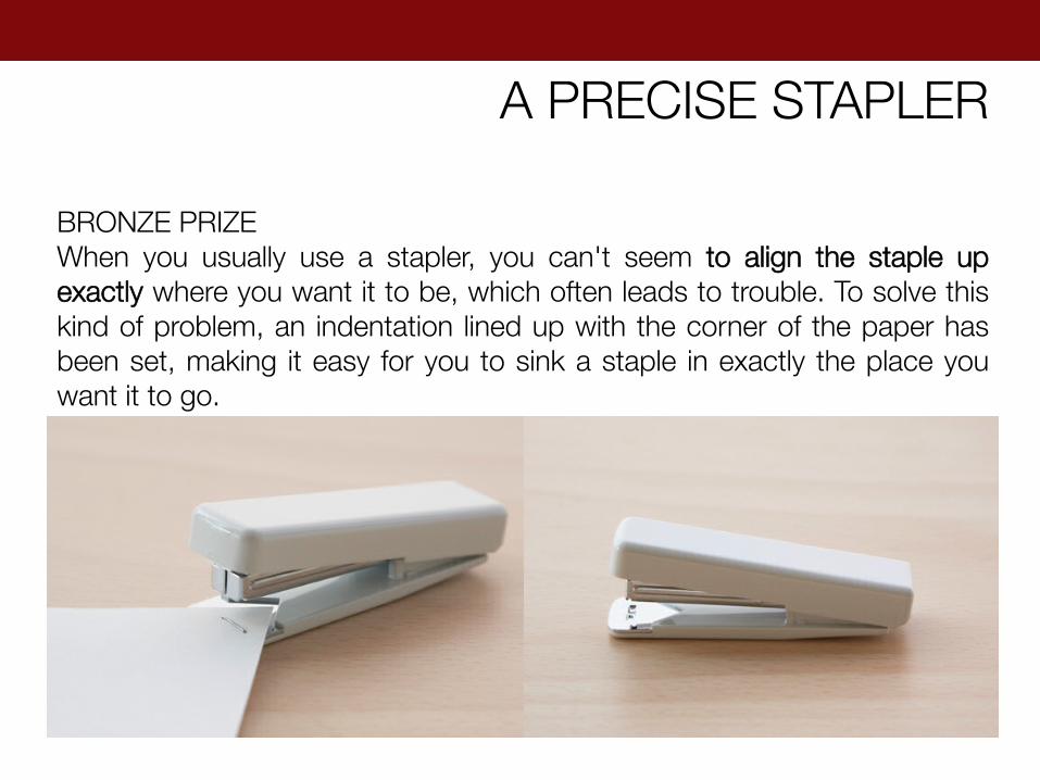
A PRECISE STAPLER
BRONZE PRIZE When you usually use a stapler, you can't seem to align the staple up exactly where you want it to be, which often leads to trouble. To solve this kind of problem, an indentation lined up with the corner of the paper has been set, making it easy for you to sink a staple in exactly the place you want it to go.
While MUJI incorporates many sustainable principles into its operations, there’s still a long way to go before it can be labeled a truly environment-friendly brand. Its products are composed primarily of unsustainable materials like plastic and polyester, and most of its product manufacturing is done in China, Indonesia and Vietnam, countries with controversial labor practices. As for the standards themselves, the company says that it has established its own Ryohin Standards that are stricter than current laws, but it fails to mention what those standards are.
CONTROVERSY
Sometimes it‘s more difficult to resist than to act. As designers we‘re easily tempted to renew, replace or change things. One of the virtues of working with Japanese no-brand MUJI is using what already exists, simplifying, even leaving things alone, creating objects that blend into the environment rather than making a strong mark. KONSTANTINE GRCIC
If you want something that doesn't disturb your aesthetics. At MUJI you can always find things that don't clash. Minimalism and anonymity are the two elements which make up the essential nature of the MUJI. MUJI retains a panel of design consultants but, in keeping with its low-key nature, doesn't flaunt their names. The aim of offering quality products but without branding, even though many of the designers behind the products are famous names. ENZO MARI
To develop the company so that it retains its authenticity while connecting with the country into which it is expanding is important. “This point is very important because it is in this that Muji differs from other brands. Zara is Zara. Every Zara is the same. Every Chanel is the same. But MUJI is not the same. In each country, we gather collaborators,” he said, explaining that the company’s products have evolved uniquely in different parts of the world. All the products have the brand’s distinctive minimalism and yet there are details that set them apart. “Only being bigger is not the final goal for us,” said Hara. “Muji people don’t hurry.” It’s tantalising to imagine MUJI — with its pristine, precise and clean aesthetic — encountering the vibrancy of colour and patterns associated with India. “Traditional Indian creativity is very interesting, I think,” said Hara. “The taste, the choice of colour, the use of material, the quality of handicraft, all the very complicated patterns.” Unfortunately, in spite of this, there is no possibility of Muji expanding to India in the next three years. “I think Mumbai is a very good possibility. Maybe,” he said
Ryohin Keikaku Co, the operator of MUJI-brand household goods retail shops, is hoping to expand into the Indian market in two to three years, Chairman Tadamitsu Matsui said in 2008. Kenya Hara visited India when MUJI participated in the Wills India Fashion Week in Delhi in March 2012.
MUJI & INDIA

TEJAL M GALA | SEMESTER 3 | RETAIL & EXHIBITION DESIGN
THANK YOU