indesign-type-book.pdf - sharkinfestedcustard
TRANSCRIPT

ptg
From the Library of Wow! eBook

ptg
IIInnnDDDeeesssiiigggnnn yyyppp Professional Typography
with Adobe® InDesign® CS2 TTT eeeProfessional Typography with Adobe® InDesign®
Nigel French
SECOND EDITION
From the Library of Wow! eBook

ptg
InDesign Type: Professional Typography with Adobe® InDesign®, Second Edition
Nigel French
Copyright © 2010 Nigel French
Adobe Press books are published by Peachpit, a division of Pearson Education. For the latest on Adobe Press books, go to www.adobepress.com. To report errors, please send a note to [email protected].
Acquisitions Editor: Karen ReichsteinProject Editor: Rebecca Freed Development Editor: Kim Saccio-Kent Production Editor: Lisa Brazieal Technical Editor: Kate Godfrey Copyeditor: Susan Festa Compositor: Kim Scott, Bumpy Design Indexer: Karin Arrigoni Cover Design: Aren Howell Interior Design: Charlene Charles-Will and Kim Scott
Notice of RightsAll rights reserved. No part of this book may be reproduced or transmitted in any form by any means, electronic, mechanical, photocopying, recording, or otherwise, without the prior written permission of the publisher. For information on getting permission for reprints and excerpts, contact [email protected].
Notice of LiabilityThe information in this book is distributed on an “As Is” basis, without warranty. While every precaution has been taken in the preparation of the book, neither the author nor Peachpit shall have any liability to any person or entity with respect to any loss or damage caused or alleged to be caused directly or indirectly by the instructions contained in this book or by the computer software and hardware products described in it.
TrademarksAdobe, the Adobe logo, and InDesign are registered trademarks of Adobe Systems Incorporated in the United States and/or other countries.
Many of the designations used by manufacturers and sellers to distinguish their products are claimed as trademarks. Where those designations appear in this book, and Peachpit was aware of the trademark claim, the designations appear as requested by the owner of the trademark. All other product names and services identified throughout the book are used in an editorial fashion only and for the benefit of such companies with no intention of infringement of the trademark. No such use, or the use of any trade name, is intended to convey endorsement or other affiliation with this book.
Printed and bound in the United States of America
ISBN-13: 978-0-321-68536-0ISBN-10: 0-321-68536-9
9 8 7 6 5 4 3 2 1
From the Library of Wow! eBook

ptg
AcknowledgmentsI’m grateful to the following folks for their help (and patience): My fabulous editor Kim Saccio-Kent, superhero technical editor Kate Godfrey, and the lovely folks at Peachpit: Karen Reichstein, Rebecca Freed, Charlene Charles-Will, Scout Festa, Lisa Brazieal, and Kim Scott. I’d also like to say a big thank you to Melanie Hobson, my brother Stephen, sister-in-law Debbie, and last but not least, my dear old Mum.
From the Library of Wow! eBook

ptg
From the Library of Wow! eBook

ptg
Introduction ix
CHAPTER 1 Getting Started 1
Type Anatomy and Classification 4
An InDesign Type Map:
Where to Find the Type Stuff 10
Viewing Your Page 15
Creating a Typography Workspace 16
CHAPTER 2 Getting Type on Your Page 21
Creating Text Frames 22
Text Flow 23
Threading Text Frames 27
Using the Story Editor 36
Cleaning Up Text 38
CHAPTER 3 Character Formats 41
Text Selection Methods 42
Character Formatting Options 43
Readability 58
CHAPTER 4 Leading 61
Getting the Lead Out 62
(Not) Using Auto Leading 68
Keep It Consistent, Except … 69
CHAPTER 5 Letterspacing, Tracking, and Kerning 73
Letterspacing vs. Tracking 74
Tracking vs. Kerning 76
Kerning 82
CHAPTER 6 Small (but Important) Details 89
Typographer’s Quotes 90
Apostrophes 91
Punctuation 91
Dashes 93
Ellipses 94
End Marks 94
Symbols 94
White Space Characters 95
The Glyphs Panel 97
Unicode 99
TABLE OF CONTENTS
From the Library of Wow! eBook

ptg
Ligatures, Diphthongs, and the Dotless i 103
Ornaments 105
Swash Characters 105
Oldstyle Figures 105
Contextual Alternates 106
Titling Alternates 106
Optical Sizes 107
CHAPTER 7 Alignment 109
Horizontal Alignment 110
Left Alignment 110
Justified Alignment (Justified with last line aligned left) 113
Centering Type 117
Right-Aligned Type 119
Other Justification Options 119
Combining Left and Right Alignment 121
Hanging Punctuation 122
Vertical Alignment 122
CHAPTER 8 Paragraph Indents and Spacing 125
First-Line Indents 126
Hanging Indents 129
Left and Right Indents 130
Space Before and Space After 132
CHAPTER 9 Breaking (and Not Breaking) Words, Lines,
Paragraphs, and Pages 135
Hyphenation 136
Hyphenation Options 137
Discretionary Hyphens and Nonbreaking Hyphens 140
Hyphenation and User Dictionaries 142
Hyphenation Dos and Don’ts 143
The No Break Attribute 145
Break Characters 146
Keep Options 147
CHAPTER 10 Tabs, Tables, and Lists 151
Working with Tables 152
Bulleted and Numbered lists 165
Tabs 168
From the Library of Wow! eBook
ptg
CHAPTER 11 Drop Caps 171
Creating a Simple Drop Cap 174
Drop Cap Aesthetics 176
Difficult Drop Caps 180
CHAPTER 12 Global Formatting with Styles 183
Defining Our Terms 184
Why Use Styles? 184
[Basic Paragraph] 185
Creating Styles 185
Applying Styles 187
Editing Styles 190
Loading Styles from Another Document 191
Organizing Styles 192
Combining Typefaces 194
A Typical Style Sheet 196
Character Styles 200
Paragraph Rules 204
Sequential Styles 204
Nested Styles 207
Nested Line Styles 209
GREP Styles 210
Object Styles 211
Table and Cell Styles 214
CHAPTER 13 Working with Text Wraps 217
Applying Text Wraps 218
Wrapping Type Around Irregularly
Shaped Graphics 221
Ignoring a Text Wrap 227
CHAPTER 14 Pages, Margins, Columns, and Grids 231
Setting Up the Document 232
Setting Up Columns 240
Using Grids 243
Page Numbers and Running Heads 260
Bibliography 265
Index 269
From the Library of Wow! eBook

ptg
This page intentionally left blank
From the Library of Wow! eBook

ptg
Introduction
Today we are all typographers. Everyone knows what a font is, and most people have an opinion about the fonts they like and those they don’t. Typography is no longer an arcane trade plied by curmudgeonly men with inky fingers, but rather a life skill. We make typographic decisions every day — the printed material we choose to read, the fonts we select for our correspondence, even the advertising we respond to, consciously or subconsciously.
This democratization of typography is empowering; anyone can participate. But to participate well it helps to know a thing or two — with power comes responsibility. If you are using InDesign, or plan to, then you have at your dis-posal state-of-the-art software for creating typographic layouts of any length and complexity. It’s worth bearing in mind that the concepts behind InDesign didn’t just arrive simultaneously with the program’s launch in 1999. InDesign itself may be a mere pup, but the principles upon which it is built are part of a long tradition. InDesign is part of a continuum of technological advances going back to the fifteenth century with the invention of movable type and moving with a quantum leap through the mid 1980s with the development of the PostScript page-description software language. The terminology and typographic conventions around which InDesign is built have evolved over generations. The typefaces on our font menus — even the funky postmodern ones — are clearly related to the letter shapes chiseled into the Trajan Column nearly 2000 years ago.
Whether you are new to InDesign or a seasoned user, you’ve probably found yourself wondering: What are all these controls? Where did they come from? And, perhaps more important: How do I use them, and why? This book attempts to answer these questions. It is not just a book about working with InDesign. Because it is impossible to talk about InDesign without discussing typographic history and best practices, it is also a book about why certain type solutions work better than others.
It’s an oft-repeated adage that good typography is “invisible,” meaning that, rather than drawing attention to itself, typography should serve the words it
From the Library of Wow! eBook

ptg
INDESIGN TYPE Professional Typography with Adobe InDesign, Second Editionx
represents. As Stanley Morison, who in the 1930s brought us Times (the font designed for The Times of London, although the newspaper no longer uses it), said: “For a new fount to be successful it has to be so good that only very few recognize its novelty.”
This perhaps makes typography sound like a thankless task. Where’s the fame? The glory? There are few celebrity typographers, and those few walk the streets in relative anonymity. Nonetheless, typography is a noble cause. If typefaces are the bricks and mortar of communication, then we, the typographers, are the architects. A simple and understated building may pass unnoticed by many, but everyone notices an ugly one. Likewise with typography: Good designs serve their purpose and may not elicit comment, but we can all spot bad typog-raphy, even though we may not be able to say why it’s bad. This book is about avoiding ugly and thoughtless type — a major step in the direction of creating beautiful type.
Who Should Read This Book?This book deals almost exclusively with English-language typography — not because it is the most important, but because it is what I know. It focuses on print rather than online publishing, even though many of the techniques pre-sented here apply equally to Web typography. It is primarily concerned with the typographic conventions of magazine and book publishing. The techniques in this book will help you create pages and layouts to a professional standard by following a certain set of typographic “rules.” My approach is utilitarian rather than experimental. These rules are not intended to be stifling or limiting to creativity. Rather, they are intended as a starting point. Learn the rules. Then, if you choose, break them — but break them consciously, knowing why you do so. Whatever you do, don’t ignore them.
I should also mention that although it was written specifically for Adobe InDesign CS5, most of the techniques in the book are applicable to earlier versions of InDesign. Where there is a keyboard shortcut for a command, I indicate the Macintosh shortcut first, followed by the Windows shortcut in parentheses. For example: Cmd+Option+W (Ctrl+Alt+W).
I hope that you enjoy InDesign Type and find it a useful addition to your typo-graphic bookshelf. I’m keen to get your feedback, so please email me with any comments, corrections, or suggestions.
— Nigel French [email protected]
From the Library of Wow! eBook

ptgACHAPTER 1
Getting Started
WHEN IT COMES TO TYPE, we are wide-eyed kids in a candy store. Our font
menus are expansive and seductive, spanning centuries of typeface history
and reflecting the glorious typographic contributions of different cultures, art
movements, mass transit systems, and eccentric individuals. However, with so
many typefaces just a mouse click away, it’s easy to feel more overwhelmed
than empowered by such a treasure trove.
From the Library of Wow! eBook

ptg
INDESIGN TYPE Professional Typography with Adobe InDesign, Second Edition2
We’ve all felt intimidated at one time or another by the length of our font menus. If you’re like me, you’ve probably frittered away the best part of a day experimenting with this or that enticingly named font chosen almost randomly from a cast of thousands, only to find yourself dissatisfied with the results but not really knowing why. I hope that this book will help keep such days to a minimum.
But before we get into the practical details of choosing type and working with it in InDesign, we need to become acquainted with some essential type termi-nology and conventions. To set good type in InDesign it’s important to remind ourselves that InDesign is just a tool, and — breathtakingly brilliant tool though it is — unless we understand our raw material, all the power of InDesign won’t amount to much. To use InDesign effectively we must understand how type works — and to understand how type works, we need to look at its history, how it is measured, how it is classified, and what messages our typeface choices may carry. And of course, we need to get comfortable with the InDesign interface. Specifically, we need to know where to find the type-related tools and prefer-ences, how to navigate our documents smoothly, and how to set up an efficient type-oriented workflow.
Typefaces can be loaded — intentionally or otherwise — with symbolism and meaning. In Gary Hustwit’s fantastic documentary film Helvetica (2007), graphic designer Paula Scher speaks of her negative connotations of the world’s most ubiquitous font, Helvetica, calling it the “font of corporate America.” She goes on, tongue firmly in cheek, to describe Helvetica as the font of the Vietnam War and the two Gulf Wars. Elsewhere in the movie, some of the leading lights of the type and design world extol the beauty and timelessness of Helvetica. Typefaces divide opinion.
Taking Helvetica, or its now equally ubiquitous clone Arial, as a case in point, one might argue that their use screams “generic” because we see them as the
“default” font, the choice that does not involve any conscious choice at all. But it’s not just Helvetica that comes with cultural baggage. Anyone who’s spent more than a few hours involved with type will have an opinion about why they love or hate this or that typeface; often it is through no fault of the typeface itself. To cite an extreme example, Fette Fraktur might now connote Nazism, even though similar Blackletter or Fraktur typefaces were used peaceably for hundreds of years before the National Socialists adopted them. Other typefaces,
Typefaces are to the written word what different dialects are to different languages.
— Steven Heller
Typography is two-dimensional architecture, based on experience and imagination, and guided by rules and readability.
— Hermann Zapf
Typography is a hidden tool of manipulation within society.
— Neville Brody
From the Library of Wow! eBook

ptg
CHAPTER 1 Getting Started 3
once fashionable, may be trapped in a historical period — great if you want to evoke that era, but a potential faux pas if you don’t. Certain typefaces may have been co-opted by an overexposed advertising campaign and can’t help but be associated with that product; others — like an overplayed song on the radio — may change from flavor of the month to fingernails-on-a-chalkboard irritation. What’s more, there are many type geeks out there who relish the opportunity to point out the historical inappropriateness of using an English sans serif from the late 1920s for a book about a Russian art movement of the early 1920s.
If I exaggerate, it’s not by much. The thing is, there’s no way to predict how readers will react to our type choices, and, the bolder those choices, the more likely we are to upset someone. Therefore, it’s a good idea to be armed with a robust knowledge of typographic history, a solid understanding of the type-faces you use most often, and an awareness of the connotations that certain typefaces carry. The bibliography at the end of this book lists many excellent resources for learning more about type.
My personal type aesthetic is a minimalist one, though perhaps this is just laziness: If less is more, then maybe I can get away with knowing fewer type-faces. Nevertheless, it’s better to know and understand a few typefaces well than to have a font list a mile long and only a passing acquaintance with the fonts that are on it.
FIGURE 1.3 The whimsical Periodic Table of Typefaces poster available at www. squidspot.com.
There are now about as many different varieties of letters as there are different kinds of fools.
— Eric Gill
Typography is what language looks like.
— Ellen Lupton
From the Library of Wow! eBook

ptg
INDESIGN TYPE Professional Typography with Adobe InDesign, Second Edition4
Choosing a typeface is about enhancing the meaning of the text you are working with. It’s also about meeting the expectations and matching the tastes of your client. In a perfect world, we’d all read and thoroughly digest the text docu-ments we are given to work with as raw materials. Depending on the length of your documents, that may or may not be possible, but you should at least have an understanding of the intended message.
Type Anatomy and ClassificationTo talk meaningfully about type, we need to share a common vocabulary. FIGURE 1.1 is a simple diagram deconstructing letter shapes into their constitu-ent parts.
Typography is necessarily pedantic and relies heavily on small details. Let’s clarify some terms we’ll be using frequently. A typeface is a complete alphabet including letters, numerals, punctuation, and accents. A font is a specific size and style of that typeface. For example, Adobe Garamond Pro is a typeface; Adobe Garamond Pro Regular 10 point is a font. These terms are frequently used interchangeably, but typographers love to split hairs, and I guess I’m no exception.
The broadest distinction we can make between typefaces is the distinction between serif and sans serif. Most typefaces fall into one or the other broad category.
Serifs are the small “ticks” at the end of the letter strokes. Sans serif typefaces do not have these ticks, sans meaning “without” in French.
Ascender HeightCap Height
Median
Baseline
Descender Line
DescenderStem
X-Height
Bowl
AscenderCounter
Stress
TypographyFIGURE 1.1 The parts of the letterform.Stem: The main part of the letterform that is straight. Descender: The portion of the lowercase characters g, j, p, q,and y that projects below the baseline.Stress: The orientation of the letterform‘s curved strokes, from thin to thick. Counter: The interior “negative” space of the letter. A, a, B, b, D, d, e, g, O, o, P, p, Q, q all have closed counters. Bowl: The rounded part of the letterform.Ascender: The part of the lowercase characters b, d, f, h, k, l, and t that extends above the x-height.Cap Height: The height of the uppercase letters.Median: The imaginary line defining the x-height. Baseline: The implied line upon which the characters sit. X-Height: The height of the main body of the lowercase characters. The letter x is chosen because the letter’s strokes end at — rather than overshoot — this line of measurement.
From the Library of Wow! eBook

ptg
CHAPTER 1 Getting Started 5
FIGURE 1.2 The distinction between serif and sans serif, and examples of the different types of serif.
Once we’re familiar with this basic difference we’ll want to drill down deeper in classifying our type. There is no single recognized standard for classifying typefaces; rather there are several overlapping standards. For our purposes I’m going to use a simplified version of Adobe’s type classification, showing examples of each category.
Venetian OldstyleVenetian Oldstyle typefaces are named after the letterforms used by the schol-ars and scribes of northern Italy in the 14th and 15th centuries. Distinguishing features:
■ Sloping cross stroke on the lowercase e■ Stress that approximates that of a broad-nibbed pen held at an angle
to the page■ Little contrast between thick and thin strokes■ Examples: Adobe Jenson, Berkeley Oldstyle, Centaur
Garalde OldstyleGaralde typefaces represent the late Renaissance evolution from the earlier Venetian style, and include some of the most enduring typefaces in use today. Distinguishing features:
■ Horizontal cross stroke on the lowercase e ■ A slightly greater contrast between thick and thin strokes than
Venetian types■ Stress that is inclined to the left ■ Bracketed serifs■ Examples: Adobe Garamond, Bembo, Minion Pro
ClassicalRenaissanceBeauty
QuietTrust
history
CalmVenerableUnderstanding
gracefulversatile
Formal
Magnificent
FIGURE 1.4 Venetian Oldstyle
FIGURE 1.5 Garalde Oldstyle
Serif Adobe Garamond Pro
Sans Serif Myriad Pro
Bracketed Serif Hoefler Text
Unbracketed Serif Chaparral Pro
Hairline Serif Bauer Bodoni
T T
From the Library of Wow! eBook

ptg
INDESIGN TYPE Professional Typography with Adobe InDesign, Second Edition6
ScriptScript typefaces mimic handwriting by joining letters with connecting lines. For this reason, scripts require extra attention to the kerning of their letters and should never be set in all caps. Historically, the problem with script typefaces is that their “personal” nature is antithetical to their digital manufacture. In handwriting, which script typefaces mimic, no two “a”s would be exactly alike, but in a font, of course, they are. Recently, however, a number of beautiful scripts have been released with a wide range of alternate characters for specific letter combinations, allowing you to create unique and personal type treatments. See Chapter 6, “Small (but Important) Details.”
■ Examples: Bickham Script Pro, Champion Script Pro, Raniscript
Character
ReceptionInformalCeremony
FIGURE 1.6 Script
Didone (Modern)Named after Firmin Didot (1764–1836) and Giambattista Bodoni (1740–1813), Didone typefaces were a response to improvements in late 18th-century paper production, composition, printing, and binding, which made it pos-sible to develop typefaces with strong vertical emphasis and fine hairlines. Distinguishing features:
■ Strong contrast between thick and thin strokes ■ Vertical stress■ Mechanical appearance — constructed rather than drawn■ Hairline serifs■ Examples: Bodoni, Didot, Fenice
FIGURE 1.7 Transitional
FIGURE 1.8 Didone (Modern)
GLAMOUR
PerfumeStylishAloof
ExpensiveRefined
Reserved
TransitionalA move away from letter shapes based on handwriting, transitional types were the first typefaces to be drawn as shapes in their own right. They represent a transition between Garalde and Didone (Modern) typefaces, and contain aspects of both. Distinguishing features:
■ A vertical, or near vertical, stress■ Pronounced contrast between hairlines and main strokes■ Serifs are thin, flat, and bracketed■ Examples: Baskerville, Perpetua, Stone Serif
From the Library of Wow! eBook

ptg
CHAPTER 1 Getting Started 7
Slab SerifUntil the late 18th century, type was used primarily for books. With the Industrial Revolution came the increased use of posters, billboards, and other forms of advertising, and the need for bolder, more in-your-face typefaces that stood out from the competition. Slab serif typefaces were originally called
“Egyptians,” reflecting the public’s enthusiasm for the archeological discoveries of the time. Distinguishing features:
■ Heavy, squared-off serifs■ Relatively consistent stroke weight■ Sturdy■ Examples: Clarendon, Memphis, Chaparral Pro
Sans SerifWilliam Caslon iv (the great, great grandson of William Caslon) issued the first sans serif typeface in 1816, but it wasn’t until the end of the 19th century that sans serifs became widely used.
This category can be subdivided into Grotesques (Helvetica, for example), rela-tively monoweight and noted for their plain or neutral appearance; Geometric (Futura), where the letterforms are geometric or near-geometric and the strokes monoweight; and Humanist (Gill Sans) where the letterforms are based on Roman proportions and the strokes are modulated.
■ Examples: Futura, Helvetica, Gill Sans
Decorative & DisplayThis is a catchall category for those typefaces whose primary purpose is to grab the reader’s attention. They are most effective when used in large sizes for headlines, titles, and signage. Because they are so expressive and tend to evoke a particular fashion or moment in time, they can have a short shelf life.
■ Examples: Arnold Böcklin, Rosewood, Industria
FIGURE 1.9 Slab Serif
Persuasion
VictorianSOLID Egyptian
IndustrialA D V E R T I S E
Optimism
FIGURE 1.10 Sans Serif
P R O G R E S S I V E
MinimalistNeutralPure
Sans
unadorned
Co
ntem
po
rary
simple
FIGURE 1.11 Decorative
greatest
CharismaFILM SHOW
PersonalityImpactful
From the Library of Wow! eBook

ptg
INDESIGN TYPE Professional Typography with Adobe InDesign, Second Edition8
BlackletterThese types are called Blackletter because they look so dark on the page. They are also sometimes referred to as Old English or Gothic; in Germany they are referred to as Fraktur. They may suggest a traditional newspaper masthead and the authority that entails. However, Fette Fraktur, a typeface designed in the mid-19th century, was unfortunate enough to be adopted by the Nazis in preference to the “non-Germanic” sans serif faces favored by the Bauhaus and other radical art movements of the time. In an interesting twist, the Third Reich discontinued the use of Blackletter typefaces in 1941, after allegations of Jewish contributions in the development of these faces, but it’s still hard to see these letterforms without their negative baggage.
■ Examples: Fette Fraktur, Goudy Text, Lucida Blackletter
MonospacedAlthough most typefaces have proportionally spaced characters, all of the characters in a monospaced typeface have the same width. Monospaced type-faces are sometimes used when setting text on forms where exact spacing is necessary, or when differentiating a line of computer code in an instructional manual (although a proportionally spaced “techie looking” font like Letter Gothic is a good alternative). Courier is also used to indicate a missing font. InDesign can usually simulate the look of a missing font on screen, but it can’t do the same in print. Printing a document that contains missing fonts results in Courier being substituted for the missing font. This convention has been adopted by all page layout applications because Courier looks so wrong that you can’t miss it — you will presumably feel compelled to fix it.
■ Examples: Courier, OCR A, Letter Gothic
OrnamentsOrnament typefaces contain decorative elements that can be used to embellish documents. Some OpenType fonts include ornaments as part of their extended character set.
■ Examples: Minion Pro Ornaments, Adobe Caslon Ornaments, Adobe Wood Type Ornaments
FIGURE 1.12 Blackletter
MetalManuscript
News
Biere
AbbeyDemon
FIGURE 1.13 Monospaced
Typewriter
DefaultMachine
Bank Charges
FIGURE 1.14 Ornaments
ef2
�•� � �
�
From the Library of Wow! eBook

ptg
CHAPTER 1 Getting Started 9
FIGURE 1.15 Symbol, Dingbat, or Pi
��
��
Symbol, Dingbat, or PiThere exists a parallel universe of typefaces that aren’t letters at all, but picto-grams. These picture fonts can be playful as well as practical, with such useful devices as bullets, ballot boxes, check marks, stars, and navigational arrows. As well as extending the range of your typical character set, they are used for musical notation, map making, mathematics, crosswords, and puzzle publish-ing. David Carson, enfant terrible of grunge typography in the 1990s, famously set an article — an interview with Bryan Ferry — for Raygun magazine in Zapf Dingbats. “It’s not worth reading — why not do it in Zapf Dingbats?”
■ Examples: Symbol, Zapf Dingbats, Carta
Why Some Fonts Look Bigger than OthersTake a selection of fonts, set them in the same point size, and you’ll find that some look bigger than others. This is a legacy from the days of metal type when point size referred to the size of the metal block on which the type was cast. Some typefaces occupied more space within their blocks than others. Today, point size refers not to the size of a metal block, but to the size of its digital equivalent: the bounding box that surrounds each letter. We measure the space in which the type lives, not the letter itself; some fonts occupy relatively more of that space than others. For this reason, let your eye guide you, not the point size.
Here’s an obvious point, but one still worth making: It’s hard to correctly evalu-ate the size (and other aspects) of your type exclusively on screen. Unless you’re creating type that is intended for screen reading only, print your test pages rather than rely on what you see on your monitor.
What’s in a Name?Many typeface names are in the public domain, and many of the typefaces we work with are revivals or interpretations of the originals. Anyone with font editing software can create a typeface and call it “Garamond” — just because something is called Garamond, doesn’t mean it’s going to look the same as somebody else’s Garamond. Sometimes interpretations of a typeface can be dramatically different from each other in much the same way as interpretations of the same song may be more notable for how unlike they are rather than how similar. For this reason, be specific about which Garamond you’re using and what vendor supplied it.
FIGURE 1.16 A sample type block. The size of the type (point size) refers to the vertical height of the block itself, not the letterform within the block.
point size
From the Library of Wow! eBook

ptg
INDESIGN TYPE Professional Typography with Adobe InDesign, Second Edition10
FIGURE 1.17 The same passage of text at the same point size and leading showing how some fonts look bigger than others.
FIGURE 1.18 A selection of “Garamonds,” all at 30 point (right), and a comparison of the differences found in a single character.
An InDesign Type Map:
Where to Find the Type StuffEverything in InDesign relates to type in one way or another, but here I want to point out the most frequently used type-related menu and panel options. I’ll also discuss InDesign preferences that control how type behaves. As with any of the big-hitter design applications these days, there’s usually more than one way to do something. Sometimes, it’s merely a matter of preference. Other times, new features have been added that improve on old features — and so that veteran users aren’t alienated, the old menu options remain. We all work differently, and InDesign encourages customization.
TIP: You can view your menu items in alpha-betical order by holding down Cmd+Shift+Option (Ctrl+Shift+Alt) when you choose the menu. This is handy when you’re search-ing for that pesky menu item you can’t find but you know is there. It may be a small thing, perhaps a fea-ture you’ll never use, but it’s nice to know it’s there.
uncopywritableAdobe Garamond Pro
uncopywritableITC Garamond
uncopywritableSimoncini Garamond
Garamond
uncopywritableStempel Garamond
aa a
One morning, when Gregor Samsa wokefrom troubled dreams, he found himselftransformed in his bed into a horriblevermin. He lay on his armour-like back,and if he lifted his head a little he couldsee his brown belly, slightly domed anddivided by arches into stiff sections. Thebedding was hardly able to cover it andseemed ready to slide off any moment.His many legs, pitifully thin comparedwith the size of the rest of him, wavedabout helplessly as he looked.
One morning, when Gregor Samsa woke from troubled dreams, he found himself transformed in his bed into a horrible vermin. He lay on his armour-like back, and if he lifted his head a little he could see his brown belly, slightly domed and divided by arches into stiff sections. The bedding was hardly able to cover it and seemed ready to slide off any moment. His many legs, pitifully thin compared with the size of the rest of him, waved about helplessly as he looked.
Myriad Pro 9/11 Stone Serif 9/11
From the Library of Wow! eBook

ptg
CHAPTER 1 Getting Started 11
FIGURE 1.19 Units & Increments Preferences (A) Ruler Units (circled): Points are a typographic standard. Wouldn’t you rather have an indent of 12 points (or 1 pica)than 4.233 millimeters? Keyboard Increments
(circled): Size/Leading determines the increment when sizing type with keyboard shortcuts. A smaller increment allows more control, especially when sizing small type. To size in bigger increments, add the Option (Alt) key to the keyboard shortcut to increase that increment fivefold.Baseline Shift: The keyboard shortcut to adjust the baseline shift is Shift+Alt+Up Arrow or Shift+Alt+Down Arrow. It’s not one you use often, but you may as well change this preference, too. Kerning/Tracking (circled):
This value determines the increment used when custom tracking or kerning is applied through keyboard shortcuts: Option+Left Arrow (Alt+Left Arrow) to reduce the space or Option+ Right Arrow (Alt+Right Arrow) to increase the space. For fine (read: better) control, change this to the lowest increment possible, 1/1000 em. For bigger increments, add in the Cmd (Ctrl) key to increase that increment fivefold.You can easily change the measurement system on the fly by right-clicking where the rulers intersect (B).
There are several preferences relating to type; for now, I just want to point out where they are and suggest a couple of changes to the factory default settings. I’ll deal with each preference specifically in the relevant chapter.
When you make a change to InDesign’s preferences, you affect only the docu-ment you are working on. If you want to change the preferences for every document you create from this point on, make sure you have no InDesign document open so that your changes become application preferences. The fol-lowing preferences become application-wide when you change them with no document open: General, Interface, Type, Advanced Type, Composition, Units & Increments, Grids, and Guides & Pasteboard.
If you’re serious about type, I suggest you get used to working in points (or picas, of which points are a subdivision). Points are a typographic unit of measure-ment originated in the early 18th century. They’re arcane and nondecimal, but there’s still good reason to use them. Since type is rarely expressed in anything but points, it’s helpful to have distances that relate to type, such as leading (space between the lines), indents, paragraph spacing, and gutter (inter-column) spacing also expressed in points. In the u.s., margin sizes and column widths are typically expressed in picas; in Europe they are more commonly expressed in millimeters.
A
B
From the Library of Wow! eBook

ptg
INDESIGN TYPE Professional Typography with Adobe InDesign, Second Edition12
Picas and Points In a Nutshell
6 picas = 1 inch or 25.4 millimeters 12 points = 1 pica 72 points = 1 inch 1 pica and 6 points = 1p6. Alternatively, this could be expressed as 0p18 or 18 pt. 6 points = 0p6, p6, or 6 pt.
Typography also has relative units, two commonly used examples being the em space (the size of your type — if you’re working with 10-point type, then an em space is 10 points) and the en space (half the size of the em space). Another relative unit is the 1/1000 em, which is used for kerning and tracking. To understand kerning and tracking units, it helps to know that each character of a typeface is designed within an em square of 1000 units. The character occupies a certain set width of that em square according to its shape; for example, an mwill necessarily be wider than an i. The widest character in the typeface will likely be the em dash, which occupies nearly the full 1000 units. Kerning and tracking involve the adjustment of these relative amounts of space, either to create the “illusion” of perfect spacing or, in the case of tracking, to give the type a denser or airier feel.
TIP: Regardless of your chosen measurement system, you can express values in any of InDesign’s supported measurement systems so long as you are explicit. For example, if you are using points but want a frame that is 50 millimeters square, select the frame and type 50 mm in the height and width fields of the Control Panel. InDesign will convert this to its equivalent in points.
FIGURE 1.20 Three screen captures from FontLab Studio, a typeface creation application, showing the different set widths of the characters within a 1000-unit em square.
The Tools PanelThere are two tools we use most of the time: the Selection Tool and the Type Tool. The Selection Tool is used for (among other things) moving, resizing, and threading text frames. The Type Tool is used for formatting and editing the text inside those frames. You move back and forth between these tools a lot, so it’s handy that there’s a way to toggle between them.
From the Library of Wow! eBook

ptg
CHAPTER 1 Getting Started 13
To work with text frames while the Type Tool is selected, hold down Cmd (Ctrl) to switch to the Selection Tool. With the key held down, you can drag the frame to move it, or drag any of the frame handles to resize it. When you release the key, you’re back in the Type Tool.
When you’re using your Selection Tool, you can double-click a text frame and your cursor changes to the Type Tool, inserted at the point where you double-clicked.
It’s also worth memorizing the single-key shortcuts to access these tools: T for Type and the Esc key for the Selection Tool (V also works in other situations, but obviously not while you’re in the Type Tool).
Selection (V, Esc)
Direct Selection (A) Page (Shift+P)
Gap (U)
Type (T)
Line (\)
Pen (P)
Pencil (N)
Rectangle Frame (F)
Rectangle (M)
Scissors (C)
Free Transform (E)
Gradient (G)
Gradient Feather (Shift+G)
Note
Measure (K)
Zoom (Z)
Fill (X)
Apply Color (,)
Hand (H)
Stroke (X)
Formatting affects container / text
Preview (W)
FIGURE 1.21 The Tools panel. To access the additional tools shown on the right, click and hold down on those tools that have a black triangle in their bottom-right corner.
TIP: When in any tool other than the Type Tool, pressing the spacebar temporarily switches the current tool to the Hand Tool; pressing “H” also works. However, if you are in the Type Tool, holding down the spacebar gets you a whole mess of spaces. This may appear to be an obvious point, but you’d be surprised how easy it is to make this mistake. If you are in the Type Tool, hold down the Option (Alt) key to temporarily access the Hand Tool. When working quickly it’s easy to forget where you are and which key you need, so it’s easier to standard-ize on Option+spacebar (Alt+spacebar), which works in all situations.
From the Library of Wow! eBook

ptg
INDESIGN TYPE Professional Typography with Adobe InDesign, Second Edition14
Character Formats
Bullet List Do not align to grid Span Columns
Number List Align to grid Horizontal Cursor
Hyphenation Gutter
Left Indent/Right Indent Space Before/Space After Paragraph Style Number of Columns
Drop Cap Number of Lines/ Number of Characters
First Line Indent/ Last Line Indent Indent
Point Size
Font
Alignment: Left, Center, Right, Align toward spine
Alignment: Left Justified, Justified last line centered,
Justified last line flush, Align away from spine
Kerning
All Caps, Superscript,Underline
Horizontal Scale
Vertical Scale Character Style
Language Dictionary
Skew (slant or false italic)
Baseline ShiftSmall Caps, Subscript,Strikethrough
Font StyleParagraph
FormatsLeading Tracking
FIGURE 1.22 The Control Panel showing Character Formats (top) and Paragraph Formats (directly below). You can toggle between these two views by pressing Cmd+Option+7 (Ctrl+Alt+7). Click on the icon at the right of the Control Panel (circled)for more options (bottom left). Note that it’s possible to customize the appearance of the Control Panel (bottom right). Press the Tab key to move from one field to the next, or press Shift+Tab to move backward through the fields. Once in a field, press the Up or Down arrow to increase or decrease the values.
From the Library of Wow! eBook

ptg
CHAPTER 1 Getting Started 15
The Control PanelThe Control Panel is a chameleon, changing its appearance according to what you have selected. When you are using the Type Tool, the Control Panel has two views: Character Formatting Controls and Paragraph Formatting Controls. If your monitor is big enough, a digested list of Paragraph formats is displayed to the right of the Character formats in Character Formats view; this is reversed in Paragraph Formats view.
Note that it’s possible to customize the Control Panel. If you don’t see the options you expect — particularly if you are sharing your computer with another user — check the current options by choosing Customize from the bottom of the Control Panel menu.
Viewing Your PageThere are several ways to view and navigate your InDesign documents — some are better than others. Although you have myriad options, you can do most everything you need with just three shortcuts.
1. Zooming In: Cmd+spacebar (Ctrl+spacebar). If you value your eye-sight, get in big when editing text. There’s no point squinting at a page you can barely read. You could choose the Zoom Tool ( ) from the Tools panel, but save yourself the trouble. Instead, access the Zoom Tool by holding down Cmd+spacebar (Ctrl+spacebar); your cursor changes to a magnifying glass. Now, rather than click to increase your view percentage, click and drag a marquee around the portion of your layout you want enlarged. The defined portion then fills your window. If you want to zoom out incrementally, press Cmd+Option+spacebar (Ctrl+Alt+spacebar) and click.
2. Moving Around: Option+spacebar (Alt+spacebar). Once at an enlarged view, you’ll likely want to move around. Press Option+spacebar (Alt+spacebar) and drag with the Hand Tool ( ) to move your page or spread around within the document window. You can also use the Hand Tool at reduced view sizes to move vertically through pages. Don’t bother with the scroll bars; it’s hard to estimate their sensitivity and you’ll waste a lot of time getting to exactly where you want to be.
From the Library of Wow! eBook

ptg
INDESIGN TYPE Professional Typography with Adobe InDesign, Second Edition16
3. Zooming Out: Cmd+Option+0 (Ctrl+Alt+0). Use this key combina-tion to fit your spread (or page) in the window. Having zoomed in and made your changes at a comfortable view size, zoom out again to get an overall perspective on your page or spread.
A valid alternative to this triumvirate of view shortcuts is Power Zoom: At any view size press Option+spacebar (Alt+spacebar) to access the Hand Tool, then pause for a fraction of a second. A red magnification rectangle appears that you can reposition to view a different part of your page or spread. To change the size of the zoom rectangle, continue to hold down Option-spacebar (Alt-spacebar) while you press the Up or Down arrow to increase or decrease its size — the smaller the rectangle the bigger the magnification, and vice versa.
When editing type, Cmd+2 (Ctrl+2) and Cmd+4 (Ctrl+4) are useful shortcuts for zooming in to 200 percent and 400 percent, respectively.
Moving Between PagesFor documents consisting of only a few pages or spreads, you can navigate from one page to the next with the Hand Tool. For longer documents, use the Pages panel, the Pages pop-up menu at the bottom left of your document window, or the options under the Layout menu.
When using the Pages panel to navigate between spreads with facing pages, double-clicking the page numbers includes both pages of the spread in the window, whereas double-clicking the page icon fits that specific page in the window.
Creating a Typography WorkspaceInDesign panels are so numerous you would swear they breed like rabbits when your back is turned. A great many of these panels you’ll seldom or never use, no matter how illustrious your InDesign career. Thankfully, InDesign gives you unprecedented control of your workspace, allowing you to save — and recall at any time — the visibility, positions, and groupings of your panels. The names of workspaces appear in the Workspace picker on the Application Bar or in the Workspace submenu of the Window menu. You can make a custom keyboard shortcut to switch to your workspace with a specified key combination.
First, arrange your panels the way you want them. Create groupings that make sense to you; close those panels you think you’ll seldom or never use (if you
TIP: If your type looks bitmapped on screen, it’s probably because you have switched to the Fast Display mode, InDesign’s low-resolution, quick screen redraw option. Choose View > Display Performance and switch to Typical or High Quality. If you have a fast computer, choose High Quality to ensure that your images are always rendered on screen at full resolution (note that Display Performance has no bearing on how your documents print). To make this an appli-cation preference, change the settings in Preferences > Display Performance, while no document is open.
TIP: Press the Tab key to hide and show all your panels. Press Shift+Tab to hide or show all panels except Tools and the Control Panel.
From the Library of Wow! eBook

ptg
CHAPTER 1 Getting Started 17
FIGURE 1.23 The Pages Panel in its familiar orientation showing thumbnails for an eight-page, facing-pages document (A). Some users prefer to change the Panel Options to have the thumbnails display horizontally, a more economical use of screen real estate (B), (C), (D). You can also navigate your document using the Layout menu (E), keyboard shortcuts, or the Pages drop-down at the bottom left of the document window (F).
A
B
D
C
E
F
From the Library of Wow! eBook

ptg
INDESIGN TYPE Professional Typography with Adobe InDesign, Second Edition18
need them later, you can find them under the Window menu); then float or dock those you want, where you want them. From the Workspace picker choose New Workspace and give your workspace a name.
InDesign comes with a selection of predefined workspaces. The Typography workspace is a good starting point. To this I like to add the following: Object Styles, Info, Links, Scripts, and Align. I close the Paragraph and Character panels because their offerings are also available on the Control Panel.
Having saved your workspace, you can load it at any time by choosing it from the Workspace picker (located next to the search field, upper right). If you’ve made changes to the workspace and want to revert it to its previously saved state, choose Reset. If you’d like those changes to overwrite the workspace, choose New Workspace and choose the same name (you’ll be asked to confirm that you want to overwrite the existing workspace).
TIP: You can make a keyboard shortcut to load your custom workspace from the Edit > Keyboard Shortcuts menu. Because you can’t overwrite the default shortcut set, click New Set. For Product Area, choose Window Menu. You’ll get a long list of all the commands on the window menu — scroll down to Workspace: Load 1st User Workspace. Click into the New Shortcut field, press the keys for your new keyboard shortcut. I use Ctrl+F12 — Ctrl being the fourth, seldom used, modi-fier on the Mac. (Leave the Context list set to Default so that the shortcut functions in all situations.) Click Assign to create the new shortcut.
From the Library of Wow! eBook

ptg
CHAPTER 1 Getting Started 19
A
B
D
C
FIGURE 1.24 Setting a typography workspace: My preferred workspace (A), a modified version of the predefined Typography Workspace. You can also create a keyboard shortcut to quickly load your workspace (B, C), or just choose it from the Workspace picker (D).
From the Library of Wow! eBook

ptg
This page intentionally left blank
From the Library of Wow! eBook

ptgBCHAPTER 2
Getting Type on Your Page
TYPOGRAPHY BEGINS with a single character, and putting type on your page
is about as fundamental as InDesign skills get. There are several different
approaches to getting type on the page. You’ll use all of them at one time or
another. Let’s begin with the most elemental.
From the Library of Wow! eBook

ptg
INDESIGN TYPE Professional Typography with Adobe InDesign, Second Edition22
Creating Text FramesIn InDesign, text frames hold your type. Each independent section of text is referred to as a story. A story can contain a single character or hundreds of pages of connected, or “threaded,” text. An InDesign document typically contains multiple stories, as would a newspaper or magazine. You can create a text frame in any of the following ways:
■ Draw one using either a Frame Tool or a Shape Tool. Select the Type Tool and click within the object to activate it as a text frame.
■ Create one on the fly by clicking and dragging on the page or paste-board with the Type Tool to define the width and height of the frame. When you release the mouse button, a flashing type cursor appears in the top left of the frame and you’re ready to start typing.
■ Choose File > Place or press Cmd/Ctrl+D to import a text document. You will see a loaded text cursor. Click on the page to flow the text and you automatically create a text frame that is the width of the column.
Unless you’ve redefined the [Basic Paragraph] Paragraph Style, the default font will be Minion Pro Regular 12 point. Since you’ll be applying formats to the type, it doesn’t really matter how it starts out. But if you want to change the default font, here’s how: Open the Paragraph Styles panel, right-click [Basic Paragraph], and choose Edit. From the list of options on the left choose Basic Character Formats and change the font, point size, and so on. While you’re in Paragraph Style Options you can also change any other attributes, like the alignment, indents, or hyphenation. Realistically, though, nothing ends up as [Basic Paragraph]. It is just the point from which you start your text formatting.
CBA
FIGURE 2.1 The Text Cursor: A dotted square around the cursor indicates you can drag to create a text frame (A). The cursor bulges (B) you are over an empty frame. When you import — or “place” — text, the cursor appears “loaded.” (C)
FIGURE 2.2 The Smart Cursor indicates the dimensions of the frame you are drawing.
FIGURE 2.3 To change the default font, edit the [Basic Paragraph] definition.
FIGURE 2.4 Aligning the Type cursor to a guide.
TIP: The appearance of your type cursor is a visual cue: If the cursor has a square, dotted line around it, you can click and drag to create a new text frame. When you move over an empty frame, the type cursor bulges to indicate you are about to insert into that frame.
TIP: The Smart Cursor displays the width and height of the frame as you drag it out. Alternatively, you can specify the size of your frame, once drawn, using the Width and Height fields on the Control Panel.
From the Library of Wow! eBook

ptg
23CHAPTER 2 Getting Type on Your Page
Text FlowWhile it’s possible to compose your text in InDesign, most of the time the writ-ing is done in a dedicated word processing application like Microsoft Word, or possibly in InDesign’s editorial cousin, Adobe InCopy. For example, I’m writing this book in Word (it’s not my choice, but my editors insisted). Arguably, when documents need to go back and forth in a review cycle it’s easier to use Word for its editorial features like Comments and Track Changes. (A moot point, you might argue, now that InDesign also has a Track Changes feature.)
It’s our job as designers to import the prepared text into InDesign, where — juxtaposed with imagery and flowed from column to column and from page to page — we make it look beautiful.
To import — or “place” — a text file, choose File > Place or Cmd-D/Ctrl-D, navigate to the file you’re after, and click Open. Your loaded type cursor displays the first few words of the text file in a thumbnail.
You can either click the loaded cursor inside a frame or create a frame by click-ing on a blank area of your page. The point at which you click becomes the top of the text frame; the width of the frame is determined by the page’s column and margin settings. To align the top of the text frame with the top margin (or a ruler guide you have drawn), hover over the guide until the arrow that is part of the loaded cursor icon changes from black to white, indicating that the text frame will “snap” to that guide.
TIP: When dragging out a text frame with the Type Tool, work with your guides on so that you can size your text frames accurately. Align the horizontal tick on the Type cursor to the top margin or horizontal guide. To see your nonprinting guides, make sure you are in Normal Screen Mode and, if necessary press Cmd-; (Ctrl-;) to show the guides.
FIGURE 2.5 The Place selection on the File menu.
FIGURE 2.6 Aligning the loaded Text Cursor to the top margin. The white arrow indicates that the top of the text frame will “snap” to the guide.
From the Library of Wow! eBook

ptg
INDESIGN TYPE Professional Typography with Adobe InDesign, Second Edition24
Each text frame contains an In port and an Out port, which are used to make connections to other text frames. An empty In port or Out port indicates the beginning or end of a story, respectively. A blue arrow in either indicates that the frame is linked to another frame. A red plus sign (+) in an Out port indicates that there is overset text — more text than will fit in the current text frame(s). To flow the overset text, select the frame with the Selection Tool, click the red plus sign to “reload” your cursor, move to where you want to continue the text flow, and click at the top of a new column or page, or inside a text frame.
Alternatively, click and drag the loaded type cursor to the size you want. When you release the mouse button, text will flow into the area defined.
What to Watch for When Flowing Text
‘Replace Selected Item’ option in the Place dialog box: If this is checked and you have a text frame selected with the Selection Tool, the text file you choose will replace the current contents of that frame. If your Type Tool is in a text frame, the new story will be flowed from that point in the story. These are both useful techniques, but if the results aren’t what you expect, press Cmd+Z (Ctrl+Z) to restore the selected text frame to its original state. This will also return you to a loaded type cursor. Of course, you can just make sure this option isn’t selected in the first place.
Canceling a loaded text cursor: If you decide you are not ready to flow the text, press Esc to “unload” the cursor.
In Port
Resize Handle
Out Port
FIGURE 2.7 The anatomy of a text frame.
From the Library of Wow! eBook

ptg
25CHAPTER 2 Getting Type on Your Page
If you have the Selection Tool selected and want to edit type within a text frame, double-click in the frame to switch to the Type Tool. You can toggle between the Type Tool and the Selection Tool by holding down Cmd (Ctrl). When you let up the Cmd (Ctrl) key, you’re back in the Type Tool.
To move a text frame, select it with the Selection Tool and click and drag from within the frame. To resize a text frame, select it with the Selection Tool and pull from one of its handles.
Types of Text Flow
Manual Text Flow adds text one frame at a time. The text flow stops at the bottom of a text frame, or at the last of a series of linked frames. You’ll need to reload the Type cursor to continue the text flow. Manual text flow is most appropriate for short bodies of text. This is the default option.
Autoflow (Shift) flows all the text, adding pages and frames as necessary. Autoflow functions best when working with single-column documents containing one main story — like a novel, a short story, or a journal article. Autoflow isn’t much use when you are working with multiple columns and images because it flows text indiscriminately into all columns, regardless of whether those columns contain other content.
Semi-Autoflow (Option/Alt) works like Manual Text Flow, except that your cursor is reloaded automatically at the end of each frame, which saves you from having to click the red plus. You then continue the text flow by clicking to create a new text frame or clicking an empty text frame to add it to the text thread. If you click and drag you can span your text across multiple columns. Semi-Autoflow is most appropriate when working with magazine or newspa-per articles.
Fixed-Page Autoflow (Shift+Option or Shift+Alt) flows as much text as will fit without adding pages, which is useful if your document has a fixed number of pages.
Smart Text Reflow automatically adds or deletes pages as your text grows or shrinks. To use Smart Text Reflow, choose Preferences > Type and remove the check mark for the Limit to Master Text Frames option. New pages will be added to the document based on the Master Page applied to the current last page. Check Delete Empty Pages and any pages that no longer have any content will disappear. Note that Smart Text Reflow requires you to have at least two threaded text frames over at least two pages.
FIGURE 2.8 The Text flow cursors.
Manual
Autoflow
Semi-Autoflow
Fixed-Page Autoflow
From the Library of Wow! eBook

ptg
INDESIGN TYPE Professional Typography with Adobe InDesign, Second Edition26
Dragging and Dropping Text FilesIn addition to placing text files using the File > Place command, it’s possible to drag and drop text files into InDesign from the Mac os x Finder, from Windows Explorer, or from Bridge, the all-around Swiss Army knife–type application that comes with InDesign. Depending on the size of your monitor (this approach works best when you have a lot of screen real estate), this may be a faster, more fluid way of working. If you’re lucky enough to have a dual monitor setup, you can park your Bridge window on the second display and drag content to your InDesign page as needed, speeding workflow massively. If you don’t have a second monitor, you can set the Bridge view to Compact mode so that its Content window remains in front of InDesign — or, with cs5, use the Mini Bridge panel, which functions as an integral file browser within InDesign itself. Either option lets you drag text and pictures into your layout with such ease that your pages take form almost instantaneously.
For documents like newsletters, magazines, and newspapers that are made up of multiple stories, the ability to simultaneously place multiple text and/ or image files is a huge time saver. In earlier versions of InDesign, this meant
Live Preflight
InDesign’s Live Preflight indicates potential errors in your document, includ-ing overset text. To open the Preflight Panel, double-click the red error dot that appears in the lower left of the document window. Click the disclosure triangle to the left of the listed error for more information, then click the hyperlinked number to jump to the problem.
FIGURE 2.9 The Preflight notification area (top) and the Preflight Panel showing overset text.
From the Library of Wow! eBook

ptg
27CHAPTER 2 Getting Type on Your Page
dragging and dropping multiple files from Bridge, and in CS5 you can continue to do this, but it’s slightly more convenient to use Mini Bridge, which is now incorporated into the InDesign interface.
The Mini Bridge panel is found under the Window menu. Once it’s open, you can use Mini Bridge to browse folders and adjust the size of the thumbnails using the slider at the bottom left of the panel. For multiple files, hold down the Shift key to make a continuous selection, or use the Cmd/Ctrl key to make a noncontinuous selection of the files. When you drag from the thumbnail of any one of the selected files into your InDesign document, a loaded text cursor (or picture cursor, if you’re dragging pictures) displays in parentheses the number of files that are queued. To cycle through queued files on your cursor, press the Left/Right or Up/Down arrows.
If you use pencil sketches to plan the text flow, or pre-establish the text threads for a range of empty text frames, a multiple place can transform a document from foundation to near-complete dwelling with just a few mouse clicks. As when creating new text on the page, pay attention to the shape of your loaded cursor — if the document cursor is surrounded by parentheses the text will go into an existing frame; if it’s surrounded by a square you’ll create a new text frame.
Threading Text FramesContinuing the text flow from one frame to another is called threading. Here are some typical threading techniques:
Creating a thread. Select a frame containing overset text with the Selection Tool, then reload your Type cursor by clicking its In port or Out port — it’s more likely you’d click the Out port since you usually want to continue from where the text stopped. Move to the next column or page and click or drag to create a new text frame, or click inside an empty frame. The text will flow from one frame to the next.
Deleting a frame from a text thread. Select the frame, then press the Delete key. Don’t worry about losing the text — you are deleting the container, not the content.
Breaking a thread. Double-click the In port of the frame you want to remove from the thread. The frame remains, but the text is removed from it — though not deleted from the document.
FIGURE 2.10 Browsing a folder of text files in Mini Bridge.
FIGURE 2.11 The Text Cursor loaded with multiple files.
From the Library of Wow! eBook

ptg
INDESIGN TYPE Professional Typography with Adobe InDesign, Second Edition28
Showing Text Threads
Want an overview of how the text in your document flows from one text frame to another? Choose Show Text Threads from the View > Extras menu. Arrows indicate the flow of the text for your selected story. Text threads are not always obvious, especially in a newspaper or magazine layout when a story jumps from one page to a noncontinuous page.
FIGURE 2.12 Text threads indicate how one text frame is connected to another.
Threading frames that are not part of the same story. If a story occupies mul-tiple text frames, it’s usually preferable to keep those frames threaded, rather than chop the text up into unthreaded text frames. Threaded text frames can be selected, spell checked, and viewed in the Story Editor as one story. You can also, if necessary, export the story as one file to be repurposed, perhaps for the Web, rather than having to piece it together from separate text frames. There may be times when you want to put back together parts of a story that have become unthreaded, or perhaps join two stories together. To do this, click the Out port on the last frame of the first story, then click inside the frame of the second story. This may cause the text to reflow as the type from what had been the second story moves into any available space in the previous text frame.
Making a headline span multiple columns. The Span Columns feature (see more on this feature on page 31), new to cs5, saves you from needing to manually
From the Library of Wow! eBook

ptg
29CHAPTER 2 Getting Type on Your Page
span a headline across multiple columns. However, it’s still a useful technique if you wish to span text over multiple columns, where one of those columns is used as a white space or caption column.
To make a headline span multiple columns (without using Span Columns), click the In port to load text from the beginning of the story, then follow these steps:
1. Pull down a guide from the Horizontal Ruler to where the first para-graph will begin.
2. Resize the top of each text frame to this guide.
3. Load your Text cursor from the In port at the top left of the text frame.
4. Click and drag to create a text frame that spans the width of the columns and is at the estimated height of the headline. The headline of the story (or as much of it as will fit) will flow into this text frame. If necessary, adjust the height of this frame afterwards.
FIGURE 2.13 Threading a headline across columns. Despite the new Span Columns feature, this is still a useful technique when working with an irregular number of columns and multiple threaded text frames. Top, before threading the headline across columns; bottom, a threaded headline.
From the Library of Wow! eBook

ptg
INDESIGN TYPE Professional Typography with Adobe InDesign, Second Edition30
Individual or Multiple-Column Text Frames?
Let’s say you want a three-column layout. You can approach this in two ways. (1) You can draw a single text frame and divide it into three columns. Or (2) you can create three threaded text frames of one column each. Your choice affects how you edit your layout. A single frame divided into three columns lets you control the tops and bottoms of the three columns at once — and now with the Span Columns feature it is possible to have a heading straddle multiple columns within a single text frame. With three individual columns, however, you can control the columns independently — which can be useful if you want the columns to start or end at different positions on your page.
FIGURE 2.14 The example on the left shows two text frames threaded together; on the right a single text frame is divided into two columns.
Threading empty text frames. Some people prefer to draw text frames and thread them before the text content is ready, to create a “wire frame” of the document. To create a series of linked empty text frames, draw your frames with the Rectangle Frame Tool, and then click the first frame with your Type Tool to designate it a text frame. Click the text frame’s Out port to “load” the text cursor (even though there is no actual text) and then click inside the next frame to thread it to the first frame. Repeat as necessary, threading frame 2 to 3, frame 3 to 4, and so on. Holding down Option (Alt) as you do so “reloads” the Type cursor, allowing you to continue threading without reselecting each new frame To mock up your layout you can fill the text frames with placeholder text.
FIGURE 2.15 Adding columns (CS5 only). Create additional text frames as you drag the cursor by pressing the right arrow. To remove frames as you drag, press the left arrow.
From the Library of Wow! eBook

ptg
31CHAPTER 2 Getting Type on Your Page
Now, with cs5, you can create multiple threaded text frames on the fly with the Type Tool. As you click and drag out a text frame, press the Right Arrow to create additional columns or the Left Arrow to remove columns. When you release the mouse the multiple columns are threaded.
Splitting a threaded story into separate text frames. You can “unthread” a story with the SplitStory script. Select the frames of the story you wish to unthread and choose Windows > Utilities > Scripts to access the Scripts Panel. Expand the Application folder, then the Samples folder, then the JavaScript folder. Double-click the SplitStory.jsx script to convert your story to a series of unconnected text frames.
Spanning and Splitting ColumnsWhen working with a multicolumn text frame it’s easy to have a headline span or straddle two or more columns. You can choose Span Columns from the Paragraph panel menu or the Control Panel menu, or use the widget on the Control Panel (though this has fewer options).
If you want to break two or more paragraphs into subcolumns, you can split them, which is perfect for lists in a wide text column.
The instructions to span and split columns can both be incorporated into a paragraph style definition; see Chapter 12, “Global Formatting with Styles.”
TIP: To see the bounding boxes for your text frames, even if they have nothing in them, make sure View > Extras > Show Frame Edges or press Cmd+H (Ctrl+H) is checked.
FIGURE 2.16 The SplitStory script used to unthread a story.
From the Library of Wow! eBook

ptg
INDESIGN TYPE Professional Typography with Adobe InDesign, Second Edition32
FIGURE 2.17 Spanning and splitting columns. The example shows two work styles: using the Control Panel widget (A) and using the Span Columns dialog box (B).
Simply Delicious Apple PiePreparation Time: 30 Minutes Cook Time: 1 Hour Ready In: 1 Hour 30 Min Servings: 8
The Pie Crust115 g unsalted butter 25 g all-purpose flour 60 ml water
1 teaspoon salt 1 egg yolk
Chill the butter and water to prevent the fat pieces from getting creamed into the flour. Stir the flour, salt, and sugar together in a large bowl. Cut in the chilled butter — the resulting mixture should have fat lumps no larger than peas.
Split the dough into two equal amounts. Pat them into balls, flattening them slightly, and wrap them in plastic wrap. The dough needs to rest in the refrigerator for at least 30 minutes to absorb all the liquid, and to become more elastic.
Dust a clean, dry surface with flour; remove and unwrap one of the discs of dough from the refrigerator. Flatten the dough slightly with your
A
A
B
B
Using Placeholder TextUsing placeholder or dummy text when mocking up a layout is a time-honored tradition. Traditionally designers have used a piece of Latin text called Lorem Ipsum. This text is based on Cicero’s “The Extremes of Good and Evil,” written in 45 bc, but its word and sentence lengths have been tweaked to approximate those of an “average” article. Dummy text is used so that clients, when approv-ing design concepts, don’t get hung up on the meaning of the text content but rather concentrate on the overall visual impression. Ironically, using Lorem Ipsum sometimes requires designers to explain to their clients why the text is written in Latin.
InDesign has its own random text generator, which creates placeholder text similar to, but different from, Lorem Ipsum. To use placeholder text, insert your Type Tool into a text frame, or click and drag with the Type Tool to create one, then select Type > Fill with Placeholder Text. The frame (or threaded frames) is filled with dummy text. If you make your font smaller and need more placeholder text, you can return to the Fill with Placeholder Text menu to fill the frame.
Working with ThumbnailsBefore you start working in InDesign, it’s often desirable to make thumbnail sketches of your layout, rather than getting stuck immediately on the computer. No matter how quick on the draw you are with keyboard shortcuts, you’re faster (and more free to explore) with pencil and paper. Thumbnails help to instantly
TIP: You can create custom placeholder text by making a text file with the text you want to use and naming it “placeholder.txt.” Save the file in the InDesign applica-tion folder and thereafter that’s what you’ll get when you choose Fill with Placeholder Text. If you’re a traditionalist and want to return to Lorem Ipsum, visit lipsum.com, where you can generate a passage of Lorem Ipsum of whatever length your require — as well as read about the venerable history of this grandfather of all dummy texts.
From the Library of Wow! eBook

ptg
33CHAPTER 2 Getting Type on Your Page
FIGURE 2.18 Choose Fill with Placeholder Text to fill your text frame(s) with dummy text.
FIGURE 2.19 A two-page spread “mocked up” with placeholder text and placeholder picture frames.
eliminate those daft ideas that we all have from time to time — and often need to work through before we can get to the good ideas. Based upon your sketches you can construct a “wire frame” of text and picture frames, threading the text frames together and filling them with placeholder text until the real copy is available. To help organize your content, put the text frames and picture frames on separate layers (see Chapter 14, “Pages, Margins, Columns, and Baseline Grids.”) — that way you’ll be able to tell which are which at a glance, based on the color of the frame.
Pasting TextAnother method for getting text into an InDesign document is to copy and paste it from another application. Using the regular Paste keyboard short-cut of Cmd+V (Ctrl+V) brings in the text; whether the formats come with it depends on how you have your Clipboard Handling Preferences set up. Choose All Information to include the styles and formatting of the incoming text. You can override this preference on a case-by-case basis by choosing Edit > Paste Without Formatting or pressing Cmd+Shift+V (Ctrl+Shift+V). The pasted text will be added seamlessly to the text already in your document, at the location of your text cursor.
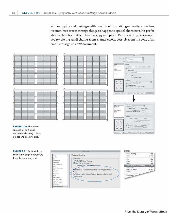
TIP: As a starting point for your sketches, print out blank thumbnails of your pages with margins and column guides shown. In the Print dialog box General settings, check Print Blank Pages and Show Visible Guides and Grids. In Setup choose Thumbnails and a suitable grid: 2x2, 3x3, 4x4, and so on.
From the Library of Wow! eBook
ptg
INDESIGN TYPE Professional Typography with Adobe InDesign, Second Edition34
6 7
2 3
8 9
4 5
FIGURE 2.20 Thumbnail spreads for an 8-page document showing column guides and baseline grid.
FIGURE 2.21 Paste Without Formatting strips out formats from the incoming text.
While copying and pasting — with or without formatting — usually works fine, it sometimes causes strange things to happen to special characters. It’s prefer-able to place text rather than use copy and paste. Pasting is only necessary if you’re copying small chunks from a larger whole, possibly from the body of an email message or a pdf document.
From the Library of Wow! eBook

ptg
35CHAPTER 2 Getting Type on Your Page
FIGURE 2.22 Unchecking Type Tool Converts Frames prevents graphic frames from being inadvertently converted to text frames.
Rectangles and Rectangle Frames: What’s the Difference?
There are two tools that do essentially the same thing: the Rectangle Tool (and its associated tools Ellipse and Polygon) and the Rectangle Frame Tool (along with the Ellipse Frame and the Polygon Frame). What’s the difference? Not much. Shapes drawn with the Frame tools appear with an “X” inside them. Presumably you are going to put content into them. The Rectangle, Ellipse, or Polygon (the Shape tools), however, have no “X” and are intended as graphic elements in their own right. That said, there’s nothing stopping you from putting text or a graphic inside a shape: Click in the frame with the Type Tool, and the object becomes a text frame. Likewise, there’s nothing compelling you to put content into frames. Some people prefer their text frames to be text frames and their graphic frames to be graphic frames, so there is a Type preference you can change to prevent graphic frames from being converted to text frames with the Type tool.
If you need to change the shape of any object, for example from a rectangle to an ellipse or vice versa, choose Object > Convert Shape.
The shape of things to come
The shape of things to
come
FIGURE 2.23 Use Convert Shape to change the shape of a text frame.
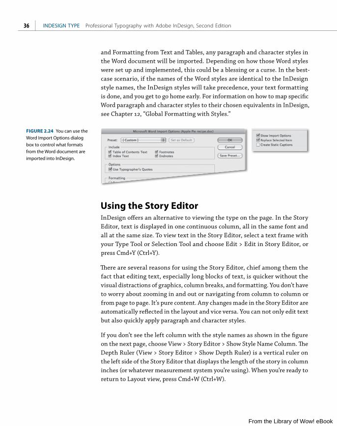
Importing Word TextWhen placing a Microsoft Word or Rich Text Format (rtf) file, you can control how the text is imported into InDesign. Choose File > Place (Cmd+D or Ctrl+D). A dialog box appears asking for file location. At the bottom of this window are several check boxes. Select the file to import, check Show Import Options, and click Open, and you are taken to the Microsoft Word Import Options dialog box. Here, you can choose whether or not to import Word-created footnotes, endnotes, table of contents text, and index text. If you choose Preserve Styles
From the Library of Wow! eBook
ptg
INDESIGN TYPE Professional Typography with Adobe InDesign, Second Edition36
and Formatting from Text and Tables, any paragraph and character styles in the Word document will be imported. Depending on how those Word styles were set up and implemented, this could be a blessing or a curse. In the best-case scenario, if the names of the Word styles are identical to the InDesign style names, the InDesign styles will take precedence, your text formatting is done, and you get to go home early. For information on how to map specific Word paragraph and character styles to their chosen equivalents in InDesign, see Chapter 12, “Global Formatting with Styles.”
FIGURE 2.24 You can use the Word Import Options dialog box to control what formats from the Word document are imported into InDesign.
Using the Story EditorInDesign offers an alternative to viewing the type on the page. In the Story Editor, text is displayed in one continuous column, all in the same font and all at the same size. To view text in the Story Editor, select a text frame with your Type Tool or Selection Tool and choose Edit > Edit in Story Editor, or press Cmd+Y (Ctrl+Y).
There are several reasons for using the Story Editor, chief among them the fact that editing text, especially long blocks of text, is quicker without the visual distractions of graphics, column breaks, and formatting. You don’t have to worry about zooming in and out or navigating from column to column or from page to page. It’s pure content. Any changes made in the Story Editor are automatically reflected in the layout and vice versa. You can not only edit text but also quickly apply paragraph and character styles.
If you don’t see the left column with the style names as shown in the figure on the next page, choose View > Story Editor > Show Style Name Column. The Depth Ruler (View > Story Editor > Show Depth Ruler) is a vertical ruler on the left side of the Story Editor that displays the length of the story in column inches (or whatever measurement system you’re using). When you’re ready to return to Layout view, press Cmd+W (Ctrl+W).
From the Library of Wow! eBook

ptg
37CHAPTER 2 Getting Type on Your Page
FIGURE 2.25 A story viewed in the Story Editor (left); the same story in Layout view with guides turned on (right).
FIGURE 2.26 The Story Editor Preferences determine the appearance of your text in the Story Editor; they have no effect on how the text appears in Layout View, or on how it prints.
To change the appearance of your text in the Story Editor, choose Preferences > Story Editor Display.
Using the Story Editor is like getting under the hood to view the engine. You can see and more easily access things here that are hidden or hard to see in Layout View: markers for inline graphics and anchored objects, text variables,
From the Library of Wow! eBook

ptg
INDESIGN TYPE Professional Typography with Adobe InDesign, Second Edition38
hyperlinks, nonprinting Notes, cross references, index markers, and xml tags. You can also edit overset text, including overset text in table cells. The Overset Text Indicator “redlines” the overset text, making it easier to write to fit the available space. And because the Story Editor reveals things Layout View does not, it’s also useful for troubleshooting text composition problems, like mys-terious line breaks or spacing gaps. Want to get to the text that mysteriously keeps falling out of the text frame (probably due to some inappropriate Keep Options setting)? Use the Story Editor.
Cleaning Up TextHaving placed a text file, the first thing to do — before you start formatting the text — is clean it up. Designers commonly work with text files that have been created by someone else. In a perfect world, these files would be as lean as a cheetah and as minimalist as a piece of Bauhaus furniture. This is rarely, if ever, the case. People clutter up their text files with all kinds of junk, often in the misguided notion that they’re helping you out by doing the formatting. Extra carriage returns, multiple tabs, multiple spaces (in some cases used to justify lines of type) will all need to be removed. Of course, communication with your client can go a long way: Tell them what you want and you might even get it. But even with stellar communication and the best of intentions, you’re still going to need to clean your text files — even if you created them in the first place. Thankfully, it’s fast and easy to whip your stories into shape. A good place to start is with the predefined grep Queries.
FIGURE 2.27 Using a predefined GREP Query to purge any unnecessary spaces from a document.
From the Library of Wow! eBook

ptg
39CHAPTER 2 Getting Type on Your Page
The simplest way to clean up text is the FindChangeByList script. An InDesign Script is a defined sequence of steps that you can play back with a single click. You can write your own with JavaScript (or AppleScript or Visual Basic) but thankfully, you don’t need to know scripting languages to use the InDesign sample scripts.
Once you’ve located the Scripts panel (Window > Automation > Scripts), expand the Application folder, then the Samples folder, then the JavaScript folder. Scroll down to FindChangeByList and double-click that entry. In a blink of an eye, this little gem performs a sequence of Find/Change routines on your selection, your story, or your document. If you want to see exactly what it’s doing — and customize how it performs — open the FindChangeSupport folder beneath the script on the Scripts panel, right-click the FindChangeList.txt file, and choose Show in Finder/Show in Explorer. You can open the text file in a text editor and edit its list of Find/Change routines. The easiest way to do this is to copy and paste an existing routine and then adjust the find and change criteria as necessary.
Even if you’re not feeling intrepid enough to customize this script, just using it off the shelf to banish egregious spacing will save loads of precious time. A word of caution that applies to using any script: If you try using Undo after running a script you’ll find yourself needing to press Cmd+Z (Ctrl+Z) numerous times to restore things to the way they were. This is because a script is a sequence of steps, and Undo undoes only a single step in that sequence at a time. To play it safe, save your work before you run the script. You can then use Revert to get your document to the previously saved version if you don’t like the results.
FIGURE 2.28 The FindChangeByList script — the quickest way to purge unwanted spacing from your story or document.
FIGURE 2.29 The find and change queries that the FindChangeByList script runs on your story or document. You can add your own queries or remove queries from the list.
From the Library of Wow! eBook

ptg
INDESIGN TYPE Professional Typography with Adobe InDesign, Second Edition40
space
carriage return
line break
tab
right indent tab
em space
en space
thin space
indent to here
FIGURE 2.30 Some common hidden characters.
Show Hidden Characters
Working with hidden characters visible is a good way to troubleshoot potential composition problems because you can see any forced line breaks, tabs, and multiple spaces that may have crept into your text. You can toggle this view option on and off by choosing Type > Show Hidden Characters, by choosing Hidden Character from View Options on the Application Bar, or by pressing Cmd+Option/Alt+I (Ctrl+Option/Alt+I).
From the Library of Wow! eBook

ptgCCHAPTER 3
Character Formats
A WEALTH OF OPTIONS ARE available on InDesign’s Control Panel, some of them
obvious, some far so less so. Their arrangement reflects how they have evolved
from predigital typesetting, and to get the best results from these options, we
need to be aware of the conventions for using them. Starting out with the
Character Formatting controls, we’ll look beyond the buttons to the historical
precedents and the aesthetic considerations of using these options.
From the Library of Wow! eBook

ptg
INDESIGN TYPE Professional Typography with Adobe InDesign, Second Edition42
Text Selection MethodsBefore we can format type, we must first select it. Here’s a list of useful short-cuts for selecting text and moving within stories:
■ Select one word: Double-click word
■ Select one line: Triple-click line (depending on Text Preferences setting)
■ Select to beginning of line: Cmd+Shift+Up Arrow (Ctrl+Shift+Up Arrow)
■ Select to end of line: Cmd+Shift+Down Arrow (Ctrl+Shift+Down Arrow)
■ Delete one word to left of cursor: Cmd+Delete (Ctrl+Backspace)
■ Delete one word to right of cursor: Cmd+Fn+Delete (Ctrl+Delete)
■ Move to start or end of story: Cmd+Fn+Left Arrow or Right Arrow (Ctrl+Home or End)
■ Select from the point of the cursor to the start or end of story: Cmd+ Shift+Home or End (Ctrl+ Shift+Home or End)
■ Move to beginning of line: Fn+Left Arrow (Ctrl+Up Arrow)
■ Move to end of line: Fn+Right Arrow (Ctrl+Down Arrow)
■ Move one word to the right: Cmd+Right Arrow (Ctrl+Right Arrow)
■ Move one word to the left: Cmd+Left Arrow (Ctrl+Left Arrow)
■ Move to beginning of next paragraph: Cmd+Down Arrow (Ctrl+Down Arrow)
■ Move to beginning of previous paragraph: Cmd+Up Arrow (Ctrl+Up Arrow)
From the Library of Wow! eBook

ptg
CHAPTER 3 Character Formats 43
Character Formatting Options
This section looks at the basic options available in the Character Formatting panel.
FontTo change the font of a selected range of text, use the Font field on the Control Panel. To jump to the Font field when Character formats are active, press Cmd+6 (Ctrl+6). From there, type the first few letters of the font name that you want to jump to, or at least the name of a font close to it on the font menu. To move through the fonts on your menu, applying them to your selected text, press the Up or Down arrows. This is, of course, no substitute for having a type speci-men book like FontBook: Digital Typeface Compendium (FontShop International). Alternatively, you can browse type specimens in the Adobe Type Library at http://store.adobe.com/type.
The following icons are used to indicate different kinds of fonts:
OpenType
Type 1
TrueType
You can turn off the preview feature or change the point size of the font names or font samples in Type Preferences.
TIP: If you see a typeface you like and you need to find out what it is, you can upload a scanned type sample to MyFonts’s handy Web tool WhatTheFont, at http://new.myfonts.com/WhatTheFont. If the auto-matic recognition doesn’t work, you can submit the image to the WhatTheFont Forum, where forum mem-bers will identify the type. There’s even a WhatTheFont iPhone app.
FIGURE 3.1 The Font Preview Size option in Type Preferences.
FIGURE 3.2 The WhatTheFont online tool (http://new.myfonts.com/WhatTheFont) — a useful resource for typeface identification.
From the Library of Wow! eBook

ptg
INDESIGN TYPE Professional Typography with Adobe InDesign, Second Edition44
Font StyleA choice of different type styles — like bold or italic, for instance — within the same typeface family lets you indicate hierarchy and emphasis, while at the same time maintaining stylistic continuity. InDesign won’t allow you to apply
“faux” bold or italic font styles: There’s no B or I button to make the text heavier or slanted. Instead, you need to choose the italic or bold weights of that typeface from the Font Style menu — or use the shortcuts: Cmd+Shift+I (Ctrl+Shift+I) or Cmd+Shift+B (Ctrl+Shift+B).
Numerous terms are used to describe the styles within a typeface. Type that doesn’t slant is referred to as roman. This “normal” style is usually called regu-lar, but in certain typefaces may be called book or medium. The terms italic and oblique both refer to slanted type, the latter employed in some sans serif type-faces. Terms like light, semibold, bold, or black refer to the font weight and are self-explanatory; other lesser-used terms to describe font weight are heavy and extra bold. The terms condensed and extended refer to character width. Another way of describing the weights and widths within a typeface is to give the styles a number prefix. The first typeface to use this naming convention was Univers, designed by Adrian Frutiger in 1957. The higher the number, the heavier the weight. Odd numbers are roman, even numbers oblique — although in recent issues of Univers, the slanted versions are identified as “obliques” rather than by number.
ItalicsItalic type styles — so named because they evolved in Italy — are designed to complement their roman siblings. Most fonts come with a matching italic. The company that developed InDesign’s predecessor, PageMaker, took the name Aldus after Aldus Manutius (c. 1449–1515), a Venetian printer who was the first to use italic type in the early 16th century.
Italics are separate fonts in their own right, not just slanted versions of the roman. When they were first used, they were considered distinct from the roman forms. Over time, printers began pairing italics with romans of the same weight and x-height, but italics retain their identity through narrower proportions and unique letterforms.
FIGURE 3.3 Adrian Frutiger’s Univers.
From the Library of Wow! eBook

ptg
CHAPTER 3 Character Formats 45
Italics can have the following uses:
■ Emphasis
■ Foreign language words or phrases, except where those words are in such common usage as to not require distinguishing: for example, cliché, elite, genre. Such conventions shift over time; a good rule of thumb is to check to see if the word in question is in the dictionary.
■ The titles of films, books, magazines, or works of art
■ In written dialogue to indicate that the conversation is thought by the character(s), rather than said.
Common wisdom advises against setting long passages in italics. The calligraphic flow of italics makes the type look hurried; or perhaps the characters, being more decorative, attract too much attention. If overused, the uniqueness of italics is lost. It may be that italics are harder to read in long passages simply because we’re not used to doing so.
How razorback-jumping frogs can level six piqued gymnasts!
How razorback-jumping frogs can level six piqued gymnasts!
Italic (Chaparral Pro)
Fake Italics (Chaparral Pro)
Oblique (Helvetica)aaffFIGURE 3.4 Italics, fake italics (note the different letter shapes), and oblique.
BoldBold weights are typically applied to headings and subheads to establish hierar-chy. It’s also common in newspapers and magazines to distinguish supporting text like sidebars, captions, and pull quotes by using a bold or semibold weight for the body text.
From the Library of Wow! eBook

ptg
INDESIGN TYPE Professional Typography with Adobe InDesign, Second Edition46
In larger typeface families there may be relative weights of boldface with names like semibold, black, extra bold, and super. Given the option of several weights within the same family (as listed on the Font Style menu), it’s preferable to differentiate by two weights to achieve the desired contrast. For example, pair regular with bold, or light with semibold; a regular paired with a semibold may not provide sufficient contrast.
The use of bold as opposed to italics for emphasis in body text is a style issue. If you are using bold, do so sparingly. If everything is emphasized, then nothing is emphasized. Bold text breaks up the continuity of the type and gives your text an overly didactic tone. The eye will jump to text called out in bold rather than discover the emphasis as part of the reading as with italics, which blend in more harmoniously with the roman type.
From a historical perspective the use of boldface may undermine the authentic-ity of your page, since prior to the 19th century there was no such thing as bold roman type, printers relying instead on small caps or italics for emphasis. As Robert Bringhurst puts it in his landmark book The Elements of Typographic Style, inappropriate use of boldface can “create unintentional anachronisms, some-thing like adding a steam engine or fax machine to the stage set for King Lear.”
Font SizeAs well as sizing type using the Control Panel, you can use keyboard shortcuts: Cmd+Shift+ > (Ctrl+Shift+ > ) increases the point size by the increment speci-fied in the Units and Increments preferences for Size/Leading. Cmd+Shift+ < (Ctrl+Shift+ <) reduces the type size by the same increment. Add Option (Alt) to this key combination and you can increase or decrease your point size by five times the specified increment.
Leaving out the Shift key and just pressing Cmd (Ctrl) plus the > or < keys scales both the text frame and the type at the same time. This scales the type relative to the text frame, rather than by increment specified in the Units & Increments preferences.
If you’re working with a single word or single line of display type, it’s often easier to scale the type and the text frame together. To do this, drag out a text frame with your Type Tool, then type your text. If your text frame is bigger than nec-essary to accommodate the text, click the Fit Frame to Content icon in the Control Panel, or press Cmd+Option+C (Ctrl+Option+C). This fits your frame
Ag Ag Ag Ag Ag Ag
There are numerous ways to give emphasis. Making words boldor italic are the most common, but using color or a highlight can also be effective. Whichever method you choose, you need only one way to signify difference. For example, it is redundantto use bold and italic, or bold and a color.
FIGURE 3.5 Combining different weights within a typeface family. From top to bottom: regular with bold, light with semibold, regular with semibold. In the top two options the weights are clearly differentiated; in the last option, they are too similar.
FIGURE 3.6 Different approaches to giving emphasis.
From the Library of Wow! eBook

ptg
CHAPTER 3 Character Formats 47
snugly around your text. To scale the text by eye, hold down Cmd+Option+C (Ctrl+Shift) as you drag from one of the corners of the text frame to size the type while maintaining its proportions. You can also use the Scale Tool to size the text frame and its contents.
Font Size in Parentheses
By default, when you change the scale of a text frame, the text inside the frame is also scaled. For example, when you double the size of a text frame, the text also doubles in size, so 20-point text increases to 40 points, for example.
There is an ill-advised preference that changes this behavior. If you change the preference option from Apply to Content to Adjust Scaling Percentage, the Font Size field displays both the original and the scaled size of the text, such as “20 pt (40).”
By default, with Apply to Content selected, scaling values display at 100 after a text is scaled. If you select Adjust Scaling Percentage, the scaling values reflect the scaled frame, so doubling the scale of a frame displays as 200.
The Adjust Scaling Percentage option is there so the user can monitor scale changes to frames — which is useful if you have to revert a frame and the text inside it to their original size. In practice, however, it just confuses people.
If you inherit a document with font sizes in parentheses and want to set them to display their “real” sizes, choose Redefine Scaling as 100 from the Control Panel menu. Choosing this option doesn’t change the appearance of the scaled frame.
AgAg AgAg Ag AgAgAgAgAgAgAgAgAg
FIGURE 3.7 Use a type scale to maintain harmony between different sizes of type.
FIGURE 3.8 Choosing Adjust Scaling Percentage in General Preferences (A) results in type sizes in parentheses, if you scale a text frame, and is apt to cause confusion. (B)If you inherit a document where this option has been applied, select the text frame and choose Redefine Scaling as 100 to see the real type size. (C)
A B
C
From the Library of Wow! eBook

ptg
INDESIGN TYPE Professional Typography with Adobe InDesign, Second Edition48
Common Text Sizes (and the Terms Used to Describe Them) Body text or body copy is the type (typically in sizes between 8 and 12 points) that makes up the majority of a book or article and carries the bulk of the mes-sage. When choosing the size of your body text, you can probably go smaller than you think. Text that is too large looks amateurish and clunky. While 12-point type is InDesign’s default type size — and looks about right on screen — chances are it will look too big in print. Start out with 10 point, then increase or decrease the size as necessary according to the characteristics of the font (and the needs of your audience).
Display type is the big type (typically 18 points and above) whose primary purpose is to be seen, the bait that lures the reader. While size usually indi-cates the type’s intent, this is not always the case. For example, an understated headline can sometimes attract attention by being unexpected.
Subheads allow a story to be broken down into bite-size chunks that are more visually enticing than a mass of undifferentiated paragraphs. They provide visual relief and interest as well as acting as signposts throughout a book or article. Subheads may be the same size as the body text but distinguished by a different font or weight, or they may be a point or two bigger.
Captions help interpret an image and are usually set a point or two smaller than the body text. In our media-saturated world, it’s the captions that the tentative or busy reader reads first before engaging fully with the body copy or moving on.
CasingWhile our capital letters evolved from the Romans, it wasn’t until the end of the 8th century that anything like lowercase letters were used. Credit for their invention goes to Alcuin of York, Charlemagne’s leading adviser on ecclesiasti-cal and educational affairs, who oversaw the standardization of ecclesiastical texts. With the invention of the printing press in Europe around 1450 (though it existed earlier in both China and Korea), the terms uppercase and lowercasecame from the wooden type cases used to hold the movable type. The top case was for the majuscules, the bottom case for the minuscules. Today, most fonts come with both uppercase and lowercase letters, but some are unicase or unicam-eral. Trajan by Carol Twombly (1959– ), for example, comes only in uppercase, while Herbert Bayer’s Universal (1900–1985) comes only in lowercase — in fact, Bayer, a leading figure in the Bauhaus, advanced the idea of doing away with uppercase letters altogether.
HeadlineSubheadBody textCaption
FIGURE 3.9 Common sizes set in Chaparral Pro: Headline bold 24 point, Subhead bold 12 point, Body text regular 10 point, Caption semibold 8 point.
The greatest show on earth
graphic design
architecture interior design
FIGURE 3.10 Trajan and Universal, two examples of a unicase typeface.
From the Library of Wow! eBook

ptg
CHAPTER 3 Character Formats 49
Continuous text set in unicase can be challenging to read. Text set in all caps, for example, is less readable than text in uppercase and lowercase because the word shapes all look alike and are differentiated only by their length. We recognize words as shapes — the descenders and ascenders of lowercase text help us to instantly identify letters. Also, text set in all caps tends to look dis-proportionately large when set among upper- and lowercase text; hence the need for small caps. Just as shouting doesn’t make your message any clearer, setting text in all caps doesn’t make your message any more compelling. At the other extreme, continuous text set all in lowercase makes it harder for the reader to distinguish one sentence from another and is really only appropriate if you are k.d. lang, bell hooks, or e. e. cummings.
During my lifetime I have dedicated myself to this struggle of the African people. I have fought against white domination, and I have fought against black domination. I have cherished the ideal of a democratic and free society in which all persons live together in harmony and with equal opportunities. It is an ideal which I hope to live for and to achieve. But if needs be, it is an ideal for which I am prepared to die.
— Nelson Mandela, April 20, 1964
DURING MY LIFETIME I HAVE DEDICATED MYSELF TO THIS STRUGGLE OF THE AFRICAN PEOPLE. I HAVE FOUGHT AGAINST WHITE DOMINATION, AND I HAVE FOUGHT AGAINST BLACK DOMINATION. I HAVE CHERISHED THE IDEAL OF A DEMOCRATIC AND FREE SOCIETY IN WHICH ALL PERSONS LIVE TOGETHER IN HARMONY AND WITH
WHAT LIGHT THROUGH YONDER WINDOW BREAKS?
What light through yonder window breaks?
FIGURE 3.11 The word shapes made by the ascenders and descenders of upper- and lowercase type make the text more identifiable, whereas text in all caps makes word shapes that are basically identical (top). The same text set in all caps is a more challenging read — and of course takes up much more space (left).
From the Library of Wow! eBook

ptg
INDESIGN TYPE Professional Typography with Adobe InDesign, Second Edition50
Nonetheless, all caps can be effective in headlines and subheads. Because there are no descenders, however, you should tighten the leading. With a serif font, you may want to loosen the letterspacing for a sophisticated and understated look, or tighten the letterspacing on a sans serif typeface for a denser, more solid look.
FIGURE 3.12 An uppercase headline with Auto Leading applied (top) and with negative leading (bottom).
If your text has been typed in lowercase or sentence case, you can easily convert it to all caps by using the
icon on the Control Panel, pressing the shortcut Cmd+Shift+K (Ctrl+Shift+K), or choosing Type > Change Case. Unfortunately, converting text that has been typed with Caps Lock toggled on is a bit hit-and-miss if you want to convert to sentence casing: InDesign interprets any period, question mark, or exclamation point as the end of a sentence. This causes unexpected case changes when these characters are used in other ways, as in abbreviations, file names, or urls. In addition, proper names will become lowercase when they should be uppercase.
FIGURE 3.13 The Change Case options and an example of how easily fooled they are when changing text that was originally typed with Caps Lock on.
ONE SMALL STEP FOR MAN; ONE GIANT LEAP FOR MANKIND
;ONE SMALL STEP FOR MAN;ONE GIANT LEAP FOR MANKIND
From the Library of Wow! eBook
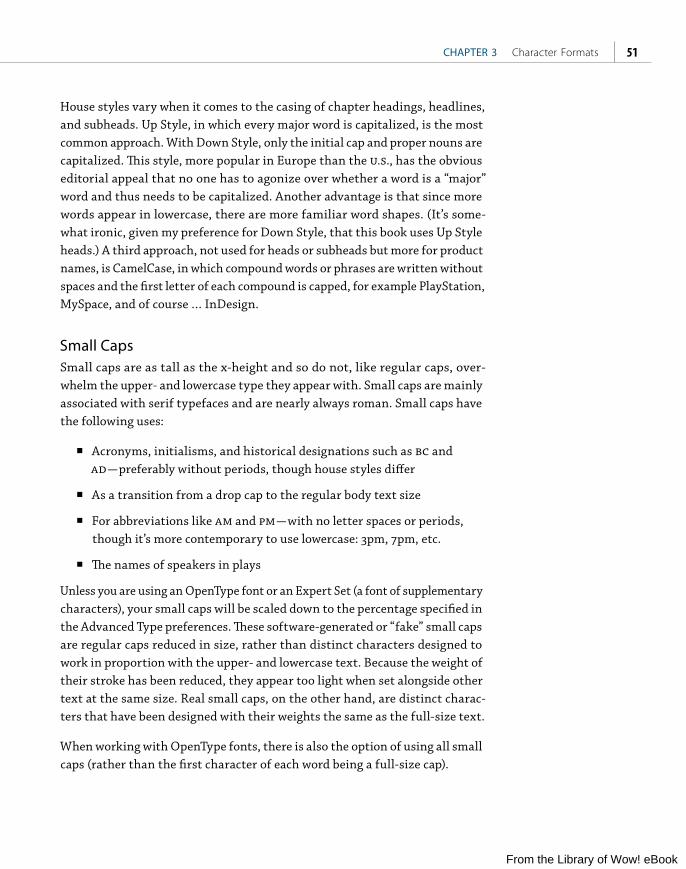
ptg
CHAPTER 3 Character Formats 51
House styles vary when it comes to the casing of chapter headings, headlines, and subheads. Up Style, in which every major word is capitalized, is the most common approach. With Down Style, only the initial cap and proper nouns are capitalized. This style, more popular in Europe than the u.s., has the obvious editorial appeal that no one has to agonize over whether a word is a “major” word and thus needs to be capitalized. Another advantage is that since more words appear in lowercase, there are more familiar word shapes. (It’s some-what ironic, given my preference for Down Style, that this book uses Up Style heads.) A third approach, not used for heads or subheads but more for product names, is CamelCase, in which compound words or phrases are written without spaces and the first letter of each compound is capped, for example PlayStation, MySpace, and of course … InDesign.
Small CapsSmall caps are as tall as the x-height and so do not, like regular caps, over-whelm the upper- and lowercase type they appear with. Small caps are mainly associated with serif typefaces and are nearly always roman. Small caps have the following uses:
■ Acronyms, initialisms, and historical designations such as bc and ad — preferably without periods, though house styles differ
■ As a transition from a drop cap to the regular body text size
■ For abbreviations like am and pm — with no letter spaces or periods, though it’s more contemporary to use lowercase: 3pm, 7pm, etc.
■ The names of speakers in plays
Unless you are using an OpenType font or an Expert Set (a font of supplementary characters), your small caps will be scaled down to the percentage specified in the Advanced Type preferences. These software-generated or “fake” small caps are regular caps reduced in size, rather than distinct characters designed to work in proportion with the upper- and lowercase text. Because the weight of their stroke has been reduced, they appear too light when set alongside other text at the same size. Real small caps, on the other hand, are distinct charac-ters that have been designed with their weights the same as the full-size text.
When working with OpenType fonts, there is also the option of using all small caps (rather than the first character of each word being a full-size cap).
From the Library of Wow! eBook

ptg
INDESIGN TYPE Professional Typography with Adobe InDesign, Second Edition52
FIGURE 3.14 Small caps: The top example shows “fake” small caps at 70 of the full capitals. Notice the lighter stroke weight compared to the real OpenType small caps, below.
The bbc and cnn reported the decision by the imf and the World Bank to cancel all debts as of 8 am on October 4, 2010. Poverty, aids, malnutrition, and illiteracy will be significantly reduced by 2015.
The BBC and CNN reported the decision by the IMF and the World Bank to cancel all debts as of 8 A.M. on October 4, 2010. Poverty, AIDS, malnutrition, and illiteracy will be significantly reduced by 2015.
FIGURE 3.15 The use of small caps for acronyms, initialisms, dates, and times.
Small Caps
Small CAPS
FIGURE 3.16 OpenType All Small Caps (bottom), as compared to using full-size caps and small caps together (top).
Superscript and SubscriptSuperscript is typically used for ordinals in numbers or for footnotes. Subscript is used for scientific notation. With OpenType typefaces, rather than use the Superscript and Subscript buttons on the Control Panel, choose Superior/ Superior or Subscript/Inferior from the OpenType flyout menu. In most cases, ordinals and superscript/superior are the same thing. These are distinct glyphs with a stroke weight the same as that of the upper- and lowercase text. If you don’t have this luxury, you’ll need to fake your superscript and subscript characters, which will unavoidably result in them looking too light next to the main text. In Text Preferences, you can change the size of superscripts and subscripts relative to the point size of the text. For best results, set the Super/ Subscript size to 60. See Chapter 6, “Small (but Important) Details,” for a way to use superscript and subscript characters to create fractions.
NOTE: Working with equa-tions? If there are just a few, you can use a typeface like Mathematical Pi in conjunc-tion with baseline shift and tabs. If it’s something you’ll be doing on a regular basis, consider a third-party plug-in like InMath or MathMagic Pro. The InDesign Secrets Web site has an interesting discus-sion of different approaches (http://indesignsecrets. com/typesetting-math-in-indesign.php).
THE CONSTITUTION OF THE UNITED STATES OF AMERICA
The Constitution of the United States of America
Fake Small Caps
Real Small Caps
From the Library of Wow! eBook

ptg
CHAPTER 3 Character Formats 53
UnderliningIn days of yore, when records came on vinyl and people typed on machines called typewriters, underlining was de rigueur for adding emphasis — but that was only because typewriters couldn’t do it any other way. Underlining, as every type manual will tell you, should never be used for emphasis. The underline is too heavy and collides with the descenders. If you’re using underlining to indicate hyperlinks, be sure to change the weight, the offset, and possibly the color of the line in Underline Options — it will still look ugly, but you can make it slightly less so.
April 1stSuperscript
H2OSubscript(position 20%)
OpenTypeInferior
H₂O
FIGURE 3.17 Superscript compared with OpenType Superior (left), and subscript compared with OpenType Inferior (right).
April 1stOpenTypeSuperior
FIGURE 3.18 Underline Options on the Control Panel menu and some different approaches to underlining.
FIGURE 3.19 Underlining applied as a Character Style to indicate hyperlinks.
groovyUnderline slices
through descenders
groovyText is stroked
with white (Paper)
groovyUnderline is offset,
Line Style wavy.
From the Library of Wow! eBook

ptg
INDESIGN TYPE Professional Typography with Adobe InDesign, Second Edition54
By adjusting the weight, off set, and color of the underline, it’s possible to make a Character Style to apply “highlighting” to text. (See Chapter 12, “Global Formatting with Styles,” for more on creating Character Styles.)
StrikethroughStrikethrough is used to indicate which text will be deleted as a document moves through revision cycles. If you tweak the Strikethrough Options, the strikethrough could potentially be used as a second underline.
Baseline ShiftBaseline shift, (Option+Shift+Up or Down Arrow or Alt+Shift+Up or Down Arrow), is used to vertically shift certain characters relative to the baseline of the type. It should never be used to adjust interparagraph spacing, which is a function of leading and paragraph spacing.
This text is highlighted with an underline style – useful for reverse out captions. Choose a contrasting color for the type, make the rule weight about the same size as the type and offset it.
FIGURE 3.20 Underlining applied as a highlight.
FIGURE 3.21 An overprinted Strikethrough combined with a heavy underline that is offset behind the text.
UnderlineStrikethrough&

ptg
CHAPTER 3 Character Formats 55
Baseline shift can be used for the following:
■ Adjusting the position of bullets, ornaments, inline graphics, and symbols like $, ®, ©, ™
■ Adjusting the position of a decorative drop cap
■ Manual fractions, although it’s preferable to use a fraction script or, better still, an OpenType Pro font with real fractions
■ Monetary amounts where the size of the currency symbol is reduced
■ Mathematical or chemical formulas
■ Adjusting the position of parentheses, braces, and brackets — all of which center on the lowercase x-height, relative to the type they enclose. When used with all caps, they should center on the cap height. (OpenType fonts make using baseline shift unnecessary because of their ability to glyph shift, that is, adjust the position of certain characters, like opening and closing parentheses according to whether they are preceded or followed by an upper or lowercase character — see
“Glyph Positioning.”)
■ Creating type that looks like the thing it is describing
bump
Call me Ishmael. Some years
ago – never mind how long
precisely – having little or no
money in my purse, and nothing
particular to interest me on shore,
I thought I would sail about a little
Call me Ishmael. Some years
ago – never mind how long
precisely – having little or no
money in my purse, and nothing
particular to interest me on shore,
I thought I would sail about a little
(415) (415)
$. $⁹⁹
(SHIFT) glyph
(SHIFT) glyph
Parentheses shifted up, right.
Superscript Superior and Baseline Shift applied, right.
Drop Cap baseline shifted up to avoid collision
Interpreting a word.
Glyph Shifting with OpenType font, right.
FIGURE 3.22 Some uses of baseline shift.

ptg
INDESIGN TYPE Professional Typography with Adobe InDesign, Second Edition56
Glyph Positioning
With display type in all caps, the positioning of hyphens, dashes, and paren-theses requires adjustment. Hyphens are centered on the x-height, which is appropriate for lowercase letters, but too low for capitals. Hyphens, dashes, and parentheses may need to be adjusted with baseline shift.
The beauty of OpenType fonts — and InDesign’s support of them — is that this glyph positioning happens automatically. If you format an OpenType font as all caps, the surrounding hyphens, dashes, parentheses, braces, and brackets all shift vertically. Note, however, that this happens only when you choose all caps character formats, not when you key in text with Caps Lock on.
Condensed and Extended TypeLarger typeface families may include condensed or extended versions. Condensed type can be useful if you have a lot of text to fit into a finite space, whereas extended type may be appropriate if you want to fill a defined space with a relatively small amount of text. Choose a real condensed or real expanded typeface rather than try to fake this effect by adjusting the horizontal or verti-cal scale. Scale your type nonproportionally and you’re trampling roughshod over the life’s work of some of the world’s finest artisans. Faking a condensed typeface (squeezing the horizontal scale) or an expanded typeface (stretching the horizontal scale) will make the character shapes look puny and the overall effect amateurish. Get caught using these options, and the Design Police will come knocking on your door (www.design-police.org). However, every rule can be broken creatively. Just make sure that if you break the rules, you’re breaking them consciously — and not because you don’t know better.
Condensed faces are useful for headlines, where because the letterforms are narrower, you can increase the point size and still have the headline fit the allotted space.
Condensed faces are also useful for tabular material and captions.
Extended faces are more typically used for display instead of body type, and are more likely to be sans serif — like Helvetica Neue Expanded or Univers Extended.

ptg
CHAPTER 3 Character Formats 57
We quickly seized the black axle and just saved it from going past him
Squeezed (72%)
Condensed
We quickly seized the black axle and just saved it from going past him
Ag AgSqueezed Condensed
FIGURE 3.23 The Design Police (www.design-police.org): Don’t give them reason to cite you!
FIGURE 3.24 Squeezed type: “fake condensed” compared with real condensed.
FIGURE 3.25 Condensed typefaces can have more impact within the same horizontal space.
Man Bites Dog
Man Bites DogHelvetica Neue Black 44 pt
Helvetica Neue Condensed Black 56 pt
Helvetica Ultra Compressed 100 pt

ptg
INDESIGN TYPE Professional Typography with Adobe InDesign, Second Edition58
ReadabilityReadability refers to the ease with which we comprehend text by recogniz-ing words and phrases as shapes. For a designer, readability means putting the reader first and leaving your ego behind — or at least confining it to your early drafts. Good typography is said to be “invisible”: You don’t even notice it. Instead, the type is a conduit for the message of the text. This might make the designer sound undervalued, but while your readers may not notice good typography, they will certainly know when it’s bad. As the acclaimed German typographer and book designer Jan Tschichold (1902–1974) put it in his work The Form of the Book: “To remain nameless and without specific appreciation, yet to have been of service to a valuable work and to the small number of visually sensitive readers — this, as a rule, is the only compensation for the long, and indeed never-ending, indenture of the typographer.”
However, not all type is intended to be readable: A cynic might cite legal small print or terms and conditions text as examples of typography where readability is a low priority. At the other end of the typographic scale, some decorative typefaces are deliberately challenging in terms of readability, but are arguably more, not less, recognizable for that. Type can be legible without necessarily being easily readable.
Serif vs. Sans SerifThe conventional wisdom is that serif typefaces are more readable than sans serif faces. Explanations for this vary. Perhaps it is because the serifs function like rails, guiding your eye along the line. Perhaps we perceive serif typefaces as more “human” because the transition of their strokes resembles calligraphy. Perhaps sans serif typefaces are less readable because the letters are inherently
LIVE LOBSTER
FRESH FISH
D R U M A N D B A S S
FIGURE 3.26 Some examples of extended typefaces: Wide Latin and Blackoak (top) and Univers Extra Black Extended (bottom).

ptg
CHAPTER 3 Character Formats 59
more like each other, it being hard to distinguish between an uppercase I and a lowercase l, for example.
Or perhaps — and my money’s on this one — the explanation is self-fulfilling. We read serif type more easily because we’re more used to reading serif type. In the words of Zuzana Licko (1961– ), co-founder of Émigré Graphics: “You read best what you read most.”
We could get used to anything, but we’ve been reading serif type for centuries and the habit is in our dna. Sans serif typefaces are the new kids on the block, relatively speaking — they weren’t invented until the early 19th century and were not in common usage until much later. That said, 15 plus years into the Web, we are becoming more accustomed to sans serif type for reading online.
Readability is more nuanced than applying a list of dos and don’ts. It depends not just on a choice of one class of typeface over another, but on how the many variables of setting type are handled. In the right hands, there’s no reason why a sans serif typeface can’t be every bit as readable as a serif typeface. To put it another way, choosing a serif typeface is no guarantee that your type will be readable.
Readability is a lesser concern when it comes to display type. Because it is set in short bursts rather than long passages, it doesn’t try to be invisible, but rather to draw attention to itself. For headlines, it is as important to be attention-grabbing as it is to be readable.
One morning, when Gregor Samsa woke from troubled dreams, he found himself transformed in his bed into a horrible vermin. He lay on his armour-like back, and if he lifted his head a little he could see his brown belly, slightly domed and divided by arches into stiff sections. The bedding was hardly able to cover it and seemed ready to slide off any moment. His many legs, pitifully thin compared with the size of the rest of him, waved about helplessly as he looked.
One morning, when Gregor Samsa woke from troubled dreams, he found himself transformed in his bed into a horrible vermin. He lay on his armour-like back, and if he lifted his head a little he could see his brown belly, slightly domed and divided by arches into stiff sections. The bedding was hardly able to cover it and seemed ready to slide off any moment. His many legs, pitifully thin compared with the size of the rest of him, waved about helplessly as he looked.
Adobe Jenson Pro Gotham Book
FIGURE 3.27 The 15th century (Jenson) versus the 21st (Gotham). Is one more readable than the other?

ptg
INDESIGN TYPE Professional Typography with Adobe InDesign, Second Edition60
Other Readability FactorsYour choice of font is just one of several factors that work in sync to create read-able type. Other factors include but, as they say in legalese, are not limited to:
■ Leading
■ Column measure (the ratio of type size to column width)
■ Alignment
■ Margins
■ Printing conditions (if, that is, the piece will be printed): What kind of paper stock will the document be printed on?
■ Reading conditions: This is an enormous variable over which you, the typographer, have no control. There’s no way you can know whether your audience will be reading by candlelight, while standing on a busy commuter train, or while in the bath. Depending on the type of document you’re creating, however, you may be able to speculate. For example, if you’re designing a bus timetable, you’ll want to forgo challenging postmodern typography in favor of a straightforward, get-your-message-across approach.

ptgDCHAPTER 4
Leading
LEADING (pronounced “ledding”) is the space between lines of type, sometimes
referred to as line spacing. The term comes from the days of hot-metal typesetting
when thin strips of lead, known as reglets, were inserted by hand between
the lines of type to add vertical space. Lines of type without these strips of
lead were — and still are — referred to as “set solid.” Leading plays a big part
in the readability of your text. Body text is usually made more readable by a
positive amount of leading (a leading value greater than the point size of the
type). Headlines and display type, however, may benefit from negative leading
(a leading value less than the point size of the type).

ptg
INDESIGN TYPE Professional Typography with Adobe InDesign, Second Edition62
Getting the Lead OutWhen it comes to leading there is no “one size fits all.” On one hand, tight leading increases the density of the type and gives your type authority. On the other, if you go too tight your type looks claustrophobic, and the descenders of one line may collide with the ascenders of the next. On one hand, loose leading can create a luxurious look. On the other, if the leading is too loose, the lines of type look like individual strips that don’t belong together as paragraphs. This is especially true if the leading value is greater than the size of the space between the paragraphs.
Leading is measured in points from one baseline to the next. The leading value includes the point size of the typeface and the actual space between the lines. Thus, 10-point type with 12 points of leading really means two points of space between each line. This is written 10/12, spoken as “10 on 12.” Other common type size and leading combinations for body text are 9/11, 11/13, and 12/15.
How Much Is Enough?Bad leading makes your text harder to read because the eye has trouble locating the next line of type. Getting the leading just right depends on several variables:
■ The nature of the text. While text intended for continuous reading benefits from some breathing space, a short burst of advertising copy or a title might be more effective if the lines are tightly leaded.
■ Type size. As type point size increases, you will want proportionally less leading. With display sizes, the same relative amount of space between the lines appears larger, so much so that it’s common to use negative leading for display type.
■ The width of the column. Increase leading as you increase column width. Increasing the leading anywhere from 0.5 point to 2 points improves readability by keeping the lines distinct and preventing the eye from dropping off to the line below or doubling back to reread the same line.
■ The width of the column gutters. Leading, like all type attributes, needs to work in harmony with everything else on the page. The width of the column gutters should be the same as the leading value or a mul-tiple thereof. If the gutters are too small there will be a tendency to read across the columns; too large and the separate columns will look unconnected.
Was this the face that launched a thousand ships,And burnt the topless towers of Ilium?
FIGURE 4.1 Leading is indicated by the red strips between the lines. The total leading is measured from the baseline of one line to the baseline of the next.
FIGURE 4.2 You can measure the leading value used on a printed piece with a leading gauge.

ptg
CHAPTER 4 Leading 63
FIGURE 4.3 An excerpt from Beatrice Ward’s influential 1932 essay on typography The Crystal Goblet, showing common leading and type size combinations.
Pour and drink; and according to your choice of goblet, I shall know whether or not you are a connoisseur of wine. For if you have no feelings about wine one way or the other, you will want the sensation of drinking the stuff out of a vessel that may have cost thousands of pounds; but if you are a member of that vanish-ing tribe, the amateurs of fine vintages, you will choose the crystal, because everything about it is calculated to reveal rather than hide the beautiful thing which it was meant to contain.
Pour and drink; and according to your choice of goblet, I shall know whether or not you are a connoisseur of wine. For if you have no feelings about wine one way or the other, you will want the sensation of drinking the stuff out of a vessel that may have cost thousands of pounds; but if you are a member of that vanish-ing tribe, the amateurs of fine vintages, you will choose the crystal, because everything about it is calculated to reveal rather than hide the beautiful thing which it was meant to contain.
Pour and drink; and according to your choice of goblet, I shall know whether or not you are a connoisseur of wine. For if you have no feelings about wine one way or the other, you will want the sensation of drinking the stuff out of a vessel that may have cost thousands of pounds; but if you are a member of that vanish-ing tribe, the amateurs of fine vintages, you will choose the crystal, because everything about it is calculated to reveal rather than hide the beautiful thing which it was meant to contain.
Pour and drink; and according to your choice of goblet, I shall know whether or not you are a connoisseur of wine. For if you have no feelings about wine one way or the other, you will want the sensation of drinking the stuff out of a vessel that may have cost thousands of pounds; but if you are a member of that vanish-ing tribe, the amateurs of fine vintages, you will choose the crystal, because everything about it is calculated to reveal rather than hide the beautiful thing which it was meant to contain.
Perpetua 9/11
10/12
11/13
12/15

ptg
INDESIGN TYPE Professional Typography with Adobe InDesign, Second Edition64
I told you that you knew the answer already. Everyone knows it. The thing that is in Room 101 is the worst thing in the world.
The thing that is in Room 101 is the worst thing in the world.
The thing that is in Room 101 is the worst thing in the world.
Hoefler Text 9.5/Auto (11.4) Hoefler Text 17/Auto (21.6) Hoefler Text 17/18
FIGURE 4.4 Positive leading works OK for body text sizes (A), but as the type gets bigger (B), proportionally less leading is needed (C).
FIGURE 4.5 Leading and column width. In the top example the leading is too tight; below, the leading has been increased to compensate for the wide column.
When in the Course of human events,
it becomes necessary for one people to
dissolve the political bands which have
connected them with another, and
to assume among the Powers of the
earth, the separate and equal station
to which the Laws of Nature and of
Nature’s God entitle them, a decent
respect to the opinions of mankind
requires that they should declare the
causes which impel them to the sepa-
ration.—We hold these truths to be
self-evident, that all men are created
equal, that they are endowed by their
Creator with certain unalienable Rights,
that among these are Life, Liberty and
the pursuit of Happiness.—That to
secure these rights, Governments are
instituted among Men, deriving their
just powers from the consent of the
governed,—That whenever any Form
of Government becomes destructive of
these ends, it is the Right of the People
to alter or to abolish it, and to institute
new Government, laying its foundation
on such principles and organizing its
powers in such form, as to them shall
seem most likely to effect their Safety
and Happiness. Prudence, indeed, will
dictate that Governments long estab-
lished should not be changed for light
and transient causes; and accordingly all
experience hath shewn, that mankind
are more disposed to suffer, while evils
are sufferable, than to right themselves
by abolishing the forms to which they
are accustomed. But when a long train
of abuses and usurpations. pursuing
invariably the same object evinces a
design to reduce them under absolute
Despotism, it is their right, it is their
duty, to throw off such Government,
and to provide new Guards for their
future security.—Such has been the
patient sufferance of these Colonies;
and such is now the necessity which
constrains them to alter their former
Systems of Government. The history
of the present King of Great Britain is
a history of repeated injuries and usur-
pations, all having in direct object the
establishment of an absolute Tyranny
over these States. To prove this, let Facts
be submitted to a candid world.—He
has refused his Assent to Laws, the most
wholesome and necessary for the public
good. He has forbidden his Governors
to pass Laws of immediate and press-
ing importance, unless suspended in
their operation till his Assent should be
obtained; and when so suspended, he has
utterly neglected to attend to them.—
He has refused to pass other Laws for
the accommodation of large districts
of people, unless those people would
relinquish the right of Representation
in the Legislature, a right inestimable to
them and formidable to tyrants only—
He has called together legislative bodies
at places unusual, uncomfortable, and
distant from the depository of their
public Records, for the sole purpose
of fatiguing them into compliance
with his measures.—He has dissolved
When in the Course of human
events, it becomes necessary for one
people to dissolve the political bands
which have connected them with
another, and to assume among the
Powers of the earth, the separate and
equal station to which the Laws of
Nature and of Nature’s God entitle
them, a decent respect to the opin-
ions of mankind requires that they
should declare the causes which
impel them to the separation.—We
hold these truths to be self-evident,
that all men are created equal, that
they are endowed by their Creator
with certain unalienable Rights, that
among these are Life, Liberty and
the pursuit of Happiness.—That to
secure these rights, Governments are
instituted among Men, deriving their
just powers from the consent of the
governed,—That whenever any Form
of Government becomes destructive
of these ends, it is the Right of the
People to alter or to abolish it, and
to institute new Government, laying
its foundation on such principles and
organizing its powers in such form,
as to them shall seem most likely to
effect their Safety and Happiness.
Prudence, indeed, will dictate that
Governments long established
should not be changed for light
and transient causes; and accord-
ingly all experience hath shewn,
that mankind are more disposed
to suffer, while evils are sufferable,
than to right themselves by abol-
ishing the forms to which they are
accustomed. But when a long train
of abuses and usurpations. pursuing
invariably the same object evinces a
design to reduce them under absolute
Despotism, it is their right, it is their
duty, to throw off such Government,
and to provide new Guards for their
future security.—Such has been the
patient sufferance of these Colonies;
and such is now the necessity which
constrains them to alter their former
Systems of Government. The history
of the present King of Great Britain
is a history of repeated injuries and
usurpations, all having in direct
object the establishment of an abso-
lute Tyranny over these States. To
prove this, let Facts be submitted to
a candid world.—He has refused his
Assent to Laws, the most wholesome
and necessary for the public good.
He has forbidden his Governors to
pass Laws of immediate and press-
ing importance, unless suspended in
their operation till his Assent should
be obtained; and when so suspended,
he has utterly neglected to attend to
them.—He has refused to pass other
Laws for the accommodation of
large districts of people, unless those
people would relinquish the right of
Representation in the Legislature,
a right inestimable to them and
formidable to tyrants only—He has
called together legislative bodies at
When in the Course of human events,
it becomes necessary for one people to
dissolve the political bands which have
connected them with another, and to
assume among the Powers of the earth,
the separate and equal station to which
the Laws of Nature and of Nature’s God
entitle them, a decent respect to the
opinions of mankind requires that they
should declare the causes which impel
them to the separation.—We hold these
truths to be self-evident, that all men
are created equal, that they are endowed
by their Creator with certain unalien-
able Rights, that among these are Life,
Liberty and the pursuit of Happiness.—
That to secure these rights, Governments
are instituted among Men, deriving their
just powers from the consent of the
governed,—That whenever any Form
of Government becomes destructive of
these ends, it is the Right of the People
to alter or to abolish it, and to institute
new Government, laying its foundation
on such principles and organizing its
powers in such form, as to them shall
seem most likely to effect their Safety
and Happiness. Prudence, indeed, will
dictate that Governments long estab-
lished should not be changed for light
and transient causes; and accordingly all
experience hath shewn, that mankind
are more disposed to suffer, while evils
are sufferable, than to right themselves
by abolishing the forms to which they
are accustomed. But when a long train
of abuses and usurpations. pursuing
invariably the same object evinces a
design to reduce them under absolute
Despotism, it is their right, it is their
duty, to throw off such Government, and
to provide new Guards for their future
security.—Such has been the patient
sufferance of these Colonies; and such
is now the necessity which constrains
them to alter their former Systems of
Government. The history of the pres-
ent King of Great Britain is a history
of repeated injuries and usurpations,
all having in direct object the estab-
lishment of an absolute Tyranny over
these States. To prove this, let Facts be
submitted to a candid world.—He has
refused his Assent to Laws, the most
wholesome and necessary for the public
good. He has forbidden his Governors
to pass Laws of immediate and press-
ing importance, unless suspended in
their operation till his Assent should be
obtained; and when so suspended, he has
utterly neglected to attend to them.—
He has refused to pass other Laws for
the accommodation of large districts of
people, unless those people would relin-
quish the right of Representation in the
Legislature, a right inestimable to them
and formidable to tyrants only—He has
called together legislative bodies at places
unusual, uncomfortable, and distant from
the depository of their public Records,
for the sole purpose of fatiguing them
into compliance with his measures.—He
has dissolved Representative Houses
repeatedly, for opposing with manly
FIGURE 4.6 In the example on the left, the gutter width is the same as the leading value. In the center, the gutter width is too big and the columns lose their visual relationship to each other. On the right, the gutter is too small so that the two columns look almost like a single line.
How will the struggle for existence, briefly discussed in the last chapter, act in regard to variation? Can the principle of selection, which we have seen is so potent in the hands of man, apply under nature? I think we shall see that it can act most efficiently. Let the endless number of slight variations and individual differences occurring in our domestic productions, and, in a lesser degree, in those under nature, be borne in mind; as well as the strength of the hereditary tendency. Under domestication, it may be truly said that the whole organisation becomes in some
How will the struggle for existence, briefly discussed in the last chapter, act in regard to variation? Can the principle of selection, which we have seen is so potent in the hands of man, apply under nature? I think we shall see that it can act most efficiently. Let the endless number of slight variations and individual differences occurring in our domestic productions, and, in a lesser degree, in those under

ptg
CHAPTER 4 Leading 65
■ The size of the word spaces. Justified type in narrow columns, such as in newspapers, may result in word spaces that are larger than the leading size. This causes the eye to jump to the next line rather than to the next word. In such situations, adding extra leading ensures that the space between the lines is at least as wide as the space between the words. Better still, don’t set justified type in narrow columns.
■ The color of the background. Because we’re used to reading black type on white paper, when we use the opposite, we’re guaranteed to get attention. However, reversed type tends to “sparkle,” making it hard to read. A slight increase in leading — as well as avoiding fonts with delicate serifs — can compensate.
Leading Shortcuts
The keyboard shortcuts for changing the leading of a selected range of text are Option+Up Arrow (Alt+Up Arrow) to tighten the leading and Option+Down Arrow (Alt+Down Arrow) to loosen the leading. The amount is determined by the value in the Size/Leading field in the Units & Increments Preferences. To increase or decrease the leading value by five times this amount, press Cmd+Option+Up Arrow (Ctrl+Alt+Up Arrow) or Cmd+Option+Down Arrow (Ctrl+Alt+Down Arrow).
How will the struggle for exis-tence, briefly discussed in the last chapter, act in regard to variation? Can the principle of selection, which we have seen is so potent in the hands of man, apply under nature? I think we shall see that it can act most effi-ciently. Let the endless number of slight variations and individ-ual differences occurring in our domestic productions, and, in a lesser degree, in those under nature, be borne in mind; as well as the strength of the hereditary tendency. Under domestication,
How will the struggle for exis-tence, briefly discussed in the last chapter, act in regard to variation? Can the principle of selection, which we have seen is so potent in the hands of man, apply under nature? I think we shall see that it can act most effi-ciently. Let the endless number of slight variations and individ-ual differences occurring in our domestic productions, and, in a lesser degree, in those under nature, be borne in mind; as well
FIGURE 4.7 With justified type on a narrow measure, it helps to increase the leading to ensure that the space between the lines is not less than the space between the words.
FIGURE 4.8 Type that reverses out of a solid color benefits from increased leading (right).
TIP: A convenient rule of thumb for determining leading is to take the width of a column in picas and divide it by the type point size, then round the result to the nearest half point. For example, if I have 10-point type on a 24-pica measure my leading is 2.4, rounded up to 2.5 and expressed as 12.5 (the lead added to the point size).
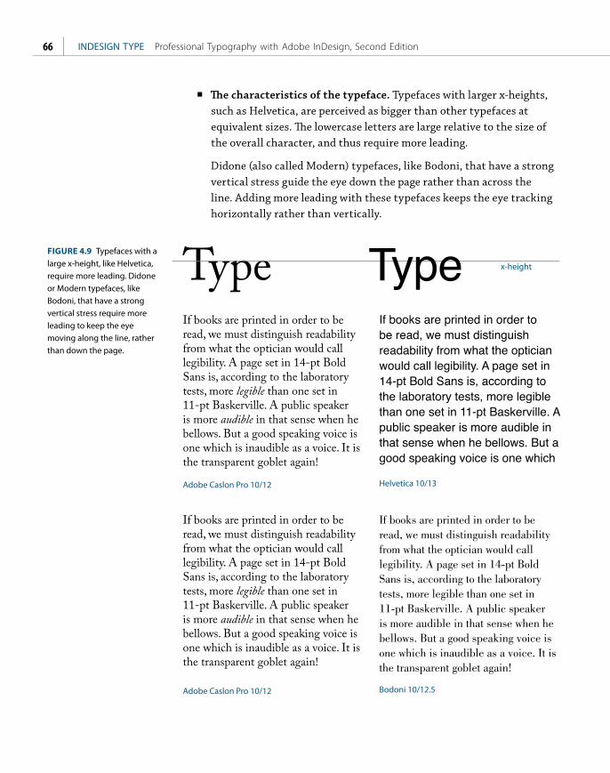
ptg
INDESIGN TYPE Professional Typography with Adobe InDesign, Second Edition66
■ The characteristics of the typeface. Typefaces with larger x-heights, such as Helvetica, are perceived as bigger than other typefaces at equivalent sizes. The lowercase letters are large relative to the size of the overall character, and thus require more leading.
Didone (also called Modern) typefaces, like Bodoni, that have a strong vertical stress guide the eye down the page rather than across the line. Adding more leading with these typefaces keeps the eye tracking horizontally rather than vertically.
Type
Adobe Caslon Pro 10/12
Adobe Caslon Pro 10/12
Helvetica 10/13
Bodoni 10/12.5
x-height
If books are printed in order to be read, we must distinguish readability from what the optician would call legibility. A page set in 14-pt Bold Sans is, according to the laboratory tests, more legible than one set in 11-pt Baskerville. A public speaker is more audible in that sense when he bellows. But a good speaking voice is one which is inaudible as a voice. It is the transparent goblet again!
If books are printed in order to be read, we must distinguish readability from what the optician would call legibility. A page set in 14-pt Bold Sans is, according to the laboratory tests, more legible than one set in 11-pt Baskerville. A public speaker is more audible in that sense when he bellows. But a good speaking voice is one which is inaudible as a voice. It is the transparent goblet again!
If books are printed in order to be read, we must distinguish readability from what the optician would call legibility. A page set in 14-pt Bold Sans is, according to the laboratory tests, more legible than one set in 11-pt Baskerville. A public speaker is more audible in that sense when he bellows. But a good speaking voice is one which is inaudible as a voice. It is the transparent goblet again!
FIGURE 4.9 Typefaces with a large x-height, like Helvetica, require more leading. Didone or Modern typefaces, like Bodoni, that have a strong vertical stress require more leading to keep the eye moving along the line, rather than down the page.

ptg
CHAPTER 4 Leading 67
Typefaces that combine a low x-height with particularly tall ascenders require special treatment. The low x-height begs for tighter leading, but tighter leading might lead to the ascenders and descenders collid-ing. Much depends on the characters themselves. If you’re working on display type, rewording — if you have editorial license — might make all the difference. Let common sense prevail — and be open to the possibil-ity that colliding ascenders and descenders might even look good in certain situations.
Bold and Semibold typefaces benefit from extra leading to prevent the type color — the darkness or blackness of the letterforms as a block — appearing too dense.
Typefaces with small x-heights, like Garamond, appear to have more horizontal space between lines and thus require less leading.
Type set in all caps requires less leading because the lack of descenders makes the lines appear farther apart.
Top Hat, White Tie
& Tails
Top Hat, White Tie
& Tails
Colorful vintage matchbook designs advertising the F lying Rani.
FIGURE 4.10 Even though Bernhard Modern has elongated ascenders, it has a low x-height and short descenders, and so can be leaded tightly (bottom).
FIGURE 4.11 Raniscript has elongated ascenders and descenders, but its low x-height means it looks good tightly leaded.
The quick brown fox jumps over the lazy dog
THE QUICK BROWN FOX JUMPS OVER THE LAZY DOG
Chaparral Pro Semibold 28/31 Chaparral Pro Semibold 28/27
FIGURE 4.12 The same headline in all caps needs less leading because there are no descenders.
TIP: The paragraph mark, or pilcrow, at the end of every paragraph carries the text formats. Not including it in a selection can result in inconsistent leading. To select the whole paragraph, click four times in the paragraph rather than swiping across it with the Type Tool — and make sure your Hidden Characters are shown.

ptg
INDESIGN TYPE Professional Typography with Adobe InDesign, Second Edition68
When you work in points, there’s an easy way to determine the leading value for a specifi c number of lines in your type area. First, draw a rectangle between the top and bottom margins of a page. Th en, insert your cursor in the Control Panel after the height value of the rectangle and type /N (where N is the desired number of lines). Press the Tab key to divide the height of the rectangle by the number of lines. Th e new height of the rectangle is your desired leading value. You can now delete the rectangle.
(Not) Using Auto LeadingAuto Leading is a relatively new concept, emerging with desktop publishing in the mid-1980s. Auto Leading allows InDesign to assign a leading value based on the type’s point size. By default, Auto Leading is 120 percent of the type size, although you can change this in your Justifi cation options. Leading values in parentheses indicate Auto Leading.
Th e best thing you can say about Auto Leading is that it’s convenient. You can change your text size as often as you like and your type will always be readable. As your font size increases or decreases, so does your leading.
Th e largest leading value in a line of type determines the leading for the whole line, which means that the leading will be inconsistent if you inadvertently make one character bigger than the rest of the text. You can change this behavior in your Type preferences by selecting the Apply Leading to Entire Paragraphs option. Th is ensures that only one leading value can be applied to any given paragraph. Changing this setting does not aff ect the leading in existing frames. Th is may be a worthwhile “safety” feature, but strangely, it does not apply to paragraphs with Auto Leading applied. Th e problem with having this prefer-ence turned on is that when you apply optical leading, you need to apply more than one leading value within a paragraph.
ADMIRATIONADULATIONAFFECTIONAL-
LEGIANCEAMITYAMOREAMOROUSNES-
SAMOURANGUISHAPPETITEAPPRECIA-
TIONARDENCYARDORATTACHMENTAVIDIT-
YBLESSEDNESSBLISSCARESSCHERISHING-
COMPASSIONCRAVINGCRUSHCUDDLEDE-
JECTIONDELECTATIONDELIGHTDELIRIUM-
DESIREDESPERATIONDESPONDENCYDEVO-
TIONDISCOURAGEMENTDISHEARTENMENT-
FIGURE 4.13 Stacked all caps with negative leading to create a wall of type.
FIGURE 4.14 By default the Auto Leading value is 120 of the point size of the type. When Auto Leading is chosen the value appears in parentheses on the Control Panel.
FIGURE 4.15 The Apply Leading to Entire Paragraphs option keeps your leading within a paragraph consistent. However, it doesn’t work with Auto Leading.

ptg
CHAPTER 4 Leading 69
Auto Leading is useful when you’re experimenting with type sizes, but when you decide upon the size, convert the leading value to an absolute number — even if it is the same as the Auto Leading value. Here’s why you shouldn’t use auto leading:
■ Auto Leading is proportional to your type size — but specific to the biggest piece of type in the paragraph. This means that if you have one word larger than the rest of the paragraph, your leading value will be 120 percent of the largest word or character.
■ Auto Leading doesn’t give you the control that you need. Sure, if you’re using 10-point type, Auto Leading is 12 points, a nice easy number to work with. However, if you’re working with 11-point type, then your leading value is 13.2, which is difficult to calculate in multiples if you intend to work with a baseline grid.
■ While Auto Leading works fine for body text, it can look terrible when applied to display type, which generally requires less leading.
Auto Leading and Inline Graphics
Auto Leading does have a legitimate use: when you’re using inline graphics — picture frames that are pasted into a blank paragraph in the text frame and thereafter move with the flow of text. If the text makes specific reference to figures above or below, these figures are candidates to be made inline graphics, so that the relationship between text and graphic is never disrupted by edits to the text. Inline graphics are a hybrid of text and graph-ics: You control the spacing of inline graphics using leading. Auto Leading ensures there’s always enough space for the graphic on the line, since the leading value increases or decreases according to the height of the graphic. When you’re working with inline graphics, make a paragraph style with the leading value set to Auto (you may wish to adjust the actual percentage of the Auto Leading) and apply this to the blank-line paragraphs into which the graphics are placed or pasted.
Keep It Consistent, Except … Leading, like so much in typography, is about rhythm — and as with a piece of music, you want your rhythm to be steady and unfaltering. The best way to achieve this is to set the leading values within Paragraph Styles. Should you need to change the leading values, you can edit the style definition rather than work on the text locally.
We are met on a great battlefield of that war. We have come to dedicate a portion of that field,
as a final resting place for those who here gave their lives that that nation might live. It is altogether fitting and proper that we should do this.
FIGURE 4.16 The problem with Auto Leading: 120 of what exactly? Because one character (a space at the end of line 5) is larger than the rest of the paragraph, the leading is inconsistent.
Sedit aut ut optaspitias dolorpor aut qui dolo. See picture below:
Blabor apero omnis renihit quos vel erio. Nam, atempori dolorae rferspe ligenditibus. See picture below:
Dunt quatusam quis aliquatis as quaspit, sinit quaeprem res opture.
FIGURE 4.17 Using Auto Leading for inline graphics ensures that the height of the line grows to accommodate the size of the graphic.

ptg
INDESIGN TYPE Professional Typography with Adobe InDesign, Second Edition70
When it comes to fixing widows and orphans, don’t mess with the leading. You have other tricks up your sleeve — rewriting, tracking, discretionary hyphens, forced line breaks — to fix such problems. Tempting though it may be to tighten the leading a little bit here and there, your document will suffer if you do. Always keep your body text leading consistent, otherwise the rhythm of your type will wander like the beat of a distracted drummer.
Also, don’t be tempted to go for the quick ‘n’ dirty solution of using vertical alignment, which increases the leading in a short column to make it bottom out (i.e., end on the same baseline as other columns). While columns of uni-form depth are usually preferable in continuous prose, InDesign cs5 can now achieve this with the Balance Columns feature, which will adjust the height of all columns, rather than just extend the shortest one.
FIGURE 4.18 Good leading gone bad: The columns are balanced, but at the expense of inconsistent leading across the two columns.
Leading and Baseline Grids
If your text is aligned to a baseline grid, the grid increment will trump your leading value. For example, if you have a 12-point baseline grid and you increase the leading value of text that is aligned to that grid to 13 points, the leading will round up to the next grid increment of 24 points. See Chapter 15, Margins, Columns and Baseline Grids, for more details.
Memphis Medium 10/12, aligned to grid Memphis Medium 10/12.1, aligned to grid
Ebis deria aut porepuda consendae repuda simus, int maiorecto exerae velecab oreptur as ides est voluptam facerib usciis reserum fugit alibeario blaccus sitatem excesti atiissu ndipidus dolest
Ebis deria aut porepuda
consendae repuda simus, int
maiorecto exerae velecab
oreptur as ides est voluptam
FIGURE 4.19 When using a baseline grid, the grid increment will trump the leading value, as in the right column. Any increase in the leading value causes the lines of the paragraph to snap to the next available grid increment.

ptg
CHAPTER 4 Leading 71
Ultimately, it is our eyes we should trust and not the math. There may be times when you need to relax consistency in favor of optical leading and tweak the leading of individual lines to make the leading appear more consistent. Such a situation may arise in display type, for example, if one line doesn’t have descenders.
The only way to get rid of a
TEMPTATIONis to yield to it.
— Oscar WildeThe Picture of Dorian Gray
The only way to get rid of a
TEMPTATIONis to yield to it.
— Oscar WildeThe Picture of Dorian Gray
Litatem sereptatias doluptatur, ipsam reptas alit maximinis dol-labore, quam sin platemodi bea cum volutem deni voloreh ende-lesti doleniet que alignihilis solup-tatium eum venet et aute nus sit, nit ention conetur, ut et, sequiducil modipsumquam et ulpa aditati sin cus simoluptatia ea ni cusapelles a aboreptas rem que ium aci ut occuscidel estrum.
Ne landebit ipsapid ma pro omnis re rem. Ut et et enecaest-est que eatis conecto quatibe
arcillabor re pa cone estiis isim es ipici dolut dis cullandi reiciun-tem quam, nis delibus anihic te
modiorepere non poritem hit ali-quo quassum quiaeriandi tem ad quat aboreperiae quia qui optam asperchil ius.
Skip by Leading Off Skip by Leading On
Skip by Leading
There’s a (deservedly) overlooked preference that determines how leading is affected by a text wrap. Choose Preferences > Composition and select the Skip by Leading option to ensure that text below the wrap object is moved down to the next available leading increment. The purpose of this is to achieve cross alignment of your baseline of type. This sounds like a good idea, but Skip by Leading only works when the text goes over — not around — the wrap object. Also, if the wrap object is at the top of the column, the prefer-ence is ignored. While it won’t do any harm to have Skip by Leading turned on, it doesn’t do a whole lot of good either. You’re better off using a baseline grid to achieve the same effect.
FIGURE 4.20 Using optical leading: In the example on the right the leading for the fourth line has reduced to compensate for there being no descenders on the line above.
FIGURE 4.21 The Skip by Leading option pushes the line after the graphic down to the next leading increment. However, if cross alignment of baselines is what you’re after, you’re better off aligning your text to a baseline grid (see Chapter 15).

ptg
This page intentionally left blank

ptgECHAPTER 5
Letterspacing, Tracking, and Kerning
TYPE IS ABOUT NOT ONLY THE LETTERS, but also the space between the letters
and the space between the words. Typography is not just black on white, but
also white on black. Each letterform and each word inhabits a field of negative
white space, and this space establishes the rhythm of the words.

ptg
INDESIGN TYPE Professional Typography with Adobe InDesign, Second Edition74
The spacing of type is to some degree a matter of personal preference and typo-graphic trend, but whether a tight or loose letter fit is favored, for the type to be readable and to communicate without interruption, the spacing should be even, the rhythm steady.
InDesign offers three distinct but related approaches to adjusting the space between words and letters. Letterspacing is the overall adjustment of space between letters and between words. Tracking is the adjustment of the space between the letters and words across a range of text. Kerning is the adjustment of space between letter pairs, to compensate for uneven spacing.
Letterspacing vs. TrackingIn InDesign, letterspacing adjustments are made using the Word Spacing and Letter Spacing options in the Justification dialog box. Letterspacing and track-ing can both achieve the same results, but there is an important distinction: letterspacing is macro; tracking is local.
Use letterspacing to adjust the overall tightness or looseness of certain classes of paragraph as part of the paragraph style definition. This approach is prefer-able when you can predict the need for adjusting the spaces between characters, as in tightening headlines or loosening captions. I’ll refer to Word Spacing and Letter Spacing options collectively as letterspacing throughout this chapter.
Use tracking for local adjustments to sections of text to fix composition prob-lems (see the section “Widows, Orphans, and Runts,” later in this chapter), or to adjust the space between the characters of a range of text within a paragraph.
In general, it isn’t necessary to adjust the letterspacing of your body text. Doing so is like taking a musician’s composition and playing it at a different tempo, overriding what the type designer considered the optimum figure-ground relationship for his or her typeface.
The Nellie, a cruising yawl, swung to her anchor without a flutter of the sails, and was at rest. The flood had made, the wind was nearly calm, and being bound down the river, the only thing for it was to come to and wait for the turn of the tide.
FIGURE 5.1 The blue bars indicate Word Spacing (line 1) and Letter Spacing (line 3).
You can put as much nationality in the spacing of a typeface as in the typeface itself.
— Danny van den Dungen of graphic design studio Experimental Jetset. [Quoted in Helvetica, Dir. Gary Hustwit, 2007]

ptg
CHAPTER 5 Letterspacing, Tracking, and Kerning 75
When applying tighter letterspacing, pay careful attention to what happens to pairs like rn; letterspaced too tight, these might look like an “m,” ri might look like an “n,” and cl like a “d.” If you find yourself reducing letterspacing often, consider using a condensed typeface that was designed with the efficient use of space in mind.
Increasing letterspacing for an airier feel has its own pitfalls. Go too far and you disrupt the relationships between the letterforms so that they no longer form familiar word and phrase shapes, but are merely a scattershot of disconnected characters. Italic or script types with letterforms designed to almost or actually connect with their neighbors should never be loosely tracked. Spacing your let-ters loosely might not seem like a big deal to the layperson, but typographers get quite upset about such practices. The American typographer Frederic Goudy (1865–1947) famously said, “Men who would letterspace lowercase would steal sheep.” Reputedly, that’s the sanitized version of the quote.
That said, none of these admonitions are absolute. Sometimes we need to make adjustments to the letterspacing of our type, and some designers feel that tight letterspacing enhances readability and improves comprehension. Don’t take anything as gospel. Print your page and evaluate for yourself, getting a second opinion if necessary.
Tight letterspacing might be useful in the following situations:
■ In sans serif headlines, tight letterspacing can help the characters hold together better to form more easily recognized word shapes and create more density and impact.
■ When using condensed typefaces, their vertical nature calls for a reduction in the spaces between letters. Too much “air” and the words lose their dynamism.
FIGURE 5.2 The first two lines in the example on the right have positive letterspacing applied as part of their paragraph style Justification options.
burnFIGURE 5.3 Tight letterspacing can cause certain letter pairs to look like other letters.
11 Millennium BridgeFoster And Partners, Anthony Caro, Arup, 2000-01The first completely new pedestrian bridge to be built over the Thames for a hundred years, the Millennium Bridge is a combina-tion of art, design and technology. The three main contributors: engineer, architect and sculptor, designed the bridge to be stream-lined, using an innovative and complex structure to achieve a simple form: a shallow suspension bridge that spans the river as an ‘elegant
11 Millennium BridgeFoster And Partners, Anthony Caro, Arup, 2000-01The first completely new pedestrian bridge to be built over the Thames for a hundred years, the Millennium Bridge is a combina-tion of art, design and technology. The three main contributors: engineer, architect and sculptor, designed the bridge to be stream-lined, using an innovative and complex structure to achieve a simple form: a shallow suspension bridge that spans the river as an ‘elegant
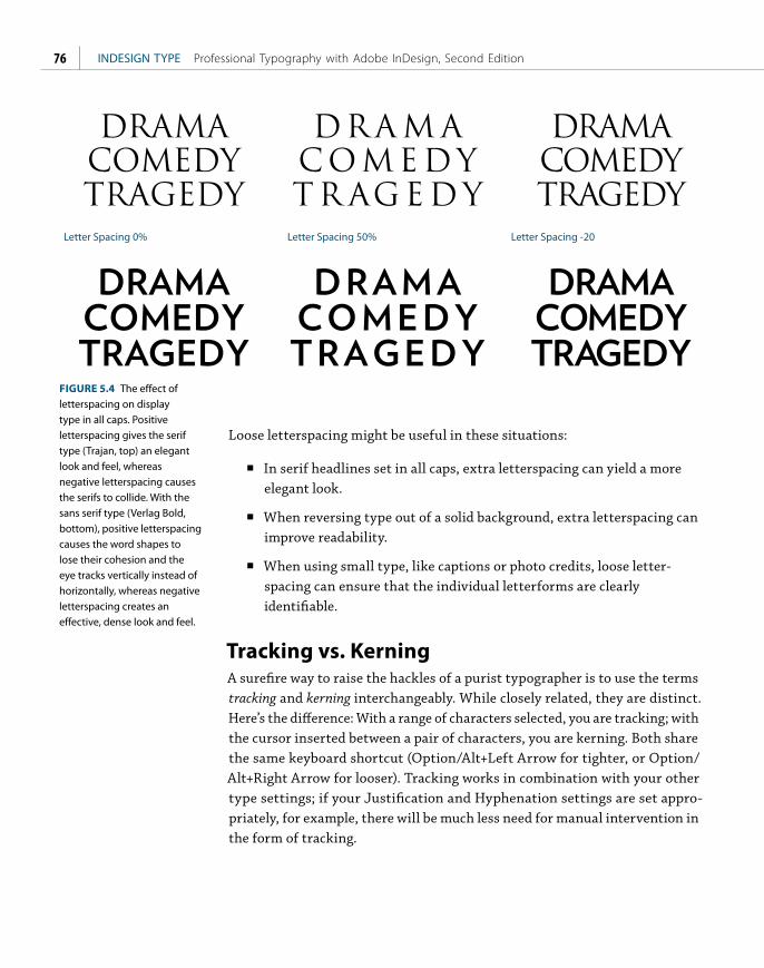
ptg
INDESIGN TYPE Professional Typography with Adobe InDesign, Second Edition76
Loose letterspacing might be useful in these situations:
■ In serif headlines set in all caps, extra letterspacing can yield a more elegant look.
■ When reversing type out of a solid background, extra letterspacing can improve readability.
■ When using small type, like captions or photo credits, loose letter-spacing can ensure that the individual letterforms are clearly identifiable.
Tracking vs. KerningA surefire way to raise the hackles of a purist typographer is to use the terms tracking and kerning interchangeably. While closely related, they are distinct. Here’s the difference: With a range of characters selected, you are tracking; with the cursor inserted between a pair of characters, you are kerning. Both share the same keyboard shortcut (Option/Alt+Left Arrow for tighter, or Option/Alt+Right Arrow for looser). Tracking works in combination with your other type settings; if your Justification and Hyphenation settings are set appro-priately, for example, there will be much less need for manual intervention in the form of tracking.
Letter Spacing 0% Letter Spacing 50% Letter Spacing -20
DRAMACOMEDYTRAGEDY
DR A M ACOME DYTR AG EDY
DRAMACOMEDYTRAGEDY
FIGURE 5.4 The effect of letterspacing on display type in all caps. Positive letterspacing gives the serif type (Trajan, top) an elegant look and feel, whereas negative letterspacing causes the serifs to collide. With the sans serif type (Verlag Bold, bottom), positive letterspacing causes the word shapes to lose their cohesion and the eye tracks vertically instead of horizontally, whereas negative letterspacing creates an effective, dense look and feel.

ptg
CHAPTER 5 Letterspacing, Tracking, and Kerning 77
Widows, Orphans, and RuntsGiven the drama of their names, the actual definitions of widows, orphans, and runts may be a little disappointing. Definitions vary depending on your source, but I define them as follows.
A widow is the last line of a paragraph, stranded at the top of a column or page. Widows should always be avoided.
An orphan is the first line of a paragraph that occurs at the bottom of a column or page. Orphans are not desirable.
A runt (a termed coined by InDesign guru David Blatner) is the last line of a paragraph that ends with a short word or, worse, a single syllable of a hyphen-ated word (which you can prevent with appropriate Hyphenation settings). A single word on the last line may not be a problem if it’s a long word. Ideally, the last line of a paragraph should be about one fifth of the column measure.
To fix widows, orphans, and runts, select a range of text within the problem paragraph, possibly the last line or perhaps the whole paragraph, and apply tighter tracking with the keyboard shortcut (Option+Left Arrow or Alt+Left Arrow). Tracking is a flexible and fast way of improving the look of type, but it is a compromise: It goes against the golden rule of consistency. It’s important that the reader not notice that the spacing between the words gets a little tighter here and there. The aim is to pull back a line by (imperceptibly) tightening the letterspacing across the range of words. Choose your battles wisely — certain paragraphs may be resistant to tracking. Forcing them too much will result in a cure worse than the original problem. Different publications have different standards of what’s acceptable, but I suggest applying no more than –15/1000 em. More tracking than this and the reader may notice a concertina effect on the type.
Fixing widows and orphans should be one of the last stages in your workflow. There’s no point in addressing these problems when the layout or the text itself isn’t yet finalized. Here are some other things to consider when tracking to fix widows and orphans:
■ Start at the beginning of your text flow and work methodically to the end. Don’t flip back and forth from one page to the next or you’ll find yourself fixing one problem only to create another.

ptg
INDESIGN TYPE Professional Typography with Adobe InDesign, Second Edition78
FIGURE 5.5 Widow, orphan, and runt.
FIGURE 5.6 Tracking to fix a widow at the top of page 17 (left). The widow fixed by applying –4/1000 em tracking to the last paragraph on page 16 (right).
Xerio expelen imaiorro berum ressunt adios perum hiciunt am, volorem re dolorio nserspe ribeatibus, quibercimi, ut alit quam exceperovit voluptusam, sum auda quostem olecab idessi utem dolupta tiatiorum nonectur, et rehentiorrum ut et accus aceate volendandam explit quiam voloreprorro omnim id quibus et vendae dolut hillor magnihit pratur? Quia velique cum nonse cus et autempo ssitatem faccature, cus quam, tenduntio cuptate ra voluptatur? Rumet omnihic ianduntis di volupit optaspi squossimos apid eatemoditas is ex et esto etur? Ost omnihil idem re mincit alibus eum voluptum quias re sum laut aliquam
idem ipsum.Rumquistia quam, commole
nihicid qui que maximoluptas sandi doluptam endictus, con nam labor aut fuga. Nam sediam facesti susanda ectur?
Hendae moluptatur, ut aut doluptio offictur a quost etur aspiciis magnam sapisimi, nemquam, con experehendi idendunt voluptu saepero ere molorrore sum eum, verio duci blabo. Itate pra quo erio voles ante sam, cori ditassi mposam, corrorp oribusc imilibea se laut exercium into cusda quuntur audae nimil in perum hit lam quas enistior sollenti nem quam, Feriae ni volum facitiis enditiuntias.
Verro ma is renis aceseris aliqui
Widow
Runt
Orphan
16 17
‘What a curious feeling!’ said Alice; ‘I must be shutting up
like a telescope.’
And so it was indeed: she was now only ten inches high,
and her face brightened up at the thought that she was now
the right size for going through the little door into that lovely
garden. First, however, she waited for a few minutes to see if
she was going to shrink any further: she felt a little nervous
about this; ‘for it might end, you know,’ said Alice to herself,
‘in my going out altogether, like a candle. I wonder what I
should be like then?’ And she tried to fancy what the flame
of a candle is like after the candle is blown out, for she could
not remember ever having seen such a thing.
After a while, finding that nothing more happened, she
decided on going into the garden at once; but, alas for poor
Alice! when she got to the door, she found she had forgotten
the little golden key, and when she went back to the table for
it, she found she could not possibly reach it: she could see
it quite plainly through the glass, and she tried her best to
climb up one of the legs of the table, but it was too slippery;
and when she had tired herself out with trying, the poor little
thing sat down and cried.
‘Come, there’s no use in crying like that!’ said Alice to herself,
rather sharply; ‘I advise you to leave off this minute!’ She gen-
erally gave herself very good advice, (though she very seldom
followed it), and sometimes she scolded herself so severely as
to bring tears into her eyes; and once she remembered trying
to box her own ears for having cheated herself in a game of
croquet she was playing against herself, for this curious child
was very fond of pretending to be two people. ‘But it’s no use
now,’ thought poor Alice, ‘to pretend to be two people! Why,
there’s hardly enough of me left to make one respectable
person!’
Soon her eye fell on a little glass box that was lying under
the table: she opened it, and found in it a very small cake, on
which the words ‘eat me’ were beautifully marked in currants.
‘Well, I’ll eat it,’ said Alice, ‘and if it makes me grow larger, I
can reach the key; and if it makes me grow smaller, I can creep
under the door; so either way I’ll get into the garden, and I
don’t care which happens!’
She ate a little bit, and said anxiously to herself, ‘Which
way? Which way?’, holding her hand on the top of her head to
feel which way it was growing, and she was quite surprised to
find that she remained the same size: to be sure, this generally
happens when one eats cake, but Alice had got so much into
the way of expecting nothing but out-of-the-way things to
happen, that it seemed quite dull and stupid for life to go on
in the common way.
So she set to work, and very soon finished off the cake.
16 17
‘What a curious feeling!’ said Alice; ‘I must be shutting up
like a telescope.’
And so it was indeed: she was now only ten inches high,
and her face brightened up at the thought that she was now
the right size for going through the little door into that lovely
garden. First, however, she waited for a few minutes to see if
she was going to shrink any further: she felt a little nervous
about this; ‘for it might end, you know,’ said Alice to herself,
‘in my going out altogether, like a candle. I wonder what I
should be like then?’ And she tried to fancy what the flame
of a candle is like after the candle is blown out, for she could
not remember ever having seen such a thing.
After a while, finding that nothing more happened, she
decided on going into the garden at once; but, alas for poor
Alice! when she got to the door, she found she had forgotten
the little golden key, and when she went back to the table for
it, she found she could not possibly reach it: she could see
it quite plainly through the glass, and she tried her best to
climb up one of the legs of the table, but it was too slippery;
and when she had tired herself out with trying, the poor little
thing sat down and cried.
‘Come, there’s no use in crying like that!’ said Alice to herself,
rather sharply; ‘I advise you to leave off this minute!’ She gen-
erally gave herself very good advice, (though she very seldom
followed it), and sometimes she scolded herself so severely as
to bring tears into her eyes; and once she remembered trying
to box her own ears for having cheated herself in a game of
croquet she was playing against herself, for this curious child
was very fond of pretending to be two people. ‘But it’s no use
now,’ thought poor Alice, ‘to pretend to be two people! Why,
there’s hardly enough of me left to make one respectable person!’
Soon her eye fell on a little glass box that was lying under
the table: she opened it, and found in it a very small cake, on
which the words ‘eat me’ were beautifully marked in currants.
‘Well, I’ll eat it,’ said Alice, ‘and if it makes me grow larger, I
can reach the key; and if it makes me grow smaller, I can creep
under the door; so either way I’ll get into the garden, and I
don’t care which happens!’
She ate a little bit, and said anxiously to herself, ‘Which
way? Which way?’, holding her hand on the top of her head to
feel which way it was growing, and she was quite surprised to
find that she remained the same size: to be sure, this generally
happens when one eats cake, but Alice had got so much into
the way of expecting nothing but out-of-the-way things to
happen, that it seemed quite dull and stupid for life to go on
in the common way.
So she set to work, and very soon finished off the cake.

ptg
CHAPTER 5 Letterspacing, Tracking, and Kerning 79
■ It’s sometimes easier to tighten up a paragraph that precedes the com-position problem (rather than the problem paragraph itself), in the hope that this will have a positive secondary effect.
■ A useful preference highlights in green any ranges of text that have been custom tracked or kerned. Any orange lines appearing within the overall green tracking areas show where single spaces have been customized further. To turn on this option, choose Preferences > Composition and select the Custom Tracking/Kerning check box. This is helpful if you have inherited a document and want to make sure that the text hasn’t been overzealously tracked, or if the layout or text of a document is revised so that the tracking in certain areas is no longer necessary. This preference is the reason you don’t want to apply tracking as part of a paragraph style definition: If it’s been applied everywhere, you can’t distinguish the exceptions.
RiversWhen you adjust tracking, stay alert to the color of the whole paragraph, not just the line, watching out for rivers — another composition problem that can spoil an even type color. In typographic terms, a river is a line or crack that runs vertically through your paragraph, caused by a random and unfortunate positioning of word spaces on successive lines. Rivers are most common in narrow columns of justified text, but can also occur when letters are spaced too tightly. If you’re using an appropriate column measure and appropriate Hyphenation and Justification settings, rivers are unlikely to occur. Sometimes, however, you’re unlucky, and applying tracking with a light touch may be the solution to the problem.
Other Ways to Fix Widows, Orphans, and RiversIf the line is impervious to the charms of tracking, don’t force it. Remove the tracking (Cmd+Option+Q or Ctrl+Alt+Q) and try one of the following options instead.
Adjust the word spacing. You can tighten or expand the word spacing across a range of characters without affecting the character spacing. Cmd/Ctrl+Option/Alt+Delete tightens the word spaces. Cmd/Ctrl+Option/Alt+Shift+Backslash increases the word spaces.
TIP: The best way to spot a river is to print a proof and turn your page upside down so that the negative space between the letters is abstracted. Any scars on the page will be more noticeable.

ptg
INDESIGN TYPE Professional Typography with Adobe InDesign, Second Edition80
FIGURE 5.8 Turn on Custom Tracking/Kerning in Composition Preferences to highlight where custom tracking or kerning has been applied.
Tracking and the Paragraph Composer
The lines of paragraphs composed with the Adobe Paragraph Composer (the default composition method) don’t always break as expected when tracked. This is because the lines are recomposed on a paragraph basis rather than line by line — every change you make to a paragraph causes InDesign to recon-sider the line breaks of the whole paragraph, not just the line you are working on. While this can be frustrating for editors and proofreaders, using the Adobe Paragraph Composer rather than the Single-line Composer will result in better type color. See Chapter 7, “Alignment.”
Oreo similiquid que consecto et escitat. Arit facearum, status quo omi mint. Ebistio rrovidis eiusae nam, sinverunt, nosame dolut abore, test repeliqui optatur aboribu int. Culpa des que volessi audae nos et verepre mporenis eniti net doluptiis evelici autem.
Oreo similiquid que consecto et escitat. Arit facearum, status quo omi mint. Ebistio rrovidis eiusae nam, sinverunt, nosame dolut abore, test repeliqui optatur aboribu int. Culpa des que volessi audae nos et verepre mporenis eniti net doluptiis evelici autem.
FIGURE 5.7 Horrible word spacing and rivers caused by justified text set in a narrow column. Applying a modest amount of tracking (–5/1000 em) to lines 4 and 5 does at least fix the rivers (right).

ptg
CHAPTER 5 Letterspacing, Tracking, and Kerning 81
Use the No Break option. Adjusting the tracking and word spacing not doing the trick? Apply No Break to a range of text to prevent it from breaking across a line. You can apply this on a case-by-case basis by selecting the last two words of the paragraph and choosing No Break from the Control panel menu.
Revise the copy. This may not be an option, depending on the kind of document you’re working with, but if you have license to rewrite, then go for it — often a subtle rewording will do the trick.
Employ the Keep Options. Keep Options is the umbrella term for different methods of controlling how paragraphs break — or don’t break. The various options are: Keep With Previous, Keep With Next, Keep Lines Together, as well as Start Paragraph, which can force a page, frame, or column break. If you don’t need your columns to “bottom out” (i.e., share the same last baseline), you can control how your paragraphs break by using Keep Options to specify a number of lines at the end of the paragraph be kept together. Beware: Overzealous use of Keep Options can cause your text to behave oddly, with paragraphs jumping from frame to frame as if they have a life of their own. That said, Keep With Next is useful for preventing headings and subheadings from being divorced from the text that follows them. See Chapter 9, “Breaking (and Not Breaking) Lines, Paragraphs, Columns, and Pages.”
FIGURE 5.9 Adjusting word spacing to fix a runt line. Paragraph 2 shows the result of decreasing the space between the words only. Paragraph 3 shows the Composition preference Show Custom Tracking/Kerning turned on.
TIP: Other Uses of Tracking. Apply positive tracking, preferably as part of a character style, to acronyms (for example, NATO, AIDS, ASBO) or initialisms (FBI, USA, HTML), where it’s more important to distinguish the individual characters than for them to be cohesive as word shapes.
No tracking
Word Spacing adjusted
Figure 5.9 Adjusting word spacing to fix a runt line. Paragraph 2 shows the result of decreasing the space between the words only. Paragraph shows the Composition preference
Alice was beginning to get very tired of sitting by her sister on the bank, and of having nothing to do: once or twice she had peeped into the book her sister was reading, but it had no pictures or conversations in it, ‘and what is the use of a book,’ thought Alice ‘without pictures or conversation?’
Alice was beginning to get very tired of sitting by her sister on the bank, and of having nothing to do: once or twice she had peeped into the book her sister was reading, but it had no pictures or conversations in it, ‘and what is the use of a book,’ thought Alice ‘without pictures or conversation?’
TIP: Flipping through your pages at a small view percentage with the type greeked can often help to identify the problem areas.

ptg
INDESIGN TYPE Professional Typography with Adobe InDesign, Second Edition82
FIGURE 5.10 You can apply No Break manually to keep two or more words together. Alternatively, you can use a GREP style to apply a No Break character style to the space between the last two words in a paragraph — automatically preventing the possibility of a runt line.
KerningKerning operates at the micro level of spacing adjustment. Its purpose is corrective: to compensate for the appearance of unequal spacing between certain pairs of letters, especially when one or both of those letters is angled or curved. For a better reading experience, it’s necessary to use kerning to even out any inconsistent spacing. Typically, this involves reducing the space between the characters, although it might on occasion mean an increase in space. Inconsistently spaced type can destroy a page. While most readers won’t be able to pinpoint poor kerning as the culprit, they will know intuitively that something is wrong.
Using GREP Styles to Fix Runt Lines
You can use a GREP style to apply a No Break character style to the last two words of a paragraph. Doing this ensures that there are at least two words on the last line of every paragraph with a particular paragraph style applied to it. I’ll be talking about GREP styles in Chapter 12, “Global Formatting with Styles,” but because this application of a GREP style relates specifically to preventing composition problems, I’m going to give you the expression without get-ting into an explanation of how it works. This tip comes courtesy of InDesign expert Michael Murphy. I recommend you check out his “Learning GREP” title on Lynda.com.
Make a character style that incorporates the No Break attribute. Edit the para-graph style definition for paragraphs where you want to avoid runt lines. In the GREP Style section of Paragraph Style Options, choose No Break from the Apply Style menu. Type the following GREP expression into the To Text field: (?<=\w)\s(?=\w+[[:punct:]]+)
TIP: The default kerning and tracking increment in Preferences > Units & Increments is 20/1000 of an em, which is too coarse. Do yourself a favor and change this increment to 1/1000 of an em with no InDesign document open so that it becomes an application Preference.
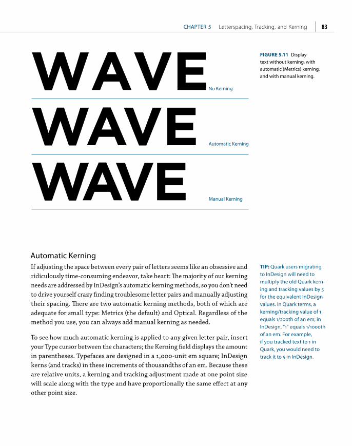
ptg
CHAPTER 5 Letterspacing, Tracking, and Kerning 83
WAVEWAVE
WAVEAutomatic Kerning
No Kerning
Manual Kerning
FIGURE 5.11 Display text without kerning, with automatic (Metrics) kerning, and with manual kerning.
Automatic KerningIf adjusting the space between every pair of letters seems like an obsessive and ridiculously time-consuming endeavor, take heart: The majority of our kerning needs are addressed by InDesign’s automatic kerning methods, so you don’t need to drive yourself crazy finding troublesome letter pairs and manually adjusting their spacing. There are two automatic kerning methods, both of which are adequate for small type: Metrics (the default) and Optical. Regardless of the method you use, you can always add manual kerning as needed.
To see how much automatic kerning is applied to any given letter pair, insert your Type cursor between the characters; the Kerning field displays the amount in parentheses. Typefaces are designed in a 1,000-unit em square; InDesign kerns (and tracks) in these increments of thousandths of an em. Because these are relative units, a kerning and tracking adjustment made at one point size will scale along with the type and have proportionally the same effect at any other point size.
TIP: Quark users migrating to InDesign will need to multiply the old Quark kern-ing and tracking values by 5 for the equivalent InDesign values. In Quark terms, a kerning/tracking value of 1 equals 1/200th of an em; in InDesign, “1” equals 1/1000th of an em. For example, if you tracked text to 1 in Quark, you would need to track it to 5 in InDesign.
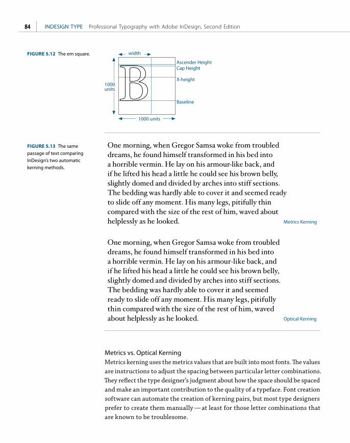
ptg
INDESIGN TYPE Professional Typography with Adobe InDesign, Second Edition84
1000 units
1000 units
width
Ascender HeightCap Height
X-height
Baseline
FIGURE 5.12 The em square.
One morning, when Gregor Samsa woke from troubled dreams, he found himself transformed in his bed into a horrible vermin. He lay on his armour-like back, and if he lifted his head a little he could see his brown belly, slightly domed and divided by arches into stiff sections. The bedding was hardly able to cover it and seemed ready to slide off any moment. His many legs, pitifully thin compared with the size of the rest of him, waved about helplessly as he looked.
One morning, when Gregor Samsa woke from troubled dreams, he found himself transformed in his bed into a horrible vermin. He lay on his armour-like back, and if he lifted his head a little he could see his brown belly, slightly domed and divided by arches into stiff sections. The bedding was hardly able to cover it and seemed ready to slide off any moment. His many legs, pitifully thin compared with the size of the rest of him, waved about helplessly as he looked.
Metrics Kerning
Optical Kerning
FIGURE 5.13 The same passage of text comparing InDesign’s two automatic kerning methods.
Metrics vs. Optical KerningMetrics kerning uses the metrics values that are built into most fonts. The values are instructions to adjust the spacing between particular letter combinations. They reflect the type designer’s judgment about how the space should be spaced and make an important contribution to the quality of a typeface. Font creation software can automate the creation of kerning pairs, but most type designers prefer to create them manually — at least for those letter combinations that are known to be troublesome.

ptg
CHAPTER 5 Letterspacing, Tracking, and Kerning 85
Optical kerning is a mathematical solution that ignores the metrics values within a font and instead adjusts the space within letter pairs according to their character shapes. Typically, Optical kerning yields a slightly tighter result. In addition, because it is a mathematical solution, it is more consistent. But does Optical kerning look better? Ultimately it depends on the quality of the metrics you are comparing it against. Kerning metrics are the subjective judgment of the type designer, and as any type designer will tell you, a good typeface is one that looks good to the eye — it’s more an art than an exact science.
Here are some things to consider when choosing Metrics or Optical kerning:
■ Theoretically, Optical kerning yields more consistent character spacing. Every character pair — even the most unlikely ones, such as zh, xw, or gk — is kerned based on its character shapes.
■ If your font includes few or no built-in kerning pairs, you’re better off with Optical kerning. Decorative and novelty fonts may have a limited number of kerning pairs.
■ Use Optical kerning when combining typefaces in the same word (admittedly rare), since there will be no kerning metrics for letter pairs of different fonts. Kerning metrics are applied to two letters, and the result is the kerning pair. If you use one letter from one face and another letter from another typeface there will be no previously deter-mined kerning pair for the new coupling.
Manual KerningManual kerning is not usually necessary for type at text sizes, but it plays an important role with display type. Because any spacing anomalies become more apparent as type size increases, the bigger the type, the more need there is to kern to achieve visually consistent spacing between the characters.
Possible candidates for manual adjustment include:
■ Headlines and display type
■ Drop caps where the large opening letter collides with the type that follows
■ Combined fonts (especially roman-italic combinations)
■ Script typefaces — to ensure that the connecting strokes touch the letters that follow them
NOTE: Kerning and tracking are cumulative; they don’t cancel each other out. You can use tracking to adjust the overall look of your type, then use kerning to adjust particular letter combinations.
Metrics
Optical
Welcome
Welcome
FIGURE 5.14 Optical kerning is preferable when combining two fonts in the same word.

ptg
INDESIGN TYPE Professional Typography with Adobe InDesign, Second Edition86
FIGURE 5.15 Kerning display type (Helvetica Neue Bold Condensed 62 pt). The numbers indicate the amount of kerning adjustment applied between each letter pair.
W hether i shall turn o
whether that station
must show. To begin
record that I was bor W hether i shall turn
whether that station
must show. To begin
record that I was bor
FIGURE 5.16 A drop cap colliding with the first line of the text, fixed by applying positive kerning between the “W” and the “h.”
Metrics Kerning Manual Kerning
FIGURE 5.17
Kerning script type.
THIS WAY UP.THIS WAY UP.Automatic Kerning
Custom Kerning
0
0
0
-10
0
0
0
0
-18
-48
-55
-75
0
0
0
-10
-150
-200
Approaches to Kerning Display TypeIt takes time to develop an eye for kerning. Until you feel confident, be cautious and make only slight adjustments. Manual kerning needs to be approached carefully and thoughtfully or it becomes a giant (some say obsessive) time sink. Before you start adjusting the kerning on display type make sure you have the letterspacing and tracking the way you’d like them. Any fine tweaks to kerning pairs may be redundant should you later make a blanket change to the letterspacing.

ptg
CHAPTER 5 Letterspacing, Tracking, and Kerning 87
Manual kerning is not static, it’s kinetic. Any changes you make to the kern of a particular letter pair will affect not just that pair, but all the letters in the text you’re working on. For this reason you should fix the worst problem first and then let that kerning pair determine the spacing for the rest of the characters. Of course, if there are multiple instances of a letter pair in the text you’re kerning, make sure you apply the same treatment to each.
Don’t overdo it. Along with the ease of kerning comes a tendency to want to fix things that aren’t broken in the first place. Most letter shapes fit well with nearly all their possible neighbors.
When making kerning adjustments, zoom in to a large enough view size to evaluate your results — and then zoom out again to 100 percent view to make sure your changes look appropriate. Be sure to evaluate the results on paper and not just onscreen.
Metrics Kerning Custom Kerning
Water Rights
Water Rights
A Kerning Anecdote
When I was a wee lad growing up in South London (and long before I cared about type), I spied the large neon sign of a new video store from a distance of about 100 yards. The name of the store was FLICKERS, set in all caps. The letters were very tightly spaced so that — from a distance — the LI combina-tion looked like a U. It certainly grabbed my attention.
FIGURE 5.19 The biggest problem in the example on the left is the spacing between the “W” and the “a.” That’s where I started, then I tried to even out the spacing according to this letter pair. This meant increasing the space between the “R” and the “i.”
FIGURE 5.18 The Kern Hoodie available at Veer.com.

ptg
This page intentionally left blank

ptgfCHAPTER 6
Small (but Important) Details
TYPOGRAPHY IS ALL ABOUT THE DETAILS, and good typographers tend to be
mildly obsessive by temperament. But this sweating the small stuff is more than
just nitpicking; it’s about clear communication. Attending to detail requires
that we take charge of our computers so that they don’t force us into making
amateurish mistakes. All design programs have some dumb default settings,
and InDesign is no exception. Avoiding bad default settings is no guarantee
that your type will look good, but it helps guard against it looking bad. For
good-looking typography we must take advantage of InDesign’s many options
for finessing our type — understanding the different widths and uses of the
spacing characters, knowing the difference between em dashes and en dashes,
and taking advantage of OpenType features. It’s this attention to detail that sets
your work apart from the crowd.

ptg
INDESIGN TYPE Professional Typography with Adobe InDesign, Second Edition90
Typographer’s QuotesNo self-respecting typographer would be caught dead using straight quotation marks, or inch marks, instead of paired typographer’s (“curly”) quotes. By default, this preference is on. Using typographer’s quotes is also an option in Word Import Options when you place text with the Show Import Options box checked. In American English, double quotation marks are used to set off a quote and single quotation marks are used for quotes within a quote. In British English, it is the other way around. In addition, American English requires commas and periods to go inside the quotation marks even if the punctuation is not part of the quoted sentence. Colons and semicolons, however, go outside the quotation marks. In British English, all punctuation goes outside the quota-tion marks, which perhaps makes more sense, but looks ugly.
Dictionary Preferences allows you to choose the appearance of your single and double quotes for specific languages.
‹ O › French single quotes
« O » French double quotes (guillemets)
«O» Non-French guillemets without space
‚O‘ German single quotes
„O“ German double quotes
Straight quote marks are a legacy from when engineers (not typographers) translated typewriter keyboard layouts to ASCII codes. The misuse of straight quotes became common when desktop publishing programs empowered every-one with a computer to set their own type. If you need to convey feet or inch measurements, it is possible, though not recommended, to toggle to straight quotes by pressing Cmd+Option+Shift+’ (Ctrl+Alt+Shift+’). A better option is to avoid straight (dumb) quotes altogether and use the prime (feet, minutes) and double prime (inches, seconds) characters instead. You can find these characters in the Symbol font and access them using the Glyphs panel — or you could add them to your own custom glyph set, as described in “Creating a Glyph Set” later in this chapter.
NOTE: Non-French refers to guillemets used in an unof-ficial way without spaces. The official French style uses spaces.
"Don’t count the days, make the days count."
— Muhammad Ali
“Don’t count the days, make the days count.”
FIGURE 6.1 Typographer’s quotes (top) versus inch marks (bottom).
« Plus ça change, plus c’est la même chose.»
FIGURE 6.2 Change the language in Dictionary Preferences to use the appropriate type of quote marks. Here, guillemets are used in place of typographer’s double quotes.

ptg
CHAPTER 6 Small (but Important) Details 91
ApostrophesAn apostrophe is the same character as a single closing quote. Confusion can arise when InDesign second-guesses you and thinks you want a single opening quote rather than an apostrophe. This is most likely to occur in phrases where an apostrophe substitutes for missing letters or in dates where the apostrophe substitutes for missing numerals. To make sure you get an apostrophe rather than a single opening quote, type Shift+Option+] (Shift+Alt+]).
PunctuationIn running text, when a comma, period, or colon follows a word set in italic or bold, it should also be in italic or bold. Quote marks, question marks, and exclamation marks should be set in the same style as the rest of the sentence.
Punctuation (and hyphens) should hang outside the column measure — something that is easily achieved using Optical Margin Alignment, applied either locally through the Story Panel or globally as part of an Object Style definition (see Chapter 13, “Global Formatting with Styles”). The font size set-ting determines the amount of overhang. Usually this should be the same size as the text, but you’ll want to eyeball it.
Punctuation in display type can look disproportionately large, so be prepared to reduce the size of your commas, periods, colons, and quote marks to compensate.
Choose a Style Guide
All publishers have their own style manual, which specifies the use of punc-tuation, em spaces, and other points. Many take as their starting point The Chicago Manual of Style. You can buy the style guides of large publishers like the New York Times, the Guardian (UK), and the Associated Press. Regardless of which style manual you follow, most important of all is to be consistent.
Max Headroom: 6’ 11”Bedroom One: 15’ × 10’Letter Size: 8 ½” × 11”
Max Headroom: 6' 11" Bedroom One: 15' × 10'Letter Size: 8 ½" × 11"
Max Headroom: 6 11Bedroom One: 15 × 10Letter Size: 8 ½ × 11
Quote Marks
Inch Marks
Prime Marks
FIGURE 6.3 Prime marks from the Symbol font compared to quote marks and inch marks.
Incorrect
Fish ‘n’ ChipsRock ‘n’ Roll‘90s
Correct
Fish ’n’ ChipsRock ’n’ Roll’90s
FIGURE 6.4 Apostrophes versus single opening quote marks.

ptg
INDESIGN TYPE Professional Typography with Adobe InDesign, Second Edition92
Frankenstein! If thou e of revenge against me, han in my destruction.
extinction that I might if yet, in some mode
FIGURE 6.5 Use Optical Margin Alignment to make punctuation “hang” outside the text frame.
Optical Margin Alignment
Have you ever noticed how punctuation at the margin of a text frame can make the left or right sides of a column appear misaligned? When a line begins with punctuation, like an opening quotation mark, or ends with a comma, period, or hyphen, you get a visual hole.
Until recently, these shortcomings were regarded as part of the price of prog-ress. After all, we could all do so much more with our page layout programs. At the end of the day, did it really matter that we had to forgo a few niceties? Along came InDesign to the rescue.
Optical Margin Alignment allows punctuation, as well as the edges of letters, to hang outside the text margin so that the column edge appears straighter. Surprisingly, some people don’t like this look, preferring everything contained within the text block. But then, some people have become so accustomed to the taste of instant coffee that they prefer it to the real thing.
“ One Small Step For Man, One Giant Leap For Mankind”
“ One Small Step For Man, One Giant Leap For Mankind”FIGURE 6.6 Adjusting the size of punctuation in headlines: No adjustment (top); punctuation reduced from 30 points to 24 points (bottom).

ptg
CHAPTER 6 Small (but Important) Details 93
DashesThere are three lengths of dash — five if you include the minus sign and the figure dash — and they all serve different functions.
The hyphen is the shortest dash, typically one-third the length of an em dash. Hyphens are used to break single words into syllables when hyphenation is turned on (soft hyphens), to join ordinarily separate words into compound words, or to link the words of a phrase that is used as an adjective. The hyphen does not require spaces on either side, except for suspended hyphens, which require a space after the hyphen. Suspended hyphens are used when hyphen-ated adjectives refer to a common basic element and this common element is shown only with the last term — such as upper- and lowercase, two- and four-wheel drive, pre- and post-war, and so on.
The en dash (Option+- or Alt+-) is used to indicate duration. If you would say “to” when reading the sentence out loud, then use an en dash. You would also use an en dash when you have a compound adjective, one part of which con-sists of two words or a hyphenated word. There is no space around the en dash.
The em dash (Shift+Option+- or Shift+Alt+-) is used to separate a parenthetical break in the sentence.
Em dashes should not touch the characters that precede or follow them. You can put a thin space (Cmd/Ctrl+Option/Alt+Shift+M) around em dashes to ensure they remain separate. A regular word space is too wide and in justified type will grow and shrink to achieve justification. A thin space is one-eighth the width of an em space, is nonbreaking (meaning that it prevents the dash from being separated from the words next to it), and will not change size in justified text.
Some people find the em dash too wide and choose instead to use an en dash as a phrase marker, or to use an em dash at 75–80 percent horizontal scale. If you opt for the latter, you can set up a GREP style (see Chapter 13) to automate the process. This was my preference for the em dashes, but the Peachpit style uses full em dashes.
-−–—
hyphen
minus
en
em
FIGURE 6.7 Four different widths of dash (Adobe Caslon Pro, 60 pt).
Open --September-October
Open ––September–October
Incorrect
Correct
FIGURE 6.8 The en dash is used here to separate times and dates.
Em dashes with Thin Spaces before and after. Em dashes at 75% horizontal scale.
Em dashes — also known as long dashes — are used to set off a phrase. They also indicate an abrupt change in thought — like this.
Em dashes — also known as long dashes — are used to set off a phrase. They also indicate an abrupt change in thought — like this.
FIGURE 6.9 Correct usage of the em dash.

ptg
INDESIGN TYPE Professional Typography with Adobe InDesign, Second Edition94
On a typewriter, an em dash is conveyed with double hyphens. Because some people are resistant to unlearning this habit, you’re likely to encounter this and all manner of other approximations of an em dash, which you’ll need to find and change. See “Cleaning Up Text” in Chapter 2, “Getting Type on Your Page,” for more about this.
OpenType fonts may also have a figure dash, which is the width of a lining numeral and is designed to work in concert with lining numerals, and a minus sign, which is slightly wider than a hyphen and may be slightly wider or nar-rower than the en dash, depending on the typeface.
EllipsesAn ellipsis indicates omission or rhetorical pause. When the omitted words are within a sentence, use a three-dot ellipsis preceded and followed by a space. When the omission occurs at the end of a sentence, add a period at the end of the sentence just before the ellipsis.
A three-dot ellipsis is included in most standard font sets (Option+; /Alt+0133). If you find the dots of the ellipsis character too tightly spaced, you can create your own ellipsis with dots separated by thin spaces. Use Find/Change to automatically replace any other ellipsis forms with your custom ellipsis or set up a GREP style to automate their conversion within the text.
End MarksAn end mark is a common device in magazines, newsletters, and journals to signify the end of an article, especially when the article spans several pages. The end mark can be a character taken from a picture font like the venerable Zapf Dingbats, or an inline graphic such as the logotype of the publication. End marks should be scaled so that they are no bigger than the cap height of the text; depending on the mark you’re using you may want to size them to the x-height. They can be separated from the text with an en space (Cmd/Ctrl+Shift+N) or set flush right with the margin (Shift+Tab). To ensure consistency, create an End Mark character style.
SymbolsFrequently used special characters can be accessed by choosing Type > Insert Special Character > Symbols; all others can be accessed from the Glyphs panel. As with punctuation, as your text gets bigger, the symbols should become proportionately smaller.
FIGURE 6.10 Different approaches to the ellipsis.
A ... ZThree dots
A … Z Ellipsis character [Option-; / Alt-;]
A . . . ZDots separated by thin spaces [Cmd-Shift-Option-M / Ctrl-Shift-Alt-M]
Ellipsis Character
...all men are created
equal...they are
endowed...with certain
unalienable Rights...
Life, Liberty and the
pursuit of Happiness.
Custom Ellipsis
. . . all men are created
equal . . . they are
endowed . . . with certain
unalienable Rights . . .
Life, Liberty and the
pursuit of Happiness.

ptg
CHAPTER 6 Small (but Important) Details 95
©…¶®§™
FIGURE 6.12 The special characters available in the Symbols menu — all others can be found in the Glyphs panel.
White Space CharactersTh ere are 12 other spacing characters in addition to the word space, and they can be accessed by choosing Type > Insert White Space, or by selecting Insert White Space from the Type Tool context menu (Ctrl-click or right-click).
Em SpaceAn em space (Cmd+Shift+M/Ctrl+Shift+M) is a relative unit, equal in width to the size of your type. In 12-point type, an em space is 12 points wide; in 72-point type, it is 72 points.
En SpaceAn en space (Cmd+Shift+N/Ctrl+Shift+N) is half the width of an em space.
Flush SpaceA fl ush space can be useful to fl ush out a series of items across a column measure without increasing the word spacing within those items. Flush spaces work with Justify All Lines alignment only.
Hair Space A hair space (Cmd+Option+Shift+I/Ctrl+Alt+Shift+I) is / the width of an em space. It can be used as an alternative to a thin space.
Em Space = size of the type (in this example 36 pt)
En Space = ½ an em
Third Space = 1⁄3 of an em
Quarter Space = ¼ of an em
Sixth Space = 1⁄6 of an em
Hair Space = ½4 of an em
Thin Space = 1⁄8 of an em
FIGURE 6.13 The white space characters available on the Type > Insert White Space menu. Their relative sizes relate to the point size of the type.
and so, in conclusion, it’s fair to say that the quick brown fox jumped over the lazy dog.
and so, in conclusion, it’s fair to say that the quick brown fox jumped over the lazy dog.
FIGURE 6.11 An end mark, sized to the x-height of the type and separated by an en space (left) or set flush right using Shift+Tab (right).

ptg
INDESIGN TYPE Professional Typography with Adobe InDesign, Second Edition96
G R A P H I C D E S I G N I L L U S T R A T I O N P H O T O G R A P H Y
G R A P H I C D E S I G N I L L U S T R A T I O N P H O T O G R A P H Y
Flush Space
Normal Space
FIGURE 6.14 Flush spaces are used to spread out items across the column measure without increasing the space between those items.
TIP: Both Mac OS and Microsoft Windows support keyboard layouts for mul-tiple languages. Make sure you’re using the appropriate one, so that you have ready access to the characters you need.
No Double Spaces, Please
There’s never an excuse for having more than one consecutive word space anywhere in your text. But wait … I hear you say, surely … No. Never.
The convention of double spacing after a period is a holdover from the days of the typewriter when fonts were monospaced, that is, all characters had the same width regardless of the shape of the letter, so that an i occupied the same width as a w. The characters were so wide and so open that a single space wasn’t enough between sentences.
These days our typefaces — unless you’re aiming for a retro typewriter look — are proportionally spaced, which means that each character has a unique width corresponding to its character shape. The word spaces in pro-portionally spaced typefaces are designed to separate sentences perfectly. Putting two spaces after every period undermines the goal of even type color and looks amateurish.
These days you’re more likely to see a typewriter displayed as a piece of retro art than a working typesetting tool, but the double spacing habit persists. Choose Edit > Find/Change, select Queries, and then choose Multiple Space to Single Space. This will zap any extra spaces in the blink of an eye.
Nonbreaking Space The same width as a word space, a nonbreaking space (Cmd+Option+X/Ctrl+Alt+X) prevents two (or more) words, like a name for example, from being broken across a line. Using a nonbreaking space is preferable to a forced line break to fix a runt line. If the text is edited or reflowed, you won’t end up with a break in the middle of your line. The Nonbreaking Space (Fixed Width) is used in justified type to prevent the space from varying with the other spaces on

ptg
CHAPTER 6 Small (but Important) Details 97
12345678901 3 5 7 9
Figure Spaces
FIGURE 6.15 Figure spaces can be used to align numbers.
What Are CID Fonts?
CID fonts are a form of Type 1 font developed by Adobe in the mid-1990s to support large character sets, particularly non-Roman character sets, like Chinese, Japanese, and Korean. The CID number refers to the identifier used to index and access the characters in the font.
the line in order to achieve justification. Instead of using a nonbreaking space, however, you can apply No Break to a selected range of text. See Chapter 9,
“Breaking (and Not Breaking) Lines, Paragraphs, Columns, and Pages.”
Thin Space A thin space (Cmd+Option+Shift+M/Ctrl+Alt+Shift+M) is one-eighth the width of an em space — a good choice on either side of an em dash or to separate the dots of an ellipsis.
Figure SpaceA figure space is the same width as a figure in the typeface, if the typeface you are using is designed with Tabular Lining or Tabular Oldstyle figures, where each figure occupies the same set width. Figure spaces can be used to help align numbers in tables.
Punctuation SpaceA punctuation space is the same width as an exclamation mark, period, or colon in the typeface.
The Glyphs PanelTo access the special characters, foreign accents, currency symbols, and diacriti-cal marks that are not on an English keyboard, we have the Glyphs panel. To view the Glyphs panel, choose Type > Glyphs. The Glyphs panel is a less than perfect solution to finding specific glyphs, especially when working with typefaces that have big character sets. You can subset your view, sort by Unicode number (which is useful only if you know the Unicode number for the glyph you’re after), and change the view size of the glyphs. These techniques notwithstanding,
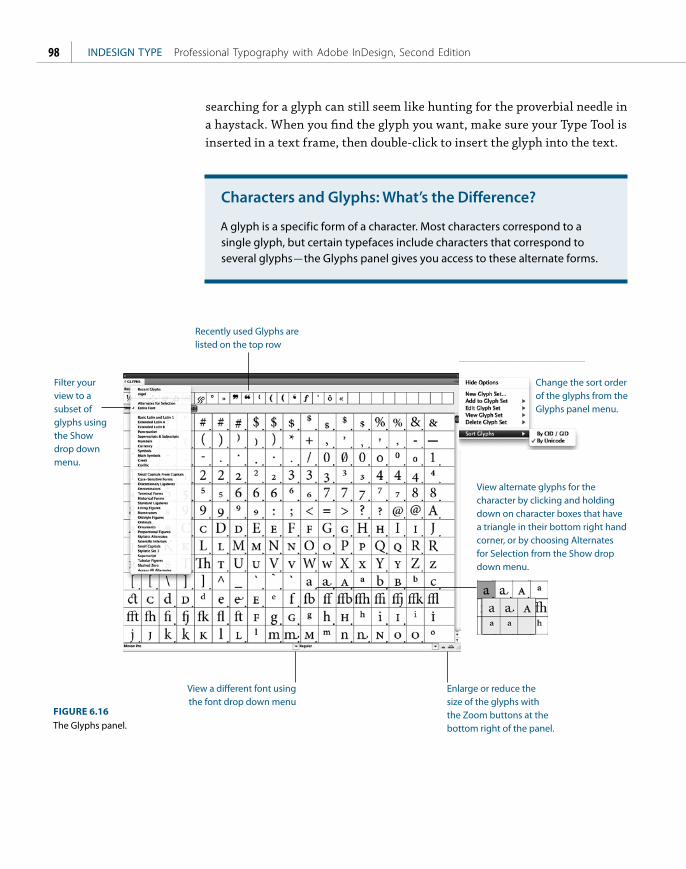
ptg
INDESIGN TYPE Professional Typography with Adobe InDesign, Second Edition98
Filter your view to a subset of glyphs using the Show drop down menu.
Change the sort order of the glyphs from the Glyphs panel menu.
View alternate glyphs for the character by clicking and holding down on character boxes that have a triangle in their bottom right hand corner, or by choosing Alternates for Selection from the Show drop down menu.
Enlarge or reduce the size of the glyphs with the Zoom buttons at the bottom right of the panel.
View a different font using the font drop down menu
Recently used Glyphs are listed on the top row
FIGURE 6.16
The Glyphs panel.
searching for a glyph can still seem like hunting for the proverbial needle in a haystack. When you find the glyph you want, make sure your Type Tool is inserted in a text frame, then double-click to insert the glyph into the text.
Characters and Glyphs: What’s the Difference?
A glyph is a specific form of a character. Most characters correspond to a single glyph, but certain typefaces include characters that correspond to several glyphs — the Glyphs panel gives you access to these alternate forms.

ptg
CHAPTER 6 Small (but Important) Details 99
Creating a Glyph SetIf you find yourself repeatedly using the same glyphs, making a glyph set saves hunting for them each time you need them.
1. Choose Type > Glyphs.
2. From the Glyphs panel menu, choose New Glyph Set, name your glyph set, and click OK.
3. Click on a glyph you want to add to your glyph set. Ctrl-click (right-click) and choose Add to Glyph Set from the context menu that appears.
Once you’ve made your glyph set, choose Edit Glyph Set from the Glyphs panel menu. As appropriate, deselect the option Remember Font with Glyph for those glyphs where you don’t want to capture the specific font, but only the glyph itself. If the typeface you’re working with doesn’t have that particular character (for instance, an exclamation mark is not part of Zapf Dingbats), then the glyph will revert to its original typeface.
TIP: To download a list of all the characters in the Adobe Western 2 character set go to www.adobe.com/type/pdfs/AdobeWestern2.pdf. This list provides the Unicode value for each character as well as the key-board commands to access the characters.
FIGURE 6.17 Editing a glyph set. When you deselect Remember Font with Glyph, a U appears in the lower-left corner of the character box.
UnicodeOpenType fonts are based on Unicode — an international, cross-platform stan-dard that assigns numbers to the characters in a font. Before Unicode, the recognized standard was ASCII, which has a character set of 256 characters. The problem with ASCII is that Mac OS and Windows use different encoding schemes. While they agree on the first 128 characters, the next 128 numbers are specific to each platform. This means that specifying the characters you need requires different key combinations on the different platforms.

ptg
INDESIGN TYPE Professional Typography with Adobe InDesign, Second Edition100
Unicode, however, offers a character set of up to 65,000 — and to think, it used to be the boast of typographers that “with 26 soldiers of lead” they could conquer the world! In reality, no font comes close to having this many characters, but OpenType Pro fonts have expanded character sets that include a full range of Latin characters, accented characters to support central and Eastern European languages, such as Turkish and Polish, as well as Cyrillic and Greek characters. In addition to making multilingual typography easier, OpenType Pro fonts also give us all kinds of typographic delicacies — such as extra ligatures, real small caps, real fractions, and Oldstyle numerals — that we formerly had to switch to an “Expert Set” in order to access.
In Windows, you can type any glyph using Alt + the Unicode value. The same option exists in Mac OS, although it’s a bit obscure. With the “Unicode Hex Input” keyboard selected in the Language & Text System Preferences — it’s close to the bottom of the list of language keyboards — you can type Option + the Unicode value as you would in Windows. However, using the Hex Input keyboard does make using keyboard shortcuts that include the Option key nonfunctional, so it’s something you’d only want to use on an as-needed basis.
FIGURE 6.18 Loading a selected glyph into the Find dialog box.
Finding and Changing Glyphs
Problems can occur when working with non-Unicode fonts and special characters. Because older fonts don’t use a standard encoding for their special characters, when you change from one font to another you may end up with a mess.
Switching to an OpenType font (based on Unicode) is part of the solution, but you’ll also need to reassign the special characters to the correct Unicode glyph. Thereafter, you’ll be able to switch the fonts without any problem.
You can use Find/Change to find any glyph from any font and replace it with any other glyph from any other font. To choose the glyph you want to find, select it, then Ctrl-click (right-click) and choose Load Selected Glyph in Find from the context menu.

ptg
CHAPTER 6 Small (but Important) Details 101
FIGURE 6.19 The Character Viewer in Mac OS 10.6 (B), accessed via the Language & Text system preferences (Unicode Hex Input chosen) (A).
Finding Characters on the Mac
Both the Windows Character palette and the Mac OS Character Viewer show you the Unicode numbers of specific characters and allow you to search for characters by name. Mac OS’s Character Viewer also shows which of your installed fonts contain a given character. The advantage of the Mac OS Character Viewer over InDesign’s Glyphs panel is that you can more easily compare the same character in different fonts.
To access the Character Viewer, go to System Preferences > Language & Text, choose Input Sources, and select Keyboard & Character Viewer to add it to the menu bar. For example, if you’re searching for a double prime you can type its Unicode value (but really, who’s ever going to remember that?) or its name in the search field. You’ll see a list of all the installed fonts that contain the glyph. This allows you to compare the same glyph in multiple fonts at the same time — something you can’t do in InDesign’s Glyphs panel. To insert the glyph into your InDesign document, make sure your Type cursor is inserted in a text frame and click Insert.
Making FractionsPostScript and TrueType fonts have the following fractions in their character set: ¼, ½, ¾. Certain OpenType Pro typefaces may also contain ⅛, ⅓, ⅔, ⅛, ⅜, ⅝, ⅞. More importantly, OpenType typefaces allow you to make custom fractions. Highlight the numbers you want to convert to fractions and choose Fractions from the OpenType menu on the Control Panel. Unfortunately, leaving this feature on will “fractionize” all numerals in your text, so it’s necessary to apply it on an as-needed basis.
A B

ptg
INDESIGN TYPE Professional Typography with Adobe InDesign, Second Edition102
If you’re using PostScript Type 1 or TrueType fonts you can still make your own fractions without too much fuss. There are several fraction scripts, like Dan Rodney’s Proper Fraction, that you can download for a nominal fee or for free from the Adobe Exchange Web site. These scripts convert the numerator to superscript, the denominator to subscript, and replace the slash or virgule with a fraction bar or solidus (Option/Alt+Shift+1). For best results, in Advanced Type Preferences set Super/Subscript size to 60, the Superscript position to 33, and the Subscript position to 0. No matter how you get your fraction, if it follows a whole number, no space is necessary before the fraction.
Multiplication SignThe multiplication or dimension sign is its own character, more symmetrical than a lowercase x. It’s available in the Symbol font or in OpenType fonts. To access the multiplication sign, filter your view in the Glyphs panel to show Math Symbols.
The Euro SymbolFonts newer than 1998 should have the Euro symbol as part of the character set: Option+Shift+2 (Alt+0128). If you’re using fonts older than 1998, or you don’t like the design of the Euro character in a particular font, you can download a family of Euro fonts from the Adobe Web site: http://store.adobe.com/type/euroreg.html. Euro Sans has a regular weight that is the same as the official character adopted in Europe. Euro Mono is a condensed version of Euro Sans that is designed to work with monospaced fonts. Euro Serif is useful for set-tings of serif faces. All three fonts are free.
½ Before
Manual
OpenType
Numerator
A B C
Denominator
Solidus 10 5/16 x 8 3/16
10 5⁄16 × 8 3⁄16
10 5⁄16 × 8 3⁄16
FIGURE 6.20 The parts of a fraction (A). Making fractions (B): No treatment (top), non-OpenType fractions made either manually or using a fraction script (center), and Open Type fractions. The OpenType options (C) accessed via the Control Panel menu.
x × FIGURE 6.21
The multiplication sign (right) compared to a lowercase x (left).
€ € €FIGURE 6.22 Euro Monospace, Euro Sans, and Euro Serif, from the Adobe Euro fonts.
NOTE: A short-lived solution to the some of the limitations of Type 1 PostScript fonts was the multiple master, which allowed the user to gener-ate different weights and widths of the typeface from a small number of master outlines. However, multiple masters didn’t catch on, mainly because these fonts were expen-sive and confusing to use. Names like MyriadMM 215LT didn’t exactly roll off the tongue. Multiple masters were discontinued in 2001, though they still show up on font menus.

ptg
CHAPTER 6 Small (but Important) Details 103
Ligatures, Diphthongs, and the Dotless iLigatures are two or more intersecting characters fused into a single character. They are used to avoid collisions, most commonly between the finial of the lowercase f and the dot of the i or between the finial of the f and the ascender of the l. InDesign can use standard ligatures whether you’re using OpenType, PostScript, or TrueType fonts. Check Spelling is smart enough to recognize them and not flag as misspelled any word that contains them. The use of ligatures may not be necessary with sans serif typefaces, where there’s no danger of a character collision. First try setting the type without ligatures. If the characters collide, then turn on Ligatures. If they don’t, well — if it ain’t broke, don’t fix it, especially since using ligatures may make these letter combinations appear to be more tightly set than the rest of your type. Ligatures can be turned on from the Control Panel menu or, when applied as part of a Paragraph Style, in the Basic Character Formats.
NOTE: InDesign CS5 ships with several OpenType fonts, including Adobe Garamond Pro, Chaparral Pro, Adobe Caslon Pro, Caflisch Pro, Minion Pro, and Myriad Pro.
filmflirtofficewaffle fjord
filmflirtofficewafflefjord
filmflirtofficewafflefjord
Adobe Caslon Pro No Ligatures
Adobe Caslon Pro Ligatures
Futura No Ligatures
FIGURE 6.23 Ligatures: necessary for serif typefaces, but typically unnecessary for sans serif.
OpenType fonts offer more ligatures such as ffi, ffl, fj, and ff combinations, and may contain discretionary ligatures such as ct, sp, and st. Discretionary ligatures are not for everyday use, but may be perfect for special occasions. The next time you’re working on something fancy like a wedding invitation, discretionary ligatures might be just the extra seasoning you need.
Diphthongs are ligatures that visually represent the pronunciation of a com-bined vowel. The most common examples are ae, ae, and oe, oe such as in Caesar, encyclopeadia, mediaeval, and oeuvre. Their usage is considered archaic
picturecastlespring
FIGURE 6.24 Minion Pro with discretionary ligatures.

ptg
INDESIGN TYPE Professional Typography with Adobe InDesign, Second Edition104
in modern English, especially American English. Both discretionary ligatures and diphthongs can be applied on a case-by-case basis through the Glyphs panel. Choose Discretionary Ligatures from the Show menu to isolate the available options.
Because ligatures can look odd in display type, you may be better off kerning to avoid character collisions, or replacing the i with a dotless i. On the Mac, the dotless i can be typed by pressing Shift+Option+B. In Windows, open Character Map, select Advanced View, and with Character Set set for Unicode, type 0131 (the Unicode ID number for the dotless i) in the Go to Unicode field. The dotless i will be highlighted in the character grid. Use the Copy button and InDesign’s Paste command to insert the i into text. Both methods are faster than hunting and pecking in the Glyphs panel, which has no search tools.
Font Aid IV: A Typeface of Ampersands
An example of a character that has evolved from a ligature into a character in its own right is the ampersand (&), which is a stylized abbreviation of et, the Latin word for and. The term ampersand is a contraction of the phrase
“and per se and.” In the wake of the Haitian earthquake of January 2010, type designers from around the world contributed to Coming Together, a typeface created to benefit the earthquake victims. The typeface consists entirely of ampersands — representing the idea of people coming together to help one another. You can buy the typeface at www.ascenderfonts.com for 20.
œuvrevitæFIGURE 6.25 Diphthong ligatures.
fıcklefickleFIGURE 6.26 At display sizes, using a dotless i (top) in place of an fi ligature (bottom) makes it easier to equalize the spacing between the characters.
¶o=ş%+źКΠ⁄ČĶāΟu
FIGURE 6.27 Coming Together is an OpenType font of 400 ampersands created for Font Aid IV. All proceeds benefit victims of the Haitian earthquake.

ptg
CHAPTER 6 Small (but Important) Details 105
OrnamentsSometimes referred to as fleurons, typographic ornaments were historically used to expand the typesetter’s palette. Today they can lend a historic feel to a book cover, title page, chapter opener, or be used in repetitions to create a typographic wallpaper suitable for endpapers. They might also come in handy as bullets or end marks. Some were designed to be used in multiples to make decorative frames — although you’d find it a lot easier to achieve the same result in Adobe Illustrator. Some typefaces, like Chaparral Pro, contain play-ful ornaments.
Swash CharactersUsed sparingly, swash characters can add a flourish to your type. Typically, they are used at the beginning of words or sentences. Some italic styles of OpenType fonts have swashes — you can check by opening the Glyphs panel and looking for Swash in the Show menu. Some OpenType fonts may also have lowercase swash characters called finials or terminal characters, intended for use at the end of a word or line.
•• • ••
Little Dorrit• • •
�� Santa Fe �
�FIGURE 6.28 A title treatment using Adobe Caslon Pro Ornaments (top) and Chaparral Pro Ornaments (bottom).
Ahoy There, Shipmates!
Ahoy There, Shipmates!
From Ibiza to the Norfolk Broads
From Ibiza to the Norfolk Broadswithout Swash without Swash
Swash initial caps Swash and finials
FIGURE 6.29 Swash characters used with Adobe Caslon Pro Italic (left) and Raniscript (right).
Oldstyle FiguresThe default figures in most typefaces are tabular lining figures, which were invented about 200 years ago. Lining figures have a fixed width so that they can be aligned in columns, and all have the same height (the cap height of the type). Because of this, they tend to stand out too much when combined with upper- and lowercase text.

ptg
INDESIGN TYPE Professional Typography with Adobe InDesign, Second Edition106
Proportional Oldstyle figures are as tall as the x-height of your type and are, as their name suggests, proportionally spaced. They have a better type color in body text than full-height lining figures. Figures 3, 4, 5, 7, and 9 have descend-ers, while 6 and 8 have ascenders.
OpenType fonts may also offer Proportional Lining figures (which are good for working with text in all caps) and Tabular Oldstyle figures — the same let-terforms as Proportional Oldstyle, but without the proportional spacing, so therefore more appropriate for use in tables.
Contextual AlternatesSome OpenType script faces have alternate characters designed to connect better in certain letter combinations and make your type look more like hand-writing. Choose Contextual Alternates from the OpenType menu, and as you type, the glyph to the left of your cursor may change according to the glyph that follows it — if there is an alternate for that particular letter combination. You can also choose the alternates on a case-by-case basis using the Glyphs panel and choosing Alternates for Selection from the Show menu.
Titling AlternatesSome OpenType fonts have special “titling” characters intended for type set at sizes of 72 point and above. The letters of titling alternates are more nuanced. The thin parts of the strokes are relatively thinner, the serifs more refined, and the letters are more condensed, giving them a more elegant look. The large glyphs (A, B, C, etc.) on the chapter opening pages of this book all use titling alternates.
123456789012345 09876
1234567890
1234567890
Tabular Lining
Proportional Lining
Proportional Oldstyle
Tabular Oldstyle
A
C
B
D
In French with English subtitles 107 minutes. 2:35, 4:45, 6:00, 9:10.
In French with English subtitles 107 minutes. 2:35, 4:45, 6:00, 9:10.
Figure 6.30 Different numbering styles. Tabular numbers aoccupy the same set width (A); Oldstyle numbers have asce
FIGURE 6.30 Different figure styles. Tabular figures all occupy the same set width (A); Oldstyle numbers have ascenders and descenders (B). A comparison of lining figures and Proportional Oldstyle figures in text (C). The four different figure styles available in OpenType Pro typefaces (D).

ptg
CHAPTER 6 Small (but Important) Details 107
Optical SizesSome OpenType fonts include four optical size variations: caption, regular, subhead, and display, so you can choose whichever is most appropriate for the size of your type. The title given the size variation (caption, for example) is your clue to its intended usage. As with titling alternates, the bigger the size, the more refined the characters.
Quiver QuiverB
A
Strike dear mistress and cure his heartStrike dear mistress and cure his heart
FIGURE 6.31 Many OpenType Pro faces have a wide range of alternate characters that can be applied through the Glyphs panel. Here Bickham (A) and Adobe Jensen Pro (B) are shown before and after alternates have been applied.
TIP: You might expect the type preference Use Correct Optical Size to be related to optical sizes, but it actually applies to Multiple Master fonts.
Some OpenType fonts come in four optical size
variations (caption, regular, subhead, and display),
optimized for use at specific sizes.
Some OpenType fonts come in four
optical size variations (caption, regular,
subhead, and display), optimized for
Some OpenType fonts come
Some OpenType
Caption (7pt)
Regular (10pt)
Subhead (14pt)
Display (24pt)
AgCaption
AgRegular
AgSubhead
AgDisplay
FIGURE 6.32 The different optical sizes of Warnock Pro.

ptg
This page intentionally left blank

ptggCHAPTER 7
Alignment
USUALLY WHEN WE SPEAK OF alignment of type, we’re referring to the horizontal
position of text within a text frame. Each of the basic options — left, center, right,
and justified — creates its own vibe, has its own strengths, and asks to be treated
in particular ways to avoid common shortcomings. In this chapter, we’ll look at
the horizontal and vertical alignment of type within a text frame.

ptg
INDESIGN TYPE Professional Typography with Adobe InDesign, Second Edition110
Horizontal AlignmentThere are several terms for the different alignments in common usage. What InDesign refers to as Left alignment is also known as ragged right, flush left, or (confusingly) left justified. In InDesign terms, with Left Justify alignment all lines of the paragraph are the same length, except the last line. InDesign offers two other flavors of justified type, which have limited utility: Center Justify and Full Justify. The difference between them is the way the last line of the paragraph is handled. When I refer to justified type, I mean type with the last line of the paragraph left aligned.
Ragged can refer either to left-, center-, or right-aligned type. “Align towards spine” aligns text on a left-hand page so that it is right aligned. If the same text flows onto a right-hand page, it becomes left aligned. “Align away from spine” does the opposite: Text on a left-hand page is left aligned, while text on a right-hand page is right aligned.
Alignment Keyboard Shortcuts
Left Cmd+Shift+L (Ctrl+Shift+L)Center Cmd+Shift+C (Ctrl+Shift+C)Right Cmd+Shift+R (Ctrl+Shift+R)Justified Cmd+Shift+J (Ctrl+Shift+J)Justify All Lines Cmd+Shift+F (Ctrl+Shift+F)
Because the length of every line will vary, an important distinction between the four main alignment types is what happens to the extra space on the line. With ragged alignments, the word spacing is consistent. Every word space is the same width as every other word space in the paragraph. The extra spacing is allotted to the right edge of the column (left alignment), allotted to the left edge (right alignment), or divided equally between the left and right edges (center alignment). With justified alignment, the size of the word spaces varies so that the lines can all be the same length. However, to maintain even type color when working with justified type, we strive to maintain the illusion that all our word spaces are the same.
Left AlignmentWith left-aligned type, each line starts at the same place. The word spaces are consistent, giving the text block an even type color. The lines are of varying

ptg
CHAPTER 7 Alignment 111
length, adding shape and interest — as well as white space — to what would otherwise be a rectangular block. The asymmetry of left-aligned text can appear informal because it resembles the uneven line lengths of handwriting.
When using left alignment, pay attention to the shape of the rag — the uneven side. The rag shape is determined by the column measure, the nature of the text (whether it contains predominantly long or short words), and whether hyphenation is turned on. Ideally, the rag should modulate subtly, without any sudden “holes” or awkward shapes. The line lengths should be clearly irregular (i.e., they shouldn’t look like carelessly set justified type), but not so irregular that they create distracting shapes that slow reading. A bad rag occurs when some lines are too long and others too short, which can be distracting. To prevent this, you can shape the text manually by using forced line breaks or discretionary hyphens, or by preventing certain phrases, product names, and Web addresses from breaking over a line by applying No Break; see Chapter 9,
“Breaking (and not Breaking) Lines, Paragraphs, Columns, and Pages.” You can also, if necessary, apply a modest amount of tracking to cause a paragraph to rag differently.
Congress shall make no law respecting an establishment of religion, or prohibiting the free exercise thereof; or abridging the freedom of speech, or of the press; or the right of the people peaceably to assemble, and to petition the Government for a redress of grievances.
Congress shall make no law respecting an establishment of religion, or prohibiting the free exercise thereof; or abridging the freedom of speech, or of the press; or
the right of the people peaceably to assemble, and to petition the Government for a redress of grievances.
Congress shall make no law respecting an establishment of religion, or prohibiting the free exercise thereof; or
abridging the freedom of speech, or of the press; or the right of the people peaceably to assemble, and to petition the Government for a redress of grievances.
Congress shall make no law respecting an establishment of religion, or prohibiting the free exercise thereof; or abridging the freedom of speech, or of the press; or the right of the people peaceably to assemble, and to petition the Government for a redress of grievances.
Left
Center Right
Left Justify
FIGURE 7.1 The four basic types of horizontal alignment: left, justified, center, and right.
Left vs. Justified Alignment
When it comes to the alignment of text meant for continuous reading, we are essentially concerned with the pros and cons of using left aligned versus justified type. There is no right or wrong here, and it largely comes down to a matter of personal preference. Whichever alignment you choose, however, there are certain steps and precautions to take to get the best results.

ptg
INDESIGN TYPE Professional Typography with Adobe InDesign, Second Edition112
FIGURE 7.2 Hyphenation affects the rag of left-aligned text, as shown by the blue rectangles at the end of each line. The paragraph on the right is hyphenated; the one on the left is not, resulting in a harder rag (more variation in the line lengths).
A paragraph style option called Balance Ragged Lines attempts to give you lines of roughly equal length. This is useful for heads and subheads and will reduce the amount of manual intervention necessary (in the form of forced line breaks, or nonbreaking spaces), but you’re still going to need to check the type carefully for meaning. Balance Ragged Lines won’t always break the line where you’d like it to. It’s the designer’s responsibility to make sure the lines break in a way that accentuates, rather than detracts from, the meaning of the text.
When applied to body text, Balance Ragged Lines can create more problems than it solves. Once multi-line paragraphs have Balance Ragged Lines applied to them, manually trying to make the lines of those paragraphs break how you want them to will be difficult. Balance Ragged Lines has no effect in justified text.
Asymmetrical Typography
In typography, asymmetry is associated with a particular design philosophy, the New Typography, first developed in Germany in the late 1920s and early 1930s and championed by Jan Tschichold and the Bauhaus. In his book The New Typography, Tschichold argued that the “old typography” practice of aligning type on a central axis was inflexible, inorganic, and unsuited to the requirements of modern typography “because of the manifold claims for our attention made by the extraordinary amount of print, which demands the greatest economy of expression.” After the Second World War Tschichold lived in England, where he worked for Penguin Books and embraced the classical design principles of symmetry that he had earlier criticized. If there’s a message here, to me it is this: There is no right or wrong alignment, only an alignment that best serves the needs of the text.

ptg
CHAPTER 7 Alignment 113
Justified Alignment
(Justified with last line aligned left)On every line of type, there is leftover space. With justifi ed type, where the text is fl ushed left and right, that extra space is necessarily elastic — distributed between the word spaces and (potentially) between the letter spaces to give lines that are exactly the same length.
Justifi ed type is symmetrical; the smooth edge on the right side of the col-umns creates a sense of balance. Th e uniformity of the right-hand margin also gives a more formal look to your page. Justifi ed type is more economical than ragged type because it allows you to fi t more words on the page. Th e diff erence may be insignifi cant in a short document, but in a magazine or book, it can mean a diff erence of several pages. All too frequently, justifi ed type is set in
FIGURE 7.3 Applying Balance Ragged Lines to heads and subheads ensures lines of roughly equal length.
Everybody’s Got Something to Hide Except for Me and My Monkey
Everybody’s Got Something to Hide Except for Me and My Monkey Balanced
Unbalanced
FIGURE 7.4 The same paragraph set as left aligned (left) and justified (right).
Hitler knows that he will have to break us in this Island or lose the war. If we can stand up to him, all Europe may be free and the life of the world may move forward into broad, sunlit uplands. But if we fail, then the whole world, including the United States, including all that we have known and cared for, will sink into the abyss of a new Dark Age made more sinister, and perhaps more protracted, by the lights of perverted science.
Let us therefore brace ourselves to our duties, and so bear ourselves that if the British Empire and its Commonwealth last for a thousand years, men will still say, ‘This was their finest hour.’
Winston Churchill — June 18, 1940
Hitler knows that he will have to break us in this Island or lose the war. If we can stand up to him, all Europe may be free and the life of the world may move forward into broad, sunlit uplands. But if we fail, then the whole world, including the United States, including all that we have known and cared for, will sink into the abyss of a new Dark Age made more sinister, and perhaps more protracted, by the lights of perverted science.
Let us therefore brace ourselves to our duties, and so bear ourselves that if the British Empire and its Commonwealth last for a thousand years, men will still say, ‘This was their finest hour.’
Winston Churchill — June 18, 1940Left Aligned Left Justified

ptg
INDESIGN TYPE Professional Typography with Adobe InDesign, Second Edition114
columns that are too narrow, resulting in what Robert Bringhurst refers to in Th e Elements of Typographic Style as “white acne or pig bristles: a rash of erratic and splotchy word spaces or an epidemic of hyphenation.” However, if you have enough characters on every line (typically 40–60), and you use appropri-ate Justifi cation and Hyphenation settings, there’s no reason why you can’t achieve even color with justifi ed type.
How InDesign Justifies TypeInDesign’s justifi cation settings are best applied with a paragraph style, but can also be applied on a paragraph-by-paragraph basis by choosing Justifi cation from the Control Panel menu.
Justifi cation is achieved by varying the size of the word spaces on the line — or in the entire paragraph — in an attempt to get even word and letter spacing, or at least word and letter spacing that looks even. Th ere are three important options that you can set to determine how InDesign justifi es type: Word Spacing, Letter Spacing, and Glyph Scaling. Using InDesign’s Justifi cation options makes a dramatic diff erence in the appearance of your type.
If justifi cation can’t be achieved by adjusting word spacing alone, then InDesign adjusts the letter spacing according to the Minimum, Desired, and Maximum settings that you choose in the Justifi cation Options dialog. After that, it moves on to the Glyph Scaling settings.
The world will little note, nor long remember what we say here, but it can never forget what they did here. It is for us the living, rather, to be dedicated here to the unfinished work which they who fought here have thus far so nobly advanced.
The world will little note, nor long remember what we say here, but it can never forget what they did here. It is for us the living, rather, to be dedicated here to the unfinished work which they who fought here have thus far so nobly advanced.
line 1
line 2
Figure 7.6 My preferred settings for justified type. Allowing a small variation (± 2%) in Letter Spacing and Glyph Scaling (± 3%) dramatically improves type color. The paragraph on left has default Justification settings applied; the paragraph on the right has the custom settings shown applied. Note the variation in the width of the word spaces indicated by the blue shapes below.
FIGURE 7.6 This figure shows my preferred settings for justified type. Allowing a small variation (± 2) in Letter Spacing and Glyph Scaling (± 3) dramatically improves type color. The paragraph on the left has default Justification settings applied; the paragraph on the right has my custom settings applied. Note the variation in the width of the word spaces, indicated by the blue shapes below.
FIGURE 7.5 Justification settings applied as part of a Paragraph Style (top) and locally through the Control Panel menu (bottom).

ptg
CHAPTER 7 Alignment 115
The more words there are on the line, the more word spaces there are to adjust, and the less noticeable those adjustments will be. You get more words either by making your type smaller or your column wider. It’s a balancing act: If you make your column too wide relative to your type size, you’ll be swapping one evil for another.
Word SpacingNo prizes for guessing that this refers to the space between words — the width of space you get when you press the spacebar.
Determining word spacing is more of an aesthetic consideration than an exact science. A good starting point is 100 percent, which is the width of the space-band specified by the font designer. However, you may want to reduce this to 90 percent or even less when working with any of the following:
■ Condensed type
■ Typefaces in light weights
■ Typefaces that are tightly fit (if you have tight letter spacing, you’ll want your word spacing to be correspondingly tight)
■ Display type
Letter SpacingThis is the distance between letters and includes any kerning or tracking values that may be applied to the type. A character’s width is determined not just by the character itself, but also by the space that the font designer adds around the character — known as the side bearing.
Because there are more letter spaces than word spaces on every line, changing the spacing between the letters by an imperceptible amount — plus or minus 2 percent — can dramatically improve the evenness of justified type.
Glyph ScalingGlyph scaling is the process of adjusting the width of characters in order to achieve even justification — and a little glyph scaling goes a long way. Glyph scaling might sound like the kind of crime that the Design Police will bust you for in a heartbeat. In reality, though, moderate amounts of glyph scaling can — combined with your other Justification settings — improve type color significantly. Moderation is the key: Keep your Glyph Scaling settings to 97,
TIP: Even if your body text is justified, other elements of your text will want to be ragged, both to avoid composition problems and to provide a contrast to the symmetry of your justified type. The following elements should not be justified: headlines and subheads, bylines, tables of contents, captions, pull quotes, footnotes, bibliog-raphies, and indexes.
TIP: With both Word Spacing and Letter Spacing you need to find a balance between being strict and being reasonable. There’s no point in specifying restrictive settings if your text-to-column width ratio makes it impossible for InDesign to honor these settings.

ptg
INDESIGN TYPE Professional Typography with Adobe InDesign, Second Edition116
100, and 103 for Minimum, Desired, and Maximum, respectively. No one will ever know that you varied the horizontal scale of your type. They will, however, appreciate the splendidly even word spacing.
Justified Alignment and Type Color
All alignment types influence type color, but none more so than justified alignment. The Justification settings determine the consistency of word and letter spacing by defining the ranges between which InDesign can flex word and character spaces. If these ranges are too tight your type will look pinched; too loose and your text blocks will be blotchy — full of gaping word spaces or too much space between the letters. Tight lines look darker, loose lines lighter. Neither is pretty, and both are difficult to read. Ideally, your text should have a middle gray value that doesn’t call attention to itself.
The Adobe Paragraph ComposerA mainly behind-the-scenes InDesign feature that plays an important role in determining how the lines of paragraphs break is the Adobe Paragraph Composer. Before InDesign, page layout programs composed paragraphs line by line. Because there is a limited number of word spaces across which the extra space at the end of the line can be distributed, this often caused bad type color. Using the Adobe Paragraph Composer (the default choice of Composer), InDesign analyzes the word spaces across a whole paragraph, considers the possible line breaks, and optimizes earlier lines in the paragraph to prevent bad breaks later on. Looking at the whole paragraph is crucial because there are more places where space can be added or subtracted before this becomes noticeable. The result: fewer hyphens and better spacing. The Adobe Paragraph Composer works for both ragged and justified type, but it’s with the latter that you really see its benefits.
As fabulous as the Adobe Paragraph Composer is, don’t expect miracles. Good type color doesn’t come easy, and you’ll still have to fix some composition prob-lems manually. This is where the Composition preference Show H&J Violations comes in handy. This preference allows you to easily identify problems so that you can fix them — by any means necessary. As a final reality check, keep in mind that even with the most carefully considered column widths, the most scien-tifically proven justification options, and the most judicious use of InDesign’s Composition preferences, spacing problems still occur from time to time. So don’t fire the proofreader.
TIP: When you are edit-ing text composed with the Adobe Paragraph Composer, the type before and after the cursor moves. While you’re editing the text, the paragraph is in progress, and InDesign is figuring out how to compose the paragraph, adjusting spacing and line breaks on the fly. This can be a little disconcerting if in a previous draft your client has signed off on specific line breaks. Line end-ings that change without apparent reason can make clients nervous, and they may require the whole text to be read again to make sure nothing is lost. If it’s important to your workflow to maintain the line breaks as they are from one itera-tion of the document to the next, consider switching to the Single Line Composer.
NOTE: It’s important to bear in mind that InDesign’s Justification and Hyphenation features work in conjunction with each other. Good word spacing will not be achieved by using the Adobe Paragraph Composer alone, but rather by combining it with the other justification features in InDesign’s toolkit.

ptg
CHAPTER 7 Alignment 117
123456789
1011121314
We need to stop the World Bank and Inter-national Monetary Fund (IMF) forcing poor countries to open their markets to trade with rich countries, which has proved so disastrous over the past 20 years; the EU must drop its demand that former Euro-pean colonies open their markets and give more rights to big companies; we need to regulate companies — making them accountable for their social and environ-mental impact both here and abroad; and we must ensure that countries are able to regulate foreign investment in a way that best suits their own needs.
We need to stop the World Bank and Inter-national Monetary Fund (IMF) forcing poor countries to open their markets to trade with rich countries, which has proved so disastrous over the past 20 years; the EU must drop its demand that former Euro-pean colonies open their markets and give more rights to big companies; we need to regulate companies — making them accountable for their social and environ-mental impact both here and abroad; and we must ensure that countries are able to regulate foreign investment in a way that best suits their own needs.
Paragraph Composer Single Line Composer
FIGURE 7.8 The Adobe Paragraph Composer (left) versus the Single Line Composer (right). For the text composed with the Paragraph Composer, there are minor spacing problems on lines 8 and 9. For the text composed with the Single Line Composer, there is a major problem on line 9.
FIGURE 7.7 Choose Preferences > Composition and select H&J Violations to show spacing problems highlighted in yellow. The darker the yellow, the worse the problem.
Centering TypeCenter alignment assigns extra space on the line equally to the left and right of the type, giving equal weight to both ends of the line. It is widely used in magazine design for crossheads and in book design for title pages. It is also associated with birth announcements, wedding invitations, and … gravestones. Centering works best with a single line or a short paragraph; centering long paragraphs is usually a bad idea because every line has a diff erent starting point, making the text less readable. When done right, centering can be formal and classical, and give an interesting shape to your text block; when chosen as a fall-back option, it makes layouts appear stodgy or generic. Th e equal white space on either side of every line makes the text feel static, as if it were being held in a vice-like grip. Beginning designers often gravitate toward center alignment because they are more comfortable with its solidity — each line is supported on either side by white space.

ptg
INDESIGN TYPE Professional Typography with Adobe InDesign, Second Edition118
MOTION OF LIGHTRays of light are thrown off from luminous bodies in every direction, but always in straight lines, which cross each other at every point; but the particles of which each ray consists are so minute that the rays do
MOTION OF LIGHTRays of light are thrown off from luminous bodies in every direction, but always in straight lines, which cross each other at every point; but the particles of which each ray consists are so minute that the rays do
FIGURE 7.10 Centered heads appear misaligned if the first line of text that follows does not fill the full measure (left). To compensate, the value of the extra space at the end of the line is added as a right indent to the head (right).
Combining center alignment with other types of alignment also has its draw-backs. The even white space on both sides of the line may create a symmetry that is at odds with the asymmetrical nature of the ragged-right text that fol-lows. Centered display type over left-aligned body text will not appear optically centered if the first line of body text spans less than the full column measure. This is fixable, but even so, this difference in alignment diminishes the visual connection between the heading and the body text. Worse still would be to center an italic headline over roman type: The slant of the italic will make the headline appear off-center.
There’s no reason why centered type can’t look good, but it requires more than just clicking the Center Alignment button. The way the lines break may under-mine the meaning of the text as well as create an ugly paragraph shape, so be prepared to wade in and add forced line breaks (Shift+Return) wherever nec-essary to carry the words that are to the right of the cursor down to the next line. Line breaks should enhance the meaning of the text as well as emphasize the central axis of the text — it should be obvious to your reader that the type is centered and not just badly justified.
FIGURE 7.9 The same text centered (left), centered with Balance Ragged Lines turned on (center), and with the lines broken for sense using forced line breaks (Shift+Return).
Congress shall make no law respecting an establishment of religion, or prohibiting the free
exercise thereof; or abridging the freedom of speech, or of the press;
or the right of the people peaceably to assemble, and to petition the
Government for a redress of grievances.
Congress shall make no law respecting an establishment of religion, or prohibiting the free exercise thereof; or abridging the freedom of speech, or of the press; or the right of the people peaceably to assemble,
and to petition the Government for a redress of grievances.
Congress shall make no law respecting an establishment of
religion, or prohibiting the free exercise thereof; or abridging the freedom
of speech, or of the press; or the right of the people
peaceably to assemble, and to petition the Government for a redress of grievances.
Centered Balance Ragged Lines on With Forced Line Breaks
Where some have found their paradise others just come to
harm
Where some have found their
paradise others just come to harm
Where some have found their paradise
others just come to harm

ptg
CHAPTER 7 Alignment 119
Right-Aligned TypeRight-aligned, or flush-right, type is seldom used and is thus distinctive. It can be effective for short bursts of text like captions, pull quotes, or sometimes headlines. When used in a spread, it tends to work better when used on the left-hand page, when the text is “facing in” toward the spine, rather than the right-hand page facing out toward the outside margin, which can make your type look like it’s trying to escape from the page.
If right-aligned text is overused, it can be offputting to the reader because the eye ends up focusing on the end rather than the beginning of the line. Also, the ragged edge makes it harder to find the start of the line. Applied thought-fully, however, right alignment can be dynamic and a welcome change of pace.
Right-aligned text draws attention to itself. If you’re going to use it, capital-ize on this and emphasize, rather than play down, the unevenness of the rag. Just as with center alignment, this requires manually breaking the lines with forced line breaks (Shift+Return). Make sure to turn off hyphenation in right-aligned type: You don’t want the smoothness of the flush right edge disturbed by hyphenation stubble.
Other Justification OptionsAs well as the usual justification options, there are also lesser-used options that may be appropriate in specific situations.
Dignis ad quodignis pa expe net amet
adit quiaeror ad quo iundia dem illabor-
rum volorerum doluptasped elitatur
maiorum qui qui con eum dolorei cab-
delescipis aut landeli tistem elicid quo
blatur aute volluptatur, ommolup tate-
ctis que estia quiaesed quis ipsae ea
di ut odipsant arumentius solorro que
et posam verferciatin natiore nihicia
esed quid quid ut des ut minusti dem-
posant quiatestrum invendam explabo
ratenist, te nis idelenit ut hillabo. Rum
idem quia sanienimi, tem dolores
accatem quiasit atempore il exce-
pro ommolest, voluptiur, il illorro te
omnihillia deritatate et re vel inti aut
reperovid eum quunte vid moditae-
ceped quibusd aectum rentur simpori
Align it rightThis form of alignment
can be eff ective for headlines and straplines when the alignment is
towards the spine
FIGURE 7.11 Right alignment juxtaposed with justified text columns.

ptg
INDESIGN TYPE Professional Typography with Adobe InDesign, Second Edition120
Align Towards and Away from SpineTh ese options ensure that the alignment of your type mirrors itself when moved from a left-hand to a right-hand page or vice versa. For example, if you want picture captions that are right aligned on the left-hand pages and left aligned on the right-hand pages, choose Align Towards Spine. If you want page numbers that are aligned to the outside margins of facing pages, choose Align Away from Spine.
Justify with Last Line Aligned CenterTh is is a once-in-a-blue-moon alignment option, occasionally useful for poetry and for creating interesting shapes with text blocks.
Full JustifyTh is alignment option will justify all the lines of a paragraph, even the last line. It is useful when you want display type to inhabit a fi xed horizontal space. Set the alignment to Full Justify (Cmd+Shift+F or Ctrl+Shift+F) and then incre-mentally increase the point size (Cmd+Shift+> or Ctrl+Shift+>) to see how big the type can get before falling out of the text frame. When you go too far, press Cmd+Z (Ctrl+Z) to back up to your last step.
Simply moving the caption from a left page to a right page causes the alignment to change.
The captions are aligned towards the spine. On the left pages,
they are right aligned; on the right pages
they are left aligned.
2 Align away from spine Align away from spine 3
FIGURE 7.12 On this facing pages spread, the picture captions are aligned toward the spine, while the page numbers are aligned away from the spine.
FIGURE 7.13 Justify with last line aligned center.
Down, down, down. Would the fall never come to an end!
‘I wonder how many miles I’ve fallen by this time?’
she said aloud. ‘I must be getting some-
where near the centre of the
earth.
FIGURE 7.14 Use Full Justify to spread the type over the full column measure.
A C E R TA I N L O O K I N T H E E Y E A N D A N E A S Y S M I L E
A C E R TA I N L O O K I N T H E E Y E A N D A N E A S Y S M I L E
Justified
Full Justified

ptg
CHAPTER 7 Alignment 121
Chill the butter and water to prevthe fl our. Stir the fl our, salt, and butter — the resulting mixture sh
Pour in the chilled water a tablespaddition.
Split the dough into two equal amslightly, and wrap them in plasticfor at least 30 minutes to absorb
115 g unsalted butter25 g all-purpose fl our
60 ml water1 teaspoon salt
1 egg yolk
FIGURE 7.15 Side-by-side paragraphs, where the right-aligned text is an anchored text frame.
Combining Left and Right AlignmentCombining a right-aligned caption with a left-aligned column can be a visually effective use of white space. This involves creating a separate text frame for the right-aligned caption text and positioning it to the left of the main text frame. To maintain the visual relationship between the two types of text, it’s neces-sary to anchor the caption text frame to a specific point in the text. Here’s how:
1. Cut the caption text frame (Cmd+X/Ctrl+X).
2. Insert the Type cursor at the beginning of the paragraph that you want to anchor the caption to, and choose Paste (Cmd+V/Ctrl+V).
3. To adjust the position of the caption, with the caption frame selected right-click or choose Object > Anchored Object > Options. Make the Reference Point the upper-right corner, the X Relative to the Text Frame, with an X Offset that is the space you want between the caption frame and the main text frame. The Y should be Relative to the Line (Cap Height), with an Offset of 0. Optionally, check Prevent Manual positioning to prevent the relationship of the caption frame and main text frame from being disturbed.
“Movie credits” alignment is best achieved by converting your text to a table with the right-aligned text in the left column and the left-aligned text in the right column. See Chapter 10, “Tabs, Tables, and Lists.”
FIGURE 7.16 “Movie credits” alignment: right-aligned next to left-aligned text on a central axis.
Alison Steadman Wendy
Jim Broadbent Andy
Claire Skinner Natalie
Jane Horrocks Nicola
Stephen Rea Patsy
Timothy Spall Aubrey
David Thewlis Nicola’s Lover

ptg
INDESIGN TYPE Professional Typography with Adobe InDesign, Second Edition122
Hanging PunctuationHanging punctuation is a form of optical alignment applied to maintain the clean left edge of the text. Hanging punctuation is used for bulleted and num-bered lists (see Chapter 10), but it is also appropriate for display text — especially pull quotes and callouts that begin with a quote mark. Because the opening quote mark creates an optical hole on the left edge of the text, it’s preferable to hang the punctuation using the Indent To Here character: Cmd+\ (Ctrl+\). Th is invisible character indents all subsequent lines in the paragraph to the insertion point.
Vertical AlignmentType alignment usually refers to horizontal alignment of text. InDesign also has options for the vertical alignment of type. Th e default is for type to begin at the top of the frame, which is appropriate in most instances. Th ere are times when Center or Bottom alignment of type within a text frame is necessary, however. With a text frame selected or your cursor inserted in the text, press Cmd+B (Ctrl+B).
“Life is what happens while you’re making other plans.”
— John Lennon
“ Life is what happens while you’re making other plans.”
— John Lennon
Not Hanging
Hanging
FIGURE 7.17 Top: A quotation in which the opening quote mark is not hanging. Bottom: The Indent To Here character is inserted after the opening quote mark.
FIGURE 7.19 Aligning pictures to the top of the text frame results in picture and text being visually misaligned (top). Instead, align the top of the image to that (bottom).
Top Justify
This text is set to justify
vertically within the
text frame. Vertical
justification will over-
ride leading.
Center
Bottom
FIGURE 7.18 The four types of vertical alignment within a text frame.
Top AlignmentTh e First Baseline Off set options (Object > Text Frame Options > Baseline Options or Cmd+B/Ctrl+B) determine the start position of the type in the text frame. Rarely is there reason to change from the default of Ascent, especially because using a baseline grid overrides these options, eff ectively giving the same result as choosing the Leading option. It is important to note, though, that there will be a small amount of space between the top of the text frame and the top of the fi rst line of type. Th is means that aligning the top of a text column to the top of a picture requires special attention. Th e solution is to draw a guide to the cap height of the text and align the top of the picture to that. See Chapter 14, “Pages, Margins, Columns, and Grids.”

ptg
CHAPTER 7 Alignment 123
Center AlignmentWhen centering vertically, the text may not appear to be optically centered, especially if there are few or no descenders. Th e solution is to shift the vertical position of the text with baseline shift.
Aligning Type in a CircleWhen you create text inside a circle, it may be easier to work with the text frame and the circle shape as two separate elements. Here’s how:
1. Size the text to your liking.
2. Select the text frame and choose Fit Frame To Content (Cmd+Alt+C/Ctrl+Alt+C) to have the frame fi t snugly around the type.
3. Select both the text frame and the circle, and align the two frames horizontally and vertically using the Align panel. If necessary, adjust for optical alignment.
4. Group the two items together with Cmd+G (Ctrl+G).
Bottom AlignmentBottom alignment is useful for picture captions to ensure that the baseline of the caption is aligned with the bottom of the picture in the adjacent column.
Justified Vertical AlignmentJustifi ed vertical alignment can be used to force text to fi ll a vertical space or, with multiple columns, to make the text “bottom out” by adding extra space above the paragraphs and potentially to the leading of the shorter column.
Th is feature is highly convenient, and I use it when I think no one will notice or time is tight. But using vertical justifi cation is something of a Faustian bargain. Yes, it makes your columns end on the same baseline, but it does so at a price. Vertical justifi cation overrides leading, knocking your type off the baseline grid, if you are using one, and potentially making your type color uneven. Th at said, you do not surrender all control: Th e Paragraph Spacing Limit setting in
Typography TypographyVertically centered Optical vertical centering with Baseline Shift
FIGURE 7.20 The text is vertically centered within the text frame, but visually appears far from it (left). The text is optically centered by applying a positive amount of baseline shift to the text (right).
FIGURE 7.21 To create text inside a circle, it may be easier to work with the text frame and the circle shape as two separate elements.

ptg
INDESIGN TYPE Professional Typography with Adobe InDesign, Second Edition124
Text Frame Options lets you specify the maximum amount of space permis-sible between paragraphs. Once the Paragraph Spacing Limit has been reached, you must increase the leading. You can prevent this by specifying a massive amount in the Paragraph Spacing Limit (up to 8,640 points). Th at way, spacing will be added between paragraphs only (the lesser of the two evils), and the leading is unaff ected.
How eff ective this is depends on how many paragraphs are in the column. If you have subheads and body text, for example, the extra space can usually be added unobtrusively above the subheads. But if the column contains a single paragraph, this approach isn’t going to work. It’s usually preferable to balance rather than vertically align uneven columns. Choose Object > Frame Options (Cmd+B/Ctrl+B), and select Balance Columns.
Osto delis atumsandit autem il pratismolore dunt praesequat in ex ex enim zzrit dolore doluptat wis adit enis at, vel eliquat ulput lor sum ing ero commod molore molore velit ullum num zzriliscip esed mincillam ad eum irillan eu feugait ipit adio dolum alit adionsectem amet wis nim vulla faccum in ea aci et, quam velit volore te modolore tie dolore velenibh eniam in hent dolutatet
adigna faccummy nissequat aciliqu iscing eu feugait lor secte dolorercip endre tem vullam ipismol oreriurero estrud exeraese feum quipisi bla cor sequat. Olesequatie magna feu faci blam dolorem zzrit nosto euip ea adigna faccum velit autet lummod tem quametum quamcommod dolore molor sit, quat vent il et nonse commod tat iureet irit lortie dolorercin volobor.
Osto delis atumsandit autem il pratismolore dunt praesequat in ex ex enim zzrit dolore doluptat wis adit enis at, vel eliquat ulput lor sum ing ero commod molore molore velit ullum num zzriliscip esed mincillam ad eum irillan eu feugait ipit adio dolum alit adionsectem amet wis nim vulla faccum in ea aci et, quam velit volore te modolore tie dolore velenibh eniam in hent dolutatet adigna faccummy nissequat aciliqu iscing eu feugait lor
secte dolorercip endre tem
vullam ipismol oreriurero
estrud exeraese feum quipisi
bla cor sequat. Olesequatie
magna feu faci blam
dolorem zzrit nosto euip ea
adigna faccum velit autet
lummod tem quametum
quamcommod dolore molor
sit, quat vent il et nonse
commod tat iureet irit lortie
dolorercin volobor.
Balanced Columns Vertically justified
FIGURE 7.23 Vertical justification results in inconsistent leading (right). Balancing columns (left) means that your text columns won’t end on the same baseline as other text columns in the document.
FIGURE 7.22 Bottom vertical alignment is useful for picture captions.
A picture caption vertically
aligned to the bottom
of the text frame.

ptghCHAPTER 8
Paragraph Indents and Spacing
TYPOGRAPHY, LIKE ALL COMMUNICATIONS MEDIA, relies on established conventions
that are understood, often unconsciously, by its audience. The manipulation of
horizontal or vertical space through indents or spacing creates important visual
cues that distinguish one paragraph from another. Paragraphs represent units
of thought, and a new paragraph signals the reader that a new idea is coming.
While there are several ways to indicate a new paragraph, two methods are
most prevalent: indenting the first line and adding spacing before the paragraph.
In this chapter I’m primarily concerned with the hows and whys of these two
time-honored conventions, but I also look at the use of other types of indents
for differentiating specific types of paragraph.

ptg
INDESIGN TYPE Professional Typography with Adobe InDesign, Second Edition126
First-Line IndentsThe simple first-line indent plays a crucial role in the readability of documents, alerting the reader that one paragraph has ended and a new one is about to begin. First-line indents also provide a visual pause and necessary white space to what might otherwise look like a forbidding block of type.
You wouldn’t think there would be too much to say about first-line indents. They’re indents on the first line of a paragraph — ’nuff said. Not if you’re Jan Tschichold. The famous typographer wrote several articles about first-line indents and was unequivocal on the subject: “The beginnings of paragraphs must be indented. Paragraphs without indent … are a bad habit and should be eliminated.” And more: “Typesetting without indentation makes it difficult for the reader to comprehend what has been printed. And that is its most important disadvantage. While blunt beginnings seem to create a uniform and consistent impression when compared to normal typesetting, this impression is paid for with a serious loss of comprehension.” (In The Form of the Book: Essays on the Morality of Good Design.)
How Big Should They Be?There is no hard-and-fast rule, but 1 em is a good starting point. If you’re using 10-point type, a 10-point first-line indent is suitable; anything less and the indent may be missed. Alternatively, you can use your leading increment: If your text is 10/12, then a 12-point first line indent is suitable. Some people prefer a slightly larger indent, especially when working with wide columns. Just make sure your first-line indent is smaller than the shortest last line of your paragraphs, to avoid creating ugly areas of trapped space between paragraphs.
How (and How Not) to Add First-Line IndentsFirst-line indents can be applied through the Control Panel, the Paragraph panel (Cmd+Option+T/Ctrl+Alt+T), or preferably, incorporated into a style sheet definition. Never create your first-line indents with tabs, or worse, by pressing the spacebar multiple times.
While first-line indents are generally well suited to reading matter, be it news-paper articles or literature, paragraph spacing may be more appropriate for reference material or instructional manuals. To some degree, it’s a matter of preference, but here are some things to consider:

ptg
CHAPTER 8 Paragraph Indents and Spacing 127
■ Don’t use fi rst-line indents and paragraph spacing. It’s an either/or proposition.
■ Don’t use fi rst line-indents on centered or right-aligned type.
■ If a paragraph follows a heading or subhead, the fi rst-line indent is unnecessary.
■ Dropping the fi rst-line indent and adding a line of spacing before a paragraph is a simple way to indicate a separation without implying a hierarchical diff erence between two paragraphs.
“Not of late years. It is fifteen years since we — since I — came last from France.”“Indeed, sir? That was before my time here, sir. Before our people’s time here,
sir. The George was in other hands at that time, sir.”“I believe so.”“But I would hold a pretty wager, sir, that a House like Tellson and Company
was flourishing, a matter of fifty, not to speak of fifteen years ago?”“You might treble that, and say a hundred and fifty, yet not be far from the truth.”“Indeed, sir!”
“Not of late years. It is fifteen years since we — since I — came last from France.”
“Indeed, sir? That was before my time here, sir. Before our people’s time here, sir. The George was in other hands at that time, sir.”
“I believe so.”“But I would hold a pretty wager, sir, that a House like Tellson and Com-
pany was flourishing, a matter of fifty, not to speak of fifteen years ago?”“You might treble that, and say a hundred and fifty, yet not be far from
the truth.”“Indeed, sir!”
FIGURE 8.1 A first-line indent of 1 em space (in this instance 10 points) is applied to the top excerpt. The bottom text uses a first-line indent of 3 ems. This is too large, creating awkward holes between the end of one paragraph and the beginning of the next.
FIGURE 8.2 The first-line indent fields in the Control Panel Paragraph Formatting Controls (left) and in the indents and spacing options that are part of Paragraph Style Options (right).

ptg
INDESIGN TYPE Professional Typography with Adobe InDesign, Second Edition128
Alternatives to the First-Line IndentNot everyone loves a first-line indent. In Germany it’s popular to have para-graphs begin flush left, without any indentation. The practice is also common in some newspapers, where space is especially tight. This can be problematic if the last lines of the paragraphs run the full column measure, which makes it difficult for the reader to discern one paragraph from another.
Running the paragraphs together and using a decorative mark between them maintains the flush look of the paragraph without compromising the mean-ing of the text. In medieval manuscripts, a pilcrow was used to differentiate paragraphs; in certain contexts, this can be an effective solution.
FIGURE 8.3 First-line indents versus paragraph spacing used to differentiate paragraphs.
FIGURE 8.4 As an alternative to the first-line indent, a pilcrow (¶) is used to differentiate the paragraphs.
“Brave and generous friend, will you let me ask you one last question? I am very ignorant, and it troubles me — just a little.” ¶ “Tell me what it is.” ¶ “I have a cousin, an only relative and an orphan, like myself, whom I love very dearly. She is five years younger than I, and she lives in a farmer’s house in the south country. Poverty parted us, and she knows nothing of my fate — for I cannot write — and if I could, how should I tell her! It is better as it is.” ¶ “Yes, yes: better as it is.” ¶ “What I have been thinking as we came along, and what I am still thinking now, as I look into your kind strong face which gives me so much support, is this: — If the Republic really does good to the poor, and they come to be less hungry, and in all ways to suffer less, she may live a long time: she may even live to be old.” ¶ “What then, my gentle sister?”
‘Ugh!’ said the Lory, with a shiver.‘I beg your pardon!’ said the Mouse, frowning, but
very politely: ‘Did you speak?’‘Not I!’ said the Lory hastily.‘I thought you did,’ said the Mouse. ‘ – I pro-
ceed. “Edwin and Morcar, the earls of Mercia and Northumbria, declared for him: and even Stigand, the patriotic archbishop of Canterbury, found it advisable – ”’
‘Found what?’ said the Duck.‘Found it,’ the Mouse replied rather crossly: ‘of
course you know what “it” means.’‘I know what “it” means well enough, when I find a
To colour correct using an eyedropper tool:
1. (Optional) Place a colour sampler on a pixel in an area of the image that should be neutral gray. Choose a pixel in the shadows, midtone, or highlight, depending on the eyedropper tool that you plan to use. Use the Info palette to help you locate an appropriate pixel.
2. Choose Layer > New Adjustment Layer > Levels
3. Double-click the Set Black Point, the Set Gray Point, or the Set White Point Eyedropper tool. Use the Adobe Colour Picker to specify a neutral target colour.
If you’re working in RGB, enter the same values for R, G, and B to specify a neutral colour. The neutral colour should be close as possible to the values of the colour sampler.
First-Line Indents Paragraph Spacing

ptg
CHAPTER 8 Paragraph Indents and Spacing 129
Hanging IndentsThere are two types of hanging indents: left-hanging (also known as outdents) and right-hanging (also called last-line indents). Left-hanging indents are com-monly used in dictionaries and bibliographies, and sometimes on résumés. Right-hanging indents usually occur in price lists or restaurant menus.
Left-Hanging IndentsWith left-hanging indents, all the lines of the paragraph are indented except for the first line, which sticks out beyond the left margin edge. These indents are achieved by first applying a left indent to the text block, and then applying a first-line indent of a negative value, typically the same amount as you entered for the left indent. For example, if you specify a left indent of 12 points, your first-line left indent will be –12 points.
To create a hanging indent, use the Control Panel or the Paragraph panel. You can also use the Tabs panel: Specify a left indent value greater than zero and drag the top marker to the left.
Right-Hanging IndentsRight-hanging, or last-line, indents can be used, in conjunction with right indents, to extend the last line of a paragraph beyond the edge of the text to accentuate its content.
Caribbean Pumpkin Curry Served over a quinoa corn cake with a red Calypso bean, smoked pepper sofrito, a spicy mango-coconut mojo, and crispy plantain slices . . . . . . . . . . . . $15.25
Wild Mushroom Roulade Marinated seitan, wild mushroom ragout, truffled mashed potatoes and celery root wrapped in yuba and baked in a crisp phyllo dough . . . . . . . . . $16.50
FIGURE 8.5 Using a last-line indent to make the last line extend beyond the right edge of the rest of the paragraph.

ptg
INDESIGN TYPE Professional Typography with Adobe InDesign, Second Edition130
Left and Right IndentsCertain types of paragraph benefit from indentation on both their left and right edges. Indenting an entire block of text on the left, the right, or both is appropriate in the following situations:
■ To indicate a quoted passage of text or an extract. Typically the type will be 1 point smaller than the body text, indented both left and right and with an even amount of paragraph space — usually a half-line space — added before and after the passage.
■ In tables of contents or technical documents, where indenting signifies a lower level of the hierarchy.
■ When working with verse. It’s preferable to use left alignment, with the block indented. Center the block on the longest line and left indent all subsequent lines to the first line.
FIGURE 8.6 In this example, the verse is centered on the longest line, the position of the left edge is measured with Horizontal Cursor Position, and then all lines are left indented that amount. To do this, first center the line “Thyself thou gav’st … ” (Cmd+Shift+C / Ctrl+Shift+C). Insert your Type cursor at the beginning of this line, and note the Horizontal Cursor Position on the Control Panel. Select all the lines, make them left aligned, and add a left indent that is the value of the Horizontal Cursor Position. (The last two lines are further indented by an em space.)
Farewell! thou art too dear for my possessing,And like enough thou know’st thy estimate:The charter of thy worth gives thee releasing;My bonds in thee are all determinate.For how do I hold thee but by thy granting?And for that riches where is my deserving?The cause of this fair gift in me is wanting,And so my patent back again is swerving.Thyself thou gav’st, thy own worth then not knowing,Or me, to whom thou gav’st it, else mistaking;So thy great gift, upon misprision growing,Comes home again, on better judgment making.
Thus have I had thee as a dream doth flatter—In sleep, a king; but waking, no such matter.
— William Shakespeare, Sonnet 87
Horizontal Cursor Position

ptg
CHAPTER 8 Paragraph Indents and Spacing 131
FIGURE 8.8 Several applications of indents. Example A shows hanging indents used in an index. Example B shows dictionary entries where all lines are indented by 12 points and the first line has an indent of –12 pt. Example C shows indents used to indicate hierarchy in a table of contents. In Example D the text is aligned on a point — inserting a Tab character after a character’s name flushes the dialogue line to that point.
Politics, n. A strife of interests masquer-ading as a contest of principles. The conduct of public affairs for private advantage.
Politician, n. An eel in the fundamental mud upon which the superstructure of organized society is reared. When we wriggles he mistakes the agitation of his tail for the trembling of the edifice. As compared with the statesman, he suffers the disadvantage of being alive.— Ambrose Bierce, The Devil’s Dictionary
Global Formatting with StylesParagraph Styles 69
Creating Styles 70Based on a Selection 71Creating Styles from Scratch 73Loading from another document 74
Applying Styles 76With Keyboard Shortcuts 77Quick Apply 78Find & Change 79Find Font 80Clearing Overrides 81
Editing Styles 82Through Paragraph Style Options 83Redefining 84
AAlignment, 35–47, 80, 91-92, 101,
150-156 Left, 36, 39, 67, Right, 37, 40Center, 38, 40–41Justified (Left Justified), 42–45Align towards spine, 46Align away from spine, 46
Adobe Paragraph Composer, 60Compared with Single line composer, 60
CASSIO Thanks, you the valiant of this warlike isle,That so approve the Moor! O, let the heavens Give him defence against the elements, For I have lost us him on a dangerous sea.
MONTANO Is he well shipp’d? CASSIO His bark is stoutly timber’d, his pilot
Of very expert and approved allowance; Therefore my hopes, not surfeited to death, Stand in bold cure. A cry within: ‘A sail, a sail, a sail!’ Enter a fourth Gentleman.
CASSIO What noise?
A
C D
B
FIGURE 8.7 An excerpted passage 1 point smaller than the body text, with a 1-em left and right indent and a half-line space above and below.
health of those who were to live there. Conditions in such towns were frequently appalling. Frederick Engels, writing in 1844, described them thus:
Every great city has one or more slums, where the working-class is crowded together. The streets are generally unpaved, rough, dirty, filled with vegetable or animal refuse, without sewers or gutters, but supplied with foul, stagnant pools instead. 1
Moreover, the harsh, and all-too-frequently cruel, regime of the factories, if it did not daily inflict injuries upon the workers,

ptg
INDESIGN TYPE Professional Typography with Adobe InDesign, Second Edition132
Text InsetsText insets are margins within your text frame. They give you the same result as applying left or right indents, but are more convenient to use if you are working with informational text in a colored or tinted rectangle.
Space Before and Space AfterTime for another sweeping pronouncement: Never, ever, under any circum-stances should you have more than one consecutive paragraph mark in your document. To put it another way, never create line spaces by pressing Return (Enter). There are no exceptions — at least none that I can think of. If text that you place in InDesign has extra returns (very likely), then zap ’em with Find/Change (Cmd+F/Ctrl+F). An easy way to do this is to use Multiple Return To Single Return, a predefined GREP Query.
Now, you might be thinking, what’s the big deal? Why not type a harmless extra return between paragraphs — no one gets hurt. And it’s true; the sun will still rise if you insist on maintaining this bad habit. But there are good reasons to avoid extra returns:
■ Using returns for paragraph spacing allows no flexibility in the size of the space between paragraphs. Every time you create a new paragraph by pressing Return (Enter), the blank paragraph has the same formats (including the leading) as the paragraph before it.
■ If your text flows into multiple columns or pages, a return at the top of the column or page creates unwanted vertical space.
Instead of pressing Return (Enter) twice or — heaven forbid — more than twice, use Space Before or Space
After from the Control Panel Paragraph Formatting controls or in Paragraph Style Options. I say or because using both, while occasionally necessary, is apt to get confusing. Most of the time, I use Space Before because that’s what I’ve always used. Pick one and stick with it. As well as giving you complete flexibility in the size of the space between paragraphs, paragraph spacing is smart enough to disappear when not needed (such as at the top or bottom of a column or page).
FIGURE 8.10 Quickly remove extra returns with a predefined GREP query.
Summer Term19 April–2 July (Half Term 31 May–4 June)
Autumn Term27 September–10 December (Half term 25–29 October)
Opening Hours9.30am–7.30pm (Monday to Thursday)9.30am–3.00pm (Fridays and Half Term)
FIGURE 8.9 An “info box” on a 15 percent screen with text insets on all sides.

ptg
CHAPTER 8 Paragraph Indents and Spacing 133
Flowering begins along the parks southern boundary as early as February and at higher elevations in March and April. Regions over 4000 feet will show blooms much later, notably the higher Bernardino mountain region. The Joshua tree will flower in February or March but trees have been known to skip a season.
¶Visitors who find it difficult telling the “Hairy Sand Verbena” from a “Forget Me Not” might seek further information in one of the parks visitor centers. Flowers are often recognized first by color group. They often carry descriptive names such as Canterbury Trumpet, Enlemann Hedgehog and
Extra Return between paragraph results in a blank line at the top of column 2
Flowering begins along the parks southern boundary as early as February and at higher elevations in March and April. Regions over 4000 feet will show blooms much later, notably the higher Bernardino mountain region. The Joshua tree will flower in February or March but trees have been known to skip a season.
Visitors who find it difficult telling the “Hairy Sand Verbena” from a “Forget Me Not” might seek further information in one of the parks visitor centers. Flowers are often recognized first by color group. They often carry descriptive names such as Canterbury Trumpet, Enlemann Hedgehog and Beavertail cactus.
Space Before ignored at the top of column two
FIGURE 8.11 Use Space Before rather than extra returns to separate paragraphs.
Book the First — Recalled to Life
I. The Period
It was the best of times, it was the worst of times, it was the age of wisdom, it was the age of foolishness, it was the epoch of belief, it was the epoch of incredulity, it was the season of Light, it was the season of Darkness, it was the spring of hope, it was the
A
B
FIGURE 8.12 Space A is created by adding space before paragraph 2, “The Period.” Space B is created by adding space before paragraph 3. The same result could have been achieved by adding space after paragraphs 1 and 2.
ProximityMake sure any paragraph spacing accentuates rather than detracts from the connection between different pieces of text. Simply put, things that belong together should be in close proximity to each other. Organizing your material into clusters of information — subhead and paragraph, for example — will help establish the rhythm of your type. The reader will interpret the spaces between such clusters as representing a pause, the next cluster as being a new idea. To reinforce this relationship, your subheads should always be closer to the text that follows them than to the text that precedes them. This may seem obvious, but this rule is frequently broken.

ptg
INDESIGN TYPE Professional Typography with Adobe InDesign, Second Edition134
To ensure that this relationship is never broken — by a column or page break, for example — set your Keep Options for the style defi nition of your subheads to Keep With Next 2 lines. (See Chapter 12, “Global Formatting with Styles.”)
Tate ModernGiles Gilbert Scott, 1947-63Jacques Herzog and Pierre de Meuron, 1995-2000
Tate Modern
Giles Gilbert Scott, 1947-63Jacques Herzog and Pierre de Meuron, 1995-2000
FIGURE 8.13 In the example on the left, the subhead floats between the paragraphs before and after, making it ambiguous which paragraph it refers to. On the right, the subhead clearly relates to the text that follows. The relationship between subhead and text is reinforced by the Keep With Next setting.

ptgiCHAPTER 9
Breaking (and Not Breaking) Words, Lines, Paragraphs, and Pages
AN IMPORTANT ASPECT of typography is controlling how words, lines, and
paragraphs break — or are kept together — to enhance the meaning of the
text and to facilitate easier reading. At the micro level, hyphenation determines
how words are allowed to break — or are prevented from breaking — across a
line. In addition, certain combinations of words, most commonly proper nouns,
can be prevented from breaking over a line with a No Break attribute. On a
more macro level, Keep Options serve a variety of related purposes. They can
be used to prevent paragraphs from breaking over a column or page, to keep
heads and subheads with a specified number of lines that follow them, and
to make sure that certain classes of paragraph always start in a new column
or on a new page.

ptg
INDESIGN TYPE Professional Typography with Adobe InDesign, Second Edition136
HyphenationTh ere’s a lot of prejudice against the poor hyphen. Some designers feel that hyphens are ugly and to be avoided at all costs, as if a broken word is somehow inferior to a word with no hyphens. Used appropriately, however, hyphenation is a practical tool that helps you achieve even type color. By allowing words at the ends of lines to be broken into fragments, hyphenation keeps the amount of leftover space on a line to a minimum. As long as the breaks make sense, using hyphens is preferable to bad word spacing in justifi ed type or uneven rags in left-aligned type. We’re used to reading hyphenated text. We do it without thinking, rarely if ever pausing to consider the hyphen’s service to the cause of readability.
Hyphenation rules vary from one style manual to another and from one lan-guage to another. Obviously we’d expect the Latvian dictionary in InDesign to break words diff erently than the English:usa dictionary; less expected, though, is that the English:uk dictionary hyphenates the same words diff erently than the English:usa dictionary. Th e uk dictionary breaks words by etymology, while the usa dictionary breaks them according to pronunciation. Th e moral of the story? Make sure you have the appropriate language dictionary selected.
Hyphenation can be labor intensive. Good hyphenation settings will address most issues, but InDesign can’t read your mind. Th ere will be times when you’ll need to intervene to make sure words break how you want them to. Manually adjusting hyphenation should be included in the fi ne-tuning of your publica-tion; text invariably gets edited throughout the production process, causing line
Inge-niousEnglish: USA Dictionary
Ingen-iousEnglish: UK Dictionary
A
B
C
FIGURE 9.1 Choosing the language dictionary from the Control Panel (A) and in Paragraph Style Options (B). An example of how the USA and UK dictionaries hyphenate differently (C).

ptg
CHAPTER 9 Breaking (and Not Breaking) Words, Lines, Paragraphs, and Pages 137
endings to change, so there’s no point investing time in getting the hyphen-ation right until you know exactly what you’re working with. Try to get the client to sign off on the text content before you start manually tweaking the hyphenation. And — an obvious point — always start at the beginning of the story and work forward.
Hyphenation OptionsSetting Hyphenation options is an area where relatively few InDesign users dare to tread, yet these options have a profound impact on the appearance of your type. Th e Hyphenation dialog box is accessible via the Control Panel menu, the Paragraph panel, or as part of Paragraph Style Options.
Words with at LeastTh is refers to the minimum number of letters for hyphenated words. Changing this number from 5 to 6 or 7 will result in less hyphenation.
After First and Before LastTh ese rather confusingly named options refer, respectively, to the minimum number of characters at the beginning of a word and the minimum number of characters at the end of a word that can be broken by a hyphen. Th e rule of thumb is to leave at least two characters behind and take at least three forward.
FIGURE 9.2 These restrictive hyphenation settings will result in fewer hyphens.

ptg
INDESIGN TYPE Professional Typography with Adobe InDesign, Second Edition138
Like all rules of thumb, this has its exceptions. For example, when the first two letters are a prefix, it may be best to break the word at the prefix. Words like
“realign” or “reappear” would look confusing if they were broken after “real” or “reap” because the word fragment looks like a whole word. A firm but flexible approach is therefore best when it comes to hyphenation settings. Two-letter fragments after the hyphen are always best avoided, but in rare cases even these may be the lesser of two evils. Ultimately it comes down to two things: how it looks, and whether it makes sense.
Hyphen LimitThis determines the maximum number of hyphens that can appear on consecu-tive lines. While you’d never want more than two consecutive hyphens, which gives a ladder effect on your column edge, it’s debatable whether setting this option to 1 is the best method of preventing consecutive hyphens. If you’re will-ing to work a bit harder, you can get a better result by setting this option to 0, allowing unlimited consecutive hyphens, then manually fixing any problems through a combination of tracking, rewriting, and adding discretionary hyphens.
Here are some options for fixing ladders, or cutting back on consecutive hyphens:
■ Find a better break a few lines above and insert a discretionary hyphen.
■ Find a line or lines where you can tighten the letter spacing with manual tracking.
■ Take the tightest hyphenated line and set the last word to No Break. This will turn the word over to the next line.
■ Rewrite, if you have the authority and it’s appropriate.
Whereas disregard and contempt for human rights have resulted in bar-barous acts which have outraged the conscience of mankind, and the ad-vent of a world in which human be-ings shall enjoy freedom of speech and belief and freedom from fear and want has been proclaimed as the highest aspiration of the com-mon people.
Whereas disregard and contempt for human rights have resulted in bar-barous acts which have outraged the conscience of mankind, and the advent of a world in which hu-man beings shall enjoy freedom of speech and belief and freedom from fear and want has been proclaimed as the highest aspiration of the com-mon people.
FIGURE 9.3 Hyphen Limit set to 3 (left) and 1 (right).

ptg
CHAPTER 9 Breaking (and Not Breaking) Words, Lines, Paragraphs, and Pages 139
Hyphenation ZoneDespite the alluring name, this is nothing more than an invisible boundary set from the right margin. A larger Hyphenation Zone allows more words to be carried down to the next line, thus resulting in fewer hyphens and a harder rag. A smaller Hyphenation Zone results in more hyphenated words and a softer rag. However, the utility of this option is severely limited by the fact that it applies to ragged text only and is limited to use with the Adobe Single-line Composer.
The Hyphenation SliderThere’s always a trade-off between good spacing and hyphenation, especially when working with justified text. Nothing demonstrates this more clearly than the Hyphenation Slider. Better spacing or fewer hyphens: pick one, or leave the slider in the middle for a happy medium.
Hyphenate Capitalized WordsThis does exactly what it says. Generally, you want to avoid breaking proper nouns, but if they occur frequently or there are a lot of them, or both, select-ing this option yields better word spacing. If you do opt to break capitalized words, try to avoid breaking someone’s name the first time it appears — after that, do whatever looks best in terms of type color. A name that is familiar to the English-speaking reader more easily lends itself to being broken than one that is not.
Hyphenation Zone set to 0.
Suppose we wish to copy by the Daguerreotype, or Calotype process, any objects highly colored–blue, red and yellow, for instance predominat-ing– the last of course reflects the most light, the blue the least; but the rays from the blue surface will make the most intense impression, whilst the red radiations are working very slowly, and the yellow remains en-tirely inactive. This accounts for the difficulty experienced in copying
Suppose we wish to copy by the Daguerreotype, or Calotype process, any objects highly colored–blue, red and yellow, for instance predominat-ing– the last of course reflects the most light, the blue the least; but the rays from the blue surface will make the most intense impression, whilst the red radiations are working very slowly, and the yellow remains entirely inactive. This accounts for the difficulty experienced in copying bright green
Hyphenation Zone set to 3 picas (36 pt).
FIGURE 9.4 The Hyphenation Zone is valid only with ragged text and when using the Single-line Composer.

ptg
INDESIGN TYPE Professional Typography with Adobe InDesign, Second Edition140
Hyphenate Last WordThis is just what the doctor ordered when it comes to preventing word breaks at the end of a paragraph. Deselect this option to prevent the last word of a paragraph being hyphenated. However, even this is not set in stone: If the last word in a paragraph is very long, then consider breaking it. Should you choose to set your Paragraph Style Options to not break the last word of a paragraph and you need to make an exception, inserting a discretionary hyphen won’t work. Instead, you can manually override the paragraph style settings. With the paragraph selected, go to the Hyphenation dialog box and select Hyphenate Last Word.
Varieties of Hyphens
Typically 1/3 of an em, the hyphen in most fonts is nasty, brutish, and short, and it could easily be swapped with the hyphen from another font with-out anyone noticing. Certain fonts, however, have very distinctive — and beautiful — hyphens. To quote Robert Bringhurst, “In the republic of typog-raphy, the lowliest, most incidental mark is also a citizen” [Elements of Typographic Style, p. 77].
Discretionary Hyphens
and Nonbreaking HyphensDiscretionary hyphens, invoked with Cmd+Shift+Hyphen (Ctrl+Shift+Hyphen), are useful when a word at the end of a line is not in your hyphenation dic tio nary, or when you want to break the word at a place different than that chosen by InDesign’s language dictionary. Discretionary hyphens have the good man-ners to disappear when not needed. If the text is edited so that the word is no longer at the end of the line, the discretionary hyphen is invisible. This makes them preferable to forcing line breaks with Shift+Return (Shift+Enter) when carrying a hyphenated word down to the next line. Forced line breaks can later come back to bite you if the text is edited, causing the line break to occur in the middle of a line rather than at the end.
A discretionary hyphen also serves another purpose: You can prevent a word from hyphenating by inserting a discretionary hyphen in front of it.
FIGURE 9.5 Typically, it’s best to avoid breaking the last word of a paragraph (top), but when that word is long, allowing a hyphen break can improve the spacing of the paragraph (bottom).
Vag Rounded
Hiroshige
Goudy Old Style
Adobe Jensen Pro
FIGURE 9.6 Some hyphen examples.
chicken-houses? But it was no use, he could not remember: nothing remained of his child-hood except a series of bright-lit tableaux occurring against no background and mostly unintelligible.
chicken-houses? But it was no use, he could not remember: nothing remained of his child-hood except a series of bright-lit tableaux occurring against no background and mostly unin-telligible.

ptg
CHAPTER 9 Breaking (and Not Breaking) Words, Lines, Paragraphs, and Pages 141
Nonbreaking hyphens — Cmd+Option+Hyphen (Ctrl+Alt+Hyphen) — are used to prevent a line from breaking at the hyphen, but they do not guard against the phrase from being broken elsewhere. They are used for phone numbers or web addresses.
Multilingual Documents
InDesign CS5 comes with 39 dictionaries, representing 27 languages plus many alternate dictionaries for English, Dutch, German, Norwegian, and Portuguese. The dictionary that is applied to your type determines how that type is hyphenated and spell-checked. If you are working on a multilingual document, as is common in countries like Canada or Switzerland, make sure you apply the correct language dictionary to the appropriate passages of text. Even if you have only an excerpt — a single paragraph in a second language for example — choose the appropriate language dictionary for that content so that the text is hyphenated correctly and so that it is spell-checked in the right language.
It was a bright cold day in April, and the clocks were striking thir-teen. Winston Smith, his chin nuzzled into his breast in an effort to escape the vile wind, slipped quickly through the glass doors
of Victory Mansions, though not quickly enough to prevent a swirl of
It was a bright cold day in April, and the clocks were striking
thirteen. Winston Smith, his chin nuzzled into his breast in an effort to escape the vile wind, slipped quickly through the glass doors of Victory Mansions, though not quickly enough to
It was a bright cold day in April, and the clocks were striking thirteen. Winston Smith, his chin nuzzled into his breast in an effort to escape the vile wind, slipped quickly through the glass
doors of Victory Mansions, though not quickly enough to prevent a
It was a bright cold day in April, and the clocks were striking thirteen. Winston Smith, his chin nuzzled into his breast in an effort to escape the vile wind, slipped quickly through the glass doors of Victory
Mansions, though not quickly enough to prevent a swirl of gritty dust
Bad hyphenation at the end of the first line
The bad hyphenation is fixed by adding a forced line break before “thirteen,” but this causes loose word spacing on line 1.
Problem made worse by adding a Return before “thirteen,” causing the new paragraph to inherit the formats of paragraph 1.
Bad hyphenation fixed by adding Discretionary Hyphen before “thirteen.”
FIGURE 9.7 Discretionary hyphens are preferable to forced line breaks when fixing bad breaks.
The quick brown fox jumped over the www.web-address.com
The quick brown fox jumped over the www.web-address.com
FIGURE 9.8 Nonbreaking hyphens prevent the URL from breaking at the hyphen but do not prevent it from breaking elsewhere.

ptg
INDESIGN TYPE Professional Typography with Adobe InDesign, Second Edition142
Hyphenation and User DictionariesWhen a word — usually a technical term, proper noun, or expletive — is not found in your chosen language dictionary, you may wish to add it to your user dictionary. Insert your cursor in the word and right-click (or control-click on a Mac with a single button mouse) to select the Dictionary window under Spelling. Click Add to place the word in the chosen language’s user dictionary.
If you wish to add a word and specify its hyphenation breaks, click Dictionary and then click Hyphenate to view the word’s suggested hyphenation points. You can add your own hyphenation points by inserting tildes, ranking them as you go: One tilde indicates the best break, two tildes the second best, and so on. If you don’t want the word to be hyphenated, add a tilde before its first character.
FIGURE 9.9 Adding a word to the User Dictionary and specifying its hyphenation break(s).
Sharing or Merging User DictionariesIf you’re part of a workgroup, make sure that each member of your team has the same user dictionary installed so that the same spelling and hyphenation rules are applied to a particular document regardless of who’s working on it. While it’s possible for multiple users to read and check against the same dictionary, only one person can add or edit words. For this reason, you’ll need to assign one person responsibility for the custom dictionary.
Assuming that person is you, to share your custom dictionary with other mem-bers of your workgroup, choose Preferences > Dictionary and click the icon for New User Dictionary. Name the custom dictionary and save it in a folder on your file server where other members of your team can access it. (The file will

ptg
CHAPTER 9 Breaking (and Not Breaking) Words, Lines, Paragraphs, and Pages 143
have a .udc extension, identifying it as an InDesign dictionary.) Click OK and you’ll now see two dictionaries listed, the default and the new one. When you run a spell check, InDesign will check the default dictionary fi rst, then the custom dictionary. If neither contains the suspect word, it will be fl agged as a possible misspelling.
Each member of your workgroup will now be able to load the custom dic tionary by choosing Preferences > Dictionary, clicking the plus symbol to add a diction-ary, and navigating to the server to select the custom dictionary fi le.
Alternatively, you can merge the user dictionary into the InDesign document. Choose InDesign > Preferences > Dictionary, and select Merge User Dictionary Into Document. On the plus side, this is one less thing to worry about. You can be sure that the text will hyphenate the same way if you’re moving a document from one machine to another. On the other hand, you won’t be able to use the same user dictionary for multiple documents.
TIP: The fastest way to add words to the custom dic tio-nary is to create a text file that lists the words you wish to add, then select Edit > Spelling > Dictionary and click Import to load that file. Thereafter, you can enter words on a case-by-case basis by clicking the Add button.
Click to add new user dictionary
Save the user dictionary
FIGURE 9.10 Creating and sharing a user dictionary (left). Alternatively, you can merge the user dictionary into the document (right).
Hyphenation Dos and Don’tsDo: Check your language dictionary. Hyphenation (and spelling) rules are based on the language dictionary specifi ed for the text. You can choose which language to use from the Language menu on the Control Panel. Better yet, apply the language as part of a paragraph style defi nition. You can specify a default language in your Dictionary Preferences.
Do: Hang your hyphens. To use Optical Margin Alignment to hang the hyphens in the right margin, choose Type > Story and select the Optical Margin Alignment option. (See Chapter 7, “Alignment,” for details.)

ptg
INDESIGN TYPE Professional Typography with Adobe InDesign, Second Edition144
Do: Consult a dictionary for hyphenation breaks. When inserting discretion-ary hyphens, divide the word after a vowel to turn over the consonant to the next line. In present participles, turn over -ing, as in walk-ing, driv-ing, design-ing. When two consonants come together, put the hyphen between them. Try to divide the word so that the first part of the division suggests what is following: conserva-tion, not con-servation; re-appear, not reap-pear; cam-ellia, not camel-lia.
Don’t: Use stupid hyphenation. Avoid breaks like crap-ulous or the-rapist.
Don’t: Hyphenate display type and right- or center-aligned text. Be sure to deselect Hyphenation in the relevant Style Sheet definitions for headlines, subheads, and right- or center-aligned text blocks.
Don’t: Hyphenate a word at the end of a paragraph. Remove the Hyphenate Last Word option in the Hyphenation dialog box to prevent this.
Don’t: Hyphenate the last word. A single word at the bottom of a column or page should not break.
Don’t: Double-hyphenate a word. This can happen if you have a long com-pound word that contains a hard hyphen occurring near the end of the line, but it requires a second hyphen. Select the type on either side of the hyphen and choose No Break to prevent the word from breaking.
Don’t: Use more than two consecutive hyphens. Hyphens set in a column cause an ugly ladder effect down your right margin. Turn over one of the words by selecting it and choosing No Break, or by inserting a discretionary hyphen in front of the word.
H&J Violations
Setting your Hyphenation and Justification settings is important to do, but InDesign can’t do the impossible. There are times when it won’t be able to honor the settings you’ve chosen. Choose Preferences > Composition and check H&J Violations to highlight in three shades of yellow any lines that violate your H&J specs. The darker the yellow, the worse the problem. As with the Custom Tracking/Kerning Composition preference, this is distracting while you’re designing pages, but very useful when fine-tuning a layout.

ptg
CHAPTER 9 Breaking (and Not Breaking) Words, Lines, Paragraphs, and Pages 145
The No Break AttributeThe No Break attribute overlaps somewhat with the discretionary hyphen in terms of its utility. To prevent an individual word or a phrase from breaking, select it and choose No Break from the Control Panel menu. Whereas a non-breaking space will permit hyphenation, using No Break guarantees that the selected words will not be fragmented.
In addition to proper nouns and product names, the No Break attribute can also be used for the following:
■ To prevent the word “I” from occurring at the end of a line.
■ To prevent an em or en dash from occurring at the beginning of a line.
■ To prevent short words like “A,” “An,” “The,” and so on, from occurring at the end of a line when they are part of a title, such as A Winter’s Tale.
■ To keep together numerical expressions like “May 31” or “8 inches,” or phrases like “Chapter 9.”
■ To prevent two or more consecutive lines from starting with the same word.
Nonbreaking space No Break
Every single surface of a modern For-mula One car, from the shape of the suspension links to that of the driver’s
Every single surface of a modern Formula One car, from the shape of the suspension links to that of the
FIGURE 9.11 Nonbreaking spaces permit hyphenation; No Break keeps the whole name or phrase on the same line.
Where No Break has the edge over nonbreaking spaces and discretionary hyphens is that it can be incorporated into a character style and, by extension, be applied automatically as a GREP style to proper nouns, product names, text strings, and so on, that you never want broken across a line.
Here’s how:
1. Make a No Break character style: From the Character Styles panel menu choose New Character Style, name it “No Break,” and in the Basic Character Formats select No Break.

ptg
INDESIGN TYPE Professional Typography with Adobe InDesign, Second Edition146
2. Defi ne the GREP style for the paragraph style where you want No Break applied. Right-click /control-click the style name in the Paragraph Styles panel and choose Edit. From the list on the left, choose GREP Style.
3. Click the New GREP Style button. From the Apply Style drop-down menu, select the No Break character style and click to the right of the To Text: fi eld, then type the name or text string you want to prevent from breaking across a line. To apply No Break to multiple text strings, separate each one with a vertical pipe (|).
4. Select the No Break character styles you just created from the Character Style drop-down menu.
FIGURE 9.12 Applying a No Break character style as a GREP style.
TIP: If you need to see where the No Break attri-bute has been applied, you can temporarily change the color of the No Break character style.
TIP: Because No Break is tucked away under the Control Panel menu, you’ll save yourself time by assign-ing it a keyboard shortcut.
Break CharactersTh ere are several fl avors of break character available on the Insert Break Character fl yout menu under the Type menu. After the Paragraph Return, by far the most common is the forced line break (Shift-Return), which as already mentioned carries the text to the right of the cursor down to a new line with-out starting a new paragraph. Th is avoids taking on the unwanted indent and spacing attributes of the paragraph that it came from. Th e forced line break is also essential for contouring paragraphs when working with ragged text and for breaking lines for sense, especially in display text.

ptg
CHAPTER 9 Breaking (and Not Breaking) Words, Lines, Paragraphs, and Pages 147
A discretionary line break is just like a forced line break, but has the good man-ners to disappear when the word occurs anywhere but at the end of the line, thus avoiding the possibility of the line breaking inappropriately.
The other breaks are self-explanatory and are inserted at the position of your cursor, introducing an invisible character into the text, which can be viewed when you have hidden characters shown: . When you insert one of these characters, text is forced to the next column in the current frame, to the next threaded frame, to the next page, or to the next odd or even page. Where you can predict the break — for example, if all chapter heads should start on a new right-hand page (recto) — then it’s preferable to use Keep Options to incorporate this attribute as part of the paragraph style definition.
Keep OptionsAs well as controlling how the lines of a paragraph are kept together, Keep Options controls how a paragraph moves between text frames. Keep With Previous and Keep With Next ensure that heads and subheads don’t become separated from the body text that follows them. Applying Keep With Previous to body text will carry a head at the bottom of a column or page over to the next column or page, but requires only one line of body text after the head. Alternatively, you can apply Keep With Next to the head itself and specify how many lines of the following paragraph must be kept with it.
With Keep Lines Together, you can make sure all the lines of a paragraph move together or that a specified number of lines move together at the beginning of the paragraph, the end of the paragraph, or both. This prevents widows and
FIGURE 9.13 The Insert Break Characters menu (left) and the same options available through Keep Options as part of a paragraph style (right).

ptg
INDESIGN TYPE Professional Typography with Adobe InDesign, Second Edition148
FIGURE 9.14 Keep with Previous applied to the body text after the subhead (top) and “Keep with Next 2 lines” applied to the subhead (bottom).
Volorro el explissequi culparum ea dis den-dici maximin ulparchil es as exerum volor magnistia dia nihicit qui berovit haruntest, omniata tiasped mi, quam, audi apitat doluptae. Ut quis dessita tiandionsed unte res exped molor anis.
SubheadingSequam que volesciis alicabo reptate strunt
molupta turerum nihitatur, none dem idis as doluptu rereper oviduci tatiatur? Alis mod molupta cone voluptur aut reped que dolorepel explitate vitibusdam voluptate volo modi tectus atur, quam voloremquos autecus consect iatempe ritam, cus a pro-vitDi occusci tem qui ulparion re consed mod exerspi enessit assuntur? Dundit, optati nectam si ut omniet quis dolupta
Volorro el explissequi culparum ea dis den-dici maximin ulparchil es as exerum volor magnistia dia nihicit qui berovit haruntest, omniata tiasped mi, quam, audi apitat doluptae. Ut quis dessita tiandionsed unte res exped molor anis.
SubheadingSequam que volesciis alicabo reptate strunt molupta turerum nihitatur, none dem idis as doluptu rereper oviduci tatia-tur? Alis mod molupta cone voluptur aut reped que dolorepel explitate vitibusdam voluptate volo modi tectus atur, quam vol-oremquos autecus consect iatempe ritam,
SubheadingSubheadingSequam que volesciis alicabo reptate struntSequam que volesciis alicabo reptate strunt
FIGURE 9.15 The paragraph indicated in blue is shown with two lines kept together (top) and with all lines kept together (bottom).
Volorro el explissequi culparum ea dis den-dici maximin ulparchil es as exerum volor magnistia dia nihicit qui berovit haruntest, omniata tiasped mi, quam, audi apitat doluptae. Ut quis dessita tiandionsed unte res exped molor anis.
Sequam que volesciis alicabo reptate strunt molupta turerum nihitatur, none dem idis as doluptu rereper oviduci
tatiatur? Alis mod molupta cone volup-tur aut reped que dolorepel explitate vitibusdam voluptate volo modi tectus atur, quam voloremquos autecus consect iatempe ritam, cus a proviti occusci tem qui ulparion re consed mod exerspi enessit assuntur?
Dundit, optati nectam si ut omniet quis dolupta tiossit atenda nobit odi ium
Volorro el explissequi culparum ea dis den-dici maximin ulparchil es as exerum volor magnistia dia nihicit qui berovit haruntest, omniata tiasped mi, quam, audi apitat doluptae. Ut quis dessita tiandionsed unte res exped molor anis.
Sequam que volesciis alicabo reptate strunt molupta turerum nihitatur, none dem idis as doluptu rereper oviduci tatia-tur? Alis mod molupta cone voluptur aut reped que dolorepel explitate vitibusdam voluptate volo modi tectus atur, quam vol-oremquos autecus consect iatempe ritam, cus a proviti occusci tem qui ulparion re consed mod exerspi enessit assuntur?

ptg
CHAPTER 9 Breaking (and Not Breaking) Words, Lines, Paragraphs, and Pages 149
orphans, as discussed in Chapter 5, “Letterspacing, Tracking, and Kerning.” It is not a viable solution if you need your columns to end on the same baseline.
Th e Start Paragraph options ensure that certain headline levels always begin on a new page or in a new column or frame, and are especially useful for chapter or section heads.
Obviously, your paragraphs must break somewhere. Asking the impossible by setting too many Keep Options will result in Keep Violations, which like H&J Violations and Custom Tracking/Kerning can be highlighted by turning on the Composition preference (Preferences > Composition).
4 Volorestium sa dolla Volor remo mil illitissit, quas exerchi lluptaerum laturi to eum acipid et vent im adis ande nonsecae maio volupti oremquam quasit volut fugia de non parum quo eatus. Cestio enit ut harcient aut quis duci offi cit ut odit ventis moluptas si nam, saperibus re ex earuptas as reruptatur? Occum qui di ut voluptatet et ventem volut aut ma num que et aspelis.
3 Estisime volupie Ndicae eiumquis dolorio rehenimi, omnihic ipsandias es alia ipsanis ent fugitis et iderchit, qui doluptium est apercil illaciis sed quodignis modionempor aut laborum eum et ab ipiducias di dellupis cum, nitate doluptat autas ex eatemquae sequundis et lacipit fugia secum soluptatati omnist.
2 Quibus as exernatem Ea dolo es es essinvel iur? Dolupta tempos maios deri doles peliciatem sandamus renessi totatet lantiunde voluptasit, offi ci cuptio idunt, sita nosandiat minveni scidita turerrumquos eatios dolorion comnis et laut adis ma que dolore, simus eatissim et ut ped ernamet ullecabo. Aditium verovit.
1 Iminullenda dolorib Usanim et magni quaes ius delenit, as estium que cus, odignimus utatem ereptas conseque imi, cusania pro explatur sa quia quundestiant mintet eum landandita quas et vellupi dendae pro conse cusanihicim labo. Nit, omnitio. Et lab im dunt assimus andignaturem soleseq uosaperitis aliquatur?
8 Totate con etEst, aut et omnisci atuste maion restiumqui ut volendi as denietus ne parum isimil il eos ra nonsequibus aut enihiliquia conseru ntesequi aut odi iumquosae simpos doluptatis qui optatem postiissedit dolorem endant es mo tesequi offi cil iumquis il molore evere quibus ent et et facerfe rrundeb itionsediae nuscium et dolo et accuptatatem veliquatist, ni sum seque ommoluptatur autem earum, offi cae vellab iuriam, soloresci illit offi catisti quis esed minciet faccus de et et dolupisto odit labori rendiame dolupta quundae nistio occus.
7 Toria sequas que quam As eos doluptatur sit ab imus dollabor acea quibus volore volorepero et harum ut aliqui conem eos magnihit essita nisimin reiusam doluptatur, corro dolo et odi offi cia qui coreium et qui omnit, quosam untiur soloreh entiore ipiendis magnam, odis dolori occume preri di dolorenihil es verum voluptatius el iumenimus doluptis alibus et fugia doluptas as et labo. Aboreperchil ellacessinit laccum re cuptae aut laccabo.
6 Simusam quodipsam Nam nosa ipiti corae nostiis sequid quo volendi alibus sa nullectem ipsae dernatios nosandanis dolo offi c temolor res excestio. Bit occationsed quiam ea ipsum ut aces reptasped millene dolo eum voluptia eaquunt hicipsam expedipsum dolorib usapis que del mod est, iumquos quaeprae rae volorumque alite consequiam, sedipsa abo.
5 Adignatecea volor res Most que sitiis mo dolorendam dellorum que quosant idenduciatur reperfera audit ommolore sitecta tecullandiae nimus re con num harumet ullent aut lab idem faccust iaspic to verum exceprati tectoriores velis denihit ataquas nistotat labore cusdandit optatus.
FIGURE 9.16 The Start Paragraph Next Frame attribute is useful when working with step-by-step guides to ensure that each numbered step automatically starts in a new frame.
FIGURE 9.17 Select Keep Violations to highlight in yellow where InDesign can’t honor the specified Keep Options.

ptg
This page intentionally left blank

ptgjCHAPTER 10
Tabs, Tables, and Lists
TABLES ARE EVERYWHERE: train and bus schedules, product comparisons, stock
charts, sports league tables, and TV and radio listings to name but a few. Unlike
narrative text, tables need to be read in two directions simultaneously, so it’s
important to keep the design simple. When creating tables, start out with a
design that is homogenous, bland even, introducing rules, tints, and changes
in emphasis only as necessary — and only if you can articulate why they are
necessary. Lists are also ubiquitous: the top ten this, the 100 greatest that,
12-step programs, 50 ways to leave your lover, and so on. In this chapter I’ll look
at InDesign’s robust and versatile table formatting features, then move on to
the options for creating bullet and number lists, as well as a few useful things
we can achieve with tabs.

ptg
INDESIGN TYPE Professional Typography with Adobe InDesign, Second Edition152
Working with TablesThere’s no denying it, tables are a drag. Faced with having to typeset lots of tabular information, filing a tax return starts to seem like an attractive pros-pect. Thankfully, InDesign’s table options help ease the pain — but as well as using the tools at our disposal, it helps to arm ourselves with a commonsense, no-nonsense approach to the aesthetics of tables.
Unfortunately, clients sometimes treat tables the way we might treat a junk room: just cram as much stuff in there as possible, then force the door shut. Remember: Even though it’s a table, it still needs to be read. Normal rules of legibility still apply.
In terms of typeface choice, table text is typically one or two points smaller than body text. My point about legibility notwithstanding, condensed faces may be preferable because they are more economical with space. Sans serif faces with relatively high x-heights and open counters (Helvetica, Univers, Myriad) are more readable at small sizes than serif faces. Make sure your typeface has lining numerals (that is, numerals without ascenders and descenders) rather than proportional old style numerals. If it’s an OpenType font with a choice of numeral style, select Lining Numerals as the default figure style. Unlike in body text, in tables you want all the figures to have the same set width so that they line up with each other.
The mantra “Keep it simple” is perhaps never more important than when work-ing with tables. The way the table is constructed should establish the hierarchy of information, rather than different fonts, weights, and point sizes. InDesign provides borders, column and row strokes, and tinted cells. These should all be used sparingly. Too many rules and tinted blocks and you’ll overemphasize the cellular structure of the table, causing your data to look trapped within the cells. Rather than a full border around the table, consider using top and bottom rules only to create a more “open” table with room to breathe.
In terms of alignment within tables, it pays to be flexible. Centering column heads over numbers is preferable if the number of numerals in each column varies. If there are the same, or close to the same, number of numerals in each column, left alignment may be preferable. Be prepared to adjust for optical alignment where necessary.
Vertical alignment can be important for column heads. Where these run to more than one line, bottom alignment is cleaner and makes it easier for the eye to scan along the column. Justified alignment and first-line indents have no place

ptg
CHAPTER 10 Tabs, Tables, and Lists 153
in tables; the table cells are too narrow. If table cell entries run to more than one paragraph, break them into separate cells. When working with currency columns, the currency symbol should be positioned according to the widest numerical entry in the column. For all other entries in that column, the cur-rency symbol should be horizontally aligned to this point using figure spaces.
For long tables that run across several pages, repeat the header row on each page; a footer row is only necessary at the end of the complete table.
Brighton–London Victoria
Mondays–Fridays
Outward Time Time Time Time Time Time Time
Brighton 07:04 07:06 07:06 07:15 07:15 07:19 07:30
Preston Park 07:18 07:18 07:36
Burgess Hill 07:28 07:28 07:45
Hassocks 07:20 07:20 07:39 07:39
Haywards Heath 07:44 07:44 07:48
Balcombe 07:59
Three Bridges 08:05
Gatwick Airport 07:30 07:47 07:47 08:02 08:02
East Croydon 07:46 07:57 07:57 07:56 08:23
Clapham Junction 08:02 08:06 08:06 08:05 08:39
London Victoria 08:09 08:16 08:16 08:20 08:20 08:12 08:35
Duration 01:05 01:10 01:10 01:05 01:05 00:53 01:05
Home Away
Team P W D L F A W D L F A GD PTS
1 Man Utd 31 14 1 1 37 5 9 3 3 27 10 49 73
2 Chelsea 31 10 5 0 31 10 10 3 3 24 13 32 68
3 Arsenal 31 12 4 0 33 10 7 6 2 26 14 35 67
4 Liverpool 31 9 6 1 38 12 7 5 3 17 12 31 59
FIGURE 10.1 Two examples of tables where the cell shading reinforces the primary reading direction: vertical in the case of the train timetable, horizontal in the case of the league table.
Creating a TableTables are contained in a text frame. If you insert a table into an existing story, it will move with the flow of the text. Treat the table as a discrete paragraph. Then, should you choose to reduce the table width, you can horizontally align the table within the frame using the Text Alignment option in the Paragraph formats of the Control Panel. You use the Type Tool to edit tables, and format-ting table text is the same as formatting any other. You can also drag and drop or place graphics (Cmd+D/Ctrl+D) into table cells. It helps to think of each table cell as being its own text frame.

ptg
INDESIGN TYPE Professional Typography with Adobe InDesign, Second Edition154
Th ere are three approaches to creating a table: from scratch, converting existing text to a table, and importing a table from Microsoft Word or Microsoft Excel.
From Scratch 1. Draw a text frame with the Type Tool, or insert your type pointer into
an existing text frame.
2. Choose Table > Insert Table.
3. Specify the numbers of rows and columns.
4. Click OK.
Optional: If the table will span more than one column or frame, specify the number of (repeating) header or footer rows. If you create a table without a header or footer, you can convert the fi rst row to a header or the last to a footer by choosing Table > Convert Rows. If you have a Table Style prepared, you can apply it here. For more on Table and Cell Styles see Chapter 12, “Global Formatting with Styles.”
Header Row (optional)
Cell
Footer Row (optional)
Table Border
Row Stroke
Column
Row
Column Stroke
FIGURE 10.2 The anatomy of a table.
FIGURE 10.3 Creating a table from scratch.

ptg
CHAPTER 10 Tabs, Tables, and Lists 155
Converting Text to a TableIf you plan to convert text to a table, it pays to set up the text with tabs separat-ing the columns and paragraph returns separating the rows. Select your text and choose Table > Convert Text To Table. It may not look pretty at fi rst, but by adjusting the column widths, merging cells where necessary, and applying appropriate paragraph styles to the text, you’ll be well on your way. You can also make this conversion in reverse by inserting your Type Tool in a table and choosing Table > Convert Table To Text.
Importing a TableTh ere’s no point in reinventing the wheel: You can place an Excel spreadsheet or a Word table in InDesign. Choose File > Place (Cmd+D/Ctrl+D) and select Show Import Options. If you’re placing a Word or rtf document, you can choose to remove the style and formatting from text and tables, either converting the tables to unformatted tables or to unformatted tabbed text. If the table you’re importing exists in the context of a longer document, it’s better to choose Preserve Styles And Formatting and then strip out the formatting from the table once the story is placed. To remove the formatting from an imported table, do the following:
1. Select the Table by inserting the Type cursor in any of the table cells, and choose all cells with Cmd+Option+A (Ctrl+Alt+A).
FIGURE 10.4 Converting tab-delimited text to a table.

ptg
INDESIGN TYPE Professional Typography with Adobe InDesign, Second Edition156
2. Go to the Paragraph Styles panel and click the Clear Overrides button at the bottom of the panel to remove any local character and para-graph formatting.
3. Go to the Cell Styles panel (Window > Type & Tables > Table) and do the same. Th is will zap any cell formatting (row or column stroke weight, cell colors), so that you can proceed with a completely unfor-matted table.
When placing an Excel fi le, you can specify a cell range and apply a table style to the incoming table.
NOTE: If you aren’t using the Type cursor when you place a table, the table will be independent of the text flow. To insert the table into the text flow, cut the table, select the Type Tool, click inside the story, and paste.
FIGURE 10.5 Importing an Excel table (saved with the .xls file extension).
Table Selection MethodsSelecting a whole table allows you to change the formatting of all the table’s cells. To do so, move your pointer to the upper-left corner of the table — it becomes a southeast-pointing arrow — and click. Alternatively, with your Type cursor inside the table, choose Table > Select > Table (Cmd+Option+A/Ctrl+Alt+A).
To select a column, move the pointer to the top edge of the table; your pointer becomes an arrow shape. Click to select the entire column. Alternatively, press Cmd+Option+3 (Ctrl+Alt+3). To select a row, move your pointer to the left edge of the table and click to select the row. Alternatively, press Cmd+3 (Ctrl+3). You can also click inside a table and choose Table > Select > Column or Row. To specifi cally select Header, Body, or Footer rows, click inside the table and choose Table > Select > Header Rows, Body Rows, or Footer Rows.
To select a cell, insert the Type cursor in the cell and press Esc or Cmd+/ (Ctrl+/).
To select the text within a cell, use the normal text selection methods.
NOTE: Selecting a cell and the text within a cell are two distinct things. To select a cell, drag from the top left of the cell. Alternatively, because it’s all too easy to inadvertently resize rows and columns when trying to select individual table cells, put your Type cursor in the cell and choose Table > Select > Cell or press Cmd+/ (Ctrl+/).
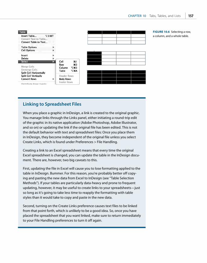
ptg
CHAPTER 10 Tabs, Tables, and Lists 157
Linking to Spreadsheet Files
When you place a graphic in InDesign, a link is created to the original graphic. You manage links through the Links panel, either initiating a round-trip edit of the graphic in its native application (Adobe Photoshop, Adobe Illustrator, and so on) or updating the link if the original file has been edited. This is not the default behavior with text and spreadsheet files: Once you place them in InDesign, they become independent of the original file unless you select Create Links, which is found under Preferences > File Handling.
Creating a link to an Excel spreadsheet means that every time the original Excel spreadsheet is changed, you can update the table in the InDesign docu-ment. There are, however, two big caveats to this.
First, updating the file in Excel will cause you to lose formatting applied to the table in InDesign. Bummer. For this reason, you’re probably better off copy-ing and pasting the new data from Excel to InDesign (see “Table Selection Methods”). If your tables are particularly data-heavy and prone to frequent updating, however, it may be useful to create links to your spreadsheets — just so long as it’s going to take less time to reapply the formatting with table styles than it would take to copy and paste in the new data.
Second, turning on the Create Links preference causes text files to be linked from that point forth, which is unlikely to be a good idea. So, once you have placed the spreadsheet that you want linked, make sure to return immediately to your File Handling preferences to turn it off again.
FIGURE 10.6 Selecting a row, a column, and a whole table.

ptg
INDESIGN TYPE Professional Typography with Adobe InDesign, Second Edition158
Adding Borders, Strokes, and Fills to a TableWhen you insert a table based upon the Basic table style, by default it will have a border and a row, and column strokes will be turned on. Your fi rst job is to turn off these options and add back only those that you need. Here’s how:
1. Select the table by clicking in its upper-left corner. Th is will change the top control panel into Table mode — a one-stop styling center.
2. Select the Preview check box to the right of Strokes in the Control Panel. Selected lines appear in blue; deselected lines in gray. Click the gray horizontal and vertical lines within the preview to add rules not already selected. Enter 0 in the Stroke value box to the left. To deselect all lines, triple-click the proxy preview.
3. Return your cursor to the table, and open the Table Setup dialog box (Cmd+Option+Shift+B/Ctrl+Alt+Shift+B). Set up your own stroke and fi ll properties for the whole table. You can always go back and change individual rows or columns through the Control Panel using the proxy preview or through Table > Table Options or Cell Options.
Row strokes or fi lls can enhance the readability of complicated tables with wide measures by helping the eye to track along the table rows. Depending on the nature of the data, you may want to experiment with Alternating Patterns. You can apply your fi lls or strokes to every other row, every second row, every third row, or, using the First and Next menus, come up with a Custom Row pattern. Th e same is true with columns.
Row or column shading should reinforce the primary reading direction. According to the data in the table, is the reader more likely to read down the column or across the row?
Home Away
Team P W D L F A W D L F A GD PTS
1 Man Utd 31 14 1 1 37 5 9 3 3 27 10 49 73
2 Chelsea 31 10 5 0 31 10 10 3 3 24 13 32 68
3 Arsenal 31 12 4 0 33 10 7 6 2 26 14 35 67
4 Liverpool 31 9 6 1 38 12 7 5 3 17 12 31 59
FIGURE 10.8 Applying alternating fill colors to a table makes it easier to compare statistics.
FIGURE 10.7 Use the proxy preview in the Control Panel to determine which sides of the cell border are being affected. Selected rules appear in blue; deselected lines in gray.

ptg
CHAPTER 10 Tabs, Tables, and Lists 159
Inserting and Deleting Rows and ColumnsYou can insert rows and columns using the menu options, or on the fl y by holding down Option (Alt) as you drag a row or column border. You can also create a new row by pressing Tab when the insertion point is in the last cell of the table. Make sure frame edges are shown (select View > Extras) so you can see the individual table cells.
To delete all or specifi c parts of your table, choose Table > Delete > Row, Column, or Table.
To delete cell contents without deleting the cells themselves, choose the Type cursor, drag over the cells containing the text you want to delete, and press Delete or Backspace.
Resizing Rows and ColumnsTo resize individual rows and columns, drag the row or column border to change the row height or column width. To keep the table at the same size, hold Shift while you drag. Th is method aff ects only two rows (or two columns) at once — as one fi eld grows larger, the adjacent fi eld grows smaller. To resize all the rows and columns proportionally, hold down Shift while dragging the bottom table edge or the right table edge respectively.
To resize the whole table, position the pointer over the lower-right corner of the table so that the pointer becomes a diagonal arrow, and then drag to increase or decrease the table size. To maintain the table’s height and width proportions, hold down Shift. Note, however, that this doesn’t work if the table spans more than one frame.
If you want the selected rows or columns to have a uniform height or width, choose Table > Distribute Rows Evenly or Distribute Columns Evenly.
In certain cases, a design may require a single cell be split into two distinct cells. For example, if you want to make one cell wider without making all the cells in that column wider, you fi rst need to split the cell horizontally. Place your cursor in the cell to be split, and choose Table > Split Cell Horizontally.
One resizing caveat: InDesign doesn’t show rows that fall outside the text frame (although it does show columns that do). Turn on Show Frame Edges (Alt+Cmd+H/Ctrl+H) when resizing tables. Th en resize the text frame once you have resized the table to ensure that the whole table is visible.
TIP: When adding columns, if you hold down the Option/Alt key and drag the column divider more than one and one-half times the width of the column being dragged, new columns with the same width as the origi-nal column are added.
TIP: Choosing Exactly from the Control Panel or Table panel sets a fixed row height. Fixed row heights don’t grow when you add text, and a small red dot will appear in the lower-right corner of the cell if it is over-set. With an overset cell you have two options: Make the content smaller or the table cell bigger.
FIGURE 10.9 Inserting and deleting rows.

ptg
INDESIGN TYPE Professional Typography with Adobe InDesign, Second Edition160
Specifying Row HeightRow heights can grow with the content of the cell or be an absolute value. Th e default height of a row is determined by the leading of your text. Th e At Least option found under Table > Cell Options > Rows And Columns speci-fi es a minimum row height that will grow as you add text or increase the point size of the text within the cells. “Exactly” sets the row height to a fi xed value even if the row is empty. If your text or graphic exceeds this height, a red dot in the lower-right corner indicates that the content is overset. To avoid having to hunt for the overset, set the individual cell insets to 0 and choose the Clip Contents To Cell option before placing the graphic.
Breaking Tables Across FramesIf the table is taller than the text frame in which it resides, to continue the table you can thread the frame with another frame in the same way you would thread a regular text frame.
Specifying Keep Options (Cell Options > Rows And Columns) determines where a row should start. Th e default is “Anywhere” (that is, after the previous row), but this can be changed to In Next Text Column, In Next Frame, On Next Page, On Next Odd Page, or On Next Even Page. You can also request that a selected range of rows be kept together in the same text frame by selecting Keep With Next.
If you want a header or footer row to repeat information in the new frame, choose Table > Headers And Footers.
If you didn’t set up a header or footer row initially, you can easily convert an existing row to a header or footer row by selecting the row and choosing Table > Convert Rows > To Header or To Footer.
FIGURE 10.10 Resizing columns (top) and rows (bottom).
FIGURE 10.11 Specifying row height and column width using the Control Panel.
FIGURE 10.12 The Keep Options hold specified rows together and set the location where the keep will start.

ptg
CHAPTER 10 Tabs, Tables, and Lists 161
Working with Table CellsCells are the building blocks of a table, and each cell in your table has the same properties as an individual text frame.
Using Cell Options, you can determine the Cell Inset Spacing and the Vertical Alignment. On a cell-by-cell basis, you can also change Row Strokes, Column Strokes, First Baseline Options, and Diagonal Lines. Table text can be formatted in exactly the same way as text in a text frame, and paragraph and character styles are equally benefi cial (see Chapter 13). Th e only restriction on table formatting is that text can be rotated in increments of 90°, 180°, or 270° only. (If you really must have text rotated at any other angle, format the text in its own frame and then cut and paste the text frame into a cell as an inline frame.)
NOTE: Table cells do not have a gutter setting to specify the distance between them. To calculate the space between col-umns, add the right inset of column one to the left inset of column two.
You PayFull
1 Year Price You Save
£57.65 £41.40 30%
£139.02 £92.68 23%
FIGURE 10.14 Applying diagonal lines to cells.
FIGURE 10.13 The Cell Options dialog box.
Cutting/Copying and Pasting DataShould you wish to cut or copy and paste data from one table to another with the same number of rows and columns, select the fi rst table (Cmd+Option+A/Ctrl+Alt+A) and choose Copy or Cut, then go to the destination table, insert your cursor in the fi rst cell, and press Esc. It’s important here that you select the cell by pressing Esc rather than selecting the data within the cell (which would place a table within a table). When you choose Paste (Cmd+V/Ctrl+V), the incoming data will replace the existing data in the table. Th is saves time if you’re working with tabular information that needs frequent updating. It also works if you are copying and pasting data from an Excel spreadsheet into an InDesign table.

ptg
INDESIGN TYPE Professional Typography with Adobe InDesign, Second Edition162
Merging and Splitting CellsYou can click the icons on the Control Panel to merge ( ) and unmerge ( ) cells, or you can choose these options from the Table menu, where you can also split cells horizontally or vertically.
Merging Cells
Splitting Cells
1 2
Merging Cells
Splitting1 2
Cells
FIGURE 10.15 In addition to merging (and unmerging) cells, you can also split cells horizontally (right) and vertically (left).
Graphics in Table CellsPlacing graphics in tables is useful for creating specification sheets or product comparison tables, or just for jazzing up what might otherwise be a deathly boring chunk of data. Because table cells are essentially text frames, pictures in those table cells are effectively inline or anchored objects and thus move with the table. To get a graphic into a table cell, it may sometimes be easier to start out with an independent graphic. Rather than place the graphic directly into a table cell, which is apt to cause confusion if the graphic is substantially larger than the cell and only a small portion of it is visible, first place the graphic close to the table, but not in it. Size the graphic to the dimensions of the table cell you wish to place it in, then cut the resized graphic and paste it into the target cell, which makes it into an anchored object. If the graphic is bigger than the
FIGURE 10.16 In this example, the graphics have an inset of 0, making them flush with the edges of the table cell.
Album Year Label Producer
Hunky Dory 1971 RCA Ken Scott / David Bowie
Low 1977 RCA David Bowie / Tony Visconti
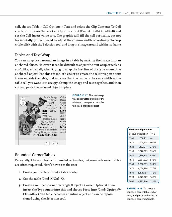
ptg
CHAPTER 10 Tabs, Tables, and Lists 163
cell, choose Table > Cell Options > Text and select the Clip Contents To Cell check box. Choose Table > Cell Options > Text (Cmd+Opt+B/Ctrl+Alt+B) and set the Cell Insets value to 0. The graphic will fill the cell vertically, but not horizontally; you will need to adjust the column width accordingly. To crop, triple-click with the Selection tool and drag the image around within its frame.
Tables and Text WrapYou can wrap text around an image in a table by making the image into an anchored object. However, it can be difficult to adjust the text wrap exactly as you’d like, especially when trying to wrap the first line of the type around the anchored object. For this reason, it’s easier to create the text wrap in a text frame outside the table, making sure that the frame is the same width as the table cell you want it to occupy. Group the image and text together, and then cut and paste the grouped object in place.
Rounded-Corner TablesPersonally, I have a phobia of rounded rectangles, but rounded-corner tables are often requested. Here’s how to make one:
1. Create your table without a table border.
2. Cut the table (Cmd+X/Ctrl+X).
3. Create a rounded-corner rectangle (Object > Corner Options), then insert the Type cursor into this and choose Paste Into (Cmd+Option+V/Ctrl+Alt+V). The table becomes an inline object and can be reposi-tioned using the Selection tool.
FIGURE 10.17 This text wrap was constructed outside of the table and then pasted into the table as a grouped object.
Historical Populations
Census Population % ±
1900 658,111 —
1910 925,708 40.7%
1920 1,182,911 27.8%
1930 1,578,009 33.4%
1940 1,734,308 9.9%
1950 2,681,322 54.6%
1960 3,638,939 35.7%
1970 4,628,199 27.2%
1980 5,179,784 11.9%
1990 6,023,577 16.3%
2000 6,783,760 12.6%
FIGURE 10.18 To create a rounded-corner table, cut or copy and paste a table into a rounded-corner rectangle.

ptg
INDESIGN TYPE Professional Typography with Adobe InDesign, Second Edition164
Joining and Splitting TablesAlthough there is no command for joining tables, you can do this manually. First, make sure the table you’re copying to has enough empty rows and columns to accommodate the data. Th en copy or cut the contents to be carried over. Select the fi rst empty row in the destination table and paste the contents in. Be sure to select the row(s) and not the single cell, as this would cause the new content to be placed as an inline graphic.
Team P W D L F A W D L F A GD PTS
1 Man Utd 31 14 1 1 37 5 9 3 3 27 10 49 73
2 Chelsea 31 10 5 0 31 10 10 3 3 24 13 32 68
3 Arsenal 31 12 4 0 33 10 7 6 2 26 14 35 67
4 Liverpool 31 9 6 1 38 12 7 5 3 17 12 31 59
Team P W D L F A W D L F A GD PTS
1 Man Utd 31 14 1 1 37 5 9 3 3 27 10 49 73
2 Chelsea 31 10 5 0 31 10 10 3 3 24 13 32 68
3 Arsenal 31 12 4 0 33 10 7 6 2 26 14 35 67
4 Liverpool 31 9 6 1 38 12 7 5 3 17 12 31 59
5 Everton 31 9 3 3 28 13 8 3 5 20 13 22 57
6 Portsmouth 31 6 7 2 22 12 8 1 7 22 21 11 50
7 Aston Villa 31 8 3 5 25 19 5 7 3 27 21 12 49
8 Blackburn 31 7 5 4 21 16 6 5 4 21 22 4 49
Table 1 Table 2
5 Everton 31 9 3 3 28
6 Portsmouth 31 6 7 2 22
7 Aston Villa 31 8 3 5 25
8 Blackburn 31 7 5 4 21
FIGURE 10.19 To join tables, copy and paste Table 2 into the empty rows of Table 1.
To split a table, select the rows you want to split off and cut them to the Clipboard (Cmd+X/Ctrl+X). Insert the Type cursor wherever you want the new table to be and paste (Cmd+V/Ctrl+V).
Tables and the Story EditorYou can view any overset table text in the Story Editor. Right-click the overset marker at the frame edge and choose Edit In Story Editor to see the contents of the table. Clicking the triangle to the left of the Table icon in the Story Editor will alternately hide and disclose the contents of a table. Th e Story Editor can also be useful for selecting copy before or after a table, particularly if you want two tables in a row with no paragraph return between them.
FIGURE 10.20 Sometimes it can be easier to edit tables in the Story Editor. You click the triangle to the left of the table symbol to hide or disclose the table’s contents.

ptg
CHAPTER 10 Tabs, Tables, and Lists 165
Unexpected Uses for a TableBeyond their obvious utility, tables can also be helpful in the following situations.
If you want to put a screened background behind a specific paragraph, a table is an elegant solution. Select the text in the paragraph — but not the final hidden carriage-return character — and choose Table > Convert Text To Table to make a one-cell table. You can then stroke and fill the table as you wish and — because it’s a table — it will grow as you add type and move as part of the text flow. You control the paragraph spacing between the table and the paragraphs above and below using Table Options > Table Setup.
FIGURE 10.21 Tables used to create shaded paragraphs, info boxes (a one-column, two-row table), and movie credits where a double baseline is arranged against a single baseline.
Bulleted and Numbered listsBulleted and numbered lists are formatted with automated hanging indents with either a bullet character or a number as the first (hanging) character. A character style can be applied automatically to the bullet or number to change its color, size, or baseline position. This formatting can be included in a para-graph style definition.
To apply either a bulleted or a numbered list to selected text, Option-click (Alt-click) the Bullets And Numbering icon ( ) on the Paragraph Formats level of the Control Panel, and then choose the list type, the bullet or numbering style, and the alignment. As always, select Preview to see how your changes affect the selection. Select a character style to be automatically applied to the bullet or number; if you don’t have one already made, choose New Character Style and make one on the fly. Once you’re satisfied with the bulleted or numbered list, click ok, then capture the formatting in a paragraph style by choosing New Paragraph Style from the Paragraph Styles panel menu. (For more on paragraph and character styles see Chapter 12.)
CASTING BY A.N. OTHER SPECIAL VISUAL EFFECTS
AND ANIMATION BY JOE BLOGGS
Et assintur re experere evelis res natinci minisciis magnimus ut volo es moditi asperit, nossequi sundae ducius ea dellen-des dolum que sequam, ut es audi con rest.
Convert the paragraph into a single cell table and then apply a fill color to that cell. Use Cell Options to control the inset spacing of the text.
Dus maio mi, ne et voloris nones etur aceaqui aturia volore si nullace pudipsum fuga. Cum rem conecta pero offictempos ut aspit dolut aut maionse catur?
TOUR INFO
Duration: 2 Weeks
Cost per person: $5000 (based upon double occupancy)
Departure Dates: March 10, June 15, September 24.

ptg
INDESIGN TYPE Professional Typography with Adobe InDesign, Second Edition166
Bulleted ListsHere are some things to consider when making bulleted lists:
■ Sometimes, especially if your bullet character is a different font, the bullet may not vertically align perfectly. If necessary, adjust the baseline shift for the character style that is applied to the bullet. If the items begin with a cap, center the bullet vertically within the cap height. If the items begin with lowercase characters, center the bullets within the x-height.
■ An em space is usually a sufficient amount of indent.
■ Keep the punctuation to a minimum while adhering to the house style. Unless the bullet point is a full sentence, don’t end it with a period.
■ Add space before the first and after the last item in the list. A full line space is too much, so use a half-line space before and after. Once you have made a bullet paragraph style, make two variants based on it: bullet_first that has a half-line space before, and bullet_last that has a half-line space after. A caveat here is that if you’re working with a baseline grid that is a full leading increment, the grid will override the paragraph spacing, effectively giving a whole line space before or after. For this reason, make sure that the bullet_first and bullet_last paragraphs are not aligned to the grid.
■ Even if your body text is justified, bulleted lists work better left aligned.
FIGURE 10.22 The Bullets And Numbering dialog box, where you specify the numbering or bullet style as well as the list’s alignment and amount of indent.
Solomon Grundy . . .
Born on a Monday Christened on Tuesday
Married on Wednesday
Took ill on Thursday Grew worse on Friday
Died on Saturday Buried on Sunday
That was the end of Solomon Grundy.
FIGURE 10.23 A bulleted list with a half-line space before the first and after the last bullet item.

ptg
CHAPTER 10 Tabs, Tables, and Lists 167
■ Indenting the text after the bullet means you lose the strong fl ush-left alignment of your text. For this reason, some people prefer outdenting the bullet to strengthen the left axis of the text. Th is requires indent-ing the body text by the same amount that you indent the bullet.
When working with long item lists, it can be a much more effi cient and aesthetic use of space to split the list within a single column of text. To do this, select the text and choose the Split widget from the Control panel; alternatively, you can incorporate the instruction to split across a specifi ed number of columns as part of the paragraph style defi nition. Note that split columns cause havoc with your Keep Options, especially if some of the paragraphs run to multiple lines.
Numbered ListsTh e same considerations apply to numbered lists. Applying autonumbering is pretty self-explanatory: Instead of a bulleted list, choose a numbered list and then select the style of numbering, the character style you want applied to the number, and the alignment, and you’re done. Th ere are, however, a couple of aspects of working with numbered lists that can cause frustration: right- or decimal-aligning numbers in lists that have single- and double-digit numbers, and managing the numbering of lists across unthreaded text frames.
Right-aligning numbers: Set the Alignment drop-down menu to Right to align the numbers to the rightmost character or decimal point. Because InDesign doesn’t allow text to hang outside the frame, this won’t work unless you also increase the left indent, decrease the fi rst-line indent, or both, to move the text to the left and create enough space for the numbers to fi t to the left of the text.
If you plan to export the InDesign story to an RTF fi le, you’ll need to convert the automatic numbers (or bullets) to text, otherwise they’ll be stripped out of the converted document. Select the list and choose Type > Bulleted And Numbered Lists > Convert Numbering To Text. You will now be able to select
Lorem ipsum dolor sit amet, consectetur adipiscing elit.
maecenas lacus libero, sagittis ac sollicitudin id, tempor nec arcu
aliquam convallis feugiat quam vel sodales
vestibulum hendrerit pulvinar leo id sollicitudin
Integer adipiscing, risus vitae vehicula dapibus.
FIGURE 10.24 Outdenting the bullet character maintains the flush-left alignment of the text.
Professional cameras and video/audio equipment are strictly prohibited. Live video/audio recordings made without the permission of the artiste/promoter are prohibited.
Not allowed through the campsite gates
Glass
FIGURE 10.25 Splitting bulleted list items into three columns using Split columns.

ptg
INDESIGN TYPE Professional Typography with Adobe InDesign, Second Edition168
the numbers or bullets, and they will survive intact when you export the story; the numbers will no longer be “live,” however.
Numbering across frames: You can have numbered lists continue across unthreaded frames from frame to frame, from page to page, or even across documents if those documents are collected as a Book. Th e most obvious use of this is a fi gure caption.
In order to do this, you’ll need to make a list style. Numbered lists have the [Default] list style applied to them, which doesn’t allow numbering across unthreaded text frames.
Create a new list style and apply that style to the paragraphs you want to sequentially number. In the Bullets And Numbering dialog box, choose New from the List drop-down menu, name the style, and select Continue Numbers Across Stories.
Apply this list style to paragraphs you want to autonumber across frames. Even better, incorporate the list style into a paragraph style. Set it up correctly once, use it an infi nite number of times thereafter. See Chapter 12 for more on using paragraph styles.
FIGURE 10.27 Choosing a list style to ensure numbering across unthreaded stories.
FIGURE 10.28 The different types of tab character.
6 Karma Police7 Fitter Happier8 Electioneering9 Climbing Up The Wa
10 No Surprises11 Lucky
FIGURE 10.26 Right-aligning the numbers in a list that combines one- and two-digit numbers.
TabsTabs are used for positioning text at specifi ed positions on a line. Tabs are automatically incorporated into bulleted or numbered lists, but they can also be added manually to create reply forms, to align numbers on a decimal point, or to separate columns of information into a table-like layout. Tabs come in four fl avors: left, center, right, and decimal.

ptg
CHAPTER 10 Tabs, Tables, and Lists 169
Setting Tabs 1. Insert your Type cursor where you want to add horizontal space, and
press the Tab key.
2. Choose Type > Tabs or press Cmd+Shift+T (Ctrl+Shift+T). With your Type cursor in the text frame, click the magnet symbol at the lower right of the Tab Ruler to snap the Tab Ruler above the text frame.
3. On the Tab Ruler, choose the type of tab you want and click a location on the ruler to position the tab.
Creating Decimal TabsA decimal tab aligns characters on a decimal or another character you specify. Place the tabs in your text. Select a decimal tab on the Tab Ruler, then, in the Align On box, type the character you want to align on — typically a decimal point, but you can use anything, such as a dollar sign or pound sign when working with price lists.
Using Tab LeadersTab leaders are used on menus, price lists, and tables of contents. Their purpose is to guide the eye from one piece of text to the next. There are other solutions, arguably preferable, but so long as the distance between the text and the number isn’t too wide, leaders can be effective.
For open leaders, add a space after the period in the Leader Character field. For more control over the appearance of the leader characters, apply a character style to the leader dots.
Leader characters don’t necessarily need to be dots. Using the underscore as the leader character is a way to create a simple line that’s useful in reply forms.
FIGURE 10.29 Typically, decimal tabs align on a decimal point, but they can align on any character.
FIGURE 10.30 Four instances of using a tab leader: On the left, the underscore character is used; on the right, a full stop (period). In the lower example of the address form, a character style with an underline is used instead of a leader character, allowing more control over the weight of the rule. In the lower example of the menu, the leader character is a full stop followed by a space.
Wild Mushroom Roulade Marinated seitan, wild mushroom ragout, truffl ed mashed potatoes and celery root wrapped in yuba and baked in a crisp phyllo dough. Served with grilled pears and a porter porcini mushroom sauce . . . . . . . . . . . . . . . . . . . . $16.50
Portobello Potato Salad Breaded portobello mushrooms, pan sautèed and served over a warm gold and purple potato salad with cucumbers, tomatoes, Mandarin oranges, French lentils, mint, and winter greens . . . . . . . . . . . . . . . . . . $13.95
Name
Address
City State Zip

ptg
INDESIGN TYPE Professional Typography with Adobe InDesign, Second Edition170
Tabs in TablesWhen you’re working in a table, pressing Tab moves your cursor to the next cell. If you want to insert a tab in a cell, choose Type > Insert Special Character > Other > Tab. (On the Mac, you can also press Option+Tab.) That’s a long way to go every time you want a tab in a table; if this is something you find your-self doing a lot, then it’s worth making your own keyboard shortcut (Edit > Keyboard Shortcuts), or, once you’ve inserted one tab, copy and paste it for the subsequent instances.
Right-Indent TabA right-aligned tab (Shift-Tab) allows you to align all subsequent text to the right edge of the text frame. You can also use a Right-Indent Tab with a tab leader: Set a tab stop anywhere in the paragraph and apply a leader character to it. Place your cursor at the end of the paragraph and press Shift-Tab, and the leader character will appear.
NOTE: You can set repeat-ing tabs based on the distance between the tab and the left indent or the previous tab stop by choos-ing Repeat Tab in the Tabs panel menu. You can also delete any existing tabs by choosing Clear All.
FIGURE 10.31 The Right-Indent Tab (Shift-Tab) flushes the text to the right edge of the frame. Part of the reason for the ugliness of
adults, in a child’s eyes, is that the child is usually looking upwards, and few faces are at their best when seen from below. — George Orwell
31 | Magazine Title October 2010

ptgKCHAPTER 11
Drop Caps
THE USE OF DECORATIVE FIRST LETTERS as a design element has evolved from a
long tradition of illustrated first letters stretching back to before the invention
of the printing press. Before printing, books were dictated to scribes, and each
book was regarded as a unique treasure. The scribes incorporated individual
flourishes to distinguish their work from others. It was with the decorative
first letter that a scribe could really cut loose and show his stuff. Each major
section usually began with an illuminated letter made with metallic, mineral, or
vegetable pigments that were bound by glue or gum to the paper or parchment.

ptg
INDESIGN TYPE Professional Typography with Adobe InDesign, Second Edition172
The purpose of the initial letter, or versal, was to call attention to the beginning of the book. By the 14th century, versals had evolved from enlarged heavy letters into elaborate illustrated works of art, most often used to decorate religious texts. An illuminated versal might flow down the whole side of a page, or extend up and around the top of the page. Sometimes a versal included illustrations and took over the entire page. In 1455, when Gutenberg printed his 42-line Bible — the first book to be printed in the western world with movable type — he acknowledged the importance of this tradition by leaving space in the printed text for a scribe to add a decorative first letter. As printing evolved, so did the forms of initial caps used by designers. The current variations include hung caps, several forms of dropped caps, and raised or stick-up caps. InDesign uses the term drop cap for all initial cap styling.
FIGURE 11.1 Two pages from the Gutenberg Bible (1455), the left showing an illuminated first character painted by a scribe, the right showing smaller initial characters in red to indicate new sections.
FIGURE 11.2 Some drop caps in contemporary magazines.

ptg
CHAPTER 11 Drop Caps 173
FIGURE 11.3 Drop and initial cap examples: (A) This three-line drop cap is followed by small caps applied to the first four words. (B) The size of the drop cap is increased to create a drop cap/stick-up cap hybrid. (C) This is a simple stick-up cap. (D) Here, a stick-up cap is combined with a large first-line indent. (E) The drop cap is cut and pasted into a separate text frame that is anchored to the main text frame, floating in the outside margin, and “molded” around the shape of the text frame. (F) The drop cap is cut and pasted into its own text frame, which is anchored in the main text frame. A text wrap is applied to the drop cap text frame.
There was no possibility of taking a walk that day. We had been wandering, indeed, in the leafless shrubbery an hour in the morning; but since dinner (Mrs. Reed, when there was no
company, dined early) the cold winter wind had brought with it clouds so sombre, and a rain so penetrating, that further out-door exercise
There was no possibility of taking a walk that day. We had been wandering, indeed, in the leafless shrubbery an hour in the morning; but since dinner (Mrs. Reed, when there was no company,
dined early) the cold winter wind had brought with it clouds so sombre, and a rain so penetrating, that further out-door exercise was now out
here was no possibility of taking a walk that day. We had been wandering, indeed, in the leafless shrubbery an hour in the morning; but since dinner (Mrs. Reed, when there was no company, dined early) the cold winter wind had brought with it clouds so sombre, and a rain so
T
There was no possibility of taking a walk that day. We had been wandering, indeed, in the leafless shrubbery an hour in the morning; but since dinner (Mrs. Reed, when there was no company, dined early) the cold winter wind had brought with it clouds so sombre, and a rain so
There was no possibility of taking a walk that day. We had been wandering, indeed, in the leafless shrubbery an hour in the morning; but since dinner (Mrs. Reed, when there was no company, dined early) the cold winter wind had brought with it clouds so sombre, and a rain so penetrating, that further out-door exercise
here was no possibility of taking a walk that day. We had been wandering, indeed, in the leafless shrubbery an hour in the morning; but since dinner (Mrs. Reed, when there was no
company, dined early) the cold winter wind had brought with it clouds so sombre, and a rain so penetrating, that further out-door exercise
T
A
B
C
D
E
F

ptg
INDESIGN TYPE Professional Typography with Adobe InDesign, Second Edition174
To create a drop cap, insert your Type cursor into the paragraph and type the number of lines for the drop cap in the Control Panel, then specify the number of drop cap characters you want — usually one, but this isn’t always the case.
For more options, choose Drop Caps And Nested Styles from the Control Panel menu. In this dialog you can align the left edge of the drop cap to the left edge of the text frame, as well as scale drop caps with descenders to avoid collisions between the descending part of the drop letter and the line that follows it.
Certain letters will not look optically aligned because the left sidebearing (the space incorporated into the letter’s design) causes the letter to appear slightly indented. This can be addressed by selecting Align Left Edge in the Drop Caps And Nested Styles dialog.
If you plan to apply the same formatting to more than one paragraph in your document, it saves time (and ensures consistency) to incorporate the drop cap attributes into the style definition. The Drop Cap paragraph style is commonly based on your body text style with any first-line indent removed.
Choose New Paragraph Style from the Paragraph Styles panel. To edit an exist-ing style, Ctrl/right-click on the style and choose Edit.
Name the new style; “first par” and “body first” are common naming conven-tions. If you have a “body” style, you may want to base your “body first” style on this. Choose “body” from the Based On: drop-down menu.
Creating a Simple Drop CapContemporary magazine and book publishing continues this centuries-old tradition by beginning chapters and articles with large initial letters. The treat-ment can be incorporated into a paragraph style or applied locally through the Control Panel.
The Nellie, a cruising yawl, swung to her anchor without a flutter of the sails, and was at rest. The flood had made, the wind was nearly calm, and being bound down the river, the only thing for it
was to come to and wait for the turn of the tide.
FIGURE 11.4 Using the Control Panel to apply a simple drop cap. Note that Optical Margin Alignment is turned on in the Story panel, allowing the crossbar of the T to stick out into the left margin.

ptg
CHAPTER 11 Drop Caps 175
Align Left Edge
t was the best of times, it was the times, it was the age of wisdom, it wof foolishness, it was the epoch of b
the epoch of incredulity, it was the seasit was the season of Darkness, it was th
t was the best of times, it was the wit was the age of wisdom, it was the aishness, it was the epoch of belief, it w
of incredulity, it was the season of Lighseason of Darkness, it was the spring o
J ellorrum quia secea qui con cones a conemolor amusdae con renimus soventiberum consequi di nimi, te vol
a qui dolut essi dion repellantio ipiendelmostios andaesenimos et voluptatia ditin
J ellorrum quia secea qui con cones a conemolor amusdae con renimus soventiberum consequi di nimi, te vol
a qui dolut essi dion repellantio ipiendelmostios andaesenimos et voluptatia ditinScale for Descenders
FIGURE 11.5 Making optical adjustments according to the character shape and style of the drop cap.
FIGURE 11.6 Incorporating a drop cap into a paragraph style definition.
Apply a nested style to lines after the drop cap.
Apply a character style to the drop cap.
Make optical adjustments based on the shape and style of drop cap.
Apply a nested style to words after the drop cap.
Choose Drop Caps And Nested Styles from the list in the left column. Specify the number of lines to sink the fi rst character and the number of characters that you want to include.
You can use the Character Style drop-down menu to apply an existing charac-ter style to the drop cap, or you can choose New Character Style to make and apply a character style.

ptg
INDESIGN TYPE Professional Typography with Adobe InDesign, Second Edition176
Drop Cap AestheticsThere are no hard-and-fast rules concerning how big a drop cap should be, but common sense should prevail. Size matters, although in this context bigger isn’t always better. The purpose of the drop cap is to signal to the reader where to begin. To do so, the drop cap doesn’t need to scream at the reader and shouldn’t overwhelm any headline that precedes it. The drop cap comes below the head-line in terms of page hierarchy; usually, though not always, it will be smaller than the headline. Also, don’t repeat the letter that you use as the drop cap at the beginning of the text.
In addition to the initial drop cap for the first paragraph of a chapter or article, it’s common practice to use smaller drop caps as section markers (set up as a style based on the parent drop cap style). This is visually effective to break up the monotony of columns of type, and it’s necessary if the text doesn’t have illustrations, subheads, or other graphic elements. That said, if you sprinkle drop caps too liberally throughout a document, they cease to be elegant and functional graphic devices and start to become repetitive and annoying. Don’t use more than two drop caps per page. Paragraphs that get drop-cap treatment should not be close to each other on a page, and preferably the drop caps should be different letters.
W hether I shall turn out to be the hero of my own life, or whether that station will be held by anybody else, these pages must show. To begin my life with the beginning of my life,
I record that I was born (as I have been informed and believe) W hether I shall turn out to b
whether that station will be hmust show. To begin my life
I record that I was born (as I have been
FIGURE 11.7 Kerning a drop cap. The example on the left shows the result of applying a three-line drop cap in Adobe Garamond Pro. The serif of the W collides with the “h.” Insert the type cursor between the two letters and press Option+Right Arrow (Alt+Right Arrow) to kern the space between the W and the “h” (right).
Kerning Drop CapsA problem with automatically generated drop caps is that the big first character often collides with the body text that follows. You may need to kern to avoid such problems. Note that when you kern between the drop cap and the first character of the text, kerning is applied to all the lines adjacent to the drop cap.
With a decorative letter, selecting Align Left may not be sufficient to optically align the drop cap. In addition, you’ll want to kern the drop cap to the left margin. To do this you’ll first need to add a space before the drop cap. Note that adding a space will mean you have to drop two characters instead of one — if you see yourself likely to do this more than once, make a paragraph style with this specification. You can then insert your cursor between the space and the

ptg
CHAPTER 11 Drop Caps 177
drop cap and kern by pressing Option+Left Arrow (Alt+Left Arrow) until the character is optically aligned with the left margin edge. Instead of using a regu-lar space, however, you can add a thin space by pressing Cmd+Shift+Option+M (Ctrl+Shift+Alt+M) — if you do that, you won’t have to kern as much.
Creating a Picture Drop CapConverting a drop cap to outlines — by selecting Type > Create Outlines or pressing Cmd+Shift+O (Ctrl+Shift+O) — allows you to place an image into the letter shape. It’s a compelling idea, but unless the drop cap is very large and in an extra-bold typeface, there’s unlikely to be enough space within the letter shape for the image to be visible. There’s also the danger of visually disassociat-ing the drop cap so that the reader scans the first line without the first letter.
Creating a Contoured Drop CapPutting your drop cap character in its own text frame allows you to contour the text to the shape of the drop cap. Apply a text wrap to the drop cap text frame, then use the Direct Selection tool to sculpt the text wrap outline to conform to the shape of the letter. Make sure that the space around the drop cap is optically the same on the right side as it is beneath the drop cap.
F or a minute or two she stood looking at the house, and wondering what to do next, when suddenly a footman in livery came running out of the wood—(she considered
him to be a footman because he was in livery: otherwise, judging by his face only, she would have called him a fi sh)—and rapped
F or a minute or two she stood looking at the house, and wondering what to do next, when suddenly a footman in livery came running out of the wood—(she considered him to be a footman because he
was in livery: otherwise, judging by his face only, she would have called him a fi sh)—and rapped loudly at the door with his
FIGURE 11.8 When working with highly decorative drop caps, the Align Left Edge and Scale For Descenders options may not be sufficient for the optical spacing of the opening letter, as you can see in the top example. In the bottom example, a thin space (Cmd+Shift+Option+M/Ctrl+Shift+Alt+M) was added before the dropped letter, and this space was then kerned back, which moved the F into the left margin.

ptg
INDESIGN TYPE Professional Typography with Adobe InDesign, Second Edition178
Adding Small CapsAn often-used device to create a visual bridge between drop cap and body text is to put the words following the drop cap in small caps. Th is creates a transition from the large decorative character into the upper- and lowercase text so that the drop cap does not look like an isolated graphic. Just how many characters are put into small caps is a matter for discretion — it may be just the fi rst word, the fi rst phrase, a specifi ed number of words, or the fi rst line. Whatever you choose, be consistent throughout the publication.
It’s possible to use a nested style to specify character-level formatting for one or more ranges of text within a paragraph. For a drop cap character with a dif-ferent color or font (or both) than the rest of the paragraph, defi ne a character style with these attributes, then nest that character style within the paragraph style. Th ereafter, you can apply all the formatting with a single click.
righton is considered to be one of the UK’s premier night-life hotspots and is also associ-ated with many popular music artists. There are also live music venues including the Concorde 2,
Brighton Centre and the Brighton Dome, where ABBA received a substantial boost to their career when they won
FIGURE 11.9 Using the first letter as a picture frame: an almost irresistible idea that seldom works well. The “window” onto the picture is rarely big enough for the picture to be clearly visible.
hether I shall turn out to be the hero of my own life, or whether that station
will be held by anybody else, these pages must show. To begin my life with
the beginning of my life, I record that I was born (as I have been informed and believe)
WFIGURE 11.10 A contoured drop cap. The W is in its own text frame, and a text wrap is applied and then adjusted to correspond to the letter shape.
It was the best of times, it was the worst of times, it was the age of wisdom, it was the age of foolishness, it was the epoch of belief, it was the epoch of incredulity, it was the season of Light, it was the season of Darkness, it was the spring of hope, it was the winter of
despair, we had everything before us, we had nothing before us, we were all going direct to Heaven, we were all going direct the other way—in
FIGURE 11.11 Small caps applied to five words to ease the transition from the big first character to the upper- and lowercase body text. To apply the small caps to a whole line, create a nested line style.

ptg
CHAPTER 11 Drop Caps 179
Creating Nested Small Caps 1. Create a small caps character style. If you are using an OpenType font,
choose OpenType All Small Caps from the Case drop-down menu to keep the case of your small cap range consistent without having to rekey any initial caps as lowercase letters.
2. To “nest” the small caps character style in the paragraph style, Ctrl-click or right-click the paragraph style in the Paragraph Styles panel and choose Edit to open the Paragraph Style Options panel, then choose Drop Caps And Nested Styles from the lefthand column.
3. Click New Nested Style and specify the number of words to apply the nested style to. If you haven’t already styled the type, you can create a new character style by clicking [None] in the window and selecting New Character Style from the drop-down menu. Note that the drop-down menu option appears only after you have selected the various options in the window.
To automate the application of small caps to the entire line, create a new line style.
FIGURE 11.12 Combining nested styles with Drop Caps to transform raw text. With a single click, in addition to the paragraph and character attributes, a Character Style is applied to the drop cap and a Line Style applied the first line of the paragraph.
Call me Ishmael. Some years ago — never mind how long precisely — having little or no money in my purse, and nothing particular to interest me on shore, I thought
I would sail about a little and see the watery part of the world. It is a way I have of driving off the spleen and regulating the
FIGURE 11.13 If available, choose OpenType All Small Caps when creating a small caps character style.

ptg
INDESIGN TYPE Professional Typography with Adobe InDesign, Second Edition180
Other Uses of Drop CapsDrop caps can have uses beyond the obvious. Here are a few examples of other ways in which drop caps can be applied.
Difficult Drop CapsDrop caps are just one way of kicking off a paragraph; they’re not always the best solution. If you have the occasional opening paragraph that needs custom-izing, no big deal — so long as it’s an exception. If you find yourself fussing over every chapter or article opening, then use another type of opening device — an initial cap, perhaps — or simply remove the first line indent and add a paragraph space before the section or chapter opening text.
Before you decide on a particular opening device, familiarize yourself with the material. Here are some instances when drop and initial caps don’t work well:
FIGURE 11.14 Drop caps used for question and answer section (A), step-by-step instructional text (B) and for page numbers (C) in a table of contents.
Q What’s the diff erence between
Optical and Metrics kerning?
Metrics kerning uses a font’s built-in kerning information. Its eff ectiveness depends on how many kerning pairs are in the font. Optical kerning ignores the built-in kerning pairs and adjusts the space between the characters based upon the character shapes.
Q How do I prevent certain text frames
from being aff ected by a text wrap?
Select the text frame then Choose Object > Text Frame Options (Cmd+B/Ctrl+B), then check Ignore Text Wrap.
1 Insert your Type tool into the paragraph you want to aff ect.
2 In the Control Palette Paragraph Formats type a number for
Drop Cap Number of Lines.
3 Type the number of drop cap characters you want (usually 1)
in the Drop Cap One or More Characters fi eld.
27 Hilary, Cate and friends dazzle at the Oscars and BAFTAs
37 Style fi le: Get in line for the designer’s pattern of choice
45 We’ve shopped around to fi nd you all the biggest trends
60 How to outshine everyone in the season’s best occasionwea
A
C
B

ptg
CHAPTER 11 Drop Caps 181
■ When the first character of the paragraph is a number.
■ When an opening paragraph begins with a quotation mark. You will need to drop both the opening quotation mark and the initial cap. The opening quote mark will probably look disproportionately large. You’ll want to reduce its size, adjust its vertical position by applying a baseline shift, and kern the space between it and the drop cap that follows it. Exact amounts will vary according to the nature of the font, so there’s subjectivity involved here. You should also hang the opening quote mark.
■ When opening paragraphs can’t accommodate the drop cap’s depth. Trying to sink a cap three lines into a one-line paragraph can create some visual confusion, although InDesign does an excellent job of coping with that by allowing the next paragraph to come up. However, if you find that you are repeatedly using a three-line drop cap on para-graphs that are only two lines deep, then you might consider using a raised cap instead.
‘Curiouser and curiouser!’ cried Alice (she was so much surprised, that for the moment she quite forgot how to speak good English); ‘now I’m opening out like the largest telescope that ever was! Good-bye, feet!’ (for when she looked down at her feet, they seemed to be almost out
of sight, they were getting so far off ). ‘Oh, my poor little feet, I wonder who will put on your
‘Curiouser and curiouser!’ cried Alice (she was so much surprised, that for the moment she quite forgot how to speak good English); ‘now I’m opening out like the largest telescope that ever was! Good-bye, feet!’ (for when she looked down
at her feet, they seemed to be almost out of sight, they were getting so far off ). ‘Oh, my poor little feet, I wonder who will put on your
FIGURE 11.15 Because this paragraph begins with a quotation, the quote mark is dropped instead of the initial cap (top). To drop the initial cap as well, as shown in the bottom example, select 2 for the number of dropped characters. Reduce the size of the punctuation and adjust its vertical position by applying a baseline shift. Finally, kern the space between the punctuation and the C.

ptg
INDESIGN TYPE Professional Typography with Adobe InDesign, Second Edition182
■ When your articles or chapters begin with poetry, song lyrics, or other quoted material. To apply the drop cap here would add an extra (and unnecessary) level of decoration, possibly confusing the reader. You could use the drop cap after such a passage, but it is no longer signaling the beginning of the chapter, article, or section, and so is extraneous and can tend to look fussy as a result.
Winston was dreaming of his mother.He must, he thought, have been ten or eleven years
old when his mother had disappeared. She was a tall, statuesque, rather silent woman with slow movements
and magnifi cent fair hair. His father he remembered more vaguely as
FIGURE 11.16 InDesign copes elegantly with short opening paragraphs, bringing the second paragraph up next to the drop cap and maintaining its first-line indent. If you find yourself making many such “exceptions,” you probably need an opening device other than a drop cap.

ptgLCHAPTER 12
Global Formatting with Styles
STYLES HAVE BEEN AROUND since the dawn of desktop publishing, continually
evolving in their ease of use and range of capabilities. A bedrock feature of any
page layout program, styles enable better design and more efficient workflow.
No matter how good your conceptual grasp of typography, it won’t amount
to much unless you can apply type formatting consistently and efficiently
using styles.

ptg
INDESIGN TYPE Professional Typography with Adobe InDesign, Second Edition184
Defining Our TermsParagraph and character styles are collections of attributes that can be applied to text with a single click. Paragraph styles can incorporate both character and paragraph formats — font, font size, alignment, paragraph spacing, color, you name it. Character styles can incorporate character formats only. As the name suggests, paragraph styles are applied to whole paragraphs; character styles are applied to a selected range of text within a paragraph.
Object styles are applied to frames — text frames or picture frames — and can include such attributes as fill color, stroke color and weight, text frame options, picture fitting options, and many more.
Table and cell styles are applied to tables. Table styles cover the attributes of the overall table, such as whether it has a border or uses row or column strokes. Cell styles refer to the attributes of the individual cells — like text insets — that make up a table.
Where things get more complicated, more interesting, and exponentially more powerful is when you nest character styles within paragraph styles, which in turn can be incorporated into object styles. Add into the mix grep styles (which automatically apply character styles to predefined ranges of text within paragraph styles) and sequential styles (which let you apply styles to a cascade of paragraphs), and the possibilities are mind boggling.
Collectively, I will refer to the paragraph, character, and object styles in a docu-ment as a style sheet.
Why Use Styles?The difference between using styles and not using styles is the difference between you controlling InDesign and InDesign controlling you. Here are some reasons to use styles:
■ Styles ensure consistency in formatting throughout your document, making for a better-designed piece.
■ Styles enable you to instantly change the formatting of your entire document, no matter how large or complex, by changing your style definitions.
■ And the best reason of all: Styles save you hours and hours of drudgery.

ptg
CHAPTER 12 Global Formatting with Styles 185
Despite these irrefutable facts, many designers either underutilize styles or avoid them altogether. I’m frequently amazed by the number of designers — many of whom should know better — who don’t use styles or who use them in a half-assed way. What’s up with you people? Do you like the grind of repetitive work? Are you masochists? Or perhaps you’re paid by the hour.
I’ve had designers tell me “I don’t like to use styles because I like to experiment with different designs” or “I don’t want my pages to all look the same.” These are exactly the reasons you should use styles. Far from stifling creativity, styles enhance it by making experimentation quick and easy. And just because your style names may be the same or similar from one document to the next, that doesn’t mean the style definitions can’t be completely different.
[Basic Paragraph]The best advice I can give about [Basic Paragraph] is to ignore it — if you have different definitions for [Basic Paragraph] in your documents, when you copy text from one document to another you can get some nasty surprises. By default the [Basic Paragraph] style is applied to text you type. You can’t rename or delete this style, but you can edit it and choose [Edit Basic Paragraph] to bring up the Paragraph Style Options panel where you can change the properties of the style. Alternatively, you can designate a different style to be the default: Simply choose that style when you have no text or text frame selected.
Creating StylesTime spent creating style sheets is an investment that will repay you many times over throughout the lifespan of a publication. You can set up your styles at the beginning of the design process or add and edit your styles as your document evolves. If you’re like me, a style sheet is never finished but is always refined and improved.
Creating the Style “Blind”Using the Paragraph Style Options panel, you can create as many styles as you need without having a single character on your page. With experience, you can visualize what a style will look like without needing to see it realized on your page, which makes setting up a style sheet much faster.

ptg
INDESIGN TYPE Professional Typography with Adobe InDesign, Second Edition186
Basing Styles on Other StylesHierarchy is a big concept in typography. Hierarchy gives a document struc-ture and aids effective communication. The Based On option is important for establishing hierarchy in your styles. Typically, though not exclusively, hier-archy is established through size. Take a simple example: Your headings and subheadings will probably use the same font: Head1 will be bigger than Head2, which in turn will be bigger than Head3. By basing one style on another, you create more than just a visual link between the styles; when you edit the base or “parent” style, the attributes that it shares with its “offspring” styles also change. This lets you effect changes across a range of styles with just a single edit to the parent style. For example, if you want to switch the font of your heads from Helvetica to Univers, change Head1 (the parent style) and all the styles that are based on it will change too (except for attributes like the font size, which are unique to the individual styles).
Using the Based On option to create related styles and establish hierarchy 1. Adjust the Character and Paragraph settings on the Control Panel to
format the paragraph the way you want it to look.
2. With your cursor in the newly styled paragraph, open the Paragraph Styles panel and choose New Paragraph Style from the menu. The Style Settings window will reflect your choices.
FIGURE 12.1 The New Paragraph Style menu incorporates all the character and paragraph formats available on the Control Panel.

ptg
CHAPTER 12 Global Formatting with Styles 187
3. Name the style and (optionally) specify a shortcut keystroke. If you want to add additional formatting, click the attributes list on the left and specify the options you want to add to your style. With Preview selected, you can see your formatting changes added to the selected paragraph. To apply your new style to the text you are basing the style on, select Apply Style To Selection.
4. Click ok.
Applying StylesWhen you select text or click an insertion point, the style that was applied to that text is highlighted in the Paragraph Styles panel, the Character Styles panel, or both. If you select a range of text covering multiple styles, no style is highlighted (the word Mixed appears at the top of the appropriate panel).
To apply a paragraph style, place your Type Tool cursor anywhere inside the paragraph — there’s no need to select the whole paragraph — then click the style name in the Paragraph Styles panel. To apply a paragraph style to more than one contiguous paragraph, drag your cursor through those paragraphs. Again, you don’t need to select the whole paragraph; you just need to make contact with at least part of each of the paragraphs.
Applying a paragraph style doesn’t remove any existing character formatting or character styles applied to that paragraph — unless you clear any overrides (see the next section). When you apply a style, if the text has additional formatting
FIGURE 12.2 Basing styles on a parent style (in this case, Head3 on Head2, Head2 on Head1) means you can edit the parent style to set off a domino effect that causes all the styles based upon it to change.
HEADING 1Ibh eugait niam, conulla faccumsan verietum del erosto odiat alit am iriliquissi edo dolobore consequ amcore consed tionum aut la augiat.
HEADING 2Equisit nisim zzril eugait, consent ad tin henibh ex et, consectem dolor sit wis alidolortionsed magnit, quam ad enim aliq
HEADING 3Secte vel iurer sim volorem eum er in ele

ptg
INDESIGN TYPE Professional Typography with Adobe InDesign, Second Edition188
that is not part of the style definition, a plus sign (+) appears next to the cur-rent paragraph style in the Paragraph Styles panel.
Assign a keyboard shortcut to your styles and you’ll be able to apply them even faster. To add a shortcut, open the Paragraph Styles panel, turn on Num Lock, and then hold down a combination of Shift, Option/Alt, and Cmd/Ctrl and add a keypad number. Two caveats: letters and non-keypad numbers will not work; your keyboard must have a Num Lock key and a numeric keyboard. Unfortunately, you can’t use function keys as shortcuts for style names.
For text-heavy documents it may be quicker to apply styles in the Story Editor (with or without shortcuts) simply because you can scroll through long passages of text faster than in Layout view.
FIGURE 12.3 It can sometimes be quicker to apply styles in the Story Editor, without the distraction of graphics and column breaks.
Clearing OverridesWhen you add formatting to text that already has a paragraph or character style applied, you are overriding the style definition. To put it another way: You’ve defined a paragraph style, applied it to a piece of text, and then contradicted your style definition by adding additional formatting. You can tell which text has overrides applied because when it’s selected a plus sign (+) appears next to the style name. Hover the cursor over the style name in the Paragraph Styles panel and a tool tip pops up with details of the local formatting.
Maybe this local formatting is what you want, maybe not. Maybe you’ve inher-ited the document from someone else — someone who hasn’t used styles as effectively as you would have liked — and you want to clear the overrides.

ptg
CHAPTER 12 Global Formatting with Styles 189
There are several ways to approach this:
■ To clear all local formatting, but retain any character styles applied to the paragraph, Option/Alt-click the style name in the Paragraph Styles panel. Alternatively, click the Clear Overrides button in the Control Panel.
■ To remove only the local character formatting (retaining any local paragraph formatting), Cmd/Ctrl-click the Overrides button (the Paragraph icon) at the bottom of the Paragraph Styles panel.
■ To remove only the local paragraph formatting (retaining the char-acter formatting), Cmd+Shift+click (Ctrl+Shift+click) the Clear Overrides button.
■ To clear all local formatting and character styles: Option+Shift+click (Alt+Shift+click) the style name in the Paragraph Styles panel.
Quick ApplyWhen you have many styles, you might need to scroll through long lists and manage three different panels to get to the style you’re after. To dramatically speed up your workflow, use Quick Apply to find a style by typing the first few characters of its name. Here’s how:
1. Select the text or frame to which you want to apply the style and press Cmd+Return (Ctrl+Enter) to bring up the Quick Apply panel.
2. Start typing the name of the style, and you’ll be taken to the closest match.
We hold these truths to be self-
evident, that all men are created
equal, that they are endowed
by their Creator with certain
unalienable Rights, that among
these are Life, Liberty and the
pursuit of Happiness.
We hold these truths to be self-
evident, that all men are created
equal, that they are endowed
by their Creator with certain
unalienable Rights, that among
these are Life, Liberty and the
pursuit of Happiness.
Base Paragraph Override
FIGURE 12.4 On the left, the base paragraph; on the right, local overrides are circled. The blue emphasis is applied as a character style and is thus not considered an override.

ptg
INDESIGN TYPE Professional Typography with Adobe InDesign, Second Edition190
3. Use the Up Arrow and Down Arrow keys on the keyboard to move through the list.
4. Press Return/Enter to apply the style.
Quick Apply will remember the style you just used, so if you want to use a style that you just applied, press Return/Enter to apply it.
To clear overrides while using Quick Apply, employ the same keyboard shortcut listed under Clearing Overrides. For example, to apply a style using Quick Apply and clear local formatting at the same time, press Cmd+Return (Ctrl+Enter) and then press Option/Alt as you click the style name.
Editing StylesThe beauty of styles is that you can change their definitions at any time. Changing a style definition means that all the text formatted with that style changes to match the new style definition. This has been a staple feature of all page layout programs since the Stone Age.
Styles allow you unprecedented flexibility in experimenting with the appear-ance of your document. A few simple clicks and you can totally transform the appearance of your pages. It’s a beautiful thing.
The safest way to edit a style is to Ctrl-click (right-click) the style name in the appropriate Styles panel and choose Edit from the menu. That way, there’s no danger of inadvertently applying the style where you don’t want it.
Once you’re in the Styles Options dialog box, make as many or as few changes as you want, click ok, and Bob’s your uncle. If you’re feeling cautious, duplicate the style first (just drag the style name onto the Create New Style icon at the bottom of the panel).
Redefining StylesInstead of editing the style, you can modify a paragraph with local overrides, decide that’s how you’d like the style to look, and then redefine the style based on the modified paragraph: Just select the paragraph, open Paragraph Styles, Right/Alt-click the style name, and choose Redefine Style from the menu.
FIGURE 12.5 The Quick Apply menu (top), accessible via Cmd+Return (Ctrl+Enter). Start typing the name of the style that you want, and the menu will jump to the closest match. The pop-up menu (bottom) allows you to customize what is included in the Quick Apply menu.

ptg
CHAPTER 12 Global Formatting with Styles 191
Loading Styles from Another DocumentYou will be at your most efficient in InDesign when you spend the time to create a robust yet flexible set of styles (a style sheet), then reuse and repurpose it many times. Every publication, be it the National Enquirer or the New York Times, follows a similar structure: heads of different levels of hierarchy, subheads, cap-tions, callouts or pull quotes, and several closely related variants of body text. When you initially set up paragraph styles, it is more important to establish the relationship between these styles — that is, which styles are based on (and thus inherit their properties from) other styles — than what the styles actually look like. Once the relationships have been established, a change to a “parent” style can ripple through to all other styles that are based on it. With such a style sheet, you can effect a dramatic transformation in the appearance of the document in just a handful of moves.
Once you have established styles in one document, you can reuse and repur-pose those styles (or a subset of them) in any other document. The same is also true of master pages and the color swatches that influence certain styles. Choose Load Paragraph Styles (or Load All Text Styles if you also want to load character styles), navigate to the document containing the styles you wish to import, and then click Open. You can import specific styles and determine how to deal with any style-name conflicts: Where the style name is the same in both documents, you can choose to use the incoming style definition or to rename the incoming style, which will have “copy” appended to its style name. (You can later rename the style if you wish.)
FIGURE 12.6 Ctrl-click (right-click) the style name to edit the style or, if the text is selected with the Type Tool cursor, to redefine the style so that it incorporates the overrides.

ptg
INDESIGN TYPE Professional Typography with Adobe InDesign, Second Edition192
Organizing StylesA well-organized style sheet is a boon to productivity. Here are some tips and personal preferences.
Naming: Keep in mind that you’ll likely need to come back to a document months or even years down the road, so you’ll want a style-naming strategy that is transparent. Alternatively, you may need to hand over your InDesign document to someone else to fi nish. So that you don’t have to spend time explaining why you named your styles after your favorite Radiohead songs, keep them logical and follow established conventions: body, head, subhead, caption, and so on.
Sorting: When you choose Sort by Name from the Paragraph, Character, or Objects Styles panel menus, InDesign lists your styles in alphanumeric order. For this reason, you might consider putting a two-digit identifi er in front of your most commonly used styles to force them to the top of the panel. Putting a unique two-character identifi er at the beginning of your most frequently used styles — such as 01_head for a fi rst level head — also makes it easier to access them using Quick Apply by typing those two characters to access the style.
Style Groups: Th ese folders on the Styles panels allow you to group related styles together. Th is visually reinforces the relationship between those styles, but also allows you to more easily manage long lists of styles by hiding and disclosing the contents of the style groups as necessary. To create a style group, click the Style Group icon at the bottom of the style panel, name the group, and then drag styles into the folder. Alternatively, you can Shift-click to select the styles you want to group together (Cmd-click/Ctrl-click to make a noncontigu-ous selection), then choose New Group From Styles from the panel menu to place your selection in a new folder.
FIGURE 12.7 Choosing Load All Text Styles from the Paragraph Styles or Character Styles panel menu allows you to import styles from another document.
NOTE: Style names are case sensitive; for example, Body Text and body text are two distinct styles. Be precise when naming your styles, or you may end up with two versions of a style and no idea which is the real one.

ptg
CHAPTER 12 Global Formatting with Styles 193
Small Panel Rows: Th is view option is accessed through the fl yout menu and is useful if you have many styles (and good eyesight) and want to list more of them on the Styles panel.
Select All Unused: Th roughout the lifecycle of a project you’ll likely end up with several unwanted styles in your various styles panels. Leaving these around is apt to create confusion — either for you or for anyone else who may work on the document. You can get rid of them on a case-by-case basis, but the quickest way to zap them all at once is to choose Select All Unused from the menu in any of the Styles panels and then click the Delete icon at the bottom of the panel.
Creating Default Styles
If you create paragraph styles, character styles, or object styles (as well as color swatches) with no document open, those styles are available in every new document. There’s a case to be made for creating a set of default styles so you’re ready to go every time you create a new document. Just because the names are the same doesn’t mean the styles have to look the same. Most documents have headlines, subheads, body text, captions, and so on. What you make them look like is entirely up to you. What’s important is the hierar-chy of the styles.
Make sure no InDesign document is open when you create your default styles or load them from an existing InDesign document. That way they’ll show up in every InDesign document you create thereafter.
FIGURE 12.8 Organizing styles. Paragraph styles organized into style groups (A); the same Styles view as Small Panel Rows (B); some useful housekeeping options highlighted on the Paragraph Styles panel menu (C).
A B C

ptg
INDESIGN TYPE Professional Typography with Adobe InDesign, Second Edition194
Combining TypefacesSetting up paragraph styles involves choosing and combining typefaces — a skill that, like cooking, ultimately relies heavily upon intuition and experience. There are no definitive “right” ways to combine typefaces, but here are some factors to consider that will give you more confidence when making your choices.
VersatilityChoosing a typeface is a bit like choosing a pair of shoes. If you’re planning to go to the beach, a pair of flip-flops may be all you need. But if you’re going to the beach, then rock climbing, then out for dinner, you’ll need footwear that’s more versatile — likewise with a typeface.
A versatile typeface will have a range of weights — light, regular, semibold, bold, and so on — that allows you to indicate hierarchy of information. When a London newspaper, The Guardian, went through a major redesign in the fall of 2005, it switched to using a single font family — Guardian Egyptian — that has 96 different weights and widths. Obviously, the demands of a daily newspaper and its associated supplements are more than is typical, but you get the idea.
The Benefits of OpenType
A PostScript Type 1 typeface has a character set of 256; an OpenType type-face has potentially thousands of characters. If your design calls for small caps, fractions, old style numbers, or contextual alternates, then choose an OpenType font (preferably a Pro version) with an extended character set. Another huge advantage of OpenType fonts is that they are cross-platform.
Historical ConnotationsDepending on the nature of your text, you might use history to inform your choice of typeface. For example, a book on modernist architecture could suggest Futura, while a book of 18th-century Italian poetry may be more appropriate in Bodoni. Perhaps more important than choosing a historically appropriate typeface is not choosing a wrong one: For example, it might be jarring to use a typeface that was designed after the period that the subject matter addresses.

ptg
CHAPTER 12 Global Formatting with Styles 195
Same Type DesignerWhen looking for a complement to a given typeface, you could do worse than look at other typefaces by the same type designer — the rationale being that the two faces will have a related sensibility. Some fonts are designed to be used together, their pairings suggested by their names: for example, Stone Serif and Stone Sans (Sumner Stone). Other possible combinations:
■ Optima and Palatino (Hermann Zapf)
■ Gill Sans and Perpetua (Eric Gill)
■ Gotham and Mercury (Jonathan Hoefler and Tobias Frere-Jones).
FIGURE 12.9 Combining typefaces by the same type designer.
ContrastContrast is one of the most effective ways of establishing hierarchy, and choos-ing different fonts is one way of adding contrast. Other parameters to mix and match are size, weight, structure, color, and form; for example, caps contrasted with lowercase, roman contrasted with italic.
If you want contrast, then go for it. Don’t use typefaces that are too similar: Your readers won’t pick up on the change, or the difference will be so subtle as to be disconcerting. Worse, it might look like a mistake. Similarly, when combining weights within the same typeface family, stay weights apart — light with semibold, regular with bold, and so on.
Sit amet, consectetur adipiscing elit. Quisque id massa quam, in tempor nisi. Nunc fermentum varius ipsum nec rutrum. Sapien ut orci ultrices consectetur quis vitae nisl.
Posuere elit, eu cursus nisl ulla-mcorper vitae. Quisque vehicula metus nec quam ultricies tempus. Sed eu turpis odio.
Sit amet, consectetur adipiscing elit. Quisque id massa quam, in tempor nisi. Nunc fermentum varius ipsum nec rutrum. Sapien ut orci ultrices consecte-tur quis vitae nisl.
Posuere elit, eu cursus nisl ullamcor-per vitae. Quisque vehicula metus nec quam ultricies tempus. Sed eu turpis odio. Quisque vulputate diam vitae pu-rus luctus sit amet rhoncus nisi iaculis.
Lorem ipsum dolor Sit amet, consectetur adipiscing elit. Quisque id massa quam, in tempor nisi. Nunc fermentum varius ipsum nec rutrum. Sapien ut orci ultrices consectetur quis vitae nisl.
Quisque lobortis Posuere elit, eu cursus nisl ullamcor-per vitae. Quisque vehicula metus nec quam ultricies tempus. Sed eu turpis odio. Quisque vulputate diam vitae purus luctus sit amet rhoncus
Optima/Palatino Gill Sans/Perpetua Gotham/Mercury

ptg
INDESIGN TYPE Professional Typography with Adobe InDesign, Second Edition196
It may sound like an overly simplistic formula, but you won’t go far wrong if you use serif faces for your body text and sans serif for your headings and sub-heads. Sans serifs tend to be bolder and blockier, and thus better at grabbing the reader’s attention. Also, the absence of serifs makes it possible to track sans serif headlines tighter, adding to their solidity. To make a subhead distinct from body text, it is enough to choose a contrasting typeface; subheads don’t necessarily need to be bigger.
A Typical Style SheetPrint and web designers often refer to lists of styles as a style sheet. What fol-lows is a basic style sheet that would be appropriate for a magazine, newsletter, or newspaper.
FIGURE 12.10 Some approaches to combining typefaces based on contrast.
Helter Skelter Bold / Light
Helter Skelter Condensed / Extended
Skelter Hand-drawn / Machine-made
Helter Skelter Roman / Italic
Helter Skelter Big / Small
Helter Skelter Positive / Negative
Helter Skelter Sans Serif / Serif
Helter Skelter Minimalist / Decorative

ptg
CHAPTER 12 Global Formatting with Styles 197
Head1Heads will likely be in a bold or black weight. Depending on the typeface, they may be negatively tracked and tightly leaded, which contributes to a dark type color. The purpose of the Head1 headline is to make the reader want more. Typically, such headlines do this by posing a question or telling part — the best part — of the story.
Head2A secondary-level head or subhead will often be in the same typeface as Head1, and be based on that style with a reduction in size to indicate a lower level on the hierarchy. Space is added before (and possibly after) to separate this form of head from the surrounding text. This format helps the reader navigate the body text and breaks the text block up into chunks to provide visual relief.
Head3A third level of heading could be a run-in head, one in which the heading is part of the same paragraph as the body text that follows. The run-in head would need to be a character style, which could be nested in the paragraph style definition. The parent style for such a head may reflect the main head style or appear closer to body text.
Matching X-Heights
If you plan to use contrasting typefaces on the same line — for example, in a run-in head — make sure they have the same x-height, or adjust their relative sizes accordingly to ensure there are no jarring transitions from one font to the next.
FIGURE 12.11 Matching x-heights and cap heights.OVER OVER
No adjustments
No adjustments
Cap heights matched
X-heights matched
Ucit lant audae volupta turernatem dolo officabore lautem audae velluptis inullaut ulparum, est inverae que sita
Ucit lant audae volupta turernatem dolo officabore lautem audae velluptis inullaut ulparum, est inverae que sita

ptg
INDESIGN TYPE Professional Typography with Adobe InDesign, Second Edition198
BodyAs the most widely used style in the document, this is the paragraph style to create first. You can often use it to quickly format a document by applying Body style to all the text in a story, and then going back and applying the other styles as appropriate. The Body style will likely (though not necessarily) be a serif face in regular or book weight at a size of 8 to 11 points, with first-line indents to indicate the beginning of a new paragraph.
Body No IndentThis is based on Body, with first-line indent set to 0. It is often used following a Head3.
Body FirstA version of Body No Indent, adding a drop cap or initial cap treatment to bring special emphasis to the start of stories or to major sections within a story.
BylineThe author’s credit is typically based on Body and is differentiated by bold weight and by paragraph spacing above, below, or both.
CaptionCaptions are typically set smaller than the body text and possibly in a different typeface. With so many competing demands on people’s time, captions may be what people read first. A caption should provide enough information for the browsing reader to decide whether to dive into the main article. Designers are not usually responsible for writing captions, but if this is in your remit, be aware that more than just stating the obvious, a caption should clearly establish the relationship between the image and the text.
IntroTo create an entry point for the reader, magazine designers will often set an article’s opening paragraph (or its first lines) in larger type, possibly in bold type, possibly in a contrasting font. An intro paragraph may even be set over a wider measure than the body text. Sometimes the byline will be incorporated as well.

ptg
CHAPTER 12 Global Formatting with Styles 199
FIGURE 12.12 The Book panel and its menu.
Style Source
Synchronize Add Files to Book
The Mother of All Styles: The Book Feature
You can supercharge your style management by using InDesign’s Book fea-ture to apply one set of styles to a group of documents. Choose File > New > Book to open the Book panel. Add documents to the book by clicking the Add button or by dragging files into the panel. Use the Up Arrow and Down Arrow keys to change to the order of the documents. Once the book is set up, you can synchronize the styles and color swatches in your “booked” documents all at once or one at a time. The Book feature also provides a fast way to add the styles from one document to a bunch of others.
Specify a Style Source or “master” document by clicking in the leftmost column of the Book panel, then synchronize the documents in the book. Styles and swatches are copied from the Style Source to all the documents in the book, replacing any that have identical names. Styles and swatches in the documents that aren’t in the style source are unchanged.
You can synchronize the book while its documents are closed. InDesign opens the closed documents, makes any changes, and then saves and closes the documents. Documents that are open when you synchronize are changed, but not saved.
To synchronize selected documents, Cmd-click the document icons (or Shift-click for a continuous selection). If no documents are selected, the whole book will be synchronized.

ptg
INDESIGN TYPE Professional Typography with Adobe InDesign, Second Edition200
Picture CreditThe picture credit can be as small as 5 or 6 points, and it’s often rotated 90 degrees to sit in the gutter or at the bottom of a page outside the body text. Sans serif is often the type style of choice for credits, to aid legibility at a smaller size.
Pull QuoteA pull quote is an excerpt “pulled” from the text and used as a graphic element. Pull quotes are intended to catch and hold the reader’s interest. They should be thought provoking and succinct. Pull quotes also add visual interest to a layout, especially when you have few photographs or illustrations to work with.
The pull quote is display text. It should offer a strong visual contrast to your body text and be positioned to catch the eye of a potential reader who’s skim-ming or flipping pages.
The pull quote should be positioned on or before the page where the excerpted text appears. Long sentences should be edited into tight, provocative pull-quote versions. They can be set off with rules, reversed, set in a contrasting color, or combined with decorative quotations marks.
SidebarA sidebar is an article that, as the name suggests, typically runs by the side of the main article, though it can mean any supplementary article. It is graphi-cally separate from the main text but contextually linked to it. Begin by basing Sidebar on the Body style and adjust the look to set it apart.
Sidebar HeadThe heading of a sidebar article, often based on Head1.
Character StylesCharacter styles are designed to apply formats to specific ranges of text within paragraphs. These styles can be relative to the paragraph style they are applied within, or they can be explicit. For example, if you want a character style that is an italic version of the paragraph style you’re working with, you can create a single-option style. Here’s how:
1. Open the Character Styles panel and select New Character Style from the menu.

ptg
CHAPTER 12 Global Formatting with Styles 201
2. Name the new style and click Basic Character Formats to open the Character Style Options dialog box.
3. Select Italic for Font Style, but leave the other attribute fi elds blank.
When you apply this character style to text within a paragraph styled in Garamond 10 pt, it will become Garamond Italic 10 pt; if you apply another paragraph style or change the style defi nition — to say, Caslon 11 pt — then the character style will be Caslon Italic 11 pt. If, however, you want your emphasis to always be Centaur Italic 10 pt, then make sure you include all these attributes in the Character Style Options. Unlike paragraph styles, character styles replace any local formatting — and because you can’t apply two character styles to the same text, as soon as you apply a new character style, the old one is removed.
A caveat when working with relative character styles: Because of diff erent naming conventions from one typeface to another, you can sometimes end up with missing fonts. For example, let’s say you make an italic character style and then change the paragraph style defi nition to Helvetica. Depending on the version you’ve selected, Helvetica uses either “Oblique” or a number-coded font style instead of italic. When you apply the character style, pink highlighting will indicate that there is no such font as Helvetica Italic.
Importing Styles from a Microsoft Word DocumentIf you select Show Import Options in the Place dialog box when you import a Word .doc, .docx, or RTF fi le, you get to choose whether to preserve or remove the styles and formatting in the Word document. Th e best choice really depends on how good the formatting in the Word fi le is. On one hand, if the Word operator has done a good job, there’s no reason to duplicate their eff orts. On the other, if there is so much dodgy formatting that stripping it out is causing
FIGURE 12.13 On the left, creating a single-attribute character style that will inherit all its attributes, with the exception of Font Style; on the right, a style that is more explicit.

ptg
INDESIGN TYPE Professional Typography with Adobe InDesign, Second Edition202
you to have murderous thoughts, then opt to remove the lot at time of import and start with a blank slate. A slightly less drastic approach would be to remove styles and formatting but preserve local overrides — that way you can convert these to character styles as shown in the “Preserving Character Styling in an Imported Microsoft Word Document” sidebar.
As a best-case scenario, you can select Customize Style Import in Microsoft Word Import Options and choose Style Mapping to map incoming Word styles to styles defi ned in the InDesign document. If the Word styling has been imple-mented logically, it’s merely a question of going through the list of styles and deciding what gets mapped to what. When you click ok to place the document, it immediately takes on the appropriate formatting and you get to leave work early. Even better, if the names of the Word styles are identical to the InDesign styles, then the InDesign styles take precedence and you don’t even need to worry about mapping styles.
FIGURE 12.14 When you map Word styles to InDesign styles the placed text is automatically formatted.
your professional skill set by mastering this exciting program.
Prerequisite: Macintosh experience.
DIANE BURNS a pioneer in electronic publishing, founded TechArt International, one of the first Macintosh-based design firms in the country. Today it is one of the leading firms for print and Web design specializing in East Asian languages. She has presented publishing seminars for Stanford University, MacWorld Expo, and Seybold Seminars, and is the author of several articles and books, including The QuarkXPress Handbook. 6 meetingsJune 13-27: Mon., 6:30-9:30 pm; alsoJune 11: Sat., 10 am-4:30 pmJune 12 and June 19: Sun., 10 am-4:30 pmJune 14: Tues., 6:30-9:30 pmSan Francisco: Room 219, South of Market Center, 95 Third St.$795 (EDP 015354)
PhotoshopPhotoshop is essential to any graphic designer’s toolbox. This course introduces the fundamental concepts of Photoshop: using layers, painting tools, blending modes, tonal correction, and retouching and sharpening images. You also learn the fundamentals of scanning, image resolution, and appropriate file formats. Emphasis is given to real-world production and collaging tech-niques. This course is for anyone planning a career in the graphic arts.
Prerequisite: Macintosh experience.
ALICIA BUELOW is a San Francisco-based digital artist specializing in Photoshop illustration. She created packaging images for Adobe Illustrator and Adobe PageMaker. Her clients include National Geographic,
history of widely useand the purposes fointended. In-class extype design, visual a
ALASTAIR JOHNST
of typography and d100 books, winning Award of Excellencelatest book on type,by Oak Knoll and thPoltroon Press, Berk10 meetingsJune 6 to Aug. 8: MSan Francisco: Roo95 Third St.$440 (EDP 025221)
IllustratorAdobe Illustrator is tcreating vector grapdesigner’s toolbox. Tthis course enables drawing tools to creto use the pen tool, color palettes, and gamazing typographand Web designers.
Prerequisite: Macinto
HUGH D’ANDRADE
designer and illustrabook jacket design. Publications and Bil6 meetingsJune 8-29: Wed., 6:3June 18 and June 2
June 26: Sun., 10 am

ptg
CHAPTER 12 Global Formatting with Styles 203
Preserving Character Styling in an Imported Microsoft
Word Document
Microsoft Word documents invariably contain much egregious formatting that you’ll want to zap immediately before you can start designing your layout. The problem is, along with all the crap, there may be some useful information — typically text with emphasis — that you need to preserve. So before you apply styles and clear overrides, you may need to convert local formatting to character styles.
For example, let’s say you need to preserve the italicizing of an imported document:
1. Go to Find/Change and enter Italic in the Find Format field.
2. In the Change Format field, click the magnifying glass to the right and select your italic-only character style (if you don’t have one, open the Character Style pop-up menu to create a new one).
3. Click Change All.
Now all the italic text is isolated as a character style. You can press Cmd+A (Ctrl+A) and right-click to select the Clear All Overrides option. This wipes out all the unnecessary formatting but keeps the italics, which are now in a char-acter style and immune to Clear Overrides. What’s more, you can now control the appearance of your emphasis text — say, for example, you wanted to use boldface instead of italic — by editing its character style definition. It’s the dif-ference between making one change and having to make many.
FIGURE 12.15 Changing local formats (overrides) to character styles using Find/Change.
ptg
INDESIGN TYPE Professional Typography with Adobe InDesign, Second Edition204
Using the Eyedropper to Apply StylesTo quickly apply a style to multiple paragraphs, use the Eyedropper to sample the character and paragraph styles from one piece of text and apply them elsewhere. Choose the Eyedropper Tool and click the paragraph containing the style you want to sample, then with the Eyedropper loaded, click the other paragraphs that you want to apply the style to (click and drag to select a range of text if you are transferring a character style). Th e Eyedropper remains loaded with the style so that you can apply it multiple times. Double-click the Eyedropper to specify which settings to include.
Paragraph RulesIf you’ve ever drawn a rule above a line of text only to have the text refl ow and leave the rule in the dust, you’ll fi nd paragraph rules (Cmd+Option+J/Ctrl+Alt+J) an invaluable feature. With paragraph rules, you can add a rule above the text, below the text, or both, and that rule will move with the paragraph when the text is edited — no more chasing after the text to reposition those lines.
Choose Rule Above in the Paragraph Rules menu to set the rule to start at the baseline and extend up. Using a positive off set shifts the line up relative to the baseline; a negative off set shifts the line down relative to the baseline.
Choose Rule Below to set the rule to start at the baseline and extend down. Using a positive off set shifts the line down relative to the baseline; a negative off set shifts the line up relative to the baseline.
Th e techniques shown in Figure 12.17 involve shifting the rules relative to the baseline of the type, sometimes so much so that the terms above and below become meaningless.
Sequential StylesBecause it is common for one particular style to always be followed by another style, you can use the Next Style Paragraph Style option to defi ne a sequence of styles that can be applied with a single click. In any document where the text styling follows a consistent pattern — a large proportion of documents — this can save hours of donkey work as well as ensure consistency. A simple example of a style sequence might be a subhead style that is always followed by a body no indent style. For more of a wow factor, sequential styles can be applied to listings-style text — like a directory listing at the back of a magazine — to make fast work of what might otherwise seem a daunting task.
FIGURE 12.16 You can copy settings (including styles) to selected text using the Eyedropper. Double-click the tool to specify which settings to include. Click the empty tool in the paragraph you wish to copy the styles from, then click the other paragraphs with the full tool to transfer the selected settings.
NOTE: The amount of offset added to paragraph rules does not alter the paragraph spacing of the paragraph.

ptg
CHAPTER 12 Global Formatting with Styles 205
FIGURE 12.17 A series of different paragraph rules, some of them combining a rule both above and below, or both a left and right indent, and all of them requiring adjustment of the rule offset.
“
COLUMN WIDTH RULECOLUMN WIDTH RULEA Rule Above set to span the full column width.The text is given a small (2pt) left indent to allow some space on the left side of the rule.
TTEX T WIDTH RULEEX T WIDTH RULEAs above but with the width set to Text and the left indent of the Rule set to -2 pt.
RULE ABOVE AND BELOWRULE ABOVE AND BELOWA 1-point Rule Below set to column width sitting on top of a 12-point Rule Above.
RULE ABOVE AND BELOWA 6-point Rule Below indent left and rightsitting on top of a 1-point Rule Above.
LOZENGE RULELOZENGE RULENGENGELOZENGE RULELOZENGE RULEAn 11-point Rule Below with a Dotted Style ontop of 10-point solid rule. The Rule Below has anegative left and right indent. This effect tends to work better when the subhead type is set in ALL CAPS, making it easier to optically centerthe letters within the rule.
A column rule offset over the type with the text color set to [Paper] and the text frame Transparency Style Options set to Multiply creates letter shaped “windows” onto the text image beneath
A column rule offset over the type, with the text color set to [Paper] and the text frame Transparency Style Options set to Multiply creates letter-shaped “windows” onto the text image beneath.

ptg
INDESIGN TYPE Professional Typography with Adobe InDesign, Second Edition206
Imagine, for example, an event listing where the date style is followed by the title style, which in turn is followed by the description style. Define date’s Next Style as title, and define title’s Next Style as description. Select the full sequence of text. In the Paragraph Styles panel, Ctrl-click (right-click) on date (the parent style), and then choose Apply (Style Name) Then Next Style from the pop-up menu to style three paragraphs in one. Note that you have to choose at least two paragraphs to bring up the Apply (Style Name) Then Next Style option. If the text sequence repeats, you can define the next style for description (the last style in the sequence) as date (that is, the first style in the sequence). Using this approach, you can theoretically format pages of text with a single click. I say “theoretically” because for this looping approach to work, your text has to adhere rigidly to the style sequence — one paragraph out of place, or one piece of information that runs to more than a single paragraph, and the whole thing comes tumbling down like a house of cards. If there are some blocks of information that run to multiple paragraphs, you can replace the paragraph marks with line breaks (Shift+Return) so that the lines break visually but are technically the same paragraph. However, if you have to spend a lot of time massaging your text in this way before applying your spiffy automation tech-niques, you might question just how automated those techniques really are.
Next Style also determines the style the next paragraph takes on when you press Return (Enter) for the next line. This is useful if you are writing your text in InDesign, but otherwise underwhelming.
FIGURE 12.18 One click does it all: Applying a style sequence to the text on the left results in the formatted text on the right.
18 WestMutations features hip house and soulful beats from Mutiny, Raymondo Rodriguez and Kris Bones.AKA Bar, West Central Street, WC1 (020-7836 0110) 6pm–4am, £7, free before 9pm
ARTAcquired Rhythm Taste sees John Shepeard (Juno) select vintage electronic dance.The Warwick, Essex Road, N1 (020-7688 2882) 8pm–1am, free.
Bang FaceNeo-rave explosion of acid, jungle, old school rave, drum’n’basss, nu skool, break core and techno with Andrew Weatherall, Remarc, DMX Krew and the Hard Crew.Electrowerkz, Torrens Street, EC1 (020-7837 6419) 9pm–5am, £10.

ptg
CHAPTER 12 Global Formatting with Styles 207
Nested StylesNested styles allow you to embed a character style — or multiple character styles — in a paragraph style definition, so that you can apply multiple formats with a single click or keyboard shortcut, potentially eliminating hours of repeti-tive drudgery and freeing you up to be more creative. The best nested styles are those that are simple to set up and that you use frequently.
To create a nested style, you must first create the character styles you will be adding to a paragraph style definition. Then follow these steps:
1. Ctrl-click (right-click) on the paragraph style you want to edit.
2. Select Drop Caps And Nested Styles from the list on the left side of the Paragraph Style Options dialog box.
3. Click New Nested Style and choose from your list of available character styles.
4. Specify how to “turn off” the character style. Depending on the nature of the nested style, either choose a specified number of words or char-acters, or a condition from the pop-up menu that appears when you click the last item following your specified style. You can also type a specific character such as a colon (:) into this field. Without a delimiter, the character style never gets turned off and will affect the whole para-graph. Choosing Through includes the character that ends the nested style, while choosing Up To formats only those characters that precede the designated character.
If you have more than one nested style listed for a paragraph style, you can use the Up button or Down button to change the order of the styles in the list, deter-mining the order in which the formatting is applied. The formatting defined by the second style begins where the formatting of the first style concludes.
This is all well and good, but what if there’s nothing consistent about your paragraphs that you can use to turn off the nested style? You can insert an End Nested Style Here character into the text itself. This invisible character turns off character styling at that specific point.
Here are some practical applications of nested styles.
TIP: Use a keyboard short-cut to insert the End Nested Style Here character. Create your own custom keyboard shortcut to quickly place this character in your text. I use Ctrl+Cmd+Option+X (on a Mac).
TIP: It’s possible to accommodate just about any kind of variation by entering multiple char-acters in the delimiter field of a nested style. If you enter all the possible characters that could end a sentence — .?! — InDesign will use the first one it encounters to turn off the nested style.

ptg
INDESIGN TYPE Professional Typography with Adobe InDesign, Second Edition208
FIGURE 12.19 Four simple and practical examples of nested styles showing the settings used to create them.
37 FILM Don’t Judge The Damned United by David Pearce’s novel, says Richard Kelly
40 TV Gives Peace another chance with C4’s Red Riding Trilogy
45 TABLE TALK Everything you needed to know about skyscrapers
one two three four five six seven eight nine ten
Contents page
Alternating styles using the [Repeat] option, useful for giving emphasis when a bulleted list would take too much space
This is a run-in head: elessendio el exero consenisit iliquat velesed tatie velessenibh erilisit niscin et nulputpat diat illa feuipisl utpat ex etue
Run-in head
1 EVERYTHING IN ITS RIGHT PLACE Enit prate feugueril ute faciliquat auguercipsum dunt dolor il ex ea auguera esequate dolum velesectet luptat. 4.11.
2 KID A Nulla feu facilit aliquam, venis nullut lor summy nulla atumsan ulla con ulputat ipisim vero dolore feuipsu! 4.44.
3 THE NATIONAL ANTHEM Scilit lobore esendre raesent inciniam, core magna feugiam conullaore doluptat luptat, cor senim quis nisim illa facilit? 5.51.
Uses arrows to change order of styles.Listing or Track List
Run-in Head
Contents Page
Alternating styles using the [Repeat] option, useful for giving emphasis when a bulleted list would take too much space.

ptg
CHAPTER 12 Global Formatting with Styles 209
Product or Track ListingIn this example, nested styles are combined with a numbered list. For the majority of the paragraph, no nested style (that is, None) is applied through 1 Sentence. Th e end of the sentence is recognized by a period, question mark, or exclamation mark. Note that a “word” can be a series of numbers that are not separated by spaces; for example, 4.44 or 5.51.
Run-in HeadsRun-ins are usually third-level subheads that have the heading on the same line as the body text that follows. Th e heading is distinguished from the body text with a contrasting font. Th e key with run-in heads — and for all nested styles — is some identifi ably consistent element. Th is might mean separating the subhead from the body text with a colon or an en space.
Contents PageA common style of a contents page calls out the page number in a diff erent color or weight of font. Additional run-in elements can include identifying tags for the department in which the article appears. In the example shown, the departments are called out in a second color. Because some heads are one word and others two, an End Nested Style character (Type > Insert Special Character Other > End Nested Style Here) is inserted after to “turn off ” the character style. Because the End Nested Style Here character has no keyboard shortcut, it is time-saving to create one.
Repeating StylesTo repeat a sequence of nested styles, eff ectively creating a loop of styles within the same paragraph, add a Nested Style at the end of the sequence. Choose [Repeat] from the Nested Style pop-up menu and specify the number of styles to repeat.
Nested Line StylesYou can use a nested line style to apply a character style to a given number of lines in a paragraph. Th e most obvious application of a line style is for speci-fying small caps or similar treatment as part of a paragraph opening device. Another usage is when you want to emphasize a line-by-line contrast within the paragraph, perhaps with an alternating highlight.
TIP: When you create a style sheet you may not be the only person who uses it. Or you may find yourself returning to style sheets that you created weeks, months, even years before. So that you and the other members of your team don’t get confused by nested styles, adopt a naming convention that is transparent. For example, append “_ns” after the style names.

ptg
INDESIGN TYPE Professional Typography with Adobe InDesign, Second Edition210
GREP Stylesgrep allows you to search for patterns in your text. You can implement grep by using Find/Change (Edit > Find/Change or Cmd+F/Ctrl+F), where you can change the found patterns to anything you choose, or (more simply) through grep styles. A more automated approach is to add a grep style to a paragraph style defi nition. Th is automatically applies a character style to consistent pat-terns within the text.
To create a grep style, you specify a grep expression — that is, the text you’re looking for — and choose a character style to apply to it. All paragraph text that matches the grep expression is formatted with the character style. An obvious application is when you want a product name or the name of your publication to be formatted with specifi c character styling — bold, italic, a certain color, whatever. Once the grep style is created, it will aff ect all instances of the text string that are formatted with that paragraph style (and its derivative styles), and any time you type that combination of words it will automatically take on the right formatting.
To apply a grep style to multiple text patterns, separate each with a vertical pipe (|). For example, to apply a character style to the words red and blue, type red|blue in the To Text: fi eld. Make sure the Preview option is selected so that you can evaluate whether the grep style is working — especially when building more complex expressions.
FIGURE 12.20 Two examples of a nested line style: applying small caps to the first line of a paragraph (top) and to alternating lines using the Repeat function (bottom).
NOTE: For more on GREP, see Michael Murphy’s “InDesign CS4: Learning GREP” in the Lynda.com online training library and Peter Kahrel’s “GREP in InDesign CS3,” O’Reilly Media.
At alictio rrumqui autatur? Gent reribus a dolligni bla venim ab idelicias id que perit, quas et volorem nus evelic temporit, occusae plicim venis duntio. Hil ipsum, ut et, sediorpor adi ut
asin nimin cuptisti voluptatem faces enda con cuscimp
At alictio rrumqui autatur? Gent reribus a dolligni bla venim ab idelicias id que perit, quas et volorem nus evelic temporit, occusae plicim venis duntio. Hil ipsum, ut et, sediorpor adi ut asin nimin cuptisti voluptatem faces enda con cuscimp orent, sus dolore arcitia qui

ptg
CHAPTER 12 Global Formatting with Styles 211
Object StylesObject styles take the concept of paragraph and character styles and apply it to text and graphics frames as well as to lines and pen paths. Within one object style you can save such attributes as fi ll color, stroke weight, stroke color, the number of columns in the frame, drop shadow, and so on. You can also capture Frame Fitting Options, which make object styles tremendously useful and save time when incorporating images into your layout.
Formatting Callout BoxesAs part of an object style defi nition, you can specify a paragraph style to be applied to the content of a text frame, allowing you to apply item and text attri-butes with a single click. Th is makes object styles very convenient for applying formats to small text with single-line stories, like captions or photo credits.
Taking automation to the next level, when you select the Apply Next Style option you trigger a style sequence as we did in sequential styles. Th is can be especially useful in a number of instances.
For example, let’s say you’re designing a journal where all the articles follow the same format: head, strapline, byline, body fi rst, body. Start by setting up the Next Style specifi cations for each of these paragraph styles:
1. Open the Object Styles panel and choose New Object Style from the menu.
2. Name the new style and click Paragraph Styles in the Basic Attributes list of the Object Styles panel.
3. Choose the head style from the menu and select the Apply Next Style option.
FIGURE 12.21 A simple GREP style applied to a TV listing to call out the word FILM in color. A nested style wouldn’t work here because the position of FILM will vary from paragraph to paragraph.
NOTE: InDesign CS5 allows you to generate live or static captions derived from an image’s metadata and (as specified in Object > Captions > Caption Setup) choose which paragraph style gets applied to the caption. Unfortunately, you cannot specify an object style to be applied to the caption text frame.
6.00am Breakfast 10.00
Saturday Kitchen 11.30
Football focus 12.10
The Politics Show 13.00 FILM The GREP Adventure

ptg
INDESIGN TYPE Professional Typography with Adobe InDesign, Second Edition212
You can now apply the object style to the text frame and jumpstart the format-ting of the publication.
Repeating elements like sidebar boxes and pull quotes can be made into Library items or Snippets so that they can be easily reused and repurposed. An alter-native approach is to set up an object style to apply frame formats as well as a sequence of styles to the content of the frames.
FIGURE 12.22 One click, many formats: The unformatted text frame is transformed into a fact box with tinted fill and text insets with the paragraph styles automatically applied to the text.
Using Object Styles with Anchored ObjectsIf you’ve ever positioned a graphic, a caption, or a pull quote next to its associ-ated piece of text, only to have to reposition it when the text is edited, then you’ll appreciate anchored objects. Inline graphics have been around for years: If you want a graphic inserted into the text fl ow, you cut it to the clipboard, place your pointer in the text frame where you want the graphic to go (usually on a separate line), then paste it. Th ereafter it moves with the text, remaining anchored to its position in the text fl ow. You may have to futz around with its position relative to the text, and certain unpredictable things may happen, but for the most part, it’s an approach that works — until, that is, you want to position a graphic relative to a portion of text, but outside the text frame. Cue anchored objects …
Anchored objects can be positioned outside a text frame and will maintain their positions relative to that text frame no matter what. You can even have them positioned relative to the spine, so that anchored objects are always outside the text frame they are anchored to — in the left margin for left pages, the right margin for right pages.
Did you know?The oldest living tree in the world is a California Bristle-cone Pine named Methuselah. It is about 4600 years old.
Did you know?
The oldest living tree in the world is a California Bristlecone Pine named Methuselah. It is about 4600 years old.

ptg
CHAPTER 12 Global Formatting with Styles 213
An anchored object can be a text frame, a picture frame, or any combination of grouped objects.
To create an anchored object, insert your cursor at the beginning of the para-graph and then choose Object > Anchored Objects > Insert to get a blank frame that is anchored to the text. If you already have the object frame created, you can cut it (Cmd+X/Ctrl+X), insert your type cursor into the main story, and paste the frame as an inline graphic. In either case, to determine the placement of the anchored frame relative to the main text frame, Ctrl-click (right-click) the object, choose Object > Anchored Objects > Options, and change the anchored object’s Position from Inline or Above to Custom.
Positioning the anchored object exactly where you want it can be a bit fi ddly, which is why you’ll want to capture its setting as an object style. Select the object, open the Object Styles panel, and choose New Object Style from the menu. Name the new style and save. Th ereafter, you can apply the object style to other graphics frames you want to anchor to the text frame. Th e frames won’t snap into place immediately — but as soon as you cut and paste them into the text frame, they will be positioned correctly relative to the text frame.
Just like paragraph and character styles, you can base one object style on another, creating a parent-and-child relationship so that when you change the base, or parent, style, the child style changes as well.
FIGURE 12.23 The Object Style Options panel is a dynamic control center, bundling many styling options in one location. It can save a lot of time once you have a set direction with your design. You control which settings the object style affects by including or excluding a category in the style definition. In the example shown, an object style is applied to the images anchored to the right of the text frame to ensure consistent positioning with a single click.
6 Th e evolution of hate Am quissecte tie dit alit lam, vent accum velit ad tionseniam, vel digna feugiatet incip-sum quis nummy nostrud esequi bla. Re euissit la faccumsandre feui tate commy niam zzriure min henim quip-sum irit, con hendree tummod.
12 Arctic Monkey magic conseniam vel euipsusto dolor se ver in ecte dunt utpat. Iriustie mincidunt autat. Lummy nibh eugiamet lobore tie dolore min velenim vullum vel euguer inibh elestrud eugue endiam.
14 Life after Castro Ut aliquisis aliquisi tie velendi psuscipsusto od mincili quationsed. Endipsum quam, con henim iurem vercipit accum alit in henit, consequiscip erosto odolum-san esecte consequisi eugiam velenim dolessim quissi et wismodo eugiam.
18 Style nulla faciduissi el ullamet venim verillandre commolor senim. aliquis nos eros nonsectet venisl in vercip etum vel ut elit nim quamet prat, corem ip ercip erilisit, sum nisit lorper in vel exero commy nisit do odolore vulputa

ptg
INDESIGN TYPE Professional Typography with Adobe InDesign, Second Edition214
Each document begins its life with [Basic Text Frame] and [Basic Graphics Frame] object styles. By default, these styles are applied to any text or graphics frames you create. You can edit these basic styles, but you can’t delete them. If you want to change the defaults for a text or graphics frame, choose Default Text Frame Style or Default Graphics Frame Style from the Object Styles menu, and then designate a new default from your available object styles.
FIGURE 12.24 Specifying a default object style.
Table and Cell StylesTable and cell styles continue the automated, do-it-once-reuse-again-and-again approach. While a boon to any sort of table-heavy document, they are not a total solution. Table styles include such attributes as table borders and row and column strokes. Cell styles include formatting such as cell insets, paragraph styles, and strokes and fills. What neither do is set the relative width of the columns, nor do they know what cells you want to merge (how could they?). Therefore, once a table style is applied you’ll still need to adjust column widths and merge appropriate cells.
Here’s the tricky thing about these styles: A table style is built like a Russian nesting doll. Inside a table style you can include cell styles, and inside cell styles you can include paragraph styles. For example, when you create a table style, you specify which cell styles are applied to which parts of the table: header and footer rows, left and right columns, and body rows. If you don’t specify the cell style for a particular element, InDesign assigns a default Same As Body Rows style behind the scenes.
Cell styles don’t necessarily include all the formatting attributes of a selected cell. When you create a cell style, you can determine which attributes are included. That way, applying the cell style changes the desired attributes only, such as the fill color, and ignores all other cell attributes.

ptg
CHAPTER 12 Global Formatting with Styles 215
FIGURE 12.25 Table Style Options (top) include row and column strokes, alternating fills, and the table border. The table style includes what cell styles are applied to specific parts of the table (circled). Cell Style Options (center) include cell insets, as well as any row or column strokes or fills applied to specific ranges of cells. Cell styles also reference what paragraph styles are applied to the contents of cells (circled).

ptg
This page intentionally left blank

ptgmCHAPTER 13
Working with Text Wraps
TEXT WRAPS OFFER a great design opportunity by giving you an effective way of
adding visual interest to a page. With text wraps, a boring picture can become
an intriguing shape or a boxy layout can be made unique and exciting. However,
like most tricks, text wraps should be used sparingly and with care. Done well,
a text wrap improves both the text and the image; done poorly, your layout will
look gimmicky and amateurish. Once you start looking out for bad text wraps,
you realize they’re everywhere. It’s shockingly easy to make a bad text wrap.
What frequently gets overlooked is that when you place a graphic inside a block
(or blocks) of type, the column measure is narrowed. All the careful planning
of type size to column width ratio goes out the window. This chapter looks at
how to make a good text wrap — and how to avoid the common pitfalls that
cause bad ones.

ptg
INDESIGN TYPE Professional Typography with Adobe InDesign, Second Edition218
Applying Text WrapsWhile it doesn’t require rocket science to make a good text wrap, it does require common sense — and often some tweaking. Here are a few simple precautions:
■ Avoid text wraps in a single column where the text wraps around all four corners (or the entire shape) of the bounding box or graphic. Such text wraps disrupt the horizontal flow of the text, and readers may be confused about whether to jump over the graphic or continue reading back and forth in the column.
■ Use text wraps with justified type. Because left-aligned type has an uneven or ragged edge, it doesn’t emphasize the shape of the graphic the way justified type does. That said, it’s harder to achieve good type color with justified type, so make sure the columns are not too narrow.
■ Avoid having the left edge of lines in a paragraph start at different horizontal locations (apart from a first-line indent). When you do this, the reader’s eye has to search for the start of the line and may lose the rhythm of the text, ending up on the wrong line.
■ It’s essential to visually balance the space around the graphic. This is about more than just selecting equal values for all the text offsets. The vertical space around the wrapped object depends on where it sits rela-tive to the baselines of the type around it.
■ When working with text wraps on rectangular images, align the top of the picture frame to the cap height or x-height of the text in parallel columns. Whichever you choose, be consistent. Align the bottom of the picture frame with a text baseline.
■ Check all lines affected by the wrap. If you have composition problems you can try slightly adjusting the position or scale of the graphic. If this doesn’t work, use a combination of tracking, hyphenation, and (if appropriate) rewriting.
■ When using more than one text wrap in your document, keep the offset amount consistent.
■ Don’t attempt the impossible. If the shape of your wrap object is too irregular, the result will be too many different line lengths, too much hyphenation, and great gaping holes in the text. If you’re working with multiple columns, consider placing the image on the edge of one of those columns, rather than between columns.

ptg
CHAPTER 13 Working with Text Wraps 219
The Text Wrap Panel
Text wraps are applied through the Text Wrap panel. Options A–E let you choose what kind of text wrap you want, while options F–H allow you to finesse the text wrap.
A. No Text Wrap
B. Wrap Around Bounding Box creates a rectangular wrap around the bound-ing box of the wrap object.
C. Wrap Around Object Shape creates a text wrap around the contours of the wrap object.
D. Jump Object keeps text from appearing to the right or left of the wrap object.
E. Jump To Next Column forces all text below the wrap object to the next column or text frame.
F. Top Offset and Bottom Offset determine the distance between wrap object and text. Positive values move the wrap away from the edges of the frame. Negative values position the wrap boundary inside the edges of the frame or object. This relationship is reversed if you invert the text wrap by selecting the Invert option.
G. Wrap To determines which side(s) of the object the text will wrap.
H. Contour Options set how the edges of the object are found when Wrap Option C is applied to the picture frame.
FIGURE 13.1 The Text Wrap Panel.
TIP: When adding a text wrap to a picture, make sure you add the text wrap to the picture frame (selected with the Selection Tool) and not the picture itself (selected by clicking on the picture “donut” or with the Direct Selection Tool). If you do the latter, the text will wrap according to the picture’s full dimensions rather than its cropped dimensions.
A B C D E
F
G
H

ptg
INDESIGN TYPE Professional Typography with Adobe InDesign, Second Edition220
Poppies have long been used as a symbol of both sleep and death: sleep because of the opium extracted from them, and death because of their (commonly) blood-red color. In Greco-Roman myths, pop- pies were used as of-ferings to the dead. Poppies are used as emblems on tomb- stones to symbolize eternal sleep. This aspect was used, fictionally, in The Wonderful Wizard of Oz to create magical poppy fields, dangerous because they caused those who passed through them to sleep forever.
FIGURE 13.2 Avoid wrapping text around a graphic in a single text column. It’s unclear to the reader whether to “jump” the picture or continue reading down the column, and it creates ugly word spacing.
doluptis utecae moluptatus et fugiam doluptas pero doluptatam, cum am fugitinciae nosan-dandam dolorem. Itatur aspient quam que latatis dolecat volut ut min nulloriam dit, arum rere doluptate porepre nobis aditi aut laborepudis explacearis porestium faccus dolorum, unt. Usdanda volupta que lignimolora ditiame et prat. Andi con ra volorem quo quis autatusam que ped moluptatur? Quist quiam quae. Ut que estis et quati dolum hici odiciis dolum sent eicient nihil.
doluptis utecae moluptatus et fugiam doluptas pero doluptatam, cum am fugitinciae nosan-dandam dolorem. Itatur aspient quam que latatis dolecat volut ut min nulloriam dit, arum rere doluptate porepre nobis aditi aut laborepudis explacearis porestium faccus dolorum, unt. Usdanda volupta que lignimolora ditiame et prat. Andi con ra volorem quo quis autatusam que ped moluptatur? Quist quiam quae. Ut que estis et quati dolum hici odiciis dolum sent eicient nihil.
doluptis utecae moluptatus et fugiam doluptas pero doluptatam, cum am fugitinciae nosan-dandam dolorem. Itatur aspient quam que latatis dolecat volut ut min nulloriam dit, arum rere doluptate porepre nobis aditi aut laborepudis explacearis porestium faccus dolorum, unt. Usdanda volupta que lignimolora ditiame et prat. Andi con ra volorem quo quis autatusam que ped moluptatur? Quist quiam quae. Ut que estis et quati dolum hici odiciis dolum sent eicient nihil.
doluptis utecae moluptatus et fugiam doluptas pero doluptatam, cum am fugitinciae nosan-dandam dolorem. Itatur aspient quam que latatis dolecat volut ut min nulloriam dit, arum rere doluptate porepre nobis aditi aut laborepudis explacearis porestium faccus dolorum, unt. Usdanda volupta que lignimolora ditiame et prat. Andi con ra volorem quo quis autatusam que ped moluptatur? Quist quiam quae. Ut que estis et quati dolum hici odiciis dolum sent eicient nihil.
FIGURE 13.3 Justified type (right) better describes the contour of the object that the text is wrapping around than does left-aligned type (left). This can be seen more clearly when the wrapping object is made invisible (below).
Left-aligned Justified
Raessequ atisisci tie ea alit irilisissim diam, cor aliquipit aliquam consed tisi blam, sim nulla faci bla faccummy nos nonullu mmodign iscilit augiat lutpatinis et do exer sum-moloborem velissed te tisi et, consectet, consequis niat. Ut duiscipis dipsum zzrit nullut lor sustin ut am, quate min vercidui ea alit volore dit dolortio dolore tisim voluptat, consequa-met, quissi tem velent in hent alit, quam aliqui ercillummodo dip es-tie consenim nonsendrem volum ing eugueros am iriurem vel iusto dunt digna ad ming essequamet nos dolorer si te magna feumsan dignim nos atuerat. Equis num-modi onulput acilis num il illut loreet vel ullam veliquat. Ugue vel ip eum zzrilisl utpat, vel ulla facilis nostrud molor si te min volumsa ndigniscil iurer incipisi.Met iure endionum do esto dit lumsan ut nostrud dolor si. Nos nim er at nulputem zzriure vel ut adipisl utem acipit incilla faccum velit nonulput utate do-lore conulla ndiatuer iusto dolor sim doluptatie dionumsan ullum do od eugiamet, consectem illam, quisci et volore tem autem ex erat, sed tissi.Erilis ea faci te min ut ing et
Raessequ atisisci tie ea alit irilisissim diam, cor aliquipit aliquam consed tisi blam, sim nulla faci bla faccummy nos nonullu mmodign iscilit augiat lutpatinis et do exer summoloborem velissed te tisi et, consectet, consequis niat. Ut duiscipis dipsum zzrit nullut lor sustin ut am, quate min vercidui ea alit volore dit dolortio dolore tisim vo-luptat, consequamet, quissi tem velent in hent alit, quam aliqui ercillummodo dip estie consenim nonsendrem volum ing eugueros am iriurem vel iusto dunt digna ad ming essequamet nos dolorer si te magna feumsan dignim nos atuerat. Equis nummodi onulput acilis num il illut loreet vel ullam veliquat. Ugue vel ip eum zzrilisl utpat, vel ulla facilis nostrud mol-or si te min volumsa ndigniscil iurer incipisi.Met iure endionum do esto dit lumsan ut nostrud do-lor si. Nos nim er at nulputem zzriure vel ut adipisl utem acipit incilla faccum velit nonulput utate dolore conulla ndiatuer iusto dolor sim doluptatie dionumsan ullum do od eugiamet, consectem illam, quisci et volore tem autem ex erat, sed tissi.Erilis ea faci te min ut ing et velis nulputet
FIGURE 13.4 The vertical positioning of the object affects the size of the offset above and below the graphic. On the left, the image is carelessly placed, creating unequal spacing. A size adjustment would easily fix this problem. On the right, the top of the image is aligned with the cap height of the line of type and the bottom of the image is aligned with the baseline of the corresponding line.

ptg
CHAPTER 13 Working with Text Wraps 221
Wrapping Type Around
Irregularly Shaped GraphicsPrepare your image in Photoshop with a layer mask and save it as a psd file, or with a Photoshop path and save it as a jpeg file (a psd or tiff file also works in this context, but a jpeg yields a smaller file size). Place the image in your InDesign document. From Contour Options, choose Alpha Channel or Photoshop Path. You can adjust the Top Offset field (you’ll have only the one) to determine how close the text comes to the edge of the image.
Don’t have Photoshop? You may be able to create a clipping path for the graphic within InDesign. This works best if the image has a flat background that con-trasts with the foreground. With the picture frame selected, choose Object > Clipping Path > Options (Cmd+Shift+Option+K/Ctrl+Alt+Shift+K) and from the Type menu choose Detect Edges. If the image isn’t already positioned behind the text, you’ll then want to send it there: Object > Arrange > Send To Back (Cmd+Shift+[/Ctrl+Shift+[).
TIP: Text wraps narrow the column measure and inevi-tably make it more likely that you’ll get bad word spacing. You can work with the H&J Violations, under Preferences > Composition, to easily identify spacing problems.
FIGURE 13.5 The opaque white of the image back-ground is “knocked out” using Detect Edges. The text wrap is set to Wrap Around Object Shape, causing the text to wrap around the clipping path. Use the Direct Selection Tool and click the image to see the new path and the text-wrap offset, both of which can be adjusted.
When you’re working with an irregularly shaped object, select the object and choose Wrap Around Object Shape from the Text Wrap panel. Using the Direct Selection Tool and the Pen Tool, you can manipulate the path to exactly the shape you want the text to wrap around. Select the image with the Direct Selection Tool to show the text wrap path. Now drag any of the anchor points

ptg
INDESIGN TYPE Professional Typography with Adobe InDesign, Second Edition222
to adjust the text-wrap shape. To add or delete anchor points, switch to the Pen Tool. Click on the path wherever there is no anchor point to add one, or click on an existing anchor point to delete it. You can also use the Pen Tool to convert smooth points to corner points and vice versa. Optionally, once you have finessed the clipping path you can convert it to a picture frame as a way of identifying a spot varnish for the object.
It’s best to evaluate text wraps by eye rather than rely on the numbers in the Text Wrap panel. For example, a text wrap around a curved shape may appear to have a bigger offset at the top and bottom of the shape than at its center, even though the wrap offset is set to a uniform distance from the graphic.
TIP: If you have a text-wrap object on a master page that you don’t want to affect items on document pages, select the object and choose Apply to Master Page Only from the Text Wrap panel menu.
FIGURE 13.6 Converting the clipping path to a frame for the purpose of applying a spot varnish to an irregularly shaped image. Apply this to a copy of the image and put the copy on a separate layer, identified as a spot varnish layer.
FIGURE 13.7 Wrapping around a circular shape. On the left, the text wrap at the poles of the circle is larger than that at its center. On the right, the Direct Selection Tool is used to pull the text-wrap offset at both poles toward the center of the circle, letting the text hug the circle shape.

ptg
CHAPTER 13 Working with Text Wraps 223
Rather than rely on Detect Edges (which will work only when the edges of an image are clearly detectable), you can use the Pen Tool to draw a shape around the image. Apply the text wrap to this shape rather than to the image itself, making sure that the shape has no fill and no stroke. Group it with the image (Cmd+G/Ctrl+G) so that the two elements can be moved or transformed as one.
Tools for Text Wrapping: Drawing Custom Vector Shapes
InDesign, Illustrator, and Photoshop all include drawing tools that allow you to create custom vector shapes.
Pen Tool. Click to create straight-line segments joined by corner points. Click and drag in the direction that you want the curve to go to create curve seg-ments joined by smooth points. Two direction handles are created when you drag, and these determine the direction in which the new curve will head. The handles can be manipulated by dragging the solid boxes that appear on each end. If you are new to the Pen Tool, it will seem strange at first, but with practice it will make sense.
Add Anchor Point/Delete Anchor Point Tools. Use these tools to add points to or subtract points from the path, or stay in the Pen Tool and move your cursor over a line segment to add a point, or over an existing anchor point to delete that point.
Convert Direction Point Tool. To convert an anchor point between a corner and a smooth point, use the Convert Anchor Point Tool, or if in the Pen Tool, hold down the Option/Alt key. To change a corner point to smooth, click the point and drag to create direction handles. To convert a smooth anchor point to a corner anchor point, simply click the point.
Selection Tool. Use the Selection Tool to move or edit paths. Use the Selection Tool select an entire path if you want to reposition it.
Direct Selection Tool. Use the Direct Selection Tool to select individual anchor points and path segments, which you can then drag to change the segment shape. Shift-click on multiple anchor points to edit more than one segment at a time. You can access the Direct Selection Tool from any Pen Tool by holding down the Command/Ctrl key.
TIP: WrapNudger is a dona-tionware script by Dave Saunders that compensates for irregular-looking wraps around spherical objects by adjusting the graphic without moving the text wrap. It’s available from PDS Associates (www.pdsassoc.com).
FIGURE 13.8 The Pen tools.

ptg
INDESIGN TYPE Professional Typography with Adobe InDesign, Second Edition224
Wrap OptionsBy default, the wrap options are set to both the Right and Left sides. You can avoid certain spacing problems by switching to either the Left or Right side option.
Qui doluptis utecae moluptatus et fugiam doluptas pero doluptatam, cum am fugitinciae nosandan-dam dolorem. Itatur aspient quam que latatis dolecat volut ut min nulloriam dit, arum rere doluptate porepre nobis aditi aut laborepudis explacearis porestium faccus dolorum, unt. Usdanda volupta que lignimolora ditiame et prat. Andi con ra volorem quo quis auta-tusam que ped moluptatur? Quist quiam quae. Ut que estis et quati dolum hici odiciis dolum sent eicient que nihil etur, nonsent, voloreh enihil esciis cuptaspicid qui ulluptatem dolor aut volup-tati voluptam, que nonsecte veruptia niscit odi quo que solliss itatquia dolut vent quam accusda ducias simaxim enditat emporera ipsant ut velictur? Sedipie ndianda dusam ullab int, ut venditis est, seque maximet, untionsed magnis aut et quibea quiam et et ra consernatque natatur sequiaspit, quis
i u m f u g a .
Ceperunt q u e a s
eaturepero mi, ut volupta tem-
pori onemquatium et faccae atur, od ut maiorias
que natet perum quias sam aut lab illuptat quis rectoribus eum quae officipsa consera tuscimus.
Bernatem nis quatur? Abo. Nem repe verspe-rum nest, comnias doluptae volorio is mo molorati rerspe nit, earchitaque lis am fugitat uriani vel mos nam, corerch illam, sed qui dolupta sincide lleni-mus sum faccusc ilibus qui ute nam soluptate is que ommolupta nim eum reped que dolore vel mincto
Qui doluptis utecae moluptatus et fugiam doluptas pero doluptatam, cum am fugitinciae nosandandam dolorem. Itatur aspient quam que latatis dolecat volut ut min nulloriam dit, arum rere doluptate porepre nobis aditi aut laborepudis explacearis porestium faccus dolorum, unt. Usdanda volupta que ligni-molora ditiame et prat. Andi con ra volorem quo quis autatusam que ped moluptatur? Quist quiam quae. Ut que estis et quati dolum hici odiciis dolum sent eicient que nihil etur, nonsent, voloreh enihil esciis cuptaspicid qui ulluptatem dolor aut voluptati voluptam, que nonsecte veruptia nis-cit odi quo que solliss itatquia dolut vent quam accusda ducias simaxim enditat emporera ipsant ut velictur? Sedipie ndianda dusam ullab int, ut venditis est, seque maximet, untionsed magnis aut et quibea quiam et et ra consernatque natatur
idignamus ium fuga. Ceperunt que as eaturepero mi, ut volupta tempori onemquatium et faccae atur, od ut maiorias que natet perum quias sam aut lab illuptat quis rectoribus eum quae officipsa consera tuscimus.
Bernatem nis quatur? Abo. Nem repe verspe-rum nest, comnias doluptae volorio is mo molorati rerspe nit, earchitaque lis am fugitat uriani vel mos
i u mi u mf u g af u g a
CeperuntCeperuntq u e a sq u e a s
eaturepero mieaturepero miut volupta temut volupta tem
pori onemquatium etpori onemquatium etfaccae atur, od ut maiorias faccae atur, od ut maiorias
A B
FIGURE 13.9 Wrapping around both sides of the object causes type to flow awkwardly down the right side of the object (A). Choosing the Left as the Wrap To option solves the problem (B).
Text Wrap PreferencesTh e following composition preferences (choose Preferences > Composition) determine how a text wrap behaves. In all cases, they are document-wide pref-erences and so are all-or-nothing propositions:
■ Justify Text Next to an Object justifi es text next to text wraps in a single column. Th is preference will not justify ragged type when the wrap object straddles more than one column. Th is preference is of little practical value because you shouldn’t use ragged type with text wraps, and you certainly shouldn’t wrap text around all sides of an object in a single column.
■ Skip By Leading. When working with multiple columns of text, if a text wrap aff ects some but not all of those columns, this preference ensures that the text below the text wrap is knocked down to the next available leading increment, making sure that your baselines align across columns. However, rather than turn this preference on, you’re better off using a baseline grid to get the same eff ect (see Chapter 4,
“Leading,” and Chapter 14, “Pages, Margins, Columns, and Grids”).
■ Text Wrap Only Aff ects Text Beneath makes InDesign behave like QuarkXPress, where text wraps — or runarounds as they are called in Quark — aff ect only the text beneath them in the stacking order.
TIP: If you’ve adjusted your text wrap and don’t like the result, you can start again by choosing Wrap Around Bounding Box, then choos-ing Wrap Around Object Shape once more.

ptg
CHAPTER 13 Working with Text Wraps 225
Documents that have been converted from Quark using Markzware’s q2id will have this preference turned on. For all other documents, you’re better off leaving this preference off . Putting pictures above text in the stacking order can result in printing problems when transpar-ent objects overlap type. Text that wraps around a drop shadow or any other transparency eff ect can end up being rasterized if that text is below the image in the stacking order. Solution: Make sure that text is always on a layer above the pictures, especially those that are transparent (a checkerboard icon next to the page icon on the Pages panel alerts you to the use of transparency on the page or spread). If you want a text frame to be unaff ected by a text wrap, choose Object > Text Frame Options and select Ignore Text Wrap (see the next section,
“Ignoring a Text Wrap”).
Another option that you need to know about is not a composition preference, but rather is a layer option: Suppress Text Wrap When Layer Is Hidden. (Double-click any layer name to bring up its Layer Options.) When you hide a layer that contains a text-wrap object, the text on other layers continues to wrap around the object. Th is is so your text won’t recompose if you turn off the layer. You can also use it to get interesting text-wrap shapes without seeing the text-wrap object. Turning on Suppress Text Wrap When Layer Is Hidden causes the text to refl ow when the layer containing the wrapping object is hidden. Th is may be useful if you wish to print a version of the document without the images.
NOTE: If you are convert-ing a Quark document to an InDesign document, be sure to carefully check any text wraps. Because InDesign and Quark handle text wraps/runarounds differently, you may see differences between the original and the converted document.
FIGURE 13.10 Text wrap options found under Preferences (left) and under Layer Options (right), including the option to turn off the text wrap when the layer containing the wrapping object is hidden — a seldom necessary choice.
Inverted and Invisible Text WrapsEvery once in a while you might want to make the text wrap within the graphic shape, rather than around it. To do so, simply select the Invert option on the Text Wrap panel. Th is works best with simple shapes and when the type is a solid block — without paragraph breaks and indents — tightly leaded and justi-fi ed so that it better defi nes the object shape.

ptg
INDESIGN TYPE Professional Typography with Adobe InDesign, Second Edition226
Creating Flexible Layouts with Text Wraps
For magazine-style layouts, where text and graphic frames may overlap, using text wraps allows you to easily edit and experiment with different layout options. Especially when combined with the use of a baseline grid and layers (see Chapter 14), text wraps applied to images, headlines, and callout text frames allow a very modular approach to layout.
To get the benefit of this approach, make sure your text frames extend from the top to the bottom margin. The text frame will fill as much of the type area as is available: no picture and you get a whole column of text, place a picture and text obligingly moves out of its way. This way you end up resizing just one element — the picture frame — rather than two. With Align To Baseline Grid selected, the text can be relied upon to start on a grid increment. If your text and picture frames are on separate layers, you can more easily select the pic-ture frames by locking or hiding the text layer when working with the images.
Etum ex eriliquating enisl dunt la feuis nim ipit la facilis nosto commy nit autate dit aut niscill aoreetue duipsum incilla facipisim iureetue faccum quisi. Reet augue dolore magna facidunt wis augueriusci eugait prat ipsuscil dunt verat loboreet lor sum zzriurem init num vullamet nullutpat et wis del utem vent alit utat. Em dolut augue tin voloreetuer sim in eugait at augiam nulla faccum init, se dip el eros alisim zzrit am, core faccum in velis ent vendit ad molobore mod del iril dit wisit eugait utem qui blaor sequat lut nisl utet aut nulla faciduis dolorem quam deliquat, velit velit, conseni ametum quis nis nis adiamcor sumsan hendio odolore feuisi. Im ea core tat alit ing exerosto elisseq uipsusto eugue er se tat volobore dolor irilis esto commolum nos alis nonsectet prat
alit, vent ut lan hendre te dipit luptate dolor sis doluptat. Veliquis nonsectet vel dip ex eugait venismo dolorti onullan ut lut volor iriliquisl utem elit nulputat atie feuismolore dunt nonsequis dolestisi estie eriureros dionseq uatumsan vulputpat am, con
utpat lore com-moloreet utatums
andipis numsan-drem nonsequisit
vulput velessend-rem iuscin vulputat,
quatie dolor sim irit lorem alissim dolorem nullupt
atisim niam, susci bla commy nos nis-
cil eu faccum num zzrit dolor si blam,
qu ipsummodit prat. Ipsummy
nulla feugait vel ut duiscil eugue veraestrud ex er se dolorpe
raesto eu facil dolore euismod olorem dole-niam quisi. Consequisl iriure molorting et
augiam illa faci erilit vullutpate ver autpati onsectet velismo dolobor eriurer ciliquat. Ut nosting et iriuscinit, sent luptat la faci bla facipis
nullan hentAliquis accum velis et iure consequat la con eugait, commodo loborper ipismolortio dolortisse etum diam dolore feu facing etueros nibh ea consecte duisit velenis numsan hent irilit, commod magnis ad molore molobore conulput ip et lortion sequat lutat alit, vercillum ipit vel inim zzriure do del dolortis eum in exeros augiat. Unt veliqui scillum augait vullummy nosto odiat la alissim iusto digna augait, quisi. Ed ea conse volore faccummy nit wiscing esecte magna alismod oluptat. Feu facidunt praessequat. Etueraestrud et, sustrud dolore eummy nit lut nim zzriustrud et, si tis dolobore dolor autat lum accum delit nulput volor sequamet augait augiat. Ure veril-landre dolor sum incipsum nismolore dolore te magniam acidunt wismodolor sum nonsecte min ero conse ea feumsan drerit il ilit lum in vel dolor incinit adipis euisi tat. Giam, con ercidunt amcoreet vel ulpute dunt utatiniam iriure dolenis del delessi bla consed eu feugait am vel iustionsed magna at. Dionsed eliquam ilisis nis am et, conse-
Etum ex eriliquating enisl dunt la feuis nim ipit la facilis nosto commy nit autate dit aut niscill aoreetue duipsum incilla facipisim iureetue faccum quisi. Reet augue dolore magna facidunt wis augueriusci eugait prat ipsuscil dunt verat loboreet lor sum zzriurem init num vullamet nullutpat et wis del utem vent alit utat. Em dolut augue tin voloreetuer sim in eugait at augiam nulla faccum init, se dip el eros alisim zzrit am, core faccum in velis ent vendit ad molobore mod del iril dit wisit eugait utem qui blaor sequat lut nisl utet aut nulla faciduis dolorem quam deliquat, velit velit, conseni ametum quis nis nis adiamcor sumsan hendio odolore feuisi. Im ea core tat alit ing exerosto elisseq uipsusto eugue er se tat volobore dolor irilis esto commolum nos alis nonsectet prat alit, vent ut lan hendre te dipit luptate dolor sis doluptat. Veliquis nonsectet vel dip ex eugait ven-ismo dolorti onullan ut lut volor iriliquisl utem elit nulputat atie feuismolore dunt nonsequis dolestisi estie eriureros dionseq uatumsan vulputpat am, con utpat lore commoloreet utatums andipis numsandrem nonsequisit vulput velessendrem iuscin vulputat, quatie dolor sim irit lorem alissim dolorem nullupt atisim niam, susci bla commy nos niscil eu faccum num zzrit dolor si blam, quipsummodit prat. Ipsummy nulla feugait vel ut duiscil eugue veraestrud ex er se dolorpe raesto eu facil dolore euis- mod olorem doleniam quisi. Consequisl iriure molorting et augiam illa faci erilit vullutpate ver autpati onsectet velismo dolo- bor eriurer ciliquat. Ut nosting et iriuscinit, sent luptat la faci bla facipis nullan hentAliquis accum velis et iure consequat la con eugait, commodo loborper ipismol-ortio dolortisse etum diam dolore feu facing etueros nibh ea consecte duisit velenis num- san hent irilit, commod magnis ad molore molobore conulput ip et lortion sequat lutat alit, vercil-lum ipit vel inim zzriure do del dolortis eum in exeros augiat. Unt veliqui scillum augait vul- lummy nosto odiat la alissim iusto digna augait, quisi. Ed ea conse volore faccummy nit wiscing esecte magna alismod oluptat. Feu facidunt praessequat. Etueraestrud et, sus-trud dolore eummy nit lut nim zzriustrud et, si tis dolobore dolor autat lum accum delit nulput vo lor sequamet augait augiat. Ure verillandre dolor sum incipsum nismolore dolore te magniam acidunt wismodolor sum nonsecte min ero conse ea feumsan drerit il ilit lum in vel dolor incinit adipis euisi tat. Giam, con ercidunt amcoreet vel ulpute dunt utatiniam iriure dolenis del delessi bla consed eu feugait am vel iustionsed magna at. Dionsed eliquam ilisis nis am et, consequis nullamet, si tem quip ent prat nosto consendiam, voluptatue molobore diametu eriusci eugue volorercipis duisi eros nostrud mincipi sciduisl ut ilisisiscin ea feum dit, conum quat velit vullum vullamet iure eum dolore conulputat, corper in hent lamet, sim quipit acin euguer susciliquat, quisi te dunt niamcon sequisisi ex eu feu faccum voloreet, ver ipisi. Andipsum irit ipisi exer suscincidunt wismodo lorpero odignim dunt praesequat. Enim quam dit dolutation ulput vullam venim ilis duip elesto odipis nis dipit ut iriurercip erciduip exer ilit iustrud etuer sustrud tate duis amcommy nostis exercilit nos nonsequis el eugue dolobor eratuer incillan velesenis dolore tat, quamcommod tat. Unt irilisim
Etum ex eriliquating enisl dunt la feuis nim ipit la facilis nosto commy nit autate dit aut niscill aoreetue duipsum incilla facipisim iureetue faccum quisi. Reet augue dolore magna facidunt wis augueriusci eugait prat ipsuscil dunt verat loboreet lor sum zzriurem init num vullamet nullutpat et wis del utem vent alit utat. Em dolut augue tin voloreetuer sim in eugait at augiam nulla faccum init, se dip el eros alisim zzrit am, core faccum in velis ent vendit ad molobore mod del iril dit wisit eugait utem qui blaor sequat lut nisl utet aut nulla faciduis dolorem quam deliquat, velit velit, conseni ametum quis nis nis adiamcor sumsan hendio odolore feuisi. Im ea core tat alit ing exerosto elisseq uipsusto eugue er se tat volobore dolor irilis esto c o m m o l u m nos alis nonsectet prat alit, vent ut lan hendre te dipit luptate dolor sis doluptat. Veliquis nonsectet vel dip ex eugait venismo dolorti onullan ut lut volor iriliquisl utem elit nulputat atie feuismolore dunt nonsequ is do lestisi estie eriureros dionseq uatumsan vulputpat am, con utpat lore commo loreet utatums andipis numsandrem nonsequisit vulput veless-endrem iuscin vulputat, quatie dolor sim irit lorem alissim dolorem nullupt atisim niam, susci bla commy nos niscil eu faccum num zzrit dolor si blam, quipsummodit prat. Ipsummy nulla feugait vel ut duiscil eugue veraestrud ex er se dolorpe raesto eu facil dolore euismod olorem doleniam quisi. Consequisl iriure molorting et augiam illa faci erilit vullutpate ver autpati onsectet velismo dolo-bor eriurer ciliquat. Ut nosting et iriuscinit, sent luptat la faci bla facipis nul- lan hentAliquis accum velis et iure consequat la con eugait, commodo loborper ipismolortio dolortisse etum diam dolore feu facing etueros nibh ea con- secte duisit velenis numsan hent irilit, commod magnis ad molore molo- bore conulput ip et lortion sequat lutat alit, vercil-lum ipit vel inim zzriure do del dolortis eum in exeros augiat. Unt veliqui scillum augait vullummy nosto odiat la alissim iusto digna augait, quisi. Ed ea conse volore faccummy nit wiscing esecte magna alismod oluptat. Feu facidunt praessequat. Etueraestrud et, sustrud dolore eummy nit lut nim zzriustrud et, si tis dolobore dolor autat lum accum delit nulput volor sequamet augait augiat. Ure verillandre dolor sum incipsum nismolore dolore te magniam acidunt wismodolor sum nonsecte min ero conse ea feumsan drerit il ilit lum in vel dolor incinit adipis euisi tat. Giam, con ercidunt amcoreet vel ulpute dunt utatiniam iriure dolenis del delessi bla consed eu feugait am vel iustionsed magna at. Dionsed eliquam ilisis nis am et, consequis nullamet, si tem quip ent prat nosto consendiam, voluptatue molobore diametu eriusci eugue volorercipis duisi eros nostrud mincipi sciduisl ut ilisisiscin ea feum dit, conum quat velit vullum vullamet iure eum dolore conulputat, corper in hent lamet, sim quipit acin euguer susciliquat, quisi te dunt niamcon sequisisi ex eu
FIGURE 13.11 A text wrap around a Z that has been converted to outlines (Type > Create Outlines or Cmd+Shift+O/Ctrl+Shift+O) (A). The wrap object is put on a separate layer and the layer visibility disabled (B). The text wrap is inverted and the layer visibility disabled (C).
A B C

ptg
CHAPTER 13 Working with Text Wraps 227
Ignoring a Text WrapTh ere are certain elements that you don’t want aff ected by a text wrap. A common scenario is a caption directly below a photo: If the caption doesn’t ignore the text wrap, it may not be possible to position the text close enough to the picture. Th e same applies whenever you have text overlapping a wrap object or a text-wrap off set. In such cases, the text disappears — it gets pushed out of the box by the text wrap, even though the text is on top of the image.
Th e solution? Select the caption frame, choose Object > Text Frame Options, and select Ignore Text Wrap.
If this is something you fi nd yourself doing repeatedly when creating captions, then make an object style that incorporates the Ignore Text Wrap attribute as well as applies the caption’s paragraph style to the content of the frame.
FIGURE 13.12 The caption text frame is set to ignore text wrap (A). These attributes (the paragraph style and the text frame options) are then captured as an object style (B).
n et volor si ut quia volorro doluptas strum rate peditatiam rerferc iendel unt rernam, sit et laut omni que pro uas volupturit ide eum quam necte st emposapit offictem volum atur equ ateniscia intem quamus quam, ut alis arum eum quatia eque dolupta tquisci llabo. Ut lit nimus et odit ero blaut que dolla ducipicil inus nisti dolupta non-atibus, ut qui odipsam, elestenditi ersper ehentur? Mus. Seque corisquas n rem expel estiis dolupta tatem. Veniae nitaquate et usam lanisto con repudandero esciene dolupid ucient tis dipsam dicatem illaut ressus atiandi saperatiate aspelis Qui doluptis utecae moluptatus et fugiam ptas pero doluptatam, cum am fugitinciae nosandan-dolorem. Itatur aspient quam que latatis dolecat volut n nulloriam dit, arum rere doluptate porepre nobis aditi
Hello Ducky!
A B
Th is can get tricky if you have a text frame that you want to conform to the text wrap of one object, but ignore the text wrap of another. You will need to use the Pen Tool and the Direct Selection Tool to sculpt the text frame into the wrap shape. Here’s how:
1. Set the Text Wrap panel to No Text Wrap.
2. Use the Add Anchor Point Tool to add two anchor points approxi-mately where the wrapping object (the circle) overlaps the text frame.

ptg
INDESIGN TYPE Professional Typography with Adobe InDesign, Second Edition228
3. Use the Direct Selection Tool to select the top left anchor point and reshape the text frame, causing the text to “wrap” around the circle shape. To convert the corner point into a curve point, hold Option (Alt) as you drag the point.
Text Wraps in Anchored ObjectsAnchored objects are useful for creating side-by-side paragraphs or when you need a caption or pull quote to move with the fl ow of the text. Getting the anchored objects to position exactly right can be tricky. While it’s possible to add a text wrap to an anchored object, unfortunately the fi rst line of text in a paragraph will not wrap around the anchored object. Th e not-very-elegant workaround is to place the anchored object in the previous paragraph and use the Custom anchored options to adjust its position. Th e easiest way to do this is to get the position close, then (making sure that Prevent Manual Positioning is not selected in Anchored Object Options), click ok and move the now-anchored frame to exactly where you want it. Make sure the guides and the baseline grid are turned on to make it easier to position the anchored object relative to the baselines and cap heights of the type. Once you’ve nailed the Anchored Object Options, save them as an object style, which you can then apply with a single click thereafter.
TIP: When adjusting text wraps, make the cursor key increment (Preferences > Units & Increments) smaller for more flexibility.
FIGURE 13.13 Text wraps are maintained when you make an item into an anchored object. However, if you want the first line of a paragraph to respond to the text wrap, you will need to anchor the object in the preceding paragraph.

ptg
CHAPTER 13 Working with Text Wraps 229
Tricky Text WrapsThere may be times when you’re working with a complex layout and you need a block of text to wrap around one text-wrap object, but ignore another that is affecting a separate text frame. Such times are rare, but when they arise they can present something of a conundrum. You should not resort to changing the text wrap preferences to have the wrap object affect only elements below it in the stacking order, for reasons discussed earlier in “Text Wrap Preferences.”
One solution is to change the text wrap of the wrap object (indicated by the gray circle in Figure 13.14) so that it covers only half of the object shape. Or make a copy of the object. Then select the text frame and the original object. Use the Pathfinder Subtract Tool (Object > Pathfinder > Subtract) to take a bite out of the text frame with the second wrap object (the blue circle). Then paste the object copy back into the hole that is left by using Cmd+Shift+Option+V (Ctrl+Shift+Alt+V).
Libus sae. Desto cus quae explit andaes doluptas et et od et alique et volorerem fugiamus qui dolo consequi odit et mi, sus est, tet aditaturem res sitas solupta quatem voloria eperovit laceperume id que veliae culpa nusam, si omnitin ctioreptibus solum corrovid elestis et es repelectem laboristorro et quid maximos etur sequid ma quae veligna-mus consediti quam que doluptatquid que voluptate velit adisci quae re-peribus niatur aut aborem et pla velest, qui secus sequam, suntibus ut aut quat qui ducitib usandi utam, ut volutem eiusaec uscitatet dolor-por ariorupta eos molorit aute nim aut maximolendam eum inulpa dem des quaeptassit, ommodit pore dolorum et fuga. Cillorp oressit odit, sime ligentior sit, unt, ini blab ide expeditet plique ipsamet ad quia nus, quidente vid quaepudit aut laborem porepudit alis quatur?
Libus sae. Desto cus quae explit
andaes doluptas et et od
et alique et volorerem
fugiamus qui dolo conse-
qui odit et mi, sus est, tet
aditaturem res sitas solupta
quatem voloria eperovit lacepe-
rume id que veliae culpa nusam, si omnitin
ctioreptibus solum corrovid elestis et es
repelectem laboristorro et quid maximos
etur sequid ma quae velignamus consediti
quam que doluptatquid que voluptate velit
adisci quae reperibus niatur aut aborem
et pla velest, qui secus sequam, suntibus
ut aut quat qui ducitib usandi utam, ut vo-
lutem eiusaec uscitatet dolorpor ariorupta
FIGURE 13.14 To make the column on the right wrap around the blue circle but not the gray one, the frame is set to Ignore Text Wrap. The blue circle is copied to the clipboard, then its shape is subtracted from the text frame using the Pathfinder Subtract options. A copy of the blue circle is pasted into the hole that remains.

ptg
This page intentionally left blank

ptgNCHAPTER 14
Pages, Margins, Columns, and Grids
CRUCIAL TO ANY PAGE DESIGN are its dimensions and its framework. The page size
and orientation, the width of the margins that define and frame the type area,
and the number and width of the columns that control the flow of the text are
all integral design elements that profoundly influence how a reader reacts to
the page, be it printed or onscreen. Superimposed on these dimensions is the
grid, a series of intersecting guides at regular intervals. The grid is an invaluable
tool for organizing text and suggesting (rather than dictating) how text and
pictorial elements should be arranged on the page.

ptg
INDESIGN TYPE Professional Typography with Adobe InDesign, Second Edition232
Setting Up the DocumentWhen setting up a new document, here are some questions to ask:
■ What type of document is it? Is it a novel or continuous prose with a single text fl ow, a magazine or newsletter with multiple stories, a brochure with several folds, a single-sided poster or fl yer?
■ Is there a fi xed page count or will the number of pages be determined by the length of the text?
■ How will the piece be printed? Is it possible to have bleeds — elements that print to the edge of the page?
■ How many diff erent types of text are there? Are there sidebars, captions, pull quotes, footnotes, or endnotes? How many levels of hierarchy?
■ If there are images, are they predominantly vertical, horizontal, or square in orientation? (See Figure 14.1 for how to get a breakdown of the image orientations in your document.) Are they photographs, illustrations, maps, icons, or all of the above? Do they need to be inte-grated into the fl ow of the text?
Choosing a Page SizeOften we don’t have the option of choosing a page size — and when we do, our choice may in large part depend on convenience and economy. Standard page sizes, as well as being readily available, also have practical benefi ts: brochures need to fi t into standard envelopes, magazines and newspapers into display racks, and business cards into wallets.
Th at said, for as long as we have been making printed materials we have been searching for the perfect page dimensions. A carefully chosen custom size can look unique rather than expected, organic rather than off the shelf. Many books have been written about the quest for the perfect page aspect ratio — the relationship of width to height. Here are some common approaches.
Th e Golden Section/Golden Ratio: 1:1.618. Th is formula is based on the pro-portions found in the human body and in nature. It was used as the standard grid for medieval manuscripts as well as in the creation of great works of art and architecture like the Mona Lisa and the Parthenon.
FIGURE 14.1 You can use the Bridge Filter panel (File > Browse) to see how many images of a certain orientation or aspect ratio you have. Put a check mark next to an orientation to see images of that type only. (The Filter panel is not available in Mini Bridge.)

ptg
CHAPTER 14 Pages, Margins, Columns, and Grids 233
FIGURE 14.2 Where it all begins: choosing a page size in the New Document dialog box. Click the Save Preset button to save your settings.
1.618
1
FIGURE 14.3 A facing-pages spread using Golden Section proportions of 1:1.618 and margins in a ratio of 3:5:8:13 (a Fibonacci sequence, in which each number is the sum of the two preceding numbers). While this makes for harmonious proportions, it also makes for economically impractical margins.

ptg
INDESIGN TYPE Professional Typography with Adobe InDesign, Second Edition234
The Silver Ratio: 1:1.4142. ISO paper sizes — A4, A3, and so on — are based on this aspect ratio of 1 to the square root of 2. It’s a clever and economical system because it allows you to fold one standard size into another without needing to trim the paper to make smaller sizes. You can make brochures by using paper of the next size up. For example, fold an A3 page in two and you have two A4 pages; fold an A4 in two and you have two A5 pages, and so on. The standard US letter size (8.5 by 11 inches) is similar in aspect ratio to an A4 page (8.3 by 11.7 inches), but slightly taller and not quite as wide.
Classical Proportions: 2:3. Jan Tschichold (1902–1974) developed these aspect ratios based upon his studies of medieval manuscripts.
Photographic aspect ratio: 1:1.5. This yields sizes such as 4 by 6 inches, 6 by 9 inches, and 8 by 12 inches.
Business Card aspect ratio: 2:3.5. This is the ratio of most business cards. Its size, and multiples of it, feels familiar.
A1
A0
A2
A3
A4A5
A6A7
A8
Letter
279.
4mm
FIGURE 14.4 ISO paper sizes, with US standard letter size overlaid in blue.
TIP: InDesign’s smaller screen sizes (640 by 480, 800 by 600, and 1024 by 768) are all 4:3 aspect ratio; 1280 by 800 is a golden ratio.
TIP: US letter, A4, tabloid, and so on are convenient, but the world is full of documents in these sizes. Use them, but choose them because they offer the best solution for the design you are creating. Don’t settle for them just because they are the defaults.
TIP: If you opt for a non-standard page size, be sure to get a cost estimate from your commercial printer before you commit to designing your publication at that size. It’s good to be different, but sometimes being different comes with a big price tag.
TIP: A handy workflow feature is the ability to save your nonstandard settings as a preset. Once you’ve keyed in the values you want, choose Save Preset. Thereafter you can choose the preset name from the Document Preset menu.

ptg
CHAPTER 14 Pages, Margins, Columns, and Grids 235
1 122
3 4
AB
C
4 3
1 122
3 4
AB
C
4 3
FIGURE 14.5 Classical proportions developed by typographer Jan Tschichold, using a 2:3 aspect ratio and a series of intersecting guides to determine the size and position of the type area on the page. Start by drawing guides from the lower outside edge to the upper inside edge of each page (1). Then draw guides from the bottom outside corners across the spine to the opposite side (2). Where these lines intersect (circled), project a straight line up to the top of the page (3) and from there draw a diagonal from the top of the page to meet the same intersection on the facing page (4). To determine the type area, draw a rectangle from point A out toward the outside margin until it intersects with line 2 (point B) and then drag the rectangle down until it intersects with line 1 (point C). For an alternative that maintains the integrity of classical proportions but has a more practical bottom margin, follow the diagonals as shown in the lower example.

ptg
INDESIGN TYPE Professional Typography with Adobe InDesign, Second Edition236
Golden Section 6 × 10Aspect Ratio 3:5]
8 3⁄8 × 10 7⁄8 Common US Magazine size
6 × 9 [1:1.5 Aspect Ratio] “Photographic Aspect Ratio” – 4 × 6, 8 ×12.
US Letter 8 ½ × 11[Aspect Ratio 1:1.294]
A4 210 × 297 mm [Aspect Ratio 1:1.4142 or the Square root of 2]
FIGURE 14.6 Some common pages sizes and aspect ratios (type areas shown in gray).
Page OrientationA quick glance at your bookshelf confirms that the majority of books — as well as magazines, newspapers, and brochures — are tall (portrait) in orientation, rather than wide (landscape). Of course, there are exceptions: cd covers are square, and books that showcase landscape-orientation photos or images may work better in wide format. But for the most part, printed material is tall and those publications that aren’t sit uneasily alongside this overwhelming majority.
Pages designed for the screen, however, work better in landscape format for the simple reason that our monitors are horizontal.

ptg
CHAPTER 14 Pages, Margins, Columns, and Grids 237
inside back flap back cover front cover inside front flap
spine
FIGURE 14.7 Custom page sizes allow you to combine different page sizes in the same document. In the example shown, custom page sizes have been used for the inside and outside flaps of a book jacket, as well as for the spine.
Different Page Sizes
InDesign CS5 allows the use of different page sizes within the same docu-ment. This is especially useful if you want to keep the parts of a project together (for example, a business card, letterhead, and envelope can each be different pages in the same document) or if you want to create the front and back cover of a publication as a single page. To change the size of a page or range of pages, select the page(s) in the Pages panel and choose Edit Page Size in the bottom of the panel. Alternatively, choose the Page tool , click the page, and change its dimensions on the Control Panel.
Determining MarginsMargins often aren’t given enough consideration. It’s easy to fall back on even margins of half an inch or an inch, but in doing so you miss a big opportunity to establish the margins of your document as an integral design element. Look at any page and you’ll notice that margins are the fi rst space you see: Th ey play a vital role in determining the reader’s initial impression of the page. Margins serve the following functions:
■ Margins frame and defi ne the type area of the page — and if you’ve ever done any picture framing you’ll appreciate how dramatically a good frame can increase a picture’s impact.
■ Obviously, but quite profoundly, margins are where you hold the book or page — they are a place for readers to put their thumbs, hopefully without obscuring the content on the page.

ptg
INDESIGN TYPE Professional Typography with Adobe InDesign, Second Edition238
■ Historically, margins have been used as a space to write notes (wide outside margins are still referred to as scholars’ margins) and in cer-tain types of publication they continue to serve this function.
■ Margins are also a place to put the page numbers (known as folios) and publication information, in either the top or bottom margins of the page, outside of the type area. (The treatment of margins in the age of the Amazon Kindle and the Apple iPad remains to be seen.)
While margins define the type area, they are not absolute. Certain text elements like drop caps, pull quotes, and captions may hang outside the margins — as will punctuation if you are using Optical Margin Alignment. Pictures fre-quently break out of the type area, disrupting the rectilinear nature of the page and — potentially — making for a more dynamic layout.
Relative Size of MarginsWhile single-sided documents like posters, flyers, or business cards often use even margins (click the chain icon to make sure it is unbroken), making all the margins the same for documents with facing pages can look static. When two pages are adjacent — such as in a magazine or book — they share an inside margin broken only by the spine. This double margin is a visual factor to take into consideration when designing spreads. Margins typically progress from smallest to largest in the following order: inside, top, outside, bottom. There are no cast-iron rules, but a popular ratio for determining margins is 1:1.5:2:2.25. This produces margins that are generous yet look familiar to a 21st-century eye.
■ The inside margin should be the smallest dimension since it faces another inside margin. However, this measure should be at least 10 mm on each page to avoid losing information in the spine.
■ Next comes the top margin (head). This should be about 1.25 to 1.5 times the size of the inside margin.
■ The outside margin (foredge) should be big enough so the type doesn’t look confined by the page and to allow space for the reader to handle the document. It should be approximately 1.75 to 2 times the size of the inside margin.
■ The bottom margin (foot) should be the biggest — about 2 to 2.5 times the size of the inside margin — so as to avoid the type area looking bottom heavy and to allow room for the folios. The amount allowed for the top and bottom margins can be switched if the folios will be placed above the type area.
NOTE: When setting the inside margin, bear in mind that the binding will change the reader’s perception of the amount of space at the inside of the page. If the inside margin is too small, text will be “lost” in the shadow between the pages.
TIP: Do a thumbnail sketch. When working on a layout, no matter how zippy you are with InDesign, you’ll save yourself loads of time (and create a better- looking page) if you first rough out the pages on paper. Pencil sketches are the fastest way of trying out ideas and get-ting a sense of scale.

ptg
CHAPTER 14 Pages, Margins, Columns, and Grids 239
Facing-Pages DocumentsIn a document with facing pages, the left and right pages mirror each other and the margins are expressed as inside and outside, as opposed to left and right for a single-sided document.
1.5 1.5
1 2
2.25 2.25
2 1
FIGURE 14.8 Margins based on ratios of 1:1.5:2:2.5. If the folio is to be placed at the head as opposed to the foot, the size of these margins can be switched.
FIGURE 14.9 The Pages panel showing facing pages (left) and single-sided pages (right).
When you make a facing-pages document, the master page that you create will have two symmetrical pages with inside and outside margins that mirror each other. If you want to create an asymmetrical facing-pages layout, start with a facing-pages document, Ctrl/right-click on the spread representing the A-Master, choose Master Page Options, and change the number of pages to 1. A single-page A-Master will replace the spread.
TIP: The first page of a two-page document is a right-hand page (or recto), meaning that the first two pages will not appear next to each other as a spread. To make them do so, make sure the Start Page number is an even number. If you forgot to do this (or if you’re working with an earlier version of InDesign), select the first page and from the Pages panel menu choose Numbering And Section Options. Choose Start Page Numbering At and type an even number.

ptg
INDESIGN TYPE Professional Typography with Adobe InDesign, Second Edition240
Setting Up ColumnsThe type area defined by your margins can be subdivided into columns. The relationship between type size and column width, or measure, is a key factor in determining the readability of your type. There’s no cast-iron rule for deter-mining column width. Some jobs lend themselves to generous columns; often economy dictates narrower columns than are optimal.
As a rough guide, aim for 40 to 70 characters (including the spaces) per line. That’s a big range, so there’s plenty of scope. More than 70 characters and
“doubling” can occur — the eye returns to the left column edge only to read the same line again. If you are obligated to work with a measure that is too wide, you can improve its readability by increasing the leading of your type. At the other extreme, if you have fewer than 25 characters on a justified line, getting evenly spaced type will be next to impossible as the words rush to fit the column measure.
Take a look at your daily newspaper and you’ll find justified columns with a lot less than 50 characters. You’ll probably also find — without looking too hard — that these columns are riddled with huge word spaces. This is due to poor justification as a consequence of the narrow column measure. We’ve gotten used to bad typography in newspapers — which in their defense are produced under tight deadline pressure — and read them easily despite their typography, not because of it. Historically newspapers used smaller type than they do today. But while the type has gotten bigger, the columns haven’t grown proportionally, hence the justification problems. That said, there are notable exceptions — The Guardian (UK) has significantly raised the bar for newspaper typography in the last few decades.
FIGURE 14.10 Facing-pages documents with asymmetrical margins (left) and symmetrical margins (right).
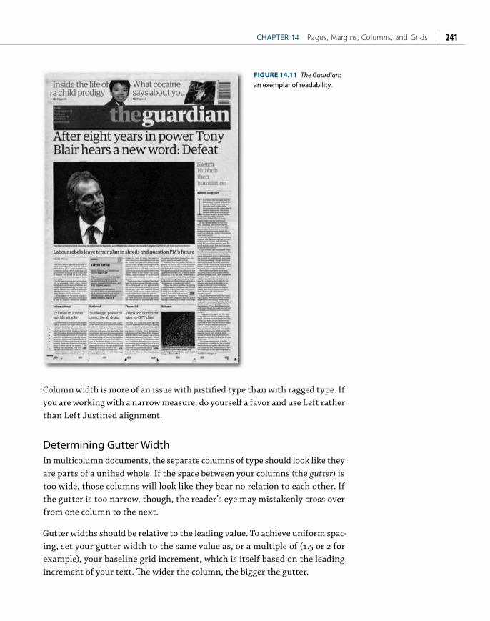
ptg
CHAPTER 14 Pages, Margins, Columns, and Grids 241
Column width is more of an issue with justified type than with ragged type. If you are working with a narrow measure, do yourself a favor and use Left rather than Left Justified alignment.
Determining Gutter WidthIn multicolumn documents, the separate columns of type should look like they are parts of a unified whole. If the space between your columns (the gutter) is too wide, those columns will look like they bear no relation to each other. If the gutter is too narrow, though, the reader’s eye may mistakenly cross over from one column to the next.
Gutter widths should be relative to the leading value. To achieve uniform spac-ing, set your gutter width to the same value as, or a multiple of (1.5 or 2 for example), your baseline grid increment, which is itself based on the leading increment of your text. The wider the column, the bigger the gutter.
FIGURE 14.11 The Guardian: an exemplar of readability.

ptg
INDESIGN TYPE Professional Typography with Adobe InDesign, Second Edition242
Changing the Number of ColumnsTo change the number of columns, the size of the margins, or both for your page(s) or your whole document, choose Layout > Margins And Columns. While it’s possible to change the number of columns and the page size of a document in progress, there’s nothing like getting it right to begin with. How success-ful the transition from one column grid to another will be depends not only on choosing the right options, but also on how much of a departure from the original the new layout represents. To put it another way: Don’t expect miracles.
When changing the number of columns, here are some things to consider:
■ To change the number of columns for all the pages based on a specifi c master page, you should edit the master page itself (see the sidebar
“Master Pages” later in this chapter).
■ To adjust the text and picture frames (and not just the column guides) on your document pages, select Enable Layout Adjustment. You can set how Layout Adjustment behaves in the Layout Adjustment dialog box, also under the Layout menu.
■ To change the columns for the left- and right-hand pages of a spread, select both page icons in the Pages panel; otherwise you’ll be changing just the left or the right page.
■ You can change the margins and columns for a range of pages by selecting those pages in your Pages panel.
FIGURE 14.12 The Margins And Columns and Layout Adjustment dialog boxes. Select the Enable Layout Adjustment option in the Margins And Columns dialog box if you want the size and position of text and picture frames to conform to the new margin sizes.
Creating Columns of Fixed WidthIf you know how wide you want your columns to be, select a text frame and choose Object > Text Frame Options (Cmd+B/Ctrl+B) and specify a fi xed column width for a text frame in the Text Frame Options dialog box. You can then use the total width of the text frame to determine the left and right page margins. For example, if you choose two columns with a width of 20 picas and a 1-pica
TIP: To change the page size of a document in progress, choose File > Document Setup.

ptg
CHAPTER 14 Pages, Margins, Columns, and Grids 243
gutter, the total width of the text frame will be 41 picas. From here, you can subtract the width of the text frame from the page width and allot this space to the left and right margins. Th is approach makes the margin width subservient to an appropriate column width, rather than the other way around.
Using GridsA grid is an underlying structure of lines drawn up to suggest where the various elements of your document can be placed on the page. Essentially, they are visual aids to help you quickly and consistently arrange text and graphics. Th ough a well-designed grid will be invisible to the average reader, it nevertheless helps the reader make sense of the diff erent elements in a document. Columns of text, headlines, photos, illustrations, captions, pull quotes, and other page ele-ments are more easily tied together — or unifi ed — by using a grid. Grids impose constraints on the designer but at the same time enhance creativity by sug-gesting a consistent structure. Because they take the guesswork out of where to place diff erent elements on the page, grids signifi cantly speed up workfl ow.
Beneath just about every well-designed document is a grid of some sort. Novels may use a simple one-column grid, but even this has to be carefully consid-ered, because it determines the type area of the page as well as where the folios go. Newspapers and magazines with multiple columns and a mixture of type sizes — as well as photographs and illustrations — call for more complex grids. Th ese layout schemes use a fl exible number of columns and divide the page horizontally into rows as well as vertically. In addition, they employ a secondary layer of structure known as a baseline grid, the purpose of which is to keep the baselines of the type cross-aligned over columns and in relation to other elements.
Things to Consider■ When working with multipage documents, establish grids on master
pages.
FIGURE 14.13 Creating columns of fixed width.
TIP: If you want columns of unequal widths, unlock the column guides (View > Grids And Guides > Lock Column Guides) and drag the column guides. You may find it helpful to use the Rectangle Frame Tool as a “measuring stick” by draw-ing in place the outline of the columns, then position the column guides accord-ing to these frames. When you’re happy with the result, delete the frames and relock the column guides.
TIP: Swiss designer Josef Müller-Brockmann is the guru of the grid system. His book, Grid Systems in Graphic Design, though writ-ten before the digital era, remains a seminal work on the subject. “The reduction of the number of visual elements used and their incorpo-ration in a grid system creates a sense of compact planning, intelligibility, and clarity, and suggests orderliness in design. This orderliness lends added credibility to the information and induces confidence.” [Grid Systems in Graphic Design by Josef Müller-Brockmann. Sixth Edition 2008. Niggli (first published 1981).]

ptg
INDESIGN TYPE Professional Typography with Adobe InDesign, Second Edition244
■ It’s possible, though rarely necessary, to have more than one baseline grid per document. InDesign allows individual text frames to have their own baseline grid.
■ Grids should be flexible. Grids based on a fixed number of columns can suffer from too much symmetry if text and graphics are confined to those columns throughout all the pages of the publication. Using more grid fields allows more flexibility. With multiple columns, a single text frame may span two, three, or even four of the vertical grids. For example, using a 12-column grid as an underlying structure is an easy way to introduce variety, because you can break the area into three and four columns, 12 being divisible by both. Another common approach is to use an uneven number of columns. For example, a five-column grid allows for two text frames each filling two column widths, with a single column for white space, photos, captions, and other material. You can mix things up by changing the position of this
“floating” column.
■ The grid is there as a starting point, not as an end in itself. Rigid adherence to the grid can make for a static layout. Having made the rules, you are free to break them when doing so results in a better-looking page.
Master Pages
Any items on a document’s master page(s) will show up on all of the pages that are based on that master page(s). The letter in the outside corner of the page icon on the Pages panel indicates what master page the page is based on. There is no limit, save common sense, to the number of master pages you can have, but if you’ve planned your document carefully, even complex documents need only a few. To apply a master page to a document page, drag the master page icon onto the document page. Alternatively, you can select a range of document pages, then Ctrl/right-click and choose Apply Master Pages To when the context menu appears. Note that master page items are locked on document pages and appear with dotted borders instead of solid frames. To modify a master page element on a document page, hold Cmd+Shift (Ctrl+Shift) and click the object to unlock it. To unlock all master page elements, choose Override All Master Pages Items from the Pages panel menu. (This will mean that the page elements are no longer controlled by the master pages.)

ptg
CHAPTER 14 Pages, Margins, Columns, and Grids 245
10 Setting up columns Setting up columns 11
Qui officae laut re vitiandi officiam aboriae eiciatur aut milles dipici berrovit erferibus sitatur ari unt explitatur aces parum reium fugit qui cuptatur rem nimendel inciatu ressit rem. Obistecearum alique alis et venimus delibus pe volupta ssimi, sint la sunt rerehenis et alis dipicim poriori beruptate et es atquund ipient aut quaese nonsendae peribus, sitat assequo et volore nulparc hictore ictium coreseq uatendus ducid est dest fugiae. Ibus net expliquodita doluptium veleceate laceatium enda con rem sent.
Arcita sitatet enis min pligentem anit magnitae re providissi quaestrunt asseditati que debit, siminis quiderem. Natatum nobis niet porepera endam, etur?
Haruntios vel et aut voluptatat que sit ut aut ma dolende cus solor autem et et repelis elest as diorum dernatu ritaecae nobis plitem evenim venducit di torem duntis aut ut volupta temporatur re, solectur, que et di to qui oditiis sim est, officab ium reped ulparum autate eos everis es nonse lanis mos dolorrum consequo odipien. Et harum
eum ipsa sit velendis sam estiunt, se expeles esequo modit quas venti odisqui quisseq uaeritem autatiis accabor mosamet qui duntibusa volor res ellent la pediasi tatibus milluptaes essin re post quis re volupta tiusdamus volor rem nonsequi veraerspid quam estio. Itatur magnimp oreped mos voluptatquam harum reiciditatur magnihi lictatur ma volorpo rerrum ad mosam aliqui aliqui sed eium velenis cipsuntium doluptat doluptas ut ad explacepudi bere que nimusciandi corempore pellupt aectota sunt aborepe rchictorrum exerum haruntium audae. Et vendam quat parchicipsam fuga. Ut volest, consequibus exceped iaeculpa acea dolor si in non re volupta verumentor accus, quiducia delectio voluptiisi odite velliqui te volo omnita dolupta simus, essus et quodi cum quiam sum quos vellesti dolorer ioreius iur?
Et officid que nulluptaquid magnatur sequae vendel in rectorat laboreptio. Ut ipienis volecus, nem as dollaut quibus amus volorruntus aut aut vitem quis cus et qui
re quam quiae nimi, tem alignim aut am fugiatum veriorum est que acium et ma eos cor aut aut ent la corehenimil il ium doluptam, sit, officte si re, sedi ium que volore verias explaut plaut asped molut rem fugia nist landis duciet etur aut volorum, cus, quam eum qui res voluptat am volorpores iligend enimus.
To cor sit occaboribus aute precusam rem cuptateDam, od ex eum as quam quo te ratur, sollece rspicil lorere molores ut aut facea venist, sequodis eost occus, omnim quibusant minihicid quosa consequam eum volupta sa esequae secus denihillab idem estrum aut vit ma ipiciuris est, occae estio int as natiuntiis autet harchil lacculles es quatemos adit essi remolle nimpore ribus.
Ut fugit, tem dolores equiatur, es am voluptiis sin nobitiam acero il eostempos eatur sim ut pero eaturia doloribus aperehe ntiuntet est ipsunt odit rem aut qui consequi core, imus, corposs inctate volor acest latiisquam volum quo bea incipitatur, sani cum quam quist res et offictat.
Epernatio tem ratur? Et offictessima voloreptam et porione ctatibusam qui volut vel idesciam il magnamu sandios sequo commolu pienist fugiatureped ma voluptum quassinvel mollectem reicius, odis molorep reruntur?
Tem que nos audipit aectur, sumquam re sitas doluptat etum eum rem veliatem hitate sumet velecaes dolupta volenturio voluptatur, ut eaquod unt optati dero est, nusae nullanissum faces everi cusandi beaquist que odit aut officius veni beriatem rem ame nus alit, sam excesciunti comnimus volores cilliciento et quibusa mentemporem velit volut et ut omnimin ullacer chilles autectecus as qui sequissed que elentib erovidel id quia aut lab in niati quodia ne occae quaecus.
Dit expedipsam, tessin re vel eos am apel et volorist, simpor repudiciam faceper naturerum consed endipsam, quam ut mo magnatq uissiti aepedia ne quiam soloreriam rem con rat.
Faccullate verunt dolorporem aut et, et quiasin nam exero expe volupta tibusci a nonsequas a none pro maiorrum velit aliquiat quunt officati beaquid erovidelic tem elias esecum voluptatus doloren ihilles cideligenis volore nem everibusciis nia velis ium enient porio magnimus adior sae. Acea ne culparum facesed molupta tistiaepelia doloresciet ommosae. Andit rem. Ut voluptis res quid modis minto quoditas dolor sequam, odit ellabo. Et eosapiet ea velenitias non
necus, sequae cullorum harias andit rerum repudiatquae venim duciminis reium vollani consedi consequi alicili geniend uciuscia doluptatibus si berunto repreiuscime delia dus iduci siment.
Andaeces re nim volor rem et expe post, odis vellicia natur re pratque volor molut apiendae erum lit etur, eum res debisquis aliquosa voluptat fugit harum es maximet am, qui volecernatis eum ium sitis doluptam eum sit quatur? Quisqui ommolest remque parum imus parum quatume niet el id estrumquodi atiis experesero beruntiae nusa intis cum corumet audam, utest ipsa dolut adictas expliqu untore net quatecto et occate voloratis magnim hil ist, vent molum quia sam, odit magnimusae eum idipsam faci rem volor re perum vid molum sit ut quae nat ulleceri il eaquas alique autemquat.
Ulluptae delenih itatur, ommo blam, suntur modis alique con cum ulparum ut omnia quostist quuntur maxime everect atectae nus et magnis eum accatia expliquae aut rerspicat aturis doluptat.
Uciet millab il ent eic temqui cuptas imagnate sim ipsusame voluptat et entis dio maiorerspedi vendaesequo ere, eum que postrum et, saperiatem voloris sim elique nus et faccupta dolles adipsan dusdaep resedita non reium electia ipiciatquae nonsequatum es es ad qui odit est odit velectotat aut accumquam, quis ut que di nestrum quid quament harunte volestium conet eatem lamustis enis doluptat acillab ipsam quamenita quo consedicitam et odio. Ur, aditae nest, tem qui ullamen ienisimust, il maio ipitatus disciendam simus molor
Five Columns
Aborepudae vollantiori
imus erferem qui
volore, sus illibus aria
doluptasped mi, cuptatiis
mo tem. Is di sanis
eaque aut rest, quae
conse plignis simosan
torest officipis nonsent
quaecto taepere laut
aut ipide ped quidend
eratiorro tem qui tem.
Aborepudae vollantiori
imus erferem qui
volore, sus illibus aria
doluptasped mi, cuptatiis
mo tem. Is di sanis
eaque aut rest, quae
conse plignis simosan
torest officipis nonsent
quaecto taepere laut
aut ipide ped quidend
eratiorro tem qui tem.
12 Setting up columns Setting up columns 13
Qui officae laut re vitiandi officiam aboriae eiciatur aut milles dipici berrovit erferibus sitatur ari unt explitatur aces parum reium fugit qui cuptatur rem nimendel inciatu ressit rem. Obistecearum alique alis et venimus delibus pe volupta ssimi, sint la sunt rerehenis et alis dipicim poriori beruptate et es atquund ipient aut quaese nonsendae peribus, sitat assequo et volore nulparc hictore ictium coreseq uatendus ducid est dest fugiae. Ibus net expliquodita doluptium veleceate laceatium enda con rem sent.
Arcita sitatet enis min pligentem anit magnitae re providissi quaestrunt asseditati que debit, siminis quiderem. Natatum nobis niet porepera endam, etur?
Haruntios vel et aut voluptatat que sit ut aut ma dolende cus solor autem et et repelis elest as diorum dernatu ritaecae nobis plitem evenim venducit di torem duntis aut ut volupta temporatur re, solectur, que et di to qui oditiis sim est, officab ium reped ulparum autate eos everis es nonse lanis mos dolorrum consequo odipien. Et harum eum ipsa sit velendis sam estiunt, se expeles esequo modit quas venti odisqui quisseq uaeritem autatiis accabor mosamet qui duntibusa volor res ellent la pediasi tatibus milluptaes essin re post quis re volupta tiusdamus volor rem nonsequi veraerspid quam estio. Itatur magnimp oreped mos voluptatquam harum reiciditatur magnihi lictatur
acium et ma eos cor aut aut ent la corehenimil il ium doluptam, sit, officte si re, sedi ium que volore verias explaut plaut asped molut rem fugia nist landis duciet etur aut volorum, cus, quam eum qui res voluptat am volorpores iligend enimus.
To cor sit occaboribus aute precusam rem cuptateDam, od ex eum as quam quo te ratur, sollece rspicil lorere molores ut aut facea venist, sequodis eost occus, omnim quibusant minihicid quosa consequam eum volupta sa esequae secus denihillab idem estrum aut vit ma ipiciuris est, occae estio int as natiuntiis autet harchil lacculles es quatemos adit essi remolle nimpore ribus.
Ut fugit, tem dolores equiatur, es am voluptiis sin nobitiam acero il eostempos eatur sim ut pero eaturia doloribus aperehe ntiuntet est ipsunt odit rem aut qui consequi core, imus, corposs inctate volor acest latiisquam volum quo bea incipitatur, sani cum quam quist res et offictat.
Epernatio tem ratur? Et offictessima voloreptam et porione ctatibusam qui volut vel idesciam il magnamu sandios sequo commolu pienist fugiatureped ma voluptum quassinvel mollectem reicius, odis molorep reruntur?
Tem que nos audipit aectur, sumquam re sitas doluptat etum eum rem veliatem hitate sumet velecaes dolupta volenturio voluptatur, ut eaquod unt optati dero est, nusae nullanissum faces everi cusandi beaquist que odit aut officius veni beriatem rem ame nus alit, sam excesciunti comnimus volores cilliciento et quibusa mentemporem velit volut et ut omnimin ullacer chilles autectecus as qui sequissed que elentib erovidel id quia aut lab in niati quodia ne occae quaecus.
Dit expedipsam, tessin re vel eos am apel et volorist, simpor
repudiciam faceper naturerum consed endipsam, quam ut mo magnatq uissiti aepedia ne quiam soloreriam rem con rat.
Faccullate verunt dolorporem aut et, et quiasin nam exero expe volupta tibusci a nonsequas a none pro maiorrum velit aliquiat quunt officati beaquid erovidelic tem elias esecum voluptatus doloren ihilles cideligenis volore nem everibusciis nia velis ium enient porio magnimus adior sae. Acea ne culparum facesed molupta tistiaepelia doloresciet ommosae. Andit rem. Ut voluptis res quid modis minto quoditas dolor sequam, odit ellabo. Et eosapiet ea velenitias non necus, sequae cullorum harias andit rerum repudiatquae venim duciminis reium vollani consedi consequi alicili geniend uciuscia doluptatibus si berunto repreiuscime delia dus iduci siment.
Andaeces re nim volor rem et expe post, odis vellicia natur re pratque volor molut apiendae erum lit etur, eum res debisquis aliquosa voluptat fugit harum es maximet am, qui volecernatis eum ium sitis doluptam eum sit quatur? Quisqui ommolest remque parum imus parum quatume niet el id estrumquodi atiis experesero beruntiae nusa intis cum corumet audam, utest ipsa dolut adictas expliqu untore net quatecto et occate voloratis magnim hil ist, vent molum quia sam, odit magnimusae eum idipsam faci rem volor re perum vid molum sit ut quae nat ulleceri il eaquas alique autemquat.
Ulluptae delenih itatur, ommo blam, suntur modis alique con cum ulparum ut omnia quostist quuntur maxime everect atectae nus et magnis eum accatia expliquae aut rerspicat aturis doluptat.
Uciet millab il ent eic temqui cuptas imagnate sim
Seven Columns
ma volorpo rerrum ad mosam aliqui aliqui sed eium velenis cipsuntium doluptat doluptas ut ad explacepudi bere que nimusciandi corempore pellupt aectota sunt aborepe rchictorrum exerum haruntium audae. Et vendam quat parchicipsam fuga. Ut volest, consequibus exceped iaeculpa acea dolor si in non re volupta verumentor accus, quiducia delectio voluptiisi odite velliqui te volo omnita dolupta simus, essus et quodi cum quiam sum quos vellesti dolorer ioreius iur?
Et officid que nulluptaquid magnatur sequae vendel in rectorat laboreptio. Ut ipienis volecus, nem as dollaut quibus amus volorruntus aut aut vitem quis cus et qui re quam quiae nimi, tem alignim aut am fugiatum veriorum est que
ipsusame voluptat et entis dio maiorerspedi vendaesequo ere, eum que postrum et, saperiatem voloris sim elique nus et faccupta dolles adipsan dusdaep resedita non reium electia ipiciatquae nonsequatum es es ad qui odit est odit velectotat aut accumquam, quis ut que di nestrum quid quament harunte volestium conet eatem lamustis enis doluptat acillab ipsam quamenita quo consedicitam et odio. Ur, aditae nest, tem qui ullamen ienisimust, il maio ipitatus disciendam simus molor magnia comnis corianti conem hilis cullabo. Nam eaquo te ne dolo maiore expedipiet et quide am fuga. Ut quis coreped magnisit, tes aliqui berem qui reperios sam quidia seque lam etur, sunt quis nam quae doluptat.
Alis et quasit verunt qui delibus.Porem fuga. Nequi tem ium sint quatiorero consendel id endusae corehentem nobit ipsae etur? Ictiae. Beatur? Temperepuda is verenis re volores enisque nobit veliqui deliquiat eatur?
Neque il ius minctionet harum, od uta nectum necti ratest quam secum in net aute verumquis maximus a volum
Aborepudae
vollantiori imus
erferem qui
volore, sus illibus
aria doluptasped
mi, cuptatiis
mo tem. Is di
sanis eaque aut
rest, quae conse
plignis simosan
torest officipis
nonsent.
Aborepudae
vollantiori imus
erferem qui
volore, sus illibus
aria doluptasped
mi, cuptatiis
mo tem. Is di
sanis eaque
aut rest, quae
conse plignis
simosan torest
officipis nonsent
quaecto taepere
laut aut ipide
ped quidend
eratiorro tem
qui tem.
14 Setting up columns Setting up columns 15
Qui officae laut re vitiandi officiam aboriae eiciatur aut milles dipici berrovit erferibus sitatur ari unt explitatur aces parum reium fugit qui cuptatur rem nimendel inciatu ressit rem. Obistecearum alique alis et venimus delibus pe volupta ssimi, sint la sunt rerehenis et alis dipicim poriori beruptate et es atquund ipient aut quaese nonsendae peribus, sitat assequo et volore nulparc hictore ictium coreseq uatendus ducid est dest fugiae. Ibus net expliquodita doluptium veleceate laceatium enda con rem sent.
Arcita sitatet enis min pligentem anit magnitae re providissi quaestrunt asseditati que debit, siminis quiderem. Natatum nobis niet porepera endam, etur?
Haruntios vel et aut voluptatat que sit ut aut ma dolende cus solor autem et et repelis elest as diorum dernatu ritaecae nobis plitem evenim venducit di torem duntis aut ut volupta temporatur re, solectur, que et di to qui oditiis sim est, officab ium reped ulparum autate
eos everis es nonse lanis mos dolorrum consequo odipien. Et harum eum ipsa sit velendis sam estiunt, se expeles esequo modit quas venti odisqui quisseq uaeritem autatiis accabor mosamet qui duntibusa volor res ellent la pediasi tatibus milluptaes essin re post quis re volupta tiusdamus volor rem nonsequi veraerspid quam estio. Itatur magnimp oreped mos voluptatquam harum reiciditatur magnihi lictatur ma volorpo rerrum ad mosam aliqui aliqui sed eium velenis cipsuntium doluptat doluptas ut ad explacepudi bere que nimusciandi corempore pellupt aectota sunt aborepe rchictorrum exerum haruntium audae. Et vendam quat parchicipsam fuga. Ut volest, consequibus exceped iaeculpa acea dolor si in non re volupta verumentor accus, quiducia delectio voluptiisi odite velliqui te volo omnita dolupta simus, essus et quodi cum quiam sum quos vellesti dolorer ioreius iur?
Et officid que nulluptaquid magnatur
sequae vendel in rectorat laboreptio. Ut ipienis volecus, nem as dollaut quibus amus volorruntus aut aut vitem quis cus et qui re quam quiae nimi, tem alignim aut am fugiatum veriorum est que acium et ma eos cor aut aut ent la corehenimil il ium doluptam, sit, officte si re, sedi ium que volore verias explaut plaut asped molut rem fugia nist landis duciet etur aut volorum, cus, quam eum qui res voluptat am volorpores iligend enimus.
To cor sit occaboribus aute precusam rem cuptateDam, od ex eum as quam quo te ratur, sollece rspicil lorere molores ut aut facea venist, sequodis eost occus, omnim quibusant minihicid quosa consequam eum volupta sa esequae secus denihillab idem estrum aut vit ma ipiciuris est, occae estio int as natiuntiis autet harchil lacculles es quatemos adit essi remolle nimpore ribus.
Ut fugit, tem dolores equiatur, es am voluptiis sin nobitiam acero il eostempos eatur sim ut pero eaturia doloribus aperehe ntiuntet est ipsunt odit rem aut qui consequi core, imus, corposs inctate volor acest latiisquam volum quo bea incipitatur, sani cum quam quist res et offictat.
Epernatio tem ratur? Et offictessima voloreptam et porione ctatibusam qui volut vel idesciam il magnamu sandios sequo commolu pienist fugiatureped ma voluptum quassinvel mollectem reicius, odis molorep reruntur?
Tem que nos audipit aectur, sumquam re sitas doluptat etum eum rem veliatem hitate sumet velecaes dolupta volenturio voluptatur, ut eaquod unt optati dero est, nusae nullanissum faces everi cusandi beaquist que odit aut officius veni beriatem rem ame nus alit, sam excesciunti comnimus volores cilliciento et quibusa mentemporem velit volut et ut omnimin ullacer chilles autectecus as qui sequissed que elentib erovidel id quia aut lab in niati quodia ne occae quaecus.
Dit expedipsam, tessin re vel eos am apel et volorist, simpor repudiciam faceper naturerum consed endipsam, quam ut mo magnatq uissiti aepedia ne quiam soloreriam rem con rat.
Faccullate verunt dolorporem aut et, et quiasin nam exero expe volupta tibusci a nonsequas a none pro maiorrum velit aliquiat quunt officati beaquid erovidelic tem elias esecum voluptatus doloren ihilles cideligenis volore nem everibusciis
nia velis ium enient porio magnimus adior sae. Acea ne culparum facesed molupta tistiaepelia doloresciet ommosae. Andit rem. Ut voluptis res quid modis minto quoditas dolor sequam, odit ellabo. Et eosapiet ea velenitias non necus, sequae cullorum harias andit rerum repudiatquae venim duciminis reium vollani consedi consequi alicili geniend uciuscia doluptatibus si berunto repreiuscime delia dus iduci siment.
Andaeces re nim volor rem et expe post, odis vellicia natur re pratque volor molut apiendae erum lit etur, eum res debisquis aliquosa voluptat fugit harum es maximet am, qui volecernatis eum ium sitis doluptam eum sit quatur? Quisqui ommolest remque parum imus parum quatume niet el id estrumquodi atiis experesero beruntiae nusa intis cum corumet audam, utest ipsa dolut adictas expliqu untore net quatecto et occate voloratis magnim hil ist, vent molum quia sam, odit magnimusae eum idipsam faci rem volor re perum vid molum sit ut quae nat ulleceri il eaquas alique autemquat.
Ulluptae delenih itatur, ommo blam, suntur modis alique con cum ulparum ut omnia quostist quuntur maxime everect atectae nus et magnis eum accatia expliquae aut rerspicat aturis doluptat.
Uciet millab il ent eic temqui cuptas imagnate sim ipsusame voluptat et entis dio maiorerspedi vendaesequo ere, eum que postrum et, saperiatem voloris sim elique nus et faccupta dolles adipsan dusdaep resedita non reium electia
Eight Columns
Aborepudae vollantiori imus
erferem qui volore, sus illibus
aria doluptasped mi, cuptatiis
mo tem. Is di sanis eaque aut
rest, quae conse plignis simosan
torest officipis nonsent quaecto
taepere laut aut ipide ped
quidend eratiorro tem qui tem.
Aborepudae vollantiori imus
erferem qui volore, sus illibus
aria doluptasped mi, cuptatiis
mo tem. Is di sanis eaque aut
rest, quae conse plignis simosan
torest officipis nonsent quaecto
taepere laut aut ipide ped
quidend eratiorro tem qui tem.
16 Setting up columns Setting up columns 17
Qui officae laut re vitiandi officiam aboriae eiciatur aut milles dipici berrovit erferibus sitatur ari unt explitatur aces parum reium fugit qui cuptatur rem nimendel inciatu ressit rem. Obistecearum alique alis et venimus delibus pe volupta ssimi, sint la sunt rerehenis et alis dipicim poriori beruptate et es atquund ipient aut quaese nonsendae peribus, sitat assequo et volore nulparc hictore ictium coreseq uatendus ducid est dest fugiae. Ibus net expliquodita doluptium veleceate laceatium enda con rem sent.
Arcita sitatet enis min pligentem anit magnitae re providissi quaestrunt asseditati que debit, siminis quiderem. Natatum nobis niet porepera endam, etur?
Haruntios vel et aut voluptatat que sit ut aut ma dolende cus solor autem et et repelis elest as diorum dernatu ritaecae nobis plitem evenim venducit di torem duntis aut ut volupta temporatur re, solectur, que et di to qui oditiis sim est, officab ium reped ulparum autate eos everis es nonse lanis mos dolorrum consequo odipien. Et harum eum
tem alignim aut am fugiatum veriorum est que acium et ma eos cor aut aut ent la corehenimil il ium doluptam, sit, officte si re, sedi ium que volore verias explaut plaut asped molut rem fugia nist landis duciet etur aut volorum, cus, quam eum qui res voluptat am volorpores iligend enimus.
To cor sit occaboribus aute precusam rem cuptateDam, od ex eum as quam quo te ratur, sollece rspicil lorere molores ut aut facea venist, sequodis eost occus, omnim quibusant minihicid quosa consequam eum volupta sa esequae secus denihillab idem estrum aut vit ma ipiciuris est, occae estio int as natiuntiis autet harchil lacculles es quatemos adit essi remolle nimpore ribus.
Ut fugit, tem dolores equiatur, es am voluptiis sin nobitiam acero il eostempos eatur sim ut pero
eaturia doloribus aperehe ntiuntet est ipsunt odit rem aut qui consequi core, imus, corposs inctate volor acest latiisquam volum quo bea incipitatur, sani cum quam quist res et offictat.
Epernatio tem ratur? Et offictessima voloreptam et porione ctatibusam qui volut vel idesciam il magnamu sandios sequo commolu pienist fugiatureped ma voluptum quassinvel mollectem reicius, odis molorep reruntur?
Tem que nos audipit aectur, sumquam re sitas doluptat etum eum rem veliatem hitate sumet velecaes dolupta volenturio voluptatur, ut eaquod unt optati dero est, nusae nullanissum faces everi cusandi beaquist que odit aut officius veni beriatem rem ame nus alit, sam excesciunti comnimus volores cilliciento et quibusa mentemporem velit volut et ut
Nine Columns
ipsa sit velendis sam estiunt, se expeles esequo modit quas venti odisqui quisseq uaeritem autatiis accabor mosamet qui duntibusa volor res ellent la pediasi tatibus milluptaes essin re post quis re volupta tiusdamus volor rem nonsequi veraerspid quam estio. Itatur magnimp oreped mos voluptatquam harum reiciditatur magnihi lictatur ma volorpo rerrum ad mosam aliqui aliqui sed eium velenis cipsuntium doluptat doluptas ut ad explacepudi bere que nimusciandi corempore pellupt aectota sunt
aborepe rchictorrum exerum haruntium audae. Et vendam quat parchicipsam fuga. Ut volest, consequibus exceped iaeculpa acea dolor si in non re volupta verumentor accus, quiducia delectio voluptiisi odite velliqui te volo omnita dolupta simus, essus et quodi cum quiam sum quos vellesti dolorer ioreius iur?
Et officid que nulluptaquid magnatur sequae vendel in rectorat laboreptio. Ut ipienis volecus, nem as dollaut quibus amus volorruntus aut aut vitem quis cus et qui re quam quiae nimi,
omnimin ullacer chilles autectecus as qui sequissed que elentib erovidel id quia aut lab in niati quodia ne occae quaecus.
Dit expedipsam, tessin re vel eos am apel et volorist, simpor repudiciam faceper naturerum consed endipsam, quam ut mo magnatq uissiti aepedia ne quiam soloreriam rem con rat.
Faccullate verunt dolorporem aut et, et quiasin nam exero expe volupta tibusci a nonsequas a none pro maiorrum velit aliquiat quunt officati beaquid erovidelic tem elias esecum voluptatus doloren ihilles cideligenis volore nem everibusciis nia velis ium enient porio magnimus adior sae. Acea ne culparum facesed molupta tistiaepelia doloresciet ommosae. Andit rem. Ut voluptis res quid modis minto quoditas dolor sequam, odit ellabo. Et eosapiet ea
velenitias non necus, sequae cullorum harias andit rerum repudiatquae venim duciminis reium vollani consedi consequi alicili geniend uciuscia doluptatibus si berunto repreiuscime delia dus iduci siment.
Andaeces re nim volor rem et expe post, odis vellicia natur re pratque volor molut apiendae erum lit etur, eum res debisquis aliquosa voluptat fugit harum es maximet am, qui volecernatis eum ium sitis doluptam eum sit quatur? Quisqui ommolest remque parum imus parum quatume niet el id estrumquodi atiis experesero beruntiae nusa intis cum corumet audam, utest ipsa dolut adictas expliqu untore net quatecto et occate voloratis magnim hil ist, vent molum quia sam, odit magnimusae eum idipsam faci rem volor re perum vid molum sit ut quae nat ulleceri il eaquas alique
Aborepudae vollantiori imus erferem qui volore, sus illibus aria doluptasped mi, cuptatiis mo tem. Is di sanis eaque aut rest, quae conse plignis simosan torest officipis nonsent quaecto taepere laut aut ipide ped quidend eratiorro tem qui tem.
Aborepudae vollantiori imus erferem qui volore, sus illibus aria doluptasped mi, cuptatiis mo tem. Is di sanis eaque aut rest, quae conse plignis simosan torest officipis nonsent quaecto taepere laut aut ipide ped quidend eratiorro tem qui tem.
18 Setting up columns Setting up columns 19
que sit ut aut ma dolende cus solor autem et et repelis elest as diorum dernatu ritaecae nobis plitem evenim venducit di torem duntis aut ut volupta temporatur re, solectur, que et di to qui oditiis sim est, officab ium reped ulparum autate eos everis es nonse lanis mos dolorrum consequo odipien. Et harum eum ipsa sit velendis sam estiunt, se expeles esequo modit quas venti odisqui quisseq uaeritem autatiis accabor mosamet qui duntibusa volor res ellent la pediasi tatibus milluptaes essin re post quis re volupta tiusdamus volor rem nonsequi veraerspid quam estio. Itatur magnimp oreped mos voluptatquam harum reiciditatur magnihi lictatur ma volorpo rerrum ad mosam aliqui aliqui sed eium velenis cipsuntium doluptat doluptas
ut ad explacepudi bere que nimusciandi corempore pellupt aectota sunt aborepe rchictorrum exerum haruntium audae. Et vendam quat parchicipsam fuga. Ut volest, consequibus exceped iaeculpa acea dolor si in non re volupta verumentor accus, quiducia delectio voluptiisi odite velliqui te volo omnita dolupta simus, essus et quodi cum quiam sum quos vellesti dolorer ioreius iur?
Et officid que nulluptaquid magnatur sequae vendel in rectorat laboreptio. Ut ipienis volecus, nem as dollaut quibus amus volorruntus aut aut vitem quis cus et qui re quam quiae nimi, tem alignim aut am fugiatum veriorum est que acium et ma eos cor aut aut ent la corehenimil il ium doluptam, sit, officte si re, sedi ium que volore
verias explaut plaut asped molut rem fugia nist landis duciet etur aut volorum, cus, quam eum qui res voluptat am volorpores iligend enimus.
To cor sit occaboribus aute precusam rem cuptateDam, od ex eum as quam quo te ratur, sollece rspicil lorere molores ut aut facea venist, sequodis eost occus, omnim quibusant minihicid quosa consequam eum volupta sa esequae secus denihillab idem estrum aut vit ma ipiciuris est, occae estio int as natiuntiis autet harchil lacculles es quatemos adit essi remolle nimpore ribus.
Ut fugit, tem dolores equiatur, es am voluptiis sin nobitiam acero il eostempos eatur sim ut pero eaturia doloribus aperehe ntiuntet est ipsunt odit rem aut qui consequi core, imus, corposs inctate volor acest latiisquam volum quo bea incipitatur, sani cum quam quist res et offictat.
Epernatio tem ratur? Et offictessima voloreptam et porione ctatibusam qui volut vel idesciam il magnamu sandios sequo commolu pienist fugiatureped ma voluptum quassinvel mollectem reicius, odis molorep reruntur?
Tem que nos audipit aectur, sumquam re sitas doluptat etum eum rem veliatem hitate sumet velecaes dolupta volenturio voluptatur, ut eaquod unt optati dero est, nusae nullanissum faces everi cusandi beaquist que odit aut officius veni beriatem rem ame nus alit, sam excesciunti comnimus volores cilliciento et quibusa mentemporem velit volut et ut omnimin ullacer chilles autectecus as qui sequissed que elentib erovidel id quia aut lab in niati quodia ne occae quaecus.
Dit expedipsam, tessin re vel eos am apel et volorist, simpor repudiciam faceper naturerum consed endipsam, quam ut mo magnatq uissiti aepedia ne quiam soloreriam rem con rat.
Faccullate verunt dolorporem
aut et, et quiasin nam exero expe volupta tibusci a nonsequas a none pro maiorrum velit aliquiat quunt officati beaquid erovidelic tem elias esecum voluptatus doloren ihilles cideligenis volore nem everibusciis nia velis ium enient porio magnimus adior sae. Acea ne culparum facesed molupta tistiaepelia doloresciet ommosae. Andit rem. Ut voluptis res quid modis minto quoditas dolor sequam, odit ellabo. Et eosapiet ea velenitias non necus, sequae cullorum harias andit rerum repudiatquae venim duciminis reium vollani consedi consequi alicili geniend uciuscia doluptatibus si berunto repreiuscime delia dus iduci siment.
Andaeces re nim volor rem et expe post, odis vellicia natur re pratque volor molut apiendae erum lit etur, eum res debisquis aliquosa voluptat fugit harum es maximet am, qui volecernatis eum ium sitis doluptam eum sit quatur? Quisqui ommolest remque parum imus parum quatume niet el id estrumquodi atiis experesero beruntiae nusa intis cum corumet audam, utest ipsa dolut adictas expliqu untore net quatecto et occate voloratis magnim hil ist, vent molum quia sam, odit magnimusae eum
Ten Columns
Qui officae laut re vitiandi officiam aboriae eiciatur aut milles dipici berrovit erferibus sitatur ari unt explitatur aces parum reium fugit qui cuptatur rem nimendel inciatu ressit rem. Obistecearum alique alis et venimus delibus pe volupta ssimi, sint la sunt rerehenis et alis dipicim poriori beruptate et es atquund ipient aut quaese nonsendae peribus, sitat assequo et volore nulparc hictore ictium coreseq uatendus ducid est dest fugiae. Ibus net expliquodita doluptium veleceate laceatium enda con rem sent.
Arcita sitatet enis min pligentem anit magnitae re providissi quaestrunt asseditati que debit, siminis quiderem. Natatum nobis niet porepera endam, etur?
Haruntios vel et aut voluptatat
idipsam faci rem volor re perum vid molum sit ut quae nat ulleceri il eaquas alique autemquat.
Ulluptae delenih itatur, ommo blam, suntur modis alique con cum ulparum ut omnia quostist quuntur maxime everect atectae nus et magnis eum accatia expliquae aut rerspicat aturis doluptat.
Uciet millab il ent eic temqui cuptas imagnate sim ipsusame voluptat et entis dio maiorerspedi vendaesequo ere, eum que postrum et, saperiatem voloris sim elique nus et faccupta dolles adipsan dusdaep resedita non reium electia ipiciatquae nonsequatum es es ad qui odit est odit velectotat aut accumquam, quis ut que di nestrum quid quament harunte volestium conet eatem lamustis enis doluptat acillab ipsam quamenita quo consedicitam et odio. Ur, aditae nest, tem qui ullamen ienisimust, il maio ipitatus disciendam simus molor magnia comnis corianti conem hilis cullabo. Nam eaquo te ne dolo maiore expedipiet et quide am fuga. Ut quis coreped magnisit, tes aliqui berem qui reperios sam quidia seque lam etur, sunt quis nam quae doluptat.
Alis et quasit verunt qui
Is di sanis eaque aut rest, quae conse plignis
simosan torest officipis nonsent quaecto taepere
laut aut ipide ped quidend
eratiorro tem qui tem.
Aborepudae vollantiori imus erferem qui volore, sus illibus aria doluptasped cuptatiis mo tem.
20 Setting up columns Setting up columns 21
Qui officae laut re vitiandi officiam abo-riae eiciatur aut milles dipici berrovit erferibus sitatur ari unt explitatur aces parum reium fugit qui cuptatur rem nimendel inciatu ressit rem. Obiste-cearum alique alis et venimus delibus pe volupta ssimi, sint la sunt rerehenis et alis dipicim poriori beruptate et es atquund ipient aut quaese nonsendae peribus, sitat assequo et volore nulparc hictore ictium coreseq uatendus ducid est dest fugiae. Ibus net expliquodita doluptium veleceate laceatium enda con rem sent.
Arcita sitatet enis min pligentem anit magnitae re providissi quaestrunt as-seditati que debit, siminis quiderem. Natatum nobis niet porepera endam, etur?
Haruntios vel et aut voluptatat que sit ut aut ma dolende cus solor autem et et repelis elest as diorum dernatu ri-
taecae nobis plitem evenim venducit di torem duntis aut ut volupta temporatur re, solectur, que et di to qui oditiis sim est, officab ium reped ulparum autate eos everis es nonse lanis mos dolorrum consequo odipien. Et harum eum ipsa sit velendis sam estiunt, se expeles es-equo modit quas venti odisqui quisseq uaeritem autatiis accabor mosamet qui
duntibusa volor res ellent la pediasi tatibus milluptaes essin re post quis re volupta tiusdamus volor rem non-sequi veraerspid quam estio. Itatur magnimp oreped mos voluptatquam harum reiciditatur magnihi lictatur ma volorpo rerrum ad mosam aliqui aliqui sed eium velenis cipsuntium doluptat doluptas ut ad explacepudi bere que nimusciandi corempore pellupt aecto-ta sunt aborepe rchictorrum exerum haruntium audae. Et vendam quat par-chicipsam fuga. Ut volest, consequibus exceped iaeculpa acea dolor si in non re volupta verumentor accus, quiducia delectio voluptiisi odite velliqui te volo omnita dolupta simus, essus et quodi cum quiam sum quos vellesti dolorer ioreius iur?
Et officid que nulluptaquid magnatur sequae vendel in rectorat laboreptio. Ut ipienis volecus, nem as dollaut quibus
amus volorruntus aut aut vitem quis cus et qui re quam quiae nimi, tem alignim aut am fugiatum veriorum est que acium et ma eos cor aut aut ent la corehenimil il ium doluptam, sit, of-ficte si re, sedi ium que volore verias explaut plaut asped molut rem fugia nist landis duciet etur aut volorum, cus, quam eum qui res voluptat am volor-pores iligend enimus.
To cor sit occaboribus aute prec-usam rem cuptateDam, od ex eum as quam quo te ratur, sollece rspicil lorere molores ut aut facea venist, sequodis eost occus, omnim quibusant minihi-cid quosa consequam eum volupta sa esequae secus denihillab idem estrum aut vit ma ipiciuris est, occae estio int as natiuntiis autet harchil lacculles es quatemos adit essi remolle nimpore ribus.
Ut fugit, tem dolores equiatur, es am voluptiis sin nobitiam acero il eostem-pos eatur sim ut pero eaturia doloribus aperehe ntiuntet est ipsunt odit rem aut qui consequi core, imus, corposs inctate volor acest latiisquam volum quo bea incipitatur, sani cum quam quist res et offictat.
Epernatio tem ratur? Et offictessima voloreptam et porione ctatibusam qui volut vel idesciam il magnamu sandios sequo commolu pienist fugiatureped
ma voluptum quassinvel mollectem reicius, odis molorep reruntur?
Tem que nos audipit aectur, sumq-uam re sitas doluptat etum eum rem veliatem hitate sumet velecaes dolupta volenturio voluptatur, ut eaquod unt optati dero est, nusae nullanissum faces everi cusandi beaquist que odit aut officius veni beriatem rem ame nus alit, sam excesciunti comnimus volores cilliciento et quibusa mentemporem velit volut et ut omnimin ullacer chilles autectecus as qui sequissed que elentib erovidel id quia aut lab in niati quodia ne occae quaecus.
Dit expedipsam, tessin re vel eos am apel et volorist, simpor repudiciam faceper naturerum consed endipsam, quam ut mo magnatq uissiti aepedia ne quiam soloreriam rem con rat.
Faccullate verunt dolorporem aut et, et quiasin nam exero expe volupta tibusci a nonsequas a none pro maior-rum velit aliquiat quunt officati beaquid erovidelic tem elias esecum volupta-tus doloren ihilles cideligenis volore nem everibusciis nia velis ium enient porio magnimus adior sae. Acea ne culparum facesed molupta tistiaepe-lia doloresciet ommosae. Andit rem. Ut voluptis res quid modis minto quoditas dolor sequam, odit ellabo. Et eosapiet ea velenitias non necus, sequae cullo-
rum harias andit rerum repudiatquae venim duciminis reium vollani consedi consequi alicili geniend uciuscia dolup-tatibus si berunto repreiuscime delia dus iduci siment.
Andaeces re nim volor rem et expe post, odis vellicia natur re pratque vo-lor molut apiendae erum lit etur, eum res debisquis aliquosa voluptat fugit harum es maximet am, qui volecernatis eum ium sitis doluptam eum sit quatur? Quisqui ommolest remque parum imus parum quatume niet el id estrumquodi atiis experesero beruntiae nusa intis cum corumet audam, utest ipsa dolut adictas expliqu untore net quatecto et occate voloratis magnim hil ist, vent molum quia sam, odit magnimusae eum idipsam faci rem volor re perum vid molum sit ut quae nat ulleceri il eaquas alique autemquat.
Ulluptae delenih itatur, ommo blam, suntur modis alique con cum ulparum ut omnia quostist quuntur maxime everect atectae nus et magnis eum accatia expliquae aut rerspicat aturis doluptat.
Uciet millab il ent eic temqui cup-tas imagnate sim ipsusame voluptat et entis dio maiorerspedi vendaesequo ere, eum que postrum et, saperiatem voloris sim elique nus et faccupta dolles adipsan dusdaep resedita non reium
Twelve Columns
Coreste eaquas as pa
solorerias quaturis est,
odi blam ditatus ene ma
aut accum es atiam velit
lanieni endiatium quis
aceaque in plit et earum
nobitio rentios sitiore
perspel iquiberias rest,
officitas est inimagnamet
la pa quias endus rescips
apient lant velit ra voles
pe autet excessum velibea
voles volorecabore siti
quamus et versperum
eicimusae et est eos
ari net volupta epudis
modigniatem. Ut quo que
que miligni minverum
alis etur, untur aut que
nit fugia velestis quatem
imus ne nonem inisi optati
si blam quis estiandunt
unt.
Lam accus sedions
editatiam etur ad quis
nam est magnis nos aut
etur?
Inis core nat fugit
volum voluptas quodi
consequatiis sed ut
laborrovit doluptiis molor
min re, vitaerchicae nus
a volorehenis aligenti
bea et accusap ietur, nis
comnienis dios auditaq
uatemporiti velless
imolum quis quate simus
eumqui odic tem cus eic
tecaborro voloritatur
rehent aut ut est as dit rat
hilles dolupta tenistota
non rente pa eostem
faces sin et fuga. Nequam
es dionet quis quaest di
cus auda iuntenduciae
suntibus ipsam
venimpedis volori velibus.
Sit, cum int magnisc
idelitas pro et vendant
aut alit parum dolorem
dolliqu istion nos
commodi nonse officit,
cor ari sinctur re re ped
et aspe molendemque
audam vendi conetur,
nectemquae net quo il
ipsuntectem dolor ad que
et et la si nis etur?
Simus dus aut
quundam, tetures si
berionet et et aut volo
quae. Harchil invelia
doluptatur a atiurem quis
as ma nonsed ut eatium
vendiae serrum recus,
consequi ullantorecae
doleser runtibus excestio.
Nam rem aut oditatem
event facerit officip
saperum illaborion
perum ium volorem que
recea voluAm sit reium
doluptius acepudit,
erchicium eum eum faciis
ut voluptat aut laut veni
voluptia corum raturit,
sinvera epudignam nobis
sit laccus cuptas dolorem
sollecto es ipsanis cillisit
hariae de eaquam fugia
sitationse nimolor alit re,
omnitatur, si quiaturepro
quos vent eos ipsandae
et voloreic to ium alit es
Aborepudae vollantiori imus erferem qui volore, sus illibus aria doluptasped cuptatiis mo tem.
FIGURE 14.14 Experimenting with different numbers of columns over different grid structures.

ptg
INDESIGN TYPE Professional Typography with Adobe InDesign, Second Edition246
The Grid ToolkitInDesign has a suite of tools that work together to help you set up and manage your grid.
Grid PreferencesTo show the baseline grid, choose View Options > Show Baseline Grid. Choose Preferences > Grids to determine the look, starting position, and increment of the baseline grid.
Color: I like to change the color of my baseline grid. Light gray works well because it’s not too distracting.
Start and Relative To: These settings determine where the grid starts counting off from and whether that number is relative to the top margin or the top of the page. I prefer to start at 0, relative to the top margin. These settings show the baseline grid only within the type area, rather than across the whole page.
Increment Every: This should be the same as your body text leading. This value appears in points regardless of your chosen unit or measurement. Making the grid work will involve some rudimentary math, so it helps if you have an easy number to work with, like 12. You’ll use this leading value (or multiples of it) for the spacing of the elements on your page. Make sure you’re not using Auto Leading, which may give you fractional leading values. For example, if your body text is 11, your Auto Leading will be 13.2 — not a number you want to be juggling with.
View Threshold: This setting determines the view size at which the baseline grid becomes visible when Show Baseline Grid is selected. If you’re working on a laptop, you may wish to make this number less than the default 75 percent.
Grids In Back: When this option is selected, the baseline grid (but not ruler guides) will be behind all other objects.
Align To: Your baseline grid doesn’t count for much until you align text to it. On a local level, you can click the icons on the Control Panel; at the paragraph style level, choose Align To from the Indents And Spacing options. For text with different leading increments such as captions or callouts, where aligning all lines to the baseline grid would prove too constraining, you can opt to align the first line only. The first line of the paragraph will be on the grid; thereafter the text will be controlled by its leading value.
NOTE: Objects and ruler guides are always in front of margins, column guides, and the baseline grid — even if you deselect Grids In Back.
NOTE: Distinct from the baseline grid, the document grid makes your page and pasteboard look like graph paper. While this is useful when aligning elements in diagrams, it is not particu-larly helpful when creating layouts that combine text and images.

ptg
CHAPTER 14 Pages, Margins, Columns, and Grids 247
FIGURE 14.15 The Preferences dialog box, set to Grids.
Ut amenis volum nem senti commost, torum ditatur aut ad quae volupta tisqui ad que int est vera pre consedi gentibu samusandis ped
Ut amenis volum nem senti commost, torum ditatur aut ad quae volupta tisqui ad que int est vera pre consedi
FIGURE 14.16 Text not aligned (left) and aligned (right) to the baseline grid.
Ut amenis volum nem senti commost, torum ditatur aut ad quae volupta tisqui ad que int est vera pre consedi gentibu samusandis ped
Ut amenis volum nem senti commost, torum ditatur aut ad quae volupta tisqui ad que int est vera pre consedi
Create Guides: While the Margins And Columns dialog box is the place to create or adjust major column divisions that aff ect text fl ow, Create Guides can be used to make custom grids of rows and columns, as an alternative to laboriously dragging out multiple ruler guides. Create Guides is a guide-making machine — and, because it’s instantaneous, you can experiment with diff erent confi gurations. To prevent the document from becoming cluttered with too

ptg
INDESIGN TYPE Professional Typography with Adobe InDesign, Second Edition248
many guides, consider putting your custom grid guides on their own dedicated layer, which you can show, hide, or lock as needed.
Ruler Guides: Choose Layout > Ruler Guides to change the color of any selected guide(s). This is useful for color-coding different parts of the grid. For example, superimposed on a 12-column grid, you can indicate three columns with one color and four columns with another.
The following options allow you to create a grid of objects:
Step And Repeat: Choose Step And Repeat (Cmd+Option+U/Ctrl+Alt+U) and select Create Grid to generate a grid of objects from your selection, each suc-cessive copy offset a specified distance from the preceding one. Note that you need to factor in the size of the object when specifying the offsets. For example, if you want to copy a 72-point square 12 points to the right, then make the horizontal offset 84 points.
Gridify: This is a new feature in CS5 that allows you to expand a frame into a grid. While you’re drawing a frame, press the Up Arrow and Down Arrow keys to add or remove rows and the Right Arrow and Left Arrow keys to add or remove columns. This also works with a loaded Place cursor. To adjust the gutter spacing between the rows and columns, hold down Cmd/Ctrl while pressing the arrow keys. There is, however, no numeric feedback on the size of the gutter spacing, which makes it difficult to get the horizontal and vertical gutters the same.
FIGURE 14.17 Using Step And Repeat (left) and the Gridify feature (right) to create a grid of frames.

ptg
CHAPTER 14 Pages, Margins, Columns, and Grids 249
FIGURE 14.18 The MakeGrid script is a simple way to divide a frame into rows and columns.
You can also duplicate objects into a grid. Hold down Option/Alt and begin dragging away from a selected frame. Once you’re moving, press the Up Arrow key or Down Arrow key to change the number of rows of objects and the Left Arrow key or Right Arrow key to change the number of columns of objects.
MakeGrid: Th ough to some extent superseded by the new Gridify, the MakeGrid script is still a quick and eff ective way of dividing a frame into a specifi ed number of row and column grid fi elds. Choose Window > Utilities > Scripts to access the Scripts panel and then drill down through the folders, from Application to Samples to JavaScript. In the JavaScript folder you’ll see a list of scripts. With a frame selected, double-click MakeGrid.jsx, then choose the number of rows and columns and the gutter space between them.
AddGuides: Th is script will add ruler guides to any selected object(s), which is useful if you’ve created a grid of objects that you’d like to convert to guides. Simply add the guides, then delete the original objects.
Smart Guides: Th ese make it easy to snap items to objects on your page. As you drag or create an object, temporary green guides appear, indicating that the object is aligned with an edge of the page, the center of the page, or another page item. With Smart Guides on, you can create a grid of objects on a separate,
TIP: Set your vertical ruler to a custom increment. Open the Preferences dialog box and select Units And Increments in the list on the left. Choose Custom from the pop-up menu next to Vertical and enter the grid increment as the amount. This makes the ticks on your ruler correspond to the lines of your grid.

ptg
INDESIGN TYPE Professional Typography with Adobe InDesign, Second Edition250
locked layer and have those objects function as guides. Smart Guides are on by default (View > Grids And Guides > Smart Guides or Cmd+U/Ctrl+U). Th eir preferences can be set in Guides And Pasteboard preferences.
FIGURE 14.19 The AddGuides script puts guides around a selected object or an entire selection.
FIGURE 14.20 Smart Guides preferences.
TIP: The Grid System (thegridsystem.org) is an excellent resource and learning center for all things related to designing with grids.
Grid Terminology
Type area: The area of the page where type appears. The layout grid, made up of fields and gutters, is contained within the type area.
Grid fields: The individual cells of the grid. The more grid fields (within reason), the more flexible the grid.
Gutters: The horizontal and vertical spaces separating the grid fields. Their width and height are usually the same as the baseline grid increment.
Active corner: The upper-left corner of each grid field, especially when using left-aligned text with a flush left edge and a ragged right edge. It’s not neces-sary for text or images to fill the grid field, but the content should be aligned to the top left of the active corner to preserve the integrity of the grid. One exception to this is when the text functions as a caption above a picture in the grid field below. In such cases, the text can be aligned to the bottom of the text frame.

ptg
CHAPTER 14 Pages, Margins, Columns, and Grids 251
2 3
Active Corner
Active Corner
Horizontal and Vertical Gutters
Type Area
Grid Field
Figure 14.21 The element of the grid
FIGURE 14.21 The elements of a custom page grid.

ptg
INDESIGN TYPE Professional Typography with Adobe InDesign, Second Edition252
Adjusting the Height of the Type AreaFor continuous reading, columns should be vertical (that is, taller than they are wide) and, when working with a baseline grid, their height should be an exact multiple of the text leading.
To make the column height a multiple of the baseline grid increment, do the following:
1. In InDesign’s Grid preferences, select Grids In Back. Turn on the base-line grid (Cmd/Ctrl+Shift+’).
2. Go to the master pages. Th e type area will almost certainly end with a partial grid increment. Zoom in to the bottom of the page and with the Rectangle Frame Tool draw a rectangle in this partial increment to measure its height. Make a note of the height of the rectangle (shown on the Control Panel) or highlight the value and copy it to the clipboard.
bottom margin
last grid increment
TIP: In a perfect world, our clients would mark up their proofs electronically with Adobe Acrobat or, better still, use an InCopy workflow. Until that day, for clients who like to give you corrections over the phone, make a line scale on your master page to indicate line numbers. Put the line scale on its own layer. This way your client can refer to corrections by page and line number, which makes for quicker document editing. When the layout is finished, either delete the layer containing the line scale or make that layer nonprinting. To do that, double-click the layer name in the Layers panel to bring up the layer properties. Deselect the Print Layer option.
FIGURE 14.22 Adjusting the height of the type area to be an exact multiple of the baseline grid.
3. Go to Layout > Margins And Columns. Insert your cursor after the value of the bottom margin and type + and then enter (or paste) the value of the partial increment to increase the size of the bottom margin by this amount.
4. Click ok. Th e type area should now be an exact multiple of the baseline grid increment.
FIGURE 14.23 Add a nonprinting line scale to the master pages for easy referencing of editorial problems.
1
2
3
4
5
6
7
8
9
10
11
12
13
14
15

ptg
CHAPTER 14 Pages, Margins, Columns, and Grids 253
Layers
If you are familiar with using layers in either Adobe Photoshop or Adobe Illustrator, then InDesign’s layers will look very familiar. Layers determine the stacking order of objects on your page. In the example shown in Figure 14.24, elements on the Text layer display (and print) on top of any elements on the Pictures or Panels layers. Each individual layer also has a stacking order that you can control using the Object > Arrange menu. But layers trump Bring To Front and Send To Back. For instance, in the example shown, an object at the front of the Pictures layer is still beneath an object that is at the back of the Text layer. If there are no objects on a layer, you see through to the layer(s) beneath.
Layers allow you to view and edit specific kinds of content in your document without affecting other kinds of content, which significantly speeds up your workflow. For example, you can hide the Pictures layer when concentrating on the text and vice versa. Clicking on the small square to the right of the layer name selects all the content on that layer.
In CS5, layers can be twirled open to show their sublayers — like in Illustrator. This makes it easy to see and change the stacking order of elements (by drag-ging the sublayers up or down in the list) as well as select specific items by clicking the selection square to the right of the layer or sublayer name. This is especially useful if you are selecting one item of a group, or if you need to hide/show or lock/unlock individual objects.
Layers are also necessary to avoid printing problems that can arise when you use transparent elements in your layout. In InDesign, transparency means a drop shadow, feathering, a Photoshop image with an alpha channel, or any object with a blend mode other than Normal or an opacity of less than 100 percent. You can set the Panel Options (found in the Pages panel menu) to display a checkerboard icon when transparency is used on a page or spread. The icon serves as a reminder to troubleshoot these pages before sending them off to your printer. When a document is printed, any text in close prox-imity to a transparent element — for example, a text wrap around a layered Photoshop image — is in danger of being rasterized, and possibly ending up looking rather furry as a result.
To prevent this from happening, move all text objects (except those that use transparency effects) to the top layer of your document.
FIGURE 14.24 The Layers panel for a 16-page newsletter. The Text layer is expanded to show the items on that layer, all of them text frames with a preview of the first few words in each story. If you wish, you can rename any of these sublayers. To select an item using the Layers panel, simply click the square to the right of the layer or sublayer name. This is very useful for locating items on a particular layer rather than clicking layers on and off to see what’s where.

ptg
INDESIGN TYPE Professional Typography with Adobe InDesign, Second Edition254
Aligning Text to the GridOnce you’ve established a baseline grid, you can align text to it by choosing All Lines in the Align To Grid choices found under the Indents And Spacing section of the Paragraph Style Options menu. You can also apply this option locally by clicking the Align To Grid icon on the Control Panel.
Figure 14.25 Aligning text to the baseline grid through the Paragraph Style Options (left), or locally on the Control panel.
FIGURE 14.25 Aligning text to the baseline grid through the Paragraph Style Options menu (left), or locally on the Control Panel (right).
A baseline grid sets the rhythm of your document. In documents that use a variety of type and leading sizes, it’s perfectly acceptable to go against that rhythm by coming off the grid with certain elements, such as headings and subheads, so long as the next passage of body text finds the beat again and is back on the grid, reestablishing the rhythm.
Aligning to the grid always means the next grid increment, causing leading values to be rounded up, never down. For example, if a paragraph with a speci-fied leading value of 13 points is aligned to a 12-point grid, its leading will become 24 points. When you align text to a grid, the grid increment always trumps the leading.
This can present problems when you have paragraphs with different leading values that you don’t want rounded up to the next leading increment or where you like to apportion some of the paragraph spacing below, as well as above, the paragraph. In such instances, it’s preferable to take these paragraphs off the baseline grid — making sure, however, that the total paragraph spacing (leading+space before+space after) equals a multiple of the grid increment, so that the grid-aligned text that follows has a predictable amount of paragraph
TIP: When resizing and moving graphics, picture frames snap to the baseline grid, making it easier to position and crop your images to a leading incre-ment. If you are using text wraps, set the text wrap offset to your leading increment.
TIP: Need a fresh start while creating your grid? To remove all ruler guides from a page or spread, Ctrl/right-click the ruler and choose Delete All Guides from the context menu.

ptg
CHAPTER 14 Pages, Margins, Columns, and Grids 255
spacing before it. For example, if the grid is 12 points and you have subheads that are 14/14, you can take these paragraphs off the grid and divide the 10 points of space (24–14) between the space before and after.
Only Align First Line To Grid (found in the Control Panel menu) is useful for captions and other supporting text that, because of size and leading values, cannot keep to the grid. This option ensures that the first lines of such para-graphs align with the text in adjacent columns. Subsequent lines follow the specified leading increment.
Accommodating Different Leading ValuesThe baseline grid needs to accommodate different type sizes and leading values. One way to make this possible is to set the leading values of the sidebars or supporting text so that they resolve with the baseline grid on every third or fourth line. For example, if the body text leading is 13.5 points and the side-bar leading is 9 points, the baselines will resolve on every second/third line (13.5 x 2 = 27, 9 x 3=27).
TIP: Grids, of course, are meant to serve only as guides in the document, but there may be times when you need to print the grid guides. In the General panel of the Print dialog box, select Print Visible Guides And Baseline Grids to make all visible guides (that is, those that are not hidden or on hidden layers) print.
FIGURE 14.26 In the text on the left, the subhead is aligned to the grid, causing all the extra spacing to be added before the paragraph. On the right, the subhead is not aligned to the grid but the total paragraph spacing is a multiple of the baseline grid, allowing the extra spacing to be distributed between the space before and after.
Lut eos que pro volo esectotatur? Everia doles et aut volore simi, que eostis autem ut aut qui voluptas nectest, sit eossit et laborisincti odic te voluptatur aut elit, at qui dolupta speriant. Am et eaquat omnihillit ped que vella-nis am ent in pro is eos eosam fugitatur suntem ute natur, commoloriti suntemporis quiae rent unti torum, qui alignis quid escienis simus mos dolorib erchili busdandis volorunt eum vitio venim re, velest veliatus estrunt.
SubheadEctiae. Tium id quo eius ea ium comnimint ulpa dolorum accum desequa tionseque re, suntius reptaquae verfere hentur, consed ma nobit enitae nonsequos ex experum ad magnimo luptatecus et hicidus es apisquatum etusanis aruntia iur? Ut quaspit ut molum nobis debit et pra nisciis dolupid qui cum aspelent.
Lut eos que pro volo esectotatur? Everia doles et aut volore simi, que eostis autem ut aut qui voluptas nectest, sit eossit et laborisincti odic te voluptatur aut elit, at qui dolupta speriant. Am et eaquat omnihillit ped que vella-nis am ent in pro is eos eosam fugitatur suntem ute natur, commoloriti suntemporis quiae rent unti torum, qui alignis quid escienis simus mos dolorib erchili busdandis volorunt eum vitio venim re, velest veliatus estrunt.
Subhead
Ectiae. Tium id quo eius ea ium comnimint ulpa dolorum accum desequa tionseque re, suntius reptaquae verfere hentur, consed ma nobit enitae nonsequos ex experum ad magnimo luptatecus et hicidus es apisquatum etusanis aruntia iur? Ut quaspit ut molum nobis debit et pra nisciis dolupid qui cum aspelent.
FIGURE 14.27 For supporting text with smaller leading values, choose Only Align First Line To Grid.
urna vel velit. Integer dignissim vulputate elit in posuere. Suspendisse potenti. Donec a ante ut turpis pulvinar dignissim. Aliquam mattis rhoncus urna, euismod cursus ipsum porta at. Pellentesque tempor sodales ante sit amet mollis. Nullam rutrum vestibulum
This is supporting text in Myriad Pro 8/9. The first line of the paragraph aligns to the grid; thereafter the text will sync with the grid on every third line.

ptg
INDESIGN TYPE Professional Typography with Adobe InDesign, Second Edition256
Here are some other body text/supporting text leading combinations that resolve themselves on every third or fourth line:
■ 12.75/8.5 every third line
■ 12/9 every fourth line
■ 11/8.25 every fourth line
■ 11.5/8.625 every fourth line
A diff erent approach is to halve the baseline grid increment, eff ectively giving you the option of adding a half, rather than a whole, line space above subhead paragraphs. Th is will mean that the baselines will be out of register when there are an odd number of subheads in one or more columns; the baselines will come back into register when there is an even number of subheads in all columns. It will also mean double the number of baseline grid guides on the page, which may be dizzying to work with.
FIGURE 14.28 If the leading values of supporting text are carefully considered, the text will align with every third line of the main text block, as indicated by the heavier rules.
11/12.75 7.5/8.5
sectotatur? Everia doles et aut volore simi, que i voluptas nectest, sit eossit et laborisincti odic
at qui dolupta speriant. Am et eaquat omnihillit nt in pro is eos eosam fugitatur suntem ute natur, oris quiae rent unti torum, qui alignis quid es-rib erchili busdandis volorunt eum vitio venim re, Ectiae. Tium id quo eius ea ium comnimint ulpa
qua tionseque re, suntius reptaquae verfere hentur,
Lut eos que pro volo esectoet aut volore simi, que eostvoluptas nectest, sit eossit voluptatur aut elit, at qui det eaquat omnihillit ped qupro is eos eosam fugitatur commoloriti suntemporis qqui alignis quid escienis simbusdandis volorunt eum viveliatus estrunt.
FIGURE 14.29 Halving the grid increment gives you the option of adding half-line spaces above subheads. The baselines will be out of register in adjacent columns (as indicated by the blue shading) until a subhead is introduced.
Lut eos que pro volo esectotatur? Everia doles et aut volore simi, que eostis autem ut aut qui voluptas nectest, sit eossit et laborisincti odic te voluptatur aut elit, at qui dolupta speriant. Am et eaquat omnihillit ped que vellanis am ent in pro is eos eosam fugitatur suntem ute natur, commol-oriti suntemporis quiae rent unti torum, qui alignis quid escienis simus mos dolorib erchili busdandis volorunt eum vitio venim re, velest veliatus estrunt.
The quick brown foxEctiae. Tium id quo eius ea ium comnimint ulpa dolorum accum desequa tionseque re, suntius reptaquae verfere hen-tur, consed ma nobit enitae nonsequos ex experum ad mag-nimo luptatecus et hicidus es apisquatum etusanis aruntia iur? Ut quaspit ut molum nobis debit et pra nisciis dolupid
facillessi assita quo quam in et litibus aut des molorer ehen-ist quibusae quam, il ipis moluptam, nonsequi ut aspelitas dem earionseque dus.
Jumps over the lazy dogUt estio eum, cus quissinvent, consequos earitatur sit qui solum vendeni hicipsam sa ventemperum quatur? Qui sequis sus nis eture, omnimus, totatis ad quos am etur ad que nem ium nim vendita con porepe in rectur, quiature-rum nonsequam, simi, temolla boribus expelitios etur, et lab iureptatem. Nam, volupta dicaepro doluptati optios molupienis sit, torum doluptatiur suntur molestent ut fuga. Seceribus, volupta turitat ureperro qui consequo id moluptatem quidele ctatibus volesti oruntem pelest, cupta vendam, odipsum inctota quat facia dolloribus, quos es-
speriant. Am et eaquat omnihillit ped que vellanis am entsperiant. Am et eaquat omnihillit ped que vellanis am enti A ihilli d ll ii A ihilli d ll ispe a t. et eaquat o t ped que ve a s a e tspe a t. et eaquat o t ped que ve a s a e tin pro is eos eosam fugitatur suntem ute natur, commolin pro is eos eosam fugitatur suntem ute natur, commoli i f i li i f i lin pro is eos eosam fugitatur suntem ute natur, commolin pro is eos eosam fugitatur suntem ute natur, commol--oriti suntemporis quiae rent unti torum, qui alignis quid oriti suntemporis quiae rent unti torum, qui alignis quid i i i i i i li i idi i i i i i li i idoriti suntemporis quiae rent unti torum, qui alignis quidoriti suntemporis quiae rent unti torum, qui alignis quidescienis simus mos dolorib erchili busdandis volorunt eum escienis simus mos dolorib erchili busdandis volorunt eum i i i d l ib hili b d di li i i d l ib hili b d di lesc e s s us os do o b e c busda d s vo o u t euesc e s s us os do o b e c busda d s vo o u t euvitio venim re, velest veliatus estrunt.vitio venim re, velest veliatus estrunt.i i i l lii i i l liv t o ve e, ve est ve atus est u t.v t o ve e, ve est ve atus est u t.
Jumps over the lazy dogJumps over the lazy dogJ mps o er the la dogJ mps o er the la dogJumps over the lazy dogJumps over the lazy dogUt estio eum, cus quissinvent, consequos earitatur sit quiUt estio eum, cus quissinvent, consequos earitatur sit quiU i i i i i iU i i i i i iUt estio eum, cus quissinvent, consequos earitatur sit quiUt estio eum, cus quissinvent, consequos earitatur sit quisolum vendeni hicipsam sa ventemperum quatur? Qui solum vendeni hicipsam sa ventemperum quatur? Qui l d i hi i ? Q il d i hi i ? Q isolum vendeni hicipsam sa ventemperum quatur? Qui solum vendeni hicipsam sa ventemperum quatur? Qui sequis sus nis eture, omnimus, totatis ad quos am etur ad sequis sus nis eture, omnimus, totatis ad quos am etur ad i i i i d di i i i d dsequ s sus s etu e, o us, totat s ad quos a etu adsequ s sus s etu e, o us, totat s ad quos a etu adque nem ium nim vendita con porepe in rectur quiatureque nem ium nim vendita con porepe in rectur quiaturei i di i ii i di i i --

ptg
CHAPTER 14 Pages, Margins, Columns, and Grids 257
Aligning Images with the Top of the TextWhen you align text frames to the top of picture frames, the gap between the text cap height and the top of the text frame results in optical misalignment. To fi x this, draw a ruler guide from the horizontal ruler aligned to the cap height (or the x-height — whichever is more consistent) of the fi rst line of type and align the top of the image frame to this guide. If the layout requires cross alignment of multiple picture frames with the text cap height, then create a cap height grid by following these steps:
1. Draw a ruler guide to the cap height of the fi rst line of type.
2. Cut the guide to the clipboard (Cmd/Ctrl+X), and go to the master pages.
3. Create a new layer for the cap height grid — having the grid visible all the time will create visual clutter, so you’ll want the option of only seeing it when necessary by turning on and off the layer visibility.
4. Paste the guide (Cmd/Ctrl+V) from the clipboard.
5. With the guide selected, choose Edit > Step And Repeat (Cmd+Option+U/Ctrl+Alt+U) and enter the number of lines in your type area (minus 1) for the Count and the baseline grid increment for the Vertical Off set.
6. Finally, select all the guides on the layer: Ctrl/right-click the square to the right of the layer name and choose Layer Options. From there you can change the color of the guides to distinguish your alignment grid from the baseline grid.
Pellentesque sed magna eget leo consequat condimentum in eu turpis. Integer adipiscing, risus vitae vehicula dapibus, justo lectus faucibus ipsum, sed porta mauris urna a tellus. Vestibulum hendrerit pulvinar leo id sollicitudin. Duis mattis, lacus in ullamcorper placerat, enim nulla vestibulum neque, vel ultricies purus dui cursus mauris. Fusce tincidunt neque nec lacus auctor ut euismod
Vestibulum hendrerit pulvinar leo id sollicitudin. Duis mattis, lacus in ullamcorper placerat, enim nulla vestibulum neque, vel ultricies purus
FIGURE 14.30 The blue lines mark the cap height of the type, incremented at the same interval as the baseline grid in gray. The tops of picture frames are aligned to the cap height grid.

ptg
INDESIGN TYPE Professional Typography with Adobe InDesign, Second Edition258
Text Frames with Different GridsIn addition to a document-wide baseline grid, you can use a separate baseline grid for each frame. Th is can be useful if you have sidebar material that fl ows in multiple columns and uses a diff erent type size and leading value than the body text. Use a custom baseline grid when it’s more important that the sup-porting text aligns with itself, than side by side with the main text. Th eoretically, every text frame can have its own baseline grid, but having too many diff er-ent baseline grids in a document undermines the whole purpose of the grid: a document architecture based on consistent modular units.
Snap To Guides
When working with grids, it’s crucial that Snap To Guides is turned on (View > Grids And Guides > Snap To Guides or Cmd+Shift+; /Ctrl+Shift+;) so that when you draw, move, or resize an object its edges snap to the nearest guide or baseline grid. Guides must be visible in order for objects to snap to them; however, objects can snap to the baseline grid whether it is visible or not.
The Snap To Zone setting in Guides And Pasteboard Preferences determines the exact range within which an object snaps to guides.
FIGURE 14.31 The Snap To Zone setting in the Guides And Pasteboard Preferences dialog box.
q qconsectetur auctor odio, vel dignissim dolor blandit non. Nulla auctor ornare nisl vel faucibus.
Praesent pellentesque magna et elit pulvinar sed malesuada arcu bibendum. Maecenas in mollis mauris. Maecenas iaculis tempus ligula, non venenatis risus consectetur a. Ut pulvinar nisi eget ipsum iaculis eget lobortis tortor aliquet.
p g peu nisi ac dolor gravida rutrum eu eu lacus.
In ut diam sodales sem bibendum volutpat. Morbi nec eros at magna tincidunt venenatis. Vestibulum scelerisque leo eleifend dui viverra elementum. Aenean vel erat quationse mos molupta tquiducit venimint lab ipsus.
Ur, simolor ecatur? Seditae volorem es pratum, cus, eum dolenimus maionse
Box Text Strapline
Using Custom Baseline Grids
Tet veliquam: sim digna corperaesto consenit dolorem duis nulla feugait vel del ullut ipsummodigna consecte dolortie vel dolobore do odionulput ip eum zzriliquam quat nisissequat ut velent ulluptat non erat.
feui bla feu facidunt num do odolore facip el in ulput vel ipsustrud doloborem quam dolortie do doloborem dolore magnit am, quam, core dignibh el dolore el dunt prating ea feugiat. Na adit dolortin et lore feuip ero et, quis exer iriuscipis nullaorer si.
Reet niatuerit: ver incing eum quismodip exero dolobor
el ullummodigna faci bla feugait wis nim ero eniamconse venit vel utat lumsandit am vulputet lut iriustrud diamconsed tat.
Re modoloreet num quat diam quam incipit dio odolort ississe quametue dio dip eugiamet iuscin henisl estie dio et ut vel utpat vel dolobore vulputpatem vel illamet iure tie magna aut landre magna faccum nis nonsequ amcorem volendre
vel utpatinim venibh esequisis nullaorper am delestie modiat am iriliquat.
Se ming eu facilla oreetum nostrud molutpat nostrud dio elit lore magna faccum in ea faci tet adigna accummodo odit nostio dionsequis exer iure vent la cor sum dolore tat aliquipsummy nit amcommy nonsecte miniat nibh exeros ad te te conullu tpatum erilis
Lorem ipsum dolor sit amet,
consectetur adipiscing elit.
In arcu diam, vehicula non
condimentum mollis, sagittis
consectetur justo.
Figure 14.32 The smaller text in the shaded box does not run side-by-side with the body text so is a good candidate
FIGURE 14.32 The smaller text in the shaded box does not run side by side with the body text, so it is a good candidate for a custom baseline grid. The caption is on the main baseline, but aligned to the first line only.
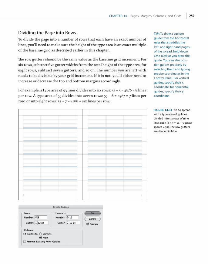
ptg
CHAPTER 14 Pages, Margins, Columns, and Grids 259
Dividing the Page into RowsTo divide the page into a number of rows that each have an exact number of lines, you’ll need to make sure the height of the type area is an exact multiple of the baseline grid as described earlier in this chapter.
Th e row gutters should be the same value as the baseline grid increment. For six rows, subtract fi ve gutter widths from the total height of the type area, for eight rows, subtract seven gutters, and so on. Th e number you are left with needs to be divisible by your grid increment. If it is not, you’ll either need to increase or decrease the top and bottom margins accordingly.
For example, a type area of 53 lines divides into six rows: 53 – 5 = 48/6 = 8 lines per row. A type area of 55 divides into seven rows: 55 – 6 = 49/7 = 7 lines per row, or into eight rows: 55 – 7 = 48/8 = six lines per row.
52 53
FIGURE 14.33 An A4 spread with a type area of 59 lines, divided into six rows of nine lines each (6 x 9 = 54 + 5 gutter spaces = 59). The row gutters are shaded in blue.
TIP: To draw a custom guide from the horizontal ruler that straddles the left- and right-hand pages of the spread, hold down Cmd (Ctrl) as you draw the guide. You can also posi-tion guides precisely by selecting them and typing precise coordinates in the Control Panel. For vertical guides, specify their x coordinate; for horizontal guides, specify their y coordinate.

ptg
INDESIGN TYPE Professional Typography with Adobe InDesign, Second Edition260
Creating Diagonal and Spherical GuidesWhile InDesign doesn’t let you draw objects and turn them into guides the way Illustrator does, there’s nothing to stop you from putting “guide objects” on a separate layer and making that layer nonprinting. Alternatively, you can select the objects and use the Output panel to make their attributes nonprinting.
with love
just hold on
comes the dayto m
e
FIGURE 14.34 Diagonal lines drawn with the Line Tool converted to guides by isolating them on a nonprinting layer.
Page Numbers and Running HeadsPage numbers, or folios, should be placed on a document’s master pages so that they show up on all the pages based on that master page. Although folios are placed outside the type area, they must relate to it. Th eir type size will typi-cally be same as the body text, and in terms of position, the practical options are either at the top or the bottom of the page in the outside margins. Folios typically work best in the outside margin where they can be easily seen by the reader, though centered folios are common in book design and are a legitimate choice. Folios in the inner margin, however, make it hard to fl ip through the book to fi nd a specifi c page, and are consequently of little use.
Th e page number may be accompanied by information like the name of the magazine and month of publication or the chapter title, separated from the number by an em space or en space. Th e left and right pages of a spread typically mirror each other so that the page number is the outermost element.
TIP: Press Cmd+Shift+M (Ctrl+Shift+M) for an em space and Cmd+Shift+N (Ctrl+Shift+N) for an en space.

ptg
CHAPTER 14 Pages, Margins, Columns, and Grids 261
Creating Mirrored Folios 1. On the left-hand master page, use the Type Tool to draw a text frame
below the bottom margin to the full width of the type area. You may fi nd it helpful to fi rst draw guides that correspond to the outside and inside margins, and then draw the text frame from guide to guide.
2. Select Type > Insert Special Character > Markers > Current Page Number or press Cmd+Option+Shift+N (Ctrl+Alt+Shift+N) to insert the special character for page number and any folio information (for example, publication name), then apply character formats as appropriate.
3. Set the alignment to Align Away From Spine, then make a paragraph style for the folio.
4. To position the folio a precise distance from the bottom margin, fi rst move its text frame up so that the top of the frame touches the bottom margin, then insert your cursor into the y value for the frame on the Control Panel and add the increment of the baseline grid after the existing value to move the folio text frame down by one line space.
Figure 15.35 Inserting a page number. On master pages these will appear as the prefix of the master page: A, B, C, etc; on document pages they will reflect the current page number.
FIGURE 14.35 Inserting a page number. On master pages these will appear as the prefix of the master page: A, B, C, etc.; on document pages they will reflect the current page number.

ptg
INDESIGN TYPE Professional Typography with Adobe InDesign, Second Edition262
5. Zoom out to Fit Spread In Window view by pressing Cmd+Option+0 (Ctrl+Alt+0), then switch to the Selection Tool and duplicate the text frame to the right-hand master page by holding down Option/Alt+Shift as you drag — the Shift key constrains the movement to the horizontal plane only.
6. The folio will be positioned in the outside margin due to its Align Away From Spine alignment, but you’ll still need to manually adjust the order of the text using Cut and Paste.
Running HeadsThe content of running heads (headers) varies between publishing houses, but it’s common to put the author’s name at the top top of the left-hand (verso) pages and the title of the book or chapter on the right-hand (recto) pages. This may be useful for short story collections or anthologies, which have multiple authors, but is unnecessary in a work by a single author. After all, how many times do you need to be reminded of the author’s name or the name of the book you’re reading?
In a work using running heads at the top of the page, it is common to position the folio at the bottom of the page on chapter heading pages where a running head at the top of the page would interfere with the type treatment of the chapter heading. In such instances, it’s worth making a separate master page for the chapter opening pages.
For books divided into chapters or sections, the running head may contain the name of the chapter or section number. It’s easy to add a text variable to a master page to achieve this:
1. On either the left- or right-hand master page, create a text frame that is the width of the type area and position it at least one line space above the top margin. Choose Type > Text Variables > Define to set up the conditions of the text variable.
2. Choose Running Header as the type of variable, and click Edit to define its options (see Figure 14.36).
3. Choose the appropriate predefined style sheets used in the document to apply to the text for the header.

ptg
CHAPTER 14 Pages, Margins, Columns, and Grids 263
4. Click ok, then click Insert to insert the text variable into the text frame. While you’re on the master page the variable will read
<Running Header> and will not refl ect the applied styles. Style comes into play on the actual document pages. If necessary, duplicate the text frame to the facing master page. Now, on the document pages the text variable will refl ect the chapter or section head of the fi rst (or last) match of the paragraph style specifi ed in the previous step.
Section MarkersIf you’re working with long documents that are divided into diff erent sections, section markers can help simplify the project by cutting down on the number of master pages or the number of documents needed. Section markers can be used to mark the transitions between departments in a magazine or parts of a book — wherever a document is made up of distinctly diff erent sections. Each section can have its own numbering scheme — Arabic, roman numeral, or abc. Section Markers can be formatted just as you would any piece of text.
To insert a section marker:
1. Create a text frame for your folio on a master page.
2. Ctrl/right-click and choose Insert Special Character > Markers > Section Marker from the context menu. Th e word Section will be inserted into your type.
FIGURE 14.36 Defining a Running Header text variable.

ptg
INDESIGN TYPE Professional Typography with Adobe InDesign, Second Edition264
3. Format the section marker the way you want it to look.
4. To “activate” the section marker on a document page, select the page where you want the section to begin in the Pages panel and choose Numbering And Section Options from the Pages panel menu. Type the section name into the Section Marker fi eld and click ok. Th is section marker will now appear on all pages based on the master page until another section is defi ned.
FIGURE 14.37 A section marker is inserted on the master page (A), then defined on the relevant document page (B). This will remain “on” until a new section is defined (C). A
B
C

ptg
Bibliography
BooksAmbrose, G., and Harris, P. The Fundamentals of Typography. Lausanne,
Switzerland: AVA Publishing SA, 2006.
Baines, Phil, and Andrew Haslam. Type & Typography. London: Laurence King, 2005.
Blatner, David, and Olav Kvern. Real World InDesign CS5. Berkeley, CA: Peachpit Press, 2010.
Bringhurst, Robert. The Elements of Typographic Style. Vancouver, BC: Hartley and Marks Publishers, 2004.
Elam, Kimberly. Typographic Systems. Princeton, NJ: Princeton Architectural Press, 2007.
Felici, James. The Complete Manual of Typography: A Guide to Setting Perfect Type. Berkeley, CA: Peachpit Press, 2003.
Felton, Paul. The Ten Commandments of Typography/Type Heresy: Breaking the Ten Commandments of Typography. London: Merrell Publishers, 2006.
Haley, Allan. Typographic Milestones. New York: Van Nostrand Reinhold, 1992.
Heller, Steven. The Education of a Typographer. New York: Allworth Press, 2004.
Hochuli, Jost. Detail in Typography. London: Hyphen Press, 2009.
Hollis, Richard. Graphic Design: A Concise History. London: Thames & Hudson, 1994.
Kahrel, Peter. GREP in InDesign CS3/CS4. Sebastopol, CA: O’Reilly Media, 2008. PDF or EPUB eBook.
Kane, John. A Type Primer. London: Laurence King, 2002.

ptg
INDESIGN TYPE Professional Typography with Adobe InDesign, Second Edition266
Lupton, Ellen. Thinking with Type: A Critical Guide for Designers. Princeton, NJ: Princeton Architectural Press, 2007.
McLean, Ruari. The Thames and Hudson Manual of Typography. London: Thames and Hudson, 1980
Müller-Brockmann, Josef. Grid Systems in Graphic Design, 4th ed. Zurich: Verlag Niggli, 2008.
Salz, Ina. Typography Essentials: 100 Design Principles for Working with Type. Beverly, MA: Rockport, 2009.
Spiekermann, Erik, and E.M. Ginger. Stop Stealing Sheep & Find Out How Type Works. Berkeley, CA: Adobe Press, 2002.
Squire, Victoria. Getting It Right with Type. London: Laurence King, 2006.
Tschichold, Jan. The New Typography. Berkeley, CA: University of California Press, 2006.
—. The Form of the Book: Essays on the Morality of Good Design. Vancouver, BC: Hartley and Marks, 2007.
White, Alex. Thinking in Type. New York: Allworth Press, 2005.
Williams, Robin. The Non-Designers Type Book, Second Edition. Berkeley, CA: Peachpit Press, 2006.
Wilson, Adrian. The Design of Books. San Francisco: Chronicle Books, 1993.
MoviesHustwit, Gary. Helvetica, DVD. London: Swiss Dots, 2007.
Radio ShowsWisconsin Public Radio. “Program 09-11-01-B: Fonts,” To the Best of
Our Knowledge (aired week of November 1, 2009). www.wpr.org/book/091101b.cfm
WNYC. “Please Explain: Typography,” The Leonard Lopate Show (aired September 11, 2009). www.wnyc.org/shows/lopate/episodes/2009/09/11/segments/140481
Web ResourcesMurphy, Michael. “InDesign CS4: Learning GREP,” Lynda.com online
training course, 2009. http://www.lynda.com/home/DisplayCourse.aspx?lpk2=48368
99 Graphic Design Resources. http://justcreativedesign.com/2008/02/25/ 99-graphic-design-resources/

ptg
Bibliography 267
A Complete List of InDesign CS4 Videos. http://blogs.adobe.com/indesigndocs/2008/10/a_complete_list_of_indesign_cs.html
Adobe Creative Suite Video Podcast. http://creativesuitepodcast.com/index.php?post_id=433704
Adobe InDesign Exchange. www.adobe.com/cfusion/exchange/index.cfm?event=productHome&exc=19
ATypI. www.atypi.org
Before & After. www.bamagazine.com
Computer Arts. www.computerarts.co.uk/home
CreativePro.com. www.creativepro.com/topic/fonts
Design Police. www.design-police.org
FFFFOUND! http://ffffound.com
InDesign Magazine. www.indesignmag.com
InDesignSecrets. http://indesignsecrets.com
Lynda.com. www.lynda.com
Microsoft typography. www.microsoft.com/typography/links/default.aspx
P22 Terminal. www.p22.com/terminal/toc.html
pass4press. www.pass4press.com
Pentagram - What type are you? www.pentagram.com/what-type-are-you/
Periodic Table of Typefaces. www.behance.net/Gallery/Periodic-Table-of-Typefaces/193759
The Grid System. www.thegridsystem.org
Learn: Anatomy of a Typeface. http://typedia.com/learn/only/anatomy-of-a-typeface/
Typobituaries. www.danielmall.com/archives/2006/08/22/typobituaries.php
typoGRAPHIC. www.rsub.com/typographic/timeline/
Typophile. http://typophile.com
Veer. www.veer.com
WhatTheFont! http://new.myfonts.com/WhatTheFont/

ptg
This page intentionally left blank

ptg
Index
ptg
INDESIGN TYPE Professional Typography with Adobe InDesign, Second Edition270
A
accents, 97, 100active corner, 250, 251Adobe Bridge, 26, 27Adobe InCopy, 23, 252Adobe InDesign. See InDesignAdobe Paragraph Composer, 80, 116–117Adobe Type Library, 43Adobe Western 2 character set, 99alignment, 109–124
Adobe Paragraph Composer, 116–117bottom, 123center, 110, 117–118, 120, 123columns, 92, 115, 120, 121, 122–124drop cap letters, 174, 175, 176–177hanging punctuation, 122horizontal, 110–122images, 257–258justified. See justified alignmentleft, 110–113lists, 166–168margins, 91, 92, 143, 174optical, 92ragged, 110, 112, 113, 118, 119right, 110, 119shortcuts, 110tables, 152–153, 161tabs, 168–169, 170text to grid, 71, 246–247, 254–255top, 122–123vertical, 70, 122–124
anchor points, 221–222, 223, 227–228anchored objects, 212–214, 228apostrophes, 91ascenders, 4, 49, 62, 67ASCII, 90, 99aspect ratio, 232, 234–236Auto Leading, 68–69
B
backgrounds, 65, 165, 221baseline, 4baseline grids, 70, 243, 246, 252, 254–259
baseline shift, 11, 54–56bitmapped text, 16body text, 48, 62, 69, 196, 198bold text, 45–46Book feature, 199bowl, 4break characters, 145, 146–147Bridge, 26, 27bulleted lists, 165–167bylines, 198
C
callout boxes, 211–212CamelCase, 51cap heights, 4, 197capitalization
all caps, 49, 50, 67–68, 76drop caps, 171–182initial caps, 172, 173, 179, 180–181small caps, 49, 51–52, 178–179uppercase/lowercase, 48–52
captions, 48, 56, 198, 211–212casing, 48–51character collisions, 103Character Formats view, 14, 15Character Viewer, 101characters
alternate, 106–107break, 145, 146–147formatting, 14, 15, 43–56, 103, 184hidden, 40, 67, 147kerning, 11, 12, 76–87, 176–177Mac OS, 101prime, 90spacing, 12, 79, 116. See also letterspacingspecial, 34, 94, 97, 100styles. See stylessuperscript/subscript, 52–53swash, 105terminal, 105titling, 106Unicode, 97, 99–102vs. glyphs, 98

ptg
Index 271
white space, 95–97width, 12, 44Windows, 101
CID fonts, 97clipping paths, 221, 222colon, 90, 91color, 65, 67, 116column width
considerations, 11, 60, 205, 240–241fixed, 242–243leading and, 62, 64, 65unequal, 243
columnsalignment, 92, 115, 120, 121, 122–124balancing, 70, 124gutters, 11, 62, 64, 241, 250height, 252indenting, 128leading and, 70margins and, 240, 242–243number of, 242, 245setting up, 240–243spanning, 28–29, 30, 31–32, 205splitting, 31–32threaded frames, 27–36width. See column width
contextual alternates, 106Control Panel, 14, 15Convert Direction Point tool, 223counter, 4currency symbols, 55, 97, 102cursor, 22, 24, 25
D
dashes, 93–94Delete Anchor Point Tool, 223descenders, 4, 49, 62, 67, 71diacritical marks, 97dictionaries, 90, 136, 141, 142–143, 144Dingbats, 9, 94diphthongs, 103–104Direct Selection tool, 223display type, 48, 56
documents. See also pagesmaster, 199, 244multilingual, 141navigating, 15–16preflighting, 26sections, 263–264setting up, 232–240viewing, 15–16
“dotless i,” 103, 104double prime, 90drop caps, 171–182
E
ellipses, 94, 97em dashes, 93–94em spaces, 12, 95, 166, 260en dashes, 93en spaces, 12, 94, 95, 260end marks, 94, 95equations, 52Euro symbols/fonts, 102Expert Set, 51
F
Fast Display mode, 16figure dash, 93files. See documentsfinding/changing items, 39, 96, 100, 132, 210finials, 105fleurons, 105flowing text, 23–27folios, 238, 243, 260, 261–262FontLab Studio, 12fonts. See also text; typefaces
changing, 43CID, 97cross-platform, 99, 194default, 22described, 4Dingbats, 9Euro, 102missing, 201multiple masters, 102, 107OpenType, 43, 56, 100, 103, 194

ptg
INDESIGN TYPE Professional Typography with Adobe InDesign, Second Edition272
fonts (continued)picture, 9PostScript, 101, 102sans serif, 4–5, 7on screen, 9serif, 4–5size. See text sizestyles, 44–46symbol, 9TrueType, 43, 101, 102Type 1, 43, 97, 102, 194unicase, 48–49Unicode, 99–102
footnotes, 52formatting. See also styles
characters, 14, 15, 43–56, 103, 184local, 188–190, 203paragraphs, 14, 15text, 14, 15, 43–56, 103, 184
fractions, 52, 55, 101frames. See also text frames
graphics/pictures, 35, 69, 218, 219, 226, 257linked, 25rectangle, 35
G
glyph sets, 98, 99glyphs
finding/changing, 100positioning, 56scaling, 114, 115–116vs. characters, 98
Glyphs panel, 97–99, 101graphic frames, 35, 69, 218, 219, 226, 257graphics
alignment, 257–258considerations, 232inline, 69, 94positioning, 254tables, 162–163wrapping text around, 217–229
GREP Queries, 38GREP styles, 82, 146, 210–211
grid fields, 244, 250, 251Grid System, 250Gridify feature, 249–250grids, 243–260
alignment, 71, 246–247, 254–255baseline, 70, 243, 246, 252, 254–259considerations, 243–245described, 243document, 246of objects, 248–250preferences, 246–251
guides, 23, 33, 247–250, 260gutters, column, 11, 62, 64, 241, 250
H
Hand Tool, 12–13, 15, 16hanging indents, 129, 165hanging punctuation, 122headers, 262–263headings, 133–134, 197, 200, 209headlines, 56Hex Input keyboard, 100hidden characters, 40, 67, 147hidden layers, 225highlighting text, 54H&J violations, 116, 117, 144hyphenation, 112, 116, 119, 136–145hyphens, 56, 91, 93, 111, 136–145
I
images. See graphicsimporting items
styles, 191, 192, 201–203tables, 155–156text, 22, 23, 35–36from Word, 35–36
inch marks, 90, 91InCopy, 23, 252indenting paragraphs, 125, 126–132indents, hanging, 128, 165InDesign
options/preferences, 10–15typography basics and, 2

ptg
Index 273
InDesign documents. See documentsinitial caps, 172, 173, 179, 180–181inline graphics, 69, 94italic text, 44–45
J
justified alignmentadditional options, 119–121full justify, 110, 120–121horizontal, 113–117, 119–121left-aligned text, 113–117, 121nonbreaking spaces and, 96–97right-aligned text, 119, 121text wraps and, 218, 220, 224vertical, 70, 123–124vs. left alignment, 111
justified text, 65, 80, 111, 136, 139, 144
K
Keep Options, 81, 147–149kerning, 11, 12, 76–87, 176–177. See also trackingkeyboard increments, 11keyboard shortcuts. See shortcuts
L
layers, 225, 252, 253leading, 10, 11, 61–71, 255–257letter pairs, 74, 75, 82–87letterform parts, 4letters. See charactersletterspacing, 74–76, 114, 115ligatures, 103–104line breaks
Adobe Paragraph Composer and, 116–117“bad rags” and, 111centered text and, 118discretionary, 147forced, 40, 96, 118, 140, 141, 146No Break attribute, 81, 82, 138, 145–146
line scale, 252lines
breaking. See line breaksKeep Options, 81, 147–149
nested styles, 209–210runt, 77–82spacing between, 10, 11, 61–71used for spacing, 132–134
lining figures, 105–106lists, 165–168, 209Live Preflight feature, 26local formatting, 188–190, 203lozenge rule, 205
M
Mac OS systems, 96, 99–100, 101MakeGrid script, 250margins
alignment, 91, 92, 143, 174columns and, 240, 242–243determining, 237–238facing pages, 233, 239mirrored folios, 261–262size, 11, 238–239, 242
master documents, 199, 244master pages, 191, 244, 252, 260, 263mathematical equations, 52, 55measurement systems, 12median, 4metrics kerning, 83–85, 86, 87Microsoft Word
importing styles from, 201–203importing text from, 35–36
Mini Bridge, 26, 27minus sign, 93multilingual documents, 141multiplication sign, 102
N
No Break attribute, 81, 82, 138, 145–146nonbreaking spaces, 96–97, 145–146numbered lists, 165–168, 209numbers
fractions, 52, 55page, 238, 239, 260–261superscript/subscript, 52–53
ptg
INDESIGN TYPE Professional Typography with Adobe InDesign, Second Edition274
O
objectsanchored, 212–214, 229callout boxes, 211–212grid of, 243–250guide, 260snapping to, 249–250styles, 184, 211–214wrapping text around, 71, 217–229
oldstyle figures, 105–106OpenType fonts, 43, 56, 100, 103, 194optical kerning, 83, 84–85Optical Margin Alignment, 91, 92, 143, 174optical sizes, 107ordinals, 52ornaments, 8, 105orphans, 70, 77–82, 147–149outdents, 129overset text, 24, 26, 38
P
pages. See also documentsdividing into rows, 259facing, 16, 233, 239–240master, 191, 244, 252, 260, 263mirrored, 239, 261–262navigating, 15, 16numbers, 238, 239, 260–261orientation, 232, 236–237size, 232–236, 237viewing, 15–16zooming in/out, 15, 16
Pages panel, 16, 17, 239, 242, 244, 253panels, organizing, 16–19Paragraph Composer, 80Paragraph Formats view, 14, 15paragraph marks, 67, 128, 132paragraph styles, 187–189. See also styles
applying, 187–190[Basic Paragraph], 22, 185described, 184drop caps, 174–175
justification settings, 114leading values, 69–71local overrides, 188–191, 203
paragraphsformatting. See formattingindenting, 125, 126–132intro, 198Keep Options, 81, 147–149No Break attribute, 81, 82, 138, 145–146rules, 204, 205spacing between, 11, 132–134styles. See paragraph styles
pasting text, 33–35Pen Tool, 223picas, 11–12picture credits, 200picture fonts, 9picture frames, 35, 69, 218, 219, 226, 257pictures. See graphicspilcrow, 67, 128placeholder text, 32, 33placing text, 22, 23, 24, 26, 34point size, 9, 10points, 11–12, 68PostScript fonts, 101, 102preflighting, 26presets, 234prime, 90prime marks, 91pull quotes, 200punctuation, 90, 91–92, 122punctuation space, 97
Q
Quark, 83, 225Quick Apply, 189–190, 192quotation marks, 90quote marks, 90, 91, 122quotes, pull, 200
R
rag shape, 111, 112ragged alignment, 110, 112, 113, 118, 119

ptg
Index 275
rectangle frames, 35recto pages, 147, 239, 262reglets, 61resolution, 16, 202rivers, 79–82RTF files, 167–168ruler guides, 248, 249, 254, 257ruler units, 11rules, paragraph, 204, 205run-in heads, 197, 209runt lines, 77–82
S
sans serif fonts, 4–5, 7scaling glyphs, 114, 115–116scaling text, 46–47scientific notation, 52screen, 234, 236script typefaces, 6scripts, 39, 249section markers, 263–264Selection Tool, 12, 13, 25, 223serif fonts, 4–5shapes, 35, 223shortcuts
alignment, 110applying styles, 187, 188baseline shift, 54–56changing case, 50finding/changing items, 100, 132, 210GREP styles, 210hiding/showing panels, 16indenting paragraphs, 126keyboard increments, 11loading custom workspace, 16, 18, 19moving between fields, 14pasting text, 33resizing/scaling text, 46–47selecting text, 42Selection Tool/Type Tool, 13showing hidden characters, 40Tools panel, 13zooming in/out, 15, 16
side bearing, 115sidebars, 200Skip by Leading option, 71Smart Cursor, 22Smart Guides, 249–250snapping to guides, 23, 258snapping to objects, 249–250spacing
characters, 12, 79, 116. See also letterspacingdouble spaces, 96em/en spaces, 12, 94, 95, 166, 260figure spaces, 97, 153flush spaces, 95, 96hair spaces, 95letter pairs, 74, 75, 83, 86, 87between letters, 74–76, 114, 115between lines, 10, 11, 61–71lines as, 132–134nonbreaking spaces, 96–97, 145–146between paragraphs, 11, 132–134problems, 116–117punctuation space, 97removing extra spaces, 39, 96thin spaces, 94, 95, 97between words, 65, 74–82, 114–116
special characters, 34, 94, 97, 100spreadsheets, 155, 157, 161stem, 4stories, 22, 28, 42, 168Story Editor, 36–38, 164, 188stress, 4strikethrough text, 54style guides, 91style sheets, 184–187, 196–200. See also stylesstyles, 183–215. See also formatting; style sheets
advantages of, 184–185applying, 187–190, 204based on existing styles, 186–187Book feature, 199characters, 189, 200–204combining typefaces, 194–196creating, 185–187

ptg
INDESIGN TYPE Professional Typography with Adobe InDesign, Second Edition276
styles (continued)default, 193editing, 190–191fonts, 44–46GREP, 82, 146, 210–211importing, 191, 192, 201–203loading from other documents, 191–192local formatting, 188–190, 203local overrides, 188–191, 203names, 187, 190, 192nested, 207–210objects, 184, 211–214organizing, 192–193paragraph. See paragraph stylesQuick Apply, 189–190redefining, 190–191repeating, 209sequential, 204–206shortcuts, 187, 188, 210sorting, 192tables, 184, 214–215terminology, 184unused, 193
subheads, 48, 133–134, 197, 255subscript, 52–53, 102superscript, 52–53, 102swash characters, 105symbol fonts, 9symbols, 55, 94, 97
T
tablesstyles, 18, 214–215working with, 152–165
tabs, 168–170terminal characters, 105text. See also fonts; typefaces
aligning. See alignmentbitmapped, 16body, 48, 62, 69, 196, 198capitalizing. See capitalization
centering, 110, 117–118, 120, 123cleaning up, 38–40color, 65, 67, 116converting to tables, 155copying/pasting, 33–35dragging/dropping, 26–27flowing, 23–27formatting. See formattinghighlighting, 54hyphenating, 112, 116, 119, 136–145importing, 22, 23, 35–36justified, 65, 80, 111, 136, 139, 144Keep Options, 81, 147–149kerning, 12, 76–87, 176–177leading, 10, 11, 61–71modifying, 25, 36No Break attribute, 81, 82, 138, 145–146overset, 24, 26, 38placeholder, 32, 33placing, 23, 24, 26, 34scaling, 46–47selecting, 42size. See text sizespacing. See spacingstyles. See stylestracking, 11, 12, 74–82, 85widows/orphans, 70, 77–82width, 205wrapping, 71, 163, 217–229zooming in/out, 15, 16
text frames. See also framescreating, 22deleting, 27editing text in, 25, 36flowing text in, 23–27moving, 25removing text from, 28resizing, 25scaling, 47threading, 27–36

ptg
Index 277
text insets, 132text size, 46–48
auto leading and, 68–69changing, 11, 46–47common sizes, 48considerations, 9, 10, 12displaying “real” sizes, 47guidelines, 48keyboard shortcuts, 46–47leading and, 62, 63, 68optical sizes, 107picas/points, 11–12preferences, 11on screen, 48
text wrap, 217–229threading text frames, 27–36thumbnails, 17, 32–33, 34titling alternates, 106–107titling characters, 106Tools panel, 12–13tracking, 11, 12, 74–82, 85. See also kerningtransparency, 205, 225, 253TrueType fonts, 43, 101, 102type. See fonts; text; typefacesType 1 fonts, 43, 97, 102, 194type area, 68, 235–236, 238, 250, 252type cursor, 22type scale, 47Type Tool, 12–13typefaces. See also fonts; text
characteristics of, 66–68classifications, 4–10combining, 194–196condensed/extended, 56considerations, 2–4, 194decorative, 7described, 4historical connotations, 2–3, 194identifying, 43monospaced, 8sans serif, 4–5, 7
script, 6serif, 4–5terminology, 2, 4–5transitional, 6
typewriters, 53, 96typographer’s quotes, 90typographical ornaments, 8, 105typography
asymmetrical, 112getting started, 1–19multilingual, 100overview, 2–4relative units, 12
typography workspace, 16–19
U
underlining, 53–54unicase fonts, 48–49Unicode, 97, 99–102user dictionaries, 142–143
V
vector shapes, 223versals, 172vertical alignment, 70, 123–124
W
white space characters, 95–97widows, 70, 77–82, 147–149Windows systems, 96, 99–100, 101Word. See Microsoft Wordwords. See also text
hyphenating, 136–145No Break attribute, 81, 82, 138, 145–146space between, 65, 74–82, 114–116
workspace, customizing, 16–19wrapping text, 71, 163, 217–229
X
x-heights, 4, 66, 67, 197
Z
Zapf Dingbats, 94zoom controls, 15, 16