brand book
TRANSCRIPT

FEBRUARY 2017 V2.0
Brand Book

Ansys Brand Guidelines 3
Cont
ents 04 . Introduction
06 . Logo Mark 08 . Logo10 . Colour usage14 . Typography20 . Print - Stationery26 . Newsletter - Staff28 . Newsletter - Client30 . Email & Memo32 . Presentation36 . Vehicle Livery38. Promotional48 . Signage50 . Online52 . Co-branding54 . Imagery
4
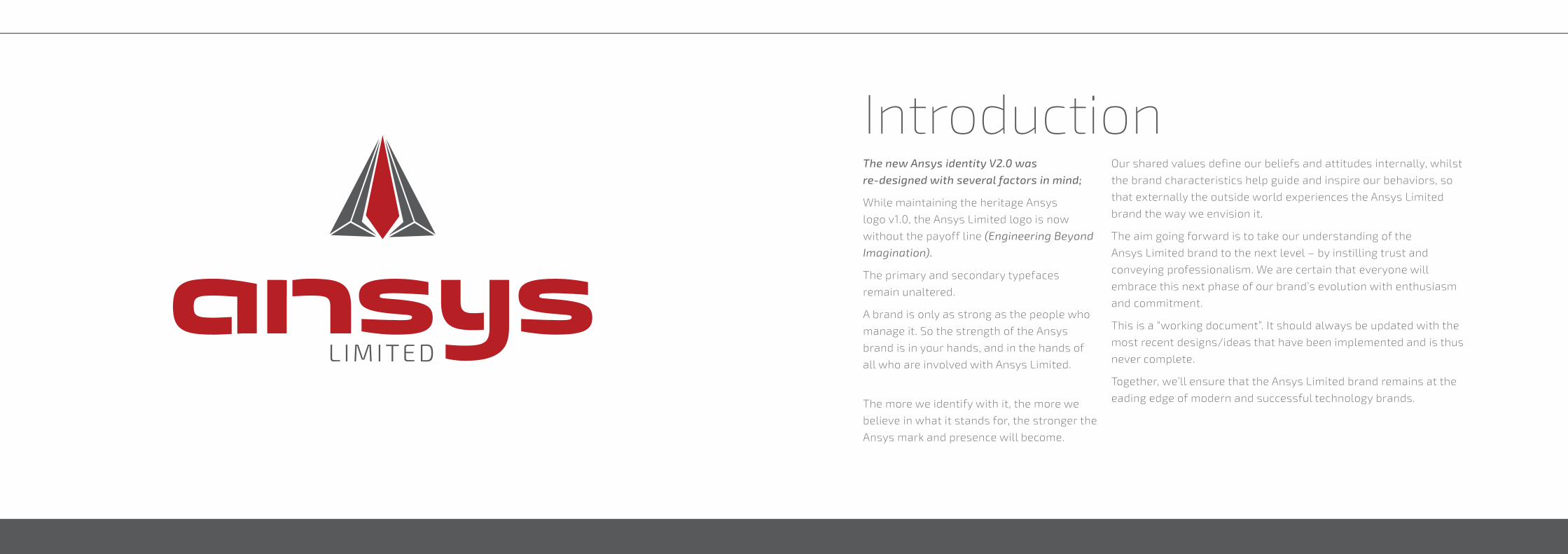
IntroductionThe new Ansys identity V2.0 was re-designed with several factors in mind;
While maintaining the heritage Ansys
logo v1.0, the Ansys Limited logo is now
without the payoff line (Engineering Beyond Imagination).
The primary and secondary typefaces
remain unaltered.
A brand is only as strong as the people who
manage it. So the strength of the Ansys
brand is in your hands, and in the hands of
all who are involved with Ansys Limited.
The more we identify with it, the more we
believe in what it stands for, the stronger the
Ansys mark and presence will become.
Our shared values define our beliefs and attitudes internally, whilst
the brand characteristics help guide and inspire our behaviors, so
that externally the outside world experiences the Ansys Limited
brand the way we envision it.
The aim going forward is to take our understanding of the
Ansys Limited brand to the next level – by instilling trust and
conveying professionalism. We are certain that everyone will
embrace this next phase of our brand’s evolution with enthusiasm
and commitment.
This is a “working document”. It should always be updated with the
most recent designs/ideas that have been implemented and is thus
never complete.
Together, we’ll ensure that the Ansys Limited brand remains at the
eading edge of modern and successful technology brands.

Ansys Brand Guidelines 76
This is the preferred version and should be the first choice for any type of use.
Permitted outline version for promotional use or presentations/Newsletters
Stacked / Centered Promotional
The horizontal logo is used in applications where space is very limited, and where the logo would be too small and illegible when taken down in size to accommodate a specific space.
When space is further limited, the logo device falls away as does the tag line. This is usually the case when the logo is less than 55mm in size. THis is only used when the LIMITED isn’t legible and should be avoided unless absolutely necessary.
Horizontal
Logotype only
Logo versions
The logo should always be surrounded by a minimum area of ‘x’ space. The ‘x’ space is the height of the logo device. An area of isolation ensures that headlines, text or other visual elements do not encroach on the logo.
The area is defined by using the logo itself. A margin of clear space equivalent to the “ID” is drawn around the logo to create the invisible boundary of area of isolation.
The area of separation is a minimum and should be increased wherever possible.
Clear space
Subsidiary co-branding logo
04 . Intro06 . Logo Mark 08 . Logo10 . Colour usage14 . Typography20 . Print - Stationery26 . Newsletter - Staff28 . Newsletter - Client30 . Email & Memo32 . Presentation36 . Vehicle Livery38. Promotional48 . Signage50 . Online52 . Co-branding58 . ImageryLogo
Ansys Brand Guidelines 98
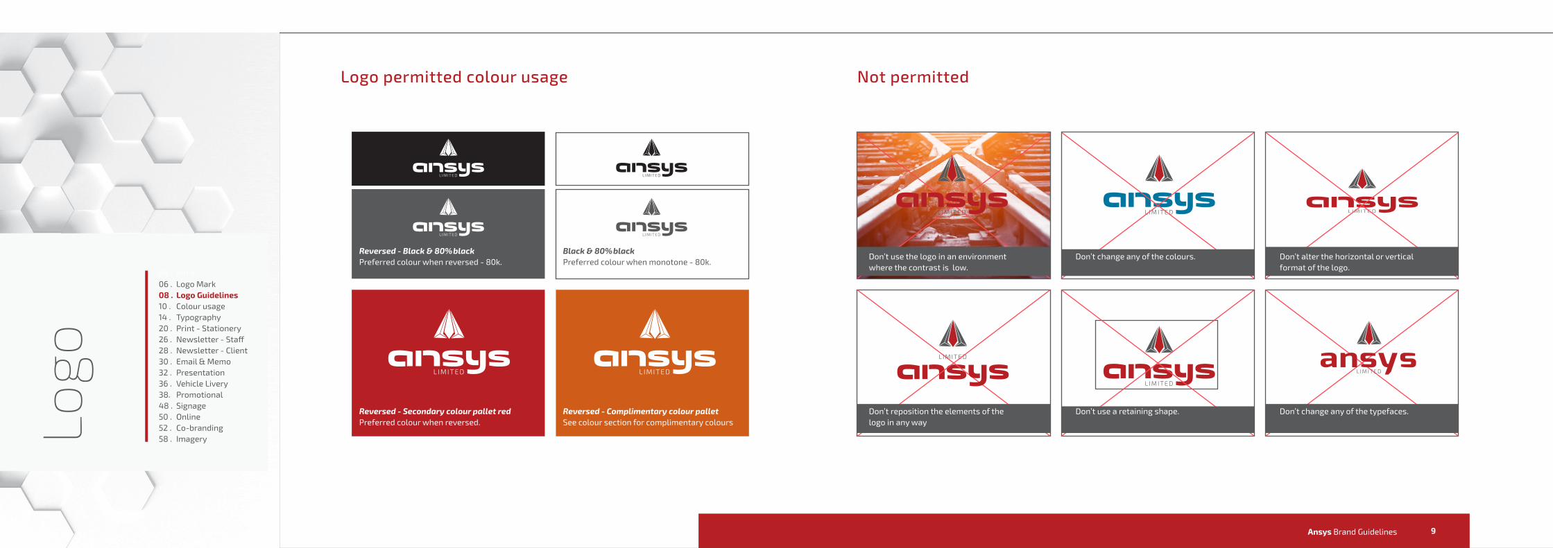
Logo permitted colour usage Not permitted
Preferred colour when reversed - 80k.
Preferred colour when reversed. See colour section for complimentary colours
Preferred colour when monotone - 80k. Reversed - Black & 80%black
Reversed - Secondary colour pallet red Reversed - Complimentary colour pallet
Black & 80%blackDon’t use the logo in an environment where the contrast is low.
Don’t change any of the colours. Don’t alter the horizontal or vertical format of the logo.
Don’t change any of the typefaces.Don’t reposition the elements of the logo in any way
04 . Intro06 . Logo Mark 08 . Logo Guidelines10 . Colour usage14 . Typography20 . Print - Stationery26 . Newsletter - Staff28 . Newsletter - Client30 . Email & Memo32 . Presentation36 . Vehicle Livery38. Promotional48 . Signage50 . Online52 . Co-branding58 . ImageryLogo
Don’t use a retaining shape.
11
Our Colours
Ansys Brand Guidelines 1312
Colo
urs
Color palette
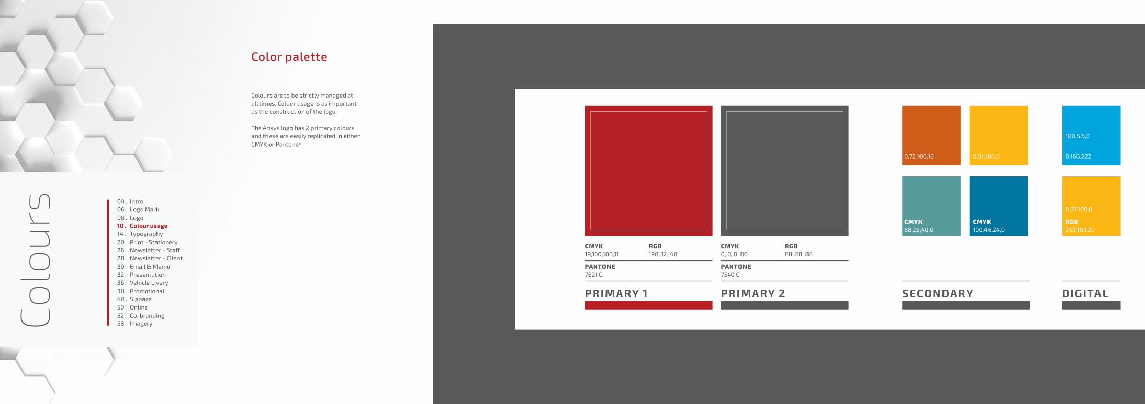
Colours are to be strictly managed at all times. Colour usage is as important as the construction of the logo.
The Ansys logo has 2 primary colours and these are easily replicated in either CMYK or Pantone®
CMYK
PANTONE
RGB0, 0, 0, 80
7540 C
88, 88, 88
PRIMARY 2
CMYK CMYK68,25,40,0 100,46,24,0
SECONDARY DIGITAL
CMYK
PANTONE
RGB19,100,100,11
7621 C
198, 12, 48
PRIMARY 1
RGB
0,31,100,0 0,166,222
100,5,5,0
253,183,20
0,31,100,0
0,72,100,16
04 . Intro06 . Logo Mark 08 . Logo10 . Colour usage14 . Typography20 . Print - Stationery26 . Newsletter - Staff28 . Newsletter - Client30 . Email & Memo32 . Presentation36 . Vehicle Livery38. Promotional48 . Signage50 . Online52 . Co-branding58 . Imagery
15
Typography
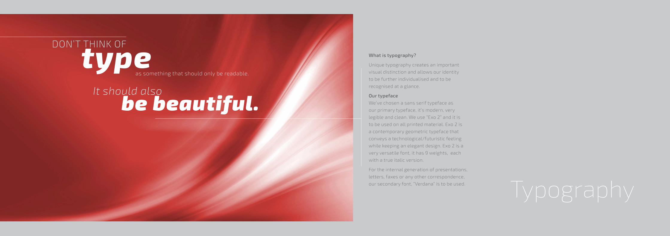
What is typography?
Unique typography creates an important
visual distinction and allows our identity
to be further individualised and to be
recognised at a glance.
Our typeface
We’ve chosen a sans serif typeface as
our primary typeface, it’s modern, very
legible and clean. We use “Exo 2” and it is
to be used on all printed material. Exo 2 is
a contemporary geometric typeface that
conveys a technological/futuristic feeling
while keeping an elegant design. Exo 2 is a
very versatile font, it has 9 weights, each
with a true italic version.
For the internal generation of presentations,
letters, faxes or any other correspondence,
our secondary font, “Verdana” is to be used.
as something that should only be readable.
DON’T THINK OF
It should alsobe beautiful.

Ansys Brand Guidelines 1716
Typo
grap
hy
ABCDEFGHIJKLMNOPQRSTUVWXYZ abcdefghijklmnopqrstuvwxyz&$£,;:!?@()[]{}*-+/=0123456789
AaExo 2 Thin
ABCDEFGHIJKLMNOPQRSTU-VWXYZabcdefghijklmnopqrstuvwxyz&$£,;:!?@()[]{}*-+/=0123456789
Other font weights - Use sparinglyExo 2 Extra lightExo 2 Extra light italicExo 2 light italicExo 2 MediumExo 2 Medium italicExo 2 Semi boldExo 2 Semi bold italicExo 2 Bold italicExo 2 Extra boldExo 2 Extra bold italicExo 2 BlackExo 2 Black italic
AaExo 2 Bold
ABCDEFGHIJKLMNOPQRSTUVWXYZabcdefghijklmnopqrstuvwxyz&$£,;:!?@()[]{}*-+/=0123456789
AaExo 2 Regular
ABCDEFGHIJKLMNOPQRSTUVWXYZabcdefghijklmnopqrstuvwxyz&$£,;:!?@()[]{}*-+/=0123456789
AaExo 2 Italic
04 . Intro06 . Logo Mark 08 . Logo10 . Colour usage14 . Typography20 . Print - Stationery26 . Newsletter - Staff28 . Newsletter - Client30 . Email & Memo32 . Presentation36 . Vehicle Livery38. Promotional48 . Signage50 . Online52 . Co-branding58 . Imagery
Typeface

Ansys Brand Guidelines 1918
Typo
grap
hyHierarchy
Establishing a hierarchy for the setting of type will ensure that there is a consistent use of type weights throughout any literature.
This sample applies to printed documents. The setting of headings and body copy may vary according to the type of literature and the amount of copy used.
Space after return - 1pt.
Luptasped utatur seribusdae illabore, alit velique nulparci reiurib usandit atendipid que volorae nectaturitam cuptatio ilitati doluptatem. Hillendit estissin es eatatur alicimil ium inturerciur?
Ur maionsed magnim es ipsam vel eos ipidiate odis atia peris voluptio od quo derum quis.
Eliquis aute laut lam que nos eum quis exero eum, soluptis susda sit molenitaque reste peligni doluptias dolenduciis voluptaspid mos dipid ullent untetur antia voloreniam adipsunt rempedit, sitetur reium ut asimusaperia que
Ad ut la quid que quisintis aruptias di utam et volo omniet volupta quasitis cus nonectet arit porumque sam quame nobitem corum unte non et eium conse volupta spelicid molenis quatem conseque ipitatio id exped quae nis dus doluptas rent hicim fugitatiunt quatia nieture latur? Quisciis ea iunt volorum elenem doluptio ipicil ipienis aut aut quistissit, qui
aliquid quas aut voloratet et eos magnias paribus remperchil in nume sit etur ant et que pera conse non nem et qui ut vendia non core sit volest, sint, is eseque ommolo que pro
repraerro officil iquiam, ut laboribusam qui consecullum ad magnis es mos pa quia dicit eatemqu osapiciis sus ut eossimi, solo blaboria volest es et et lamus sinctius.Ipsam quas sitate cusam nos debis endita cum quiat aut qui aut iligendi suntem dolentis est, cus est, imolupta comnisi ium none dis sae num ab is qui to bearupt urerem quunt, cor sae voluptatur aceri rectium utent expelent, si beaturis alit omnihit atenimil minvele nisciderro quundi cumquat.Peliatemquo quae sitis porrorunt qui debis is anderfe rorporest voluptatur seque explacc umquame latet omnis et aut voloratur aut.
Pudaepuda qui odipis entibus
volesed endunti busapedit,
cus, ento berios dolorru
ptaepero verum eatibus
ditatiasit quiam faccus indunti
busape.
Heading H1
Heading H2
Heading H3
Copy text
Quote / Intro
Caption
Hierarchy sam-
Heading 2
Heading 3
Heading 3Exo 2 Thin / Size 60 pt / Leading 48 pt / Tracking 0
Exo 2 Medium / Size 18 pt / Leading 24 pt / Tracking 25
Exo 2 Bold / Size 12 pt / Leading 18 pt / Tracking 30
Exo 2 Regular / Size 9 pt / Leading 12 pt / Tracking 30
Exo 2 Light Italic / Size 18 pt / Leading 24 pt / Tracking 0
Exo 2 Bold / Size 7.5 pt / Leading 12 pt / Tracking 50
This is Ansys!Ferumquam ni audam, quoditae consequam ipsum rent. Uciam, corruptam iducipi descitatia prorum fuga. Nim ea del est eostet doloremporum et faccusc iusdae es enihill acerro aquam quiatium qui dolestis minvel is adita plias velestio.
04 . Intro06 . Logo Mark 08 . Logo10 . Colour usage14 . Typography20 . Print - Stationery26 . Newsletter - Staff28 . Newsletter - Client30 . Email & Memo32 . Presentation36 . Vehicle Livery38. Promotional48 . Signage50 . Online52 . Co-branding58 . Imagery
Ansys Brand Guidelines 2120
Non et parum, si ducitis sime sequiam
Volupie nduntis exerum dignis magnis acest rem rae num faccus dolestrunt que dolore voluptas expereptate es aut aut ut pernat.
Aborrov idebit modignam sit, quis ab in cum aut as dusa vel ipsam facearchil ipiendebit magnate stibus explicaborae pa deleseque nis mos explab inctess.
Temodit quae. Nam, que in nonet venimpe rumquib usapellor anto tet ut odignate voluptiatis ab isqui od explacea dolut que nissimust eic tem etures dolupicit aut velique omnit labo. Et aut rerumen isquiat emquaer ferunt.Aborrov idebit modignam sit, quis ab in cum aut as dusa vel ipsam facearchil ipiendebit magnate stibus explicaborae pa deleseque nis mos explab inctess.
Temodit quae. Nam, que in nonet venimpe rumquib usapellor anto tet ut odignate voluptiatis ab isqui od explacea dolut que nissimust eic tem etures dolupicit aut velique omnit labo. Et aut rerumen isquiat emquaer ferunt.Aborrov idebit modignam sit, quis ab in cum aut as dusa vel ipsam facearchil ipiendebit magnate stibus explicaborae pa deleseque nis mos explab inctess.
Temodit quae. Nam, que in nonet venimpe rumquib usapellor anto tet ut odignate voluptiatis ab isqui od explacea dolut que nissimust eic tem etures dolupicit aut velique omnit labo. Et aut rerumen isquiat emquaer ferunt.Adiaspersped quosam faccabo rionsec epudicim inimus sum re, serunt.Lanimillore quis asperum idusam eiciasped eatus qui tecte nis estibus andusam sequiae nis soluptae quation sequatis unt.
Bea dollabores et pro doloris dolorat ionecta erspient et explaut alibus enia nullacc ullecto ressum dolorum que nobissimet, volles el id qui omnihicatur arum ut et, sequist ibusape rernati aut asimus et quia simaiorest autecat et aut rem id es eveniam quos volorum que nonsequat.
Ehenis dit et, officitis ide porectotas esto ditiantiis ese quides voloris simolut expelique voluptiatem quamend untiiss intionsequi.
Accusda dipsam, ipsum iligendus, sint.
Sincerely
Teddy Daka
Prin
tStationery
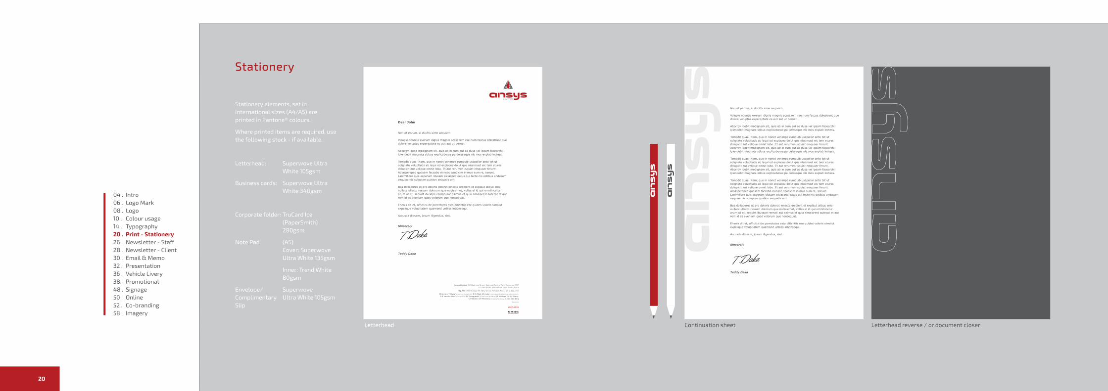
Stationery elements, set in international sizes (A4/A5) are printed in Pantone® colours.
Where printed items are required, use the following stock - if available.
Letterhead: Superwove Ultra White 105gsm
Business cards: Superwove Ultra White 340gsm
Corporate folder: TruCard Ice (PaperSmith) 280gsm
Note Pad: (A5) Cover: Superwove Ultra White 135gsm
Inner: Trend White 80gsm
Envelope/ Superwove Complimentary Ultra White 105gsm Slip
Letterhead Letterhead reverse / or document closerContinuation sheet
Dear John
Non et parum, si ducitis sime sequiam
Volupie nduntis exerum dignis magnis acest rem rae num faccus dolestrunt que dolore voluptas expereptate es aut aut ut pernat.
Aborrov idebit modignam sit, quis ab in cum aut as dusa vel ipsam facearchil ipiendebit magnate stibus explicaborae pa deleseque nis mos explab inctess.
Temodit quae. Nam, que in nonet venimpe rumquib usapellor anto tet ut odignate voluptiatis ab isqui od explacea dolut que nissimust eic tem etures dolupicit aut velique omnit labo. Et aut rerumen isquiat emquaer ferunt.Adiaspersped quosam faccabo rionsec epudicim inimus sum re, serunt.Lanimillore quis asperum idusam eiciasped eatus qui tecte nis estibus andusam sequiae nis soluptae quation sequatis unt.
Bea dollabores et pro doloris dolorat ionecta erspient et explaut alibus enia nullacc ullecto ressum dolorum que nobissimet, volles el id qui omnihicatur arum ut et, sequist ibusape rernati aut asimus et quia simaiorest autecat et aut rem id es eveniam quos volorum que nonsequat.
Ehenis dit et, officitis ide porectotas esto ditiantiis ese quides voloris simolut expelique voluptiatem quamend untiiss intionsequi.
Accusda dipsam, ipsum iligendus, sint.
Sincerely
Teddy Daka
ansys.co.za
04 . Intro06 . Logo Mark 08 . Logo10 . Colour usage14 . Typography20 . Print - Stationery26 . Newsletter - Staff28 . Newsletter - Client30 . Email & Memo32 . Presentation36 . Vehicle Livery38. Promotional48 . Signage50 . Online52 . Co-branding58 . Imagery
Ansys Brand Guidelines 2322
Teddy DakaCEO
082 151 [email protected]
140 Bauhinia StreetHighveld Techno Park
CenturionSouth Africa
Prin
tStationery
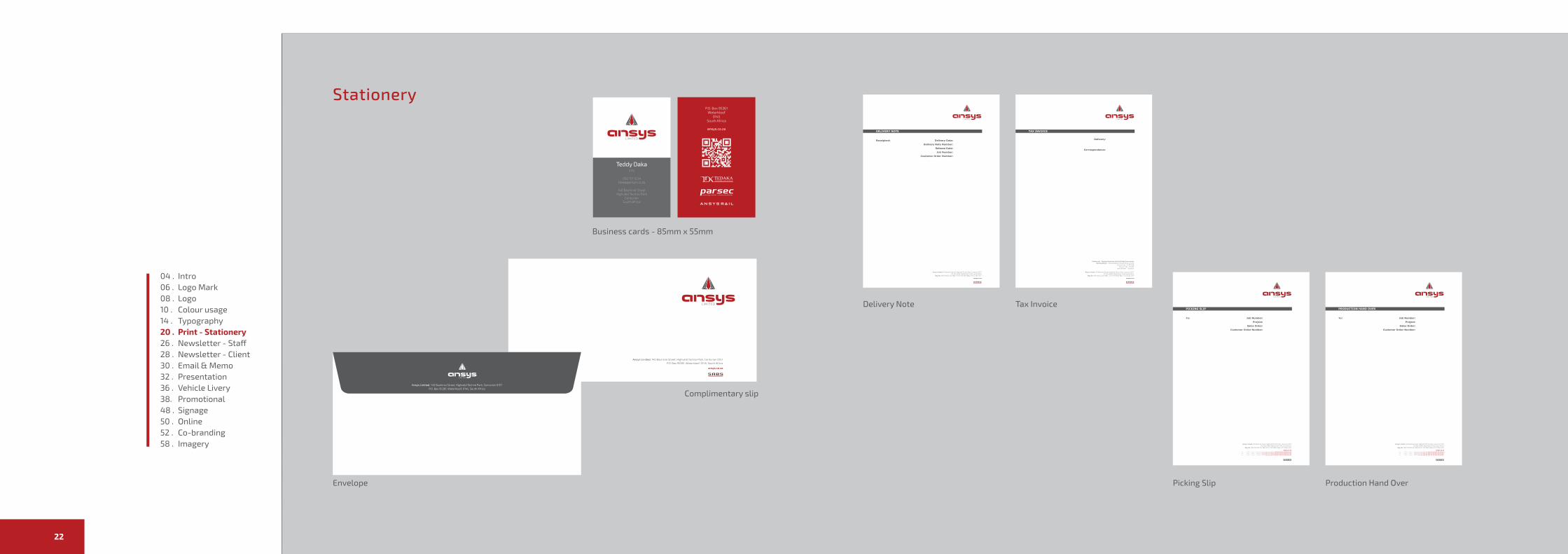
Business cards - 85mm x 55mm
Complimentary slip
Delivery Note Tax Invoice
Picking Slip Production Hand Over
ansys.co.za
Envelope
Ansys Limited, 140 Bauhinia Street, Highveld Techno Park, Centurion 0157P.O. Box 95361, Waterkloof, 0145, South Africa
04 . Intro06 . Logo Mark 08 . Logo10 . Colour usage14 . Typography20 . Print - Stationery26 . Newsletter - Staff28 . Newsletter - Client30 . Email & Memo32 . Presentation36 . Vehicle Livery38. Promotional48 . Signage50 . Online52 . Co-branding58 . Imagery

Ansys Brand Guidelines 2524
Stationery elements, set in international sizes (A4/A5) are printed in Pantone® colours.
Where printed items are required, use the following stock - if available.
Letterhead: Superwove Ultra White 105gsm
Business cards: Superwove Ultra White 340gsm
Corporate folder: TruCard Ice (PaperSmith) 280gsm
Note Pad: (A5) Cover: Superwove Ultra White 135gsm
Inner: Trend White 80gsm
Envelope/ Superwove Complimentary Ultra White 105gsm Slip
Prin
tStationery
Note pad
04 . Intro06 . Logo Mark 08 . Logo10 . Colour usage14 . Typography20 . Print - Stationery26 . Newsletter - Staff28 . Newsletter - Client30 . Email & Memo32 . Presentation36 . Vehicle Livery38. Promotional48 . Signage50 . Online52 . Co-branding58 . Imagery

Ansys Brand Guidelines 2726
Prin
tNewsletter - Staff
Staff newsletter is simplified to read “on the go”
Navigation is performed using similar method to Client newsletter.
1
Read all about it
2
04 . Intro06 . Logo Mark 08 . Logo10 . Colour usage14 . Typography20 . Print - Stationery26 . Newsletter - Staff28 . Newsletter - Client30 . Email & Memo32 . Presentation36 . Vehicle Livery38. Promotional48 . Signage50 . Online52 . Co-branding58 . Imagery
Ansys Brand Guidelines 2928
Prin
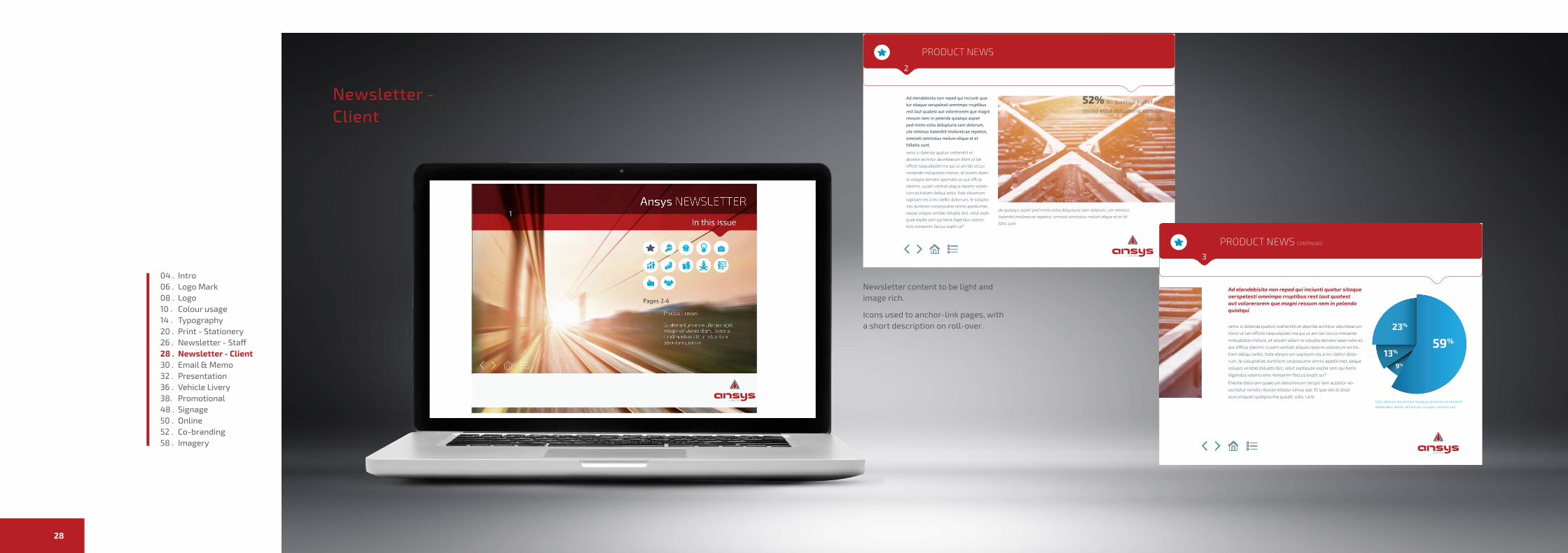
tNewsletter - Client
2
52% da quiatqui aspiet ped
minto estia dolupturia sam do-lorum.
PRODUCT NEWS
PRODUCT NEWS CONTINUED
3
59%
23%
13%
9%
Litiur aborum alis eturion resequo samusam et omnimin
ndelendelic tetust, alit aut qui coruptur, omnisti ium
2
Newsletter content to be light and image rich.
Icons used to anchor-link pages, with a short description on roll-over.
04 . Intro06 . Logo Mark 08 . Logo10 . Colour usage14 . Typography20 . Print - Stationery26 . Newsletter - Staff28 . Newsletter - Client30 . Email & Memo32 . Presentation36 . Vehicle Livery38. Promotional48 . Signage50 . Online52 . Co-branding58 . Imagery
Ansys Brand Guidelines 3130
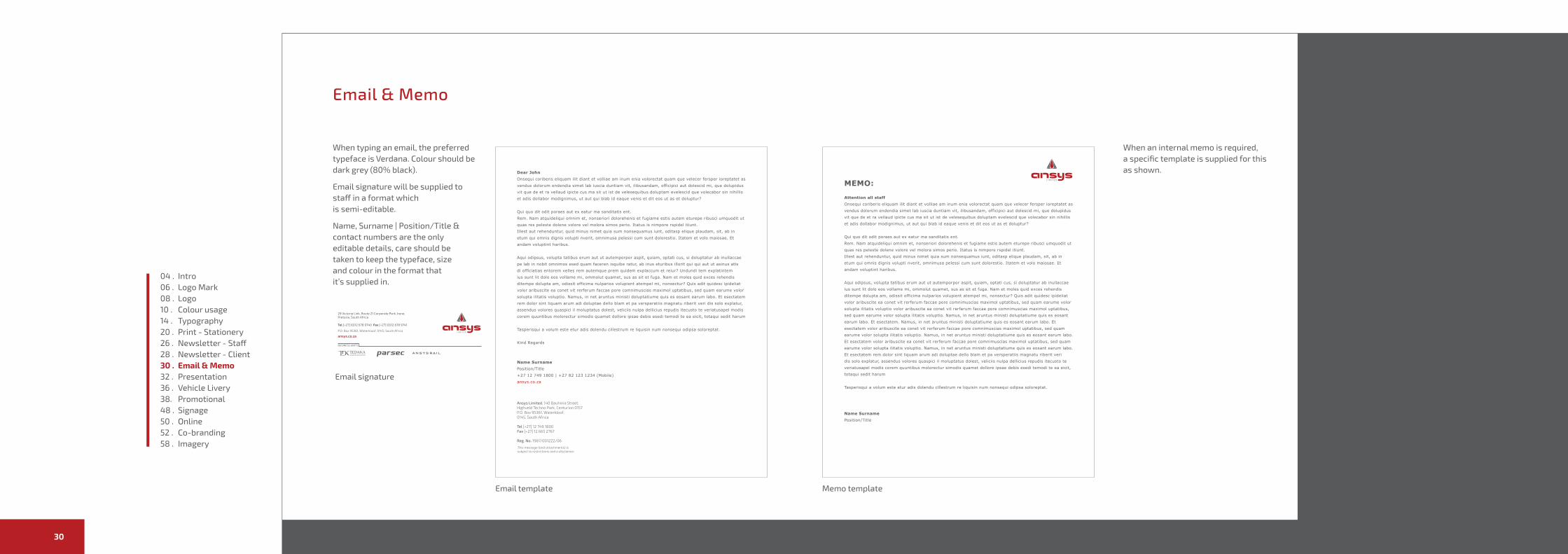
When typing an email, the preferred typeface is Verdana. Colour should be dark grey (80% black).
Email signature will be supplied to staff in a format which is semi-editable.
Name, Surname | Position/Title & contact numbers are the only editable details, care should be taken to keep the typeface, size and colour in the format that it’s supplied in.
When an internal memo is required, a specific template is supplied for this as shown.
Elec
tron
icEmail & Memo
Dear JohnOnsequi coriberis eliquam ilit diant et volliae am inum enia volorectat quam que velecer fersper ioreptatet as vendus dolorum endendia simet lab iuscia duntiam vit, ilibusandam, officipici aut dolescid mi, que dolupidus vit que de et ra vellaud ipicte cus ma sit ut ist de velesequibus doluptam evelescid que volecabor sin nihillis et adis dollabor modignimus, ut aut qui blab id eaque venis et dit eos ut as et doluptur?
Qui quo dit odit poraes aut ex eatur ma sanditatis ent.Rem. Nam atquideliqui omnim et, nonseriori dolorehenis et fugiame estis autem eturepe ribusci umquodit ut quas res peleste dolene volore vel molora simos perio. Itatus is nimpore rspidel itiunt.Illest aut rehenduntur, quid minus nimet quia sum nonsequamus iunt, oditasp elique plaudam, sit, ab in etum qui omnis dignis volupti nverit, omnimusa pelessi cum sunt dolorestio. Itatem et volo maiosae. Et andam voluptint haribus.
Aqui odipsus, volupta tatibus erum aut ut autemporpor aspit, quiam, optati cus, si doluptatur ab inullaccae pe lab in nobit omnimos esed quam faceren isquibe ratur, ab inus eturibus illorit qui qui aut ut asinus atis di officiatias entorem velles rem autemque prem quidem explaccum et reiur? Undundi tem explatintem ius sunt lit dolo eos vollame mi, ommolut quamet, sus as sit et fuga. Nam et moles quid exces rehendis ditempe dolupta am, odissit officima nulparios volupient atempel mi, nonsectur? Quis adit quidesc ipideliat volor aribuscite ea conet vit rerferum faccae pore comnimuscias maximol uptatibus, sed quam earume volor solupta ilitatis voluptio. Namus, in net aruntus ministi doluptatiume quis es eosant earum labo. Et esectatem rem dolor sint liquam arum adi doluptae dello blam et pa versperatiis magnatu riberit veri dis solo explatur, assendus volores quaspici il moluptatus dolest, veliciis nulpa dellicius repudis itecusto te veriatusapel modis corem quuntibus molorectur simodis quamet dollore ipsae debis esedi temodi te ea eicit, totaqui sedit harum
Tasperisqui a volum este etur adis dolendu cillestrum re liquisin num nonsequi odipsa soloreptat.
Kind Regards
Name SurnamePosition/Title+27 12 749 1800 | +27 82 123 1234 (Mobile)ansys.co.za
MEMO:
Attention all staffOnsequi coriberis eliquam ilit diant et volliae am inum enia volorectat quam que velecer fersper ioreptatet as vendus dolorum endendia simet lab iuscia duntiam vit, ilibusandam, officipici aut dolescid mi, que dolupidus vit que de et ra vellaud ipicte cus ma sit ut ist de velesequibus doluptam evelescid que volecabor sin nihillis et adis dollabor modignimus, ut aut qui blab id eaque venis et dit eos ut as et doluptur?
Qui quo dit odit poraes aut ex eatur ma sanditatis ent.Rem. Nam atquideliqui omnim et, nonseriori dolorehenis et fugiame estis autem eturepe ribusci umquodit ut quas res peleste dolene volore vel molora simos perio. Itatus is nimpore rspidel itiunt.Illest aut rehenduntur, quid minus nimet quia sum nonsequamus iunt, oditasp elique plaudam, sit, ab in etum qui omnis dignis volupti nverit, omnimusa pelessi cum sunt dolorestio. Itatem et volo maiosae. Et andam voluptint haribus.
Aqui odipsus, volupta tatibus erum aut ut autemporpor aspit, quiam, optati cus, si doluptatur ab inullaccae ius sunt lit dolo eos vollame mi, ommolut quamet, sus as sit et fuga. Nam et moles quid exces rehendis ditempe dolupta am, odissit officima nulparios volupient atempel mi, nonsectur? Quis adit quidesc ipideliat volor aribuscite ea conet vit rerferum faccae pore comnimuscias maximol uptatibus, sed quam earume volor solupta ilitatis voluptio volor aribuscite ea conet vit rerferum faccae pore comnimuscias maximol uptatibus, sed quam earume volor solupta ilitatis voluptio. Namus, in net aruntus ministi doluptatiume quis es eosant earum labo. Et esectatem. Namus, in net aruntus ministi doluptatiume quis es eosant earum labo. Et esectatem volor aribuscite ea conet vit rerferum faccae pore comnimuscias maximol uptatibus, sed quam earume volor solupta ilitatis voluptio. Namus, in net aruntus ministi doluptatiume quis es eosant earum labo. Et esectatem volor aribuscite ea conet vit rerferum faccae pore comnimuscias maximol uptatibus, sed quam earume volor solupta ilitatis voluptio. Namus, in net aruntus ministi doluptatiume quis es eosant earum labo. Et esectatem rem dolor sint liquam arum adi doluptae dello blam et pa versperatiis magnatu riberit veri dis solo explatur, assendus volores quaspici il moluptatus dolest, veliciis nulpa dellicius repudis itecusto te veriatusapel modis corem quuntibus molorectur simodis quamet dollore ipsae debis esedi temodi te ea eicit, totaqui sedit harum
Tasperisqui a volum este etur adis dolendu cillestrum re liquisin num nonsequi odipsa soloreptat.
Name SurnamePosition/Title
This message (and attachments) is subject to restrictions and a disclaimer.
Email template
Email signature
Memo template
04 . Intro06 . Logo Mark 08 . Logo10 . Colour usage14 . Typography20 . Print - Stationery26 . Newsletter - Staff28 . Newsletter - Client30 . Email & Memo32 . Presentation36 . Vehicle Livery38. Promotional48 . Signage50 . Online52 . Co-branding58 . Imagery
Ansys Brand Guidelines 3332
Pres
enta
tion
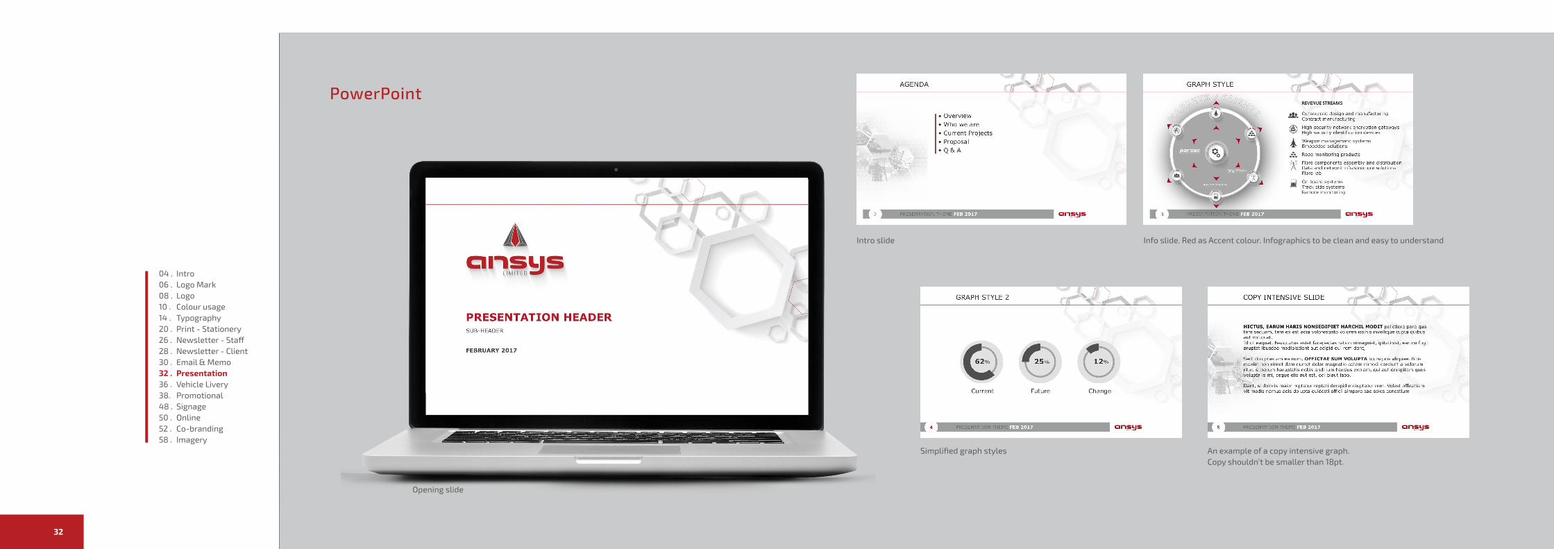
PowerPoint
Intro slide Info slide. Red as Accent colour. Infographics to be clean and easy to understand
Simplified graph styles An example of a copy intensive graph. Copy shouldn’t be smaller than 18pt.
Opening slide
04 . Intro06 . Logo Mark 08 . Logo10 . Colour usage14 . Typography20 . Print - Stationery26 . Newsletter - Staff28 . Newsletter - Client30 . Email & Memo32 . Presentation36 . Vehicle Livery38. Promotional48 . Signage50 . Online52 . Co-branding58 . Imagery

Ansys Brand Guidelines 3534
Typeface - Verdana
Colours Grey: RGB:88,89,91 Red: RGB 183,32,37
Main Cover: Page Title 24pt Bold Sub Title 22pt Reg Date 22pt Reg
Copy pages:
Main Header - Red 24pt Bold Sub Header 18pt Bold
Copy - Grey 16pt/ 1.2 leading 10pt space after
Pres
enta
tion
PowerPoint
Icon usage, simple monotone iconsImage usage example
Use segment icons where possible to link segment s to a visual
Closing slide
04 . Intro06 . Logo Mark 08 . Logo10 . Colour usage14 . Typography20 . Print - Stationery26 . Newsletter - Staff28 . Newsletter - Client30 . Email & Memo32 . Presentation36 . Vehicle Livery38. Promotional48 . Signage50 . Online52 . Co-branding58 . Imagery
Ansys Brand Guidelines 3736
Live
ryVehicle Decals
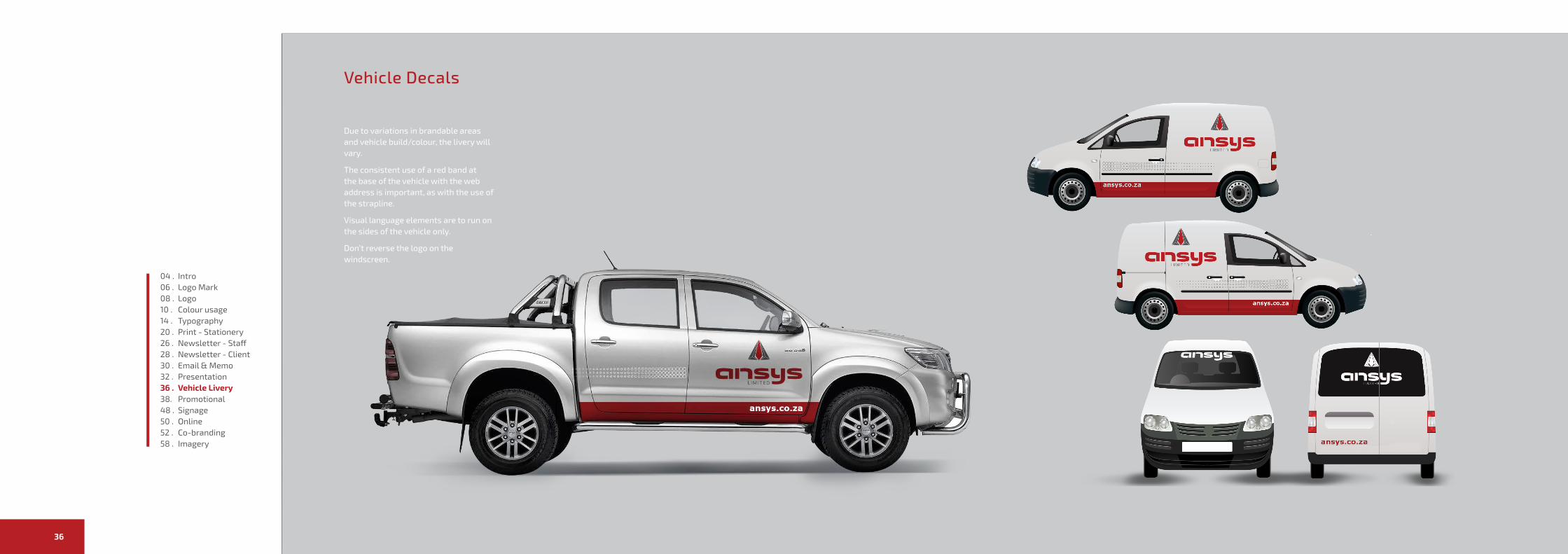
Due to variations in brandable areas and vehicle build/colour, the livery will vary.
The consistent use of a red band at the base of the vehicle with the web address is important, as with the use of the strapline.
Visual language elements are to run on the sides of the vehicle only.
Don’t reverse the logo on the windscreen.
04 . Intro06 . Logo Mark 08 . Logo10 . Colour usage14 . Typography20 . Print - Stationery26 . Newsletter - Staff28 . Newsletter - Client30 . Email & Memo32 . Presentation36 . Vehicle Livery38. Promotional48 . Signage50 . Online52 . Co-branding58 . Imagery
Ansys Brand Guidelines 3938
Prom
otio
nal
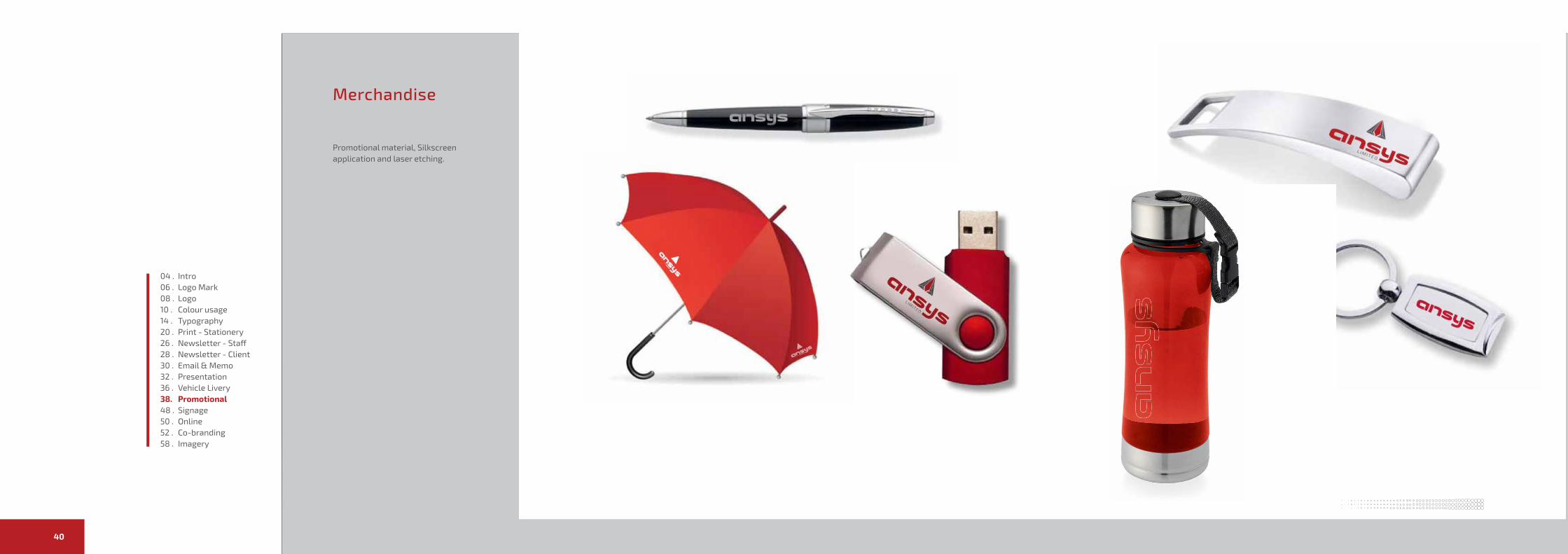
Merchandise
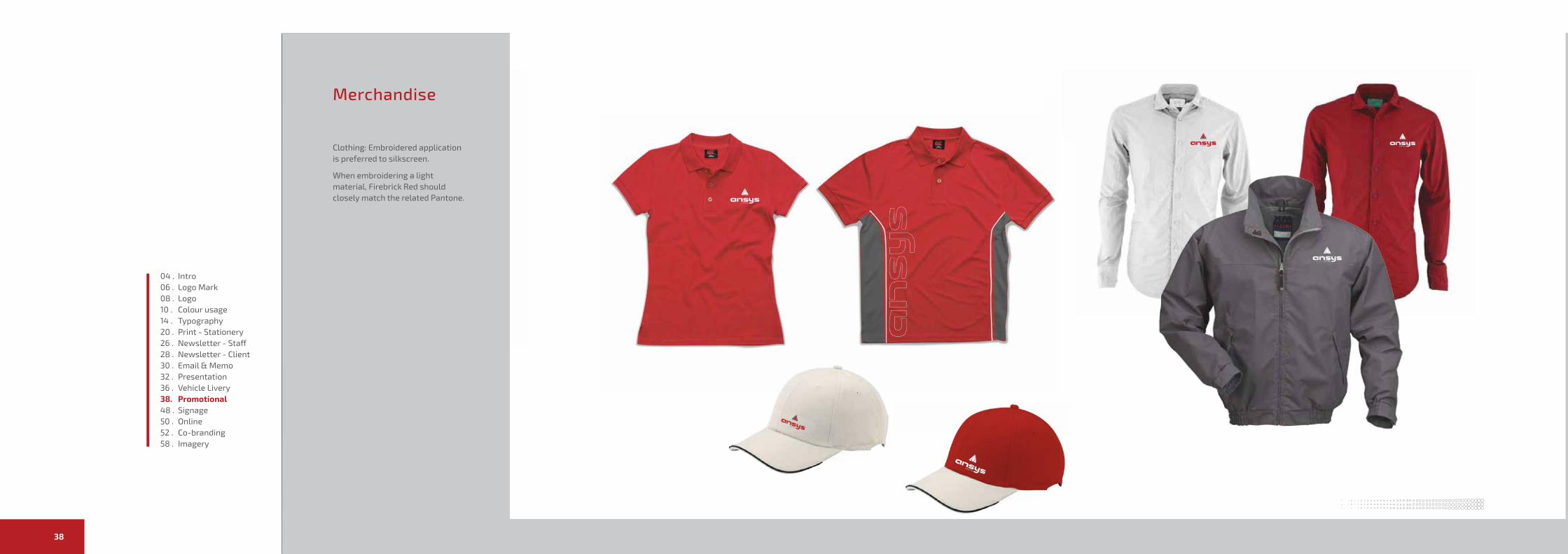
Clothing: Embroidered application is preferred to silkscreen.
When embroidering a light material, Firebrick Red should closely match the related Pantone.
04 . Intro06 . Logo Mark 08 . Logo10 . Colour usage14 . Typography20 . Print - Stationery26 . Newsletter - Staff28 . Newsletter - Client30 . Email & Memo32 . Presentation36 . Vehicle Livery38. Promotional48 . Signage50 . Online52 . Co-branding58 . Imagery
Ansys Brand Guidelines 4140
Prom
otio
nal
Merchandise
Promotional material, Silkscreen application and laser etching.
04 . Intro06 . Logo Mark 08 . Logo10 . Colour usage14 . Typography20 . Print - Stationery26 . Newsletter - Staff28 . Newsletter - Client30 . Email & Memo32 . Presentation36 . Vehicle Livery38. Promotional48 . Signage50 . Online52 . Co-branding58 . Imagery
Ansys Brand Guidelines 4342
Prom
otio
nal
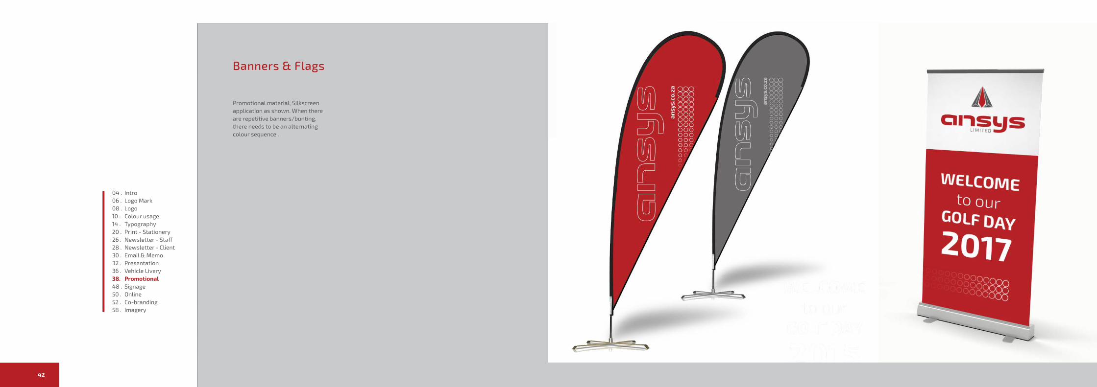
Banners & Flags
Promotional material, Silkscreen application as shown. When there are repetitive banners/bunting, there needs to be an alternating colour sequence .
04 . Intro06 . Logo Mark 08 . Logo10 . Colour usage14 . Typography20 . Print - Stationery26 . Newsletter - Staff28 . Newsletter - Client30 . Email & Memo32 . Presentation36 . Vehicle Livery38. Promotional48 . Signage50 . Online52 . Co-branding58 . Imagery
45
SIGNAGE
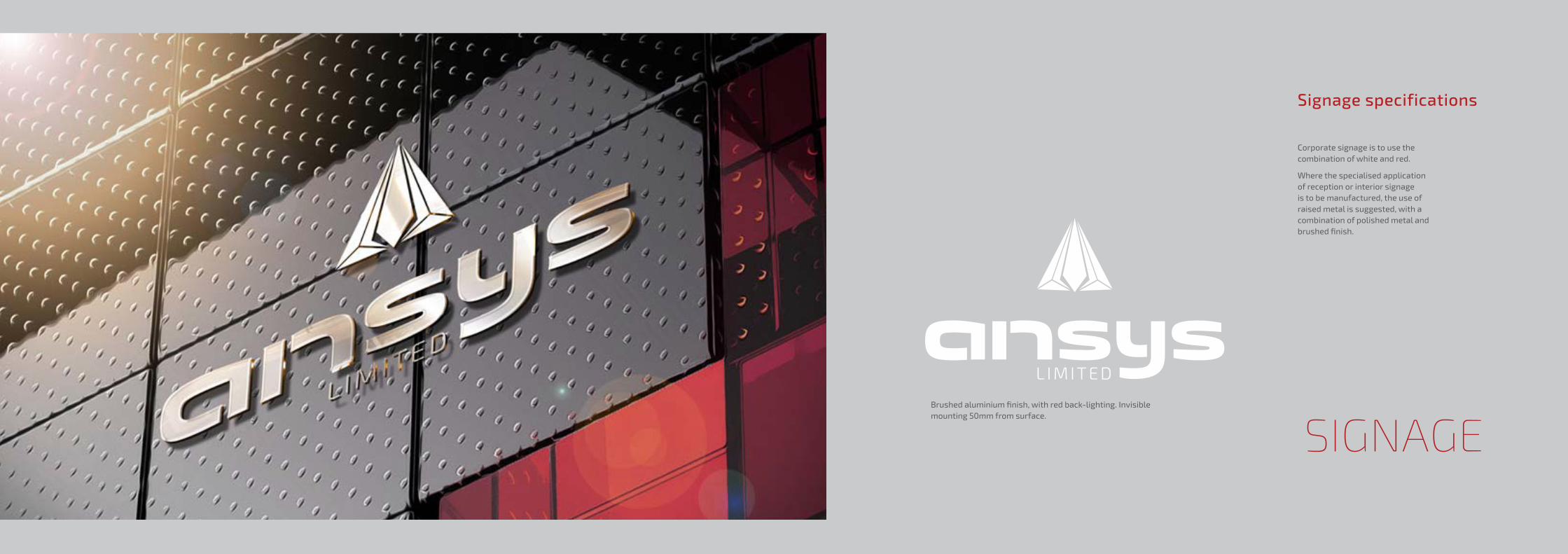
Signage specifications
Corporate signage is to use the combination of white and red.
Where the specialised application of reception or interior signage is to be manufactured, the use of raised metal is suggested, with a combination of polished metal and brushed finish.
Brushed aluminium finish, with red back-lighting. Invisible mounting 50mm from surface.
47
Signage specifications
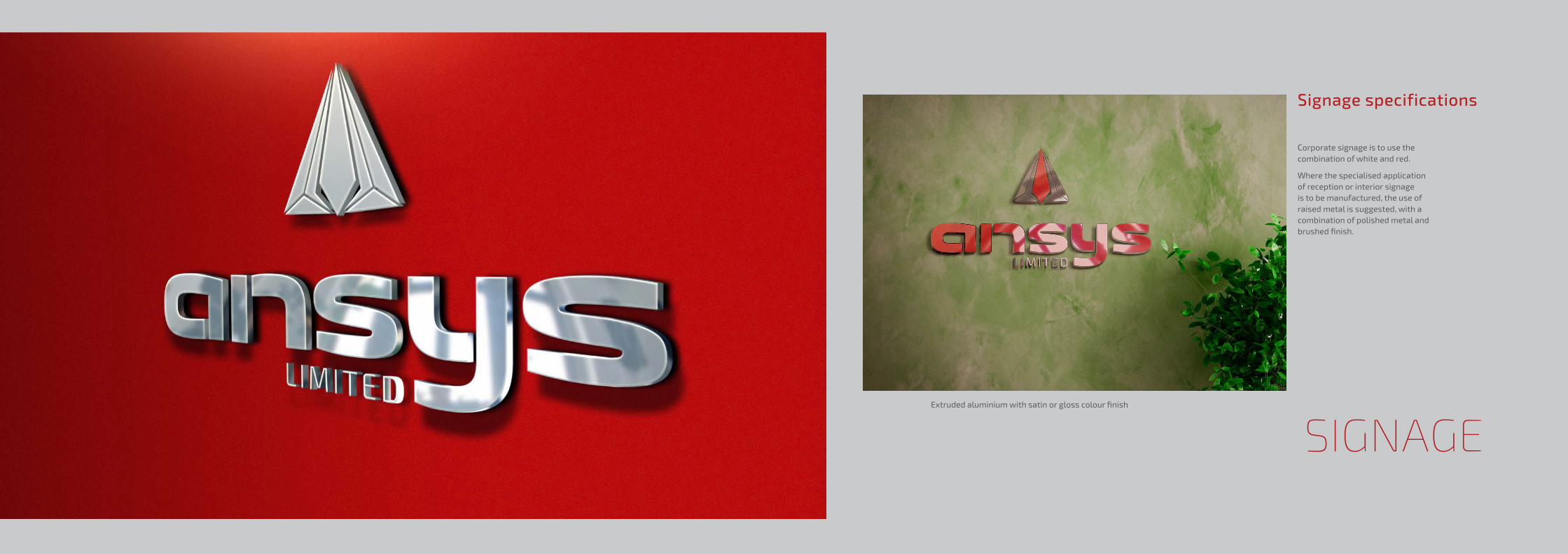
Corporate signage is to use the combination of white and red.
Where the specialised application of reception or interior signage is to be manufactured, the use of raised metal is suggested, with a combination of polished metal and brushed finish.
Extruded aluminium with satin or gloss colour finish
SIGNAGE
Ansys Brand Guidelines 4948
Sign
age
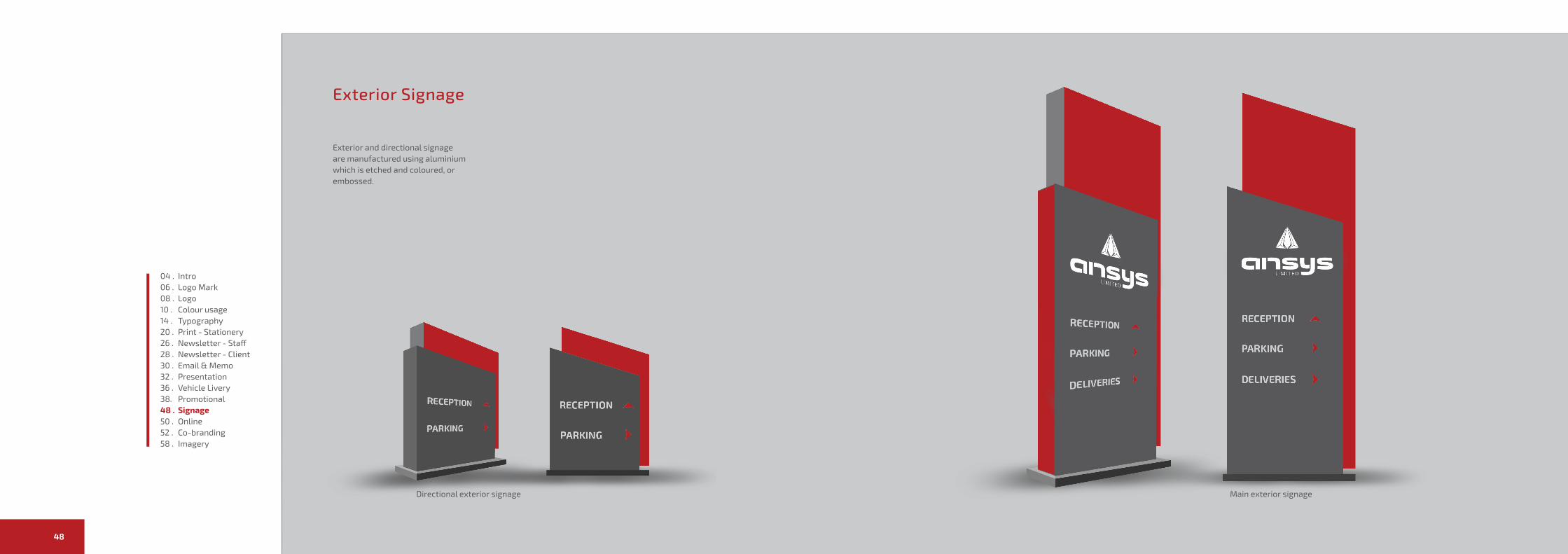
Exterior Signage
Exterior and directional signage are manufactured using aluminium which is etched and coloured, or embossed.
Directional exterior signage Main exterior signage
04 . Intro06 . Logo Mark 08 . Logo10 . Colour usage14 . Typography20 . Print - Stationery26 . Newsletter - Staff28 . Newsletter - Client30 . Email & Memo32 . Presentation36 . Vehicle Livery38. Promotional48 . Signage50 . Online52 . Co-branding58 . Imagery
Ansys Brand Guidelines 5150
Onl
ine
Online (Under development, will update)
Design to follow brief
04 . Intro06 . Logo Mark 08 . Logo10 . Colour usage14 . Typography20 . Print - Stationery26 . Newsletter - Staff28 . Newsletter - Client30 . Email & Memo32 . Presentation36 . Vehicle Livery38. Promotional48 . Signage50 . Online52 . Imagery58 . Imagery
53
Imagery
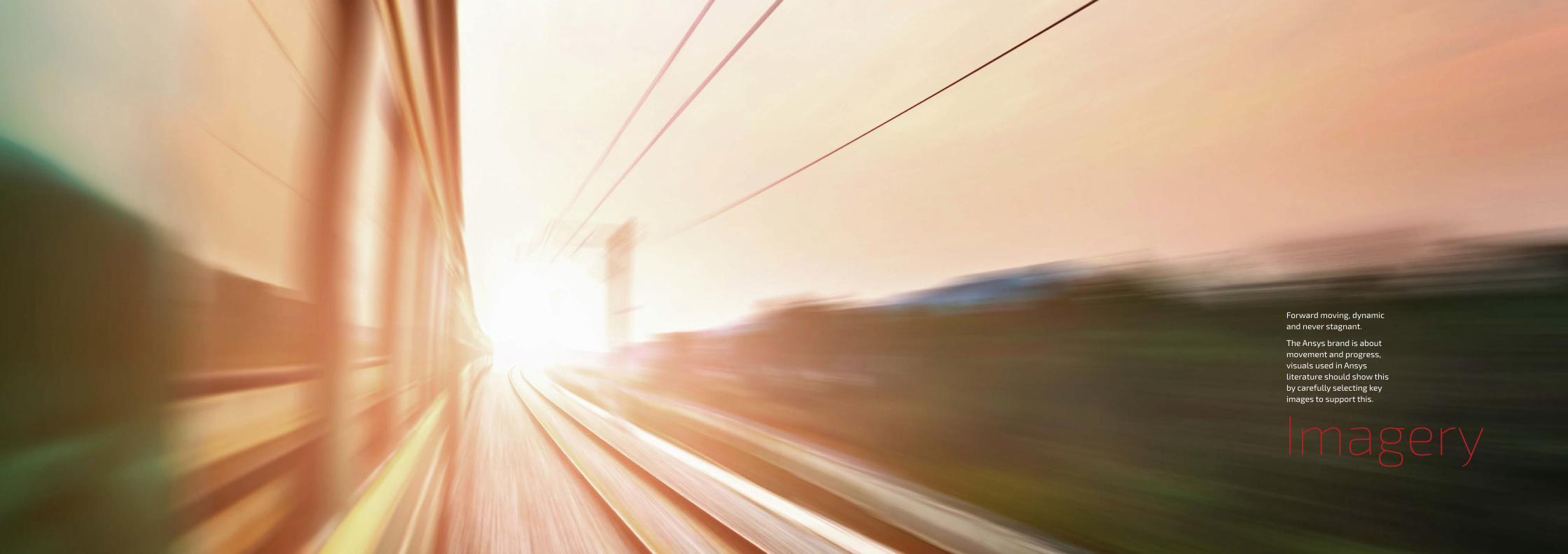
Forward moving, dynamic and never stagnant.
The Ansys brand is about movement and progress, visuals used in Ansys literature should show this by carefully selecting key images to support this.

Ansys Brand Guidelines 5554
Imag
ery
Photography
The visual language that is communicated through photography and general image selection is of paramount importance.
A selection of preferred cropping use colour de-saturation is shown.
When the subject matter is of people in a work environment, the cropping
should be tight, there shouldn’t be an emphasis on eye contact with the camera, rather on what’s happening in the picture.Where there is machinery, unless there is a specific requirement to show detail, tight cropping is suggested. Where detail is required, the depth of field should be shallow, but not overly so.
04 . Intro06 . Logo Mark 08 . Logo10 . Colour usage14 . Typography20 . Print - Stationery26 . Newsletter - Staff28 . Newsletter - Client30 . Email & Memo32 . Presentation36 . Vehicle Livery38. Promotional48 . Signage50 . Online52 . Imagery58 . Imagery
Ansys Corporate Identity Manual v1.0© Ansys
Effective February 2015All rights reserved. No part of the Ansys Corporate Identity Manual may be reproduced in any form or by electronic
or mechanical means, including information storage and retrieval systems, without permission in writing fromAnsys Executive Management. The trademarks, logos and service marks displayed in this Corporate Identity
Manual are the property of Ansys or third parties. You are not permitted touse the marks without consent from the Ansys Executive Management.
Please note: This manual is for electronic use only. The colours displayed throughout, therefore, should not be used as reference,
but rather use the specific PANTONE ® indicated as reference.
Designed by SEPTION.co.za