a visual framework invites human into the clustering process
TRANSCRIPT
A Visual Framework Invites Human into the Clustering Process
Keke Chen Ling Liu College of Computing, Georgia Institute of Technology, Atlanta, GA 30332
{kekechen, lingliu}@cc.gatech.edu
Abstract
Clustering is a technique commonly used in scientific research. The task of clustering inevitably involves human participation – The clustering is not finished when the computer/algorithm finishes but the user has evaluated, understood and accepted the patterns. This defines a human involved “clustering-analysis/evaluation” iteration. Instead of neglecting this human involvement, we provide a visual framework (VISTA) with all power of algorithmic approaches (since their result can be visualized), and in addition we allow the user to steer/monitor/refine the clustering process with domain knowledge. The visual-rendering result also provides a precise pattern for fast post-processing.
Keywords: Scientific Data Clustering, Information Visualization, VISTA, Human Factor in Computing
1. Introduction
Clustering is a basic technique commonly used in data analysis tasks, where there is little prior information (e.g. statistical models) available about the data. In the past few decades, researchers have provided hundreds of clustering algorithms. Most of the researches have been focused on the efficient and effective clustering of the datasets with regular cluster distribution, in which clusters have spherical shapes and can be represented by centroids and radiuses approximately, but they do poorly (may produce high error rate) on skewed datasets, which have non-spherical regular or totally irregular cluster distributions.
Some researchers have realized this problem and try to present cluster shapes as precisely as possible in the clustering process, such as representative-point based algorithm CURE [7] and density-based algorithm DBSCAN [22]. CURE uses several representative points to describe the boundary of a cluster approximately, instead of using one centriod only. This approach works for the non-spherical regular shapes, such as elongated regular shapes. However, it still does not work very well for clusters of irregular shapes. In general, the number of points used to represent a cluster increases as the complexity of its shape increases. Since the user may not know how irregular the cluster shape is, it is hard for
her/him to know how many representative points are enough to describe the cluster boundary precisely. In general, it is very difficult to tune the parameters of the algorithm to find a satisfactory result, like the number of representative points in CURE, the MinPts and ε in DBSCAN.
It is well known that, given a dataset, it is possible to have more than one criterion to partition the dataset with respect to different domain constraints. There is an interesting “whale, elephant, and tuna fish classification” example in [21], which illustrates that the same dataset may need to be partitioned differently for different purposes. It is also recognized that the automated algorithms are lack of the flexibility to enable people to realize the cluster shape and make any modification to the clustering result easily.
Most frequently, the task of clustering is letting the user gets an initial understanding of the data; which means the clustering is not finished until the user has evaluated, understood and accepted the patterns or results. This defines a “clustering – analysis/evaluation” iteration. Instead of being neglected in this process, we think the user should be able to participate in the clustering process by providing the domain knowledge and making better decisions based on his perception. Therefore, we provide a visual framework (VISTA) with all power of algorithmic approaches (since their result can be just visualized), and in addition we allow the user to steer/monitor/refine the clustering process with any domain knowledge. The visual rendering result also provides a precise pattern for fast post-processing.
There are three main contributions in this paper. • First, we provide a visual framework with all power
of algorithmic approaches and, in addition, we allow the user to steer/monitor/refine the clustering process with domain knowledge.
• Second, we introduce a visual cluster rendering system VISTA, which can visualize the result of any clustering algorithms, and help the user to understand and adjust the cluster distribution interactively.
• Third, we present a map-based cluster encoding technique (ClusterMap) which provides a relatively precise pattern for fast labelling or classification, in the post-clustering phase.
We have conducted two sets of experiments on a set of datasets selected from the public domain, one is designed to evaluate the effectiveness of the visual cluster rendering system, and the other is to measure the performance of the ClusterMap and compare it with two commonly known cluster representations.
The rest of the paper is organized as follows. Section 2 gives the visual framework for cluster analysis and outlines the VISTA approach. Section 3 introduces the VISTA visual clustering system. We discuss the reliability of the visual clustering in terms of the underlying visualization model and the flexibility in terms of the interaction techniques used in the visual rendering. Section 4 describes the map based cluster representation ClusterMap, which takes advantage of the visual rendering results. Section 5 discusses some experiments, which demonstrate the effectiveness of the VISTA clustering rendering system and better performance of using ClusterMap for post-processing. The paper ends with a discussion on the related work, a summary, and an outline of the future work.
2. A Visual framework for cluster analysis
Since most frequently, the cluster analysis involves the
“clustering – analysis/evaluation” iterations. In many cases, a normal process can be described as follows:
1. Run the algorithms with initial parameters.
2. Analyse the clustering results with statistical measures and domain knowledge to evaluate the cluster quality.
3. If the result is not satisfactory, adjust the parameters and re-run the clustering algorithms, then do 2 again until find satisfactory result.
4. If the result is satisfactory, do post-processing, which may include labelling the items in the entire dataset with the cluster labels.
With the automated algorithms, in step 2, it is often hard to reveal the skew distribution with statistical information, such as mean, variance and diameter. In step 3, it is also very hard to find appropriate parameters for some algorithms for a new run. For example, CURE [7] requires the parameter of the number of representative points and shrink factor, DBSCAN [22] needs proper ε and MinPts to get satisfactory clusters, DENCLUE [23] needs to define the smoothness level and the significance level. In step 4, a coarse post-processing may produce unsatisfactory final results, even though the intermediate clustering result is pretty good.
If the step 2 and 3 can be combined together, which means the user can do evaluation when clustering is in process, and be able to monitor or refine the clustering process, the length of the iterations would be reduced
greatly. In addition, the user would understand more about the dataset and thus be more confident with the clustering result.
However, it is obviously very hard for the automated algorithms to achieve such a goal. Instead, we think interactive cluster rendering could be a good candidate. Former studies [7] in the area of visual data exploration support the notion that visual exploration can help in cognition. Visual representations can be very powerful in revealing trends, highlighting outliers, showing clusters, and exposing gaps. With the right coding, human pre-attentive perceptual skills enable users to recognize patterns, spot outliers, identify gaps and find clusters in a few hundred milliseconds [24]. In addition, it requires no understanding of complex mathematical or statistical algorithms or parameters [10].
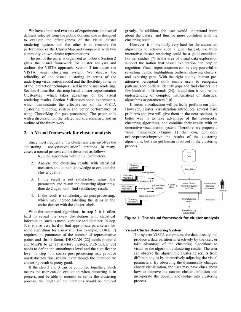
It seems visualization will perfectly perform our plan. However, cluster visualization introduces several hard problems too (we will give them in the next section). A better way is to take advantage of the resourceful clustering algorithms, and combine their results with an interactive visualization system. Therefore, we propose a visual framework (Figure 1) that can, not only utilize/process/improve the results of the clustering algorithms, but also get human involved in the clustering process.
Visual Cluster Rendering System The system VISTA can process the data directly and
produce a data partition interactively by the user, or take advantage of the clustering algorithms to visualize the algorithmic clustering results. The user can observe the algorithmic clustering results from different angles by interactively adjusting the visual parameters. By observing the dynamically changed cluster visualization, the user may have clues about how to improve the current cluster definition and incorporate the domain knowledge into clustering process.
Figure 1. The visual framework for cluster analysis
Data Filter
Data Filter prepares the data for visualization. It handles the missing values and normalizes the data. If the dimensionality is too high, dimensionality reduction techniques are applied to get a manageable number of dimensions. When data sets grow past a million items and cannot be easily seen on a computer display, Data Filter also extract relevant subsets, aggregate data into meaningful units, or randomly sample to create a manageable dataset.
Label Filter/Selector Label Selector selects which clustering result will be used in visualization. While a clustering algorithm finishes, it usually assign a label to each item in the dataset. Label Filter extracts a part of the labels according to the data items extracted by Data Filter. For example, VISTA may want to visualize one cluster of the data only. In this case, the labels of this cluster are extracted.
Post-processing Labeling entire or part of dataset is necessary for
many applications. One of the most common succeeding tasks of clustering is classification, which usually requires a set of correctly labeled data items as training set. The accuracy of the training set would affect the performance of the classification algorithms greatly. In our framework, a new cluster presentation, ClusterMap, and the associated post-processing method are developed. ClusterMap makes the labeling result as possibly consistent as the expected cluster distribution.
3. VISTA – an interactive cluster rendering system
Although visualization approaches have advantages over the automated techniques in statistics or machine learning. However, cluster visualization brings up four specific problems: • First, the limited system capability, e.g. memory and
CPU, may restrict the size of the datasets that can be visualized in real time. The screen size is also a particular limitation for visualization.
• Since the dataset usually have dimensionality higher than 3D, how to visualize clusters of such datasets without introducing too much visual bias is the second problem. This is known as the cluster- preserving problem [9]. The visual biases can be classified to “broken” clusters, “overlapped” clusters, and clustered outliers. A well-designed visualization model can remove part of these biases and the rest
can be possibly corrected through visual tuning operations. A key question is how to design a set of easy-to-use visual interface operations based on a reasonable visualization model so that one can use them to improve the visual clustering quality.
• The third problem is the fact that human needs experience to use the visualization system, and human-computer interaction usually costs more time than automated algorithms. To alleviate this problem, the system should be easy to use and gives the user confidence about what she/he has seen or found.
We describe the VISTA solutions to address the three problems of cluster visualization. In VISTA, we mainly implement the sampling techniques in Data Filter to address the first problem. More concretely, we use sampling to generate a representative dataset that is manageable in size. Then we derive cluster patterns from this sample set, which are then applied to label the entire dataset. Solutions to the second problem depend on the underlying mechanisms used for visualization. We developed one kind of scatterplot like visualization based on α-mapping (in section 3.1) and star coordinates [14], where a dense point-cloud is considered a real cluster or several overlapped clusters. We believe this is the most intuitive way to visualize clusters.
3.1 A cluster visualization model
A good cluster visualization model ensures the visualization system to produce reliable visualizations that preserve the cluster structure at most. In the first version of VISTA, we only consider the visualization model defined in metric Euclidean distance space and the visualization involves several connected transforms and finally produce a 2D visualization that partially keeps k-D information. Concretely, the VISTA visualization model consists of a max-min normalization with estimated bounds and the α-mapping. We proved that this model is linear mapping based, and thus have the important property that maintains the reliability of the system. 3.1.1 Max-min normalization with estimated bounds. We consider the processed dataset in form of a column*row table, where columns represent the dimensions and a row is regarded as one data item. When the Euclidean distance is used to measure the similarity of two data items, we really want each dimension to have the same effect to the similarity measurement. The goal of using normalization in VISTA visualization model is to eliminate the dominating effect of the large value columns to the distance and let each column contributes equally. The normalized result also fits the α-mapping results into a resizable visualization area. Given the
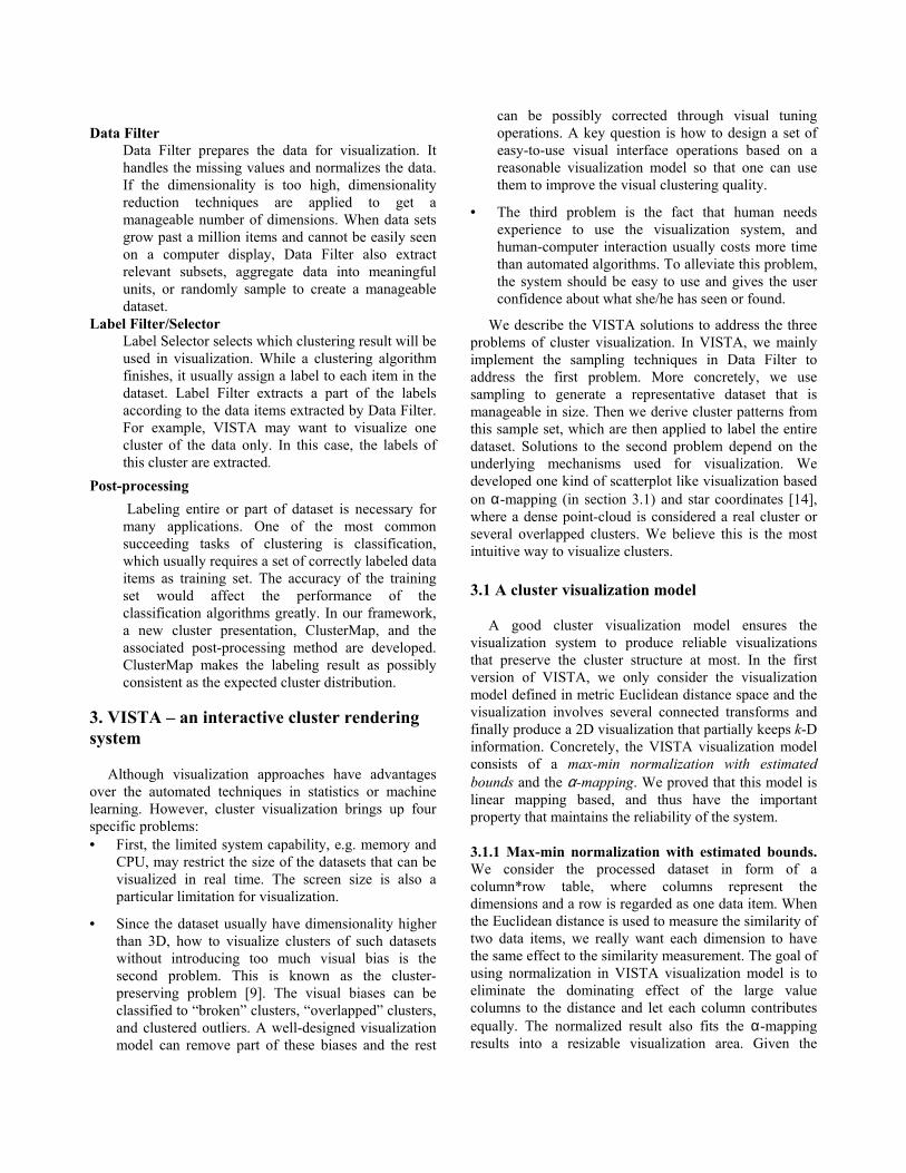
maximum and minimum bounds (max and min) of a column, max-min normalization defines the following transformation to scale all items in the column into [-1, 1]: max-min normalization: 1min)(maxmin)(*2 −−−=′ vv , v is the original value and v’ is the normalized value (1)
A problem with the max-min normalization is the
possibility of encountering “out of bounds” error, when the normalized dataset is a sample set of the entire dataset. The max and min bounds used for the sample dataset may not be the bounds for the entire raw dataset. To handle the “out of bounds” error, we propose a modified max-min algorithm to minimize the impact of “out of bounds” while still taking the advantage of original max-min normalization.
There are two problems: (1) how to minimize the probability of data items “out of bounds”; (2) if the “out of bounds” data is occurred, how to handle them. One feasible assumption is that the distribution of each column in a very large dataset can be approximately modelled as a normal distribution. Let ix denote the average value of column i, n is the number of rows in the sample dataset, si
2 is the deviation, and xij is the value of the item in row j of column i. The mean and variance of a column can be approximated by ix and si
2. Let the probability of data items in the raw dataset that
are out of bounds be limited toε , and bi denote the distance from bounds to the estimated mean. With Chebyshev’s Inequality, which is held for large samples, the distance from bounds to the mean iµ can be computed as follows:
P{|X – iµ | ≥ bi } ≤ 2
2
i
i
bσ = ε ⇒ bi = ε
σ i2
Using the ix and 2is as approximation, the bounds of a
column can be approximately defined as:
+
− εε
22, i
iii
sxsx
Considering the actual bounds [min(sci), max(sci)] of the ith column (sci) in the sample, we represent the bounds of the ith column as:
+
− }),max{max(,}),min{min(
22
εεi
iii
iisxscsxsc
In the first prototype of VISTA, we set ε = ¼, and yield the bounds:
[ ]}2),max{max(,}2),min{min( iiiiii sxscsxsc +−
All of the parameters used to normalize the columns can be calculated by scanning the sample set once. When the normalization is applied to the raw dataset later on, a value in column i, if out of bounds, can be scaled to the nearby bound.
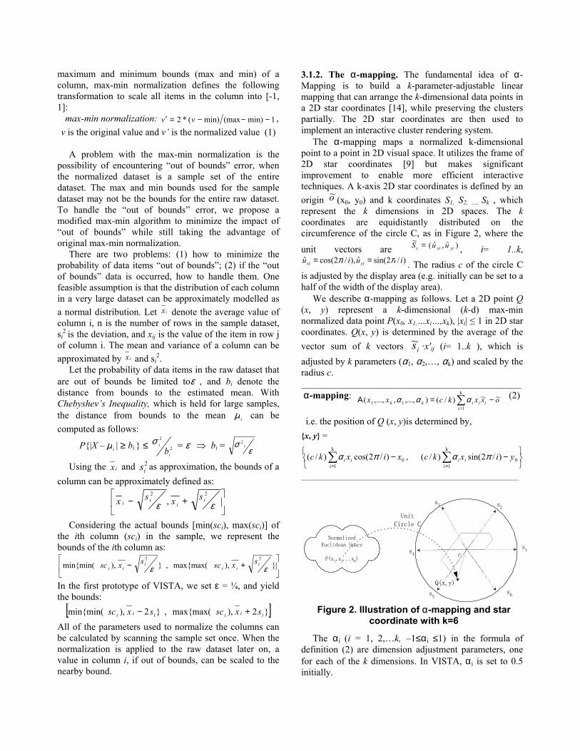
3.1.2. The α-mapping. The fundamental idea of α-Mapping is to build a k-parameter-adjustable linear mapping that can arrange the k-dimensional data points in a 2D star coordinates [14], while preserving the clusters partially. The 2D star coordinates are then used to implement an interactive cluster rendering system.
The α-mapping maps a normalized k-dimensional point to a point in 2D visual space. It utilizes the frame of 2D star coordinates [9] but makes significant improvement to enable more efficient interactive techniques. A k-axis 2D star coordinates is defined by an origin o~ (x0, y0) and k coordinates S1, S2, …, Sk , which represent the k dimensions in 2D spaces. The k coordinates are equidistantly distributed on the circumference of the circle C, as in Figure 2, where the
unit vectors are )ˆ,ˆ(~yixii uuS = , i= 1..k,
)/2sin(ˆ),/2cos(ˆ iuiu yixi ππ == . The radius c of the circle C is adjusted by the display area (e.g. initially can be set to a half of the width of the display area).
We describe α-mapping as follows. Let a 2D point Q (x, y) represent a k-dimensional (k-d) max-min normalized data point P(x0, x1,…xi…,xk), |xi| ≤ 1 in 2D star coordinates. Q(x, y) is determined by the average of the vector sum of k vectors is~ ·x'ij (i= 1..k ), which is adjusted by k parameters (α1, α2,…, αk) and scaled by the radius c. ______________________________________________ α-mapping: osxkcxx iiikk
~~ )/(),...,,,...,(k
1i11 −=Α ∑
=
ααα (2)
i.e. the position of Q (x, y)is determined by, {x, y} =
−
− ∑∑
==
k
1i0
k
1i0 )/2sin( )/(,)/2cos( )/( yixkcxixkc iiii παπα
___________________________________________________
The αi (i = 1, 2,…k, –1≤αi ≤1) in the formula of definition (2) are dimension adjustment parameters, one for each of the k dimensions. In VISTA, αi is set to 0.5 initially.
cs1
s2s3
s4
s6
UnitCircle C
Q(x,y)
NormalizedEuclidean Space
P(x1,x2...x6)
s5
Figure 2. Illustration of α-mapping and star coordinate with k=6
There are two advantages over the α-mapping: 1) It is a linear (or affine) mapping, given the constants
αi. It is known that the linear mapping does not break clusters [9] but may cause overlapped clusters [14], and sometimes, overlapped outliers to form fake clusters. Given that the α-mapping is linear and thus there is no “broken clusters” in the visualization. All we need to do is to separate the overlapped clusters, or those falsely clustered outliers, which can be achieved with the help of dynamic visualization through interactive operations.
2) The mapping is adjustable by αi. The αi (i = 1,2,…k, –1≤αi ≤1) can be regarded as the weight of the i-th dimension, which means how significant the i-th dimension is in the visualization. Changing αi continuously, we can see the effect of the i-th dimension to the cluster distribution in a series of smoothly changed projections, which provide important cluster clues.
3) Experience with using VISTA system shows α-mapping is better than the original mapping in star coordinates paper [14], in terms of visual scaling and the effect of interaction for rendering clusters.
3.2 VISTA Cluster Rendering System
We build an interactive cluster rendering system using
the mapping-based visualization model. The first prototype of the VISTA visual rendering system is designed for Euclidean datasets. The system is available for downloading at disl.cc.gatech.edu/VISTA.
3.2.1Cluster rendering methods. Two kinds of visual rendering methods are used in Vista system, one is unguided rendering and the other is guided. In unguided rendering process, a user marks clusters based on the information obtained via dynamic and interactive exploration, such as dense point-cloud area and cluster behaviors. In this kind of exploration, dynamic visualization produced by a continuous α-parameter adjustment, plays the important role to distinguish whether a dense area is a real cluster or a cluster formed by overlapping. However, for some complex cluster distribution, it may be still hard to distinguish the boundaries, thus may lead to a higher error rate than the guided process.
In guided rendering, the data items may already have been labeled by clustering algorithms, or there are a small number of data items, which are labeled by experts with domain knowledge, acting as “landmarks” in visualization. In both cases, the labeled items are visualized in different colors. Therefore, in a satisfactory visualization, the points in the same color (in the same cluster) should be in the same region. However, cluster rendering plays different roles in the two scenarios. In the
first case, where items labeled by a cluster algorithm, visual rendering can be used to correct the imprecise or incorrect cluster boundaries. In addition, the domain knowledge can be applied to merge/split clusters, and create cluster hierarchies. In the second case, the landmark points are visualized in different features so that the user can use them as guiding information to find some visualization that distinguishes the application-specific cluster structure. Because the “guideboard” is available, the guided rendering usually gives better results than the unguided rendering in practice.
3.2.2 Interactive cluster rendering operations. As discussed in Section 3.1, an important feature of the VISTA mapping model is its ability to preserve the clusters partially during the mapping of k-dimensional space to a 2D k-axis star coordinate space. The task of the Vista cluster rendering system is to utilize the interactive visualization techniques to help users find or separate the overlapped clusters through continues dynamic visualization operations. We have designed and implemented a set of interactive rendering operations in VISTA. Some main operations include α-parameter adjustment, subset selection, cluster merging/splitting and defining cluster hierarchies.
The most frequently used operation is α-parameter adjustment, which changes α parameters defined in formula (2) and thus changes the projection plane. Each change refreshes the visualization in real time (about several hundred milliseconds in terms of the size of the dataset and the capability of system). α-parameter adjustment enables the user to find the dominating dimensions, to observe the dataset from different angles and to discriminate the real clusters from overlapping clusters in continuously changed visualizations. The user mainly uses this operation to find the sketch of a cluster distribution. Random rendering and automatic rendering are another two automated α-parameter adjustment methods complement to the basic α-parameter adjustment. Random rendering changes α parameters of all dimensions randomly at the same time and helps users find interesting patterns if the cluster distribution is not so obvious. Automatic rendering continuously changes the α parameter of one chosen dimension automatically, which can save some interactive operations.
Another set of operations are point-set oriented, used to edit the cluster definition in flat level (merging/splitting) or hierarchical level (defining hierarchies, zooming in/out and so on). Due to the space limitation, most features presented in [1] are not introduced here.
4. ClusterMap– a new cluster representation
The best way to discuss the features of the ClusterMap representation and the associated post-processing methods is to compare it with two typical representation methods introduced in [21]. They are centroid-based representation and boundary representative points based representation. We name the associated post-processing methods as Centroid-Based Labelling (CBL) and Representative-Point-Based Labelling (RPBL). To label a point, CBL compares the distances of this point to the centroids of clusters. The point is labelled with the cluster ID of the nearest centroid. RPBL utilizes the representative points produced by clustering. To label a point, it looks up the nearest neighbour of this point among all representative points and labels the point with the cluster ID of the nearest representative point. Given that the total number of representative points is much larger than the number of clusters, RPBL costs more to label the entire dataset than CBL does. However, CBL produces high error rate for most irregular cluster shapes. So it is clear that a key challenge to the distance-comparison based labelling algorithms is making a reasonable tradeoff between precision and performance. In addition, neither RPBL nor CBL distinguishes outliers, which leads to a high error-rate for those datasets that have many outliers.
In comparison, the ClusterMap labeling algorithm runs faster and yields better results. The basic idea behind the ClusterMap is “mapping is labelling”. Briefly, with VISTA system, we can find a satisfactory mapping that discriminates clusters and outliers well, and the clustering result is encoded as a ClusterMap that includes the mapping parameters to create the final visualization and the coding for different cluster regions. In most situations, the ClusterMap provides more details than the centroid based or representative points based cluster representation, thus its labeling is more precise in post-processing. Some additional benefits are 1) the boundary can be adjusted and modified to adapt to any special situation, 2) the outliers can be distinguished well, 3) and the general clustering algorithms can utilize ClusterMap as their labelling phase by loading the clustering labels
into VISTA visual rendering system and defining a satisfactory ClusterMap. The ClusterMap algorithm includes three components: map-based encoding of the clustering rules, map-reading and mapping-based labeling.
4.1 Encoding Clustering Rules
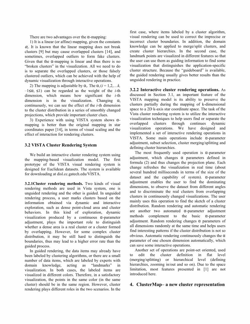
When visual cluster rendering produces a satisfactory visualization, we can set the boundaries of clusters by freehand drawing on the visualization. Each cluster is assigned with a unique cluster identifier. After the cluster regions are marked, the entire display area can be saved (represented) as a 2D (width by height) byte array. Each grid in the array is labeled by the corresponding cluster ID if it is located on a cluster region, otherwise, labeled as outlier. The display area is about 688*688 pixels on 1024*768 resolution screen, slightly larger for higher resolution. So it requires about several megabyte memory in maximum. Figure 3 shows an example of Cluster Map with three clusters. As shown in Figure 3, the Cluster Map array is often a sparse matrix, which can be stored more space-efficiently.
4.2 ClusterMap labeling
The post-processing phase is usually separated from the visual cluster rendering process. Therefore, the ClusterMap should be loaded into memory before labeling. Reading the cluster map (the 2D projection array and the mapping parameters) into memory costs only several hundreds of microseconds and thus can be ignored from the entire post-processing.
The Map based labelling follows a similar mechanism as to the α-mapping, which applies the mapping formulas derived from the visualization model (in section 3): ______________________________________________ Normalization: x'ij = δi*(xij – mini) -1 (3)
00
iji00
iji x' * py',x' * px'_ yyxxMappingk
ij
k
ij − =− = :Γ ∑∑
==
(4)
where pxi = kuxii /ˆα , pyi = kuyii /ˆα and , δi = 2/(maxi –
mini) can be pre-computed at the beginning of labelling. ______________________________________________
Concretely, the labeling algorithm reads the j-th row (x0j, x1j…xij…xkj) from the k-D raw dataset, and uses the formula (3) to generate a max-min normalization for each dimension and the formula (4) to yield a 2D projection coordinate (x′j, y′j). Reading the value of the cell (x′j, y′j) in the 2D array, it gets the cluster ID label for the j-th row, either, zero for outliers or a positive integer for a cluster. This process repeats over the entire raw dataset to label every item.
Figure 3: a sample map with 3 clusters
4.3 Complexity Analysis
Given a raw dataset, assume that, k is the dimensionality and N is the size of the raw dataset. We count the number of necessary multiplication to estimate the cost. Therefore, one k-d Euclidean distance calculation costs k multiplication. Map rebuilding and parameter reading cost constant time (see section 5). In the labelling step, for each data item in the raw dataset, the max-min normalization costs k multiplication. The α-mapping function costs k multiplication respectively to calculate x and y coordinates. Searching for the cluster map to get the corresponding cluster ID costs O(1) time. Hence, the total cost for the entire dataset is 3kN.
While kd-tree [22] is used to organize the representative points, we get optimal complexity for the distance-comparison based labelling algorithms. The cost to find the nearest neighbour point in kd-tree is at least log2(cm) distance calculation for RPBL and at least log2(c) for CBL. As reported in the CURE paper, only when the number of representative points is great than 10 (m>=10), the RPBL can get right clusters for irregular cluster shapes.
5. Experiments
This section presents two sets of experiments. The
main objective of these experiments is to evaluate the effectiveness of the VISTA visual clustering system, and the predominance of ClusterMap over the other cluster representations.
The first prototype of the VISTA cluster rendering system can deal with up to 50,000 items in real time in common desktop environment. With better configuration, it can deal with more items. In this range, the size of the dataset does not affect the performance of the clustering process nor the clustering result. For very large datasets, the raw dataset is first sampled to get a representative subset in population of less than 50,000 items. That means the categories of datasets, whether they are small, medium or large, will not make much difference in evaluating results. We can choose several public-domain
datasets that are irregular in cluster distribution, although they are small or medium in size. The second set of experiments is designed to show the ClusterMap cluster representation has advantages over RPBL and CBL, in terms of better performance and lower error rate. As we discussed in section 4.3, the costs of the labelling algorithms are analytically linear, therefore, again, a small/medium sample size is sufficient to show the linear trends over the large dataset.
5.1 Effectiveness of Visual Cluster Rendering
The VISTA visual clustering system was implemented
in Java. Our initial experiments were conducted on a number of well-known datasets that can be found in UCI machine learning database (www.ics.uci.edu). These datasets, although small or medium in size, have irregular cluster distribution, which is an important factor for testing the effectiveness of the VISTA system.
It is well known that CURE gives better results than other existing algorithms by recognizing clusters in irregular shapes. To show how effective the VISTA visual cluster rendering is, in terms of accuracy improvement, we choose to compare the error rates of the VISTA visual cluster rendering results with that of the CURE clustering algorithm.
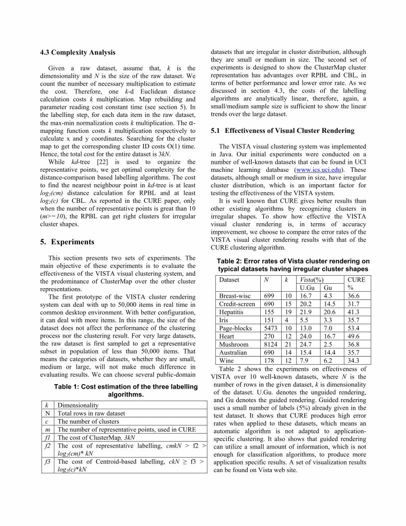
Table 2 shows the experiments on effectiveness of VISTA over 10 well-known datasets, where N is the number of rows in the given dataset, k is dimensionality of the dataset. U.Gu. denotes the unguided rendering, and Gu denotes the guided rendering. Guided rendering uses a small number of labels (5%) already given in the test dataset. It shows that CURE produces high error rates when applied to these datasets, which means an automatic algorithm is not adapted to application-specific clustering. It also shows that guided rendering can utilize a small amount of information, which is not enough for classification algorithms, to produce more application specific results. A set of visualization results can be found on Vista web site.
Table 1: Cost estimation of the three labelling algorithms.
k Dimensionality N Total rows in raw dataset c The number of clusters m The number of representative points, used in CURE f1 The cost of ClusterMap, 3kN f2 The cost of representative labelling, cmkN > f2 >
log2(cm)* kN f3 The cost of Centroid-based labelling, ckN ≥ f3 >
log2(c)*kN
Table 2: Error rates of Vista cluster rendering on typical datasets having irregular cluster shapes
Vista(%) Dataset N k U.Gu Gu
CURE%
Breast-wisc 699 10 16.7 4.3 36.6 Credit-screen 690 15 20.2 14.5 31.7 Hepatitis 155 19 21.9 20.6 41.3 Iris 151 4 5.5 3.3 35.7 Page-blocks 5473 10 13.0 7.0 53.4 Heart 270 12 24.0 16.7 49.6 Mushroom 8124 21 24.7 2.5 36.8 Australian 690 14 15.4 14.4 35.7 Wine 178 12 7.9 6.2 34.3
5.2 ClusterMap Labelling
We have discussed three different disk-labelling algorithms: Representative-Point Based labelling (RPBL), Centroid-Based labelling (CBL), and ClusterMap. In this section we study the performance and error rate of ClusterMap compared to the two other popular labelling algorithms RPBL and CBL. In the following subsections, we first describe the datasets used in the experiments and the environmental setup for these experiments. Then we discuss the experimental results obtained over different datasets.
5.2.1 Datasets and experiment setup. Two datasets are used for the second set of the experiments reported in this paper. One is the simulated dataset DS1 used in CURE. DS1 is a 2D dataset having five regular clusters, including three spherical clusters, two connected elliptic clusters, and many outliers. In our experiments, DS1 is used to evaluate the effect of outliers to the labelling algorithms. The second dataset we use is a real dataset – Shuttle dataset (STATLOG version). It is a 9-dimensional dataset with very irregular cluster distribution. There are seven clusters in this dataset, among which one is very large with approximately 80% of data items, and two are moderately large with approximately 15% and 5% of data items, respectively. The others are tiny. Shuttle dataset is used to evaluate the effect of clustering result to the
labelling process. All datasets have original labels, so we can calculate exact error rate with the original labels and produced labels.
The three labelling algorithms are implemented in C++. We use the CURE clustering algorithm implemented by U. of Wisconsin at Madison, to get representative points for RBPL, with the parameters: the number of representative points is 10, alpha (shrink factor) is set to 0.5, and k is the expected number of clusters. We use ANN (Approximate Nearest Neighbour) C++ library from U. of Maryland at College Park to construct kd-tree for RBPL and CBL. When we evaluate the experimental results, the constant parts – the cost of cluster map rebuilding or kd-tree building are excluded from the graphs but still listed in discussion.
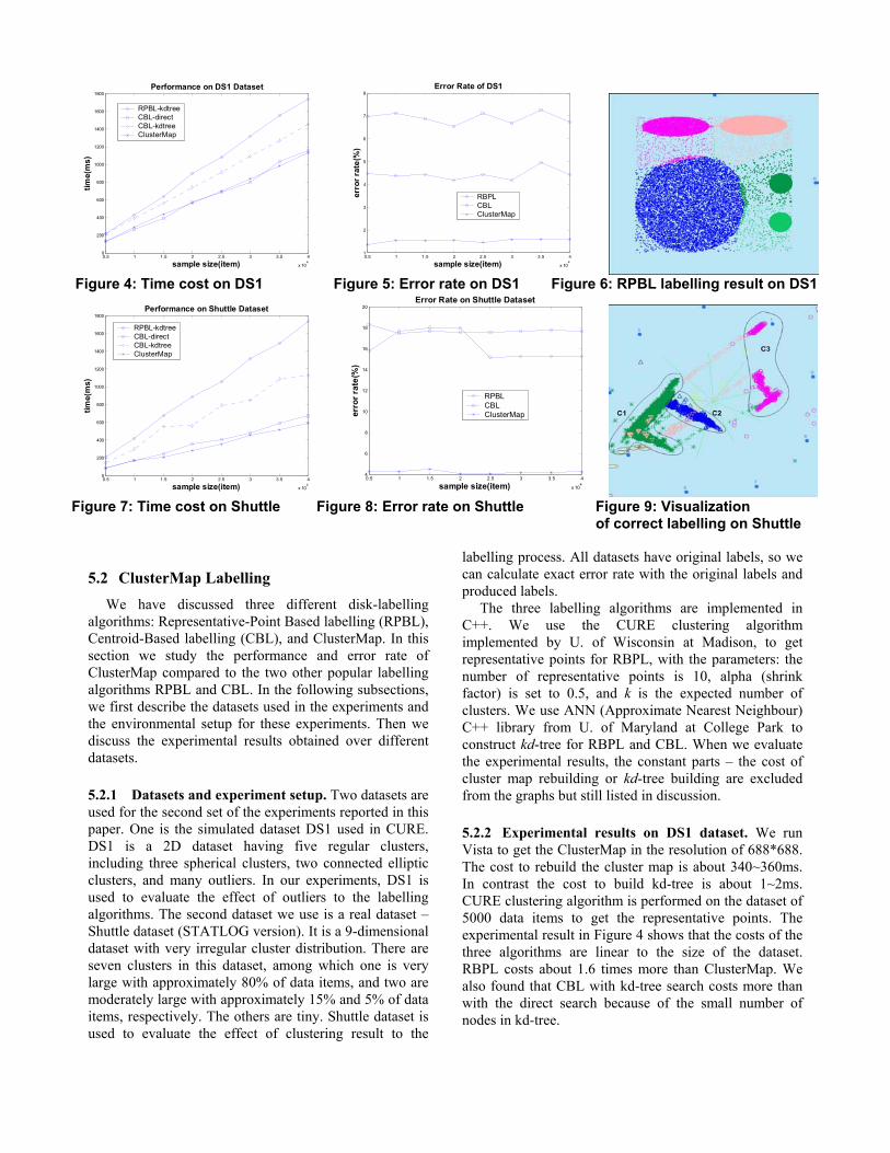
5.2.2 Experimental results on DS1 dataset. We run Vista to get the ClusterMap in the resolution of 688*688. The cost to rebuild the cluster map is about 340~360ms. In contrast the cost to build kd-tree is about 1~2ms. CURE clustering algorithm is performed on the dataset of 5000 data items to get the representative points. The experimental result in Figure 4 shows that the costs of the three algorithms are linear to the size of the dataset. RBPL costs about 1.6 times more than ClusterMap. We also found that CBL with kd-tree search costs more than with the direct search because of the small number of nodes in kd-tree.
0.5 1 1.5 2 2.5 3 3.5 4
x 104
0
200
400
600
800
1000
1200
1400
1600
1800
sample size(item)
time(
ms)
Performance on DS1 Dataset
RPBL-kdtreeCBL-directCBL-kdtreeClusterMap
0.5 1 1.5 2 2.5 3 3.5 4
x 104
1
2
3
4
5
6
7
8
sample size(item)
erro
r rat
e(%
)
Error Rate of DS1
RBPLCBLClusterMap
Figure 4: Time cost on DS1 Figure 5: Error rate on DS1 Figure 6: RPBL labelling result on DS1
0.5 1 1.5 2 2.5 3 3.5 4
x 104
0
200
400
600
800
1000
1200
1400
1600
1800
sample size(item)
time(
ms)
Performance on Shuttle Dataset
RPBL-kdtreeCBL-directCBL-kdtreeClusterMap
0.5 1 1.5 2 2.5 3 3.5 4
x 104
4
6
8
10
12
14
16
18
20
sample size(item)
erro
r rat
e(%
)
Error Rate on Shuttle Dataset
RPBLCBLClusterMap
Figure 7: Time cost on Shuttle Figure 8: Error rate on Shuttle Figure 9: Visualization
of correct labelling on Shuttle
The DS1 dataset is used to show the effect of outliers to the labelling algorithms. The error rate of RBPL is on average of 4.5% over DS1; the error rate of the CBL has the error rate of 6.8%; while the error rate of ClusterMap has only about 1.5%. ClusterMap also shows a more stable error rate. From the visualization of the labelling results, CBL suffers from the large circle cluster and outliers. Most RBPL errors come from the outliers. Due to the space limitation, we only show the visualization of CURE labelling results. Visualization of RBPL labelling on a 10000-item subset (Figure 6) shows the outliers are labelled as the nearby cluster.
5.2.3 Experimental results on shuttle dataset. Shuttle dataset has very irregular clusters (Figure 9). With a small number of “landmark points”, we can easily and correctly define the clusters with VISTA. We run ClusterMap on the same resolution. Again, CURE algorithm is performed on a 5000-item subset to get the representative points. The result also shows the costs of the three algorithms are linear to the size of Shuttle dataset (Figure 7), but this time RBPL costs about 2.6 times as much as ClusterMap and the CBL should use direct search again because there are only 3 centroids.
We use the shuttle dataset to evaluate how the errors from the clustering algorithms affect the labelling algorithms. Figure 8 shows that the error rate of RBPL is on average of 17% over the Shuttle dataset and the CBL has an error rate of 18%. ClusterMap has only 4.2% of incorrect labelling, much lower than the other two algorithms. The high error rate with the RBPL is primarily caused by the incorrect clustering result or lack of the ability to describing irregular cluster shapes, which leads to wrong boundary description for labelling.
Let us take a closer look at the three large clusters shown in Figure 9. Cluster c3 actually has two parts; c1 and c2 are connected; c1 is a triangular shape in 2D star coordinates. CURE clustering simply cannot incorporate the application-specific features. In the visualization of
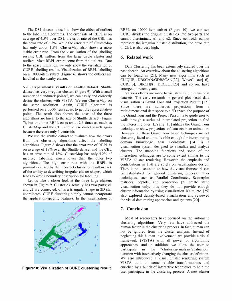
RBPL on 10000-item subset (Figure 10), we can see CURE divides the original cluster c3 into two parts and cannot discriminate c1 and c2. Since centroids cannot represent the irregular cluster distribution, the error rate of CBL is also very high.
6. Related work Data Clustering has been extensively studied over the
past decade. An overview about the clustering algorithms can be found in [21]. Many new algorithms such as CLIQUE, DBSCAN/GDBSCAN[22], WaveCluster[16], CURE[3], BIRCH[8], DECLUE[23] and so on, have emerged in recent years.
Various efforts are made to visualize multidimensional datasets. The early research on general plot based data visualization is Grand Tour and Projection Pursuit [12]. Since there are numerous projections from a multidimensional data space to a 2D space, the purpose of the Grand Tour and the Project Pursuit is to guide user to walk through a series of interpolated projection to find the interesting ones. L.Yang [13] utilizes the Grand Tour technique to show projections of datasets in an animation. However, all these Grand Tour based techniques are not clustering-faced and not flexible enough for incorporating domain knowledge. Star Coordinate [14] is a visualization system designed to visualize and analyze clusters. The mapping functions and some of the interaction techniques are to some extent similar to the VISTA cluster rendering. However, the emphasis and contributions in [14] are solely on visualization design. There is no discussion on how the visual framework can be established for general clustering process. Other techniques, such as Parallel Coordinates, Scatterplot matrices, coplots, and prosection [2] create static visualization only, thus they do not provide enough cluster information by using visualization. Keim, etc. [25] also explored density-based visualization and reviewed the visual data mining approaches and systems [20].
7. Conclusion
Most of researchers have focused on the automatic
clustering algorithms. Very few have addressed the human factor in the clustering process. In fact, human can not be ignored from the cluster analysis. Instead of neglecting this human involvement, we provide a visual framework (VISTA) with all power of algorithmic approaches, and in addition, we allow the user to participate in the “clustering-analysis/evaluation” iteration with interactively changing the cluster definition. We also introduced a visual cluster rendering system VISTA built on some reliable transformations and enriched by a bunch of interactive techniques to help the user participate in the clustering process. A new cluster
Figure10: Visualization of CURE clustering result
representation ClusterMap based on the visualization results, encodes the visual rendering result into a precise pattern that enables a better post-processing.
8. Acknowledgements We appreciate Prof. Vipin Kumar providing us the
implementation of CURE. This research is also partially supported by a NSF CCR grant, a NSF ITR grant, and a DoE grant.
9. Reference [1] VISTA web site: disl.cc.gatech.edu/VISTA [2] W.S.Cleveland. “Visualizing Data”, AT&T Bell Laboratories, Hobart Press, NJ.1993. [3] G.Guha, R.Rastogi, and K.Shim. “CURE: An efficient clustering algorithm for large databases”, in Proc. of the ACM SIGMOD1998 [4] W. DuMouchel and C.Volinsky, et al. “Squasing Flat Files Flatter”, in Proc. of SIGKDD99. [5] P. Huber. “Massive data sets workshop: The morning after”, Massive Data Set, National Academy Press, 1996 [6] M. Halkidi, M. Vazirgiannis, I. Batistakis. “Quality scheme assessment in the clustering process”, in Proc. of PKDD, Lyon, France, 2000 [7] J.Larkin and H.A.Simon. “Why a diagram is (sometimes) worth ten thousand words”, Cognitive Science, 11(1): 65-99, 1987 [8] T, Zhang, R.Ramakrishnan, and M.Livny. “BIRCH: An efficient data clustering method for very large databases”, In Proc. Of ACM SIGMOD1996 [9] I. S. Dhillon, D. S. Modha and W. S. Spangler: “Visualizing Class Structure of Multidimensional Data”, In Proc. of the 30th Symposium on the Interfaces, 1998. [10] D. Keim. “Visual Exploration of Large Data Sets”, Communications of the ACM. August 2001, V. 44. No. 8 [11] C. Faloutsos, K. Lin, "FastMap: A Fast Algorithm for Indexing, Data-Mining and Visualization of Tradditional and Multimedia Datasets," in Proc. of ACM SIGMOD1995 [12] D.R. Cook, A. Buja, J. Cabrea, and H. Hurley “Grand tour and projection pursuit”, Journal of
Computational and Graphical Statistics, V23. 1995 [13] Li Yang. “Interactive Exploration of Very Large Relational Datasets through 3D Dynamic Projections”, in Proc. of ACM SIGKDD2000 [14] E. Kandogan. “Visualizing Multi-dimensional Clusters, Trends, and Outliers using Star Coordinates”, in Proc. of ACM SIGKDD2001. [15] Jeffrey S. Vitter. “Random Sampling with a Reservoir”, ACM Transactions on Mathematical Software, Vol. 11, No.1, March 1985 [16]G.Sheikholeslami, S.Chatterjee, and A.Zhang. “Wavecluster: A multi-resolution clustering approach for very large spatial databases”, In Proc. VLDB98’, 1998 [17] Joseph B. Kruskal and Myron Wish. “Multidimensional scaling”, SAGE publications, Beverly Hills,1978 [18] A. Jain and R.Dubes. “Algorithms for Clustering Data”, Prentice hall, Englewood Cliffs, NJ, 1988 [19] J. Friedman, J. Bentley and R. Finkel. “An algorithm for finding best matches in Logarithmic Expected Time”, ACM Trans. on Mathematical Software, Vol3, No 3, 1997 [20] Grinstein G., Ankerst M., Keim D.A., “Visual Data Mining: Background, Applications, and Drug Discovery Applications”, Tutorial at ACM SIGKDD2002, Edmonton, Canada. [21] A.K. Jain, M.N. Murty, and Flynn, P.J.: Data Clustering: A Review. ACM Computing Surveys, 1999
[22] Ester, M., Kriegel, H., Sander, J. and Xu, X. “A Density-based Algorithm for Discovering Clusters in Large Spatial Databases with Noise”, in Proc. of KDD96
[23] Hinneburg, A. and Keim, D. “ An Efficient Approach to Clustering in Large Multimedia Databases with Noise”, in Proc. of KDD-98 [24] Ben Shneiderman: Inventing Discovery Tools: “Combining Information Visualization with Data Mining”, Information Visualization 2002, 1, p5-12 [25] A. Hinneburg, D. Keim, and M. Wawryniuk: “HD-Eye: Visual Mining of High-Dimensional Data”. IEEE Computer Graphics and Applications. V19, No 5, 1999