cross platform design guidelines for smartphones
TRANSCRIPT
1 | Page
CROSS PLATFORM DESIGN
GUIDELINES FOR
SMARTPHONES
1. Writer’s Thought
2. Current market trend
3. Diversified Platforms and Resolutions
4. Design guidelines and Comparison
4.1. Touchscreen Target Area
4.2. Typography
4.3. Iconography & Images
References

2 | Page
1. Writer’s Thought
Nowadays the world is getting closer and more accessible, the reason behind this revolution is a just a handheld
device. That small unit changed everyone’s life, made everyone feel that “I am mobile”. Device became a part of our
life and gave us a comfort to change our traditional ways of writing, booking, searching, appreciating, liking, disliking
and so on…
Did you notice why this happened?
The birth of this device took place to provide wireless communication.
The first handheld mobile device was introduced in 1973 [^], it was just a wireless communication and not so good
and beautiful as you are handling today. A point to notice is the revolution in designing; previously it was focused on
handling of device also known as Form factor [^].
The cellphone revolution kicked off 40 years ago today
Device designs were introduced with new size, shape, and style for more convenience of using and carrying it. But
actual revolution happened when it was introduced with additional features, including cellular, Wi-Fi, Bluetooth,
camera, video player, music player, touch screen. That was a time when handheld devices became smart phones, now
it is more than just to make calls and send text messages. It has actually become your personal device and you are
experiencing that you are “Mobile”.

3 | Page
2. Current market trend
The transformation of wireless communicator to Smartphone is truly based on user’s need and the progress of
smartphone became a substitute to our PCs. Most users have both personal computer and Smartphone. But if you
observe, they are more conveniently using smartphone for browsing the Internet, reading e-mails, connected with
social media, listening to music and playing games. That’s the reason; number of smartphone users is increasing as
compared to personal computers.
Smartphones, only a few years old, design for mobile has not been a hot topic in the design community. However,
since the launch of touch-screen smartphones, interest in the mobile GUI (graphical user interface) has made a radical
turnaround. Designers are looking for ways to break into this exciting new field of design. The purpose of this article
is to define why design for mobile matters, and highlight the shades of designing native and web-based mobile
applications.
Unless you’ve been living under a rock, you’ve probably heard that designing for mobile is different than designing
websites or desktop applications. And the differences are multiplying rapidly as more devices with additional
functionality hit the market.
So why does design for mobile matter?
Let’s take a look at the differences between Diversified Mobile OS and Devices to get a better understanding of their
own functionality and designing guidelines.

4 | Page
3. Diversified mobile OS and resolutions
“Like it or not, designing for mobile requires some technical knowledge of the platform
you’re designing for”
Mobile device screens are smaller than desktop monitors, but what does that really mean? Size things down?
Squeeze them in? The temptation may be to make things simply ‘fit’ into a smaller screen, when just the opposite is
true. Even when you’re trying to communicate many things to the user, less is more. Your primary goal from a design
standpoint is to create a simple, elegant solution that’s easy to use.
Today there are many mobile brands and devices are available in the market. So while starting a new design for
mobile the first step is to know which devices you are designing. It also depends on target user group(s). Having
knowledge of devices will help you to make your design more elegant. However, many mobile brands and devices are
available in the market; they are supported by mobile Operating System also referred to as mobile OS. Here are the
common Mobile OS and their market share [^].
Though it seems only four leading mobile OS brands, but these OS supports various devices with different screen
sizes and display resolutions. We can categorize it for better understanding.

5 | Page
ANDROID is a leading OS which supports various mobile manufacturers. It is very difficult to categorize based on devices; in this case we can group it with the help of density.
Apple IOS upgrades its products' hardware periodically (approximately yearly). There have been ten major releases of
iPhone till Sep 2014.

6 | Page
WINDOWS PHONE, Microsoft came up with new OS; Windows phone 8 with improved UI and four types of
display resolutions.
BLACKBERRY comes up with their Smart phones with own OS just like Apple IOS. New Blackberry 10 is a latest OS and targeting four display resolutions. The upcoming Smartphone (Future high-resolution device) is little weird in shape, its exact square shaped touch device. Blackberry still has smartphones with QWERTY physical keypad and touch screen.
Blackberry also introduces DU (Design Unit) for scaling assets for different type of screen resolutions. The design bucket value indicates the pixel size of one design unit on the device. We will discuss on this in ‘ICONOGRAPHY & IMAGES’
Till now all we discussed was about working area of devices as every OS supports different resolutions and display
sizes. They have their own design principles as well. For designers, its highly recommended to follow UI guidelines
developed by each platform, so avoid to create single interface for cross platforms.
Advantages for adopting guidelines for target platforms:
● Cut down additional efforts of development
● For better consistency for increased usability for end-users
7 | Page
● Enhance functionality using the capabilities of mobile devices where possible to engage and delight users
4. Design guidelines and comparisons
Smartphone users have different age, gender, educational background, income, jobs, value & lifestyle, personality and
their need and way of using a mobile application may also be diversified. Unlike desktop or web app, mobile user may
want to use the mobile apps anywhere anytime. While at home, on the way to office, On the way to home, Coffee bar,
While using restrooms, Waiting in the bus stop, In the bus or subways etc, Using the device while moving, Performing
another task at the same time, With or without a network signal, or with a slow data transfer connection, In an
extremely dark or bright environment, Running out of battery, In an extremely noisy or distracting environment.
While the design cannot be prepared for every possible situation, the key to mobile design is to keep it simple.
Simplicity is achieved by focusing on the most important features and keeping the design clear and accessible. Key
tasks should be able to perform with low effort and important information should be easily available. All this can be
achieved by following UI guidelines defined by each platforms.
Lets see what is the difference between cross platform UI guidelines.
Major of users are handling touch sensitive Smartphones, traditional physical keyboard devices are outdated now
(except some of Blackberry). The advantage of touch enabled device is; user can interact with maximum area of
device. It enables the maximum number of content accessibility on smaller screen size. Instead of trackball or physical
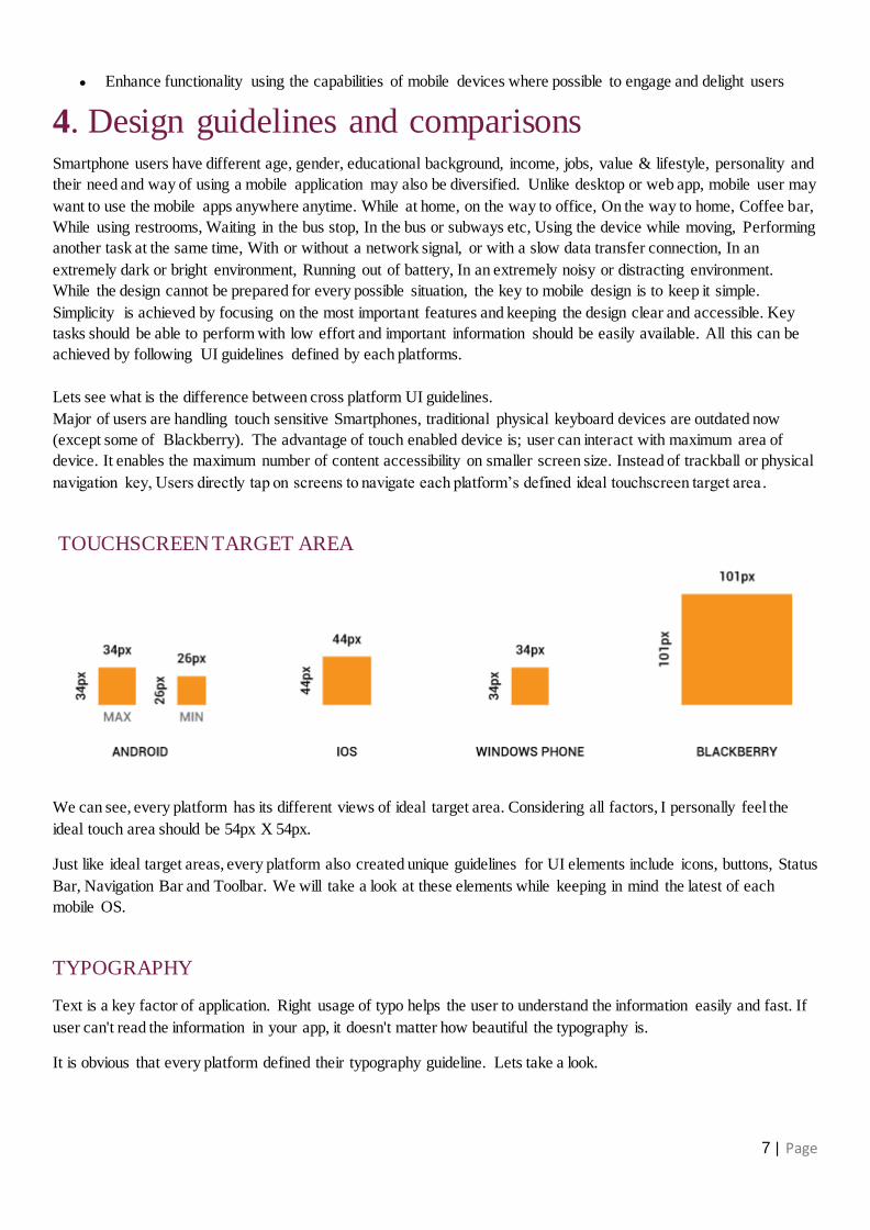
navigation key, Users directly tap on screens to navigate each platform’s defined ideal touchscreen target area .
TOUCHSCREEN TARGET AREA
We can see, every platform has its different views of ideal target area. Considering all factors, I personally feel the
ideal touch area should be 54px X 54px.
Just like ideal target areas, every platform also created unique guidelines for UI elements include icons, buttons, Status
Bar, Navigation Bar and Toolbar. We will take a look at these elements while keeping in mind the latest of each
mobile OS.
TYPOGRAPHY
Text is a key factor of application. Right usage of typo helps the user to understand the information easily and fast. If
user can't read the information in your app, it doesn't matter how beautiful the typography is.
It is obvious that every platform defined their typography guideline. Lets take a look.

8 | Page
Android design language relies on traditional typographic tools such as scale, space, rhythm, and alignment with an
underlying grid. Successful deployment of these tools is essential to help users quickly understand a screen of
information. To support such use of typography, ‘Ice Cream Sandwich’ introduced a new type family named Roboto,
created specifically for the requirements of UI and high-resolution screens.
Typographic Scale for Android UI design is as follows:
Users can select a system-wide scaling factor for text in the Settings app. In order to support these accessibility
features, type should be specified in scale-independent pixels (SP - One sp is one pixel on a 160 dpi screen if the
user's global text scale is set to 100%) wherever possible. Layouts supporting scalable types should be tested against
these settings.
● Text size Large 22 sp
● Text size Medium 18 sp
● Text size Small 14 sp
● Text size Micro 12 sp
IOS system interface uses ‘Helvetica Neue’, but there is a wide range of built-in fonts available. Though IOS has
given freedom of using any font type but it is much more particular about consistency of UI font. Apple says,
‘Prioritize content when responding to text-size changes, not all content is important to user’.
Apple uses a 20pt font for titles and button labels, 17pt for list labels, 16pt for text, 13pt for the top bar, 12pt for the
App icons and 10pt for the dock
Text should not smaller than 11pt, even when the user chooses the extra-small text size. For comparison, the body
style uses a font size of 17pt at the large size, which is the default text-size setting.
IOS also gives an option of invert color, It improves contrast for better readability for visual impairment people and
reduces strength for night reading.
Windows Phone UI is happy with ‘Segoe UI’ font type. The reason behind is ‘Segoe UI Symbol’ has been used as in
app icons, we will discuss on this in next Iconography topic. Windows phone guidelines is having similar explanation
as Android, The type ramp establishes a crucial design relationship from headlines to body text and ensures a clear
and understandable hierarchy between the different levels. Users immediately understand where to find information
and how to parse the page.
Too many type sizes and weights make it hard to establish an effective information hierarchy. For that reason, the
Windows phone UI uses only a handful of font sizes and weights,
● Segoe UI Light 42 point for titles
● Segoe UI Light 20 point for headings
● Segoe UI Semilight 11 point for body copy
● Segoe UI Regular 9 point for captions
Blackberry UI is using ‘Slate Pro’ Font, it is the preferred font for the BlackBerry 10 smartphones because it is elegant
9 | Page
and legible, allowing users to access information quickly and easily and it uses medium, regular, and light font
weights, as well as light italic type to differentiate body content.
● Text size XX Large 16 points (79 px)
● Text size X Large 12 points (59 px)
● Text size Large 10 points (50 px)
● Text size Primary 9 points (45 px)
● Text size Medium 8 points (40 px)
● Text size Small 7.11 points (35 px)
● Text size X Small 6 points (30 px)
● Text size XX Small 4.8 points (22 px)
ICONOGRAPHY & IMAGES
An icon is a graphic that takes up a small portion of screen real estate and provides a quick, intuitive representation of
an action, a status, or an app. It is especially important that your icons are immediately understandable. They are the
street signs of apps. If they are not easily and immediately understood, the user will get frustrated and likely uninstall
your app.
Each platform, whether Android, iPhone, Windows or Blackberry, has its own established guidelines for icons.
ANDROID
When you design icons for your app for Android smart phones, it's important to keep in mind that your app may be
installed on a variety of devices that offer a range of pixel densities. But you can make your icons look great on all
devices by providing each icon in multiple sizes. When your app runs, Android checks the characteristics of the device
screen and loads the appropriate density-specific assets for your app.
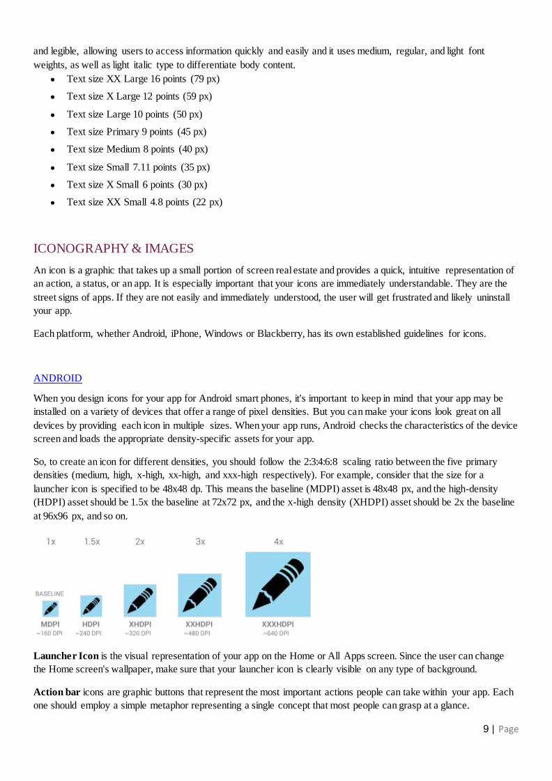
So, to create an icon for different densities, you should follow the 2:3:4:6:8 scaling ratio between the five primary
densities (medium, high, x-high, xx-high, and xxx-high respectively). For example, consider that the size for a
launcher icon is specified to be 48x48 dp. This means the baseline (MDPI) asset is 48x48 px, and the high-density
(HDPI) asset should be 1.5x the baseline at 72x72 px, and the x-high density (XHDPI) asset should be 2x the baseline
at 96x96 px, and so on.
Launcher Icon is the visual representation of your app on the Home or All Apps screen. Since the user can change
the Home screen's wallpaper, make sure that your launcher icon is clearly visible on any type of background.
Action bar icons are graphic buttons that represent the most important actions people can take within your app. Each
one should employ a simple metaphor representing a single concept that most people can grasp at a glance.
10 | Page
Small / Contextual Icons, Within the body of your app, use small icons to surface actions and/or provide status for
specific items. For example, in the Gmail app, each message has a star icon that marks the message as important.
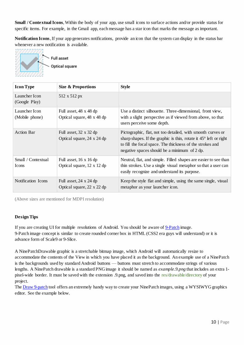
Notification Icons , If your app generates notifications, provide an icon that the system can display in the status bar
whenever a new notification is available.
Icon Type Size & Proportions Style
Launcher Icon
(Google Play)
512 x 512 px
Launcher Icon
(Mobile phone)
Full asset, 48 x 48 dp
Optical square, 48 x 48 dp
Use a distinct silhouette. Three-dimensional, front view,
with a slight perspective as if viewed from above, so that
users perceive some depth.
Action Bar Full asset, 32 x 32 dp
Optical square, 24 x 24 dp
Pictographic, flat, not too detailed, with smooth curves or
sharp shapes. If the graphic is thin, rotate it 45° left or right
to fill the focal space. The thickness of the strokes and
negative spaces should be a minimum of 2 dp.
Small / Contextual
Icons
Full asset, 16 x 16 dp
Optical square, 12 x 12 dp
Neutral, flat, and simple. Filled shapes are easier to see than
thin strokes. Use a single visual metaphor so that a user can
easily recognize and understand its purpose.
Notification Icons Full asset, 24 x 24 dp
Optical square, 22 x 22 dp
Keep the style flat and simple, using the same single, visual
metaphor as your launcher icon.
(Above sizes are mentioned for MDPI resolution)
Design Tips
If you are creating UI for multiple resolutions of Android. You should be aware of 9-Patch image.
9-Patch image concept is similar to create rounded corner box in HTML (CSS2 era guys will understand) or it is
advance form of Scale9 or 9-Slice.
A NinePatchDrawable graphic is a stretchable bitmap image, which Android will automatically resize to
accommodate the contents of the View in which you have placed it as the background. An example use of a NinePatch
is the backgrounds used by standard Android buttons — buttons must stretch to accommodate strings of various
lengths. A NinePatch drawable is a standard PNG image it should be named as example.9.png that includes an extra 1-
pixel-wide border. It must be saved with the extension .9.png, and saved into the res/drawable/directory of your
project.
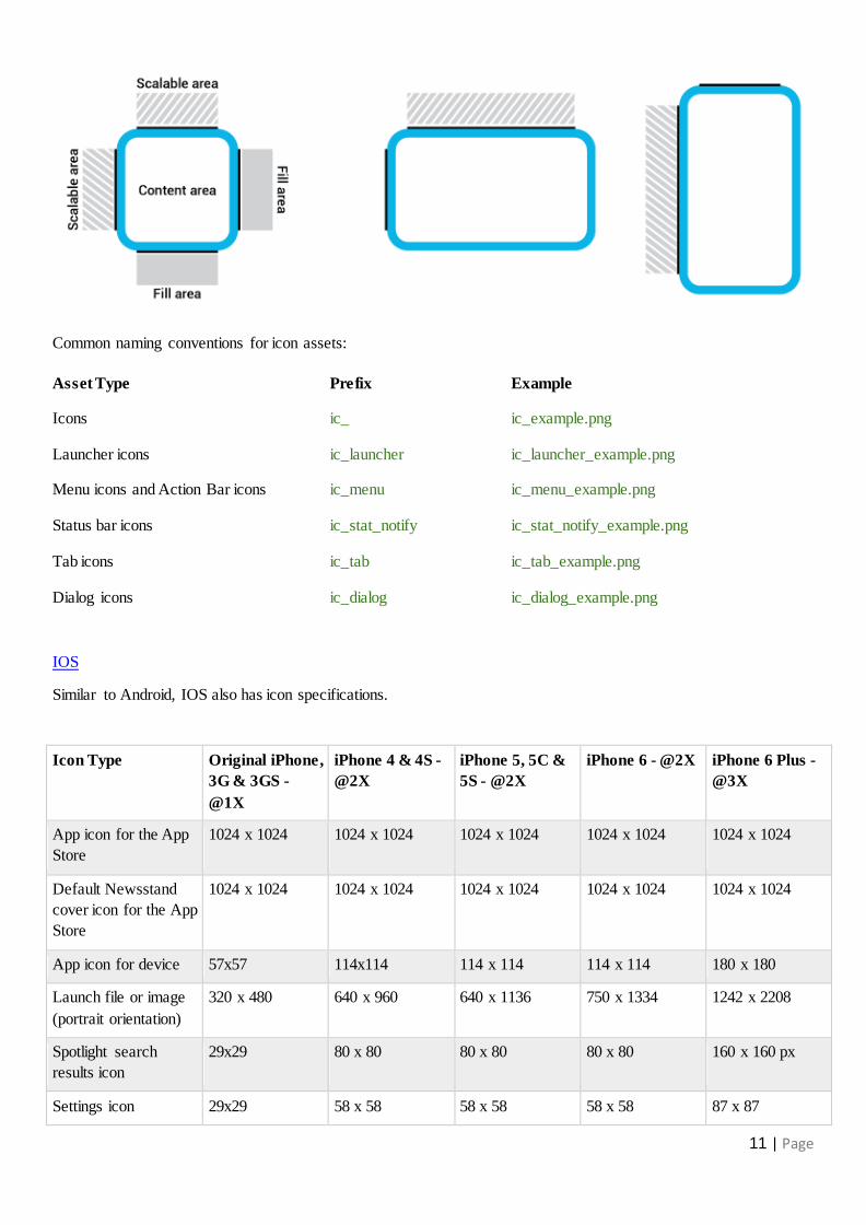
The Draw 9-patch tool offers an extremely handy way to create your NinePatch images, using a WYSIWYG graphics
editor. See the example below.
11 | Page
Common naming conventions for icon assets:
Asset Type Prefix Example
Icons ic_ ic_example.png
Launcher icons ic_launcher ic_launcher_example.png
Menu icons and Action Bar icons ic_menu ic_menu_example.png
Status bar icons ic_stat_notify ic_stat_notify_example.png
Tab icons ic_tab ic_tab_example.png
Dialog icons ic_dialog ic_dialog_example.png
IOS
Similar to Android, IOS also has icon specifications.
Icon Type Original iPhone,
3G & 3GS -
@1X
iPhone 4 & 4S -
@2X
iPhone 5, 5C &
5S - @2X
iPhone 6 - @2X iPhone 6 Plus -
@3X
App icon for the App
Store
1024 x 1024 1024 x 1024 1024 x 1024 1024 x 1024 1024 x 1024
Default Newsstand
cover icon for the App
Store
1024 x 1024 1024 x 1024 1024 x 1024 1024 x 1024 1024 x 1024
App icon for device 57x57 114x114 114 x 114 114 x 114 180 x 180
Launch file or image
(portrait orientation)
320 x 480 640 x 960 640 x 1136 750 x 1334 1242 x 2208
Spotlight search
results icon
29x29 80 x 80 80 x 80 80 x 80 160 x 160 px
Settings icon 29x29 58 x 58 58 x 58 58 x 58 87 x 87

12 | Page
Toolbar and
navigation bar icon
44 x 44 44 x 44 44 x 44 66 x 66
Tab bar icon 50 x 50
max: 96 x 64
50 x 50
max: 96 x 64
50 x 50
max: 96 x 64
75 x 75
max: 144 x 96
Web clip icon
(for web apps and
websites)
120 x 120 120 x 120 120 x 120 180 x 180
(Above values are in Pixels)
Common naming convention for assets:
Asset Type Original iPhone,
3G & 3GS - @1X
iPhone 4 & 4S -
@2X
iPhone 5, 5C &
5S - @2X
iPhone 6 - @2X iPhone 6 Plus -
@3X
LaunchImage LaunchImage320
x480.png
LaunchImage320
LaunchImage320
LaunchImage320
LaunchImage320
Design Tips
In IOS application you can use resizable images that can result in better app performance.
● If you want a solid color with no gradient, create a 1 x 1 point image
● If you want a vertical gradient, create an image that has a width of 1 point and a height that matches the height
of the UI element’s background
● If you want to provide a repeating textured appearance, you need to create an image with dimensions that
match the dimensions of the repeating portion of the texture
● If you want to provide a nonrepeating textured appearance, you need to create a static image with dimensions
that match the dimensions of the UI element’s background area
WINDOWS PHONE
As we discussed, Windows come up with very innovative UI pattern called metro UI. To complete your quest for the
perfect app, you will need to create a bunch of assets. They’re required to obtain a good looking app.
Most of the UI controls added to Segoe UI Symbol are mapped to the Private Use Area of Unicode (PUA). The PUA
allows font developers to assign private Unicode values to glyphs that don’t map to existing code points. This can be
useful when creating a symbol font, but it creates an interoperability problem. If the font is not available, the glyphs
won’t show up. Only use these glyphs when you can specify the Segoe UI Symbol font.
If you are working with tiles, you can't use these glyphs because you can't specify the tile font and PUA glyphs are not
available via font-fallback. Using “sprite” board with custom icons is a good alternative in this scenario.

13 | Page
Below is a list of assets which will help you to create perfect app design.
Icon Type WVGA HD720 WXGA Full HD
Panorama background 960 x 800 1536 x 1280 1536 x 1280 1536 x 1280
Application Icon 99 x 99 | 14px padding
99 x 99 | 14px padding
99 x 99 | 14px padding
99 x 99 | 14px padding
App list Icon 62 x 62 | 9px padding
93 x 93 | 13px padding
99 x 99 | 14px padding
62 x 62 | 9px padding
Application Tile Image 173 x 173 173 x 173 173 x 173 173 x 173
Device application icon for Windows Phone Marketplace catalog (small)
99 x 99 99 x 99 99 x 99 99 x 99
Device application icon for Windows Phone Marketplace catalog (large)
173 x 173 173 x 173 173 x 173 173 x 173
Desktop application icon for Windows Phone Marketplace catalog
200 x 200 200 x 200 200 x 200 200 x 200
App Bar Buttons 48 x 48 circle with 26 x 26 icon
76 x 76 circle with 42 x 42 icon
76 x 76 circle with 42 x 42 icon
76 x 76 circle with 42 x 42 icon
Splash Screen 768 x 1280 768 x 1280 768 x 1280 768 x 1280
Small iconic tile 69 x 69 | 12px padding
103 x 103 | 12px padding
110 x 110 | 19px padding
69 x 69 | 12px padding
Medium iconic tile 126 x 126 | 21px padding
189 x 189 | 31px padding
202 x 202 | 34px padding
126 x 126 | 21px padding
Small flip or cycle tile 100 x 100 | 27px padding
159 x 159 | 41px padding
159 x 159 | 43px padding
99 x 99 | 27px padding
Medium flip or cycle tile 210 x 210 336 x 336 336 x 336 336 x 336
Large flip or cycle tile 430 x 210 691 x 336 691 x 336 691 x 336
(Above values are in Pixels)
Common naming convention for assets:
Asset Type WVGA HD720 WXGA Full HD
Splashscreen SplashScreenImage.
screen-WVGA.png
SplashScreenImage.
screen-720p.png
SplashScreenImage.scr
een-wxga.png
Slapshscreenimage.pn
g
Application icon ApplicationIcon.png ApplicationIcon.png ApplicationIcon.png ApplicationIcon.png
Catalogue image CatalogueImage.pn
g
CatalogueImage.png CatalogueImage.png CatalogueImage.png
Lens icon (Lens.Screen-
WVGA.png
Lens.screen-720.png Lens.Screen-
WXGA.png

14 | Page
BLACKBERRY
BlackBerry smartphones use different sizes for in-app icons and indicators. App icons are based on basic shapes. Most
of the rounded squares and circles used in the UI. If you use a symbol in your icon, make it the same size as the
symbols in other BlackBerry application icons. The symbol should be 62% of the total size of your icon.
Some BlackBerry devices feature an OLED display that uses a dark version of the standard BlackBerry 10
theme. It is recommended to create two different theme icon set while creating UI for blackberry devices. One is for
dark background which is lighter color of icons and other is for light background with dark color icons.
Design Unit
As mentioned earlier Blackberry come up with DU (design unit) for scaling assets. The bucket value indicates the
pixel size of one one design unit of device.
1 DU on 720 x 720 resolution phone is 9 pixels, If you have a radio button that is 5 x 5 du. It equals 45 x 45 pixels on
720 x 720 resolution phones, 40 x 40 pixels on 720 x 1280 resolution phones and so on.
You can reverse the formula to calculate du from known pixel values, making asset scaling easy. For example,
if you have a square button 114 x 114 pixels that you created for the 768 x 1280 resolution smartphone and you want
to figure out the design unit size to scale the image for a 1400 x 1400 future device, here's how:
1. Divide 114 by 10 (the design bucket for 768 x 1280 resolution) to get 11.4.
2. Round off to the nearest integer to get the du value (11 x 11 du).
3. Multiply the du value by the design bucket of the new device (12) to get 132 x 132 pixels.
Screen resolution Density Bucket
720 x 720 330 ppi 9
720 x1280 295 ppi 8
768 x 1280 356 ppi 10
1440 x 1440 452 ppi 12
Asset Type 720 x 720 px 720 x 1280 px 768 x 1280 px 1440 x 1440 px
App icon 90 x 90 px 96 x 96 px 110 x 110 px 144 x 144 px
Active Frames 310 x 211 px 319 x 437 px 334 x 396 px 440 x 486 px (large) 440 x 195 px (small)
Large icons: Action bar with tab icons, Action
8 x 8 du FA 5.5 x 5.5 du
8 x 8 du FA 5.5 x 5.5 du
8 x 8 du FA 5.5 x 5.5 du
8 x 8 du FA 5.5 x 5.5 du

15 | Page
menu icons, Tab menu icons, Content area icons, Application menu icons, Context menu icons
Medium icons 7 x 7 du FA 4.5 x 4.5 du
7 x 7 du FA 4.5 x 4.5 du
7 x 7 du FA 4.5 x 4.5 du
7 x 7 du FA 4.5 x 4.5 du
Small icons 6 x 6 du FA 4.5 x 4.5 du
6 x 6 du FA 4.5 x 4.5 du
6 x 6 du FA 4.5 x 4.5 du
6 x 6 du FA 4.5 x 4.5 du
FA: Focal area (The focal area refers to the size of the symbol within the icon itself)
Active Frames
An Active Frame (also called an application cover) appears on the home screen. Users tap an Active Frame to re -open
the app.

16 | Page
5. References
1. History of mobile phones
2. The cellphone revolution kicked off 40 years ago today
3. Generate titanium icon & splash assets
4. Screen densities, sizes, configurations, and icon sizes
5. Android dpi calculator
6. What are the most common android screen resolutions?
7. Mobile UX and Mobile UI guidelines: The 2014 Collection
8. The Elements Of The Mobile User Experience
9. iOS and Android Design Guidelines Cheat Sheet
10. UX Metaphor Equivalents for iOS & Android
11. Icon Naming Specification
12. Tips for exporting assets for iOS & Android design - UNITiD
13. Windows Phone 8 Icon Size Guide
14. Readability: the Optimal Line Length