ballast point case study
TRANSCRIPT

Ballast Point Brewing & Spirits
Case Study Report
Gargi Godbole
July 18, 2016

Ballast Point Brewing & Spirits Company Brand Ballast Point Brewing & Spirits Company is an award winning brewing company, in San Diego, CA. It was founded in 1996 by Jack White. Its main manufacturing products are beers and spirits, including rum, gin, and vodka, to name a few. However, it is also known for its tastings. Currently, Ballast Point has six locations, all in Southern California. However, its beers and spirits can also be found in local grocery stores and supermarkets all around the world. The current website for Ballast Point Brewing & Spirits is designed to display its various beers and alcoholic products. The website also includes recipes for home brewing and mixings. Although the website serves its purpose, its design does not give justice to all listed. This case study reviews some of the website’s features and suggests alternatives to make the user experience more friendly and efficient.
Ballast Point Brewing & Spirits Website
Age Confirmation Page Overview:When the Ballast Point website is accessed, the first thing to appear is a page to confirm whether or not the user is 21 years of age. A Ballast Point logo appears on top, followed by the question “ARE YOU 21 YEARS OR OLDER?”, followed by a “Yes Enter Site” button below.
Problem: The words “ARE YOU 21 YEARS OR OLDER?” appears on two separate lines. This acts as a discontinuity to the word flow. The confirmation question and the “Yes” sign appears on the bottom half of the page. There is only one button (a button to click yes), which is impractical since the question asked should give the option for two choices.

Solution: Make the age confirmation message appear in one line. Pull the logo up, so that the question appears in the center of the page. Change the question into a statement “I AM 21 YEARS OR OLDER”, and which the user can then directly click to enter the site. This means, the “Yes” button will now be removed. The color scheme for this page will remain the same.
Wireframe:
Homepage Navigation Bar Overview:The navigation bar has links to seven pages – “Beers”, “Spirits”, “About”, “Visit”, “News”, “Home Brew Mart”, and “Shop”. The Ballast Point logo appears on left side of the navigation bar. All these items appear on a large overlay.
Problem: There are too many items on the navigation bar. A user may become confused by the options available. Furthermore, the navigation bar is not equally spaced between each item, further leading to the crowded look. The overlay is also too large.
Solution:
Less number of pages will be listed, with rearranging some and combining some. The final list will be: “Beers”, “Spirits”, “Make At Home”, “Merchandize”, and “Location and Other Information”. The links will be placed in zigzag design, with the “Location and Other Information” links in the center. While three of the links will be kept the same, the “Visit”, “News”, and “About” pages will be combined. The “Shop” page will be renamed to “Merchandize”. The pages have been renamed to help the user understand what they should expect when they click on the link to visit the page. Furthermore, the logo on the left side would be made smaller. The overlay will be shortened. The color scheme will remain the same.
Wireframe:
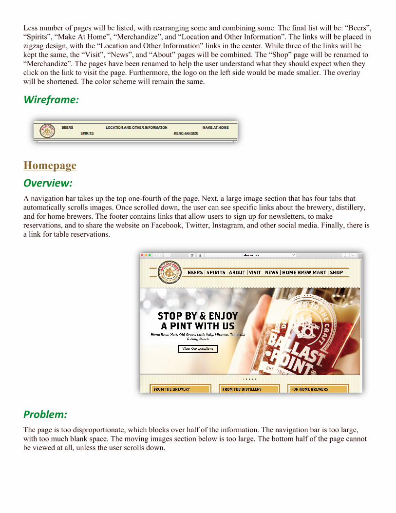
Homepage Overview: A navigation bar takes up the top one-fourth of the page. Next, a large image section that has four tabs that automatically scrolls images. Once scrolled down, the user can see specific links about the brewery, distillery, and for home brewers. The footer contains links that allow users to sign up for newsletters, to make reservations, and to share the website on Facebook, Twitter, Instagram, and other social media. Finally, there is a link for table reservations.
Problem: The page is too disproportionate, which blocks over half of the information. The navigation bar is too large, with too much blank space. The moving images section below is too large. The bottom half of the page cannot be viewed at all, unless the user scrolls down.

Solution: The new navigation bar will be used here. The moving images section and tabs about brewery, distillery, and home brewers will be made smaller, based on proportions of the screen. The color scheme and the footer will remain the same. The entire homepage will be adjusted on one screen – a scroll bar will not be needed.

Wireframe:
“Beers” Page
Overview: This page contains the list of beers Ballast Point offers. The same overlay navigation bar, as the Homepage, is used here. However, “Packaged” and “Draft Only” links have been added onto the overlay. On the left, there is an option that reads “View All” that allows users to view all beers at once; each beer bottle appears as a small image on the “View All” page. Below the navigation bar is a blue bar that contains specific links for “Packaged” – “Year Round”, “Limited”, “Homework Series”, and “Date Stamp Guide” – and “Draft Only” – “Barrel Aged”, “Collaboration”, “Pepper Beers”, and “Everything Else” – beers. Below all this are the list of specific beers with a large picture of the beer on right and description on the left. When further scrolled down, users have option of viewing beers on the consequent tabs.
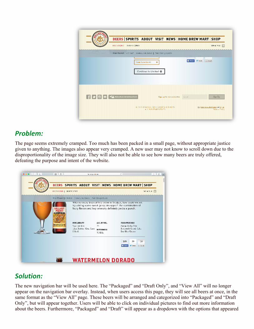
Problem: The page seems extremely cramped. Too much has been packed in a small page, without appropriate justice given to anything. The images also appear very cramped. A new user may not know to scroll down due to the disproportionality of the image size. They will also not be able to see how many beers are truly offered, defeating the purpose and intent of the website.
Solution: The new navigation bar will be used here. The “Packaged” and “Draft Only”, and “View All” will no longer appear on the navigation bar overlay. Instead, when users access this page, they will see all beers at once, in the same format as the “View All” page. These beers will be arranged and categorized into “Packaged” and “Draft Only”, but will appear together. Users will be able to click on individual pictures to find out more information about the beers. Furthermore, “Packaged” and “Draft” will appear as a dropdown with the options that appeared

inside the blue panel as part of the dropdown menu. This will be part of the navigation bar overlay. Once a user clicks on a specific category of brew, the page will automatically take them to the location on the page where that specific category appears. The color scheme will once again be the same.
Wireframes:
Conclusion Ballast Point Brewing & Spirits Company, Inc. is a local, San Diego-based brewing company. However, its products are sold around the world. Considering its large retail base, its current website is does not do justice in advertising its products. The new look for the website will allow the user to see the products being offered more clearly, with less number of clicks.