the newsletter of the appellate practice section … thereof times new roman regular 14pt (western)....
TRANSCRIPT

The Appellate ReviewThe Newsletter of the Appellate Practice Section
State Bar of GeorgiaWinter 2013
See Typography on page 7
Our Section Vice-Chair, Scott Key, asked typography expert Matthew Butterick to review the Georgia appellate rules and provide guidance for practitioners on applying principles of typography to Georgia appellate briefs. The following is his analysis.
Court rules about typography are designed to ensure fairness to parties and produce a minimum standard of readability. But they’re not designed to produce
good typography. As a lawyer, that’s your job.
As you consider the typography of your briefs, the most important principle is follow the rules. Don’t take shortcuts. For instance, Court of Appeals of Georgia Rule 1(c) and Supreme Court of Georgia Rule 16 requires 14-point text. Is that pretty big? Yes. Should you take it upon yourself to use a smaller size? No. The rule is clear. Follow it.
Let’s go through Court of Appeals of Georgia Rule 1(c) line-by-line and see what kind of typographic latitude it permits. Supreme Court of Georgia Rule 16 on Type has very similar requirements to Rule 1(c). (By the way, nothing in this article is offered as legal advice. I’m not admitted to practice in Georgia. I’m telling you how the rule looks to me. How you interpret it is ultimately up to you.)
All documents filed with the Court shall be typed or printed on non-transparent, letter size (8 ½” x 11”) white paper and bound at the top with staples or fasteners (round head or Acco) except as provided in Rule 46.
Nothing typographic to worry about here.
All documents filed with the Court shall have no less than double spacing between the lines including quotations and footnotes.
Double spacing means line spacing that’s twice as large as the point size. Single spacing means line spacing that’s the same as the point size. Beware of your word processor’s pre-fabricated “Double” and “Single” line-spacing options, which typically add extra space. For instance, at a 14-point font size, Microsoft Word’s “Double” line spacing is about 33 points, when it should be 28 points. Use the “Exact” line spacing option to get it
right – you’ll get more lines per page.
Letter spacing and type or font size shall be no smaller than 10 characters per inch. Notwithstanding the ten (10) characters per inch requirement, the Court shall accept in lieu thereof Times New Roman Regular 14pt (Western).
A type specification in terms of “character per inch” refers to a font where all the letters are the same width, also known as a monospaced font. All typewriters used monospaced fonts, and Courier – originally a design for the IBM Selectric in the ’50s – is the most common mono- spaced font on today’s computers.
But today, we don’t use typewriters, so there’s no need to use Courier. So please—don’t. (If you overrule my advice, note that 10 characters per inch is equivalent to 12 points in your word processor.)
Your alternative is Times New Roman, in 14 points. So use that.
Someday, I hope more courts will recognize that there are many excellent fonts other than Times New Roman. For those who think of it as the official font of the legal profession, please note: the U.S. Supreme Court forbids lawyers from using Times New Roman, and never uses it for its own published opinions. Chief Judge Frank Easterbrook of the Seventh Circuit is an outspoken critic of Times New Roman. The Seventh Circuit’s typographic guidelines encourage lawyers to use something else. The Seventh Circuit’s opinions don’t use it either.
Any documents that do not comply with the Court rules may be returned to counsel with notice of the defect of the pleading, and/or counsel may be ordered to redact and recast such documents.
Remember when I told you to follow the rules? Now you know why. Don’t take typographic shortcuts and count on nobody noticing. Recently, as part of USPTO litigation, Microsoft made a motion to strike one of Apple’s filings in part because the font was too small. (See http://bit.ly/gwPF8E.)
How Smart Typography Can Be Your Secret Weaponby Matthew Butterick
The Appellate Review 2013 Winter Edition2
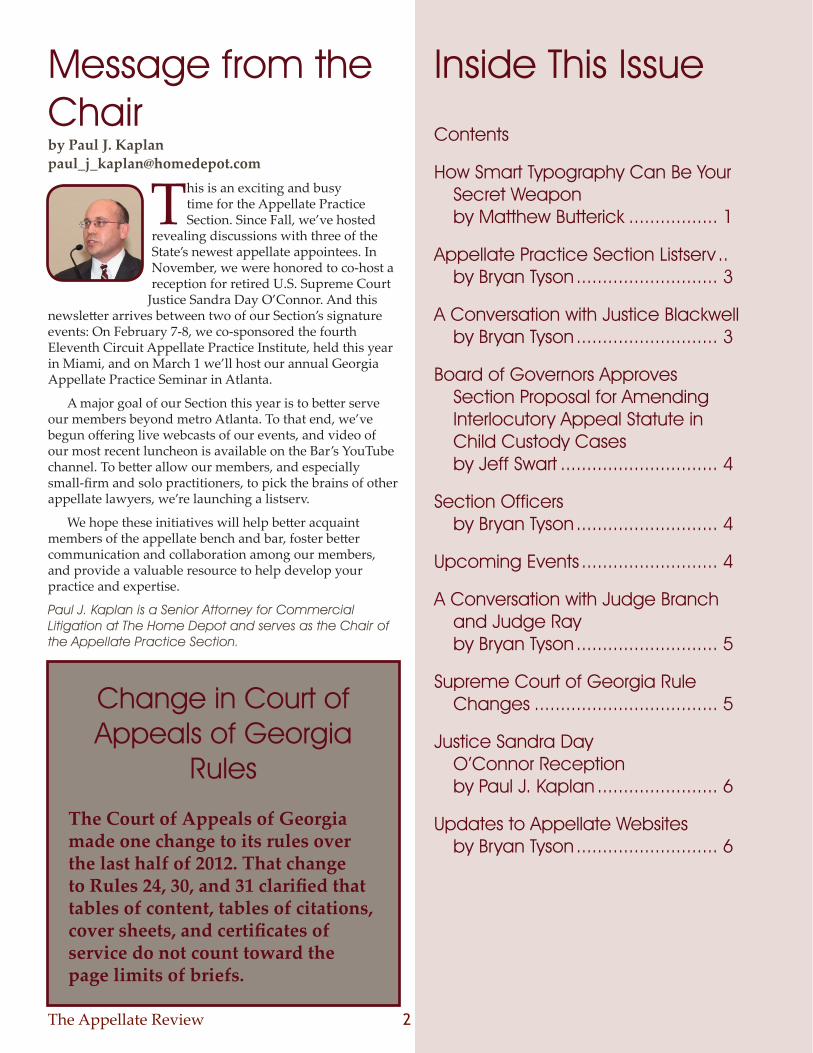
This is an exciting and busy time for the Appellate Practice Section. Since Fall, we’ve hosted
revealing discussions with three of the State’s newest appellate appointees. In November, we were honored to co-host a reception for retired U.S. Supreme Court
Justice Sandra Day O’Connor. And this newsletter arrives between two of our Section’s signature events: On February 7-8, we co-sponsored the fourth Eleventh Circuit Appellate Practice Institute, held this year in Miami, and on March 1 we’ll host our annual Georgia Appellate Practice Seminar in Atlanta.
A major goal of our Section this year is to better serve our members beyond metro Atlanta. To that end, we’ve begun offering live webcasts of our events, and video of our most recent luncheon is available on the Bar’s YouTube channel. To better allow our members, and especially small-firm and solo practitioners, to pick the brains of other appellate lawyers, we’re launching a listserv.
We hope these initiatives will help better acquaint members of the appellate bench and bar, foster better communication and collaboration among our members, and provide a valuable resource to help develop your practice and expertise.
Paul J. Kaplan is a Senior Attorney for Commercial Litigation at The Home Depot and serves as the Chair of the Appellate Practice Section.
Message from the Chairby Paul J. Kaplan [email protected]
Contents
How Smart Typography Can Be Your Secret Weapon by Matthew Butterick ................. 1
Appellate Practice Section Listserv .. by Bryan Tyson ........................... 3
A Conversation with Justice Blackwell by Bryan Tyson ........................... 3
Board of Governors Approves Section Proposal for Amending Interlocutory Appeal Statute in Child Custody Cases by Jeff Swart .............................. 4
Section Officers by Bryan Tyson ........................... 4
Upcoming Events .......................... 4
A Conversation with Judge Branch and Judge Ray by Bryan Tyson ........................... 5
Supreme Court of Georgia Rule Changes ................................... 5
Justice Sandra Day O’Connor Reception by Paul J. Kaplan ....................... 6
Updates to Appellate Websites by Bryan Tyson ........................... 6
Inside This Issue
Change in Court of Appeals of Georgia
Rules
The Court of Appeals of Georgia made one change to its rules over the last half of 2012. That change to Rules 24, 30, and 31 clarified that tables of content, tables of citations, cover sheets, and certificates of service do not count toward the page limits of briefs.
The Appellate Review 2013 Winter Edition3
Sharing information and ideas with other practitioners who specialize in appellate practice is one major benefit of participating in the Appellate Practice
Section. But with the pressures of daily practice that benefit can be lost, especially for those in solo practice or who practice outside of the Atlanta area.
To help our members better collaborate and connect, we are pleased to launch a new listserv for Section members to discuss appellate practice issues. Many members already utilize a listserv for other specialty areas like criminal defense or election law. The Appellate Practice Section listserv provides the same functionality for appellate practice questions and ideas.
For the uninitiated, a listserv is an electronic mailing list. Emails sent to the group email address are automatically sent to everyone who joined the mailing list. Any replies are also sent to the entire list. This allows for the easy sharing of information.
We have elected to use a Google Group for our listserv functionality. This setup gives the recipient several options on how to receive the emails to avoid being overwhelmed. First, instead of receiving every email as it is sent, you can
elect to receive a “daily digest” that is one email containing all the emails sent that day. Second, every message includes the phrase “[Georgia Appellate]” at the beginning of the email subject so that you can easily sort messages or create a rule that automatically puts them in a folder apart from your inbox. Third, if you decide there are too many emails, you can unsubscribe by clicking on a link at the bottom of each email.
This resource should be immensely helpful to Section members—everything from questions about the rules to formatting to general practice tips are available because the entire Section membership can see your question. When sending emails to the list, be sure to remember that recipients may include judges or opposing counsel, and review the tips posted on the group page. This list is designed for appellate practice questions, so questions for other subject areas should be sent to other lists.
To join the list, email [email protected] to request an invitation.
Bryan Tyson is an associate at Strickland Brockington Lewis LLP and serves as secretary for the Appellate Practice Section.
Appellate Practice Section Listservby Bryan Tyson
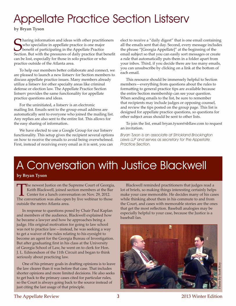
The newest Justice on the Supreme Court of Georgia, Keith Blackwell, joined section members at the Bar Center for a lunch conversation on Nov. 29, 2012.
The conversation was also open by live webinar to those outside the metro Atlanta area.
In response to questions posed by Chair Paul Kaplan and members of the audience, Blackwell explained how he became a lawyer and how he approaches being a judge. His original motivation for going to law school was not to practice law—instead, he was seeking a way to get a waiver of the rules relating to his eyesight to become an agent for the Georgia Bureau of Investigation. But after graduating first in his class at the University of Georgia School of Law, he went on to clerk for Hon. J. L. Edmondson of the 11th Circuit and began to think seriously about practicing law.
One of his primary goals in drafting opinions is to leave the law clearer than it was before that case. That includes shorter opinions and more limited decisions. He also seeks to get back to the primary cases cited for particular rules, so the Court is always going back to the source instead of just citing the last usage of that principle.
Blackwell reminded practitioners that judges read a lot of briefs, so making things interesting certainly helps make your case memorable. He decides many of his cases while thinking about them in his commute to and from the Court, and cases with memorable stories are the ones that get the most reflection. Baseball analogies may be especially helpful to your case, because the Justice is a baseball fan.
A Conversation with Justice Blackwellby Bryan Tyson
Phot
o by
Sco
tt K
ey
The Appellate Review 2013 Winter Edition4
Board of Governors Approves Section Proposal for Amending Interlocutory Appeal Statute in Child Custody Cases by Jeff Swart
On Jan. 12, 2013, the State Bar Board of Governors unanimously approved the section’s proposal to amend O.C.G.A. § 5-6-34(a)(11) to restrict the
types of orders in child custody cases that can be directly and immediately appealed as a matter of right. Under the section’s proposed amendment, parties in such cases would have a right to immediately appeal only such orders that actually affect child custody (including related contempt orders). Otherwise, parties seeking appellate review in child custody cases would need to comply with the discretionary appeal procedure provided by O.C.G.A. § 5-6-34(b).
The purpose of the proposed amendment is to reduce the appeals of collateral orders in child custody cases, with the hope of achieving a corresponding reduction in the time and expense required to bring such cases to final judgment. The issue was first called to the Section’s attention by Judge Christopher McFadden of the Georgia Court of Appeals and was thereafter noted by the Court in Collins v. Davis 318 Ga. App. 265, 269 n.17, 733 S.E.2d 798, 801 n.17 (2012).
The Section has been working closely with the Family Law Section on this proposal, which is expected to be presented to the General Assembly in the 2013 session.
Jeff Swart is a partner at Alston & Bird LLP and serves as the chair of the Appellate Practice Section’s State Practice and Legislation Committee.
Upcoming Event The annual state Appellate Practice
Seminar will be held on March 1, 2013, at the Bar Center in Atlanta, chaired by Darren Summerville. The seminar always receives generous support from the Judges of the Court of Appeals of Georgia and the Justices of the Supreme Court of Georgia, many of whom have agreed to participate in panel discussions on the appellate process. Together with several experienced practitioners, the Judges and Justices will share their advice on brief-writing, oral argument and professionalism in appellate advocacy. Go to http://www.iclega.org/programs/8203.html for more information.
Section Officersby Bryan Tyson
During the Sept. 27, 2012, Planning Meeting of the section, the following officers were elected for the 2012-2013 bar year:
• Paul Kaplan, chair
• Scott Key, vice-chair
• Ronan Doherty, immediate past chair
• Bryan Tyson, secretary
• Darren Summerville, treasurer
The following committees and chairs were designated for the upcoming year:
• State Practice and Legislation Committee – Jeff Swart, chair
• Federal Practice Committee – Lynn Fant Merritt and Larry Sommerfiled, co-chairs
• Programming and Events Committee – Scott Key, chair
• Communications Committee – Bryan Tyson, chair

The Appellate Review 2013 Winter Edition5
During the Midyear Meeting of the State Bar of Georgia, members of the Appellate Practice Section sat down for a lunch conversation with the newest judges on the Court of Appeals, Hon. Lisa Branch and Hon. William “Billy” Ray. Ray’s appointment was effective July 30, to fill the term of Justice Keith Blackwell while Branch was appointed effective Sept. 1, 2012, to replace retiring Hon. Charles Mikell. Section Chair Paul Kaplan led the discussion.
Ray was first introduced to the law as a child when he testified as a witness in a murder case. Later, he would ride his bike to court and watch the lawyers try cases. After a stint in politics as a state Senator, he applied for a Superior Court vacancy. He enjoyed serving as a superior court judge, but had a desire to bring his legislative experience and different perspective to help make the final calls in many appeals.
Branch followed in the steps of her grandfather, who was a lawyer and businessman, and always wanted to serve as a judge. Even in law school, at least one professor would address her as “Judge Branch.” After clerking for U.S. District Judge Owen Forrester, she focused primarily on the federal bench. She did not consider a Georgia opening until a friend asked whether she ever considered the Court of Appeals, so she decided to apply.
Both found some differences in life on the appellate bench versus their prior efforts. Ray noted the different pace and comparative lack of court time compared to the superior court. Branch appreciates the interactive nature of the Court of Appeals, which is similar to the environment at her firm.
Branch’s experience serving in a federal agency informs her approach to being a judge. That history drives her
respect for the separation of powers and to look for the unintended consequences of decisions.
Prior to Ray’s appointment, no lawyer from Gwinnett County had served on an appellate court. Both judges agreed that geographic diversity on the appellate courts is extremely valuable.
The Appellate Practice Section regularly hosts conversations with new members of the appellate bench in conversations to facilitate interactions with the bench and the bar. Video of the Section’s discussion with Judge Branch and Judge Ray is available on the Bar’s YouTube channel at http://youtu.be/i0e3uSXlIRA.
A Conversation with Judge Branch and Judge Rayby Bryan Tyson
Phot
o by
Bry
an T
yson
Section Chair Paul Kaplan moderates a conversation with Court of Appeals Judges Lisa Branch and Billy Ray.
The Supreme Court of Georgia made several changes to its rules the last half of 2012. Those changes include:
1. Supreme Court Rule 20 – The rule was clarified that tables of contents, tables of citations, appendices, and certificates of service do not count against the page limits on briefs. The Court also imposed a 50-page limit on briefs in criminal cases where the death penalty was not sought or imposed.
2. Supreme Court Rule 34 – The Court removed the phrase “by a majority vote of the Court” at the end of subsection (4), so that subsection now reads:
“The application is for leave to appeal a judgment and decree of divorce that is final under OCGA § 5-6-34 (a) (1) and timely under OCGA § 5-6-35 (d) and is determined to have possible merit.”
3. Supreme Court Rules 91-96 – The Court revised the definition of supervising attorneys for third-year law students practicing before the Court to include the Attorney General of Georgia.
Supreme Court of Georgia Rule Changes
The Appellate Review 2013 Winter Edition6
Recent changes to the websites of the Supreme Court of Georgia and the Court of Appeals of Georgia have expanded the availability of court documents.
The Supreme Court now publishes lists of cases in which it denied certiorari. They are available under the “Granted & Denied Petitions” navigation bar at the top of the page. The denials are noted by date and by case number.
The Court of Appeals now makes available its decisions in cases as part of the “Docket Search” results for each case. After searching for a case and clicking on the case number, the opinion is a link as the last item of the “Court of Appeals Information” section. Next to “Opinion/Order” you can click on “View” to see a PDF of the order or opinion.
Updates to Appellate Websitesby Bryan Tyson
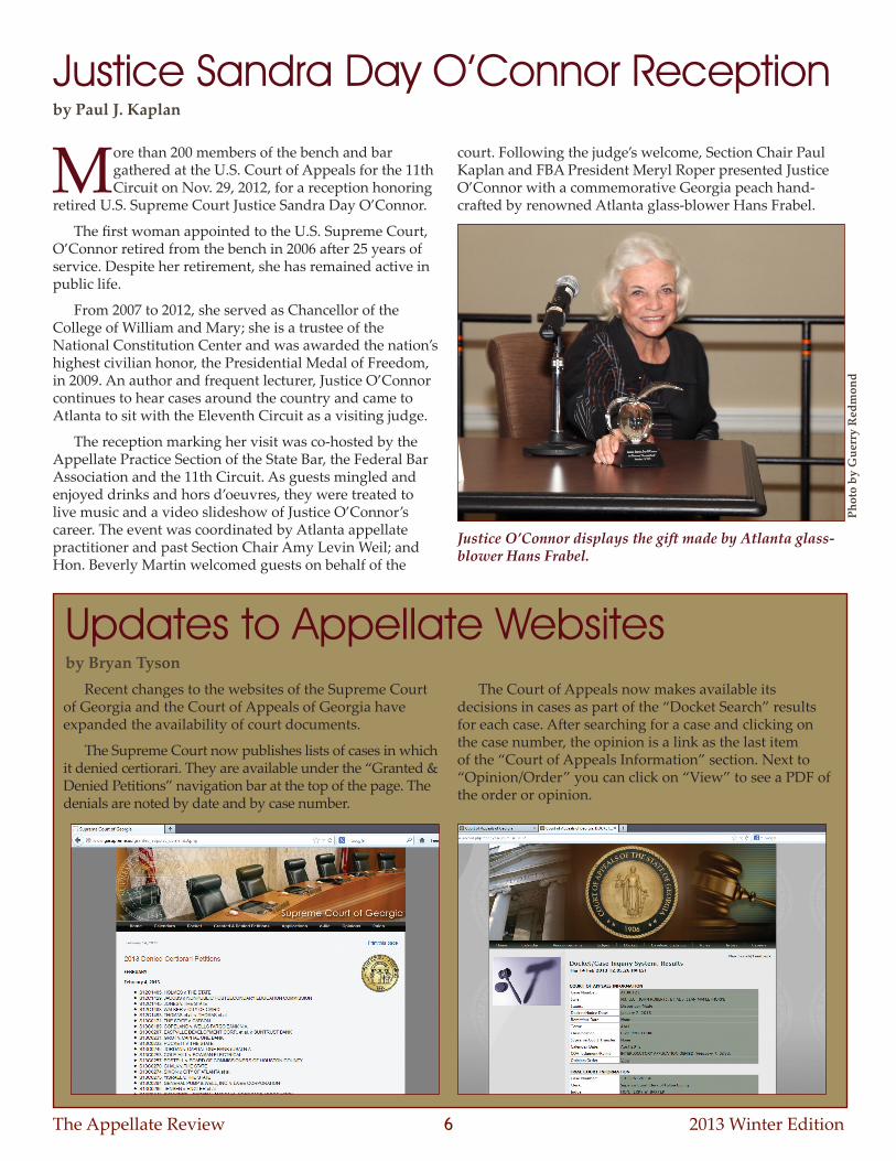
More than 200 members of the bench and bar gathered at the U.S. Court of Appeals for the 11th Circuit on Nov. 29, 2012, for a reception honoring
retired U.S. Supreme Court Justice Sandra Day O’Connor.
The first woman appointed to the U.S. Supreme Court, O’Connor retired from the bench in 2006 after 25 years of service. Despite her retirement, she has remained active in public life.
From 2007 to 2012, she served as Chancellor of the College of William and Mary; she is a trustee of the National Constitution Center and was awarded the nation’s highest civilian honor, the Presidential Medal of Freedom, in 2009. An author and frequent lecturer, Justice O’Connor continues to hear cases around the country and came to Atlanta to sit with the Eleventh Circuit as a visiting judge.
The reception marking her visit was co-hosted by the Appellate Practice Section of the State Bar, the Federal Bar Association and the 11th Circuit. As guests mingled and enjoyed drinks and hors d’oeuvres, they were treated to live music and a video slideshow of Justice O’Connor’s career. The event was coordinated by Atlanta appellate practitioner and past Section Chair Amy Levin Weil; and Hon. Beverly Martin welcomed guests on behalf of the
court. Following the judge’s welcome, Section Chair Paul Kaplan and FBA President Meryl Roper presented Justice O’Connor with a commemorative Georgia peach hand-crafted by renowned Atlanta glass-blower Hans Frabel.
Justice Sandra Day O’Connor Receptionby Paul J. Kaplan
Phot
o by
Gue
rry
Red
mon
d
Justice O’Connor displays the gift made by Atlanta glass- blower Hans Frabel.
The Appellate Review 2013 Winter Edition7
What about the other direction—should you file a motion to strike if you see a typographic flaw? I can’t dispense legal advice. But in my practice, I see plenty of nonconforming documents from other lawyers. My view is that unless the typographic flaw actually creates prejudice, i.e., the opposing lawyer is ending up with more space for argument than they ought to, I’m not going to make a fuss. Judges are busy enough. I don’t need to occupy them with complaints about harmless infractions. That said, the judges I’ve encountered take compliance with the court rules seriously, regardless of the topic.
All paper documents filed with this Court shall have a non-glossy, white back of recyclable paper, heavier than regular stationery-type paper.
Nothing typographic to worry about here either.
In Typography for Lawyers, I talk about how four typographic decisions have the greatest influence on how a document looks: font choice, point size, line spacing, and page margins. Rule 1(c) controls the first three.
Let’s consider the fourth: page margins. Page margins should be large enough to yield about 45–90 characters per line, or 2–3 lowercase alphabets. While Rule 1(c) doesn’t specify a margin size, if you’re using 14-point Times New Roman, one-inch margins will be about right. (Smaller fonts need bigger margins. When using a 12-point font, margins of 1.5–2 inches are better.)
So where does the rule give you latitude? I don’t want to raise false hope, Georgia lawyers: these rules are some of the more inflexible formatting rules I’ve seen.
The classic page layout from the typewriter era is one-inch margins on all sides, 12-point monospaced font, and double-spaced lines. Because of its genesis in typewritten documents, this format is the basis of many institutional document-layout rules, including Rule 1(c). (Monospaced fonts are wider than proportional fonts like Times New Roman, so the point of requiring 14-point Times is to bring it closer in overall length to a 12-point monospaced font.)
But have you ever seen a book, newspaper, or magazine that uses this layout? No. Why not? Because it’s not optimally legible. So why would anyone use it? Because it suits the severely limited capabilities of the typewriter. So if we don’t use typewriters anymore, why does everyone still use this layout? Good question.
The answer, at least for court rules, is page limits. Like most places, Georgia controls the length of briefs with page limits. In the typewriter age, this worked because typewriter output was standardized: everyone’s typewriter produced the same number of words per page. In the digital age, there can be far more variation in formatting, so page limits only work if formatting is rigidly controlled.
It’s ironic – typewriters were always understood to be a lesser substitute for the typographic quality of a professional print shop. But now that we have computers
that can deliver print-shop quality, we’re asked to make them behave like typewriters.
That’s why I think courts would be better off putting length rules in terms of word limits rather than page limits. Unlike typewriters, all word processors have a word-count function. Compared to page limits, word counts are harder to evade. To be fair, they’re also harder to verify. But California’s Court of Appeal uses word counts, and makes them work by requiring that each document end with a certification of word count. Once you shift from page limits to word limits, you no longer need to rigidly control formatting.
I’m in favor of formatting rules that are as nonrestrictive as possible. As I said at the beginning, courts would always need to impose a few rules to achieve fairness and minimum standards of legibility. But other than that, typography should be considered part of the advocate’s territory, just like oral argument skills.
For those who worry that nonrestrictive rules would produce a crazy diversity of document layouts – I doubt it. If you repealed these rules tomorrow, I imagine most Georgia appellate lawyers would just continue using 14-point Times New Roman. Nonrestrictive rules let those who care about good typography use good typography; everyone else can keep being mediocre.
So how can you maximize typographic quality under today’s rules?
You can practice good type-composition habits. The most common typing errors in legal documents: straight quotation marks instead of curly ones, two spaces between sentences instead of one, multiple hyphens instead of dashes, too many exclamation points (any more than one is suspect), and alphabetic approximations of trademark and copyright symbols like (TM) and (C). If you’re guilty of any of these infractions, take the time to find out how to insert the proper typographic characters. For bonus points: learn to use the nonbreaking space after paragraph and section marks, to keep them bound to their numerical references.
You can also improve the typography of your headings, which are an important tool for an appellate writer. Headings present two sets of problems: structural and typographic. If you cure the structural problems, the typographic problems get a lot easier.
The big structural problem: lawyers often use too many levels of headings. This leads to increasingly desperate attempts to make them visually distinct, usually with injudicious combinations of formatting (e.g., bold, plus underlined, plus all caps, plus indented four inches). So I recommend using only three levels of headings – two is better. Remember that headings are supposed to reveal the structure of your argument, not your document. You don’t have to call out every topic, subtopic, mini-topic, and microtopic. It confuses your readers and eventually exhausts them.
Then you can consider the typography. I recommend using these parameters:
Typography continued from page 1
The Appellate Review 2013 Winter Edition8
1. Don’t use all caps. If your headings are full sentences, they’re too long for caps.
2. Don’t underline. It’s another ugly holdover from typewriters.
3. Don’t center your headings. Centering is fine for a line or two, but multiline headings are harder to read if they’re centered.
4. Use bold, not italic. For headings, bold is easier to read than italic and stands out better on the page. (Non-bold headings work too.)
5. It’s fine to make the point size of a heading bigger, but just a little. Use the smallest increment necessary to make a visible difference. If your text is set in 14 point, you needn’t go up to 16 point. Try a smaller increase—to 14.5 or 15 point.
6. Only use two levels of indenting, even if you use more than two levels of headings. Some lawyers like to indent every heading a little farther. It gets ridiculous.
7. Suppress hyphenation in headings.
8. Use the “keep lines together” and “keep with next paragraph” options in your word processor to prevent headings from breaking awkwardly across pages.
I wish you well in your typographic explorations. Keep in mind that improving your eye for typography has risks. A reader recently wrote me to say that she loved learning to make her documents look great. The problem? Having adjusted her standards, everything that arrived on her desk from other attorneys now looked intolerably sloppy. You’ve been warned.
Matthew Butterick is an attorney, designer, and writer in Los Angeles. He is the author of the website http://www.typographyforlawyers.com and the book Typography for Lawyers (Jones McClure Publishing).
Judging Panel Volunteers Still Needed
for the 2013 State Finals Tournament
Saturday, March 16Gwinnett Justice Center,
Lawrenceville
At least two rounds of HSMT judging panel experience or one year of coaching experience required
to serve at state.
VOLUNTEER FORMS ARE AVAILABLE ONLINE
IN THE “VOLUNTEER” SECTION OF OUR WEBSITE
www.georgiamocktrial.org
Contact the Mock Trial Officewith questions:
404-527-8779 or toll free800-334-6865 ext. 779
Email: [email protected] Join us on Facebook!
www.facebook.com/GeorgiaMockTrial
To contribute information to the newsletter, please
contact Bryan Tyson, editor, at bryan.tyson@
sbllaw.com