special font for dyslexia? - essay.utwente.nl · 5 renske de leeuw, december 2010 introduction...
TRANSCRIPT
Special Font For Dyslexia?
Master’s thesis Renske de Leeuw
First supervisor: Dr. T. van Leeuwen
Second supervisor: Prof. Dr. W.R. Joolingen
December 2010, University of Twente

2 Renske de Leeuw, December 2010
3 Renske de Leeuw, December 2010
Abstract
Abstract: Reading errors like switching letters is a persistent characteristic of errors for
dyslectics (Braams, 2001). This type of error can be explained by the magnocellular theory
(Stein, 2001; Stein, Talcott, & Walsh, 2000). The font “Dyslexie” is developed to increase the
reading accuracy and readability of texts for dyslectics, so that the errors by switching letters
are reduced.
Aim: To examine difference in reading speed and accuracy between dyslectics and normal
readers, while reading printed words and non-words in the fonts “Dyslexie” and Arial.
Sample: Twenty-one dyslectic and twenty-two normal reading students participated
voluntarily or received European Credits or money
Method: Students read the reading tests EMT and Klepel twice. Once printed in the font
Arial and once in the font “Dyslexie”. The order was randomly assigned. In-between the
reading tests an auditory task was fulfilled.
Results: No significant difference in speed was measured, but there were some positive
and negative effects found for the interaction font and dyslexia on the accuracy for reading
words and non-words.
Conclusion: Reading with the font “Dyslexie” does not improve the reading speed for
reading words. However some specific type of reading errors are decreased, but others are
increased. Overall the dyslectics read fewer errors while reading the words printed in the font
“Dyslexie”. Further research in needed to examine the hypotheses that the reading speed and
accuracy increases while reading texts that are printed in the font “Dyslexie”.
Keywords: Dyslexia, visual noise, special font, reading ability.

4 Renske de Leeuw, December 2010
Samenvatting
Samenvatting: Leesfouten zoals het verwisselen van letters is een hardnekkig
verschijnsel voor dyslecten (Braams, 2001). Het verwisselen van letters kan verklaard worden
door de magnocellulaire theorie (Stein, 2001; Stein, et al., 2000). Het lettertype “Dyslexie” is
ontwikkeld om de accuratesse en leesbaarheid van teksten, voor dyslecten, te vergroten.
Enkele aanpassingen zijn specifiek gemaakt om verwisselingen van letters te verkleinen.
Doel: Het onderzoeken van de leessnelheid en accuratesse tussen dyslecten en normale
lezers van het lezen van woorden en non-woorden in het lettertype “Dyslexie” en Arial.
Proefpersonen: Eenentwintig dyslecten en tweeëntwintig normaal lezende studenten
hebben deel genomen op vrijwillige basis of met een vergoeding in European Credits of geld.
Methode: De studenten hebben de leestesten EMT en Klepel twee keer gelezen. Eén keer
met het lettertype Arial en één keer met het lettertype “Dyslexie”. De volgorde was
willekeurig toegekend. Tussen de twee leesmomenten werd een auditieve taak uitgevoerd
Resultaten: Er waren geen significante verschillen voor de leessnelheid, maar er zijn
enkele positieve en negatieve effecten gevonden voor de interactie lettertype “Dyslexie” en de
diagnose dyslexie voor de accuratesse van het lezen van woorden en non-woorden.
Conlcusie: Het lezen met het lettertype “Dyslexie” heeft geen effect op de leessnelheid.
Echter verminderen diverse specifieke leesfouten, terwijl andere toenemen. Over het
algemeen maakten de dyslecten minder leesfouten, wanneer ze woorden lazen met het
lettertype “Dyslexie”. Vervolg onderzoek is nodig om de hypothesen te testen dat de
leessnelheid en accuratesse vergroten wanneer teksten gemaakt zijn met het lettertype
“Dyslexie”.
5 Renske de Leeuw, December 2010
Introduction
Dyslexia is a reading and spelling problem that is seen in every education level and age
(Kuijpers, et al., 2003; Vellutino, Fletcher, Snowling, & Scanlon, 2004). The definition of
dyslexia states that someone has dyslexia when his or her reading performance is significantly
behind what may be expected based on his or her intelligence and the followed reading
education and only when there are no neurological damages, that causes the reading disability
(Lyon, Shaywitz, & Shaywitz, 2003). It is possible to deal with the disability and compensate
the reading- and spelling problems that dyslectics have in daily activities. In the field of
dyslexia and specific support for dyslectics there are many solutions to ameliorate the
consequences. However a lot of these support methods are not based on scientific research.
This is also the case for special dyslectic fonts. These fonts are designed to enhance the
readability of texts and the reading accuracy. The current study is to investigate the possible
effects of one of these fonts, on the level of word reading by dyslectics.
Phonological theory about dyslexia
When children learn to read, they learn to understand what a phoneme (single sound that
represents a letter) and grapheme (single letter symbol) are and which phoneme are linked to
which grapheme. During the learning process these skills, called the phonological skills,
improve and young children learn to read small words and letters very quickly (Van der Leij,
2003). Yet, children with dyslexia have a hard time mastering the phonological skills, partly
because they have trouble with the phonological awareness and phonological processing.
Phonological awareness is the understanding and awareness that spoken words consist of
individual phonemes, or speech sounds (Van der Leij, 2003). The phonological processing
consists of several skills that are used to rhyme, spell and read pseudo words (non existing
words). A deficit in the phonological processing can be found in the tasks such as rhyming,
non word repetition, phonetic spelling and rapid naming (Snowling, 1998). The phonological
core deficit theory explains the phonological problem for dyslectics due to a deficit in the
phonological processing (Bradley & Bryant, 1978). Results of the studies by van der Leij and
colleagues (Bekebrede, van der Leij, & Share, 2009; de Jong & van der Leij, 2003; van der
Leij & Morfidi, 2006) indicated a deficit in phonological skills in Dutch and English for
Dutch students learning English (van der Leij & Morfidi, 2006). Van der Leij and Morfidi
(2006) also state that the results imply a universal phonological core, due to the pattern that
was found for the problems of the phoneme awareness manifesting in Dutch and English.
Even though it seems that the phonological awareness of a disabled reader changes and
6 Renske de Leeuw, December 2010
develops over the years, a phonological deficit remains (de Jong & van der Leij, 2003).
People with poor phonological skills can compensate these if they have good orthographic
skills (Bekebrede, et al., 2009; van der Leij & Morfidi, 2006).
Orthography and dyslexia
Orthographic skills can be defined as the ability for accessing, storing and the forming of
orthographic representations, in the mind (Burt, 2006). The orthographic skills are based on
the orthographic and phonological awareness (Vellutino, et al., 2004). Orthographic
awareness is the sensitivity to remember where the letters in a written word are placed
(Vellutino, et al., 2004) and to recode (novel) letter strings (words) into spoken words, like
with reading pseudo words (de Jong & van der Leij, 2003; Siegel, Share, & Geva, 1995). In a
study by Siegel, Share and Geva (1995) the orthographic awareness skills of dyslectics was
significant higher when compared with the normal readers. The explanation that Siegel et al.
(1995) give for their results is that the problems of dyslectics are caused by less integrated
orthographic and phonological skills.
Magnocellular deficit theory
Another theory about the cause of dyslexia is the magnocellular deficit theory. This theory
states that a deficit in the sensitivity could be explained as a defect in the visual magnocellular
system, that causes dyslexia (Vellutino, et al., 2004). The magnocellular system is responsible
for the timing and tracking of the eye movements during reading. Research on the effect of
deficits in sensitivity of the magnocellular pathways showed that dyslectics have impairments
in motion sensitivity (Boets, Wouters, Van Wieringen, De Smedt, & Ghesquiere, 2008;
Scheuerpflug, et al., 2004; Talcott, Hansen, Assoku, & Stein, 2000). Talcott and colleagues
found a correlation between orthographic skills and the motion sensitivity for the dyslectic
subjects, when the sensory sensitivity and word decoding where taken as correlations (Talcott,
Hansen, et al., 2000; Talcott, Witton, et al., 2000).
Due to the deficits in the sensitivity of the magnocellular pathways, a dyslectic person may
see letters moving over each other (Liederman, et al., 2003; Stein, 2001; Stein, et al., 2000).
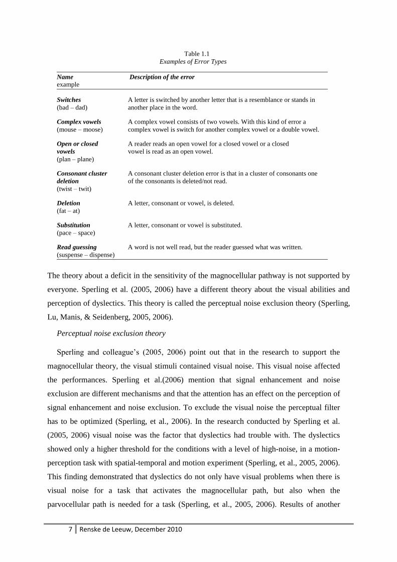
Switching letters is named as a common type of error for dyslectics (Grossar & Fiddelaers,
2004). Table 1.1 shows an example of the most common reading errors of dyslectics. Reading
errors like switching and mirroring letters are made by young readers, but fade away when a
reader is getting more experienced. For dyslectics it seems that switching and mirroring errors
are persistent (Braams, 2001).
7 Renske de Leeuw, December 2010
Table 1.1
Examples of Error Types
Name Description of the error
example
Switches A letter is switched by another letter that is a resemblance or stands in
(bad – dad) another place in the word.
Complex vowels A complex vowel consists of two vowels. With this kind of error a
(mouse – moose) complex vowel is switch for another complex vowel or a double vowel.
Open or closed A reader reads an open vowel for a closed vowel or a closed
vowels vowel is read as an open vowel.
(plan – plane)
Consonant cluster A consonant cluster deletion error is that in a cluster of consonants one
deletion of the consonants is deleted/not read.
(twist – twit)
Deletion A letter, consonant or vowel, is deleted.
(fat – at)
Substitution A letter, consonant or vowel is substituted.
(pace – space)
Read guessing A word is not well read, but the reader guessed what was written.
(suspense – dispense)
The theory about a deficit in the sensitivity of the magnocellular pathway is not supported by
everyone. Sperling et al. (2005, 2006) have a different theory about the visual abilities and
perception of dyslectics. This theory is called the perceptual noise exclusion theory (Sperling,
Lu, Manis, & Seidenberg, 2005, 2006).
Perceptual noise exclusion theory
Sperling and colleague‟s (2005, 2006) point out that in the research to support the
magnocellular theory, the visual stimuli contained visual noise. This visual noise affected
the performances. Sperling et al.(2006) mention that signal enhancement and noise
exclusion are different mechanisms and that the attention has an effect on the perception of
signal enhancement and noise exclusion. To exclude the visual noise the perceptual filter
has to be optimized (Sperling, et al., 2006). In the research conducted by Sperling et al.
(2005, 2006) visual noise was the factor that dyslectics had trouble with. The dyslectics
showed only a higher threshold for the conditions with a level of high-noise, in a motion-
perception task with spatial-temporal and motion experiment (Sperling, et al., 2005, 2006).
This finding demonstrated that dyslectics do not only have visual problems when there is
visual noise for a task that activates the magnocellular path, but also when the
parvocellular path is needed for a task (Sperling, et al., 2005, 2006). Results of another
8 Renske de Leeuw, December 2010
study, which focused on the visual abilities of dyslectics, indicated that the dyslectics had
visual impairments in identification of single and triple letters, and adding visual noise did
elevate the thresholds (Shovman & Ahissar, 2006). In this study the visual impairments
seems to be the result of the reading difficulties, rather then the cause, because there was
no relation between the reading scores and the tested visual abilities (Shovman & Ahissar,
2006).
Sperling et al. (2005) also suggest that due to the difficulties in noise exclusion,
dyslectics could have trouble with letter recognitions. This presumption is based on the
skills that are needed for letter recognition. To recognize a letter it is necessary to abstract
all kinds of characteristics of the font that potentially can be labelled as visual noise. The
perceptual noise theory states that dyslectics have trouble with excluding noise. In the light
of this statement it would be interesting to study the abilities of dyslectics on extracting
subtle font characteristics. If some font characteristics can be seen as noise, it could be
hypothesized that specific font characteristics make it harder to read with that font, for
dyslectics. The question that arises then is: what particular aspects and characteristics of a
font may introduce the visual noise?
Fonts
A font consists out of several aspects. Hypothesised by several researchers is that these
aspects have an influence on the perception of a font and that the reading speed and
accuracy of the readers is influenced by these aspects.
Typeface, size and serifs. There are several studies that tried to determine what aspects
introduce visual noise in a font. A series of different experiments, with variation in types of
fonts and sizes and reading tasks, by Wilkins and colleague‟s (Hughes & Wilkins, 2000;
Wilkins, Cleave, Grayson, & Wilson, 2009; Wilkins, et al., 2007) showed that children
benefit from a larger font. Also older adults (mean age 70) preferred an 14-point font size
above the 12-point font size (Bernard, Liao, & Mills, 2001). Besides an impact caused by
differences in size and spacing between fonts, there are fonts with a serif and fonts without
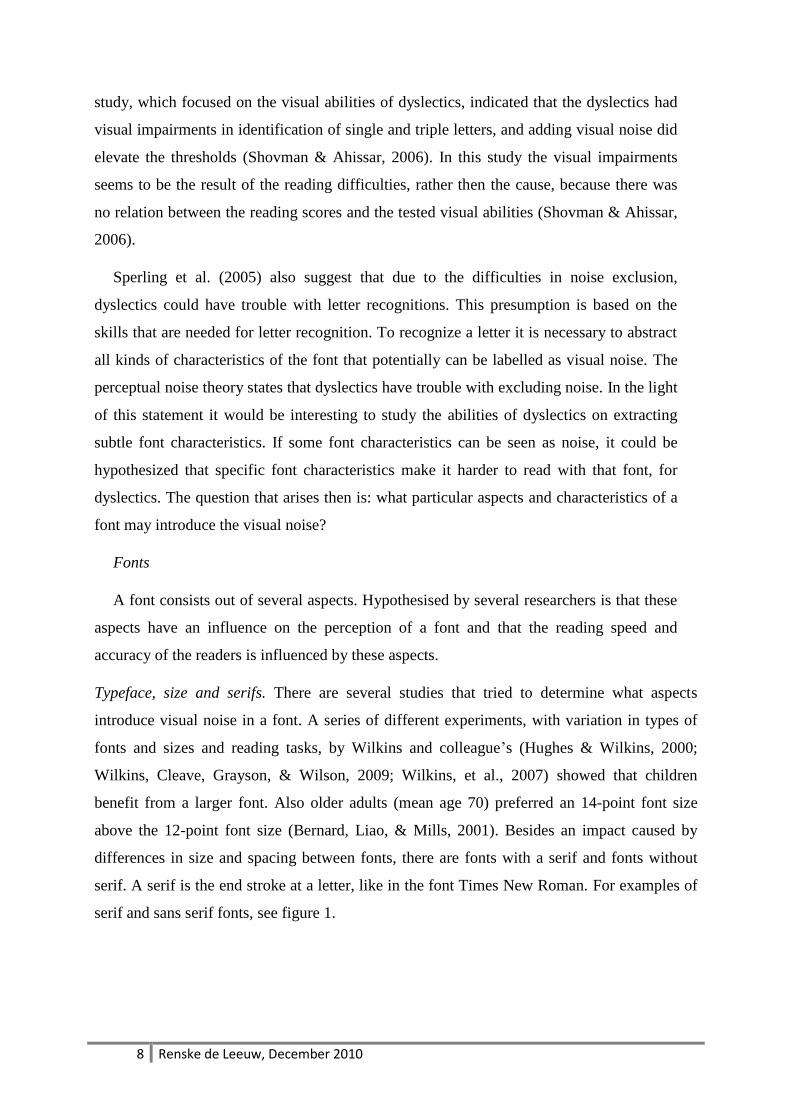
serif. A serif is the end stroke at a letter, like in the font Times New Roman. For examples of
serif and sans serif fonts, see figure 1.
9 Renske de Leeuw, December 2010
Figure 1. Examples of fonts with and without serif, and size
Researchers on the impact of serifs in fonts are inconclusive in their results. Adults and
children read significantly faster with a sans serif font presented at 14-point size (Bernard,
Chaparro, Mills, & Halcomb, 2002; Woods, Davis, & Scharff, 2005). Arditi and Cho
(2005) found that their own made font with serifs was read slightly faster, than their own
made font without serifs. Their explanation for this result was that the font with serifs had
a bigger spacing between the letters, which makes letters easier to read (Arditi & Cho,
2005; Bernard, et al., 2002). In another study, which focused on the visual stress caused by
the amount of strokes (vertical and horizontal lines) in a string of letters (a word), the
reading speed was a little faster for sans serif fonts (Wilkins, et al., 2007). As serifs are like
extra strokes on single letters, Wilkins, Smith and colleges (2007) hypothesized that these
serifs could be a noise factor in words, because the serif enhances the amount of strokes in
a word.
Sans serif font
Typeface: dyslexie / regular, point: 12
The quick brown fox jumps over the lazy dog
Typeface: Arial / regular, point: 12
The quick brown fox jumps over the lazy dog
Typeface: Comic Sans MS / regular, point: 12
The quick brown fox jumps over the lazy dog
Serif font
Typeface: Times New Roman / regular, point: 12
The quick brown fox jumps over the lazy dog
Typeface: Georgia / regular, size: 12
The quick brown fox jumps over the lazy dog
Typeface: Courier New / regular, size: 12
The quick brown fox jumps over the lazy dog
10 Renske de Leeuw, December 2010
X-height. Another difference between fonts such as, Arial and Times New Romans,
apart from the difference in serifs is that the x-height of Arial is larger in the same point
size as Times New Romans (Woods, et al., 2005). The x-height in a typeface is the
distance between the baseline and the mean line. Research on the effect of the x-height
showed that the reading speed was higher when children read a text in a font with an
enlarged x-height (Bernard, et al., 2001). This enlarged x-height helps with discriminating
between letters with the same appearance (Watts & Nisbet, 1974). However, not every x-
height of each letter can be changed. Changing every x-height in a font, erases the
discrimination characteristics between letters like „o‟ and „d‟ (Watts & Nisbet, 1974).
Therefore Watts and Nisbet advised that a change in x-height should be considered per
letter.
Distinguishing letters. Changing the x-height could make a letter distinguishable.
Another research on making letters distinctive is from Lockhead and Crist (1980). In this
study, conducted with children, letters could be distinguished by a dot or a little slash. The
distinctive letters where read faster and more accurate by children who just learned to read
in comparison with children who already can read (Lockhead & Crist, 1980). Lockhead
and Crist (1980) also refer to the benefits of reading with distinctive letters for reading
disabled children. These children also read faster and more accurate with distinctive
letters. They cite from another research, conducted by them. Lockhead and Crist (1980)
concluded their research on distinctive letters by stating that “The particular letter itself is
not intrinsically easy or difficult to classify or to identify; relations among letters
determine task difficulty” (p.493).
As the results above indicate, there is no clear distinction about what the visual noise in a
font is. However there are results that indicated that font size, spacing, serifs, x-height and
letter distinction have an effect on the reading performances of normal and reading disabled
children and adults. The present study will be researching the font “Dyslexie”. “Dyslexie” is a
font that is designed to make less reading errors such as mirroring, turning and switching
letters in a text (Boer, 2009). Figure 2 gives an example of the font “Dyslexie”.
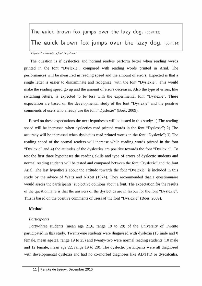
11 Renske de Leeuw, December 2010
The quick brown fox jumps over the lazy dog. (point 12)
The quick brown fox jumps over the lazy dog. (point 14)
Figure 2. Example of font “Dyslexie”
The question is if dyslectics and normal readers perform better when reading words
printed in the font “Dyslexie”, compared with reading words printed in Arial. The
performances will be measured in reading speed and the amount of errors. Expected is that a
single letter is easier to discriminate and recognize, with the font “Dyslexie”. This would
make the reading speed go up and the amount of errors decreases. Also the type of errors, like
switching letters, is expected to be less with the experimental font “Dyslexie”. These
expectation are based on the developmental study of the font “Dyslexie” and the positive
commends of users who already use the font “Dyslexie” (Boer, 2009).
Based on these expectations the next hypotheses will be tested in this study: 1) The reading
speed will be increased when dyslectics read printed words in the font “Dyslexie”; 2) The
accuracy will be increased when dyslectics read printed words in the font “Dyslexie”; 3) The
reading speed of the normal readers will increase while reading words printed in the font
“Dyslexie” and 4) the attitudes of the dyslectics are positive towards the font “Dyslexie”. To
test the first three hypotheses the reading skills and type of errors of dyslectic students and
normal reading students will be tested and compared between the font “Dyslexie” and the font
Arial. The last hypothesis about the attitude towards the font “Dyslexie” is included in this
study by the advice of Watts and Nisbet (1974). They recommended that a questionnaire
would assess the participants‟ subjective opinions about a font. The expectation for the results
of the questionnaire is that the answers of the dyslectics are in favour for the font “Dyslexie”.
This is based on the positive comments of users of the font “Dyslexie” (Boer, 2009).
Method
Participants
Forty-three students (mean age 21,6, range 19 to 28) of the University of Twente
participated in this study. Twenty-one students were diagnosed with dyslexia (13 male and 8
female, mean age 21, range 19 to 25) and twenty-two were normal reading students (10 male
and 12 female, mean age 22, range 19 to 28). The dyslectic participants were all diagnosed
with developmental dyslexia and had no co-morbid diagnoses like AD(H)D or dyscalculia.
12 Renske de Leeuw, December 2010
The normal reading students also did not have AD(H)D or dyscalculia.
The study was approved by the ethics committee of the faculty behavioral science. The
participants signed an informed consent and received a compensation of € 7,50 or 1 European
Credit (EC) for participation. Some participants participated voluntarily.
Material and design
Reading tests: The reading test consists of the Dutch One Minute Test (EMT) (in Dutch:
Een Minuut Test) (Brus & Voeten, 1973) and the Klepel (Van den Bos, Spelberg, Scheepstra,
& De Vries, 1994). Both the A and B version were used in this study. The EMT is a word
reading fluency test which is scored in words read correctly in one minute (raw score). The
Klepel is a non-word reading test with two minutes reading time, to read as much non-words
out loud as possible. The amount of corrected read words is scored as the raw score. With the
Klepel the technical reading aspect is tested. The tests were conducted conform the manual of
the EMT and Klepel.
Participants were a signed to one condition. There were four conditions, namely:
- reading first the A version of the EMT and Klepel, printed in Arial, and second the B
version of the EMT and Klepel, printed in “Dyslexie”;
- reading first the A version of the EMT and Klepel, printed in “Dyslexie”, and second
the B version of the EMT and Klepel printed in Arial;
- reading first the B version of the EMT and Klepel, printed in Arial, and second the A
version of the EMT and Klepel, printed in “Dyslexie”;
- reading first the B version of the EMT and Klepel, printed in “Dyslexie”, and second
the A version of the EMT and Klepel printed in Arial.
Font: For this study Arial (point size 14, rule liner 23) was used as the standard font. Arial
is a common used sans serif font (Woods, et al., 2005) The experimental font is “Dyslexie”
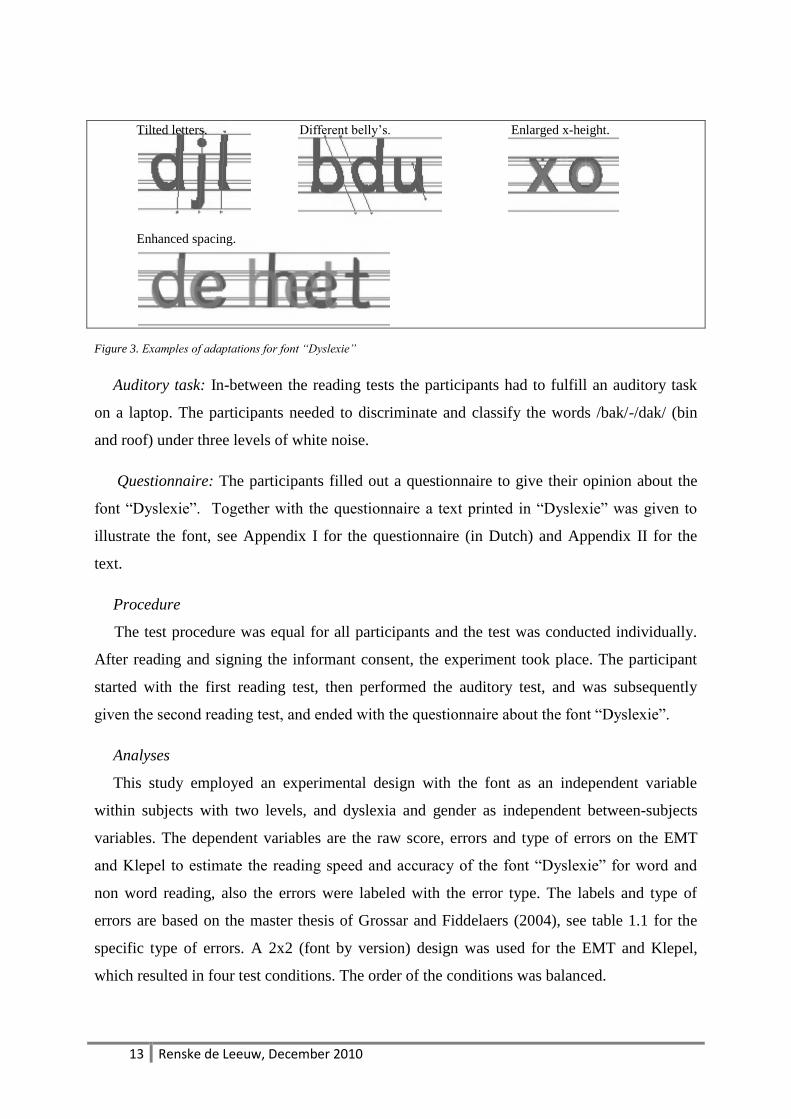
(point size 12, rule liner 23) (Boer). “Dyslexie” is developed by making the next adaptations;
the base of the letter is heavier (more bold looking), the x-height and openings in the letters
are increased, but not the widths, some letters are tilted a little bit, resembling letters differ in
their heights and forms (like the belly‟s of the b and d), capitols and reading sings are more
bolt, and the spacing between the letters is enhanced (Boer, 2009).
13 Renske de Leeuw, December 2010
Tilted letters. Different belly‟s. Enlarged x-height.
Enhanced spacing.
Figure 3. Examples of adaptations for font “Dyslexie”
Auditory task: In-between the reading tests the participants had to fulfill an auditory task
on a laptop. The participants needed to discriminate and classify the words /bak/-/dak/ (bin
and roof) under three levels of white noise.
Questionnaire: The participants filled out a questionnaire to give their opinion about the
font “Dyslexie”. Together with the questionnaire a text printed in “Dyslexie” was given to
illustrate the font, see Appendix I for the questionnaire (in Dutch) and Appendix II for the
text.
Procedure
The test procedure was equal for all participants and the test was conducted individually.
After reading and signing the informant consent, the experiment took place. The participant
started with the first reading test, then performed the auditory test, and was subsequently
given the second reading test, and ended with the questionnaire about the font “Dyslexie”.
Analyses
This study employed an experimental design with the font as an independent variable
within subjects with two levels, and dyslexia and gender as independent between-subjects
variables. The dependent variables are the raw score, errors and type of errors on the EMT
and Klepel to estimate the reading speed and accuracy of the font “Dyslexie” for word and
non word reading, also the errors were labeled with the error type. The labels and type of
errors are based on the master thesis of Grossar and Fiddelaers (2004), see table 1.1 for the
specific type of errors. A 2x2 (font by version) design was used for the EMT and Klepel,
which resulted in four test conditions. The order of the conditions was balanced.
14 Renske de Leeuw, December 2010
For the analyses the raw scores, amount of errors and specific type of errors, on the EMT
and Klepel, were examined by using a repeated measure analyses.
Results
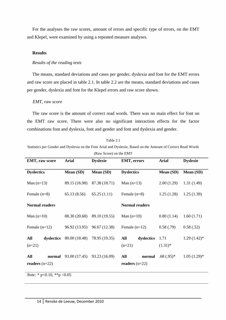
Results of the reading tests
The means, standard deviations and cases per gender, dyslexia and font for the EMT errors
and raw score are placed in table 2.1. In table 2.2 are the means, standard deviations and cases
per gender, dyslexia and font for the Klepel errors and raw score shown.
EMT, raw score
The raw score is the amount of correct read words. There was no main effect for font on
the EMT raw score. There were also no significant interaction effects for the factor
combinations font and dyslexia, font and gender and font and dyslexia and gender.
Table 2.1
Statistics per Gender and Dyslexia on the Font Arial and Dyslexie, Based on the Amount of Correct Read Words
(Raw Score) on the EMT
EMT, raw score Arial Dyslexie EMT, errors Arial Dyslexie
Dyslectics Mean (SD) Mean (SD) Dyslectics Mean (SD) Mean (SD)
Man (n=13) 89.15 (16.98) 87.38 (18.71) Man (n=13) 2.00 (1.29) 1.31 (1.49)
Female (n=8) 65.13 (8.56) 65.25 (1.11) Female (n=8) 1.25 (1.28) 1.25 (1.39)
Normal readers Normal readers
Man (n=10) 88.30 (20.68) 89.10 (19.55) Man (n=10) 0.80 (1.14) 1.60 (1.71)
Female (n=12) 96.92 (13.95) 96.67 (12.38) Female (n=12) 0.58 (.79) 0.58 (.52)
All dyslectics
(n=21)
80.00 (18.48) 78.95 (19.35) All dyslectics
(n=21)
1.71
(1.31)*
1.29 (1.42)*
All normal
readers (n=22)
93.00 (17.45) 93.23 (16.09) All normal
readers (n=22)
.68 (.95)* 1.05 (1.29)*
Note: * p<0.10, **p <0.05
15 Renske de Leeuw, December 2010
EMT, amount of errors
The analyses for the main effect of font on the EMT errors showed no significant results.
There were also no significant interactions between font and gender for the EMT errors.
However, a trend was found for the interaction effect between font and dyslexia for the
amount of errors on the EMT (F (1, 39) = 4.00, p = .053). Subsequent analyses showed that
there is an effect for the dyslectics with the font Arial (F (1, 41) = 8.85, p = .005), but not with
the font “Dyslexie” (F (1, 41) = .33, p = .564). The dyslectics (M= 1.71, SD = 1.31) made
more errors than the normal readers (M= 0.68, SD = 0.95) on the EMT with the font Arial.
An interaction effect between font and dyslexia and gender showed a trend for the amount of
errors on the EMT (F (1, 39) = 3.99, p = .053). A subsequent analysis for separate levels of
the factor gender could not be performed for the females, because there was no difference in
the amount of reading errors on the EMT. The analysis of font by dyslexia for the male
participants showed that there is a significant result (F (1, 21) = 5.70, p = .026). Next, effects
of the factor font were tested for the normal reading males (F (1, 9) = 3.69, p = .087) and for
the dyslectic males (F (1, 12) = 2.43, p = .145). The normal reading males made more errors
on the EMT with the font “Dyslexie” (M= 1.60, SD = 1.71), than with the font Arial (M= 0.8,
SD = 1.14). These results showed that the trend of reading errors for the interaction effect
font, dyslexia and gender could be explained by the performances of the normal reading
males.
EMT, specific type of errors
The results on the analysis for font, as main effect, showed that there is a trend on the EMT
Open or Closed Vowel errors (F (1, 39) = 3.10, p = .086). This result could be explained by
the fact that there were no open or closed vowel errors made with the font “Dyslexie”.
There were no other significant results or trends reported for font effects for the other specific
type of errors on EMT.
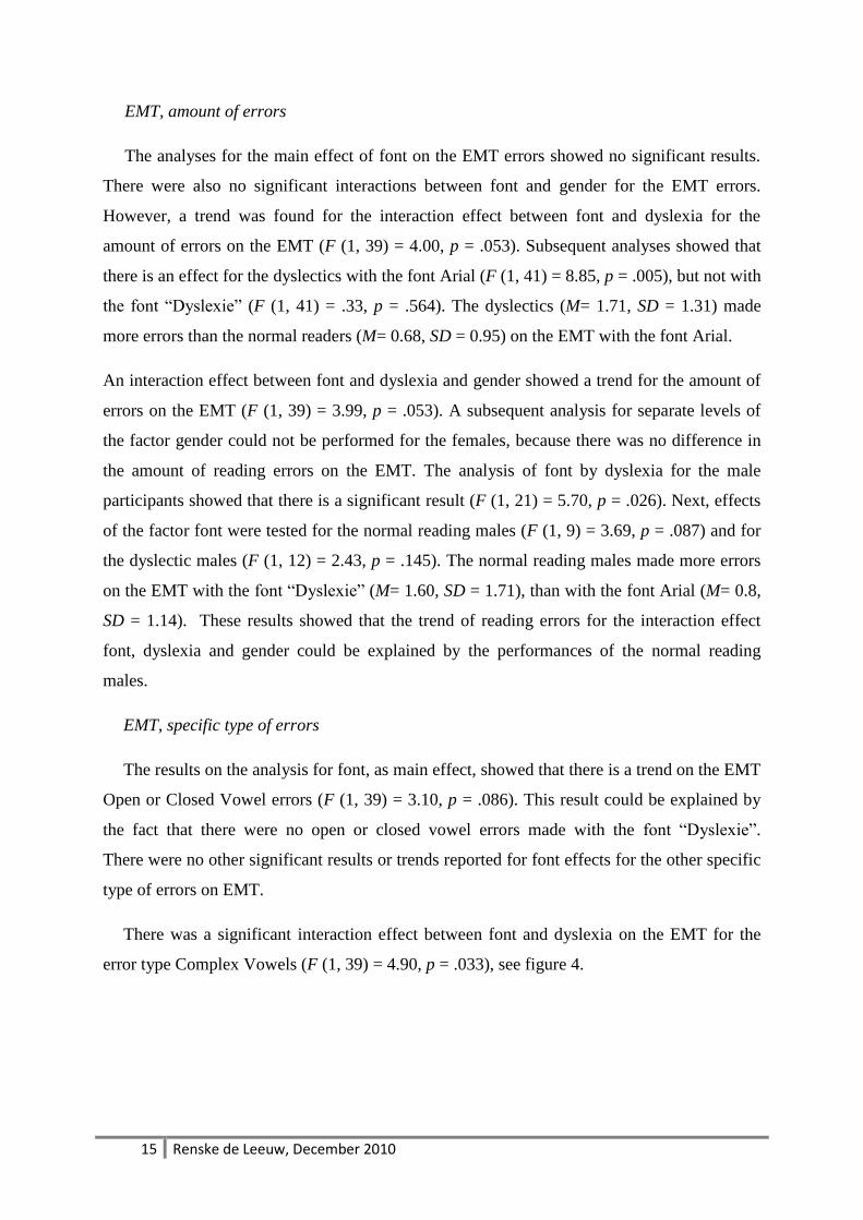
There was a significant interaction effect between font and dyslexia on the EMT for the
error type Complex Vowels (F (1, 39) = 4.90, p = .033), see figure 4.
16 Renske de Leeuw, December 2010
Figure 4. EMT Complex Vowel Errors
Further analysis on the Complex Vowel errors failed to show significant font effects for
the normal readers (F (1, 20) = 1.82, p = .193), but there was a near trend reported for the
dyslectics (F (1, 19) = 4.00, p = .100,). Subsequent analyses for separate levels of the factor
font did not indicated significant results for the dyslectics on the font Arial (F (1, 41) = .17, p
= .683) or on the font “Dyslexie” (F (1, 41) = 2.21, p = .145), see table 2.1 for the M and SD
results. This interaction effect between font and dyslexia could be further analyzed when the
interaction effect is extended with gender. The interaction effect between font and dyslexia
and gender did give a significant result on the EMT Complex Vowel errors (F (1, 39) = 8.68,
p = .005). Because the analysis of the factors font and dyslexia gave no significant results, the
next analysis will start with analyzing the gender factor. There was no significant results for
the males (F (1, 21) = .76, p = .393), but there was a significant result for the females (F (1,
18) = 7.16, p = .015). Subsequently an analysis was conducted for the dyslectic females (F (1,
7) = 4.20, p = .080) and the normal reading females (F (1, 11) = 2.20, p = .166). Dyslectic
females did make Complex Vowel errors, on the EMT, with the font “Dyslexie” (M= 0.38,
SD = 0.52), but non with the font Arial. This indicated that the significant effect, noted for the
EMT Complex Vowel errors, can be explained by the results of the dyslectic females. There
were no further significant effects or trends for the interaction effect font and dyslexia or the
interaction effect font and dyslexia and gender on the specific type of errors on the EMT.
17 Renske de Leeuw, December 2010
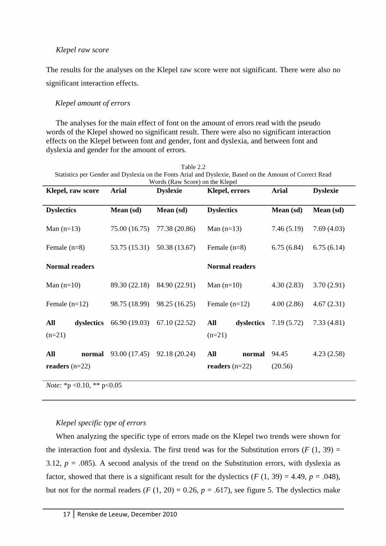
Klepel raw score
The results for the analyses on the Klepel raw score were not significant. There were also no
significant interaction effects.
Klepel amount of errors
The analyses for the main effect of font on the amount of errors read with the pseudo
words of the Klepel showed no significant result. There were also no significant interaction
effects on the Klepel between font and gender, font and dyslexia, and between font and
dyslexia and gender for the amount of errors.
Table 2.2
Statistics per Gender and Dyslexia on the Fonts Arial and Dyslexie, Based on the Amount of Correct Read
Words (Raw Score) on the Klepel
Klepel, raw score Arial Dyslexie Klepel, errors Arial Dyslexie
Dyslectics Mean (sd) Mean (sd) Dyslectics Mean (sd) Mean (sd)
Man (n=13) 75.00 (16.75) 77.38 (20.86) Man (n=13) 7.46 (5.19) 7.69 (4.03)
Female (n=8) 53.75 (15.31) 50.38 (13.67) Female (n=8) 6.75 (6.84) 6.75 (6.14)
Normal readers Normal readers
Man (n=10) 89.30 (22.18) 84.90 (22.91) Man (n=10) 4.30 (2.83) 3.70 (2.91)
Female (n=12) 98.75 (18.99) 98.25 (16.25) Female (n=12) 4.00 (2.86) 4.67 (2.31)
All dyslectics
(n=21)
66.90 (19.03) 67.10 (22.52) All dyslectics
(n=21)
7.19 (5.72) 7.33 (4.81)
All normal
readers (n=22)
93.00 (17.45) 92.18 (20.24) All normal
readers (n=22)
94.45
(20.56)
4.23 (2.58)
Note: *p <0.10, ** p<0.05
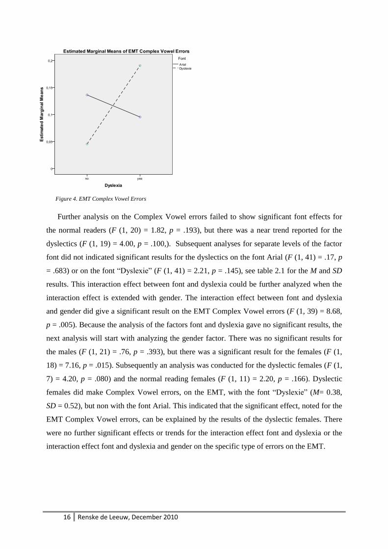
Klepel specific type of errors
When analyzing the specific type of errors made on the Klepel two trends were shown for
the interaction font and dyslexia. The first trend was for the Substitution errors (F (1, 39) =
3.12, p = .085). A second analysis of the trend on the Substitution errors, with dyslexia as
factor, showed that there is a significant result for the dyslectics (F (1, 39) = 4.49, p = .048),
but not for the normal readers (F (1, 20) = 0.26, p = .617), see figure 5. The dyslectics make
18 Renske de Leeuw, December 2010
les Substitution errors, on the Klepel, with the font “Dyslexie” (M = 0.95, SD = 0.28), than
with the font Arial (M = 1.33, SD = 0.31).
Figure 5. Klepel Substitution errors
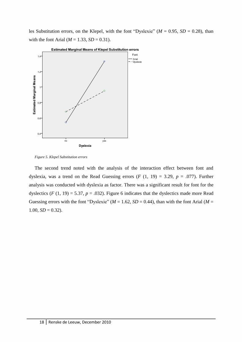
The second trend noted with the analysis of the interaction effect between font and
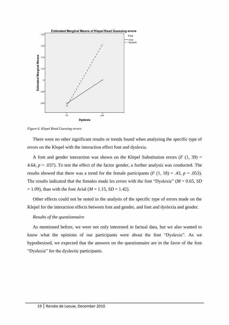
dyslexia, was a trend on the Read Guessing errors (F (1, 19) = 3.29, p = .077). Further
analysis was conducted with dyslexia as factor. There was a significant result for font for the
dyslectics (F (1, 19) = 5.37, p = .032). Figure 6 indicates that the dyslectics made more Read
Guessing errors with the font “Dyslexie” (M = 1.62, SD = 0.44), than with the font Arial (M =
1.00, SD = 0.32).
19 Renske de Leeuw, December 2010
Figure 6. Klepel Read Guessing errors
There were no other significant results or trends found when analyzing the specific type of
errors on the Klepel with the interaction effect font and dyslexia.
A font and gender interaction was shown on the Klepel Substitution errors (F (1, 39) =
4.64, p = .037). To test the effect of the factor gender, a further analysis was conducted. The
results showed that there was a trend for the female participants (F (1, 18) = .43, p = .053).
The results indicated that the females made les errors with the font “Dyslexie” (M = 0.65, SD
= 1.09), than with the font Arial (M = 1.15, SD = 1.42).
Other effects could not be noted in the analysis of the specific type of errors made on the
Klepel for the interaction effects between font and gender, and font and dyslexia and gender.
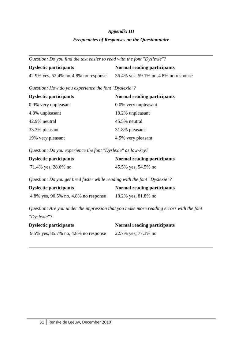
Results of the questionnaire
As mentioned before, we were not only interested in factual data, but we also wanted to
know what the opinions of our participants were about the font “Dyslexie”. As we
hypothesized, we expected that the answers on the questionnaire are in the favor of the font
“Dyslexie” for the dyslectic participants.
20 Renske de Leeuw, December 2010
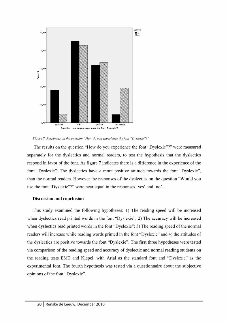
Figure 7. Responses on the question “How do you experience the font “Dyslexie”?”
The results on the question “How do you experience the font “Dyslexie”?” were measured
separately for the dyslectics and normal readers, to test the hypothesis that the dyslectics
respond in favor of the font. As figure 7 indicates there is a difference in the experience of the
font “Dyslexie”. The dyslectics have a more positive attitude towards the font “Dyslexie”,
than the normal readers. However the responses of the dyslectics on the question “Would you
use the font “Dyslexie”?” were near equal in the responses „yes‟ and „no‟.
Discussion and conclusion
This study examined the following hypotheses: 1) The reading speed will be increased
when dyslectics read printed words in the font “Dyslexie”; 2) The accuracy will be increased
when dyslectics read printed words in the font “Dyslexie”; 3) The reading speed of the normal
readers will increase while reading words printed in the font “Dyslexie” and 4) the attitudes of
the dyslectics are positive towards the font “Dyslexie”. The first three hypotheses were tested
via comparison of the reading speed and accuracy of dyslectic and normal reading students on
the reading tests EMT and Klepel, with Arial as the standard font and “Dyslexie” as the
experimental font. The fourth hypothesis was tested via a questionnaire about the subjective
opinions of the font “Dyslexie”.
21 Renske de Leeuw, December 2010
The results of this study do not confirm hypotheses 1 and 3. The results indicated that
neither the dyslectics nor the normal readers did increase their reading speed significantly
while reading the words on the EMT and Klepel with the font “Dyslexie”.
The results of the analysis showed that hypothesis 2 is partially supported. The dyslectics
made fewer errors, then the normal readers, on the EMT with the font “Dyslexie”. This is an
indication that reading with the font “Dyslexie” decreases the amount of reading errors. The
results of the analyses of the interactions between font and dyslexia and the interaction
between font and dyslexia and gender showed that the normal reading males made more
errors on the EMT with the font “Dyslexie”. This assumes that the font “Dyslexie” is only
beneficial for dyslectics and that there is no evidence for hypothesis 3.
There is support for hypothesis 4 however a contradiction in responses was noted. Where
ass the attitudes towards the font “Dyslexie” are positive for the dyslectics they would not use
the font. One of the most given explanation is that the font “Dyslexie” would not be accepted
by teachers or other students.
The question that arises is which of the adaptations, that created the font “Dyslexie”, has a
positive effect on the decreasing of reading errors for the dyslectics? Or are there other
explanations for the results of this study?
Adaptations in a font
The literature is inconclusive about the factors of font adaptation. One of the font
characteristics of “Dyslexie” is that the font has an enlarged x-height. Literature indicated that
increasing the x-height could increase the reading speed (Bernard, et al., 2002; Watts &
Nisbet, 1974; Woods, et al., 2005). However, the literature also points out that changing the
x-height for every letter has a counter effect. Several letters are harder to discriminate from
each other when their x-height is changed. If all letters or the letters that are less characteristic
have an enlarged x-height, the reading speed is likely to decrease (Watts & Nisbet, 1974). We
cannot state that the adapted x-height is the cause for the amount of errors made by the
normal reading males on the EMT. However for a follow up study it would be interesting to
research the readability with x-heights that have been changed.
There were also adaptations made in the font “Dyslexie” to increase the specific reading
error of switching and mirroring letters. These adaptations were made to decrease the
chances of switching or mirroring letters that look alike. The analysis on the specific type
of errors indicated that neither the dyslectics, nor the normal readers did make less
22 Renske de Leeuw, December 2010
switching errors with the font “Dyslexie”, there were also no significant differences
between the dyslectics and normal readers for the amount of switching errors. These
results are in line with the results of Hutzler, Kronbichler et al. (2006) and Vellutino et al.
(2004). They did not find any differences in the processing and reading of letter stings,
words and pseudo words and the accuracy for dyslectics.
It would be speculation to explain the performances with the font “Dyslexie” due to the
heavier base or x-height adaptations. The literature indicates that there are negative effects
of the x-height (Watts & Nisbet, 1974), but there is no literature about the effects of
heavier bases of letters. Furthermore in this study the font “Dyslexie” was tested and not
the effects of the separated adaptations that are used to make the font “Dyslexie”.
Therefore it is not possible to say that changing the x-height or the characteristics of a
letter caused the decrease in the amount of errors, like the open or closed vowel or
substitution errors for the dyslectics. Or that those adaptations were the reason for the
increase of the amount of complex vowel errors for the dyslectic females. A follow up
study would be necessary to study the effects of adaptations in a font on the reading speed
and accuracy.
Other explanations
Gender differences. The literature review of Wallentin (2009) showed that studies of
gender differences for verbal abilities and language cortex did not find a difference, or the
differences that were found, were close to 0% (Wallentin, 2009). Based on these results it
is stated that no clear explanations or reason based on gender differences can be given in
the current study.
Dyslexia. Research pointed out that dyslectics make more complex vowel errors, than
normal readers (Grossar & Fiddelaers, 2004). Therefore the differences between the dyslectics
and normal readers could be explained by the characteristic errors that dyslectics make.
The results of the specific type of errors for technical reading indicated that the dyslectics
made more guessing errors with the font “Dyslexie”. This result could be explained by the
possibility that the dyslectics used the strategy of guessing while reading the pseudo-words in
the font “Dyslexie”. The combination of pseudo-words and the font “Dyslexie” could have
caused an overload of the reading skills of the dyslectics. This could be explained by the fact
that dyslectics have a hard time reading pseudo-words (Braams, 2002) and that some of the
23 Renske de Leeuw, December 2010
adaptations in the font “Dyslexie” are not increasing the readability of words and that thereby
the dyslectics made more guessing errors, than the normal readers.
Using a special font
The results of the questionnaire indicated that the dyslectics in this study were positive
about the font “Dyslexie”. These results supports hypothesis 4. This is an important factor for
the decision of using a font or not (Watts & Nisbet, 1974). If the font would work, but the
users would not like it, the chance that the font would be used is very small.
What was interesting in the responses of the dyslectics is that they would not use the font,
because other people, who would have to read their work, would not like the font. This gives
the impression that dyslectics are adapting to others, instead of ask for understanding of the
use of an adapted font, so that a dyslectic can cope with his/her handicap.
Future research and design options
The development of the font “Dyslexie” was especially made for texts (Boer, 2009). This
study was conducted with words. A follow up study with sentences and texts, printed in the
font “Dyslexie” could give information about the reading speed and accuracy on text level.
This study did not measure the orthographic skills of the participants and the reading
comprehension for reading with the font “Dyslexie”. An extra between-subject variable that
could be taken in consideration for further research is the orthographic skills. This would be
interesting when taking in consideration that the orthographic skills effects the reading skills
(Siegel, et al., 1995). Also a second study could research the reading skills and reading
comprehension of texts with the font “Dyslexie. The reading could be read aloud or silence. A
study as proposed here, could test the hypothesis that the reading of a font with an expected
higher readability increases the reading comprehension, because the focus of the technical
part of reading decreases. Also further research with the font “Dyslexie” and the increase of
the guessing errors on technical reading could be interesting. This because the question arises
that if a dyslectic reader is making more guessing errors; the reading comprehension could be
expected to be different.
Another variation for a follow up study would be to take different ages and education level.
The participants in this study were university students. This could have influenced the results,
because the participants of the current study have more reading experience than other
participant groups of different age and education levels. The performances of the participants
can be explained from the results of a study on life-span reading. This study indicated that the
24 Renske de Leeuw, December 2010
word-reading speed keeps increasing when dyslectics get older (van den Bos, Zijlstra, &
Spelberg, 2002). Another study indicated that the education level of a dyslectic has an
influence on their word-reading speed, which could be explained by the amount of reading
that is necessary for the higher education levels (Kuijpers, et al., 2003). Therefore future
research with different age and education levels are necessary to study the possibilities of the
font “Dyslexie”.
Another type of additional research could focus on the effects that single font adaptations
have on the reading speed, accuracy and readability of words en texts for dyslectics and
normal reader.
25 Renske de Leeuw, December 2010
References:
Arditi, A., & Cho, J. (2005). Serifs and font legibility. Vision Research, 45(23), 2926-2933. Bekebrede, J., van der Leij, A., & Share, D. (2009). Dutch dyslexic adolescents: Phonological-core
variable-orthographic differences. Reading and Writing, 22(2), 133-165. Bernard, M., Chaparro, B., Mills, M., & Halcomb, C. (2002). Examining children s reading performance
and preference for different computer-displayed text. Behaviour & Information Technology, 21(2), 87-96.
Bernard, M., Liao, C., & Mills, M. (2001). The Effects of Font Type and Size on the Legibility and Reading Time of Online Text by Older Adults.
Boer, C. T. Netherlands Patent No.: Studiostudio. Boer, C. T. (2009). Dyslexie Lettertype. Retrieved 20 July 2009, 2009, from
http://www.studiostudio.nl/ Boets, B., Wouters, J., Van Wieringen, A., De Smedt, B., & Ghesquiere, P. (2008). Modelling relations
between sensory processing, speech perception, orthographic and phonological ability, and literacy achievement. Brain and language, 106(1), 29-40.
Braams, T. (2001). Dyslexie, een complex taalprobleem (Vol. 4). Amsterdam: Boom. Braams, T. (2002). De zin van onzinwoorden. Remedial Teaching, 2, 6. Bradley, L., & Bryant, P. (1978). Difficulties in auditory organisation as a possible cause of reading
backwardness. Brus, B., & Voeten, M. (1973). Een-minuut-test. Verantwoording en handleiding: Nigmegen:
Berkhout. Burt, J. (2006). What is orthographic processing skill and how does it relate to word identification in
reading? Journal of Research in Reading, 29(4), 400-417. de Jong, P., & van der Leij, A. (2003). Developmental changes in the manifestation of a phonological
deficit in dyslexic children learning to read a regular orthography. Journal of Educational Psychology, 95(1), 22-40.
Grossar, S., & Fiddelaers, W. (2004). Leeshulp voor jonge lezers en dyslectische kinderen. Unpublished masterthesis. K.U. Leuven, ESAT.
Hughes, L., & Wilkins, A. (2000). Typography in children's reading schemes may be suboptimal: evidence from measures of reading rate. Journal of Research in Reading, 23(3), 314-324.
Kuijpers, C., Van der Leij, A., Been, P., Van Leeuwen, T., Keurs, M., Schreuder, R., et al. (2003). Leesproblemen in het voortgezet onderwijs en de volwassenheid. Pedagogische Studiën, 80(4), 272-287.
Liederman, J., McGraw Fisher, J., Schulz, M., Maxwell, C., Théoret, H., & Pascual-Leone, A. (2003). The role of motion direction selective extrastriate regions in reading: a transcranial magnetic stimulation study* 1. Brain and language, 85(1), 140-155.
Lockhead, G., & Crist, W. (1980). Making letters distinctive. Journal of Educational Psychology, 72(4), 483-493.
Lyon, G., Shaywitz, S., & Shaywitz, B. (2003). A definition of dyslexia. Annals of Dyslexia, 53, 1-14. Scheuerpflug, P., Plume, E., Vetter, V., Schulte-Koerne, G., Deimel, W., Bartling, J., et al. (2004). Visual
information processing in dyslexic children. Clinical Neurophysiology, 115(1), 90-96. Shovman, M., & Ahissar, M. (2006). Isolating the impact of visual perception on dyslexics' reading
ability. Vision Research, 46(20), 3514-3525. Siegel, L., Share, D., & Geva, E. (1995). Evidence for Superior Orthographic Skills in Dyslexics.
Psychological Science, 6(4), 250-254. Snowling, M. (1998). Dyslexia as a phonological deficit: Evidence and implications. Child and
Adolescent Mental Health, 3(1), 4-11. Sperling, A. J., Lu, Z. L., Manis, F. R., & Seidenberg, M. S. (2005). Deficits in perceptual noise exclusion
in developmental dyslexia. [Article]. Nature Neuroscience, 8(7), 862-863.
26 Renske de Leeuw, December 2010
Sperling, A. J., Lu, Z. L., Manis, F. R., & Seidenberg, M. S. (2006). Motion-perception deficits and reading impairment: It's the noise, not the motion. [Article]. Psychological Science, 17(12), 1047-1053.
Stein, J. (2001). The magnocellular theory of developmental dyslexia. Dyslexia, 7(1), 12-36. Stein, J., Talcott, J., & Walsh, V. (2000). Controversy about the visual magnocellular deficit in
developmental dyslexics. Trends in cognitive sciences, 4(6), 209-210. Talcott, J., Hansen, P., Assoku, E., & Stein, J. (2000). Visual motion sensitivity in dyslexia: evidence for
temporal and energy integration deficits. Neuropsychologia, 38(7), 935-943. Talcott, J., Witton, C., McLean, M., Hansen, P., Rees, A., Green, G., et al. (2000). Dynamic sensory
sensitivity and children's word decoding skills. Proceedings of the national academy of sciences of the united states of america, 97(6), 2952.
Van den Bos, K., Spelberg, H., Scheepstra, A., & De Vries, J. (1994). De klepel. Een test voor de leesvaardigheid van pseudo-woorden. Nijmegen: Berkhout Testmateriaal.
van den Bos, K., Zijlstra, B., & Spelberg, H. (2002). Life-span data on continuous-naming speeds of numbers, letters, colors, and pictured objects, and word-reading speed. Scientific Studies of Reading, 6(1), 25-49.
Van der Leij, A. (2003). Leesproblemen en dyslexie: beschrijving, verklaring en aanpak: Lemniscaat Publishers.
van der Leij, A., & Morfidi, E. (2006). Core deficits and variable differences in Dutch poor readers learning English. Journal of learning disabilities, 39(1), 74.
Vellutino, F., Fletcher, J., Snowling, M., & Scanlon, D. (2004). Specific reading disability (dyslexia): What have we learned in the past four decades? Journal of Child Psychology and Psychiatry, 45(1), 2-40.
Wallentin, M. (2009). Putative sex differences in verbal abilities and language cortex: A critical review. Brain and language, 108(3), 175-183.
Watts, L., & Nisbet, J. (1974). Legibility in children's books: A review of research: Nfer Nelson. Wilkins, A., Cleave, R., Grayson, N., & Wilson, L. (2009). Typography for Children May Be
Inappropriately Designed. Journal of Research in Reading, 32(4), 11. Wilkins, A., Smith, J., Willison, C., Beare, T., Boyd, A., Hardy, G., et al. (2007). Stripes within words
affect reading. Perception, 36, 1788-1803. Woods, R., Davis, K., & Scharff, L. (2005). Effects of Typeface and Font Size on Legibility for Children.
AMERICAN JOURNAL OF PSYCHOLOGICAL RESEARCH 1(1).
27 Renske de Leeuw, December 2010
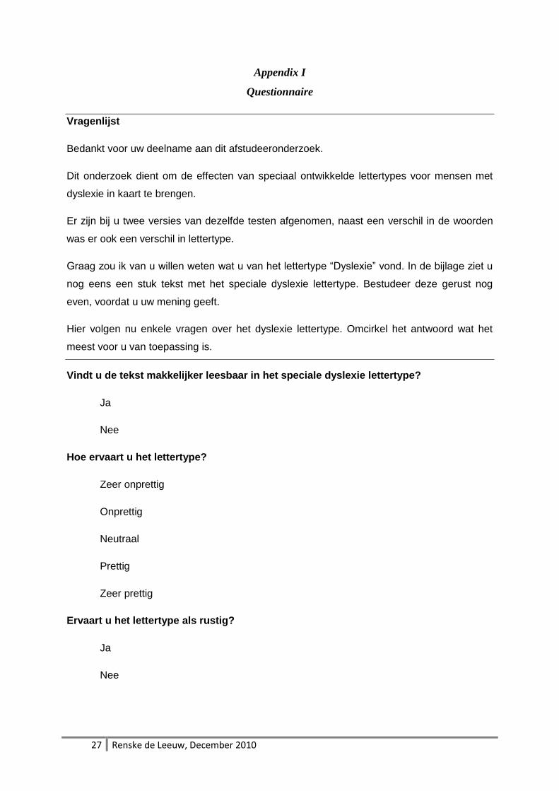
Appendix I
Questionnaire
Vragenlijst
Bedankt voor uw deelname aan dit afstudeeronderzoek.
Dit onderzoek dient om de effecten van speciaal ontwikkelde lettertypes voor mensen met
dyslexie in kaart te brengen.
Er zijn bij u twee versies van dezelfde testen afgenomen, naast een verschil in de woorden
was er ook een verschil in lettertype.
Graag zou ik van u willen weten wat u van het lettertype “Dyslexie” vond. In de bijlage ziet u
nog eens een stuk tekst met het speciale dyslexie lettertype. Bestudeer deze gerust nog
even, voordat u uw mening geeft.
Hier volgen nu enkele vragen over het dyslexie lettertype. Omcirkel het antwoord wat het
meest voor u van toepassing is.
Vindt u de tekst makkelijker leesbaar in het speciale dyslexie lettertype?
Ja
Nee
Hoe ervaart u het lettertype?
Zeer onprettig
Onprettig
Neutraal
Prettig
Zeer prettig
Ervaart u het lettertype als rustig?
Ja
Nee
28 Renske de Leeuw, December 2010
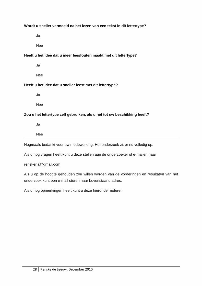
Wordt u sneller vermoeid na het lezen van een tekst in dit lettertype?
Ja
Nee
Heeft u het idee dat u meer leesfouten maakt met dit lettertype?
Ja
Nee
Heeft u het idee dat u sneller leest met dit lettertype?
Ja
Nee
Zou u het lettertype zelf gebruiken, als u het tot uw beschikking heeft?
Ja
Nee
Nogmaals bedankt voor uw medewerking. Het onderzoek zit er nu volledig op.
Als u nog vragen heeft kunt u deze stellen aan de onderzoeker of e-mailen naar
Als u op de hoogte gehouden zou willen worden van de vorderingen en resultaten van het
onderzoek kunt een e-mail sturen naar bovenstaand adres.
Als u nog opmerkingen heeft kunt u deze hieronder noteren
29 Renske de Leeuw, December 2010
Appendix II
Text for the questionnaire
Vrijwilligerswerk tijdens vakantie wint aan populariteit
Gebaseerd op: nrc.next (20-1-2009)
Een lekkere vakantie waarbij je ook nog tijd vrij maakt voor
een goed doel is de nieuwste trend op reisgebied. Volgens
Lucas Meijs, bijzonder hoogleraar vrijwilligerswerk aan de
Rotterdam School of Management van de Erasmus
Universiteit, wordt vrijwilligerswerk tijdens de vakantie steeds
populairder. `Het Vrijwilligerstoerisme, het voluntourism, is
onderdeel van een hele grote trend. Lonely Planet heeft zelfs
een gids gemaakt: Volunteer: A Travellers Guide.`
Reisorganisatie Fox Reizen gaat mee in de trend met Fox Feel
Good. De reisorganisatie biedt de luxe en rust van een
vakantie en combineert die met het goede gevoel van
vrijwilligerswerk. Fox is de nieuwste in een reeks van
reisbureaus die soortgelijke reizen aanbiedt. Een andere
speler, het ideële Commundo, biedt reizen aan waarbij men
twee weken werkt en de laatste week rondreist door het land.
Travel Active richt zich op jongeren; zij bieden taallessen,
vrijwilligerswerk en excursies in één reis.
De meeste touroperators werken met particuliere organisaties.
De grote goede doelen, zoals Unicef, Oxfam Novib en
SOS-Kinderdorpen, hebben hierbij hun bedenkingen.
`Ontwikkelingssamenwerking is een complex vak. Wij werken
met kinderen, dan moet je echt weten wat je doet.
Vooropgesteld zijn het goed bedoelde initiatieven. Maar hoe

30 Renske de Leeuw, December 2010
goed je het ook bedoelt, het blijft pleisters plakken`, aldus
Martin de Beer, woordvoerder van Unicef.
(bron: http://www.profnews.nl/903771/vrijwilligerswerk-tijdens-
vakantie-wint-aan-populariteit)
31 Renske de Leeuw, December 2010
Appendix III
Frequencies of Responses on the Questionnaire
Question: Do you find the text easier to read with the font "Dyslexie"?
Dyslectic participants Normal reading participants
42.9% yes, 52.4% no, 4.8% no response 36.4% yes, 59.1% no, 4.8% no response
Question: How do you experience the font "Dyslexie"?
Dyslectic participants Normal reading participants
0.0% very unpleasant 0.0% very unpleasant
4.8% unpleasant 18.2% unpleasant
42.9% neutral 45.5% neutral
33.3% pleasant 31.8% pleasant
19% very pleasant 4.5% very pleasant
Question: Do you experience the font "Dyslexie" as low-key?
Dyslectic participants Normal reading participants
71.4% yes, 28.6% no 45.5% yes, 54.5% no
Question: Do you get tired faster while reading with the font "Dyslexie"?
Dyslectic participants Normal reading participants
4.8% yes, 90.5% no, 4.8% no response 18.2% yes, 81.8% no
Question: Are you under the impression that you make more reading errors with the font
"Dyslexie"?
Dyslectic participants Normal reading participants
9.5% yes, 85.7% no, 4.8% no response 22.7% yes, 77.3% no
32 Renske de Leeuw, December 2010
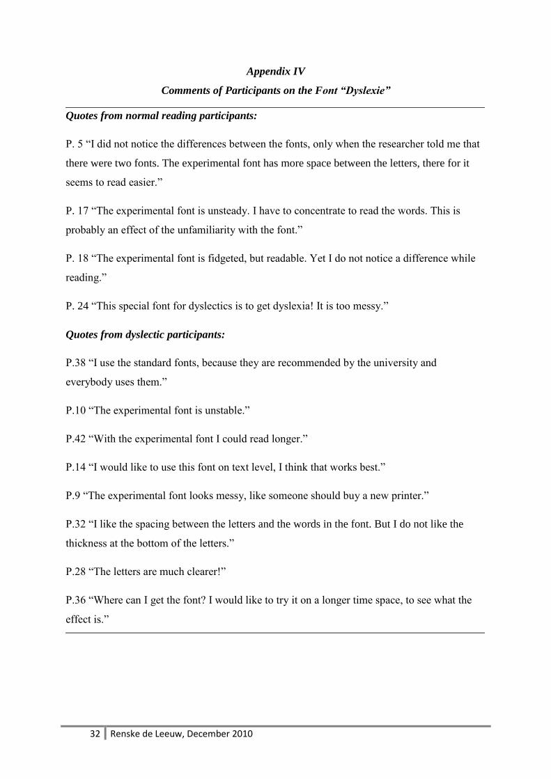
Appendix IV
Comments of Participants on the Font “Dyslexie”
Quotes from normal reading participants:
P. 5 “I did not notice the differences between the fonts, only when the researcher told me that
there were two fonts. The experimental font has more space between the letters, there for it
seems to read easier.”
P. 17 “The experimental font is unsteady. I have to concentrate to read the words. This is
probably an effect of the unfamiliarity with the font.”
P. 18 “The experimental font is fidgeted, but readable. Yet I do not notice a difference while
reading.”
P. 24 “This special font for dyslectics is to get dyslexia! It is too messy.”
Quotes from dyslectic participants:
P.38 “I use the standard fonts, because they are recommended by the university and
everybody uses them.”
P.10 “The experimental font is unstable.”
P.42 “With the experimental font I could read longer.”
P.14 “I would like to use this font on text level, I think that works best.”
P.9 “The experimental font looks messy, like someone should buy a new printer.”
P.32 “I like the spacing between the letters and the words in the font. But I do not like the
thickness at the bottom of the letters.”
P.28 “The letters are much clearer!”
P.36 “Where can I get the font? I would like to try it on a longer time space, to see what the
effect is.”