prof. martin c. njoroge 9 th june 2015 this is the first slide and should contain: o title of...
TRANSCRIPT

POWERPOINT PRESENTATION
GUIDELINES
Prof. Martin C. Njoroge9th June 2015

This is the first slide and should contain:
o Title of presentationo Date of presentationo Presenter’s name
(See previous slide)
Introduction slide

Main points of what you will talk about. Start broad, finish specific
(See next slide)
Outline slide

Outlines Slide Structure Fonts Color Background Images Graphs Spelling and Grammar Conclusions Questions Contacts
Outline

Use 1-2 slides per minute of your presentation. Never read your slides, talk freely.
Create a logical flow to your presentation.
Make your presentation readable. Pick an easy-to-read font face.
Slide Structure
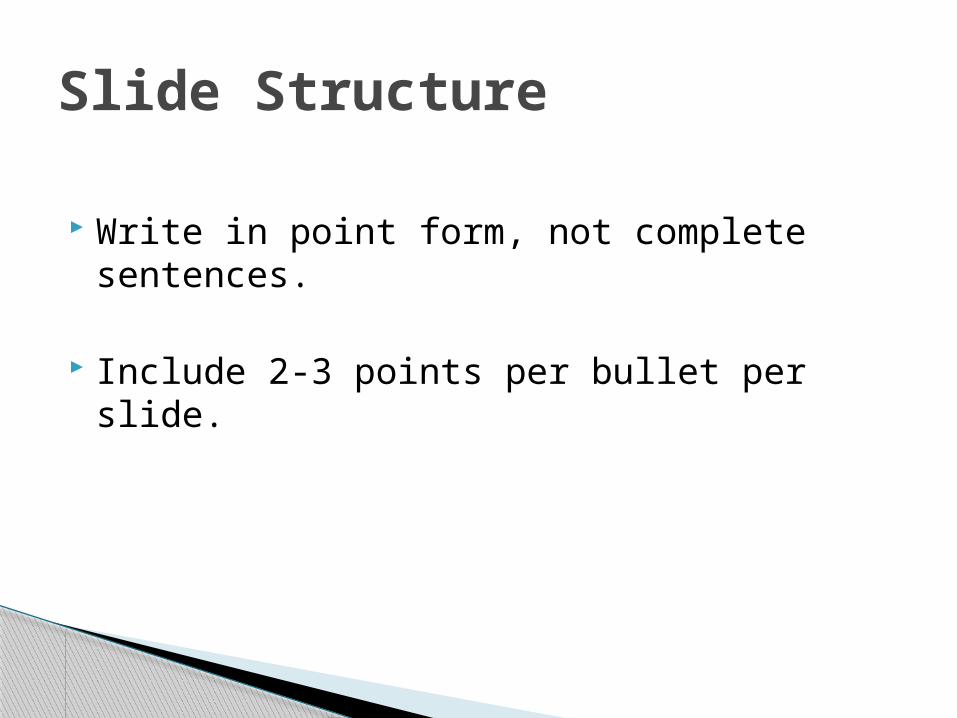
Write in point form, not complete sentences.
Include 2-3 points per bullet per slide.
Slide Structure
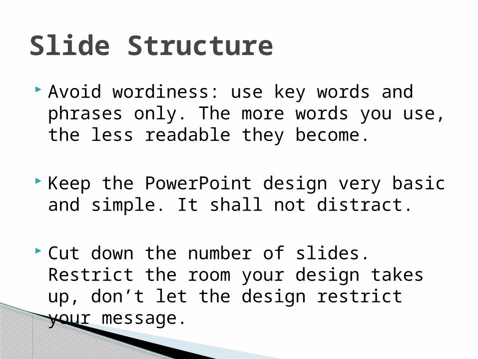
Avoid wordiness: use key words and phrases only. The more words you use, the less readable they become.
Keep the PowerPoint design very basic and simple. It shall not distract.
Cut down the number of slides. Restrict the room your design takes up, don’t let the design restrict your message.
Slide Structure
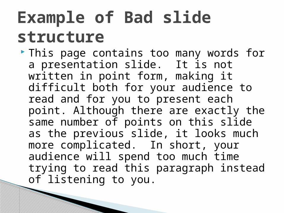
This page contains too many words for a presentation slide. It is not written in point form, making it difficult both for your audience to read and for you to present each point. Although there are exactly the same number of points on this slide as the previous slide, it looks much more complicated. In short, your audience will spend too much time trying to read this paragraph instead of listening to you.
Example of Bad slide structure
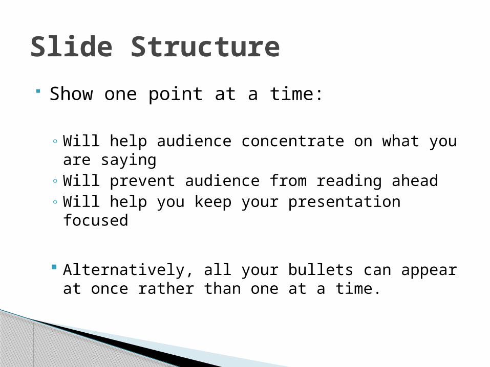
Show one point at a time:
◦ Will help audience concentrate on what you are saying
◦ Will prevent audience from reading ahead◦ Will help you keep your presentation focused
Alternatively, all your bullets can appear at once rather than one at a time.
Slide Structure

Do not use distracting animation e.g. slide transitions and sound effects
Do not go overboard with the animation
Be consistent with the animation that you use
Slide Structure

Carefully select font sizes for headers and text. Use different size fonts for main points and secondary points. 28 to 34 font size is recommended for subtitles. The title default size is 44.
Use a standard font like Times New Roman, Arial or Calibri; they tend to be the easiest to read on screens.
Consistently use the same font face and sizes on all slides.
Fonts

If you use a small font, your audience won’t be able to read what you have written
CAPITALIZE ONLY WHEN NECESSARY. IT IS DIFFICULT TO READ
Don’t use a complicated font
Example of bad font size & style

Use a color of font that contrasts sharply with the background◦ E.G: blue font on white background
Use color to reinforce the logic of your structure◦ Ex: light blue title and dark blue text
Carefully use color to emphasize or highlight a point◦ But only use this occasionally
Colour - Good

If you want to play with colors, keep it easy on the eyes and always keep good contrast in mind so that your readers do not have to strain to guess what you’ve typed on your slide.
E.g. Using a font color that does not contrast with the background color is hard to read.
Using color for decoration is distracting,
annoying and can shatter a presentation.
Color

Using a different color for each point is unnecessary◦ Using a different color for secondary points is also
unnecessary
Don’t weaken the color effect by using too many colors at an instance.
E.g Trying to be creative can also be bad
Color
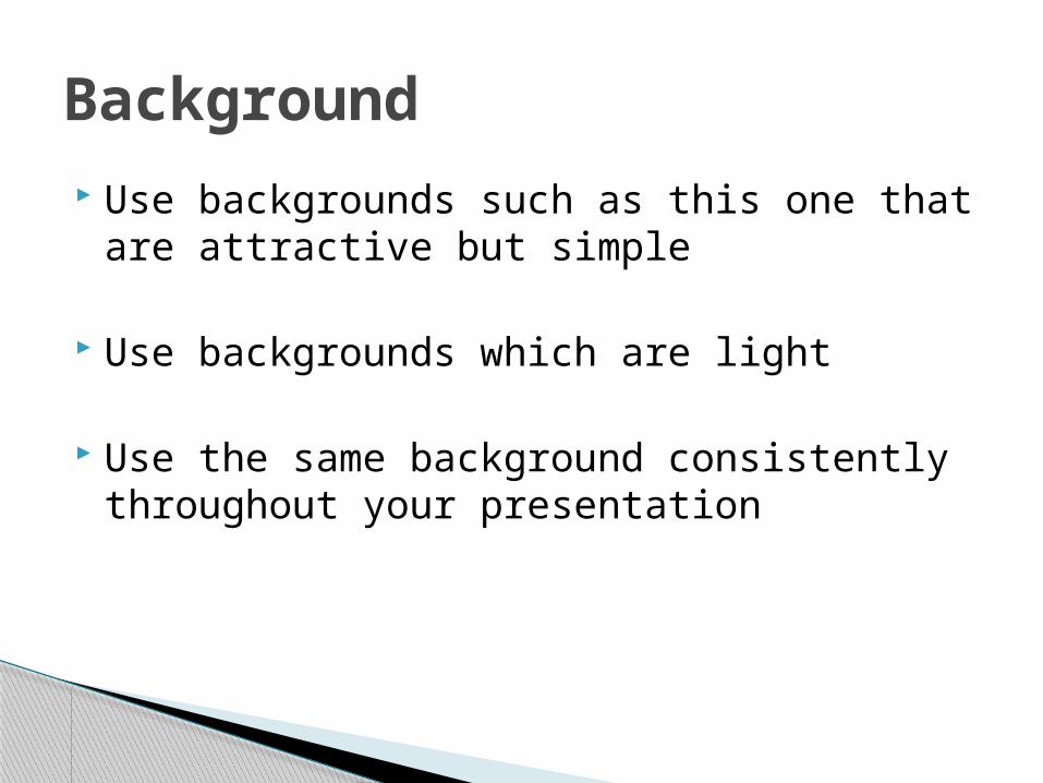
Use backgrounds such as this one that are attractive but simple
Use backgrounds which are light
Use the same background consistently throughout your presentation
Background
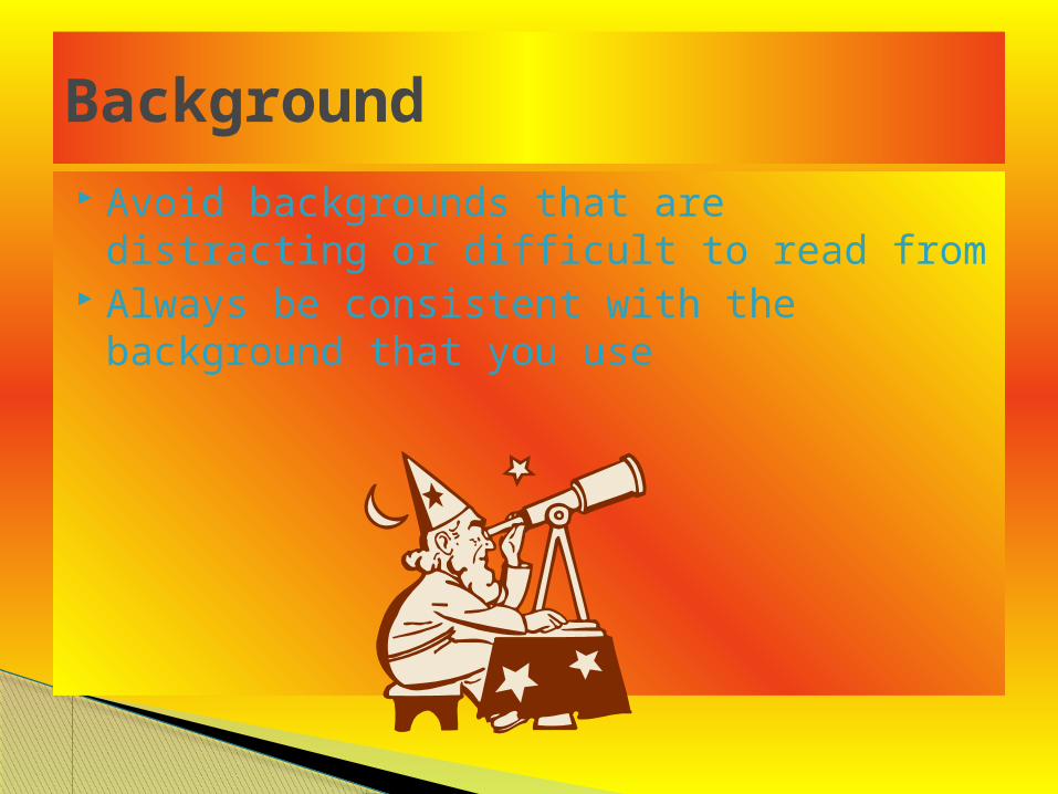
Avoid backgrounds that are distracting or difficult to read from
Always be consistent with the background that you use
Background

Images are key elements of every presentation. Your audience will want to see what you’re talking about, and a good visual cue will help them to understand your message much better.
Images can reinforce or complement your message.
For a very public and official presentation, keep copyrights in mind.
Images

Use graphs rather than just charts and words◦ Data in graphs is easier to comprehend & retain
than is raw data◦ Trends are easier to visualize in graph form
Always title your graphs.
Graphs

This graph is small, has no title or supporting information e.t.c.
Example of a bad graph
January February March AprilBlue Balls 20.4 27.4 90 20.4Red Balls 30.6 38.6 34.6 31.6

Example of a good graph
Items Sold in First Quarter of 2002
0
10
20
30
40
50
60
70
80
90
100
January February March April
Blue Balls
Red Balls
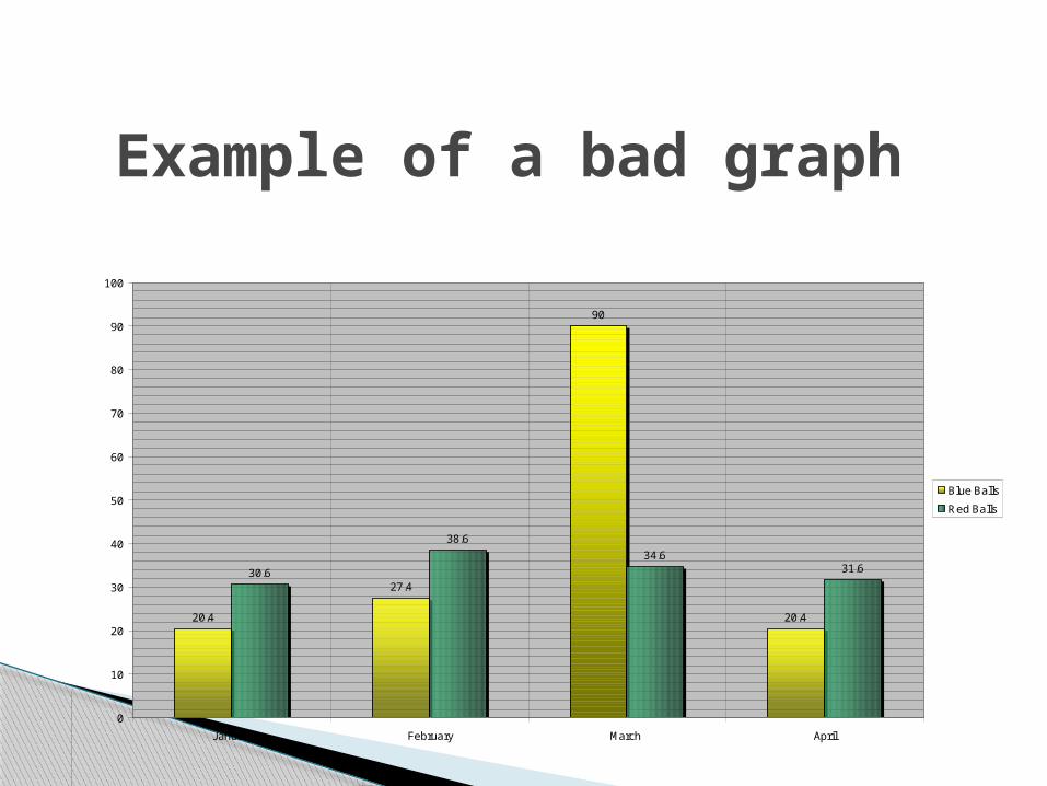
Example of a bad graph
20.4
27.4
90
20.4
30.6
38.6
34.631.6
0
10
20
30
40
50
60
70
80
90
100
January February March April
Blue Balls
Red Balls
Why the previous slide is classified as being bad;
Minor gridlines are unnecessary Font is too small Colors are illogical Title is missing Shading is distracting
Bad graphs

Proof read your slides for:◦ speling mistakes◦ the use of of repeated words◦ grammatical errors you might have make
If English is not your first language, please have someone else check your presentation!
Spelling and Grammar

Use an effective and strong closing◦ Your audience is likely to remember your last
words
Use a conclusion slide to:◦ Summarize the main points of your presentation◦ Suggest future avenues of research
Conclusion

End your presentation with a simple question slide to:
◦ Invite your audience to ask questions/ engage in a short question-and-answer session with your audience
◦ Pose a question for discussion.
Questions

Provide contact information for follow up.
Contact information
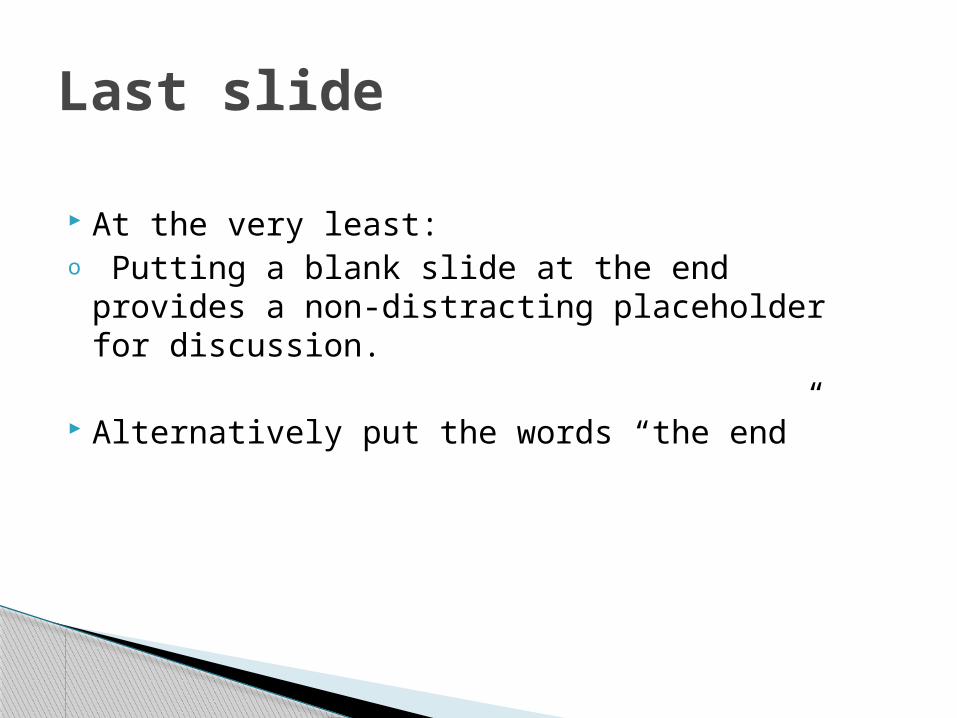
At the very least:o Putting a blank slide at the end provides a
non-distracting placeholder for discussion.
Alternatively put the words “the end”
Last slide

THE END