principles of ux design
TRANSCRIPT
PRINCIPLES OF UX DESIGN
How to implement user experience design in a design process
LAB UNIVERSITY OF APPLIED SCIENCES LTD Bachelor of Engineering Degree programme in Information and CommunicationTechnology Spring 2020 Timo Heikinmäki
Tiivistelmä
Tekijä(t)
Heikinmäki, Timo
Julkaisun laji
Opinnäytetyö, AMK
Valmistumisaika
Kevät 2020
Sivumäärä
31
Työn nimi
Käyttäjäkokemussuunnittelun pääperiaatteet Käyttäjäkokemussuunnittelun implementointi suunnitteluprosessissa
Tutkinto
Insinööri (AMK) Tiivistelmä
Opinnäytetyössä käydään läpi käyttäjäkokemussuunnittelun pääperiaatteet ja se, kuinka käytännössä käyttäjäkokemus tulee näkymään palvelu-, systeemi- ja tuotesuunnittelun prosessissa.
Työn toimeksiantaja oli LAB-ammattikorkeakoulu, joka oli osana hanketta, Maallemuuttajat 2030. Hanke jakaa tietoa ja käytännön esimerkkejä jakamis- ja palvelutalouden toimintamalleista maaseudulla Suomessa. Hankeen rahoittajana toimii Euroopan maaseudun kehittämisen maatalousrahasto. Hanke tarvitsee nettisivun näyttääkseen jakamis- ja palvelutalouden esimerkkejä.
Opinnäytetyössä tutkitaan käyttäjäkokemussuunnittelun pääperiaatteet nettisivun kehittämisprosessissa ja kuinka käyttäjäkokemussuunnittelu käytännössä voidaan lisätä suunnitteluprosessiin.
Opinnäytetyön tuloksena toimitettiin toimiva nettisivu. Käyttäjäkokemussuunnittelun pääperiaatteet oli esitetty hyvän ja huonon toteutuksen esimerkkeinä. Opinnäytetyön johtopäätöksenä todettiin, että käyttäjäkokemussuunnittelu voi säästää huomattavan määrän resursseja, mikäli se on implementoitu suunnitteluprosessiin oikein.
Avainsanat
Käyttäjäkokemussuunnittelu, Käyttäjäkokemus, Käyttöliittymäsuunnittelu, Käytettävyys, Vaatimukset
Abstract
Author(s)
Heikinmäki, Timo
Type of publication
Bachelor’s thesis
Published
Spring 2020
Number of pages
31
Appendices
9
Title of publication
Principles of UX design How to implement user experience design in a design process
Name of Degree
Bachelor of Engineering Abstract
This thesis discusses user experience design. It deals with the core aspects of the user experience design, how user experience is used in practice in the designing process and how it will be seen in a service, system or product.
The thesis was commissioned by the LAB University of Applied Sciences as part of the Maallemuuttajat 2030 Project. The project is funded by the European Agricultural Fund for Rural Development (EAFRD). The project shares information and practical examples of sharing & service economy opportunities in the rural area of Finland. The project requires a functional website to display a handful of showcase projects.
The website is the case study of the thesis. It demonstrates the user experience approaches and how user experience design is implemented to the designing process.
As a result of the thesis, a functional website was delivered. Principles of user experience design were examined and presented as a practical implementation of good and bad examples. Conclusion of the thesis was that UX design could save a lot of resources when implemented to the design process correctly.
Keywords
UX design, user experience, UI design, user-centered design, usability, requirements
1
CONTENTS
Contents ............................................................................................................................................ 1
1 Introduction ............................................................................................................................... 2
2 User experience.......................................................................................................................... 3
2.1 History ................................................................................................................................ 4
2.2 Foundations of UX design .................................................................................................. 5
2.3 Return of Investment (ROI) ................................................................................................ 6
3 Design methods .......................................................................................................................... 7
3.1 User-centred design (UCD) ................................................................................................. 7
4 Requirements ............................................................................................................................. 9
4.1 5E’s of usability ................................................................................................................. 10
4.2 Accessibility Requirements .............................................................................................. 12
4.3 Rationalizing requirements .............................................................................................. 13
5 Design solutions ....................................................................................................................... 14
6 In practice ................................................................................................................................. 16
6.1 Understanding the concept .............................................................................................. 16
6.2 Ideate ............................................................................................................................... 18
6.3 Create ............................................................................................................................... 21
7 Conclusions .............................................................................................................................. 25
LIST OF References ........................................................................................................................... 26
Appendices ....................................................................................................................................... 32
2
1 INTRODUCTION
Urbanization is a growing problem in Finland (Laakso & Loikkanen 2018). The decreasing
population in the countryside reduces profitability for companies, which causes the
companies to close. The lack of services and utilities has a huge impact on the residents
of the rural areas.
The ‘Maallemuuttajat 2030 Project’ is a LAB University of Applied Sciences project and it
is funded by the European Agricultural Fund for Rural Development (EAFRD). The project
is looking for solutions to slow down the urbanization in Finland. The project provides
information about the exchange possibilities of services, utilities and premises amongst
the residents of the countryside. In practice, the resident of the rural area could trade
utilities including farm equipment in exchange for other services. The project requires a
website to display a handful of showcase exchange possibilities.
Technology has been growing rapidly after it became affordable for consumers. A need
for efficient and usable products grew alongside the technology. Users replaced old
products with more user-friendly creations. The same happened to websites. Research
shows that 61% of website users leave the site if the required data is not displayed
immediately. (Austin 2019.)
The website for the project is developed by using user experience (UX) design
approaches. The objectives for the thesis are to capture the core aspects of UX design,
and to explain what happens when UX design is not considered. This thesis focuses on
creating the website for the Maallemuuttajat 2030 Project and does not take part in other
areas of the project. Only the website requirements are documented and shown in the
thesis. Evaluation with end users will be left out due to the small amount of time to invest
in the thesis. The thesis will explain how websites can be created to be more user-friendly,
how to form a list of requirements, and it will also present the core principles of UXD. The
thesis focuses on answering the following research question:
How UX design in practice will be seen on the website, and what happens when UX
design is poorly implemented to the system, service or product.
The research method for the thesis was qualitative research, which includes interviews
and creating user profiling tools and a heuristic evaluation. These were used to create a
list of requirements for the website. The interviews with the project manager and other
stakeholders were face to face. Phone message applications were used to maintain
communication. All major changes and updates were approved by the project manager.
3
2 USER EXPERIENCE
How humans process information and how they behave is a field of cognitive psychology
(McLeod 2015). UX is sometimes hard to separate from cognitive psychology. The
difference is that UX design (UXD) implements the cognitive psychology knowledge to a
system, service or product, while cognitive psychology is trying to find the answer to the
question why humans behave such a way. (CrashCourse 2014; Interaction Design
Foundation 2019b; Margot 2019; Rodriguez 2017.)
Despite the fact that companies started to rather appreciate the concept of UX, they tend
to have a distorted view of UXD. UXD is heavily attached to user interface (UI) design,
even though products can be created without UI, as in the case of voice technology, for
example. (AJ&Smart 2019; Allabraton 2019; Essex 2019; Nielsen & Norman 2020;
Schwarz 2017; They Make Design 2019.)
UXD focuses on understanding and creating a list of requirements for the project and
forming strategies to satisfy all parties involved using different UX approaches. Paper
sketches and interactive prototypes can be built to validate requirements that the project
has. UI design focuses on creating the visual appearance for the system or product.
(Allabraton 2019; Interaction Design Foundation 2019b, c; Nielsen & Norman 2020.)
The purpose of UXD is to use cognitive psychology principles as a tool to understand the
user’s behaviour, to produce products that satisfy the end user. Poorly implemented UX
design can result in an unsatisfied end user. (Greever 2014; Interaction Design
Foundation 2019a, b, c; Rodriguez 2017.) Well thought-out UX design will save resources
and guarantees satisfied stakeholders. (Allabraton 2019; Greever 2014; Hartman 2020;
Sanguinetti 2017.)
In practice, if the product does not bring value to the user, the design has failed. On the
other hand, if the product raises interest among the users, creates a safer experience and
more efficient usage or the user is simply satisfied with the product, the design has
succeeded. (UX Booth 2013; Stevens 2019.)
UX design takes part in every phase of the system, service or product design circle. In
practice, this ranges from understanding the concept to evaluating the finished product.
(Allabraton 2019; Sanguinetti 2017.) Because UX design takes place in every phase of
the design circle, there are signs of UX design dividing into four or more separate fields of
work, but a basic knowledge of UX is a requirement for all of them. (Interaction Design
Foundation 2019a, b.) Such dispersions will be explained later in this thesis.
4
2.1 History
The technological revolution in the late 19th century pushed industries to find ways to
increase productivity. The First World War had a huge impact on production lines, since a
huge portion of the workers were taking part in the war. Industries had a huge lack of
skilled workers, which forced companies to find alternative solutions to boost production
levels. (Clouting 2018; Rowe 2014; UX Booth 2013.)
By the mid-20th century, human factors and ergonomics were taking off when designing
products and production lines. The Second World War forced companies to produce
products that meet the user needs. Henry Dreyfuss wrote the book “Designing for
People”, which focused on understanding the human requirements. (UX Booth 2013;
Stevens 2019.)
Around the same time, human behaviour research started to take form as a new field of
science now known as cognitive psychology. Cognitive psychology later formed human-
computer interaction (HCI) when the technology started to be accessible for consumers.
(Interaction Design Foundation 2019b; UX Booth 2013.)
In the mid-90s, cognitive psychologist Don Norman came up with the name ‘user
experience’ when he started to work at Apple. Personal computing and, later on, websites
and mobile applications boosted the need for UX design to a whole new level. (Stevens
2019; Interaction Design Foundation 2019b; UX Booth 2013.)
Humankind has been making conscious design decisions after HCI started to form, (Inter-
action Design Foundation 2019b) but the ideologies of UX can be tracked all the way back
to when humans have been creating things (AJ&Smart 2019; Sahasrabuddhe 2018). User
experience has historical roots dating back to 4000 BC in the area now known as China.
Environment knowledge called Fengshui focused on creating environments that boost
people’s wellness. It is also known to find the most optimal way to construct buildings in a
way that does not affect the usage or burden the environment. (Stevens 2019.)
Living in 460-370 BC, Hippocrates wrote “Ergonomics in Ancient Greece”, which is a
guideline for operating surgery.
As regards the tools, we will state how and when they should be used; they must be
positioned in such a way as to not obstruct the surgeon, and also be within easy
reach when required. (ErgoU 2006.)
5
2.2 Foundations of UX design
Depending on the project and the company, a UX designer might focus on a specific area
of UX. Smaller companies look for a general UX designer that might do overall UX
designing, and bigger companies have more specific UX tasks. (AJ&Smart 2019;
Allabraton 2019; Arhipova 2020; Interaction Design Foundation 2019b;
UXBEGINNER.COM 2020.)
The UX work process can be divided into four separate fields of work. There are slight
variations between these areas, depending on the company and the project
(UXBEGINNER.COM 2020). Therefore it is best to explain the concept, rather than give
their names. The four steps of UX are: understand, ideate, create and test. (AJ&Smart
2019; Allabraton 2019; Business Analysis Excellence Pty Ltd 2015.)
Understanding the concept and fully internalizing the whole need for the product is the
focus on this step. Researching the background for the project and creating the list of
requirements using different research methods and approaches help form a wide view of
the project. This step entails keeping the concept understandable for everyone involved,
including customers, the development team and end users, and documenting and
updating the requirements during the evolving process on every four steps of UX design.
(AJ&Smart 2019; GeeksforGeeks 2020; Nuseibeh & Easterbrook, 2000, 35-46.)
Without this step, there might be misconception and overlapped work (Greever 2014). A
poorly documented and explained concept drives to miscommunication, which might
appear as the proverb:
Customer is always right. (Writingexplained.org 2020.)
This will lead to unsatisfied customers because the provided product and the product’s life
span did not meet expectations and/or requirements. Most of those cases could have
been avoided if the documentation had been made. (AJ&Smart 2019; Allabraton 2019;
Business Analysis Excellence Pty Ltd 2015; Greever 2014; Interaction Design Foundation
2019a, b.)
Ideating the product based on the documentation and requirements that have been set for
the project is part of this step. Designing sketches and interactive prototypes helps
recognize the design errors that could otherwise waste resources or even cause the
whole project to fail. Showing customers and stakeholders early designs to form the right
picture of the project helps to avoid misunderstandings. (Greever 2014.)
6
Five to seven testers of early designs will find the most crucial designing errors (Nielsen
2012a). Those crucial errors could be navigation errors, for example a main menu button
not working properly. Fixing early paper sketches and interactive prototypes is cheaper
than fixing the pre-established concept. (AJ&Smart 2019; Allabraton 2019; Greever 2014;
Interaction Design Foundation 2019a, b.)
Creating the user interface for the product is done on this step based on, the feedback
and the prototypes. This phase is focused on checking the functionalities and the overall
product usage flow as well as using Schneiderman’s 8 golden rules to help create the
most user-friendly product. The 8 golden rules are explained later in the thesis. (AJ&Smart
2019; Allabraton 2019; Interaction Design Foundation 2019a.)
Testing the product against the requirements in order to find design errors which might
have been left unnoticed is the focus of this step. Unnoticed design errors could be issues
which might affect the usage flow. In practice, these errors could be the 5E’s of usability
which are explained later in this thesis.
Only focusing on testing the product and ignoring other phases of the design does not fix
the real problem behind the product. For example, if the production line produces
products, and only the finished products are evaluated, the real problem which causes the
fault is still not solved. (Interaction Design Foundation 2019a, c.)
2.3 Return of Investment (ROI)
Evaluating how much money UXD will save or has saved is difficult. Seeing value in
something that is not concrete and does not show in the monthly revenue is difficult to
verify. If the UX design is trying to find errorless solutions for the design, how can the time
be counted if the errors never occurred? (Allabraton 2019; Farrell 2015; Greever 2014;
Hartman 2020; Sanguinetti 2017.)
Every dollar invested in ease of use returns $10 to $100. (Hartman 2020.)
The ROI of UX can be calculated by measuring how much time is saved after a new
design. According to NNgroup, Mozilla has received 70% less support calls after they
spent 14 weeks on understanding usability requirements. (Farrell 2015.)
The ROI of UX is not directly proportional, but it can be seen in a satisfied customer, and
a decrease in occurring errors, time spent on actions or even training time. (Allabraton
2019; Farrell 2015; Greever 2014; Hartman 2020; Sanguinetti 2017.)
7
3 DESIGN METHODS
3.1 User-centred design (UCD)
The user-centred design (UCD) approach is a way to develop a product where the user is
the main subject. The user is kept in the development process from start to end to ensure
the end user satisfaction. Observation, research and evaluation are core points of the
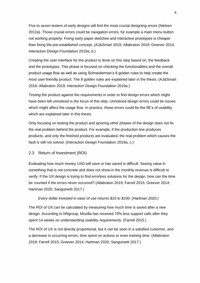
UCD. The ISO 9241-210:2019 standard’s description of the workflow of the UCD contains
four phases, which are shown in Image 1. (Interaction Design Foundation 2019a; ISO
2019b.)
Image 1. Interaction Design Foundation’s illustration of the UCD approach
The phase of understanding context of use concentrates on by researching where the
product is used. The situation might be different when using the system or product for
example in a noisy environment. Creating a product which gives instructions in voice
format will impact the usage negatively. Creating scenarios when and where the product
is used helps create a more accurate list of requirements. (Interaction Design Foundation
2019a.)
Specifying user requirements and understanding what the user does with the product, and
why the user needs the product is the focus of the next phase. The problem is looked at
from the user’s point of view using different profiling tools, such as the ‘personas’ method.
Personas help to create imaginary users to set the users in the centre of the designing
process. This helps in creating an accurate list of requirements such as understanding the
divergences in technological aptitude between age groups. (Interaction Design
Foundation 2019a.)
Design solutions are created in the next phase by following the requirements and
instructions which have been set earlier in the development process. The focus of this part
is on creating effective design solutions without affecting the usage. Considering the
8
variance in the user base to create a successful product is the focus of this phase.
(Interaction Design Foundation 2019a; Wong 2020.)
The focus of the next section is to evaluate the final product against requirements using
different evaluation approaches, such as expert analysis, qualitative analysis and
quantitative analysis. This step focuses on finding the design errors and shortcomings
before publishing the product. If the product does not meet the requirements, the product
is put back into the design rotation. (AJ&Smart 2019; Allabraton 2019; Interaction Design
Foundation 2019a; Nielsen 2012b.)
There are approaches that do not consider the user in the design process. System-
centred design (SCD) focuses on understanding the system capabilities and what the
system needs in order to carry out the wanted action. For example, if software is not
capable of doing the desired design, it is left out of the product development chain due to
money and time reasons. (Interaction Design Foundation 2019b; Web Accessibility
Wizard 2020, 1-7.)
Technology-centred design (TCD) focuses on the same principles but from technology’s
perspective. TCD entails understanding what the technological limitations are that force
the design to be a certain way. Those limitations might be physical and material
limitations, for example the system not being able to carry out the task due to a high
demand of processing power. (Interaction Design Foundation 2019a, b; Web Accessibility
Wizard 2020, 1-7.)
These examples are design approaches and it does not mean that a specific approach
has to be followed from the start to the end of the project. As mentioned earlier, the UX
design process evolves during its lifespan, which means that the tools and approaches
should follow the same principles. Approaches that are the most suitable for the current
situation should be used to ensure a successful design process.
Using the UCD approach will satisfy the end user if used correctly but cost-efficiency
might not be the most profitable solution. It is important to understand the amount of
resources that the project has and to create the project development process around
those constraints to avoid the exceeding of resources. This means creating solutions by
making compromises between the user requirements and resources. In practice this
means for example changing the design process from UCD to SCD if the system is able to
provide all the crucial features the product requires. Non-crucial details, which could be
UI-related, are the adjustable design solutions which are often compromised on or deleted
from the final product.
9
4 REQUIREMENTS
In order to understand the whole concept of the project, the requirements must be
established. All parties involved have their own set of goals and requirements. All the
goals and requirements cannot be achieved but rationalizing and balancing between
stakeholders guarantees a successful project lifespan. (Allabraton 2019; Business
Analysis Excellence Pty Ltd 2015; Cao, 2018.)
For instance, resources could force the project to be done in the scheduled time to be
profitable. This can be counted as a manager requirement as well as a constraint.
Software limitations could be something beyond the expertise the developer or designer
has. The aim is finding the most suitable solutions that benefit everyone’s needs without
overanalysing. (Business Analysis Excellence Pty Ltd 2015; Cao, 2018.)
The purpose is to gather information about the task, concept and stakeholders, to
determine the reliable requirements. Different data collecting analyses and interactive
testing help create the list of requirements. In practice, the purpose is to find solutions and
avoid the errors. (Allabraton 2019.) It is important to understanding the real needs of the
product and omit the unnecessary designs from the final product. (Business Analysis
Excellence Pty Ltd 2015.)
Constraints are limitations or, in other words, lines which the project does not cross. There
are a lot of different constraints that affect the product like, for example company policies
and law, safety and security considerations and even programming languages which
could have been set by the developing team. Everything that set the project boundaries
are constraints. (Business Analysis Excellence Pty Ltd 2015; Kwiatek, 2019.)
Functional requirements (FR) are the features that describe the very behaviour of the
product. These are characteristics of the product which will be seen in practice as
functions, for example buttons on the websites. FR define, how the product should work
and how the product is used by the users and how the user is going to interact with the
product. In other words, FR is the physical functionalities the product required to satisfy
the end users. (PMC Lounge 2018; Sahasrabuddhe 2018; Srivastava 2017.)
Non-functional requirements (NFR) are implicit expectations that the user has set for the
product, such as when the user expects the website to load fast, or the usage of the site
to be of acceptable quality. NFRs are non-physical appearances that affect the user
satisfaction. (PMC Lounge 2018; Sahasrabuddhe 2018; Srivastava 2017.)
“NFRs describe the overall experience of using a product.” (Sahasrabuddhe 2018.)
10
Data requirement stands for the content the system has and the data structure that the
system requires to maintain or perform the task. This could be, for example, displaying
content on the website or transferring information to another system such as in the case of
representing Google Maps on the website to share location data. (SemWebQuality.org
2020.)
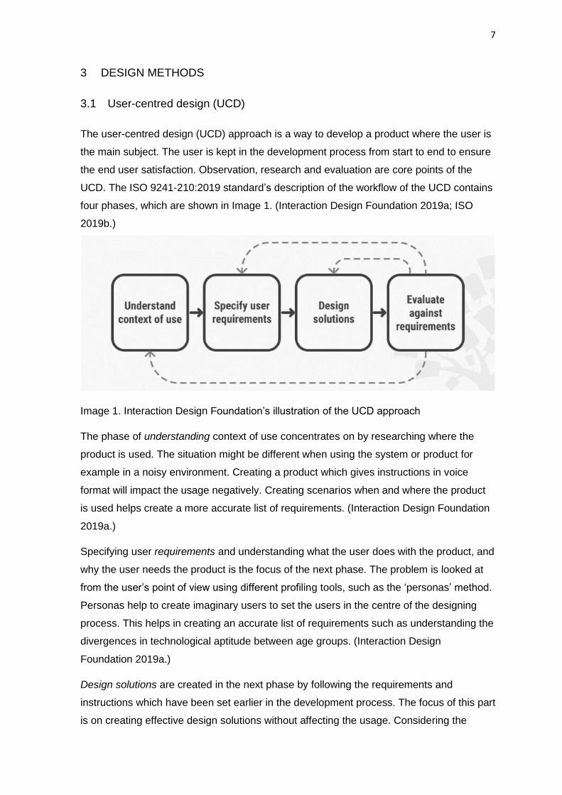
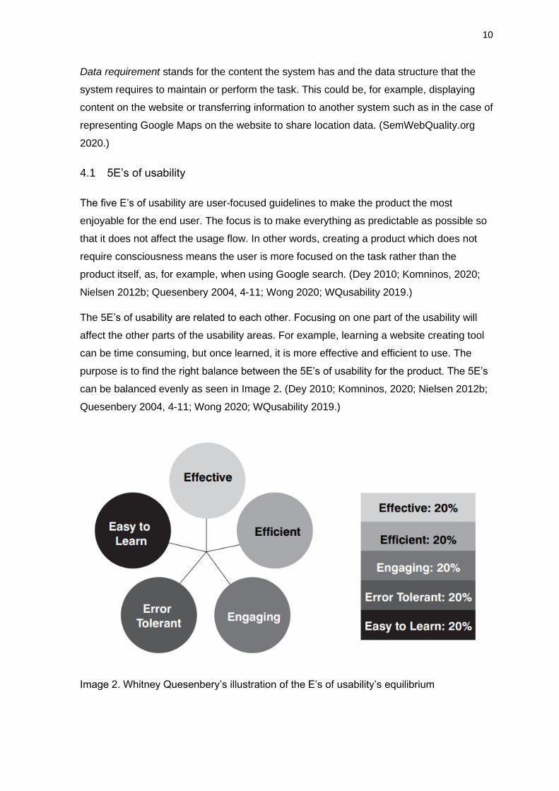
4.1 5E’s of usability
The five E’s of usability are user-focused guidelines to make the product the most
enjoyable for the end user. The focus is to make everything as predictable as possible so
that it does not affect the usage flow. In other words, creating a product which does not
require consciousness means the user is more focused on the task rather than the
product itself, as, for example, when using Google search. (Dey 2010; Komninos, 2020;
Nielsen 2012b; Quesenbery 2004, 4-11; Wong 2020; WQusability 2019.)
The 5E’s of usability are related to each other. Focusing on one part of the usability will
affect the other parts of the usability areas. For example, learning a website creating tool
can be time consuming, but once learned, it is more effective and efficient to use. The
purpose is to find the right balance between the 5E’s of usability for the product. The 5E’s
can be balanced evenly as seen in Image 2. (Dey 2010; Komninos, 2020; Nielsen 2012b;
Quesenbery 2004, 4-11; Wong 2020; WQusability 2019.)
Image 2. Whitney Quesenbery’s illustration of the E’s of usability’s equilibrium
11
Effective product design refers to supporting the user during the product usage in order to
create a seamless user experience. Effectiveness stands for the usage accuracy the
product is able to provide, meaning that the user does not have to double guess what the
functionalities are. Effectiveness could be providing information for the user and, for
example, helping to fill a form on a website but only accepting correctly written input to
avoid errors. (Dey 2010; Komninos, 2020; Nielsen 2012b; Quesenbery 2004, 5; Wong
2020; WQusability 2019.)
Efficiency and effectiveness are often mixed up, but when looking at them from a usability
perspective, there are slight differences. Efficiency focuses on the usage speed, but the
user is only able to maintain the speed if the effectiveness is at a tolerable level. For
example, if the website form has multiple pages, the user must be able to change pages
without losing the already filled parts. This would otherwise affect the usage speed as well
as the seamless user experience of the website negatively. (Dey 2010; Komninos, 2020;
Nielsen 2012b; Quesenbery 2004, 5; Wong 2020; WQusability 2019.)
‘Engaging’ refers to creating an appealing look for the product. Companies highly focus on
investing in this area of the design. An engaging, pleasant, interesting and satisfying
interface is the factor that attracts users by creating an enjoyable user experience. This is
often accomplished at the cost of efficiency, which means that the website is created to
look more stunning, but the usage of the website has suffered. (Dey 2010; Komninos,
2020; Nielsen 2012b; Quesenbery 2004, 5; Wong 2020; WQusability 2019.)
‘Error tolerant’ refers to preventing errors and helping the user to recover from the ones
which do occur. Creating an errorless product seems to be unlikely but understanding the
importance of error recovery can help keeping the user satisfied. Errors which might occur
could be caused by users, for example the user may insert input wrongly. Helping the user
to recover from the mistakes, for example by giving advices to fix the error or inform the
user about the error. (Dey 2010; Komninos, 2020; Nielsen 2012b; Quesenbery 2004, 5;
Wong 2020; WQusability 2019.)
‘Easy to learn’ means that the user is capable of learning new and recalling previous
functions and features without disproportionate effort. Learnability should not be
compromised regardless of how often the user interacts with the product. A product is
used by users with different skill levels and at varying frequency. Some of the users might
use the product only once and some might use it daily, but the interface of the product has
to be remembered and relearned every time. In practice this means for example that the
short-term memory load should be limited to almost zero. (Dey 2010; Komninos, 2020;
Nielsen 2012b; Quesenbery 2004, 5-6; Wong 2020; WQusability 2019.)
12
4.2 Accessibility Requirements
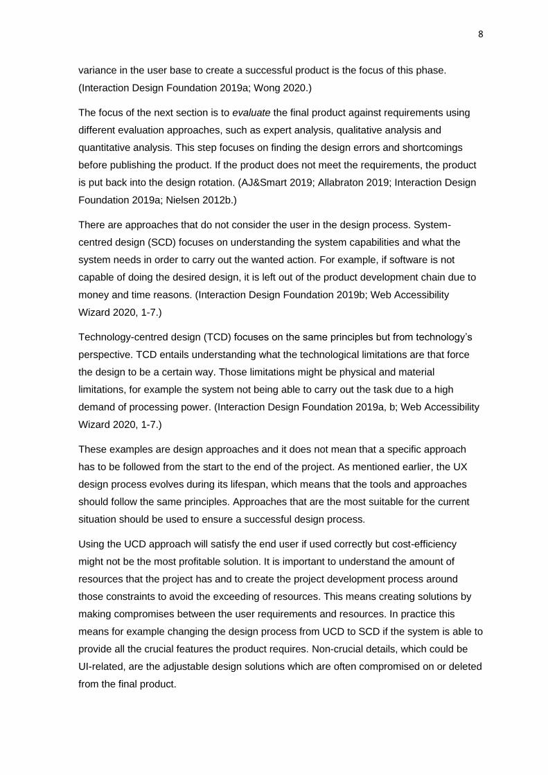
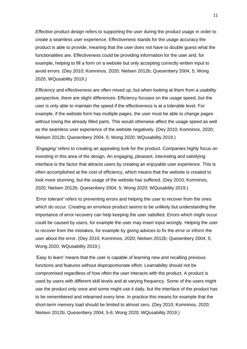
National Statistical Service (NSI) published a research in 2012 about accessibility. The
results showed that in Finland, among people between the ages of 15-64, 15% had some
sort of accessibility problem. Example of different colour blindness are demonstrated in
Image 3. (THL 2016.)
Image 3. Different colour blindness illustrated by Ivan Tuchkov
Web content accessibility Guideline (WCAG) 2.1 is a guideline for accessibilities. The
guideline forces the public sector to provide websites which are usable for everyone.
Websites must follow the accessibility standard guideline until 23.09.2020. Mobile
applications must follow the accessibility standard guideline until 23.06.2021.
(Saavutattavasti.fi 2019; Saavutettavuusdirektiivi.fi 2019.)
Accessibility requirements can be, for example:
• Physical: dwarfism, paralytic
• Visual: nearsightedness, blindness, colour blindness
• Hearing: hearing loss, profound deafness, deafness.
• Speech: Apraxia, dysarthria.
• Cognitive: autism
A person might have multiple disabilities at the same time. Focusing on understanding the
user context by using the UCD approach, helps to create a wider view of the upcoming
problems. (Interaction Design Foundation 2019a.)
There have been examples of how big organizations have neglected these guidelines.
The Sydney Olympic games 2000 had to pay penalties for not providing sites for athletes
who had visual limitations. (McGee & Patel 2009.)
Creating a website to be, for example, more readable by adding more contrast between
text and background helps not only the people with some visual disabilities, but everyone
who uses the website.
13
4.3 Rationalizing requirements
Prioritizing the work and setting milestones and deadlines for the project help keeping
track of the project. Finding the key elements which are the crucial part of the product and
starting to create the product around them. Keeping the project simple helps to see the
problems earlier and find the errors faster. (Batagoda 2018; Firesmith 2004, 35-47;
Karlson 2020; Schedlbauer 2020.)
Resources define the priority of the project. How much time and money can be invested to
create working functions. Understanding the bonds between requirements and prioritizing
functions which have the most links. Constraints which are set for the product set the
direction where the project is going. (Firesmith 2004, 35-47; Karlson 2020; Schedlbauer
2020.)
Keeping track of the changes between bonds and new requirements is crucial. Problems
start occurring if documentation is not updated frequently during the project’s lifespan.
Creating documentation that is understandable for development team and for the
client/user. (Firesmith 2004, 35-47; Karlson 2020; Schedlbauer 2020.)
Consequences of poorly prioritizing the requirements can lead to the loss of resources.
This may show as creating unnecessary details which could have been left out from the
final product. In practice, prioritizing the requirements correctly could reveal, for example,
that the wireframe tool for the website does not support video format as a background
plate. This could result in the created video not being able to be displayed on the website.
Scheduling the requirements poorly for the project can cause the loss of the project due to
exceeding time limits. These will lead to unfavourable financial circumstances as well as
unsatisfied stakeholders. (Firesmith 2004, 35-47; Karlson 2020; Schedlbauer 2020.)
14
5 DESIGN SOLUTIONS
The interface is the first layer which evokes feeling. UI is used to describe the human-
computer interaction, including screens, mouse and keyboard (Rouse 2020). Different UI
approaches are used to create tempting interfaces. Breaking design rules and patterns to
attract the user by, for example, aligning text on the website to the right side to draw
users’ attention. (Interaction Design 2020c; Rouse 2020.)
Because of the flexible nature of UI design, UI’s focus is on creating the interface using
the requirements as a guideline for the product design. The purpose of UID is to make the
interface more appealing and interesting. (Interaction Design, 2020c; Rouse 2020.) An UI
designer might set requirements for the product, such as that the product interface must
be done with a specific tool. (Interaction Design, 2020c; Rouse 2020.)
Ben Schneiderman’s ‘Eight Golden Rules of Interface Design’ is a guideline to guarantee
satisfied end users. Apple, Google and Microsoft have well known products that reflect the
Schneiderman’s eight golden rules. (Wong 2020.)
Schneiderman’s eight golden rules are:
• Strive for consistency. Effectiveness of the system by creating the interface
understandable in a way where, for example, every page of the website follows the
same layout structure. (Gallello 2014; Shneiderman 2005, 74-76.)
• Enable frequent users to use shortcuts. Advanced users need to have a faster
workflow. Creating quicker methods to perform actions such as the copy and paste
function on computers. (Gallello 2014; Shneiderman 2005, 74-76.)
• Offer informative feedback. Providing beneficial guidance for the user during the
usage of the product. Informative feedback can be, for example, giving
understandable error messages or sharing the location on the website. (Gallello
2014; Shneiderman 2005, 74-76.)
• Design dialogue to yield closure. Sharing knowledge of the actions for the user by,
for example, informing the user that an action was completed. The user should not
be left wondering whether an action went through or not. (Gallello 2014;
Shneiderman 2005, 74-76.)
• Offer simple error handling. Creating easy to use error management for the user
where, for example, an incorrectly filled part of the form is highlighted. User-
negative experiences can be avoided, even if an error occurred, by simply not
pointing out the user’s wrong action but rather giving them instructions. (Gallello
2014; Shneiderman 2005, 74-76.)
15
• Permit easy reversal of actions. Give an option to go backwards on the system
without losing already made progress. (Gallello 2014; Shneiderman 2005, 74-76.)
• Support internal locus of control. The user should be the initiator of the action and
not the other way around. Creating the illusion that the user is in charge of the
system. For example, the system should ask to execute the action, but also give
option to not do so. (Gallello 2014; Shneiderman 2005, 74-76.)
• Reduce short-term memory load. Humans can hold information for about 20-30
seconds and remember 7 ± 2 objects in short-term memory. Reducing the amount
of actions that need to be remembered, creates a more efficient experience for the
users. (Gallello 2014; Margot 2019; Shneiderman 2005, 74-76.)
16
6 CASE: MAALLEMUUTTAJAT 2030 WEBSITE
The practical part of this thesis used paper sketches to demonstrate the early designs of
the website. Interactive prototypes were created with Figma to showcase the website
ideas to stakeholders. Figma is an open-source vector-based UXD tool for web and phone
applications. It is used to create an image of the application interface. The benefits of
using Figma are that it allows the designer to demonstrate the appearance and the usage
of the product for the stakeholders with cost efficiency. The purpose of this is to reveal any
design errors which might occur, such as navigation and UI-related errors. Figma does not
create the real website but it is used to create a replica of the website which in practice is
a “slideshow” of the website pages. The interactive part of Figma is that the software
allows to create links between the pages: for example, pressing the website’s tab to
another page changes the currently displayed page to the page which is clicked on. This
creates the illusion of the functional website, which is created with less effort. Because of
that, the testing of the website can be started early on in the design process.
The project manager bought the host service and the website domain from a third-party
provider. The host service used cPanel as their control panel and it was used to install the
content management system (CMS), which in this case was WordPress. WordPress was
installed using cPanel’s CMS installing tool, and the host service’s default CMS plugins
and themes were deleted after the installation. Starting with a blank WordPress, the
theme Sierra Nature, which belongs to the Alastar theme family, was installed. The
explanation for using this particular theme is explained later in the thesis.
The Elementor plugin was installed onto Wordpress to help creating the website using a
graphical interface. Elementor is a block-type building tool for WordPress, which helps
create, for example, text layouts by adding blocks that contain the text functionalities to
the website. The benefit of Elementor is that the plugin is much faster to use than most of
the other methods for developing a website, but the cost of the efficient development is
Elementor’s poor flexibility. Elementor has been developed to do certain designs and
creating something outside of its capabilities might not be possible or would be time
consuming to create.
6.1 Understanding the concept
The website development took place during the early stage of the Maallemuuttajat 2030
Project. The thesis focused on the website development and it was estimated to be done
before the project’s practical part took off. For that reason, the opportunity to have direct
contact with the primary focus group did not exist.
17
The assumptions of the average user of the website and overall knowledge of the project
was given by the project manager. Based on the interviews with the project manager,
personas were created to demonstrate the average user of the website.
The average user is most likely to use at least a couple of the top ten most visited Finnish
websites. To avoid negative impact on the usability and to reduce short-term memory
load, the website should follow the overall layout of the most used websites in Finland.
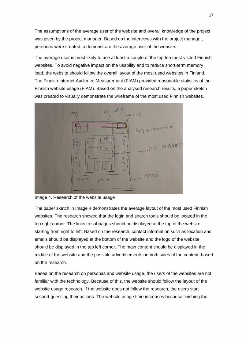
The Finnish Internet Audience Measurement (FIAM) provided reasonable statistics of the
Finnish website usage (FIAM). Based on the analysed research results, a paper sketch
was created to visually demonstrate the wireframe of the most used Finnish websites.
Image 4. Research of the website usage
The paper sketch in Image 4 demonstrates the average layout of the most used Finnish
websites. The research showed that the login and search tools should be located in the
top right corner. The links to subpages should be displayed at the top of the website,
starting from right to left. Based on the research, contact information such as location and
emails should be displayed at the bottom of the website and the logo of the website
should be displayed in the top left corner. The main content should be displayed in the
middle of the website and the possible advertisements on both sides of the content, based
on the research.
Based on the research on personas and website usage, the users of the websites are not
familiar with the technology. Because of this, the website should follow the layout of the
website usage research. If the website does not follow the research, the users start
second-guessing their actions. The website usage time increases because finishing the
18
action takes longer for the users. The impact is negative because the increased time
spent in using the website is added to the users’ time finding the right action.
The project’s requirements for the website were to hold the information for two to three
years before the project ends. A part of the requirements was to create the website, so it
does not require visual updating during its lifespan. The short lifecycle of the website led
to focusing on the overall usage of the website and eliminating the non-essential designs.
Polishing the website, which included the colour template and the overall final appearance
of the site, was done at the end.
In terms of the website’s content, the displayable material and the format of the material
were not provided by the project manager due to the early phase of the project. In order to
keep the budget as minimal as possible, tools and materials such as the CMS,
background photos and textures had to be free-licenced, self-taken or self-made.
Updating the website, such as uploading content, had to be easy to use for the content
producer. The project was funded by the public sector, which force the website to follow
WCAG standards. These are the constraints which were set for the website.
6.2 Ideate
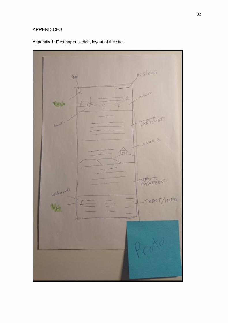
The first paper sketch was created to demonstrate the website layout. It followed the
instructions which were set during the research phase. To create the website so it does
not need visual updating, a modern look for the website was created by using screen-size
background photos and dividing the website into horizontal chunks. It was decided that
the content on the website would be displayed in the middle of the chunks and would
leave a gap between the content to create a more readable website. To create the gap
between the chunks, every other chunk was designed to have a plain background colour.
The first paper sketch is shown in Appendix 1. (Appx.1)
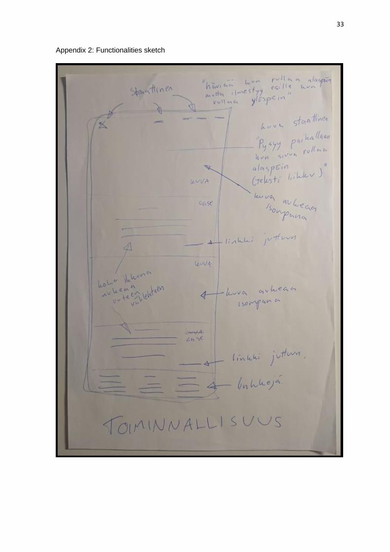
The second paper sketch demonstrates the functionalities of the website. The functionality
sketch demonstrates that all the screen-sized photos were designed to be stationary and
when scrolling down on the website, the chunk without a background photo will be
“moving” on top of the stationary photos. The purpose of this was to create the feeling of a
modern website. (Appx.2)
19
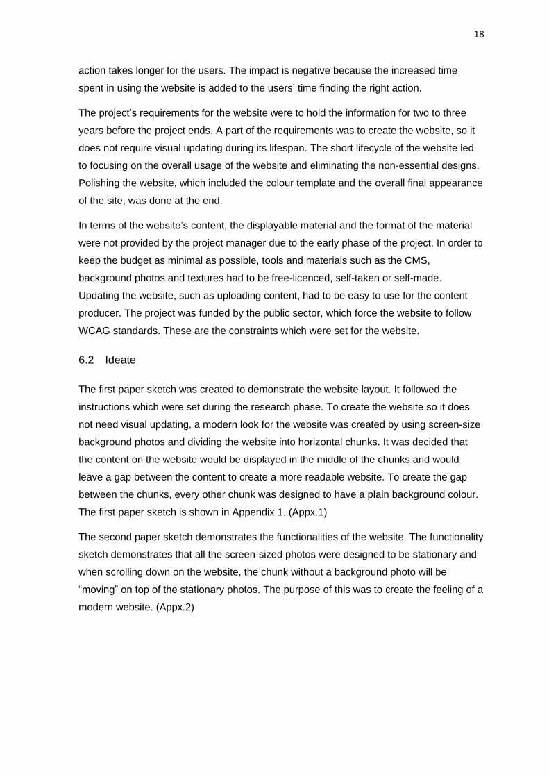
Image 5. Designing the content
To make the website meet the WCAG standards, the website needs to be designed so
that it is accessible to everyone. As shown in Image 5, the website was designed to be
more understandable and clearer for the user.
A website can be designed to be more accessible by creating a more understandable gap
between the displayable material as for example in this case using shadows to create the
illusion of depth between chunks. The contrast between the text and background was
designed to be balanced to highlight the text in order to make it more readable.
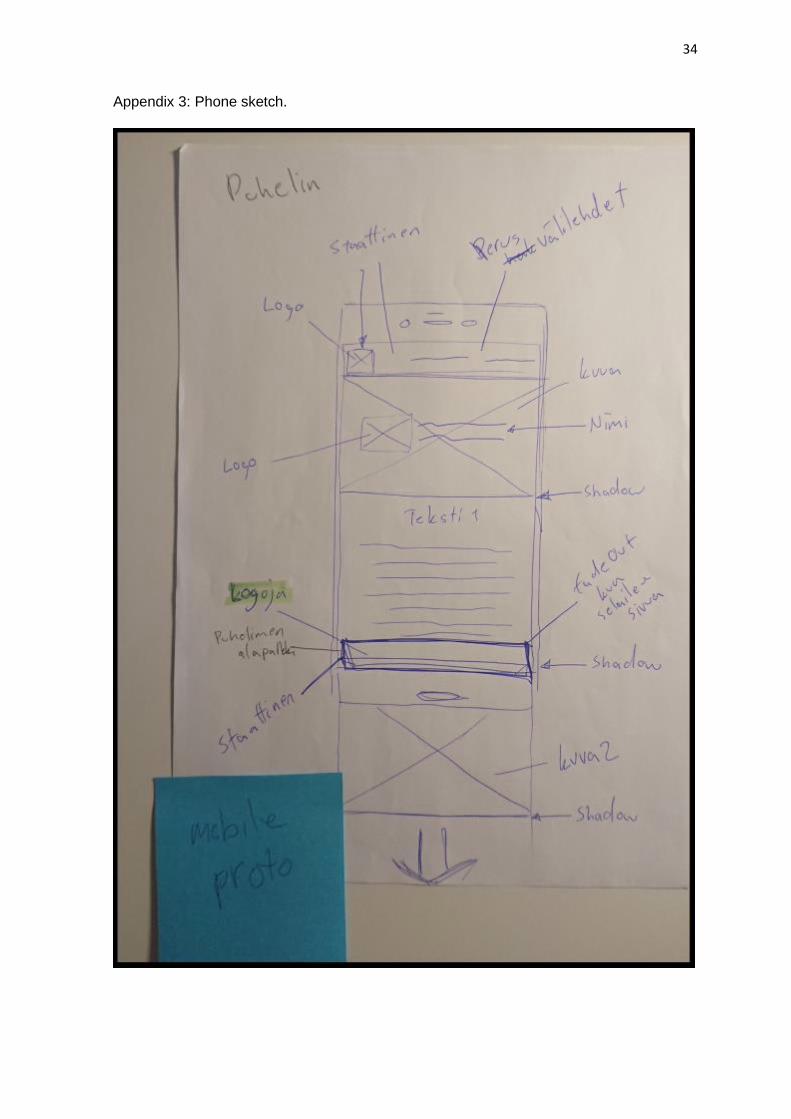
Over half of the traffic on websites was made by phones and tablets in 2019. (Statista
2020) Creating websites without considering mobile users disregards a huge portion of
the users, which inevitably affects the general opinion of the website negatively. In
Appendix 3, the paper sketch was made to determine the differences between the
platforms. Creating a coherent experience for mobile users is achieved by focusing on the
text appearance. Making the text screen-wide and balancing the contrast enables the text
to be visually more understandable when using a mobile phone. (Appx. 3)
An interactive prototype was created with Figma to demonstrate the website usage. The
purpose was to find possible design errors which might occur during the website usage.
To avoid misconceptions, the interactive prototype was shown to stakeholders to keep the
project understandable for everyone. The purpose of showing the interactive prototype
was to demonstrate the framework and navigation of the website and not show a polished
version of the prototype. The reason for this decision was to save time in the designing
process. In practice, this meant not using exact fonts, background photos or small details
20
on the prototype. The overall usage and feeling of the website were the purpose of the
interactive prototype. The project manager approved the interactive prototype, which did
not reveal any major errors. The interactive prototype is seen in Appendix 4.
Based on the new requirements that the paper sketches and interactive prototype created,
research for optimal tools to fulfil the design plans was made. The website was decided to
be created with WordPress due to the content producer’s previous experience. A suitable
theme and plugin for WordPress were found. The Alastar theme and Elementor plugin
supported the design plans almost entirely. Every major feature the design plan had, was
covered in the research. Smaller adjustments were not tested. Based on the topic
‘rationalizing the requirements’, the UCD approach was changed to SCD. The Elementor
plugin is now a new constraint for the project. Designs that cannot be created with
Elementor are left out due to the short lifecycle of the project. Smaller adjustments are not
worth the time. The results of testing the Alastar theme and Elementor plugin are seen in
Appendix 5. (Appx. 5)
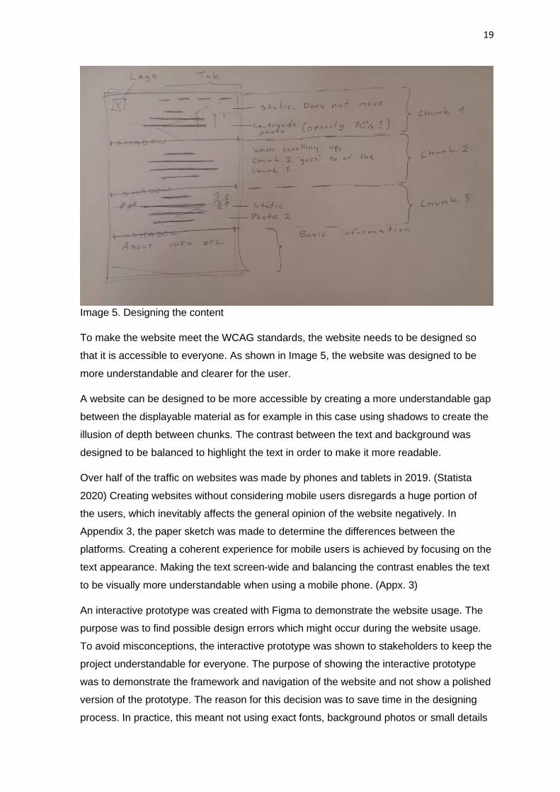
Image 6. List of priorities
To avoid creating non-essential designs that could be left out of the final product,
prioritizing the work can reveal those designs before they are made. The list of priorities
was created for the website and is seen in Image 6. The image shows the highest priority
from left to right and from top to bottom.
Creating the framework for the website is priority 1. Focusing on the framework will reveal
Elementor’s capabilities of creating the website. Understanding the tools used for the
website development might help to fix other problems which might occur. Creating the
navigation for the website early on helps to recognize the possible problems such as a
subpage that does not lead anywhere. Also making the website responsive early on and
21
checking it after adding new features reduce the time of finding the problem causing the
website to break during the website testing.
Designing the website usage to be as seamless as possible is the priority of phase 2.
Focusing on the contrast between the content and the background is part of this phase.
The website can be made more user-friendly by changing the text to be more readable.
This can be achieved, for example, by changing the fonts, font sizes and font colours.
Social media websites have been known to be based on a lot of research of readable
fonts. Using the same fonts as any popular social media websites guarantees a readable
font.
Creating an appealing look for the website is the focus of the priority step 3. Attaching the
background photos and colours as well as creating the fading between the chunks is the
main focus of this step. Smaller adjustments such as drawing the users’ attention to
certain design parts are left for the polishing part of the website. Only the most visual
interface designs are focused on in this priority step.
Attaching the content and contact information, such as location, phone numbers and
emails is priority 4. Without the content, the website polishing cannot start because a
prediction of how the final layout will settle on the website is hard to make.
Polishing the website and checking that every added feature and function works is the
final priority. This includes making smaller adjustments to create a point of interest on the
website, in order to draw the user’s attention to a wanted portion of the website. A part of
this step is to add the rest of the non-essential designs such as materials and features
that could slightly increase the usability and accessibility for the website. In practice this
could be a button changing its colour after it has been clicked on.
6.3 Create
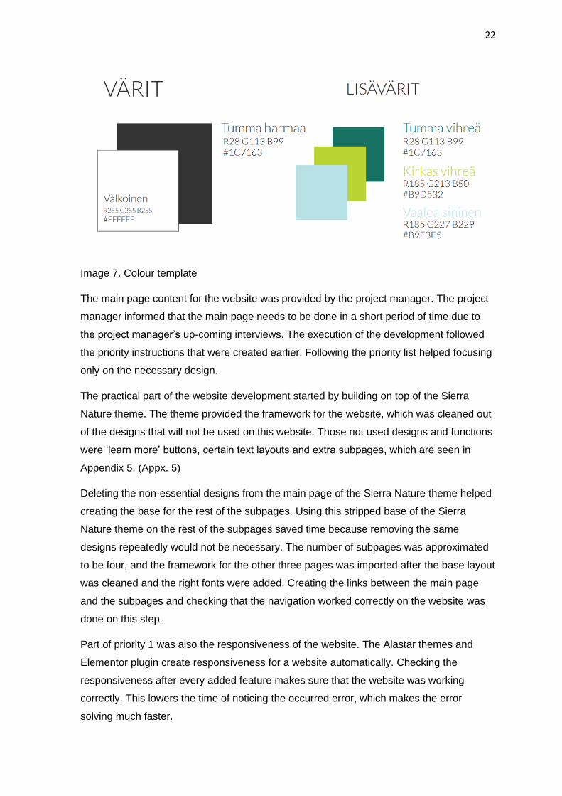
The multidisciplinary expertise that LAB was able to provide by enabling the use of a logo
designer and photographer to produce professional material for the website was a
valuable support for this project. Due to the knowledge of the logo designer’s colour
understanding, and aesthetic reasons, the website followed the instructions of the colour
template the designer made. The colour template had two primary colours and three
additional colours which are seen in Image 7. The primary colours are used in the overall
appearance of the website, and the additional colours were used to highlight smaller
features such as headers. The background and the rest of the photo material was taken
by the professional photographer. The photos were used in another project, but the
material met the quality standards which were set for the website.
22
Image 7. Colour template
The main page content for the website was provided by the project manager. The project
manager informed that the main page needs to be done in a short period of time due to
the project manager’s up-coming interviews. The execution of the development followed
the priority instructions that were created earlier. Following the priority list helped focusing
only on the necessary design.
The practical part of the website development started by building on top of the Sierra
Nature theme. The theme provided the framework for the website, which was cleaned out
of the designs that will not be used on this website. Those not used designs and functions
were ‘learn more’ buttons, certain text layouts and extra subpages, which are seen in
Appendix 5. (Appx. 5)
Deleting the non-essential designs from the main page of the Sierra Nature theme helped
creating the base for the rest of the subpages. Using this stripped base of the Sierra
Nature theme on the rest of the subpages saved time because removing the same
designs repeatedly would not be necessary. The number of subpages was approximated
to be four, and the framework for the other three pages was imported after the base layout
was cleaned and the right fonts were added. Creating the links between the main page
and the subpages and checking that the navigation worked correctly on the website was
done on this step.
Part of priority 1 was also the responsiveness of the website. The Alastar themes and
Elementor plugin create responsiveness for a website automatically. Checking the
responsiveness after every added feature makes sure that the website was working
correctly. This lowers the time of noticing the occurred error, which makes the error
solving much faster.
23
Fixing line spacing of the font and adding the right colours to make it follow the colour
template which was set earlier is part of priority 2. Making sure that the menus, text
content areas and contact information area were readable all over the website was part of
this step.
The next step was to choose the background photos from the photobank and to
implement them onto the website and change the contrast between the text and the
photos. Changing the text box layouts to align better with the content on the website and
adding more photos to the main page to demonstrate the upcoming projects was part of
this step. One incorrectly scaling feature was noticed during this step. The error occurred
when using the Firefox browser on windowed mode. The Firefox browser displayed a gray
bar underneath the background photo on the main page. Rescaling the background photo
solved the error.
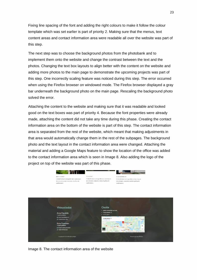
Attaching the content to the website and making sure that it was readable and looked
good on the text boxes was part of priority 4. Because the font properties were already
made, attaching the content did not take any time during this phase. Creating the contact
information area on the bottom of the website is part of this step. The contact information
area is separated from the rest of the website, which meant that making adjustments in
that area would automatically change them in the rest of the subpages. The background
photo and the text layout in the contact information area were changed. Attaching the
material and adding a Google Maps feature to show the location of the office was added
to the contact information area which is seen in Image 8. Also adding the logo of the
project on top of the website was part of this phase.
Image 8. The contact information area of the website
24
At this point, the website development was done to the point where it needed the rest of
the content. The website appearance could not be finished due to not knowing which kind
of format the content was going to be displayed in. The project manager was planning
with other stakeholders of the project to add an additional blog page or/and a list of
downloadable PDF files to the website, but the plans were not finalized. The website
development was frozen until the plans were realized.
The project manager decided to terminate the website due to lack of displayable content
and the incoherence of the domain name. The project did not directly refer to the name of
the domain and was for this reason seen as a misleading name. The domain name should
have been changed to be more suitable for the project. The work that would have gone to
changing the domain was considered too time-consuming to implement.
The details of the project were attached to the website of LAB university of Applied
Sciences as a subdomain and sharing information on the remaining parts of the project
was decided to be done via other routes. The website was deleted, and the domain was
released.
25
7 CONCLUSIONS
UXD principles can be used in every field to provide a more satisfying experience with the
product, system or service. The less the product, system or service has user interface, the
more focus goes to understanding the non-functional requirements of the project. This
means that the UXD is still part of the designing process even if there is no UI. Developing
extensive knowledge of the requirements and making the documentation readable for
every party involved in the project might help solve or foresee upcoming problems.
Researching alternative solutions and creating conclusions based on that research can
solve problems before they occur. Keeping a multidisciplinary development team involved
in the design process and asking their opinion on the design solutions might expose
occurring errors or/and new requirements.
In practice, the UXD implementation manifests itself in avoiding errors as much as
possible. A lot of the work is put into understanding the concept so that the practical
development of the product, system or service can be done smoothly. In this website
project, the outcome of the usage research worked as a guideline for the website
development. Without usage research, the website layout could have been incomplete,
and it would have been a matter of luck that the product meets the users’ requirements for
the website. Visually UXD can be seen in website development as making the contrast
between the text and the background more obvious. This improves the accessibility of the
website.
As stated earlier, the thesis focused on creating the website for the Maallemuuttajat 2030
Project and did not take part in other areas of the project. The thesis is a great example of
what happens when UX is considered and what happens if the UX design is left without
attention. The process of creating the website seems complicated and time consuming,
but in reality the overall sketches are fast and cheap to make. Creating the website
without having to think about the design aspects or tools and overall measurements of the
website helps in building the basic framework for the website quickly.
When the UX is not considered, it is hard to see the overall view of the project. It is a
matter of luck whether the project will meet the requirements or reach the end of the
design cycle. In this case, the research of the project requirements was left to little or no
attention, which drove the website to not be used in the project due to lack of displayable
content. This could have been avoided if the project documentations had been made
understandable for every stakeholder involved.
26
LIST OF REFERENCES
AJ&Smart. 2019. What Is UX Design? - A Full Overview. Video [accessed 27 Feb 2020].
Available at: https://www.youtube.com/watch?v=SRec90j6lTY
Allabraton, R. 2019. What Is The UX Design Process? A Complete, Actionable Guide.
[accessed 6 Nov 2019]. Available at: https://careerfoundry.com/en/blog/ux-design/the-ux-
design-process-an-actionable-guide-to-your-first-job-in-ux/
Arhipova, A. 2020. 7 Key Motives to Invest Time and Effort in UX for Digital Product.
[accessed 6 Nov 2019]. Available at: https://tubikstudio.com/7-key-motives-to-invest-time-
and-effort-in-ux-for-digital-product/
Austin, C. 2019. The Business Value of UX Design [Infographic]. [accessed 6 Nov 2019].
Available at: https://www.impactbnd.com/blog/the-business-value-of-ux-design
Batagoda, M. 2018. How I am managing six design projects at the same time. [accessed
13 Mar 2020]. Available at: https://uxdesign.cc/how-i-am-managing-6-projects-at-the-
same-time-405cf7649f82
Business Analysis Excellence Pty Ltd. 2015. Four Main Activities Requirements
Engineering - Requirements, Stakeholders & Key Activities. Video [accessed 11 Nov
2019]. Available at: https://www.youtube.com/watch?v=UvZVBayVjQY
Cao, J. 2018. The Beginner’s Guide to Capturing UX Requirements. [accessed 13 Mar
2020]. Available at: https://www.uxpin.com/studio/blog/the-beginners-guide-to-capturing-
ux-requirements/
Clouting, L. 2018. THE FACTORIES THAT FED THE FRONT IN THE FIRST WORLD
WAR. [accessed 13 Mar 2020]. Available at: https://www.iwm.org.uk/history/the-factories-
that-fed-the-front-in-the-first-world-war
CrashCourse. 2014. Cognition - How Your Mind Can Amaze and Betray You: Crash
Course Psychology #15. Video [accessed 11 Nov 2019]. Available at:
https://www.youtube.com/watch?v=R-sVnmmw6WY
Dey, A. 2010. The 5 Es of content usability. [accessed 9 Mar 2020]. Available at:
https://4syllables.com.au/articles/5es-content-usability/
ErgoU. 2006. Ergonomics in Ancient Greece. [accessed 12 Dec 2020]. Available at:
http://ergou.simor.ntua.gr/research/ancientGreece/AncientGreece.htm
27
Essex, E. 2019. Designing a Future of Innovative UX, Without UI. [accessed 13 Mar
2020]. Available at: https://devops.com/designing-a-future-of-innovative-ux-without-ui/
Farrell, S. 2015. How Iterative Testing Decreased Support Calls By 70% on Mozilla's
Support Website. [accessed 13 Mar 2020]. Available at:
https://www.nngroup.com/articles/testing-decreased-support/
FIAM. 2020. Tulokset. [accessed 13 Mar 2020]. Available at: https://fiam.fi/tulokset/
Firesmith, D. 2004. Prioritizing Requirements. 35-47. [accessed 13 Mar 2020]. Available
at: http://www.jot.fm/issues/issue_2004_09/column4.pdf
Gallello, C. 2014. Low cost usability testing. [accessed 11 Nov 2019]. Available at:
https://medium.com/@cgallello/low-cost-usability-testing-61b5f8a2a1be
GeeksforGeeks. 2020. Software Engineering | Requirements Engineering Process.
[accessed 13 Mar 2020]. Available at: https://www.geeksforgeeks.org/software-
engineering-requirements-engineering-process/
Grammarist. 2020. The customer is always right. [accessed 13 Mar 2020]. Available at:
https://grammarist.com/phrase/the-customer-is-always-right/
Greever, T. 2014. How a UX Designer Saves You Time and Money in Development.
[accessed 6 Nov 2019]. Available at: https://www.bitovi.com/blog/how-a-ux-designer-
saves-you-time-and-money-in-development
Hartman, M. 2020. [Intro guide] The ROI of UX. [accessed 6 Nov 2019]. Available at:
https://www.uxbeginner.com/roi-ux-intro-guide/
Interaction Design Foundation. 2019a. User Centered Design. [accessed 6 Nov 2019].
Available at: https://www.interaction-design.org/literature/topics/user-centered-design
Interaction Design Foundation. 2019b. User Experience (UX) Design. [accessed 6 Nov
2019]. Available at: https://www.interaction-design.org/literature/topics/ux-design
Interaction Design Foundation. 2020c. User Interface (UI) Design. [accessed 13 Mar
2020]. Available at: https://www.interaction-design.org/literature/topics/ui-design
ISO. 2018a. ISO 9241-11:2018 (en) Ergonomics of human-system interaction — Part 11:
Usability: Definitions and concepts. [accessed 9 Mar 2020]. Available at:
https://www.iso.org/obp/ui/#iso:std:iso:9241:-11:ed-2:v1:en
28
ISO. 2019b. ISO 9241-210:2019. Ergonomics of human-system interaction — Part 210:
Human-centred design for interactive systems. [accessed 13 Mar 2020]. Available at:
https://www.iso.org/standard/77520.html
Jerow, E. HOW UX DESIGN SAVES TIME AND MONEY. [accessed 6 Nov 2019].
Available at: https://www.hansondodge.com/blog/2017/november/how-ux-design-saves-
time-and-money/
Karlson, K. 2020. 3 Methods to Set Priorities (That Actually Work). [accessed 13 Mar
2020]. Available at: https://www.scoro.com/blog/how-to-set-priorities-guide/
Komninos, A. 2020. An Introduction to Usability. [accessed 9 Mar 2020]. Available at:
https://www.interaction-design.org/literature/article/an-introduction-to-usability
Kwiatek, K. 2019. UX PRINCIPLES: CONSTRAINTS, DISCOVERABILITY, FEEDBACK,
AND MORE. [accessed 13 Mar 2020]. Available at: https://www.zivtech.com/blog/ux-
principles-constraints-discoverability-feedback-and-more
Laakso, S. & Loikkanen, H. 2018. Kaupungistuminen – viimeaikainen ilmiö vai pitkään
jatkunut kehityskulku? [accessed 13 Mar 2020]. Available at:
https://www.kvartti.fi/fi/artikkelit/kaupungistuminen-viimeaikainen-ilmio-vai-pitkaan-
jatkunut-kehityskulku
Margot, A. 2019. Cognitive psychology in UX design: Minimising the cognitive load.
[accessed 14 Mar 2020]. Available at: https://medium.com/design-signals/cognitive-
psychology-in-ux-minimising-the-cognitive-load-d97ad8e3115b
McGee, L. & Patel, S. 2009. A Cautionary Tale of Inaccessibility: Sydney Olympics
Website. [accessed 13 Mar 2020]. Available at: https://www.w3.org/WAI/business-
case/archive/socog-case-study
McLeod, S. 2015. Cognitive Psychology. [accessed 12 Dec 2019]. Available at:
https://www.simplypsychology.org/cognitive.html
Morovián, L. 2019. UX Storyboard Creation: A Complete Guide For Beginners. [accessed
11 Nov 2019]. Available at: https://uxstudioteam.com/ux-blog/ux-storyboard/
Nielsen, J. 2012a. How Many Test Users in a Usability Study? [accessed 13 Mar 2020].
Available at: https://www.nngroup.com/articles/how-many-test-users/
Nielsen, J. 2012b. Usability 101: Introduction to Usability. [accessed 6 Nov 2019].
Available at: https://www.nngroup.com/articles/usability-101-introduction-to-usability/
29
Nielsen, J. & Norman, D. 2020. The Definition of User Experience (UX). [accessed 6 Nov
2019]. Available at: https://www.nngroup.com/articles/definition-user-experience/
Nuseibeh, B. & Easterbrook, S. 2000. Requirements Engineering: A Roadmap. 35-46.
[accessed 13 Mar 2020]. Available at: http://mcs.open.ac.uk/ban25/papers/sotar.re.pdf
PMC Lounge. 2018. Functional and Non-functional Requirements | What is the difference
between the two? Video [accessed 14 Mar 2020]. Available at:
https://www.youtube.com/watch?v=j4WITZFLkUM
Quesenbery, W. 2004. Balancing the 5Es: Usability. 4-11 [accessed 9 Mar 2020].
Available at: http://www.whitneyquesenbery.com/articles/5es-citj0204.pdf
Rodriguez, L. 2017. Cognitive psychology as part of integrated UX Design process.
[accessed 13 Mar 2020] Available at: https://www.userzoom.com/blog/cognitive-
psychology-as-part-of-an-integrated-ux-design-process/
Rouse, M. 2020. User interface (UI). [accessed 13 Mar 2020]. Available at:
https://searchapparchitecture.techtarget.com/definition/user-interface-UI
Rowe, S. 2014. Labor. [accessed 13 Mar 2020]. Available at: https://encyclopedia.1914-
1918-online.net/article/labor
Saavutettavissa.fi. 2019. WCAG [accessed 12 Dec 2019]. Available at:
https://www.saavutettavasti.fi/tietoa-saavutettavuudesta/wcag/
Saavutettavuusdirektiivi.fi. 2019. WCAG [accessed 12 Dec 2019]. Available at:
https://saavutettavuusdirektiivi.fi/saavutettavuus-verkkopalveluissa/
Sahasrabuddhe, R. 2018. Non-Functional Requirements (NFRs): The Unsung Heroes.
[accessed 14 Mar 2020]. Available at: https://www.dotnetcurry.com/project-
management/1462/non-functional-requirements-nfrs
Sanguinetti, M. 2017. User experience design saves you time & money [accessed 6 Nov
2019]. Available at: https://blog.uruit.com/good-user-experience-saves-time/
Schedlbauer, M. 2020. Requirements Prioritization Strategies. [accessed 13 Mar 2020].
Available at: https://www.projecttimes.com/articles/requirements-prioritization-
strategies.html
Schwarz, D. 2017. 4 Examples of Invisible UI to Boost UX Behind the Scenes. [accessed
13 Mar 2020]. Available at: https://www.sitepoint.com/invisible-ui-boost-ux-behind-the-
scenes/
30
SemWebQuality.org. 2020. Create Data Requirements. [accessed 13 Mar 2020].
Available at:
http://semwebquality.org/mediawiki/index.php?title=Create_Data_Requirements
Shneiderman, B. 2005. Designing the user interface. 74-76. [accessed 6 Nov 2019].
Available at: http://compfo.com/news/wp-content/uploads/2017/09/Designing-the-User-
Interface_-Strategies-for-Effective-Human-Computer-Interaction4th-Edition-Ben-
Shneiderman-Catherine-Plaisant-Addison-Wesley-2004.pdf
Srivastava, A. 2017. Functional Vs Non Functional Requirements | Business Analyst Tuto-
rial | Techcanvass. Video [accessed 14 Mar 2020]. Available at:
https://www.youtube.com/watch?v=kJ3PlGJXFGo
Statista. 2020. Percentage of mobile device website traffic worldwide from 1st quarter
2015 to 4th quarter 2019. [accessed 11 Nov 2019].
https://www.statista.com/statistics/277125/share-of-website-traffic-coming-from-mobile-
devices/
Stevens, E. 2019. The Fascinating History of UX Design: A Definitive Timeline. [accessed
6 Nov 2019]. Available at: https://careerfoundry.com/en/blog/ux-design/the-fascinating-
history-of-ux-design-a-definitive-timeline/
They Make Design. 2019. What is UI design? What is UX design? UI vs UX: What’s the
difference. [accessed 20 Feb 2020]. Available at: https://uxplanet.org/what-is-ui-vs-ux-
design-and-the-difference-d9113f6612de
THL. 2016. Vammaisia on työikäisistä suomalaisista 7 tai 29 prosenttia. [accessed 12 Dec
2019]. Available at: https://blogi.thl.fi/vammaisia-on-tyoikaisista-suomalaisista-7-tai-29-
prosenttia/
UX Booth. 2013. Where UX Comes From. [accessed 23 Feb 2020]. Available at:
https://www.uxbooth.com/articles/where-ux-comes-from/
UXBEGINNER.COM. 2020. How to Navigate the Ocean of UX Job Titles. [accessed 14
Apr 2020]. Available at: https://www.uxbeginner.com/how-to-navigate-the-ocean-of-ux-job-
titles/
UXteam. 2020. Every Dollar Invested In Ease Of Use Returns $10 To $100. [accessed 6
Nov 2019]. Available at: https://www.uxteam.com/blog/every-dollar-invested-in-ease-of-
use-returns-10-to-100-dollars/
31
Web Accessibility Wizard. 2020. System Centered vs.Customer Centered Design
[accessed 13 Mar 2020]. Available at: https://hci.cs.siue.edu/NSF/Files/Semester/Week1-
2/PPT-Text/Slide8.html
Wong, E. 2020. Shneiderman’s Eight Golden Rules Will Help You Design Better
Interfaces. [accessed 13 Mar 2020]. Available at: https://www.interaction-
design.org/literature/article/shneiderman-s-eight-golden-rules-will-help-you-design-better-
interfaces
WQusability. 2019. Using the 5Es to understand users. [accessed 9 Mar 2020]. Available
at: https://www.wqusability.com/articles/getting-started.html
Writingexplained.org. 2020. What Does The Customer is Always Right Mean?. [accessed
13 Mar 2020]. Available at: https://writingexplained.org/idiom-dictionary/the-customer-is-
always-right
Image 1. Interaction foundation design. [accessed 13 Mar 2020]. Available at:
https://www.interaction-design.org/literature/topics/user-centered-design
Image 2. Balancing the 5Es: Usability. [accessed 13 Mar 2020]. Available at:
http://www.whitneyquesenbery.com/articles/5es-citj0204.pdf
Image 3. Color blindness: how to design an accessible user interface. [accessed 13 Mar
2020]. Available at: https://uxdesign.cc/color-blindness-in-user-interfaces-66c27331b858
32
APPENDICES
Appendix 1: First paper sketch, layout of the site.
33
Appendix 2: Functionalities sketch
34
Appendix 3: Phone sketch.
35
Appendix 4: Interactive prototype created using Figma.
36
Appendix 5: Alastar and Elementor test page.
37
Appendix 6: Main page of the website.
38
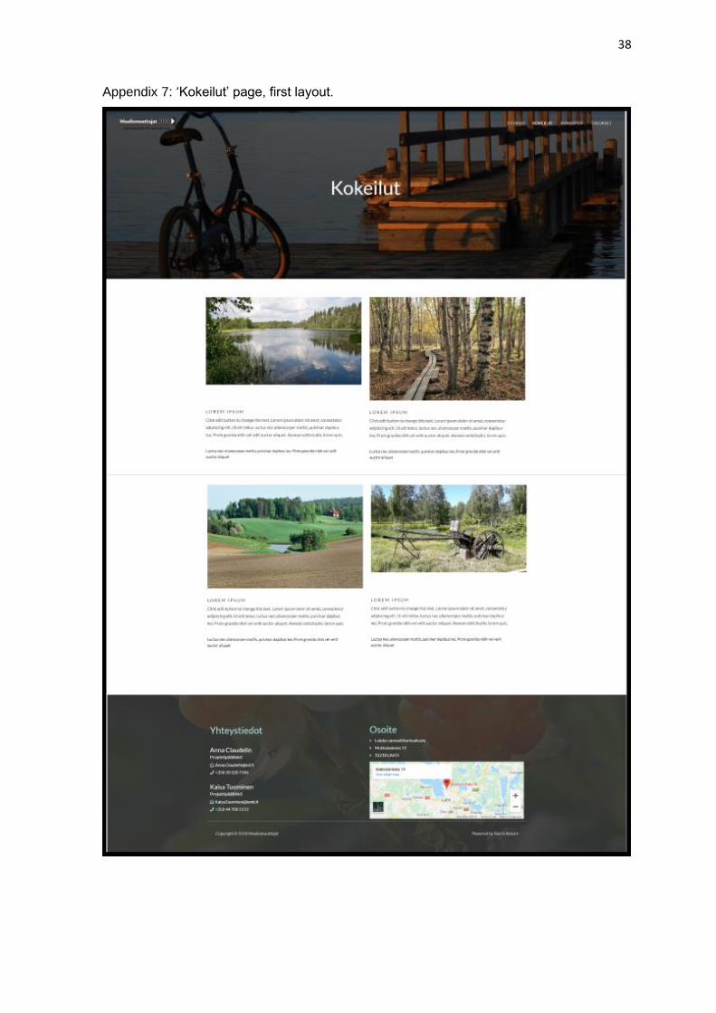
Appendix 7: ‘Kokeilut’ page, first layout.
39
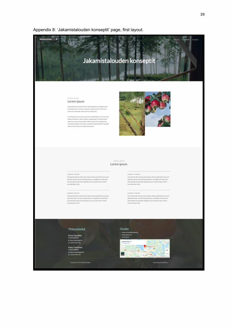
Appendix 8: ‘Jakamistalouden konseptit’ page, first layout.
40
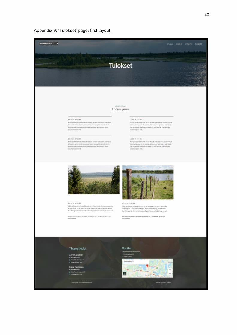
Appendix 9: ‘Tulokset’ page, first layout.