nicole macura, s9626
DESCRIPTION
skład interaktywny - angTRANSCRIPT

Nicole Macura Sztuka Nowych Mediów
Rok 2011/2012 s9626

3
Moving types – letters in motion.a retrospective of typographyin film from the early days.
Media ExhibitionGutenberg-Museum, Mainz, GermanyAnja Stöffler, Ralf Dringenberg
The exhibition is taking place against an exciting historical backdrop. The capability to reproduce written texts, which had previously been the province of scribes and copyists, was accelerated throughJohannes Gutenberg’s invention of book printing, among other factors. Accompanying developments included the humanization of knowledge with the beginnings of an educational system, andfollowed the publication of pamphlets and newspapers and debates about values in society (to name but a few aspects) and so on.
Among other examples, semantic aspects are found in the entertaining children’s film “The Many Adventures of Winnie the Pooh,” the Disney classic produced in 1977. Here the typeface is animated in a rather conventional manner. The little bear jumps from side to side, leapfrogs with the typography; letters waft away like dry leaves or fall like raindrops and interact with Winnie.
In 1893, with the invention of motion pictures – about 450 years after Johannes Gutenberg –animated letters exploited the technical possibilities to conquer the script environment. Letters became three-dimensional and dynamic. Letters could act, and transcendedthe static medium. They were capable of demonstrat-ing physical processes, of evaporating, dissolving to liquid or chronologically illustrating “human traits.”
The “Moving Types” exhibit is a retrospective of moving typography and reflects aesthetic, media-cultural and media-technical developments. What began as static representations of informationon the title and dialog slides of the silent picture era has veritably developed into “living typography.” The integration of the dimension of time makes it possible to steer the viewer’s attention by controlling the flow of reading, thereby facilitating the communication ofadditional information or the addition of an interactive aspect, as well as referring to specific meta-levels or connotations in combination with sound.
Our goal is to demonstrate this evolutionary process, present the current state of affairs and illuminate potential future applications of animated typography. The center of our attention is the manipulationof the temporal dimension of typography, according to the following aspects:
1. Technological innovation2. Formal-aesthetic, methodic dimension3. Concepts regarding content

The Cabinet of Dr. Caligari (1920)
Kyle Cooper Seven (1995)
Technical inventions and their consequences for de-sign e.g. the procedure used to reproduce films in the early 20th century (e.g. Pfarrers Töchterlein, 1912), developments in the area of computer technology e.g. 3D (opening titles from Superman from 1977) or motion tracking (opening titles “Stranger than Fiction” from 2006), current stereoscopic developments (as in the closing titles of the movie “The Green Hornet” from 2011) and installations conceivedfor specific spaces – to name just a few aspects.
Technological innovation
This refers to the overall use of syntactical design pa-rameters, e.g. typography superimposed on an image or integrated into an image e.g. using masking tech-nology, or typography that itself is transformed into an image. Successful design makes itself obvious bymeans of distinctive application of design parameters such as form (shape), color, movement etc. – in other words, a visually consistent method that avoids arbitrariness. A fine example is “Arte Info”: Thetypeface and size demonstrate consistency, the movement is oriented on the geometry and perspec-tive of the images, the dramaturgical principle pursues the “Panta Rei” – “never stand still” as an inevitablecontinuum. No interleaving, but a continual flow of occurrences in real time.
Formal-aesthetic, methodic dimensionThis refers to contextual conception aspects such as Kyle Cooper’s title sequence for the film »Seven« from the year 1995. The visual and typographical aesthetic is characterized by sporadically overlapping and sometimes hard-to-decipher letters and words. Fast cuts and subtle macro shots suggest the theme of the detective story, or the typography in the silent film “The Cabinet of Dr. Caligari” from 1920.The typography underscores the muddled character of the Doctor in the spatial dimension. The “artists against piracy” commercials are another fine exam-ple. The type dances to the music and at the same time elucidates the creative process used by artists – namely composers. Semantic aspects are also seen in Winnie the Pooh and in the educational movie “Lisa’s World.” A child explains complex political contexts using “very simplified” terms in the style ofchildren’s stories.
Concepts regarding content
5
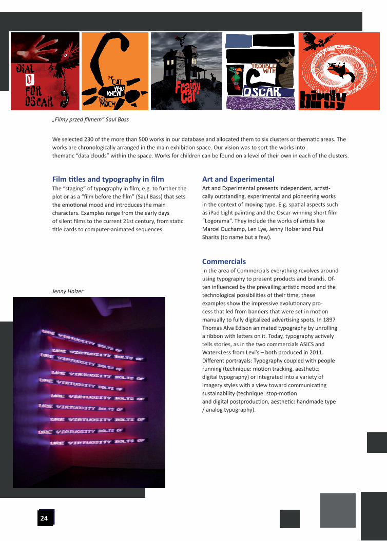
„Filmy przed filmem” Saul Bass
Jenny Holzer
We selected 230 of the more than 500 works in our database and allocated them to six clusters or thematic areas. The works are chronologically arranged in the main exhibition space. Our vision was to sort the works into thematic “data clouds” within the space. Works for children can be found on a level of their own in each of the clusters.
The “staging” of typography in film, e.g. to further the plot or as a “film before the film” (Saul Bass) that sets the emotional mood and introduces the main characters. Examples range from the early daysof silent films to the current 21st century, from static title cards to computer-animated sequences.
Film titles and typography in filmArt and Experimental presents independent, artisti-cally outstanding, experimental and pioneering works in the context of moving type. E.g. spatial aspects such as iPad Light painting and the Oscar-winning short film “Logorama”. They include the works of artists like Marcel Duchamp, Len Lye, Jenny Holzer and Paul Sharits (to name but a few).
Art and Experimental
In the area of Commercials everything revolves around using typography to present products and brands. Of-ten influenced by the prevailing artistic mood and the technological possibilities of their time, these examples show the impressive evolutionary pro-cess that led from banners that were set in motion manually to fully digitalized advertising spots. In 1897 Thomas Alva Edison animated typography by unrolling a ribbon with letters on it. Today, typography actively tells stories, as in the two commercials ASICS and Water<Less from Levi’s – both produced in 2011. Different portrayals: Typography coupled with people running (technique: motion tracking, aesthetic:digital typography) or integrated into a variety of imagery styles with a view toward communicating sustainability (technique: stop-motionand digital postproduction, aesthetic: handmade type / analog typography).
Commercials

„filmy przed filmem” Saul Bass
From Bob Dylan to Björk, moving type often plays a central role in musical “video clips.” Typography visualized lyrics, underscores the message of a song or creates, as in Alex Gopher’s “The Child,” an entire urban environment using New York as an example.
Music Videos
Corporate Motion unites the broad segment of TV-Design, from Station IDs to program credits like those for “Dr. Who” (BBC), which has advanced to the level of a classic of media history.
Corporate Motion
In spite of the media-technical evolution it has undergone, typography still serves to communicate content. This is particularly evident in this section. We present examples that visually demonstrate complex processes, facts or data so they can be easilycomprehended by the viewer.
Information Graphics
In the past two decades, thanks to the increasing availability of production materials and deregulation of media channels, time-based design has grown dramatically. Against this backdrop we started interviewing international designers about their artistic outlooks and work methods. Some of these filmed interviews are included in the exhibit. We are always interested in the people behind the artistic ef-forts, in their ideas and concepts as well as their tech-nical implementation. Inspired by traditional Chinese water calligraphy, Gundela Kleinholdermann uses a sponge on a broomstick to write out a poem – right on the pavement of Seilergasse street in front of the mu-seum. The temporal process of writing in the spatial dimension, along with the dissolution of the writing through natural processes such as wind, water and air call attention to the “ephemeral” context of the work and the poem by Oda Schäfer. You have to find the right moment in time, as it were, then take the time to read what is written – before it disappears. In contrast, the work by Parisian design agency H5 and the team around Ludovic Houplain. The short film “Logorama,” which won an Oscar in 2009, plays with logos and
Interviews with designers
brand design to create a 3D “brand architecture” based on the city of Los Angeles. The use of familiar logos and the way they are integrated into the urban landscape is subtle, and furthers the plot, culminatingin the end of the world due to an earthquake. These two examples demonstrate the broad range of the exhibited works, but also how the job description of the profession has expanded as the media andtechnology have developed.
7
The concept behind the exhibition
Media façadeThe subject of the exhibition announces itself on the outside of the museum building. Passers-by and exhibition visitors can send text messages that appear on the building’s façade. They are digitally encoded and move across the façade in the form of pulsating LED pixels before becoming legible on the bridge that connects the two parts of the museum building. This makes the exterior façade itself part of the exhibition. Motion sensors outside and inside the buildingchange the color or appearance of the typography in response to the movements made by people passing by. Our ambition was not only to make the subject visually manifest in a public space, but also to enable people to participate in the exhibition by contributing messages of their own. Our experience has shown that the concept works very well. The media façade is an emblematic presentation of the subject of ani-mated typography in the 21st century.
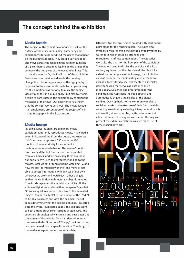
Media lounge“Moving Types” is an interdisciplinary media exhibition. It not only reproduces media, it is a media event in its own right. From the outset, we knew we didn’t just want to present 230 works on 230monitors. It was a priority for us to depict contemporary media behavior. The screen/monitor has traversed the last few meters that separated it from our bodies, and we now carry them around in our pockets. We used to get together and go to the movies, later we sat around at home watching TV, and now we are “permanently online” and more or less able to access information with devices of our ownwherever we are – and watch each other doing it.Within the exhibition architecture, cubes illuminated from inside represent the individual exhibits. All the exits are digitally encoded within the space. So-called QR codes, quick response codes, link to the animated images. You need a tablet PC (an edition of the iPad 2)to be able to access and view the exhibits. The QR codes determine what the exhibit looks like. Projected onto the white, illuminated cubes, the exhibits seem to float among curvy constructions of steel wire. The cubes are chronologically arranged and bear dates and the names of the exhibits for easy orientation. As is the case with the “Internet of Things,” the information can be accessed from a specific location. The design of the media lounge is reminiscent of a rotated
QR code. And the protrusions painted with blackboard paint stand for the missing pixels. The cubes also symbolically call to mind the movable type invented by Gutenberg, which could be arranged andrearranged in infinite combinations. The QR codes were also the basis for the floor plan of the exhibition.The medium used to display the exhibits is the 21st century equivalent of the blackboard: the iPad. Like virtually no other piece of technology, it exploits the current potential for manipulating media. iPads are available for visitors to use. They feature a speciallydeveloped App that serves as a scanner and a medialibary. Designed and programmed for the exhibition, the App reads the code directly and automatically triggers the display of the digital exhibits. Our App harks to the community feeling of social networks and makes use of their functionalities: collecting – evaluating – sharing. Many networks such as LinkedIn, vimeo, youtube, twitter – to name just a few – influence the way we use media. The way wepresent the exhibits recalls the way we make use of these (social) networks.
Sharing AeraIn a special section of the exhibition –the “sharing area” – it’s possible to “publish” content by project-ing it onto a large screen. This “sharing area” pays tribute to contemporary media technology while at the same time encouraging visitors to reflect on their own media habits. Selected QR codes be loaded into the sharing station from visitors’ individual iPads. The projector immediately plays the exhibits. In addition to the sharing area, the exhibition demonstrates the historical evolution of media. To do so we broughttogether tremendous technical achievements. The result is a concise representation of the history of media-technological development. Digital picture frames create a timeline that lets visitors track theprogress made.
Sustainability: Website & Me-dia Library, Media CatalogWe print out an individual QR code for the visitors after they have experienced the exhibition. It contains a code number that lets them access Medialibary on our website www.moving-types.com.There they can again watch all the film exhibits for which we were able to acquire online rights. The cata-log is based on the same idea. More than 80 works can be accessed via QR tag and displayed on individual smartphones or tablets (Apple or Android) usinga specially programmed App. This makes the printed catalog a “cinema.” In some cases, the students who designed and created the QR tags were inspired to do so in the style of the works they refer to. The scanners are capable of reading even inverted tags or tags withdistorted perspective. Catalog: www.moving-types.de/katalog.html
University of Applied Sciences, Media-Design, Mainz,Germany
Anja Stöffler,
University of Design, Schwäbisch Gmünd,Germany
Ralf Dringenberg,
Both doing work in the area of “animated typography” for many years – as designers, researchers and instructors. Over the years, our research collabora-tion on the topic of time as a parameter of design has resulted in what has become a quite substantial collec-tion containing more than 500 international, aestheti-cally or technically outstanding, typographical works. As the archive grew, so did our idea to put together a retrospective exhibition on the subject. This
ultimately resulted in the current exhibition project “Moving Types – Letters in Motion” at the Gutenberg Museum in Mainz, with the support of the “City of Science” initiative. Conceived as a touring exhibition, it will remain in Mainz until April 22 in 2012 beforemoving to the Galery in the Museum Prediger in Schwäbisch Gmünd. Coordination work is underway with additional venues in France, the Netherlands and Poland.