ncc css - final report part 2- data analysis - final -...
TRANSCRIPT
© Commonwealth Telecommunications Organisation
Nigeria Consumer Satisfaction Survey Final Report Final Report Part 2: Data Analysis
For
Nigeria Communications Commission (NCC)
Submitted by
NCC Consumer Satisfaction Survey (NCC CSS) Team: Commonwealth Telecommunications Organisation (CTO)
Decision Support Consulting Ltd Telecom Advisory Services (TAS) Ltd
Seals Consultants Ltd
November 2012
This Report is a formal deliverable for the Nigerian Nationwide Consumer Satisfaction Survey Project. It is the second part of the final deliverable for the project, which called for the CTO and Partners, Seals Ltd, Telecom Advisory Services and Decision Support (the NCC CSS team) to work with the NCC’s Consumer Affairs Bureau to survey 50,000 Nigerian ICT users, analyse the results and provide a final report to the NCC. The project also calls on the NCC CSS team develop a Consumer Satisfaction Index that the NCC will use to record and assess levels of consumer satisfaction. This report should be read with the Final Report Part 1: Overview, as it presents the full analysis, including the disaggregation by demographic descriptors that are not found in the Overview report.
Nigeria Consumer Satisfaction Survey Final Report Final Report Part 2: Data Analysis
Page | i
Table of Contents
Acknowledgements ........................................................................................................................ 1
About the NCC Consumer Affairs Bureau ........................................................................................ 1
Roles and Responsiblities of the The NCC Customer Satisfaction ..................................................... 2
Survey Team ................................................................................................................................... 2
Introduction .................................................................................................................................... 4
1. Background ............................................................................................................................. 6
2. Methodology ........................................................................................................................... 6
2.1. Survey approach .................................................................................................................................... 6
2.2. Weighting .............................................................................................................................................. 7 2.2.1. Purpose ........................................................................................................................................ 7 2.2.2. Calculating weights ...................................................................................................................... 7
2.3. Analysis ............................................................................................................................................... 10
2.4. Composite Customer Satisfaction Index .............................................................................................. 11 2.4.1. Description of approach ............................................................................................................. 11 2.4.2. Scoring ........................................................................................................................................ 12 2.4.3. Constructing indices -‐ Mobile ..................................................................................................... 12 2.4.4. Constructing indices – Fixed ....................................................................................................... 16 2.4.5. Constructing Indices – Public Access .......................................................................................... 18 2.4.6. Constructing indices – Internet .................................................................................................. 20
3. Survey Design ........................................................................................................................ 23
3.1. Questionnaire Design .......................................................................................................................... 23
3.2. Sampling design .................................................................................................................................. 26
4. Data Sets ............................................................................................................................... 27
4.1. Number of Valid Records ..................................................................................................................... 27
4.2. Geographical Distribution of Samples ................................................................................................. 28
4.3. Distribution of Samples by Demographics .......................................................................................... 29
4.4. Telecommunications Services Used ..................................................................................................... 31
5. Mobile Phones ...................................................................................................................... 32

Nigeria Consumer Satisfaction Survey Final Report Final Report Part 2: Data Analysis
Page | ii
5.1. Survey Data ......................................................................................................................................... 32 5.1.1. Descriptors -‐ Mobile ................................................................................................................... 32 5.1.2. Views on voice calling -‐ Mobile .................................................................................................. 34 5.1.3. Network reliability -‐ Mobile ....................................................................................................... 39 5.1.4. Views on SMS ............................................................................................................................. 42 5.1.5. Views on Value Added Services .................................................................................................. 45 5.1.6. Recharge Service (pre-‐paid accounts) ........................................................................................ 48 5.1.7. Complaints Handling -‐ Mobile .................................................................................................... 52 5.1.8. Key Satisfaction Indicators -‐ Mobile ........................................................................................... 57 5.1.9. Summary of Scores -‐ Mobile ...................................................................................................... 62
5.2. Customer Satisfaction Index ................................................................................................................ 63 5.2.1. Calculating Customer Satisfaction Index (CSI) -‐ Mobile ............................................................. 63 5.2.2. CSI, CCI, Demographics and Phone Use -‐ Mobile ....................................................................... 64
6. Fixed Phones ......................................................................................................................... 67
6.1. Survey Data ......................................................................................................................................... 67 6.1.1. Descriptors -‐ Fixed ...................................................................................................................... 67 6.1.2. Views on Voice Calling -‐ Fixed .................................................................................................... 70 6.1.3. Network Reliability -‐ Fixed ......................................................................................................... 73 6.1.4. Complaints Handling -‐ Fixed ....................................................................................................... 74 6.1.5. Key Satisfaction Indicators -‐ Fixed .............................................................................................. 77 6.1.6. Summary of Scores -‐ Fixed ......................................................................................................... 81
6.2. Customer Satisfaction Index ................................................................................................................ 81 6.2.1. Calculating NCC Customer Satisfaction Index (CSI) -‐ Fixed ......................................................... 81 6.2.2. CSI, CCI and Key Demographics -‐ Fixed ...................................................................................... 82
7. Public Access Phones ............................................................................................................. 83
7.1. Survey Data ......................................................................................................................................... 83 7.1.1. Descriptors – Public access ......................................................................................................... 83 7.1.2. Views on Voice Calling – Public access ....................................................................................... 85 7.1.3. Network reliability – Public access ............................................................................................. 86 7.1.4. Key Satisfaction Indicators – Public access ................................................................................. 88
7.2. Customer Satisfaction Index ................................................................................................................ 91 7.2.1. Calculating NCC Customer Satisfaction Index (CSI) – Public access ........................................... 91 7.2.2. NCC CSI, Demographics and Public phone use – Public access .................................................. 91
8. Internet ................................................................................................................................. 93
8.1. Survey Data ......................................................................................................................................... 93 8.1.1. Descriptors -‐ Internet ................................................................................................................. 93 8.1.2. Views on internet quality ........................................................................................................... 95 8.1.3. Network reliability -‐ Internet ...................................................................................................... 99 8.1.4. Complaints Handling -‐ Internet ................................................................................................ 102 8.1.5. Key Satisfaction indicators -‐ Internet ....................................................................................... 105 8.1.6. Summary of scores -‐ Internet ................................................................................................... 108

Nigeria Consumer Satisfaction Survey Final Report Final Report Part 2: Data Analysis
Page | iii
8.2. Customer Satisfaction Index .............................................................................................................. 109 8.2.1. Calculating NCC Customer Satisfaction Index (CSI) -‐ Internet .................................................. 109 8.2.2. CSI, CCI, Demographics, and Internet characteristics -‐ Internet .............................................. 110
9. Customer Rights .................................................................................................................. 114
9.1. Responses .......................................................................................................................................... 114
9.2. Key Demographics ............................................................................................................................. 118
9.3. Mobile Users ..................................................................................................................................... 119
Annex A Questionnaire .......................................................................................................... 121
Annex B Local Government Areas used for sampling .............................................................. 130

Nigeria Consumer Satisfaction Survey Final Report Final Report Part 2: Data Analysis
Page | 1
Acknowledgements
The NCC CSS team is extremely appreciative of the instrumental role the Nigerian Communications Commission (NCC), most notably the Commission’s Consumer Affairs Bureau (CAB), has played in the successful delivery of this project. In addition to initiating the project and contracting the members of the NCC CSS team, the CAB team has provided guidance and advice throughout the project. The CAB team worked collaboratively with the NCC CSS team, playing key roles in the development of the survey instrument, the design of the sampling framework, as well as the administration and the monitoring of all field work. Its unwavering commitment to the project was evident throughout the process. Indeed, the successful completion of the project would not have been possible without the constant, committed and measured input of the NCC CAB team.
About the NCC Consumer Affairs Bureau
The Nigerian Communications Commission’s Consumer Affairs Bureau (CAB) was created in September 2001. It is charged with the responsibility to protect the rights, privileges and interests of telecommunications consumers. It drives the Commission’s work to ensure that the following expectations of consumers are met: access to robust services; affordability and availability of service; transparent tariff regime; redress when wronged and compensation when wrongly billed/loss of service.
Amongst other things, the CAB strives to empower consumers through awareness programmes; develop policy and regulatory interventions on consumer awareness; facilitate remedial action for dissatisfied consumers; facilitate efficient consumer-operator interactions for complaints management; and collaborate with consumer advocacy groups, among others.
Nigeria Consumer Satisfaction Survey Final Report Final Report Part 2: Data Analysis
Page | 2
Roles and Responsiblities of the The NCC Customer Satisfaction Survey Team
The Commonwealth Telecommunications Organisation (CTO) was contracted as lead consultant and was responsible for the coordination of the survey. The CTO was also responsible for the administration of the survey in the North Central
and North East Geopolitical Zones. The CTO is the oldest and largest Commonwealth organisation in the field of ICTs. With a history dating back to 1901, it brings together Commonwealth & non-Commonwealth governments, regulators, operators, technology providers and civil society organisations, in multi-stakeholder partnerships. www.cto.int Its mission is to promote, facilitate and guide members in using ICTs to deliver effective development interventions and it delivers its mandate through research & consultancies, training, and conferences. The CTO uses its experience and expertise to support members in leveraging ICTs to advance socio-economic development in order to emancipate, enrich, equalise and empower all peoples within the Commonwealth and beyond.
Decision Support Consulting Limited was contracted to administrate the survey in the South West Zone. Decision Support was eh founded in 1997 as an independent professional,
full-service research agency and is based in Nigeria. Established by individuals with extensive experience in the industry and regular exposure to new developments in research, Decision Support combines global learning with local knowledge to build strong Brands across the African market. A full-service research agency with over 12 years experience Decision Support service areas spread across West Africa. Core services are: Consumer Research; Business to Business Research; and Social Research. Decision Support collaborates with well-established and renowned research bodies and aims to continually lead by offering professional research solutions for marketing and social accountability by Clients with interest in Africa.
Nigeria Consumer Satisfaction Survey Final Report Final Report Part 2: Data Analysis
Page | 3
Telecom Advisory Services (TAS) was contracted to administrate the survey in the South South and North West Zones. TAS is the telecommunication consulting firm of choice in
West Africa with its origins in the Netherlands. TAS has grown quite significantly since our arrival in Africa in Q4 2007. The company currently serves many of the largest GSM, CDMA, Wimax and Data service providers in Africa, Middle East and Europe. It offers various services ranging from Strategy to Operational Efficiency, RFP management, business process improvement, research and analysis, surveys, etc. With well seasoned professionals that have over 15 years of experience in the telecommunication industry, we are poised to deliver high quality results using methodologies and techniques that have been tested and proven over time. Telecom Advisory Services Ltd consultants have gained experience in these areas at top telcos and ISPs including Vodafone, KPN, Belgacom, Nortel Networks, Celtel/Zain/Airtel, Mcel, Brasil Telecom, Meditel, MTN, Starcomms, Zoom Mobile, Nokia Siemens, Swift networks, Mobitel, Oduatel, among others. www.telecomadvisory.com.ng
Seals Consultants were contracted to administrate the survey in the South East Zone. Seals Consultants came into being as a subsidiary of Seal Limited which was incorporated in November 1996. With a mission of becoming a foremost financial and management consulting firm within and outside Nigeria, Seals is most diligent, efficient and effective in delivering on its consultancy services which have widened dramatically to
include research, training and human capital development as well as conferences, seminars and workshops. While Chief Cyril Eneh, a retired Federal Permanent Secretary is Chairman of Seals, Mr Onyebuchi Anih is the Managing Consultant.
Nigeria Consumer Satisfaction Survey Final Report Final Report Part 2: Data Analysis
Page | 4
Introduction
This report is the second part of a two-part final deliverable for the Nigerian Consumer Satisfaction Survey Project. It has been prepared by the Commonwealth Telecommuni-cations Organisation (CTO), Decision Support, Telecom Advisory Services and Seals Ltd for the Nigerian Communications Commission (NCC). The project called on the CTO, Decision Support, Telecoms Advisory Services and Seals Consultants Ltd, the NCC CSS team, to survey 50,000 Nigerian ICT users, analyse the data, and report on the results. The Project also called on the NCC CSS team to develop a NCC Consumer Satisfaction Index for the Commission and provide suggestions in respect of how the NCC may improve services and compensation/remedies for consumers. The purpose of this report, Part 2 of the Final Report, is to provide readers with the detailed analysis of the data collected during the survey phase of the project. Indeed, the full analysis within this report includes a disaggregation by demographic descriptors that have not been brought forward into the Overview report. This report also describes in full the methodology used to construct the Consumer Satisfaction and Customer Care indices. It is recommended that this section of the final report is read following a review of the Final Report Part 1: Overview, which is the first part of the Final Report. It provides a summary of the key findings outlined in this report and the NCC CSS team’s suggestions for improving services and compensation/remedies for consumers. This report is structured as follows: Part 1 summarises the background to the project. Part 2 describes the methodology employed during the project, including the survey approach, the weighting exercise undertaken during data analysis and the rationale for the data analysis. It also details how the various Customer Satisfaction and Customer Care Indices were developed. Part 3 outlines the questionnaire and sampling design. Part 4 presents the data sets that were collected from each geo-political zone and the FCT. It describes the number of valid records, the geographic distribution of the sample, the distribution of samples by demographics, and the ICTs that were used by the respondents. Part 5 describes the survey data relating to mobile phones, including the results of the data analysis. It also presents the Customer Satisfaction and Customer Care Indices for mobile.
Nigeria Consumer Satisfaction Survey Final Report Final Report Part 2: Data Analysis
Page | 5
Part 6 describes the survey data relating to fixed line phones, including the results of the data analysis. It also presents the Customer Satisfaction and Customer Care Indices for fixed line. Part 7 describes the survey data relating to public access phones, including the results of the data analysis. It also presents the Customer Satisfaction and Customer Care Indices for public access phones. Part 8 describes the survey data relating to Internet, including the result of the data analysis. It also presents the Customer Satisfaction and Customer Care Indices for Internet. Part 9 describes the survey data relating to customer rights.
Nigeria Consumer Satisfaction Survey Final Report Final Report Part 2: Data Analysis
Page | 6
1. Background
The Consumer Satisfaction survey was designed to ascertain the quality of service and level of satisfaction for voice and data services, and to develop a NCC consumer satisfaction index. The survey was also designed to ascertain consumer complaints profile and consumer experience of the complaints management services, and to determine consumer awareness of their rights. Findings from the survey provide the basis for suggestions for how services may be improved and remedies and compensation.
The NCC CSS team gathered primary data from nearly 50,000 consumers from all six geo-political zones in Nigeria, through face to face interviews. The data includes perceptions of telecommunications services, focussed on attitude type evaluations.
The survey was designed to be representative of the population of the country as a whole. Although a randomised cluster sampling approach was originally proposed, NCC requested a more straight forward quota sampling approach be used.
The survey (questionnaire, sampling methodology, and data entry tool) were designed by the NCC CSS team. The Field work undertaken in each zone was completed by individual members of the team. The CTO was responsible for administering the survey in the North Central and North East zones; Decision Support was responsible for administration in the South West zone; TAS was responsible for both the South South and North West zone; and Seals was given responsibility for the South East zone. Following the completion of data collection, each team submitted data for centralised analysis. This report presents findings from the analysis of the data sets.
2. Methodology
2.1. Survey approach
The methodology is based on concepts from the American Customer Satisfaction Index (ACSI) model, which considers quality, value and expectations as key aspects of customer satisfaction. The construct has two features of particular interest:
• Customer satisfaction is best measured as a latent variable (a composite variable based on several measurable variables), as it is difficult to measure directly.
• It has a forward looking component, looking beyond current levels of satisfaction to on-going behaviours that are a consequence of levels of satisfaction e.g. loyalty.
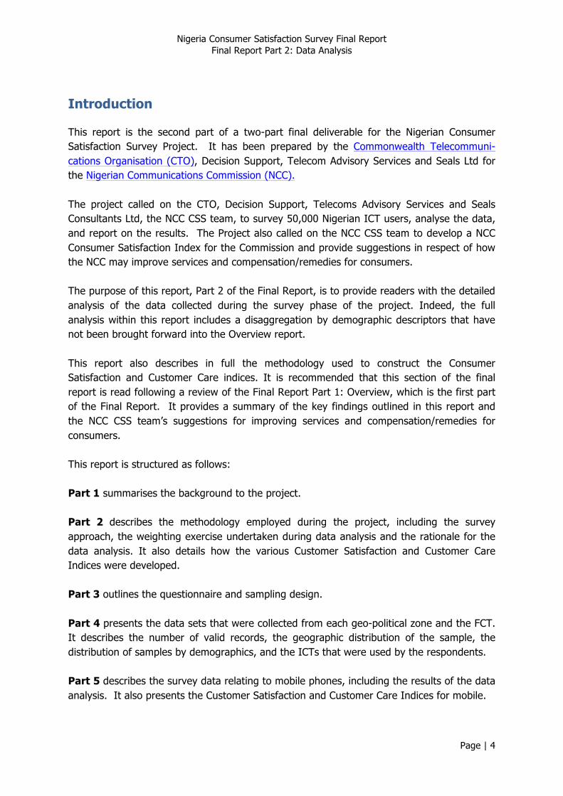
As customer service is a key feature of the NCC Guidelines1 , the methodology has sought to find ways in which the element of customer service can be incorporated into customer satisfaction, as shown in Figure 1 (Page 7).
1 Nigerian Communications Act (No. 19 of 2003), Quality of Service Regulations, 2012.
Nigeria Consumer Satisfaction Survey Final Report Final Report Part 2: Data Analysis
Page | 7
Customer Care Quality
Expectations
Value Satisfaction Intentions
Figure 1 Construct for survey methodology
Core telecommunications services have been treated separately, so separate indices have been calculated for each of the following services:
• Mobile phones; • Fixed line phones; • Public access; • Internet;
2.2. Weighting
2.2.1. Purpose
The sampling design was based on the population frame, taking account of gender, age, and rural/urban context. The samples returned did not adhere to the sampling design, so a weighting has been applied in order to make the frequency statistics arising from the data more representative of the population of the country.
As highlighted in preliminary reports, it proved difficult to collect the data strictly according to age and gender groups due to nature of society in some areas of Nigeria. For example, in some enumeration areas with large Islamic populations it was difficult for male enumerators to approach potential female respondents. The teams also faced security issues in some areas so, given that the field teams’ safety was of paramount importance, field plans were changed as necessary to minimise any exposure to danger.
2.2.2. Calculating weights
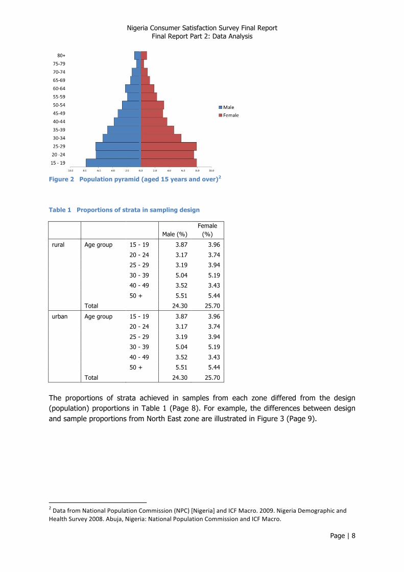
The population pyramid for adults in Nigeria is presented in Figure 2 (Page 8). The sampling design reflected this population distribution; note that the number of age categories in the design was reduced to six. Given a rural:urban split of 50:50, the sampling design proportions to be applied to each zone are presented in Table 1 (Page 8).
Nigeria Consumer Satisfaction Survey Final Report Final Report Part 2: Data Analysis
Page | 8
Figure 2 Population pyramid (aged 15 years and over)2
Table 1 Proportions of strata in sampling design
Male (%)
Female (%)
rural Age group 15 - 19 3.87 3.96
20 - 24 3.17 3.74
25 - 29 3.19 3.94
30 - 39 5.04 5.19
40 - 49 3.52 3.43
50 + 5.51 5.44
Total
24.30 25.70
urban Age group 15 - 19 3.87 3.96
20 - 24 3.17 3.74
25 - 29 3.19 3.94
30 - 39 5.04 5.19
40 - 49 3.52 3.43
50 + 5.51 5.44
Total
24.30 25.70
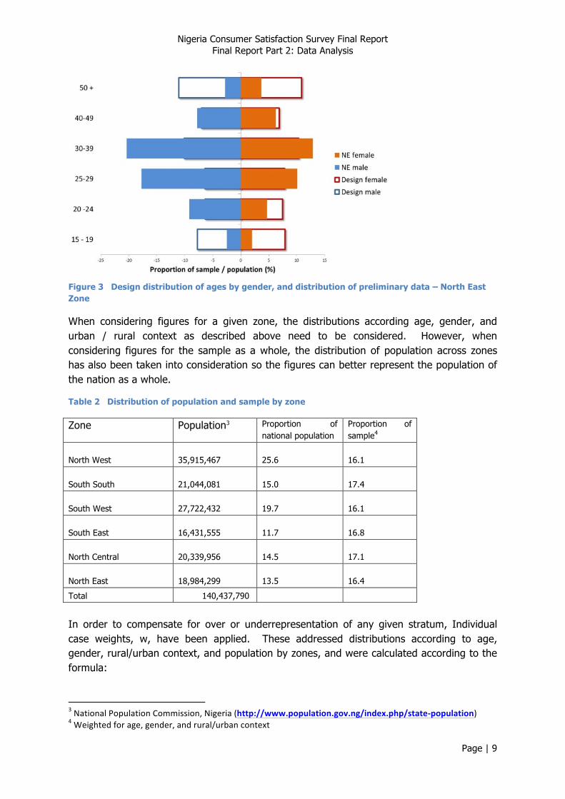
The proportions of strata achieved in samples from each zone differed from the design (population) proportions in Table 1 (Page 8). For example, the differences between design and sample proportions from North East zone are illustrated in Figure 3 (Page 9).
2 Data from National Population Commission (NPC) [Nigeria] and ICF Macro. 2009. Nigeria Demographic and Health Survey 2008. Abuja, Nigeria: National Population Commission and ICF Macro.
Nigeria Consumer Satisfaction Survey Final Report Final Report Part 2: Data Analysis
Page | 9
Figure 3 Design distribution of ages by gender, and distribution of preliminary data – North East Zone
When considering figures for a given zone, the distributions according age, gender, and urban / rural context as described above need to be considered. However, when considering figures for the sample as a whole, the distribution of population across zones has also been taken into consideration so the figures can better represent the population of the nation as a whole.
Table 2 Distribution of population and sample by zone
Zone Population3 Proportion of national population
Proportion of sample4
North West 35,915,467 25.6 16.1
South South 21,044,081 15.0 17.4
South West 27,722,432 19.7 16.1
South East 16,431,555 11.7 16.8
North Central 20,339,956 14.5 17.1
North East 18,984,299 13.5 16.4
Total 140,437,790
In order to compensate for over or underrepresentation of any given stratum, Individual case weights, w, have been applied. These addressed distributions according to age, gender, rural/urban context, and population by zones, and were calculated according to the formula:
3 National Population Commission, Nigeria (http://www.population.gov.ng/index.php/state-‐population) 4 Weighted for age, gender, and rural/urban context
Nigeria Consumer Satisfaction Survey Final Report Final Report Part 2: Data Analysis
Page | 10
Note that all figures given in the analysis are based on weighted data, except where stated otherwise.
2.3. Analysis
Tables present weighted data for each zone, which is adjusted for age, gender and rural/urban distributions. They also present data for the country (whole sample), which is adjusted for the population distribution across zones.
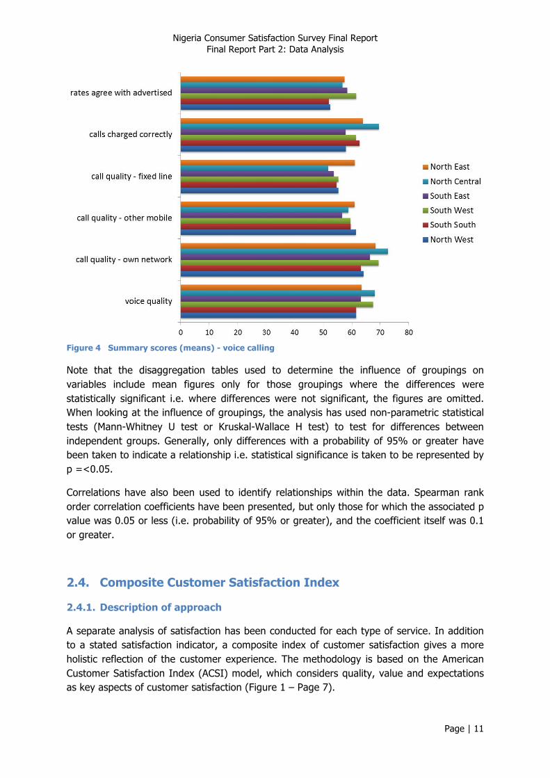
Responses to the attitudinal questions have been converted to a unipolar scale to give a score from 0 to 100, where 0 represents very poor and 100 represents very good performance. Charts and comparisons (e.g. disaggregation according to gender, age etc.) are based on the means of these unipolar scores.
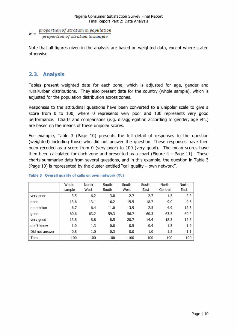
For example, Table 3 (Page 10) presents the full detail of responses to the question (weighted) including those who did not answer the question. These responses have then been recoded as a score from 0 (very poor) to 100 (very good). The mean scores have then been calculated for each zone and presented as a chart (Figure 4 – Page 11). These charts summarise data from several questions, and in this example, the question in Table 3 (Page 10) is represented by the cluster entitled “call quality – own network”.
Table 3 Overall quality of calls on own network (%)
Whole sample
North West
South South
South West
South East
North Central
North East
very poor 3.5 6.2 3.8 2.7 2.7 1.5 2.2
poor 13.6 13.1 16.2 15.5 18.7 9.0 9.8
no opinion 6.7 6.4 11.0 3.9 2.5 4.9 12.3
good 60.6 63.2 59.3 56.7 60.3 63.5 60.2
very good 13.8 8.8 8.5 20.7 14.4 18.3 12.5
don't know 1.0 1.3 0.8 0.5 0.4 1.3 1.9
Did not answer 0.8 1.0 0.3 0.0 1.0 1.5 1.1
Total 100 100 100 100 100 100 100
Nigeria Consumer Satisfaction Survey Final Report Final Report Part 2: Data Analysis
Page | 11
Figure 4 Summary scores (means) - voice calling
Note that the disaggregation tables used to determine the influence of groupings on variables include mean figures only for those groupings where the differences were statistically significant i.e. where differences were not significant, the figures are omitted. When looking at the influence of groupings, the analysis has used non-parametric statistical tests (Mann-Whitney U test or Kruskal-Wallace H test) to test for differences between independent groups. Generally, only differences with a probability of 95% or greater have been taken to indicate a relationship i.e. statistical significance is taken to be represented by p =<0.05.
Correlations have also been used to identify relationships within the data. Spearman rank order correlation coefficients have been presented, but only those for which the associated p value was 0.05 or less (i.e. probability of 95% or greater), and the coefficient itself was 0.1 or greater.
2.4. Composite Customer Satisfaction Index
2.4.1. Description of approach
A separate analysis of satisfaction has been conducted for each type of service. In addition to a stated satisfaction indicator, a composite index of customer satisfaction gives a more holistic reflection of the customer experience. The methodology is based on the American Customer Satisfaction Index (ACSI) model, which considers quality, value and expectations as key aspects of customer satisfaction (Figure 1 – Page 7).
Nigeria Consumer Satisfaction Survey Final Report Final Report Part 2: Data Analysis
Page | 12
The construct is predicated on the view that customer satisfaction is a complex construct that is too subtle to measure directly e.g. by simply asking the question. The methodology explores ways in which groups of questions relate to each other to provide measures of underlying constructs (latent variables).
For each service, the questionnaire includes specific indicators for:
• Expectations – “to what extent is the quality of services in line with your expectations?”
• Value – “overall, how would you rate the value for money offered by the services you pay for?”
• Satisfaction – “overall, how satisfied are you with your [service provider]?” • Intention – “how likely are you to change to an alternative operator (in the next
year)?” Other attitudinal questions explore aspects of:
• quality of service • customer care.
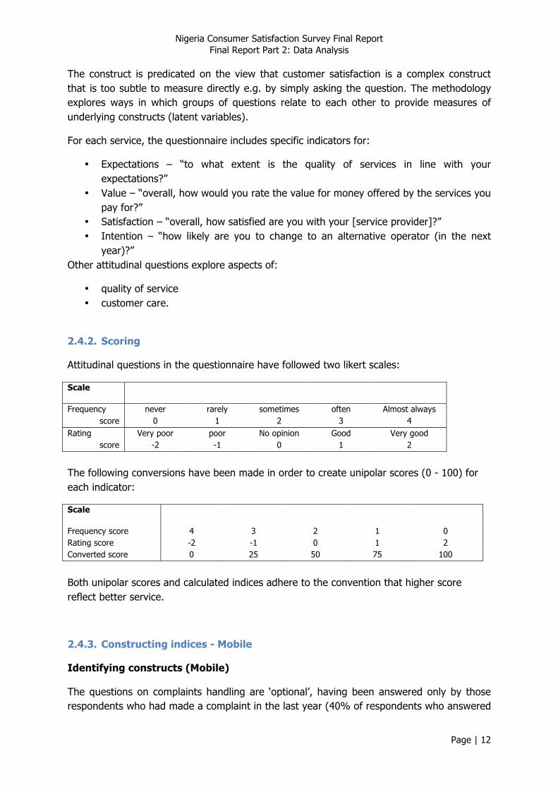
2.4.2. Scoring
Attitudinal questions in the questionnaire have followed two likert scales:
Scale
Frequency never rarely sometimes often Almost always score 0 1 2 3 4
Rating Very poor poor No opinion Good Very good score -2 -1 0 1 2
The following conversions have been made in order to create unipolar scores (0 - 100) for each indicator:
Scale
Frequency score 4 3 2 1 0 Rating score -2 -1 0 1 2 Converted score 0 25 50 75 100
Both unipolar scores and calculated indices adhere to the convention that higher score reflect better service.
2.4.3. Constructing indices - Mobile
Identifying constructs (Mobile)
The questions on complaints handling are ‘optional’, having been answered only by those respondents who had made a complaint in the last year (40% of respondents who answered
Nigeria Consumer Satisfaction Survey Final Report Final Report Part 2: Data Analysis
Page | 13
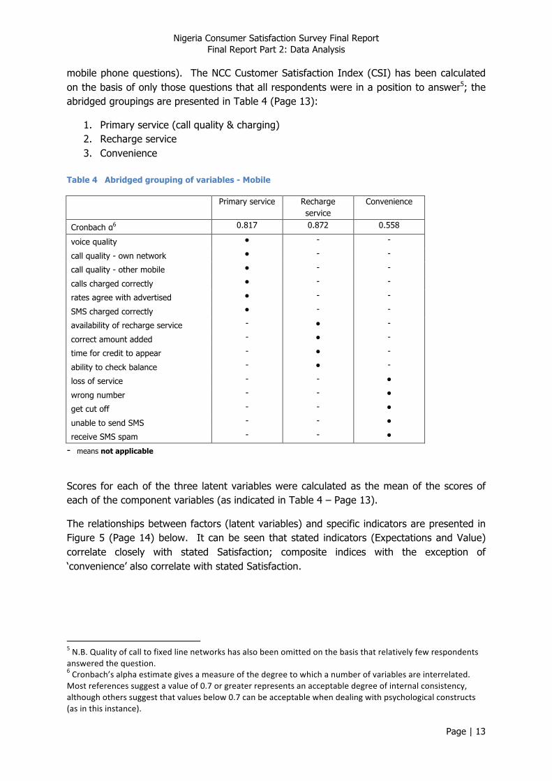
mobile phone questions). The NCC Customer Satisfaction Index (CSI) has been calculated on the basis of only those questions that all respondents were in a position to answer5; the abridged groupings are presented in Table 4 (Page 13):
1. Primary service (call quality & charging) 2. Recharge service 3. Convenience
Table 4 Abridged grouping of variables - Mobile
Primary service Recharge service
Convenience
Cronbach α6 0.817 0.872 0.558
voice quality ● - -
call quality - own network ● - -
call quality - other mobile ● - -
calls charged correctly ● - -
rates agree with advertised ● - -
SMS charged correctly ● - -
availability of recharge service - ● -
correct amount added - ● -
time for credit to appear - ● -
ability to check balance - ● -
loss of service - - ●
wrong number - - ●
get cut off - - ●
unable to send SMS - - ●
receive SMS spam - - ●
- means not applicable
Scores for each of the three latent variables were calculated as the mean of the scores of each of the component variables (as indicated in Table 4 – Page 13).
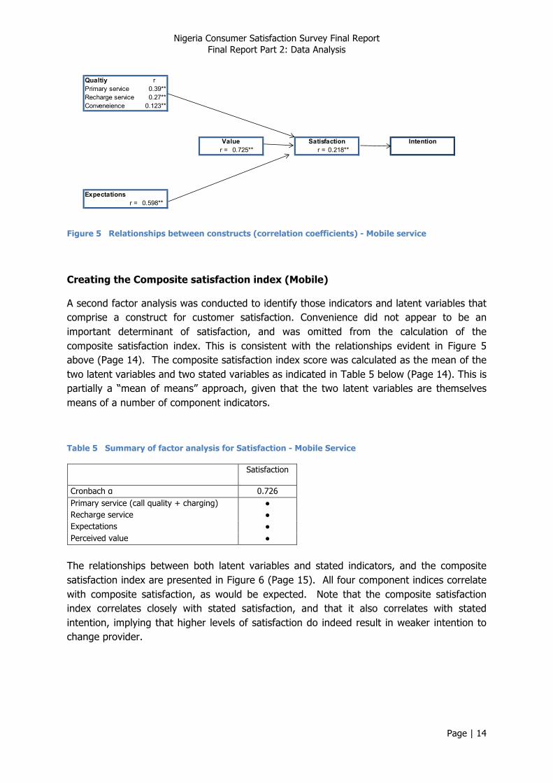
The relationships between factors (latent variables) and specific indicators are presented in Figure 5 (Page 14) below. It can be seen that stated indicators (Expectations and Value) correlate closely with stated Satisfaction; composite indices with the exception of ‘convenience’ also correlate with stated Satisfaction.
5 N.B. Quality of call to fixed line networks has also been omitted on the basis that relatively few respondents answered the question. 6 Cronbach’s alpha estimate gives a measure of the degree to which a number of variables are interrelated. Most references suggest a value of 0.7 or greater represents an acceptable degree of internal consistency, although others suggest that values below 0.7 can be acceptable when dealing with psychological constructs (as in this instance).
Nigeria Consumer Satisfaction Survey Final Report Final Report Part 2: Data Analysis
Page | 14
Qualtiy rPrimary service 0.39**Recharge service 0.27**Conveneience 0.123**
r = 0.725** r = 0.218**
Expectationsr = 0.598**
Value Satisfaction Intention
Figure 5 Relationships between constructs (correlation coefficients) - Mobile service
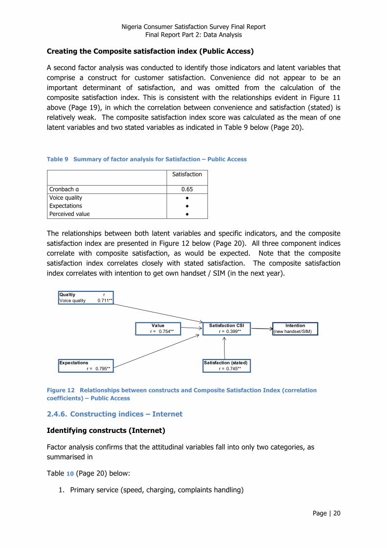
Creating the Composite satisfaction index (Mobile)
A second factor analysis was conducted to identify those indicators and latent variables that comprise a construct for customer satisfaction. Convenience did not appear to be an important determinant of satisfaction, and was omitted from the calculation of the composite satisfaction index. This is consistent with the relationships evident in Figure 5 above (Page 14). The composite satisfaction index score was calculated as the mean of the two latent variables and two stated variables as indicated in Table 5 below (Page 14). This is partially a “mean of means” approach, given that the two latent variables are themselves means of a number of component indicators.
Table 5 Summary of factor analysis for Satisfaction - Mobile Service
Satisfaction
Cronbach α 0.726 Primary service (call quality + charging) ● Recharge service ● Expectations ● Perceived value ●
The relationships between both latent variables and stated indicators, and the composite satisfaction index are presented in Figure 6 (Page 15). All four component indices correlate with composite satisfaction, as would be expected. Note that the composite satisfaction index correlates closely with stated satisfaction, and that it also correlates with stated intention, implying that higher levels of satisfaction do indeed result in weaker intention to change provider.

Nigeria Consumer Satisfaction Survey Final Report Final Report Part 2: Data Analysis
Page | 15
Qualtiy rPrimary service 0.692**Recharge service 0.576**
r = 0.825** r = 0.179**
Expectations Satisfaction (stated)r = 0.79** r = 0.719**
Value Satisfaction CSI Intention
Figure 6 Relationships between constructs and Composite Satisfaction Index (correlation coefficients) - Mobile service
Supplementary Customer Care Index
Customer care is clearly of importance to NCC, but it has not been included in the NCC CSI because only a limited number of respondents (those who have made a complaint in the last year) were in a position to answer those questions relating to the experience of complaints handling. A supplementary Customer Care Index has been calculated as the mean of the following indicators:
• ease of finding number • time to answer • IVR service • staff • resolution of complaint • time to resolve
This group has a reasonable degree of internal consistency (Cronbach α = 0.558). Figure 7 below (Page 15) indicates that for those respondents who have answered the customer care questions, the customer care index correlates closely with the composite satisfaction index.
Qualtiy rPrimary service 0.692** r = 0.488**Recharge service 0.576**
r = 0.825** r = 0.179**
Expectations Satisfaction (stated)r = 0.79** r = 0.719**
Customer Care
Value Satisfaction CSI Intention
Figure 7 Relationships between constructs (including Customer Care) and Composite Satisfaction Index (correlation coefficients) - Mobile service

Nigeria Consumer Satisfaction Survey Final Report Final Report Part 2: Data Analysis
Page | 16
2.4.4. Constructing indices – Fixed
Identifying constructs (Fixed)
The questions on complaints handling are ‘optional’, having been answered only by those respondents who had made a complaint in the last year (40% of respondents who answered fixed phone questions). The NCC Customer Satisfaction Index (CSI) has been calculated on the basis of only those questions that all respondents were in a position to answer; the abridged groupings are presented in
Table 6 below (Page 16):
1. Primary service (call quality & charging) 2. Convenience
Table 6 Grouping of variables - Fixed
Primary service Convenience
Cronbach α 0.857 0.757
voice quality ● -
call quality - fixed networks ● -
call quality - mobile networks ● -
calls charged correctly ● -
rates agree with advertised ● -
loss of service - ●
wrong number - ●
get cut off - ●
- means not applicable
Scores for each of the three latent variables were calculated as the mean of the scores of each of the component variables (as indicated in
Table 6 above – Page 16).
The relationships between latent variables and stated indicators are presented in Figure 8 (Page 17) below. It can be seen that stated indicators (Expectations and Value) correlate closely with stated Satisfaction, as do the composite indices. Note that there is an inverse correlation between satisfaction and intention. This is somewhat counterintuitive and suggests that motivation to change to an alternative provider is motivated by factors other than satisfaction.

Nigeria Consumer Satisfaction Survey Final Report Final Report Part 2: Data Analysis
Page | 17
Qualtiy rPrimary service 0.587**Inconveneience 0.146*
Satisfaction Intentionr = 0.722** r = -0.191**
Expectationsr = 0.575**
Value
Figure 8 Relationships between constructs (correlation coefficients) - Fixed service
Creating the Composite satisfaction index (Fixed)
A second factor analysis was conducted to identify those indicators and latent variables that comprise a construct for customer satisfaction. Convenience did not appear to be an important determinant of satisfaction, and was omitted from the calculation of the composite satisfaction index. This is consistent with the relationships evident in Figure 8 (Page 17) in which the correlation between convenience and satisfaction (stated) is weak. The composite satisfaction index score was calculated as the mean of one latent variables and two stated variables as indicated in
Table 7 (Page 17).
Table 7 Summary of factor analysis for Satisfaction - Fixed Service
Satisfaction
Cronbach α 0.765 Primary service (call quality + charging) ● Expectations ● Perceived value ●
The relationships between both latent variables and stated indicators, and the composite satisfaction index are presented in Figure 9 (Page 18). All three component indices correlate with composite satisfaction, as would be expected. Note that the composite satisfaction index correlates closely with stated satisfaction. Again, the composite satisfaction index correlates inversely with stated intention.

Nigeria Consumer Satisfaction Survey Final Report Final Report Part 2: Data Analysis
Page | 18
Qualtiy rPrimary service 0.77**
r = 0.823** r = -0.349**
Expectations Satisfaction (stated)r = 0.859** r = 0.766**
Value Satisfaction CSI Intention
Figure 9 Relationships between constructs and Composite Satisfaction Index (correlation coefficients) - Fixed service
Supplementary Customer Care Index
Customer Care is clearly of importance to NCC, but it has not been included in the NCC CSI because only a limited number of respondents were in a position to answer those questions relating to the experience of complaints handling (those who had made a complaint in the last year). A supplementary index has been calculated as the mean of the following indicators:
• ease of finding number • time to answer • IVR service • staff • resolution of complaint • time to resolve
This group has a high degree of internal consistency (Cronbach α = 0.889). Figure 10 (Page 18) indicates that for those respondents who have answered the customer care questions, the customer care index correlates closely with the composite satisfaction index.
Qualtiy rPrimary service 0.77** r = 0.731**
r = 0.823** r = -0.349**
Expectations Satisfaction (stated)r = 0.859** r = 0.766**
Customer Care
Value Satisfaction CSI Intention
Figure 10 Relationships between constructs (including Customer Care) and Composite Satisfaction Index (correlation coefficients) - Fixed service
Nigeria Consumer Satisfaction Survey Final Report Final Report Part 2: Data Analysis
Page | 19
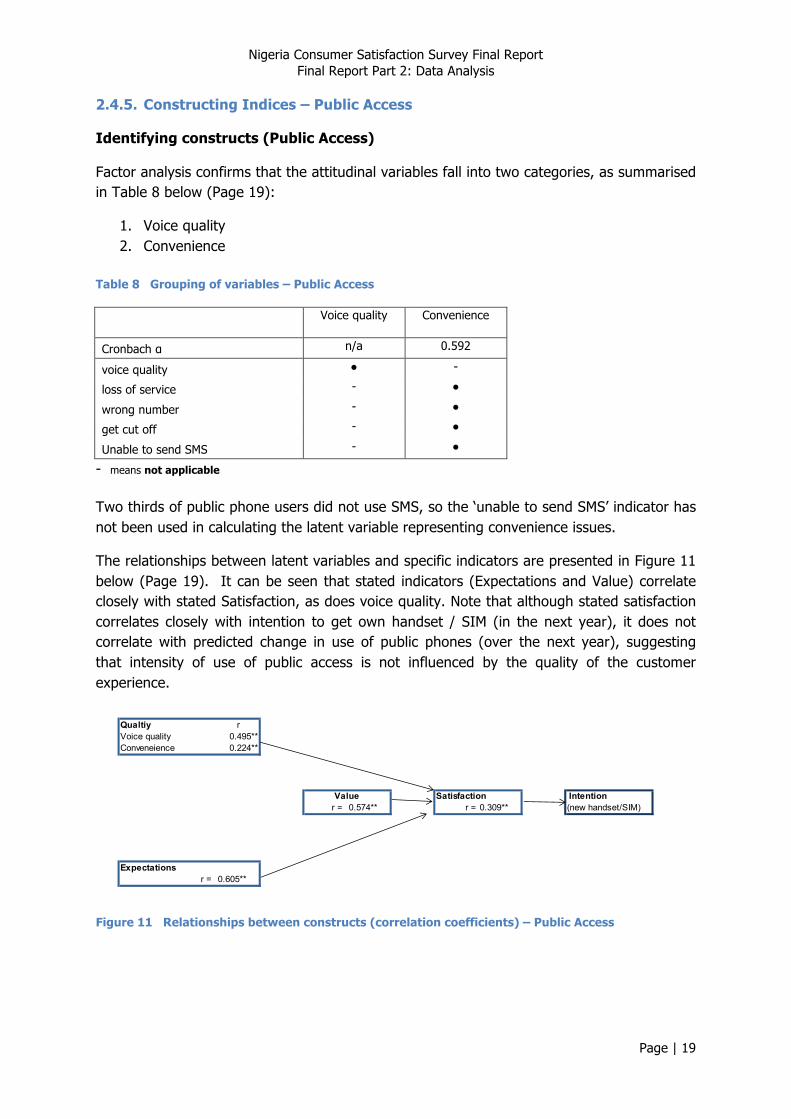
2.4.5. Constructing Indices – Public Access
Identifying constructs (Public Access)
Factor analysis confirms that the attitudinal variables fall into two categories, as summarised in Table 8 below (Page 19):
1. Voice quality 2. Convenience
Table 8 Grouping of variables – Public Access
Voice quality Convenience
Cronbach α n/a 0.592
voice quality ● -
loss of service - ●
wrong number - ●
get cut off - ●
Unable to send SMS - ●
- means not applicable Two thirds of public phone users did not use SMS, so the ‘unable to send SMS’ indicator has not been used in calculating the latent variable representing convenience issues.
The relationships between latent variables and specific indicators are presented in Figure 11 below (Page 19). It can be seen that stated indicators (Expectations and Value) correlate closely with stated Satisfaction, as does voice quality. Note that although stated satisfaction correlates closely with intention to get own handset / SIM (in the next year), it does not correlate with predicted change in use of public phones (over the next year), suggesting that intensity of use of public access is not influenced by the quality of the customer experience.
Qualtiy rVoice quality 0.495**Conveneience 0.224**
Satisfaction Intentionr = 0.574** r = 0.309** (new handset/SIM)
Expectationsr = 0.605**
Value
Figure 11 Relationships between constructs (correlation coefficients) – Public Access
Nigeria Consumer Satisfaction Survey Final Report Final Report Part 2: Data Analysis
Page | 20
Creating the Composite satisfaction index (Public Access)
A second factor analysis was conducted to identify those indicators and latent variables that comprise a construct for customer satisfaction. Convenience did not appear to be an important determinant of satisfaction, and was omitted from the calculation of the composite satisfaction index. This is consistent with the relationships evident in Figure 11 above (Page 19), in which the correlation between convenience and satisfaction (stated) is relatively weak. The composite satisfaction index score was calculated as the mean of one latent variables and two stated variables as indicated in Table 9 below (Page 20).
Table 9 Summary of factor analysis for Satisfaction – Public Access
Satisfaction
Cronbach α 0.65 Voice quality ● Expectations ● Perceived value ●
The relationships between both latent variables and specific indicators, and the composite satisfaction index are presented in Figure 12 below (Page 20). All three component indices correlate with composite satisfaction, as would be expected. Note that the composite satisfaction index correlates closely with stated satisfaction. The composite satisfaction index correlates with intention to get own handset / SIM (in the next year).
Qualtiy rVoice quality 0.711**
r = 0.754** r = 0.399** (new handset/SIM)
Expectations Satisfaction (stated)r = 0.795** r = 0.745**
Value Satisfaction CSI Intention
Figure 12 Relationships between constructs and Composite Satisfaction Index (correlation coefficients) – Public Access
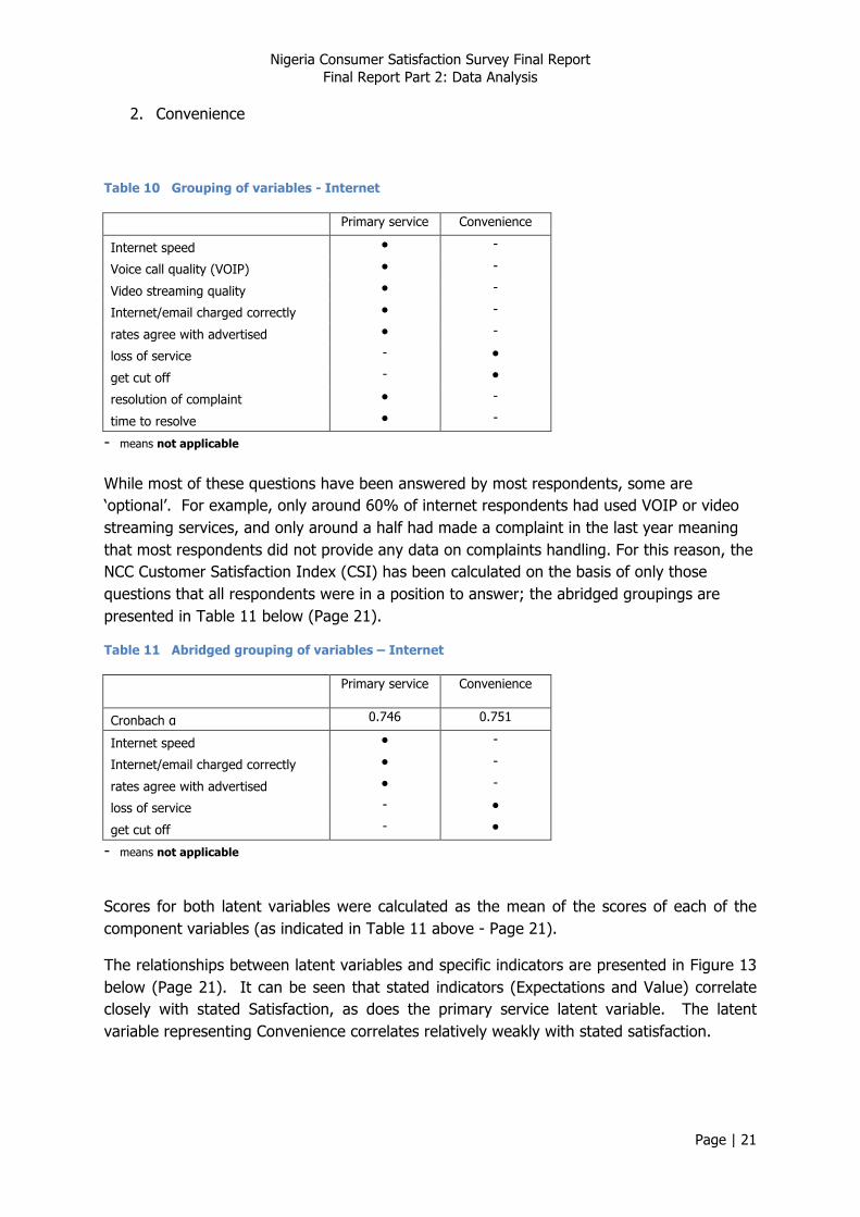
2.4.6. Constructing indices – Internet
Identifying constructs (Internet)
Factor analysis confirms that the attitudinal variables fall into only two categories, as summarised in
Table 10 (Page 20) below:
1. Primary service (speed, charging, complaints handling)
Nigeria Consumer Satisfaction Survey Final Report Final Report Part 2: Data Analysis
Page | 21
2. Convenience
Table 10 Grouping of variables - Internet
Primary service Convenience
Internet speed ● -
Voice call quality (VOIP) ● -
Video streaming quality ● -
Internet/email charged correctly ● -
rates agree with advertised ● -
loss of service - ●
get cut off - ●
resolution of complaint ● -
time to resolve ● -
- means not applicable While most of these questions have been answered by most respondents, some are ‘optional’. For example, only around 60% of internet respondents had used VOIP or video streaming services, and only around a half had made a complaint in the last year meaning that most respondents did not provide any data on complaints handling. For this reason, the NCC Customer Satisfaction Index (CSI) has been calculated on the basis of only those questions that all respondents were in a position to answer; the abridged groupings are presented in Table 11 below (Page 21).
Table 11 Abridged grouping of variables – Internet
Primary service Convenience
Cronbach α 0.746 0.751
Internet speed ● -
Internet/email charged correctly ● -
rates agree with advertised ● -
loss of service - ●
get cut off - ●
- means not applicable
Scores for both latent variables were calculated as the mean of the scores of each of the component variables (as indicated in Table 11 above - Page 21).
The relationships between latent variables and specific indicators are presented in Figure 13 below (Page 21). It can be seen that stated indicators (Expectations and Value) correlate closely with stated Satisfaction, as does the primary service latent variable. The latent variable representing Convenience correlates relatively weakly with stated satisfaction.

Nigeria Consumer Satisfaction Survey Final Report Final Report Part 2: Data Analysis
Page | 22
Qualtiy rPrimary service 0.583**Conveneience 0.151**
r = 0.716** r = 0.233**
Expectationsr = 0.599**
Value Satisfaction Intention
Figure 13 Relationships between constructs (correlation coefficients) - Internet
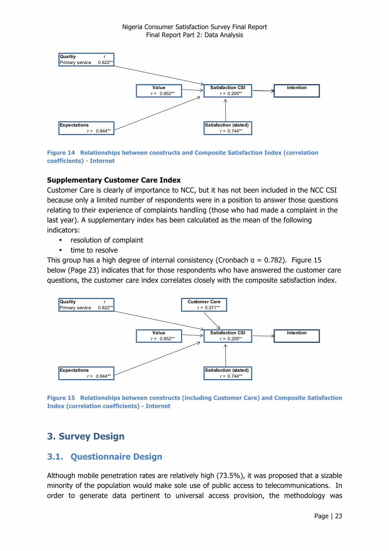
Creating the Composite satisfaction index (Internet)
A second factor analysis was conducted to identify those indicators and latent variables that comprise a construct for customer satisfaction. Convenience did not appear to be an important determinant of satisfaction, and was omitted from the calculation of the composite satisfaction index. This is consistent with the relationships evident in Figure 13 (Page 21), which showed a weak correlation between convenience and stated satisfaction. The composite satisfaction index score was calculated as the mean of the single latent variable and two stated variables as indicated in Table 12 below (Page 22).
Table 12 Summary of factor analysis for Satisfaction - Internet
Satisfaction
Cronbach α 0.801 Primary service (speed + charging) ● Expectations ● Perceived value ●
The relationships between both latent variables and specific indicators, and the composite satisfaction index are presented in Figure 14(Page 22 ). All three component indices correlate with composite satisfaction, as would be expected. Note that the composite satisfaction index correlates closely with stated satisfaction, and that it also correlates with stated intention, implying that higher levels of satisfaction do indeed result in weaker intention to change ISP.
Nigeria Consumer Satisfaction Survey Final Report Final Report Part 2: Data Analysis
Page | 23
Qualtiy rPrimary service 0.822**
r = 0.852** r = 0.205**
Expectations Satisfaction (stated)r = 0.844** r = 0.744**
Value Satisfaction CSI Intention
Figure 14 Relationships between constructs and Composite Satisfaction Index (correlation coefficients) - Internet
Supplementary Customer Care Index Customer Care is clearly of importance to NCC, but it has not been included in the NCC CSI because only a limited number of respondents were in a position to answer those questions relating to their experience of complaints handling (those who had made a complaint in the last year). A supplementary index has been calculated as the mean of the following indicators:
• resolution of complaint • time to resolve
This group has a high degree of internal consistency (Cronbach α = 0.782). Figure 15 below (Page 23) indicates that for those respondents who have answered the customer care questions, the customer care index correlates closely with the composite satisfaction index.
Qualtiy rPrimary service 0.822** r = 0.571**
r = 0.852** r = 0.205**
Expectations Satisfaction (stated)r = 0.844** r = 0.744**
Customer Care
Value Satisfaction CSI Intention
Figure 15 Relationships between constructs (including Customer Care) and Composite Satisfaction Index (correlation coefficients) - Internet
3. Survey Design
3.1. Questionnaire Design
Although mobile penetration rates are relatively high (73.5%), it was proposed that a sizable minority of the population would make sole use of public access to telecommunications. In order to generate data pertinent to universal access provision, the methodology was
Nigeria Consumer Satisfaction Survey Final Report Final Report Part 2: Data Analysis
Page | 24
designed to canvas not only phone subscribers (both mobile and fixed), but also public access users. A single questionnaire, comprising five sections, was designed to gather data on all telecommunications services (Annex A Questionnaire):
• Mobile phones – including optional sections: o value added services o pre-paid account recharge service o complaints
• Fixed line phones – including optional sections: o complaints
• Public access • Internet – including optional sections:
o complaints • Customer rights.
In order to restrict the time required of any respondent, enumerators navigated through the questionnaire using the logic presented in Figure 16 (Page 25). Questions in each section fell into the following categories:
• Descriptors – describe the personal circumstances of respondents (rural/urban context, gender, age, socio-economic classification7;
• Patterns of use of telecommunications services – services used, , providers used, intensity of use;
• Detailed indicators – covering salient features of the consumer experience; these are either frequency indicators (e.g. perceptions of frequency of loss of service, getting cut off), or altitudinal indicators (e.g. views on quality of service, accuracy of charging). Modules address optional services accessed only by certain consumers (e.g. value added services, complaints handling).
• Inevitably, the questionnaire design was a compromise between gathering detailed data of interest, and keeping it short enough in order to minimise respondent fatigue and to be administered within consultants’ budgets.
7 Constraints on the number of questions meant it was not possible to include questions that would enable an objective assessment of socio-‐economic status, so a simple subjective assessment by the enumerator was used as a compromise.

Nigeria Consumer Satisfaction Survey Final Report Final Report Part 2: Data Analysis
Page | 25
Figure 16 ICT selection logic for questionnaire
Nigeria Consumer Satisfaction Survey Final Report Final Report Part 2: Data Analysis
Page | 26
The project timescales provided an opportunity to pilot the questionnaire briefly. Between the 9th and 12th July, the CTO and Selected Consultants undertook a pilot of the questionnaire in order to assess its appropriateness, especially in terms of whether it met the objectives of data collection. A limited number of questionnaires were administered in the widest geographical area possible within each Geo-Political zone and the FCT.
Following the pilot, the NCC Survey team submitted reports that detailed the number of questionnaires administered, the average time it took to deliver each questionnaire, and an indication of which questions posed the most difficulties to the enumerators administering them and respondents answering them.
3.2. Sampling design
The sample was drawn from the population of adults (15 years and over). In order to eliminate “null” responses, the sample was drawn from the population of telecommunications service users, defined as “those who have made some use of voice or data communications within the previous 3 months”.
It was originally proposed to use a randomised cluster sampling design, but NCC requested a simpler quota sampling approach. This is a non-probability sampling approach that is particularly popular with market research samples without the expense involved in collecting random samples. The large sample size, coupled with the fact that it was drawn from across the country, means that results are likely to be reasonably representative of the overall population, at least in terms of characteristics used to design the quotas.
Quotas were designed to reflect the key demographics of the population - area (rural/urban), gender and age. Although this was a non-probability sampling method, a degree of randomness was introduced in the selection of geographical areas from which the sample was to be drawn.
Each zone was regarded as an individual domain, so equal sample sizes were specified for each zone. It was beyond the scope of the budget to sample from clusters throughout each zone, so a multi-stage sampling process was required. It was proposed to use Local Government Areas (LGAs) as the first level of sampling. Within each zone, a manageable number of LGAs were selected randomly - two urban LGAs and one rural LGA from each state i.e. roughly 18 LGAs per zone (given an average of roughly six states per zone). See Annex 2 for the detail of LGAs that the sample was drawn from. Within each LGA, Enumeration Areas (EAs) were to be selected randomly as the second level of sampling.8
8 At the request of the NCC, the Decision Support field team administering the survey in the South West Zone did not take equal numbers from each of its designated States. A full breakdown of the samples drawn from the South West Zone can be reviewed in the Interim Report submitted by Decision Support on the 18.09.2012.

Nigeria Consumer Satisfaction Survey Final Report Final Report Part 2: Data Analysis
Page | 27
4. Data Sets
4.1. Number of Valid Records
Data sets were received from each of the selected consultants – see Table 13 (Page 27)
Table 13 Summary of records received
Consultant Zones Records received
Decision Support South West 8,413
CTO North Central and North East 16,794
SEALS South East Zone 8,132
Telecom Advisory Services North West and South South 16,800
Total 50,139
Data records were deleted for the following reasons:
• Respondents had answered none of the questions relating to any of the telecommunications services;
• Records had been entered more than once (duplicates) • Records were clearly duplicates from the key data content (even if the serial
numbers were different); • Multiple fields had erroneous data entered (not within the expected coding range).
The number of records deleted from each data set is summarised in Table 14 below (Page 27).
Table 14 Summary of records deleted
Not used services
Entered more than
once
Duplicates Erroneous data entry
Total records deleted
Valid records
Decision Support 566 0 267 0 833 7,580
CTO 273 22 389 3 687 16,107
SEALS 35 13 4 0 52 8,080
Telecom Advisory Services 107 1 557 21 686 16,114
Total 47,881
Each of the data fields was checked for spurious data falling outside of the expected coding range. Erroneous data was either deleted or corrected where the error was evident; the number of edits made to date from each section is presented in Table 15 below (Page 27).
Table 15 Number of records edited
Mobile Fixed Public Access Internet Rights ICT Decision Support 6 3 0 0 0 CTO 5 0 0 0 0 SEALS 0 0 0 0 0 TAS 105 2 0 7 7
Nigeria Consumer Satisfaction Survey Final Report Final Report Part 2: Data Analysis
Page | 28
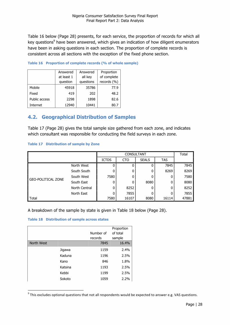
Table 16 below (Page 28) presents, for each service, the proportion of records for which all key questions9 have been answered, which gives an indication of how diligent enumerators have been in asking questions in each section. The proportion of complete records is consistent across all sections with the exception of the fixed phone section.
Table 16 Proportion of complete records (% of whole sample)
Answered at least 1 question
Answered all key
questions
Proportion of complete records (%)
Mobile 45918 35786 77.9
Fixed 419 202 48.2
Public access 2298 1898 82.6
Internet 12940 10441 80.7
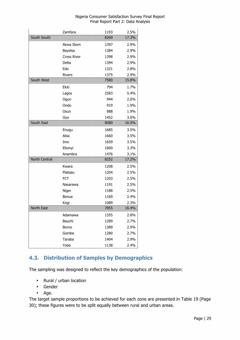
4.2. Geographical Distribution of Samples
Table 17 (Page 28) gives the total sample size gathered from each zone, and indicates which consultant was responsible for conducting the field surveys in each zone.
Table 17 Distribution of sample by Zone
CONSULTANT Total
ICTDS CTO SEALS TAS
GEO-POLITICAL ZONE
North West 0 0 0 7845 7845
South South 0 0 0 8269 8269
South West 7580 0 0 0 7580
South East 0 0 8080 0 8080
North Central 0 8252 0 0 8252
North East 0 7855 0 0 7855 Total 7580 16107 8080 16114 47881
A breakdown of the sample by state is given in Table 18 below (Page 28).
Table 18 Distribution of sample across states
Number of records
Proportion of total sample
North West 7845 16.4%
Jigawa 1159 2.4%
Kaduna 1196 2.5%
Kano 846 1.8%
Katsina 1193 2.5%
Kebbi 1199 2.5%
Sokoto 1059 2.2%
9 This excludes optional questions that not all respondents would be expected to answer e.g. VAS questions.
Nigeria Consumer Satisfaction Survey Final Report Final Report Part 2: Data Analysis
Page | 29
Zamfara 1193 2.5%
South South 8269 17.3%
Akwa Ibom 1397 2.9%
Bayelsa 1384 2.9%
Cross River 1398 2.9%
Delta 1394 2.9%
Edo 1321 2.8%
Rivers 1375 2.9%
South West 7580 15.8%
Ekiti 794 1.7%
Lagos 2583 5.4%
Ogun 944 2.0%
Ondo 919 1.9%
Osun 888 1.9%
Oyo 1452 3.0%
South East 8080 16.9%
Enugu 1685 3.5%
Abia 1660 3.5%
Imo 1659 3.5%
Ebonyi 1600 3.3%
Anambra 1476 3.1%
North Central 8252 17.2%
Kwara 1208 2.5%
Plateau 1204 2.5%
FCT 1203 2.5%
Nasarawa 1191 2.5%
Niger 1188 2.5%
Benue 1169 2.4%
Kogi 1089 2.3%
North East 7855 16.4%
Adamawa 1355 2.8%
Bauchi 1289 2.7%
Borno 1389 2.9%
Gombe 1280 2.7%
Taraba 1404 2.9%
Yobe 1138 2.4%
4.3. Distribution of Samples by Demographics
The sampling was designed to reflect the key demographics of the population:
• Rural / urban location • Gender • Age.
The target sample proportions to be achieved for each zone are presented in Table 19 (Page 30); these figures were to be split equally between rural and urban areas.
Nigeria Consumer Satisfaction Survey Final Report Final Report Part 2: Data Analysis
Page | 30
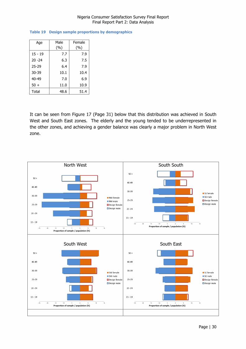
Table 19 Design sample proportions by demographics
Age Male (%)
Female (%)
15 - 19 7.7 7.9
20 -24 6.3 7.5
25-29 6.4 7.9
30-39 10.1 10.4
40-49 7.0 6.9
50 + 11.0 10.9
Total 48.6 51.4
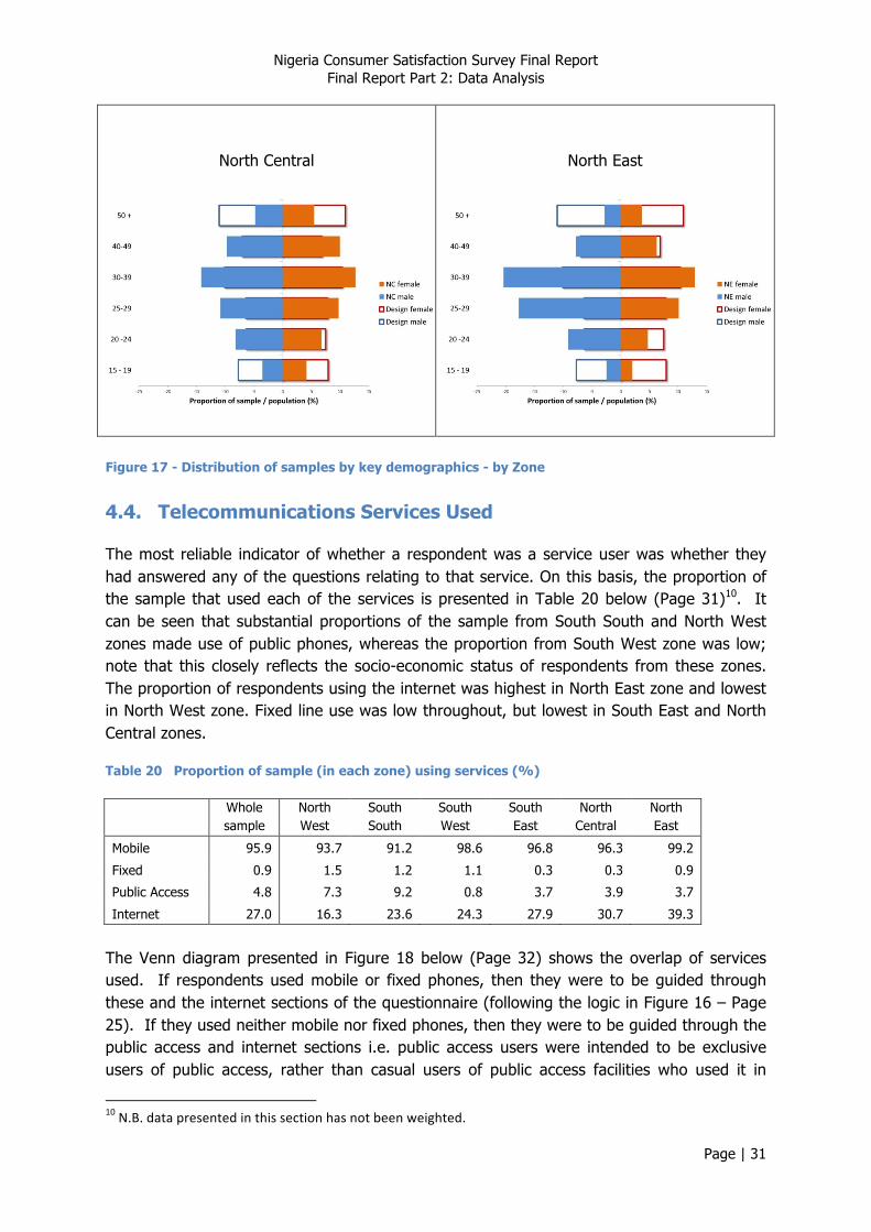
It can be seen from Figure 17 (Page 31) below that this distribution was achieved in South West and South East zones. The elderly and the young tended to be underrepresented in the other zones, and achieving a gender balance was clearly a major problem in North West zone.
North West
South South
South West
South East
Nigeria Consumer Satisfaction Survey Final Report Final Report Part 2: Data Analysis
Page | 31
North Central
North East
Figure 17 - Distribution of samples by key demographics - by Zone
4.4. Telecommunications Services Used
The most reliable indicator of whether a respondent was a service user was whether they had answered any of the questions relating to that service. On this basis, the proportion of the sample that used each of the services is presented in Table 20 below (Page 31)10. It can be seen that substantial proportions of the sample from South South and North West zones made use of public phones, whereas the proportion from South West zone was low; note that this closely reflects the socio-economic status of respondents from these zones. The proportion of respondents using the internet was highest in North East zone and lowest in North West zone. Fixed line use was low throughout, but lowest in South East and North Central zones.
Table 20 Proportion of sample (in each zone) using services (%)
Whole sample
North West
South South
South West
South East
North Central
North East
Mobile 95.9 93.7 91.2 98.6 96.8 96.3 99.2
Fixed 0.9 1.5 1.2 1.1 0.3 0.3 0.9
Public Access 4.8 7.3 9.2 0.8 3.7 3.9 3.7
Internet 27.0 16.3 23.6 24.3 27.9 30.7 39.3
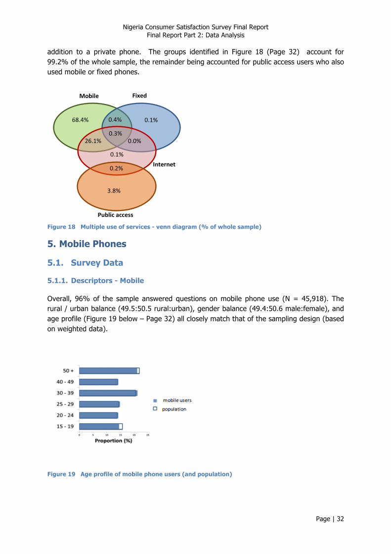
The Venn diagram presented in Figure 18 below (Page 32) shows the overlap of services used. If respondents used mobile or fixed phones, then they were to be guided through these and the internet sections of the questionnaire (following the logic in Figure 16 – Page 25). If they used neither mobile nor fixed phones, then they were to be guided through the public access and internet sections i.e. public access users were intended to be exclusive users of public access, rather than casual users of public access facilities who used it in
10 N.B. data presented in this section has not been weighted.
Nigeria Consumer Satisfaction Survey Final Report Final Report Part 2: Data Analysis
Page | 32
addition to a private phone. The groups identified in Figure 18 (Page 32) account for 99.2% of the whole sample, the remainder being accounted for public access users who also used mobile or fixed phones.
Mobile
Fixed
Internet
Public access
68.4% 0.1%
0.3% 26.1% 0.0%
0.1%
0.2%
3.8%
0.4%
Figure 18 Multiple use of services - venn diagram (% of whole sample)
5. Mobile Phones
5.1. Survey Data
5.1.1. Descriptors - Mobile
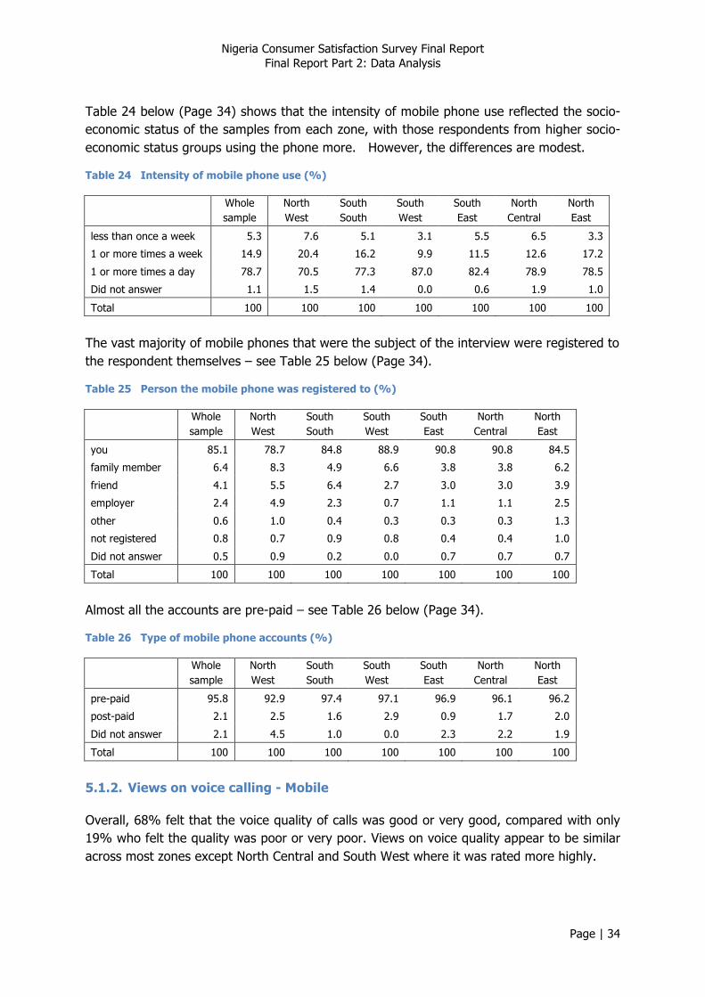
Overall, 96% of the sample answered questions on mobile phone use (N = 45,918). The rural / urban balance (49.5:50.5 rural:urban), gender balance (49.4:50.6 male:female), and age profile (Figure 19 below – Page 32) all closely match that of the sampling design (based on weighted data).
Figure 19 Age profile of mobile phone users (and population)

Nigeria Consumer Satisfaction Survey Final Report Final Report Part 2: Data Analysis
Page | 33
The distribution of socio-economic status of respondents is presented in Table 21 (Page 33).
Table 21 Socio-economic status of mobile phone users (and whole sample)
Mobile phone users (%)
Whole sample
(%)
lower class 43.5 45.8 middle class 40.3 38.6 upper class 15.6 14.9 Did not answer 0.6 0.7 Total 100 100
In terms of subscriber numbers, MTN was the clear market leader, followed by Globacom and Airtel. Only in SE zone was the trend different, where Etisalat was the second most popular operator. Airtel appeared to be particularly popular in North East zone. Note that respondents commonly had more than one SIM card, so the figures in Table 22 (Page 33) sum to more than 100%.
Table 22 Proportion of mobile phone users subscribing to networks (%)
Whole sample
North West
South South
South West
South East
North Central
North East
Etisalat 12.8 15.7 5.9 14.1 20.2 9.4 9.7
M-Tel 0.5 0.5 0.1 0.8 0.2 0.2 0.8
Globacom 18.6 16.3 14.1 25.7 14.1 21.5 17.3
Airtel 18.1 17.5 13.0 21.1 16.9 9.8 29.8
MTN 66.9 63.5 68.1 64.9 86.9 67.5 56.7
Other 0.7 1.3 0.2 0.9 0.5 0.4 0.5
Total 118 115 101 128 139 109 115
Table 23 below (Page 33), on the other hand, gives a breakdown of the network respondents used most (so the proportions sum to 100%). Note that the proportion of respondents using M-Tel and ‘other’ operators was relatively small, so these have generally been omitted from narrative interpretation of the data.
Table 23 Principal network used by mobile phone users (%)
Whole sample
North West
South South
South West
South East
North Central
North East
Etisalat 8.1 12.7 5.6 7.1 7.1 7.5 5.6
M-Tel 0.2 0.2 0.1 0.5 0.0 0.1 0.1
Globacom 13.3 10.1 13.6 18.1 5.2 18.1 13.2
Airtel 13.9 14.6 12.5 14.7 7.9 7.2 25.0
MTN 62.6 60.4 67.8 58.8 79.0 64.1 51.2
Other 0.5 1.0 0.2 0.6 0.2 0.4 0.3
Did not answer 1.4 0.9 0.1 0.1 0.6 2.5 4.7
Total 100 100 100 100 100 100 100
Nigeria Consumer Satisfaction Survey Final Report Final Report Part 2: Data Analysis
Page | 34
Table 24 below (Page 34) shows that the intensity of mobile phone use reflected the socio-economic status of the samples from each zone, with those respondents from higher socio-economic status groups using the phone more. However, the differences are modest.
Table 24 Intensity of mobile phone use (%)
Whole sample
North West
South South
South West
South East
North Central
North East
less than once a week 5.3 7.6 5.1 3.1 5.5 6.5 3.3
1 or more times a week 14.9 20.4 16.2 9.9 11.5 12.6 17.2
1 or more times a day 78.7 70.5 77.3 87.0 82.4 78.9 78.5
Did not answer 1.1 1.5 1.4 0.0 0.6 1.9 1.0
Total 100 100 100 100 100 100 100
The vast majority of mobile phones that were the subject of the interview were registered to the respondent themselves – see Table 25 below (Page 34).
Table 25 Person the mobile phone was registered to (%)
Whole sample
North West
South South
South West
South East
North Central
North East
you 85.1 78.7 84.8 88.9 90.8 90.8 84.5
family member 6.4 8.3 4.9 6.6 3.8 3.8 6.2
friend 4.1 5.5 6.4 2.7 3.0 3.0 3.9
employer 2.4 4.9 2.3 0.7 1.1 1.1 2.5
other 0.6 1.0 0.4 0.3 0.3 0.3 1.3
not registered 0.8 0.7 0.9 0.8 0.4 0.4 1.0
Did not answer 0.5 0.9 0.2 0.0 0.7 0.7 0.7
Total 100 100 100 100 100 100 100
Almost all the accounts are pre-paid – see Table 26 below (Page 34).
Table 26 Type of mobile phone accounts (%)
Whole sample
North West
South South
South West
South East
North Central
North East
pre-paid 95.8 92.9 97.4 97.1 96.9 96.1 96.2
post-paid 2.1 2.5 1.6 2.9 0.9 1.7 2.0
Did not answer 2.1 4.5 1.0 0.0 2.3 2.2 1.9
Total 100 100 100 100 100 100 100
5.1.2. Views on voice calling - Mobile
Overall, 68% felt that the voice quality of calls was good or very good, compared with only 19% who felt the quality was poor or very poor. Views on voice quality appear to be similar across most zones except North Central and South West where it was rated more highly.
Nigeria Consumer Satisfaction Survey Final Report Final Report Part 2: Data Analysis
Page | 35
Table 27 Views on voice quality of calls (%)
Whole sample
North West
South South
South West
South East
North Central
North East
very poor 3.0 4.6 2.3 2.5 3.1 2.0 2.9
poor 15.7 15.0 18.2 14.7 21.5 14.0 12.9
no opinion 11.4 12.9 15.6 7.2 5.3 7.0 20.5
good 58.3 58.3 57.4 61.6 56.9 61.1 52.7
very good 9.7 5.1 5.6 13.9 11.2 14.1 9.4
Did not answer 1.8 4.0 0.9 0.0 2.0 1.7 1.5
Total 100 100 100 100 100 100 100
The quality of calls to other networks appears to be poorer than the quality of on-net calls (Table 28 – Page 35 and Table 29 – Page 35).
Table 28 Overall quality of calls on own network (%)
Whole sample
North West
South South
South West
South East
North Central
North East
very poor 3.5 6.2 3.8 2.7 2.7 1.5 2.2
poor 13.6 13.1 16.2 15.5 18.7 9.0 9.8
no opinion 6.7 6.4 11.0 3.9 2.5 4.9 12.3
good 60.6 63.2 59.3 56.7 60.3 63.5 60.2
very good 13.8 8.8 8.5 20.7 14.4 18.3 12.5
don't know 1.0 1.3 0.8 0.5 0.4 1.3 1.9
Did not answer 0.8 1.0 0.3 0.0 1.0 1.5 1.1
Total 100 100 100 100 100 100 100
Table 29 Overall quality of calls on other mobile networks (%)
Whole sample
North West
South South
South West
South East
North Central
North East
very poor 5.5 7.2 4.8 5.8 6.1 4.3 3.4
poor 20.9 16.5 18.6 24.9 28.3 22.2 17.2
no opinion 10.4 5.8 16.6 5.0 4.8 14.7 20.0
good 48.3 51.0 47.9 52.4 48.6 42.5 43.7
very good 10.3 11.0 8.9 10.8 8.6 10.8 11.0
don't know 1.6 1.1 1.4 1.3 2.0 2.1 2.1
Did not answer 3.2 7.5 1.8 0.0 1.7 3.4 2.7
Total 100 100 100 100 100 100 100
The quality of calls to fixed line networks is poorer still (Table 30 below – Page 36). Note that over 20% of respondents from North West zone did not answer the question on quality of calls to fixed line networks, compared with 0% from South West, indicating that calling fixed line phones is linked to socio-economic status and location i.e. where fixed lines are available.

Nigeria Consumer Satisfaction Survey Final Report Final Report Part 2: Data Analysis
Page | 36
Table 30 Overall quality of calls on fixed line networks (%)
Whole sample
North West
South South
South West
South East
North Central
North East
very poor 6.2 9.0 3.2 6.5 3.5 8.9 3.6
poor 14.4 8.6 11.5 22.9 16.6 16.8 10.4
no opinion 18.3 9.3 41.2 10.8 14.6 18.1 24.8
good 29.8 29.4 25.4 38.2 24.9 25.4 31.6
very good 6.6 5.1 4.2 7.9 4.1 7.2 11.1
don't know 16.5 17.9 8.8 13.7 27.5 18.6 14.6
Did not answer 8.2 20.7 5.7 0.0 8.8 5.0 3.8
Total 100 100 100 100 100 100 100 Overall, two thirds of respondents felt that the correctness of charging(accuracy of billing) of calls was good or very good (Table 31 below – Page 36); there was little variation across zones, with the exception of North Central , where the proportion was higher.
Table 31 Rating of correct charging of calls to mobile account (%)
Whole sample
North West
South South
South West
South East
North Central
North East
very poor 6.5 10.8 5.2 6.0 7.2 3.3 4.2
poor 19.6 17.6 21.8 24.3 26.6 12.2 15.4
no opinion 5.7 7.0 8.2 3.3 2.7 4.3 8.5
good 52.6 51.8 43.6 49.6 51.5 59.9 60.7
very good 13.2 8.9 19.5 16.1 10.1 17.2 8.5
don't know 1.4 1.5 1.1 0.7 0.7 2.5 1.8
Did not answer 1.1 2.4 0.7 0.0 1.2 0.7 1.0
Total 100 100 100 100 100 100 100
On the other hand, less than one half of respondents felt that the alignment of charges and advertised rates was good or very good (Table 32 below – Page 36). Again, non-response rates were highest in North West zone. Zones where alignment with advertised rates appeared to be a particular problem were North West and South South.
Table 32 Rating of agreement of mobile charges with rates advertised (%)
Whole sample
North West
South South
South West
South East
North Central
North East
very poor 4.6 5.1 3.7 5.9 4.7 4.8 2.8
poor 21.5 22.8 27.5 18.5 22.3 22.2 16.1
no opinion 15.2 10.9 24.0 6.8 9.5 18.7 26.8
good 37.5 26.4 34.0 48.4 46.2 37.9 36.2
very good 7.9 6.7 4.1 12.2 8.0 9.6 5.9
don't know 7.8 10.5 4.7 8.2 7.1 4.7 9.7
Did not answer 5.5 17.5 2.0 0.0 2.2 2.2 2.6
Total 100 100 100 100 100 100 100
Nigeria Consumer Satisfaction Survey Final Report Final Report Part 2: Data Analysis
Page | 37
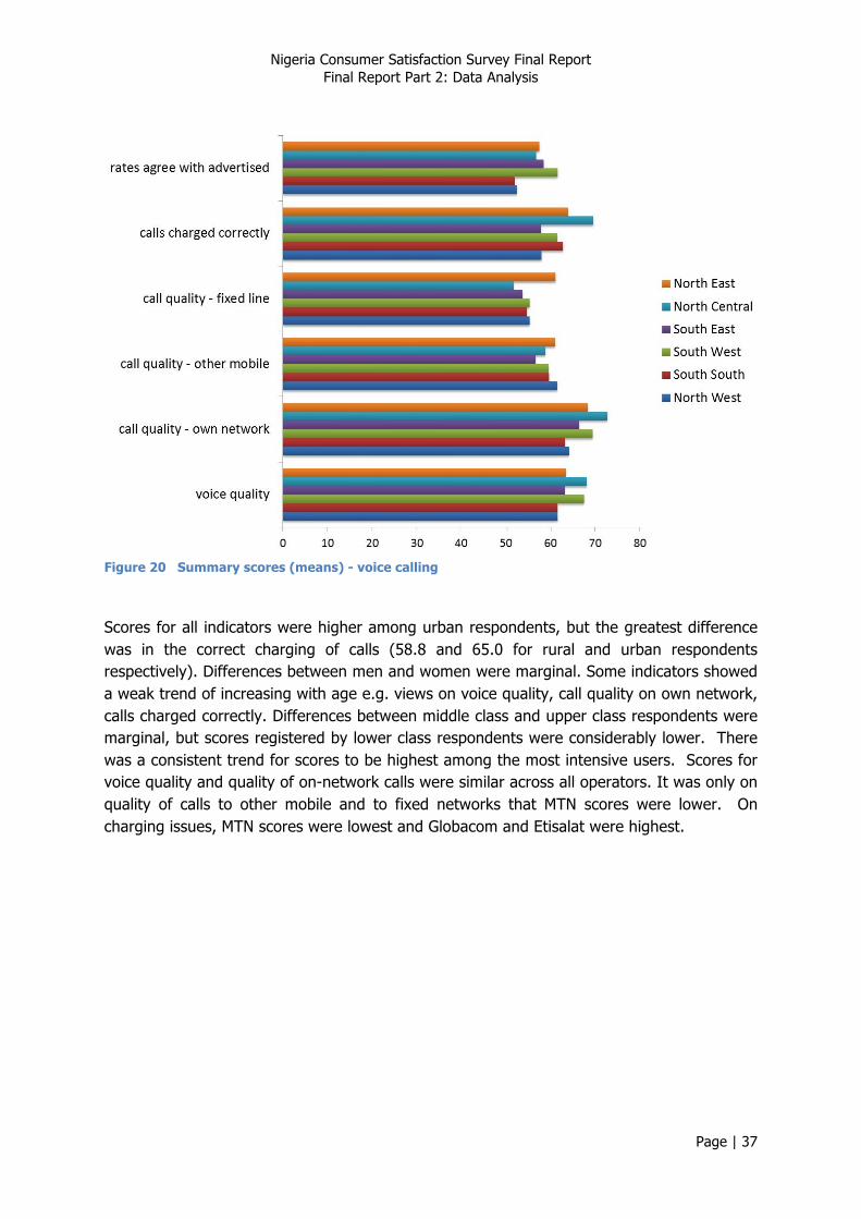
Figure 20 Summary scores (means) - voice calling
Scores for all indicators were higher among urban respondents, but the greatest difference was in the correct charging of calls (58.8 and 65.0 for rural and urban respondents respectively). Differences between men and women were marginal. Some indicators showed a weak trend of increasing with age e.g. views on voice quality, call quality on own network, calls charged correctly. Differences between middle class and upper class respondents were marginal, but scores registered by lower class respondents were considerably lower. There was a consistent trend for scores to be highest among the most intensive users. Scores for voice quality and quality of on-network calls were similar across all operators. It was only on quality of calls to other mobile and to fixed networks that MTN scores were lower. On charging issues, MTN scores were lowest and Globacom and Etisalat were highest.
Nigeria Consumer Satisfaction Survey Final Report Final Report Part 2: Data Analysis
Page | 38
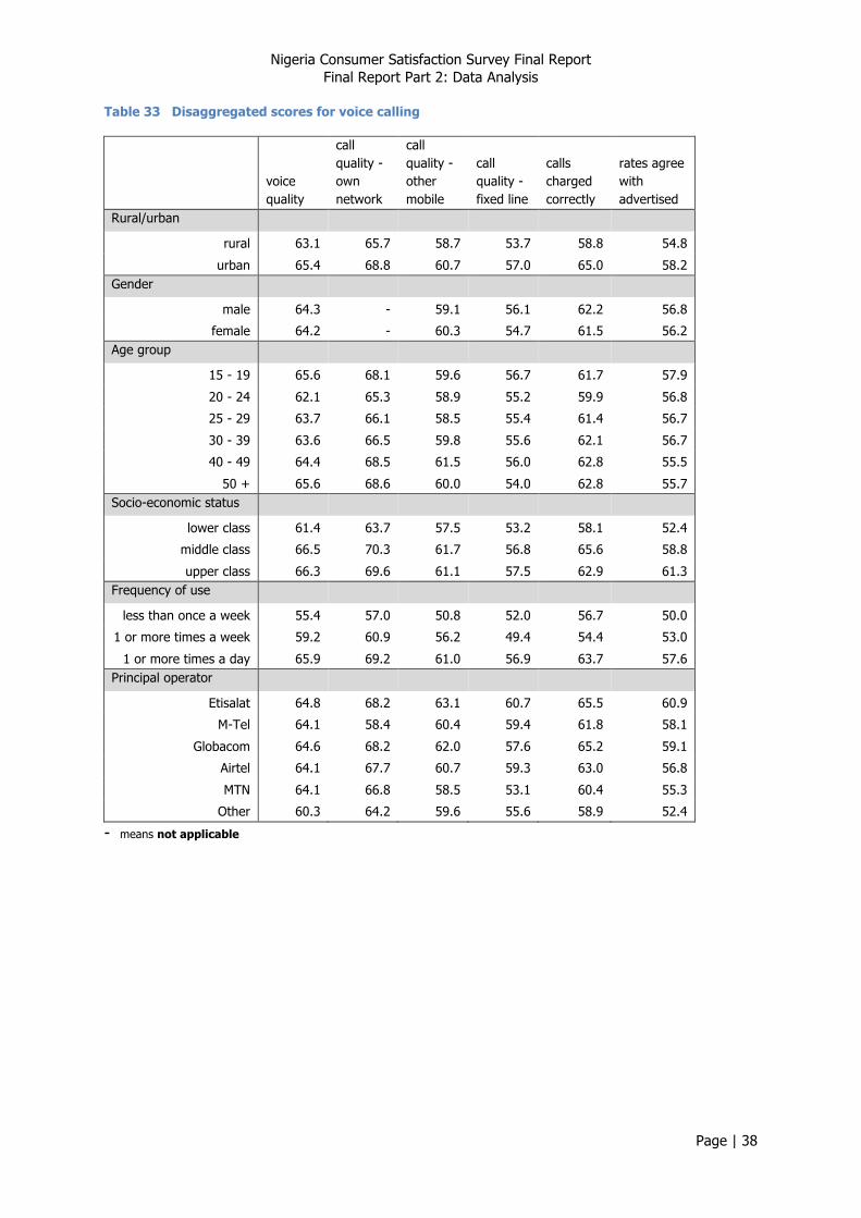
Table 33 Disaggregated scores for voice calling
voice quality
call quality - own network
call quality - other mobile
call quality - fixed line
calls charged correctly
rates agree with advertised
Rural/urban
rural 63.1 65.7 58.7 53.7 58.8 54.8
urban 65.4 68.8 60.7 57.0 65.0 58.2 Gender
male 64.3 - 59.1 56.1 62.2 56.8
female 64.2 - 60.3 54.7 61.5 56.2 Age group
15 - 19 65.6 68.1 59.6 56.7 61.7 57.9
20 - 24 62.1 65.3 58.9 55.2 59.9 56.8
25 - 29 63.7 66.1 58.5 55.4 61.4 56.7
30 - 39 63.6 66.5 59.8 55.6 62.1 56.7
40 - 49 64.4 68.5 61.5 56.0 62.8 55.5
50 + 65.6 68.6 60.0 54.0 62.8 55.7 Socio-economic status
lower class 61.4 63.7 57.5 53.2 58.1 52.4
middle class 66.5 70.3 61.7 56.8 65.6 58.8
upper class 66.3 69.6 61.1 57.5 62.9 61.3 Frequency of use
less than once a week 55.4 57.0 50.8 52.0 56.7 50.0
1 or more times a week 59.2 60.9 56.2 49.4 54.4 53.0
1 or more times a day 65.9 69.2 61.0 56.9 63.7 57.6 Principal operator
Etisalat 64.8 68.2 63.1 60.7 65.5 60.9
M-Tel 64.1 58.4 60.4 59.4 61.8 58.1
Globacom 64.6 68.2 62.0 57.6 65.2 59.1
Airtel 64.1 67.7 60.7 59.3 63.0 56.8
MTN 64.1 66.8 58.5 53.1 60.4 55.3
Other 60.3 64.2 59.6 55.6 58.9 52.4
- means not applicable
Nigeria Consumer Satisfaction Survey Final Report Final Report Part 2: Data Analysis
Page | 39
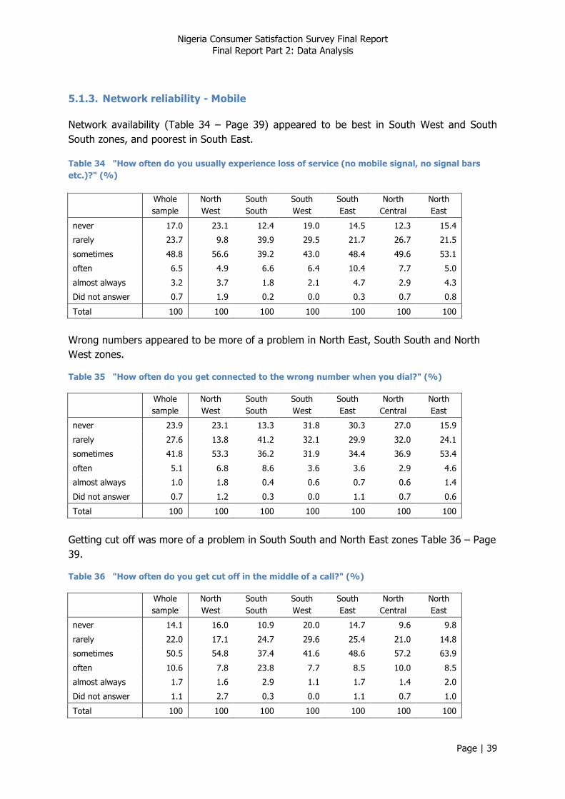
5.1.3. Network reliability - Mobile
Network availability (Table 34 – Page 39) appeared to be best in South West and South South zones, and poorest in South East.
Table 34 "How often do you usually experience loss of service (no mobile signal, no signal bars etc.)?" (%)
Whole sample
North West
South South
South West
South East
North Central
North East
never 17.0 23.1 12.4 19.0 14.5 12.3 15.4
rarely 23.7 9.8 39.9 29.5 21.7 26.7 21.5
sometimes 48.8 56.6 39.2 43.0 48.4 49.6 53.1
often 6.5 4.9 6.6 6.4 10.4 7.7 5.0
almost always 3.2 3.7 1.8 2.1 4.7 2.9 4.3
Did not answer 0.7 1.9 0.2 0.0 0.3 0.7 0.8
Total 100 100 100 100 100 100 100
Wrong numbers appeared to be more of a problem in North East, South South and North West zones.
Table 35 "How often do you get connected to the wrong number when you dial?" (%)
Whole sample
North West
South South
South West
South East
North Central
North East
never 23.9 23.1 13.3 31.8 30.3 27.0 15.9
rarely 27.6 13.8 41.2 32.1 29.9 32.0 24.1
sometimes 41.8 53.3 36.2 31.9 34.4 36.9 53.4
often 5.1 6.8 8.6 3.6 3.6 2.9 4.6
almost always 1.0 1.8 0.4 0.6 0.7 0.6 1.4
Did not answer 0.7 1.2 0.3 0.0 1.1 0.7 0.6
Total 100 100 100 100 100 100 100
Getting cut off was more of a problem in South South and North East zones Table 36 – Page 39.
Table 36 "How often do you get cut off in the middle of a call?" (%)
Whole sample
North West
South South
South West
South East
North Central
North East
never 14.1 16.0 10.9 20.0 14.7 9.6 9.8
rarely 22.0 17.1 24.7 29.6 25.4 21.0 14.8
sometimes 50.5 54.8 37.4 41.6 48.6 57.2 63.9
often 10.6 7.8 23.8 7.7 8.5 10.0 8.5
almost always 1.7 1.6 2.9 1.1 1.7 1.4 2.0
Did not answer 1.1 2.7 0.3 0.0 1.1 0.7 1.0
Total 100 100 100 100 100 100 100
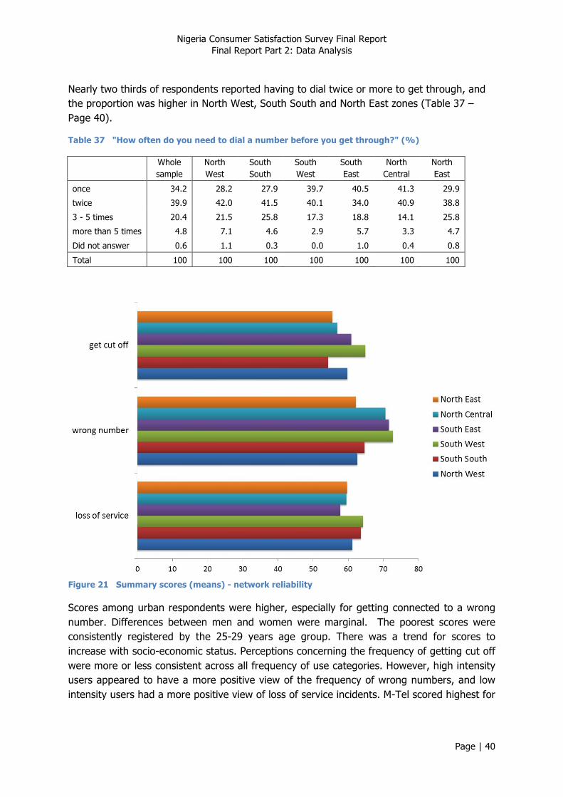
Nigeria Consumer Satisfaction Survey Final Report Final Report Part 2: Data Analysis
Page | 40
Nearly two thirds of respondents reported having to dial twice or more to get through, and the proportion was higher in North West, South South and North East zones (Table 37 – Page 40).
Table 37 "How often do you need to dial a number before you get through?" (%)
Whole sample
North West
South South
South West
South East
North Central
North East
once 34.2 28.2 27.9 39.7 40.5 41.3 29.9
twice 39.9 42.0 41.5 40.1 34.0 40.9 38.8
3 - 5 times 20.4 21.5 25.8 17.3 18.8 14.1 25.8
more than 5 times 4.8 7.1 4.6 2.9 5.7 3.3 4.7
Did not answer 0.6 1.1 0.3 0.0 1.0 0.4 0.8
Total 100 100 100 100 100 100 100
Figure 21 Summary scores (means) - network reliability
Scores among urban respondents were higher, especially for getting connected to a wrong number. Differences between men and women were marginal. The poorest scores were consistently registered by the 25-29 years age group. There was a trend for scores to increase with socio-economic status. Perceptions concerning the frequency of getting cut off were more or less consistent across all frequency of use categories. However, high intensity users appeared to have a more positive view of the frequency of wrong numbers, and low intensity users had a more positive view of loss of service incidents. M-Tel scored highest for

Nigeria Consumer Satisfaction Survey Final Report Final Report Part 2: Data Analysis
Page | 41
loss of service (and MTN poorest). The spread across operators of scores was smaller for both wrong numbers and getting cut off, but Airtel scores were lowest.
Table 38 Disaggregated scores for network reliability
Loss of service
Wrong number Get cut off
Rural/urban
rural 60.9 65.9 58.5
urban 61.6 68.5 59.8 Gender
male - 67.5 59.4
female - 66.9 58.9 Age group
15 - 19 61.2 69.1 61.3
20 - 24 62.1 67.5 58.9
25 - 29 60.1 65.3 57.4
30 - 39 61.8 66.4 59.1
40 - 49 61.6 67.0 59.4
50 + 61.0 67.8 59.1 Socio-economic status
lower class 59.4 64.4 58.3
middle class 62.1 68.8 59.1
upper class 64.5 70.8 61.8 Frequency of use
less than once a week 63.4 65.8 59.4
1 or more times a week 58.0 64.2 60.8
1 or more times a day 61.7 67.9 58.9 Principal operator
Etisalat 62.8 67.7 59.8
M-Tel 66.6 67.2 61.6
Globacom 62.3 68.5 59.4
Airtel 61.0 64.5 57.6
MTN 60.9 67.5 59.3
Other 61.3 63.5 61.4
- means not applicable
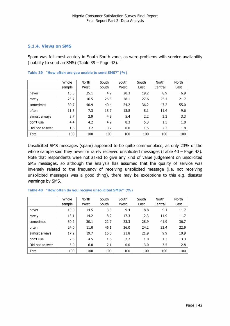
Nigeria Consumer Satisfaction Survey Final Report Final Report Part 2: Data Analysis
Page | 42
5.1.4. Views on SMS
Spam was felt most acutely in South South zone, as were problems with service availability (inability to send an SMS) (Table 39 – Page 42).
Table 39 "How often are you unable to send SMS?" (%)
Whole sample
North West
South South
South West
South East
North Central
North East
never 15.5 25.1 4.9 20.3 19.2 8.9 6.9
rarely 23.7 16.5 26.3 28.1 27.6 25.4 21.7
sometimes 39.7 40.9 40.4 24.2 36.2 47.2 55.0
often 11.3 7.3 18.7 13.8 8.1 11.4 9.6
almost always 3.7 2.9 4.9 5.4 2.2 3.3 3.3
don't use 4.4 4.2 4.2 8.3 5.3 1.5 1.8
Did not answer 1.6 3.2 0.7 0.0 1.5 2.3 1.8
Total 100 100 100 100 100 100 100
Unsolicited SMS messages (spam) appeared to be quite commonplace, as only 23% of the whole sample said they never or rarely received unsolicited messages (Table 40 – Page 42). Note that respondents were not asked to give any kind of value judgement on unsolicited SMS messages, so although the analysis has assumed that the quality of service was inversely related to the frequency of receiving unsolicited message (i.e. not receiving unsolicited messages was a good thing), there may be exceptions to this e.g. disaster warnings by SMS.
Table 40 "How often do you receive unsolicited SMS?" (%)
Whole sample
North West
South South
South West
South East
North Central
North East
never 10.0 14.5 3.3 9.4 8.8 9.1 11.7
rarely 13.1 14.2 8.2 17.3 12.3 11.9 11.7
sometimes 30.2 30.1 22.7 23.3 28.9 41.9 36.7
often 24.0 11.0 46.1 26.0 24.2 22.4 22.9
almost always 17.2 19.7 16.0 21.8 21.9 9.9 10.9
don't use 2.5 4.5 1.6 2.2 1.0 1.3 3.3
Did not answer 3.0 6.0 2.1 0.0 3.0 3.5 2.8
Total 100 100 100 100 100 100 100
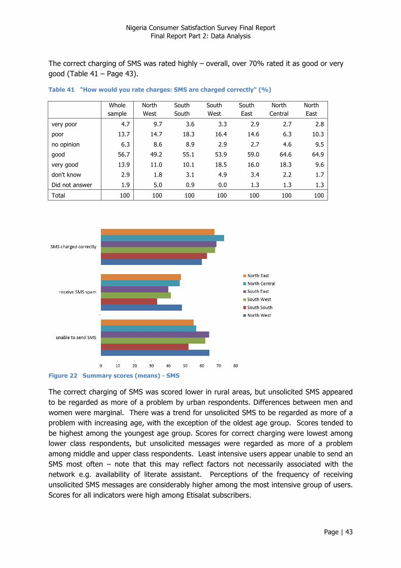
Nigeria Consumer Satisfaction Survey Final Report Final Report Part 2: Data Analysis
Page | 43
The correct charging of SMS was rated highly – overall, over 70% rated it as good or very good (Table 41 – Page 43).
Table 41 "How would you rate charges: SMS are charged correctly" (%)
Whole sample
North West
South South
South West
South East
North Central
North East
very poor 4.7 9.7 3.6 3.3 2.9 2.7 2.8
poor 13.7 14.7 18.3 16.4 14.6 6.3 10.3
no opinion 6.3 8.6 8.9 2.9 2.7 4.6 9.5
good 56.7 49.2 55.1 53.9 59.0 64.6 64.9
very good 13.9 11.0 10.1 18.5 16.0 18.3 9.6
don't know 2.9 1.8 3.1 4.9 3.4 2.2 1.7
Did not answer 1.9 5.0 0.9 0.0 1.3 1.3 1.3
Total 100 100 100 100 100 100 100
Figure 22 Summary scores (means) - SMS
The correct charging of SMS was scored lower in rural areas, but unsolicited SMS appeared to be regarded as more of a problem by urban respondents. Differences between men and women were marginal. There was a trend for unsolicited SMS to be regarded as more of a problem with increasing age, with the exception of the oldest age group. Scores tended to be highest among the youngest age group. Scores for correct charging were lowest among lower class respondents, but unsolicited messages were regarded as more of a problem among middle and upper class respondents. Least intensive users appear unable to send an SMS most often – note that this may reflect factors not necessarily associated with the network e.g. availability of literate assistant. Perceptions of the frequency of receiving unsolicited SMS messages are considerably higher among the most intensive group of users. Scores for all indicators were high among Etisalat subscribers.

Nigeria Consumer Satisfaction Survey Final Report Final Report Part 2: Data Analysis
Page | 44
Table 42 Disaggregated scores for SMS services
Unable to send
SMS
Receive SMS spam
SMS charged correctly
Rural/urban
rural 58.9 44.0 63.4
urban 60.3 42.6 68.8 Gender
male 60.2 43.8 66.2
female 59.0 42.8 66.0 Age group
15 - 19 61.6 46.6 68.5
20 - 24 59.3 44.9 65.5
25 - 29 58.1 43.4 65.8
30 - 39 58.9 42.3 65.9
40 - 49 58.2 40.2 65.6
50 + 61.2 43.0 65.7 Socio-economic status
lower class 60.4 44.2 62.0
middle class 58.4 42.5 69.8
upper class 60.5 42.4 68.1 Frequency of use
less than once a week 54.5 53.1 61.6
1 or more times a week 59.1 54.2 57.3
1 or more times a day 60.0 40.6 68.1 Principal operator
Etisalat 61.7 47.0 66.7
M-Tel 53.7 46.8 64.5
Globacom 58.8 43.3 67.6
Airtel 58.1 42.5 66.2
MTN 59.9 42.9 65.7
Other 59.7 48.5 61.2

Nigeria Consumer Satisfaction Survey Final Report Final Report Part 2: Data Analysis
Page | 45
5.1.5. Views on Value Added Services
Overall, almost one third of respondents used their mobile phone to access value added services11; this proportion was similar across zones with the exception of North West zone, where it was only 13% (Table 43 – Page 45).
Table 43 "Do you use your mobile phone to access information or value added services?" (%)
Whole sample
North West
South South
South West
South East
North Central
North East
no 69.3 81.9 62.6 70.9 61.9 64.7 63.4
yes 28.5 12.8 36.8 29.1 36.9 32.8 34.6
Did not answer 2.2 5.3 0.6 0.0 1.2 2.5 1.9
Total 100 100 100 100 100 100 100
Table 44 "How often have you had difficulty accessing VAS?" - among VAS users (%)
Whole sample
North West
South South
South West
South East
North Central
North East
never 8.8 11.4 5.3 13.9 9.4 4.7 8.1
rarely 22.3 10.0 25.2 35.7 20.2 13.4 21.1
sometimes 53.7 59.2 54.7 37.7 52.7 67.3 56.0
often 9.2 8.1 10.6 9.9 9.8 10.1 5.8
almost always 2.9 4.5 2.6 2.8 2.3 2.3 3.2
Did not answer 3.3 6.8 1.6 0.0 5.6 2.2 5.8
Total 100 100 100 100 100 100 100
Table 45 "How would you rate charges: info/VAS are charged correctly?" - among VAS users (%)
Whole sample
North West
South South
South West
South East
North Central
North East
very poor 4.4 4.4 6.6 4.0 5.6 3.0 2.6
poor 19.0 21.7 28.9 14.8 23.8 13.5 12.7
no opinion 10.5 8.6 15.2 6.1 8.1 14.4 10.6
good 46.6 38.8 36.9 53.7 47.0 43.9 55.3
very good 11.4 6.5 8.9 14.9 11.1 14.3 10.5
don't know 6.3 12.9 2.7 6.4 3.3 8.2 6.8
Did not answer 1.8 7.1 0.8 0.0 1.1 2.7 1.4
Total 100 100 100 100 100 100 100
11 Information or value added services e.g. downloads, mobile banking etc.

Nigeria Consumer Satisfaction Survey Final Report Final Report Part 2: Data Analysis
Page | 46
Figure 23 Summary scores (means) – VAS
Rural respondents registered lower scores for the correct charging for VAS. Women registered slightly lower scores. Scores tended to be highest among the youngest age group. Differences between middle class and upper class respondents were marginal, but scores registered by lower class respondents were lower. Low intensity users expressed least difficulty accessing VAS services, but they were most likely to feel that services were not charged correctly. Etisalat subscribers scored both indicators highly, and MTN subscribers rated them poorly.
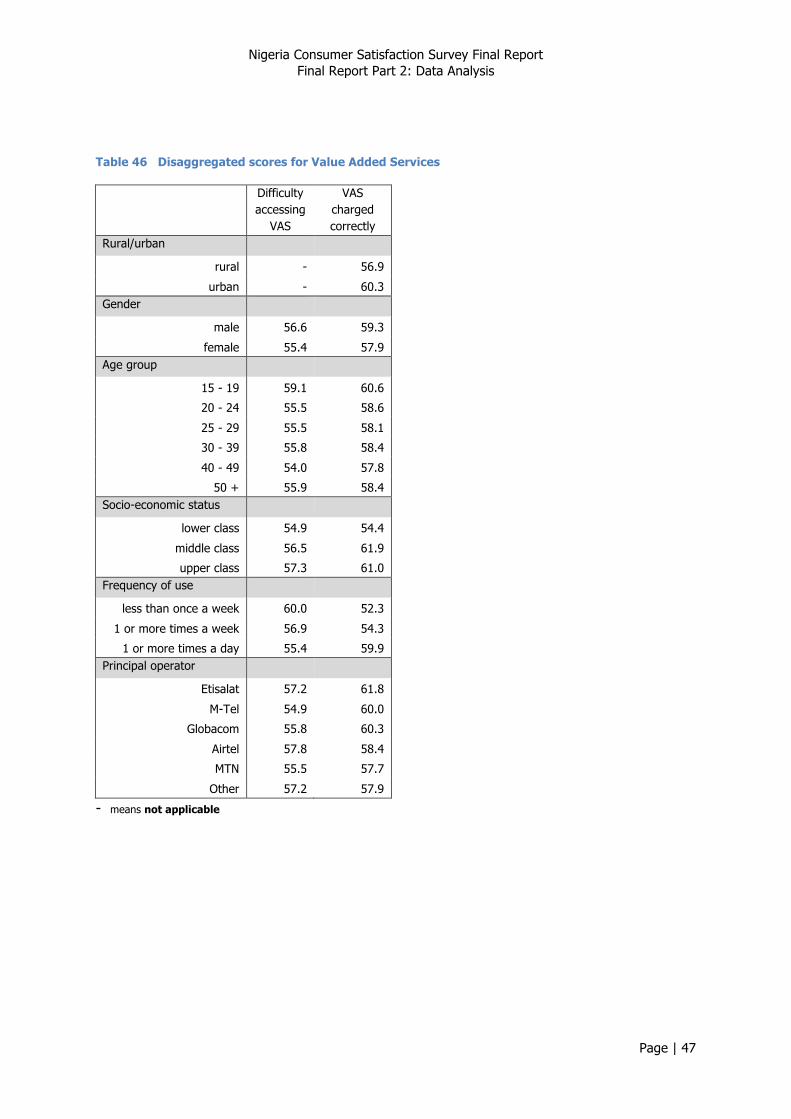
Nigeria Consumer Satisfaction Survey Final Report Final Report Part 2: Data Analysis
Page | 47
Table 46 Disaggregated scores for Value Added Services
Difficulty accessing
VAS
VAS charged correctly
Rural/urban
rural - 56.9
urban - 60.3 Gender
male 56.6 59.3
female 55.4 57.9 Age group
15 - 19 59.1 60.6
20 - 24 55.5 58.6
25 - 29 55.5 58.1
30 - 39 55.8 58.4
40 - 49 54.0 57.8
50 + 55.9 58.4 Socio-economic status
lower class 54.9 54.4
middle class 56.5 61.9
upper class 57.3 61.0 Frequency of use
less than once a week 60.0 52.3
1 or more times a week 56.9 54.3
1 or more times a day 55.4 59.9 Principal operator
Etisalat 57.2 61.8
M-Tel 54.9 60.0
Globacom 55.8 60.3
Airtel 57.8 58.4
MTN 55.5 57.7
Other 57.2 57.9
- means not applicable
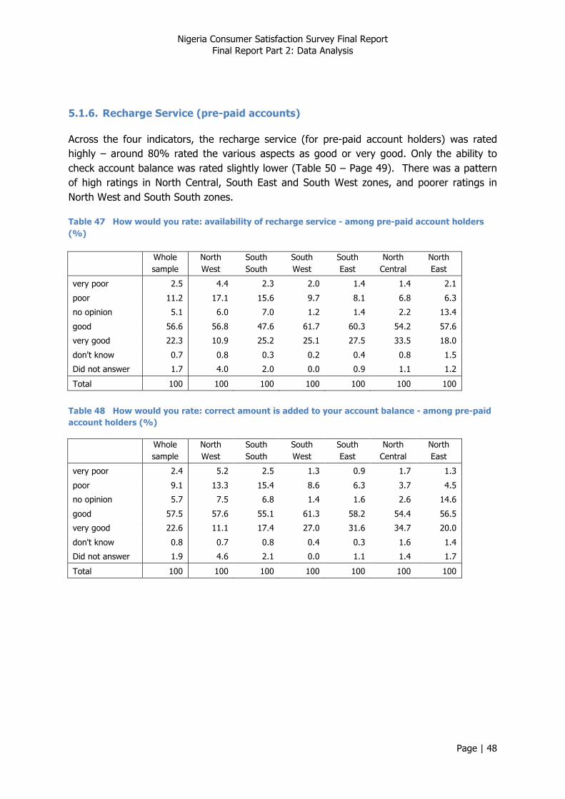
Nigeria Consumer Satisfaction Survey Final Report Final Report Part 2: Data Analysis
Page | 48
5.1.6. Recharge Service (pre-paid accounts)
Across the four indicators, the recharge service (for pre-paid account holders) was rated highly – around 80% rated the various aspects as good or very good. Only the ability to check account balance was rated slightly lower (Table 50 – Page 49). There was a pattern of high ratings in North Central, South East and South West zones, and poorer ratings in North West and South South zones.
Table 47 How would you rate: availability of recharge service - among pre-paid account holders (%)
Whole sample
North West
South South
South West
South East
North Central
North East
very poor 2.5 4.4 2.3 2.0 1.4 1.4 2.1
poor 11.2 17.1 15.6 9.7 8.1 6.8 6.3
no opinion 5.1 6.0 7.0 1.2 1.4 2.2 13.4
good 56.6 56.8 47.6 61.7 60.3 54.2 57.6
very good 22.3 10.9 25.2 25.1 27.5 33.5 18.0
don't know 0.7 0.8 0.3 0.2 0.4 0.8 1.5
Did not answer 1.7 4.0 2.0 0.0 0.9 1.1 1.2
Total 100 100 100 100 100 100 100
Table 48 How would you rate: correct amount is added to your account balance - among pre-paid account holders (%)
Whole sample
North West
South South
South West
South East
North Central
North East
very poor 2.4 5.2 2.5 1.3 0.9 1.7 1.3
poor 9.1 13.3 15.4 8.6 6.3 3.7 4.5
no opinion 5.7 7.5 6.8 1.4 1.6 2.6 14.6
good 57.5 57.6 55.1 61.3 58.2 54.4 56.5
very good 22.6 11.1 17.4 27.0 31.6 34.7 20.0
don't know 0.8 0.7 0.8 0.4 0.3 1.6 1.4
Did not answer 1.9 4.6 2.1 0.0 1.1 1.4 1.7
Total 100 100 100 100 100 100 100

Nigeria Consumer Satisfaction Survey Final Report Final Report Part 2: Data Analysis
Page | 49
Table 49 How would you rate: time taken for credit to appear on your account - among pre-paid account holders (%)
Whole sample
North West
South South
South West
South East
North Central
North East
very poor 2.2 3.2 2.8 1.6 1.3 2.2 1.5
poor 11.1 15.3 17.6 10.5 9.8 5.0 6.0
no opinion 6.7 7.6 6.1 1.5 2.1 7.9 16.0
good 55.8 54.5 48.0 61.9 59.8 52.4 56.9
very good 21.0 12.9 21.9 24.1 25.3 29.3 16.2
don't know 1.1 0.9 1.4 0.4 0.7 1.6 1.8
Did not answer 2.2 5.5 2.2 0.0 1.1 1.5 1.7
Total 100 100 100 100 100 100 100
Table 50 How would you rate: ability to check your account balance - among pre-paid account holders (%)
Whole sample
North West
South South
South West
South East
North Central
North East
very poor 3.0 4.5 2.9 3.1 1.1 2.9 2.0
poor 12.4 15.5 20.1 10.4 11.4 9.4 6.6
no opinion 7.3 8.0 7.3 1.6 1.6 10.5 16.5
good 54.6 53.1 51.0 59.3 58.3 50.5 54.5
very good 19.2 12.4 14.9 25.3 25.8 23.4 15.4
don't know 1.3 1.6 1.5 0.3 0.6 1.9 1.9
Did not answer 2.3 4.9 2.5 0.0 1.3 1.5 3.0
Total 100 100 100 100 100 100 100
Nigeria Consumer Satisfaction Survey Final Report Final Report Part 2: Data Analysis
Page | 50
Figure 24 Summary scores (means) - recharge service

Nigeria Consumer Satisfaction Survey Final Report Final Report Part 2: Data Analysis
Page | 51
Scores registered by rural respondents were consistently lower than those of urban respondents. Women registered slightly lower scores across all indicators. Scores were consistently highest among the youngest age group, but among other age groups, there was a trend for scores to increase with age for both availability of the recharge serve and adding correct amount to the account. Scores were consistently highest among middle class respondents, slightly lower among upper class respondents, and considerably lower among lower class respondents. Scores were mostly lowest among MTN subscribers, although the spread of scores across operators was small.
Table 51 Disaggregated scores for recharge services (pre-paid accounts)
Availability of
recharge service
Correct amount added
Time for credit to appear
Ability to check
balance
Rural/urban
rural 69.5 70.4 69.0 67.4
urban 74.1 75.1 73.5 71.2 Gender
male 72.4 73.2 72.0 69.9
female 71.2 72.3 70.4
68.7 Age group
15 - 19 73.3 74.8 73.5 71.1
20 - 24 69.9 71.7 70.6 68.5
25 - 29 70.7 71.8 70.4 68.0
30 - 39 71.6 72.4 70.8 69.4
40 - 49 71.8 72.7 71.1 69.4
50 + 72.8 73.1 71.1 69.5 Socio-economic status
lower class 68.0 68.8 67.5 65.9
middle class 75.4 76.4 74.7 72.1
upper class 73.2 74.4 72.9 71.9 Frequency of use
less than once a week 64.1 64.5 64.0 63.2
1 or more times a week 62.7 64.6 63.1 61.8
1 or more times a day 74.1 74.9 73.3 71.2 Principal operator
Etisalat 72.6 73.3 72.6 71.5
M-Tel 78.0 75.6 75.4 71.4
Globacom 72.3 74.2 72.7 70.7
Airtel 72.0 72.1 71.1 70.0
MTN 71.5 72.5 70.7 68.5
Other 65.8 64.6 67.3 63.1

Nigeria Consumer Satisfaction Survey Final Report Final Report Part 2: Data Analysis
Page | 52
5.1.7. Complaints Handling - Mobile
Overall, one third of respondents had made a complaint in the last year (Table 52 – Page 52). The frequency of complaints (in the last year) does not appear to be linked to any particular feature of service provision, with one exception – more sophisticated consumers, who use their phone to access VAS, tended to complain more frequently (rs = 0.227, p = 0.000).
Table 52 "How often have you made a complaint in the last year?" (%)
Whole sample
North West
South South
South West
South East
North Central
North East
never 64.0 68.9 65.4 69.2 59.1 50.2 65.5
once 14.2 9.4 18.8 12.0 17.2 19.6 13.0
2 - 5 times 12.8 6.5 10.7 12.6 14.5 22.0 15.2
more than 5 times 4.8 3.7 3.2 6.2 6.2 5.5 4.0
Did not answer 4.2 11.5 1.9 0.0 3.1 2.7 2.3
Total 100 100 100 100 100 100 100
The highest level of complaints was registered in North Central zone. Across all zones, complaints were most commonly lodged by phone (Table 53 – Page 52).
Table 53 "How did you usually contact Customer Services?" - among those who made a complaint (%)
Whole sample
North West
South South
South West
South East
North Central
North East
by phone 89.6 84.5 81.0 90.2 91.0 95.4 92.9
visit to Customer Care centre 7.9 12.3 13.5 8.9 6.5 3.0 5.0
Did not answer 2.5 3.2 5.5 0.9 2.4 1.6 2.1
Total 100 100 100 100 100 100 100
Overall, complaints most commonly concerned problems with recharging and with charging and billing (Table 54 – Page 53).
Nigeria Consumer Satisfaction Survey Final Report Final Report Part 2: Data Analysis
Page | 53
Table 54 "The last time you made a complaint, what was it about?" – among those who made a complaint (%), by zone
Whole sample
North West
South South
South West
South East
North Central
North East
Incorrect charging / billing 20.1 19.6 19.0 31.6 19.4 10.8 20.4
Inability to make / receive voice calls 13.8 6.6 14.9 12.1 15.6 14.6 19.8
Request for Value Added service 8.7 1.7 11.2 5.9 8.9 13.9 8.8
Time to resolve an existing complaint 4.8 1.2 5.0 5.0 4.4 6.2 6.4
Blackberry complaint 2.3 0.6 4.5 3.3 1.1 1.9 2.3
Inability to recharge 22.4 40.6 18.5 20.0 20.0 24.9 9.6
paying a bill 2.5 1.1 4.4 1.1 2.5 2.5 3.9
SMS 5.7 7.4 5.5 4.2 3.5 6.7 6.8
Data complaint 4.5 2.3 1.6 5.5 6.7 5.0 5.4
other 11.3 12.9 7.9 10.9 14.4 9.9 12.8
Did not answer 3.9 6.1 7.4 0.2 3.5 3.6 3.8
Total 100 100 100 100 100 100 100
Incorrect charging / billing appeared to be of particular concern in South West zone, and among Airtel subscribers (Table 55 – Page 53); inability to recharge was the leading concern in North West zone.
Table 55 "The last time you made a complaint, what was it about?" – among those who made a complaint (%), by operator
Whole sample
Etisalat Globacom Airtel MTN
Incorrect charging / billing 20.1 17.9 20.5 25.4 19.0
Inability to make / receive voice calls 13.8 11.2 11.5 13.1 14.8
Request for Value Added service 8.7 12.5 9.6 6.2 8.7
Time to resolve an existing complaint 4.8 3.8 4.8 5.4 4.8
Blackberry complaint 2.3 2.2 2.1 2.1 2.4
Inability to recharge 22.4 24.8 22.4 19.1 23.0
paying a bill 2.5 1.9 3.5 3.0 2.3
SMS 5.7 5.3 7.0 5.6 5.4
Data complaint 4.5 6.8 4.8 4.0 4.3
other 11.3 8.7 10.2 12.6 11.6
Did not answer 3.9 4.8 3.6 3.4 3.8
Total 100 100 100 100 100
Among those who made a complaint, poorest ratings for aspects of the complaints handling process were given to time to answer their call (Table 57 – Page 54) and to the time taken to resolve their complaint (Table 61 – Page 55). Ratings for both indicators were low in North Central zone. The staff that people talked to (e.g. polite, knowledgeable) got the highest ratings in all zones.
Nigeria Consumer Satisfaction Survey Final Report Final Report Part 2: Data Analysis
Page | 54
Table 56 "How would you rate aspects of complaints handling: finding the right number to call?" - among those who had made a complaint (%)
Whole sample
North West
South South
South West
South East
North Central
North East
very poor 5.5 8.0 3.0 6.1 5.4 6.0 3.8
poor 17.1 17.4 15.3 19.0 22.1 15.7 13.0
no opinion 7.0 5.2 21.2 4.1 3.8 3.6 6.8
good 54.8 55.8 44.5 50.9 52.6 60.4 63.1
very good 12.4 7.9 9.5 19.1 12.4 11.9 11.4
don't know 1.1 3.0 1.3 0.7 0.9 0.6 0.7
Did not answer 2.1 2.8 5.1 0.0 2.8 1.8 1.3
Total 100 100 100 100 100 100 100
Table 57 "How would you rate aspects of complaints handling: time taken to answer call?" - among those who had made a complaint (%)
Whole sample
North West
South South
South West
South East
North Central
North East
very poor 21.4 12.1 12.3 50.4 21.2 13.8 11.8
poor 24.3 27.9 18.9 0.0 37.1 40.4 22.4
no opinion 8.2 5.4 16.4 2.5 2.9 12.6 9.2
good 35.0 42.0 34.6 36.3 29.9 24.8 46.8
very good 7.2 6.2 10.0 10.0 5.5 4.5 7.6
don't know 1.1 2.0 0.9 0.8 0.8 1.4 0.6
Did not answer 2.9 4.4 7.0 0.0 2.7 2.6 1.6
Total 100 100 100 100 100 100 100
Table 58 "How would you rate aspects of complaints handling: effectiveness of IVR service?" - among those who had made a complaint (%)
Whole sample
North West
South South
South West
South East
North Central
North East
very poor 11.4 6.8 3.4 27.2 7.3 11.9 5.4
poor 14.2 18.1 9.8 0.0 26.4 20.6 12.7
no opinion 9.7 7.2 19.2 6.4 6.5 9.5 10.7
good 46.5 47.1 37.3 46.5 46.0 43.8 59.8
very good 12.8 10.1 21.4 18.2 8.7 10.1 7.3
don't know 2.3 5.6 1.8 1.8 1.9 1.6 1.7
Did not answer 3.1 5.1 7.1 0.0 3.2 2.5 2.3
Total 100 100 100 100 100 100 100

Nigeria Consumer Satisfaction Survey Final Report Final Report Part 2: Data Analysis
Page | 55
Table 59 "How would you rate aspects of complaints handling: staff you talked to?" - among those who had made a complaint (%)
Whole sample
North West
South South
South West
South East
North Central
North East
very poor 4.9 2.8 1.9 12.3 1.8 1.7 8.0
poor 6.9 12.3 13.4 0.0 9.4 3.6 6.9
no opinion 5.6 5.2 11.9 3.9 2.8 3.8 7.6
good 47.9 48.3 38.5 49.1 55.3 48.3 47.4
very good 29.2 20.8 22.9 33.3 27.5 38.6 26.1
don't know 1.8 4.1 3.0 1.4 0.6 1.1 1.2
Did not answer 3.6 6.6 8.3 0.0 2.7 2.9 2.7
Total 100 100 100 100 100 100 100
Table 60 "How would you rate aspects of complaints handling: resolution of your complaint?" - among those who had made a complaint (%)
Whole sample
North West
South South
South West
South East
North Central
North East
very poor 12.5 8.2 6.2 28.5 4.5 9.8 13.2
poor 15.6 17.2 13.8 0.0 24.9 20.4 21.0
no opinion 10.1 5.8 16.5 4.1 3.6 16.1 13.4
good 42.4 41.3 37.8 47.3 48.0 40.8 38.1
very good 14.0 16.6 14.4 19.3 16.0 8.7 9.8
don't know 1.2 0.8 2.3 0.9 0.3 1.2 1.9
Did not answer 4.2 9.9 9.0 0.0 2.7 3.1 2.5
Total 100 100 100 100 100 100 100
Table 61 "How would you rate aspects of complaints handling: time to resolve your complaint?" - among those who had made a complaint (%)
Whole sample
North West
South South
South West
South East
North Central
North East
very poor 21.9 6.9 11.8 38.1 9.8 32.1 22.0
poor 18.3 22.0 25.6 0.0 33.9 16.1 20.3
no opinion 6.3 4.8 13.8 4.1 4.0 4.7 8.1
good 34.5 33.6 25.9 41.6 36.7 34.3 32.2
very good 11.9 15.0 8.4 15.4 11.9 8.3 12.8
don't know 1.4 1.4 2.5 0.7 0.6 1.4 2.3
Did not answer 5.6 16.3 11.9 0.0 3.1 3.2 2.2
Total 100 100 100 100 100 100 100
Nigeria Consumer Satisfaction Survey Final Report Final Report Part 2: Data Analysis
Page | 56
Figure 25 Summary scores (means) - complaints handling
There is some evidence that the customer care experienced through Customer Care centres was more timely – see Figure 26 (Page 56).
Figure 26 Rating of customer care experienced through call centres and Customer Care centres (whole sample)
Only for certain indicators were scores lower among rural respondents – satisfactory and timely resolution of complaints, and quality of staff. Men rated the IVR service more poorly than women did, and women rated the quality of staff more poorly. No clear trends with age were evident. Scores for time to answer decrease with socio-economic status, yet scores for time taken to resolve the complaint increase with socio-economic status. Finding the right number to call, and the quality of staff were scored lowest by lower class respondents. Overall, least intensive users tended to rate aspects of the complaints
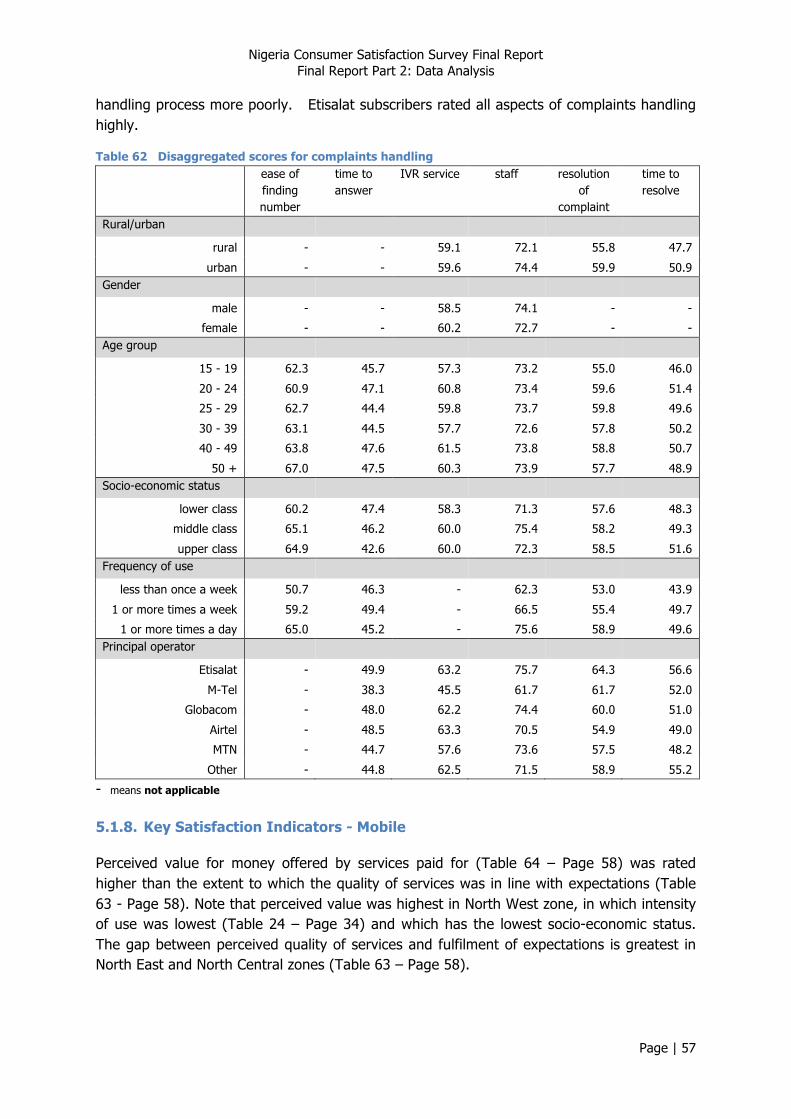
Nigeria Consumer Satisfaction Survey Final Report Final Report Part 2: Data Analysis
Page | 57
handling process more poorly. Etisalat subscribers rated all aspects of complaints handling highly.
Table 62 Disaggregated scores for complaints handling ease of
finding number
time to answer
IVR service staff resolution of
complaint
time to resolve
Rural/urban
rural - - 59.1 72.1 55.8 47.7
urban - - 59.6 74.4 59.9 50.9 Gender
male - - 58.5 74.1 - -
female - - 60.2 72.7 - - Age group
15 - 19 62.3 45.7 57.3 73.2 55.0 46.0
20 - 24 60.9 47.1 60.8 73.4 59.6 51.4
25 - 29 62.7 44.4 59.8 73.7 59.8 49.6
30 - 39 63.1 44.5 57.7 72.6 57.8 50.2
40 - 49 63.8 47.6 61.5 73.8 58.8 50.7
50 + 67.0 47.5 60.3 73.9 57.7 48.9 Socio-economic status
lower class 60.2 47.4 58.3 71.3 57.6 48.3
middle class 65.1 46.2 60.0 75.4 58.2 49.3
upper class 64.9 42.6 60.0 72.3 58.5 51.6 Frequency of use
less than once a week 50.7 46.3 - 62.3 53.0 43.9
1 or more times a week 59.2 49.4 - 66.5 55.4 49.7
1 or more times a day 65.0 45.2 - 75.6 58.9 49.6 Principal operator
Etisalat - 49.9 63.2 75.7 64.3 56.6
M-Tel - 38.3 45.5 61.7 61.7 52.0
Globacom - 48.0 62.2 74.4 60.0 51.0
Airtel - 48.5 63.3 70.5 54.9 49.0
MTN - 44.7 57.6 73.6 57.5 48.2
Other - 44.8 62.5 71.5 58.9 55.2
- means not applicable 5.1.8. Key Satisfaction Indicators - Mobile
Perceived value for money offered by services paid for (Table 64 – Page 58) was rated higher than the extent to which the quality of services was in line with expectations (Table 63 - Page 58). Note that perceived value was highest in North West zone, in which intensity of use was lowest (Table 24 – Page 34) and which has the lowest socio-economic status. The gap between perceived quality of services and fulfilment of expectations is greatest in North East and North Central zones (Table 63 – Page 58).

Nigeria Consumer Satisfaction Survey Final Report Final Report Part 2: Data Analysis
Page | 58
There was a trend across all four indicators for scores to be lowest in North East zone, and highest in South East and North West zones.
Table 63 "To what extent is the quality of services in line with your expectations?" (%)
Whole sample
North West
South South
South West
South East
North Central
North East
much lower 6.7 9.0 3.2 5.7 5.3 5.5 10.2
lower 29.7 19.6 31.9 32.1 29.5 31.6 39.5
in line 31.1 27.1 35.9 28.1 27.0 43.5 28.0
higher 21.8 23.0 21.6 27.9 29.2 12.2 14.8
much higher 3.2 2.9 3.3 4.9 5.2 1.5 1.3
don't know 2.8 5.6 1.4 1.3 1.0 1.8 3.8
Did not answer 4.7 12.8 2.6 0.0 2.8 3.8 2.3
Total 100 100 100 100 100 100 100
Table 64 "Overall, how would you rate the value for money offered by the services you pay for?" (%)
Whole sample
North West
South South
South West
South East
North Central
North East
very poor 4.8 4.9 4.0 4.4 6.2 5.3 4.7
poor 26.0 15.8 26.1 32.7 29.0 28.2 28.9
no opinion 10.2 11.1 13.2 4.8 4.4 10.1 18.3
good 46.8 46.1 48.3 51.1 48.9 48.1 37.4
very good 4.8 4.0 4.7 6.0 8.0 2.6 3.8
don't know 2.3 3.9 1.0 1.1 0.7 1.9 4.5
Did not answer 5.1 14.2 2.7 0.0 2.9 3.9 2.3
Total 100 100 100 100 100 100 100
Table 65 "Overall, how satisfied are you with your mobile operator?" (%)
Whole sample
North West
South South
South West
South East
North Central
North East
very dissatisfied 3.8 4.2 2.3 3.1 4.9 4.5 4.3
dissatisfied 26.2 19.5 27.2 31.1 28.4 25.2 28.5
no opinion 11.1 12.5 12.6 4.3 3.9 13.0 21.6
satisfied 49.7 46.7 51.4 55.4 52.8 51.2 40.3
very satisfied 4.6 4.6 4.1 6.1 7.1 2.2 3.0
Did not answer 4.6 12.4 2.4 0.0 2.9 3.8 2.3
Total 100 100 100 100 100 100 100
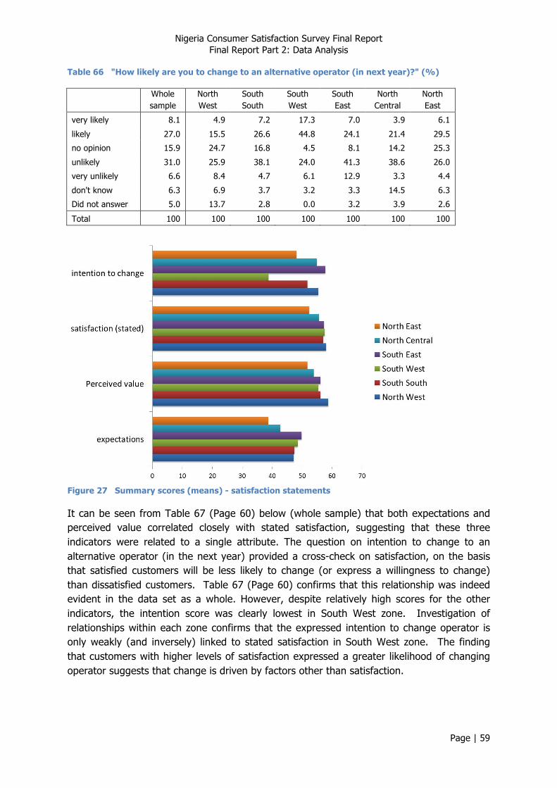
Nigeria Consumer Satisfaction Survey Final Report Final Report Part 2: Data Analysis
Page | 59
Table 66 "How likely are you to change to an alternative operator (in next year)?" (%)
Whole sample
North West
South South
South West
South East
North Central
North East
very likely 8.1 4.9 7.2 17.3 7.0 3.9 6.1
likely 27.0 15.5 26.6 44.8 24.1 21.4 29.5
no opinion 15.9 24.7 16.8 4.5 8.1 14.2 25.3
unlikely 31.0 25.9 38.1 24.0 41.3 38.6 26.0
very unlikely 6.6 8.4 4.7 6.1 12.9 3.3 4.4
don't know 6.3 6.9 3.7 3.2 3.3 14.5 6.3
Did not answer 5.0 13.7 2.8 0.0 3.2 3.9 2.6
Total 100 100 100 100 100 100 100
Figure 27 Summary scores (means) - satisfaction statements
It can be seen from Table 67 (Page 60) below (whole sample) that both expectations and perceived value correlated closely with stated satisfaction, suggesting that these three indicators were related to a single attribute. The question on intention to change to an alternative operator (in the next year) provided a cross-check on satisfaction, on the basis that satisfied customers will be less likely to change (or express a willingness to change) than dissatisfied customers. Table 67 (Page 60) confirms that this relationship was indeed evident in the data set as a whole. However, despite relatively high scores for the other indicators, the intention score was clearly lowest in South West zone. Investigation of relationships within each zone confirms that the expressed intention to change operator is only weakly (and inversely) linked to stated satisfaction in South West zone. The finding that customers with higher levels of satisfaction expressed a greater likelihood of changing operator suggests that change is driven by factors other than satisfaction.
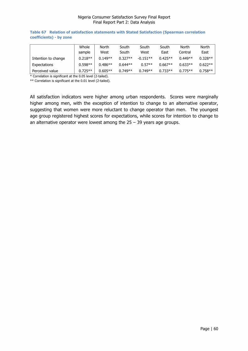
Nigeria Consumer Satisfaction Survey Final Report Final Report Part 2: Data Analysis
Page | 60
Table 67 Relation of satisfaction statements with Stated Satisfaction (Spearman correlation coefficients) - by zone
Whole sample
North West
South South
South West
South East
North Central
North East
Intention to change 0.218** 0.149** 0.327** -0.151** 0.425** 0.449** 0.328**
Expectations 0.598** 0.486** 0.644** 0.57** 0.667** 0.633** 0.622**
Perceived value 0.725** 0.605** 0.749** 0.749** 0.733** 0.775** 0.758** * Correlation is significant at the 0.05 level (2-tailed). ** Correlation is significant at the 0.01 level (2-tailed).
All satisfaction indicators were higher among urban respondents. Scores were marginally higher among men, with the exception of intention to change to an alternative operator, suggesting that women were more reluctant to change operator than men. The youngest age group registered highest scores for expectations, while scores for intention to change to an alternative operator were lowest among the 25 – 39 years age groups.

Nigeria Consumer Satisfaction Survey Final Report Final Report Part 2: Data Analysis
Page | 61
Overall, scores for satisfaction indicators increased with socio-economic status, with the exception of intention to change to an alternative operator, which exhibited an opposite trend; this suggests that higher status customers are more willing to change, irrespective of the level of service enjoyed. Indicators were rated highest among most intensive users, with the exception of intention to change, which showed only a modest spread of scores. Stated satisfaction was highest among Etisalat subscribers, , as were scores for alignment of services with expectations, and intention to change. Scores for these indicators tended to be lowest among MTN subscribers, with the exception of intention to change operator, indicating that MTN subscribers remain relatively loyal.
Table 68 Disaggregated scores for key satisfaction indicators
Expectations Perceived value
Satisfaction (stated)
Intention to change
Rural/urban
rural 43.2 52.9 53.9 49.3
urban 48.7 58.2 59.1 51.3 Gender
male 46.5 56.0 56.7 49.4
female 45.5 55.2 56.3 51.1 Age group
15 - 19 47.3 56.6 58.6 51.3
20 - 24 45.9 54.2 55.9 50.6
25 - 29 45.8 55.5 56.5 49.1
30 - 39 45.9 55.3 56.5 49.1
40 - 49 45.7 55.5 56.6 50.2
50 + 45.5 56.2 55.5 51.5 Socio-economic status
lower class 43.5 53.8 54.0 52.1
middle class 47.0 56.8 58.3 50.8
upper class 49.7 57.1 58.9 44.1 Frequency of use
less than once a week 41.7 53.3 52.1 48.0
1 or more times a week 40.1 49.8 51.7 50.8
1 or more times a day 47.3 56.8 57.7 50.3 Principal operator
Etisalat 47.9 57.9 59.5 52.7
M-Tel 50.2 47.9 56.4 38.5
Globacom 46.8 56.4 57.5 49.2
Airtel 46.1 58.0 57.3 47.6
MTN 45.4 54.5 55.7 50.9
Other 47.1 59.8 57.4 50.4
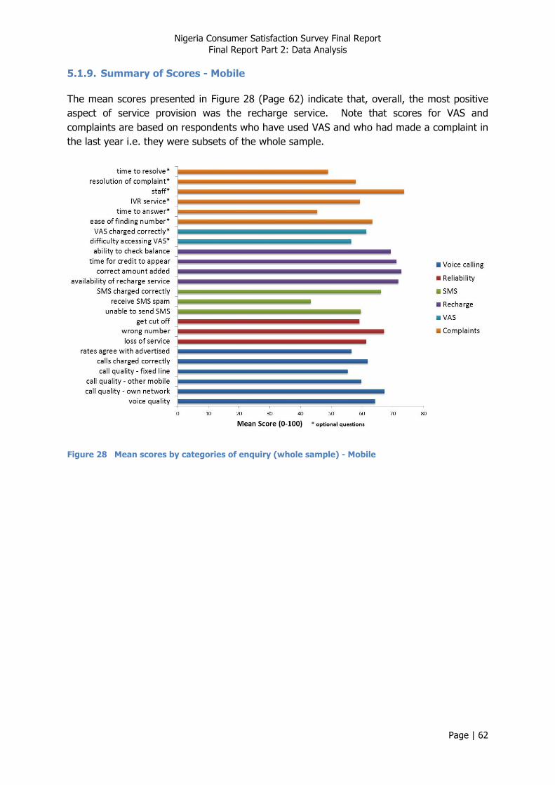
Nigeria Consumer Satisfaction Survey Final Report Final Report Part 2: Data Analysis
Page | 62
5.1.9. Summary of Scores - Mobile
The mean scores presented in Figure 28 (Page 62) indicate that, overall, the most positive aspect of service provision was the recharge service. Note that scores for VAS and complaints are based on respondents who have used VAS and who had made a complaint in the last year i.e. they were subsets of the whole sample.
Figure 28 Mean scores by categories of enquiry (whole sample) - Mobile
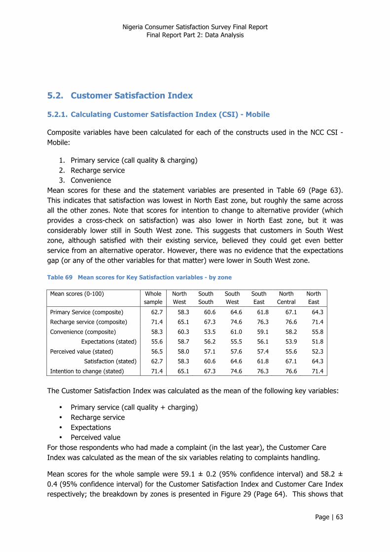
Nigeria Consumer Satisfaction Survey Final Report Final Report Part 2: Data Analysis
Page | 63
5.2. Customer Satisfaction Index
5.2.1. Calculating Customer Satisfaction Index (CSI) - Mobile
Composite variables have been calculated for each of the constructs used in the NCC CSI - Mobile:
1. Primary service (call quality & charging) 2. Recharge service 3. Convenience
Mean scores for these and the statement variables are presented in Table 69 (Page 63). This indicates that satisfaction was lowest in North East zone, but roughly the same across all the other zones. Note that scores for intention to change to alternative provider (which provides a cross-check on satisfaction) was also lower in North East zone, but it was considerably lower still in South West zone. This suggests that customers in South West zone, although satisfied with their existing service, believed they could get even better service from an alternative operator. However, there was no evidence that the expectations gap (or any of the other variables for that matter) were lower in South West zone.
Table 69 Mean scores for Key Satisfaction variables - by zone
Mean scores (0-100) Whole sample
North West
South South
South West
South East
North Central
North East
Primary Service (composite) 62.7 58.3 60.6 64.6 61.8 67.1 64.3
Recharge service (composite) 71.4 65.1 67.3 74.6 76.3 76.6 71.4
Convenience (composite) 58.3 60.3 53.5 61.0 59.1 58.2 55.8
Expectations (stated) 55.6 58.7 56.2 55.5 56.1 53.9 51.8
Perceived value (stated) 56.5 58.0 57.1 57.6 57.4 55.6 52.3
Satisfaction (stated) 62.7 58.3 60.6 64.6 61.8 67.1 64.3
Intention to change (stated) 71.4 65.1 67.3 74.6 76.3 76.6 71.4
The Customer Satisfaction Index was calculated as the mean of the following key variables:
• Primary service (call quality + charging) • Recharge service • Expectations • Perceived value
For those respondents who had made a complaint (in the last year), the Customer Care Index was calculated as the mean of the six variables relating to complaints handling.
Mean scores for the whole sample were 59.1 ± 0.2 (95% confidence interval) and 58.2 ± 0.4 (95% confidence interval) for the Customer Satisfaction Index and Customer Care Index respectively; the breakdown by zones is presented in Figure 29 (Page 64). This shows that

Nigeria Consumer Satisfaction Survey Final Report Final Report Part 2: Data Analysis
Page | 64
customer satisfaction was lowest in North West and North East zones. It is interesting to note that the Customer Care Index was relatively high in both of these zones, and the Customer Care Index was lowest in South West zone, which enjoyed the highest Customer Satisfaction Index score. This suggests that in zones where service was poor, customers expressed greater appreciation for the support they were given.
Figure 29 Customer Satisfaction Index and Customer Care Index - by zone
5.2.2. CSI, CCI, Demographics and Phone Use - Mobile
Comparing the calculated values of the NCC Customer Satisfaction and Customer Care indices between key groupings (Table 70 – Page 65) shows some interesting characteristics:
• Customer satisfaction scores were higher in urban areas, whereas differences in the NCC Customer Care index - Mobile were marginal;
• Differences between men and women were marginal;
• There was a trend of increasing NCC CSI scores - Mobile with age (although the trend was weak).
• The spread of NCC CSI scores - Mobile across operators was only 3.1 points– from 58.2 (MTN) to 61.3 (Etisalat) – see Table 70. Note that MTN is by far the most commonly used operator, yet it received the lowest NCC CSI scores - Mobile. The spread of NCC CCI scores - Mobile (excluding M-Tel) was also modest (4.6) - ranging from 57.4 (MTN) to 62.0 (Etisalat).

Nigeria Consumer Satisfaction Survey Final Report Final Report Part 2: Data Analysis
Page | 65
Table 70 Disaggregated scores for composite indices
Customer Satisfaction
Index
Customer Care Index
Area
rural 56.5 57.4
urban 61.8 58.9 Gender
male 59.8 -
female 58.4 - Age group
15 - 19 60.3 56.2
20 - 24 58.0 58.9
25 - 29 58.8 58.3
30 - 39 59.0 57.8
40 - 49 59.3 59.1
50 + 59.4 59.5 Socio-economic status
lower class 55.9 57.0
middle class 61.4 59.2
upper class 61.2 58.2 Frequency of use
less than once a week 53.6 51.1
1 or more times a week 52.1 56.6
1 or more times a day 60.8 59.0 Operator
Etisalat 61.3 62.0
M-Tel 60.3 52.5
Globacom 60.8 59.9
Airtel 60.1 58.8
MTN 58.2 57.4
- means not applicable When looking at differences in NCC CSI scores - Mobile between demographic groupings on a zone by zone basis, the following were evident (Table 71 – Page 66):
• The gap between NCC CSI scores - Mobile in rural and urban areas was greatest in North West zone;
• Only in North West zone was the difference between men and women sizeable; • The spread of scores across age groups was lowest in South West zone, and high in
North West and South South zones – in North West zone NCC CSI score - Mobile was lowest among the oldest age group (50 years and over), yet in South South zone this group registered the highest NCC CSI scores - Mobile;
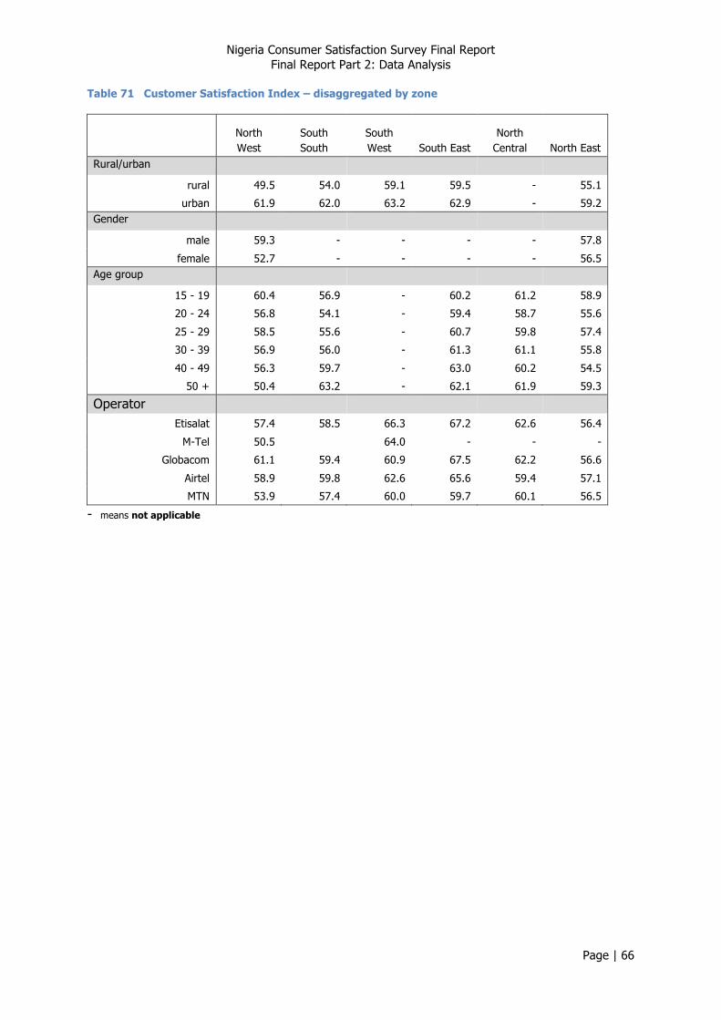
Nigeria Consumer Satisfaction Survey Final Report Final Report Part 2: Data Analysis
Page | 66
Table 71 Customer Satisfaction Index – disaggregated by zone
North West
South South
South West South East
North Central North East
Rural/urban
rural 49.5 54.0 59.1 59.5 - 55.1
urban 61.9 62.0 63.2 62.9 - 59.2 Gender
male 59.3 - - - - 57.8
female 52.7 - - - - 56.5 Age group
15 - 19 60.4 56.9 - 60.2 61.2 58.9
20 - 24 56.8 54.1 - 59.4 58.7 55.6
25 - 29 58.5 55.6 - 60.7 59.8 57.4
30 - 39 56.9 56.0 - 61.3 61.1 55.8
40 - 49 56.3 59.7 - 63.0 60.2 54.5
50 + 50.4 63.2 - 62.1 61.9 59.3
Operator
Etisalat 57.4 58.5 66.3 67.2 62.6 56.4
M-Tel 50.5 64.0 - - -
Globacom 61.1 59.4 60.9 67.5 62.2 56.6
Airtel 58.9 59.8 62.6 65.6 59.4 57.1
MTN 53.9 57.4 60.0 59.7 60.1 56.5
- means not applicable
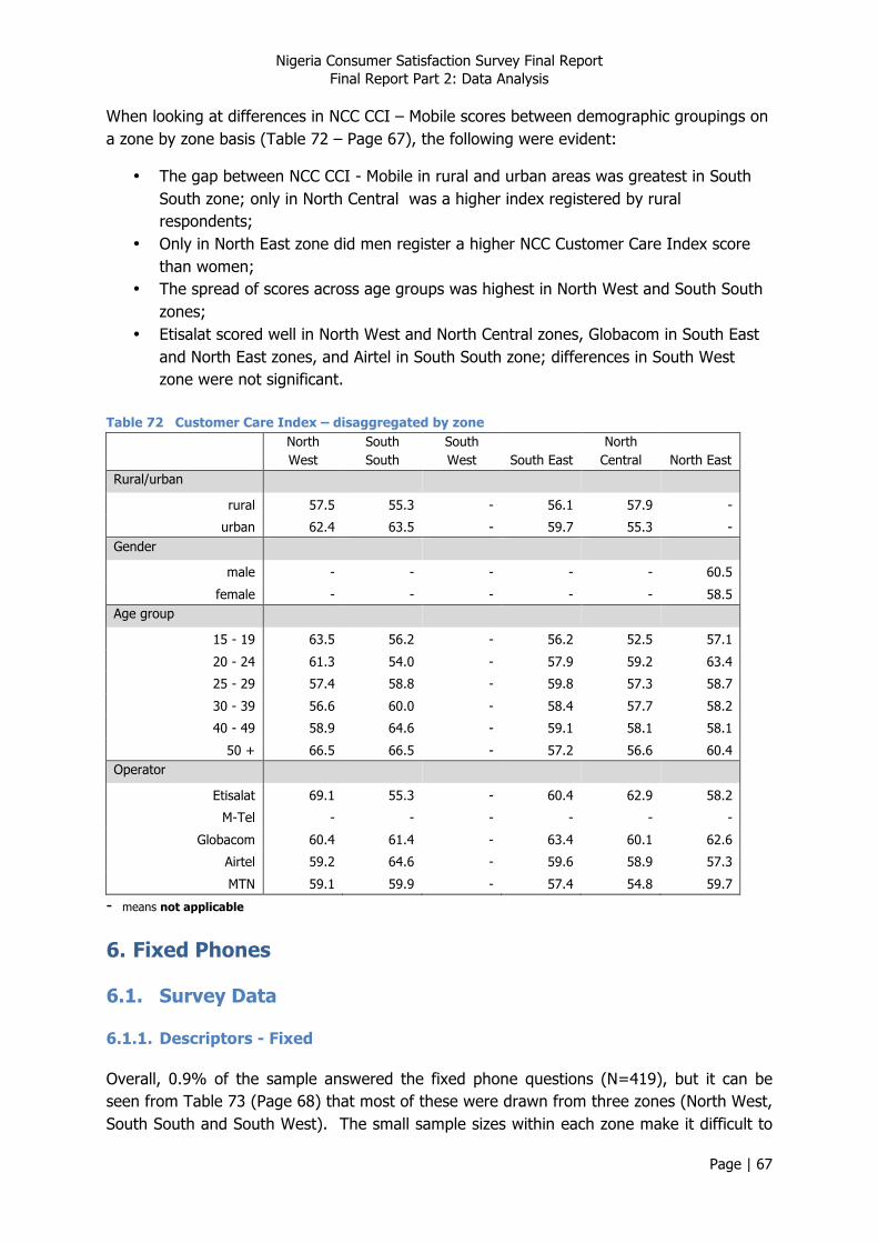
Nigeria Consumer Satisfaction Survey Final Report Final Report Part 2: Data Analysis
Page | 67
When looking at differences in NCC CCI – Mobile scores between demographic groupings on a zone by zone basis (Table 72 – Page 67), the following were evident:
• The gap between NCC CCI - Mobile in rural and urban areas was greatest in South South zone; only in North Central was a higher index registered by rural respondents;
• Only in North East zone did men register a higher NCC Customer Care Index score than women;
• The spread of scores across age groups was highest in North West and South South zones;
• Etisalat scored well in North West and North Central zones, Globacom in South East and North East zones, and Airtel in South South zone; differences in South West zone were not significant.
Table 72 Customer Care Index – disaggregated by zone North
West South South
South West South East
North Central North East
Rural/urban
rural 57.5 55.3 - 56.1 57.9 -
urban 62.4 63.5 - 59.7 55.3 - Gender
male - - - - - 60.5
female - - - - - 58.5 Age group
15 - 19 63.5 56.2 - 56.2 52.5 57.1
20 - 24 61.3 54.0 - 57.9 59.2 63.4
25 - 29 57.4 58.8 - 59.8 57.3 58.7
30 - 39 56.6 60.0 - 58.4 57.7 58.2
40 - 49 58.9 64.6 - 59.1 58.1 58.1
50 + 66.5 66.5 - 57.2 56.6 60.4 Operator
Etisalat 69.1 55.3 - 60.4 62.9 58.2
M-Tel - - - - - -
Globacom 60.4 61.4 - 63.4 60.1 62.6
Airtel 59.2 64.6 - 59.6 58.9 57.3
MTN 59.1 59.9 - 57.4 54.8 59.7
- means not applicable
6. Fixed Phones
6.1. Survey Data
6.1.1. Descriptors - Fixed
Overall, 0.9% of the sample answered the fixed phone questions (N=419), but it can be seen from Table 73 (Page 68) that most of these were drawn from three zones (North West, South South and South West). The small sample sizes within each zone make it difficult to
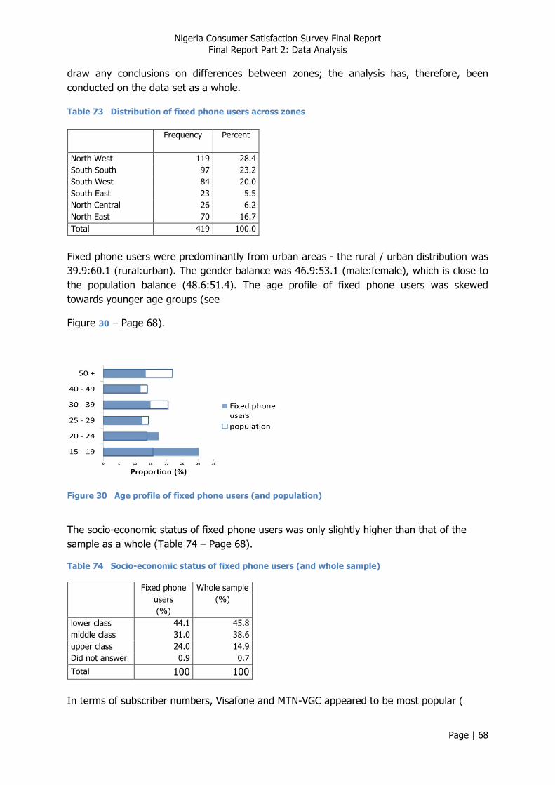
Nigeria Consumer Satisfaction Survey Final Report Final Report Part 2: Data Analysis
Page | 68
draw any conclusions on differences between zones; the analysis has, therefore, been conducted on the data set as a whole.
Table 73 Distribution of fixed phone users across zones
Frequency Percent
North West 119 28.4 South South 97 23.2 South West 84 20.0 South East 23 5.5 North Central 26 6.2 North East 70 16.7 Total 419 100.0
Fixed phone users were predominantly from urban areas - the rural / urban distribution was 39.9:60.1 (rural:urban). The gender balance was 46.9:53.1 (male:female), which is close to the population balance (48.6:51.4). The age profile of fixed phone users was skewed towards younger age groups (see
Figure 30 – Page 68).
Figure 30 Age profile of fixed phone users (and population)
The socio-economic status of fixed phone users was only slightly higher than that of the sample as a whole (Table 74 – Page 68).
Table 74 Socio-economic status of fixed phone users (and whole sample)
Fixed phone users (%)
Whole sample (%)
lower class 44.1 45.8 middle class 31.0 38.6 upper class 24.0 14.9 Did not answer 0.9 0.7
Total 100 100 In terms of subscriber numbers, Visafone and MTN-VGC appeared to be most popular (
Nigeria Consumer Satisfaction Survey Final Report Final Report Part 2: Data Analysis
Page | 69
Table 75 – Page 69).
Table 75 Proportion of fixed phone users subscribing to providers (%)
Whole sample
Intercellular 4.8
Multilinks 7.3
NITEL 3.2
Starcomms 9.2
Visafone 18.8
Zoom 1.5
Globacom 5.2
MTN-VGC 14.5
Other 11.4
Total 75.9
Some respondents indicated they had more than one fixed line, so they were asked to identify their principal provider (Table 76 – Page 69). This table shows that the sample sizes for some providers are small, so any comparison between providers should be treated with caution.
Table 76 Principal provider used by fixed phone users (%)
Frequency Percent
Intercellular 17 4.0
Multilinks 31 7.1
NITEL 14 3.2
Starcomms 39 9.0
Visafone 77 17.7
Zoom 7 1.5
Globacom 22 5.1
MTN-VGC 57 13.1
Other 49 11.4
don't know 5 1.1
Did not answer 117 26.8
Total 435 100
Nitel is the only fixed line operator that uses copper wire to provide services. The other fixed line operators use an appropriate mix of other technologies, including GSM, CDMA, and fibre.12
12 Note that that fixed line in this context means both traditional fixed line providers (i.e. copper wire services) and those providers of fixed wireless phones.
Nigeria Consumer Satisfaction Survey Final Report Final Report Part 2: Data Analysis
Page | 70
Table 77 (Page 70) shows that there is a sizable minority of fixed phone users that uses the phone infrequently (less than once a week).
Table 77 Intensity of fixed phone use (%)
Whole sample
less than once a week 11.8
1 or more times a week 27.7
1 or more times a day 34.5
Did not answer 26.0
Total 100.0
Less than half of fixed phones that were the subject of the interview were registered to the respondent themselves – see Table 78 (Page 70). Over two thirds of accounts were pre-paid – see Table 79 (Page 70).
Table 78 Person the fixed phone was registered to (%)
Whole sample
you 41.8
family member 16.9
friend 10.3
employer 7.6
other 1.3
not registered 2.7
Did not answer 19.5
Total 100
Table 79 Type of fixed phone accounts (%)
Whole sample
pre-paid
62.7
post-paid
16.6
Did not answer 20.7
Total 100
6.1.2. Views on Voice Calling - Fixed
Overall, 49% felt that the voice quality of calls was good or very good, compared with only 21% who felt the quality was poor or very poor (Table 80 – Page 70).
Table 80 Views on voice quality of calls (%)
Whole sample
Nigeria Consumer Satisfaction Survey Final Report Final Report Part 2: Data Analysis
Page | 71
very poor 7.6
poor 13.0
no opinion 10.9
good 35.9
very good 13.2
Did not answer 19.4
Total 100
Views on the quality of calls specifically to fixed line networks closely matches this – 48% felt the quality was good or very good, compared with 21% who felt it was poor or very poor (Table 81 – Page 71).The response rate to the question on quality of calls to mobile networks (Table 81 - Page 71) was lower, but among those who did answer, a higher proportion felt the quality was good or very good.
Table 81 Overall quality of calls – fixed phones
on fixed line
networks (%)
on mobile
networks (%)
very poor 4.1 6.4
poor 16.5 10.1
no opinion 10.0 7.5
good 35.8 33.9
very good 11.8 11.7
don't know 1.8 1.7
Did not answer 19.9 28.6
Total 100 100
42% felt that the accuracy of charging of calls was good or very good, compared with 28% who felt it was poor or very poor (Table 82 – Page 71). Similarly, the proportion of respondents that felt the alignment of charges with advertised rates was good or very good (34%) was higher than the proportion who felt it was poor or very poor (21%) (Table 82 -Page 71).
Table 82 Rating of fixed phone charges (%)
Correct charging of calls
Agreement of charges with rates advertised
very poor 8.0 5.6
poor 20.1 15.7
no opinion 6.1 13.3
good 32.2 23.3
very good 10.0 10.6
don't know 3.2 3.3
Did not answer 20.4 28.2
Nigeria Consumer Satisfaction Survey Final Report Final Report Part 2: Data Analysis
Page | 72
Total 100 100
Only the differences in scores for voice quality of calls and the correct charging of calls were significantly higher among urban respondents. Differences in the scores registered by men and women were not significant. Perceptions on the quality of calls to mobile networks were highest among the youngest age group. Overall, scores for these indicators increased with higher socio-economic status. Scores among low intensity users were lowest, and for some indicators, there was a trend for scores to drop off again among the most intensive users. Visafone, the operator with the greatest number of subscribers in the sample, was scored highest on voice quality and the correct charging of calls.
Table 83 Disaggregated scores for voice calling
voice quality
call quality - fixed
networks
call quality - mobile
networks calls charged
correctly
rates agree with
advertised Rural/urban
rural 55.6 - - 51.3 -
urban 64.0 - - 58.3 - Gender
male - - - - -
female - - - - - Age group
15 - 19 - - 69.2 - -
20 - 24 - - 54.5 - -
25 - 29 - - 57.1 - -
30 - 39 - - 61.1 - -
40 - 49 - - 61.5 - -
50 + - - 62.6 - - Socio-economic status
lower class 55.2 57.7 - 50.6 50.5
middle class 64.1 58.9 - 52.8 58.4
upper class 65.2 68.5 - 64.6 61.5 Intensity of use
less than once a week 52.8 47.5 54.3 - -
1 or more times a week 64.3 61.7 65.3 - -
1 or more times a day 61.4 66.3 63.8 - - Principal operator
Intercelluar 42.6 43.3 40.7 25.3 39.4
Multilinks 40.4 49.5 42.1 50.2 39.9
NITEL 38.2 29.6 47.9 23.9 32.6
Starcomms 64.9 66.3 62.4 66.2 65.9
Visafone 72.9 69.1 67.7 66.0 61.4
Zoom - - - - -
Globacom 55.6 42.6 78.6 55.1 70.2
MTN-VGC 70.4 66.4 61.1 57.7 60.9
- means not applicable
Nigeria Consumer Satisfaction Survey Final Report Final Report Part 2: Data Analysis
Page | 73
6.1.3. Network Reliability - Fixed
Perceptions of a range of indicators representing network reliability were similar (Table 84 – Page 73), and suggest that only around one third of users never or rarely experienced problems.
Table 84 Perceptions on frequency of network problems
Loss of service
(%)
Wrong number
(%)
Get cut off (%)
never 14.2 17.3 18.2
rarely 20.0 19.0 19.9
sometimes 36.7 36.2 32.3
often 8.1 5.0 9.3
almost always 2.1 3.3 .7
Did not answer 19.0 19.3 19.6
Total 100 100 100
Over half of respondents felt that they had to dial a number more than once (Table 85 – Page 73).
Table 85 "How often do you need to dial a number before you get through?" (%)
Whole sample
once 28.5
twice 30.1
3 - 5 times 16.0
more than 5 times 5.4
Did not answer 19.9
Total 100
Differences in scores between urban and rural respondents were not significant; neither were differences between men and women, or differences between age groups. Scores for getting cut off were highest (i.e. dropping the line was perceived to be infrequent) among lower status respondents (Table 86 – Page 74), and also among high intensity phone users (note that status correlates only weakly with intensity of use rs = 0.113, p = 0.045). Scores were lowest among the middle class group, and the middle intensity of use group. Among the operators with larger numbers of subscribers, Starcomm appeared to perform slightly better than Visafone on loss of service and dropping lines. MTN-VGC registered considerably lower scores for all indicators.
Nigeria Consumer Satisfaction Survey Final Report Final Report Part 2: Data Analysis
Page | 74
Table 86 Disaggregated scores for network reliability
loss of service
wrong number get cut off
Socio-economic status
lower class - - 69.7
middle class - - 57.7
upper class - - 62.7 Intensity of use
less than once a week - 65.5 63.1
1 or more times a week - 51.4 58.4
1 or more times a day - 71.7 67.4 Principal operator
Intercelluar 54.6 55.2 52.8
Multilinks 69.9 67.0 67.3
NITEL 70.3 63.6 73.0
Starcomms 65.5 71.7 68.5
Visafone 62.7 71.0 63.5
Zoom 0.0 0.0 0.0
Globacom 70.5 65.2 67.1
MTN-VGC 50.1 55.9 53.7
6.1.4. Complaints Handling - Fixed
Overall, one third of respondents had made a complaint in the last year (Table 87 – Page 74).
Table 87 "How often have you made a complaint in the last year?" (%)
Whole sample
never 41.3
once 15.9
2 - 5 times 14.3
more than 5 times 8.0
Did not answer 20.4
Total 100
Complaints were most commonly lodged by phone (Table 88 – Page 74).
Table 88 "How did you usually contact Customer Services?" - among those who made a complaint (%)
Whole sample
Nigeria Consumer Satisfaction Survey Final Report Final Report Part 2: Data Analysis
Page | 75
by phone 69.4
visit to Customer Care centre 24.6
Did not answer 6.0
Total 100
Overall, complaints most commonly concerned problems with charging and billing (Table 89 – Page 75).
Table 89 "The last time you made a complaint, what was it about?" – among those who made a complaint (%)
Whole sample
Incorrect charging / billing 24.5
Inability to make / receive voice calls 14.0
SMS 13.8
Disconnection 7.6
Inability to recharge 6.8
paying a bill 5.5
Time to resolve an existing complaint 2.8
Data complaint 1.7
other 6.1
Did not answer 17.0
Total 100
However, Table 90 (Page 75) suggests that complaints were linked not only to charging and voice quality issues, but also to network reliability issues.
Table 90 Links between indicators and Frequency of complaints (Spearman correlation coefficients)
Indicator Correlation coefficient
Intensity of fixed line phone use Type of account (fixed) How often do you need to dial a number 0.198** voice quality call quality - fixed networks -0.198** call quality - mobile networks calls charged correctly -0.118* rates agree with advertised loss of service -0.243** wrong number -0.263** get cut off -0.217** How often have you made a complaint in the last year - How did you usually contact Customer Services - ease of finding number -

Nigeria Consumer Satisfaction Survey Final Report Final Report Part 2: Data Analysis
Page | 76
time to answer -0.179* IVR service - staff - resolution of complaint - time to resolve -
* Correlation is significant at the 0.05 level (2-tailed). ** Correlation is significant at the 0.01 level (2-tailed).
- means not applicable
Among those who made a complaint, poorest ratings were given to time to answer their call and ease of finding the right number to call (Table 91 – Page 76). The staff that people talked to (e.g. polite, knowledgeable) got the highest ratings.
Table 91 "How would you rate aspects of complaints handling?" - among those who had made a complaint (%)
finding the right number to call
time taken to answer call
effectiveness of IVR service
staff you talked to
resolution of your complaint
time to resolve your complaint
very poor 6.4 8.6 5.5 7.9 5.8 5.5
poor 20.3 18.2 10.9 6.2 14.4 13.8
no opinion 14.4 12.1 16.5 12.1 10.3 14.5
good 25.8 26.1 23.8 39.0 34.7 32.8
very good 17.0 13.5 20.1 10.2 12.3 7.1
don't know 3.5 2.2 2.5 2.9 1.2 3.2
Did not answer 12.5 19.3 20.7 21.8 21.4 23.1
Total 100 100 100 100 100 100
The comparison made in Figure 31 (Page 76) suggests that experience of complaints handling through call centres was considerably better than the experience of visiting customer care centres.
Figure 31 Rating of customer care experienced through call centres and Customer Care centres (whole sample)
Nigeria Consumer Satisfaction Survey Final Report Final Report Part 2: Data Analysis
Page | 77
Differences between rural and urban respondents were not significant, and neither were most differences according to gender and socio-economic status. Women scored the time taken to resolve complaints lower than men, and the highest socio-economic status group registered the poorest score for IVR services (Table 92 – Page 77). Intensity of use categories showed a consistent trend such that the intermediate group (one or more times a week) registered the highest scores.
Table 92 Disaggregated scores for complaints handling
ease of finding
number time to answer IVR service staff
resolution of
complaint time to resolve
Gender
male - - - - - 63.5
female - - - - - 54.1 Age group
15 - 19 - 73.4 - - - -
20 - 24 - 47.0 - - - -
25 - 29 - 52.0 - - - -
30 - 39 - 65.2 - - - -
40 - 49 - 56.4 - - - -
50 + - 54.1 - - - - Socio-economic status
lower class - - 62.8 - - -
middle class - - 71.3 - - -
upper class - - 58.3 - - - Intensity of use
less than once a week 54.3 50.7 59.8 45.8 51.9 -
1 or more times a week 67.1 67.5 74.3 68.6 69.0 -
1 or more times a day 55.0 52.0 48.5 61.9 55.5 - Principal operator
Intercelluar 21.1 - - - - -
Multilinks 36.7 58.0 44.9 49.7 45.4 42.6
NITEL
Starcomms 63.2 58.4 53.2 66.7 66.0 65.0
Visafone 55.3 55.8 70.2 76.4 72.7 69.2
Zoom
Globacom 69.3 61.3 67.0 74.9 60.9 43.7
MTN-VGC 82.9 76.4 78.2 74.1 75.3 66.8
- means not applicable 6.1.5. Key Satisfaction Indicators - Fixed
Perceived value for money offered by services paid for (Table 94 – Page 78) was rated higher than the extent to which the quality of services was in line with expectations (
Table 93 – Page 78).
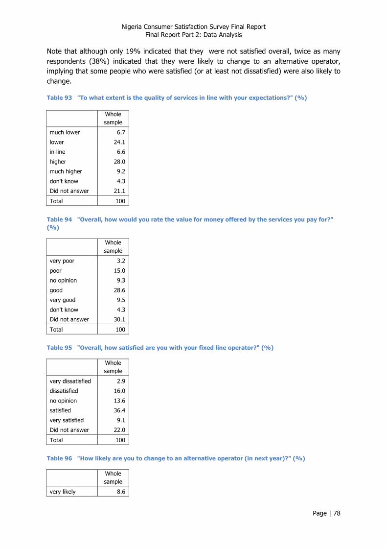
Nigeria Consumer Satisfaction Survey Final Report Final Report Part 2: Data Analysis
Page | 78
Note that although only 19% indicated that they were not satisfied overall, twice as many respondents (38%) indicated that they were likely to change to an alternative operator, implying that some people who were satisfied (or at least not dissatisfied) were also likely to change.
Table 93 "To what extent is the quality of services in line with your expectations?" (%)
Whole sample
much lower 6.7
lower 24.1
in line 6.6
higher 28.0
much higher 9.2
don't know 4.3
Did not answer 21.1
Total 100
Table 94 "Overall, how would you rate the value for money offered by the services you pay for?" (%)
Whole sample
very poor 3.2
poor 15.0
no opinion 9.3
good 28.6
very good 9.5
don't know 4.3
Did not answer 30.1
Total 100
Table 95 "Overall, how satisfied are you with your fixed line operator?" (%)
Whole sample
very dissatisfied 2.9
dissatisfied 16.0
no opinion 13.6
satisfied 36.4
very satisfied 9.1
Did not answer 22.0
Total 100
Table 96 "How likely are you to change to an alternative operator (in next year)?" (%)
Whole sample
very likely 8.6

Nigeria Consumer Satisfaction Survey Final Report Final Report Part 2: Data Analysis
Page | 79
likely 29.4
no opinion 13.9
unlikely 10.7
very unlikely 6.6
don't know 8.6
Did not answer 22.1
Total 100
It can be seen from Table 97 (Page 79) (whole sample) that both expectations and perceived value correlated closely with stated satisfaction, confirming that these were both key aspects of satisfaction. Although the question on intention to change to an alternative operator (in the next year) correlates with stated satisfaction, the correlation is negative, implying that respondents who were satisfied expressed a greater likelihood of changing operator. This counterintuitive finding suggests that intention to change operator is driven by factors other than the level of satisfaction with existing operator.
Table 97 Relation of satisfaction statements with Stated Satisfaction (Spearman correlation coefficients)
Whole sample
Intention to change -0.191**
Expectations 0.575**
Perceived value 0.722** * Correlation is significant at the 0.05 level (2-tailed).
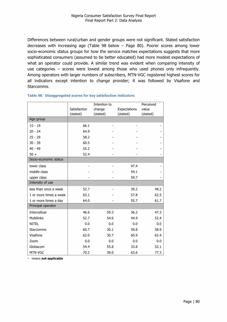
Nigeria Consumer Satisfaction Survey Final Report Final Report Part 2: Data Analysis
Page | 80
Differences between rural/urban and gender groups were not significant. Stated satisfaction decreases with increasing age (Table 98 below – Page 80). Poorer scores among lower socio-economic status groups for how the service matches expectations suggests that more sophisticated consumers (assumed to be better educated) had more modest expectations of what an operator could provide. A similar trend was evident when comparing intensity of use categories – scores were lowest among those who used phones only infrequently. Among operators with larger numbers of subscribers, MTN-VGC registered highest scores for all indicators except intention to change provider; it was followed by Visafone and Starcomms.
Table 98 Disaggregated scores for key satisfaction indicators
Satisfaction (stated)
Intention to change (stated)
Expectations (stated)
Perceived value (stated)
Age group
15 - 19 66.1 - - -
20 - 24 64.9 - - -
25 - 29 58.2 - - -
30 - 39 60.5 - - -
40 - 49 55.2 - - -
50 + 52.4 - - - Socio-economic status
lower class - - 47.4 -
middle class - - 54.1 -
upper class - - 59.7 - Intensity of use
less than once a week 52.7 - 39.2 49.2
1 or more times a week 63.1 - 57.8 62.5
1 or more times a day 64.0 - 55.7 61.7 Principal operator
Intercelluar 46.6 59.3 36.2 47.3
Multilinks 52.7 54.6 44.9 52.4
NITEL 0.0 0.0 0.0 0.0
Starcomms 60.7 30.1 59.8 58.9
Visafone 62.0 30.7 60.9 62.4
Zoom 0.0 0.0 0.0 0.0
Globacom 54.4 55.8 33.8 52.1
MTN-VGC 70.2 39.0 63.6 77.3
- means not applicable

Nigeria Consumer Satisfaction Survey Final Report Final Report Part 2: Data Analysis
Page | 81
6.1.6. Summary of Scores - Fixed
The mean scores presented in Figure 32 (Page 81) indicate that, overall, the most positive aspect of service provision was the network reliability. Correct charging of calls stood out as a poorly rated issue. Note that scores for complaints were based on respondents who had made a complaint in the last year i.e. they are subsets of the whole sample.
Figure 32 Mean scores by categories of enquiry (whole sample) - Fixed
6.2. Customer Satisfaction Index
6.2.1. Calculating NCC Customer Satisfaction Index (CSI) - Fixed
Composite variables have been calculated for each of the constructs used in the NCC CSI - Fixed:
4. Primary service (call quality & charging) 5. Convenience
Mean scores for these and the statement variables are presented in Table 99 (Page 81).
Table 99 Mean scores for Key Satisfaction variables
Mean scores (0-100) Whole sample
Primary Service (composite) 59.5
Convenience (composite) 63.0
Perceived value (stated) 60.0
Expectations (stated) 53.0
Satisfaction (stated) 60.5
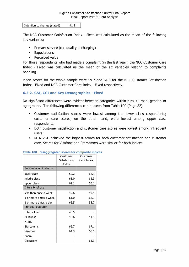
Nigeria Consumer Satisfaction Survey Final Report Final Report Part 2: Data Analysis
Page | 82
Intention to change (stated) 41.8
The NCC Customer Satisfaction Index - Fixed was calculated as the mean of the following key variables:
• Primary service (call quality + charging) • Expectations • Perceived value
For those respondents who had made a complaint (in the last year), the NCC Customer Care Index - Fixed was calculated as the mean of the six variables relating to complaints handling.
Mean scores for the whole sample were 59.7 and 61.8 for the NCC Customer Satisfaction Index - Fixed and NCC Customer Care Index - Fixed respectively.
6.2.2. CSI, CCI and Key Demographics - Fixed
No significant differences were evident between categories within rural / urban, gender, or age groups. The following differences can be seen from Table 100 (Page 82):
• Customer satisfaction scores were lowest among the lower class respondents; customer care scores, on the other hand, were lowest among upper class respondents;
• Both customer satisfaction and customer care scores were lowest among infrequent users;
• MTN-VGC achieved the highest scores for both customer satisfaction and customer care. Scores for Visafone and Starcomms were similar for both indices.
Table 100 Disaggregated scores for composite indices
Customer Satisfaction
Index
Customer Care Index
Socio-economic status
lower class 52.2 62.9
middle class 63.0 65.3
upper class 62.1 56.1 Intensity of use
less than once a week 47.6 49.1
1 or more times a week 61.0 68.1
1 or more times a day 62.5 55.7 Principal operator
Intercelluar 40.5 -
Multilinks 45.6 41.9
NITEL - -
Starcomms 65.7 67.1
Visafone 64.3 66.1
Zoom - -
Globacom - 63.3
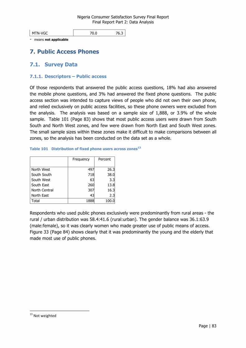
Nigeria Consumer Satisfaction Survey Final Report Final Report Part 2: Data Analysis
Page | 83
MTN-VGC 70.0 76.3
- means not applicable
7. Public Access Phones
7.1. Survey Data
7.1.1. Descriptors – Public access
Of those respondents that answered the public access questions, 18% had also answered the mobile phone questions, and 3% had answered the fixed phone questions. The public access section was intended to capture views of people who did not own their own phone, and relied exclusively on public access facilities, so these phone owners were excluded from the analysis. The analysis was based on a sample size of 1,888, or 3.9% of the whole sample. Table 101 (Page 83) shows that most public access users were drawn from South South and North West zones, and few were drawn from North East and South West zones. The small sample sizes within these zones make it difficult to make comparisons between all zones, so the analysis has been conducted on the data set as a whole.
Table 101 Distribution of fixed phone users across zones13
Frequency Percent
North West 497 26.3 South South 718 38.0 South West 63 3.3 South East 260 13.8 North Central 307 16.3 North East 43 2.3 Total 1888 100.0
Respondents who used public phones exclusively were predominantly from rural areas - the rural / urban distribution was 58.4:41.6 (rural:urban). The gender balance was 36.1:63.9 (male:female), so it was clearly women who made greater use of public means of access. Figure 33 (Page 84) shows clearly that it was predominantly the young and the elderly that made most use of public phones.
13 Not weighted
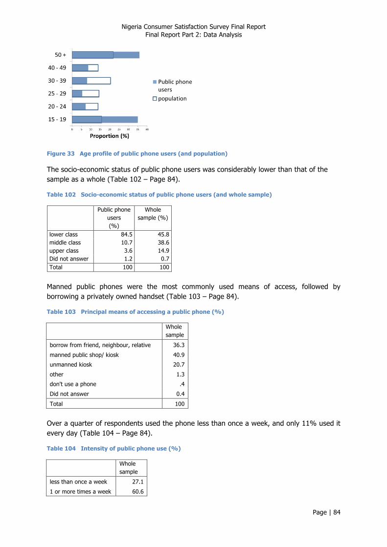
Nigeria Consumer Satisfaction Survey Final Report Final Report Part 2: Data Analysis
Page | 84
Figure 33 Age profile of public phone users (and population)
The socio-economic status of public phone users was considerably lower than that of the sample as a whole (Table 102 – Page 84).
Table 102 Socio-economic status of public phone users (and whole sample)
Public phone users (%)
Whole sample (%)
lower class 84.5 45.8 middle class 10.7 38.6 upper class 3.6 14.9 Did not answer 1.2 0.7 Total 100 100
Manned public phones were the most commonly used means of access, followed by borrowing a privately owned handset (Table 103 – Page 84).
Table 103 Principal means of accessing a public phone (%)
Whole sample
borrow from friend, neighbour, relative 36.3
manned public shop/ kiosk 40.9
unmanned kiosk 20.7
other 1.3
don't use a phone .4
Did not answer 0.4
Total 100
Over a quarter of respondents used the phone less than once a week, and only 11% used it every day (Table 104 – Page 84).
Table 104 Intensity of public phone use (%)
Whole sample
less than once a week 27.1
1 or more times a week 60.6
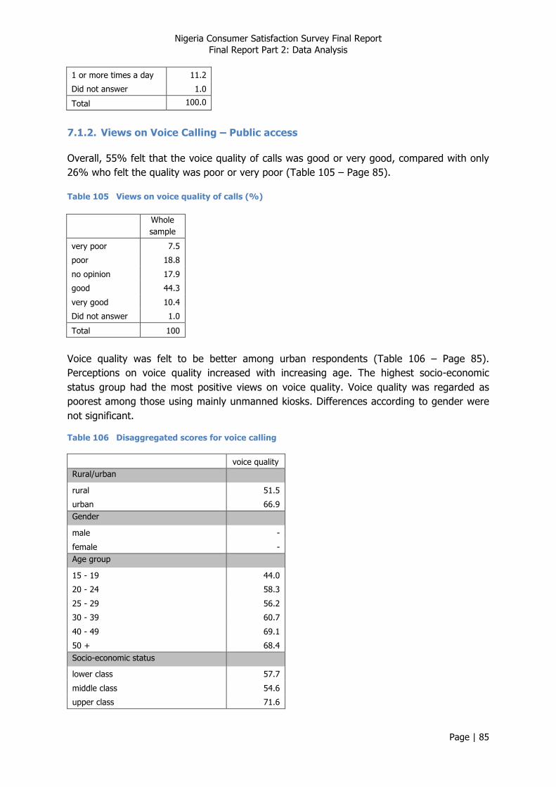
Nigeria Consumer Satisfaction Survey Final Report Final Report Part 2: Data Analysis
Page | 85
1 or more times a day 11.2
Did not answer 1.0
Total 100.0
7.1.2. Views on Voice Calling – Public access
Overall, 55% felt that the voice quality of calls was good or very good, compared with only 26% who felt the quality was poor or very poor (Table 105 – Page 85).
Table 105 Views on voice quality of calls (%)
Whole sample
very poor 7.5
poor 18.8
no opinion 17.9
good 44.3
very good 10.4
Did not answer 1.0
Total 100
Voice quality was felt to be better among urban respondents (Table 106 – Page 85). Perceptions on voice quality increased with increasing age. The highest socio-economic status group had the most positive views on voice quality. Voice quality was regarded as poorest among those using mainly unmanned kiosks. Differences according to gender were not significant.
Table 106 Disaggregated scores for voice calling
voice quality
Rural/urban
rural 51.5
urban 66.9 Gender
male -
female - Age group
15 - 19 44.0
20 - 24 58.3
25 - 29 56.2
30 - 39 60.7
40 - 49 69.1
50 + 68.4 Socio-economic status
lower class 57.7
middle class 54.6
upper class 71.6

Nigeria Consumer Satisfaction Survey Final Report Final Report Part 2: Data Analysis
Page | 86
Intensity of use
less than once a week -
1 or more times a week -
1 or more times a day - Means of access
borrow from friend, neighbour, relative 61.2
manned public shop/ kiosk 61.1
unmanned kiosk 45.5
- means not applicable 7.1.3. Network reliability – Public access
Loss of service was perceived to occur most frequently, and getting connected to the wrong number least frequently - Table 107 (Page 86).
Table 107 Perceptions on frequency of network problems
Loss of service
(%)
Wrong number
(%)
Get cut off (%)
never 20.4 32.0 21.5
rarely 14.2 20.8 24.8
sometimes 52.0 40.4 44.7
often 11.6 6.0 7.4
almost always 1.2 .4 1.0
Did not answer 0.8 0.4 0.6
Total 100 100 100
Nearly three quarters of respondents felt they needed to dial a number more than once before getting through (Table 108 – Page 86).
Table 108 "How often do you need to dial a number before you get through?" (%)
Whole sample
once 26.3
twice 54.4
3 - 5 times 14.0
more than 5 times 4.8
Did not answer 0.5
Total 100
60% of public phone users use SMS (
Table 109 – Page 87), and of these, only one third never or rarely experienced difficulties in sending SMS.

Nigeria Consumer Satisfaction Survey Final Report Final Report Part 2: Data Analysis
Page | 87
Table 109 “How often are you unable to send SMS?” (%)
Whole sample
never 10.0
rarely 11.6
sometimes 27.8
often 9.4
almost always 1.5
Don’t use 39.3
Did not answer 0.4
Total 100
Perceptions of network reliability tended to be higher among urban respondents, although the frequency of wrong numbers was higher among urban respondents (Table 110 – Page 87). Where differences were significant, women tended to have a poorer view of indicators. Although differences were significant, no clear trends could be seen linking scores to age. Scores for loss of service and wrong numbers were lowest among the lowest socio-economic status group, yet scores for getting cut off were highest. Scores for all four indicators were highest among lowest frequency phone users. Scores were lowest among respondents using unmanned public kiosks.
Table 110 Disaggregated scores for network reliability
loss of service
wrong number get cut off
Unable to send SMS
Rural/urban
rural 58.4 70.3 62.4 -
urban 63.0 68.5 67.9 - Gender
male - 71.8 65.5 59.4
female - 68.3 64.2 57.1 Age group
15 - 19 59.0 72.4 65.7 59.9
20 - 24 58.0 69.8 58.8 54.9
25 - 29 56.6 67.9 63.3 62.2
30 - 39 57.2 66.7 61.0 58.8
40 - 49 61.1 72.9 68.7 60.0
50 + 63.2 66.8 65.0 55.9 Socio-economic status
lower class 59.9 68.9 65.2 -
middle class 60.4 73.0 60.5 -
upper class 70.3 74.0 63.7 - Intensity of use
less than once a week 68.0 75.3 74.8 70.8
1 or more times a week 57.2 67.2 59.8 52.2
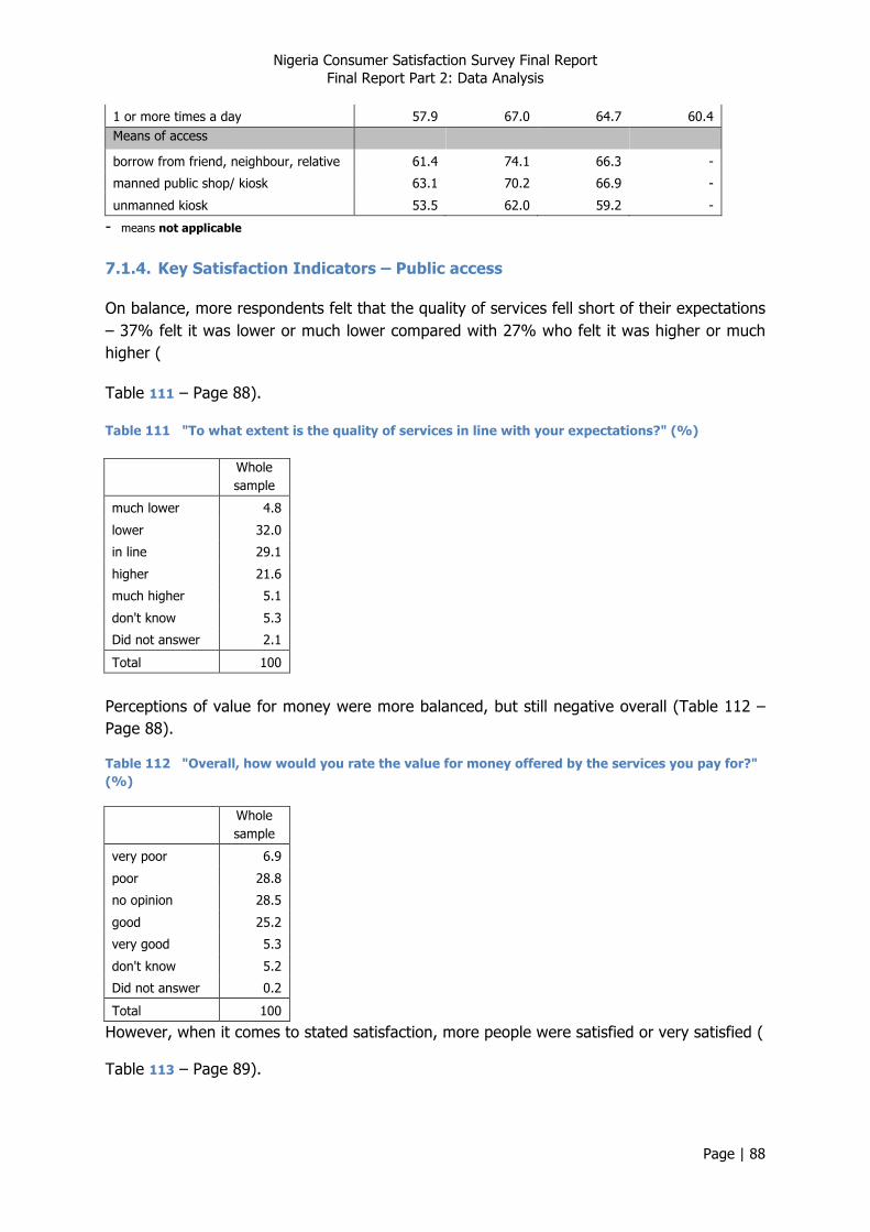
Nigeria Consumer Satisfaction Survey Final Report Final Report Part 2: Data Analysis
Page | 88
1 or more times a day 57.9 67.0 64.7 60.4 Means of access
borrow from friend, neighbour, relative 61.4 74.1 66.3 -
manned public shop/ kiosk 63.1 70.2 66.9 -
unmanned kiosk 53.5 62.0 59.2 -
- means not applicable 7.1.4. Key Satisfaction Indicators – Public access
On balance, more respondents felt that the quality of services fell short of their expectations – 37% felt it was lower or much lower compared with 27% who felt it was higher or much higher (
Table 111 – Page 88).
Table 111 "To what extent is the quality of services in line with your expectations?" (%)
Whole sample
much lower 4.8
lower 32.0
in line 29.1
higher 21.6
much higher 5.1
don't know 5.3
Did not answer 2.1
Total 100
Perceptions of value for money were more balanced, but still negative overall (Table 112 – Page 88).
Table 112 "Overall, how would you rate the value for money offered by the services you pay for?" (%)
Whole sample
very poor 6.9
poor 28.8
no opinion 28.5
good 25.2
very good 5.3
don't know 5.2
Did not answer 0.2
Total 100
However, when it comes to stated satisfaction, more people were satisfied or very satisfied (
Table 113 – Page 89).
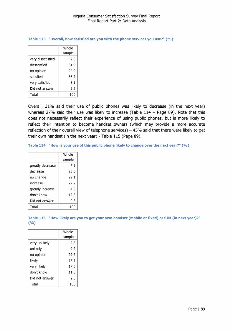
Nigeria Consumer Satisfaction Survey Final Report Final Report Part 2: Data Analysis
Page | 89
Table 113 "Overall, how satisfied are you with the phone services you use?" (%)
Whole sample
very dissatisfied 2.8
dissatisfied 31.9
no opinion 22.9
satisfied 36.7
very satisfied 3.1
Did not answer 2.6
Total 100
Overall, 31% said their use of public phones was likely to decrease (in the next year) whereas 27% said their use was likely to increase (Table 114 – Page 89). Note that this does not necessarily reflect their experience of using public phones, but is more likely to reflect their intention to become handset owners (which may provide a more accurate reflection of their overall view of telephone services) – 45% said that there were likely to get their own handset (in the next year) - Table 115 (Page 89).
Table 114 "How is your use of this public phone likely to change over the next year?" (%)
Whole sample
greatly decrease 7.9
decrease 23.0
no change 29.1
increase 22.2
greatly increase 4.6
don't know 12.5
Did not answer 0.8
Total 100
Table 115 "How likely are you to get your own handset (mobile or fixed) or SIM (in next year)?" (%)
Whole sample
very unlikely 2.8
unlikely 9.2
no opinion 29.7
likely 27.2
very likely 17.6
don't know 11.0
Did not answer 2.5
Total 100
Nigeria Consumer Satisfaction Survey Final Report Final Report Part 2: Data Analysis
Page | 90
It can be seen from Table 116 (Page 90) (whole sample) that both expectations and perceived value correlated closely with stated satisfaction, confirming that these were both key aspects of satisfaction. Intention to get a handset also correlated with stated satisfaction, suggesting that people’s experience of using public phones (including privately owned handsets) is influential in their decision to subscribe
Table 116 Relation of satisfaction statements with Stated Satisfaction (Spearman correlation coefficients)
Whole sample
Intention to get own handset 0.319**
Expectations 0.6**
Perceived value 0.581** * Correlation is significant at the 0.05 level (2-tailed). ** Correlation is significant at the 0.01 level (2-tailed).
Scores were generally higher among urban respondents, with the exception of perceived value, which reflects the premium value of communications in remote locations. Although women were more likely to feel that services did not meet their expectations, their potential use of public phones in the future was higher than that of men. All indicators exhibited a trend of increasing scores with increasing age. Scores were highest among the highest socio-economic status group, with the exception of intended change in use of public phones, but this was likely to represent a shift towards personal handset ownership, which was highest among the upper class group. Intention to get a handset was also highest among the most intensive public phone users. Stated satisfaction, perceived value for money, and intention to get a handset were all lowest among users of unmanned kiosks; this paints a picture of a dissatisfied group that feel they are overcharged, yet are unable or unwilling to invest in a handset; note that intensity of phone use is similar across different means of access.
Table 117 Disaggregated scores for key satisfaction indicators
Satisfaction (stated)
intended change in
use (stated)
Intention to get
handset (stated)
Expectations (stated)
Perceived value
(stated)
Rural/urban
rural 50.5 45.1 61.2 - 49.6
urban 52.6 51.9 67.4 - 46.2 Gender
male - 46.0 - 48.8 -
female - 48.9 - 46.6 - Age group
15 - 19 43.7 44.4 57.0 41.0 42.3
20 - 24 47.6 43.7 61.0 46.6 49.3
25 - 29 51.9 44.1 61.3 50.5 49.1
30 - 39 54.9 44.8 63.6 45.1 53.7
40 - 49 57.2 48.1 80.4 51.7 50.6
50 + 57.6 53.5 68.8 52.9 52.0
Nigeria Consumer Satisfaction Survey Final Report Final Report Part 2: Data Analysis
Page | 91
Socio-economic status
lower class 50.7 48.2 62.6 - 47.0
middle class 51.4 50.8 67.0 - 50.8
upper class 67.1 35.2 79.9 - 67.1 Intensity of use
less than once a week 53.9 35.8 62.3 41.5 38.1
1 or more times a week 49.2 53.7 63.7 48.3 51.5
1 or more times a day 55.6 48.6 67.0 54.1 53.5 Means of access
borrow from friend, neighbour, relative 49.5 54.2 69.6 - 51.1
manned public shop/ kiosk 54.7 43.7 65.2 - 47.5
unmanned kiosk 47.7 44.8 51.1 - 43.5
- means not applicable
7.2. Customer Satisfaction Index
7.2.1. Calculating NCC Customer Satisfaction Index (CSI) – Public access
A composite variable was calculated for the convenience construct used in the NCC CSI – Public Access. Mean scores for this and the statement variables are presented in Table 118 (Page 91).
Table 118 Mean scores for Key Satisfaction variables
Mean scores (0-100) Whole sample
Voice quality (single indicator) 57.9
Convenience (composite) 64.8
Perceived value (stated) 48.2
Expectations (stated) 47.4
Satisfaction (stated) 51.4
Intention to get handset (stated) 63.8
The NCC Customer Satisfaction Index – Public access was calculated as the mean of the following key variables:
• Voice quality • Expectations • Perceived value
The mean score for the whole sample was 51.0 ± 0.8 (95% confidence interval).
7.2.2. NCC CSI, Demographics and Public phone use – Public access
The following characteristics were evident from Table 119 ( Figure 92) :
• Scores among urban respondents were slightly higher than those registered by rural respondents;

Nigeria Consumer Satisfaction Survey Final Report Final Report Part 2: Data Analysis
Page | 92
• Scores for the NCC CSI – Public access increased with increasing age;
• Scores were lowest among respondents from the lowest socio-economic status category;
• Scores increased with increasing frequency of use;
• Respondents who mainly used unmanned kiosks registered lowest levels of satisfaction.
Differences between men and women were not significant.
Table 119 Disaggregated scores for customer satisfaction index
NCC CSI
Rural/urban rural 49.2
urban 53.5 Age group
15 - 19 42.5
20 - 24 50.4
25 - 29 51.7
30 - 39 52.7
40 - 49 58.3
50 + 57.6 Socio-economic status
lower class 50.3
middle class 51.5
upper class 62.7 Intensity of use
less than once a week 46.1
1 or more times a week 52.0
1 or more times a day 55.3 Means of access
borrow from friend, neighbour, relative 52.5
manned public shop/ kiosk 52.6
unmanned kiosk 44.3
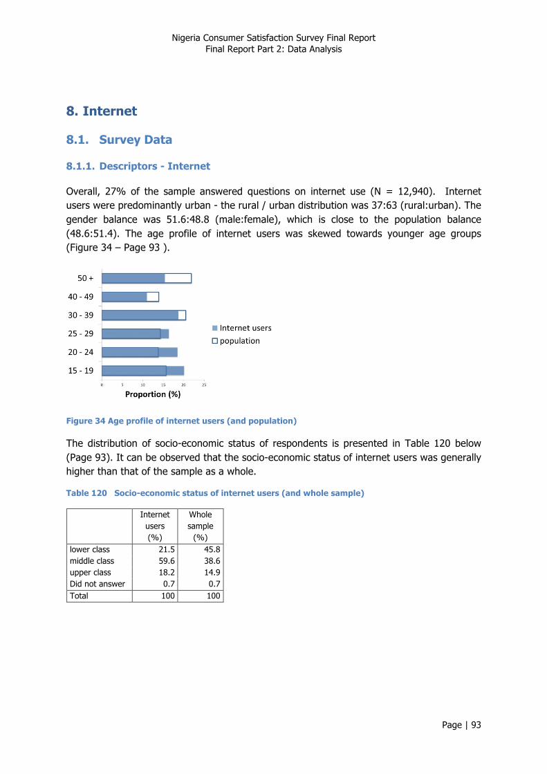
Nigeria Consumer Satisfaction Survey Final Report Final Report Part 2: Data Analysis
Page | 93
8. Internet
8.1. Survey Data
8.1.1. Descriptors - Internet
Overall, 27% of the sample answered questions on internet use (N = 12,940). Internet users were predominantly urban - the rural / urban distribution was 37:63 (rural:urban). The gender balance was 51.6:48.8 (male:female), which is close to the population balance (48.6:51.4). The age profile of internet users was skewed towards younger age groups (Figure 34 – Page 93 ).
Figure 34 Age profile of internet users (and population)
The distribution of socio-economic status of respondents is presented in Table 120 below (Page 93). It can be observed that the socio-economic status of internet users was generally higher than that of the sample as a whole.
Table 120 Socio-economic status of internet users (and whole sample)
Internet users (%)
Whole sample
(%) lower class 21.5 45.8 middle class 59.6 38.6 upper class 18.2 14.9 Did not answer 0.7 0.7 Total 100 100
Nigeria Consumer Satisfaction Survey Final Report Final Report Part 2: Data Analysis
Page | 94
A clear majority of users accessed the internet through mobile devices (other than a Blackberry) e.g. smartphone, iPad (Table 121- Page 94).
Table 121 Means of accessing the internet (% of internet users in each zone)
Whole sample
North West
South South
South West
South East
North Central
North East
Home PC / laptop 12.5 5.7 9.9 20.0 14.3 14.4 9.6
Blackberry 18.0 25.6 9.7 21.7 7.6 15.4 23.7
Other mobile device 63.8 52.2 71.5 66.0 76.0 67.0 54.0
Cybercafe 18.6 14.4 13.0 20.4 35.3 21.0 10.8
Total 112.9 97.9 104.1 128.1 133.2 117.8 98.1
Though a much smaller proportion used them as their main means of access (Table 122 – Page 94), a substantial proportion of respondents made use of cybercafés (Table 121 – Page 94), suggesting that cybercafés continue to be of value even to people with private means of access
Table 122 Principal means of accessing the internet (% of internet users in each zone)
Whole sample
North West
South South
South West
South East
North Central
North East
home PC or laptop 7.6 3.2 7.8 12.7 6.3 6.9 7.5
Blackberry 16.2 24.9 9.2 17.7 6.2 13.3 22.2
other mobile device 61.1 50.6 70.0 62.7 70.1 64.7 52.0
cybercafe 8.5 9.2 11.7 6.9 13.6 7.1 4.8
Did not answer 6.6 12.1 1.3 0.0 3.7 7.9 13.4
Total 100 100 100 100 100 100 100
In terms of customer accounts, MTN appear to be the dominant internet service provider (ISP) (Table 123 – Page 94). Etisalat, Airtel and Globacom each have roughly one fifth of MTN’s number of subscribers. This pattern is fairly consistent across all zones. For the purposes of comparison, only these major ISPs have been used.
Table 123 Internet service provider
Whole sample
North West
South South
South West
South East
North Central
North East
Airtel* 10.7 14.6 14.1 14.8 5.2 4.5 10.4
Direct on PC 1.8 0.3 1.4 6.0 1.6 0.2 0.8
Etisalat* 11.0 14.8 6.8 13.4 12.6 9.2 9.3
Globacom* 9.4 10.2 6.3 8.8 2.3 13.3 13.1
Hyperia 0.5 0.3 1.1 1.2 0.1 0.1 0.1
IPNX 0.2 0.0 0.5 0.4 0.1 0.0 0.1
Mobitel 0.1 0.1 0.0 0.1 0.1 0.3 0.2
MTN* 54.3 50.8 53.8 43.6 65.9 61.8 53.3
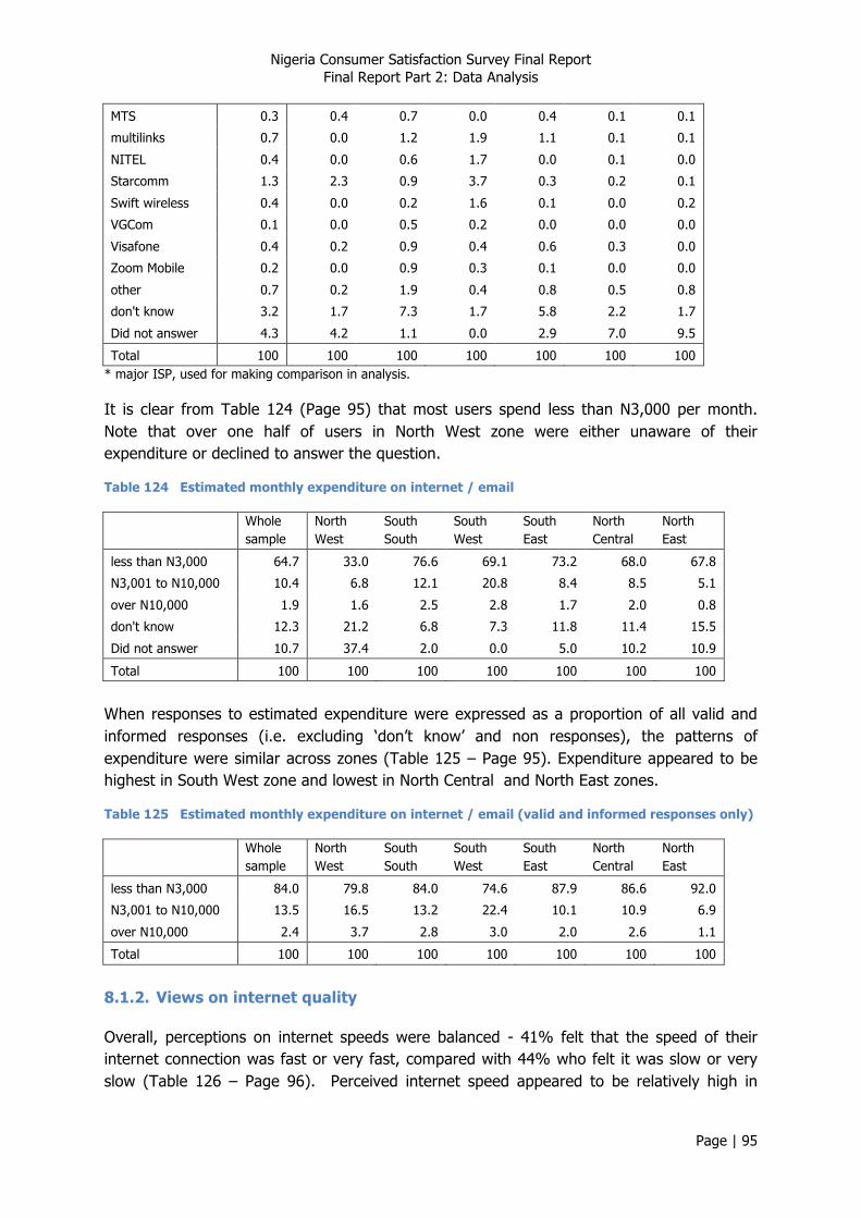
Nigeria Consumer Satisfaction Survey Final Report Final Report Part 2: Data Analysis
Page | 95
MTS 0.3 0.4 0.7 0.0 0.4 0.1 0.1
multilinks 0.7 0.0 1.2 1.9 1.1 0.1 0.1
NITEL 0.4 0.0 0.6 1.7 0.0 0.1 0.0
Starcomm 1.3 2.3 0.9 3.7 0.3 0.2 0.1
Swift wireless 0.4 0.0 0.2 1.6 0.1 0.0 0.2
VGCom 0.1 0.0 0.5 0.2 0.0 0.0 0.0
Visafone 0.4 0.2 0.9 0.4 0.6 0.3 0.0
Zoom Mobile 0.2 0.0 0.9 0.3 0.1 0.0 0.0
other 0.7 0.2 1.9 0.4 0.8 0.5 0.8
don't know 3.2 1.7 7.3 1.7 5.8 2.2 1.7
Did not answer 4.3 4.2 1.1 0.0 2.9 7.0 9.5
Total 100 100 100 100 100 100 100 * major ISP, used for making comparison in analysis.
It is clear from Table 124 (Page 95) that most users spend less than N3,000 per month. Note that over one half of users in North West zone were either unaware of their expenditure or declined to answer the question.
Table 124 Estimated monthly expenditure on internet / email
Whole sample
North West
South South
South West
South East
North Central
North East
less than N3,000 64.7 33.0 76.6 69.1 73.2 68.0 67.8
N3,001 to N10,000 10.4 6.8 12.1 20.8 8.4 8.5 5.1
over N10,000 1.9 1.6 2.5 2.8 1.7 2.0 0.8
don't know 12.3 21.2 6.8 7.3 11.8 11.4 15.5
Did not answer 10.7 37.4 2.0 0.0 5.0 10.2 10.9
Total 100 100 100 100 100 100 100
When responses to estimated expenditure were expressed as a proportion of all valid and informed responses (i.e. excluding ‘don’t know’ and non responses), the patterns of expenditure were similar across zones (Table 125 – Page 95). Expenditure appeared to be highest in South West zone and lowest in North Central and North East zones.
Table 125 Estimated monthly expenditure on internet / email (valid and informed responses only)
Whole sample
North West
South South
South West
South East
North Central
North East
less than N3,000 84.0 79.8 84.0 74.6 87.9 86.6 92.0
N3,001 to N10,000 13.5 16.5 13.2 22.4 10.1 10.9 6.9
over N10,000 2.4 3.7 2.8 3.0 2.0 2.6 1.1
Total 100 100 100 100 100 100 100
8.1.2. Views on internet quality
Overall, perceptions on internet speeds were balanced - 41% felt that the speed of their internet connection was fast or very fast, compared with 44% who felt it was slow or very slow (Table 126 – Page 96). Perceived internet speed appeared to be relatively high in
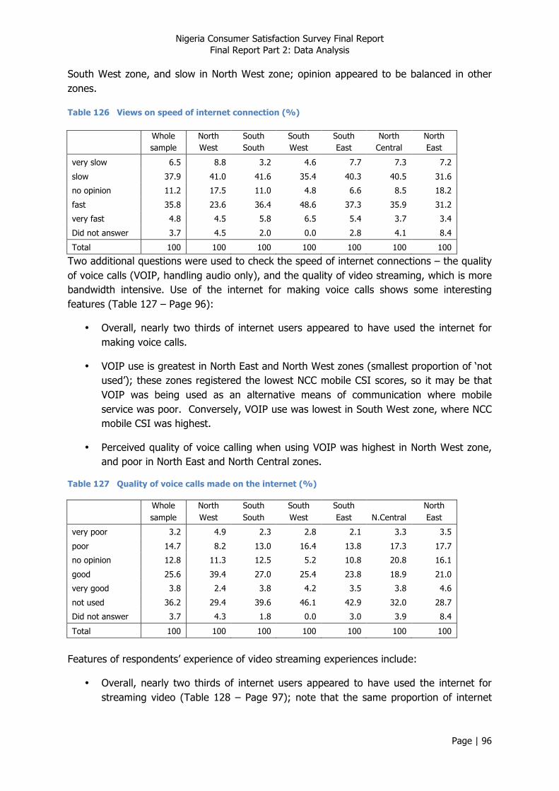
Nigeria Consumer Satisfaction Survey Final Report Final Report Part 2: Data Analysis
Page | 96
South West zone, and slow in North West zone; opinion appeared to be balanced in other zones.
Table 126 Views on speed of internet connection (%)
Whole sample
North West
South South
South West
South East
North Central
North East
very slow 6.5 8.8 3.2 4.6 7.7 7.3 7.2
slow 37.9 41.0 41.6 35.4 40.3 40.5 31.6
no opinion 11.2 17.5 11.0 4.8 6.6 8.5 18.2
fast 35.8 23.6 36.4 48.6 37.3 35.9 31.2
very fast 4.8 4.5 5.8 6.5 5.4 3.7 3.4
Did not answer 3.7 4.5 2.0 0.0 2.8 4.1 8.4
Total 100 100 100 100 100 100 100
Two additional questions were used to check the speed of internet connections – the quality of voice calls (VOIP, handling audio only), and the quality of video streaming, which is more bandwidth intensive. Use of the internet for making voice calls shows some interesting features (Table 127 – Page 96):
• Overall, nearly two thirds of internet users appeared to have used the internet for making voice calls.
• VOIP use is greatest in North East and North West zones (smallest proportion of ‘not used’); these zones registered the lowest NCC mobile CSI scores, so it may be that VOIP was being used as an alternative means of communication where mobile service was poor. Conversely, VOIP use was lowest in South West zone, where NCC mobile CSI was highest.
• Perceived quality of voice calling when using VOIP was highest in North West zone, and poor in North East and North Central zones.
Table 127 Quality of voice calls made on the internet (%)
Whole sample
North West
South South
South West
South East N.Central
North East
very poor 3.2 4.9 2.3 2.8 2.1 3.3 3.5
poor 14.7 8.2 13.0 16.4 13.8 17.3 17.7
no opinion 12.8 11.3 12.5 5.2 10.8 20.8 16.1
good 25.6 39.4 27.0 25.4 23.8 18.9 21.0
very good 3.8 2.4 3.8 4.2 3.5 3.8 4.6
not used 36.2 29.4 39.6 46.1 42.9 32.0 28.7
Did not answer 3.7 4.3 1.8 0.0 3.0 3.9 8.4
Total 100 100 100 100 100 100 100
Features of respondents’ experience of video streaming experiences include:
• Overall, nearly two thirds of internet users appeared to have used the internet for streaming video (Table 128 – Page 97); note that the same proportion of internet
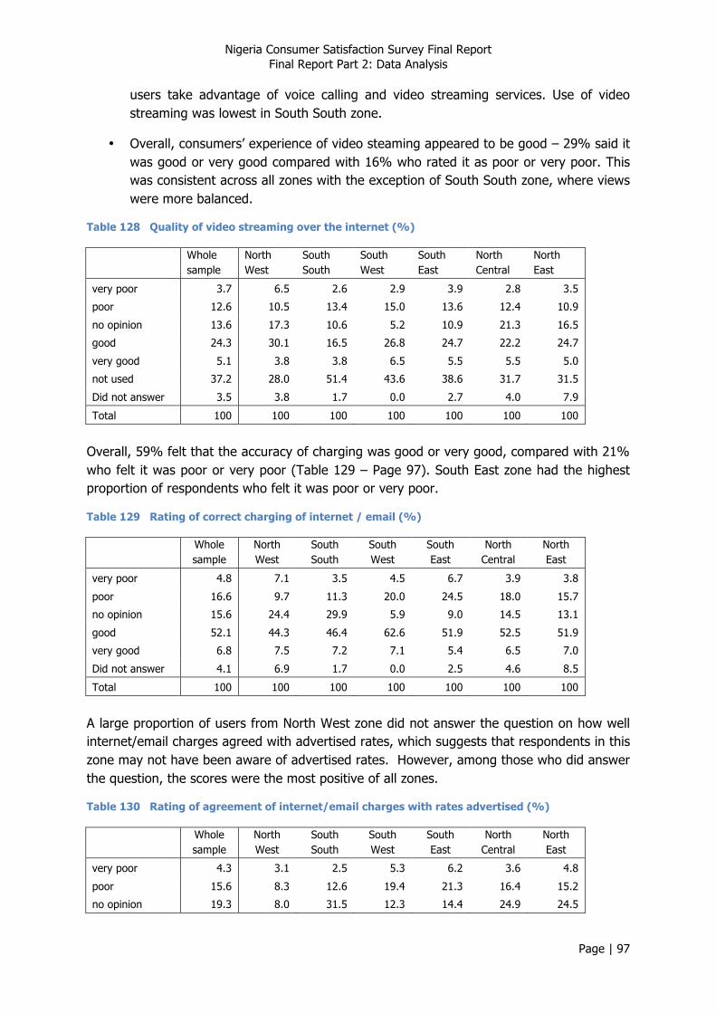
Nigeria Consumer Satisfaction Survey Final Report Final Report Part 2: Data Analysis
Page | 97
users take advantage of voice calling and video streaming services. Use of video streaming was lowest in South South zone.
• Overall, consumers’ experience of video steaming appeared to be good – 29% said it was good or very good compared with 16% who rated it as poor or very poor. This was consistent across all zones with the exception of South South zone, where views were more balanced.
Table 128 Quality of video streaming over the internet (%)
Whole sample
North West
South South
South West
South East
North Central
North East
very poor 3.7 6.5 2.6 2.9 3.9 2.8 3.5
poor 12.6 10.5 13.4 15.0 13.6 12.4 10.9
no opinion 13.6 17.3 10.6 5.2 10.9 21.3 16.5
good 24.3 30.1 16.5 26.8 24.7 22.2 24.7
very good 5.1 3.8 3.8 6.5 5.5 5.5 5.0
not used 37.2 28.0 51.4 43.6 38.6 31.7 31.5
Did not answer 3.5 3.8 1.7 0.0 2.7 4.0 7.9
Total 100 100 100 100 100 100 100
Overall, 59% felt that the accuracy of charging was good or very good, compared with 21% who felt it was poor or very poor (Table 129 – Page 97). South East zone had the highest proportion of respondents who felt it was poor or very poor.
Table 129 Rating of correct charging of internet / email (%)
Whole sample
North West
South South
South West
South East
North Central
North East
very poor 4.8 7.1 3.5 4.5 6.7 3.9 3.8
poor 16.6 9.7 11.3 20.0 24.5 18.0 15.7
no opinion 15.6 24.4 29.9 5.9 9.0 14.5 13.1
good 52.1 44.3 46.4 62.6 51.9 52.5 51.9
very good 6.8 7.5 7.2 7.1 5.4 6.5 7.0
Did not answer 4.1 6.9 1.7 0.0 2.5 4.6 8.5
Total 100 100 100 100 100 100 100
A large proportion of users from North West zone did not answer the question on how well internet/email charges agreed with advertised rates, which suggests that respondents in this zone may not have been aware of advertised rates. However, among those who did answer the question, the scores were the most positive of all zones.
Table 130 Rating of agreement of internet/email charges with rates advertised (%)
Whole sample
North West
South South
South West
South East
North Central
North East
very poor 4.3 3.1 2.5 5.3 6.2 3.6 4.8
poor 15.6 8.3 12.6 19.4 21.3 16.4 15.2
no opinion 19.3 8.0 31.5 12.3 14.4 24.9 24.5

Nigeria Consumer Satisfaction Survey Final Report Final Report Part 2: Data Analysis
Page | 98
good 42.9 32.5 40.9 55.9 46.6 41.2 38.8
very good 7.2 8.4 9.4 7.1 5.7 6.6 6.1
Did not answer 10.7 39.8 3.1 0.0 5.8 7.2 10.6
Total 100 100 100 100 100 100 100
Figure 35 Summary scores (means) – internet quality
Although differences in ratings for speed of internet connections were not significant, scores for the quality of VOIP and video streaming were higher among urban respondents. Men were marginally more critical of internet speeds than women. There is a general trend for scores to be highest among middle aged groups (25 to 39 years) and to drop off with increasing age. Scores for all indicators were higher among middle class respondents than among lower class respondents. There was a consistent trend among all indicators for scores to decrease with increasing expenditure on internet / email i.e. more intensive users were more critical of the quality of the service.
Scores for internet speed were highest among users of mobile devices (other than a Blackberry), but quality of voice calls and video streaming were rated most highly by Blackberry users. Views on charging issues (correct charging and agreement with advertise rates) were most positive among users of mobile devices and Blackberries. Scores for internet speed were highest among Etisalat subscribers, and lowest among MTN subscribers (with a large spread of 10 points). Scores for the quality of voice calling and video streaming were highest among Airtel and Etisalat subscribers. Scores for the two charging issues were also highest among Etisalat subscribers, and lowest among Airtel and MTN subscribers.
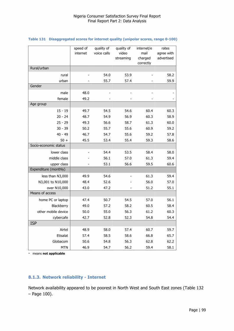
Nigeria Consumer Satisfaction Survey Final Report Final Report Part 2: Data Analysis
Page | 99
Table 131 Disaggregated scores for internet quality (unipolar scores, range 0-100)
speed of internet
quality of voice calls
quality of video
streaming
internet/email
charged correctly
rates agree with advertised
Rural/urban
rural - 54.0 53.9 - 58.2
urban - 55.7 57.4 - 59.9 Gender
male 48.0 - - - -
female 49.2 - - - - Age group
15 - 19 49.7 54.5 54.6 60.4 60.3
20 - 24 48.7 54.9 56.9 60.3 58.9
25 - 29 49.3 56.6 58.7 61.3 60.0
30 - 39 50.2 55.7 55.6 60.9 59.2
40 - 49 46.7 54.7 55.6 59.2 57.8
50 + 45.5 53.4 55.4 59.3 58.6 Socio-economic status
lower class - 54.4 53.5 58.4 58.0
middle class - 56.1 57.0 61.3 59.4
upper class - 53.1 56.6 59.5 60.6 Expenditure (monthly)
less than N3,000 49.9 54.6 - 61.3 59.4
N3,001 to N10,000 48.4 52.6 - 56.0 57.0
over N10,000 43.0 47.2 - 51.2 55.1 Means of access
home PC or laptop 47.4 50.7 54.5 57.0 56.1
Blackberry 49.0 57.2 58.2 60.5 58.4
other mobile device 50.0 55.0 56.3 61.2 60.3
cybercafe 42.7 52.8 52.3 54.8 54.4
ISP
Airtel 48.9 58.0 57.4 60.7 59.7
Etisalat 57.4 58.5 58.6 66.8 65.7
Globacom 50.6 54.8 56.3 62.8 62.2
MTN 46.9 54.7 56.2 59.4 58.1
- means not applicable
8.1.3. Network reliability - Internet
Network availability appeared to be poorest in North West and South East zones (Table 132 – Page 100).
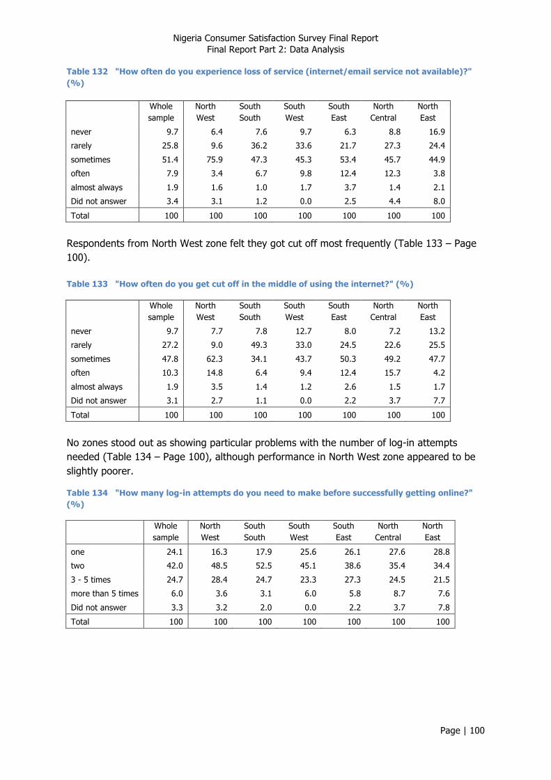
Nigeria Consumer Satisfaction Survey Final Report Final Report Part 2: Data Analysis
Page | 100
Table 132 "How often do you experience loss of service (internet/email service not available)?" (%)
Whole sample
North West
South South
South West
South East
North Central
North East
never 9.7 6.4 7.6 9.7 6.3 8.8 16.9
rarely 25.8 9.6 36.2 33.6 21.7 27.3 24.4
sometimes 51.4 75.9 47.3 45.3 53.4 45.7 44.9
often 7.9 3.4 6.7 9.8 12.4 12.3 3.8
almost always 1.9 1.6 1.0 1.7 3.7 1.4 2.1
Did not answer 3.4 3.1 1.2 0.0 2.5 4.4 8.0
Total 100 100 100 100 100 100 100
Respondents from North West zone felt they got cut off most frequently (Table 133 – Page 100). Table 133 "How often do you get cut off in the middle of using the internet?" (%)
Whole sample
North West
South South
South West
South East
North Central
North East
never 9.7 7.7 7.8 12.7 8.0 7.2 13.2
rarely 27.2 9.0 49.3 33.0 24.5 22.6 25.5
sometimes 47.8 62.3 34.1 43.7 50.3 49.2 47.7
often 10.3 14.8 6.4 9.4 12.4 15.7 4.2
almost always 1.9 3.5 1.4 1.2 2.6 1.5 1.7
Did not answer 3.1 2.7 1.1 0.0 2.2 3.7 7.7
Total 100 100 100 100 100 100 100
No zones stood out as showing particular problems with the number of log-in attempts needed (Table 134 – Page 100), although performance in North West zone appeared to be slightly poorer.
Table 134 "How many log-in attempts do you need to make before successfully getting online?" (%)
Whole sample
North West
South South
South West
South East
North Central
North East
one 24.1 16.3 17.9 25.6 26.1 27.6 28.8
two 42.0 48.5 52.5 45.1 38.6 35.4 34.4
3 - 5 times 24.7 28.4 24.7 23.3 27.3 24.5 21.5
more than 5 times 6.0 3.6 3.1 6.0 5.8 8.7 7.6
Did not answer 3.3 3.2 2.0 0.0 2.2 3.7 7.8
Total 100 100 100 100 100 100 100

Nigeria Consumer Satisfaction Survey Final Report Final Report Part 2: Data Analysis
Page | 101
Figure 36 Summary scores (means) - network reliability
Urban users perceived loss of service and getting cut off to occur more frequently i.e. lower scores. Differences according to gender were not significant. Perceptions of reliability issues were generally more positive among the 30 to 49 year old age groups. Users from the highest socio-economic status group appeared to have a more negative view of the frequency of getting cut off; least intensive users had the most positive views. Scores for both indicators were highest among Blackberry users, and lowest among cybercafé users. Scores for both indicators were highest among Etisalat subscribers, and lowest among MTN subscribers.
Table 135 Disaggregated scores for network reliability (unipolar scores, range 0-100)
loss of service get cut off
Rural/urban
rural 61.7 60.2
urban 56.9 57.3 Gender
male - -
female - - Age group
15 - 19 58.9 58.4
20 - 24 57.4 56.4
25 - 29 57.3 57.0
30 - 39 60.1 59.4
40 - 49 59.3 60.1
50 + 59.2 59.7 Socio-economic status
lower class - 58.0
middle class - 59.4
upper class - 55.7 Expenditure (monthly)
less than N3,000 - 60.5
N3,001 to N10,000 - 56.7
over N10,000 - 58.5 Means of access
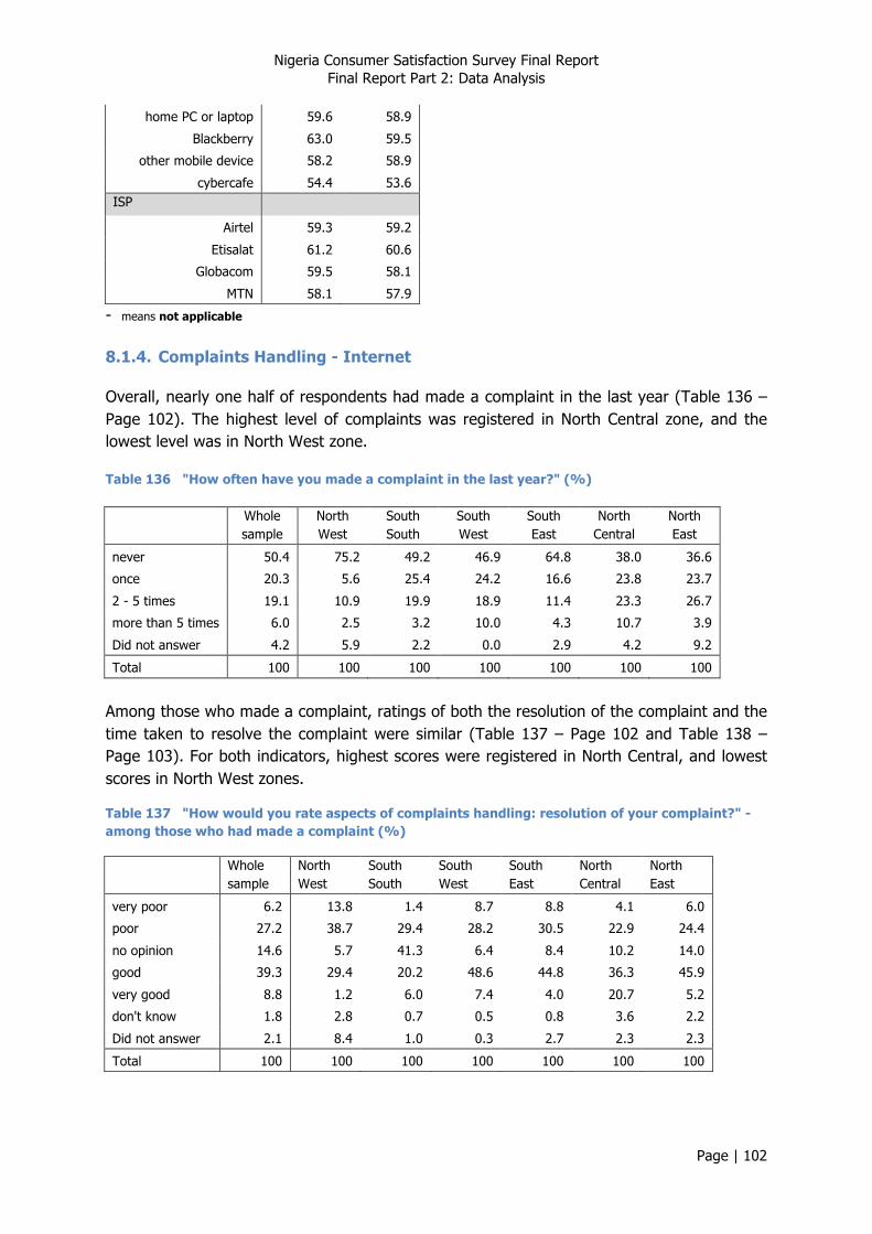
Nigeria Consumer Satisfaction Survey Final Report Final Report Part 2: Data Analysis
Page | 102
home PC or laptop 59.6 58.9
Blackberry 63.0 59.5
other mobile device 58.2 58.9
cybercafe 54.4 53.6 ISP
Airtel 59.3 59.2
Etisalat 61.2 60.6
Globacom 59.5 58.1
MTN 58.1 57.9
- means not applicable 8.1.4. Complaints Handling - Internet
Overall, nearly one half of respondents had made a complaint in the last year (Table 136 – Page 102). The highest level of complaints was registered in North Central zone, and the lowest level was in North West zone.
Table 136 "How often have you made a complaint in the last year?" (%)
Whole sample
North West
South South
South West
South East
North Central
North East
never 50.4 75.2 49.2 46.9 64.8 38.0 36.6
once 20.3 5.6 25.4 24.2 16.6 23.8 23.7
2 - 5 times 19.1 10.9 19.9 18.9 11.4 23.3 26.7
more than 5 times 6.0 2.5 3.2 10.0 4.3 10.7 3.9
Did not answer 4.2 5.9 2.2 0.0 2.9 4.2 9.2
Total 100 100 100 100 100 100 100
Among those who made a complaint, ratings of both the resolution of the complaint and the time taken to resolve the complaint were similar (Table 137 – Page 102 and Table 138 – Page 103). For both indicators, highest scores were registered in North Central, and lowest scores in North West zones.
Table 137 "How would you rate aspects of complaints handling: resolution of your complaint?" - among those who had made a complaint (%)
Whole sample
North West
South South
South West
South East
North Central
North East
very poor 6.2 13.8 1.4 8.7 8.8 4.1 6.0
poor 27.2 38.7 29.4 28.2 30.5 22.9 24.4
no opinion 14.6 5.7 41.3 6.4 8.4 10.2 14.0
good 39.3 29.4 20.2 48.6 44.8 36.3 45.9
very good 8.8 1.2 6.0 7.4 4.0 20.7 5.2
don't know 1.8 2.8 0.7 0.5 0.8 3.6 2.2
Did not answer 2.1 8.4 1.0 0.3 2.7 2.3 2.3
Total 100 100 100 100 100 100 100
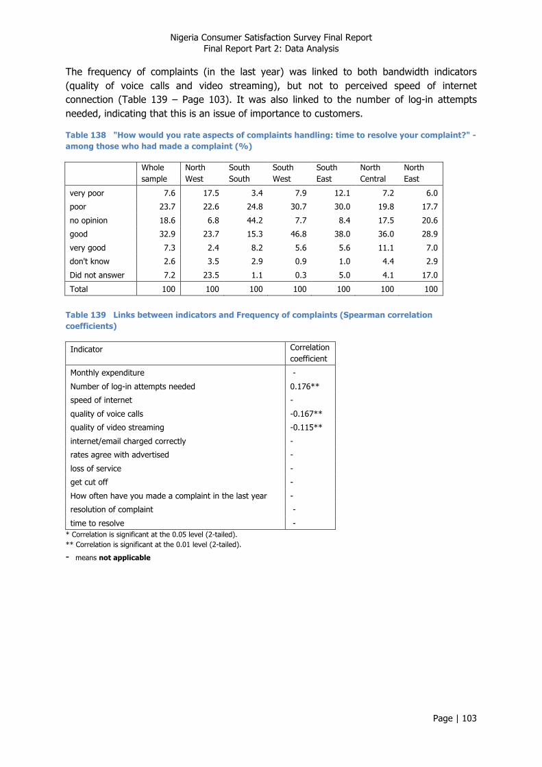
Nigeria Consumer Satisfaction Survey Final Report Final Report Part 2: Data Analysis
Page | 103
The frequency of complaints (in the last year) was linked to both bandwidth indicators (quality of voice calls and video streaming), but not to perceived speed of internet connection (Table 139 – Page 103). It was also linked to the number of log-in attempts needed, indicating that this is an issue of importance to customers.
Table 138 "How would you rate aspects of complaints handling: time to resolve your complaint?" - among those who had made a complaint (%)
Whole sample
North West
South South
South West
South East
North Central
North East
very poor 7.6 17.5 3.4 7.9 12.1 7.2 6.0
poor 23.7 22.6 24.8 30.7 30.0 19.8 17.7
no opinion 18.6 6.8 44.2 7.7 8.4 17.5 20.6
good 32.9 23.7 15.3 46.8 38.0 36.0 28.9
very good 7.3 2.4 8.2 5.6 5.6 11.1 7.0
don't know 2.6 3.5 2.9 0.9 1.0 4.4 2.9
Did not answer 7.2 23.5 1.1 0.3 5.0 4.1 17.0
Total 100 100 100 100 100 100 100
Table 139 Links between indicators and Frequency of complaints (Spearman correlation coefficients)
Indicator Correlation coefficient
Monthly expenditure -
Number of log-in attempts needed 0.176**
speed of internet -
quality of voice calls -0.167**
quality of video streaming -0.115**
internet/email charged correctly -
rates agree with advertised -
loss of service -
get cut off -
How often have you made a complaint in the last year -
resolution of complaint -
time to resolve - * Correlation is significant at the 0.05 level (2-tailed). ** Correlation is significant at the 0.01 level (2-tailed).
- means not applicable
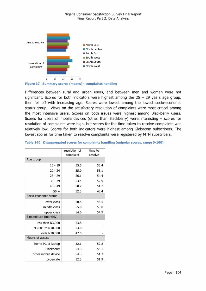
Nigeria Consumer Satisfaction Survey Final Report Final Report Part 2: Data Analysis
Page | 104
Figure 37 Summary scores (means) - complaints handling
Differences between rural and urban users, and between men and women were not significant. Scores for both indicators were highest among the 25 – 29 years age group, then fell off with increasing age. Scores were lowest among the lowest socio-economic status group. Views on the satisfactory resolution of complaints were most critical among the most intensive users. Scores on both issues were highest among Blackberry users. Scores for users of mobile devices (other than Blackberry) were interesting – scores for resolution of complaints were high, but scores for the time taken to resolve complaints was relatively low. Scores for both indicators were highest among Globacom subscribers. The lowest scores for time taken to resolve complaints were registered by MTN subscribers.
Table 140 Disaggregated scores for complaints handling (unipolar scores, range 0-100)
resolution of complaint
time to resolve
Age group
15 - 19 55.5 53.4
20 - 24 55.0 53.1
25 - 29 56.1 54.4
30 - 39 53.4 52.9
40 - 49 50.7 51.7
50 + 52.3 48.4 Socio-economic status
lower class 50.5 48.5
middle class 55.0 53.0
upper class 54.6 54.9 Expenditure (monthly)
less than N3,000 53.8 -
N3,001 to N10,000 53.0 -
over N10,000 47.5 - Means of access
home PC or laptop 52.1 52.8
Blackberry 54.3 55.1
other mobile device 54.3 51.3
cybercafe 52.3 51.9

Nigeria Consumer Satisfaction Survey Final Report Final Report Part 2: Data Analysis
Page | 105
ISP
Airtel 54.1 54.6
Etisalat 53.9 54.7
Globacom 56.0 55.4
MTN 54.5 51.1
- means not applicable 8.1.5. Key Satisfaction indicators - Internet
Scores for all four indicators were highest in North West zone, and lowest scores tended to be registered in North Central zone.
Table 141 "To what extent is the quality of services in line with your expectations?" (%)
Whole sample
North West
South South
South West
South East
North Central
North East
much lower 5.2 7.8 3.3 4.7 5.4 3.8 6.0
lower 28.8 19.0 24.3 29.0 34.2 42.1 24.5
no opinion 15.4 10.7 24.2 12.0 9.0 14.0 21.5
higher 37.5 43.6 41.1 46.3 40.1 30.7 25.9
much higher 5.6 10.2 3.5 6.1 5.1 1.9 6.4
don't know 3.1 3.1 2.1 1.9 1.2 3.3 6.3
Did not answer 4.4 5.5 1.6 0.0 5.1 4.2 9.3
Total 100 100 100 100 100 100 100
Table 142 "Overall, how would you rate the value for money offered by the services you pay for?" (%)
Whole sample
North West
South South
South West
South East
North Central
North East
very poor 5.4 3.5 3.3 4.6 7.1 7.3 6.5
poor 22.9 10.7 16.0 25.7 26.4 31.4 24.8
no opinion 11.9 3.9 26.1 9.8 5.6 7.3 17.9
good 48.5 66.2 45.6 50.8 48.0 41.9 40.8
very good 5.2 5.0 5.5 7.5 7.5 3.3 3.1
don't know 2.6 3.6 1.0 1.6 1.3 4.0 3.5
Did not answer 3.5 7.2 2.5 0.0 4.1 4.8 3.5
Total 100 100 100 100 100 100 100
Table 143 "Overall, how satisfied are you with your ISP?" (%)
Whole sample
North West
South South
South West
South East
North Central
North East
very dissatisfied 4.5 3.8 2.4 5.2 5.1 7.0 3.4
dissatisfied 25.0 10.9 32.7 26.7 29.1 28.1 23.0
no opinion 12.2 8.1 12.0 9.5 6.8 12.1 21.8
satisfied 49.4 61.4 44.9 51.7 47.7 45.5 45.5
very satisfied 5.1 6.1 6.1 6.8 7.0 2.6 2.6
Did not answer 3.9 9.6 1.9 0.0 4.2 4.7 3.7
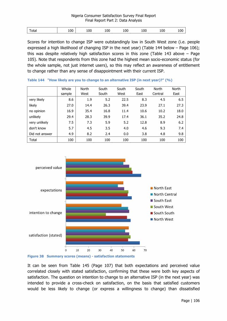
Nigeria Consumer Satisfaction Survey Final Report Final Report Part 2: Data Analysis
Page | 106
Total 100 100 100 100 100 100 100
Scores for intention to change ISP were outstandingly low in South West zone (i.e. people expressed a high likelihood of changing ISP in the next year) (Table 144 below – Page 106); this was despite relatively high satisfaction scores in this zone (Table 143 above – Page 105). Note that respondents from this zone had the highest mean socio-economic status (for the whole sample, not just internet users), so this may reflect an awareness of entitlement to change rather than any sense of disappointment with their current ISP.
Table 144 "How likely are you to change to an alternative ISP (in next year)?" (%)
Whole sample
North West
South South
South West
South East
North Central
North East
very likely 8.6 1.9 5.2 22.5 8.3 4.5 6.5
likely 27.0 14.4 26.3 39.4 23.9 27.1 27.3
no opinion 16.9 35.4 16.8 11.4 10.6 10.2 18.0
unlikely 29.4 28.3 39.9 17.4 36.1 35.2 24.8
very unlikely 7.5 7.3 5.9 5.2 12.8 8.9 6.2
don't know 5.7 4.5 3.5 4.0 4.6 9.3 7.4
Did not answer 4.9 8.2 2.4 0.0 3.8 4.8 9.8
Total 100 100 100 100 100 100 100
Figure 38 Summary scores (means) - satisfaction statements
It can be seen from Table 145 (Page 107) that both expectations and perceived value correlated closely with stated satisfaction, confirming that these were both key aspects of satisfaction. The question on intention to change to an alternative ISP (in the next year) was intended to provide a cross-check on satisfaction, on the basis that satisfied customers would be less likely to change (or express a willingness to change) than dissatisfied
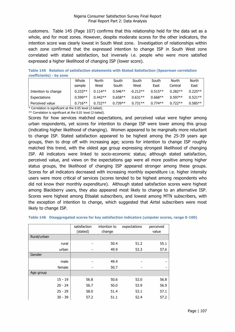
Nigeria Consumer Satisfaction Survey Final Report Final Report Part 2: Data Analysis
Page | 107
customers. Table 145 (Page 107) confirms that this relationship held for the data set as a whole, and for most zones. However, despite moderate scores for the other indicators, the intention score was clearly lowest in South West zone. Investigation of relationships within each zone confirmed that the expressed intention to change ISP in South West zone correlated with stated satisfaction, but inversely i.e. people who were more satisfied expressed a higher likelihood of changing ISP (lower score).
Table 145 Relation of satisfaction statements with Stated Satisfaction (Spearman correlation coefficients) - by zone
Whole sample
North West
South South
South West
South East
North Central
North East
Intention to change 0.233** 0.114** 0.546** -0.212** 0.515** 0.282** 0.225**
Expectations 0.599** 0.442** 0.658** 0.631** 0.668** 0.597** 0.521**
Perceived value 0.716** 0.722** 0.739** 0.731** 0.774** 0.722** 0.585** * Correlation is significant at the 0.05 level (2-tailed). ** Correlation is significant at the 0.01 level (2-tailed).
Scores for how services matched expectations, and perceived value were higher among urban respondents, yet scores for intention to change ISP were lower among this group (indicating higher likelihood of changing). Women appeared to be marginally more reluctant to change ISP. Stated satisfaction appeared to be highest among the 25-39 years age groups, then to drop off with increasing age; scores for intention to change ISP roughly matched this trend, with the oldest age group expressing strongest likelihood of changing ISP. All indicators were linked to socio-economic status; although stated satisfaction, perceived value, and views on the expectations gap were all more positive among higher status groups, the likelihood of changing ISP appeared stronger among these groups. Scores for all indicators decreased with increasing monthly expenditure i.e. higher intensity users were more critical of services (scores tended to be highest among respondents who did not know their monthly expenditure). Although stated satisfaction scores were highest among Blackberry users, they also appeared most likely to change to an alternative ISP. Scores were highest among Etisalat subscribers, and lowest among MTN subscribers, with the exception of intention to change, which suggested that Airtel subscribers were most likely to change ISP.
Table 146 Disaggregated scores for key satisfaction indicators (unipolar scores, range 0-100)
satisfaction (stated)
intention to change
expectations perceived value
Rural/urban
rural - 50.4 51.2 55.1
urban - 49.9 53.3 57.6 Gender
male - 49.4 - -
female - 50.7 - - Age group
15 - 19 56.8 50.6 52.0 56.8
20 - 24 56.7 50.0 53.9 56.9
25 - 29 58.0 51.4 53.1 57.1
30 - 39 57.2 51.1 52.4 57.2
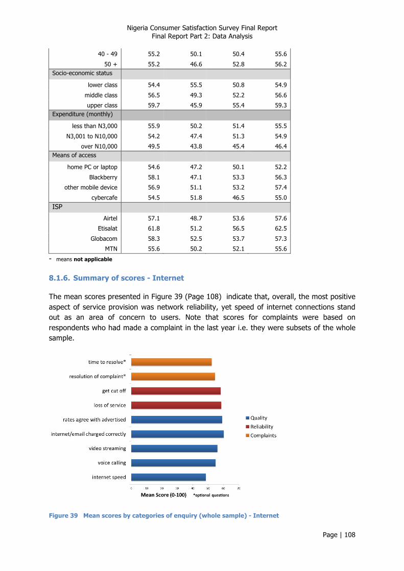
Nigeria Consumer Satisfaction Survey Final Report Final Report Part 2: Data Analysis
Page | 108
40 - 49 55.2 50.1 50.4 55.6
50 + 55.2 46.6 52.8 56.2 Socio-economic status
lower class 54.4 55.5 50.8 54.9
middle class 56.5 49.3 52.2 56.6
upper class 59.7 45.9 55.4 59.3 Expenditure (monthly)
less than N3,000 55.9 50.2 51.4 55.5
N3,001 to N10,000 54.2 47.4 51.3 54.9
over N10,000 49.5 43.8 45.4 46.4 Means of access
home PC or laptop 54.6 47.2 50.1 52.2
Blackberry 58.1 47.1 53.3 56.3
other mobile device 56.9 51.1 53.2 57.4
cybercafe 54.5 51.8 46.5 55.0 ISP
Airtel 57.1 48.7 53.6 57.6
Etisalat 61.8 51.2 56.5 62.5
Globacom 58.3 52.5 53.7 57.3
MTN 55.6 50.2 52.1 55.6
- means not applicable 8.1.6. Summary of scores - Internet
The mean scores presented in Figure 39 (Page 108) indicate that, overall, the most positive aspect of service provision was network reliability, yet speed of internet connections stand out as an area of concern to users. Note that scores for complaints were based on respondents who had made a complaint in the last year i.e. they were subsets of the whole sample.
Figure 39 Mean scores by categories of enquiry (whole sample) - Internet

Nigeria Consumer Satisfaction Survey Final Report Final Report Part 2: Data Analysis
Page | 109
8.2. Customer Satisfaction Index
8.2.1. Calculating NCC Customer Satisfaction Index (CSI) - Internet
Composite variables have been calculated for each of the constructs used in the CSI:
1. Primary service (internet speed & charging) 2. Convenience
Mean scores for these and the statement variables are presented in Table 147 (Page 109). This indicates that satisfaction was lowest in North Central zone, but roughly the same across all the other zones except North West zone, where it was highest by a considerable margin. Primary service scores were lowest in South East zone, and the composite convenience indicator was lowest in North West zone.
Table 147 Mean scores for Key Satisfaction variables - by zone
Mean scores (0-100) Whole sample
North West
South South
South West
South East
North Central
North East
Primary Service (composite) 56 58 57 59 53 55 56
Convenience (composite) 59 52 62 61 55 56 63
Perceived value (stated) 57 66 59 58 56 51 52
Expectations (stated) 53 58 54 55 51 46 51
Satisfaction (stated) 57 65 55 57 56 52 55
Intention to change ISP (stated) 50 57 54 35 56 55 49
The NCC Customer Satisfaction Index - Internet was calculated as the mean of the following key variables:
• Primary service (internet speed & charging) • Expectations • Perceived value
For those respondents who had made a complaint (in the last year), the NCC Customer Care Index - Internet was calculated as the mean of the two variables relating to complaints handling.
Mean scores for the whole sample were 54.7 ± 0.4 (95% confidence interval) and 53.0 ± 0.6 (95% confidence interval) for the NCC Customer Satisfaction Index - Internet and NCC Customer Care Index - Internet respectively; the breakdown by zones is presented in Figure 40 (Page 110). This shows that customer satisfaction was lowest in North Central zone. It is interesting to note that the NCC Customer Care Index - Internet was clearly highest in this zone. Similarly, the NCC Customer Care Index - Internet was lowest in North West zone, which enjoyed the highest NCC Customer Satisfaction Index - Internet score. This suggests that in zones where service was poor, customers expressed greater appreciation for the support they were given.

Nigeria Consumer Satisfaction Survey Final Report Final Report Part 2: Data Analysis
Page | 110
Figure 40 Customer Satisfaction Index and Customer Care Index - by zone
8.2.2. CSI, CCI, Demographics, and Internet characteristics - Internet
Comparing the calculated values of the NCC Customer Satisfaction and Customer Care indices - Internet (Table 148 – Page 110) shows some interesting characteristics:
• Differences between rural and urban respondents were not significant; • The NCC Customer Satisfaction Index -Internet was slightly higher among women; • Although the NCC Customer Satisfaction Index -Internet did not show any clear trend
with age, the NCC Customer Care Index - Internet dropped off among older age groups;
• Both indices appeared to be linked to socio-economic status, being weaker among lower status groups;
• Both indices were also linked to monthly expenditure (reflecting intensity of use), such that higher intensity users were more critical of services;
• Users of mobile devices (other than Blackberry) registered the highest Customer Satisfaction scores, but low Customer Care scores; both indices were lowest among cybercafé users;
• The NCC Customer Satisfaction Index - Internet Score was highest among Etisalat subscribers, followed by Globacom subscribers, who also registered the highest NCC Customer Care Index - Internet scores; both indices were lowest among MTN subscribers.
Table 148 Disaggregated scores for composite indices Customer
Satisfaction Index
Customer Care Index
Gender
male 54.1 -
female 55.4 - Age group
15 - 19 54.3 54.5
20 - 24 54.6 53.6

Nigeria Consumer Satisfaction Survey Final Report Final Report Part 2: Data Analysis
Page | 111
25 - 29 55.0 55.0
30 - 39 55.6 53.4
40 - 49 53.7 51.7
50 + 54.6 49.4 Socio-economic status
lower class 53.6 49.3
middle class 54.7 53.8
upper class 56.3 55.0 Expenditure (monthly)
less than N3,000 54.8 53.0
N3,001 to N10,000 54.1 51.7
over N10,000 46.9 48.6 Means of access
home PC or laptop 51.9 52.7
Blackberry 53.2 54.5
other mobile device 55.9 52.6
cybercafe 50.7 52.1
ISP
Airtel 55.3 54.8
Etisalat 60.7 54.4
Globacom 56.9 55.6
MTN 53.5 52.5
- means not applicable When looking at differences in NCC CSI - Internet between groupings on a zone by zone basis, the following were evident (Table 149 – Page 112):
• Internet NCC CSI - Internet scores were higher among rural respondents in South South and North Central zones, but higher among urban respondents in North West and North East zones i.e. no consistent trend;
• Only in two zones was the trend for women to register higher Internet NCC CSI scores evident;
• Trends with age were different in each zone: in North West zone NCC CSI – Internet was highest among the youngest age group, then declined with increasing age, in South South and South West zones NCC CSI - Internet was highest among the middle age groups, in North Central and North East zones, NCC CSI - Internet was highest among the oldest age group;
• Only in South East zone was NCC CSI - Internet highest among Blackberry users, in most other zones it was highest among users of other mobile devices, except North West zone where cybercafé users scored particularly highly.
• NCC CSI - Internet was highest among Etisalat subscribers in North West, South West, South East and North East zones, and among Globacom subscribers in South South and North Central zones.
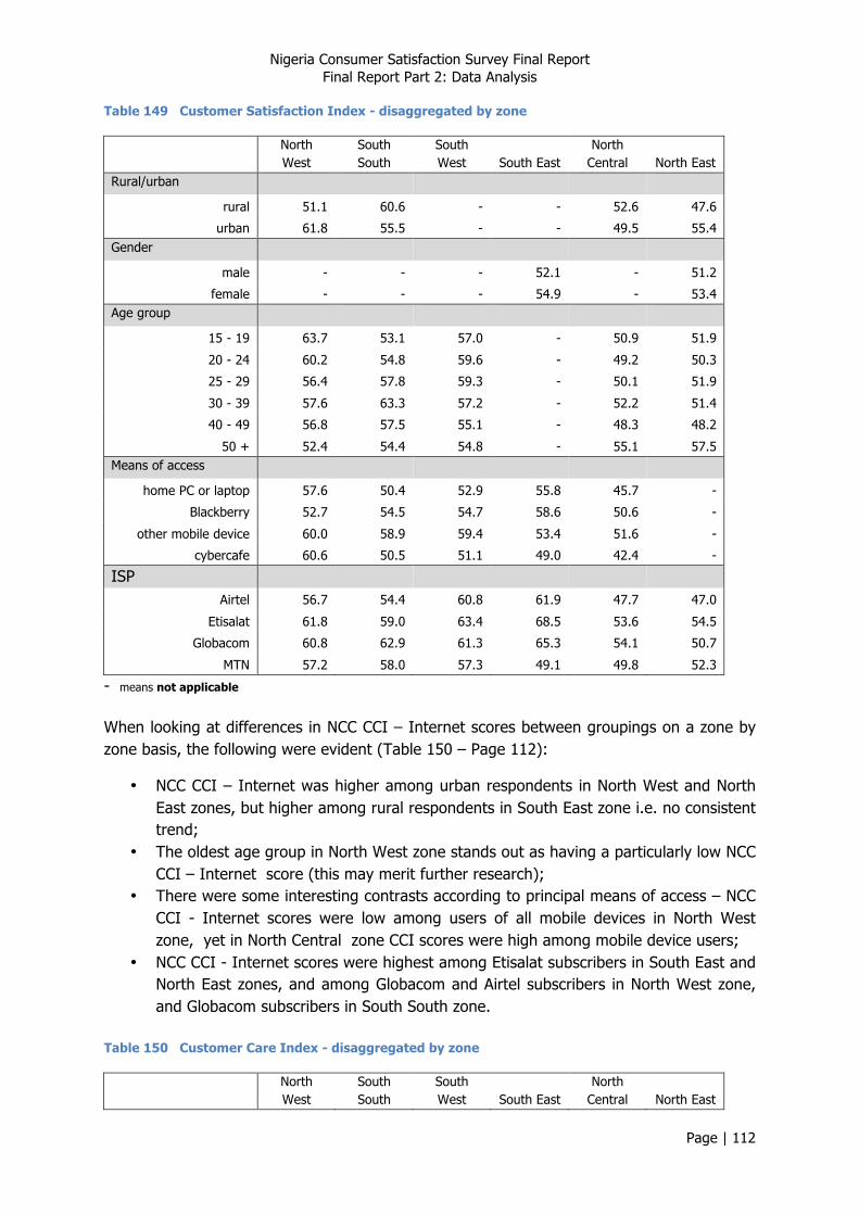
Nigeria Consumer Satisfaction Survey Final Report Final Report Part 2: Data Analysis
Page | 112
Table 149 Customer Satisfaction Index - disaggregated by zone
North West
South South
South West South East
North Central North East
Rural/urban
rural 51.1 60.6 - - 52.6 47.6
urban 61.8 55.5 - - 49.5 55.4 Gender
male - - - 52.1 - 51.2
female - - - 54.9 - 53.4 Age group
15 - 19 63.7 53.1 57.0 - 50.9 51.9
20 - 24 60.2 54.8 59.6 - 49.2 50.3
25 - 29 56.4 57.8 59.3 - 50.1 51.9
30 - 39 57.6 63.3 57.2 - 52.2 51.4
40 - 49 56.8 57.5 55.1 - 48.3 48.2
50 + 52.4 54.4 54.8 - 55.1 57.5 Means of access
home PC or laptop 57.6 50.4 52.9 55.8 45.7 -
Blackberry 52.7 54.5 54.7 58.6 50.6 -
other mobile device 60.0 58.9 59.4 53.4 51.6 -
cybercafe 60.6 50.5 51.1 49.0 42.4 -
ISP
Airtel 56.7 54.4 60.8 61.9 47.7 47.0
Etisalat 61.8 59.0 63.4 68.5 53.6 54.5
Globacom 60.8 62.9 61.3 65.3 54.1 50.7
MTN 57.2 58.0 57.3 49.1 49.8 52.3
- means not applicable When looking at differences in NCC CCI – Internet scores between groupings on a zone by zone basis, the following were evident (Table 150 – Page 112):
• NCC CCI – Internet was higher among urban respondents in North West and North East zones, but higher among rural respondents in South East zone i.e. no consistent trend;
• The oldest age group in North West zone stands out as having a particularly low NCC CCI – Internet score (this may merit further research);
• There were some interesting contrasts according to principal means of access – NCC CCI - Internet scores were low among users of all mobile devices in North West zone, yet in North Central zone CCI scores were high among mobile device users;
• NCC CCI - Internet scores were highest among Etisalat subscribers in South East and North East zones, and among Globacom and Airtel subscribers in North West zone, and Globacom subscribers in South South zone.
Table 150 Customer Care Index - disaggregated by zone
North West
South South
South West South East
North Central North East
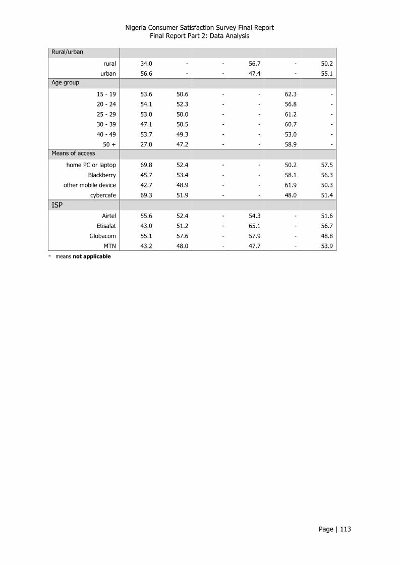
Nigeria Consumer Satisfaction Survey Final Report Final Report Part 2: Data Analysis
Page | 113
Rural/urban
rural 34.0 - - 56.7 - 50.2
urban 56.6 - - 47.4 - 55.1 Age group
15 - 19 53.6 50.6 - - 62.3 -
20 - 24 54.1 52.3 - - 56.8 -
25 - 29 53.0 50.0 - - 61.2 -
30 - 39 47.1 50.5 - - 60.7 -
40 - 49 53.7 49.3 - - 53.0 -
50 + 27.0 47.2 - - 58.9 - Means of access
home PC or laptop 69.8 52.4 - - 50.2 57.5
Blackberry 45.7 53.4 - - 58.1 56.3
other mobile device 42.7 48.9 - - 61.9 50.3
cybercafe 69.3 51.9 - - 48.0 51.4
ISP
Airtel 55.6 52.4 - 54.3 - 51.6
Etisalat 43.0 51.2 - 65.1 - 56.7
Globacom 55.1 57.6 - 57.9 - 48.8
MTN 43.2 48.0 - 47.7 - 53.9
- means not applicable
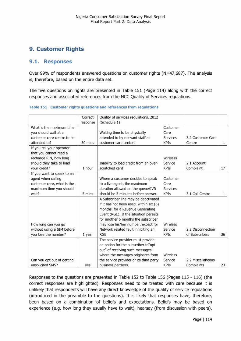
Nigeria Consumer Satisfaction Survey Final Report Final Report Part 2: Data Analysis
Page | 114
9. Customer Rights
9.1. Responses
Over 99% of respondents answered questions on customer rights (N=47,687). The analysis is, therefore, based on the entire data set.
The five questions on rights are presented in Table 151 (Page 114) along with the correct responses and associated references from the NCC Quality of Services regulations.
Table 151 Customer rights questions and references from regulations
Correct response
Quality of services regulations, 2012 (Schedule 1)
What is the maximum time you should wait at a customer care centre to be attended to? 30 mins
Waiting time to be physically attended to by relevant staff at customer care centers
Customer Care Services KPIs
3.2 Customer Care Centre 1
If you tell your operator that you cannot read a recharge PIN, how long should they take to load your credit? 1 hour
Inability to load credit from an over-scratched card
Wireless Service KPIs
2.1 Account Complaint 17
If you want to speak to an agent when calling customer care, what is the maximum time you should wait? 5 mins
Where a customer decides to speak to a live agent, the maximum duration allowed on the queue/IVR should be 5 minutes before answer.
Customer Care Services KPIs 3.1 Call Centre 1
How long can you go without using a SIM before you lose the number? 1 year
A Subscriber line may be deactivated if it has not been used, within six (6) months, for a Revenue Generating Event (RGE). If the situation persists for another 6 months the subscriber may lose his/her number, except for Network related fault inhibiting an RGE
Wireless Service KPIs
2.2 Disconnection of Subscribers 36
Can you opt out of getting unsolicited SMS? yes
The service provider must provide an option for the subscriber to“opt out” of receiving such messages where the messages originates from the service provider or its third party business partners.
Wireless Service KPIs
2.2 Miscellaneous Complaints 23
Responses to the questions are presented in Table 152 to Table 156 (Pages 115 - 116) (the correct responses are highlighted). Responses need to be treated with care because it is unlikely that respondents will have any direct knowledge of the quality of service regulations (introduced in the preamble to the questions). It is likely that responses have, therefore, been based on a combination of beliefs and expectations. Beliefs may be based on experience (e.g. how long they usually have to wait), hearsay (from discussion with peers),
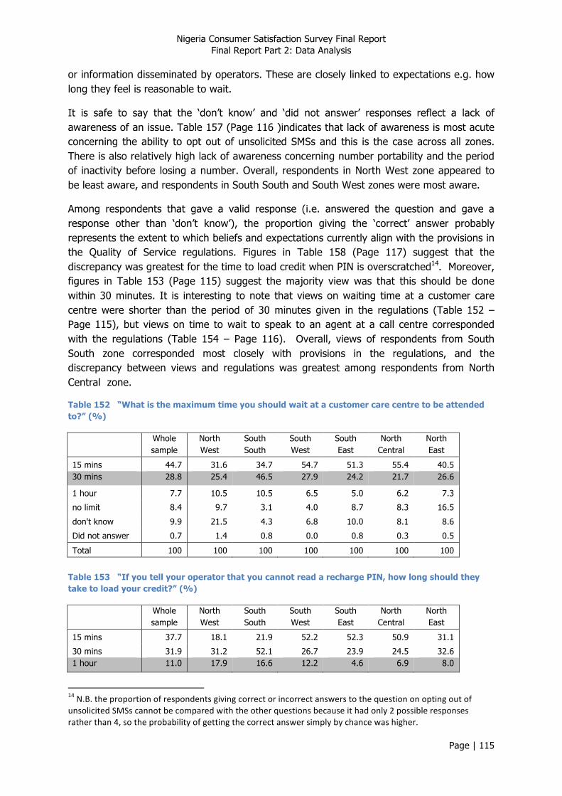
Nigeria Consumer Satisfaction Survey Final Report Final Report Part 2: Data Analysis
Page | 115
or information disseminated by operators. These are closely linked to expectations e.g. how long they feel is reasonable to wait.
It is safe to say that the ‘don’t know’ and ‘did not answer’ responses reflect a lack of awareness of an issue. Table 157 (Page 116 )indicates that lack of awareness is most acute concerning the ability to opt out of unsolicited SMSs and this is the case across all zones. There is also relatively high lack of awareness concerning number portability and the period of inactivity before losing a number. Overall, respondents in North West zone appeared to be least aware, and respondents in South South and South West zones were most aware.
Among respondents that gave a valid response (i.e. answered the question and gave a response other than ‘don’t know’), the proportion giving the ‘correct’ answer probably represents the extent to which beliefs and expectations currently align with the provisions in the Quality of Service regulations. Figures in Table 158 (Page 117) suggest that the discrepancy was greatest for the time to load credit when PIN is overscratched14. Moreover, figures in Table 153 (Page 115) suggest the majority view was that this should be done within 30 minutes. It is interesting to note that views on waiting time at a customer care centre were shorter than the period of 30 minutes given in the regulations (Table 152 – Page 115), but views on time to wait to speak to an agent at a call centre corresponded with the regulations (Table 154 – Page 116). Overall, views of respondents from South South zone corresponded most closely with provisions in the regulations, and the discrepancy between views and regulations was greatest among respondents from North Central zone.
Table 152 “What is the maximum time you should wait at a customer care centre to be attended to?” (%)
Whole sample
North West
South South
South West
South East
North Central
North East
15 mins 44.7 31.6 34.7 54.7 51.3 55.4 40.5 30 mins 28.8 25.4 46.5 27.9 24.2 21.7 26.6
1 hour 7.7 10.5 10.5 6.5 5.0 6.2 7.3
no limit 8.4 9.7 3.1 4.0 8.7 8.3 16.5
don't know 9.9 21.5 4.3 6.8 10.0 8.1 8.6
Did not answer 0.7 1.4 0.8 0.0 0.8 0.3 0.5
Total 100 100 100 100 100 100 100
Table 153 “If you tell your operator that you cannot read a recharge PIN, how long should they take to load your credit?” (%)
Whole sample
North West
South South
South West
South East
North Central
North East
15 mins 37.7 18.1 21.9 52.2 52.3 50.9 31.1
30 mins 31.9 31.2 52.1 26.7 23.9 24.5 32.6 1 hour 11.0 17.9 16.6 12.2 4.6 6.9 8.0
14 N.B. the proportion of respondents giving correct or incorrect answers to the question on opting out of unsolicited SMSs cannot be compared with the other questions because it had only 2 possible responses rather than 4, so the probability of getting the correct answer simply by chance was higher.
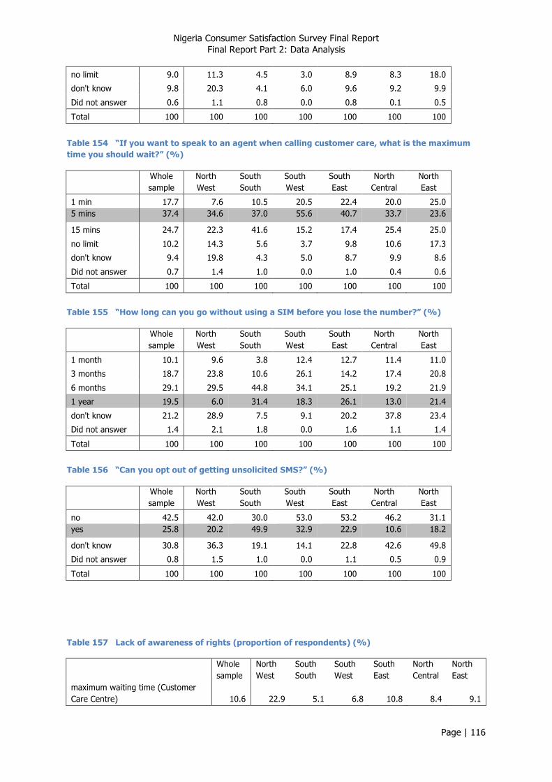
Nigeria Consumer Satisfaction Survey Final Report Final Report Part 2: Data Analysis
Page | 116
no limit 9.0 11.3 4.5 3.0 8.9 8.3 18.0
don't know 9.8 20.3 4.1 6.0 9.6 9.2 9.9
Did not answer 0.6 1.1 0.8 0.0 0.8 0.1 0.5
Total 100 100 100 100 100 100 100
Table 154 “If you want to speak to an agent when calling customer care, what is the maximum time you should wait?” (%)
Whole sample
North West
South South
South West
South East
North Central
North East
1 min 17.7 7.6 10.5 20.5 22.4 20.0 25.0 5 mins 37.4 34.6 37.0 55.6 40.7 33.7 23.6
15 mins 24.7 22.3 41.6 15.2 17.4 25.4 25.0
no limit 10.2 14.3 5.6 3.7 9.8 10.6 17.3
don't know 9.4 19.8 4.3 5.0 8.7 9.9 8.6
Did not answer 0.7 1.4 1.0 0.0 1.0 0.4 0.6
Total 100 100 100 100 100 100 100
Table 155 “How long can you go without using a SIM before you lose the number?” (%)
Whole sample
North West
South South
South West
South East
North Central
North East
1 month 10.1 9.6 3.8 12.4 12.7 11.4 11.0
3 months 18.7 23.8 10.6 26.1 14.2 17.4 20.8
6 months 29.1 29.5 44.8 34.1 25.1 19.2 21.9
1 year 19.5 6.0 31.4 18.3 26.1 13.0 21.4
don't know 21.2 28.9 7.5 9.1 20.2 37.8 23.4
Did not answer 1.4 2.1 1.8 0.0 1.6 1.1 1.4
Total 100 100 100 100 100 100 100
Table 156 “Can you opt out of getting unsolicited SMS?” (%)
Whole sample
North West
South South
South West
South East
North Central
North East
no 42.5 42.0 30.0 53.0 53.2 46.2 31.1 yes 25.8 20.2 49.9 32.9 22.9 10.6 18.2
don't know 30.8 36.3 19.1 14.1 22.8 42.6 49.8
Did not answer 0.8 1.5 1.0 0.0 1.1 0.5 0.9
Total 100 100 100 100 100 100 100
Table 157 Lack of awareness of rights (proportion of respondents) (%)
Whole sample
North West
South South
South West
South East
North Central
North East
maximum waiting time (Customer Care Centre) 10.6 22.9 5.1 6.8 10.8 8.4 9.1

Nigeria Consumer Satisfaction Survey Final Report Final Report Part 2: Data Analysis
Page | 117
time to load credit (spoiled PIN) 10.4 21.4 4.9 6.0 10.4 9.3 10.4
maximum waiting time (Call Centre) 10.1 21.2 5.3 5.0 9.7 10.3 9.2
period before losing number 22.6 31.0 9.3 9.1 21.8 38.9 24.8
opt out of unsolicited SMS 31.6 37.8 20.1 14.1 23.9 43.1 50.7
aware of number portability 22.3 34.0 13.6 10.1 18.0 27.4 30.9
Table 158 Correct knowledge of rights (proportion of respondents) (%)
Whole sample
North West
South South
South West
South East
North Central
North East
maximum waiting time (Customer Care Centre) 28.8 25.4 46.5 27.9 24.2 21.7 26.6
time to load credit (spoiled PIN) 11.0 17.9 16.6 12.2 4.6 6.9 8.0
maximum waiting time (Call Centre) 37.4 34.6 37.0 55.6 40.7 33.7 23.6
period before losing number 19.5 6.0 31.4 18.3 26.1 13.0 21.4
opt out of unsolicited SMS 25.8 20.2 49.9 32.9 22.9 10.6 18.2
Two additional questions were used to test levels of awareness of number portability and the NCC contact number. Responses to the question on number portability need to be interpreted carefully, given the fact that at the time of the survey, number portability was not available. The 18% respondents who said they were aware of number portability (Table 159 – Page 117) must have either been answering in abstract terms (i.e. they were familiar with the concept), or been misinformed. Either way, the figures provide a baseline for future reference. Awareness of the issue appeared remarkably high in South South zone.
Table 159 "Are you aware of number portability (keep your number if you change to an alternative operator)?” (%)
Whole sample
North West
South South
South West
South East
North Central
North East
no 59.8 47.3 42.3 75.0 73.0 64.9 57.2
yes 17.8 18.7 44.0 14.9 9.0 7.8 11.9
don't know 21.6 32.4 12.7 10.1 17.3 27.1 30.1
Did not answer 0.7 1.6 0.9 0.0 0.7 0.3 0.8
Total 100 100 100 100 100 100 100
Similarly, a remarkably high proportion of respondents from South South zone (42%) were aware of the NCC toll-free contact number; this is so much higher than the other zones (typically around 5%) that the overall mean of 11% masks low levels of awareness in most of the country (Table 160 – Page 117).
Table 160 “Are you aware of the toll-free number you can use to contact the NCC Contact Centre?” (%)
Whole sample
North West
South South
South West
South East
North Central
North East
no 88.0 95.1 57.0 91.5 95.7 96.2 93.6
yes 11.3 3.7 41.8 8.5 3.4 3.4 5.9
Did not answer 0.7 1.2 1.2 0.0 0.9 0.4 0.5
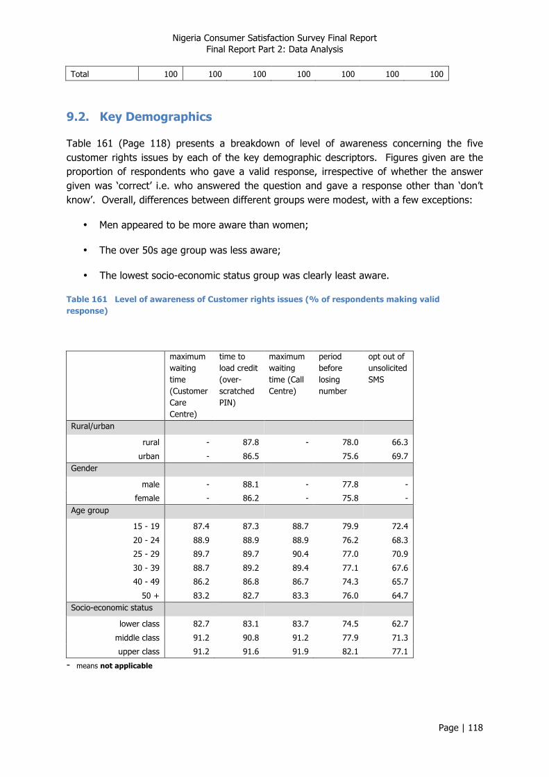
Nigeria Consumer Satisfaction Survey Final Report Final Report Part 2: Data Analysis
Page | 118
Total 100 100 100 100 100 100 100
9.2. Key Demographics
Table 161 (Page 118) presents a breakdown of level of awareness concerning the five customer rights issues by each of the key demographic descriptors. Figures given are the proportion of respondents who gave a valid response, irrespective of whether the answer given was ‘correct’ i.e. who answered the question and gave a response other than ‘don’t know’. Overall, differences between different groups were modest, with a few exceptions:
• Men appeared to be more aware than women;
• The over 50s age group was less aware;
• The lowest socio-economic status group was clearly least aware.
Table 161 Level of awareness of Customer rights issues (% of respondents making valid response)
maximum waiting time (Customer Care Centre)
time to load credit (over-scratched PIN)
maximum waiting time (Call Centre)
period before losing number
opt out of unsolicited SMS
Rural/urban
rural - 87.8 - 78.0 66.3
urban - 86.5 75.6 69.7 Gender
male - 88.1 - 77.8 -
female - 86.2 - 75.8 - Age group
15 - 19 87.4 87.3 88.7 79.9 72.4
20 - 24 88.9 88.9 88.9 76.2 68.3
25 - 29 89.7 89.7 90.4 77.0 70.9
30 - 39 88.7 89.2 89.4 77.1 67.6
40 - 49 86.2 86.8 86.7 74.3 65.7
50 + 83.2 82.7 83.3 76.0 64.7 Socio-economic status
lower class 82.7 83.1 83.7 74.5 62.7
middle class 91.2 90.8 91.2 77.9 71.3
upper class 91.2 91.6 91.9 82.1 77.1
- means not applicable

Nigeria Consumer Satisfaction Survey Final Report Final Report Part 2: Data Analysis
Page | 119
Table 162 (Page 119) presents a breakdown of the proportion of respondents whose views corresponded with the provisions of the regulations, by key demographic descriptors. Socio-economic status demonstrated an interesting trend such that a higher proportion of lower class respondents correctly identified the maximum waiting time at a Customer Care Centre, yet a higher proportion of upper class respondents correctly identified the maximum waiting time for agents at a call centre. This reflects a greater willingness to wait among lower status groups, which brings them more into line with the stipulated waiting time at Customer Care centres than the high status group. However, because a greater proportion of respondents in the low status group are willing to wait more than 5 minutes to speak to an agent at a call centre, the proportion registering an accurate response was lowest.
Table 162 Accuracy of knowledge on Customer rights issues (% of respondents making correct response)
maximum waiting time (Customer Care Centre)
time to load credit (over-scratched PIN)
maximum waiting time (Call Centre)
period before losing number
opt out of unsolicited SMS
Rural/urban
rural 32.4 13.8 - 25.3 39.4
urban 33.6 15.5 - 18.8 35.7 Gender
male - - - - 37.1
female - - - - 37.8 Age group
15 - 19 32.6 15.2 42.5 20.0 40.3
20 - 24 32.0 13.7 44.5 23.6 35.4
25 - 29 31.6 13.2 43.7 22.3 36.0
30 - 39 34.5 15.0 42.7 23.8 40.2
40 - 49 34.2 14.0 42.5 24.3 39.1
50 + 32.7 15.9 39.1 19.8 34.2 Socio-economic status
lower class 35.5 18.7 38.9 22.6 41.4
middle class 33.0 11.2 41.6 21.8 34.8
upper class 26.2 12.5 53.4 21.7 34.6
- means not applicable 9.3. Mobile Users
Breakdowns by principal operator of both level of awareness and accuracy of customer rights issues among mobile phone users are presented in Table 163 (Page 120) and Table 164 (Page 120) respectively. No trends of interest are evident15.
15 Bear in mind that the number of M-‐Tel subscribers is small (N=78).
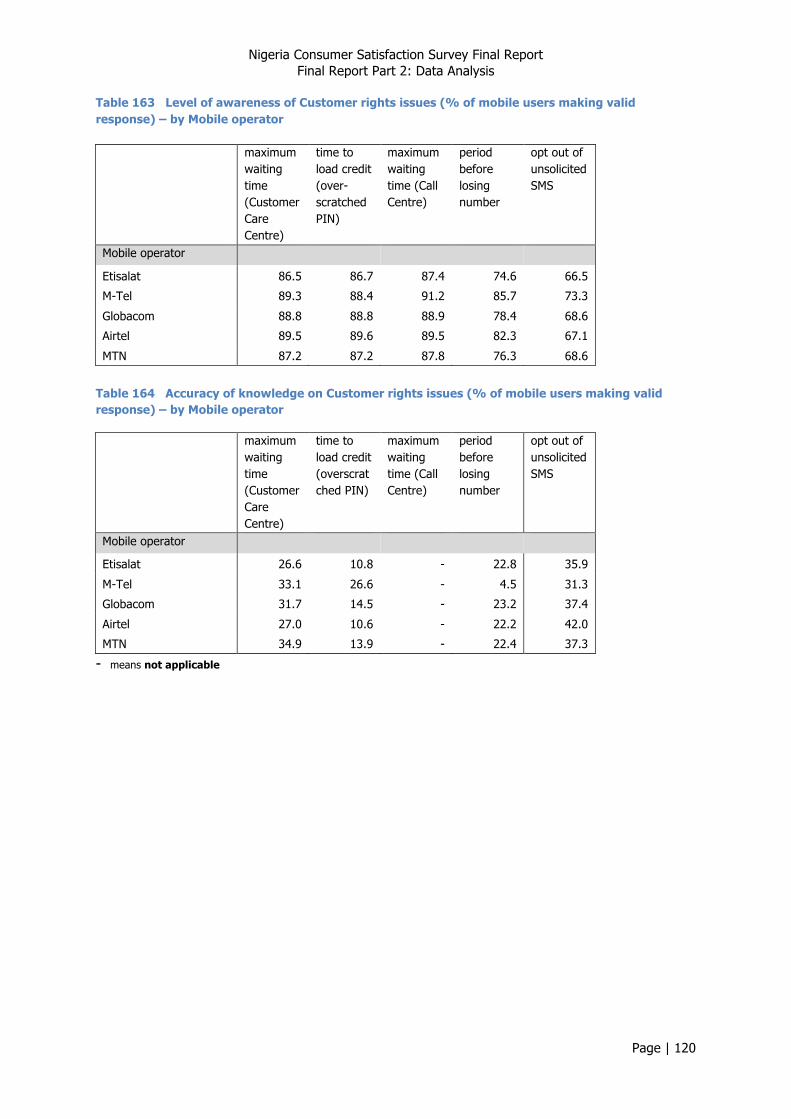
Nigeria Consumer Satisfaction Survey Final Report Final Report Part 2: Data Analysis
Page | 120
Table 163 Level of awareness of Customer rights issues (% of mobile users making valid response) – by Mobile operator
maximum waiting time (Customer Care Centre)
time to load credit (over-scratched PIN)
maximum waiting time (Call Centre)
period before losing number
opt out of unsolicited SMS
Mobile operator
Etisalat 86.5 86.7 87.4 74.6 66.5
M-Tel 89.3 88.4 91.2 85.7 73.3
Globacom 88.8 88.8 88.9 78.4 68.6
Airtel 89.5 89.6 89.5 82.3 67.1
MTN 87.2 87.2 87.8 76.3 68.6
Table 164 Accuracy of knowledge on Customer rights issues (% of mobile users making valid response) – by Mobile operator
maximum waiting time (Customer Care Centre)
time to load credit (overscratched PIN)
maximum waiting time (Call Centre)
period before losing number
opt out of unsolicited SMS
Mobile operator
Etisalat 26.6 10.8 - 22.8 35.9
M-Tel 33.1 26.6 - 4.5 31.3
Globacom 31.7 14.5 - 23.2 37.4
Airtel 27.0 10.6 - 22.2 42.0
MTN 34.9 13.9 - 22.4 37.3
- means not applicable