magazine adverts media
TRANSCRIPT

Magazine Adverts
Magazine Adverts

Examples of Magazine Ads
Examples of magazine adverts

SimilaritiesWhat do they both Contain?
1. They both have the artist names as the boldest text on the advertisement.
2. They both have images that depict their most striking features individually. For Ed Sheeran, it’s his bright ginger hair, which is emulated through the orange tint on the article. Beyonce is known for her remarkable poses and image that she sets out. The extravagant heels further this.
3. Both have the album name or symbol, which stands out as very bold. Sheeran’s is the bold ‘+’ sign, and Beyonce’s is ‘4’.
***I chose these to compare because they are very different. This then illustrates the similarities further in contrast to most other advertisements***
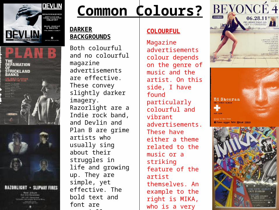
Common Colours?COLOURFUL
Magazine advertisements colour depends on the genre of music and the artist. On this side, I have found particularly colourful and vibrant advertisements. These have either a theme related to the music or a striking feature of the artist themselves. An example to the right is MIKA, who is a very bold artist whose songs are usually very bouncy and happy.
DARKER BACKGROUNDS
Both colourful and no colourful magazine advertisements are effective. These convey slightly darker imagery. Razorlight are a Indie rock band, and Devlin and Plan B are grime artists who usually sing about their struggles in life and growing up. They are simple, yet effective. The bold text and font are especially effective against the darker backgrounds, however Plan B’s decided to contrast between both white and red, which also works efficiently.
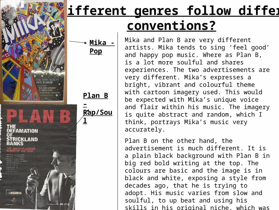
Do different genres follow different conventions?
Mika - Pop
Plan B – Rap/Soul
Mika and Plan B are very different artists. Mika tends to sing ‘feel good’ and happy pop music. Where as Plan B, is a lot more soulful and shares experiences. The two advertisements are very different. Mika’s expresses a bright, vibrant and colourful theme with cartoon imagery used. This would be expected with Mika’s unique voice and flair within his music. The imagery is quite abstract and random, which I think, portrays Mika’s music very accurately.
Plan B on the other hand, the advertisement is much different. It is a plain black background with Plan B in big red bold writing at the top. The colours are basic and the image is in black and white, exposing a style from decades ago, that he is trying to adopt. His music varies from slow and soulful, to up beat and using his skills in his original niche, which was rap and grime. The advertisement represents a simple artist with a simple ambition, and the colours enflame this idea. His music can reflect a lot of his childhood, and perhaps this slightly darker approach achieves that effect.

Album cover
Magazine Advertisement
Comparison between magazine advertisement and album cover
Similarities
• They are the same layout and design
• The lettering and font mostly is the same
• The theme is exactly the same which highlights my thoughts in the previous slide.
Differences
• The colours do vary in some elements. E.g. the planet to the bottom left of the cover is in colour, whereas in the advertisement it is not.
• The advertisement is marginally bigger than the cover, as well as there being text at the bottom of the advertisement, about the release date and featured songs.