genespring gx 9 analyzing affymetrix data tutorial - … gx 9 data analysis tutorial for affymetrix...
TRANSCRIPT

Tutorial
Analyzing Affymetrix® Gene Expression data in GeneSpring GX 9

GeneSpring GX 9 Data Analysis Tutorial for Affymetrix data 2
Introduction to Tutorial: This tutorial provides a hands-on exploration of the variety of GeneSpring GX functionalities by guiding you through the analysis of an Affymetrix® gene expression microarray dataset. In doing so, this tutorial aims to demonstrate how to use the tools available in GeneSpring GX to answer biological questions relevant to the experimental design. Understanding GeneSpring GX Terminology Some terms used in the general biological research community have a more specialized use in GeneSpring GX. A brief definition of each is provided below to clarify the tutorial instructions. More terminology can be found in the GeneSpring GX User Manual.
A project is the primary workspace which contains a collection of experiments. The ability to combine experiments into a project in Genespring GX allows for easy interrogation of cross-experimental results. For example, you may want to visualize how genes that were found to be differentially expressed in one experiment are behaving in another experiment within the project. A project could have multiple experiments that are run on different technologies and possibly different organisms as well.
A technology in GeneSpring GX contains information on the array design as well as biological information about all the entities on a specific array type. Technology refers to this package of information available for each array type, for e.g., Affymetrix HG-U133 plus 2 is one technology, Agilent 12097 (Human 1A) is another and so on. An experiment comprises samples which all belong to the same technology. A technology initially must be installed for each new array type to be analyzed. An entity is a discrete feature measured by microarray analysis such as a probe or probe set. A sample contains data from a microarray run for a single biological source. An experiment is a collection of samples used for a particular research study that are to be analyzed as a set. In GeneSpring GX, an experiment consists of multiple interpretations which group these samples by user-defined parameters. A parameter is a variable in experiments such as treatment type, tissue type, time, or dose. Parameter values are values assigned to experiment parameters. For example, “Day 14” could represent a parameter value of the experiment parameter “Time”.

GeneSpring GX 9 Data Analysis Tutorial for Affymetrix data 3
A condition consists of one or more samples that represent a common biological state. For example, if you have serum from 3 different patients with cancer, these serum samples describe the tumor condition. The normal condition is accordingly represented by a different set of serum samples from healthy patients. Multiple interpretations can be made from the same experiment data. Interpretations group samples into different conditions, if applicable to the study. Therefore, interpretations allow alternative analysis approaches. Starting GeneSpring GX Upon launching GeneSpring GX for the first time, a Demo Project will automatically open. This project, created using the Agilent One-color technology, contains an experiment called “HeLa cells treated with compound X” and data objects derived from analysis of this data. If you would like to be guided through the analysis of this dataset, please refer to the Quick Start Guide that can be accessed from GeneSpring GX > Help (in toolbar) > Document Index > Quick Start Guide. For the purpose of this tutorial, we will use the data in the Demo Project to become familiar with the GeneSpring GX interface. 1. Start up GeneSpring GX.
• Double-click the GeneSpring GX icon on the desktop. 2. Open the Demo Project.
• If this is your first time launching GeneSpring GX, the Demo Project and HeLa cells treated with compound X experiment will automatically open. If you have previously launched GeneSpring GX, go to Project > Open Project > Select Demo Project and click Open.
• A GeneSpring GX window should appear with the name of the project (Demo Project) shown on the upper left hand corner of the window, below the Project Navigator bar. See Figure 1. For the Demo Project, the HeLa cells treated with compound X experiment will be automatically opened.

GeneSpring GX 9 Data Analysis Tutorial for Affymetrix data 4
Figure 1. GeneSpring GX window displays the name of the project (Demo Project) that the window represents below the Project Navigator bar. 3. Activate the Profile Plot view for the experiment.
• From the menu, select View > Profile Plot. All Views can be accessed from two places. The first is from the menu by going to View and selecting the desired view. The other is by clicking on the individual view icons below the menu. For the purpose of tutorial, you will be instructed to select Views from the menu.
4. Explore the GeneSpring GX Interface
• As you go through the tutorial, you will need to use different parts of the GeneSpring GX application window. This window is organized into 3 main parts. See Figure 2a.
• Locate the Navigator on the left side. The navigator displays the project that you have opened and all the experiments associated with the project. Once experiment(s) within the project are opened, the navigator will be divided into multiple panels. The top panel is the project navigator and each experiment will have its own navigator panel. The Navigator panel for each experiment contains folders of data objects that have been imported into or created within GeneSpring GX. Items in multiple navigator folders are usually selected to create a useful data display.
• Locate the browser in the center portion of the window. The browser is an empty space within the interface that gets populated by a View or analysis result window.

GeneSpring GX 9 Data Analysis Tutorial for Affymetrix data 5
• Locate the Workflow panel on the right. The Workflow panel contains various tools that you will use to set up an experiment and analyze your data. The tools are grouped into different categories that reflect the order of an analysis workflow. For example, the first category is Experiment Setup, followed by Quality Control, and then Analysis.
5. Explore the Navigator of GeneSpring GX.
• A new feature in GeneSpring GX 9.0 is the data hierarchy structure of the Navigator. This allows users to quickly determine the workflow that was performed to obtain a data object. For example, the All Entities list is first input list for any analysis in GeneSpring GX. Suppose you take the All Entities list as the input for Filter on Flags analysis to filter for quality probes and created an Entity List of the results. This Entity List will be stored in the Navigator as a child of the All Entity List node. In other words, each data object will be saved as a child of the node of the input Entity List used to generate that object.
• In the HeLa cells treated with compound X experiment, click on the plus sign next to the All Entities list to open that node. Open the Filtered on Flags [P, M] Entity List. Open the T-test, p<.05 Entity List. Open the Fold change >= 2.0 Entity List. Open the GO Analysis folder. Your navigator for the experiment should now look like the one displayed in Figure 2b. From this data hierarchy structure, I can quickly tell that I started my analysis with the All Entities list, and used that list as input for Filter on Flags analysis to obtain a list of quality probes. This filtered list was then used for T-test statistical analysis to obtain a list of differentially expressed probes, which were then subjected to Fold Change analysis to obtain probes with a greater than 2-fold change between the conditions. The resulting Entity List from Fold Change analysis was then used as the input list for GO Analysis and Clustering analysis.
6. Close the Demo Project.
• To close the project, click on the X button next to the Demo Project Navigator bar. Alternatively, you can go to toolbar and choose Project > Close Project.

GeneSpring GX 9 Data Analysis Tutorial for Affymetrix data 6
Figure 2a. GeneSpring GX main window is divided into 3 main sections: 1) navigator, 2) browser, and 3) Workflow panel.

GeneSpring GX 9 Data Analysis Tutorial for Affymetrix data 7
Figure 2b. View of the GeneSpring GX Navigator. Analysis data objects are organized in a hierarchical structure. Section 1 Loading Data and Creating an Experiment Exercise 1. Import Data and create an experiment Now that you have been introduced to the GeneSpring GX terminology and interface, we will now begin the analysis of the one-color Affymetrix dataset in GeneSpring GX. Experimental Design of the Tutorial Dataset: Patients with cardiomyopathy have weakened heart pumps which can result in the heart not being able to pump enough blood to the body’s other organs- a condition known as congestive heart failure (CHF). Patients with ischemic cardiomyopathy have weakened heart pumps due to insufficient blood and oxygen being delivered to the area. Patients with idiopathic cardiomyopathy have weakened heart pumps due to an unknown cause. To better understand the molecular mechanism underlying congestive heart failure caused by ischemic and idiopathic cardiomyopathy, transcriptional profiling of human myocardial samples from patients with the mentioned etiologies and non-failing hearts was performed.

GeneSpring GX 9 Data Analysis Tutorial for Affymetrix data 8
In the experiment that you will be analyzing, myocardial mRNA was collected, amplified, labeled, and applied to Affymetrix HG U133 Plus 2 arrays. The experiment consists of 4 biological replicates for each of the following groups: non-failing, ischemic cardiomyopathy, and idiopathic cardiomyopathy. Each of these three groups is represented by 2 female and 2 male patient samples. The Congestive Heart Failure dataset can be downloaded from the GeneSpring GX web page (http://genespring.com). From there, click on the GeneSpring GX link, and follow the link to the GeneSpring GX Extras page. Click on the GeneSpring GX 9 Dataset for Affymetrix Tutorial link. This will lead you to download a zip file containing the Congestive Heart Failure gene expression microarray dataset to be used with this tutorial.
Upon unzipping the file, you should see a folder labeled Congestive Heart Failure Dataset for Affymetrix Tutorial. Within the folder, you will see another folder labeled “Dataset” containing 12 data files corresponding to the 12 samples in the dataset. You will also see an addition file named Experiment Parameters. This file contains information regarding the parameters and parameter values associated with each sample. You will need this information when we set up the experiment for analysis. 1. To begin data analysis in GeneSpring GX, create a new project and experiment.
• From the toolbar, click Project > New Project. • In the Create New Project window, type”CHF Tutorial” and click OK. • In the Experiment Selection Dialog window, click on the Create new experiment
radio button. See Figure 3. • Click OK.
Figure 3. Experiment selection dialog. • In the New Experiment- Experiment description window, enter the information
below. See Figure 4: a. Experiment name: Congestive Heart Failure b. Experiment type: Affymetrix Expression c. Workflow type: Advanced Analysis

GeneSpring GX 9 Data Analysis Tutorial for Affymetrix data 9
d. Data analysis in GeneSpring GX can be performed using the Guided Workflow mode or the Advanced Analysis mode. The Guided Workflow mode guides you through a workflow that is routinely performed on microarray gene expression profiling experiments. This includes creating an experiment, performing quality control on both samples and entities, finding differentially expressed entities, and performing Gene Ontology classification analysis. This mode will be helpful to users who are new to GeneSpring GX or users who are not familiar with microarray gene expression data analysis. The Advanced Analysis mode is classic GeneSpring GX. This mode gives you the flexibility of performing analysis using any combination of filtering and analytical tools available in GeneSpring GX. The Advanced Analysis mode will be useful to users who are familiar with GeneSpring GX and/or users who are already familiar with microrarray gene expression data analysis.
• Click the OK button to continue.
Figure 4. Enter experiment description and select workflow type in this window. 2. Import data files into GeneSpring GX.
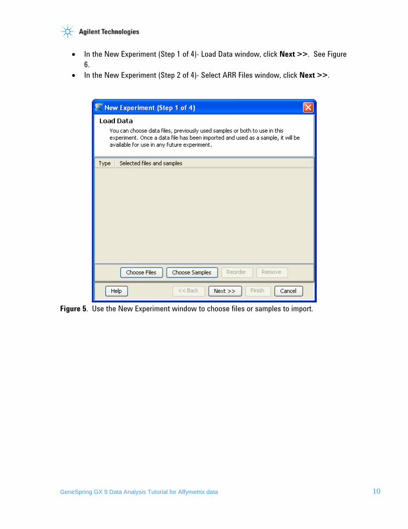
• In the New Experiment (Step 1 of 4)- Load Data window, click on the Choose File(s) button to search for the data files. See Figure 5.
• In the Open window, locate the data files of the dataset. • Select all 12 files and click Open.
GeneSpring GX 9 Data Analysis Tutorial for Affymetrix data 10
• In the New Experiment (Step 1 of 4)- Load Data window, click Next >>. See Figure 6.
• In the New Experiment (Step 2 of 4)- Select ARR Files window, click Next >>.
Figure 5. Use the New Experiment window to choose files or samples to import.

GeneSpring GX 9 Data Analysis Tutorial for Affymetrix data 11
Figure 6. The New Experiment- Load Data window displays the files to be loaded. 3. Define summarization and baseline transformation methods for the experiment.
• Changes in gene expression across samples within an experiment may be attributed to true biological variation or systematic variation. To answer biological questions that the experiment was designed to address, we only care to measure true biological variation across the experimental conditions. Applying data normalization allows you to limit the systematic variation in the data such that true biological variations are revealed and more readily detected.
• In the New experiment (Step 3 of 4)-Summarization Algorithm window, select the following options (See Figure 7):
o Summarization Algorithm: RMA o Baseline Transformation: Baseline to median of all samples o Click Finish.

GeneSpring GX 9 Data Analysis Tutorial for Affymetrix data 12
Figure 7. The New Experiment- Summarization Algorithm window allows you to select the normalization and baseline transformation methods to apply to the experiment.
4. Download the Technology needed to import data into GeneSpring GX.
• If the technology for the dataset has not already been installed in GeneSpring GX, you will be prompted to do so. Upon clicking Yes, the technology will be downloaded from the Agilent server. See Figure 8.
Figure 8. This window allows you to download the technology for the dataset. 5. View the newly created experiment.

GeneSpring GX 9 Data Analysis Tutorial for Affymetrix data 13
• Once an experiment has been created from the imported data files, a BoxWhisker Plot view of the data automatically opens. Each “BoxWhisker” shows the distribution of intensity values of the probe sets within the sample. See Figure 9.
Figure 9. A new GeneSpring GX window for the newly created CHF Tutorial project containing the Congestive Heart Failure experiment.
Section 2 Setting Up the Experiment There are several steps that must be taken to set the experiment up for analysis in GeneSpring GX. These steps include defining experimental parameters for the experiment, assigning parameter values to each sample, and creating experiment interpretations to group these samples by a parameter or combination of parameters. Replicate measurements of the same gene for the same biological condition can add great value to the data mining process. Statistical calculations based on replicate measurement error help determine the reliability of the analysis results. Thus, having replicate samples for each experiment condition is a crucial part of good experiment design. In the Congestive Heart Failure (CHF) experiment, each of the 12 samples represents one of three CHF Etiology conditions. Each unique CHF Etiology condition is represented by 4 replicate samples, 2 females and 2 males. To group individual samples into replicates within an

GeneSpring GX 9 Data Analysis Tutorial for Affymetrix data 14
experimental condition, you must first define the parameter(s) associated with the experiment and assign each sample the proper parameter values. Exercise 1: Define experiment parameters and assign parameter values to each sample. 1. Activate the Experiment Grouping window.
• In the Workflow panel, open the Experiment Setup section and click on the Experiment Grouping link.
2. Create parameters and assign parameter values. • Parameters associated with your experiment can be added to this window in one of
two ways. Parameters and parameter values for each sample can be loaded automatically from a file containing such information. To add parameters and parameter values from file, click on the Load experiment parameters from file icon, select the file, and click Open. Parameters and parameter values can also be added to this window manually. We will explore both methods in this tutorial.
• Load parameter and parameter values from file. o Click on the Load parameters from file icon , in the Experiment Grouping
window (Figure 10) and select the Experiment Parameter.txt file contained within the Congestive Heart Failure Dataset for Affymetrix Tutorial folder that you had downloaded. This folder also contains the data files for the experiment. Click Open.
o The Experiment Grouping window should now be populated with parameter and parameter values for each sample. See Figure 11.
• Manually enter the parameter and parameter values for each sample. o First, we need to remove the information that has been loaded from the file.
Click within a cell under the CHF Etiology parameter column and click the Delete Parameter button. Click within a cell under the Gender parameter column and click the Delete Parameter button.
o Click on the Samples column header to sort the samples according to Samples values.
o Click on the Add Parameter button in the Experiment Parameters window. o In the Add/Edit Experiment Parameter window, type “CHF Etiology” in the
Parameter Name box. See Figure 12. o For the CHF Etiology parameter, there are three unique values, Non-failing,
Ischemic, and Idiopathic. Use information in Table 1 to enter the appropriate parameter values for each sample. Select all samples sharing the same parameter value (e.g. select all four Non-failing samples) and click Assign Value. Enter the parameter value.
o Once all samples have been assigned a CHF Etiology parameter value, click OK.
o Repeat the same process by adding the parameter “Gender”.

GeneSpring GX 9 Data Analysis Tutorial for Affymetrix data 15
o Once all samples have been assigned a CHF Etiology and Gender parameter value, click OK in the Experiment Grouping window.
Figure 10. The Experiment Grouping window allows you to define the parameters associated with the experiment and parameter values associated with each sample.

GeneSpring GX 9 Data Analysis Tutorial for Affymetrix data 16
Figure 11. The Experiment Grouping window displays the experiment parameter(s) values associated with each sample within the experiment.

GeneSpring GX 9 Data Analysis Tutorial for Affymetrix data 17
Figure 12. Define a new experimental parameter and assign parameter values using the Add/Edit Experiment Parameter window.
Sample Name CHF Etiology Gender PA-N_249.txt Non-failing Female PA-N_300.txt Non-failing Male PA-N_322.txt Non-failing Male PA-N_326.txt Non-failing Female PAD_10.txt Idiopathic Male PAD_4.txt Idiopathic Female PAD_7.txt Idiopathic Female PAD_9.txt Idiopathic Male PAS_3.txt Ischemic Female PAS_6.txt Ischemic Female

GeneSpring GX 9 Data Analysis Tutorial for Affymetrix data 18
PAS_7.txt Ischemic Male PAS_8.txt Ischemic Male
Table 1: Experiment parameter values associated with each sample. Exercise 2. Create experimental interpretations to group replicate samples into conditions Creating the appropriate parameters and assigning the proper parameter values to each sample allows you to identify and group samples in multiple ways. This next step will demonstrate how you can create different interpretations to group samples in different ways for subsequent analysis. 1. Activate the Create Interpretation window.
• In the Workflow panel, open the Experiment Setup section and click on the Create Interpretation link.
2. Create an interpretation in which samples are grouped by the parameter “CHF Etiology”.
• In the Create Interpretation (Step 1 of 3)- Select parameters window, check the parameter “CHF Etiology” and click Next >>. See Figure 13.
• In the Create Interpretation (Step 2 of 3)- Select conditions window, make sure that all the conditions defined by the parameter “CHF Etiology” are checked. There are three unique parameter values for parameter “CHF Etiology”. Therefore, samples will be grouped into three unique experimental conditions: Idiopathic, Ischemic, and Non-failing. See Figure 14.
o Make sure that the box “Average over replicates in conditions” is checked. When this box is checked, the average signal intensity value for each entity across the replicate samples in the condition will be used for display and for analysis. If this box is unchecked, the individual signal intensity value for each entity in each sample will be used for display.
o Click Next>>. • Save the new interpretation as “CHF Etiology” (Step 3 of 3).
o GeneSpring GX will give each object created a default name. However, this can be changed to a name of your choice.
o In the Name box, type “CHF Etiology”. See Figure 15. o Click Finish.

GeneSpring GX 9 Data Analysis Tutorial for Affymetrix data 19
Figure 13. The Create Interpretation- Select parameters window allows you to select the experiment parameter(s) to group samples by.
Figure 14. The Create Interpretation- Select conditions window allows you to determine what conditions you would like to include for the interpretation to be created. In addition, it

GeneSpring GX 9 Data Analysis Tutorial for Affymetrix data 20
allows you to choose whether or not to average the intensity values for each entity across the replicates in each condition.
Figure 15. The Save Interpretation window saves the details of the interpretation created. 3. View expression data as defined by the CHF Etiology interpretation. See Figure 16.
• A profile plot displaying your expression data should automatically appear in the browser of GeneSpring GX.
• Look into the Analysis folder. The “All Entities” list is in bold, indicating that the list is selected for display in the profile plot. GeneSpring GX will only show the expression data for the entities in the selected list.
• Look into the Interpretations folder. The “CHF Etiology” interpretation is in bold, indicating that the interpretation is selected for display. GeneSpring GX will display expression data for the entities in the selected entity list, according to the sample grouping defined by the selected interpretation.

GeneSpring GX 9 Data Analysis Tutorial for Affymetrix data 21
Figure 16. Expression data for the Congestive Heart Failure experiment is being displayed in the Profile Plot View. The experimental conditions on the x-axis are defined by the Interpretation selected in the Navigator. 4. Create an interpretation in which samples are grouped by the parameter “Gender”.
• When an experiment has more than one experimental parameter associated with it, samples can be grouped in multiple ways. Thus, for a single experiment, multiple interpretations are often created.
• Repeat this exercise by first activating the Create Interpretation window. o In the Workflow panel, open the Experiment Setup section and click on the
Create Interpretation link. • In the Create Interpretation (Step 1 of 3)- Select parameters window, check the
parameter “Gender” and click Next >>. • In the Create Interpretation (Step 2 of 3)- Select conditions window, make sure that
all the conditions defined by the parameter “Gender” are checked. There are two unique parameter values for parameter “Gender”. Therefore, samples will be grouped into two unique experimental conditions: Male and Female.
o Make sure that the box “Average over replicates in conditions” is checked. o Click Next>>.
• Save the new interpretation as “Gender”.

GeneSpring GX 9 Data Analysis Tutorial for Affymetrix data 22
o In the Name box, type “Gender”. o Click Finish.
5. Create a new experiment interpretation that will group samples by both parameters “CHF Etiology” and “Gender”.
• Samples can also be grouped by multiple parameters. For example, you can group the samples in this experiment by both “CHF Etiology” and “Gender”. Only samples with the same “CHF Etiology” value and “Gender” value will now be grouped in the same condition and be considered replicate samples.
• Repeat this exercise by first activating the Create Interpretation window. o In the Workflow panel, open the Experiment Setup section and click on the
Create Interpretation link. • In the Create Interpretation (Step 1 of 3)- Select parameters window, check the
parameters “CHF Etiology” and “Gender” and click Next >>. • In the Create Interpretation (Step 2 of 3)- Select conditions window, make sure that
all the conditions defined by the parameters “CHF Etiology” and “Gender” are checked. There are six unique parameter values. Therefore, samples will be grouped into six unique experimental conditions: Idiopathic, Female; Idiopathic, Male; Ischemic, Female; Ischemic, Male; Non-failing, Female; and Non-failing, Male.
o Make sure that the box “Average over replicates in conditions” is checked. o Click Next>>.
• Save the new interpretation as “CHF Etiology-Gender”. o In the Name box, type “CHF Etiology-Gender”. o Click Finish.
Section 3 Viewing expression data in GeneSpring GX Now that we have set up the experiment, you will explore the different ways to view your data in this next part of the tutorial. The general rule for viewing expression data in GeneSpring GX is that what you see in the browser is determined by what objects you have selected in the navigator. Two objects that nearly always have to be selected to view data in the browser are an entity list and an experiment interpretation. GeneSpring GX will only show the expression data for the entities in the selected list. The normalized intensity values displayed for each entity will be determined by the selected interpretation, since the interpretation defines how samples are grouped as replicates into experimental conditions. For each entity, the average intensity values across the replicates are used for display and analysis. If you are familiar with previous versions of GeneSpring GX, you will notice that a key difference in GeneSpring GX 9.0 is that you can have multiple views of your data open at

GeneSpring GX 9 Data Analysis Tutorial for Affymetrix data 23
one time. For example, you can have a scatter plot view of the expression data displayed at the same time that you have a profile plot of the same data displayed. The advantage of this is that you can simultaneously view your data in multiple ways. The data for the views are also linked in that selecting entities in one view will select the same entities in all the other opened views as well. However, without being diligent about closing views that are no longer needed, you can end up with many windows open. Exercise 1. View expression data in a Profile Plot As we were creating the different interpretations in the previous section, a profile plot for each interpretation was automatically generated and displayed. Thus, at this point of the tutorial, you already have views opened in the browser. You may not see multiple views opened if the view has been maximized to fit the browser. In this case, the views are entirely stacked upon each other. Click on the red X in the upper right-hand corner of the view to close the window. Close all of these views before proceeding with the rest of the tutorial. In the Profile Plot view, each continuous line corresponds to a single probe set’s normalized intensity value (y-axis) for each condition (x-axis) within the Congestive Heart Failure experiment. GeneSpring GX uses log base 2 of the intensity values for calculations and for display. In GeneSpring GX, data is generally normalized and baseline transformed to center values around a baseline of 0. Therefore, normalized values of 0 represents baseline level of probe set intensity values, values greater than 0 represent upregulated probe sets, and values less than 0 represent downregulated probe sets. 1. View data for the “Congestive Heart Failure” experiment in Profile Plot view.
• In the navigator pane, click the All Entities list in the Analysis folder, and the CHF Etiology - Gender interpretation within the Interpretations folder.
• From the Menu, Click View > Profile Plot. See Figure 17. • Close the Profile Plot.

GeneSpring GX 9 Data Analysis Tutorial for Affymetrix data 24
Figure 17. Each line in the Profile Plot View represents a probe set’s normalized intensity values (Y-axis) in each condition (X-axis) defined by the selected interpretation. The plot shows the averaged value for each probe set in a condition. 2. Set the order of experimental conditions for the display.
The order in which experimental conditions are displayed in the views can be specified. For example, in this experiment you have parameters CHF Etiology and Gender and you want your profile plots to group conditions by Gender first, with the order of “Female” first, followed by “Male”. Furthermore, within each Gender conditions, you would like the CHF Etiology conditions to be in the following order: “Non-failing” first, followed by “Ischemic”, and “Idiopathic”. To achieve this, use the Experiment Grouping window to set the conditions in the desired order. • Activate the Experiment Grouping window.
o In the Workflow panel, open the Experiment Setup section and click on the Experiment Grouping link.
• Set the order of experimental conditions. o Select the Gender column by clicking into any of the parameter value cells. o Click on the left arrow icon button on the upper left of the Experiment
Grouping window. This action should move the Gender column to the left of the CHF Etiology column. See Figure 18.

GeneSpring GX 9 Data Analysis Tutorial for Affymetrix data 25
o Click on the Re-order parameter values icon . Within the Order Parameter Values window, select a condition defined by the parameter Gender and use the up and down arrows on the right hand side of the window to move the conditions in the right order. See Figure 19. The order going from top to down in this window will be the order going from left to right on a profile plot. Thus, “Female” should be listed first, then “Male”.
o Click OK. o Now we will order the conditions within the CHF Etiology parameter. Click
in any of the parameter value cells for the CHF Etiology and repeat the steps for ordering the conditions. The order should be “Non-failing”, “Ischemic”, then “idiopathic”.
o Click OK. o In the Experiment Grouping window, click Close.
3. View data for the “Congestive Heart Failure” experiment in Profile Plot view.
• In the navigator pane, click the All Entities list in the Analysis folder, and the CHF Etiology-Gender interpretation within the Interpretations folder.
• From the Menu, Click View > Profile Plot. See Figure 20. • Verify that the conditions are in the following order, going from left to right on the
X-axis: “Female, Non-failing”, “Female, Ischemic”, “Female, Idiopathic”, “Male, Non-failing”, “Male, Ischemic”, and “Male, Idiopathic”.
• Close the Profile Plot.

GeneSpring GX 9 Data Analysis Tutorial for Affymetrix data 26
Figure 18. Experiment Grouping window allows you to specify the order of experimental parameters and conditions to be displayed in various views and plots.

GeneSpring GX 9 Data Analysis Tutorial for Affymetrix data 27
Figure 19. Use the Order Parameter Values window to manipulate the order in which the conditions will be displayed for a particular experiment parameter.

GeneSpring GX 9 Data Analysis Tutorial for Affymetrix data 28
Figure 20. The profile plot of the active interpretation is shown, with the new order of the conditions. Exercise 2. View expression data in Spreadsheet View The Spreadsheet View allows you to view the normalized intensity values for the entities in the entity list selected in the Navigator. Selected annotations for these entities are also displayed within the spreadsheet. The normalized intensity values reported in the Spreadsheet View are determined by the interpretation selected in the Navigator. 1. Open the All Entities list in a spreadsheet view.
• From the Analysis navigator folder, select All Entities list. • From the Interpretations navigator folder, select CHF Etiology interpretation. • From the menu, Click View > Spreadsheet. The spreadsheet window opens and
reports the normalized intensity values for all entities in the selected list. See Figure 21.
• Close the Spreadsheet.
Figure 21. The Spreadsheet view shows normalized intensity values of the selected entity list, for the selected interpretation. Also shown are selected annotations associated with each probe set.

GeneSpring GX 9 Data Analysis Tutorial for Affymetrix data 29
Exercise 3. View data in the Scatter Plot View The scatter plot view can be useful in comparing global expression of entities between two samples or two experimental conditions. Doing so allows you to compare, at a high-level, the effects of the experimental conditions on gene expression. The scatter plot will also allow you to qualitatively identify entities whose expression is significantly different between two samples or conditions. An entity list can be made from any selected entities within the plot. 1. View data for the “Congestive Heart Failure” experiment in the scatter plot view.
• Select the All Entities list from the Analysis folder in the navigator. • Select the CHF Etiology interpretation from the Interpretations folder in the
navigator. • Click View > Scatter Plot. By default, the scatter plot displays the normalized
intensity values of each entity. The horizontal axis represents the first condition in the selected experiment interpretation and the vertical axis shows the second condition of the same interpretation. To change the condition to display, use the drop-down menu for the X-Axis and Y-Axis.
2. Change the scatter plot to display expression data for the “Idiopathic” condition on the X-Axis. • From the X-Axis drop-down menu, select condition “Idiopathic”.
3. Create an Entity List of probe sets whose expression values are downregulated in the Idiopathic condition, relative to expression in the Ischemic condition.
• Using a scatter plot, we are only qualitatively identifying probe sets that appear to have lower expression values in the Idiopathic condition, relative to the Ischemic condition. Select a few probe sets that appear to be down-regulated in the Idiopathic condition relative to the Ischemic condition by drawing a box around those probe sets. Selected probe sets should now be colored green in the plot. See Figure 22.
• To create an Entity List for these probe sets, click on the Create Entity List icon from the toolbar.
• In the Entity List Inspector window (Figure 23), type “Lower expression in Idiopathic than Ischemic in Scatter Plot” and click OK. The “Lower expression in Idiopathic than Ischemic in Scatter Plot” Entity List is now saved under the All Entities list in the Navigator.
• Close the Scatter Plot view. 4. View the expression profiles of entities in the “Lower expression in Idiopathic than Ischemic in Scatter Plot” Entity List in a Profile Plot.

GeneSpring GX 9 Data Analysis Tutorial for Affymetrix data 30
• Select the Lower expression in Idiopathic than Ischemic in Scatter Plot entity list from the Analysis folder in the navigator.
• Select the CHF Etiology interpretation from the Interpretations folder in the navigator.
• From the menu, click View > Profile Plot. • If you had selected the correct probe sets from the Scatter Plot, the expression
profiles of these entities should show a down-ward slope from the Ischemic condition to the Idiopathic condition.
• Close the Profile Plot.
Figure 22. The Scatter Plot view allows you to plot each probe set according to the intensity values in two samples or two conditions.

GeneSpring GX 9 Data Analysis Tutorial for Affymetrix data 31
Figure 23. The Entity List Inspector shows the probe sets contained in the Entity List, along with selected annotations associated with each probe set. Exercise 4. Use the Entity Inspector to view data for a single entity When performing data analysis, there is often a need to interrogate the data for a single entity of interest. For example, if gene x is known to play an important role in the biological process the experiment is examining, you may want to immediately see the expression profile of gene x in your experiment. In GeneSpring GX, you can search for a gene of interest and interrogate the data for that gene. For this Congestive Heart Failure experiment, we are interested in interrogating GATA4, a transcription factor that is known

GeneSpring GX 9 Data Analysis Tutorial for Affymetrix data 32
to regulate the expression of genes associated with cardiac hypertrophy. Thus, before you even begin your analysis, you would like to quickly check the expression of this gene. 1. View the expression data in a Profile Plot.
• Select the All Entities list from the Analysis folder in the navigator. • Select the CHF Etiology interpretation from the Interpretations folder in the
navigator. • From the menu, click View > Profile Plot.
2. Search for the probe sets that represent GATA4 in the data.
• From the menu, click Search > Entities. • In the Search for box, type in “GATA4” and leave all other default settings. This
search criteria will instruct GeneSpring GX to search through all the probe sets in the All Entities list and return probe sets that have “GATA4” in the selected annotation columns (on the right-hand side). If you would like to expand the search to other annotation columns, select the desired columns from the left-hand side, and click the appropriate arrow. See Figure 24.
Figure 24. The Search Entities tool allows you to search for a specific probe set based on a number of annotation criteria.
• Click Next>>.

GeneSpring GX 9 Data Analysis Tutorial for Affymetrix data 33
• The Search Entities (Step 2 of 3)- Output views window should now display the search results. Click Next>> to save these entities as an Entity List.
3. Create an Entity List containing the probe sets identified in the search.
• GeneSpring GX will create an Entity List for the search results as in Figure 25. Type “Entities search result for GATA4” in the Name box and click Finish.
• Select the Entities search result for GATA4 list from the Navigator. These probe sets should now be displayed in the Profile Plot. Note that the profiles of these probe sets are quite different.
Figure 25. Save the search results as an Entity List. 4. Interrogate the data for the probe set representing the GATA4 gene. You should see two expression profiles that are shape like a “V”where expression is significantly decreased in the Ischemic condition. Select the profile with the lowest expression value in the Ischemic condition. See Figure 26.
• Double-click on profile to activate the Entity Inspector window for the probe set. See Figure 27.

GeneSpring GX 9 Data Analysis Tutorial for Affymetrix data 34
• The Entity Inspector window gives detailed information regarding the probe set. The information are organized into three separate tabs:
o Annotation tab: This window contains Information for the gene that the probe set represents. Note that only a pre-selected set of annotations are being displayed. To display other annotations that are contained within the technology, click on the Configure Columns button and select the annotation columns of interest. Also note that the annotation values are actual links. For example, if you click on 2626 value for the Entrez Gene annotation, the Entrez Gene page for that specific entry will appear.
o Data tab: This window displays the Normalized and Raw intensity values for each sample in the experiment. Also displayed are the experimental conditions that each sample belongs to. GeneSpring GX will only show the conditions for the parameter that is being used to defined samples in the chosen interpretation selected in the Navigator.
o Plot tab: This window displays the profile plot for the selected probe set. Conditions displayed on the X-axis are defined by the interpretation selected in the Navigator.
• Click OK to close the Entity Inspector. 5. Close the Profile Plot.
Figure 26. Expression data for the probe sets representing the GATA4 gene.

GeneSpring GX 9 Data Analysis Tutorial for Affymetrix data 35
Figure 27. The Entity Inspector window shows various information for a specific probe set, such as annotations, intensity values for each sample or condition, and the expression profile. Section 4 Perform Quality Control on Samples Although much of the quality control process should occur even before samples are hybridized to a microarray, there are several tools in GeneSpring GX that can be used for quality control assessment after the gene expression data have been imported into GeneSpring GX. Using these tools, outlying samples can be detected, allowing you to make the decision of whether or not to include these samples in subsequent analyses. Exercise 1. Perform quality control on samples.

GeneSpring GX 9 Data Analysis Tutorial for Affymetrix data 36
The Quality on Samples tool allows you to assess sample quality using various criteria, including Internal Control 3’/5’ ratio, hybridization control plots, sample correlation matrix, and Principal Components Analysis on samples. If a poor quality sample is detected and you would like to remove the sample from your experiment, select the sample from any of the displayed plots and click on the Add/Remove button. If a sample is removed, re-summarization of the remaining samples will be performed.
Internal Control 3’/5’ ratio gives an indication of the integrity of the starting RNA and efficiency of the first strand cDNA synthesis. You should expect 3’/5’ ratio for these probe sets to be close to 1. A 3’/5’ ratio of greater than 3 indicates that either the starting RNA was degraded or that there was problem with the cDNA synthesis reaction. Ratio values greater than 3 will be colored red to flag your attention.
Pre-mixed hybridization control transcripts in known staggered concentrations are added to the hybridization mix. These controls allow you to monitor the hybridization and washing process. The signal intensity of these controls should increase as expected with the known staggered concentrations. Deviation from the expected intensity profile of these controls indicates a potential problem with the hybridization or washing process.
Principal Component Analysis (PCA) allows you to compare the expression profile of samples. Samples representing the same experimental condition should be more similar to each other than to samples representing a different experimental condition. Thus, they should group closer together in a PCA plot. Deviation from this assumption could be due to poor quality samples in the dataset or true biological variation within the populations under study. 1. Activate the Quality Control on Samples tool to assess sample quality.
• In the Workflow panel, open the Quality Control section and click on the Quality Control on Samples link.
2. Interrogate results from Quality Control on Samples analysis (Figure 28).
• Click on the Correlation Coefficient tab. Browse the Correlation Coefficients table. This table reports the correlation coefficient calculated between all possible pairs of samples within the experiment.
• Click on the Correlation Plot tab. Browse the Correlation Plot. This plot reports the same information as the Correlation Coefficients table, except that correlation values are being represented in a color scheme.
• Click on the Internal Controls: 3’/5’ ratios tab. Browse the Internal Controls: 3’/5’ ratios table. Samples with values above 3 will be colored red in the table.
• Click on the Hybridization Controls tab. Browse the Hybridization Controls plot. Each profile represents the signal intensities of the hybridization control probes in

GeneSpring GX 9 Data Analysis Tutorial for Affymetrix data 37
each sample. Here you see that the profiles across all samples are similar and that within each sample, the profiles reflects the staggered concentration of these probes. This indicates good hybridization and washing of the arrays.
• Browse the PCA Scores plot. Click in the PCA plot to bring up the legend for PCA. Here, you see that samples with the same parameter values are being colored and shaped similarly. For example, Non-failing samples are represented by a circle, Idiopathic samples by a square, and Ischemic samples by a triangle. Female samples are colored red and male samples are colored blue. In this dataset, samples are grouping well according to the parameter CHF Etiology, but not Gender. This indicates that the parameter CHF Etiology explains the variance in gene expression data across the samples more than the parameter Gender.
• Looking at the various tables and plots, we decide that the samples in this experiment are of acceptable quality for further analysis.
• Click the Close button to close the Quality Control on Samples results window.
Figure 28. The Quality Control window shows values for various metrics that are used to gauge sample quality.

GeneSpring GX 9 Data Analysis Tutorial for Affymetrix data 38
Exercise 2: Use the Hierarchical Clustering algorithm to create a condition tree Within GeneSpring GX, various clustering algorithms are available to identify probe sets with similar expression profiles or samples with similar expression profiles. Hierarchical clustering-Condition Tree groups samples/conditions together based on the similarity of their expression profiles of the probe sets selected for analysis. Thus, building a condition tree can be used to perform quality control on samples. Similar to the assumption made for PCA, samples representing the same experimental condition should be more similar to each other than to samples representing a different experimental condition. Thus, they should group closer together in a PCA plot. Deviation from this assumption could be due to poor quality samples in the dataset or true biological variation within the populations under study. 1. Activate the Clustering analysis tool.
• In the Workflow panel, open the Analysis section and click on the Clustering link.
2. In the Clustering (Step 1 of 4)- Input Parameters window, select the Entity List, Interpretation, and Clustering algorithm for the analysis:
• Click the Choose… button to select Entity List for the analysis. o From the Analysis folder, select the All Entities Entity List and click OK.
• Click the Choose… button to select the Interpretation for the analysis. o From the Interpretations folder, select the All Samples interpretation and
click OK. NOTE: Most of the analysis tools within GeneSpring GX will require you to select an Entity List and an experiment Interpretation as inputs for the analysis. One way to select these inputs for analysis is the method described above. Alternatively, before activating the link for the tool, you can select the Entity List and Interpretation from the Navigator itself. Once the tool is activated, the Entity List and Interpretation that was selected in the Navigator will be automatically chosen as inputs for the analysis. This method is often faster. For the purpose of this tutorial, instructions are written such that you will select Entity List and Interpretation inputs using the method described in steps 1 and 2 of this exercise.
• Clustering Algorithm: o From the drop-down menu, choose “Hierarchical”.
• Click Next>>. 3. In the Clustering (Step 2 of 4)- Input Parameters window, select the input parameters for Hierarchical clustering:
• Cluster on: o From the drop-down menu, select “Conditions”.

GeneSpring GX 9 Data Analysis Tutorial for Affymetrix data 39
• Distance metric: o From the drop-down menu, select “Pearson Centered”.
• Linkage rule: o From the drop-down menu, select “Centroid”.
• Click Next>>. 4. In the clustering (Step 3 of 4)- Output views window, click Next>>. 5. Save the results of Hierarchical clustering analysis.
• In the Clustering (Step 4 of 4)- Object Details window, type “Congestive Heart Failure (All Samples)” in the Name box.
• Click Finish. 6. Inspect the Condition Tree (Figure 29) in the browser.
• The Condition Tree is saved and appears as an object in the Navigator. Once the Condition Tree is saved, it should be automatically displayed in the browser. If you close this view and would like to display it again, double-click on the Congest Heart Failure (All Samples) Condition Tree object in the Navigator.
• Make sure that the All Entities list is selected in the Navigator, as this was the input list for analysis. Remember that GeneSpring GX will only display entities in the Entity List selected in the Navigator.
• Condition trees display sample similarities as a dendrogram, a tree-like structure made up of “branches”. Shorter branches nest within longer ones until eventually one stem joins all branches. This nested structure forces all samples to be related at a certain level, with longer branches representing the more distantly related samples.
• The tree structure represents the relationship between the samples used in this analysis. Samples are being grouped according to the similarity of their expression profiles across the probe sets in the Entity List used for the analysis. Note that samples group well according to the parameter CHF Etiology. Interestingly, samples of the Idiopathic condition are more similar in their expression profiles to Non-failing samples than to Ischemic samples.
• To manipulate the size of the Condition Tree: o Click on the icon, , to expand the tree vertically. . o Click on the icon, , to contract the tree vertically. o Click on the icon, , to expand the tree horizontally. o Click on the icon, , to contract the tree horizontally. o Close the Condition Tree view.

GeneSpring GX 9 Data Analysis Tutorial for Affymetrix data 40
Figure 29. Condition Tree generated using the Hierarchical Clustering algorithm in which samples are grouped according to the degree of similarity of their expression profiles over the selected probe sets. Samples with more similar expression profiles are grouped closer to each other in the tree. Section 5 Perform Quality Control on Probe sets Before you proceed with analysis, a good practice is to remove probe sets with unreliable expression measurements. These include probe sets representing genes that are not expressed in any of the samples. Including these probe sets in analyses may yield erroneous results such as false positives in statistical analysis and grouping of dissimilar expression profiles in clustering analyses. While different methods exist to remove probe sets with unreliable measurements, for this dataset, you will use the Filter Probesets by

GeneSpring GX 9 Data Analysis Tutorial for Affymetrix data 41
Expression tool to remove these probe sets and produce a list of quality probe sets that will be used for subsequent analyses. Exercise 1. Filter for probe sets with reliable intensity measurements The aim of this filtering is to remove low-intensity signals of genes that are not expressed. For this dataset, it was determined that intensity values below the 20th percentile in each sample likely represent signal intensity values corresponding to genes that are not expressed. 1. Activate the Filter Probesets by Expression tool.
• In the Workflow panel, open the Quality Control section and click on the Filter Probesets by Expression link.
2. In the Filter by Expression (Step 1 of 4)- Entity list and Interpretation window, select the Entity List and Interpretation to use for the analysis.
• Click the Choose… button to select Entity List for the analysis. o From the Analysis folder, select the All Entities list and click OK.
• Click the Choose… button to select the Interpretation for the analysis. o From the Interpretations folder, select the CHF Etiology-Gender
interpretation and click OK. • In the Filter by Expression (Step 1 of 4)- Entity List and Interpretation window, click
Next>>. 3. In the Filter by Expression (Step 2 of 4)- Input Parameters window, set the filtering criteria.
• Range of interest o Upper percentile cutoff: 100 o Lower percentile cutoff: 20 o For this analysis, we assumed that if a gene is expressed in the sample, the
signal intensity value for the probe set representing the gene would be greater than the 20th percentile of all signal intensity values of the sample.
• Retain entities in which: o At least 100% of the values in any 1 out of 6 conditions are within range. o If probe sets were filtered such that they must have values within the range
in all 6 conditions, potentially interesting genes that may not be expressed in one or several experimental conditions will be excluded. Thus, potentially interesting biological changes between experimental conditions could be missed. To decrease the chances of missing these changes, we decreased the stringency of the filter such that even if the gene is only expressed in all

GeneSpring GX 9 Data Analysis Tutorial for Affymetrix data 42
of the samples in any one experimental condition, the probe set will pass the filter.
• In the Filter by Expression (Step 2 of 4)- Input Parameters window, click Next>> 4. In the Filter by Expression (Step 3 out of 4)- Output Views of Filter by Expression window , preview the filtering results. See Figure 30.
• This window displays the number of probe sets that passed the filter criteria. Here you see that 44566 probe sets out of 54675 probe sets in the All Entities list had a signal intensity value above the 20th percentile in 100% of the samples of at least 1 experimental condition.
• Click Next>>. 5. In the Filter by Expression (Step 4 out of 4)- Save Entity List window, save the probe sets that passed the filtering criteria as an Entity List.
• In the Name box, type “QC probe sets” click Finish.
Figure 30 Filter on Expression window shows the number of probe sets that would pass the current filter criteria. Section 6 Identifying Probe sets of Interest

GeneSpring GX 9 Data Analysis Tutorial for Affymetrix data 43
After eliminating samples and probe sets of poor quality, the next step in analyzing this dataset will be to identify probe sets that are differentially expressed between experimental conditions. Identifying genes that are differentially expressed between a set of conditions is often the first step in an attempt to understand the biological process under examination. In this study, we are attempting to understand the molecular mechanism underlying congestive heart failure caused by ischemic and idiopathic cardiomyopathy. It is thought that the Ischemic and Idiopathic conditions may have resulted from the dysregulation of a set of key genes. Thus, identifying genes that are differentially expressed between these CHF etiologies may lead to a better understanding of the disease process. Exercise 1. Find candidates for differential expression using the 2-way ANOVA Significant change in gene expression can be identified using parametric or non-parametric statistical tests between 2 or more experimental conditions. One-way tests are applied to test for differential expression across conditions defined by one parameter, i.e., Treatment type. Two-way tests are applied to test for differential expression across groups defined by two parameters, i.e., treatment type and tissue type. When comparing 3 or more conditions with one-way tests, a parametric or nonparametric post hoc test can subsequently be used to identify the pairs of conditions between which significant changes occur. In this study, each sample is associated with two different experiment parameters; CHF Etiology and Gender. Thus, changes in expression across the samples within this experiment can be due to differences in CHF Etiology, differences in Gender, or the interaction between CHF Etiology and Gender. To determine the contribution of each parameter to the changes in gene expression across the samples, you will apply the two-way ANOVA to the Congestive Heart Failure experiment. 1. Activate the Statistical Analysis tool.
• In the Workflow panel, open the Analysis section and click on the Statistical Analysis link.
2. In the Significance Analysis (Step 1 of 8)- Input Parameters window, select the Entity List and Interpretation to be used for statistical analysis.
• Click the Choose… button to select Entity List for the analysis. o From the Analysis folder, select the QC probe sets list and click OK.
• Click the Choose… button to select the Interpretation for the analysis. o From the Interpretations folder, select the CHF Etiology-Gender
interpretation and click OK. • Click Next>>.
3. In the Significance Analysis (Step 2 of 8)- Select Test window, select the statistical test to be performed.

GeneSpring GX 9 Data Analysis Tutorial for Affymetrix data 44
• Select “2-way ANOVA” from the Select test drop-down menu. • Click Next>>.
4. In the Significance Analysis (Step 5 of 8)- p-value Computation window, select the p-value computation method.
• P-value Computation: Asymptotic • Multiple Testing Correction: Benjamini Hochberg FDR • Click Next>>.
5. View results of the 2-way ANOVA.
• The Significance Analysis (Step 7 of 8)- Results window (Figure 31) reports the results from the 2-way ANOVA in several displays. For explanation of each result display, consult the GeneSpring GX User Guide Manual.
• GeneSpring GX will save 3 Entity Lists from the analysis, one containing probe sets that have a significant p-value for the parameter CHF Etiology; one containing probe sets that have a significant p-value for the parameter Gender; and one containing probe sets that have a significant interaction p-value. Empty Entity List (with zero entities in them), will not be saved.
• In one of the results displays, these three lists are automatically projected into the Venn Diagram, allowing you to compare the content of the three lists. From the Venn Diagram, you can identify interesting probe sets. For example, perhaps you are interested in probe sets that are differentially expressed across CHF Etiology conditions, but not across Gender. Probe sets from any region of the Venn Diagram can be saved as an Entity List. To do so, select the region of interest in the Venn Diagram and click on the Save custom list button.
• Note that all of the significant probe sets were found to only be differentially expressed between CHF Etiology conditions. These results indicate that the differences in CHF Etiology conditions of these samples account for the variance in gene expression across the samples. Differences in Gender of these samples do not account for the variances in gene expression across the samples. Furthermore, there is no interaction between the CHF Etiology and Gender parameters. In other words, how a gene’s expression changes across CHF Etiology conditions does not depend on whether you are a female or male. Conversely, how a gene’s expression changes across females and males does not depend on CHF Etiology conditions.
6. Save the probe sets that passed the statistical test as Entity Lists.
• In the Significance Analysis (Step 7 of 8)- Results window, click Next>>. This will save the three Entity Lists generated by the 2-way ANOVA. If an Entity List does not contain at least one entity, the list will not be saved.
• In the Significance Analysis (Step 8 of 8)- Save Entity List window, the default names that will be given to the three Entity Lists from the 2-way ANOVA would be

GeneSpring GX 9 Data Analysis Tutorial for Affymetrix data 45
listed on the left-hand side of the window. See Figure 32. However, for this analysis, only one of the three Entity Lists contains 1 or more entities. Thus only one Entity List is saved.
• If multiple Entity Lists are to be saved, each Entity List name can be changed by selecting the list from the left-hand panel and typing in the new name in the Name box.
• For our analysis, we will save the Entity List with its default name (2way ANOVA corrected p-value (CHF Etiology) p<=.05.
• Click Finish. • A folder named 2way ANOVA cutoff .05 will be saved to the Navigator. Within this
folder will be the one Entity List saved from the 2-way ANOVA.
Figure 31. Results window from the 2-way ANOVA.

GeneSpring GX 9 Data Analysis Tutorial for Affymetrix data 46
Figure 32. Saves the entitiy list passing the cut-off along with its details and annotations. Exercise 2. Find candidates for differential expression using the One-way ANOVA Results from the 2-way ANOVA showed that the parameter CHF Etiology best explains the differences in gene expression between the samples in the experiment, with little to no contribution from the other parameter, Gender. In addition, there is little to no interaction between the two parameters. Thus, for this analysis, we will choose to disregard the Gender parameter and use the One-way ANOVA to identify genes that are differentially expressed between the three CHF Etiology conditions. A probe set with a significant p-value from the ANOVA has a statistically significant change in intensity value between at least two of the conditions tested. When comparing three or more conditions, it is not known between which pairs or groups of conditions the probe set is differentially expressed. In cases where three or more conditions are tested, a post-hoc test can be applied to identify the pairs or groups of conditions between which significant changes occur. For this analysis, you will apply the One-way ANOVA and a post-hoc test to the Congestive Heart Failure experiment. Only the probe sets that have a significant p-value calculated by the One-way statistical test would be used for the post-hoc test.

GeneSpring GX 9 Data Analysis Tutorial for Affymetrix data 47
1. Activate the Statistical Analysis tool.
• In the Workflow panel, open the Analysis section and click on the Statistical Analysis link.
2. In the Significance Analysis (Step 1 of 8)- Input Parameters window, select the Entity List and Interpretation to be used for statistical analysis.
• Click the Choose… button to select Entity List for the analysis. o From the Analysis folder, select the QC probe sets list and click OK.
• Click the Choose… button to select the Interpretation for the analysis. o From the Interpretations folder, select the CHF Etiology interpretation and
click OK. • Click Next>>.
3. In the Significance Analysis (Step 2 of 8)- Select Test window, select the statistical test to be performed.
• Select “ANOVA” from the Select test drop-down menu. • Click Next>>.
4. In the Significance Analysis (Step 3of 8)- Select Post-hoc Test window, select the Post Hoc test to be performed.
• Select “SNK” from the Post Hoc drop-down menu. • Click Next>>.
5. In the Significance Analysis (Step 6 of 8)- p-value Computation window, select the p-value computation method.
• P-value Computation: Asymptotic • Multiple Testing Correction: Benjamini Hochberg FDR • Click Next>>.
6. View the results from the One-way ANOVA. See Figure 33.
• The Significance Analysis (Step 7 of 8)- Results window reports results from the One-way ANOVA in several displays. For explanation of each result display, consult the GeneSpring GX User Guide Manual.

GeneSpring GX 9 Data Analysis Tutorial for Affymetrix data 48
Figure 33. Results window from the One-way ANOVA and Post-hoc test. 7. Save the probe sets of interest from the One-way ANOVA and Post-hoc test.
• Probe set with a significant p-value from the One-way ANOVA indicates that the intensity values associated with the probe set are statistically different between at least two of the CHF etiologies. However, you have no information about which two etiologies or between how many pairs. For example, the intensity values could be statistically different between non-failing and idiopathic, non-failing and ischemic, idiopathic and ischemic, or between non-failing, ischemic, and idiopathic. Results from the post hoc test will allow you to determine between which etiologies the intensity values significantly changed.
• The Post-hoc Analysis Report panel displays the Post-hoc results in a matrix. In this view, the three tested conditions are put into a matrix. The blue boxes indicate the number of probe sets with intensity values that the post-hoc test determined to be statistically different between the conditions. The orange boxes indicate the number of probe sets with intensity values that the post-hoc test determined to not be statistically different between the conditions. To make an Entity List of probe sets of interest, click on the box you wish to select and click on the Save Custom Lists button. Entities from multiple boxes can be saved to a single Entity List. To

GeneSpring GX 9 Data Analysis Tutorial for Affymetrix data 49
do this, click on the boxes you wish to select and click on Union or Intersection button. • Make an Entity List containing probe sets with intensity values that are
statistically different between both Non-failing and Idiopathic and Non-failing and Ischemic.
o Click on the blue box corresponding to Non-failing and Idiopathic (5,148 probe sets). Hold down on the Shift key and click on the blue box corresponding to Non-failing and Ischemic (9,748 probe sets). Both boxes should now be selected. Click on the Intersection button. This will create an Entity List containing probe sets that are differentially expressed between Non-failing and Idiopathic AND Non-failing and Ischemic.
o In the Save New Probe Set List window, type “Differentially expressed between Non-failing and both diseased etiologies” in the Name box. Click OK.
• Make an Entity List containing probe sets with intensity values that are statistically different between Non-Failing and Idiopathic.
o Click on the blue box corresponding to Non-failing and Idiopathic (5,148 probe sets). Click on the Save custom list button. This will create an Entity List containing probe sets that are differentially expressed between Non-failing and Idiopathic.
o In the Save New Probe Set List window, type “Differentially expressed between Non-failing and Idiopathic” in the Name box. Click OK.
• Make an Entity List containing probe sets with intensity values that are statistically different between Non-Failing and Ischemic.
o Click on the blue box corresponding to Non-failing and Ischemic (9,748 probe sets). Click on the Save custom list button. This will create an Entity List containing probe sets that are differentially expressed between Non-failing and Ischemic.
o In the Save New Probe Set List window, type “Differentially expressed between Non-failing and Ischemic” in the Name box. Click OK.
8. Save the probe sets that passed the One-way ANOVA statistical test as an Entity List.
• Probe sets with significant p-values calculated from the One-way ANOVA have intensity values that are statistically different between at least two of the three tested conditions. To save these probe sets as an Entity List, click Next>> in the Significance Analysis (Step 7 of 8)- Results window.
• In the Save Entity List window, type “Differentially expressed between at least two CHF etiologies” and click Finish.
Exercise 3. Identify probe sets of interest using the Venn Diagram

GeneSpring GX 9 Data Analysis Tutorial for Affymetrix data 50
The Venn Diagram is a visualization tool in GeneSpring GX that can be used to compare the content of up to three different Entity Lists. From this comparison, you can create Entity Lists containing entities in the overlap or non-overlap regions of the Venn Diagram. As a result, entities of interest can be extracted from the comparison and saved as an Entity List. At this point of the analysis, we are interested in answering the following questions. What genes are differentially expressed between Non-failing and Idiopathic, but not between Non-failing and Ischemic? What genes are differentially expressed between Non-failing and Ischemic, but not between Non-failing and Idiopathic? What genes are differentially expressed between both Non-failing and Ischemic AND Non-failing and Idiopathic? 1. Activate the Venn Diagram.
• From the View menu, select Venn Diagram. 2. Project the three Entity Lists of interest onto the Venn Diagram. See Figure 34.
• In the Choose Entity List window, select the following: o Entity List 1: Differentially expressed between Non-failing and Idiopathic o Entity List 2: Differentially expressed between Non-failing and Ischemic o Entity List 3: All Entities
• Click OK. 3. Save an Entity List of probe sets that are differentially expressed between Non-failing and Idiopathic, but not between Non-failing and Ischemic.
• Select region in Venn Diagram that corresponds to region A in Figure 35 and click on the “Create Entity List” icon, , within the Venn Diagram window.
• In the Entity List Inspector window, type “Differentially expressed between Non-failing and Idiopathic, but not between Non-failing and Ischemic” in the Name box.
• Click OK. 4. Save an Entity List of probe sets that are differentially expressed between Non-failing and Ischemic, but not between Non-failing and Idiopathic.
• Select region in Venn Diagram that corresponds to region B in Figure X and click on the “Create Entity List” icon, , within the Venn Diagram window.
• In the Entity List Inspector window, type “Differentially expressed between Non-failing and Ischemic, but not between Non-failing and Idiopathic” in the Name box.
• Click OK. 5. Save an Entity List of probe sets that are differentially expressed between Non-failing and Idiopathic AND Non-failing and Ischemic.

GeneSpring GX 9 Data Analysis Tutorial for Affymetrix data 51
• These probe sets would correspond to region C. However, we do not need to save an Entity List containing these probe sets because these same probe sets were saved in Step 7 of the Exercise 2 above. Take a moment to consider how these are the same probe sets.
6. Close the Venn Diagram window.
Figure 34. The Choose Entity Lists window allows you to select the Entity Lists to display in the Venn Diagram.

GeneSpring GX 9 Data Analysis Tutorial for Affymetrix data 52
Figure 35. The Venn Diagram allows you to compare the content of up to three Entity Lists. Here, we are comparing two Entity Lists of interest and the All Entities list. Exercise 3. Filter probe sets based on fold-change Although statistical analysis allows you to identify probe sets whose change in expression between at least two experimental conditions is statistically significant, the magnitude of the change is still undefined. In this exercise, you will perform fold change analysis on the probe sets that were found to be differentially expressed between the CHF Etiology conditions to identify those that have at least a 1.5-fold change in expression between at least two of the CHF Etiology conditions. 1. Activate the Fold Change tool.
• In the Workflow panel, open the Analysis section and click on the Fold Change link.
2. In the Fold Change (Step 1 of 4)- Input Parameters window, select the entity list and interpretation to be used for fold change analysis.
• Click the Choose… button to select Entity List for the analysis.
A
B C

GeneSpring GX 9 Data Analysis Tutorial for Affymetrix data 53
o From the Analysis folder, select the Differentially expressed between at least two CHF etiologies Entity List and click OK.
• Click the Choose… button to select the Interpretation for the analysis. o From the Interpretations folder, select the CHF Etiology interpretation and
click OK. • Click Next>>.
3. In the Fold Change (Step 2 of 4)- Pairing Options window, select the conditions to be used for fold change analysis. See Figure 36.
o In the Select pairing option drop-down menu, select “All conditions against control”.
o In the Select control condition drop-down menu, select “Non-failing”. o Click Next>>.
4. Perform fold change analysis using 1.5 fold change as cutoff.
• Note that GeneSpring GX will automatically perform fold change analysis with default cutoff of 2 fold. See Figure 37.
• Change the fold change cut-off to 1.5. o Click the Change cutoff button and type in “1.5” for Fold Change cutoff.
You must hit Enter key on the keyboard for the change to be applied. o In the Minimum number of pairs box, leave the selection as 1. o This setting will instruct GeneSpring GX to return all probe sets with at least
a 1.5 fold difference in intensity value between Non-failing and Ischemic OR Non-failing and Idiopathic.
o Click Close. • The Fold Change (Step 3 of 4)- Fold Change Results window should now reflect the
results of the analysis using the new cutoff. o The number of probe sets that pass the current filter criteria is displayed on
top of the profile plot. o Clicking on the Fold change tab below the Profile Plot will allow you to see
the calculated fold change for each probe set that passed the filter. • Click Next>>.
5. Save filtered probe sets as an Entity List.
• In the Fold Change (Step 4 of 4)- Object Details window, type “Fold change greater than 1.5 in Non-failing vs Ischemic or Non-failing vs Idiopathic” in the Name box.
• Click Finish.

GeneSpring GX 9 Data Analysis Tutorial for Affymetrix data 54
Figure 36. The Fold Change-Pairing Options window allows you to select the pair(s) of conditions for fold change analysis. Fold change analysis can also be performed between all condition against control.

GeneSpring GX 9 Data Analysis Tutorial for Affymetrix data 55
Figure 37. Results window for fold change analysis. Exercise 4: Find other genes with similar expression profiles to a target gene The Find Similar Entities tool allows you to identify probe sets with similar expression profiles to a selected target probe set. It is thought that genes with similar expression profiles may share similar biological functions. At the beginning of this tutorial, we looked at the expression level of GATA4, a gene that encodes a transcription factor that modulates the expression of other genes implicated in congestive heart failure. We will use the Find Similar Entities tool to identify genes that have similar expression profiles to GATA4, as they may also play an important role in mediating the disease mechanism. 1. Activate the Find Similar Entities tool.
• In the Workflow panel, open the Analysis section and click on the Find Similar Entities link.
2. In the Find Similar Entities (Step 1 of 3)- Input Parameters window, select the parameters for the analysis.
• Click the Choose… button to select Entity List for the analysis.

GeneSpring GX 9 Data Analysis Tutorial for Affymetrix data 56
o From the Analysis folder, select the “Differentially expressed between at least two CHF etiologies” Entity List and click OK.
• Click the Choose… button to select the Interpretation for the analysis. o From the Interpretations folder, select the CHF Etiology-Gender
interpretation and click OK. • Click on the Select… button to select the target probe set for the analysis.
o In the Find box, type in “GATA4”. This will instruct GeneSpring GX to find probe set that contains “GATA4” in any of the annotation columns in the table.
o The probe set representing GATA4 should now be highlighted in green. Sort the values in the Gene Symbol column by clicking on the column header. Note that there are multiple probe sets representing the GATA4 gene.
o Select the probe set with the Probe Set ID 243692_at and click OK. See Figure 38.
• In the Similarity Metric drop-down menu, select Pearson (Figure 39). • Click Next>>.

GeneSpring GX 9 Data Analysis Tutorial for Affymetrix data 57
Figure 38. The Choose Query Entity window allows you to search for the gene of interest based on any annotations in the technology.

GeneSpring GX 9 Data Analysis Tutorial for Affymetrix data 58
Figure 39. Input window allows users to input the parameters for Find Similar Entities tool.

GeneSpring GX 9 Data Analysis Tutorial for Affymetrix data 59
3. Change the correlation coefficient cutoff for the analysis.
• The Find Similar Entities (Step 2 of 3)- Output View of Find Similar Entities window displays the analysis results. 96 probe sets were found to have an expression profile with a correlation coefficient greater than 0.95 to the expression profile of GATA4. Note that a 0.95 correlation coefficient cutoff was automatically applied for the analysis. See Figure 40.
• Increase the correlation cutoff for the analysis to o Click Change Cutoff. o In the Minimum box, type 0.99. o In the Maximum box, type 1. You must hit Enter key on the keyboard for the
change to be applied. o Click Close. o The number of probe sets that pass the current analysis parameters is
displayed on top of the profile plot.

GeneSpring GX 9 Data Analysis Tutorial for Affymetrix data 60
Figure 40. This window displays the expression profiles of probe sets that pass the current filter criteria. 4. Save the probe sets as an Entity List.
• In the Find Similar Entities (Step 2 of 3)- Output View of Find Similar Entities window, click Next>>.
• In the Find Similar Entities (Step 3 of 3)- Save Entity List window, type “Entities similar to GATA4 with cutoff 0.99” in the Name box.
• Click Finish. Section 7 Clustering Gene Expression Data Within GeneSpring GX, various clustering algorithms are available to group genes with similar expression profiles together. These algorithms include K-means and Hierarchical clustering, among others. Genes that share similar biological functions are thought to exhibit similar expression profiles across a set of experimental conditions. Thus, clustering analysis can be used to cluster your genes of interest that share similar biological functions together.

GeneSpring GX 9 Data Analysis Tutorial for Affymetrix data 61
Exercise 1. Use the Hierarchical clustering algorithm to build an entity and condition tree Hierarchical clustering algorithm can be used to generate an entity tree in which probe sets are grouped based on the similarity of their expression profiles across the experimental conditions selected for analysis. This relationship between probe sets is displayed in a dendrogram. Hierarchical clustering algorithm can also be used to group samples or conditions based on their expression across a set of probe sets. In this way, the expression profiles of samples or conditions can be compared. Here, you would expect that replicate samples within the same experimental condition would be more similar in their expression profiles than samples belonging to a different condition. 1. Activate the Clustering tool.
• In the Workflow panel, open the Analysis section and click on the Clustering link.
2. In the Clustering (Step 1 of 4)- Input Parameters window, select the following: • Click the Choose… button to select Entity List for the analysis.
o From the Analysis folder, select the Fold change greater than 1.5 in Non-failing vs Ischemic or Non-failing vs Idiopathic Entity List and click OK.
• Click the Choose… button to select the Interpretation for the analysis. o From the Interpretations folder, select the All Samples interpretation and
click OK. • From the Clustering Algorithm drop-down menu, select “Hierarchical”. • Click Next>>.
3. In the Clustering (Step 2 of 4)- Input Parameters window, select input parameters for Hierarchical Clustering analysis.
• From the Cluster on drop-down menu, select “Both entities and conditions”. This will instruct GeneSpring GX to simultaneously perform Hierarchical Clustering on both entities and conditions, where the results will be a 2-dimensional dendrogram.
• From the Distance metric drop-down menu, select “Pearson Centered”. • From the Linkage rule drop-down menu, select “Centroid”. • Click Next>>.
4. In the clustering (Step 3 of 4)- Output views window, click Next>>.
• This window allows you to preview the results of the clustering analysis. We will look more closely at the results once we have saved it as a data object in the Navigator.
5. Save the results of Hierarchical clustering analysis.
• In the Clustering (Step 4 of 4)- Object Details window, type “Hierarchical : Combined Tree of significant 1.5 fold change probe sets” in the Name box.

GeneSpring GX 9 Data Analysis Tutorial for Affymetrix data 62
• Click Finish. 6. Inspect the 2-D dendrogram. See Figure 41.
• The combined entity and condition tree is automatically displayed in the browser. If you had closed this view and wanted to display it again, double-click on the Hierarchical: Combined Tree of significant 1.5 fold change probe sets tree in the Navigator.
• Make sure that the Fold change greater than 1.5 in Non-failing vs Ischemic or Non-failing vs Idiopathic Entity List is selected in the Navigator. This was the input list for the generation of the tree. Selecting this Entity List while viewing the tree will instruct GeneSpring GX to show all the probe sets used for the analysis.
• The horizontal tree structure (Condition tree) represents the relationship between the samples used in this analysis. Samples are being grouped according to the similarity of their expression profiles across the probe sets in the Entity List used for the analysis. The vertical tree structure (Entity tree) represents the relationship between the probe sets used in this analysis. Probe sets are grouped according to the similarity of their expression profiles across the samples selected for analysis.
• To manipulate the size of the combined tree: o Click on the icon to expand the tree vertically. o Click on the icon to contract the tree vertically. o Click on the icon to expand the tree horizontally. o Click on the icon to contract the tree horizontally.
• Inspect the grouping of samples. o Note that the condition tree is organized into 3 distinct grouping clusters,
with each cluster representing a CHF Etiology. Interestingly, the expression profiles of the Idiopathic samples across the genes found to be differentially expressed and have a fold change of 1.5 or greater between at least two conditions are more similar to Non-failing samples than to Ischemic samples. This may indicate that ischemic and idiopathic cardiomyopathy have distinct disease mechanisms.
7. Close the tree view.

GeneSpring GX 9 Data Analysis Tutorial for Affymetrix data 63
Figure 41. Hierarchical Clustering can be used to generate an entity tree and a condition tree. In one dimension (entity tree), probe sets are grouped according to the similarity of their expression profiles across a set of samples or conditions. In the other dimension, samples or conditions (condition tree) are grouped according to the similarity of their expression profiles across the probe sets selected for the clustering analysis. Exercise 2: Use the K-means clustering algorithm to group probe sets with similar expression profiles together K-means clustering will also allow you to group probe sets based on the similarity of their expression profiles. Unlike Hierarchical clustering, probe sets will be grouped into discrete clusters based on the similarity of their expression profiles.
B C D

GeneSpring GX 9 Data Analysis Tutorial for Affymetrix data 64
1. Activate the Clustering tool.
• In the Workflow panel, open the Analysis section and click on the Clustering link.
2. In the Clustering (Step 1 of 4)- Input Parameters window, select the following: • Click the Choose… button to select Entity List for the analysis.
o From the Analysis folder, select the Fold change greater than 1.5 in Non-failing vs Ischemic or Non-failing vs Idiopathic Entity List and click OK.
• Click the Choose… button to select the Interpretation for the analysis. o From the Interpretations folder, select the CHF Etiology-Gender
interpretation and click OK. • From the Clustering Algorithm drop-down menu, select “K-Means”. • Click Next>>.
3. In the Clustering (Step 2 of 4)- Input Parameters window, select the following:
• From the Cluster on drop-down menu, select “entities”. o From the Distance metric drop-down menu, select “Pearson Centered”.
• In the Number of clusters box, type 5 • In the Number of Iterations box, leave the default number of iteration at 50. • Click Next>>.
4. In the Clustering (Step 3 of 4)- Output views window, click Next>>.
• This window allows you to preview the results of the clustering analysis. We will look more closely at the results once we have saved it as a data object in the Navigator. Note that there is a Cluster Set tab within the window. This view allows you qualitatively assess the quality of the clustering. Click on the Cluster Set tab.
5. Save the results of K-means clustering analysis.
• In the Clustering (Step 4 of 4)- Object Details window, type “K-Means with 5 clusters: Entity Classification” in the Name box.
• In GeneSpring GX, a clustering result is saved as a data object called “Classification”.
• Click Finish. 6. Inspect the clustering analysis results.
• Once the Classification has been saved, the clustering results will automatically be displayed in the currently selected view. For this analysis, if a Profile Plot is the currently selected view, GeneSpring GX will display 5 Profile Plots within one window. Each Profile Plot corresponds to a cluster and displays the expression profiles of the probe sets belonging to that cluster. A Profile Plot is the most useful

GeneSpring GX 9 Data Analysis Tutorial for Affymetrix data 65
display for viewing clustering results. If the Profile Plot is not already selected, select it before double-clicking on the Classification icon to view the clustering results. See Figure 42.
• The goal of clustering analysis is to group probe sets with similar expression profiles into a cluster. Though intracluster variability can always be decreased by increasing the number of clusters to be generated, doing so may lead to creating clusters that share similar expression profiles. In this case, we are starting to separate probe sets with similar expression profiles into different clusters. This is not desirable, as probe sets representing genes with similar biological functions may now be separated into different clusters.
7. Create an Entity List for each cluster generated.
• GeneSpring GX can generate an Entity List for each cluster in a Classification. Doing so will allow you to interrogate more closely the genes that share similar expression profiles in your experiment.
o Right-click on the K-Means with 5 clusters: Entity Classification object in the Navigator.
o Select Expand as Entity List. 8. Close the Profile Plot view window for the K-Means with 5 clusters: Entity Classification.

GeneSpring GX 9 Data Analysis Tutorial for Affymetrix data 66
Figure 42. Result from a clustering analysis is saved as a Classification object, which can be displayed in Profile Plot view in the browser. Section 6 Biological Queries After identifying genes of interest in GeneSpring GX, it is often desirable to put these statistically significant findings into a biological context. The first step in doing this involves determining the biological functions of these genes of interest. Three main analyses that can be performed in GeneSpring GX to achieve this goal are GO Ontology analysis, Gene Set Enrichment Analysis (GSEA), and Pathways analysis. In this section, you will learn how to use these three tools in GeneSpring GX to further analyze your statistically significant findings in a biological context. Exercise 1. Perform GO Ontology analysis to determine the biological functions of your genes of interest. At this point of the analysis, you have identified your probe sets of interest (i.e. probe sets that were found to be differentially expressed and/or probe sets that show a certain

GeneSpring GX 9 Data Analysis Tutorial for Affymetrix data 67
magnitude of change in expression between experimental conditions) and have saved them as an Entity List. The GO Analysis tool allows you to quickly group genes of interest based on the GO terms associated with each gene. This then allows you to answer the questions; what biological process, molecular function, and cellular component are my genes involved in? Is there a significant enrichment of my genes of interest in any particular ontology? Did my experimental conditions have a significant effect on the expression of genes involved in a particular biological function? For this tutorial, we will limit our analysis to only one of the Entity Lists of interest. 1. Activate the GO Analysis tool.
• In the Workflow panel, open the Results Interpretation section and click on the GO Analysis link.
2. Use the GO Analysis tool to identify the GO categories in which there is a significant enrichment of the genes found to be differentially expressed between Non-failing and Idiopathic conditions.
• In the GO Analysis (Step 1 of 2)- Input Parameters window, select the Entity List to be used for the analysis.
o Click the Choose… button to select Entity List for the analysis. From the Analysis folder, select the Differentially expressed
between Non-failing and Idiopathic Entity List. o Click Next>>.
• In the GO Analysis (Step 2 of 2)- Output Views window, view the results from the GO Analysis. See Figure 43.
o The GO Analysis (Step 2 of 2)- Output Views window reports results from the GO Analysis in several displays. For explanation of each result display, consult the GeneSpring GX User Guide Manual.
o In the Pie Chart display, click on the “Call out” icon to see the labels for the different regions of the Pie Chart. Each label contains the GO ID, GO term, p-value and corrected p-values for the category, and the number of counts (probe sets) in the Entity List that are found in the category. Note that these labels can be moved around by dragging them to their desired position. Double-click on any region of the Pie Chart. This will instruct GeneSpring GX to display the GO categories directly under the selected parent category (the category that you double-clicked on). Use the right and left arrow icons to move up or down the GO classification schema. To save the probe sets in a specific category, select the region of interest in the Pie Chart and click on the Save custom list… button.
o The Spreadsheet displays GO categories in which there was a significant enrichment of the probe sets used for the analysis. Note that GeneSpring GX automatically applied a corrected p-value cutoff of 0.1. Thus, the

GeneSpring GX 9 Data Analysis Tutorial for Affymetrix data 68
Spreadsheet will only show categories with corrected p-value of less than 0.1. The corrected p-value cutoff can be change by clicking on the Change cutoff button and entering a new cutoff value. The values in any of the columns in the Spreadsheet can be sorted by clicking on the column header. To save the probe sets in a specific category, select the category and click on the Save custom list… button.
• In the GO Analysis (Step 2 of 2)- Output views window, apply a new corrected p-value cutoff.
o Click on Change cutoff. o In the p-value cutoff box, type “0.01” and hit Enter. o Click Close. o Note that the results have been updated to reflect the new corrected p-
value cutoff. • Save each significant GO category as an Entity List.
o In the GO Analysis (Step 2 of 2)- Output views window, click Finish. o The probe sets found in each category will be saved as an Entity List. Each
Entity List will be named after the GO term associated with that category. All lists from the GO Analysis will be saved into a folder named “GO analysis with p-value cutoff X” (the cutoff value used for the analysis). The saved lists will be sub-divided into three folders corresponding to the three highest levels of the GO Classification schema: Cellular Process, Molecular Function, and Biological Process.
o Close the GO Analysis with p-value cutoff .01 folder by clicking on the minus sign next to the folder.

GeneSpring GX 9 Data Analysis Tutorial for Affymetrix data 69
Figure 43. Results from GO analysis. Only GO categories that satisfy the p-value cutoff will be displayed in the Spreadsheet. The Pie Chart displays how genes in the selected Entity List are categorized at a particular node within the GO Tree. Labels within the Pie Chart provide information such as the GO ID, GO term, number of genes found in the selected list that are also found in the category, and the p-value and corrected p-value calculated to indicate the significance of this enrichment. Exercise 2: Gene Set Enrichment Analysis (GSEA) GSEA is another analytical method that allows scientists to make biological interpretations of their gene expression data. In the above exercise, we only looked at genes that were found to be differentially expressed and asked whether there is a significant enrichment of these genes in a particular GO classification. GSEA interrogates genome-wide expression profiles from samples belonging to two different classes (e.g. normal and tumor) and determines whether genes in an a priori defined gene set correlate with class distinction. A gene set is defined as a group of genes that either share common biological function, chromosomal location, or regulation. First, genes are ranked based on the correlation between their expression intensities and class distinction. As a result, genes that differ most in their expression between the two classes will appear at the top and bottom of the

GeneSpring GX 9 Data Analysis Tutorial for Affymetrix data 70
list. The assumption is that genes related to the phenotypic distinction of the classes will tend to be found at the top and bottom of the list. An enrichment score (ES) is then calculated to reflect the degree of overrepresentation of genes in a particular gene set at the top and bottom of the entire ranked list. A p-value is then derived for the ES to estimate its significance level. The p-value is then adjusted for multiple hypothesis testing. 1. Download the gene sets from the Broad Institute.
• Download all four gene sets-C1, C2, C3 and C4 to a local directory from the following website: http://www.broad.mit.edu/gsea/
2. Import the gene sets into GeneSpring GX
• In the Workflow panel, open the Utilities section and click on the Import BROAD Lists link.
• Select file you would like to import and click Open. 3. Activate the GSEA tool.
• In the Workflow panel, open the Results Interpretation section and click on the GSEA link.
4. Perform GSEA.
• In the GSEA (Step 1 of 2)- Input Parameters window, select the Entity List to be used for the analysis.
o Click the Choose… button to select Entity List for the analysis. From the Analysis folder, select the All Entities list and click OK.
o Click the Choose… button to select Interpretation for the analysis. From the Interpretation folder, select the CHF Etiology Interpretation
and click OK. o Click Next>>.
• In the GSEA (Step 2 of 5)- Pairing Options window, select the pair of conditions to compare. See Figure 44.
o Select all three listed conditions. o Click Next>>.
• In the GSEA (Step 3 of 5)- Choose Gene Sets window, select the following parameters for the Gene Set Enrichment Algorithm and click Next>>. See Figure 45.
o Min no. of Genes to be found in a Gene Set:: 15 o Maximum no. of permutations: 1000 o Gene Set Search: Simple Search o BROAD Gene Sets: C4 Neighborhood Sets

GeneSpring GX 9 Data Analysis Tutorial for Affymetrix data 71
Figure 44. The Pairing Options window allows you to select the pairs of conditions to be used for GSEA.

GeneSpring GX 9 Data Analysis Tutorial for Affymetrix data 72
Figure 45. The Choose Gene Sets window allows you to define the parameters for GSEA. 5. Review results for GSEA analysis.
• Gene sets with significant q-value for any of the three pairs of condition selected for analysis are listed in the GSEA (Step 4 of 5)- Results from GSEA window. See Figure 46.
• To get information on the reported values, please refer to the GeneSpring GX User Manual.
• Click Finish to save all significant Gene sets. • Activate the Entity List Inspector for the chr6q13 list by double-clicking on the Entity
List icon in the Navigator. • In the Notes section of the Entity List Inspector, scroll down to see the q-values
reported for each of the three pairs of conditions selected for analysis. You will see that it is the Idiopathic vs Non-failing comparison for which there is significant enrichment of the genes in the chr6q13 gene set.

GeneSpring GX 9 Data Analysis Tutorial for Affymetrix data 73
Figure 46. The Results from the GSEA window displays the gene sets with significant q-values. All gene sets displayed in this window will be automatically saved as Entity Lists once you click the Change q-value cut-off button. Exercise 3: Perform pathway analysis on the genes of interest. GeneSpring GX allows you to import and view BioPAX pathways. BioPAX is an open platform for the distribution of network and pathway information. More information regarding the BioPAX format can be found at http://biopax.org. This website also contains links to a number of pathway databases that provide pathways in the BioPAX format, such as KEGG, BioCyc, and NCI Cancer Cell Map. A list of other sources of BioPAX compatible pathways are provided at the Pathguide site: http://pathguide.org/. Note: You are not permitted to download or import KEGG pathway data for use with the Software unless you have obtained the appropriate license to do so directly from Pathway Solutions, Inc. ([email protected]). See also http://pathway.jp/index.html or http://www.biopax.org for details. Other pathway/networks/data providers may require similar license

GeneSpring GX 9 Data Analysis Tutorial for Affymetrix data 74
agreements and User should obtain all appropriate licenses before downloading any such data. The Pathways tool in GeneSpring GX allows you to integrate information regarding the dynamics and dependencies of the genes of interest within a pathway. The Find Similar Pathways tool also allows you to quickly answer the questions; what pathways are my genes of interest found in? In which biological pathways is there a significant enrichment of my genes of interest? GeneSpring GX comes pre-loaded with a small set of 21 pathways in the BioPAX format, courtesy of the Computation Biology Center at Memorial Sloan-Kettering Cancer Center, the Gary Bader’s lab at the University of Toronto, the Pandey Lab at Johns Hopkins University, and the Institute of Bioinformationcs (Bangalore, India). To import new BioPAX pathways into GeneSpring GX, go to the Utilities section of the Workflow and click on the Import BioPax pathways link. Pathways will be imported and saved in the GeneSpring GX database. For more information regarding importing BioPAX pathways, please refer to the GeneSpring GX Quick Start Guide or the GeneSpring GX User Manual. For this tutorial, we will look at the pathways that have already been pre-loaded into GeneSpring GX. 1. Activate the Find Similar Pathways tool.
• In the Workflow panel, open the Results Interpretation section and click on the Find Similar Pathways link.
2. Perform Find Similar Pathways analysis.
• In the Find Similar Pathways (Step 1 of 2)- Input Parameters window, select the Entity List to be used for the analysis.
o Click the Choose… button to select Entity List for the analysis. From the Analysis folder, select the Fold change greater than 1.5 in
Non-failing vs Ischemic or Non-failing vs Idiopathic list and click OK.
o Click Next>>. 3. Review results for Find Similar Pathways analysis.
• The Find Similar Pathways tool will match the entities in the input Entity List to all of the pathways that have been saved in the GeneSpring GX database. For each pathway, the Fisher’s Exact test is used to compute a p-value that indicates the whether the overlap observed between the entities found in the Entity List and the pathway is due to chance. The results are then reported in the Find Similar Pathways (Step 2 of 2)- Results window. For more detailed explanation of the values reported, please refer to the GeneSpring GX User Manual.
• In the Similar Pathways panel, pathways that have a significant overlap with the Entity List will be listed. With this analysis, you will see that no pathways are
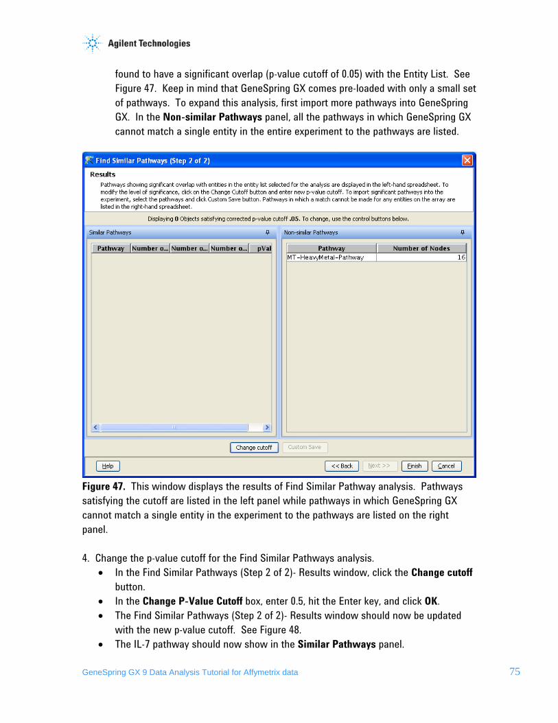
GeneSpring GX 9 Data Analysis Tutorial for Affymetrix data 75
found to have a significant overlap (p-value cutoff of 0.05) with the Entity List. See Figure 47. Keep in mind that GeneSpring GX comes pre-loaded with only a small set of pathways. To expand this analysis, first import more pathways into GeneSpring GX. In the Non-similar Pathways panel, all the pathways in which GeneSpring GX cannot match a single entity in the entire experiment to the pathways are listed.
Figure 47. This window displays the results of Find Similar Pathway analysis. Pathways satisfying the cutoff are listed in the left panel while pathways in which GeneSpring GX cannot match a single entity in the experiment to the pathways are listed on the right panel. 4. Change the p-value cutoff for the Find Similar Pathways analysis.
• In the Find Similar Pathways (Step 2 of 2)- Results window, click the Change cutoff button.
• In the Change P-Value Cutoff box, enter 0.5, hit the Enter key, and click OK. • The Find Similar Pathways (Step 2 of 2)- Results window should now be updated
with the new p-value cutoff. See Figure 48. • The IL-7 pathway should now show in the Similar Pathways panel.

GeneSpring GX 9 Data Analysis Tutorial for Affymetrix data 76
Figure 48. The results window automatically updates the results as a new p-value cutoff is entered. 5. Save the significant pathway results.
• In the Find Similar Pathways (Step 2 of 2)-Results window, click Finish. This will save all of the pathways in the Similar Pathways panel to the Similar Pathways satisfying p-value cutoff folder in the Navigator of the active experiment.
6. View the IL-7 pathway in GeneSpring GX.
• First, make sure that the Fold change greater than 1.5 in Non-failing vs Ischemic or Non-failing vs Idiopathic Entity List is selected in the Navigator, as this is the input list for Find Similar Pathways analysis. Like any other Views in GeneSpring GX, only the entities found in the Entity List that are also found in the pathway will be displayed.

GeneSpring GX 9 Data Analysis Tutorial for Affymetrix data 77
• Double-click on the IL-7 pathway icon. The IL-7 pathway should now be displayed in the browser. The nodes in the pathway that have a blue outline are the gene products that are also found in the currently selected Entity List. See Figure 49.
• You can zoom into any part of the pathway, grab and move the pathway on the
canvas, center the pathway in view, and select multiple ways to organize the network/pathway. All of these actions can be accessed through the icons within the pathway view window. Take some time to try these various actions.
• Also note that the legend for the pathway can be found in the panel below the Workflow panel.
Figure 49. The pathway view in GeneSpring GX. Nodes outlined in blue are those that are represented by entities in the currently selected Entity List. 7. Import the other pathways into the Congestive Heart Failure experiment.
• Any pathways that have been imported into the GeneSpring GX database can be searched for and subsequently added to the active experiment.
• Search for the pathways to add. o From menu, go to Search > Pathways. o In the Search Wizard (Step 1 of 3)- Search Parameters window, leave the
Search keyword box empty and click Next>>. This will command GeneSpring GX to return all pathways saved in the database. See Figure 50.
o In the Search Wizard (Step 3 of 3)- Search Results window, select all of the pathways in the table except IL-7 and click on the Add selected pathways

GeneSpring GX 9 Data Analysis Tutorial for Affymetrix data 78
to active experiment icon. These pathways should now be added to the Imported Pathways folder within the Congestive Heart Failure Experiment.
o These pathways can be view the same way as we did with the IL-7 pathway.
Figure 50. The search results window displays pathways that satisfy the input search criteria. Select the pathways you want to add to the current experiment and click on the Add selected pathways to active experiment icon.