visualisation with matlab review of basic graphics
TRANSCRIPT
Visualisation with Matlab
Outline
• Review of Basic Graphics• Modifying Graphics Properties• Scatter Plots• Customizing Graphics Objects• The Graphics Object hierarchy• Images and 3D Surface Plots• Visualisaing Surfaces• Colormaps and Indexed Colors• Creating Indexed Color Images
Review of Basic Graphics
•Powerful 2D and 3D graphics features are available.
•Graphics is built upon a collection of objects whose properties can be altered to change the appearance ofgraphs.
•Graphs may be drawn by using the low-level graphics primitives alone but there are usually higher levelfunctions available for most of the common graphics needs.
Figure Window
•Any graphics command will normally use the current figure window ‘if there is one’ or open up a new figurewindow ‘if there is not one already’ , and will create the plots within that window.
•It is always possible to open a new graphics window by using the figurecommand. Figure windows can laterbe closed by using the closecommand or cleared by using the clfcommand.
•When dealing with multiple figure windows, a better control can be applied by using handles.
x=-pi:2*pi/20:pi
x = -3.1416 -2.8274 -2.5133 -2.1991 -1.8850 -1.5708 -1.2566 -0.9425
y1=sin(-pi:2*pi/20:pi);y2=cos(-pi:2*pi/20:pi);
1
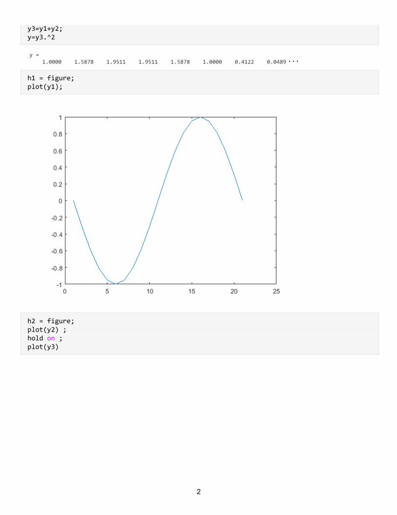
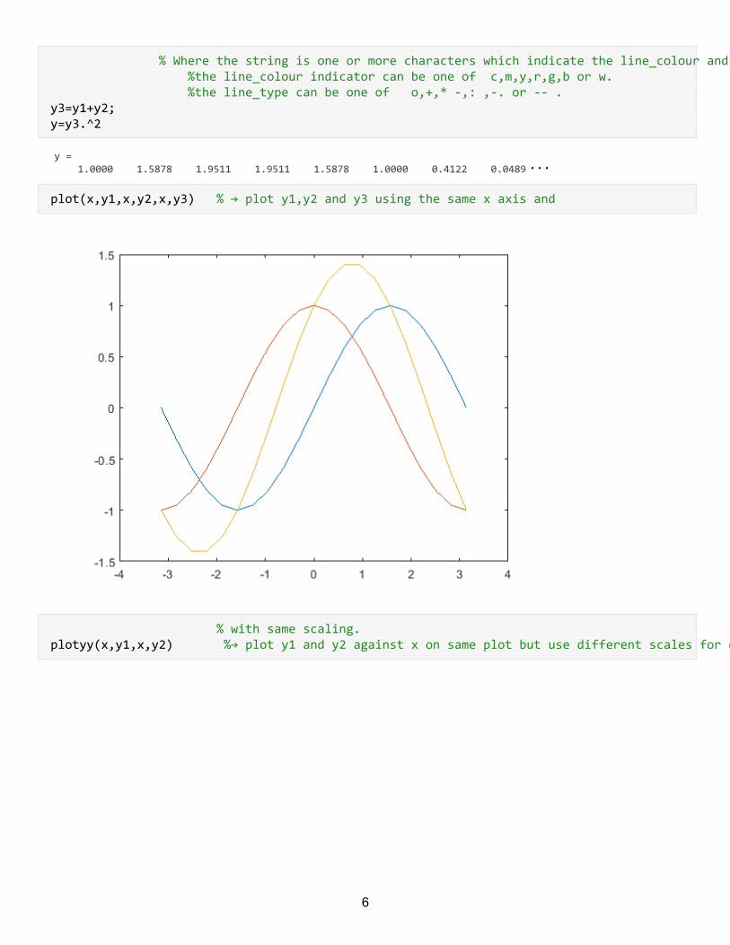
y3=y1+y2;y=y3.^2
y = 1.0000 1.5878 1.9511 1.9511 1.5878 1.0000 0.4122 0.0489
h1 = figure; plot(y1);
h2 = figure; plot(y2) ; hold on ; plot(y3)
2
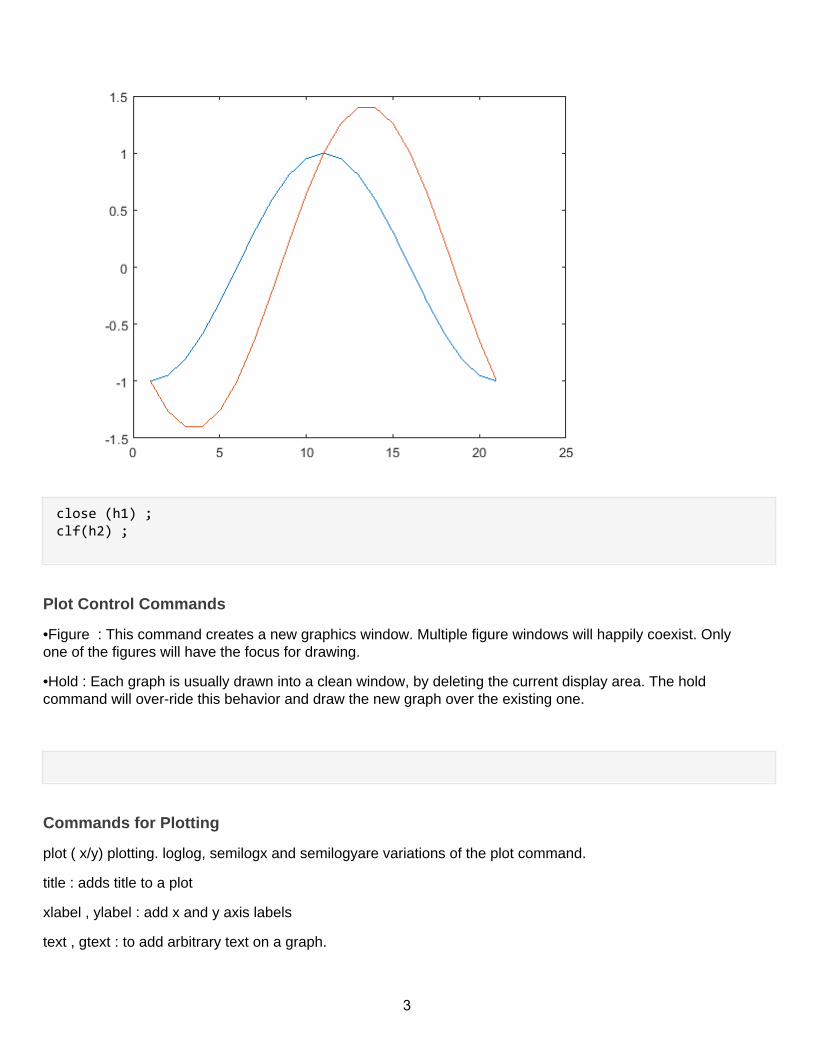
close (h1) ; clf(h2) ;
Plot Control Commands
•Figure : This command creates a new graphics window. Multiple figure windows will happily coexist. Onlyone of the figures will have the focus for drawing.
•Hold : Each graph is usually drawn into a clean window, by deleting the current display area. The holdcommand will over-ride this behavior and draw the new graph over the existing one.
Commands for Plotting
plot ( x/y) plotting. loglog, semilogx and semilogyare variations of the plot command.
title : adds title to a plot
xlabel , ylabel : add x and y axis labels
text , gtext : to add arbitrary text on a graph.
3
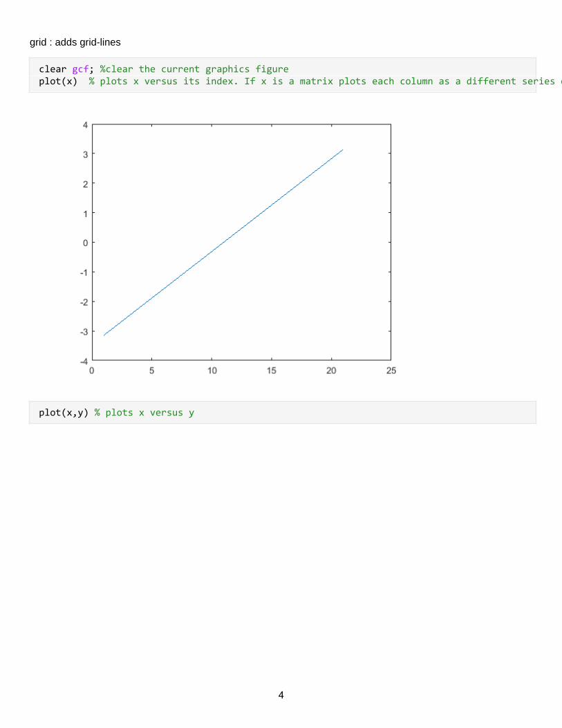
grid : adds grid-lines
clear gcf; %clear the current graphics figureplot(x) % plots x versus its index. If x is a matrix plots each column as a different series on the same axis.
plot(x,y) % plots x versus y
4
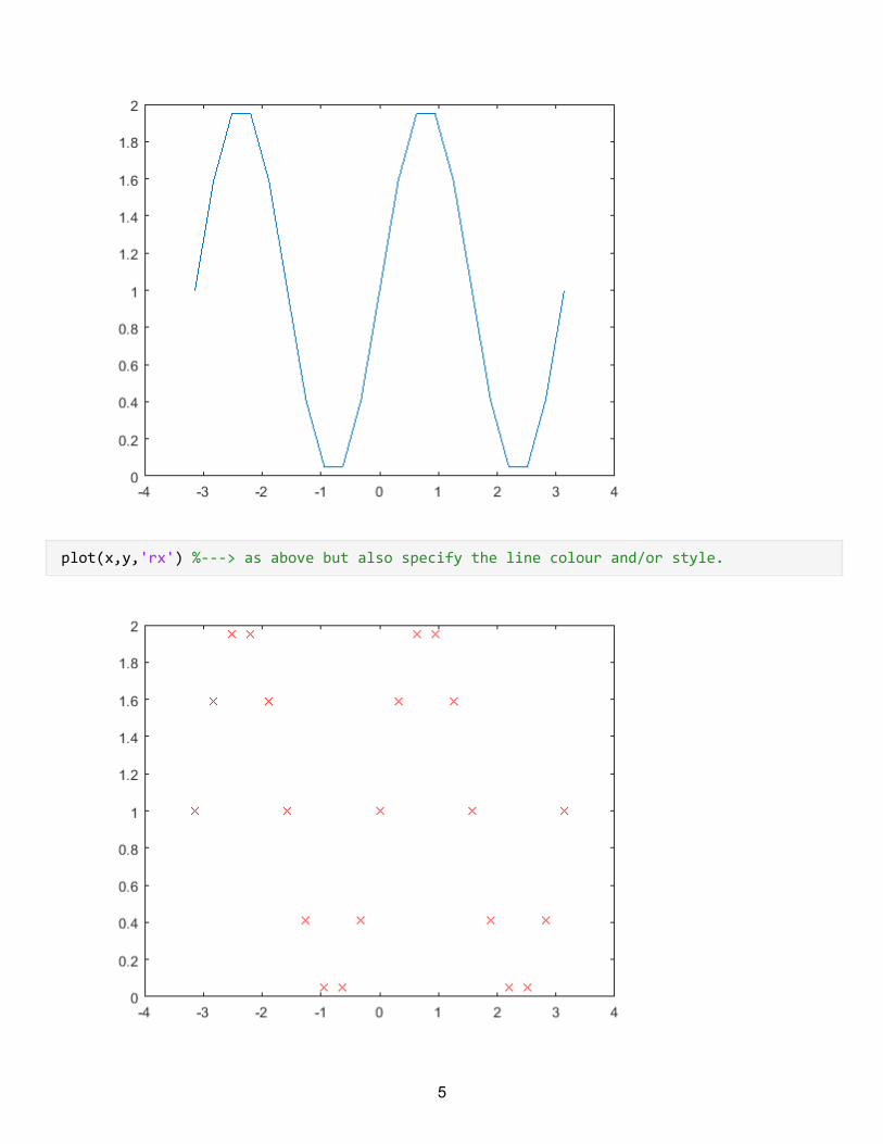
plot(x,y,'rx') %---> as above but also specify the line colour and/or style.
5
% Where the string is one or more characters which indicate the line_colour and optionally the line_type to use. %the line_colour indicator can be one of c,m,y,r,g,b or w. %the line_type can be one of o,+,* -,: ,-. or -- . y3=y1+y2;y=y3.^2
y = 1.0000 1.5878 1.9511 1.9511 1.5878 1.0000 0.4122 0.0489
plot(x,y1,x,y2,x,y3) % → plot y1,y2 and y3 using the same x axis and
% with same scaling.plotyy(x,y1,x,y2) %→ plot y1 and y2 against x on same plot but use different scales for each graph.
6
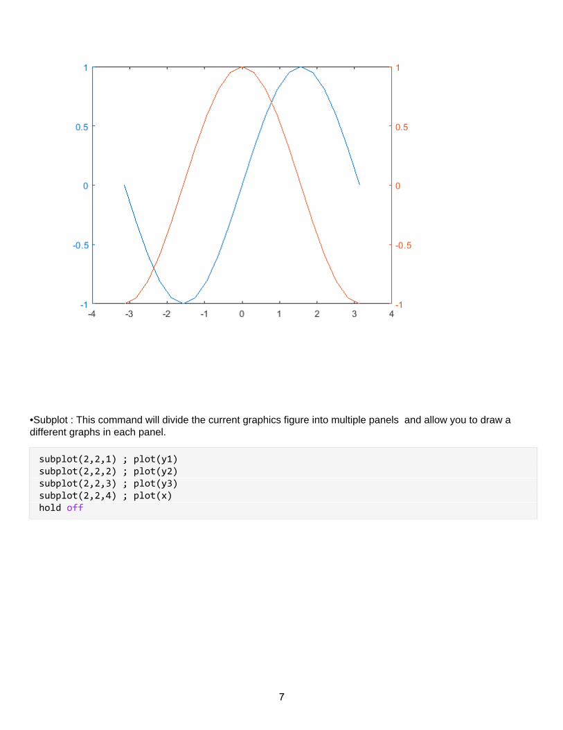
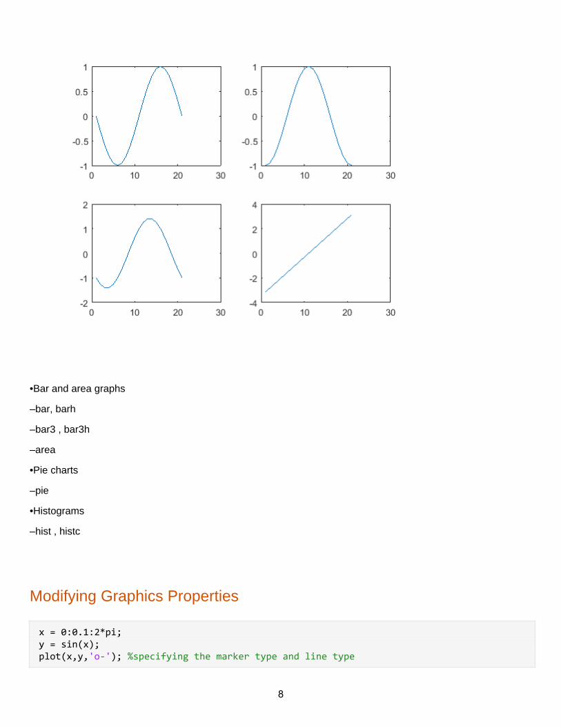
•Subplot : This command will divide the current graphics figure into multiple panels and allow you to draw adifferent graphs in each panel.
subplot(2,2,1) ; plot(y1) subplot(2,2,2) ; plot(y2)subplot(2,2,3) ; plot(y3) subplot(2,2,4) ; plot(x) hold off
7
•Bar and area graphs
–bar, barh
–bar3 , bar3h
–area
•Pie charts
–pie
•Histograms
–hist , histc
Modifying Graphics Properties
x = 0:0.1:2*pi;y = sin(x);plot(x,y,'o-'); %specifying the marker type and line type
8
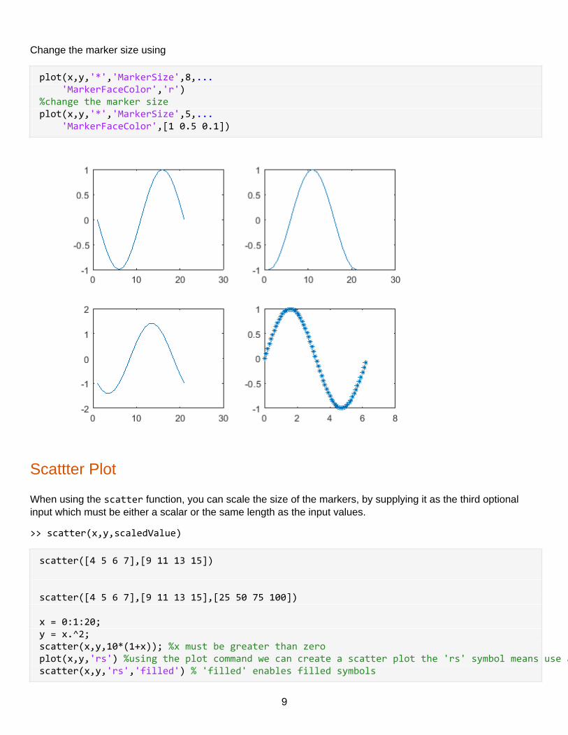
Change the marker size using
plot(x,y,'*','MarkerSize',8,... 'MarkerFaceColor','r')%change the marker sizeplot(x,y,'*','MarkerSize',5,... 'MarkerFaceColor',[1 0.5 0.1])
Scattter Plot
When using the scatter function, you can scale the size of the markers, by supplying it as the third optionalinput which must be either a scalar or the same length as the input values.
>> scatter(x,y,scaledValue)
scatter([4 5 6 7],[9 11 13 15]) scatter([4 5 6 7],[9 11 13 15],[25 50 75 100]) x = 0:1:20;y = x.^2;scatter(x,y,10*(1+x)); %x must be greater than zeroplot(x,y,'rs') %using the plot command we can create a scatter plot the 'rs' symbol means use a red squarescatter(x,y,'rs','filled') % 'filled' enables filled symbols
9
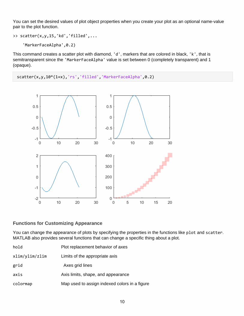
You can set the desired values of plot object properties when you create your plot as an optional name-valuepair to the plot function.
>> scatter(x,y,15,'kd','filled',...
'MarkerFaceAlpha',0.2)
This command creates a scatter plot with diamond, 'd', markers that are colored in black, 'k', that issemitransparent since the 'MarkerFaceAlpha' value is set between 0 (completely transparent) and 1(opaque).
scatter(x,y,10*(1+x),'rs','filled','MarkerFaceAlpha',0.2)
Functions for Customizing Appearance
You can change the appearance of plots by specifying the properties in the functions like plot and scatter.MATLAB also provides several functions that can change a specific thing about a plot.
hold Plot replacement behavior of axes
xlim/ylim/zlim Limits of the appropriate axis
grid Axes grid lines
axis Axis limits, shape, and appearance
colormap Map used to assign indexed colors in a figure
10
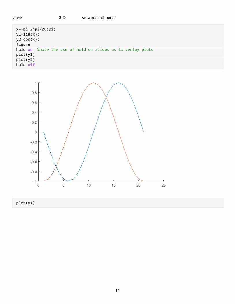
view 3-D viewpoint of axes
x=-pi:2*pi/20:pi;y1=sin(x);y2=cos(x);figurehold on %note the use of hold on allows us to verlay plotsplot(y1)plot(y2)hold off
plot(y1)
11
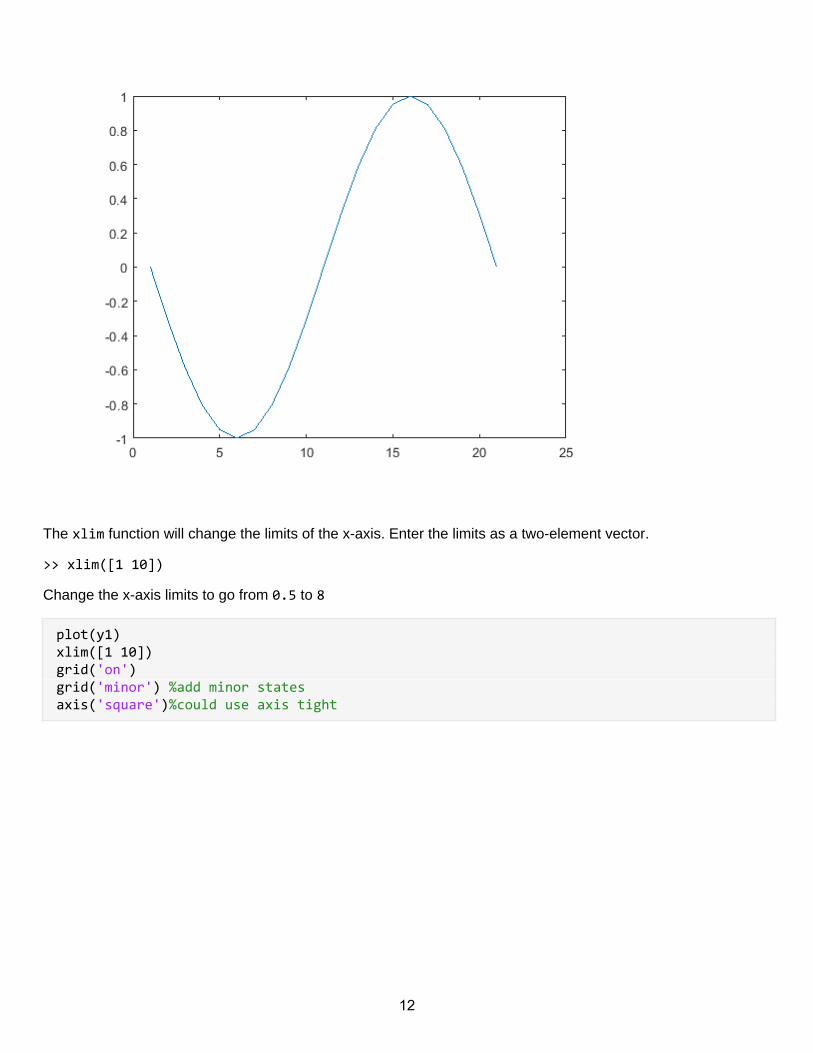
The xlim function will change the limits of the x-axis. Enter the limits as a two-element vector.
>> xlim([1 10])
Change the x-axis limits to go from 0.5 to 8
plot(y1)xlim([1 10])grid('on')grid('minor') %add minor statesaxis('square')%could use axis tight
12
Customizing Graphics Objects
Plots in matlab are collections of grahics objects it is possible to customise plots by editing these objectsdirectly
Accessing Graphics Objects
To modify the properties of a graphics object, the first step is to obtaining a variable (sometimes calleda handle) that refers to the particular graphics object.
Info: You can obtain the graphics object variable by assigning output from the graphics functions.
For example, the folllowing command creates a figure object f.
>> f = figure
x = 0:0.1:2*pi;y = sin(x);h=figure;
Info: By assigning output from the plot command, you can obtain a line object variable.
>> p = plot(x,y)
p=plot(x,y);
13
Info: How can you get the graphics object variables for a plot that is already created?
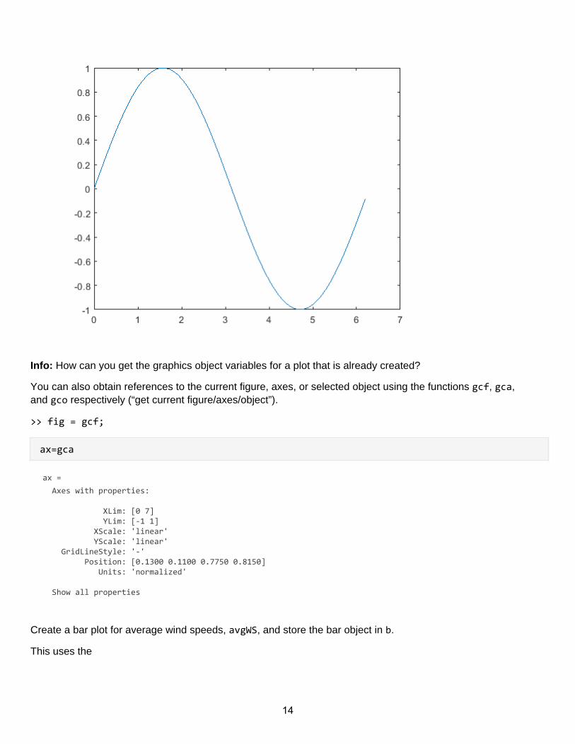
You can also obtain references to the current figure, axes, or selected object using the functions gcf, gca,and gco respectively (“get current figure/axes/object”).
>> fig = gcf;
ax=gca
ax = Axes with properties:
XLim: [0 7] YLim: [-1 1] XScale: 'linear' YScale: 'linear' GridLineStyle: '-' Position: [0.1300 0.1100 0.7750 0.8150] Units: 'normalized'
Show all properties
Create a bar plot for average wind speeds, avgWS, and store the bar object in b.
This uses the
14
splitapply - Y = splitapply(func,X,G) splits X into groups specified by G and applies the function func toeach group. splitapply returns Yas an array that contains the concatenated outputs from func for thegroups split out of X.
and
findgroups - G = findgroups(A) returns G, a vector of group numbers created from the grouping variable A.The output argument G contains integer values from 1 to N, indicating N distinct groups for the N uniquevalues in A.
For patient information data with height and gender information we could Split Height into groups specifiedby G. Calculate the mean height by gender. The first row of the output argument is the mean height of thefemale patients, and the second row is the mean height of the male patients.
load patients
G = findgroups(Gender);
splitapply(@mean,Height,G)
Here is an application
hurrs=readtable('..\data\hurricaneData1990s.txt')
hurrs = 51×5 tableNumber Timestamp Country Windspeed Pressure
1 1 29-Jun-1991... 'N/A' 23 1012
2 1 29-Jun-1991... 'N/A' 23 1012
3 1 30-Jun-1991... 'N/A' NaN 1012
4 1 30-Jun-1991... 'United Sta... 23 1012
5 1 30-Jun-1991... 'United Sta... 23 1012
6 1 30-Jun-1991... 'N/A' 23 1012
7 1 01-Jul-1991... 'N/A' 23 1012
8 1 01-Jul-1991... 'United Sta... 23 1012
9 1 01-Jul-1991... 'United Sta... 23 1012
10 1 01-Jul-1991... 'United Sta... 23 1012
11 1 02-Jul-1991... 'United Sta... 23 1012
12 2 19-Aug-1991... 'N/A' 109 957
13 2 19-Aug-1991... 'N/A' NaN 950
14 2 19-Aug-1991... 'N/A' 109 953
15 2 19-Aug-1991... 'N/A' 98 964
16 2 20-Aug-1991... 'N/A' 69 977
15
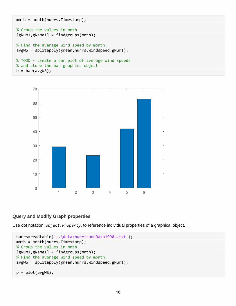
mnth = month(hurrs.Timestamp); % Group the values in mnth.[gNum1,gName1] = findgroups(mnth); % Find the average wind speed by month.avgWS = splitapply(@mean,hurrs.Windspeed,gNum1); % TODO - create a bar plot of average wind speeds% and store the bar graphics objectb = bar(avgWS);
Query and Modify Graph properties
Use dot notation, object.Property, to reference individual properties of a graphical object.
hurrs=readtable('..\data\hurricaneData1990s.txt');mnth = month(hurrs.Timestamp);% Group the values in mnth.[gNum1,gName1] = findgroups(mnth);% Find the average wind speed by month.avgWS = splitapply(@mean,hurrs.Windspeed,gNum1); p = plot(avgWS);
16
Use dot notation with the property name to return object property value.
>> ax.PropertyName.
Can also use the dot notation to assign a value to an object property.
>> ax.PropertyName = newValue.
ax = gca;ax.FontWeightax.FontWeight='bold'
You do not have to remember all the property names. That's what the documentation is for.
Use MATLAB documentation to find the property name that controls the location of the x-axis and set itsvalue to
Query the current location of the x and y-axis. HINT: Search for Controlling Axis Location
ax.XAxisLocation
ans =
'bottom'
ax.YAxisLocation
ans =
'left'
You can use these properties to change the position of an axis.
Set the x-axis so it passes through the origin of the y-axis (y = 0).
ax.XAxisLocation = 'top';
the property that controls the location of x-axis tick marks. Set it's value to [1, 2, 3, 4,5,6].
Finally we, rotate the labels on the x-axis by 45° by setting the XTickLabelRotation property.
ax.XTick([1, 2, 3, 4,5,6]);ax.XTickLabel = {'TD','TS','F1','F2','F3','F4','F5','F6','F7','F8','F9'}ax.XTickLabelRotation=45
Querying and Modifying Properties
use the graphic object variables to customize an existing plot without recreating it.
Use the line object p to change the line Color to RGB color values [0.9 0.2 0.04].
% hurrs=readtable('..\data\hurricaneData1990s.txt');% mnth = month(hurrs.Timestamp);% % Group the values in mnth.
17
% [gNum1,gName1] = findgroups(mnth);% % Find the average wind speed by month.% avgWS = splitapply(@mean,hurrs.Windspeed,gNum1);avgWS=50*rand(1,12)%fig = figure;ax = axes;p = plot(avgWS,'-d');p.Color = [0.9 0.2 0.04];p.MarkerFaceColor = [0.1 0.2 0.8];
You can even modify the data values of an existing plot. Currently, the data values on on the x-axis go from 1to 12.
p.XData = linspace(0,1,12);
t = 0:0.1:2*pi;y1 = sin(t);y2=sin(4*t); fig = figure;ax1 = axes;l1 = plot(t,y1);axis tight;ax2 = axes('Position',[.6 .6 .25 .25]);l2 = plot(ax2,t,y2);
a figure containing 2 axes and 2 line plots is created for you. All the graphics objects are saves in variables atthe time of creation.
Create a variable, x that contains the x-limit values for the large set of axes.
Set the smaller set of axes to have the same x-limits as the larger set.
Change the y-limits of the smaller set of axes to be the same as the larger set.
x = ax1.XLimax2.XLim = x;ax2.YLim = ax1.YLim;
clf;hurrs=readtable('..\data\hurricaneData1990s.txt');mnth = month(hurrs.Timestamp);% % Group the values in mnth.[gNum1,gName1] = findgroups(mnth);%mNames = monthNum2Name(gName1);% % Find the average wind speed by month.avgWS = splitapply(@mean,hurrs.Windspeed,gNum1);
18
% TODO - create a bar plot of average wind speeds% and store the bar graphics objectfigureb = bar(avgWS);
Change the transparency of the bars by setting the FaceAlpha property of b to 0.4.
Also, change the BarWidth to 0.6.
Set mNames as x-axis tick labels.
b.FaceAlpha = 0.4;b.BarWidth = 0.6; % Get axes object and then set XTickLabel propertyax = gca;%ax.XTickLabel = mNames;
cars=readtable('../data/vehicles.csv');
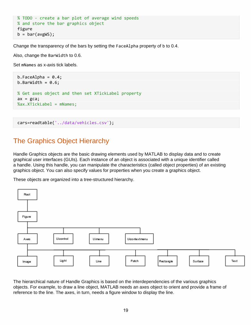
The Graphics Object Hierarchy
Handle Graphics objects are the basic drawing elements used by MATLAB to display data and to creategraphical user interfaces (GUIs). Each instance of an object is associated with a unique identifier calleda handle. Using this handle, you can manipulate the characteristics (called object properties) of an existinggraphics object. You can also specify values for properties when you create a graphics object.
These objects are organized into a tree-structured hierarchy.
The hierarchical nature of Handle Graphics is based on the interdependencies of the various graphicsobjects. For example, to draw a line object, MATLAB needs an axes object to orient and provide a frame ofreference to the line. The axes, in turn, needs a figure window to display the line.
19
clf;xModel=(1:66)/100; x=66*rand(1,13)/100;y=1./x;yModel=(1./xModel);fig = figure;plot(xModel,yModel,'LineWidth',2);hold onscatter(x,y,50*y,'filled','MarkerFaceAlpha',0.6,'MarkerEdgeColor','b');
The goal of this exercise is to find the scatter and line plot objects by using the graphics hierarchy.
Recall that one way to get the current axes object is to use the function gca. Another way of getting the axesgraphics object is to use the graphics hierarchy.
Since axes is a child of the figure, you can use the Children property of the figure object fig to get the axesobject.
Recall that one way to get the current axes object is to use the function gca. Another way of getting the axesgraphics object is to use the graphics hierarchy.
Since axes is a child of the figure, you can use the Children property of the figure object fig to get the axesobject.
Get the axes graphics object using the Children property and store it in ax.
ax = fig.Children
The scatter and line plots are the children of the axes.
Get the Children of the axes object and store the result in p.
p = ax.Children
You can examine the variable p by double clicking the variable name in the workspace.
Notice that the variable p is an array containing two graphics objects. That is because the axes has twochildren, the scatter plot and the line plot. Extract the first element of this array and assign it to sp.
sp = p(1)
Every graphics object has a (read-only) Typeproperty.
Find the type of the object sp and store it in spType.
spType = sp.Type
Objects that are Axes Properties
clf;xModel=(1:66)/100;
20
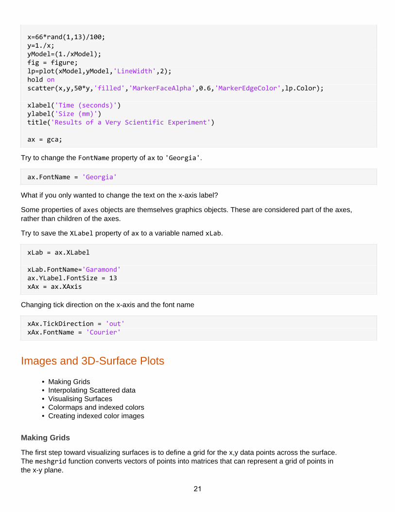
x=66*rand(1,13)/100;y=1./x;yModel=(1./xModel);fig = figure;lp=plot(xModel,yModel,'LineWidth',2);hold onscatter(x,y,50*y,'filled','MarkerFaceAlpha',0.6,'MarkerEdgeColor',lp.Color); xlabel('Time (seconds)')ylabel('Size (mm)')title('Results of a Very Scientific Experiment') ax = gca;
Try to change the FontName property of ax to 'Georgia'.
ax.FontName = 'Georgia'
What if you only wanted to change the text on the x-axis label?
Some properties of axes objects are themselves graphics objects. These are considered part of the axes,rather than children of the axes.
Try to save the XLabel property of ax to a variable named xLab.
xLab = ax.XLabel xLab.FontName='Garamond'ax.YLabel.FontSize = 13xAx = ax.XAxis
Changing tick direction on the x-axis and the font name
xAx.TickDirection = 'out'xAx.FontName = 'Courier'
Images and 3D-Surface Plots
• Making Grids• Interpolating Scattered data• Visualising Surfaces• Colormaps and indexed colors• Creating indexed color images
Making Grids
The first step toward visualizing surfaces is to define a grid for the x,y data points across the surface.The meshgrid function converts vectors of points into matrices that can represent a grid of points inthe x-y plane.
21
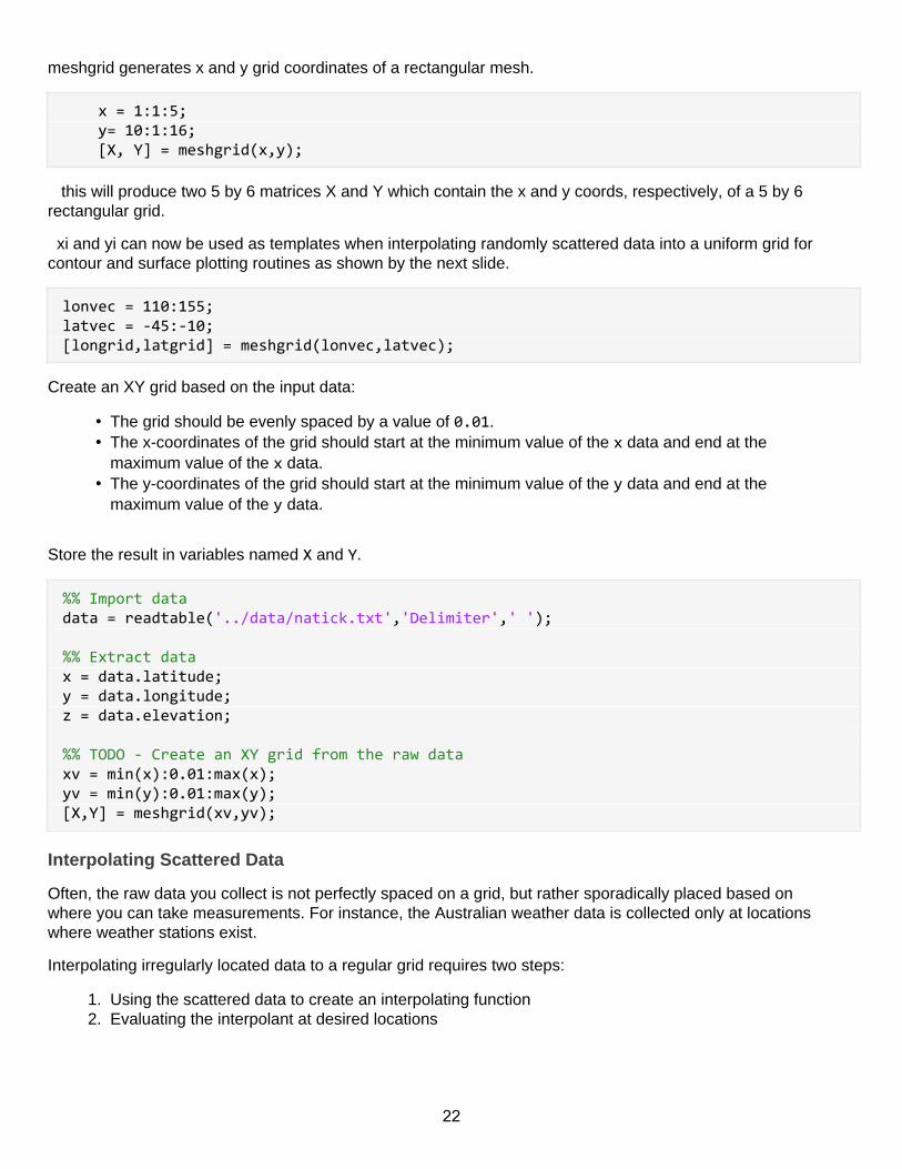
meshgrid generates x and y grid coordinates of a rectangular mesh.
x = 1:1:5; y= 10:1:16; [X, Y] = meshgrid(x,y);
this will produce two 5 by 6 matrices X and Y which contain the x and y coords, respectively, of a 5 by 6rectangular grid.
xi and yi can now be used as templates when interpolating randomly scattered data into a uniform grid forcontour and surface plotting routines as shown by the next slide.
lonvec = 110:155;latvec = -45:-10;[longrid,latgrid] = meshgrid(lonvec,latvec);
Create an XY grid based on the input data:
• The grid should be evenly spaced by a value of 0.01.• The x-coordinates of the grid should start at the minimum value of the x data and end at the
maximum value of the x data.• The y-coordinates of the grid should start at the minimum value of the y data and end at the
maximum value of the y data.
Store the result in variables named X and Y.
%% Import datadata = readtable('../data/natick.txt','Delimiter',' '); %% Extract datax = data.latitude;y = data.longitude;z = data.elevation; %% TODO - Create an XY grid from the raw dataxv = min(x):0.01:max(x);yv = min(y):0.01:max(y);[X,Y] = meshgrid(xv,yv);
Interpolating Scattered Data
Often, the raw data you collect is not perfectly spaced on a grid, but rather sporadically placed based onwhere you can take measurements. For instance, the Australian weather data is collected only at locationswhere weather stations exist.
Interpolating irregularly located data to a regular grid requires two steps:
1. Using the scattered data to create an interpolating function2. Evaluating the interpolant at desired locations
22
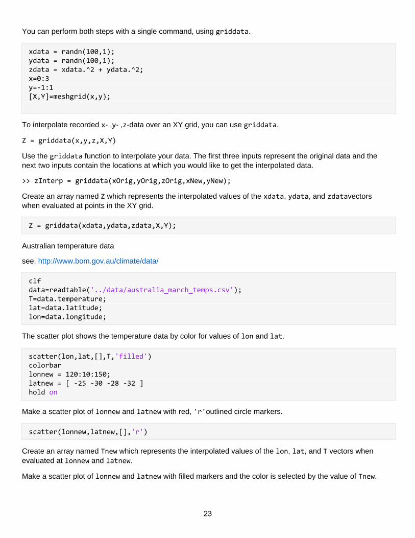
You can perform both steps with a single command, using griddata.
xdata = randn(100,1);ydata = randn(100,1);zdata = xdata.^2 + ydata.^2;x=0:3y=-1:1[X,Y]=meshgrid(x,y);
To interpolate recorded x- ,y- ,z-data over an XY grid, you can use griddata.
Z = griddata(x,y,z,X,Y)
Use the griddata function to interpolate your data. The first three inputs represent the original data and thenext two inputs contain the locations at which you would like to get the interpolated data.
>> zInterp = griddata(xOrig,yOrig,zOrig,xNew,yNew);
Create an array named Z which represents the interpolated values of the xdata, ydata, and zdatavectorswhen evaluated at points in the XY grid.
Z = griddata(xdata,ydata,zdata,X,Y);
Australian temperature data
see. http://www.bom.gov.au/climate/data/
clfdata=readtable('../data/australia_march_temps.csv');T=data.temperature;lat=data.latitude;lon=data.longitude;
The scatter plot shows the temperature data by color for values of lon and lat.
scatter(lon,lat,[],T,'filled')colorbarlonnew = 120:10:150;latnew = [ -25 -30 -28 -32 ]hold on
Make a scatter plot of lonnew and latnew with red, 'r'outlined circle markers.
scatter(lonnew,latnew,[],'r')
Create an array named Tnew which represents the interpolated values of the lon, lat, and T vectors whenevaluated at lonnew and latnew.
Make a scatter plot of lonnew and latnew with filled markers and the color is selected by the value of Tnew.
23
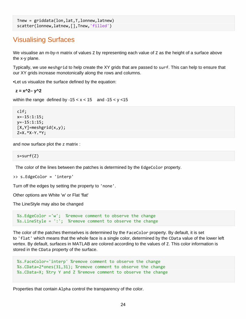
Tnew = griddata(lon,lat,T,lonnew,latnew)scatter(lonnew,latnew,[],Tnew,'filled')
Visualising Surfaces
We visualise an m-by-n matrix of values Z by representing each value of Z as the height of a surface abovethe x-y plane.
Typically, we use meshgrid to help create the XY grids that are passed to surf. This can help to ensure thatour XY grids increase monotonically along the rows and columns.
•Let us visualize the surface defined by the equation:
z = x^2– y^2
within the range defined by -15 < x < 15 and -15 < y <15
clf;x=-15:1:15;y=-15:1:15;[X,Y]=meshgrid(x,y);Z=X.*X-Y.*Y;
and now surface plot the z matrix :
s=surf(Z)
The color of the lines between the patches is determined by the EdgeColor property.
>> s.EdgeColor = 'interp'
Turn off the edges by setting the property to 'none'.
Other options are White 'w' or Flat 'flat'
The LineStyle may also be changed
%s.EdgeColor ='w'; %remove comment to observe the change%s.LineStyle = ':'; %remove comment to observe the change
The color of the patches themselves is determined by the FaceColor property. By default, it is setto 'flat' which means that the whole face is a single color, determined by the CData value of the lower leftvertex. By default, surfaces in MATLAB are colored according to the values of Z. This color information isstored in the CData property of the surface.
%s.FaceColor='interp' %remove comment to observe the change%s.CData=2*ones(31,31); %remove comment to observe the change%s.CData=X; %try Y and Z %remove comment to observe the change
Properties that contain Alpha control the transparency of the color.
24
Try to set the FaceAlpha property to a value between 0and 1 to see how the transparency changes.
s.FaceAlpha=0.5;
The contour and courf commands
Syntax:
contour(Z) contourf(Z)
contour(Z,n) contourf(Z,n)
contour(Z,v) contourf(Z,v)
where Z is a matrix n is an integer and v is a vector.
If n is specified (n) number of contour lines are drawn. If v is specified each element of v indicates theposition of the contour level.
contour and contourf are identical except that contourf draws filled contours.
h=contour(Z)
Labelling Contours
•Once a contour is drawn by using one of the contour, contourf or contour3 functions the resultant contourlines can be labelled by using the clabel function as shown below with an example;
% draw the contours but return the contour matrix C and the object handle h
[C,h]=contour(Z,10)clabel(C,h)
•A better method is to use clabel(C,h,’manual’)which allows the user to locate exact positions via themouse. Once the labels are there they can also be edited via plot edit.
Colormaps and Indexed Colors
A Matlab figure will have a color-map ( i.e. palette ) associated with it that determines the range of colorsavailable for surface, patch and image colouring.
The colors in a surface are determined by indexing into a color lookup table associated with the parent figurewindow, called a colormap.
•The default colormap is normally a 64-by-3 array of RGB values from blue to red.
•The colormapcommand can be used to define/refine this colour palette in following different ways;
25
• colormap(name) where name is any one of the following predefined palette names: default, hsv, hot ,pink , copper,gray,jet, summer , spring, winter ,bone …
• mymap = colormap save the current colormap matrix in mymap
• or mymap = get(gcf , ‘Colormap’ ) ;
• colormap(mymap) redefine the colormap by using mymap array.
• While a figure is active its color map can be viewed and modified by using the command colormapeditor
caxis command
•Whilst colormap determines the colour-palette to use , such as ‘rainbow’ , grey-scale’ etc. caxis commanddetermines how the data values gets mapped onto this colour-scale.
•By default the minimum data value minmaps onto the first colour in the colour palette and the maximumdata value max maps onto the last colour in the colourmap.
•Values between minand maxare mapped linearly to the corresponding intermediate colours in thecolourmap.
•The colour mapping can be redefined by calling caxis with new minimum and maximum values for the firstand last colours. E.g.
caxis ([ xmin xmax] )
Summary
Each point on a surface has a color data value. These values are stored in the CDataproperty of the surface
The color data value is mapped to a range of values. The range is set by the axes using the CLimproperty ofthe axes
The location within the range maps to a single color on the colormap of the figure. The colormap is stored inthe Colormapproperty of the figure.
clf;x=-15:1:15;y=-15:1:15;[X,Y]=meshgrid(x,y);Z=X.*X-Y.*Y;s=surf(X,Y,Z)
Info: The colorbar command adds a colorbar so that you can see a range of values.
>> colorbar
colorbar
Info: The default colormap of a figure is called parula. You can modify this using the colormapfunction.
>> colormap(jet)
26
Other predefined colormaps are hsv, hot, cool, spring, summer, autumn, winter, gray, bone,copper, pink
colormap('cool')
The CLim property of the axes object defines the values that will be associated with the first and last colors inthe colormap. By default, the range is the interval from the minimum to the maximum value of ZData.
ax=gca%c = ax.CLim%ax.CLim=1.5*c;
%ax.CLim=[-50 200]; %change the c limits
You can see that the color saturates outside the given limits. Compare the values in CLim with the rangeof CData.
Viewpoint
•Matlab allows us to re-define the viewing direction of the eye for 3D plots via the viewcommand.
• Format: view ( azimuth , elevation )
•This view direction is defined by two terms namely;
•Azimuth = Angle the eye makes with the y axis ( in degrees)
•Elevation = angle the eye makes with the x/y plane ( in degrees).
Animation
Animations can be create by
–By varying the position properties of graphics objects.
–By creating movies ( useful for complex pictures)
In the case studies check the membrane example and the
pause(0.15);
set(h,'ZData',Z) %reset the z data for the grahics window with grahics handle h
drawnow
In the case studies check the shallow water example, note that this example uses the mesh command todisplay a mesh
at each time step.
27
Creating Indexed-Color Images
You can visualize matrix values in two dimensions using a colored image that shows each matrix element asa pixel, colored according to the value of the matrix element.
Matlab and Images
•Graphics features of Matlab we have seen so far were related to creating of images by mostly vectorgraphics techniques. We are now going to study the manipulating and displaying of previously capturedimages.
•Whatever the format, fundamentally images are represented as two or three dimensional arrays with eachelement representing the colour or intensity of a particular pixel of the picture.
•It would be perfectly valid to represent such image data as ordinary ( double precision) Matlab Matrices butthe memory required to store a say 1000 by 1000 image will 8 Mbytes which is too extravagant.
•As most image pixel data will be accurately representable by 8bits, a Matlab data type named uint8( unsigned integer) is normally used for image data handling. This reduces the memory requirement to 1/8th!
Matlab Image Types
•A Matlab image consists of a data-matrix and possibly a colourmap matrix. The following three differentimage types are used;
–Intensity Images
–Indexed Images
–RGB (TrueColour) Images
Intensity Images
•An intensity image is stored as a 2-Dimensional Matrix. Each element of this matrix maps onto a color row,stored in the colormap matrix.
•A colormap matrix of (N) colours is defined as an N rows by 3 columns matrix, each row representing adifferent color defined by its Red , Green and Blue components.
•The values in the intensity image matrix is scaled such that the maximum value maps onto the highest color(i.e. N) and the minimum value maps onto the lowest color (i.e. 1). Hence every element of the intensityimage matrix can be mapped onto a color in the colormap matrix.
•Although this colourmap index is used during display it is not stored as part of the image as it can always bededuced from the data.
•Intensity images are normally used for gray-scale type images where only the intensity is important, such asx-ray images.
Indexed Images
•These are stored as a two dimensional array of image data plus a colormap matrix.
28
•The colormap matrix is a m-rows by 3 columns matrix with each of the rows representing a colour definedby the three R,G,B components (ranging 0.0 to 1.0) of that colour. The image data contains indexes to thiscolormap matrix.
•The colormap is usually stored with the image and saved/loaded by the imwrite/imread functions.
Handling Graphics Images
•Reading/Writing Graphics Images
–imread , imwrite
–load , save( if only the image was saved as a MAT file)
•Displaying Graphics Images
–image
–imagesc
–Note: For square pixels, use: axis image
•Utilities
–imfinfoind2rgb
Info: The pcolor function has the same syntax as surf. In fact, it actually creates a flat surfacewith ZData all set to 0 and CData set to Z.
>> pcolor(X,Y,Z)
clfx = -1:0.1:1;y = -1:0.1:1;[X,Y] = meshgrid(x,y);Z = X.^2 + Y.^2;s = pcolor(X,Y,Z);s.EdgeAlpha = 0.2;colormap('parula');s.FaceColor='interp';
The imagesc function displays each element of a matrix as as a single color based on the element value.The result is an image object. If you just give a single matrix as input, the result will be an indexed image.
>> imagesc(Z)
clfx = -1:0.1:1;y = -1:0.1:1;[X,Y] = meshgrid(x,y);
29
Z = X.^2 - Y.^2; im = imagesc(Z);
By default, the x- and y-axis range of an image spans the number of rows and columns of the matrix,respectively. If you give x and y data as input, it must be in the form of a vector, not a matrix. It can even be atwo-element vector of range values.
>> imagesc([0 1],[-2 2],Z)
im2 = imagesc([-1 1],[-1 1],Z)
x = linspace(-1,1,31);y = linspace(-1,1,31);L = membrane;L(L==0) = nan(nnz(L==0),1);axs = subplot(1,2,1);s = pcolor(x,y,L);axim = subplot(1,2,2);im = imagesc([-1 1],[-1 1],L);
Info: Notice the differences between the two images.
Empty, or NaN, values are blank in the surface, whereas they are mapped to the minimum value in the image.Also, the alignment of the patch is different. And, the ordering of y coordinates is different.
The direction of the y-axis can be changed using the axis command:
>> axis xy
>> axis ij
uncomment the following to see the corret axis definition and to set the edge color.
%axis xy%s.EdgeColor = 'none';
RGB Images
•Sometimes known as Truecolor images the data is stored as an n-m-3 image. I.e. m by n with 3 planes.These 3 planes represent the R,G and B components of the pixel respectively. There are normally 8 bitsallocated to the representation of each colour. Therefore 24 bits represent all 3 colours. Thus makingit 2^24=16Million possible colours.
•There is no colormap array for RGB images as all the colour information is contained in the data matrix.
Importing Data and Pre-Processing Data
30
Inspect a set of data
subplot(1,1,1)plot(x)clear gcf edit ..\data\hurricaneData1990s.txt
Import data set and show scatter plot
hurrs=readtable('..\data\hurricaneData1990s.txt')scatter(hurrs.Pressure,hurrs.Windspeed)
Import data set with header lines
hurrs2=readtable('..\data\hurricaneData1990s-v2.txt','HeaderLines',5)scatter(hurrs2.Number,hurrs2.Windspeed)
import data and skip lines with particular format ignore comment lines specify format
can also specify particular delimeters
hurrs3=readtable('..\data\hurricaneData1990s-v3.txt','CommentStyle','##')scatter(hurrs3.Number,hurrs3.Windspeed)x = readtable('..\data\hurricaneData1990s-v2.txt',... 'Delimiter',',\t',... 'HeaderLines',5); hurrs3 % sz=size(hurrs3);% a=hurrs3.Country;% for i=1:sz(1)% if isequal(a{i},'N/A' )% hurrs3.Location{i} = 'Sea';% else% hurrs3.Location{i} = 'Land';% end% end% % hurrs3.Location; hurrs3.Country;
31
cellfun and cell2mat
Very often we need to apply tests and operations on data arrays. Because of the structure of cell arrays suchoperations are not always straigtforward.
A number of possibilities is indicated below
• Use the cellfun to apply a function to every element of the cell array• Use the categorical function e.g. for a set of data calle cars cars.make = categorical( cars.make );• Use the cell2mat function to convert a cell array to a matrix
mnth = month(hurrs.Timestamp);
% Group the values in mnth.
[gNum1,gName1] = findgroups(mnth);
% Find the average wind speed by month.
avgWS = splitapply(@mean,hurrs.Windspeed,gNum1);
Apply function to each cell in cell arra
%reports error in live script but gives correct output %in matlab workbench eqna = @(x)isequal(x,'N/A'); setloc = @(x) char((x) .* 'Sea ' + ~(x) .* 'Land'); %setloc takes as input true or false hurrs3.Location=cellfun(eqna,hurrs3.Country); %the output hurrs2.Location is an array so use array function next hurrs3.Location=arrayfun(setloc,hurrs3.Location,'UniformOutput',false);
Categorical Data
% convert country and location to categories hurrs3.Country=categorical(hurrs3.Country); % hurrs3.Location=categorical(hurrs3.Location); C = hurrs3.Country;whos C % convert C to a categorical array C = categorical(C); whos C %hurrs3.Country
32
rename categories
add a new variable named Location to the table data. This variable is meant to indicate whether thehurricane was observed on land or on the sea.
One way to do this is to find all the valid country names (values excluding 'N/A') and then merge themto create a new category named 'Land' using the function mergecats. Assign the result to a newvariable Locationin the table data.
Then, use the function renamecats to rename the category 'N/A' to 'Sea'
.
% % % hurrs3=readtable('..\data\hurricaneData1990s-v3.txt','CommentStyle','##')% % % % Find the distinct categories% cats = categories(hurrs3.Country);% % % Remove 'N/A' from cats% countryNames = setdiff(cats,'N/A');% % % Merge all countries% hurrs3.Location = mergecats(hurrs3.Country,countryNames,'Land')% % % Rename N/A to Sea% hurrs3.Location = renamecats(hurrs3.Location,'N/A','Sea')
create a scatter plot with wind speed values along the x-axis and pressure values along the y-axis. Also, theobservations on land should be plotted using red markers and the observations on sea should have bluemarkers. The plot should look something like this:
You can follow these steps to create the plot.
1. Find the wind speed and pressure values observed on land using the resultof data.Location == 'Land'as an index. Similarly, find values observed on the sea.
2. Use the scatter(x,y,'b','filled') command to create a scatter plot with filled blue markers.Replace xand y with windspeed and pressure values observed on the sea.
3. Use the command hold on so that the next plot is added on top of the existing plot.
4. Finally, create another scatter plot with values on land. Make this plot red ('r'). Enter hold off at theend.
% Read data
33
data = readtable('..\data\hurricaneData1990s-v2.txt','HeaderLines',5);data.Country = categorical(data.Country); % TODO - Add a new variable named 'Location' to the table 'data'% It should be categorical and have a value 'Land' if the row has a valid% country listed and 'N/A' otherwise. % Find the distinct categoriescats = categories(data.Country); % Remove 'N/A' from catscountryNames = setdiff(cats,'N/A'); % Merge all countriesdata.Location = mergecats(data.Country,countryNames,'Land'); % Rename N/A to Seadata.Location = renamecats(data.Location,'N/A','Sea') % Find index of on-land and on-sea observation indexonland = data.Location == 'Land';onsea = data.Location == 'Sea'; % Create scatter plotsscatter(data.Windspeed(onsea),data.Pressure(onsea),'b','filled');hold onscatter(data.Windspeed(onland),data.Pressure(onland),'r','filled');hold off % Optional - annotate the plotxlabel('Wind Speed')ylabel('Pressure')legend('Sea','Land')
using categorical values
Info: If your categories have an inherent ordering – for example, “low”, “medium”, and “high” – you canspecify this with an optional property 'Ordinal':
v = [ 10 5 0 0 ];levels = { 'beg' 'mid' 'last' };categorical(v,[0 5 10],levels) x = [2 4 1 1 2 2 1 2 4];xlevels = {'tiny','small','big','huge'};y = categorical(x,1:4,xlevels)
34
%ordinal values v = [ 10 5 0 0 ];levels = { 'beg' 'mid' 'last' };c = categorical(v,... [0 5 10],levels,... 'Ordinal',true) c > 'mid' y = categorical(x,1:4,xlevels,'Ordinal',true) %Info: Categorical arrays allow the use of == for comparison.y == 'tiny'; %Create a variable named iSmall which contains values of true % corresponding to the values in y that equal 'small'. iSmall = y == 'small' % Create a variable named idx which contains values % of true corresponding to the values in y that are larger than tiny.idx = y > 'tiny'
Working with missing data
x = [0.32 0.95 NaN 0.87 0.71 0.42] xAvg = mean(x) % Info: In order to find the average value of a vector and omit NaN from the calculation,% you can use the 'omitnan' flag as an additional input to the mean function. xAvg = mean(x,'omitnan')xMed = median(x,'omitnan') % Info: There are some statistical functions, such as max and min, % that are designed to ignore NaNs in calculations by default.xMin = min(x)y=xtest = isequal(x,y) % Info: The isequal function tests for strict equality, which means that NaNs% will cause it to fail. However, if you wish to test an array for numeric equality,% as well as determining if the NaNs align, you can use isequaln.test = isequaln(x,y)
The default behavior for many statistical functions is that NaN will be returned if the array includes NaN:
• cov• mean• median
35
• std• var
However, the default behavior of max and min is to use 'omitnan'.
zero values update
wsI=isnan(hurrs3.Windspeed); hurrs3.Windspeed(find(wsI))=0; % sz=size(hurrs3);% a=hurrs3.Country;% for i=1:sz(1)% if isequal(a{i},'N/A' )% hurrs3.Location{i} = 'Sea';% else% hurrs3.Location{i} = 'Land';% end% end
Discretizing Continuous Data
discretize the values in price into 4 bins.
As a first step, create a row vector, levels, that contains the edge values of the desired bins. The lowestedge value should be 0, the highest should be 40 and difference between the adjacent edge values shouldbe 10
price = [34.17,26.71,7.92,27.17,36.30,24.88,30.34,27.26,16.96];levels = 0:10:40 % Info: You can use the discretize function to categorize% values into discrete bins using the values of the bin edges.% Bin the values in the price vector using levels as the % bin edges. Store the resulting bin numbers in pBinNo.pBinNo = discretize(price,levels) % Discretize x using the bin edges binedges % and store the resulting bin numbers in y.binedges = [0 0.2 0.6 0.9];x = [ 0.90 0.32 0.95 NaN 0.87 0.71 0.42 0.60];y = discretize(x,binedges) % Info: Any NaNs or values outside the range of the bins% are unclassified.% % If you want to include bins for values outside of the edges, % add -Inf or Inf to the vector of bin edges.
36
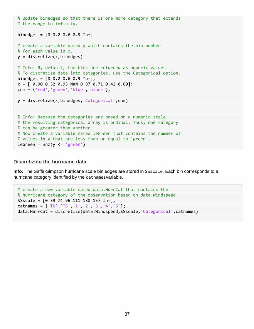
% Update binedges so that there is one more category that extends % the range to infinity. binedges = [0 0.2 0.6 0.9 Inf] % create a variable named y which contains the bin number% for each value in x.y = discretize(x,binedges) % Info: By default, the bins are returned as numeric values.% To discretize data into categories, use the Categorical option.binedges = [0 0.2 0.6 0.9 Inf];x = [ 0.90 0.32 0.95 NaN 0.87 0.71 0.42 0.60];cnm = {'red','green','blue','black'}; y = discretize(x,binedges,'Categorical',cnm) % Info: Because the categories are based on a numeric scale, % the resulting categorical array is ordinal. Thus, one category % can be greater than another.% Now create a variable named leGreen that contains the number of % values in y that are less than or equal to 'green'.leGreen = nnz(y <= 'green')
Discretizing the hurricane data
Info: The Saffir-Simpson hurricane scale bin edges are stored in SSscale. Each bin corresponds to ahurricane category identified by the catnamesvariable.
% create a new variable named data.HurrCat that contains the % hurricane category of the observation based on data.Windspeed.SSscale = [0 39 74 96 111 130 157 Inf];catnames = {'TD','TS','1','2','3','4','5'};data.HurrCat = discretize(data.Windspeed,SSscale,'Categorical',catnames)
37