microsoft excel 2013 - data analysis and business modeling jan
TRANSCRIPT


Microsoft Excel 2013: Data Analysis and Business Modeling
Wayne L. Winston

Published with the authorization of Microsoft Corporation by:O’Reilly Media, Inc.1005 Gravenstein Highway NorthSebastopol, California 95472
Copyright © 2014 by Wayne L .Winston All rights reserved. No part of the contents of this book may be reproduced or transmitted in any form or by any means without the written permission of the publisher.
ISBN: 978-0-7356-6913-0
2 3 4 5 6 7 8 9 10 LSI 9 8 7 6 5 4
Printed and bound in the United States of America.
Microsoft Press books are available through booksellers and distributors worldwide. If you need support related to this book, email Microsoft Press Book Support at [email protected]. Please tell us what you think of this book at http://www.microsoft.com/learning/booksurvey.
Microsoft and the trademarks listed at http://www.microsoft.com/about/legal/en/us/IntellectualProperty/Trademarks/EN-US.aspx are trademarks of the Microsoft group of companies. All other marks are property of their respective owners.
The example companies, organizations, products, domain names, email addresses, logos, people, places, and events depicted herein are fictitious. No association with any real company, organization, product, domain name, email address, logo, person, place, or event is intended or should be inferred.
This book expresses the author’s views and opinions. The information contained in this book is provided without any express, statutory, or implied warranties. Neither the author, O’Reilly Media, Inc., Microsoft Corporation, nor its resellers, or distributors will be held liable for any damages caused or alleged to be caused either directly or indirectly by this book.
Acquisitions and Developmental Editor: Kenyon Brown
Production Editor: Kara Ebrahim
Editorial Production: nSight, Inc.
Technical Reviewer: Peter Myers
Copyeditor: nSight, Inc.
Indexer: nSight, Inc.
Cover Design: Twist Creative • Seattle
Cover Composition: Ellie Volckhausen
Illustrator: Rebecca Demarest
[2014-01-31]

Contents at a glance
Introduction xxi
ChAptEr 1 range names 1ChAptEr 2 Lookup functions 15ChAptEr 3 INDEX function 23ChAptEr 4 MAtCh function 27ChAptEr 5 text functions 35ChAptEr 6 Dates and date functions 51ChAptEr 7 Evaluating investments by using net present value criteria 59ChAptEr 8 Internal rate of return 67ChAptEr 9 More Excel financial functions 75ChAptEr 10 Circular references 87ChAptEr 11 IF statements 93ChAptEr 12 time and time functions 111ChAptEr 13 the paste Special command 117ChAptEr 14 three-dimensional formulas 123ChAptEr 15 the Auditing tool and Inquire add-in 127ChAptEr 16 Sensitivity analysis with data tables 139ChAptEr 17 the Goal Seek command 149ChAptEr 18 Using the Scenario Manager for sensitivity analysis 155ChAptEr 19 the COUNtIF, COUNtIFS, COUNt, COUNtA, and COUNtBLANK functions 161ChAptEr 20 the SUMIF, AVErAGEIF, SUMIFS, and AVErAGEIFS functions 169ChAptEr 21 the OFFSEt function 175ChAptEr 22 the INDIrECt function 187ChAptEr 23 Conditional formatting 195ChAptEr 24 Sorting in Excel 223ChAptEr 25 tables 231ChAptEr 26 Spinner buttons, scroll bars, option buttons, check boxes, combo boxes, and group list boxes 245ChAptEr 27 the analytics revolution 261ChAptEr 28 Introducing optimization with Excel Solver 267ChAptEr 29 Using Solver to determine the optimal product mix 273ChAptEr 30 Using Solver to schedule your workforce 285

iv Contents at a glance
ChAptEr 31 Using Solver to solve transportation or distribution problems 291ChAptEr 32 Using Solver for capital budgeting 297ChAptEr 33 Using Solver for financial planning 305ChAptEr 34 Using Solver to rate sports teams 313ChAptEr 35 Warehouse location and the GrG Multistart and Evolutionary Solver engines 319ChAptEr 36 penalties and the Evolutionary Solver 329ChAptEr 37 the traveling salesperson problem 335ChAptEr 38 Importing data from a text file or document 339ChAptEr 39 Importing data from the Internet 345ChAptEr 40 Validating data 349ChAptEr 41 Summarizing data by using histograms 359ChAptEr 42 Summarizing data by using descriptive statistics 369ChAptEr 43 Using pivottables and slicers to describe data 385ChAptEr 44 the Data Model 441ChAptEr 45 powerpivot 455ChAptEr 46 power View 469ChAptEr 47 Sparklines 485ChAptEr 48 Summarizing data with database statistical functions 491ChAptEr 49 Filtering data and removing duplicates 501ChAptEr 50 Consolidating data 521ChAptEr 51 Creating subtotals 527ChAptEr 52 Charting tricks 533ChAptEr 53 Estimating straight-line relationships 569ChAptEr 54 Modeling exponential growth 577ChAptEr 55 the power curve 581ChAptEr 56 Using correlations to summarize relationships 589ChAptEr 57 Introduction to multiple regression 597ChAptEr 58 Incorporating qualitative factors into multiple regression 605ChAptEr 59 Modeling nonlinearities and interactions 615ChAptEr 60 Analysis of variance: one-way ANOVA 623ChAptEr 61 randomized blocks and two-way ANOVA 629ChAptEr 62 Using moving averages to understand time series 641ChAptEr 63 Winters’s method 645ChAptEr 64 ratio-to-moving-average forecast method 651ChAptEr 65 Forecasting in the presence of special events 655ChAptEr 66 An introduction to random variables 663

Contents at a glance v
ChAptEr 67 the binomial, hypergeometric, and negative binomial random variables 669ChAptEr 68 the poisson and exponential random variable 679ChAptEr 69 the normal random variable 683ChAptEr 70 Weibull and beta distributions: modeling machine life and duration of a project 691ChAptEr 71 Making probability statements from forecasts 697ChAptEr 72 Using the lognormal random variable to model stock prices 701ChAptEr 73 Introduction to Monte Carlo simulation 705ChAptEr 74 Calculating an optimal bid 715ChAptEr 75 Simulating stock prices and asset allocation modeling 721ChAptEr 76 Fun and games: simulating gambling and sporting event probabilities 731ChAptEr 77 Using resampling to analyze data 739ChAptEr 78 pricing stock options 743ChAptEr 79 Determining customer value 757ChAptEr 80 the economic order quantity inventory model 763ChAptEr 81 Inventory modeling with uncertain demand 769ChAptEr 82 Queuing theory: the mathematics of waiting in line 777ChAptEr 83 Estimating a demand curve 785ChAptEr 84 pricing products by using tie-ins 791ChAptEr 85 pricing products by using subjectively determined demand 797ChAptEr 86 Nonlinear pricing 803ChAptEr 87 Array formulas and functions 813
Index 831


vii
What do you think of this book? We want to hear from you! Microsoft is interested in hearing your feedback so we can continually improve our books and learning resources for you. to participate in a brief online survey, please visit:
microsoft.com/learning/booksurvey
Contents
Introduction . . . . . . . . . . . . . . . . . . . . . . . . . . . . . . . . . . . . . . . . . . . . . . . . . . . . xxiErrata . . . . . . . . . . . . . . . . . . . . . . . . . . . . . . . . . . . . . . . . . . . . . . . . . . . xxvi
We want to hear from you . . . . . . . . . . . . . . . . . . . . . . . . . . . . . . . . . xxvi
Stay in touch . . . . . . . . . . . . . . . . . . . . . . . . . . . . . . . . . . . . . . . . . . . . . xxvi
Chapter 1 Range names 1How can I create named ranges? . . . . . . . . . . . . . . . . . . . . . . . . . . . . . . . . . . . . 1
Using the Name box to create a range name . . . . . . . . . . . . . . . . . . . . 2
Creating named ranges by using Create From Selection . . . . . . . . . . 4
Creating range names by using Define Name . . . . . . . . . . . . . . . . . . . 5
Name Manager . . . . . . . . . . . . . . . . . . . . . . . . . . . . . . . . . . . . . . . . . . . . . . 6
Answers to this chapter’s questions . . . . . . . . . . . . . . . . . . . . . . . . . . . . . . . . . . 7
Remarks . . . . . . . . . . . . . . . . . . . . . . . . . . . . . . . . . . . . . . . . . . . . . . . . . . . . . . . .13
Problems . . . . . . . . . . . . . . . . . . . . . . . . . . . . . . . . . . . . . . . . . . . . . . . . . . . . . . . .13
Chapter 2 Lookup functions 15Syntax of the lookup functions . . . . . . . . . . . . . . . . . . . . . . . . . . . . . . . . . . . . .15
VLOOKUP syntax . . . . . . . . . . . . . . . . . . . . . . . . . . . . . . . . . . . . . . . . . . .15
HLOOKUP syntax . . . . . . . . . . . . . . . . . . . . . . . . . . . . . . . . . . . . . . . . . . .16
Answers to this chapter’s questions . . . . . . . . . . . . . . . . . . . . . . . . . . . . . . . . .16
Problems . . . . . . . . . . . . . . . . . . . . . . . . . . . . . . . . . . . . . . . . . . . . . . . . . . . . . . . .20
Chapter 3 INDEX function 23Syntax of the INDEX function . . . . . . . . . . . . . . . . . . . . . . . . . . . . . . . . . . . . . .23
Answers to this chapter’s questions . . . . . . . . . . . . . . . . . . . . . . . . . . . . . . . . .23
Problems . . . . . . . . . . . . . . . . . . . . . . . . . . . . . . . . . . . . . . . . . . . . . . . . . . . . . . . .25

viii Contents
Chapter 4 MATCH function 27Answers to this chapter’s questions . . . . . . . . . . . . . . . . . . . . . . . . . . . . . . . . .29
Problems . . . . . . . . . . . . . . . . . . . . . . . . . . . . . . . . . . . . . . . . . . . . . . . . . . . . . . . .32
Chapter 5 Text functions 35Text function syntax . . . . . . . . . . . . . . . . . . . . . . . . . . . . . . . . . . . . . . . . . . . . . .36
The LEFT function . . . . . . . . . . . . . . . . . . . . . . . . . . . . . . . . . . . . . . . . . . .37
The RIGHT function . . . . . . . . . . . . . . . . . . . . . . . . . . . . . . . . . . . . . . . . .37
The MID function . . . . . . . . . . . . . . . . . . . . . . . . . . . . . . . . . . . . . . . . . . .37
The TRIM function . . . . . . . . . . . . . . . . . . . . . . . . . . . . . . . . . . . . . . . . . .37
The LEN function . . . . . . . . . . . . . . . . . . . . . . . . . . . . . . . . . . . . . . . . . . .37
The FIND and SEARCH functions . . . . . . . . . . . . . . . . . . . . . . . . . . . . .37
The REPT function . . . . . . . . . . . . . . . . . . . . . . . . . . . . . . . . . . . . . . . . . .37
The CONCATENATE and & functions . . . . . . . . . . . . . . . . . . . . . . . . . .38
The REPLACE function . . . . . . . . . . . . . . . . . . . . . . . . . . . . . . . . . . . . . . .38
The VALUE function . . . . . . . . . . . . . . . . . . . . . . . . . . . . . . . . . . . . . . . .38
The UPPER, LOWER, and PROPER functions . . . . . . . . . . . . . . . . . . . .38
The CHAR function . . . . . . . . . . . . . . . . . . . . . . . . . . . . . . . . . . . . . . . . .38
The CLEAN Function . . . . . . . . . . . . . . . . . . . . . . . . . . . . . . . . . . . . . . . .39
The SUBSTITUTE FUNCTION . . . . . . . . . . . . . . . . . . . . . . . . . . . . . . . . .39
Answers to this chapter’s questions . . . . . . . . . . . . . . . . . . . . . . . . . . . . . . . . .40
Extracting data by using the Convert Text To Columns Wizard . . .43
Problems . . . . . . . . . . . . . . . . . . . . . . . . . . . . . . . . . . . . . . . . . . . . . . . . . . . . . . . .47
Chapter 6 Dates and date functions 51Answers to this chapter’s questions . . . . . . . . . . . . . . . . . . . . . . . . . . . . . . . . .52
Problems . . . . . . . . . . . . . . . . . . . . . . . . . . . . . . . . . . . . . . . . . . . . . . . . . . . . . . . .57
Chapter 7 Evaluating investments by using net present value criteria 59
Answers to this chapter’s questions . . . . . . . . . . . . . . . . . . . . . . . . . . . . . . . . .60
Problems . . . . . . . . . . . . . . . . . . . . . . . . . . . . . . . . . . . . . . . . . . . . . . . . . . . . . . . .64

Contents ix
Chapter 8 Internal rate of return 67Answers to this chapter’s questions . . . . . . . . . . . . . . . . . . . . . . . . . . . . . . . . .68
Problems . . . . . . . . . . . . . . . . . . . . . . . . . . . . . . . . . . . . . . . . . . . . . . . . . . . . . . . .73
Chapter 9 More Excel financial functions 75Answers to this chapter’s questions . . . . . . . . . . . . . . . . . . . . . . . . . . . . . . . . .75
CUMPRINC and CUMIPMT functions . . . . . . . . . . . . . . . . . . . . . . . . . . . . . . .81
Problems . . . . . . . . . . . . . . . . . . . . . . . . . . . . . . . . . . . . . . . . . . . . . . . . . . . . . . . .83
Chapter 10 Circular references 87Answers to this chapter’s questions . . . . . . . . . . . . . . . . . . . . . . . . . . . . . . . . .87
Problems . . . . . . . . . . . . . . . . . . . . . . . . . . . . . . . . . . . . . . . . . . . . . . . . . . . . . . . .90
Chapter 11 IF statements 93Answers to this chapter’s questions . . . . . . . . . . . . . . . . . . . . . . . . . . . . . . . . .94
Problems . . . . . . . . . . . . . . . . . . . . . . . . . . . . . . . . . . . . . . . . . . . . . . . . . . . . . . .106
Chapter 12 Time and time functions 111Answers to this chapter’s questions . . . . . . . . . . . . . . . . . . . . . . . . . . . . . . . .111
Problems . . . . . . . . . . . . . . . . . . . . . . . . . . . . . . . . . . . . . . . . . . . . . . . . . . . . . . .115
Chapter 13 The Paste Special command 117Answers to this chapter’s questions . . . . . . . . . . . . . . . . . . . . . . . . . . . . . . . .117
Problems . . . . . . . . . . . . . . . . . . . . . . . . . . . . . . . . . . . . . . . . . . . . . . . . . . . . . . .121
Chapter 14 Three-dimensional formulas 123Answer to this chapter’s question . . . . . . . . . . . . . . . . . . . . . . . . . . . . . . . . .123
Problem . . . . . . . . . . . . . . . . . . . . . . . . . . . . . . . . . . . . . . . . . . . . . . . . . . . . . . .125

x Contents
Chapter 15 The Auditing tool and Inquire add-in 127Answers to this chapter’s questions . . . . . . . . . . . . . . . . . . . . . . . . . . . . . . . .130
Problems . . . . . . . . . . . . . . . . . . . . . . . . . . . . . . . . . . . . . . . . . . . . . . . . . . . . . . .138
Chapter 16 Sensitivity analysis with data tables 139Answers to this chapter’s questions . . . . . . . . . . . . . . . . . . . . . . . . . . . . . . . .140
Problems . . . . . . . . . . . . . . . . . . . . . . . . . . . . . . . . . . . . . . . . . . . . . . . . . . . . . . .146
Chapter 17 The Goal Seek command 149Answers to this chapter’s questions . . . . . . . . . . . . . . . . . . . . . . . . . . . . . . . .149
Problems . . . . . . . . . . . . . . . . . . . . . . . . . . . . . . . . . . . . . . . . . . . . . . . . . . . . . . .152
Chapter 18 Using the Scenario Manager for sensitivity analysis 155Answer to this chapter’s question . . . . . . . . . . . . . . . . . . . . . . . . . . . . . . . . .155
Remarks . . . . . . . . . . . . . . . . . . . . . . . . . . . . . . . . . . . . . . . . . . . . . . . . . . . . . . .158
Problems . . . . . . . . . . . . . . . . . . . . . . . . . . . . . . . . . . . . . . . . . . . . . . . . . . . . . . .158
Chapter 19 The COUNTIF, COUNTIFS, COUNT, COUNTA, and COUNTBLANK functions 161
Answers to this chapter’s questions . . . . . . . . . . . . . . . . . . . . . . . . . . . . . . . .163
Remarks . . . . . . . . . . . . . . . . . . . . . . . . . . . . . . . . . . . . . . . . . . . . . . . . . . . . . . .166
Problems . . . . . . . . . . . . . . . . . . . . . . . . . . . . . . . . . . . . . . . . . . . . . . . . . . . . . . .166
Chapter 20 The SUMIF, AVERAGEIF, SUMIFS, and AVERAGEIFS functions 169
Answers to this chapter’s questions . . . . . . . . . . . . . . . . . . . . . . . . . . . . . . . .170
Problems . . . . . . . . . . . . . . . . . . . . . . . . . . . . . . . . . . . . . . . . . . . . . . . . . . . . . . .172
Chapter 21 The OFFSET function 175Answers to this chapter’s questions . . . . . . . . . . . . . . . . . . . . . . . . . . . . . . . .176
Remarks . . . . . . . . . . . . . . . . . . . . . . . . . . . . . . . . . . . . . . . . . . . . . . . . . . . . . . .184
Problems . . . . . . . . . . . . . . . . . . . . . . . . . . . . . . . . . . . . . . . . . . . . . . . . . . . . . . .185

Contents xi
Chapter 22 The INDIRECT function 187Answers to this chapter’s questions . . . . . . . . . . . . . . . . . . . . . . . . . . . . . . . .188
Problems . . . . . . . . . . . . . . . . . . . . . . . . . . . . . . . . . . . . . . . . . . . . . . . . . . . . . . .193
Chapter 23 Conditional formatting 195Answers to this chapter’s questions . . . . . . . . . . . . . . . . . . . . . . . . . . . . . . . .197
Problems . . . . . . . . . . . . . . . . . . . . . . . . . . . . . . . . . . . . . . . . . . . . . . . . . . . . . . .219
Chapter 24 Sorting in Excel 223Answers to this chapter’s questions . . . . . . . . . . . . . . . . . . . . . . . . . . . . . . . .223
Problems . . . . . . . . . . . . . . . . . . . . . . . . . . . . . . . . . . . . . . . . . . . . . . . . . . . . . . .230
Chapter 25 Tables 231Answers to this chapter’s questions . . . . . . . . . . . . . . . . . . . . . . . . . . . . . . . .231
Problems . . . . . . . . . . . . . . . . . . . . . . . . . . . . . . . . . . . . . . . . . . . . . . . . . . . . . . .244
Chapter 26 Spinner buttons, scroll bars, option buttons, check boxes, combo boxes, and group list boxes 245
Answers to this chapter’s questions . . . . . . . . . . . . . . . . . . . . . . . . . . . . . . . .247
Problems . . . . . . . . . . . . . . . . . . . . . . . . . . . . . . . . . . . . . . . . . . . . . . . . . . . . . . .258
Chapter 27 The analytics revolution 261Answers to this chapter’s questions . . . . . . . . . . . . . . . . . . . . . . . . . . . . . . . .261
Chapter 28 Introducing optimization with Excel Solver 267Problems . . . . . . . . . . . . . . . . . . . . . . . . . . . . . . . . . . . . . . . . . . . . . . . . . . . . . . .270
Chapter 29 Using Solver to determine the optimal product mix 273Answers to this chapter’s questions . . . . . . . . . . . . . . . . . . . . . . . . . . . . . . . .273
Problems . . . . . . . . . . . . . . . . . . . . . . . . . . . . . . . . . . . . . . . . . . . . . . . . . . . . . . .283

xii Contents
Chapter 30 Using Solver to schedule your workforce 285Answer to this chapter’s question . . . . . . . . . . . . . . . . . . . . . . . . . . . . . . . . .285
Problems . . . . . . . . . . . . . . . . . . . . . . . . . . . . . . . . . . . . . . . . . . . . . . . . . . . . . . .288
Chapter 31 Using Solver to solve transportation or distribution problems 291
Answer to this chapter’s question . . . . . . . . . . . . . . . . . . . . . . . . . . . . . . . . .291
Problems . . . . . . . . . . . . . . . . . . . . . . . . . . . . . . . . . . . . . . . . . . . . . . . . . . . . . . .294
Chapter 32 Using Solver for capital budgeting 297Answer to this chapter’s question . . . . . . . . . . . . . . . . . . . . . . . . . . . . . . . . .297
Handling other constraints . . . . . . . . . . . . . . . . . . . . . . . . . . . . . . . . . .300
Solving binary and integer programming problems . . . . . . . . . . . .301
Problems . . . . . . . . . . . . . . . . . . . . . . . . . . . . . . . . . . . . . . . . . . . . . . . . . . . . . . .303
Chapter 33 Using Solver for financial planning 305Answers to this chapter’s questions . . . . . . . . . . . . . . . . . . . . . . . . . . . . . . . .305
Problems . . . . . . . . . . . . . . . . . . . . . . . . . . . . . . . . . . . . . . . . . . . . . . . . . . . . . . .310
Chapter 34 Using Solver to rate sports teams 313Answer to this chapter’s question . . . . . . . . . . . . . . . . . . . . . . . . . . . . . . . . .314
Problems . . . . . . . . . . . . . . . . . . . . . . . . . . . . . . . . . . . . . . . . . . . . . . . . . . . . . . .318
Chapter 35 Warehouse location and the GRG Multistart and Evolutionary Solver engines 319
Understanding the GRG Multistart and Evolutionary Solver engines . . .319
How does Solver solve linear Solver problems? . . . . . . . . . . . . . . . .319
How does the GRG Nonlinear engine solve nonlinear optimization models? . . . . . . . . . . . . . . . . . . . . . . . . . . . . . . . . . . . . . .320
How does the Evolutionary Solver engine tackle nonsmooth optimization problems? . . . . . . . . . . . . . . . . . . . . . . . . . . . . . . . . . . . .323
Answers to this chapter’s questions . . . . . . . . . . . . . . . . . . . . . . . . . . . . . . . .323
Problems . . . . . . . . . . . . . . . . . . . . . . . . . . . . . . . . . . . . . . . . . . . . . . . . . . . . . . .328

Contents xiii
Chapter 36 Penalties and the Evolutionary Solver 329Answers to this chapter’s questions . . . . . . . . . . . . . . . . . . . . . . . . . . . . . . . .329
Using conditional formatting to highlight each employee’s ratings . . . .332
Problems . . . . . . . . . . . . . . . . . . . . . . . . . . . . . . . . . . . . . . . . . . . . . . . . . . . . . . .333
Chapter 37 The traveling salesperson problem 335Answers to this chapter’s questions . . . . . . . . . . . . . . . . . . . . . . . . . . . . . . . .335
Problems . . . . . . . . . . . . . . . . . . . . . . . . . . . . . . . . . . . . . . . . . . . . . . . . . . . . . . .338
Chapter 38 Importing data from a text file or document 339Answer to this chapter’s question . . . . . . . . . . . . . . . . . . . . . . . . . . . . . . . . .339
Problems . . . . . . . . . . . . . . . . . . . . . . . . . . . . . . . . . . . . . . . . . . . . . . . . . . . . . . .344
Chapter 39 Importing data from the Internet 345Answer to this chapter’s question . . . . . . . . . . . . . . . . . . . . . . . . . . . . . . . . .345
Problems . . . . . . . . . . . . . . . . . . . . . . . . . . . . . . . . . . . . . . . . . . . . . . . . . . . . . . .348
Chapter 40 Validating data 349Answers to this chapter’s questions . . . . . . . . . . . . . . . . . . . . . . . . . . . . . . . .349
Remarks . . . . . . . . . . . . . . . . . . . . . . . . . . . . . . . . . . . . . . . . . . . . . . . . . . . . . . .355
Problems . . . . . . . . . . . . . . . . . . . . . . . . . . . . . . . . . . . . . . . . . . . . . . . . . . . . . . .356
Chapter 41 Summarizing data by using histograms 359Answers to this chapter’s questions . . . . . . . . . . . . . . . . . . . . . . . . . . . . . . . .359
Problems . . . . . . . . . . . . . . . . . . . . . . . . . . . . . . . . . . . . . . . . . . . . . . . . . . . . . . .367
Chapter 42 Summarizing data by using descriptive statistics 369Answers to this chapter’s questions . . . . . . . . . . . . . . . . . . . . . . . . . . . . . . . .370
Using conditional formatting to highlight outliers . . . . . . . . . . . . .375
Problems . . . . . . . . . . . . . . . . . . . . . . . . . . . . . . . . . . . . . . . . . . . . . . . . . . . . . . .382

xiv Contents
Chapter 43 Using PivotTables and slicers to describe data 385Answers to this chapter’s questions . . . . . . . . . . . . . . . . . . . . . . . . . . . . . . . .386
Remarks about grouping . . . . . . . . . . . . . . . . . . . . . . . . . . . . . . . . . . .424
Problems . . . . . . . . . . . . . . . . . . . . . . . . . . . . . . . . . . . . . . . . . . . . . . . . . . . . . . .437
Chapter 44 The Data Model 441Answers to this chapter’s questions . . . . . . . . . . . . . . . . . . . . . . . . . . . . . . . .441
Problems . . . . . . . . . . . . . . . . . . . . . . . . . . . . . . . . . . . . . . . . . . . . . . . . . . . . . . .453
Chapter 45 PowerPivot 455Answers to this chapter’s questions . . . . . . . . . . . . . . . . . . . . . . . . . . . . . . . .456
Problems . . . . . . . . . . . . . . . . . . . . . . . . . . . . . . . . . . . . . . . . . . . . . . . . . . . . . . .468
Chapter 46 Power View 469Answers to this chapter’s questions . . . . . . . . . . . . . . . . . . . . . . . . . . . . . . . .470
Problems . . . . . . . . . . . . . . . . . . . . . . . . . . . . . . . . . . . . . . . . . . . . . . . . . . . . . . .483
Chapter 47 Sparklines 485Answers to this chapter’s questions . . . . . . . . . . . . . . . . . . . . . . . . . . . . . . . .485
Problems . . . . . . . . . . . . . . . . . . . . . . . . . . . . . . . . . . . . . . . . . . . . . . . . . . . . . . .490
Chapter 48 Summarizing data with database statistical functions 491
Answers to this chapter’s questions . . . . . . . . . . . . . . . . . . . . . . . . . . . . . . . .493
Problems . . . . . . . . . . . . . . . . . . . . . . . . . . . . . . . . . . . . . . . . . . . . . . . . . . . . . . .498
Chapter 49 Filtering data and removing duplicates 501Answers to this chapter’s questions . . . . . . . . . . . . . . . . . . . . . . . . . . . . . . . .503
Problems . . . . . . . . . . . . . . . . . . . . . . . . . . . . . . . . . . . . . . . . . . . . . . . . . . . . . . .518
Chapter 50 Consolidating data 521Answer to this chapter’s question . . . . . . . . . . . . . . . . . . . . . . . . . . . . . . . . .521
Problems . . . . . . . . . . . . . . . . . . . . . . . . . . . . . . . . . . . . . . . . . . . . . . . . . . . . . . .525

Contents xv
Chapter 51 Creating subtotals 527Answers to this chapter’s questions . . . . . . . . . . . . . . . . . . . . . . . . . . . . . . . .527
Problems . . . . . . . . . . . . . . . . . . . . . . . . . . . . . . . . . . . . . . . . . . . . . . . . . . . . . . .532
Chapter 52 Charting tricks 533Answers to this chapter’s questions . . . . . . . . . . . . . . . . . . . . . . . . . . . . . . . .534
Problems . . . . . . . . . . . . . . . . . . . . . . . . . . . . . . . . . . . . . . . . . . . . . . . . . . . . . . .566
Chapter 53 Estimating straight-line relationships 569Answers to this chapter’s questions . . . . . . . . . . . . . . . . . . . . . . . . . . . . . . . .571
Problems . . . . . . . . . . . . . . . . . . . . . . . . . . . . . . . . . . . . . . . . . . . . . . . . . . . . . . .575
Chapter 54 Modeling exponential growth 577Answer to this chapter’s question . . . . . . . . . . . . . . . . . . . . . . . . . . . . . . . . .577
Problems . . . . . . . . . . . . . . . . . . . . . . . . . . . . . . . . . . . . . . . . . . . . . . . . . . . . . . .580
Chapter 55 The power curve 581Answer to this chapter’s question . . . . . . . . . . . . . . . . . . . . . . . . . . . . . . . . .584
Problems . . . . . . . . . . . . . . . . . . . . . . . . . . . . . . . . . . . . . . . . . . . . . . . . . . . . . . .586
Chapter 56 Using correlations to summarize relationships 589Answer to this chapter’s question . . . . . . . . . . . . . . . . . . . . . . . . . . . . . . . . .591
Filling in the correlation matrix . . . . . . . . . . . . . . . . . . . . . . . . . . . . . .593
Using the CORREL function . . . . . . . . . . . . . . . . . . . . . . . . . . . . . . . . .594
Relationship between correlation and R2 . . . . . . . . . . . . . . . . . . . . .594
Correlation and regression toward the mean . . . . . . . . . . . . . . . . . .595
Problems . . . . . . . . . . . . . . . . . . . . . . . . . . . . . . . . . . . . . . . . . . . . . . . . . . . . . . .595
Chapter 57 Introduction to multiple regression 597Answers to this chapter’s questions . . . . . . . . . . . . . . . . . . . . . . . . . . . . . . . .597

xvi Contents
Chapter 58 Incorporating qualitative factors into multiple regression 605
Answers to this chapter’s questions . . . . . . . . . . . . . . . . . . . . . . . . . . . . . . . .605
Chapter 59 Modeling nonlinearities and interactions 615Answers to this chapter’s questions . . . . . . . . . . . . . . . . . . . . . . . . . . . . . . . .615
Problems for Chapters 57 and 58. . . . . . . . . . . . . . . . . . . . . . . . . . . . . . . . . .619
Chapter 60 Analysis of variance: one-way ANOVA 623Answers to this chapter’s questions . . . . . . . . . . . . . . . . . . . . . . . . . . . . . . . .624
Problems . . . . . . . . . . . . . . . . . . . . . . . . . . . . . . . . . . . . . . . . . . . . . . . . . . . . . . .628
Chapter 61 Randomized blocks and two-way ANOVA 629Answers to this chapter’s questions . . . . . . . . . . . . . . . . . . . . . . . . . . . . . . . .630
Problems . . . . . . . . . . . . . . . . . . . . . . . . . . . . . . . . . . . . . . . . . . . . . . . . . . . . . . .638
Chapter 62 Using moving averages to understand time series 641Answer to this chapter’s question . . . . . . . . . . . . . . . . . . . . . . . . . . . . . . . . .641
Problem . . . . . . . . . . . . . . . . . . . . . . . . . . . . . . . . . . . . . . . . . . . . . . . . . . . . . . .643
Chapter 63 Winters’s method 645Time series characteristics . . . . . . . . . . . . . . . . . . . . . . . . . . . . . . . . . . . . . . . .645
Parameter definitions . . . . . . . . . . . . . . . . . . . . . . . . . . . . . . . . . . . . . . . . . . . .645
Initializing Winters’s method . . . . . . . . . . . . . . . . . . . . . . . . . . . . . . . . . . . . .646
Estimating the smoothing constants . . . . . . . . . . . . . . . . . . . . . . . . . . . . . . .647
Remarks . . . . . . . . . . . . . . . . . . . . . . . . . . . . . . . . . . . . . . . . . . . . . . . . . . . . . . .649
Problems . . . . . . . . . . . . . . . . . . . . . . . . . . . . . . . . . . . . . . . . . . . . . . . . . . . . . . .649
Chapter 64 Ratio-to-moving-average forecast method 651Answers to this chapter’s questions . . . . . . . . . . . . . . . . . . . . . . . . . . . . . . . .651
Problem . . . . . . . . . . . . . . . . . . . . . . . . . . . . . . . . . . . . . . . . . . . . . . . . . . . . . . .654

Contents xvii
Chapter 65 Forecasting in the presence of special events 655Answers to this chapter’s questions . . . . . . . . . . . . . . . . . . . . . . . . . . . . . . . .655
Problems . . . . . . . . . . . . . . . . . . . . . . . . . . . . . . . . . . . . . . . . . . . . . . . . . . . . . . .662
Chapter 66 An introduction to random variables 663Answers to this chapter’s questions . . . . . . . . . . . . . . . . . . . . . . . . . . . . . . . .663
Problems . . . . . . . . . . . . . . . . . . . . . . . . . . . . . . . . . . . . . . . . . . . . . . . . . . . . . . .667
Chapter 67 The binomial, hypergeometric, and negative binomial random variables 669
Answers to this chapter’s questions . . . . . . . . . . . . . . . . . . . . . . . . . . . . . . . .670
Problems . . . . . . . . . . . . . . . . . . . . . . . . . . . . . . . . . . . . . . . . . . . . . . . . . . . . . . .676
Chapter 68 The Poisson and exponential random variable 679Answers to this chapter’s questions . . . . . . . . . . . . . . . . . . . . . . . . . . . . . . . .679
Problems . . . . . . . . . . . . . . . . . . . . . . . . . . . . . . . . . . . . . . . . . . . . . . . . . . . . . . .682
Chapter 69 The normal random variable 683Answers to this chapter’s questions . . . . . . . . . . . . . . . . . . . . . . . . . . . . . . . .683
Problems . . . . . . . . . . . . . . . . . . . . . . . . . . . . . . . . . . . . . . . . . . . . . . . . . . . . . . .689
Chapter 70 Weibull and beta distributions: modeling machine life and duration of a project 691
Answers to this chapter’s questions . . . . . . . . . . . . . . . . . . . . . . . . . . . . . . . .691
Problems . . . . . . . . . . . . . . . . . . . . . . . . . . . . . . . . . . . . . . . . . . . . . . . . . . . . . . .696
Chapter 71 Making probability statements from forecasts 697Answers to this chapter’s questions . . . . . . . . . . . . . . . . . . . . . . . . . . . . . . . .698
Problems . . . . . . . . . . . . . . . . . . . . . . . . . . . . . . . . . . . . . . . . . . . . . . . . . . . . . . .699

xviii Contents
Chapter 72 Using the lognormal random variable to model stock prices 701
Answers to this chapter’s questions . . . . . . . . . . . . . . . . . . . . . . . . . . . . . . . .701
Remarks . . . . . . . . . . . . . . . . . . . . . . . . . . . . . . . . . . . . . . . . . . . . . . . . . . . . . . .704
Problems . . . . . . . . . . . . . . . . . . . . . . . . . . . . . . . . . . . . . . . . . . . . . . . . . . . . . . .704
Chapter 73 Introduction to Monte Carlo simulation 705Answers to this chapter’s questions . . . . . . . . . . . . . . . . . . . . . . . . . . . . . . . .706
The impact of risk on your decision . . . . . . . . . . . . . . . . . . . . . . . . . .712
Confidence interval for mean profit . . . . . . . . . . . . . . . . . . . . . . . . . .713
Problems . . . . . . . . . . . . . . . . . . . . . . . . . . . . . . . . . . . . . . . . . . . . . . . . . . . . . . .713
Chapter 74 Calculating an optimal bid 715Answers to this chapter’s questions . . . . . . . . . . . . . . . . . . . . . . . . . . . . . . . .715
Problems . . . . . . . . . . . . . . . . . . . . . . . . . . . . . . . . . . . . . . . . . . . . . . . . . . . . . . .718
Chapter 75 Simulating stock prices and asset allocation modeling 721
Answers to this chapter’s questions . . . . . . . . . . . . . . . . . . . . . . . . . . . . . . . .722
Problems . . . . . . . . . . . . . . . . . . . . . . . . . . . . . . . . . . . . . . . . . . . . . . . . . . . . . . .729
Chapter 76 Fun and games: simulating gambling and sporting event probabilities 731
Answers to this chapter’s questions . . . . . . . . . . . . . . . . . . . . . . . . . . . . . . . .731
Problems . . . . . . . . . . . . . . . . . . . . . . . . . . . . . . . . . . . . . . . . . . . . . . . . . . . . . . .737
Chapter 77 Using resampling to analyze data 739Answer to this chapter’s question . . . . . . . . . . . . . . . . . . . . . . . . . . . . . . . . .739
Problems . . . . . . . . . . . . . . . . . . . . . . . . . . . . . . . . . . . . . . . . . . . . . . . . . . . . . . .742
Chapter 78 Pricing stock options 743Answers to this chapter’s questions . . . . . . . . . . . . . . . . . . . . . . . . . . . . . . . .744
Problems . . . . . . . . . . . . . . . . . . . . . . . . . . . . . . . . . . . . . . . . . . . . . . . . . . . . . . .754

Contents xix
Chapter 79 Determining customer value 757Answers to this chapter’s questions . . . . . . . . . . . . . . . . . . . . . . . . . . . . . . . .757
Problems . . . . . . . . . . . . . . . . . . . . . . . . . . . . . . . . . . . . . . . . . . . . . . . . . . . . . . .761
Chapter 80 The economic order quantity inventory model 763Answers to this chapter’s questions . . . . . . . . . . . . . . . . . . . . . . . . . . . . . . . .763
Problems . . . . . . . . . . . . . . . . . . . . . . . . . . . . . . . . . . . . . . . . . . . . . . . . . . . . . . .767
Chapter 81 Inventory modeling with uncertain demand 769Answers to this chapter’s questions . . . . . . . . . . . . . . . . . . . . . . . . . . . . . . . .770
Problems . . . . . . . . . . . . . . . . . . . . . . . . . . . . . . . . . . . . . . . . . . . . . . . . . . . . . . .775
Chapter 82 Queuing theory: the mathematics of waiting in line 777Answers to this chapter’s questions . . . . . . . . . . . . . . . . . . . . . . . . . . . . . . . .777
Problems . . . . . . . . . . . . . . . . . . . . . . . . . . . . . . . . . . . . . . . . . . . . . . . . . . . . . . .782
Chapter 83 Estimating a demand curve 785Answers to this chapter’s questions . . . . . . . . . . . . . . . . . . . . . . . . . . . . . . . .785
Problems . . . . . . . . . . . . . . . . . . . . . . . . . . . . . . . . . . . . . . . . . . . . . . . . . . . . . . .789
Chapter 84 Pricing products by using tie-ins 791Answer to this chapter’s question . . . . . . . . . . . . . . . . . . . . . . . . . . . . . . . . .791
Problems . . . . . . . . . . . . . . . . . . . . . . . . . . . . . . . . . . . . . . . . . . . . . . . . . . . . . . .794
Chapter 85 Pricing products by using subjectively determined demand 797
Answers to this chapter’s questions . . . . . . . . . . . . . . . . . . . . . . . . . . . . . . . .797
Problems . . . . . . . . . . . . . . . . . . . . . . . . . . . . . . . . . . . . . . . . . . . . . . . . . . . . . . .800
Chapter 86 Nonlinear pricing 803Answers to this chapter’s questions . . . . . . . . . . . . . . . . . . . . . . . . . . . . . . . .803
Problems . . . . . . . . . . . . . . . . . . . . . . . . . . . . . . . . . . . . . . . . . . . . . . . . . . . . . . .810

xx Contents
Chapter 87 Array formulas and functions 813Answers to this chapter’s questions . . . . . . . . . . . . . . . . . . . . . . . . . . . . . . . .814
Problems . . . . . . . . . . . . . . . . . . . . . . . . . . . . . . . . . . . . . . . . . . . . . . . . . . . . . . .827
Index 831
What do you think of this book? We want to hear from you! Microsoft is interested in hearing your feedback so we can continually improve our books and learning resources for you. to participate in a brief online survey, please visit:
microsoft.com/learning/booksurvey

xxi
Introduction
Whether you work for a Fortune 500 corporation, a small company, a government agency, or a not-for-profit organization, if you’re reading this introduction the
chances are you use Microsoft Excel in your daily work. Your job probably involves sum-marizing, reporting, and analyzing data. It might also involve building analytic mod-els to help your employer increase profits, reduce costs, or manage operations more efficiently.
Since 1999, I’ve taught thousands of analysts at organizations such as 3M, Booz Allen Hamilton consulting, Bristol-Myers Squibb, Broadcom Cisco Systems, Deloitte Consulting, Drugstore.com, eBay, Eli Lilly, Ford, General Electric, General Motors, Intel, Microsoft, Morgan Stanley, NCR, Owens Corning, Pfizer, Proctor & Gamble, PWC, Sch-lumberger, Tellabs, the U.S. Army, the U.S. Department of Defense, and Verizon how to use Excel more efficiently and productively in their jobs. Students have often told me that the tools and methods I teach in my classes have saved them hours of time each week and provided them with new and improved approaches for analyzing important business problems.
I’ve used the techniques described in this book in my own consulting practice to solve many business problems. For example, I have used Excel to help the Dallas Mavericks and New York Knickers NBA basketball teams evaluate referees, players, and lineups. During the last 15 years I have also taught Excel business modeling and data analysis classes to MBA students at Indiana University’s Kelley School of Business. (As proof of my teaching excellence, I have won over 45 teaching awards, and have won the school’s overall MBA teaching award six times.) I would like to also note that 95 percent of MBA students at Indiana University take my spreadsheet modeling class even though it is an elective.
The book you have in your hands is an attempt to make these successful classes available to everyone. Here is why I think the book will help you learn how to use Excel more effectively:
■■ The materials have been tested while teaching thousands of analysts working for Fortune 500 corporations and government agencies, including the U.S. Army.
■■ I’ve written the book as though I am talking to the reader. I hope this approach transfers the spirit of a successful classroom environment to the written page.

xxii Introduction
■■ I teach by example, which makes concepts easier to master. These examples are constructed to have a real-world feel. Many of the examples are based on ques-tions sent to me by employees of Fortune 500 corporations.
■■ For the most part, I lead you through the approaches I take in Excel to set up and answer a wide range of data analysis and business questions. You can follow along with my explanations by referring to the sample worksheets that accom-pany each example. However, I have also included template files for the book’s examples on the companion website. If you want to, you can use these tem-plates to work directly with Excel and complete each example on your own.
■■ For the most part, the chapters are short and organized around a single con-cept. You should be able to master the content of most chapters with at most two hours of study. By looking at the questions that begin each chapter, you’ll gain an idea about the types of problems you’ll be able to solve after mastering a chapter’s topics.
■■ In addition to learning about Excel formulas, you will learn some important math in a fairly painless fashion. For example, you’ll learn about statistics, forecasting, optimization models, Monte Carlo simulation, inventory modeling, and the mathematics of waiting in line. You will also learn about some recent developments in business thinking, such as real options, customer value, and mathematical pricing models.
■■ At the end of each chapter, I’ve provided a group of practice problems (over 600 in total) that you can work through on your own. These problems will help you master the information in each chapter. Answers to all problems are included in files on the book’s companion website. Many of these problems are based on actual problems faced by business analysts at Fortune 500 companies.
■■ Most of all, learning should be fun. If you read this book, you will learn how to predict U.S. presidential elections, how to set football point spreads, how to determine the probability of winning at craps, and how to determine the probability of a specific team winning an NCAA tournament. These examples are interesting and fun, and they also teach you a lot about solving business problems with Excel.
Note To follow along with this book, you must have Excel 2013. Previous ver-sions of this book can be used with Excel 2003, Excel 2007, or Excel 2010.

Introduction xxiii
What’s new in this editionThis edition of the book contains the following changes:
■■ An explanation of Excel’s 2013 exciting Flash Fill feature
■■ An explanation of how to delete invisible characters which often mess up calculations.
■■ An explanation of the following new Excel 2013 functions: SHEET, SHEETS, FORMULATEXT, and ISFORMULA.
■■ A simple method for listing all of a workbook’s worksheet names.
■■ A chapter describing the exciting new field of analytics.
■■ How to create PivotTables from data in disparate locations or based on another PivotTable.
■■ How to use Excel 2013’s new Timeline feature to filter PivotTables based on dates.
■■ A description of Excel 2013’s Data Model.
■■ A description of Excel 2013’s PowerPivot add-in.
■■ How to use Power View to create mind blowing charts and graphics.
■■ A new chapter on charting tricks and a general description of charting in Excel 2013.
■■ Over 30 new problems have been added.
What you should know before reading this bookTo follow the examples in this book you do not need to be an Excel guru. Basically, the two key actions you should know how to do are the following:
■■ Enter a formula You should know that formulas must begin with an equals sign (=). You should also know the basic mathematical operators. For example, you should know that an asterisk (*) is used for multiplication, a forward slash (/) is used for division, and the caret key (̂ ) is used to raise a quantity to a power.
■■ Work with cell references You should know that when you copy a formula that contains a cell reference such as $A$4 (an absolute cell reference, which is created by including the dollar signs), the formula still refers to cell A4 in the

xxiv Introduction
cells you copy it to. When you copy a formula that contains a cell reference such as $A4 (a mixed cell address), the column remains fixed, but the row changes. Finally, when you copy a formula that contains a cell reference such as A4 (a relative cell reference), both the row and the column of the cells referenced in the formula change.
How to use this bookAs you read along with the examples in this book, you can take one of two approaches:
■■ You can open the template file that corresponds to the example you are study-ing and complete each step of the example as you read the book. You will be surprised how easy this process is and amazed with how much you learn and retain. This is the approach I use in my corporate classes.
■■ Instead of working in the template, you can follow my explanations as you look at the final version of each sample file.
Using the companion contentThis book features a companion website that makes available to you all the sample files you use in the book’s examples (both the final Excel workbooks and starting templates you can work with on your own). The workbooks and templates are organized in folders named for each chapter. The answers to all chapter-ending problems in the book are also included with the sample files. Each answer file is named so that you can identify it easily. For example, the file containing the answer to Problem 2 in Chapter 10 is named s10_2.xlsx.
To work through the examples in this book, you need to copy the book’s sample files to your computer. These practice files, and other information, can be downloaded from the book’s detail page, located at:
http://aka.ms/Excel2013Data/files
Display the detail page in your Web browser, and follow the instructions for down-loading the files.

Introduction xxv
AcknowledgmentsI am eternally grateful to Jennifer Skoog and Norm Tonina, who had faith in me and first hired me to teach Excel classes for Microsoft finance. Jennifer in particular was instrumental in helping design the content and style of the classes on which the book is based. Keith Lange of Eli Lilly, Pat Keating and Doug Hoppe of Cisco Systems, and Den-nis Fuller of the U.S. Army also helped me refine my thoughts on teaching data analysis and modeling with Excel.
Editors Kenyon Brown and Rachel Roumeliotis did a great job of keeping me (and the book) on schedule. Peter Myers did a great job with the technical editing. Thanks also to Production Editors Kara Ebrahim and Chris Norton for managing the book’s production. I am grateful to my many students at the organizations where I’ve taught and at the Indiana University Kelley School of Business. Many of them have taught me things I did not know about Excel.
Alex Blanton, formerly of Microsoft Press, championed this project at the start and shared my vision of developing a user-friendly text designed for use by business analysts.
Finally, my lovely and talented wife, Vivian, and my wonderful children, Jennifer and Gregory, put up with my long weekend hours at the keyboard.
Support & feedbackThe following sections provide information on errata, book support, feedback, and contact information.

xxvi Introduction
ErrataWe’ve made every effort to ensure the accuracy of this book and its companion con-tent. If you do find an error, please report it on our Microsoft Press site at oreilly.com:
1. Go to http://microsoftpress.oreilly.com.
2. In the Search box, enter the book’s ISBN or title.
3. Select your book from the search results.
4. On your book’s catalog page, under the cover image, you’ll see a list of links.
5. Click View/Submit Errata.
You’ll find additional information and services for your book on its catalog page. If you need additional support, please e-mail Microsoft Press Book Support at [email protected].
Please note that product support for Microsoft software is not offered through the addresses above.
We want to hear from youAt Microsoft Press, your satisfaction is our top priority, and your feedback our most valuable asset. Please tell us what you think of this book at:
http://www.microsoft.com/learning/booksurvey
The survey is short, and we read every one of your comments and ideas. Thanks in advance for your input!
Stay in touchLet’s keep the conversation going! We’re on Twitter: http://twitter.com/MicrosoftPress.

1
C H A P T E R 1
range names
Questions answered in this chapter:
■■ I want the total sales in Arizona, California, Montana, New York, and New Jersey. Can I use a formula to compute the total sales in a form such as AZ+CA+MT+NY+NJ instead of SUM(A21:A25) and still get the right answer?
■■ What does a formula such as Average(A:A) do?
■■ What is the difference between a name with workbook scope and one with worksheet scope?
■■ I really am getting to like range names. I have started defining range names for many of the workbooks I have developed at the office. However, the range names do not show up in my formulas. How can I make recently created range names show up in previously created formulas?
■■ How can I paste a list of all range names (and the cells they represent) into my worksheet?
■■ I am computing projected annual revenues as a multiple of last year’s revenue. Is there a way to have the formula look like (1+growth)*last year?
■■ For each day of the week, we are given the hourly wage and hours worked. Can we compute total salary for each day with the wages*hours formula?
You have probably worked with worksheets that use formulas such as SUM(A5000:A5049). Then you have to find out what’s contained in cells A5000:A5049. If cells A5000:A5049 contain sales in each US state, wouldn’t the formula SUM(USSales) be easier to understand? In this chapter, you learn how to name individual cells or ranges of cells and how to use range names in formulas.
How can I create named ranges?
There are three ways to create named ranges:
■■ By entering a range name in the Name box
■■ By clicking Create From Selection in the Defined Names group on the Formulas tab
■■ By clicking Name Manager or Define Name in the Defined Names group on the Formulas tab

2 CHAPTER 1 Range names
Using the Name box to create a range nameThe Name box (shown in Figure 1-1) is located directly above the label for column A. (To see the Name box, click the Formula bar.) To create a range name in the Name box, simply select the cell or range of cells that you want to name, click in the Name box, and then type the range name you want to use. Press Enter, and you’ve created the range name. Clicking the drop-down arrow in the Name box displays the range names defined in the current workbook. You can display all the range names in a workbook by pressing the F3 key to open the Paste Name dialog box. When you select a range name from the Name box, Microsoft Excel 2013 selects the cells corresponding to that range name. This enables you to verify that you’ve chosen the cell or range that you intended to name. Range names are not case sensitive.
FIGURE 1-1 You can create a range name by selecting the cell range you want to name and then typing the range name in the Name box.
For example, suppose you want to name cell F3 east and cell F4 west. See Figure 1-2 and the Eastwestempt.xlsx file. Select cell F3, type east in the Name box, and then press Enter. Select cell F4, type west in the Name box, and press Enter. If you now reference cell F3 in another cell, you see =east instead of =F3. This means that whenever you see the reference east in a formula, Excel will insert whatever is in cell F3.
FIGURE 1-2 Name cell F3 east and cell F4 west.
Suppose you want to assign a rectangular range of cells (such as A1:B4) the name Data. Select the cell range A1:B4, type Data in the Name box, and press Enter. Now a formula such as =AVERAGE(Data) would average the contents of cells A1:B4. See the Data.xlsx file and Figure 1-3.

Range names CHAPTER 1 3
FIGURE 1-3 Name the A1:B4 range Data.
Sometimes, you want to name a range of cells made up of several noncontiguous rectangular ranges. For example, in Figure 1-4 and the Noncontig.xlsx file, you might want to assign the name Noncontig to the range consisting of cells B3:C4, E6:G7, and B10:C10. To assign this name, select any one of the three rectangles making up the range (B3:C4 for now). Hold down the Ctrl key and then select the other two ranges (E6:G7 and B10:C10). Now release the Ctrl key, type the name Noncontig in the Name box, and press Enter. Using Noncontig in any formula will now refer to the contents of cells B3:C4, E6:G7, and B10:C10. For example, entering the formula =AVERAGE(Noncontig) in cell E11 yields 4.75 (because the 12 numbers in your range add up to 57, and 57/12 = 4.75).
FIGURE 1-4 This is how to name a noncontiguous range of cells.

4 CHAPTER 1 Range names
Creating named ranges by using Create From Selection The Statestemp.xlsx worksheet contains sales during March for each of the 50 US states. Figure 1-5 shows a subset of this data. You would like to name each cell in the B6:B55 range with the cor-rect state abbreviation. To do this, select the A6:B55 range and click Create From Selection in the Defined Names group on the Formulas tab (see Figure 1-6) and then select the Left Column check box, as indicated in Figure 1-7.
FIGURE 1-5 By naming the cells that contain state sales with state abbreviations, you can use the abbreviation rather than the cell’s column letter and row number when you refer to the cell.
FIGURE 1-6 Select Create From Selection.

Range names CHAPTER 1 5
FIGURE 1-7 Select the Left Column check box.
Excel now knows to associate the names in the first column of the selected range with the cells in the second column of the selected range. Thus, B6 is assigned the range name AL, B7 is named AK, and so on. Creating these range names in the Name box would have been incredibly tedious! Click the drop-down arrow in the Name box to verify that these range names have been created.
Creating range names by using Define NameIf you choose Name Manager on the Formulas tab and select Define Name from the menu shown in Figure 1-6, the New Name dialog box shown in Figure 1-8 opens.
FIGURE 1-8 This is how the New Name dialog box appears before creating any range names.

6 CHAPTER 1 Range names
Suppose you want to assign the name range1 (range names are not case sensitive) to the cell range A2:B7. Type range1 in the Name box and then point to the range or type =A2:B7 in the Refers To area. The New Name dialog box will now look like Figure 1-9. Click OK, and you’re done.
FIGURE 1-9 The New Name dialog box looks like this after creating a range name.
If you click the Scope arrow, you can select Workbook or any worksheet in your workbook. This decision is discussed later in this chapter, so for now, just choose the default scope of Workbook. You can also add comments for any of your range names.
Name ManagerIf you now click the Name arrow, the name range1 (and any other ranges you have created) appears in the Name box. In Excel 2013, there is an easy way to edit or delete your range names. Open Name Manager by selecting the Formulas tab and then click Name Manager from the menu shown in Figure 1-6. You now see a list of all range names. For example, for the States.xlsx file, the Name Manager dialog box will look like Figure 1-10.
To edit any range name, double-click the range name or select the range name and click Edit; you can then change the name of the range, the cells the range refers to, or the scope of the range.
To delete any subset of range names, first select the range names you want to delete. If the range names are listed consecutively, select the first range name in the group you want to delete, hold down the Shift key, and select the last range name in the group. If the range names are not listed consecutively, you can select any range name you want to delete and then hold down the Ctrl key while you select the other range names for deletion. Then press the Delete key to delete the selected range names.
Now look at some specific examples of how to use range names.

Range names CHAPTER 1 7
FIGURE 1-10 This is the Name Manager dialog box for States.xlsx.
Answers to this chapter’s questions
This section provides the answers to the questions that are listed at the beginning of the chapter.
I want the total sales in Arizona, California, Montana, New York, and New Jersey. Can I use a formula to compute the total sales in a form such as AZ+CA+MT+NY+NJ instead of SUM(A21:A25) and still get the right answer?
Return to the States.xlsx file, in which you assigned each state’s abbreviation as the range name for the state’s sales. If you want to compute total sales in Alabama, Alaska, Arizona, and Arkansas, clearly you could use the formula SUM(B6:B9). You could also point to cells B6, B7, B8, and B9, and the for-mula would be entered as =AL+AK+AZ+AR. The latter formula is self-describing.
As another illustration of how to use range names, look at the Historicalinvesttemp.xlsx file, shown in Figure 1-11, which contains annual percentage returns on stocks, T-bills, and bonds. (Some rows are hidden in this figure; the data ends in row 89.)

8 CHAPTER 1 Range names
FIGURE 1-11 This figure shows historical investment data.
Select the B8:D89 cell range and then choose Formulas and Create From Selection. For this example, names are created in the top row of the range. The B8:B89 range is named Stocks, the C8:C89 range T.Bills, and the D8:D89 range T.Bonds. Now you no longer need to remember where your data is. For example, in cell B91, after typing =AVERAGE(, you can press F3, and the Paste Name dialog box opens, as shown in Figure 1-12. You can also bring up a list of range names that can be pasted in formulas if you start typing and click Use In Formula on the Formulas tab.
FIGURE 1-12 You can add a range name to a formula by using the Paste Name dialog box.

Range names CHAPTER 1 9
You can select Stocks in the Paste Name list and click OK. After entering the closing parenthesis, the formula, =AVERAGE(Stocks), computes the average return on stocks (11.28 percent). The beauty of this approach is that even if you don’t remember where the data is, you can work with the stock return data anywhere in the workbook!
This chapter would be remiss if it did not mention the exciting AutoComplete capabilities of Excel 2013. If you begin typing =Average(T, Excel shows you a list of range names and functions that begin with T, and you can just double-click T.Bills to complete the entry of the range name.
What does a formula such as Average(A:A) do?
If you use a column name (in the form of A:A, C:C, and so on) in a formula, Excel treats an entire column as a named range. For example, entering the =AVERAGE(A:A) formula averages all numbers in column A. Using a range name for an entire column is very helpful if you frequently enter new data in a column. For example, if column A contains monthly sales of a product, as new sales data are entered each month, your formula computes an up-to-date monthly sales average. Use caution, however, because if you enter the =AVERAGE(A:A) formula in column A, you will get a circular reference mes-sage because the value of the cell containing the average formula depends on the cell containing the average. You learn how to resolve circular references in Chapter 10, “Circular references.” Similarly, entering the =AVERAGE(1:1) formula averages all numbers in row 1.
What is the difference between a name with workbook scope and one with worksheet scope?
The Sheetnames.xlsx file will help you understand the difference between range names that have workbook scope and range names that have worksheet scope. When you create names with the Name box, the names default to workbook scope. For example, suppose you use the Name box to assign the name sales to the cell range E4:E6 in Sheet3, and these cells contain the numbers 1, 2, and 4, respectively. If you enter a formula such as =SUM(sales) in any worksheet, you obtain an answer of 7 because the Name box creates names with workbook scope, so anywhere in the workbook you refer to the name sales (which has workbook scope), the name refers to cells E4:E6 of Sheet3. In any worksheet, if you now enter the =SUM(sales) formula, you will obtain 7 because anywhere in the workbook, Excel links sales to cells E4:E6 of Sheet3.
Now suppose that you type 4, 5, and 6 in cells E4:E6 of Sheet1 and 3, 4, and 5 in cells E4:E6 of Sheet2, and then you open Name Manager, give the name jam to cells E4:E6 of Sheet1, and define the scope of this name as Sheet1. Then you move to Sheet2, open Name Manager, give the name jam to cells E4:E6, and define the scope of this name as Sheet2. The Name Manager dialog box now looks like Figure 1-13.

10 CHAPTER 1 Range names
FIGURE 1-13 The Name Manager dialog box displays worksheet and workbook names.
Now, what if you enter the =SUM(jam) formula in each sheet? In Sheet 1, =SUM(jam) will total cells E4:E6 of Sheet1. Because those cells contain 4, 5, and 6, you obtain 15. In Sheet2, =SUM(jam) will total cells E4:E6 of Sheet2, yielding 3 + 4 + 5 = 12. In Sheet3, however, the =SUM(jam) formula will yield a #NAME? error because no range is named jam in Sheet3. If you enter the =SUM(Sheet2!jam) formula anywhere in Sheet3, Excel will recognize the worksheet-level name that represents cell range E4:E6 of Sheet2 and yield a result of 3 + 4 + 5 = 12. Thus, by prefacing a worksheet-level name by its sheet name followed by an exclamation point (!), you can refer to a worksheet-level range in a worksheet other than the sheet in which the range is defined.
I really am getting to like range names. I have started defining range names for many of the workbooks I have developed at the office. However, the range names do not show up in my formulas. How can I make recently created range names show up in previously created formulas?
Look at the Applynames.xlsx file and Figure 1-14.

Range names CHAPTER 1 11
FIGURE 1-14 This figure shows how to apply range names to formulas.
The price of a product was entered in cell F3 and product demand of =10000–300*F3 in cell F4. The unit cost and fixed cost are entered in cells F5 and F6, respectively, and profit is computed in cell F7 with the =F4*(F3–F5)–F6 formula. In this example, Formulas, Create From Selection, and then Left Column are used to name cell F3 price, cell F4 demand, cell F5 unit cost, cell F6 fixed cost, and cell F7 profit. You would like these range names to show up in the cell F4 and cell F7 formulas. To apply the range names, first select the range where you want the range names applied (in this case, F4:F7). Now open the Defined Names group on the Formulas tab, click the Define Name arrow, and then choose Apply Names. Highlight the names you want to apply and then click OK. Note that cell F4 now contains the =10000–300*price formula, and cell F7 contains the =demand*(price–unit_cost)–fixed_cost formula, as you wanted.
By the way, if you want the range names to apply to the entire worksheet, select the entire work-sheet by clicking the Select All button at the intersection of the column and row headings.
How can I paste a list of all range names (and the cells they represent) into my worksheet?
Press F3 to open the Paste Name box and then click the Paste List button. (See Figure 1-12.) A list of range names and the cells each corresponds to will be pasted into your worksheet, beginning at the current cell location.
I am computing projected annual revenues as a multiple of last year’s revenue. Is there a way to have the formula look like (1+growth)*last year?
The Last year.xlsx file contains the solution to this problem. As shown in Figure 1-15, you want to com-pute revenues for 2012–2018 that grow at 10 percent per year off a base level of $300 million in 2011.

12 CHAPTER 1 Range names
FIGURE 1-15 Create a range name for the previous year.
To begin, use the Name box to name cell B3 growth. Now comes the good part! Move the cursor to B7 and open the New Name dialog box by clicking Define Name in the Defined Names group on the Formulas tab. Fill in the New Name dialog box as shown in Figure 1-16.
FIGURE 1-16 In any cell, this name refers to the cell above the active cell.
Because you are in cell B7, Excel interprets this range name always to refer to the cell above the current cell. This would not work if, in the B6 cell reference, the 6 were dollar signed because dollar signing the 6 would prevent the row reference from changing to pick up the row directly above the active cell. If you enter the =previous*(1+growth) formula in cell B7 and copy it down to the B8:B13

Range names CHAPTER 1 13
range, each cell will contain the formula you want and will multiply 1.1 by the contents of the cell directly above the active cell.
For each day of the week, we are given the hourly wage and hours worked. Can we compute total salary for each day with the wages*hours formula?
As shown in Figure 1-17 (see the Namedrows.xlsx file), row 12 contains daily wage rates, and row 13 contains hours worked each day.
FIGURE 1-17 In any cell, this name refers to the cell above the active cell.
You can select row 12 (by clicking the 12) and use the Name box to enter the name wage. Select row 13 and type the name hours in the Name box. If you now enter the wage*hours formula in cell F14 and copy this formula to the G14:L14 range, you can see that Excel finds the wage and hour val-ues and multiplies them in each column.
Remarks
■■ Excel does not allow you to use the letters r and c as range names.
■■ The only symbols allowed in range names are periods (.) and underscores (_).
■■ If you use Create From Selection to create a range name, and your name contains spaces, Excel inserts an underscore (_) to fill in the spaces. For example, Product 1 is created as Product_1.
■■ Range names cannot begin with numbers or look like a cell reference. For example, 3Q and A4 are not allowed as range names. Because Excel 2013 has more than 16,000 columns, a range name such as cat1 is not permitted because there is a CAT1 cell. If you try to name a cell CAT1, Excel tells you the name is invalid. Probably your best alternative is to name the cell cat1_.
Problems
1. The Stock.xlsx file contains monthly stock returns for General Motors and Microsoft. Name the ranges containing the monthly returns for each stock and compute the average monthly return on each stock.
2. Open a new blank workbook and name the range containing the A1:B3 and A6:B8 cells as Red.

14 CHAPTER 1 Range names
3. In cells Q5 and Q6 in the Citydistances.xlsx file, you can enter the latitude and longitude of any city and, in Q7 and Q8, the latitude and longitude of a second city. Cell Q10 computes the distance between the two cities. Define range names for the latitude and longitude of each city and ensure that these names show up in the formula for total distance.
4. The Sharedata.xlsx file contains the numbers of shares you own of each stock and the price of each stock. Compute the value of the shares of each stock with the shares*price formula.
5. Create a range name that averages the past five years of sales data. Assume annual sales are listed in a single column. Use data in the Last5.xlsx file.

15
C H A P T E R 2
Lookup functions
Questions answered in this chapter:
■■ How can I write a formula to compute tax rates based on income?
■■ Given a product ID, how can I look up the product’s price?
■■ Suppose that a product’s price changes over time. I know the date the product was sold. How can I write a formula to compute the product’s price?
Syntax of the lookup functions
Lookup functions enable you to look up values from worksheet ranges. In Microsoft Excel 2013, you can perform both vertical lookups (by using the VLOOKUP function) and horizontal lookups (by using the HLOOKUP function). In a vertical lookup, the lookup operation starts in the first column of a worksheet range. In a horizontal lookup, the operation starts in the first row of a worksheet range. Because the majority of formulas using lookup functions involve vertical lookups, this chapter con-centrates on VLOOKUP functions.
VLOOKUp syntaxThe syntax of the VLOOKUP function is as follows. The brackets ([ ]) indicate optional arguments.
VLOOKUP(lookup value,table range,column index,[range lookup])
■■ Lookup value is the value you want to look up in the first column of the table range.
■■ Table range is the range that contains the entire lookup table. The table range includes the first column, in which you try to match the lookup value, and any other columns in which you want to look up formula results.
■■ Column index is the column number in the table range from which the value of the lookup function is obtained.
■■ Range lookup is an optional argument. The point of range lookup is to specify an exact or approximate match. If the range lookup argument is True or omitted, the first column of the table range must be in ascending numerical order. If the range lookup argument is True or omitted and an exact match to the lookup value is found in the first column of the table

16 CHAPTER 2 Lookup functions
range, Excel bases the lookup on the row of the table in which the exact match is found. If the range lookup argument is True or omitted and an exact match does not exist, Excel bases the lookup on the largest value in the first column that is less than the lookup value. If the range lookup argument is False and an exact match to the lookup value is found in the first column of the table range, Excel bases the lookup on the row of the table in which the exact match is found. If no exact match is obtained, Excel returns an #N/A (Not Available) response. Note that a range lookup argument of 1 is equivalent to True, whereas a range lookup argument of 0 is equivalent to False.
hLOOKUp syntaxIn an HLOOKUP function, Excel tries to locate the lookup value in the first row (not the first column) of the table range. For an HLOOKUP function, use the VLOOKUP syntax and change column to row.
Now, explore some interesting examples of lookup functions.
Answers to this chapter’s questions
This section provides the answers to the questions that are listed at the beginning of the chapter.
How can I write a formula to compute tax rates based on income?
The following example shows how a VLOOKUP function works when the first column of the table range consists of numbers in ascending order. Suppose that the tax rate depends on income, as shown in Table 2-1.
TABLE 2-1 Tax rate on income
Income level Tax rate
$0–$9,999 15%
$10,000–$29,999 30%
$30,000–$99,999 34%
$100,000 and over 40%
To see an example of how to write a formula that computes the tax rate for any income level, open the Lookup.xlsx file, shown in Figure 2-1.

Lookup functions CHAPTER 2 17
FIGURE 2-1 Use a lookup function to compute a tax rate. The numbers in the first column of the table range are sorted in ascending order.
First, the relevant information (tax rates and break points) was entered in cell range D6:E9. The table range is named D6:E9 lookup. It’s recommended always to name the cells you’re using as the table range. If you do so, you need not remember the exact location of the table range, and when you copy any formula involving a lookup function, the lookup range will always be correct. To illus-trate how the lookup function works, some incomes were entered in the D13:D17 range. By copying the VLOOKUP(D13,Lookup,2,True) formula from E13 to E14:E17, the tax rate was computed for the income levels listed in D13:D17. Examine how the lookup function worked in cells E13:E17. Note that because the column index in the formula is 2, the answer always comes from the second column of the table range.
■■ In D13, the income of –$1,000 yields #N/A because –$1,000 is less than the lowest income level in the first column of the table range. If you want a tax rate of 15 percent associated with an income of –$1,000, replace the 0 in D6 with a number that is –1,000 or smaller.
■■ In D14, the income of $30,000 exactly matches a value in the first column of the table range, so the function returns a tax rate of 34 percent.
■■ In D15, the income level of $29,000 does not exactly match a value in the first column of the table range, which means the lookup function stops at the largest number less than $29,000 in the first column of the range—$10,000 in this case. This function returns the tax rate in column 2 of the table range opposite $10,000, or 30 percent.

18 CHAPTER 2 Lookup functions
■■ In D16, the income level of $98,000 does not yield an exact match in the first column of the table range. The lookup function stops at the largest number less than $98,000 in the first column of the table range. This returns the tax rate in column 2 of the table range opposite $30,000—34 percent.
■■ In D17, the income level of $104,000 does not yield an exact match in the first column of the table range. The lookup function stops at the largest number less than $104,000 in the first column of the table range, which returns the tax rate in column 2 of the table range opposite $100,000—40 percent.
In F13:F17, the value of the range lookup argument was changed from True to False, and the VLOOKUP(D13,Lookup,2,False) formula was copied from F13 to F14:F17. Cell F14 still yields a 34 percent tax rate because the first column of the table range contains an exact match to $30,000. All the other entries in F13:F17 display #N/A because none of the other incomes in D13:D17 has an exact match in the first column of the table range.
Given a product ID, how can I look up the product’s price?
Often, the first column of a table range does not consist of numbers in ascending order. For example, the first column of the table range might list product ID codes or employee names. In my experience teaching thousands of financial analysts, I’ve found that many people don’t know how to deal with lookup functions when the first column of the table range does not consist of numbers in ascending order. In these situations, remember only one simple rule: Use False as the value of the range lookup argument.
Here’s an example. In the Lookup.xlsx file (see Figure 2-2), you can see the prices for five products, listed by their product ID code. How do you write a formula that takes a product ID code and returns the product price?
FIGURE 2-2 Look up prices from product ID codes. When the table range isn’t sorted in ascending order, enter False as the last argument in the lookup function formula.
Many people would enter the formula as in cell I18: VLOOKUP(H18,Lookup2,2). However, note that when you omit the fourth argument (the range lookup argument), the value is assumed to be True.

Lookup functions CHAPTER 2 19
Because the product IDs in the Lookup2 (H11:I15) table range are not listed in alphabetical order, an incorrect price ($3.50) is returned. If you enter the VLOOKUP(H18,Lookup2,2,False) formula in cell I18, the correct price ($5.20) is returned.
You would also use False in a formula designed to find an employee’s salary by using the employ-ee’s last name or ID number.
By the way, you can see in Figure 2-2 that columns A to G are hidden. To hide columns, you begin by selecting the columns you want to hide. Click the Home tab on the ribbon. In the Cells group, choose Format, point to Hide & Unhide (under Visibility), and then choose Hide Columns.
Suppose that a product’s price changes over time. I know the date the product was sold. How can I write a formula to compute the product’s price?
Suppose the price of a product depends on the date the product was sold. How can you use a lookup function in a formula that will pick up the correct product price? More specifically, suppose the price of a product is as shown in the following table:
Date sold Price
January–April 2005 $98
May–July 2005 $105
August–December 2005 $112
Write a formula to determine the correct product price for any date on which the product is sold in the year 2005. For variety, use an HLOOKUP function. The dates when the price changes are in the first row of the table range. See the Datelookup.xlsx file, shown in Figure 2-3.
FIGURE 2-3 Use an HLOOKUP function to determine a price that changes depending on the date it’s sold.
The HLOOKUP(B8,lookup,2,TRUE) formula is copied from C8 to C9:C11. This formula tries to match the dates in column B with the first row of the B2:D3 range. At any date between 1/1/05 and 4/30/05, the lookup function stops at 1/1/05 and returns the price in B3; for any date between 5/1/05 and

20 CHAPTER 2 Lookup functions
7/31/05, the lookup stops at 5/1/05 and returns the price in C3; and for any date later than 8/1/05, the lookup stops at 8/1/05 and returns the price in D3.
Problems
1. The Hr.xlsx file gives employee ID codes, salaries, and years of experience. Write a formula that yields the employee’s salary from a given ID code. Write another formula that yields the employee’s years of experience from a given ID code.
2. The Assign.xlsx file gives the assignment of workers to four groups. The suitability of each worker for each group (on a scale from 0 to 10) is also given. Write a formula that gives the suitability of each worker for the group to which the worker is assigned.
3. You are thinking of advertising Microsoft products on a sports telecast. As you buy more ads, the price of each ad decreases as shown in the following table:
Number of ads Price per ad
1–5 $12,000
6–10 $11,000
11–20 $10,000
21 and higher $9,000
For example, if you buy 8 ads, you pay $11,000 per ad, but if you buy 14 ads, you pay $10,000 per ad. Write a formula that yields the total cost of purchasing any number of ads.
4. You are thinking of advertising Microsoft products on a popular TV music program. You pay one price for the first group of ads, but as you buy more ads, the price per ad decreases as shown in the following table:
Ad number Price per ad
1–5 $12,000
6–10 $11,000
11–20 $10,000
21 or higher $9,000
For example, if you buy 8 ads, you pay $12,000 per ad for the first 5 ads and $11,000 for each of the next 3 ads. If you buy 14 ads, you pay $12,000 for each of the first 5 ads, $11,000 for each of the next 5 ads, and $10,000 for each of the last 4 ads. Write a formula that yields the total cost of purchasing any number of ads. Hint: You probably need at least three columns in your table range, and your formula might involve two lookup functions.

Lookup functions CHAPTER 2 21
5. The annual rate your bank charges you to borrow money for 1, 5, 10, or 30 years is shown in the following table:
Duration of loan Annual loan rate
1 year 6%
5 years 7%
10 years 9%
30 years 10%
If you borrow money from the bank for any duration from 1 through 30 years that’s not listed in the table, your rate is found by interpolating between the rates given in the table. For example, you borrow money for 15 years. Because 15 years is one quarter of the way between 10 years and 30 years, the annual loan rate would be calculated as follows:
Write a formula that returns the annual interest rate on a loan for any period between 1 and 30 years.
6. The distance between any two US cities (excluding cities in Alaska and Hawaii) can be approxi-mated by this formula:
69 * (lat1 - lat2)2 + (long1 - long2)2
The Citydata.xlsx file contains the latitude and longitude of selected US cities. Create a table that gives the distance between any two of the listed cities.
7. In the Pinevalley.xlsx file, the first worksheet contains the salaries of several employees at Pine Valley University, the second worksheet contains the age of the employees, and the third worksheet contains the years of experience. Create a fourth worksheet that contains the sal-ary, age, and experience for each employee.
8. The Lookupmultiplecolumns.xlsx file contains information about several sales made at an electronics store. A salesperson’s name will be entered in B17. Write an Excel formula that can be copied from C17 to D17:F17 that extracts each salesperson’s radio sales to C17, TV sales to D17, printer sales to E17, and CD sales to F17.
+ =41 (9)
43 (10) 9.75%

22 CHAPTER 2 Lookup functions
9. The Grades.xlsx file contains students’ grades on an exam. Suppose the curve is as follows:
Score Grade
Below 60 F
60–69 D
70–79 C
80–89 B
90 and above A
Use Excel to return each student’s letter grade on this exam.
10. The Employees.xlsx file contains the ranking each of 35 workers has given (on a 0–10 scale) to three jobs. The file also gives the job to which each worker is assigned. Use a formula to com-pute each worker’s ranking for the job to which the worker is assigned.
11. Suppose one dollar can be converted to 1,000 yen, 5 pesos, or 0.7 euros. Set up a spreadsheet in which the user can enter an amount in US dollars and a currency, and the spreadsheet con-verts dollars to the entered currency.

23
C H A P T E R 3
INDEX function
Questions answered in this chapter:
■■ I have a list of distances between US cities. How can I write a function that returns the distance between, for example, Seattle and Miami?
■■ Can I write a formula that references the entire column containing the distances between each city and Seattle?
Syntax of the INDEX function
The INDEX function enables you to return the entry in any row and column within an array of num-bers. The most commonly used syntax for the INDEX function is the following:
INDEX(Array,Row Number,Column Number)
To illustrate, the INDEX(A1:D12,2,3) formula returns the entry in the second row and third column of the A1:D12 array. This entry is the one in cell C2.
Answers to this chapter’s questions
This section provides the answers to the questions that are listed at the beginning of the chapter.
I have a list of distances between US cities. How can I write a function that returns the dis-tance between, for example, Seattle and Miami?
The Index.xlsx file (see Figure 3-1) contains the distances between eight US cities. The C10:J17 range, which contains the distances, is named Distances.

24 CHAPTER 3 INDEX function
FIGURE 3-1 You can use the INDEX function to calculate the distance between cities.
Suppose that you want to enter the distance between Boston and Denver in a cell. Because dis-tances from Boston are listed in the first row of the array named Distances, and distances to Denver are listed in the fourth column of the array, the appropriate formula is INDEX(distances,1,4). The results show that Boston and Denver are 1,991 miles apart. Similarly, to find the (much longer) dis-tance between Seattle and Miami, you would use the INDEX(distances,6,8) formula. Seattle and Miami are 3,389 miles apart.
Imagine that a resident of Seattle, Kurt Sovain is embarking on a road trip to visit relatives in Phoenix, Los Angeles (USC!), Denver, Dallas, and Chicago. At the conclusion of the road trip, Kurt returns to Seattle. Can you easily compute how many miles Kurt travels on the trip? As you can see in Figure 3-2, you simply list the cities Kurt visited (8-7-5-4-3-2-8) in the order he visited them, starting and ending in Seattle, and copy the INDEX(distances,C21,C22) formula from D21 to D26. The formula in D21 computes the distance between Seattle and Phoenix (city number 7), the formula in D22 com-putes the distance between Phoenix and Los Angeles, and so on. Kurt will travel a total of 7,112 miles on his road trip. Just for fun, use the INDEX function to show that the Miami Heat travel more miles during the NBA season than any other team.
FIGURE 3-2 These are the distances for Kurt’s road trip.

INDEX function CHAPTER 3 25
Can I write a formula that references the entire column containing the distances between each city and Seattle?
The INDEX function makes it easy to reference an entire row or column of an array. If you set the row number to 0, the INDEX function references the listed column. If you set the column number to 0, the INDEX function references the listed row. To illustrate, suppose you want to total the distances from each listed city to Seattle. You could enter either of the following formulas:
SUM(INDEX(distances,8,0))
SUM(INDEX(distances,0,8))
The first formula totals the numbers in the eighth row (row 17) of the Distances array; the second formula totals the numbers in the eighth column (column J) of the Distances array. In either case, you find that the total distance from Seattle, to the other cities, and back to Seattle is 15,221 miles, as you can see in Figure 3-1.
Problems
1. Use the INDEX function to compute the distance between Los Angeles and Phoenix and the distance between Denver and Miami.
2. Use the INDEX function to compute the total distance from Dallas to the other cities.
3. A resident of Dallas, Texas, is embarking on a road trip that takes her to Chicago, Denver, Los Angeles, Phoenix, and Seattle. How many miles will she travel on this trip?
4. The Product.xlsx file contains monthly sales for six products. Use the INDEX function to com-pute the sales of Product 2 in March. Use the INDEX function to compute total sales during April.
5. The Nbadistances.xlsx file shows the distance between any pair of NBA arenas. Suppose you begin in Atlanta, visit the arenas in the order listed, and then return to Atlanta. How far would you travel?
6. Use the INDEX function to solve problem 10 of Chapter 2, “Lookup functions.”


27
C H A P T E R 4
MAtCh function
Questions answered in this chapter:
■■ Given monthly sales for several products, how can I write a formula that returns the sales of a product during a specific month? For example, how much of Product 2 did I sell during June?
■■ Given a list of baseball players’ salaries, how can I write a formula that yields the player with the highest salary? How about the player with the fifth-highest salary?
■■ Given the annual cash flows from an investment project, how do I write a formula that returns the number of years required to pay back the project’s initial investment cost?
Suppose you have a worksheet with 5,000 rows containing 5,000 names. You need to find the name John Doe, which you know appears somewhere (and only once) in the list. Wouldn’t you like to know of a formula that would return the row number that contains that name? The MATCH function enables you to find the first occurrence of a match to a given text string or number within a given array. You should use the MATCH function instead of a lookup function when you want the position of a number in a range rather than the value in a particular cell. The syntax of the match function is:
Match(lookup value,lookup range,[match type])
In the explanation that follows, assume that all cells in the lookup range are in the same column. In this syntax:
■■ Lookup value is the value you’re trying to match in the lookup range.
■■ Lookup range is the range you’re examining for a match to the lookup value. The lookup range must be a row or column.
■■ Match type=1 requires the lookup range to consist of numbers listed in ascending order. The MATCH function then returns the row location in the lookup range (relative to the top of the lookup range) that contains the largest value in the range that is less than or equal to the lookup value.
■■ Match type=–1 requires the lookup range to consist of numbers listed in descending order. The MATCH function returns the row location in the lookup range (relative to the top of the lookup range) that contains the last value in the range that is greater than or equal to the lookup value.

28 CHAPTER 4 MATCH function
■■ Match type=0 returns the row location in the lookup range that contains the first exact match to the lookup value. (Chapter 19, “COUNTIF, COUNTIFS, COUNT, COUNTA, and COUNTBLANK functions,” discusses how to find the second or third match.) When no exact match exists and match type=0, Excel returns the error message #N/A. Most MATCH function applications use match type=0, but if match type is not included, match type=1 is assumed. Thus, use match type=0 when the cell contents of the lookup range are unsorted. This is the situation you usu-ally face.
The Matchex.xlsx file, shown in Figure 4-1, contains three examples of the MATCH function’s syntax.
FIGURE 4-1 Use the MATCH function to locate the position of a value in a range.
In cell B13, the MATCH(“Boston”,B4:B11,0) formula returns 1 because the first row in the B4:B11 range contains the value Boston. Text values must be enclosed in quotation marks (“”). In cell B14, the MATCH(“Phoenix”,B4:B11,0) formula returns 7 because cell B10 (the seventh cell in B4:B11) is the first cell in the range that matches Phoenix. In cell E12, the MATCH(0,E4:E11,1) formula returns 4 because the last number that is less than or equal to 0 in the E4:E11 range is in cell E7 (the fourth cell in the lookup range). In cell G12, the MATCH(–4,G4:G11,–1) formula returns 7 because the last number that is greater than or equal to –4 in the G4:G11 range is contained in cell G10 (the seventh cell in the lookup range).
The MATCH function can also work with an inexact match. For example, the MATCH(“Pho*”,B4:B11,0) formula returns 7. The asterisk is treated as a wildcard, which means that Microsoft Excel searches for the first text string in the B4:B11 range that begins with Pho. Incidentally, this same technique can be used with a lookup function. For example, in the price lookup exercise in Chapter 2, “Lookup functions,” the VLOOKUP(“x*”,lookup2,2) formula would return the price of prod-uct X212 ($4.80).
If the lookup range is contained in a single row, Excel returns the relative position of the first match in the lookup range, moving from left to right. As shown in the following examples, the MATCH func-tion is often very useful when it is combined with other Excel functions such as VLOOKUP, INDEX, or MAX.

MATCH function CHAPTER 4 29
Answers to this chapter’s questions
This section provides the answers to the questions that are listed at the beginning of the chapter.
Given monthly sales for several products, how can I write a formula that returns the sales of a product during a specific month? For example, how much of Product 2 did I sell during June?
The Productlookup.xlsx file (shown in Figure 4-2) lists sales of four NBA bobble-head dolls from January through June. How can you write a formula that computes the sales of a given product dur-ing a specific month? The trick is to use one MATCH function to find the row that contains the given product and another MATCH function to find the column that contains the given month. You can then use the INDEX function to return the product sales for the month.
FIGURE 4-2 The MATCH function can be used in combination with functions such as INDEX and VLOOKUP. The range B4:G7 contains sales data for the dolls and is named Sales.
This figure shows how MATCH and INDEX functions can be combined to look up sales for any month and player combination. The range B4:G7 contains sales data for the dolls and is named Sales. The product you want to know about is in cell A10 and the month is in cell B10. In C10, you use the MATCH(A10,A4:A7,0) formula to determine which row number in the Sales range contains sales fig-ures for the Kobe doll. Then, in cell D10, use the MATCH(B10,B3:G3,0) formula to determine which col-umn number in the Sales range contains June sales. Now that you have the row and column numbers that contain the sales figures you want, you can use the INDEX(Sales,C10,D10) formula in cell E10 to yield the piece of sales data that’s needed. For more information on the INDEX function, see Chapter 3, “The INDEX function.”
Given a list of baseball players’ salaries, how can I write a formula that yields the player with the highest salary? How about the player with the fifth-highest salary?
The Baseball.xlsx file (see Figure 4-3) lists the salaries paid to 401 Major League Baseball players dur-ing the 2001 season. The data is not sorted by salary, and you want to write a formula that returns the name of the player with the largest salary as well as the name of the player with the fifth-highest salary.

30 CHAPTER 4 MATCH function
To find the name of the player with the highest salary, proceed as follows:
1. Use the MAX function to determine the value of the highest salary.
2. Use the MATCH function to determine the row that contains the player with the highest salary.
3. Use a VLOOKUP function (keying off the data row containing the player’s salary) to look up the player’s name.
The range C12:C412 includes players’ salaries and is named Salaries. The range used in the VLOOKUP function (range A12:C412) is named Lookup.
FIGURE 4-3 This example uses the MAX, MATCH, and VLOOKUP functions to find and display the highest value in a list.
In cell C9, you find the highest player salary ($22 million) with the MAX(Salaries) formula. Next, in cell C8, you use the MATCH(C9,Salaries,0) formula to determine the player number of the player with the highest salary. Variable match type=0 was used because the salaries are not listed in either ascending or descending order. Player number 345 has the highest salary. Finally, in cell C6, you use the VLOOKUP(C8,Lookup,2) function to find the player’s name in the second column of the lookup range. Not surprisingly, Alex Rodriguez was the highest-paid player in 2001.

MATCH function CHAPTER 4 31
To find the name of the player with the fifth-highest salary, you need a function that yields the fifth-largest number in an array. The LARGE function does that job. The syntax of the LARGE func-tion is LARGE(cell range,k). When it is entered this way, it returns the kth-largest number in a cell range. Thus, the LARGE(salaries,5) formula in cell D9 yields the fifth-largest salary ($12.6 million). Proceeding as before, you find that Derek Jeter is the player with the fifth-highest salary. (The dl before Jeter’s name indicates that at the beginning of the season, Jeter was on the disabled list.) The SMALL(salaries,5) function would return the fifth-lowest salary.
Given the annual cash flows from an investment project, how can I write a formula that returns the number of years required to pay back the project’s initial investment cost?
The Payback.xlsx file, shown in Figure 4-4, shows the projected cash flows for an investment project over the next 15 years. Assume that in Year 1, the project required a cash outflow of $100 million. During Year 1, the project generated a cash inflow of $14 million. You expect cash flows to grow at 10 percent per year. How many years will pass before the project pays back its investment?
The number of years required for a project to pay back an investment is called the payback period. In high-tech industries, the payback period is often used to rank investments. (You learn in Chapter 7, “Evaluating investments by using net present value criteria,” that payback is flawed as a measure of investment quality because it ignores the value of money over time.) For now, concentrate on how to determine the payback period for this simple investment model.
FIGURE 4-4 Use the MATCH function to calculate an investment’s payback period.

32 CHAPTER 4 MATCH function
To determine the payback period for the project, proceed as follows:
1. In column B, compute the cash flows for each year.
2. In column C, compute the cumulative cash flows for each year.
Now you can use the MATCH function (with match type=1) to determine the row number of the first year in which cumulative cash flow is positive. This calculation gives you the payback period.
The cells in B1:B3 have the range names listed in A1:A3. Year 0 cash flow (–Initial_investment) is entered in cell B5. Year 1 cash flow (Year_1_cf) is entered in cell B6. Copying the B6*(1+Growth) for-mula from B7 to B8:B20 computes the cash flow for Year 2 through Year 15.
To compute the Year 0 cumulative cash flow, use the B5 formula in cell C5. For later years, you can calculate cumulative cash flow by using a formula such as Year t cumulative cash flow=Year t–1 cumulative cash flow+Year t cash flow. To implement this relationship, copy the =C5+B6 formula from C6 to C7:C20.
To compute the payback period, use the MATCH function (with match type=1) to compute the last row of the C5:C20 range containing a value less than 0. This calculation always gives you the payback period. For example, if the last row in C5:C20 that contains a value less than 0 is the sixth row in the range, the seventh value marks the cumulative cash flow for the first year the project is paid back. Because your first year is Year 0, the payback occurs during Year 6. Therefore, the formula in cell E2, MATCH(0,C5:C20,1), yields the payback period (6 years). If any cash flows after Year 0 are negative, this method fails because the range of cumulative cash flows would not be listed in ascending order.
Problems
1. Using the distances between US cities given in the Index.xlsx file, write a formula using the MATCH function to determine (based on the names of the cities) the distance between any two of the cities.
2. The Matchtype1.xlsx file lists the dollar amounts of 30 transactions in chronological order. Write a formula that yields the first transaction for which total volume to date exceeds $10,000.
3. The Matchthemax.xlsx file gives the product ID codes and unit sales for 265 products. Use the MATCH function in a formula that yields the product ID code of the product with the largest unit sales.
4. The Buslist.xlsx file gives the amount of time between bus arrivals (in minutes) at 45th Street and Park Avenue in New York City. Write a formula that, for any arrival time after the first bus, gives the amount of time you have to wait for a bus. For example, if you arrive 12.4 minutes from now, and buses arrive 5 minutes and 21 minutes from now, you wait 21 – 12.4 = 8.6 minutes for a bus.

MATCH function CHAPTER 4 33
5. The Salesdata.xlsx file contains the number of computers each salesperson sold. Create a for-mula that returns the units a given salesperson sold.
6. Suppose the VLOOKUP function was removed from Excel. Explain how you could still get along by using the MATCH and INDEX functions.


35
C H A P T E R 5
text functions
Questions answered in this chapter:
■■ I have a worksheet in which each cell contains a product description, a product ID, and a product price. How can I put all the product descriptions in column A, all the product IDs in column B, and all the prices in column C?
■■ Every day, I receive data about total US sales, which is computed in a cell as the sum of East, North, and South regional sales. How can I extract East, North, and South sales to separate cells?
■■ At the end of each school semester, my students evaluate my teaching performance on a scale from 1 to 7. I know how many students gave me each possible rating score. How can I easily create a bar graph of my teaching evaluation scores?
■■ I have downloaded numerical data from the Internet or a database. When I try to do calcula-tions with the data, I always get a #VALUE error. How can I solve this problem?
■■ I like text functions, but is there an easy way (not involving text functions) to extract first or last names from data, create an email list from a list of names, or perform other routine operations on text data?
When someone sends you data or you download data from the web, it often isn’t formatted the way you want. For example, in sales data you download, dates and sales amounts might be in the same cell, but you need them to be in separate cells. How can you manipulate data so that it appears in the format you need? The answer is to become good at using the Microsoft Excel text functions. In this chapter, you learn how to use the following Excel text functions and the new Flash Fill feature to manipulate your data so that it looks the way you want:
■■ LEFT
■■ RIGHT
■■ MID
■■ TRIM
■■ LEN
■■ FIND

36 CHAPTER 5 Text functions
■■ SEARCH
■■ REPT
■■ CONCATENATE
■■ REPLACE
■■ VALUE
■■ UPPER
■■ LOWER
■■ PROPER
■■ CHAR
■■ CLEAN
■■ SUBSTITUTE
Text function syntax
The Textfunctions.xlsx file, shown in Figure 5-1, includes examples of text functions. You see how to apply these functions to a specific problem later in the chapter but begin by seeing what each of the text functions does. Then you can combine the functions to perform some complex manipulations of data.
FIGURE 5-1 This figure shows examples of text functions.

Text functions CHAPTER 5 37
the LEFT functionThe LEFT(text,k) function returns the first k characters in a text string. For example, cell C3 contains the LEFT(A3,4) formula. Excel returns Regg.
the RIGHT functionThe RIGHT(text,k) function returns the last k characters in a text string. For example, in cell C4, the RIGHT(A3,4) formula returns ller.
the MID functionThe MID(text,k,m) function begins at character k of a text string and returns the next m characters. For example, the MID(A3,2,5) formula in cell C8 returns characters 2–6 from cell A3; the result is eggie.
the TRIM functionThe TRIM(text) function removes all spaces from a text string except for single spaces between words. For example, in cell C5, the TRIM(A3) formula eliminates two of the three spaces between Reggie and Miller and yields Reggie Miller. The TRIM function also removes spaces at the beginning and end of a cell’s contents.
the LEN functionThe LEN(text) function returns the number of characters in a text string (including spaces). For example, in cell C6, the LEN(A3) formula returns 15 because cell A3 contains 15 characters. In cell C7, the LEN(C5) formula returns 13. Because two spaces have been removed in the trimmed result in cell C5, cell C5 contains two fewer characters than the original text in A3.
the FIND and SEARCH functionsThe FIND(text_to_find,actual_text,k) function returns the location at or after character k of the first character of text to find in actual text. FIND is case sensitive. SEARCH has the same syntax as FIND, but it is not case sensitive. For example, the FIND(“r”,A3,1) formula in cell C10 returns 15, the location of the first lowercase r in the Reggie Miller text string. (The uppercase R is ignored because FIND is case sensitive.) Entering SEARCH(“r”,A3,1) in cell C11 returns 1 because SEARCH matches r to either a lowercase character or an uppercase character. Entering FIND(“ “,A3,1) in cell C9 returns 7 because the first space in the Reggie Miller string is the seventh character.
the REPT functionYou can use the REPT function to repeat a text string a specified number of times. The syntax is REPT(text,number_of_times). For example REPT(“|”,3) produces output |||.

38 CHAPTER 5 Text functions
the CONCATENATE and & functionsThe CONCATENATE(text1,text2, . . .,text30) function can be used to join up to 30 text strings into a single string. The & operator can be used instead of CONCATENATE. For example, entering the A1&” “&B1 formula in cell C12 returns Reggie Miller. Entering the CONCATENATE(A1,” “,B1) formula in cell D12 yields the same result.
the REPLACE functionThe REPLACE(old_text,k,m,new_text) function begins at character k of old text and replaces the next m characters with new text. For example, in cell C13, the REPLACE(A3,3,2,”nn”) formula replaces the third and fourth characters (gg) in cell A3 with nn. This formula yields Rennie Miller.
the VALUE function The VALUE(text) function converts a text string that represents a number to a number. For example, entering the VALUE(A15) formula in cell B15 converts text string 31 in cell A15 to numerical value 31. You can identify value 31 in cell A15 as English text because it is left justified. Similarly, you can iden-tify value 31 in cell B15 as a number because it is right justified.
the UPPER, LOWER, and PROPER functionsThe UPPER(text) function changes text to all uppercase. For example, in cell C16, the LOWER(C12) formula changes the capital letters to small and yields reggie miller. In cell C17, the UPPER(C16) for-mula changes all letters to uppercase and yields REGGIE MILLER. Finally, in cell C18, the PROPER(C17) formula restores the proper case and yields Reggie Miller.
the CHAR functionThe CHAR(number) function yields (for a number between 1 and 255) the ASCII character with that number. For example, CHAR(65) yields A, CHAR(66) yields B, and this sequence continues. The ASCIIcharacters.xlsx file contains a list of ASCII characters. A partial listing is shown in Figure 5-2.

Text functions CHAPTER 5 39
FIGURE 5-2 Here is a partial list of ASCII characters.
the CLEAN FunctionAs you can see in Figure 5-2, certain characters, such as character number 10 (which represents a line feed), are invisible. Applying the CLEAN function to a cell removes some but not all the invisible (or nonprinting) ASCII characters. The CLEAN function will not remove, for example, CHAR(160), which is a nonbreaking space. Later in this chapter, you examine how to remove troublesome characters such as CHAR(160) from a cell.
the SUBSTITUTE FUNCtIONThe SUBSTITUTE function replaces specific text in a cell when you do not know the position of the text. The syntax of the SUBSTITUTE function is SUBSTITUTE(cell,old_text,new_text,[instance_ number]). The last argument is optional. If omitted, every occurrence of old text in the cell is replaced by new text. If the last argument is included (say with a value of n), only the nth instance of old text is replaced by new text. To illustrate the use of the SUBSTITUTE function, suppose you want to replace the spaces in cell C17 with asterisks. First, you enter the SUBSTITUTE(D17,” “,”*”) formula in cell C19.

40 CHAPTER 5 Text functions
This replaces each space with an * and yields I* LOVE* EXCEL* 2013! Entering the SUBSTITUTE(D17, ”“,”*”,3) formula in cell C20 replaces only the third space with an * and yields I LOVE EXCEL*2013!
Answers to this chapter’s questions
You can see the power of text functions by using them to solve some actual problems that former students have experienced working for Fortune 500 corporations. Often, the key to solving problems is to combine multiple text functions into a single formula.
I have a worksheet in which each cell contains a product description, a product ID, and a product price. How can I put all the product descriptions in column A, all the product IDs in column B, and all the prices in column C?
In this example, the product ID is always defined by the first 12 characters, and the price is always indicated in the last 8 characters (with two spaces following the end of each price). The solution, con-tained in the Lenora.xlsx file and shown in Figure 5-3, uses the LEFT, RIGHT, MID, VALUE, TRIM, and LEN functions.
It’s always a good idea to begin by trimming excess spaces, which you can do by copying the TRIM(A4) formula from B4 to B5:B12. The only excess spaces in column A turn out to be the two spaces inserted after each price. To see this, put the cursor in cell A4 and press F2 to edit the cell. If you move to the end of the cell, you see two blank spaces. The results of using the TRIM function are shown in Figure 5-3. To prove that the TRIM function removed the two extra spaces at the end of cell A4, you can use formulas =LEN(A4) and =LEN(B4) to show that cell A4 contains 52 characters, and cell B4 contains 50 characters.
FIGURE 5-3 Use the TRIM function to trim away excess spaces.
To capture the product ID, you need to extract the 12 leftmost characters from column B. To do this, copy the LEFT(B4,12) formula from C4 to C5:C12. This formula extracts the 12 leftmost characters from the text in cell B4 and the following cells, yielding the product ID, as you can see in Figure 5-4.

Text functions CHAPTER 5 41
FIGURE 5-4 Use text functions to extract the product ID, price, and product description from a text string.
To extract the product price, you know that the price occupies the last six digits of each cell, so you need to extract the rightmost six characters from each cell. To do so, the VALUE(RIGHT(B4,6) formula was copied from cell D4 to D5:D12. The VALUE function was used to turn the extracted text into a numerical value. If you don’t convert the text to a numerical value, you can’t perform mathematical operations on the prices.
Extracting the product description is much trickier. By examining the data, you can see that if you begin your extraction with the thirteenth character and continue until you are six characters from the end of the cell, you can get the data you want. Copying the MID(B4,13,LEN(B4)–6–12) formula from E4 to E5:E12 does the job. LEN(B4) returns the total number of characters in the trimmed text. This formula (MID for middle) begins with the thirteenth character and then extracts the number of characters equal to the total number less the 12 characters at the beginning (the product ID) and the 6 characters at the end (price). This subtraction leaves only the product description.
Now suppose you are given the data with the product ID in column C, the price in column D, and the product description in column E. Can you put these values together to recover your original text?
Text can easily be combined by using the CONCATENATE function. Copying the CONCATENATE(C4,E4,D4) formula from F4 to F5:F12 recovers your original (trimmed) text, which you can see in Figure 5-4.
The concatenation formula starts with the product ID in cell C4. Next, you add the product description from cell E4. Finally, you add the price from cell D4. You have now recovered the entire text describing each computer! Concatenation can also be performed by using the & sign. You could recover the original product ID, product description, and price in a single cell with the C4&E4&D4 for-mula. Note that cell E4 contains a space before the product description and a space after the product description. If cell E4 did not contain these spaces, you could use the C4&” “&E4&” “&D4 formula to insert the necessary spaces. The space between each pair of quotation marks results in the insertion of a space.
If the product IDs did not always contain 12 characters, this method of extracting the information would fail. You could, however, extract the product IDs by using the FIND function to discover the location of the first space. Then you could obtain the product ID by using the LEFT function to extract all characters to the left of the first space. The example in the next section shows how this approach works.
If the price did not always contain precisely six characters, extracting the price would be a little tricky. See Problem 15 for an example of how to extract the last word in a text string.

42 CHAPTER 5 Text functions
Every day, I receive data about total US sales, which is computed in a cell as the sum of East, North, and South regional sales. How can I extract East, North, and South sales to separate cells?
This problem was expressed by an employee in the Microsoft finance department. She received a worksheet each day containing formulas such as =50+200+400, =5+124+1025, and other such formulas. She needed to extract each number into a cell in its own column. For example, she wanted to extract the first number (East sales) in each cell to column C, the second number (North sales) to column D, and the third number (South sales) to column E. What makes this problem challenging is that you don’t know the exact location of the character at which the second and third numbers start in each cell. In cell A3, North sales begin with the fourth character. In cell A4, North sales begin with the third character.
The data for this example is in the Salesstripping.xlsx file, shown in Figure 5-5. You can identify the locations of the different regions’ sales as follows:
■■ East sales are represented by every character to the left of the first plus sign (+).
■■ North sales are represented by every character between the first and second plus signs.
■■ South sales are represented by every character to the right of the second plus sign.
By combining the FIND, LEFT, LEN, and MID functions, you can easily solve this problem as follows:
■■ Use the Edit, Replace command to replace each equal sign (=) with a space. To remove the equal signs, select the A3:A6 range. Then, on the Home tab in the Editing group, choose Find & Select and then choose Replace. In the Find What field, enter an equal sign and insert a space in the Replace With field. Then choose Replace All. This converts each formula into text by replacing the equal sign with a space.
■■ Use the FIND function to locate the two plus signs in each cell.
FIGURE 5-5 Extract East, North, and South sales with a combination of the FIND, LEFT, LEN, and MID functions.
Begin by finding the location of the first plus sign for each piece of data. By copying the FIND(“+”,A3,1) formula from B3 to B4:B6, you can locate the first plus sign for each data point. To find the second plus sign, begin one character after the first plus sign, copying the FIND(“+”,A3,B3+1) formula from C3 to C4:C6.
To find East sales, you can use the LEFT function to extract all the characters to the left of the first plus sign, copying the LEFT(A3,B3-1) formula from D3 to D4:D6. To extract North sales, use the MID

Text functions CHAPTER 5 43
function to extract all the characters between the two plus signs. Begin one character after the first plus sign and extract the number of characters equal to (Position of 2nd plus sign) – (Position of 1st plus sign) – 1. If you leave out the –1, you’ll get the second plus sign. (Go ahead and check this.) So, to get North sales, you copy the MID(A3,B3+1,C3–B3–1) formula from E3 to E4:E6.
To extract South sales, you use the RIGHT function to extract all the characters to the right of the second plus sign. South sales will have the number of characters equal to (Total characters in cell) – (Position of 2nd plus sign). You compute the total number of characters in each cell by copying the LEN(A3) formula from F3 to F4:F6. Finally, you can obtain South sales by copying the RIGHT(A3,F3-C3) formula from G3 to G4:G6.
Extracting data by using the Convert text to Columns WizardThere is an easy way to extract East, North, and South sales (and data similar to this example) without using text functions. Select cells A3:A6 and then, on the Data tab on the ribbon, in the Data Tools group, click Text To Columns. Select Delimited, click Next, and then fill in the dialog box as shown in Figure 5-6.
FIGURE 5-6 This figure shows the Convert Text To Columns Wizard.
Entering the plus sign in the Delimiters area directs Excel to separate each cell into columns, breaking at each occurrence of the plus sign. Note that options are provided for breaking data at tabs, semicolons, commas, or spaces. Now click Next, select the upper-left corner of your destination range (in the example, cell A8 is chosen), and click Finish. The result is shown in Figure 5-7.

44 CHAPTER 5 Text functions
FIGURE 5-7 Here are the results of the Convert Text To Columns Wizard.
At the end of each school semester, my students evaluate my teaching performance on a scale from 1 to 7. I know how many students gave me each possible rating score. How can I easily create a bar graph of my teaching evaluation scores?
The Repeatedhisto.xlsx file contains teaching evaluation scores (on a scale from 1 to 7). Two people gave scores of 1, three people gave scores of 2, and so on. Using the REPT function, you can eas-ily create a graph to summarize this data. Copy the =REPT(“|”,C4) formula from D4 to D5:D10. This formula places as many “|” characters in column D as the entry in column C. Figure 5-8 makes clear the preponderance of good scores (6s and 7s) and the relative rarity of poor scores (1s and 2s). Repeating a character such as | enables you to mimic a bar graph or histogram easily. See Chapter 41, “Summarizing data by using histograms,” for further discussion of how to create histograms with Excel.
FIGURE 5-8 Use the REPT function to create a frequency graph.
I have downloaded numerical data from the Internet or a database. When I try to do calcula-tions with the data, I always get a #VALUE error. How can I solve this problem?
In the Cleanexample.xlsx file (see Figure 5-9), the unprintable CHAR(10) and CHAR(160) have been concatenated in front of the number 33 in cells E5 and H6, respectively. In cells E8 and H8, you apply the VALUE function in an attempt to transform the contents of E5 and H6 into numbers, but the result is the #VALUE error, which indicates that Excel cannot figure out that you want these cells treated as numbers. In cell E11, the contents of cell E5 were cleaned with the CLEAN(E5) formula. In cell E12, you see the numerical value 33, so the VALUE(E11) formula succeeds after CHAR(10) was cleaned. However, in cell H10, an attempt was made to clean the contents of cell H6 with the CLEAN(H6)

Text functions CHAPTER 5 45
formula. In cell H11, the VALUE(H10) formula fails because the CLEAN function does not remove CHAR(160). You can, however, use the SUBSTITUTE function to replace CHAR(160) with an empty space, and all is well. In cell H14, use the FIND(CHAR(160),H10) formula to verify that CHAR(160) is present in cell H10. You find that the first character in cell H10 was CHAR(160); if the FIND func-tion returned an error, you would know that CHAR(160) was not present in cell H10. In cell H15, the SUBSTITUTE(H6,CHAR(160),””) formula replaces all occurrences of CHAR(160) with an empty space. In cell H16, the VALUE(H15) formula yields the number 33, so we can now perform mathematical opera-tions on the contents of cell H15!
FIGURE 5-9 Use the CLEAN and SUBSTITUTE functions to remove unprintable characters.
I like text functions, but is there an easy way (not involving text functions) to extract first or last names from data, create an email list from a list of names, or perform other routine operations on text data?
Flash Fill uses sophisticated pattern recognition technology to mimic many tasks that were previously performed with text functions. The Flashfill.xlsx file contains the following examples of Flash Fill in action:
■■ Extracting first and last names
■■ Creating email addresses for UXYZ University by appending @UXYZ.edu to a person’s last name
■■ Extracting the dollar and cents amounts from a list of prices
To use the Flash Fill feature, look at a column near your data and in the row containing the first row of data type in an example of what you want to accomplish. Usually, if you press Enter and then

46 CHAPTER 5 Text functions
Ctrl+E, Flash Fill correctly anticipates your wishes and fills in the remaining cells. Sometimes, however, it takes more than one example for Flash Fill to get things right.
As shown in Figure 5-10, you want to extract each person’s first and last name in columns E and F. Type Tricia in cell E6 of the first and last worksheet and press Enter. Press Ctrl+E, and Excel fills in each person’s first name in E7:E13. Similarly, if you type Lopez in F6, press Enter, and then press Ctrl+E, Flash Fill enters each person’s last name in F7:F13.
FIGURE 5-10 Flash Fill automatically fills in first and last names.
As shown in Figure 5-11, you want to create an email address for each person by appending @ UXYZ.edu to each person’s last name. Begin by typing [email protected] in cell E6 of the work-sheet email. After pressing Enter, press Ctrl+E, and Flash Fill magically creates email addresses in the E7:E13 range.
FIGURE 5-11 Create email addresses with Flash Fill.
As shown in Figure 5-12, you want to extract the dollar and cents amounts of the prices shown in the D6:D11 cell range of the Dollars and Cents worksheet. To begin, type 6 in cell E6 and press Enter. After pressing Ctrl+E, the correct dollar amounts are inserted in E7:E11. Similarly, if you type 56 in F6 and press Enter followed by Ctrl+E, Flash Fill fills in the correct cents amounts in F7:F11.

Text functions CHAPTER 5 47
FIGURE 5-12 Use Flash Fill to extract dollars and cents.
Flash Fill can make mistakes, especially when the data is not very consistent. Also (unlike formulas involving text functions), the results from Flash Fill are not dynamic and will not update if the original data is changed.
If you wish, you may disable Flash Fill by selecting Options from FILE on the ribbon. Under Advanced, open the Editing Options section of the dialog box and clear Automatically Flash Fill.
Problems
1. Cells B2:B5 of the Showbiz.xlsx workbook contain the fictitious addresses of some of our favor-ite people. Use text functions to extract each person’s name to one column and each person’s street address to another.
2. The IDprice.xlsx workbook contains the product ID and prices for various products. Use text functions to put the product IDs and prices in separate columns and then use the Text To Columns command on the Data tab on the ribbon to accomplish the same goal.
3. The Quarterlygnpdata.xlsx workbook contains quarterly GNP data for the United States (in billions of 1996 dollars). Extract this data to three columns so that the first column contains the year, the second column contains the quarter number, and the third column contains the GNP. The Textstylesdata.xlsx file contains information about the style, color, and size of a variety of shirts. For example, the first shirt is style 100 (indicated by digits between the colon and the hyphen). Its color is 65, and its size is L. Use text functions to extract the style, color, and size of each shirt.
4. The file Textstylesdata.xlsx contains information about the style, color, and size for a variety of shirts. For example, the first shirt is style 100 (indicated by digits between the colon and the hyphen). Its color is 65, and its size is 1. Use text functions to extract the size, color, and style of each shirt.
5. The Emailproblem.xlsx file gives first and last names of several new Microsoft employees. To create an email address for each employee, follow the first letter of the employee’s first name by the employee’s last name and add @microsoft.com to the end. Use text functions to create the email addresses efficiently.

48 CHAPTER 5 Text functions
6. The Lineupdata.xlsx file gives the number of minutes played by five-player combinations (lineups). (Lineup 1 played 10.4 minutes, for instance.) Use text functions to put this data into a form suitable for numerical calculations; for example, transform 10.4m into the number 10.4.
7. The Reversenames.xlsx file gives the first names, middle names or initials, and last names of several people. Transform these names so that the last name appears first, followed by a comma, and then followed by the first and middle names. For example, transform Gregory William Winston into Winston, Gregory William.
8. The Incomefrequency.xlsx file contains the distribution of starting salaries for MBA graduates of Faber College. Summarize this data by creating a frequency graph.
9. Recall that CHAR(65) yields the letter A, CHAR(66) yields the letter B, and so on. Use these facts to populate cells B1:B26 efficiently with the sequence of A, B, C, and so on through Z.
10. The Capitalizefirstletter.xlsx file contains various song titles or phrases, such as, “The rain in Spain falls mainly in the plain.” Ensure that the first letter of each song title is capitalized.
11. The Ageofmachine.xlsx file contains data in the following form:
• S/N: 160768, vib roller,84” smooth drum,canopy Auction: 6/2–4/2005 in Montgomery, Alabama
• Each row refers to a machine purchase. Determine the year of each purchase.
12. When downloading corporate data from the Security and Exchange Commission’s EDGAR site, you often obtain data for a company that looks something like this:
• Cash and Cash Equivalents: $31,848, $31,881
• How would you extract Cash and Cash Equivalents efficiently for each company?
13. The Lookuptwocolumns.xlsx file gives the model, year, and price for each of a series of cars. Set up formulas that enable you to enter the model and year of a car and return its price.
14. The Moviedata.xlsx file contains the names of several movies followed by the number of cop-ies of the movie DVD purchased by a local video store. Extract the title of each movie from this data.
15. The Moviedata.xlsx file contains the names of several movies followed by the number of cop-ies of the movie DVD purchased by a local video store. For each movie, extract the number of copies purchased from this data. Hint: You probably want to use the SUBSTITUTE function. The syntax of the SUBSTITUTE function is SUBSTITUTE(text,old_text,new_text,[instance_num]). If instance num is omitted, every occurrence of old text in text is replaced by new text. If instance num is given, then only that occurrence of old text is replaced by new text. For exam-ple, SUBSTITUTE(A4,1,2) would replace each 1 in cell A4 with a 2, but SUBSTITUTE(A4,1,2,3) would replace only the third occurrence of a 1 in cell A4 with a 2.

Text functions CHAPTER 5 49
16. The Problem16data.xlsx file contains the number of people who responded 1–5 on a mar-keting questionnaire (1 = Very unlikely to buy product, . . . , 5 = Very likely to buy product). Summarize this data graphically by using the asterisk symbol. To make your summary look more appealing, on the Home tab on the ribbon, choose Orientation in the Alignment group and make the text vertical. Right-click the row number and increase the row height. Finally, in the Alignment group, choose Wrap Text so that you make the text of your graph vertical.
17. The Problem17data.xlsx file contains people’s names (such as Mr. John Doe). Use text functions to extract each person’s title and first name to separate columns.
18. The Weirddata.xls file contains three numbers imported from an Internet site. Add up the numbers and see that the total is incorrect. Modify the data so that the SUM function can obtain the correct sum of the three numbers. Hint: Use the FIND function to find out which invisible character is present!
19. Use Flash Fill to change the names in the Flashfilltemplate.xls worksheet to lowercase.
20. Use Flash Fill to extract the number from each row in the Movienumbers.xlsx file.
21. For the data in Movienumbers.xlsx, use Flash Fill to create a column that inserts the number in the movie title at the end of the phrase, “The number in the title of this movie is . . . “.


51
C H A P T E R 6
Dates and date functions
Questions answered in this chapter:
■■ When I enter dates in Excel, I often see a number such as 37625 rather than a date such as 1/4/2003. What does this number mean, and how can I change it to a normal date?
■■ Can I use a formula to display today’s date automatically?
■■ How can I determine a date that is 50 workdays after another date? How can I exclude holi-days if I want to?
■■ How can I determine the number of workdays between two dates?
■■ I have 500 dates entered in an Excel worksheet. How can I write formulas to extract from each date the month, year, day of the month, and day of the week?
■■ I am given the year, month, and day of the month for a date. Is there an easy way to recover the actual date?
■■ My business has purchased and sold machines. For some, I have the date the machine was purchased and the date the machine was sold. Can I easily determine how many months we kept these machines?
To illustrate the most commonly used month-day-year formats in Microsoft Excel 2013, suppose today is January 4, 2004. You can enter this date as any of the following:
■■ 1/4/2004
■■ 4-Jan-2004
■■ January 4, 2004
■■ 1/4/04
If you enter only two digits to represent a year, and the digits are 30 or higher, Excel assumes the digits represent years in the twentieth century; if the digits are lower than 30, Excel assumes they rep-resent years in the twenty-first century. For example, 1/1/29 is treated as January 1, 2029, but 1/1/30 is treated as January 1, 1930. Each year, the year treated as dates in the twenty-first century increases by one.

52 CHAPTER 6 Dates and date functions
Answers to this chapter’s questions
This section provides the answers to the questions that are listed at the beginning of the chapter.
When I enter dates in Excel, I often see a number such as 37625 rather than a date such as 1/4/2003. What does this number mean, and how can I change it to a normal date?
The way Excel treats calendar dates is sometimes confusing to the novice. The key is understanding that Excel can display a date in a variety of month-day-year formats, or it can display a date in serial format. A date in serial format, such as 37625, is simply a positive integer that represents the number of days between the given date and January 1, 1900. Both the current date and January 1, 1900 are included in the count. For example, Excel displays January 3, 1900, in serial format as the number 3, which means there are three days between January 1, 1900, and January 3, 1900 (including both days).
Note Excel assumes that 1900 was a leap year containing 366 days. In reality, 1900 con-tained only 365 days. For some fascinating information on the origin of this bug, see www.joelonsoftware.com/items/2006/06/16.html.
Figure 6-1 shows the worksheet named Serial Format in the Dates.xlsx file. Suppose you are given the dates shown in cells D5:D14 in serial format. For example, value 37622 in cell D5 indicates a date that is 37,622 days after January 1, 1900 (including both January 1, 1900, and day 37,622). To display these serial dates in month-day-year format, copy them to E5:E14. Select the E5:E14 cell range, right-click the selection, and choose Format Cells. At any time, by the way, you can open the Format Cells dialog box by pressing Ctrl+1. Now select the date format you want from the list shown in Figure 6-2. The dates in E5:E14 are displayed in date format, as you can see in Figure 6-1. If you want to format dates in the serial number format, select E5:E14, right-click the selection, and choose Format Cells, General.
FIGURE 6-1 Use the Format Cells command to change dates from serial number format to month-day-year format.

Dates and date functions CHAPTER 6 53
Simply changing the date format of a cell to General will yield the date in serial format. Another way to obtain the date in serial format is to use the DATEVALUE function and enclose the date in quotation marks. For example, in the Date Format worksheet of the Dates.xlsx file, cell I5 contains the DATEVALUE(“1/4/2003”) formula. Excel yields 37625, which is the serial format for January 4, 2003.
FIGURE 6-2 Reformat a serial number to month-day-year format as this figure shows.
Can I use a formula to display today’s date automatically?
Displaying today’s date with a formula is easy, as you can see by looking at cell C13 of the Date Format worksheet shown in Figure 6-3. Entering the TODAY() function in a cell displays today’s date. This screenshot was created on July 7, 2013.

54 CHAPTER 6 Dates and date functions
FIGURE 6-3 Here are examples of date functions.
How can I determine a date that is 50 workdays after another date? How can I exclude holi-days if I want to?
The WORKDAY(start_date,#days,[holidays]) function displays the date that is the number of work-days (a workday is a nonweekend day) indicated by #days after a given start date. Holidays is an optional argument for the function by which you can exclude from the calculation any dates that are listed in a cell range. Thus, entering the WORKDAY(C14,50) formula in cell D14 of the Date Format worksheet tells you that 3/14/2003 is 50 workdays after 1/3/2003. If you believe that the only two holidays that matter are Martin Luther King Day and Independence Day, you can change the formula to WORKDAY(C14,50,F17:F18). With this addition, Excel does not count 1/20/2003 in its calculations, making 3/17/2003 the fiftieth workday after 1/3/2003. Note that instead of referring to the holidays in other cells, you can enter them directly in the WORKDAY formula with the serial number of each holiday enclosed in curly brackets ({ }). For example, WORKDAY(38500,10,{38600,38680,38711}) would find the tenth workday after the date with serial number 38500, ignoring Labor Day, Thanksgiving, and Christmas 2005.
The WORKDAY.INTL function was introduced in Excel 2010. Use this function to choose your own definition of a workday. The syntax is WORKDAY.INTL(start_date,days,weekend,[holidays]). Use the third argument to specify the definition of a day off. You can use the following codes to specify the definition of a day off:
1 or omitted Saturday, Sunday
2 Sunday, Monday
3 Monday, Tuesday
4 Tuesday, Wednesday
5 Wednesday, Thursday
6 Thursday, Friday

Dates and date functions CHAPTER 6 55
7 Friday, Saturday
11 Sunday only
12 Monday only
13 Tuesday only
14 Wednesday only
15 Thursday only
16 Friday only
17 Saturday only
For example, in worksheet Date Format of the Dates.xlsx file, the date 100 workdays after 3/14/2011 was computed in cell C27 (see Figure 6-4), with Sunday and Monday as days off, with the WORKDAY.INTL(C23,100,2) formula. In cell C28, the date 100 workdays after 3/14/2011 when only Sunday is a day off was computed by using the WORKDAY.INTL(C23,100,11) formula. You can also enter the definition of days off with a string of seven ones and zeroes; a one indicates a day off, and the first entry in the string is Monday, the second is Tuesday, and so on. Thus, in cells D26 and D27, the previous results were duplicated with the WORKDAY.INTL(C23,100,”1000001”) and WORKDAY.INTL(C23,100,”0000001”) formulas, respectively.
How can I determine the number of workdays between two dates?
The key to solving this problem is to use the NETWORKDAYS function. The syntax for this function is NETWORKDAYS(start_date,end_date,[holidays]), where holidays is an optional argument identifying a cell range that lists the dates you want to count as holidays. The NETWORKDAYS function returns the number of working days between start_date and end_date, excluding weekends and any listed holi-days. As an illustration of the NETWORKDAYS function, look at cell C18 in the Date Format worksheet, which contains the NETWORKDAYS(C14,C15) formula. This formula yields the number of working days between 1/3/2003 and 8/4/2003, which is 152. The NETWORKDAYS(C14,C15,F17:F18) formula in cell C17 yields the number of workdays between 1/3/2003 and 8/4/2003, excluding Martin Luther King Day and Independence Day. The answer is 152–2=150.
The NETWORKDAYS.INTL function was introduced with Excel 2010. Like the WORKDAYS.INTL function, NETWORKDAYS.INTL enables you to customize the definition of a weekend. For exam-ple, in cell C31 of the Date Format worksheet in the Dates.xlsx file, the number of workdays (373) between 3/14/2011 and 8/16/2012 was computed, when Sunday and Monday are days off, with the NETWORKDAYS.INTL(C23,C24,2) formula. (See Figure 6-4.) In cell D31, the same result was computed with the NETWORKDAYS.INTL(C23,C24,”1000001”) formula.

56 CHAPTER 6 Dates and date functions
FIGURE 6-4 This figure shows examples of international date functions.
I have 500 dates entered in an Excel worksheet. How can I write formulas that will extract from each date the month, year, day of the month, and day of the week?
The Date Format worksheet of the Dates.xlsx file (see Figure 6-3) lists several dates in the B5:B10 cell range. In B5 and B7:B9, four formats were used to display January 4, 2003. In columns D:G, the year, month, day of the month, and day of the week for each date were extracted. By copying the YEAR(B5) formula from D5 to D6:D10, the year for each date was extracted. By copying the MONTH(B5) formula from E5 to E6:E10, the month (1=January, 2=February, and so on) portion of each date was extracted. By copying the DAY(B5) formula from F5 to F6:F10, the day of the month for each date was extracted. Finally, by copying the WEEKDAY(B5,1) formula from G5 to G6:G10, the day of the week for each date was extracted. Note that this process might not work for non-US regional settings.
When the last argument of the WEEKDAY function is 1, 1=Sunday, 2=Monday, and so on. When the last argument is 2, 1=Monday, 2=Tuesday, and so on. When the last argument is 3, 0=Monday, 1=Tuesday, and so on.
I am given the year, month, and day of the month for a date. Is there an easy way to recover the actual date?
The DATE function, whose arguments are DATE(year,month,day), returns the date with the given year, month, and day of the month. In the Date Format worksheet, copying the DATE(D5,E5,F5) formula from cell H5 to cells H6:H10 recovers the dates you started with.
My business has purchased and sold machines. For some, I have the date the machine was purchased and the date the machine was sold. Can I easily determine how many months we kept these machines?
The DATEDIF function can easily determine the number of complete years, months, or days between two dates. In file Datedif.xlsx (see Figure 6-5), you can see that a machine was bought on 10/15/2006 and was sold on 4/10/2008. How many complete years, months, or days was the machine kept? The syntax of the DATEDIF function is DATEDIF(startdate,enddate,time_unit). If the unit is written

Dates and date functions CHAPTER 6 57
as “y,” you get the number of complete years between the start and end dates; if the unit is written as “m,” you get the number of complete months between the start and end dates; and if the unit is written as “d,” you get the number of complete days between the start and end dates. Thus, enter-ing DATEDIF(D4,D5,”y”) in cell D6 shows that the machine was kept for one full year. Entering the DATEDIF(D4,D5,”m”) formula in cell D7 shows the machine was kept for 17 complete months. Entering the DATEDIF(D4,D5,”d”) formula in cell D7 shows the machine was kept for 543 complete days.
FIGURE 6-5 This figure shows use of the DATEDIF function.
Problems
1. What is the serial format for January 25, 2006?
2. What is the serial format for February 14, 1950?
3. To what actual date does a serial format of 4526 correspond?
4. To what actual date does a serial format of 45000 correspond?
5. Determine the day that occurs 74 workdays after today’s date (including holidays).
6. Determine the day that occurs 74 workdays after today’s date (including holidays but exclud-ing the current year’s Christmas, New Year’s Day, and Independence Day).
7. How many workdays (including holidays) are there between July 10, 2005, and August 15, 2006?
8. How many workdays (including holidays but excluding Christmas, New Year’s Day, and Independence Day) are there between July 10, 2005, and August 15, 2006?
Note The Datep.xlsx file contains several hundred dates. Use this file for the next set of problems.
9. Determine the month, year, day of the month, and day of the week for each date.
10. Express each date in serial format.

58 CHAPTER 6 Dates and date functions
11. A project begins on December 4, 2005. The project consists of Activities 1, 2, and 3. Activity 2 can start the day after Activity 1 finishes. Activity 3 can start the day after Activity 2 finishes. Set up a worksheet that accepts as inputs the duration (in days) of the three activities and outputs both the month and year during which each activity is completed.
12. You bought a stock on July 29, 2005, and sold it on December 30, 2005. The stock exchange is closed on Labor Day, Christmas, and Thanksgiving. Create a list of dates of when the stock market was open during the time you owned the stock.
13. The Machinedates.xlsx file contains dates on which several machines were bought and sold. Determine how many months and years each machine was kept.
14. Given any date, find a way to have Excel compute the day of the week of the first day of the date’s month.
15. Given any date, find a way to have Excel compute the last day of the date’s month. Hint: DATE(2005,13,1), surprisingly, returns 1/1/2006.
16. Given any date, how can you compute which day of the year it is? For example, what day of the year will 4/15/2020 be? Hint: The DATE(2020,1,0) formula will return the serial number for day 0 of January 2020, and Excel will treat this as December 31, 2019.
17. In the country of Fredonia, employees have Tuesday and Wednesday off. What date is 200 workdays after 5/3/2013?
18. In the country of Lower Ampere, employees have Friday and Saturday off. In addi-tion, Valentine’s Day is a holiday. How many workdays are there between 1/10/2014 and 5/31/2015?
19. Suppose the first quarter of each year is January–March, the second quarter is April–June, and so on. Write a formula that returns the first day of the quarter for a given date.
20. Use the definitions of quarters given in problem 19 and write a formula that computes the last day of the previous quarter for any given date.
21. Set up a spreadsheet in which a person can enter his date of birth, and the spreadsheet returns the person’s actual age.
22. Memorial Day is always the last Monday in May. Set up a spreadsheet in which you can enter the year, and the spreadsheet determines the date of Memorial Day.
23. Create a spreadsheet that always lists the next 50 workdays (assuming no holidays and that Monday through Friday are the workdays.)

59
C H A P T E R 7
Evaluating investments by using net present value criteria
Questions answered in this chapter:
■■ What is net present value (NPV)?
■■ How can I use the Excel NPV function?
■■ How can I compute NPV when cash flows are received at the beginning of a year or in the middle of a year?
■■ How can I compute NPV when cash flows are received at irregular intervals?
Consider the following two investments, whose cash flows are listed in the NPV.xlsx file and shown in Figure 7-1:
■■ Investment 1 requires a cash outflow of $10,000 today and $14,000 two years from now. One year from now, this investment will yield $24,000.
■■ Investment 2 requires a cash outflow of $6,000 today and $1,000 two years from now. One year from now, this investment will yield $8,000.
Which is the better investment? Investment 1 yields total cash flow of $0, whereas Investment 2 yields a total cash flow of $1,000. At first glance, Investment 2 appears to be better, but wait a minute. Most of the cash outflow for Investment 1 occurs two years from now, whereas most of the cash out-flow for Investment 2 occurs today. Spending $1 two years from now doesn’t seem as costly as spend-ing $1 today, so maybe Investment 1 is better than first appears. To determine which investment is better, you need to compare the values of cash flows received at different points in time. That’s where the concept of net present value proves useful.

60 CHAPTER 7 Evaluating investments by using net present value criteria
FIGURE 7-1 To determine which investment is better, you need to calculate net present value.
Answers to this chapter’s questions
This section provides the answers to the questions that are listed at the beginning of the chapter.
What is net present value?
The net present value (NPV) of a stream of cash flow received at different points in time is simply the value measured in today’s dollars. Suppose you have $1 today, and you invest this dollar at an annual interest rate of r percent. This dollar will grow to 1+r dollars in the first year, (1+r)2 dollars in two years, and so on. You can say, in some sense, that $1 today equals $(1+r) a year from now and $(1+r)2 two years from now. In general, you can say that $1 today is equal to $(1+r)n n years from now. As an equation, this calculation can be expressed as follows:
$1 now = $(1+r)n received n years from now
If you divide both sides of this equation by (1 + r)n, you get the following important result:
1/(1 + r)n now = $1 received n years from now
This result tells you how to compute (in today’s dollars) the NPV of any sequence of cash flows. You can convert any cash flow to today’s dollars by multiplying the cash flow received n years from now (n can be a fraction) by 1/(1 + r)n.

Evaluating investments by using net present value criteria CHAPTER 7 61
You then add up the value of the cash flows (in today’s dollars) to find the investment’s NPV. Assume r is equal to 0.2. You could calculate the NPV for the two investments you’re considering as follows:
24,000 (1 + 0.20)1
= $277.78–14,000 (1 + 0.20)2
= Investment1NPV = –10,000 + +
8,000 (1 + 0.20)1
= $–27.78–1,000 (1 + 0.20)2
= Investment2NPV = –6,000 + +
Based on NPV, Investment 1 is superior to Investment 2. Although total cash flow for Investment 2 exceeds total cash flow for Investment 1, Investment 1 has a better NPV because a greater proportion of Investment 1’s negative cash flow comes later, and the NPV criterion gives less weight to cash flows that come later. If you use a value of .02 for r, Investment 2 has a larger NPV because when r is very small, later cash flows are not discounted as much, and NPV returns results similar to those derived by ranking investments according to total cash flow.
Note The interest rate of r = 0.2 was randomly chosen, skirting the issue of how to deter-mine an appropriate value of r. You need to study finance for at least a year to understand the issues involved in determining an appropriate value for r. The appropriate value of r used to compute NPV is often called the company’s cost of capital. Suffice it to say that most US companies use an annual cost of capital between 0.1 (10 percent) and 0.2 (20 per-cent). If the annual interest rate is chosen according to accepted finance practices, projects with NPV > 0 increase the value of a company, projects with NPV < 0 decrease the value of a company, and projects with NPV = 0 keep the value of a company unchanged. A company should (if it had unlimited investment capital) invest in every available investment having positive NPV.
To determine the NPV of Investment 1 in Microsoft Excel, assign the range name r_ to the inter-est rate (located in cell C3). Copy the Time 0 cash flow from C5 to C7. You can determine the NPV for Investment 1’s Year 1 and Year 2 cash flows by copying the D5/(1+r_)^D$4 formula from D7 to E7. The caret symbol (̂ ), located over the number 6 on the US keyboard, raises a number to a power. In cell A5, compute the NPV of Investment 1 by adding the NPV of each year’s cash flow with the SUM(C7:E7) formula. To determine the NPV for Investment 2, copy the formulas from C7:E7 to C8:E8 and from A5 to A6.
How can I use the Excel NPV function?
The Excel NPV function uses the NPV(rate,range of cells) syntax. This function determines the NPV for the given rate of the cash flows in the range of cells. The function’s calculation assumes that the first cash flow is one period from now. In other words, entering the NPV(r_,C5:E5) formula will not determine the NPV for Investment 1. Instead, this formula (entered in cell C14) computes the NPV of the following sequence of cash flows: –$10,000 a year from now, $24,000 two years from now, and –$14,000 three years from now. Call this Investment 1 (End of Year). The NPV of Investment 1 (End of Year) is $231.48. Assuming beginning of year cash flows, to compute the actual cash NPV of

62 CHAPTER 7 Evaluating investments by using net present value criteria
Investment 1, enter the C7+NPV(r_,D5:E5) formula in cell C11. This formula does not discount the Time 0 cash flow at all (which is correct because Time 0 cash flow is already in today’s dollars) but first mul-tiplies the cash flow in D5 by 1/1.2 and then multiplies the cash flow in E5 by 1/1.22.
The formula in cell C11 yields the correct NPV of Investment 1, $277.78.
How can I compute NPV when cash flows are received at the beginning of a year or in the middle of a year?
To use the NPV function to compute the net present value of a project whose cash flows always occur at the beginning of a year, you can use the approach described to determine the NPV of Investment 1: Separate out the Year 1 cash flow and apply the NPV function to the remaining cash flows. Alternatively, observe that for any year n, $1 received at the beginning of year n is equivalent to $(1 + r) received at the end of year n. Remember that in one year, a dollar will grow by a factor of (1 + r). Thus, if you multiply the result obtained with the NPV function by (1 + r), you can convert the NPV of a sequence of year-end cash flows to the NPV of a sequence of cash flows received at the beginning of the year. You can also compute the NPV of Investment 1 in cell D11 with the (1+r_)*C14 formula. Of course, you again obtain an NPV of $277.78.
Now suppose the cash flows for an investment occur in the middle of each year. For an organiza-tion that receives monthly subscription revenues, you can approximate the 12 monthly revenues received during a given year as a lump sum received in the middle of the year. How can you use the NPV function to determine the NPV of a sequence of mid-year cash flows? For any Year n,
$ 1 + r
received at the end of Year n is equivalent to $1 received at the middle of Year n because in half a year, $1 will grow by a factor of
1 + r
If you assume the cash flows for Investment 1 occur mid-year, you can compute the NPV of the mid-year version of Investment 1 in cell C17 with the SQRT(1+r_)*C14 formula. You obtain a value of $253.58.
How can I compute NPV when cash flows are received at irregular intervals?
Cash flows often occur at irregular intervals, which makes computing the NPV or internal rate of return (IRR) of these cash flows more difficult. Fortunately, the Excel XNPV function makes computing the NPV of irregularly timed cash flows a snap.
The XNPV function uses the XNPV(rate,values,dates) syntax. The first date listed must be the earli-est, but other dates need not be listed in chronological order. The XNPV function computes the NPV of the given cash flows, assuming the current date is the first date in the sequence. For example, if the first listed date is 4/8/13, the NPV is computed in April 8, 2013, dollars.

Evaluating investments by using net present value criteria CHAPTER 7 63
To illustrate the use of the XNPV function, look at the example on the NPV as of First Date work-sheet in the XNPV.xlsx file, which is shown in Figure 7-2. Suppose that on April 8, 2015, you paid out $900. Later, you receive the following amounts:
■■ $300 on August 15, 2015
■■ $400 on January 15, 2016
■■ $200 on June 25, 2016
■■ $100 on July 3, 2016
If the annual interest rate is 10 percent, what is the NPV of these cash flows? Enter the dates (in Excel date format) in D3:D7 and the cash flows in E3:E7. Entering the XNPV(A9,E3:E7,D3:D7) formula in cell D11 computes the project’s NPV in April 8, 2015, dollars because that is the first date listed. This project would have an NPV, in April 8, 2015, dollars, of $28.64.
FIGURE 7-2 This figure shows the use of the XNPV function.
The computations the XNPV function performs are as follows:
1. Compute the number of years after April 8, 2015, that each date occurred. (This was done in column F.) For example, August 15 is 0.3534 years after April 8.
2. Discount cash flows at the rate of 1/(1+rate)years after.
For example, the August 15, 2015 cash flow is discounted by
1 (1 + 0.1)3534
= 0.967
3. Sum up overall cash flows in cell E11: (cash flow value)*(discount factor).
Suppose that today’s date is actually July 8, 2013. How would you compute the NPV of an invest-ment in today’s dollars? Simply add a row with today’s date and 0 cash flow and include this row in the range for the XNPV function. (See Figure 7-3 and the Today worksheet.) The NPV of the project in today’s dollars is $106.99.

64 CHAPTER 7 Evaluating investments by using net present value criteria
FIGURE 7-3 NPV is converted to today’s dollars.
Note that if a cash flow is left blank, the NPV function ignores both the cash flow and the period, and the XNPV function returns a #NUM error.
Problems
1. An NBA player is to receive a $1,000,000 signing bonus today and $2,000,000 one year, two years, and three years from now. Assuming r = 0.10 and ignoring tax considerations, would he be better off receiving $6,000,000 today?
2. A project has the following cash flows:
Now One year from now Two years from now Three years from now
–$4 million $4 million $4 million –$3 million
If the company’s cost of capital is 15 percent, should it proceed with the project?
3. Beginning one month from now, a customer will pay his Internet provider $25 per month for the next five years. Assuming all revenue for a year is received at the middle of a year, esti-mate the NPV of these revenues. Use r = 0.15.
4. Beginning one month from now, a customer will pay $25 per month to her Internet provider for the next five years. Assuming all revenue for a year is received at the middle of a year, use the XNPV function to obtain the exact NPV of these revenues. Use r = 0.15.

Evaluating investments by using net present value criteria CHAPTER 7 65
5. Consider the following set of cash flows over a four-year period. Determine the NPV of these cash flows if r = 0.15 and cash flows occur at the end of the year:
Year 1 2 3 4
-$600 $550 -$680 $1,000
Solve Problem 5, assuming cash flows occur at the beginning of each year.
6. Consider the following cash flows:
Date Cash flow
12/15/01 –$1,000
1/11/02 $300
4/7/03 $600
7/15/04 $925
If today is November 1, 2001, and r = 0.15, what is the NPV of these cash flows?
7. After earning an MBA, a student will begin working at an $80,000-per-year job on September 1, 2005. He expects to receive a 5 percent raise each year until he retires on September 1, 2035. If the cost of capital is 8 percent a year, determine the total present value of his before-tax earnings.
8. Consider a 30-year bond that pays $50 at the end of Years 1–29 and $1,050 at the end of Year 30. If the appropriate discount rate is 5 percent per year, what is a fair price for this bond?


67
C H A P T E R 8
Internal rate of return
Questions answered in this chapter:
■■ How can I find the IRR of cash flows?
■■ Does a project always have a unique IRR?
■■ Are there conditions that guarantee a project will have a unique IRR?
■■ If each of two projects has a single IRR, how can I use the projects’ IRRs?
■■ How can I find the IRR of irregularly spaced cash flows?
■■ What is the MIRR, and how can I compute it?
The net present value (NPV) of a sequence of cash flows depends on the interest rate (r) used. For example, if you consider cash flows for Projects 1 and 2 (see the IRR worksheet in the IRR.xlsx file, shown in Figure 8-1), you find that for r = 0.2, Project 2 has a larger NPV, and for r = 0.01, Project 1 has a larger NPV. When you use NPV to rank investments, the outcome can depend on the interest rate. It is the nature of human beings to want to boil everything in life down to a single number. The internal rate of return (IRR) of a project is simply the interest rate that makes the NPV of the project equal to 0. If a project has a unique IRR, the IRR has a nice interpretation. For example, if a project has an IRR of 15 percent, you receive an annual rate of return of 15 percent on the cash flow you invested. In this chap-ter’s examples, you’ll find that Project 1 has an IRR of 47.5 percent, which means that the $400 invested at Time 1 is yielding an annual rate of return of 47.5 percent. Sometimes, however, a project might have more than one IRR or even no IRR. In these cases, speaking about the project’s IRR is useless.
FIGURE 8-1 This figure shows an example of the IRR function.

68 CHAPTER 8 Internal rate of return
Answers to this chapter’s questions
This section provides the answers to the questions that are listed at the beginning of the chapter.
How can I find the IRR of cash flows?
The IRR function calculates internal rate of return. The function has the IRR(range_of_cash_flows,[guess]) syntax, in which guess is an optional argument. If you do not enter a guess for a proj-ect’s IRR, Excel begins its calculations with a guess that the project’s IRR is 10 percent and then varies the estimate of the IRR until it finds an interest rate that makes the project’s NPV equal 0 (the project’s IRR). If Excel can’t find an interest rate that makes the project’s NPV equal 0, Excel returns #NUM. In cell B5, enter the IRR(C2:I2) formula to compute Project 1’s IRR. Excel returns 47.5 percent. Thus, if you use an annual interest rate of 47.5 percent, Project 1 will have an NPV of 0. Similarly, you can see that Project 2 has an IRR of 80.1 percent.
Even if the IRR function finds an IRR, a project might have more than one IRR. To check whether a project has more than one IRR, you can vary the initial guess of the project’s IRR (for exam-ple, from –90 percent to 90 percent). You can vary the guess for Project 1’s IRR by copying the IRR($C$2:$I$2,A8) formula from B8 to B9:B17. Because all the guesses for Project 1’s IRR yield 47.5 percent, you can be fairly confident that Project 1 has a unique IRR of 47.5 percent. Similarly, you can be fairly confident that Project 2 has a unique IRR of 80.1 percent.
Does a project always have a unique IRR?
In the Multiple IRR worksheet in the IRR.xlsx file (see Figure 8-2), you can see that Project 3 (cash flows of –20, 82, –60, 2) has two IRRs. The guess was varied about Project 3’s IRR from –90 percent to 90 percent by copying the IRR($B$4:$E$4,B8) formula from C8 to C9:C17.

Internal rate of return CHAPTER 8 69
FIGURE 8-2 This project has more than one IRR.
Note that when a guess is 30 percent or less, the IRR is –9.6 percent. For other guesses, the IRR is 216.1 percent. For both these interest rates, Project 3 has an NPV of 0.
In the No IRR worksheet in the IRR.xlsx file (shown in Figure 8-3), you can see that no matter what guess you use for Project 4’s IRR, you receive the #NUM message. This message indicates that Project 4 has no IRR.
When a project has multiple IRRs or no IRR, the concept of IRR loses virtually all meaning. Despite this problem, however, many companies still use IRR as their major tool for ranking investments.

70 CHAPTER 8 Internal rate of return
FIGURE 8-3 This is a project with no IRR.
Are there conditions that guarantee a project will have a unique IRR?
If a project’s sequence of cash flows contains exactly one change in sign, the project is guaranteed to have a unique IRR. For example, for Project 2 in the IRR worksheet, the sign of the cash flow sequence is – + + + + +. There is only one change in sign (between Time 1 and Time 2), so Project 2 must have a unique IRR. For Project 3 in the Multiple IRR worksheet, the signs of the cash flows are – + – +. Because the sign of the cash flows changes three times, a unique IRR is not guaranteed. For Project 4 in the No IRR worksheet, the signs of the cash flows are + – +. Because the signs of the cash flows change twice, a unique IRR is not guaranteed in this case either. Most capital investment projects (such as building a plant) begin with a negative cash flow followed by a sequence of positive cash flows. Therefore, most capital investment projects do have a unique IRR.
If each of two projects has a single IRR, how can I use the projects’ IRRs?
If a project has a unique IRR, you can state that the project increases the value of the company if and only if the project’s IRR exceeds the annual cost of capital. For example, if the cost of capital for a company is 15 percent, both Project 1 and Project 2 would increase the value of the company.

Internal rate of return CHAPTER 8 71
Suppose two projects are under consideration (both having unique IRRs), but you can undertake at most one project. It’s tempting to believe that you should choose the project with the larger IRR. To illustrate that this belief can lead to incorrect decisions, look at Figure 8-4 and the Which Project worksheet in IRR.xlsx. Project 5 has an IRR of 40 percent, and Project 6 has an IRR of 50 percent. If you rank projects based on IRR and can choose only one project, you would choose Project 6. Remember, however, that a project’s NPV measures the amount of value the project adds to the company. Clearly, Project 5 will (for virtually any cost of capital) have a larger NPV than Project 6. Therefore, if only one project can be chosen, Project 5 is it. IRR is problematic because it ignores the scale of the project. Whereas Project 6 is better than Project 5 on a per-dollar-invested basis, the larger scale of Project 5 makes it more valuable to the company than Project 6.
FIGURE 8-4 IRR can lead to an incorrect choice of which project to pursue.
How can I find the IRR of irregularly spaced cash flows?
Cash flows occur on actual dates, not just at the start or end of the year. The XIRR function has the XIRR(cash_flow,dates,[guess]) syntax. The XIRR function determines the IRR of a sequence of cash flows that occur on any set of irregularly spaced dates. As with the IRR function, guess is an optional argument. For an example of how to use the XIRR function, look at Figure 8-5 and worksheet XIRR of the IRR.xlsx file.
FIGURE 8-5 This is an example of the XIRR function.
The XIRR(F4:F7,E4:E7) formula in cell D9 shows that the IRR of Project 7 is –48.69 percent.
What is the MIRR, and how can I compute it?
In many situations, the rate at which a company borrows funds is different from the rate at which the company reinvests funds. IRR computations implicitly assume that the rate at which a company

72 CHAPTER 8 Internal rate of return
borrows and reinvests funds is equal to the IRR. If you know the actual rate at which you borrow money and the rate at which you can reinvest money, the modified internal rate of return (MIRR) function computes a discount rate that makes the NPV of all your cash flows (including paying back your loan and reinvesting your proceeds at the given rates) equal to 0. The syntax of MIRR is MIRR(cash flow values,borrowing rate,reinvestment rate). A nice thing about MIRR is that it is always unique. Figure 8-6 in worksheet MIRR of the IRR.xlsx file contains an example of MIRR. Suppose you borrow $120,000 today and receive the following cash flows: Year 1: $39,000; Year 2: $30,000; Year 3: $21,000; Year 4: $37,000; Year 5: $46,000. Assume you can borrow at 10 percent per year and reinvest your profits at 12 percent per year.
After entering these values in cells E7:E12 of worksheet MIRR, you can find the MIRR in cell D15 with the MIRR(E7:E12,E3,E4) formula. Thus, this project has an MIRR of 12.61 percent. The actual IRR of 13.07 percent was computed in cell D16.
FIGURE 8-6 This is an example of the MIRR function.
Note that if a cash flow is left blank, the IRR function ignores both the cash flow and the period and returns a #NUM error.

Internal rate of return CHAPTER 8 73
Problems
1. Compute all IRRs for the following sequence of cash flows:
Year 1 Year 2 Year 3 Year 4 Year 5 Year 6 Year 7
–$10,000 $8,000 $1,500 $1,500 $1,500 $1,500 –$1,500
Consider a project with the following cash flows. Determine the project’s IRR. If the annual cost of capital is 20 percent, would you undertake this project?
Year 1 Year 2 Year 3
–$4,000 $2,000 $4,000
Find all IRRs for the following project:
Year 1 Year 2 Year 3
$100 –$300 $250
Find all IRRs for a project having the given cash flows on the listed dates:
1/10/2003 7/10/2003 5/25/2004 7/18/2004 3/20/2005 4/1/2005 1/10/2006
–$1,000 $900 $800 $700 $500 $500 $350
Consider the following two projects and assume a company’s cost of capital is 15 percent. Find the IRR and NPV of each project. Which projects add value to the company? If the company can choose only a single project, which project should it choose?
Year 1 Year 2 Year 3 Year 4
Project 1 –$40 $130 $19 $26
Project 2 –$80 $36 $36 $36
Twenty-five-year-old Meg Prior intends to invest $10,000 in her retirement fund at the begin-ning of each of the next 40 years. Assume that during each of the next 30 years, Meg will earn 15 percent on her investments and during the last 10 years before she retires, her investments will earn 5 percent. Determine the IRR associated with her investments and her final retire-ment position. How do you know there will be a unique IRR? How would you interpret the unique IRR?
2. Give an intuitive explanation of why Project 6 (on the Which Project worksheet in the IRR.xlsx file) has an IRR of 50 percent.

74 CHAPTER 8 Internal rate of return
3. Consider a project having the following cash flows:
Year 1 Year 2 Year 3
–$70,000 $12,000 $15,000
Try to find the IRR of this project without simply guessing. What problem arises? What is the IRR of this project? Does the project have a unique IRR?
4. For the cash flows in Problem 1, assume you can borrow at 12 percent per year and invest profits at 15 percent per year. Compute the project’s MIRR.
5. Suppose today that you paid $1,000 for the bond described in Problem 9 of Chapter 7, “Evaluating investments by using net present value criteria.” What would be the bond’s IRR? A bond’s IRR is often called the yield of the bond.

75
C H A P T E R 9
More Excel financial functions
Questions answered in this chapter:
■■ You are buying a copier. Would you rather pay $11,000 today or $3,000 a year for five years?
■■ If at the end of each of the next 40 years I invest $2,000 a year toward my retirement and earn 8 percent a year on my investments, how much will I have when I retire?
■■ I am borrowing $10,000 for 10 months with an annual interest rate of 8 percent. What are my monthly payments? How much principal and interest am I paying each month?
■■ I want to borrow $80,000 and make monthly payments for 10 years. The maximum monthly payment I can afford is $1,000. What is the maximum interest rate I can afford?
■■ If I borrow $100,000 at 8 percent interest and make payments of $10,000 per year, how many years will it take me to pay back the loan?
When you borrow money to buy a car or house, you always wonder whether you are getting a good deal. When you save for retirement, you are curious about how large a nest egg you’ll have when you retire. In our daily work and personal lives, financial questions similar to these often arise. Knowledge of the Microsoft Excel PV, FV, PMT, PPMT, IPMT, CUMPRINC, CUMIPMT, RATE, and NPER functions makes it easy to answer these types of questions.
Answers to this chapter’s questions
This section provides the answers to the questions that are listed at the beginning of the chapter.
You are buying a copier. Would you rather pay $11,000 today or $3,000 a year for five years?
The key to answering this question is being able to value the annual payments of $3,000 per year. Assume the cost of capital is 12 percent per year. You could use the NPV function to answer this ques-tion, but the Excel PV function provides a much quicker way to solve it. A stream of cash flows that involves the same amount of cash outflow (or inflow) each period is called an annuity. Assuming that each period’s interest rate is the same, you can easily value an annuity by using the Excel PV function. It returns the value in today’s dollars of a series of future payments, under the assumption of periodic, constant payments and a constant interest rate. The syntax of the PV function is PV(rate,#per,[pmt],[fv],[type]), where pmt, fv, and type are optional arguments.

76 CHAPTER 9 More Excel financial functions
Note When working with Excel financial functions, you can use the following conventions for the signs of pmt (payment) and fv (future value): money received has a positive sign, and money paid out has a negative sign.
■■ Rate is the interest rate per period. For example, if you borrow money at 6 percent per year and the period is a year, then rate = 0.06. If the period is a month, then rate = 0.06/12 = 0.005.
■■ #per is the number of periods in the annuity. For this copier example, #per = 5. If payments on the copier are made each month for five years, #per = 60. Your rate must, of course, be con-sistent with #per. That is, if #per implies a period is a month, you must use a monthly interest rate; if #per implies a period is a year, you must use an annual interest rate.
■■ Pmt is the payment made each period. For this copier example, pmt = –$3,000. A payment has a negative sign, whereas money received has a positive sign. At least one of pmt or fv must be included.
■■ Fv is the cash balance (or future value) you want to have after the last payment is made. For this copier example, fv = 0. For example, if you want to have a $500 cash balance after the last payment, fv = $500. If you want to make an additional $500 payment at the end of the last period, fv = –$500. If fv is omitted, it is assumed to equal 0.
■■ Type is either 0 or 1 and indicates when payments are made. When type is omitted or equal to 0, payments are made at the end of each period. When type = 1, payments are made at the beginning of each period. Note that you may also write True instead of 1 and False instead of 0 in all functions discussed in this chapter.
Figure 9-1 indicates how to solve the copier problem. (See the PV worksheet of the Excelfinfunctions.xlsx file.)
The present value of paying $3,000 at the end of each year for five years with a 12 percent cost of capital was computed in cell B3 by using the =PV(0.12,5,–3000,0,0) formula. Excel returns an NPV of $10,814.33. By omitting the last two arguments, you can obtain the same answer with the =PV(0.12,5,–3000) formula. Thus, it is a better deal to make payments at the end of the year than to pay out $11,000 today.
If you make payments on the copier of $3,000 at the beginning of each year for five years, the NPV of the payments is computed in cell B4 with the =PV(0.12,5,–3000,0,1) formula. Note that changing the last argument from a 0 to a 1 changed the calculations from end of year to beginning of year. You can see that the present value of your payments is $12,112.05. Therefore, it’s better to pay $11,000 today than make payments at the beginning of the year.
Suppose you pay $3,000 at the end of each year and must include an extra $500 payment at the end of Year 5. You can now find the present value of all your payments in cell B5 by including a future value of $500 with the =PV(0.12,5,–3000,–500,0) formula. Note that the $3,000 and $500 cash flows

More Excel financial functions CHAPTER 9 77
have negative signs because you are paying out the money. The present value of all these payments is equal to $11,098.04.
FIGURE 9-1 This is an example of the PV function.
If at the end of each of the next 40 years I invest $2,000 a year toward my retirement and earn 8 percent a year on my investments, how much will I have when I retire?
In this situation, you want to know the value of an annuity in terms of future dollars (40 years from now) and not today’s dollars. This is a job for the Excel FV (future value) function. The FV function gives the future value of an investment assuming periodic, constant payments with a constant inter-est rate. The syntax of the FV function is FV(rate,#per,[pmt],[pv],[type]), where pmt, pv, and type are optional arguments.
■■ Rate is the interest rate per period. In this case, rate equals 0.08.
■■ #Per is the number of periods in the future at which you want the future value computed. #Per is also the number of periods during which the annuity payment is received. In this case, #per = 40.
■■ Pmt is the payment made each period. In this case, pmt equals –$2,000. The negative sign indicates that you are paying money into an account. At least one of pmt or pv must be included.
■■ Pv is the amount of money (in today’s dollars) owed right now. In this case, pv equals $0. If today you owe someone $10,000, then pv equals $10,000 because the lender gave you $10,000, and you received it. If today you had $10,000 in the bank, then pv equals –$10,000 because you must have paid $10,000 into your bank account. If pv is omitted, it is assumed to equal 0.

78 CHAPTER 9 More Excel financial functions
■■ Type is a 0 or 1 and indicates when payments are due or money is deposited. If type equals 0 or is omitted, money is deposited at the end of the period. In this case, type is 0 or omitted. If type equals 1, payments are made or money is deposited at the beginning of the period.
In worksheet FV of file Excelfinfunctions.xlsx (see Figure 9-2), you can enter the =FV(0.08,40,–2000) formula in cell B3 to find that, in 40 years, your nest egg will be worth $518,113.04. Note that you should enter a negative value for the annual payment because the $2,000 is paid into your account. You could obtain the same answer by entering the last two unnecessary arguments with the FV(0.08,40,–2000,0,0) formula.
If deposits were made at the beginning of each year for 40 years, the =FV(0.08,40,–2000,0,1) for-mula (entered in cell B4) would yield the value in 40 years of your nest egg: $559,562.08.
FIGURE 9-2 This is an example of the FV function.
Finally, suppose that, in addition to investing $2,000 at the end of each of the next 40 years, you initially have $30,000 to invest. If you earn 8 percent per year on your investments, how much money will you have when you retire in 40 years? You can answer this question by setting pv equal to –$30,000 in the FV function. The negative sign is used because you have deposited, or paid, $30,000 into your account. In cell B5, the =FV(0.08,40,–2000,–30000,0) formula yields a future value of $1,169,848.68.

More Excel financial functions CHAPTER 9 79
I am borrowing $10,000 for 10 months with an annual interest rate of 8 percent. What are my monthly payments? How much principal and interest am I paying each month?
The Excel PMT function computes the periodic payments for a loan, assuming constant payments and a constant interest rate. The syntax of the PMT function is PMT(rate,#per,pv,[fv],[type]), where fv and type are optional arguments.
■■ Rate is the per-period interest rate of the loan. In this example, use one month as a period; rate equals 0.08/12 = 0.006666667.
■■ #Per is the number of payments made. In this case, #per equals 10.
■■ Pv is the present value of all the payments. That is, pv is the amount of the loan. In this case, pv equals $10,000. Pv is positive because you are receiving the $10,000.
■■ Fv indicates the final loan balance you want to have after making the last payment. In this case, fv equals 0. If fv is omitted, Excel assumes that it equals 0. Suppose you have taken out a balloon loan for which you make payments at the end of each month, but at the conclusion of the loan, you pay off the final balance by making a $1,000 balloon payment. Then fv equals –$1,000. The $1,000 is negative because you are paying it out.
■■ Type is a 0 or 1 and indicates when payments are due. If type equals 0 or is omitted, payments are made at the end of the period. If you first assumed end-of-month payments, type is 0 or omitted. If type equals 1, payments are made or money is deposited at the beginning of the period.
In cell G1 of the PMT worksheet of the Excelfinfunctions.xlsx file (see Figure 9-3), compute the monthly payment on a 10-month loan for $10,000, assuming an 8 percent annual interest rate and end-of-month payments with the =–PMT(0.08/12,10,10000,0,0) formula. The monthly payment is $1,037.03. The PMT function by itself returns a negative value because you are making payments to the company giving you the loan.
If you want to, you can use the Excel IPMT and PPMT functions to compute the amount of inter-est paid each month toward the loan and the amount of the balance paid down each month. (This is called payment on the principal.)
To determine the interest paid each month, use the IPMT function. The syntax of the IPMT func-tion is IPMT(rate,per,#per,pv,[fv],[type]), where fv and type are optional arguments. The per argument indicates the period number for which you compute the interest. The other arguments mean the same as they do for the PMT function. Similarly, to determine the amount paid toward the principal each month, you can use the PPMT function. The syntax of the PPMT function is PPMT(rate,per,#per,pv,[fv],[type]). The meaning of each argument is the same as it is for the IPMT function. By copying the =–PPMT(0.08/12,C6,10,10000,0,0) formula from F6 to F7:F16, you can compute the amount of each month’s payment that is applied to the principal. For example, during Month 1, you pay only $970.37 toward the principal. As expected, the amount paid toward the principal increases each month. The minus sign is needed because the principal is paid to the company giving you the loan, and PPMT will return a negative number. By copying the =–IPMT(0.08/12,C6,10,10000,0,0) formula from G6 to

80 CHAPTER 9 More Excel financial functions
G7:G16, you can compute the amount of interest paid each month. For example, in Month 1, you pay $66.67 in interest. Of course, the amount of interest paid each month decreases.
FIGURE 9-3 These are examples of PMT, PPMT, CUMPRINC, CUMIPMT, and IPMT functions.
Note that each month (Interest Paid) + (Payment Toward Principal) = (Total Payment). Sometimes the total is off by a cent due to rounding.
You can also create the ending balances for each month in column H by using the relationship (Ending Month t Balance) = (Beginning Month t Balance) – (Month t Payment toward Principal). Note that in Month 1, Beginning Balance equals $10,000. In column D, you can create each month’s begin-ning balance by using the relationship of (for t = 2, 3, . . . 10)(Beginning Month t Balance) = (Ending Month t – 1 Balance). Of course, Ending Month 10 Balance equals $0, as it should.
Interest each month can be computed as (Month t Interest) = (Interest rate) * (Beginning Month t Balance). For example, the Month 3 interest payment can be computed as = (0.0066667) * ($8,052.80), which equals $53.69.
Of course, the NPV of all payments is exactly $10,000. You can check this in cell D17 with the NPV(0.08/12,E6:E15) formula. (See Figure 9-3.)
If the payments are made at the beginning of each month, the amount of each payment is com-puted in cell D19 with the =–PMT(0.08/12,10,10000,0,1) formula. Changing the last argument to 1 changes each payment to the beginning of the month. Because the lender is getting her money

More Excel financial functions CHAPTER 9 81
earlier, monthly payments are less than the end-of-month case. If she pays at the beginning of the month, the monthly payment is $1,030.16.
Finally, suppose that you want to make a balloon payment of $1,000 at the end of 10 months. If you make your monthly payments at the end of each month, the =–PMT(0.08/12,10,10000,–1000,0) formula in cell D20 computes your monthly payment. The monthly payment turns out to be $940. Because $1,000 of the loan is not being paid with monthly payments, it makes sense that your new monthly payment is less than the original end-of-month payment of $1,037.03.
CUMPRINC and CUMIPMT functions
You’ll often want to accumulate the interest or principal paid during several periods. The CUMPRINC and CUMIPMT functions make this easy.
The CUMPRINC function computes the principal paid between two periods (inclusive). The syntax of the CUMPRINC function is CUMPRINC(rate,#per,pv,start_period,end_period,type). Rate, #per, pv, and type have the same meanings as described previously.
The CUMIPMT function computes the interest paid between two periods (inclusive). The syn-tax of the CUMIPMT function is CUMIPMT(rate,#nper,pv,start_period,end_period,type). Rate, #per, pv, and type have the same meanings as described previously. For example, in cell F19 on the PMT worksheet, you can compute the interest paid during months 2 through 4 ($161.01) by using the =CUMIPMT(0.08/12,10,10000,2,4,0) formula. In cell G19, compute the principal paid off in months 2 through 4 ($2,950.08) by using the =CUMPRINC(0.08/12,10,10000,2,4,0) formula.
I want to borrow $80,000 and make monthly payments for 10 years. The maximum monthly payment I can afford is $1,000. What is the maximum interest rate I can afford?
Given a borrowed amount, the length of a loan, and the payment each period, the RATE function tells you the rate of the loan. The syntax of the RATE function is RATE(#per,pmt,pv,[fv],[type],[guess]), where fv, type, and guess are optional arguments. #Per, pmt, pv, fv, and type have the same mean-ings as previously described. Guess is simply a guess at what the loan rate is. Usually, guess can be omitted. Entering the =RATE(120,–1000,80000,0,0) formula in cell D9 of the Rate worksheet (in the Excelfinfunctions.xlsx file) yields .7241 percent as the monthly rate. Assume payments are made at the end of the month. (See Figure 9-4.)
You can verify the RATE function calculation in cell D15. The =PV(.007241,120,–1000,0,0) formula yields $80,000.08. This shows that payments of $1,000 at the end of each month for 120 months have a present value of $80,000.08.
If you could pay back $10,000 during month 120, the maximum rate you could handle would be given by the =RATE(120,–1000,80000,–10000,0,0) formula. In cell D12, this formula yields a monthly rate of 0.818 percent.

82 CHAPTER 9 More Excel financial functions
FIGURE 9-4 This is an example of the RATE function.
If I borrow $100,000 at 8 percent interest and make payments of $10,000 per year, how many years will it take me to pay back the loan?
Given the size of a loan, the payments each period, and the loan rate, the NPER function tells you how many periods it takes to pay back a loan. The syntax of the NPER function is NPER(rate,pmt,pv,[fv],[type]), where fv and type are optional arguments.
Assuming end-of-year payments, the =NPER(0.08,–10000,100000,0,0) formula in cell D7 of work-sheet Nper (in the Excelfinfunctions.xlsx file) yields 20.91 years. (See Figure 9-5.) Thus, 20 years of payments will not quite pay back the loan, but 21 years will overpay the loan. To verify the calculation, use the PV function in cells D10 and D11 to show that paying $10,000 per year for 20 years pays back $98,181.47, and paying $10,000 for 21 years pays back $100,168.03.
Suppose that you are planning to pay back $40,000 in the final payment period. How many years will it take to pay back the loan? Entering the =NPER(0.08,–10000,100000,–40000,0) formula in cell D14 shows that it will take 15.90 years to pay back the loan. Thus, 15 years of payments will not quite pay off the loan, and 16 years of payments will slightly overpay the loan.

More Excel financial functions CHAPTER 9 83
FIGURE 9-5 This is an example of the NPER function.
Problems
Unless otherwise mentioned, all payments are made at the end of the period.
1. You have just won the lottery. At the end of each of the next 20 years, you will receive a pay-ment of $50,000. If the cost of capital is 10 percent per year, what is the present value of your lottery winnings?
2. A perpetuity is an annuity that is received forever. If I rent out my house and, at the begin-ning of each year, I receive $14,000, what is the value of this perpetuity? Assume an annual 10 percent cost of capital. (Hint: Use the PV function and let the number of periods be many!)
3. I now have $250,000 in the bank. At the end of each of the next 20 years, I withdraw $15,000. If I earn 8 percent per year on my investments, how much money will I have in 20 years?
4. I deposit $2,000 per month (at the end of each month) over the next 10 years. My investments earn 0.8 percent per month. I would like to have $1 million in 10 years. How much money should I deposit now?
5. A Premier League soccer player is receiving $15 million at the end of each of the next seven years. He can earn 6 percent per year on his investments. What is the present value of his future revenues?

84 CHAPTER 9 More Excel financial functions
6. At the end of each of the next 20 years, I will receive the following amounts:
Years Amounts
1–5 $200
6–10 $300
11–20 $400
Use the PV function to find the present value of these cash flows if the cost of capital is 10 percent. Hint: Begin by computing the value of receiving $400 a year for 20 years and then subtract the value of receiving $100 a year for 10 years and continue in that way.
7. You are borrowing $200,000 on a 30-year mortgage with an annual interest rate of 10 per-cent. Assuming end-of-month payments, determine the monthly payment, interest payment each month, and amount paid toward principal each month.
8. Answer each question in Problem 7, assuming beginning-of-month payments.
9. Use the FV function to determine the value to which $100 accumulates in three years if you are earning 7 percent per year.
10. You have a liability of $1,000,000 due in 10 years. The cost of capital is 10 percent per year. What amount of money do you need to set aside at the end of each of the next 10 years to meet this liability?
11. You are planning to buy a new car. The cost of the car is $50,000. You have been offered two payment plans:
• A 10 percent discount on the sales price of the car, followed by 60 monthly payments financed at 9 percent per year.
• No discount on the sales price of the car, followed by 60 monthly payments financed at 2 percent per year.
If you believe your annual cost of capital is 9 percent, which payment plan is a better deal? Assume all payments occur at the end of the month.
12. I presently have $10,000 in the bank. At the beginning of each of the next 20 years, I will invest $4,000, and I expect to earn 6 percent per year on my investments. How much money will I have in 20 years?
13. A balloon mortgage requires you to pay off part of a loan during a specified period and then make a lump sum payment to pay off the remaining portion of the loan. Suppose you borrow $400,000 on a 20-year balloon mortgage, and the interest rate is .5 percent per month. Your end-of-month payments during the first 20 years are required to pay off $300,000 of your loan, at which point, you have to pay off the remaining $100,000. Determine your monthly payments for this loan.
14. An adjustable rate mortgage (ARM) ties monthly payments to a rate index (for instance, the US T-bill rate). Suppose you borrow $60,000 on an ARM for 30 years (360 monthly payments).

More Excel financial functions CHAPTER 9 85
The first 12 payments are governed by the current T-bill rate of 8 percent. In years 2–5, monthly payments are set at the year’s beginning monthly T-bill rate + 2 percent. Suppose the T-bill rates at the beginning of years 2–5 are as follows:
Beginning of year T-bill rate
2 10 percent
3 13 percent
4 15 percent
5 10 percent
Determine monthly payments during years 1–5 and each year’s ending balance.
15. Suppose you have borrowed money at a 14.4 percent annual rate, and you make monthly payments. If you have missed four consecutive monthly payments, how much should next month’s payment be to catch up?
16. You want to replace a machine in 10 years and estimate the cost will be $80,000. If you can earn 8 percent annually on your investments, how much money should you put aside at the end of each year to cover the cost of the machine?
17. You are buying a motorcycle. You pay $1,500 today and $182.50 a month for three years. If the annual rate of interest is 18 percent, what was the original cost of the motorcycle?
18. Suppose the annual rate of interest is 10 percent. You pay $200 a month for two years, $300 a month for a year, and $400 for two years. What is the present value of all your payments?
19. You can invest $500 at the end of each six-month period for five years. If you want to have $6,000 after five years, what is the annual rate of return you need on your investments?
20. I borrow $2,000 and make quarterly payments for two years. The annual rate of interest is 24 percent. What is the size of each payment?
21. I have borrowed $15,000. I am making 48 monthly payments, and the annual rate of interest is 9 percent. What is the total interest paid over the course of the loan?
22. I am borrowing $5,000 and plan to pay back the loan with 36 monthly payments. The annual rate of interest is 16.5 percent. After one year, I pay back $500 extra and shorten the period of the loan to two years total. What will my monthly payment be during the second year of the loan?
23. With an adjustable rate mortgage, you make monthly payments depending on the interest rates at the beginning of each year. You have borrowed $60,000 on a 30-year ARM. For the first year, monthly payments are based on the current annual T-bill rate of 9 percent. In years 2–5, monthly payments will be based on the following annual T-bill rates +2 percent.
• Year 2: 10 percent
• Year 3: 13 percent

86 CHAPTER 9 More Excel financial functions
• Year 4: 15 percent
• Year 5: 10 percent
The catch is that the ARM contains a clause that ensures that monthly payments can increase a maximum of 7.5 percent from one year to the next. To compensate the lender for this provi-sion, the borrower adjusts the ending balance of the loan at the end of each year based on the difference between what the borrower actually paid and what he should have paid. Determine monthly payments during Years 1–5 of the loan.
24. You have a choice of receiving $8,000 each year beginning at age 62, and ending when you die, or receiving $10,000 each year beginning at age 65 and ending when you die. If you think you can earn an 8 percent annual return on your investments, which will net the larger amount?
25. You have just won the lottery and will receive $50,000 a year for 20 years. What rate of inter-est would make these payments the equivalent of receiving $500,000 today?
26. A bond pays a $50 coupon at the end of each of the next 30 years and pays $1,000 face value in 30 years. If you discount cash flows at an annual rate of 6 percent, what would be a fair price for the bond?
27. You have borrowed $100,000 on a 40-year mortgage with monthly payments. The annual interest rate is 16 percent. How much will you pay over the course of the loan? With four years left on the loan, how much will you still owe?
28. I need to borrow $12,000. I can afford payments of $500 per month, and the annual rate of interest is 4.5 percent. How many months will it take to pay off the loan?
29. You are considering borrowing $50,000 on a 180-month loan. The annual interest rate on the loan depends on your credit score in the following fashion:
Write a formula that gives your monthly payments as a function of your credit score.
30. You intend to borrow $40,000 for a new car. You want to determine the monthly payments and total interest paid in the following situations:
• 48-month loan, 6.85% annual rate
• 60-month loan, 6.59% annual rate

87
C H A P T E R 1 0
Circular references
Questions answered in this chapter:
■■ I often get a circular reference message from Excel. Does this mean I’ve made an error?
■■ How can I resolve circular references?
When Microsoft Excel 2013 displays a message stating that your workbook contains a circular refer-ence, it means there is a loop, or dependency, between two or more cells in a workbook. For example, a circular reference occurs if the value in cell A1 influences the value in D3, the value in cell D3 influ-ences the value in cell E6, and the value in cell E6 influences the value in cell A1. Figure 10-1 illustrates the pattern of a circular reference.
FIGURE 10-1 This is a loop causing a circular reference.
As you’ll soon see, you can resolve circular references by clicking the File tab on the ribbon and then choosing Options. Choose Formulas and then select the Enable Iterative Calculation check box.
Answers to this chapter’s questions
This section provides the answers to the questions that are listed at the beginning of the chapter.
I often get a circular reference message from Excel. Does this mean I’ve made an error?
A circular reference usually arises from a logically consistent worksheet in which several cells exhibit a looping relationship similar to that illustrated in Figure 10-1. Look at a simple example of a problem that cannot easily be solved in Excel without creating a circular reference.

88 CHAPTER 10 Circular references
A small company earns $1,500 in revenues and incurs $1,000 in costs. It wants to give 10 percent of its after-tax profits to charity. Its tax rate is 40 percent. How much money should it give to charity? The solution to this problem is in worksheet Sheet1 in the Circular.xlsx file, shown in Figure 10-2.
FIGURE 10-2 A circular reference can occur when you’re calculating taxes.
Begin by naming the cells in D3:D8 with the corresponding names in cells C3:C8. Enter the firm’s revenue, tax rate, and costs in D3:D5. To compute a contribution to charity as 10 percent of after-tax profit, enter the 0.1*after_tax_profit formula in cell D6. Determine before-tax profit in cell D7 by subtracting costs and the charitable contribution from revenues. The formula in cell D7 is Revenues–Costs–Charity. Finally, compute after-tax profit in cell D8 as (1–tax_rate)*before_tax_profit.
Excel indicates a circular reference in cell D8. (See the bottom-left corner of the Circular. xlsx file). What’s going on?
1. Charity (cell D6) influences before-tax profit (cell D7).
2. Before-tax profit (cell D7) influences after-tax profit (cell D8).
3. After-tax profit (cell D8) influences charity.
Thus, you have a loop of form D6-D7-D8-D6 (indicated by the blue arrows in Figure 10-2), which causes the circular reference message. The worksheet is logically correct; you have done nothing wrong. Still, you can see from Figure 10-2 that Excel is calculating an incorrect answer for charitable contributions.
How can I resolve circular references?
Resolving a circular reference is easy. Simply click the File tab at the left end of the ribbon and then choose Options to open the Excel Options dialog box. Choose Formulas in the left pane and then select the Enable Iterative Calculation check box in the Calculation Options section, as shown in Figure 10-3.

Circular references CHAPTER 10 89
FIGURE 10-3 Use Enable Iterative Calculation to resolve a circular reference.
When you activate Enable Iterative Calculation, Excel recognizes that your circular reference has generated the following system of three equations with three unknowns:
Charity=0.1*(AfterTax Profit) BeforeTax Profit=Revenue–Charity–Costs AfterTax Profit=(1–Tax rate)*(BeforeTax Profit)
The three unknowns are Charity, BeforeTax Profit, and AfterTax Profit. When you activate Enable Iterative Calculation, Excel iterates (based on my experience with circular references, 100 iterations should be used) to seek a solution to all equations generated by the circular reference. From one iteration to the next, the values of the unknowns are changed by a complex mathematical procedure (Gauss-Seidel Iteration). Excel stops if the maximum change in any worksheet cell from one itera-tion to the next is smaller than the Maximum Change value (0.001 by default). You can reduce the Maximum Change setting to a smaller number, such as 0.000001. If you do not reduce the Maximum Change setting to a smaller number, you might find Excel assigning a value of, for example, 5.001 to a cell that should equal 5, and this is annoying. In addition, some complex worksheets might require more than 100 iterations before converging to a resolution of the circularity. For this example, how-ever, the circularity is almost instantly resolved, and you can see the solution given in Figure 10-4.
Note The charitable contribution of $28.30 is now exactly 10 percent of the after-tax profit of $283.01. All other cells in the worksheet are now correctly computed.
Note that the Excel iteration procedure is only guaranteed to work when solving systems of linear equations. In other situations, convergence to a solution is not always guaranteed. In the tax example, resolving the circular references requires solving a system of linear equations, so you know Excel will find the correct answer.

90 CHAPTER 10 Circular references
FIGURE 10-4 Excel runs the calculations to resolve the circular reference.
Here’s one more example of a circular reference. In any Excel formula, you can refer to an entire column or row by name. For example, the AVERAGE(B:B) formula averages all cells in column B. The =AVERAGE(1:1) formula averages all cells in row 1. This shortcut is useful if you’re continually dumping new data (such as monthly sales) into a column or row. The formula always computes average sales, and you do not ever need to change it. The problem is that if you enter this formula in the column or row that it refers to, you create a circular reference. By activating Enable Iterative Calculation, circular references such as these are resolved quickly.
Problems
1. Before paying employee bonuses and state and federal taxes, a company earns profits of $60,000. The company pays employees a bonus equal to 5 percent of after-tax profits. State tax is 5 percent of profits (after bonuses are paid). Federal tax is 40 percent of profits (after bonuses and state tax are paid). Determine the amount paid in bonuses, state tax, and federal tax.
2. On January 1, 2002, I have $500. At the end of each month, I earn 2 percent interest. Each month’s interest is based on the average of the month’s beginning and ending balances. How much money will I have after 12 months?
3. My airplane is flying the following route: Houston–Los Angeles–Seattle–Minneapolis–Houston. On each leg of the journey, the plane’s fuel usage (expressed as miles per gallon) is 40–.02*(average fuel en route). Here, average fuel en route is equal to .5*(initial fuel en route+final fuel en route). My plane begins in Houston with 1,000 gallons of fuel. The distance flown on each leg of the journey is as follows:

Circular references CHAPTER 10 91
Leg Miles
Houston to Los Angeles 1,200
Los Angeles to Seattle 1,100
Seattle to Minneapolis 1,500
Minneapolis to Houston 1,400
How many gallons of fuel remain when I return to Houston?
4. A common method used to allocate costs to support departments is the reciprocal cost allocation method. This method can easily be implemented by use of circular references. To illustrate, suppose Wingtip Toys has two support departments: Accounting and Consulting. The company also has two product divisions: Division 1 and Division 2. It has decided to allo-cate $600,000 of the cost of operating the Accounting department and $116,000 of the cost of operating the Consulting department to the two divisions. The fraction of accounting and consulting time each part of the company uses is as follows:
Accounting Consulting Division 1 Division 2
Percentage of accounting work done for other parts of the company
0% 20% 30% 50%
Percentage of consulting work done for other parts of the company
10% 0% 80% 10%
How much of the accounting and consulting costs should be allocated to other parts of the company? You need to determine two quantities: total cost allocated to accounting and total cost allocated to consulting. Total cost allocated to accounting equals $600,000+.1*(total cost allocated to consulting) because 10 percent of all consulting work was done for the Accounting department. A similar equation can be written for the total cost allocated to consulting. You should now be able to calculate the correct allocation of both accounting and consulting costs to each other part of the company.
5. We start a year with $200 and receive $100 during the year. We also receive 10 percent inter-est at the end of the year with the interest based on our starting balance. In this case, we end the year with $320. Determine the ending balance for the year if interest accrues on the aver-age of our starting and ending balances.


93
C H A P T E R 1 1
IF statements
Questions answered in this chapter:
■■ If I order up to 500 units of a product, I pay $3.00 per unit. If I order from 501 through 1,200 units, I pay $2.70 per unit. If I order from 1,201 through 2,000 units, I pay $2.30 per unit. If I order more than 2,000 units, I pay $2.00 per unit. How can I write a formula that expresses the purchase cost as a function of the number of units purchased?
■■ I just purchased 100 shares of stock at a cost of $55 per share. To hedge the risk that the stock might decline in value, I purchased 60 six-month European put options. Each option has an exercise price of $45 and costs $5. How can I develop a worksheet that indicates the six-month percentage return on my portfolio for a variety of possible future prices?
■■ Many stock market analysts believe that moving-average trading rules can outperform the market. A commonly suggested moving-average trading rule is to buy a stock when the stock’s price moves above the average of the past 15 months and to sell a stock when the stock’s price moves below the average of the past 15 months. How would this trading rule have performed against the Standard & Poor’s 500 Stock Index (S&P)?
■■ In the game of craps, two dice are tossed. If the total of the dice on the first roll is 2, 3, or 12, you lose. If the total of the dice on the first roll is 7 or 11, you win. Otherwise, the game keeps going. How can I write a formula to determine the status of the game after the first roll?
■■ In most pro forma financial statements, cash is used as the plug to make assets and liabilities balance. I know that using debt as the plug would be more realistic. How can I set up a pro forma statement having debt as the plug?
■■ When I copy a VLOOKUP formula to determine salaries of individual employees, I get a lot of #NA errors. Then when I average the employee salaries, I cannot get a numerical answer because of the #NA errors. Can I easily replace the #NA errors with a blank space so I can compute average salary?
■■ My worksheet contains quarterly revenues for Wal-Mart. Can I easily compute the revenue for each year and place it in the row containing the first quarter’s sales for that year?
■■ IF statements can get rather large. How many IF statements can I nest in a cell? What is the maximum number of characters allowed in an Excel formula?

94 CHAPTER 11 IF statements
The situations listed here seem to have little, if anything, in common. However, setting up Microsoft Excel 2013 models for each of these situations requires the use of an IF statement. The IF formula is probably the single most useful formula in Excel. With IF formulas, you can conduct conditional tests on values and formulas, mimicking (to a limited degree) the conditional logic provided by computing languages such as C, C++, and Java.
An IF formula begins with a condition such as A1>10. If the condition is true, the formula returns the first value listed in the formula; otherwise, you move on within the formula and repeat the pro-cess. The easiest way to show you the power and utility of IF formulas is to use them to help answer each of this chapter’s questions.
Answers to this chapter’s questions
This section provides the answers to the questions that are listed at the beginning of the chapter.
If I order up to 500 units of a product, I pay $3.00 per unit. If I order from 501 through 1,200 units, I pay $2.70 per unit. If I order from 1,201 through 2,000 units, I pay $2.30 per unit. If I order more than 2,000 units, I pay $2.00 per unit. How can I write a formula that expresses the purchase cost as a function of the number of units purchased?
You can find the solution to this question on the Quantity Discount worksheet in the Ifstatement.xlsx file. The worksheet is shown in Figure 11-1.
FIGURE 11-1 You can use an IF formula to model quantity discounts.
Suppose cell A9 contains your order quantity. You can compute an order’s cost as a function of the order quantity by implementing the following logic:
■■ If A9 is less than or equal to 500, the cost is 3*A9.
■■ If A9 is from 501 through 1,200, the cost is 2.70*A9.

IF statements CHAPTER 11 95
■■ If A9 is from 1,201 through 2,000, the cost is 2.30*A9.
■■ If A9 is more than 2,000, the cost is 2*A9.
Begin by linking the range names in A2:A4 to cells B2:B4 and linking the range names in cells D2:D5 to cells C2:C5. Then you can implement this logic in cell B9 with the following formula:
IF(A9<=_cut1,price1*A9,IF(A9<=_cut2,price2*A9,IF(A9<=_cut3,price3*A9,price4*A9)))
To understand how Excel computes a value from this formula, recall that IF statements are evalu-ated from left to right. If the order quantity is less than or equal to 500 (cut1), the cost is given by price 1*A9. If the order quantity is not less than or equal to 500, the formula checks to see whether the order quantity is less than or equal to 1,200. If this is the case, the order quantity is from 501 through 1,200, and the formula computes a cost of price 2*A9. Next, the formula checks whether the order quantity is less than or equal to 2,000. If this is true, the order quantity is from 1,201 through 2,000, and the formula computes a cost of price 3*A9. Finally, if the order cost has not yet been com-puted, the formula defaults to the value price 4*A9. In each case, the IF formula returns the correct order cost. Note that three other order quantities are entered in cells A10:A12, and the cost formula is copied to B10:B12. For each order quantity, the formula returns the correct total cost.
An IF formula containing more than one IF statement is called a nested IF formula.
I just purchased 100 shares of stock at a cost of $55 per share. To hedge the risk that the stock might decline in value, I purchased 60 six-month European put options. Each option has an exercise price of $45 and costs $5. How can I develop a worksheet that indicates the six-month percentage return on my portfolio for a variety of possible future prices?
Before tackling this problem, I want to review some basic concepts from the world of finance. A European put option allows you to sell a share of a stock at a given time in the future (in this case, six months) for the exercise price (in this case, $45). If the stock’s price in six months is $45 or higher, the option has no value. Suppose, however, that the price of the stock in 6 months is below $45. Then you can make money by buying a share and immediately reselling the stock for $45. For example, if in 6 months the stock is selling for $37, you can make a profit of $45 – $37, or $8 per share, by buying a share for $37 and then using the put to resell the share for $45. You can see that put options protect you against downward moves in a stock price. In this case, whenever the stock’s price in six months is below $45, the puts start accruing some value. This cushions a portfolio against a decrease in value of the shares it owns. Note also that the percentage return on a portfolio (assume that the stocks in the portfolio do not pay dividends) is computed by dividing the number of the change in the portfolio’s value (final portfolio value–initial portfolio value) by the portfolio’s initial value.
With this background, look at how the six-month percentage return on this portfolio, consisting of 60 puts and 100 shares of stock, varies as the share price varies between $20 and $65. You can find this solution on the Hedging worksheet in the Ifstatement.xlsx file. The worksheet is shown in Figure 11-2.
The labels in A2:A7 are linked to cells B2:B7. The initial portfolio value is equal to 100($55)+60($5)=$5,800, shown in cell B7. By copying the IF(A9<exprice,exprice–A9,0)*Nputs formula from B9 to B10:B18, you can compute the final value of the puts. If the six-month price is less than

96 CHAPTER 11 IF statements
the exercise price, you can value each put as exercise price–six-month price. Otherwise, each put will have a value of $0 in six months. Copy the Nshares*A9 formula from C9 to C10:C18 and compute the final value of the shares. Copying the ((C9+B9)–startvalue)/startvalue) formula from D9 to D10:D18 computes the percentage return on the hedged portfolio. Copying the (C9–Nshares*pricenow)/(Nshares*pricenow) formula from E9 to E10:E18 computes the percentage return on the portfolio if you are unhedged (that is, you have no puts).
FIGURE 11-2 This is a hedging example that uses IF statements.
In Figure 11-2, you can see that if the stock price drops below $45, the hedged portfolio has a larger expected return than the unhedged portfolio. Note also that if the stock price does not decrease, the unhedged portfolio has a larger expected return. This is why the purchase of puts is often referred to as portfolio insurance.
Many stock market analysts believe that moving-average trading rules can outperform the market. A commonly suggested moving-average trading rule is to buy a stock when the stock’s price moves above the average of the previous 15 months and to sell a stock when the stock’s price moves below the average of the previous 15 months’ price. How would this trad-ing rule have performed against the Standard & Poor’s 500 Stock Index (S&P)?

IF statements CHAPTER 11 97
In this example, compare the performance of the moving-average trading rule (in the absence of transaction costs for buying and selling stock) to a buy-and-hold strategy. The strength of a moving-average trading rule is that it helps you follow market trends. A moving-average trading rule lets you ride up with a bull market and sell before a bear market destroys you.
The data set contains the monthly value of the S&P 500 Index for the period of January, 1871, through October, 2002. To track the performance of the moving-average trading strategy, you need to track the following information each month:
■■ What is the average of the S&P 500 Index over the past 15 months?
■■ Do I own stock at the beginning of each month?
■■ Do I buy stock during the month?
■■ Do I sell stock during the month?
■■ What is the cash flow for the month (positive if I sell stock, negative if I buy stock, and 0 otherwise)?
The worksheet for this situation requires you to scroll down many rows. It helps to keep columns A and B, as well as the headings in row 8, visible as you scroll down. To do this, in the Matradingrule .xlsx file, move the cursor to cell C9, choose View on the ribbon, and then select Freeze Panes in the Windows group. This presents the choices shown in Figure 11-3.
FIGURE 11-3 Choose from the Freeze Panes options.
Here you choose Freeze Panes, which keeps columns A and B and rows 6–8 visible as you scroll through the worksheet. Freeze Top Row keeps just the top row visible while scrolling through the rest of the worksheet. For example, if the visible top row is row 6, you see row 6 no matter how far down you scroll. If you choose Freeze First Column, you always see the leftmost column as you scroll through the worksheet. Selecting Unfreeze Panes from the menu returns you to normal worksheet view.
The Matradingrule.xlsx file, shown in Figure 11-4, includes the formulas needed to track the effec-tiveness of a moving-average strategy. Tackling this problem requires several IF formulas, and some of the IF formulas require an AND operator. For example, you buy the stock during a month if and only if you don’t own the stock at the beginning of the month, and the current month’s price is higher than the 15-month moving average for the stock’s price. The first month for which you can compute a 15-month moving average is April 1872, so begin your calculations in row 24.

98 CHAPTER 11 IF statements
FIGURE 11-4 The moving-average trading rule beats buy-and-hold.
Assume that you first owned the stock in April 1872, so enter Yes in cell C24.
■■ By copying the AVERAGE(B9:B23) formula from D24 to D25:D1590, you compute the 15-month moving average for each month.
Note An easy way to copy the formula from D24 to D25:D1590 is to point at the lower-right corner of cell D24 (the pointer appears as a crosshair) and then double-click the left mouse button. Double-clicking copies the formula to all the cells in the column with a value in the column to the left. You can use this trick to copy formulas in multiple columns also.
■■ By copying the IF(AND(C24=”No”,B24>D24),”yes”,”no”) formula from E24 to E25:E1590, you determine for each month whether the S&P share is purchased during the month. Remember that you purchase the share only if you did not own the stock at the beginning of the month, and the current value of the S&P exceeds its 15-month moving average. Notice the AND por-tion of the formula. It contains two conditions (more than two are allowed) separated by a comma. If both conditions are satisfied, the formula returns Yes; otherwise, it returns No. For an IF formula to recognize text, place quotation marks (“ “) around the text.
■■ By copying the IF(AND(C24=”Yes”,B24<D24),”yes”,”no”) formula from F24 to F25:F1590, you determine for each month whether the S&P share is sold. The stock is sold if and only if you owned the S&P share at the beginning of the month and the current value of the S&P share is below the 15-month moving average. April 1873 is the first month in which you sell your S&P stock.
■■ During any month before October 2002, if you buy a share of the S&P during the month, the cash flow is negative the value of the S&P share you bought. If you sell a share of the S&P dur-ing the month, the cash flow equals the value of the S&P. Otherwise, the cash flow is 0. During October 2002, you sell any S&P share you own to get credit for its value. Therefore, by copy-ing the IF(E24=”yes”,–B24,IF(F24=”yes”,B24,0)) formula from G24 to G25:G1589, you record the

IF statements CHAPTER 11 99
cash flow for all months before October 2002. Entering the IF(C1590=”yes”,B1590,0) formula in cell G1590 gives you credit for selling any stock you own at the beginning of the past month.
• In cell G6, compute total profit from the moving-average trading strategy with the SUM(G24:G1590) formula. You can see that the 15-month moving-average strategy earns a profit of $1,319.75.
• The profit from buying and holding shares is simply the October 2002 S&P value minus the April 1872 S&P value. Compute the profit from the buy-and-hold strategy in cell G7 with the B1590–B24 formula.
As you can see, the buy-and-hold profit of $849.45 is far worse than the profit from the moving-average trading rule. Of course, this solution ignores the transaction costs incurred in buying and selling stocks. If transaction costs are large, this might wipe out the excess profits the moving-average trading strategy earns.
In the game of craps, two dice are tossed. If the total of the dice on the first roll is 2, 3, or 12, you lose. If the total of the dice on the first roll is 7 or 11, you win. Otherwise, the game keeps going. How can I write a formula to determine the status of the game after the first roll?
The fact that you lose in craps if you throw a 2, 3, or 12 can be conveniently modeled by placing an OR formula within an IF formula. In cell B5 of the Craps worksheet of the Ifstatement.xlsx file, shown in Figure 11-5, enter the IF(OR(A5=2,A5=3,A5=12),”lose”,IF(OR(A5=7,A5=11),”win”,”keep_going”)) for-mula. This formula is then copied from B5 to B6:B7. The formula displays lose if a 2, 3, or 12 is entered in cell A5. It displays win if a 7 or 11 is entered, and it displays keep going for any other value.
FIGURE 11-5 Use IF statements to model the first roll in craps.
In most pro forma financial statements, cash is used as the plug to make assets and liabilities balance. I know that using debt as the plug would be more realistic. How can I set up a pro forma statement having debt as the plug?
A pro forma statement is basically a prediction of a company’s financial future. A pro forma requires construction of a company’s future balance sheets and income statements. The balance sheet pro-vides a snapshot of the company’s assets and liabilities at any point in time; an income statement tells you how the company’s financial status is changing at any point in time. Pro forma statements can help a company determine its future needs for debt; they are also key parts of models that stock ana-lysts use to determine whether a stock is properly valued. In the Proforma.xlsx file, the free cash flows (FCFs) were generated for a company for the next four years. Figure 11-6 shows the balance sheet, and Figure 11-7 shows the income statement.

100 CHAPTER 11 IF statements
FIGURE 11-6 This is a pro forma assumptions statement and balance sheet.
FIGURE 11-7 This is a pro forma income statement.
Column D contains information about the company’s status (during year 0). The basic assumptions are as follows:
■■ Sales growth (SG) is 2 percent per year.
■■ Initial sales are $1,000.
■■ Interest rate on debt is 10 percent.
■■ Dividend payout is 5 percent of net income.
■■ The tax rate is 53 percent.
■■ Cost of goods sold (COGS) is 75 percent of sales.
■■ Depreciation is 10 percent of gross fixed assets.
■■ Liquid assets earn 9 percent.
■■ Current assets are 15 percent of sales.
■■ Current liabilities are 7 percent of sales.

IF statements CHAPTER 11 101
Assign the names in the cell range C3:C10 to the cells in the range D3:D10. Then, during each Year t, basic finance and accounting imply the following relationships, which are then implemented in a series of formulas:
■■ Formula 11.1 Year t+1 sales=(Year t sales)*(1+SG). You can compute sales during each year by copying the D28*(1+SG) formula from E28 to F28:H28.
■■ Formula 11.2 Year t COGS=COGS*(Year t sales). Each year’s COGS is computed by copying the formula COGS*E28 from E29 to F29:H29.
■■ Formula 11.3 If Year t assets>Year t liabilities, Year t debt must be set equal to Year t total assets – Year t current liabilities – Year t equity. Otherwise, Year t debt equals 0. You can compute each year’s debt in E21:H21 with the IF(E18>E20+E24,E18–E20–E24,0) formula. If Year t total assets are greater than Year t total liabilities, this formula sets Year t debt to Year t total assets – Year t current liabilities – Year t equity. This equalizes, or balances, assets and liabilities. Otherwise, you set Year t debt equal to 0. In this case, Year t cash and marketable securities are used to balance assets and liabilities.
■■ Formula 11.4 Year t current liabilities = (CL/Sales ratio)*(Year t sales). In E20:H20, use the $H$4*E28 formula to compute current liabilities for each year (copying this formula from E20 to F20:H20).
■■ Formula 11.5 Year t equity = Year t stock +Year t retained earnings. In E24:H24, you can compute equity by copying the SUM(E22:E23) formula from E24 to F24:H24.
■■ Formula 11.6 If Year t debt is greater than 0, Year t cash and marketable securities equals 0. Otherwise, Year t cash and marketable securities equals MAX(0,Year t total liabilities – Year t current assets – Year t net fixed assets). In E13:H13, compute cash and marketable securities for each year by copying the IF(E21>0,0,MAX(0,E25–E14–E17)) formula from E13 to F13:H13. If Year t debt is greater than 0, you need not use Year t cash and marketable securities to balance assets and liabilities. In this case, set Year t cash and marketable securities equal to 0. Otherwise, set Year t cash and marketable securities equal to Year t total assets – Year t current liabilities – Year t equity. This balances assets and liabilities if Year t assets (without cash and marketable securities) are less than Year t liabilities. If debt does not balance assets and liabili-ties, this creates liquid assets as the plug that does balance assets and liabilities.
■■ Formula 11.7 Year t interest expense = (Year t debt)*IRD. In E33, compute interest expense by using the IRD*E21 formula, copying this formula again to F33:H33.
■■ Formula 11.8 Year t interest income = (Year t cash and marketable securities)*LAIR. In E32:H32, compute interest income by copying the LAIR*E13 formula from E32 to F32:H32.
■■ Formula 11.9 Year t operating income = Year t sales – Year t COGS – Year t depreciation. In E31:H31, operating income is computed by copying the E28–E29–E30 formula from E31 to F31:H31.
■■ Formula 11.10 Year t dividends = (Year t net income)*DIV. In E39:H39, copy the E36*DIV formula from E39 to F39:H39 to compute dividends for each year.

102 CHAPTER 11 IF statements
■■ Formula 11.11 Year t + 1 beginning retained earnings = Year t ending retained earnings. Compute beginning retained earnings each year in F38:H38, copying the E40 formula from F38 to G38:H38.
■■ Formula 11.12 Year t end of year retained earnings = Year t beginning retained earnings + Year t net income – Year t dividends. In E40:H40, compute each year’s ending retained earn-ings by copying the E38+E36–E39 formula from E40 to F40:H40.
■■ Formula 11.13 Year t income before taxes = Year t operating income – Year t interest expense + Year t cash income. Compute income before taxes by copying the E31–E33+E32 formula from E34 to F34:H34.
■■ Formula 11.14 Year t taxes = (Year t income before taxes)*TR. Compute each year’s taxes in E35:H35 by copying the TR*E34 formula from E35 to F35:H35.
■■ Formula 11.15 Year t net income after taxes = (Year t income before taxes) – (Year t taxes). In E36:H36, compute each year’s net income by copying the E34–E35 formula from E36 to F36:H36.
■■ Formula 11.16 Year t gross fixed assets = Year t net fixed assets + Year t accumulated depreciation. In cells E15:H15, compute gross fixed assets for each year by copying the E17+E16 formula.
■■ Formula 11.17 Year t depreciation = (Year t net fixed assets)*DEP. For each year, you can use the DEP*E15 formula to compute depreciation, copying the formula from E30 to F30:H30.
■■ Formula 11.18 Year t accumulated depreciation = Year t – 1 accumulated depreciation + Year t depreciation. For each year, use the D16+E30 formula to compute accumulated depre-ciation by copying the formula from E16 to F16:H16.
■■ Formula 11.19 Year t net fixed assets = Year t gross fixed assets – Year t accumulated depre-ciation. In row 17, to compute net fixed assets, copy the E15–E16 formula from E17 to F17:H17.
■■ Formula 11.20 Year t total assets = Year t liquid assets + Year t net fixed assets + Year t cash and marketable securities. By adding liquid assets, current assets, and net fixed assets, you can compute total assets by copying the SUM(E13,E14,E17) formula from E18 to F18:H18.
■■ Formula 11.21 Year t total liabilities = Year t current liabilities + Year t debt + Year t equity. By copying the SUM(E20,E21,E24) formula from E25 to F25:H25, you can compute total liabili-ties for each period. Each year will balance because of your debt and liquid asset statements.
Formulas 11.3 and 11.6 require the use of IF statements. This worksheet will also contain circular references. (For more information about solving circular references, see Chapter 10, “Circular refer-ences.”) For example, the following relationships create a circular reference:
■■ Year t cash affects Year t total assets.
■■ Year t total assets affect Year t debt.
■■ Year t debt affects Year t cash.

IF statements CHAPTER 11 103
Because the worksheet contains circular references, you need to click the File tab, choose Options and then Formulas, and select the Enable Iterative Calculations check box. As explained in Chapter 10, this enables Excel to resolve circular references. Note that for each Year t, total assets in row 18 equal total liabilities in row 25. This shows the power of IF formulas combined with circular references.
When I copy a VLOOKUP formula to determine salaries of individual employees, I get a lot of #N/A errors. Then when I average the employee salaries, I cannot get a numerical answer because of the #N/A errors. Can I easily replace the #N/A errors with a blank space so I can compute average salary?
The Errortrap.xlsx file (see Figure 11-8) contains salaries and names of five employees in the D3:E7 cell range. In D11:D15 is a list of five people; compute their salary by copying the =VLOOKUP(D11,$D3:$E$7,2,False) formula from E11 to E12:E15. Unfortunately, in cells E13 and E14, Excel displays an #N/A error. NA is the acronym for “not available.” Excel returns an #N/A error value when a formula cannot return an appropriate result. Because JR and Josh have no listed salary, VLOOKUP cannot return a salary value for them. Thus, when you compute average salary in E16 with the =AVERAGE(E11:E15) formula, you get an #N/A error. Many people manually replace the #N/A errors with spaces so that their average formula will calculate properly (by ignoring the spaces). The IFERROR function makes replacing errors with a character (such as a space or a 0) easy. The syntax of IFERROR is IFERROR(value,value_if_error).
The first argument is the formula you want calculated, and the second argument is the value to insert in the cell if your formula returns an error value. (Other common error values are #DIV/0, #NAME, #NUM, #REF, #VALUE; more on these later in the section.) Therefore, copying the IFERROR(VLOOKUP(D11,$D$3:$E3:$E7,2,False),” “) formula from F11 to F12:F15 computes salary cor-rectly for each actual employee and enters a blank space for people who are not actual employees. The =AVERAGE(F11:F15) formula now correctly computes the average salary for all listed employees.
FIGURE 11-8 Here is an example of how error-trapping formulas trap formulas.
Excel 2010 and Excel 2013 provide a new function, the AGGREGATE function, that enables you to perform calculations and ignore rows that contain errors. The syntax of the AGGREGATE function is AGGREGATE(function_number,option,array). Function number is a code between 1 and 19 that gives

104 CHAPTER 11 IF statements
the function involved in your calculations. For example, 1 = AVERAGE, and 9 = SUM. See the Help topic on this function (by clicking Help On This Function in the Function Wizard) for a complete list of available functions. Option gives the type of cells that should be ignored in your calculations. (See Table 11-1.) Option 6 ignores error values. Array is simply the range of cells used in your calculations. As shown in cell E18, the AGGREGATE(1,6,E11:E15) formula correctly computes the average (74.6667) of the listed salaries.
TABLE 11-1 Types of cells that should be ignored
Option Behavior
0 or omitted Ignore nested SUBTOTAL and AGGREGATE functions..
1 Ignore hidden rows and nested SUBTOTAL and AGGREGATE functions.
2 Ignore error values and nested SUBTOTAL and AGGREGATE functions.
3 Ignore hidden rows, error values, and nested SUBTOTAL and AGGREGATE functions.
4 Ignore nothing.
5 Ignore hidden rows.
6 Ignore error values.
7 Ignore hidden rows and error values.
The Errortypes.xlsx file, shown in Figure 11-9, contains examples of other common error values.
FIGURE 11-9 These are examples of Excel error values.
■■ In cell D3, the =C3/B3 formula yields a #DIV/0! value because you can’t divide by 0.
■■ In cell D6, the =C6+D6 formula yields a #VALUE! error because Jack is not the appropriate type of data for the entered formula. (Jack is text.)
■■ In cell D7, the =SUM(Sales) formula returns a #NAME? error, indicating that the Sales range name referred to in the formula is not defined.
■■ In cell D8, the =SQRT(–1) formula results in a #NUM! error, which results when you enter an unacceptable argument in a function. Because negative numbers do not have square roots, Excel displays the #NUM! error.
■■ In cell C9, entering the SUM(A1:A3) formula and then deleting column A results in a #REF! error because the cells that are referred to in the formula (cells A1:A3) are no longer in the worksheet.
You can use the IFERROR function to replace any of these error values by a number or text string.

IF statements CHAPTER 11 105
My worksheet contains quarterly revenues for Wal-Mart. Can I easily compute the revenue for each year and place it in the row containing the first quarter’s sales for that year?
The Walmartrev.xlsx file contains quarterly revenues (in millions of dollars) for Wal-Mart. (See Figure 11-10.) Rows 6, 10, 14, and so on contain the revenues for the first quarter of each year. In each of these rows, you will compute total revenues for the year in column E. In other rows, column E should be blank. You could enter the SUM(D6:D9) formula in cell E6 and copy this formula to E10, E14, E18, and so on, but there must be a better way. Using an IF statement with two neat Excel functions, (ROW and MOD), gives you an easy way to enter the formula once and then copy it. The ROW(cell reference) function yields the row of reference. The =ROW(A6) function yields a 6; if you are in row 6, the =ROW() function would also yield a 6. The MOD(number,divisor) function yields the remainder when number is divided by divisor. For example, MOD(9,4) yields 1, whereas MOD(6,3) yields 0. You want your formula to work only in rows that leave a remainder of 2 when divided by 4. Therefore, copying the =IF(MOD(ROW(),4)= 2,SUM(D6:D9),” “) formula from E6 to E7:E57 ensures that you add up rev-enues for the current year only in rows that leave a remainder of 2 when divided by 4. This means that you compute annual revenues only in the first quarter of each year, which is the goal.
FIGURE 11-10 This is a summary of Wal-Mart, annual revenues.
IF statements can get rather large. How many IF statements can I nest in a cell? What is the maximum number of characters allowed in an Excel formula?
In Excel 2013, you can nest up to 64 IF statements in a cell. In previous versions of Excel, you could nest a maximum of seven IF statements. In Excel 2010 (and Excel 2007), a cell can contain up to 32,000 characters.

106 CHAPTER 11 IF statements
Problems
1. Suppose the price of a product will change at dates in the future as follows:
Date Price
On or before February 15, 2004 $8
From February 16, 2004, through April 10, 2005 $9
From April 11, 2005, through January 15, 2006 $10
After January 15, 2006 $11
Write a formula that computes the price of the product based on the date the product is sold.
2. The Blue Yonder Airlines flight from Seattle to New York has a capacity of 250 people. The airline sold 270 tickets for the flight at a price of $300 per ticket. Tickets are nonrefundable. The variable cost of flying a passenger (mostly food costs and fuel costs) is $30 per passenger. If more than 250 people show up for the flight, the flight is overbooked, and Blue Yonder must pay overbooking compensation of $350 per person to each overbooked passenger. Develop a worksheet that computes Blue Yonder’s profit based on the number of customers who show up for the flight.
3. A major drug company is trying to determine the correct plant capacity for a new drug. A unit of annual capacity can be built for a cost of $10. Each unit of the drug sells for $12 and incurs variable costs of $2. The drug will be sold for 10 years. Develop a worksheet that computes the company’s 10-year profit, given the chosen annual capacity level and the annual demand for the drug. Assume demand for the drug is the same each year. You can ignore the time value of money in this problem.
4. The drug company is producing a new drug. The company has made the following assumptions:
• During Year 1, 100,000 units will be sold.
• Sales will grow for three years and then decline for seven years.
• During the growth period, sales will grow at a rate of 15 percent per year. During the decline, sales will drop at a rate of 10 percent per year.
Develop a worksheet that uses the values for Year 1 sales, the length of the growth cycle, the length of the decline cycle, the growth rate during the growth cycle, and the rate of decrease during the decline cycle to compute unit sales for Years 1–11.
5. You are bidding on a construction project. The low bid gets the project. You estimate the project cost at $10,000. Four companies are bidding against you. It costs $400 to prepare the bid. Write a formula that (given the bids of your four competitors and your bid) computes your profit.

IF statements CHAPTER 11 107
6. We are bidding on a valuable painting. The high bid gets the painting. We estimate the paint-ing’s value at $10,000. Four companies are bidding against us. It costs $400 to prepare the bid. Write a formula that (given the bids of our four competitors and our bid) determines whether we get the painting.
7. A drug company believes its new drug will sell 10,000 units during 2004. It expects two competitors to enter the market. The year in which the first competitor enters, the company expects to lose 30 percent of its market share. The year in which the second competitor enters, the company expects to lose 15 percent of its market share. The size of the market is growing at 10 percent per year. Given values for the years in which the two competitors enter, develop a worksheet that computes the annual sales for years 2004–2013.
8. A clothing store has ordered 100,000 swimsuits. It costs $22 to produce a swimsuit. It plans to sell them until August 31 at a price of $40 and then mark the price down to $30. Given values for demand through August 31 and after August 31, develop a worksheet to compute the profit from this order.
9. On each roll of the dice after the first roll in a game of craps, the rules are as follows: If the game has not ended and the current roll matches the first roll, you win the game. If the game has not ended and the current roll is a 7, you lose. Otherwise, the game continues. Develop a worksheet that tells you (given knowledge of the first four rolls) the status of the game after four dice rolls.
10. On the S&P moving-average example, suppose you still buy shares if the current price exceeds the 15-month moving average, but you sell if the current price is less than the 5-month mov-ing average. Is this strategy more profitable than selling when the current price is less than the 15-month moving average?
11. A European call option gives you the right to buy a share of stock at a specified future date for a given exercise price. A butterfly spread involves buying one call option with a low exercise price, buying one call option with a high exercise price, and selling two call options with an exercise price midway between the low and high exercise prices. Here is an example of a but-terfly spread: The current stock price is $60. You buy a $54 six-month European call option for $9, buy a $66 six-month European call option for $4, and sell two $60 European call options for the price of $6. Compute the profit (in dollars, not percentage) for this transaction as a function of six-month stock prices ranging from $40 to $80. When a trader purchases a but-terfly spread, which type of movement in the stock price during the next six months is the trader betting on?
12. Suppose a stock is currently selling for $32. You buy a six-month European call option with an exercise price of $30 for $2.50 and sell a six-month European call option with an exercise price of $35 for $1. Compute the profit of this strategy (in dollars) as a function of a six-month stock price ranging from $25 to $45. Why is this strategy called a bull spread? How would you modify this strategy to create a bear spread?
13. Reconsider your pro forma example. Suppose the interest rate on your debt depends on your financial well-being. More specifically, suppose that if your earnings before interest and

108 CHAPTER 11 IF statements
taxes (EBIT) are negative, your interest rate on debt is 16 percent. If your interest expense is more than 10 percent of EBIT and EBIT is positive, your interest rate on debt is 13 percent. Otherwise, your interest rate is 10 percent. Modify the pro forma to account for this variable interest rate.
14. Do this problem independently of problem 13. Suppose your firm wants a debt-to-equity ratio of 50 percent during each year. How would you modify the pro forma? Hint: You must keep each year’s stock nonnegative and use stock and cash or marketable securities to balance assets and liabilities.
15. Martin Luther King Day occurs on the third Monday in January. Write a formula that computes (given the year) the date of Martin Luther King Day. Hint: First determine the day of the week for January 1 of the given year.
16. Thanksgiving occurs on the fourth Thursday in November. Write a formula that computes (given the year) the date of Thanksgiving. Hint: First determine the day of the week for November 1 of the given year.
17. The first quarter of the year is January–March; the second quarter, April–June; the third quar-ter, July–September; and the fourth quarter, October–December. Write a formula that returns (for any given date) the quarter of the year.
18. Write a formula that returns a person’s age, given her date of birth.
19. Labor Day is the first Monday in September. Write a formula that determines the date of Labor Day for a given year.
20. The Nancybonds.xlsx file gives the bond rating for several bonds in a previous and future month. You want to count efficiently how many bonds were downgraded. Unfortunately, each company is listed in more than one row. Assuming you have sorted the data on the company name, how would you determine the number of downgraded bonds?
21. The Addresses.xlsx file gives people’s names on one line, their street address on the next line, and their city, state, and ZIP code on the following line. How could you put each person’s information on one line?
22. The FormattingDDAnum.xlsx file gives a bunch of text strings, such as DDA, D, DDA1250045, and so on. A cell is properly formatted if the first three characters are DDA and the last seven characters are a number one million or larger. Determine which cells are properly formatted.
23. Suppose the number of Group 1 members is listed in cell B1, the number of Group 2 members is listed in cell B2, and the number of Group 3 members is listed in cell B3. The total number of group members is always 100. Suppose that Group 1 has 50 members, Group 2 has 30 members, and Group 3 has 20 members. Efficiently place a 1 for each Group 1 member in column D, a 2 for each Group 2 member in column D, and a 3 for each Group 3 member in column D. Thus, column D should (in this example) have a 1 in D1:D50, a 2 in D51:D80, and a 3 in D81:D100.

IF statements CHAPTER 11 109
24. The Dividebyprice.xlsx file contains units sold of each product and total revenue. You want to determine the average price for each product. Of course, if units sold is 0, then there is no average price. Error-trap the Dividebyprice.xlsx file to ensure that all products with zero sales yield the No Sales message instead of a #DIV!0 error.
25. The School of Fine Art has 100 lockers numbered 1 to 100. At present, all lockers are open. Begin by closing every locker whose number evenly divides by 3. Then toggle (toggling means opening a closed locker and closing an open locker) each locker whose number is divisible by 4; then toggle each locker whose number is divisible by 5, . . . , and, finally, toggle each locker whose number is divisible by 100. How many lockers are now open?
26. The Matchlist.xlsx file contains a list of people who bought your product in February and a list of people who bought it in March. Determine how many of your February customers pur-chased your product in March.
27. Set up a calendar worksheet that takes a given month and year as inputs and tells you the day of the week on which each day of the month occurs.
28. Some rows of column C of the Problem28data.xlsx file contain the word and. Create formulas in column D that place an X in a row of column D if and only if column C in that row contains the word and.
29. Suppose you toss two 20-sided dice. The 400 possible outcomes are (1, 1), (1, 2), . . . , (20, 20). Use IF statements to generate all 400 possible outcomes systematically.
30. Using the data in the Catsanddogs.xlsx file, determine how many times the text string cat or dog occurs.


111
C H A P T E R 1 2
time and time functions
Questions answered in this chapter:
■■ How can I enter times in Excel?
■■ How can I enter a time and date in the same cell?
■■ How does Excel do computations with times?
■■ How can I have my worksheet always display the current time?
■■ How can I use the TIME function to create times?
■■ How can I use the TIMEVALUE function to convert a text string to a time?
■■ How can I extract the hour, minute, or second from a given time?
■■ Given work starting and ending times, how can I determine the number of hours an employee worked?
■■ I added up the total time an employee worked, and I never get more than 24 hours. What did I do wrong?
■■ How can I easily create a sequence of regularly spaced time intervals?
Recall from Chapter 6, “Dates and date functions,” that Microsoft Excel 2013 gives the date January 1, 1900, the serial number 1; January 2, 1900, the serial number 2; and so on. Excel also assigns serial numbers to times (as a fraction of a 24-hour day). The starting point is midnight, so 3:00 A.M. has a serial number of .125, noon has a serial number of .5, 6:00 P.M. has a serial number of .75, and so on. If you combine a date and time in a cell, the serial number is the number of days after January 1, 1900, plus the time fraction associated with the given time. Thus, entering January 1, 2007 in a cell yields (when formatted as General) a serial number of 39083, whereas January 1, 2007, 6:00 A.M. yields a serial number of 39083.25.
Answers to this chapter’s questions
This section provides the answers to the questions that are listed at the beginning of the chapter.

112 CHAPTER 12 Time and time functions
How can I enter times in Excel?
To indicate times, you enter a colon (:) after the hour and another colon before the seconds. For example, in file Time.xlsx (see Figure 12-1), the time of 8:30 A.M. in cell C2 is entered simply as 8:30 or 8:30 AM. In cell C3, 8:30 P.M. is entered as 8:30 PM. As shown in cell D3, you could also enter 8:30 P.M. with 24-hour military time as 20:30. In cell A4, the time is entered as 3:10:30 PM. This represents 30 seconds after 3:10 P.M.
FIGURE 12-1 This figure shows examples of time formats.
How can I enter a time and date in the same cell?
Simply put a space after the date and enter the time. In cell F13 of file Time.xlsx, January 1, 2007 5:35 is entered. Of course, this represents 5:35 A.M. on January 1, 2007. Excel immediately reformatted this to 1/1/2007 5:35.
How does Excel do computations with times?
When Excel computes differences in times, the result displayed depends on the format used in the cell. Figure 12-2 displays the various Excel time formats.
FIGURE 12-2 This figure shows the different Excel time formats.
In the Time.xlsx file (see Figure 12-2), the difference between 8:30 P.M. and 8:30 A.M. in cells F5 and H5 are displayed with the =C3–C2 formula. If you do not change the format, Excel thinks these times are 12 hours apart and enters 12:00 PM, as shown in cell H5. In most cases, you’ll want Excel to portray these times as .5 days apart. (Multiplying by 24, you could convert this time difference to hours.) To make Excel show .5 in cell F5, format cell F5 as a number.
In cell F7, the user tried to subtract an earlier time from a later time with the =D2–D3 formula. Because he did not reformat the cell, Excel displays the dreaded ##############. If he changes the

Time and time functions CHAPTER 12 113
cell containing the formula to the Number format (as in cell F8), he obtains the correct time differ-ence, –.5 days.
Cells B17 and C17 give the start times for two jobs, whereas cells B18 and C18 give the finish times for the jobs. (See Figure 12-3.) If you want to calculate how many hours it takes to complete each job, copy the =B18–B17 formula from B19 to C19 and reformat the cell as Number. Thus, the first job took 29.18 days, and the second job took 28.97 days.
FIGURE 12-3 Determine the time needed to complete jobs.
How can I have my worksheet always display the current time?
The Excel =NOW() formula gives today’s date and the current time. For example, in cell G2 (see Figure 12-4) of file Time.xlsx, entering =NOW() yielded 7/11/2013 6:51 because the screen capture was cre-ated at 6:50 A.M. on July 11, 2013. To compute the current time, enter the =NOW()–TODAY() formula in cell H2 or I2. Cell H2 is formatted to show a time (9:50 P.M.), whereas cell I2 is formatted to show a number (.91 days). This represents the fact that 9:50 P.M. is 91 percent of the way between midnight of one day and midnight of the next day.
FIGURE 12-4 Use the Now() and Today() functions.
How can I use the TIME function to create times?
The TIME function has the TIME(hour,minute,second) syntax. Given an hour, minutes, and seconds, the TIME function returns a time of day. The TIME function never returns a value exceeding 24 hours.
In cell A2 (see Figure 12-1), the =TIME(8,30,0) formula yields 8:30 A.M. In cell A3, the =TIME(20,30,0) formula yields 8:30 P.M. In cell A4, the =TIME(15,10,30) formula yields 3:10:30 P.M. Finally, note that in cell A5, the =TIME(25,10,30) formula treats the 25 as though it is 25 – 24 = 1 and yields 1:10:30 A.M.
If the number of seconds does not show up in a cell, just select a Time format that displays seconds.
How can I use the TIMEVALUE function to convert a text string to a time?
The TIMEVALUE function has the =TIMEVALUE(timetext) syntax, where timetext is a text string that gives a time in a valid format. Then TIMEVALUE returns the time as a fraction between 0 and 1. (This means that the TIMEVALUE function ignores any date in timetext.) For example, in cell A7 (see Figure 12-1), the =TIMEVALUE(“8:30”) formula yields 0.354166667 because 8:30 A.M. is 35.4 percent of the way between midnight of one day and midnight of the next day.

114 CHAPTER 12 Time and time functions
How can I extract the hour, minute, or second from a given time?
The Excel HOUR, MINUTE, and SECOND functions extract the appropriate time unit from a cell con-taining time. For example (as shown in Figure 12-1), entering the =HOUR(A4) formula in cell C5 yields 15 (3:00 P.M. is 15:00 military time). Entering the =Minute(A4) formula in cell D5 yields 10, whereas entering =SECOND(A4) in cell E5 yields 30.
Given work starting and ending times, how can I determine the number of hours an employee worked?
In cells C10:D11 (see Figure 12-5), you can enter the times that Jane and Jack started and ended work. You want to figure out how long each of them worked. The problem is that Jane finished work the day after she started, so simple subtraction does not give the actual number of hours she worked. Copying the =IF(D10>C10,24*(D10–C10),24+24*(D10–C10)) formula from C13 to C14 yields the cor-rect result. These cells are formatted as Number. If the finish time is after the start time, subtracting the start time from the finish time and multiplying by 24 yields hours worked. If the finish time is before the start time, then 24*(finish time – start time) yields a negative number of hours, but adding 24 hours fixes things, assuming the end of the shift was one day later. Thus, Jane worked 9 hours, and Jack worked 8.5 hours.
FIGURE 12-5 Compute the length of time employees worked.
I added up the total time an employee worked, and I never get more than 24 hours. What did I do wrong?
Cells C31:D35 in Figure 12-6 give the number of hours (formatted as h:mm) an employee worked on each day of her workweek. In cell D36, the =SUM(D31:D35) formula computes the total number of hours worked during the week. Excel displays 14:48. This is clearly wrong, but the fault is not with the SUM function but with the cell formatting. With the h:mm format, Excel never displays a value exceeding 24 hours. You can choose a format (38:48:00) that displays more than 24 hours, as cell D38 shows. Then, summing up the hours worked each day displays the correct number of hours worked (38 hours and 48 minutes).
FIGURE 12-6 Determine the total hours worked during the week.

Time and time functions CHAPTER 12 115
How can I easily create a sequence of regularly spaced time intervals?
Suppose a doctor takes appointments from 8:00 A.M. in 20-minute segments up to 5:00 P.M. How can you enter the list of possible appointment times in different rows? Use the great AutoFill fea-ture in Excel. (See Figure 12-7.) Enter the first two times (8:00 A.M. and 8:20 A.M.) in cells L15:L16. Now select cells L15:L16 and move the cursor to the lower-right corner of cell L16 until you see the black cross. Drag the pointer down until you see 5:00 P.M. (the last appointment time). From cells L15:L16, Excel has guessed (correctly!) that you want to enter times that are 20 minutes apart. Entering Monday in a cell and Tuesday below it and using AutoFill will yield a sequence of Monday, Tuesday, Wednesday, . . . , eventually restarting at Monday. Entering 1/1/2007 in one cell, 2/1/2007 in another cell, selecting these two cells, and using AutoFill yields a sequence of dates such as 1/1/2007, 2/1/2007, 3/1/2007, and so on.
FIGURE 12-7 Enter a sequence of times.
Problems
1. Write a formula that will return a time 18 hours after the current time.
2. The Marathon.xlsx file gives marathon race times for four runners. Problems (a) through (c) refer to this data. Compute the average time of the runners.
a. How much faster was John than Jill?
b. How many total minutes did each runner take?
c. How many total seconds did each runner take?
3. The Jobshop.xlsx file gives the start time and date for several jobs and the time required to complete each job. Determine the completion time for each job.


117
C H A P T E R 1 3
the paste Special command
Questions answered in this chapter:
■■ How can I move the results of calculations (not the formulas) to a different part of a worksheet?
■■ I have a list of names in a column. How can I make the list appear in a row instead of a column?
■■ I’ve downloaded US T-bill interest rates from a website into Excel. The data displays a 5 when the interest rate is 5 percent, 8 when the interest rate is 8 percent, and so on. How can I easily divide my results by 100 so that a 5 percent interest rate, for example, is displayed as .05?
With the Paste Special command in Microsoft Excel 2013, you can easily manipulate worksheet data. In this chapter, you see how to use the Paste Special command to perform the following types of operations:
■■ Paste only the values in cells (not the formulas) in a different part of a worksheet.
■■ Transpose data in columns to rows and vice versa.
■■ Transform a range of numbers by adding, subtracting, dividing, or multiplying each number in the range by a given constant.
Answers to this chapter’s questions
This section provides the answers to the questions that are listed at the beginning of the chapter.
How can I move the results of calculations (not the formulas) to a different part of a worksheet?
In the Paste Special Value worksheet in the Pastespecial.xlsx file, the E4:H9 cell range contains the names, games, total points, and points per game for five 10- to 11-year-old basketball players from Bloomington, Indiana. In the H5:H9 cell range, use the data in cells F5:G9 to compute each child’s points per game, as shown in Figure 13-1. Suppose you want to copy this data and the calculated points per game—but not the formulas that perform the calculations—to a different cell range (E13:H18, for example). Just select the E4:H9 range, press Ctrl+C, and then move to the upper-left corner of the range where you want to copy the data (cell E13 in this example). Next, right-click the upper-left corner cell in the target range, choose Paste Special, and then fill in the Paste Special

118 CHAPTER 13 The Paste Special command
dialog box as indicated in Figure 13-2. After clicking OK, the E13:H18 range contains the data but not the formulas from the E4:H9 cell range. You can check this by clicking cell H16. You see a value (7) but not the formula that was used to compute Gregory’s average points per game. Note that if you use the Paste Special command, select Values, and then paste the data into the same range from which you copied the data, your formulas disappear from the worksheet.
FIGURE 13-1 Use the Paste Special command to paste only values.
FIGURE 13-2 The Paste Special dialog box with Values selected. Selecting Values pastes only values and not formulas.
I have a list of names in a column. How can I make the list appear in a row instead of a column?
To realign data from a row to a column (or vice versa), copy the data and then use the Paste Special command with Transpose selected. Essentially, Transpose in the Paste Special dialog box flips selected cells around so that the first row of the copied range becomes the first column of the range you paste data into and vice versa. For an example, look at the Paste Special Transpose worksheet in the Pastespecial.xlsx file, shown in Figure 13-3.
Suppose that you want to list the players’ names in one row (starting in cell E13). Select the E5:E9 range and then press Ctrl+C to copy the data. Right-click cell E13, click Paste Special, and select Transpose in the Paste Special dialog box. After you click OK, Excel transposes the players’ names into one row.

The Paste Special command CHAPTER 13 119
FIGURE 13-3 Use the Transpose option in the Paste Special dialog box to transpose a row of data into a column or a column of data into a row.
Suppose you want to transpose the spreadsheet content in E4:H9 to a range beginning in cell E17. Begin by selecting the E4:H9 range. Next, press Ctrl+C. Now move to the upper-left corner of the range where you want to put the transposed information (E17). Right-click and choose Paste Special, select Transpose, and then click OK. You see that the content of E4:H9 is transposed (turned on its side), as shown in Figure 13-3. Note that in F20:J20, Excel was smart enough to adjust the points-per-game formula so that the average for each player is now computed from data in the same column instead of in the same row.
Note When you select Paste Special and click Paste Link instead of OK, the transposed cells are linked to the original cells, and changes you make to the original data are reflected in the copy. By changing the value in cell F5 to 7, the value in cell F18 becomes 7 as well, and cell F20 will display Dan’s average as 4 points per game.
I’ve downloaded US T-bill interest rates from a website into Excel. The data displays a 5 when the interest rate is 5 percent, 8 when the interest rate is 8 percent, and so on. How can I easily divide my results by 100 so that a 5 percent interest rate, for example, is displayed as .05?
The Paste Special Divide Before worksheet in the Pastespecial.xlsx file (see Figure 13-4) contains the annual rate of interest paid by three-month US T-bills for each month between January 1970 and February 1987. In January 1970, the annual rate on a three-month T-bill was 8.01 percent. Suppose you want to earn annual interest on $1 invested at the current T-bill rate. The formula to calculate the rate is (1 + (annual rate)/100). It would be easier to compute earned interest if the column of annual interest rates were divided by 100.
The Operations area of the Paste Special dialog box enables you to add, subtract, multiply, or divide each number in a range by a given number, providing an easy way to divide each interest rate by 100. Here you want to divide each number in column D. To begin, enter your divisor (100). You can enter it anywhere in the worksheet—F5 in this instance. (See Figure 13-4.) With F5 selected, press Ctrl+C. You see the moving ants surrounding cell F5. Select the range of numbers you want to

120 CHAPTER 13 The Paste Special command
modify. To select all the data in column D, click in cell D10, press Ctrl+Shift, and then press the down arrow key. This shortcut is a useful trick for selecting a tall cell range. (To select a wide set of data listed in one row, move to the first data point, press Ctrl+Shift, and then press the right arrow key.) Right-click and choose Paste Special and then select Divide in the Paste Special dialog box, as shown in Figure 13-5.
FIGURE 13-4 This figure shows the data for using Divide in the Paste Special dialog box to divide a data range by a constant.
FIGURE 13-5 You can apply an option in the Operation area of the Paste Special dialog box to a range of cells.
After you click OK, Excel divides each selected number in column D by 100. The results are shown in Figure 13-6. If you had selected Add, D10 would display 108.01; if you had selected Subtract, D10 would display –91.99; and if you had selected Multiply, D10 would display 801.

The Paste Special command CHAPTER 13 121
FIGURE 13-6 These are the results of using Divide in the Paste Special dialog box.
Problems
1. The Mavs.xlsx file contains statistics for the great 2002–2003 Dallas Mavericks basketball team. Player names are listed in column A, statistical categories are listed in row 3, and statistical results are listed in rows 4–20. Change the worksheet so that all player names are listed in the same row and all statistical categories are listed in the same column.
2. Field goal percentage, free throw percentage, and three-point percentage are listed as deci-mals. For example, Steve Nash made 91.9 percent of his free throws, which is listed as .919. Change the worksheet so that all shooting percentages are listed as a number from 1 through 100.
3. The Productpaste.xlsx file contains data on quarterly sales for four products. Copy this data to another range so that quarterly sales are read across instead of down. Link your copied data to the original data so that your computation of annual sales in the copied data range reflect changes entered in rows 5–8.
4. The Productsalespaste.xlsx file contains sales of Products X, Y, and Z (in thousands of units). Convert this sales data to sales in actual units. Hint: Remember you can use the Ctrl key (as explained in Chapter 1, “Range names”) to select a noncontiguous range of cells.


123
C H A P T E R 1 4
three-dimensional formulas
Question answered in this chapter:
■■ Is there an easy way to set up a multiple-worksheet workbook in which each worksheet has a similar structure? Can I easily create formulas that involve cells in multiple worksheets?
In many business situations, you have to set up workbooks in which each worksheet has a similar format or structure. Here are some examples:
■■ You want to track your company’s sales in each region of the country in a separate worksheet and then summarize total sales in a summary worksheet.
■■ You want to track your company’s sales for each month in a separate worksheet and then summarize year-to-date sales in a summary worksheet.
In this chapter, you learn how to set up workbooks in which the individual worksheets have a similar structure. This chapter also discusses three-dimensional formulas, which enable you to write formulas easily to perform calculations on cells in multiple worksheets.
Answer to this chapter’s question
This section provides the answer to the question that is listed at the beginning of the chapter.
Is there an easy way to set up a multiple-worksheet workbook in which each worksheet has a similar structure? Can I easily create formulas that involve cells in multiple worksheets?
Suppose you want to set up a workbook that contains a separate worksheet to track sales in each region (East, South, Midwest, and West) of the United States. You also want to summarize total sales in a summary worksheet. In each worksheet, you want to track your product’s price, unit cost, and units sold as well as your fixed cost and profits. In the summary worksheet, you want to track just total profit and units sold. You want your individual region worksheets to look like Figure 14-1.
FIGURE 14-1 This figure shows sales in the East.

124 CHAPTER 14 Three-dimensional formulas
To set up this structure, you enter the product price in cell C3 of each worksheet, the unit cost in cell C4, the units sold in cell C5, and the fixed cost in cell C6. Then, in cell C7, you compute the East region profit with the (C3-C4)*C5-C6 formula. You want the same structure in the worksheets for the other regions. It turns out you need to enter the headings and formula in only one worksheet, and then Excel automatically copies them to the other region’s worksheets.
To begin, open a blank workbook, which by default contains one worksheet. By clicking the Insert Worksheet icon to the right of the last-named worksheet (or by pressing Shift+F11), insert four new worksheets so that your workbook contains five worksheets. Name the first four worksheets East, South, Midwest, and West. Name the last worksheet Summary. All sales will be totaled in the Summary worksheet. (By the way, if you select Options on the File tab and then choose General, you can change the number of worksheets included in a workbook by default.)
To set up the regional worksheets, select the first worksheet (East); hold down the Shift key and select the last individual worksheet (West). Now, whatever you enter in the East worksheet is dupli-cated in the other regional worksheets. Simply type Price in cell B3, Unit Cost in cell B4, Units Sold in cell B5, Fixed Cost in cell B6, and Profit in cell B7. Finally, enter the (C3-C4)*C5-C6 formula in cell C7. Now click the last sheet to leave this data entry procedure. You see that each regional worksheet has the same headings in column B and the correct Profit formula in cell C7.
You are now ready to use three-dimensional formulas to compute total units sold and profit. In cell C5, you compute total units sold. Remember that you entered units sold for each region in cell C5. Move your cursor to cell C5 of the Summary worksheet where you want to compute total units sold. Type =SUM( and then move your cursor to the first cell you want to total (cell C5 of sheet East). Next, hold down the Shift key and click the name of the last worksheet you want to total (in this case, West). Last, enter a right (closing) parenthesis in the formula bar, and you see the SUM(east:west!C5) formula entered in cell C5 of the Summary sheet. This formula is an example of a three-dimensional formula. Most Excel formulas operate in two dimensions (rows and columns). A three-dimensional formula operates in a third dimension: across worksheets. This formula tells Excel to sum cell C5 in all worksheets, starting with the East worksheet and ending with the West worksheet. If you wanted to, you could have typed this formula in cell C5 of the Summary worksheet. Copying this formula and pasting it to cell C7 of the Summary worksheet computes your company’s total profit. (See Figure 14-2.)
FIGURE 14-2 This figure summarizes unit sales and profit.

Three-dimensional formulas CHAPTER 14 125
In Chapter 22, “The INDIRECT function,” you learn how the INDIRECT function can summarize data in different worksheets. Later, you learn about four other methods you can use to summarize data in multiple worksheets and or workbooks.
■■ PivotTables (Chapter 43)
■■ Data Consolidate (Chapter 52)
■■ Data Model (Chapter 44)
■■ PowerPivot (Chapter 45)
Problem
1. You own six local coffee shops. The revenues and customer count for each coffee shop are given in the following table:
Shop Revenues Customer Count
1 $8,000 1,950
2 $7,000 1,800
3 $9,000 2,200
4 $8,400 2,000
5 $5,900 1,400
6 $10,100 2,500
Set up a workbook that makes it easy to enter revenue and customer count for each store and create a summary worksheet (using three-dimensional formulas) that computes total weekly revenue and customer count.


127
C H A P T E R 1 5
the Auditing tool and Inquire add-in
Questions answered in this chapter:
■■ I’ve just been handed a five thousand–row worksheet that computes the net present value (NPV) of a new car. In the worksheet, my financial analyst made an assumption about the annual percentage of the growth in the product’s price. Which cells in the worksheet are affected by this assumption?
■■ I think my financial analyst made an error computing Year 1 before-tax profit. Which cells in the worksheet model were used for this calculation?
■■ How does the auditing tool work when I’m working with data in more than one worksheet or workbook?
■■ What is the new Inquire add-in and how can I install it?
■■ What information does the Inquire add-in show about a workbook?
■■ How does the Inquire add-in compare workbooks?
■■ How does the Inquire add-in show the relationships between cell formulas?
■■ How does the Inquire add-in show the relationships between worksheets?
When you hear the word structure, you might often think about the structure of a building. The struc-ture of a worksheet model refers to the way input assumptions (data such as unit sales, price, and unit cost) are used to compute outputs of interest such as NPV, profit, or cost. The Microsoft Excel 2013 auditing tool provides an easy method for documenting the structure of a worksheet or workbook, which makes understanding the logic underlying complex worksheet models easier. To view the auditing options in Excel, click the Formulas tab on the ribbon and then view the Formula Auditing group. (See Figure 15-1.)
This chapter discusses the Trace Precedents, Trace Dependents, and Remove Arrows commands. Here, this chapter holds a brief discussion of the other elements of the Formula Auditing group. The Evaluate Formula command is discussed in Chapter 21, “The OFFSET function.”

128 CHAPTER 15 The Auditing tool and Inquire add-in
FIGURE 15-1 This figure shows the Formula Auditing toolbar.
Clicking the Show Formulas icon, shown in Figure 15-1, serves as a switch that toggles the display of formulas in cells and the display of the values that result from the formulas. You can also press Ctrl+~ to toggle between showing formulas in cells and showing the formulas’ results. Formulas can also be shown in a spreadsheet by using the new FORMULATEXT function in Excel 2013. The ISFORMULATEXT.xlsx file (see Figure 15-2) illustrates the use of this function.
FIGURE 15-2 This figure shows the usage of the ISFORMULA and FORMULATEXT functions.
The numbers 1, 2, and 3 are entered in column A and, in column B, they are multiplied by 5. Copying the =FORMULATEXT(B4) formula from E4 to E5:E6 causes the formulas from column B to appear in column E.
Columns C and D illustrate the use of another new Excel 2013 function, ISFORMULA. This formula returns TRUE if a cell contains a formula and FALSE otherwise. If you copy the =ISFORMULA(A4) for-mula from C4 to C4:D6, you see that column B contains formulas, and column A does not.
Error Checking, shown in Figure 15-1, checks your worksheet for errors and gives you help on the errors. To illustrate how the Excel Error Trap capability works, look again at the Errortrap.xlsx file from Chapter 10, “Circular references.” (See Figure 15-3.)
Clicking the drop-down arrow yields three options: Error Checking, Trace Errors, and Circular References. Your workbook contains no circular references, so Circular Reference is dimmed. If the workbook contained any circular references, Excel would highlight them. If you select Error Checking, Excel begins to check for errors. The first error it finds is in cell E13; the dialog box shown in Figure 15-4 opens. Clicking Help On This Error leads you to further information about the error. Show Calculation Steps enables you to step through the calculation of the formula. Ignore Error closes the

The Auditing tool and Inquire add-in CHAPTER 15 129
dialog box. Edit In Formula Bar enables you to edit the formula. Selecting Previous returns you to the previously found error, and Next sends you to the dialog box for the next error.
FIGURE 15-3 This figure illustrates Error Checking and Trace Errors.
FIGURE 15-4 This figure shows the Error Checking dialog box.
If you select Trace Errors from the drop-down menu and the active cell contains an error, the cells needed to compute the active cell are indicated by blue arrows or a blue rectangle. For example, in Figure 15-3, cell D13 and the D3:E7 cell range are needed to compute cell E13. (This cell generated an #N/A error.)

130 CHAPTER 15 The Auditing tool and Inquire add-in
By using the Watch Window, you can select a cell or cells and then, no matter where you are in the workbook, you see how the value of the selected cells changes. For example, after selecting the Watch Window, you can select Add Watch and add a formula (say to cell C3 in Sheet 1). Now, even if you are working in a different workbook, the Watch Window shows you how cell C3 of Sheet 1 changes.
Trace Precedents and Trace Dependents locate and display precedents and dependents for work-sheet cells or formulas. A precedent is any cell whose value is needed to compute a selected formula’s value. For example, if you were analyzing a direct-mail campaign, you would make assumptions about the number of letters mailed and the response rate for the mailing. Then you could compute the number of responses as response rate*letters mailed. In this case, the response rate and total letters mailed are precedents of the cell containing the formula used to compute total responses. A dependent is any cell containing a formula whose values can’t be computed without knowledge of a selected cell. In the previous example, the cell containing the total number of responses is a depen-dent of the cell containing the response rate. Excel marks precedents and dependents with blue arrows when you use the auditing tool. The Remove Arrows button clears the display of the arrows.
Let’s apply the auditing tool to some practical problems.
Answers to this chapter’s questions
This section provides the answers to the questions that are listed at the beginning of the chapter.
I’ve just been handed a five thousand–row worksheet that computes the net present value (NPV) of a new car. In the worksheet, my financial analyst made an assumption about the annual percentage of the growth in the product’s price. Which cells in the worksheet are affected by this assumption?
The Original Model worksheet in the NPVaudit.xlsx file contains calculations that compute the NPV of after-tax profits for a car expected to be available from the manufacturer for five years. (See Figure 15-5.) Price and cost are in thousands of dollars. The parameter values assumed for the analysis are given in cells C1:C8 (with associated range names listed in cells B1:B8). Assume that the price of the product will increase by 3 percent per year. Which cells in the worksheet are dependents of this assumption?
To answer this question, select cell C8 (the cell containing the assumption of 3 percent price growth) and then click the Trace Dependents button in the Formula Auditing group on the Formulas tab. Excel displays the set of arrows, shown in Figure 15-6, pointing to direct dependents of cell C8. Note that for Trace Dependents or Trace Precedents (see the following) to work correctly, the entire ribbon must show before clicking Trace Dependents. Pressing Control+F1 serves as a toggle between just the ribbon tabs and all options showing on the ribbon.

The Auditing tool and Inquire add-in CHAPTER 15 131
FIGURE 15-5 You can use the auditing tool to trace formulas in complex spreadsheets.
By clicking the Trace Dependents button once, Excel points to the cells that directly depend on the price growth assumption. In Figure 15-6, you can see that only the unit prices for Years 2–5 depend directly on this assumption. Clicking Trace Dependents repeatedly shows all formulas whose calcula-tion requires the value for annual price growth, as shown in Figure 15-7.
FIGURE 15-6 Trace directly dependent cells.

132 CHAPTER 15 The Auditing tool and Inquire add-in
FIGURE 15-7 Clicking Trace Dependents repeatedly shows all the dependents of the price growth assumption.
You can see that in addition to unit price in Years 2–5, the price growth assumption affects Years 2–5 revenue, before-tax profits, tax paid, after-tax profits, and NPV. You can remove the arrows by clicking the Remove Arrows button.
The keystroke combination of CONTROL+] highlights all direct dependents of the active cell in blue; the keystroke combination of CONTROL+SHIFT+] highlights in blue all dependents of the active cell.
I think my financial analyst made an error in computing Year 1 before-tax profit. Which cells in the worksheet model were used for this calculation?
Now you want to find the precedents for cell B15, the cells needed to compute Year 1 before-tax profit. Select cell B15 and then click the Trace Precedents button once. You see the arrows shown in Figure 15-8.
As you can see, the cells needed to compute before-tax Year 1 profit directly are Year 1 revenues and Year 1 cost. (Before-tax Year 1 profit equals Year 1 revenue minus Year 1 cost.) Repeatedly clicking the Trace Precedents button yields all precedents of Year 1 before-tax profit, as shown in Figure 15-9.

The Auditing tool and Inquire add-in CHAPTER 15 133
FIGURE 15-8 These are the direct precedents for Year 1 before-tax profit.
FIGURE 15-9 Click Trace Precedents repeatedly to show all precedents of Year 1 before-tax profit.
Here the only input assumptions that influence Year 1 before-tax profit are Year 1 sales, Year 1 price, and Year 1 cost.

134 CHAPTER 15 The Auditing tool and Inquire add-in
How does the auditing tool work when I’m working with data in more than one worksheet or workbook?
Consider the simple worksheet model in the Audittwosheets.xlsx workbook, shown in Figure 15-10. The formula in the Profit worksheet computes a company’s profit (unit sales*(price – variable cost) – fixed cost) from information contained in the Data worksheet.
FIGURE 15-10 This figure shows data for using the auditing tool on multiple worksheets.
Suppose you want to know the precedents of the profit formula. Select cell D7 in the Profit work-sheet and then click Trace Precedents in the Formula Auditing group on the Formulas tab. You see a dotted line, an arrow, and the worksheet icon shown in Figure 15-11.
FIGURE 15-11 This is the result of tracing precedents with data on multiple worksheets.
The worksheet icon indicates that the precedents of the profit formula lie in another worksheet. Double-clicking the dotted line opens the Go To dialog box, shown in Figure 15-12.
Now you can click any of the listed precedents (cells D4:D7 in the Data worksheet), and Excel will send you to the precedent you selected.

The Auditing tool and Inquire add-in CHAPTER 15 135
FIGURE 15-12 With the Go To dialog box, you can audit data in multiple worksheets.
What is the new Inquire add-in and how can I install it?
If you own Excel 2013 Professional Plus, you have access to the Inquire add-in, a more sophisticated version of the auditing tool that enables you to:
■■ Derive many interesting statistics about the current workbook.
■■ Compare two workbooks to determine how they differ.
■■ Create a sophisticated diagram of the cells that are precedents or dependents of the current cell.
■■ Create a sophisticated diagram of the interrelationships between worksheets in the current workbook.
■■ Clean excess formatting from a workbook.
■■ List the passwords associated with the workbook.
■■ To install the Inquire add-in, proceed as follows:
1. Select File on the ribbon and choose Options.
2. Choose Add-Ins. Select COM Add-ins and click GO.
3. Select Inquire Add-in and click OK. You should now see the INQUIRE tab on the ribbon.

136 CHAPTER 15 The Auditing tool and Inquire add-in
What information does the Inquire add-in show about a workbook?
Use Inquire to analyze your NPVaudit.xlsx workbook. Open the workbook and select the Inquire rib-bon tab. The menu shown in Figure 15-13 appears.
FIGURE 15-13 This is the Inquire menu.
Selecting Workbook Analysis yields the resulting statistics.
After selecting Workbook Analysis, the Workbook Analysis Report dialog box opens. You can check any features for which you want details or select Summary to check off all options. Figure 15-14 shows the results when Formulas is selected. On the right, you can see all 123 cells that contain formulas in the workbook.
FIGURE 15-14 Inquire shows you the location of all formulas in a workbook.
How does Inquire compare workbooks?
Often, the analyst hands his workbook off to a colleague who makes changes in the workbook. The Inquire add-in makes it easy to compare two workbooks and identify differences between them. To illustrate how Inquire compares workbooks, open the Prodmixtemp.xlsx file. This workbook (which is discussed further in Chapter 29, “Using Solver to determine the optimal product mix”) contains data but no formulas, which are needed to determine a profit-maximizing product mix. The Prodmix.xlsx

The Auditing tool and Inquire add-in CHAPTER 15 137
file contains formulas needed to evaluate the product mix. After opening this workbook, the Inquire add-in can be used to compare these workbooks. Select Compare Files; you are prompted to list the files you want compared. After selecting the files, you obtain the results shown in Figure 15-15. On the right, the cells in Prodmix.xlsx that were changed are highlighted.
FIGURE 15-15 Inquire compares two workbooks.
How does Inquire show the relationships between cell formulas?
To illustrate how Inquire displays cell relationships, return to the NPVaudit.xlsx file. If you want to look at the cell relationships involving cell B15, place your cursor in cell B15 and select Cell Relationship; choose Trace Both to display both the dependents and precedents of cell B15. The resulting diagram is shown in Figure 15-16.
FIGURE 15-16 This figure shows the cell relationships involving cell B15.
How does Inquire show the relationships between worksheets?
When a workbook involves multiple worksheets, it is often difficult to understand how the work-sheets are related. The Inquire add-in makes it easy to determine how worksheets are related. To illustrate how Inquire sheds light on the relationship between two worksheets, reopen the Audittwosheetstemp.xlsx file and select Worksheet Relationships from the Inquire ribbon tab.

138 CHAPTER 15 The Auditing tool and Inquire add-in
Figure 15-17 shows the results. From Figure 15-17, it is apparent that information from the Data work-sheet is needed to compute the results in the Profit worksheet.
FIGURE 15-17 Inquire shows relationships between worksheets.
Problems
1. In the car NPV example, determine the following:
• The direct dependents and all dependents of the interest rate
• The direct dependents and all dependents of the tax rate
• The direct precedents and all precedents for Year 4 unit sales
• The direct precedents and all precedents for Year 3 costs
2. For the Prodmix.xlsx file, determine:
• The precedents of profit.
• The dependents of amount of Product 1 produced.
3. In the Prodmix.xlsx file, use the Inquire add-in to diagram the dependents of Product 1 produced.
4. In the Prodmix.xlsx file, use the Inquire add-in to diagram the precedents of profit.

139
C H A P T E R 1 6
Sensitivity analysis with data tables
Questions answered in this chapter:
■■ I’m thinking of starting a store in the local mall to sell gourmet lemonade. Before opening the store, I’m curious about how my profit, revenue, and variable costs will depend on the price I charge and the unit cost.
■■ I intend to build a new house. The amount of money I need to borrow (with a 15-year repay-ment period) depends on the price for which I sell my current house. I’m also unsure about the annual interest rate I’ll receive when I close. Can I determine how my monthly payments will depend on the amount borrowed and the annual interest rate?
■■ A major Internet company is thinking of purchasing another online retailer. The retailer’s current annual revenues are $100 million, with expenses of $150 million. Current projections indicate that the retailer’s revenues are growing at 25 percent per year, and its expenses are growing at 5 percent per year. You know projections might be in error, however, and would like to know, for a variety of assumptions about annual revenue and expense growth, the number of years before the retailer will show a profit.
Most worksheet models contain assumptions about certain parameters or inputs to the model. In the lemonade example, the inputs include:
■■ The price for which a glass of lemonade is sold.
■■ The unit cost of producing a glass of lemonade.
■■ The sensitivity of demand for lemonade to price charged.
■■ The annual fixed cost of running a lemonade stand.
Based on input assumptions, you can compute outputs of interest. For the lemonade example, the outputs of interest might include:
■■ Annual profit.
■■ Annual revenue.
■■ Annual variable cost.
Despite best intentions, assumptions about input values can be in error. For example, your best guess about the variable cost of producing a glass of lemonade might be $0.45, but it’s possible

140 CHAPTER 16 Sensitivity analysis with data tables
that your assumption is in error. Sensitivity analysis determines how a spreadsheet’s outputs vary in response to changes to its inputs. For example, you might want to see how a change in product price affects yearly profit, revenue, and variable cost. With a data table in Microsoft Excel 2013, you can easily vary one or two inputs and perform a sensitivity analysis. With a one-way data table, you can determine how changing one input changes any number of outputs. With a two-way data table, you can determine how changing two inputs changes a single output. This chapter’s three examples show how easy it is to use a data table and obtain meaningful sensitivity results.
Answers to this chapter’s questions
This section provides the answers to the questions that are listed at the beginning of the chapter.
I’m thinking of starting a store in the local mall to sell gourmet lemonade. Before opening the store, I’m curious about how my profit, revenue, and variable costs will depend on the price I charge and the unit cost.
The work required for this analysis is in the Lemonade.xlsx file. (See Figure 16-1, Figure 16-2, and Figure 16-4.) The input assumptions are given in the D1:D4 range. Assume that annual demand for lemonade (see the formula in cell D2) equals 65000–9000*price. (Chapter 83, “Estimating a demand curve,” contains a discussion of how to estimate a demand curve.) The names created in C1:C7 cor-respond to cells D1:D7.
Annual revenue was computed in cell D5 with the demand*price formula. In cell D6, the annual variable cost was computed with the unit_cost*demand formula. Finally, in cell D7, profit was com-puted by using the revenue – fixed_cost – variable_cost formula.
FIGURE 16-1 These are the inputs that change the profitability of a lemonade store.
Suppose that you want to know how changes in price (for example, from $1.00 through $4.00 in $0.25 increments) affect annual profit, revenue, and variable cost. Because you’re changing only one input, a one-way data table will solve the problem. The data table is shown in Figure 16-2.
To set up a one-way data table, begin by listing input values in a column. The prices of interest (ranging from $1.00 through $4.00 in $0.25 increments) are listed in the C11:C23 range. Next, move over one column and up one row from the list of input values, and there the formulas are listed that you want the data table to calculate. The formula for profit is entered in cell D10, the formula for revenue in cell E10, and the formula for variable cost in cell F10.

Sensitivity analysis with data tables CHAPTER 16 141
FIGURE 16-2 This is a one-way data table with varying prices.
Now select the table range (C10:F23). The table range begins one row above the first input; its last row is the row containing the last input value. The first column in the table range is the column containing the inputs; its last column is the last column containing an output. After selecting the table range, click the Data tab on the ribbon. In the Data Tools group, choose What-If Analysis and then choose Data Table. Now fill in the Data Table dialog box as shown in Figure 16-3.
FIGURE 16-3 Create a data table.
For the column input cell, you use the cell in which you want the listed inputs—that is, the values listed in the first column of the data table range—to be assigned. Because the listed inputs are prices, you can choose D1 as the column input cell. After you click OK, Excel creates the one-way data table shown in Figure 16-4.
FIGURE 16-4 This is a one-way data table with varying prices.
In the D11:F11 range, profit, revenue, and variable cost are computed for a price of $1.00. In cells D12:F12, profit, revenue, and variable cost are computed for a price of $1.25 and on through the range of prices. The profit-maximizing price among all listed prices is $3.75. A price of $3.75 would

142 CHAPTER 16 Sensitivity analysis with data tables
produce an annual profit of $58,125.00, annual revenue of $117,187.50, and an annual variable cost of $14,062.50.
Suppose you want to determine how annual profit varies as price varies from $1.50 through $5.00 (in $0.25 increments) and unit cost varies from $0.30 through $0.60 (in $0.05 increments). Because you’re changing two inputs here, you need a two-way data table. (See Figure 16-5.) List the values for one input down the first column of the table range (use the H11:H25 range for the price values) and the values for the other input in the first row of the table range. (In this example, the I10:O10 range holds the list of unit cost values.) A two-way data table can have only one output cell, and the formula for the output must be placed in the upper-left corner of the table range. Therefore, place the profit formula in cell H10.
FIGURE 16-5 A two-way data table shows profit as a function of price and unit variable cost.
Select the table range (cells H10:O25) and click the Data tab. In the Data Tools group, choose What-If Analysis and then select Data Table. Cell D1 (price) is the column input cell, and cell D3 (unit variable cost) is the row input cell. These settings ensure that the values in the first column of the table range are used as prices, and the values in the first row of the table range are used as unit variable costs. After clicking OK, you see the two-way data table shown in Figure 16-5. As an exam-ple, in cell K19, when you charge $3.50 and the unit variable cost is $0.40, the annual profit equals $58,850.00. For each unit cost, the profit-maximizing price has been highlighted. Note that as the unit cost increases, the profit-maximizing price increases because some of the cost increase is passed on to customers. Of course, you can only guarantee that the profit-maximizing price in the data table is within $0.25 of the actual profit-maximizing price. When you learn about Excel Solver in Chapter 83, you learn how to determine (to the penny) the exact profit-maximizing price.
Here are some other notes on this problem:
■■ As you change input values in a worksheet, the values calculated by a data table change, too. For example, if you increased fixed cost by $10,000, all profit numbers in the data table would be reduced by $10,000.
■■ You can’t delete or edit a portion of a data table. If you want to save the values in a data table, select the table range, copy the values, and then right-click and select Paste Special. Choose Values from the Paste Special menu. If you take this step, however, changes to your work-sheet inputs no longer cause the data table calculations to update.

Sensitivity analysis with data tables CHAPTER 16 143
■■ When setting up a two-way data table, be careful not to mix up your row and column input cells. A mix-up will cause nonsensical results.
■■ Most people set their worksheet calculation mode to Automatic. With this setting, any change in your worksheet will cause all your data tables to be recalculated. Usually, you want this, but if your data tables are large, automatic recalculation can be incredibly slow. If the constant recalculation of data tables is slowing your work down, click the File tab on the ribbon, choose Options, and then click the Formulas tab. Select Automatic Except For Data Tables. When Automatic Except For Data Tables is selected, all your data tables recalculate only when you press the F9 (recalculation) key. Alternatively, you can click the Calculation Options button (in the Calculation group on the Formulas tab) and then choose Automatic Except For Data Tables.
I intend to build a new house. The amount of money I need to borrow (with a 15-year repay-ment period) depends on the price for which I sell my current house. I’m also unsure about the annual interest rate I’ll receive when I close. Can I determine how my monthly payments will depend on the amount borrowed and the annual interest rate?
The real power of data tables becomes evident when you combine a data table with one of the Excel functions. In this example, you use a two-way data table to vary two inputs (the amount borrowed and the annual interest rate) to the Excel PMT function and determine how the monthly payment var-ies as these inputs change. (The PMT function is discussed in detail in Chapter 9, “More Excel financial functions.”) The work for this example is in the Mortgagedt.xlsx file, shown in Figure 16-6.
Suppose you’re borrowing money on a 15-year mortgage, for which monthly payments are made at the end of each month. Input the amount borrowed in cell D2, the number of months in the mortgage (180) in D3, and annual interest rate in D4. Associate the range names in cells C2:C4 with cells D2:D4. Based on these inputs, compute the monthly payment in D5 with the -PMT(Annual_int_rate/12,Number_of_Months,Amt_Borrowed) formula.
FIGURE 16-6 You can use a data table to determine how mortgage payments vary as the amount borrowed and the interest rate change.
You think that the amount borrowed will range (depending on the price for which you sell your current house) between $300,000 and $650,000 and that your annual interest rate will range between 5 percent and 8 percent. In preparation for creating a data table, enter the amounts borrowed in the C8:C15 range and possible interest rate values in the D7:J7 range. Cell C7 contains the output you want to recalculate for various input combinations. Therefore, set cell C7 equal to cell D5. Select the

144 CHAPTER 16 Sensitivity analysis with data tables
table range (C7:J15), choose What-If Analysis on the Data tab, and then select Data Table. Because numbers in the first column of the table range are amounts borrowed, the column input cell is D2. Numbers in the first row of the table are annual interest rates, so your row input cell is D4. After you click OK, you see the data table shown in Figure 16-6. This table shows, for example, that if you bor-row $400,000 at an annual rate of 6 percent, your monthly payments would be just over $3,375. The data table also shows that at a low interest rate (for example, 5 percent), an increase of $50,000 in the amount borrowed raises the monthly payment by around $395, whereas at a high interest rate (such as 8 percent), an increase of $50,000 in the amount borrowed raises the monthly payment by about $478.
A major Internet company is thinking of purchasing another online retailer. The retailer’s current annual revenues are $100 million, with expenses of $150 million. Current projections indicate that the retailer’s revenues are growing at 25 percent per year, and its expenses are growing at 5 percent per year. You know projections might be in error, however, and would like to know, for a variety of assumptions about annual revenue and expense growth, the number of years before the retailer will show a profit.
You want to determine the number of years needed to break even, using annual growth rates in rev-enue from 10 percent through 50 percent and annual expense growth rates from 2 percent through 20 percent. Assume also that if the firm cannot break even in 13 years, you’ll say it cannot break even. Your work is in the Bezos.xlsx file, shown in Figure 16-7 and Figure 16-8.
Hide columns A and B and rows 16–18. To hide columns A and B, first select any cells in columns A and B (or select the column headings) and then click the Home tab. In the Cells group, click Format, point to Hide & Unhide, and select Hide Columns. To hide rows 16–18, select any cells in those rows (or select the row headings) and repeat the previous procedure, selecting Hide Rows. The Format Visibility options also include Unhide Rows and Unhide Columns. If you receive a worksheet with many hidden rows and columns and want to display all of them quickly, you can select the entire worksheet by clicking the Select All button at the intersection of the column and row headings. Now selecting Unhide Rows or Unhide Columns will display all hidden rows or columns in the worksheet.
In row 11, project the firm’s revenue out 13 years (based on the annual revenue growth rate assumed in E7) by copying the E11*(1+$E$7) formula from F11 to G11:R11. In row 12, project the firm’s expenses out 13 years (based on the annual expense growth rate assumed in E8) by copying the E12*(1+$E$8) formula from F12 to G12:R12. (See Figure 16-7.)
FIGURE 16-7 You can use a data table to calculate how many years it will take to break even.

Sensitivity analysis with data tables CHAPTER 16 145
You would like to use a two-way data table to determine how varying the growth rates for rev-enues and expenses affects the years needed to break even. You need one cell whose value always tells you the number of years needed to break even. Because you can break even during any of the next 13 years, this might seem like a tall order.
Begin by using an IF statement for each year in row 13 to determine whether you break even dur-ing the year. The IF statement returns the number of the year if you break even during the year or 0 otherwise. Determine the year you break even in cell E15 by adding all the numbers in row 13. Finally, you can use cell E15 as the output cell for a two-way data table.
Copy the IF(AND(E11<E12,F11>F12),F10,0) formula from cell F13 to G13:R13. This formula shows that you break even for the first time during a year if, and only if, during the previous year, revenues are less than expenses and, during the current year, revenues are greater than expenses. If this is the case, the year number is entered in row 13; otherwise, 0 is entered.
Now, in cell E15, you can determine the break even year (if any) with the IF(SUM(F13:R13)>0,SUM (F13:R13),”No BE”) formula. If you do not break even during the next 13 years, the formula returns the “No BE” text string.
Now, enter the annual revenue growth rates (10 percent through 50 percent) in the E21:E61 range. Enter annual expense growth rates (2 percent to 20 percent) in the F20:X20 range. Ensure that the year-of-break even formula is copied to cell E20 with the =E15 formula. Select the E20:X61 table range, click What-If Analysis on the Data tab, and then choose Data Table. Select cell E7 (revenue growth rate) as the column input cell and cell E8 (expense growth rate) as the row input cell. With these settings, you obtain the two-way data table shown in Figure 16-8.
FIGURE 16-8 This figure shows a two-way data table.
Note, for example, that if expenses grow at 4 percent a year, a 10-percent annual growth in rev-enue will result in breaking even in eight years, whereas a 50-percent annual growth in revenue will result in breaking even in only two years! Also note that if expenses grow at 12 percent per year and revenues grow at 14 percent per year, you will not break even by the end of 13 years.

146 CHAPTER 16 Sensitivity analysis with data tables
Problems
1. You’ve been assigned to analyze the profitability of Bill Clinton’s autobiography. The following assumptions have been made:
• Bill is receiving a one-time royalty payment of $12 million.
• The fixed cost of producing the hardcover version of the book is $1 million.
• The variable cost of producing each hardcover book is $4.
• The publisher’s net from book sales per hardcover unit sold is $15.
• The publisher expects to sell 1 million hardcover copies.
• The fixed cost of producing the paperback is $100,000.
• The variable cost of producing each paperback book is $1.
• The publisher’s net from book sales per paperback unit sold is $4.
• Paperback sales will be double hardcover sales.
Use this information to answer the following questions:
• How will the publisher’s before-tax profit vary as hardcover sales vary from 100,000 through 1 million copies?
• How does the publisher’s before-tax profit vary as hardcover sales vary from 100,000 through 1 million copies and the ratio of paperback sales to hardcover sales varies from 1 through 2.4?
2. The annual demand for a product equals 500 - 3p + 10a.5 where p is the price of the product in dollars and a is hundreds of dollars spent on advertising the product. The annual fixed cost of selling the product is $10,000, and the unit variable cost of producing the product is $12. Determine a price (within $10) and amount of advertising (within $100) that maximizes profit.
3. Reconsider your hedging example from Chapter 11, “IF statements.” For stock prices in six months that range from $20 through $65 and the number of puts purchased varies from 0 through 100 (in increments of 10), determine the percentage return on your portfolio.
4. For your mortgage example, suppose you know the annual interest rate will be 5.5 percent. Create a table that shows the difference in payments among a 15-year, 20-year, and 30-year mortgage for amounts borrowed from $300,000 through $600,000 (in $50,000 increments).
5. Currently, you sell 40,000 units of a product for $45 each. The unit variable cost of producing the product is $5. You are thinking of cutting the product price by 30 percent. You are sure this will increase sales by an amount from 10 percent through 50 percent. Perform a sensitiv-ity analysis to show how profit will change as a function of the percentage increase in sales. Ignore fixed costs.

Sensitivity analysis with data tables CHAPTER 16 147
6. Assume that at the end of each of the next 40 years, you put the same amount in your retire-ment fund and earn the same interest rate each year. Show how the amount of money you will have at retirement changes as you vary your annual contribution from $5,000 through $25,000 and the rate of interest varies from 3 percent through 15 percent.
7. The payback period for a project is the number of years needed for a project’s future profits to pay back the project’s initial investment. A project requires a $300 million investment at Time 0. The project yields profit for 10 years, and Time 1 cash flow will be between $30 million and $100 million. Annual cash flow growth will be from 5 percent through 25 percent a year. How does the project payback depend on the Year 1 cash flow and cash flow growth rates?
8. A software development company is thinking of translating a software product into Swahili. Currently, 200,000 units of the product are sold per year at a price of $100 each. Unit vari-able cost is $20. The fixed cost of translation is $5 million. Translating the product into Swahili will increase sales during each of the next three years by some unknown percentage over the current level of 200,000 units. Show how the change in profit resulting from the translation depends on the percentage increase in product sales. You can ignore the time value of money and taxes in your calculations.
9. The Citydistances.xlsx file gives latitude and longitude for several US cities. It also has a for-mula that determines the distance between two cities by using a given latitude and longitude. Create a table that computes the distance between any pair of cities listed.
10. You have begun saving for your child’s college education. You plan to save $5,000 per year and want to know the amount of money you will have in the college fund for annual rates of return on your investment from 4 percent through 12 percent after saving for 10–15 years.
11. If you earn interest at percentage rate r per year and compound your interest n times per year, then in y years, $1 will grow to (1 + (r/n))ny dollars. Assuming a 10 percent annual interest rate, create a table showing the factor by which $1 will grow in 5–15 years for daily, monthly, quarterly, and semiannual compounding.
12. Assume you have $100 in the bank. Each year, you withdraw x percent (ranging from 4 percent through 10 percent) of your original balance. For annual growth rates of 3 percent through 10 percent per year, determine how many years it will take before you run out of money. Hint: You should use the IFERROR function (discussed in Chapter 11) because if your annual growth rate exceeds the withdrawal rate, you will never run out of money.
13. If you earn interest at an annual rate of x percent per year, in n years, $1 will become (1 + x ) n dollars. For annual rates of interest from 1 percent through 20 percent, determine exactly when (in years) $1 will double.
14. You are borrowing $200,000 and making payments at the end of each month. For an annual interest rate ranging from 5 percent through 10 percent and loan durations of 10, 15, 20, 25, and 30 years, determine the total interest paid on the loan.

148 CHAPTER 16 Sensitivity analysis with data tables
15. You are saving for your child’s college fund. You will contribute the same amount of money to the fund at the end of each year. Your goal is to end up with $100,000. For annual investment returns ranging from 4 percent through 15 percent and number of years investing varying from 5–15 years, determine your required annual contribution.
16. The Antitrustdata.xlsx file gives the starting and ending years for many court cases. Determine the number of court cases active during each year.
17. You can retire at age 62 and receive $8,000 per year or retire at age 65 and receive $10,000 per year. What is the difference (in today’s dollars) between these two choices as you vary the annual rate at which you discount cash flows between 2 percent and 10 percent and vary age of death between 70 and 84?

149
C H A P T E R 1 7
the Goal Seek command
Questions answered in this chapter:
■■ For a given price, how many glasses of lemonade does a lemonade store need to sell per year to break even?
■■ We want to pay off our mortgage in 15 years. The annual interest rate is 6 percent. The bank told us we can afford monthly payments of $2,000. How much can we borrow?
■■ I always had trouble with story problems in high school algebra. Can Excel make solving story problems easier?
The Goal Seek feature in Microsoft Excel 2013 enables you to compute a value for a worksheet input that makes the value of a given formula match the goal you specify. For example, in the lemonade store example in Chapter 16, “Sensitivity analysis with data tables,” suppose you have fixed overhead costs, fixed per-unit costs, and a fixed sales price. Given this information, you can use Goal Seek to calculate the number of glasses of lemonade you need to sell to break even. Essentially, Goal Seek embeds a powerful equation solver in your worksheet. To use Goal Seek, you need to provide Excel with three pieces of information:
■■ Set Cell Specifies that the cell contains the formula that calculates the information you’re seeking. In the lemonade example, Set Cell would contain the formula for profit.
■■ To Value Specifies the numerical value for the goal that’s calculated in Set Cell. In the lem-onade example, because you want to determine the sales volume that represents the break-even point, To Value would be 0.
■■ By Changing Cell Specifies the input cell that Excel changes until Set Cell calculates the goal defined in the To Value cell. In the lemonade example, By Changing Cell would contain annual lemonade sales.
Answers to this chapter’s questions
This section provides the answers to the questions that are listed at the beginning of the chapter.

150 CHAPTER 17 The Goal Seek command
For a given price, how many glasses of lemonade does a lemonade store need to sell per year to break even?
The work for this section is in the Lemonadegs.xlsx file, which is shown in Figure 17-1. As in Chapter 16, assume an annual fixed cost of $45,000.00 and a variable unit cost of $0.45. Assume a price of $3.00. The question is how many glasses of lemonade do you need to sell each year to break even.
FIGURE 17-1 Use this data to set up the Goal Seek feature to perform a break-even analysis.
To start, insert any number for demand in cell D2. In the What-If Analysis group on the Data tab, click Goal Seek. Now fill in the Goal Seek dialog box as shown in Figure 17-2.
FIGURE 17-2 The Goal Seek dialog box is filled in with entries for a break-even analysis.
The dialog box indicates that you want to change cell D2 (annual demand, or sales) until cell D7 (profit) hits a value of 0. After you click OK, you get the result that’s shown in Figure 17-1. If you sell approximately 17,647 glasses of lemonade per year (or 48 glasses per day), you’ll break even. To find the value you’re seeking, Excel varies the demand in cell D2 (alternating between high and low values) until it finds a value that makes profit equal $0. If a problem has more than one solution, Goal Seek will still display only one answer.
We want to pay off our mortgage in 15 years. The annual interest rate is 6 percent. The bank told us we can afford monthly payments of $2,000. How much can we borrow?
You can begin to answer this question by setting up a worksheet to compute the monthly payments on a 15-year loan (assume payments at the end of the month) as a function of the annual interest rate and a trial loan amount. Look at the work done in the Paymentgs.xlsx file and in Figure 17-3.
In cell E6, the –PMT(annual_int_rate/12,years,amt._borrowed) formula computes the monthly pay-ment associated with the amount borrowed, which is listed in cell E5. Filling in the Goal Seek dialog box as shown in Figure 17-4 calculates the amount borrowed that results in monthly payments equal to $2,000. With a limit of $2,000 for monthly payments, you can borrow up to $237,007.03.

The Goal Seek command CHAPTER 17 151
FIGURE 17-3 You can use data such as this with the Goal Seek feature to determine the amount you can borrow based on a set monthly payment.
FIGURE 17-4 The Goal Seek dialog box is set up to calculate the mortgage example.
I always had trouble with story problems in high school algebra. Can Excel make solving story problems easier?
If you think back to high school algebra, most story problems required you to choose a variable (it was usually called x) that solved a particular equation. Goal Seek is an equation solver, so it’s perfectly suited to solving story problems. Here’s a typical high school algebra problem:
Maria and Edmund have a lover’s quarrel while honeymooning in Seattle. Maria storms into her Mazda Miata and drives 64 miles per hour toward her mother’s home in Los Angeles. Two hours after Maria leaves, Edmund jumps into his BMW in hot pursuit, driving 80 miles per hour. How many miles will each person have traveled when Edmund catches Maria?
You can find the solution in the Maria.xlsx file, shown in Figure 17-5.
FIGURE 17-5 Goal Seek can help you solve story problems.
Set Cell will be the difference between the distances Maria and Edmund have traveled. You can set this to a value of 0 by changing the number of hours Maria drives. Of course, Edmund drives two hours less than Maria.
Enter a trial number of hours that Maria drives in cell D2. Associate the range names in the C2:C8 cell range with cells D2:D8. Because Edmund drives two fewer hours than Maria, enter the Time_Maria_drives–2 formula in cell D4. In cells D6 and D7, use the fact that distance = speed*time to compute the total distance Maria and Edmund travel. The difference between the distances is

152 CHAPTER 17 The Goal Seek command
computed in cell D8 with the Maria_distance–Edmund_distance formula. Now you can fill in the Goal Seek dialog box as shown in Figure 17-6.
FIGURE 17-6 The Goal Seek dialog box is filled in to solve an algebra story problem.
Change Maria’s hours of driving (cell D2) until the difference between the miles each travels (cell D8) equals 0. As you can see, after Maria drives 10 hours and Edmund 8 hours, they will each have driven a distance of 640 miles.
Problems
1. From Problem 1 in Chapter 16, determine how many hardcover books must be sold to break even.
2. From the car net present value (NPV) example in Chapter 15, “The auditing tool and Inquire add-in,” by what rate do annual sales need to grow for total NPV to equal $1 million?
3. What value of Year 1 unit cost would increase your NPV in the car example in Chapter 15 to $1 million?
4. In your mortgage example, suppose you need to borrow $200,000 for 15 years. If your maxi-mum payments are limited to $2,000 per month, how high an annual interest rate can you tolerate?
5. How could you use Goal Seek to determine a project’s internal rate of return (IRR)?
6. At the end of each of the next 40 years, you will put $20,000 in your retirement fund. What rate of return on your investments do you need to have $2 million available for retirement in 40 years?
7. You expect to earn 10 percent per year on your retirement investments. At the end of each of the next 40 years, you want to put the same amount of money in your retirement portfolio. How much money do you need to put in each year to have $2 million in your account when you retire?

The Goal Seek command CHAPTER 17 153
8. Consider two projects with the following cash flows:
Year 1 Year 2 Year 3 Year 4
Project 1 –$1,000 $400 $350 $400
Project 2 –$900 $100 $100 $1,000
For what rate of interest will Project 1 have a larger NPV? (Hint: Find the interest rate that makes both projects have the same NPV.)
9. You are managing a conference at your college. Your fixed costs are $15,000. You must pay the 10 speakers $700 each and the college union $300 per conference participant for food and lodging costs. You are charging each conference participant who is not also a speaker $900, which includes the conference fee and food and lodging costs. How many paid regis-trants need to attend for you to break even?
10. You are buying 40 pounds of candy. Some of the candy sells for $10 per pound, and some sells for $6 per pound. How much candy at each price should you buy to result in an average cost of $7 per pound?
11. Three electricians are wiring your new home. Electrician 1 by himself will need 11 days to do the job. Electrician 2 by himself will need 5 days to do the job. Electrician 3 by herself will need 9 days to do the job. If all three electricians work on the job, how long will the job take to complete?
12. To celebrate the Lewis and Clark expedition, you are traveling 40 miles upstream and then 40 miles downstream in a canoe. The speed of the river current is 5 miles per hour. If the trip takes you 5 hours total, how fast do you travel if the river has no current?
13. In the NPV.xlsx file in Chapter 7, “Evaluating investments by using net present value criteria,” you found that for high interest rates, Project 1 has a larger NPV and, for small interest rates, Project 2 has a larger NPV. For what interest rate would the two projects have the same NPV?


155
C H A P T E R 1 8
Using the Scenario Manager for sensitivity analysis
Question answered in this chapter:
■■ I’d like to create best, worst, and most likely scenarios for a firm’s sales of an automobile model by varying the values of Year 1 sales, annual sales growth, and Year 1 sales price. Data tables for sensitivity analysis enable me to vary only one or two inputs, so I can’t use a data table. Does Excel have a tool I can use to vary more than two inputs in a sensitivity analysis?
You can use the Scenario Manager to perform sensitivity analysis by varying as many as 32 input cells. With the Scenario Manager, you first define the set of input cells you want to vary. Name your scenario and enter the value of each input cell for each scenario. Finally, select the output cells (also called result cells) that you want to track. The Scenario Manager then creates a beautiful report con-taining the inputs and the values of the output cells for each scenario.
Answer to this chapter’s question
This section provides the answer to the question that is listed at the beginning of the chapter.
I’d like to create best, worst, and most likely scenarios for a firm’s sales of an automobile model by varying the values of Year 1 sales, annual sales growth, and Year 1 sales price. Data tables for sensitivity analysis enable me to vary only one or two inputs, so I can’t use a data table. Does Excel have a tool I can use to vary more than two inputs in a sensitivity analysis?
Suppose you want to create the following three scenarios related to the net present value (NPV) of a car, using the example in Chapter 15, “The Auditing tool and Inquire add-in.”
Year 1 sales Annual sales growth Year 1 sales price
Best case $20,000 20% $10.00
Most likely case $10,000 10% $7.50
Worst case $5,000 2% $5.00
For each scenario, you want to look at the firm’s NPV and each year’s after-tax profit. The work is in the NPVauditscenario.xlsx file. Figure 18-1 shows the worksheet model (contained in the Original

156 CHAPTER 18 Using the Scenario Manager for sensitivity analysis
Model worksheet), and Figure 18-2 shows the scenario report (contained in the Scenario Summary worksheet).
FIGURE 18-1 This is the data on which the scenarios are based.
FIGURE 18-2 This is the scenario summary report.
To begin defining the best-case scenario, click the Data tab and then choose Scenario Manager in the What-If Analysis menu in the Data Tools group. Click the Add button and fill in the Add Scenario dialog box as shown in Figure 18-3.
FIGURE 18-3 These are the data inputs for the best-case scenario.

Using the Scenario Manager for sensitivity analysis CHAPTER 18 157
Enter a name for the scenario (Best) and select C2:C4 as the input cells containing the values that define the scenario. After you click OK in the Add Scenario dialog box, fill in the Scenario Values dialog box with the input values that define the best case, as shown in Figure 18-4.
FIGURE 18-4 Define the input values for the best-case scenario.
When you click Add in the Scenario Values dialog box, you can enter the data for the most-likely and worst-case scenarios. After entering data for all three scenarios, click OK in the Scenario Values dialog box. The Scenario Manager dialog box, shown in Figure 18-5, lists the scenarios you created. When you click Summary in the Scenario Manager dialog box, you can choose the result cells that will be displayed in scenario reports. Figure 18-6 shows how you indicated that you want the sce-nario summary report in the Scenario Summary dialog box to track each year’s after-tax profit (cells B17:F17) as well as total NPV (cell B19).
FIGURE 18-5 The Scenario Manager dialog box displays each scenario you define.
FIGURE 18-6 Use the Scenario Summary dialog box to select the result cells for the summary report.
Because the result cells come from more than one range, you can separate the B17:F17 and B19 ranges with a comma. (You could also have pressed the Ctrl key to select and enter multiple ranges.) After selecting Scenario Summary (instead of PivotTable), click OK, and Excel creates the beautiful

158 CHAPTER 18 Using the Scenario Manager for sensitivity analysis
Scenario Summary report pictured earlier, in Figure 18-2. Notice that Excel includes a column, labeled Current Values, for the values that were originally placed in the worksheet. The worst case loses money (a loss of $13,345.75), whereas the best case is quite profitable (a profit of $226,892.67). Because the worst-case price is less than your variable cost, the worst case loses money in each year.
Remarks
■■ Scenario PivotTable Report in the Scenario Summary dialog box presents the scenario results in a PivotTable format.
■■ Suppose you select a scenario in the Scenario Manager dialog box and then click the Show button. The input cells’ values for the selected scenario then appear in the worksheet, and Excel recalculates all formulas. This tool is great for presenting a slide show of your scenarios.
■■ It’s hard to create a lot of scenarios with the Scenario Manager because you need to input each individual scenario’s values. Monte Carlo simulation (see Chapter 73, “Introduction to Monte Carlo simulation”) makes it easy to create many scenarios. When you use the Monte Carlo simulation method, you can find information such as the probability that the NPV of a project’s cash flows is nonnegative—an important measure because it is the probability that the project adds value to the company.
■■ Clicking the minus (–) sign in row 5 of the Scenario Summary report hides the Assumption cells and shows only results. Clicking the plus (+) sign restores the full report.
■■ Suppose you send a file to several people, and each adds his own scenarios. After each person returns the file containing the scenarios to you, you can merge all the scenarios into one workbook by opening each person’s version of the workbook, clicking the Merge button in the Scenario Manager dialog box in the original workbook, and then selecting the work-books containing the scenarios you want to merge. Excel merges the selected scenarios in the original workbook.
Problems
1. Delete the best-case scenario and run another scenario report.
2. Add a scenario named High Price, in which Year 1 price equals $15, and the other two inputs remain at their most-likely values.

Using the Scenario Manager for sensitivity analysis CHAPTER 18 159
3. For the lemonade stand example in Chapter 16, “Sensitivity analysis with data tables,” use the Scenario Manager to display a report summarizing profit for the following scenarios:
Scenario Price Unit cost Fixed cost
High cost/high price $5.00 $1.00 $65,000.00
Medium cost/medium price $4.00 $0.75 $45,000.00
Low cost/low price $2.50 $0.40 $25,000.00
For the mortgage payment example in Chapter 16, use the Scenario Manager to create a report tabulating monthly payments for the following scenarios:
Scenario Amount borrowed Annual rate Number of monthly payments
Lowest payment $300,000 4% 360
Most-likely payment $400,000 6% 240
Highest payment $550,000 8% 180


161
C H A P T E R 1 9
the COUNtIF, COUNtIFS, COUNt, COUNtA, and COUNtBLANK functions
Questions answered in this chapter:
■■ Suppose I have a list of songs that were played on the radio. For each song, I know the singer, the date the song was played, and the length of the song. How can I answer questions such as these about the songs in the list:
• How many were sung by each singer?
• How many were not sung by my favorite singer?
• How many were at least four minutes long?
• How many were longer than the average length of all songs on the list?
• How many were sung by singers whose last names begin with S?
• How many were sung by singers whose last names contain exactly six letters?
• How many were played after June 15, 2005?
• How many were played before 2009?
• How many were exactly four minutes long?
• How many were sung by my favorite singer and were exactly four minutes long?
• How many were sung by my favorite singer and were three to four minutes long?
■■ In a more general context, how can I perform operations such as the following:
• Count the number of cells in a range containing numbers.
• Count the number of blank cells in a range.
• Count the number of nonblank cells in a range.

162 CHAPTER 19 The COUNTIF, COUNTIFS, COUNT, COUNTA, and COUNTBLANK functions
You often need to count the number of cells in a range that meet a given criterion. For example, if a worksheet contains information about makeup sales, you might want to count the number of sales transactions made by the salesperson named Jennifer or the number of sales transactions that occurred after June 10. The COUNTIF function enables you to count the number of cells, in a range that meet criteria that are defined based on one row or column of the worksheet.
The syntax of the COUNTIF function is COUNTIF(range,criterion):
■■ Range is the range of cells in which you want to count cells meeting a given criterion.
■■ Criterion is a number, date, or expression that determines whether to count a given cell in the range.
The syntax of COUNTIFS is COUNTIFS(range1,criterion1,range2,criterion2,…,range_n,criterion_n).
COUNTIFS counts the number of rows for which the range1 entry meets criterion1, the range2 entry meets criterion2, the range_n entry meets criterion_n, and so on. Thus, COUNTIFS allows the criteria to involve more than one column or multiple conditions in one column. Other functions that allow for multiple criteria are discussed in Chapter 20, “The SUMIF, AVERAGEIF, SUMIFS, and AVERAGEIFS functions,” and Chapter 48, “Summarizing data with database statistical functions.”
The key to using the COUNTIF function (and similar functions) successfully is understanding the wide variety of criteria that Microsoft Excel accepts. The types of criteria you can use are best explained through the use of examples. In addition to examples of the COUNTIF function, this chapter provides examples of the COUNT, COUNTA, and COUNTBLANK functions:
■■ The COUNT function counts the number of cells in a range containing numbers.
■■ The COUNTA function counts the number of nonblank cells in a range.
■■ The COUNTBLANK function counts the number of blank cells in a range.
As an illustration of how to use these functions, consider a database (Rock.xlsx file) that gives the following information for each song played on radio station WKRP:
■■ The singer
■■ The date the song was played
■■ The length of the song
Figure 19-1 shows a subset of the data.

The COUNTIF, COUNTIFS, COUNT, COUNTA, and COUNTBLANK functions CHAPTER 19 163
FIGURE 19-1 This is the song database used for the COUNTIF examples.
Answers to this chapter’s questions
This section provides the answers to the questions that are listed at the beginning of the chapter.
How many songs were sung by each singer?
To begin, select the first row of the database, the D6:G6 range. Select the whole database by press-ing Ctrl+Shift+down arrow. In the Defined Names group on the Formulas tab, click Create From Selection and then choose Top Row. This names the D7:D957 range Song Numb, the E7:E957 range Singer, the F7:F957 range Date, and the G7:G957 range Minutes. To determine how many songs were sung by each singer, copy the COUNTIF(Singer,B5) formula from C5 to C6:C12. In cell C5, this formula now displays the number of cells in the Singer range that match the value in B5 (Eminem). The database contains 114 songs sung by Eminem. Similarly, Cher sang 112 songs, and so on, as you can see in Figure 19-2. You could also have found the number of songs sung by Eminem with the COUNTIF(Singer,”Eminem”) formula. Note that you must enclose text such as Eminem in quotation marks (““) and that criteria are not case sensitive.
FIGURE 19-2 Use COUNTIF to determine how many songs were sung by each singer.
How many songs were not sung by Eminem?
To solve this problem, you need to know that Excel interprets the character combination <> as “not equal to.” The COUNTIF(Singer,”<>Eminem”) formula, entered in cell C15, tells you that 837 songs in the database were not sung by Eminem, as you can see in Figure 19-3. You must enclose <>Eminem

164 CHAPTER 19 The COUNTIF, COUNTIFS, COUNT, COUNTA, and COUNTBLANK functions
in quotation marks because Excel treats the not-equal-to (<>) character combination as text, and Eminem is, of course, text. You could obtain the same result by using the COUNTIF(Singer,”<>”&B5) formula, which uses the ampersand (&) symbol to concatenate the reference to cell B5 and the <> operator.
FIGURE 19-3 You can combine the COUNTIF function with the not-equal-to operator (<>).
How many songs were at least four minutes long?
In cell C16, you can compute the number of songs played that lasted at least four minutes by using the COUNTIF(Minutes,”>=4”) formula. You need to enclose >=4 in quotation marks because the greater-than or equal-to (>=) character combination, like <>, is treated as text. You can see that 477 songs lasted at least four minutes.
How many songs were longer than the average length of all songs on the list?
To answer this question, first compute the average length of a song with the AVERAGE(Minutes) for-mula in cell G5. Then, in cell C17, compute the number of songs that last longer than the average with the COUNTIF(Minutes,”>”&G5) formula. You can refer to another cell (in this case, G5) in the criteria by using the & character. You can see that 477 songs lasted longer than average, which matches the number of songs lasting at least 4 minutes. These numbers match because it is assumed the length of each song was an integer. For a song to last at least 3.48 minutes, it has to last at least 4 minutes.
How many songs were sung by singers whose last names begin with S?
To answer this question, use a wildcard character, the asterisk (*), in the criteria. An asterisk represents any sequence of characters. Thus, the COUNTIF(Singer,”S*”) formula in cell C18 picks up any song sung by a singer whose last name begins with S. (The criteria are not case sensitive.) Two hundred thirty-two songs were sung by singers with last names that begin with S. This number is simply the total of the songs sung by Bruce Springsteen and Britney Spears (103 + 129 = 232).
How many songs were sung by singers whose last names contain exactly six letters?
This example uses the question mark (?) wildcard character. The question mark matches any charac-ter. Therefore, entering the COUNTIF(Singer,”??????”) formula in cell C19 counts the number of songs sung by singers having six letters in their last name. The result is 243. (Two singers have last names of six characters, Britney Spears and Eminem, who together sang a total of 243 songs—129 + 114 = 243.)

The COUNTIF, COUNTIFS, COUNT, COUNTA, and COUNTBLANK functions CHAPTER 19 165
How many songs were played after June 15, 2005?
The criteria you use with COUNTIF functions handle dates based on a date’s serial number. (A later date is considered larger than an earlier date.) The COUNTIF(Date,”>6/15/2005”) formula in cell C20 tells you that 98 songs were played after June 15, 2005.
How many songs were played before 2009?
Here, you want your criteria to pick up all dates on or before December 31, 2008. Enter the COUNTIF(Date,”<=12/31/2008”) formula in cell C21. You can see that 951 songs (which turns out to be all the songs) were played before the start of 2009.
How many songs were exactly four minutes long?
In cell C22, compute the number of songs lasting exactly four minutes with the COUNTIF(Minutes,4) formula. This formula counts the number of cells in the G7:G957 range containing a 4. As you can see, 247 songs lasted exactly four minutes. In a similar fashion, cell C23 shows that 230 songs lasted exactly five minutes.
How many songs played were sung by Bruce Springsteen and were exactly four minutes long?
You want to count each row in which an entry in the Singer column is Springsteen and an entry in the Minutes column is 4. Because this question involves more than one criterion, this is a job for the won-derful COUNTIFS function. Enter the =COUNTIFS(Singer,”Springsteen”,Minutes,4) formula in cell C24.
This formula counts any row in which Singer is Springsteen and Minutes equals 4. Bruce Springsteen sang 24 songs that were exactly four minutes long. Your favorite Springsteen song might be “Thunder Road,” but that song is more than four minutes long. Use the function wizard to input formulas involving the COUNTIFS function. Don’t forget that you can paste range names into your formula with the F3 key.
How many songs played were sung by Madonna and were three to four minutes long?
Because you are dealing with multiple criteria, this is again a job for COUNTIFS. Entering the =COUNTIFS(Singer,”Madonna”,Minutes,”<=4”,Minutes,”>=3”) formula in cell C25 counts all rows in which Madonna sang a song that was from three to four minutes long. These are exactly the rows you want to count. It turns out that Madonna sang 70 songs that were from three to four minutes long. (Maybe your favorite one is “Crazy for You!”)
How can I count the number of cells in a range containing numbers?
The COUNT function counts the number of cells in a range containing a numeric value. For example, the COUNT(B5:C14) formula in cell C2 displays 9 because nine cells (the cells in C5:C13) in the B5:C14 range contain numbers. (See Figure 19-2.)
How can I count the number of blank cells in a range?
The COUNTBLANK function counts the number of blank cells in a range. For example, the COUNTBLANK(B5:C14) formula entered in cell C4 returns a value of 2 because two cells (B14 and C14) in the B5:C14 range contain blanks.

166 CHAPTER 19 The COUNTIF, COUNTIFS, COUNT, COUNTA, and COUNTBLANK functions
How do I count the number of nonblank cells in a range?
The COUNTA function returns the number of nonblank cells in a range. For example, the COUNTA(B5:C14) formula in cell C3 returns 18 because 18 cells in the B5:C14 range are not blank.
Remarks
In the remainder of the book, alternative methods are discussed to answer questions involving two or more criteria (such as how many Britney Spears songs were played before June 10, 2005):
■■ Database statistical functions are discussed in Chapter 48.
■■ Array formulas are discussed in Chapter 87, “Array formulas and functions.”
Problems
The following questions refer to the Rock.xlsx file:
1. How many songs were not sung by Britney Spears?
2. How many songs were played before June 15, 2004?
3. How many songs were played between June 1, 2004, and July 4, 2006? Hint: Take the differ-ence between two COUNTIF functions.
4. How many songs were sung by singers whose last names begin with M?
5. How many songs were sung by singers whose names contain an e?
6. Create a formula that always yields the number of songs played today. Hint: Use the TODAY() function.
7. For the D4:G15 cell range, count the cells containing a numeric value. Count the number of blank cells. Count the number of nonblank cells.
8. How many songs sung by Barry Manilow were played in 2004?
9. How many songs at least 4 minutes long and sung by Mandy Moore were played in 2007 or earlier?
10. How many songs exactly three minutes long and sung by Britney Spears were played later than 2004?
11. The NBA.xlsx file contains the following information:
• Columns A and B contain the name of each NBA team and a code number for each team. For example, Team 1 is Atlanta.
• Column C contains the home team for each game.

The COUNTIF, COUNTIFS, COUNT, COUNTA, and COUNTBLANK functions CHAPTER 19 167
• Column D contains the visiting team for each game.
• Column E contains points scored by the home team.
• Column F contains points scored by the visiting team.
From this data, compute the number of games played by each team.
12. The Matchthesecond.xlsx file gives a list of names. Some names occur more than once. Determine the row in which, for example, the second occurrence of the name “Dave” occurs. Set up a worksheet in which you can enter a person’s name and a positive integer (such as n) and it returns the row in which the name occurs for the nth time.
13. The Numbers.xlsx file contains a set of numbers. Count how many of these numbers are between 1 and 12, inclusive.


169
C H A P T E R 2 0
the SUMIF, AVErAGEIF, SUMIFS, and AVErAGEIFS functions
Questions answered in this chapter:
■■ I’m a sales manager for a makeup company and have summarized the following information for each sales transaction: salesperson, date of sale, units sold (or returned), and total price received (or paid out for returns). How can I answer the following questions?
• What is the total dollar amount of merchandise sold by each salesperson?
• How many units were returned?
• What is the total dollar amount of sales in or after 2005?
• How many units of lip gloss were sold? How much revenue did lip gloss sales bring in?
• What is the total dollar amount of sales by someone other than a specific salesperson?
• What is the average number of units sold in each transaction by a specific salesperson?
• What is the total dollar amount of lipstick sold by a specific salesperson?
• What is the average quantity (in units) of lipstick in each sale by a specific salesperson?
• Among transactions involving at least 50 units, what is the average quantity of lipstick in each sale by a specific salesperson?
• Among transactions of more than $100, what is the total dollar amount of lipstick sold by a specific salesperson? What is the total dollar amount from transactions of less than $100?
If you want to sum all the entries in one column (or row) that match criteria that depend on another column (or row), the SUMIF function gets the job done. The syntax of the SUMIF function is SUMIF(range,criterion,[sum_range]):
■■ Range is the range of cells that you want to evaluate with a criterion.
■■ Criterion is a number, date, or expression that determines whether a given cell in the sum range is added.
■■ Sum range is the range of cells that are added. If sum range is omitted, it is assumed to be the same as range.

170 CHAPTER 20 The SUMIF, AVERAGEIF, SUMIFS, and AVERAGEIFS functions
The rules for criteria you can use with the SUMIF function are identical to the rules used for the COUNTIF function. For information about the COUNTIF function, see Chapter 19, “The COUNTIF, COUNTIFS, COUNT, COUNTA, and COUNTBLANK functions.”
The AVERAGEIF function has the AVERAGEIF(range,criterion,[average_range]) syntax. AVERAGEIF averages the range of cells meeting a criterion.
Microsoft Excel 2013 includes three functions (introduced in Excel 2007) that you can use to flag rows that involve multiple criteria: COUNTIFS (discussed in Chapter 19), SUMIFS, and AVERAGEIFS. Other functions you can use to do calculations involving multiple criteria are discussed in Chapter 48, “Summarizing data with database statistical functions.” Array functions (see Chapter 87, “Array func-tions and formulas”) can also be used to handle calculations involving multiple criteria.
The syntax of SUMIFS is SUMIFS(sum_range,range1,criterion1,range2,criterion2, . . . , rangeN, criterionN). SUMIFS sums up every entry in the sum_range for which criterion1 (based on range1) and criterion2 (based on range2), . . . , criterionN (based on rangeN) are all satisfied. In a simi-lar fashion, the AVERAGEIFS function has the AVERAGEIFS(sum_range,range1,criterion1,range2,-criterion2, . . . ,rangeN,criterionN) syntax. AVERAGEIFS averages every entry in the sumrange for which criterion1 (based on range1) and criterion2 (based on range2), . . . , criterionN (based on rangeN) are all satisfied.
Answers to this chapter’s questions
This section provides the answers to the questions that are listed at the beginning of the chapter.
What is the total dollar amount of merchandise sold by each salesperson?
The work for the problems in this chapter is in the Makeup2007.xlsx file. Figure 20-1 shows a subset of the data.
FIGURE 20-1 This is the data you’ll use for SUMIF examples.
As usual, begin by labeling the data in columns G through L with the corresponding names in cells G4:L4. For example, the Product range name corresponds to the J5:J1904 range. To compute the total amount sold by each salesperson (see Figure 20-2), copy the SUMIF(Name,A5,Dollars) formula

The SUMIF, AVERAGEIF, SUMIFS, and AVERAGEIFS functions CHAPTER 20 171
from cell B5 to B6:B13. This formula adds up every entry in the Dollars column that contains the name Emilee in the Name column and shows that Emilee sold $25,258.87 worth of makeup. Of course, the =SUMIF(Name,”Emilee”,Dollars) formula would yield the same result.
FIGURE 20-2 These are the results of SUMIF computations.
How many units were returned?
In cell B16, the SUMIF(Units,”<0”,Units) formula totals every number less than 0 in the Units column (column K). The result is –922. Inserting a minus sign in front of the SUMIF formula shows that 922 units were returned. (Recall that when the sum range argument is omitted from a SUMIF function, Excel assumes that sum range equals range. Therefore, the –SUMIF(Units,”<0”) formula would also yield 922.)
What is the total dollar amount of sales in or after 2005?
In cell B17, the SUMIF(Date,”>=1/1/2005”,Dollars) formula totals every entry in the Dollar column (column L) that contains a date on or after 1/1/2005 in the Date column. The formula shows that $157,854.32 worth of makeup was sold in 2005 or later.
How many units of lip gloss were sold? How much revenue did lip gloss sales bring in?
In cell B18, the SUMIF(Product,”lip gloss”,Units) formula totals every cell in the Units column that contains the text “lip gloss” in the Product column (column J). You can see that 16,333 units of lip gloss were sold. This is the net sales amount; transactions in which units of lip gloss were returned are counted as negative sales.
In a similar fashion, in cell B19, the SUMIF(Product,”lip gloss”,Dollars) formula tells you that a net amount of $49,834.64 worth of lip gloss was sold. This calculation counts refunds associated with returns as negative revenue.
What is the total dollar amount of sales by someone other than Jen?
In cell B20, the SUMIF(Name,”<>Jen”,Dollars) formula sums the dollar amount of all transactions that do not have Jen in the Name column. You find that salespeople other than Jen sold $211,786.51 worth of makeup.

172 CHAPTER 20 The SUMIF, AVERAGEIF, SUMIFS, and AVERAGEIFS functions
What is the average number of units sold in each transaction by a specific salesperson?
This is a job for the AVERAGEIF function. Entering the =AVERAGEIF(Name,”Jen”,Units) formula in cell B26 averages every entry in the Units column that contains Jen in the Name column. Jen’s average transaction size was 43.548 units. You can verify this in cell C26 with the =SUMIF(Name,”Jen”,Units) /COUNTIF(Name,”Jen”) formula.
What is the total dollar amount of lipstick sold by Jen?
This calculation involves two criteria (Name=”Jen” and Product=”lipstick”). Therefore, you need to compute the quantity you’re looking for in cell B21 with the =SUMIFS(Dollars,Name,”Jen”,Product, ”lipstick”) formula. The total dollar amount of all transactions in which Jen sold lipstick is $3,953.
What is the average quantity (in units) of lipstick in each sale by Zaret?
This calculation requires the AVERAGEIFS function. Compute the quantity in cell B22 with the =AVERAGEIFS(Units,Name,”Zaret”,Product,”lipstick”) formula. For the sales transactions in which Zaret sold lipstick, the average number of units sold is 33.
Among transactions involving at least 50 units, what is the average quantity of lipstick in each sale by Zaret?
Here again, use AVERAGEIFS but add a criterion to ensure that the number of units sold in each transaction was at least 50. In cell B23, enter the =AVERAGEIF(Units,Name,”Zaret”,Product,”lipstick”,Units,”>=50”) formula. In all transactions in which Zaret sold at least 50 units of lipstick, the average transaction size is 68 units.
Among transactions of more than $100, what is the total dollar amount of lipstick sold by Jen? What is the total dollar amount from transactions of less than $100?
Because the criteria are Name=Jen, Product=lipstick, and some statement about the dollar size of each order, you need to use the SUMIFS function. In cell B24, compute the total amount in transac-tions in which Jen sold lipstick and the dollar amount was at least $100 with the =SUMIFS(Dollars,-Name,”Jen”,Product,”lipstick”,Dollars”>=100”) formula. Jen sold $3,583 worth of lipstick in such transactions. In lipstick transactions involving less than $100, you can see in cell B25 that the answer is $370. (The formula is =SUMIFS(Dollars,Name,”Jen”,Product,”lipstick”,Dollars,”<100”.) Note that $370 + $3,583 equals the total revenue Jen generated from lipstick sales (computed in cell B21).
Problems
1. For each product, determine the total number of units and dollar volume sold.
2. Determine the total revenue earned before December 10, 2005.
3. Determine the total units sold by salespeople whose last names begin with C.
4. Determine the total revenue earned by people who have five letters in their names.
5. How many units were sold by people other than Colleen?

The SUMIF, AVERAGEIF, SUMIFS, and AVERAGEIFS functions CHAPTER 20 173
6. How many units of makeup were sold from January 15, 2004, through February 15, 2005?
7. The NBA.xlsx file contains the following information:
• Columns A and B list the name of each NBA team and a code number for each team. For example, team 1 is Atlanta and so on.
• Column C lists the home team for each game.
• Column D lists the visiting team for each game.
• Column E lists points scored by the home team.
• Column F lists points scored by the visiting team.
From this data, compute for each team the average number of points the team scored per game and the average number of points the team gave up.
8. The Toysrus.xlsx file contains sales revenue (in millions of dollars) during each quarter for the years 1997–2001 and the first two quarters of 2002. Use this data to compute a seasonal index for each quarter of the year. For example, if average sales during the first quarter were 80 percent of the overall average sales per quarter, the first quarter would have a seasonal index of 0.8.
9. The Sumifrows.xlsx file contains sales data during several winter, spring, summer, and fall quar-ters. Determine average sales during the winter, spring, summer, and fall quarters.
10. Again, by using the Makeup2007.xlsx file, determine how much revenue was made on sales transactions involving at least 50 units of makeup.
11. How many units of lip gloss did Cici sell in 2004?
12. What is the average number of units of foundation sold by Emilee?
13. What is the average dollar size of a foundation sale by Betsy after the end of 2004?
14. In transactions in which Ashley sold at least 40 units of lipstick, what is the total dollar amount?
15. Create a table that contains sales of each product by each person.
16. Create a table that, when you enter a year in your worksheet, contains sales of each product by a person during that year.
17. From the Numbers.xlsx file, find the total of all numbers between 5 and 15, inclusive.
18. From the Numbers.xlsx file, find the average of all numbers between 10 and 25, inclusive.


175
C H A P T E R 2 1
the OFFSEt function
Questions answered in this chapter:
■■ How can I create a reference to a range of cells that is a specified number of rows and col-umns from a cell or another range of cells?
■■ How can I perform a lookup operation based on the right most column in a table range instead of the left most column?
■■ I often download software product sales information listed by country. I need to track rev-enues from Iran as well as costs and units sold, but the data about Iran isn’t always in the same location in the worksheet. Can I create a formula that will always pick out Iran’s revenues, costs, and units sold?
■■ Each drug my company develops goes through three stages of development. I have a list of the cost by month for each drug, and I know the length in months of each development stage. Can I create formulas that compute the total cost incurred for each drug during each stage of development?
■■ I run a small video store. In a worksheet, my accountant has listed the name of each movie and the number of copies in stock. Unfortunately, he combined this information in one cell for each movie. How can I extract the number of copies of each movie in stock to a separate cell?
■■ How does the Excel Evaluate Formula feature work?
■■ How can I write a formula that always returns the last number in a column?
■■ How can I set up a range name that automatically includes new data?
■■ I am charting my company’s monthly unit sales. Each month, I download the most recent month’s unit sales. I would like my chart to update automatically. Is there an easy way to accomplish this?
Use the OFFSET function to create a reference to a range that is a specified number of rows and columns away from a cell or range of cells. Basically, to create a reference to a range of cells, you first specify a reference cell. You then indicate the number of rows and columns away from the reference cell that you want to create your range. For example, by using the OFFSET function, I can create a reference to a cell range that contains two rows and three columns and begins two columns to the right and one row above the current cell. You can calculate the specified number of rows and columns to move from a reference cell by using other Microsoft Excel functions.

176 CHAPTER 21 The OFFSET function
The syntax of the OFFSET function is OFFSET(reference,rows_moved,columns_moved,height,width).
■■ Reference is a cell or range of cells from which the offset begins. If you specify a range of cells, the cells must be adjacent to each other.
■■ Rows moved is the number of rows away from the reference cell or range that you want the range reference to start (the upper-left cell in the offset range). A negative number of rows moves you up from the reference; a positive number of rows moves you down. For example, if reference equals C5 and rows moved equals –1, you move to row 4. If rows moved equals +1, you move to row 6. If rows moved equals 0, you stay at row 5.
■■ Columns moved is the number of columns away from the reference cell or range that you want the range reference to start. A negative number of columns moves you left from the reference; a positive number of columns moves you right. For example, if reference equals C5 and columns moved equals –1, you move to column B. If columns moved equals +1, you move to column D. If columns moved equals 0, you stay at column C.
■■ Height and width are optional arguments that give the number of rows and columns in the offset range. If height or width is omitted, the OFFSET function creates a range for which the value of height or width equals the height or width of the reference cell or range.
Answers to this chapter’s questions
This section provides the answers to the questions that are listed at the beginning of the chapter.
How can I create a reference to a range of cells that is a specified number of rows and col-umns from a cell or another range of cells?
The Offsetexample.xlsx file, shown in Figure 21-1, provides some examples of the OFFSET function in action.
FIGURE 21-1 This figure shows the use of the OFFSET function in combination with the SUM function.
For example, in cell B10, enter the formula shown in cell A10: SUM(OFFSET(B7,–1,1,2,1)). This for-mula begins in cell B7. It moves one row up and one column to the right, which takes you to cell C6. The formula now selects a range consisting of two rows and one column, which yields range C6:C7.

The OFFSET function CHAPTER 21 177
The SUM function adds the numbers in this range, which yields 2 + 6 = 8. The other two examples shown in Figure 21-1 work the same way. The following sections show you how to apply the OFFSET function to solve some problems from major US companies.
How can I perform a lookup operation based on the right most column in a table range instead of the left most column?
In Figure 21-2 (see the Lefthandlookup.xlsx workbook) are listed the members of the 2002–2003 Dallas Mavericks NBA basketball team and their field goal percentages. If you’re asked to find the player with a specific field goal percentage, you could easily solve that problem by using a VLOOKUP function. But what you really want to do is a left-side lookup, which involves finding the field goal percentage for a player by using his name. A VLOOKUP function can’t perform a left-side lookup, but a left-side lookup is simple if you combine the MATCH and OFFSET functions.
FIGURE 21-2 You can do a left-side lookup by using the MATCH and OFFSET functions.
First, enter the player’s name in cell D7 and then use a reference cell of B7 (the field goal percent-age column header) with the OFFSET function. To find the player’s field goal percentage, move down to the row below row 7, where the player’s name appears. This is a job for the MATCH function. The MATCH function portion of the OFFSET(B7,MATCH(D7,$C$8:$C$22,0),0) formula moves down to the row containing the specified player’s name and then moves over 0 columns. Because the reference consists of one cell, omitting the height and width arguments of the OFFSET function ensures that the range this formula returns is also one cell. Thus, you pick up the player’s field goal percentage.
I often download software product sales information listed by country. I need to track reve-nues from Iran as well as costs and units sold, but the data about Iran isn’t always in the same location in the worksheet. Can I create a formula that will always pick out Iran’s revenues, costs, and units sold?
The Asiansales.xlsx file (see Figure 21-3) contains data for units sold, sales revenue, and variable cost for software sold to several countries in Asia and the Middle East. Each month, when you download the monthly financial reports, the location of each country in the worksheet changes, so you need formulas that always return (for a given country) the correct units sold, revenue, and variable cost.

178 CHAPTER 21 The OFFSET function
FIGURE 21-3 You can use the OFFSET function in calculations when you’re working with data that aren’t always in the same location in a worksheet.
By copying the OFFSET($C$6,MATCH($C21,$C$7:$C$17,0),D20) formula from D21 to E21:F21, you can compute the result you want. This formula sets reference equal to cell C6 (which contains the words Country/Region) and then moves over one column (to cell D20) to find units sold and down to the row containing the country listed in C21. In cell E21, the reference to D20 now refers to E20 and becomes a 2, so you move over two columns to the right of column C to find revenue. In cell E21, the reference to D20 now refers to F20 and becomes a 3, so you move three columns to the right of column C to find variable cost.
Each drug my company develops goes through three stages of development. I have a list of the cost by month for each drug, and I know how many months each development stage took for each drug. Can I create formulas that compute the total cost incurred for each drug dur-ing each stage of development?
The Offsetcost.xlsx file contains the monthly costs incurred to develop five drugs and, for each drug, the number of months required to complete each phase. A subset of the data is shown in Figure 21-4.
The goal is to determine for each drug the total cost incurred during each development phase. In cells D4:D6, you compute the total development costs for Phases 1–3 for Drug 1. Compute Phase 1 costs for Drug 1 by using a cell reference of D10, with rows moved and columns moved equal to 0. Setting height equal to the number of months in Phase 1 and width equal to 1 captures all Phase 1 costs. Compute Phase 1 costs for Drug 1 in cell D4 with the SUM(OFFSET(D10,0,0,D1,1)) formula. Next, in cell D5, compute Phase 2 total costs for Drug 1 by using the SUM(OFFSET(D10,D1,0,D2,1)) formula. Start with a cell reference of D10 (the first month of costs) and move down the number of rows equal to the length of Phase 1. This takes you to the beginning of Phase 2. Setting height equal to the value

The OFFSET function CHAPTER 21 179
in cell D2 ensures that you include all Phase 2 costs. Finally, in cell D6, find the Phase 3 development costs for Drug 1 by using the SUM(OFFSET(D10,D1+D2,0,D3,1)) formula. In this formula, you start from the first month of sales and move down the number of rows equal to the total time needed for Phases 1 and 2. This takes you to the beginning of Phase 3 where, in cell D3, you total the number of rows to capture Phase 3 costs. Then, by copying the formulas in D4:D6 to E4:H6, you can compute total costs for Phase 1 through Phase 3 for Drug 2 through Drug 5. For example, for Drug 2, total Phase 1 costs equal $313, total Phase 2 costs equal $789, and total Phase 3 costs equal $876.
FIGURE 21-4 Use the OFFSET function to compute development costs for Phase 1 through Phase 3.
I run a small video store. In a worksheet, my accountant has listed the name of each movie and the number of copies in stock. Unfortunately, he combined this information into one cell for each movie. How can I extract the number of copies of each movie in stock to a separate cell?
The Moviestemp.xlsx file contains the name of each movie and the number of copies in stock in the C2:C12 range.
FIGURE 21-5 Use the OFFSET function to show this movie example.

180 CHAPTER 21 The OFFSET function
As shown in Column B of Figure 21-5 (see the Movies worksheet of the Movies.xlsx workbook), you want to extract the number of copies owned of each movie to a separate cell. If the number of copies were listed to the left of a movie’s title, this problem would be easy; you could use the FIND function to locate the first space and then use the LEFT function to return all the data to the left of the first space. (See Chapter 5, “Text functions,” for a discussion of how to use the LEFT and FIND functions as well as other functions you can use to work with text.) Unfortunately, this technique doesn’t work when the number of copies is listed to the right of the movie title. For a one-word movie title, for example, the number of copies is to the right of the first space, but for a four-word movie title, the number of copies is to the right of the fourth space.
One way to solve this problem is to click the Data tab on the ribbon and, in the Data Tools group, click Text To Columns to place each word in a title and the number of copies in separate columns. You can use the COUNTA function to count the total number of words in a title, including the number of items as a word, for each movie. You can then use the OFFSET function to locate the number of items.
To begin, insert enough columns to the right of the data to allow each word in the movies’ titles and the number of items to be extracted to a separate column. You could use six columns (Raiders of the Lost Ark requires six columns), as you can see in Figure 21-5. Then you can select the C2:C12 cell range and choose Text To Columns on the Data tab. Select Delimited in the Convert Text To Columns Wizard and use the space character as the delimiting character. After selecting cell D2 as the destination cell, the results show in columns D through I of Figure 21-5.
Now, count the number of words in each movie’s cell (counting the number of items as a word) by copying the COUNTA(D2:I2) formula from A2 to A3:A12. The results are shown in Figure 21-5.
Finally, by copying the OFFSET(C2,0,A2) formula from B2 to B3:B12, you can locate the number of copies of each movie in stock. This formula begins at the reference cell containing the movie title and moves over the number of columns equal to the number of words in the title cell. Because the refer-ence cell contains only one cell, you can omit the height and width arguments of the OFFSET function so that the function uses only the cell containing the last word (the number of copies) of the title cell.
Of course, as shown in Figure 21-6 and the worksheet, you could use Flash Fill to extract the num-ber of copies of each movie. Enter 40 in cell D2 and 12 in cell D3; press Enter and then press Ctrl+E.
FIGURE 21-6 Use Flash Fill to extract the number of items in stock.

The OFFSET function CHAPTER 21 181
How does the Excel Evaluate Formula feature work?
If you select any portion of a cell formula and then press F9, Excel displays the value created by that portion of the formula. When you have finished reviewing the evaluated value, you must press Esc, or the value will replace the formula. This trick makes debugging and understanding complex formulas easier. Thus, it might be easier to understand what the OFFSET portion of the formula does if you apply this trick to any of the formulas in this chapter. For example, in the Offsetcost.xlsx file, cell E4 generates total Phase 1 cost with the =SUM(OFFSET(E10,0,0,E1,1)) formula. If you move the cursor over OFFSET(E10,0,0,E1,1), highlight this part of the formula, and then select F9, you see =SUM({135,120,58}), which indicates that the OFFSET portion of the formula in cell D4 uses the correct cells (D10:D12). Be sure you press Esc to exit this procedure, or you will modify the formula!
Another way to see how a complex formula works is to use the Evaluate Formula command. Move the cursor to E4 and click the Formulas tab on the ribbon. In the Formula Auditing group, choose Evaluate Formula. (See Figure 21-7.) Click the Evaluate button (it looks like a magnifying glass), and Excel simplifies the formula step by step until you see the formula’s result. After clicking Evaluate twice, the formula appears as =SUM($E$10:E$12), so you know that in cell E4, you have selected the Phase 1 cells for Drug 2, which is what you wanted.
FIGURE 21-7 This is the Evaluate Formula dialog box.
How can I write a formula that always returns the last number in a column?
You often download new data into a worksheet. Can you write a formula that always returns sales during the most recent month? (See the Mostrecent.xlsx file and Figure 21-8.)
FIGURE 21-8 Find the last number in a column.
Enter the OFFSET(B6,COUNT(B:B),0,1,1) formula in cell D4.

182 CHAPTER 21 The OFFSET function
This formula begins in cell B6 and moves down the number of rows equal to the number of numerical entries in column B. This takes you to the most recent month of sales, which is selected because 1,1 returns only one cell.
How can I set up a range name that automatically includes new data?
People who use Excel often add rows or columns of data to a range of data they use to create a PivotTable or to perform another type of analysis. Usually, they simply update the range of cells referred to in their formula and then rerun the analysis. However, you can use dynamic range names and never have to update the range of data referred to in a formula or PivotTable. The range auto-matically updates. Here is an example.
The Dynamicrange.xlsx file shows entries from a human resources (HR) database. (See Figure 21-9.)
FIGURE 21-9 This figure shows an example of a dynamic range.
Currently, nine rows and four columns contain data. Wouldn’t it be nice if you could create a range name that would automatically include more rows and columns when you add people or fields of information to the database?
To create a dynamic range, click the Formulas tab and, in the Defined Names group, choose Name Manager. Click New and define a range, as shown in Figure 21-10.
FIGURE 21-10 Create a dynamic range.

The OFFSET function CHAPTER 21 183
The range starts in the upper-left corner: cell A1. Because you want cell A1 to be the upper-left corner of the named range, you choose rows moved and columns moved to equal 0. The selected range has number of rows=number of nonblank entries in column A, and number of columns=number of nonblank entries in row 1. Thus, if you add people or data fields, the formula automatically expands to include them. The dollar signs ($) are needed so that the defined range will not shift if you move around the worksheet.
To try this out, enter the =SUM(data) formula in cell G11. At present, this formula totals all num-bers in the A1:D10 range and yields $448,278.
Now add the name Meredith to row 11, enter a salary of $10,000 in B11, enter a variable for Mistakes (add the word Mistakes) in E1, and enter 1,000 in E11. The =SUM(data) formula now includes the 10,000 and 1,000 and automatically updates to $459,278.
I am charting my company’s monthly unit sales. Each month, I download the most recent month’s unit sales. I would like my chart to update automatically. Is there an easy way to accomplish this?
The Chartdynamicrange.xlsx workbook (see Figure 21-11) contains the units sold of your company’s product. As you can see, the units sold have been charted using an XY (scatter) chart.
FIGURE 21-11 You can use the OFFSET function to update this chart dynamically.
Beginning in row 19, you download new sales data. Is there an easy way to ensure that the chart automatically includes the new data?
The key to updating the chart is to use the OFFSET function to create dynamic range names for both the Months column and the Units Sold column. As new data is entered, the dynamic range for unit sales automatically includes all sales data, and the dynamic range for months includes each month number. After creating these ranges, you can modify the chart, replacing the data ranges used in the chart with the dynamic ranges. The chart now updates as new data is entered.
To begin, click Define Names on the Formulas tab on the ribbon to open the New Name dialog box. Create a range named Units by filling in the dialog box as shown in Figure 21-12.

184 CHAPTER 21 The OFFSET function
FIGURE 21-12 Create a dynamic range name for the units sold.
Entering =OFFSET(‘dynamic range’!$C$3,0,0,COUNT(!$C:$C),1) in the Refers To area of the dialog box creates a range one column wide beginning in cell C3, which contains the first unit sales data point. The range will contain as many numbers as there are in column C, which is derived by the por-tion of the formula that reads COUNT(‘dynamic range’!$C:$C). As new data is entered in column C, the data is automatically included in the range named Units.
Next, create a dynamic range named Month for the months entered in column B. The formula is shown in Figure 21-13.
FIGURE 21-13 This is the formula that defines a dynamic range named Month.
Now click any point in the chart. In the formula box, you see the SERIES(‘dynamic range’!$C$2,’dynamic range’!$B$3:$B$18,’dynamic range’!$C$3:$C$18,1) formula. This formula is the way Excel retrieves the data required to plot the chart. Replace the $B$3:$B$18 and $C$3:$C18 ranges with the dynamic range names as follows:
SERIES(‘dynamic range’!$C$2,Chartdynamicrange.xlsx!Month,Chartdynamicrange .xlsx!Units,1)
If a blank space is listed above any new data, this method won’t work. Enter some new data, and you’ll see that it is included in the chart.
Remarks
The Excel Table feature makes it easy to set things up so that charts and formulas automatically incor-porate new data. See Chapter 25, “Tables,” for a discussion of this feature.

The OFFSET function CHAPTER 21 185
Problems
1. The C21p1.xlsx file contains data about unit sales for 11 products from 1999 to 2003. Write a formula using the MATCH and OFFSET functions that determines the sales of a given product during a given year. Can you think of a way to solve this problem without using the MATCH and OFFSET functions?
2. A commonly suggested moving average trading rule is to buy a stock when its price moves above the average of the past D months and to sell it when its price moves below the average of the past D months. Chapter 11, “IF statements,” showed that for D = 15, this trading rule outperformed the Standard & Poor’s 500 by a substantial amount. By combining a one-way data table with the OFFSET function, determine the value of D that maximizes trading profit (excluding transactions costs). You can find pertinent data in the Matradingrule.xlsx file.
3. A commonly suggested moving average trading rule is to buy a stock when its price moves above the average of the past B months and to sell it when its price moves below the average of the past S months. Chapter 11 shows that for B = S = 15, this trading rule outperformed the Standard & Poor’s 500 by a substantial amount. By combining a two-way data table with the OFFSET function, determine the values of B and S that maximize trading profit (excluding transactions costs). You’ll find data for this problem in the Matradingrule.xlsx file.
4. The Lagged.xlsx file contains data about the number of magazine ads placed by US Army recruiting during each of 60 consecutive months. For each month, the k-month lagged num-ber of ads is defined to equal the number of ads placed k months ago. For months 7–60, you want to compute the 1-month lagged and 2-month through 6-month lagged values of the number of ads. Use the OFFSET function to compute these lagged values efficiently.
5. The Verizondata.xlsx file gives sales of four Verizon phones in five regions. Determine an effi-cient method to enter the region, type of phone, and sales of each phone for each of the 20 region–product combinations into one row.
6. The Agingdata.xlsx file gives the number of insurance claims projected to be received daily and the number of insurance company workers available. Each day, a worker can process up to 30 claims. Workers process the oldest claims in the system first. Cells H6:AL6 contain the number of claims already in the system on January 1, before new claims arrive. Set up a worksheet to track the aging of the claims. That is, for each day, how many 1-day-old , 2-day-old, . . . 30-day-old, and over-30-day-old claims will be in the system?
7. Each row of the DVDsales.xlsx file contains monthly sales of a DVD. Write a formula to deter-mine sales for each DVD during its first six months on the market.
8. To obtain a golfer’s handicap, you average the 10 lowest of the golfer’s last 20 rounds. Then you subtract 80 and round to the nearest integer. Thus, if the 10 lowest of the last 20 rounds add up to 864, the handicap would be 6. The Golfdata.xlsx file contains a golfer’s scores. Beginning in row 24, compute the golfer’s handicap after each round. Assume that if the tenth best score in the last 20 rounds occurs more than once, all rounds including that score will be

186 CHAPTER 21 The OFFSET function
included in the handicap calculation. Note that the =ROUND(x,0) Excel function will round x to the nearest integer.
9. Each row of the Carsumdata.xlsx file contains sales data for a product (car, train, or plane) from January through July, and you enter a month and a product in the worksheet. Write a formula that gives the total sales of that product during the given month.
10. The Verizon.xlsx file contains monthly returns on Verizon stock. Use the OFFSET function to extract all the January returns to one column, all the February returns to one column, and so on.
11. The Casesensitive.xlsx file contains product codes and product prices. Note that the prod-uct codes are case sensitive. For example, DAG32 is not the same product as dag32. Write a formula that gives the product price for any product code. Hint: You might need to use the EXACT function. The EXACT(cell1,cell2) formula yields True if cell1 and cell2 have exactly the same contents. EXACT differentiates between uppercase and lowercase letters.
12. The Reversed.xlsx file contains a column of numbers. Use the OFFSET function to reverse the numbers so that the number on the bottom occurs on the top and so on.
13. The Diagonal.xlsx file contains a matrix of numbers. Determine how to put the diagonal ele-ments of the matrix in a single column.
14. The Yeartodate.xlsx file contains a company’s monthly sales from 2008 through 2014. Write a formula that returns the year’s cumulative sales to date for a given year and month of a year. For example, if you enter a 6 for the month and 2010 for the year, your formula should com-pute total sales for the January–June 2010 period.
15. Show how you might create a graph of monthly sales that always displays just the last six months of sales.
16. The Transactiondata.xlsx file contains sales transactions in divisions A, B, C, D, and E of a drug company. Use the OFFSET function to modify this data so that the sales for each division appear in a single row.

187
C H A P T E R 2 2
the INDIrECt function
Questions answered in this chapter:
■■ My worksheet formulas often contain references to cells, ranges, or both. Rather than change these references in my formulas, can I place the references in their own cells so that I can eas-ily change my cell or range references without changing my underlying formulas?
■■ Each worksheet in a workbook lists monthly sales of a product in cell D1. Is there an easy way to write and copy a formula that lists each month’s product sales in one worksheet?
■■ Suppose I total the values in the A5:A10 range with the SUM(A5:A10) formula. If I insert a blank row somewhere between rows 5 and 10, my formula updates automatically to SUM(A5:A11). How can I write a formula so that when I insert a blank row between rows 5 and 10, my formula still totals the values in the original range, A5:A10?
■■ How can I use the INDIRECT function in a formula to read the range name portion of a for-mula in a worksheet?
■■ My workbook contains sales in each country for each of my company’s products. How can I easily pool this data in a single summary worksheet?
■■ Is there an easy way to list all the worksheets in a workbook?
The INDIRECT function is probably one of the most difficult Microsoft Excel functions to master. Knowing how to use the INDIRECT function, however, enables you to solve many seemingly unsolv-able problems. Essentially, any reference to a cell within the INDIRECT portion of a formula results in the immediate evaluation of the cell reference to equal the content of the cell. To illustrate the use of INDIRECT, look at the Indirectsimpleex.xlsx file, which is shown in Figure 22-1.
FIGURE 22-1 Here is a simple example of the INDIRECT function.
In cell C4, enter formula =INDIRECT(A4). Excel returns the value 6 because the reference to A4 is immediately replaced by the text string “B4”, and the formula is evaluated as =B4, which yields the value 6. Similarly, entering the =INDIRECT(A5) formula in cell C5 returns the value in cell B5, which is 9.

188 CHAPTER 22 The INDIRECT function
Answers to this chapter’s questions
This section provides the answers to the questions that are listed at the beginning of the chapter.
My worksheet formulas often contain references to cells, ranges, or both. Rather than change these references in my formulas, can I place the references in their own cells so that I can eas-ily change my cell or range references without changing my underlying formulas?
In this example, the data you use is contained in the Sumindirect.xlsx file, shown in Figure 22-2. The B4:H16 cell range lists monthly sales data for six products during a 12-month period.
You currently calculate total sales of each product during months 2–12. An easy way to make this calculation is to copy the SUM(C6:C16) formula from C18 to D18:H18. Suppose, however, that you want to change which months are totaled. For example, you might want total sales for months 3–12. You could change the formula in cell C18 to SUM(C7:C16) and then copy this formula to D18:H18, but using this approach is problematic because you have to copy the formula in C18 to D18:H18 and, without looking at the formulas, nobody knows which rows are being added.
FIGURE 22-2 You can use the INDIRECT function to change cell references in formulas without changing the formulas themselves.
The INDIRECT function provides another approach. Place the starting and ending rows of your summation in cells D2 and E2. Then, by using the INDIRECT function, all you need to do is change the starting and ending row references in D2 and E2, and the sums are updated to include the rows you want. Also, by looking at the values in D2 and E2, you can see at a glance which rows (months) are being added. You just need to copy the SUM(INDIRECT(C$3&$D$2&’’:’’&C$3&$E$2)) formula from C18 to D18:H18.
If you want to see how Excel evaluates a reference to the INDIRECT function, use the following trick. Click in part of the formula (for example, C$3) and then press F9. Excel shows you the value of the selected portion of the formula. For example, C$3 evaluates to C. Be sure to press Esc to undo the change. Every cell reference within the INDIRECT portion of this formula is evaluated to equal the contents of the cell. C$3 is evaluated as C, $D$2 is evaluated as 6, and $E$2 is evaluated as 16. With the ampersand (&) included as the concatenation symbol, Excel evaluates this formula as SUM(C6:C16), which is exactly what you want. The formula in C18 returns the value 38 + 91 + . . . 69

The INDIRECT function CHAPTER 22 189
= 607. In cell D18, the formula evaluates as SUM(D6:D16), which is the result you want. If you want to add up sales during months 4 through 6, you simply enter 8 in D2 and 10 in E2, and then the formula in C18 returns 33 + 82 + 75 = 190. (For information about using the ampersand to concatenate val-ues, see Chapter 5, “Text functions.”)
Each worksheet in a workbook lists monthly sales of a product in cell D1. Is there an easy way to write and copy a formula that lists each month’s product sales in one worksheet?
The Indirectmultisheet.xlsx file (see Figure 22-3) contains seven worksheets. In each worksheet, cell D1 contains data about the sales of a product during a particular month. Suppose Sheet 1 contains Month 1 sales, Sheet 2 contains Month 2 sales, and so on. For example, sales in Month 1 equals 1, in Month 2 it equals 4, and so on.
FIGURE 22-3 This figure shows monthly sales (months 1–7) of a product listed by using the INDIRECT function.
Now suppose you want to compile a list of each month’s sales into one worksheet. A tedious approach would be to list Month 1 sales with the =Sheet1!D1 formula, Month 2 sales with the =Sheet2!D1 formula, and so on until you list Month 7 sales with the =Sheet7!D1 formula. If you have 100 months of data, this approach is time consuming and error prone. A much more elegant approach is to list Month 1 sales in cell E10 of Sheet1 with the INDIRECT($C$10&D10&’’!D1’’) formula. Excel evaluates $C$10 as “Sheet”, D10 as “1”, and ‘’!D1’’ as the text string “!D1”. The whole formula is evaluated as =Sheet1!D1, which yields Month 1 sales, located in cell D1 of Sheet1. Copying this formula to the E11:E16 range lists the entries in cell D1 of Sheet 2 through Sheet 7. When the formula in cell E10 is copied to cell E11, the reference to D10 changes to D11, and cell E11 returns the value located at Sheet2!D1.
Suppose I total the values in the A5:A10 range with the SUM(A5:A10) formula. If I insert a blank row somewhere between rows 5 and 10, my formula updates automatically to SUM(A5:A11). How can I write a formula so that when I insert a blank row between rows 5 and 10, my formula still totals the values in the original range, A5:A10?
The SUM(A5:A10) worksheet in the Indirectinsertrow.xlsx file (shown in Figure 22-4) illustrates several ways to total the numbers in cell range A5:A10. In cell A12, you can enter the traditional SUM(A5:A10) formula, which yields 6+7+8+9+1+2=33.

190 CHAPTER 22 The INDIRECT function
Similarly, the SUM($A$5:$A$10) formula in cell E9 yields a value of 33. However, if you insert a row between rows 5 and 10, both formulas attempt to total the cells in the A5:A11 range.
FIGURE 22-4 This figure shows several ways to sum the values in the A5:A10 cell range.
With the INDIRECT function, you have at least two ways to total the values in the A5:A10 range. Enter the SUM(INDIRECT(‘’A5:A10’’)) formula in cell F9. Because Excel treats INDIRECT(‘’A5:A10’’) as the text string ‘’A5:A10’’, if you insert a row in the worksheet, this formula still totals the entries in the A5:A10 cell range.
Another way to use the INDIRECT function to total the entries in the A5:A10 range is the SUM(INDIRECT(‘’A’’&C4&’’:A’’&D4)) formula, which is the formula entered in cell C6. Excel treats the reference to C4 as a 5 and the reference to D4 as a 10, so this formula becomes SUM(A5:A10). Inserting a blank row between row 5 and row 10 has no effect on this formula because the reference to C4 is still treated as a 5, and the reference to D4 is still treated as a 10. In Figure 22-5, you can see the sums calculated by the four formulas after a blank row is inserted below row 7. You can find this data on the Row Inserted worksheet in the Indirectinsertrow.xlsx file.
As you can see, the classic SUM formulas, which do not use the INDIRECT function, have changed to add up the entries in the A5:A11 range, so these formulas still yield a value of 33. The two SUM formulas that do use the INDIRECT function continue to add up the entries in the A5:A10 range, so the value of 2 (now in cell A11) is no longer included in the calculated sum. The SUM formulas that use the INDIRECT function yield a value of 31.
FIGURE 22-5 This figure shows the results of SUM formulas after inserting a blank row in the original range.

The INDIRECT function CHAPTER 22 191
How can I use the INDIRECT function in a formula to read the range name portion of a for-mula in a worksheet?
Suppose you have named several ranges in a worksheet to correspond to quarterly product sales. (See Figure 22-6 and the Indirectrange.xlsx file.) For example, the D4:E6 range (named Quarter1) con-tains fictitious first-quarter sales of various Microsoft products.
FIGURE 22-6 Use the INDIRECT function to create a reference to a range name within a formula.
It would be great to write a formula that can easily be copied and that then yields the sales of each product in each quarter in a single rectangular range of the worksheet, as shown in H17:J20. You would think you could enter the =VLOOKUP(H$16,$G17,2,FALSE) formula in cell H17 and then copy this formula to the H17:J20 range. Unfortunately, Excel does not recognize $G17 as referring to the Quarter1 range name. Rather, Excel just thinks $G17 is the text string “Quarter1”. The formula, therefore, returns an #NA error. To remedy this problem, simply enter the =VLOOKUP(H$16,INDIRECT($G17),2,FALSE) formula in cell H17 and then copy this formula to the H17:J20 range. This works perfectly! INDIRECT($G17) is evaluated as Quarter1 and is now recognized as a range name. You have now easily generated sales data of all products during all four quarters.
My workbook contains sales in each country for each of my company’s products. How can I easily pool this data in a single summary worksheet?
Cells E7:E9 of the Indirectconsolidate.xlsx file contain sales of cars, trucks, and planes on each conti-nent. Each continent has its own worksheet. How can you summarize this data in a single sheet?
In the Summary worksheet, create the summary shown in Figure 22-7.
FIGURE 22-7 Use the INDIRECT function to create a summary of product sales.

192 CHAPTER 22 The INDIRECT function
Copy the INDIRECT(E$6&”!”&$C7) formula from cell E7 to the E7:I9 range. This formula creates the =LA!E7 formula, which calculates car sales in Latin America. Copying this formula picks off the sales for each type of product on each continent.
In the Another Summary worksheet (see Figure 22-7), you can create the same table in a slightly different manner; you can automate the generation of the cell addresses from which to pull car, truck, and plane sales by copying the ADDRESS(ROW(),COLUMN()+2) formula from C7 to C8:C9. This gener-ates column E in the cell address and then rows 8 and 9. The ROW() function entered in a cell returns the cell’s row number, and the COLUMN() function entered by itself in a cell returns the column num-ber of the current cell (in this case, 3). When entered as part of the third argument of the ADDRESS function, the term COLUMN()+2 effectively returns the column label for the cell two columns to the right of the current cell (in this case, column E). Then you can copy the INDIRECT(E$6&”!”&$C7) for-mula from cell E7 to the E7:I9 range.
Is there an easy way to list all the worksheets in a workbook?
In the previous example, it was easy to list the worksheet names. Suppose you had a workbook with 100 or more worksheets. If you want to unleash the full power of the INDIRECT function to pull data from a subset of these worksheets, you need an efficient method for listing the name of each work-sheet in a workbook. To list all worksheet names in a workbook efficiently, proceed as follows. (See workbook Worksheetnames.xlsm and Figure 22-8 and Figure 22-9.)
1. As shown in Figure 22-8, on the Formulas tab, select Define Names; in the New Name dialog box, create a range name. Call the range Worksheets with the =GET.WORKBOOK(1) formula.
GET.WORKBOOK(1) is a macro, so the file suffix must be .xlsm.
2. Select a horizontal array containing as many rows as your workbook has worksheets, although in this example, it is easy to see that there are only three worksheets. If you do not know the number of worksheets in a workbook, you can use the Excel 2013 SHEETS() function. In cell H13, the SHEETS() function returns the number of worksheets in a workbook (in this case, 3).
By the way, the new Excel 2013 SHEET() formula enters the number of the current worksheet in the workbook. If you entered =SHEET() anywhere in the Bob worksheet, the formula would enter 1; anywhere in the Allen worksheet, 2; anywhere in the Jill worksheet, 3.
3. In the left corner of the selected range (in this case, H15), type =Worksheet and press Ctrl+Shift+Enter.
The Worksheet range name acts as an array formula (see Chapter 87, “Using array functions,” for more discussion of array formulas), so you must press Ctrl+Shift+Enter for the formula to work. In the H15:J15 cell range, you now see the workbook name enclosed in square brackets followed by the worksheet names, listed in the order of the worksheets.
To return each worksheet name to a separate cell, just use the RIGHT and FIND functions from Chapter 5 to extract each worksheet name by pulling out all characters to the right of the square bracket. Copy the =RIGHT(I15,LEN(I15)-FIND(“]”,I15,1)) formula from H16 to I16:J16. You now see the

The INDIRECT function CHAPTER 22 193
worksheet names listed in the H16:J16 range. However, if the worksheet names change, the H15:J15 range remains unchanged. If you want the worksheet names to update after they are changed, you must delete the contents of H15:J15 and reenter the Worksheet array formula.
FIGURE 22-8 Create a range name that can be used to extract worksheet names.
FIGURE 22-9 Worksheet names are extracted in Row 16 and number of sheets is pulled, using the SHEET() function.
Problems
1. The ADDRESS function yields the actual cell address associated with a row and column. For example, the ADDRESS(3,4) formula yields $D$3. What result would be obtained if you entered formula =INDIRECT(ADDRESS(3,4))?
2. The P23_2.xlsx workbook contains data for the sales of five products in four regions (East, West, North, and South). Use the INDIRECT function to create formulas that enable you to calculate the total sales of any combination of consecutively numbered products easily, such as Product 1 through Product 3, Product 2 through Product 5, and so on.

194 CHAPTER 22 The INDIRECT function
3. The P23_3.xlsx file contains six worksheets. Sheet 1 contains Month 1 sales for Product 1 through Product 4. These sales are always listed in the E5:H5 range. Use the INDIRECT func-tion to tabulate the sales of each product efficiently by month in a separate worksheet.
4. Write a formula that totals the entries in the G2:K2 cell range even if you insert one or more columns between columns G and K.
5. The Marketbasketdata.xlsx file contains sales of various items. For each row, a 1 in columns B through K indicates a purchased item, whereas a 0 marks an item that was not purchased. In the Day Week column, a 1 means the transaction was on a Monday, a 2 means the transac-tion was on a Tuesday, and so on. For each item listed in K9:K14, calculate the percentage of transactions in which the item was purchased. In addition, calculate the fraction of transac-tions taking place on each day.
6. The Verizonindirectdata.xlsx file contains each employee’s hours of work and employee rating for January–May. Set up a consolidation sheet that enables you to choose any person and then report that person’s hours of work during each month along with her overall rating for the month.

195
C H A P T E R 2 3
Conditional formatting
Questions answered in this chapter:
■■ How can I visually indicate whether recent temperature data is consistent with global warming?
■■ How does the Highlight Cells conditional formatting feature work?
■■ How can I check or customize my rules?
■■ How do data bars work?
■■ How does Excel 2013 treat negative data bars?
■■ How do color scales work?
■■ How do icon sets work?
■■ How can I color-code monthly stock returns so that every good month is indicated in one color and every bad month in another?
■■ Given quarterly corporate revenues, how can I indicate quarters in which revenues increased over the previous quarter in one color and quarters in which revenues decreased from the previous quarter in another color?
■■ Given a list of dates, how can I indicate weekend dates in a specific color?
■■ Our basketball coach has given each player a rating between 1 and 10 based on the player’s ability to play guard, forward, or center. Can I set up a worksheet that visually indicates the ability of each player to play the position to which she’s assigned?
■■ What does Stop If True in the Manage Rules dialog box do?
■■ How can I use the Format Painter to copy a conditional format?
Use conditional formatting to specify formatting for a cell range on the basis of the contents of the cell range. For example, given exam scores for students, you can use conditional formatting to dis-play the names of students in red who have a final average of at least 90. Basically, when you set up conditions to format a range of cells, Microsoft Excel 2013 checks each cell in the range to determine whether any of the conditions you specified (such as exam score >90) is satisfied. Excel applies the format you chose to all the cells that satisfy the condition. If the content of a cell does not satisfy any of the conditions, the formatting of the cell remains unchanged. In Excel 2007, conditional formatting

196 CHAPTER 23 Conditional formatting
was completely revised and expanded. Excel 2010 added some minor improvements to conditional formatting. In this chapter, you see how to use all the conditional formatting features included in Excel 2013.
To view the conditional formatting options, first select the range you want to format. Then, on the Home tab, in the Styles group, click the Conditional Formatting arrow (see Figure 23-1) to open a menu of conditional formatting options, as shown in Figure 23-2.
FIGURE 23-1 This figure shows the conditional formatting command.
FIGURE 23-2 These are the conditional formatting options.
Here is a short explanation of each option:
■■ Highlight Cells Rules These rules enable you to assign a format to cells whose contents meet one of the following criteria:
• Are within a specific numerical range
• Match a specific text string
• Are within a specific range of dates (relative to the current date)
• Occur more than once (or only once) in the selected range

Conditional formatting CHAPTER 23 197
■■ Top/Bottom Rules Use these rules to assign a format to any of the following:
• N largest or smallest values in a range. For example, N = 10 will highlight the 10 largest or 10 smallest values in a range.
• Top or bottom n percent of numbers in a range.
• Numbers above or below the average of all the numbers in a range.
■■ Data Bars, Color Scales, and Icon Sets Use these formats to identify large, small, or inter-mediate values in the selected range easily. Larger data bars are associated with larger num-bers. With color scales, you might, for example, have smaller values appear in red and larger values in blue with a smooth transition applied as values in the range increase from small to large. With icon sets, you can use as many as five symbols to identify different ranges of val-ues. For example, you might display an arrow pointing up to indicate a large value, pointing to the right to indicate an intermediate value, and pointing down to indicate a small value.
■■ New Rule Use this rule to create your own formula to determine whether a cell should have a specific format. For example, if a cell exceeds the value of the cell above it, you could apply the color green to the cell. If the cell is the fifth-largest value in its column, you could apply the color red to the cell, and so on.
■■ Clear Rules Use these rules to delete all conditional formats you have created for a selected range or for the entire worksheet.
■■ Manage Rules Use these rules to view, edit, and delete conditional formatting rules; create new rules; or change the order in which Excel applies the conditional formatting rules you have set.
Answers to this chapter’s questions
This section provides the answers to the questions that are listed at the beginning of the chapter.
How can I visually indicate whether recent temperature data is consistent with global warming?
This question offers a perfect opportunity to apply the Top/Bottom conditional formatting rules. The Globalwarming2011.xlsx file (Figure 23-4 shows a subset of this data) contains the average world temperatures for years 1881 through 2011. If global warming has occurred, you would expect the numbers in recent years to be larger than the numbers in earlier years. To determine whether recent years are warmer, try to highlight the 20 warmest years in red. Select the F5:F135 range containing the temperatures. On the Home tab, in the Styles group, click Conditional Formatting and then select Top/Bottom Rules. Select Top 10 Items and fill in the dialog box as shown in Figure 23-3.

198 CHAPTER 23 Conditional formatting
FIGURE 23-3 Highlight the 20 highest temperatures in red.
Note Opening the drop-down list on the right side of Figure 23-3 displays a list of options, including Custom Format. Selecting this option displays the Format Cells dialog box, in which you create a custom format that is applied when the conditional formatting condi-tion is satisfied.
Now select the G5:G135 range, return to Top/Bottom Rules, and select Top 10%. Accepting the default selection of 10 highlights the top 10 percent of the temperatures in red and the bottom 10 percent in green. Note that all years in the bottom 10 percent were 1918 or earlier, and all years in the top 10 percent were 1997 or later. Finally, in column H, highlight above-average temperatures in green and below-average temperatures in red. Note that all years earlier than 1936 had below-average temperatures, whereas all years after 1976 had above-average temperatures. Conditional formatting is a powerful tool that can be used to demonstrate that the earth (for whatever reasons) seems to have become warmer recently.
FIGURE 23-4 Use conditional formatting to implement Top/Bottom Rules.
How does the Highlight Cells conditional formatting feature work?
The Highlightcells.xlsx file (see Figure 23-5) demonstrates how the Highlight Cells feature is used. For example, suppose you want to highlight all duplicate names in C2:C11 in red. Simply select the C2:C11 cell range, choose Conditional Formatting in the Styles group on the Home tab, choose Highlight Cells Rules and Duplicate Values, and then choose Light Red Fill With Dark Red Text. Click OK to apply the rule so that all names occurring more than once (John and Josh) are highlighted in red.

Conditional formatting CHAPTER 23 199
FIGURE 23-5 Use Highlight Cells Rules.
Now suppose you want to highlight in red all cells in the D2:D11 range that contain the text “Eric”. Select the D2:D11 cell range, click Conditional Formatting, choose Highlight Cells Rules, and then select Text That Contains. Type Eric in the left box and choose Light Red Fill With Dark Red Text on the right. As shown in Figure 23-5, both Eric and Erica are highlighted. (Erica contains the “Eric” text string.)
Suppose you have a list of dates (such as in E2:E11), and you want to highlight any cell that con-tains yesterday’s date in green and any other date during the past seven days in red. (See the Right Way worksheet in the Highlightcells.xlsx file.) Assume (as in Figure 23-5) that the current date is July 19, 2013. Note that cell E3 contains the =TODAY()–1 formula, so cell E3 always displays yesterday’s date. Cell E4 contains the =TODAY()–5 formula.
Begin by selecting the cell range you want to format (E2:E11). Select A Date Occurring and then select Yesterday with Green Fill With Dark Green Text. Click Conditional Formatting and Highlight Cells Rules and again choose A Date Occurring. In the A Date Occurring dialog box, select In The Last 7 Days and Light Red Fill With Dark Red Text. Formatting rules created later have precedence over rules created earlier (unless you change the order of precedence, as explained in the next section of this chapter). This explains why 7/18/2013 is formatted in red rather than in green.
How can I check or customize my rules?
After creating conditional formatting rules, you can view your rules by choosing Manage Rules on the Conditional Formatting menu. For example, select the dates in E2:E11, click Conditional Formatting, and choose Manage Rules; you see the rules displayed in Figure 23-6. You can see that the Last 7 Days formatting rule will be applied before the Yesterday formatting rule. This is because the format placed in a cell is based on the first matched rule.

200 CHAPTER 23 Conditional formatting
FIGURE 23-6 This figure shows the Conditional Formatting Rules Manager dialog box.
In the Conditional Formatting Rules Manager dialog box, you can do the following:
■■ Create a rule by clicking the New Rule button.
■■ Edit or change a rule by clicking the Edit Rule button.
■■ Delete a rule by selecting it and then clicking the Delete Rule button.
■■ Change the order of precedence by selecting a rule and then clicking the up arrow or down arrow.
To illustrate the use of the Conditional Formatting Rules Manager dialog box, copy the previous worksheet (right-click the worksheet tab, click Move Or Copy, and then select the Create A Copy check box) to the Right Way worksheet of the Highlightcells.xlsx file. Select the Yesterday rule and click the up arrow. The Yesterday rule now has higher precedence than the Last 7 Days rule, so E3 will be formatted green and not red. Figure 23-7 shows how the Conditional Formatting Rules Manager dialog box looks, and Figure 23-8 shows that cell E3 is green and cell E4 is red as you wanted.
FIGURE 23-7 Now Yesterday has a higher priority than Last 7 Days.

Conditional formatting CHAPTER 23 201
FIGURE 23-8 After you change the precedence of rules, yesterday is now formatted in green.
How do data bars work?
When you have a long list of numbers, it’s nice to have a visual indicator that enables you to identify large and small numbers easily. Data bars, color scales, and icon sets (all introduced in Excel 2007) are perfect tools for displaying differences in a list of numbers.
Figure 23-9 (see the Databars.xlsx file) shows the use of data bars. Begin by applying the default data bars to the data in D6:D15. Select the data in D6:D15, click Conditional Formatting, and then choose Data Bars. Select blue data bars and choose Gradient Fill to create the format shown in column D of Figure 23-9. Cells containing larger numbers contain longer blue bars. The default option is to associate the shortest data bar with the smallest number in the selected range and the longest data bar with the largest number. As you can see in column D, the size of the data bars is directly pro-portional to the data value; that is, the data bar for 4 is twice as large as the data bar for 2, and so on.
FIGURE 23-9 Visually distinguish numeric values by using data bars.
If, after clicking Data Bars, you choose More Rules, the New Formatting Rule dialog box shown in Figure 23-10 opens. (You can also display this dialog box by choosing Manage Rules and Edit Rule or by double-clicking a rule.) In this dialog box, you can change the criteria used to assign no data bar and the longest data bars to cells. In E6:E15, assign no data bar to numbers less than or equal to 3 and the longest bar to any number greater than or equal to 8. As shown in Figure 23-9, all numbers in column E that are less than or equal to 3 have no data bar, all numbers that are greater than or equal to 8 have the longest bar, and the numbers between 3 and 8 have graduated bars. Note that in the Edit Formatting Rule dialog box, you can select the Show Bar Only check box to display only the color bar and not the cell value in the conditionally formatted cells.

202 CHAPTER 23 Conditional formatting
FIGURE 23-10 You can customize your data bars by using this dialog box.
Next, in column F, assign no bar to numbers in the bottom 20 percent of the F6:F15 range and the longest bar to numbers in the top 20 percent. In other words, all numbers < = 1 + .2(21 – 1) = 5 have no data bar, and all numbers > = 1 + .8(21 – 1 )= 17 have the longest data bar. Figure 23-9 shows that in column F, the first five numbers have no data bar, and the numbers 17 and 21 have the longest data bar.
In the G6:G13 cell range, associate no data bar with all numbers at or below the twentieth per-centile of the data (3) and associate the longest data bar with all numbers at or above the eightieth percentile of the data (17). From the Bar Direction list, you can specify whether your data bars begin at the right or left border of the cell.
Excel 2013 allows solid shading for data bars and enables you to orient data bars associated with negative values so that they run in a direction opposite to positive values. After selecting Negative Values and Axis from the Edit the Rule Description dialog box, you can move the axis from the normal position in the center of the cell or make the negative data bars open to the left (the default) or to the right. The Negativedatabars.xlsx file and Figure 23-11 show how solid data bars appear for a data set containing negative numbers. The last two columns in Figure 23-11 use the Automatic Axis setting, which allocates more space to the positive entries because they are larger in magnitude than the negative values.

Conditional formatting CHAPTER 23 203
FIGURE 23-11 This figure shows data bars for negative values with both solid and gradient shading.
How do color scales work?
Use color scales to summarize some data sets. Like Highlight Cells Rules, a color scale uses cell shading to display the differences in cell values. This section describes an example of a three-color scale. (The Colorscaleinvestment.xlsx file and Figure 23-12 illustrate the use of a three-color scale. Note rows 19–75 are hidden; to display them, select rows 18 and 76, right-click the selection, and then click Unhide.) Select the annual returns on Stocks, T-Bills, and T-Bonds in cells B8:D89. Choose Conditional Formatting, Color Scales, and then More Rules to display the Edit Formatting Rule dialog box, which is filled in as shown in Figure 23-13.
FIGURE 23-12 This figure shows three-color scales.
Choose the color red to indicate the lowest return, green to indicate the highest return, and orange to indicate the return at the midpoint. Amazingly, Excel makes small changes to the color shading of each cell based on the value in the cell. In column B of Figure 23-12, the lowest return is shaded red. Note that 1931 and 2008 (as we all know) were very poor years for stocks. As the returns approach the fiftieth percentile, the cell color gradually changes to yellow. Then, as the returns increase from the fiftieth percentile toward the largest return, the cell color changes from yellow to green. Most of the green and red cells are associated with stocks because annual stock returns are

204 CHAPTER 23 Conditional formatting
more variable than bond or T-bill returns. This variability causes large and small stock returns to occur quite frequently. Virtually all annual returns for T-Bills or T-Bonds are yellow because the low variabil-ity of annual returns on these investments means that intermediate returns occur most of the time.
FIGURE 23-13 Customize a three-color scale.
Some two-color scales were created in the Scalesiconsdatabars.xlsx file shown in Figure 23-14. To do this, select the range of cells; click Conditional Formatting and choose Color Scales. You can select the color combination you want from the given list or create your own by choosing More Rules.
You can choose a two-color scale that indicates lower values in white and higher values in dark blue.
■■ In the D19:D28 cell range, choose to make the lowest value white and the highest value blue. As numbers increase, the cell shading becomes darker.
■■ In the E19:E28 range, choose to make values less than or equal to 3 white and values greater than or equal to 8 blue. For numbers between 3 and 8, as numbers increase, the cell shading becomes darker.
■■ In the F19:F28 range, choose to make values in the bottom 20 percent of the range white and numbers in the top 20 percent blue. For numbers in the middle 60 percent, cell shading becomes darker as numbers increase.
FIGURE 23-14 This figure shows two-color scales.

Conditional formatting CHAPTER 23 205
How do icon sets work?
You can also display numerical differences by using icon sets. (See Figure 23-15 and the Scalesiconsdatabars.xlsx file.) An icon set consists of three to five symbols. You define criteria to associate an icon with each value in a cell range. For example, you might use a down arrow for small numbers, an up arrow for large numbers, and a horizontal arrow for intermediate values. The E32:F41 cell range contains two illustrations of the use of icon sets. For each column, you can use the red down arrow, the yellow horizontal arrow, and the green up arrow, for instance.
FIGURE 23-15 This figure shows how icon sets with arrows are used to summarize data.
You can assign icons to a range of numerical values as follows:
1. After selecting the numbers in E32:E41, choose Conditional Formatting and Icon Sets; choose More Rules and the 3 Arrows (Colored) icon set from the Icon Styles list. In column E, you want numbers less than 4 to display a down arrow, numbers from 4 to 8 to display a horizontal arrow, and numbers 8 or larger to display an up arrow. To accomplish this goal, set the options in the Edit Formatting Rule dialog box as shown in Figure 23-16.
FIGURE 23-16 Assign icons to numerical values.
2. In a similar fashion, set up a formatting rule for F31:F42 so that up arrows are placed in cells containing numbers in the eightieth percentile or above of all values (>=8), and down

206 CHAPTER 23 Conditional formatting
arrows are placed in cells containing numbers in the bottom 20 percent of all values (<=1). Figure 23-17 displays the configured formatting settings.
FIGURE 23-17 Assign icons to percentile values.
Optional settings include Reverse Icon Order, which associates the icons on the left with small numbers and the icons on the right with larger numbers, and Show Icon Only, which hides the contents of the cell. In Excel 2013, you can hide a subset of icons. You can also customize icon sets. In the Customize Icons worksheet in the Historicalinvest.xlsx file, you can use three icons to summa-rize investment returns. The top third of the returns appear with a gray up arrow; the bottom third of the returns contain a red down arrow. You can hide the flat arrow icon for the middle third of the returns. Figure 23-18 shows the resulting icons, and Figure 23-19 shows the dialog box (accessed from Manage Rules) that creates this formatting. You can customize the three-gray-arrow icon set by replacing the gray down arrow with a red arrow.
FIGURE 23-18 This figure shows a customized icon set with a hidden icon.
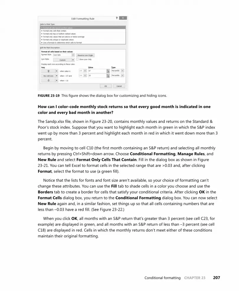
Conditional formatting CHAPTER 23 207
FIGURE 23-19 This figure shows the dialog box for customizing and hiding icons.
How can I color-code monthly stock returns so that every good month is indicated in one color and every bad month in another?
The Sandp.xlsx file, shown in Figure 23-20, contains monthly values and returns on the Standard & Poor’s stock index. Suppose that you want to highlight each month in green in which the S&P index went up by more than 3 percent and highlight each month in red in which it went down more than 3 percent.
Begin by moving to cell C10 (the first month containing an S&P return) and selecting all monthly returns by pressing Ctrl+Shift+down arrow. Choose Conditional Formatting, Manage Rules, and New Rule and select Format Only Cells That Contain. Fill in the dialog box as shown in Figure 23-21. You can tell Excel to format cells in the selected range that are >0.03 and, after clicking Format, select the format to use (a green fill).
Notice that the lists for fonts and font size aren’t available, so your choice of formatting can’t change these attributes. You can use the Fill tab to shade cells in a color you choose and use the Borders tab to create a border for cells that satisfy your conditional criteria. After clicking OK in the Format Cells dialog box, you return to the Conditional Formatting dialog box. You can now select New Rule again and, in a similar fashion, set things up so that all cells containing numbers that are less than –0.03 have a red fill. (See Figure 23-22.)
When you click OK, all months with an S&P return that’s greater than 3 percent (see cell C23, for example) are displayed in green, and all months with an S&P return of less than –3 percent (see cell C18) are displayed in red. Cells in which the monthly returns don’t meet either of these conditions maintain their original formatting.

208 CHAPTER 23 Conditional formatting
FIGURE 23-20 Conditional formatting highlights returns in the S&P stock index.
FIGURE 23-21 Apply special formatting to S&P returns greater than 3 percent.

Conditional formatting CHAPTER 23 209
FIGURE 23-22 Color stock returns of less than 3 percent in red and greater than 3 percent in green.
Here are some useful tips concerning conditional formatting:
■■ To delete conditional formatting (or any format) applied to a range of cells, simply select the range of cells, click Conditional Formatting, choose Clear Rules, and then choose Clear Rules From Selected Cells.
■■ To select all the cells in a worksheet to which conditional formatting applies, press F5 to open the Go To dialog box. In the dialog box, click Special, select Conditional Formats, and then click OK.
■■ If you want to edit a conditional formatting rule, choose Manage Rules and then double-click the rule or click Edit Rules.
■■ You can delete a specific conditional formatting rule by choosing Manage Rules, selecting the rule, and then choosing Delete Rule.
Notice that after both rules are defined, the red formatting rule is listed first (because it was cre-ated more recently than the green formatting rule). In the Conditional Formatting Rules Manager dia-log box, rules are listed in order of precedence. In this example, it does not matter which rule is listed first because no cell can satisfy the criteria for both rules. If rules conflict, however, the rule listed first takes precedence. To change the order of conditional formatting rules, select the rule and click the up arrow to move the rule up in precedence or the down arrow to move the rule down in precedence.
Given quarterly corporate revenues, how can I indicate quarters in which revenues increased over the previous quarter in one color and quarters in which revenues decreased from the previous quarter in another color?
The Amazon.xlsx file contains quarterly revenues (in millions) for Amazon.com from 1995 through 2009. (See Figure 23-23.) You want to highlight quarters in which revenues increased over the previ-ous quarter in green and highlight quarters in which revenues decreased over the previous quarter in red.

210 CHAPTER 23 Conditional formatting
Use A Formula in the Conditional Formatting Rules Manager dialog box enables you to specify a formula that defines conditions that Excel checks before it applies formatting to a cell. This section uses this option, but before you use this formula option, look at how Excel evaluates some logical functions. The work is in the Logicalexamples.xlsx file.
FIGURE 23-23 Highlight increased sales in green and decreased sales in red.
What happens when you type a formula such as =B3<2 in cell B4? If the value in B3 is a number smaller than 2, Excel returns the value True in cell B4; otherwise, Excel returns False. You can refer to the Logicalexamples.xlsx file, shown in Figure 23-24, for other examples like this, including combina-tions of AND, OR, and NOT in formulas.
■■ In cell B6, the =OR(B3<3,C3>5) formula returns the value True if either of the conditions, B3<3 or C3>5, is true. Because the value of C3 is greater than 5, Excel returns True.
■■ In cell B7, the =AND(B3=3,C3>5) formula returns True if B3=3 and C3>5. Because B3 is not equal to 3, Excel returns False. In cell B8, however, the =AND(B3>3,C3>5) formula returns True because B3>3 and C3>5 are both true.

Conditional formatting CHAPTER 23 211
■■ In cell B9, the =NOT(B3<2) formula returns True because B3<2 would return False, and a not-false value becomes True.
FIGURE 23-24 This figure shows logical functions.
Now look at how Use A Formula enables you to create a conditional format in a range of cells. Begin by selecting the range of cells to which you want to apply a conditional format. Click Conditional Formatting and choose Manage Rules to open the Conditional Formatting Rules Manager dialog box. Choose New Rule and then select Use A Formula To Determine Which Cells To Format (the last option, also called the formula option). To use the formula option, you enter a formula (the formula must start with an equals sign) that is true if and only if you want the cell in the upper-left corner to be assigned the chosen format. Your logical formula can be copied like an ordinary formula to the remainder of the selected range, so use dollar signs ($) judiciously to ensure that for each cell of the selected range the formula will be true if and only if you want your format to apply to the cell. Choose Format and then enter the formatting you want. Click OK. After clicking OK in the Conditional Formatting dialog box, your formula and formatting are copied to the whole cell range. The formatting is applied to any cell in the selected range that satisfies the condition defined in the formula.
Now return to the Amazon.xlsx file, and you will highlight in green the quarters in which revenues increase. Select the E6:E61 range (there is no prior quarter to which you can compare the revenue figure in cell E5) and then instruct Excel to highlight a cell’s value in green if it is larger than the cell’s value above it. Figure 23-25 shows how to set up the rule.
If you enter =E6>E5 by pointing to the appropriate cells, be sure you remove the $ signs from the formula in the Conditional Formatting dialog box, or the formula won’t be copied. Probably the easi-est way to insert or delete dollar signs is to use the F4 key. When you highlight a cell reference such as A3, pressing F4 includes or deletes dollar signs in the following order: A3, $A$3, A$3, $A3. Thus, if you start with $A$3, pressing F4 changes the cell reference to A$3. The formula in this example ensures that cell E6 is colored green if and only if sales in that quarter exceed the previous quarter. After clicking OK, you’ll find that all quarters in which revenue increased are colored green. In cell E7, for example, the formula was copied in the usual way, becoming =E7>E6.

212 CHAPTER 23 Conditional formatting
FIGURE 23-25 This figure shows conditional formatting settings that will display in green the quarters in which revenue increased.
To add the condition for formatting cells in which revenue decreased, select the E6:E61 range again, open the Conditional Formatting Rules Manager dialog box, choose New Rule, and then select Use A Formula To Determine Which Cells To Format. Enter the =E6<E5 formula and then click Format. On the Fill tab, change the fill color to red and then click OK twice. The Conditional Formatting Rules Manager dialog box opens, as shown in Figure 23-26.
FIGURE 23-26 These conditions will display quarters in which revenue increased in green and quarters in which revenue decreased in red.
You can use the formula option with color scales, data bars, and icon sets. Select the option when setting the criteria for your color scale, data bars, or icon sets.

Conditional formatting CHAPTER 23 213
Given a list of dates, how can I indicate weekend dates in a specific color?
The Weekendformatting.xlsx file (see Figure 23-27) contains several dates. You want to highlight all Saturdays and Sundays in red. To do this, copy the WEEKDAY(C6,2) formula from cell D6 to D7:D69. Choosing Type=2 for the WEEKDAY function returns a 1 for each Monday, a 2 for each Tuesday, and so on, so that the function returns a 6 for each Saturday and a 7 for each Sunday.
FIGURE 23-27 Use the WEEKDAY function to highlight weekend days in red.
Select the D6:D69 range, click Conditional Formatting, and then choose Manage Rules. Click New Rule and the formula option and fill in the dialog box as shown in Figure 23-28.

214 CHAPTER 23 Conditional formatting
FIGURE 23-28 Use the Edit Formatting Rule dialog box setup to display weekend days in red.
After you click OK, each date whose weekday is equal to 6 (for Saturday) or 7 (for Sunday) is colored red. The =OR(D6=6,D6=7) formula implies that a cell entry of 6 or 7 will activate the red font color. You could have also used Format Only Cells That Contain and >=6 or >5 to obtain the same formatting.
Our basketball coach has given each player a rating between 1 and 10 based on the player’s ability to play guard, forward, or center. Can I set up a worksheet that visually indicates the ability of each player to play the position to which she’s assigned?
The Basketball.xlsx file, shown in Figure 23-29, contains ratings given to 20 players for each position and the position (1=Guard, 2=Forward, 3=Center) played by each player. The goal here is to fill with red the cell containing the rating for each player for the position to which she’s assigned.

Conditional formatting CHAPTER 23 215
FIGURE 23-29 This worksheet rates each player’s ability to play a position.
Begin by selecting the C3:E22 range, which contains the players’ ratings. Click Conditional Formatting and choose Manage Rules. Choose New Rule and then choose the formula option. Now fill in the dialog box as shown Figure 23-30.
The =$A3=C$1 formula compares the player’s assigned position to the column heading (1, 2, or 3) in row 1. If the player’s assigned position is set to 1 (Guard), her rating in column C, which is her guard rating, appears in red. Similarly, if the player’s assigned position is set to 2, her forward rating in column D appears in red. Finally, if the assigned position is set to 3, her center rating in column E appears in red. Note that if you do not include the dollar sign with the A and the 1 in the formula, it will not copy down and across correctly.

216 CHAPTER 23 Conditional formatting
FIGURE 23-30 Use the Edit Formatting Rule dialog box setup to show player ratings in red fill.
Note also that Excel 2013 allows conditional formats created with formulas to reference data in other worksheets.
What does the Stop If True option in the Manage Rules dialog box do?
Suppose that Stop If True is selected for a rule. If a cell satisfies this rule, all lower precedent rules are ignored. Use the Income.xlsx file to illustrate the use of Stop If True. This file shows median income for each US state for years between 1984 and 2010. Suppose (as shown in Figure 23-31) that you want to have up arrows show for the 10 states that have the highest 2010 median income and no icons to appear for any other states. The key is to make the first rule No Format for the states with the 40 lowest median incomes and then to select Stop If True. Then create the desired icon set.
The settings that hide the arrows for the 40 states with the lowest 40 median 2010 incomes are shown in Figure 23-32.

Conditional formatting CHAPTER 23 217
FIGURE 23-31 Use up arrows to highlight the 10 states with largest median income.
FIGURE 23-32 This figure shows the settings that ensure that only the top 10 median incomes are highlighted with up arrows.

218 CHAPTER 23 Conditional formatting
The settings for the second rule are shown in Figure 23-33. Note that the top 20 percent of states involves .2 * 50 = 10 states. The remaining settings are of no importance.
FIGURE 23-33 This figure shows the settings that ensure that the top 10 states in median income get an up arrow.
How can I use the Format Painter to copy a conditional format?
The Format Painter icon (see the paintbrush shown in Figure 23-34) enables you to paint the format (including conditional formats) from any cell or group of cells to any group of cells. Select the cell or group of cells with the format you want to copy and click the Format Painter icon. Use the paintbrush to select the cells where you want the format copied.
FIGURE 23-34 This figure shows the Format Painter icon.

Conditional formatting CHAPTER 23 219
If you want to copy a format to a range that includes nonadjacent cells, double-click the Format Painter and select all the cells where you want the format copied. To turn off the Format Painter, click the Format Painter icon.
Problems
1. Using the data in the Sandp.xlsx file, use conditional formatting in the following situations:
• Format in bold each month in which the value of the S&P index increased and underline each month in which the value of the S&P index decreased.
• Highlight in green each month in which the S&P index changed by a maximum of 2 percent.
• Highlight the largest S&P index value in red and the smallest in purple.
2. Using the data in the Toysrusformat.xlsx file, highlight all fourth-quarter revenues in blue and first-quarter revenues in red.
3. The Test.xlsx file contains exam scores for students. The top 10 students receive an A, the next 20 students receive a B, and all other students receive a C. Highlight the A grades in red, the B grades in green, and the C grades in blue. Hint: The LARGE(D4:D63,10) function gives you the tenth-highest grade on the test.
4. In the Weekendformatting.xlsx file, highlight all weekdays in red. Highlight in blue all days that occur in the first 10 days of the month.
5. Suppose each worker in the Microsoft finance department has been assigned to one of four groups. The supervisor of each group has rated each worker on a 0–10 scale, and each worker has rated his satisfaction with each of the four groups. (See the Satissuper.xlsx file.) Based on the group to which each worker is assigned, highlight the supervisor rating and the worker satisfaction rating for each worker.
6. The Varianceanalysis.xlsx file contains monthly profit forecasts and monthly actual sales. The sales variance for a month equals:
predictedsales
actualsales – predictedsales
Highlight in red all months with a favorable variance of at least 20 percent and highlight in green all months with an unfavorable variance of more than 20 percent.
7. For your drug cost example from Chapter 21, “The OFFSET function,” format the worksheet so that all Phase 1 costs are displayed in red, all Phase 2 costs are displayed in green, and all Phase 3 costs are displayed in purple.
8. The Names.xlsx file contains a list of names. Highlight all duplicates in green and all names containing Ja in red.

220 CHAPTER 23 Conditional formatting
9. The Duedates.xlsx file contains due dates for various invoices. Highlight in red all invoices due by the end of the next month.
10. In the Historicalinvest.xlsx file, set up conditional formatting with three icons so that 10 percent of returns have an up arrow, 10 percent have a down arrow, and 80 percent have a horizontal arrow.
11. The Nbasalaries.xlsx file contains salaries of NBA players in millions of dollars. Set up data bars to summarize this data. Players making less than $1 million should have the shortest data bar, and players making more than $15 million should have the longest data bar.
12. Set up a three-color scale to summarize the NBA salary data. Change the color of the bottom 10 percent of all salaries to green and the top 10 percent to red.
13. Use five icons to summarize the NBA player data. Create break points for icons at $3 million, $6 million, $9 million, and $12 million.
14. How could you set things up so that no icons are shown for players who have salaries between $7 million and $8 million? Hint: Use Stop If True.
15. The Fractiondefective.xlsx file contains the percentage of defective units produced daily. A day’s production is considered acceptable if 2 percent or less of the items produced are defective. Highlight all acceptable days with a green flag. In another worksheet, highlight all acceptable days with a red flag. Hint: Use Stop If True to ensure that no icon occurs in any cell containing a number greater than 2.
16. Summarize the global warming data with a three-color scale. Lower temperatures should be blue, intermediate temperatures should be yellow, and higher temperatures should be red.
17. Suppose you are saving for your child’s college fund. You will contribute the same amount of money to the fund at the end of each year. Your goal is to end up with $100,000. For annual investment returns ranging from 4 percent to 15 percent and number of years investing varying from 5 to 15 years, determine your required annual contribution. Suppose you can save $10,000 per year. Use conditional formatting to highlight the minimum number of years needed for each annual return rate to accumulate $100,000.
18. The Amazon.xlsx file contains quarterly revenues for Amazon.com. Use conditional formatting to ensure that sales during each quarter are highlighted in a different color.
19. Set up conditional formatting that colors the A1:H8 cell range like a checkerboard, with alter-nating white and black coloring. Hint: The ROW() function gives the row number of a cell, and the COLUMN() function gives the column number of a cell.
20. When students take Vivian’s accounting exam, they are told to enter their email alias on a Scantron. Often, they make a mistake. Vivian has a list of the actual email aliases for the students in the class. She would like to highlight in yellow the email aliases students enter that are not true aliases. This will help her correct them easily. The Scantrons.xlsx file contains the necessary data. Help Vivian out!

Conditional formatting CHAPTER 23 221
21. The Top5.xlsx file contains the revenues each year of 50 companies. For each year, highlight the companies that have the five largest revenues. Hint: The LARGE(B1:B50,5) function would return the fifth largest number in the B1:B50 range.
22. The Threetimes.xlsx file contains a list of names. Highlight in red each name that appears at least three times.
23. The GNP.xlsx file contains quarterly US gross national product. Take advantage of the fact that data bars handle negative values to summarize quarterly GNP percentage growth rates.
24. Using the data in the Globalwarming2011temp.xlsx file, highlight the years (not the tempera-tures) in which the temperature is above average.
25. The Accountsums.xlsx file (see Figure 23-35) shows weekly salaries in thousands of dollars (listed in chronological order) paid to several top-notch consultants. For example, during the first week, Britney made $91,000 and, during the last week, made $57,000:
• Use the Formula option to highlight each person’s name in yellow.
• Use the Formula option to highlight each person’s first week of salary in orange.
FIGURE 23-35 This figure shows the data for Problem 25.

222 CHAPTER 23 Conditional formatting
26. The Shading.xlsx file contains 27 quarters of sales:
• Shade alternate rows in green and yellow.
• Alternately shade four rows in green, four rows in yellow, and so on.

223
C H A P T E R 2 4
Sorting in Excel
Questions answered in this chapter:
■■ How can I sort sales transaction data so that transactions are sorted first by salesperson and then by product, by units sold, and in chronological order from oldest to most recent?
■■ I have always wanted to sort my data based on cell color or font color. Is this possible in Excel 2013?
■■ I love the great icon sets described in Chapter 23, “Conditional formatting.” Can I sort my data based on the icon in the cell?
■■ My worksheet includes a column containing the month in which each sale occurred. When I sort by this column, I get either April (first month alphabetically) or October (last month alphabetically) on top. How can I sort by this column so that the months are chronologically sorted, that is, January transactions on top, followed by February and the following months?
■■ Can I sort data without using the Sort dialog box?
Almost every user of Microsoft Excel has at one time or another sorted columns of data alphabetically or by numerical value. Look at some examples of how powerful sorting is in Excel 2013.
Answers to this chapter’s questions
This section provides the answers to the questions that are listed at the beginning of the chapter.
How can I sort sales transaction data so that transactions are sorted first by salesperson and then by product, by units sold, and in chronological order from oldest to most recent?
JAC is a small company that sells makeup. The Makeup worksheet in the Makeupsorttemp.xlsx file in the Templates folder for this chapter (see Figure 24-1) contains the following sales transaction information:
■■ Transaction number
■■ Name of salesperson
■■ Date of transaction
■■ Product sold

224 CHAPTER 24 Sorting in Excel
■■ Units sold
■■ Dollars received
■■ Location of transaction
FIGURE 24-1 This figure shows the sales transaction data before sorting.
You want to sort the data so that:
■■ Transactions are listed alphabetically by salesperson. You want to sort in the usual A-to-Z order so that all of Ashley’s transactions are first and all of Zaret’s transactions are last.
■■ Each person’s transactions are sorted alphabetically by product. Thus, Ashley’s eyeliner trans-actions will be followed by Ashley’s foundation transactions and so on.
■■ For each salesperson and product, transactions are listed by number of units sold (in descend-ing order).
■■ If a salesperson makes two or more sales of the same product for the same number of units, transactions are listed in chronological order.
In versions of Excel before Excel 2007, it was difficult to sort by more than three criteria. Now Excel enables you to apply up to 64 criteria in one sort. To sort the sales data, you need to select the data (cell range E3:K1894) first. Two easy ways to select these data are as follows:
■■ Position the cursor in the upper-left corner of the data (cell E3) and then press Ctrl+Shift+right arrow followed by Ctrl+Shift+down arrow.
■■ Position the cursor anywhere in the cell range and press Ctrl+Shift+*.

Sorting in Excel CHAPTER 24 225
On the Data tab, in the Sort & Filter group, choose Sort to open the Sort dialog box shown in Figure 24-2.
FIGURE 24-2 The Sort dialog box is not yet filled in.
Because row 3 contains headings for the data columns, select the My Data Has Headers check box. Select the following four criteria in the order shown:
1. Sort by the Name column so that values (this means cell contents) are in A-to-Z order.
2. Sort by the Product column so that values are in A-to-Z order.
3. Sort by the Units column so that values are in order from largest to smallest.
4. Sort by the Date column so that values are in chronological order from oldest to newest.
The dialog box now looks like Figure 24-3.
FIGURE 24-3 The Sort dialog box is set up for the sales sorting example.

226 CHAPTER 24 Sorting in Excel
The result of your sort is shown in Figure 24-4.
FIGURE 24-4 This figure shows the sorted sales transaction data.
Note that all of Ashley’s transactions are listed first, with eyeliner followed by foundation and so on. Eyeliner transactions are listed from the largest number of units sold to the smallest. In the case of a tie (see rows 6 and 7), the transactions are listed in chronological order.
Using the Sort dialog box, you can easily add sort criteria (Add Level), delete sort criteria (Delete Level), copy the settings that define a level of the sort (Copy Level), or specify whether your data has headers. By selecting Options, you can make the sort operation case sensitive or even sort data for which each data item is listed in a different column (instead of the more common situation in which each case is in a different row).
I have always wanted to sort my data based on cell color or font color. Is this possible in Excel 2013?
In Excel 2013, sorting on cell or font color is simple. Consider the Makeup worksheet in the Makeupsorttemp.xlsx file. Several names in column F are highlighted in different colors. For example, Cici in cell F620 is highlighted in red, and Colleen in cell F833 is highlighted in yellow. Suppose you want names with green fill on top, followed by yellow and then by red, with the rest of the rows on the bottom. To sort the Name column by color, simply select the range you want to sort (E3:K1894), click Sort, and choose Add Level. Select the Name column, click the Sort On setting, and select Cell Color. (Selecting Font Color sorts by font color.) For the first level, select green from the Order

Sorting in Excel CHAPTER 24 227
list, select yellow for the second level, and select red for the third level. The completed dialog box is shown in Figure 24-5. The resulting sort is shown in the Colors worksheet of the Makeupsort.xlsx file in the Practice Files folder for this chapter and in Figure 24-6.
FIGURE 24-5 The Sort dialog box is set up to sort by color.
FIGURE 24-6 This figure shows the results of sorting by color.
I love the great icon sets described in Chapter 23. Can I sort my data based on the icon in the cell?
To sort by icon, select Cell Icon from the Sort On list in the Sort dialog box. In the Order list, choose the icon you want on top for the first level and so on.

228 CHAPTER 24 Sorting in Excel
My worksheet includes a column containing the month in which each sale occurred. When I sort by this column, I get either April (first month alphabetically) or October (last month alphabetically) on top. How can I sort by this column so that the months are chronologically sorted, that is, January transactions on top, followed by February and the following months?
The Dates worksheet in the Makeupsorttemp.xlsx file contains a list of months. (See Figure 24-7.) You would like to sort the months so that they appear in chronological order beginning with January. Begin by selecting the D6:D15 range and sorting column D by values. When selecting the order, select Custom List and then select the option, beginning with January, February, March. Note that you could also have sorted by the day of the week. The completed dialog box is shown in Figure 24-8, with the resulting sort shown in Figure 24-9.
Note that in the Custom Lists dialog box, you can create a custom sort order list. Select New List; under List Entries, type the entries in the order you want to sort by and then click Add. Your new list is now included as a menu selection. For example, if you enter Jack, John, and Alan in List Entries (on different lines or separated by commas), all entries with Jack would be listed first, followed by John listings, with Alan listings at the end.
FIGURE 24-7 This figure shows the months to be sorted.

Sorting in Excel CHAPTER 24 229
FIGURE 24-8 The Sort dialog box is set up to sort by month.
FIGURE 24-9 The months are sorted in chronological order.
Can I sort data without using the Sort dialog box?
Sometimes sorting data without using the Sort dialog box is more convenient. To illustrate how this is done, suppose again that you want to sort the sales transaction data in the Makeup worksheet in the Makeupsort.xlsx file so that transactions are sorted first by salesperson and then by product, by units sold, and, finally, in chronological order from the oldest to the most recent. To begin, select the least important column to sort on first, which is the date column (G3:G1894). Next, in the Sort & Filter group on the Data tab, click the Sort A To Z button (see Figure 25-10) and, with Expand The Selection selected, click Sort so that all the columns are sorted. The Sort A To Z button sorts numeri-cal data so that the smallest numbers or oldest dates are on top and sorts text so that A precedes B and so on.

230 CHAPTER 24 Sorting in Excel
FIGURE 24-10 The Sort icon can be used to sort without the Sort dialog box.
The Sort Z To A button sorts numerical data so that the largest numbers or most recent dates are on top and sorts text data so that Z precedes Y.
Next, sort by the second least important column (Units) Z To A because you want larger sales on top. Then sort from A to Z by Product, and, finally, from A to Z by salesperson. These steps achieve the same results as shown in Figure 24-4.
Problems
1. In the Makeupsort.xlsx file, sort the sales data alphabetically by location and then by product type, name, date of sale, and units sold.
2. The Sortday.xlsx file contains hours worked on different days of the week. Sort the data so that Monday data is followed by Tuesday data and so on.
3. The Sorticons.xlsx file contains annual investment returns with an up arrow used to indicate good years, a horizontal arrow used to indicate average years, and a red down arrow used to indicate bad years. Sort the data by the icons in the Stock column with up arrows on top, fol-lowed by horizontal arrows and then red down arrows.
4. The Makeupsortfont.xlsx file contains your makeup data with certain dates shown in blue, red, or brown font. Sort the data so that brown dates are on top, followed by red dates and then blue dates.

231
C H A P T E R 2 5
tables
Questions answered in this chapter:
■■ I have entered the number of units sold and total revenue for each salesperson in a work-sheet, and I can easily compute average price for each salesperson. How can I create a nice format that is automatically copied if I enter new data? In addition, is there an easy way to copy my formulas automatically when new data is added?
■■ I have entered several years of natural gas prices in my worksheet, and I created a nice line chart displaying the monthly variation in prices. Can I set things up so that when I add new gas price data, my chart automatically updates?
■■ For each sales transaction, I have the salesperson, date, product, location, and size of the transaction. Can I easily summarize, for example, total lipstick sales by Jen or Colleen in the East?
■■ How do Table Slicers (new to Excel 2013) help us slice and dice data in an Excel table?
■■ How can I easily refer to portions of a table in other parts of my workbook?
■■ Do conditional formats automatically apply to new data added to a table?
When most of us use Microsoft Excel, we often enter new data. Then we manually update our for-mulas, formats, and charts. What a drag! Now the Excel 2013 Table capabilities make this drudgery a thing of the past.
Answers to this chapter’s questions
This section provides the answers to the questions that are listed at the beginning of the chapter.
I have entered the number of units sold and total revenue for each salesperson in a work-sheet, and I can easily compute average price for each salesperson. How can I create a nice format that is automatically copied if I enter new data? In addition, is there an easy way to copy my formulas automatically when new data is added?
The Tableexampletemp.xlsx file in the Templates folder for this chapter (see Figure 25-1) contains units sold and revenue data for each of six salespersons. You know that new data will be added beginning in row 12 and, in column H, you would like to calculate the average price (Units/Revenue) generated

232 CHAPTER 25 Tables
by each salesperson. You would like to create an attractive format for the data and have the formula for average price copied automatically as new data is added.
FIGURE 25-1 This figure shows the data for creating a table.
By creating a table, your formulas and formatting can be automatically updated when you add data. Begin by selecting the current range of data and headers (E5:G11). Click Table on the Insert tab or press Ctrl+T. After ensuring that the My Table Has Headers box is selected, you will see that the table range (E5:G11) is formatted beautifully. This formatting will continue automatically whenever new data is entered in the table. When you are working in a table, many styles and options are avail-able on the Table Tools Design tab. (See Figure 25-2.) This tab is visible only when the active cell is within a table. You can select a formatting style that will be applied to the current table data and to any new data that is added to the table.
Note that the column headings have arrows, as you can see in Figure 25-3. These arrows serve as functionality you can use to sort or filter the table (more on filtering when how to summarize easily, for example, total lipstick sales by Jen or Colleen in the East is discussed later in this chapter).
FIGURE 25-2 This figure shows the table design options.
FIGURE 25-3 This is a table formatted with filters.

Tables CHAPTER 25 233
The cells in the selected table (excluding the headers) are given the name Table1 by default. The name has been changed to Sales in the Properties group on the Design tab. If you click the Formulas tab and then choose Name Manager, you can see that the E6:G12 range is named Sales. The beauty of this range name (and the table) is that the range dynamically expands to include new rows added to the bottom of the table and new columns added to the right of the table. In Chapter 21, “The OFFSET function,” you used the OFFSET function to create a dynamic range, but the new table capa-bilities make creation of a dynamic range easy.
Suppose that in D15 you want to compute total revenue. Begin by typing =SUM(S; Microsoft Excel offers you the option to complete the entry automatically with the Sales table range. Implement AutoComplete by double-clicking the range name. You can also implement AutoComplete by moving the cursor to Sales and pressing the Tab key. Then, when you see =SUM(Sales and type an opening bracket ( [ ), Formula AutoComplete offers the option to complete the formula with column headings from the Sales table. (See Figure 25-4.) You can complete your formula as =SUM(Sales[Revenue]) and calculate total revenue as $155,480. (See Figure 25-5.) (You will see an example of selecting the entries in the AutoComplete box that begin with number signs [#] when table structure is discussed later in this chapter.)
FIGURE 25-4 Here are AutoComplete options for a table.
If new rows of data are added, the data in these rows is automatically accounted for in the formula. To illustrate this idea, you can add new data in row 12: Amanda sold 400 units for $5,000. As shown in Figure 25-6, the total revenue has increased by $5,000 to $160,480.
The formatting has been extended to row 12 as well, and the total revenue formula has been updated to include Amanda’s data. Even if data is added within the table (instead of at the bottom), everything will be updated in a consistent fashion.

234 CHAPTER 25 Tables
FIGURE 25-5 This figure shows total revenue for original data.
FIGURE 25-6 New data is added to the table in row 12.
Now suppose that you want to compute the price per unit earned by each salesperson in column H. Type Unit Price in H5 as the column heading and, while in cell H6, point to cell G6. The formula is now [@Revenue]. Type a slash (/) and point to cell F6 and press Enter. An amazing thing happens. Excel automatically copies the formula down to the bottom of the table in cell H12, as shown in Figure 25-7. If you open any cell in column H, the formula appears as [@Revenue]/[@Units]. Of course, =[@Revenue]/[@Units] is a lot easier to understand than =G6/F6. This formula can be interpreted as dividing whatever is in the current row in the Revenue column by whatever is in the current row in the

Tables CHAPTER 25 235
Units column. If you now add new data to the first three columns of the table, your price formula will automatically copy down.
FIGURE 25-7 The Table feature causes the unit price formula to AutoCopy.
If you click anywhere in a table, the Table Tools contextual tab appears on the ribbon and offers choices, including the following:
■■ Change Table Name Can be used to rename a table, such as changing the name from Table1 (the default) to Sales.
■■ Convert to Range Converts the table range to normal cells and removes the table structure.
■■ Resize Table Adds or subtracts rows and/or columns to the defined table range.
■■ Remove Duplicates Removes rows that contain duplicates. For example, selecting only the Name column in the Remove Duplicates dialog box ensures that a name will not occur more than once. Selecting both the Name and Units columns ensures that no rows in the table will match both Name and Units and or other column names.
■■ Header Row If selected, displays the header row. If cleared, the header row is not displayed.
■■ Total Row Total Row is discussed when table structure is explained later in this chapter.
■■ First Column If selected, applies a special format to the first column of the table.
■■ Last Column If selected, assigns a special format to the last column of the table.
■■ Banded Rows If selected, gives the even-numbered rows in the table a different format than odd-numbered rows.
■■ Banded Columns If selected, gives odd-numbered columns in the table a different format than even-numbered columns.

236 CHAPTER 25 Tables
■■ Table Styles Can be selected from any of the table formats shown in this group. If the table expands or contracts, the format will be consistently applied.
I have entered several years of natural gas prices in my worksheet, and I created a nice line chart displaying the monthly variation in prices. Can I set things up so that when I add new gas price data, my chart automatically updates?
In the Gasprices507.xlsx file, the Original worksheet contains natural gas prices per thousand feet from July 2002 through December 2004. (See Figure 25-8.) As previously described, you can select B4:C34 (containing months and prices) and press Ctrl+T to create a table from this range, and then you can create a line graph to display this data by choosing Line in the Charts group on the Insert tab and selecting the fourth type of line graph. The line graph already created is shown in Figure 25-9.
FIGURE 25-8 Here is the gas price data for 2002–2004.
Next, you can copy this worksheet (by right-clicking the worksheet name, choosing Move Or Copy Sheet, and then selecting Make A Copy) and add gas prices through July 2006. (The data now extends to row 53.) The new worksheet is named New Data. Note that the line graph in this worksheet automatically updates to include the new data. (See Figure 25-10.)

Tables CHAPTER 25 237
FIGURE 25-9 Gas price line graph: 2002–2004 data.
FIGURE 25-10 Here is a gas price line graph showing data for 2002 through 2006.
This example illustrates that if you base your chart on a table, new data will automatically be included in the chart.

238 CHAPTER 25 Tables
For each sales transaction, I have the salesperson, date, product, location, and size of the transaction. Can I easily summarize, for example, total lipstick sales by Jen or Colleen in the East?
The Tablemakeuptemp.xlsx file from the template folder contains sales transactions. (See Figure 25-11.) For each transaction, you have the following information: transaction number, name, date, product, location, dollars, and units sold. If you format this data as a table, you can add a total row for the Units and Dollars columns and then use the filter arrows to make the total row include the subset of transactions you want. To begin, place the cursor anywhere within the data and create a table by pressing Ctrl+T. Note that if you scroll through the table, the header row remains visible. With the cursor in the table, select the Total Row check box in the Table Style Options group on the Design tab. By default, Excel enters the total number of rows in the table in cell K1895, which you can delete. After first selecting the cell in which the arrows appear, click the arrows to the right of cells I1895 and J1895 and then click Sum. This totals all entries in the table’s Units and Dollars columns. Thus, the total revenue is currently $239,912.67, and 78,707 units were sold. (See Figure 25-12 and the Tablemakeuptotals.xlsx file.)
FIGURE 25-11 This table shows makeup sales data.
FIGURE 25-12 This figure shows the total revenue and units sold.

Tables CHAPTER 25 239
To make the totals reflect only lipstick sales in the East by either Ashley or Hallagan, click the arrow in F3 (to the right of the Name header). Clear the Select All check box so that no names are selected, select the check boxes for Ashley and Hallagan (see Figure 25-13), and click OK. Next, click the Product arrow, select the Lipstick check box, and then click the Location arrow and select the East check box. You now see all the data fitting the filtering criteria in Figure 25-14 and in the Slicers work-sheet of the Tablemakeuptotals.xlsx file. You’ll see that Ashley and Hallagan sold 564 units of lipstick in the East for a total of $1,716.56. This table filtering feature makes it easy to compute totals for any subset of rows in an Excel worksheet. If you want, you can also copy the rows involving Colleen or Jen selling lipstick in the East and paste them elsewhere.
FIGURE 25-13 Filter on names from the table.

240 CHAPTER 25 Tables
FIGURE 25-14 Subtotals are filtered for units and revenue.
How do Table slicers (new to Excel 2013) help us slice and dice data in an Excel table?
In Excel 2010, slicers were introduced to simplify the filtering of PivotTables. (See Chapter 43, “Using PivotTables and Slicers to describe data,” for details.) In Excel 2013, slicers can now be used to filter tables. The advantage of slicers is that you can easily see the filter options and selection. To create fil-ters for your Makeup example, place your cursor inside the table and, on the Insert tab, select Slicers from the Filters group. To create slicers for Name, Product, and Location, select them as shown in Figure 25-15.
The slicers are shown in Figure 25-16. In a slicer, you can filter on multiple items by using the Shift key to select adjacent items or the Control key to select nonadjacent items.
Your slicers in Figure 25-16 filter on all sales involving Ashley and Hallagan selling lipstick in the East. Note that the Totals row and visible rows are identical to Figure 25-14. To remove all filters, click the filter icon located at the right corner of the slicer.
You can resize a slicer by selecting it and dragging the edges or corners. When you select a slicer, you can configure it by using the Slicer Tools Options tab on the ribbon. On this tab, you can modify many features of the slicer, including the slicer style, slicer name, the number of columns, and the slicer’s size.

Tables CHAPTER 25 241
FIGURE 25-15 Create slicers for Name, Product, and Location.
FIGURE 25-16 Use slicers to filter a table.

242 CHAPTER 25 Tables
How can I easily refer to portions of a table in other parts of my workbook?
The Tablestructure.xlsx file shows many examples of how you can refer to parts of a table when you are working outside the table’s range. These references are often called structured references. (See Figure 25-17.) When you enter a table name in a formula followed by an opening bracket ([), AutoComplete makes the column names and the following table specifics available for selection:
■■ Table Name All cells in the table, excluding the header and total rows.
■■ #All All cells in the table, including the total row (if any).
■■ #Data All cells in the table except for the first row and the total row.
■■ #Headers Just the header row.
■■ #Totals Just the total row. If there is no total row, this returns an empty cell range.
■■ #This Row All table entries in the current row.
A column reference includes all cells in a table column, excluding the header and total row entries (if any).
Here are some examples of how table specifiers can be used in formulas:
■■ In cell B8, the =SUM(Table1[@]) formula sums the entries in row 8 (41+28+49+40).
■■ In cell C15, the =COUNTA(Table1[#All]) formula yields 55 because the table contains 55 entries.
■■ In cell C16, the =COUNTA([Table1]) formula yields 45 because the header and total rows are not counted. In cell C17, the =COUNTA(Table[#data]) formula yields 45 because the D5:H13 cell range is referenced.
■■ In cell C18, the =COUNTA(Table1[#Headers]) formula yields 5 because only the header row (D4:H4) is referenced.
■■ In cell C19, the =SUM(Table1[Q1]) formula yields 367 because the formula sums the entries in E5:E13.
■■ In cell C20, the =SUM(Table1[#Totals]) formula sums up all entries in the total row and yields 1,340, which is the total sum of all table entries.
■■ In cell C21, the =SUM(Table1[[#Data],[Q1]:[Q3]]) formula sums up all data entries that are in columns Q1:Q3, inclusive (cells E5:G13). Thus, column names separated by a colon include all data entries between and including the column name before the colon and the column name after the colon.
Of course, all these formulas are automatically updated if new data is added to the table.

Tables CHAPTER 25 243
FIGURE 25-17 This table shows structured references.
Do conditional formats automatically apply to new data added to a table?
Yes, conditional formats automatically include new table data. (See Figure 25-18.) To illustrate, a con-ditional format was placed in worksheet Original of file Tablestructure.xlsx to highlight the three larg-est Q1 sales in column E. Entries in rows 7, 12, and 13 were highlighted. In worksheet Add Biggersale, the entry 90 was added in cell E14. This becomes the largest entry in the column and is immediately highlighted. Cell E7 is no longer highlighted because it is no longer one of the three largest numbers in column E of the table.
FIGURE 25-18 Conditional formatting extends automatically to new table data.

Problems
1. The Singers.xlsx file contains a list of songs sung by different singers as well as the length of each song. Set up your worksheet to compute the total number of songs sung by Eminem and the average length of each song. If new data is added, your formulas should automatically update.
2. In the Tableexample.xlsx file, set things up so that each salesperson’s rank according to total revenue and units sold is included in the worksheet. If new data is included, your ranks should automatically update. You might find it convenient to use the RANK.EQ function. The syntax of the RANK function is =RANK.EQ(number,array,0). This function yields the rank of a number in a range array; rank=1 is the largest number.
3. The Lookupdata.xlsx file contains product codes and prices. Set up the worksheet so that you can enter a product code, and your worksheet will return the product price. When new prod-ucts are introduced, your formula should still work.
4. The Productlookup.xlsx file contains the product sales made each day of the week. Set up a formula that returns the sale of any product on any given day. If new products are added to the data, your formula should be able to include sales for those products.
5. The Tablepie.xlsx file contains sales information for different products sold in a small general store. You want to set up a pie chart to summarize this data. If new product categories are added, the pie chart should automatically include the new data.
6. The Tablexnpvdata.xlsx file lists cash flows received by a small business. Set up a formula to compute (as of January 5, 2007) the net present value (NPV) of all cash flows. Assume an annual discount rate of 10 percent. If new cash flows are entered, your formula should auto-matically include them.
7. The Nikedata.xlsx file contains quarterly sales revenues for Nike. Create a graph of Nike sales that automatically includes new sales revenue data.
8. For the data in file Tablemakeuptemp.xlsx, determine total units and revenue for all lip gloss or lipstick sold by Jen or Ashley in the South or East.
9. The Closest.xlsx file contains people’s names and salaries. Set up a worksheet that takes any number and finds the person whose salary is closest to that number. Your worksheet should accomplish this goal even if new names are added or existing names are deleted from the list.
10. The Adagency.xlsx file contains salaries and ages for employees of an ad agency. Set up a spreadsheet that will compute the average salary and age of the agency’s employees. Your calculations should automatically update if the agency hires or fires workers.

245
C H A P T E R 2 6
Spinner buttons, scroll bars, option buttons, check boxes, combo boxes, and group list boxes
Questions answered in this chapter:
■■ I need to run a sensitivity analysis that has many key inputs, such as Year 1 sales, annual sales growth, Year 1 price, and unit cost. How can I quickly vary these inputs and see the effect of the variation on the calculation of net present value, for example?
■■ How can I set up a simple check box that toggles conditional formatting on and off?
■■ How can I set up my worksheet so that my supply-chain personnel can click a button to choose whether we charge a high, low, or medium price for a product?
■■ How can I create an easy way for a user of my worksheet to enter a day of the week without having to type any text?
User forms enable people who use Microsoft Excel 2013 to add a variety of useful controls to a worksheet. In this chapter, you’ll see how easy it is to use spinner buttons, scroll bars, check boxes, option buttons, combo boxes, and list boxes. To access Excel user forms, click the Developer tab on the ribbon and choose Insert in the Controls group to display the forms controls (not to be confused with ActiveX controls, which are usually used within the Microsoft Visual Basic for Applications [VBA] programming language).
Note To display the Developer tab, click the File tab and then choose Options. Choose Customize Ribbon and then select Developer in the Main Tabs list.
The user forms discussed in this chapter are shown in Figures 26-1 through 26-6. (See also the Controls.xlsx file in the Practice files folder for this chapter.)

246 CHAPTER 26 Spinner buttons, scroll bars, option buttons, check boxes, combo boxes, and group list boxes
FIGURE 26-1 This is the spinner button.
FIGURE 26-2 This is the scroll bar.
FIGURE 26-3 This is a check box.
FIGURE 26-4 This is an option button.
FIGURE 26-5 This is a combo box.
FIGURE 26-6 This is a list box.

Spinner buttons, scroll bars, option buttons, check boxes, combo boxes, and group list boxes CHAPTER 26 247
Answers to this chapter’s questions
This section provides the answers to the questions that are listed at the beginning of the chapter.
First, see how to use spinner buttons and scroll bars.
As discussed in Chapter 18, “Using the Scenario Manager for sensitivity analysis,” you use the Scenario Manager to change a group of input cells to see how various outputs change. Unfortunately, the Scenario Manager requires you to enter each scenario individually, which makes creating more than a few scenarios difficult. For example, suppose you believe that four key inputs to the car net present value (NPV) model are Year 1 sales, Sales growth, Year 1 price, and Year 1 cost. (See the NPVspinners.xlsx file.) You’d like to see how NPV changes as the inputs change in the following ranges:
Input Low value High value
Year 1 sales $5,000 $30,000
Annual sales growth 0% 50%
Year 1 price $6 $20
Year 1 cost $2 $15
Using the Scenario Manager to generate the scenarios in which the input cells vary within the given ranges would be very time-consuming. By using spinner buttons, however, a user can quickly generate a host of scenarios that vary each input between its low and high value. A spinner button is a control that is linked to a specific cell. As you click the up or down arrow on the spinner button, the value of the linked cell changes. You can see how formulas of interest (such as one that calculates a car’s NPV) change in response to changes in the inputs.
I need to run a sensitivity analysis that has many key inputs, such as Year 1 sales, annual sales growth, Year 1 price, and Year 1 unit cost. How can I quickly vary these inputs and see the effect of the variation on the calculation of net present value, for example?
Here’s how to create spinner buttons by which you can vary Year 1 sales, sales growth, Year 1 price, and Year1 cost within the ranges you want. The Original Model worksheet (see the NPVspinnerstemp.xlsx file in the Templates folder) is shown in Figure 26-7.

248 CHAPTER 26 Spinner buttons, scroll bars, option buttons, check boxes, combo boxes, and group list boxes
FIGURE 26-7 This figure shows the Original Model worksheet without any spinner buttons.
To create the spinner buttons, select the rows in which you want to insert spinner buttons (in this example, rows 2–5) and then increase the height of the rows by right-clicking and selecting Format, Row, and Height. A row height of 27 is usually enough to accommodate the spinner button arrows. Alternatively, hold down the Alt key while you draw the control so that it fits the cell.
Display the User Forms menu by clicking Insert in the Controls group on the Developer tab. Click the spinner button form control (shown in Figure 26-1) and drag it to where you want it to appear in your worksheet (cell D2). You see a plus sign (+). Pressing the left mouse button anchors the spinner button where you want it, and you can draw the shape for the spinner button. To change the shape of a form control or to move the control, place the cursor on the control and hold down the Ctrl key. When the pointer turns into a four-headed arrow, drag the control to move it. When the pointer appears as a two-headed arrow, you can drag the control to resize it.
A spinner button now appears in cell D2. After configuring the spinner button, you can use it to change the value of Year1 sales. Right-click the spinner button and, on the shortcut menu, click Copy. Right-click cell D3 and then click Paste. Also, paste the spinner button into cells D4 and D5. You should now see four spinner buttons as shown in Figure 26-8.

Spinner buttons, scroll bars, option buttons, check boxes, combo boxes, and group list boxes CHAPTER 26 249
FIGURE 26-8 Spinner buttons are placed in worksheet cells.
Now you need to link each spinner button to an input cell. To link the spinner button in D2 to cell C2, right-click the spinner button in cell D2 and then click Format Control. Fill in the Format Control dialog box as shown in Figure 26-9.
FIGURE 26-9 Use the Format Control dialog box to link Year1sales to a spinner button.

250 CHAPTER 26 Spinner buttons, scroll bars, option buttons, check boxes, combo boxes, and group list boxes
The current value is not important. The rest of the settings tell Excel that this spinner button is linked to the values in cell C2 (Year1sales); that each click of the up arrow will increase the value in C2 by 1,000; and that each click of the down arrow will decrease the value in C2 by 1,000. When the value in C2 reaches 30,000, clicking the up arrow will not increase it; when the value in C2 reaches 5,000, clicking the down arrow will not decrease the value.
Use the Format Control dialog box to link the spinner button in D4 to Year1price (cell C4). For the current value, 9 was used. The minimum value is 6, the maximum value is 20, and the incremental change is 1. Clicking the spinner button arrows in cell D4 varies the Year1price between $6 and $20 in $1 increments.
To link the spinner button in cell D5 to Year1 cost (cell D5), 6 was used for the current value, 2 for the minimum value, 15 for the maximum value, and 1 as the incremental change. Clicking the spinner button arrows in cell D5 changes Year1 cost from $2 to $15 in $1 increments.
Linking the spinner button in cell D3 to Sales growth is trickier. You want the spinner button con-trol to change sales growth to 0 percent, 1 percent, . . . 50 percent. The problem is that the minimum increment a spinner button value can change is 1. Therefore, you need to link this spinner button to a dummy value in cell E3 and place the E3/100 formula in cell C3. Now, as cell E3 varies from 1 to 50, sales growth varies between 1 percent and 50 percent. Figure 26-10 shows how to link this spin-ner button to cell E3. Remember that sales growth in cell C3 is simply the number in cell E3 divided by 100.
By the way, if the cursor is within the control and you hold down the Control key, you can easily use the handles to resize a control.

Spinner buttons, scroll bars, option buttons, check boxes, combo boxes, and group list boxes CHAPTER 26 251
FIGURE 26-10 These are the Format Control dialog box settings that link the spinner button in cell D3 to cell E3.
By clicking a spinner button arrow, you can easily see how changing a single input cell—given the values for the other inputs listed in the worksheet—changes the car’s NPV. To see the effect of the changes, you can select cell F9, click Freeze Panes on the View menu, and then click Freeze Panes again. This command freezes the data above row 9 and to the left of column F. You can now use the scroll bars on the right of the window to arrange it as you see it in Figure 26-11.

252 CHAPTER 26 Spinner buttons, scroll bars, option buttons, check boxes, combo boxes, and group list boxes
FIGURE 26-11 You can freeze panes to see the results of calculations in other parts of a worksheet.
Given the values of the other inputs, clicking the sales growth spinner button arrows shows that a 1 percent increase in sales growth is worth about $2,000. (To return the worksheet to its normal state, click Freeze Panes on the View menu, followed by Unfreeze Panes.)
The scroll bar control is very similar to the spinner button. The main difference is that by moving the cursor over the gray area in the middle of the scroll bar, you can cause the linked cell to change in value continuously. By selecting Format Control on the shortcut menu and changing the value under Page Change in the Format Control dialog box, you can control the speed with which the linked cell changes.
How can I set up a simple check box that toggles conditional formatting on and off?
A check box is a form of control that specifies a value of True in a cell when the box is selected and False when the box is cleared. Check boxes can be used to create toggle switches that turn a

Spinner buttons, scroll bars, option buttons, check boxes, combo boxes, and group list boxes CHAPTER 26 253
particular feature on or off. As an example, see how to use a check box to turn the conditional for-matting feature on or off.
Suppose a worksheet contains monthly sales, and you want to color the five largest sales in green and the five smallest sales in red. (See the Checkbox.xlsx file.) You enter the =LARGE(Sales,5) formula in cell G4, which computes the fifth-largest sales value. In cell H4, you compute the fifth-smallest sales value with the =SMALL(Sales,5) formula. (See Figure 26-12.)
FIGURE 26-12 Use a check box to turn conditional formatting on and off.
Next, you create a check box and configure it to enter True or False in cell F1. On the Developer tab, click Insert and select the check box (see Figure 26-3) from the Forms Controls palette. Drag the check box to cell G9 and change its text to read Turn Formatting On Or Off. Right-click the check box, click Format Control, and fill in the dialog box as shown in Figure 26-13.

254 CHAPTER 26 Spinner buttons, scroll bars, option buttons, check boxes, combo boxes, and group list boxes
FIGURE 26-13 This is the Format Control dialog box for a check box.
Now, whenever you select the check box, True is placed in F1, and whenever you clear the check box, False is placed in cell F1.
After selecting the D4:D29 cell range, click Conditional Formatting in the Styles group on the Home tab and then click New Rule. Enter the formulas shown in Figure 26-14 and Figure 26-15 to color the top five sales green and the bottom five sales red. Note that the AND($F$1) portion of the formula ensures that the formatting can be applied if cell F1 is True. The check box determines whether cell F1 is True or False, so if the check box is not selected, the cells will not turn green or red.
If you want, you can select cell F1 and change the font color to white to hide True and False.

Spinner buttons, scroll bars, option buttons, check boxes, combo boxes, and group list boxes CHAPTER 26 255
FIGURE 26-14 This figure shows the format to turn the five largest cells green.
FIGURE 26-15 This figure shows the format to turn the five smallest cells red.

256 CHAPTER 26 Spinner buttons, scroll bars, option buttons, check boxes, combo boxes, and group list boxes
How can I set up my worksheet so that my supply-chain personnel can click a button to choose whether we charge a high, low, or medium price for a product?
Suppose that you can charge one of three prices for a product: high, medium, or low. These prices are listed in cells B7:B9 of the Optionbuttons.xlsx file. You could easily use a lookup table to print the price if a user typed in High, Medium, or Low. It’s better design, however, if the user can select an option button that says High Price, Medium Price, or Low Price, and a formula automatically computes the price. (See Figure 26-16.)
To use option buttons, you first draw a group box (see Figure 26-5) after choosing this control from the User Forms menu. Then you drag an option button for each choice into the group box. Because you have three price levels, you need to drag three option buttons into the group box. Right-click any option button and then use the Format Control command to link any one of the option buttons to a cell. The first option button was linked to cell E4. All the option buttons in the group box are now linked to the same cell. Selecting the first option button enters a 1 in cell E4, selecting the second option button enters a 2 in cell E4, and selecting the third option button enters a 3 in cell E4.
FIGURE 26-16 Use option buttons to select product price.
Entering the =INDEX(A7:A9,E4,1) formula in cell E7 returns the price description corresponding to the selected option button. In cell F7, the =VLOOKUP(E7,A7:B9,2,FALSE) formula computes the price cor-responding to the selected option button.

Spinner buttons, scroll bars, option buttons, check boxes, combo boxes, and group list boxes CHAPTER 26 257
How can I create an easy way for a user of my spreadsheet to select a day of the week without having to type any text?
The Combobox.xlsx file shows how to create a combo box or a list box (see Figure 26-17) a user can click to select an item easily from a list. (Data validation also makes it easy to create drop-down boxes; see Chapter 40, “Validating data.”) The goal here is to compute the number of hours an employee worked on a given day. The hours worked each day are listed in cells G9:G15. You can use a combo box or list box to select an entry from a list. If the combo box or list box is linked to a cell (by Format Control), a 1 is placed in the linked cell if the first entry in the box is selected; if the second entry in the list is selected, a 2 is entered in the linked cell and so on. To set up the worksheet, click the Developer tab, choose Insert, and then drag a combo box from the Form Controls menu to C5 and a list box to D16. Right-click the combo box and choose Format Control. Select the F9:F15 input range (which contains days of the week) and link cell A8. Now right-click the list box and select Format Control. Select the F9:F15 input range and link cell A13. After these steps, if you select Tuesday from the combo box and Friday from the list box, for example, you see a 2 in A8 and a 5 in A13.
In cell F3, the =INDEX(F9:F15,A8,1) formula lists the day of the week corresponding to the combo box selection. In cell G3, the =VLOOKUP(F3,$F$9:$G$15,2,False) formula locates the number of hours worked for the day selected in the combo box. In a similar fashion, the formulas in F4 and G4 list the day of the week and hours worked for the day selected in the list box.
FIGURE 26-17 Use combo boxes and list boxes to select the day of the week.

258 CHAPTER 26 Spinner buttons, scroll bars, option buttons, check boxes, combo boxes, and group list boxes
Problems
1. Add a spinner button for the car NPV example that enables you to vary the tax rate between 30 percent and 50 percent.
2. Add a spinner button for the car NPV example that enables you to vary the interest rate between 5 percent and 20 percent.
3. The Format Control dialog box allows a minimum value of 0. Despite this limitation, can you figure out a way to use a spinner button to vary sales growth between –10 percent and 20 percent?
4. Using the lemonade example in Chapter 16, “Sensitivity analysis with data tables,” create spin-ner buttons that allow the inputs to vary within the following ranges:
Input Low value High value
Price $2.00 $5.00
Unit cost $0.20 $1.00
Fixed cost $20,000.00 $100,000.00
Using the mortgage payment example in Chapter 17, “The Goal Seek command,” create spin-ner buttons that allow inputs to vary within the following ranges:
Input Low value High value
Amount borrowed $270,000 $800,000
Number of months of payments 120 360
Annual interest rate 4% 10%
For the weekend example used in Chapter 23, “Conditional formatting,” set up a check box that turns conditional formatting on or off.
5. In the financial formulas described in Chapter 9, “More Excel financial functions,” you used a last argument of 1 to indicate end-of-month cash flows and 0 to indicate beginning-of-month cash flows. Excel recognizes True as equivalent to a 1 and False as equivalent to 0. Set up a worksheet in which a user can enter the number of months of a loan, principal, and annual interest rate to find the monthly payment. Then use a check box to select whether the pay-ments are at the beginning or end of the month.

Spinner buttons, scroll bars, option buttons, check boxes, combo boxes, and group list boxes CHAPTER 26 259
6. Using the data for Problem 15 in Chapter 21, “The OFFSET function,” create a spinner to graph the last few months of sales (ranging from 3 to 8 months).
7. The Suppliers.xlsx file contains the unit price you pay to each of your suppliers and the units purchased. Create a list box by which to pick the supplier and return the unit price and units purchased.


261
C H A P T E R 2 7
the analytics revolution
Questions answered in this chapter:
■■ What is analytics?
■■ What is predictive analytics?
■■ What is prescriptive analytics?
■■ Why has analytics increased in importance?
■■ How important is analytics to your organization?
■■ What do you need to know to do analytics?
■■ What difficulties can occur when undertaking an analytics implementation?
■■ What trends will affect future developments in analytics?
Answers to this chapter’s questions
This section provides the answers to the questions that are listed at the beginning of the chapter.
What is analytics?
Analytics is the practice of using data to help make decisions that meet the organization’s objectives better. Typical objectives include maximizing profit, minimizing cost, reducing financial risk, improv-ing health care and educational outcomes, reducing crime, and other considerations. Of course, the use of data to make decisions is not a recent phenomenon. For example, the Greek philosopher Thales used options (see Chapter 77, “Pricing Stock Options”) to increase profits and decrease the risk incurred by renting out olive presses. The term analytics became popular after the 2007 publication of Thomas Davenport’s book, Competing on Analytics (Boston: Harvard Business School Press, 2007).
What is predictive analytics?
Predictive analytics is simply using data to make accurate predictions about quantities of interest. Some examples include:
■■ Predicting the outcome of presidential elections (see Chapter 58, “Incorporating qualitative factors into multiple regression”).

262 CHAPTER 27 The analytics revolution
■■ Predicting the outcome of NFL games (see Chapter 34, “Using Solver to rate sports teams”).
■■ Determining how placement of a product in a store determines product sales (see Chapter 60, “Analysis of variance: One-way ANOVA”).
■■ Determining how course of treatment affects chance of survival from cancer.
■■ Determining how the marketing mix (advertising, price cuts, putting product on display) affects daily sales of 3M Scotch tape. This is difficult because seasonality also affects sales, and the prediction model must adjust for the effect of seasonality on sales.
■■ What is the chance of each team to win the NCAA tournament? (See Chapter 76, “Fun and games: Simulating gambling and sporting event probabilities.”)
■■ Chapters 34 and 76 and Chapters 53–64 cover topics in predictive analytics.
What is prescriptive analytics?
Prescriptive analytics involves using mathematical models, usually data driven, to help make decisions that maximize or minimize an appropriate objective. Some examples include:
■■ What product price maximizes profit? (See Chapters 83–86.)
■■ What product mix maximizes Eli Lilly’s monthly profit? (See Chapter 29, “Using Solver to deter-mine the optimal product mix.”)
■■ How can I schedule my workforce to minimize operating costs? (See Chapter 30, “Using Solver to schedule your workforce.”)
■■ How can a company minimize the cost of shipping products from plants to customers? (See Chapter 31, “Using Solver to solve transportation or distribution problems.”)
■■ How can an organization choose projects that maximize corporate objectives subject to limited resources? For example, given limited capital and programmers, how can Microsoft maximize the profitability generated from new products? How can your local school board use limited funds to maximize the high school graduation rate? These topics are discussed in Chapter 32, “Using Solver for capital budgeting.”
■■ How much money do I need to save each year to have enough money for retirement? (See Chapter 33, “Using Solver for financial planning.”)
■■ How can bookies set point spreads that ensure that they earn a profit? (See Chapter 34.)
■■ Where should warehouses be located to minimize the distance shipments must travel? (See Chapter 35, “Warehouse location and the GRG Multistart and Evolutionary Solver engines.”)
■■ How should workers be assigned to jobs to make both bosses and employees happy? (See Chapter 36, “Penalties and the Evolutionary Solver.”)
■■ In what order should your UPS driver drop off packages to minimize the time needed to deliver all packages? (See Chapter 37, “The traveling salesperson problem.”)

The analytics revolution CHAPTER 27 263
■■ How many Valentine’s Day cards should Hallmark print to maximize expected profit? (See Chapter 73.)
■■ What should a company bid on a construction project to maximize its expected profit? (See Chapter 74, “Calculating an optimal bid.”)
■■ What asset allocation minimizes the risk needed to obtain a desired expected return? (See Chapter 75, “Simulating stock prices and asset allocation modeling.”)
Why has analytics increased in importance?
Analytics has recently become more important for several reasons. First, much more useful data is available. For example, FACTUAL is a start-up company that is trying to collect all data that might be useful; it has a database containing the location of all US gas stations and nutritional information on all items sold by a grocery chain. New sources of useful data are being generated at a rapidly increas-ing rate. For example, starting with the 2013–2014 season, all NBA arenas will have cameras that track the location of each player and the ball every second during the game.
In addition to more data being available, computers and programs are getting faster all the time, making it easier to handle big data sets. For example, PowerPivot (see Chapter 45, “PowerPivot”) makes it easy to create business intelligence (BI) reports based on hundreds of millions of rows of data. Software that is not Microsoft Excel–based, such as SAS and HADOOP, make it relatively easy to process and analyze huge data sets.
How important is analytics to your organization?
The importance of analytics to an organization depends on the benefits gained from an analytics approach balanced against the costs of implementation. For example, do the benefits obtained from evaluating teachers through analytics outweigh the costs?
Looking at the use of analytics in professional sports sheds a lot of light on the importance of analytics. In baseball (think Moneyball), much readily available data can be used to evaluate baseball players. This data is relatively easy to analyze, so almost every major league team has an analytics department. In the past, few NBA teams had analytics departments. At the 2013 Sloan Conference on Sports Analytics, only one team (the Lakers, and we know how they performed—poorly) was not represented. However, not that many NFL teams have analytics departments, perhaps because many important problems in football analytics are difficult to solve. For example, in baseball and basketball, it is not that difficult to estimate a fair value for a player. In football, this is much more difficult. How can we estimate the value of a great pass blocker when there are few available statistics measuring the performance of offensive linemen?
What do you need to know to do analytics?
Many universities are developing undergraduate, graduate, and online programs to certify analyt-ics professionals. Analogous to the Certified Public Accountant (CPA) exam, INFORMS (Institute for Operations Research and Management Science) introduced an exam in 2013 to certify people as certified analytics professionals. At a minimum, the analytics professional should have knowledge of the following topics:

264 CHAPTER 27 The analytics revolution
■■ How to manipulate data in any form. This includes manipulation of nonquantitative data such as tweets on Twitter.
■■ How to bring disparate data sets together so they can be used in an analytics study. For example, a fast food restaurant might want to reduce employee turnover. This would require what was known about each employee (education, age, test scores, and other statistics) as well as the employee’s performance history. Then a model could be developed that predicts employee turnover based on what was known when the employee was hired. Unfortunately, at many firms, data on employee hires and employee performance resides in separate databases that do not talk to one another.
■■ Good skills to analyze and manipulate data in Excel.
■■ How to analyze big data sets by using a statistical package such as R, SPSS, or SAS.
■■ Knowledge of statistics, including all forms of predictive analytics and classification algorithms. For example, how can a person be classified as a likely candidate for a heart attack?
■■ Knowing how simulation can model uncertain situations such as the future value of your 401k portfolio or the queue at the hospital emergency room.
■■ Using optimization to find the best way to do something. For example, what space allocation to different products maximizes a department store’s profits?
What difficulties can occur when undertaking an analytics implementation?
Several problems can arise during an analytics implementation:
■■ Often, it is difficult to agree on the right metric to evaluate success. For example, until Saber metrics guru Bill James came along, everyone thought fielders should be evaluated based on fielding percentage, which is the fraction of balls hit near a fielder that are successfully fielded. Clearly, this metric does not account for the fact that a slow-footed shortstop allows many balls to go to the outfield and turn into hits. Bill James created range factor, which is a much better measure of fielding performance. For a shortstop, for example, range factor is put-outs + assists per inning for the player, divided by average putouts + assists per inning for all shortstops. A range factor exceeding 1 indicates that a player gets to many balls the average shortstop misses. Ozzie Smith is generally considered one of the greatest fielding shortstops of all time. His career fielding percentage of .966 is not great, but during his best years, his range factor was superb. Of course, Ozzie played on artificial turf, and this makes his range factor even more amazing. The moral is not to hesitate to question metrics that you think are not reflective of your organization’s actual performance.
■■ As previously mentioned, often data sources needed for an analytics project do not talk to each other. For example, a software company wanted to predict future revenues. It knew that future revenues depended on trial versions that had been sent to potential customers and personal sales calls on potential customers. Unfortunately, the sales data and the customer data were in different databases that did not communicate, so the project suffered a huge and unnecessary delay.

The analytics revolution CHAPTER 27 265
■■ In a predictive analytics study, analysts often do not know what data is needed to make better decisions. I suggest working backward. After determining what you want to forecast, think about the variables that might help you predict the variable of interest. Here are some examples of situations in which a new set of data needed to be created to complete an analyt-ics project:
• Noted sports analytics personality Jeff Sagarin and the author wanted to determine a method to evaluate the defensive ability of NBA players. Because the NBA box score includes few defensive (steals and blocks) statistics, a new set of data was needed. We reasoned that a good defensive player would cause his team to give up few points when he was in the game, and his absence would cause this team to give up more points when the player was out. We created a data set listed for all minutes the players were on the court and the number of points given up. Using this data, we could identify the defensive contri-butions of great defenders such as Ron Artest, Kevin Garnett, and Marc Gasol.
• United Health wanted to reduce health care costs incurred by its employees. It determined that it needed to know whether employees were being treated for conditions that could cause high future health care costs. Diabetes causes large future health care costs (and horrible problems). United Health paid employees $450 to be screened for diabetes and other conditions. An amazing 30 percent of employees were diabetic or pre-diabetic and did not know it. Treating those patients enabled United Health to keep health costs flat and improve future quality of life for its employees.
What trends will affect future developments in analytics?
Faster computers and better algorithms for analyzing data and performing optimizations virtually ensure that analytics will become more important in the future. Improvements in visualization will make it easier for the novice analyst to spot patterns in complex data. Chapter 46, “Power View,” dis-cusses the exciting capability of Excel 2013 Power View to create beautiful, insightful visualizations. In Chapter 52, “Charting tricks,” you learn many exciting charting tricks that help you create charts that lead to better understanding of data.
Probably the most important trend in analytics in the near future is that many analytics appli-cations will be available anywhere, anytime on mobile devices. For example, in 2011, San Ramon, California, developed a smartphone application that signed up people who know cardiopulmonary resuscitation (CPR) so they could perform CPR on a person near them who needs it. When a 911 call arrives and an ambulance cannot get there in time, a text message is sent to any registered person, giving the location of the stricken person. This enables the ill person to receive CPR much more quickly.
Another trend in analytics will be an increase in real-time predictions that lead to action in real time. For example, if predictions indicate a Target store will run out of Pepsi by 11 A.M., the analytics application will know the location of all Pepsi trucks, and a message will be sent to the truck, telling the driver to restock Pepsi by 11 A.M.


267
C H A P T E R 2 8
Introducing optimization with Excel Solver
In many situations, you want to find the best way to do something. More formally, you want to find the values of certain cells in a worksheet that optimize (maximize or minimize) a certain objective. Microsoft Excel Solver helps you answer optimization problems such as the following ones:
■■ How can a large drug company determine the monthly product mix that maximizes corporate profitability at its Indianapolis plant?
■■ If Microsoft produces Xbox consoles at three locations, how can it minimize the cost of meet-ing demand for them?
■■ What price for Xbox consoles and games will maximize profit from Xbox sales for Microsoft?
■■ Microsoft would like to undertake 20 strategic initiatives that will tie up money and skilled programmers for the next five years. It does not have enough resources for all 20 projects; which ones should it undertake?
■■ How do bookmakers find the best set of ratings to set accurate point spreads for NFL teams?
■■ How should I allocate my retirement portfolio among high-tech stocks, value stocks, bonds, cash, and gold?
An optimization model has three parts: the target cell, the changing cells, and the constraints. The target cell represents the objective or goal. You want to minimize or maximize the amount in the tar-get cell. In the question about a drug company’s product mix given earlier, the plant manager would presumably want to maximize the profitability of the plant during each month. The cell that measures profitability would be the target cell. The target cells for each situation described at the beginning of the chapter are listed in Table 28-1.
Keep in mind, however, that in some situations, you might have multiple target cells. For example, Microsoft might have a secondary goal to maximize Xbox market share.

268 CHAPTER 28 Introducing optimization with Excel Solver
TABLE 28-1 List of target cells
Model Maximize or minimize Target cell
Drug company product mix Maximize Monthly profit
Xbox shipping Minimize Distribution costs
Xbox pricing Maximize Profit from Xbox consoles and games
Microsoft project initiatives Maximize Net present value (NPV) contributed by selected projects
NFL ratings Minimize Difference between scores predicted by ratings and actual game scores
Retirement portfolio Minimize Risk factor of portfolio
Changing cells are the worksheet cells that you can change or adjust to optimize the target cell. In the drug company example, the plant manager can adjust the amount produced for each product during a month. The cells in which these amounts are recorded are the changing cells in this model. Table 28-2 lists the appropriate changing cell definitions for the models described at the beginning of the chapter, and Table 28-3 lists the problem constraints.
TABLE 28-2 List of changing cells
Model Changing cells
Drug company product mix Amount of each product produced during the month
Xbox shipping Amount produced at each plant each month that is shipped to each customer
Xbox pricing Console and game prices
Microsoft program initiatives Which projects are selected
NFL ratings Team ratings
Retirement portfolio Fraction of money invested in each asset class
TABLE 28-3 List of problem constraints
Model Constraints
Drug company product mix Product mix uses no more resources than are availableDo not produce more of a product than can be sold
Xbox shipping Do not ship more units each month from a plant than plant capacityMake sure that each customer receives the number of Xbox consoles that it needs
Xbox pricing Prices can’t be too far out of line with competitors’ prices
Microsoft project initiatives Projects selected can’t use more money or skilled programmers than are available
NFL ratings None
Retirement portfolio Invest all our money somewhere (cash is a possibility)Obtain an expected return of at least 10 percent on our investments
The best way to understand how to use Solver is by looking at some detailed examples. In later chapters, you learn how to use Solver to address each of the situations described in this chapter as well as several other important business problems.

Introducing optimization with Excel Solver CHAPTER 28 269
To activate Solver, click the File tab, choose Options, and then click Add-Ins. In the Manage box at the bottom of the dialog box, select Excel Add-Ins and click Go. Select the Solver Add-In check box in the Add-Ins dialog box and click OK. After Solver is activated, you can run Solver by clicking Solver in the Analysis group on the Data tab. Figure 28-1 shows the Solver Parameters dialog box. In the next few chapters, you see how to use this dialog box to configure the target cell, changing cells, and constraints for a Solver model.
FIGURE 28-1 This figure shows the Solver Parameters dialog box.
Beginning with Excel 2010, Solver has been greatly revamped and improved. The primary change is the presence of the Select A Solving Method list. From this list, you must select the appropriate solution engine for your optimization problem:
■■ The Simplex LP engine solves linear optimization problems. As you will see in Chapters 29–32, a linear optimization problem is one in which the target cell and constraints are all created by adding terms of the (changing cell)*(constant) form.
■■ The GRG nonlinear engine solves optimization problems in which the target cell or some of the constraints are not linear and are computed by using common mathematical operations

270 CHAPTER 28 Introducing optimization with Excel Solver
such as multiplying or dividing changing cells, raising changing cells to a power, exponential or trigonometric functions involving changing cells, and so on. The GRG engine includes a powerful Multistart option that enables you to solve many problems that were solved incor-rectly with previous versions of Excel. Chapters 33 through 35 discuss the GRG nonlinear engine.
■■ The Evolutionary Solver engine is used when your target cell or constraints contain non-smooth functions that reference changing cells. A nonsmooth function is one whose slope abruptly changes. For example, when x = 0, the slope of the absolute value of x abruptly changes from –1 to 1. If your target cell or constraints contain IF, SUMIF, COUNTIF, SUMIFS, COUNTIFS, AVERAGEIF, AVERAGEIFS, ABS, MAX, or MIN functions that reference the changing cells, you are using nonsmooth functions, and the Evolutionary Solver engine probably has the best shot at finding a good solution to your optimization problem. The Evolutionary Solver engine is discussed in Chapter 36, “Penalties and the Evolutionary Solver,” and Chapter 37, “The traveling salesperson problem.”
After you have input the target cell, changing cells, and constraints, what does Solver do? To answer this question, you need some background in Solver terminology. Any specification of the changing cells that satisfies the model’s constraints is a feasible solution. For instance, any product mix that satisfies the following three conditions would be a feasible solution:
■■ Does not use more raw material or labor than is available.
■■ Does not produce more of each product than is demanded.
■■ Does not produce a negative amount of any product.
Essentially, Solver searches all feasible solutions and finds the one that has the best target cell value (the largest value for maximum optimization, the smallest for minimum optimization). Such a solu-tion is called an optimal solution. As you’ll see in Chapter 29, “Using Solver to determine the optimal product mix,” some Solver models have no optimal solution, and some have a unique solution. Other Solver models have multiple (actually, an infinite number of) optimal solutions. In the next chapter, you’ll begin your study of Solver examples by examining the drug company product mix problem.
Problems
For each situation described, identify the target cell, changing cells, and constraints:
1. I am borrowing $100,000 for a 15-year mortgage. The annual rate of interest is 8 percent. How can I determine my monthly mortgage payment?
2. How should an auto company allocate its advertising budget between different advertising formats?
3. How should cities transport students to more distant schools to obtain racial balance?
4. If a city has only one hospital, where should it be located?

Introducing optimization with Excel Solver CHAPTER 28 271
5. How should a drug company allocate its sales force’s efforts among its products?
6. A drug company has allocated $2 billion to purchasing biotech companies. Which companies should it buy?
7. The tax rate charged to a drug company depends on the country in which a product is pro-duced. How can a drug company determine where each drug should be made?


273
C H A P T E R 2 9
Using Solver to determine the optimal product mix
Questions answered in this chapter:
■■ How can I determine the monthly product mix that maximizes profitability?
■■ Does a Solver model always have a solution?
■■ What does it mean if a Solver model yields the Set Values Do Not Converge result?
Answers to this chapter’s questions
This section provides the answers to the questions that are listed at the beginning of the chapter.
How can I determine the monthly product mix that maximizes profitability?
Companies often need to determine the quantity of each product to produce on a monthly basis. In its simplest form, the product mix problem involves how to determine the amount of each product that should be produced during a month to maximize profits. Product mix must usually adhere to the following constraints:
■■ Product mix can’t use more resources than are available.
■■ Because demand for each product is limited, you don’t want to produce more of it during a month than demand dictates because the excess production is wasted (for example, a perish-able drug).
Now, solve the following example of the product mix problem. You can find a feasible solution to this problem in the Feasible Solution worksheet of the Prodmix.xlsx file, shown in Figure 29-1. Trial values for the amount produced of each drug have been entered in row 2.

274 CHAPTER 29 Using Solver to determine the optimal product mix
FIGURE 29-1 This figure shows a feasible product mix.
You work for a drug company that produces six products at its plant. Production of each product requires labor and raw material. Row 4 in Figure 29-1 shows the hours of labor needed to produce a pound of each product, and row 5 shows the pounds of raw material needed to produce a pound of each product. For example, producing a pound of Product 1 requires six hours of labor and 3.2 pounds of raw material. For each drug, the price per pound is given in row 6, the unit cost per pound is given in row 7, and the profit contribution per pound is given in row 9. For example, Product 2 sells for $11.00 per pound, incurs a unit cost of $5.70 per pound, and contributes $5.30 profit per pound. The month’s demand for each drug is given in row 8. For example, demand for Product 3 is 1,041 pounds. This month, 4,500 hours of labor and 1,600 pounds of raw material are available. How can this company maximize its monthly profit?
If you knew nothing about Solver, you might attack this problem by constructing a worksheet to track profit and resource usage associated with the product mix. Then you could use trial and error to vary the product mix to optimize profit without using more labor or raw material than is available or producing any drug in excess of demand. You use Solver in this process only at the trial-and-error stage. Essentially, Solver is an optimization engine that flawlessly performs the trial-and-error search.
A key to solving the product mix problem is to compute the resource usage and profit associated with any given product mix efficiently. An important tool that you can use to make this computation is the SUMPRODUCT function. It multiplies corresponding values in cell ranges and returns the sum of those values. Each cell range used in a SUMPRODUCT evaluation must have the same dimensions, so you can use SUMPRODUCT with two rows or two columns but not with one column and one row.
As an example of how you can use the SUMPRODUCT function in the product mix example, com-pute resource usage. Labor usage is calculated by the following formula:
(Labor used per pound of drug 1)*(Drug 1 pounds produced)+(Labor used per pound of drug 2) *(Drug 2 pounds produced)+...(Labor used per pound of drug 6)*(Drug 6 pounds produced)

Using Solver to determine the optimal product mix CHAPTER 29 275
You could compute labor usage in a more tedious fashion as D2*D4+E2*E4+F2*F4+G2*G4+ H2*H4+I2*I4. Similarly, raw material usage could be computed as D2*D5+E2*E5+F2*F5+G2*G5+ H2*H5+I2*I5. However, entering these formulas in a worksheet for six products is time-consuming. Imagine how long it would take if you were working with a company that produced, for example, 50 products at its plant. A much easier way to compute labor and raw material usage is to copy the SUMPRODUCT($D$2:$I$2,D4:I4) formula from D14 to D15. This formula computes D2*D4+E2*E4+F2*F4+G2*G4+H2*H4+I2*I4 (which is the labor usage) but is much easier to enter. Use the $ sign with the D2:I2 range so that when you copy the formula, you still capture the product mix from row 2. The formula in cell D15 computes raw material usage.
In a similar fashion, profit is determined by the following formula:
(Drug 1 profit per pound)*(Drug 1 pounds produced)+(Drug 2 profit per pound) *(Drug 2 pounds produced)+...(Drug 6 profit per pound)*(Drug 6 pounds produced)
Profit is easily computed in cell D12 with the SUMPRODUCT(D9:I9,$D$2:$I$2) formula.
You now can identify the three components of the product mix Solver model:
■■ target cell The goal is to maximize profit (computed in cell D12).
■■ Changing cells The number of pounds produced of each product is listed in the D2:I2 cell range.
■■ Constraints You have the following constraints:
• Do not use more labor or raw material than is available. That is, the values in cells D14:D15 (the resources used) must be less than or equal to the values in cells F14:F15 (the available resources).
• Do not produce more of a drug than is in demand. That is, the values in the D2:I2 cells (pounds produced of each drug) must be less than or equal to the demand for each drug (listed in cells D8:I8).
• You can’t produce a negative amount of any drug.
This chapter shows you how to enter the target cell, changing cells, and constraints into Solver. Then all you need to do is click the Solve button to find a profit-maximizing product mix.
To begin, click the Data tab and, in the Analysis group, click Solver.
Note As explained in Chapter 28, “Introducing optimization with Excel Solver,” Solver is activated by clicking the File tab and then choosing Options and Add-Ins. In the Manage list, click Excel Add-ins and click Go. Select the Solver Add-In check box and then click OK.
The Solver Parameters dialog box opens, as shown in Figure 29-2.

276 CHAPTER 29 Using Solver to determine the optimal product mix
FIGURE 29-2 This figure shows the Solver Parameters dialog box.
Click the Set Objective box and then select the profit cell (cell D12). Click the By Changing Variable Cells box and then point to the D2:I2 range, which contains the pounds produced of each drug. The dialog box should now look like Figure 29-3.

Using Solver to determine the optimal product mix CHAPTER 29 277
FIGURE 29-3 This figure shows the Solver Parameters dialog box with target cell and changing cells defined.
You’re now ready to add constraints to the model. Click the Add button. The Add Constraint dialog box opens, as shown in Figure 29-4.
FIGURE 29-4 This figure shows the Add Constraint dialog box.

278 CHAPTER 29 Using Solver to determine the optimal product mix
To add the resource usage constraints, click the Cell Reference box and then select the D14:D15 range. After confirming the selection of <= from the middle list, click the Constraint box and then select the F14:F15 cell range. The Add Constraint dialog box should now look like Figure 29-5.
FIGURE 29-5 This figure shows the Add Constraint dialog box with the resource usage constraints entered.
You have now ensured that when Solver tries different values for the changing cells, only combina-tions that satisfy both D14<=F14 (labor used is less than or equal to labor available) and D15<=F15 (raw material used is less than or equal to raw material available) are considered. Click Add to enter the demand constraints, filling in the Add Constraint dialog box as shown in Figure 29-6.
FIGURE 29-6 This figure shows the Add Constraint dialog box with the demand constraints entered.
Adding these constraints ensures that when Solver tries different combinations for the changing cell values, only combinations that satisfy the following parameters are considered:
■■ D2<=D8 (the amount produced of Drug 1 is less than or equal to the demand for Drug 1)
■■ E2<=E8 (the amount produced of Drug 2 is less than or equal to the demand for Drug 2)
■■ F2<=F8 (the amount produced of Drug 3 is less than or equal to the demand for Drug 3)
■■ G2<=G8 (the amount produced of Drug 4 is less than or equal to the demand for Drug 4)
■■ H2<=H8 (the amount produced of Drug 5 is less than or equal to the demand for Drug 5)
■■ I2<=I8 (the amount produced of Drug 6 is less than or equal to the demand for Drug 6)
Click OK in the Add Constraint dialog box. The Solver Parameters dialog box should look like Figure 29-7.

Using Solver to determine the optimal product mix CHAPTER 29 279
FIGURE 29-7 This is the final Solver Parameters dialog box for the product mix problem.
Selecting the Make Unconstrained Variables Non-Negative check box ensures that all the changing cells are forced to be greater than or equal to 0.
Next, choose Simplex LP from the Select A Solving Method list. You choose the Simplex LP engine because the product mix problem is a special type of Solver problem called a linear model. Essentially, a Solver model is linear under the following conditions:
■■ The target cell is computed by adding together the terms of the (changing cell)*(constant) form.
■■ Each constraint satisfies the linear model requirement. This means that each constraint is evalu-ated by adding together the terms of the (changing cell)*(constant) form and comparing the sums to a constant.
Why is this Solver problem linear? Your target cell (profit) is computed as follows:
(Drug 1 profit per pound)*(Drug 1 pounds produced)+(Drug 2 profit per pound) *(Drug 2 pounds produced)+...(Drug 6 profit per pound)*(Drug 6 pounds produced)

280 CHAPTER 29 Using Solver to determine the optimal product mix
This computation follows a pattern in which the target cell’s value is derived by adding together terms of the (changing cell)*(constant) form.
Your labor constraint is evaluated by comparing the value derived from (Labor used per pound of Drug 1)*(Drug 1 pounds produced)+(Labor used per pound of Drug 2)*(Drug 2 pounds produced)+ . . . (Labor used per pound of Drug 6)*(Drug 6 pounds produced) to the labor available.
Therefore, the labor constraint is evaluated by adding together the terms of the (changing cell)*(constant) form and comparing the sums to a constant. Both the labor constraint and the raw material constraint satisfy the linear model requirement.
The demand constraints take the following form:
(Drug 1 produced)<=(Drug 1 Demand) (Drug 2 produced)<=(Drug 2 Demand) ... (Drug 6 produced)<=(Drug 6 Demand)
Each demand constraint also satisfies the linear model requirement because each is evaluated by adding together the terms of the (changing cell)*(constant) form and comparing the sums to a constant.
Knowing that the product mix model is a linear model, why should you care?
■■ If a Solver model is linear and you select Simplex LP, Solver is guaranteed to find the optimal solution to the Solver model. If a Solver model is not linear, Solver might or might not find the optimal solution.
■■ If a Solver model is linear and you select Simplex LP, Solver uses a very efficient algorithm (the simplex method) to find the model’s optimal solution. If a Solver model is linear and you do not select Simplex LP, Solver uses a very inefficient algorithm (the GRG2 method) and might have difficulty finding the model’s optimal solution.
After you click Solve, Solver calculates an optimal solution (if one exists) for the product mix model. As stated in Chapter 28, an optimal solution to the product mix model would be a set of changing cell values (pounds produced of each drug) that maximizes profit over the set of all fea-sible solutions. Again, a feasible solution is a set of changing cell values satisfying all constraints. The changing cell values shown in Figure 29-8 are a feasible solution because all production levels are nonnegative, production levels do not exceed demand, and resource usage does not exceed available resources.

Using Solver to determine the optimal product mix CHAPTER 29 281
FIGURE 29-8 A feasible solution to the product mix problem fits within constraints.
The changing cell values shown in Figure 29-9 represent an infeasible solution for the following reasons:
■■ You produce more of Drug 5 than the demand for it.
■■ You use more labor than is available.
■■ You use more raw material than is available.
FIGURE 29-9 An infeasible solution to the product mix problem doesn’t fit within the defined constraints.

282 CHAPTER 29 Using Solver to determine the optimal product mix
FIGURE 29-10 This is the optimal solution to the product mix problem.
Your drug company can maximize its monthly profit at a level of $6,625.20 by producing 596.67 pounds of Drug 4; 1,084 pounds of Drug 5; and none of the other drugs. You can’t determine whether you can achieve the maximum profit of $6,625.20 in other ways. All you can be sure of is that with your limited resources and demand, you cannot make more than $6,625.20 this month.
Does a Solver model always have a solution?
Suppose that demand for each product must be met. (See the No Feasible Solution worksheet in the Prodmix.xlsx file.) You then have to change your demand constraints from D2:I2<=D8:I8 to D2:I2>=D8:I8. To do this, open Solver, select the D2:I2<=D8:I8 constraint, and then click Change. The Change Constraint dialog box, shown in Figure 29-11, opens.
FIGURE 29-11 This is the Change Constraint dialog box.
As shown in Figure 29-12, select >= and then click OK. You’ve now ensured that Solver will con-sider changing only cell values that meet all demands. When you click Solve, you’ll see the message, “Solver could not find a feasible solution.” This message does not mean that you made a mistake in your model but, rather, that with limited resources, you can’t meet demand for all products. Solver is

Using Solver to determine the optimal product mix CHAPTER 29 283
simply telling you that if you want to meet demand for each product, you need to add more labor, more raw material, or both.
FIGURE 29-12 Demand constraint now ensures that demand is met.
What does it mean if a Solver model yields the Set Values Do Not Converge result?
What happens if you allow unlimited demand for each product and negative quantities to be pro-duced of each drug? (You can see this Solver problem on the Set Values Do Not Converge worksheet in the Prodmix.xlsx file.) To find the optimal solution for this situation, open Solver and clear the Make Unconstrained Variables Non-Negative check box. In the Solver Parameters dialog box, select the D2:I2<=D8:I8 demand constraint and then click Delete to remove the constraint. When you click Solve, Solver returns the Set Cell Values Do Not Converge message. This message means that if the target cell is to be maximized (as in this example), there are feasible solutions with arbitrarily large target cell values. For example, if you wanted to make a billion dollars in profit, Solver could find a feasible solution to make that level of profit (see Problem 7). (If the target cell is to be minimized, the Set Cell Values Do Not Converge message means there are feasible solutions with arbitrarily small tar-get cell values.) In this situation, by allowing negative production of a drug, you create resources that can be used to produce arbitrarily large amounts of other drugs. Given your unlimited demand, you can make unlimited profit. In a real situation, you can’t make an infinite amount of money. In short, if you see Set Values Do Not Converge, your model does have an error.
Problems
1. Suppose your drug company can purchase up to 500 hours of labor at $1 more per hour than current labor costs. How can it maximize profit?
2. At a chip manufacturing plant, four technicians (A, B, C, and D) produce three products (Products 1, 2, and 3). This month, the chip manufacturer can sell 80 units of Product 1, 50 units of Product 2, and, at most, 50 units of Product 3. Technician A can make only Products 1 and 3. Technician B can make only Products 1 and 2. Technician C can make only Product 3. Technician D can make only Product 2. For each unit produced, the products contribute the

284 CHAPTER 29 Using Solver to determine the optimal product mix
following profit: Product 1, $6; Product 2, $7; and Product 3, $10. The time (in hours) each technician needs to manufacture a product is as follows:
Product Technician A Technician B Technician C Technician D
1 2 2.5 Cannot do Cannot do
2 Cannot do 3 Cannot do 3.5
3 3 Cannot do 4 Cannot do
Each technician can work up to 120 hours per month. How can the chip manufacturer maxi-mize its monthly profit? Assume a fractional number of units can be produced.
3. A computer manufacturing plant produces mice, keyboards, and video game joysticks. The per-unit profit, per-unit labor usage, monthly demand, and per-unit machine-time usage are given in the following table:
Mice Keyboards Joysticks
Profit/unit $8 $11 $9
Labor usage/unit .2 hour .3 hour .24 hour
Machine time/unit .04 hour .055 hour .04 hour
Monthly demand 15,000 29,000 11,000
Each month, a total of 13,000 labor hours and 3,000 hours of machine time are available. How can the manufacturer maximize its monthly profit contribution from the plant?
4. Resolve your drug example, assuming that a minimum demand of 200 units for each drug must be met.
5. Jason makes diamond bracelets, necklaces, and earrings. He wants to work a maximum of 160 hours per month. He has 800 ounces of diamonds. The profit, labor time, and ounces of diamonds required to produce each product are as follows. If demand for each product is unlimited, how can Jason maximize his profit?
Product Unit profit Labor hours per unit Ounces of diamonds per unit
Bracelet $300 .35 1.2
Necklace $200 .15 .75
Earrings $100 .05 .5
In your product mix example, suppose that whenever you sell more than 400 pounds of any product, you must give a $1 per pound discount on each pound above 400 sold. How does this change the answer to the problem?
6. If demand is unlimited and negative production is allowed, find a feasible solution that earns a billion dollars.
7. Assuming unlimited demand and unlimited resources, find a feasible solution that earns $1 billion in profit.

285
C H A P T E R 3 0
Using Solver to schedule your workforce
Question answered in this chapter:
■■ How can I schedule my workforce efficiently to meet labor demands?
Many organizations (such as banks, restaurants, and postal service companies) know what their labor requirements are at different times of the day, and they need a method to schedule their workforce efficiently. You can use Solver to solve workforce scheduling problems easily.
Answer to this chapter’s question
This section provides the answer to the question that is listed at the beginning of the chapter.
How can I schedule my workforce efficiently to meet labor demands?
Bank 24 processes checks seven days a week. The number of workers needed each day to process checks is shown in row 14 of the Bank24.xlsx file, which appears in Figure 30-1. For example, 13 work-ers are needed on Tuesday, 15 workers are needed on Wednesday, and so on. All bank employees work five consecutive days. What is the minimum number of employees Bank 24 can have and still meet its labor requirements?
FIGURE 30-1 This figure shows the data you’ll use to work through the bank workforce scheduling problem.

286 CHAPTER 30 Using Solver to schedule your workforce
■■ Target cell Minimize total number of employees.
■■ Changing cells Number of employees who start work (the first of five consecutive days) each day of the week. Each changing cell must be a nonnegative integer.
■■ Constraints For each day of the week, the number of employees who are working must be greater than or equal to the number of employees required—(Number of employees working)>=(Needed employees).
To set up the model for this problem, you need to track the number of employees working each day. Begin by entering trial values in the A5:A11 cell range for the number of employees who start their five-day shift each day. For example, in A5, 1 is entered, indicating that 1 employee begins work on Monday and works Monday through Friday. Each day’s required workers are entered in the C14:I14 range.
To track the number of employees working each day, a 1 or a 0 is entered in each cell in the C5:I11 range. The value 1 indicates that the employees who started working on the day designated in the cell’s row are working on the day associated with the cell’s column. For example, the 1 in cell G5 indicates that employees who started working on Monday are working on Friday; the 0 in cell H5 indicates that the employees who started working on Monday are not working on Saturday.
By copying the =SUMPRODUCT($A$5:$A$11,C5:C11) formula from C12 to D12:I12, you can com-pute the number of employees working each day. For example, in cell C12, this formula evaluates to =A5+A8+A9+A10+A11, which equals (Number starting on Monday) + (Number starting on Thursday) + (Number starting on Friday) + (Number starting on Saturday) + (Number starting on Sunday). This total is indeed the number of people working on Monday.
After computing the total number of employees in cell A3 with the =SUM(A5:A11) formula, you can enter a model in Solver as shown in Figure 30-2.
In the target cell (A3), you want to minimize the number of total employees. The C12:I12>=C14:I14 constraint ensures that the number of employees working each day is at least as large as the number needed each day. The A5:A11=integer constraint ensures that the number of employees beginning work each day is an integer. To add this constraint, click Add in the Solver Parameters dialog box and fill in the Add Constraint dialog box as shown in Figure 30-3.
Note that this model is linear because the target cell is created by adding together changing cells, and the constraint is created by comparing the result obtained by adding together the product of each changing cell times a constant (either 1 or 0) to the required number of workers. Therefore, you select the Simplex LP engine. Because you cannot start a negative number of workers on a day, select Make Unconstrained Variables Non-Negative. After clicking Solve, you find the optimal solution that was shown earlier, in Figure 30-1.

Using Solver to schedule your workforce CHAPTER 30 287
FIGURE 30-2 The Solver Parameters dialog box is filled in to solve the workforce problem.
FIGURE 30-3 This constraint defines the number of workers who start each day as an integer.
A total of 20 employees is needed. One employee starts on Monday, three start on Tuesday, four start on Thursday, one starts on Friday, two start on Saturday, and nine start on Sunday. Note that this model actually has multiple optimal solutions that use 20 workers. If you run Solver again, you might very well find one of these alternative optimal solutions.

288 CHAPTER 30 Using Solver to schedule your workforce
Problems
1. Suppose Bank 24 had 22 employees and that the goal was to schedule employees so that they would have the maximum number of weekend days off. How should the workers be scheduled?
2. Suppose Bank 24 employees are paid $150 per day the first five days they work and can work a day of overtime at a cost of $350. How should the bank schedule its employees?
3. The number of telephone reservation operators needed by an airline during each time of day is as follows:
Time Operators needed
Midnight–4 A.M. 12
4 A.M.–8 A.M. 16
8 A.M.–noon 22
Noon–4 P.M. 30
4 P.M.–8 P.M. 31
8 P.M.–midnight 22
Each operator works one of the following six-hour shifts: midnight to 6:00 A.M., 6:00 A.M. to noon, noon to 6:00 P.M., 6:00 P.M. to midnight. What is the minimum number of operators needed?
4. Shown in Figure 30-4 are the number of people in different demographic groups who watch various TV shows and the cost (in thousands of dollars) of placing a 30-second ad on each show. For example, it costs $160,000 to place a 30-second ad on Friends. The show is watched by 6 million males between the ages of 18 and 35, 3 million males between 36 and 55, 1 mil-lion males over 55, 9 million females between 18 and 35, 4 million females between 36 and 55, and 2 million females over 55. The data also includes the number of people in each group (in millions) that you want to see the ad. For example, the advertiser wants at least 60 million 18 to 35-year-old males to see its ads. What is the cheapest way to meet these goals?

Using Solver to schedule your workforce CHAPTER 30 289
FIGURE 30-4 This figure shows the data for problem 4.
5. The Pine Valley Credit Union is trying to schedule bank tellers. The credit union is open from 8 A.M. to 6 P.M. and needs the following number of tellers each hour:
Needed Time
4 8–9
8 9–10
6 10–11
4 11–12
9 12–1
8 1–2
5 2–3
4 3–4
4 4–5
5 5–6
Full-time tellers can work from 8 A.M. to 5 P.M. (with a 12 to 1 P.M. lunch hour) or from 9 A.M. to 6 P.M. (with a 1 P.M. to 2 P.M. lunch hour).
Part-time tellers work from 10 A.M. to 2 P.M. Full-time tellers receive $300 per day, and part-time tellers $60 per day. At most, four part-time tellers can be hired. How can the credit union minimize its daily teller salary cost?


291
C H A P T E R 3 1
Using Solver to solve transportation or distribution problems
Question answered in this chapter:
■■ How can a drug company determine at which location it should produce drugs and from which location it should ship drugs to customers?
Many companies manufacture products at different locations (often called supply points) and ship their products to customers (often called demand points). A natural question is, “What is the least expensive way to produce and ship products to customers and still meet demand?” This type of problem is called a transportation problem. A transportation problem can be set up as a linear Solver model with the following specifications:
■■ Target cell Minimize total production and shipping cost.
■■ Changing cells This is the amount produced at each supply point that is shipped to each demand point.
■■ Constraints The amount shipped from each supply point can’t exceed plant capacity. Each demand point must receive its required demand. In addition, each changing cell must be nonnegative.
Answer to this chapter’s question
This section provides the answer to the question that is listed at the beginning of the chapter.
How can a drug company determine at which location it should produce drugs and from which location it should ship drugs to customers?
You can follow along with this problem by looking at the Transport.xlsx file. Suppose a company pro-duces a certain drug at its Los Angeles, Atlanta, and New York facilities. Each month, the Los Angeles plant can produce up to 10,000 pounds of the drug. Atlanta can produce up to 12,000 pounds, and New York can produce up to 14,000 pounds. The company must ship the number of pounds listed in cells B2:E2 each month to the four regions of the United States—East, Midwest, South, and West—as

292 CHAPTER 31 Using Solver to solve transportation or distribution problems
shown in Figure 31-1. For example, the West region must receive at least 13,000 pounds of the drug each month. The cost per pound of producing a drug at each plant and shipping the drug to each region of the country is given in cells B4:E6. For example, it costs $3.50 to produce one pound of the drug in Los Angeles and ship it to the Midwest region. What is the cheapest way to deliver the quan-tity of the drug each region needs?
FIGURE 31-1 This is data for a transportation problem.
To express the target cell, you need to track total shipping cost. After entering trial values in the B10:E12 cell range for shipments from each supply point to each region, you can compute total ship-ping cost as follows:
(Amount sent from LA to East)*(Cost per pound of sending drug from LA to East) +(Amount sent from LA to Midwest)*(Cost per pound of sending drug from LA to Midwest) +(Amount sent from LA to South)*(Cost per pound of sending drug from LA to South) +(Amount sent from LA to West)*(Cost per pound of sending drug from LA to West) +...(Amount sent from New York City to West) *(Cost per pound of sending drug from New York City to West)
The SUMPRODUCT function can multiply corresponding elements in two rectangles (as long as the rectangles are the same size) and add the products together. The B4:E6 cell range has been named Costs and the changing cells range (B10:E12) Shipped. Therefore, total shipping and production cost is computed in cell B18 with the SUMPRODUCT(costs,shipped) formula.
To express the problem’s constraints, first compute the total shipped from each supply point. By entering the SUM(B10:E10) formula in cell F10, you can compute the total number of pounds shipped from Los Angeles as (LA shipped to East) + (LA shipped to Midwest) + (LA shipped to South) + (LA shipped to West). Copying this formula to F11:F12 computes the total shipped from Atlanta and

Using Solver to solve transportation or distribution problems CHAPTER 31 293
New York City. Later, you’ll add a constraint (called a supply constraint) that ensures that the amount shipped from each location does not exceed the plant’s capacity.
Next, compute the total received by each demand point. Begin by entering the SUM(B10:B12) for-mula in cell B13. This formula computes the total number of pounds received in the East as (Pounds shipped from LA to East) + (Pounds shipped from Atlanta to East) + (Pounds shipped from New York City to East). By copying this formula from B13 to C13:E13, you compute the pounds of the drug received by the Midwest, South, and West regions. Later, you’ll add a constraint (called a demand constraint) that ensures that each region receives the amount of the drug it requires.
Open the Solver Parameters dialog box (click Solver in the Analysis group on the Data tab) and fill it in as shown in Figure 31-2.
FIGURE 31-2 Solver is set up to solve your transportation problem.
You want to minimize total shipping cost (computed in cell B18). The changing cells are the number of pounds shipped from each plant to each region of the country. (These amounts are listed in the range named Shipped, consisting of cells B10:E12.) The F10:F12<=H10:H12 constraint (the supply constraint) ensures that the amount sent from each plant does not exceed its capacity. The

294 CHAPTER 31 Using Solver to solve transportation or distribution problems
B13:E13>=B15:E15 constraint (the demand constraint) ensures that each region receives at least the amount of the drug it needs.
This model is a linear Solver model because the target cell is created by adding together the terms of the form (changing cell)*(constant), and both your supply and demand constraints are created by comparing the sum of changing cells to a constant. Because the model is linear, choose the Simplex LP engine. Clearly, shipments must be nonnegative, so select the Make Unconstrained Variables Non-Negative check box.
After clicking Solve in the Solver Parameters dialog box, you are presented with the optimal solution shown earlier, in Figure 31-1. The minimum cost of meeting customer demand is $86,800. This minimum cost can be achieved if the company uses the following production and shipping schedule:
■■ Ship 10,000 pounds from Los Angeles to the West region.
■■ Ship 3,000 pounds from Atlanta to the West region and the same amount from Atlanta to the Midwest region. Ship 6,000 pounds from Atlanta to the South region.
■■ Ship 9,000 pounds from New York City to the East region and 3,000 pounds from New York City to the Midwest region.
Problems
1. The following table gives the distances between Boston, Chicago, Dallas, Los Angeles, and Miami. Each city requires 40,000 kilowatt hours (kWh) of power, and Chicago, Dallas, and Miami are capable of producing 70,000 kWh. Assume that shipping 1,000 kWh over 100 miles costs $4. From where should power be sent to minimize the cost of meeting each city’s demand?
Boston Chicago Dallas Los Angeles Miami
Chicago 983 0 1205 2112 1390
Dallas 1815 1205 0 801 1332
Miami 1539 1390 1332 2757 0
2. Resolve this chapter’s example assuming that demand in the West region increases to 13,000.
3. Your company produces and sells drugs at several locations. The decision of where to pro-duce goods for each sales location can have a huge impact on profitability. The model here is similar to the model used in this chapter to determine where drugs should be produced. Use the following assumptions:
• You produce drugs at six locations and sell to customers in six areas.

Using Solver to solve transportation or distribution problems CHAPTER 31 295
• The tax rate and variable production cost depend on where the drug is produced. For example, any units produced at Location 3 cost $6 per unit to produce; profits from these goods are taxed at 20 percent.
• The sales price of each drug depends on where the drug is sold. For example, each product sold in Location 2 is sold for $40:
Production location 1 2 3 4 5 6
Sales price $45 $40 $38 $36 $39 $34
Tax rate 31% 40% 20% 40% 35% 18%
Variable production cost $8 $7 $6 $9 $7 $7
• Each of the six plants can produce up to 6 million units per year.
• The annual demand (in millions) for your product in each location is as follows:
Sales location 1 2 3 4 5 6
Demand 1 2 3 4 5 6
• The unit shipping cost depends on the plant where the product is produced and where the product is sold:
Sold 1 Sold 2 Sold 3 Sold 4 Sold 5 Sold 6
Plant 1 $3 $4 $5 $6 $7 $8
Plant 2 $5 $2 $6 $9 $10 $11
Plant 3 $4 $3 $1 $6 $8 $6
Plant 4 $5 $5 $7 $2 $5 $5
Plant 5 $6 $9 $6 $5 $3 $7
Plant 6 $7 $7 $8 $9 $10 $4
For example, if you produce a unit at Plant 1 and sell it in Location 3, it costs $5 to ship it.
How can you maximize after-tax profit with your limited production capacity?
4. Suppose that each day, northern, central, and southern California each uses 100 billion gallons of water. Also, assume that northern California and central California have 120 billion gallons of water available, whereas southern California has 40 billion gallons of water available. The cost of shipping 1 billion gallons of water between the three regions is as follows:
Northern Central Southern
Northern $5,000 $7,000 $10,000
Central $7,000 $5,000 $6,000
Southern $10,000 $6,000 $5,000

296 CHAPTER 31 Using Solver to solve transportation or distribution problems
You will not be able to meet all demand for water, so assume that each billion gallons of unmet demand incurs the following shortage costs:
Northern Central Southern
Shortage cost/billion gallons short $6,000 $5,500 $9,000
How should California’s water be distributed to minimize the sum of shipping and shortage costs?

297
C H A P T E R 3 2
Using Solver for capital budgeting
Question answered in this chapter:
■■ How can a company use Solver to determine which projects it should undertake?
Each year, a company such as Eli Lilly needs to determine which drugs to develop; a company such as Microsoft, which software programs to develop; a company such as Proctor & Gamble, which new consumer products to develop. Solver can help a company make these decisions.
Answer to this chapter’s question
This section provides the answer to the question that is listed at the beginning of the chapter.
How can a company use Solver to determine which projects it should undertake?
Most corporations want to undertake projects that contribute the greatest net present value (NPV), subject to limited resources (usually capital and labor). Say that a software development company is trying to determine which of 20 software projects it should undertake. The NPV (in millions of dollars) contributed by each project as well as the capital (in millions of dollars) and the number of pro-grammers needed during each of the next three years is given on the Basic Model worksheet in the Capbudget.xlsx file, shown in Figure 32-1. For example, Project 2 yields $908 million. It requires $151 million during Year 1, $269 million during Year 2, and $248 million during Year 3. Project 2 requires 139 programmers during Year 1, 86 programmers during Year 2, and 83 programmers during Year 3. Cells E4:G4 show the capital (in millions of dollars) available during each of the three years, and cells H4:J4 indicate how many programmers are available. For example, during Year 1, up to $2.5 billion in capital and 900 programmers are available.

298 CHAPTER 32 Using Solver for capital budgeting
FIGURE 32-1 This is data you will use with Solver to determine which projects to undertake.
The company must decide whether it should undertake each project. Assume that the com-pany can’t undertake a fraction of a software project; if 0.5 of the needed resources is allocated, for example, the company would have a nonworking program that would bring in $0 revenue!
The trick in modeling situations in which you either do or don’t do something is to use binary changing cells. A binary changing cell always equals 0 or 1. When a binary changing cell that cor-responds to a project equals 1, you do the project. If a binary changing cell that corresponds to a project equals 0, you don’t do the project. You set up Solver to use a range of binary changing cells by adding a constraint; select the changing cells you want to use and then choose Bin from the list in the Add Constraint dialog box.
With this background, you’re ready to solve the software project selection problem. As with any Solver model, you should begin by identifying the target cell, the changing cells, and the constraints:
■■ Target cell Maximize the NPV generated by selected projects.
■■ Changing cells Look for a 0 or 1 binary changing cell for each project. Locate these cells in the A6:A25 range (named the doit range). For example, a 1 in cell A6 indicates that you under-take Project 1; a 0 in cell A6 indicates that you don’t undertake Project 1.
■■ Constraints You need to ensure that for each Year t (t = 1, 2, 3), Year t capital used is less than or equal to Year t capital available, and Year t labor used is less than or equal to Year t labor available.
As you can see, the worksheet must compute the NPV, the capital used annually, and the program-mers used each year for any selection of projects. In cell B2, use the SUMPRODUCT(doit,NPV) formula to compute the total NPV generated by selected projects. (The NPV range name refers to the C6:C25

Using Solver for capital budgeting CHAPTER 32 299
range.) For every project with a 1 in column A, this formula picks up the NPV of the project, and for every project with a 0 in column A, this formula does not pick up the NPV of the project. Therefore, you can compute the NPV of all projects, and the target cell is linear because it is computed by sum-ming terms that follow the (changing cell)*(constant) form. In a similar fashion, compute the capital used each year and the labor used each year by copying the SUMPRODUCT(doit,E6:E25) formula from E2 to F2:J2.
Now fill in the Solver Parameters dialog box as shown in Figure 32-2.
FIGURE 32-2 The Solver Parameters dialog box is set up for the project selection model.
The goal is to maximize the NPV of selected projects (cell B2). The changing cells (the range named doit) are the binary changing cells for each project. The E2:J2<=E4:J4 constraint ensures that dur-ing each year, the capital and labor used are less than or equal to the capital and labor available. To add the constraint that makes the changing cells binary, click Add in the Solver Parameters dia-log box and then select Bin from the list in the middle of the Add Constraint dialog box. The Add Constraint dialog box should appear as shown in Figure 32-3.

300 CHAPTER 32 Using Solver for capital budgeting
FIGURE 32-3 Use Bin in the Add Constraint dialog box to set up binary changing cells—cells that display either a 0 or a 1.
This model is linear because the target cell is computed as the sum of terms that have the (chang-ing cell)*(constant) form and because the resource usage constraints are computed by comparing the sum of (changing cells)*(constants) to a constant. Therefore, select the Simplex LP engine.
With the Solver Parameters dialog box filled in, click Solve and get the results shown earlier, in Figure 32-1. The company can obtain a maximum NPV of $9,293 billion ($9.293 billion) by choosing Projects 2, 3, 6–10, 14–16, 19, and 20.
handling other constraintsSometimes project selection models have other constraints. For example, suppose that if you select Project 3, you must also select Project 4. Because the current optimal solution selects Project 3 but not Project 4, this tells you that the current solution can’t remain optimal. To solve this problem, add the constraint that the binary changing cell for Project 3 is less than or equal to the binary changing cell for Project 4.
You can find this example on the If 3 then 4 worksheet in the Capbudget.xlsx file, which is shown in Figure 32-4. Cell L9 refers to the binary value related to Project 3, and cell L12 to the binary value related to Project 4. By adding the L9<=L12 constraint, if you choose Project 3, L9 equals 1, and this constraint forces L12 (the Project 4 binary) to equal 1. This constraint must also leave the binary value in the changing cell of Project 4 unrestricted if you do not select Project 3. If you do not select Project 3, L9 equals 0, and the constraint allows the Project 4 binary to equal 0 or 1, which is what you want. The new optimal solution is shown in Figure 32-4.
Now suppose that you can do only four projects from among Projects 1 through 10. (See the At Most 4 Of P1–P10 worksheet, shown in Figure 32-5.) In cell L8, you compute the sum of the binary values associated with Projects 1 through 10 with the SUM(A6:A15) formula. Then add the L8<=L10 constraint, which ensures that at most, 4 of the first 10 projects are selected. The new optimal solution is shown in Figure 32-5. The NPV has dropped to $9.014 billion.

Using Solver for capital budgeting CHAPTER 32 301
FIGURE 32-4 This is the new optimal solution for If Project 3’s selection requires we do Project 4.
FIGURE 32-5 Optimal solution when only 4 of Projects 1–10 can be selected.
Solving binary and integer programming problemsLinear Solver models in which some or all changing cells are required to be binary or an integer are usually harder to solve than linear models in which all changing cells are allowed to be fractions. For this reason, analysts are often satisfied with a near-optimal solution to a binary or integer program-ming problem. If your Solver model runs for a long time, you might want to consider adjusting the Integer Optimality (formerly called Tolerance) setting in the Solver Options dialog box. (See Figure 32-6.) For example, a Tolerance setting of .5 means that Solver will stop the first time it finds a feasible solution that is within 0.5 percent of the theoretical optimal target cell value. (The theoretical opti-mal target cell value is the optimal target value found when the binary and integer constraints are

302 CHAPTER 32 Using Solver for capital budgeting
omitted.) Often you’ll be faced with a choice between finding an answer within 10 percent of opti-mal in 10 minutes or finding an optimal solution in two weeks of computer time! The default Integer Optimality value is 5%, which means that Solver stops when it finds a target cell value within 5 per-cent of the theoretical optimal target cell value. When the software development example was first solved, the Integer Optimality was set to 5% and found an optimal target cell value of 9269. When the Integer Optimality value was changed to 0.50%, a better target cell value (9293) was obtained.
FIGURE 32-6 This figure shows adjustment of the Integer Optimality option.

Using Solver for capital budgeting CHAPTER 32 303
Problems
1. A company has nine projects under consideration. The NPV added by each project and the capital required for each project during the next two years is shown in the following table. (All numbers are in millions.) For example, Project 1 will add $14 million in NPV and require expenditures of $12 million during Year 1 and $3 million during Year 2. During Year 1, $50 mil-lion in capital is available for projects, and $20 million is available during Year 2:
NPV Year 1 expenditure Year 2 expenditure
Project 1 14 12 3
Project 2 17 54 7
Project 3 17 6 6
Project 4 15 6 2
Project 5 40 32 35
Project 6 12 6 6
Project 7 14 48 4
Project 8 10 36 3
Project 9 12 18 3
• If you can’t undertake a fraction of a project but must undertake either all or none of it, how can you maximize NPV?
• Suppose that if Project 4 is undertaken, Project 5 must be undertaken. How can you maxi-mize NPV?
2. A publishing company is trying to determine which of 36 books it should publish this year. The Pressdata.xlsx file gives the following information about each book:
• Projected revenue and development costs (in thousands of dollars)
• Pages in each book
• Whether the book is geared toward an audience of software developers (indicated by a 1 in column E)
The company can publish books with a total of up to 8,500 pages this year and must publish at least four books geared toward software developers. How can the company maximize its profit?
3. In the SEND + MORE = MONEY equation, each letter represents a different digit from 0–9. Which digit is associated with each letter?

304 CHAPTER 32 Using Solver for capital budgeting
4. Jill is trying to determine her class schedule for the next semester. A semester consists of two seven-week half semesters. Jill must take four courses during each half semester. There are five time slots during each semester. Of course, Jill cannot take the same course twice. Jill has associated a value with each course and time slot. This data is in the Classdata.xlsx file. For example, course 1 during time slot 5 in semester 1 has a value of 5. Which courses should Jill take during each semester to maximize her total value from the semester’s courses?
5. Use conditional formatting to highlight in yellow fill each row corresponding to a selected project.
6. Use Solver to determine the minimum number of coins needed to make change for 92 cents.

305
C H A P T E R 3 3
Using Solver for financial planning
Questions answered in this chapter:
■■ Can I use Solver to verify the accuracy of the Excel PMT function or to determine mortgage payments for a variable interest rate?
■■ Can I use Solver to determine how much money I need to save for retirement?
Solver can be a powerful tool for analyzing financial planning problems. In many of these types of problems, a quantity such as the unpaid balance on a loan or the amount of money needed for retire-ment changes over time. For example, consider a situation in which you borrow money. Because only the noninterest portion of each monthly payment reduces the unpaid loan balance, you know that the following equation (Equation 1) is true:
(Unpaid loan balance at end of period t) = (Unpaid loan balance at beginning of period t) – [(Month t payment) – (Month t interest paid)]
Now suppose that you are saving for retirement. Until you retire, you deposit at the beginning of each period (say periods equal years) an amount of money in your retirement account, and during the year, your retirement fund is invested and receives a return of some percentage. During retirement, you withdraw money at the beginning of each year, and your retirement fund still receives an invest-ment return. You know that the following equation (Equation 2) describes the relationship among contributions, withdrawals, and return:
(Retirement savings at end of Year t+1) = (Retirement savings at end of Year t + retirement contribution at beginning of Year t+1 – Year t+1 retirement withdrawal) *(Investment return earned during Year t+1)
Combining basic relationships such as these with Solver enables you to answer a myriad of inter-esting financial planning problems.
Answers to this chapter’s questions
This section provides the answers to the questions that are listed at the beginning of the chapter.

306 CHAPTER 33 Using Solver for financial planning
Can I use Solver to verify the accuracy of the Excel PMT function or to determine mortgage payments for a variable interest rate?
Recall that in Chapter 9, “More Excel financial functions,” you found the monthly payment (assum-ing payments occur at the end of a month) on a 10-month loan for $8,000 at an annual interest rate of 10 percent to be $1,037.03. Could you have used Solver to determine your monthly payment? You’ll find the answer in the PMT By Solver worksheet in the Finmathsolver.xlsx file, which is shown in Figure 33-1.
FIGURE 33-1 This is the Solver model for calculating the monthly payment for a loan.
The key to this model is to use Equation 1 (shown earlier in the chapter) to track the monthly beginning balance. The Solver target cell is to minimize the monthly payment. The changing cell is the monthly payment. The only constraint is that the ending balance in Month 10 equals 0.
Enter the beginning balance in cell B5. You can enter a trial monthly payment in cell C5 and then copy the monthly payment to the C6:C14 range. Because you assume that the payments occur at the end of each month, interest is incurred on the balance at the beginning of the month. The monthly interest rate (cell C1 is named Rate) is computed in D1 by dividing the annual rate of 0.08 by 12. The interest paid each month is computed by copying the rate*B5 formula from cell D5 to D6:D14. Each month, this formula computes the interest as .006666*(month’s beginning balance). By copying the (B5–(Payment–D5)) formula from cell E5 to E6:E14, you use Equation 1 to compute each month’s ending balance. Because (Month t+1 beginning balance) = (Month t ending balance), each month’s beginning balance is computed by copying the =E5 formula from cell B6 to B7:B14.
You are now ready to use Solver to determine the monthly payment. To see how you’ve set up the Solver Parameters dialog box, take a look at Figure 33-2.

Using Solver for financial planning CHAPTER 33 307
FIGURE 33-2 The Solver Parameters dialog box is set up to determine mortgage payments.
The goal is to minimize the monthly payment (cell C5). Note that the changing cell is the same as the target cell. The only constraint is that the ending balance for Month 10 must equal 0. Adding this constraint ensures that the loan is paid off. After you choose the Simplex LP engine and select the nonnegative variables option, Solver calculates a payment of $1,037.03, which matches the amount calculated by the Excel PMT function.
This model is linear because the target cell equals the changing cell, and the constraint is created by adding multiples of changing cells.
It should be mentioned that when Solver models involve very large or very small numbers, Solver sometimes thinks models that are linear are not linear. To avoid this problem, it is good practice to select Use Automatic Scaling in the Options dialog box. This should ensure that Solver properly recognizes linear models as being linear.
Can I use Solver to determine how much money I need to save for retirement?
By using Equation 2 (shown earlier in the chapter), you can easily determine how much money a per-son needs to save for retirement. Here’s an example.

308 CHAPTER 33 Using Solver for financial planning
You are planning for your retirement, and at the beginning of this year and each of the next 39 years, you will contribute some money to your retirement fund. Each year, you plan to increase your retirement contribution by $500. When you retire in 40 years, you plan to withdraw (at the beginning of each year) $100,000 per year for 20 years. You make the following assumptions about the yields for your retirement investment portfolio:
■■ During the first 20 years of your investing, the investments will earn 10 percent per year.
■■ During all other years, your investments will earn 5 percent per year.
You assume that all contributions and withdrawals occur at the beginning of the year. Given these assumptions, what is the least amount of money you can contribute this year and still have enough to make your retirement withdrawals?
You can find the solution to this question on the Retire worksheet in the Finmathsolver.xlsx file, shown in Figure 33-3. Note that many rows are hidden in the model.
This worksheet simply tracks your retirement balance during each of the next 60 years. Each year, you earn the indicated interest rate on the retirement balance. Begin by entering a trial value for the Year 1 payment in cell C6. Copying the C6+500 formula from cell C7 to C8:C45 ensures that the retirement contribution increases by $500 per year during Years 2 through 40. Enter in column D the assumed return on your investments for each of the next 60 years. In cells E46:E65, enter the annual $100,000 withdrawal for Years 41 through 60. Copying the (B6+C6–E6)*(1+D6) formula from F6 to F7:F65 uses Equation 2 to compute each year’s ending retirement account balance. Copying the =F6 formula from cell B7 to B8:B65 computes the beginning balance for Years 2 through 60. Of course, the Year 1 initial balance is 0. Note that the 6.8704E-07 value in cell F65 is approximately 0, with the difference the result of a rounding error.
FIGURE 33-3 Here is retirement planning data that can be set up for analysis with Solver.

Using Solver for financial planning CHAPTER 33 309
The Solver Parameters dialog box for this model is shown in Figure 33-4. You want to minimize your Year 1 contribution (cell C6). The changing cell is also your Year 1 contribution (cell C6). Ensure that you never run out of money during retirement by adding the F46:F65>=0 constraint so that the ending balance for Years 41 through 60 is nonnegative.
FIGURE 33-4 The Solver Parameters dialog box is set up for the retirement problem.
After choosing the Simplex LP engine and selecting Make Unconstrained Variables Non-Negative in the Solver Parameters dialog box, click Solve in the Solver Parameters dialog box; you find that the first year’s contribution should equal $1,387.87.
This model is linear because the target cell equals the changing cell, and the constraint is created by adding multiples of changing cells. Note that because the return on the investments is not the same each year, there is no easy way to use Excel financial functions to solve this problem. Solver pro-vides a general framework that can be used to analyze financial planning problems when mortgage rates or investment returns are not constant.

310 CHAPTER 33 Using Solver for financial planning
Problems
1. I am borrowing $15,000 to buy a new car. I will make 60 end-of-month payments. The annual interest rate on the loan is 10 percent. The car dealer is a friend of mine, and he will allow me to make the monthly payment for Months 1–30 equal to one-half the payment for Months 31 through 60. What is the payment during each month?
2. Solve the retirement planning problem, assuming that withdrawals occur at the end of each year and contributions occur at the beginning of each year.
3. Solve the mortgage example, assuming that payments are made at the beginning of each month.
4. In the retirement-planning example, suppose that during Year 1, your salary is $40,000 and your salary increases 5 percent per year until retirement. You want to save the same percent-age of your salary each year you work. What percentage of your salary should you save?
5. In the mortgage example, suppose that you want your monthly payment to increase by $50 each month. What should each month’s payment be?
6. Assume you want to take out a $300,000 loan on a 20-year mortgage with end-of-month payments. The annual rate of interest is 6 percent. Twenty years from now, you need to make an ending balloon payment of $40,000. Because you expect your income to increase, you want to structure the loan so that at the beginning of each year, your monthly payments increase by 2 percent. Determine the amount of each year’s monthly payment.
7. Blair’s mother is saving for Blair’s college education. The following payments must be made at the indicated times:
4 years from now 5 years from now 6 years from now 7 years from now
$24,000 $26,000 $28,000 $30,000
The following investments are available:
• Today, one year from now, two years from now, three years from now, and four years from now, she can invest money for one year and receive a 6 percent return.
• Today, two years from now, and four years from now, she can invest money for two years and receive a 14 percent return.
• Three years from now, she can invest money for three years and receive an 18 percent return.
• Today, she can invest money for seven years and receive a 65 percent return.
What is the minimum amount that Blair’s mother needs to commit today to Blair’s college education that ensures that she can pay her college bills?

Using Solver for financial planning CHAPTER 33 311
8. I owe $10,000 on one credit card that charges 18 percent annual interest and $5,000 on another credit card that charges 12 percent annual interest. Interest for the month is based on the month’s beginning balance. I can afford to make total payments of $2,000 per month, and the minimum monthly payment on each card is 10 percent of the card’s unpaid balance at the beginning of the month. My goal is to pay off both cards in two years. What is the minimum amount of interest I need to pay?


313
C H A P T E R 3 4
Using Solver to rate sports teams
Question answered in this chapter:
■■ Can I use Excel to set NFL point spreads?
Many of us follow basketball, football, hockey, or baseball. Oddsmakers set point spreads on games in all these sports and others. For example, the bookmakers’ best guess was that the Indianapolis Colts would win the 2010 Super Bowl by 7 points. Instead, the New Orleans Saints won the game. In this chapter, you see that Solver predicted that the Saints were the better team and should have been favored. Now see how Solver can estimate the relative ability of NFL teams accurately.
Using a simple Solver model, you can generate reasonable point spreads for games based on the scores of the 2009 season. The work is in file Nfl2009april2010.xlsx, shown in Figure 34-1. You use the score of each game of the 2009 NFL season as input data. The changing cell for the Solver model is a rating for each team and the size of the home field advantage. For example, if the Indianapolis Colts have a rating of +5 and the New York Jets have a rating of +7, the Jets are considered two points bet-ter than the Colts.
With regard to the home-field edge, in most years, college and professional football teams, as well as professional basketball teams, tend to win by an average of three points (whereas home college basketball teams tend to win by an average of five points). In your model, however, you will define the home edge as a changing cell and have Solver estimate the home edge. You can define the outcome of an NFL game to be the number of points by which the home team outscores the visitors and pre-dict the outcome of each game by using the following equation (Equation 1):
(Predicted points by which home team outscores visitors) = (Home edge)+(Home team rating)–(Away Team rating)
For example, if the home-field edge equals three points, when the Colts host the Jets, the Colts will be a one-point favorite (3 + 5 – 7). If the Jets host the Colts, the Jets will be a five-point favorite (3 + 7 – 5). (The Tampa Bay–New England game was played in London, so there is no home edge for this game.)
What target cell will yield reliable ratings? The goal is to find the set of values for team ratings and home-field advantage that best predicts the outcome of all games. In short, you want the prediction for each game to be as close as possible to the outcome of each game. This suggests that you want to minimize the sum over all games of (Actual outcome) – (Predicted outcome). However, the prob-lem with using this target is that positive and negative prediction errors cancel each other out. For example, if you over-predict the home-team margin by 50 points in one game and under-predict the

314 CHAPTER 34 Using Solver to rate sports teams
home-team margin by 50 points in another game, the target cell would yield a value of 0, indicating perfect accuracy, when in fact you were off by 50 points a game. You can remedy this problem by minimizing the sum over all games by using the [(Actual Outcome) – (Predicted Outcome)]2 formula. Now positive and negative errors will not cancel each other out.
Answer to this chapter’s question
This section provides the answer to the question that is listed at the beginning of the chapter.
Can I use Excel to set NFL point spreads?
See now how to determine accurate ratings for NFL teams by using the scores from the 2009 regu-lar season. You can find the data for this problem in the Nfl2009april2010.xlsx file, which is shown in Figure 34-1.
FIGURE 34-1 This is the data rating NFL teams that you’ll use with Solver.
To begin, place a trial home-field advantage value in cell B8.
Starting in row 5, columns E and F contain the home and away teams for each game. For example, the first game (listed in row 5) is Tennessee playing at Pittsburgh. Column G contains the home team’s score, and column H contains the visiting team’s score. As you can see, the Steelers beat the Titans 13–10. You can now compute the outcome of each game (the number of points by which the home team beats the visiting team) by entering the =G5–H5 formula in cell I5. By pointing to the lower-right portion of this cell and double-clicking, you can copy this formula down to the last regu-lar season game, which appears in row 260. (By the way, an easy way to select all the data is to press Ctrl+Shift+down arrow. This key combination takes you to the last row filled with data—row 260 in this case.)

Using Solver to rate sports teams CHAPTER 34 315
In column J, use Equation 1 to generate the prediction for each game. The prediction for the first game is computed in cell J5 as follows:
=$B$8+VLOOKUP(E5,$B$12:$C$43,2,FALSE)-VLOOKUP(F5,$B$12:$C$43,2,FALSE)
This formula creates a prediction for the first game by adding the home edge to the home-team rating and then subtracting the visiting-team rating. (Note that in row 103, the term $B$8 is deleted from the formula because there was no home edge in the New England–Tampa Bay game.) The term VLOOKUP(E5,$B$12:$C$43,2,FALSE) locates the home-team rating, and VLOOKUP(F5,$B$12:$C$43,2,FALSE) looks up the visiting team’s rating. (For more information about using lookup functions, see Chapter 2, “Lookup functions.”) In column K, compute the squared error (actual score – predicted score)2 for each game. Your squared error for the first game is computed in cell K5 with the =(I5 – J5)2 formula. After selecting the I5:K5 cell range, you can double-click and copy the formulas down to row 260.
Next, compute the target cell in cell K3 by summing all the squared errors with the SUM(J5:J260) formula.
tip You can enter a formula for a large column of numbers such as this by typing =SUM( and then selecting the first cell in the range you want to add together. Press Ctrl+Shift+down arrow to enter the range from the cell you selected to the bottom row in the column and then add the closing parenthesis.
It is convenient to make the average team rating equal to 0. A team with a positive rating is better than average and a team with a negative rating is worse than average. Compute the average team rating in cell C10 with the AVERAGE(C12:C43) formula.
You can now fill in the Solver Parameters dialog box as shown in Figure 34-2.

316 CHAPTER 34 Using Solver to rate sports teams
FIGURE 34-2 The Solver Parameters dialog box is set up for NFL ratings.
Minimize the sum of the squared prediction errors for all games (computed in cell K3) by changing each team’s rating (listed in cells C12:C43) and the home advantage (cell B8). The C10=0 constraint ensures that the average team rating is 0. From Figure 34-1, you can see that the home team has an advantage of 2.26 points over the visiting team. The 15 highest-rated teams are shown in Figure 34-3. Remember that the ratings listed in cell range E3:E34 are computed by Solver. In the template file, you can start with any numbers in these cells, and Solver will still find the best ratings.

Using Solver to rate sports teams CHAPTER 34 317
FIGURE 34-3 These are the top 15 teams for the NFL 2009 season.
These ratings have the Saints around 5 points better than the Colts, so this model would have predicted (before the playoffs) that the Saints would beat the Colts by 5 points.
Why is your model not a linear Solver model?This model is not linear because the target cell adds together terms of the (Home Team Rating + Home-Field Edge – Visiting Team Rating)2 form. Recall that for a Solver model to be linear, the target cell must be created by adding together terms with the (changing cell)*(constant) form. This relationship doesn’t exist in this case, so the model is not linear. Solver does obtain the correct answer, however, for any sports-rating model in which the target cell minimizes the sum of squared errors. Note that the GRG nonlinear engine was chosen because this model is not linear and did not involve nonmathematical functions such as IF statements. I did not select Make Unconstrained Variables Non-Negative because to have the team ratings average 0, you must allow some of the team ratings to be negative.
Note Recently, I found that the GRG Solver engine works poorly when automatic scaling is checked. I recommend opening the Options dialog box and clearing Use Automatic Scaling.

318 CHAPTER 34 Using Solver to rate sports teams
Problems
1-4. The Nfl0x.xlsx (x = 1, 2, 3, 4) files contain scores for every regular season game during the 200x NFL season. Rate the teams for each season. During each season, which teams would you forecast to have made the Super Bowl?
5. For the 2004 season, devise a method to predict the actual score of each game. Hint: Give each team an offensive rating and a defensive rating. Who had the best offense? Who had the best defense?
6. True or false? An NFL team could lose every game and be an above-average team.
7. The Nba01_02.xlsx file contains scores for every game during the 2001–2002 NBA season. Rate the teams.
8. The Nba02_03.xlsx file contains scores for every regular season game during the 2002–2003 NBA season. Rate the teams.
9. The Worldball.xlsx file contains all scores from the 2006 World Basketball Championships. Rate the teams. Who were the best three teams?
10. This method of rating teams works fine for football and basketball. What problems arise if you apply these methods to hockey or baseball?
11. The NFL2012data.xlsx file contains scores of all NFL 2012 regular season games. Rate the teams. Even though the Colts were 10–6, your ratings have the Colts as a well-below-average team. Can you explain this anomaly?

319
C H A P T E R 3 5
Warehouse location and the GrG Multistart and Evolutionary Solver engines
Questions answered in this chapter:
■■ Where in the United States should an Internet shipping company locate a single warehouse to minimize the total distance that packages are shipped?
■■ Where in the United States should an Internet shipping company locate two warehouses to minimize the total distance that packages are shipped?
In Microsoft Excel 2013, Solver has been blessed with many new exciting capabilities. This chapter (and Chapter 36, “Penalties and the Evolutionary Solver,” and Chapter 37, “The traveling salesperson problem”) explains how these algorithms can help you solve many important optimization problems.
Understanding the GRG Multistart and Evolutionary Solver engines
As was pointed out in Chapter 28, “Introducing optimization with Excel Solver,” the Excel 2013 Solver uses three engines to solve optimization problems: Simplex LP, GRG Nonlinear, and Evolutionary. The following sections provide more details about how the latter two of these engines are used to solve optimization problems.
how does Solver solve linear Solver problems?As was pointed out in Chapters 28 through 33, a Solver model is linear if all references to chang-ing cells in the target cells and constraints are created by adding together terms of the (changing cells)*(constants) form. For linear models, you should always select the Simplex LP engine, which is designed to find solutions to linear Solver models efficiently. The Excel 2013 Solver can handle problems with up to 200 changing cells and 100 constraints. Versions of Solver that can handle larger problems are available from the Solver.com website.

320 CHAPTER 35 Warehouse location and the GRG Multistart and Evolutionary Solver engines
how does the GrG Nonlinear engine solve nonlinear optimization models?If your target cell, any of your constraints, or both contain references to changing cells that are not of the (changing cell)*(constant) form, you have a nonlinear model. If x and y are changing cells, refer-ences such as the following in the target cell, any constraints, or both make your model nonlinear:
■■ x2
■■ xy
■■ sin x
■■ ex
■■ xe2y
If your nonlinear formulas involve ordinary math operators such as the previous examples, proper use of the GRG Nonlinear engine should quickly find the optimal solution to your Solver model. To illustrate how the GRG Nonlinear engine works, suppose you want to maximize –x2 + 4x + 2. This function is graphed in Figure 35-1.
FIGURE 35-1 This is how the GRG Nonlinear engine maximizes a function.
You can see that this function is maximized for x = 2. Notice also that for x = 2, the function has a slope of 0. The GRG Nonlinear engine solves this problem by trying to find a point at which the slope of the function is 0. Similarly, if you want to minimize y = x2, the GRG Nonlinear engine solves this problem by determining that the slope of this function is 0 for x = 0. See Figure 35-2.

Warehouse location and the GRG Multistart and Evolutionary Solver engines CHAPTER 35 321
FIGURE 35-2 This is how the GRG Nonlinear engine minimizes a function.
Unfortunately, many functions cannot be maximized simply by locating a point where the func-tion’s slope equals 0. For example, suppose you want to maximize the function shown in Figure 35-3, when x ranges between –5 and +10.
FIGURE 35-3 This is maximizing a function with multiple peaks.
You can see that this function has more than one peak. If you start with a value of x near 1, you will find the right solution to the (x = 1) problem. If you start near another peak—say near x = 5—you will find a solution of x = 5, which is incorrect. Because in most problems (especially those with more than one changing cell) you do not know a good starting point, it appears you have a major hurdle to clear. Fortunately, Excel 2013 has a Multistart option. You can select Multistart after choosing Options and then clicking the GRG Nonlinear tab. When the Multistart option is selected, Excel chooses many starting solutions and finds the best answer after beginning with these starting points. This approach usually resolves the multiple peak and valley problem.
By the way, pressing Esc stops Solver. Also, keep in mind that GRG Multistart works best when you place reasonable upper and lower bounds on your changing cells. (For example, you do not specify changing cell<=100 million.)

322 CHAPTER 35 Warehouse location and the GRG Multistart and Evolutionary Solver engines
The GRG engine also runs into trouble if the target cell, constraints, or both use nonsmooth func-tions such as MAX, MIN, ABS, IF, SUMIF, COUNTIF, SUMIFS, COUNTIFS, and others that involve chang-ing cells. These functions create points where there is no uniquely defined slope because the slope changes abruptly. For example, suppose an optimization problem requires you to model the value of a European call option with a $40 exercise price. This call option enables you to buy the stock for $40. If the stock price is s at expiration of the option, then the value of the call option may be computed with the max(0,s-40) or IF(s>40,s-40,0) formula relationship graphed in Figure 35-4. It is clear that when s = 40, the option value has no slope, so the GRG engine would break down.
FIGURE 35-4 The option value has no slope for a $40 stock price.
As Figure 35-5 shows, Solver models that include the absolute value function (recall that the abso-lute value of a number is just the distance of the number from 0) will have no slope for x = 0. In Excel, the ABS(x) function returns the absolute value of a number x.
FIGURE 35-5 The absolute value function has no slope for x = 0.

Warehouse location and the GRG Multistart and Evolutionary Solver engines CHAPTER 35 323
Optimization problems in which the target cell, any of the constraints, or both have no slope for any changing cell values are called nonsmooth optimization problems. Even GRG Multistart has dif-ficulty with these types of problems. In these situations, you should apply the Solver Evolutionary engine. For nonlinear Solver models, Solver is limited to 100 changing cells and 100 constraints.
how does the Evolutionary Solver engine tackle nonsmooth optimization problems?Evolutionary Solver in Excel 2013 is based on genetic algorithms, a concept discovered by John Holland, a computer science professor at the University of Michigan. To use the Evolutionary Solver, begin by taking 50 to 100 points in the problem’s feasible region (that is, the set of points that meet the constraints). This set of points is called the population. Then, the target cell is evaluated for each point. Using the idea of survival of the fittest from the theory of evolution, you change the points in the population in a way that increases the likelihood that future population members are located near previous population members that have a good target cell value. Because this approach is based on target cell values and not on slopes, multiple peaks and valleys pose no problem. Also, functions that do not have slopes (the so-called nonsmooth functions) also become a less important issue. The Evolutionary Solver engine (like GRG Multistart) also works best when reasonable upper and lower bounds are placed on your changing cells. After you select the Evolutionary Solver engine, it’s best to choose Options, click the Evolutionary tab, and change the mutation rate to .5. Also, select the Required Bounds On Variables check box and increase the maximum time without improvement to 3,600 seconds. Increasing the mutation rate decreases the likelihood that the Solver gets stuck near a poor solution. Increasing the maximum time without improvement to 3,600 seconds enables the Solver to run until it fails to improve the target cell for 3,600 seconds. That way, the Solver keeps run-ning if you leave your computer.
Now, use Solver to solve two interesting facility location problems.
Answers to this chapter’s questions
This section provides the answers to the questions that are listed at the beginning of the chapter.
Where in the United States should an Internet shipping company locate a single warehouse to minimize the total distance that packages are shipped?
The number of shipments (in thousands) made each year to various cities is shown in Figure 35-6. (See the One warehouse worksheet in the Warehouseloc.xlsx file.)

324 CHAPTER 35 Warehouse location and the GRG Multistart and Evolutionary Solver engines
FIGURE 35-6 Here is data for the single warehouse problem.
A key to this model is the following formula, which gives the approximate distance between two US cities having a latitude and longitude given by (Lat1, Long1) and (Lat2, Long2).
* (Lat1 - Lat2)2 + (Long1 - Long2)2Distance = 69
To begin, enter trial values in cells F4:G4 for the latitude and longitude of the warehouse. Next, by copying the 69*SQRT((C7-$F$4) 2̂+(D7-$G$4) 2̂) formula from F7 to F8:F27, you compute the approx-imate distance of each city from the warehouse. Next, copying the E7*F7 formula from G7 to G8:G27 computes the distance traveled by the shipments to each city. In cell H5, the SUM(G7:G27) formula computes the total distance traveled by all shipments. Your target cell is to minimize H5 by changing F4:G4. After you select the GRG Nonlinear engine, the Solver Parameters dialog box appears, as in Figure 35-7.
After you click Solve, you’ll find that the warehouse should be located at 36.81 degrees latitude and 92.48 degrees longitude, which is near Springfield, Missouri. (See Figure 35-6.)

Warehouse location and the GRG Multistart and Evolutionary Solver engines CHAPTER 35 325
FIGURE 35-7 This is the Solver Parameters dialog box for the One warehouse problem.
Where in the United States should an Internet shipping company locate two warehouses to minimize the total distance that packages are shipped?
The work for this problem is in the Two warehouses worksheet in the Warehouseloc.xlsx file, shown in Figure 35-8.
To begin, enter trial latitudes and longitudes for the warehouses in F4:G5. Next, copy the 69*SQRT((C7-$F$4) 2̂+(D7-$G$4) 2̂) formula from F7 to F8:F27 to compute the distance of each city from Warehouse 1. By copying the 69*SQRT((C7-$F$5) 2̂+(D7-$G$5) 2̂) formula from G7 to G8:G27, you compute the distance from each city to Warehouse 2. Because the shipments from each city will be sent from the closer warehouse, you now compute the distance of each city to the closer ware-house by copying the MIN(F7,G7) formula from H7 to H8:H27. In I7:I27, you compute the distance traveled by each city’s shipments by copying the H7*E7 formula from I7 to I8:I27. In cell I5, you com-pute the total distance traveled by shipments with the SUM(I7:I27) formula.

326 CHAPTER 35 Warehouse location and the GRG Multistart and Evolutionary Solver engines
FIGURE 35-8 This figure shows a model for locating two warehouses.
You’re now ready to use Solver to determine the optimal warehouse locations. The setup for the Solver Parameters dialog box is shown in Figure 35-9.
Begin by selecting the GRG Nonlinear engine and then use the poor solution, which places each warehouse at 0 latitude and longitude. This solution is poor for two reasons: It locates the warehouses in Africa and it puts two warehouses in the same place. After running Solver, you find that Solver recommends locating both warehouses in the same place. Of course, this is a suboptimal solution. The problem is twofold: The MIN function creates situations with no slopes, and perhaps your target cell, as a function of the four changing cells, has multiple peaks and valleys. If your target cell has multiple peaks and valleys (in four dimensions), perhaps your poor starting solution is not near the lowest valley, which is the true optimal solution. When you suspect multiple peaks and valleys exist, it is a good idea to use GRG Multistart, which tries multiple starting points and finds the best answer from each. Most of the time, the best of the best Multistart finds will be the optimal solution to the problem. To use Multistart, place upper and lower bounds on the changing cells. For the bounds on latitude changing cells, you could select 0 and 90 degrees. This ensures that the warehouse is north of the equator. For the bounds on longitude changing cells, choose 0 and 150, which ensures that your location is west of Greenwich, England, and east of Anchorage, Alaska.

Warehouse location and the GRG Multistart and Evolutionary Solver engines CHAPTER 35 327
FIGURE 35-9 Solver is set up for locating two warehouses.
After running the GRG Multistart engine, you find the total distance traveled was 119,676 miles, and the average distance traveled per shipment is 502 miles. The locations of the warehouses are shown in cells F4:G5 of Figure 35-8. Warehouse 1 is located near Lexington, Kentucky; Warehouse 2 is located near Lancaster, California.
To confirm that Solver found the optimal solution, run the Evolutionary Solver engine. You find no improvement in the optimal solution.
Suppose you had set an upper bound for longitude of 110 degrees. After running Solver, you would have found that Solver recommends a longitude near 110 degrees. If you place bounds on a changing cell and the Solver forces the changing cell to assume a value near a bound, you should relax the bound.

328 CHAPTER 35 Warehouse location and the GRG Multistart and Evolutionary Solver engines
Problems
1. Find the optimal solution to the warehouse problem if three warehouses are allowed.
2. Suppose you want to locate a single restroom so that company employees have to travel the smallest possible distance per day when going to the bathroom. Employees work in four loca-tions within the plant as described in the following table:
X Y Number of employees
5 20 6
50 50 12
25 75 23
80 30 15
Assume that employees always walk in a north–south or east–west direction when going to and from the restroom. Where should the restroom be located? Solve Problem 2 if the com-pany wants to locate two restrooms.

329
C H A P T E R 3 6
penalties and the Evolutionary Solver
Questions answered in this chapter:
■■ What are the keys to using the Evolutionary Solver successfully?
■■ How can I use the Evolutionary Solver to assign 80 workers in Microsoft Finance to a job in one of four workgroups?
Answers to this chapter’s questions
This section provides the answers to the questions that are listed at the beginning of the chapter.
What are the keys to using the Evolutionary Solver successfully?
Previously, this book stated that the Evolutionary Solver should be used to find solutions to optimiza-tion problems in which the target cell, changing cells, or both involve nonsmooth functions such as IF, ABS, MAX, MIN, COUNTIF, COUNTIFS, SUMIF, SUMIFS, AVERAGEIF, and AVERAGEIFS. Before solving a problem with the Evolutionary Solver, you should do the following in the Solver Parameters dialog box:
■■ Click Options, select the Evolutionary tab, and increase Mutation Rate to .50. Increasing the mutation rate enables the Solver to jump around in the set of possible solutions and avoid being stuck in a portion of the set of possible solutions that does not contain a good solution to the Solver model.
■■ Change Maximum Time Without Improvement to 3,600 seconds. Increasing Maximum Time Without Improvement ensures that if you leave your PC, Microsoft Excel will keep looking for a solution for 3,600 seconds. You can stop the Solver at any time by pressing the Esc key.
■■ Place reasonable lower and upper bounds on your changing cells. Placing bounds on the changing cells reduces the size of the region in which Solver searches for an optimal solution. This can greatly speed Solver’s progress toward an optimal solution. The user can change many other Evolutionary Solver settings, but Mutation Rate and Maximum Time Without Improvement have been found to be the only settings that have a significant impact on the solution process.

330 CHAPTER 36 Penalties and the Evolutionary Solver
Everything in life has an upside and a downside, and the Evolutionary Solver is no exception. The upside of the Evolutionary Solver is that it handles nonsmooth functions well. The downside is that constraints that are not linear functions of the changing cells are not handled very well. To handle most constraints with the Evolutionary Solver, you should penalize the target cell to make violation of a constraint a bad thing. Then the survival of the fittest will do away with any constraint violation. The chapter’s next question shows how to use penalties with the Evolutionary Solver.
How can I use the Evolutionary Solver to assign 80 workers in Microsoft Finance to a job in one of four workgroups?
You need to assign 80 employees to four workgroups. The head of each workgroup has rated each employee’s competence on a 0 to 10 scale (10 equals most competent). Each employee has rated his satisfaction with each job assignment (again on a 0 to 10 scale). For example, Worker 1 has been given a 9 rating from the leader of Workgroup 1, and Worker 1 gives Workgroup 4 a rating of 7.
The work for this question is in the Assign.xlsx file. (See Figure 36-1.) You want to assign between 18 and 22 people to each workgroup. You consider job competence to be twice as important as employee satisfaction. How can you assign employees to workgroups to maximize total satisfaction and ensure that each division has the required number of employees?
FIGURE 36-1 This is the data for the job assignment problem.

Penalties and the Evolutionary Solver CHAPTER 36 331
In cells A3:A82, enter trial assignments of workers to workgroups. Assigning each worker to Workgroup 1, for example, is an acceptable starting solution. Copying the HLOOKUP(A3,Qual,B3+1) formula from K3 to K3:K82 enables you to look up each employee’s qualifications for her assigned job. Note that Qual refers to the C2:F82 range. Next, copying the HLOOKUP(A3,Satis,B3+1) formula from L3 to L3:L82 enables you to look up the employee’s satisfaction with her assigned job. Satis is the range name for G2:J82.
To deal with the fact that each division needs between 18 and 22 employees, you need to count how many employees have been assigned to each workgroup. You can do this in cells N6:N9 by copy-ing the COUNTIF($A$3:$A$82,M6) formula from N6 to N7:N9. Next, in cells O6:O9, determine whether a workgroup has the incorrect number of employees by copying the IF(OR(N6<18,N6>22),1,0) formula from O6 to O7:O9.
Now you’ll see how to work on computing the target cell. In K1:L1, you compute total competence and total job quality by copying the SUM(K3:K82) formula from K1 to K1:L1. To ensure that each workgroup will have between 18 and 22 workers, you can penalize the target cell. Choose a penalty of 1,000 for each workgroup that has fewer than 18 or more than 22 workers. There is no hard and fast rule to help you determine an appropriate penalty. In this situation, the average rating is 5. This yields a target cell of 2*400 + 400 = 1,200. Therefore, it seems likely that putting the wrong number of people in any division would not benefit the target cell by more than 1,000, so survival of the fit-test will kill off any solution for which a workgroup has too many or too few workers. The appropri-ate penalty should not be too large (100,000) because it sometimes makes the Solver ignore the real problem. If the penalty is too small, the Solver will not achieve the goal you’ve set.
In cell O10, compute the total number of divisions that do not have the correct number of work-ers with the SUM(O6:O9) formula. Now you are finally ready to compute the target cell in cell O12 by adding twice the total competence to the total job satisfaction and subtracting a penalty of 1,000 for each group that does not have the correct number of employees. Your final target cell is computed with the 2*K1+L1–1000*O10 formula.
You now can create the Solver model for this problem. You need to use the Evolutionary Solver because the COUNTIF and IF functions are nonsmooth functions of the changing cells. The model is shown in Figure 36-2.
Maximize the weighted sum of workgroup and employee satisfaction less the penalty for an incorrect number of workers in a workgroup (cell O12) and then constrain each worker’s assignment to be 1, 2, 3, or 4. The solution is shown in Figure 36-1. Each group has the right number of workers; average employee competence is 7.2, and average employee satisfaction is 6.3. Over all 80 workers, the average of their competence ratings is 4.4, and the overall average for satisfaction ratings is 5, so conditions have improved quite a lot over a random assignment.

332 CHAPTER 36 Penalties and the Evolutionary Solver
FIGURE 36-2 This is the Solver model for the worker assignment problem.
If you had tried the GRG Nonlinear engine (even with Multistart), the Solver would not have found the optimal solution because the model includes nonsmooth functions. Another tip about using the Evolutionary Solver is to use as few changing cells as possible, and you will usually be rewarded by Solver taking less time to find an optimal solution.
Using conditional formatting to highlight each employee’s ratings
You can use the conditional formatting feature to highlight in yellow each employee’s actual compe-tence and satisfaction (based on his assignment). At cell C3, select the C3:J82 cell range. Select New Rule from Conditional Formatting on the Home tab, select Use A Formula To Determine Which Cells To Format, and fill in the dialog box as shown in Figure 36-3.

Penalties and the Evolutionary Solver CHAPTER 36 333
FIGURE 36-3 Use conditional formatting to highlight worker quality and satisfaction.
This formula enters a yellow format in cell C3 if and only if the first worker is assigned to Workgroup 1. Excel copies this formula across and down so that each worker’s quality and satisfaction ratings are highlighted only for the workgroup to which each employee is assigned.
Problems
1. Use the Evolutionary Solver to solve Problem 4 in Chapter 32, “Using Solver for capital budgeting.”
2. Solve the two-warehouse problems in Chapter 35, “Warehouse location and the GRG Multistart and Evolutionary Solver engines,” assuming that each warehouse can ship, at most, 120,000 units.
3. In the fictional state of Politicians Care about U.S., there are eight congressional districts. Each of 15 cities must be assigned to a congressional district, and each district must be assigned between 150,000 and 250,000 voters. The makeup of each district is given in the following table. Assign the cities to districts to maximize the number of districts won by the Democrats:
City Rep Dem
1 80 34
2 43 61
3 40 44
4 20 24
5 40 114
6 40 64
7 70 34
8 50 44

334 CHAPTER 36 Penalties and the Evolutionary Solver
9 70 54
10 70 64
11 80 45
12 40 50
13 50 60
14 60 65
15 50 70
4. Solve the assignment of workers example, assuming that worker satisfaction is twice as impor-tant as the bosses’ ratings.
5. Cook County General is attempting to develop the work schedule for its 20 nurses. Each nurse will work four consecutive days and is assigned to one of the following schedules:
Schedule Days worked
1 Monday–Thursday
2 Tuesday–Friday
3 Wednesday–Saturday
4 Thursday–Sunday
5 Friday–Monday
6 Saturday–Tuesday
7 Sunday–Wednesday
Each nurse will be assigned for the week to either the ICU or a patient ward. Each nurse’s satis-faction with her assignment is given in the Nursejackiedata.xlsx file. For example, if Nurse 5 is assigned to the ICU, Nurse 5 gives a perfect 10 rating to work schedule 3.
Each day, the ICU needs six nurses, and the patient wards need five nurses. Schedule the nurses to maximize their satisfaction and meet hospital needs.
You will need to know which schedules satisfy nurse demand for different days. For example, nurses starting on Monday, Friday, Saturday, and Sunday will work on Monday.

335
C H A P T E R 3 7
the traveling salesperson problem
Questions answered in this chapter:
■■ How can I use Excel to solve sequencing problems?
■■ How can I use Excel to solve a traveling salesperson problem (TSP)?
Answers to this chapter’s questions
This section provides the answers to the questions that are listed at the beginning of the chapter.
How can I use Excel to solve sequencing problems?
Many business problems involve the choice of an optimal sequence. Here are two examples:
■■ In what order should a print shop work on 10 jobs to minimize the total time by which jobs fail to meet their due dates? Problems of this type are called job shop scheduling problems.
■■ A salesperson lives in Boston and wants to visit 10 other cities before returning home. In which order should he visit the cities to minimize the total distance he travels? This is an example of the classic TSP.
Here are two other examples of a TSP:
■■ A delivery driver needs to make 20 stops today. In which order should she deliver packages to minimize her time on the road?
■■ A robot must drill 10 holes to produce a single printed circuit board. Which order of drilling the holes minimizes the total time needed to produce a circuit board?
The Microsoft Excel 2013 Solver makes tackling sequencing problems very easy. Simply choose Evolutionary Solver, select your changing cells, and define All Different constraints. Configuring con-straints with All Different ensures that if you have 10 changing cells, Excel will assign the values of 1, 2, . . . 10 to the changing cells, with each value occurring exactly once. In general, if you select a range of n changing cells to be different, Excel ensures that the changing cells assume the values of 1, 2, . . . , n, with each possible value occurring exactly once. See how to use Dif to solve a traveling salesperson problem easily.

336 CHAPTER 37 The traveling salesperson problem336 CHAPTER 37 The traveling salesperson problem
How can I use Excel to solve a traveling salesperson problem (TSP)?
Solve the following problem.
Willie Lowman is a salesman who lives in Boston. He needs to visit each of the cities listed in Figure 37-1 and then return to Boston. In what order should Willie visit the cities to minimize the total distance he travels? Your work is in file Tsp.xlsx.
FIGURE 37-1 Here is data for the TSP.
To model this problem in a spreadsheet, you should note that any ordering or permutation of the numbers 1 through 11 represents an order for visiting cities. For example, the order of 2-4-6-8-10-1-3-5-7-9-11 can be viewed as traveling from Boston (City 1) to Dallas (City 3), to LA (City 5), and finally to SF (City 10) before returning to Boston. Because the order is viewed from the location of City 1, there are 10! = 10 × 9 × 8 × 7 × 6 . . . × 2 × 1 = 3,628,800 possible orderings for Willie to consider.
To begin, you need to determine the total distance traveled for any given order for visiting the cities. The INDEX function is perfect for this situation. Recall from Chapter 3, “The INDEX function,” that the syntax of the INDEX function is INDEX(Range,row#,column#). Excel looks in the range of cells named Range and picks out the entry specified in row# and column#. In this case, you can use the INDEX function to find the total distance traveled in visiting all cities.
Begin by entering an order of the integers 1 through 11 in the F16:F26 range. Next, name the G4:Q14 range distances and enter the INDEX(distances,F26,F16) formula in cell G16. This formula determines the distance between the last city listed (in F26) and the first city listed (in F16). Enter the

The traveling salesperson problem CHAPTER 37 337 The traveling salesperson problem CHAPTER 37 337
INDEX(Distances,F16,F17) formula in cell G17 and copy it to the G18:G26 range. In G17, the formula computes the distance between the first and second city listed, the second and third city, and so on. Now you can compute the target cell (total distance traveled) in cell G27 with the SUM(G16:G26) formula.
At this point, you’re ready to invoke the Evolutionary Solver. Minimize cell G27, click Add Constraint, and select the F16:F26 range. Select Dif for All Different. This ensures that the Solver always keeps the changing cells in the selected range, assuming the values 1, 2, up to 11. Each value will occur exactly once. The Solver Parameters dialog box is shown in Figure 37-2. Before running Solver, increase the mutation rate to .5.
FIGURE 37-2 The Solver is set up for a traveling salesperson problem.
The minimum possible distance to travel is 8,995 miles. To see the order in which the cities are visited, begin in the row with a 1 (corresponding to Willie’s home, Boston) and follow the cities in the listed sequence. The cities are visited in the following order: Boston–NY–Pittsburgh–Chicago–Denver–Seattle–San Francisco–Los Angeles–Phoenix–Dallas–Miami–Boston. Many other sequences for visiting the cities also yield the minimum total travel distance of 8,995 miles.

338 CHAPTER 37 The traveling salesperson problem338 CHAPTER 37 The traveling salesperson problem
Problems
1. A small job shop needs to schedule six jobs. The due date and days needed to complete each job are given in the following table. In what order should the jobs be scheduled to minimize the total days the jobs are late?
Job Processing time Due date (measured from today)
1 9 32
2 7 29
3 8 22
4 18 21
5 9 37
6 6 28
2. The Nbamiles.xlsx file contains the distance between all NBA arenas. Suppose you live in New York and want to visit each arena once and return to New York. In what order should you visit the cities to minimize total distance traveled?
3. Suppose now that you live in Atlanta and are driving 29 general managers on this trip to NBA arenas. Each general manager wants to return to his home. Each time you visit an arena, you drop off a general manager at his home arena. In what order should you drop off the general managers to minimize the total distance traveled by the general managers?
4. In the Willy Lowman problem, suppose you must visit New York immediately after Denver. What is the solution to the problem?

339
C H A P T E R 3 8
Importing data from a text file or document
Question answered in this chapter:
■■ How can I import data from a text file into Excel so that I can analyze it?
Jeff Sagarin, the creator of the USA Today basketball and football ratings, and I have developed a sys-tem to rate NBA players that several NBA teams have used, including the Dallas Mavericks and New York Knicks. Every day during the season, Jeff’s FORTRAN program produces a multitude of informa-tion, including ratings for each Dallas Maverick lineup during each game. Jeff’s program produces this information in the form of a text file. In this chapter, you see how you can import a text file into Microsoft Excel to use it for data analysis.
Answer to this chapter’s question
This section provides the answer to the question that is listed at the beginning of the chapter.
How can I import data from a text file into Excel so that I can analyze it?
You will likely often receive data in a Microsoft Word document or in a text (.txt) file that you need to import into Excel for analysis. To import a Word document into Excel, you should first save it as a text file. You can then use the Text Import Wizard to import the file. With the Text Import Wizard, you can break data in a text file into columns by using one of the following approaches:
■■ If you choose the fixed-width option, Excel guesses where the data should be broken into columns. You can easily modify the Excel assumptions.
■■ If you choose the delimited option, you pick delimeter characters (common choices are a comma, a space, or a plus sign), and Excel breaks the data into columns wherever it encoun-ters the character(s) you choose.
As an example, the Lineupsch38.docx file (a sample of the data is shown in the following block) contains the length of time each lineup played for Dallas in several games during the 2002–2003 sea-son. The file also contains the rating of the lineup. For example, the first two lines tell you that against Sacramento, the lineup of Bell, Finley, LaFrentz, Nash, and Nowitzki were on the court together for

340 CHAPTER 38 Importing data from a text file or document
9.05 minutes and that the lineup played at a level of 19.79 points (per 48 minutes), worse than an average NBA lineup.
Bell Finley LaFrentz Nash Nowitzki - 19.79 695# 9.05m SAC DAL* Finley Nash Nowitzki Van Exel Williams - 11.63 695# 8.86m SAC DAL* Finley LaFrentz Nash Nowitzki Van Exel 102.98 695# 4.44m SAC DAL* Bradley Finley Nash Nowitzki Van Exel - 44.26 695# 4.38m SAC DAL* Bradley Nash Nowitzki Van Exel Williams 9.71 695# 3.05m SAC DAL* Bell Finley LaFrentz Nowitzki Van Exel - 121.50 695# 2.73m SAC DAL* Bell LaFrentz Nowitzki Van Exel Williams 39.35 695# 2.70m SAC DAL* Bradley Finley Nowitzki Van Exel Williams 86.87 695# 2.45m SAC DAL* Bradley Nash Van Exel Williams Rigaudeau - 54.55 695# 2.32m SAC DAL*
You’d like to import this lineup information into Excel so that, for each lineup, the following infor-mation would be listed in different columns:
■■ Each player’s name
■■ Minutes played by the lineup
■■ Rating of the lineup
The player named Van Exel (full name Nick Van Exel) raises a problem. If you choose the delimited option and use a space character to break the data into columns, Van Exel will occupy two columns. For lineups that include Van Exel, the numerical data will be located in a different column than the column in which the data is located for lineups that don’t include Van Exel. To remedy this problem, use the Replace command in Word to change each occurrence of Van Exel to Exel. Now, when Excel breaks up the data where a space occurs, Van Exel will require only one column. The first few rows of your data now look like the following.
Bell Finley LaFrentz Nash Nowitzki - 19.79 695# 9.05m SAC DAL* Finley Nash Nowitzki Exel Williams - 11.63 695# 8.86m SAC DAL* Finley LaFrentz Nash Nowitzki Exel 102.98 69 5# 4.44m SAC DAL* Bradley Finley Nash Nowitzki Exel - 44.26 695# 4.38m SAC DAL* Bradley Nash Nowitzki Exel Williams 9.71 69 5# 3.05m SAC DAL* Bell Finley LaFrentz Nowitzki Exel - 121.50 695# 2.73m SAC DAL* Bell LaFrentz Nowitzki Exel Williams 39.35 69 5# 2.70m SAC DAL* Bradley Finley Nowitzki Exel Williams 86.87 69 5# 2.45m SAC DAL* Bradley Nash Exel Williams Rigaudeau - 54.55 695# 2.32m SAC DAL*
Of course, your approach would fail if another player had the last name Exel. If that were the case, you could replace Van Exel with Exel1.
The trick to importing data from a Word or text file into Excel is to use the Excel Text Import Wizard. As mentioned earlier, you first need to save the Word file (Lineupsch38.docx in this example) as a text file. To do this, open the file in Word, click the File tab, click Save As, and then select Plain Text in the Save As Type list. In the File Conversion dialog box, select Windows (Default) and then click OK. Your file should now be saved with the Lineupsch38.txt name. Close the Word document.
In Excel, open the Lineupsch38.txt file. To see the text files in the Open window, you need to change the file type drop-down list (located to the right of the File name box) to Text Files. When the file opens, you see step 1 of the Text Import Wizard, which is shown in Figure 38-1.

Importing data from a text file or document CHAPTER 38 341
FIGURE 38-1 This figure shows step 1 of the Text Import Wizard.
Clearly, in this case, you want to select Delimited and break the data at each space. However, suppose you choose Fixed Width. Then step 2 of the Text Import Wizard appears, shown in Figure 38-2. As you can see, you can create, move, or delete a break point. For many data import operations, changing column breaks can be a hit-or-miss adventure.
If you select Delimited in step 1, you see the second step of the Text Import Wizard that’s shown in Figure 38-3. Tab is selected by default, and keeping Tab selected is recommended because many Excel add-ins do not work properly if Tab is cleared. Select Space as the delimiter. Selecting Treat Consecutive Delimiters As One ensures that consecutive spaces result in only a single column break.

342 CHAPTER 38 Importing data from a text file or document
FIGURE 38-2 Step 2 of the Text Import Wizard appears after selecting Fixed Width.
FIGURE 38-3 This figure shows step 2 of the Text Import Wizard after selecting Delimited.

Importing data from a text file or document CHAPTER 38 343
When you click Next, you’re sent to the third step in the wizard, which is shown in Figure 38-4. You can configure the column data format for a selected column. By selecting General as the format, you direct Excel to treat numerical data as numbers and other values as text.
FIGURE 38-4 This figure shows step 3 of the wizard, in which you can select a format to apply to the data you’re importing.
When you click Finish, the wizard imports the data into Excel, as shown in Figure 38-5.
FIGURE 38-5 Here is the Excel file with lineup information.

344 CHAPTER 38 Importing data from a text file or document
Each player is listed in a separate column (columns A–E); column F contains the rating of each lineup, column G contains the game number, column H contains the minutes played by each lineup, and columns I and J list the two teams playing in the game. Of course, if you want, you could globally replace Exel with Van Exel, so the player’s proper name was restored to the data.
After saving the file as an Excel workbook (.xlsx), you can use all the analytic capabilities of Excel to analyze the performance of Dallas’s lineups. For example, you could calculate the average perfor-mance of the team when Dirk Nowitzki is on or off the court.
Problems
1. The Kingslineups.docx file contains performance ratings for some of the Sacramento Kings lineups. Import this data into Excel.
2. In the example discussed in the chapter, the time each lineup played (column H) ends with an m. Modify the file so that the time played by each lineup is an actual number.

345
C H A P T E R 3 9
Importing data from the Internet
Question answered in this chapter:
■■ How can I easily download sports statistics into Excel?
We all know that the World Wide Web contains useful data on just about everything. However, you can’t really do any sort of analysis of this data while it’s on the web. You need to import the data into Microsoft Excel, which you can do very easily, providing the data is defined inside an HTML table. In an Excel workbook, on the Data tab, in the Get External Data group, click From Web. When the New Web Query dialog box appears, paste the URL of the webpage into it and then click Go. The webpage appears in preview, and you can select the HTML table you want to import. The answer to this chapter’s question shows you how to implement this simple procedure.
Answer to this chapter’s question
This section provides the answer to the question that is listed at the beginning of the chapter.
How can I easily download sports statistics into Excel?
The http://www.pro-football-reference.com/players/M/MannPe00/gamelog/ URL leads you to a game-by-game log of Peyton Manning’s NFL statistics. A subset of this data imported into Excel is shown in Figure 39-1. Your work for this example is in file Peyton.xlsx.
To import the data into Excel, copy the URL and then open a blank worksheet. Now click the Data tab on the ribbon and, in the Get External Data group, click From Web. When the New Web Query dialog box appears, press Ctrl+V to paste the URL into the address box and then click Go. The New Web Query dialog box displays the data shown in Figure 39-2. (If you receive script errors, click No to dismiss the warnings and stop running scripts. It will not affect the import process.)

346 CHAPTER 39 Importing data from the Internet
FIGURE 39-1 This figure shows Peyton Manning’s game-by-game quarterback (QB) statistics.
FIGURE 39-2 Here is the New Web Query dialog box after choosing a URL.
Click the arrow that points to the data you want to download (choose to import just Manning’s regular season statistics) and Import. (Each arrow represents an HTML table within the webpage.) In this case, you would click the arrow above Rk. The arrow changes to a check mark. After clicking Import, you see the Import Data dialog box, in which you indicate to Excel where you want to place the data. Choose cell B2 of the current worksheet for this example. After clicking OK, the analysts’ rat-ings are imported into the worksheet. (See Figure 39-1.) Note that the numbers and labels are beauti-fully separated into different cells. If you right-click within the data and select Refresh, Excel goes out

Importing data from the Internet CHAPTER 39 347
to the web and pulls the most recent data. Therefore, if you click Refresh every Tuesday during the NFL season, Manning’s latest game stats will be added to your worksheet.
You can easily set your query to be refreshed or updated in any fashion you want. Just right-click anywhere in the query results, select Data Range Properties, and change the Refresh Control set-tings. As shown in Figure 39-3, the query was specified to be automatically refreshed whenever the file is opened.
FIGURE 39-3 Refresh settings for the web query.
To edit this query, right-click anywhere within the query output and select Edit Query. By clicking the Options button shown in the upper-right of Figure 39-2, you can control the formatting of your query results.

348 CHAPTER 39 Importing data from the Internet
If you are using Internet Explorer, you can also create a web query from an HTML table by right-clicking inside the table and selecting Export To Microsoft Excel. The data is automatically imported into a new workbook starting in cell A1.
Note If you have Office 2013 Pro Plus or higher, you can download Microsoft Power Query for Excel from http://office.microsoft.com/en-us/excel/download-microsoft-power-query-for -excel-FX104018616.aspx. Power Query provides many superb tools for downloading data from the web and makes it easy to manipulate the downloaded data. For example, you can control the columns of data selected for download and filter rows.
Problems
1. From Basketball-Reference.com, download the career statistics of your favorite player into Excel.
2. From Fangraphs.com, download the career statistics of your favorite player into Excel.
3. From Pro-football-reference.com (seasons page), download the 2012 game results into Excel.
4. Find the top moneymaking movies of all time and download their revenues into Excel.
5. From NFL.com, download 2012 rushing statistics.

349
C H A P T E R 4 0
Validating data
Questions answered in this chapter:
■■ I’m entering scores from professional basketball games into Excel. I know that a team scores from 50 to 200 points per game. I once entered 1,000 points instead of 100 points, which messed up my analysis. Is there a way Excel can prevent me from making this type of error?
■■ I’m entering the date and amount of my business expenses for a new year. Early in the year, I often enter the previous year in the Date field by mistake. Can I set up Excel to prevent me from making this type of error?
■■ I’m entering a long list of numbers. Can Excel warn me if I enter a nonnumeric value?
■■ My assistant needs to enter state abbreviations when she enters dozens and dozens of sales transactions. Can we set up a list of state abbreviations to minimize the chance that she’ll enter an incorrect abbreviation?
A lot of our work often involves mind-numbing data entry. When you’re entering a lot of informa-tion in Microsoft Excel, it’s easy to make an error. The data validation feature in Excel 2013 can greatly lessen the chances that you’ll commit a costly error. To set up data validation, you begin by selecting the cell range that you want to apply data validation to. Choose Data Validation on the Data tab and then specify the criteria (as you’ll see in this chapter’s examples) that Excel uses to flag any invalid data that’s entered.
Answers to this chapter’s questions
This section provides the answers to the questions that are listed at the beginning of the chapter.
I’m entering scores from professional basketball games into Excel. I know that a team scores from 50 to 200 points per game. I once entered 1,000 points instead of 100 points, which messed up my analysis. Is there a way Excel can prevent me from making this type of error?
Suppose that you’ll enter the number of points scored by the home team in cells A2:A11, and, you’ll enter the number of points scored by the visiting team in cells B2:B11. (You’ll find the work to solve this problem in the Nbadvl.xlsx file.) You want to ensure that each value entered in the A2:B11 range is a whole number from 50 through 200.

350 CHAPTER 40 Validating data
Begin by selecting the A2:B11 range and then choose Data Validation on the Data tab. Select the Settings tab, select Whole Number from the Allow list, and then fill in the Data Validation dialog box as shown in Figure 40-1.
FIGURE 40-1 Use the Settings tab in the Data Validation dialog box to set up data validation criteria.
The Excel default response to invalid data (called an error alert) is a message stating, “The value entered is not valid. A user has restricted values that can be entered into the cell.” You can use the Error Alert tab in the Data Validation dialog box (see Figure 40-2) to change the nature of the error alert, including the icon, the title for the message box, and the text of the message itself.
On the Input Message tab, you can create a prompt or alert that informs a user about the type of data that can be safely entered. The message is displayed as a tooltip in the selected cell. For example, you can enter an error alert that states, “Please enter a whole number between 50 and 200.” After typing a number that violates that criterion, say 34, in cell E5, you would then see the message shown in Figure 40-3.

Validating data CHAPTER 40 351
FIGURE 40-2 This figure shows Error Alert tab options in the Data Validation dialog box.
FIGURE 40-3 Error alert for the basketball data validation example.
I’m entering the date and amount of my business expenses for a new year. Early in the year, I often enter the previous year in the date field by mistake. Can I set up Excel to prevent me from making this type of error?
Suppose it is early in 2013, and you are entering the date in the A2:A20 cell range. (See the Datedv . xlsx file.) Select the A2:A20 range and then choose Data Validation on the Data tab. Fill in the Settings tab of the Data Validation dialog box as shown in Figure 40-4. Then you will not be allowed to enter any date earlier than 1/1/2013.

352 CHAPTER 40 Validating data
FIGURE 40-4 Use settings such as these to ensure the validity of dates you enter.
If you enter a date in this range that occurs earlier than January 1, 2013, you’ll be warned about the error. For example, entering 1/15/2012 in cell A3 brings up the error alert you define.
I’m entering a long list of numbers. Can Excel warn me if I enter a nonnumeric value?
To unleash the full power of data validation, you can use the Custom settings. When you select Custom in the Allow list on the Settings tab of the Data Validation dialog box (see Figure 40-5), you use a formula to define valid data. A formula you enter for data validation works the same as a formula used for conditional formatting, which is described in Chapter 23, “Conditional formatting.” You enter a formula that is true if and only if the content of the first cell in the selected range is valid. When you click OK in the Data Validation dialog box, the formula is copied to the validation formula of the remaining cells in the range. When you enter a value in a cell in the selected range, Excel dis-plays an error alert if the formula you entered returns False.
To illustrate the use of the Custom setting, suppose that you want to ensure that each entry in the B2:B20 cell range is a number. (See the Numberdv.xlsx file.) The key to solving this problem is using the Excel ISNUMBER function. The ISNUMBER function returns True if the function refers to a cell that contains numeric data. The function returns False if the function refers to a cell that contains a non-numeric value. To ensure that entering a nonnumeric entry in B2:B20 will create an error, proceed as follows.
With the cursor in cell B2, select the B2:B20 cell range. Click the Data tab, click Data Validation in the Data Tools group, and then fill in the Settings tab of the Data Validation dialog box as shown in Figure 40-5.

Validating data CHAPTER 40 353
FIGURE 40-5 Use the ISNUMBER function to ensure that the data in a range is numeric.
After clicking OK, you’ll receive an error prompt if you try to enter any nonnumeric value in B2:B20. For example, if you type John in cell B3, you receive an error alert.
If you click Data Validation while working in cell B3, the formula shown in Figure 40-5 is displayed as =ISNUMBER(B3). This demonstrates that the formula entered in cell B2 is copied in the correct fashion. Entering John in cell B3 causes =ISNUMBER(B3) to return False, so you receive the error alert.
My assistant needs to enter state abbreviations when she enters dozens and dozens of sales transactions. Can we set up a list of state abbreviations to minimize the chance that she’ll enter an incorrect abbreviation?
The key to this data validation problem is to use the List validation criteria. Begin by entering a list of state abbreviations. See the Statedv.xlsx file. In this example, use the I6:I55 range and name the range abbrev. Next, select the range in which you’ll enter state abbreviations. (The example uses D5:D156.) After clicking Data Validation on the Data tab, fill in the Data Validation dialog box as shown in Figure 40-6.
Now, whenever you select a cell in the D5:D156 range, clicking the drop-down arrow displays a list of state abbreviations, as shown in Figure 40-7. Only abbreviations that appear on the list are valid values in this range. If you do not use the drop-down list and instead type a state abbreviation, you’ll receive an error message if you enter an incorrect abbreviation (such as ALK for Alaska).

354 CHAPTER 40 Validating data
FIGURE 40-6 The Data Validation dialog box can be used to define a list of valid values.
FIGURE 40-7 This figure shows a drop-down list of state abbreviations.

Validating data CHAPTER 40 355
Remarks
Following is some more information you will find useful as you explore the abilities of Excel to help you solve problems and validate data:
■■ If you press F5, click Special in the Go To dialog box, and then select Data Validation, Excel selects all cells with data validation settings. You can also use the Go To Special dialog box to select all cells containing data validation.
■■ In versions of Excel prior to Excel 2010, if you wanted to use a data validation drop-down list based on a data source list in a different worksheet, you needed to name the list (as this chap-ter’s example was) for the drop-down list to work. Since Excel 2010, this limitation has been removed.
■■ If you use the dynamic-range technique described in Chapter 21, “The OFFSET function,” changes you make (adding or deleting items) to the data source list are automatically reflected in the drop-down list. (See Problem 10 in this chapter.) Also, if you name the data source list as an Excel table (see Chapter 25, “Tables”), changes in the data source are reflected in the drop-down list as long as you point to the list range and do not try to type the table name.
■■ Suppose you want to use a drop-down list to select a company you sell candy bars to. You want another drop-down list that you can use to select the list of candy bars you sell at the selected store. The problem is that the same set of candy bars might not be sold at each store. How do you create such a nested (often referred to as a cascading selection) list selection? Suppose the stores are Target and CVS; suppose you assign a range name of Target to the list of candy bars sold at Target and a range name of CVS to the list of candy bars sold at CVS. If the drop-down list for store selection is in, for example, A20, you could create the appropriate drop-down list in cell B20 by clicking Data Validation and filling in the =INDIRECT(A20) for-mula for the list selected. As discussed in Chapter 22, “The INDIRECT function,” if A20 contains CVS, the list will key off the CVS range that contains all candy bars sold at CVS, and so on. See Problem 11 in this chapter.
■■ To clear data validation from a range, select the range, choose Data Validation on the Data tab, and then select Clear All.
■■ If you have a long list, you probably want to invoke the Excel AutoComplete feature. If you start the range for your drop-down list in the cell below the end of the list (no blank cells allowed), AutoComplete will work. See the Fruitlist.xlsx file.
■■ You can also use data validation to set up criteria based on the length of text in a cell (see Problem 4 in this chapter) or the time of day (see Problem 15, also in this chapter).

356 CHAPTER 40 Validating data
Problems
1. You are entering nonnegative whole numbers in the C1:C20 cell range. Enter a data validation setting that ensures that each entry is a nonnegative whole number.
2. You are entering the dates of transactions in the C1:C15 cell range that occurred during July 2004. Enter a data validation setting that ensures that each date entered occurs in July 2004.
3. With the List option in the group of data validation settings, you can generate an error message if a value that is not included in a list is entered in the cell range you’re validating. Suppose you’re entering employee first names in the A1:A10 cell range. The only employees of the company are Jen, Greg, Vivian, Jon, and John. Use the List option to ensure that no one misspells a first name.
4. With the Text Length option in the group of data validation settings, you can generate an error alert when the number of characters in a cell does not match the number you define. Use Text Length to ensure that each cell in the C1:C10 range will contain at most five charac-ters (including blanks).
5. You are entering employee names in the A1:A10 cell range. Use data validation to ensure that no employee’s name is entered more than twice. (Hint: Use the Custom setting and the COUNTIF function.)
6. You are entering product ID codes in the A1:A15 cell range. Product ID codes must always end with the characters xyz. Use data validation to ensure that each product ID code entered ends with xyz. (Hint: Use the Custom setting and the RIGHT function.)
7. Suppose you want every entry in the B2:B15 cell range to contain text and not a numerical value. Use data validation to ensure that entering a numerical value returns an error. (Hint: Use the ISTEXT function.)
8. Set up a data validation procedure that ensures that all numbers typed in column E will con-tain exactly two decimal places. (Hint: Use the LEN and FIND functions.)
9. The Latitude.xlsx file contains a formula to compute the distance between two cities, using their latitude and longitude. The file also contains the latitude and longitude of various US cit-ies. Set up a drop-down list so that when you select a city in cell P2 and another city in cell Q2, the distance between the cities is computed in Q10.
10. Ensure that if new cities are added to the list of cities in Problem 9, the drop-down list will include the new cities.

Validating data CHAPTER 40 357
11. The Candybardata.xlsx file contains a list of stores where you sell candy bars. The worksheet also contains the types of candy bars you sell at each store and the price charged for each candy bar. Set up your worksheet so that users can enter or select both the store and a candy bar from a drop-down list and have the price show up in D19:
• Enable users to select a store from the drop-down list in B19.
• Set up a drop-down list in C13 to let users choose a type of candy bar from a list contain-ing only those candy bars sold at a selected store. (Hint: Use the INDIRECT function when defining the list.)
• If you change the store in B19, C19 might temporarily not list a candy bar sold at the newly selected store. Ensure that in C19, your worksheet says Make Selection Above if this is the case. For example, if B19 says CVS and C13 says Gumballs, C19 should say Make Selection Above.
12. You have a $100,000 expense budget. In column A, you will enter expenses as they are incurred. Set up a data validation criterion that ensures that the total expenses listed in col-umn E do not exceed your budget.
13. Set up a data validation criterion that ensures that a column of numbers is entered in descending order.
14. Set up data validation criteria that ensure that a person can only enter dates that are on Monday through Friday. (Hint: The WEEKDAY function returns a 1 for Sunday, a 2 for Monday, and so on.)
15. Set up data validation criteria that ensure that the time entered in the A1:A20 cell range will be a morning time.


359
C H A P T E R 4 1
Summarizing data by using histograms
Questions answered in this chapter:
■■ People often say that a picture is worth a thousand words. Can I use Excel to create a picture (called a histogram) that summarizes the values in a data set?
■■ What are some common shapes of histograms?
■■ What can I learn by comparing histograms from different data sets?
The ability to summarize a large data set is important. The three tools used most often to summarize data in Microsoft Excel are histograms, descriptive statistics, and PivotTables. This chapter discusses the use of histograms for summarizing data. It covers descriptive statistics in Chapter 42, “Summarizing data by using descriptive statistics,” and PivotTables in Chapter 43, “Using PivotTables and slicers to describe data.”
Answers to this chapter’s questions
This section provides the answers to the questions that are listed at the beginning of the chapter.
People often say that a picture is worth a thousand words. Can I use Excel to create a picture (called a histogram) that summarizes the values in a data set?
A histogram is a commonly used tool to summarize data. Essentially, a histogram tells you how many observations (another term for data points) fall in various ranges of values. For example, a histogram created from monthly Cisco stock returns might show how many monthly returns Cisco had from 0 percent through 10 percent, 11 percent through 20 percent, and so on. The ranges in which you group data are referred to as bin ranges.
Look at how to construct and interpret histograms that summarize the values of monthly returns for Cisco and GM stock in years 1990–2000. You’ll find this data (and returns for other stocks) in the Stock.xlsx file. Figure 41-1 shows a subset of the data (in the Stockprices worksheet). During March 1990, for example, Cisco stock increased in value by 1.1 percent.

360 CHAPTER 41 Summarizing data by using histograms
FIGURE 41-1 This figure shows monthly stock returns.
When constructing histograms with Excel, you can let Excel define the bin ranges, or you can define the bin ranges yourself. If Excel defines the bin ranges, you could end up with weird-looking bin ranges, such as –12.53 percent to 4.52 percent. For this reason, you might prefer to define the ranges yourself.
A good way to start defining bin ranges for a histogram (you can think of defining bin ranges as setting boundaries) is to divide the range of values (between the smallest and largest) into 8 to 15 equally spaced categories. All the monthly returns for Cisco are from –30 percent through 40 percent, so choose bin range boundaries of –30 percent, –20 percent, –10 percent, 0 percent, and so on up to 40 percent.
To create bin ranges, enter CSCO, .4, .3, .2, … , –.2, –.3 (the boundaries of the bin ranges) in cells H54:H62. Next, on the Data tab on the ribbon, in the Analysis group, click Data Analysis to open the Data Analysis dialog box; it lists the functions of the Analysis ToolPak, which contains many of the statistical capabilities in Excel.

Summarizing data by using histograms CHAPTER 41 361
Note If the Data Analysis command doesn’t appear on the Data tab, click the File tab, choose Options, and then select Add-Ins. In the Manage box, click Excel Add-Ins and then click Go. In the Add-Ins dialog box, select Analysis ToolPak (the first choice, not Analysis ToolPak VBA) and then click OK. Now you can access the Analysis ToolPak func-tions by clicking Data Analysis in the Analysis group on the Data tab.
By clicking Histogram in the Data Analysis dialog box, you open the Histogram dialog box (with all inputs blank) shown in Figure 41-2.
FIGURE 41-2 This is the Histogram dialog box for the Cisco histogram.
Here’s how to fill in the dialog box as it’s shown in Figure 41-2:
■■ Select the input range (F51:F181). (To select the F51:F181 range, you can select cell F51 and then press Ctrl+Shift+down arrow. This takes you to the bottom of the column.) This range includes all the data you want to use to create the histogram. Include the CSCO label from cell F51 because when you do not include a label in the first row, the x-axis of the histogram is often labeled with a number, which can be confusing.
■■ The bin range (H54:H62) includes the boundaries of the bin ranges. Excel creates bins of –30 percent through –20 percent, –20 percent through –10 percent, and so on up to 30–40 percent.
■■ Select Labels because the first rows of both the bin range and the input range contain labels.

362 CHAPTER 41 Summarizing data by using histograms
■■ Choose to create the histogram in a new worksheet (name it histo).
■■ Select Chart Output, or Excel will not create a histogram.
Click OK in the Histogram dialog box. The Cisco histogram will look like the one shown in Figure 41-3.
FIGURE 41-3 This Cisco histogram was created by using an Excel Analysis ToolPak function.
When you create the histogram, you’ll see gaps between the bars. To remove these gaps, right-click any bar on the graph and choose Format Data Series. In the Format Data Series pane, drag Gap Width to 0%. You might also see that a label does not appear for each bar. If all the labels do not appear, select the graph and drag any handle that has two arrows to widen the graph. You can also reduce the font size to make a label appear. To reduce the font size, right-click the graph axis and then right-click Font. Change the font size to 5. You can also change the title of the chart by select-ing the text and entering the title you want. After you make some of these changes, the histogram appears as it’s shown in Figure 41-4.
FIGURE 41-4 You can change the format of different elements in the chart.

Summarizing data by using histograms CHAPTER 41 363
Notice that Cisco returns are most likely between 0 and 10 percent per month, and the height of the bars drops off as the graph moves away from the tallest bar. When you create the histogram, you also obtain the bin-range frequency summary shown in Figure 41-5.
FIGURE 41-5 These are Cisco bin-range frequencies.
From the bin-range frequencies, you can learn, for example, that for two months, Cisco’s return was greater than –30 percent and less than or equal to –20 percent; for 13 months, the monthly return was greater than –20 percent and less than or equal to –10 percent.
What are some common shapes of histograms?
For most data sets, a histogram created from the data will be classified as one of the following:
■■ Symmetric
■■ Skewed right (positively skewed)
■■ Skewed left (negatively skewed)
■■ Multiple peaks
The following list looks at each type in more detail. See the Skewexamples.xlsx file:
■■ Symmetric distribution A histogram is symmetric if it has a single peak and looks approxi-mately the same to the left of the peak as to the right of the peak. Test scores (such as IQ tests) are often symmetric. For example, the histograms of IQs (see cell W42) might look like Figure 41-6. Notice that the height of the bars one bar away from the peak bar are approxi-mately the same, the height of the bars two bars away from the peak bar are approximately the same, and so on. The bar labeled 105 represents all people with an IQ greater than 95 and less than or equal to 105, the bar labeled 65 represents all people having an IQ less than or equal to 65, and so on. Also note that Cisco monthly returns are approximately symmetric.

364 CHAPTER 41 Summarizing data by using histograms
FIGURE 41-6 This is a symmetric histogram.
■■ Skewed right (positively skewed) A histogram is skewed right (positively skewed) if it has a single peak and the values of the data set extend much farther to the right of the peak than to the left of the peak. Many economic data sets (such as family or individual income) exhibit a positive skew. Figure 41-7 (see cell T24) shows an example of a positively skewed histogram created from a sample of family incomes.
FIGURE 41-7 A positively skewed histogram was created from data about family income.
■■ Skewed left (negatively skewed) A histogram is skewed left (negatively skewed) if it has a single peak and the values of the data set extend much farther to the left of the peak than to the right of the peak. Days from conception to birth are negatively skewed. An example is shown in cell Q7 of Figure 41-8. The height of each bar represents the number of women whose time from conception to birth fell in the given bin range. For example, two women gave birth fewer than 180 days after conception.

Summarizing data by using histograms CHAPTER 41 365
FIGURE 41-8 This is a negatively skewed histogram of data plotting days from conception to birth.
■■ Multiple peaks When a histogram exhibits multiple peaks, it usually means that data from two or more populations are being graphed together. For example, suppose the diameter of elevator rails produced by two machines yields the histogram shown in Figure 41-9. See cell Q11 of the Twinpeaks.xlsx file.
FIGURE 41-9 This is a multiple-peak histogram.
In this histogram, the data clusters into two groups. In all likelihood, each group of data corre-sponds to the elevator rails produced by one of the machines. If you assume that the diameter you want for an elevator rail is .55 inches, you can conclude that one machine is producing elevator rails that are too narrow, whereas the other machine is producing elevator rails that are too wide. You should follow up with your interpretation of this histogram by constructing a histogram charting the elevator rails produced by each machine. This example shows why histograms are a powerful tool in quality control.

366 CHAPTER 41 Summarizing data by using histograms
What can I learn by comparing histograms from different data sets?
Analysts are often asked to compare different data sets. For example, you might be asked how the monthly returns on GM and Cisco stock differ. To answer a question such as this, you can construct a histogram for GM by using the same bin ranges as for Cisco and then place one histogram above the other, as shown in Figure 41-10. See the Histograms worksheet in the Stock.xlsx file.
FIGURE 41-10 This figure shows the use of histograms that include the same bin ranges to compare different data sets.
By comparing these two histograms, you can draw two important conclusions:
■■ Typically, Cisco performed better than GM. You know this because the highest bar for Cisco is one bar to the right of the highest bar for GM. Also, the Cisco bars extend farther to the right than the GM bars.
■■ Cisco had more variability, or spread about the mean, than GM. Note that GM’s peak bar con-tains 59 months, whereas Cisco’s peak bar contains only 41 months. This shows that for Cisco, more of the returns are outside the bin that represents the most likely Cisco return. Cisco returns are more spread out than GM returns.
In Chapter 42, you look at more details about the differences between the monthly returns on Cisco and GM.

Summarizing data by using histograms CHAPTER 41 367
Problems
1. Use the data in Stock.xlsx to construct histograms for monthly returns for GE and Intel.
2. Use the data in Historicalinvest2009.xlsx to create histograms for annual returns on stocks and bonds. Then compare the annual returns on these stocks and bonds.
3. You are given (in the Deming.xlsx file) the measured diameter (in inches) for 500 rods pro-duced by Rodco, as reported by the production foreman. A rod is considered acceptable if it is at least 1 inch in diameter. In the past, the diameter of the rods produced by Rodco has followed a symmetric histogram:
• Construct a histogram of these measurements.
• Comment on any unusual aspects of the histogram.
Can you guess what might have caused any unusual aspects of the histogram? (Hint: One of quality-guru Edwards Deming’s 14 points is to “Drive out fear.”)
4. The Unemployment.xlsx file contains monthly US unemployment rates. Create a histogram. Are unemployment rates symmetric or skewed?
5. The Teams.xlsx file contains runs scored by Major League Baseball teams during a season. Create a histogram. Are runs scored symmetric or skewed?
6. The NFLpoints.xlsx file contains points scored by NFL teams during a season. Create a histo-gram. Are points scored symmetric or skewed?


369
C H A P T E R 4 2
Summarizing data by using descriptive statistics
Questions answered in this chapter:
■■ What defines a typical value for a data set?
■■ How can I measure how much a data set spreads from its typical value?
■■ Together, what do the mean and standard deviation of a data set tell me about the data?
■■ How can I use descriptive statistics to compare data sets?
■■ For a given data point, can I easily find its percentile ranking within the data set? For example, how can I find the ninetieth percentile of a data set?
■■ How can I easily find the second largest or second smallest number in a data set?
■■ How can I rank numbers in a data set?
■■ What is the trimmed mean of a data set?
■■ When I select a range of cells, is there an easy way to get a variety of statistics that describe the data in those cells?
■■ Why do financial analysts often use the geometric mean to summarize the average return on a stock?
Chapter 41, “Summarizing data by using histograms,” showed how you can describe data sets by using histograms. In this chapter, you see how to describe a data set by using particular characteristics of the data such as the mean, median, standard deviation, and variance—measures that Microsoft Excel 2013 groups as descriptive statistics. You can obtain the descriptive statistics for a set of data by clicking Data Analysis in the Analysis group on the Data tab and then selecting Descriptive Statistics. After you enter the relevant data and click OK, all the descriptive statistics of your data are displayed. If you do not see Data Analysis on the Data tab, install the Data Analysis add-in by fol-lowing the instructions given in Chapter 41.

370 CHAPTER 42 Summarizing data by using descriptive statistics
Answers to this chapter’s questions
This section provides the answers to the questions that are listed at the beginning of the chapter.
What defines a typical value for a data set?
To illustrate the use of descriptive statistics, return to the Cisco and GM monthly stock return data in the Stock.xlsx file. To create a set of descriptive statistics for this data, click Data Analysis on the Analysis tab and then select Descriptive Statistics. Fill in the Descriptive Statistics dialog box as shown in Figure 42-1.
FIGURE 42-1 This figure shows the Descriptive Statistics dialog box.
The input range is the monthly Cisco and GM returns, located in the E51:F181 range (including the labels in row 51). The remainder of the Descriptive Statistics dialog box has been filled in as shown in Figure 42-1 for the following reasons:
■■ Columns was selected in the Grouped By options because each data set is listed in a different column.
■■ Labels In First Row was selected because the first row of the data range contains labels and not data.

Summarizing data by using descriptive statistics CHAPTER 42 371
■■ Cell I53 of the current worksheet was selected as the first cell in the output range.
■■ Summary Statistics was selected to ensure that the most commonly used descriptive statistics measures for both GM and Cisco monthly returns were displayed.
When you click OK, Excel calculates the descriptive statistics, as shown in Figure 42-2.
FIGURE 42-2 This figure shows the descriptive statistics results for Cisco and GM stocks.
Now, interpret the descriptive statistics that define a typical value (or a central location) for Cisco’s monthly stock returns. The Descriptive Statistics output contains three measures of central location: mean (or average), median, and mode:
■■ Mean The mean of a data set is written as x and is simply the average of all observations in the sample. If the data values were x1, x2, … ,xn the following equation calculates the mean:
n 1 ∑ xi
i – n
i – 1x =
Here, n equals the number of observations in the sample, and xi is the ith observation in the sample. You find that Cisco’s mean monthly return is 5.6 percent per month.
It is always true that the sum of the deviations of all values from the mean equals 0. Thus, you can think of a data set’s mean as a balancing point for the data. Of course, without using the Descriptive Statistics option, you can obtain a sample’s mean in Excel by applying the AVERAGE function to the appropriate cell range.

372 CHAPTER 42 Summarizing data by using descriptive statistics
■■ Median The median of a sample is the middle observation when the data is listed from smallest to largest. If a sample contains an odd number of observations, the median is the observation that has as many observations below it as above it. Thus, for a sample of nine, the median would be the fifth smallest (or fifth largest) observation. When a sample includes an even number of observations, you can simply average the two middle observations. Essentially, the median is the fiftieth percentile of the data. For example, the median monthly return on Cisco is 5 percent. You could also obtain this information by using the MEDIAN function.
■■ Mode The mode is the most frequently occurring value in the sample. If no value occurs more than once, the mode does not exist. For GM, no monthly return occurred more than once for years 1990–2000, so the mode does not exist. For Cisco, the mode was approximately 5.14 percent. In versions of Excel prior to Excel 2010, you could also use the MODE function to compute the mode. If no data value occurred more than once, the MODE function returned #NA.
The problem is that a data set can have more than one mode, and the MODE function simply returned the first mode it found. For this reason, Excel 2010 introduced two functions: MODE.SNGL and MODE.MULT. (See the file Modefunctions.xlsx.)
MODE.SNGL performs exactly as the MODE function performed in earlier Excel versions. Earlier versions of Excel, however, do not recognize the MODE.SNGL function.
MODE.MULT is an array function. You’ll learn more about array functions in Chapter 87, “Array functions and formulas.” To use the MODE.MULT function (or any other array function) you must first select the range of cells where the function will return values. Next, enter the func-tion or formula. Finally, do not just press Enter; you must hold down the Ctrl key followed by the Shift key and then press Enter. The problem with the MODE.MULT function is that you do not know in advance how many modes a data set has, so you do not know the correct size of the range that you need to select.
The Modefunctions.xlsx file (see Figure 42-3) shows the use of all three functions involving modes.

Summarizing data by using descriptive statistics CHAPTER 42 373
FIGURE 42-3 This figure shows examples of Excel MODE functions.
The mode is rarely used as a measure of central location. It is interesting to note, however, that for a symmetric data set, the mean, median, and mode are equal.
A natural question is whether the mean or median is a better measure of central location. Essentially, the mean is the best measure of central location if the data set does not exhibit an excessive skew. Otherwise, you should use the median as the measure of central location. If a data set is highly skewed, extreme values distort the mean. In this case, the median is a better measure of a typical data set value. For example, the US government reports median family income instead of mean family income because family income is highly positively skewed.
The skewness measure the Descriptive Statistics output reports indicates whether a data set is highly skewed:
• A skew greater than +1 indicates a high degree of positive skew.
• A skew less than –1 indicates a high degree of negative skew.
• A skew between –1 and +1, inclusive, indicates a relatively symmetric data set.
Thus, monthly returns of GM and Cisco exhibit a slight degree of positive skewness. Because the skewness measure for each data set is less than +1, the mean is a better measure of a typical return than the median. You can also use the SKEW function to compute the skew of a data set.

374 CHAPTER 42 Summarizing data by using descriptive statistics
■■ Kurtosis Kurtosis, which sounds like a disease, is not a very important measure. Kurtosis near 0 means a data set exhibits peakedness close to the normal (or standard bell-shaped) curve. (The normal curve is discussed in Chapter 69, “The normal random variable.”) Positive kurto-sis means that a data set is more peaked than a normal random variable, whereas negative kurtosis means that data is less peaked than a normal random variable. GM monthly returns are more peaked than a normal curve, whereas Cisco monthly returns are less peaked than a normal curve.
How can I measure how much a data set spreads from its typical value?
Consider two investments that each yield an average of 20 percent per year. Before deciding which investment you prefer, you’d like to know about the spread, or riskiness, of the investment. The most important measures of the spread (or dispersion) of a data set from its mean are sample variance, sample standard deviation, and range.
■■ Sample variance and sample standard deviation The sample variance s2 is defined by the following formula:
n – 11 ∑ ( xi – x )2
i – n
i – 1
s2 =
You can think of the sample variance as the average squared deviation of the data from its mean. Intuitively, it seems that you should divide by n to compute a true average squared deviation, but for technical reasons, you need to divide by n – 1.
Dividing the sum of the squared deviations by n – 1 ensures that the sample variance is an unbiased measure of the true variance of the population from which the sampled data is drawn.
The sample standard deviation s is just the square root of s2.
Here is an example of these computations for the three numbers 1, 3, and 5:
3 – 11 [ ( 1 – 3 )2 + ( 3 – 3 )2 + ( 5 – 3 )2 ] = 4s2 =
You find that:
s = 4 = 2
In the stock example, the sample standard deviation of monthly returns for Cisco is 12.2 per-cent with a sample variance of 0.015%2. Naturally, %2 is hard to interpret, so you usually look at the sample standard deviation. For GM, the sample standard deviation is 8.97 percent.

Summarizing data by using descriptive statistics CHAPTER 42 375
In previous versions of Excel, the sample variance of a data set was computed with the VAR function, and the sample standard deviation was computed with the STDEV function. You can still use these functions in Excel 2010, but Excel 2010 has added the equivalent func-tions, VAR.S and STDEV.S. (The S stands for sample.) The new functions, VAR.P and STDEV.P, compute the population variance and population standard deviation. To compute a popula-tion variance or standard deviation, simply replace n – 1 in the denominator of the definition of s2 by n.
■■ Range The range of a data set is the largest number in the data set minus the smallest num-ber. Here, the range in the monthly Cisco returns is equal to 54 percent, and the range for GM monthly returns is 52 percent.
Together, what do the mean and standard deviation of a data set tell me about the data?
Assuming that a histogram can be described by a symmetric histogram, the rule of thumb says the following:
■■ Approximately 68 percent of all observations are between x – s and x + s.
■■ Approximately 95 percent of all observations are between x – 2s and x + 2s.
■■ Approximately 99.7 percent of all observations are between x – 3s and x + 3s.
In Chapter 69, you will see that the 68 percent, 95 percent and 99.7 percent are derived from the Gaussian, or normal random variable.
For example, you would expect that approximately 95 percent of all Cisco monthly returns are from –19 percent through 30 percent, as shown here:
Mean – 2s = .056 – 2 × (.122) = –19% and Mean + 2s = .056 + 2 × (.122) = 30%
Any observation more than two standard deviations away from the mean is called an outlier. For the Cisco data, 9 of 130 observations (or roughly 7 percent of all returns) are outliers. In general, the rule of thumb is less accurate for highly skewed data sets but is usually very accurate for relatively symmetric data sets, even if the data does not come from a normal population.
Many valuable insights can be obtained by finding causes of outliers. Companies should try to ensure that the causes of good outliers occur more frequently and the causes of bad outliers occur less frequently.
Using conditional formatting to highlight outliersYou’ll find that it is often useful to highlight all outliers in a data set. An example is shown in Figure 42-4. (See the Stockprices worksheet in the Stock.xlsx file.)

376 CHAPTER 42 Summarizing data by using descriptive statistics
FIGURE 42-4 Outliers for Cisco are highlighted with conditional formatting.
For example, to highlight the outliers for the Cisco data, you first compute the lower cutoff for an outlier (mean – 2s) in cell J69 and the upper cutoff for an outlier (mean + 2s) in cell J70. Next, select the entire range of Cisco returns (cells F52:F181). Then, at the first cell in the (F52) range, select Conditional Formatting on the Home tab and select New Rule. In the Edit Formatting Rule dialog box, select Use A Formula To Determine Which Cells To Format and then fill in the rest of the dialog box as shown in Figure 42-5.
This condition ensures that if cell F52 is more than 2s above or below the mean monthly Cisco return, the format you select (a red font color in this case) will be applied to cell F52. This formatting condition is automatically copied to the selected range, and all outliers show up in red.

Summarizing data by using descriptive statistics CHAPTER 42 377
FIGURE 42-5 This figure shows the conditional formatting rules to select outliers, as shown in the Edit Formatting Rule dialog box.
How can I use descriptive statistics to compare data sets?
You can use descriptive statistics to summarize the differences between data sets, for example, between Cisco and GM monthly returns. Looking at the shape and the measures and spread of a typi-cal value, you can conclude the following:
■■ Typically (looking at either the mean or the median), Cisco monthly returns are higher than GM.
■■ Cisco monthly returns are more variable (looking at standard deviation, variance, and range) than monthly GM returns.
■■ Both Cisco and GM monthly returns exhibit slightly positive skews. GM monthly returns are more peaked than a normal curve, whereas Cisco monthly returns are less peaked than a normal curve.
For a given data point, can I easily find its percentile ranking within the data set? For example, how can I find the ninetieth percentile of a data set?
Before Excel 2010, the PERCENTILE and PERCENTRANK functions were useful when you wanted to determine an observation’s relative position in a data set. Four new related functions were added in Excel 2010: PERCENTILE.INC, PERCENTILE.EXC, PERCENTRANK.INC, and PERCENTRANK.EXC. The

378 CHAPTER 42 Summarizing data by using descriptive statistics
PERCENTILE.INC and PERCENTRANK.INC functions give results identical to the old PERCENTILE and PERCENTRANK functions. Note that previous versions of Excel do not recognize these new functions. Examples of how all these functions work are in the Percentile.xlsx file, shown in Figure 42-6.
FIGURE 42-6 This figure shows examples of PERCENTILE and PERCENTRANK functions.
The PERCENTILE, PERCENTILE.INC, and PERCENTILE.EXC functions return the percentile of a data set that you specify. The syntax of these functions is of the PERCENTILE.INC(data,k) form, which returns the kth percentile of the information in the cell range specified by data.
Consider a data set consisting of n pieces of data. The old PERCENTILE and the new PERCENTILE.INC functions returned the pth percentile (0<p<1) as the 1 + (n – 1)p ranked item in the data set. For example, in H13, the PERCENTILE.INC(C4:C18,F13) formula computes the ninetieth percentile of the data in C4:C18 as 1 + (15 – 1).9, which equals the 13.6 ranked item. That is, assuming the data is sorted in ascending order, Excel computes a number 60 percent of the way between the thirteenth data point (130) and the fourteenth data point (140). This yields 136.

Summarizing data by using descriptive statistics CHAPTER 42 379
The PERCENTILE.EXC function computes the kth percentile as the (n + 1)p ranked item in the data set. PERCENTILE.EXC computes the ninetieth percentile of the data as (15 + 1)(.9), which is the 14.4 ranked item. That is, the ninetieth percentile (assuming again data is sorted in ascending order) is computed to be 40 percent of the way between the fourteenth data point (140) and the fifteenth data point (300). This yields (.60)(140) + (.40)(300) = 204. You can see that the two functions return drastically different answers. If you consider the data to have been drawn by sampling from a large set of data, you might assume that given the data you’ve seen, there is much more than a 10 percent chance that a piece of data would be more than 136. After all, two of the 15 data points are more than 130, so it does not seem reasonable to say that the ninetieth percentile of the data is only 136. Therefore, saying the ninetieth percentile is 204 seems more reasonable. Using the .EXC function instead of the .INC function is strongly recommended. Note that the .EXC function does not compute a percentile for 0 and 1. The .EXC stands for the fact that the PERCENTILE.EXC function excludes the zero and one hundredth percentiles.
The PERCENTRANK, PERCENTRANK.INC, and PERCENTRANK.EXC functions return the ranking of an observation relative to all values in a data set. The syntax of the PERCENTRANK.EXC function, for example, is PERCENTRANK.EXC(data,value). The PERCENTRANK and PERCENTRANK.INC functions both calculate the percentile rank of the kth smallest number in the data set as (k – 1)/(n-1). Thus, as shown in cell E4, the PERCENTILE or PERCENTILE.INC function yields a rank of 0 for 10 because k = 1 for this data point. The PERCENTRANK.EXC function computes the rank of the kth smallest data point as k/(n + 1). In cell D4, the PERCENTRANK.EXC function returns a rank of 1/16 = .0625. A percentile ranking of 6.25 percent seems more realistic than a ranking of 0 percent because there is little reason to think that a value of 10 is the smallest data point in a larger data set from which this data was sampled.
Note The PERCENTILE and PERCENTRANK functions are easily confused. To simplify, PERCENTILE yields a value of the data, whereas PERCENTRANK yields a percentage.
How can I easily find the second largest or second smallest number in a data set?
The =LARGE(range,k) formula returns the kth largest number in a cell range. The =SMALL(range,k) formula returns the kth smallest number in a cell range. For example, in the Trimmean.xlsx file, in cell F1, the =LARGE(C4:C62,2) formula returns the second largest number in the C4:C62 (99) cell range, whereas in cell F2, the =SMALL(C4:C62,2) formula returns the second smallest number in the C4:C62 (80) cell range. (See Figure 42-7.)

380 CHAPTER 42 Summarizing data by using descriptive statistics
FIGURE 42-7 This figure shows examples of the LARGE and SMALL functions, the RANK and RANK.AVG functions, and trimmed mean.
How can I rank numbers in a data set?
In previous versions of Excel, you used the RANK function to rank numbers in a data set. The syn-tax of the RANK function is RANK(number,array,0). Excel 2010 introduced a function, RANK.EQ, that returns results identical to the RANK function. This formula yields the rank of a number in a given array, where the largest number in the array is assigned rank 1, the second largest number is rank 2, and so on. The RANK(number,array,1) or RANK.EQ(number,array,1) syntax results in assigning a rank of 1 to the smallest number in the array, a rank of 2 to the second smallest number, and so on. In the Trimmean.xlsx file (see Figure 42-7), copying the RANK.EQ(C4,$C$4,$C$62,0) formula from cell D4 to D5:D62 returns the rank of each test score. For example, the score of 100 in cell C7 is the highest score, whereas the scores of 98 in cells C21 and C22 tied for third highest. Note that the RANK func-tion returned a 3 for both scores of 98.
The Excel RANK.AVG function has the same syntax as the other RANK functions, but in the case of ties, RANK.AVG returns the average rank for all tied data points. For example, because the two scores of 98 ranked third and fourth, RANK.AVG returns 3.5 for each. The average ranks were generated by copying the RANK.AVG(C4,$C$4:$C$62,0) formula from E4 to E5:E62.
What is the trimmed mean of a data set?
Extreme skewness in a data set can distort the mean of the data set. In these situations, people usually use median as a measure of the data set’s typical value. The median, however, is unaffected by many changes in the data. For example, compare the following two data sets:
Set 1: –5, –3, 0, 1, 3, 5, 7, 9, 11, 13, 15

Summarizing data by using descriptive statistics CHAPTER 42 381
Set 2: –20, –18, –15, –10, –8, 5, 6, 7, 8, 9, 10
These data sets have the same median (5), but the second data set should have a lower typi-cal value than the first. The Excel TRIMMEAN function is less distorted by extreme values than the AVERAGE function, but it is more influenced by extreme values than the median. The =TRIMMEAN(range,percent) formula computes the mean of a data set after deleting the data points at the top percent divided by 2 and bottom percent divided by 2. Before Excel determines the number of data points to remove, it rounds down the number of excluded points to the nearest multiple of 2. For example, applying the TRIMMEAN function with percent=10% converts the mean after deleting the top 5 percent and bottom 5 percent of the data. In cell F3 of the Trimmean.xlsx file, the =TRIMMEAN(C4:C62,.10) formula computes the mean of the scores in C4:C62 after deleting the two highest and two lowest scores. Four observations are deleted because 0.1*59 = 5.9 rounds down to four. (The result is 90.04.) In cell F4, the =TRIMMEAN(C4:C62,.05) formula computes (90.02) the mean of the scores in C4:C62 after deleting the top and bottom scores. Two observations are removed because 0.05*59 = 2.95 rounds down to two. (See Figure 42-7.)
When I select a range of cells, is there an easy way to get a variety of statistics that describes the data in those cells?
To see the solution to this question, select the C4:C36 cell range in the Trimmean.xlsx file. In the lower-right corner of your screen, the Excel status bar displays a cornucopia of statistics describing the numbers in the selected cell range. (See Figure 42-8.) For example, for the C4:C36 cell range, the mean is 90.39, there are 33 numbers, the smallest value is 80, and the largest value is 100. If you right-click the status bar, you can change the displayed set of statistics.
FIGURE 42-8 This figure shows the statistics on the status bar.
Why do financial analysts often use the geometric mean to summarize the average return on a stock?
The Geommean.xlsx file contains the annual returns of two fictitious stocks. (See Figure 42-9.)
Cell C9 indicates that the average annual return on Stock 1 is 5 percent, and the average annual return on Stock 2 is 10 percent. This would seem to indicate that Stock 2 is a better investment. If you think about it, however, what will probably happen with Stock 2 is that one year you will lose 50 percent and the next gain 70 percent. This means that every two years, $1.00 becomes 1(1.7)(.5) = .85. Because Stock 1 never loses money, you know that it is clearly the better investment. Using the geometric mean as a measure of average annual return helps to conclude correctly that Stock 1 is the better investment. The geometric mean of n numbers is simply the nth root of the product of the numbers. For example, the geometric mean of 1 and 4 is the square root of 4 (2), whereas the geometric mean of 1, 2, and 4 is the cube root of 8 (also 2). To use the geometric mean to calculate an average annual return on an investment, you add 1 to each annual return and take the geometric mean of the resulting numbers. Then subtract 1 from this result to obtain an estimate of the stock’s average annual return.

382 CHAPTER 42 Summarizing data by using descriptive statistics
FIGURE 42-9 This figure shows the geometric mean.
The =GEOMMEAN(range) formula finds the geometric mean of numbers in a range. So, to esti-mate the average annual return on each stock, you proceed as follows:
1. Compute 1 + each annual return by copying the =1+C5 formula from C12 to C12:D15.
2. Copy the =GEOMEAN(C12:C15)–1 formula from C16 to D16.
The annual average return on Stock 1 is estimated to be 5 percent, and the annual average return on Stock 2 is –7.8 percent. Note that if Stock 2 yields the mean return of –7.8 percent during two con-secutive years, $1 becomes 1(1 –.078)2 = .85, which agrees with common sense.
Problems
1. Use the data in the Stock.xlsx file to generate descriptive statistics for Intel and GE stock.
2. Use your answer to Problem 1 to compare the monthly returns on Intel and GE stock.
3. City Power & Light produces voltage-regulating equipment in New York and ships the equip-ment to Chicago. A voltage regulator is considered acceptable if it can hold a voltage of 25 to 75 volts. The voltage held by each unit is measured in New York before each unit is shipped. The voltage is measured again when the unit arrives in Chicago. A sample of voltage measure-ments from each city is given in the Citypower.xlsx file:

Summarizing data by using descriptive statistics CHAPTER 42 383
• Using descriptive statistics, comment on what you have learned about the voltage units hold before and after shipment.
• What percentage of units is acceptable before and after shipping?
• Do you have any suggestions about how to improve the quality of City Power & Light’s regulators?
• Ten percent of all New York regulators have a voltage exceeding what value?
• Five percent of all New York regulators have a voltage less than or equal to what value?
4. In the Decadeincome.xlsx file, you are given a sample of incomes (in thousands of 1980 dol-lars) for a set of families sampled in 1980 and 1990. Assume that these families are representa-tive of the whole United States. Republicans claim that the country was better off in 1990 than in 1980 because average income increased. Do you agree?
5. Use descriptive statistics to compare the annual returns on stocks, T-bills, and corporate bonds. Use the data contained in the Historicalinvest.xlsx file.
6. In 1970 and 1971, eligibility for the US armed services draft was determined on the basis of a draft lottery number. The number was determined by birth date. A total of 366 balls, one for each possible birth date, were placed in a container and shaken. The first ball selected was given the number 1 in the lottery, the second ball the number 2, and so on. Men whose birth-days corresponded to the lowest numbers were drafted first. The Draftlottery.xlsx file contains the actual results of the 1970 and 1971 drawings. For example, in the 1970 drawing, January 1 received the number 305. Use descriptive statistics to demonstrate that the 1970 draft lot-tery was not random and the 1971 lottery was random. (Hint: Use the AVERAGE and MEDIAN functions to compute the mean and median lottery number for each month.)
7. The Jordan.xlsx file gives the starting salaries (hypothetical) of all 1984 geography graduates from the University of North Carolina (UNC). What is your best estimate of a typical starting salary for a geography major? In reality, the major at UNC having the highest average start-ing salary in 1984 was geography because the great basketball player Michael Jordan was a geography major!
8. Use the LARGE or SMALL function to sort the annual stock returns in the Historicalinvest.xlsx file. What advantage does this method of sorting have over clicking the Sort button?
9. Compare the mean, median, and trimmed mean (trimming 10 percent of the data) of the annual returns on stocks, T-bills, and corporate bonds given in the Historicalinvest.xlsx file.
10. Use the geometric mean to estimate the mean annual return on stocks, bonds, and T-bills in the Historicalinvest.xlsx file.
11. The Dow.xlsx file contains monthly returns on the 30 Dow stocks during the past 20 years. Use this data to determine the three stocks with the largest mean monthly returns.
12. Using the Dow.xlsx data again, determine the three stocks with the most risk or variability.

384 CHAPTER 42 Summarizing data by using descriptive statistics
13. Using the Dow.xlsx data, determine the three stocks with the highest skew.
14. Using the Dow.xlsx data, how do the trimmed-mean returns (trim off 10 percent of the returns) differ from the overall mean returns?
15. The Incomedata.xlsx file contains incomes of a representative sample of Americans in years 1975, 1985, 1995, and 2005. Describe how US personal income has changed over this time period.
16. The Coltsdata.xlsx file contains yards gained by the 2006 Indianapolis Colts on each rushing and passing play. Describe how the outcomes of rushing plays and passing plays differ.

385
C H A P T E R 4 3
Using pivottables and slicers to describe data
Questions answered in this chapter:
■■ What is a PivotTable?
■■ How can I use a PivotTable to summarize grocery sales at several grocery stores?
■■ What PivotTable layouts are available in Excel 2013?
■■ Why is a PivotTable called a PivotTable?
■■ How can I easily change the format in a PivotTable?
■■ How can I collapse and expand fields?
■■ How can I sort and filter PivotTable fields?
■■ How can I summarize a PivotTable by using a PivotChart?
■■ How can I use the Report Filter section of the PivotTable?
■■ How do PivotTable slicers work?
■■ How can I add blank rows or hide subtotals in a PivotTable?
■■ How can I apply conditional formatting to a PivotTable?
■■ How can I update my calculations when I add new data?
■■ I work for a small travel agency for which I need to mass-mail a travel brochure. My funds are limited, so I want to mail the brochure to people who spend the most money on travel. From information in a random sample of 925 people, I know the gender, the age, and the amount these people spent on travel last year. How can I use this data to determine how gender and age influence a person’s travel expenditures? What can I conclude about the type of person to whom I should mail the brochure?

386 CHAPTER 43 Using PivotTables and slicers to describe data
■■ I’m doing market research about station wagons. I need to determine what factors influence the likelihood that a family will purchase a station wagon. From information in a large sample of families, I know the family size (large or small) and the family income (high or low). How can I determine how family size and income influence the likelihood that a family will purchase a station wagon?
■■ I work for a manufacturer that sells microchips globally. I’m given monthly actual and pre-dicted sales for Canada, France, and the United States for Chip 1, Chip 2, and Chip 3. I’m also given the variance, or difference, between actual and budgeted revenues. For each month and each combination of country and product, I’d like to display the following data: actual rev-enue, budgeted revenue, actual variance, actual revenue as a percentage of annual revenue, and variance as a percentage of budgeted revenue. How can I display this information?
■■ What is a calculated field?
■■ How can I use a report filter or slicer?
■■ How can I group items in a PivotTable?
■■ What is a calculated item?
■■ What is “drilling down”?
■■ I often have to use specific data in a PivotTable to determine profit, such as the April sales in France of Chip 1. Unfortunately, this data moves around when new fields are added to my PivotTable. Does Excel have a function that enables me always to extract April’s Chip 1 sales in France from the PivotTable?
■■ How can I use the New Excel 2013 Timeline feature to summarize data during different time periods?
■■ How can I use a PivotTable to summarize total sales to date during a year?
■■ How can I use a PivotTable to summarize sales this month compared to the same month a year earlier?
■■ How can I create a PivotTable based on data in several locations?
■■ How can I create a PivotTable based on an already created PivotTable?
Answers to this chapter’s questions
This section provides the answers to the questions that are listed at the beginning of the chapter.
What is a PivotTable?
In numerous business situations, you need to analyze, or slice and dice, your data to gain important insights. Imagine that you sell different grocery products in different stores at different points in time. You might have hundreds of thousands of data points to track. PivotTables enable you to summarize

Using PivotTables and slicers to describe data CHAPTER 43 387
your data quickly in almost any way imaginable. For example, for your grocery store data, you could use a PivotTable to determine the following quickly:
■■ Amount spent per year in each store on each product
■■ Total spending at each store
■■ Total spending for each year
In a travel agency, as another example, you might slice data so that you can determine whether the average amount spent on travel is influenced by age or gender or by both factors. In analyzing automobile purchases, you’d like to compare the fraction of large families that buy a station wagon to the fraction of small families that purchase a station wagon. For a microchip manufacturer, you’d like to determine total Chip 1 sales in France, for example, during April, and so on. A PivotTable is an incredibly powerful tool that you can use to slice and dice data. The easiest way to understand how a PivotTable works is to walk through some carefully constructed examples, so get started! Begin with an introductory example and then explore many advanced PivotTable features through subsequent examples.
How can I use a PivotTable to summarize grocery sales at several grocery stores?
The Data worksheet in the Groceriespt.xlsx file contains more than 900 rows of sales data. (See Figure 43-1.) Each row contains the number of units sold and revenue of a product at a store as well as the month and year of the sale. The product group (fruit, milk, cereal, or ice cream) is also included. You would like to see a breakdown of sales during each year of each product group and product at each store. You would also like to be able to show this breakdown during any subset of months in a given year (for example, what the sales were from January through June).

388 CHAPTER 43 Using PivotTables and slicers to describe data
FIGURE 43-1 This is the data for the grocery PivotTable example.
Before creating a PivotTable, you must have headings in the first row of your data. Notice that the grocery data contains headings (Year, Month, Store, Group, Product, Units, and Revenue) in row 2. Place your cursor anywhere in the data and then click PivotTable in the Tables group on the Insert tab. Excel opens the Create PivotTable dialog box, shown in Figure 43-2, and makes an assumption about your data range. (In this case, Excel correctly guessed that the data range was A1:G923.) By selecting Use An External Data Source, you can also refer to a database as a source for a PivotTable. Data Model, new in Excel 2013, is discussed in Chapter 44, “The Data Model.”

Using PivotTables and slicers to describe data CHAPTER 43 389
FIGURE 43-2 This is the Create PivotTable dialog box.
After you click OK, you see the PivotTable Fields list shown in Figure 43-3.

390 CHAPTER 43 Using PivotTables and slicers to describe data
FIGURE 43-3 This is the PivotTable Fields list.
You fill in the PivotTable Field list by dragging PivotTable headings, or fields, into the boxes, or zones. This step is critical to ensuring that the PivotTable summarizes and displays the data in the manner you want. The four zones are as follows:
■■ Row Labels Fields dragged here are listed on the left side of the table in the order in which they are added to the box. For example, you can drag the Year, Group, Product, and Store fields, in that order, to the Row Labels box. This causes Excel to summarize data first by year, then for each product group within a given year, then by product within each group, and, finally, each product by store. At any time, you can drag a field to a different zone or reorder the fields within a zone by dragging a field up or down in a zone or by clicking the arrow to the right of the field label.
■■ Column Labels Fields dragged here have their values listed across the top row of the PivotTable. To start out this example, you have no fields in the Column Labels zone.

Using PivotTables and slicers to describe data CHAPTER 43 391
■■ Values Fields dragged here are summarized mathematically in the table. Units and Revenue (in that order) have been dragged to this zone. Excel tries to guess what kind of calculation you want to perform on a field. In this example, Excel guesses that Revenue and Units should be summed, which happens to be correct. If you want to change the method of calculation for a data field to an average, a count, or something else, click the data field and choose Value Field Settings. An example of how to use the Value Field Settings command is given later in the chapter. If you select a numeric field from the field list, the field is automatically added to the Values zone and aggregated by using Sum. If you select a nonnumeric field from the field list, the field is automatically placed in the Rows zone.
■■ Report Filter Beginning in Excel 2007, Report Filter is the new name for the old Page Field area. For fields dragged to the Report Filter area, you can easily pick any subset of the field values so that the PivotTable shows calculations based only on that subset. In this example, Month was dragged to the Report Filter area. You can easily select any subset of months, for example January to June, and the calculations are based on only those months.
The completed PivotTable Fields is shown in Figure 43-4. The resulting PivotTable is shown in Figure 43-5 and in the All Row Fields worksheet of the Groceriespt.xlsx workbook. In row 5, you can see that 243,228 units were sold for $728,218.68 in 2005.
tip Here is some advice about navigating between worksheets:
■■ Control+PageUp key sequence moves you back one worksheet.
■■ Control+PageDn key sequence moves you forward one worksheet.
■■ Right-clicking either of the arrows to the left of the first worksheet name brings up a list of worksheet names from which you can move to any worksheet in the workbook.
Note To see the field list, you need to be in a field in the PivotTable. If you do not see the field list, right-click any cell in the PivotTable and select Show Field List.

392 CHAPTER 43 Using PivotTables and slicers to describe data
FIGURE 43-4 This is the completed PivotTable Fields list.

Using PivotTables and slicers to describe data CHAPTER 43 393
FIGURE 43-5 This is the grocery PivotTable in compact form.
What PivotTable layouts are available?
The PivotTable layout shown in Figure 43-5 is called the compact form. In the compact form, the row fields are shown one on top of another. To change the layout, first place your cursor anywhere within the table. On the Design tab, in the Layout Group, click Report Layout and choose one of the fol-lowing: Show In Compact Form (see Figure 43-5), Show In Outline Form (see Figure 43-6 and the Outline Form worksheet), or Show In Tabular Form (Figure 43-7 and the Tabular Form worksheet).

394 CHAPTER 43 Using PivotTables and slicers to describe data
FIGURE 43-6 This is the outline form.
FIGURE 43-7 This is the tabular form.

Using PivotTables and slicers to describe data CHAPTER 43 395
Why is a PivotTable called a PivotTable?
You can easily pivot fields from a row to a column and vice versa to create a different layout. For example, by dragging the Year field to the Column Labels box, you create the PivotTable layout shown in Figure 43-8. (See the Years Column worksheet.)
FIGURE 43-8 The Years field is pivoted to the column field.
How can I easily change the format in a PivotTable?
If you want to change the format of an entire column field, double-click the column heading and click Number Format in the Value Field Settings dialog box. Apply the format you want. For example, in the Formatted $s worksheet, the Revenue field is formatted as currency by double-clicking the Sum Of Revenue heading and applying a currency format. You can also change the format of a value field by clicking the arrow to the right of the Value field in PivotTable Fields. Select Value Field Settings followed by Number Format, and then you can reformat the column as you want it.
From any cell in a PivotTable, you can select the Design tab on the ribbon to reveal many PivotTable styles.
How can I collapse and expand fields?
Expanding and collapsing fields (a feature introduced in Excel 2007) is a great advantage in PivotTables. In Figure 43-5, you see minus (–) signs by each year, group, and product. Clicking the minus sign collapses a field and changes the sign to a plus (+) sign. Clicking the plus sign expands the field. For example, if you click the minus sign by cereal in any cell in column A, you find that in each year, cereal is contracted to one row, and the various cereal stores are no longer listed. See Figure 43-9 and the Cerealcollapse worksheet. Clicking the plus sign in cell A6 brings back the detailed or expanded view listing sales for each individual cereal.

396 CHAPTER 43 Using PivotTables and slicers to describe data
FIGURE 43-9 The cereal item is collapsed.
You can also expand or contract an entire field. Go to any row containing a member of that field and select PivotTable Tools Analyze on the ribbon. In the Active Field group, click either the green Expand Field button (labeled with a plus sign) or the red Contract Field button (labeled with a minus sign). (See Figure 43-10.)
FIGURE 43-10 This shows the Expand Field and Collapse Field button.
For example, suppose you simply want to see only the sales by product group for each year. Pick any cell containing a group’s name (for example, A6), select PivotTable Tools Options on the ribbon, and click the Collapse Field button. You see the result shown in Figure 43-11 (the Groups Collapsed worksheet). Selecting the Expand Field button brings you back to the original view.

Using PivotTables and slicers to describe data CHAPTER 43 397
FIGURE 43-11 The Group field is collapsed.
How can I sort and filter PivotTable fields?
In Figure 43-5, the products are listed alphabetically within each group. For example, Cheerios is the first type of cereal listed. If you want the products to be listed in reverse alphabetical order, simply move the cursor to any cell containing a product (for example, A7 containing Cheerios in the All Row Fields worksheet) and click the drop-down arrow to the right of Row Labels in A5. You see the list of filtering options shown in Figure 43-12. Selecting Sort Z To A as shown in Figure 43-12 would list Special K first for Cereal, whole milk first for Milk, plums for Fruit, and so on.
Initially, your PivotTable displays results first from 2005, then 2006, and then 2007. If you want to see the data for 2007 first, move the cursor to any cell containing a year (for example, A5) and choose Sort Largest To Smallest from the available options.
At the bottom of the filtering options dialog box, you can also select any subset of products to be displayed. You might want to clear Select All first and then select the products you want to show.

398 CHAPTER 43 Using PivotTables and slicers to describe data
FIGURE 43-12 These are the PivotTable filtering options for the Product field.
For another example of filtering, look at the Data worksheet in the Ptcustomers.xlsx file, shown in Figure 43-13. The worksheet data contains the customer number, the amount paid, and the quarter of the year in which payment was received for each customer transaction. After dragging Customer to the Row Labels box, Quarter to the Column Labels box, and Paid to the Values box, the PivotTable shown in Figure 43-14 is displayed. (See the Ptable worksheet in the Pcustomers.xlsx file.)

Using PivotTables and slicers to describe data CHAPTER 43 399
FIGURE 43-13 The Customer PivotTable data.

400 CHAPTER 43 Using PivotTables and slicers to describe data
FIGURE 43-14 This is the Customer PivotTable.
Naturally, you might like to show a list of just your top 10 customers. To obtain this layout, click the Row Labels arrow and select Value Filters. Choose Top 10 Items to obtain the layout shown in Figure 43-15. (See the Top 10 cus worksheet.) Of course, by selecting Clear Filter, you can return to the original layout.

Using PivotTables and slicers to describe data CHAPTER 43 401
FIGURE 43-15 This figure shows Top 10 customers.
Suppose you simply want to see the top customers that generate 50 percent of your revenue. Select the Row Labels filtering icon, select Value Filters and Top 10, and fill in the dialog box as shown in Figure 43-16.
FIGURE 43-16 Configure the Top 10 Filter dialog box to show customers generating 50 percent of revenue.
The resulting PivotTable is in the Top Half worksheet and shown in Figure 43-17. As you can see, the top 14 customers generate a little more than half of the revenue.

402 CHAPTER 43 Using PivotTables and slicers to describe data
FIGURE 43-17 The top customers generate half of the revenues.
Now suppose you want to sort your customers by Quarter 1 revenue. (See the Sorted q1 work-sheet.) Right-click anywhere in the Quarter 1 column, point to Sort, and then click Sort Largest To Smallest. The resulting PivotTable is shown in Figure 43-18. Note that Customer 13 paid the most in Quarter 1, Customer 2 paid the second most, and so on.

Using PivotTables and slicers to describe data CHAPTER 43 403
FIGURE 43-18 Customers are sorted on Quarter 1 revenue.
How can I summarize a PivotTable by using a PivotChart?
Excel makes it easy to summarize PivotTables visually by using PivotCharts. The key to laying out the data the way you want it in a PivotChart is to sort data and collapse or expand fields. In the grocery example, suppose you want to summarize the trend over time of each food group’s unit sales. (See the Chart 2 worksheet in the Groceriespt.xlsx file.) You should move the Year field to the Row area and delete Revenue from the Values area. You also need to collapse the entire Group field in the Row Labels zone and move Groups to the Column area. Now you are ready to create a PivotChart. Click anywhere inside the table and select PivotChart from the Analyze tab. Now pick the chart type you want to create. The fourth Line Graph option, which displays the chart shown in Figure 43-19, has been chosen here. The chart shows that milk sales were highest in 2005 and lowest in 2006.

404 CHAPTER 43 Using PivotTables and slicers to describe data
FIGURE 43-19 This is the PivotChart for the unit group sales trend.
How can I use the Report Filter section of the PivotTable?
Recall that Months was placed in the Report Filter section of the table. To see how to use a report filter, suppose that you want to summarize sales for the months of January to June. By clicking the Filter icon in cell B2 of the First 6 months worksheet, you can select January–June. This results in the PivotTable shown in Figure 43-20, which summarizes the number of units sold by product, group, and year for the months of January to June.

Using PivotTables and slicers to describe data CHAPTER 43 405
FIGURE 43-20 A PivotTable summarizing January to June sales.
How do PivotTable slicers work?
The problem with a report filter is that a viewer of the PivotTable shown in Figure 43-20 cannot easily see that the table summarizes January to June sales. The Excel slicer feature (introduced in Excel 2010) neatly solves this problem. To create a slicer for any of the columns of data used to generate your PivotTable, place your cursor anywhere in the PivotTable and then click Slicer on the ribbon’s Insert tab. In the Slicers worksheet of the Groceriespt.xlsx file, Slicer was selected from the Insert menu. The Month and Product fields were selected to create slicers for Month and Product. Using a given slicer, you can select any subset of possible values to be used in creating your table. In the Month slicer, the months January through June were selected (one at a time while holding down the Ctrl key). Nothing was done to the Product slicer, so the data is based on January to June sales. The slicers are shown in Figure 43-21.
You can also add a slicer for a field by right-clicking the field in the PivotTable Fields pane and selecting Add As Slicer.

406 CHAPTER 43 Using PivotTables and slicers to describe data
FIGURE 43-21 Here is an example of slicers for the Month and Product fields.
If you select a slicer, on the Slicer Tools Options ribbon tab, you see formatting options that enable you to change its appearance. For example, you can change the height and width as well as the number of columns in the slicer. You can also easily resize a slicer by dragging its sides or corners.
How can I add blank rows or hide subtotals in a PivotTable?
If you want to add a blank row between each grouped item, select PivotTable Tools Design on the ribbon, click Blank Rows, and then click Insert Blank Line After Each Item. If you want to hide subtotals or grand totals, select PivotTable Tools Design and then select Subtotals or Grand Totals. After adding blank rows and hiding all totals, you can obtain the table in the Blank rows no totals worksheet of the Grocerypt.xlsx workbook, shown in Figure 43-22. After right-clicking in any PivotTable cell, you can select PivotTable Options to open the PivotTable Options dialog box.

Using PivotTables and slicers to describe data CHAPTER 43 407
FIGURE 43-22 Here is the grocery PivotTable without totals.
How can I apply conditional formatting to a PivotTable?
Suppose you want to apply data bars to the Units column in the grocery PivotTable. One problem you’ll encounter is that subtotals and grand totals will have large data bars and make the other data bars smaller than they should be. It’s better to have the data bars apply to all product sales, not the subtotals and grand totals. (See the Cond form worksheet of workbook Groceriespt.xlsx.) To apply the data bars to only the unit sales by product, begin by placing the cursor in any cell containing unit sales for a product (for example, chocolate milk in B8). On the Home tab, click Conditional Formatting followed by Data Bars and then choose More Rules. You see the New Formatting Rule dialog box shown in Figure 43-23.

408 CHAPTER 43 Using PivotTables and slicers to describe data
FIGURE 43-23 This is the New Formatting Rule dialog box for using conditional formatting with PivotTables.
By selecting All Cells Showing “Sum of Units” Values For “Product” and selecting the $B$8:$B$227 range, you can ensure that data bars apply only to cells listing unit sales for products, as you can see in the Cond form worksheet and Figure 43-24.

Using PivotTables and slicers to describe data CHAPTER 43 409
FIGURE 43-24 This figure shows data bars for a PivotTable.
How can I update my calculations when I add new data?
If the data in your original set of rows changes, you can update your PivotTable to include the data changes by right-clicking the table and selecting Refresh. You can also select Refresh from the Analyze tab.
If you want data you add to be automatically included in your PivotTable calculations when you refresh it, you should define your original data set as a table by selecting it with Ctrl+T. (See Chapter 25, “Tables,” for more information.)
If you want to change the range of data used to create a PivotTable, you can always select Change Data Source on the Analyze tab. You can also move the table to a different location by selecting Move PivotTable.

410 CHAPTER 43 Using PivotTables and slicers to describe data
I work for a small travel agency for which I need to mass-mail a travel brochure. My funds are limited, so I want to mail the brochure to people who spend the most money on travel. From information in a random sample of 925 people, I know the gender, the age, and the amount these people spent on travel last year. How can I use this data to determine how gender and age influence a person’s travel expenditures? What can I conclude about the type of person to whom I should mail the brochure?
To understand this data, you need to break it down as follows:
■■ Average amount spent on travel by gender
■■ Average amount spent on travel for each age group
■■ Average amount spent on travel by gender for each age group
The data is included on the Data worksheet in the Traveldata.xlsx file, and a sample is shown in Figure 43-25. For example, the first person is a 44-year-old male who spent $997 on travel.
FIGURE 43-25 This is travel agency data showing age, gender, and amount spent on travel.
First, get a breakdown of spending by gender. Begin by selecting Insert PivotTable. Excel extracts the A2:D927 range. After clicking OK, put the cursor in the table so that the field list appears. Next,

Using PivotTables and slicers to describe data CHAPTER 43 411
drag the Gender column to the Row Labels zone and drag Amount Spent On Travel to the Values zone. This results in the PivotTable shown in Figure 43-26.
You can tell from the heading, Sum Of Amount Spent On Travel, that you are summarizing the total amount spent on travel, but you actually want the average amount spent on travel by men and women. To calculate these quantities, double-click Sum Of Amount Spent On Travel from the PivotTable (not the field list!) and then select Average from the Value Field Settings dialog box, shown in Figure 43-27.
FIGURE 43-26 This PivotTable summarizes the total travel expenditures by gender.
FIGURE 43-27 You can select a different summary function in the Value Field Settings dialog box.

412 CHAPTER 43 Using PivotTables and slicers to describe data
You now see the results, shown in Figure 43-28.
FIGURE 43-28 Here are the average travel expenditures by gender.
On average, people spend $908.13 on travel. Women spend an average of $901.16, whereas men spend $914.99. This PivotTable indicates that gender has little influence on the propensity to travel. By clicking the Row Labels arrow, you can filter to show just male or female results.
Now you want to see how age influences travel spending. Switch Gender to the Columns zone of the PivotTable by dragging Gender from the Row Labels zone to the Column Labels zone. To break down spending by age, drag Age to the Row area. The PivotTable now appears as it’s shown in Figure 43-29.
FIGURE 43-29 This PivotTable shows the average travel expenditures by age and gender.

Using PivotTables and slicers to describe data CHAPTER 43 413
Age seems to have little effect on travel expenditures. In fact, this PivotTable is pretty useless in its present state. You need to group data by age to see any trends. To group the results by age, right-click anywhere in the Age column and choose Group. In the Grouping dialog box (shown in Figure 43-30), you can designate the interval by which to define an age group. By using 10-year incre-ments, you obtain the PivotTable shown in Figure 43-31.
On average, 25–34-year-olds spend $935.84 on travel, 55–64-year-olds spend $903.57 on travel, and so on. This information is more useful, but it still indicates that people of all ages tend to spend about the same amount on travel. This view of the data does not help determine whom you should mail your brochure to.
FIGURE 43-30 Use the Group And Show Detail command to group detailed records.
Finally, get a breakdown of average travel spending by age for men and women separately. All you have to do is drag Gender to the Column Labels zone of the field list, resulting in the PivotTable shown in Figure 43-31. (See the Final Table worksheet.)
FIGURE 43-31 This is the age and gender breakdown of travel spending.
Now you’re cooking! You can see that as age increases, women spend more on travel and men spend less. Now you know who should get the brochure: older women and younger men. As a stu-dent once said, “That would be some kind of cruise!”

414 CHAPTER 43 Using PivotTables and slicers to describe data
A graph provides a nice summary of this analysis. Move the cursor inside the PivotTable and, from the Analyze tab on the ribbon, select PivotChart. A menu of recommended charts appears. The first choice (Clustered Column) has been selected. The result is the chart shown in Figure 43-32. If you want to edit the chart further, select PivotChart Tools. Then, for example, if you choose Layout, you can add titles to the chart and axis and make other changes.
FIGURE 43-32 This is a PivotChart for the age and gender travel expenditure breakdown.
Each age group spends approximately the same on travel, but as age increases, women spend more than men. (If you want to use a different type of chart, you can change the chart type by right-clicking the PivotChart and then choosing Chart Type.)
Notice that the bars showing expenditures by males decrease with age, and the bars representing the amount spent by women increase with age. You can see why the PivotTables that showed only gender and age data failed to unmask this pattern. Because half your sample population is men and half is women, you found that the average amount spent by people does not depend on their age. (Notice that the average height of the two bars for each age is approximately the same.) You also found that the average amount spent by men and women was approximately the same. You can see this because, averaged over all ages, the blue and red bars have approximately equal heights. Slicing and dicing the data simultaneously across age and gender does a much better job of showing you the real information.
Note that by clicking the drop-down arrow associated with A, you could filter the graph on Age, and by clicking the drop-down arrow associated with Gen, you could filter the graph based on Gender.
I’m doing market research about station wagons. I need to determine what factors influence the likelihood that a family will purchase a station wagon. From information in a large sample

Using PivotTables and slicers to describe data CHAPTER 43 415
of families, I know the family size (large or small) and the family income (high or low). How can I determine how family size and income influence the likelihood that a family will pur-chase a station wagon?
In the Station.xlsx file, you can find the following information:
■■ Is the family size large or small?
■■ Is the family’s income high or low?
■■ Did the family buy a station wagon? Yes or No.
A sample of the data is shown in Figure 43-33 (see the Data worksheet). For example, the first fam-ily listed is a small, high-income family that did not buy a station wagon.
FIGURE 43-33 This is data collected about income, family size, and the purchase of a station wagon.
You want to determine how family size and income influence the likelihood that a family will pur-chase a station wagon. The trick is to look at how income affects purchases for each family size and how family size affects purchases for each income level.
To begin, choose Insert Pivot Table and then select the data (the B2:D345 cell range). Using PivotTable Fields, drag Family Size to the Row Labels area, Station Wagon to the Column Labels

416 CHAPTER 43 Using PivotTables and slicers to describe data
area, and any of the three fields to the Values area. The result is the PivotTable shown in Figure 43-34. (See the 1st Table worksheet.) Notice that Excel has chosen to summarize the data appropriately by counting the number of observations in each category. For example, 34 high-salary, large families did not buy a station wagon, whereas 100 high-salary, large families did buy one.
FIGURE 43-34 This is a summary of station wagon ownership by family size and salary.
You would like to know for each row in the PivotTable the percentage of families that purchased a station wagon. To display the data in this format, right-click any value cell in the PivotTable data and then choose Value Field Settings, which opens the Value Field Settings dialog box. In the dialog box, click Show Values As and then select % Of Row in the Show Data As list. You now obtain the PivotTable shown in Figure 43-35. (See the 1st Percent Breakdown worksheet.)
FIGURE 43-35 This is the percentage breakdown of station wagon ownership by income for large and small families.

Using PivotTables and slicers to describe data CHAPTER 43 417
From Figure 43-35, you learn that for both large and small families, income has little effect on whether the family purchases a station wagon. Now you need to determine how family size affects the propensity to buy a station wagon for high-income and low-income families. To do this, move Salary above Family Size in the Row Labels zone, resulting in the PivotTable shown in Figure 43-36. (See the Final Percent Breakdown worksheet.)
FIGURE 43-36 This is the breakdown of station wagon ownership by family size for high and low salaries.
From this table, you learn that for high-income families, a large family is much more likely to buy a station wagon than a small family. Similarly, for low-income families, a large family is also more likely to purchase a wagon than a small family. The bottom line is that family size has a much greater effect on the likelihood that a family will purchase a station wagon than income.
I work for a manufacturer that sells microchips globally. I’m given monthly actual and pre-dicted sales for Canada, France, and the United States for Chip 1, Chip 2, and Chip 3. I’m also given the variance, or difference, between actual and budgeted revenues. For each month and each combination of country and product, I’d like to display the following data: actual revenue, budgeted revenue, actual variance, actual revenue as a percentage of annual rev-enue, and variance as a percentage of budgeted revenue. How can I display this information?
In this scenario, you are a finance manager for a microchip manufacturer. You sell your products in different countries and regions and at different times. PivotTables can help you summarize your data in a format that’s easily understood.
The Ptableexample.xlsx file includes monthly actual and predicted sales during 1997 of Chip 1, Chip 2, and Chip 3 in Canada, France, and the United States. The file also contains the variance, or difference, between actual revenues and budgeted revenues. A sample of the data is shown in Figure 43-37. (See the Data worksheet.) For example, in the United States in January, sales of Chip 1 totaled $4,000, although sales of $5,454 were predicted. This yielded a variance of –$1,454.

418 CHAPTER 43 Using PivotTables and slicers to describe data
FIGURE 43-37 Chip data from different countries for different months shows actual, budget, and variance revenues.
For each month and each combination of country and product, you would like to display the fol-lowing data:
■■ Actual revenue
■■ Budgeted revenue
■■ Actual variance
■■ Actual revenue as a percentage of annual revenue
■■ Variance as a percentage of budgeted revenue
To begin, select a cell within the range of data you’re working with (remember that the first row must include headings) and then choose Insert PivotTable. Excel automatically determines that your data is in the A1:F208 range.
If you drag Month to the Rows zone, Country to the Columns zone, and Revenue to the Values area, for example, you obtain the total revenue each month by country. A field you add to the Filters zone (Product, for example) enables you to filter your PivotTable by using values in that field. By add-ing Product to the Filters zone, you can view sales of only Chip 1 by month for each country. Given

Using PivotTables and slicers to describe data CHAPTER 43 419
that you want to be able to show data for any combination of country and product, you should add Month to the Rows zone of the PivotTable and both Country and Product to the Filters zone. Next, drag Var, Revenue, and Budget to the Values zone. You have now created the PivotTable that is shown in Figure 43-38. (See the 1st Table worksheet.)
FIGURE 43-38 This is a monthly summary of revenue, budget, and variance.
For example, in January, total revenue was $87,534, and total budgeted sales were $91,831, so actual sales fell $4,297 short of the forecast.
You want to determine the percentage of revenue earned during each month. Again, drag Revenue from the field list to the Values area of the PivotTable. Right-click in this value column and then choose Value Field Settings. In the Value Field Settings dialog box, click Show Values As. In the Show Values As list, select % Of Column and rename this field as Sum Of Revenue2, as shown in Figure 43-39.
You now obtain the PivotTable shown in Figure 43-40. (See the 2nd Table worksheet.) January sales provided 8.53 percent of revenue. Total revenue for the year was $1,026,278.

420 CHAPTER 43 Using PivotTables and slicers to describe data
FIGURE 43-39 Create each month’s percentage of annual revenue.
FIGURE 43-40 This is the monthly revenue breakdown.

Using PivotTables and slicers to describe data CHAPTER 43 421
Instead of using Value Fields Settings to change the display of a data field, you may change the way a Values field is displayed by right-clicking a value cell and selecting Show Values As.
What is a calculated field?
Now you want to determine for each month the variance as a percentage of total sales. To do this, you can create a calculated field. Select a cell anywhere within the data area of the PivotTable and then choose Fields Items and Sets from the Analyze tab. Choose Calculated Field to open the Insert Calculated Field dialog box. As shown in Figure 43-41, enter a name for your field and then enter your formula. The formula for this example is =Var/Budget. You can enter the formula yourself or use the list of fields and the Insert Field button to add a field to the formula. After clicking Add and then OK, you see the PivotTable shown in Figure 43-42. (See the Calc Field worksheet of the Ptableexample.xlsx file.)
FIGURE 43-41 Create a calculated field.

422 CHAPTER 43 Using PivotTables and slicers to describe data
FIGURE 43-42 This shows the PivotTable with calculated field for variance percentage.
Thus, in January, sales were 4.7 percent lower than budgeted. By opening the Insert Calculated Field dialog box again, you can modify or delete a calculated field.
How can I use a report filter or slicer?
To see sales of Chip 2 in France, for example, you can select the appropriate values from the Product and Country fields in the Filters zone. With Chip 2 and France selected, you would see the PivotTable shown in Figure 43-43. Figure 43-44 shows how to create the same table with slicers (see the Slicers worksheet).
FIGURE 43-43 This figure shows sales of Chip 2 in France.
In the Slicers worksheet, Slicers was used to create the same table. You can click in the PivotTable and select Slicers from the Insert tab. Create the slicers shown in Figure 43-44 by selecting the Product and Country fields. Selecting Chip 2 from the Product slicer and France from the Country

Using PivotTables and slicers to describe data CHAPTER 43 423
slicer yields the relevant computations for all transactions involving Chip 2 in France. As was previ-ously mentioned, you can also create a slicer by right-clicking the field in the Fields list.
FIGURE 43-44 This figure shows sales of Chip 2 in France with slicers.
How can I group items in a PivotTable?
Often, you want to group headings in a PivotTable. For example, you might want to combine sales for January to March. To create a group, select the items you want to group, right-click the selection, and then choose Group And Show Detail, Group. After changing the name Group 1 to Jan-March and deleting Month from the Row Labels section of the PivotTable dialog box, you obtain the PivotTable shown in Figure 43-45.

424 CHAPTER 43 Using PivotTables and slicers to describe data
FIGURE 43-45 Grouping items for January, February, and March.
remarks about groupingFollowing are some further insights about using grouping in Excel:
■■ You can disband a group by selecting Group And Show Detail and then Ungroup.
■■ You can group nonadjacent selections by holding down the Ctrl key while you select nonadja-cent rows or columns.
■■ With numerical values or dates in a row field, you can group by number or dates in arbi-trary intervals. For example, you can create groups for age ranges and then find the average income for all 25–34-year-olds.
What is a calculated item?
A calculated item works just like a calculated field except that you are creating one row rather than a column. To create a calculated item, you should select an item in the row area of the PivotTable, not an item in the body of the PivotTable. Then, on the Analyze tab, select Fields Items and Sets, fol-lowed by Calculated Item.
To illustrate how to create a Calculated Item, look at the Calculateditem.xlsx file. In the worksheet data (see Figure 43-46), you have sales of different car brands. You would like to summarize total sales by the company’s country (Japan, Germany, or United States).

Using PivotTables and slicers to describe data CHAPTER 43 425
FIGURE 43-46 This is the data for creating a calculated field.
To begin, create a PivotTable listing total sales by country (see worksheet PT1). Drag Brand to the Rows zone and Sales to the Values zone. You now obtain the PivotTable shown in Figure 43-47.
FIGURE 43-47 The PivotTable is summarizing sales by brand.

426 CHAPTER 43 Using PivotTables and slicers to describe data
Before creating a calculated item, it is a good idea to hide the Grand Total by selecting Grand Totals from the Design Tab and selecting Off for Rows and Columns. Otherwise, after you create the calculated item, the Grand Totals will double-count each car.
To create a calculated item for Japan, put your cursor anywhere in the Row Labels Column of the PivotTable and then select Fields Items and Sets from the Analyze tab. After selecting Calculated Item, fill in the dialog box as shown in Figure 43-48 and select OK.
FIGURE 43-48 Create a calculated item for Japan.
This dialog box creates a calculated item for Japan by adding together Honda and Nissan sales. In a similar fashion, you can create calculated fields that summarize sales in Germany and the United States. The resulting PivotTable is in worksheet Calc Item and is shown in Figure 43-49.
If you want to delete a calculated item or calculated field, select Calculated Item or Calculated Field from Fields Items and Sets. From the Name section of the dialog box, select the field or item you wish to delete and select Delete.

Using PivotTables and slicers to describe data CHAPTER 43 427
FIGURE 43-49 This is a list of calculated items.
If you desire, you may hide the individual brand sales by filtering on the row labels and selecting just Japan, Germany, and United States.
See problem 11 in the “Problems” section of this chapter for an example of creating a calculated item. In the chip manufacturing PivotTable example, you could not create a calculated item because you had multiple copies of the Revenue field.
What is “drilling down”?
“Drilling down” is double-clicking a cell in a PivotTable to display all the detailed data that’s summa-rized in that field. For example, double-clicking any March entry in the microchip scenario displays the data that’s related to March sales.
I often have to use specific data in a PivotTable to determine profit, such as the April sales in France of Chip 1. Unfortunately, this data moves around when new fields are added to my PivotTable. Does Excel have a function that enables me always to extract April’s Chip 1 sales in France from the PivotTable?
Yes, there is such a function. The GETPIVOTDATA function fills the bill. Suppose that you want to extract sales of Chip 1 in France during April from the PivotTable contained in the Data worksheet in the Getpivotdata.xlsx file. (See Figure 43-50.) Entering the GETPIVOTDATA(A4,”April_France_Chip_1_Sum_of_Revenue”) formula in cell E2 yields the correct value ($37,600) even if additional products, countries, and months are added to the PivotTable later. You can also determine the resulting revenue by pointing to the cell containing Chip 1 April sales in France (cell D26).
The first argument for this function is in the cell in the upper-left corner of the PivotTable (cell A4). You enclose the PivotTable headings in quotation marks (separated by spaces) that define the entry you want. The last entry must specify the data field, but other headings can be listed in any order.

428 CHAPTER 43 Using PivotTables and slicers to describe data
Thus, the formula here means “For the PivotTable whose upper-left corner is in cell A4, find the Sum of Revenue for Chip 1 in France during April.” This formula returns the correct answer even if the sales data for Chip 1 in France in April moves to a different location in the PivotTable.
FIGURE 43-50 Use the GETPIVOTDATA function to locate April Chip 1 Sales in France.
If you want simply to return total revenue ($1,026,278), you can enter the GETPIVOTDATA(A4,”Sum_of_Revenue”) formula (see cell F2).
To see the true power of the GETPIVOTDATA function, suppose you want to summarize sales of each product by country for each month of the year in a nice table as shown in Figure 43-51.
FIGURE 43-51 Use GETPIVOTDATA to extract April sales of each product in each country.

Using PivotTables and slicers to describe data CHAPTER 43 429
To begin, create a drop-down box enabling you to enter the month of the year in cell J9. Enter the countries in I13:I15 and the products in J12:L12. In cell J13, copy your previous GETPIVOTDATA formula from E2 and edit it to become =IFERROR(GETPIVOTDATA(“Sum_of_Revenue”,$A$4,”Month”,$J$9,”Product”,J$12,”Country”,$I13),0). Copying this formula from J13 to J13:L15 pulls the sales of each product during April from the PivotTable. As you copy across, the product pulls changes, and as you copy down, the country pulls changes. In each cell, the chosen month is pulled from cell J9. The use of the IFERROR function ensures that if no sales of a product occurred in a country during the selected month, you return a 0 instead of an error message. Imagine how useful this trick would be if you sold 1000 products in 200 countries and regions!
Often, the GETPIVOTDATA function is a nuisance. In these cases, you can turn off the option to use it. Suppose you want to refer to data in cells B5:B11 from a PivotTable elsewhere in your work-book. You would probably use the =B5 formula and copy it to the B6:B11 range. Hopefully, this would extract B6, B7, . . . , B11 to the cells you want. Unfortunately, if the GETPIVOTDATA option is active, you get a bunch of GETPIVOTDATA functions that refer to the same cell. If you want to turn off GETPIVOTDATA, click the File tab and then click Options. Select Formulas and, under Working With Formulas, clear the GetPivotData Function For PivotTable References check box. This ensures that clicking inside a PivotTable yields a formula like =B5 rather than a GETPIVOTDATA function. You can also turn off GetPivotData in a particular PivotTable by selecting PivotTable from the Analyze tab. Select Options and, from the drop-down list, clear Generate GetPivotData.
Finally, note that you can also combine the MATCH and OFFSET functions (explained in Chapter 4, “MATCH function,” and Chapter 21, “The OFFSET function,” respectively) to extract various PivotTable entries.
How can I use the new Excel 2013 Timeline feature to summarize data during different time periods?
Excel 2013 introduces a wonderful new feature, Timeline, that enables you to filter your PivotTable easily based on time periods. Assuming that your data has a column containing actual dates, you can select any subset of consecutive calendar years, quarters, months, or days in your data, and the Timeline feature ensures that all PivotTable calculations include only spreadsheet rows from the selected period.
To illustrate the use of the Timeline feature, look at the Makeuptimeline.xlsx workbook. In the worksheet data, the following information is listed for 1900 makeup transactions: Salesperson, Product, Date, Units, and Revenue. In the worksheet Pivot Table, you see a PivotTable that summa-rizes sales of each product by each salesperson. After clicking anywhere in the PivotTable, click the Insert tab on the ribbon and select Timeline from the Filters group. You see the timeline shown in Figure 43-52.

430 CHAPTER 43 Using PivotTables and slicers to describe data
FIGURE 43-52 This is the timeline for Makeup data.
By using the Shift key, you can select adjacent quarters that can be used to summarize sales. For example, the Timeline worksheet (see Figure 43-53) summarizes sales during 2004 and the first two quarters of 2005. Clicking the funnel restores a PivotTable based on all data.
FIGURE 43-53 This timeline summarizes sales for 2004 and first two quarters of 2005.

Using PivotTables and slicers to describe data CHAPTER 43 431
How I can use a PivotTable to summarize total sales to date during a year?
Using Value Field Settings makes it easy to summarize total sales to date during a year. To illustrate this, look at the MonthtoMonth.xlsx file. The Data worksheet contains the Month, Year, and Amount for a number of sales transactions. To begin, in the Year to Date worksheet, summarize monthly sales for each year by dragging Month to the Rows area, Year to the Columns area, and Revenues to the Values area. This yields the PivotTable shown in Figure 43-54.
FIGURE 43-54 This is a summary of sales by month and year.
This figure shows a sales summary broken down by month and year. From anywhere in the PivotTable, right-click and select Value Field Settings and Show Values As and choose Running Total In. Select Month. The resulting PivotTable, shown in Figure 43-55 (see worksheet Year to Date), shows the sales for each month for the given year through that month. For example, sales through February 2010 were $58,449. You may also create the running totals by right-clicking any values cell and choosing Show Values As.

432 CHAPTER 43 Using PivotTables and slicers to describe data
FIGURE 43-55 Here are year-to-date sales totals.
How can I use a PivotTable to summarize sales this month compared to the same month a year earlier?
Again, you will use the data in the Month to Month workbook. In the Previous Year worksheet, cre-ate a PivotTable by dragging Month to the Row area, Year to the Column area, and Sales to the Values area. After right-clicking anywhere in the PivotTable and selecting Value Field Settings, filling in the dialog box as shown in Figure 43-56 creates the PivotTable shown in Figure 43-57. Here you see how sales during each month compare to the same month in the previous year. For example, January 2010 sales increased 704.15 percent over January 2009 sales. Again, you can also change the display of sales from actual sales to comparing a month to the same month during the previous year by right-clicking a values cell and selecting Show Values As.

Using PivotTables and slicers to describe data CHAPTER 43 433
FIGURE 43-56 These are the settings needed to compare a month to the same month in the previous year.
FIGURE 43-57 Comparison of sales to the same month during the previous year.

434 CHAPTER 43 Using PivotTables and slicers to describe data
How can I create a PivotTable based on data in several locations?
Often, the data needed to create a PivotTable can lie in different worksheets or different workbooks. The key to creating a PivotTable from data in different locations is to press ALT+D+P and open the classic PivotTable And PivotChart Wizard, shown in Figure 43-58.
FIGURE 43-58 This is the classic PivotTable and PivotChart Wizard opening page.
To illustrate how to create a PivotTable based on data in different ranges, open the East and West files and, through View Arrange Tiled, display them side by side as shown in Figure 43-59. This data represents January, February, and March sales in the East and West. You want to produce a PivotTable that summarizes total sales of each product during each month.

Using PivotTables and slicers to describe data CHAPTER 43 435
FIGURE 43-59 Two files will be summarized with a PivotTable.
To begin, press ALT+D+P and select Multiple Consolidation Ranges, as shown in Figure 43-58. After selecting Next, select Create A Single Page Field For Me and, from Step 2b of the PivotTable and PivotChart Wizard, select, as shown in Figure 43-60, the East sales data and click Add to add it to the range of data that will be used to create your PivotTable.
FIGURE 43-60 Add the East data.
Clear the East data from the Range portion of the page; select the West data and add this data to the All Ranges section. After clicking Next, you can decide whether to place the final PivotTable in a new worksheet or the current worksheet. A new worksheet has been chosen here. After selecting Finish, you obtain the PivotTable (see Figure 43-61) in the PT worksheet of West.xlsx workbook.

436 CHAPTER 43 Using PivotTables and slicers to describe data
FIGURE 43-61 This PivotTable is summarizing East and West sales.
You find, for example, that total sales of Product A in February were 1317. You can filter on the products by selecting the drop-down arrow in cell A4 and filter on the months by using the drop-down arrow in cell B3. The drop-down arrow in cell B1 enables you to filter the PivotTable so only East or West sales data is used. Refresh updates the PivotTable based on data changes. Slicers and timelines do not work with a PivotTable created from Multiple Ranges.
If you do not like the ALT+D+P combination, you can add the PivotTable And PivotChart Wizard to the Quick Access toolbar by selecting File, Options, Quick Access Toolbar, and Commands Not on the Ribbon and then selecting PivotTable and PivotChart Wizard.
To create a PivotTable from multiple ranges, the headings (in this case, January, February, and March) in each range must be identical. Chapter 44 discusses a new feature in Excel 2013, the Data Model, which enables you to create PivotTables even when a heading from one source range occurs in none of the other source ranges.
How can I create a PivotTable based on an already created PivotTable?
Often, you want to create a PivotTable based on an already created PivotTable. This enables you to view several PivotTables based on the same data. For example, a summary of makeup sales with each salesperson’s name listed going down and product listed going across was created in the Timeline. xlsx workbook (as shown in Figure 43-52). Suppose you also want to create a PivotTable with product listed going down and salesperson going across. With the cursor in the PivotTable worksheet of work-book Makeuptimeline.xls, press ALT+D+P to open the PivotTable And PivotChart Wizard. Choose Another PivotTable or PivotChart Report. Choose the PivotTable from which you wish to build your new table. The original PivotTable has been chosen: PivotTable10. Now the Field list appears, and you can create a new PivotTable without disturbing your old table. Product has been put in the Row area, Name in the Column area, and Dollars in the Values area. This creates the PivotTable shown in Figure 43-62.

Using PivotTables and slicers to describe data CHAPTER 43 437
FIGURE 43-62 Here is a PivotTable based on another PivotTable.
Problems
1. Contoso, Ltd. produces microchips. Five types of defects (labeled 1–5) have been known to occur. Chips are manufactured by two operators (A and B), using four machines (1–4). You are given data about a sample of defective chips, including the type of defect, the operator, machine number, and day of the week the defect occurred. Use this data to chart a course of action that would lead, as quickly as possible, to improved product quality. You should use a PivotTable to stratify the defects with respect to type of defect, day of the week, machine used, and operator working. You might even want to break down the data by machine, opera-tor, and so on. Assume that each operator and machine made an equal number of products. You’ll find this data in the Contoso.xlsx file.
2. You own a fast-food restaurant and have done some market research in an attempt to under-stand your customers better. For a random sample of customers, you are given the income, gender, and number of days per week that residents go out for fast food. Use this information to determine how gender and income influence the frequency with which a person goes out to eat fast food. The data is in the McDonalds.xlsx file.
3. Students at the School of Fine Art apply to study either English or Science. You have been assigned to determine whether the School of Fine Art discriminates against women in admit-ting students to the school of their choice. You are given the following data on the School of Fine Art’s students:
• Female or male
• Major applied for: English (Eng) or Science (Sci)
• Admit? Yes or No
Assuming that women are as qualified for each major as men are, does this data indicate that the college discriminates against women? Be sure you use all available information. The data is in the Finearts.xlsx file.
4. You have been assigned to evaluate the quality of care given to heart attack patients at Emergency Room (ER) and Chicago Hope (CH). For the past month, you are given the follow-ing patient data:

438 CHAPTER 43 Using PivotTables and slicers to describe data
• Hospital (ER or CH).
• Risk category (high or low). High-risk people are less likely to survive than low-risk people.
• Patient outcome (live or die).
Use this data to determine which hospital is doing a better job of caring for heart attack patients. Hint: Use all the data. The data is in the Hospital.xlsx file.
5. You are given the monthly level of the Dow Jones Index for years 1947 to 1992. Does this data indicate any unusual seasonal patterns in stock returns? Hint: You can extract the month (January, February, and so on) by using the TEXT(A4,”mmm”) formula copied to any column. The data is in the Dow.xlsx file.
6. The Makeupdb.xlsx file contains information about the sales of makeup products. For each transaction, you are given the following information:
• Name of salesperson
• Date of sale
• Product sold
• Units sold
• Transaction revenue
Create a PivotTable to compile the following information:
• The number of sales transactions for each salesperson.
• For each salesperson, the total revenue by product.
• Using your answer to the previous question, create a function that always yields Jen’s lip-stick sales.
• Total revenue generated by each salesperson broken down by location.
• Total revenue by salesperson and year. (Hint: You need to group the data by year.)
7. For years 1985 to 1992, you are given monthly interest rates on bonds that pay money one year after the day they’re bought. It’s often suggested that interest rates are more volatile—tend to change more—when interest rates are high. Does the data in the Intratevol-volatility.xlsx file support this statement? (Hint: PivotTables can display standard deviations.)
8. For the grocery example, prepare a chart that summarizes the trend over time of the sales at each store.
9. For the grocery example, create a calculate field that computes an average per unit price received for each product.
10. For the grocery example, create a PivotChart that summarizes the sales of each product at each store for years 2005 and 2006.

Using PivotTables and slicers to describe data CHAPTER 43 439
11. For the data in the Calcitemdata.xlsx file, create calculated items that summarize sales of des-sert (cakes + puddings) and fruits (apples + grapes).
12. In the chip PivotTable example, create a PivotTable that summarizes monthly sales of Chips 1 and 3 in France and the United States.
13. In the customer PivotTable example, show the top 15 customers in one table and the bottom 5 customers in another table.
14. The Ptablepartsdata.xlsx file contains sales of various parts. Each part code begins with either Part (for computer part) or Comp (for computer). Create a PivotTable that shows only sales of Parts. (Hint: Use a labels filter.)
15. For the data in problem 14, summarize the total sales of parts and computers.
16. The Cigarettedata.xlsx file contains the age of a sample of Americans, whether they smoke cigarettes or cigars, and whether they died during the current year. What can you conclude from this data?
17. The Collegedata.xlsx file tells you the following information about students who applied to graduate school at Kelley University: gender, desired major, whether accepted or rejected. If you construct the appropriate PivotTable, you will find fewer women are accepted than men are. Do you think Kelley discriminates against women?
18. The AnalyzeSurveydata.xlsx file contains answers on a 1–7 scale to various questions on a teaching evaluation survey. Create a PivotChart that charts the fraction of the time each value 1–7 occurs for each question. Filter the chart to show the breakdown for any set of three ques-tions you choose.
19. Using the data in the MonthtoMonth.xlsx file, create a PivotTable that shows how each month’s sales differs from the previous month for the year 2010.


441
C H A P T E R 4 4
the Data Model
Questions answered in this chapter:
■■ What is the Data Model feature and why do I need to learn about it?
■■ How can I add data to the Data Model?
■■ How can I create relationships within the Data Model?
■■ How can I use the Data Model to create PivotTables?
■■ How does the Quick Explore option work?
■■ How can I add new data to a Data Model?
■■ How can I remove data from the Data Model?
■■ How can I use the Data Model to create a new PivotTable?
■■ How can I edit or delete relationships?
■■ How does the DISTINCT COUNT function work?
Answers to this chapter’s questions
This section provides the answers to the questions that are listed at the beginning of the chapter.
What is the Data Model feature and why do I need to learn about it?
The Data Model feature is new in Excel 2013. (It was an add-in in Excel 2010.) The Data Model provides an easy way to load data beyond the ordinary capabilities of Excel 2013 (1,048,576 rows of data) and use this data to create PivotTables. The Data Model also enables you to combine data that comes from sources outside of Excel (including Access and SQL Server) with data from Excel. Finally, an understanding of the Data Model will make it easier for you to grasp the amazing capabilities of PowerPivot (see Chapter 45, “PowerPivot”), which is available if you have access to Excel 2013 Pro Plus or Office 365.
In Chapter 43, “Using PivotTables and slicers to describe data,” you learned how to use the Excel PivotTable feature to summarize data. You saw how to create PivotTables based on data in disparate locations, but this approach required the data in each location to have the same column headings.

442 CHAPTER 44 The Data Model
This is often not the case. For example, the Datamodeltemp.xlsx workbook contains two worksheets. The Reps worksheet (shown on the left in Figure 44-1) contains a list of salespeople ID numbers and the state where they sell your products. The Sales worksheet (shown on the right in Figure 44-1) shows unit sales generated by each employee. Naturally, you would like to use a PivotTable to summarize sales by state. The problem is that the data in the Sales worksheet does not know each salesperson’s state. You could add a column by using VLOOKUP formulas to insert the states in the Sales worksheet. If you had several hundred thousand rows of data, however, these VLOOKUPs would greatly slow down your spreadsheet performance. The Excel Data Model enables you to work around the VLOOKUPs by easily creating a relationship that tells Excel the state for each salesperson without the need of slow VLOOKUPs.
Data must be included in the Data Model to create amazing graphics with Power View. (See Chapter 46, “Power View,” for a discussion of Power View.) Finally, if you want to mash up data from different sources such as databases, the web, text files, and Excel spreadsheets, you want to use PowerPivot (discussed in Chapter 45). When you understand the Data Model, PowerPivot becomes much easier to understand. Power View and PowerPivot are only available if you have the Pro Plus or Office 365 edition of Excel 2013, but the Data Model is included in all editions of Excel 2013.
FIGURE 44-1 This is the data used in the Data Model example.
How can I add data to the Data Model?
Before adding any data to the Data Model, you should make the data a table (see Chapter 25, “Tables”). First, select the data, including column headers, in the Reps worksheet and use Ctrl+T to make the data a table. From Table Tools, name the table Reps. Then, as shown in Figure 44-2, select PivotTable from the Insert tab and select the Add This Data To The Data Model check box. This ensures that the data in the Reps worksheet is included in the Data Model. In a similar fashion, select the data in the Sales worksheet and name the table Sales. Add the Sales table to the Data Model.

The Data Model CHAPTER 44 443
FIGURE 44-2 Add data to the Data Model.
How can I create relationships within the Data Model?
If you want to summarize sales by state, you have a problem. At present, there is no way for Excel to know each salesperson’s state. Somehow, you need to create a relationship that enables Excel to determine the state for each row of data in the Sales table. After adding the Sales table to the Data Model, you can create the needed relationship by selecting Relationships from the Data tab. After clicking Relationships, selecting New opens the Create Relationship dialog box shown in Figure 44-3. The Primary Column must be the column of data that involves a one-to-one relationship that can be mapped into the Foreign Column. Because the Reps table has a state for each sales rep in your example, the Primary Column must be the ID column in the Reps table. Make the Foreign Column the ID column from the Sales table. These settings are shown in Figure 44-3. Now if you try to create a PivotTable that summarizes sales by state, you will be fine because, for each ID number in the Sales table, Excel will know to pull the correct state from the Reps table.

444 CHAPTER 44 The Data Model
FIGURE 44-3 Create a relationship between the tables.
How can I use the Data Model to create PivotTables?
After adding the Sales table to the Data Model, you see PivotTable Fields. After selecting All, you see all tables added to the Data Model, as shown in Figure 44-4.
FIGURE 44-4 This is the field list for the Data Model example.

The Data Model CHAPTER 44 445
After clicking the triangles to the left of the Reps and Sales tables, you see all columns from the Reps and Sales tables. To create a PivotTable that computes total sales in each state, drag States to the Rows zone and Sales to the Values zone, as shown in Figure 44-5. You obtain the PivotTable shown in Figure 44-6.
FIGURE 44-5 This is the creation of the PivotTable to determine sales in each state.
For example, 10,846 units were sold in Alaska; 24,147 units were sold in Georgia, and so on.
If you had tried to create the PivotTable before creating the relationship shown in Figure 44-3, Excel would have had no way to figure out the state for each row of the Sales table. Excel would have therefore prompted you to create the needed relationship.

446 CHAPTER 44 The Data Model
FIGURE 44-6 This figure shows the unit sales in each state.
How does the Quick Explore option work?
If you click the total sales for any state (Alaska here) you see the Quick Explore Icon shown in Figure 44-7. Clicking the drop-down arrow to the right of the icon opens the box shown in Figure 44-8. Quick Explore suggests drilling down by ID. Clicking Drill To ID shows the sales for all salespeople associated with Alaska sales (see Figure 44-9).
FIGURE 44-7 This is what the Quick Explore icon looks like.

The Data Model CHAPTER 44 447
FIGURE 44-8 Quick Explore suggests drilling down to Salesperson ID.
FIGURE 44-9 This figure shows Alaska salespeople and sales.
How can I add new data to a Data Model?
If you want to add a new set of data to the Data Model, make the data a table and select Insert PivotTable. You can select Add This Data To Data Model and, if you select All (instead of Active), you can now use the new data in your PivotTable.
You may also add a newly created Excel Table to a Data Model by clicking the Data tab on the rib-bon and selecting Connections. The Workbook Connections dialog box opens. After selecting Add, the Existing Connections dialog box opens. After choosing Tables, you can add your new table to the Data Model.
If adding new data means adding new rows to tables already included in the Data Model, select Refresh from the Workbook Connections dialog box after selecting Connections from the Data tab to ensure that your PivotTables will update to include the new data.

448 CHAPTER 44 The Data Model
How can I remove data from a Data Model?
To remove data from a Data Model, click the Data tab on the ribbon and then select Connections. As shown in Figure 44-10, you can select a Table (Reps is selected) and choose Remove to remove the table from the Data Model.
How can I use the Data Model to create a new PivotTable?
To use existing data to create a new PivotTable, proceed as follows:
1. Open the Create PivotTable dialog box by selecting PivotTable from the Insert tab.
2. Select Use An External Data Source and then select Choose Connection.
3. From the Existing Connections tab, select Tables and then choose Tables In Workbook Data Model. You see the dialog box shown in Figure 44-11.
4. If you now select Open, you are returned to the Create PivotTable dialog box, and you can now create a PivotTable.
FIGURE 44-10 The Workbook Connections dialog box is set to remove the Reps table from the Data Model.

The Data Model CHAPTER 44 449
FIGURE 44-11 Sales and Reps tables are now available for a PivotTable.
How can I edit or delete relationships?
To edit or delete relationships, select Relationships from the Data tools group on the Data tab. This opens the Manage Relationships dialog box shown in Figure 44-12. From this dialog box, you can edit or delete relationships or create new relationships.

450 CHAPTER 44 The Data Model
FIGURE 44-12 This is the Manage Relationships dialog box.
How does the DISTINCT COUNT function work?
In the DISTINCTCOUNTemp.xlsx file, you are given (as shown in Figure 44-13) a list of athletes (1–100) and salary payments received. Because many athletes received more than one payment, they occur more than once on the list. You are also given the sport each athlete plays. Suppose you want to determine how many athletes played each sport. First, make the data in E3:F466 a table named Money and the data in the K6:L106 range a table named Activity; add each table to the Data Model. Create a relationship with the primary key as Person in the Activity table and the foreign key as Person in the Money table. Create a PivotTable (see the Count of Person worksheet) by dragging Sport to the Row zone and dragging Person from the Money table to the Values zone. This yields the PivotTable shown in Figure 44-14. Because there are only 100 athletes, you see that each person is counted multiple times. To fix this problem, right-click any value cell in the PivotTable and choose Value Field Settings. If you scroll to the bottom, you find, as shown in Figure 44-15, that the last (but not least!) choice is Distinct Count. This choice ensures that each athlete is counted only once and yields the PivotTable shown in Figure 44-16 and worksheet Distinct Count. This PivotTable shows exactly how many athletes play each sport!

The Data Model CHAPTER 44 451
FIGURE 44-13 This is the data for the DISTINCT COUNT example.
FIGURE 44-14 This PivotTable counts each athlete multiple times.

452 CHAPTER 44 The Data Model
FIGURE 44-15 Choose Distinct Count to obtain a unique list of the number of athletes playing each sport.
FIGURE 44-16 This is the distinct count of how many athletes play each sport.

The Data Model CHAPTER 44 453
Problems
TheFaberu.xlsx file contains salaries, travel expenses, Faculty ID, Department code, and Faculty code for all business school faculty. Use this data to answer the following questions. (No VLOOKUPS allowed!)
1. Use the Data Model to create a PivotTable that gives average salary broken down by department.
2. Use the Data Model to create a PivotTable that gives average salary broken down by type of faculty member and department.
3. Use the Data Model to create a PivotTable that gives average travel expenses by departments.


455
C H A P T E R 4 5
powerpivot
Questions answered in this chapter:
■■ How can I load data into PowerPivot?
■■ How can I use PowerPivot to create a PivotTable?
■■ How can I use slicers with PowerPivot?
■■ What are DAX functions?
Microsoft PowerPivot was first introduced as a downloadable add-in for Excel 2010. If you have Excel 2013 Pro Plus or Office 365, PowerPivot for Excel is available to you. PowerPivot for Microsoft Excel 2013 is an add-in that enables you to:
■■ Store and query large volumes of data (think hundreds of millions of rows) efficiently that you can combine from multiple data sources and multiple data formats. For example, some of your data might come from a Microsoft Access database, some from a text file, some from several Excel files, and some from live data imported from a website.
■■ Create calculated columns (beyond field definitions). For example, if each row of your source data contained revenue and costs, you could create a calculated column to compute Profit = Revenue – Costs. PowerPivot contains many DAX (Data Expression Language) functions that facilitate the creation of calculated columns.
■■ Create calculated fields that aggregate data from different rows. For example, a calculated field could compute total profit as the sum of profit from each transaction.
■■ Create KPIs (Key Performance Indicators) that make it easy for an organization to track per-formance against targets. For example, a PowerPivot KPI could be used to determine for each year and salesperson how his actual sales compared to his sales quota.
■■ PowerPivot can be used as a data source for workbook reports (PivotTables, Charts, CUBE functions, Power View, and so on). Power View is covered in Chapter 46, “Power View.”
■■ PowerPivot reports can be published to Microsoft SharePoint to allow automatic data refresh, facilitate sharing, and enable IT monitoring. When published, it can be used as a data source for other analytic and reporting experiences (such as publishing to SharePoint, a deployment process).

456 CHAPTER 45 PowerPivot
This chapter introduces PowerPivot. For a more complete explanation of how PowerPivot works, read Microsoft PowerPivot for Excel 2013: Give Your Data Meaning (Microsoft Press 2013) by Marco Russo and Alberto Ferrari.
To enable the PowerPivot add-in, select File from the ribbon. Select Options followed by Add-ins. At the bottom of the Add-ins dialog box, select COM Add-ins and then click GO. From COM Add-ins, select Microsoft Office PowerPivot For Excel 2013 and click OK. You now see a PowerPivot tab on the ribbon.
Answers to this chapter’s questions
This section provides the answers to the questions that are listed at the beginning of the chapter.
How can I load data into PowerPivot?
After you enable PowerPivot, you see a PowerPivot tab on the ribbon. Click the PowerPivot tab and click the Manage button to display the options shown in Figure 45-1. After choosing Home, you see the Home tab shown in Figure 45-2.
FIGURE 45-1 This figure shows the PowerPivot options.
FIGURE 45-2 This figure shows the PowerPivot window Home ribbon tab.

PowerPivot CHAPTER 45 457
On the Home tab, you can import data from multiple data sources and formats, for example:
■■ If you select From Database, PowerPivot loads data from an Access or SQL Server database.
■■ If you select From Report, PowerPivot loads data from a SQL Server Reporting Services report.
■■ If you select From Data Feeds, you can read data from a website that has an OData feed.
■■ For more information on ODATA feeds, see http://mdn.microsoft.com/en-us/magazine /ff714561.aspx.
■■ Choose Other Sources to load data from all supported data sources, including Excel files, text files, and many other types of databases such as Oracle and Teradata.
■■ After making Excel data into a table, you can select Paste to link the data to PowerPivot.
To illustrate how to download data from multiple sources into PowerPivot, use the Storesales .txt text file, in which is listed sales transactions from 20 stores. A subset of the data is shown in Figure 45-3.
You can see that for each transaction, you are given the store number, the product sold, sale date, units sold, and revenue. You want to summarize this data by state, but the state for each store is listed in a different file, States.xlsx. The location of each store is shown in Figure 45-4.
FIGURE 45-3 This figure shows the sales data to be loaded into PowerPivot.

458 CHAPTER 45 PowerPivot
FIGURE 45-4 This figure shows the location of each store by state.
You want to create a PivotTable that enables you to slice and dice your data so that you can view how you performed selling each product in each state. To begin, click the PowerPivot tab and then click Manage to open the PowerPivot window. See the Home tab shown in Figure 45-2. Because you want to import a text file, select From Text (it is the last choice) from From Other Sources. As shown in Figure 45-5, you can then browse to the Storesales.txt file. You do not need to enter anything in the Friendly connection name section of the dialog box, but the PowerPivot Text File name is chosen here. Because the first row of data contains column headers, select Use First Row As Column Headers. In the Column Separator list, select Tab because the data fields in the text file is tab delimited. Click Finish and then Close to complete the process of importing the text file’s data into PowerPivot.

PowerPivot CHAPTER 45 459
FIGURE 45-5 Set up a text file import for PowerPivot.
Figure 45-6 shows the result after the text data is imported into PowerPivot. A subset of the data is shown. At the bottom, you can see a tab indicating that the source of the data is Storesales.txt. The tab is the table name, and you could have created a name during the import process.

460 CHAPTER 45 PowerPivot
FIGURE 45-6 This is a subset of the data imported from Storesales.txt.
Next, you want to import the States.xlsx file so that you can relate to the sales data. To import States.xlsx, return to Excel by clicking the Switch To Workbook Excel icon in the upper-left corner (second icon with an X) of the PowerPivot ribbon. Open the States.xlsx file and make the data a table. Copy the data you need. Select Paste on the Home tab in PowerPivot (see Figure 45-2). The Paste Preview dialog box shown in Figure 45-7 opens.

PowerPivot CHAPTER 45 461
FIGURE 45-7 This is the Paste Preview dialog box.
Select Use First Row As Column Headers and change the table name to States. After clicking OK, the data from States.xlsx is imported into PowerPivot, as shown in Figure 45-8. Note that at the bottom of the window, a tab appears for each table that can be used to create reports.

462 CHAPTER 45 PowerPivot
FIGURE 45-8 Data from two sources are now imported into PowerPivot.
Alternatively, the data in the States.xlsx file could have been imported into Excel by selecting Excel File from From Other Sources and then browsing to the States.xlsx file and selecting the worksheet(s) you want to import.
Recall that you want to analyze sales in different states. The problem is that, at present, PowerPivot does not know that the listing of store locations from States.xlsx corresponds to the stores listed in the text file. To remedy this problem, you must create a relationship between the two data sources. To create this relationship, you can click the Design ribbon tab in the PowerPivot window (see Figure 45-2), choose Create Relationship, and proceed as shown in Chapter 44, “The Data Model.” It is much easier, however, to click Diagram View from the Home tab and define the needed relation-ship by dragging (as shown in Figure 45-9) one column on top of another from the many-side to the one-side.

PowerPivot CHAPTER 45 463
FIGURE 45-9 The relationship diagram enables you to link stores between data sources.
To return to the data view, click the Data View icon shown in Figure 45-2.
How can I use PowerPivot to create a PivotTable?
Now you’re ready to use PowerPivot to summarize your company’s sales data through a PivotTable. For a discussion of other report types that PowerPivot supports, refer again to Ferrari and Russo (2013). Select the Home tab in the PowerPivot window and then select PivotTable. The Create PivotTable dialog box opens and prompts you to choose a new worksheet or a location in the current worksheet. Choose a new worksheet. The PowerPivot Fields dialog box opens, shown in Figure 45-10.

464 CHAPTER 45 PowerPivot
FIGURE 45-10 This figure shows the PowerPivot Fields dialog box.
By clicking the triangles to the left of the States and Storesales tables, you have access to all columns (now referred to as fields) of imported data. The goal is to get a breakdown by state and product of total revenue and units sold. To summarize revenue and units sold, drag the Revenue and Units fields to the Values zone. Drag State to the Rows zone and Product to the Columns zone to arrange PivotTable Fields as shown in Figure 45-11. Note that the fields used in the PivotTable are selected.

PowerPivot CHAPTER 45 465
FIGURE 45-11 This figure shows the assignment of fields to create a PivotTable report.
The portion of the PivotTable involving CDs, DVDs, and food is shown in Figure 45-12. As you can see, 3,881 DVDs were sold in Illinois (ILL) for a total revenue of $2,295.76.
FIGURE 45-12 This figure shows PivotTable breaking down product sales by state.

466 CHAPTER 45 PowerPivot
How can I use slicers with PowerPivot?
In Chapter 43, “Using PivotTables and slicers to describe data,” you learned how to use slicers to reveal details and different perspectives in your PivotTable analyses. Here, you create slicers that summa-rize the data for any subset of products and stores. To do this, you can right-click anywhere in your PivotTable and select Slicers. After choosing Stores and Products, you see the resulting slicers shown in Figure 45-13. (See the Pivotwithslicers.xlsx file.) From Slicer Tools, you can modify the appearance of the slicers. For example, you can modify the Stores slicer to have four columns. As described in Chapter 43, you can hold down the Ctrl key as you click to multiselect products, stores, or both. Also, the Shift key can be used to select any contiguous range from a slicer. The PivotTable shown in Figure 45-13 gives the total revenue and units sold of books and food in Stores 7 through 11. Because Stores 7 through 11 are all in Illinois or Michigan, these are the only states shown in the resulting PivotTable.
FIGURE 45-13 This figure shows Product and Store slicers.
What are DAX functions?
Recall from Chapter 43 that you can generate new formulas in a PivotTable by using calculated items or calculated fields. After your data is imported into PowerPivot, you can use DAX formula language to create new calculated columns that make the data model much more meaningful.
Note A full discussion of DAX is beyond the scope of this chapter. Microsoft PowerPivot for Excel 2013: Give Your Data Meaning includes an excellent and complete discussion of the DAX language.

PowerPivot CHAPTER 45 467
To illustrate some DAX formulas, see how to create calculated columns to allow analysis of year, month, and day of the month. To begin, click the Storessales tab in the PowerPivot window and select the first blank column. Clicking the fx button below the PowerPivot ribbon displays a list of DAX functions. Many of these (such as YEAR, MONTH, and DAY ) are based on Excel functions. Selecting the Date & Time category displays the list of DAX functions shown in Figure 45-14. The DAX language includes many other powerful functions. For example, the DISTINCT function can return a table of distinct values found in a column.
FIGURE 45-14 This is a listing of DAX functions.
To place the year, month, and day of the month for each transaction in a separate column, move to the first cell of the first blank column and type =YEAR(st. Then you are prompted with the columns from the Data Model tables that you can pass into the YEAR function. Select the Date column and complete the =YEAR(storesales[Date]) formula. The column is now populated with the year of each sales transaction. By right-clicking the column heading, you can rename the column as Year. In the next column, compute the month of the year by entering the =MONTH(storesales[Date]) formula. In the next column, compute the day of the month with the =DAY(storesales[Date]) formula. By right-clicking each column heading, you can rename these columns as Month and Day Of Month. The table with the calculated columns is shown in Figure 45-15.

468 CHAPTER 45 PowerPivot
FIGURE 45-15 Year, Month, and Day Of Month calculated columns are created with DAX formulas.
Now you can create a variety of informative PivotTables. For example, you can summarize sales in each state by year. (See Problem 1.)
Problems
1. Summarize total sales in each state by year.
2. Summarize total revenue by store and create a slicer for stores.

469
C H A P T E R 4 6
power View
Questions answered in this chapter:
■■ How can I prepare data for Power View?
■■ What kind of charts can I create with Power View?
■■ How can I filter Power View charts?
■■ How can I display sales data by state or country?
■■ How can I turn a time series scatter chart into an animated experience?
■■ How can I use Multiples to create many charts easily?
If you have Microsoft Excel 2013 Pro Plus or Office 365, Power View for Excel is available to you. In this chapter, you learn the basics of how Power View can be used to create amazing charts and graphics. Basically, Power View creates a new sheet in your workbook that acts like a blank canvas on which you can create several charts. You can map sales onto a US or world map and even turn a scatter chart of US crimes into an experience that animates the evolution of US crimes over time.
To enable the Power View add-in, select File from the ribbon. At the bottom of the Add-ins dialog box, select COM Add-ins and then click GO. From COM Add-ins, select Microsoft Office Power View For Excel 2013 and click OK. If you click Insert on the ribbon, you see the Power View icon shown in Figure 46-1. On the Insert tab, click Power View in the Reports group (see Figure 46-1) when you want to add a new Power View sheet. If you have not already installed and enabled the Silverlight add-in on your PC, you are prompted to do so. It is a free download.
FIGURE 46-1 This is a view of the ribbon after selecting Insert, including the Power View icon.

470 CHAPTER 46 Power View
Answers to this chapter’s questions
This section provides the answers to the questions that are listed at the beginning of the chapter.
How can I prepare data for Power View?
To ready Excel data as the source data for a Power View report, select the data and insert a new Power View sheet. Excel automatically adds the selected range to the workbook data model (see Chapter 44, “The Data Model”). Figure 46-2 shows sales data for an iced tea company (see file Teasales.xlsx) that will be used throughout this chapter. Each row gives the year, state, product sold, and units sold. It is recommended to make all Excel data used as the source for Power View reports into Excel Tables (see Chapter 25, “Tables”). This ensures that new data is automatically included in Power View reports.
If you select Get External Data from the Data tab on the ribbon, you can also use external data-bases, text files, and websites as the source data for Power View reports.
To get ready to create charts from this data, select Power View from the Insert tab.
FIGURE 46-2 Tea sales data are used to illustrate Power View.

Power View CHAPTER 46 471
You will see that a blank Power View sheet is added to the workbook (see Figure 46-3), and Power View Fields (based on the Teasales table) appears at the right of the report canvas. Clicking the tri-angle to the left of Teasales expands the table to display all fields in the Teasales table.
FIGURE 46-3 This is a blank Power View sheet.
Suppose you want to create charts based on the year, units sold, and product sold. After selecting Year and Units (as shown in Figure 46-4), these fields appear in the Field zone. Clicking the drop-down arrow to the right of Year changes the method of calculation for Year to Do Not Summarize. Otherwise, all rows having the same year will be summed to obtain the entry in the Year column. After typing in a title (Tea Sales), you now have a report (see Figure 46-5) consisting of a single table that lists total units sold for each year. Now the table can be transformed into other data visualiza-tions, including charts.

472 CHAPTER 46 Power View
FIGURE 46-4 Here are Year and Units added to the Fields zone.

Power View CHAPTER 46 473
FIGURE 46-5 This is the Year and Units table.
What kind of charts can I create with Power View?
If you click the Design tab, you see on the left side of the ribbon the Power View arsenal of data visu-alizations shown in Figure 46-6. Under Other Charts, you see Line, Scatter, and Pie charts. The Map option is explained later in this chapter.
FIGURE 46-6 These are the available Power View charts.
Begin by exploring a Stacked Column chart to display total units sold for each year. Ensure that the table is in focus (select it) and then, on the Design tab, select Stacked Column. You may resize the chart by dragging the sides or corners of the chart, yielding the chart in Figure 46-7 and sheet Power View 1 of Teasalescharts.xlsx.
Add another chart to your canvas! Suppose you want to create a line chart that shows units sold each year of each product. Click a blank portion of the canvas and then, in Power View Fields, select Year, Units, and Products to create a table consisting of these three fields. Use the Design tab to transform the table into the line chart. This results in the charts shown in Figure 46-8.

474 CHAPTER 46 Power View
FIGURE 46-7 This is a chart showing tea sales by year.
FIGURE 46-8 This figure shows two charts of Tea Sales data.
How can I filter Power View charts?
In Chapter 43 through Chapter 45, you learned how to use slicers to filter PivotTables, the Data Model, and PowerPivot models. You now learn four ways to filter in Power View:
■■ Filters
■■ Slicers
■■ Filtering by Chart
■■ Tiles

Power View CHAPTER 46 475
If you hover inside a chart or table, in the top-right corner, you see the Filter (a funnel) and Pop-Out (or Pop-In) icons (the icon with the arrow to the right of the Filter icon). Clicking the Pop-Out icon makes the chart or table expand to fill the canvas. Clicking the icon again makes the chart or table pop in to revert it to its original size.
Hover inside the chart in the Power View 2 worksheet of the Teasales1.xlsx file and click the Filter icon. On the right of the screen (see Figure 46-10), filter the chart to show only sales through 2012.
FIGURE 46-9 The Filter and Pop-Out icons appear in the upper-right portion of the table or chart.
FIGURE 46-10 Sales are filtered through 2012.

476 CHAPTER 46 Power View
A wonderful feature of Power View is the fact that one chart can be used to filter all charts on a Power View worksheet. In the Power View 1 worksheet of the Teasalesfilterbycharts.xlsx workbook, select 2008, 2010, and 2012 on the Units chart. As shown in Figure 46-11, the Product chart is also filtered to show only sales in 2008, 2010, and 2012. Selecting 2015 in the Units By Year chart restores the unfiltered charts.
FIGURE 46-11 Selecting 2008, 2010, and 2012 on Units By Year filters other charts.
You can also filter a Power View Chart with a slicer. A slicer is created by first defining a single col-umn table and then transforming it into a slicer. It then enables interactive filtering inside the report canvas, and that visually describes the filter selection the report uses. In the PowerView 1 worksheet of the Teasalesslicer.xlsx workbook (see Figure 46-12), use a slicer to filter annual unit sales by product to show only Black Tea and Peach Tea sales. To begin, select a blank area and create a new table con-sisting of the Product field. You see a list of products. On the Design tab, click Slicer. To multiselect, press the Ctrl key to select Black Tea and Peach Tea. As shown in Figure 46-12, the slicer causes the chart to show sales results for only black and peach teas. To clear the filter, hover within the slicer and click the Eraser icon located in the top-right corner.

Power View CHAPTER 46 477
FIGURE 46-12 The slicer shows only Black Tea and Peach Tea sales.
Finally, you can use Tiles to filter on one item of a field at a time. In the Power View 1 worksheet of the Teasalestiles.xlsx workbook, create a tile that enables you to zero in on each state. To begin, create a table showing years, states, and units. Create a line chart that shows sales in each state during each year. This chart is too busy, so add a tile on states by clicking the arrow to the right of States in Power View Fields and selecting Add As Tile By. The chart filtered on the California tile is shown in Figure 46-13.

478 CHAPTER 46 Power View
FIGURE 46-13 The tile is used to show annual California sales.
Any chart that is within the blue lines is filtered by the tile. You can add additional visualizations within this region to have them filter by the tile selection also.
How can I display sales data by state or country?
In the Teasalesmap.xlsx workbook, you want to visualize total sales by state on a US map. To begin, create a table consisting of States and Units, as shown in Figure 46-14.

Power View CHAPTER 46 479
FIGURE 46-14 This figure shows sales by state that will feed into a map summary.
On the Design tab, transform the table to Map. Power View uses Bing Maps to draw maps and geocode text locations, and this requires Internet connectivity. You are prompted to allow this con-nectivity the first time access is required for the workbook session. After you allow access, you see the amazing sales summary shown in Figure 46-15. For each state, there is a bubble whose size represents the state’s sales. You can hover your cursor over a bubble to reveal statistics for the state.

480 CHAPTER 46 Power View
FIGURE 46-15 This figure shows unit sales summarized by state.
How can I turn a time series scatter chart into an animated experience?
In 2006, German statistician Hans Rosling gave a TED Talk (http://www.bing.com/videos/search?q= Ted+talk+animated+movie+data&mid=B8B186BF6A38B76D6F39B8B186BF6A38B76D6F39&view= detail&FORM=VIRE2) in which he used amazing graphics to summarize the evolution of world eco-nomic development. Now Power View empowers you to create similarly amazing animated visualiza-tions to display the evolution of three quantitative variables.
To illustrate the process with US crimes between 1960 and 2009, use the Crimedata.xlsx file, which contains statistics on violent crimes, property crimes, and murders during each of these years. You want to create an animated visualization showing how these quantities change over time. To begin, make the data a table and select Scatter from the other chart options. Fill in the field areas as shown in Figure 46-16:
■■ Placing Violent in the X Value zone ensures that violent crimes are represented by the X axis value.
■■ Placing Property in the Y Value zone ensures that property crimes are represented by the Y axis value.
■■ Placing murder in the Size zone ensures that murders are represented by the size of a bubble.
■■ Placing Year in the Details zone ensures that one point is displayed for each year.

Power View CHAPTER 46 481
■■ The optional Color zone has been left blank. If it is filled in, the color field is used to catego-rize each point by color.
■■ The key is to define Year as the Play Axis field. This results in the addition of a Play button and Time axis at the bottom of the chart. Clicking the Play button animates the chart through the years. You can use the Time axis to begin your animation during any year.
FIGURE 46-16 These are the settings you use to create the Crime data movie.
Figure 46-17 shows the final chart. Warning: These charts are addictive!
If you play out the animation shown in Figure 46-17, you see crimes increase for a while and then (thankfully) decline. There is great debate about whether the primary cause of this crime decline is improvement in policy strategies or simply demographics. (Young males commit most crimes, and the number of young males eventually drops.)

482 CHAPTER 46 Power View
FIGURE 46-17 This is an animated summary of crime data.
How can I use Multiples to create many charts easily?
Suppose you want to summarize annual sales of each product in a separate chart. The Power View Multiples feature makes this a snap. To see how, look at the Power View 1 sheet in the Teasalesmultiples.xlsx file. Begin with the summary of Unit Sales shown in Figure 46-7 and then simply drag Product to either the Vertical or Horizontal Multiples zones. Vertical Multiples was chosen here and obtained the following set of charts for each product. The Layout tab enables you to change the appearance of these charts.

Power View CHAPTER 46 483
FIGURE 46-18 Here are product charts created with Multiples.
Problems
The Cellphonedata.xlsx file contains the population and number of cell phones for the 20 countries having the most cell phones. Use this data in Problems 1 through 5:
1. Create a column chart that summarizes cell phones by country.
2. Create a scatter chart that plots cell phones versus population.
3. Set up a slicer to filter a clustered column graph of cell phones by country.
4. Set up a tile to filter a column chart that summarizes cell phones by country.
5. Summarize the population data on a map.
6. The Returns.xlsx file contains annual returns on US stocks, T-bills, and bonds for the 1928–2012 period. Create an animation to show the evolution of investment returns over time.


485
C H A P T E R 4 7
Sparklines
Questions answered in this chapter:
■■ How can you graphically summarize daily customer counts for each of a bank’s branches in a single cell?
■■ How can you modify sparklines?
■■ How can you summarize an NFL team’s sequence of wins or losses in a single cell?
■■ Do sparklines automatically update when new data is included?
Sparklines are exciting graphics that can summarize a row or column of data in a single cell. The term sparkline was first used by Edward Tufte, a famous expert on the visual presentation of data and its analysis. He described sparklines as “data-intense, design-simple, word-sized graphics.” Microsoft Excel 2013 makes it easy to create amazing graphics that reside in a single cell.
Answers to this chapter’s questions
This section provides the answers to the questions that are listed at the beginning of the chapter.
How can you graphically summarize daily customer counts for each of a bank’s branches in a single cell?
The Sparklines.xlsx file contains daily customer counts at several branches of a New York state bank. See Figure 47-1.
Say that you want to summarize the weekly customer counts by graphing the daily counts for each branch in a single cell. Select the range where you want your sparklines to go (I8:I14 is chosen) and then, from the Insert ribbon tab, select Line from the Sparklines group, which is shown in Figure 47-2.

486 CHAPTER 47 Sparklines
FIGURE 47-1 This figure shows data for sparklines.
FIGURE 47-2 These are the Sparklines choices.
Fill in the following dialog box with the data on which the sparklines are based (D8:H14). See Figure 47-3.
FIGURE 47-3 Create line sparklines.
You now see a line graph (Figure 47-4) that summarizes the customer traffic for each branch. You can see this in the Line Sparkline worksheet in the Sparklines.xlsx file.

Sparklines CHAPTER 47 487
FIGURE 47-4 Line sparklines are summarizing branch traffic.
You can see that for each branch, Monday and Friday are clearly the busiest days.
How can you modify sparklines?
If you click in any cell containing a sparkline, the Sparkline Tools Design tab opens. After selecting the Design tab, you can make many changes to your sparklines. For example, as shown in Figure 47-5, you can select the high and low points to be marked.
The resulting sparklines are shown in Figure 47-6. See the High Low worksheet in the Sparklines .xlsx file.
FIGURE 47-5 Select high and low points to mark on sparklines.
FIGURE 47-6 High and low points are marked on sparklines.

488 CHAPTER 47 Sparklines
These sparklines make it clear that Friday is the busiest day for each branch, and Tuesday or Wednesday is the least busy day.
From the Design tab, you can make the following changes to your sparklines:
■■ Change the type of sparkline (line, column, or win/loss). Column and win/loss sparklines are discussed later in the chapter.
■■ Use the Edit Data command to change the data used to create the sparklines. You can also change the default setting so that hidden data is included in your sparklines.
■■ Select any combination of the high point, low point, negative points, first point, or last point to be marked.
■■ Change the style or color associated with the sparklines and sparkline markers.
■■ By selecting Axis, you can change the way the axes are set for each sparkline. For example, you can make the x-axis or y-axis scale the same for each sparkline. The default is to base the scale for each axis on the data for the individual sparkline. This is the scaling used in Figure 47-4. Custom enables you to pick an upper and lower limit for each axis.
■■ When data points occur at irregularly spaced dates, you can select Data Axis from Axis so that the graphed points are separated by an amount of space proportional to the differences in dates. Figure 47-7 shows company sales at irregularly spaced dates. (See the Date Axis worksheet in the Sparklines.xlsx file.) In cell F12, the sparkline is graphed as though the dates are spaced at regular intervals. After clicking Axis and choosing the C10:C13 range to use as the data axis, the sparkline in cell F10 reflects the irregular date spacing.
FIGURE 47-7 Here are sparklines with a date axis.
You can also change line sparklines to column sparklines by clicking any sparkline and then select-ing Column from the Sparklines Tools Design tab. See Figure 47-8 and the Column Sparkline work-sheet in the Sparklines.xlsx file.

Sparklines CHAPTER 47 489
FIGURE 47-8 This is a column sparkline graph.
How can you summarize an NFL team’s sequence of wins or losses in a single cell?
The Nflwinslosses.xlsx file contains the game-by-game performance for each NFL team during the 2009 regular season. A subset of this data is shown in Figure 47-9. (See the Win Loss worksheet.)
FIGURE 47-9 Sparklines summarize wins and losses for NFL teams.

490 CHAPTER 47 Sparklines
A 1 (one) denotes a win and a –1 a loss. Each win/loss sparkline treats any positive number as an up block and any negative number as a down block. Any 0s are graphed as a gap. To create the win / loss sparklines, select the range where the sparklines should be placed (cell range C8:C39) and then select Win/Loss from the Sparklines group on the Insert menu. Choose the E8:T39 data range. The spar-klines make the 2009 NFL season come alive. You can see the amazing starts of the Indianapolis Colts and the New Orleans Saints. You can see that the Tennessee Titans started poorly and then played much better. The New York Giants started well and then hit a rough patch. Win/loss sparklines are great for tracking an organization’s progress toward meeting quotas or goals. See Problem 4 at the end of this chapter.
Do Sparklines automatically update when new data is included?
If you want your sparklines to update automatically to include new data, make the data a table (see Chapter 25, “Tables”) or convert the data to a dynamic range (see Chapter 21, “The OFFSET function.”)
Problems
1. For the bank branch data, make your line sparklines use the same scale for each branch.
2. The Dow.xlsx data contains the values of the Dow Jones Index for January 2 through August 10, 2010. Create a line sparkline to show the ups and downs of the market.
3. Use win/loss sparklines to capture the market’s ups and downs. Again, use the Dow.xlsx file.
4. The Goals.xlsx file shows the percentage by which bank branches met or failed to meet their goals each month. Summarize this data with win/loss sparklines.

491
C H A P T E R 4 8
Summarizing data with database statistical functions
Questions answered in this chapter:
■■ Joolas is a small makeup company that tracks each sales transaction in a Microsoft Excel 2013 worksheet. Often, it wants to answer questions such as:
• How many dollars’ worth of lip gloss did Jen sell?
• What was the average number of lipstick units sold each time Jen made a sale in the East region?
• What was the total dollar amount of all makeup sold by Emilee or in the East region?
• How many dollars’ worth of lipstick were sold by Colleen or Zaret in the East region?
• How many lipstick transactions were not in the East region?
• How many dollars’ worth of lipstick did Jen sell during 2004?
• How many units of makeup were sold for a price of at least $3.20?
• What is the total dollar amount each salesperson sold of each makeup product?
■■ What helpful tricks can I use to set up criteria ranges?
■■ I have a database that lists, for each sales transaction, the revenue, the date sold, and the product ID code. Given the date sold and the ID code for a transaction, is there an easy way to extract the transaction’s revenue?
As you saw in Chapter 43, “Using PivotTables and slicers to describe data,” Excel PivotTables are a great tool for summarizing data. Often, however, a PivotTable gives you much more information than you need. Database statistical functions make it easy to answer any reporting question without creat-ing a PivotTable.
You are already familiar with functions such as SUM, AVERAGE, COUNT, MAX, and MIN. By prefix-ing a D (which stands for database) on these and other functions, you create database statistical func-tions. However, what does the DSUM function do, for example, that the SUM function can’t? Whereas the SUM function adds up every cell in a cell range, the DSUM function enables you to specify (by using criteria) a subset of rows to add together in a cell range. For example, suppose you have a

492 CHAPTER 48 Summarizing data with database statistical functions
sales database for a small makeup company that contains the following information about each sales transaction:
■■ Name of salesperson
■■ Transaction date
■■ Product sold
■■ Units sold
■■ Dollars of revenue generated per transaction
■■ Region of the country where the transaction took place
You can find this data in the Makeupdb.xlsx file, which is shown in Figure 48-1.
FIGURE 48-1 Use this data to describe how to work with database statistical functions.
By using the DSUM function with appropriate criteria, you could, for example, add up the revenue generated only by transactions involving lip gloss sales in the East during 2004. Essentially, the criteria you set up flags those rows you want to include in the total sum. Within these rows, the DSUM func-tion acts like the ordinary SUM function.

Summarizing data with database statistical functions CHAPTER 48 493
The syntax of the DSUM function is DSUM(database,field,criteria):
■■ Database is the cell range that makes up the database. The first row of the list contains labels for each column.
■■ Field is the column containing the values you want the function to add. You can define the field by enclosing the column label in quotation marks. (For example, you would designate the Dollars column by entering “Dollars”.) The field can also be specified by using the position of the column in the database, measured from left to right. For example, the makeup transaction database would use columns H through M. (The Transactions column was not included as part of the database.) You could specify column H as field 1 and column M as field 6.
■■ A criterion refers to a cell range that specifies the rows on which the function should operate. The first row of a criteria range must include one or more column labels. (The only exception to this rule is computed criteria, which is discussed in the last two examples in this chapter.) As the examples illustrate, the key to creating a criteria range is to understand that multiple crite-ria in the same row are joined by AND, whereas criteria in different rows are joined by OR.
Now look at some examples (see Figure 48-2) that illustrate the power and versatility of database statistical functions.
Answers to this chapter’s questions
This section provides the answers to the questions that are listed at the beginning of the chapter.
How many dollars’ worth of lip gloss did Jen sell?
In this example, you want to apply DSUM to column 5 of the database. Column 5 contains the dollar volume for each transaction. (The database is named Data, which consists of the H4:M1895 range.) The criteria range in O4:P5 flags all rows in the database in which Name equals Jen and Product equals lip gloss. Thus, entering the DSUM(data,5,O4:P5) formula in cell N5 (see Figure 48-2) cal-culates the total dollar amount of lip gloss sold by Jen. You could have also entered the formula as DSUM(data,”Dollars”,O4:P5). Jen sold $5,461.61 worth of lip gloss. In cell N6, you can find the same answer by using the SUMIFS function (see Chapter 20, “The SUMIF, AVERAGEIF, SUMIFS, and AVERAGEIFS functions”) with the =SUMIFS(Dollars,Name,”Jen”,Product,”lip gloss”) formula.

494 CHAPTER 48 Summarizing data with database statistical functions
FIGURE 48-2 Here are database statistical functions at work.
What was the average number of lipstick units sold each time Jen had a sale in the East region?
You can compute this number by entering the DAVERAGE(data,4,O7:Q8) formula in cell N8. Using 4 as the value for field specifies the Units column, and the O7:Q8 criteria range flags all rows in the data-base in which Name equals Jen, Product equals lipstick, and Location equals East. Using DAVERAGE ensures that you average the units sold for the flagged rows. You can see that on average, Jen sold 42.25 units of lipstick in transactions in the East region. In cell N9, you can calculate the same answer by using the =AVERAGEIFS(Units,Name,”Jen”,Product,”lipstick”,Location,”east”) formula.
What was the total dollar amount of all makeup sold by Emilee or in the East region?
In cell N11, you can compute the total dollars ($76,156.48) of sales by Emilee or in the East by using the DSUM(data,5,O10:P12) formula. The criteria in O10:P12 flags sales in the East or by Emilee, because criteria in different rows are treated as an OR operation. The great programmers at Microsoft have ensured that this formula does not double-count Emilee’s sales in the East. Here, you cannot use SUMIFS to find the answer easily.
How many dollars’ worth of lipstick were sold by Colleen or Zaret in the East region?
The DSUM(data,5,O13:Q15) formula in cell N14 computes the total lipstick revenue generated through Colleen’s and Zaret’s sales ($1,073.20) in the East. Notice that O14:Q14 specifies criteria that

Summarizing data with database statistical functions CHAPTER 48 495
select Colleen’s lipstick sales in the East, and O15:Q15 specifies criteria that select Zaret’s lipstick sales in the East. Remember that criteria in different rows are joined by OR. In cell N15, the answer to this question is calculated with the following formula:
=SUMIFS(Dollars,Name,"Colleen",Product,"lipstick",Location,"east") +SUMIFS(Dollars,Name,"Zaret",Product,"lipstick",Location,"east")
How many lipstick transactions were not in the East region?
In cell N17, you can compute the total number of lipstick transactions (164) outside the East region with the DCOUNT(data,4,O16:P17) formula. You use DCOUNT in this problem because you want to specify criteria by which the function will count the number of rows involving lipstick sales and regions other than in the East. Excel treats the <>East expression in the criteria range as “not East.” For this problem, using SUMIFS would require you to have a SUMIFS function for each region.
Because the COUNT function counts numbers, you need to refer to a column containing numerical values. Column 4, the Units column, contains numbers, so that column is designated in the formula. The DCOUNT(data,3,O16:P17) formula would return 0 because there are no numbers in the database’s third column (which is column J in the worksheet). Of course, the DCOUNTA(data,3,O16:P17) formula would return the correct answer because COUNTA counts text as well as numbers.
How many dollars’ worth of lipstick did Jen sell during 2004?
The trick here is knowing how to flag only sales that occurred in 2004. By including in one row of your criteria range a reference to the Date field, using the >=1/1/2004 and <1/1/2005 expressions captures only the 2004 sales. Thus, entering the DSUM(data,5,O18:R19) formula in cell N19 computes the total lipstick sales by Jen ($1,690.79) after January 1, 2004, and before January 1, 2005. In cell N20, the answer to this problem is calculated with the =SUMIFS(Dollars,Date,”>=1/1/2004”,Date,”<=12/31/2004”,Product,”lipstick”,Name,”Jen”) formula.
How many units of makeup were sold for a price of at least $3.20?
This example involves computed criteria. Basically, computed criteria flags rows of the database on the basis of whether a computed condition is true or false for that row. For this question, you want to flag each row that contains Dollars/Units>=$3.20. When setting up a computed criterion (see Figure 48-3), the label in the first row above the computed criteria must not be a column label. For example, you can’t use Name, Product, or another label from row 4 of this worksheet. The computed criterion is set up to be a formula that returns True based on the first row of information in the database. Thus, to specify rows in which the average price is greater than or equal to $3.20, you need to enter =(L5/K5)>=3.2 in your criterion range below a heading that is not a column label. If the first row of data does not satisfy this condition, you will see FALSE in the worksheet, but Excel will still flag all rows having a unit price that’s greater than or equal to $3.20. Entering the DSUM(data,4,O21:O22) formula in N22 computes the total number of units of makeup sold (1,127) in orders for which the unit price was greater than or equal to $3.20. Note that cell O22 contains the =(L5/K5)>=3.2 formula.

496 CHAPTER 48 Summarizing data with database statistical functions
FIGURE 48-3 This figure shows a computed criterion.
What is the total dollar amount each salesperson sold of each makeup product?
For this problem, you could use a DSUM function whose criteria range is based on both the Name and Product columns. Using a data table, you can easily loop through all possible combinations of Name and Product in the criteria range and compute the total revenue for each Name and Product combination.
Begin by entering any name in cell X26 and any product in cell Y26. Enter the DSUM(data,5,X25:Y26) formula in cell Q25, which computes total sales revenue for (in this case) Betsy and eyeliner. Enter each salesperson’s name in the Q26:Q33 cell range and each product in the R25:V25 cell range. Now select the data table range (Q25:V33). On the Data tab, in the Data Tools group, click What-If Analysis and then click Data Table. Choose cell X26 as the column input cell and Y26 as the row input cell. You then obtain the results shown in Figure 48-4. Each entry in the data table computes the revenue generated for a different name and product combination because the data table causes the names to be placed in cell X26 and the products to be placed in cell Y26. For example, Ashley sold $3,245.45 worth of lipstick.
FIGURE 48-4 Combine data tables with a DSUM function.

Summarizing data with database statistical functions CHAPTER 48 497
This example shows how combining data tables with database statistical functions can quickly generate many statistics of interest. Note that you could also have solved this problem by copying the =SUMIFS(Dollars,Name,$Q37,Product,R$36) formula from cell R37 to R37:V45.
What helpful tricks can I use to set up criteria ranges?
Here are some examples of little tricks that might help you set up an appropriate criteria range. Suppose the column label in the first row of the criteria range refers to a column containing text (for example, column H).
■■ *Allie* will flag records containing the text string Allie in column H.
■■ A?X will flag a record if the record’s column H entry begins with A and contains X as its third character. (The second character can be anything!)
■■ <>*B* will flag a record if column H’s entry does not contain any Bs.
If a column (for example, column I) contains numerical values,
■■ >100 will flag a record if column I contains a value greater than 100.
■■ <>100 will flag a record if column I contains a value not equal to 100.
■■ >=1000 will flag a record if column I contains a value greater than or equal to 1,000.
I have a database that lists, for each sales transaction, the revenue, the date sold, and the product ID code. Given the date sold and the ID code for a transaction, is there an easy way to capture the transaction’s revenue?
The Dget.xlsx file (see Figure 48-5) contains a database that lists revenues, dates, and product ID codes for a series of sales transactions. If you know the date and the product ID code for a transac-tion, how can you find the transaction’s revenue? With the DGET function, it’s simple. The syntax of the DGET function is DGET(database,field#,criteria). Given a cell range for database and a value for field# in the database (counting columns from left to right across the range), the DGET func-tion returns the entry in column field# from the database record satisfying the criteria. If no record satisfies the criteria, the DGET function returns the #VALUE error message. If more than one record satisfies the criteria, the DGET function returns the #NUM! error message.
Suppose that you want to know the revenue for a transaction involving product ID code 62426 that occurred on 1/9/2006. Assuming that there is only one transaction involving this product on the given date, the DGET(B7:D28,1,G5:H6) formula (entered in cell G9) yields the transaction’s revenue of $169. Note that 1 was used for the field# argument because Revenue is listed in the first column of the database (which is contained in the B7:D28 cell range). The G5:H6 criteria range ensures that you find a transaction involving product 62426 on 1/9/2006.

498 CHAPTER 48 Summarizing data with database statistical functions
FIGURE 48-5 This figure shows the usage of the DGET function.
Problems
1. How many units of lip gloss did Zaret sell during 2004 and 2005?
2. Create a data table that contains each person’s total revenue and units sold.
3. How many units of lip gloss did Colleen sell outside the West region?
4. Using the data in the Makeupdb.xlsx file, create a data table that shows the average per-unit revenue generated by each person for sales in which the average per-unit price exceeded $3.30.
5. Use the data in the Sales.xlsx file to determine the following:
• Total dollar sales in the Midwest
• Total dollars that Heather sold in the East
• Total dollars that Heather sold or that were sold in the East

Summarizing data with database statistical functions CHAPTER 48 499
• Total dollars sold in the East by Heather or John
• Number of transactions in the East region
• Number of transactions with greater than average sales
• Total sales not in the Midwest
6. The Housepricedata.xlsx file contains the following information for selected homes:
• Square footage
• Price
• Number of bathrooms
• Number of bedrooms
Use this information to answer the following questions:
• What is the average price of all homes having a total number of bathrooms and bedrooms greater than or equal to six?
• How many homes sell for more than $300,000 and have a total number of bedrooms and bathrooms less than or equal to five?
• How many homes have at least three bathrooms, but the total number of bedrooms and bathrooms is less than or equal to six?
• What is the highest price of a home having at most 3,000 square feet and a total number of bedrooms and bathrooms less than or equal to six? (Hint: Use the DMAX function to solve this problem.)
7. The Deciles.xlsx file contains the unpaid balance for 20 accounts. Use DBASE functions to com-pute the total unpaid balances in each decile.


501
C H A P T E R 4 9
Filtering data and removing duplicates
Questions answered in this chapter:
Joolas is a small company that manufactures makeup. Its managers track each sales transaction in a Microsoft Excel 2013 worksheet. Sometimes they want to extract, or filter out, a subset of their sales data. For example, they might want to identify sales transactions that answer the following questions:
■■ How can I identify all transactions in which Jen sold lipstick in the East region?
■■ How can I identify all transactions in which Cici or Colleen sold lipstick or mascara in the East or South region?
■■ How can I copy all transactions in which Cici or Colleen sold lipstick or mascara in the East or South region to a different worksheet?
■■ How can I clear filters from a column or database?
■■ How can I identify all transactions that involved sales greater than $280 and greater than 90 units?
■■ How can I identify all sales occurring in 2005 or 2006?
■■ How can I identify all transactions in the last three months of 2005 or the first three months of 2006?
■■ How can I identify all transactions for which the salesperson’s first name starts with C?
■■ How can I identify all transactions for which the cell containing the product name is colored in red?
■■ How can I identify all transactions in the top 30 revenue values in which Hallagan or Jen was the salesperson?
■■ How can I easily obtain a complete list of salespeople?
■■ How can I view every combination of salesperson, product, and location that occurs in the database?

502 CHAPTER 49 Filtering data and removing duplicates
■■ If my data changes, how can I reapply the same filter?
■■ How can I extract all foundation transactions in the first six months of 2005 for which Emilee or Jen was the salesperson and the average per-unit price was more than $3.20?
Excel 2013 has filtering capabilities that make identifying any subset of data a snap. Excel also makes it easy to remove duplicate records from a list. You’ll find the work for this chapter in the Makeupfilter.xlsx file. For the 1,891 sales transactions listed in this file (Figure 49-1 shows a subset of the data), you have the following information:
■■ Transaction number
■■ Name of the salesperson
■■ Date of the transaction
■■ Product sold
■■ Units sold
■■ Dollar amount of the transaction
■■ Transaction location
FIGURE 49-1 Here is the makeup sales data.

Filtering data and removing duplicates CHAPTER 49 503
In what follows, any rectangular range of cells with headings in the first row of each column is referred to as a database. Each column (C through I) of your database (cell range C4:I1894) is called a field. Each row of the database that contains data is called a record. (Thus, the records in your data-base are contained in the C4:I1894 cell range.) The first row of each field must contain a field name. For example, the name of the field in column F is Product. By using the Excel AutoFilter, you can query the database using AND criteria to identify a subset of records. This means that you can use queries of the “Find all records where Field 1 satisfies certain conditions, and Field 2 satisfies certain condi-tions, and Field 3 satisfies certain conditions” form. This chapter’s examples illustrate the capabilities of the Excel AutoFilter.
Answers to this chapter’s questions
This section provides the answers to the questions that are listed at the beginning of the chapter.
How can I identify all transactions in which Jen sold lipstick in the East region?
To begin, place your cursor anywhere in the database and select Filter in the Sort & Filter group on the Data tab on the ribbon. As shown in Figure 49-2, each column of the database now has an arrow in the heading row (see the Data worksheet).
FIGURE 49-2 This figure shows the AutoFilter heading arrows.

504 CHAPTER 49 Filtering data and removing duplicates
After clicking the arrow for the Name column, you see the choices shown in Figure 49-3. You could choose Text Filters, which enables you to filter based on characteristics of the person’s name (more on this later). For now, you just want to work with data for Jen, so first clear the Select All check box, select the check box for Jen, and then click OK. You now see only those records for which Jen was the salesperson. Next, at the Product column, select the lipstick check box. At the Location column, select the East check box. You now see only those transactions for which Jen sold lipstick in the East region. (See Figure 49-4 and the Lipstick Jen East worksheet.) Notice that the arrow has changed to a funnel in the columns in which you set up filtering criteria.
FIGURE 49-3 These are the choices for filtering the Name column.

Filtering data and removing duplicates CHAPTER 49 505
FIGURE 49-4 Jen sells lipstick in the East region.
How can I identify all transactions in which Cici or Colleen sold lipstick or mascara in the East or South region?
You select Cici and Colleen from the Name column list, lipstick and mascara from the Product column list, and East and South from the Location column list. The records meeting these filtering criteria are shown in Figure 49-5. (See the Cici Colleen Lipstick And Masc worksheet.)
FIGURE 49-5 Here are the transactions in which Cici or Colleen sold lipstick or mascara in the East or South region.

506 CHAPTER 49 Filtering data and removing duplicates
How can I copy all transactions in which Cici or Colleen sold lipstick or mascara in the East or South region to a different worksheet?
The trick here is first to press F5, click Special, and then select Visible Cells Only. Now when you copy your data, Excel includes only the visible rows (in this case, the rows selected by the filtering cri-teria). Select all the filtered cells in the worksheet (Cici, Colleen, lipstick, and mascara) and paste them into a blank worksheet. You can create a blank worksheet in your workbook by right-clicking any worksheet tab, clicking Insert, selecting Worksheet, and then clicking OK. The Visible Cells Copied worksheet contains the records where Cici or Colleen sold lipstick or mascara in the East.
How can I clear filters from a column or database?
Clicking Filter on the Data tab removes all filters. Clicking the funnel for any column for which you created a filter displays an option to clear the filter from that column.
How can I identify all transactions that involved sales greater than $280 and greater than 90 units?
After clicking Filter on the Data tab, first click the Units column arrow to display the options shown in Figure 49-6.
FIGURE 49-6 This figure shows filtering options for a numerical column.

Filtering data and removing duplicates CHAPTER 49 507
You can select any subset of numerical unit values (for example, all transactions for which sales were –10 or –8 units). Number Filters is chosen here to display the choices in Figure 49-7.
FIGURE 49-7 Here are the Number Filters options.
Most of the options you see in the figure are self-explanatory. Here, you choose Is Greater Than and then fill in the dialog box as shown in Figure 49-8.
FIGURE 49-8 Select all records where units sold is greater than 90.
Next, at the Dollars column, click to include only records where the dollar amount is greater than $280. You obtain the records shown in Figure 49-9. (See the Sales > 90 units dollars > $280 work-sheet.) Note that all selected records have both units greater than 90 and dollars greater than $280.

508 CHAPTER 49 Filtering data and removing duplicates
FIGURE 49-9 This shows the transactions where more than 90 units were sold for a total of more than $280.
How can I identify all sales occurring in 2005 or 2006?
After clicking Filter on the ribbon, click the arrow for the Date column to display the choices in Figure 49-10.

Filtering data and removing duplicates CHAPTER 49 509
FIGURE 49-10 These are filtering options for the Date column.
After selecting 2005 and 2006, you see only those records involving sales in 2005 or 2006, as shown in Figure 49-11. (See the Sales In 2005 And 2006 worksheet.)

510 CHAPTER 49 Filtering data and removing duplicates
FIGURE 49-11 This figure shows sales during 2005 and 2006.
Note that you could also have selected Date Filters to display the options shown in Figure 49-12.
Most of these options are self-explanatory as well. Custom Filter enables you to select any range of dates as your filtering criteria.

Filtering data and removing duplicates CHAPTER 49 511
FIGURE 49-12 These are the Date filtering options.
How can I identify all transactions in the last three months of 2005 or the first three months of 2006?
After clicking the arrow for the Date column, you see the list of years shown in Figure 49-10. Clicking the + sign to the left of the year displays a list of months. You can select October through December of 2005 and then January through March of 2006 to show all sales during those months. (See Figure 49-13 and the Filter By Months worksheet.)

512 CHAPTER 49 Filtering data and removing duplicates
FIGURE 49-13 This figure shows all sales from October 2005 through March 2006.
How can I identify all transactions for which the salesperson’s first name starts with C?
Click the Name column arrow and choose Text Filters. Select Begins With and, in the dialog box shown in Figure 49-14, choose Begins With C.
FIGURE 49-14 This is the Custom AutoFilter dialog box set up to select all records for which the salesperson’s name begins with C.

Filtering data and removing duplicates CHAPTER 49 513
How can I identify all transactions for which the cell containing the product name is colored in red?
Click the Product column arrow and then choose Filter By Color. You can now select the color to use as a filter. As shown in Figure 49-15, only the rows for which the product is colored in red are included here. Figure 49-16 shows the resulting records (see the Filter By Color worksheet).
FIGURE 49-15 This is the dialog box for filtering by cell color.
FIGURE 49-16 Here are all the records where the product cell color is red.
How can I identify all transactions in the top 30 of all revenue values for which Hallagan or Jen was the salesperson?
After clicking Filter on the ribbon, you click the Name column arrow and then select the check boxes for Hallagan and Jen. Click the arrow for the Dollar column and choose Number Filters. From the Number Filters list, select Top 10 and then fill in the dialog box as shown in Figure 49-17. You have

514 CHAPTER 49 Filtering data and removing duplicates
now filtered all records in the top 30 revenue values in which Jen or Hallagan is the salesperson. See the results in Figure 49-18 (and the Top 30 $s With Hallagan Or Jen worksheet). Note that only five of the top 30 sales had Hallagan or Jen as the salesperson. You can also select Top 5 percent, Bottom 20 percent, and so on for any numerical column.
FIGURE 49-17 This is the dialog box in which to select the top 30 records by dollar value.
FIGURE 49-18 These are the top 30 records by dollar value for which Jen or Hallagan was the salesperson.
How can I easily obtain a complete list of salespeople?
Here, you want a list of all the salespeople without anybody’s name repeated. Begin by selecting Remove Duplicates on the Data tab on the ribbon to display the Remove Duplicates dialog box shown in Figure 49-19. After choosing Unselect All, select only the Name check box and then click OK. This setting filters the data for only the first record involving each salesperson’s name. See the results in Figure 49-20 and in the Name Duplicates Removed worksheet.
Important Because selecting Remove Duplicates removes some of your data, I recommend making a copy of your data before selecting Remove Duplicates.

Filtering data and removing duplicates CHAPTER 49 515
FIGURE 49-19 This is the Remove Duplicates dialog box with the Name column selected.
FIGURE 49-20 This figure shows the list of salespersons’ names.
How can I view every combination of salesperson, product, and location that occurs in the database?
Here again, you need to click Remove Duplicates on the Data tab to begin. Fill in the Remove Duplicates dialog box as shown in Figure 49-21.
Figure 49-22 lists the first record for each combination of person, product, and location occurring in the database. (See the Unique Name Product Location worksheet.) One hundred eighty unique combinations occurred. Note that the twentieth record was omitted because it included Zaret selling lip gloss in the Midwest, and the fifth record had already picked up this combination.

516 CHAPTER 49 Filtering data and removing duplicates
FIGURE 49-21 Find unique salesperson, product, and location combinations.
FIGURE 49-22 This is a list of unique salesperson, product, and location combinations.

Filtering data and removing duplicates CHAPTER 49 517
If my data changes, how can I reapply the same filter?
Right-click any cell in your filtered results, point to Filter, and then click Reapply. Any changes to your data are reflected in the filtered data.
How can I extract all foundation transactions in the first six months of 2005 for which Emilee or Jen was the salesperson and the average per-unit price was more than $3.20?
The AutoFilter feature (even with Custom) is limited to AND queries across columns. This means, for example, that you cannot find all transactions for lipstick sales by Jen during 2005 or foundation sales by Zaret during 2004. To perform more-complex queries such as this one, you need to use the Advanced Filter feature. To use Advanced Filter, you set up a criteria range that specifies the records you want to extract. (This process is described in detail in Chapter 48, “Summarizing data with data-base statistical functions.”) After specifying the criteria range, you tell Excel whether you want the records extracted to the current location or to a different location. To identify all foundation transac-tions in the first six months of 2005 for which Emilee or Jen was the salesperson and for which the average per-unit price was more than $3.20, you can use the criteria range shown in the O4:S6 range in Figure 49-23. (See the Jen + Emilee worksheet in the Advancedfilter.xlsx file.)
FIGURE 49-23 Set up a criteria range to use with an advanced filter.
In cells R5 and R6, enter the =(L5/K5)>3.2 formula. Recall from Chapter 48 that this formula creates computed criteria that flag each row in which the per-unit price is more than $3.20. Also, remember that your heading for a computed criterion must not be a field name. Price was used here as the field heading. The criteria in O5:S5 flag all records in which Jen is the salesperson, the date is between 1/1/2005 and 6/30/2005, the product sold is foundation, and the per-unit price is more than $3.20. The criteria in O6:S6 flag all records in which Emilee is the salesperson, the date is between 1/1/2005 and 6/30/2005, the product sold is foundation, and the per-unit price is more than $3.20. The O4:S6 criteria range flags exactly the records you want. Remember that criteria in different rows are joined by OR.
You can now select any cell within the database range and select Advanced in the Sort & Filter group on the Data tab. Fill in the dialog box as shown in Figure 49-24.

518 CHAPTER 49 Filtering data and removing duplicates
FIGURE 49-24 These are the Advanced Filter dialog box settings.
With these settings, you are telling Excel to extract all records in the database (the G4:M1895 cell range) that satisfy the criteria specified in O4:S6. These records should be copied to a range whose upper-left corner is cell O14. The records extracted are shown in the O14:U18 cell range. Only the four records shown in Figure 49-25 meet the defined criteria. (See the Jen + Emilee worksheet again.)
FIGURE 49-25 Here are the Advanced Filter results.
If you select Unique Records Only in the Advanced Filter dialog box, no duplicate records are returned. For example, if Jen had another foundation transaction in the East region on 3/19/2005 for one unit for $4.88, only one of those transactions would be extracted.
Problems
1. Find all transactions in which Hallagan sold eyeliner in the West region.
2. Find all transactions that rank in the top 5 percent with regard to units sold.
3. Find the top 20 revenue-generating transactions that involve foundation sales.
4. Find all transactions involving sales of at least 60 units during 2004 for which the per-unit price was a maximum of $3.10.

Filtering data and removing duplicates CHAPTER 49 519
5. Find all foundation transactions during the first three months of 2004 for which the per-unit price was larger than the average price received for foundation during the entire period.
6. Find all transactions in which Zaret or Betsy sold either lipstick or foundation.
7. Find all unique combinations of product and salesperson’s name.
8. Find all the top 30 sales (by units) occurring in 2005 that involved lip gloss or mascara.
9. Find all sales by Jen between August 10 and September 15, 2005.
10. Find all sales of lipstick sold by Colleen for which the number of units sold is higher than the average number of units in a lipstick transaction.
11. Find all unique combinations of name, product, and location occurring during the first three months of 2006.
12. Find all records in which the product cell is colored yellow.


521
C H A P T E R 5 0
Consolidating data
Question answered in this chapter:
■■ My company sells products in several regions of the United States. Each region keeps records of the number of units of each product sold during the months of January, February, and March. Is there an easy way to create a master workbook that always combines each region’s sales and gives a tally of the total amount of each product sold in the United States during each month?
A business analyst often receives worksheets that tally the same information (such as monthly product sales) from different affiliates or regions. To determine the company’s overall profitability, the analyst usually needs to combine or consolidate this information in a single Microsoft Excel workbook. PivotTables built from multiple consolidation ranges can be used to accomplish this goal, but the little-known Consolidate command (on the Data tab on the ribbon) is another way to accomplish this goal. With Consolidate, you can ensure that changes in the individual worksheets are automatically reflected in the consolidated worksheet.
Answer to this chapter’s question
This section provides the answer to the question that is listed at the beginning of the chapter.
My company sells products in several regions of the United States. Each region keeps records of the number of units of each product sold during the months of January, February, and March. Is there an easy way to create a master workbook that always combines each region’s sales and gives a tally of the total amount of each product sold in the United States during each month?
The East.xlsx file (shown in Figure 50-1) displays monthly unit sales of Products A–H in the eastern United States during January, February, and March. Similarly, the West.xlsx file (shown in Figure 50-2) displays monthly unit sales of Products A–H in the western United States from January through March. Your need is to create a consolidated worksheet that tabulates each product’s total sales by month.
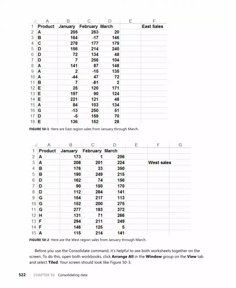
522 CHAPTER 50 Consolidating data
FIGURE 50-1 Here are East region sales from January through March.
FIGURE 50-2 Here are the West region sales from January through March.
Before you use the Consolidate command, it’s helpful to see both worksheets together on the screen. To do this, open both workbooks, click Arrange All in the Window group on the View tab and select Tiled. Your screen should look like Figure 50-3.

Consolidating data CHAPTER 50 523
FIGURE 50-3 East and West sales are arranged on the same screen.
Now open a blank worksheet in a new workbook and then click Arrange All and Tiled again. In the blank worksheet, click Consolidate in the Data Tools group on the Data tab, and you see the Consolidate dialog box, shown in Figure 50-4.
FIGURE 50-4 This is the Consolidate dialog box.
To consolidate the data from the East and West regions in your new, blank worksheet, enter the ranges you want to consolidate in the Reference box of the Consolidate dialog box, clicking Add

524 CHAPTER 50 Consolidating data
after selecting each range. By selecting the Top Row and Left Column check boxes in the Use Labels In area, you ensure that Excel consolidates the selected ranges by looking at labels in the top row and left column of each range. Create Links To Source Data enables changes in the selected ranges to be reflected in the consolidated worksheet. Select Sum in the Function box because you want Excel to add up the total sales of each product by month. Selecting Count, for instance, would count the number of transactions for each product during each month; selecting Max would com-pute the largest sales transaction for each product during each month. The Consolidate dialog box should be filled out as shown in Figure 50-5.
After clicking OK, the new worksheet looks like the one shown in Figure 50-6. (See file Eastandwestconsolidated.xlsx.) You can see, for example, that 1,317 units of Product A were sold in February, 597 units of Product F were sold in January, and so on.
FIGURE 50-5 This is the completed Consolidate dialog box.
FIGURE 50-6 Here is the total sales data after consolidation.

Consolidating data CHAPTER 50 525
Now, in cell C2 of East.xlsx, change the February Product A sales from 263 to 363. Notice that in the consolidated worksheet, the entry for February Product A sales has also increased by 100 (from 1,317 to 1,417). This change occurs because Create Links To Source Data was selected in the Consolidate dialog box. (By the way, if you click the 2 right below the workbook name in the con-solidated worksheet, you see how Excel grouped the data to perform the consolidation.) The result is contained in the Eastandwestconsolidated.xlsx file. Of course, you could also summarize data from different worksheets by using PivotTables with Multiple Consolidation Ranges (see Chapter 43, “Using PivotTables and slicers to describe data”).
If you frequently download new data to your source workbooks (in this case, East.xlsx and West . xlsx), it’s a good idea to name the ranges, including your data as a table. Then new data is automatically included in the consolidation. You might also choose to select some blank rows below the current data set. When you populate the blank rows with new data, Excel picks up the new data when it performs the consolidation. A third choice is to make each data range a dynamic range. (See Chapter 21, “The OFFSET function,” for more information.)
Problems
The following problems refer to the data in the Jancon.xlsx and Febcon.xlsx files. Each file contains the unit sales, dollar revenues, and product sold for each transaction during the month:
1. Create a consolidated worksheet that gives the total unit sales and dollar revenue for each product by region.
2. Create a consolidated worksheet that gives the largest first-quarter transaction for each prod-uct by region from the standpoint of revenue and units sold.


527
C H A P T E R 5 1
Creating subtotals
Questions answered in this chapter:
■■ Is there an easy way to set up a worksheet to calculate total revenue and units sold by region?
■■ Can I also obtain a breakdown by salesperson of sales in each region?
Joolas is a small company that manufactures makeup. For each transaction, it tracks the name of the salesperson, the location of the transaction, the product sold, the units sold, and the revenue. The managers want answers to questions such as those that are the focus of this chapter.
PivotTables can be used to slice and dice data in Microsoft Excel. Often, however, you’d like an easier way to summarize a list or a database within a list. In a sales database, for example, you might want to create a summary of sales revenue by region, a summary of sales revenue by product, and a summary of sales revenue by salesperson. If you sort a list by the column in which specific data is listed, the Subtotal command enables you to create a subtotal in a list on the basis of the values in the column. For example, if you sort the makeup database by location, you can calculate total revenue and units sold for each region and place the totals just below the last row for that region. As another example, after sorting the database by product, you can use the Subtotal command to calculate total revenue and units sold for each product and display the totals below the row in which the product changes. Unfortunately, if you have made a range of cells an Excel table (see Chapter 25, “Tables”), you cannot use that table to create subtotals.
In the next section, you see how easy it is to use Subtotals to summarize Excel data.
Answers to this chapter’s questions
This section provides the answers to the questions that are listed at the beginning of the chapter.
Is there an easy way to set up a worksheet to calculate total revenue and units sold by region?
The data for this question is in the Makeupsubtotals.xlsx file. In Figure 51-1, you can see a subset of the data as it appears after sorting the list by the Location column.
To calculate revenue and units sold by region, place the cursor anywhere in the database and then click Subtotal in the Outline group on the Data tab. In the Subtotal dialog box, fill in the values as shown in Figure 51-2.

528 CHAPTER 51 Creating subtotals
By selecting Location from the At Each Change In list, you ensure that subtotals are created at each point in which the value in the Location column changes. This corresponds to the different regions. Selecting Sum from the Use Function dialog box tells Excel to create totals for each region based on any set of columns. By selecting Units and Dollars in the Add Subtotal To area, you indicate that subtotals should be created for these columns. Replace Current Subtotals causes Excel to remove any previously computed subtotals. Because you haven’t created any subtotals, it doesn’t matter whether this option is selected for this example. If Page Break Between Groups is selected, Excel inserts a page break after each subtotal. Selecting the Summary Below Data check box causes Excel to place subtotals below the data. If this option is not selected, the subtotals are created above the data used for the computation. Clicking Remove All removes subtotals from the list.
FIGURE 51-1 After sorting a list by the values in a specific column, you can easily create subtotals for that data.
A sample of the Subtotals results is shown in Figure 51-3. You can see that 18,818 units were sold in the East region, earning revenue of $57,372.09.

Creating subtotals CHAPTER 51 529
FIGURE 51-2 This is the Subtotal dialog box.
FIGURE 51-3 These are the subtotals for the East region.

530 CHAPTER 51 Creating subtotals
Notice that in the left corner of the window (see Figure 51-3), below the Name box, buttons with the numbers 1, 2, and 3 appear. Clicking the largest number (in this case, 3) yields the data and sub-totals. If you click the 2 button, you see just the subtotals by region, as shown in Figure 51-4. Clicking the 1 button yields the Grand Total, as shown in Figure 51-5. In short, clicking a lower number reduces the level of detail shown.
FIGURE 51-4 When you create subtotals, Excel adds buttons that you can click to display only subtotals or both subtotals and details.
FIGURE 51-5 Display the overall total without any detail.
Can I also obtain a breakdown by salesperson of sales in each region?
If you want to, you can nest subtotals. In other words, you can obtain a breakdown of sales by each salesperson in each region, or you can even get a breakdown of how much each salesperson sold of each product in each region. (See the Nestedsubtotals.xlsx file.) To demonstrate the creation of nested subtotals, create a breakdown of sales by each salesperson in each region.
To begin, you must sort your data first by Location and then by Name. This gives a breakdown for each salesperson of units sold and revenue within each region. If you sort first by Name and then by Location, you would get a breakdown of units sold and revenue for each salesperson by region. After sorting the data, you proceed as before and create the subtotals by region. Click Subtotal again and fill in the dialog box as shown in Figure 51-6.
You now want a breakdown by Name. Clearing the Replace Current Subtotals check box ensures that you will not replace your regional breakdown. You can now see the breakdown of sales by each salesperson in each region as shown in Figure 51-7.

Creating subtotals CHAPTER 51 531
FIGURE 51-6 Create nested subtotals.
FIGURE 51-7 Here is an example of nested subtotals.

532 CHAPTER 51 Creating subtotals
Problems
You can find the data for this chapter’s problems in the Makeupsubtotals.xlsx file. Use the Subtotal command for the following computations:
1. Find the units sold and revenue for each salesperson.
2. Find the number of sales transactions for each product.
3. Find the largest transaction (in terms of revenue) for each product.
4. Find the average dollar amount per transaction by region.
5. Display a breakdown of units sold and revenue for each salesperson that shows the results for each product by region.

533
C H A P T E R 5 2
Charting tricks
Questions answered in this chapter:
■■ How can I create combination charts?
■■ How can I create a secondary axis?
■■ How can I handle missing data?
■■ How can I handle the appearance of hidden data?
■■ How can I use pictures to add bling to my column graphs?
■■ I charted annual sales data in a column graph, and the years do not show up as column labels. What did I do wrong?
■■ How can I include data labels and data tables in my charts?
■■ How can I use Excel 2013 to place data labels on a chart based on the contents of cells?
■■ How can I track sales force performance over time?
■■ How can I create a band chart to check whether inventory is within acceptable levels?
■■ How can I store a chart as a template?
■■ How can I use a thermometer chart to portray progress against a target?
■■ How can I create dynamic chart labels?
■■ How can I use check boxes to control which series are charted?
■■ How can I use a list box to choose the series to be charted?
■■ How can I create a Gantt chart?
■■ How can I create a chart based on sorted data?
■■ How can I create a histogram that automatically updates when I include new data?
■■ How can I add conditional colors to a chart?
■■ How can I use waterfall charts to track progress toward a sales target or break down compo-nents of sales price?

534 CHAPTER 52 Charting tricks
■■ How can I use the GETPIVOTDATA function and the Excel Table feature to create dynamic dashboards?
■■ How can I create a Pareto chart?
■■ How can I insert a vertical line in a chart to separate pre-merger and post-merger performance?
■■ How can I use a radar chart to portray how basketball team members differ in strength, speed, and jumping ability?
■■ I know I can use a scatter plot to display how two variables change. How can I use a bubble chart to summarize the variation of three variables?
An old Chinese proverb says a picture is worth a thousand words. Excel can create many amazing charts, and this chapter shows you many examples of charting tips and tricks. Be aware that charting in Excel 2013 has changed a lot from previous versions.
Answers to this chapter’s questions
This section provides the answers to the questions that are listed at the beginning of the chapter.
How can I create combination charts?
The Combinationstemp.xlsx file contains Actual and Target sales for January through July. You would like to create a chart that shows each month’s actual and target sales. First, select the F5:H12 range and, from the Insert tab, select Column Charts and choose the first 2D (clustered) column chart, shown in Figure 52-1. Using two columns makes it difficult to see the contrast between the actual and target sales, so use a combination chart in which one series is charted as a line and the other as a column. To create this chart, right-click on either series and select Change Chart Type. After choos-ing Combo (a new choice in Excel 2013) choose the first choice as shown in Figure 52-2. This yields the combination chart shown in Figure 52-3.

Charting tricks CHAPTER 52 535
FIGURE 52-1 This is a column chart for actual and sales target.
FIGURE 52-2 Select a Combo chart.

536 CHAPTER 52 Charting tricks
FIGURE 52-3 This is a combination chart.
How can I create a secondary axis?
When charting two quantities of differing magnitude, a secondary axis is often needed to make sense of the chart. To illustrate the idea, Figure 52-6 (see the Secondaryaxis.xlsx file) shows monthly revenues and units sold. If you show this data on a single Y-axis, monthly revenues would be hardly visible. To remedy this problem, begin by selecting the (D7:F16) range that you want charted. From the Insert tab, select the Combo Chart icon shown in Figure 52-4.
FIGURE 52-4 This is the Combo Chart icon.
From the drop-down arrow, select Create Custom Combo Chart and fill in the dialog box as shown in Figure 52-5.
The resulting chart summarizes Revenue on a secondary axis (the right-side vertical axis) with a line chart. The resulting chart in 52-6 shows clearly that monthly revenues and units sold change in a virtually lockstep fashion.

Charting tricks CHAPTER 52 537
FIGURE 52-5 Create a combo chart with a secondary axis.
FIGURE 52-6 A secondary axis is used to summarize revenue.

538 CHAPTER 52 Charting tricks
How can I handle missing data?
Often, some rows of a spreadsheet have missing data. Excel gives you three ways to chart missing data:
■■ Show the data as zeroes.
■■ Show the data as blanks (gaps).
■■ Replace a missing data point by a line joining adjacent data points.
To illustrate how things work, the Missingdata.xlsx file contains hourly temperatures, but several values are missing. After plotting the data as a line chart, right-click the data and choose Select Data. This opens the dialog box shown in Figure 52-7.
FIGURE 52-7 This figure shows the Hidden And Empty Cell Settings dialog box.
After selecting Connect Data Points With Line, you obtain the graph shown in Figure 52-8. Choose the Line Graph with dots and lines so you can pick out the missing data because missing data points have no markers.

Charting tricks CHAPTER 52 539
FIGURE 52-8 Missing data are replaced by lines.
How can I handle the appearance of hidden data?
Often, we plot data such as daily sales and filter the data in the spreadsheet. In this situation, Excel gives you a choice either to continue showing all the data in the chart or just show the filtered data. The Hidden.xlsx file contains daily sales of a product for a year. If you graph the data as a line chart, you see the chart shown in Figure 52-9. If you right-click the data and select Show Data In Hidden Rows And Columns, shown in Figure 52-7, even if you filter the data, all data points will still be dis-played in the chart. For example, as shown in Figure 52-10, the data is filtered to show only December sales, but the chart still shows all daily sales for the entire year. If you did not select Show Data In Hidden Rows And Columns, only December sales would be visible in the chart.

540 CHAPTER 52 Charting tricks
FIGURE 52-9 This is a chart showing daily product sales.
FIGURE 52-10 Data is filtered, but the chart is not.
How can I use pictures to add bling to my column graphs?
Usually, the magnitude of product sales are summarized with boring columns or bars in which the height of the column or width of the bar is proportional to the product sales. Wouldn’t it be more fun to summarize product sales with a picture of your product, scaled proportionally to actual sales? To illustrate the idea, check out the Picturegraph.xlsx file and the chart shown in Figure 52-11.
In this example, you assume that your company sells soda, so you wish to summarize monthly sales with a soda bottle whose size reflects the magnitude of monthly sales. To begin, select the C5:D8

Charting tricks CHAPTER 52 541
range and, from the Insert tab, select the first 2D column chart option (Clustered Column). Then right-click any column and hover over Format Data Series. Select Fill and then Picture, and you see the window shown in Figure 52-12. After selecting soda and pressing Enter, you are presented with many pictures of soda. After selecting the desired soda bottle and clicking Insert, the picture is inserted in the graph as shown in Figure 52-11, with the height of the soda bottle proportional to actual sales.
FIGURE 52-11 Soda sales are summarized with a soda bottle.
FIGURE 52-12 This is the Insert Pictures dialog box.
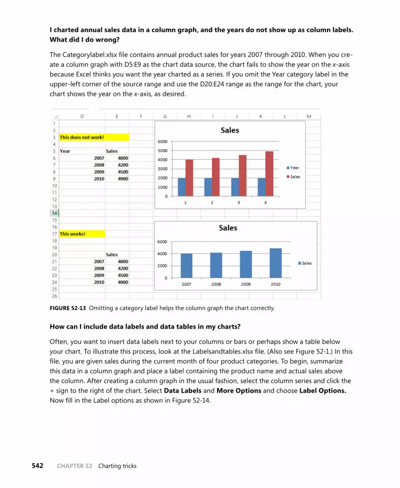
542 CHAPTER 52 Charting tricks
I charted annual sales data in a column graph, and the years do not show up as column labels. What did I do wrong?
The Categorylabel.xlsx file contains annual product sales for years 2007 through 2010. When you cre-ate a column graph with D5:E9 as the chart data source, the chart fails to show the year on the x-axis because Excel thinks you want the year charted as a series. If you omit the Year category label in the upper-left corner of the source range and use the D20:E24 range as the range for the chart, your chart shows the year on the x-axis, as desired.
FIGURE 52-13 Omitting a category label helps the column graph the chart correctly.
How can I include data labels and data tables in my charts?
Often, you want to insert data labels next to your columns or bars or perhaps show a table below your chart. To illustrate this process, look at the Labelsandtables.xlsx file. (Also see Figure 52-1.) In this file, you are given sales during the current month of four product categories. To begin, summarize this data in a column graph and place a label containing the product name and actual sales above the column. After creating a column graph in the usual fashion, select the column series and click the + sign to the right of the chart. Select Data Labels and More Options and choose Label Options. Now fill in the Label options as shown in Figure 52-14.

Charting tricks CHAPTER 52 543
FIGURE 52-14 These settings are needed to show sales and series name on a separate line.
You now see the chart shown in Figure 52-15, which shows the category names and values for each column on separate lines.
FIGURE 52-15 Category names and sales are included in the chart.

544 CHAPTER 52 Charting tricks
You now see how to place a data table summarizing sales below the chart. Simply select the cat-egory axis and click the + sign to the right of the chart. After clicking Data Tables, you see the data table shown in Figure 52-16.
FIGURE 52-16 Sales are summarized with a data table.
If you want to see more Data Table options, select the triangle to the right of Data Table.
How can I use Excel 2013 to place data labels on a chart based on the contents of cells?
Excel 2013 now makes it possible to place data labels from cells directly on charts. To illustrate the idea, examine the Labelsfromcells.xlsx file shown in Figure 52-17.
FIGURE 52-17 This is a scatterplot with labels from cells.

Charting tricks CHAPTER 52 545
To begin creating this graph, select the H5:I10 cell range and choose the first Scatter Plot choice from the Insert tab. (Scatter Plot is the icon with dots next to the pie chart.) This creates the scatter plot in Figure 52-17 without the city labels. To create the city labels, select the chart. From the Design tab, select Add Chart Element, choose Data Labels and then More Data Label Options. Select the first-choice Value from Cells and clear Y Value. Now you can select the G6:G10 cell range to insert the city labels in the chart as shown in Figure 52-17.
How can I track sales force performance over time?
The Salestracker.xlsx file lists monthly sales by your outstanding sales force from January through May (see Figure 52-18).
FIGURE 52-18 Here is the monthly sales data.
You want to use icons (up, down, or flat arrow) to track during each month whether a salesper-son’s ranking has improved, declined, or stayed the same. You could use Excel icon sets (described in Chapter 23, “Conditional formatting”), but then you would have to insert a set of icons for each month, which is a tedious task. A more efficient (although not as aesthetically pleasing) way to cre-ate these icons is to enter an h when you want an up arrow, enter an i when you want a down arrow, and enter a g when you want a flat arrow. Then if you change the font to Wingdings 3, you have the

546 CHAPTER 52 Charting tricks
desired arrows because the letters of the alphabet correspond in Wingdings 3 to the symbols shown in Figure 52-19.
FIGURE 52-19 This is the correspondence between letters and Wingdings 3 symbols.
To create the icons shown in Figure 52-20, proceed as follows:
■■ Copying the RANK(E6,E$6:E0,0) formula from J6 to J6:N20 computes each person’s sales rank during each month.
■■ Copying the IF(K6<J6,”h”,IF(K6>J6,”i”,”g”)) formula from O6 to O7:R20 creates an h if the per-son’s rank has improved, an i if the person’s rank has declined, and a g if the salesperson’s rank has stayed the same.
■■ After changing the font in the O6:R20 range to Wingdings 3, you see the icons shown in Figure 52-20.
The advantage of this approach is that you can use IF statements to customize the conditions eas-ily that define the icons.

Charting tricks CHAPTER 52 547
FIGURE 52-20 These are the icons that track change in salesperson performance.
How can I create a band chart to check whether inventory is within acceptable levels?
Often, you need to track a quantity (inventory, cash on hand, number of accidents) and want to track whether the quantity is remaining between historical upper and lower limits. A band chart provides a useful tool to monitor how a process changes over time. Figure 52-21 shows an example of a band chart. (See the Bandchart.xlsx file.)
FIGURE 52-21 A band chart summarizes inventory levels.

548 CHAPTER 52 Charting tricks
To create the band chart, proceed as follows:
1. You entered your lower limit on inventory (5) in B2 and your upper limit (25) on inventory in B3.
2. In row 5, you enter the lower limit for each month by copying the =$B$2 formula from B5 to C5:G5.
3. Copying the =$B$3-$B$2 formula from B6 to C6:G6 computes the upper limit–lower limit. Label this row Upper Limit because this row will be used to generate the line representing your upper inventory limit of 25 units.
4. Select the B5:G7 range and select a Stacked area chart (the second 2D area option).
5. Select the Value series, right-click Chart Change Type, and choose the first line-chart option.
6. Add a secondary axis to the Values series and then delete it.
7. Right-click the Lower Limit series and select Fill. From the Fill menu, select No Fill.
Your band chart shows that you are having great difficulty maintaining inventory levels between the desired lower and upper limits.
How can I store a chart as a template?
You just created a beautiful band chart. You might think that each time you want to create a band chart, you need to repeat the previously described steps. This is not the case. You can save the band (or any other chart) as a template and pull up the chart settings whenever you desire. To illustrate the idea, open the Bandchart.xlsx file, right-click the chart, select Save As Template, and give the chart any name you want. (Band was chosen here.) Now suppose you want a band chart just for the months of January to March. Select the data A4:D7 range and, from the Insert tab, select the arrow in the lower-right corner of the Chart group. Select All Charts and Templates. Browse to the desired chart template, click OK, and you are done!
How can I use a thermometer chart to portray progress against a target?
A thermometer chart shows actual values of a quantity such as revenues stacked within a column that shows a target value. The resulting chart (shown in Figure 52-22) resembles a thermometer, hence the name.

Charting tricks CHAPTER 52 549
FIGURE 52-22 This is a thermometer chart.
To create a thermometer chart, proceed as follows:
1. Select the A1:H3 range and a Clustered Column 2D chart.
2. Select the Revenue series and then right-click and select Format Data Series. Add a second-ary axis and then delete it.
3. Select the Revenue series and again right-click and select Format Data Series. Set Overlap to 0% and Gap width to 48%.
4. Select the Target series and again right-click and select Format Data Series. Set Overlap to 0% and Gap width to 261%.
5. You now see the chart shown in Figure 52-22. You might have to adjust the gap widths to obtain a chart you like. Making the Target gap width smaller, for example, makes the red bars wider; making the Revenue gap width larger makes the blue bars narrower.
How can I create dynamic chart labels?
You have probably encountered workbooks with charts in which you change a worksheet input, and the chart labels do not change. This often causes confusion. Now learn how to link series labels and chart titles to worksheet cells. To illustrate the idea (see workbook DynamicLabels.xlsx and Figure 52-23), suppose you want to chart future GDP in the United States and China. You want the

550 CHAPTER 52 Charting tricks
chart title to contain the year in which China’s GDP passes US GDP and the series label to contain the annual growth rate for each nation. In C5 and C8, you can change the estimated growth rates from their current values of 3% for US GDP and 10% for China GDP.
FIGURE 52-23 Create dynamic labels.
The key idea is to link your chart title and labels to cells that change when the growth rates change. Proceed as follows:
1. Copying the IF(D7>=D4,1,0) formula from D10 to E10:R10 enters a 1 if China GDP is at least as big as US GDP.
2. In cell C14, determine the year in which China passes the United States with the IFERROR(MATCH(1,D10:R10,0),”none”) formula. Note that if China never passes the United States, this formula returns “none”.
3. In cell C17, the =IF(C14=”none”,“US stays on top”,“Chinese_GDP_to_pass_US_GDP_in _Year“&TEXT(C14,”0”)) formula creates your desired chart title. Note that if China never passes the United States, your chart title will be US Stays on Top. Otherwise, your chart title is linked to C14, so the chart title will contain the year in which China passes the United States. The “0” in the TEXT function ensures that the year is formatted as an integer.
4. In cell C18, the “USA(“&TEXT(C5,”0.0%”)&“annual_growth)” formula creates the chart title for the USA series. The “0.0%” portion of the text function ensures that the growth rate is format-ted as a percentage.
5. In cell C19, the =”China(“&TEXT(C8,”0.0%”)&“annual_growth)” formula creates the chart title for the China series.
6. Now you are ready to create the chart with dynamic labels.

Charting tricks CHAPTER 52 551
7. Press Ctrl, select the noncontinuous C2:R2, C4:R4, C7:R7 range, and create a scatter chart (third option).
8. Select Add Chart Element from the Design tab and select Centered Overlay Title. In the formula bar, type an equals (=) sign, point to cell C17, and press Enter. You now have a dynamic chart label.
9. Select Series 1 (the USA GDP series) and right-click and choose Select Data. Click Edit and fill in the Edit Series dialog box as follows:
FIGURE 52-24 Create a dynamic USA series label.
This links the USA series label to cell C18, which contains the annual growth rate. In a similar fash-ion, you link the China series label to cell C19. You now have completed a chart with dynamic labels.
How can I use check boxes to control which series are charted?
You might recall from Chapter 26, “Spin buttons, scroll bars, option buttons, check boxes, combo boxes, and group list boxes,” that a check box can be used to toggle the contents of a cell between TRUE and FALSE. It turns out that if Excel sees an #N/A error in a cell, the cell will not generate a point appearing in the chart. Therefore, if you do not want to chart a series, simply use an IF formula to make the charted series #N/A when the check box puts a False in a cell.
To begin, use the methods described in Chapter 26 to create two check boxes, one to control the 2010 series and another to control the 2011 series. The 2010 check box controls cell B1, and the 2011 check box controls cell C1. The original data is in E6:L7. Copying the IF($B$1,F6,NA()) formula from F10 to F11:L11 simply returns the original data for the year if the year’s check box is selected or returns #N/A if the year’s check box is cleared. You now select the E9:L11 cell range as the source data for a Line With Markers chart. Now clearing a year’s check box hides a year’s data in the chart, and select-ing the check box shows the year’s data in the chart.

552 CHAPTER 52 Charting tricks
FIGURE 52-25 Check boxes can control the series appearing in a chart.
How can I use a list box to choose the series to be charted?
Suppose your spreadsheet (see Listbox.xlsx) contains 2007–2011 sales in the East, West, Midwest, and South. You want an easy way to control which series is charted. A list box (see Chapter 26) provides an easy way to choose the series to be charted. To begin, on the Developer tab, from the Insert group, select List Box (fifth icon in the top row) from Form Controls. When you see the pointer, right-click and select Format Control. Select $A$14:$A$17 as Input Range and Cell Link $H$2. Now, with an intelligent use of the INDEX function, you can use cell H2 to control the charted series.
Copying the INDEX($H$16:$K$21,G7,$H$2) formula from I7 to I8:I10 retrieves the correct series. For example, in the list box shown in Figure 52-26, the East region was selected. This places a 1 in cell H2. Your INDEX function retrieves the first column (column H) of data as desired. Now select the H7:Y11 range and create a scatter chart, and you see that when you click a region in the list box, the selected series is charted.

Charting tricks CHAPTER 52 553
FIGURE 52-26 Use a list box to control the charted series.
How can I create a Gantt chart?
Often, a project requires a number of projects to be completed. A Gantt chart portrays the time each project begins. Shown in Figure 52-27 (see file Gantt.xlsx) is a Gantt chart for a project consisting of five activities. To create this chart, proceed as follows:
1. Select the F3:H8 cell range and create a Stacked 2D bar chart (second option).
2. Right-click the Start series and, after selecting Fill, choose No Fill to hide the Start series.
3. Right-click the vertical axis and, after selecting Format Axis, select Categories In Reverse Order to ensure that Task 1 is listed first instead of last.
FIGURE 52-27 This is a Gantt chart.

554 CHAPTER 52 Charting tricks
How can I create a chart based on sorted data?
Suppose you have sales in a number of states (see Figure 52-28 and file Sortedgraphx.xlsx), and you want the graph to list the states in descending order of sales as shown in Figure 52-29. To create this chart, you need to reorganize the data in columns J to L so the sales data is sorted in descending order. To accomplish this goal, proceed as follows:
1. Copying the RANK(F9,$F$9:$F$23,0) formula from G9 to G10:G22 computes the rank of each state’s sales. For example, NY ranks sixth. Note, however, that KY, Ala, and Ari have the same level of sales. To sort the states in descending order of sales, you need to associate a unique rank with each state.
2. Copying the G9+COUNTIF($G$8:G8,G9) formula from H9 to H10:H22 creates a unique rank for each state by increasing the rank of a state with a tied rank each time a tied rank occurs.
3. Copying the INDEX(E$9:E$23,MATCH($J9,$H$9:$H$23,0),1) formula from K9 to K9:L23 sorts the States and Sales based on descending sales.
4. Now creating a column graph based on K9:L23 yields the graph shown in Figure 52-29.
FIGURE 52-28 This is sales data for a sorted graph.

Charting tricks CHAPTER 52 555
FIGURE 52-29 Sales are sorted in descending order.
How can I create a histogram that automatically updates when I include new data?
In Chapter 42, “Summarizing data by using descriptive statistics,” you learned how to use the Analysis Toolpak to create a histogram. Unfortunately, histograms created with the Analysis Toolpak will not update if existing data is changed or if new data is added. By using the Excel Table fea-ture, you can easily create histograms that automatically adjust to changes in the source data. The Dynamichistograms.xlsx file illustrates the idea (see Figure 52-30). Column E contains NBA player sala-ries in millions of dollars for the 2003–2004 season. To begin, select the E5:E446 range and make that range a table. Enter the bin ranges for your histogram in the H7:H28 range. Note that row 28 will cal-culate the number of salaries that are larger than $20 million. Use the FREQUENCY function to count how many salaries fall into each bin range. The FREQUENCY function (see Chapter 87, “Array formulas and functions”) is an array function. To use this function, you need to select the range the function populates (in this case, I7:I28) first, enter the function syntax, and then press Ctrl+Shift+Enter. After selecting I7:I28, type in the =FREQUENCY(E6:E446,H7:H27) formula and press Ctrl+Shift+Enter. Excel now enters the number of players (0) with a salary less than or equal to 0 in I7, in I8 the number of salaries >0 and <=1 million (124), . . . , in I27 the number of players with salaries >19 and <=20 million (2), and in I28 the number of players with a salary >20 million. To create the dynamic histogram, select the H7:I28 cell range and create a column graph. You now have a dynamic histogram that automati-cally updates to account for changes in the source data. To prove that the histogram updates, add a few salaries of $30 million. You now see a new spike occur on the right side of the graph.

556 CHAPTER 52 Charting tricks
FIGURE 52-30 This is a dynamic histogram.
How can I add conditional colors to a chart?
Suppose you are charting actual and targeted sales for each month, and you want months that perform at 90 percent of target or better in blue, 75 percent of target or worse in green, and other months in red. The Cond colors.xlsx file (Figure 52-31) shows how this is done. The trick to create this chart is to put the data for each color in a different row. To begin, place sales you want colored blue in row 19 by copying the =IF(F13/F14>F15,F13/F14,” “) formula from F19 to G19:M19. Then, to place the sales you want colored red in row 20, copy the =IF(AND(G13/G14>G16,G13/G14<=G15),G13/G14,” “) formula from F20 to G20:M20. Finally, place the sales for months that should appear in green in row 20 by copying the =IF(AND(G13/G14>G16,G13/G14<=G15),G13/G14,” “) formula from F21 to G21:M21. Now select the E18:M21 range and create a column chart. If you want to change the color for any series, select the series and click the paintbrush to the right of the chart; select Color and choose the color of your choice.

Charting tricks CHAPTER 52 557
FIGURE 52-31 Blue indicates a good month, green a bad month, and red a so-so month.
How can I use waterfall charts to track progress toward a sales target or break down compo-nents of sales price?
Waterfall charts, originally developed by the McKinsey consulting firm, are often used to show prog-ress toward a final cash position or a breakdown of a company’s total revenue into cost components and profit. The Waterfallcharts.xlsx file contains several examples of waterfall charts. In the All Positive worksheet (see Figure 52-32), you create a waterfall chart for a situation in which all cash flows are positive. You want the chart to show the monthly progress toward your cash flow goal of $3,270. After entering your cash flows in column C, you need to track your cumulative cash flow in column B. Copying the B2+C2 formula from B3 to B4:B7 computes the cumulative cash flow through the end of each month. Next, select the A1:C7 cell range and create a stacked column chart. Selecting the Base series and choosing No Fill yields the waterfall chart shown in Figure 52-32.
FIGURE 52-32 In this waterfall chart, all cash flows are positive.

558 CHAPTER 52 Charting tricks
Figure 52-33 (see worksheet Positive and Negative) shows a waterfall chart when some cash flows are negative.
After entering the positive cash flows in column C and negative cash flows in column D, compute the total cash flow through the end of each month by copying the E1+C2-D2 formula from E2 to E3:E7. Next, in column B, by copying the E1-D2 formula from B2 to B3:B7, compute the cumulative cash flow through last month, adjusted by the current month’s negative cash flow. After selecting the A1:D7 range and creating a column chart, all you have to do is hide column B, and you have the waterfall chart shown in Figure 52-33.
FIGURE 52-33 This is a waterfall chart when some cash flows are positive and some are negative.
By following the method used in the Positive and Negative worksheet, you can easily break down a company’s revenue into its cost components (including profit). See worksheet Profitability Waterfall and Figure 52-34.
FIGURE 52-34 This is a profitability waterfall chart.

Charting tricks CHAPTER 52 559
How can I use the GETPIVOTDATA function and the Excel Table feature to create dynamic dashboards?
Often, you might download monthly, quarterly, or weekly sales data and want to summarize the sales data in charts that automatically update to include new data. Knowledge of the Excel GETPIVOTDATA function (see Chapter 43, “Using PivotTables and slicers to describe data”) and Excel Table feature (see Chapter 25, “Tables”) make this relatively straightforward (see file Randy.xlsx). Suppose you download weekly sales data for four product categories, Filtrate, Tape, Command, and Abrasives, at four stores: Menards, Target, Lowe’s, and Home Depot. Your goal is to set up a dashboard that enables you to chart weekly sales to data at a given store quickly and give you control of which product categories appear in the chart. As shown in Figure 52-35, your data is downloaded in columns D–G. Make the D4:G243 range a table. This ensures that a PivotTable based on this data automatically updates to include new data when you refresh the table.
FIGURE 52-35 Here are sales data for dynamic dashboards.
You now create a PivotTable by dragging Week to the Rows zone, Store and Category to the Columns zone, and Revenues to the Values zone. This PivotTable (shown in Figure 52-36) summa-rizes weekly sales for each category in each store.

560 CHAPTER 52 Charting tricks
FIGURE 52-36 PivotTable is summarizing category sales by store.
Now you are ready to use the GETPIVOTDATA function to extract the data needed to create the desired charts. To begin, create a drop-down box (see Chapter 40, “Validating data”) in cell AG8 that can be used to select a store. Create check boxes (see Chapter 26) for each category that can be used to control the AH9:AK9 range. These cells control which categories appear in your chart. Copy the IF( AH$9=FALSE,NA(),IFERROR(GETPIVOTDATA(“Revenue”,$I$11,”WEEK”,$AG11,”Category”,AH$10, ”Store”,$AG$8),” “)) formula from AG11 to the AG11:AK23 range. If you select the check box for a category, this formula extracts the weekly sales for the category; if the category is cleared, #N/A is entered in the cell. Also, if 0 sales occurred, the IFERROR portion of the formulas ensures that sales of 0 are entered. Make the AG10:AK24 range a table so any charts based on this range update automati-cally to include new data. Figure 52-37 shows how the source data for your chart appears if you want to summarize Abrasive, Safety, and Tape sales at Lowe’s.

Charting tricks CHAPTER 52 561
FIGURE 52-37 This is the source data for your chart.
Now for the payoff! Select the AG10:AK24 range and create a scatter plot with smooth lines. The finished chart is shown in Figure 52-38. This chart can show sales at any store of any category combi-nation and update when new data is downloaded.

562 CHAPTER 52 Charting tricks
FIGURE 52-38 A dynamic dashboard summarizes sales at Lowe’s of Abrasives, Tape, and Safety.
How can I create a Pareto chart?
Companies often summarize problems reported by customers with a Pareto chart. A Pareto chart shows a list of problems on the x-axis and, on the y-axis, the fraction of problems associated with each problem and the cumulative percentage of problems caused by the listed problems. The Pareto.xlsx file (see Figure 52-39) illustrates the idea. To begin, sort the problems so they are listed in descending order based on the number of times the problem was reported. Copying the E5/SUM($E$5:$E$10) formula from F5 to F6:F10 computes the percentage of all problems for each type of problem. For example, Set Up caused 31 percent of all problems. Copying the SUM($F$5:F5) formula from G5 to G6:G10 computes the cumulative percentage of problems. For example, the first three listed problems caused 80 percent of all reported problems. After selecting the D4:D10 range, hold down the Ctrl key and select the F4:G10 range. After selecting the combo chart settings shown in Figure 52-40, you have the desired Pareto chart.
Often, Pareto charts can be used to display the 80/20 rule. Some manifestations of the 80/20 rule are as follows:
■■ 20 percent of different customer complaints cause 80 percent of reported problems.
■■ 20 percent of people have 80 percent of total income.
■■ 20 percent of your products generate 80 percent of your profit.
■■ 20 percent of your salespeople generate 80 percent of your sales.

Charting tricks CHAPTER 52 563
FIGURE 52-39 Use a Pareto chart to summarize customer complaints.
FIGURE 52-40 Here are chart settings for a Pareto chart.

564 CHAPTER 52 Charting tricks
How can I insert a vertical line in a chart to separate pre-merger and post-merger performance?
Suppose (see file Verticalline.xlsx and Figure 52-41) your company was merged with another company on January 10, 2011, and you are charting daily sales. You might want to insert a vertical line in your graph to indicate the date of the merger. If you draw the vertical line with the Excel Shapes feature, and the chart is moved, the line will be in the wrong place. To remedy this problem, begin by select-ing the E10:F32 range; create a scatter chart with lines (third option). In the B15:C16 range, enter the date of the merger and the lower and upper limits on the y coordinates for your vertical line. (In this case, the lower limit = 0, and the upper limit = 120.) Copy the B15:C16 range and right-click your chart. Clicking the Paste icon inserts the vertical line on the January 10 date.
FIGURE 52-41 The vertical line indicates that January 10, 2011 was the merger date.
How can I use a radar chart to portray how basketball team members differ in strength, speed, and jumping ability?
The Radar.xlsx file (see Figure 52-42) summarizes four athletes in the dimensions of strength, speed, and agility. Select the C2:F6 range and, from the Insert tab, select the Radar chart icon shown in Figure 52-43. From the drop-down menu, select Radar Chart with Markers, and you will have the radar chart shown in Figure 52-42. The center of the radar chart indicates a score of 0, and the farther a marker is from the center, the better the score. The chart makes it easy to see, for example, that Max scores poorly on all measures, and Christian scores well on all three measures.

Charting tricks CHAPTER 52 565
FIGURE 52-42 This is a radar chart with markers.
FIGURE 52-43 This is a radar chart icon.
I know I can use a scatter plot to display how two variables change. How can I use a bubble chart to summarize the variation of three variables?
Whereas a scatter plot shows you how two variables vary, a bubble chart enables you to summa-rize three variables visually. The Bubble.xlsx file (see Figure 52-44) contains, for several countries, the percentage variance in sales relative to budget, the annual growth in sales, and each country’s market size. To summarize this data in a bubble chart, select the D9:F14 range, click the drop-down arrow by Scatter Plot from the Insert tab, and choose the first Bubble Chart option. After add-ing (as described earlier in the chapter) a data label for each bubble based on the country (cell range C10:C14) and placing the labels above each bubble, you obtain the bubble chart shown in Figure 52-44. The areas of the bubbles are proportional to the market size of each country. For example, the US bubble contains 50 percent more area than the China bubble.

566 CHAPTER 52 Charting tricks
FIGURE 52-44 This is an area bubble chart.
Problems
The Cakes.xlsx file contains the number of salespeople and revenue for a bakery for each month. Use this data for problems 1 to 4:
1. Create a combination chart with a secondary axis to summarize monthly salespeople and revenues.
2. Graph monthly revenue and insert data labels on the chart.
3. Graph the number of salespeople and insert a data table below the chart.
4. Plot monthly sales by using a cake chart rather than a column chart.

Charting tricks CHAPTER 52 567
The Hiddenpivot.xlsx file contains sales of candy between 2009 and 2017. Use this data for prob-lems 5 and 6:
5. Filter the data so that only 2013 sales appear in the spreadsheet, but all data appears in the chart.
6. Summarize each year’s sales in a PivotTable and show the percentage improvement in sales from year to year.
7. By using the data in the Salestracker.xlsx file, highlight the top two salespeople each month with an up arrow, the bottom two with a down arrow, and the others with a flat arrow.
8. The Indiana University basketball team considers at least 50 deflections per game a good per-formance and 30 or fewer deflections a poor performance. In the past six games, Indiana had 25, 55, 45, 43, 59, and 39 deflections. Plot this data on a band chart.
9. Plot the data of problem 8 on a column chart in which good defensive games are highlighted in green, bad games in red, and other games in orange.
10. During its first year of operation, a firm’s revenue was $5 million and expenses were $6 million. For different assumed growth rates in expenses and revenues, plot 10 years of revenues and expenses and ensure that the graph title shows the year that revenues first exceed expenses.
The Crimedata.xlsx file contains annual violent crimes, property crimes, and murders in the United States. Use this data for problems 11 and 12:
11. Create a graph showing the number of crimes each year. Use check boxes to control which series are plotted.
12. To summarize murders, create a histogram that updates automatically when new data is included.
13. The following table contains the performance reviews of five employees. Use a radar chart to summarize the performance reviews:
Person Hardworking CollegialCompletes tasks on time Punctual
Wayne 1 2 3 4
Vivian 5 6 7 8
Greg 10 9.5 9 8.5
Jen 9 2 9 4
Wanda 1 1.5 2 2.5

568 CHAPTER 52 Charting tricks
14. A project consists of five activities. The start time and duration of each activity are given. Summarize this data in a Gantt chart:
Activity Start time Duration
A 0 4
B 3 6
C 5 7
D 6 8
E 3 6
15. The profit, revenue, and cost breakdown for a year are given in the following table. Summarize this data in a waterfall chart:
Item Amount
Revenue $300,000
Profit $65,000
Labor Costs $100.000
Material Costs $80,000
Overhead Costs $55,000
16. The Paretodata.xlsx file contains product sales at a hardware store. Create a Pareto chart for revenue by product. Does the 80/20 rule appear to hold for this data?

569
C H A P T E R 5 3
Estimating straight-line relationships
Questions answered in this chapter:
■■ How can I determine the relationship between monthly production and monthly operating costs?
■■ How accurately does this relationship explain the monthly variation in plant operating costs?
■■ How accurate are my predictions likely to be?
■■ When estimating a straight-line relationship, which functions can I use to get the slope and intercept of the line that best fits the data?
Suppose you manage a plant that manufactures small refrigerators. National headquarters tells you how many refrigerators to produce each month. For budgeting purposes, you want to forecast your monthly operating costs and need answers to the questions that are the focus of this chapter.
Every business analyst should have the ability to estimate the relationship between important business variables. In Microsoft Excel, the trend curve, which is discussed in this chapter as well as in Chapter 54, “Modeling exponential growth,” and Chapter 55, “The power curve,” is often helpful in determining the relationship between two variables. The variable that analysts try to predict is called the dependent variable. The variable you use for prediction is called the independent variable. Here are some examples of business relationships you might want to estimate:
Independent variable Dependent variable
Units produced by plant in a month Monthly cost of operating plant
Dollars spent on advertising in a month Monthly sales
Number of employees Annual travel expenses
Company revenue Number of employees (headcount)
Monthly return on the stock market Monthly return on a stock (for example, Dell)
Square feet in home Value of home
The first step in determining how two variables are related is to graph the data points (by using Scatter Chart) so that the independent variable is on the x-axis, and the dependent variable is on the y-axis. With the chart selected, click a data point (all data points are then displayed in blue), click

570 CHAPTER 53 Estimating straight-line relationships
Trendline in the Analysis group on the Chart Tools Layout tab, and then click More Trendline Options (or right-click and select Add Trendline). You see the Format Trendline dialog box, which is shown in Figure 53-1.
FIGURE 53-1 These are the Format Trendline dialog box options.
If your graph indicates that a straight line is a reasonable fit to the points, choose Linear. If the graph indicates that the dependent variable increases at an accelerating rate, Exponential (or per-haps Power) probably fits the relationship. If the graph shows that the dependent variable increases at a decreasing rate, or that the dependent variable decreases at a decreasing rate, Power is probably the most relevant.
This chapter focuses on the Linear option. Chapter 54 discusses the Exponential option, and Chapter 55 covers the Power option. Chapter 62, “Using moving averages to understand time series,” discusses the moving average curve, and Chapter 85 “Pricing products by using subjective demand,” discusses the polynomial curve. (The logarithmic curve is of little value in this discussion, so it is not addressed.)

Estimating straight-line relationships CHAPTER 53 571
Answers to this chapter’s questions
This section provides the answers to the questions that are listed at the beginning of the chapter.
How can I determine the relationship between monthly production and monthly operating costs?
The Costestimate.xlsx file, shown in Figure 53-2, contains data about the units produced and the monthly plant operating cost for a 14-month period. You are interested in predicting monthly operat-ing costs from units produced, which helps the plant manager determine the operating budget and understand better the cost to produce refrigerators.
FIGURE 53-2 This is the plant operating data.
Begin by creating an XY chart (or a scatter plot) that displays the independent variable (units produced) on the x-axis and the dependent variable (monthly plant cost) on the y-axis. The column of data that you want to display on the x-axis must be located to the left of the column of data you want to display on the y-axis. To create the graph, select the data in the C2:D16 range (including the labels in cells C2 and D2). Click Scatter in the Charts group on the Insert tab and select the first option (Scatter With Only Markers) as the chart type. You see the graph shown in Figure 53-3.

572 CHAPTER 53 Estimating straight-line relationships
FIGURE 53-3 Here is a scatter plot of operating cost versus units produced.
When you look at the scatter plot, it seems reasonable that a straight line (or linear relationship) exists between units produced and monthly operating costs. You can see the straight line that fits the points best by adding a trendline to the chart. Click within the chart to select it and then click a data point. All the data points are displayed in blue, with an X covering each point. Right-click and then click Add Trendline. In the Format Trendline dialog box, select Linear and then select the Display Equation On Chart and the Display R-Squared Value On Chart check boxes, as shown in Figure 53-4.
FIGURE 53-4 Select trendline options.

Estimating straight-line relationships CHAPTER 53 573
After clicking Close and adding axis labels and a chart title, you see the results shown in Figure 53-5. A title was added to the chart and labels for the x-axis and y-axis by selecting Chart Tools and, from the Design tab, selecting Add Chart Element.
FIGURE 53-5 This is the completed trendline.
If you want to add more decimal points to the values in the equation, you can select the trendline equation and, after selecting Format from Chart Tools, choose Format Selection. After selecting Number, you can choose the number of decimal places to be displayed.
How does Excel determine the best-fitting line? It chooses the line that minimizes (over all lines that could be drawn) the sum of the squared vertical distance from each point to the line. The vertical distance from each point to the line is called an error, or residual. The line Excel creates is called the least-squares line. You minimize the sum of squared errors rather than the sum of the errors because in simply summing the errors, positive and negative errors can cancel each other out. For example, if you add errors, a point 100 units above the line and a point 100 units below the line cancel each other. If you square errors, however, Excel uses the fact that your predictions for each point are wrong to find the best-fitting line.
Thus, Excel calculates the best-fitting straight line for predicting monthly operating costs from monthly units produced as follows:
(Monthly operating cost)=37,894.0956+64.2687(Units produced)
By copying the 64.2687*C3+37894.0956 formula from cell E3 to the E4:E16 cell range, you com-pute the predicted cost for each observed data point. For example, when 1,260 units are produced, the predicted cost is $123,118. (See Figure 53-2.)
You should not use a least-squares line to predict values of an independent variable that lie outside the range for which you have data. The line in this example should only be used to predict

574 CHAPTER 53 Estimating straight-line relationships
monthly plant operating costs during months in which production is between approximately 450 and 1,300 units.
The intercept of this line is $37,894.10, which can be interpreted as the monthly fixed cost. Therefore, even if the plant does not produce any refrigerators during a month, this graph estimates that the plant will still incur costs of $37,894.10. The slope of this line (64.2687) indicates that each extra refrigerator produced increases monthly costs by $64.27. Thus, the variable cost of producing a refrigerator is estimated to be $64.27.
The errors (or residuals) for each data point were computed in cells F3:F16. The error for each data point was defined as the amount by which the point varies from the least-squares line. For each month, error equals the observed cost minus the predicted cost. Copying the D3-E3 formula from F3 to F4:F16 computes the error for each data point. A positive error indicates a point is above the least-squares line, and a negative error indicates that the point is below the least-squares line, The sum of the errors was computed in cell F1 and yielded –0.03. In reality, for any least-squares line, the sum of the errors should equal 0. (–0.03 was obtained because the equation was rounded to four decimal points.) The fact that errors sum to 0 implies that the least-squares line has the intuitively satisfying property of splitting the points in half.
How accurately does this relationship explain the monthly variation in plant operating cost?
Clearly, each month, both the operating cost and the units produced vary. A natural question is, “What percentage of the monthly variation in operating costs is explained by the monthly variation in units produced?” The answer to this question is the R2 value (0.69 shown in Figure 53-5). You can state that the linear relationship explains 69 percent of the variation in monthly operating costs. This implies that 31 percent of the variation in monthly operating costs is explained by other factors. Using multiple regression (see Chapters 57 through 59), you can try to determine other factors that influence operating costs.
People always ask what a good R2 value is. There is really no definitive answer to this question. With one independent variable, of course, a larger R2 value indicates a better fit of the data than a smaller R2 value. A better measure of the accuracy of your predictions is the standard error of the regression, which is described in the next section.
How accurate are my predictions likely to be?
When you fit a line to points, you obtain a standard error of the regression that measures the spread of the points around the least-squares line. The standard error associated with a least-squares line can be computed with the STEYX function. The syntax of this function is STEYX(yrange,xrange), where yrange contains the values of the dependent variable, and xrange contains the values of the indepen-dent variable. In cell K1, the standard error of the cost estimate line in the Costestimate.xlsx file was computed by using the STEYX(D3:D16,C3:C16) formula. The result is shown in Figure 53-6.
Approximately 68 percent of the points should be within one standard error of regression (SER) of the least-squares line, and about 95 percent of the points should be within two SER of the least-squares line. These measures are reminiscent of the descriptive statistics rule of thumb that was described in Chapter 42, “Summarizing data by using descriptive statistics.” In this example, the

Estimating straight-line relationships CHAPTER 53 575
absolute value of around 68 percent of the errors should be $13,772 or smaller, and the absolute value of around 95 percent of the errors should be $27,544 (or 2*13,772) or smaller. By looking at the errors in column F, you can see that 10 out of 14, or 71 percent, of the points are within one SER of the least-squares line, and all (100 percent) of the points are within two standard SER of the least-squares line. Any point that is more than two SER from the least-squares line is called an outlier. Looking for causes of outliers can often help you improve the operation of your business. For exam-ple, a month in which actual operating costs are $30,000 higher than anticipated would be a cost outlier on the high side. If you could ascertain the cause of this high cost outlier and prevent it from recurring, you would clearly improve plant efficiency. Similarly, consider a month in which actual costs are $30,000 less than expected. If you could ascertain the cause of this low cost outlier and ensure that it occurred more often, you would improve plant efficiency.
FIGURE 53-6 This is the computation of slope, intercept, R squared (RSQ) values, and standard error of regression.
When estimating a straight-line relationship, which functions can I use to get the slope and intercept of the line that best fits the data?
The Excel SLOPE(yrange,xrange) and INTERCEPT(yrange,xrange) functions return the slope and intercept, respectively, of the least-squares line. Thus, entering the SLOPE(D3:D16,C3:C16) for-mula in cell I1 (see Figure 53-6) returns the slope (64.27) of the least-squares line. Entering the INTERCEPT(D3:D16,C3:C16) formula in cell I2 returns the intercept (37,894.1) of the least-squares line. By the way, the RSQ(yrange,xrange) function returns the R2 value associated with a least-squares line. So, entering the RSQ(D3:D16,C3:C16) formula in cell I3 returns the R2 value of 0.6882 for the least-squares line.
Problems
The Delldata.xlsx file contains monthly returns for the Standard & Poor’s stock index and for Dell stock. The beta of a stock is defined as the slope of the least-squares line used to predict the monthly return for a stock from the monthly return for the market:
1. Estimate the beta of Dell.
2. Interpret the meaning of Dell’s beta.
3. If you believe a recession is coming, would you rather invest in a high-beta or a low-beta stock?

576 CHAPTER 53 Estimating straight-line relationships
4. During a month in which the market goes up 5 percent, you are 95 percent sure that Dell’s stock price will increase between which range of values?
The Housedata.xlsx file gives the square footage and sales prices for several houses in Bellevue, Washington:
5. You will build a 500-square-foot addition to your house. How much do you think your home value will increase as a result?
6. What percentage of the variation in home value is explained by variation in house size?
7. A 3,000-square-foot house is selling for $500,000. Is this price out of line with typical real estate values in Bellevue? What might cause this discrepancy?
8. We know that 32 degrees Fahrenheit is equivalent to 0 degrees Celsius and that 212 degrees Fahrenheit is equivalent to 100 degrees Celsius. Use the trend curve to determine the relation-ship between Fahrenheit and Celsius temperatures. When you create your initial chart, before clicking Finish, you must indicate that data is in columns and not rows because with only two data points, Excel assumes different variables are in different rows.
9. The Betadata.xlsx file contains the monthly returns on the Standard & Poor’s index as well as the monthly returns on Cinergy, Dell, Intel, Microsoft, Nortel, and Pfizer. Estimate the beta of each stock.
10. The Electiondata.xlsx file contains, for several elections, the percentage of votes Republicans gained from voting machines (counted on election day) and the percentage Republicans gained from absentee ballots (counted after election day). Suppose that during an election, Republicans obtained 49 percent of the votes on election day and 62 percent of the absentee ballot votes. The Democratic candidate cried “fraud.” What do you think?
11. The Oldfaithful.xlsx file gives the duration between eruptions of the Old Faithful geyser and the length of the next eruption. Suppose it has been 4 minutes since the last eruption. You are 95 percent sure that the length of the next eruption is between ______ and ______.
12. The Dailydow.xlsx file gives daily values for the Dow Jones index from 1996 to 2010. What is the R squared value when you predict tomorrow’s Dow Jones index from today’s? Does this high R squared value mean that the market is easy to predict?

577
C H A P T E R 5 4
Modeling exponential growth
Question answered in this chapter:
■■ How can I model the growth of a company’s revenue over time?
If you want to value a company, it’s important to have some idea about its future revenues. Although the future might not be like the past, you often begin a valuation analysis of a corporation by study-ing the company’s revenue growth during the recent past. Many analysts like to fit a trend curve to recent revenue growth. To fit a trend curve, you plot the year on the x-axis (for example, the first year of data is Year 1, the second year of data is Year 2, and so on), and on the y-axis, you plot the com-pany’s revenue.
Usually, the relationship between time and revenue is not a straight line. Recall that a straight line always has the same slope, which implies that when the independent variable (in this case, the year) is increased by 1, the prediction for the dependent variable (revenue) increases by the same amount. For most companies, revenue grows by a fairly constant percentage each year. If this is the case, as revenue increases, the annual increase in revenue also increases. After all, revenue growth of 10 per-cent of $1 million means revenue grows by $100,000. Revenue growth of 10 percent of $100 million means revenue grows by $10 million. This analysis implies that a trend curve for forecasting revenue should grow more steeply and have an increasing slope. The exponential function has the property that as the independent variable increases by 1, the dependent variable increases by the same per-centage. This relationship is exactly what you need to model revenue growth.
The equation for the exponential function is y = aebx. Here, x is the value of the independent variable (in this example, the year), whereas y is the value of the dependent variable (in this case, annual revenue). The value e (approximately 2.7182) is the base of natural logarithms. If you select Exponential from the Excel trendline options, Excel calculates the values of a and b that best fit the data. Look at an example.
Answer to this chapter’s question
This section provides the answer to the question that is listed at the beginning of the chapter.

578 CHAPTER 54 Modeling exponential growth
How can I model the growth of a company’s revenue over time?
The Ciscoexpo.xlsx file, shown in Figure 54-1, contains the revenues for Cisco for years 1990 through 1999. All revenues are in millions of dollars. In 1990, for example, Cisco’s revenues were $103.47 million.
FIGURE 54-1 This figure shows Cisco’s annual revenues for the years 1990 through 1999.
To fit an exponential curve to this data, begin by selecting the A3:B13 cell range. Next, on the Insert tab, in the Charts group, click Scatter. Selecting the first chart option (Scatter With Only Markers) creates the chart shown in Figure 54-2.
Because the slope of a straight line is constant, fitting a straight line to this data would be ridicu-lous. When a graph’s slope is rapidly increasing, as in this example, an exponential growth will usually provide a good fit to the data.
To obtain the exponential curve that best fits this data, right-click a data point (all the points turn blue) and then click Add Trendline. In the Format Trendline dialog box, select Exponential in the Trendline Options area and select the Display Equation On Chart and Display R-Squared Value On Chart check boxes. After you click Close, you see the trend curve shown in Figure 54-3.
The estimate of Cisco’s revenue in year x (remember that x = 1 is year 1990) is computed from the following formula:
Estimated Revenue=58.552664e.569367x
Compute estimated revenue in the C4:C13 cell range by copying the =58.552664*EXP(0.569367*A4) formula from C4 to C5:C13. For example, the estimate of Cisco’s revenue in 1999 (year 10) is $17.389 billion.

Modeling exponential growth CHAPTER 54 579
FIGURE 54-2 This is a scatter plot for the Cisco trend curve.
FIGURE 54-3 This is the exponential trend curve for Cisco revenues.
Notice that most of the data points are very close to the fitted exponential curve. This pattern indicates that exponential growth does a good job of explaining Cisco’s revenue growth during the 1990s. The fact that the R2 value (0.98) is very close to 1 is also consistent with the visual evidence of a good fit.

580 CHAPTER 54 Modeling exponential growth
Remember that whenever x increases by 1, the estimate from an exponential curve increases by the same percentage. You can verify this fact by computing the ratio of each year’s estimated revenue to the previous year’s estimated revenue. To compute this ratio, copy the =C5/C4 formula from D5 to D6:D13. You find that the estimate of Cisco’s growth rate is 76.7 percent per year, which is the best estimate of Cisco’s annual growth rate for years 1990 through 1999.
Of course, to use this estimated annual revenue growth rate in a valuation analysis, you need to ask yourself whether it’s likely that this growth rate can be maintained. Be forewarned that exponen-tial growth cannot continue forever. For example, if you use the exponential trend curve to forecast revenues for 2005 (year 16), Cisco’s 2005 predicted revenues would be $530 billion. If this estimate were realized, Cisco’s revenues would have tripled the 2005 revenues of the world’s largest company (Walmart). This seems highly unrealistic. The moral is that during its early years, the revenue growth for a technology company follows exponential growth. After a while, the growth rate slows down. If Wall Street analysts had understood this fact during the late 1990s, the Internet stock bubble might have been avoided. Note that during 1999, Cisco’s actual revenue fell well short of the trend curve’s estimated revenue. This fact might well have indicated the start of the technology slowdown, which began during late 2000.
By the way, why must you use x = 1 instead of x = 1990? If you used x = 1990, Excel would have to juggle numbers around the size of e1990. A number this large causes Excel a great deal of difficulty.
Problems
The Exponentialdata.xlsx file contains annual sales revenue for Staples, Walmart, and Intel. Use this data to work through the first five problems for this chapter:
1. For each company, fit an exponential trend curve to its sales data.
2. For which company does exponential growth have the best fit with its revenue growth?
3. For which company does exponential growth have the worst fit with its revenue growth?
4. For each company, estimate the annual percentage growth rate for revenues.
5. For each company, use your trend curve to predict 2003 revenues.
6. The Impalas.xlxs file contains the prices of 2009, 2008, 2007, and 2006 Impalas during 2010. From this data, what can you conclude about how a new car loses its value as it grows older?

581
C H A P T E R 5 5
the power curve
Question answered in this chapter:
■■ As my company produces more of a product, it learns how to make the product more effi-ciently. Can I model the relationship between units produced and the time needed to produce a unit?
A power curve is calculated with the equation y = axb. In the equation, a and b are constants. Using a trend curve, you can determine the values of a and b that make the power curve fit a scatter plot dia-gram best. In most situations, a is greater than 0. When this is the case, the slope of the power curve depends on the value of b, as follows:
■■ For b>1, y increases as x increases, and the slope of the power curve increases as x increases.
■■ For 0<b<1, y increases as x increases, and the slope of the power curve decreases as x increases.
■■ For b = 1, the power curve is a straight line.
■■ For b<0, y decreases as x increases, and the power curve flattens out as x increases.
Here are examples of different relationships that can be modeled by a power curve. These exam-ples are contained in the Powerexamples.xlsx file.
If you are trying to predict total production cost as a function of units produced, you might find a relationship similar to that shown in Figure 55-1. Notice that b equals 2. As mentioned previously, with this value of b, the cost of production increases with the number of units produced. The slope becomes steeper, which indicates that each additional unit costs more to produce. This relationship might occur because increased production requires more overtime labor, which costs more than regular labor.

582 CHAPTER 55 The power curve
FIGURE 55-1 Predict cost as a function of the number of units produced.
If you are trying to predict sales as a function of advertising expenditures, you might find a curve similar to that shown in Figure 55-2.
FIGURE 55-2 The plot shows sales as a function of advertising.
Here, b equals 0.5, which is between 0 and 1. When b has a value in this range, sales increase with increased advertising but at a decreasing rate. Thus, the power curve enables you to model the idea of diminishing return—that each additional dollar spent on advertising will provide less benefit.

The power curve CHAPTER 55 583
If you are trying to predict the time needed to produce the last unit of a product based on the number of units produced to date, you often find a scatter plot similar to that shown in Figure 55-3.
Here you find that b equals –0.1. Because b is less than 0, the time needed to produce each unit decreases, but the rate of decrease—that is, the rate of learning—slows down. This relationship means that during the early stages of a product’s life cycle, huge savings in labor time occur. As you make more of a product, however, savings in labor time occur at a slower rate. The relationship between cumulative units produced and time needed to produce the last unit is called the learning or experience curve.
FIGURE 55-3 Plot the time needed to produce a unit based on cumulative production.
A power curve has the following properties:
■■ Property 1 If x increases by 1 percent, y increases by approximately b percent.
■■ Property 2 Whenever x doubles, y increases by the same percentage.
Suppose that demand for a product as a function of price can be modeled as 1000(Price)–2. Property 1 then implies that a 1 percent increase in price will lower demand (regardless of price) by 2 percent. In this case, the exponent b (without the negative sign) is called the elasticity. Elasticity is discussed further in Chapter 83, “Estimating a demand curve.” With this background, take a look at how to fit a power curve to data.

584 CHAPTER 55 The power curve
Answer to this chapter’s question
This section provides the answer to the question that is listed at the beginning of the chapter.
As my company produces more of a product, it learns how to make the product more effi-ciently. Can I model the relationship between units produced and the time needed to produce a unit?
The Fax.xlsx file contains data about the number of fax machines produced and the unit cost (in 1982 dollars) of producing the last fax machine made during each year. In 1983, for example, 70,000 fax machines were produced, and the cost of producing the last fax machine was $3,416. The data is shown in Figure 55-4.
FIGURE 55-4 This is the data used to plot the learning curve for producing fax machines.
Because a learning curve tries to predict either cost or the time needed to produce a unit from data about cumulative production, the cumulative number of fax machines produced by the end of each year is calculated in column C. In cell C4, refer to cell B4 to show the number of fax machines produced in 1982. By copying the SUM($B$4:B4) formula from C5 to C6:C10, you can compute cumu-lative fax machine production for the end of each year.
You can now create a scatter plot that shows cumulative units produced on the x-axis and unit cost on the y-axis. After creating the chart, you click one of the data points (the data points will be displayed in blue) and then right-click and click Add Trendline. In the Format Trendline dialog box, select Power and then select the Display Equation On Chart and Display R-Squared Value On Chart check boxes. With these settings, you obtain the chart shown in Figure 55-5. The curve drawn represents the power curve that fits the data best.

The power curve CHAPTER 55 585
FIGURE 55-5 This is the learning curve for producing fax machines.
The power curve predicts the cost of producing a fax machine as follows:
Cost of producing fax machine=65,259(cumulative units produced)-.2533
Notice that most data points are near the fitted power curve and that the R2 value is nearly 1, indi-cating that the power curve fits the data well.
By copying the 65259*C4^–0.2533 formula from cell E4 to E5:E10, you compute the predicted cost for the last fax machine produced during each year. (The carat symbol [̂ ], which is located over the 6 key, is used to raise a number to a power.)
If you estimated that 1,000,000 fax machines were produced in 1989, after computing the total 1989 production (2,744,000) in cell C11, you can copy the forecast equation to cell E11 to predict that the last fax machine produced in 1989 cost $1,526.85.
Remember that Property 2 of the power curve states that whenever x doubles, y increases by the same percentage. By entering twice cumulative 1988 production in cell C12 and copying your forecast formula in E10 to cell E12, you’ll find that doubling cumulative units produced reduces the predicted cost to 83.8 percent of its previous value (1,516.83/1,712.60). For this reason, the current learning curve is known as an 84-percent learning curve. Each time you double units produced, the labor required to make a fax machine drops by 16.2 percent.
If a curve becomes steeper, the exponential curve might fit the data as well as the power curve does. A natural question is which curve fits the data better? In most cases, this question can be answered simply by eyeballing the curves and choosing the one that looks like it’s a better fit. More precisely, you could compute the sum of squared errors (SSE) for each curve (obtained by adding up the square of the curve value minus the actual value for each data point) and choose the curve with the smaller SSE.

586 CHAPTER 55 The power curve
The learning curve was discovered in 1936 at Wright-Patterson Air Force Base in Dayton, Ohio, when it was found that whenever the cumulative number of airplanes produced doubled, the time required to make each airplane dropped by around 15 percent.
Wikipedia gives the following learning curve estimates for various industries:
■■ Aerospace: 85 percent
■■ Shipbuilding: 80–85 percent
■■ Complex machine tools for new models: 75–85 percent
■■ Repetitive electronics manufacturing: 90–95 percent
■■ Repetitive machining or punch-press operations: 90–95 percent
■■ Repetitive electrical operations: 75–85 percent
■■ Repetitive welding operations: 90 percent
■■ Raw materials: 93–96 percent
■■ Purchased parts: 85–88 percent
Problems
1. Use the fax machine data to model the relationship between cumulative fax machines pro-duced and total production cost.
2. Use the fax machine data to model the relationship between cumulative fax machines pro-duced and average production cost per machine.
3. A marketing director estimates that total sales of a product as a function of price will be as shown in the following table. Estimate the relationship between price and demand and predict demand for a $46 price. A 1 percent increase in price will reduce demand by what percentage?
Price Demand
$30.00 300
$40.00 200
$50.00 110
$60.00 60
4. The brand manager for a new drug believes that the annual sales of the drug as a function of the number of sales calls on doctors will be as shown in the following table. Estimate sales of the drug if 80,000 sales calls are made on doctors:

The power curve CHAPTER 55 587
Sales calls Units sold
50,000 25,000
100,000 52,000
150,000 68,000
200,000 77,000
5. The time needed to produce each of the first ten airplanes is as follows:
Unit Hours
1 1,000
2 800
3 730
4 630
5 600
6 560
7 560
8 500
9 510
10 510
Estimate the total number of hours needed to produce the next ten airplanes.


589
C H A P T E R 5 6
Using correlations to summarize relationships
Question answered in this chapter:
■■ How are monthly stock returns for Microsoft, GE, Intel, GM, and Cisco related?
Trend curves are a great help in understanding how two variables are related. Often, however, you need to understand how more than two variables are related. Looking at the correlation between any pair of variables can provide insights into how multiple variables move up and down in value together.
The correlation (usually denoted by r) between two variables (call them x and y) is a unit-free measure of the strength of the linear relationship between x and y. The correlation between any two variables is always between –1 and +1. Although the exact formula used to compute the correla-tion between two variables isn’t very important, being able to interpret the correlation between the variables is.
A correlation near +1 means that x and y have a strong positive linear relationship. That is, when x is larger than average, y tends to be larger than average, and when x is smaller than average, y also tends to be smaller than average. When a straight line is applied to the data, there will be a straight line with a positive slope that does a good job of fitting the points. As an example, for the data shown in Figure 56-1 (x = units produced and y = monthly production cost), x and y have a correlation of +0.9. (See the Correlationexamples.xlsx file for Figures 56-1 through 56-3.)

590 CHAPTER 56 Using correlations to summarize relationships
FIGURE 56-1 This is a correlation near +1, indicating that two variables have a strong positive linear relationship.
However, a correlation near –1 means that there is a strong negative linear relationship between x and y. That is, when x is larger than average, y tends to be smaller than average, and when x is smaller than average, y tends to be larger than average. When a straight line is applied to the data, the line has a negative slope that does a good job of fitting the points. As an example, for the data shown in Figure 56-2, x and y have a correlation of –0.9.
FIGURE 56-2 This is a correlation near –1, indicating that two variables have a strong negative linear relationship.

Using correlations to summarize relationships CHAPTER 56 591
A correlation near 0 means that x and y have a weak linear relationship. That is, knowing whether x is larger or smaller than its mean tells you little about whether y will be larger or smaller than its mean. Figure 56-3 shows a graph of the dependence of unit sales (y) on years of sales experience (x). Years of experience and unit sales have a correlation of 0.003. In this data set, the average experience is 10 years. You can see that when a person has more than 10 years of sales experience, his sales can be either low or high. You can also see that when a person has fewer than 10 years of sales experi-ence, sales can be low or high. Although experience and sales have little or no linear relationship, there is a strong nonlinear relationship (see the fitted curve) between years of experience and sales. Correlation does not measure the strength of nonlinear relationships.
FIGURE 56-3 This is a correlation of 0, indicating a weak linear relationship between two variables.
Answer to this chapter’s question
This section provides the answer to the question that is listed at the beginning of the chapter.
How are monthly stock returns for Microsoft, GE, Intel, GM, and Cisco related?
The Stockcorrel.xlsx file (see Figure 56-4) shows monthly stock returns for Microsoft, GE, Intel, GM, and Cisco during the 1990s. You can use correlations to understand how movements in these stocks are related.
To find the correlations between each pair of stocks, click Data Analysis in the Analysis group on the Data tab and then select Correlation. You must install the Analysis ToolPak (as described in Chapter 41, “Summarizing data by using histograms,” and Chapter 42, “Summarizing data by using descriptive statistics”) before you can use this feature. Click OK and then fill in the Correlation dialog box as shown in Figure 56-5.

592 CHAPTER 56 Using correlations to summarize relationships
FIGURE 56-4 These are monthly stock returns during the 1990s.
FIGURE 56-5 This is the Correlation dialog box.
The easiest way to enter the input range is to select the upper-left cell of the range (B51) and then press Ctrl+Shift+right arrow followed by Ctrl+Shift+down arrow. Select Labels In First Row if the first row of the input range contains labels. Enter cell H52 as the upper-left cell of the output range. After clicking OK, you get the results shown in Figure 56-6.

Using correlations to summarize relationships CHAPTER 56 593
FIGURE 56-6 Here are the stock return correlations.
The correlation between Cisco and Microsoft is 0.513, for example, whereas the correlation between GM and Microsoft is 0.069. The analysis shows that returns on Cisco, Intel, and Microsoft are most closely tied together. Because the correlation between each pair of these stocks is around 0.5, these stocks exhibit a moderate positive relationship. In other words, if one stock does better than average, it is likely (but not certain) that the other stocks will do better than average. Because Cisco, Intel, and Microsoft stock returns are closely tied to technology spending, their fairly strong correla-tion is not surprising. You can also see that the monthly returns on Microsoft and GM are virtually uncorrelated. This relationship indicates that when Microsoft stock does better than average, you really can’t tell whether GM stock will do better or worse than average. Again, this trend is not sur-prising because GM is not really a high-tech company and is more susceptible to the vagaries of the business cycle.
Filling in the correlation matrixAs you can see in this example, Excel left some entries in the correlation matrix blank. For exam-ple, the correlation between Microsoft and GE (which is equal to the correlation between GE and Microsoft) is omitted. If you want to fill in the entire correlation matrix, right-click the matrix and then click Copy. Right-click a blank portion of the worksheet and then click Paste Special. In the Paste Special dialog box, select Transpose. This flips the data on its side. Now right-click the flipped data and click Copy. Right-click the original correlation matrix and click Paste Special again. In the Paste Special dialog box, select Skip Blanks and then click OK. The transposed data is copied to the original matrix, but pasting the data does not copy the blank cells from the transposed data. The full correlation matrix is shown in Figure 56-7.

594 CHAPTER 56 Using correlations to summarize relationships
FIGURE 56-7 This is the complete correlation matrix.
Using the CORREL functionAs an alternative to using Correlation from the Analysis ToolPak, you can use the CORREL function. For example, entering the CORREL(E52:E181,F52:F181) formula in cell I49 confirms that the correlation between monthly returns on Cisco (shown in column F) and GM (shown in column E) is 0.159.
relationship between correlation and R2
In Chapter 53, “Estimating straight-line relationships,” you found an R2 value for units produced and monthly operating cost of 0.688. How is this value related to the correlation between units produced and monthly operating costs? The correlation between two sets of data is simply:
R2value
for the trendline, where you choose the sign for the square root to be the same as the sign of the slope of the trendline. Thus, the correlation between units produced and monthly operating cost for the data in Chapter 53 is
.688 = + .829+

Using correlations to summarize relationships CHAPTER 56 595
Correlation and regression toward the meanYou have probably heard the phrase, “regression toward the mean.” Essentially, this statement means that the predicted value of a dependent variable will be in some sense closer to its average value than the independent variable. More precisely, suppose you try to predict a dependent variable y from an independent variable x. If x is k standard deviations above average, your prediction for y will be rk standard deviations above average. (Here, r = correlation between x and y.) Because r is between –1 and +1, this means that y is fewer standard deviations away from the mean than x. This is the real definition of “regression toward the mean.” See Problem 5 for an interesting application of the con-cept of regression toward the mean.
Problems
The data for the following problems is in file Ch56data.xlsx:
1. The Problem 1 worksheet contains the number of cars parked each day both in the outdoor lot and in the parking garage near the Indiana University Kelley School of Business. Find and interpret the correlation between the number of cars parked in the outdoor lot and in the parking garage.
2. The Problem 2 worksheet contains daily sales volume (in dollars) of laser printers, printer car-tridges, and school supplies. Find and interpret the correlations between these quantities.
3. The Problem 3 worksheet contains annual returns on stocks, T-bills, and T-bonds. Find and interpret the correlations between the annual returns on these three classes of investments.
Here are two more problems:
4. The Dow.xlsx file contains the monthly returns between the 30 stocks comprising the Dow Jones Index. Find the correlations between all stocks. Then, for each stock, use conditional for-matting to highlight the three stocks most correlated with that stock. (Of course, you should not highlight a stock as correlated with itself.)
5. NFL teams play 16 games during the regular season. Suppose the standard deviation of the number of games won by all teams is 2, and the correlation between the number of games a team wins in two consecutive seasons is 0.5. If a team goes 12 and 4 during a season, what is your best prediction for how many games that team will win next season?


597
C H A P T E R 5 7
Introduction to multiple regression
Questions answered in this chapter:
■■ Our factory manufactures three products. How can I predict the cost of running the factory based on the number of units produced?
■■ How accurate are my forecasts for predicting monthly cost based on units produced?
■■ I know how to use the Data Analysis command to run a multiple regression. Is there a way to run the regression without using this command and place the regression’s results in the same worksheet as the data?
Answers to this chapter’s questions
This section provides the answers to the questions that are listed at the beginning of the chapter.
Our factory manufactures three products. How can I predict the cost of running the factory based on the number of units produced?
Chapter 53 through Chapter 55 described how to use the trend curve in Microsoft Excel 2013 to predict one variable (called y, or the dependent variable) from another variable (called x, or the independent variable). However, you often want to use more than one independent variable (called independent variables x1, x2, . . . xn) to predict the value of a dependent variable. In these cases, you can use either the multiple regression option in the Excel Data Analysis feature or the LINEST function to estimate the relationship you want.
Multiple regression assumes that the relationship between y and x1, x2, . . . xn has the following form:
Y=Constant+B1x1+B2x2+...Bnxn
Excel calculates the values of Constant, B1, B2, . . . Bn to make the predictions from this equation as accurate (in the sense of minimizing the sum of squared errors) as possible. The following example illustrates how multiple regression works.
The Data worksheet in the Mrcostest.xlsx file (see Figure 57-1) contains the cost of running a plant over 19 months as well as the number of units of Product A, Product B, and Product C produced dur-ing each month.

598 CHAPTER 57 Introduction to multiple regression
FIGURE 57-1 This is the data for predicting monthly operating costs.
You would like to find the best forecast for monthly operating cost that has the following form (which is referred to as Form 1):
Monthly operating cost=Constant+B1*(Units A produced)+B2*(Units B produced) +B3*(Units C produced)
The Excel Data Analysis feature can find the equation for this form that best fits your data. Click Data Analysis in the Analysis group on the Data tab and then select Regression. Fill in the Regression dialog box as shown in Figure 57-2.
Note If you haven’t previously installed the Analysis ToolPak, click the File tab, click Options, and then click Add-Ins. With Excel Add-ins selected in the Manage dialog box, click Go, select the Analysis ToolPak check box, and then click OK.

Introduction to multiple regression CHAPTER 57 599
FIGURE 57-2 This is the Regression dialog box.
■■ Input Y Range (B3:B22 in this example) contains the dependent variable or data (including the Cost label) that you want to predict.
■■ Input X Range (C3:E22) contains the data or independent variables (including the A Made, B Made, and C Made labels) that you want to use in the prediction. Excel has a limit of 15 inde-pendent variables, which must be in adjacent columns.
■■ Because both the Input X and Input Y ranges include labels, select the Labels check box.
■■ The output was placed in a new worksheet, titled Regression.
■■ Selecting the Residuals check box causes Excel to list, for each observation, the prediction from Form 1 and the residual, which equals the observed cost minus the predicted cost.
After clicking OK in the Regression dialog box, you obtain the output shown in Figure 57-3 and Figure 57-4. (See the Regression worksheet.)

600 CHAPTER 57 Introduction to multiple regression
FIGURE 57-3 Here is the original multiple regression output.
FIGURE 57-4 Here is the original multiple regression residual output.
What is the best prediction equation? You’ll find in the Coefficients column (column B of the summary output) that the best equation of Form 1 that can be used to predict monthly cost is the following:
Predicted monthly cost=35,102.90+2.07(AMade)+4.18(BMade)+4.79(CMade)

Introduction to multiple regression CHAPTER 57 601
A natural question is which of your independent variables are useful for predicting monthly cost? After all, if you choose the number of games the Seattle Mariners won during a one-month period as an independent variable, you would expect that this variable would have little effect on predict-ing monthly operating cost. When you run a regression, each independent variable has a p-value between 0 and 1. Any independent variable with a p-value (see column E) of less than or equal to 0.05 is considered useful for predicting the dependent variable. Thus, the smaller the p-value, the higher the predictive power of the independent variable. Your three independent variables have p-values of 0.23 (for A Made), 0.025 (for B Made), and 0.017 (for C Made). These p-values can be interpreted as follows:
■■ When you use B Made and C Made to predict monthly operating cost, you have a 77 percent chance (1 – 0.23) that A Made adds predictive power.
■■ When you use A Made and C Made to predict monthly operating cost, there is a 97.5 percent chance (1 – 0.025) that B Made adds predictive power.
■■ When you use A Made and B Made to predict monthly operating cost, there is a 98.3 percent chance (1 – 0.017) that C Made adds predictive power.
Your p-values indicate that A Made does not add much predictive power to B Made and C Made, which means that if you know B Made and C Made, you can predict monthly operating cost about as well as you can if you include A Made as an independent variable. Therefore, you can opt to delete A Made as an independent variable and use just B Made and C Made for your prediction. Copy the data to the A Removed worksheet and delete the A Made column (column C). Adjust the Input X range to be C3:D22. In the NoA worksheet, you can see the regression output shown in Figure 57-5 and Figure 57-6.
FIGURE 57-5 Multiple regression output with A Made data removed as an independent variable.

602 CHAPTER 57 Introduction to multiple regression
FIGURE 57-6 This is residual output calculated when A Made data is removed as an independent variable.
You can see that B Made and C Made have very low p-values (0.002 and 0.007, respectively). These values indicate that both these independent variables have useful predictive power. By using the new coefficients in column B, you can now predict monthly operating cost by using the following equation:
Predicted monthly operating cost=35,475.3+5.32(BMade)+5.42(CMade)
How accurate are my forecasts for predicting monthly cost based on units produced?
In the regression output in cell B5 of the NoA worksheet (see Figure 57-5), R2 equals 0.61. An R2 value such as this one means that together, B Made and C Made explain 61 percent of the varia-tion in monthly operating costs. Notice that in the original regression, which included A Made as an independent variable, R2 equals 0.65. This indicates that the addition of A Made as an independent variable explains only 4 percent more variation in monthly operating costs. Having such a minor dif-ference is consistent with the decision to delete A Made as an independent variable.
In the regression output in cell B7 in the NoA worksheet, the standard error for the regression with B Made and C Made as independent variables is 1,274. You would expect about 68 percent of your multiple regression forecasts to be accurate within one standard error and 95 percent to be accurate within two standard errors. Any forecast that differs from the actual value by more than two standard

Introduction to multiple regression CHAPTER 57 603
errors is considered an outlier. Thus, if your forecasted operating cost is in error by more than $2,548 (2*1274), you consider that observation to be an outlier.
In the Residual portion of the output, shown earlier, in Figure 57-6, you are given for each observa-tion the predicted cost and the residual, which equals the actual cost less the predicted cost. For the first observation, for example, the predicted cost is $43,381.10. The residual of $1,057.95 indicates that the prediction of actual cost was too low by $1,057.95.
I know how to use the Data Analysis command to run a multiple regression. Is there a way to run the regression without using this command and place the regression’s results in the same worksheet as the data?
The Excel LINEST function can be used to insert the results of a regression analysis directly into a workbook. The LINEST function is an example of an array function. (See Chapter 87, “Array formulas and functions,” for further discussion of array functions and formulas.) For now, here is an introduc-tion to array functions:
■■ Before entering an array function, you must always select the cell range in which you want the results of the array function to be located.
■■ Instead of pressing Enter to perform the calculation, you must press Ctrl+Shift+Enter to com-plete the entry of an array function.
■■ After entering an array function, you see a curly bracket in the formula bar when you select a cell in which the array function’s results are located. This bracket indicates that the results in the cell were computed with an array function.
■■ You can’t modify data in any part of a range created by an array function.
To use the LINEST function when there are m independent variables, begin by selecting a blank cell range consisting of five rows and m + 1 columns where you want LINEST to deposit the results. In the A Removed worksheet, the F5:H9 range was used.
The syntax of the LINEST function is LINEST(KnownYs,KnownXs,True,True). If the third argument is changed to False, Excel estimates the equation without a constant term. Changing the fourth argu-ment to False causes the LINEST function to omit many regression computations and return only the multiple regression equation.
With the upper-left cell of the target range selected (F5 in this example), select the range of the size you want (in this case, the F5:H9 cell range) and then enter the =LINEST(B4:B22,C4:D22,True, True) formula. Because LINEST is an array function at this point, first hold down Ctrl+Shift and then press Enter for the function to work correctly. After using this key combination, you obtain the results shown in Figure 57-7. (See the A Removed worksheet.)

604 CHAPTER 57 Introduction to multiple regression
FIGURE 57-7 Use the LINEST function to calculate a multiple regression.
In row 5, you find the prediction equation (coefficients read right to left, starting with the inter-cept) of Predicted monthly cost = 35,475.3 + 5.32(B Made) + 5.43(C Made). Row 6 contains standard errors for each coefficient estimate, but these are not too relevant. Cell F7 contains the R2 value of 0.61, and cell G7 contains the regression standard error of 1,274. Rows 8 and 9 contain information (F statistic, degrees of freedom, sum of squares regression, and sum of squares residual) that is less important.
Note Problems that you can work with to learn more about multiple regression are avail-able at the end of Chapter 59, “Modeling nonlinearities and interactions.”

605
C H A P T E R 5 8
Incorporating qualitative factors into multiple regression
Questions answered in this chapter:
■■ How can I predict quarterly US auto sales?
■■ How can I predict US presidential elections?
■■ Is there an Excel function I can use to make forecasts easily from a multiple regression equation?
In the first example of multiple regression in Chapter 57, “Introduction to multiple regression,” the monthly cost of plant operations was forecasted by using the number of units of each product manu-factured at the plant. Because you can quantify exactly the amount of a product produced at a plant, you can refer to the units produced of Product A, Product B, and Product C as quantitative indepen-dent variables. In many situations, however, independent variables can’t be easily quantified. In this chapter, you look at ways to incorporate qualitative factors such as seasonality, gender, or the party of a presidential candidate into a multiple regression analysis.
Answers to this chapter’s questions
This section provides the answers to the questions that are listed at the beginning of the chapter.
How can I predict quarterly U.S. auto sales?
Suppose you want to predict quarterly US auto sales to determine whether the quarter of the year affects auto sales. Use the data in the Data worksheet in the Autotemp.xlsx file, shown in Figure 58-1. Sales are listed in thousands of cars, and GNP is in billions of dollars.

606 CHAPTER 58 Incorporating qualitative factors into multiple regression
FIGURE 58-1 Here is the auto sales data.
You might be tempted to define an independent variable that equals 1 during the first quarter, 2 during the second quarter, and so on. Unfortunately, this approach would force the fourth quarter to have four times the effect of the first quarter, which might not be true. The quarter of the year is a qualitative independent variable. To model a qualitative independent variable, you create an indepen-dent variable called a dummy variable for all but one of the qualitative variable’s possible values. (It is arbitrary which value you leave out. In this example, Quarter 4 was omitted.) The dummy variables tell you which value of the qualitative variable occurs. Thus, you have a dummy variable for Quarter 1, Quarter 2, and Quarter 3 with the following properties:
■■ Quarter 1 dummy variable equals 1 if the quarter is Quarter 1 or 0 if otherwise.
■■ Quarter 2 dummy variable equals 1 if the quarter is Quarter 2 or 0 if otherwise.
■■ Quarter 3 dummy variable equals 1 if the quarter is Quarter 3 or 0 if otherwise.
A Quarter 4 observation will be identified by the fact that the dummy variables for Quarter 1 through Quarter 3 equal 0. You can see why you don’t need a dummy variable for Quarter 4. In fact, if you include a dummy variable for Quarter 4 as an independent variable in the regression, Microsoft Excel returns an error message, because if an exact linear relationship exists between any set of inde-pendent variables, Excel must perform the mathematical equivalent of dividing by 0 (an impossibility)

Incorporating qualitative factors into multiple regression CHAPTER 58 607
when running a multiple regression. In this example, if you include a Quarter 4 dummy variable, every data point satisfies the following exact linear relationship:
(Quarter 1 Dummy)+(Quarter 2 Dummy)+(Quarter 3 Dummy)+(Quarter 4 Dummy)=1
Note An exact linear relationship occurs if there exists constants c0, c1, . . . cN, such that for each data point, c0 + c1x1 + c2x2 + . . . cNxN = 0. Here, x1 through xN are the values of the independent variables.
To create the dummy variable for Quarter 1, copy the IF(B12=1,1,0) formula from G12 to G13:G42. This formula places a 1 in column G whenever a quarter is the first quarter or a 0 in column G when-ever the quarter is not the first quarter. In a similar fashion, create dummy variables for Quarter 2 (in H12:H42) and Quarter 3 (in I12:I42). You can see the results of the formulas in Figure 58-2.
FIGURE 58-2 Use dummy variables to track the quarter in which a sale occurs.
In addition to seasonality, you want to use macroeconomic variables such as gross national product (GNP, in billions of 1986 dollars), interest rates, and unemployment rates to predict car sales. Suppose, for example, that you are trying to estimate sales for the second quarter of 1979. Because values for GNP, interest rate, and unemployment rate aren’t known at the beginning of the second quarter in 1979, you can’t use second quarter 1979 GNP, interest rate, and unemployment rate to pre-dict Quarter 2 1979 auto sales. Instead, you use the values for GNP, interest rate, and unemployment rate lagged one quarter to forecast auto sales. By copying the =D11 formula from J12 to J12:L42, you

608 CHAPTER 58 Incorporating qualitative factors into multiple regression
create the lagged value for GNP, the first of your macroeconomic independent variables. For example, the J12:L12 range contains GNP, unemployment rate, and interest rate for the first quarter of 1979.
You can now run the multiple regression by clicking Data Analysis on the Data tab and then selecting Regression in the Data Analysis dialog box. Use C11:C42 as the Input Y Range and G11:L42 as the Input X Range, select the Labels option (row 11 contains labels), and select the Residuals check box. After clicking OK, you obtain the output, which you can see in the Regression worksheet and in Figure 58-3, Figure 58-4, and Figure 58-5.
FIGURE 58-3 This is the summary output and ANOVA table for auto sales data.
In Figure 58-4, you can see that the equation (equation 1) used to predict quarterly auto sales is as follows:
Predicted quarterly sales=3154.7+156.833Q1+379.784Q2+203.03 6Q3+.174(LAGGNP in billions) –93.83(LAGUNEMP)–73.91(LAGINT)
Also in Figure 58-4, you see that each independent variable has a p-value less than or equal to 0.15. You can conclude that all independent variables have a significant effect on quarterly auto sales. You interpret all coefficients in a regression equation ceteris paribus (which means that each coef-ficient gives the effect of the independent variable after adjusting for the effects of all other variables in the regression).
FIGURE 58-4 This is the coefficient information for the auto sales regression.

Incorporating qualitative factors into multiple regression CHAPTER 58 609
Here’s an interpretation of each coefficient:
■■ A $1 billion increase in last quarter’s GNP increases quarterly car sales by 174.
■■ An increase of 1 percent in last quarter’s unemployment rate decreases quarterly car sales by 93,832.
■■ An increase of 1 percent in last quarter’s interest rate decreases quarterly car sales by 73,917.
To interpret the coefficients of the dummy variables, you must realize that they tell you the effect of seasonality relative to the value left out of the qualitative variables. Therefore:
■■ In Quarter 1, car sales exceed Quarter 4 car sales by 156,833.
■■ In Quarter 2, car sales exceed Quarter 4 car sales by 379,784.
■■ In Quarter 3, car sales exceed Quarter 4 car sales by 203,036.
You find that car sales are highest during the second quarter (April through June; tax refunds and summer are coming) and lowest during the third quarter (October through December; why buy a new car when winter salting will ruin it?).
From the Summary output shown in Figure 58-3, you can learn the following:
■■ The variation in the independent variables (macroeconomic factors and seasonality) explains 78 percent of the variation in the dependent variable (quarterly car sales).
■■ The standard error of regression is 190,524 cars. You can expect around 68 percent of your forecasts to be accurate within 190,524 cars and about 95 percent of your forecasts to be accurate within 381,048 cars (2*190,524).
■■ Thirty-one observations are used to fit the regression.
The only quantity of interest in the ANOVA table in Figure 58-3 is the significance (0.00000068). This measure implies that there are only 6.8 chances in 10,000,000 that, taken together, all the inde-pendent variables are useless in forecasting car sales. Thus, you can be quite sure that the indepen-dent variables are useful in predicting quarterly auto sales.
Figure 58-5 shows, for each observation, the predicted sales and residual. For example, for the second quarter of 1979 (observation 1), predicted sales from equation 1 are 2,728.6, and the residual is 181,411 cars (2910 – 2728.6). Note that no residual exceeds 381,000 in absolute value, so you have no outliers.

610 CHAPTER 58 Incorporating qualitative factors into multiple regression
FIGURE 58-5 These are the residuals for the auto sales data.
How can I predict US presidential elections?
When asked which factors drive presidential elections, presidential advisor James Carville said, “It’s the economy, stupid.” Yale economist Roy Fair showed that Carville was correct in thinking that the state of the economy has a large influence on the results of presidential elections. Fair’s dependent variable (see the Data worksheet in the Preselect12l.xlsx file, shown in Figure 58-6) for each election (1916 through 2012) was the percentage of the two-party vote (ignoring votes received by third-party candidates) that went to the incumbent party. He tried to predict the incumbent party’s percentage of the two-party vote by using independent variables such as:
■■ Party in power In your data, 1 denotes when the Republican party was in power, and 0 denotes when the Democratic party was in power.
■■ Percentage growth in GNP during the first nine months of the election year
■■ Absolute value of the inflation rate during the first nine months of the election year You use the absolute value because either a positive or a negative inflation rate is bad.

Incorporating qualitative factors into multiple regression CHAPTER 58 611
■■ Number of quarters during the last four years in which economic growth was strong Strong economic growth is defined as growth at an annual level of 3.2 percent or more.
■■ Length of time an incumbent party has been in office Fair used 0 to denote one term in office, 1 for two terms, 1.25 for three terms, 1.5 for four terms, and 1.75 for five terms or more. This definition implies that each term after the first term in office has less influence on the election results than the first term in office.
■■ Elections during wartime The elections in 1920 (World War I), 1944 (World War II), and 1948 (World War II was still underway in 1945) were defined as wartime elections. (Elections held during the Vietnam War were not considered to be wartime elections.) During wartime years, the variables related to quarters of good growth and inflation were deemed irrelevant and were set to 0.
■■ The current president running for reelection If this is the case, this variable is set to 1; otherwise, this variable is set to 0. In 1976, Gerald Ford was not considered a president run-ning for reelection because he was not elected either as president or as vice-president.
FIGURE 58-6 This is presidential election data.
The data from elections from 1916 through 2000 are now used to develop a multiple regression equation that can be used to forecast future presidential elections. The 2004, 2008, and 2012 elec-tions have been saved as validation points. When fitting a regression to data, it’s always a good idea to hold back some of your data for use in validating your regression equation. Holding back data enables you to determine whether your regression equation can do a good job of forecasting data it hasn’t seen. Any forecasting tool that poorly forecasts data it hasn’t seen should not be used to predict the future.

612 CHAPTER 58 Incorporating qualitative factors into multiple regression
To run the regression, click Data Analysis in the Analysis group on the Data tab and then select the Regression tool in the Data Analysis dialog box. C7:C28 was used here as the Input Y Range and E7:L28 as the Input X Range. The Labels option (row 6 contains labels) was selected. The output was placed in the Answer worksheet, which you can see in Figure 58-7.
FIGURE 58-7 This is the regression output for predicting presidential elections.
In Figure 58-7, you can see that all independent variables (if you round down the War coefficient to 0.10) have p-values less than or equal to 0.10 and should all be used in predictions. From the coeffi-cients section in Figure 58-7, you can determine that the best equation to predict elections is given by the following (equation 1):
Predicted presidential election percentage= 45.29 +0.69GROWTH – 0.71ABSINFL +0.86*QTRSGOODGROWTH – 3.23TIMEINOFFICE + 5.83REPB + 4.75WAR + 4.04PRESRUNNING
The coefficients of the independent variables can be interpreted as follows (after adjusting for all other independent variables):
■■ A 1 percent increase in the annual GNP growth rate during an election year is worth 0.69 percent to the incumbent party.
■■ A 1 percent deviation from the ideal (0 percent inflation) costs the incumbent party 0.71 percent of the vote.
■■ Every good quarter of growth during an incumbent’s term increases his (maybe her someday soon) vote by 0.86 percent.
■■ Relative to having one term in office, the second term in office decreases the incumbent’s vote by 3.22 percent, and each later term decreases the incumbent’s vote by 0.25*(3.22percent) = 0.80 percent.
■■ A Republican has a 5.83 percent edge over a Democrat.

Incorporating qualitative factors into multiple regression CHAPTER 58 613
■■ The United States at war adds 4.79 percent to the prediction for the incumbent vote share.
■■ If the president is running, you should add 4.04 percent to your prediction for the incumbent vote share.
FIGURE 58-8 These figures are residuals from the presidential election equation.
From cell B5, you see that your regression explains 91.5 percent of the variation in the incumbent’s vote share. From the standard error of 2.46 percent, you learn that approximately 95 percent of your forecasts should be accurate within 2*2.46 = 4.92%. Because the margin of error on presidential polls the day of the election is around 3 percent, it is amazing that your model, which does not account for the quality of the candidates, does so well! Look at Figure 58-8; you see that the only outlier was the 1992 Bush–Clinton election, in which Clinton performed 5.68 percent better than expected. This could be attributed to the fact that Clinton was a great campaigner.
Is there an Excel function I can use to make forecasts easily from a multiple regression equation?
It’s tedious to make forecasts by using an equation such as equation 1, but the Excel TREND function makes it easy to generate forecasts from a multiple regression. You don’t even have to run a regres-sion with the Data Analysis command. The syntax of the TREND function is TREND(Known_y’s,Known _x’s,New_x’s,Const). This function will run a regression that attempts to predict Known y’s from Known x’s. The results of this regression are then applied to the New x’s data to generate predictions based on the fitted regression equation. If Const = TRUE, the regression intercept is calculated normally, whereas if Const= FALSE, the regression equation is fit without an intercept.

614 CHAPTER 58 Incorporating qualitative factors into multiple regression
The TREND function is an example of an array function. A brief introduction to array functions was provided in Chapter 57, “Introduction to multiple regression,” and a more complete discussion of array functions is offered in Chapter 87, “Array formulas and functions.”
To illustrate the use of the TREND function, how to generate forecasts for the 1916 through 2012 elections is described by using data from only the 1916 through 2000 elections. Begin, as described in Chapter 57, by selecting the cell range (in this example, L17:L31) where you want your forecasts to go. With the pointer in the first cell of this range (cell L17), enter the =TREND(C7:C28,E7:K28,E7:K31, TRUE) formula. Next, as described in Chapter 57, press Ctrl+Shift+Enter. You now see (see Figure 58-6) the forecast for each election, generated in cells L7:L31. Note that in 2004, the incumbent (Bush) per-formed 4.6 percent worse than expected, and in 2008 and 2012, the candidates of the party in power (McCain and Obama) performed 1.4 percent better than expected.
Note Problems that you can work through to learn more about multiple regression are available at the end of Chapter 59, “Modeling nonlinearities and interactions.”

615
C H A P T E R 5 9
Modeling nonlinearities and interactions
Questions answered in this chapter:
■■ What does it mean when we say that an independent variable has a nonlinear effect on a dependent variable?
■■ What does it mean when we say that the effects of two independent variables on a dependent variable interact?
■■ How can I test for the presence of nonlinearity and interaction in a regression?
Answers to this chapter’s questions
This section provides the answers to the questions that are listed at the beginning of the chapter.
What does it mean when we say that an independent variable has a nonlinear effect on a dependent variable?
An independent variable often influences a dependent variable through a nonlinear relationship. For example, if you try to predict product sales by using an equation such as Sales = 500 – 10*Price, price influences sales linearly. This equation indicates that a unit increase in price will (at any price level) reduce sales by 10 units. If the relationship between sales and price were governed by an equation such as Sales = 500 + 4*Price – .40*Price2, price and sales would be related nonlinearly. As shown in Figure 59-1, larger increases in price result in larger decreases in demand (see the Nonlinearity worksheet in the Interactions.xlsx file). In short, if the change in the dependent variable caused by a unit change in the independent variable is not constant, there is a nonlinear relationship between the independent and dependent variables.

616 CHAPTER 59 Modeling nonlinearities and interactions
FIGURE 59-1 This figure shows a nonlinear relationship between demand and price.
What does it mean when we say that the effects of two independent variables on a dependent variable interact?
If the effect of one independent variable on a dependent variable depends on the value of another independent variable, you can say that the two independent variables exhibit interaction. For exam-ple, suppose you try to predict sales by using price and the amount spent on advertising. If the effect of changing the level of advertising dollars is large when the price is small and small when the price is high, price and advertising exhibit interaction. If the effect of changing the level of advertising dollars is the same for any price level, sales and price do not exhibit any interaction.
How can I test for the presence of nonlinearity and interaction in a regression?
To see whether an independent variable has a nonlinear effect on a dependent variable, you simply add an independent variable to the regression that equals the square of the independent variable. If the squared term has a low p-value (less than 0.15), you have evidence of a nonlinear relationship.
To check whether two independent variables exhibit interaction, add a term to the regression that equals the product of the independent variables. If the term has a low p-value (less than 0.15), you have evidence of interaction.
To illustrate, try to determine how gender and experience influence salaries at a small manufactur-ing company. For each employee, you are given the following set of data. You can find the informa-tion in the Data worksheet in the Interactions.xlsx file, shown in Figure 59-2:
■■ Annual salary (in thousands of dollars)
■■ Years of experience working in the manufacturing business
■■ Gender (1 = female, 0 = male)

Modeling nonlinearities and interactions CHAPTER 59 617
Use this data to predict salary (the dependent variable) based on years of experience and gen-der. To test whether years of experience has a nonlinear effect on salary, add the term Experience Squared by copying the B2 2̂ formula from D2 to D3:D98. To test whether experience and gender have a significant interaction, add the term Experience*Gender by copying the B2*C2 formula from E2 to E3:E98. Run a regression with an Input Y Range of A1:A98 and an Input X Range of B1:E98. After selecting Labels in the Regression dialog box and clicking OK, you should obtain the results shown in Figure 59-3.
FIGURE 59-2 This is the data for predicting salary based on gender and experience.
You can see that gender is insignificant (its p-value is greater than 0.15). All other independent variables are significant (meaning they have a p-value less than or equal to 0.15). You can delete the insignificant gender variable as an independent variable. To do this, copy the data into a new work-sheet called FinalRegression. (Right-click any worksheet tab, click Move Or Copy, and then select the Create A Copy check box.) After deleting the Gender column, you obtain the regression results included in the FinalRegression worksheet and shown in Figure 59-4.

618 CHAPTER 59 Modeling nonlinearities and interactions
FIGURE 59-3 These are regression results that test for nonlinearity and interaction.
FIGURE 59-4 These are the regression results after deleting the insignificant gender variable.
All independent variables are now significant (have a p-value less than or equal to 0.15). Therefore, you can predict salary (in thousands of dollars) by using the following equation (equation 1):
Predicted salary=59.06+.78(EXP)-.033EXP2–2.07(EXP*GENDER)
The negative EXP2 term indicates that each additional year of experience has less impact on salary, which means that experience has a nonlinear effect on salary. In fact, this model shows that after 13 years of experience, each additional year of experience actually reduces salary.
Remember that gender equals 1 for a woman and 0 for a man. After substituting 1 for gender in equation 1, a woman’s salary can be predicted as follows:
Predicted salary=59.06+78EXP-.033EXP2 –2.07(EXP*1)=59.06-.033EXP2–1.29EXP

Modeling nonlinearities and interactions CHAPTER 59 619
For a man (substituting gender = 0), the following equation can be used:
Predicted salary=59.06+.78EXP-.033EXP2 –2.07(EXP*0)=59.06+.78EXP-.033EXP2
Thus, the interaction between gender and experience shows that each additional year of experi-ence benefits a woman an average of 0.78 – (–1.29) = $2,070 less than a man. This indicates that women are not being treated fairly.
Problems for Chapters 57 and 58
Fizzy Drugs wants to optimize the yield from an important chemical process. The company thinks the number of pounds produced each time the process is run depends on the size of the container used, the pressure, and the temperature. The scientists involved believe the effect of changing one variable might depend on the values of other variables. The size of the process container must be between 1.3 and 1.5 cubic meters, pressure must be between 4 and 4.5 mm, and temperature must be between 22 and 30 degrees Celsius. The scientists patiently set up experiments at the lower and upper levels of the three control variables and obtain the data shown in the Fizzy.xlsx file:
1. Determine the relationship among yield, size, temperature, and pressure.
2. Discuss the interactions among pressure, size, and temperature.
3. What settings for temperature, size, and pressure would you recommend?
Here are additional multiple regression problems:
4. For 12 straight weeks, you have observed the sales (in number of cases) of canned tomatoes at Mr. D’s Supermarket. (See the Grocery.xlsx file.) Each week, you keep track of the following:
• Was a promotional notice for canned tomatoes placed in all shopping carts?
• Was a coupon for canned tomatoes given to each customer?
• Was a price reduction (none, 1, or 2 cents off) given?
Use this data to determine how the preceding factors influence sales. Predict sales of canned tomatoes during a week in which you use a shopping cart notice, offer a coupon, and reduce price by 1 cent.
5. The Countryregion.xlsx file contains the following data for several underdeveloped countries:
• Infant mortality rate
• Adult literacy rate
• Percentage of students finishing primary school
• Per capita GNP

620 CHAPTER 59 Modeling nonlinearities and interactions
Use this data to develop an equation that can be used to predict infant mortality. Are there any outliers in this set of data? Interpret the coefficients in your equation. Within what value should 95 percent of your predictions for infant mortality be accurate?
6. The Baseball96.xlsx file gives runs scored, singles, doubles, triples, home runs, and bases stolen for each Major League Baseball team during the 1996 season. Use this data to determine the effects of singles, doubles, and other activities on run production.
7. The Cardata.xlsx file provides the following information for 392 car models:
• Cylinders
• Displacement
• Horsepower
• Weight
• Acceleration
• Miles per gallon (MPG)
Determine an equation that can be used to predict MPG. Why do you think all the indepen-dent variables are not significant?
8. The Priceads.xlsx file contains weekly unit sales of a product as well as the product price and advertising expenditures. Explain how advertising and product price influence unit sales.
9. The Teams.xlsx file contains runs scored; hit-by-pitcher; and walks, singles, doubles, triples, and home runs for Major League Baseball teams during the 2000–2006 seasons:
• Use this data to build a model that predicts how many runs a team will score based on the team’s hitting statistics.
• How accurate is this model for predicting how many runs a team will score during a season?
• Suppose a team had a positive residual exceeding three times the regression’s standard error. What might cause such a result?
10. A hitter’s on-base percentage (OBP) is calculated as hit-by-pitcher + walks + hits/(at bats + hit-by-pitcher + walks + sacrifice flies). A hitter’s slugging percentage (SLG) is total bases (home runs gets credit for four bases, triples get three, doubles two, and singles 1) divided by at-bats. The Opsslug.xlsx file contains hitting data for major league teams during the 2000–2006 seasons.
Use this data to build a model that can be used to predict runs scored by a team from a team’s OBP and SLG:
• Would you recommend that a team use this model or the model from problem 9 to predict runs scored?

Modeling nonlinearities and interactions CHAPTER 59 621
• How could this model be used to evaluate individual players’ hitting abilities?
• Why might you be skeptical if this model was used to evaluate the hitting ability of a truly great hitter such as Albert Pujols of the St. Louis Cardinals?
11. The NFLinfo.xlsx file contains the following data for NFL teams during the 2003–2006 seasons:
• Margin = Number of points by which a team outscores its opponent
• NYP/A = Yards gained passing per pass attempt
• YR/A = Yards gained per rushing attempt
• DNYP/A = Yards gained passing by opponents per pass attempt
• DYR/A = Yards gained rushing by opponents per attempt
• TO = Turnovers by team
• DTO = Turnovers by a team’s opponents
Does this data indicate that passing or rushing effectiveness has more impact on team success?
Around how many points does a turnover cost a team?
Many football fans believe you need a good rushing attack to set up the passing game. Does this data give any support to that view?
12. The Qbinfo.xlsx file lists the famous quarterback ratings for NFL quarterbacks during the 2009 season. The quarterback rating is based on the quarterback’s completion percentage, percent-age of passes that result in a touchdown, yards per pass attempt, and percentage of passes that are intercepted:
• Develop a formula to predict a quarterback’s rating based on his season statistics.
• How accurate are your predictions?


623
C H A P T E R 6 0
Analysis of variance: one-way ANOVA
Questions answered in this chapter:
■■ The owner of my company, which publishes computer books, wants to know whether the position of our books in the computer book section of bookstores influences sales. More specifically, does it really matter whether the books are placed in the front, back, or middle of the computer book section?
■■ If I am determining whether populations have significantly different means, why is the tech-nique called analysis of variance?
■■ How can I use the results of one-way ANOVA for forecasting?
Data analysts often have data about several groups of people or items and want to determine whether the data about the groups differs significantly. Here are some examples:
■■ Is there a significant difference in the length of time that four doctors keep mothers in the hospital after those patients give birth?
■■ Does the production yield for a new drug depend on whether the size of the container in which the drug is produced is large, small, or medium?
■■ Does the drop in blood pressure attained after taking one of four drugs depend on the drug taken?
When you’re trying to determine whether the means in several sets of data that depend on one factor are significantly different, one-way analysis of variance, or ANOVA, is the correct tool to use. In the preceding examples, the factors are the doctors, the container size, and the drug, respectively. In analyzing the data, you can choose between two hypotheses:
■■ Null hypothesis, which indicates that the means of all groups are identical.
■■ Alternative hypothesis, which indicates a statistically significant difference between the groups’ means.
To test these hypotheses in Microsoft Excel, you can use Anova: Single Factor in the Data Analysis dialog box. If the p-value Excel computes is small (usually less than or equal to 0.15), you can conclude

624 CHAPTER 60 Analysis of variance: one-way ANOVA
that the alternative hypothesis is true (the means are significantly different). If the p-value is greater than 0.15, the null hypothesis is true (the populations have identical means). Let’s look at an example.
Answers to this chapter’s questions
This section provides the answers to the questions that are listed at the beginning of the chapter.
The owner of my company, which publishes computer books, wants to know whether the position of our books in the computer book section of bookstores influences sales. More specifically, does it really matter whether the books are placed in the front, back, or middle of the computer book section?
The publishing company wants to know whether its books sell better when a display is set up in the front, back, or middle of the computer book section. Weekly sales (in hundreds) were monitored at 12 stores. At five stores, the books were placed in the front; at four stores, in the back; and at three stores, in the middle. Resulting sales are contained in the Signif worksheet in the Onewayanova.xlsx file, which is shown in Figure 60-1. Does the data indicate that the location of the books has a signifi-cant effect on sales?
FIGURE 60-1 Book sales data.
You can assume that the 12 stores have similar sales patterns and are approximately the same size. This assumption enables you to use one-way ANOVA because you believe that at most one factor (the position of the display in the computer book section) is affecting sales. (If the stores were different sizes, you would need to analyze the data with two-way ANOVA, which is discussed in Chapter 61, “Randomized blocks and two-way ANOVA.”)
To analyze the data, on the Data tab, click Data Analysis and then select Anova: Single Factor. Fill in the dialog box as shown in Figure 60-2.

Analysis of variance: one-way ANOVA CHAPTER 60 625
FIGURE 60-2 Anova: Single Factor dialog box.
Use the following configurations:
■■ The data for your input range, including labels, is in cells B3:D8.
■■ Select Labels In First Row because the first row of the input range contains labels.
■■ Select Columns because the data is organized in columns.
■■ Select C12 as the upper-left cell of the output range.
■■ The selected alpha value is not important. You can use the default value.
After clicking OK, you obtain the results shown in Figure 60-3.
FIGURE 60-3 One-way ANOVA results.

626 CHAPTER 60 Analysis of variance: one-way ANOVA
In cells F16:F18, you see average sales, depending on the location of the display. When the display is at the front of the computer book section, average sales are 900; when the display is at the back of the section, sales average 1,400; and when the display is in the middle, sales average 1,100. Because the p-value of 0.003 (in cell H23) is less than 0.15, you can conclude that these means are significantly different.
If I am determining whether populations have significantly different means, why is the tech-nique called analysis of variance?
Suppose that the data in your book sales study is the data shown in the worksheet named Insig, shown in Figure 60-4 (and in the Onewayanova.xlsx file). If you run a one-way ANOVA on this data, you obtain the results shown in Figure 60-5.
FIGURE 60-4 Book store data for which the null hypothesis is accepted.
Note that the mean sales for each part of the store are exactly as before, yet the p-value of .66 indicates that you should accept the null hypothesis and conclude that the position of the display in the computer book section doesn’t affect sales. The reason for this strange result is that in the second data set, you have much more variation in sales when the display is at each position in the computer book section. In the first data set, for example, the variation in sales when the display is at the front is between 700 and 1,100, whereas in the second data set, the variation in sales is between 200 and 2,000. The variation of sales within each store position is measured by the sum of the squares of data within a group. This measure is shown in cell D24 in the first data set and in cell F24 in the second. In the first data set, the sum of squares of data within groups is only 22, whereas in the second data set, the sum of squares within groups is 574! This large variation within the data points at each store position masks the variation between the groups (store positions) themselves and makes it impossible to conclude for the second data set that the difference between sales in different store positions is significant.

Analysis of variance: one-way ANOVA CHAPTER 60 627
FIGURE 60-5 ANOVA results accepting the null hypothesis.
How can I use the results of a one-way ANOVA for forecasting?
If there is a significant difference between group means, the best forecast for each group is simply the group’s mean. Therefore, in the first data set, you predict the following:
■■ Sales when the display is at the front of the computer book section will be 900 books per week.
■■ Sales when the display is at the back will be 1,400 books per week.
■■ Sales when the display is in the middle will be 1,100 books per week.
If there is no significant difference between the group means, your best forecast for each obser-vation is simply the overall mean. Thus, in the second data set, you predict weekly sales of 1,117, independent of where the books are placed.
You can also estimate the accuracy of your forecasts. The square root of the Within Groups MS (mean square) is the standard deviation of the forecasts from a one-way ANOVA. As shown in Figure 60-3, the standard deviation of forecasts for the first data set is 1.56 (see the Signif worksheet again). By rule of thumb, this means that you would expect, for example:
■■ During 68 percent of all the weeks in which books are placed at the front of the computer book section, sales will be between 900 – 156 = 744 and 900 + 156 = 1,056 books.
■■ During 95 percent of all weeks in which books are placed at the front of the computer book section, sales will be between 900 – 2(156) = 588 books and 900 + 2(156) = 1,212 books.

628 CHAPTER 60 Analysis of variance: one-way ANOVA
Problems
You can find the data for the following problems in the Chapter60data.xlsx file:
1. For patients of four cardiologists, you are given the number of days the patients stayed in the hospital after open-heart surgery:
• Is there evidence that the doctors have different discharge policies?
• You are 95 percent sure that a patient of Doctor 1 will stay in the hospital between what range of days?
2. A drug can be produced by using a 400-degree, 300-degree, or 200-degree oven. You are given the pounds of the drug yielded when various batches are baked at different temperatures:
• Does temperature appear to influence the process yield?
• What is the range of pounds of the product that you are 95 percent sure will be produced with a 200-degree oven?
• If you believe that pressure within the container also influences process yield, does this analysis remain valid?

629
C H A P T E R 6 1
randomized blocks and two-way ANOVA
Questions answered in this chapter:
■■ I am trying to analyze the effectiveness of my sales force. The problem is that in addition to a sales representative’s effectiveness, the amount that a representative sells depends on the district to which he is assigned. How can I incorporate the district assignments of my repre-sentatives into my analysis?
■■ Based on my knowledge of sales representatives and districts, how can I forecast sales? How accurate are my sales forecasts?
■■ How can I determine whether varying the price and the amount of advertising affects the sales of a video game? How can I determine whether price and advertising interact significantly?
■■ How can I interpret the effects of price and advertising on sales when significant interaction between price and advertising is absent?
In many sets of data, two factors can influence a dependent variable. Here are some examples:
Factors Dependent variable
Sales representative and district assignment Sales
Product price and advertising expenditure Sales
Temperature and pressure Production yield
Surgeon and brand of stent used Health of patient after open-heart surgery
When two factors might influence a dependent variable, randomized blocks or two-way analysis of variance (ANOVA) can be used to determine which, if any, of the factors have a significant influ-ence on the dependent variable. With two-way ANOVA, you can also determine whether two factors exhibit a significant interaction. For example, suppose you are trying to predict sales by using product price and advertising budget. Price and advertising interact significantly if the effect of advertising depends on the product price.
In a randomized block model, you observe each possible combination of factors exactly once. You can’t test for interactions in a randomized block design. In a two-way ANOVA model, you observe

630 CHAPTER 61 Randomized blocks and two-way ANOVA
each combination of factors the same number of times (call it k). In this case, k must be greater than 1. In a two-way ANOVA model, you can easily test for interactions.
Answers to this chapter’s questions
This section provides the answers to the questions that are listed at the beginning of the chapter.
I am trying to analyze the effectiveness of my sales force. The problem is that in addition to a sales representative’s effectiveness, the amount that a representative sells depends on the district to which she is assigned. How can I incorporate the district assignments of my repre-sentatives into my analysis?
Suppose you want to determine how a sales representative and the sales district to which the repre-sentative is assigned influence product sales. To answer the question in this example, you can have each of four sales reps spend a month selling in each of five sales districts. The resulting sales are given in the Randomized Blocks worksheet in the Twowayanova.xlsx file and shown in Figure 61-1. For example, Rep 1 sold 20 units during the month she was assigned to District 4.
FIGURE 61-1 Data for the randomized blocks example.
This model is called a two-way ANOVA without replication because two factors (district and sales representative) can influence sales, and you have only a single instance pairing each representative with each district. This model is also called a randomized block design because you’d like to random-ize (chronologically) the assignment of representatives to districts. In other words, you’d like to ensure that the month during which Rep 1 is assigned to District 1 is equally likely to be the first, second, third, fourth, or fifth month. This randomization hopefully lessens the effect of time (a representa-tive presumably becomes better over time) on your analysis; in a sense, you are blocking the effect of districts when you try to compare sales representatives.
To analyze this data in Microsoft Excel, click Data Analysis on the Data tab and then select Anova: Two-Factor Without Replication. Fill in the dialog box as shown in Figure 61-2.
You can use the following information to set up this analysis:
■■ The input range data is in cells C5:G10.
■■ Select Labels because the first row of the input range contains labels.
■■ Enter B12 as the upper-left cell of the output range.

Randomized blocks and two-way ANOVA CHAPTER 61 631
■■ The alpha value determines the number shown in the F Crit column. You will not need the information in the F Crit column so, throughout this chapter, you can use the default alpha value of 0.05.
FIGURE 61-2 Anova: Two-Factor Without Replication dialog box for setting up a randomized blocks model.
The output you obtain is shown in Figure 61-3. (The results in cells G12:G24 were not created by the Excel Data Analysis feature. Formulas were entered in those cells, as is explained later in the chapter.)
FIGURE 61-3 Randomized blocks output.
To determine whether the row factor (districts) or column factor (sales representatives) has a significant effect on sales, just look at the p-value. If the p-value for a factor is low (less than .15), the factor has a significant effect on sales. The row p-value (.0000974) and column p-value (.024) are both less than .15, so both the district and the representative have a significant effect on sales.

632 CHAPTER 61 Randomized blocks and two-way ANOVA
Based on my knowledge of sales representatives and districts, how can I forecast sales? How accurate are my sales forecasts?
How should you predict product sales? You can predict sales during a month by using equation 1, shown here:
Predicted sales=Overall average+(Rep effect)+(District effect)
In this equation, Rep effect equals 0 if the sales rep factor is not significant. If the sales rep factor is significant, Rep effect equals the mean for the given rep minus the overall average. Likewise, District effect equals 0 if the district factor is not significant. If the district factor is significant, District effect equals the mean for the given district minus the overall average.
Compute the overall average (17.6) in cell G12 by using the AVERAGE(D6:G10) formula. The rep-resentative and district effects are computed by copying the E15–$G$12 formula from cell G15 to G16:G24. As an example, you can compute predicted sales by Rep 4 in District 2 as 17.6 – 2.85 + 3.6 = 18.35. This value is computed in cell D38 (see Figure 61-4) with the G12+G16+G24 formula. If the dis-trict effect is significant and the sales representative effect is not, predicted sales for Rep 4 in District 2 would be 17.6 – 2.85 = 14.75.
FIGURE 61-4 Forecast for sales in District 2 by Rep 4.
As in one-way ANOVA, the standard deviation of the forecast errors is the square root of the mean square error shown in cell E31. You can compute this standard deviation in cell E32 with the SQRT(E31) formula. Thus, you can be 95 percent sure that if Rep 4 is assigned to District 2, monthly sales will be between 18.35 – 2(3.99) = 10.37 and 18.35 + 2(3.99) = 26.33. These limits are computed in cell D39 and D40 with the D38–2*E32 and D38+2*E32 formulas, respectively.
How can I determine whether varying the price and the amount of advertising affects the sales of a video game? How can I determine whether price and advertising interact significantly?
When you have more than one observation for each combination of the row and column factors, you have a two-factor ANOVA with replication. To perform this sort of analysis, Excel requires you to have the same number of observations for each row-and-column combination.
In addition to testing for the significance of the row and column factors, you can also test for significant interaction between them. For example, if you want to understand how price and adver-tising affect sales, an interaction between price and advertising would indicate that the effect of an advertising change would depend on the price level (or, equivalently, the effect of a price change would depend on the advertising level). A lack of interaction between price and advertising would mean that the effect of a price change would not depend on the level of advertising.

Randomized blocks and two-way ANOVA CHAPTER 61 633
As an example of two-factor ANOVA with replication, suppose you want to determine how price and advertising level affect the monthly sales of a video game. In the Two Way ANOVA No Interaction worksheet in the Twowayanova.xlsx file, you can find the data shown in Figure 61-5. During the three months in which advertising was low and price was medium, for example, 21, 20, and 16 units were sold.
FIGURE 61-5 Video game sales data; no interaction.
Notice that for each price/advertising combination, there are exactly three observations. In cell D1, the overall average (25.037) of all observations with the AVERAGE(D4:F12) formula is computed. In cells G4, G7, and G10, the effect for each level of advertising is computed. For example, the effect of having a low level of advertising equals the average for low advertising minus the overall average. In cell G4, the low advertising effect of –5.59 with the AVERAGE(D4:F6)–$D$1 formula is computed. In a similar fashion, the effect of each price level by copying the AVERAGE(D4:D12)–$D$1 formula from D13 to E13:F13 is computed.
To analyze this data, click Data Analysis on the Data tab, and then select Anova: Two-Factor With Replication in the Data Analysis dialog box. Fill in the dialog box as shown in Figure 61-6.
FIGURE 61-6 Anova: Two-Factor With Replication dialog box for running a two-factor ANOVA with replication.

634 CHAPTER 61 Randomized blocks and two-way ANOVA
You can use the following information to set up the analysis:
■■ The input range data, including labels, is in C3:F12. In two-way ANOVA with replication, Excel requires a label for each level of the column effect in the first row of each column in the input range. Thus, you can enter Low, Medium, and High in cells D3:F3 to indicate the possible price levels. Excel also requires a label for each level of the row effect in the first column of the input range. These labels must appear in the row that marks the beginning of the data for each level. Thus, you can place labels corresponding to low, medium, and high levels of advertising in cells C4, C7, and C10.
■■ In the Rows Per Sample box, enter 3 because you have three replications for each combination of price and advertising level.
■■ The upper-left cell of your output range is B14.
The only important portion of the output is the ANOVA table, which is shown in Figure 61-7.
FIGURE 61-7 Two-way ANOVA with replication output; no interaction.
As with randomized blocks, an effect (including interactions) is significant if it has a p-value that’s less than .15. Here, Sample (this is the row for advertising effect) and Price (shown in the row labeled Columns) are highly significant, and there is no significant interaction. (The interaction p-value is .79!) Therefore, you can conclude that price and advertising influence sales and that the effect of advertising on sales does not depend on the price level. Figure 61-8 graphs average sales for each price advertising combination, and demonstrates the fact that price and advertising do not exhibit a significant interaction. (See the Graph No Interaction worksheet.)
Notice that as advertising increases, average sales increase at roughly the same rate, whether the price level is low, medium, or high. Basically, you can recognize No Interaction by the fact that the series for each price level are nearly parallel.

Randomized blocks and two-way ANOVA CHAPTER 61 635
FIGURE 61-8 No interaction between price and advertising in this data set.
How can I interpret the effects of price and advertising on sales when significant interaction between price and advertising is absent?
In the absence of a significant interaction, you can forecast sales in a two-factor ANOVA with replica-tion in the same way that you do in a two-factor ANOVA without replication. Here’s the equation to use (equation 2):
Predicted sales=Overall average+[Row or advertising effect(if significant)] +[Column or price effect(if significant)]
This analysis assumes that price and advertising are the only factors that affect sales. If sales are highly seasonal, seasonality would need to be incorporated into the analysis. (Seasonality is dis-cussed in Chapter 63, “Winters’s method,” and Chapter 65, “Forecasting in the presence of special events.”) For example, when price is high and advertising is medium, predicted sales are given by 25.037 + (–1.814) + (–8.704) = 14.52. (See cell E54 in Figure 61-9, which shows the Two Way ANOVA No Interaction worksheet again.) In Figure 61-5, shown earlier, you can see that the overall average is equal to 25.037, the medium advertising effect equals –1.814, and the high price effect equals –8.704.

636 CHAPTER 61 Randomized blocks and two-way ANOVA
FIGURE 61-9 Forecasts for sales with high price and medium advertising.
The standard deviation of the forecast errors equals the square root of your mean squared within error:
29.78 = 5.46
You can be 95 percent sure that the forecast is accurate within 10.92 units. In other words, you are 95 percent sure that sales during a month with high price and medium advertising will be between 3.60 and 25.43 units.
In the Two Way ANOVA with Interaction worksheet, the data from the previous example was changed to the data shown in Figure 61-10. After running the analysis for a two-factor ANOVA with replication, the results shown in Figure 61-11 were obtained.
FIGURE 61-10 Sales data with interaction between price and advertising.

Randomized blocks and two-way ANOVA CHAPTER 61 637
FIGURE 61-11 Output for the two-factor ANOVA with interaction.
In this data set, the p-value for interaction is .001. When you see a low p-value (less than .15) for interaction, you do not even check p-values for row and column factors. You simply forecast sales for any price and advertising combination to equal the mean of the three observations involving that price and advertising combination. For example, the best forecast for sales during a month with high advertising and medium price is:
434 + 40 + 32
3106 = 35.555 units=
The standard deviation of forecast errors is again the square root of the mean square within:
( 17.11 = 4.14)
Thus, you can be 95 percent sure that the sales forecast is accurate within 8.26 units.
Figure 61-12 illustrates why this data exhibits a significant interaction between price and advertis-ing. For a low and medium price, increased advertising increases average sales, but if price is high, increased advertising has no effect on average sales. This explains why you cannot use equation 2 to forecast sales when a significant interaction is present. After all, how can you talk about an advertising effect when the effect of advertising depends on the price?
The key thing to notice about this graph is that the different series are not parallel. This tells you that at different price levels, changes in advertising have different effects on sales.

638 CHAPTER 61 Randomized blocks and two-way ANOVA
FIGURE 61-12 Price and advertising exhibit a significant interaction in this set of data.
Problems
The data for the following problems is in the Ch61.xlsx file.
1. You believe that pressure (high, medium, or low) and temperature (high, medium, or low) influence the yield of a production process. Given this theory, determine the answers to the following problems:
• Use the data in the Problem 1 worksheet to determine how temperature and/or pressure influence the yield of the process.
• With high pressure and low temperature, you’re 95 percent sure that process yield will be in what range?
2. You are trying to determine how the particular sales representative and the number of sales calls (one, three, or five) made to a doctor influence the amount (in thousands of dollars) that each doctor prescribes of your drug. Use the data in the Problem 2 worksheet to determine the answers to the following problems:
• How do the representative and number of sales calls influence sales volume?
• If Rep 3 makes five sales calls to a doctor, you’re 95 percent sure she will generate prescrip-tions within what range of dollars?

Randomized blocks and two-way ANOVA CHAPTER 61 639
3. Answer the questions in Problem 2 by using the data in the Problem 3 worksheet.
4. The Coupondata.xlsx file contains information on sales of peanut butter for weeks when a coupon was given out (or not) and advertising was done (or not) in the Sunday paper. Describe how the coupon and advertising influence peanut butter sales.


641
C H A P T E R 6 2
Using moving averages to understand time series
Question answered in this chapter:
■■ I’m trying to analyze the upward trend in quarterly revenues of Amazon.com since 1996. Fourth quarter sales in the United States are usually larger (because of Christmas) than sales during the first quarter of the following year. This pattern obscures the upward trend in sales. How can I show the upward trend in revenues graphically?
Answer to this chapter’s question
This section provides the answer to the question that is listed at the beginning of the chapter.
Time series data simply displays the same quantity measured at different points in time. For exam-ple, the data in the Amazon.com.xlsx file, a subset of which is shown in Figure 62-1, displays the time series for quarterly revenues in millions of dollars for Amazon.com. The data covers the time interval from the fourth quarter of 1995 through the third quarter of 2012.
To graph this time series, select the C2:D70 range, which contains the quarter number (the first quarter is Quarter 1, and the last is Quarter 69) and Amazon quarterly revenues (in millions of dollars). Then choose Chart on the Insert tab and the second option under the Scatter chart type (Scatter With Smooth Lines And Markers). The time series plot is shown in Figure 62-2.

642 CHAPTER 62 Using moving averages to understand time series
FIGURE 62-1 Quarterly revenues for Amazon.com sales.
FIGURE 62-2 Time series plot of quarterly Amazon.com revenues.
There is an upward trend in revenues, but the fact that fourth-quarter revenues dwarf revenues during the first three quarters of each year makes it hard to spot the trend. Because there are four quarters per year, it would be nice to graph average revenues during the last four quarters. This is called a four-period moving average. Using a four-quarter moving average smooths out the seasonal

Using moving averages to understand time series CHAPTER 62 643
influence because each average will contain one data point for each quarter. Such a graph is called a moving average graph because the plotted average moves over time. Moving average graphs also smooth out random variation, which helps you get a better idea of what is going on with your data.
To create a moving average graph of quarterly revenues, you can modify the chart. Select the graph and then click a data point until all the data points are displayed in blue. Right-click any point, click Add Trendline, and then select Moving Average. Set the period equal to 4. Microsoft Excel now creates the four-quarter moving average trend curve that’s shown in Figure 62-3. (See the Amazon.com.xlsx file.)
For each quarter, Excel plots the average of the current quarter and the last three quarters. Of course, for a four-quarter moving average, the moving average curve starts with the fourth data point. The moving average curve makes it clear that Amazon.com’s revenues had a steady upward trend. In fact, the slope of the four-quarter moving average appears to be increasing. In all likelihood, the slope of this moving average graph will eventually level off, resulting in a graph that looks like an S curve. The Excel Trend Curve feature cannot fit S curves, but the Excel 2013 Solver can be used to fit S curves to data. See Marketing Analytics by Wayne Winston (John Wiley, in press) for an explanation of how to fit S curves to data.
FIGURE 62-3 Four-quarter moving average trend curve.
Problem
1. The Ch62data.xlsx file contains quarterly revenues for GM, Ford, and GE. Construct a four-quarter moving average trend curve for each company’s revenues. Describe what you learn from each trend curve.


645
C H A P T E R 6 3
Winters’s method
You often need to predict future values of a time series, such as monthly costs or monthly product revenues. This is usually difficult because the characteristics of any time series are constantly chang-ing. Smoothing or adaptive methods are usually best suited for forecasting future values of a time series. This chapter describes the most powerful smoothing method: Winters’s method. To help you understand how Winters’s method works, I’ll use it to forecast monthly housing starts in the United States. Housing starts are simply the number of new homes whose construction begins during a month. I’ll begin by describing the three key characteristics of a time series.
Time series characteristics
The behavior of most time series can be explained by understanding three characteristics: base, trend, and seasonality:
■■ The base of a series describes the series’ current level in the absence of any seasonality. For example, suppose the base level for US housing starts is 160,000. In this case, you can believe that if the current month were an average month relative to other months of the year, 160,000 housing starts would occur.
■■ The trend of a time series is the percentage increase per period in the base. Thus, a trend of 1.02 means that you estimate that housing starts are increasing by 2 percent each month.
■■ The seasonality (seasonal index) for a period tells you how far above or below a typical month you can expect housing starts to be. For example, if the December seasonal index is .8, then December housing starts are 20 percent below a typical month. If the June seasonal index is 1.3, then June housing starts are 30 percent higher than a typical month.
Parameter definitions
After observing month t, you will have used all data observed through the end of month t to estimate the following quantities of interest:
■■ Lt = Level of series
■■ Tt = Trend of series
■■ St = Seasonal index for current month

646 CHAPTER 63 Winters’s method
The key to Winters’s method is the following three equations, which are used to update Lt, Tt, and St. In the following formulas, alp, bet, and gam are called smoothing parameters. You choose the values of these parameters to optimize forecasts. In the following formulas, c equals the number of periods in a seasonal cycle (c = 12 months, for example) and xt equals the observed value of the time series at time t:
■■ Formula 1: Lt = alp(xt/st–c) + (1 – alp)(Lt–1*Tt–1)
■■ Formula 2: Tt = bet(Lt/Lt–1) + (1 – bet)Tt–1
■■ Formula 3: St = gam(xt/Lt) + (1 – gam)st-c
Formula 1 indicates that the new base estimate is a weighted average of the current observation (deseasonalized) and the last period’s base updated by the last trend estimate. Formula 2 indicates that the new trend estimate is a weighted average of the ratio of the current base to the last period’s base (this is a current estimate of trend) and the last period’s trend. Formula 3 indicates that you update your seasonal index estimate as a weighted average of the estimate of the seasonal index based on the current period and the previous estimate. Note that larger values of the smoothing parameters correspond to putting more weight on the current observation.
You can define Ft,k as your forecast (F) after period t for the period t+k. This results in the formula Ft,k = Lt*(Tt)kst+k–c. (I refer to this as formula 4.)
This formula first uses the current trend estimate to update the base k periods forward. Then the resulting base estimate for period t + k is adjusted by the appropriate seasonal index.
Initializing Winters’s method
To start Winters’s method, you must have initial estimates for the series base, trend, and seasonal indexes. In this example, monthly housing starts for years 1986 and 1987 were used to initialize Winters’s method. Smoothing parameters were then chosen to optimize one-month-ahead forecasts for years 1988 through 1996. See Figure 63-1 and the House2.xlsx file. Here are the steps that were followed.

Winters’s method CHAPTER 63 647
FIGURE 63-1 Initialization of Winters’s method.
■■ Step 1 Estimate, for example, the January seasonal index as the average of January housing starts for 1986 and 1987 divided by the average monthly starts for 1986 and 1987. Therefore, copying the =AVERAGE(B2,B14)/AVERAGE($B$2:$B$25) formula from G14 to G15:G25 gener-ates the estimates of seasonal indexes. For example, the January estimate is 0.75, and the June estimate is 1.17.
■■ Step 2 To estimate the average monthly trend, divide the twelfth root of the 1987 mean starts by the 1986 mean starts. Compute this in cell J3 (and copy it to cell D25) with the =(J1/J2)^(1/12) formula.
■■ Step 3 Going into January 1987, estimate the base of the series as the deseasonalized December 1987 value. This was computed in C25 with the =(B25/G25) formula.
Estimating the smoothing constants
Now you’re ready to estimate smoothing constants. In column C, you can update the series base; in column D, the series trend; and in column G, the seasonal indexes. In column E, compute the forecast for next month and, in column F, compute the absolute percentage error for each month. Finally, use the Solver to choose values for the smoothing constants that minimize the sum of the absolute percentage errors. Here’s the process:
■■ Step 1 In G11:I11, enter trial values (between 0 and 1) for the smoothing constants.
■■ Step 2 In C26:C119, compute the updated series level with formula 1 by copying the =alp*(B26/G14)+(1–alp)*(C25*D25) formula from C26 to C27:C119.

648 CHAPTER 63 Winters’s method
■■ Step 3 In D26:D119, use formula 2 to update the series trend, copying the =bet*(C26 /C25)+(1–bet)*D25 formula from D26 to D27:D119.
■■ Step 4 In G26:G119, use formula 3 to update the seasonal indexes, copying the =gam*(B26 /C26)+(1–gam)*G14 formula from G26 to G27:G119.
■■ Step 5 In E26:E119, use formula 4 to compute the forecast for the current month by copying the =(C25*D25)*G14 formula from E26 to E27:E119.
■■ Step 6 In F26:F119, compute the absolute percentage error for each month by copying the =ABS(B26-E26)/B26 formula from F26 to F27:F119.
■■ Step 7 Compute the average absolute percentage error for years 1988 through 1996 in F21 with the =AVERAGE(F26:F119) formula.
■■ Step 8 Now use Solver to determine smoothing parameter values that minimize the average absolute percentage error. The Solver Parameters dialog box is shown in Figure 63-2.
FIGURE 63-2 Solver Parameters dialog box for Winters’s model.
Smoothing parameters (G11:I11) were used to minimize the average absolute percentage error (cell F21). The Solver ensures that you find the best combination of smoothing constants. Smoothing constants must be between 0 and 1. Here, alp = .50, bet = .01, and gam = .27 minimize the average absolute percentage error. You might find slightly different values for the smoothing constants, but

Winters’s method CHAPTER 63 649
you should obtain a mean absolute percentage error (MAPE) close to 7.3 percent. In this example, many combinations of the smoothing constants give forecasts having approximately the same MAPE. Your one-month-ahead forecasts are off by an average of 7.3 percent.
Remarks
■■ Instead of choosing smoothing parameters to optimize one-period forecast errors, you could, for example, choose to optimize the average absolute percentage error incurred in forecasting total housing starts for the next six months.
■■ If at the end of month t you want to forecast sales for the next four quarters, you would sim-ply add ft,1 + ft,2 + ft,3 + ft,4. If you want, you could choose smoothing parameters to minimize the absolute percentage error incurred in estimating sales for the next year.
Problems
All the data for the following problems is in the Quarterly.xlsx file:
1. Use Winters’s method to forecast one-quarter-ahead revenues for Apple.
2. Use Winters’s method to forecast one-quarter-ahead revenues for Amazon.com.
3. Use Winters’s method to forecast one-quarter-ahead revenues for Home Depot.
4. Use Winters’s method to forecast total revenues for the next two quarters for Home Depot.


651
C H A P T E R 6 4
ratio-to-moving-average forecast method
Questions answered in this chapter:
■■ What is the trend of a time series?
■■ How can I define seasonal indexes for a time series?
■■ Is there an easy way to incorporate trend and seasonality into forecasting future product sales?
Often, you need a simple, accurate method to predict future quarterly revenues of a corporation or future monthly sales of a product. The ratio-to-moving-average method provides an accurate, easy-to-use forecasting method for these situations.
In the Ratioma.xlsx file, you are given data for sales of a product during 20 quarters (shown later in Figure 64-1 in rows 5 through 24), and you want to predict sales during the next four quarters (quar-ters 21–24). This time series has both trend and seasonality.
Answers to this chapter’s questions
This section provides the answers to the questions that are listed at the beginning of the chapter.
What is the trend of a time series?
A trend of 10 units per quarter means, for example, that sales are increasing by 10 units per quarter, whereas a trend of –5 units per quarter means that sales tend to decrease 5 units per quarter.
How do I define seasonal indexes for a time series?
We know that Walmart sees a large increase in its sales during the fourth quarter (because of the holi-day season). If you do not recognize this, you would have trouble coming up with good forecasts of quarterly Walmart revenues. The concept of seasonal indexes helps you understand a company’s sales pattern better. The quarterly seasonal indexes for Walmart revenues are as follows:
■■ Quarter 1 (January through March): .90
■■ Quarter 2 (April through June): .98

652 CHAPTER 64 Ratio-to-moving-average forecast method
■■ Quarter 3 (July through September): .96
■■ Quarter 4 (October through December): 1.16
These indexes imply, for example, that sales during a fourth quarter are typically 16 percent higher than sales during an average quarter. Seasonal indexes must average out to 1.
To see whether you understand seasonal indexes, try to answer the following question: Suppose that during Quarter 4 of 2013, Walmart has sales of $200 billion, and during Quarter 1 of 2014, Walmart has sales of $180 billion. Are things getting better or worse for Walmart? The key idea here is to deseasonalize sales and express each quarter’s sales in terms of an average quarter. For example, the Quarter 4 2013 sales are equivalent to selling 200/1.16 = $172.4 billion in an average quarter, and the Quarter 1 2014 sales are equivalent to selling 180/.9 = $200 billion in an average quarter. Thus, even though Walmart’s actual sales decreased 10 percent, sales appear to be increasing by (200/172.4) – 1 = 16 percent per quarter. This simple example shows how important it is to under-stand your company’s or product’s seasonal indexes.
Is there an easy way to incorporate trend and seasonality into forecasting future product sales?
Now let’s turn to the simple ratio-to-moving-average forecasting method. This technique enables you to estimate a time series’ trend and seasonal indexes easily and makes it easy to generate forecasts of future values of the time series. The work done for this question is shown in Figure 64-1 and the Ratioma.xlsx file.
FIGURE 64-1 Data for the ratio-to-moving-average example.

Ratio-to-moving-average forecast method CHAPTER 64 653
You begin by trying to estimate the deseasonalized level of the series during each period (using centered moving averages). Then you can fit a trend line to your deseasonalized estimates (in column G). Next, determine the seasonal index for each quarter. Finally, estimate the future level of the series by extrapolating the trend line and then predict future sales by reseasonalizing the trend line estimate:
■■ Calculating moving averages To begin, compute a four-quarter moving average (four quarters eliminates seasonality) for each quarter by averaging the prior quarter, the current quarter, and the next two quarters. To do this, copy the AVERAGE(E5:E8) formula from F6 to F7:F22. For example, for Quarter 2, the moving average is .25*(24 + 44 + 61 + 79) = 52.
■■ Calculating centered moving averages The moving average for Quarter 2 is centered at Quarter 2.5, whereas the moving average for Quarter 3 is centered at Quarter 3.5. Averaging these two moving averages gives a centered moving average, which estimates the level of the process at the end of Quarter 3. Copying the AVERAGE(F6:F7) formula from cell G7 gives you an estimate of the level of the series during each series—without seasonality!
■■ Fitting a trend line to the centered moving averages You use the centered moving aver-ages to fit a trend line that can be used to estimate the future level of the series.
In F1, use the SLOPE(G7:G22,B7:B22) formula to find the slope of the trend line and, in cell F2, use the INTERCEPT(G7:G22,B7:B22) formula to find the intercept of the trend line. You can now estimate the level of the series during Quarter t to be 6.94t + 30.17. Copying the Intercept+Slope*B23 formula from G25 to G26:G28 computes the estimated level of the series from Quarter 21 onward.
■■ Computing the seasonal indexes Recall that a seasonal index of, say, 2 for a quarter means sales in that quarter are twice sales during an average quarter, and a seasonal index of .5 for a quarter means that sales during that quarter are half of an average quarter. To determine the seasonal indexes, begin by calculating actual sales/centered moving average for each quarter for which you have sales. To do this, copy the =E7/G7 formula from cell H7 to H8:H22. You’ll see, for example, that during each first quarter, sales were 77, 71, 90, and 89 percent of aver-age, so you can estimate the seasonal index for Quarter 1 as the average of these four num-bers (82 percent). To calculate the initial seasonal index estimates, copy the AVERAGEIF($D$7:$D$22,J3,$H$7:$H$22) formula from cell K5 to K6:K8. This formula averages the four estimates you have for Quarter 1 seasonality.
Unfortunately, the seasonal indexes do not average exactly to 1. To ensure that the final sea-sonal indexes average to 1, copy the K3/AVERAGE($K$3:$K$6) formula from L3 to L4:L6.
■■ Forecasting sales during Quarters 21–24 To create the sales forecast for each future quar-ter, you simply multiply the trend line estimate for the quarter’s level (from column G) by the appropriate seasonal index. Copying the VLOOKUP(D25,season,3)*G25 formula from cell G25 to G26:G28 computes the final forecast for Quarters 21–24.

654 CHAPTER 64 Ratio-to-moving-average forecast method
If you think the trend of the series has changed recently, you can estimate the series’ trend based on more recent data. For example, you could use the centered moving averages for Quarters 13–18 to get a more recent trend estimate with the SLOPE(G17:G22,B17:B22) formula. This yields an estimated trend of 8.09 units per quarter. If you want to forecast Quarter 22 sales, for example, you would add 4(8.09) to the last centered moving average you have (from Quarter 18) of 160.13 to estimate the level of the series in Quarter 22. Then multiplying by the Quarter 2 seasonal index of .933 yields a final forecast for Quarter 22 sales of (160.13 + 4(8.09))*(.933) = 179.6 units.
Problem
1. The Walmartdata.xlsx file contains quarterly revenues of Walmart during years 1994–2009. Use the ratio-to-moving-average method to forecast revenues for Quarters 3 and 4 in 2009 and Quarters 1 and 2 in 2010. Use Quarters 53–60 to create a trend estimate that you use in your forecasts.

655
C H A P T E R 6 5
Forecasting in the presence of special events
Questions answered in this chapter:
■■ How can I determine whether specific factors influence customer traffic?
■■ How can I evaluate forecast accuracy?
■■ How can I check whether my forecast errors are random?
For a student project in the early 1990s (before direct deposit!), a class and I attempted to forecast the number of customers visiting the Eastland Plaza Branch of the Indiana University (IU) Credit Union each day. Interviews with the branch manager made it clear that the following factors affected the number of customers:
■■ Month of the year
■■ Day of the week
■■ Whether the day was a faculty or staff payday
■■ Whether the day before or the day after was a holiday
Answers to this chapter’s questions
This section provides the answers to the questions that are listed at the beginning of the chapter.
How can I determine whether specific factors influence customer traffic?
The data collected is contained in the Original worksheet in the Creditunion.xlsx file, shown in Figure 65-1. If you try to run a regression on this data by using dummy variables (as described in Chapter 58, “Incorporating qualitative factors into multiple regression”), the dependent variable would be the number of customers arriving each day (the data in column E). You would need 19 independent variables:
■■ Eleven to account for the month (12 months minus 1)
■■ Four to account for the day of the week (5 business days minus 1)

656 CHAPTER 65 Forecasting in the presence of special events
■■ Two to account for the types of paydays that occur each month
■■ Two to account for whether a particular day follows or precedes a holiday
Microsoft Excel 2013 allows only 15 independent variables, so it appears that you’re in trouble.
FIGURE 65-1 Data used to predict credit union customer traffic.
When a regression forecasting model requires more than 15 independent variables, you can use the Excel Solver to estimate the coefficients of the independent variables. You can also use Excel to compute the R-squared values between forecasts and actual customer traffic and the standard devia-tion for the forecast errors. To analyze this data (see Figure 65-2), a forecasting equation was created by using a lookup table to locate the day of the week, the month, and other factors. Then Solver was used to choose the coefficients for each level of each factor that yields the minimum sum of squared errors. (Each day’s error equals actual customers minus forecasted customers.) Here are the particulars.
Begin by creating indicator variables (in columns G through J) for whether the day is a staff pay-day (SP), faculty payday (FAC), before a holiday (BH), or after a holiday (AH). (See Figure 65-1.) For example, in cells G4, H4, and J4, enter 1 to indicate that January 2 was a staff payday, faculty payday, and after a holiday. Cell I4 contains 0 to indicate that January 2 was not before a holiday.
The forecast is defined by a constant (which helps center the forecasts so that they will be more accurate) and effects for each day of the week, each month, a staff payday, a faculty payday, a day occurring before a holiday, and a day occurring after a holiday. Insert trial values for all these parame-ters (the Solver changing cells) in the O4:O26 cell range, shown in Figure 65-2. Solver will then choose

Forecasting in the presence of special events CHAPTER 65 657
values that make the model fit the data best. For each day, the forecast of customer count will be generated by the following equation:
Predicted customer count=Constant+(Month effect)+(Day of week effect) +(Staff payday effect, if any)+(Faculty payday effect, if any)+ (Before holiday effect, if any)+(After holiday effect, if any)
Using this model, you can compute a forecast for each day’s customer count by copying the fol-lowing formula from K4 to K5:K257:
$O$26+VLOOKUP(B4,$N$14:$O$25,2)+VLOOKUP(D4,$N$4:$O$8,2) +G4*$O$9+H4*$O$10+I4*$O$11+J4*$O$12
Cell O26 picks up the constant term. VLOOKUP(B4,$N$14:$O$25,2) picks up the month coefficient for the current month, and VLOOKUP(D4,$N$4:$O$8,2) picks up the day of the week coefficient for the current week. G4*$O$9+H4*$O$10+I4*$O$11+J4*$O$12 picks up the effects (if any) when the current day is coded as SP, FAC, BH, or AH.
By copying the (E4-K4) 2̂ formula from L4 to L5:L257, you can compute the squared error for each day. Then, in cell L2, compute the sum of squared errors with the SUM(L4:L257) formula.
FIGURE 65-2 Changing cells and customer forecasts.
In cell R4, average the day of the week changing cells with the AVERAGE(O4:O8) formula, and in cell R5, average the month changing cells with the AVERAGE(O14:O25) formula. Later, you can con-strain the average month and day of the week effects to equal 0, which ensures that a month or day of the week with a positive effect has a higher than average customer count, and a month or day of the week with a negative effect has a lower than average customer count.
You can use the Solver settings shown in Figure 65-3 to choose the forecast parameters to mini-mize the sum of squared errors.

658 CHAPTER 65 Forecasting in the presence of special events
FIGURE 65-3 Solver Parameters dialog box for determining forecast parameters.
The Solver model changes the coefficients for the month, day of the week, BH, AH, SP, FAC, and the constant to minimize the sum of square errors. You can also constrain the average day of the week and month effect to equal 0. Use the Solver to obtain the results shown in Figure 65-2. For example, Friday is the busiest day of the week, and June is the busiest month. A staff payday raises the forecast (all else being equal—in the Latin, ceteris paribus) by 397 customers.
How can I evaluate forecast accuracy?
To evaluate the accuracy of the forecast, you compute the R-squared value between the forecasts and the actual customer count in cell J1. The formula you use is RSQ(E4:E257,K4:K257). This formula com-putes the percentage of the actual variation in customer count that is explained by the forecasting model. Here, the independent variables explain 77 percent of the daily variation in customer count.
You compute the error for each day in column M by copying the E4–K4 formula from M4 to M5:M257. A close approximation to the standard error of the forecast is given by the standard devia-tion of the errors. This value is computed in cell M1 by using the STDEVS(M4:M257) formula. Thus, approximately 68 percent of the forecasts should be accurate within 163 customers, 95 percent accu-rate within 326 customers, and so on.

Forecasting in the presence of special events CHAPTER 65 659
Try to spot any outliers. Recall that an observation is an outlier if the absolute value of a forecast error exceeds two times the standard error of the regression. Select the M4:M257 range and then click Conditional Formatting on the Home tab. Next, select New Rule and, in the New Formatting Rule dialog box, choose Use A Formula To Determine Which Cells To Format. Fill in the rule description in the dialog box as shown in Figure 65-4. (For more information about conditional for-matting, see Chapter 23, “Conditional formatting.”)
FIGURE 65-4 Using conditional formatting to spot forecast outliers.
After you choose a format with a red font, the conditional formatting settings will display in red any error that exceeds 2*(standard deviation of errors) in absolute error. Looking at the outliers, you can see that the model often under-forecasts the customer count for the first three days of the month. Also, during the second week in March (spring break), the model over-forecasts, and the day before spring break, it greatly under-forecasts.
To remedy this problem, in the 1st Three Days worksheet, changing cells were added for each of the first three days of the month and for spring break and the day before spring break. Trial values were added for these new effects in cells O26:O30. By copying the following formula from K4 to K5:K257:
$O$25+VLOOKUP(B4,$N$13:$O$24,2)+VLOOKUP(D4,$N$4:$O$8,2)+G4*$O$9+H4*$O$10+I4*$O$11+J4*$O$12 +IF(C4=1,$O$26,IF(C4=2,$O$27,IF(C4=3,$O$28,0)))
the effects of the first three days of the month are included. (The term IF(C4=1,$O$26, IF(C4=2,$O$27,IF(C4=3,$O$28,0))) picks up the effect of the first three days of the month.) The spring break coefficients were entered manually in cells K52:K57. For example, in cell K52, +O29 was added to the formula, and in cells K53:K57, +O30 was added.
After including the new changing cells in the Solver dialog box, you get the results shown in Figure 65-5. Notice that the first three days of the month greatly increase customer count (probably because

660 CHAPTER 65 Forecasting in the presence of special events
of government support and Social Security checks) and that spring break reduces customer count. Figure 65-5 also shows the improvement in the forecasting accuracy. The R squared value (RSQ) has improved to 87 percent, and the standard error is reduced to 122 customers.
FIGURE 65-5 Forecast parameters and forecasts including spring break and the first three days of the month.
By looking at the forecast errors for the week of 12/24 through 12/31 (see Figure 65-6), you can see that the model has greatly over-forecasted the customer counts for the days in this week. It also under-forecasted customer counts for the week before Christmas. Further examination of the forecast errors (often called residuals) also shows the following:
■■ Thanksgiving is different from a normal holiday in that the credit union is far less busy than expected the day after Thanksgiving.
■■ The day before Good Friday is really busy because people leave town for Easter.
■■ Tax day (April 16) is also busier than expected.
■■ The week before Indiana University starts fall classes (last week in August) was not busy, prob-ably because many staff and faculty take a summer fling vacation before the hectic onrush of the fall semester.
FIGURE 65-6 Errors for Christmas week.

Forecasting in the presence of special events CHAPTER 65 661
In the Christmas week worksheet, changing cells were added to incorporate the effects of these factors. After adding the new parameters as changing cells, run Solver again. The results you should get are shown in Figure 65-7. The RSQ is up to 92 percent, and the standard error is down to 98.61 customers! Note that the post–Christmas week effect reduced daily customer count by 359, the day before Thanksgiving added 607 customers, the day after Thanksgiving reduced customer count by 161, and so on.
FIGURE 65-7 Final forecast parameters.
Notice also how the forecasting model is improved by using outliers. If your outliers have some-thing in common (such as being the first three days of the month), include the common factor as an independent variable, and your forecasting error will drop.
How can I check whether my forecast errors are random?
A good forecasting method should create forecast errors or residuals that are random. By random errors, I mean that your errors exhibit no discernible pattern. If forecast errors are random, the sign of your errors should change (from plus to minus or minus to plus) approximately half the time. Therefore, a commonly used test to evaluate the randomness of forecast errors is to look at the num-ber of sign changes in the errors. If you have n observations, nonrandomness of the errors is indicated if you find either fewer than:
n2n – 1 –

662 CHAPTER 65 Forecasting in the presence of special events
or more than:
n2n – 1 +
changes in sign. In the Christmas week worksheet, as shown in Figure 65-7, the number of sign changes was determined in the residuals by copying the IF(M5*M4<0,1,0) formula from cell P5 to P6:P257. A sign change in the residuals occurs if and only if the product of two consecutive residuals is negative. Therefore, this formula yields 1 whenever a change in the sign of the residuals occurs. There were 125 changes in sign. In cell P1:
254 = 110.62254 – 1 –
changes were computed in sign as the cutoff for nonrandom residuals. Therefore, you have random residuals.
A similar analysis was performed to predict daily customer counts for dinner at a major restaurant chain. The special factors corresponded to holidays. The study found that Super Sunday (the day of the NFL’s Super Bowl) was the least busy day, and Valentine’s Day and Mother’s Day were the busiest. Also, Saturday was the busiest day of the week for dinner, and Friday was the busiest day of the week for lunch.
Problems
1. How can you use the techniques outlined in this chapter to predict the daily sales of pens at Staples?
2. If you had several years of data, how would you incorporate a trend in the analysis?

663
C H A P T E R 6 6
An introduction to random variables
Questions answered in this chapter:
■■ What is a random variable?
■■ What is a discrete random variable?
■■ What is the mean, variance, and standard deviation of a random variable?
■■ What is a continuous random variable?
■■ What is a probability density function?
■■ What are independent random variables?
In today’s world, the only thing that’s certain is that we face a great deal of uncertainty. In the next nine chapters, you find some powerful techniques you can use to incorporate uncertainty in busi-ness models. The key building block in modeling uncertainty is understanding how to use random variables.
Answers to this chapter’s questions
This section provides the answers to the questions that are listed at the beginning of the chapter.
What is a random variable?
Any situation whose outcome is uncertain is called an experiment. The value of a random variable is based on the (uncertain) outcome of an experiment. For example, tossing a pair of dice is an experi-ment, and a random variable might be defined as the sum of the values shown on each die. In this case, the random variable could assume any of the values of 2, 3, and so on up to 12. As another example, consider the experiment of selling a new video game console, for which a random variable might be defined as the market share for this new product.

664 CHAPTER 66 An introduction to random variables
What is a discrete random variable?
A random variable is discrete if it can assume a finite number of possible values. Here are some examples of discrete random variables:
■■ Number of potential competitors for your product
■■ Number of aces drawn in a five-card poker hand
■■ Number of car accidents you have (hopefully zero!) in a year
■■ Number of dots showing on a die
■■ Number of free throws out of 12 that Phoenix Sun’s star Steve Nash makes during a basketball game
What is the mean, variance, and standard deviation of a random variable?
In Chapter 42, “Summarizing data by using descriptive statistics,” the mean, variance, and standard deviation for a data set was discussed. In essence, the mean of a random variable (often denoted by µ) is the average value of the random variable you would expect if you performed an experiment many times. The mean of a random variable is often referred to as the random variable’s expected value. The variance of a random variable (often denoted by σ2) is the average value of the squared deviation from the mean of a random variable that you would expect if you performed an experiment many times. The standard deviation of a random variable (often denoted by σ) is simply the square root of its variance. As with data sets, the mean of a random variable is a summary measure for a typi-cal value of the random variable, whereas the variance and standard deviation measure the spread of the random variable about its mean.
As an example of how to compute the mean, variance, and standard deviation of a random vari-able, suppose you believe that the return on the stock market during the next year is governed by the following probabilities:
Probability Market return
.40 +20 percent
.30 0 percent
.30 -20 percent
Hand calculations show the following:
µ = .40*(.20) + .30*(.00) + .30*(–.20) = .02 or 2 percent
σ2 = .4*(.20 – .02)2 + .30*(.0 – .02)2 + .30*(–.20 – .02)2 = .0276
Then σ = .166 or 16.6 percent.
In the Meanvariance.xlsx file (shown in Figure 66-1), these computations are verified.

An introduction to random variables CHAPTER 66 665
FIGURE 66-1 Computing the mean, standard deviation, and variance of a random variable.
The mean of the market return was computed in cell C9 with the SUMPRODUCT(B4:B6,C4:C6) formula. This formula multiplies each value of the random variable by its probability and sums up the products.
To compute the variance of the market return, the squared deviation of each value of the random variable was determined from its mean by copying the (B4–$C$9) 2̂ formula from D4 to D5:D6. Then, in cell C10, the variance of the market return was computed as the average squared deviation from the mean with the SUMPRODUCT(C4:C6,D4:D6) formula. Finally, the standard deviation of the market return was computed in cell C11 with the SQRT(C10) formula.
What is a continuous random variable?
A continuous random variable is a random variable that can assume a very large number or, to all intents and purposes, an infinite number of values. Here are some examples of continuous random variables:
■■ Price of Microsoft stock one year from now
■■ Market share for a new product
■■ Market size for a new product
■■ Cost of developing a new product
■■ Newborn baby’s weight
■■ Person’s IQ
■■ Dirk Nowitzki’s three-point shooting percentage during next season
What is a probability density function?
A discrete random variable can be specified by a list of values and the probability of occurrence for each value of the random variable. Because a continuous random variable can assume an infinite number of values, you can’t list the probability of occurrence for each value of a continuous random variable. A continuous random variable is completely described by its probability density function. For example, the probability density function for a randomly chosen person’s IQ is shown in Figure 66-2.

666 CHAPTER 66 An introduction to random variables
FIGURE 66-2 Probability density function for IQs.
A probability density function (pdf) has the following properties:
■■ The value of the pdf is always greater than or equal to 0.
■■ The area under the pdf equals 1.
■■ The height of the density function for a value x of a random variable is proportional to the likelihood that the random variable assumes a value near x. For example, the height of the density for an IQ of 83 is roughly half the height of the density for an IQ of 100. This tells you that IQs near 83 are approximately half as likely as IQs around 100. Also, because the density peaks at 100, IQs around 100 are most likely.
■■ The probability that a continuous random variable assumes a range of values equals the cor-responding area under the density function. For example, the fraction of people having IQs from 80 through 100 is simply the area under the density from 80 through 100.
■■ Note that a discrete random variable that assumes many values is often modeled as a continu-ous random variable. (See Chapter 69, “The normal random variable.”) For example, although the number of half gallons of milk sold in a single day by a small grocery store is discrete, it proves more convenient to model this discrete random variable as a continuous random variable.
What are independent random variables?
A set of random variables is independent if knowledge of the value of any of its subsets tells you nothing about the values of the other random variables. For example, the number of games the Indiana University football team won during a year is independent of the percentage return on Microsoft during the same year. Knowing that Indiana did very well would not change your view of how Microsoft stock did during the year.

An introduction to random variables CHAPTER 66 667
However, the returns on Microsoft stock and Intel stock are not independent. If you are told that Microsoft stock had a high return in one year, in all likelihood, computer sales were high, which tells you that Intel probably had a good year as well.
Problems
1. Identify the following random variables as discrete or continuous:
• Number of games the Seattle Seahawks win next season
• Number that comes up when spinning a roulette wheel
• Unit sales of Microsoft Surface tablets next year
• Length of time that a light bulb lasts before it burns out
2. Compute the mean, variance, and standard deviation of the number of dots showing when a die is tossed.
3. Determine whether the following random variables are independent:
• Daily temperature and sales at an ice cream store
• Suit and number of a card drawn from a deck of playing cards
• Inflation and return on the stock market
• Price charged for and the number of units sold of a car model
4. The current price of a company’s stock is $20. The company is a takeover target. If the take-over is successful, the company’s stock price will increase to $30. If the takeover is unsuccess-ful, the stock price will drop to $12. Determine the range of values for the probability of a suc-cessful takeover that would make it worthwhile to purchase the stock today. Assume your goal is to maximize your expected profit. Hint: Use the Goal Seek command, which is discussed in detail in Chapter 17, “The Goal Seek command.”
5. When a roulette wheel is spun, the possible outcomes are 0, 00, 1, 2, . . . , 36. If you bet on a number coming up, you win $35 if your number comes up, and you lose $1 otherwise. What are the mean and standard deviation of your winnings on a single play of the game?


669
C H A P T E R 6 7
the binomial, hypergeometric, and negative binomial random variables
Questions answered in this chapter:
■■ What is a binomial random variable?
■■ How can I use the BINOM.DIST function to compute binomial probabilities?
■■ If equal numbers of people prefer Coke to Pepsi and Pepsi to Coke and I ask 100 people whether they prefer Coke to Pepsi, what is the probability that exactly 60 people prefer Coke to Pepsi and the probability that between 40 and 60 people prefer Coke to Pepsi?
■■ Of all the elevator rails my company produces, 3 percent are considered defective. We are about to ship a batch of 10,000 elevator rails to a customer. To determine whether the batch is acceptable, the customer will randomly choose a sample of 100 rails and check whether each sampled rail is defective. If two or fewer sampled rails are defective, the customer will accept the batch. How can I determine the probability that the batch will be accepted?
■■ Airlines do not like flights with empty seats. Suppose that, on average, 95 percent of all ticket holders show up for a flight. If the airline sells 105 tickets for a 100-seat flight, what is the probability that the flight will be overbooked?
■■ The local Village Deli knows that 1,000 customers come for lunch each day. On average, 20 percent order the specialty vegetarian sandwich. These sandwiches are premade. How many should the deli make if it wants to have a 5 percent chance of running out of vegetarian sandwiches?
■■ What is the hypergeometric random variable?
■■ What is the negative binomial random variable?

670 CHAPTER 67 The binomial, hypergeometric, and negative binomial random variables
Answers to this chapter’s questions
This section provides the answers to the questions that are listed at the beginning of the chapter.
What is a binomial random variable?
A binomial random variable is a discrete random variable used to calculate probabilities when all three of the following apply:
■■ n independent trials occur.
■■ Each trial results in one of two outcomes: success or failure.
■■ In each trial, the probability of success (p) remains constant.
In such a situation, the binomial random variable can be used to calculate probabilities related to the number of successes in a given number of trials. We let x be the random variable denoting the number of successes occurring in n independent trials when the probability of success on each trial is p. Here are some examples in which the binomial random variable is relevant:
■■ Coke or Pepsi Assume that equal numbers of people prefer Coke to Pepsi and Pepsi to Coke. You ask 100 people whether they prefer Coke to Pepsi. You’re interested in the prob-ability that exactly 60 people prefer Coke to Pepsi and the probability that from 40 through 60 people prefer Coke to Pepsi. In this situation, you have a binomial random variable defined by the following:
• Trial: survey individuals
• Success: prefer Coke
• p equals 0.50
• n equals 100
Let x equal the number of people sampled who prefer Coke. You want to determine the prob-ability that x = 60 and 40 ≤ x ≤ 60.
■■ Elevator rails Of all the elevator rails you produce, 3 percent are considered defective. You are about to ship a batch of 10,000 elevator rails to a customer. To determine whether the batch is acceptable, the customer will randomly choose a sample of 100 rails and check whether each sampled rail is defective. If two or fewer sampled rails are defective, the cus-tomer will accept the batch. You want to determine the probability that the batch will be accepted.
You have a binomial random variable defined by the following:
• Trial: look at a sampled rail
• Success: rail is defective

The binomial, hypergeometric, and negative binomial random variables CHAPTER 67 671
• p equals 0.03
• n equals 100
Let x equal the number of defective rails in the sample. You want to find the probability that x ≤ 2.
■■ Airline overbooking Airlines don’t like flights with empty seats. Suppose that, on average, 95 percent of all ticket holders show up for a flight. If the airline sells 105 tickets for a 100-seat flight, what is the probability that the flight will be overbooked?
You have a binomial random variable defined by the following:
• Trial: individual ticket holders
• Success: ticket holder shows up
• p equals 0.95
• n equals 105
Let x equal the number of ticket holders who show up. Then you want to find the probability that x ≥ 101.
How can I use the BINOM.DIST function to compute binomial probabilities?
Microsoft Excel 2013 includes the BINOM.DIST function, which you can use to compute binomial probabilities. If you want to compute the probability of x or fewer successes for a binomial random variable having n trials with probability of success p, simply enter BINOM.DIST(x,n,p,1). If you want to compute the probability of exactly x successes for a binomial random variable having n trials with probability of success of p, enter BINOM.DIST(x,n,p,0). Entering 1 as the last argument of BINOM .DIST yields a cumulative probability; entering 0 yields the probability mass function for any particular value. (Note that a last argument of True can be used instead of a 1, and a last argument of False can be used instead of a 0.) Previous versions of Excel will not recognize the BINOM.DIST function. In previ-ous versions of Excel, you can use the BINOMDIST function, which has exactly the same syntax as the BINOM.DIST function. Let’s use the BINOM.DIST function to calculate some probabilities of interest. You’ll find the data and analysis in the Binomialexamples.xlsx file, which is shown in Figure 67-1.

672 CHAPTER 67 The binomial, hypergeometric, and negative binomial random variables
FIGURE 67-1 Using the binomial random variable.
If equal numbers of people prefer Coke to Pepsi and Pepsi to Coke and I ask 100 people whether they prefer Coke to Pepsi, what is the probability that exactly 60 people prefer Coke to Pepsi and the probability that between 40 and 60 people prefer Coke to Pepsi?
You have n = 100 and p = 0.5. You seek the probability that x = 60 and the probability that 40 ≤ x ≤ 60, where x equals the number of people who prefer Coke to Pepsi. First, you find the probability that x = 60 by entering the BINOM.DIST(60,100,0.5,0) formula. Excel returns the value 0.011.
To use the BINOM.DIST function to compute the probability that 40 ≤ x ≤ 60, you can note that the probability that 40 ≤ x ≤ 60 equals the probability that x ≤ 60 minus the probability that x ≤ 39. Thus, you can obtain the probability that from 40 through 60 people prefer Coke by entering the BINOM.DIST(60,100,0.5,1)–BINOM.DIST(39,100,0.5,1) formula. Excel returns the value 0.9648. So, if Coke and Pepsi are equally preferred, it is very unlikely that in a sample of 100 people, Coke or Pepsi would be more than 10 percent ahead. If a sample of 100 people shows Coke or Pepsi to be more than 10 percent ahead, you should probably doubt that Coke and Pepsi are equally preferred.
Of all the elevator rails my company produces, 3 percent are considered defective. We are about to ship a batch of 10,000 elevator rails to a customer. To determine whether the batch is acceptable, the customer will randomly choose a sample of 100 rails and check whether each sampled rail is defective. If two or fewer sampled rails are defective, the customer will accept the batch. How can I determine the probability that the batch will be accepted?
If you let x equal the number of defective rails in a batch, you have a binomial random variable with n = 100 and p = 0.03. You seek the probability that x ≤ 2. Simply enter the BINOM.DIST(2,100,0.03,1)

The binomial, hypergeometric, and negative binomial random variables CHAPTER 67 673
formula in cell C8. Excel returns the value 0.42. Thus, the batch will be accepted 42 percent of the time.
Really, your chance of success is not exactly 3 percent on each trial. For example, if the first 10 rails are defective, the chance the next rail is defective has dropped to 290/9,990; if the first 10 rails are not defective, the chance the next rail is defective is 300/9,990. Therefore, the probability of success on the eleventh trial is not independent of the probability of success on one of the first 10 trials. Despite this fact, the binomial random variable can be used as an approximation when a sample is drawn and the sample size is less than 10 percent of the total population. Here, the population equals 10,000, and the sample size is 100. Exact probabilities involving sampling from a finite population can be calculated with the hypergeometric random variable, which is discussed later in this chapter.
Airlines do not like flights with empty seats. Suppose that, on average, 95 percent of all ticket holders show up for a flight. If the airline sells 105 tickets for a 100-seat flight, what is the probability that the flight will be overbooked?
Let x equal the number of ticket holders who show up for the flight. You have n = 105 and p = 0.95. You seek the probability that x ≥ 101. Note that the probability that x ≤ 101 equals 1 minus the probability that x ≤ 100. So, to compute the probability that the flight is overbooked, you enter the 1–BINOM.DIST(100,105,0.95,1) formula in cell C10. Excel yields 0.392, which means there is a 39.2 percent chance that the flight will be overbooked.
The local Village Deli knows that 1,000 customers come for lunch each day. On average, 20 percent order the specialty vegetarian sandwich. These sandwiches are premade. How many should the deli make if it wants to have a 5 percent chance of running out of vegetarian sandwiches?
In Excel 2013, the BINOM.INV function, with the BINOM.INV(trials, probability of success, alpha) syntax, determines the smallest number x for which the probability of less than or equal to x successes is at least alpha. In earlier versions of Excel, the CRITBINOM(trials, probability of success, alpha) func-tion yielded the same results as BINOM.INV. In this example, trials equals 1,000, probability of success equals 0.2, and alpha equals .95. As shown in Figure 67-2, if the deli orders 221 sandwiches, the prob-ability that demand will be less than or equal to 221 is at least 0.95. Also, the probability that 220 or fewer sandwiches will be demanded is less than 0.95.

674 CHAPTER 67 The binomial, hypergeometric, and negative binomial random variables
FIGURE 67-2 Example of BINOM.INV function.
What is the hypergeometric random variable?
The hypergeometric random variable governs a situation such as the following:
■■ An urn contains N balls.
■■ Each ball is one of two types (called success or failure).
■■ There are s successes in the urn.
■■ A sample of size n is drawn from the urn.
Look at an example in the Hypergeom.dist.xlsx file, which is shown in Figure 67-3. The Excel 2013 HYPERGEOM.DIST(x,n,s,N,0) formula gives the probability of x successes if n balls are drawn from an urn containing N balls, of which s are marked as success. The Excel 2013 HYPERGEOM.DIST(x,n,s,N,1) formula gives the probability of less than or equal to x successes if n balls are drawn from an urn con-taining N balls, of which s are marked as success. (As with the BINOM.DIST function, True can be used to replace 1 and False to replace 0.)
For example, suppose that 40 of the Fortune 500 companies have a woman CEO. The 500 CEOs are analogous to the balls in the urn (N = 500), and the 40 women are representative of the s successes in the urn. Then, copying the HYPERGEOM.DIST(C8,Sample_size,Population_women,Population_size,0) formula from D8 to D9:D18 gives the probability that a sample of 10 Fortune 500 companies will have 0, 1, 2, . . . , 10 women CEOs. Here, Sample_size equals 10, Population_women equals 40, and Population_size equals 500.
Finding a woman CEO is a success. In the sample of 10, for example, there’s a probability of 0.431 that no women CEOs will be in the sample. By the way, you could have approximated this probability with the BINOM.DIST(0,10,0.08,0) formula, yielding 0.434, which is very close to the true probability of 0.431. In cell F10, the probability that at most 2 of the 10 people in the sample would be women was

The binomial, hypergeometric, and negative binomial random variables CHAPTER 67 675
computed with the HYPGEOM.DIST(2,Sample_Size,Population_women,Population_size,TRUE) formula. Thus, there is a 96.2 percent chance that at most two people in the sample will be women. Of course, you could have obtained this answer by adding the shaded cells (D8:D10) together.
FIGURE 67-3 Using the hypergeometric random variable.
What is the negative binomial random variable?
The negative binomial random variable applies to the same situation as the binomial random variable, but the negative binomial random variable gives the probability of f failures occurring before the sth success. Thus, =NEGBINOM.DIST(f,s,p,0) gives the probability that exactly f failures will occur before the sth success when the probability of success is p for each trial, and =NEGBINOM.DIST(f,s,p,1) gives the probability that at most f failures will occur before the sth success when the probability of success is p for each trial. For example, consider a baseball team that wins 40 percent of its games (see the Negbinom.dist.xlsx file and Figure 67-4). Copying the =NEGBINOM.DIST(D9,2,0.4,False) formula from E9 to E34 gives the probability of 0, 1, 2, . . . , 25 losses occurring before the second win. Note here that success equals a game won. For example, there is a 19.2 percent chance the team will lose exactly one game before winning two games. In cell G10, the =NEGBINOM.DIST(3,2,0.4,TRUE) formula was used to compute the chance that at most three losses will occur before your team wins two games (0.663). Of course, you could have obtained this answer by simply adding up the shaded cells (E9:E12).

676 CHAPTER 67 The binomial, hypergeometric, and negative binomial random variables
FIGURE 67-4 Using the negative binomial random variable.
Problems
1. Suppose that, on average, 4 percent of all CD drives received by a computer company are defective. The company has adopted the following policy: Sample 50 CD drives in each ship-ment and accept the shipment if none are defective. Using this information, determine the following:
• What fraction of shipments will be accepted?
• If the policy changes so that a shipment is accepted if only one CD drive in the sample is defective, what fraction of shipments will be accepted?
• What is the probability that a sample size of 50 will contain at least 10 defective CD drives?
2. Using the airline overbooking data:
• Determine how the probability of overbooking varies as the number of tickets sold varies from 100 through 115. Hint: Use a one-way data table.
• Show how the probability of overbooking varies as the number of tickets sold varies from 100 through 115, and the probability that a ticket holder shows up varies from 80 percent through 95 percent. Hint: Use a two-way data table.

The binomial, hypergeometric, and negative binomial random variables CHAPTER 67 677
3. Suppose that during each year, a given mutual fund has a 50 percent chance of beating the Standard & Poor’s 500 Stock Index (S&P Index). In a group of 100 mutual funds, what is the probability that at least 10 funds will beat the S&P Index during at least 8 out of 10 years?
4. Professional basketball player Steve Nash is a 90-percent foul shooter:
• If he shoots 100 free throws, what is the probability that he will miss more than 15 shots?
• How good a foul shooter would Steve Nash be if he had only a 5 percent chance of making fewer than 90 free throws out of 100 attempts? Hint: Use Goal Seek.
5. When tested for extra sensory perception (ESP), participants are asked to identify the shape on a card from a 25-card deck. The deck consists of five cards with each of five shapes. If a person identifies 12 cards correctly, what would you conclude?
6. Suppose that in a group of 100 people, 20 have the flu and 80 do not. If you randomly select 30 people, what is the chance that at least 10 people have the flu?
7. A student is selling magazines for a school fundraiser. There is a 20 percent chance that a given house will buy a magazine. He needs to sell five magazines. Determine the probability that he will need to visit 5, 6, 7, . . . , 100 houses to sell five magazines.
8. Use the BINOM.DIST function to verify that the BINOM.INV function yields the correct answer to your Village Deli example.
9. In the seventeenth century, French mathematicians Pierre de Fermat and Blaise Pascal were inspired to formulate the theory of modern probability after trying to solve the Problem of the Points. Here is a simple example: Pascal and Fermat take turns tossing coins. Fermat wins a point if a head is tossed, and Pascal wins a point if a tail is tossed. If Pascal is ahead 8–7 and the first player with 10 points wins, what is the chance that Pascal will win?


679
C H A P T E R 6 8
the poisson and exponential random variable
Questions answered in this chapter:
■■ What is the Poisson random variable?
■■ How can I compute probabilities for the Poisson random variable?
■■ If the number of customers arriving at a bank is governed by a Poisson random variable, what random variable governs the time between arrivals?
Answers to this chapter’s questions
This section provides the answers to the questions that are listed at the beginning of the chapter.
What is the Poisson random variable?
The Poisson random variable is a discrete random variable that is useful for describing probabilities for situations in which events (such as customer arrivals at a bank or orders placed for a product) have a small probability of occurring during a short time interval. More specifically, during a short time interval, denoted as t, either zero or one event will occur, and the probability of one event occurring during a short interval of length t is (for some λ) given by λt. Here, λ is the mean number of occur-rences per time unit.
Situations in which the Poisson random variable can be applied include the following:
■■ Number of units of a product demanded during a month.
■■ Number of deaths per year by horse kick in the Prussian army.
■■ Number of car accidents you have during a year.
■■ Number of copies of The Seat of the Soul ordered today at Amazon.com.
■■ Number of worker’s compensation claims filed at a company this month.
■■ Number of defects in 100 yards of string. (Here, 1 yard of string plays the role of time.)

680 CHAPTER 68 The Poisson and exponential random variable
How can I compute probabilities for the Poisson random variable?
You can use the Microsoft Excel 2013 POISSON.DIST function to compute probabilities involving the Poisson random variable. In earlier versions of Excel, the POISSON function yielded POISSON prob-abilities. Just remember that in a length of time t, the mean of a Poisson random variable is t. The syntax of the POISSON function is as follows:
POISSON.DIST(x,Lambda,True_or_1) calculates the probability that a Poisson random variable with a mean equal to Lambda is less than or equal to x.
POISSON.DIST(x,Lambda,False_or_0) calculates the probability that a Poisson random variable with a mean equal to Lambda is equal to x.
Here are some examples of how to compute probabilities for Poisson random variables. You can find these examples in the Poisson.xlsx file, shown in Figure 68-1.
FIGURE 68-1 Using the Poisson random variable.
Suppose that my consulting business receives an average of 30 phone calls per hour. During a two-hour period, I want to determine the following:
■■ The probability that exactly 60 calls will be received in the next two hours
■■ The probability that the number of calls received in the next two hours will be fewer than or equal to 60
■■ The probability that from 50 through 100 calls will be received in the next two hours
During a two-hour period, the mean number of calls is 60. In cell C4, I find the probability (0.05) that exactly 60 calls will be received in the next two hours by using the POISSON.DIST(60,C2,False) formula. In cell C5, I find the probability (0.534) that at most 60 calls will be received in two hours with the POISSON.DIST(60,C2,True) formula. In cell C6, I find the probability (0.916) that from 50 through 100 calls will be received in two hours with the POISSON.DIST(100,C2,True)–POISSON.DIST(49,C2,True) formula.
Note You can always use 1 instead of True as an argument in any Excel function.

The Poisson and exponential random variable CHAPTER 68 681
If the number of customers arriving at a bank is governed by a Poisson random variable, what random variable governs the time between arrivals?
The time between arrivals can be any value, which means that the time between arrivals is a continu-ous random variable. If an average of arrivals occurs per time unit, the time between arrivals follows an exponential random variable having the probability density function (pdf) of f(t) = λ–λt. This ran-dom variable has a mean, or average, value equal to 1/λ. For λ = 30, a graph of the exponential pdf is shown in Figure 68-2. You can find this chart and the data for this example in the Density worksheet in the Exponentialdist.xlsx file.
FIGURE 68-2 Exponential probability density function.
Recall from Chapter 66, “An introduction to random variables,” that for a continuous random vari-able, the height of the pdf for a number x reflects the likelihood that the random variable assumes a value near x. You can see in Figure 68-2 that extremely short times between bank arrivals (for example, less than 0.05 hours) are very likely, but that for longer times, the pdf drops off sharply.
Even though the average time between arrivals is 1/30 = 0.033 hours, there’s a reasonable chance that the time between arrivals will be as much as 0.20 hours. The Excel 2013 EXPON.DIST(x,1/mean,True_or_1) formula will give the probability that an exponential random variable with a given mean will assume a value less than or equal to x. Thus, the second argument to the EXPON.DIST function is the rate per time unit at which events occur. For example, to com-pute the probability that the time between arrivals is at least 5, 10, or 15 minutes, you can copy the 1–EXPON.DIST(C5,$D$2,True_or_1) formula from cell D5 to D7. In earlier versions of Excel, the EXPONDIST function yields the same results as EXPON.DIST.
Note that minutes were first converted to hours (5 minutes equals 1/12 hour and so on). Also, the mean time between arrivals is 0.033 hours, so 1/Mean = 1/.033 = 30 was entered in the formula. In short, the arrival rate per time unit was entered, as you can see in Figure 68-3.

682 CHAPTER 68 The Poisson and exponential random variable
FIGURE 68-3 Computations of exponential probabilities.
Problems
1. Beer drinkers order an average of 40 pitchers of beer per hour at Nick’s Pub in Bloomington, Indiana:
• What is the probability that at least 100 pitchers are ordered in a two-hour period?
• What is the chance that the time between ordered pitchers will be 30 seconds or less?
2. Suppose that teenage drivers have an average of 0.3 accidents per year:
• What is the probability that a teenager will have no more than one accident during a year?
• What is the probability that the time between accidents will be six months or less?
3. I am next in line at a fast-food restaurant in which customers wait in a single line, and the time to serve a customer follows an exponential distribution with a mean of 3 minutes. What is the chance that I will have to wait at least 5 minutes to be served?
4. Since 1900, a fraction (.00124) of all Major League Baseball games have resulted in no-hitters. A team plays 162 games in a season. What is the chance that a team pitches two or more no-hitters during a season?

683
C H A P T E R 6 9
the normal random variable
Questions answered in this chapter:
■■ What are the properties of the normal random variable?
■■ How can I use Excel to find probabilities for the normal random variable?
■■ Can I use Excel to find percentiles for normal random variables?
■■ Why is the normal random variable appropriate in many real-world situations?
Answers to this chapter’s questions
This section provides the answers to the questions that are listed at the beginning of the chapter.
What are the properties of the normal random variable?
In Chapter 66, “An introduction to random variables,” you learned that continuous random variables can be used to model quantities such as the following:
■■ Price of Microsoft stock one year from now
■■ Market share for a new product
■■ Market size for a new product
■■ Cost of developing a new product
■■ Newborn baby’s weight
■■ A person’s IQ
Remember that if a discrete random variable (such as sales of Big Macs during 2014) can assume many possible values, you can approximate the value by using a continuous random variable as well. As described in Chapter 66, any continuous random variable X has a probability density function (pdf). The pdf for a continuous random variable is a nonnegative function with the following proper-ties (a and b are arbitrary numbers):
■■ The area under the pdf is 1.
■■ The probability that X < a equals the probability that X ≤ a. This probability is represented by the area under the pdf to the left of a.
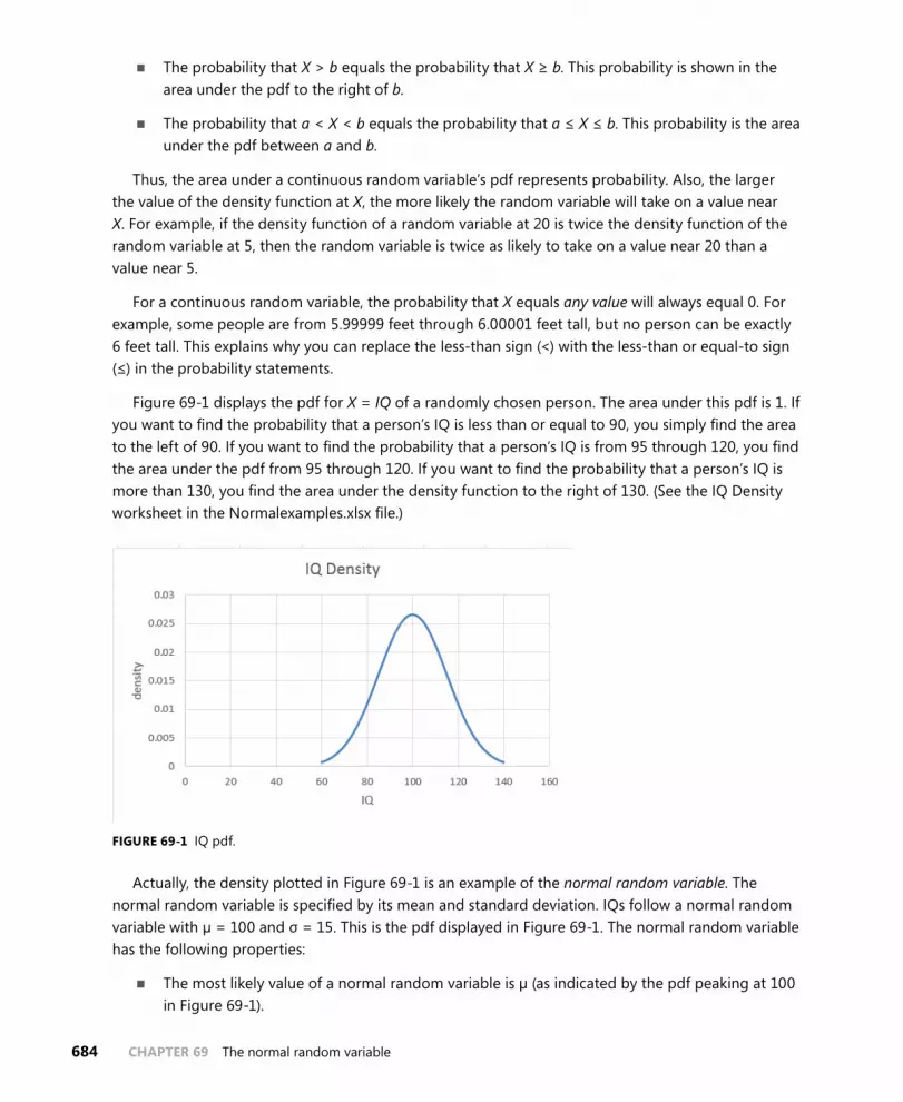
684 CHAPTER 69 The normal random variable
■■ The probability that X > b equals the probability that X ≥ b. This probability is shown in the area under the pdf to the right of b.
■■ The probability that a < X < b equals the probability that a ≤ X ≤ b. This probability is the area under the pdf between a and b.
Thus, the area under a continuous random variable’s pdf represents probability. Also, the larger the value of the density function at X, the more likely the random variable will take on a value near X. For example, if the density function of a random variable at 20 is twice the density function of the random variable at 5, then the random variable is twice as likely to take on a value near 20 than a value near 5.
For a continuous random variable, the probability that X equals any value will always equal 0. For example, some people are from 5.99999 feet through 6.00001 feet tall, but no person can be exactly 6 feet tall. This explains why you can replace the less-than sign (<) with the less-than or equal-to sign (≤) in the probability statements.
Figure 69-1 displays the pdf for X = IQ of a randomly chosen person. The area under this pdf is 1. If you want to find the probability that a person’s IQ is less than or equal to 90, you simply find the area to the left of 90. If you want to find the probability that a person’s IQ is from 95 through 120, you find the area under the pdf from 95 through 120. If you want to find the probability that a person’s IQ is more than 130, you find the area under the density function to the right of 130. (See the IQ Density worksheet in the Normalexamples.xlsx file.)
FIGURE 69-1 IQ pdf.
Actually, the density plotted in Figure 69-1 is an example of the normal random variable. The normal random variable is specified by its mean and standard deviation. IQs follow a normal random variable with µ = 100 and σ = 15. This is the pdf displayed in Figure 69-1. The normal random variable has the following properties:
■■ The most likely value of a normal random variable is µ (as indicated by the pdf peaking at 100 in Figure 69-1).

The normal random variable CHAPTER 69 685
■■ As the value x of the random variable moves away from µ, the probability that the random variable is near x sharply decreases.
■■ The normal random variable is symmetric about its mean. For example, IQs near 80 are as likely as IQs near 120.
■■ A normal random variable has 68 percent of its probability within σ of its mean, 95 percent within 2σ of its mean, and 99.7 percent within 3σ of its mean. These measures should remind you of the rule of thumb described in Chapter 42, “Summarizing data by using descriptive statistics.” In fact, the rule of thumb is based on the assumption that data is sampled from a normal distribution, which explains why the rule of thumb does not work as well when the data fails to exhibit a symmetric histogram.
For a larger σ, a normal random variable is more spread out about its mean. This pattern is illus-trated in Figures 69-2 and 69-3. (See the Sigma of 5 and 15 worksheet in the Normalexamples.xlsx file.)
FIGURE 69-2 Normal random variable pdf with a mean equal to 60 and a standard deviation equal to 5.
FIGURE 69-3 Normal random variable pdf with a mean equal to 60 and a standard deviation equal to 15.

686 CHAPTER 69 The normal random variable
How can I use Excel to find probabilities for the normal random variable?
Consider a normal random variable X with a mean µ and standard deviation σ. Suppose for any num-ber x, you want to find the probability that X ≤ x, which is called the normal cumulative function. To use Microsoft Excel 2013 to find the probability that X ≤ x, enter the NORM.DIST(x,µ,σ,1) formula. Of course, the fourth argument of 1 could be replaced by True.
The argument 1 tells Excel to compute the normal cumulative. If the last argument of the function is 0, Excel returns the actual value of the normal random variable pdf. Excel 2013 statistical functions (such as NORM.DIST) have been modified or redesigned completely to provide better accuracy than their counterparts (such as NORMDIST) in previous versions of Excel.
You can use the NORM.DIST function to answer many questions concerning normal probabilities. You can find examples in the Normal worksheet in the Normalexamples.xlsx file, which is shown in Figure 69-4 and in the following three scenarios.
FIGURE 69-4 Calculating normal probability.
■■ What fraction of people have an IQ of less than 90? Let X equal the IQ of a randomly chosen person. Then you seek the probability that X < 90, which is equal to the probability that X ≤ 90. Therefore, you can enter the NORM.DIST(90,100,15,1) formula in cell C3 of the Normal worksheet, and Excel returns 0.252. Thus, 25.2 percent of all people have an IQ less than 90.
■■ What fraction of all people have IQs from 95 through 120? When finding the probabil-ity that a ≤ X ≤ b, you use the (area under the normal density function to the left of b) – (area under normal density function to the left of a) formula. Thus, you can find the probability that a ≤ X ≤ b by entering the NORM.DIST(b,µ,s,1)–NORM.DIST(a,µ,s,1) formula. You can answer the question about IQs from 95 through 120 by entering the NORMDIST(120,100,15,1)–NORMDIST(95,100,15,1) formula in cell C4 of the Normal worksheet. Excel returns the prob-ability 0.539, so 53.9 percent of all people have an IQ from 95 through 120.
■■ What fraction of all people have IQs of at least 130? To find the probability that X ≥ b, note that the probability that X ≥ b equals 1 – probability X < b. You can compute the prob-ability that X ≥ b by entering the 1–NORM.DIST(b,µ,σ,1) formula. You seek the probability that X ≥ 130. This equals 1 – probability X < 130. You enter the 1–NORM.DIST(130,100,15,1)

The normal random variable CHAPTER 69 687
formula in cell C5 of the Normal worksheet. Excel returns 0.023, so you know that 2.3 percent of people have an IQ of at least 130.
Can I use Excel to find percentiles for normal random variables?
Consider a given normal random variable X with mean and standard deviation. In many situations, you want to answer questions such as the following:
■■ A drug manufacturer believes that next year’s demand for its popular antidepressant will be normally distributed, with mean equal to 60 million days of therapy (DOT) and sigma equal to 5 million DOT. How many units of the drug should be produced this year if the company wants to have only a 1 percent chance of running out of the drug?
■■ Family income in Bloomington, Indiana, is normally distributed, with mean equal to $30,000 and sigma equal to $8,000. The poorest 10 percent of all families in Bloomington are eligible for federal aid. What should the aid cutoff be?
In the first example, you want to determine the ninety-ninth percentile of demand for the antide-pressant. That is, you seek the number x such that there is only a 1 percent chance that demand will exceed x and a 99 percent chance that demand will be less than x. In the second example, you want the tenth percentile of family income in Bloomington. That is, you seek the number x such that there is only a 10 percent chance that family income will be less than x and a 90 percent chance that family income will exceed x.
Suppose you want to find the pth percentile (expressed as a decimal) of a normal random variable X with a mean and a standard deviation. In Excel 2013, simply enter the NORM.INV(p,µ,σ) formula. This formula returns a number x such that the probability that X ≤ x equals the specified percen-tile. You now can solve your examples. You’ll find these exercises on the Normal worksheet in the Normalexamples.xlsx file.
For the drug manufacturing example, let X equal annual demand for the drug. You want a value x such that the probability that X ≥ x equals 0.01 or the probability that X < x equals 0.99. Again, you seek the ninety-ninth percentile of demand, which you find (in millions) by entering the NORM .INV(0.99,60,5) formula in cell C7. Excel returns 71.63, so the company must produce 71,630,000 DOT. This assumes, of course, that the company begins the year with no supply of the drug on hand. If, for example, it had a beginning inventory of 10 million DOT, it would need to produce 61,630,000 DOT during the current year.
To determine the cutoff for federal aid, if X equals the income of a Bloomington family, you seek a value of x such that the probability that X ≤ x equals 0.10, or the tenth percentile of Bloomington family income. You find this value with the NORM.INV(0.10,30000,8000) formula. Excel returns $19,747.59, so aid should be given to all families with incomes smaller than $19,749.59.
Why is the normal random variable appropriate in many real-world situations?
A well-known mathematical result called the central limit theorem indicates that if you add together many (usually at least 30 is sufficient) independent random variables, their sum is normally distrib-uted. This result holds true even if the individual random variables are not normally distributed. Many

688 CHAPTER 69 The normal random variable
quantities (such as measurement errors) are created by adding together many independent random variables, which explains why the normal random variable occurs often in the real world. Here are some other situations in which you can use the central limit theorem:
■■ The total demand for pizzas during a month at a supermarket is normally distributed even if the daily demand for pizzas is not.
■■ The amount of money you win if you play craps 1,000 times is normally distributed, even though the amount of money you win on each individual play is not.
Another important mathematical result shows how to find the mean, variance, and standard devia-tions of sums of independent random variables. If you are adding together independent random variables X1, X2, . . . , Xn where mean Xi = µi, and standard deviation Xi = σi then the following are true:
1. Mean (X1 + X2 + . . . Xn) = µ1 + µ2 + . . . µn
2. Variance (X1 + X2 + . . . Xn) = 2 2 21 2 ... n+ +s s s
3. Standard deviation (X1 + X2 + . . . Xn) = σ2 + σ2 + ...σ221 n
Note that 1 is true even when the random variables are not independent. By combining 1 through 3 with the central limit theorem, you can solve many complex probability problems, such as the fol-lowing: Suppose daily demand for pizza is not normally distributed but has a mean of 45 and sigma of 10. What is the probability that at least 1,400 pizzas will be sold during a month? Your pizza solution is in the Central Limit worksheet in the Normalexamples.xlsx file, which is shown in Figure 69-5.
FIGURE 69-5 Using the central limit theorem.
Even though the daily demand for frozen pizzas is not normally distributed, you know from the central limit theorem that the 30-day demand for frozen pizzas is normally distributed. Given this, the preceding 1 through 3 imply the following:
■■ From 1, the mean of a 30-day demand equals 30(45) = 1,350.
■■ From 2, the variance of a 30-day demand equals 30(12)2 = 4,320.
■■ From 3, the standard deviation of a 30-day demand equals = 65.73.

The normal random variable CHAPTER 69 689
Thus, the 30-day demand for pizzas can be modeled following a normal random variable with a mean of 1,350 and a standard deviation of 65.73. In cell D11, the probability that at least 1,400 piz-zas are sold is computed as the probability that the normal approximation is at least 1,399.5 (note that a demand of 1,399.6, for example, would round up to 1,400) with the 1–NORM .DIST(1399.5,D7,D9,TRUE) formula. You find the probability that demand in a 30-day period for at least 1,400 pizzas is 22.6 percent.
The number of pizzas that you must stock to have only a 1 percent chance of running out of pizzas is just the ninety-ninth percentile of the demand distribution. You determine the ninety-ninth percen-tile of the demand distribution (1,503) in cell D12 with the NORM.INV(0.99,D7,D9) formula. Therefore, at the beginning of a month, you should bring your stock of pizzas up to 1,503 if you want to have only a 1 percent chance of running out of pizzas.
Problems
1. Suppose you can set the mean number of ounces of soda that is put into a can. The actual number of ounces has a standard deviation of 0.05 ounces:
• If you set the mean at 12.03 ounces, and a soda can is acceptable if it contains at least 12 ounces, what fraction of cans is acceptable?
• What fraction of cans have less than 12.1 ounces?
• What should you set the mean to if you want at most 1 percent of your cans to contain at most 12 ounces? Hint: Use the Goal Seek command.
2. Annual demand for a drug is normally distributed with a mean of 40,000 units and a standard deviation of 10,000 units:
• What is the probability that annual demand is from 35,000 through 49,000 units?
• If you want to have only a 5 percent chance of running out of the drug, at what level should you set annual production?
3. The probability of winning a game of craps is 0.493. If I play 10,000 games of craps and bet the same amount on each game, what is the probability that I’m ahead? Begin by determin-ing the mean and standard deviation of the profit on one game of craps. Then use the central limit theorem.
4. Weekly sales of Volvo’s Cross Country station wagons are normally distributed with a mean of 1,000 and standard deviation of 250:
• What is the probability that, during a week, from 400 through 1,100 station wagons are sold?
• There is a 1 percent chance that fewer than what number of station wagons is sold during a week?


691
C H A P T E R 7 0
Weibull and beta distributions: modeling machine life and duration of a project
Questions answered in this chapter:
■■ How can I estimate the probability that a machine will work without failing for at least 20 hours?
■■ How can I estimate the probability that hanging drywall in a building will take more than 200 hours?
The Weibull random variable is a continuous random variable that is often used to model the lifetime of a machine. If you have data about how long similar machines have lasted in the past, you can esti-mate the two parameters (alpha and beta) that define a Weibull random variable. You can then use the WEIBULL.DIST function in Microsoft Excel 2013 to determine probabilities of interest such as an estimate of how long a machine will run without failing.
The beta random variable is a continuous random variable that’s often used to model the duration of an activity. Given estimates of the minimum duration, maximum duration, mean duration, and the standard deviation of the duration, you can use the BETA.DIST function in Excel 2013 to determine probabilities of interest.
Answers to this chapter’s questions
This section provides the answers to the questions that are listed at the beginning of the chapter.
How can I estimate the probability that a machine will work without failing for at least 20 hours?
Suppose you have observed the lifetime of seven similar machines. The data collected about the machines is contained in the Weibullest.xlsx file, shown in Figure 70-1.

692 CHAPTER 70 Weibull and beta distributions: modeling machine life and duration of a project
FIGURE 70-1 Machine lifetime data.
Reliability engineers have found that the Weibull random variable is usually appropriate for modeling machine lifetimes. The Weibull random variable is specified by two parameters: alpha and beta. Based on the data, you can determine (using the AVERAGE and STDEV.S functions in cells B13 and B14) that, on average, a machine lasts 18.68 hours, with a standard deviation of 7.40 hours. By copying these values to cells G6 and G11 and running the Solver with the settings shown in Figure 70-2, you can find estimates of alpha and beta that ensure that the Weibull random variable will have a mean and standard deviation matching the data. In this case, alpha equals 2.725 and beta equals 21.003, as you can see in Figure 70-3. Any value you enter for alpha and beta in cells E2 and E3 for a Weibull random variable yields a mean (computed in cell E6) and standard deviation (computed in cell E11). The Solver model varies alpha and beta until the mean and standard deviation of the Weibull distribution equal the mean and standard deviation of machine lifetime computed from your data. The Multistart option for the GRG Nonlinear engine is recommended for this. The Multistart engine works best with upper and lower bounds on the changing cells. A lower bound of 0.010 on alpha and beta will always work. An upper bound of 1,000 for alpha and beta was tried. If the Solver makes alpha or beta bump up against your upper bound, you should relax the bound.

Weibull and beta distributions: modeling machine life and duration of a project CHAPTER 70 693
FIGURE 70-2 Solver settings for determining parameters for a Weibull random variable.
FIGURE 70-3 Estimates of alpha and beta for a Weibull random variable.

694 CHAPTER 70 Weibull and beta distributions: modeling machine life and duration of a project
Here’s the syntax of the WEIBULL.DIST function:
WEIBULL.DIST(x,alpha,beta,Cumulative)
When Cumulative equals True, this formula results in the probability that a Weibull random vari-able with parameters alpha and beta is less than or equal to x. Changing True to False yields the height of the Weibull probability density function (pdf). Remember from Chapter 66, “An introduc-tion to random variables,” that the height of a pdf for any value x of a continuous random vari-able indicates the likelihood that the random variable assumes a value near x. Thus, if the Weibull density for 20 hours were twice the Weibull density for 10 hours, you would know that a machine is twice as likely to work for 20 hours before failing than to work for 10 hours before failing. Before answering some questions involving probabilities of interest, note that in prior versions of Excel, the WEIBULLDIST function yields the same results as WEIBULL.DIST:
■■ What is the probability that a machine will last at least 20 hours? This probability (41.7 percent) is computed in cell G16 with the 1–WEIBULL.DIST(20,alpha,beta,1) formula. Essentially, this formula computes the area under the Weibull pdf to the right of 20 hours by subtracting from 1 the area to the left of 20 hours.
■■ What is the probability that a machine will last from 15 through 30 hours? This prob-ability (66.9 percent) is computed in cell G18 with the WEIBULL.DISTL(30,alpha,beta,TRUE)–WEIBULL.DIST(15,alpha,beta,TRUE) formula. This formula finds the area under the Weibull pdf from 15 through 30 hours by computing the area to the left of 30 hours minus the area to the left of 15 hours. After you subtract the probability of a machine working without failure for less than 15 hours from the probability of a machine working without failure for less than or equal to 30 hours, you are left with the probability that a machine will work without failure from 15 through 30 hours.
How can I estimate the probability that hanging drywall in a building will take more than 200 hours?
Since the development of the Polaris missile in the 1950s, project managers have modeled activity durations with the beta random variable. To specify a beta random variable, you need to specify a minimum value, a maximum value, and two parameters (alpha and beta). The data in the Beta.xlsx file (see Figure 70-4) can be used to estimate the parameters of a beta distribution.
Suppose that you believe that the time needed to hang drywall in a building is sure to be between 0 and 600 hours. These are your minimum and maximum values, entered in cells C7 and C8. The F8:F22 cell range contains the lengths of time needed to hang drywall in 15 buildings of a similar size. In cell F5, the AVERAGE function was used to compute the mean time (78.49 hours) needed to hang drywall in these 15 buildings. In cell F6, the STDEV function was used to determine the standard deviation (47.97 hours) of the time needed to hang drywall in these buildings. Any choice of values of alpha and beta determine the shape of the beta distribution’s pdf and the mean and standard devia-tion for the corresponding beta random variable. If you can choose alpha and beta values to match the mean and standard deviation of the drywall installation times computed from this data, it seems reasonable that these alpha and beta values will yield probabilities consistent with the observed data. After you enter the mean and standard deviation for the drywall installation data in cells C9 and C10,

Weibull and beta distributions: modeling machine life and duration of a project CHAPTER 70 695
the worksheet computes values for alpha (2.20) in cell C5 and beta (14.66) in cell C6 that ensure that the mean and standard deviation of the beta random variable match the mean and standard devia-tion of the data.
FIGURE 70-4 Determining probabilities with the beta random variable.
The BETA.DIST(x,alpha,beta,True_or_1,lower,upper) function determines the probability that a beta random variable ranging from lower through upper, with parameters alpha and beta, assumes a value less than or equal to x. The last two parameters are optional, and if they are omitted, Excel assumes lower equals 0 and upper equals 1. The BETA.DIST(x,alpha,beta,False_or_0,lower,upper) function returns the pdf for a random variable following a beta distribution. You can now use the BETA.DIST function to determine probabilities of interest.
To compute the probability that hanging drywall will take at least 200 hours, you can use the formula in cell C15, 1–BETA.DIST(200,alpha,beta,True_or_1,lower,upper). The result is 2.1 percent. This formula simply computes the probability that hanging drywall will take at least 200 hours as 1 – prob-ability dry walling takes less than or equal to 200 hours.
The probability that hanging drywall will take at most 80 hours (58.3 percent) can be computed with the formula in cell C16, BETA.DIST(80,alpha,beta,True,lower,upper). And to compute the prob-ability that the task will take from 30 through 150 hours (77.1 percent), in cell C17, use the BETA.DIST(150,alpha,beta,True,lower,upper)–BETA.DIST(30,alpha,beta,True,lower,upper) formula. This formula computes the probability that dry walling takes from 30 through 150 hours as the probability that dry walling takes less than or equal to 150 hours minus the probability that dry walling takes less than or equal to 30 hours. The difference between these probabilities counts only instances when dry walling takes from 30 through 150 hours.

696 CHAPTER 70 Weibull and beta distributions: modeling machine life and duration of a project
Problems
The data for this chapter’s problems are contained in the Ch70data.xlsx file:
1. In the Problem 1 worksheet, you are given data about the duration of a machine’s lifetime:
• What is the probability that the machine will last at least 10 hours?
• What is the probability that the machine will last from 1 through 5 hours?
• What is the probability that the machine will fail within 6 hours?
2. You need to clean your house today. In the Problem 2 worksheet, you are given data about how long it has taken to clean your house in the past. If you start cleaning at noon, what are the chances that you’ll be finished in time to leave at 7:00 P.M. for a movie?

697
C H A P T E R 7 1
Making probability statements from forecasts
Questions answered in this chapter:
■■ On what basis do we evaluate forecasts?
■■ If a drug company forecasts that it will sell 60 million units of a drug next year, what is the chance it will sell more than 65 million units of that drug next year?
Each day, we are constantly inundated by forecasts. Here are some examples:
■■ The government predicts the GNP will grow by 4 percent during the next year.
■■ The Eli Lilly marketing department predicts that during the next year, demand for a given drug will be 400,000,000 DOT (days of therapy).
■■ A Wall Street guru predicts the Dow will go up 20 percent during the next 12 months.
■■ The bookmakers forecast that the Indiana Pacers will beat the Houston Rockets by 6 in the opening game of the 2015 NBA season.
Although the forecasts we receive might be the best available, they are almost sure to be incor-rect. For example, the bookmaker’s prediction that the Pacers will win by 6 points is incorrect unless the Pacers win by exactly 6 points. In short, any single value (or point forecast) implies a distribution for the quantity being forecasted. How can you find a random variable that correctly models the uncertainty inherent in the point forecast? The key to putting a distribution around a point forecast is to have some historical data about the accuracy of past forecasts of the quantity of interest. For example, with regard to the forecast for the Dow industrial average, you might have, for the past 10 years, the forecast made in January of each year for the percentage change in the Dow and the actual change in the Dow for each of the 10 years.

698 CHAPTER 71 Making probability statements from forecasts
Answers to this chapter’s questions
This section provides the answers to the questions that are listed at the beginning of the chapter.
On what basis do we evaluate forecasts?
You can begin by seeing whether past forecasts exhibit any bias. For each past forecast, you deter-mine the actual value and forecasted value. Then you average these ratios. If your forecasts are unbi-ased, this average should be around 1. Any significant deviation from 1 indicates a significant bias. For example, if the average of actual and forecasted is 2, actual results tend to be around twice the forecast. To correct for a bias, you should automatically double your forecast. If the average of actual and forecasted is .5, actual results tend to be around half the actual forecast, so to eliminate bias, you should automatically halve your forecast. After you eliminate forecast bias, you look at the standard deviation of the percentage errors of the unbiased forecast and use the following normal random variable to model the quantity being forecasted:
■■ Mean = the unbiased forecast
■■ Standard deviation = (unbiased forecast)*(standard deviation of the percentage errors associ-ated with the unbiased forecasts)
The standard deviation of the percentage errors measures the accuracy of the past forecasts. Clearly, a smaller standard deviation of percentage forecast errors is preferred to a larger standard deviation.
The Drugfore.xlsx file (see Figure 71-1) illustrates the ideas of forecast bias and forecast accuracy. The file contains actual and forecasted sales (in millions of DOT) for years 2005 through 2012. First, these forecasts will be shown to be biased, and then they’ll be corrected for the bias.
FIGURE 71-1 Correcting for forecast bias and measuring forecast accuracy.

Making probability statements from forecasts CHAPTER 71 699
To begin, in cells F5:F12, check for bias by computing actual sales and forecasted sales for each year. To do this, copy the D5/E5 formula from F5 to F6:F12.
Next, in cell F2, compute the bias of the original forecasts by averaging each year’s actual and forecasted value with the AVERAGE(F5:F12) formula. Actual sales tend to come in 8 percent under forecast. To correct past biased forecasts, multiply them by .92 by copying the $F$2*E5 formula from G5 to G6:G12. In H5:H12, compute each year’s percentage error for the unbiased forecast by copying the (D5-G5)/G5 formula from H5 to H6:H12. As you can see, for example, 2005 actual sales were 16 percent less than the unbiased forecast, whereas in 2011, actual sales were 19 percent larger than the unbiased forecast.
Now evaluate the accuracy of the forecast errors in cell I2 by computing the standard deviation of the percentage errors with the STDEV.S(H5:H12) formula. The standard deviation of past unbiased forecasts has been around 11.4 percent of the unbiased forecast.
If a drug company forecasts that it will sell 60 million units of a drug in 2013, what is the chance it will sell more than 65 million units of the drug in 2013?
Forecast errors often follow a normal random variable. Therefore, after correcting for bias, you can assume that forecast errors follow a normal random variable with:
■■ Mean = the unbiased forecast.
■■ Standard deviation = (unbiased forecast)*(standard deviation of the percentage errors associ-ated with the unbiased forecasts).
In your example, this means that you should model drug sales in 2013 as a normal random variable with mean = 60(.918) = 55.08 million and standard deviation = (.11375)*55.08 = 6.27 million. You can now use the Excel NORM.DIST function to compute, in cell E18 (see Figure 71-2), the chance of selling at least 65 million units in 2013 with the 1-NORM.DIST(65,F15,F16,TRUE) formula. There is a 5.7 percent chance of selling more than 65 million units of the drug.
FIGURE 71-2 Chance of selling more than 65 million units of the drug.
Problems
1. In Game 7 of the Boston Celtics–Los Angeles Lakers 2010 NBA finals, the Lakers were favored by seven points. By looking at past NBA games, you will find that bookmakers’ forecasts are unbiased. In addition, the standard deviation of bookmaker forecasts in past NBA games is

700 CHAPTER 71 Making probability statements from forecasts
12 points. Before the game, what would you have estimated as the probability that the Lakers would win the game?
2. A leading cell phone company forecasts that it will sell 3 million units next year of its bestsell-ing phone. In the past, actual sales have been unbiased, with forecast errors having a standard deviation equal to 10 percent of forecasted sales. What are the chances that fewer than 2.5 million phones will be sold next year?
3. The USC.xlsx file contains the USC football team’s margins of victory for years 2005 through 2009 and the bookmaker’s forecast (before the game) for the USC margin of victory. Do these data indicate that the bookmaker’s forecasts are unbiased? If USC is favored by 10 points, estimate the chance that USC wins the game.

701
C H A P T E R 7 2
Using the lognormal random variable to model stock prices
Questions answered in this chapter:
■■ What is the lognormal random variable?
■■ Is there a reason stock prices might follow a lognormal random variable?
■■ How can I model the future price of any stock as a lognormal random variable?
■■ How can I compute the probability that the Microsoft stock price will exceed $38 six months from now?
■■ How can I compute the median price of Microsoft in six months?
Many people are interested in modeling the future price of a stock, a commodity such as oil or wheat, or a future exchange rate. For the past 40 years, the lognormal random variable has been the random variable most often used to model stock prices. In this chapter, you learn why the lognor-mal random variable is a reasonable model for stock prices and how to determine the appropriate lognormal parameters for any stock. The chapter closes by showing how the Excel LOGNORM.DIST and LOGNORM.INV functions can be used to calculate probabilities that involve the future price of a stock.
Answers to this chapter’s questions
This section provides the answers to the questions that are listed at the beginning of the chapter.
What is a lognormal random variable?
A random variable Y follows a lognormal random variable if ln Y follows a normal random variable. When using the Excel LOGNORM.DIST and LOGNORM.INV functions, a lognormal random variable Y is characterized by two parameters: a mean Mu equal to the expected value of ln Y and a standard deviation Sigma equal to the standard deviation of ln Y.
Is there a reason stock prices might follow a lognormal random variable?
Let Y equal the price of a stock n days from now, P equal the stock’s price today, and Xt equal the percentage change in the stock’s price during day t. Then Y = P*X1*X2*. . . Xn. Because the logarithm of

702 CHAPTER 72 Using the lognormal random variable to model stock prices
a product is the sum of the logarithms, it’s true that ln Y = ln P + ln X1 + ln X2 +. . . ln Xn. Suppose the changes in prices on different days are independent random variables. Recall from Chapter 69, “The normal random variable,” that the central limit theorem implies that the sum of many independent random variables will be a normal random variable, even if the individual random variables are not normally distributed. This explains why ln Y is likely to be a normal random variable, and this implies that Y is a lognormal random variable.
How can I model the future price of any stock as a lognormal random variable?
At the close of trading on August 9, 2013, the price of Microsoft stock was $32.70. Suppose you are interested in modeling the price of Microsoft stock in six months as a lognormal random variable. How can you estimate Mu and Sigma? Luckily, information is easily available on the Internet to help you model the future price of a stock. The Ivolatility.com website provides an estimate of a stock’s annual volatility (call it Sigma_). The annual volatility is a surrogate for a stock’s riskiness or variability. At the close of trading on August 9, 2013, you can find from Ivolatility.com that the Microsoft implied volatility was 22.27 percent. To represent Sigma_ as a decimal, you write Sigma_ = .2227. (The method used to compute implied volatility is discussed in Chapter 78, “Pricing stock options.”)
From the Investment section of finance.yahoo.com, you can find the consensus opinion of analysts for the price of Microsoft in a year, shown in Figure 72-1.
FIGURE 72-1 Analysts’ forecasts for Microsoft stock price in one year.
Let S equal today’s stock price and S1 equal the estimated mean price in one year. Then Mu_, a sur-rogate for the annual mean return on the stock, can be estimated by Mu_ = ln (S1/S0).
You know that S equals $32.70, and S1 equals $34.92. Therefore (as computed in cell F7 of the Lognormal.xlsx file; see Figure 72-2), Mu_ = ln (34.92/32.70) = 0.06568.

Using the lognormal random variable to model stock prices CHAPTER 72 703
FIGURE 72-2 Using lognormal to model the price of Microsoft stock in six months.
If you want to model the price of Microsoft stock t years in the future, you need to know Mut = Mean of ln of Microsoft stock price in t years and Sigmat = Standard deviation of ln of Microsoft stock price in t years. It turns out that:
Mut = ln S + t(Mu_ – .5Sigma_ 2̂) and Sigma = Sigma_* t .
For six months, t =.5 years. In cell E9, Mu.5 was computed as ln(32.7) +.5*(.06568) – .5*(.2227)2 = 3.507819.
In cell E10, you compute Sigma.5 = (.227)* .5 = 0.157473.
Therefore, you can model the price of Microsoft in six months as a lognormal random variable with Mu = 3.507819 and Sigma = 0.157473.
How can I compute the probability that the Microsoft stock price will exceed $38 six months from now?
The Excel 2013 LOGNORM.DIST(x,Mean,Sigma,True_or_1) function computes the probability that a lognormal random variable with parameters Mean and Sigma is less than or equal to x. Changing True (or 1) to False (or 0) returns the height of the lognormal pdf at x.
In previous versions of Excel, the LOGNORMDIST function returns the same results as LOGNORM .DIST. In cell F13, you can determine the chance that the price of a share of Microsoft will exceed $38. This is calculated by 1 – Probability that share is >=$38, so use the 1-LOGNORM.DIST(38,F9,F10,True) formula. There is a 20.5 percent chance that a share of Microsoft will sell for more than $38 in six months.
In cell F14, you can determine the chance that a share of Microsoft will sell for less than or equal to $20 in six months with the LOGNORM.DIST(20,F9,F10,True) formula. There is less than a one percent chance that a share of Microsoft will sell for $20 or less in six months.

704 CHAPTER 72 Using the lognormal random variable to model stock prices
How can I compute the median price of Microsoft in six months?
The LOGNORM.INV(p,Mu,Sigma) function returns the value x of a lognormal random variable with parameters Mu and Sigma such that there is a probability p that the lognormal random variable is less than or equal to x.
Suppose you want to determine the median price of Microsoft stock in six months. This is a price $x such that there is a 50 percent chance that the Microsoft stock price in six months will be less than or equal to $x. In cell F15, you find the median price in six months with the LOGNORM.INV(0.5,F9,F10) formula. The median price in six months is $33.38.
Remarks
The famous Black-Scholes option-pricing formula is discussed in Chapter 78. It assumes that the price of a stock does follow a lognormal random variable.
In recent years, it has become apparent that for many stocks, future stock prices take on extremely high or low values more often than the lognormal random variable predicts. This has caused analysts to search for other random variables with fat tails that can be used to model future stock prices. For more details on this topic, see Nicholas Taleb’s best-selling book, The Black Swan (New York: Random House, 2010). Also, an alternative method for modeling stock prices that does not assume that future stock prices follow a lognormal random variable is discussed in Chapter 75, “Simulating stock prices and asset allocation modeling.”
Problems
Suppose a stock sells for $30 today. The annual volatility of the stock is 35 percent, and analysts pre-dict the expected price of the stock in a year will be $35. Use this information to answer the following questions:
1. What is the probability that in two years the stock will sell for more than $45?
2. What is the probability that in two years the stock will sell for less than $25?
3. You are 95 percent sure that the price of the stock in two years will be between what two values? Hint: Use .025 and .975 as the first arguments in the LOGNORM.INV function.

705
C H A P T E R 7 3
Introduction to Monte Carlo simulation
Questions answered in this chapter:
■■ Who uses Monte Carlo simulation?
■■ What happens when I type =RAND() in a cell?
■■ How can I simulate values of a discrete random variable?
■■ How can I simulate values of a normal random variable?
■■ How can a greeting card company determine how many cards to produce?
Data analysts would like to estimate the probabilities of uncertain events accurately. For example, what is the probability that a new product’s cash flows will have a positive net present value (NPV)? What is the risk factor of an investment portfolio? Monte Carlo simulation enables you to model situ-ations that present uncertainty and then play them out on a computer thousands of times.
Note The term Monte Carlo simulation comes from the computer simulations performed during the 1930s and 1940s to estimate the probability that the chain reaction needed for an atom bomb to detonate would work successfully. The physicists involved in this work were big fans of gambling, so they gave the simulations the code name Monte Carlo.
In the next five chapters, examples are provided of how you can use Microsoft Excel 2013 to per-form Monte Carlo simulations.

706 CHAPTER 73 Introduction to Monte Carlo simulation
Answers to this chapter’s questions
This section provides the answers to the questions that are listed at the beginning of the chapter.
Who uses Monte Carlo simulation?
Many companies use Monte Carlo simulation as an important part of their decision-making process. Here are some examples:
■■ General Motors, Proctor and Gamble, Pfizer, Bristol-Myers Squibb, and Eli Lilly use simulation to estimate both the average return and the risk factor of new products. At GM, former CEO Rick Waggoner used this information to determine which products came to market.
■■ GM uses simulation for activities such as forecasting net income for the corporation, predict-ing structural and purchasing costs, and determining its susceptibility to different kinds of risk (such as interest rate changes and exchange rate fluctuations).
■■ Lilly uses simulation to determine the optimal plant capacity for each drug.
■■ Proctor and Gamble uses simulation to model and optimally hedge foreign exchange risk.
■■ Sears uses simulation to determine how many units of each product line should be ordered from suppliers—for example, the number of pairs of Dockers trousers that should be ordered this year.
■■ Oil and drug companies use simulation to value real options such as the value of an option to expand, contract, or postpone a project.
■■ Financial planners use Monte Carlo simulation to determine optimal investment strategies for their clients’ retirement.
What happens when I type =RAND() in a cell?
When you type the =RAND() formula in a cell, you get a number that is equally likely to assume any value between 0 and 1. Thus, around 25 percent of the time, you should get a number less than or equal to 0.25; around 10 percent of the time, you should get a number that is at least 0.90, and so on. To demonstrate how the RAND function works, take a look at the Randdemo.xlsx file, shown in Figure 73-1.

Introduction to Monte Carlo simulation CHAPTER 73 707
FIGURE 73-1 Demonstrating the RAND function.
Note When you open the Sheet1 worksheet in the Randdemo.xlsx file, you will not see the same random numbers shown in Figure 73-1. The RAND function always recalculates the numbers it generates when a worksheet is opened or when new information is entered in the worksheet. The values in the Frozen worksheet are fixed to correspond to Figure 73-1.
The =RAND() formula was copied from cell C3 to C4:C402; the C3:C402 range was named Data. Then, in column F, you can track the average of the 400 random numbers (cell F2) and use the COUNTIF function to determine the fractions that are between 0 and 0.25, 0.25 and 0.50, 0.50 and 0.75, and 0.75 and 1. When you press the F9 key, the random numbers are recalculated. Notice that the average of the 400 numbers is always approximately 0.5 and that around 25 percent of the results are in intervals of 0.25. These results are consistent with the definition of a random number. Also note that the values RAND generates in different cells are independent. For example, if the random num-ber generated in cell C3 is a large number (for example, 0.99), that tells you nothing about the values of the other random numbers generated.

708 CHAPTER 73 Introduction to Monte Carlo simulation
How can I simulate values of a discrete random variable?
Suppose the demand for a calendar is governed by the following discrete random variable:
Demand Probability
10,000 0.10
20,000 0.35
40,000 0.3
69,000 0.25
How can you have Excel play out, or simulate, this demand for calendars many times? The trick is to associate each possible value of the RAND function with a possible demand for calendars. The fol-lowing assignment ensures that a demand of 10,000 will occur 10 percent of the time, and so on:
Demand Random number assigned
10,000 Less than 0.10
20,000 Greater than or equal to 0.10, and less than 0.45
40,000 Greater than or equal to 0.45, and less than 0.75
69,000 Greater than or equal to 0.75
To demonstrate the simulation of demand, look at the Sim worksheet in the Discretesim.xlsx file (or its Frozen version shown in Figure 73-2).
FIGURE 73-2 Simulating a discrete random variable.
The key to this simulation is to use a random number to initiate a lookup from the F2:G5 table range (named Lookup). Random numbers greater than or equal to 0 and less than 0.10 will yield a demand of 10,000; random numbers greater than or equal to 0.10 and less than 0.45 will yield a demand of 20,000; random numbers greater than or equal to 0.45 and less than 0.75 will

Introduction to Monte Carlo simulation CHAPTER 73 709
yield a demand of 40,000; and random numbers greater than or equal to 0.75 will yield a demand of 69,000. Four hundred random numbers were generated by copying the RAND() formula from C3 to C4:C402. Then 400 trials, or iterations, of calendar demand were generated by copying the VLOOKUP(C3,lookup,2) formula from B3 to B4:B402. This formula ensures that any random number less than 0.10 generates a demand of 10,000; any random number between 0.10 and 0.45 generates a demand of 20,000; and so on. In the F8:F11 cell range, the COUNTIF function was used to determine the fraction of the 400 iterations yielding each demand. When you press F9 to recalculate the random numbers, the simulated probabilities are close to the assumed demand probabilities.
How can I simulate values of a normal random variable?
If you type the NORM.INV(rand(),mu,sigma) formula in any cell, you generate a simulated value of a normal random variable having a mean Mu and standard deviation sigma. This procedure is illus-trated in the Sim worksheet in the Normalsim.xlsx file. (See Figure 73-3 for the Frozen version.)
FIGURE 73-3 Simulating a normal random variable.
Suppose you want to simulate 400 trials for a normal random variable with a mean of 40,000 and a standard deviation of 10,000. (These values are typed in cells E1 and E2, and these cells are named mean and sigma, respectively.) Copying the =RAND() formula from C4 to C5:C403 generates 400 ran-dom numbers. Copying the NORM.INV(C4,mean,sigma) formula from B4 to B5:B403 generates 400 trial values from a normal random variable with a mean of 40,000 and a standard deviation of 10,000. When you press the F9 key to recalculate the random numbers, the mean remains close to 40,000 and the standard deviation close to 10,000.
Essentially, for a random number p, the NORM.INV(p,mean,sigma) formula generates the pth per-centile of a normal random variable with a mean Mu and a standard deviation Sigma. For example, the random number 0.87 in cell C4 (see Figure 73-3) generates approximately the eighty-seventh percentile of a normal random variable with a mean of 40,000 and a standard deviation of 10,000 in cell B4.

710 CHAPTER 73 Introduction to Monte Carlo simulation
How can a greeting card company determine how many cards to produce?
This section demonstrates how Monte Carlo simulation can be used as a decision-making tool. Suppose that the demand for a Valentine’s Day card is governed by the following discrete random variable:
Demand Probability
10,000 0.10
20,000 0.35
40,000 0.3
69,000 0.25
The greeting card sells for $4.00, and the variable cost of producing each card is $1.50. Leftover cards must be disposed of at a cost of $0.20 per card. How many cards should be printed?
Basically, you simulate each possible production quantity (10,000; 20,000; 40,000; or 69,000) many times (for example, one thousand iterations). Then you determine which order quantity yields the maximum average profit over the one thousand iterations. You can find the data for this section in the Sim worksheet in the Valentine.xlsx file. (The Frozen version is shown in Figure 73-4.) The range names in cells B1:B11 were assigned to cells C1:C11. The name Lookup was assigned to the G3:H6 cell range. The sales price and cost parameters are entered in cells C4:C6.
FIGURE 73-4 Valentine’s Day card simulation.
Enter a trial production quantity (40,000 in this example) in cell C1. Create a random number in cell C2 with the =RAND() formula. As previously described, demand for the card in cell C3 is simulated with the VLOOKUP(rand,lookup,2) formula. (In the VLOOKUP formula, rand is the cell name assigned to cell C3, not the RAND function.)
The number of units sold is the smaller of the production quantity and demand. In cell C8, com-pute revenue with the MIN(produced,demand)*unit_price formula. In cell C9, compute total produc-tion cost with the produced*unit_prod_cost formula.
If more cards are produced than are in demand, the number of units left over equals production minus demand; otherwise, no units are left over. Compute the disposal cost in cell C10 with the unit_disp_cost*IF(produced>demand,produced–demand,0) formula. Finally, in cell C11, compute profit as revenue – total_var_cost-total_disposing_cost.

Introduction to Monte Carlo simulation CHAPTER 73 711
It would be nice to have an efficient way to press F9 many times (for example, one thousand) for each production quantity and tally the expected profit for each quantity. This situation is one in which a two-way data table comes to the rescue. (See Chapter 16, “Sensitivity analysis with data tables,” for details about data tables.) The data table used in this example is shown in Figure 73-5.
FIGURE 73-5 Two-way data table for greeting card simulation.
In the A16:A1015 cell range, enter the numbers 1 to 1,000 (corresponding to the 1,000 trials). One easy way to create these values is to start by entering 1 in cell A16. Select the cell and then, on the Home tab in the Editing group, click Fill (the icon with the down arrow), and select Series to open the Series dialog box. In the Series dialog box, shown in Figure 73-6, enter a step value of 1 and a stop value of 1,000. In the Series In area, select Columns and then click OK. The numbers 1 through 1,000 will be entered in column A, starting in cell A16.
FIGURE 73-6 Using the Series dialog box to fill in the trial numbers 1 through 1,000.

712 CHAPTER 73 Introduction to Monte Carlo simulation
Enter the possible production quantities (10,000; 20,000; 40,000; 69,000) in cells B15:E15. You want to calculate profit for each trial number (1 through 1,000) and each production quantity. Refer to the formula for profit (calculated in cell C11) in the upper-left cell of the data table (A15) by entering =C11.
You can now trick Excel into simulating one thousand iterations of demand for each production quantity. Select the table range (A15:E1015) and then, in the Data Tools group on the Data tab, click What If Analysis and then select Data Table. To set up a two-way data table, choose the produc-tion quantity (cell C1) as the row input cell and select any blank cell (cell I14 was chosen here) as the column input cell. After you click OK, Excel simulates one thousand demand values for each order quantity.
To understand why this works, consider the values placed by the data table in the C16:C1015 cell range. For each of these cells, Excel uses a value of 20,000 in cell C1. In C16, the column input cell value of 1 is placed in a blank cell, and the random number in cell C2 recalculates. The corresponding profit is then recorded in cell C16. Then the column input cell value of 2 is placed in a blank cell, and the random number in C2 again recalculates. The corresponding profit is entered in cell C17.
By copying the AVERAGE(B16:B1015) formula from cell B13 to C13:E13, you can compute average simulated profit for each production quantity. By copying the STDEV(B16:B1015) formula from cell B14 to C14:E14, you can compute the standard deviation of the simulated profits for each order quan-tity. Each time you press F9, one thousand iterations of demand are simulated for each order quantity. Producing 40,000 cards always yields the largest expected profit, so producing 40,000 cards appears to be the proper decision.
the impact of risk on your decisionIf you produce 20,000 instead of 40,000 cards, the expected profit drops approximately 22 percent, but risk (as measured by the standard deviation of profit) drops almost 73 percent. Therefore, if you are extremely averse to risk, producing 20,000 cards might be the right decision. Incidentally, produc-ing 10,000 cards always has a standard deviation of 0 cards because if you produce 10,000 cards, you will always sell all of them without any leftovers.
Note In this workbook, I set the Calculation option to Automatic Except For Tables. (Use the Calculation command in the Calculation group on the Formulas tab.) This setting en-sures that the data table does not recalculate unless you press F9, which is a good idea because a large data table will slow down your work if it recalculates every time you type something in your worksheet. Note that in this example, whenever you press F9, the mean profit changes. This happens because each time you press F9, a different sequence of one thousand random numbers is used to generate demands for each order quantity.

Introduction to Monte Carlo simulation CHAPTER 73 713
Confidence interval for mean profitA natural question to ask in this situation is, “Into what interval will I be 95 percent sure that the true mean profit will fall?” This interval is called the 95 percent confidence interval for mean profit. A 95 percent confidence interval for the mean of any simulation output is computed by the following formula:
Mean Profit +_1.96 * profitst.dev.
number iterations
In cell J11, you can compute the lower limit for the 95 percent confidence interval on mean profit when 40,000 calendars are produced with the D13–1.96*D14/SQRT(1000) formula. In cell J12, the upper limit for the 95 percent confidence interval was computed with the D13+1.96*D14/SQRT(1000) formula. These calculations are shown in Figure 73-7.
FIGURE 73-7 Ninety-five percent confidence interval for mean profit when 40,000 calendars are ordered.
You can be 95 percent sure that your mean profit when 40,000 calendars are ordered is between $55,076 and $61,008.
Problems
1. An auto dealer believes that demand for 2015 model cars will be normally distributed with a mean of 200 and a standard deviation of 30. His cost of receiving an Envoy is $25,000, and he sells an Envoy for $40,000. Half of all the Envoys not sold at full price can be sold for $30,000. He is considering ordering 200, 220, 240, 269, 280, or 300 Envoys. How many should he order?
2. A small supermarket is trying to determine how many copies of People magazine it should order each week. The owner believes the demand for People is governed by the following discrete random variable:
Demand Probability
15 0.10
20 0.20
25 0.30
30 0.25
35 0.15
The supermarket pays $1.00 for each copy of People and sells it for $1.95. Each unsold copy can be returned for $0.50. How many copies of People should the store order?


715
C H A P T E R 7 4
Calculating an optimal bid
Questions answered in this chapter:
■■ How can I simulate a binomial random variable?
■■ How can I determine whether a continuous random variable should be modeled as a normal random variable?
■■ How can I use simulation to determine the optimal bid for a construction project?
When bidding against competitors on a project, the two major sources of uncertainty are the number of competitors and the bids submitted by each competitor. If your bids are high, you’ll make a lot of money on each project, but you’ll get very few projects. If your bids are low, you’ll work on lots of projects but make very little money on each one. The optimal bid is somewhere in the middle. Monte Carlo simulation is a useful tool for determining the bid that maximizes expected profit.
Answers to this chapter’s questions
This section provides the answers to the questions that are listed at the beginning of the chapter.
How can I simulate a binomial random variable?
The BINOM.INV(n,p,rand()) formula simulates the number of successes in n independent trials, each of which has a probability of success equal to p. As explained in Chapter 73, “Introduction to Monte Carlo simulation,” the RAND function generates a number equally likely to assume any value between 0 and 1. As shown in the Binomialsim.xlsx file (see Figure 74-1), when you press F9, the BINOM.INV(100,0.9,D3) formula entered in cell C3 simulates the number of free throws that Steve Nash (a 90-percent foul shooter in the NBA) makes in 100 attempts. The BINOM.INV(100,0.5,D4) formula in cell C4 simulates the number of heads tossed in 100 tosses of a fair coin. In cell C5, the BINOM.INV(3,0.4,D5) formula simulates the number of competitors entering the market during a year in which there are three possible entrants and each competitor is assumed to have a 40 percent chance of entering the market. Of course, the RAND() formula was entered in D3:D5.

716 CHAPTER 74 Calculating an optimal bid
FIGURE 74-1 Simulating a binomial random variable.
How can I determine whether a continuous random variable should be modeled as a normal random variable?
Suppose that you think the most likely bid by a competitor is $50,000. Recall that the normal prob-ability density function (pdf) is symmetric about its mean. Therefore, to determine whether a normal random variable can be used to model a competitor’s bid, you need to test for symmetry about the bid’s mean. If the competitor’s bid exhibits symmetry about the mean of $50,000, bids of $40,000 and $60,000, $45,000 and $55,000, and so on should be approximately equally likely. If the symmetry assumption seems reasonable, you can then model each competitor’s bid as a normal random vari-able with a mean of $50,000.
How can you estimate the standard deviation of each competitor’s bid? Recall from the rule of thumb discussed in Chapter 42, “Summarizing data by using descriptive statistics,” that data sets with symmetric histograms have roughly 95 percent of their data within two standard deviations of the mean. Similarly, a normal random variable has a 95 percent probability of being within two standard deviations of its mean. Suppose that you are 95 percent sure that a competitor’s bid will be between $30,000 and $70,000. This implies that 2*(standard deviation of competitor’s bid) equals $20,000, or the standard deviation of a competitor’s bid equals $10,000.
If the symmetry assumption is reasonable, you can now simulate a competitor’s bid with the NORM.INV(rand(),50000,10000) formula. (See Chapter 73 for details about how to model normal random variables, using the NORM.INV function.)
How can I use simulation to determine the optimal bid for a construction project?
Assume that you’re bidding on a construction project that will cost you $25,000 to complete. It costs $1,000 to prepare your bid. You have six potential competitors, and you estimate that there is a 50 percent chance that each competitor will bid on the project. If a competitor places a bid, its bid is assumed to follow a normal random variable with a mean equal to $50,000 and a standard deviation equal to $10,000. Also suppose you are only preparing bids that are exact multiples of $5,000. What

Calculating an optimal bid CHAPTER 74 717
should you bid to maximize expected profit? Remember, the low bid wins! You’ll find the work for this question in the Bidsim.xlsx file, shown in Figure 74-2 and Figure 74-3.
FIGURE 74-2 Bidding simulation model.
FIGURE 74-3 Bidding simulation data table.

718 CHAPTER 74 Calculating an optimal bid
Your strategy should be as follows:
■■ Generate the number of bidders.
■■ For each potential bidder who actually bids, use the normal random variable to model the bid. If a potential bidder does not bid, you assign a large bid (for example, $100,000) to ensure that he does not win the bidding.
■■ Determine whether you are the low bidder.
■■ If you are the low bidder, you earn a profit equal to your bid, less project cost, less $1,000 (the cost of making the bid). If you are not the low bidder, you lose the $1,000 cost of the bid.
■■ Use a two-way data table to simulate each possible bid (for example, $30,000, $35,000, . . . , $60,000) one thousand times and then choose the bid with the largest expected profit.
To begin, assign the names in the D1:D4 cell range to the E1:E4 range. Determine in cell E3 the number of bidders with the BINOM.INV(6,0.5,F3) formula. Cell F3 contains the RAND() for-mula. Determine which of the potential bidders actually bid by copying the IF(D9<=Number_bidders,”yes”,”no”) formula from E9 to E10:E14.
Generate a bid for each bidder (nonbidders are assigned a bid of $100,000) by copying the IF(E9=”yes”,NORM.INV(G9,50000,10000),100000) formula from cell F9 to F10:F14. Each cell in the G9:G14 cell range contains the RAND function. In cell D17, determine whether you are the low bidder and win the project with the IF(mybid<=MIN(F9:F14),”yes”,”no”) formula. In cell D19, compute profit with the IF(D17=”yes”,mybid–costproject–cost_bid,–cost_bid) formula, recognizing that you receive only the amount of the bid and pay project costs if you win the bid.
Now you can use a two-way data table (shown in Figure 74-3) to simulate one thousand bids between $30,000 and $60,000. Copy the profit to cell D22 by entering the =D19 formula. Select the D22:K1022 table range. On the Data tab, in the Data Tools group, click What-If Analysis and then click Data Table to specify the input values for the data table. The column input cell is any blank cell in the worksheet, and the row input cell is E4 (the location of the bid). Clicking OK in the Data Table dialog box simulates the profit from each bid one thousand times.
Copying the AVERAGE(E23:E1022) formula from E21 to F21:K21 calculates the mean profit for each bid. Each time you press F9, you see that the mean profit for one thousand trials is maximized by bid-ding $40,000.
Problems
1. How would the optimal bid change if you had 12 competitors?
2. Suppose you are bidding for an oil well that you believe will yield $40 million (including the cost of developing and mining the oil) in profits. Three competitors are bidding against you, and each competitor’s bid is assumed to follow a normal random variable with a mean of $30 million and a standard deviation of $4 million. What should you bid (within $1 million)?

Calculating an optimal bid CHAPTER 74 719
3. A commonly used continuous random variable is the uniform random variable. A uniform random variable—written as U(a,b)—is equally likely to assume any value between two given numbers a and b. Explain why the a + (b – a)*RAND() formula can be used to simulate U(a,b).
4. Investor Peter Fischer is bidding to take over a biotech company. The company is equally likely to be worth any amount between $0 and $200 per share. Only the company itself knows its true value. Peter is such a good investor that the market will immediately estimate the firm’s value at 50 percent more than its true value. What should Peter bid per share for this company?
5. Seattle Mariner baseball player Ichiro Suzuki is asking for salary arbitration on his contract. Salary arbitration in Major League Baseball works as follows: The player submits a salary that he thinks he should be paid, as does the team. The arbitrator (without seeing the salaries sub-mitted by the player or the team) estimates a fair salary. The player is then paid the submitted salary that is closer to the arbitrator’s estimate. For example, suppose Ichiro submits a $12 million offer, and the Seattle Mariners submit a $7 million offer. If the arbitrator says a fair sal-ary is $10 million, Ichiro will be paid $12 million, whereas if the arbitrator says a fair salary is $9 million, Ichiro will be paid $7 million. Assume that the arbitrator’s estimate is equally likely to be anywhere between $8 and $11 million, and the team’s offer is equally likely to be anywhere between $6 million and $9 million. Within $1 million, what salary should Ichiro submit?


721
C H A P T E R 7 5
Simulating stock prices and asset allocation modeling
Questions answered in this chapter:
■■ I recently bought 100 shares of GE stock. What is the probability that during the next year this investment will return more than 10 percent?
■■ I’m trying to determine how to allocate my investment portfolio among stocks, T-bills, and bonds. What asset allocation over a five-year planning horizon will yield an expected return of at least 10 percent and minimize risk?
The past few years have shown that future returns on investments are highly uncertain. Chapter 72, “Using the lognormal random variable to model stock prices,” showed how to use the lognormal random variable to model stock prices. Many financial experts have been critical of using the lognor-mal random variable to model stock prices because the lognormal underestimates the probability of extreme events (often called black swans). This chapter explains a relatively simple approach to assessing uncertainty in future investment returns. This approach is based on the idea of bootstrap-ping. Essentially, bootstrapping simulates future investment returns by assuming that the future will be similar to the past. For example, if you want to simulate the stock price of GE in one year, you can assume that each month’s percentage change in price is equally likely to be one of, for example, the percentage changes for the previous 60 months. This method allows you to generate thousands of scenarios for the future value of your investments easily. In addition to scenarios that assume that future variability and average returns will be similar to the recent past, you can easily adjust boot-strapping to reflect a view that future returns on investments will be less or more favorable than in the recent past.
After you’ve generated future scenarios for investment returns, it’s a simple matter to use the Microsoft Excel Solver to work out the asset allocation problem—that is, how should you allocate your investments to attain the level of expected return you want but with minimum risk?
The following two examples demonstrate the simplicity and power of the bootstrapping approach.

722 CHAPTER 75 Simulating stock prices and asset allocation modeling
Answers to this chapter’s questions
This section provides the answers to the questions that are listed at the beginning of the chapter.
I recently bought 100 shares of GE stock. What is the probability that during the next year this investment will return more than 10 percent?
Suppose that GE stock is currently selling for $28.50 per share. Data for the monthly returns on GE (as well as for Microsoft and Intel) for the months between August 1997 and July 2002 is included in the Gesim.xlsx file, shown in Figure 75-1. For example, in the month ending on August 2, 2002 (basically, this is July 2002), GE lost 12.1 percent. These returns include dividends (if any) paid by each company.
FIGURE 75-1 GE, Microsoft, and Intel stock data.
The price of GE stock in one year is uncertain, so how can you get an idea about the range of variation in the price of GE stock one year from now? The bootstrapping approach simply estimates a return on GE during each of the next 12 months by assuming that the return during each month is equally likely to be any of the returns for the 60 months listed. In other words, the return on GE next month is equally likely to be any of the numbers in the F5:F64 cell range. To implement this idea, you use the RANDBETWEEN(1,60) formula to choose a scenario for each of the next 12 months. For example, if this function returns 7 for next month, you use the return for GE in cell F11 (4.1 percent), which is the seventh cell in the range, as next month’s return. The results are shown in Figure 75-2. (You’ll see different values because the RANDBETWEEN function automatically recalculates random values when you open the worksheet.)

Simulating stock prices and asset allocation modeling CHAPTER 75 723
To begin, you enter GE’s current price per share ($28.50) in cell J6. Then you generate a scenario for each of the next 12 months by copying the RANDBETWEEN(1,60) formula from K6 to K7:K17. Use a lookup table to obtain the GE return based on your scenario. To do this, you simply copy the VLOOKUP(K6,lookup,5) formula from L6 to L7:L17. As the formula indicates, the B5:F64 range is named lookup, with the returns for GE in the fifth column of the lookup range. In the scenarios shown in Figure 75-2, you can see, for example, that the return for GE six months into the future is equal to the 12/1/2001 data point, that is, a 4.6 percent return. (Compare cell L11 in Figure 75-2 with cell F13 in Figure 75-1.)
FIGURE 75-2 Simulating GE stock price in one year.
Copying the (1+L6)*J6 formula from M6 to M7:M17 determines each month’s ending GE price. The formula takes the form of (1 + month’s return)*(GE’s beginning price). Finally, copying the =M6 for-mula from J7 to J8:J17 computes the beginning price for each month as equal to the previous month’s ending price.
You can now use a data table to generate one thousand scenarios for GE’s price in one year and the one-year percentage return on your investment. The data table is shown in Figure 75-3. In cell J19, you copy the ending price with the =M17 formula. In cell K19, you enter the (M17–$J$6)/$J$6 formula to compute the one-year return as (Ending GE price – Beginning GE price)/Beginning GE price.
Next, select the (J19:K1019) table range, click What-If Analysis in the Data Tools group on the Data tab, and then select Data Table. You set up a one-way data table by selecting a blank cell as the column input cell. After you click OK in the Data Table dialog box, Excel generates one thousand scenarios for GE’s stock price in one year. (The calculation option for this workbook has been set to Automatic Except For Tables on the Formulas tab in the Excel Options dialog box. You need to press F9 if you want to see the simulated prices change.)

724 CHAPTER 75 Simulating stock prices and asset allocation modeling
FIGURE 75-3 Data table for GE simulation.
In cells M20:M24, use the COUNTIF function (see Chapter 19, “The COUNTIF, COUNTIFS, COUNT, COUNTA, and COUNTBLANK functions”) to summarize the range of returns that can occur in one year. For example, in cell M20, you can compute the probability of losing money in one year with the COUNTIF(returns,”<0”)/1000 formula. (The range containing the one thousand simulated returns is named Returns.) The simulation indicates that, based on the data for 1997–2002, there is roughly a 40 percent chance that your GE investment will lose money during the next year. You can also see the following results:
■■ There is a 45 percent probability that returns will be more than 10 percent.
■■ There is a 15 percent probability that returns will be between 0 and 10 percent.
■■ There is a 12 percent chance that the investment will lose between 0 and 10 percent.
■■ There is a 28 percent chance that the investment will lose more than 10 percent.
■■ The average return for the next year will be approximately 10.7 percent.
Many pundits believe that future stock returns will not be as good as in the recent past. Suppose you feel that in the next year, GE will perform on average 5 percent worse per year than it performed during the 1997–2002 period for which you have data. You can easily incorporate this assumption into a simulation by changing the final price formula for GE in cell M17 to (1 + L17)*J17 – 0.05*J6. This simply reduces the ending GE price by 5 percent of its initial price, which reduces your returns for the next year by 5 percent. You can see these results in the Gesimless5.xlsx file, shown in Figure 75-4.
Note that the estimate is now a 49 percent chance that the price of GE stock will decrease during the next year. The average is not exactly 5 percent lower than the previous simulation because each time you run one thousand iterations, the simulated values change.

Simulating stock prices and asset allocation modeling CHAPTER 75 725
FIGURE 75-4 Pessimistic view of the future.
I’m trying to determine how to allocate my investment portfolio among stocks, T-bills, and bonds. What asset allocation over a five-year planning horizon will yield an annual expected return of at least 8 percent and minimize risk?
A key decision made by individuals, mutual fund managers, and other investors is how to allocate assets among different asset classes, given the future uncertainty about returns for these asset classes. A reasonable approach to asset allocation is to use bootstrapping to generate one thousand simulated values for the future values of each asset class and then use the Excel Solver to determine an asset allocation that yields an expected return yet minimizes risk. As an example, suppose you are given annual returns on stocks, T-bills, and bonds during the period from 1973 to 2012. You are investing for a five-year planning horizon, and based on the historical data, you want to know which asset allocation yields a minimum risk (as measured by standard deviation) of annual returns and yields an annual expected return of at least 10 percent. You can see this data in the Assetallsim.xlsx file, shown in Figure 75-5. (Not all the data is shown.)
FIGURE 75-5 Historical returns on stocks, T-bills, and bonds.

726 CHAPTER 75 Simulating stock prices and asset allocation modeling
To begin, you use bootstrapping to generate one thousand simulated values for stocks, T-bills, and bonds in five years. Assume that each asset class has a current price of $1. (See Figure 75-6.)
For each asset class, you enter an initial unit price of $1 in the H10:J10 cell range. Next, by copying the RANDBETWEEN(1973,2012) formula from K10 to K11:K14, you generate a scenario for each of the next five years. For example, for the data shown, next year will be similar to 1973, the following year will be similar to 1996, and so on. Copying the H10*(1+VLOOKUP($K10,lookup,L$8)) formula from L10 to L10:N14 generates each year’s ending value for each asset class. For stocks, for example, this formula computes the following:
(Ending year t stock value)=(Beginning year t stock value)*(1+Year t stock return)
FIGURE 75-6 Simulating five-year returns on stocks, T-bills, and bonds.
Copying the =L10 formula from H11 to H11:J14 computes the value for each asset class at the beginning of each successive year.
You can now use a one-way data table to generate one thousand scenarios of the value of stocks, T-bills, and bonds in five years. Begin by copying the Year 5 ending value for each asset class to cells I16:K16. Select the (H16:K1015) table range, click What If Analysis on the Data tab, and then click Data Table. Use any blank cell as the column input cell to set up a one-way data table. After clicking OK in the Data Table dialog box, you obtain one thousand simulated values for the value of stocks, T-bills, and bonds over five years. It is important to note that this approach models the fact that stocks, T-bills, and bonds do not move independently. In each of the five years, the stock, T-bill, and bond returns are always chosen from the same row of data. This enables the bootstrapping approach to reflect the interdependence of returns on these asset classes that has been exhibited during the recent past. (See Problem 7 at the end of this chapter for concrete evidence that bootstrapping appropriately models the interdependence between the returns on your three asset classes.)

Simulating stock prices and asset allocation modeling CHAPTER 75 727
With this setup, you’re ready to find the optimal asset allocation, which is calculated in the Assetallocationopt.xlsx file, shown in Figure 75-7. To start, copy the one thousand simulated five-year asset values and paste them into a blank worksheet. (Here, the C4:E1003 cell range was chosen.) In cells C2:E2, enter trial fractions of your assets allocated to stocks, T-bills, and bonds, respectively. In cell F2, add these asset allocation fractions with the SUM(C2:E2) formula. Later, you can add the F2=1 constraint to the Solver model, which ensures that you invest 100 percent of your money in one of the three asset classes.
FIGURE 75-7 Optimal asset allocation model.
Next, you want to determine the final portfolio value for each scenario. To make this calculation, you can use a formula such as (Final portfolio value) = (Final value of stocks) + (Final value of T-bills) + (Final value of bonds). Copying the SUMPRODUCT(C4:E4,$C$2:$E$2) formula from cell F4 to F5:F1003 determines the final asset position for each scenario.
The next step is to determine the annual return over the five-year simulated period for each scenario that Excel generated. Note that (1 + Annual return)5 equals (Final portfolio value)/(Initial portfolio value). Because the initial portfolio value is just $1, this tells you that Annual return equals (Final portfolio value)1/5 – 1.
By copying the (F4/1)^(1/5)–1 formula from cell G4 to G5:G1003, you can compute the annual return for each scenario during the five-year simulated period. After naming the G4:G1003 range (which contains the simulated annual returns) Returns, you can compute the average annual return in cell I3 with the AVERAGE(returns) formula and the standard deviation of the annual returns in cell I4 with the STDEV.S(returns) formula.

728 CHAPTER 75 Simulating stock prices and asset allocation modeling
Now you’re ready to use Solver to determine the set of allocation weights that yields an expected annual return of at least 8 percent, yet minimizes the standard deviation of the annual returns. The Solver Parameters dialog box set up to perform this calculation is shown in Figure 75-8.
FIGURE 75-8 Solver Parameters dialog box set up for your asset allocation model.
■■ You try to minimize the standard deviation of the annual portfolio return (cell I4).
■■ The changing cells are the asset allocation weights (cells C2:E2).
■■ You must allocate 100 percent of the money you have to the three asset classes (F2=1).
■■ The expected annual return must be at least 8 percent (I3>=0.08).
■■ You assume that no short sales are allowed, which is modeled by forcing the fraction of the money in each asset class to be nonnegative. To implement this, select the Make Unconstrained Variables Non-Negative check box.
■■ The minimum risk asset allocation is 25.3 percent stocks, 72.5 percent T-bills, and 2.2 percent bonds. This portfolio yields an expected annual return of 8 percent and an annual standard deviation of 2.3 percent.

Simulating stock prices and asset allocation modeling CHAPTER 75 729
Suppose you believe that the next 5 years will, on average, produce returns for stocks that are 5 percent worse than they’ve been for the past 30 years. It is easy to incorporate these expectations into the simulation. (See Problem 4 at the end of the chapter.)
Problems
Problems 1–3 use data in the Gesim.xlsx file:
1. Assume that the current price of Microsoft stock is $28 per share. What is the probability that in two years the price of Microsoft stock will be at least $35?
2. Solve Problem 1 again, this time with the assumption that during the next two years, Microsoft will on average perform 6 percent better per year than it performed during the 1997–2002 period for which you have data.
3. Assume that the current price of Intel is $20 per share. What is the probability that during the next three years, you will earn at least a 30 percent return (for the three-year period) on a pur-chase of Intel stock?
Problems 4 through 7 use data in the Assetallsim.xlsx file:
4. Suppose you believe that over the next five years, stocks will produce returns that are 5 per-cent worse per year, on average, than the 1973–2009 data. Find an asset allocation among stocks, T-bills, and bonds that yields an expected annual return of at least 6 percent yet mini-mizes risk.
5. Suppose you believe that it is two times more likely that investment returns for each of the next five years will be more like the period from 1992 to 2001 than the period from 1972 to 1991. For example, the chance that next year will be like 1993 has twice the probability that next year will be like 1980. This belief causes your bootstrapping analysis to give more weight to the recent past. How would you factor this belief into your portfolio optimization model?
6. Many mutual funds and investors hedge the risk that stocks will go down by purchasing put options. (See Chapter 78, “Pricing stock options,” for more discussion of put options.) How could an asset allocation model be used to determine an optimal hedging strategy that uses puts?
7. Determine the correlations (based on the 1973–2009 data) among annual returns on stocks, T-bills, and bonds. Then determine the correlation (based on the one thousand scenarios cre-ated by bootstrapping) among the final values for stocks, T-bills, and assets. Does it appear that the bootstrapping approach picks up the interdependence among the returns on stocks, T-bills, and bonds?


731
C H A P T E R 7 6
Fun and games: simulating gambling and sporting event probabilities
Questions answered in this chapter:
■■ What is the probability of winning at craps?
■■ In five-card draw poker, what is the probability of getting three of a kind?
■■ Going into the NCAA basketball Final Four, what is the probability of each team winning the tournament?
Gambling and following sporting events are popular pastimes. I think gambling and sports are excit-ing because you never know what’s going to happen. Monte Carlo simulation is a powerful tool that you can use to approximate gambling and sporting event probabilities. Essentially, you estimate probability by playing out a gambling or sporting event situation multiple times. If, for example, you have Microsoft Excel play out the game of craps 10,000 times and you win 4,900 times, you would estimate the probability of winning at craps to equal 4,900/10,000, or 49 percent. If you play out the 2003 NCAA men’s Final Four 1,000 times and Syracuse wins 300 of the iterations, you would estimate Syracuse’s probability of winning the championship as 300/1,000, or 30 percent.
Answers to this chapter’s questions
This section provides the answers to the questions that are listed at the beginning of the chapter.
What is the probability of winning at craps?
In the game of craps, a player rolls two dice. If the combination is 2, 3, or 12, the player loses. If the combination is 7 or 11, the player wins. If the combination is a different number, the player continues rolling the dice until he either matches the number thrown on the first roll (called the point) or rolls 7. If the player rolls the point before rolling 7, the player wins. If the player rolls 7 before rolling the point, the player loses. By complex calculations, you can show that the probability of a player win-ning at craps is 0.493. You can use Excel to simulate the game of craps many times (two thousand was chosen for this example) to approximate this probability.

732 CHAPTER 76 Fun and games: simulating gambling and sporting event probabilities
In this example, it is crucial to keep in mind that you don’t know how many rolls the game will take. This example shows that the chance of a game requiring more than 50 rolls of the dice is highly unlikely, so you’ll play out 50 rolls of the dice. After each roll, the game status is tracked as follows:
■■ 0 equals the game is lost.
■■ 1 equals the game is won.
■■ 2 equals the game continues.
The output cell keeps track of the status of the game after the fiftieth roll by recording 1 to indicate a win and 0 to indicate a loss. You can review the work done in the Craps.xlsx file, shown in Figure 76-1.
FIGURE 76-1 Simulating a game of craps.
In cell B2, use the RANDBETWEEN function to generate the number on the first die on the first roll by using the RANDBETWEEN(1,6) formula. The RANDBETWEEN function ensures that each of its arguments is equally likely, so each die has an equal (1/6) chance of yielding 1, 2, 3, 4, 5, or 6. Copying this formula to the B2:AY3 range generates 50 rolls of the dice. (In Figure 76-1, rolls 8 through 48 were hidden.)
In the B4:AY4 cell range, compute the total dice combination for each of the 50 rolls by copying the SUM(B2:B3) formula from B4 to C4:AY4. In cell B5, determine the game status after the first roll with the IF(OR(B4=2,B4=3,B4=12),0,IF(OR(B4=7,B4=11),1,2)) formula. Remember that a roll of 2, 3, or 12 results in a loss (entering 0 in the cell); a roll of 7 or 11 results in a win (1); and any other roll results in the game continuing (2).
In cell C5, compute the status of the game after the second roll with the IF(OR(B5=0,B5=1),B5, IF(C4=$B4,1,IF(C4=7,0,2))) formula. If the game ends on the first roll, maintain the status of the game. If a roll makes your point, record a win with 1. If a roll is a 7, record a loss. Otherwise, the game con-tinues. A dollar sign was added in the reference to column B ($B4) in this formula to ensure that each roll tries to match the point thrown on the first roll. Copying this formula from C5 to D5:AY5 records the game status after rolls 2 through 50.
The game result is in cell AY5, which is copied to C6 so that you can easily see it. Use a one-way data table to play out the game of craps two thousand times. In cell E9, enter the =C6 formula, which tracks the outcome of the game (0 if a loss or 1 if a win). Next, select the (D9:E2009) table range, click What-If Analysis in the Data Tools group on the Data tab, and then click Data Table. Here, a one-way table was chosen with any blank cell as the column input cell. After you press F9, Excel simulates the game of craps two thousand times.

CHAPTER 76 Fun and games: simulating gambling and sporting event probabilities 733
In cell E8, you can compute the fraction of the simulations that result in wins with the AVERAGE(E10:E2009) formula. For the two thousand iterations, you win 49.25 percent of the time. If you had run more trials (for example, 10,000 iterations), you would have come closer to the true prob-ability of winning at craps (49.3%). For information about using a one-way data table, see Chapter 16, “Sensitivity analysis with data tables.”
In five-card draw poker, what is the probability of getting three of a kind?
An ordinary deck of cards contains four cards of each type—four aces, four deuces, and so on up to four kings. To estimate the probability of getting a particular poker hand, you can assign the value of 1 to an ace, 2 to a deuce, and on up through the deck so that a jack is assigned the value of 11, a queen is assigned 12, and a king is assigned 13.
In five-card draw poker, you are dealt five cards. Many probabilities are of interest but use simula-tion to estimate the probability of getting three of a kind, which requires you to have three of one type of card and no pairs. (If you have a pair and three of a kind, the hand is a full house.) To simulate the five cards drawn, you proceed as follows. (See the Poker.xlsx file, shown in Figure 76-2.)
■■ Associate a random number with each card in the deck.
■■ The five cards chosen will be the five cards associated with the five smallest random numbers, which gives each card an equal chance of being chosen.
■■ Count how many of each card (ace through king) are drawn.
FIGURE 76-2 Estimating the probability that you’ll draw three of a kind in a poker game.
To begin, list all the cards in the deck in cells D3:D54: four 1s, four 2s, and so on up to four 13s. Copy the RAND function from cell E3 to E4:E54 to associate a random number with each card in the

734 CHAPTER 76 Fun and games: simulating gambling and sporting event probabilities
deck. Copying the RANK.EQ(E3,$E$3:$E$54,1) formula from C3 to C4:C54 gives the rank (ordered from smallest to largest) of each random number. For example, in Figure 76-2, you can see that the fourth 3 in the deck (row 14) is associated with the 23rd smallest random number. (You will see different results in the worksheet because the random numbers are automatically recalculated when you open the worksheet.)
The syntax of the RANK.EQ function is RANK.EQ(number,array,1_or_0). If the last argument of the RANK.EQ function is 1, the function returns the rank of the number in the array, with the smallest number receiving a rank of 1, the second smallest number a rank of 2, and so on. If the last argument of the RANK.EQ function is 0, the function returns the rank of the number in the array, with the larg-est number receiving a rank of 1, the second largest number receiving a rank of 2, and so on.
In ranking random numbers, no ties can occur (because the random numbers would have to match 16 digits).
Suppose, for example, that you are ranking the numbers 1, 3, 3, and 4 and that the last argument of the RANK.EQ function was 1. Excel would return the following ranks:
Number Rank (smallest number has rank of 1)
1 1
3 2
3 2
4 4
Because 3 is the second smallest number, 3 would be assigned a rank of 2. The other 3 would also be assigned a rank of 2. Because 4 is the fourth smallest number, it would be assigned a rank of 4. Understanding the treatment of ties by the RANK.EQ function will help you complete Problem 1 at the end of the chapter.
By copying the VLOOKUP(A3,lookup,2,FALSE) formula from cell B3 to B4:B7, you can draw five cards from the deck. This formula draws the five cards corresponding to the five smallest random numbers. (The lookup table range C3:D54 has been named lookup.) FALSE was used in the VLOOKUP function because the ranks need not be in ascending order.
Having assigned the range name Drawn to the drawn cards (the B3:B7 range), copying the COUNTIF(drawn,I3) formula from J3 to J4:J15 counts how many of each card are in the hand drawn. In cell J17, determine whether the hand includes three of a kind with the IF(AND(MAX(J3:J15)=3,COUNTIF(J3:J15,2)=0),1,0) formula. This formula returns a 1 if and only if the hand has three of one kind and no pairs.
Now, use a one-way data table to simulate four thousand poker hands. In cell J19, recopy the results of cell J17 with the J17 formula. Select the table range (I19:J4019). After clicking What-If Analysis in the Data Tools group on the Data tab and then clicking Data Table, you set up a one-way data table by selecting any blank cell as the column input cell. After you click OK, Excel simulates four thousand poker hands. In cell G21, record the estimated probability of three of a kind with the

CHAPTER 76 Fun and games: simulating gambling and sporting event probabilities 735
AVERAGE(J20:J4019) formula. Estimate the chance of three of a kind at 1.9 percent. (Using basic prob-ability theory, you can show that the true probability of drawing three of a kind is 2.1 percent.)
Going into the 2003 NCAA men’s basketball Final Four, what was the probability of each team winning the tournament?
You can rate college basketball teams by using the methodology described in Chapter 34, “Using Solver to rate sports teams,” but it is difficult to get the scores of all past games. The highly respected Sagarin ratings (available at sagarin.com) always gives up-to-date ratings for all college basketball teams. On the eve of the 2003 men’s Final Four, the Sagarin ratings of the four teams were Syracuse (led by Carmelo Anthony), 91.03; Kansas, 92.76; Marquette (led by Dwayne Wade), 89.01; and Texas, 90.66. Given this information, you can play out the Final Four several thousand times to estimate the chance that each team will win.
The mean prediction for the number of points by which the home team wins is favorite rating – underdog rating. In the Final Four, there is no home team, but if there was one, you would add five points to the home team’s rating. (In professional basketball, the home edge is four points, and in college and professional football, the home edge is three points.) Then you can use the NORM.INV function to simulate the outcome of each game. (See Chapter 69, “The Normal random variable,” for a discussion about using the NORM.INV function to simulate a normal random variable.)
The likely outcome of the 2003 Final Four was calculated in the Final4sim.xlsx file, shown in Figure 76-3. The semifinals pitted Kansas against Marquette and Syracuse against Texas.
FIGURE 76-3 Simulating the outcome of the NCAA 2003 Final Four.
To begin, enter each team’s name and rating in the C4:D5 and C8:D9 cell ranges. In cell F4, use the RAND function to enter a random number for the Marquette–Kansas game and, in cell F8, enter

736 CHAPTER 76 Fun and games: simulating gambling and sporting event probabilities
a random number for the Syracuse–Texas game. The simulated outcome is always relative to the top team listed.
In cell E4, determine the outcome of the Kansas–Marquette game (from the standpoint of Kansas) with the NORM.INV(F4,D4–D5,10) formula. Note that Kansas is favored by D4–D5 points. In cell E8, determine the outcome of the Texas–Syracuse game (from the standpoint of Syracuse) with the NORM.INV(F8,D8–D9,10) formula. (The standard deviation for the difference between the actual win-ning margin and point spread of a college basketball game is 10 points.)
In cells G5 and G6, ensure that the winner of each semifinal game moves on to the finals. A semifinal outcome of greater than 0 causes the top listed team to win; otherwise, the bottom listed team wins. Thus, in cell G5, you enter the winner of the first game by using the IF(E4>0,”KU”,“MARQ”) formula. In cell G6, enter the winner of the second game by using the IF(E8>0,”SYR”,”TEX”) formula.
In cell H5, enter a random number to simulate the outcome of the championship game. Copying the VLOOKUP(G5,$C$4:$D$9,2,FALSE) formula from I5 to I6 obtains the rating for each team in the championship game. Next, in cell J5, compute the outcome of the championship game (from the reference point of the top listed team in cell G5) with the NORM.INV(H5,I5–I6,10) formula. Finally, in cell K5, determine the actual champion with the IF(J5>0,G5,G6) formula.
Now you can use a one-way data table in the usual fashion to play out the Final Four two thou-sand times. The simulated winners are in the M12:M2011 cell range. Copying the COUNTIF($M$12:$M$2011,J12)/2000 formula from K12 to K13:K15 computes the predicted probability of each team winning: 37 percent for Kansas, 27 percent for Syracuse, 22 percent for Texas, and 14 percent for Marquette. These probabilities can be translated to odds by using the following formula:
prob team winsprob team loses
Odds against team winning =
For example, the odds against Kansas are 1.63 to 1:
(1 – 0.37)/0.37 = 1.63
This means that if you placed $1 on Kansas to win and a bookmaker paid you $1.63 for a Kansas championship, the bet is fair. Of course, the bookie will lower these odds slightly to ensure that he makes money. (See Problem 6 at the end of this chapter for a related exercise.)
This methodology can easily be extended to simulate the entire NCAA tournament. Just use IF statements to ensure that each winner advances and use VLOOKUP functions to find each team’s rating. See the Ncaa2003.xlsx file for a simulation of the 2003 tournament. The analysis gave Syracuse (the eventual winner) a 4 percent chance to win at the start of the tournament.
In this worksheet comments were used to explain the work, which you can see in Figure 76-4. Here is some background about using comments:
■■ To insert a comment in a cell, first select the cell. On the Review tab, in the Comments group, click New Comment and then type your comment text. You see a small red mark in the upper-right corner of any cell containing a comment.

CHAPTER 76 Fun and games: simulating gambling and sporting event probabilities 737
■■ To edit a comment, right-click the cell containing the comment and click Edit Comment.
■■ To make a comment always visible, right-click the cell and click Show/Hide Comments. Clicking Hide Comment when the comment is displayed hides the comment unless the pointer is in the cell containing the comment.
■■ If you want to print your comments, click the Page Setup dialog box launcher (the small arrow in the bottom-right corner of the group) on the Page Layout tab to open the Page Setup dialog box. In the Comments box on the Sheet tab, you can indicate whether you want comments printed as displayed on the sheet or at the end of the sheet.
FIGURE 76-4 Comments in a worksheet.
Problems
1. Suppose 30 people are in a room. What is the probability that at least two of them have the same birthday?
2. What is the probability of being dealt one pair in five-card draw poker?
3. What is the probability of being dealt two pairs in five-card draw poker?
4. In the game of Keno, 80 balls (numbered 1 through 80) are mixed up, and then 20 balls are randomly drawn. Before the 20 balls are drawn, a player chooses 10 different numbers. If at least 5 of the numbers are drawn, the player wins. What is the probability of winning?
5. Going into the 2003 NBA finals, the rating system described in Chapter 34 rated the San Antonio Spurs three points higher than the New Jersey Nets. Teams play until one team wins four games. The first two games were at San Antonio, the next three at New Jersey, and the final two games were scheduled for San Antonio. What is the probability that San Antonio will win the series?
6. What odds should the bookmaker give on Kansas winning the Final Four if the bookmaker wants to earn an average of 10 cents per dollar bet?

738 CHAPTER 76 Fun and games: simulating gambling and sporting event probabilities
7. What is the probability of being dealt a flush in five-card draw poker?
8. If you break a 1-inch stick in two places that are randomly chosen, you have three smaller sticks. What are the chances that the three sticks form a triangle?
9. Suppose each hitter on a baseball team has a 50 percent chance of hitting a home run and a 50 percent chance of striking out. On average, how many runs will this team score in an inning?

739
C H A P T E R 7 7
Using resampling to analyze data
Question answered in this chapter:
■■ I produced nine batches of a product by using a high temperature and seven batches by using a low temperature. What is the probability that the product yield is better at the high temperature?
Data analysts often need to address questions such as these:
■■ What is the probability that a new teaching technique improves student learning?
■■ What is the probability that aspirin reduces the incidence of heart attacks?
■■ What is the probability that Machine 1 is the most productive of our three machines?
You can use a simple yet powerful technique known as resampling to make inferences from data. To make statistical inferences by using resampling, you regenerate data many times by sampling with replacement from your data. Sampling with replacement from data means that the same data point can be chosen more than once. You then make inferences based on the results of this repeated sampling. A key tool in implementing resampling is the RANDBETWEEN function. Entering the RANDBETWEEN(a,b) function yields with equal probability any integer between a and b (inclusive). For example, RANDBETWEEN(1,9) is equally likely to yield one of the numbers 1 through 9, inclusive.
Answer to this chapter’s question
This section provides the answer to the question that is listed at the beginning of the chapter.
I produced nine batches of a product by using a high temperature and seven batches by using a low temperature. What is the probability that the product yield is better at the high temperature?
The Resampleyield.xlsx file, shown in Figure 77-1, contains the product yield from nine batches of a product manufactured at a high temperature and seven batches manufactured at a low temperature.
The mean yield at a high temperature is 39.74, and the mean yield at a low temperature is 32.27. This difference does not prove, however, that mean yield at a high temperature is better than mean yield at a low temperature. You want to know, based on your sample data, the probability that yield at a high temperature is better than at a low temperature. To answer this question, you can randomly generate nine integers between 1 and 9, which creates a resampling of the high-temperature yields.

740 CHAPTER 77 Using resampling to analyze data
For example, if you generate the random number 4, the resampled data for high-temperature yields will include a yield of 41.40; if you generate the random number 2, the resampled data will generate a yield of 39.93, and so on. Next, you randomly generate seven integers between 1 and 7, which creates a resampling of the low-temperature yields. You can then check the resampled data to see whether the high-temperature mean is larger than the low-temperature mean and then use a data table to repeat this process several hundred times. (The process was repeated 400 times in this example.) In the resampled data, the fraction of the time that the high-temperature mean is larger than the low-temperature mean estimates the probability that the high-temperature process is superior to the low-temperature process.
FIGURE 77-1 Product yields at high and low temperature.
To begin, you generate a resampling of the high-temperature data by copying the RANDBETWEEN(1,9) formula from cell C16 to C17:C24, as shown in Figure 77-2. A given observa-tion can be chosen more than once or not chosen at all. Copying the VLOOKUP(C16,lookup,2) formula from cell D16 to D17:D24—the range C4:E13 has been named lookup—generates the yields corresponding to the random resampling of the data. Next, generate a resampling from the low- temperature yields. Copying the RANDBETWEEN(1,7) formula from E16 to E17:E22 gen-erates a resampling of seven observations from the original low-temperature data. Copying the VLOOKUP(E16,lookup,3) formula from F16 to F17:F22 generates the seven actual, resampled, low-temperature yields.
In cell D26, compute the mean of the resampled high-temperature yields with the AVERAGE(D16:D24) formula. Similarly, in cell F26, compute the mean of the resampled low- temperature yields with the AVERAGE(F16:F22) formula. In cell D29, determine whether the resam-pled mean for high temperature is larger than the resampled mean for low temperature with the IF(D26>F26,1,0) formula.

CHAPTER 77 Using resampling to analyze data 741
FIGURE 77-2 Implementation of resampling.
To replay the resampling 400 times, you can use a one-way data table. Iteration numbers 1 through 400 were put in the C32:431 cell range. (See Chapter 73, “Introduction to Monte Carlo simu-lation,” for an explanation of how to use the Fill Series command to create a list of iteration values easily.) By typing =D29 in cell D31, create the formula that records whether high-temperature mean is larger than low-temperature mean in the output cell for the data table. After selecting the table range (C31:D431) and then selecting Data Table from the What-If Analysis menu in the Data Tools group on the Data tab, choose any blank cell in the worksheet as the column input cell. You have now tricked Microsoft Excel into playing out the resampling 400 times. Each iteration with a value of 1 indicates a resampling in which high temperature has the larger mean. Each iteration with a value of 0 indicates a resampling for which low temperature has a larger mean. In cell F31, determine the frac-tion of time that high-temperature yield has a larger mean by using the AVERAGE(D32:D431) formula. In Figure 77-2, the resampling indicates a 91 percent chance that high temperature has a larger mean than low temperature. Of course, pressing F9 will generate a different set of 400 resamplings and give you a slightly different estimate of the probability that high-temperature yield is superior to low-temperature yield.

742 CHAPTER 77 Using resampling to analyze data
Problems
1. You are testing a new flu drug. Out of 24 flu victims who were given the drug, 20 felt better and 4 felt worse. Out of 9 flu victims who were given a placebo, 6 felt better and 3 felt worse. What is the probability that the drug is more effective than the placebo?
2. A talk on the dangers of high cholesterol was given to eight workers. Each worker’s cholesterol was tested both before and after the talk, with the following results. What is the probability that the talk caused the workers to undertake lifestyle changes that reduced their cholesterol?
Cholesterol before Cholesterol after
220 210
195 198
250 210
200 199
220 224
260 212
175 179
198 184
3. The beta of a stock is simply the slope of the best-fitting line used to predict the monthly return on the stock from the monthly return given in the Standard & Poor’s (S&P) 500 index. A beta that is larger than 1 indicates that a stock is more cyclical than the market, whereas a beta of less than 1 indicates that a stock is less cyclical than the market. The Betaresampling .xlsx file contains more than 12 years of monthly returns on Microsoft (MSFT), Pfizer (PFE), other stocks, and the S&P index. Use this data to determine the probability that Microsoft has a lower beta than Pfizer. You will need to use the Excel SLOPE function to estimate the beta for each iteration of resampling.
4. The Lawdata.xlsx file gives the LSAT scores and law school GPA for 15 law school students. Based on this data, you are 95 percent sure the correlation between LSAT score and GPA is between which two values?

743
C H A P T E R 7 8
pricing stock options
Questions answered in this chapter:
■■ What are call and put options?
■■ What is the difference between an American and a European option?
■■ As a function of the stock price on the exercise date, what do the payoffs look like for European calls and puts?
■■ What parameters determine the value of an option?
■■ How can I estimate the volatility of a stock based on historical data?
■■ How can I use Excel to implement the Black–Scholes formula?
■■ How do changes in key parameters change the value of a call or put option?
■■ How can I use the Black–Scholes formula to estimate a stock’s volatility?
■■ I don’t want somebody changing my neat option-pricing formulas. How can I protect the formulas in my worksheet so that nobody can change them?
■■ How can I use option pricing to help my company make better investment decisions?
During the early 1970s, economists Fischer Black, Myron Scholes, and Robert Merton derived the Black–Scholes option-pricing formula, which enables you to derive a value for a European call or put option. Scholes and Merton were awarded the 1997 Nobel Prize in Economics for their efforts. (Black died before 1997, and Nobel prizes are not awarded posthumously.) The work of these economists revolutionized corporate finance. This chapter introduces you to their important work.
Note For an excellent technical discussion of options, see David G. Luenberger’s book, Investment Science, 2nd ed. (Oxford University Press, 2013).

744 CHAPTER 78 Pricing stock options
Answers to this chapter’s questions
This section provides the answers to the questions that are listed at the beginning of the chapter.
What are call and put options?
A call option gives the owner of the option the right to buy a share of stock for the exercise price. A put option gives the owner of the option the right to sell a share of stock for the exercise price.
What is the difference between an American and a European option?
An American option can be exercised on or before a date known as the exercise date (often referred to as the expiration date). A European option can be exercised only on the exercise date.
As a function of the stock price on the exercise date, what do the payoffs look like for European calls and puts?
Let’s look at cash flows from a six-month European call option on shares of IBM with an exercise price of $110. Let P equal the price of IBM stock in six months. The payoff from a call option on these shares is $0 if P ≤ 110 and P – 110 if P > 110. With a value of P below $110, you would not exercise the option. If P is greater than $110, you would exercise the option to buy stock for $110 and imme-diately sell the stock for P, thereby earning a profit of P – 110. Figure 78-1 shows the payoff from this call option. In short, a call option pays $1 for every dollar by which the stock price exceeds the exer-cise price. The payoff for this call option can be written as Max(0,P – 110). Notice that the call option graph in Figure 78-1 (see the Call worksheet in the Optionfigures.xlsx file) has a slope 0 for a value of P smaller than the exercise price. Its slope is 1 for a value of P greater than the exercise price.
FIGURE 78-1 Cash flows from a call option.
You can show that if a stock pays no dividends, it is never optimal to exercise an American call option early. Therefore, for stock that does not pay a dividend, an American and a European call option both have the same value.

CHAPTER 78 Pricing stock options 745
Now look at cash flows from a six-month European put option on shares of IBM with an exercise price of $110. Let P equal the price of IBM in six months. The payoff from the put option is $0 if P ≥ 110 and P – 110 if P < 110. For a value of P below $110, you would buy a share of stock for P and immediately sell the stock for $110. This yields a profit of 110 – P. If P is larger than $110, it would not be profitable to buy the stock for P and sell it for $110, so you would not exercise the option to sell the stock for $110.
Figure 78-2 displays the payoff from this put option (see the Put worksheet in the Optionfigures .xlsx file). In short, a put option pays $1 for each dollar by which the stock price is below the exercise price. A put payoff can be written as Max(0,110 – P). Note that the slope of the put payoff is –1 for a value of P less than the exercise price, and the slope of the put payoff is 0 for a value of P greater than the exercise price.
FIGURE 78-2 Cash flows from a put option.
An American put option can be exercised early, so the cash flows from an American put option cannot be determined without knowledge of the stock price at times before the expiration date.
What parameters determine the value of an option?
In their derivation of the Black–Scholes option-pricing model, Black, Scholes, and Merton showed that the value of a call or put option depends on the following parameters:
■■ Current stock price.
■■ The option’s exercise price.
■■ Time (in years) until the option expires (referred to as the option’s duration).
■■ Interest rate (per year on a compounded basis) on a risk-free investment (usually T-bills) throughout the duration of the investment. This rate is called the risk-free rate. For example, if three-month T-bills are paying 5 percent, the risk-free rate is computed as ln(1 + 0.05). (Calculating the logarithm transforms a simple interest rate into a compounded rate.)

746 CHAPTER 78 Pricing stock options
Compound interest simply means that at every instant, you are earning interest on your interest.
■■ Annual rate (as a percentage of the stock price) at which dividends are paid. If a stock pays 2 percent of its value each year in dividends, the dividend rate is 0.02.
■■ Stock volatility (measured on an annual basis). An annual volatility of, for example, 30 per-cent means that (approximately) the standard deviation of the annual percentage changes in the stock’s price is expected to be around 30 percent. During the Internet bubble of the late 1990s, the volatility of many Internet stocks exceeded 100 percent. You can estimate this important parameter in two ways.
The Black–Scholes pricing formula requires the price of the stock to follow a lognormal random variable. See Chapter 72, “Using the lognormal random variable to model stock prices,” for further discussion of the lognormal random variable.
How can I estimate the volatility of a stock based on historical data?
To estimate the volatility of a stock based on data about the stock’s monthly returns, you can proceed as follows:
■■ Determine the monthly return on the stock for a period of several years.
■■ Determine for each month ln(1 + monthly return).
■■ Determine the standard deviation of ln(1 + monthly return). This calculation gives you the monthly volatility.
■■ Multiply the monthly volatility by 12 to convert monthly volatility to an annual volatility.
This procedure is illustrated in the Dellvol.xlsx file, which estimates the annual volatility of Dell stock, using monthly prices in the period from August 1988 through May 2001. (See Figure 78-3, in which several rows of data are hidden.)
FIGURE 78-3 Computing the historical volatility for Dell.

CHAPTER 78 Pricing stock options 747
Copying the (B2–B3)/B3 formula from cell C2 to C3:C154 computes each month’s return on Dell stock. Then copying the 1+C2 formula from D2 to D3:D154 computes for each month 1 + month’s return. Next, compute ln(1 + month’s return) for each month by copying the LN(D2) formula from E2 to E3:E154 and compute the monthly volatility in cell H3 with the STDEV.S(E2:E154) formula. Finally, compute an estimate of Dell’s annual volatility with the SQRT(12)*H3 formula. Dell’s annual volatility is estimated to be 57.8 percent.
How can I use Excel to implement the Black–Scholes formula?
To apply the Black–Scholes formula in Microsoft Excel, you need input values for the following parameters:
■■ S = Today’s stock price
■■ t = Duration of the option (in years)
■■ X = Exercise price
■■ r = Annual risk-free rate (This rate is assumed to be continuously compounded.)
■■ σ = Annual volatility of stock
■■ y = Percentage of stock value paid annually in dividends
Given these input values, the Black–Scholes price for a European call option can be computed as follows.
Define:
σ t
Ln(XS )+(r – y +
2σ2
)t d1 =
and:
σ td2 = d1 –
Then the call price C is given by:
C = Se–ytN(d1) – Xe–rtN(d2 )
Here, N(x) is the probability that a normal random variable with a mean of 0 and a σ equal to 1 is less than or equal to x. For example, N(–1) = .16, N(0) = .5, N(1) = .84, and N(1.96) = .975. A normal random variable with a mean of 0 and a standard deviation of 1 is called a standard normal. The cumulative normal probability can be computed in Excel 2013 with the NORM.S.DIST function. Entering NORM.S.DIST(x,True_or_1) returns the probability that a standard normal random variable is less than or equal to x. For example, entering the NORM.S.DIST(–1,True) formula in a cell will yield 0.16, which indicates that a normal random variable with a mean of 0 and a standard deviation of 1 has a 16 percent chance of assuming a value less than –1.

748 CHAPTER 78 Pricing stock options
The price of a European put P can be written as:
P = Se–yt(N(d1) – 1) – Xe–rt(N(d2 ) – 1)
In the Bstemp.xlsx file (see Figure 78-4) is a template that computes the value for a European call or put option. Enter the parameter values in B5:B10 and read the value of a European call in D13 and a European put in D14.
FIGURE 78-4 Valuing European calls and puts.
Note Valuing American options is beyond the scope of this book. Interested readers should refer to Luenberger’s excellent textbook.
As an example, suppose that Cisco stock sells for $20 today and that you’ve been issued a seven-year European call option. Assume that the annual volatility of Cisco stock is 50 percent, and the risk-free rate during the seven-year period is estimated at 5 percent per year. Compounded, this translates to ln(1 + .05) = .04879. Cisco does not pay dividends, so the annual dividend rate is 0. The value of the call option is calculated to be $10.64. A seven-year put option with an exercise price of $24 would be worth $7.69.
How do changes in key parameters change the value of a call or put option?
■■ In general, the effect of changing an input parameter on the value of a call or put is given in the following table:
Parameter European call European put American call American put
Stock price + - + -
Exercise price - + - +
Time to expiration ? ? + +

CHAPTER 78 Pricing stock options 749
Volatility + + + +
Risk-free rate + - + -
Dividends - + - +
An increase in today’s stock price always increases the value of a call and decreases the value of a put.
■■ An increase in the exercise price always increases the value of a put and decreases the value of a call.
■■ An increase in the duration of an option always increases the value of an American option. In the presence of dividends, an increase in the duration of an option can either increase or decrease the value of a European option.
■■ An increase in volatility always increases option value.
■■ An increase in the risk-free rate increases the value of a call because higher rates tend to increase the growth rate of the stock price (which is good for the call). This situation more than cancels out the fact that the option payoff is worth less as a result of the higher interest rate. An increase in the risk-free rate always decreases the value of a put because the higher growth rate of the stock tends to hurt the put, as does the fact that future payoffs from the put are worth less. Again, this assumes that interest rates do not affect current stock prices, but they do.
■■ Dividends tend to reduce the growth rate of a stock price, so increased dividends reduce the value of a call and increase the value of a put.
By using one-way and two-way data tables (see Chapter 16, “Sensitivity analysis with data tables,” for details about how to work with data tables), you can, if you want, explore the specific effects of parameter changes on the value of calls and puts.
How can I use the Black–Scholes formula to estimate a stock’s volatility?
Earlier in this chapter, you saw how to use historical data to estimate a stock’s annual volatility. The problem with a historical volatility estimate is that the analysis looks backward. What you really want is an estimate of a stock’s volatility looking forward. Theimplied volatility approach implied volatility approach simply estimates a stock’s volatility as the volatility value that will make the Black–Scholes price match the option’s market price. In short, implied volatility extracts the volatility value implied by the option’s market price.
You can easily use the Goal Seek command and the input parameters you’ve been using to com-pute an implied volatility. On July 22, 2003, Cisco was selling for $18.43. An October 2003 call option with a $17.50 exercise price was selling for $1.85. This option expires on October 18 (89 days in the future). Thus, the option has a duration of 89/365 = 0.2438 years. Cisco does not expect to pay divi-dends; assume a T-bill rate of 5 percent and a corresponding risk-free rate of ln(1 + .05) = 0.04879. To determine the volatility for Cisco implied by this option price, you enter the relevant parameters in cells B5:B10 of the Ciscoimpvol.xlsx file, which is shown in Figure 78-5.

750 CHAPTER 78 Pricing stock options
FIGURE 78-5 Using implied volatility to estimate Cisco’s volatility.
Next, use the Goal Seek dialog box (see Figure 78-6) to determine the volatility (the value in cell B10) that makes the call price (the formula in D13) hit a value of $1.85.
FIGURE 78-6 Goal Seek settings to find implied volatility.
This option implies an annual volatility for Cisco of 34 percent, as you can see in Figure 78-5.
Note The www.Ivolatility.com website provides an estimate of the volatility of any stock, either historical or implied.
I don’t want somebody changing my neat option-pricing formulas. How can I protect the formulas in my worksheet so that nobody can change them?
Surely, you have sent a worksheet to someone who then changed your carefully constructed formu-las. Sometimes you want to protect a worksheet so that another user can only enter input data but not modify the worksheet’s formulas. You can see how to protect all the formulas in the Black–Scholes template in the following example. (See the Bstemp.xlsx and Bstempprotected.xlsx files.)
Begin by unlocking all the cells in the worksheet and then lock the cells you want to protect. First, click the gray box in the upper-left corner of the worksheet, where the row and column headings intersect (next to the A and the 1). After you click this box, any format changes you make affect the entire worksheet. For example, if you select a bold format after clicking this box, all the cells in the worksheet will use the bold format.

CHAPTER 78 Pricing stock options 751
After selecting the entire worksheet, click the Font dialog box launcher (the small arrow) on the Home tab. This opens the Format Cells dialog box, shown in Figure 78-7. On the Protection tab, clear the Locked check box, as shown in Figure 78-7, and then click OK. Now all cells in the worksheet are unlocked, which means that even if the worksheet is protected, you can still access these cells.
FIGURE 78-7 Format Cells dialog box.
Next, select all the formulas in the worksheet. To do this, press F5, which opens the Go To dialog box. Click Special, select Formulas, and click OK. Click the Format Cells dialog box launcher again and, on the Protection tab, select the Locked check box. Selecting this box locks all the formulas.
Now you can protect the worksheet, which will prevent a user from changing your formulas. Click Protect Sheet in the Changes group on the Review tab. In the Protect Sheet dialog box, select the Select Unlocked Cells check box, as shown in Figure 78-8. This option allows users of a template to select unlocked cells, but the formulas will be off-limits.
Now, when you click any formula, you cannot see or change its contents. Go ahead and try to mess up a formula! The result of protecting this workbook is saved in the Bstempprotected.xlsx file.

752 CHAPTER 78 Pricing stock options
FIGURE 78-8 Allowing users to access unlocked cells.
How can I use option pricing to help my company make better investment decisions?
Option pricing can be used to improve a company’s capital budgeting or financial decision-making process. The use of option pricing to evaluate actual investment projects is called real options. The idea of real options is credited to Judy Lewent, the former chief financial officer of Merck. Essentially, real options let you put an explicit value on managerial flexibility, which is often missed by traditional capital budgeting. The following two examples illustrate the concepts of real options.
Note Refer to Luenberger’s book for a more detailed discussion of real options.
You own an oil well. Today, your best guess is that the oil in the well is worth $50 million. In five years (if you own the well), you will make a decision to develop the oil well, at a cost of $70 million. A wildcatter is willing to buy the well today for $10 million. Should you sell the well?
Of course, the value of the oil in five years might increase. Even if you assume that the value of the oil would increase by 5 percent a year, the oil would be worth only $63.81 million in five years. Traditional capital budgeting says that the well is worthless because the cost to develop it is more than the value of the oil in the well. But wait; in five years’ time, the value of the oil in the well will be different because many things (such as the global oil price) might change. There’s a chance that the oil will be worth at least $70 million in five years. If the oil is worth $80 million in five years, develop-ing the well in five years would return $10 million.
Essentially, you own a five-year European call option on this well because the payoff from the well in five years is the same as the payoff on a European call option with a stock price of $50 million, an exercise price of $70 million, and a duration of five years. You can assume an annual volatility similar to the volatility of a typical oil company stock (for example, 30 percent). If you use a T-bill rate of 5 percent, corresponding to a risk-free rate of 4.879 percent, in the Oilwell.xlsx file (see Figure 78-9),

CHAPTER 78 Pricing stock options 753
you can determine that the value of this call option is $11.47 million, which means that you should not sell the well for $10 million.
Of course, you do not know the actual volatility for this oil well. Therefore, you can use a one-way data table to determine how the value of the option depends on a volatility estimate. (See Figure 78-9.) From the data table, you can see that as long as the oil well’s volatility is at least 27 percent, your oil well option is worth more than $10 million.
FIGURE 78-9 Oil well real options.
As a second example, consider a biotech drug company that is developing a drug for a pharma-ceutical firm. The biotech company currently believes the value of the drug is $50 million. Of course, the value of the drug might drop over time. To protect against a price drop, the biotech company wants the drug to have a guaranteed value of $50 million in five years. If an insurance company wants to underwrite this liability, what is a fair price to charge?
Essentially, the biotech company is asking for a payment of $1 million in five years for each $1 mil-lion by which the value of the drug in five years is below $50 million. This is equivalent to a five-year put option on the value of the drug. Assuming a T-bill rate is 5 percent and the annual volatility on comparable drug stocks is 40 percent (see the Drugabandon.xlsx file, shown in Figure 78-10), the value of this option is $10.51 million. This type of option is often referred to as an abandonment option, but it is equivalent to a put option. (Figure 78-10 displays a one-way data table to show how the value of the abandonment option depends on the assumed volatility, ranging from 30 to 45 per-cent of the drug’s value.)

754 CHAPTER 78 Pricing stock options
FIGURE 78-10 Calculating an abandonment option.
Problems
1. Use the monthly stock returns in the Volatility.xlsx file to determine estimates of annual volatil-ity for Intel, Microsoft, and GE.
2. A stock is selling today for $42. The stock has an annual volatility of 40 percent, and the annual risk-free rate is 10 percent:
• What is a fair price for a six-month European call option with an exercise price of $40?
• How much does the current stock price have to increase for the purchaser of the call option to break even in six months?
• What is a fair price for a six-month European put option with an exercise price of $40?
• How much does the current stock price have to decrease for the purchaser of the put option to break even in six months?
• What level of volatility would make the $40 call option sell for $6? (Hint: Use the Goal Seek command.)
3. On September 25, 2000, JDS Uniphase stock sold for $106.81 per share. On the same day, a $100 European put expiring on January 20, 2001, sold for $11.875. Compute an implied vola-tility for JDS Uniphase stock based on this information. Use a T-bill rate of 5 percent.

CHAPTER 78 Pricing stock options 755
4. On August 9, 2002, Microsoft stock was selling for $48.58 per share. A $35 European call option expiring on January 17, 2003, was selling for $13.85. Use this information to estimate the implied volatility for Microsoft stock. Use a T-bill rate of 4 percent.
5. You have an option to buy a new plane in three years for $25 million. Your current estimate of the value of the plane is $21 million. The annual volatility for the change in the plane’s value is 25 percent, and the risk-free rate is 5 percent. What is the option to buy the plane worth?
6. The current price of copper is 95 cents per pound. The annual volatility for copper prices is 20 percent, and the risk-free rate is 5 percent. In one year, you have the option (if you want it) to spend $1.25 million to mine 8 million pounds of copper. The copper can be sold at whatever the copper price is in one year. It costs 85 cents to extract a pound of copper from the ground. What is the value of this situation to you?
7. You own the rights to a biotech drug. Your best estimate is that the current value of these rights is $50 million. Assuming that the annual volatility of biotech companies is 90 percent and the risk-free rate is 5 percent, what is the value of an option to sell the rights to the drug five years from now for $40 million?
8. Merck is debating whether to invest in a pioneer biotech project. The company estimates that the worth of the project is –$56 million. Investing in the pioneer project gives Merck the option to own, if it wants to, a much bigger technology that will be available in four years. If Merck does not participate in the pioneer project, it cannot own the bigger project. The bigger project will require $1.5 billion in cash four years from now. Currently, Merck estimates the net present value (NPV) of the cash flows from the bigger project to be $597 million. Assuming a risk-free rate of 10 percent and that the annual volatility for the bigger project is 35 percent, what should Merck do? (This is the problem that started the whole field of real options!)
9. Develop a worksheet that uses the following inputs to compute annual profit:
• Annual fixed cost
• Unit cost
• Unit price
• Annual demand = 10,000 – 100*(price)
Protect the cells used to compute annual demand and annual profit.


757
C H A P T E R 7 9
Determining customer value
Questions answered in this chapter:
■■ A credit card company currently has an 80 percent retention rate. How will the company’s profitability improve if the retention rate increases to 90 percent or higher?
■■ A long-distance phone company gives the competition’s customers an incentive to switch. How large an incentive should it give?
Many companies undervalue their customers. When valuing a customer, a company should look at the net present value (NPV) of the long-term profits that the company earns from the customer. (For detailed information about net present value, see Chapter 7, “Evaluating investments by using net present value criteria.”) Failure to look at the long-term value of a customer often causes a company to make poor decisions. For example, a company might cut its customer service staff by 10 percent to save $1 million, but the resulting decrease in service quality might cause it to lose much more than $1 million in customer value, which would, of course, result in the company being less profitable. The following two examples show how to compute customer value.
Answers to this chapter’s questions
This section provides the answers to the questions that are listed at the beginning of the chapter.
A credit card company currently has an 80 percent retention rate. How will the company’s profitability improve if the retention rate increases to 90 percent or higher?
This example is based on a discussion in Frederick Reichheld’s excellent book, The Loyalty Effect (Harvard Business School Press, 2001). You can find the sample data for this example in the Loyalty .xlsx file, shown in Figure 79-1. Reichheld estimates the profitability of a credit card customer based on the number of years the customer has held a card. For example, during the first year a customer has the credit card, the cardholder generates –$40 profit, which is the result of customer acquisition costs and the cost of setting up the customer’s account. During each successive year, the profit gener-ated by the customer increases until a customer who has owned a card for 20 or more years gener-ates $161 per year in profits.
The credit-card company wants to determine how the value of a customer depends on the com-pany’s retention rate. Currently, the company has an 80 percent retention rate, which means that at the end of each year, 20 percent (1 – 0.80) of all customers do not renew their card. (The 20 percent

758 CHAPTER 79 Determining customer value
of customers who don’t renew can be referred to as the annual churn rate.) The credit card company wants to determine the long-term value of a customer for retention rates of 80 percent, 85 percent, 90 percent, 95 percent, and 99 percent.
FIGURE 79-1 Value of a credit card customer.
To determine the long-term value of a customer, you start with a cohort of, for example, 100 customers. (A cohort is a group of individuals having a statistical factor in common. The size 100 is arbitrary here, but round numbers make it easier to follow the analysis.) Then you determine how many of these customers are still around each year with the (Customers around for year t + 1) = (Retention rate)*(Customers around for year t) formula. You can assume that customers quit only at the end of each year. Then you use the NPV function to determine the total NPV (assuming a 15 percent discount rate) generated by the original cohort of 100 customers. The 15 percent discount rate implies that $1 earned one year from now is worth the same as $1.00/$1.15 of profit earned now. Dividing this number by the number of customers in the original cohort (100) gives you the value of an individual customer.
First, assign the names in the B6:B7 cell range to the C6:C7 cell range. Enter the number of original customers (100) in cell C9. Copying the retention_rate*C9 formula from cell C10 to the C11:C38 range generates the number of customers present for each year. For example, 80 customers will be present in Year 2.
Compute the profit earned each year by multiplying the number of remaining customers by each customer’s profit. To make this calculation, copy the C9*B9 formula from cell D9 to D10:D38. In cell E4, compute the average NPV generated by an individual customer with the ( 1 + Interest _ rate)*NPV(Interest_rate,D9:D38)/100 formula. Assume cash flows at the beginning of the year and a 15 percent annual discount rate. The portion of the formula that reads NPV( Interest _ rate,D9:D38) computes the average NPV generated by an individual customer, assuming end-of-year

CHAPTER 79 Determining customer value 759
cash flows. Multiplying by (1 + Interest_rate) converts the end-of-year cash flow NPV to a beginning-of-year NPV.
With an 80 percent retention rate, the average customer is worth $141.72. To determine how the value of an individual customer varies with a change in annual retention rate, use a one-way data table. Enter the relevant annual retention rates in the F9:F13 cell range. In cell G8, enter the formula you want the data table to calculate (NPV per customer) with the =E4 formula. Select the table range (F8:G13) and then choose Data Table from the What-If Analysis command on the Data tab. After entering a column input cell of C6, you obtain the profit calculations shown in Figure 79-1. Notice that increasing the retention rate from 80 percent to 90 percent nearly doubles the value of each customer, which strongly argues for being nice to these customers and against pinching pennies on activities related to customer service. Understanding the value of a customer gives most companies a crucial lever that can be used to increase their profitability.
A long-distance phone company gives the competition’s customers an incentive to switch. How large an incentive should it give?
You work for a phone company in which the average long-distance customer spends $400 per year, and the company generates a 10 percent profit margin on each dollar spent. At the end of each year, 50 percent of the company’s customers switch to the competition, and without any incentives, 30 per-cent of the competition’s customers switch to your company. You’re considering giving the competi-tion’s customers a one-time incentive to switch companies. How large an incentive can you give and still break even?
The key to analyzing this problem (which you can find in the Phoneloyalty.xlsx file, shown in Figure 79-2) is to look at the NPV for two situations:
■■ Situation 1 100 customers begin with the competition.
■■ Situation 2 You pay the 100 customers who are with the competition a certain amount to switch to your company.
By following through each situation for a period of time (for example, 20 years), you can use the Goal Seek command to determine the dollar amount x paid to a person switching to your company that makes you indifferent about the following two situations:
■■ Situation 1 You have just paid 100 unloyal customers $x each to switch to your company.
■■ Situation 2 The market consists of 100 unloyal customers.
Assume that the analysis begins on June 30, 2014, and that customers switch companies at most once per year. Assign the range names in cells A2:A6 to cells B2:B6. The key step in the analysis is to realize that (year t + 1 customers with us) = .3*(year t competitor customers) + .5*(year t our custom-ers). Similarly (year t + 1 customers with competition) = .7*(year t competition customers) + .5*(year t our customers).

760 CHAPTER 79 Determining customer value
FIGURE 79-2 Phone incentive analysis.
Enter 100 in cell D9 (customers with us) and 0 in cell E9 (customers with the competition). This customer alignment corresponds to the situation right after the incentive is offered to 100 customers. Assume that customers who receive the incentive must stay with the company for at least one year. Copying the (1–probleave)*D9+probcome*E9 formula from D10 to D11:D28 generates the number of customers during each year. (Years 2022 through 2029 are hidden in Figure 79-2.) Copying the probleave*D9+(1–probcome)*E9 formula from E10 to E11:E28 calculates the number of customers with the competition during each year.
In cell F9, generate the profit earned during the first year with the D9*annrevenue*profitmargin–switch_fee*100 formula. Note that the cost of paying the 100 customers with the competition to switch has been subtracted. Copying the D10*annrevenue*profitmargin formula from F10 to F11:F28 generates profit during later years. In cell D5, compute the NPV of the profits associated with the incentive by using the XNPV(0.1,F9:F28,B9:B28) formula. (See Chapter 7 for a discussion of the XNPV function.)
In a similar fashion, in the G8:I28 cell range, generate the profits earned each year from 100 cus-tomers who were originally with the competition. On June 30, 2014, 30 of these 100 customers will have switched (even without incentives). In cell F2, compute the difference between the NPV with the incentive and the NPV without the incentive.
Finally, use the Goal Seek command to vary the size of the incentive (cell B2) to set F2 equal to 0. The Goal Seek dialog box is shown in Figure 79-3. An incentive of $34.22 makes the NPV of the two situations identical. Therefore, you could give incentives of up to $34.22 for a customer to switch and still have increased profitability.

CHAPTER 79 Determining customer value 761
FIGURE 79-3 Goal Seek settings to determine the maximum incentive that increases profitability.
Problems
1. Whirlswim Appliance is considering giving each of its customers free maintenance on each DVD player purchased. The company estimates that this proposal will require it to pay an aver-age of $2.50 for each DVD player sold today (the cost in today’s dollars). Currently, the market consists of 72,000 consumers whose last purchase was from Whirlswim and 86,000 consumers whose last purchase was from a competitor. In a given year, 40 percent of all consumers pur-chase a DVD player. If their last purchase was a Whirlswim, there is a 60 percent chance that their next purchase will be a Whirlswim. If their last purchase was not a Whirlswim, there is a 30 percent chance that their next purchase will be a Whirlswim. A purchase during the current year will lead to a $20 profit. The contribution to profit (and maintenance cost per purchaser) from a purchaser grows at 5 percent per year. Profits (over a 30-year horizon) are discounted at 10 percent per year.
Suppose that you provide free maintenance. If the customer’s last purchase was a Whirlswim, the probability that the customer’s next purchase will be a Whirlswim will increase by an unknown amount between 0 percent and 10 percent. Similarly, if you give free maintenance and the customer’s last purchase was not a Whirlswim, the probability that her next purchase is a Whirlswim will increase by an unknown amount between 0 percent and 10 percent. Do you recommend that Whirlswim adopt the free maintenance policy?
2. Mr. D’s Supermarket is determined to please its customers with a customer advantage card. Currently, 30 percent of all shoppers are loyal to Mr. D’s. A loyal Mr. D’s customer shops at Mr. D’s 80 percent of the time. An unloyal Mr. D’s customer shops at Mr. D’s 10 percent of the time. A typical customer spends $150 per week, and Mr. D’s is running on a 4 percent profit margin.
The customer advantage card will cost Mr. D’s an average of $0.01 per dollar spent. You believe Mr. D’s share of loyal customers will increase by an unknown amount between 2 percent and 10 percent. You also believe that the fraction of the time a loyal customer shops at Mr. D’s will increase by an unknown amount between 2 percent and 12 percent. Should Mr. D’s adopt a customer advantage card? Should Mr. D’s adopt the card if its profit margin is 8 percent instead of 4 percent?


763
C H A P T E R 8 0
the economic order quantity inventory model
Questions answered in this chapter:
■■ An electronics store sells 10,000 cell phones per year. Each time an order is placed for a supply of cell phones, the store incurs an order cost of $10. The store pays $100 for each cell phone, and the cost of holding a cell phone in inventory for a year is assumed to be $20. When the store orders cell phones, how large an order should it make?
■■ A computer manufacturing plant produces 10,000 servers per year. The cost to produce each server is $2,000. The cost to set up a production run of servers is $200, and the cost to hold a server in inventory for a year is $500. The plant can produce 25,000 servers per year if it wants to. When the plant produces servers, how large a batch should it produce?
When a store orders an item repeatedly, a natural question is what quantity the store should order each time. If the store orders too many items, it incurs excessive inventory or holding costs. If the store orders too few items, it incurs excessive reordering costs. Somewhere, there must be a happy medium that minimizes the sum of annual inventory and order costs.
Similarly, consider a manufacturing plant that produces batches of a product. What batch size minimizes the sum of annual inventory and setup costs? The two examples in this chapter show how to use the economic order quantity formula (developed in 1913 by F. Harris of Westinghouse Corporation) to answer these questions.
Answers to this chapter’s questions
This section provides the answers to the questions that are listed at the beginning of the chapter.

764 CHAPTER 80 The economic order quantity inventory model
An electronics store sells 10,000 cell phones per year. Each time an order is placed for a sup-ply of cell phones, an order cost of $10 is incurred. The store pays $100 for each cell phone, and the cost of holding a cell phone in inventory for a year is assumed to be $20. When the store orders cell phones, how large an order should it make?
The size of an order that minimizes the sum of annual inventory and ordering costs can be deter-mined after the following parameters are known:
■■ K = Cost per order
■■ h = Cost of holding one unit in inventory for a year
■■ D = Annual demand for product
You can follow an example of how to work with these parameters by using the EOQ worksheet in the Eoq.xlsx file, which is shown in Figure 80-1.
FIGURE 80-1 EOQ template.
If q equals order size, annual inventory cost equals 0.5qh. (Throughout this example, this equation is referred to as Equation 1.) You derive Equation 1 because the average inventory level (0.5q) will be half the maximum inventory level. To see why the average inventory level is 0.5q, note that you can compute the average inventory level for a cycle (the time between the arrival of orders). At the beginning of a cycle, an order arrives, and the inventory level is q. At the end of the cycle, you are out of stock, and the inventory level is 0. Because demand occurs at a constant rate, the average inven-tory level during a cycle is simply the average of 0 and q or 0.5q. Maximum inventory level will equal q because orders are assumed to arrive at the instant that the inventory level is reduced to 0.
Because D/q orders are placed per year, annual ordering cost equals (D/q)*K. (Refer to this equa-tion as Equation 2.) Using calculus or the Excel Solver, you can show that the annual sum of inventory and ordering costs is minimized for a value of q equal to the economic order quantity (EOQ), which is calculated using the following formula (Equation 3):
h2KDEOQ=

CHAPTER 80 The economic order quantity inventory model 765
From this formula, you can see the following:
■■ An increase in demand or ordering cost will increase the EOQ.
■■ An increase in holding cost will decrease the EOQ.
In the Eoq.xlsx file, use Equation 3 to determine EOQ in cell C5. Determine annual holding cost in cell C6 by using Equation 1. Determine annual ordering cost in cell C7 with Equation 2. Notice that for EOQ, the annual ordering cost equals the annual holding cost, which will always be the case. In cell C8, determine the total annual cost (ignoring the purchasing cost, which does not depend on your ordering strategy) with the C6+C7 formula.
Of course, you can use one-way and two-way data tables to determine the sensitivity of the EOQ and various costs to variations in K, h, and D. In this example, K = $10, D = 10,000 cell phones per year, and h = $20 per cell phone. By inserting these values in cells C2:C4, you find the following:
■■ Each order should be for 100 cell phones.
■■ Annual holding and ordering costs each equal $1,000. The EOQ always sets annual holding costs equal to annual ordering costs.
■■ Total annual costs (exclusive of purchasing costs) equal $2,000.
When you are working with EOQ, keep the following in mind:
■■ The presence of quantity discounts invalidates the EOQ because the annual purchase cost then depends on the order size.
■■ The EOQ assumes that demand occurs at a relatively constant rate throughout the year. The EOQ should not be used for products for which there is seasonal demand.
■■ Annual holding cost is usually assumed to be between 10 percent and 40 percent of a prod-uct’s unit purchasing cost.
■■ Included (in the EOQ Protected worksheet in the Eoq.xlsx file) is a version of the EOQ work-sheet in which all formulas are protected. When the sheet is protected, nobody can change the formulas. See Chapter 78, “Pricing stock options,” for instructions about how to protect a worksheet.
More Info For more information about inventory modeling, interested readers can refer to my book, Operations Research: Applications and Algorithms (Duxbury Press, 2007).
A computer manufacturing plant produces 10,000 servers per year. The cost to produce each server is $2,000. The cost to set up a production run of servers is $200, and the cost to hold a server in inventory for a year is $500. The plant can produce 25,000 servers per year if it wants to. When the plant produces servers, how large a batch should it produce?
With the EOQ model, you assume an order arrives the instant the order is placed. When a com-pany manufactures a product instead of ordering it, an order must be produced and cannot arrive

766 CHAPTER 80 The economic order quantity inventory model
instantaneously. In such situations, instead of computing the cost-minimizing order quantity, you need to determine the cost-minimizing batch size. When a company produces a product internally instead of purchasing the product externally, the batch size that minimizes costs depends on the fol-lowing parameters:
■■ K = Cost of setting up a batch for production.
■■ h = Cost of holding each unit in inventory for a year.
■■ D = Annual demand for the product.
■■ R = Annual rate at which the product can be produced. For example, IBM might have the capacity to produce 25,000 servers per year.
If q equals the size of each production batch, the annual holding cost equals 0.5*(q/R)*(R – D)*h. (Refer to this equation as Equation 4.) Equation 4 follows because each batch takes q/R years to pro-duce, and during a production cycle, inventory increases at a rate of R – D. The maximum inventory level, which occurs at the completion of a batch, can be calculated as (q/R)*(R – D). The average inven-tory level will thus equal 0.5*(q/R)*(R – D).
Because D/q batches are produced per year, annual setup cost equals KD/q (referred to as Equation 5). Using calculus or the Excel Solver, you can show that the batch size that minimizes the sum of annual setup and production-run costs is given by the following (referred to as Equation 6). This model is called the economic order batch (EOB) size:
h(R–D)2KDREOB=
From this formula, you can determine the following:
■■ An increase in K or D will increase the EOB.
■■ An increase in h or R will decrease the EOB.
In the Cont Rate EOQ worksheet in the Contrateeoq.xlsx file, a template is constructed to deter-mine the EOB, annual setup, and holding costs. The worksheet is shown in Figure 80-2.
FIGURE 80-2 Template for computing EOB.

CHAPTER 80 The economic order quantity inventory model 767
For this example, K = $200, h = $500, D = 10,000 units per year, and R = 25,000 units per year. After entering these parameter values in the C2:C5 cell range, you find the following:
■■ The batch size that minimizes costs is 115.47 servers. Thus, the company should produce 115 or 116 servers in each batch.
■■ The annual holding cost and setup costs equal $17,320.51. Again, the EOB will always set annual holding cost equal to annual setup cost.
■■ Total annual cost (exclusive of variable production costs) is $34,641.02.
■■ 86.6 batches per year will be produced.
When you are working with the EOB model, keep the following in mind:
■■ If the unit variable cost of producing a product depends on the batch size, the EOB model is invalid.
■■ The EOB assumes that demand occurs at a relatively constant rate throughout the year. The EOB should not be used for products for which there is seasonal demand.
■■ The annual holding cost is usually assumed to be between 10 percent and 40 percent of a product’s unit purchasing cost.
■■ Included (in the Protected worksheet in the Contrateeoq.xlsx file) is a version of the EOB worksheet in which all formulas are protected. See Chapter 78 for instructions about how to protect a worksheet.
Problems
1. An appliance store sells HDTVs. Annual demand is estimated at 1,000 units. The cost to carry an HDTV in inventory for one year is $500, and the cost to place an order for HDTVs is $400:
• How many HDTVs should be ordered each time an order is placed?
• How many orders per year should be placed?
• What are the annual inventory and ordering costs?
2. Suppose that the Waterford Crystal company can produce up to 100 iced-tea pitchers per day. Further, suppose that the plant is open 250 days per year and that annual demand is for 20,000 pitchers. The cost to hold a pitcher in inventory for a year might be $10, and the cost to set up the facility to produce iced tea pitchers might be $40:
• What batch size would you recommend for iced-tea pitchers?
• How many batches per year should be produced?
• What are the annual setup and inventory costs for iced-tea pitchers?


769
C H A P T E R 8 1
Inventory modeling with uncertain demand
Questions answered in this chapter:
■■ At what inventory level should I place an order if my goal is to minimize annual holding, ordering, and shortage costs?
■■ What does the term 95-percent service level mean?
Chapter 80, “The economic order quantity inventory model,” showed you how to use the economic order quantity (EOQ) to determine an optimal order quantity and production batch size. The exam-ples assumed that demand occurred at a constant rate. Thus, if annual demand occurred at a rate of, for example, 1,200 units per year, monthly demand would equal 100 units. As long as demand occurs at a relatively constant rate, the EOQ is a good approximation of the cost-minimizing order quantity.
In reality, demand during any time period is uncertain. When demand is uncertain, a natural ques-tion is how low to let the inventory level go before placing an order. The inventory level at which an order should be placed is called the reorder point. Clearly, a high reorder point will decrease short-age costs and increase holding costs. Similarly, a low reorder point will increase shortage costs and decrease holding costs. At some intermediate reorder point, the sum of shortage and holding costs is minimized. The first example in this chapter shows how to determine a reorder point that minimizes expected ordering, shortage, and holding costs based on the following two assumptions:
■■ Each unit you are short is back ordered by a customer, and you incur the shortage cost cB. This cost is primarily a measure of the customer’s dissatisfaction caused by late receipt of an ordered item.
■■ Each unit you are short results in a lost sale, and you incur the shortage cost cLS > cB. The lost sales cost includes the profit lost from the lost sale as well as the shortage cost included in cB.
The second example shows how to determine the optimal reorder point based on a service level approach. For example, a 95-percent service level means that you set the reorder point at a level ensuring that, on average, 95 percent of all demand is met on time. It is usually difficult to determine the cost of a shortage in either the back-ordered case or the lost-sales case. For that reason, most companies set reorder points by using the service level approach.

770 CHAPTER 81 Inventory modeling with uncertain demand
Note On this book’s companion website, for the back-ordered and lost-sales models, I’ve included a worksheet named Protected in which all formulas are protected for both the back-ordered and lost-sales cases. You can use these worksheets as templates.
Answers to this chapter’s questions
This section provides the answers to the questions that are listed at the beginning of the chapter.
At what inventory level should I place an order if my goal is to minimize annual holding, ordering, and shortage costs?
As indicated in Chapter 80, the EOQ depends on the following parameters:
■■ K = Cost per order.
■■ h = Cost of holding one unit in inventory for a year.
■■ D = Annual demand for the product. Because demand is now uncertain, you let D stand for the expected annual demand for the product.
the back-order caseSee the Reorderpoint_backorder.xlsx file, shown in Figure 81-1, for the data to use in this example. First suppose that each shortage results in the back-ordered units. In other words, a shortage does not result in any lost demand. Also assume that each unit you are short incurs a cost cB. In this case, the reorder point depends on the following quantities:
■■ EOQ is the economic order quantity (the quantity ordered each time an order is placed).
■■ K is the cost per order.
■■ h is the annual holding cost per unit.
■■ D is the mean annual demand.
■■ SOC is the cost per unit short.
■■ annsig is the standard deviation of annual demand.
■■ meanLT is the average lead time; that is, the average time between placing an order and receiving the order.
■■ sigmaLT is the standard deviation of lead time.

CHAPTER 81 Inventory modeling with uncertain demand 771
Say that a department store wants to determine an optimal inventory policy for ordering electric mixers. It has the following information:
■■ It costs $50 to place an order for mixers.
■■ It costs $10 to hold a mixer in inventory for a year.
FIGURE 81-1 Determining the reorder point when shortages are backordered.
■■ On average, the store sells 1,000 mixers per year.
■■ All customers who try to purchase a mixer when the store is sold out of them return at a later date and buy a mixer when the mixer is in stock. The store incurs a penalty of $20 for each unit it is short.
■■ The annual demand for mixers (based on historical data) has a standard deviation of 40.8.
■■ Lead time is always two weeks (0.038 years), with a standard deviation of 0.
After you enter K, h, and D in cells C2:C4, the spreadsheet computes the EOQ (100 mixers) in C5. After you enter SOC, annsig, meanLT, and sigmaLT in cells C7:C10, the spreadsheet computes in cell C14 the reorder point that minimizes the sum of expected annual holding and shortage costs (51.63 mixers). Thus, the department store should order 100 mixers whenever its stock decreases to 51.62 (or 52) mixers.
The safety stock level associated with a given reorder point is reorder point–mean lead time demand. The department store maintains a safety stock level of 51.62 – 38.46 = 13.16 mixers, com-puted in cell C15. Essentially, the safety stock is always in inventory, resulting in extra holding costs. A higher level of safety stock will, of course, reduce shortages.

772 CHAPTER 81 Inventory modeling with uncertain demand
the lost-sales caseNow suppose that each shortage results in a lost sale. The cost associated with a lost sale is usually estimated as the back-order penalty plus the profit associated with a unit sold. Suppose that the department store earns a $20 profit on each mixer it sells. The unit shortage cost for the lost-sales case is then $40 ($20 lost profit + $20 back-order penalty).
In the Reorderpoint_lostsales.xlsx file, shown in Figure 81-2, you can see the work done to esti-mate the reorder point for the lost-sales case. After entering the lost-sales cost of $40 in cell C7 of the spreadsheet, you find that the optimal inventory policy is to order 100 mixers and place an order when inventory is down to 54.23 mixers. Your safety stock level is 15.77 mixers, and 2.4 percent of the store’s demand for mixers will be unmet. Notice that the assumption of a lost sale has increased the reorder point and reduced the probability of a shortage. This happens because the increased cost of a shortage (from $20 to $40) makes the store more eager to avoid shortages.
FIGURE 81-2 Determining the reorder point when sales will be lost.
Increased uncertainty greatly increases the reorder point. For example, in the lost-sales case, if the standard deviation for lead time is one week (0.019 years) rather than 0, the reorder point increases to 79.50 mixers, and the safety stock more than doubles from when your lead time was known with certainty.
What does the term 95 percent service level mean?
As stated earlier in the chapter, a 95-percent service level simply means that you want 95 percent of your demand to be met on time. Because estimating the back-order penalty and/or the penalty that results from a lost sale is often difficult, many companies set safety stock levels for products by set-ting a service level. Using the Servicelevelreorder.xlsx file (shown in Figure 81-3), you can determine the reorder point corresponding to any service level you want.

CHAPTER 81 Inventory modeling with uncertain demand 773
FIGURE 81-3 Determination of the reorder point by using the service level approach.
As an example, consider a pharmacy that is trying to determine an optimal inventory policy for a drug it stocks. The pharmacy would like to meet 95 percent of demand for the drug on time. The fol-lowing parameters are relevant:
■■ Each order for the drug costs $50.
■■ The cost to hold a unit of the drug in inventory for a year is $10.
■■ Average demand per year for the drug is 1,000 units.
■■ The standard deviation of annual demand is 69.28 units.
■■ The time required to receive a shipment of the drug always takes exactly one month (0.083 years).
You enter the service level you want (0.95) in cell C1 and all other parameters in cells C2:C4 and C7:C9. To determine the reorder point yielding the service level you want, click Solver in the Data Analysis group on the Data tab. The Solver model (see Figure 81-4) adjusts the reorder point until the percentage of demand met on time matches the service level you want. Under Options, choose Multistart. (See Chapter 35, “Warehouse location and the GRG Multistart and Evolutionary Solver engines.”) Then you put a lower bound of .001 on the reorder point (to keep the Solver from try-ing a negative reorder point) and an upper bound of 10,000 (fairly arbitrary) on the reorder point. If the Solver bumps up against your upper bound, you should relax the bound. As you can see in Figure 81-3, the pharmacy should order 100 units of the drug whenever its inventory level drops to 90.23 units. This reorder point corresponds to a safety stock level of 6.90 units.

774 CHAPTER 81 Inventory modeling with uncertain demand
FIGURE 81-4 Solver Parameters dialog box for determining the reorder point for a 95-percent service level.
In the following table, the reorder point and safety stock levels corresponding to service levels between 80 percent and 99 percent are listed:
Service-level percentage Reorder point/units Safety stock/units
80 65.34 -17.99
85 71.85 -11.48
90 79.57 -3.76
95 90.23 6.90
99 108.44 25.11
Notice that moving from an 80 percent service level to a 99 percent service level increases the reorder point by almost 67 percent! Also note that you can attain a 90-percent service level with a reorder point less than the mean lead time demand (refer to cell C10 in Figure 81-3). A 90 percent service level results in a negative safety stock level, which is possible because shortages occur only during the lead time, and lead times usually cover a small portion of a year.

CHAPTER 81 Inventory modeling with uncertain demand 775
Problems
When working with Problems 1 and 2, assume that a restaurant serves an average of 5,000 bottles of wine per year. The standard deviation of the annual demand for wine is 1,000 bottles. The annual holding cost for a bottle of wine is $1. It costs $10 to place an order for wine, and it takes an average of three weeks (with a standard deviation of one week) for the wine to arrive:
1. Assume that when the restaurant is out of wine, it incurs a penalty of $5 as the result of lost goodwill. In addition, the restaurant earns a profit of $2 per bottle of wine. Determine an optimal ordering policy for the wine.
2. Determine an inventory policy for wine that yields a 99-percent service level.
3. A reorder point policy is often referred to as a two-bin policy. How can a reorder point policy be implemented when two bins are used to store inventory?


777
C H A P T E R 8 2
Queuing theory: the mathematics of waiting in line
Questions answered in this chapter:
■■ What factors affect the number of people and the time we spend waiting in line?
■■ What conditions should be met before analyzing the average number of people present or the average time spent in a queuing system?
■■ Why does variability degrade the performance of a queuing system?
■■ Can I easily determine the average time a person spends at airport security or waiting in line at a bank?
We have all spent a lot of time waiting in lines, and you’ll soon see that a slight increase in service capacity can often greatly reduce the size of the lines we encounter. If you run a business, ensuring that your customers do not spend too much time waiting is important. Therefore, business people need to understand the mathematics of wait time, usually referred to as queuing theory. This chapter shows you how to determine the service capacity needed to provide adequate service.
Answers to this chapter’s questions
This section provides the answers to the questions that are listed at the beginning of the chapter.
What factors affect the number of people and the time we spend waiting in line?
This chapter addresses queuing problems in which all arriving customers wait in one line for the first available service person. (To keep things simple, service people are referred to as servers.) This model is a fairly accurate representation of the situations you face when you wait at a bank, in an airport security line, or at the post office. By the way, the idea of having customers wait in one line started in about 1970, when banks and post-office branches realized that although waiting in one line does not reduce the average time customers spend waiting, it does reduce the variability of the time they spend in line, thereby creating a fairer system.

778 CHAPTER 82 Queuing theory: the mathematics of waiting in line
Three main factors influence the time you spend in a queuing system:
■■ The number of servers Clearly, the more servers, the less time on average customers spend in line, and fewer people on average will be present in the line.
■■ The mean and the standard deviation of the time between arrivals The time between arrivals is called interarrival time. If the average interarrival time increases, the number of arrivals decreases, which results in shorter lines and less time spent in a queuing system. As you soon see, an increase in standard deviation of interarrival times increases the average time a customer spends in a queuing system and the average number of customers present.
■■ The mean and the standard deviation of the time needed to complete service If the average service time increases, you see an increase in the average time a customer spends in the system and in the number of customers present. An increase in the standard deviation of service times increases the average time a customer spends in a queuing system and the aver-age number of customers present.
What conditions should be met before analyzing the average number of people present or the average time spent in a queuing system?
When analyzing the time people spend waiting in lines, mathematicians talk about steady state characteristics of a system. Essentially, steady state means that a system has operated for a long time. More specifically, analysts would like to know the value of the following quantities in the steady state:
■■ W = Average time a customer spends in the system
■■ Wq = Average time a customer spends waiting in line before the customer is served
■■ L = Average number of customers present in the system
■■ Lq = Average number of customers waiting in line
By the way, it is always true that L = (1/mean interarrival time)*W and Lq = (1/mean interarrival time)*Wq.
To discuss the steady state of a queuing system meaningfully, the following must be the case:
■■ The mean and standard deviation of both the interarrival times and the service times changes little over time. The technical phrase is that the distribution of interarrival and service times is stationary over time.
■■ (1/mean service time)*(number of servers) > (1/(mean interarrival time)). This will be Equation 1.

CHAPTER 82 Queuing theory: the mathematics of waiting in line 779
Essentially, if Equation 1 is true, you can serve more people per hour than are arriving. For exam-ple, if mean service time equals 2 minutes (or 1/30 of an hour), and mean interarrival time equals 1 minute (or 1/60 of an hour), Equation 1 tells you that 30*(number of servers) > 60, or that the number of servers must be greater than or equal to 3 for a steady state to exist. If you cannot serve customers faster than they arrive, eventually you fall behind and never catch up, resulting in an infinite line.
Why does variability degrade the performance of a queuing system?
To see why variability degrades the performance of a queuing system, consider a one-server system in which customers arrive every 2 minutes, and service times always equal 2 minutes. There will never be more than one customer in the system. Now suppose that customers arrive every 2 minutes, but half of all service times are 0.5 minutes and half are 3.5 minutes. Even though arrivals are totally pre-dictable, the uncertainty in service time means that eventually the server falls behind and a line forms. For example, if the first four customers have 3.5-minute service times, after 12 minutes, four custom-ers are waiting, which is illustrated in the following table:
Time Event Present after event
0 minutes Arrival 1 person
2 minutes Arrival 2 people
3.5 minutes Service completed 1 person
4 minutes Arrival 2 people
6 minutes Arrival 3 people
7 minutes Service completed 2 people
8 minutes Arrival 3 people
10 minutes Arrival 4 people
10.5 minutes Service completed 3 people
12 minutes Arrival 4 people
Can I easily determine the average time a person spends at airport security or waiting in line at a bank?
The Model worksheet in the Queuingtemplate.xlsx file contains a template that you can use to determine approximate values for L, W, Lq, and Wq (usually within 10 percent of their true value). The worksheet is shown in Figure 82-1.

780 CHAPTER 82 Queuing theory: the mathematics of waiting in line
FIGURE 82-1 Queuing template.
After you enter the following data, the template computes Wq, Lq, W, and L. The parameters in cells B6:B9 can easily be estimated by using past data:
■■ Number of servers (cell B5)
■■ Mean interarrival time (cell B6)
■■ Mean service time (cell B7)
■■ Standard deviation of interarrival times (cell B8)
■■ Standard deviation of service times (cell B9)
Here’s an example of the template in action. You want to determine how the operating characteris-tics of an airline security line during the 9:00 A.M. to 5:00 P.M. shift depends on the number of agents working. In the Queuing Data worksheet in the Queuingtemplate.xlsx file, shown in Figure 82-2, inter-arrival times and service times are tabulated. (Some rows have been hidden.)
By copying the AVERAGE(B4:B62) formula from cell B1 to C1, you find the mean interarrival time is 12.864 seconds, and the mean service time is 77.102 seconds. Because mean service time is almost six times as large as mean interarrival time, you need at least six agents to guarantee a steady state. Copying the STDEV.S(B4:B62) formula from cell B2 to C2 tells you that the standard deviation of the interarrival times is 4.439 seconds, and the standard deviation of the service times is 48.051 seconds.
Return to the queuing template in the Model worksheet. If you enter these values in cells B6:B9 and enter six servers in cell B5, you find that disaster ensues. In the steady state, nearly 236 people will be in line (cell B19). You’ve probably been at the airport in this situation.

CHAPTER 82 Queuing theory: the mathematics of waiting in line 781
FIGURE 82-2 Airline interarrival and service times.
Use a one-way data table (shown in Figure 82-3) to determine how changing the number of agents affects the system’s performance. In cells F10:F14, enter the number of agents to consider (6 through 10). In cell G9, enter the formula to compute L(=B19) and, in H9, enter the formula to compute W(=B18). Select the table range (F8:H14) and then click Data Table from the What-If Analysis menu on the Data tab. After choosing cell B5 (the number of servers) as the row input cell, you obtain the data table shown in Figure 82-3. Notice that adding just one ticket agent to the original six agents reduces the expected number of customers present in line from 236 to fewer than 7. Adding the seventh agent reduces a customer’s average time in the system from 3,038 seconds (50.6 minutes) to 89 seconds (1.5 minutes). This example shows that a small increase in service capacity can greatly improve the performance of a queuing system.
In cells F16:K22, you can use a two-way data table to examine the sensitivity of the average time in the system (W ) to changes in the number of servers and standard deviation of service times. The row input cell is B5, and the column input cell is B9. When seven agents are working, an increase in the standard deviation of service times from 40 seconds to 90 seconds results in a 29 percent increase in the mean time in the system (from 86.2 seconds to 111.8 seconds).

782 CHAPTER 82 Queuing theory: the mathematics of waiting in line
FIGURE 82-3 Sensitivity analysis for an airport security line.
Note Readers who are interested in a more extensive discussion of the queuing theory should refer to my book, Operations Research: Applications and Algorithms (Duxbury Press, 2007).
Problems
A bank has six tellers. Use the following information to answer Problems 1 to 4:
• Mean service time equals 1 minute.
• Mean interarrival time equals 25 seconds.
• Standard deviation of service times equals 1 minute.
• Standard deviation of interarrival times equals 10 seconds.
1. Determine the average time a customer waits in line.
2. On average, how many customers are present in the bank line?
3. Would you recommend adding more tellers?

CHAPTER 82 Queuing theory: the mathematics of waiting in line 783
4. Suppose it costs $20 per hour to have a teller working, and you value a customer’s time at $15 per hour. How many tellers should you have working?
5. Thirty women work on the fifth floor of a business school. Assume each woman uses the restroom three times a day (the office is open from 8 A.M. to 5 P.M.), and each visit takes 180 seconds on average, with a standard deviation of 90 seconds. Assume the standard deviation of time between arrivals to the restroom is 5 minutes. How many toilets would you recom-mend for the women’s restroom?


785
C H A P T E R 8 3
Estimating a demand curve
Questions answered in this chapter:
■■ What do I need to know to price a product?
■■ What is the meaning of elasticity of demand?
■■ Is there any easy way to estimate a demand curve?
■■ What does a demand curve tell us about a customer’s willingness to pay for our product?
Every business must determine a price for each of its products. Pricing a product properly is difficult. Chapter 84, “Pricing products by using tie-ins,” and Chapter 85, “Pricing products by using subjec-tively determined demand,” describe some simple models that might aid you in pricing a product to maximize profitability. For further insights into pricing, refer to the excellent book, Power Pricing, by Robert J. Dolan and Hermann Simon (Free Press, 1997).
Answers to this chapter’s questions
This section provides the answers to the questions that are listed at the beginning of the chapter.
What do I need to know to price a product?
Consider a product such as a candy bar. To determine a profit-maximizing price, you need to know two things:
■■ The variable cost of producing each unit of the product (call this UC).
■■ The product’s demand curve. Simply put, a demand curve tells you the number of units of a product a customer will demand at each price. In short, if you charge a price of $p per unit, the demand curve gives you a number D(p), which equals the number of units of the product that will be demanded at price $p. Of course, a firm’s demand curve is constantly changing and often depends on factors beyond the firm’s control (such as the state of the economy and a competitor’s price).
After you know UC and the demand curve, the profit corresponding to a price of $p is simply (p – UC)*D(p). After you have an equation for D(p), which gives the quantity of the product demanded at each price, you can use the Microsoft Excel Solver feature to find the profit-maximizing price, which you’ll see in Chapter 84 and Chapter 85.

786 CHAPTER 83 Estimating a demand curve
What is the meaning of elasticity of demand?
Given a demand curve, the price elasticity for demand is the percentage decrease in demand result-ing from a 1 percent increase in price. When elasticity is larger than 1 percent, demand is price elastic. When demand is price elastic, a price cut increases revenue. When elasticity is less than 1 percent, demand is price inelastic. When demand is price inelastic, a price cut decreases revenue. Here are some observed estimates of elasticities:
■■ Salt, 0.1 (very inelastic)
■■ Coffee, 0.25 (inelastic)
■■ Legal fees, 0.4 (inelastic)
■■ TV sets, 1.2 (slightly elastic)
■■ Restaurant meals, 2.3 (elastic)
■■ Foreign travel, 4.0 (very elastic)
A 1 percent decrease in the cost of foreign travel, for example, will result in a 4 percent increase in demand for foreign travel.
Is there any easy way to estimate a demand curve?
Using q to represent the quantity demanded of a product, the two most commonly used forms for estimating demand curves are as follows:
■■ Linear demand curve In this case, demand follows a straight-line relationship of the form q = a – bp. For example, q = 10 – p is a linear demand curve. (Here, a and b can be determined by using a method described later in the chapter.) When the demand curve is linear, the elas-ticity is constantly changing.
■■ Power demand curve In this situation, the demand curve is described by a power curve of the form q = apb, b<0. (See Chapter 55, “The power curve,” for more information.) Again, a and b can be determined by the method described later in the chapter. The equation q = 100p-2 is an example of a power demand curve. If demand follows a power curve, for any price the elasticity equals –b. Thus, for the demand curve q = 100p-2, the price elasticity of demand always equals 2.
Suppose that a product’s demand curve follows a linear or power demand curve. If you know the current price and demand for a product and the product’s price elasticity of demand, determining the product’s demand curve is a simple matter. Here are two examples.
A product is currently selling for $100, and demand equals 500 units. The product’s price elastic-ity for demand is 2. Assuming the demand curve is linear, you want to determine the equation of the demand curve. The solution is in the Linearfit.xlsx file, which is shown in Figure 83-1.

CHAPTER 83 Estimating a demand curve 787
FIGURE 83-1 Fitting a linear demand curve.
Given two points, you know that a unique straight line passes through those two points, and you actually know two points on the demand curve. One point is p = 100, and q = 500. Because elastic-ity of demand equals 2, a 1 percent increase in price results in a 2 percent decrease in demand. Thus, if p = 101 (a 1 percent increase), demand drops by 2 percent of 500 (10 units) to 490. Thus, p=101, and q = 490 is a second point on the demand curve. You can now use the Excel trendline to find the straight line that passes through the (100,500) and (101,490) points.
You begin by entering these points in the worksheet in the D5:E6 cell range, as shown in Figure 83-1. Select the D4:E6 range and, on the ribbon, in the Charts group on the Insert tab, choose Scatter, Scatter With Straight Lines. After selecting this option for a Scatter chart, you see the graph has a positive slope. This implies that higher prices lead to higher demand, which cannot be correct. The problem is that with only two data points, Excel assumes that the data points you want to graph are in separate columns, not separate rows. To be sure that Excel understands that the individual points are in separate rows, click inside the graph and, on the ribbon, click the Design tab in the Chart Tools section. Click Switch Row/Column in the Data section of the Design tab. (Note that by clicking the Select Data button, you can change the source data that generates your chart.) Now right-click one of the points, click Add Trendline, and then select Linear and Display Equation On Chart. You see the straight-line plot, complete with the equation shown in Figure 83-1. Because x is price and y is demand, the equation for the demand curve is q = 1500 – 10p. This equation means that each $1 increase in price costs you 10 units of demand. Of course, demand cannot be linear for all values of p because for large values of p, a linear demand curve will yield negative demand. For prices near the current price, however, the linear demand curve is usually a good approximation of the product’s true demand curve.

788 CHAPTER 83 Estimating a demand curve
As a second example, again assume that a product is currently selling for $100, and demand equals 500 units. The product’s price elasticity for demand is 2. Now fit a power demand curve to this infor-mation. See the Powerfit.xlsx file, shown in Figure 83-2.
FIGURE 83-2 Power demand curve.
In cell E3, enter a trial value for a. Then, in cell D5, enter the current price of $100. Because elasticity of demand equals 2, you know that the demand curve has the form of q = ap-2, where a is unknown. In cell E5, enter the demand for a price of $100, corresponding to the value of a in cell E3, with the a*D5^-2 formula. Now you can use the Goal Seek command (for details, see Chapter 17, “The Goal Seek command”) to determine the value of a that makes the demand for price $100 equal to 500 units. Set cell E5 to the value of 500 by changing cell E3. You find that a value for a of 5 million yields a demand of 500 at a price of $100. Thus, the demand curve (graphed in Figure 83-2) is given by q = 5,000,000p-2. For any price, the price elasticity of demand on this demand curve equals 2.
What does a demand curve tell us about a customer’s willingness to pay for our product?
Suppose you are trying to sell a software program to a Fortune 500 company. Let q equal the number of copies of the program the company demands and let p equal the price charged for the software. Suppose you have estimated that the demand curve for software is given by q = 400 – p. Clearly, your customer is willing to pay less for each additional unit of the software program. Locked inside this demand curve is information about how much the company is willing to pay for each unit of the program. This information is crucial for maximizing profitability of sales.
Rewrite the demand curve as p = 400 – q. Thus, when q = 1, p = $399 and so on. Now try to figure out the value the customer attaches to each of the first two units of the program. Assuming that the customer is rational, the customer will buy a unit if and only if the value of the unit exceeds your price. At a price of $400, demand equals 0, so the first unit cannot be worth $400. At a price of $399, however, demand equals 1 unit. Therefore, the first unit must be worth something between $399 and $400. Similarly, at a price of $399, the customer does not purchase the second unit. At a price of

CHAPTER 83 Estimating a demand curve 789
$398, however, the customer is purchasing two units, so the customer does purchase the second unit. Therefore, the customer values the second unit somewhere between $399 and $398.
It can be shown that the best approximation of the value of the ith unit purchased by the customer is the price that makes demand equal to i – 0.5. For example, by setting q equal to 0.5, the value of the first unit is 400 – 0.5 = $399.50. Similarly, by setting q = 1.5, the value of the second unit is 400 – 1.5 =$398.50.
Problems
1. Suppose you are charging $60 for a board game you invented and have sold three thousand units during the past year. Elasticity for board games is known to equal 3. Use this information to determine a linear and power demand curve.
2. For each of your answers in Problem 1, determine the value consumers place on the two thou-sandth unit purchased of your game.


791
C H A P T E R 8 4
pricing products by using tie-ins
Question answered in this chapter:
■■ How does the fact that customers buy razor blades as well as razors affect the profit- maximizing price of razors?
Certain consumer product purchases frequently result in the purchase of related products, or tie-ins. Here are some examples:
Original purchase Tie-in product
Razor Razor blades
Men’s suit Shirt and/or tie
Personal computer Software training manual
Video game console Video game
Using the techniques described in Chapter 83, “Estimating a demand curve,” it’s easy to determine a demand curve for the product that’s originally purchased. You can then use the Microsoft Excel Solver to determine the original product price that maximizes the sum of the profit earned from the original and the tie-in products. The following example shows how this analysis is done.
Answer to this chapter’s question
This section provides the answer to the question that is listed at the beginning of the chapter.
How does the fact that customers buy razor blades as well as razors affect the profit- maximizing price of razors?
Suppose that you’re currently charging $5.00 for a razor, and you’re selling 6 million razors. Assume that the variable cost of producing a razor is $2.00. Finally, suppose that the price elasticity of demand for razors is 2. What price should you charge for razors?
Assume (incorrectly) that no purchasers of razors buy blades. You determine the demand curve (assuming a linear demand curve) as shown in Figure 84-1. (You can find this data and the chart on the No Blades worksheet in the Razorsandblades.xlsx file.) Two points on the demand curve are price = $5.00, demand = 6 million razors and price = $5.05 (an increase of 1 percent), demand = 5.88 mil-lion (2 percent less than 6 million). After drawing a chart and inserting a linear trendline as shown in

792 CHAPTER 84 Pricing products by using tie-ins
Chapter 83, you find the demand curve equation is y = 18 – 2.4x. Because x equals price and y equals demand, you can write the demand curve for razors as follows: demand (in millions) = 18 – 2.4(price).
FIGURE 84-1 Determining the profit-maximizing price for razors.
Associate the names in cell C6 and the C9:C11 range with cells D6 and D9:D11. Enter a trial price in D9 and determine demand for that price in cell D10 with the 18-2.4*price formula. Determine in cell D11 the profit for razors by using the demand*(price–unit_cost) formula.
Now, use Solver to determine the profit-maximizing price. The Solver Parameters dialog box is shown in Figure 84-2.
Maximize the profit cell (cell D11) by changing the price (cell D9). The model is not linear because the target cell multiplies two quantities—demand and (price – cost)—each depending on the chang-ing cell. Solver finds that charging $4.75 for a razor maximizes profit. (Maximum profit is $18.15 million.)
Now suppose that the average purchaser of a razor buys 50 blades and that you earn $0.15 of profit per blade purchased. How does this change the price you should charge for a razor? Assume that the price of a blade is fixed. (In Problem 3 at the end of the chapter, the blade price changes.) The analysis is in the Blades worksheet, which is shown in Figure 84-3.

CHAPTER 84 Pricing products by using tie-ins 793
FIGURE 84-2 Solver Parameters dialog box set up for maximizing razor profit.
FIGURE 84-3 Price for razors with blade profit included.

794 CHAPTER 84 Pricing products by using tie-ins
Use the Create From Selection command in the Defined Names group on the Formulas tab to associate the names in cells C6:C11 with cells D6:D11. (For example, cell D10 is named Demand.)
Note Astute readers will recall that cell D10 of the No Blades worksheet was also named Demand. What does Excel do when you use the range name Demand in a formula? Excel simply refers to the cell named Demand in the current worksheet. In other words, when you use the range name Demand in the Blades worksheet, Excel refers to cell D10 of that work-sheet and not to cell D10 in the No Blades worksheet.
In cells D7 and D8, enter the relevant information about blades. In D9, enter a trial price for razors and, in D10, compute demand with the 18-2.4*price formula. Next, in cell D11, compute total profit from razors and blades with the demand*(price–unit_cost)+demand*blades_per_razor*profit _per_blade formula. Notice that demand*blades_per_razor*profit_per_blade is the profit from blades.
The Solver setup is exactly as was shown earlier, in Figure 84-2: Change the price to maximize the profit. Of course, now the profit formula includes the profit earned from blades. Excel shows that profit is maximized by charging only $1.00 (half the variable cost!) for a razor. This price results from making so much money from blades. You are much better off ensuring that many people have razors even though you lose $1.00 on each razor sold. Many companies do not understand the importance of the profit from tie-in products. This leads them to overprice their primary product and not maxi-mize their total profit.
Problems
Note In all the following problems, assume a linear demand curve.
1. You are trying to determine the profit-maximizing price for a video game console. Currently, you are charging $180 and selling 2 million consoles per year. It costs $150 to produce a console, and price elasticity of demand for consoles is 3. What price should you charge for a console?
2. Now assume that, on average, a purchaser of your video game console buys 10 video games, and you earn $10 profit on each video game. What is the correct price for consoles?
3. In the razor and blade example, suppose the cost to produce a blade is $0.20. If you charge $0.35 for a blade, a customer buys an average of 50 blades. Assume the price elasticity of demand for blades is 3. What price should you charge for a razor and for a blade?
4. You are managing a movie theater that can handle up to eight thousand patrons per week. The current demand, price, and elasticity for ticket sales, popcorn, soda, and candy are given in Figure 84-4. The theater keeps 45 percent of ticket revenues. Unit cost per ticket, popcorn sales, candy sales, and soda sales are also given. Assuming linear demand curves, how can the

CHAPTER 84 Pricing products by using tie-ins 795
theater maximize profits? Demand for food is the fraction of patrons who purchase the given food.
FIGURE 84-4 Movie problem data.
5. A prescription drug is produced in the United States and sold internationally. Each unit of the drug costs $60 to produce. In the German market, you are selling the drug for 150 euros per unit. The current exchange rate is 0.667 US dollars per euro. Current demand for the drug is 100 units, and the estimated elasticity is 2.5. Assuming a linear demand curve, determine the appropriate sales price (in euros) for the drug.


797
C H A P T E R 8 5
pricing products by using subjectively determined demand
Questions answered in this chapter:
■■ Sometimes I don’t know the price elasticity for a product. In other situations, I don’t believe a linear or power demand curve is relevant. Can I still estimate a demand curve and use Solver to determine a profit-maximizing price?
■■ How can a small drugstore determine the profit-maximizing price for lipstick?
Answers to this chapter’s questions
This section provides the answers to the questions that are listed at the beginning of the chapter.
Sometimes I don’t know the price elasticity for a product. In other situations, I don’t believe a linear or power demand curve is relevant. Can I still estimate a demand curve and use Solver to determine a profit-maximizing price?
When you don’t know the price elasticity for a product or don’t think you can rely on a linear or power demand curve, a good way to determine a product’s demand curve is to identify the lowest price and highest price that seem reasonable. You can then try to estimate the product’s demand with the high price, the low price, and a price midway between the high and low prices. Given these three points on the product’s demand curve, you can use the Microsoft Excel Trendline feature to fit a quadratic demand curve with the following formula (Equation 1):
Demand=a(price)2+b(pri=ce)+c
For any three specified points on the demand curve, values of a, b, and c exist that will make Equation 1 exactly fit the three specified points. Because Equation 1 fits three points on the demand curve, it seems reasonable to believe that the equation will give an accurate representation of demand for other prices. You can then use Equation 1 and Solver to determine maximum profit, which is given by the (price–unit cost)*demand formula. The following example shows how this pro-cess works.

798 CHAPTER 85 Pricing products by using subjectively determined demand
How can a small drugstore determine the profit-maximizing price for lipstick?
Suppose that a drugstore pays $0.90 for each unit of lipstick it orders. The store is considering charg-ing from $1.50 through $2.50 for a unit of lipstick. The store thinks that at a price of $1.50, it will sell 60 units per week. (See Figure 85-1 and the Lipstickprice.xlsx file.) At a price of $2.00, the store thinks it will sell 51 units per week, and at a price of $2.50, 20 units per week. What price should the store charge for lipstick?
FIGURE 85-1 Lipstick pricing model.
You begin by entering the three points with which you chart the demand curve in the E3:F6 cell range. After selecting E3:F6, click the Charts group on the ribbon’s Insert tab and then select the first option for a Scatter chart. You can then right-click a data point and select Add Trendline. In the Format Trendline dialog box (see Figure 85-2), choose Polynomial and select 2 in the Order box (to obtain a quadratic curve of the form of Equation 1). Select Display Equation On Chart.

CHAPTER 85 Pricing products by using subjectively determined demand 799
FIGURE 85-2 Configuring the Format Trendline dialog box for selecting a polynomial demand curve.
Excel creates the chart shown in Figure 85-1. The estimated demand curve (Equation 2) is Demand = –44*Price2 + 136*Price – 45.
Next, you insert a trial price in cell I2. You compute product demand by using Equation 2 in cell I3 with the –44*price 2̂+136*price–45 formula. (Cell I2 is named Price.) Then you compute weekly profit from lipstick sales in cell I4 with the demand*(price–unit_cost) formula. (Cell E2 is named Unit_Cost, and cell I3 is named Demand.) Then you use Solver to determine the price that maximizes profit. The Solver Parameters dialog box is shown in Figure 85-3. Note that you must constrain the price to be between the lowest and the highest specified prices ($1.50 through $2.50). If you allow Solver to consider prices outside this range, the quadratic demand curve might slope upward, which implies that a higher price would result in larger demand. This result is unreasonable, which is why you should constrain the price.
The result is that the drugstore should charge $2.04 for a unit of lipstick. This yields sales of 49.4 units per week and a weekly profit of $56.24.
The approach to pricing outlined in this chapter requires no knowledge of the concept of price elasticity. Inherently, the Solver considers the elasticity for each price when it determines the profit-maximizing price. This approach can easily be applied by organizations that sell thousands of differ-ent products. The only data that needs to be specified for each product is its variable cost and the three given points on the demand curve.

800 CHAPTER 85 Pricing products by using subjectively determined demand
FIGURE 85-3 Configuring the Solver Parameters dialog box to calculate lipstick pricing.
Problems
1. Suppose it costs $250 to produce a video game console. A price from $200 through $400 is under consideration. Estimated demand for the game console is shown in the following table:
Price Demand (in millions)
$200 2
$300 0.9
$400 0.2
What price should you charge for a game console?
2. This problem uses the demand information given in Problem 1. Each game owner buys an average of 10 video games. You earn $10 profit per video game. What price should you charge for the game console?

CHAPTER 85 Pricing products by using subjectively determined demand 801
3. You are trying to determine the correct price for a new weekly magazine. The variable cost of printing and distributing a copy of the magazine is $0.50. You are thinking of charging from $0.50 through $1.30 per copy. The estimated weekly sales of the magazine are shown in the following table:
Price Demand (in millions)
$0.50 2
$0.90 1.2
$1.30 0.3
In addition to sales revenue from the magazine, you can charge $30 per one thousand copies sold for each of the 20 pages of advertising in each week’s magazine. What price should you charge for the magazine?


803
C H A P T E R 8 6
Nonlinear pricing
Questions answered in this chapter:
■■ What is linear pricing?
■■ What is nonlinear pricing?
■■ What is bundling, and how can it increase profitability?
■■ How can I find a profit-maximizing, nonlinear pricing plan?
Answers to this chapter’s questions
This section provides the answers to the questions that are listed at the beginning of the chapter.
What is linear pricing?
Chapter 84, “Pricing products by using tie-ins,” and Chapter 85, “Pricing products by using sub-jectively determined demand,” show how to determine a profit-maximizing price for a product. In those chapters’ examples, however, the implicit assumption is made that no matter how many units a customer purchases, she is charged the same amount per unit. This model is known as linear pric-ing because the cost of buying x units is a straight-line function of x; namely, cost of x units = (unit price)*x. You see in this chapter that nonlinear pricing can often greatly increase a company’s profit.
What is nonlinear pricing?
A nonlinear pricing scheme simply means that the cost of buying x units is not a straight-line function of x. We have all encountered nonlinear pricing strategies. Here are some examples:
■■ Quantity discounts The first five units might cost $20 each and the remaining units $12 each. Quantity discounts are commonly used by companies selling software and computers. An example of the cost of purchasing x units is shown in the Nonlinear Pricing Examples work-sheet in the Nlp.xlsx file, which is shown in Figure 86-1. Notice that the graph has a slope of 20 for five or fewer units purchased and a slope of 12 for more than five units purchased.

804 CHAPTER 86 Nonlinear pricing
FIGURE 86-1 Cost of quantity discount plan.
■■ Two-part tariff When you join a country club, you usually pay a fixed fee for joining the club and then a fee for each round of golf you play. Suppose that your country club charges a membership fee of $500 per year and charges $20 per round of golf. This type of pricing strategy is called a two-part tariff. For this pricing policy, the cost of purchasing a given num-ber of rounds of golf is shown in Figure 86-2. Again, look at the Nonlinear Pricing Examples worksheet in Nlp.xlsx. Note that the graph has a slope of 520 from zero through one unit purchased and a slope of 20 for more than one unit purchased. Because a straight line must always have the same slope, you can see that a two-part tariff is highly nonlinear.
FIGURE 86-2 Cost of two-part tariff.
What is bundling, and how can it increase profitability?
Price bundling involves offering a customer a set of products for a price less than the sum of the products’ individual prices. To analyze why bundling works, you need to understand how a rational consumer makes decisions. For each product combination available, a rational consumer looks at the

CHAPTER 86 Nonlinear pricing 805
value of what you are selling and subtracts the cost to purchase it. This yields the consumer surplus of the purchase. A rational consumer buys nothing if the consumer surplus of each available option is negative. Otherwise, the consumer purchases the product combination having the largest consumer surplus.
So how can bundling increase your profitability? Suppose that you sell computers and printers and have two customers. The values each customer attaches to a computer and a printer are shown here:
Customer Computer value Printer value
1 $1,000 $500
2 $500 $1,000
You only offer the computer and printer for sale separately. By charging $1,000 for a printer and for a computer, you will sell one printer and one computer and receive $2,000 in revenue. Now sup-pose that you offer the printer and computer in combination for $1,500. Each customer buys both the computer and the printer, and you receive $3,000 in revenue. By bundling the computer and printer, you can extract more of the consumer’s total valuation. Bundling works best if customer valuations for the bundled products are negatively correlated. In this example, the negative correlation between the values for the bundled products results because the customer who places a high value on a printer places a low value on a computer, and the customer who places a low value on a printer places a high value on a computer.
When you go to a theme park such as Disneyland, you don’t buy a ticket for each ride. You buy a ticket to enter the theme park or you don’t go. This is an example of pure bundling because the con-sumer does not have the option to pay for a subset of the offered products. This approach reduces lines (imagine a line at every ride) and results in more profit.
To see why this bundling approach increases profitability, suppose there is only one customer and that the number of rides the customer wants to go on is governed by a demand curve that is calcu-lated as (Number of rides) = 20 – 2*(Price of ride). From the discussion of demand curves in Chapter 83, “Estimating a demand curve,” you know that the value the consumer gives to the ith ride is the price that makes demand equal to i – 0.5. Thus, you know that i – 0.5 = 20 – 2*(value of ride i) or, solv-ing for the value of ride i, that (value of ride i) = 10.25 – (i/2). The first ride is worth $9.75, the second ride is worth $9.25, and so on to the twentieth ride, which is worth $0.25.
Assume you charge a constant price per ride and that it costs $2 in variable costs per ride. You seek the profit-maximizing linear pricing scheme. On the OnePrice worksheet in the Nlp.xlsx file, shown in Figure 86-3, you see how to determine the profit-maximizing price per ride.
Associate the range names in C8:C10 with cells D8:D10. Enter a trial price in cell D8 and compute the number of ride tickets purchased in cell D9 with the 20–(2*D8) formula. Compute the profit in cell D12 with the Demand*(price–unit_cost) formula. You can now use the Solver to maximize the value in D12 (profit) by changing cell D8 (price). A price of $6 results in eight ride tickets being purchased, and you earn a maximum profit of $32.

806 CHAPTER 86 Nonlinear pricing
FIGURE 86-3 Profit-maximizing linear pricing scheme.
Now pretend that you’re like Disneyland and offer only a bundle of 20 rides to the customer. You set a price equal to the sum of the customer’s valuations for each ride ($9.75 + $9.25 + . . . $0.75 + $0.25 = $100.00). The customer values all 20 rides at $100.00, so the customer will buy a park entry ticket for $100.00. You earn a profit of $100.00 – $2.00(20) = $60.00, which almost doubles your profit from linear pricing.
How can I find a profit-maximizing, nonlinear pricing plan?
In this section, you see how you can determine a profit-maximizing, two-part-tariff pricing plan for the amusement park example. Proceed as follows:
1. Hypothesize trial values for the fixed fee and the price per ride.
2. Determine the value the customer associates with each ride: Value of ride i = 10 – .5(i – .5) = 10.25 – 0.5i.
3. Determine the cumulative value associated with buying i rides.
4. Determine the price charged for i rides: Fixed fee + i*(price per ride).
5. Determine the consumer surplus for buying i rides: Value of i rides – price of i rides.
6. Determine the maximum consumer surplus.
7. Determine the number of units purchased. If the maximum consumer surplus is negative, no units are purchased. Otherwise, use the MATCH function to find the number of units yielding the maximum surplus.
8. Use a VLOOKUP function to look up revenue corresponding to the number of units purchased.
9. Compute profit as revenue – costs.
10. Use a two-way data table to determine a profit-maximizing fixed fee and price per ride.
The work for this approach is in the Two-Part Tariff worksheet in the Nlp.xlsx file, which is shown in Figure 86-4.
To begin, name cell F2 Fixed and cell F3 LP. Enter trial values for the fixed fee and the price per ride in cells F2 and F3. Next, determine the value the consumer places on each ride by copying the

CHAPTER 86 Nonlinear pricing 807
10.25–(D6/2) formula from cell E6 to E7:E25. You find that the customer places a value of $9.75 on the first ride, $9.25 on the second ride, and so on.
FIGURE 86-4 Determination of optimal two-part tariff.
To compute the cumulative value of the first i rides, copy the SUM($E$6:E6) formula from F6 to F7:F25. This formula adds up all values in column E that are in or above the current row. By copying the fixed_fee+price_per_ride*D6 formula from G6 to G7:G25, you can compute the cost of i rides. For example, the cost of five rides is $68.50.
Recall that the consumer surplus for i rides equals (Value of i rides) – (Cost of i rides). By copying the F6–G6 formula from cell H6 to the H7:H25 range, you compute the consumer’s surplus for purchasing any number of rides. For example, the consumer surplus for purchasing five rides is –$24.75, which is the result of the large fixed fee.
In cell H4, compute the maximum consumer surplus with the MAX(H6:H25) formula. Remember that if the maximum consumer surplus is negative, no units are purchased. Otherwise, the consumer will purchase the number of units yielding the maximum consumer surplus. Therefore, by entering the IF(H4>=0,MATCH(H4,H6:H25,0),0) formula in cell I1, you determine the number of units purchased (in this case, 15). Notice that the MATCH function finds the number of rows you need to move down in the H6:H24 range to find the first match to the maximum surplus.
Now name the D5:G25 range lookup. You can then look up total revenue in the fourth column of this range based on the number of units purchased (which is already computed in cell I1). The total revenue is computed in cell I2 with the IF(I1=0,0,VLOOKUP(I1,lookup,4)) formula. Notice that if no rides are purchased, you earn no revenue. Compute total production cost for rides purchased in cell I3 with the I1*C3 formula. In cell J6, compute profit as revenues less costs with the I2–I3 formula.

808 CHAPTER 86 Nonlinear pricing
Now you can use a two-way data table to determine the profit-maximizing combination of fixed fee and price per ride. The data table is shown in Figure 86-5. (Many rows and columns are hidden.) In setting up the data table, the fixed fee was varied between $10.00 and $60.00 (the values in the K10:K60 range), and the price per ride was varied between $0.50 and $5.00 (the values in L9:BE9). Profit was recomputed in cell K9 with the =J6 formula.
Select the table range (cells K9:BE60) and then, on the Data tab, in the Data Tools group, click What-If Analysis. Select Data Table. The column input cell is F2 (the fixed fee), and the row input cell is F3 (the price per ride). Clicking OK in the Table dialog box computes the profit for each fixed fee and price per ride combination represented in the data table.
FIGURE 86-5 Two-way data table computing optimal two-part tariff.
To highlight the profit-maximizing two-part tariff, use conditional formatting; select the L10:BE60 range. Click Conditional Formatting on the Home tab, click Top/Bottom Rules, and then click Top 10 Items. Change the 10 in the dialog box to a 1 so that only the largest profit is formatted. Here, a fixed fee of $56.00 and a price per ride of $2.50 earns a profit of $63.50, which almost doubles the profit from linear pricing. A fixed fee of $59.00 and a price per ride of $2.30 also yields a profit of $63.50.
Because a quantity-discount plan involves selecting three variables (cutoff, high price, and low price), you cannot use a data table to determine a profit-maximizing quantity-discount plan. You

CHAPTER 86 Nonlinear pricing 809
might think you could use a Solver model (with changing cells set to cutoff, high price, and low price) to determine a profit-maximizing quantity-discount strategy. Before Excel 2010, the Solver often had difficulty determining optimal solutions when the target cell is computed by using formulas con-taining IF statements. The Excel 2013 Solver handles the quantity-discount problem with ease, even with the use of IF statements. In the Qd.xlsx file (see Figure 86-6), use the Evolutionary Solver engine to find the profit-maximizing quantity-discount plan. Assume that all units bought up to a cutoff (called CUT) are sold at a high price (called HP) and that the remaining items are sold at a low price (called LP). The only change in the spreadsheet setup is in column G. After naming cells F1:F3 with the names in E1:E3, compute the amount a person would pay to buy any number of units by copying the IF(D6<=Cut,D6*HP,HP*Cut+(D6-Cut)*LP) formula from G6 to G7:G25. The Solver Parameters dialog box setup is shown in Figure 86-7. As described in Chapter 35, “Warehouse location and the GRG Multistart and Evolutionary Solver engines,” use the Evolutionary Solver here because the model uses IF statements that involve changing cells. The Mutation Rate under Evolutionary Solver options was changed to .5. Note that you must constrain the cutoff point to be an integer; use an upper bound of $20 for all the changing cells. Of course, if Solver had chosen a price near $20, you would have relaxed the upper bound on the price changing cells.
The Solver found a maximum profit of $63.97, obtained by charging $18.48 for the first four units purchased and $1.84 for the remaining units. The customers will buy 16 units. If you had run Solver longer, it would have found the true maximum profit, which is $64.00.
FIGURE 86-6 Use of Solver to find the profit-maximizing quantity-discount plan.

810 CHAPTER 86 Nonlinear pricing
FIGURE 86-7 Solver settings for maximizing a quantity-discount plan.
Problems
You own a small country club and have three types of customers who value each round of golf they play during a month as shown in the following table:
Round no. Customer type 1 Customer type 2 Customer type 3
1 $60 $50 $40
2 $50 $45 $30
3 $40 $30 $20
4 $30 $15 $10
5 $20 $0 $0
6 $10 $0 $0

CHAPTER 86 Nonlinear pricing 811
1. Find a profit-maximizing two-part tariff.
2. Suppose you will offer a pure bundle. For example, a member can play up to five rounds of golf for $60 per month. The member has no option to choose from other than the pure bundle. What pure bundle maximizes your profit?


813
C H A P T E R 8 7
Array formulas and functions
Questions answered in this chapter:
■■ What is an array formula?
■■ How can I interpret formulas such as (D2:D7)*(E2:E7) and SUM(D2:D7*E2:E7)?
■■ I have a list of names in one column. These names change often. Is there an easy way to transpose the listed names to one row so that changes in the original column of names are reflected in the new row?
■■ I have a list of monthly stock returns. Is there a way to determine the number of returns from –30 percent through –20 percent, –10 percent through 0 percent, and so on that will auto-matically update if I change the original data?
■■ Can I write one formula that will sum up the second digit of a list of integers?
■■ Is there a way to look at two lists of names and determine which names occur on both lists?
■■ Can I write a formula that averages all numbers in a list that exceed the list’s median value?
■■ I have a sales database for a small makeup company that lists the salesperson, product, units sold, and dollar amount for every transaction. I know I can use database statistical functions or COUNTIFS, SUMIFS, and AVERAGEIFS to summarize this data. Can I also use array functions to summarize the data and answer questions such as how many units of makeup a salesperson sold, how many units of lipstick were sold, and how many units were sold by a specific sales-person or were lipstick?
■■ What are array constants and how can I use them?
■■ How can I edit array formulas?
■■ Given quarterly revenues for a toy store, can I estimate the trend and seasonality of the store’s revenues?
■■ Given a list of transactions in different countries, how can I calculate the median size of a transaction in each country?

814 CHAPTER 87 Array formulas and functions
Answers to this chapter’s questions
This section provides the answers to the questions that are listed at the beginning of the chapter.
What is an array formula?
Array formulas often provide a shortcut or more efficient approach to performing complex calcula-tions with Microsoft Excel. An array formula can return a result in either one cell or a range of cells. Array formulas perform operations on two or more sets of values, called array arguments. Each array argument used in an array formula must contain exactly the same number of rows and columns.
When you enter an array formula, you must first select the range in which you want Excel to place the array formula’s results. Then, after entering the formula in the first cell of the selected range, you must press Ctrl+Shift+Enter. If you fail to press Ctrl+Shift+Enter, you’ll obtain incorrect or nonsensical results. The process of entering an array formula and then pressing Ctrl+Shift+Enter can be referred to as array-entering a formula.
Excel also contains a variety of array functions. Chapter 42, “Summarizing data by using descriptive statistics,” discusses the MODE.MULT array function. You met two array functions (LINEST and TREND) in Chapter 57, “Introduction to multiple regression,” and Chapter 58, “Incorporating qualitative fac-tors into multiple regression.” As described in those chapters, to use an array function or formula, you must first select the range in which you want the formula or function’s results placed. Then, after entering the function or formula in the first cell of the selected range, you must press Ctrl+Shift+Enter. This chapter introduces you to three other useful array functions: TRANSPOSE, FREQUENCY, and LOGEST. You also learn how to write your own array formulas.
As you’ll see, you cannot delete any part of a cell range that contains results computed with an array formula. In addition, you cannot paste an array formula into a range that contains both blank cells and array formulas. For example, if you have an array formula in cell C10 and you want to copy it to the C10:J15 cell range, you cannot simply copy the formula to this range because the range contains both blank cells and the array formula in cell C10. To work around this difficulty, copy the formula from C10 to D10:J10 and then copy the contents of C10:J10 to C11:J15.
The best way to learn how array formulas and functions work is by looking at some examples, so let’s get started.
How can I interpret formulas such as (D2:D7)*(E2:E7) and SUM(D2:D7*E2:E7)?
On the Total Wages worksheet in the Arrays.xlsx file is listed the number of hours worked and the hourly wage rates for six employees, as you can see in Figure 87-1.
If you want to compute each person’s total wages, you could simply copy the D3*E3 formula from F2 to F3:F7. There is certainly nothing wrong with that approach, but using an array formula provides a more elegant solution. Begin by selecting the F2:F7 range, where you want to compute each per-son’s total earnings. Then enter the =(D2:D7*E2:E7) formula and press Ctrl+Shift+Enter. You see that each person’s total wages are correctly computed. Also, if you look at the Formula bar, you see that the formula appears as {=(D2:D7*E2:E7)}. The curly brackets are the way Excel tells you that you’ve

CHAPTER 87 Array formulas and functions 815
created an array formula. (You don’t enter the curly brackets that show up at the beginning and end of an array formula, but the curly brackets indicate that a formula is an array formula in this chapter.)
FIGURE 87-1 Using array formulas to compute hourly wages.
To see how this formula works, click in the Formula bar, highlight D2:D7 in the formula, and then press F9. You see {3;4;5;8;6;7}, which is the way Excel creates the D2:D7 cell range as an array. Now select E2:E7 in the Formula bar and then press F9 again. You see {6;7;8;9;10;11}, which is the way Excel creates an array corresponding to the E2:E7 range. The inclusion of the asterisk (*) tells Excel to multiply the corresponding elements in each array. Because the cell ranges being multiplied include six cells each, Excel creates arrays with six items, and because you selected a range of six cells, each person’s total wage is displayed in its own cell. Had you selected a range of only five cells, the sixth item in the array would not be displayed.
Suppose you want to compute the total wages earned by all employees. One approach is to use the =SUMPRODUCT(D2:D7,E2:E7) formula. Again, however, try to create an array formula to compute total wages. Begin by selecting one cell (cell G2 is chosen here) in which to place the result. Then enter the =SUM(D2:D7*E2:E7) formula in cell G2. After pressing Ctrl+Shift+Enter, you obtain (3)(6) + (4)(7) + (5)(8) + (8)(9) + (6)(10) + (7)(11) = 295. To see how this formula works, select the D2:D7*E2:E7 portion in the Formula bar and then press F9. You see SUM({18;28;40;83;60;77}), which shows that Excel created a six-element array whose first element is 3*6(18), whose second element is 4*7(28), and so on, until the last element, which is 7*11(77). Excel then adds up the values in the array to obtain the total of $295.
I have a list of names in one column. These names change often. Is there an easy way to transpose the listed names to one row so that changes in the original column of names are reflected in the new row?
The Transpose worksheet in the Arrays.xlsx file, shown in Figure 87-2, lists a set of names in cells A4:A8. The goal is to list these names in one row (the C3:G3 cell range). If you knew that the original list of names would never change, you could accomplish this goal by copying the cell range and then using Transpose in the Paste Special dialog box. (See Chapter 13, “The Paste Special command,” for details.) Unfortunately, if the names in column A change, the names in row 3 would not reflect those changes if you use Paste Special, Transpose. What you need in this situation is the TRANSPOSE function.

816 CHAPTER 87 Array formulas and functions
FIGURE 87-2 Using the TRANSPOSE function.
The TRANSPOSE function is an array function that changes rows of a selected range into col-umns and vice versa. To begin using TRANSPOSE in this example, you select the C3:G3 range, where you want the transposed list of names to be placed. Then, in cell C3, you array-enter the =TRANSPOSE(A4:A8) formula. The list of names is now displayed in one row. More important, if you change any of the names in A4:A8, the corresponding name will change in the transposed range.
I have a list of monthly stock returns. Is there a way to determine the number of returns from –30 percent through –20 percent, –10 percent through 0 percent, and so on that will auto-matically update if I change the original data?
This problem is a job for the FREQUENCY array function. The FREQUENCY function counts how many values in an array (called the data array) occur within given value ranges (specified by a bin array). The syntax of the FREQUENCY function is FREQUENCY (data_array,bin_array).
To illustrate the use of the FREQUENCY function, look at the Frequency worksheet in the Arrays .xlsx file, shown in Figure 87-3. It lists monthly stock returns for a fictitious stock in the A4:A77 cell range.
FIGURE 87-3 Using the FREQUENCY function.

CHAPTER 87 Array formulas and functions 817
You find in cells A1 and A2 (using the MIN and MAX functions) that all returns are from –44 per-cent through 53 percent. Based on this information, you can set up bin value boundaries in cells C7:C17, starting at –0.4 and ending at 0.6. Now select the D7:D18 range, where you want the results of the FREQUENCY function to be placed. In this range, cell D7 will count the number of data points less than or equal to –0.4, D8 will count the number of data points greater than –0.4 and less than or equal to –0.3, and so on. Cell D17 will count all data points greater than 0.5 and less than or equal to 0.6, and cell D18 will count all the data points that are greater than 0.6.
Enter the =FREQUENCY(A4:A77,C7:C17) formula and then press Ctrl+Shift+Enter. This formula tells Excel to count the number of data points in A4:A77 (the data array) that lie in each of the bin ranges defined in C7:C17. The results show that one return is greater than –0.4 and less than or equal to –0.3. Thirteen returns are greater than 0.1 and less than or equal to 0.2. If you change any of the data points in the data array, the results generated by the FREQUENCY function in cells D7:D17 will reflect the changes in your data.
Can I write one formula that will sum up the second digit of a list of integers?
In the A4:A10 cell range in the Sum Up 2nd Digit worksheet in the Arrays.xlsx file, seven integers are listed. (See 87-4.) You would like to write one formula that sums up the second digit of each number. You could obtain this sum by copying the VALUE(MID(A4,2,1)) formula from B4 to B5:B10. This for-mula returns (as a numerical value) the second character in cell A4. Then you could add up the B4:B10 range and obtain the total of 27.
FIGURE 87-4 Summing second digits in a set of integers.
An array function makes this process much easier. Simply select cell C7 and array-enter the =SUM(VALUE(MID(A4:A10,2,1)) formula. Your array formula will return the correct answer, 27.
To see what this formula does, highlight MID(A4:A10,2,1) in the Formula bar and then press F9. You see {“4”;”5”;”6”;”6”;”0”;”3”;”3”}. This string of values shows that Excel has created an array consist-ing of the second digit (viewed as text) in the A4:A10 cell range. The VALUE portion of the formula changes these text strings into numerical values, which are added up by the SUM portion of the formula.

818 CHAPTER 87 Array formulas and functions
Notice that in cell A11, a number with one digit is entered. Because this number has no second digit, the MID portion of your formula returns #VALUE. How can you modify this array formula to account for the possible inclusion of one-digit integers? Simply array-enter the {SUM(IF(LEN(A4:A11) >=2,VALUE(MID(A4:A11,2,1)),0))} formula in cell E8. This formula replaces any one-digit integer with a 0, so you still obtain the correct sum.
Is there a way to look at two lists of names and determine which names occur on both lists?
In the Matching Names worksheet in the file Arrays.xlsx file, two lists of names appear (in col-umns D and E), as you can see in Figure 87-5. Here, you want to determine which names on List 1 also appear on List 2. To accomplish this, you select the C5:C28 range and array-enter the ={MATCH(D5:D28,E5:E28,0)} formula in cell C5. This formula loops through the C5:C28 cells. In cell C5, the formula verifies whether the name in D5 has a match in column E. If a match exists, the formula returns the position of the first match in E5:E28. If no match exists, the formula returns #NA (for not available). Similarly, in cell C6, the formula verifies whether the second name on List 1 has a match. You see, for example, that Artest does not appear on the second list but Harrington does (first matched in the second cell in the E5:E28 range).
FIGURE 87-5 Finding duplicates in two lists.

CHAPTER 87 Array formulas and functions 819
To enter Yes for each name in List 1 with a match in List 2, and No for each List 1 name without a match, select the B5:B28 cell range and array-enter the {IF(ISERROR(C5:C28),”No”,”Yes”)} formula in cell B5. This formula displays No for each cell in C5:C28 containing the #NA message and Yes for all cells returning a numerical value. Note that =ISERROR(x) yields True if the formula x evaluates to an error and yields False otherwise.
Can I write a formula that averages all numbers in a list that are greater than or equal to the list’s median value?
On the Average Those > Median worksheet in the Arrays.xlsx file, shown in Figure 87-6, the D5:D785 range (named Prices) contains a list of prices. You want to average all prices that are at least as large as the median price. In cell F2, compute the median with the Median(prices) formula. In cell F3, com-pute the average of numbers greater than or equal to the median by entering the =SUMIF(prices,”>=”&F2,prices)/COUNTIF(prices,”>=”&F2) formula. This formula adds up all prices that are at least as large as the median value (243) and then divides by the number of prices that are at least as large as the median. The average of all prices at least as large as the median price is $324.30.
FIGURE 87-6 Averaging prices at least as large as the median price.
An easier approach is to select cell F6 and array-enter the =AVERAGE(IF(prices> =MEDIAN(prices),prices,””))} formula. This formula creates an array that contains the row’s price if the row’s price is greater than or equal to the median price or a space otherwise. Averaging this array gives you the results you want.

820 CHAPTER 87 Array formulas and functions
I have a sales database for a small makeup company that lists the salesperson, product, units sold, and dollar amount for every transaction. I know I can use database statistical functions or COUNTIFS, SUMIFS, and AVERAGEIFS to summarize this data. Can I also use array functions to summarize the data and answer questions such as how many units of makeup a salesper-son sold, how many units of lipstick were sold, and how many units were sold by a specific salesperson or were lipstick?
The Makeuparray.xlsx file contains a list of 1,900 sales transactions made by a makeup company. For each transaction, the transaction number, salesperson, transaction date, product sold, units sold, and dollar volume are listed. You can see some of the data in Figure 87-7.
FIGURE 87-7 Makeup database.
This data can easily be summarized by using database statistical functions, as described in Chapter 48, “Summarizing data with database statistical functions,” or by using the COUNTIFS and SUMIFS functions. (See Chapter 19, “The COUNTIF, COUNTIFS, COUNT, COUNTA, and COUNTBLANK functions,” and Chapter 20, “The SUMIF, AVERAGEIF, SUMIFS, and AVERAGEIFS functions”). As you’ll see in this section, array functions provide an easy, powerful alternative to these functions:
■■ how many units of makeup did Jen sell? You can easily answer this question by using the SUMIF function. In this worksheet, the J5:J1904 cell range is named Name and the M5:M1904 cell range Units. The SUMIF(Name,”Jen”,Units) formula was entered in cell E7 to sum up all the units sold by Jen. The total is 9,537 units. You can also answer this question by array-entering the =SUM(IF(J5:J1904=”Jen”,M5:M1904,0))} formula in cell E6. This formula creates an array that contains the units sold for a transaction made by Jen and a 0 for all other transactions.

CHAPTER 87 Array formulas and functions 821
Therefore, summing this array also yields the number of units sold by Jen—9,537—as you can see in Figure 87-8.
FIGURE 87-8 Summarizing data with array formulas.
■■ how many units of lipstick did Jen sell? This question requires a criterion that uses two columns (Name and Product). You could answer this question by using the database statistical function formula =DSUM(J4:N1904,4,E9:F10), which is entered in cell F7. This formula shows that Jen sold 1,299 units of lipstick. You can also obtain this answer by using the array formula entered in cell F6, =SUM((J5:J1904=”jen”)*(L5:L1904=”lipstick”)*M5:M1904)}.
To understand this formula, you need to know a bit about Boolean arrays. The portion of this formula that reads (J5:J1904=”jen”) creates a Boolean array. For each entry in J5:J1904 that equals Jen, the array includes the value True, and for each entry in J5:J1904 that does not equal Jen, the array contains False. Similarly, the (L5:L1904=”lipstick”) portion of this formula creates a Boolean array with a True corresponding to each cell in the range that contains the word lipstick and a False corresponding to each cell in the range that does not. When Boolean arrays are multiplied, another array is created using the following rules:
• True*True = 1
• True*False = 0
• False*True = 0
• False*False = 0

822 CHAPTER 87 Array formulas and functions
In short, multiplying Boolean arrays mimics the AND operator. Multiplying the product of the Boolean arrays by the values in the M5:M1904 range creates a new array. In any row in which Jen sold lipstick, this array contains the units sold. In all other rows, this array contains a 0. Summing this array yields Jen’s total lipstick sales (1,299).
■■ how many units were sold by Jen or were lipstick? In cell G7, the database statistical func-tion =DSUM(J4:N1904,4,E12:F14) was used to find that all units that were sold by Jen or that were lipstick total 17,061. In cell G6, compute the number of units that were sold by Jen or that were lipstick by array-entering the {SUM(IF((J5:J1904=”jen”)+(L5:L1904=”lipstick”),1,0) *M5:M1904)} formula.
Again, the portion of this formula that reads (J5:J1904=”jen”)+(L5:L1904=”lipstick”) creates two Boolean arrays. The first array contains True if and only if Jen (the formula is not case sensitive) is the salesperson. The second array contains True if and only if the product sold is lipstick. When Boolean arrays are added, the following rules are used:
• False + True = 1
• True + True = 1
• True + False = 1
• False + False = 0
In short, adding Boolean arrays mimics the OR operator. Therefore, this formula creates an array in which each row where Jen is the salesperson or lipstick is the product sold multiplies the number of units sold by 1. In any other row, the number of units sold is multiplied by 0. The same result is obtained as with the database statistical formula (17,061).
■■ Can I summarize the number of units of each product sold by each salesperson? Array formulas make answering a question such as this a snap. You begin by listing each sales-person’s name in the A17:A25 cell range and each product name in the B16:F16 cell range. Now you array-enter the {SUM(($J$5:$J$1904=$A17)*($L$5:$L$1904=B$16)*$M$5:$M$1904)} formula in cell B17.
This formula counts only units of eyeliner sold by Ashley (1,920 units). By copying this formula to C17:F17, you can compute the units of each product sold by Ashley. Copy the formulas in C17:F17 to C18:C25 and compute the number of units of each product sold by each salesper-son. Notice that you must add a dollar sign to A in the reference to cell A17 so that you always pull the person’s name, and you add a dollar sign to the 16 in the reference to cell B16 so that you always pull the product.
Note Astute readers might ask why not simply select the formula in B17 and try to copy it in one step to fill in the table. Remember that you cannot paste an array formula into a range that contains both blank cells and array formulas, which is why you must first copy the formula in B17 to C17:F17 and then drag it down to complete the table.

CHAPTER 87 Array formulas and functions 823
What are array constants and how can I use them?
You can create your own arrays and use them in array formulas. Simply enclose the array values in curly brackets—{ }. You need to enclose text in double quotation marks (“ “) as well. You can also include the logical values True and False as entries in the array. Formulas or symbols such as dollar signs or commas are not allowed in array constants.
As an example of how an array constant might be used, look at the Creating Powers worksheet in the Arrays.xlsx file, shown in Figure 87-9.
FIGURE 87-9 Creating second and fourth powers of sales.
In this worksheet, you’re given sales during six months, and you want to create for each month the second, third, and fourth power of sales. Simply select the D4:F9 range, which is where you want the resulting computation to be placed. Array-enter the =C4:C9^{2,3,4} formula in cell D4. In the D4:D9 cell range, this formula loops through and squares each number in C4:C9. In the E4:E9 cell range, the formula loops through and cubes each number in C4:C9. Finally, in the F4:F9 cell range, the formula loops through and raises each number in C4:C9 to the fourth power. The array constant {2,3,4} is required to let you loop through different power values.
How can I edit array formulas?
Suppose you have an array formula that creates results in multiple cells and you want to edit, move, or delete the results. You cannot edit a single element of the array. To edit an array formula, make a change to any cell within the array and then press Ctrl+Shift+Enter to apply the change. Now, the entire array will be updated.
Given quarterly revenues for a toy store, can I estimate the trend and seasonality of the store’s revenues?
The Toysrustrend.xlsx file, shown in Figure 87-10, contains quarterly revenues (in millions of dollars) for a toy store during the years of 1997 through 2002. You would like to estimate the quarterly trend in revenues as well as the seasonality associated with each quarter (first quarter equals January–March; second quarter equals April–June; third quarter equals July–September; fourth quarter equals October–December). A trend of 1 percent per quarter, for example, means that sales are increasing at 1 percent per quarter. A seasonal index for the first quarter of 0.80, for example, means that sales during Quarter 1 are approximately 80 percent of an average quarter.
The trick to solving this problem is to use the LOGEST function. Suppose that you are trying to predict a variable y from independent variables x1, x2, . . . , xn, and you believe that for some values of

824 CHAPTER 87 Array formulas and functions
a, b1, b2, . . . , bn, the relationship between y and x1, x2, . . . , xn is given by y = a(b1)x1(b2)x2(bn)xn. (Call this Equation 1.)
FIGURE 87-10 Toy revenue trend and seasonality estimation.
The LOGEST function is used to determine values of a, b1, b2, . . . , bn that best fit this equation to the observed data. To use the LOGEST function to estimate trend and seasonality, note the following:
■■ y equals quarterly revenues.
■■ x1 equals the quarter number. (Listed in chronological order, the current quarter is Quarter 1, the next quarter is Quarter 2, and so on.)
■■ x2 equals 1 if the quarter is the first quarter of the year and 0 otherwise.
■■ x3 equals 1 if the quarter is the second quarter of the year and 0 otherwise.
■■ x4 equals 1 if the quarter is the third quarter of the year and 0 otherwise.
You need to choose one quarter to leave out of the model. (The fourth quarter was chosen here.) This approach is similar to the one used with dummy variables in Chapter 58. The model you choose to estimate is then y = a(b1)x1(b2)x2(b3)x3(b4)x4. When the LOGEST function determines values of a, b1, b2, b3, and b4 that best fit the data, the values are interpreted as follows:
■■ a is a constant used to scale the forecasts.
■■ b1 is a constant that represents the average per-quarter percentage increase in toy store sales.

CHAPTER 87 Array formulas and functions 825
■■ b2 is a constant that measures the ratio of first-quarter sales to the omitted quarter’s (fourth quarter) sales.
■■ b3 is a constant that measures the ratio of second-quarter sales to the omitted quarter’s sales.
■■ b4 is a constant that measures the ratio of third-quarter sales to the omitted quarter’s sales.
To begin, create the dummy variables for Quarters 1–3 in the G6:I27 cell range by copying the IF($D6=G$4,1,0) formula from G6 to G6:I27. Remember that a fourth quarter is known to Excel because all three dummy variables equal 0 during the fourth quarter, which is why you can leave out the dummy variable for this quarter.
Select the K6:O6 cell range, where you want LOGEST to place the estimated coefficients. The constant a will be placed in the right-most cell, followed by the coefficients corresponding to the ordering of the independent variables. Thus, the trend coefficient will be next to the constant, then the Quarter 1 coefficient, and so on.
The syntax to use for the LOGEST function is LOGEST(y_range,x_range,True,True). After array-entering the =LOGEST(E6:E27,F6:I27,True,True)} formula in cell K6, you obtain the coefficient estimates shown in Figure 87-10. The equation to predict quarterly revenues (in millions) is as follows:
4219.57*(1.0086)quarter number*(.435)Q1dummy*(.426)Q2dummy*(.468)Q3dummy
During the first quarter, the Q1 dummy equals 1, and the Q2 and Q3 dummies equal 0. (Recall that any number raised to the power 0 equals 1.) Thus, during a first quarter, quarterly revenues are predicted to equal 4219.57*(1.0086)quarter number*(.435).
During a second quarter, the Q1 dummy and the Q3 dummy equal 0, and the Q2 dummy equals 1. During this quarter, quarterly revenues are predicted to equal 4219.57*(1.0086)quarter number *(.426). During a third quarter, the Q1 dummy and the Q2 dummy equal 0 and the Q3 dummy equals 1. Quarterly revenues during this quarter are predicted to equal 4219.57*(1.0086)quarter number*(.468). Finally, during a fourth quarter, the Q1, Q2, and Q3 dummies equal 0. During this quarter, quarterly revenues are predicted to equal 4219.57*(1.0086)quarter number.
In summary, you have estimated a quarterly upward trend in revenues of 0.9 percent (around 3.6 percent annually). After adjusting for the trend, you find the following:
■■ Quarter 1 revenues average 43.5 percent of Quarter 4 revenues.
■■ Quarter 2 revenues average 42.6 percent of Quarter 4 revenues.
■■ Quarter 3 revenues average 46.8 percent of Quarter 4 revenues.
To create a seasonal index for each quarter, you give the omitted quarter (Quarter 4) a value of 1 and find that an average quarter has a weight equal to the following (see cell K2 in Figure 87-10):
= .582.435 + .426 + .468 + 1 4

826 CHAPTER 87 Array formulas and functions
Then you can compute the relative seasonal index for Quarters 1–3 by copying the K6/$K$2 for-mula from K4 to L4:M4. The Quarter 4 seasonality is computed in cell M2 with the 1/K2 formula. After adjusting for the trend, you can conclude the following:
■■ Quarter 1 sales are 80 percent of a typical quarter.
■■ Quarter 2 sales are 73 percent of a typical quarter.
■■ Quarter 3 sales are 75 percent of a typical quarter.
■■ Quarter 4 sales are 172 percent of a typical quarter.
Suppose you want to generate the forecast for each quarter corresponding to the fitted equation (Equation 1). You can use the Excel GROWTH function to create this forecast. The GROWTH function is an array function with the GROWTH(known_ys,known_xs,new_xs,True) syntax. This formula gives the predictions for the new xs when Equation 1 is fitted to the data contained in the ranges specified by known ys and known xs. Thus, selecting the J6:J27 range and array-entering the ={GROWTH(E6:E27, F6:I27,F6:I27,TRUE)} formula in cell J6 generates forecasts from Equation 1 for each quarter’s revenue. For example, the forecast for Quarter 4 of 1997, using Equation 1, is $4.366 billion.
Given a list of transactions in different countries, how can I calculate the median size of a transaction in each country?
The Medians.xlsx (see Figure 87-11) contains the revenue generated by a company’s transactions in France, the United States, and Canada. Here, you want to calculate the median size of the transac-tions in each country. Suppose, for example, you want to compute the median size of a transaction in the United States. An easy way to do this is to create an array that contains only the US revenues and replaces other revenues by a blank space. Then you can have Excel compute the median of this new array. After naming the data in column C Country and naming the data in column D Revenue, you can array-enter the =MEDIAN(IF(Country=F5,Revenue,””)) formula in cell G5 to replace the revenue in each row containing a non-US transaction by a blank space and calculate the median size of US transactions ($6,376.50). Copying this formula from G5 to G6:G7 computes the median transaction size for Canada and France. In effect, this approach develops a MEDIANIF function that is analo-gous to the AVERAGEIF function of Chapter 20. Of course, this approach could be used to create a STDEVIF, PERCENTIF, or other statistical function that performs calculations on any specified subset of your data.

CHAPTER 87 Array formulas and functions 827
FIGURE 87-11 Finding median transaction size in each country.
Problems
All data for Problems 1 through 5 are in the Chapter87data.xlsx file:
1. The Duplicate worksheet contains two lists of names. Use an array formula to count the num-ber of names appearing on both lists.
2. The Find Errors worksheet contains some calculations. Use an array formula to count the num-ber of cells containing errors. (Hint: Use the ISERROR function in your array formula.)
3. The Sales worksheet contains 48 months of sales at a toy store. Create an array formula to add (beginning with Month 3) every fifth month of sales. (Hint: You might want to use the Excel MOD function. MOD(number,divisor) yields the remainder after the number is divided by the divisor. For example, MOD(7,5) yields 2.)
4. Use an array function to compute the third, fifth, and seventh power of each month’s sales.
5. The Product worksheet contains sales during April through August of Products 1 through 7. Sales for each month are listed in the same column. Rearrange the data so that sales for each month are listed in the same row, and changes to the original data are reflected in the new arrangement you have created.

828 CHAPTER 87 Array formulas and functions
6. Use the data in the Historicalinvest.xlsx file to create a count of the number of years in which stock, bond, and T-bill returns are from –20 percent through –15 percent, –15 percent through –10 percent, and so on.
7. An M by N matrix is a rectangular array of numbers containing m rows and n columns. For example,
1 2 34 5 67 8 9
is a 3-by-3 matrix. Consider two matrices, A and B. Suppose that the number of columns in matrix A equals the number of rows in matrix B. Then you can multiply matrix A by matrix B. (The product is written as AB.) The entry in row I and column J of AB is computed by applying the SUMPRODUCT function to row I of A and column J of B. AB will have as many rows as A and as many columns as B. The Excel MMULT function is an array function with which you can multiply matrices. Use the MMULT function to multiply the following matrices:
1 2 34 5 67 7 0
1 2 31 2 03 3 0
A= and B=
8. A square matrix has the same number of rows and columns. Given a square matrix A, suppose there exists a matrix B whereby AB equals a matrix in which each diagonal entry equals 1 and all other entries equal 0. You can then say that B is the inverse of A. The Excel array function MINVERSE finds the inverse of a square matrix. Use the MINVERSE function to find the inverse for matrices A and B in Problem 7.
9. Suppose you have invested a fraction fi of your money in investment i (i = 1,2, . . . ,n). In addi-tion, suppose the standard deviation of the annual percentage return on investment i is si and the correlation between the annual percentage return on investment i and investment j is ñij. You would like to know the variance and standard deviation of the annual percentage return on your portfolio. This can easily be computed by using matrix multiplication. Create the fol-lowing three matrices:
• Matrix 1 equals a 1 by n matrix whose ith entry is sif i.
• Matrix 2 equals an n by n matrix whose entry in row i and column j is ñij.
• Matrix 3 is an n by 1 matrix whose ith entry is sif i.
The variance of the annual percentage return on your portfolio is simply (Matrix 1)*(Matrix 2)*(Matrix 3). The data in Historicalinvest.xlsx gives annual returns on stocks, bonds, and T-bills. Use the MMULT and TRANSPOSE functions to estimate (based on the given historical data) the variance and standard deviation of a portfolio that invests 50 percent in stocks, 25 percent in bonds, and 25 percent in T-bills.

CHAPTER 87 Array formulas and functions 829
Problems 10 through 13 use the data in the Makeupdb.xlsx file.
10. How many dollars’ worth of lip gloss did Jen sell?
11. What was the average number of lipstick units sold by Jen in the East region?
12. How many dollars of sales were made by Emilee or in the East region?
13. How many dollars’ worth of lipstick were sold by Colleen or Zaret in the East region?
14. Use the data in the Chapter58data.xlsx file to estimate the trend and seasonal components of the quarterly revenues of Ford and GM.
15. In the toy store example (using the Toysrustrend.xlsx file), use the data for 1999–2001 to fore-cast quarterly revenues for 2002.
16. The Lillydata.xlsx file contains information from a market research survey that was used to gather insights to aid in designing a new blood pressure drug. Fifteen experts (six from Lilly and nine from other companies—see column N) were asked to compare five sets of four potential Lilly products. The fifth choice in each scenario is that a competitor’s drug is chosen over the four listed Lilly drugs.
For example, in the first scenario, the second option considered would be a Lilly drug that reduced blood pressure 18 points, resulted in 14 percent of side effects, and sold for $16.
The I5:N21 range contains the choices each expert made for each of the five scenarios. For example, the first expert (who worked for Lilly) chose a competitor’s drug when faced with Scenario 1 and chose the first listed drug when faced with Scenario 2. Use this information to answer the following:
• Enter a formula that can be copied from I2 to I2:M5 that calculates the price for each sce-nario and option in I2:M5.
• Enter an array formula in I23 that can be copied to I23:I32 and then to J23:M32 that cal-culates for each question the frequency of each response (1–5), broken down by Lilly and non-Lilly experts. Thus for Question 1, one Lilly expert responded 1, three responded 2, and two responded 5.
17. The Arrayexam1data.xlsx file contains sales by company and date. Your job is to break sales down on a quarterly basis by using array formulas.
Summarize (using only array formulas) by company and by quarter as shown in Figure 87-12.

830 CHAPTER 87 Array formulas and functions
FIGURE 87-12 Format for Problem 17 answer.
For example, L7 should contain Quarter 1 (January 1 through March 31) ACS sales, and so on. Verify your answer with a PivotTable.
18. Explain why array-entering the =SUM(1/COUNTIF(Info,Info)) formula will yield the number of unique entries in the Info range. Apply this formula to the data in the Unique.xlsx file and verify that it returns the number of unique entries.
19. The Salaries.xlsx file contains the salaries of NBA players. Write an array formula that adds the four largest player salaries. Hint: Use the array constant {1,2,3,4} in conjunction with the LARGE function. Then generalize your formula so that you can enter any positive integer n, and your formula will add the n largest salaries. Hint: If cell G9 contains an integer n, when you array-enter a ROW(Indirect(“1:”&G9)) formula, Excel will create an array constant {1,2, . . . ,n}.

831
Aabandonment option, 753–754ABS function, 322absolute value function, 322Access database, loading data from, 457accumulated depreciation, 102accuracy of forecasts, 574–575
estimating, 627for predicting monthly cost based on units
produced, 602–603Add Constraint dialog box, 299
Bin option, 298for product mix solver problem, 277–278
Add-Ins dialog boxAnalysis ToolPak, 361COM Add-Ins, 469
addition, with Paste Special, 119ADDRESS function, 192Add Scenario dialog box, 156Advanced Filter dialog box, 518Advanced Filter feature, 517–518advertising
impact on sales, 632, 635plot showing sales as function, 582
agegrouping data by, 412influence on travel spending, 412–413
AGGREGATE function, 103alternative hypothesis, 623Amazon.com.xlsx file, 641Amazon.xlsx file, 209American options, 744, 748ampersand (&), concatenation with, 38, 164analysis of variance. See ANOVA (analysis of variance)Analysis ToolPak
for histogram, 555installing, 598
Index
Symbols& (and) operator, 38, 164* (asterisk) wildcard, 164
for MATCH function, 28^ (caret symbol), for raising number to a power, 61, 585: (colon), to indicate time, 112$ (dollar sign)
and cell references, 12in conditional formatting formula, 211
>= (greater-than or equal-to) character, 164– (minus) signs, in PivotTable, 395<> (not equal to) operator, 163+ (plus) sign, in PivotTable, 395##############, display of, 112#DIV/0! value, 104#N/A (Not Available) response, 16, 18, 129, 191
and charts, 551from MODE function, 372from VLOOKUP, 103
#NUM errorfrom IRR function, 68, 69from XNPV function, 64
#NUM! error, 104, 497#Per, 76
in FV function, 77#REF! error, 104#VALUE error, 44, 497, 818#VALUE! error, 104? (question mark) wildcard, 164“ “ (quotation marks)
for IF statement text, 98for MATCH text values, 28for text in criteria, 163
_ (underscore), in range names, 1324-hour military time, 112{ } (curly brackets), for array formulas, 814

analytics
832 Index
analytics, 261–266difficulties in implementing, 264–265importance, 263knowledge needed for, 263–264predictive, 261–262, 264prescriptive, 262–263trends in, 265
analytics professionals, certification for, 263Analyze tab
Changed Data Source, 409Field Items, 421PivotChart, 403, 413
and (&) operator, 38, 164AND operator, 210, 493
for database criteria, 503in IF statement, 97, 98
animated charts, changing time series scatter to, 480–482
annual cost of capital, 61annual holding cost, 766
assumptions, 765minimizing, 770–772
annual revenue, computing, 140annual setup cost, 766annual variable cost, 140annual volatility of stock riskiness, 702annuity
number of periods in, 76value in future dollars, 77value of, 75
ANOVA (analysis of variance)one-way, 623–628two-way, 629–640
Anova: Single Factor dialog box, 625ANOVA table
for auto sales data, 608significance, 609
Anova: Two-Factor Without Replication dialog box, 631
Applynames.xlsx file, 10area chart, stacked, 548argument, error from, 104array arguments, 814array constants, 823array formulas, 814
editing, 823interpreting, 814–815
array functions, 814FREQUENCY function, 555, 816–817LINEST function, 603–604
MODE.MULT function as, 372for summarizing sales database
transactions, 820–822for sum of second digit in integer list, 817–818TRANSPOSE function, 815–816TREND function, 614
arraysof prices greater than median, 819Worksheet range name as, 192
Arrays.xlsx fileAverage Those > Median worksheet, 819Creating Powers worksheet, 823Frequency worksheet, 816Matching Names worksheet, 818Total Wages worksheet, 814Transpose worksheet, 815
ASCII character, function to provide, 38ASCIIcharacters.xlsx file, 38Asiansales.xlsx file, 177Assetallocationopt.xlsx file, 727Assetallsim.xlsx file, 725Assign.xlsx file, 330assumptions
annual holding cost for inventory, 765finding cells affected by, 130–132for simulation, 724in worksheet models, 139
asterisk (*) wildcard, 164for MATCH function, 28
auditing tool, 127–138. See also Inquire add-infor multiple worksheets, 134
Audittwosheetstemp.xlsx file, 137Audittwosheets.xlsx workbook, 134AutoComplete
column headings for, 233with range names, 9, 355
AutoFill feature, 115AutoFilter, 503
limitations, 517Automatic calculation mode, for data tables, 143Automatic Except For Data Tables, 143automatic scaling, for GRG Solver engine, 317Autotemp.xlsx file, Data worksheet, 605average
moving, time series understood with, 641–644time waiting inline at airport or at bank, 779–782
AVERAGE function, 632for average annual return, 727copying, 98, 712for bias calculation, 699

call option
Index 833
for mean interval time, 780for mean of resampled high-temperature
yields, 740for moving averages, 653#N/A error, 103sample mean from, 371TRIMMEAN function vs., 381
AVERAGEIF function, 170, 172AVERAGEIFS function, 170, 172average inventory level, 766average quantity of sales, 172axes
secondary, for combo charts, 536–537x and y
of histogram, 361label for, 572scale for sparkline, 488of scatter chart, 569
Bbalance sheets, 99–104balloon loan, 79balloon payment, 81band chart, 547–548Bandchart.xlsx file, 547Banded Columns tool, 235Banded Rows tool, 235bar graph, creating, 44Baseball.xlsx file, 29base of time series, 645basketball team members, abilities, 564–565Basketball.xlsx file, 214best-case scenario, 156BETA.DIST function, 691, 695–696beta of stock, 742beta random variable, 691, 694–696Bezos.xlsx file, 144bias in past forecasts, 698bids
calculating optimal, 715–720for construction project, simulation for
optimal, 716–718estimating standard deviation of
competitors', 716Bidsim.xlsx file, 716binary changing cells, in modeling, 298binary programming problems, solving, 301–302BINOM.DIST function, 671–672, 672BINOMDIST function, 671
Binomialexamples.xlsx file, 671binomial random variable, 670–671
negative, 675–676simulating, 715–716
Binomialsim.xlsx file, 715BINOM.INV function, 673, 715, 718bin ranges, 359, 361
counting units in each, 555defining, 360
bin value boundaries, 817Black, Fischer, 743Black–Scholes option-pricing formula, 704
for stock volatility estimates, 749–750implementing, 747–748
black swans (extreme events), 721The Black Swan (Taleb), 704blank cells, counting, 162, 165blank rows, adding to PivotTable, 406–407blank worksheet, creating, 506bonds, allocating investments, 725–728Boolean arrays, 821, 822bootstrapping, 721, 722
for asset allocation, 725–726break even
Goal Seek to determine, 150for retailer, 144two-way data table for, 145
Bstempprotected.xlsx file, 751Bstemp.xlsx file, 748bubble charts, 565bundling, 804–806business variables, estimating relationship
between, 569butterfly spread, 107By Changing Cell, for Goal Seek, 149
Ccalculated columns, 455
DAX formulas for, 467calculated fields, 455
deleting, 426in PivotTable, 421–422
calculated items, 424–427deleting, 426
Calculateditem.xlsx file, 424calculations, moving results of, 117call option, 744
impact of key parameter changes, 748–749

call price
834 Index
call price, 747capital budgeting
option pricing to improve, 752Solver for, 297–304
caret symbol [̂ ], for raising number to a power, 61, 585
cascading list selection, 355case sensitivity, of FIND function, 37cash flows
from call option, 744comparing, 59from European put option, 745finding IRR, 68finding IRR for irregularly spaced, 71net present value of, interest rate and, 67number of years for payback of initial investment
cost, 31–32Categorylabel.xlsx file, 542cell ranges. See also conditional formatting
getting statistics describing, 381MATCH function to locate position for value
in, 28OFFSET function for reference to, 175–186selecting all data in column or row, 120value lookup from, 15
cell references$ (dollar sign) and, 12in INDIRECT function, 187–194
cellscolor of, sorting based on, 226–227counting based on characteristics, 165counting those containing number, 162count of those meeting given criterion, 162dependency between, 87. See also circular
referencesextracting data to separate, 41–43, 180finding those affected by assumptions, 130–132formatting for hours, SUM and, 114highlighting dependents for active, 132ignoring, 103viewing value changes, 130
cell values, shading to display differences, 203–204centered moving averages, calculating, 653central limit theorem, 687, 702central location measures, 371–374certification for analytics professionals, 263ceteris paribus, 608Change Table Name tool, 235changing cells
All Different constraints for, 335
bounds on, 329for forecasting, 657in modeling, 298in optimization model, 268for product mix Solver model, 275for software project selection problem, 298for Solver workforce scheduling, 286for transportation problem, 291
characters. See also text stringsCLEAN function to remove invisible, 39count for text string, 37FIND function to extract, 41maximum number in formulas, 105
CHAR function, 38Chartdynamicrange.xlsx file, 183charts, 533–568
adding trendline, 572automatic updates after adding data, 236band chart for checking inventory levels,
547–548basing on table, 237bubble, 565–566changing time series scatter to animated,
480–482check boxes to control series, 551–552Clustered Column 2D, 549column labels, troubleshooting display, 542combination, 534–536
secondary axis for, 536–537conditional colors in, 556–557data labels, 542–544
based on cell contents, 544–547dynamic, 549–551
of data points, 569Gantt, 553hidden data appearance, 539histogram automatic update for new data,
555–556Line With Markers, 551list box to select series, 552–553missing data and, 538–539moving average, 643Multiples to create, 482–483Pareto, 562–563pictures in column graphs, 540–541in Power View, 469
creating, 473–474filtering, 474–478filtering with slicer, 476–477filtering with Tiles, 477

conditional formatting
Index 835
radar, 564–565resizing, 473scatter, 569
of cumulative units produced and unit costs, 584–585
variable changes displayed with, 565separate for each product, 482–483sorted data as basis, 554–555Stacked 2D bar, 553stacked area, 548Stacked Column, 473storing as template, 548tables in, 542thermometer for progress display, 548–549updates automatically, 183vertical line for separation, 564waterfall, 557–558
chart titles, linking to cells, 549–551Chart Tools Layout tab, Analysis, Trendline, 570check boxes, 246
for scroll bar, 252to control series charting, 551–552
churn rate, 758circular references, 9, 87–92, 102
resolving, 88–90Circular.xlsx file, 88Ciscoexpo.xlsx file, 577cities, list of distances between, 23–24Cleanexample.xlsx file, 44CLEAN function, 39, 44clearing
data validation, 355filters from column or database, 506
Clear Rules, for conditional formatting, 197Clustered Column 2D chart, 549coefficients
of dummy variables, 609of independent variables, 612interpreting in regression equation, 608–609
cohort, 758collapsing PivotTable fields, 395–396colon (:), to indicate time, 112color
of cell or font, sorting based on, 226–227in charts, conditional formatting of, 556–557coding monthly stock returns, 207–208filtering by, 513for sparklines, 488for weekend dates, 213
Colorscaleinvestment.xlsx file, 203
color scales, 203–204for conditional formatting, 197
COLUMN function, 192column graphs, pictures in, 540–541column labels, in charts, troubleshooting
display, 542Column Labels zone, in PivotTable Field list, 390columns
calculated, 455clearing filters from, 506copying formula to all cells in, 98formula to return last number in, 181freezing to keep visible, 97hiding, 19hiding or unhiding, 144INDEX function to reference, 25as named range, 9realigning data to rows, 118–119referencing by name, 90selecting all data in, 119
combination charts, 534–536Combinationstemp.xlsx file, 534combining text strings, 41combo box, 246Combobox.xlsx file, 256combo charts, secondary axis for, 536–537comments in worksheets, 736–737compact form for PivotTable, 393comparing workbooks, Inquire add-in for, 136–137compound interest, 745computed criteria, for database functions, 495CONCATENATE function, 38, 41Cond colors.xlsx file, 556conditional formatting, 195–222
based on rating for player abilities, 214–215chart colors, 556–557copying with Format Painter, 218–219customizing rules, 199–200data bars, 201–202dates as basis for, 199deleting, 209deleting rule, 200employee ratings highlighted with, 332–333Highlight Cells, 198–199icon sets in, 203–204options, 196order of precedence for rules, 209outliers highlighting with, 375–382PivotTable with, 407–409for profit-maximizing two-part tariff, 808

Conditional Formatting Rules Manager dialog box
836 Index
for revenue quarters, 209–212selecting cells having, 209toggling on and off, 252–253
Conditional Formatting Rules Manager dialog box, 200, 212
formula option, 211Use A Formula, 210
conditional tests. See IF statementsconfidence interval, for mean profit, 712conflict, in conditional formatting rules, 209Consolidate dialog box, 523consolidating data, 521–526constraints
on price, 799for product mix Solver model, 275for software project selection problem, 298Solver handling of, 300for Solver workforce scheduling, 286for transportation problem, 291, 292
construction project, simulation for optimal bid, 716–718
consumer surplus of purchase, 805, 807continuous random variable, 665
modeling as normal random variable, 716Contrateeoq.xlsx file, Cont Rate EOQ worksheet, 766Convert Text To Columns Wizard, 180
extracting data with, 43–47Convert to Range tool, 235copying
array formulas, 814conditional formatting with Format Painter,
218–219filtered transactions to different worksheet, 506formatting automatically, 231–235formulas automatically, 231–235formula to all cells in column, 98HLOOKUP function, 331spinner buttons, 248worksheets, 236
correlationand regression toward the mean, 595relationship to r-squared value, 594summarizing relationships with, 589–596
Correlation dialog box, 591–592correlation matrix, 593–594CORREL function, 594Costestimate.xlsx file, 571, 574cost-minimizing batch size, 766–767cost of capital, 61
IRR vs., 70
cost of goods sold (COGS), 101costs
of inventory shortage, 769inventory to minimize annual holding, ordering
and shortage costs, 770–772of lost sales, 769minimizing for inventory and orders, 763–765monthly fixed, 573operating, explaining monthly variation, 574predicting for factory production of 3
products, 597–602variable, 574
COUNTA function, 162, 166, 180COUNTBLANK function, 162, 165COUNT function, 162, 165, 495
OFFSET function with, 181COUNTIF function, 162, 163, 164, 331, 554, 707, 724,
734, 736, 819serial number for date in, 165
COUNTIFS function, 162, 170array function alternatives, 820multiple criteria for, 165
countrycalculating median size of revenue, 826–827displaying sales data by, 478–479tracking revenues based on, 177–178
crapsdetermining status after first roll, 99probability of winning, 731–733
Create From Selection, 4–5Create Links To Source Data option, for consolidating
data, 524, 525Create PivotTable dialog box, 388–389, 448, 463Create Relationship dialog box, 443Create Sparklines dialog box, 486credit card company, retention rate, 757–759Creditunion.xlsx file, Original worksheet, 655Crimedata.xlsx file, 480CRITBINOM function, 673criteria
for database functions, 493for SUMIF function, rules for, 170multiple, for COUNTIFS function, 165multiple for sort, 224ranges setup, 497
CUMIPMT function, 81–82CUMPRINC function, 81–82cumulative cash flow, calculating, 32curly brackets ({ }), for array formulas, 814current time, displaying, 113

Data tab
Index 837
Custom AutoFilter dialog box, 507, 512customers
determining value, 757–762factors impacting traffic, 655–658graphic summary of daily counts, 485–487incentives to switch companies, 759–760
customizing icon sets, 206Custom Lists dialog box, for custom sort order, 228cutoffs, computing for outlier, 376
Ddashboards, dynamic, 559–561data
changing for sparklines, 488consolidating, 521–526extracting from PivotTable, 427–429extracting to separate cell, 180hidden, charts and, 539histograms for summarizing, 359–368importing
from Internet, 345–348from text file or document, 339–344
loading into PowerPivot, 456–463missing, charts and, 538–539preparing for Power View, 470–473realigning from row or column, 118–119reapplying filter after changes, 517sorting for subtotals, 530summarizing. See descriptive statisticsvalidating, 349–358
Data Analysis command, running regression without, 603–604
Data Analysis dialog box, 360Anova: Single Factor, 623, 624Anova: Two-Factor with Replication, 633–634Regression, 608, 612
data analysis, resampling for, 739–742data array, 816. See also arraysdata bars, 201–202
for conditional formatting, 197in PivotTable, 407
database, 503clearing filters from, 506loading data from, 457Number Filters for, 507
database statistical functions, 491–500data entry
automatic chart updates after adding, 236
of dates, 53on multiple worksheets, 124preventing date errors, 351preventing nonnumeric value, 352state abbreviations list for, 353of time and date in one cell, 112of times, 112tooltips for, 350updating calculations after, 409
data labels in charts, 542–544based on cell contents, 544–547
Data Model, 441–454adding data to, 442–443, 447basics, 441–442deleting data from, 448PivotTable creation with, 444–446, 448–449Quick Explore option, 446–447
Datamodeltemp.xlsx fileReps worksheet, 442Sales worksheet, 442
data points, 359graph of, 569
data setsdefining typical value for, 370–374descriptive statistics for comparing, 377finding second smallest or largest number in, 379measuring spreads, 374–375percentile ranking in, 377–379range of, 375ranking numbers in, 380trimmed mean, 380–381
data sourcescreating relationship between, 462–463
Data tabData Analysis, 360, 612
Anova: Two-Factor Without Replication, 630Correlation, 591Descriptive Statistics, 369Regression, 598Solver, 269, 275, 773
Data ToolsConsolidate, 523Text To Columns, 180Text To Columns, Delimited, 43
Data Validation, 349, 352Clear All, 355
Get External Data, 470From Web, 345
Outline, Subtotal, 527Relationships, 443, 449

Data Table dialog box
838 Index
Remove Duplicates, 514–515Sort & Filter
Advanced, 517Filter, 503Sort, 224Sort A To Z, 229
What-If AnalysisData Table, 141, 142, 143, 145, 496, 718, 723,
726, 732, 734, 781Goal Seek, 150Scenario Manager, 156
Data Table dialog box, 141data tables
combining with functions, 143–144for EOQ sensitivity, 765one-way
for impact of agent count, 781for poker hand simulation, 734for resampling, 741
saving values in, 142scenario generation with, 723–724two-way, 711
data validationclearing, 355selecting cells with settings, 355
Data Validation dialog boxError Alert tab, 350, 351Input Message tab, 350list validation in, 353–354Settings tab, 350, 351
DATEDIF function, 58–59Datedv.xlsx file, 351DATE function, 58Datelookup.xlsx file, 19A Date Occurring dialog box, 199dates
Autofill for day of week, 115calculating in relation to another date, 56color for weekend, 213conditional formatting based on, 199data entry of, 53determining number of workdays between
two, 57entry with time in one cell, 112extracting month, year, day from, 58filtering based on, 508–510General format of, 55preventing data entry errors, 351price lookup based on, 19
sales statistics based on, 495serial number for, 111
Dates.xlsx file, 54, 57, 58DATEVALUE function, 55DAVERAGE function, 494DAX (Data Expression Language) functions, 455,
466–468DAY function, 58DAY function (DAX), 467day of week
Autofill for, 115selecting, 256
DCOUNT function, 495debt. See also loans
computing, 101debugging, formula segment value display for, 181decisions, mathematical models for, 262default settings, number of worksheets in
workbook, 124Define Name command, 5–7degrees of freedom, 604deleting
array formulas and, 814calculated item or calculated field, 426conditional formatting, 197, 200, 209data from Data Model, 448duplicates from tables, 235range names, 6relationships, 449–450subtotals, 528
delimited option, for importing data, 339, 341Dellvol.xlsx file, 746demand
constraint, 293elasticity of, 786subjectively determined, for product
pricing, 797–802demand curve
and customer willingness to pay for product, 788–789
estimating, 785–790demand points, 291density function of random variable, 684dependency between cells, 87. See also circular
referencesdependents, 130
highlighting for active cell, 132dependent variables, 569
graph for, 571influence of two factors, 629

error values
Index 839
nonlinear effect of independent variable on, 615–616
depreciation, computing, 102descriptive statistics, 369–384
data sets comparison with, 377for range of cells, 381
Descriptive Statistics dialog box, 370deseasonalization of sales estimates, 652–654Design tab
Add Chart Element, Data Labels, 545Layout Group, Report Layout, 393Map, 479Table Style Options, Total Row check box, 238
Developer tabControls, Insert, 245, 248Insert, 253, 256
Form Controls, 552DGET function, 497–498Dget.xlsx file, 497disabling Flash Fill, 47discounted cash flow, 61discount rate, for cash flows NPV equalizing zero, 72discrete random variable, 664, 666, 683
simulating values, 708–709Discretesim.xlsx file, Sim worksheet, 708Display Equation On Chart option for trendline, 572Display R-Squared Value On Chart option for
trendline, 572distances between cities, function to return, 23–24DISTINCTCOUNTemp.xlsx file, 450DISTINCT COUNT function, 450–452DISTINCT function (DAX), 467distribution problems, Solver for, 291–296#DIV/0! value, 104dividends, 101division
with Paste Special, 119by zero, 104
document, importing data from, 339–344dollar sign ($)
and cell references, 12in conditional formatting formula, 211
“drilling down” in PivotTable, 427–429Drugfore.xlsx file, 698DSUM function, 493–494, 821, 822
with criteria range of Name and Product, 496SUM function vs., 491–492syntax, 493
dummy variables, 606–607creating, 825
interpreting coefficients of, 609duplicates, removing from table, 235duration of activity, modeling, 691, 694–696dynamic dashboards, 559–561Dynamichistograms.xlsx file, 555dynamic labels, charts with, 549–551dynamic range, 355, 525
name for, 182Dynamicrange.xlsx file, 182
EEastandwestconsolidated.xlsx file, 525economic order quantity inventory model, 763–768economy, influence on presidential elections, 610Edit Formatting Rule dialog box, 203, 205, 214, 376editing
array formulas, 823comments, 737conditional formatting rule, 209range names, 6relationships, 449–450
Edit the Rule Description dialog box, 20280/20 rule, 562elasticity, 583
of demand, 786email addresses, Flash Fill to create, 46employee ratings, conditional formatting for
highlighting, 332–333Enable Iterative Calculation, 87, 88, 102ending balances, for each month, 80ending time, calculating number of hours between
starting time and, 114Eoq.xlsx file, EOQ worksheet, 764error alert, 350Error Checking, 128Error Checking dialog box, 129errors
from dummy variable, 606in forecasts, 660
randomness of, 661–662errors (residuals)
for data points, 574for trendline and data point, 573
Errortrap.xlsx file, 103Errortypes.xlsx file, 104error values, 103
#DIV/0! value, 104#N/A (Not Available), 16, 18, 129, 191, 818

Esc key, stopping Solver with
840 Index
from MODE function, 372from VLOOKUP, 103
#NUM!, 497#VALUE, 497, 818
Esc key, stopping Solver with, 321estimates
accuracy of forecasts, 627of demand curve, 785–790deseasonalization for sales, 652probabilities of uncertain events, 705–714of revenue trends and seasonality, 823–826
European option, 744European put options
cash flow from, 745price of, 748stock purchase with, 95–96
Evaluate Formula dialog box, 181Evolutionary Solver engine, 270, 323, 327, 809
penalties and, 329–334traveling salesperson problem in, 337worker assignment to workgroups, 330–332
exact linear relationship, 607Excel 2007, conditional formatting feature
changes, 195Excel Error Trap capability, 128Excel Evaluate Formula feature, 181Excelfinfunctions.xlsx file, 79Excel Options dialog box
Add-Ins, 135Solver Add-in, 269
Advanced, 47Editing Options, 47
Customize Ribbon, Main tabs, 245Formulas
Automatic Except for Data Tables, 143Enable Iterative Calculations, 87, 88, 102Working With Formulas, 429
Use Automatic Scaling, 307Excel Solver. See Solverexercise date, 744exercise price, 744Existing Connections dialog box, 447expanding PivotTable fields, 395–396experience curve, 583experiment, 663expiration date, 744EXPON.DIST function, 681EXPONDIST function, 681exponential curve, sum of squared errors for, 585
Exponentialdist.xlsx file, Density worksheet, 681exponential graph, 570exponential growth, limitations, 580exponential growth modeling, 577–580
obtaining best-fitting curve, 578extracting characters, FIND function for, 41extracting data
Convert Text To Columns Wizard, 43–47from PivotTable, 427–429to separate cell, 41–43, 180
extreme events (black swans), 721extreme skewness, 380–381
FFair, Roy, 610favorite rating–underdog rating, 735Fax.xlsx file, 584feasible solution, 270fields
assigning to creat PivotTable report, 465calculated, 455in database, 503in PivotTable, collapsing and expanding, 395–396
filtered transactions, copying to different worksheet, 506
filtering, 501–520based on date, 508–510by beginning letter of name, 512charts
with slicer, 476–477with Tiles, 477
clearing from column or database, 506by color, 513PivotTable fields, 397–403Power View charts, 474–478reapplying after data changes, 517Table slicers for, 240top 30 revenue values by salesperson, 513–514transactions, 503–504, 505transactions by months, 511–512
Final4sim.xlsx file, 735financial analysts, geometric mean use by, 381financial functions, 76
CUMIPMT function, 81–82CUMPRINC function, 81–82FV function, 77IPMT function, 79NPER function, 82

function keys
Index 841
NPV function, 75–76PMT function, 79PPMT function, 79
financial planning, Solver for, 305–312FIND function, 37, 41, 42, 180Finmathsolver.xlsx file, PMT By Solver
worksheet, 306First Column tool, 235five-card draw poker, probability of three-of-a-kind
hand, 733–734fixed costs, monthly, 573fixed-width option, for importing data, 339, 341flagging fields, containing text string, 497Flash Fill, 45
disabling, 47to extract data, 180
Flashfill.xlsx file, 45Font dialog box, launcher, 751fonts
color of, sorting based on, 226–227size for histogram, 362Wingdings, 546–547
forecastsaccuracy for predicting monthly cost based on
units produced, 602–603basis for evaluating, 698–700errors, 699
randomness of, 661–662standard deviation of, 632
estimating accuracy, 627generating from multiple regression, 613–614one-way ANOVA for, 627probability statements from, 697–700ratio-to-moving-average, 651–654sales based on sales representatives and
districts, 632special events impacting, 655–662
Format Cells dialog box, 55, 198, 207date display in, 54Protection tab, 751
Format Control dialog box, 252for check box, 254for spinner button, 249
Format Data Series, Fill, Picture, 541Format Painter, copying conditional formatting
with, 218–219formatting. See also conditional formatting
copying automatically, 231–235PivotTable changes, 395
Format Trendline dialog box, 570, 572, 798–799Exponential, 578Power, 584
forms, displaying controls, 245Formula Auditing toolbar, 128Formula AutoComplete, 233Formula bar, 2
array formulas in, 814formulas. See also array formulas
adding range name to, 8auditing tool to trace, 131copying automatically, 231–235copying results only, 117displaying range names in existing, 10entry for large column of numbers, 315INDIRECT function to read range name portion
in, 191Inquire add-in to display relationships, 137maximum number of characters in, 105pasting range names into, 165protecting from change, 750–751range names in, 2selecting all in worksheet, 751three-dimensional, 123–126toggling display with value display, 128
Formulas tabCalculation
Automatic Except For Data Tables, 143Calculation, 712
Create From Selection, 8Defined Names, 183, 192
Create From Selection, 1, 4, 163, 794Define Name, Apply Names, 11Name Manager, 182
Formula Auditing, 127Evaluate Formula, 181Trace Dependents, 130Trace Precedents, 134
Name Manager, 6, 233Define Name, 5
FORMULATEXT function, 128four-period moving average, 642–643Freeze Panes command, 97, 251–252FREQUENCY array function, 555, 816–817F statistic, 604function keys
F3 for pasting range names, 165F4 for changing dollar signs in cell reference, 211F9 for iterations, 712

functions
842 Index
F9 for recalculation, 143F9 to display formula segment value, 181
functionscombining with data table, 143–144maximizing in GRG Nonlinear engine, 320minimizing in GRG Nonlinear engine, 321
Function Wizard, Help On This Function, 103future value (Fv), 76
of PMT function, 79FV function, 77
Ggambling probabilities simulation, 731–738Gantt chart, 553Gauss-Seidel Iteration, 89gender
influence on amount spent on travel, 411–412nonlinear effect on salary, 617–618
General format of date, 55genetic algorithms, 323geometric mean, 381GEOMMEAN function, 382Geommean.xlsx file, 381Gesimless5.xlsx file, 724GETPIVOTDATA function, 427–429, 559–561
turning off, 429Getpivotdata.xlsx file, 427GET.WORKBOOK macro, 192Globalwarming2011.xlsx file, 197Goal Seek command, 149–154, 759, 788
for algebra story problems, 151–152for implied volatility, 749–750
Goal Seek dialog box, 150, 151, 760–761Go To dialog box, 134, 209, 751
Special, 355gradient fill, for data bars, 201Grand Total, hiding, 426
in PivotTable, 406graphic summary, of daily customer counts,
485–487graphs. See chartsgreater-than or equal-to (>=) character, 164GRG Multistart, 326GRG nonlinear engine, 269, 317
minimizing functions in, 321optimization models in, 320–323trouble in, 322
GRG Nonlinear tab, Multistart option, 321
Groceriespt.xlsx file, 387All Row Fields worksheet, 391Slicers worksheet, 405
grocery sales at several stores, summaries, 387–388gross fixed assets, 102gross national product (GNP), 607group box, option button in, 255Grouping dialog box, 413grouping items, in PivotTable, 423–424GROWTH function, 826guess, for IRR function, 68
HHeader Row tool, 235headings for PivotTable, 388Help On This Error, 128Help On This Function, 103Hidden.xlsx file, 539hiding
columns, 19, 144Grand Total, 426rows, 144subtotals in PivotTable, 406–407
Highlight Cells conditional formatting, 196, 198–199Highlightcells.xlsx file, 198high points on Sparklines, 487Histogram dialog box, 361histograms, 44
automatic update for new data, 555–556common shapes, 363–365comparing from different data sets, 366for data summaries, 359–368gaps between bars, 362
Historicalinvesttemp.xlsx file, 7Historicalinvest.xlsx file, 206HLOOKUP function, 16, 19
copying, 331holding costs, safety stock and, 771holidays, WORKDAY function and, 56Holland, John, 323Home tab
Cells, Format, Hide & Unhide, 19, 144Conditional Formatting, 197
Data Bars, 407New Rule, 254, 332, 376Top/Bottom Rules, 808
Diagram View, 462Editing, Fill, 711

Insert tab
Index 843
for PowerPivot window, 456Styles, Conditional Formatting, 196
horizontal lookup, 15HOUR function, 113hours
calculating number to complete job, 113cell formatting, SUM and, 114
HTML table, importing from, 345HYPERGEOM.DIST function, 674–675Hypergeom.dist.xlsx file, 674hypergeometric random variable, 673, 674–675
Iicon sets, 545
for conditional formatting, 197sorting data based on, 227
IFERROR function, 103, 550, 560IF statements, 93–110
for break even analysis, 145nested, 95–96, 105OR operator, 99purchase price as function of number of units
purchased, 94–95Solver and, 809with ROW and MOD functions, 104
Ifstatement.xlsx fileCraps worksheet, 99Hedging worksheet, 95Quantity Discount worksheet, 94
ignored cells, 103implied volatility approach, 749importing data
from Internet, 345–348to PowerPivot, 457
text files for, 459from text file or document, 339–344
incentives, for customers to switch companies, 759–760
income before taxes, computing, 102income statements, 99–104Income.xlsx file, 216independent random variables, 666
normal distribution of sum, 687independent variables, 569
coefficients of, 612graph for, 571multiple, 597nonlinear effect on dependent variable, 615–616
predictive power of, 601p-value of, 601–602, 608
INDEX function, 23–26, 336, 552, 554MATCH function and, 29
Index.xlsx file, 23Indirectconsolidate.xlsx file, 191INDIRECT function, 187–194, 355
product sales summary from, 191–192to read range name portion in formula, 191SUM function with, 188
Indirectmultisheet.xlsx file, 189Indirectsimpleex.xlsx file, 187industries, learning curve estimates for various, 586infeasible solution, 281INFORMS (Institute for Operations Research and
Management Science), 263input assumptions, in worksheet models, 139input cells, linking spinner buttons to, 249–250input range, for histogram, 361Inquire add-in, 135–138
to display formula relationships, 137for relationships between worksheets, 137workbook comparison, 136–137workbook information from, 136
Inquire tab, 136Cell Relationship, 137Worksheet Relationships, 137
Insert Calculated Field dialog box, 421Insert Calculated Item dialog box, 426inserting
comments, 736worksheets in workbook, 124
Insert Pictures dialog box, 541Insert PivotTable command, 418Insert tab
ChartsLine, 236Scatter, 545, 571, 578, 798Scatter, Bubble Chart, 565Scatter, Scatter with Straight Lines, 787Scatter With Smooth Lines And Markers,
641–642Column Charts, 534Filters
Slicers, 240Timeline, 429
PivotTable, 448Add This Data To The Data Model, 442
Radar chart, 564Reports, Power View, 469, 470

installing Analysis ToolPak
844 Index
Slicer, 405Sparklines
Line, 485Win/Loss, 490
Tables, 232PivotTable, 388
Worksheet, 506installing Analysis ToolPak, 598integer, for date display, 54Integer Optimality setting, 301–302integer programming problems, solving, 301Interactions.xlsx file
Data worksheet, 616Nonlinearity worksheet, 615
interaction, testing for presence in regression, 616–619
interarrival time, 778mean, 780
INTERCEPT function, 575, 653intercept of line, in straight-line relationship, 575interest
accumulating for several periods, 81payment amount in loan, 79
interest expense, computing, 101interest income, computing, 101interest rate, 607
calculating for borrowed amount, 81and cash flows NPV, 67
interest rate per period, 76internal rate of return (IRR), 67–74
finding for irregularly spaced cash flows, 71modified, 71
Internet Explorer, Export To Microsoft Excel from, 348
Internet, importing data from, 345–348invalid data, Excel default response to, 350invalid range name, 13inventory
band chart for checking levels, 547–548economic order quantity inventory model,
763–768modeling with uncertain demand, 769–776
investmentsallocating portfolio among stocks, T-bills, and
bonds, 725–728calculating number of years for payback given
annual cash flow, 31–32net present value criteria for evaluating, 59–66pricing options for decisions, 752–754probability of gain, 722–724
uncertainty of future returns, 721invisible characters, CLEAN function to remove, 39IPMT function, 79IRR. See internal rate of return (IRR)IRR function, 68IRR.xlsx file, 68, 72ISERROR function, 819ISFORMULA function, 128ISFORMULATEXT.xlsx file, 128ISNUMBER function, 352–353iterations
enabling for calculations, 87, 88F9 function keys for, 712simulating, 712
JJames, Bill, 264job shop scheduling problems, 335
Kkeyboard function keys
F3 for pasting range names, 165F4 for changing dollar signs in cell reference, 211F9 for iterations, 712F9 for recalculation, 143F9 to display formula segment value, 181
KPIs (Key Performance Indicators), 455Kurtosis, 373
Llabels
charts with dynamic, 549–551for histogram, 362for x- and y-axis, 572
Labelsandtables.xlsx file, 542Labelsfromcells.xlsx file, 544LARGE function, 31, 379Last Column tool, 235Last year.xlsx file, 11lead time, uncertainty impact, 772leap year, Excel and 1900, 54learning curve, 583
discovery, 586for fax machine production, 585
least-squares line, 573LEFT function, 37, 40, 42, 180

mean
Index 845
Lefthandlookup.xlsx file, 177left-side lookup, 177Lemonade.xlsx file, 140LEN function, 37, 41Lenora.xlsx file, 40Lewent, Judy, 752liabilities. See also loans
computing, 101lifetime of machine, modeling, 691–693linear demand curve, 786, 787
alternative, 797linear equations, Excel iterative procedure for, 89Linearfit.xlsx file, 786linear graph, 570linear models, 279–280, 301linear pricing, 803linear problem solving, 319
optimization, 269linear relationships, 572
exact, 607line charts, creating, 473LINEST function, 603–604Lineupsch38.docx file, 339Lineupsch38.txt file, 340Line With Markers chart, 551lipstick, profit-maximizing price for, 798list boxes, 246
to choose charted series, 552–553lists
comparing for common entries, 818–819selecting item from, 256
loanscalculating monthly payments, 79periods for payback, 82
LOGEST function, 823–824Logicalexamples.xlsx file, 210logical functions, 210lognormal random variable, 701–704, 721LOGNORM.DIST function, 701, 703LOGNORM.INV function, 701, 704lookup functions, 15–22. See also MATCH function
* (asterisk) as wildcard, 28based on right-most column in range, 177HLOOKUP function, 16, 19for product price from product ID, 18VLOOKUP function, 15–16
lookup, random number to initiate, 708lost-sales case, for inventory, 772–774lost sales cost, 769LOWER function, 38
low points on Sparklines, 487Loyalty.xlsx file, 757
Mmacroeconomic variables, 607macros, file suffix, 192Make Unconstrained Variables Non-Negative
setting, 309Makeup2007.xlsx file, 170Makeuparray.xlsx file, 820Makeupfilter.xlsx file, 502Makeupsorttemp.xlsx file
Dates worksheet, 228Makeup worksheet, 223, 226
Makeupsort.xlsx file, 229Makeupsubtotals.xlsx file, 527Makeuptimeline.xlsx file, 429Manage dialog box, Excel Add-ins, 598Manage Relationships dialog box, 449Manage Rules dialog box, Stop If True option,
216–218Manage Rules, for conditional formatting, 197manufacturing plant, production size, 765–767MAPE (mean absolute percentage error), 649market trends, 97mass-mailing travel brochure, 410–414Matchex.xlsx file, 28MATCH function, 27–34, 429, 550, 807, 818
to compute payback period, 32to find highest value in list, 30OFFSET function and, 177
mathematical models for decisions, 262mathematical operations, 41Matradingrule.xlsx file, 97matrices, multiplying, 828MAX function, 101, 744, 807
to find highest value in list, 30maximizing function, in GRG Nonlinear engine, 320maximizing profitability, monthly product mix
for, 273–282maximum inventory level, 766Maximum Time Without Improvement, 329mean, 371
forecasting use of, 627geometric, 381information from, 375mode vs., 373of normal random variable, 684–685

mean profit, confidence interval for
846 Index
of random variable, 664–665regression toward, correlation and, 595of resampled high-temperature yields, 740of sums of independent random variables, 688of time between arrivals, 778of time needed to complete service, 778trimmed, 380–381as unbiased forecast, 698
mean profit, confidence interval for, 712measures of central location, 371–374MEDIAN function, 372, 819MEDIANIF function, 826median of sample, 372Medians.xlsx file, 826merger, indicator on graph, 564merging scenarios in workbooks, 158Merton, Robert, 743metrics in baseball, 264microchip manufacturer, PivotTables for summarizing
data, 417–420Microsoft Power Query for Excel, 348Microsoft Word document, importing data
from, 339middle of year, NPV when cash flow occurs at, 62MID function, 37, 41, 42, 817military time, 112MIN function, 326, 710minimizing functions, in GRG Nonlinear engine, 321minus (–) signs, in PivotTable, 395MINUTE function, 113MINVERSE function, 828MIRR function, 71Missingdata.xlsx file, 538MMULT function, 828mode, 372–373
mean vs., 373MODE function, 372Modefunctions.xlsx file, 372modeling nonlinearities, 615–622MODE.MULT function, 372MODE.SNGL function, 372MOD function, 104modified internal rate of return, 71Monte Carlo simulation, 158
basics, 705–714for optimal bid calculation, 715uses, 706
month-day-year format, 54MONTH function, 58MONTH function (DAX), 467
monthly fixed cost, 573monthly operating cost, forecast for, 598monthly payments, calculating for loans, 79months
extracting from date, 58formula to return product sales for specific, 29sorting chronologically, 228
MonthtoMonth.xlsx file, 431mortgage
Goal Seek for determining amount based on payments, 150
monthly payment based on loan amount and interest rate, 143–144
Mortgagedt.xlsx file, 143mortgage payments, Solver to determine for variable
interest rate, 306–307Moviestemp.xlsx file, 179moving averages
calculating, 653time series understood with, 641–644
moving-average trading rules, 96–99Mrcostest.xlsx file, Data worksheet, 597multiple peaks on histogram, 365Multiple Ranges, PivotTable slicers and, 436multiple regression, 574
basics, 597–604function for forecasting from equation, 613–614output, 600qualitative factors in, 605–614residual output, 600
multiplicationof matrices, 828with Paste Special, 119
Mutation Rate, 329
N#N/A (Not Available) response, 16, 18, 129, 191
and charts, 551from MATCH function, 818from MODE function, 372from VLOOKUP, 103
Name box, range name creation with, 2–3#NAME? error, 104Name Manager, 6–7, 182, 233
dialog box, 9names. See also range names
filtering by beginning letter of, 512referencing columns or rows by, 90

#NUM! error
Index 847
navigating worksheets, 391NCAA men’s basketball Final Four, probability of
team win, 735–737negative binomial random variable, 675–676Negativedatabars.xlsx file, 202negative kurtosis, 374negative linear relationship, 590negatively skewed histogram, 364negative skew, 373NEGBINOM.DIST function, 675Negbinom.dist.xlsx file, 675nesting
IF statements, 95, 105list selection, 355subtotals, 530
net fixed assets, 102net income after taxes, 102net present value (NPV), 59–66
for cash flowsinterest rate and, 67at irregular intervals, 62–64received at year's beginning, 62
definition of term, 60–61of long-term profits from customer, 757projects contributing greatest, 297
NETWORKDAYS function, 57NETWORKDAYS.INTL function, 57New Formatting Rule dialog box, 201–202, 407–408
Use A Formula To Determine Which Cells To Format, 659
New Name dialog box, 5, 12, 183, 192New Rule, for conditional formatting, 197New Web Query dialog box, 346Nfl2009april2010.xlsx file, 313NFL teams
point spreads, 314–317summarizing sequence of wins or losses,
489–49095-percent service level, 772–774Nlp.xlsx file
Nonlinear Pricing Examples worksheet, 803, 804OnePrice worksheet, 805Two-Part Tariff worksheet, 806
nonadjacent selections, grouping, 424nonblank cells, counting, 162, 166noncontiguous ranges, naming, 3nonlinearities
modeling, 615–622testing for presence in regression, 616–619
nonlinear pricing, 803–812profit-maximizing, 806–810
nonlinear Solver model, 317nonnumeric value
preventing data entry of, 352nonprinting characters, CLEAN function to
remove, 39nonsmooth functions, 270nonsmooth optimization problems, 323normal cumulative function, 686Normalexamples.xlsx file, Normal worksheet, 686normal random variables, 683–690
appropriateness for real-world situations, 687–688
finding probabilities for, 686percentiles for, 687properties, 683–685, 684–685simulating values, 709
NORM.DIST function, 686NORM.INV function, 709, 687, 735–736NORM.S.DIST function, 747not equal to (<>) operator, 163NOT operator, 210NOW function, 113NPER function, 82NPV. See net present value (NPV)NPVauditscenario.xlsx file, 155NPVaudit.xlsx file, 136, 137
Original Model worksheet, 130NPV function, 61–62, 75–77, 758NPVspinnerstemp.xlsx file, Original Model
worksheet, 247NPV.xlsx file, 59null hypothesis, 623, 626Number Filters for database, 507numbers
assigning icons to range, 205converting text to, 41converting to text string, 38counting cells containing, 162count of cells in range containing, 165not in ascending order, for lookup, 18raising to a power, 61ranking in data sets, 380
#NUM errorfrom IRR function, 68from XNPV function, 64
#NUM! error, 104

observations
848 Index
Oobservations. See data pointsOData feed, 457Offsetcost.xlsx file, 178Offsetexample.xlsx file, 176OFFSET function, 175–186, 233, 429
COUNT function with, 181dynamic range names from, 183MATCH function and, 177SUM function with, 178
Oilwell.xlsx file, 752one-way ANOVA, 623–628Onewayanova.xls file, Insig worksheet, 626Onewayanova.xlsx file, 624one-way data table, 140–141operating costs
explaining monthly variation, 574production relationship to, 571–574
operating income, computing, 101optimal bid, calculating, 715–720optimal product mix, Solver for determining,
273–284optimal solution, 270optimization model
changing cells in, 268GRG nonlinear engine for, 320–323problem constraints, 268Solver for, 267–272target cells, 267–268
option buttons, 246for product price selection, 255–256
optionsparameters determining value, 745–746pricing for investment decisions, 752–754
Options dialog box. See Excel Options dialog boxorder costs, minimizing, 770–772order of precedence, for conditional formatting
rules, 200, 209OR operator, 210, 493
database functions with, 495in IF statement, 99
outliers, 375, 574, 603computing cutoffs for, 376conditional formatting for highlighting, 375–382in forecasts, 659–661
outline form, for PivotTable, 394output cells, in Scenario Manager, 155
PPage Break Between Groups, 528Page Setup dialog box, Sheet tab, 737Pareto chart, 562–563Pareto.xlsx file, 562Paste Link, 119Paste Name dialog box, 2, 8Paste Preview dialog box, 460–461Paste Special command, 142Paste Special dialog box, 117–122
Transpose, 118, 593, 815Pastespecial.xlsx file
Paste Special Divide Before worksheet, 119Paste Special Transpose worksheet, 118Paste Special Value worksheet, 117
pasting range names into formula, 165pattern recognition technology, Flash Fill use
of, 45–47payback period, 31, 147Payback.xlsx file, 31Paymentgs.xlsx file, 150payment on the principal, 79payment (Pmt), 76
in FV function, 77present value of, 76
penalties, Evolutionary Solver and, 329–334#Per, 76
in FV function, 77for PMT function, 79
percentage return, calculating for stock purchase with European put options, 95–96
PERCENTILE.EXC function, 377, 378–379PERCENTILE function, 377, 378PERCENTILE.INC function, 377, 378percentiles
for normal random variables, 687ranking in data set, 377–379
PERCENTRANK.EXC function, 377, 379PERCENTRANK function, 377, 379PERCENTRANK.INC function, 377, 379percent values, spinner button for, 250performance, tracking sales over time, 545–546periods for loan payback, 82perpetuity, 83Peyton.xlsx file, 345Phoneloyalty.xlsx file, 759Picturegraph.xlsx file, 540pictures in column graphs, 540–541PivotChart, summarizing PivotTable with, 403–404

prescriptive analytics
Index 849
PivotChart Tools, 414PivotTable, 521
adding blank rows, 406–407basics, 386–387basing on data in several locations, 434–436calculated field in, 421–422collapsing and expanding fields, 395–396conditional formatting in, 407–409creating
based on existing, 436with Data Model, 444–446, 448–449with PowerPivot, 463–465
“drilling down” in, 427–429extracting data from, 427–429field assignments for creating report, 465format changes for, 395format for scenario summary, 158grouping items in, 423–424headings for, 388hiding subtotals in, 406–407layouts, 393–394reason for name, 395refreshing, 447report filter, 404–405, 422sales summary for month compared same month
previous year, 432–433slicers for, 405–406, 422
Multiple Ranges and, 436sorting and filtering fields, 397–403summarizing
data by time periods, 429–430grocery sales at several stores, 387–388total sales to date, 431–432with PivotChart, 403–404
PivotTable And PivotChart Wizard, 434–436adding to Quick Access toolbar, 436
PivotTable Field list, 390–392PivotTable Options dialog box, 406PivotTable Tools Analyze tab, 396PivotTable Tools Design tab, Blank Rows, 406plus (+) sign, in PivotTable, 395PMT function, 79
in two-way table, 143Solver to verify accuracy, 306–307
Pmt (payment), 76in FV function, 77
point forecast, 697point spreads for games, Solver model for, 313POISSON.DIST function, 680Poisson random variable, 679–682
poker, probability of three-of-a-kind hand, 733–734Pop-Out/Pop-In icons, for charts or tables, 475population, 323population standard deviation, 375population variance, 375portfolio insurance, 96position, MATCH function to locate for value in
range, 28positive kurtosis, 374positive linear relationship, 589–590positively skewed histogram, 364positive skew, 373power curve, 569, 581–588power demand curve, 786, 788
alternative, 797Powerexamples.xlsx file, 581power graph, 570PowerPivot, 442, 455–468
basics, 455–456enabling add-in, 456importing data to, 457importing text files for, 459loading data into, 456–463PivotTable creation with, 463–465slicers use with, 466
PowerPivot Fields dialog box, 463–464PowerPivot tab, Manage, 458Power Query, 348Power View, 442, 469–484
blank sheet, 471charts
creating, 473–474filtering, 474–478filtering with slicer, 476–477filtering with Tiles, 477
data preparation for, 470–473displaying sales data by state or country,
478–479Multiples feature, 482–483
PPMT function, 79precedents, 130predictions
accuracy of, 574–575of future values of time series, 645–650real-time, 265of sports outcomes, 313US auto sales, 605–609US presidential elections, 610–613
predictive analytics, 261–262, 264prescriptive analytics, 262–263

present value (Pv)
850 Index
present value (Pv). See also net present value (NPV)in FV function, 77for PMT function, 79
presidential elections in US, predicting, 610–613previous year, creating range name for, 12price elasticity, 786
unknown, 797price per unit, computing, 234pricing
average of all greater than median, 819bundling and, 804–806as function of number purchased, 94impact of changes, 140impact on sales, 632, 635linear, 803lookup
based on date, 19product ID for, 18–19
nonlinear, 803–812options for investment decisions, 752–754products, 785profit-maximizing, 142stock options, 743–756two-part tariff, 804with subjectively determined demand, 797–802with tie-ins, 791–796
principalaccumulating for several periods, 81payment amount in loan, 79
printing comments, 737probabilities
involving sampling, 673NCAA men’s basketball Final Four, team
win, 735–737for normal random variable, 686for Poisson random variable, 680simulating for gambling and sporting
events, 731–738statements from forecasts, 697–700
probability density function (pdf), 665–666for continuous random variable, 683–684
probability statements, less-than or equal to sign (≤) in, 684
problem constraints, in optimization model, 268Prodmixtemp.xlsx file, 136Prodmix.xlsx file, 283
Feasible Solution worksheet, 273product ID, for product price lookup, 18–19production
determining appropriate level, 710–712
predicting costs for 3 products, 597–602relationship to operating costs, 571–574risk impact on decision, 712Solver to determine location, 291–294
product life cycle, and labor time savings, 583Productlookup.xlsx file, 29products
formula to return sales for specific month, 29pricing, 785total cost by development stages, 178–179
profit, 275computing, 140
profitability, 140bundling and, 804–806monthly product mix to maximizing, 273–282
profit-maximizing price, 142determining, 785for razor, 791–796
pro forma financial statements, debt as plug, 99–104Proforma.xlsx file, 99progress
thermometer chart for displaying, 548–549waterfall chart to track, 557–558
projects, Solver to determine acceptable, 297–300PROPER function, 38Protect Sheet dialog box, 751Ptableexample.xlsx file, 417Ptcustomers.xlsx file, Data worksheet, 398purchase price. See pricingpure bundling, 805put option, 744
impact of key parameter changes, 748–749slope of payoff, 745
p-valueand effect of factor on sales, 631of independent variable, 601–602, 608and nonlinear relationships, 616
PV function, 75Pv (present value). See also net present value (NPV)
in FV function, 77for PMT function, 79
Qquadratic demand curve, Trendline to fit, 797qualitative factors in multiple regression, 605–614qualitative independent variable, quarter of year
as, 606quantitative independent variables, 605

records
Index 851
quantity discountsEOQ and, 765and nonlinear pricing, 803–804
queries, 503question mark (?) wildcard, 164Queuingtemplate.xlsx file
Model worksheet, 779Queuing Data worksheet, 780
queuing theory, 777–784average time waiting in line at airport or at
bank, 779–782conditions for analysis, 778–779variability degrading performance, 779
Quick Access toolbar, adding PivotTable And PivotChart Wizard to, 436
Quick Explore option, in Data Model, 446–447quotation marks (“ “)
for MATCH text values, 28for text in arrays, 823for text in criteria, 163for text in IF statement, 98
RR2 value, 574, 602
correlation relationship to, 594for least-squares line, 575
radar chart, 564–565Radar.xlsx file, 564raising number to a power, 61, 585RANDBETWEEN function, 722–723, 726, 732Randdemo.xlsx file, 706RAND function, 706–708, 710, 715, 735randomized blocks, 629–640
output, 631random variables, 663–668
beta, 691, 694–696binomial, 670–671
negative, 675–676simulating, 715–716
continuous, 665modeling as normal random variable, 716
definition, 663discrete, 664, 666, 683
simulating values, 708–709governing time between arrivals, 681hypergeometric, 673, 674–675independent, 666lognormal, 701–704, 721
mean, variance, and standard deviation of, 664–665
normal, 683–690simulating values, 709
Poisson, 679–682uniform, 719Weibull, 691–693
range lookup argument, 16, 18range names, 1–14
applying to entire worksheet, 11AutoComplete of, 9automatically including new data, 182–183creating, 1–7
with Create From Selection, 4–5with Define Name, 5–7with Name box, 2–3
displaying in existing formulas, 10duplicate in multiple worksheets, 794error from undefined, 104for table range, 17pasting into formula, 165pasting list into worksheet, 11restrictions, 13scope for, 6
range of cellsgetting statistics describing, 381MATCH function to locate position for value
in, 28OFFSET function for reference to, 175–186selecting all data in column or row, 120value lookup from, 15
range of data set, 375RANK.AVG function, 380RANK.EQ function, 380, 734RANK function, 380, 546, 554ranking numbers, in data sets, 380Rate, 76
in FV function, 77for PMT function, 79
RATE function, 81rating for player abilities, conditional formatting
based on, 214–215Ratioma.xlsx file, 651, 652ratio-to-moving-average forecast method, 651–654Razorsandblades.xlsx file, No Blades worksheet, 791razors, profit-maximizing price of, 791–796real options, 752real-time predictions, 265reciprocal cost allocation method, 91records, 503

rectangular range of cells, naming
852 Index
rectangular range of cells, naming, 2reference cells, for OFFSET function, 175#REF! error, 104refreshing PivotTables, 447refresh settings, for web query, 347regional worksheets, set up for, 124region, calculating total revenue and units sold
by, 527–530regression. See also multiple regression
estimating independent variable coefficients for, 656
standard error for, 602sum of squares, 604testing for presence of nonlinearity and
interaction in, 616–619toward the mean, correlation and, 595
Regression dialog box, 598, 599regression equation, holding back data for
validating, 611Reichheld, Frederick, 757relationships
between correlation and r-squared value, 594creating
within Data Model, 443–444between data sources, 462–463
editing or deleting, 449–450power curve for modeling, 581of stock returns, 591–593straight-line estimates, 569–576summarizing, correlations for, 589–596
remainder from division, MOD function to return, 105
Remove Duplicates tool, 235, 514–515removing. See deletingreorder point
in back-order case, 770–771inventory level for, 769in lost-sales case, 772
Reorderpoint_lostsales.xlsx file, 772Repeatedhisto.xlsx file, 44Replace Current Subtotals, 528REPLACE function, 38replication
two-factor ANOVA with, 632two-way ANOVA without, 630
report filterslimitations of, 405for PivotTable, 422
Report Filter zone, in PivotTable Field list, 391REPT function, 37, 44
Required Bounds On Variables setting, 323Resampleyield.xlsx file, 739resampling for data analysis, 739–742residuals
for data points, 574in forecasts, 660
randomness of, 661–662from presidential election equation, 613sum of squares, 604for trendline and data point, 573
Resize Table tool, 235resizing charts, 473resolving circular references, 88–90result cells, in Scenario Manager, 155retailer, profit potential based on revenue and
expenses, 144–145retained earnings, computing, 101, 102retirement planning, 305
Solver for, 307–309returned units, totals of, 171revenue
calculating median size in each country, 826–827calculating total, 233calculating total by region, 527–530conditional formatting for quarters, 209–212estimating trends and seasonality, 823–826filtering top 30 values by salesperson, 513fitting trend curve to recent growth, 577–580moving average graph of, 643sorting customers by, 402–403tracking based on country, 177–178
Reverse Icon Order, in conditional formatting, 206Review tab
Changes, Protect Sheet, 751Comments, New Comment, 736
RIGHT function, 37, 43risk-free rate, 745risk, impact on production decision, 712Rock.xlsx file, 162Rosling, Hans, 480ROW function, 104, 192Row Labels zone, in PivotTable Field list, 390rows
adding blank in PivotTable, 406–407of database, 503freezing to keep visible, 97hiding or unhiding, 144ignoring those with errors, 103increasing height of, 248INDEX function to reference, 25

service time, mean
Index 853
realigning data to column, 118–119referencing by name, 90selecting all data in, 120
RSQ function, 575
Ssafety stock level, 771Sagarin ratings, 735salary
finding highest in list, 29–31nonlinear effect of years of experience, 617wages*hours formula for computing, 13
salesaverage number of units sold per
transaction, 172average quantity of, 172breakdown by salesperson in region, 530–531calculating units of, 171computing, 101deseasonalization of estimates, 652forecast based on sales representatives and
districts, 632impact of price and advertising, 632interpreting effects of price and advertising
on, 635plotting as function of advertising, 582summarizing transactions, 238–240summary worksheet by country, 191–192total dollar amount based on year, 171total dollar amount by salesperson, 170–171trends and seasonality in forecasting future, 652
sales database, array functions to summarize, 820–822
sales forceanalysis of effectiveness, 630–631complete list of, 514
sales statistics, database function for, 493–498Salesstripping.xlsx file, 42Salestracker.xlsx file, 545sample standard deviation, 374–375sample variance, 374–375sampling, probabilities involving, 673Sandp.xlsx file, 207saving
charts as templates, 548values in data table, 142
Scalesiconsdatabars.xlsx file, 204scaling, for sparkline axis, 488
scatter chart, 564, 569for Cisco trend curve, 579of cumulative units produced and unit
costs, 584–585with smooth lines and markers, 641–642variable changes displayed with, 565
Scenario Manager, 155–160Scenario Manager dialog box, 157scenarios, data table to generate, 723–724Scenario Values dialog box, 157Scholes, Myron, 743scope
for range name, 6worksheets vs. workbooks, 9
scroll bars, 246, 247check box for, 252
S curve, 643SEARCH function, 37seasonal demand, EOQ and, 765seasonal indexes, 651–652
computing, 653seasonality
in forecasting future sales, 652for time period, 645
Secondaryaxis.xlsx file, 536SECOND function, 113seconds (time), displaying, 113Select A Solving Method list, 269selecting
all data in column, 120all formulas in worksheet, 751cells having conditional formatting, 209cells with data validation settings, 355day of the week, 256list items, 256noncontiguous ranges, 3
sensitivity analysis, 139–148, 155–160with multiple key inputs, spinner buttons
for, 247–252sequencing problems, 335serial number for dates, 54, 111
in COUNTIF function, 165series charting, check boxes to control, 551–552Series dialog box, 711SERIES function, 184series in chart, list box to select, 552–553series labels, linking to cells, 549–551service level approach, 769Servicelevelreorder.xlsx file, 772service time, mean, 780

Set Cell, for Goal Seek
854 Index
Set Cell, for Goal Seek, 149, 151Set Values Do Not Converge result, from Solver
model, 283SHEET function, 192SHEETS function, 192shipping
company location for two warehouses, 325–327minimizing costs, 293Solver to determine location for, 291–294
shortage cost, 769minimizing, 770–772
Show Calculation Steps, 128Show Data In Hidden Rows And Columns, 539significance, in ANOVA table, 609Simplex LP engine, 269, 279, 280simulation
assumptions for, 724of gambling and sporting event
probabilities, 731–738for optimal bid for construction project, 716–718of stock prices, 721–730
size of charts, changing, 473SKEW function, 373skewness
extreme, 380–381in histogram, 364measure, 373
slicersfiltering charts with, 476–477PivotTables with, 405–406, 422
Multiple Ranges and, 436PowerPivot use of, 466for tables, 240
Slicer Tools Options tab, 240formatting options, 406
Sloan Conference on Sports Analytics, 263SLOPE function, 575, 653slope of function
in GRG Nonlinear engine, 320of put payoff, 745of straight-line relationship, 575
SMALL function, 31, 379smoothing parameters in Winters's method, 646Solver
for capital budgeting, 297–304Esc key for stopping, 321estimating independent variable coefficients
with, 656Evolutionary Solver, 323, 327
penalties and, 329–334
for financial planning, 305–312lack of solution from, 282–283linear problem solving, 319nonlinear model, 317optimal product mix from, 273–284optimization with, 267–272quantity-discount with IF statements, 809for retirement planning, 307–309smoothing constants values from, 647–648sports teams ratings with, 313–318transportation or distribution problems in,
291–296to verify PMT function accuracy, 306–307workforce scheduling with, 285–290
Solver Add-In, activating, 269–270Solver Options dialog box, 301–302Solver Parameters dialog box, 269, 275–277
for asset allocation model, 728for determining forecast parameters, 658Evolutionary Solver problem in, 329Make Unconstrained Variables Non-Negative
setting, 309for maximizing quantity-discount plan, 809–810for maximizing razor profit, 792–793for mortgage payments determination, 307for NFL ratings, 316for One warehouse problem, 325for product mix problem, 279for profit-maximizing price, 799for project selection model, 299for reorder point for 95-percent service level, 774for retirement planning, 309for transportation problem, 293for traveling salesperson problem, 337for Winters's model, 648for workforce problem, 287
Sort dialog box, 224sorting without using, 229–230
sorted data, as chart basis, 554–555Sortedgraphx.xlsx file, 554sorting, 223–230
based on cell or font color, 226–227custom list for, 228data for subtotals, 530icon sets as basis for, 227months chronologically, 228multiple criteria for, 224PivotTable fields, 397–403transaction data, 223–226

SUM function
Index 855
Sort Largest To Smallest command, for PivotTable, 397
Sort Z To A, 397spaces, removing from text string, 37, 40Sparklines, 485–490
automatic updates, 490modifying, 487–488
Sparklines.xlsx file, 485Line Sparkline worksheet, 486–487
Sparkline Tools Design tab, 487special events, forecasts impacted by, 655–662spinner buttons, 246, 247
copying and pasting, 248creating, 248for percent values, 250linking to input cells, 249–250
sporting events probabilities simulation, 731–738sports teams ratings, Solver for, 313–318SQL Server database, loading data from, 457SQRT function, 324, 325, 632squared errors, sum of, 657square matrix, 828Stacked 2D bar chart, 553Stacked area chart, 548Stacked Column chart, 473standard deviation
of bids, estimating, 716of forecast errors, 632information from, 375of normal random variable, 684–685of random variable, 664–665sample, 374–375of sums of independent random variables, 688of time between arrivals, 778of time needed to complete service, 778unbiased forecast and, 698
standard error of the regression, 574, 602standard normal, 747starting time, calculating number of hours between
ending time and, 114state abbreviations
list for data entry, 353for named ranges, 4, 7
Statedv.xlsx file, 353states
displaying sales data by, 478–479listing in descending order of sales, 554
Statestemp.xlsx file, 4States.xlsx file, 6, 7, 460
station wagons, family factors in purchase decision, 414–417
Station.xlsx file, 415STDEV function, 375, 712STDEV.P function, 375STDEV.S function, 375, 727STDEVS function, 658steady state characteristics of system, 778–779STEYX function, 574Stockcorrel.xlsx file, 591stock prices
lognormal random variable for modeling, 701–704
median in future, 704options, 743–756simulating, 721–730
stock returnscolor coding, 207–208relationship of, 591–593
stocksallocating investments, 725–728annual volatility of riskiness, 702beta of, 742purchase with European put options, 95–96transaction costs, 99website for volatility estimates, 750
Stop If True option, 216–218stopping Solver, Esc key for, 321store orders, determining quantity, 763–765Storesales.txt file, 458story problems in algebra, Goal Seek for, 151–152straight-line relationship
estimates, 569–576slope, 575
structure of worksheet model, 127styles
for PivotTable, 395for sparklines, 488
SUBSTITUTE function, 39–40, 45Subtotal dialog box, 527–529subtotals, 527–532
deleting, 528in PivotTable, hiding, 406–407nesting, 530
subtraction, with Paste Special, 119SUM function, 807, 817
cell formatting for hours, 114DSUM function vs., 491–492INDIRECT function with, 188

SUMIF function
856 Index
maintaining original range after row insertion, 189–190
OFFSET function with, 177, 178for retained earnings calculation, 101
SUMIF function, 169, 170, 819, 820SUMIFS function, 170, 172, 493, 497
array function alternatives, 820Sumindirect.xlsx file, 188summarizing
bubble chart for three variables, 565with database statistical functions, 491–500graph of daily customer counts, 485–487grocery sales at several stores, 387–388NFL team sequence of wins or losses, 489–490PivotTables, 417–420
data by time periods, 429–430with PivotChart, 403–404
relationships, correlations for, 589–596sales database transactions, array functions
for, 820–822sales for month compared same month previous
year, 432–433Subtotal command for, 527–532total sales to date with PivotTable, 431–432
Summary Below Data, 528summary report for scenarios, 157summary worksheet, for sales by country, 191sum of squared errors (SSE), 657
for exponential curve, 585sum of squares regression, 604sum of squares residual, 604SUMPRODUCT function, 274–275, 286, 292, 298, 815supply constraint, 292supply points, 291Switch To Workbook Excel icon, 460symbols, in range names, 13symmetric histogram, 363symmetry about the mean, testing for, 716
TTableexampletemp.xlsx file, 231Tablemakeuptemp.xlsx file, 238table range
range names for, 17for VLOOKUP, 15
tables, 231–244AutoComplete options for, 233basing chart on, 237
in charts, 542–544data source list as, 355for histogram, 555removing duplicates from, 235
Table slicers, 240Table Styles tool, 236Table Tools contextual tab, 235Table Tools Design tab, 232tabular form, for PivotTable, 394Taleb, Nicholas, The Black Swan, 704target cells
in optimization model, 267–268for product mix Solver model, 275for software project selection problem, 298for Solver workforce scheduling, 286for transportation problem, 291, 292
taxescomputing, 102computing rates based on income, 16–18
T-bills, allocating investments, 725–728Teasales1.xlsx file, Power View 2 worksheet, 475Teasalesfilterbycharts.xlsx file, 476Teasalesmultiples.xlsx file, 482Teasalesslicer.xlsx file, 476Teasalestiles.xlsx file, 477temperature data, visual indicators for, 197templates, storing charts as, 548text files
importing data from, 339–344importing for PowerPivot, 459
text filters, 503, 512text functions, 35–50
CHAR function, 38CLEAN function, 39, 44CONCATENATE function, 38, 41FIND function, 37, 41, 42LEFT function, 37, 40, 42LEN function, 37, 41LOWER function, 38MID function, 37, 41, 42PROPER function, 38REPLACE function, 38REPT function, 37, 44RIGHT function, 37, 43SEARCH function, 37SUBSTITUTE function, 39–40, 45TRIM function, 37, 40UPPER function, 38VALUE function, 38, 41, 45
Textfunctions.xlsx file, 36

trimmed mean of data set
Index 857
Text Import Wizard, 339–344text strings
character count for, 37combining, 41converting to number, 38, 41converting to time, 113finding first occurrence of match in, 27flagging fields containing, 497quotation marks for, 823
in IF statement, 98in MATCH function, 28
removing spaces from, 37repeating, 37returning characters from, 37
Text That Contains option, for conditional formatting, 199
thermometer chart, 548–549three-dimensional formulas, 123–126tie-ins, pricing with, 791–796Tiles, for filtering charts, 477time
between arrivals, random variable governing, 681
calculating number of hours between starting and ending, 114
computations with, 112creating sequence of regularly spaced
intervals, 115data entry of, 112
with date in one cell, 112displaying current, 113format for displaying, 112serial number for, 111summarizing PivotTable data by periods,
429–430tracking sales performance over, 545–546
TIME function, 113Timeline feature, 429–430time series
characteristics, 645moving averages for understanding, 641–644predicting future values, 645–650seasonal indexes for, 651–652trend of, 651
time series scatter chart, changing to animated, 480–482
TIMEVALUE function, 113Time.xlsx file, 112, 113title of chart, 572TODAY function, 55, 113
today’s date, formula to automatically display, 55toggling, 109
formula display with value display, 128Tolerance setting, for Solver, 301tooltips, for data entry, 350Top 10 Filter dialog box, 401Top 10 Items, for PivotTable layout, 400Top/Bottom Rules, for conditional formatting, 197total assets, 102total cost of product, by development stages,
178–179total hours, SUM function for, 114total production cost, predicting as function of units
produced, 581total revenue, computing, 233total sales to date, summarizing with
PivotTable, 431–432To Value, for Goal Seek, 149Toysrustrend.xlsx file, 823Trace Dependents, 130, 132Trace Errors, 129Trace Precedents, 130, 132–133transactions
costs for stock, 99filtering, 503–504, 505filtering by color, 513filtering by months, 511–512sorting data, 223–226
transportation problems, Solver for, 291–296Transport.xlsx file, 291TRANSPOSE function, 815–816Transpose option for Paste Special, 118travel brochure, mass-mailing, 410–414Traveldata.xlsx file, Data worksheet, 410traveling salesperson problem (TSP), 336–337trend curves, 569
for relationship of variables, 589TREND function, 613–614trendlines
adding to chart, 572determining best-fitting, 573to fit quadratic demand curve, 797fitting to centered moving averages, 653
trendsin forecasting future sales, 652of time series, 645
TRIM function, 37, 40TRIMMEAN function, 381Trimmean.xlsx file, 381trimmed mean of data set, 380–381

Tsp.xlsx file
858 Index
Tsp.xlsx file, 336Tufte, Edward, 485two-part tariff, 804
determining optimal, 807two-way ANOVA, 629–640
with replication, 632sales forecasts with, 635
Twowayanova.xlsx file, Randomized Blocks worksheet, 630
two-way data table, 140, 142, 143for break even point, 145
Uunbiased forecasts, 698uncertain demand, inventory modeling with,
769–776uncertain events, estimating probabilities, 705–714uncertainty, modeling inherent, in point
forecast, 697underscore (_), in range names, 13unemployment rates, 607Unfreeze Panes command, 97, 252Ungroup command, 424unhiding columns or rows, 144uniform random variable, 719unique internal rate of return, 68–69
guaranteeing, 70use of, 70–71
Unique Records Only option for filter, 518US auto sales, predicting, 605–609US cities, approximate distance between, 324US presidential elections, predicting, 610–613units produced, predicting total production cost as
function of, 581units sold, calculating total by region, 527–530UPPER function, 38Use A Formula To Determine Which Cells To Format
setting, 332Use Function dialog box, 528user forms, 245
menu, 248
VValentine.xlsx file, Sim worksheet, 710validating data, 349–358validating regression equation, holding back data
for, 611
#VALUE error, 44#VALUE! error, 104Value Field Settings command, 391Value Field Settings dialog box, 416, 419–420
Average, 411–412Number Format, 395
VALUE function, 38, 41, 45, 817value of customer, determining, 757–762Values field, display choices, 421values, toggling formula display with, 128Values zone, in PivotTable Field list, 390VAR function, 375variable cost, 574variable interest rate, Solver to determine mortgage
payments, 306–307variables
correlation between, 589estimating relationship between, 569independent vs. dependent, 569macroeconomic, 607nonlinear effect of independent variable on
dependent, 615–616random, 663–668scatter chart for displaying changes, 565
variance. See also ANOVA (analysis of variance)of random variable, 664–665sample, 374–375of sums of independent random variables, 688
VAR.P function, 375VAR.S function, 375vertical line for chart separator, 564Verticalline.xlsx file, 564vertical lookup, 15View tab
Freeze Panes, 251–252Unfreeze Panes, 252Windows
Arrange All, 522Freeze Panes, 97
Visible Cells Only option for copying, 506visiblity of comments, 737VLOOKUP function, 15–16, 315, 709, 710, 657, 723,
734, 736* (asterisk) as wildcard, 28Excel Data Model vs., 442to find highest value in list, 30for tax rate based on income, 16–18
volatility of stocks, 746–747Black–Scholes formula for estimating, 749–750website for estimates, 750

zones, in PivotTable Field list
Index 859
Wwaiting in line
factors affecting time spent, 777–778mathematics of, 777–784
Walmartrev.xlsx file, 104warehouse location for shipping company, 323Warehouseloc.xlsx file
One warehouse worksheet, 323Two warehouses worksheet, 325
Watch Window, 130waterfall charts, 557–558Waterfallcharts.xlsx file, All Positive worksheet, 557web query, refresh settings for, 347WEEKDAY function, 58, 213weekend
color for dates, 213customizing definition of, 57
WEIBULL.DIST function, 691, 694Weibull random variable, 691–693What-If Analysis, 141
Data Table, 141, 142, 143, 145, 496, 718, 723, 726, 732, 734, 781
Goal Seek, 150Scenario Manager, 156
wildcards* (asterisk) in MATCH function, 28in database function criteria, 497? (question mark) as, 164
Wingdings font, 546–547win/loss sparkline, 490Winters's method, 645–650
initializing, 646–647parameter definitions, 645–646smoothing constants estimates, 647–649
Word document, importing data from, 339Workbook Analysis Report dialog box, 136Workbook Connections dialog box, 447, 448workbooks
combining region sales in, 521–526creating blank worksheet in, 506displaying all range names in, 2Inquire add-in information on, 136Inquire add-in to compare, 136–137inserting worksheets, 124listing all worksheets in, 192–193merging scenarios in, 158scope vs. worksheet scope, 9
WORKDAY function, 56WORKDAY.INTL function, 56
workdays, determining the number between two dates, 57
workforce schedulingEvolutionary Solver for, 330–332Solver for, 285–290
worksheetsassumptions in models, 139comments in, 736–737copying, 236copying filtered transactions to different, 506displaying multiple, 522duplicate range names in multiple, 794formulas for cells in multiple, 123–126Inquire add-in for relationships between, 137inserting in workbook, 124listing all in workbook, 192–193navigating, 391pasting range names list into, 11scope vs. workbook scope, 9structure of model, 127
Xx-axis
of histogram, 361label for, 572scale for sparkline, 488of scatter chart, 569
XIRR function, 71.xlsm file suffix, 192XNPV function, 62, 760XY chart, 571. See also scatter chart
Yy-axis
label for, 572scale for sparkline, 488of scatter chart, 569
YEAR function, 58YEAR function (DAX), 467years of experience, nonlinear effect on salary,
617–618
Zzero, division by, 104zones, in PivotTable Field list, 390–392

About the author
WAYNE L . WINSTON is Professor Emeritus at the Indiana University Kelley School of Business and is presently a Visiting Professor at the Bauer College of Business at the University of Houston. He has won over 45 teaching awards, has taught Excel and Excel modeling to thousands of business analysts at Fortune 500 companies, and has consulted with many organizations, including the Dallas Mavericks and New York Knicks NBA teams. He has written 15 books on Excel, management science, and operations research, including Mathletics, which describes the math behind the exciting new field of sports analytics.

Now that you’ve read the book...
Was it useful?Did it teach you what you wanted to learn?Was there room for improvement?
Let us know at http://aka.ms/tellpress
Your feedback goes directly to the staff at Microsoft Press, and we read every one of your responses. Thanks in advance!
Tell us what you think!