in a minor key 1
TRANSCRIPT
[The following article appeared in SEDERI 21 (2011)]
IN A MINOR KEY: VISUAL EFFECTS IN SHAKE-SPEARE’S SONNETS
Shakespeare’s Sonnets have long been admired and
studied by poetry enthusiasts from around the globe. They
are often considered to be the supreme expression of love,
in all its infinite variety, in the English language. The
sequence may be unconventional, but when was Shakespeare
not? In this paper I will explore the Sonnets from the
point of view of their visual effects, with the goal of
discovering whether a case might be made for the presence of
an authorial hand in their printing. For purposes of getting
as close to the originals as possible, I have consulted
online facsimile editions of the poems (in particular the
Chalmers-Bridgewater copy from the Huntington Library,
courtesy of R. G. Siemens) and, where relevant, have
reproduced spellings from the original 1609 Quarto (Q).
To begin with the obvious, the text of the quarto—which
contains four pages of front matter, the sequence of 154
sonnets (which includes the “Cupid” epigrams) and the
“complaint” poem, in rhyme royal—is spread out over 80 pages
and 11 signatures (A-L, but missing, as was customary, J).
Pages 1-4 include the title page on A1r1 and the dedication
on A2r (A1v and A2v are blank); pages 5-69 (B1r-K1r) are
1 The abbreviations used by Elizabethan printers for recto and verso are r and v.
given over to the sonnets themselves; and pages 70-80 (K1v-
L2v) contain the 329 lines of A Lover’s complaint. With only
three exceptions (Sonnets 99, 126, and 145), the poems
consist of 14 lines and are in iambic pentameter verse, each
beginning with a large capital letter and ending with an
indented, rhymed couplet.
Two ornamental headpieces appear in the quarto: one on
the title page and the other on B1r, which begins the sonnet
sequence. Numbering of the sonnets starts with Sonnet 2
(“When fortie winters shall besiege thy brow,” also on B1r).
The sequence concludes with the word FINIS, in caps and
followed by a period, with the letters K (for the signature)
and A (for the catchword to A Lover’s complaint) beneath. The
book itself concludes with the word FINIS, again in caps,
followed by a period and an ornamental border. One of the
curiosities of the text involves the spelling of
Shakespeare’s name on the title page; it is as we have come
to spell it today, with the addition (found elsewhere) of a
hyphen between s and p; the hyphen repeats in the headers on
the verso pages of the sonnet sequence. It also repeats on
the title-page of A Lover’s complaint, and in the headers in
that section as well, only this time it is accompanied by
the author’s Christian name, William—its only appearance in
the quarto, although the diminutive, Will/will, is punned upon
in several of the sonnets, notably 135-6 (both poems are
complete on Ilr), where it most often appears in italics. To
return to the hyphen in Shake-speares Sonnets, however, James
Shapiro (2010: 256) alleges, in Contested Will, such a spelling
was probably a compositional necessity, given that “when
setting a ‘k’ followed by a long ‘s’ in italic font—with the
name Shakespeare, for example—the two letters could easily
collide and the font might snap. The easiest solution was
inserting a letter ‘e,’ a hyphen, or both.” According to
Shapiro, it was “a habit that carried over when setting
roman font as well.”
I am not directly concerned with whether the
publication of the quarto was authorized, although the more
we note of “design” in Q, the more difficult it becomes not
to discern an authorial hand in its composition.2 Instead, I
propose to look at the visual features apparent in a handful
of sonnets and then to comment on what may be seen as
“unifying features” in the design of the sonnet sequence and
in that of the quarto itself. Visual, for my purposes, may
refer to any typographical or design elements in the poems
that are immediately apparent to the naked eye, even in
those cases where the eye must first be directed to them.
Visual may be used in its customary relation to the poet’s
imagery as well.
Much speculation has focused on what will here be
termed the “clock” sonnets—numbers 12, 52, and 60—so it is
2 For an exploration of the notion that the Sonnets are a “bootleg” of Shakespeare’s poems, see Clinton Heylin’s So Long as Men Can Breathe (2009).
perhaps appropriate to begin with these. The obvious thing
to say is that these sonnets appear to have been placed3 in
Q so as to suggest a correspondence between their subject
matter and the number of hours on a clock (Sonnet 12), weeks
in a calendar year (52), and “minuites” in an hour (60). The
poet’s insistence on marking time in the “clock” sonnets, by
way of their number, is a standard of analysis, but the
poems contain other visual features as well. In Sonnet 12,
for example, lines 1-2 protrude further into the right
margin that do lines 3-6, producing a kind of canopy effect,
perhaps as a visual complement to the trees that in Line 6
“which erst from heat did canopy the herd.” The poem
announces its key image—“When I doe count the clock that tels
the time”—in its first line. The word clock appears but one
more time in Q, in Sonnet 57. It is surely no coincidence
that 5 + 7 = 12.
Subsequent references, in Sonnets 77 and 104, are to a
“dial,” rather than to a clock, but the poet’s choice of
time as a theme in the sonnets serves to foreground the
image of a clock face, which may be figuratively mirrored in
the very outline of each poem.4 Sonnet 12 also introduces
(by name) the figure of “Time’s scythe,” which, in various
3 Don Patterson (2010: 40) says, “The numerical position of the sonnets often turn[s] out to be a little meta-pun, providing more justification for the belief that we can read the author’s hand in . . . the sequence.”4 In addition to a mirror and a clock face, I shall identify additional objects that may be suggested by the sonnet form below.
incarnations5, cuts its way across the sequence, as in
Sonnet 100, where this number’s Roman counterpart, the
numeral C, is evocative of the scythe’s shape, a suggestion
effectively reinforced by the compositional “swipe” taken
out of line 11 (“I any, be Satire to decay”), which is
radically foreshortened. The figure of the scythe, or
sickle, also anticipates the absence of two lines that have
been literally lopped off at the end of Sonnet 126, the last
of the Fair Youth sequence, and one of the three poems in
the sequence that does not conform to the Shakespearean
sonnet form. Here, the missing couplet has been replaced by
two sets of empty parentheses, or brackets, in which one
critic discovers the figure of an hourglass (Kalas 2007:
263-4); while another sees in them a “quietus,” a product of
the Fair Youth’s “failure” to couple and produce an heir
(Duncan-Jones 2007: 366); and yet a third finds “the mute
effigy of the rendered youth” (Vendler 1997: 538).
Sonnet 52 is one of a sub-sequence that begins with
Sonnet 50; it does not, however, as do the other poems in
this sub-sequence, concern a journey; rather, it reverts to
a theme first treated in Sonnet 48, that of the speaker’s
“treasure.” The central image in 52 is of a “key,” the only
mention of which in Q is in line 1 of this sonnet: “So am I
5 The sevens in Sonnet 77, which is located at the halfway mark into thesequence and whose numbers add up to fourteen, may be said to mirror oneanother (the word “glass” repeats in lines 1 and 5); they may further represent the repeated figure of a scythe. Indeed, the first two lines of Sonnet 77 are “cut off” from lines 3-14 on E4v.
as the rich whose blessed key.” I shall be returning to keys
in due course, but both sonnets, 48 and 52, refer directly
to a chest (or casket) said to contain jewels or other “up-
locked treasure.” In Sonnet 52, the treasure is compared to
“feasts,” or “Holy days,” as David West (2007: 169) calls
them: “Like stones of worth they thinly placed are, / Or
captaine Jewells in the carconet.” The setting of such
jewels in a carcanet, or “ornamental collar or necklace”
(OED) may remind one of the sequencing of sonnets—as verse
jewels—in a corona. Sonnet 52 is placed approximately a
third of the way into the sonnet sequence; at two-thirds, we
find sonnet 104, which is twice 52 and which is another
sonnet concerned with time: three years to be exact, or 156
weeks (which is just two more than the number of poems in
the sequence).6
Sonnet 60 is perhaps the most visually suggestive of
the clock group. Helen Vendler (1997: 286) contends the
trochees that begin lines 1-2 of Sonnet 60 “draw attention
to the hastening of the waves, the attacks by eclipses and
by Time, and the countervailing praising by verse.” Fair
enough; but one may also see the movement of the waves in
the alternating long and short lines of the first and second
quatrains of Sonnet 60, which might be said to mimic the
tide’s ebb and flow as the waves “make towards the pibled
6 Helen Vendler (1997: 255) points out that “the word robe is literally hidden inside the word ward-robe” in line 10 of Sonnet 52: “Or as the ward-robe which the robe doth hide.”
shore.” Further, quatrain 2 is broken in the Quarto over two
pages after line five, a fact which brings both “Crawles”
and “Crooked” into relief.7 The “ebb and flow” of the lines
in Q2 may thus be said to mimic the vicissitudes of life.
The preponderance of “C” and “Cr” words, including contend,
crown’d, confound, and cruel (and perhaps eclipses as well) may
recall the curved blade of the “scythe” in line 12, an image
carried over from Sonnet 52.
Any sonnet may be discussed in visual terms, but some
images are more fanciful than others. For example, one may
see in the numerals that comprise the title, Sonnet 99, the
nodding heads of flowers. Plus, I don’t think it far-fetched
to see in Sonnet 111, perhaps the most narcissistic of the
sonnets, a visual pun on “I, I, I.” I am not alone in my
fancy. At least one writer, Nigel Davies (2010), author of
the website The Place 2 Be, sees in the digits that make up
Sonnet 55, which is overstuffed with alliterated “w” and “s”
sounds, an abbreviation for the very title of the quarto:
Shake-speare’s Sonnets.8 He also “notes” puns on the musical
octave (which consists of 12 keys and eight notes) in
Sonnets 8 and 128. In examining the Chalmers quarto, I have
come to suspect that the monosyllabic widow line (“Thou
blind fool love, what doost thou to mine eyes”) on I1r that
begins Sonnet 137contains two sets of eyes (my italics).9 7 Crawls is spelled without the “e” as a catchword at the bottom of E1r.8 This sort of “play” reminds me of internet emoticons. 9 Not all such puns are innocent: Blogger Brooke Marshall (2008) argues for a ribald typographical pun in John Donne’s “The Flea” that depends
Moreover, may we not see the outline of a viol or lute in
the figure 8 of Sonnet 8, which includes the lines, “Marke
how one string sweet husband to an other, / Strikes each in
each by mutuall ordering”?
The compact form of the sonnet is instantly
recognizable on the page. However, the poet embeds images in
the poems that repeat throughout the sequence leading to
other, emblematic, associations, such as with those of the
clock face or “dial” and carcanet of jewels, both of which
are discussed above. Such images may include the portrait
miniature (more of which later), the glass (or mirror), the
monument (along with epitaph and memorial), the chest (or
casket), the sail (Sonnets 80, 86, and 117), the seal, the
escutcheon (or coat of arms), and even the theatrical stage—
in particular with regard to the discovery space, concealed
as it was by elaborate hangings (Gurr and Ichikawa 2000: 6-
7). But more of this later.
The sonnets may be examined individually, or they may
be studied as a sequence. With respect to the latter, Marcy
L. North (2007: 219), who concedes that there are “vestiges
of a manuscript origin” in the quarto, nonetheless suggests
that its “patched-together arrangement, lack of an author’s
epistle, and even the asymmetrical page layout” are
“noticeably unconventional” (204). She concludes that the
on a confusion between the long s and f in the line, “It suck’d me first,and now sucks thee.”
volume “shares some of the characteristics of the highly
standardized 1590s sequences, such as quarto formatting,
simple numbering of sonnets, and a fore-grounding of sonnets
within a multi-genre publication” (208). The fact that more
than one sonnet is arranged on a page, and that some are
broken over two pages, creates “a kind of forward rhythm
that cuts across the thematic divisions and connections in
the sequence.” One might add that such an arrangement serves
to keep the reader turning pages, no small feat considering
the number of poems in the sequence. Only the final sonnet,
Sonnet 154, which is itself a variation on, or mirror-image
of, 153, is given pride of place on its own page.
Elizabeth D. Harvey (2007: 314) further identifies an
ordering device involving color: “Readers of Shakespeare’s
sonnets have noted that the sequence moves along a gamut of
color, from the ‘fairest Creatures’ of the first sonnet to
the praise of ‘black’ in sonnet 127.” This movement from
white to black is visually complemented by the black ink on
the “white” pages of the Quarto itself. The speaker alludes
to other colors in the sequence, including “the ‘living hue’
of the Fair Youth in Sonnet 67 that ‘blush[es] through
lively veins’” (323), suggesting both the color of the rose
(with its bloodlike hue) and the so-called “carnation,” or
“flesh colour” of the portrait miniature (Coombs 1998: 16).
The overall composition of the sonnet sequence is
punctuated by certain standard features of book-making in
the period. These include the ornaments on A1r (the title
page), B1r, and L2v. The last of these concludes the
complaint poem, so it need not concern us here. However, I
find the first two suggestive, especially after having read
Bruce R. Smith’s The Key of Green (2009)and Patricia Fumerton’s
“‘Secret’ Arts: Elizabethan Miniatures and Sonnets” (1986).
Between them, these two works give me the temerity to
suggest that the choice of headpieces on A1r and B1r is not
fortuitous. Indeed, both ornaments may be said to “invite”
the reader into the text, and not without playing up on
certain themes that inform the sonnets themselves.10 The
compositor’s (dare we say Shakespeare’s?) precise choice of
headpieces may not be significant. Indeed, most of the
information I found on them on the web was intended to
support someone’s claim that Francis Bacon was the true
author of the poems and plays. Not a very encouraging note
on which to start to my investigation! The headpiece on the
title page appears to feature two cupids flanking a possibly
crowned, androgynous figure, but it’s the “back-to-back”
conies that catch Baconian eyes; they see in these figures
an anagram of their candidate’s name. Looking at the bigger
picture, however, and taking the entire mise-en-page (with its
titles and publisher’s colophon) into consideration, might 10 I had a hard time finding information on the headpieces, and I am indebted to Georgianna Ziegler (2010) of the Folger library, with whom Icommunicated by email, for information on the use of headpieces in the Renaissance.
one not “see” the approximate outline of a Renaissance
stage, empty except for the words announcing the title and
for the claim that the poems are “Never before imprinted,”
rather ingeniously playing upon Shakespeare’s reputation as
a playwright (and actor) and inviting the reader to take
part in a drama? The headpiece itself may be said to
represent a tapestry or stage hanging, perhaps drawn up to
reveal the title in a sort-of discovery space.11 The lines
that appear beneath the period after “Never before
Imprinted.” represent the perimeter of the stage.
What then of the second headpiece? Is it doing double-
duty as a stage hanging? Perhaps, but Shake-speares Sonnets is
a multi-genre text that includes two epigrams (perhaps
echoed in the cupids of the first headpiece) and a
complaint. The public was invited to a viewing of the non-
lyric works of the Quarto as to a drama played out on a
public stage. But the 154 poems that make up the sonnet
sequence are of a more private, one might even say
claustrophobic (with their dramatis personae reduced to two
or three players), nature than the Cupid epigrams and
complaints, whether autobiographical or not. The second
headpiece, which appears in place of a number above Sonnet 1
(and which is a variation on the headpiece used in the 1623
Folio) is said, by R. L. Eagle (1947: 38), to feature “a key
11 I am basing my assumption as to what a Renaissance stage might have looked like on engravings such as those by Thomas Rawlings and John Payne, found in Bruce R. Smith’s The Key of Green (2009: 224).
suspended from the centre urn or vase.” He then goes on to
list other volumes, by Shakespeare and others, that carry
the same headpiece.12 This key may well look forward to
Sonnet 52, of which we have already spoken, but might it not
also refer to the dedication on A2r, which begins
“TO.THE.ONLIE.BEGETTER.” and which may be said to
approximate the shape of a keyhole?13 And what attaches to a
keyhole but a private space—not a discovery space, such as
is found on a public stage, but a bedroom, perhaps, or a
casket containing something precious to its owner? Patricia
Fumerton (1986: 57-59) relates the story of a meeting
between Sir James Melville and Queen Elizabeth I that
involves the viewing of a portrait miniature of the Earl of
Leicester in her majesty’s “bed-chamber.” The movement
described is from a public space (the palace) to a private
space (the bed-chamber) and on to an even more private
space, the “cabinet” containing the portrait. A similar
passage may be implied by the placement of headpieces at
certain liminal or threshold spaces within the quarto
itself. The stage hanging represented on the title page
12 For whatever reason this particular headpiece was selected, it happens to be the one we fnd in the Quarto; it may have been selected bythe compositor because it was the most convenient to hand, but it was selected.13 Another interpretation might be that the dedication is so arranged asto suggest one V stacked over a second, the double V’s representing the letter W, for William. Elizabethan printers often used two v’s to represent w when they ran out of w’s. [Also of interest is Don Paterson’s assertion that “if we count W’s as two V’s” the letters in the dedication add up to (sonnet?) 144 (2010: 4).]
opens to reveal a discovery space on B1r; the discovery
space, like Elizabeth’s bed-chamber, contains a cabinet,
this one holding, not portrait miniatures, but the sequence
of 154 sonnets. Fumerton herself views the sonnet as a verse
counterpart to the portrait miniature (1986: 59):
The leading Elizabethan artists of miniatures and
sonnets . . . particularly address problems of self and
self-expression, and while in ironic contradiction,
find an answer in the same “game” of secrecy: in
representing through “public” forms (of ornament,
convention, rhetoric) the “private” and “true” self, a
representation that necessarily could never be
presented.
Rather than a stage hanging, the headpiece to the sonnets
(B1r) more closely represents a canopy or curtain panel,
such as was used to conceal that most intimate of spaces in
the home, a bed. As in the case of Elizabeth and Melville’s
progress from bed-chamber to cabinet, the poet’s sequence
takes us from the Fair Youth sonnets to the most intimate
sub-sequence of sonnets, numbers 127-152. The parentheses
that conclude the Fair Youth sequence14 may then be said to
conclude one act, while raising the curtain on yet a third
14 These may also be explained as a compositor’s attempt to sort out thenumber of lines on the page so they will equal approximately 36 (Atkins 2003: 511-12).

space, this one concealing the most private act in the
poet’s drama, his adulterous affair with the Dark Lady.
A quote from Stephen Greenblatt’s Will in the World (2004:
233-34) will suffice to show how natural it is for scholars
to resort to the stage as a metaphor when discussing the
sonnets (my italics): “the whole enterprise of writing a
sonnet sequence precisely involved drawing a translucent
curtain—of one of those gauzy fabrics Elizabethans loved—over
the scene, so that only shadowy figures are visible to the
public.” He goes on to say (249):
The sonnets are a thrilling, deeply convincing staging of
the poet’s inner life, an intimate performance of
Shakespeare’s response to his tangled emotional
relationships with a young man, a rival poet, and a
dark lady; and the sonnets are a cunning sequence of
beautiful locked boxes to which there are no keys, an
exquisitely constructed screen behind which it is
virtually impossible to venture with any confidence.
Greenblatt insists upon the absence of a key, but might not
the Q compositor’s design effects, which include the
dedication page and the headpieces, have been meant as a
compositional “key” to guide readers through the maze of
said “boxes”?
Are there precedents for such an assertion? There may
well be; perhaps we have just overlooked them. The
Renaissance preoccupation with word games and the like is
well-grounded in Shakespeare, as Stephen Booth and others
have demonstrated, but it hardly stops there. Sir Philip
Sidney punned on his own name when he took the sobriquet
Astrophil for his sonnet sequence, not published until after
his death (1591). Photographs of sonnet quartos by
Shakespeare and his contemporaries that appear on G. R.
Ledger’s (2009) website illustrate the custom of centering
the text on the title and dedication pages, in a self-
conscious appeal to the visual, often with striking results,
as on the title page of a 1591 printing of Astrophil and Stella,
with its mirroring effect. In an age of perspective drawing,
trompe l’oeil was a favorite effect of artists (take, for
example, the Sistine Chapel) and surely would have been
known to English book compositors. The compositor’s
selection of a headpiece for a book necessarily involves a
design choice, even if the reason for that choice is
economy. I can easily imagine compositors amusing themselves
by selecting headpieces and other design effects that might
compliment themes in the books they were working on. Perhaps
this was part of their professional brief? And what
headpiece would be more appropriate to a sequence of love
poems than one (out of the many available) sporting an image
of cupids?
Certain visual effects may suggest a carryover from the
printed editions of Shakespeare’s plays. I am thinking
particularly of the italicizing of certain words for
emphasis (Will/will) as a possible clue (or should I say
“cue”) to the reader of their thematic import. We are now
given reason to believe that players’ parts (rolls of paper
containing an actor’s words) might have contained actual
stage directions, such as are implied by shared or
incomplete lines in the text.15 Might this practice be
echoed in the breaking up of text over two pages or the
foreshortening of a line of text for effect in the sonnets?
It is probably just a happy coincidence that catchwords
function in much the same way as cues on the page.
The sonnet form itself is a “design” choice, this time
of the poet. As I have attempted to convey, the sonnet’s
very shape (suggestive as it is of a portrait miniature, a
mirror, a clock face, etc.) may be intended to comment on
themes associated with its subject matter, love.
The more we see of design in the poems, the more likely
we are to sense a directing hand in their composition. The
temptation then becomes to identify that hand as
Shakespeare’s. The placement of ornaments in book design has
been a chief concern of printers at least since the age of
15 No such “parts” for Shakespeare’s plays exist. For a full discussionof their possibilities, however, see Simon Palfrey and Tiffany Stern’s Shakespeare in Parts.
illuminated manuscripts. The monks working at Lindisfarne
were probably not aware of the commercial potential of
books, but by Shakespeare’s time, the physical appearance of
a book (not to mention its size and cost) could easily
affect its success. It is unfortunate that Shakespeare’s
austere, yet lovely, book came out in the middle of a plague
year; otherwise, it might more readily have caught the eye
of aesthetically-minded book buyers. The “Shake-speare” name
alone—and there it was, trumpeted to high heavens on the
title page—did not, as it turns out, guarantee sales.
As mentioned above, Sonnet 154 takes pride of place in
the quarto as the second of the Cupid epigrams and the last
of the sequence. Ben Crystal (2009: 151-52) recounts a
friend’s suggestion that Shakespeare may have hubristically
arrived at the number 154 for his sequence by considering
the maximum number of syllables possible in an individual
sonnet (Sonnet 20, because of its feminine endings, is just
such a sonnet). True or not, Sonnets 153 and 154, the so-
called Cupid epigrams have a kind of tacked-on feel for most
readers. They are disappointed by their near-pedestrian and
redundant quality. It has even been suggested that they
might be Shakespearean juvenilia. However, their placement
at the end of the sequence makes for a visual bookend to the
appearance of the cupids in the headpiece to Q, and they
conveniently stretch the sequence out in order for it to
arrive at that “odd” number, 154. As Shakespeare’s last
“word,”they may be anticlimactic, but they do serve to
underscore his amatory theme and to function as a kind of
entr’acte, if you will, between the intense drama of the
sonnets themselves and the lighter fare afforded by the
complaint poem.
Appropriately, the last word in Sonnet 154 is love.
References:
Atkins, Carl D. 2004. “The Application of Bibliographical
Principles to the Editing of Punctuation in Shakespeare’s
Sonnets.” Studies in Philology 100/4: 493-513. JSTOR
http://www.jstor.org. Last accessed 18/05/2010.
Booth, Stephen 1977. Shakespeare’s Sonnets. New Haven: Yale
University Press.
Coombs, Katherine 1998. The Portrait Miniature in England. London:
V&A.
Crystal, Ben 2009. Shakespeare on Toast. London: Icon Books.
Davies, Nigel 2010. “The Sequencing of Shakespeare’s
Sonnets.” The Place 2 B
http://www.geocities.com/Athens/Troy/4081/Sonnets.html.
Last accessed 19/ 05/2010.
Duncan-Jones, Katherine, ed. 2007. Shakespeare’s Sonnets. 1999.
London: Arden.
Eagle, R. L. 1947. “The Headpiece on Shakespeare’s Sonnets,
1609.” Notes and Queries 192/2: 38.
Fumerton, Patricia 1986. “‘Secret’ Arts: Elizabethan
Miniatures and Sonnets.” Representations 15: 57-97.
Greenblatt, Stephen 2004. Will in the World: How Shakespeare Became
Shakespeare. London: W. W. Norton & Company.
Gurr, Andrew, and Mariko Ichikawa 2000. Staging in Shakespeare’s
Theatres. Oxford: Oxford University Press.
Harvey, Elizabeth D. “Flesh Colors and Shakespeare’s
Sonnets.” Schoenfeldt 314-328.
Heylin, Clinton. So Long as Men Can Breathe: The Untold Story of
Shakespeare’s Sonnets 2009. Philadelphia: Da Capo
Press.
Kalas, Rayna. “Fickle Glass.” Schoenfeldt 261-276.
Ledger, G. R. 2009. The Amazing Web Site of Shakespeare’s Sonnets.
http://www.shakespeares-sonnets.com. Last accessed
20/05/2010.
Marshall, Brooke 2008. “Typography and Renaissance-Era
Eroticism.” WPDFD.
http://www.wpdfd.com/issues/87/typography-renaissance-
era-eroticism. Last accessed 17/07/2008.
North, Mary. “The Sonnets and Book History.” Schoenfeldt
204-221.
Palfrey, Simon, and Tiffany Stern 2007. Shakespeare in Parts.
Oxford: Oxford University Press.
Patterson, Don 2010. Reading Shakespeare’s Sonnets: A New Commentary
by Don Patterson. London, Faber.
Rollins, Hyder Edward, ed. 1944. A New Variorum Edition of
Shakespeare: The Sonnets. Vol.25 (Part II). Philadelphia:
Lippincott.
Schoenfeldt, Michael Carl, ed. 2007. A Companion to Shakespeare’s
Sonnets. Malden, MA: Blackwell.
Shapiro, James 2010. Contested Will: Who Wrote Shakespeare? London:
Faber and Faber.
Siemens, R. G. 1998. Shakespeare’s Sonnets: A Facsimile of the
Chalmers-Bridgewater Copy (Aspley Imprint) of the 1609 Quarto, in
the Huntington Library.
http://extra.shu.ac.uk/emls/Sonnets/Sonnets.html. Last
accessed 19/05/2010.
Smith, Bruce R. 2009. The Key of Green: Passion and Perception in
Renaissance Culture. Chicago: University of Chicago Press.
Vendler, Helen 1997. The Art of Shakespeare’s Sonnets. Cambridge:
Harvard University Press.
West, David 2007. Shakespeare’s Sonnets. London: Duckworth
Overlook.
Ziegler, Georgianna 2010. Folger Library. Email
correspondence. March-April.

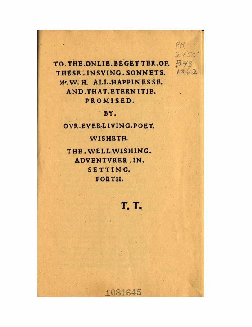
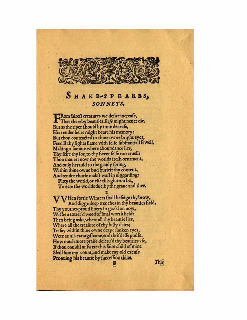
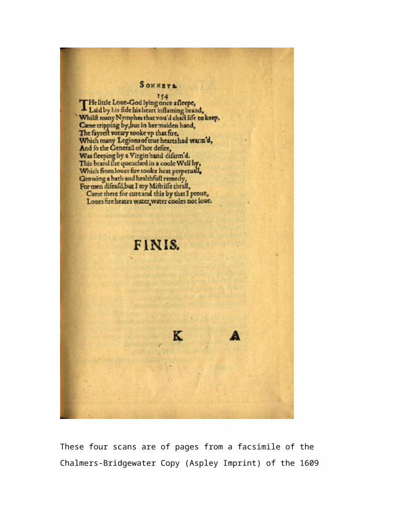
These four scans are of pages from a facsimile of the
Chalmers-Bridgewater Copy (Aspley Imprint) of the 1609
Quarto, in the Huntington Library. They have been
converted into digital format by R.G. Siemens, U of Alberta,
1998. The first is the title page (A1r), the second the
dedication (A2r), the third the first page of the sonnet
sequence (B1r), and the fourth the last page of the sonnet
sequence (k1r).