exploring two-variable quantitative data
TRANSCRIPT

UNIT 2 Exploring Two-Variable Data
Chapter 3
Introduction 152
Section 3.1 153 Scatterplots and Correlation
Section 3.2 176 Least-Squares Regression
Section 3.3 213 Transforming to Achieve Linearity
Chapter 3 Wrap-Up Free Response AP ® Problem, Yay! 236
Chapter 3 Review 236
Chapter 3 Review Exercises 238
Chapter 3 AP ® Statistics Practice Test 241
Chapter 3 Project 246
Exploring Two-Variable Quantitative Data
AfriP
ics.
com
/Ala
my
Stoc
k Ph
oto
04_StarnesUPDtps6e_26929_ch03_151_246.indd 151 03/06/19 10:20 AM
Propert
y of B
edfor
d, Free
man & W
orth H
igh Sch
ool P
ublish
ers ©
2020
. Do n
ot dis
tribute
.

152 C H A P T E R 3 Exploring Two-VariablE QuanTiTaTiVE DaTa
Investigating relationships between variables is central to what we do in statis-tics. When we understand the relationship between two variables, we can use the value of one variable to help us make predictions about the other variable. In Section 1.1, we explored relationships between categorical variables, such as membership in an environmental club and snowmobile use for visitors to Yellow-stone National Park. The association between these two variables suggests that members of environmental clubs are less likely to own or rent snowmobiles than nonmembers.
In this chapter, we investigate relationships between two quantitative variables. What can we learn about the price of a used car from the number of miles it has been driven? What does the length of a fish tell us about its weight? Can students with larger hands grab more candy? The following activity will help you explore the last question.
INTRODUCTION
In this activity, you will investigate if students with a larger hand span can grab more candy than students with a smaller hand span.1
ACTIVITY Candy grab
Josh
Tab
or
1. Measure the span of your dominant hand to the nearest half- centimeter (cm). Hand span is the distance from the tip of the thumb to the tip of the pinkie finger on your fully stretched-out hand.
2. One student at a time, go to the front of the class and use your dominant hand to grab as many candies as possible from the container. You must grab the candies with your fingers pointing down (no scooping!) and hold the candies for 2 seconds before counting them. After counting, put the candy back into the container.
3. On the board, record your hand span and number of candies in a table with the following headings:
Hand span (cm) Number of candies
4. While other students record their values on the board, copy the table onto a piece of paper and make a graph. Begin by constructing a set of coordinate axes. Label the horizontal axis “Hand span (cm)” and the vertical axis “Number of candies.” Choose an appropriate scale for each axis and plot each point from your class data table as accurately as you can on the graph.
5. What does the graph tell you about the relationship between hand span and number of candies? Summarize your observa-tions in a sentence or two.
04_StarnesUPDtps6e_26929_ch03_151_246.indd 152 5/20/19 3:18 PM
Propert
y of B
edfor
d, Free
man & W
orth H
igh Sch
ool P
ublish
ers ©
2020
. Do n
ot dis
tribute
.
153Section 3.1 Scatterplots and Correlation
Most statistical studies examine data on more than one variable for a group of individuals. Fortunately, analysis of relationships between two variables builds on the same tools we used to analyze one variable. The principles that guide our work also remain the same:
• Plot the data, then look for overall patterns and departures from those patterns.• Add numerical summaries.• When there’s a regular overall pattern, use a simplified model to describe it.
Explanatory and Response VariablesIn the “Candy grab” activity, the number of candies is the response variable. Hand span is the explanatory variable because we anticipate that knowing a stu-dent’s hand span will help us predict the number of candies that student can grab.
LEARNING TARGETS By the end of the section, you should be able to:
• Distinguish between explanatory and response variables for quantitative data.
• Make a scatterplot to display the relationship between two quantitative variables.
• Describe the direction, form, and strength of a relationship displayed in a scatterplot and identify unusual features.
• Interpret the correlation.
• Understand the basic properties of correlation, including how the correlation is influenced by unusual points.
• Distinguish correlation from causation.
It is easiest to identify explanatory and response variables when we initially specify the values of one variable to see how it affects another variable. For instance, to study the effect of alcohol on body temperature, researchers gave several different amounts of alcohol to mice. Then they measured the change in each mouse’s body temperature 15 minutes later. In this case, amount of alcohol is the explanatory variable, and change in body temperature is the response vari-able. When we don’t specify the values of either variable before collecting the data, there may or may not be a clear explanatory variable.
A one-variable data set is sometimes called univariate data. A data set that describes the relationship between two variables is sometimes called bivariate data.
DEFINITION Response variable, Explanatory variableA response variable measures an outcome of a study. An explanatory variable may help predict or explain changes in a response variable.
You will often see explanatory variables called independent variables and response variables called dependent variables. Because the words independent and dependent have other meanings in statistics, we won’t use them here.
SECTION 3.1 Scatterplots and Correlation
04_StarnesUPDtps6e_26929_ch03_151_246.indd 153 5/20/19 3:18 PM
Propert
y of B
edfor
d, Free
man & W
orth H
igh Sch
ool P
ublish
ers ©
2020
. Do n
ot dis
tribute
.
154 C H A P T E R 3 Exploring Two-VariablE QuanTiTaTiVE DaTa
In many studies, the goal is to show that changes in one or more explanatory vari-ables actually cause changes in a response variable. However, other explanatory–response relationships don’t involve direct causation. In the alcohol and mice study, alcohol actually causes a change in body temperature. But there is no cause-and-effect relationship between SAT math and evidence-based reading and writing scores.
Displaying Relationships: Scatterplots Although there are many ways to display the distribution of a single quantita-tive variable, a scatterplot is the best way to display the relationship between two quantitative variables.
DEFINITION Scatterplot A scatterplot shows the relationship between two quantitative variables measured on the same individuals. The values of one variable appear on the horizontal axis, and the values of the other variable appear on the vertical axis. Each individual in the data set appears as a point in the graph.
40
35
30
25
20
15
10
17 18 19 20 21 22 23 24 25
Hand span (cm)
Num
ber
of S
tarb
urst
can
dies
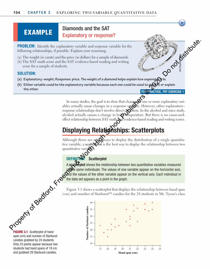
FIGURE 3.1 Scatterplot of hand span (cm) and number of Starburst candies grabbed by 24 students. Only 23 points appear because two students had hand spans of 19 cm and grabbed 28 Starburst candies.
PROBLEM: Identify the explanatory variable and response variable for the following relationships, if possible. Explain your reasoning.
(a) The weight (in carats) and the price (in dollars) for a sample of diamonds. (b) The SAT math score and the SAT evidence-based reading and writing
score for a sample of students.
SOLUTION: (a) Explanatory: weight; Response: price. The weight of a diamond helps explain how expensive it is. (b) Either variable could be the explanatory variable because each one could be used to predict or explain
the other.
EXAMPLE Diamonds and the SAT Explanatory or response?
FOR PRACTICE, TRY EXERCISE 1
stor
i/Dep
osit
Phot
os
Figure 3.1 shows a scatterplot that displays the relationship between hand span (cm) and number of Starburst™ candies for the 24 students in Mr. Tyson’s class
04_StarnesUPDtps6e_26929_ch03_151_246.indd 154 5/20/19 3:18 PM
Propert
y of B
edfor
d, Free
man & W
orth H
igh Sch
ool P
ublish
ers ©
2020
. Do n
ot dis
tribute
.
155Section 3.1 Scatterplots and Correlation
who did the “Candy grab” activity. As you can see, students with larger hand spans were typically able to grab more candies.
After collecting bivariate quantitative data, it is easy to make a scatterplot.
The following example illustrates the process of constructing a scatterplot.
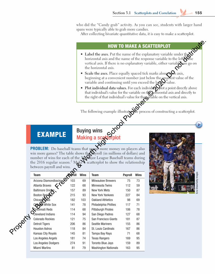
PROBLEM: Do baseball teams that spend more money on players also win more games? The table shows the payroll (in millions of dollars) and number of wins for each of the 30 Major League Baseball teams during the 2016 regular season. 2 Make a scatterplot to show the relationship between payroll and wins.
EXAMPLE Buying wins Making a scatterplot
Ezra
Sha
w/G
etty
Imag
es
HOW TO MAKE A SCATTERPLOT
• label the axes. Put the name of the explanatory variable under the horizontal axis and the name of the response variable to the left of the vertical axis. If there is no explanatory variable, either variable can go on the horizontal axis.
• Scale the axes. Place equally spaced tick marks along each axis, beginning at a convenient number just below the smallest value of the variable and continuing until you exceed the largest value.
• plot individual data values. For each individual, plot a point directly above that individual’s value for the variable on the horizontal axis and directly to the right of that individual’s value for the variable on the vertical axis.
Team Payroll Wins Team Payroll Wins
Arizona Diamondbacks 103 69 Milwaukee Brewers 75 73
Atlanta Braves 122 68 Minnesota Twins 112 59
Baltimore Orioles 157 89 New York Mets 150 87
Boston Red Sox 215 93 New York Yankees 227 84
Chicago Cubs 182 103 Oakland Athletics 98 69
Chicago White Sox 141 78 Philadelphia Phillies 117 71
Cincinnati Reds 114 68 Pittsburgh Pirates 106 78
Cleveland Indians 114 94 San Diego Padres 127 68
Colorado Rockies 121 75 San Francisco Giants 181 87
Detroit Tigers 206 86 Seattle Mariners 155 86
Houston Astros 118 84 St. Louis Cardinals 167 86
Kansas City Royals 145 81 Tampa Bay Rays 71 68
Los Angeles Angels 181 74 Texas Rangers 169 95
Los Angeles Dodgers 274 91 Toronto Blue Jays 159 89
Miami Marlins 81 79 Washington Nationals 163 95
04_StarnesUPDtps6e_26929_ch03_151_246.indd 155 5/20/19 3:18 PM
Propert
y of B
edfor
d, Free
man & W
orth H
igh Sch
ool P
ublish
ers ©
2020
. Do n
ot dis
tribute
.
156 C H A P T E R 3 Exploring Two-VariablE QuanTiTaTiVE DaTa
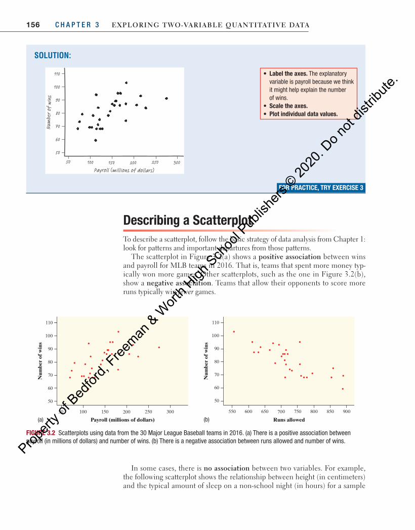
Describing a ScatterplotTo describe a scatterplot, follow the basic strategy of data analysis from Chapter 1: look for patterns and important departures from those patterns.
The scatterplot in Figure 3.2(a) shows a positive association between wins and payroll for MLB teams in 2016. That is, teams that spent more money typ-ically won more games. Other scatterplots, such as the one in Figure 3.2(b), show a negative association. Teams that allow their opponents to score more runs typically win fewer games.
SOLUTION:
FOR PRACTICE, TRY EXERCISE 3
• Label the axes. The explanatory variable is payroll because we think it might help explain the number of wins.
• Scale the axes.• Plot individual data values.
Payroll (millions of dollars)30050 100 200 250150
110
100
90
80
70
60
50
Num
ber o
f wi
ns
In some cases, there is no association between two variables. For example, the following scatterplot shows the relationship between height (in centimeters) and the typical amount of sleep on a non-school night (in hours) for a sample
FIGURE 3.2 Scatterplots using data from the 30 Major League Baseball teams in 2016. (a) There is a positive association between payroll (in millions of dollars) and number of wins. (b) There is a negative association between runs allowed and number of wins.
30050 100 200 250150
110
100
90
80
70
60
50
Num
ber
of w
ins
Payroll (millions of dollars) Runs allowed
Num
ber
of w
ins
900550 600 700 750 800 850650
110
100
90
80
70
60
50
(a) (b)
04_StarnesUPDtps6e_26929_ch03_151_246.indd 156 5/20/19 3:18 PM
Propert
y of B
edfor
d, Free
man & W
orth H
igh Sch
ool P
ublish
ers ©
2020
. Do n
ot dis
tribute
.
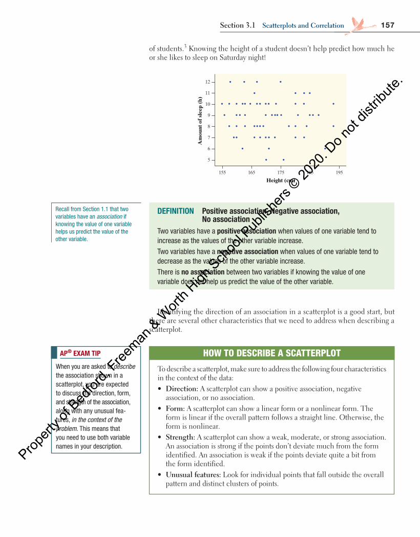
157Section 3.1 Scatterplots and Correlation
of students.3 Knowing the height of a student doesn’t help predict how much he or she likes to sleep on Saturday night!
Height (cm)
Am
ount
of s
leep
(h)
195155 165 185175
12
11
9
8
7
6
5
10
Identifying the direction of an association in a scatterplot is a good start, but there are several other characteristics that we need to address when describing a scatterplot.
DEFINITION Positive association, Negative association, No association
Two variables have a positive association when values of one variable tend to increase as the values of the other variable increase.
Two variables have a negative association when values of one variable tend to decrease as the values of the other variable increase.
There is no association between two variables if knowing the value of one variable does not help us predict the value of the other variable.
Recall from Section 1.1 that two variables have an association if knowing the value of one variable helps us predict the value of the other variable.
AP® EXAM TIP
When you are asked to describe the association shown in a scatterplot, you are expected to discuss the direction, form, and strength of the association, along with any unusual fea-tures, in the context of the problem. This means that you need to use both variable names in your description.
HOW TO DESCRIBE A SCATTERPLOT
To describe a scatterplot, make sure to address the following four characteristics in the context of the data:• Direction: A scatterplot can show a positive association, negative
association, or no association.• Form: A scatterplot can show a linear form or a nonlinear form. The
form is linear if the overall pattern follows a straight line. Otherwise, the form is nonlinear.
• Strength: A scatterplot can show a weak, moderate, or strong association. An association is strong if the points don’t deviate much from the form identified. An association is weak if the points deviate quite a bit from the form identified.
• unusual features: Look for individual points that fall outside the overall pattern and distinct clusters of points.
04_StarnesUPDtps6e_26929_ch03_151_246.indd 157 5/20/19 3:18 PM
Propert
y of B
edfor
d, Free
man & W
orth H
igh Sch
ool P
ublish
ers ©
2020
. Do n
ot dis
tribute
.

158 C H A P T E R 3 Exploring Two-VariablE QuanTiTaTiVE DaTa
Even though they have opposite directions, both associations in Figure 3.2 on page 156 have a linear form. However, the association between runs allowed and wins is stronger than the relationship between payroll and wins because the points in Figure 3.2(b) deviate less from the linear pattern. Each scatterplot has one unusual point: In Figure 3.2(a) , the Los Angeles Dodgers spent $274 million and had “only” 91 wins. In Figure 3.2(b) , the Texas Rangers gave up 757 runs but had 95 wins.
Even when there is a clear relationship between two variables in a scatterplot, the direction of the association describes only the overall trend—not an abso-lute relationship. For example, even though teams that spend more generally have more wins, there are plenty of exceptions. The Minnesota Twins spent more money than six other teams, but had fewer wins than any team in the league.
cautionaution
!
PROBLEM: Describe the relationship in each of the following contexts. (a) The scatterplot on the left shows the relationship between
the duration (in minutes) of an eruption and the interval of time until the next eruption (in minutes) of Old Faithful during a particular month.
(b) The scatterplot on the right shows the relationship between the average income (gross domestic product per person, in dollars) and fertility rate (number of children per woman) in 187 countries. 4
EXAMPLE Old Faithful and fertility Describing a scatterplot
FOR PRACTICE, TRY EXERCISE 5
Bigs
hotD
3/iS
tock
/Get
ty Im
ages
SOLUTION: (a) There is a strong, positive linear relationship between the duration
of an eruption and the interval of time until the next eruption. There are two main clusters of points: one cluster has durations around 2 minutes with intervals around 55 minutes, and the other cluster has durations around 4.5 minutes with intervals around 90 minutes.
(b) There is a moderately strong, negative nonlinear relationship between average income and fertility rate in these countries. There is a country outside this pattern with an average income around $30,000 and a fertility rate around 4.7.
Even with the clusters, the overall direction is still positive. In some cases, however, the points in a cluster go in the opposite direction of the overall association.
The association is called “nonlinear” because the pattern of points is clearly curved.
54321
120
110
100
90
80
70
60
50
40
Inte
rval
(m
in)
Duration (min)160,000120,00080,00040,0000
8
7
6
5
4
3
2
1
Fert
ility
rat
e
Average income ($)
04_StarnesUPDtps6e_26929_ch03_151_246.indd 158 5/20/19 3:18 PM
Propert
y of B
edfor
d, Free
man & W
orth H
igh Sch
ool P
ublish
ers ©
2020
. Do n
ot dis
tribute
.

159Section 3.1 Scatterplots and Correlation
CHECK YOUR UNDERSTANDING
Is there a relationship between the amount of sugar (in grams) and the number of calories in movie-theater candy? Here are the data from a sample of 12 types of candy. 5
Name Sugar (g) Calories Name Sugar (g) Calories
Butterfinger Minis 45 450 Reese’s Pieces 61 580
Junior Mints 107 570 Skittles 87 450
M&M’S ® 62 480 Sour Patch Kids 92 490
Milk Duds 44 370 SweeTarts 136 680
Peanut M&M’S ® 79 790 Twizzlers 59 460
Raisinets 60 420 Whoppers 48 350
1. Identify the explanatory and response variables. Explain your reasoning. 2. Make a scatterplot to display the relationship between amount of sugar and the
number of calories in movie-theater candy. 3. Describe the relationship shown in the scatterplot.
8. Technology Corner MAKING SCATTERPLOTS
TI-Nspire and other technology instructions are on the book’s website at highschool.bfwpub.com/updatedtps6e .
Making scatterplots with technology is much easier than constructing them by hand. We’ll use the MLB data from page 155 to show how to construct a scatterplot on a TI-83/84.
1. Enter the payroll values in L1 and the number of wins in L2.
• Press STAT and choose Edit….
• Type the values into L1 and L2.
2. Set up a scatterplot in the statistics plots menu.
• Press 2nd Y = (STAT PLOT).
• Press ENTER or 1 to go into Plot1.
• Adjust the settings as shown.
04_StarnesUPDtps6e_26929_ch03_151_246.indd 159 5/20/19 3:18 PM
Propert
y of B
edfor
d, Free
man & W
orth H
igh Sch
ool P
ublish
ers ©
2020
. Do n
ot dis
tribute
.
160 C H A P T E R 3 Exploring Two-VariablE QuanTiTaTiVE DaTa
3. Use ZoomStat to let the calculator choose an appropriate window.
• Press ZOOM and choose ZoomStat.
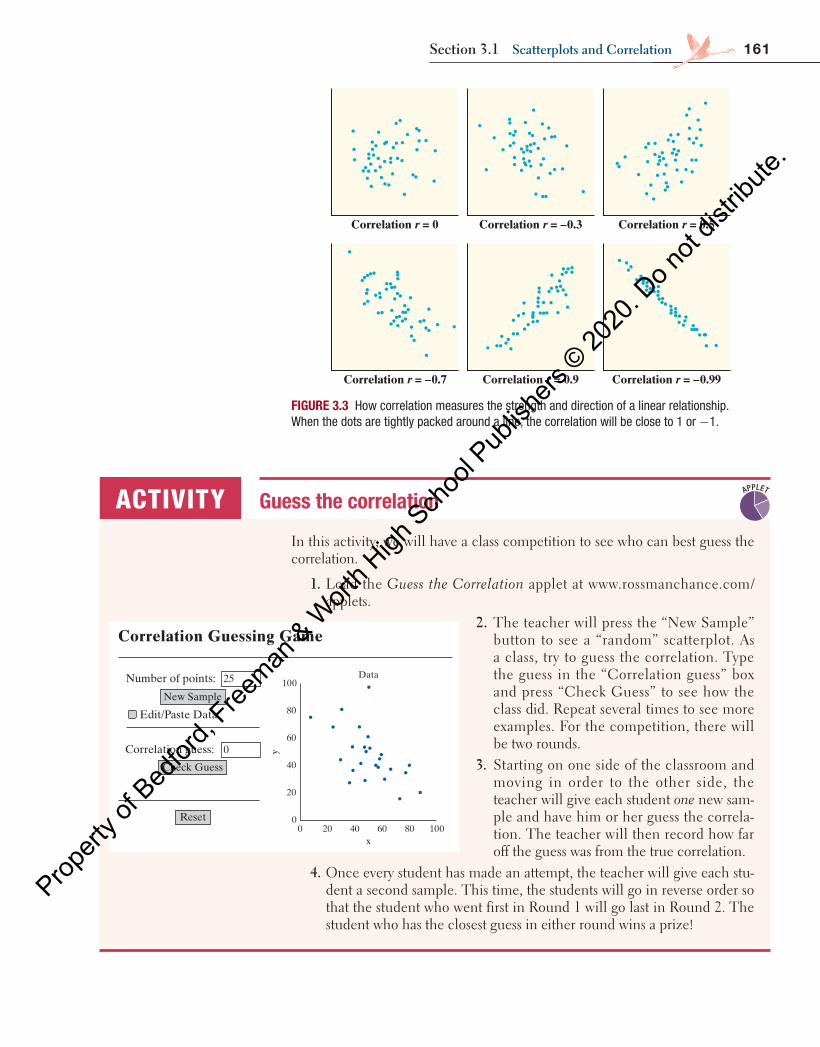
Measuring Linear Association: Correlation A scatterplot displays the direction, form, and strength of a relationship between two quantitative variables. Linear relationships are particularly important because a straight line is a simple pattern that is quite common. A linear relationship is considered strong if the points lie close to a straight line and is considered weak if the points are widely scattered about the line. Unfortunately, our eyes are not the most reliable tools when it comes to judging the strength of a linear relationship. When the association between two quantitative variables is linear, we can use the correlation r to help describe the strength and direction of the association.
Here are some important properties of the correlation r :
• The correlation r is always a number between −1 and r1( 1 1)− ≤ ≤ . • The correlation r indicates the direction of a linear relationship by its sign:
r 0> for a positive association and r 0< for a negative association. • The extreme values r 1= − and r 1= occur only in the case of a perfect lin-
ear relationship, when the points lie exactly along a straight line. • If the linear relationship is strong, the correlation r will be close to 1 or −1.
If the linear relationship is weak, the correlation r will be close to 0.
it is only appropriate to use the correlation to describe strength and direction for a linear relationship. This is why the word linear kept appearing in the list above!
Figure 3.3 shows six scatterplots that correspond to various values of r. To make the meaning of r clearer, the standard deviations of both variables in these plots are equal, and the horizontal and vertical scales are the same. The cor-relation r describes the direction and strength of the linear relationship in each scatterplot.
cautionaution
!
AP ® EXAM TIP
If you are asked to make a scatterplot, be sure to label and scale both axes. Don’t just copy an unlabeled calculator graph directly onto your paper.
Some people refer to r as the “correlation coefficient.”
DEFINITION Correlation r For a linear association between two quantitative variables, the correlation r measures the direction and strength of the association.
04_StarnesUPDtps6e_26929_ch03_151_246.indd 160 5/20/19 3:18 PM
Propert
y of B
edfor
d, Free
man & W
orth H
igh Sch
ool P
ublish
ers ©
2020
. Do n
ot dis
tribute
.
161Section 3.1 Scatterplots and Correlation
Correlation r = –0.7 Correlation r = 0.9 Correlation r = –0.99
Correlation r = 0 Correlation r = –0.3 Correlation r = 0.5
FIGURE 3.3 How correlation measures the strength and direction of a linear relationship. When the dots are tightly packed around a line, the correlation will be close to 1 or −1.
In this activity, we will have a class competition to see who can best guess the correlation.
1. Load the Guess the Correlation applet at www.rossmanchance.com/applets.
ACTIVITY Guess the correlation
Correlation Guessing Game
Number of points:
Edit/Paste Data
Correlation guess:
New Sample
25
Check Guess
0
Reset
Data100
80
60
40
20
00 20 40 60 80 100
y
x
APPLET
2. The teacher will press the “New Sample” button to see a “random” scatterplot. As a class, try to guess the correlation. Type the guess in the “Correlation guess” box and press “Check Guess” to see how the class did. Repeat several times to see more examples. For the competition, there will be two rounds.
3. Starting on one side of the classroom and moving in order to the other side, the teacher will give each student one new sam-ple and have him or her guess the correla-tion. The teacher will then record how far off the guess was from the true correlation.
4. Once every student has made an attempt, the teacher will give each stu-dent a second sample. This time, the students will go in reverse order so that the student who went first in Round 1 will go last in Round 2. The student who has the closest guess in either round wins a prize!
04_StarnesUPDtps6e_26929_ch03_151_246.indd 161 5/20/19 3:18 PM
Propert
y of B
edfor
d, Free
man & W
orth H
igh Sch
ool P
ublish
ers ©
2020
. Do n
ot dis
tribute
.
162 C H A P T E R 3 Exploring Two-VariablE QuanTiTaTiVE DaTa
The following example illustrates how to interpret the correlation.
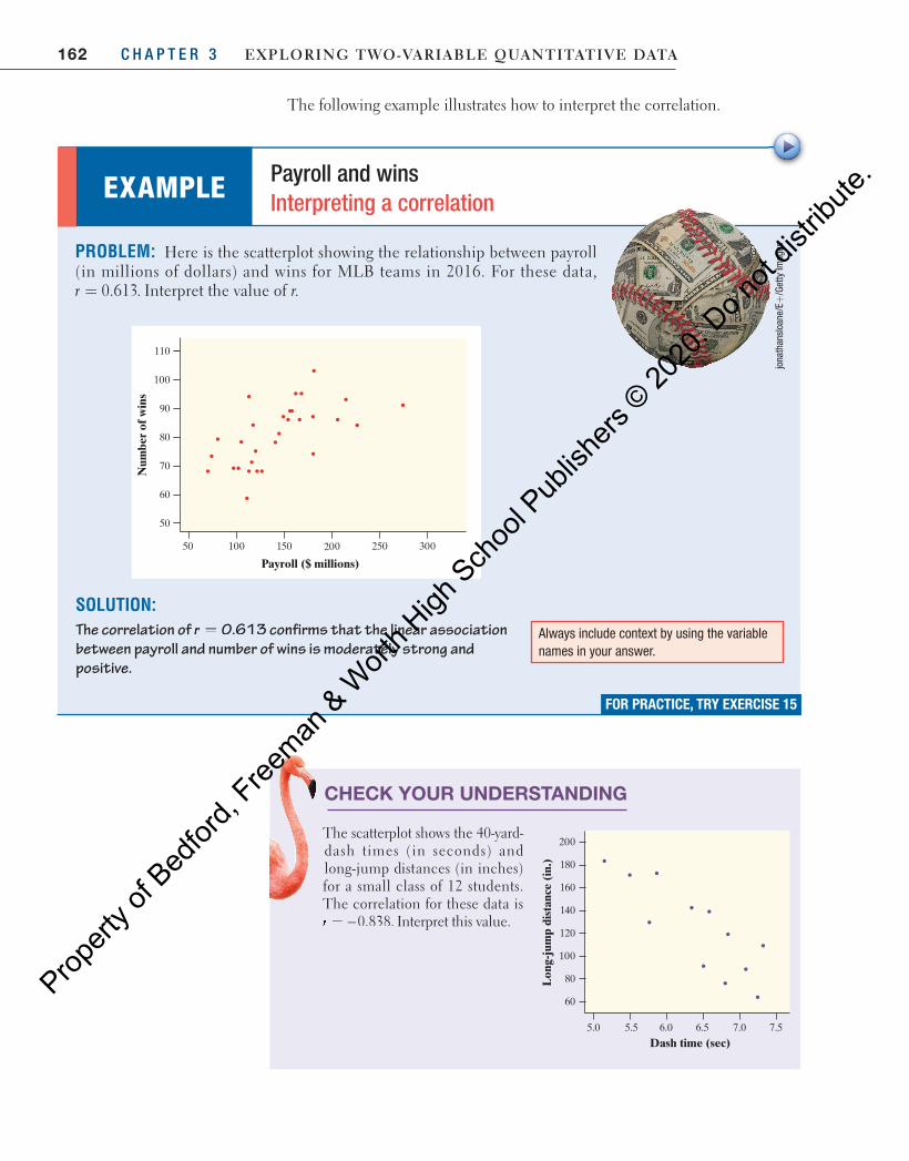
CHECK YOUR UNDERSTANDING
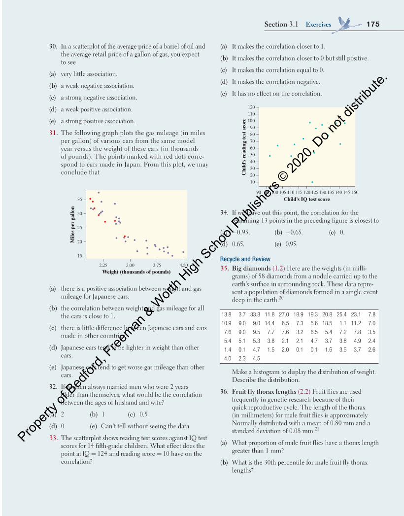
The scatterplot shows the 40-yard-dash times (in seconds) and long-jump distances (in inches) for a small class of 12 students. The correlation for these data is r 0.838.= − Interpret this value.
5.55.0
60
80
100
120
140
160
180
200
Dash time (sec)
Lon
g-ju
mp
dist
ance
(in
.)
6.5 7.0 7.56.0
EXAMPLE Payroll and wins Interpreting a correlation
PROBLEM: Here is the scatterplot showing the relationship between payroll (in millions of dollars) and wins for MLB teams in 2016. For these data, r 0.613.= Interpret the value of r.
FOR PRACTICE, TRY EXERCISE 15
jona
than
sloa
ne/E
+/G
etty
Imag
es
SOLUTION: The correlation of r = 0.613 confirms that the linear association between payroll and number of wins is moderately strong and positive.
Always include context by using the variable names in your answer.
30050 100 200 250150
110
100
90
80
70
60
50
Num
ber
of w
ins
Payroll ($ millions)
04_StarnesUPDtps6e_26929_ch03_151_246.indd 162 5/20/19 3:18 PM
Propert
y of B
edfor
d, Free
man & W
orth H
igh Sch
ool P
ublish
ers ©
2020
. Do n
ot dis
tribute
.
163Section 3.1 Scatterplots and Correlation
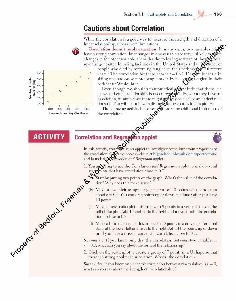
Cautions about Correlation While the correlation is a good way to measure the strength and direction of a linear relationship, it has several limitations.
Correlation doesn’t imply causation. In many cases, two variables might have a strong correlation, but changes in one variable are very unlikely to cause changes in the other variable. Consider the following scatterplot showing total revenue generated by skiing facilities in the United States and the number of
people who died by becoming tangled in their bedsheets in 10 recent years. 6 The correlation for these data is r 0.97.= Does an increase in skiing revenue cause more people to die by becoming tangled in their bedsheets? We doubt it!
Even though we shouldn’t automatically conclude that there is a cause-and-effect relationship between two variables when they have an association, in some cases there might actually be a cause-and-effect rela-tionship. You will learn how to distinguish these cases in Chapter 4 .
The following activity helps you explore some additional limitations of the correlation.
300
400
500
600
700
800
Revenue from skiing ($ millions)
Num
ber o
f dea
ths
from
tang
ling
1600 1800 2000 2200 2400
In this activity, you will use an applet to investigate some important properties of the correlation. Go to the book’s website at highschool.bfwpub.com/updatedtps6eand launch the Correlation and Regression applet.
1. You are going to use the Correlation and Regression applet to make several scatterplots that have correlation close to 0.7.
(a) Start by putting two points on the graph. What’s the value of the correla-tion? Why does this make sense?
(b) Make a lower-left to upper-right pattern of 10 points with correlation about r 0.7.= You can drag points up or down to adjust r after you have 10 points.
(c) Make a new scatterplot, this time with 9 points in a vertical stack at the left of the plot. Add 1 point far to the right and move it until the correla-tion is close to 0.7.
(d) Make a third scatterplot, this time with 10 points in a curved pattern that starts at the lower left and rises to the right. Adjust the points up or down until you have a smooth curve with correlation close to 0.7.
Summarize: If you know only that the correlation between two variables is r 0.7,= what can you say about the form of the relationship?
2. Click on the scatterplot to create a group of 7 points in a U shape so that there is a strong nonlinear association. What is the correlation?
Summarize: If you know only that the correlation between two variables is r 0,=what can you say about the strength of the relationship?
ACTIVITY Correlation and Regression applet APPLET
cautionaution
!
04_StarnesUPDtps6e_26929_ch03_151_246.indd 163 5/20/19 3:18 PM
Propert
y of B
edfor
d, Free
man & W
orth H
igh Sch
ool P
ublish
ers ©
2020
. Do n
ot dis
tribute
.
164 C H A P T E R 3 Exploring Two-VariablE QuanTiTaTiVE DaTa
3. Click on the scatterplot to create a group of 10 points in the lower-left corner of the scatterplot with a strong linear pattern (correlation about 0.9).
(a) Add 1 point at the upper right that is in line with the first 10. How does the correlation change?
(b) Drag this last point straight down. How small can you make the correla-tion? Can you make the correlation negative?
Summarize: What did you learn from Step 3 about the effect of an unusual point on the correlation?
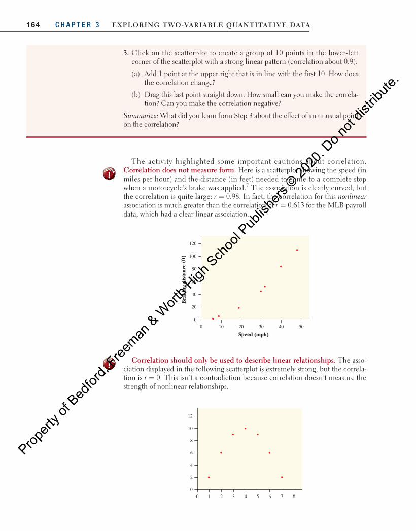
The activity highlighted some important cautions about correlation. Correlation does not measure form. Here is a scatterplot showing the speed (in miles per hour) and the distance (in feet) needed to come to a complete stop when a motorcycle’s brake was applied. 7 The association is clearly curved, but the correlation is quite large: r 0.98.= In fact, the correlation for this nonlinearassociation is much greater than the correlation of r 0.613= for the MLB payroll data, which had a clear linear association.
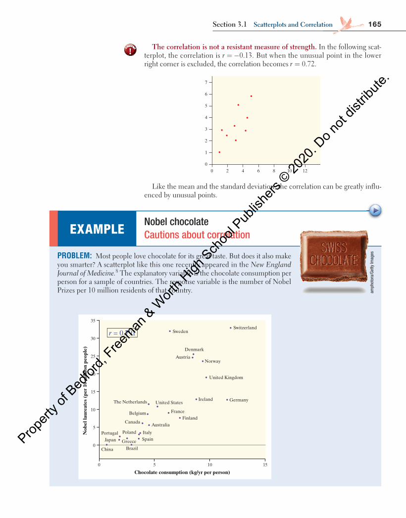
Correlation should only be used to describe linear relationships. The asso-ciation displayed in the following scatterplot is extremely strong, but the correla-tion is r 0.= This isn’t a contradiction because correlation doesn’t measure the strength of nonlinear relationships.
Speed (mph)
Bra
king
dis
tanc
e (f
t)
60
80
40
20
0
120
100
100 20 30 40 50
6
8
4
2
0
12
10
0 1 2 3 4 5 6 7 8
cautionaution
!
cautionaution
!
04_StarnesUPDtps6e_26929_ch03_151_246.indd 164 5/20/19 3:18 PM
Propert
y of B
edfor
d, Free
man & W
orth H
igh Sch
ool P
ublish
ers ©
2020
. Do n
ot dis
tribute
.
165Section 3.1 Scatterplots and Correlation
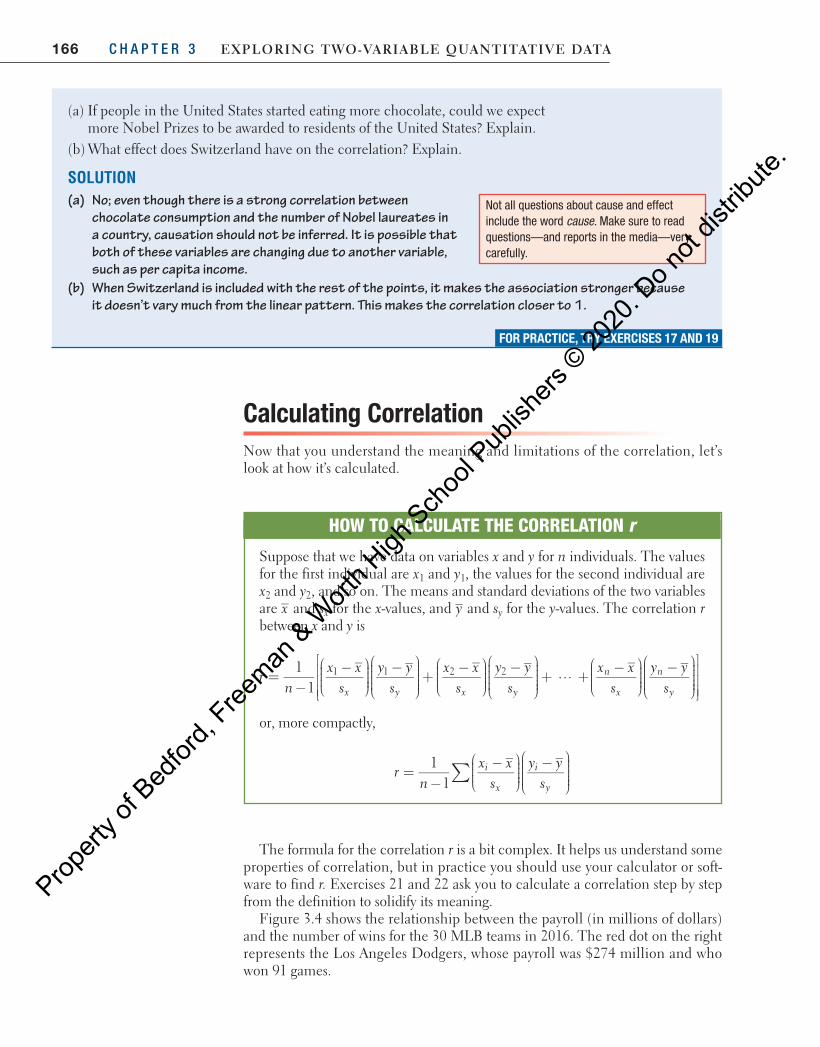
The correlation is not a resistant measure of strength. In the following scat-terplot, the correlation is = −0.13.r But when the unusual point in the lower right corner is excluded, the correlation becomes = 0.72.r
Like the mean and the standard deviation, the correlation can be greatly influ-enced by unusual points.
3
4
2
1
0
7
6
5
0 2 4 86 10 12
PROBLEM: Most people love chocolate for its great taste. But does it also make you smarter? A scatterplot like this one recently appeared in the New England Journal of Medicine. 8 The explanatory variable is the chocolate consumption per person for a sample of countries. The response variable is the number of Nobel Prizes per 10 million residents of that country.
EXAMPLE Nobel chocolate Cautions about correlation
SwitzerlandSweden
Denmark
AustriaNorway
United Kingdom
Ireland GermanyUnited StatesThe Netherlands
Belgium
Canada
Poland
Greece
Portugal
China
Japan
Brazil
FranceFinland
Australia
ItalySpain
0
0
5
5
10
15
20
25
30
35
10 15
Chocolate consumption (kg/yr per person)
Nob
el la
urea
tes
(per
10
mill
ion
peop
le)
r = 0.791
amph
otor
a/Ge
tty Im
ages
cautionaution
!
04_StarnesUPDtps6e_26929_ch03_151_246.indd 165 5/20/19 3:18 PM
Propert
y of B
edfor
d, Free
man & W
orth H
igh Sch
ool P
ublish
ers ©
2020
. Do n
ot dis
tribute
.
166 C H A P T E R 3 Exploring Two-VariablE QuanTiTaTiVE DaTa
Calculating CorrelationNow that you understand the meaning and limitations of the correlation, let’s look at how it’s calculated.
(a) If people in the United States started eating more chocolate, could we expect more Nobel Prizes to be awarded to residents of the United States? Explain.
(b) What effect does Switzerland have on the correlation? Explain.
SOLUTION(a) No; even though there is a strong correlation between
chocolate consumption and the number of Nobel laureates in a country, causation should not be inferred. It is possible that both of these variables are changing due to another variable, such as per capita income.
(b) When Switzerland is included with the rest of the points, it makes the association stronger because it doesn’t vary much from the linear pattern. This makes the correlation closer to 1.
FOR PRACTICE, TRY EXERCISES 17 AND 19
Not all questions about cause and effect include the word cause. Make sure to read questions—and reports in the media—very carefully.
The formula for the correlation r is a bit complex. It helps us understand some properties of correlation, but in practice you should use your calculator or soft-ware to find r. Exercises 21 and 22 ask you to calculate a correlation step by step from the definition to solidify its meaning.
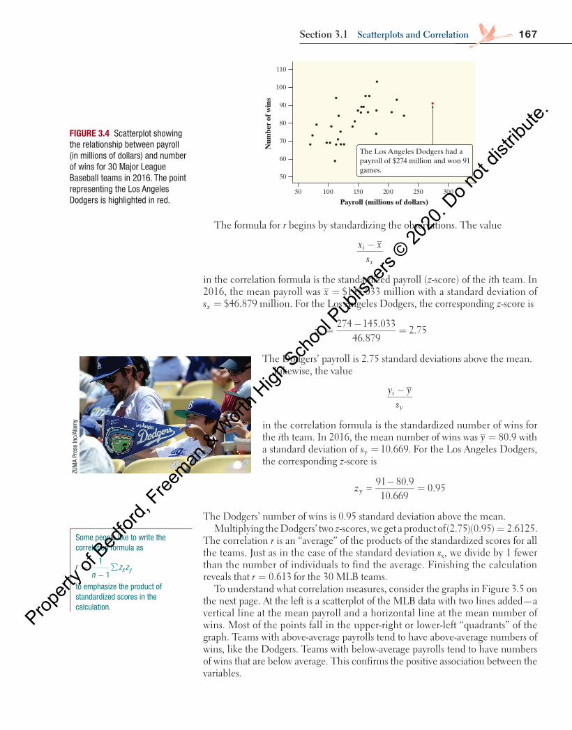
Figure 3.4 shows the relationship between the payroll (in millions of dollars) and the number of wins for the 30 MLB teams in 2016. The red dot on the right represents the Los Angeles Dodgers, whose payroll was $274 million and who won 91 games.
HOW TO CALCULATE THE CORRELATION r
Suppose that we have data on variables x and y for n individuals. The values for the first individual are x1 and y1, the values for the second individual are x2 and y2, and so on. The means and standard deviations of the two variables are x and sx for the x-values, and y and sy for the y-values. The correlation r between x and y is
rn
x xs
y ys
x xs
y ysx y x y
=−
−
−
+
−
−
+
11
…1 1 2 2 x xs
y ys
n
x
n
y+
−
−
or, more compactly,
11
rn
x xs
y ys
i
x
i
y∑=
−−
−
04_StarnesUPDtps6e_26929_ch03_151_246.indd 166 5/20/19 3:18 PM
Propert
y of B
edfor
d, Free
man & W
orth H
igh Sch
ool P
ublish
ers ©
2020
. Do n
ot dis
tribute
.
167Section 3.1 Scatterplots and Correlation
The formula for r begins by standardizing the observations. The value
x xs
i
x
−
in the correlation formula is the standardized payroll (z-score) of the ith team. In 2016, the mean payroll was = $145.033x million with a standard deviation of
= $46.879sx million. For the Los Angeles Dodgers, the corresponding z-score is
274 145.03346.879
2.75zx =−
=
The Dodgers’ payroll is 2.75 standard deviations above the mean.Likewise, the value
y ys
i
y
−
in the correlation formula is the standardized number of wins for the ith team. In 2016, the mean number of wins was 80.9y = with a standard deviation of 10.669.sy = For the Los Angeles Dodgers, the corresponding z-score is
=91 80.910.669
0.95zy−
=
The Dodgers’ number of wins is 0.95 standard deviation above the mean.Multiplying the Dodgers’ two z-scores, we get a product of (2.75)(0.95) 2.6125.=
The correlation r is an “average” of the products of the standardized scores for all the teams. Just as in the case of the standard deviation sx, we divide by 1 fewer than the number of individuals to find the average. Finishing the calculation reveals that 0.613r = for the 30 MLB teams.
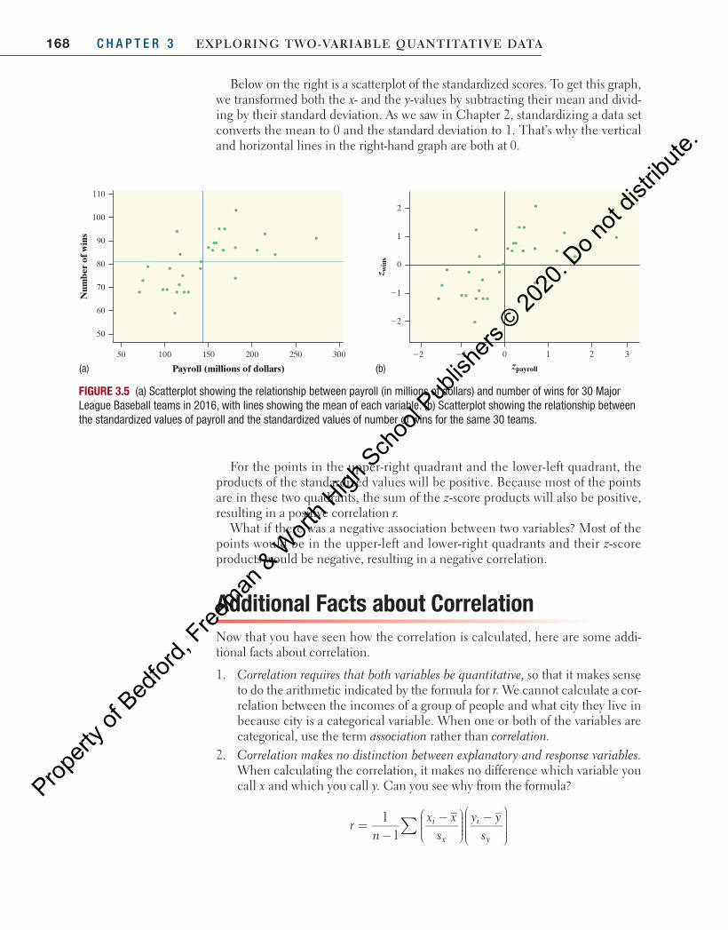
To understand what correlation measures, consider the graphs in Figure 3.5 on the next page. At the left is a scatterplot of the MLB data with two lines added—a vertical line at the mean payroll and a horizontal line at the mean number of wins. Most of the points fall in the upper-right or lower-left “quadrants” of the graph. Teams with above-average payrolls tend to have above-average numbers of wins, like the Dodgers. Teams with below-average payrolls tend to have numbers of wins that are below average. This confirms the positive association between the variables.
110
50
60
70
80
90
100
50 100 150 200 250 300
The Los Angeles Dodgers had apayroll of $274 million and won 91games.
Payroll (millions of dollars)
Num
ber
of w
ins
FIGURE 3.4 Scatterplot showing the relationship between payroll (in millions of dollars) and number of wins for 30 Major League Baseball teams in 2016. The point representing the Los Angeles Dodgers is highlighted in red.
ZUM
A Pr
ess
Inc/
Alam
y
Some people like to write the correlation formula as
=−
∑ x y1
1r
nz z
to emphasize the product of standardized scores in the calculation.
04_StarnesUPDtps6e_26929_ch03_151_246.indd 167 5/20/19 3:18 PM
Propert
y of B
edfor
d, Free
man & W
orth H
igh Sch
ool P
ublish
ers ©
2020
. Do n
ot dis
tribute
.
168 C H A P T E R 3 Exploring Two-VariablE QuanTiTaTiVE DaTa
Below on the right is a scatterplot of the standardized scores. To get this graph, we transformed both the x- and the y-values by subtracting their mean and divid-ing by their standard deviation. As we saw in Chapter 2, standardizing a data set converts the mean to 0 and the standard deviation to 1. That’s why the vertical and horizontal lines in the right-hand graph are both at 0.
For the points in the upper-right quadrant and the lower-left quadrant, the products of the standardized values will be positive. Because most of the points are in these two quadrants, the sum of the z-score products will also be positive, resulting in a positive correlation r.
What if there was a negative association between two variables? Most of the points would be in the upper-left and lower-right quadrants and their z-score products would be negative, resulting in a negative correlation.
Additional Facts about CorrelationNow that you have seen how the correlation is calculated, here are some addi-tional facts about correlation.
1. Correlation requires that both variables be quantitative, so that it makes sense to do the arithmetic indicated by the formula for r. We cannot calculate a cor-relation between the incomes of a group of people and what city they live in because city is a categorical variable. When one or both of the variables are categorical, use the term association rather than correlation.
2. Correlation makes no distinction between explanatory and response variables. When calculating the correlation, it makes no difference which variable you call x and which you call y. Can you see why from the formula?
11
rn
x xs
y ys
i
x
i
y∑=
−−
−
110
50
60
70
80
90
100
50 100 150 200 250 300
Payroll (millions of dollars)
Num
ber
of w
ins
22
21
0
1
2
22 21 0 1 2 3zpayroll
z win
s
FIGURE 3.5 (a) Scatterplot showing the relationship between payroll (in millions of dollars) and number of wins for 30 Major League Baseball teams in 2016, with lines showing the mean of each variable. (b) Scatterplot showing the relationship between the standardized values of payroll and the standardized values of number of wins for the same 30 teams.
(a) (b)
04_StarnesUPDtps6e_26929_ch03_151_246.indd 168 5/20/19 3:18 PM
Propert
y of B
edfor
d, Free
man & W
orth H
igh Sch
ool P
ublish
ers ©
2020
. Do n
ot dis
tribute
.
169Section 3.1 Scatterplots and Correlation
3. Because r uses the standardized values of the observations, r does not change when we change the units of measurement of x, y, or both. The correlation between height and weight won’t change if we measure height in centi-meters rather than inches and measure weight in kilograms rather than pounds.
4. The correlation r has no unit of measurement. It is just a number.
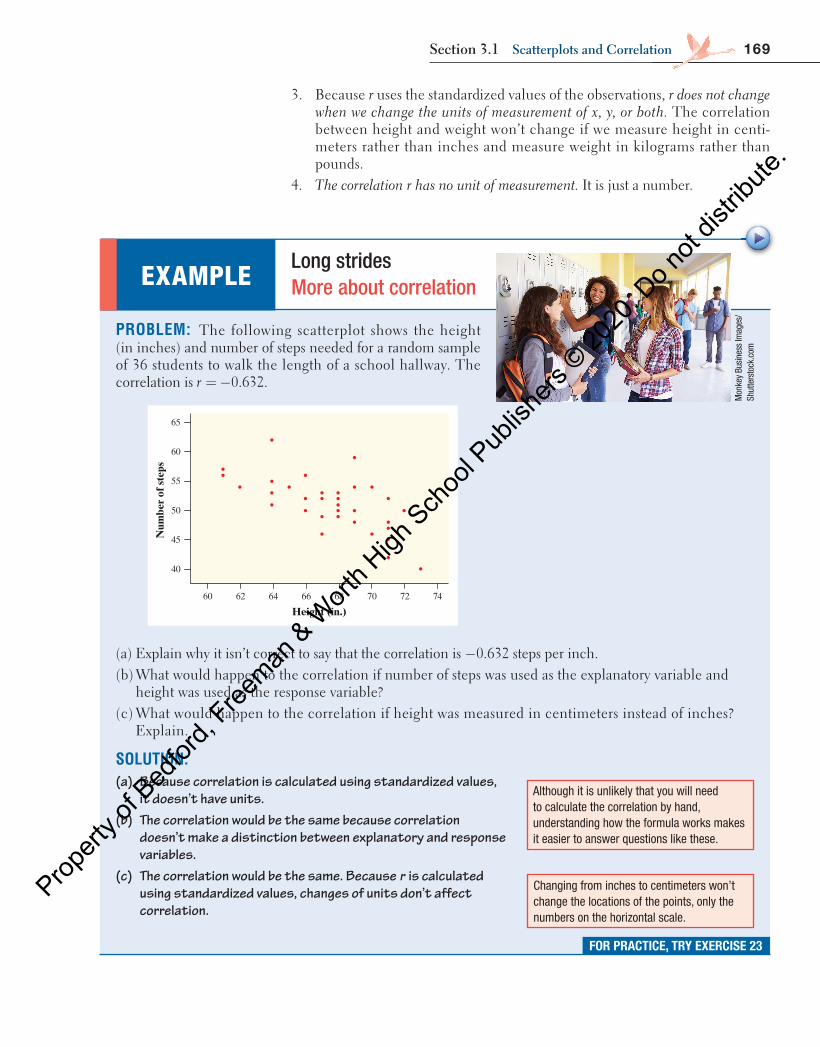
PROBLEM: The following scatterplot shows the height (in inches) and number of steps needed for a random sample of 36 students to walk the length of a school hallway. The correlation is 0.632.r = −
65
40
45
50
55
60
60 62 64 66 68 70 72 74
Height (in.)
Num
ber
of s
teps
(a) Explain why it isn’t correct to say that the correlation is −0.632 steps per inch. (b) What would happen to the correlation if number of steps was used as the explanatory variable and
height was used as the response variable? (c) What would happen to the correlation if height was measured in centimeters instead of inches?
Explain.
SOLUTION: (a) Because correlation is calculated using standardized values,
it doesn’t have units. (b) The correlation would be the same because correlation
doesn’t make a distinction between explanatory and response variables.
(c) The correlation would be the same. Because r is calculated using standardized values, changes of units don’t affect correlation.
EXAMPLE Long strides More about correlation
FOR PRACTICE, TRY EXERCISE 23
Mon
key
Busi
ness
Imag
es/
Shut
ters
tock
.com
Although it is unlikely that you will need to calculate the correlation by hand, understanding how the formula works makes it easier to answer questions like these.
Changing from inches to centimeters won’t change the locations of the points, only the numbers on the horizontal scale.
04_StarnesUPDtps6e_26929_ch03_151_246.indd 169 5/20/19 3:18 PM
Propert
y of B
edfor
d, Free
man & W
orth H
igh Sch
ool P
ublish
ers ©
2020
. Do n
ot dis
tribute
.
170 C H A P T E R 3 Exploring Two-VariablE QuanTiTaTiVE DaTa
• A scatterplot displays the relationship between two quantitative variables measured on the same individuals. Mark values of one variable on the hori-zontal axis ( x axis) and values of the other variable on the vertical axis ( y axis). Plot each individual’s data as a point on the graph.
• If we think that a variable x may help predict, explain, or even cause changes in another variable y, we call x an explanatory variable and y a response vari-able. Always plot the explanatory variable on the x axis of a scatterplot. Plot the response variable on the y axis.
• When describing a scatterplot, look for an overall pattern (direction, form, strength) and departures from the pattern (unusual features) and always answer in context.
■ Direction: A relationship has a positive association when values of one variable tend to increase as the values of the other variable increase, a negative association when values of one variable tend to decrease as the values of the other variable increase, or no association when knowing the value of one variable doesn’t help predict the value of the other variable.
■ Form: The form of a relationship can be linear or nonlinear (curved). ■ Strength: The strength of a relationship is determined by how close the
points in the scatterplot lie to a simple form such as a line. ■ unusual features: Look for individual points that fall outside the pattern
and distinct clusters of points. • For linear relationships, the correlation r measures the strength and direction
of the association between two quantitative variables x and y. • Correlation indicates the direction of a linear relationship by its sign: 0r >
for a positive association and < 0r for a negative association. Correlation always satisfies − ≤ ≤1 1r with stronger linear associations having values of r closer to 1 and −1. Correlations of 1r = and 1r = − occur only when the points on a scatterplot lie exactly on a straight line.
• Remember these limitations of r : Correlation does not imply causation. The correlation is not resistant, so unusual points can greatly change the value of r.The correlation should only be used to describe linear relationships.
• Correlation ignores the distinction between explanatory and response vari-ables. The value of r does not have units and is not affected by changes in the unit of measurement of either variable.
Section 3.1 Summary
3.1 Technology Corner
TI-Nspire and other technology instructions are on the book’s website at highschool.bfwpub.com/updatedtps6e .
8. Making scatterplots Page 159
04_StarnesUPDtps6e_26929_ch03_151_246.indd 170 5/20/19 3:18 PM
Propert
y of B
edfor
d, Free
man & W
orth H
igh Sch
ool P
ublish
ers ©
2020
. Do n
ot dis
tribute
.
171Section 3.1 Exercises
1. Coral reefs and cell phones Identify the explanatory variable and the response variable for the following relationships, if possible. Explain your reasoning.
(a) The weight gain of corals in aquariums where the water temperature is controlled at different levels
(b) The number of text messages sent and the number of phone calls made in a sample of 100 students
2. Teenagers and corn yield Identify the explanatory variable and the response variable for the following relationships, if possible. Explain your reasoning.
(a) The height and arm span of a sample of 50 teenagers
(b) The yield of corn in bushels per acre and the amount of rain in the growing season
3. Heavy backpacks Ninth-grade students at the Webb Schools go on a backpacking trip each fall. Students are divided into hiking groups of size 8 by selecting names from a hat. Before leaving, students and their backpacks are weighed. The data here are from one hiking group. Make a scatterplot by hand that shows how backpack weight relates to body weight.
Body weight (lb) 120 187 109 103 131 165 158 116
Backpack weight (lb) 26 30 26 24 29 35 31 28
4. putting success How well do professional golfers putt from various distances to the hole? The data show various distances to the hole (in feet) and the percent of putts made at each distance for a sample of golfers. 9 Make a scatterplot by hand that shows how the percent of putts made relates to the distance of the putt.
Distance (ft) Percent made Distance (ft) Percent made
2 93.3 12 25.7
3 83.1 13 24.0
4 74.1 14 31.0
5 58.9 15 16.8
6 54.8 16 13.4
7 53.1 17 15.9
8 46.3 18 17.3
9 31.8 19 13.6
10 33.5 20 15.8
11 31.6
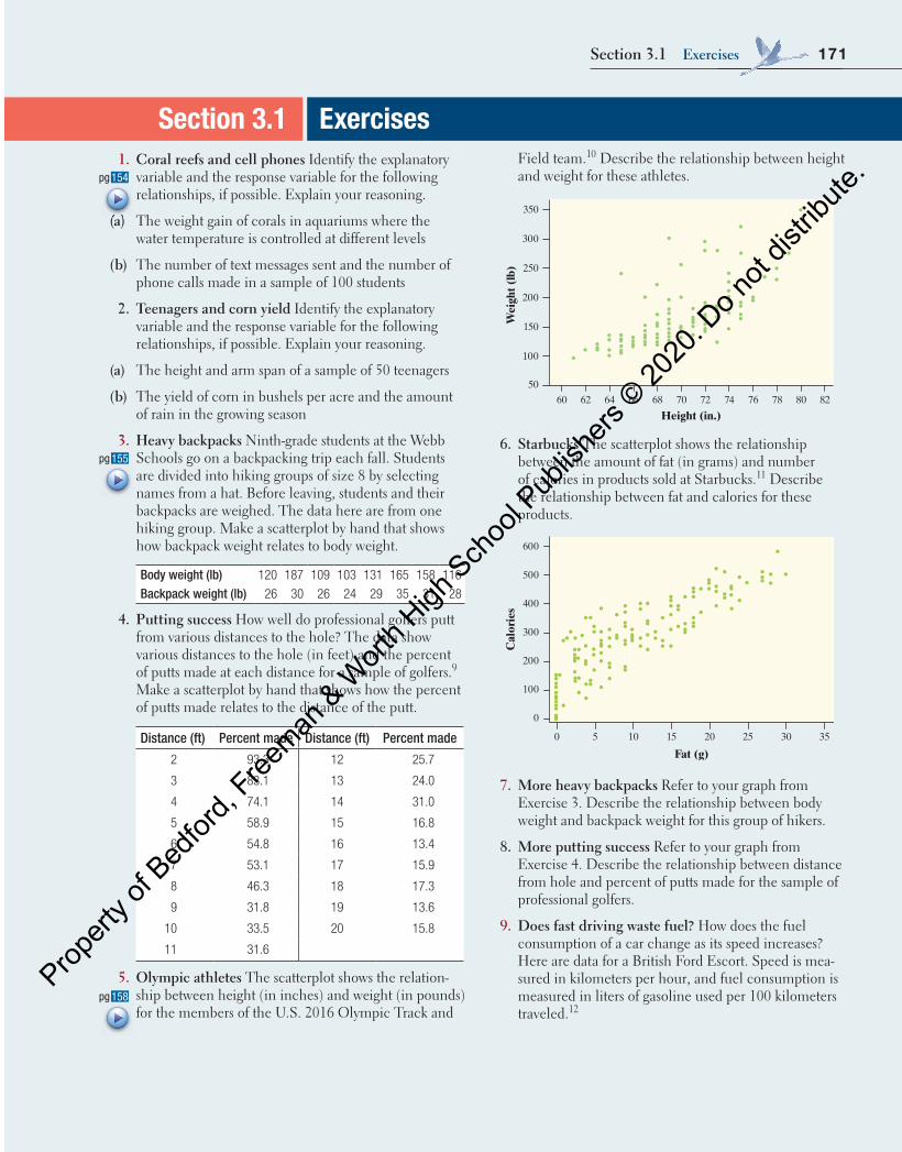
5. olympic athletes The scatterplot shows the relation-ship between height (in inches) and weight (in pounds) for the members of the U.S. 2016 Olympic Track and
Section 3.1 Exercises Field team. 10 Describe the relationship between height and weight for these athletes.
350
50
100
150
200
250
300
60 62 64 66 68 70 72 74 76 78 80 82
Height (in.)
Wei
ght (
lb)
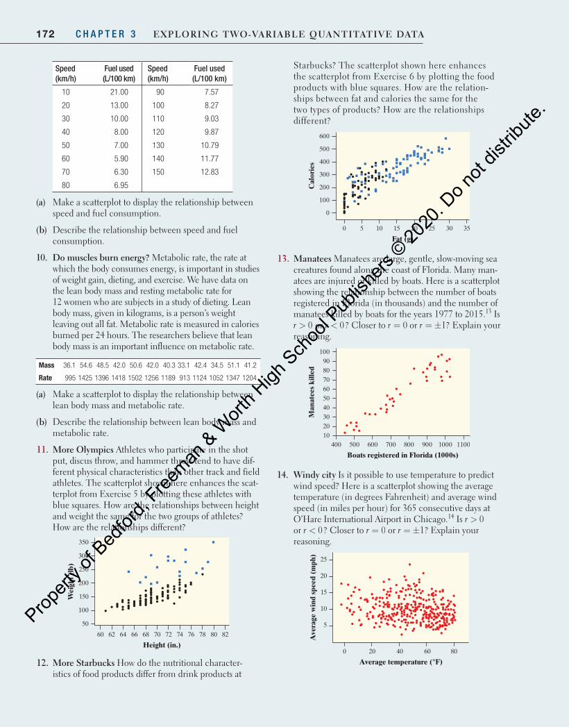
6. Starbucks The scatterplot shows the relationship between the amount of fat (in grams) and number of calories in products sold at Starbucks. 11 Describe the relationship between fat and calories for these products.
600
0
100
200
300
400
500
0 3530252015105
Fat (g)
Cal
orie
s
7. More heavy backpacks Refer to your graph from Exercise 3 . Describe the relationship between body weight and backpack weight for this group of hikers.
8. More putting success Refer to your graph from Exercise 4 . Describe the relationship between distance from hole and percent of putts made for the sample of professional golfers.
9. Does fast driving waste fuel? How does the fuel consumption of a car change as its speed increases? Here are data for a British Ford Escort. Speed is mea-sured in kilometers per hour, and fuel consumption is measured in liters of gasoline used per 100 kilometers traveled. 12
154pg
(a)
155pg
158pg
04_StarnesUPDtps6e_26929_ch03_151_246.indd 171 5/20/19 3:18 PM
Propert
y of B
edfor
d, Free
man & W
orth H
igh Sch
ool P
ublish
ers ©
2020
. Do n
ot dis
tribute
.
172 C H A P T E R 3 Exploring Two-VariablE QuanTiTaTiVE DaTa
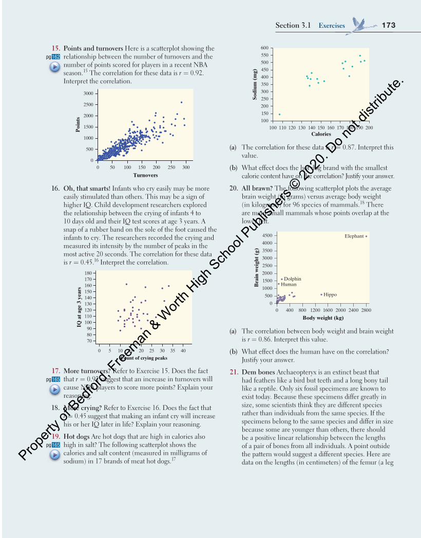
Starbucks? The scatterplot shown here enhances the scatterplot from Exercise 6 by plotting the food products with blue squares. How are the relation-ships between fat and calories the same for the two types of products? How are the relationships different?
600
0
100
200
300
400
500
0 3530252015105
Fat (g)
Cal
orie
s
13. Manatees Manatees are large, gentle, slow-moving sea creatures found along the coast of Florida. Many man-atees are injured or killed by boats. Here is a scatterplot showing the relationship between the number of boats registered in Florida (in thousands) and the number of manatees killed by boats for the years 1977 to 2015.13 Is r > 0 or r < 0? Closer to r = 0 or r = ±1? Explain your reasoning.
100
102030405060708090
400 500 600 700 800 900 1000 1100
Boats registered in Florida (1000s)
Man
atee
s ki
lled
14. windy city Is it possible to use temperature to predict wind speed? Here is a scatterplot showing the average temperature (in degrees Fahrenheit) and average wind speed (in miles per hour) for 365 consecutive days at O’Hare International Airport in Chicago.14 Is r > 0 or r < 0? Closer to r = 0 or r = ±1? Explain your reasoning.
25
5
10
15
20
0 20 40 60 80
Average temperature (°F)
Ave
rage
win
d sp
eed
(mph
)
Speed (km/h)
Fuel used (L/100 km)
Speed (km/h)
Fuel used (L/100 km)
10 21.00 90 7.57
20 13.00 100 8.27
30 10.00 110 9.03
40 8.00 120 9.87
50 7.00 130 10.79
60 5.90 140 11.77
70 6.30 150 12.83
80 6.95
(a) Make a scatterplot to display the relationship between speed and fuel consumption.
(b) Describe the relationship between speed and fuel consumption.
10. Do muscles burn energy? Metabolic rate, the rate at which the body consumes energy, is important in studies of weight gain, dieting, and exercise. We have data on the lean body mass and resting metabolic rate for 12 women who are subjects in a study of dieting. Lean body mass, given in kilograms, is a person’s weight leaving out all fat. Metabolic rate is measured in calories burned per 24 hours. The researchers believe that lean body mass is an important influence on metabolic rate.
Mass 36.1 54.6 48.5 42.0 50.6 42.0 40.3 33.1 42.4 34.5 51.1 41.2
Rate 995 1425 1396 1418 1502 1256 1189 913 1124 1052 1347 1204
(a) Make a scatterplot to display the relationship between lean body mass and metabolic rate.
(b) Describe the relationship between lean body mass and metabolic rate.
11. More olympics Athletes who participate in the shot put, discus throw, and hammer throw tend to have dif-ferent physical characteristics than other track and field athletes. The scatterplot shown here enhances the scat-terplot from Exercise 5 by plotting these athletes with blue squares. How are the relationships between height and weight the same for the two groups of athletes? How are the relationships different?
350
50
100
150
200
250
300
60 62 64 66 68 70 72 74 76 78 80 82
Height (in.)
Wei
ght (
lb)
12. More Starbucks How do the nutritional character-istics of food products differ from drink products at
04_StarnesUPDtps6e_26929_ch03_151_246.indd 172 5/20/19 3:18 PM
Propert
y of B
edfor
d, Free
man & W
orth H
igh Sch
ool P
ublish
ers ©
2020
. Do n
ot dis
tribute
.
173Section 3.1 Exercises
Calories
600
100 110 120 130 140 150 180 190160 170 200
Sodi
um (
mg)
100
550
500
450
400
350
300
250
200
150
(a) The correlation for these data is r = 0.87. Interpret this value.
(b) What effect does the hot dog brand with the smallest calorie content have on the correlation? Justify your answer.
20. all brawn? The following scatterplot plots the average brain weight (in grams) versus average body weight (in kilograms) for 96 species of mammals. 18 There are many small mammals whose points overlap at the lower left.
Body weight (kg)
4500
0 400 800 1200 1600 28002000 2400
Bra
in w
eigh
t (g)
0
Hippo
HumanDolphin
Elephant4000
3500
3000
2500
2000
1500
1000
500
(a) The correlation between body weight and brain weight is r = 0.86. Interpret this value.
(b) What effect does the human have on the correlation? Justify your answer.
21. Dem bones Archaeopteryx is an extinct beast that had feathers like a bird but teeth and a long bony tail like a reptile. Only six fossil specimens are known to exist today. Because these specimens differ greatly in size, some scientists think they are different species rather than individuals from the same species. If the specimens belong to the same species and differ in size because some are younger than others, there should be a positive linear relationship between the lengths of a pair of bones from all individuals. A point outside the pattern would suggest a different species. Here are data on the lengths (in centimeters) of the femur (a leg
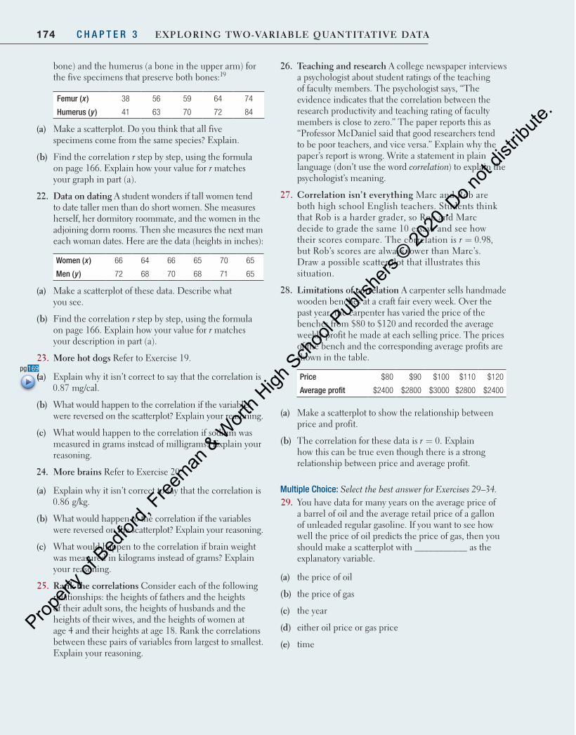
15. points and turnovers Here is a scatterplot showing the relationship between the number of turnovers and the number of points scored for players in a recent NBA season. 15 The correlation for these data is r = 0.92. Interpret the correlation.
0 50 100 150 200 250 300
Turnovers
0
500
1000
1500
2000
2500
3000
Poi
nts
16. oh, that smarts! Infants who cry easily may be more easily stimulated than others. This may be a sign of higher IQ. Child development researchers explored the relationship between the crying of infants 4 to 10 days old and their IQ test scores at age 3 years. A snap of a rubber band on the sole of the foot caused the infants to cry. The researchers recorded the crying and measured its intensity by the number of peaks in the most active 20 seconds. The correlation for these data is r = 0.45. 16 Interpret the correlation.
0
708090
100110120130140150160170180
5 10 15 20
Count of crying peaks
IQ a
t age
3 y
ears
25 30 35 40
17. More turnovers? Refer to Exercise 15 . Does the fact that r = 0.92 suggest that an increase in turnovers will cause NBA players to score more points? Explain your reasoning.
18. More crying? Refer to Exercise 16 . Does the fact that r = 0.45 suggest that making an infant cry will increase his or her IQ later in life? Explain your reasoning.
19. Hot dogs Are hot dogs that are high in calories also high in salt? The following scatterplot shows the calories and salt content (measured in milligrams of sodium) in 17 brands of meat hot dogs. 17
162pg
165pg
165pg
04_StarnesUPDtps6e_26929_ch03_151_246.indd 173 5/20/19 3:18 PM
Propert
y of B
edfor
d, Free
man & W
orth H
igh Sch
ool P
ublish
ers ©
2020
. Do n
ot dis
tribute
.
174 C H A P T E R 3 Exploring Two-VariablE QuanTiTaTiVE DaTa
bone) and the humerus (a bone in the upper arm) for the five specimens that preserve both bones: 19
Femur ( x ) 38 56 59 64 74
Humerus ( y ) 41 63 70 72 84
(a) Make a scatterplot. Do you think that all five specimens come from the same species? Explain.
(b) Find the correlation r step by step, using the formula on page 166 . Explain how your value for r matches your graph in part (a).
22. Data on dating A student wonders if tall women tend to date taller men than do short women. She measures herself, her dormitory roommate, and the women in the adjoining dorm rooms. Then she measures the next man each woman dates. Here are the data (heights in inches):
Women ( x ) 66 64 66 65 70 65
Men ( y ) 72 68 70 68 71 65
(a) Make a scatterplot of these data. Describe what you see.
(b) Find the correlation r step by step, using the formula on page 166 . Explain how your value for r matches your description in part (a).
23. More hot dogs Refer to Exercise 19 .
(a) Explain why it isn’t correct to say that the correlation is 0.87 mg/cal.
(b) What would happen to the correlation if the variables were reversed on the scatterplot? Explain your reasoning.
(c) What would happen to the correlation if sodium was measured in grams instead of milligrams? Explain your reasoning.
24. More brains Refer to Exercise 20 .
(a) Explain why it isn’t correct to say that the correlation is 0.86 g/kg.
(b) What would happen to the correlation if the variables were reversed on the scatterplot? Explain your reasoning.
(c) What would happen to the correlation if brain weight was measured in kilograms instead of grams? Explain your reasoning.
25. rank the correlations Consider each of the following relationships: the heights of fathers and the heights of their adult sons, the heights of husbands and the heights of their wives, and the heights of women at age 4 and their heights at age 18. Rank the correlations between these pairs of variables from largest to smallest. Explain your reasoning.
26. Teaching and research A college newspaper interviews a psychologist about student ratings of the teaching of faculty members. The psychologist says, “The evidence indicates that the correlation between the research productivity and teaching rating of faculty members is close to zero.” The paper reports this as “Professor McDaniel said that good researchers tend to be poor teachers, and vice versa.” Explain why the paper’s report is wrong. Write a statement in plain language (don’t use the word correlation ) to explain the psychologist’s meaning.
27. Correlation isn’t everything Marc and Rob are both high school English teachers. Students think that Rob is a harder grader, so Rob and Marc decide to grade the same 10 essays and see how their scores compare. The correlation is r = 0.98, but Rob’s scores are always lower than Marc’s. Draw a possible scatterplot that illustrates this situation.
28. limitations of correlation A carpenter sells handmade wooden benches at a craft fair every week. Over the past year, the carpenter has varied the price of the benches from $80 to $120 and recorded the average weekly profit he made at each selling price. The prices of the bench and the corresponding average profits are shown in the table.
Price $80 $90 $100 $110 $120
Average profit $2400 $2800 $3000 $2800 $2400
(a) Make a scatterplot to show the relationship between price and profit.
(b) The correlation for these data is r = 0. Explain how this can be true even though there is a strong relationship between price and average profit.
Multiple Choice: Select the best answer for Exercises 29 – 34 . 29. You have data for many years on the average price of
a barrel of oil and the average retail price of a gallon of unleaded regular gasoline. If you want to see how well the price of oil predicts the price of gas, then you should make a scatterplot with ___________ as the explanatory variable.
(a) the price of oil
(b) the price of gas
(c) the year
(d) either oil price or gas price
(e) time
169pg (a)
04_StarnesUPDtps6e_26929_ch03_151_246.indd 174 5/20/19 3:18 PM
Propert
y of B
edfor
d, Free
man & W
orth H
igh Sch
ool P
ublish
ers ©
2020
. Do n
ot dis
tribute
.
175Section 3.1 Exercises
30. In a scatterplot of the average price of a barrel of oil and the average retail price of a gallon of gas, you expect to see
(a) very little association.
(b) a weak negative association.
(c) a strong negative association.
(d) a weak positive association.
(e) a strong positive association.
31. The following graph plots the gas mileage (in miles per gallon) of various cars from the same model year versus the weight of these cars (in thousands of pounds). The points marked with red dots corre-spond to cars made in Japan. From this plot, we may conclude that
Weight (thousands of pounds)2.25 3.00 3.75 4.50
35
Mile
s pe
r ga
llon
30
25
20
15
(a) there is a positive association between weight and gas mileage for Japanese cars.
(b) the correlation between weight and gas mileage for all the cars is close to 1.
(c) there is little difference between Japanese cars and cars made in other countries.
(d) Japanese cars tend to be lighter in weight than other cars.
(e) Japanese cars tend to get worse gas mileage than other cars.
32. If women always married men who were 2 years older than themselves, what would be the correlation between the ages of husband and wife?
(a) 2 (b) 1 (c) 0.5
(d) 0 (e) Can’t tell without seeing the data
33. The scatterplot shows reading test scores against IQ test scores for 14 fifth-grade children. What effect does the point at IQ 124= and reading score 10= have on the correlation?
(a) It makes the correlation closer to 1.
(b) It makes the correlation closer to 0 but still positive.
(c) It makes the correlation equal to 0.
(d) It makes the correlation negative.
(e) It has no effect on the correlation.
Child’s IQ test score90 95 100 105 110 115 120 125 130 135 140 145 150
120
110
100
90
80
70
60
50
40
30
20
10
Chi
ld’s
rea
ding
test
sco
re
34. If we leave out this point, the correlation for the remaining 13 points in the preceding figure is closest to
(a) −0.95.
(d) 0.65.
(b) −0.65.
(e) 0.95.
(c) 0.
Recycle and Review 35. big diamonds (1.2) Here are the weights (in milli-
grams) of 58 diamonds from a nodule carried up to the earth’s surface in surrounding rock. These data repre-sent a population of diamonds formed in a single event deep in the earth.20
13.8 3.7 33.8 11.8 27.0 18.9 19.3 20.8 25.4 23.1 7.8
10.9 9.0 9.0 14.4 6.5 7.3 5.6 18.5 1.1 11.2 7.0
7.6 9.0 9.5 7.7 7.6 3.2 6.5 5.4 7.2 7.8 3.5
5.4 5.1 5.3 3.8 2.1 2.1 4.7 3.7 3.8 4.9 2.4
1.4 0.1 4.7 1.5 2.0 0.1 0.1 1.6 3.5 3.7 2.6
4.0 2.3 4.5
Make a histogram to display the distribution of weight. Describe the distribution.
36. Fruit fly thorax lengths (2.2) Fruit flies are used frequently in genetic research because of their quick reproductive cycle. The length of the thorax (in millimeters) for male fruit flies is approximately Normally distributed with a mean of 0.80 mm and a standard deviation of 0.08 mm.21
(a) What proportion of male fruit flies have a thorax length greater than 1 mm?
(b) What is the 30th percentile for male fruit fly thorax lengths?
04_StarnesUPDtps6e_26929_ch03_151_246.indd 175 5/20/19 3:18 PM
Propert
y of B
edfor
d, Free
man & W
orth H
igh Sch
ool P
ublish
ers ©
2020
. Do n
ot dis
tribute
.
176 C H A P T E R 3 Exploring Two-VariablE QuanTiTaTiVE DaTa
It is common knowledge that cars and trucks lose value the more they are driven. Can we predict the price of a used Ford F-150 SuperCrew ×4 4 truck if we know how many miles it has on the odometer? A random sample of 16 used Ford F-150 SuperCrew ×4 4s was selected from among those listed for sale at autotrader.com . The number of miles driven and price (in dollars) were recorded for each of the trucks. 22 Here are the data:
Miles driven 70,583 129,484 29,932 29,953 24,495 75,678 8359 4447
Price ($) 21,994 9500 29,875 41,995 41,995 28,986 31,891 37,991
Miles driven 34,077 58,023 44,447 68,474 144,162 140,776 29,397 131,385
Price ($) 34,995 29,988 22,896 33,961 16,883 20,897 27,495 13,997
Linear (straight-line) relationships between two quantitative variables are fairly common. In the preceding section, we found linear relationships in settings as varied as Major League Baseball, geysers, and Nobel prizes. Correlation mea-sures the strength and direction of these relationships. When a scatterplot shows a linear relationship, we can summarize the overall pattern by drawing a line on the scatterplot. A regression line models the relationship between two vari-ables, but only in a specific setting: when one variable helps explain the other. Regression, unlike correlation, requires that we have an explanatory variable and a response variable.
DEFINITION Regression line A regression line is a line that models how a response variable y changes as an explanatory variable x changes. Regression lines are expressed in the form y a bx= +y a= +y a where y (pronounced “ y -hat”) is the predicted value of y for a given value of x.
Tim
Gra
ham
/Ala
my
LEARNING TARGETS By the end of the section, you should be able to:
• Make predictions using regression lines, keeping in mind the dangers of extrapolation.
• Calculate and interpret a residual.
• Interpret the slope and y intercept of a regression line.
• Determine the equation of a least-squares regression line using technology or computer output.
• Construct and interpret residual plots to assess whether a regression model is appropriate.
• Interpret the standard deviation of the residuals and r 2 and use these values to assess how well a least-squares regression line models the relationship between two variables.
• Describe how the least-squares regression line, standard deviation of the residuals, and r 2 are influenced by unusual points.
• Find the slope and y intercept of the least-squares regression line from the means and standard deviations of x and y and their correlation.
SECTION 3.2 Least-Squares Regression
Sometimes regression lines are referred to as simple linear regression models. They are called “simple” because they involve only one explanatory variable.
04_StarnesUPDtps6e_26929_ch03_151_246.indd 176 5/20/19 3:18 PM
Propert
y of B
edfor
d, Free
man & W
orth H
igh Sch
ool P
ublish
ers ©
2020
. Do n
ot dis
tribute
.
177Section 3.2 least-Squares regression
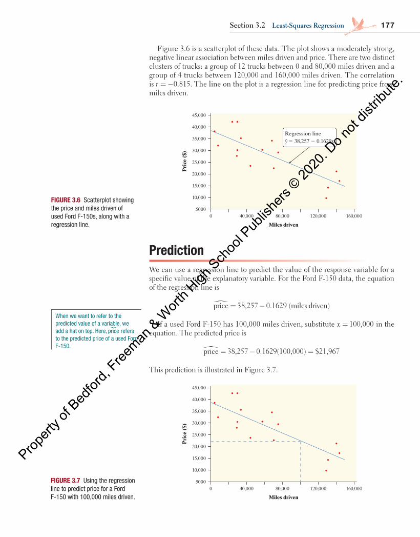
Figure 3.6 is a scatterplot of these data. The plot shows a moderately strong, negative linear association between miles driven and price. There are two distinct clusters of trucks: a group of 12 trucks between 0 and 80,000 miles driven and a group of 4 trucks between 120,000 and 160,000 miles driven. The correlation is = −0.815.r The line on the plot is a regression line for predicting price from miles driven.
PredictionWe can use a regression line to predict the value of the response variable for a specific value of the explanatory variable. For the Ford F-150 data, the equation of the regression line is
� = −price 38,257 0.1629 (miles driven)
If a used Ford F-150 has 100,000 miles driven, substitute = 100,000x in the equation. The predicted price is
= − =price 38,257 0.1629(100,000) $21,967�
This prediction is illustrated in Figure 3.7.
45,000
40,000
35,000
30,000
25,000
20,000
15,000
10,000
50000 40,000 80,000 120,000 160,000
Miles driven
Pri
ce (
$)
Regression line y = 38,257 2 0.1629x
FIGURE 3.6 Scatterplot showing the price and miles driven of used Ford F-150s, along with a regression line.
FIGURE 3.7 Using the regression line to predict price for a Ford F-150 with 100,000 miles driven.
45,000
40,000
35,000
30,000
25,000
20,000
15,000
10,000
50000 40,000 80,000 120,000 160,000
Miles driven
Pri
ce (
$)
When we want to refer to the predicted value of a variable, we add a hat on top. Here, �price refers to the predicted price of a used Ford F-150.
04_StarnesUPDtps6e_26929_ch03_151_246.indd 177 5/20/19 3:18 PM
Propert
y of B
edfor
d, Free
man & W
orth H
igh Sch
ool P
ublish
ers ©
2020
. Do n
ot dis
tribute
.
178 C H A P T E R 3 Exploring Two-VariablE QuanTiTaTiVE DaTa
Even though the value =ˆ $21, 967y is unlikely to be the actual price of a truck that has been driven 100,000 miles, it’s our best guess based on the linear model using x = miles driven. We can also think of =ˆ $21, 967y as the average price for a sample of trucks that have each been driven 100,000 miles.
Can we predict the price of a Ford F-150 with 300,000 miles driven? We can certainly substitute 300,000 into the equation of the line. The prediction is
� = − = −price 38,257 0.1629(300, 000) $10, 613
The model predicts that we would need to pay $10,613 just to have someone take the truck off our hands!
A negative price doesn’t make much sense in this context. Look again at Figure 3.7 . A truck with 300,000 miles driven is far outside the set of x values for our data. We can’t say whether the relationship between miles driven and price remains linear at such extreme values. Predicting the price for a truck with 300,000 miles driven is an extrapolation of the relationship beyond what the data show.
DEFINITION Extrapolation Extrapolation is the use of a regression line for prediction outside the interval of x values used to obtain the line. The further we extrapolate, the less reliable the predictions.
Few relationships are linear for all values of the explanatory variable. Don’t make predictions using values of x that are much larger or much smaller than those that actually appear in your data.
cautionaution
!
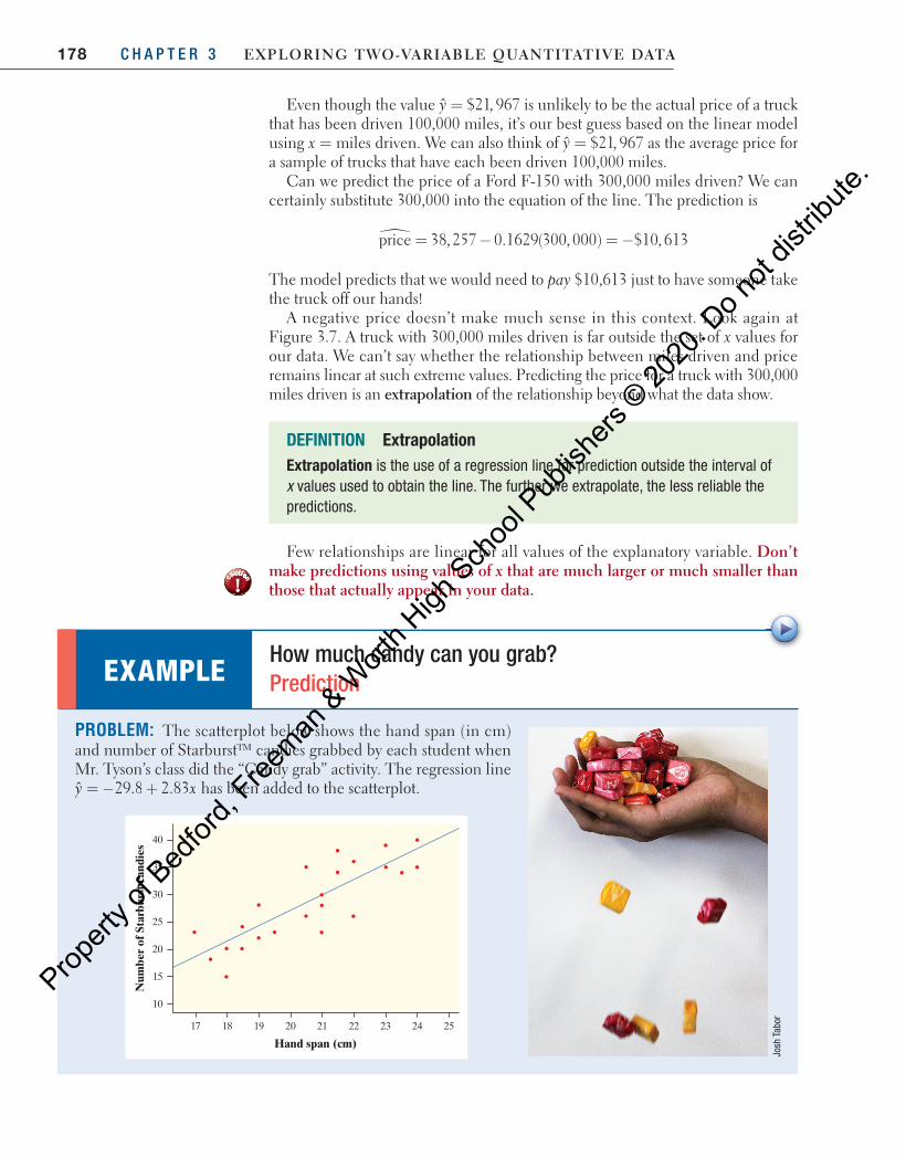
PROBLEM: The scatterplot below shows the hand span (in cm) and number of Starburst™ candies grabbed by each student when Mr. Tyson’s class did the “Candy grab” activity. The regression line
= − +ˆ 29.8 2.83y x has been added to the scatterplot.
EXAMPLE How much candy can you grab? Prediction
Josh
Tab
or
40
35
30
25
20
15
10
17 18 19 20 21 22 23 24 25
Hand span (cm)
Num
ber
of S
tarb
urst
can
dies
04_StarnesUPDtps6e_26929_ch03_151_246.indd 178 5/20/19 3:18 PM
Propert
y of B
edfor
d, Free
man & W
orth H
igh Sch
ool P
ublish
ers ©
2020
. Do n
ot dis
tribute
.
179Section 3.2 least-Squares regression
(a) Andres has a hand span of 22 cm. Predict the number of Starburst™ candies he can grab. (b) Mr. Tyson’s young daughter McKayla has a hand span of 12 cm. Predict the number of Starburst candies
she can grab. (c) How confident are you in each of these predictions? Explain.
SOLUTION: (a) = − +ˆ 29.8 2+8 2+ .83(22)y
=ˆ 32.46 Starburst candiesy
(b) = − +ˆ 29.8 2+8 2+ .83(12)y
y 4.16 Starburst candies=ˆ (c) The prediction for Andres is believable because 22=x is within the interval of x -values used to create
the model. However, the prediction for McKayla is not trustworthy because 12=x is far outside of the x -values used to create the regression line. The linear form may not extend to hand spans this small.
Don’t worry that the predicted number of Starburst candies isn’t an integer. Think of 32.46 as the average number of Starburst candies that a group of students, each with a hand span of 22 cm, could grab.
FOR PRACTICE, TRY EXERCISE 37
45,000
40,000
35,000
30,000
25,000
20,000
15,000
10,000
50000 40,000 80,000 120,000 160,000
Miles driven
Pri
ce (
$)
Residual
Regression line y = 38,257 2 0.1629x
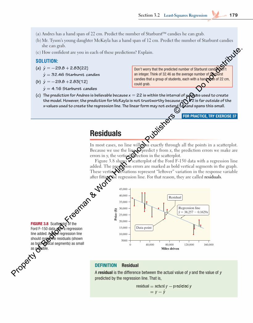
Data point FIGURE 3.8 Scatterplot of the Ford F-150 data with a regression line added. A good regression line should make the residuals (shown as bold vertical segments) as small as possible.
DEFINITION Residual A residual is the difference between the actual value of y and the value of y predicted by the regression line. That is,
= −= − ˆ
y yy y= −y y= −
residual a= −l a= −ctua= −ctua= −l p= −l p= −y yl py y= −y y= −l p= −y y= − rediy yrediy yctedy yctedy y
Residuals In most cases, no line will pass exactly through all the points in a scatterplot. Because we use the line to predict y from x, the prediction errors we make are errors in y, the vertical direction in the scatterplot.
Figure 3.8 shows a scatterplot of the Ford F-150 data with a regression line added. The prediction errors are marked as bold vertical segments in the graph. These vertical deviations represent “leftover” variation in the response variable after fitting the regression line. For that reason, they are called residuals .
04_StarnesUPDtps6e_26929_ch03_151_246.indd 179 5/20/19 3:18 PM
Propert
y of B
edfor
d, Free
man & W
orth H
igh Sch
ool P
ublish
ers ©
2020
. Do n
ot dis
tribute
.

180 C H A P T E R 3 Exploring Two-VariablE QuanTiTaTiVE DaTa
In Figure 3.8 above, the highlighted data point represents a Ford F-150 that had 70,583 miles driven and a price of $21,994. The regression line predicts a price of
= − =price 38,257 0.1629(70,583) $26,759�
for this truck, but its actual price was $21,994. This truck’s residual is
= −
= −
= − = −
residual actual predictedˆ
21, 994 26,759 $4765
y yy y
The actual price of this truck is $4765 less than the cost predicted by the regres-sion line with x = miles driven. Why is the actual price less than predicted? There are many possible reasons. Perhaps the truck needs body work, has mechanical issues, or has been in an accident.
PROBLEM: Here again is the scatterplot showing the hand span (in cm) and number of Starburst™ candies grabbed by each student in Mr. Tyson’s class. The regression line is
= − +ˆ 29.8 2.83y x .
Find and interpret the residual for Andres, who has a hand span of 22 cm and grabbed 36 Starburst candies.
SOLUTION: = − + =ˆ 29.8 2+ =8 2+ =+ =.+ =83(22)+ =83(22)+ = 32.46y Starburst candies
= − =Residual 36= −36= − 32.46 3.54 Starburst candies Andres grabbed 3.54 more Starburst candies than the number predicted by the regression line with x = hand span.
EXAMPLE Can you grab more than expected? Calculating and interpreting a residual
FOR PRACTICE, TRY EXERCISE 39
Josh
Tab
or
40
35
30
25
20
15
10
17 18 19 20 21 22 23 24 25
Hand span (cm)
Num
ber
of S
tarb
urst
can
dies
= −= − ˆ
y yy y= −y y= −
Residual a= −l a= −ctua= −ctua= −l p= −l p= −y yl py y= −y y= −l p= −y y= − redictey yredictey ydy ydy y
04_StarnesUPDtps6e_26929_ch03_151_246.indd 180 5/20/19 3:18 PM
Propert
y of B
edfor
d, Free
man & W
orth H
igh Sch
ool P
ublish
ers ©
2020
. Do n
ot dis
tribute
.
181Section 3.2 least-Squares regression
Interpreting a Regression Line A regression line is a model for the data, much like the density curves of Chapter 2 . The y intercept and slope of the regression line describe what this model tells us about the relationship between the response variable y and the explanatory variable x.
CHECK YOUR UNDERSTANDING
Some data were collected on the weight of a male white laboratory rat for the first 25 weeks after its birth. A scatterplot of y = weight (in grams) and x = time since birth (in weeks) shows a fairly strong, positive linear relationship. The regression equation y xˆ 100 40y x40y x= +y x= +y x100= +100y x100y x= +y x100y x models the data fairly
well.
1. Predict the rat’s weight at 16 weeks old. 2. Calculate and interpret the residual if the rat weighed 700 grams at 16 weeks old. 3. Should you use this line to predict the rat’s weight at 2 years old? Use the equation
to make the prediction and discuss your confidence in the result. (There are 454 grams in a pound.)
You are probably accustomed to the form y = mx + b for the equation of a line from algebra. Statisticians have adopted a different form for the equation of a regression line. Some use y b b xˆ 0 1= + . We prefer the form = +y a bx for three reasons: (1) it’s simpler, (2) your calculator uses this form, and (3) the formula sheet provided on the AP® exam uses this form. Just remember that the slope is the coefficient of x , no matter what form is used.
Let’s return to the Ford F-150 data. The equation of the regression line for these data is = −ˆ 38,257 0.1629y x , where = miles drivenx and = price.y The slope = −0.1629b tells us that the predicted price of a used Ford F-150 goes down by $0.1629 (16.29 cents) for each additional mile that the truck has been driven. The y intercept = 38,257a is the predicted price (in dollars) of a used Ford F-150 that has been driven 0 miles.
The slope of a regression line is an important numerical description of the relationship between the two variables. Although we need the value of the y intercept to draw the line, it is statistically meaningful only when the explan-atory variable can actually take values close to 0, as in the Ford F-150 data. In other cases, using the regression line to make a prediction for x = 0 is an extrapolation.
AP ® EXAM TIP
When asked to interpret the slope or y intercept, it is very important to include the word predicted (or equivalent) in your response. Otherwise, it might appear that you believe the regression equation provides actual values of y .
DEFINITION y intercept, Slope In the regression equation = +y a= +y a= + bxˆ :
• a is the y intercept , the predicted value of y when 0x = • b is the slope , the amount by which the predicted value of y changes when
x increases by 1 unit
The data used to calculate a regression line typically come from a sample. The statistics a and b in the sample regression model estimate the y intercept and slope parameters of the population regression model. You'll learn more about how this works in Chapter 12 .
04_StarnesUPDtps6e_26929_ch03_151_246.indd 181 5/20/19 3:19 PM
Propert
y of B
edfor
d, Free
man & W
orth H
igh Sch
ool P
ublish
ers ©
2020
. Do n
ot dis
tribute
.
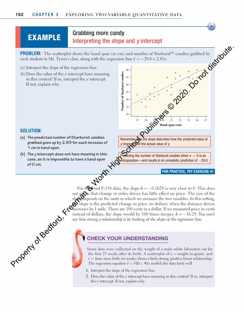
182 C H A P T E R 3 Exploring Two-VariablE QuanTiTaTiVE DaTa
CHECK YOUR UNDERSTANDING
Some data were collected on the weight of a male white laboratory rat for the first 25 weeks after its birth. A scatterplot of = weight (in grams)y and x time= since birth (in weeks) shows a fairly strong, positive linear relationship. The regression equation y xˆ 100 40y x40y x= +y x= +y x100= +100y x100y x= +y x100y x models the data fairly well.
1. Interpret the slope of the regression line. 2. Does the value of the y intercept have meaning in this context? If so, interpret
the y intercept. If not, explain why.
PROBLEM: The scatterplot shows the hand span (in cm) and number of Starburst™ candies grabbed by each student in Mr. Tyson’s class, along with the regression line = − +ˆ 29.8 2.83y x .
(a) Interpret the slope of the regression line. (b) Does the value of the y intercept have meaning
in this context? If so, interpret the y intercept. If not, explain why.
SOLUTION: (a) The predicted number of Starburst candies
grabbed goes up by 2.83 for each increase of 1 cm in hand span.
(b) The y intercept does not have meaning in this case, as it is impossible to have a hand span of 0 cm.
EXAMPLE Grabbing more candy Interpreting the slope and y intercept
FOR PRACTICE, TRY EXERCISE 41
Remember that the slope describes how the predicted value of y changes, not the actual value of y.
Predicting the number of Starburst candies when = 0x is an extrapolation—and results in an unrealistic prediction of −29.8.
40
35
30
25
20
15
10
17 18 19 20 21 22 23 24 25
Hand span (cm)N
umbe
r of
Sta
rbur
st c
andi
es
For the Ford F-150 data, the slope = −0.1629b is very close to 0. This does not mean that change in miles driven has little effect on price. The size of the slope depends on the units in which we measure the two variables. In this setting, the slope is the predicted change in price (in dollars) when the distance driven increases by 1 mile. There are 100 cents in a dollar. If we measured price in cents instead of dollars, the slope would be 100 times steeper, = −16.29b . You can’t say how strong a relationship is by looking at the slope of the regression line.
04_StarnesUPDtps6e_26929_ch03_151_246.indd 182 5/20/19 3:19 PM
Propert
y of B
edfor
d, Free
man & W
orth H
igh Sch
ool P
ublish
ers ©
2020
. Do n
ot dis
tribute
.
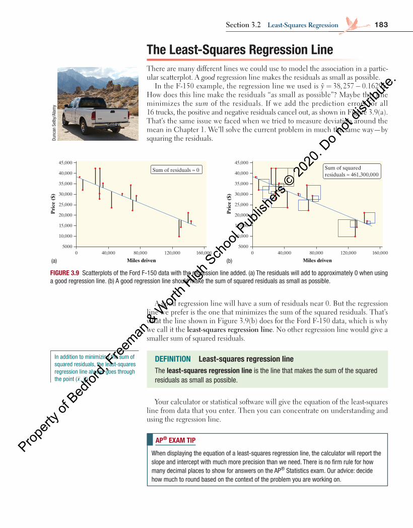
183Section 3.2 least-Squares regression
Dunc
an S
elby
/Ala
my
DEFINITION Least-squares regression lineThe least-squares regression line is the line that makes the sum of the squared residuals as small as possible.
45,000
5000
10,000
15,000
20,000
25,000
30,000
35,000
40,000
0 160,000120,00080,00040,000
Miles driven
Pri
ce (
$)
Sum of residuals ≈ 045,000
5000
10,000
15,000
20,000
25,000
30,000
35,000
40,000
0 160,000120,00080,00040,000
Miles driven
Pri
ce (
$)
Sum of squaredresiduals ≈ 461,300,000
(a) (b)
The Least-Squares Regression LineThere are many different lines we could use to model the association in a partic-ular scatterplot. A good regression line makes the residuals as small as possible.
In the F-150 example, the regression line we used is = −ˆ 38,257 0.1629y x. How does this line make the residuals “as small as possible”? Maybe this line minimizes the sum of the residuals. If we add the prediction errors for all 16 trucks, the positive and negative residuals cancel out, as shown in Figure 3.9(a). That’s the same issue we faced when we tried to measure deviation around the mean in Chapter 1. We’ll solve the current problem in much the same way—by squaring the residuals.
A good regression line will have a sum of residuals near 0. But the regression line we prefer is the one that minimizes the sum of the squared residuals. That’s what the line shown in Figure 3.9(b) does for the Ford F-150 data, which is why we call it the least-squares regression line. No other regression line would give a smaller sum of squared residuals.
FIGURE 3.9 Scatterplots of the Ford F-150 data with the regression line added. (a) The residuals will add to approximately 0 when using a good regression line. (b) A good regression line should make the sum of squared residuals as small as possible.
Your calculator or statistical software will give the equation of the least-squares line from data that you enter. Then you can concentrate on understanding and using the regression line.
In addition to minimizing the sum of squared residuals, the least-squares regression line always goes through the point (x , y ).
AP® EXAM TIP
When displaying the equation of a least-squares regression line, the calculator will report the slope and intercept with much more precision than we need. There is no firm rule for how many decimal places to show for answers on the AP® Statistics exam. Our advice: decide how much to round based on the context of the problem you are working on.
04_StarnesUPDtps6e_26929_ch03_151_246.indd 183 5/20/19 3:19 PM
Propert
y of B
edfor
d, Free
man & W
orth H
igh Sch
ool P
ublish
ers ©
2020
. Do n
ot dis
tribute
.

184 C H A P T E R 3 Exploring Two-VariablE QuanTiTaTiVE DaTa
9. Technology Corner CALCULATING LEAST-SQUARES REGRESSION LINES
TI-Nspire and other technology instructions are on the book’s website at highschool.bfwpub.com/updatedtps6e .
Let’s use the Ford F-150 data to show how to find the equation of the least-squares regression line on the TI-83/84. Here are the data again:
Miles driven 70,583 129,484 29,932 29,953 24,495 75,678 8359 4447
Price ($) 21,994 9500 29,875 41,995 41,995 28,986 31,891 37,991
Miles driven 34,077 58,023 44,447 68,474 144,162 140,776 29,397 131,385
Price ($) 34,995 29,988 22,896 33,961 16,883 20,897 27,495 13,997
1. Enter the miles driven data into L1 and the price data into L2.
2. To determine the least-squares regression line, press STAT ; choose CALC and then LinReg(a+bx).
• oS 2.55 or later: In the dialog box, enter the following: Xlist:L1, Ylist:L2, FreqList (leave blank), Store RegEQ (leave blank), and choose Calculate.
• older oS: Finish the command to read LinReg(a+bx) L1,L2 and press ENTER .
Note: If r 2 and r do not appear on the TI-83/84 screen, do this one-time series of keystrokes:
• oS 2.55 or later: Press MODE and set STAT DIAGNOSTICS to ON. Then redo Step 2 to calculate the least-squares line. The r 2 and r values should now appear.
• older oS: Press 2nd 0 (CATALOG), scroll down to DiagnosticOn, and press ENTER . Press ENTER again to execute the command. The screen should say “Done.” Then redo Step 2 to calculate the least-squares line. The r 2 and r values should now appear.
To graph the least-squares regression line on the scatterplot:
1. Set up a scatterplot (see Technology Corner 8 on page 159 ).
2. Press Y = and enter the equation of the least-squares regression line in Y1.
3. Press ZOOM and choose ZoomStat to see the scatterplot with the least-squares regression line.
Note: When you calculate the equation of the least-squares regression line, you can have the calculator store the equation to Y1. When setting up the calculation, enter Y1 for the StoreRegEq prompt blank (OS 2.55 or later) or use the following command (older OS): LinReg(a+bx) L1,L2,Y1. Y1 is found by pressing VARS and selecting Y-VARS, then Function, then Y1.
04_StarnesUPDtps6e_26929_ch03_151_246.indd 184 5/20/19 3:19 PM
Propert
y of B
edfor
d, Free
man & W
orth H
igh Sch
ool P
ublish
ers ©
2020
. Do n
ot dis
tribute
.
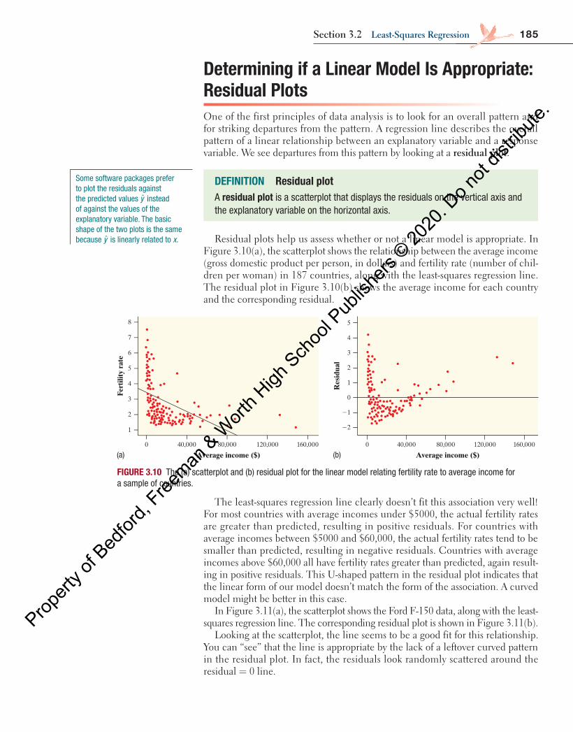
185Section 3.2 least-Squares regression
Determining if a Linear Model Is Appropriate: Residual PlotsOne of the first principles of data analysis is to look for an overall pattern and for striking departures from the pattern. A regression line describes the overall pattern of a linear relationship between an explanatory variable and a response variable. We see departures from this pattern by looking at a residual plot.
DEFINITION Residual plotA residual plot is a scatterplot that displays the residuals on the vertical axis and the explanatory variable on the horizontal axis.
Residual plots help us assess whether or not a linear model is appropriate. In Figure 3.10(a), the scatterplot shows the relationship between the average income (gross domestic product per person, in dollars) and fertility rate (number of chil-dren per woman) in 187 countries, along with the least-squares regression line. The residual plot in Figure 3.10(b) shows the average income for each country and the corresponding residual.
The least-squares regression line clearly doesn’t fit this association very well! For most countries with average incomes under $5000, the actual fertility rates are greater than predicted, resulting in positive residuals. For countries with average incomes between $5000 and $60,000, the actual fertility rates tend to be smaller than predicted, resulting in negative residuals. Countries with average incomes above $60,000 all have fertility rates greater than predicted, again result-ing in positive residuals. This U-shaped pattern in the residual plot indicates that the linear form of our model doesn’t match the form of the association. A curved model might be better in this case.
In Figure 3.11(a), the scatterplot shows the Ford F-150 data, along with the least-squares regression line. The corresponding residual plot is shown in Figure 3.11(b).
Looking at the scatterplot, the line seems to be a good fit for this relationship. You can “see” that the line is appropriate by the lack of a leftover curved pattern in the residual plot. In fact, the residuals look randomly scattered around the residual = 0 line.
FIGURE 3.10 The (a) scatterplot and (b) residual plot for the linear model relating fertility rate to average income for a sample of countries.
8
1
2
3
4
5
6
7
0 160,000120,00080,00040,000
Average income ($)
Fert
ility
rat
e
5
22
21
0
1
2
3
4
0 160,000120,00080,00040,000
Average income ($)
Res
idua
l
(a) (b)
Some software packages prefer to plot the residuals against the predicted values y instead of against the values of the explanatory variable. The basic shape of the two plots is the same because y is linearly related to x.
04_StarnesUPDtps6e_26929_ch03_151_246.indd 185 5/20/19 3:19 PM
Propert
y of B
edfor
d, Free
man & W
orth H
igh Sch
ool P
ublish
ers ©
2020
. Do n
ot dis
tribute
.
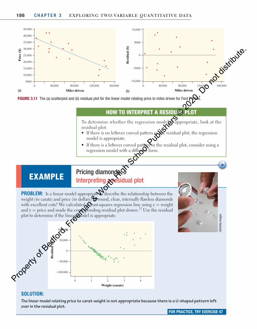
186 C H A P T E R 3 Exploring Two-VariablE QuanTiTaTiVE DaTa
45,000
40,000
35,000
30,000
25,000
20,000
15,000
10,000
50000 40,000 80,000 120,000 160,000
Miles driven
Pri
ce (
$)
Res
idua
l ($)
0 40,000 80,000 120,000 160,000
Miles driven
0
210,000
25000
5000
10,000
FIGURE 3.11 The (a) scatterplot and (b) residual plot for the linear model relating price to miles driven for Ford F-150s.
HOW TO INTERPRET A RESIDUAL PLOT
To determine whether the regression model is appropriate, look at the residual plot. • If there is no leftover curved pattern in the residual plot, the regression
model is appropriate. • If there is a leftover curved pattern in the residual plot, consider using a
regression model with a different form.
PROBLEM: Is a linear model appropriate to describe the relationship between the weight (in carats) and price (in dollars) of round, clear, internally flawless diamonds with excellent cuts? We calculated a least-squares regression line using x = weight and y = price and made the corresponding residual plot shown. 23 Use the residual plot to determine if the linear model is appropriate.
2100,000
100,000
250,000
50,000
0
0 4321
Weight (carats)
Res
idua
l ($)
SOLUTION: The linear model relating price to carat weight is not appropriate because there is a U-shaped pattern left over in the residual plot.
EXAMPLE Pricing diamonds Interpreting a residual plot
JGI/G
etty
Imag
es
FOR PRACTICE, TRY EXERCISE 47
(a) (b)
04_StarnesUPDtps6e_26929_ch03_151_246.indd 186 5/20/19 3:19 PM
Propert
y of B
edfor
d, Free
man & W
orth H
igh Sch
ool P
ublish
ers ©
2020
. Do n
ot dis
tribute
.

187Section 3.2 least-Squares regression
Think About It
WHY DO WE LOOK FOR PATTERNS IN RESIDUAL PLOTS? The word residualcomes from the Latin word residuum , meaning “left over.” When we calculate a residual, we are calculating what is left over after subtracting the predicted value from the actual value:
= −y yresidual actual predicted
Likewise, when we look at the form of a residual plot, we are looking at the form that is left over after subtracting the form of the model from the form of the association:
= −form of residual plot form of association form of model
When there is a leftover form in the residual plot, the form of the association and form of the model are not the same. However, if the form of the associ-ation and form of the model are the same , the residual plot should have no form, other than random scatter.
10. Technology Corner MAKING RESIDUAL PLOTS
TI-Nspire and other technology instructions are on the book’s website at highschool.bfwpub.com/updatedtps6e .
Let’s continue the analysis of the Ford F-150 miles driven and price data from Technology Corner 9 ( page 184 ). You should have already made a scatterplot, calculated the equation of the least-squares regression line, and graphed the line on the scatterplot. Now, we want to calculate residuals and make a residual plot. Fortunately, your calculator has already done most of the work. Each time the calculator computes a regression line, it computes the residuals and stores them in a list named RESID.
1. Set up a scatterplot in the statistics plots menu.
• Press 2nd Y = (STAT PLOT).
• Press ENTER or 1 to go into Plot1.
• Adjust the settings as shown. The RESID list is found in the List menu by pressing 2nd STAT . Note: You have to calculate the equation of the least-squares regression line using the calculator before making a residual plot. Otherwise, the RESID list will include the residuals from a different least-squares regression line.
2. Use ZoomStat to let the calculator choose an appropriate window.
• Press ZOOM and choose 9: ZoomStat.
Note: If you want to see the values of the residuals, you can have the calculator put them in L3 (or any list). In the list editor, highlight the heading of L3, choose the RESID list from the LIST menu, and press ENTER .
04_StarnesUPDtps6e_26929_ch03_151_246.indd 187 5/20/19 3:19 PM
Propert
y of B
edfor
d, Free
man & W
orth H
igh Sch
ool P
ublish
ers ©
2020
. Do n
ot dis
tribute
.
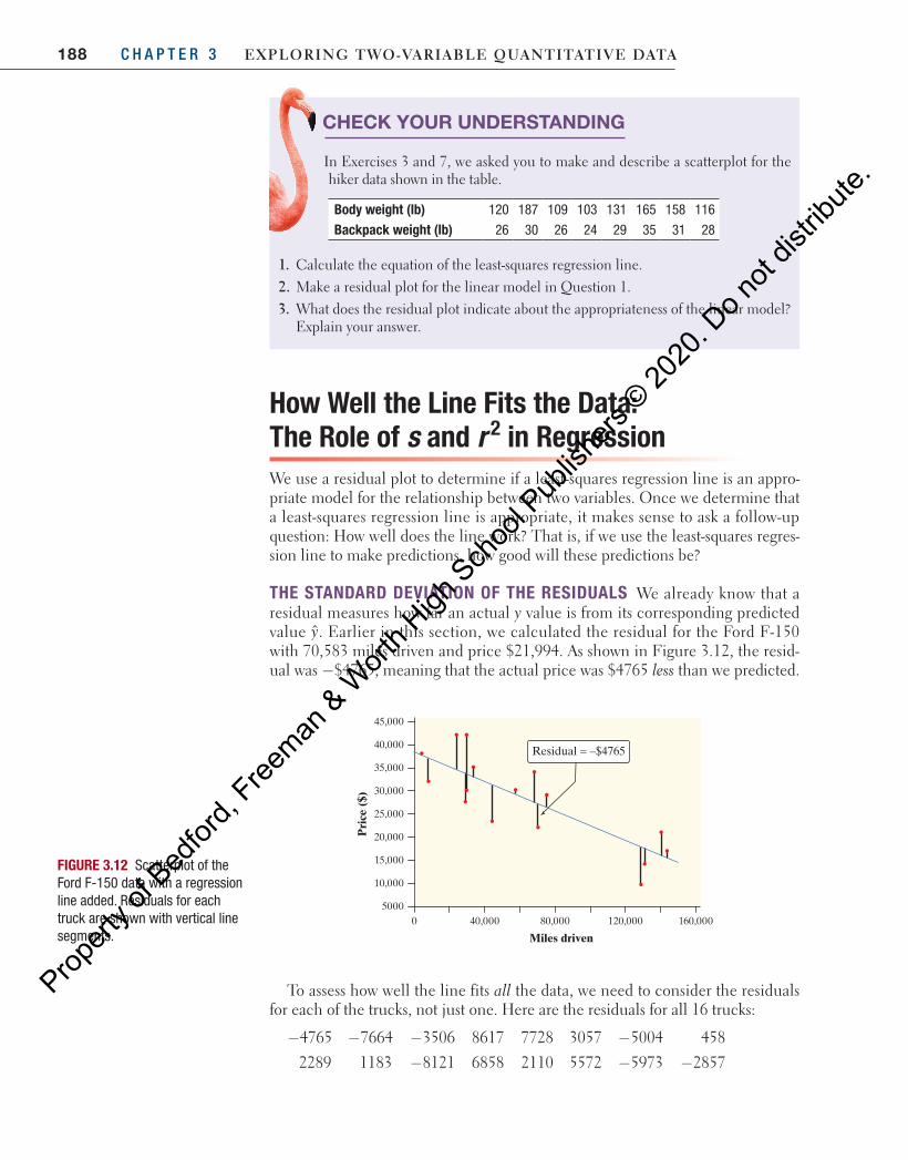
188 C H A P T E R 3 Exploring Two-VariablE QuanTiTaTiVE DaTa
How Well the Line Fits the Data: The Role of s and r 2 in RegressionWe use a residual plot to determine if a least-squares regression line is an appro-priate model for the relationship between two variables. Once we determine that a least-squares regression line is appropriate, it makes sense to ask a follow-up question: How well does the line work? That is, if we use the least-squares regres-sion line to make predictions, how good will these predictions be?
THE STANDARD DEVIATION OF THE RESIDUALS We already know that a residual measures how far an actual y value is from its corresponding predicted value y. Earlier in this section, we calculated the residual for the Ford F-150 with 70,583 miles driven and price $21,994. As shown in Figure 3.12, the resid-ual was −$4765, meaning that the actual price was $4765 less than we predicted.
CHECK YOUR UNDERSTANDING
In Exercises 3 and 7, we asked you to make and describe a scatterplot for the hiker data shown in the table.
Body weight (lb) 120 187 109 103 131 165 158 116
Backpack weight (lb) 26 30 26 24 29 35 31 28
1. Calculate the equation of the least-squares regression line.2. Make a residual plot for the linear model in Question 1.3. What does the residual plot indicate about the appropriateness of the linear model?
Explain your answer.
45,000
40,000
35,000
30,000
25,000
20,000
15,000
10,000
50000 40,000 80,000 120,000 160,000
Miles driven
Pri
ce (
$)
Residual = –$4765
FIGURE 3.12 Scatterplot of the Ford F-150 data with a regression line added. Residuals for each truck are shown with vertical line segments.
To assess how well the line fits all the data, we need to consider the residuals for each of the trucks, not just one. Here are the residuals for all 16 trucks:
−4765 −7664 −3506 8617 7728 3057 −5004 458
2289 1183 −8121 6858 2110 5572 −5973 −2857
04_StarnesUPDtps6e_26929_ch03_151_246.indd 188 5/20/19 3:19 PM
Propert
y of B
edfor
d, Free
man & W
orth H
igh Sch
ool P
ublish
ers ©
2020
. Do n
ot dis
tribute
.
189Section 3.2 least-Squares regression
Using these residuals, we can estimate the “typical” prediction error when using the least-squares regression line. To do this, we calculate the standard devi-ation of the residuals s.
To calculate s, use the following formula:
=−
=∑ −
−sum of squared residuals
2( ˆ )
2
2s
ny yn
i i
For the Ford F-150 data, the standard deviation of the residuals is
=− + − + ⋅ ⋅ ⋅ + −
−= =s
( 4765) ( 7664) ( 2857)16 2
461,264,13614
$57402 2 2
Interpretation: The actual price of a Ford F-150 is typically about $5740 away from the price predicted by the least-squares regression line with = miles driven.x If we look at the residual plot in Figure 3.11, this seems like a reasonable value. Although some of the residuals are close to 0, others are close to $10,000 or −$10,000.
THE COEFFICIENT OF DETERMINATION r 2 There is another numerical quan-tity that tells us how well the least-squares line predicts values of the response vari-able y. It is 2r , the coefficient of determination. Some computer packages call it “R-sq.” You may have noticed this value in some of the output that we showed earlier. Although it’s true that r2 is equal to the square of the correlation r, there is much more to this story.
DEFINITION Standard deviation of residuals sThe standard deviation of the residuals s measures the size of a typical residual. That is, s measures the typical distance between the actual y values and the predicted y values.
Think About It
DOES THE FORMULA FOR s LOOK SLIGHTLY FAMILIAR? It should. In Chapter 1, we defined the standard deviation of a set of quantitative data as
=∑ −
−s
x xnx
i( )1
2
We interpreted the resulting value as the “typical” distance of the data points from the mean. In the case of two-variable data, we’re interested in the typical (vertical) distance of the data points from the regression line. We find this value in much the same way: first add up the squared deviations, then average them (again, in a funny way), and take the square root to get back to the original units of measurement.
04_StarnesUPDtps6e_26929_ch03_151_246.indd 189 5/20/19 3:19 PM
Propert
y of B
edfor
d, Free
man & W
orth H
igh Sch
ool P
ublish
ers ©
2020
. Do n
ot dis
tribute
.
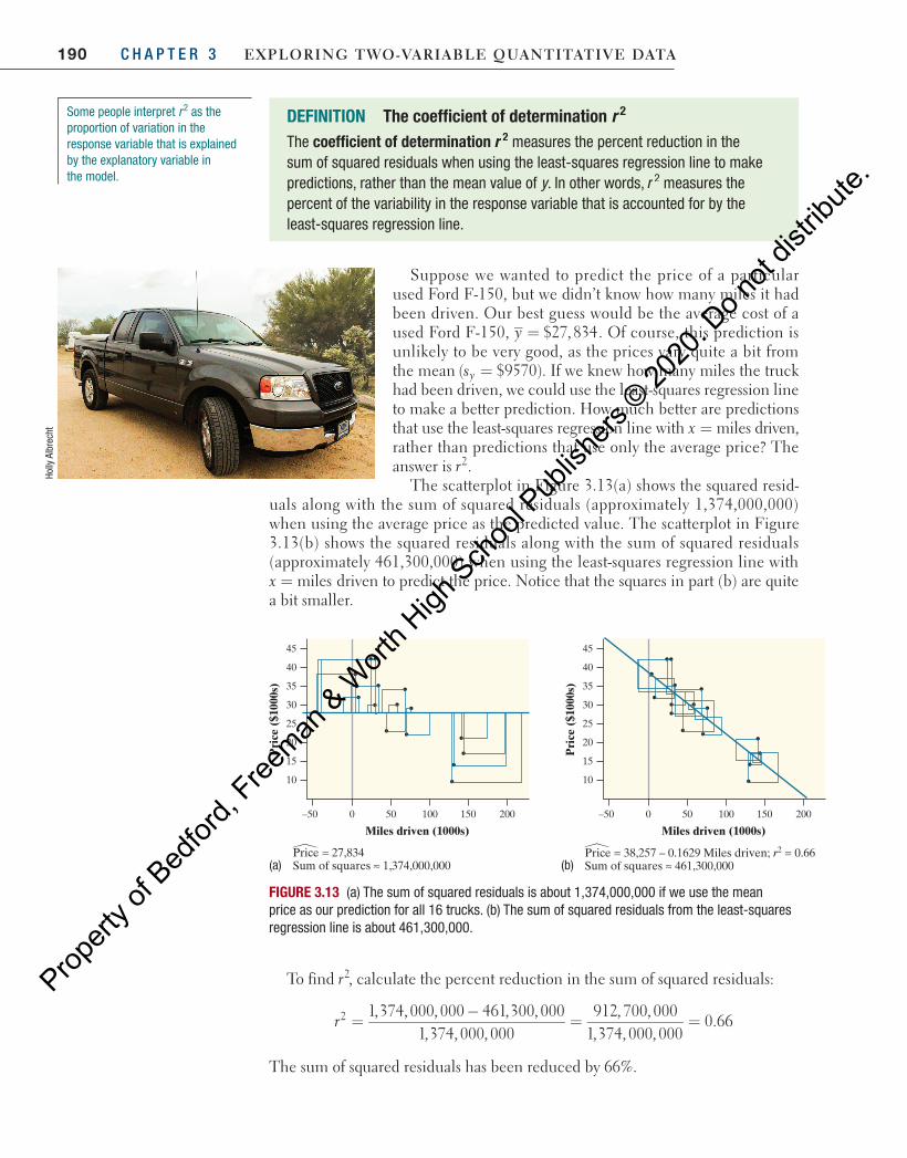
190 C H A P T E R 3 Exploring Two-VariablE QuanTiTaTiVE DaTa Ho
lly A
lbre
cht
To find 2r , calculate the percent reduction in the sum of squared residuals:
=−
= =1,374, 000, 000 461,300, 000
1,374, 000, 000912, 700, 000
1,374, 000, 0000.662r
The sum of squared residuals has been reduced by 66%.
10
15
20
25
30
35
40
45
–50 0 50 100 150 200
Price = 38,257 – 0.1629 Miles driven; r2 = 0.66Sum of squares ≈ 461,300,000
Pri
ce (
$100
0s)
Price = 27,834 Sum of squares ≈ 1,374,000,000
Miles driven (1000s)
10
15
20
25
30
35
40
45
–50 0 50 100 150 200
Pri
ce (
$100
0s)
Miles driven (1000s)
FIGURE 3.13 (a) The sum of squared residuals is about 1,374,000,000 if we use the mean price as our prediction for all 16 trucks. (b) The sum of squared residuals from the least-squares regression line is about 461,300,000.
(a) (b)
Some people interpret r 2 as the proportion of variation in the response variable that is explained by the explanatory variable in the model.
DEFINITION The coefficient of determination r 2 The coefficient of determination 2r measures the percent reduction in the sum of squared residuals when using the least-squares regression line to make predictions, rather than the mean value of y . In other words, r 2 measures the percent of the variability in the response variable that is accounted for by the least-squares regression line.
Suppose we wanted to predict the price of a particular used Ford F-150, but we didn’t know how many miles it had been driven. Our best guess would be the average cost of a used Ford F-150, = $27,834y . Of course, this prediction is unlikely to be very good, as the prices vary quite a bit from the mean =( $9570)sy . If we knew how many miles the truck had been driven, we could use the least-squares regression line to make a better prediction. How much better are predictions that use the least-squares regression line with = miles driven,xrather than predictions that use only the average price? The answer is 2r .
The scatterplot in Figure 3.13(a) shows the squared resid-uals along with the sum of squared residuals (approximately 1,374,000,000) when using the average price as the predicted value. The scatterplot in Figure 3.13(b) shows the squared residuals along with the sum of squared residuals (approximately 461,300,000) when using the least-squares regression line with = milesx driven to predict the price. Notice that the squares in part (b) are quite a bit smaller.
04_StarnesUPDtps6e_26929_ch03_151_246.indd 190 5/20/19 3:19 PM
Propert
y of B
edfor
d, Free
man & W
orth H
igh Sch
ool P
ublish
ers ©
2020
. Do n
ot dis
tribute
.
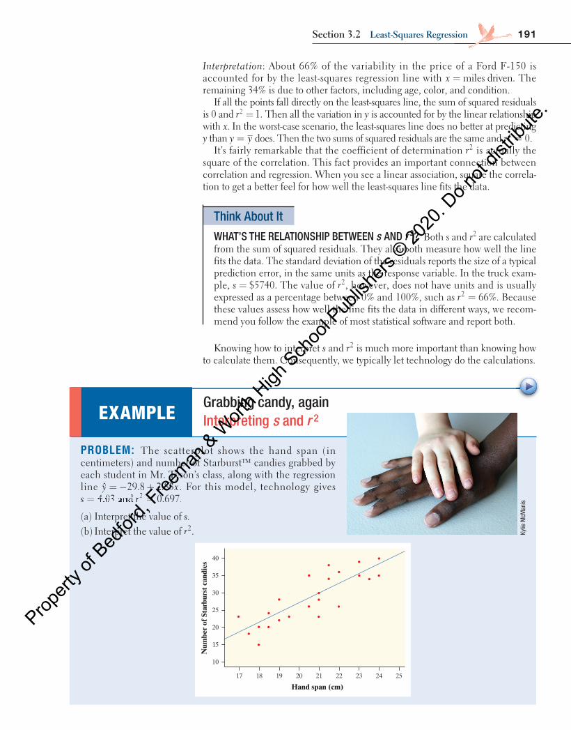
191Section 3.2 least-Squares regression
Interpretation : About 66% of the variability in the price of a Ford F-150 is accounted for by the least-squares regression line with = miles driven.x The remaining 34% is due to other factors, including age, color, and condition.
If all the points fall directly on the least-squares line, the sum of squared residuals is 0 and = 1.2r Then all the variation in y is accounted for by the linear relationship with x . In the worst-case scenario, the least-squares line does no better at predicting y than =y y does. Then the two sums of squared residuals are the same and = 0.2r
It’s fairly remarkable that the coefficient of determination 2r is actually the square of the correlation. This fact provides an important connection between correlation and regression. When you see a linear association, square the correla-tion to get a better feel for how well the least-squares line fits the data.
Think About It
WHAT’S THE RELATIONSHIP BETWEEN s AND r 2 ? Both s and r 2 are calculated from the sum of squared residuals. They also both measure how well the line fits the data. The standard deviation of the residuals reports the size of a typical prediction error, in the same units as the response variable. In the truck exam-ple, = $5740s . The value of 2r , however, does not have units and is usually expressed as a percentage between 0% and 100%, such as = 66%2r . Because these values assess how well the line fits the data in different ways, we recom-mend you follow the example of most statistical software and report both.
Knowing how to interpret s and 2r is much more important than knowing how to calculate them. Consequently, we typically let technology do the calculations.
EXAMPLE Grabbing candy, again Interpreting s and 2r
PROBLEM: The scatterplot shows the hand span (in centimeters) and number of Starburst™ candies grabbed by each student in Mr. Tyson’s class, along with the regression line = − +ˆ 29.8 2.83y x . For this model, technology gives = =s r= =s r= =s r= =s r= =4.03s r4.03s r= =s r= =4.03= =s r= =ands rands r= =s r= =and= =s r= = 0.697.2
(a) Interpret the value of s. (b) Interpret the value of 2r . Ky
lie M
cMan
is
40
35
30
25
20
15
10
17 18 19 20 21 22 23 24 25
Hand span (cm)
Num
ber
of S
tarb
urst
can
dies
04_StarnesUPDtps6e_26929_ch03_151_246.indd 191 5/20/19 3:19 PM
Propert
y of B
edfor
d, Free
man & W
orth H
igh Sch
ool P
ublish
ers ©
2020
. Do n
ot dis
tribute
.
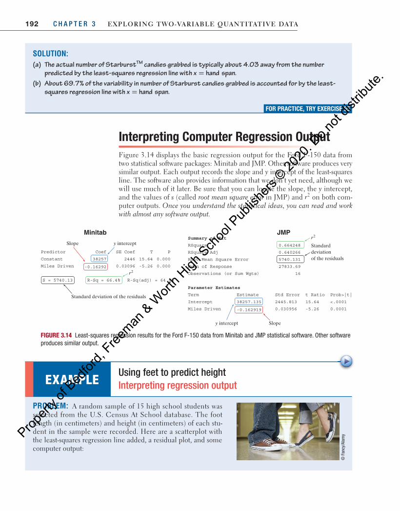
192 C H A P T E R 3 Exploring Two-VariablE QuanTiTaTiVE DaTa
Interpreting Computer Regression Output Figure 3.14 displays the basic regression output for the Ford F-150 data from two statistical software packages: Minitab and JMP. Other software produces very similar output. Each output records the slope and y intercept of the least-squares line. The software also provides information that we don’t yet need, although we will use much of it later. Be sure that you can locate the slope, the y intercept, and the values of s (called root mean square error in JMP) and 2r on both com-puter outputs. Once you understand the statistical ideas, you can read and work with almost any software output.
SE Coef T PPredictor Coef
Constant 38257 2446 15.64 0.000
Miles Driven -0.16292 0.03096 -5.26 0.000
S = 5740.13 R-Sq = 66.4% R-Sq(adj) = 64.0%
Standard deviation of the residuals
Slope y intercept
r2
MinitabSummary of Fit
842466.0erauqSR
662046.0jdAerauqSR
96.33872esnopseRfonaeM
Root Mean Square Error 5740.131
Observations (or Sum Wgts) 16
Parameter Estimates
Term Estimate Std Error t Ratio Prob>|t|
Intercept 38257.135 2445.813 15.64 <.0001
Miles Driven -0.162919 0.030956 -5.26 0.0001
r2
Standard deviation of the residuals
Slopey intercept
JMP
FIGURE 3.14 Least-squares regression results for the Ford F-150 data from Minitab and JMP statistical software. Other software produces similar output.
PROBLEM: A random sample of 15 high school students was selected from the U.S. Census At School database. The foot length (in centimeters) and height (in centimeters) of each stu-dent in the sample were recorded. Here are a scatterplot with the least-squares regression line added, a residual plot, and some computer output:
EXAMPLE Using feet to predict height Interpreting regression output
© F
ancy
/Ala
my
SOLUTION: (a) The actual number of Starburst TM candies grabbed is typically about 4.03 away from the number
predicted by the least-squares regression line with x hand span.= (b) About 69.7% of the variability in number of Starburst candies grabbed is accounted for by the least-
squares regression line with x hand span.=
FOR PRACTICE, TRY EXERCISE 55
04_StarnesUPDtps6e_26929_ch03_151_246.indd 192 5/20/19 3:19 PM
Propert
y of B
edfor
d, Free
man & W
orth H
igh Sch
ool P
ublish
ers ©
2020
. Do n
ot dis
tribute
.
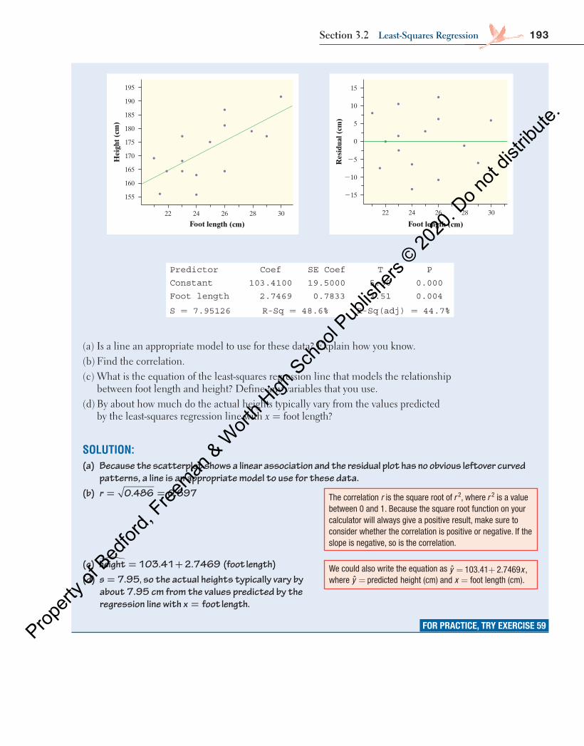
193Section 3.2 least-Squares regression
22 24 26 28 30
Foot length (cm)
Hei
ght (
cm)
195
190
185
180
175
170
165
160
155
22 24 26 28 30
Foot length (cm)
Res
idua
l (cm
)
215
210
25
0
5
15
10
Predictor Coef SE Coef T P
Constant 103.4100 19.5000 5.30 0.000
Foot length 2.7469 0.7833 3.51 0.004
S = 7.95126 R-Sq = 48.6% R-Sq(adj) = 44.7%
(a) Is a line an appropriate model to use for these data? Explain how you know.(b) Find the correlation.(c) What is the equation of the least-squares regression line that models the relationship
between foot length and height? Define any variables that you use.(d) By about how much do the actual heights typically vary from the values predicted
by the least-squares regression line with = foot length?x
SOLUTION:(a) Because the scatterplot shows a linear association and the residual plot has no obvious leftover curved
patterns, a line is an appropriate model to use for these data.(b) = =r 0.486 0.697
(c) height 103.41 2.7469 (foot length)= +�
(d) =s 7.95, so the actual heights typically vary by about 7.95 cm from the values predicted by the regression line with =x foot length.
FOR PRACTICE, TRY EXERCISE 59
The correlation r is the square root of 2r , where 2r is a value between 0 and 1. Because the square root function on your calculator will always give a positive result, make sure to consider whether the correlation is positive or negative. If the slope is negative, so is the correlation.
We could also write the equation as = +ˆ 103.41 2.7469 ,y x where =y predicted height (cm) and x = foot length (cm).
04_StarnesUPDtps6e_26929_ch03_151_246.indd 193 5/20/19 3:19 PM
Propert
y of B
edfor
d, Free
man & W
orth H
igh Sch
ool P
ublish
ers ©
2020
. Do n
ot dis
tribute
.

194 C H A P T E R 3 Exploring Two-VariablE QuanTiTaTiVE DaTa
CHECK YOUR UNDERSTANDING
In Section 3.1, you read about the Old Faithful geyser in Yellowstone National Park. The computer output shows the results of a regression of interval=y of time until the next eruption (in minutes) and duration=x of the most recent eruption (in minutes) for each eruption of Old Faithful in a particular month.
HOW TO CALCULATE THE LEAST-SQUARES REGRESSION LINE USING SUMMARY STATISTICS
We have data on an explanatory variable x and a response variable y for n indi-viduals and want to calculate the least-squares regression line = +y a bx. From the data, calculate the means x and y and the standard deviations sx and sy of the two variables and their correlation r. The slope is:
=b rs
sy
x
Because the least-squares regression line passes through the point (x , y), the y intercept is:
= −a y bx
Summary of FitRSquare 0.853725RSquare Adj 0.853165Root Mean Square Error 6.493357Mean of Response 77.543730Observations (or Sum Wgts) 263.000000
Parameter EstimatesTerm Estimate Std Error t Ratio Prob>|t|Intercept 33.347442 1.201081 27.76 <.0001*Duration 13.285406 0.340393 39.03 <.0001*
1. What is the equation of the least-squares regression line that models the relation-ship between interval and duration? Define any variables that you use.
2. Interpret the slope of the least-squares regression line.3. Identify and interpret the standard deviation of the residuals.4. What percent of the variability in interval is accounted for by the least-squares
regression line with duration?=x
Regression to the MeanUsing technology is often the most convenient way to find the equation of a least-squares regression line. It is also possible to calculate the equation of the least-squares regression line using only the means and standard deviations of the two variables and their correlation. Exploring this method will highlight an important relationship between the correlation and the slope of a least-squares regression line—and reveal why we include the word regression in the expression least-squares regression line.
04_StarnesUPDtps6e_26929_ch03_151_246.indd 194 5/20/19 3:19 PM
Propert
y of B
edfor
d, Free
man & W
orth H
igh Sch
ool P
ublish
ers ©
2020
. Do n
ot dis
tribute
.
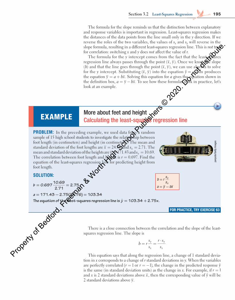
195Section 3.2 least-Squares regression
The formula for the slope reminds us that the distinction between explanatory and response variables is important in regression. Least-squares regression makes the distances of the data points from the line small only in the y direction. If we reverse the roles of the two variables, the values of s x and s y will reverse in the slope formula, resulting in a different least-squares regression line. This is not true for correlation: switching x and y does not affect the value of r.
The formula for the y intercept comes from the fact that the least-squares regression line always passes through the point ( , )x y . Once we know the slope ( b ) and that the line goes through the point ( , )x y , we can use algebra to solve for the y intercept. Substituting ( , )x y into the equation = +y a bx produces the equation = + .y a bx Solving this equation for a gives the equation shown in the definition box, = − .a y bx To see how these formulas work in practice, let’s look at an example.
There is a close connection between the correlation and the slope of the least-squares regression line. The slope is
= =⋅
b rss
r ss
y
x
y
x
This equation says that along the regression line, a change of 1 standard devia-tion in x corresponds to a change of r standard deviations in y. When the variables are perfectly correlated ( = = − )1 or 1r r , the change in the predicted response y is the same (in standard deviation units) as the change in x. For example, if = 1r and x is 2 standard deviations above x , then the corresponding value of y will be 2 standard deviations above .y
PROBLEM: In the preceding example, we used data from a random sample of 15 high school students to investigate the relationship between foot length (in centimeters) and height (in centimeters). The mean and standard deviation of the foot lengths are 24.76=x and 2.71.=sx The mean and standard deviation of the heights are 171.43=y and 10.69.=sy The correlation between foot length and height is 0.697.=r Find the equation of the least-squares regression line for predicting height from foot length.
SOLUTION:
0.69710.69
2.712.75= =b
171.43 2.75(24.76) 103.34= − =a
EXAMPLE More about feet and height Calculating the least-squares regression line
panp
ote/
Getty
Imag
es
FOR PRACTICE, TRY EXERCISE 63
=b rss
y
x
= −a y bx
The equation of the least-squares regression line is 103.34 2.75 .ˆ = +y x
04_StarnesUPDtps6e_26929_ch03_151_246.indd 195 5/20/19 3:19 PM
Propert
y of B
edfor
d, Free
man & W
orth H
igh Sch
ool P
ublish
ers ©
2020
. Do n
ot dis
tribute
.
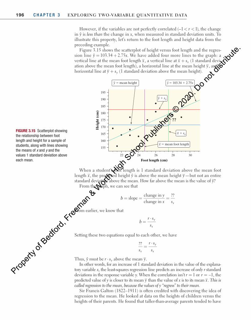
196 C H A P T E R 3 Exploring Two-VariablE QuanTiTaTiVE DaTa
However, if the variables are not perfectly correlated < <(–1 1),r the change in y is less than the change in x, when measured in standard deviation units. To illustrate this property, let’s return to the foot length and height data from the preceding example.
Figure 3.15 shows the scatterplot of height versus foot length and the regres-sion line ˆ 103.34 2.75 .= +y x We have added four more lines to the graph: a vertical line at the mean foot length x , a vertical line at +x sx (1 standard devi-ation above the mean foot length), a horizontal line at the mean height y , and a horizontal line at +y sy (1 standard deviation above the mean height).
y = 103.34 + 2.75xy = mean height
??
x = mean foot length
x + sx
y + sy
195
190
185
180
175
170
165
160
155
22 24 26 28 30
sx
Foot length (cm)
Hei
ght (
cm)
FIGURE 3.15 Scatterplot showing the relationship between foot length and height for a sample of students, along with lines showing the means of x and y and the values 1 standard deviation above each mean.
When a student’s foot length is 1 standard deviation above the mean foot length ,x the predicted height y is above the mean height y—but not an entire standard deviation above the mean. How far above the mean is the value of y?
From the graph, we can see that
byx sx
slopechange inchange in
??= = =
From earlier, we know that
=⋅
br s
sy
x
Setting these two equations equal to each other, we have
=⋅??
s
r s
sx
y
x
Thus, y must be r sy⋅ above the mean .yIn other words, for an increase of 1 standard deviation in the value of the explana-
tory variable x, the least-squares regression line predicts an increase of only r standard deviations in the response variable y. When the correlation isn’t r r1 or –1,= = the predicted value of y is closer to its mean y than the value of x is to its mean x . This is called regression to the mean, because the values of y “regress” to their mean.
Sir Francis Galton (1822–1911) is often credited with discovering the idea of regression to the mean. He looked at data on the heights of children versus the heights of their parents. He found that taller-than-average parents tended to have
04_StarnesUPDtps6e_26929_ch03_151_246.indd 196 5/20/19 3:19 PM
Propert
y of B
edfor
d, Free
man & W
orth H
igh Sch
ool P
ublish
ers ©
2020
. Do n
ot dis
tribute
.
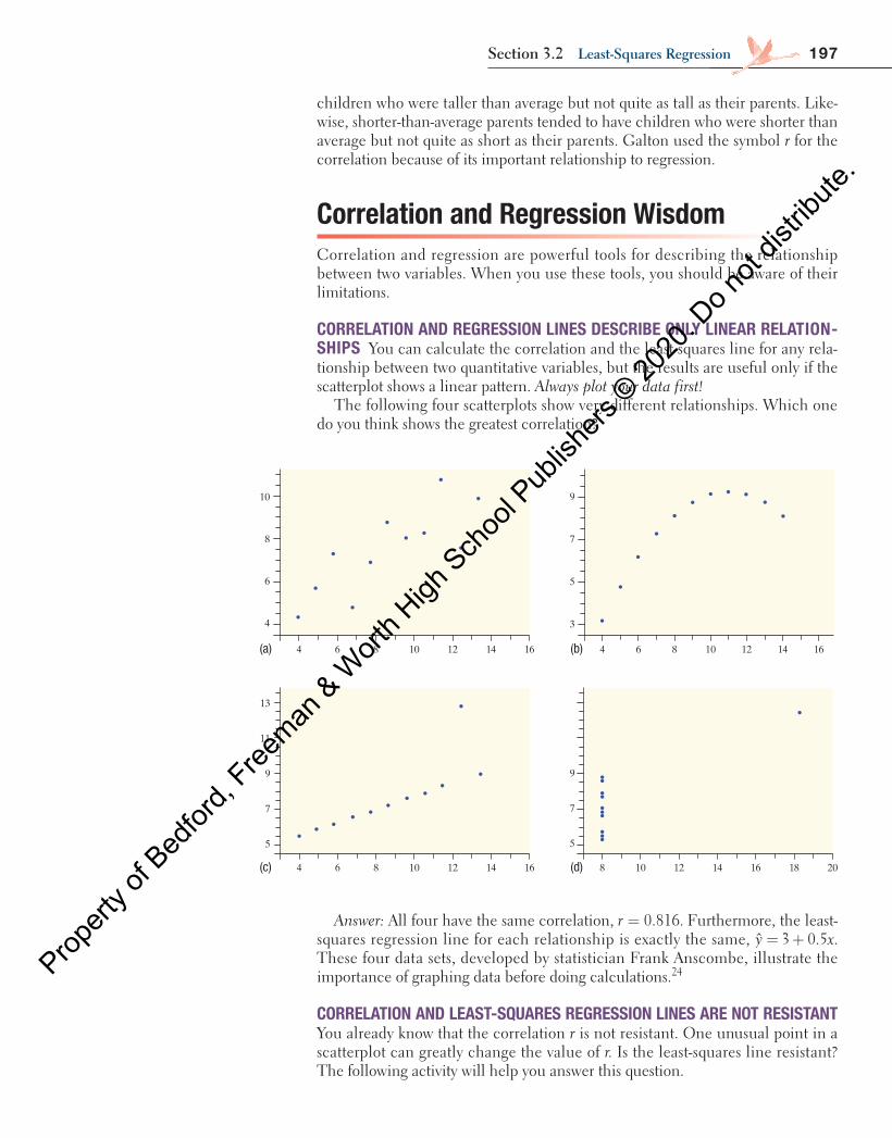
197Section 3.2 least-Squares regression
children who were taller than average but not quite as tall as their parents. Like-wise, shorter-than-average parents tended to have children who were shorter than average but not quite as short as their parents. Galton used the symbol r for the correlation because of its important relationship to regression.
Correlation and Regression WisdomCorrelation and regression are powerful tools for describing the relationship between two variables. When you use these tools, you should be aware of their limitations.
CORRELATION AND REGRESSION LINES DESCRIBE ONLY LINEAR RELATION-SHIPS You can calculate the correlation and the least-squares line for any rela-tionship between two quantitative variables, but the results are useful only if the scatterplot shows a linear pattern. Always plot your data first!
The following four scatterplots show very different relationships. Which one do you think shows the greatest correlation?
Answer: All four have the same correlation, 0.816.=r Furthermore, the least-squares regression line for each relationship is exactly the same, ˆ 3 0.5 .= +y x These four data sets, developed by statistician Frank Anscombe, illustrate the importance of graphing data before doing calculations.24
CORRELATION AND LEAST-SQUARES REGRESSION LINES ARE NOT RESISTANT You already know that the correlation r is not resistant. One unusual point in a scatterplot can greatly change the value of r. Is the least-squares line resistant? The following activity will help you answer this question.
13
7
11
9
5
4 6 8 10 12 14 16
7
9
5
8 10 12 14 16 18 20
10
6
8
4
4 6 8 10 12 14 16
9
5
7
3
4 6 8 10 12 14 16(a) (b)
(c) (d)
04_StarnesUPDtps6e_26929_ch03_151_246.indd 197 5/20/19 3:19 PM
Propert
y of B
edfor
d, Free
man & W
orth H
igh Sch
ool P
ublish
ers ©
2020
. Do n
ot dis
tribute
.
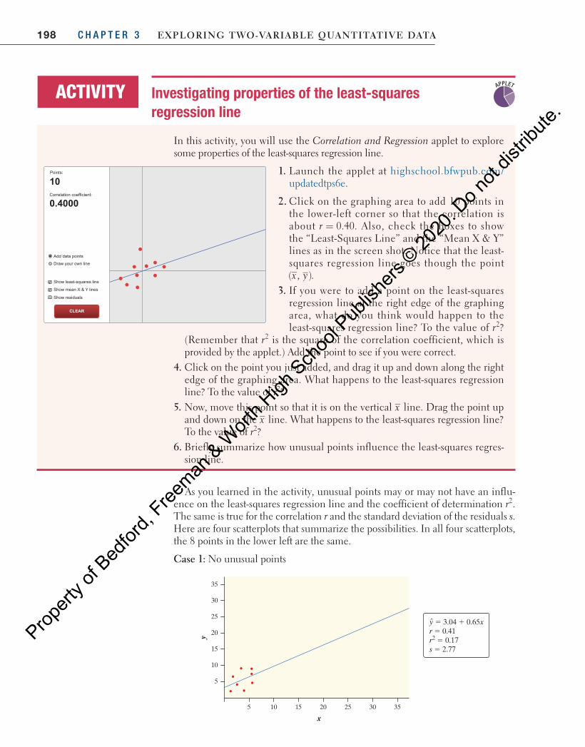
198 C H A P T E R 3 Exploring Two-VariablE QuanTiTaTiVE DaTa
As you learned in the activity, unusual points may or may not have an influ-ence on the least-squares regression line and the coefficient of determination r2. The same is true for the correlation r and the standard deviation of the residuals s. Here are four scatterplots that summarize the possibilities. In all four scatterplots, the 8 points in the lower left are the same.
Case 1: No unusual points
In this activity, you will use the Correlation and Regression applet to explore some properties of the least-squares regression line.
ACTIVITY Investigating properties of the least-squares regression line
Points:
Correlation coefficient:
Add data points
Draw your own line
Show least-squares line
Show mean X & Y lines
Show residuals
CLEAR
10
0.4000
1. Launch the applet at highschool.bfwpub.com/updatedtps6e.
2. Click on the graphing area to add 10 points in the lower-left corner so that the correlation is about = 0.40.r Also, check the boxes to show the “Least-Squares Line” and the “Mean X & Y” lines as in the screen shot. Notice that the least-squares regression line goes though the point ( , ).x y
3. If you were to add a point on the least-squares regression line at the right edge of the graphing area, what do you think would happen to the least-squares regression line? To the value of r2?
(Remember that r2 is the square of the correlation coefficient, which is provided by the applet.) Add the point to see if you were correct.
4. Click on the point you just added, and drag it up and down along the right edge of the graphing area. What happens to the least-squares regression line? To the value of r2?
5. Now, move this point so that it is on the vertical x line. Drag the point up and down on the x line. What happens to the least-squares regression line? To the value of r2?
6. Briefly summarize how unusual points influence the least-squares regres-sion line.
APPLET
5
10
15
20
25
30
35
5 10 15 20 25 30 35
x
y
y 5 3.04 1 0.65xr 5 0.41r2 5 0.17s 5 2.77
04_StarnesUPDtps6e_26929_ch03_151_246.indd 198 5/20/19 3:19 PM
Propert
y of B
edfor
d, Free
man & W
orth H
igh Sch
ool P
ublish
ers ©
2020
. Do n
ot dis
tribute
.
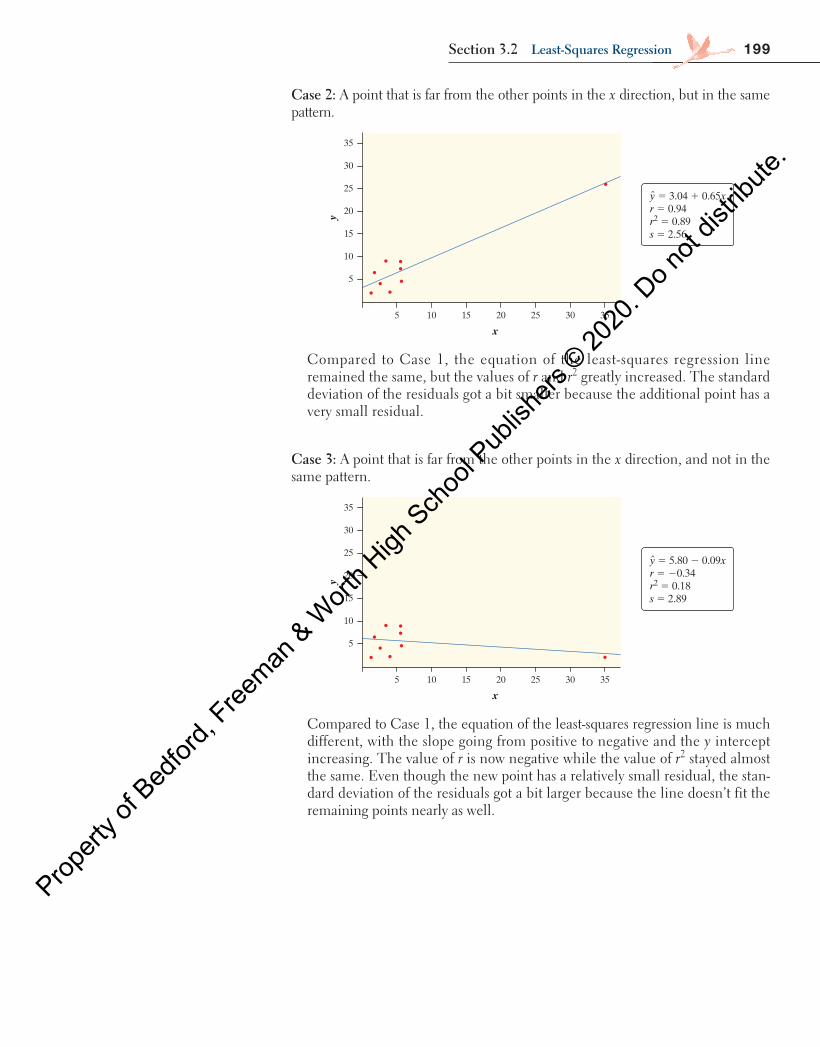
199Section 3.2 least-Squares regression
Case 2: A point that is far from the other points in the x direction, but in the same pattern.
5
10
15
20
25
30
35
5 10 15 20 25 30 35
xy
y 5 3.04 1 0.65xr 5 0.94r2 5 0.89s 5 2.56
Compared to Case 1, the equation of the least-squares regression line remained the same, but the values of r and r2 greatly increased. The standard deviation of the residuals got a bit smaller because the additional point has a very small residual.
Case 3: A point that is far from the other points in the x direction, and not in the same pattern.
5
10
15
20
25
30
35
5 10 15 20 25 30 35
x
y
y 5 5.80 2 0.09xr 5 20.34r2 5 0.18s 5 2.89
Compared to Case 1, the equation of the least-squares regression line is much different, with the slope going from positive to negative and the y intercept increasing. The value of r is now negative while the value of r2 stayed almost the same. Even though the new point has a relatively small residual, the stan-dard deviation of the residuals got a bit larger because the line doesn’t fit the remaining points nearly as well.
04_StarnesUPDtps6e_26929_ch03_151_246.indd 199 5/20/19 3:19 PM
Propert
y of B
edfor
d, Free
man & W
orth H
igh Sch
ool P
ublish
ers ©
2020
. Do n
ot dis
tribute
.

200 C H A P T E R 3 Exploring Two-VariablE QuanTiTaTiVE DaTa
5
10
15
20
25
30
35
5 10 15 20 25 30 35
x
y
y 5 6.31 1 0.65xr 5 0.11r2 5 0.01s 5 10.82
Compared to Case 1, the slope of the least-squares regression line is the same, but the y intercept is a little larger as the line appears to have shifted up slightly. The values of r and r 2 are much smaller than before. Because the new point has such a large residual, the standard deviation of the residuals is much larger.
In Cases 2 and 3, the unusual point had a much bigger x value than the other points. Points whose x values are much smaller or much larger than the other points in a scatterplot have high leverage . In Case 4, the unusual point had a very large residual. Points with large residuals are called outliers . All three of these unusual points are considered influential points because adding them to the scatterplot substantially changed either the equation of the least-squares regression line or one or more of the other summary statistics ( r , r 2 , s ).
DEFINITION High leverage, Outlier, Influential point Points with high leverage in regression have much larger or much smaller x values than the other points in the data set.
An outlier in regression is a point that does not follow the pattern of the data and has a large residual.
An influential point in regression is any point that, if removed, substantially changes the slope, y intercept, correlation, coefficient of determination, or standard deviation of the residuals.
outliers and high-leverage points are often influential in regression calculations!The best way to investigate the influence of such points is to do regression cal-culations with and without them to see how much the results differ. Here is an example that shows what we mean.
Does the age at which a child begins to talk predict a later score on a test of mental ability? A study of the development of young children recorded the age in months at which each of 21 children spoke their first word and their Gesell Adaptive Score, the result of an aptitude test taken much later. 25 A scatterplot of the data appears in Figure 3.16 , along with a residual plot, and computer output. Two points, child 18 and child 19, are labeled on each plot.
cautionaution
!
Case 4: A point that is far from the other points in the y direction, and not in the same pattern.
04_StarnesUPDtps6e_26929_ch03_151_246.indd 200 5/20/19 3:19 PM
Propert
y of B
edfor
d, Free
man & W
orth H
igh Sch
ool P
ublish
ers ©
2020
. Do n
ot dis
tribute
.
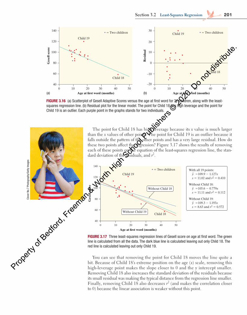
201Section 3.2 least-Squares regression
The point for Child 18 has high leverage because its x value is much larger than the x values of other points. The point for Child 19 is an outlier because it falls outside the pattern of the other points and has a very large residual. How do these two points affect the regression? Figure 3.17 shows the results of removing each of these points on the equation of the least-squares regression line, the stan-dard deviation of the residuals, and r2.
500 10 4020 30
140
120
100
40
60
80
–20
Child 19Child 19
Child 18
500 4010 20 30
–10
30
20
0
10
Res
idua
l
Age at �rst word (months) Age at �rst word (months)
Child 18
Ges
ell s
core
5 Two children 5 Two children
Age at �rst word (months)50 040302010
140
120
100
80
60
40
Ges
ell s
core
5 Two childrenChild 19
Child 18Without Child 19
Without Child 18
ˆ
ˆ
ˆ
With all 19 points: y 5109.9 2 1.127x s 5 11.02 and r2 5 0.410
Without Child 18: y 5105.6 2 0.779x s 5 11.11 and r2 5 0.112
Without Child 19: y 5109.3 2 1.193x s 5 8.63 and r2 5 0.572
FIGURE 3.17 Three least-squares regression lines of Gesell score on age at first word. The green line is calculated from all the data. The dark blue line is calculated leaving out only Child 18. The red line is calculated leaving out only Child 19.
You can see that removing the point for Child 18 moves the line quite a bit. Because of Child 18’s extreme position on the age (x) scale, removing this high-leverage point makes the slope closer to 0 and the y intercept smaller. Removing Child 18 also increases the standard deviation of the residuals because its small residual was making the typical distance from the regression line smaller. Finally, removing Child 18 also decreases r2 (and makes the correlation closer to 0) because the linear association is weaker without this point.
Clov
er N
o.7
Phot
ogra
phy/
Getty
Imag
es
(a) (b)
FIGURE 3.16 (a) Scatterplot of Gesell Adaptive Scores versus the age at first word for 21 children, along with the least-squares regression line. (b) Residual plot for the linear model. The point for Child 18 has high leverage and the point for Child 19 is an outlier. Each purple point in the graphs stands for two individuals.
04_StarnesUPDtps6e_26929_ch03_151_246.indd 201 5/20/19 3:19 PM
Propert
y of B
edfor
d, Free
man & W
orth H
igh Sch
ool P
ublish
ers ©
2020
. Do n
ot dis
tribute
.
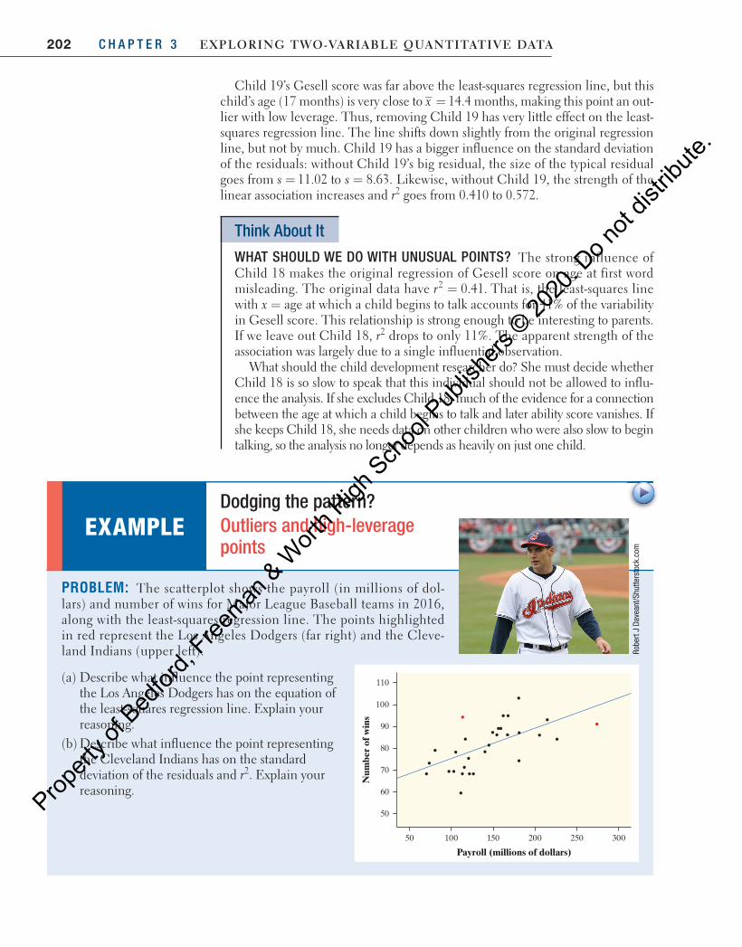
202 C H A P T E R 3 Exploring Two-VariablE QuanTiTaTiVE DaTa
Child 19’s Gesell score was far above the least-squares regression line, but this child’s age (17 months) is very close to 14.4=x months, making this point an out-lier with low leverage. Thus, removing Child 19 has very little effect on the least-squares regression line. The line shifts down slightly from the original regression line, but not by much. Child 19 has a bigger influence on the standard deviation of the residuals: without Child 19’s big residual, the size of the typical residual goes from 11.02 to 8.63.= =s s Likewise, without Child 19, the strength of the linear association increases and r 2 goes from 0.410 to 0.572.
Think About It
WHAT SHOULD WE DO WITH UNUSUAL POINTS? The strong influence of Child 18 makes the original regression of Gesell score on age at first word misleading. The original data have = 0.41.2r That is, the least-squares line with x = age at which a child begins to talk accounts for 41% of the variability in Gesell score. This relationship is strong enough to be interesting to parents. If we leave out Child 18, r 2 drops to only 11%. The apparent strength of the association was largely due to a single influential observation.
What should the child development researcher do? She must decide whether Child 18 is so slow to speak that this individual should not be allowed to influ-ence the analysis. If she excludes Child 18, much of the evidence for a connection between the age at which a child begins to talk and later ability score vanishes. If she keeps Child 18, she needs data on other children who were also slow to begin talking, so the analysis no longer depends as heavily on just one child.
PROBLEM: The scatterplot shows the payroll (in millions of dol-lars) and number of wins for Major League Baseball teams in 2016, along with the least-squares regression line. The points highlighted in red represent the Los Angeles Dodgers (far right) and the Cleve-land Indians (upper left).
(a) Describe what influence the point representing the Los Angeles Dodgers has on the equation of the least-squares regression line. Explain your reasoning.
(b) Describe what influence the point representing the Cleveland Indians has on the standard deviation of the residuals and r 2 . Explain your reasoning.
EXAMPLE Dodging the pattern? Outliers and high-leverage points
Robe
rt J
Dave
ant/ S
hutte
rsto
ck.c
om
110
100
90
80
70
60
50
50 300250200150100
Payroll (millions of dollars)
Num
ber
of w
ins
04_StarnesUPDtps6e_26929_ch03_151_246.indd 202 5/20/19 3:19 PM
Propert
y of B
edfor
d, Free
man & W
orth H
igh Sch
ool P
ublish
ers ©
2020
. Do n
ot dis
tribute
.

203Section 3.2 Summary
• A regression line models how a response variable y changes as an explanatory variable x changes. You can use a regression line to predict the value of y for any value of x by substituting this x value into the equation of the line.
• The slope b of a regression line = +y a bx describes how the predicted value of y changes for each increase of 1 unit in x.
• The y intercept a of a regression line = +y a bx is the predicted value of y when the explanatory variable x equals 0. This prediction does not have a logical interpretation unless x can actually take values near 0.
• Avoid extrapolation , using a regression line to make predictions using values of the explanatory variable outside the values of the data from which the line was calculated.
• The most common method of fitting a line to a scatterplot is least squares. The least-squares regression line is the line that minimizes the sum of the squares of the vertical distances of the observed points from the line.
Section 3.2 Summary
SOLUTION: (a) Because the point for the Los Angeles Dodgers is
on the right and below the least-squares regression line, it is making the slope of the line closer to 0 and the y intercept greater. If the Dodgers’ point was removed, the line would be steeper.
(b) Because the point for the Cleveland Indians has a large residual, it is making the standard deviation of the residuals greater and the value of r 2 smaller.
FOR PRACTICE, TRY EXERCISE 67
The point for the Dodgers has high leverage because its x value is much larger than the others.
The point for the Indians is an outlier because it has a large residual.
ASSOCIATION DOES NOT IMPLY CAUSATION When we study the relationship between two variables, we often hope to show that changes in the explanatory variable cause changes in the response variable. a strong association between two variables is not enough to draw conclusions about cause and effect. Some-times an observed association really does reflect cause and effect. A household that heats with natural gas uses more gas in colder months because cold weather requires burning more gas to stay warm. In other cases, an association is explained by other variables, and the conclusion that x causes y is not valid.
A study once found that people with two cars live longer than people who own only one car. 26 Owning three cars is even better, and so on. There is a sub-stantial positive association between number of cars x and length of life y. Can we lengthen our lives by buying more cars? No. The study used number of cars as a quick indicator of wealth. Well-off people tend to have more cars. They also tend to live longer, probably because they are better educated, take better care of themselves, and get better medical care. The cars have nothing to do with it. There is no cause-and-effect link between number of cars and length of life.
cautionaution
!
Remember: It only makes sense to talk about the correlation between two quantitative variables. If one or both variables are categorical, you should refer to the association between the two variables. To be safe, use the more general term association when describing the relationship between any two variables.
04_StarnesUPDtps6e_26929_ch03_151_246.indd 203 5/20/19 3:19 PM
Propert
y of B
edfor
d, Free
man & W
orth H
igh Sch
ool P
ublish
ers ©
2020
. Do n
ot dis
tribute
.
204 C H A P T E R 3 Exploring Two-VariablE QuanTiTaTiVE DaTa
• You can examine the fit of a regression line by studying the residuals , which are the differences between the actual values of y and predicted values of y: Residual = −y y� . Be on the lookout for curved patterns in the residual plot , which indicate that a linear model may not be appropriate.
• The standard deviation of the residuals s measures the typical size of a resid-ual when using the regression line.
• The coefficient of determination r 2 is the percent of the variation in the response variable that is accounted for by the least-squares regression line using a particular explanatory variable.
• The least-squares regression line of y on x is the line with slope =b rss
y
x and
intercept = −a y bx . This line always passes through the point ( , ).x y • influential points can greatly affect correlation and regression calculations.
Points with x values far from x have high leverage and can be very influen-tial. Points with large residuals are called outliers and can also affect correla-tion and regression calculations.
• Most of all, be careful not to conclude that there is a cause-and-effect rela-tionship between two variables just because they are strongly associated.
3.2 Technology Corners
TI-Nspire and other technology instructions are on the book’s website at highschool. bfwpub.com/updatedtps6e .
9. Calculating least-squares regression lines Page 184
10. Making residual plots Page 187
37. predicting wins Earlier we investigated the relation-ship between x = payroll (in millions of dollars) and y = number of wins for Major League Baseball teams in 2016. Here is a scatterplot of the data, along with the regression line = +ˆ 60.7 0.139 :y x
110
100
90
80
70
60
50
50 300250200150100
Payroll (millions of dollars)
Num
ber
of w
ins
(a) Predict the number of wins for a team that spends $200 million on payroll.
(b) Predict the number of wins for a team that spends $400 million on payroll.
(c) How confident are you in each of these predictions? Explain your reasoning.
38. How much gas? Joan is concerned about the amount of energy she uses to heat her home. The scatterplot (on page 205) shows the relationship between x = mean temperature in a particular month and y = mean amount of natural gas used per day (in cubic feet) in that month, along with the regression line = − xˆ 1425 19.87 .y
(a) Predict the mean amount of natural gas Joan will use per day in a month with a mean temperature of 30°F.
Section 3.2 Exercises
178pg
04_StarnesUPDtps6e_26929_ch03_151_246.indd 204 5/20/19 3:19 PM
Propert
y of B
edfor
d, Free
man & W
orth H
igh Sch
ool P
ublish
ers ©
2020
. Do n
ot dis
tribute
.
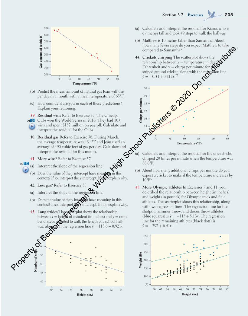
205Section 3.2 Exercises
60
Temperature (°F)
Gas
con
sum
ed (
cubi
c ft
)
900
800
700
600
500
400
300
200
555045403530
(b) Predict the mean amount of natural gas Joan will use per day in a month with a mean temperature of 65°F.
(c) How confident are you in each of these predictions? Explain your reasoning.
39. residual wins Refer to Exercise 37 . The Chicago Cubs won the World Series in 2016. They had 103 wins and spent $182 million on payroll. Calculate and interpret the residual for the Cubs.
40. residual gas Refer to Exercise 38 . During March, the average temperature was 46.4°F and Joan used an average of 490 cubic feet of gas per day. Calculate and interpret the residual for this month.
41. More wins? Refer to Exercise 37 .
(a) Interpret the slope of the regression line.
(b) Does the value of the y intercept have meaning in this context? If so, interpret the y intercept. If not, explain why.
42. less gas? Refer to Exercise 38 .
(a) Interpret the slope of the regression line.
(b) Does the value of the y intercept have meaning in this context? If so, interpret the y intercept. If not, explain why.
43. long strides The scatterplot shows the relationship between x = height of a student (in inches) and y = num-ber of steps required to walk the length of a school hall-way, along with the regression line = −ˆ 113.6 0.921 .y x
65
60
55
50
45
40
60 62 64 66 68 70 72 74
Height (in.)
Num
ber
of s
teps
182pg (a)
(b)
(a) Calculate and interpret the residual for Kiana, who is 67 inches tall and took 49 steps to walk the hallway.
(b) Matthew is 10 inches taller than Samantha. About how many fewer steps do you expect Matthew to take compared to Samantha?
44. Crickets chirping The scatterplot shows the relationship between x = temperature in degrees Fahrenheit and y = chirps per minute for the striped ground cricket, along with the regression line
= − + xˆ 0.31 0.212 .y 27
959085807570
20
19
18
17
16
15
14
Temperature (ºF)C
hirp
s pe
r m
inut
e
(a) Calculate and interpret the residual for the cricket who chirped 20 times per minute when the temperature was 88.6°F.
(b) About how many additional chirps per minute do you expect a cricket to make if the temperature increases by 10°F?
45. More olympic athletes In Exercises 5 and 11 , you described the relationship between height (in inches) and weight (in pounds) for Olympic track and field athletes. The scatterplot shows this relationship, along with two regression lines. The regression line for the shotput, hammer throw, and discus throw athletes (blue squares) is y xˆ 115 5.13= − + . The regression line for the remaining athletes (black dots) is = − +ˆ 297 6.41 .y x
350
300
200
250
150
100
50
60 62 64 66 68 70 72 74 76 78 80 82
Height (in.)
Wei
ght (
lb)
180pg
04_StarnesUPDtps6e_26929_ch03_151_246.indd 205 5/20/19 3:19 PM
Propert
y of B
edfor
d, Free
man & W
orth H
igh Sch
ool P
ublish
ers ©
2020
. Do n
ot dis
tribute
.
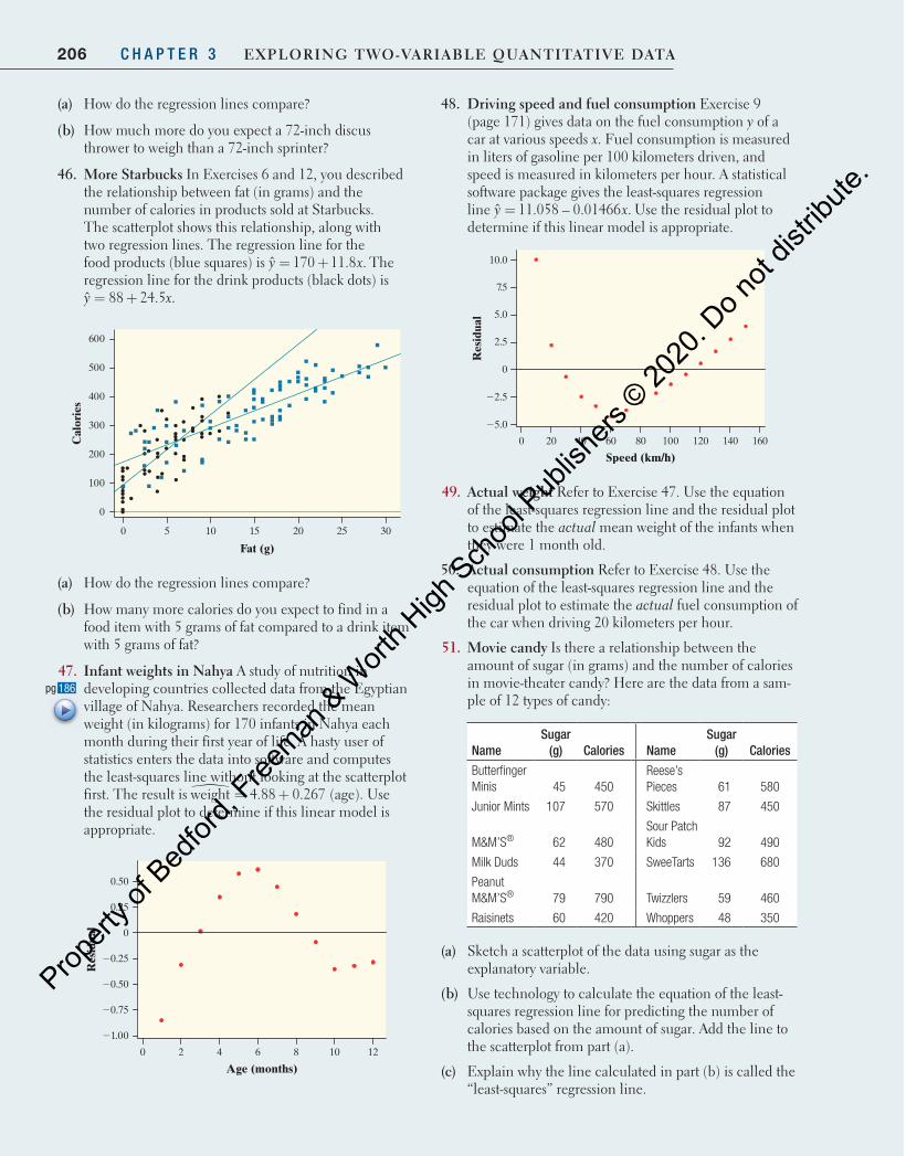
206 C H A P T E R 3 Exploring Two-VariablE QuanTiTaTiVE DaTa
48. Driving speed and fuel consumption Exercise 9 ( page 171 ) gives data on the fuel consumption y of a car at various speeds x . Fuel consumption is measured in liters of gasoline per 100 kilometers driven, and speed is measured in kilometers per hour. A statistical software package gives the least-squares regression line =ˆ 11.058 – 0.01466 .y x Use the residual plot to determine if this linear model is appropriate.
16014012010080604020
Speed (km/h)R
esid
ual
10.0
7.5
5.0
2.5
0
22.5
25.0
0
49. actual weight Refer to Exercise 47 . Use the equation of the least-squares regression line and the residual plot to estimate the actual mean weight of the infants when they were 1 month old.
50. actual consumption Refer to Exercise 48 . Use the equation of the least-squares regression line and the residual plot to estimate the actual fuel consumption of the car when driving 20 kilometers per hour.
51. Movie candy Is there a relationship between the amount of sugar (in grams) and the number of calories in movie-theater candy? Here are the data from a sam-ple of 12 types of candy:
Name Sugar
(g) Calories Name Sugar
(g) Calories
Butterfinger Minis 45 450
Reese’s Pieces 61 580
Junior Mints 107 570 Skittles 87 450
M&M’S ®
62
480 Sour Patch Kids 92 490
Milk Duds 44 370 SweeTarts 136 680
Peanut M&M’S ® 79 790 Twizzlers 59 460
Raisinets 60 420 Whoppers 48 350
(a) Sketch a scatterplot of the data using sugar as the explanatory variable.
(b) Use technology to calculate the equation of the least-squares regression line for predicting the number of calories based on the amount of sugar. Add the line to the scatterplot from part (a).
(c) Explain why the line calculated in part (b) is called the “least-squares” regression line.
(a) How do the regression lines compare?
(b) How much more do you expect a 72-inch discus thrower to weigh than a 72-inch sprinter?
46. More Starbucks In Exercises 6 and 12 , you described the relationship between fat (in grams) and the number of calories in products sold at Starbucks. The scatterplot shows this relationship, along with two regression lines. The regression line for the food products (blue squares) is = +ˆ 170 11.8 .y x The regression line for the drink products (black dots) is
= +ˆ 88 24.5 .y x
600
500
300
400
200
100
0
0 30252015105
Fat (g)
Cal
orie
s
(a) How do the regression lines compare?
(b) How many more calories do you expect to find in a food item with 5 grams of fat compared to a drink item with 5 grams of fat?
47. infant weights in nahya A study of nutrition in developing countries collected data from the Egyptian village of Nahya. Researchers recorded the mean weight (in kilograms) for 170 infants in Nahya each month during their first year of life. A hasty user of statistics enters the data into software and computes the least-squares line without looking at the scatterplot first. The result is = +weight 4.88 0.267� (age). Use the residual plot to determine if this linear model is appropriate.
12
Age (months)
Res
idua
l
0.50
0.25
0
20.25
20.50
20.75
21.00
0 2 4 6 8 10
186pg
04_StarnesUPDtps6e_26929_ch03_151_246.indd 206 5/20/19 3:19 PM
Propert
y of B
edfor
d, Free
man & W
orth H
igh Sch
ool P
ublish
ers ©
2020
. Do n
ot dis
tribute
.
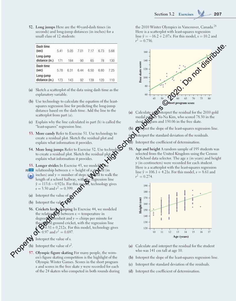
207Section 3.2 Exercises
the 2010 Winter Olympics in Vancouver, Canada. 28 Here is a scatterplot with least-squares regression line = − +ˆ 16.2 2.07 .y x For this model, = 10.2s and
= 0.736.2r
Short program score
Free
ska
te s
core
80
60
100
120
140
160
45 50 60 70 8055 65 75
(a) Calculate and interpret the residual for the 2010 gold medal winner Yu-Na Kim, who scored 78.50 in the short program and 150.06 in the free skate.
(b) Interpret the slope of the least-squares regression line.
(c) Interpret the standard deviation of the residuals.
(d) Interpret the coefficient of determination.
58. age and height A random sample of 195 students was selected from the United Kingdom using the Census At School data selector. The age x (in years) and height y (in centimeters) were recorded for each student. Here is a scatterplot with the least-squares regression line = +ˆ 106.1 4.21 .y x For this model, = 8.61s and
= 0.274.2r
Age (years)
Hei
ght (
cm)
140
130
120
150
160
170
190
180
10 11 13 15 1712 14 16
(a) Calculate and interpret the residual for the student who was 141 cm tall at age 10.
(b) Interpret the slope of the least-squares regression line.
(c) Interpret the standard deviation of the residuals.
(d) Interpret the coefficient of determination.
52. long jumps Here are the 40-yard-dash times (in seconds) and long-jump distances (in inches) for a small class of 12 students:
Dash time (sec) 5.41 5.05 7.01 7.17 6.73 5.68
Long-jump distance (in.) 171 184 90 65 78 130
Dash time (sec) 5.78 6.31 6.44 6.50 6.80 7.25
Long-jump distance (in.) 173 143 92 139 120 110
(a) Sketch a scatterplot of the data using dash time as the explanatory variable.
(b) Use technology to calculate the equation of the least-squares regression line for predicting the long-jump distance based on the dash time. Add the line to the scatterplot from part (a).
(c) Explain why the line calculated in part (b) is called the “least-squares” regression line.
53. More candy Refer to Exercise 51 . Use technology to create a residual plot. Sketch the residual plot and explain what information it provides.
54. More long jumps Refer to Exercise 52 . Use technology to create a residual plot. Sketch the residual plot and explain what information it provides.
55. longer strides In Exercise 43 , we modeled the relationship between x = height of a student (in inches) and y = number of steps required to walk the length of a school hallway, with the regression line
= −ˆ 113.6 0.921 .y x For this model, technology gives = 3.50s and = 0.399.2r
(a) Interpret the value of s .
(b) Interpret the value of r 2 .
56. Crickets keep chirping In Exercise 44 , we modeled the relationship between x = temperature in degrees Fahrenheit and y = chirps per minute for the striped ground cricket, with the regression line y xˆ 0.31 0.212 .= − + For this model, technology gives
= 0.97s and = 0.697.2r
(a) Interpret the value of s .
(b) Interpret the value of r 2 .
57. olympic figure skating For many people, the wom-en’s figure skating competition is the highlight of the Olympic Winter Games. Scores in the short program x and scores in the free skate y were recorded for each of the 24 skaters who competed in both rounds during
191pg
04_StarnesUPDtps6e_26929_ch03_151_246.indd 207 5/20/19 3:19 PM
Propert
y of B
edfor
d, Free
man & W
orth H
igh Sch
ool P
ublish
ers ©
2020
. Do n
ot dis
tribute
.
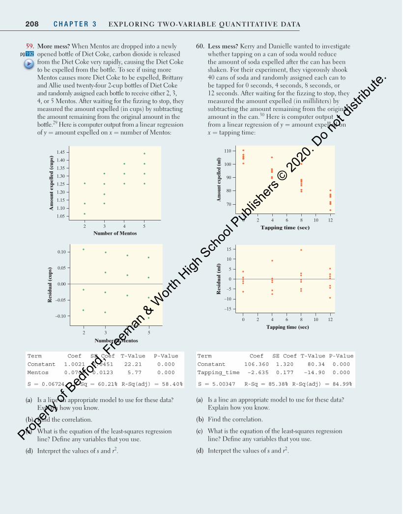
208 C H A P T E R 3 Exploring Two-VariablE QuanTiTaTiVE DaTa
60. less mess? Kerry and Danielle wanted to investigate whether tapping on a can of soda would reduce the amount of soda expelled after the can has been shaken. For their experiment, they vigorously shook 40 cans of soda and randomly assigned each can to be tapped for 0 seconds, 4 seconds, 8 seconds, or 12 seconds. After waiting for the fizzing to stop, they measured the amount expelled (in milliliters) by subtracting the amount remaining from the original amount in the can. 30 Here is computer output from a linear regression of y = amount expelled on x = tapping time:
0 2 4 6 8 10 12
Tapping time (sec)
Am
ount
exp
elle
d (m
l)
70
80
90
100
110
0 2 4 6 8 10 12
Tapping time (sec)
Res
idua
l (m
l)
–15
–10
–5
0
5
10
15
Term Coef SE Coef T-Value P-Value
Constant 106.360 1.320 80.34 0.000
Tapping_time –2.635 0.177 –14.90 0.000
S = 5.00347 R-Sq = 85.38% R-Sq(adj) = 84.99%
(a) Is a line an appropriate model to use for these data? Explain how you know.
(b) Find the correlation.
(c) What is the equation of the least-squares regression line? Define any variables that you use.
(d) Interpret the values of s and r 2 .
59. More mess? When Mentos are dropped into a newly opened bottle of Diet Coke, carbon dioxide is released from the Diet Coke very rapidly, causing the Diet Coke to be expelled from the bottle. To see if using more Mentos causes more Diet Coke to be expelled, Brittany and Allie used twenty-four 2-cup bottles of Diet Coke and randomly assigned each bottle to receive either 2, 3, 4, or 5 Mentos. After waiting for the fizzing to stop, they measured the amount expelled (in cups) by subtracting the amount remaining from the original amount in the bottle. 29 Here is computer output from a linear regression of y = amount expelled on x = number of Mentos:
2 3 4 5
Number of Mentos
Am
ount
exp
elle
d (c
ups)
1.05
1.10
1.15
1.20
1.25
1.30
1.35
1.40
1.45
2 3 4 5
Number of Mentos
Res
idua
l (cu
ps)
–0.10
–0.05
0.00
0.05
0.10
Term Coef SE Coef T-Value P-Value
Constant 1.0021 0.0451 22.21 0.000
Mentos 0.0708 0.0123 5.77 0.000
S = 0.06724 R-Sq = 60.21% R-Sq(adj) = 58.40%
(a) Is a line an appropriate model to use for these data? Explain how you know.
(b) Find the correlation.
(c) What is the equation of the least-squares regression line? Define any variables that you use.
(d) Interpret the values of s and r 2 .
192pg
04_StarnesUPDtps6e_26929_ch03_151_246.indd 208 5/20/19 3:19 PM
Propert
y of B
edfor
d, Free
man & W
orth H
igh Sch
ool P
ublish
ers ©
2020
. Do n
ot dis
tribute
.
209Section 3.2 Exercises
(a) Calculate and interpret the residual for the plot that had 2 stumps and 30 beetle larvae.
(b) Interpret the slope.
(c) By about how much do the actual number of larvae typically vary from the values predicted by the least-squares regression line with x = number of stumps?
(d) What percent of the variability in number of larvae is accounted for by the least-squares regression line with x = number of stumps?
63. Husbands and wives The mean height of married American women in their early 20s is 64.5 inches and the standard deviation is 2.5 inches. The mean height of married men the same age is 68.5 inches with stan-dard deviation 2.7 inches. The correlation between the heights of husbands and wives is about r = 0.5.
(a) Find the equation of the least-squares regression line for predicting a husband’s height from his wife’s height for married couples in their early 20s.
(b) Suppose that the height of a randomly selected wife was 1 standard deviation below average. Predict the height of her husband without using the least-squares line.
64. The stock market Some people think that the behavior of the stock market in January predicts its behavior for the rest of the year. Take the explanatory variable x to be the percent change in a stock market index in January and the response variable y to be the change in the index for the entire year. We expect a positive correlation between x and y because the change during January contributes to the full year’s change. Calculation from data for an 18-year period gives
x s yx= = =1.75% 5.36% 9.07%s ry = =15.35% 0.596
(a) Find the equation of the least-squares line for predicting full-year change from January change.
(b) Suppose that the percent change in a particular January was 2 standard deviations above average. Predict the percent change for the entire year without using the least-squares line.
65. will i bomb the final? We expect that students who do well on the midterm exam in a course will usually also do well on the final exam. Gary Smith of Pomona College looked at the exam scores of all 346 students who took his statistics class over a 10-year period. 32 Assume that both the midterm and final exam were scored out of 100 points.
(a) State the equation of the least-squares regression line if each student scored the same on the midterm and the final.
195pg
61. Temperature and wind The average temperature (in degrees Fahrenheit) and average wind speed (in miles per hour) were recorded for 365 consecutive days at Chicago’s O’Hare International Airport. Here is com-puter output for a regression of y = average wind speed on x = average temperature:
Summary of Fit
RSquare 0.047874
RSquare Adj 0.045251
Root Mean Square Error 3.655950
Mean of Response 9.826027
Observations (or Sum Wgts) 365
Parameter Estimates
Term Estimate Std Error t Ratio Prob>|t|
Intercept 11.897762 0.521320 22.82 <.0001*
Avg temp –0.041077 0.009615 –4.27 <.0001*
(a) Calculate and interpret the residual for the day where the average temperature was 42°F and the average wind speed was 2.2 mph.
(b) Interpret the slope.
(c) By about how much do the actual average wind speeds typically vary from the values predicted by the least-squares regression line with x = average temperature?
(d) What percent of the variability in average wind speed is accounted for by the least-squares regression line with x = average temperature?
62. beetles and beavers Do beavers benefit beetles? Researchers laid out 23 circular plots, each 4 meters in diameter, in an area where beavers were cutting down cottonwood trees. In each plot, they counted the number of stumps from trees cut by beavers and the number of clusters of beetle larvae. Ecologists believe that the new sprouts from stumps are more tender than other cottonwood growth, so beetles prefer them. If so, more stumps should produce more beetle larvae. 31 Here is computer output for a regression of y = number of beetle larvae on x = number of stumps:
Summary of Fit
RSquare 0.839144
RSquare Adj 0.831484
Root Mean Square Error 6.419386
Mean of Response 25.086960
Observations (or Sum Wgts) 23
Parameter Estimates
Term Estimate Std Error t Ratio Prob>|t|
Intercept –1.286104 2.853182 –0.45 0.6568
Number of stumps 11.893733 1.136343 10.47 <.0001*
04_StarnesUPDtps6e_26929_ch03_151_246.indd 209 5/20/19 3:19 PM
Propert
y of B
edfor
d, Free
man & W
orth H
igh Sch
ool P
ublish
ers ©
2020
. Do n
ot dis
tribute
.
210 C H A P T E R 3 Exploring Two-VariablE QuanTiTaTiVE DaTa
68. Stand mixers The scatterplot shows the weight (in pounds) and cost (in dollars) of 11 stand mixers. 35 The mixer from Walmart (highlighted in red) was much lighter—and cheaper—than the other mixers.
500
100
200
300
400
5 10 15 20 25 30 35
Weight (lb)
Pri
ce (
$)
(a) Describe what influence the highlighted point has on the equation of the least-squares regression line.
(b) Describe what influence the highlighted point has on the standard deviation of the residuals and r 2 .
69. Managing diabetes People with diabetes measure their fasting plasma glucose (FPG, measured in milligrams per milliliter) after fasting for at least 8 hours. Another measurement, made at regular medical checkups, is called HbA. This is roughly the percent of red blood cells that have a glucose molecule attached. It mea-sures average exposure to glucose over a period of several months. The table gives data on both HbA and FPG for 18 diabetics five months after they had com-pleted a diabetes education class. 36
Subject HbA (%) FPG (mg/ml) Subject HbA (%) FPG (mg/ml)
1 6.1 141 10 8.7 172
2 6.3 158 11 9.4 200
3 6.4 112 12 10.4 271
4 6.8 153 13 10.6 103
5 7.0 134 14 10.7 172
6 7.1 95 15 10.7 359
7 7.5 96 16 11.2 145
8 7.7 78 17 13.7 147
9 7.9 148 18 19.3 255
(a) Make a scatterplot with HbA as the explanatory variable. Describe what you see.
(b) Subject 18 has an unusually large x value. What effect do you think this subject has on the correlation? What effect do you think this subject has on the equation of the least-squares regression line? Calculate the correlation and equation of the least-squares regression line with and without this subject to confirm your answer.
(b) The actual least-squares line for predicting final-exam score y from midterm-exam score x was
= +ˆ 46.6 0.41 .y x Predict the score of a student who scored 50 on the midterm and a student who scored 100 on the midterm.
(c) Explain how your answers to part (b) illustrate regression to the mean.
66. it’s still early We expect that a baseball player who has a high batting average in the first month of the season will also have a high batting average the rest of the season. Using 66 Major League Baseball players from a recent season, 33 a least-squares regression line was calculated to predict rest-of-season batting average y from first-month batting average x. Note: A player’s batting average is the proportion of times at bat that he gets a hit. A batting average over 0.300 is considered very good in Major League Baseball.
(a) State the equation of the least-squares regression line if each player had the same batting average the rest of the season as he did in the first month of the season.
(b) The actual equation of the least-squares regression line is = +ˆ 0.245 0.109y x. Predict the rest-of-season batting average for a player who had a 0.200 batting average the first month of the season and for a player who had a 0.400 batting average the first month of the season.
(c) Explain how your answers to part (b) illustrate regression to the mean.
67. who’s got hops? Haley, Jeff, and Nathan measured the height (in inches) and vertical jump (in inches) of 74 students at their school. 34 Here is a scatterplot of the data, along with the least-squares regression line. Jacob (highlighted in red) had a vertical jump of nearly 3 feet!
35
30
25
20
15
10
5
60 62 64 66 68 70 72 74 76
Height (in.)
Ver
tica
l jum
p (i
n.)
(a) Describe the influence that Jacob’s point has on the equation of the least-squares regression line.
(b) Describe the influence that Jacob’s point has on the standard deviation of the residuals and r 2 .
202pg
04_StarnesUPDtps6e_26929_ch03_151_246.indd 210 5/20/19 3:19 PM
Propert
y of B
edfor
d, Free
man & W
orth H
igh Sch
ool P
ublish
ers ©
2020
. Do n
ot dis
tribute
.
211Section 3.2 Exercises
72. Each year, students in an elementary school take a standardized math test at the end of the school year. For a class of fourth-graders, the average score was 55.1 with a standard deviation of 12.3. In the third grade, these same students had an average score of 61.7 with a standard deviation of 14.0. The correlation between the two sets of scores is r 0.95.= Calculate the equation of the least-squares regression line for predicting a fourth-grade score from a third-grade score.
(a) = +ˆ 3.58 0.835y x
(b) = +ˆ 15.69 0.835y x
(c) = +ˆ 2.19 1.08y x
(d) = − +ˆ 11.54 1.08y x
(e) Cannot be calculated without the data.
73. Using data from the LPGA tour, a regression analysis was performed using x = average driving distance and y = scoring average. Using the output from the regres-sion analysis shown below, determine the equation of the least-squares regression line.
Predictor Coef SE Coef T P
Constant 87.974000 2.391000 36.78 0.000
Driving Distance −0.060934 0.009536 −6.39 0.000
S = 1.01216 R-Sq = 22.1% R-Sq(adj) = 21.6%
(a) = +ˆ 87.974 2.391y x
(b) y xˆ 87.974 1.01216= +
(c) = −ˆ 87.974 0.060934y x
(d) = − +ˆ 0.060934 1.01216y x
(e) = − +ˆ 0.060934 87.947y x
Exercises 74 to 78 refer to the following setting. Measurements on young children in Mumbai, India, found this least-squares l ine for predict ing y ( )= height in cm from x arm span in cm :( )= 38
= +ˆ 6.4 0.93y x
74. By looking at the equation of the least-squares regression line, you can see that the correlation between height and arm span is
(a) greater than zero.
(b) less than zero.
(c) 0.93.
(d) 6.4.
(e) Can’t tell without seeing the data.
(c) Subject 15 has an unusually large y value. What effect do you think this subject has on the correlation? What effect do you think this subject has on the equation of the least-squares regression line? Calculate the correlation and equation of the least-squares regression line with and without this subject to confirm your answer.
70. rushing for points What is the relationship between rushing yards and points scored in the National Football League? The table gives the number of rushing yards and the number of points scored for each of the 16 games played by the Jacksonville Jaguars in a recent season.37
GameRushing
yardsPoints scored Game
Rushing yards
Points scored
1 163 16 9 141 17
2 112 3 10 108 10
3 128 10 11 105 13
4 104 10 12 129 14
5 96 20 13 116 41
6 133 13 14 116 14
7 132 12 15 113 17
8 84 14 16 190 19
(a) Make a scatterplot with rushing yards as the explanatory variable. Describe what you see.
(b) Game 16 has an unusually large x value. What effect do you think this game has on the correlation? On the equation of the least-squares regression line? Calculate the correlation and equation of the least-squares regression line with and without this game to confirm your answers.
(c) Game 13 has an unusually large y value. What effect do you think this game has on the correlation? On the equation of the least-squares regression line? Calculate the correlation and equation of the least-squares regression line with and without this game to confirm your answers.
Multiple Choice: Select the best answer for Exercises 71–78. 71. Which of the following is not a characteristic of the
least-squares regression line?
(a) The slope of the least-squares regression line is always between –1 and 1.
(b) The least-squares regression line always goes through the point x y, .( )
(c) The least-squares regression line minimizes the sum of squared residuals.
(d) The slope of the least-squares regression line will always have the same sign as the correlation.
(e) The least-squares regression line is not resistant to outliers.
04_StarnesUPDtps6e_26929_ch03_151_246.indd 211 5/20/19 3:20 PM
Propert
y of B
edfor
d, Free
man & W
orth H
igh Sch
ool P
ublish
ers ©
2020
. Do n
ot dis
tribute
.

212 C H A P T E R 3 Exploring Two-VariablE QuanTiTaTiVE DaTa
Recycle and Review 79. Fuel economy (2.2) In its recent Fuel Economy Guide,
the Environmental Protection Agency (EPA) gives data on 1152 vehicles. There are a number of outliers, mainly vehicles with very poor gas mileage or hybrids with very good gas mileage. If we ignore the outliers, however, the combined city and highway gas mileage of the other 1120 or so vehicles is approximately Normal with mean 18.7 miles per gallon (mpg) and standard deviation 4.3 mpg.
(a) The Chevrolet Malibu with a four-cylinder engine has a combined gas mileage of 25 mpg. What percent of the 1120 vehicles have worse gas mileage than the Malibu?
(b) How high must a vehicle’s gas mileage be in order to fall in the top 10% of the 1120 vehicles?
80. Marijuana and traffic accidents (1.1) Researchers in New Zealand interviewed 907 drivers at age 21. They had data on traffic accidents and they asked the drivers about marijuana use. Here are data on the numbers of accidents caused by these drivers at age 19, broken down by marijuana use at the same age:39
Marijuana use per year
Never 1–10 times 11–50 times 51+ times
Number of drivers 452 229 70 156
Accidents caused 59 36 15 50
(a) Make a graph that displays the accident rate for each category of marijuana use. Is there evidence of an association between marijuana use and traffic accidents? Justify your answer.
(b) Explain why we can’t conclude that marijuana use causes accidents based on this study.
75. In addition to the regression line, the report on the Mumbai measurements says that = 0.95.2r This sug-gests that
(a) although arm span and height are correlated, arm span does not predict height very accurately.
(b) height increases by =0.95 0.97 cm for each additional centimeter of arm span.
(c) 95% of the relationship between height and arm span is accounted for by the regression line.
(d) 95% of the variation in height is accounted for by the regression line with x = arm span.
(e) 95% of the height measurements are accounted for by the regression line with x = arm span.
76. One child in the Mumbai study had height 59 cm and arm span 60 cm. This child’s residual is
(a) −3.2 cm. (b) −2.2 cm. (c) −1.3 cm.
(d) 3.2 cm. (e) 62.2 cm.
77. Suppose that a tall child with arm span 120 cm and height 118 cm was added to the sample used in this study. What effect will this addition have on the correla-tion and the slope of the least-squares regression line?
(a) Correlation will increase, slope will increase.
(b) Correlation will increase, slope will stay the same.
(c) Correlation will increase, slope will decrease.
(d) Correlation will stay the same, slope will stay the same.
(e) Correlation will stay the same, slope will increase.
78. Suppose that the measurements of arm span and height were converted from centimeters to meters by dividing each measurement by 100. How will this conversion affect the values of r2 and s?
(a) r2 will increase, s will increase.
(b) r2 will increase, s will stay the same.
(c) r2 will increase, s will decrease.
(d) r2 will stay the same, s will stay the same.
(e) r2 will stay the same, s will decrease.
04_StarnesUPDtps6e_26929_ch03_151_246.indd 212 5/20/19 3:20 PM
Propert
y of B
edfor
d, Free
man & W
orth H
igh Sch
ool P
ublish
ers ©
2020
. Do n
ot dis
tribute
.
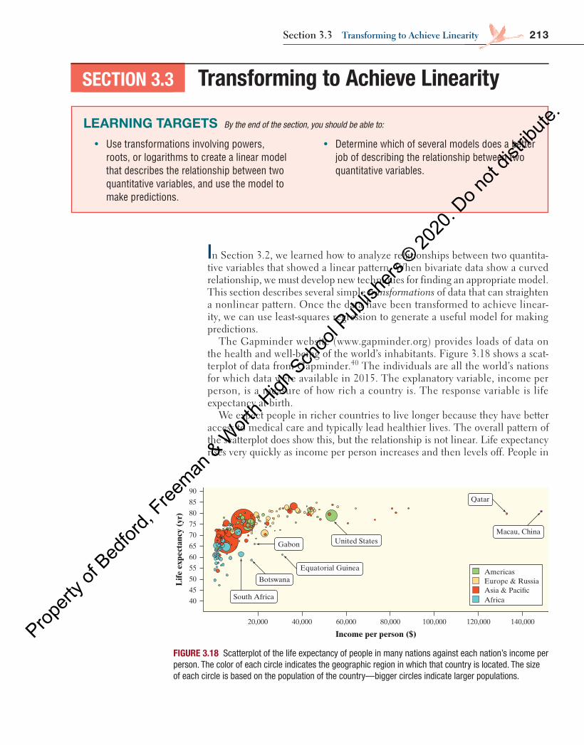
213
In Section 3.2, we learned how to analyze relationships between two quantita-tive variables that showed a linear pattern. When bivariate data show a curved relationship, we must develop new techniques for finding an appropriate model. This section describes several simple transformations of data that can straighten a nonlinear pattern. Once the data have been transformed to achieve linear-ity, we can use least-squares regression to generate a useful model for making predictions.
The Gapminder website (www.gapminder.org) provides loads of data on the health and well-being of the world’s inhabitants. Figure 3.18 shows a scat-terplot of data from Gapminder.40 The individuals are all the world’s nations for which data were available in 2015. The explanatory variable, income per person, is a measure of how rich a country is. The response variable is life expectancy at birth.
We expect people in richer countries to live longer because they have better access to medical care and typically lead healthier lives. The overall pattern of the scatterplot does show this, but the relationship is not linear. Life expectancy rises very quickly as income per person increases and then levels off. People in
SECTION 3.3 Transforming to Achieve Linearity
LEARNING TARGETS By the end of the section, you should be able to:
• Use transformations involving powers, roots, or logarithms to create a linear model that describes the relationship between two quantitative variables, and use the model to make predictions.
• Determine which of several models does a better job of describing the relationship between two quantitative variables.
Lif
e ex
pect
ancy
(yr
)
Income per person ($)
90
85
80
75
70
65
60
55
50
45
40
20,000 40,000 60,000 80,000 100,000 120,000 140,000
Macau, China
Qatar
Equatorial Guinea
South Africa
Botswana
United StatesGabon
Americas
Asia & Paci�cEurope & Russia
Africa
FIGURE 3.18 Scatterplot of the life expectancy of people in many nations against each nation’s income per person. The color of each circle indicates the geographic region in which that country is located. The size of each circle is based on the population of the country—bigger circles indicate larger populations.
Section 3.3 Transforming to achieve linearity
04_StarnesUPDtps6e_26929_ch03_151_246.indd 213 5/20/19 3:20 PM
Propert
y of B
edfor
d, Free
man & W
orth H
igh Sch
ool P
ublish
ers ©
2020
. Do n
ot dis
tribute
.
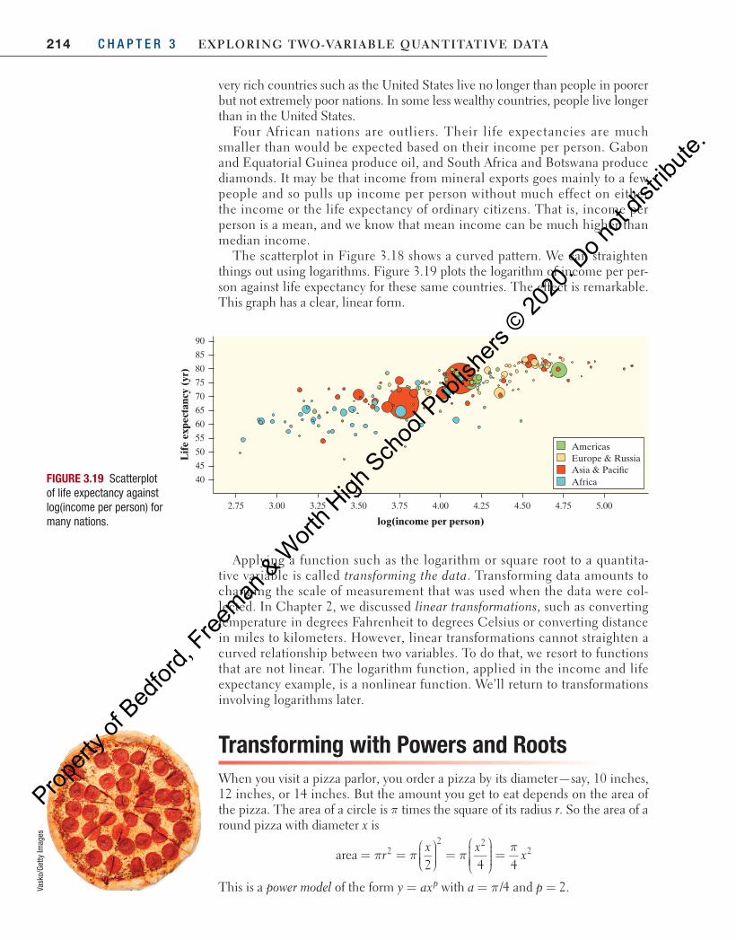
214 C H A P T E R 3 Exploring Two-VariablE QuanTiTaTiVE DaTa
very rich countries such as the United States live no longer than people in poorer but not extremely poor nations. In some less wealthy countries, people live longer than in the United States.
Four African nations are outliers. Their life expectancies are much smaller than would be expected based on their income per person. Gabon and Equatorial Guinea produce oil, and South Africa and Botswana produce diamonds. It may be that income from mineral exports goes mainly to a few people and so pulls up income per person without much effect on either the income or the life expectancy of ordinary citizens. That is, income per person is a mean, and we know that mean income can be much higher than median income.
The scatterplot in Figure 3.18 shows a curved pattern. We can straighten things out using logarithms. Figure 3.19 plots the logarithm of income per per-son against life expectancy for these same countries. The effect is remarkable. This graph has a clear, linear form.
Lif
e ex
pect
ancy
(yr
)
log(income per person)
90
85
80
75
70
65
60
55
50
45
40
3.00 4.00 4.25 4.503.25 3.50 4.75 5.003.752.75
Americas
Asia & Paci�cEurope & Russia
AfricaFIGURE 3.19 Scatterplot of life expectancy against log(income per person) for many nations.
Applying a function such as the logarithm or square root to a quantita-tive variable is called transforming the data. Transforming data amounts to changing the scale of measurement that was used when the data were col-lected. In Chapter 2, we discussed linear transformations, such as converting temperature in degrees Fahrenheit to degrees Celsius or converting distance in miles to kilometers. However, linear transformations cannot straighten a curved relationship between two variables. To do that, we resort to functions that are not linear. The logarithm function, applied in the income and life expectancy example, is a nonlinear function. We’ll return to transformations involving logarithms later.
Transforming with Powers and RootsWhen you visit a pizza parlor, you order a pizza by its diameter—say, 10 inches, 12 inches, or 14 inches. But the amount you get to eat depends on the area of the pizza. The area of a circle is π times the square of its radius r. So the area of a round pizza with diameter x is
area2 4 4
22 2
2π π ππ
= =
=
=rx x
x
This is a power model of the form =y axp with a π= /4 and = 2p .Vask
o/Ge
tty Im
ages
04_StarnesUPDtps6e_26929_ch03_151_246.indd 214 5/20/19 3:20 PM
Propert
y of B
edfor
d, Free
man & W
orth H
igh Sch
ool P
ublish
ers ©
2020
. Do n
ot dis
tribute
.

215Section 3.3 Transforming to achieve linearity
When we are dealing with things of the same general form, whether circles or fish or people, we expect area to go up with the square of a dimension such as diameter or height. Volume should go up with the cube of a linear dimension. That is, geometry tells us to expect power models in some settings. There are other physical relationships between two variables that are described by power models. Here are some examples from science.
• The distance that an object dropped from a given height falls is related to time since release by the model
distance (time)2= a
• The time it takes a pendulum to complete one back-and-forth swing (its period) is related to its length by the model
period length (length)1/2= =a a
• The intensity of a light bulb is related to distance from the bulb by the model
intensitydistance
(distance)22= = −a
a
Although a power model of the form =y axp describes the nonlinear rela-tionship between x and y in each of these settings, there is a linear relationship between xp and y. If we transform the values of the explanatory variable x by rais-ing them to the p power, and graph the points ( , )x yp , the scatterplot should have a linear form. The following example shows what we mean.
PROBLEM: Imagine that you have been put in charge of organizing a fishing tournament in which prizes will be given for the heaviest Atlantic Ocean rock-fish caught. You know that many of the fish caught during the tournament will be measured and released. You are also aware that using delicate scales to try to weigh a fish that is flopping around in a moving boat will probably not yield very accurate results. It would be much easier to measure the length of the fish while on the boat. What you need is a way to convert the length of the fish to its weight.
You contact the nearby marine research laboratory, and it provides reference data on the length (in centime-ters) and weight (in grams) for Atlantic Ocean rockfish of several sizes. 41 Here is a scatterplot of the data. Note the clear curved form.
Length 5.2 8.5 11.5 14.3 16.8 19.2 21.3 23.3 25.0 26.7
Weight 2 8 21 38 69 117 148 190 264 293
Length 28.2 29.6 30.8 32.0 33.0 34.0 34.9 36.4 37.1 37.7
Weight 318 371 455 504 518 537 651 719 726 810
EXAMPLE Go fish! Transforming with powers
Les
Brea
ult/A
lam
y
Wei
ght (
g)
0
100
200
300
400
500
600
700
800
900
403224168
Length (cm)
04_StarnesUPDtps6e_26929_ch03_151_246.indd 215 5/20/19 3:20 PM
Propert
y of B
edfor
d, Free
man & W
orth H
igh Sch
ool P
ublish
ers ©
2020
. Do n
ot dis
tribute
.
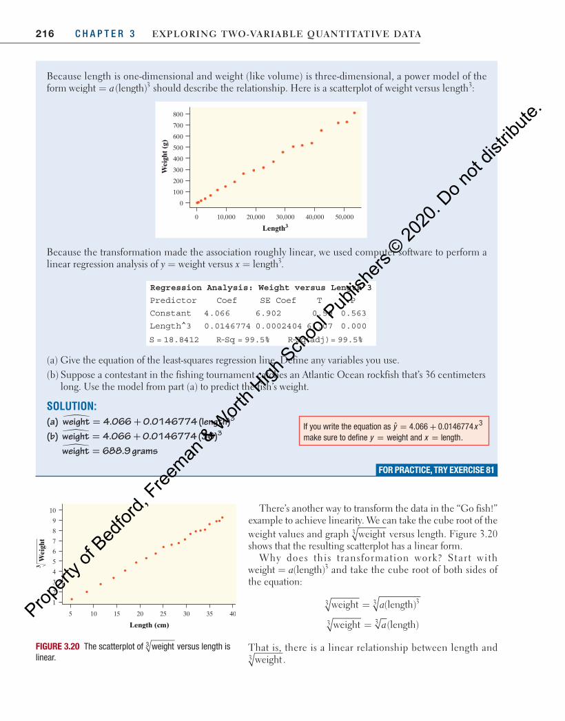
216 C H A P T E R 3 Exploring Two-VariablE QuanTiTaTiVE DaTa
Because length is one-dimensional and weight (like volume) is three-dimensional, a power model of the form aweight (length)3= should describe the relationship. Here is a scatterplot of weight versus length3:
Wei
ght (
g)
0
100
200
300
400
500
600
700
800
50,00040,00030,00020,00010,0000
Length3
Because the transformation made the association roughly linear, we used computer software to perform a linear regression analysis of = weighty versus = length3x .
Regression Analysis: Weight versus Length^3
Predictor Coef SE Coef T P
Constant 4.066 6.902 0.59 0.563
Length^3 0.0146774 0.0002404 61.07 0.000
S = 18.8412 R-Sq = 99.5% R-Sq(adj)= 99.5%
(a) Give the equation of the least-squares regression line. Define any variables you use.(b) Suppose a contestant in the fishing tournament catches an Atlantic Ocean rockfish that’s 36 centimeters
long. Use the model from part (a) to predict the fish’s weight.
SOLUTION:(a) �weight 4.066 0.0146774 (length)3= +(b) �weight 4.066 0.0146774 (36)3= + �weight 688.9 grams=
FOR PRACTICE, TRY EXERCISE 81
If you write the equation as ˆ 4.066 0.0146774 3y x= + make sure to define y weight= and x length= .
There’s another way to transform the data in the “Go fish!” example to achieve linearity. We can take the cube root of the weight values and graph weight3 versus length. Figure 3.20 shows that the resulting scatterplot has a linear form.
Why does this transformation work? St art with aweight (length)3= and take the cube root of both sides of
the equation:
aweight (length)3 33=
aweight (length)3 3=
That is, there is a linear relationship between length and weight3 .
Wei
ght
3
1
2
3
4
5
6
7
8
9
10
403530252015105
Length (cm)
FIGURE 3.20 The scatterplot of weight3 versus length is linear.
04_StarnesUPDtps6e_26929_ch03_151_246.indd 216 5/20/19 3:20 PM
Propert
y of B
edfor
d, Free
man & W
orth H
igh Sch
ool P
ublish
ers ©
2020
. Do n
ot dis
tribute
.
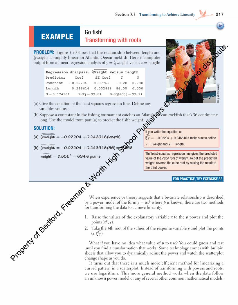
217Section 3.3 Transforming to achieve linearity
EXAMPLE Go fish! Transforming with roots
Doug
Wils
on/A
lam
y
If you write the equation as
y x,0.02204 0.2466163� = − + make sure to define
weight=y and length=x .
The least-squares regression line gives the predicted value of the cube root of weight. To get the predicted weight, reverse the cube root by raising the result to the third power.
FOR PRACTICE, TRY EXERCISE 83
When experience or theory suggests that a bivariate relationship is described by a power model of the form =y axp where p is known, there are two methods for transforming the data to achieve linearity.
1. Raise the values of the explanatory variable x to the p power and plot the points x yp( , ).
2. Take the pth root of the values of the response variable y and plot the points x yp( , ).
What if you have no idea what value of p to use? You could guess and test until you find a transformation that works. Some technology comes with built-in sliders that allow you to dynamically adjust the power and watch the scatterplot change shape as you do.
It turns out that there is a much more efficient method for linearizing a curved pattern in a scatterplot. Instead of transforming with powers and roots, we use logarithms. This more general method works when the data follow an unknown power model or any of several other common mathematical models.
PROBLEM: Figure 3.20 shows that the relationship between length and weight3 is roughly linear for Atlantic Ocean rockfish. Here is computer output from a linear regression analysis of = weight3y versus x length:=
Regression Analysis: Weight3 versus Length
Predictor Coef SE Coef T P
Constant 0.02204− 0.07762 0.28− 0.780
Length 0.246616 0.002868 86.00 0.000
S 0.124161= R-Sq 99.8%= R-Sq(adj) 99.7%=
(a) Give the equation of the least-squares regression line. Define any variables you use.
(b) Suppose a contestant in the fishing tournament catches an Atlantic Ocean rockfish that’s 36 centimeters long. Use the model from part (a) to predict the fish’s weight.
SOLUTION:
(a) �weight 0.02204 0.246616 (length)3 = − +
(b) �weight 0.02204 0.246616 (36) 8.8563 = − + =
�weight 8.856 694.6 grams3= =
04_StarnesUPDtps6e_26929_ch03_151_246.indd 217 5/20/19 3:20 PM
Propert
y of B
edfor
d, Free
man & W
orth H
igh Sch
ool P
ublish
ers ©
2020
. Do n
ot dis
tribute
.
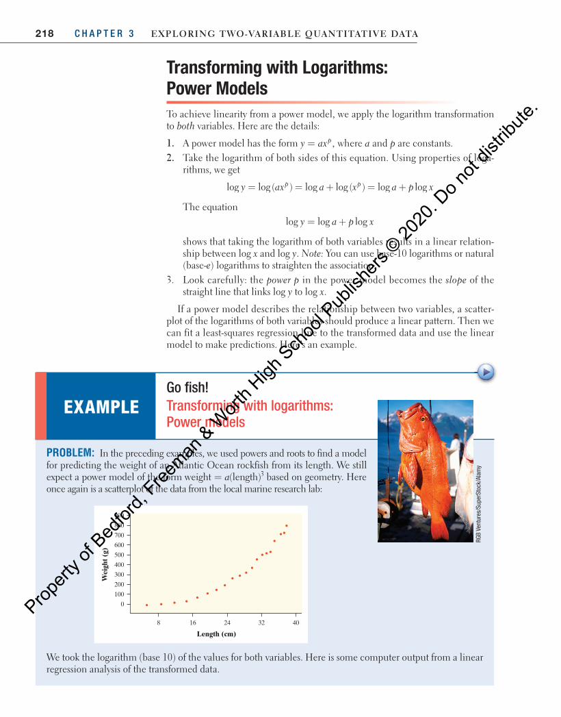
218 C H A P T E R 3 Exploring Two-VariablE QuanTiTaTiVE DaTa
Transforming with Logarithms: Power Models To achieve linearity from a power model, we apply the logarithm transformation to both variables. Here are the details:
1. A power model has the form = ,y axp where a and p are constants. 2. Take the logarithm of both sides of this equation. Using properties of loga-
rithms, we get
y ax a x a p xp plog log ( ) log log ( ) log log= = + = +
The equation = +log log logy a p x
shows that taking the logarithm of both variables results in a linear relation-ship between log x and log y. Note: You can use base-10 logarithms or natural (base-e) logarithms to straighten the association.
3. Look carefully: the power p in the power model becomes the slope of the straight line that links log y to log x.
If a power model describes the relationship between two variables, a scatter-plot of the logarithms of both variables should produce a linear pattern. Then we can fit a least-squares regression line to the transformed data and use the linear model to make predictions. Here’s an example.
PROBLEM: In the preceding examples, we used powers and roots to find a model for predicting the weight of an Atlantic Ocean rockfish from its length. We still expect a power model of the form aweight (length)3= based on geometry. Here once again is a scatterplot of the data from the local marine research lab:
Wei
ght (
g)
0
100
200
300
400
500
600
700
800
900
403224168
Length (cm)
We took the logarithm (base 10) of the values for both variables. Here is some computer output from a linear regression analysis of the transformed data.
EXAMPLE Go fish! Transforming with logarithms: Power models
RGB
Vent
ures
/Sup
erSt
ock/
Alam
y
04_StarnesUPDtps6e_26929_ch03_151_246.indd 218 5/20/19 3:20 PM
Propert
y of B
edfor
d, Free
man & W
orth H
igh Sch
ool P
ublish
ers ©
2020
. Do n
ot dis
tribute
.
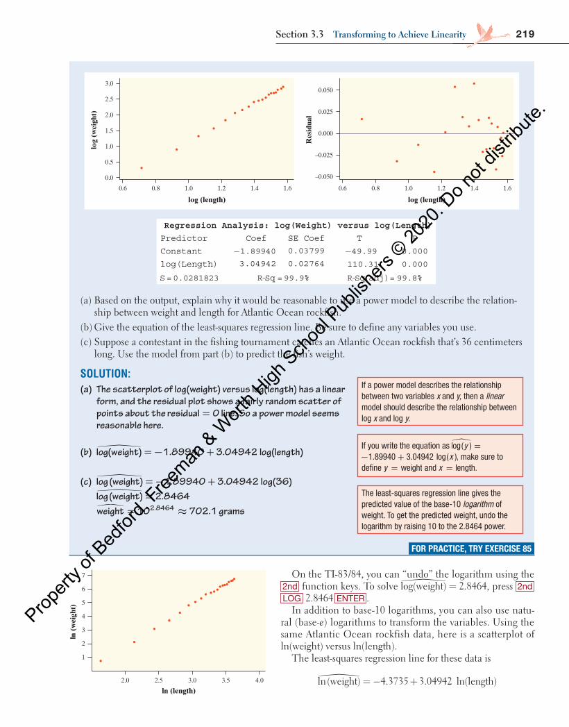
219Section 3.3 Transforming to achieve linearity
Res
idua
l
–0.025
–0.050
0.000
0.025
0.050lo
g (w
eigh
t)
0.0
0.5
1.0
1.5
2.0
2.5
3.0
1.61.2 1.41.00.80.6
log (length)
1.61.2 1.41.00.80.6
log (length)
Regression Analysis: log(Weight) versus log(Length)
Predictor Coef SE Coef T P
Constant −1.89940 0.03799 −49.99 0.000
log(Length) 3.04942 0.02764 110.31 0.000
S=0.0281823 R-Sq =99.9% R-Sq(adj)= 99.8%
(a) Based on the output, explain why it would be reasonable to use a power model to describe the relation-ship between weight and length for Atlantic Ocean rockfish.
(b) Give the equation of the least-squares regression line. Be sure to define any variables you use.(c) Suppose a contestant in the fishing tournament catches an Atlantic Ocean rockfish that’s 36 centimeters
long. Use the model from part (b) to predict the fish’s weight.
SOLUTION:(a) The scatterplot of log(weight) versus log(length) has a linear
form, and the residual plot shows a fairly random scatter of points about the residual 0= line. So a power model seems reasonable here.
(b) log(weight) 1.89940 3.04942 log(length)� = − +
(c) log (weight) 1.89940 3.04942 log(36)� = − + �log(weight) 2.8464= weight 10 702.1 grams2.8464� = ≈
FOR PRACTICE, TRY EXERCISE 85
If a power model describes the relationship between two variables x and y, then a linear model should describe the relationship between log x and log y.
The least-squares regression line gives the predicted value of the base-10 logarithm of weight. To get the predicted weight, undo the logarithm by raising 10 to the 2.8464 power.
If you write the equation as �log( ) =y 1.89940 3.04942 log( ),x− + make sure to
define weight=y and length.=x
ln (
wei
ght)
1
3
2
4
5
6
7
4.03.0 3.52.52.0
ln (length)
On the TI-83/84, you can “undo” the logarithm using the 2nd function keys. To solve � =log(weight) 2.8464, press 2nd LOG 2.8464 ENTER .
In addition to base-10 logarithms, you can also use natu-ral (base-e) logarithms to transform the variables. Using the same Atlantic Ocean rockfish data, here is a scatterplot of ln(weight) versus ln(length).
The least-squares regression line for these data is
� = − +ln(weight) 4.3735 3.04942 ln(length)
04_StarnesUPDtps6e_26929_ch03_151_246.indd 219 5/20/19 3:20 PM
Propert
y of B
edfor
d, Free
man & W
orth H
igh Sch
ool P
ublish
ers ©
2020
. Do n
ot dis
tribute
.

220 C H A P T E R 3 Exploring Two-VariablE QuanTiTaTiVE DaTa
To predict the weight of an Atlantic Ocean rockfish that is 36 centimeters, we start by substituting 36 for length.
� = − + =ln(weight) 4.3735 3.04942 ln(36) 6.55415
To get the predicted weight, we then undo the natural logarithm by raising e to the 6.55415 power.
� = =weight 702.2 grams6.55415e
On the TI-83/84, you can “undo” the natural logarithm using the 2nd function keys. To solve ln(weight) 6.55415,= press 2nd LN 6.55415 ENTER .
Your calculator and most statistical software will calculate the logarithms of all the values of a variable with a single command. The important thing to remem-ber is that if a bivariate relationship is described by a power model, then we can linearize the relationship by taking the logarithm of both the explanatory and response variables.
Think About It
HOW DO WE FIND THE POWER MODEL FOR PREDICTING Y FROM X ? The least-squares line for the transformed rockfish data is
� = − +log(weight) 1.89940 3.04942 log(length)
If we use the definition of the logarithm as an exponent, we can rewrite this equation as
� = − +weight 10 1.89940 3.04942 log(length)
Using properties of exponents, we can simplify this as follows:
� = ⋅ =− +weight 10 10 using the fact that1.89940 3.04942log(length) b b bm n m n
� = ⋅ =−weight 10 10 using the fact that log log1.89940 log(length)3.04942p x xp
� = =weight 0.0126(length) using the fact that 103.04942 log xx
This equation is now in the familiar form of a power model =y axp with = 0.0126a and = 3.04942p . Notice how close the power is to 3, as expected
from geometry.We could use the power model to predict the weight of a 36-centimeter-long
Atlantic Ocean rockfish:� ( )= ≈weight 0.0126 36 701.76 grams3.04942
This is roughly the same prediction we got earlier. Here is the scatterplot of the original rockfish data with the power model added. Note how well this model fits the association!
00
100
200
300
400
500
600
700
800
5 10 15Length (cm)
Wei
ght (
g)
20 25 30 35 40
weight = 0.0126(length)3.04942
04_StarnesUPDtps6e_26929_ch03_151_246.indd 220 5/20/19 3:20 PM
Propert
y of B
edfor
d, Free
man & W
orth H
igh Sch
ool P
ublish
ers ©
2020
. Do n
ot dis
tribute
.
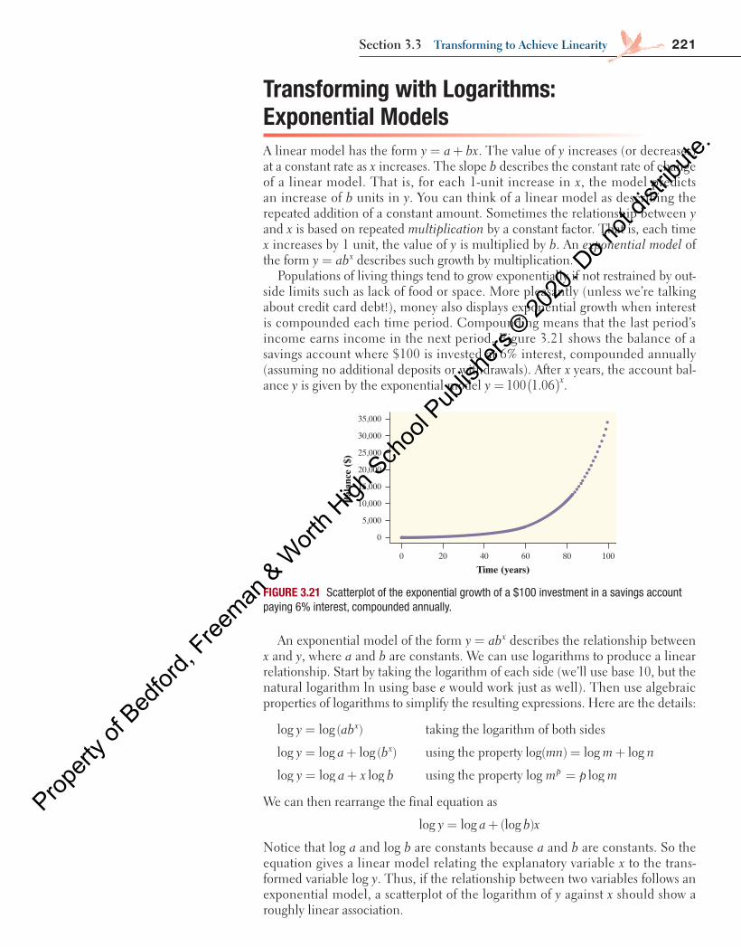
221Section 3.3 Transforming to achieve linearity
Transforming with Logarithms: Exponential ModelsA linear model has the form = +y a bx. The value of y increases (or decreases) at a constant rate as x increases. The slope b describes the constant rate of change of a linear model. That is, for each 1-unit increase in x, the model predicts an increase of b units in y. You can think of a linear model as describing the repeated addition of a constant amount. Sometimes the relationship between y and x is based on repeated multiplication by a constant factor. That is, each time x increases by 1 unit, the value of y is multiplied by b. An exponential model of the form =y abx describes such growth by multiplication.
Populations of living things tend to grow exponentially if not restrained by out-side limits such as lack of food or space. More pleasantly (unless we’re talking about credit card debt!), money also displays exponential growth when interest is compounded each time period. Compounding means that the last period’s income earns income in the next period. Figure 3.21 shows the balance of a savings account where $100 is invested at 6% interest, compounded annually (assuming no additional deposits or withdrawals). After x years, the account bal-ance y is given by the exponential model ( )= 100 1.06y x.
FIGURE 3.21 Scatterplot of the exponential growth of a $100 investment in a savings account paying 6% interest, compounded annually.
Bal
ance
($)
0
10,000
5,000
15,000
20,000
25,000
35,000
30,000
10060 8040200
Time (years)
An exponential model of the form =y abx describes the relationship between x and y, where a and b are constants. We can use logarithms to produce a linear relationship. Start by taking the logarithm of each side (we’ll use base 10, but the natural logarithm ln using base e would work just as well). Then use algebraic properties of logarithms to simplify the resulting expressions. Here are the details:
=log log ( )y abx taking the logarithm of both sides
= +log log log ( )y a bx using the property = +log( ) log logmn m n
= +log log logy a x b using the property log = logm p mp
We can then rearrange the final equation as
y a b xlog log (log )= +
Notice that log a and log b are constants because a and b are constants. So the equation gives a linear model relating the explanatory variable x to the trans-formed variable log y. Thus, if the relationship between two variables follows an exponential model, a scatterplot of the logarithm of y against x should show a roughly linear association.
04_StarnesUPDtps6e_26929_ch03_151_246.indd 221 5/20/19 3:20 PM
Propert
y of B
edfor
d, Free
man & W
orth H
igh Sch
ool P
ublish
ers ©
2020
. Do n
ot dis
tribute
.
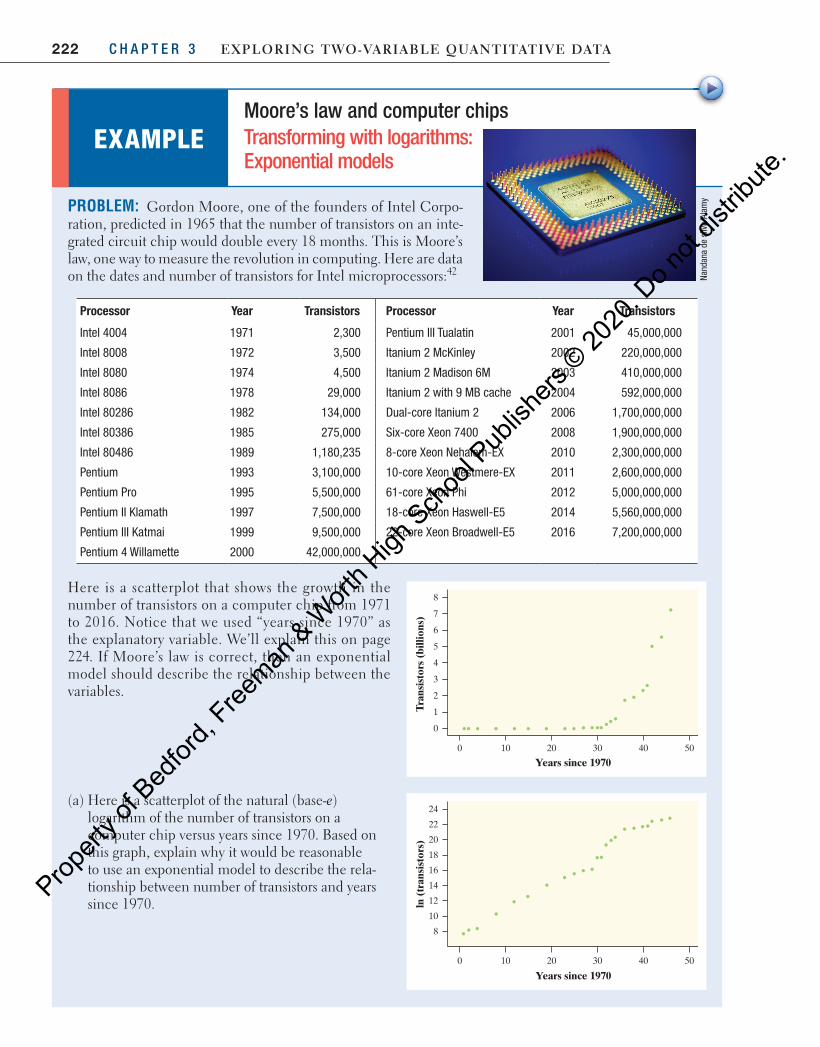
222 C H A P T E R 3 Exploring Two-VariablE QuanTiTaTiVE DaTa
PROBLEM: Gordon Moore, one of the founders of Intel Corpo-ration, predicted in 1965 that the number of transistors on an inte-grated circuit chip would double every 18 months. This is Moore’s law, one way to measure the revolution in computing. Here are data on the dates and number of transistors for Intel microprocessors: 42
Processor Year Transistors Processor Year Transistors
Intel 4004 1971 2,300 Pentium III Tualatin 2001 45,000,000
Intel 8008 1972 3,500 Itanium 2 McKinley 2002 220,000,000
Intel 8080 1974 4,500 Itanium 2 Madison 6M 2003 410,000,000
Intel 8086 1978 29,000 Itanium 2 with 9 MB cache 2004 592,000,000
Intel 80286 1982 134,000 Dual-core Itanium 2 2006 1,700,000,000
Intel 80386 1985 275,000 Six-core Xeon 7400 2008 1,900,000,000
Intel 80486 1989 1,180,235 8-core Xeon Nehalem-EX 2010 2,300,000,000
Pentium 1993 3,100,000 10-core Xeon Westmere-EX 2011 2,600,000,000
Pentium Pro 1995 5,500,000 61-core Xeon Phi 2012 5,000,000,000
Pentium II Klamath 1997 7,500,000 18-core Xeon Haswell-E5 2014 5,560,000,000
Pentium III Katmai 1999 9,500,000 22-core Xeon Broadwell-E5 2016 7,200,000,000
Pentium 4 Willamette 2000 42,000,000
Here is a scatterplot that shows the growth in the number of transistors on a computer chip from 1971 to 2016. Notice that we used “years since 1970” as the explanatory variable. We’ll explain this on page 224 . If Moore’s law is correct, then an exponential model should describe the relationship between the variables.
(a) Here is a scatterplot of the natural (base-e) logarithm of the number of transistors on a computer chip versus years since 1970. Based on this graph, explain why it would be reasonable to use an exponential model to describe the rela-tionship between number of transistors and years since 1970.
EXAMPLE Moore’s law and computer chips Transforming with logarithms: Exponential models
Nand
ana
de s
ilva/
Alam
y
Tran
sist
ors
(bill
ions
)
0
3
2
1
4
5
6
8
7
5030 4020100
Years since 1970
ln (
tran
sist
ors)
8
14
12
10
16
18
20
24
22
5030 4020100
Years since 1970
04_StarnesUPDtps6e_26929_ch03_151_246.indd 222 5/20/19 3:20 PM
Propert
y of B
edfor
d, Free
man & W
orth H
igh Sch
ool P
ublish
ers ©
2020
. Do n
ot dis
tribute
.
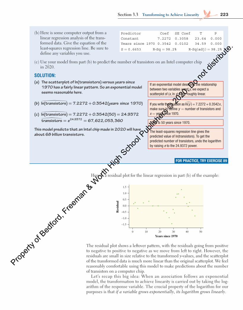
223Section 3.3 Transforming to achieve linearity
(b) Here is some computer output from a linear regression analysis of the trans-formed data. Give the equation of the least-squares regression line. Be sure to define any variables you use.
(c) Use your model from part (b) to predict the number of transistors on an Intel computer chip in 2020.
SOLUTION:(a) The scatterplot of ln(transistors) versus years since
1970 has a fairly linear pattern. So an exponential model seems reasonable here.
(b) �ln(transistors) 7.2272 0.3542(years since 1970)= +
(c) �ln(transistors) 7.2272 0.3542(50) 24.9372= + = transistors e 67, 622, 053, 36024.9372� = =
This model predicts that an Intel chip made in 2020 will have about 68 billion transistors.
FOR PRACTICE, TRY EXERCISE 89
If an exponential model describes the relationship between two variables x and y, we expect a scatterplot of (x, ln y ) to be roughly linear.
2020 is 50 years since 1970.
If you write the equation as ln( ) = 7.2272 + 0.3542�y x , make sure to define y = number of transistors and x = years since 1970.
The least-squares regression line gives the predicted value of ln(transistors). To get the predicted number of transistors, undo the logarithm by raising e to the 24.9372 power.
Predictor Coef SE Coef T PConstant 7.2272 0.3058 23.64 0.000Years since 1970 0.3542 0.0102 34.59 0.000
S 0.6653= R-Sq 98.2%= R-Sq(adj) 98.2%=
Here is a residual plot for the linear regression in part (b) of the example:
Res
idua
l
–1.5
–0.5
–1.0
0.0
0.5
1.5
1.0
5030 4020100
Years since 1970
The residual plot shows a leftover pattern, with the residuals going from positive to negative to positive to negative as we move from left to right. However, the residuals are small in size relative to the transformed y-values, and the scatterplot of the transformed data is much more linear than the original scatterplot. We feel reasonably comfortable using this model to make predictions about the number of transistors on a computer chip.
Let’s recap this big idea: When an association follows an exponential model, the transformation to achieve linearity is carried out by taking the log-arithm of the response variable. The crucial property of the logarithm for our purposes is that if a variable grows exponentially, its logarithm grows linearly.
04_StarnesUPDtps6e_26929_ch03_151_246.indd 223 5/20/19 3:20 PM
Propert
y of B
edfor
d, Free
man & W
orth H
igh Sch
ool P
ublish
ers ©
2020
. Do n
ot dis
tribute
.
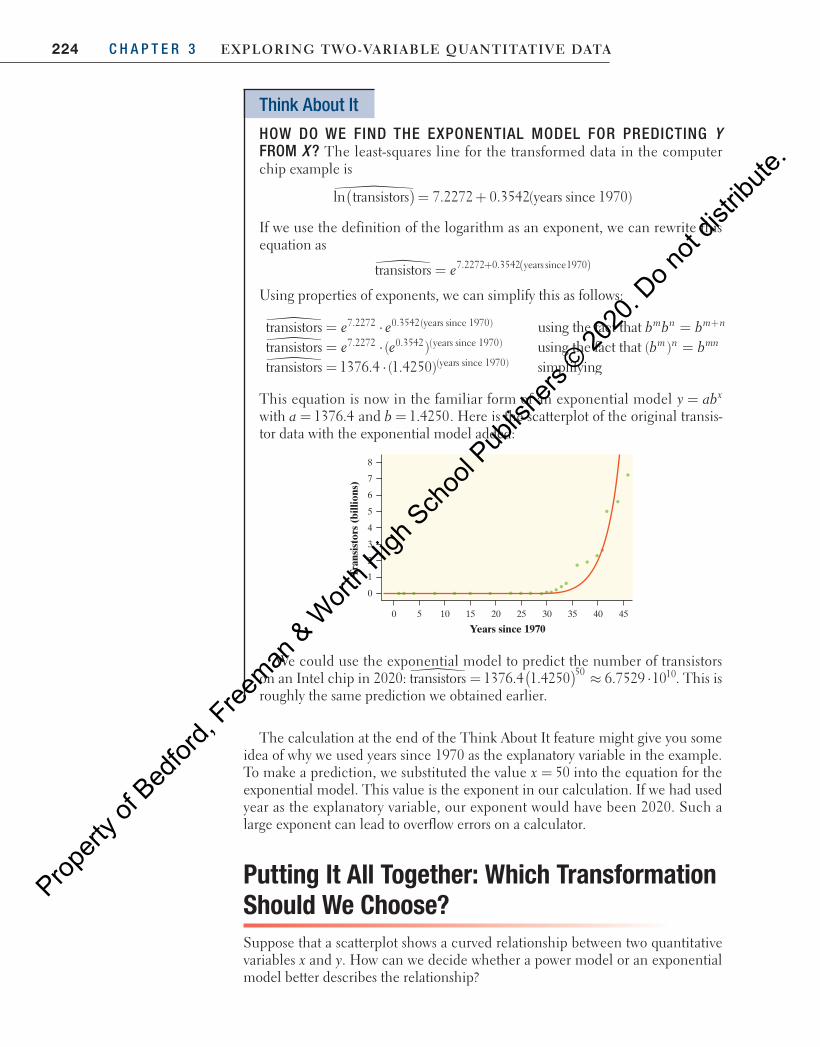
224 C H A P T E R 3 Exploring Two-VariablE QuanTiTaTiVE DaTa
Think About It
HOW DO WE FIND THE EXPONENTIAL MODEL FOR PREDICTING Y FROM X ? The least-squares line for the transformed data in the computer chip example is
�ln transistors 7.2272 0.3542(years since 1970)( ) = +
If we use the definition of the logarithm as an exponent, we can rewrite this equation as
� = ( )+transistors 7.2272 0.3542 years since1970e
Using properties of exponents, we can simplify this as follows:
e e b b bm n m n�transistors using the fact that7.2272 0.3542(years since 1970)= ⋅ = +
e e b bm n mn�transistors ( ) using the fact that ( )7.2272 0.3542 (years since 1970)= ⋅ =�transistors 1376.4 (1.4250) simplifying(years since 1970)= ⋅
This equation is now in the familiar form of an exponential model =y abx with = 1376.4a and = 1.4250b . Here is the scatterplot of the original transis-tor data with the exponential model added:
Tran
sist
ors
(bill
ions
)
0
3
2
1
4
5
6
8
7
4530 402010 25 351550
Years since 1970
We could use the exponential model to predict the number of transistors on an Intel chip in 2020: � ( )= ≈ ⋅transistors 1376.4 1.4250 6.7529 1050 10. This is roughly the same prediction we obtained earlier.
The calculation at the end of the Think About It feature might give you some idea of why we used years since 1970 as the explanatory variable in the example. To make a prediction, we substituted the value = 50x into the equation for the exponential model. This value is the exponent in our calculation. If we had used year as the explanatory variable, our exponent would have been 2020. Such a large exponent can lead to overflow errors on a calculator.
Putting It All Together: Which Transformation Should We Choose?Suppose that a scatterplot shows a curved relationship between two quantitative variables x and y. How can we decide whether a power model or an exponential model better describes the relationship?
04_StarnesUPDtps6e_26929_ch03_151_246.indd 224 5/20/19 3:20 PM
Propert
y of B
edfor
d, Free
man & W
orth H
igh Sch
ool P
ublish
ers ©
2020
. Do n
ot dis
tribute
.
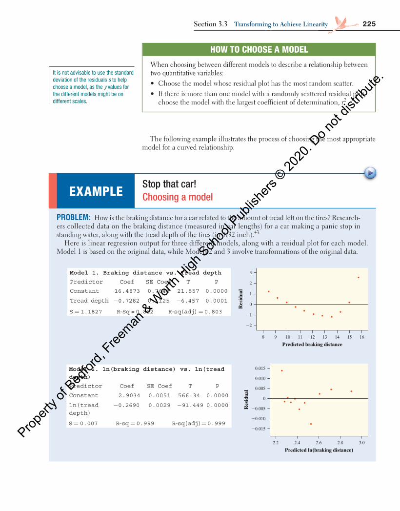
225Section 3.3 Transforming to achieve linearity
The following example illustrates the process of choosing the most appropriate model for a curved relationship.
HOW TO CHOOSE A MODEL
When choosing between different models to describe a relationship between two quantitative variables: • Choose the model whose residual plot has the most random scatter. • If there is more than one model with a randomly scattered residual plot,
choose the model with the largest coefficient of determination, r 2 .
PROBLEM: How is the braking distance for a car related to the amount of tread left on the tires? Research-ers collected data on the braking distance (measured in car lengths) for a car making a panic stop in standing water, along with the tread depth of the tires (in 1/32 inch). 43
Here is linear regression output for three different models, along with a residual plot for each model. Model 1 is based on the original data, while Models 2 and 3 involve transformations of the original data.
Model 1. Braking distance vs. Tread depth
Predictor Coef SE Coef T P
Constant 16.4873 0.7648 21.557 0.0000
Tread depth 0.7282− 0.1125 6.457− 0.0001
S 1.1827= R-Sq =0.822 R-sq(adj) 0.803=
Model 2. ln(braking distance) vs. ln(tread depth)
Predictor Coef SE Coef T P
Constant 2.9034 0.0051 566.34 0.0000
ln(tread depth)
0.2690− 0.0029 91.449− 0.0000
S 0.007= R-sq 0.999= R-sq(adj) 0.999=
EXAMPLE Stop that car! Choosing a model
Res
idua
l
22
21
0
1
2
3
169 1210 14 1511 138
Predicted braking distance
Res
idua
l
20.015
20.010
20.005
0
0.005
0.010
0.015
3.02.2 2.4 2.6 2.8
Predicted ln(braking distance)
It is not advisable to use the standard deviation of the residuals s to help choose a model, as the y values for the different models might be on different scales.
04_StarnesUPDtps6e_26929_ch03_151_246.indd 225 5/20/19 3:20 PM
Propert
y of B
edfor
d, Free
man & W
orth H
igh Sch
ool P
ublish
ers ©
2020
. Do n
ot dis
tribute
.
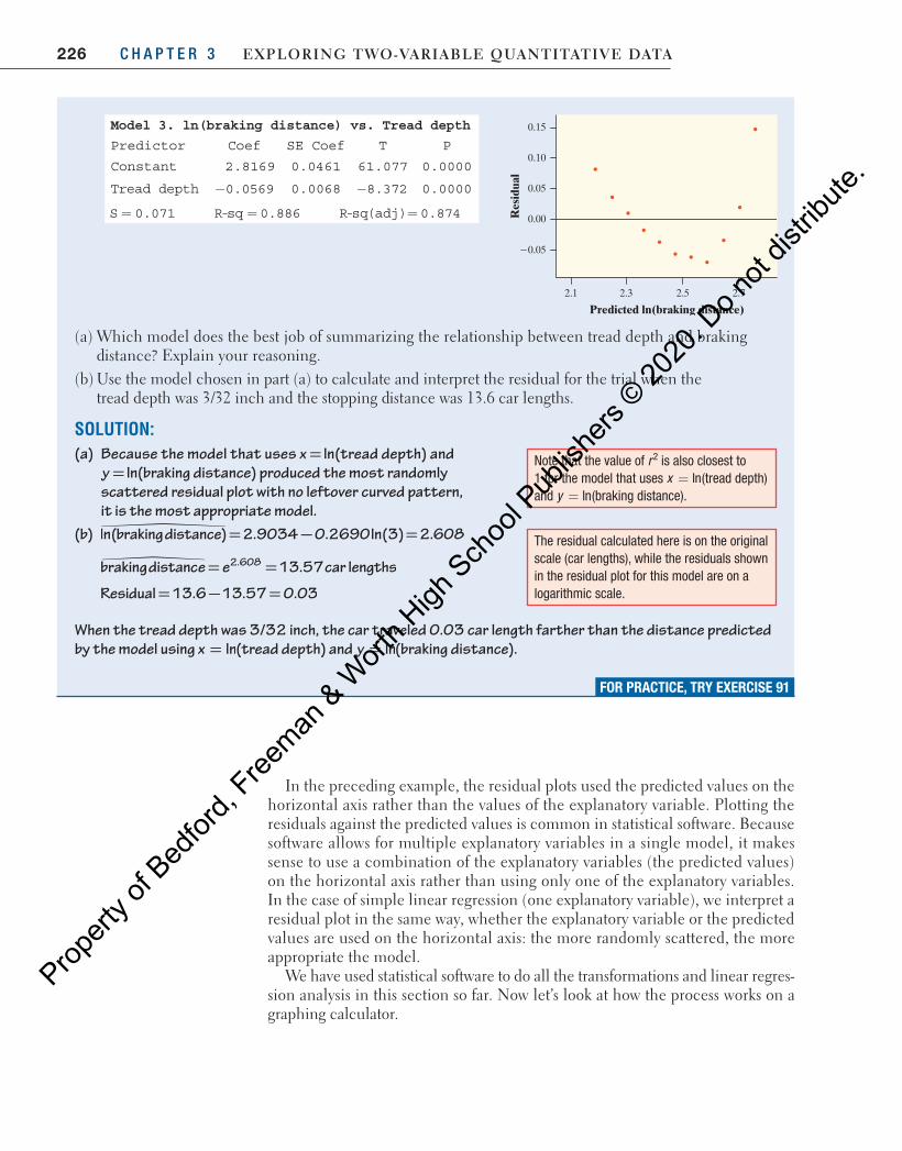
226 C H A P T E R 3 Exploring Two-VariablE QuanTiTaTiVE DaTa
Model 3. ln(braking distance) vs. Tread depth
Predictor Coef SE Coef T P
Constant 2.8169 0.0461 61.077 0.0000
Tread depth 0.0569− 0.0068 8.372− 0.0000
S 0.071= R-sq 0.886= R-sq(adj) 0.874=
(a) Which model does the best job of summarizing the relationship between tread depth and braking distance? Explain your reasoning.
(b) Use the model chosen in part (a) to calculate and interpret the residual for the trial when the tread depth was 3/32 inch and the stopping distance was 13.6 car lengths.
SOLUTION:(a) Because the model that uses ln=x (tread depth) and
ln=y (braking distance) produced the most randomly scattered residual plot with no leftover curved pattern, it is the most appropriate model.
(b) �ln(braking distance) 2.9034 0.2690ln(3) 2.608= − =
= =brakingdistance e 13.57car lengths2.608�
Residual 13.6 13.57 0.03= − =
When the tread depth was 3/32 inch, the car traveled 0.03 car length farther than the distance predicted by the model using = lnx (tread depth) and = lny (braking distance).
In the preceding example, the residual plots used the predicted values on the horizontal axis rather than the values of the explanatory variable. Plotting the residuals against the predicted values is common in statistical software. Because software allows for multiple explanatory variables in a single model, it makes sense to use a combination of the explanatory variables (the predicted values) on the horizontal axis rather than using only one of the explanatory variables. In the case of simple linear regression (one explanatory variable), we interpret a residual plot in the same way, whether the explanatory variable or the predicted values are used on the horizontal axis: the more randomly scattered, the more appropriate the model.
We have used statistical software to do all the transformations and linear regres-sion analysis in this section so far. Now let’s look at how the process works on a graphing calculator.
Note that the value of r2 is also closest to 1 for the model that uses = lnx (tread depth) and = lny (braking distance).
The residual calculated here is on the original scale (car lengths), while the residuals shown in the residual plot for this model are on a logarithmic scale.
FOR PRACTICE, TRY EXERCISE 91
Res
idua
l
20.05
0.00
0.05
0.10
0.15
2.1 2.3 2.5 2.7
Predicted ln(braking distance)
04_StarnesUPDtps6e_26929_ch03_151_246.indd 226 5/20/19 3:20 PM
Propert
y of B
edfor
d, Free
man & W
orth H
igh Sch
ool P
ublish
ers ©
2020
. Do n
ot dis
tribute
.
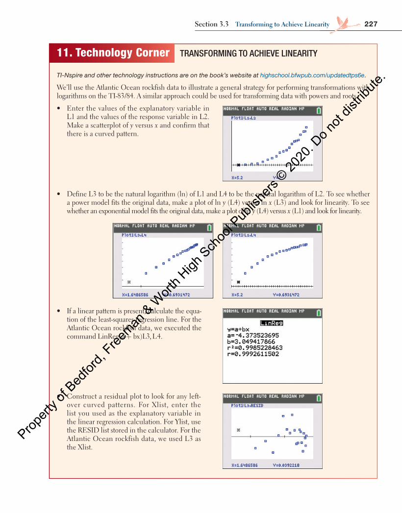
227Section 3.3 Transforming to achieve linearity
11. Technology Corner TRANSFORMING TO ACHIEVE LINEARITY
TI-Nspire and other technology instructions are on the book’s website at highschool.bfwpub.com/updatedtps6e.
We’ll use the Atlantic Ocean rockfish data to illustrate a general strategy for performing transformations with logarithms on the TI-83/84. A similar approach could be used for transforming data with powers and roots.
• Enter the values of the explanatory variable in L1 and the values of the response variable in L2. Make a scatterplot of y versus x and confirm that there is a curved pattern.
• Define L3 to be the natural logarithm (ln) of L1 and L4 to be the natural logarithm of L2. To see whether a power model fits the original data, make a plot of ln y (L4) versus ln x (L3) and look for linearity. To see whether an exponential model fits the original data, make a plot of ln y (L4) versus x (L1) and look for linearity.
• If a linear pattern is present, calculate the equa-tion of the least-squares regression line. For the Atlantic Ocean rockfish data, we executed the command +LinReg(a bx)L3, L4.
• Construct a residual plot to look for any left-over curved patterns. For Xlist, enter the list you used as the explanatory variable in the linear regression calculation. For Ylist, use the RESID list stored in the calculator. For the Atlantic Ocean rockfish data, we used L3 as the Xlist.
04_StarnesUPDtps6e_26929_ch03_151_246.indd 227 5/20/19 3:20 PM
Propert
y of B
edfor
d, Free
man & W
orth H
igh Sch
ool P
ublish
ers ©
2020
. Do n
ot dis
tribute
.
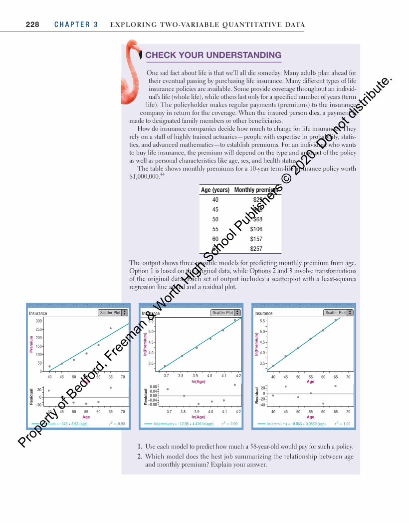
228 C H A P T E R 3 Exploring Two-VariablE QuanTiTaTiVE DaTa
CHECK YOUR UNDERSTANDING
One sad fact about life is that we’ll all die someday. Many adults plan ahead for their eventual passing by purchasing life insurance. Many different types of life insurance policies are available. Some provide coverage throughout an individ-ual’s life (whole life), while others last only for a specified number of years (term
life). The policyholder makes regular payments (premiums) to the insurance company in return for the coverage. When the insured person dies, a payment is
made to designated family members or other beneficiaries.How do insurance companies decide how much to charge for life insurance? They
rely on a staff of highly trained actuaries—people with expertise in probability, statis-tics, and advanced mathematics—to establish premiums. For an individual who wants to buy life insurance, the premium will depend on the type and amount of the policy as well as personal characteristics like age, sex, and health status.
The table shows monthly premiums for a 10-year term-life insurance policy worth $1,000,000.44
Age (years) Monthly premium
40 $29
45 $46
50 $68
55 $106
60 $157
65 $257
The output shows three possible models for predicting monthly premium from age. Option 1 is based on the original data, while Options 2 and 3 involve transformations of the original data. Each set of output includes a scatterplot with a least-squares regression line added and a residual plot.
Insurance
300
30
–30
0
Premium
Res
idual
Age
250
200
150
100
50
040 45 50 55 60 65 70
Age40 45 50 55 60 65 70
5.5
5.0
4.5
4.0
3.5
3.7 3.8 3.9 4.0 4.1 4.2
3.7 3.8 3.9 4.0 4.1 4.2
Insurance
Res
idual
In(Premium)
In(Age)
In(Age)
0.08
0.000.04
–0.04–0.08
Insurance
Age
Age
5.5
5.0
4.5
4.0
3.5
40 45 50 55 60 65 70
In(Premium)
Res
idual
40 45 50 55 60 65 70
200
–20–40
premium = –343 + 8.63 (age) In(premium) = –12.98 + 4.416 In(age) In(premium) = –0.063 + 0.0859 (age)
Scatter Plot Scatter Plot Scatter Plot
r 2 5 0.99 r 2 5 1.00r 2 5 0.90
1. Use each model to predict how much a 58-year-old would pay for such a policy.2. Which model does the best job summarizing the relationship between age
and monthly premium? Explain your answer.
04_StarnesUPDtps6e_26929_ch03_151_246.indd 228 5/20/19 3:20 PM
Propert
y of B
edfor
d, Free
man & W
orth H
igh Sch
ool P
ublish
ers ©
2020
. Do n
ot dis
tribute
.
229Section 3.3 Exercises
• Curved relationships between two quantitative variables can sometimes be changed into linear relationships by transforming one or both of the variables. Once we transform the data to achieve linearity, we can fit a least-squares regres-sion line to the transformed data and use this linear model to make predictions.
• When theory or experience suggests that the relationship between two vari-ables follows a power model of the form y axp= , transformations involving powers and roots can linearize a curved pattern in a scatterplot.
■ option 1 : Raise the values of the explanatory variable x to the power p, then look at a graph of x yp( , ).
■ option 2 : Take the pth root of the values of the response variable y, then look at a graph of x yp( , ).
• Another useful strategy for straightening a curved pattern in a scatterplot is to take the logarithm of one or both variables. When a power model describes the relationship between two variables, a plot of log y versus log x (or ln y versus ln x) should be linear.
• For an exponential model of the form y abx= , the predicted values of the response variable are multiplied by a factor of b for each increase of 1 unit in the explanatory variable. When an exponential model describes the relationship between two variables, a plot of log y versus x (or ln y versus x) should be linear.
• To decide between competing models, choose the model with the most ran-domly scattered residual plot. If it is difficult to determine which residual plot is the most randomly scattered, choose the model with the largest value of r 2.
Section 3.3 Summary
3.3 Technology Corner
TI-Nspire and other technology instructions are on the book’s website at highschool.bfwpub.com/updatedtps6e .
11. Transforming to achieve linearity Page 227
Section 3.3 Exercises 81. The swinging pendulum Mrs. Hanrahan’s precalculus
class collected data on the length (in centimeters) of a pendulum and the time (in seconds) the pendulum took to complete one back-and-forth swing (called its period). The theoretical relationship between a pendu-lum’s length and its period is
g
π=period
2length
where g is a constant representing the acceleration due to gravity (in this case, g = 980 cm/s2 ). Here is a graph of period versus length, along with output from a linear regression analysis using these variables.
Per
iod
(s)
0.6
1.2
1.0
0.8
1.4
1.6
1.8
2.2
2.0
111086 9754
length
215pgpg
04_StarnesUPDtps6e_26929_ch03_151_246.indd 229 5/20/19 3:20 PM
Propert
y of B
edfor
d, Free
man & W
orth H
igh Sch
ool P
ublish
ers ©
2020
. Do n
ot dis
tribute
.
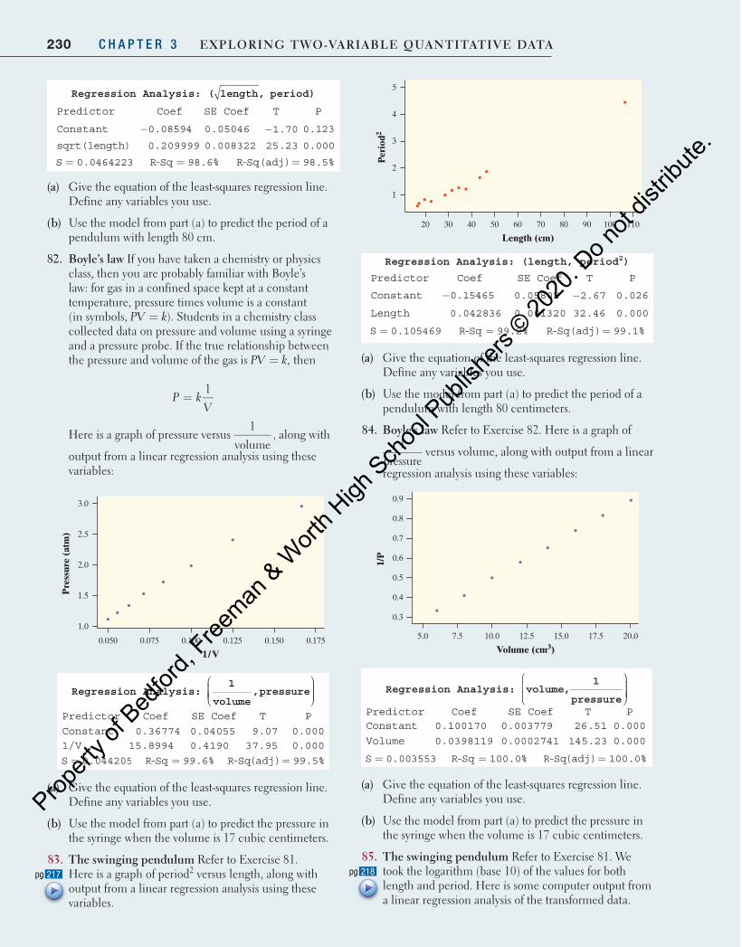
230 C H A P T E R 3 Exploring Two-VariablE QuanTiTaTiVE DaTa
Per
iod2
1
2
3
4
5
1107030 9050 8040 1006020
Length (cm)
Regression Analysis: (length, period 2 )
Predictor Coef SE Coef T P
Constant 0.15465− 0.05802 2.67− 0.026
Length 0.042836 0.001320 32.46 0.000
S 0.105469= R-Sq 99.2%= R-Sq(adj) 99.1%=
(a) Give the equation of the least-squares regression line. Define any variables you use.
(b) Use the model from part (a) to predict the period of a pendulum with length 80 centimeters.
84. boyle’s law Refer to Exercise 82 . Here is a graph of 1
pressure versus volume, along with output from a linear
regression analysis using these variables:
1/P
0.3
0.4
0.5
0.6
0.7
0.8
0.9
20.017.57.5 12.510.0 15.05.0
Volume (cm3)
Regression Analysis: volume,1
pressure
Predictor Coef SE Coef T P Constant 0.100170 0.003779 26.51 0.000
Volume 0.0398119 0.0002741 145.23 0.000
S 0.003553= R-Sq 100.0%= R-Sq(adj) 100.0%=
(a) Give the equation of the least-squares regression line. Define any variables you use.
(b) Use the model from part (a) to predict the pressure in the syringe when the volume is 17 cubic centimeters.
85. The swinging pendulum Refer to Exercise 81 . We took the logarithm (base 10) of the values for both length and period. Here is some computer output from a linear regression analysis of the transformed data.
218pgpg
Regression Analysis: ( length, period)
Predictor Coef SE Coef T P
Constant 0.08594− 0.05046 1.70− 0.123
sqrt(length) 0.209999 0.008322 25.23 0.000
S 0.0464223= R-Sq 98.6%= R-Sq(adj) 98.5%=
(a) Give the equation of the least-squares regression line. Define any variables you use.
(b) Use the model from part (a) to predict the period of a pendulum with length 80 cm.
82. boyle’s law If you have taken a chemistry or physics class, then you are probably familiar with Boyle’s law: for gas in a confined space kept at a constant temperature, pressure times volume is a constant (in symbols, PV k= ). Students in a chemistry class collected data on pressure and volume using a syringe and a pressure probe. If the true relationship between the pressure and volume of the gas is PV k,= then
P kV
=1
Here is a graph of pressure versus 1
volume, along with
output from a linear regression analysis using these variables:
Pre
ssur
e (a
tm)
1.0
1.5
2.0
2.5
3.0
0.1750.1250.075 0.1500.1000.050
1/V
Regression Analysis:
1
volume,pressure
Predictor Coef SE Coef T P Constant 0.36774 0.04055 9.07 0.000 1/V 15.8994 0.4190 37.95 0.000
S 0.044205= R-Sq 99.6%= R-Sq(adj) 99.5%=
(a) Give the equation of the least-squares regression line. Define any variables you use.
(b) Use the model from part (a) to predict the pressure in the syringe when the volume is 17 cubic centimeters.
83. The swinging pendulum Refer to Exercise 81 . Here is a graph of period 2 versus length, along with output from a linear regression analysis using these variables.
217pgpg
04_StarnesUPDtps6e_26929_ch03_151_246.indd 230 5/20/19 3:20 PM
Propert
y of B
edfor
d, Free
man & W
orth H
igh Sch
ool P
ublish
ers ©
2020
. Do n
ot dis
tribute
.
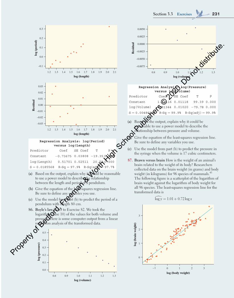
231Section 3.3 Exercises
log
(pre
ssur
e)
0.0
0.1
0.2
0.3
0.4
0.5
Res
idua
l
–0.0075
–0.0050
–0.0025
0.0000
0.0025
0.0050
1.31.21.0 1.10.90.8
log (volume)
1.31.21.0 1.10.90.8
log (volume)
Regression Analysis: log(Pressure) versus log(Volume)
Predictor Coef SE Coef T P
Constant 1.11116 0.01118 99.39 0.000
log(Volume) 0.81344− 0.01020 79.78− 0.000
S 0.00486926= R-Sq 99.9%= R-Sq(adj) 99.9%=
(a) Based on the output, explain why it could be reasonable to use a power model to describe the relationship between pressure and volume.
(b) Give the equation of the least-squares regression line. Be sure to define any variables you use.
(c) Use the model from part (b) to predict the pressure in the syringe when the volume is 17 cubic centimeters.
87. brawn versus brain How is the weight of an animal’s brain related to the weight of its body? Researchers collected data on the brain weight (in grams) and body weight (in kilograms) for 96 species of mammals.45 The following figure is a scatterplot of the logarithm of brain weight against the logarithm of body weight for all 96 species. The least-squares regression line for the transformed data is
y x� = +log 1.01 0.72 log
0 1 2 3
log (body weight)
3
log
(bra
in w
eigh
t)
2
1
0
– 1
log
(per
iod)
–0.1
0.0
0.1
0.2
0.3
2.11.91.3 1.51.4 1.7 2.01.6 1.81.2
log (length)
Res
idua
l
–0.03
–0.02
–0.01
0.00
0.01
0.02
0.03
2.12.01.3 1.61.4 1.8 1.91.5 1.71.2
log (length)
Regression Analysis: log(Period) versus log(Length)
Predictor Coef SE Coef T P
Constant 0.73675− 0.03808 19.35− 0.000
log(Length) 0.51701 0.02511 20.59 0.000
S 0.0185568= R-Sq 97.9%= R-Sq(adj) 97.7%=
(a) Based on the output, explain why it would be reasonable to use a power model to describe the relationship between the length and period of a pendulum.
(b) Give the equation of the least-squares regression line. Be sure to define any variables you use.
(c) Use the model from part (b) to predict the period of a pendulum with length 80 cm.
86. boyle’s law Refer to Exercise 82. We took the logarithm (base 10) of the values for both volume and pressure. Here is some computer output from a linear regression analysis of the transformed data.
log
(pre
ssur
e)
0.0
0.1
0.2
0.3
0.4
0.5
Res
idua
l
–0.0075
–0.0050
–0.0025
0.0000
0.0025
0.0050
1.31.21.0 1.10.90.8
log (volume)
1.31.21.0 1.10.90.8
log (volume)
04_StarnesUPDtps6e_26929_ch03_151_246.indd 231 5/20/19 3:21 PM
Propert
y of B
edfor
d, Free
man & W
orth H
igh Sch
ool P
ublish
ers ©
2020
. Do n
ot dis
tribute
.
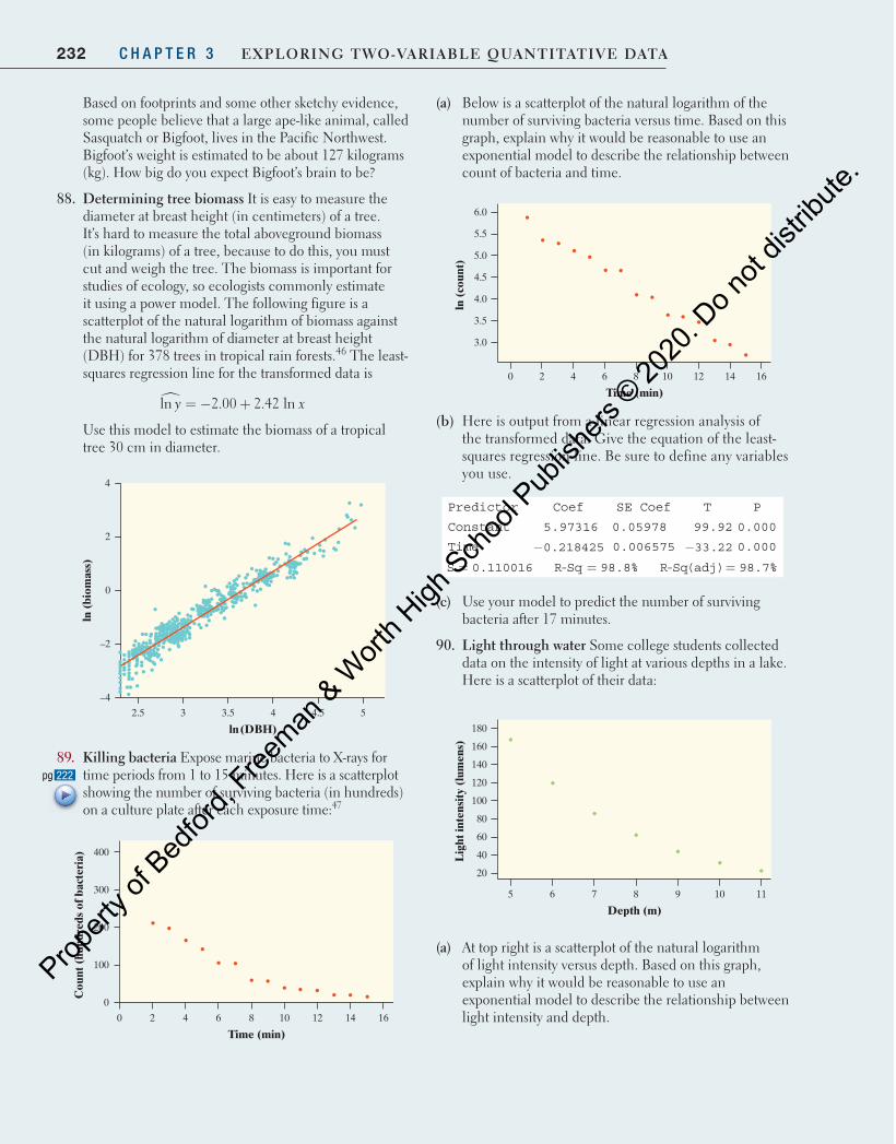
232 C H A P T E R 3 Exploring Two-VariablE QuanTiTaTiVE DaTa
(a) Below is a scatterplot of the natural logarithm of the number of surviving bacteria versus time. Based on this graph, explain why it would be reasonable to use an exponential model to describe the relationship between count of bacteria and time.
ln (
coun
t)
3.0
3.5
4.0
4.5
5.5
5.0
6.0
16142 4 8 106 120
Time (min)
(b) Here is output from a linear regression analysis of the transformed data. Give the equation of the least-squares regression line. Be sure to define any variables you use.
Predictor Coef SE Coef T P
Constant 5.97316 0.05978 99.92 0.000
Time 0.218425− 0.006575 33.22− 0.000
S 0.110016= R-Sq 98.8%= R-Sq(adj) 98.7%=
(c) Use your model to predict the number of surviving bacteria after 17 minutes.
90. light through water Some college students collected data on the intensity of light at various depths in a lake. Here is a scatterplot of their data:
Lig
ht in
tens
ity
(lum
ens)
40
20
60
80
120
100
160
140
180
11106 7 8 95
Depth (m)
(a) At top right is a scatterplot of the natural logarithm of light intensity versus depth. Based on this graph, explain why it would be reasonable to use an exponential model to describe the relationship between light intensity and depth.
Based on footprints and some other sketchy evidence, some people believe that a large ape-like animal, called Sasquatch or Bigfoot, lives in the Pacific Northwest. Bigfoot’s weight is estimated to be about 127 kilograms (kg). How big do you expect Bigfoot’s brain to be?
88. Determining tree biomass It is easy to measure the diameter at breast height (in centimeters) of a tree. It’s hard to measure the total aboveground biomass (in kilograms) of a tree, because to do this, you must cut and weigh the tree. The biomass is important for studies of ecology, so ecologists commonly estimate it using a power model. The following figure is a scatterplot of the natural logarithm of biomass against the natural logarithm of diameter at breast height (DBH) for 378 trees in tropical rain forests. 46 The least-squares regression line for the transformed data is
y x� = − +ln 2.00 2.42 ln
Use this model to estimate the biomass of a tropical tree 30 cm in diameter.
ln (
biom
ass)
4
2.5 3 3.5 4 4.5
–4
–2
0
2
5
ln(DBH)
89. Killing bacteria Expose marine bacteria to X-rays for time periods from 1 to 15 minutes. Here is a scatterplot showing the number of surviving bacteria (in hundreds) on a culture plate after each exposure time: 47
Cou
nt (
hund
reds
of b
acte
ria)
0
100
200
300
400
16148 124 6 1020
Time (min)
222pgpg
04_StarnesUPDtps6e_26929_ch03_151_246.indd 232 5/20/19 3:21 PM
Propert
y of B
edfor
d, Free
man & W
orth H
igh Sch
ool P
ublish
ers ©
2020
. Do n
ot dis
tribute
.
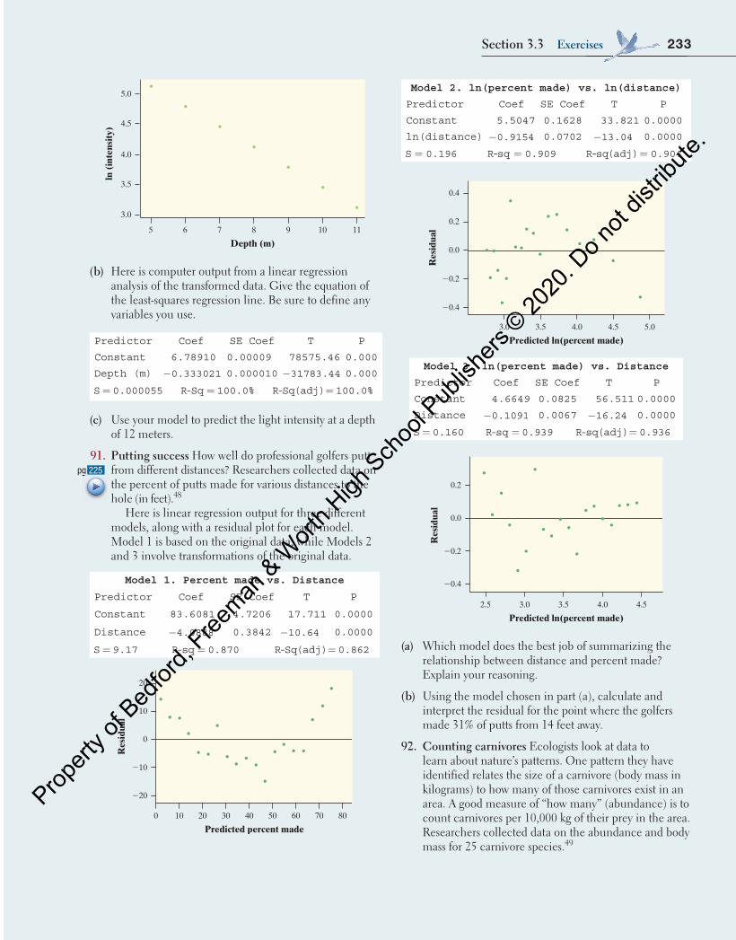
233Section 3.3 Exercises
ln (
inte
nsit
y)
3.0
3.5
4.0
4.5
5.0
11106 7 8 95
Depth (m)
(b) Here is computer output from a linear regression analysis of the transformed data. Give the equation of the least-squares regression line. Be sure to define any variables you use.
Predictor Coef SE Coef T P
Constant 6.78910 0.00009 78575.46 0.000
Depth (m) 0.333021− 0.000010 31783.44− 0.000
S 0.000055= R-Sq 100.0%= R-Sq(adj) 100.0%=
(c) Use your model to predict the light intensity at a depth of 12 meters.
91. putting success How well do professional golfers putt from different distances? Researchers collected data on the percent of putts made for various distances to the hole (in feet). 48
Here is linear regression output for three different models, along with a residual plot for each model. Model 1 is based on the original data, while Models 2 and 3 involve transformations of the original data.
Model 1. Percent made vs. Distance
Predictor Coef SE Coef T P
Constant 83.6081 4.7206 17.711 0.0000
Distance 4.0888− 0.3842 10.64− 0.0000
S 9.17= R-sq 0.870= R-Sq(adj) 0.862=
Res
idua
l
220
210
0
10
20
0 10 20 30 40 50 60 70 80
Predicted percent made
Model 2. ln(percent made) vs. ln(distance)
Predictor Coef SE Coef T P
Constant 5.5047 0.1628 33.821 0.0000
ln(distance) 0.9154− 0.0702 13.04− 0.0000
S 0.196= -R sq 0.909= -R sq(adj) 0.904=
Res
idua
l
20.4
20.2
0.0
0.2
0.4
3.0 3.5 4.0 4.5 5.0
Predicted ln(percent made)
Model 3. ln(percent made) vs. Distance
Predictor Coef SE Coef T P
Constant 4.6649 0.0825 56.511 0.0000
Distance 0.1091− 0.0067 16.24− 0.0000
S 0.160= R-sq 0.939= R-sq(adj) 0.936= R
esid
ual
20.4
20.2
0.0
0.2
2.5 3.0 3.5 4.0 4.5
Predicted ln(percent made)
(a) Which model does the best job of summarizing the relationship between distance and percent made? Explain your reasoning.
(b) Using the model chosen in part (a), calculate and interpret the residual for the point where the golfers made 31% of putts from 14 feet away.
92. Counting carnivores Ecologists look at data to learn about nature’s patterns. One pattern they have identified relates the size of a carnivore (body mass in kilograms) to how many of those carnivores exist in an area. A good measure of “how many” (abundance) is to count carnivores per 10,000 kg of their prey in the area. Researchers collected data on the abundance and body mass for 25 carnivore species. 49
225pgpg
04_StarnesUPDtps6e_26929_ch03_151_246.indd 233 5/20/19 3:21 PM
Propert
y of B
edfor
d, Free
man & W
orth H
igh Sch
ool P
ublish
ers ©
2020
. Do n
ot dis
tribute
.
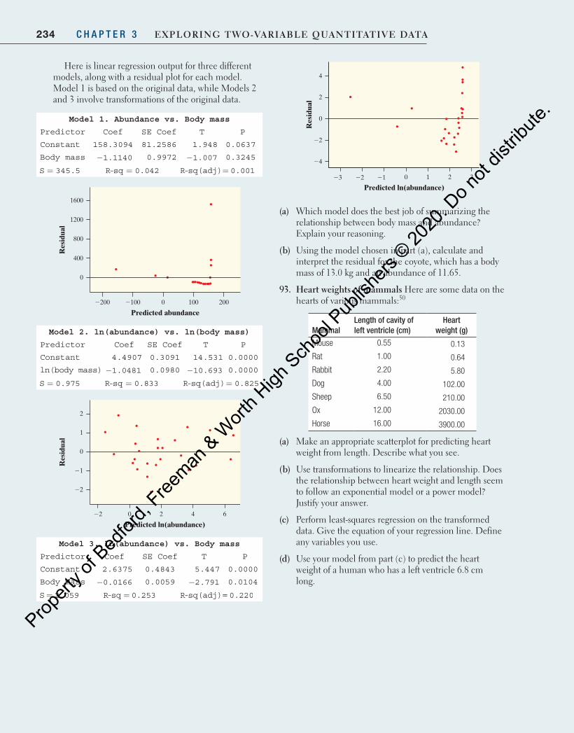
234 C H A P T E R 3 Exploring Two-VariablE QuanTiTaTiVE DaTa
Here is linear regression output for three different models, along with a residual plot for each model. Model 1 is based on the original data, while Models 2 and 3 involve transformations of the original data.
Model 1. Abundance vs. Body mass
Predictor Coef SE Coef T P
Constant 158.3094 81.2586 1.948 0.0637
Body mass 1.1140− 0.9972 1.007− 0.3245
S 345.5= R-sq 0.042= R-sq(adj) 0.001=
Res
idua
l
0
400
800
1200
1600
2200 2100 0 100 200
Predicted abundance
Model 2. ln(abundance) vs. ln(body mass)
Predictor Coef SE Coef T P
Constant 4.4907 0.3091 14.531 0.0000
ln(body mass) 1.0481− 0.0980 10.693− 0.0000
S 0.975= R-sq 0.833= R-sq(adj) 0.825=
Res
idua
l
22
21
0
2
1
22 0 2 4 6
Predicted ln(abundance)
Model 3. ln(abundance) vs. Body mass
Predictor Coef SE Coef T P
Constant 2.6375 0.4843 5.447 0.0000
Body mass 0.0166− 0.0059 2.791− 0.0104
S 2.059= R-sq 0.253= =R-sq(adj) 0.220
Res
idua
l
24
22
0
2
4
23 22 21 0 1 32
Predicted ln(abundance)
(a) Which model does the best job of summarizing the relationship between body mass and abundance? Explain your reasoning.
(b) Using the model chosen in part (a), calculate and interpret the residual for the coyote, which has a body mass of 13.0 kg and an abundance of 11.65.
93. Heart weights of mammals Here are some data on the hearts of various mammals:50
MammalLength of cavity of left ventricle (cm)
Heart weight (g)
Mouse 0.55 0.13
Rat 1.00 0.64
Rabbit 2.20 5.80
Dog 4.00 102.00
Sheep 6.50 210.00
Ox 12.00 2030.00
Horse 16.00 3900.00
(a) Make an appropriate scatterplot for predicting heart weight from length. Describe what you see.
(b) Use transformations to linearize the relationship. Does the relationship between heart weight and length seem to follow an exponential model or a power model? Justify your answer.
(c) Perform least-squares regression on the transformed data. Give the equation of your regression line. Define any variables you use.
(d) Use your model from part (c) to predict the heart weight of a human who has a left ventricle 6.8 cm long.
04_StarnesUPDtps6e_26929_ch03_151_246.indd 234 5/20/19 3:21 PM
Propert
y of B
edfor
d, Free
man & W
orth H
igh Sch
ool P
ublish
ers ©
2020
. Do n
ot dis
tribute
.
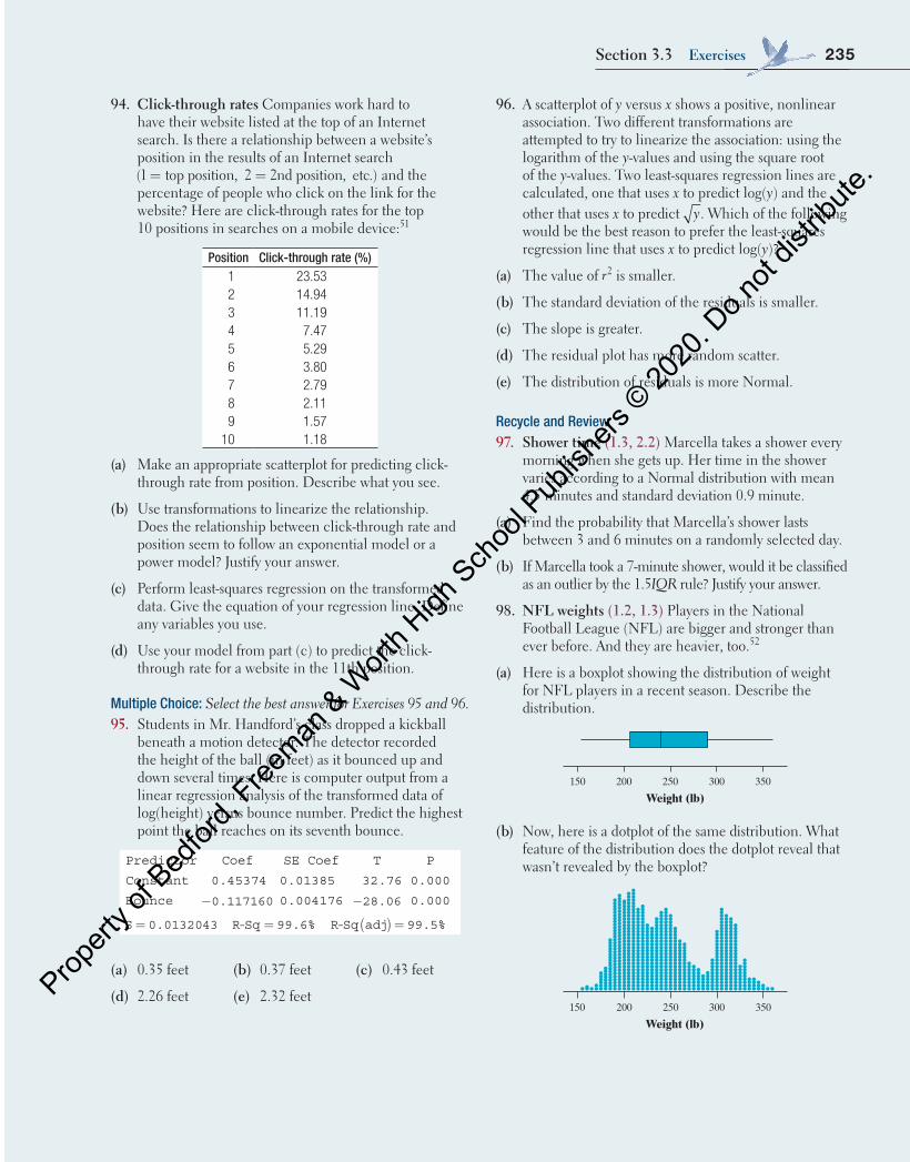
235Section 3.3 Exercises
94. Click-through rates Companies work hard to have their website listed at the top of an Internet search. Is there a relationship between a website’s position in the results of an Internet search
= =(1 top position, 2 2nd position, etc.) and the percentage of people who click on the link for the website? Here are click-through rates for the top 10 positions in searches on a mobile device:51
Position Click-through rate (%)1 23.532 14.943 11.194 7.475 5.296 3.807 2.798 2.119 1.57
10 1.18
(a) Make an appropriate scatterplot for predicting click-through rate from position. Describe what you see.
(b) Use transformations to linearize the relationship. Does the relationship between click-through rate and position seem to follow an exponential model or a power model? Justify your answer.
(c) Perform least-squares regression on the transformed data. Give the equation of your regression line. Define any variables you use.
(d) Use your model from part (c) to predict the click-through rate for a website in the 11th position.
Multiple Choice: Select the best answer for Exercises 95 and 96.95. Students in Mr. Handford’s class dropped a kickball
beneath a motion detector. The detector recorded the height of the ball (in feet) as it bounced up and down several times. Here is computer output from a linear regression analysis of the transformed data of log(height) versus bounce number. Predict the highest point the ball reaches on its seventh bounce.
Predictor Coef SE Coef T P
Constant 0.45374 0.01385 32.76 0.000
Bounce 0.117160− 0.004176 28.06− 0.000
S 0.0132043= R-Sq 99.6%= R-Sq adj 99.5%( ) =
(a) 0.35 feet
(d) 2.26 feet
(b) 0.37 feet
(e) 2.32 feet
(c) 0.43 feet
96. A scatterplot of y versus x shows a positive, nonlinear association. Two different transformations are attempted to try to linearize the association: using the logarithm of the y-values and using the square root of the y-values. Two least-squares regression lines are calculated, one that uses x to predict log(y) and the other that uses x to predict y. Which of the following would be the best reason to prefer the least-squares regression line that uses x to predict log(y)?
(a) The value of r2 is smaller.
(b) The standard deviation of the residuals is smaller.
(c) The slope is greater.
(d) The residual plot has more random scatter.
(e) The distribution of residuals is more Normal.
Recycle and Review97. Shower time (1.3, 2.2) Marcella takes a shower every
morning when she gets up. Her time in the shower varies according to a Normal distribution with mean 4.5 minutes and standard deviation 0.9 minute.
(a) Find the probability that Marcella’s shower lasts between 3 and 6 minutes on a randomly selected day.
(b) If Marcella took a 7-minute shower, would it be classified as an outlier by the 1.5IQR rule? Justify your answer.
98. nFl weights (1.2, 1.3) Players in the National Football League (NFL) are bigger and stronger than ever before. And they are heavier, too.52
(a) Here is a boxplot showing the distribution of weight for NFL players in a recent season. Describe the distribution.
150 200 250 300 350
Weight (lb)
(b) Now, here is a dotplot of the same distribution. What feature of the distribution does the dotplot reveal that wasn’t revealed by the boxplot?
150 200 250 300 350
Weight (lb)
04_StarnesUPDtps6e_26929_ch03_151_246.indd 235 5/20/19 3:21 PM
Propert
y of B
edfor
d, Free
man & W
orth H
igh Sch
ool P
ublish
ers ©
2020
. Do n
ot dis
tribute
.

Chapter 3 Wrap-Up
(a) Briefly describe the association shown in the scatterplot.
(b) The equation of the least-squares regression line for these data is y x= +ˆ 180.8 15.8 . Interpret the slope of the line in the context of the study.
(c) Calculate and interpret the residual for the flower that had 2 tablespoons of sugar and looked fresh for 204 hours.
(d) Suppose that another group of students con-ducted a similar experiment using 12 flowers, but included different varieties in addition to carna-tions. Would you expect the value of r2 for the second group’s data to be greater than, less than, or about the same as the value of r2 for the first group’s data? Explain.
After you finish, you can view two example solutions on the book’s website (highschool.bfwpub.com/updatedtps6e). Determine whether you think each solution is “complete,” “substantial,” “developing,” or “minimal.” If the solution is not complete, what improvements would you suggest to the student who wrote it? Finally, your teacher will provide you with a scoring rubric. Score your response and note what, if anything, you would do differently to improve your own score.
The following problem is modeled after actual AP® Statistics exam free response questions. Your task is to generate a complete, con-cise response in 15 minutes.
Directions: Show all your work. Indicate clearly the meth-ods you use, because you will be scored on the correctness of your methods as well as on the accuracy and complete-ness of your results and explanations.
Two statistics students went to a flower shop and ran-domly selected 12 carnations. When they got home, the students prepared 12 identical vases with exactly the same amount of water in each vase. They put one tablespoon of sugar in 3 vases, two tablespoons of sugar in 3 vases, and three tablespoons of sugar in 3 vases. In the remaining 3 vases, they put no sugar. After the vases were prepared, the students randomly assigned 1 carnation to each vase and observed how many hours each flower continued to look fresh. A scatterplot of the data is shown below.
Amount of sugar (tbsp)
Fres
hnes
s (h
)
220
210
190
200
180
170
160
240
230
0 1 2 3
FRAPPY! FREE RESPONSE AP® PROBLEM, YAY!
Chapter 3 ReviewSection 3.1: Scatterplots and CorrelationIn this section, you learned how to explore the relationship between two quantitative variables. As with distributions of a single variable, the first step is always to make a graph.
A scatterplot is the appropriate type of graph to investigate relationships between two quantitative variables. To describe a scatterplot, be sure to discuss four characteristics: direc-tion, form, strength, and unusual features. The direction of a
236
04_StarnesUPDtps6e_26929_ch03_151_246.indd 236 03/06/19 10:20 AM
Propert
y of B
edfor
d, Free
man & W
orth H
igh Sch
ool P
ublish
ers ©
2020
. Do n
ot dis
tribute
.
in the y variable that is accounted for by the least-squares regression line.
You also learned how to obtain the equation of a least-squares regression line from computer output and from summary statistics (the means and standard deviations of two variables and their correlation). As with the correlation, the equation of the least-squares regression line and the val-ues of s and r2 can be greatly affected by influential points, such as outliers and points with high leverage. Make sure to plot the data and note any unusual points before making any calculations.
Section 3.3: Transforming to Achieve LinearityWhen the association between two variables is nonlinear, transforming one or both of the variables can result in a linear association.
If the association between two variables follows a power model in the form y ax ,p= there are several transforma-tions that will result in a linear association.• Raise the values of x to the power of p and plot y
versus xp.• Calculate the pth root of the y-values and plot yp
versus x.• Calculate the logarithms of the x-values and the
y-values, and plot log(y) versus log(x) or ln(y) versus ln(x).If the association between two variables follows an exponen-tial model in the form y ab ,x= transform the data by com-puting the logarithms of the y-values and plot log(y) versus x or ln(y) versus x.
Once you have achieved linearity, calculate the equation of the least-squares regression line using the transformed data. Remember to include the transformed variables when you are writing the equation of the line. Likewise, when using the line to make predictions, make sure that the pre-diction is in the original units of y. If you transformed the y variable, you will need to undo the transformation after using the least-squares regression line.
To decide which of two or more models is most appro-priate, choose the one that produces the most linear associ-ation and whose residual plot has the most random scatter. If more than one residual plot is randomly scattered, choose the model with the value of r2 closest to 1.
relationship might be positive, negative, or neither. The form of a relationship can be linear or nonlinear. A relationship is strong if it closely follows a specific form. Finally, unusual fea-tures include points that clearly fall outside the pattern of the rest of the data and distinct clusters of points.
The correlation r is a numerical summary for linear rela-tionships that describes the direction and strength of the asso-ciation. When r > 0, the association is positive, and when r < 0, the association is negative. The correlation will always take values between 1− and 1, with r = −1 and r = 1 indicat-ing a perfectly linear relationship. Strong linear relationships have correlations near 1 or 1− , while weak linear relation-ships have correlations near 0. It isn’t possible to determine the form of a relationship from only the correlation. Strong nonlinear relationships can have a correlation close to 1 or a correlation close to 0. You also learned that unusual points can greatly affect the value of the correlation and that correla-tion does not imply causation. That is, we can’t assume that changes in one variable cause changes in the other variable, just because they have a correlation close to 1 or 1− .
Section 3.2: Least-Squares RegressionIn this section, you learned how to use least-squares regres-sion lines as models for relationships between two quantita-tive variables that have a linear association. It is important to understand the difference between the actual data and the model used to describe the data. To emphasize that the model only provides predicted values, least-squares regres-sion lines are always expressed in terms of y instead of y. Likewise, when you are interpreting the slope of a least-squares regression line, describe the change in the predicted value of y.
The difference between the actual value of y and the pre-dicted value of y is called a residual. Residuals are the key to understanding almost everything in this section. To find the equation of the least-squares regression line, find the line that minimizes the sum of the squared residuals. To see if a linear model is appropriate, make a residual plot. If there is no leftover curved pattern in the residual plot, you know the model is appropriate. To assess how well a line fits the data, calculate the standard deviation of the residuals s to estimate the size of a typical prediction error. You can also calculate r2, which measures the percent of the variation
Chapter 3 review 237
Learning Target SectionRelated Example
on Page(s)Relevant Chapter Review
Exercise(s)
Distinguish between explanatory and response variables for quantitative data.
3.1 154 R3.4
Make a scatterplot to display the relationship between two quantitative variables.
3.1 155 R3.4
What Did You Learn?
04_StarnesUPDtps6e_26929_ch03_151_246.indd 237 5/20/19 3:21 PM
Propert
y of B
edfor
d, Free
man & W
orth H
igh Sch
ool P
ublish
ers ©
2020
. Do n
ot dis
tribute
.
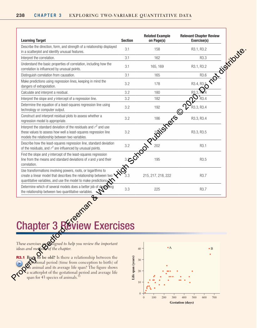
238 C H A P T E R 3 Exploring Two-VariablE QuanTiTaTiVE DaTa
Chapter 3 Review Exercises These exercises are designed to help you review the important ideas and methods of the chapter.
R3.1 born to be old? Is there a relationship between the gestational period (time from conception to birth) of an animal and its average life span? The figure shows a scatterplot of the gestational period and average life span for 43 species of animals. 53
0
10
20
30
40
Lif
e sp
an (
year
s)
Gestation (days)
A B
7000 100 200 300 400 500 600
Learning Target Section Related Example
on Page(s) Relevant Chapter Review
Exercise(s)
Describe the direction, form, and strength of a relationship displayed in a scatterplot and identify unusual features.
3.1 158 R3.1, R3.2
Interpret the correlation. 3.1 162 R3.3
Understand the basic properties of correlation, including how the correlation is influenced by unusual points.
3.1 165 , 169 R3.1, R3.2
Distinguish correlation from causation. 3.1 165 R3.6
Make predictions using regression lines, keeping in mind the dangers of extrapolation.
3.2 178 R3.4, R3.5
Calculate and interpret a residual. 3.2 180 R3.3, R3.4
Interpret the slope and y intercept of a regression line. 3.2 182 R3.4
Determine the equation of a least-squares regression line using technology or computer output.
3.2 192 R3.3, R3.4
Construct and interpret residual plots to assess whether a regression model is appropriate.
3.2 186 R3.3, R3.4
Interpret the standard deviation of the residuals and r 2 and use these values to assess how well a least-squares regression line models the relationship between two variables.
3.2 191 R3.3, R3.5
Describe how the least-squares regression line, standard deviation of the residuals, and r 2 are influenced by unusual points.
3.2 202 R3.1
Find the slope and y intercept of the least-squares regression line from the means and standard deviations of x and y and their correlation.
3.2 195 R3.5
Use transformations involving powers, roots, or logarithms to create a linear model that describes the relationship between two quantitative variables, and use the model to make predictions.
3.3 215, 217, 218, 222 R3.7
Determine which of several models does a better job of describing the relationship between two quantitative variables.
3.3 225 R3.7
04_StarnesUPDtps6e_26929_ch03_151_246.indd 238 5/20/19 3:21 PM
Propert
y of B
edfor
d, Free
man & W
orth H
igh Sch
ool P
ublish
ers ©
2020
. Do n
ot dis
tribute
.
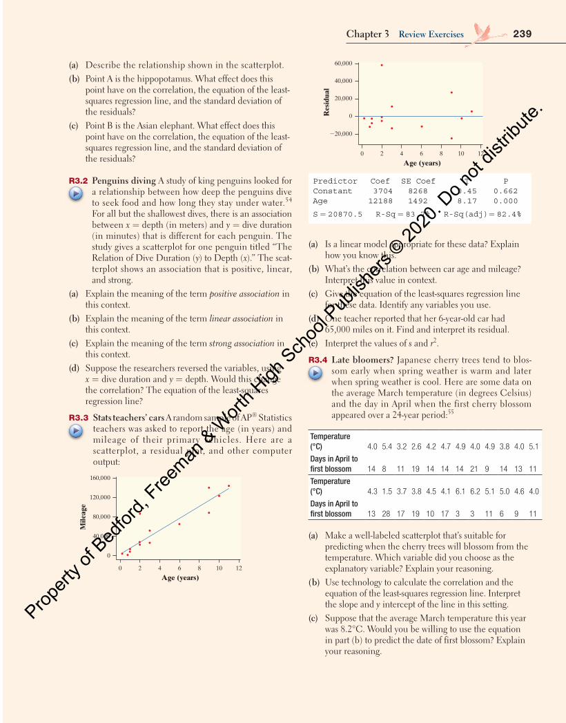
160,000
120,000
80,000
40,000
0
0 2 4 6 8 10 12
Age (years)
Mile
age
60,000
40,000
20,000
0
220,000
0 2 4 6 8 10 12
Age (years)
Res
idua
l
Predictor Coef SE Coef T PConstant Age
3704 8268 0.45 0.66212188 1492 8.17 0.000
R-Sq(adj) = 82.4%R-Sq = 83.7%S = 20870.5
(a) Is a linear model appropriate for these data? Explain how you know this.
(b) What’s the correlation between car age and mileage? Interpret this value in context.
(c) Give the equation of the least-squares regression line for these data. Identify any variables you use.
(d) One teacher reported that her 6-year-old car had 65,000 miles on it. Find and interpret its residual.
(e) Interpret the values of s and r 2 .
R3.4 late bloomers? Japanese cherry trees tend to blos-som early when spring weather is warm and later when spring weather is cool. Here are some data on the average March temperature (in degrees Celsius) and the day in April when the first cherry blossom appeared over a 24-year period: 55
Temperature (°C) 4.0 5.4 3.2 2.6 4.2 4.7 4.9 4.0 4.9 3.8 4.0 5.1
Days in April to first blossom 14 8 11 19 14 14 14 21 9 14 13 11
Temperature (°C) 4.3 1.5 3.7 3.8 4.5 4.1 6.1 6.2 5.1 5.0 4.6 4.0
Days in April to first blossom 13 28 17 19 10 17 3 3 11 6 9 11
(a) Make a well-labeled scatterplot that’s suitable for predicting when the cherry trees will blossom from the temperature. Which variable did you choose as the explanatory variable? Explain your reasoning.
(b) Use technology to calculate the correlation and the equation of the least-squares regression line. Interpret the slope and y intercept of the line in this setting.
(c) Suppose that the average March temperature this year was 8.2°C. Would you be willing to use the equation in part (b) to predict the date of first blossom? Explain your reasoning.
(a) Describe the relationship shown in the scatterplot. (b) Point A is the hippopotamus. What effect does this
point have on the correlation, the equation of the least-squares regression line, and the standard deviation of the residuals?
(c) Point B is the Asian elephant. What effect does this point have on the correlation, the equation of the least-squares regression line, and the standard deviation of the residuals?
R3.2 penguins diving A study of king penguins looked for a relationship between how deep the penguins dive to seek food and how long they stay under water. 54
For all but the shallowest dives, there is an association between x = depth (in meters) and y = dive duration (in minutes) that is different for each penguin. The study gives a scatterplot for one penguin titled “The Relation of Dive Duration ( y ) to Depth ( x ).” The scat-terplot shows an association that is positive, linear, and strong.
(a) Explain the meaning of the term positive association in this context.
(b) Explain the meaning of the term linear association in this context.
(c) Explain the meaning of the term strong association in this context.
(d) Suppose the researchers reversed the variables, using x = dive duration and y = depth. Would this change the correlation? The equation of the least-squares regression line?
R3.3 Stats teachers’ cars A random sample of AP ® Statistics teachers was asked to report the age (in years) and mileage of their primary vehicles. Here are a scatterplot, a residual plot, and other computer output:
160,000
120,000
80,000
40,000
0
0 2 4 6 8 10 12
Age (years)
Mile
age
60,000
40,000
20,000
0
220,000
0 2 4 6 8 10 12
Age (years)
Res
idua
l
Predictor Coef SE Coef T PConstant Age
3704 8268 0.45 0.66212188 1492 8.17 0.000
R-Sq(adj) = 82.4%R-Sq = 83.7%S = 20870.5
Chapter 3 review Exercises 239
04_StarnesUPDtps6e_26929_ch03_151_246.indd 239 5/20/19 3:21 PM
Propert
y of B
edfor
d, Free
man & W
orth H
igh Sch
ool P
ublish
ers ©
2020
. Do n
ot dis
tribute
.

240 C H A P T E R 3 Exploring Two-VariablE QuanTiTaTiVE DaTa
Model 1. Price vs. Weight
Predictor Coef SE Coef T P
Constant −98666 7594.1 −12.992 0.0000
Weight 105932 4219.5 25.105 0.0000
S = 34073 R-sq = 0.873 R-sq(adj) = 0.871
Res
idua
l
240,000
0
40,000
80,000
1 2 3 4
Weight
Model 2. ln(price) vs. ln(weight)
Predictor Coef SE Coef T P
Constant 9.7062 0.0209 465.102 0.0000
ln(weight) 2.2913 0.0332 68.915 0.0000
S = 0.171 R-sq = 0.981 R-sq(adj) = 0.981
Res
idua
l
20.4
20.2
0.0
0.2
0.4
21.0 0.0 1.0
ln(weight)
Model 3. ln(price) vs. Weight
Predictor Coef SE Coef T P
Constant 8.2709 0.0988 83.716 0.0000
Weight 1.3791 0.0549 25.123 0.0000
S = 0.443 R-sq = 0.873 R-sq(adj) = 0.871
Res
idua
l
21.6
21.2
20.8
20.4
0.0
0.4
1.0 2.0 3.0 4.0
Weight
(a) Use each of the three models to predict the price of a diamond of this type that weighs 2 carats.
(b) Which model does the best job of summarizing the relationship between weight and price? Explain your reasoning.
(d) Calculate and interpret the residual for the year when the average March temperature was 4.5°C.
(e) Use technology to help construct a residual plot. Describe what you see.
R3.5 what’s my grade? In Professor Friedman’s economics course, the correlation between the students’ total scores prior to the final examination and their final exam scores is r = 0.6. The pre-exam totals for all students in the course have mean 280 and standard deviation 30. The final exam scores have mean 75 and standard deviation 8. Professor Friedman has lost Julie’s final exam but knows that her total before the exam was 300. He decides to pre-dict her final exam score from her pre-exam total.
(a) Find the equation for the least-squares regression line Professor Friedman should use to make this prediction.
(b) Use the least-squares regression line to predict Julie’s final exam score.
(c) Explain the meaning of the phrase “least squares” in the context of this question.
(d) Julie doesn’t think this method accurately predicts how well she did on the final exam. Determine r 2 . Use this result to argue that her actual score could have been much higher (or much lower) than the predicted value.
R3.6 Calculating achievement The principal of a high school read a study that reported a high correlation between the number of calculators owned by high school students and their math achievement. Based on this study, he decides to buy each student at his school two calculators, hoping to improve their math achieve-ment. Explain the flaw in the principal’s reasoning.
R3.7 Diamonds! Diamonds are expensive, especially big ones. To create a model to predict price from size, the weight (in carats) and price (in dollars) was recorded for each of 94 round, clear, internally flawless dia-monds with excellent cuts. 56
Here is linear regression output for three different models, along with a residual plot for each model. Model 1 is based on the original data, while Models 2 and 3 involve transformations of the original data.
04_StarnesUPDtps6e_26929_ch03_151_246.indd 240 5/20/19 3:21 PM
Propert
y of B
edfor
d, Free
man & W
orth H
igh Sch
ool P
ublish
ers ©
2020
. Do n
ot dis
tribute
.
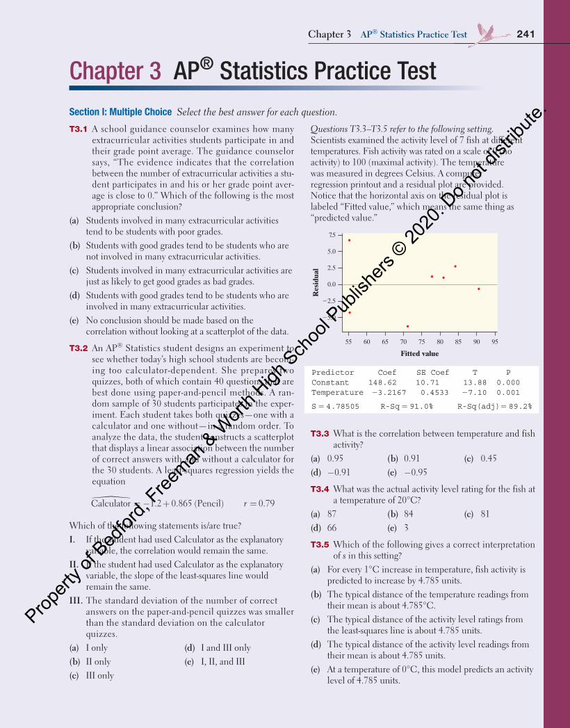
Chapter 3 AP® Statistics Practice TestSection I: Multiple Choice Select the best answer for each question.
T3.1 A school guidance counselor examines how many extracurricular activities students participate in and their grade point average. The guidance counselor says, “The evidence indicates that the correlation between the number of extracurricular activities a stu-dent participates in and his or her grade point aver-age is close to 0.” Which of the following is the most appropriate conclusion?
(a) Students involved in many extracurricular activities tend to be students with poor grades.
(b) Students with good grades tend to be students who are not involved in many extracurricular activities.
(c) Students involved in many extracurricular activities are just as likely to get good grades as bad grades.
(d) Students with good grades tend to be students who are involved in many extracurricular activities.
(e) No conclusion should be made based on the correlation without looking at a scatterplot of the data.
T3.2 An AP® Statistics student designs an experiment to see whether today’s high school students are becom-ing too calculator-dependent. She prepares two quizzes, both of which contain 40 questions that are best done using paper-and-pencil methods. A ran-dom sample of 30 students participates in the exper-iment. Each student takes both quizzes—one with a calculator and one without—in a random order. To analyze the data, the student constructs a scatterplot that displays a linear association between the number of correct answers with and without a calculator for the 30 students. A least-squares regression yields the equation
r� = − + =Calculator 1.2 0.865 (Pencil) 0.79
Which of the following statements is/are true?i. If the student had used Calculator as the explanatory
variable, the correlation would remain the same.ii. If the student had used Calculator as the explanatory
variable, the slope of the least-squares line would remain the same.
iii. The standard deviation of the number of correct answers on the paper-and-pencil quizzes was smaller than the standard deviation on the calculator quizzes.
(a) I only(b) II only(c) III only
(d) I and III only(e) I, II, and III
Questions T3.3–T3.5 refer to the following setting. Scientists examined the activity level of 7 fish at different temperatures. Fish activity was rated on a scale of 0 (no activity) to 100 (maximal activity). The temperature was measured in degrees Celsius. A computer regression printout and a residual plot are provided. Notice that the horizontal axis on the residual plot is labeled “Fitted value,” which means the same thing as “predicted value.”
Fitted value
Res
idua
l
7.5
5.0
2.5
0.0
22.5
25.0
55 60 65 70 75 80 85 90 95
Predictor Coef SE Coef T PConstant 148.62 10.71 13.88 0.000Temperature −3.2167 0.4533 −7.10 0.001
S = 4.78505 R-Sq(adj) = 89.2%R-Sq = 91.0%
T3.3 What is the correlation between temperature and fish activity?
(a) 0.95(d) −0.91
(b) 0.91(e) −0.95
(c) 0.45
T3.4 What was the actual activity level rating for the fish at a temperature of 20°C?
(a) 87(d) 66
(b) 84(e) 3
(c) 81
T3.5 Which of the following gives a correct interpretation of s in this setting?
(a) For every 1°C increase in temperature, fish activity is predicted to increase by 4.785 units.
(b) The typical distance of the temperature readings from their mean is about 4.785°C.
(c) The typical distance of the activity level ratings from the least-squares line is about 4.785 units.
(d) The typical distance of the activity level readings from their mean is about 4.785 units.
(e) At a temperature of 0°C, this model predicts an activity level of 4.785 units.
Chapter 3 ap® Statistics practice Test 241
04_StarnesUPDtps6e_26929_ch03_151_246.indd 241 5/20/19 3:21 PM
Propert
y of B
edfor
d, Free
man & W
orth H
igh Sch
ool P
ublish
ers ©
2020
. Do n
ot dis
tribute
.
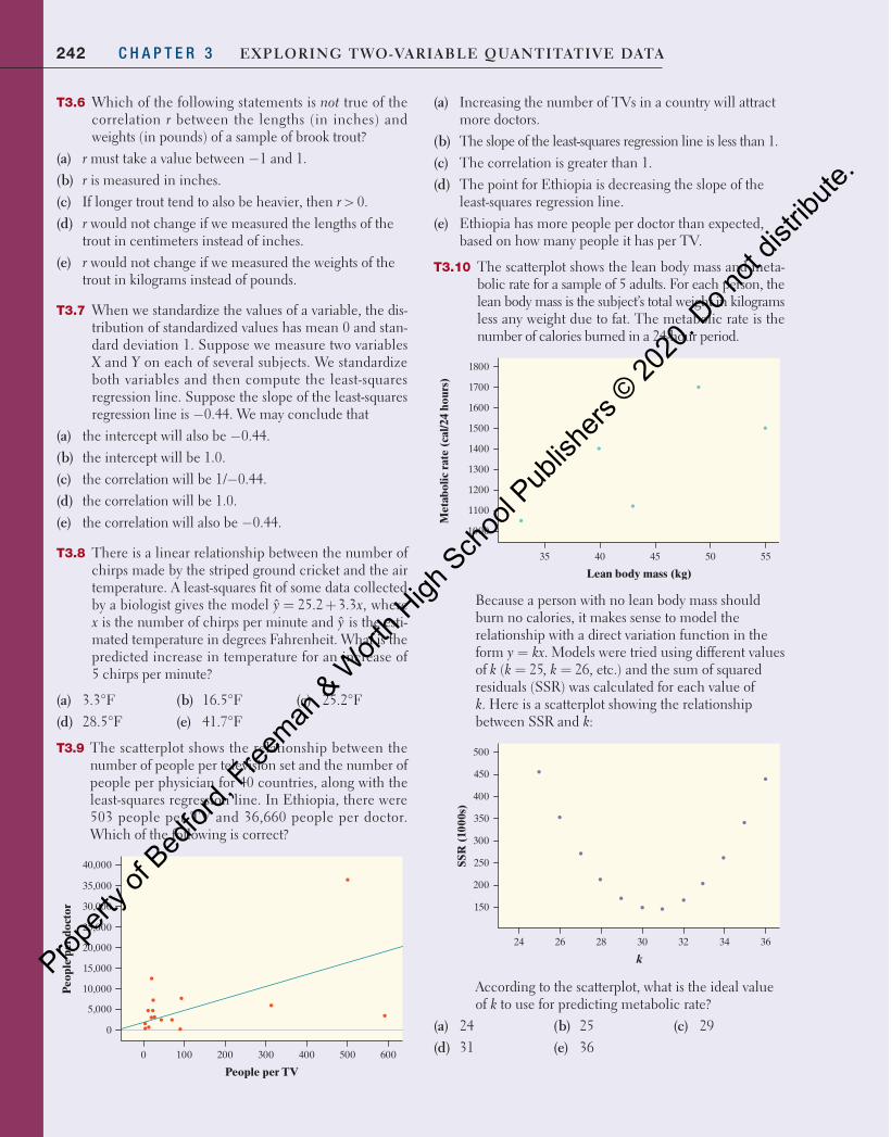
242 C H A P T E R 3 Exploring Two-VariablE QuanTiTaTiVE DaTa
T3.6 Which of the following statements is not true of the correlation r between the lengths (in inches) and weights (in pounds) of a sample of brook trout?
(a) r must take a value between −1 and 1.(b) r is measured in inches.(c) If longer trout tend to also be heavier, then r > 0.(d) r would not change if we measured the lengths of the
trout in centimeters instead of inches.(e) r would not change if we measured the weights of the
trout in kilograms instead of pounds.
T3.7 When we standardize the values of a variable, the dis-tribution of standardized values has mean 0 and stan-dard deviation 1. Suppose we measure two variables X and Y on each of several subjects. We standardize both variables and then compute the least-squares regression line. Suppose the slope of the least-squares regression line is −0.44. We may conclude that
(a) the intercept will also be −0.44.(b) the intercept will be 1.0.(c) the correlation will be 1/−0.44.(d) the correlation will be 1.0.(e) the correlation will also be −0.44.
T3.8 There is a linear relationship between the number of chirps made by the striped ground cricket and the air temperature. A least-squares fit of some data collected by a biologist gives the model = +ˆ 25.2 3.3 ,y x where x is the number of chirps per minute and y is the esti-mated temperature in degrees Fahrenheit. What is the predicted increase in temperature for an increase of 5 chirps per minute?
(a) 3.3°F(d) 28.5°F
(b) 16.5°F(e) 41.7°F
(c) 25.2°F
T3.9 The scatterplot shows the relationship between the number of people per television set and the number of people per physician for 40 countries, along with the least-squares regression line. In Ethiopia, there were 503 people per TV and 36,660 people per doctor. Which of the following is correct?
0
10,000
5,000
20,000
15,000
30,000
25,000
35,000
40,000
0 100 200 300 400 500 600
People per TV
Peo
ple
per
doct
or
(a) Increasing the number of TVs in a country will attract more doctors.
(b) The slope of the least-squares regression line is less than 1.(c) The correlation is greater than 1.(d) The point for Ethiopia is decreasing the slope of the
least-squares regression line.(e) Ethiopia has more people per doctor than expected,
based on how many people it has per TV.
T3.10 The scatterplot shows the lean body mass and meta-bolic rate for a sample of 5 adults. For each person, the lean body mass is the subject’s total weight in kilograms less any weight due to fat. The metabolic rate is the number of calories burned in a 24-hour period.
1000
1100
1300
1500
1700
1200
1400
1600
1800
35 55504540
Lean body mass (kg)
Met
abol
ic r
ate
(cal
/24
hour
s)
Because a person with no lean body mass should burn no calories, it makes sense to model the relationship with a direct variation function in the form = .y kx Models were tried using different values of ( 25, 26, etc.)= =k k k and the sum of squared residuals (SSR) was calculated for each value of k. Here is a scatterplot showing the relationship between SSR and k:
500
450
400
350
300
250
200
150
24 26 28 30 32 34 36
k
SSR
(10
00s)
According to the scatterplot, what is the ideal value of k to use for predicting metabolic rate?
(a) 24(d) 31
(b) 25(e) 36
(c) 29
04_StarnesUPDtps6e_26929_ch03_151_246.indd 242 5/20/19 3:21 PM
Propert
y of B
edfor
d, Free
man & W
orth H
igh Sch
ool P
ublish
ers ©
2020
. Do n
ot dis
tribute
.
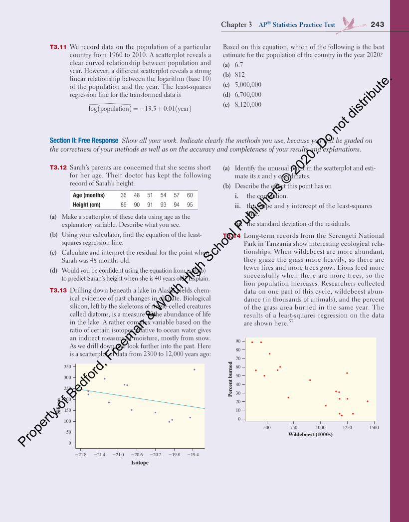
T3.11 We record data on the population of a particular country from 1960 to 2010. A scatterplot reveals a clear curved relationship between population and year. However, a different scatterplot reveals a strong linear relationship between the logarithm (base 10) of the population and the year. The least-squares regression line for the transformed data is
( ) ( )= − +log population 13.5 0.01 year�
Based on this equation, which of the following is the best estimate for the population of the country in the year 2020?(a) 6.7(b) 812(c) 5,000,000(d) 6,700,000(e) 8,120,000
Section II: Free Response Show all your work. Indicate clearly the methods you use, because you will be graded on the correctness of your methods as well as on the accuracy and completeness of your results and explanations.
T3.12 Sarah’s parents are concerned that she seems short for her age. Their doctor has kept the following record of Sarah’s height:
Age (months) 36 48 51 54 57 60
Height (cm) 86 90 91 93 94 95
(a) Make a scatterplot of these data using age as the explanatory variable. Describe what you see.
(b) Using your calculator, find the equation of the least-squares regression line.
(c) Calculate and interpret the residual for the point when Sarah was 48 months old.
(d) Would you be confident using the equation from part (b) to predict Sarah’s height when she is 40 years old? Explain.
T3.13 Drilling down beneath a lake in Alaska yields chem-ical evidence of past changes in climate. Biological silicon, left by the skeletons of single-celled creatures called diatoms, is a measure of the abundance of life in the lake. A rather complex variable based on the ratio of certain isotopes relative to ocean water gives an indirect measure of moisture, mostly from snow. As we drill down, we look further into the past. Here is a scatterplot of data from 2300 to 12,000 years ago:
350
300
250
200
150
100
50
0
221.8 221.4 221.0 220.6 220.2 219.8 219.4
Isotope
Silic
on
(a) Identify the unusual point in the scatterplot and esti-mate its x and y coordinates.
(b) Describe the effect this point has on i. the correlation. ii. the slope and y intercept of the least-squares
line. iii. the standard deviation of the residuals.
T3.14 Long-term records from the Serengeti National Park in Tanzania show interesting ecological rela-tionships. When wildebeest are more abundant, they graze the grass more heavily, so there are fewer fires and more trees grow. Lions feed more successfully when there are more trees, so the lion population increases. Researchers collected data on one part of this cycle, wildebeest abun-dance (in thousands of animals), and the percent of the grass area burned in the same year. The results of a least-squares regression on the data are shown here.57
150012501000750500
40
30
20
10
0
210
220
230
Wildebeest (1000s)
Res
idua
l
0
500 750
Wildebeest (1000s)1000 1250 1500
10
20
30
40
50
60
Per
cent
bur
ned
70
80
90
PredictorConstantWildebeest(1000s)
Coef SE Coef92.29 10.06
20.05762 0.01035
T P9.17 0.000
0.00125.56
S = 15.9880 R-Sq = 64.6% R-Sq(adj) = 62.5%
Chapter 3 ap® Statistics practice Test 243
04_StarnesUPDtps6e_26929_ch03_151_246.indd 243 5/20/19 3:21 PM
Propert
y of B
edfor
d, Free
man & W
orth H
igh Sch
ool P
ublish
ers ©
2020
. Do n
ot dis
tribute
.
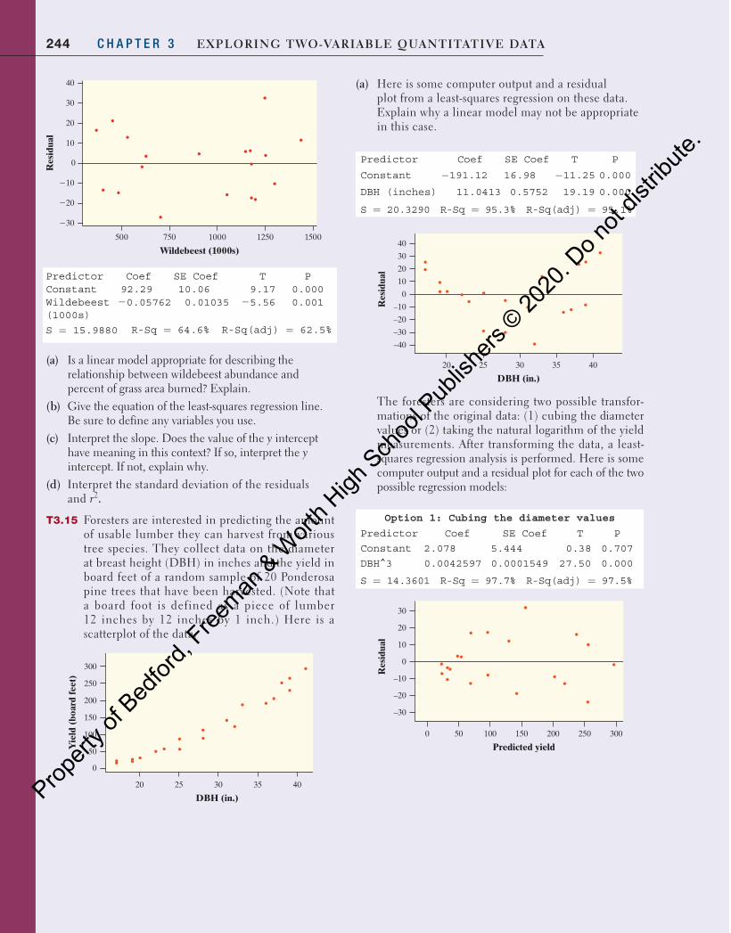
244 C H A P T E R 3 Exploring Two-VariablE QuanTiTaTiVE DaTa
150012501000750500
40
30
20
10
0
210
220
230
Wildebeest (1000s)
Res
idua
l
0
500 750
Wildebeest (1000s)1000 1250 1500
10
20
30
40
50
60
Per
cent
bur
ned
70
80
90
PredictorConstantWildebeest(1000s)
Coef SE Coef92.29 10.06
20.05762 0.01035
T P9.17 0.000
0.00125.56
S = 15.9880 R-Sq = 64.6% R-Sq(adj) = 62.5%
(a) Is a linear model appropriate for describing the relationship between wildebeest abundance and percent of grass area burned? Explain.
(b) Give the equation of the least-squares regression line. Be sure to define any variables you use.
(c) Interpret the slope. Does the value of the y intercept have meaning in this context? If so, interpret the y intercept. If not, explain why.
(d) Interpret the standard deviation of the residuals and r2.
T3.15 Foresters are interested in predicting the amount of usable lumber they can harvest from various tree species. They collect data on the diameter at breast height (DBH) in inches and the yield in board feet of a random sample of 20 Ponderosa pine trees that have been harvested. (Note that a board foot is defined as a piece of lumber 12 inches by 12 inches by 1 inch.) Here is a scatterplot of the data.
Yie
ld (
boar
d fe
et)
0
300
250
200
150
100
50
403520 25 30
DBH (in.)
(a) Here is some computer output and a residual plot from a least-squares regression on these data. Explain why a linear model may not be appropriate in this case.
Predictor Coef SE Coef T P
Constant −191.12 16.98 −11.25 0.000
DBH (inches) 11.0413 0.5752 19.19 0.000
S = 20.3290 R-Sq = 95.3% R-Sq(adj) = 95.1%
Res
idua
l
–40
–30
40
20
30
10
0
–10
–20
403520 25 30
DBH (in.)
The foresters are considering two possible transfor-mations of the original data: (1) cubing the diameter values or (2) taking the natural logarithm of the yield measurements. After transforming the data, a least-squares regression analysis is performed. Here is some computer output and a residual plot for each of the two possible regression models:
Option 1: Cubing the diameter values
Predictor Coef SE Coef T P
Constant 2.078 5.444 0.38 0.707
DBH^3 0.0042597 0.0001549 27.50 0.000
S = 14.3601 R-Sq = 97.7% R-Sq(adj) = 97.5%
Res
idua
l
–30
30
20
10
0
–10
–20
3000 50 100 150 200 250
Predicted yield
04_StarnesUPDtps6e_26929_ch03_151_246.indd 244 5/20/19 3:21 PM
Propert
y of B
edfor
d, Free
man & W
orth H
igh Sch
ool P
ublish
ers ©
2020
. Do n
ot dis
tribute
.
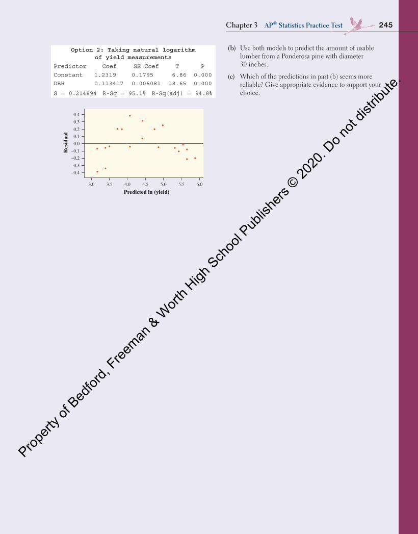
(b) Use both models to predict the amount of usable lumber from a Ponderosa pine with diameter 30 inches.
(c) Which of the predictions in part (b) seems more reliable? Give appropriate evidence to support your choice.
Option 2: Taking natural logarithm of yield measurements
Predictor Coef SE Coef T P
Constant 1.2319 0.1795 6.86 0.000
DBH 0.113417 0.006081 18.65 0.000
S = 0.214894 R-Sq = 95.1% R-Sq(adj) = 94.8%
Res
idua
l
–0.4
0.4
0.3
0.2
0.1
0.0
–0.2
–0.1
–0.3
6.03.0 3.5 4.0 4.5 5.0 5.5
Predicted ln (yield)
245Chapter 3 AP® Statistics Practice Test
04_StarnesUPDtps6e_26929_ch03_151_246.indd 245 03/06/19 1:40 PM
Propert
y of B
edfor
d, Free
man & W
orth H
igh Sch
ool P
ublish
ers ©
2020
. Do n
ot dis
tribute
.

246 C H A P T E R 3 Exploring Two-VariablE QuanTiTaTiVE DaTa
Chapter 3 Project Investigating Relationships in Baseball
What is a better predictor of the number of wins for a baseball team, the number of runs scored by the team or the number of runs they allow the other team to score? What variables can we use to predict the number of runs a team scores? To predict the number of runs it allows the other team to score? In this proj-ect, you will use technology to help answer these questions by exploring a large set of data from Major League Baseball.
part 1
1. Download the “MLB Team Data 2012–2016” Excel file from the book’s website, along with the “Glossary for MLB Team Data file,” which explains each of the variables included in the data set.58 Import the data into the statisti-cal software package you prefer.
2. Create a scatterplot to investigate the relationship between runs scored per game (R/G) and wins (W). Then calcu-late the equation of the least-squares regression line, the standard deviation of the residuals, and r2. Note: R/G is in the section for hitting statistics and W is in the section for pitching statistics.
3. Create a scatterplot to investigate the relationship between runs allowed per game (RA/G) and wins (W). Then calcu-late the equation of the least-squares regression line, the standard deviation of the residuals, and r2. Note: Both of these variables may be found in the section for pitching statistics.
4. Compare the two associations. Is runs scored or runs allowed a better predictor of wins? Explain your reasoning.
5. Because the number of wins a team has is dependent on both how many runs they score and how many runs they allow, we can use a combination of both variables to pre-dict the number of wins. Add a column in your data table for a new variable, run differential. Fill in the values using the formula R/G – RA/G.
6. Create a scatterplot to investigate the relationship between run differential and wins. Then calculate the equation of the least-squares regression line, the standard deviation of the residuals, and r2.
7. Is run differential a better predictor than the variable you chose in Question 4? Explain your reasoning.
part 2
It is fairly clear that the number of games a team wins is depen-dent on both runs scored and runs allowed. But what variables help predict runs scored? Runs allowed?
1. Choose either runs scored (R) or runs allowed (RA) as the response variable you will try to model.
2. Choose at least three different explanatory variables (or combinations of explanatory variables) that might help predict the response variable you chose in Question 1. Create a scatterplot using each explanatory variable. Then calculate the equation of the least-squares regression line, the standard deviation of the residuals, and r2 for each relationship.
3. Which explanatory variable from Question 2 is the best? Explain your reasoning.
04_StarnesUPDtps6e_26929_ch03_151_246.indd 246 5/20/19 3:21 PM
Propert
y of B
edfor
d, Free
man & W
orth H
igh Sch
ool P
ublish
ers ©
2020
. Do n
ot dis
tribute
.