create apps and visualizations.pdf - qlik | help
TRANSCRIPT
Create apps and visualizationsQlik Sense®
September 2020Copyright © 1993-2021 QlikTech International AB. All rights reserved.
HELP.QLIK.COM

© 2021 QlikTech International AB. All rights reserved. Qlik®, Qlik Sense®, QlikView®, QlikTech®, QlikCloud®, Qlik DataMarket®, Qlik Analytics Platform®, Qlik NPrinting®, Qlik Connectors®, Qlik GeoAnalytics®,Qlik Core®, Associative Difference®, Lead with Data™, Qlik Data Catalyst™, Qlik Big Data Index™ and theQlikTech logos are trademarks of QlikTech International AB that have been registered in one or morecountries. Other marks and logosmentioned herein are trademarks or registered trademarks of theirrespective owners.
Create apps and visualizations - Qlik Sense, September 2020 3
1 About this document 7
2 Creating apps 8
2.1 Foundations 8
Datamanager and Data load editor 8Datamodel 9Measures 9Dimensions 9
2.2 Structure and visuals 9
Sheets 9Bookmarks 9Stories 9
2.3 Structuring an app using sheets 9
Overview 10Creating a new sheet 11Changing the title and description of a sheet 11Changing the sheet thumbnail 11Changing the grid sizing of a sheet 12Customizing sheet size 14Changing the small screen layout 14Extending the sheet area 15Adding actions to sheets 16Copying, replacing andmoving items on sheets 16Duplicating a sheet 16Adding actions to sheets 16
2.4 Managing apps 18
Creating an app 19On-demand apps 19Styling an app 23Converting aQlikView document into a Qlik Sense app 28Manually converting aQlikView document into a Qlik Sense app 29Changing the title and description of an app 33Changing the thumbnail of an app 33Duplicating an app 34Deleting an app 34Uploading image files to media library 35Deleting image files frommedia library 36
2.5 Troubleshooting - Creating apps 37
Images are not included in an app that has beenmoved from oneQlik Sense environment toanother 37Images are not included in an app that has beenmoved from oneQlik Sense Desktopinstallation to another 38The image I want to use does not seem to work 38Using Insights impacts system performance 38
2.6 Optimizing app performance 39
App complexity 39
Contents
Create apps and visualizations - Qlik Sense, September 2020 4
Large data volumes 39App details 40Datamodel performance 42Sheet performance 45
3 Creating visualizations 48
3.1 Understand the data sources for your visualizations 49
3.2 Select visualization types that align with your purpose 49
3.3 Update visualizations to improve how data is displayed 49
3.4 Data assets in visualizations 49
Data assets 50Expressions 51Data types in visualizations 51Fields 52Dimensions 61Measures 64Reusing assets with master items 74Using expressions in visualizations 100Searching in the assets 114Designing visualizations with Direct Discovery 114
3.5 When to use what type of visualization 115
Viewing comparisons 115Viewing relationships 116Viewing compositions 116Viewing distributions 117Viewing performances 117Viewing data 117Viewing geography 118What if no standard chart suits my purpose? 118
3.6 Visualizations 118
Creating a visualization 118Reusing a visualization 119Which visualizations are available? 119Bar chart 122Box plot 145Bullet chart 155Combo chart 157Distribution plot 174Filter pane 184Gauge 190Histogram 196KPI 201Line chart 206Maps 222Mekko chart 294Pie chart 304
Contents
Create apps and visualizations - Qlik Sense, September 2020 5
Pivot table 315Scatter plot 330Table 343Text & image 366Treemap 372Waterfall chart 383Button 391Container 394Reference lines 400Custom tooltips 402Null values in visualizations 404Dashboard bundle 405Visualization bundle 417Changing ameasure/label color 438Changing background color 439Alignment 442Number formatting 442Format pattern 443Segment/card 443Items per row 444Borders 444Value/Label layout and formatting 444
3.7 Creating and editing visualizations 474
Creating visualizations 474Editing visualizations 475Best practices for designing visualizations 476Creating visualizations from your data using Insights 479Creating visualizations using chart suggestions 486Guidelines for visualizations, fields, and naming 487Using alternate states for comparative analysis 493Creating a visualization using a custom object 496Copying a visualization from an existing visualization 497Creating time-aware charts 498Changing the data of a visualization 499Changing the appearance of a visualization 504Examples 518RGB 520ARGB 520HSL 521Color keywords 521Qlik Sense color functions 521Example 1: Coloring by a dimension in the visualization 527Example 2: Coloring by a dimension not included in the visualization 528Example 1: Color by expression in a table 529Example 2: Color by expression in a chart 530Converting a visualization to another kind of visualization 531
Contents
Create apps and visualizations - Qlik Sense, September 2020 6
Embedding a visualization or a sheet in a web page 5323.8 Troubleshooting - Creating visualizations 534
I cannot find the fields in the assets panel 534My chart is not sorted correctly 534My calendar measures display incorrect aggregations in visualizations 535There are no time ranges to select in Create calendar measures 535My date field selected for calendar measures does not use the correct calendar 535I cannot edit a variable value 536Themap is placing the locations in my location field incorrectly 536Nomap is displayed 536Error message: The data contains invalid geometries that could not be shown on themap.Review your data for errors and try again. 537Error message: The following locations could not be found: <locations>. Review thevalues in your data and try again. 537Error message: The following locations could not be located: <locations>. Review thevalues in your data and try again. 537Error message: The following locations hadmore than one result: <locations>. Set acustom scope to clarify which locations to display. 538Error message: Some lines could not be shown because of invalid data in the widthexpression. Review your data for errors and try again. 538Error message: Some density points could no be shown because of invalid data in theweight expression. Review your data for errors and try again. 539I added an image background layer and cannot seemy image 539
Contents
1 About this document
1 About this documentVisualizations are used to present the data that is loaded into the app. The selections you make in the appare reflected in all associated visualizations on all sheets.
Read and learn how to create and customize sheets and visualizations in your app. You will also learn aboutcreating reusable master items, and about expressions in visualizations.
This document is derived from the online help for Qlik Sense. It is intended for those who want to read partsof the help offline or print pages easily, and does not include any additional information compared with theonline help.
You find the online help, additional guides and much more at help.qlik.com/sense.
Create apps and visualizations - Qlik Sense, September 2020 7
2 Creating apps
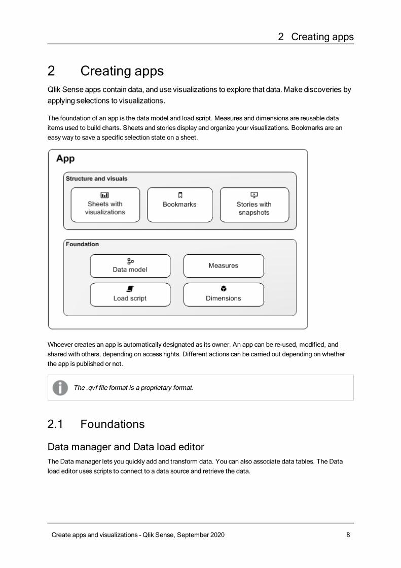
2 Creating appsQlik Sense apps contain data, and use visualizations to explore that data. Make discoveries byapplying selections to visualizations.
The foundation of an app is the data model and load script. Measures and dimensions are reusable dataitems used to build charts. Sheets and stories display and organize your visualizations. Bookmarks are aneasy way to save a specific selection state on a sheet.
Whoever creates an app is automatically designated as its owner. An app can be re-used, modified, andshared with others, depending on access rights. Different actions can be carried out depending on whetherthe app is published or not.
The .qvf file format is a proprietary format.
2.1 Foundations
Data manager and Data load editorThe Data manager lets you quickly add and transform data. You can also associate data tables. The Dataload editor uses scripts to connect to a data source and retrieve the data.
Create apps and visualizations - Qlik Sense, September 2020 8
2 Creating apps
Data modelLoaded data is structured in a data model. You can reload your data to build the data model that is best foryour app.
MeasuresMeasures are calculations used in visualizations. Measures are created from an expression composed ofaggregation functions, such asSum orMax, combined with one or several fields.
DimensionsDimensions are fields used in visualizations. Dimensions determine how the data in a visualization isgrouped. For example: total sales per country or number of products per supplier.
2.2 Structure and visuals
SheetsSheets contain data visualizations, such as charts and tables. You create structure in your app by groupingvisualizations on sheets. For example, you could have a sheet for North American sales, and a different sheetfor Europe.
BookmarksBookmarks are shortcuts to a certain set of selections and chart expansions.
StoriesStories are based on snapshots of visualizations. You present your data by creating a story that guides you tonew insights by combining snapshots of data at specific times and selection states.
In Qlik Sense Desktop, apps are typically stored in <user>\Documents\Qlik\Sense\Apps, as<Appname>.qvf, where <Appname> is the name of the app. If you rename an app in QlikSense Desktop, the .qvf is not updated.
2.3 Structuring an app using sheetsSheets structure your ideas andpurpose of your app.When you create an new app, it is goodpractice to first build a structure of empty sheets, where each sheet represents an idea or agoal. This gives a goodoverview of the app.
Create apps and visualizations - Qlik Sense, September 2020 9
2 Creating apps
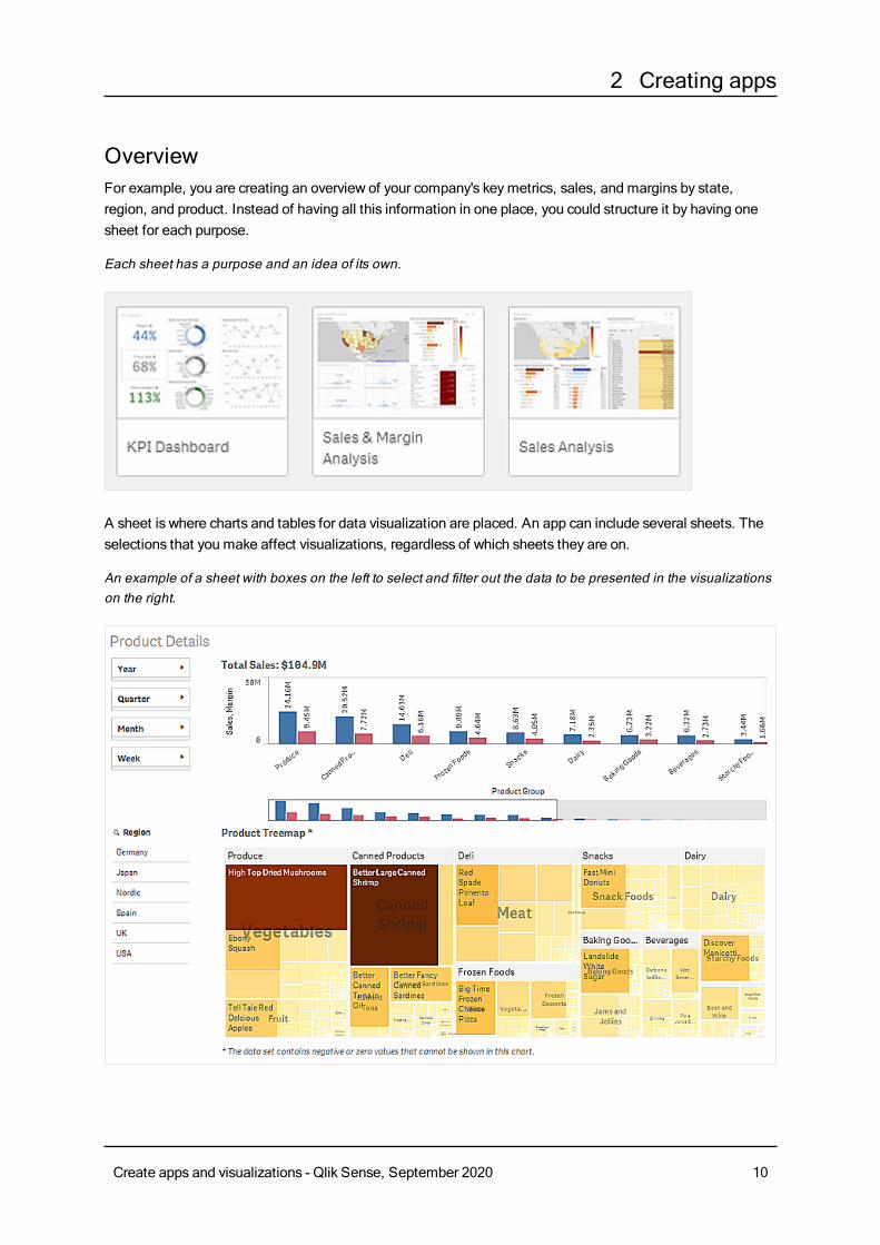
OverviewFor example, you are creating an overview of your company's keymetrics, sales, and margins by state,region, and product. Instead of having all this information in one place, you could structure it by having onesheet for each purpose.
Each sheet has a purpose and an idea of its own.
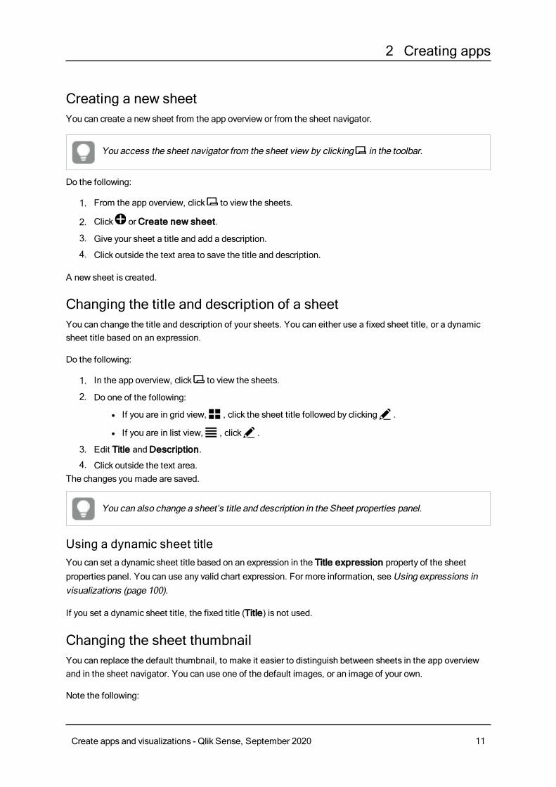
A sheet is where charts and tables for data visualization are placed. An app can include several sheets. Theselections that you make affect visualizations, regardless of which sheets they are on.
An example of a sheet with boxes on the left to select and filter out the data to be presented in the visualizationson the right.
Create apps and visualizations - Qlik Sense, September 2020 10
2 Creating apps
Creating a new sheetYou can create a new sheet from the app overview or from the sheet navigator.
You access the sheet navigator from the sheet view by clicking in the toolbar.
Do the following:
1. From the app overview, click to view the sheets.
2. Click orCreate new sheet.
3. Give your sheet a title and add a description.
4. Click outside the text area to save the title and description.
A new sheet is created.
Changing the title and description of a sheetYou can change the title and description of your sheets. You can either use a fixed sheet title, or a dynamicsheet title based on an expression.
Do the following:
1. In the app overview, click to view the sheets.
2. Do one of the following:
l If you are in grid view,ì , click the sheet title followed by clicking@ .
l If you are in list view,î , click@ .
3. Edit Title andDescription.
4. Click outside the text area.The changes you made are saved.
You can also change a sheet’s title and description in the Sheet properties panel.
Using a dynamic sheet titleYou can set a dynamic sheet title based on an expression in the Title expression property of the sheetproperties panel. You can use any valid chart expression. For more information, seeUsing expressions invisualizations (page 100).
If you set a dynamic sheet title, the fixed title (Title) is not used.
Changing the sheet thumbnailYou can replace the default thumbnail, to make it easier to distinguish between sheets in the app overviewand in the sheet navigator. You can use one of the default images, or an image of your own.
Note the following:
Create apps and visualizations - Qlik Sense, September 2020 11
2 Creating apps
l The following formats are supported: .png, .jpg, .jpeg, and .gif.
l The optimal aspect ratio of a thumbnail is 8:5 (width:height).
l You can only add or change the thumbnail of an unpublished sheet.
Do the following:
1. In the app overview, click to view the sheets.
2. Do one of the following:
l If you are in grid view,ì , click the sheet title followed by clicking@ .
l If you are in list view,î , click@ .
3. Click on the default thumbnail.
TheMedia library opens.
4. Click on a folder in the media library, for example In app orDefault.
5. Select the image you want to use as a thumbnail for the sheet and click Insert.
6. Clickm to stop editing.
The image you selected is now used as a thumbnail for the sheet, and is visible in the sheet navigator and inthe app overview.
You can also change a sheet’s thumbnail in the sheet navigator at the top right or in the Sheetproperties panel.
The following formats are supported: .png, .jpg, .jpeg, and .gif.
For Qlik Sense: You can upload images to the In app folder in the media library. You need to use the QlikManagement Console to upload images to the default folder.
For Qlik Sense Desktop: You can place images in the following folder on your computer:C:\Users\<user>\Documents\Qlik\Sense\Content\Default. Images will be available in the default folder inthe media library. When moving an app between installations, the images that you use in the app are savedin the qvf file together with the app. When you open the app in a new location, the images will be in the Inapp folder in the media library for the app.
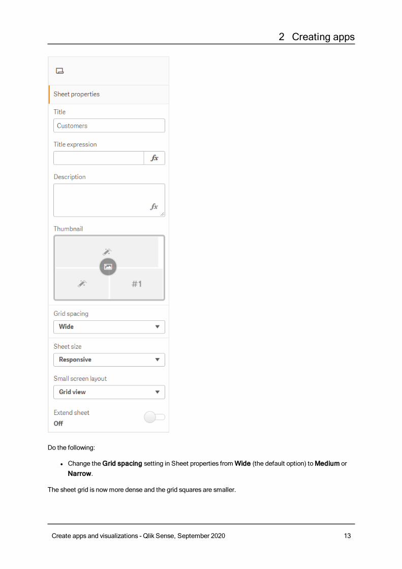
Changing the grid sizing of a sheetYou can adjust the grid sizing of the sheet to be able to fit more visualizations on a sheet, or have morecontrol over how visualizations are positioned. The grid displays when you are adding, moving, or resizing avisualization.
Grid size can be changed in the Sheet properties pane
Create apps and visualizations - Qlik Sense, September 2020 12
2 Creating apps
Do the following:
l Change theGrid spacing setting in Sheet properties fromWide (the default option) toMedium orNarrow.
The sheet grid is nowmore dense and the grid squares are smaller.
Create apps and visualizations - Qlik Sense, September 2020 13
2 Creating apps
Customizing sheet sizeBy default, Qlik Sense uses a responsive layout for sheets that adjusts the sheet to the dimensions of theuser’s screen. You can set a custom width and height for the sheet if you want to use a non-responsive layoutfor your sheets. This ensures that your dashboard will be presented to users exactly as you created them, withno adjustments for responsiveness. You can set the height and width of a sheet anywhere between 300pixels and 4,000 pixels.
When a sheet is using a custom size, you can change the grid spacing, but you cannot use Extend sheet tochange the size.
When a custom sheet is exported, the downloaded sheet is downloaded as a Responsivesheet. For optimal default sheet thumbnails, keep your custom size ratio to 8:5 (width:height).
Custom-sized sheets may have a lower quality PDF output if the sheet is too large to clearlydisplay on a single PDF page.
Do the following:
1. Change the Sheet size setting from Responsive toCustom.
2. Enter a width for the sheet in pixels.
3. Enter a height for the sheet in pixels.
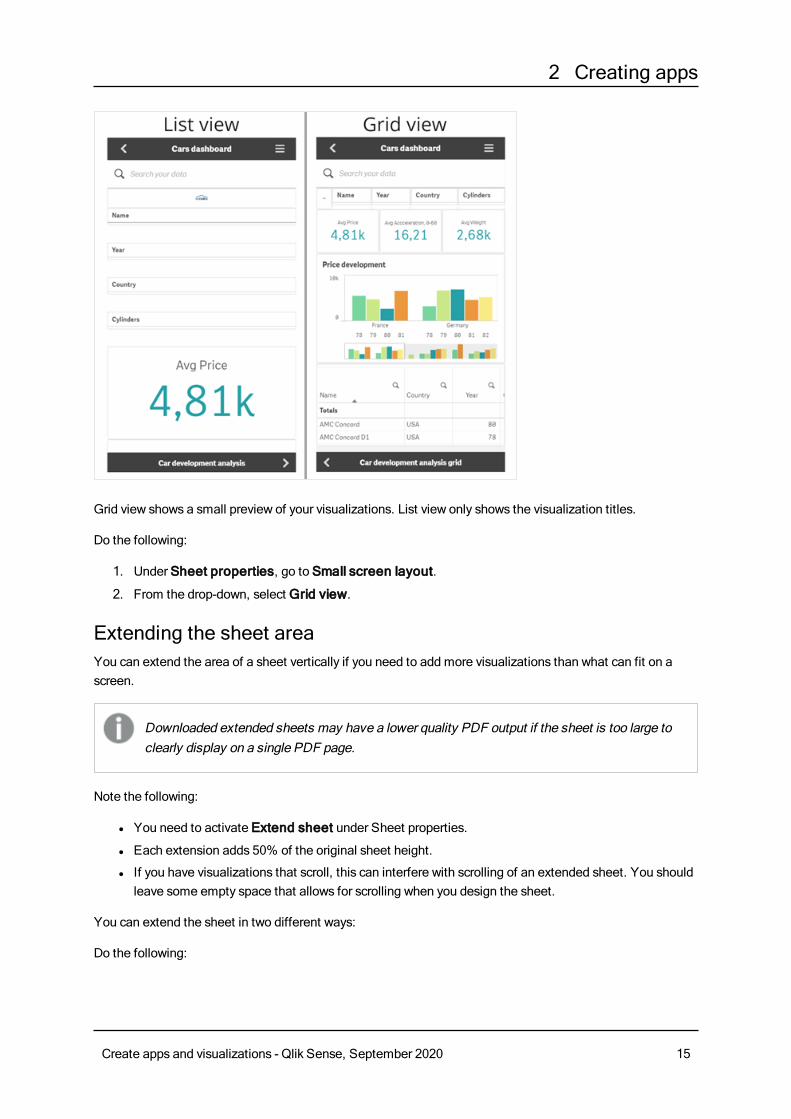
Changing the small screen layoutBy default, sheets are displayed in List view when viewed on small screens. You can change them to displayas a grid. Sheetsmust be set to responsive layout to display as grid on small screens.
A sheet viewed on a small screen in List view (left) and Grid view (right)
Create apps and visualizations - Qlik Sense, September 2020 14
2 Creating apps
Grid view shows a small preview of your visualizations. List view only shows the visualization titles.
Do the following:
1. Under Sheet properties, go to Small screen layout.
2. From the drop-down, select Grid view.
Extending the sheet areaYou can extend the area of a sheet vertically if you need to add more visualizations than what can fit on ascreen.
Downloaded extended sheets may have a lower quality PDF output if the sheet is too large toclearly display on a single PDF page.
Note the following:
l You need to activate Extend sheet under Sheet properties.
l Each extension adds 50% of the original sheet height.
l If you have visualizations that scroll, this can interfere with scrolling of an extended sheet. You shouldleave some empty space that allows for scrolling when you design the sheet.
You can extend the sheet in two different ways:
Do the following:
Create apps and visualizations - Qlik Sense, September 2020 15
2 Creating apps
l Drag an object to the bottom of the sheet and drop it on the drop zone that appears.
l Toggle Extend sheet under Sheet properties.
The sheet is now expanded by 50% of the original height. You can scroll vertically in the sheet to access allcontent.
Adding actions to sheetsYou can add actions to sheets that trigger when users navigate to those sheets. For example, you couldautomatically clear selections in the app when users navigate to a particular sheet.
For more information, see Adding actions to sheets (page 16).
Copying, replacing and moving items on sheetsYou can copy, replace, and move items on a sheet and between sheets. You can do this in the followingways:
l Using the edit bar on the sheet ( , and ).
l By right-clicking and selectingCut, Copy and Paste.
l With the keyboard shortcuts Ctrl+C, Ctrl+X and Ctrl+V.
Duplicating a sheetYou can duplicate any sheet, regardless of whether it is a sheet that belongs to the app or a sheet you havecreated yourself. The purpose of duplicating sheets is to save time by reusing content, and to allow you tomodify the duplicate so that it fits your needs better.A duplicated sheet contains the same visualizations asthe original sheet, and is linked to the samemaster items. The duplicated sheet is a standalone sheet with noconnection to the original sheet. Duplicated sheets appear underMy sheets in app overview and in the sheetnavigator.
You can duplicate a sheet in the following ways:
l ClickDuplicate in the shortcut menu of a sheet in the app overview or in the sheet navigator.
l ClickDuplicate sheet in the global menu in the app overview or in sheet view.
Adding actions to sheetsYou can set actions to sheets that trigger whenusers navigate to the sheet. Sheet actions areuseful when youwant to assist app users with predefined selection or selection controls whenthey navigate to a sheet. For example, a sheet could automatically apply a bookmark or clear allselections whenusers navigate to the sheet.
Sheet actions can be configured in the properties panel. You can add multiple actions to a sheet. The actionsare performed in the order they are listed under Actions. You can change the order of an action by draggingit.
Create apps and visualizations - Qlik Sense, September 2020 16
2 Creating apps
All expressions used in sheet actions are evaluated before the actions are performed. Forexample, you could not use an expression in an action that selects results from a previousaction as the expression evaluates before the selection is made by the action.
Sheet actions are not triggered if the sheet is an embedded sheet or in a mashup.
Do the following:
1. In sheet view, click Edit sheet in the toolbar.
2. ClickActions in the properties panel of the sheet.
3. ClickAdd action.
4. Select the action you want to use.For some actions you need to provide details for the action. For example, for the Select values in afield action, you need to select a field, and which value to select in the field.
5. Optionally, after Label, enter a name for the action.
Available sheet actionsYou can add one or more actions to be performed when users navigate to the sheet. For some actions, youneed to provide details for the action.
Apply bookmarkYou can apply the selection that is defined in a bookmark that you choose.
Move backwards in your selectionsYou can move one step backwards in your selection history.
Move forwards in your selectionsYou can move one step forwards in your selection history.
Clear all selectionsYou can clear all selections in the app. You can optionally overwrite locked selections.
Clear selections in other fieldsYou can clear selections from all fields except the one you specify. You can optionally overwrite lockedselections.
Clear selections in fieldYou can clear all selections from a field that you specify.
Select all values in a fieldYou can select all values in a field that you specify. You can optionally overwrite locked selections.
Create apps and visualizations - Qlik Sense, September 2020 17
2 Creating apps
Select values in a fieldYou can select a list of values in a field that you specify. Separate the values to select with a semi colon. Youcan optionally overwrite locked selections.
Select alternativesSelect all alternative values in a field that you specify. You can optionally overwrite locked selections.
Select excludedSelect all excluded values in a field that you specify. You can optionally overwrite locked selections.
Select possible values in a fieldSelect all possible values in a field that you specify. You can optionally overwrite locked selections.
Toggle field selectionYou can set the sheet to toggle between the current selection, and a selection that adds selections defined bya search string. You can use wild cards in the search string. If you want to define a list of values you need touse the format (A|B), where A and B are values to select.
Lock all selectionsYou can lock all selections in the app.
Lock a specific fieldYou can lock selections in a field that you specify.
Unlock all selectionsYou can unlock all selections in the app.
Unlock a specific fieldYou can unlock selections in a field that you specify.
Set variable valueYou can assign a value to a variable.
2.4 Managing appsOnce youhave created andbuilt an appwith the sheets and visualizations youwant it to have,youmay want to fine-tune it tomake it easy and efficient to use, not only for yourself but also forother people.
You can, for instance:
l Apply app styling (logo and header)
l Create reusable master items (visualizations, dimensions and measures)
l Add bookmarks to keep track of important and interesting data selections and connections
Create apps and visualizations - Qlik Sense, September 2020 18
2 Creating apps
l Change the app’s title and description, and also add a thumbnail to it
l Publish your own apps
l Move your own published apps between streams
l Export an app
Creating an appThe first thing you need to do when building an app is to create an empty placeholder for it. You create theapp placeholder from the hub.
Do the following:
1. ClickCreate new app in the hub.
2. Give your app a name.
3. ClickCreate.The app is created.
4. ClickOpen app.The app opens in the app overview.
The next step is to add data to the new app.
On-demand appsOn-demandapps enable you to load andanalyze big data sources inQlik Sense.
Trying to analyze an entire big data store at one time is highly inefficient. Nevertheless, to makerepresentative visualizations, all the data must be discoverable. Qlik Sense on-demand apps give usersaggregate views of big data stores and allow them to identify and load relevant subsets of the data fordetailed analysis.
On-demand apps are made up of several building blocks or components, and some of those components arebuilt by users with advanced scripting skills.
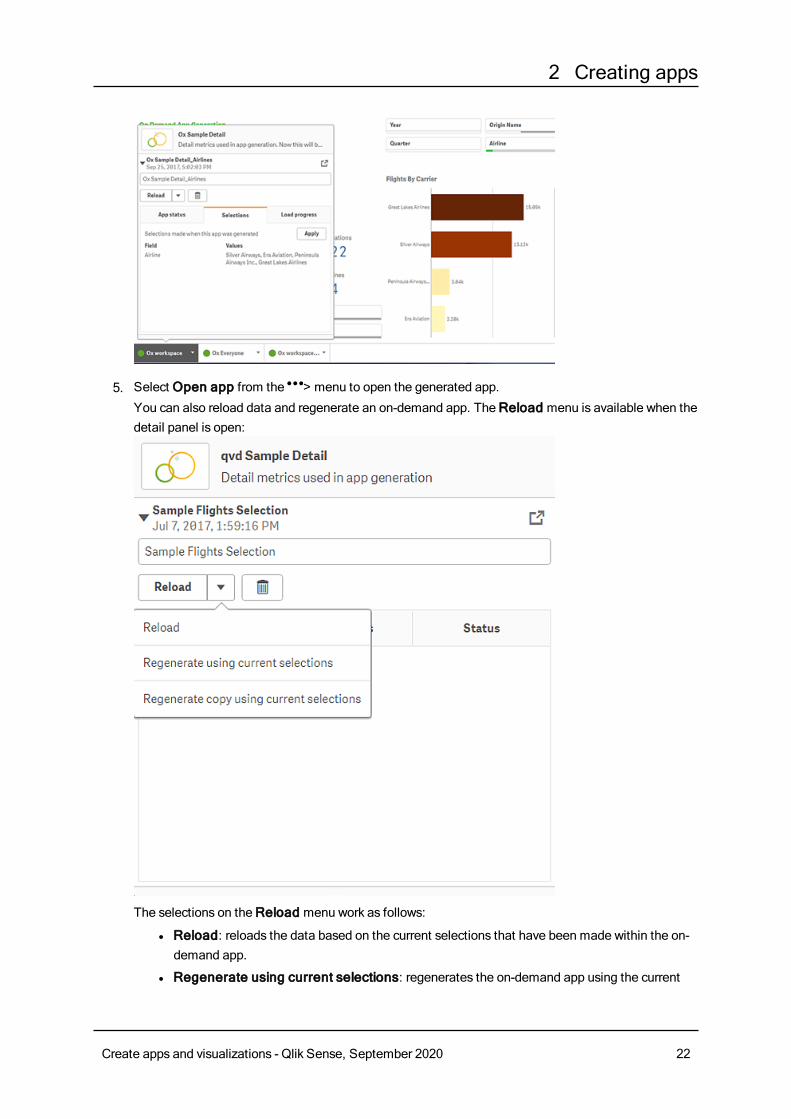
Generating an on-demand appYou generate an on-demand app when you have selected a manageable subset of data using an on-demandselection app. Any selection app that you are working with will contain one or more navigation links forgenerating on-demand apps in the App navigation bar.
The on-demand apps shown on the App navigation bar have completion indicators that start to turn greenas you make selections in the selection app. Each on-demand app on the app navigation bar has a limit onthe amount of data it can contain. When selections are made in the selection app, the completion indicatorshowswhen the amount of data selected is within the bounds set for the on-demand app.
Once an on-demand app's indicator turns completely green, you can generate that app with the currentlyselected data. Or you can choose to open an instance of that app that was generated previously with anotherselection of data. Every on-demand app in the app navigation bar can be generated multiple times, and those
Create apps and visualizations - Qlik Sense, September 2020 19
2 Creating apps
generated apps remain accessible. When the maximum number of apps has been generated, you mustdelete an existing app before you can generate a new on-demand app. On-demand apps also may have anexpiration time after which they are automatically deleted.
Anonymous users can only generate on-demand apps that are published automatically.Because anonymous users can only use published apps, they cannot use an on-demand appunless it is published automatically when it is generated. If an anonymous user attempts togenerate an on-demand app that is not set for automatic publication, amessage displaysindicating that the user cannot generate an app from that particular on-demand app navigationpoint.
The maximum number of apps and the retention time are set on the on-demand app navigation link. The appnavigation link is one of the building blocks of on-demand apps, and it is usually added by the creator of theselection app.
Do the following:
1. Open an on-demand selection app.
2. Select from the visualization objects in the selection app.
3. When the completion indicator on an on-demand app in the App navigation bar turns completelygreen, click the on-demand app.You can select an on-demand app in the App navigation bar to open its generation panel. There you
can click the to see theConstraint (maximum number of records allowed) and the number of
records currently selected. You can also see the number of values selected for each field and anyconstraints on the fields. When on-demand apps are created, constraints can be placed on individualfields. For example, a field for Year might be limited so that no more than two values can be selected.When the number of records (Row count) currently selected is less than or equal to the maximumnumber of records allowed, the completion indicator turns completely green. An app cannot begenerated, however, until all the constraints have been met. If the row count is within the constraintbut one or more of the fields have not met the requirements of their constraints, theGenerate newapp button will not be enabled.
If you select Generate new app when constraints panel is open, you will not see the
generated app. Click the to close the panel, and you will see the new app listed if it
generated successfully.
4. Click theGenerate new app button to create a new instance of the on-demand app with the datacurrently selected.The new instance of the app is generated and appears in the generation panel above theGeneratenew app button.To see more about the generated app, open its detail panel.
Create apps and visualizations - Qlik Sense, September 2020 20
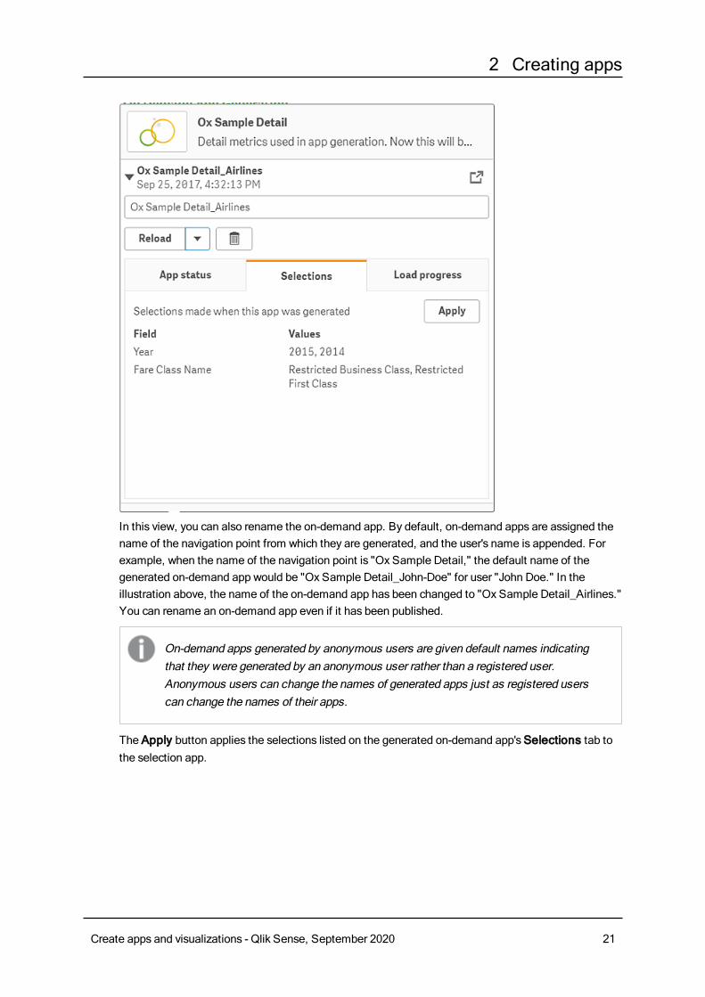
2 Creating apps
In this view, you can also rename the on-demand app. By default, on-demand apps are assigned thename of the navigation point from which they are generated, and the user's name is appended. Forexample, when the name of the navigation point is "Ox Sample Detail," the default name of thegenerated on-demand app would be "Ox Sample Detail_John-Doe" for user "John Doe." In theillustration above, the name of the on-demand app has been changed to "Ox Sample Detail_Airlines."You can rename an on-demand app even if it has been published.
On-demand apps generated by anonymous users are given default names indicatingthat they were generated by an anonymous user rather than a registered user.Anonymous users can change the names of generated apps just as registered userscan change the names of their apps.
The Apply button applies the selections listed on the generated on-demand app'sSelections tab tothe selection app.
Create apps and visualizations - Qlik Sense, September 2020 21
2 Creating apps
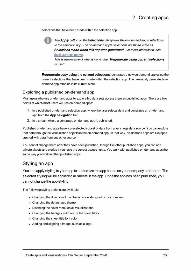
5. Select Open app from the > menu to open the generated app.
You can also reload data and regenerate an on-demand app. TheReload menu is available when thedetail panel is open:
The selections on theReload menu work as follows:
l Reload: reloads the data based on the current selections that have been made within the on-demand app.
l Regenerate using current selections: regenerates the on-demand app using the current
Create apps and visualizations - Qlik Sense, September 2020 22
2 Creating apps
selections that have been made within the selection app.
The Apply button on the Selections tab applies the on-demand app's selectionsto the selection app. The on-demand app's selections are those listed asSelections made when this app was generated. For more information, seethe illustration above.This is the reverse of what is done when Regenerate using current selectionsis used.
l Regenerate copy using the current selections: generates a new on-demand app using thecurrent selections that have been made within the selection app. The previously generated on-demand app remains in its current state.
Exploring a published on-demand appMost users who use on-demand apps to explore big data sets access them as published apps. There are twopoints at which most users will use on-demand apps:
1. In a published on-demand selection app, where the user selects data and generates an on-demandapp from the App navigation bar.
2. In a stream where a generated on-demand app is published.
Published on-demand apps have a preselected subset of data from a very large data source. You can explorethat data through the visualization objects in the on-demand app. In that way, on-demand apps are like appscreated with data from any other source.
You cannot change them after they have been published, though like other published apps, you can addprivate sheets and stories if you have the correct access rights. You work with published on-demand apps thesame way you work in other published apps.
Styling an appYou canapply styling to your app to customize the appbased on your company standards. Theselected stylingwill be applied to all sheets in the app. Once the apphas beenpublished, youcannot change the app styling.
The following styling options are available:
l Changing the direction of the characters in strings of text or numbers.
l Changing the default app theme.
l Disabling the hover menu on all visualizations.
l Changing the background color for the sheet titles.
l Changing the sheet title font color.
l Adding and aligning a image, such as a logo.
Create apps and visualizations - Qlik Sense, September 2020 23
2 Creating apps
More styling can be applied to an app by a developer through custom theme extensions.
Tables support custom styling. Custom table styles override app style.
Opening app optionsYou can open the app options from anywhere in an unpublished app. It does not matter if you are exploringand discovering data, building a data model or working with data storytelling.
Do the following:
l In an unpublished app, click and then click to open app options.
l Click to close the app options.
If you are using amobile device, the app options are not available.
As of Qlik Sense June 2018, app options is not available on a published apps even whenhaving custom security rules defined with Update action on App resources.
Changing the reading orderDo the following:
1. In an unpublished app, click and then click to open app options
2. Under Appearance > Right-to-left, select On orOff.
If a visualization is shared using Qlik Sense Charts, changing the reading order in the app willalso affect the reading order in the shared chart. .
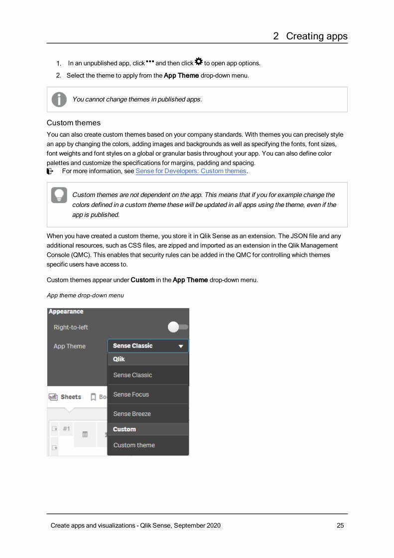
Changing the default app themeIn an unpublished app, the app theme can be set to one of the default Qlik themes using the App Themedrop-downmenu. You can also apply any custom theme that you have created and installed.
The default Qlik themes are:
l Sense Classic - Provides a more compact view of objects, and limits the space between them.
l Sense Focus - Adjusts the padding and spacing around objects as well as provides designatedspaces for titles.
l Sense Breeze - Based on Sense Focus but with different color settings.
Do the following:
Create apps and visualizations - Qlik Sense, September 2020 24
2 Creating apps
1. In an unpublished app, click and then click to open app options.
2. Select the theme to apply from the App Theme drop-downmenu.
You cannot change themes in published apps.
Custom themesYou can also create custom themes based on your company standards. With themes you can precisely stylean app by changing the colors, adding images and backgrounds as well as specifying the fonts, font sizes,font weights and font styles on a global or granular basis throughout your app. You can also define colorpalettes and customize the specifications for margins, padding and spacing.≤ For more information, see Sense for Developers: Custom themes.
Custom themes are not dependent on the app. This means that if you for example change thecolors defined in a custom theme these will be updated in all apps using the theme, even if theapp is published.
When you have created a custom theme, you store it in Qlik Sense as an extension. The JSON file and anyadditional resources, such as CSS files, are zipped and imported as an extension in the Qlik ManagementConsole (QMC). This enables that security rules can be added in the QMC for controlling which themesspecific users have access to.
Custom themes appear underCustom in the App Theme drop-downmenu.
App theme drop-down menu
Create apps and visualizations - Qlik Sense, September 2020 25
2 Creating apps
Disabling the hover menuYou can choose to disable the hover menu that appears on visualizations when users place their cursor overthem. This will effect all visualizations in the app.
Do the following:
1. In an unpublished app, click and then click to open app options.
2. ToggleDisable hover menu for visualizations.
You can disable the hover menu for a single visualization in edit mode.
Do the following:
1. In edit mode, select the visualization.
2. In the properties panel, go to Appearance > General.
3. Select Disable hover menu.
Changing colorsThe sheet title background color can be set to a solid color or a gradient of colors by selecting two colors. Thesheet title font can only be set to a solid color.
If you are using amobile device, the sheet title background is displayed as one solid color evenif two colors has been set.
When choosing colors, you have the following options:
l Choose a color from the default color palette.
l Set a Hex color by typing 6 characters in the # input field.
l Click the palette to showmore color options:
l Click the color wheel to select color.
l Drag the slider to change the color saturation.
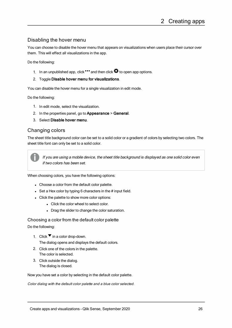
Choosing a color from the default color paletteDo the following:
1. Click in a color drop-down.
The dialog opens and displays the default colors.
2. Click one of the colors in the palette.The color is selected.
3. Click outside the dialog.The dialog is closed.
Now you have set a color by selecting in the default color palette.
Color dialog with the default color palette and a blue color selected.
Create apps and visualizations - Qlik Sense, September 2020 26
2 Creating apps
Typing a Hex colorDo the following:
1. Click in a color drop-down.
The dialog opens and displays the default colors.
2. Type 6 characters in the Hex input field: #.The color is selected in the palette.
3. Click outside the dialog.The dialog is closed.
Now you have set a color by typing the 6 hexadecimal digits.
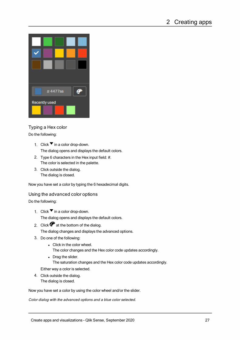
Using the advanced color optionsDo the following:
1. Click in a color drop-down.
The dialog opens and displays the default colors.
2. Click at the bottom of the dialog.
The dialog changes and displays the advanced options.
3. Do one of the following:
l Click in the color wheel.The color changes and the Hex color code updates accordingly.
l Drag the slider.The saturation changes and the Hex color code updates accordingly.
Either way a color is selected.
4. Click outside the dialog.The dialog is closed.
Now you have set a color by using the color wheel and/or the slider.
Color dialog with the advanced options and a blue color selected.
Create apps and visualizations - Qlik Sense, September 2020 27
2 Creating apps
Adding an imageYou can add an image to the sheet title, such as a logo. The following formats are supported: .png, .jpg,.jpeg, and .gif.
Do the following:
1. Click the image placeholder next to Image.TheMedia library opens.
2. Click on a folder in the media library, for example In app orDefault.
3. Select the image that you want to add to the sheet title.A preview of the image is shown.
4. Click Insert.The image is added.
Now you have added an image to the sheet title.
Converting a QlikView document into a Qlik Sense appIf you have a QlikView document, you can reuse part of your work in Qlik Sense. The load script and datamodel can be used to create an app in Qlik Sense. Visualizations, dimensions and measures, however, haveto be created in Qlik Sense.
After converting the document to an app, you may need to adapt the load script to be able to reload the scriptin Qlik Sense. In some cases, you may need to make some changes in the QlikView script before you convertthe document.
Qlik Sense provides a tool to help convert a QlikView document (QVW file) to a Qlik Sense app. The toolconverts visualizations, dimensions, measures, and variables. You must have access to the Dev Hub To usethe QlikView to Qlik Sense converter.
Instructions for how to use the converter tool are provided on the Qlik Sense Developer site.≤ For more information, seeQlikView converter.
Create apps and visualizations - Qlik Sense, September 2020 28
2 Creating apps
If you do not have access to the Dev Hub, you can convert a QlikView document manually.
We recommend that youmake changes only in a duplicate of any app that you convert, so thatyour changes are not overwritten by a later conversion.
Manually converting a QlikView document into a Qlik Sense appYou canmanually convert aQlikView document (QVW file) to aQlik Sense app. If you haveaccess to theDev Hub, you can use theQlikView toQlik Sense converter tool to simplify theprocess.
The QlikView to Qlik Sense converter is described on the Qlik Sense Developer site.
Prerequisitesl You need to have Qlik Sense Desktop installed to be able to convert a QlikView document into a QlikSense app.
l Your computer must have sufficient memory, at least 32 GB, when converting a large QlikViewdocument.
l If the QlikView document contains hidden script or uses section access, you need to have full accessto the hidden script and section access of the document.
Before converting the documentThe Always One Selected Value property for QlikView list boxes or multi boxesmust be disabled in orderto clear selections in the Qlik Sense app. If your QlikView document contains hidden script or uses sectionaccess, you need to adapt the document before you convert it.
Converting hidden script tabsWhen a QlikView document with hidden script is converted, the hidden script part will be disregarded and notincluded in the Qlik Sense script. If you want to convert the entire script, do the following before convertingthe document. This requires that you have access to the hidden script in the QlikView document.
Do the following:
1. Open the document in QlikView Script Editor.
2. Copy the code from the hidden script tabs and paste it into regular script tabs.
3. Save the document.
It is not possible to hide script code in Qlik Sense.
Removing section access codeA QlikView document with section access cannot be imported to Qlik Sense, as there are differences informat and supported functionality. You can still convert the document manually.
Do the following:
Create apps and visualizations - Qlik Sense, September 2020 29
2 Creating apps
1. Remove the section access code in QlikView Script Editor before converting the document. Thisrequires that you have full access to the script of the document.
2. Convert the document into an app.
3. Reapply section access in the Qlik Sense app. There are some differences that you may need to takeaccount for:
l User authentication is changed. The USERID field is now used to authenticate all users, andthe NTNAME and PASSWORD fields are not supported anymore.
l If you have access to the script, but not to the data, you can open the app without data and editthe script, including the section access.
l Section access is applied using strict exclusion in Qlik Sense. This means that you can onlysee data that you have been specifically granted access to.
QlikView variables excluded from exportA number of variables are not exported from a QlikView document (QVW) as they are only relevant forQlikView or is handled differently in Qlik Sense.
The following variables are not exported from a QlikView document:
l All variables starting with CD
l All variables starting with FLOPPY
l QvPath
l QvRoot
l QvWorkPath
l QvWorkRoot
l WinPath
l WinRoot
l ErrorMode
l StripComments
l ScriptErrorCount
l ScriptError
l ThousandSep
l DecimalSep
l MoneyThousandSep
l MoneyDecimalSep
l MoneyFormat
l TimeFormat
l DateFormat
l TimestampFormat
l MonthNames
l DayNames
l ScriptErrorDetails
l ScriptErrorList
Create apps and visualizations - Qlik Sense, September 2020 30
2 Creating apps
l OpenUrlTimeout
l HidePrefix
l FirstWeekDay
l BrokenWeeks
l ReferenceDay
l FirstMonthOfYear
l CollationLocale
l LongMonthNames
l LongDayNames
Converting the document into an appDo the following:
1. Copy the QlikView document (qvw format) to the directory where your apps are located.This is usually <user>\Documents\Qlik\Sense\Apps, but the location of the Apps directory dependson where you installed Qlik Sense Desktop.
2. Start Qlik Sense Desktop.You now see the QlikView document as an app in the hub, with the name ending with (qvw).
3. Click on the app to open it.
The app is saved into the Qlik Sense format (qvf file) in the folder where your QlikView document (qvw file)was stored. Also, the QlikView document file (qvw) is removed from the folder and automatically convertedinto a backup file (qvw.backup) stored here: <user>\Documents\Qlik\Sense\AppsBackup.
You have nowmigrated a QlikView document into a Qlik Sense app. The app contains the data model,including the loaded data, and the data load script.
You can use the data model to build visualizations, copy it or import it into your server environment throughthe Qlik Management Console (QMC), but you need to adapt the load script before you can reload the datamodel.
You can also drag and drop a qvw file from a folder onto the Qlik Sense Desktop hub, to open itas a Qlik Sense app. If the Qlik Sense app (qvf file) becomes stored in another folder than<user>\Documents\Qlik\Sense\Apps, move it to the Apps folder to make it available from thehub.
Adapting the data load script in Qlik SenseQlik Sense and QlikView data load scripts are compatible in general, but there are some differences that youmay need to take account for and adapt the script in the data load editor before you can reload data. You canadapt the script directly in Qlik Sense Desktop, or you can import the app into Qlik Sense and then adapt thescript.
Create apps and visualizations - Qlik Sense, September 2020 31
2 Creating apps
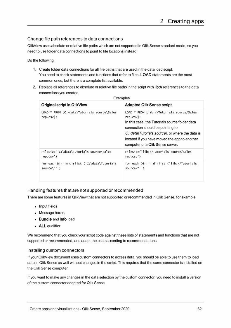
Change file path references to data connectionsQlikView uses absolute or relative file paths which are not supported in Qlik Sense standard mode, so youneed to use folder data connections to point to file locations instead.
Do the following:
1. Create folder data connections for all file paths that are used in the data load script.You need to check statements and functions that refer to files. LOAD statements are the mostcommon ones, but there is a complete list available.
2. Replace all references to absolute or relative file paths in the script with lib:// references to the dataconnections you created.
Original script in QlikView Adapted Qlik Sense script
LOAD * FROM [C:\data\Tutorials source\Sales
rep.csv];
LOAD * FROM [lib://Tutorials source/Sales
rep.csv];
In this case, the Tutorials source folder dataconnection should be pointing toC:\data\Tutorials source\, or where the data islocated if you have moved the app to anothercomputer or a Qlik Sense server.
FileSize('C:\data\Tutorials source\Sales
rep.csv')
FileSize('lib://Tutorials source/Sales
rep.csv')
for each Dir in dirlist ('C:\data\Tutorials
source\*' )
for each Dir in dirlist ('lib://Tutorials
source/*' )
Examples
Handling features that are not supported or recommendedThere are some features in QlikView that are not supported or recommended in Qlik Sense, for example:
l Input fields
l Message boxes
l Bundle and Info load
l ALL qualifier
We recommend that you check your script code against these lists of statements and functions that are notsupported or recommended, and adapt the code according to recommendations.
Installing custom connectorsIf your QlikView document uses custom connectors to access data, you should be able to use them to loaddata in Qlik Sense as well without changes in the script. This requires that the same connector is installed onthe Qlik Sense computer.
If you want to make any changes in the data selection by the custom connector, you need to install a versionof the custom connector adapted for Qlik Sense.
Create apps and visualizations - Qlik Sense, September 2020 32
2 Creating apps
Changing the title and description of an appYou can change the title and description of your apps. When creating a new app, the name of the app is usedas its title. When you change the title, the name of the app is not changed.
Do the following:
1. In the app overview, click@ in the app details area.
2. Edit Title andDescription.
3. Clickm to stop editing.
The changes you made are saved.
You can only change the title and description of an unpublished app.
Changing the thumbnail of an appYou can replace the default thumbnail of an app with another thumbnail, to make it easier to distinguishbetween apps in the hub. You can use one of the default images, or an image of your own.
Do the following:
1. In the app overview, click@ in the app details area.
2. Click on the default thumbnail.
TheMedia library opens.
3. Click on a folder in the media library, for example In app orDefault.
4. Select the image you want to use as a thumbnail for the app and click Insert.
5. Clickm to stop editing.
The image you selected is now used as a thumbnail for the app.
The optimal aspect ratio of a thumbnail is 8:5 (width:height).
The following formats are supported: .png, .jpg, .jpeg, and .gif.
For Qlik Sense: You can upload images to the In app folder in the media library. You need to use the QlikManagement Console to upload images to the default folder.
For Qlik Sense Desktop: You can place images in the following folder on your computer:C:\Users\<user>\Documents\Qlik\Sense\Content\Default. Images will be available in the default folder inthe media library. When moving an app between installations, the images that you use in the app are savedin the qvf file together with the app. When you open the app in a new location, the images will be in the Inapp folder in the media library for the app.
Create apps and visualizations - Qlik Sense, September 2020 33
2 Creating apps
You can only change the thumbnail of an unpublished app.
Duplicating an appYou can duplicate an existing app, to create a copy to develop further. You can only duplicate an app that youhave created yourself unless your administrator has assign you a security role with duplication enabled.
If you have an admin role, giving you the administration rights needed, you can create duplicates of appsfrom the QMC.
When you duplicate a published app, only the base sheets and stories will be included in thecopy.
Do the following:
l In the hub, long-touch/right-click the app you want to duplicate and select Duplicate.A toast notification is displayed for a while, at the bottom of the screen, when the duplication starts. Anew toast notification will be displayed when the app has been duplicated and give you the possibilityto update the app list. If the duplication fails, an error message will be displayed.
A copy of the app is created underWork. You can click the app to open it and start adapting it according toyour preferences.
Because of how the synchronization of data works in multi-node sites, apps containing imagesmay display broken thumbnails or images inside the apps if opened right after being duplicatedor imported. The broken images are restored when the synchronization is complete. To check ifthe images have been restored, refresh the browser window.
Deleting an appYou can delete an app that you no longer need.
From the hub, you can only delete apps that you have created and that have not yet beenpublished.
If you have published an app, the published version is locked and can only be deleted from the QlikManagement Console. The published version is a duplicate of the original app. The original version of theapp can be deleted from your personal work in the hub.
Do the following:
1. Long-touch/right-click the app in the hub and select Delete.A confirmation dialog opens.
Create apps and visualizations - Qlik Sense, September 2020 34
2 Creating apps
2. ClickDelete.A toast notification is displayed for a while, at the bottom of the screen, when the app is beingdeleted. If the deletion fails, an error message will be displayed.
You can delete a published app from theQlik Management Console.
If an app is being deleted by someone else from the stream you are currently viewing, a toast notification willbe displayed and give you the possibility to update the app list.
Uploading image files to media libraryThemedia library contains the images you can use in your app: in text & image visualizations,on story slides, and as thumbnails for apps, sheets, and stories.
You can upload images to the media library. Because of limitations in the web browsers supported byQlikSense, it is recommended to keep the height and width as well as the file size of the images as small aspossible. The maximum file size is 5 MB.
The following formats are supported: .png, .jpg, .jpeg, and .gif.
For Qlik Sense: You can upload images to the In app folder in the media library. You need to use the QlikManagement Console to upload images to the default folder.
For Qlik Sense Desktop: You can place images in the following folder on your computer:C:\Users\<user>\Documents\Qlik\Sense\Content\Default. Images will be available in the default folder inthe media library. When moving an app between installations, the images that you use in the app are savedin the qvf file together with the app. When you open the app in a new location, the images will be in the Inapp folder in the media library for the app.
You can open the media library in several ways. Do one of the following:
l In the app overview, click in the app details area and click on the thumbnail.
l If you are editing a sheet, double-click the text & image visualization to open the editing toolbar and
click .
l In storytelling view, click in the story tools panel and drag Image onto the slide and then double-
click inside the image placeholder.
TheMedia library dialog opens and now you can upload images.
Do the following:
1. Select Upload media.
2. Do one of the following:
l Drop one or more image files onto the designated area.
l Click the designated area to open the upload dialog, browse and select images, and clickOpen.
Create apps and visualizations - Qlik Sense, September 2020 35
2 Creating apps
An upload indicator is displayed while the image file is being uploaded. You can cancel an ongoing
upload by clicking on on the image.
You cannot upload a file if its file name already exists in themedia library.
Now you have added images to the media library. Click the image and select to insert the image.
Deleting image files from media libraryThemedia library contains the images you can use in your app: in text & image visualizations,on story slides, and as thumbnails for apps, sheets, and stories.
You can delete images from the media library.
You can open the media library in several ways. Do one of the following:
l In the app overview, click in the app details area and click on the thumbnail.
l If you are editing a sheet, double-click the text & image visualization to open the editing toolbar and
click .
l In storytelling view, click in the story tools panel and drag Image onto the slide and then double-
click inside the image placeholder.
TheMedia library dialog opens and now you can delete images.
Delete images using Qlik SenseDo the following:
1. Select the In app folder.
2. Select the file you want to delete.
3. Click .
A confirmation dialog is displayed.
4. ClickDelete.
Now you have deleted images from the media library.
You can also long-touch/right-click on an image file and select Delete.
For Qlik Sense: You need to use the Qlik Management Console to delete images from thedefault folder, or other folders that were created from theQlik Management Console.
Create apps and visualizations - Qlik Sense, September 2020 36
2 Creating apps
Delete images using Qlik Sense DesktopYou can delete images from the default folder by removing the files from this location:<user>\Documents\Qlik\Sense\Content\Default.
The images in the In app folder are bundled images, saved in the qvf file together with the rest of thecontents of the app. If a bundled image is no longer used in the app, the image will be deleted from the qvffile when saving the app.
2.5 Troubleshooting - Creating appsThis section describes problems that can occur when creating apps and visualizations in Qlik Sense.
Images are not included in an app that has been moved from oneQlik Sense environment to another
Possible cause
You have created an app in Qlik Sense and moved the app to another Qlik Sense environment.
When you move apps between Qlik Sense environments, imagesmay not have been moved automatically.The images have to be handled manually, in different ways depending on between which environments theapp has been moved.
Proposed action
Import the images from the Qlik Sense environment where the app was created to the target location usingthe Qlik Management Console.
Images are not included in an app that has been imported fromQlik SenseDesktop to Qlik Sense
Possible cause
You have created an app in Qlik Sense Desktop and imported the app to Qlik Sense.
When you move apps between Qlik Sense environments, imagesmay not have been moved automatically.The images have to be handled manually, in different ways depending on between which environments theapp has been moved.
Proposed action
Import the images from the images folder of the Qlik Sense Desktop app using the Qlik ManagementConsole.
Images are included automatically only when youmove an app from oneQlik Sense Desktopinstallation to another.
Create apps and visualizations - Qlik Sense, September 2020 37
2 Creating apps
The default location of the images in Qlik Sense Desktop is<user>\Documents\Qlik\Sense\Content\Default.
If you have organized images in subfolders in the Content\Default folder in Qlik SenseDesktop, these have to be addedmanually to the app and its sheets, stories and text & imageobjects after importing the images.
Images are not included in an app that has been moved from oneQlik Sense Desktop installation to another
Possible cause
You have moved an app between Qlik Sense Desktop installations.
When you move apps between Qlik Sense environments, imagesmay not have been moved automatically.The images have to be handled manually, in different ways depending on between which environments theapp has been moved.
Proposed action
Do the following:
l Copy the images from the PCwhere the app was created and paste into the images folder of thetarget location.
The default location of the images in Qlik Sense Desktop is<user>\Documents\Qlik\Sense\Content\Default.
The image I want to use does not seem to workImages are part of apps as thumbnails of the apps, sheets and stories, in the text & image object and in storyslides.
Possible cause
You are using an image in a format that is not supported.
Proposed action
Do the following:
l Convert the image to one of the supported formats (png, jpg, jpeg or gif).
Using Insights impacts system performanceInsights usesmaster items as fields in recommended charts.
Possible cause
The charts generated by the Insights are choosing fields that end up with costly charts.
Create apps and visualizations - Qlik Sense, September 2020 38
2 Creating apps
Proposed action
Do the following:
l Change what fields are exposed to published app users.
2.6 Optimizing app performanceAppperformance can be improvedwith reduced app size, simplified datamodels, and strategicuse of set analysis. This sectionwill help you avoid performance issues by pointing out areaswhere performance can be impacted.
App complexityThese are loose categories that can help diagnose issues. The most complex apps have the lowestperformance.
Simple apps:
l Do not include complex set analysis or If() statements.
l Do not include large tables.
l Have a simple data model.
l Contain simple calculations.
l May have large data volumes.
Moderate apps:
l Have a data model with many tables, but follow best practices.
l Use set analysis and several If() statements.
l Have large or wide tables on sheets (15 columns or more).
Complex apps:
l Have a very complex data model.
l Connect to large data volumes.
l Contain complex calculations, charts, and tables.
Large data volumesYou can employ these architecture strategies when you are connecting to large data volumes.
SegmentationYou can segment QVDs by dimensions, such as time frame or region. For example, you might have:
l A QVD that contains data from the two most recent years.
l A QVD that contains historical data further than two years.
l One large QVDwith all the data, which is only used by a small subset of users.
Create apps and visualizations - Qlik Sense, September 2020 39
2 Creating apps
The first, smaller app will address the analytical needs of most users. This savesmemory.
You can also have multiple apps focused on different regions. This way, users will not open an app with datathat they are not interested in or do not have rights to access. Data that is not accessible via section accessstill affects memory.
On-Demand App Generation (ODAG)Qlik Sense on-demand apps give users aggregate views of big data stores. They can identify and loadrelevant subsets of the data for detailed analysis.
From a user perspective, there are two apps:
1. A shopping cart with aggregated data.
2. An empty template app used to display detail.
The user makes selections in the shopping cart app. Once a threshold has been met, a custom LOAD script iscreated which populates the template app with the requested details.
Document chainingDocument chaining means that there is an aggregated app, which users consume regularly. If a user needsmore detail, selections can be passed from the aggregated app to a detail app, so that they can view a lowerlevel of granularity. This savesmemory, because users are not loading unnecessary detail. Documentchaining is supported via APIs.
App detailsYou need to consider your hardware environment in relation to app size, because it affects the performanceof your Qlik Sense deployment. For example, if you do not optimize your apps, theymay require morehardware resources.
Monitoring app size will help you:
l Understand current performance.
l Understand the performance impact of deploying a new app.
l Understand the performance impact of modifying an existing app.
l Resolve performance issues.
l Plan for future growth.
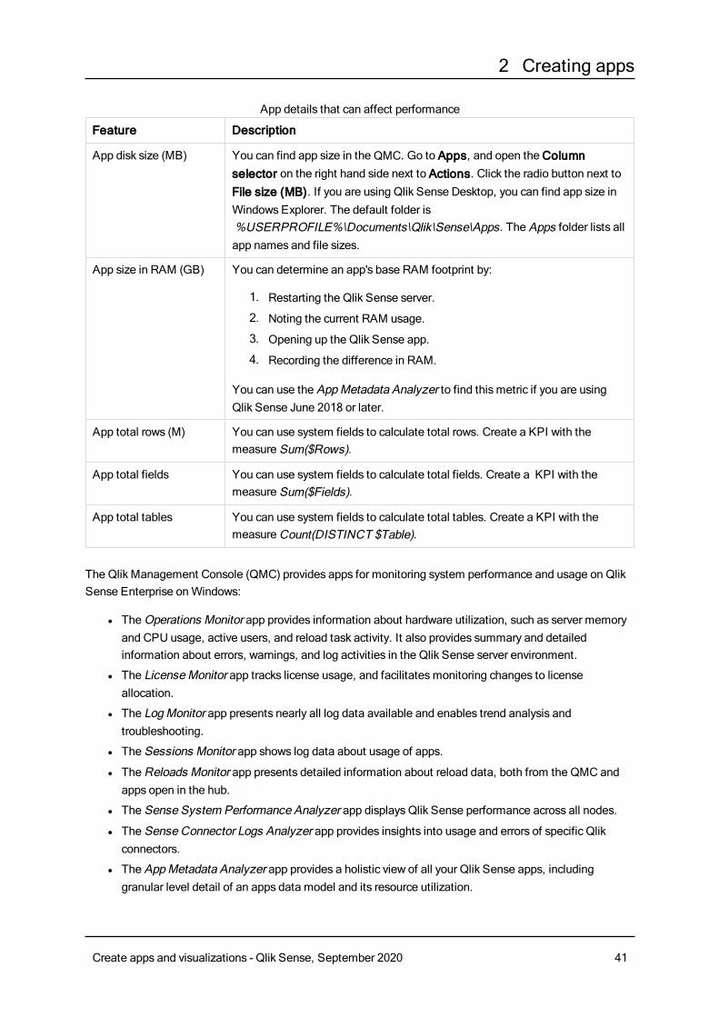
These are the basic app elements that can affect performance:
Create apps and visualizations - Qlik Sense, September 2020 40
2 Creating apps
Feature Description
App disk size (MB) You can find app size in the QMC. Go to Apps, and open theColumnselector on the right hand side next to Actions. Click the radio button next toFile size (MB). If you are using Qlik Sense Desktop, you can find app size inWindows Explorer. The default folder is%USERPROFILE%\Documents\Qlik\Sense\Apps. The Apps folder lists allapp names and file sizes.
App size in RAM (GB) You can determine an app's base RAM footprint by:
1. Restarting the Qlik Sense server.
2. Noting the current RAM usage.
3. Opening up the Qlik Sense app.
4. Recording the difference in RAM.
You can use the AppMetadata Analyzer to find this metric if you are usingQlik Sense June 2018 or later.
App total rows (M) You can use system fields to calculate total rows. Create a KPI with themeasure Sum($Rows).
App total fields You can use system fields to calculate total fields. Create a KPI with themeasure Sum($Fields).
App total tables You can use system fields to calculate total tables. Create a KPI with themeasureCount(DISTINCT $Table).
App details that can affect performance
The Qlik Management Console (QMC) provides apps for monitoring system performance and usage on QlikSense Enterprise onWindows:
l TheOperations Monitor app provides information about hardware utilization, such as server memoryand CPU usage, active users, and reload task activity. It also provides summary and detailedinformation about errors, warnings, and log activities in the Qlik Sense server environment.
l The LicenseMonitor app tracks license usage, and facilitatesmonitoring changes to licenseallocation.
l The LogMonitor app presents nearly all log data available and enables trend analysis andtroubleshooting.
l The Sessions Monitor app shows log data about usage of apps.
l TheReloads Monitor app presents detailed information about reload data, both from the QMC andapps open in the hub.
l The Sense System Performance Analyzer app displays Qlik Sense performance across all nodes.
l The Sense Connector Logs Analyzer app provides insights into usage and errors of specific Qlikconnectors.
l The AppMetadata Analyzer app provides a holistic view of all your Qlik Sense apps, includinggranular level detail of an apps data model and its resource utilization.
Create apps and visualizations - Qlik Sense, September 2020 41
2 Creating apps
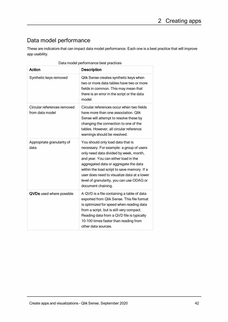
Data model performanceThese are indicators that can impact data model performance. Each one is a best practice that will improveapp usability.
Action Description
Synthetic keys removed Qlik Sense creates synthetic keys whentwo or more data tables have two or morefields in common. This maymean thatthere is an error in the script or the datamodel.
Circular references removedfrom data model
Circular references occur when two fieldshave more than one association. QlikSense will attempt to resolve these bychanging the connection to one of thetables. However, all circular referencewarnings should be resolved.
Appropriate granularity ofdata
You should only load data that isnecessary. For example: a group of usersonly need data divided by week, month,and year. You can either load in theaggregated data or aggregate the datawithin the load script to save memory. If auser does need to visualize data at a lowerlevel of granularity, you can use ODAG ordocument chaining.
QVDs used where possible A QVD is a file containing a table of dataexported from Qlik Sense. This file formatis optimized for speed when reading datafrom a script, but is still very compact.Reading data from a QVD file is typically10-100 times faster than reading fromother data sources.
Data model performance best practices
Create apps and visualizations - Qlik Sense, September 2020 42
2 Creating apps
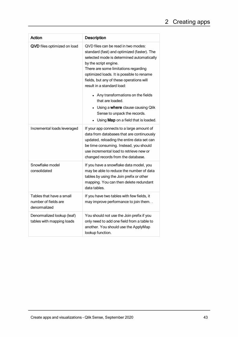
Action Description
QVD files optimized on load QVD files can be read in two modes:standard (fast) and optimized (faster). Theselected mode is determined automaticallyby the script engine.There are some limitations regardingoptimized loads. It is possible to renamefields, but any of these operations willresult in a standard load:
l Any transformations on the fieldsthat are loaded.
l Using awhere clause causing QlikSense to unpack the records.
l UsingMap on a field that is loaded.
Incremental loads leveraged If your app connects to a large amount ofdata from databases that are continuouslyupdated, reloading the entire data set canbe time consuming. Instead, you shoulduse incremental load to retrieve new orchanged records from the database.
Snowflake modelconsolidated
If you have a snowflake data model, youmay be able to reduce the number of datatables by using the Join prefix or othermapping. You can then delete redundantdata tables.
Tables that have a smallnumber of fields aredenormalized
If you have two tables with few fields, itmay improve performance to join them. .
Denormalized lookup (leaf)tables with mapping loads
You should not use the Join prefix if youonly need to add one field from a table toanother. You should use the ApplyMaplookup function.
Create apps and visualizations - Qlik Sense, September 2020 43
2 Creating apps
Action Description
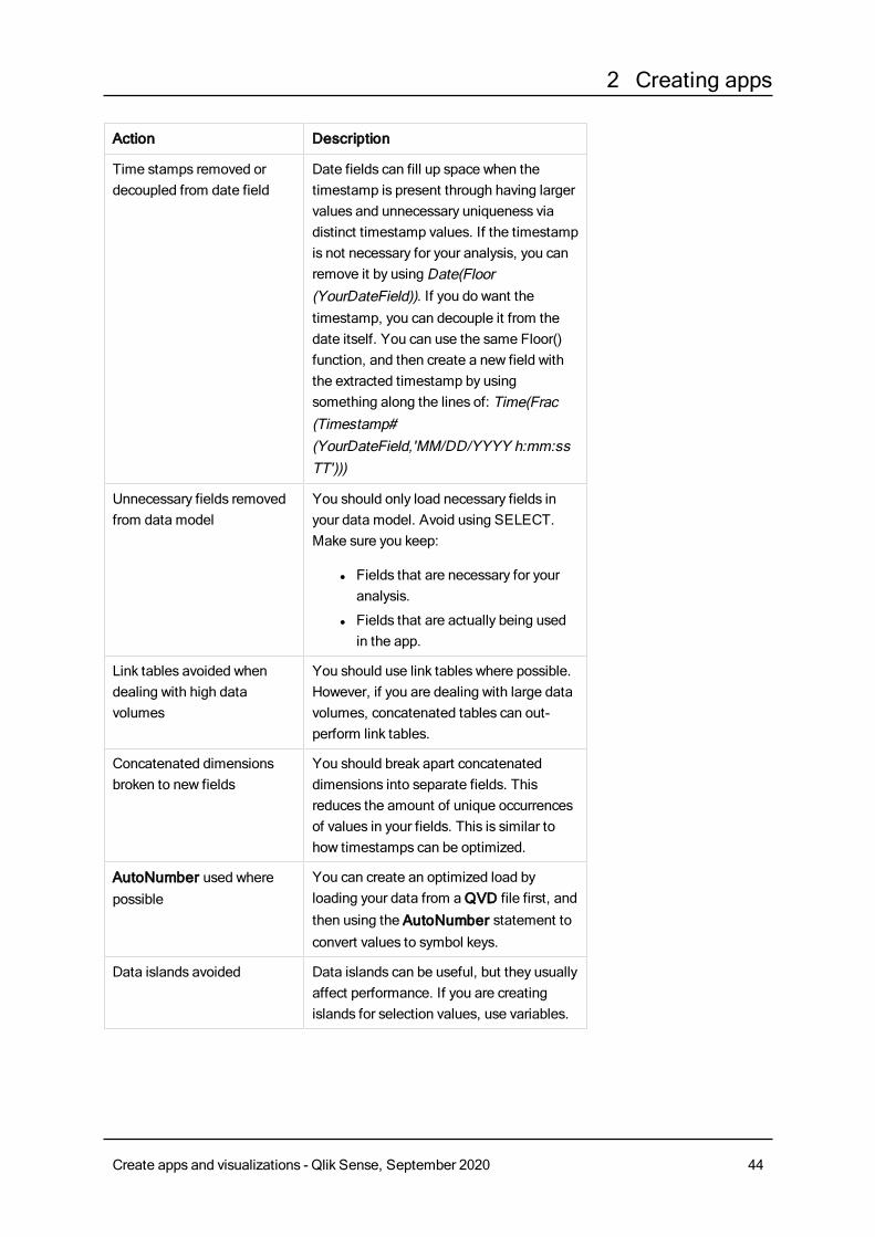
Time stamps removed ordecoupled from date field
Date fields can fill up space when thetimestamp is present through having largervalues and unnecessary uniqueness viadistinct timestamp values. If the timestampis not necessary for your analysis, you canremove it by usingDate(Floor(YourDateField)). If you do want thetimestamp, you can decouple it from thedate itself. You can use the same Floor()function, and then create a new field withthe extracted timestamp by usingsomething along the lines of: Time(Frac(Timestamp#(YourDateField,'MM/DD/YYYY h:mm:ssTT')))
Unnecessary fields removedfrom data model
You should only load necessary fields inyour data model. Avoid using SELECT.Make sure you keep:
l Fields that are necessary for youranalysis.
l Fields that are actually being usedin the app.
Link tables avoided whendealing with high datavolumes
You should use link tables where possible.However, if you are dealing with large datavolumes, concatenated tables can out-perform link tables.
Concatenated dimensionsbroken to new fields
You should break apart concatenateddimensions into separate fields. Thisreduces the amount of unique occurrencesof values in your fields. This is similar tohow timestamps can be optimized.
AutoNumber used wherepossible
You can create an optimized load byloading your data from aQVD file first, andthen using the AutoNumber statement toconvert values to symbol keys.
Data islands avoided Data islands can be useful, but they usuallyaffect performance. If you are creatingislands for selection values, use variables.
Create apps and visualizations - Qlik Sense, September 2020 44
2 Creating apps
Action Description
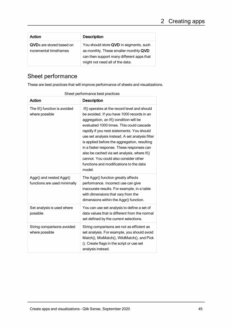
QVDs are stored based onincremental timeframes
You should storeQVD in segments, suchasmonthly. These smaller monthlyQVDcan then support many different apps thatmight not need all of the data.
Sheet performanceThese are best practices that will improve performance of sheets and visualizations.
Action Description
The If() function is avoidedwhere possible
If() operates at the record level and shouldbe avoided. If you have 1000 records in anaggregation, an If() condition will beevaluated 1000 times. This could cascaderapidly if you nest statements. You shoulduse set analysis instead. A set analysis filteris applied before the aggregation, resultingin a faster response. These responses canalso be cached via set analysis, where If()cannot. You could also consider otherfunctions and modifications to the datamodel.
Aggr() and nested Aggr()functions are used minimally
The Aggr() function greatly affectsperformance. Incorrect use can giveinaccurate results. For example, in a tablewith dimensions that vary from thedimensions within the Aggr() function.
Set analysis is used wherepossible
You can use set analysis to define a set ofdata values that is different from the normalset defined by the current selections.
String comparisons avoidedwhere possible
String comparisons are not as efficient asset analysis. For example, you should avoidMatch(), MixMatch(), WildMatch(), and Pick(). Create flags in the script or use setanalysis instead.
Sheet performance best practices
Create apps and visualizations - Qlik Sense, September 2020 45
2 Creating apps
Action Description
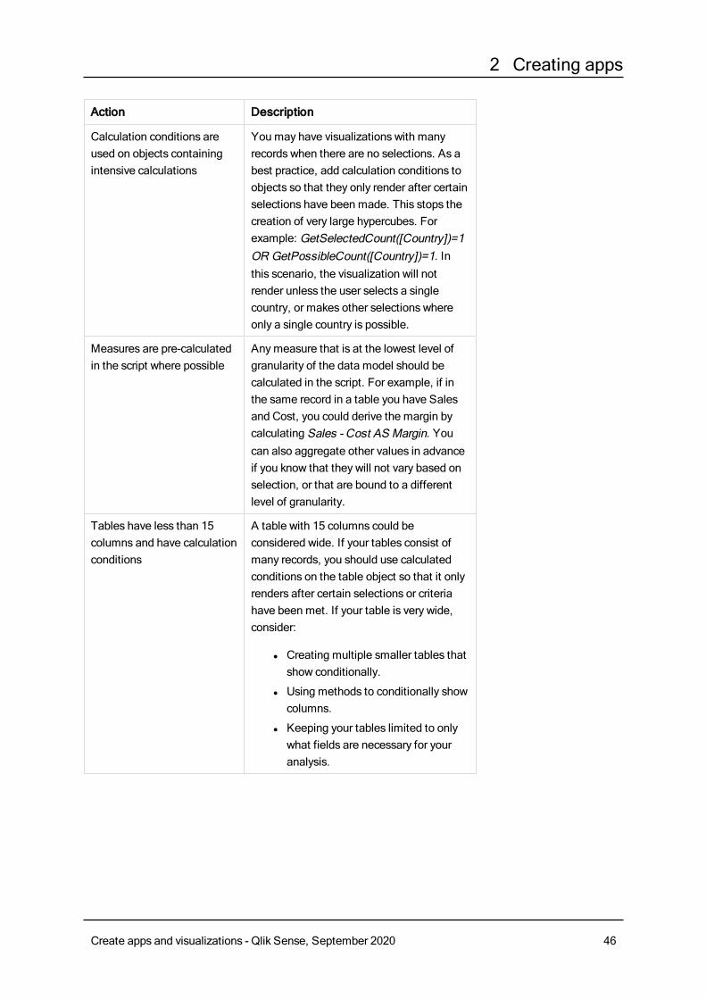
Calculation conditions areused on objects containingintensive calculations
You may have visualizations with manyrecords when there are no selections. As abest practice, add calculation conditions toobjects so that they only render after certainselections have been made. This stops thecreation of very large hypercubes. Forexample: GetSelectedCount([Country])=1OR GetPossibleCount([Country])=1. Inthis scenario, the visualization will notrender unless the user selects a singlecountry, or makes other selections whereonly a single country is possible.
Measures are pre-calculatedin the script where possible
Anymeasure that is at the lowest level ofgranularity of the data model should becalculated in the script. For example, if inthe same record in a table you have Salesand Cost, you could derive the margin bycalculating Sales - Cost AS Margin. Youcan also aggregate other values in advanceif you know that they will not vary based onselection, or that are bound to a differentlevel of granularity.
Tables have less than 15columns and have calculationconditions
A table with 15 columns could beconsidered wide. If your tables consist ofmany records, you should use calculatedconditions on the table object so that it onlyrenders after certain selections or criteriahave been met. If your table is very wide,consider:
l Creating multiple smaller tables thatshow conditionally.
l Using methods to conditionally showcolumns.
l Keeping your tables limited to onlywhat fields are necessary for youranalysis.
Create apps and visualizations - Qlik Sense, September 2020 46
2 Creating apps
Action Description
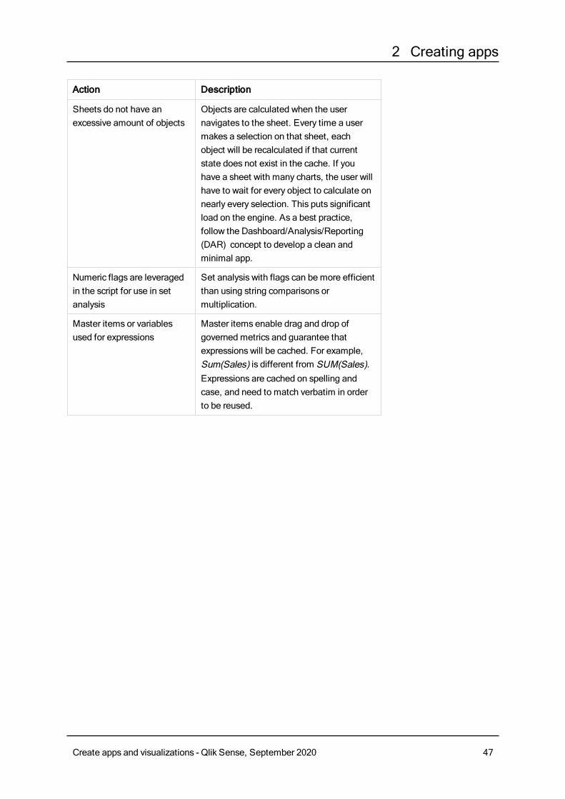
Sheets do not have anexcessive amount of objects
Objects are calculated when the usernavigates to the sheet. Every time a usermakes a selection on that sheet, eachobject will be recalculated if that currentstate does not exist in the cache. If youhave a sheet with many charts, the user willhave to wait for every object to calculate onnearly every selection. This puts significantload on the engine. As a best practice,follow the Dashboard/Analysis/Reporting(DAR) concept to develop a clean andminimal app.
Numeric flags are leveragedin the script for use in setanalysis
Set analysis with flags can be more efficientthan using string comparisons ormultiplication.
Master items or variablesused for expressions
Master items enable drag and drop ofgoverned metrics and guarantee thatexpressions will be cached. For example,Sum(Sales) is different from SUM(Sales).Expressions are cached on spelling andcase, and need to match verbatim in orderto be reused.
Create apps and visualizations - Qlik Sense, September 2020 47
3 Creating visualizations
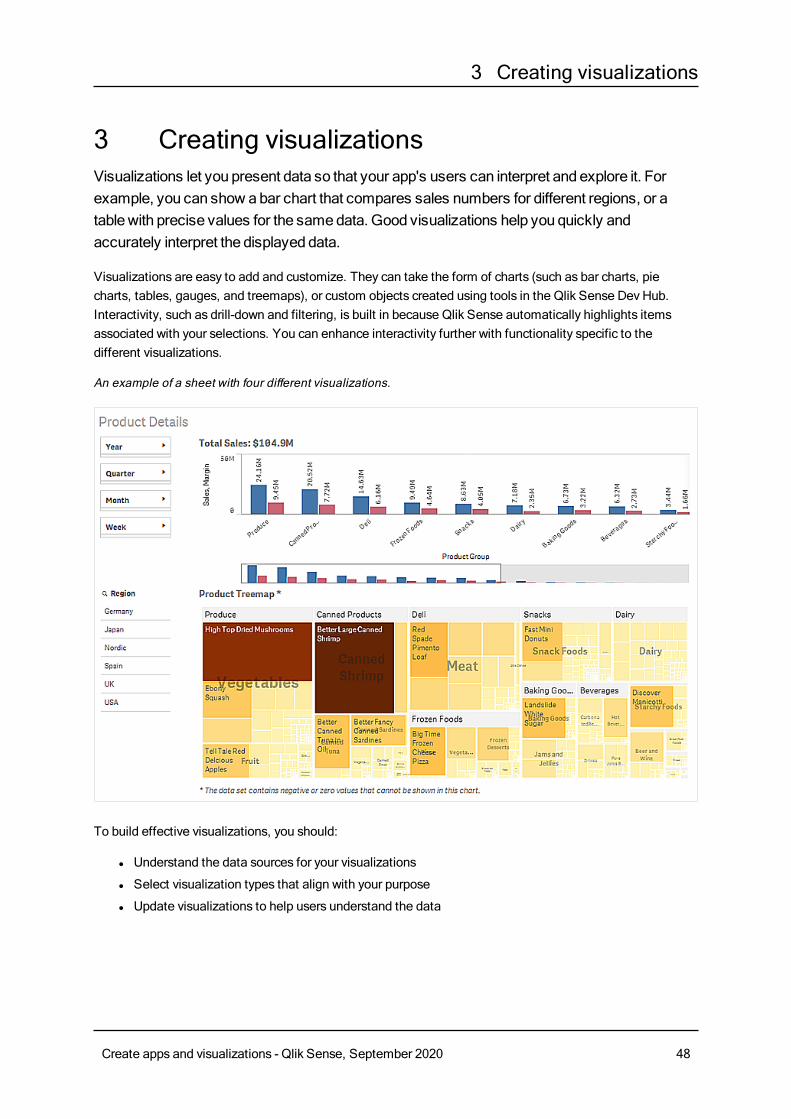
3 Creating visualizationsVisualizations let you present data so that your app's users can interpret and explore it. Forexample, you can show abar chart that compares sales numbers for different regions, or atablewith precise values for the samedata. Good visualizations help you quickly andaccurately interpret the displayed data.
Visualizations are easy to add and customize. They can take the form of charts (such as bar charts, piecharts, tables, gauges, and treemaps), or custom objects created using tools in the Qlik Sense Dev Hub.Interactivity, such as drill-down and filtering, is built in because Qlik Sense automatically highlights itemsassociated with your selections. You can enhance interactivity further with functionality specific to thedifferent visualizations.
An example of a sheet with four different visualizations.
To build effective visualizations, you should:
l Understand the data sources for your visualizations
l Select visualization types that align with your purpose
l Update visualizations to help users understand the data
Create apps and visualizations - Qlik Sense, September 2020 48
3 Creating visualizations
3.1 Understand the data sources for your visualizationsTo design an effective visualization with a clear purpose, you need to understand your data. The followingquestions will help you find out what you want to convey with your data:
l What kind of data is it? Nominal, ordinal, interval, or ratio data?
l How do different parts of the data relate to each other?
l Can you organize the data in a way that makes it easy for you to create your visualizations?
l What do you want to communicate with your data?
l Are there dimensions or measures you will want to reuse in multiple visualizations?
You also need to understand your data in terms of fields, dimensions, and measures. These affect how yourdata is used in your visualizations.
3.2 Select visualization types that align with your purposeEach visualization type has a specific goal. You need to think about the purpose of your visualization, andpick a visualization type that lets you explore your data for that purpose effectively.
For example: You want to show how ameasure, quarterly sales, behaves over time. You should create a linechart, because one of its strengths is displaying howmeasure values change over time.
If you are unsure of what visualization types to use with your data, Qlik Sense offers two methods of creatingvisualizations with assistance:
l You can use Insights to have Qlik Sense analyze your data and generate a selection of visualizations.You can then choose to add these visualizations to your sheets.
l You can also create visualizations using chart suggestions by dragging a field onto the sheet from theassets panel and then dragging additional fields that you want in the visualization onto the first field.Qlik Sense then creates a suggested visualization based on the fields selected for the visualization.
3.3 Update visualizations to improve how data isdisplayed
As you create your visualizations, you can modify them to improve how data is displayed and highlightedwithin the sheet. You can also change the data within it, or switch the visualization to another type.
3.4 Data assets in visualizationsVisualizations use data inmany different ways. How your data is comprised or created impactsyour visualizations. Primarily, your data assets becomedimensions andmeasures in your
Create apps and visualizations - Qlik Sense, September 2020 49
3 Creating visualizations
visualizations, defining the categories in your visualizations and themeasurements of thosecategories. A field can beused to group data, or it can be transformedwith an aggregatefunction to provide ameasurement in data categories.
The types of data you have in your tables and fields also impacts whether they can be used as dimensions ormeasures, as well as what sorting options are most effective. For example, quantitative data and qualitativedata have different recommended uses when they are used as either dimensions or measures.
In addition to providing the data to display, data assets can be used to control what data is displayed and howit is presented. For example, you can color a visualization using a dimension or measure not present in thevisualization. For more information, seeChanging the appearance of a visualization (page 504).
The assets panel contains the different data sources you can use in your visualizations.
Data assetsThe following data assets are available when creating visualizations:
l Fields
l Measures
l Dimensions
l Master items
FieldsFields hold the data loaded into Qlik Sense. Fields contain one or more values and correspond to columns ina database table. The field data can be qualitative or quantitative.
When creating visualizations, you use fields to create your dimensions and measures. You can also use fieldsin different ways when you add visualizations to your app. Some visualizations, such as tables, can presentfields in an unmodified state.
Some fields require extra considerations, such as date or time fields.
For more information, see Fields (page 52).
MeasuresMeasures are the data that you want to show. Measures are created from an expression composed ofaggregation functions, such asSum orMax, combined with one or several fields.
For more information, seeMeasures (page 64).
DimensionsDimensions determine how the data in a visualization is grouped. For example: total sales per country ornumber of products per supplier. Dimensions display the distinct values from the field selected as adimension. Dimensions can also be calculated using an expression.
For more information, seeDimensions (page 61).
Create apps and visualizations - Qlik Sense, September 2020 50
3 Creating visualizations
Master itemsMaster items are dimensions, measures, or visualizations that can be reused in other visualizations andsheets in your app. Updating a master item updates every instance of it. This means you could have thesamemeasure in 5 visualizations, and they would all update whenever the master item is changed.
Master items also have more design options available. You can, for example, assign colors to a masterdimension's distinct values so that the distinct values are consistent across visualizations.
Master items also include special dimensions such as drill-down dimensions and calendar measures.
For more information, seeReusing assets with master items (page 74).
ExpressionsAn expression is a combination of functions, fields, and mathematical operators (+ * / =). Expressions areused to process data in the app in order to produce a result that can be seen in a visualization
Expressions are used primarily used to create measures. They can also be used to build calculateddimensions, or to set properties within different visualizations. For example, you can use expressions todefine range limits for gauges, or reference lines for bar charts.
For more information, seeUsing expressions in visualizations (page 100).
Data types in visualizationsDifferent types of data have different properties; certain data may work better as dimensions, and some asmeasures. Similarly, as dimensions or measures, certain kinds of data may work better as a dimension insome visualizations better than others, or as a measure with certain aggregation functions.
The data in your fields can be quantitative or qualitative. Quantitative data values are measured numericallyon an ascending scale. Quantitative data can be ratios or intervals:
l Ratio: Ratios are quantitative data that you can perform arithmetic operations on, such as cost or age.For example, you can sum sales values for the month to get totals.
l Interval: Intervals are quantitative data that you cannot perform arithmetic operations on.For example, you cannot calculate a sum of temperatures during the week, but you can calculate theaverage temperature per day, and the high/low for each day.
Qualitative data can not be measured numerically, but can be described through language. Qualitative datacan be nominal or ordinal:
l Nominal: Fields with nominal data have distinct qualitative values, but without a set order.For example, product names or customer names are nominal data, as they have distinct values, butdo not have a required order.
l Ordinal: Fields with ordinal data have qualitative values that have a ranked or positioned value.Ordinal data should be sorted by its order as opposed to alphabetically.For example, low, medium, high are ordinal values. Small, medium, and large are also ordinal values.
Create apps and visualizations - Qlik Sense, September 2020 51
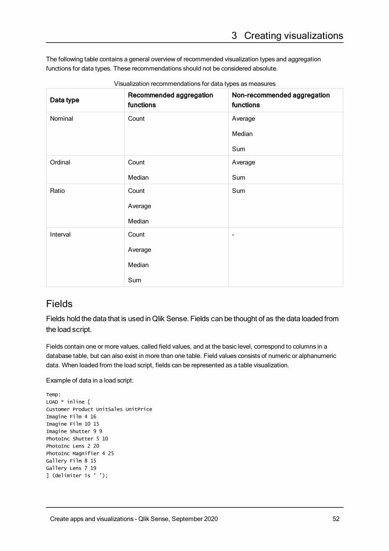
3 Creating visualizations
The following table contains a general overview of recommended visualization types and aggregationfunctions for data types. These recommendations should not be considered absolute.
Data typeRecommended aggregationfunctions
Non-recommended aggregationfunctions
Nominal Count Average
Median
Sum
Ordinal Count
Median
Average
Sum
Ratio Count
Average
Median
Sum
Interval Count
Average
Median
Sum
-
Visualization recommendations for data types asmeasures
FieldsFields hold the data that is used inQlik Sense. Fields can be thought of as the data loaded fromthe load script.
Fields contain one or more values, called field values, and at the basic level, correspond to columns in adatabase table, but can also exist in more than one table. Field values consists of numeric or alphanumericdata. When loaded from the load script, fields can be represented as a table visualization.
Example of data in a load script:
Temp:
LOAD * inline [
Customer Product UnitSales UnitPrice
Imagine Film 4 16
Imagine Film 10 15
Imagine Shutter 9 9
PhotoInc Shutter 5 10
PhotoInc Lens 2 20
PhotoInc Magnifier 4 25
Gallery Film 8 15
Gallery Lens 7 19
] (delimiter is ' ');
Create apps and visualizations - Qlik Sense, September 2020 52
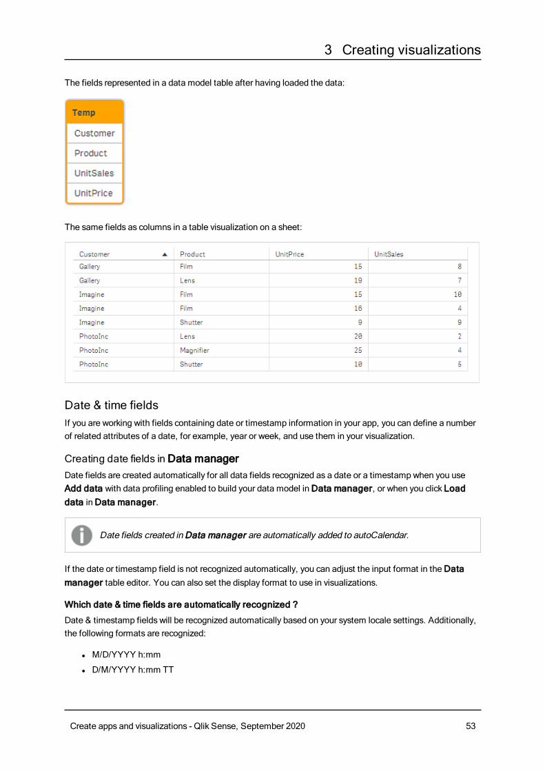
3 Creating visualizations
The fields represented in a data model table after having loaded the data:
The same fields as columns in a table visualization on a sheet:
Date & time fieldsIf you are working with fields containing date or timestamp information in your app, you can define a numberof related attributes of a date, for example, year or week, and use them in your visualization.
Creating date fields in Data managerDate fields are created automatically for all data fields recognized as a date or a timestamp when you useAdd data with data profiling enabled to build your data model inData manager, or when you click Loaddata inData manager.
Date fields created in Data manager are automatically added to autoCalendar.
If the date or timestamp field is not recognized automatically, you can adjust the input format in theDatamanager table editor. You can also set the display format to use in visualizations.
Which date & time fields are automatically recognized ?
Date & timestamp fields will be recognized automatically based on your system locale settings. Additionally,the following formats are recognized:
l M/D/YYYY h:mm
l D/M/YYYY h:mm TT
Create apps and visualizations - Qlik Sense, September 2020 53
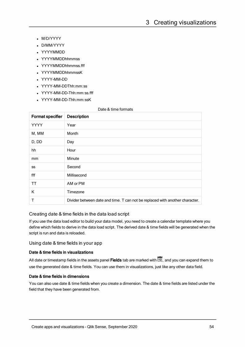
3 Creating visualizations
l M/D/YYYY
l D/MM/YYYY
l YYYYMMDD
l YYYYMMDDhhmmss
l YYYYMMDDhhmmss.fff
l YYYYMMDDhhmmssK
l YYYY-MM-DD
l YYYY-MM-DDThh:mm:ss
l YYYY-MM-DD-Thh:mm:ss.fff
l YYYY-MM-DD-Thh:mm:ssK
Format specifier Description
YYYY Year
M, MM Month
D, DD Day
hh Hour
mm Minute
ss Second
fff Millisecond
TT AM or PM
K Timezone
T Divider between date and time. T can not be replaced with another character.
Date & time formats
Creating date & time fields in the data load scriptIf you use the data load editor to build your data model, you need to create a calendar template where youdefine which fields to derive in the data load script. The derived date & time fields will be generated when thescript is run and data is reloaded.
Using date & time fields in your app
Date & time fields in visualizations
All date or timestamp fields in the assets panel Fields tab are marked with , and you can expand them to
use the generated date & time fields. You can use them in visualizations, just like any other data field.
Date & time fields in dimensions
You can also use date & time fields when you create a dimension. The date & time fields are listed under thefield that they have been generated from.
Create apps and visualizations - Qlik Sense, September 2020 54
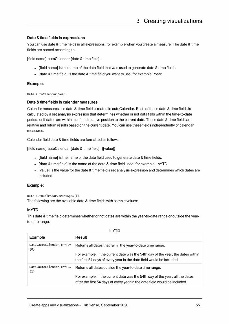
3 Creating visualizations
Date & time fields in expressions
You can use date & time fields in all expressions, for example when you create a measure. The date & timefields are named according to:
[field name].autoCalendar.[date & time field].
l [field name] is the name of the data field that was used to generate date & time fields.
l [date & time field] is the date & time field you want to use, for example, Year.
Example:
Date.autoCalendar.Year
Date & time fields in calendar measures
Calendar measures use date & time fields created in autoCalendar. Each of these date & time fields iscalculated by a set analysis expression that determines whether or not data falls within the time-to-dateperiod, or if dates are within a defined relative position to the current date. These date & time fields arerelative and return results based on the current date. You can use these fields independently of calendarmeasures.
Calendar field date & time fields are formatted as follows:
[field name].autoCalendar.[date & time field]={[value]}
l [field name] is the name of the date field used to generate date & time fields.
l [data & time field] is the name of the date & time field used, for example, InYTD.
l [value] is the value for the date & time field’s set analysis expression and determines which dates areincluded.
Example:
Date.autoCalendar.YearsAgo={1}
The following are the available date & time fields with sample values:
InYTD
This date & time field determines whether or not dates are within the year-to-date range or outside the year-to-date range.
Example Result
Date.autoCalendar.InYTD=
{0}Returns all dates that fall in the year-to-date time range.
For example, if the current date was the 54th day of the year, the dates withinthe first 54 days of every year in the date field would be included.
Date.autoCalendar.InYTD=
{1}Returns all dates outside the year-to-date time range.
For example, if the current date was the 54th day of the year, all the datesafter the first 54 days of every year in the date field would be included.
InYTD
Create apps and visualizations - Qlik Sense, September 2020 55
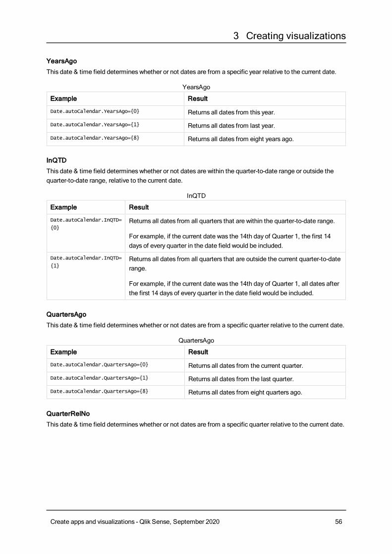
3 Creating visualizations
YearsAgo
This date & time field determines whether or not dates are from a specific year relative to the current date.
Example Result
Date.autoCalendar.YearsAgo={0} Returns all dates from this year.
Date.autoCalendar.YearsAgo={1} Returns all dates from last year.
Date.autoCalendar.YearsAgo={8} Returns all dates from eight years ago.
YearsAgo
InQTD
This date & time field determines whether or not dates are within the quarter-to-date range or outside thequarter-to-date range, relative to the current date.
Example Result
Date.autoCalendar.InQTD=
{0}Returns all dates from all quarters that are within the quarter-to-date range.
For example, if the current date was the 14th day of Quarter 1, the first 14days of every quarter in the date field would be included.
Date.autoCalendar.InQTD=
{1}Returns all dates from all quarters that are outside the current quarter-to-daterange.
For example, if the current date was the 14th day of Quarter 1, all dates afterthe first 14 days of every quarter in the date field would be included.
InQTD
QuartersAgo
This date & time field determines whether or not dates are from a specific quarter relative to the current date.
Example Result
Date.autoCalendar.QuartersAgo={0} Returns all dates from the current quarter.
Date.autoCalendar.QuartersAgo={1} Returns all dates from the last quarter.
Date.autoCalendar.QuartersAgo={8} Returns all dates from eight quarters ago.
QuartersAgo
QuarterRelNo
This date & time field determines whether or not dates are from a specific quarter relative to the current date.
Create apps and visualizations - Qlik Sense, September 2020 56
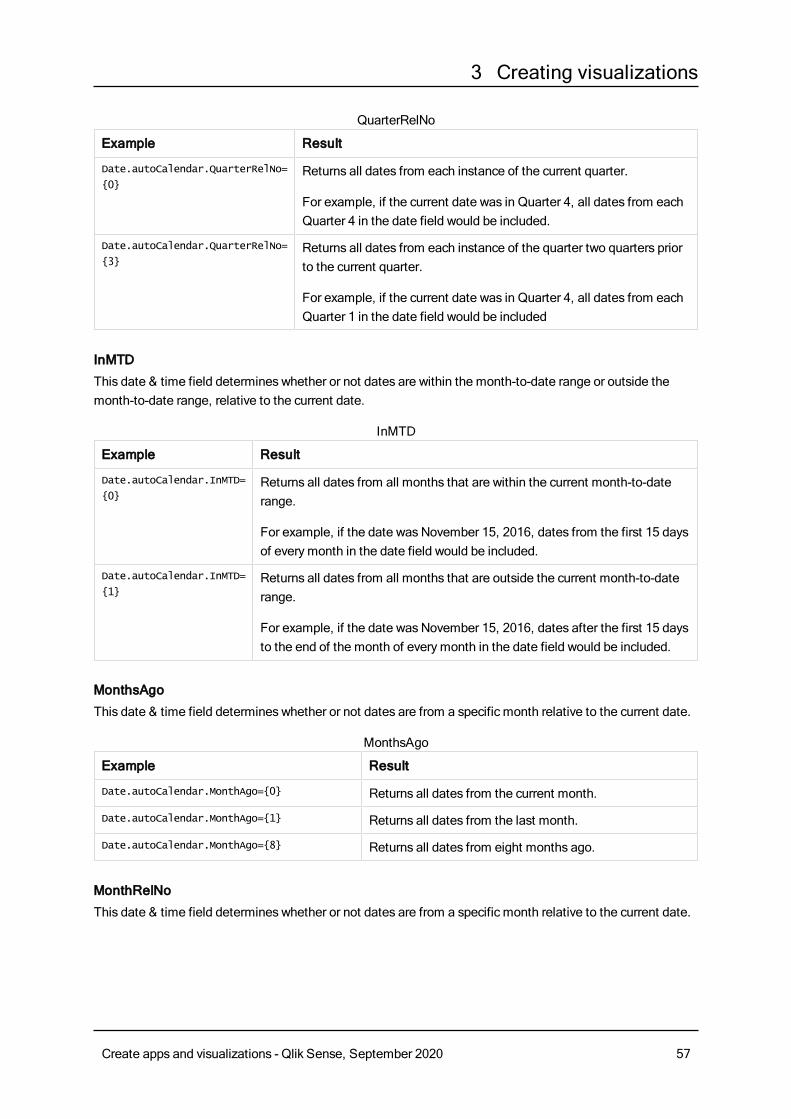
3 Creating visualizations
Example Result
Date.autoCalendar.QuarterRelNo=
{0}Returns all dates from each instance of the current quarter.
For example, if the current date was in Quarter 4, all dates from eachQuarter 4 in the date field would be included.
Date.autoCalendar.QuarterRelNo=
{3}Returns all dates from each instance of the quarter two quarters priorto the current quarter.
For example, if the current date was in Quarter 4, all dates from eachQuarter 1 in the date field would be included
QuarterRelNo
InMTD
This date & time field determines whether or not dates are within the month-to-date range or outside themonth-to-date range, relative to the current date.
Example Result
Date.autoCalendar.InMTD=
{0}Returns all dates from all months that are within the current month-to-daterange.
For example, if the date was November 15, 2016, dates from the first 15 daysof everymonth in the date field would be included.
Date.autoCalendar.InMTD=
{1}Returns all dates from all months that are outside the current month-to-daterange.
For example, if the date was November 15, 2016, dates after the first 15 daysto the end of the month of everymonth in the date field would be included.
InMTD
MonthsAgo
This date & time field determines whether or not dates are from a specific month relative to the current date.
Example Result
Date.autoCalendar.MonthAgo={0} Returns all dates from the current month.
Date.autoCalendar.MonthAgo={1} Returns all dates from the last month.
Date.autoCalendar.MonthAgo={8} Returns all dates from eight months ago.
MonthsAgo
MonthRelNo
This date & time field determines whether or not dates are from a specific month relative to the current date.
Create apps and visualizations - Qlik Sense, September 2020 57
3 Creating visualizations
Example Result
Date.autoCalendar.MonthRelNo=
{0}Returns all dates from each instance of the current month.
For example, if the current month was June, all dates in every instanceof June in the date field would be included.
Date.autoCalendar.MonthRelNo=
{1}Returns all dates from the each instance of the previousmonth.
For example, if the current month was June, all dates in every instanceof May in the date field would be included.
MonthRelNo
InWTD
This date & time field determines whether or not dates are within the week-to-date range or outside the week-to-date range, relative to the current date.
Example Result
Date.autoCalendar.InWTD=
{0}Returns all dates from all weeks that are within the current week-to-daterange.
For example, if the current date was the third day of a week, dates from thefirst three days of every week in the date field would be included.
Date.autoCalendar.InWTD=
{1}Returns all dates from all months that are outside the current month-to-daterange.
For example, if the current date was the third day of a week, dates from thelast four days of the every week in the date field would be included.
InWTD
WeeksAgo
This date & time field determines whether or not dates are from a specific week relative to the current week.
Example Result
Date.autoCalendar.WeeksAgo={0} Returns all dates from the current week.
Date.autoCalendar.WeeksAgo={8} Returns all dates from eight weeks ago.
WeeksAgo
WeekRelNo
This date & time field determines whether or not dates are from a specific week relative to the current date.
Create apps and visualizations - Qlik Sense, September 2020 58
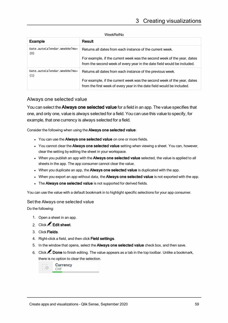
3 Creating visualizations
Example Result
Date.autoCalendar.WeekRelNo=
{0}Returns all dates from each instance of the current week.
For example, if the current week was the second week of the year, datesfrom the second week of every year in the date field would be included.
Date.autoCalendar.WeekRelNo=
{1}Returns all dates from each instance of the previous week.
For example, if the current week was the second week of the year, datesfrom the first week of every year in the date field would be included.
WeekRelNo
Always one selected valueYou can select theAlways one selected value for a field in an app. The value specifies thatone, and only one, value is always selected for a field. You can use this value to specify, forexample, that one currency is always selected for a field.
Consider the following when using the Always one selected value:
l You can use the Always one selected value on one or more fields.
l You cannot clear the Always one selected value setting when viewing a sheet. You can, however,clear the setting by editing the sheet in your workspace.
l When you publish an app with the Always one selected value selected, the value is applied to allsheets in the app. The app consumer cannot clear the value.
l When you duplicate an app, the Always one selected value is duplicated with the app.
l When you export an app without data, the Always one selected value is not exported with the app.
l The Always one selected value is not supported for derived fields.
You can use the value with a default bookmark in to highlight specific selections for your app consumer.
Set the Always one selected valueDo the following:
1. Open a sheet in an app.
2. Click Edit sheet.
3. Click Fields.
4. Right-click a field, and then click Field settings.
5. In the window that opens, select the Always one selected value check box, and then save.
6. Click Done to finish editing. The value appears as a tab in the top toolbar. Unlike a bookmark,
there is no option to clear the selection.
Create apps and visualizations - Qlik Sense, September 2020 59
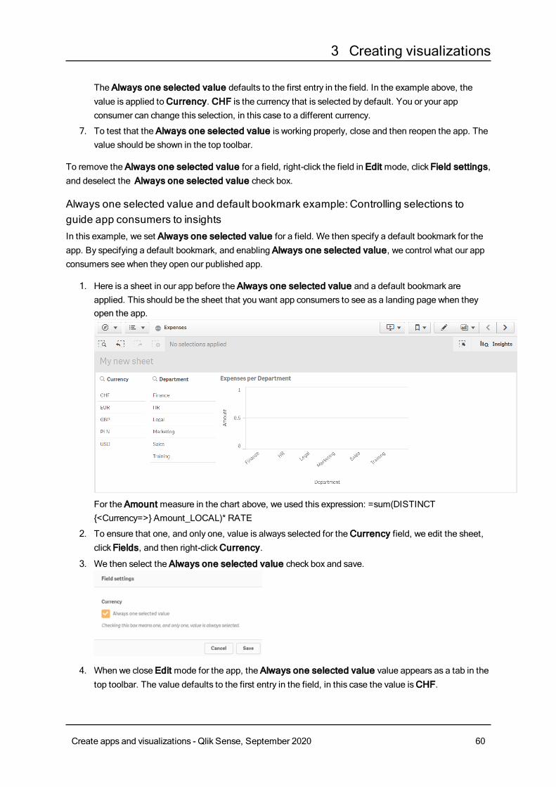
3 Creating visualizations
The Always one selected value defaults to the first entry in the field. In the example above, thevalue is applied toCurrency. CHF is the currency that is selected by default. You or your appconsumer can change this selection, in this case to a different currency.
7. To test that the Always one selected value is working properly, close and then reopen the app. Thevalue should be shown in the top toolbar.
To remove the Always one selected value for a field, right-click the field in Edit mode, click Field settings,and deselect the Always one selected value check box.
Always one selected value and default bookmark example: Controlling selections toguide app consumers to insightsIn this example, we set Always one selected value for a field. We then specify a default bookmark for theapp. By specifying a default bookmark, and enabling Always one selected value, we control what our appconsumers see when they open our published app.
1. Here is a sheet in our app before the Always one selected value and a default bookmark areapplied. This should be the sheet that you want app consumers to see as a landing page when theyopen the app.
For the Amount measure in the chart above, we used this expression: =sum(DISTINCT{<Currency=>} Amount_LOCAL)* RATE
2. To ensure that one, and only one, value is always selected for theCurrency field, we edit the sheet,click Fields, and then right-clickCurrency.
3. We then select the Always one selected value check box and save.
4. When we close Edit mode for the app, the Always one selected value value appears as a tab in thetop toolbar. The value defaults to the first entry in the field, in this case the value isCHF.
Create apps and visualizations - Qlik Sense, September 2020 60
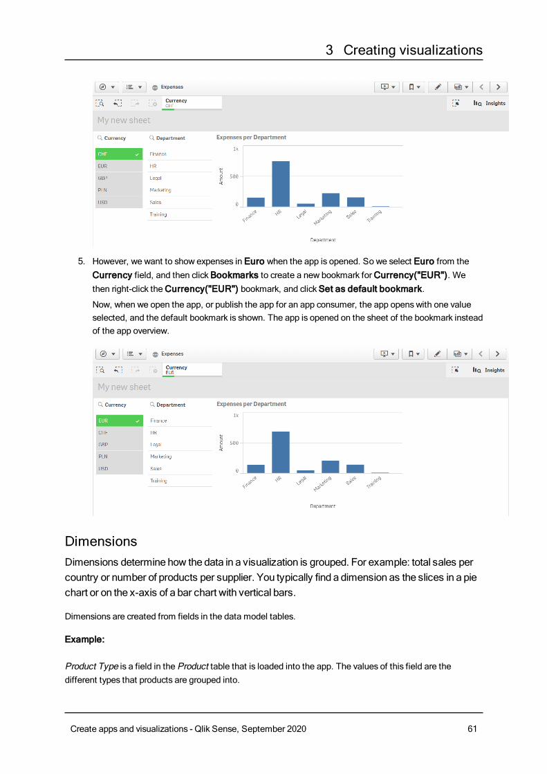
3 Creating visualizations
5. However, we want to show expenses in Euro when the app is opened. So we select Euro from theCurrency field, and then clickBookmarks to create a new bookmark forCurrency("EUR"). Wethen right-click theCurrency("EUR") bookmark, and clickSet as default bookmark.
Now, when we open the app, or publish the app for an app consumer, the app opens with one valueselected, and the default bookmark is shown. The app is opened on the sheet of the bookmark insteadof the app overview.
DimensionsDimensions determine how the data in a visualization is grouped. For example: total sales percountry or number of products per supplier. You typically find a dimension as the slices in a piechart or on the x-axis of a bar chart with vertical bars.
Dimensions are created from fields in the data model tables.
Example:
Product Type is a field in the Product table that is loaded into the app. The values of this field are thedifferent types that products are grouped into.
Create apps and visualizations - Qlik Sense, September 2020 61
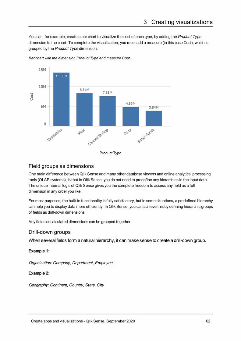
3 Creating visualizations
You can, for example, create a bar chart to visualize the cost of each type, by adding the Product Typedimension to the chart. To complete the visualization, you must add a measure (in this case Cost), which isgrouped by the Product Type dimension.
Bar chart with the dimension Product Type and measure Cost.
Field groups as dimensionsOnemain difference between Qlik Sense and many other database viewers and online analytical processingtools (OLAP systems), is that in Qlik Sense, you do not need to predefine any hierarchies in the input data.The unique internal logic of Qlik Sense gives you the complete freedom to access any field as a fulldimension in any order you like.
For most purposes, the built-in functionality is fully satisfactory, but in some situations, a predefined hierarchycan help you to display data more efficiently. In Qlik Sense, you can achieve this by defining hierarchic groupsof fields as drill-down dimensions.
Any fields or calculated dimensions can be grouped together.
Drill-down groupsWhen several fields form anatural hierarchy, it canmake sense to create a drill-downgroup.
Example 1:
Organization: Company, Department, Employee
Example 2:
Geography: Continent, Country, State, City
Create apps and visualizations - Qlik Sense, September 2020 62
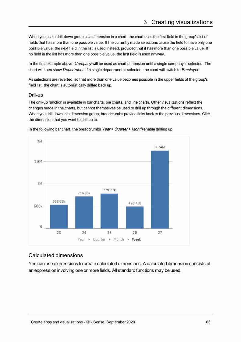
3 Creating visualizations
When you use a drill-down group as a dimension in a chart, the chart uses the first field in the group's list offields that hasmore than one possible value. If the currently made selections cause the field to have only onepossible value, the next field in the list is used instead, provided that it hasmore than one possible value. Ifno field in the list hasmore than one possible value, the last field is used anyway.
In the first example above, Company will be used as chart dimension until a single company is selected. Thechart will then showDepartment. If a single department is selected, the chart will switch to Employee.
As selections are reverted, so that more than one value becomes possible in the upper fields of the group'sfield list, the chart is automatically drilled back up.
Drill-upThe drill-up function is available in bar charts, pie charts, and line charts. Other visualizations reflect thechangesmade in the charts, but cannot themselves be used to drill up through the different dimensions.When you drill down in a dimension group, breadcrumbs provide links back to the previous dimensions. Clickthe dimension that you want to drill up to.
In the following bar chart, the breadcrumbsYear > Quarter > Month enable drilling up.
Calculated dimensionsYou canuse expressions to create calculated dimensions. A calculated dimension consists ofan expression involving one or more fields. All standard functions may beused.
Create apps and visualizations - Qlik Sense, September 2020 63
3 Creating visualizations
For performance reasons, it is recommended to perform all calculations in the data load editor.When dimensions are calculated in the chart, Qlik Sense first calculates the dimension values,and then aggregates themeasures for these calculated values, which affects the performancemore than calculations in the load script.
There are cases when calculated dimensions are powerful in data analysis, for example, if you want togenerate the dimensions values during analysis, when dimension values are dependent on the selections.
Calculated dimensions are also useful if you want to modify a field.
Once you have created a calculated dimension, you can use it as any other dimension.
Example:
You have a field called Calendar Month that includes each of the months of the year. In your app, you wantinclude a table that shows the sales for each of the first 6 months of the year. For the rest of the months, youwant to see a total. You can use an expression to create this calculated dimension.
Syntax:If ([Calendar Month] <7, [Calendar Month], 'Rest')
MeasuresMeasures are calculations used in visualizations, typically represented on the y-axis of a barchart or a column in a table. Measures are created from anexpression composedofaggregation functions, such as Sum orMax, combinedwith one or several fields.
A measure must have a name, and may also be supplied with descriptive data such as description and tags.
Example:
You can, for example, create a bar chart to visualize the cost of each type, by adding the Product Typedimension to the chart, and the measureCost, which is made from the expression Sum(Cost), that is theresult of the calculation of the aggregation function Sum over the fieldCost. The results are grouped by theProduct Type dimension.
Bar chart with the dimension Product Type and the measure Cost.
Create apps and visualizations - Qlik Sense, September 2020 64
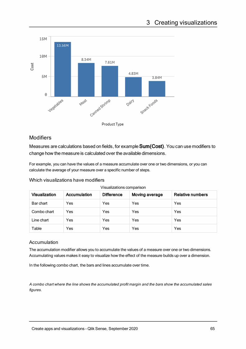
3 Creating visualizations
ModifiersMeasures are calculations based on fields, for exampleSum(Cost). You can usemodifiers tochangehow themeasure is calculated over the available dimensions.
For example, you can have the values of a measure accumulate over one or two dimensions, or you cancalculate the average of your measure over a specific number of steps.
Which visualizations have modifiers
Visualization Accumulation Difference Moving average Relative numbers
Bar chart Yes Yes Yes Yes
Combo chart Yes Yes Yes Yes
Line chart Yes Yes Yes Yes
Table Yes Yes Yes Yes
Visualizations comparison
AccumulationThe accumulation modifier allows you to accumulate the values of a measure over one or two dimensions.Accumulating valuesmakes it easy to visualize how the effect of the measure builds up over a dimension.
In the following combo chart, the bars and lines accumulate over time.
A combo chart where the line shows the accumulated profit margin and the bars show the accumulated salesfigures.
Create apps and visualizations - Qlik Sense, September 2020 65
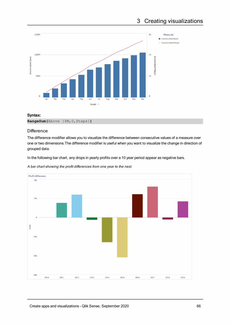
3 Creating visualizations
Syntax:RangeSum(Above {$M,0,Steps})
DifferenceThe difference modifier allows you to visualize the difference between consecutive values of a measure overone or two dimensions.The difference modifier is useful when you want to visualize the change in direction ofgrouped data.
In the following bar chart, any drops in yearly profits over a 10 year period appear as negative bars.
A bar chart showing the profit differences from one year to the next.
Create apps and visualizations - Qlik Sense, September 2020 66
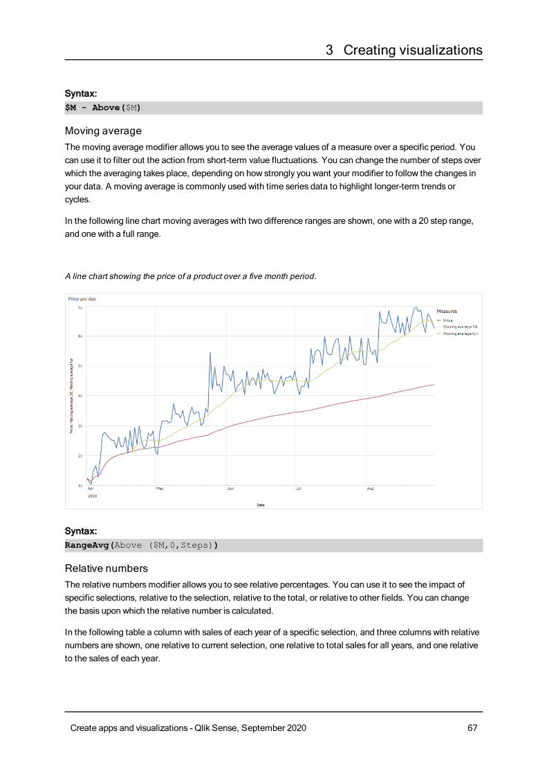
3 Creating visualizations
Syntax:$M - Above($M)
Moving averageThe moving average modifier allows you to see the average values of a measure over a specific period. Youcan use it to filter out the action from short-term value fluctuations. You can change the number of steps overwhich the averaging takes place, depending on how strongly you want your modifier to follow the changes inyour data. A moving average is commonly used with time series data to highlight longer-term trends orcycles.
In the following line chart moving averages with two difference ranges are shown, one with a 20 step range,and one with a full range.
A line chart showing the price of a product over a five month period.
Syntax:RangeAvg(Above ($M,0,Steps))
Relative numbersThe relative numbersmodifier allows you to see relative percentages. You can use it to see the impact ofspecific selections, relative to the selection, relative to the total, or relative to other fields. You can changethe basis upon which the relative number is calculated.
In the following table a column with sales of each year of a specific selection, and three columns with relativenumbers are shown, one relative to current selection, one relative to total sales for all years, and one relativeto the sales of each year.
Create apps and visualizations - Qlik Sense, September 2020 67
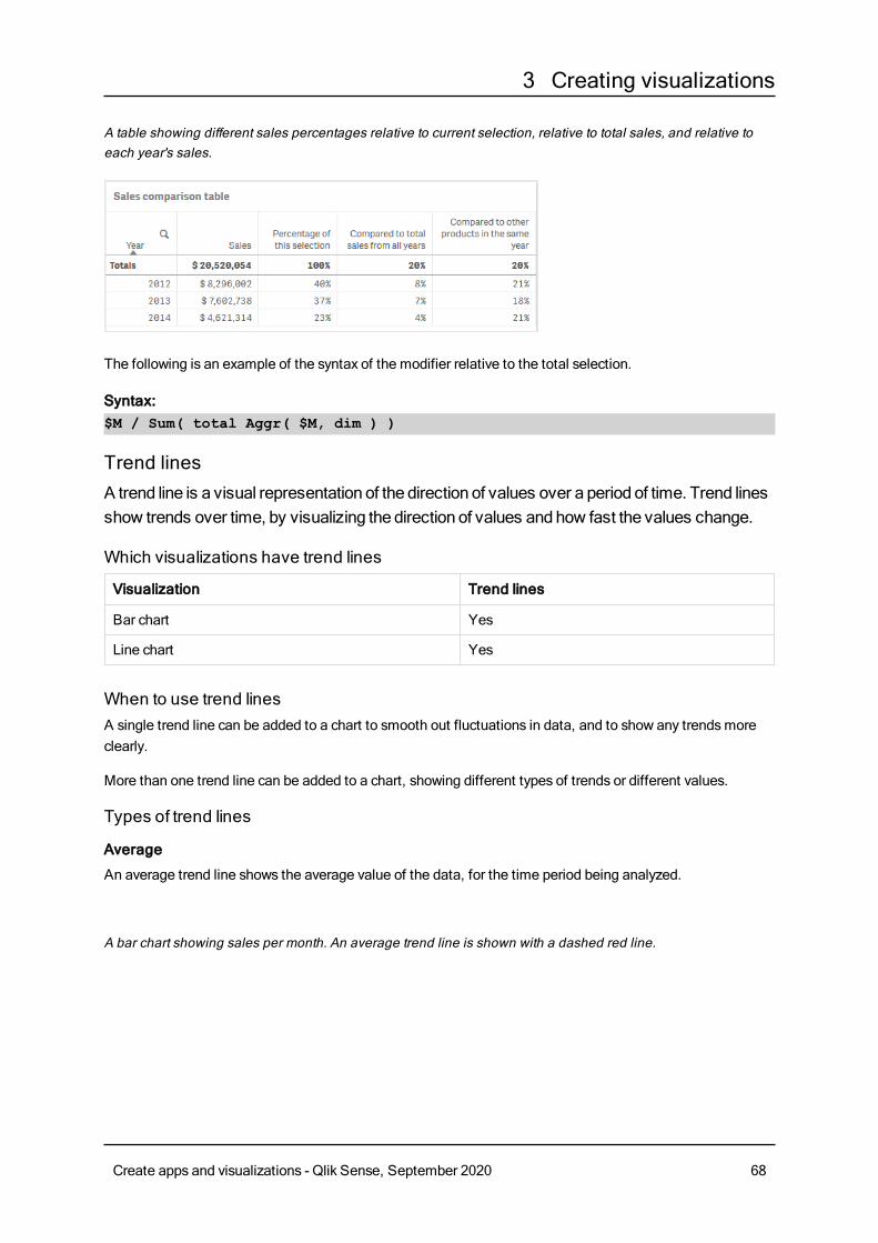
3 Creating visualizations
A table showing different sales percentages relative to current selection, relative to total sales, and relative toeach year's sales.
The following is an example of the syntax of the modifier relative to the total selection.
Syntax:$M / Sum( total Aggr( $M, dim ) )
Trend linesA trend line is a visual representation of the direction of values over a period of time. Trend linesshow trends over time, by visualizing the direction of values andhow fast the values change.
Which visualizations have trend lines
Visualization Trend lines
Bar chart Yes
Line chart Yes
When to use trend linesA single trend line can be added to a chart to smooth out fluctuations in data, and to show any trendsmoreclearly.
More than one trend line can be added to a chart, showing different types of trends or different values.
Types of trend lines
Average
An average trend line shows the average value of the data, for the time period being analyzed.
A bar chart showing sales per month. An average trend line is shown with a dashed red line.
Create apps and visualizations - Qlik Sense, September 2020 68
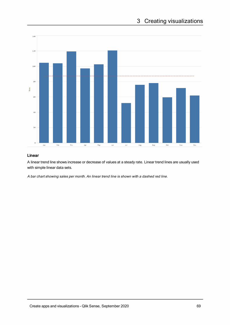
3 Creating visualizations
Linear
A linear trend line shows increase or decrease of values at a steady rate. Linear trend lines are usually usedwith simple linear data sets.
A bar chart showing sales per month. An linear trend line is shown with a dashed red line.
Create apps and visualizations - Qlik Sense, September 2020 69
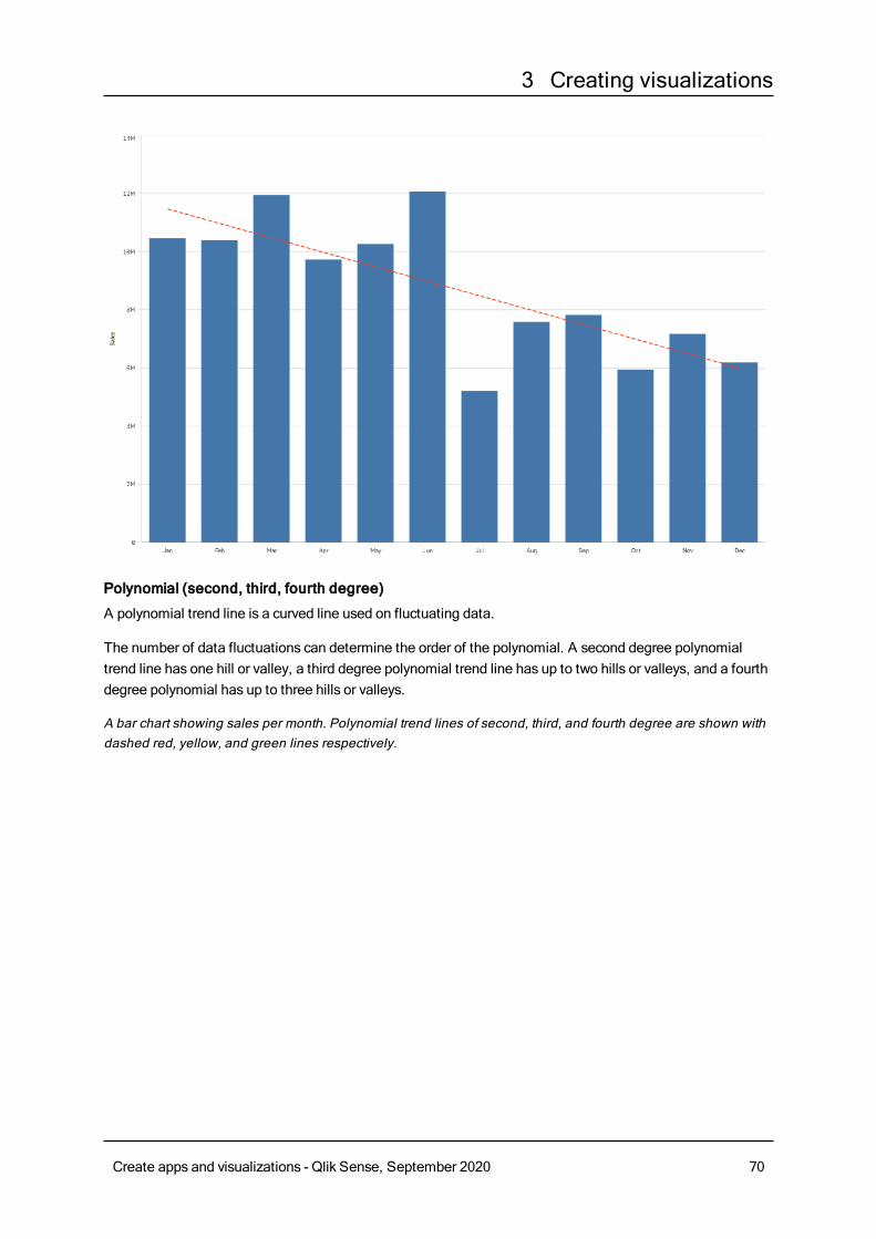
3 Creating visualizations
Polynomial (second, third, fourth degree)
A polynomial trend line is a curved line used on fluctuating data.
The number of data fluctuations can determine the order of the polynomial. A second degree polynomialtrend line has one hill or valley, a third degree polynomial trend line has up to two hills or valleys, and a fourthdegree polynomial has up to three hills or valleys.
A bar chart showing sales per month. Polynomial trend lines of second, third, and fourth degree are shown withdashed red, yellow, and green lines respectively.
Create apps and visualizations - Qlik Sense, September 2020 70
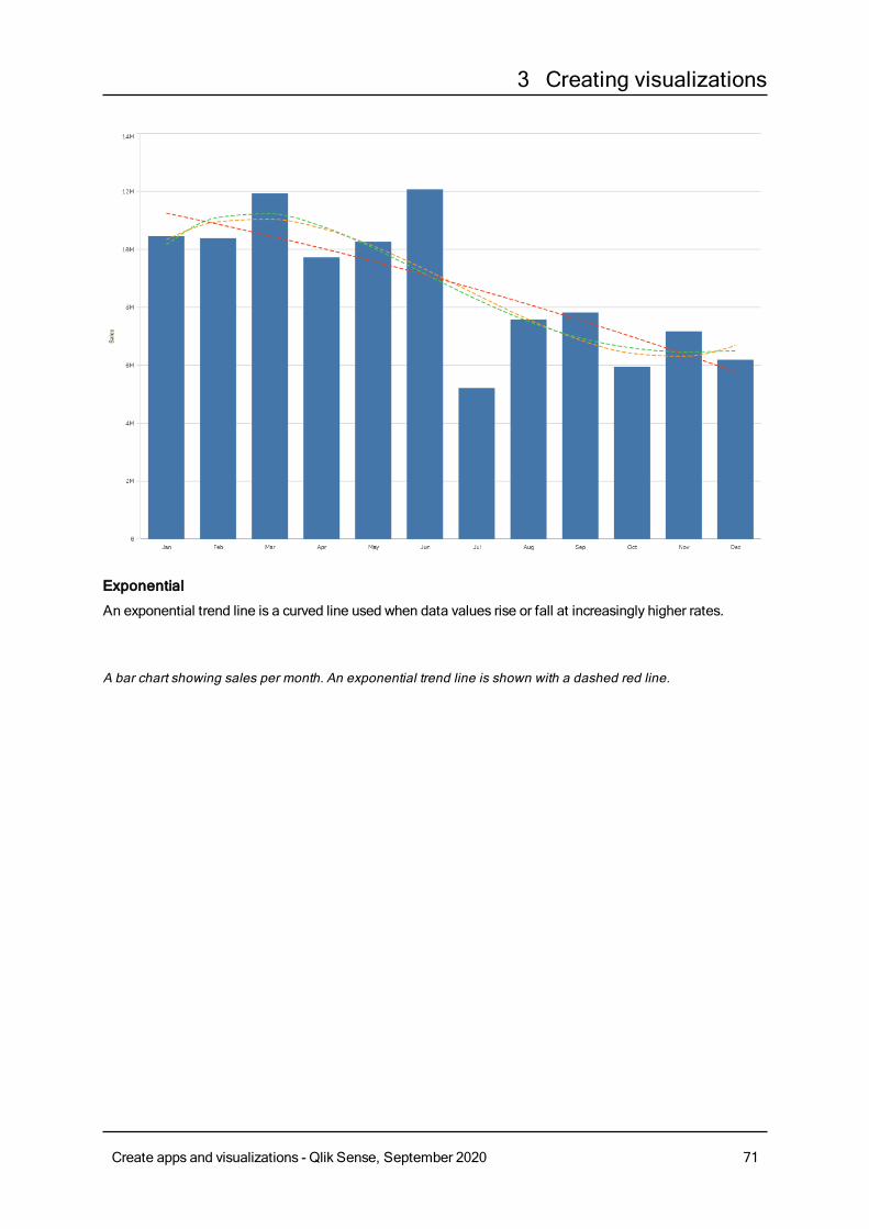
3 Creating visualizations
Exponential
An exponential trend line is a curved line used when data values rise or fall at increasingly higher rates.
A bar chart showing sales per month. An exponential trend line is shown with a dashed red line.
Create apps and visualizations - Qlik Sense, September 2020 71
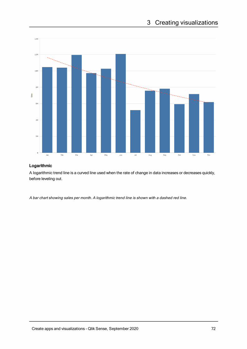
3 Creating visualizations
Logarithmic
A logarithmic trend line is a curved line used when the rate of change in data increases or decreases quickly,before leveling out.
A bar chart showing sales per month. A logarithmic trend line is shown with a dashed red line.
Create apps and visualizations - Qlik Sense, September 2020 72

3 Creating visualizations
Power
A power trend line is a curved line used with data sets that compare measurements that increase at specificrates.
A bar chart showing sales per month. A power trend line is shown with a dotted red line.
Create apps and visualizations - Qlik Sense, September 2020 73
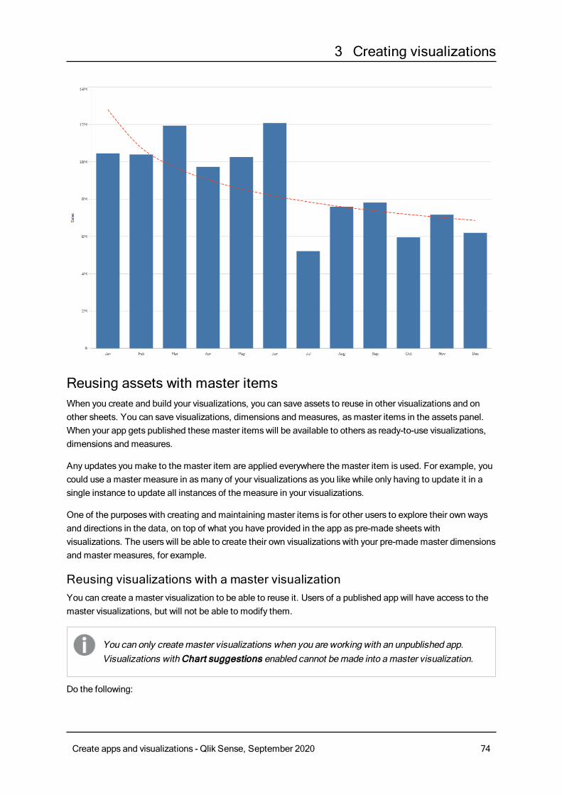
3 Creating visualizations
Reusing assets with master itemsWhen you create and build your visualizations, you can save assets to reuse in other visualizations and onother sheets. You can save visualizations, dimensions and measures, asmaster items in the assets panel.When your app gets published these master itemswill be available to others as ready-to-use visualizations,dimensions and measures.
Any updates you make to the master item are applied everywhere the master item is used. For example, youcould use a master measure in asmany of your visualizations as you like while only having to update it in asingle instance to update all instances of the measure in your visualizations.
One of the purposes with creating and maintaining master items is for other users to explore their own waysand directions in the data, on top of what you have provided in the app as pre-made sheets withvisualizations. The users will be able to create their own visualizations with your pre-made master dimensionsand master measures, for example.
Reusing visualizations with a master visualizationYou can create a master visualization to be able to reuse it. Users of a published app will have access to themaster visualizations, but will not be able to modify them.
You can only createmaster visualizations when you are working with an unpublished app.Visualizations with Chart suggestions enabled cannot bemade into amaster visualization.
Do the following:
Create apps and visualizations - Qlik Sense, September 2020 74
3 Creating visualizations
1. While editing a sheet, drag a visualization from the sheet to the master items.If you have given the visualization a title, this is automatically added as the name of the mastervisualization.
2. Add a name, or change the name if you want to.
3. Type a description for the visualization (optional).
4. Add tags (optional).
5. ClickAdd.
The visualization is now saved to the master items tab.
You can also add a visualization to themaster items by long-touching/right-clicking it on the
sheet, and selecting Add to master items.
Editing a master visualizationWhen you update a visualization in the master items, the changes will be reflected in all instances of themaster visualization.
Do the following:
1. In sheet view, click Edit sheet in the toolbar.The assets panel opens on the left-hand side.
2. Click to display the master items.
3. Click the visualization that you want to edit.The preview opens.
4. Click at the bottom of the preview.
If the visualization is used on a sheet, a dialog is displayed to inform you that any changes to themaster visualization will be applied to all its instances on the sheets.
5. ClickOK.The visualization opens for editing.
6. Make the changes you want, and clickDone in the upper right corner of the visualization to finishediting.
The visualization is updated and reflected in all its instances.
You can also edit a master item from its preview. You open the preview by clicking an item inthemaster items.
Reusing dimensions with master dimensionsWhen youareworkingwith an unpublished app, you can createmaster dimensions so that theycan be reused. Users of a published appwill have access to themaster dimensions, but will notbe able tomodify them.
You can create a master dimension in different ways.
Create apps and visualizations - Qlik Sense, September 2020 75
3 Creating visualizations
Creating a master dimension from a field
When youareworkingwith an unpublished app, you can createmaster dimensions so that theycan be reused. You can create amaster dimension from theFields section of the assets panel.
Do the following:
1. Click Edit sheet in the toolbar.The assets panel opens on the left-hand side.
2. Click to select the fields tab.
3. Click the field you want to use to create a dimension.The preview opens.
4. Click at the bottom of the preview.
TheCreate new dimensions dialog opens with the field you selected. The field name is also usedas the name of the dimension.
5. Select if the dimension is to be single or drill-down.
6. Edit the name if you want to.
7. Type a description for the dimension (optional).
8. If you want to specify a color, click in the color drop down and select a color through one of the
following methods:
l Click one of the colors in the palette.
l Type a 6 character color code in the Hex input field: #.
l Click at the bottom of the dialog, select a color in the color wheel, and optionally adjust the
saturation slider.
9. Add tags (optional).
10. ClickCreate.
11. ClickDone to close the dialog.
The dimension is now saved in theDimensions category in the master items, and you can use it invisualizations.
You can quickly add several dimensions as master items by clicking Add dimension afteradding each dimension. Click Done when you have finished.
Direct Discovery fields are indicated by in the Fields section of the assets panel.
Creating a master dimension from the assets panel
When youareworkingwith an unpublished app, you can createmaster dimensions so that theycan be reused. Users of a published appwill have access to themaster dimensions, but will notbe able tomodify them.
Create apps and visualizations - Qlik Sense, September 2020 76
3 Creating visualizations
You can only createmaster dimensions when you are working with an unpublished app.
Do the following:
1. Click Edit sheet in the toolbar.The assets panel opens on the left-hand side.
2. Click to select the master items tab.
3. Click theDimensions heading to expand the category.
4. ClickCreate new.TheCreate new dimensions dialog opens.
5. Select if the dimension is to be single or drill-down.
6. Click a field on the left-hand side to select it.The name of the field is automatically added as the name of the dimension.
7. Change the name if you want to.
8. Type a description for the dimension (optional).
9. If you want to specify a color, click in the color drop down and select a color through one of the
following methods:
l Click one of the colors in the palette.
l Type a 6 character color code in the Hex input field: #.
l Click at the bottom of the dialog, select a color in the color wheel, and optionally adjust the
saturation slider.
10. Add tags (optional).
11. ClickCreate.
12. ClickDone to close the dialog.
The dimension is now saved in theDimensions category in the master items, and you can use it invisualizations.
You can quickly add several dimensions as master items by clicking Add dimension afteradding each dimension. Click Done when you have finished.
Creating a drill-down dimension
Whenadding a dimension, you can select between creating a single or a drill-downdimension.
The following description explains how to create a drill-down group from theCreate new dimensionsdialog.
If selections cause the current drill-down dimension field to have only one possible value, thenext field in the list is used instead.
Create apps and visualizations - Qlik Sense, September 2020 77
3 Creating visualizations
Do the following:
1. Select Drill-down as dimension type.
2. Click at least two fields from the fields list on the left-hand side to insert them as the referenced fields.
You can filter which table to select fields from in the drop-down list.
You can rearrange the order of the fields you have selected by dragging them to newpositions in the list of selected fields.
3. Type a name for the dimension.
4. Type a description for the dimension (optional).
5. If you want to specify a color, click in the color drop down and select a color through one of the
following methods:
l Click one of the colors in the palette.
l Type a 6 character color code in the Hex input field: #.
l Click at the bottom of the dialog, select a color in the color wheel, and optionally adjust the
saturation slider.
6. Add tags (optional).
7. ClickCreate.
8. ClickDone to close the dialog.
The drill-down dimension is now saved in theDimensions category among the master items.
When you click the dimension in the panel on the left-hand side, the preview displays the dimension type andwhich fields are included in the drill-down dimension.
The preview displays the dimension type and which fields are included in the drill-down dimension.
Create apps and visualizations - Qlik Sense, September 2020 78
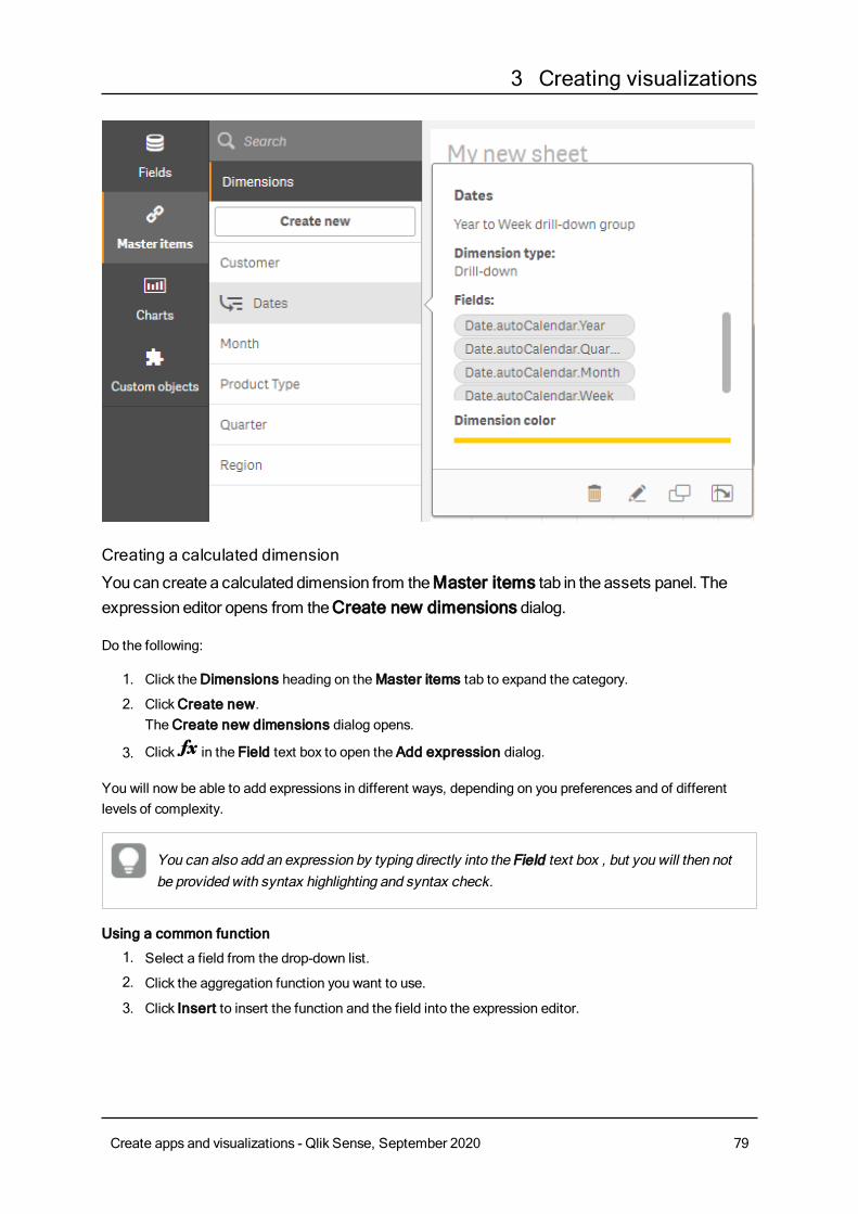
3 Creating visualizations
Creating a calculated dimension
You can create a calculated dimension from theMaster items tab in the assets panel. Theexpression editor opens from theCreate new dimensions dialog.
Do the following:
1. Click theDimensions heading on theMaster items tab to expand the category.
2. ClickCreate new.TheCreate new dimensions dialog opens.
3. Click in the Field text box to open the Add expression dialog.
You will now be able to add expressions in different ways, depending on you preferences and of differentlevels of complexity.
You can also add an expression by typing directly into the Field text box , but you will then notbe provided with syntax highlighting and syntax check.
Using a common function
1. Select a field from the drop-down list.
2. Click the aggregation function you want to use.
3. Click Insert to insert the function and the field into the expression editor.
Create apps and visualizations - Qlik Sense, September 2020 79
3 Creating visualizations
You can insert just a function or just a field by selecting only one of them.
4. ClickApply to close the Add expression dialog.Continue by adding the descriptive data for the dimension.
Adding an expression by typing
1. Type the expression directly in the expression editor.The field names you use in the expression are checked, and the syntax of the expression is validated.
As you type in the expression editor, the expression is validated continuously. If there isan error, you see a hint about what is incorrect. Additional error informationmay beavailable by clicking the icon next to the hint.
Each line in the expression editor is numbered and syntax highlighting is used.
2. ClickApply to close the Add expression dialog.For a measure, you continue by adding the descriptive data for the measure.
Adding an expression through the properties panel
You can add an expression to a visualization through the properties panel.
1. Open the sheet with the visualization that you want to edit.
2. Click Edit sheet to open the properties panel. (If it is hidden, clickShow properties in the
lower right-hand corner to open it.)
3. Click the visualization that you want to edit.The properties panel for that visualization is displayed on the right-hand side.
4. UnderData, clickAdd data and select Dimension.A dimension text box is displayed.
5. Type your expression. The expression must begin with an equals sign (=), otherwise the string will beinterpreted as text.
Detailed syntax help
You can open the online help with the full description of how to use the current function by double-clicking thefunction name in the expression editor and pressing Ctrl+H on the keyboard. This feature becomes availableafter having entered the first parenthesis of the expression after the function name.
This feature is supported only when using a computer with a keyboard.
Adding the descriptive data for the dimension
After having entered the expression, you need to add some descriptive information.
1. Type a name for the dimension.
2. Type a description for the dimension (optional).
Create apps and visualizations - Qlik Sense, September 2020 80
3 Creating visualizations
3. Optionally, click in the color drop down and select a color through one of the following methods:
l Click one of the colors in the palette.
l Type a 6 character color code in the Hex input field: #.
l Click at the bottom of the dialog, select a color in the color wheel, and optionally adjust the
saturation slider.
4. Add tags (optional).
5. ClickCreate.
6. ClickDone to close the dialog.
The calculated dimension is now saved in theDimensions category of theMaster items, and you can use itin visualizations.
Editing a master dimensionWhen you update a master dimension, the changes will be reflected in all its instances, including allvisualizations that use it.
Do the following:
1. In sheet view, click Edit sheet in the toolbar.The assets panel opens on the left-hand side.
2. Click to display the master items.
3. Click the dimension that you want to edit.The preview opens.
4. Click at the bottom of the preview.
If the dimension is used on a sheet, a dialog is displayed to inform you that any changes to the masterdimension will be applied to all its instances on the sheets.
5. ClickOK.The Edit dimension dialog opens, where you update the field or expression, name, description andtags.
6. ClickSave.
The dimension is now updated.
You can also edit a master item from its preview. You open the preview by clicking an item inthemaster items.
Deleting a master dimension ormaster measureYou can delete dimensions and measures from the master items as long as the app is not published.
If you delete amaster dimension or master measure, the visualizations that use the deletedmaster item will not work unless you replace it with a new dimension or measure.
Do the following:
Create apps and visualizations - Qlik Sense, September 2020 81
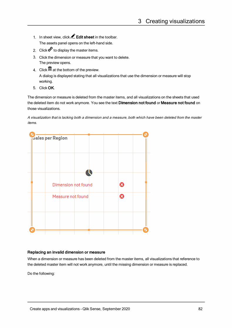
3 Creating visualizations
1. In sheet view, click Edit sheet in the toolbar.The assets panel opens on the left-hand side.
2. Click to display the master items.
3. Click the dimension or measure that you want to delete.The preview opens.
4. Click at the bottom of the preview.
A dialog is displayed stating that all visualizations that use the dimension or measure will stopworking.
5. ClickOK.
The dimension or measure is deleted from the master items, and all visualizations on the sheets that usedthe deleted item do not work anymore. You see the text Dimension not found orMeasure not found onthose visualizations.
A visualization that is lacking both a dimension and a measure, both which have been deleted from the masteritems.
Replacing an invalid dimension or measure
When a dimension or measure has been deleted from the master items, all visualizations that reference tothe deleted master item will not work anymore, until the missing dimension or measure is replaced.
Do the following:
Create apps and visualizations - Qlik Sense, September 2020 82
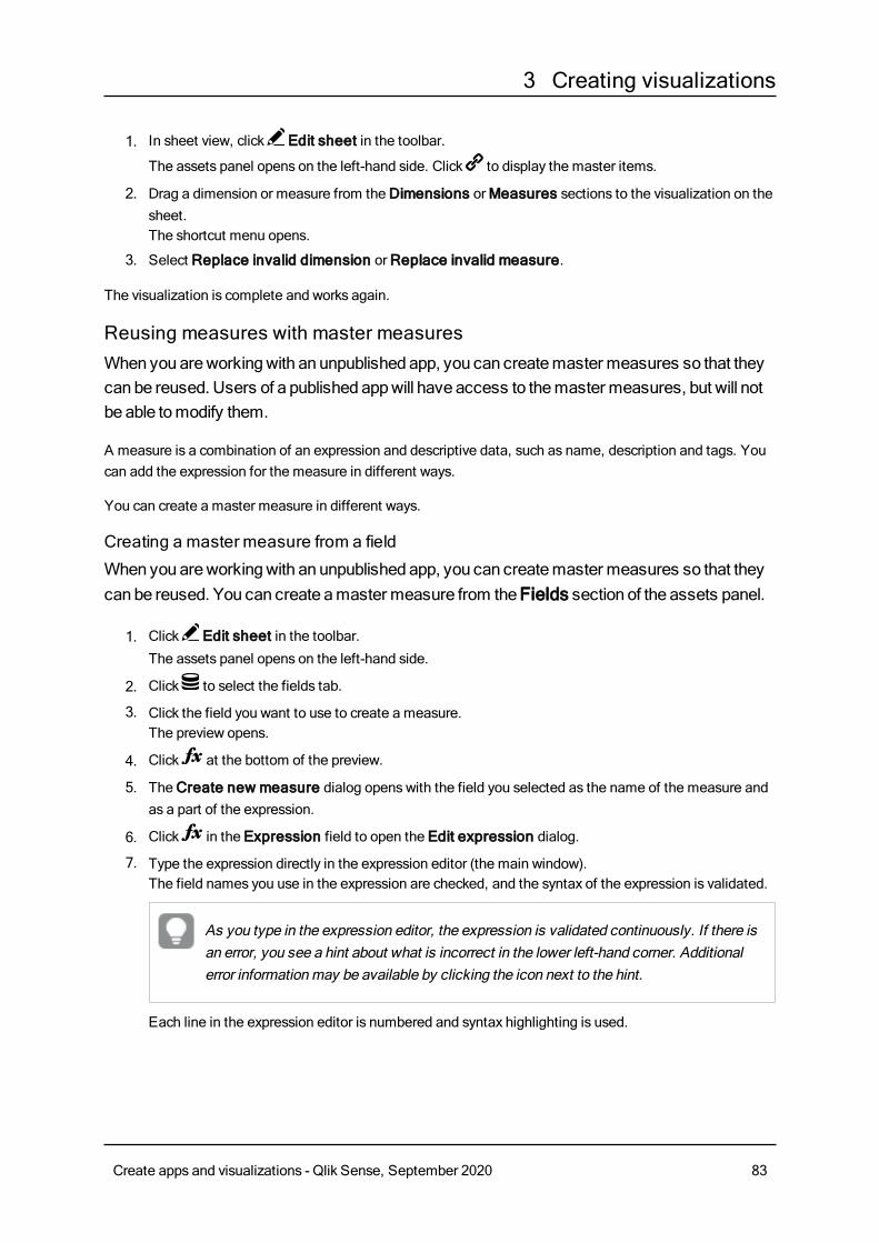
3 Creating visualizations
1. In sheet view, click Edit sheet in the toolbar.
The assets panel opens on the left-hand side. Click to display the master items.
2. Drag a dimension or measure from theDimensions orMeasures sections to the visualization on thesheet.The shortcut menu opens.
3. Select Replace invalid dimension orReplace invalid measure.
The visualization is complete and works again.
Reusing measures with master measuresWhen youareworkingwith an unpublished app, you can createmaster measures so that theycan be reused. Users of a published appwill have access to themaster measures, but will notbe able tomodify them.
A measure is a combination of an expression and descriptive data, such as name, description and tags. Youcan add the expression for the measure in different ways.
You can create a master measure in different ways.
Creating a master measure from a field
When youareworkingwith an unpublished app, you can createmaster measures so that theycan be reused. You can create amaster measure from theFields section of the assets panel.
1. Click Edit sheet in the toolbar.The assets panel opens on the left-hand side.
2. Click to select the fields tab.
3. Click the field you want to use to create a measure.The preview opens.
4. Click at the bottom of the preview.
5. TheCreate new measure dialog opens with the field you selected as the name of the measure andas a part of the expression.
6. Click in the Expression field to open the Edit expression dialog.
7. Type the expression directly in the expression editor (the main window).The field names you use in the expression are checked, and the syntax of the expression is validated.
As you type in the expression editor, the expression is validated continuously. If there isan error, you see a hint about what is incorrect in the lower left-hand corner. Additionalerror informationmay be available by clicking the icon next to the hint.
Each line in the expression editor is numbered and syntax highlighting is used.
Create apps and visualizations - Qlik Sense, September 2020 83
3 Creating visualizations
You can open the online help with the full description of how to use the current functionby double-clicking the function name in the expression editor and pressing Ctrl+H on thekeyboard. This feature becomes available after having entered the first parenthesis ofthe expression after the function name, and only when using a computer with akeyboard.
8. ClickApply to close the Add expression dialog.Now you need to add some descriptive data for the measure.
9. Edit the name if you want to.
10. Type a description for the measure (optional).
11. If you want to specify a color, click in the color drop down and select a color through one of the
following methods:
l Click one of the colors in the palette.
l Type a 6 character color code in the Hex input field.
l Click at the bottom of the dialog, select a color in the color wheel, and optionally adjust the
saturation slider.
12. Add tags (optional).
13. UnderNumber formatting, you can choose:
l Auto
l Number
l Money
l Date
l Duration
l Custom
l Measure expression
14. ClickCreate.
The measure is now saved in theMeasures category in the master items, and you can use it invisualizations.
Direct Discovery fields are indicated by in the Fields section of the assets panel.
Creating a master measure with a common aggregation function
When youareworkingwith an unpublished app, you can createmaster measures so that theycan be reused. You can easily create ameasure using oneof themost commonaggregationfunctions by selecting the function and the field from drop-down lists.
Do the following:
1. Click Edit sheet in the toolbar.
Create apps and visualizations - Qlik Sense, September 2020 84
3 Creating visualizations
The assets panel opens on the left-hand side.
2. Click to select the master items tab.
3. Click theMeasures heading to expand that category.
4. ClickCreate new.TheCreate new measure dialog opens.
5. Click in the Expression field to open the Add expression dialog.You find drop-down lists for selecting a field and a common function on the right-hand side.
6. If you want to show fields from a particular table, select this table in the top drop-down list (optional).
7. Select a field from the Field drop-down list.
8. Select a function from the bottom drop-down list.
You can insert just a field by not selecting a function.
9. Click Insert to insert the field and the function into the expression editor.
You can open the online help with the full description of how to use the current functionby double-clicking the function name in the expression editor and pressing Ctrl+H on thekeyboard. This feature becomes available after having entered the first parenthesis ofthe expression after the function name, and only when using a computer with akeyboard.
10. ClickApply to close the Add expression dialog.Now you need to add some descriptive data for the measure.
11. Type a name for the measure.
12. Type a description for the measure (optional).
13. If you want to specify a color, click in the color drop down and select a color through one of the
following methods:
l Click one of the colors in the palette.
l Type a 6 character color code in the Hex input field.
l Click at the bottom of the dialog, select a color in the color wheel, and optionally adjust the
saturation slider.
14. Add tags (optional).
15. UnderNumber formatting, you can choose:
l Auto
l Number
l Money
l Date
l Duration
l Custom
l Measure expression
Create apps and visualizations - Qlik Sense, September 2020 85
3 Creating visualizations
16. ClickCreate.
The measure is now saved in theMeasures category in the master items, and you can use it invisualizations.
Creating a master measure by typing the expression
When youareworkingwith an unpublished app, you can createmaster measures so that theycan be reused. You can add complex expressions by typing the expression into the expressioneditor.
1. Click Edit sheet in the toolbar.The assets panel opens on the left-hand side.
2. Click to select the master items tab.
3. Click theMeasures heading to expand that category.
4. ClickCreate new.TheCreate new measure dialog opens.
5. Click in the Expression field to open the Add expression dialog.
6. Type the expression directly in the expression editor (the main window).The field names you use in the expression are checked, and the syntax of the expression is validated.
As you type in the expression editor, the expression is validated continuously. If there isan error, you see a hint about what is incorrect in the lower left-hand corner. Additionalerror informationmay be available by clicking the icon next to the hint.
Each line in the expression editor is numbered and syntax highlighting is used.
You can open the online help with the full description of how to use the current functionby double-clicking the function name in the expression editor and pressing Ctrl+H on thekeyboard. This feature becomes available after having entered the first parenthesis ofthe expression after the function name, and only when using a computer with akeyboard.
7. ClickApply to close the Add expression dialog.Now you need to add some descriptive data for the measure.
8. Type a name for the measure.
9. Type a description for the measure (optional).
10. If you want to specify a color, click in the color drop down and select a color through one of the
following methods:
l Click one of the colors in the palette.
l Type a 6 character color code in the Hex input field.
l Click at the bottom of the dialog, select a color in the color wheel, and optionally adjust the
saturation slider.
Create apps and visualizations - Qlik Sense, September 2020 86
3 Creating visualizations
11. Add tags (optional).
12. UnderNumber formatting, you can choose:
l Auto
l Number
l Money
l Date
l Duration
l Custom
l Measure expression
13. ClickCreate.
The measure is now saved in theMeasures category in the master items, and you can use it invisualizations.
Editing a master measureWhen you update a master measure, the changes will be reflected in all its instances, including allvisualizations that use it.
Do the following:
1. In sheet view, click Edit sheet in the toolbar.The assets panel opens on the left-hand side.
2. Click to display the master items.
3. Click the measure that you want to edit.The preview opens.
4. Click at the bottom of the preview.
If the measure is used on a sheet, a dialog is displayed to inform you that any changes to the mastermeasure will be applied to all its instances on the sheets.
5. ClickOK.The Edit measure dialog opens, where you update the expression, name, description, color, andtags.
6. ClickSave.
The measure is now updated.
You can also edit a master item from its preview. You open the preview by clicking an item inthemaster items.
Assigning colors to master itemsYou canassign colors to your master items. Colors assigned tomaster dimensions andmaster measures persist across all instances of thosemaster items in all visualizations.
Create apps and visualizations - Qlik Sense, September 2020 87
3 Creating visualizations
If you change the color used for the master item, the color will be updated across all instances of that masteritem. Optionally, master item colors can be disabled for individual visualizations.
Visualizations use master dimension colors when Single color is selected in theColors and legend sectionof the visualization properties panel. Master measure colors are used when Single color orMulticolored areselected in theColors and legend section of the visualization properties panel.
By default, if a visualization's default Auto settings use the Single orMulticolored, master item colors willbe applied automatically. If they do not, you must switch toCustom and select a supported setting. Masteritem colors can be disabled in individual visualizations.
In a visualization with colors specified for both master dimension and master measure, Qlik Sense defaults tothe master dimension color. Master measure colors can be applied using theUse library colors drop-downand selectingMeasure in theColors and legend section of the visualization properties panel. Invisualization with a mix of master measures with assigned colors and measures without assigned colors, theother measures will use the default palette colors.
Master dimensions can have colors assigned to their distinct values.
Master measures can have custom color gradients applied to their values in visualizations. .
When assigning colors to your master items, you have the following options:
l Choose a color from the default palette
l Type a hexadecimal color code
l Choose a color using advanced color options
Assigning a color from the default color paletteDo the following:
1. In sheet view, click Edit sheet in the toolbar.
2. Click to display the master items.
3. Select a master item from your library.
4. Click .
5. Click in the color drop-down.
6. Select one of the colors in the palette.
7. Click outside the dialog.
8. ClickSave.
The color dialog with the default color palette and a blue color selected.
Create apps and visualizations - Qlik Sense, September 2020 88
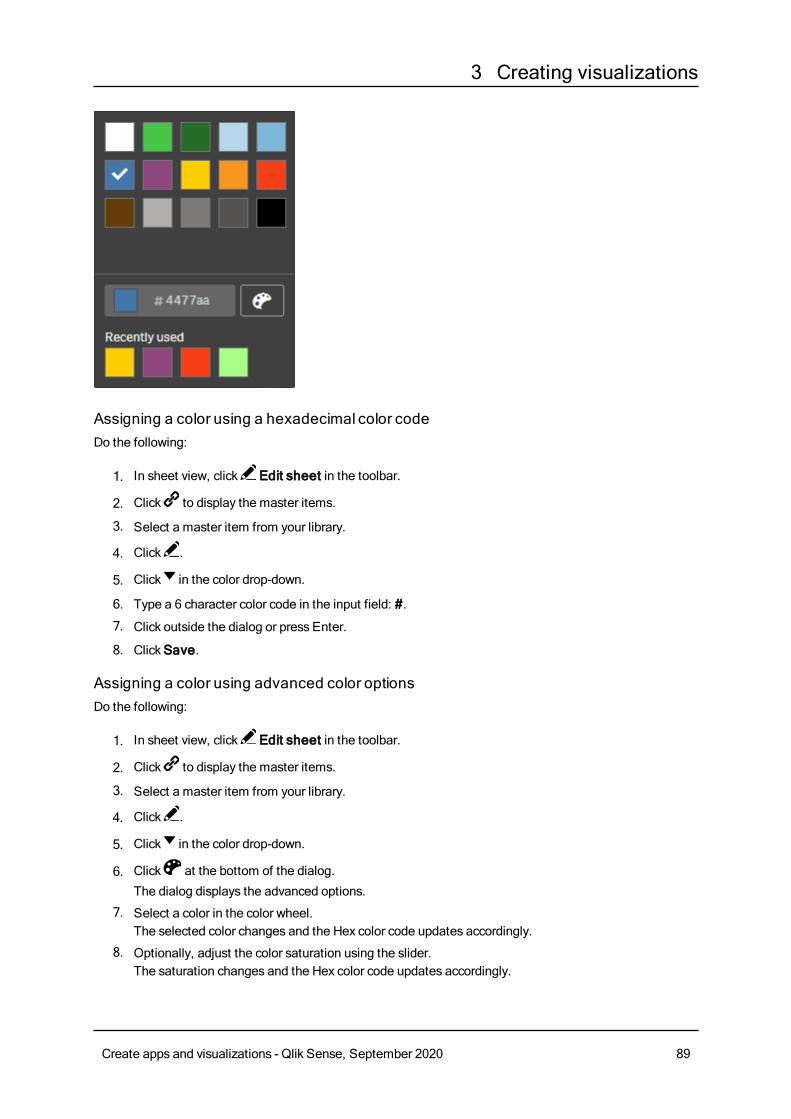
3 Creating visualizations
Assigning a color using a hexadecimal color codeDo the following:
1. In sheet view, click Edit sheet in the toolbar.
2. Click to display the master items.
3. Select a master item from your library.
4. Click .
5. Click in the color drop-down.
6. Type a 6 character color code in the input field: #.
7. Click outside the dialog or press Enter.
8. ClickSave.
Assigning a color using advanced color optionsDo the following:
1. In sheet view, click Edit sheet in the toolbar.
2. Click to display the master items.
3. Select a master item from your library.
4. Click .
5. Click in the color drop-down.
6. Click at the bottom of the dialog.
The dialog displays the advanced options.
7. Select a color in the color wheel.The selected color changes and the Hex color code updates accordingly.
8. Optionally, adjust the color saturation using the slider.The saturation changes and the Hex color code updates accordingly.
Create apps and visualizations - Qlik Sense, September 2020 89
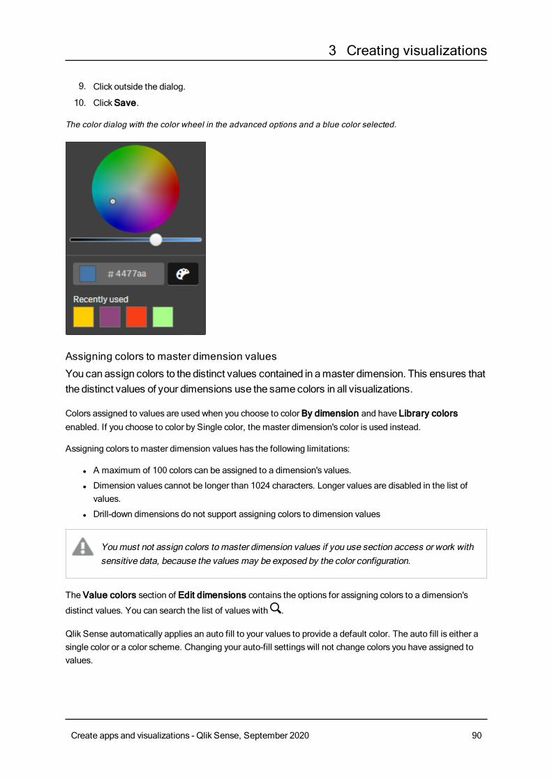
3 Creating visualizations
9. Click outside the dialog.
10. ClickSave.
The color dialog with the color wheel in the advanced options and a blue color selected.
Assigning colors to master dimension values
You canassign colors to the distinct values contained in amaster dimension. This ensures thatthe distinct values of your dimensions use the samecolors in all visualizations.
Colors assigned to values are used when you choose to color By dimension and have Library colorsenabled. If you choose to color by Single color, the master dimension's color is used instead.
Assigning colors to master dimension values has the following limitations:
l A maximum of 100 colors can be assigned to a dimension's values.
l Dimension values cannot be longer than 1024 characters. Longer values are disabled in the list ofvalues.
l Drill-down dimensions do not support assigning colors to dimension values
Youmust not assign colors to master dimension values if you use section access or work withsensitive data, because the values may be exposed by the color configuration.
The Value colors section of Edit dimensions contains the options for assigning colors to a dimension's
distinct values. You can search the list of values with .
Qlik Sense automatically applies an auto fill to your values to provide a default color. The auto fill is either asingle color or a color scheme. Changing your auto-fill settings will not change colors you have assigned tovalues.
Create apps and visualizations - Qlik Sense, September 2020 90
3 Creating visualizations
In addition to distinct values, you can set colors for the values classified as others in a visualization, that is,the collection of distinct values that fall outside the displayable values in a dimension. You can also set colorsfor null values.
Do the following:
1. In sheet view, click Edit sheet in the toolbar.
2. Click to display the master items.
3. Select a master dimension from your library.
4. Click .
5. ClickValue colors.
6. If you want to change the auto fill settings, set Auto fill toCustom , select the auto fill method, andeither select a single color or color scheme.
7. Select a value and do one of the following:
l Select a color in the color wheel, and optionally adjust the saturation slider.
l Type a 6 character color code in the Hex input field: #.
Values assigned colors display the icon.
8. If you want to remove an assigned color, select the value and click .
9. Optionally, to assign a color toOthers orNull values, click and do one of the following:
l Click one of the colors in the palette.
l Type a 6 character color code in the Hex input field: #.
l Click at the bottom of the dialog, select a color in the color wheel, and optionally adjust the
saturation slider.
10. ClickSave.
Assigning colors to master measure values
You canassign a color gradient or segment scheme to amaster measure, enabling you to colorvisualizations by measure, using colors other than the default color schemes.
If you choose to color by single color, the master measure's color is used instead of the color scheme.
To assign custom segment or gradient colors to the values in a master measure, do the following:
1. Access and enable segment colors.
2. Select the template scheme.
3. Select the segment format.
4. Optionally, add or remove limits.
5. Optionally, edit your segment limits.
6. Assign colors to your segments.
7. Save.
Accessing and enabling segment colors
Do the following:
Create apps and visualizations - Qlik Sense, September 2020 91
3 Creating visualizations
1. In sheet view, click Edit sheet in the toolbar.
2. Click to display the master items.
3. Select a master measure from your library.
4. Click .
5. Click on the Segment colors tab.
6. Set the Segment colors button toCustom coloring.
Selecting the template scheme
The template scheme provides a default template to edit. You can choose from the default classes andgradients.
Do the following:
l Under Select a template scheme, select a template scheme.
Selecting the segment format
The segment format determines how colors will be applied. Percentage adds value classes based on wherevalues fit into the percentile of their value. Fixed value uses defined values to set the limits of eachsegment.
Do the following:
l Set Segment format to Fixed value or Percentage.
Adding, editing and removing limits
By default, the number of segments depends on the scheme selected. You can create additional segmentsby adding limits. When a new segment is created a pointer marks the value of its limit.
Do the following:
l Click on the Add limit button to add a limit to the gauge.
l Use the slider to change the value of a limit. You can also type a value for the selected limit.
l Click on theRemove limit button to remove the selected limit.
Editing segments
By default, segment colors depend on the scheme selected. You can change the color of a segment and itsending.
Do the following:
l Click the segment to change colors.
l Select Gradient to use different shades of colors in the transition between segments for the selectedlimit.
Create apps and visualizations - Qlik Sense, September 2020 92
3 Creating visualizations
Create calendar measuresToanalyze data over relative time ranges, use calendar measures. For example, youmightwant to compare current year-to-date sales figures with figures from the sameperiod theprevious year.
Calendar measures aggregate data from a field over a time range, and are saved in theMeasures categoryin the master items. Calendar measures comprise a field to be aggregated, an aggregation, a date field, anda time range for that date field that sets which data is included in the aggregation. You create calendarmeasures under Fields in the Assets panel, using theCreate calendar measures dialog.
You can aggregate fields from tables loaded inData manager or from a script inData load editor, as longas the field is in the same table as the date field, or is in an associated table.
However, the date field must be from a table that has been loaded usingData manager, because calendarmeasures use expressions tagged as date & time fields that are declared in autoCalendar, and date fields areonly mapped to autoCalendar when loaded inData manager. Calendar measures support the followingaggregations with the aggregated field: Sum, Count, Avg, Min, and Max.
Calendar measures do not support calendars created using the Data load editor. If you usecalendars created using Data load editor and want to create calendar measures, youmustload a table containing a date field using Data manager for use with your tables loaded usingData load editor.
If your date field is subject to more than one calendar and both calendars are qualified for usewith calendar measures, then the first calendar loaded in the data load script is used in thecalendar measures.
A calendar measure can use one of the following time ranges are available for use with calendar measures:weekly, monthly, quarterly, and yearly. Within each time range, different measures exist for periods such ascurrent month, year-to-date, and current week last year. The following time ranges and measures areavailable for creating calendar measures:
Measure Description
YTD The year to date for all years.
YTDCurrent Year The year to date for the current year.
YTD Last Year The year to date for last year.
Calendar measures for time range Yearly
Create apps and visualizations - Qlik Sense, September 2020 93
3 Creating visualizations
Measure Description
MTD The month to date for all months and years.
MTDCurrent Month The month to date for the current month.
MTD Last Month The month to date for last month.
Current Month All dates this month.
Current Month Last Year All dates this month last year.
Last Month All dates last month.
Calendar measures for time range Monthly
Measure Description
QTD The quarter to date for all years.
QTDCurrent Quarter The quarter to date for the current quarter.
QTD Last Quarter The quarter to date for the last quarter.
Current Quarter All dates in the current quarter.
Current Quarter Last Year All dates in the current quarter last year.
Last Quarter All days for the last quarter.
Calendar measures for time range Quarterly
Measure Description
WTD The week to date for all weeks across all years.
WTDCurrent Week This week to date for the current week.
WTD Last Week The week to date for the last week.
Current Week All dates this week.
Current Week Last Year All dates this week last year.
Last Week All dates last week.
Calendar measures for time rangeWeekly
Once created, calendar measures are treated identically to master measures. That is, calendar measures arereusable and editable while an app is unpublished. Users of a published app will have access to the calendarmeasures, but will not be able to modify them.
Creating a calendarmeasure from a fieldOn a sheet in edit mode with the Fields tab open, do the following:
1. Right-click a field and select Create calendar measures.By default, the field you right-clicked will be included as the Aggregated field.
2. Select a date field from theDate field drop-down list.
Create apps and visualizations - Qlik Sense, September 2020 94
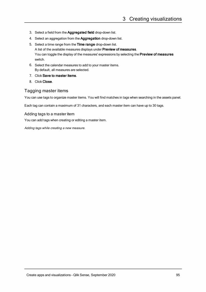
3 Creating visualizations
3. Select a field from the Aggregated field drop-down list.
4. Select an aggregation from the Aggregation drop-down list.
5. Select a time range from the Time range drop-down list.A list of the available measures displays under Preview of measures.You can toggle the display of the measures' expressions by selecting the Preview of measuresswitch.
6. Select the calendar measures to add to your master items.By default, all measures are selected.
7. ClickSave to master items.
8. ClickClose.
Tagging master itemsYou can use tags to organize master items. You will find matches in tags when searching in the assets panel.
Each tag can contain a maximum of 31 characters, and each master item can have up to 30 tags.
Adding tags to a master itemYou can add tags when creating or editing a master item.
Adding tags while creating a new measure.
Create apps and visualizations - Qlik Sense, September 2020 95
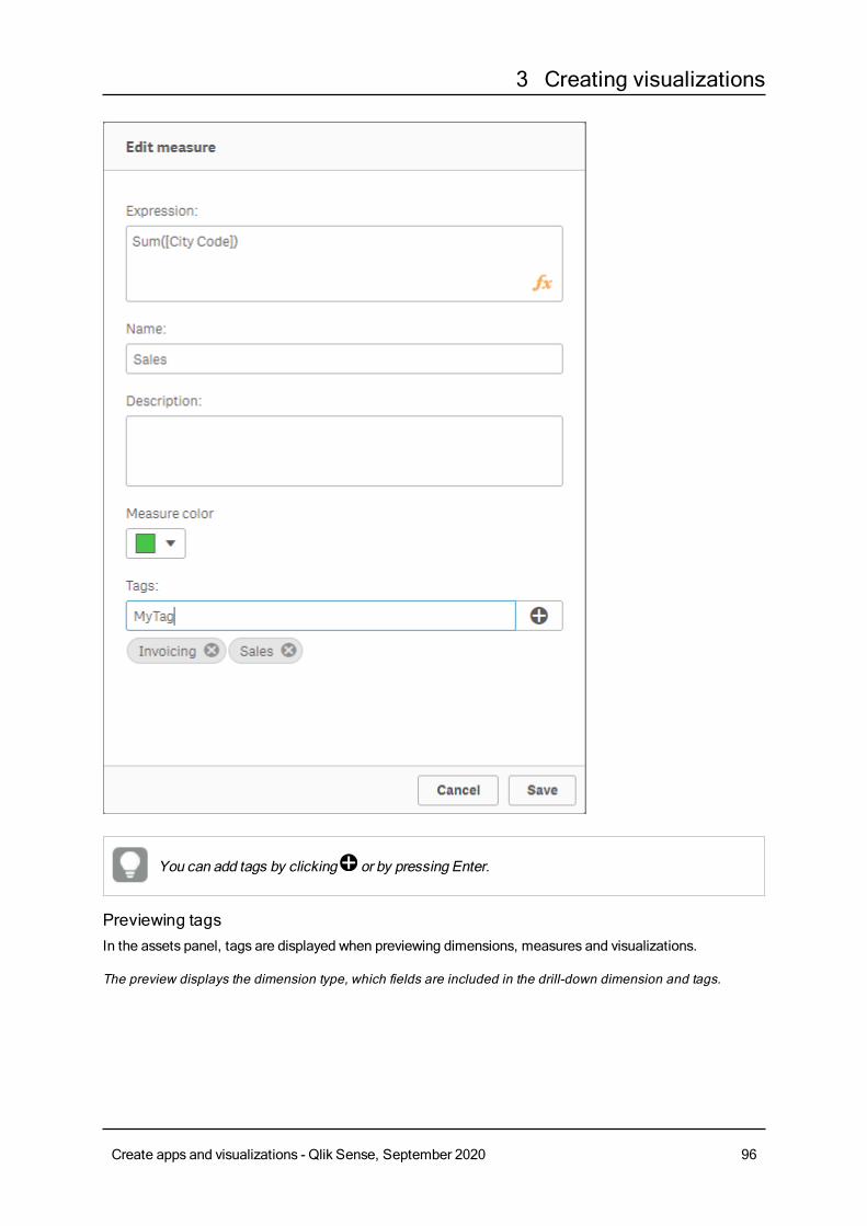
3 Creating visualizations
You can add tags by clicking or by pressing Enter.
Previewing tagsIn the assets panel, tags are displayed when previewing dimensions, measures and visualizations.
The preview displays the dimension type, which fields are included in the drill-down dimension and tags.
Create apps and visualizations - Qlik Sense, September 2020 96
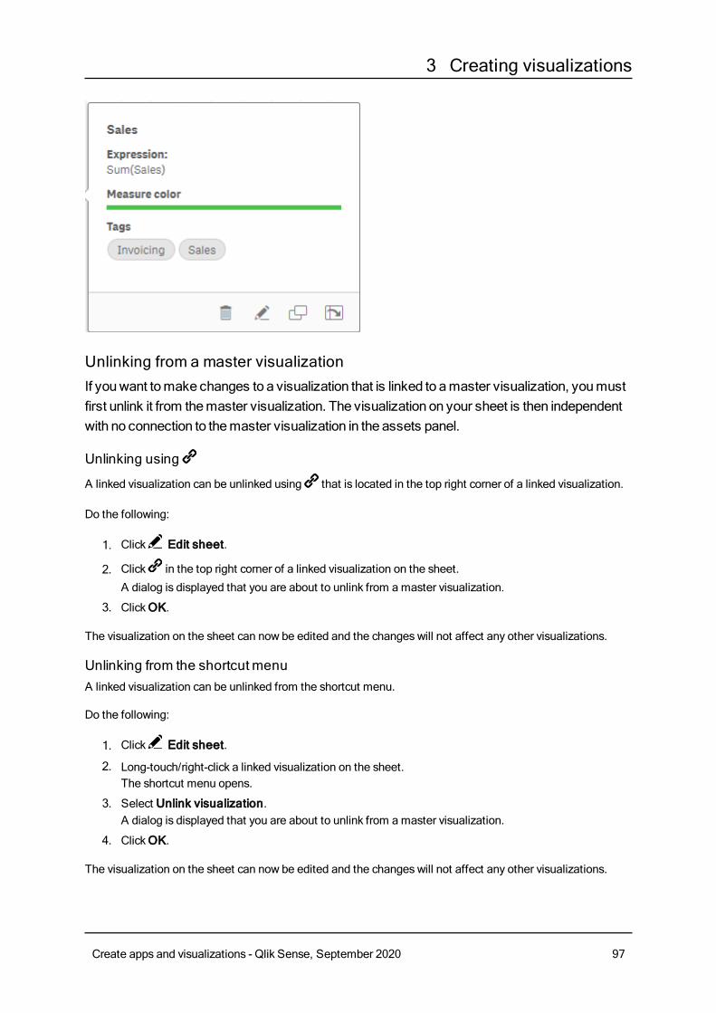
3 Creating visualizations
Unlinking from a master visualizationIf youwant tomake changes to a visualization that is linked to amaster visualization, youmustfirst unlink it from themaster visualization. The visualization on your sheet is then independentwith no connection to themaster visualization in the assets panel.
Unlinking using
A linked visualization can be unlinked using that is located in the top right corner of a linked visualization.
Do the following:
1. Click Edit sheet.
2. Click in the top right corner of a linked visualization on the sheet.
A dialog is displayed that you are about to unlink from amaster visualization.
3. ClickOK.
The visualization on the sheet can now be edited and the changes will not affect any other visualizations.
Unlinking from the shortcutmenuA linked visualization can be unlinked from the shortcut menu.
Do the following:
1. Click Edit sheet.
2. Long-touch/right-click a linked visualization on the sheet.The shortcut menu opens.
3. Select Unlink visualization.A dialog is displayed that you are about to unlink from amaster visualization.
4. ClickOK.
The visualization on the sheet can now be edited and the changes will not affect any other visualizations.
Create apps and visualizations - Qlik Sense, September 2020 97
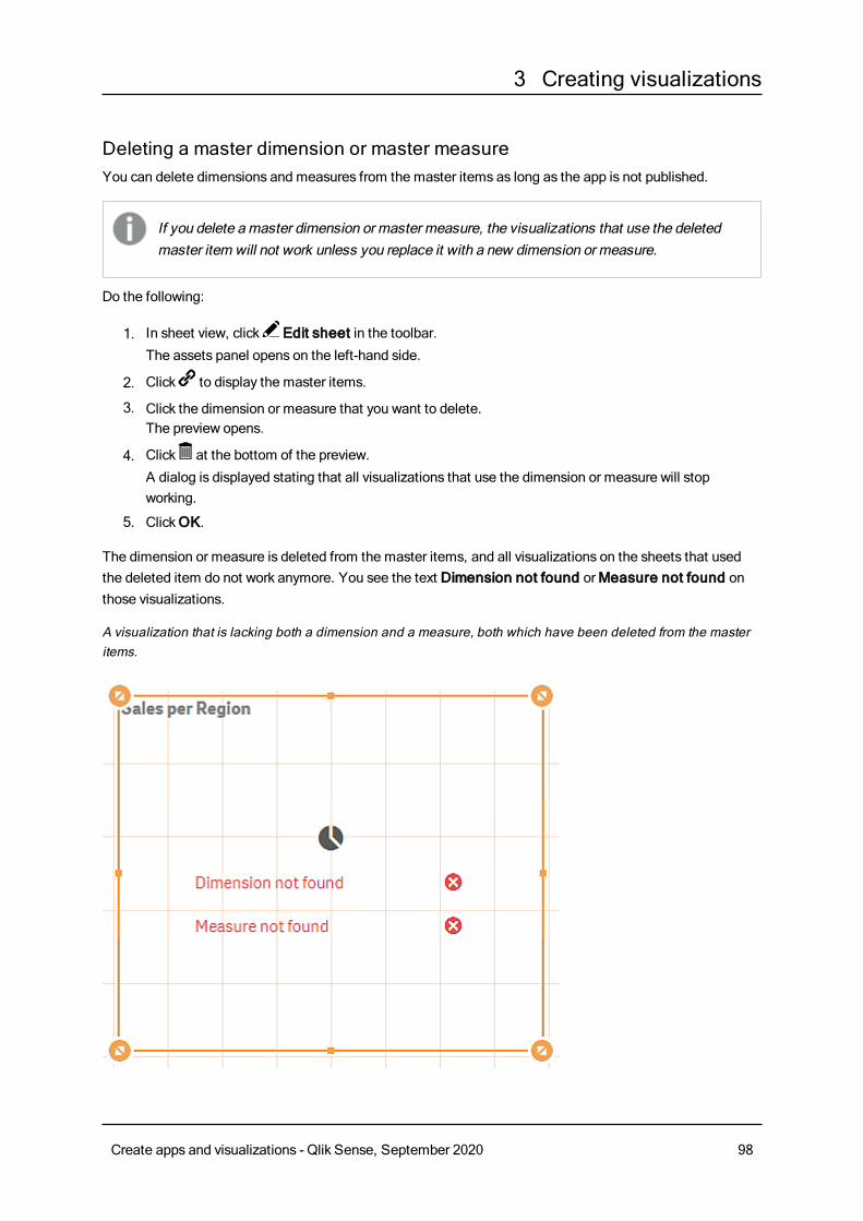
3 Creating visualizations
Deleting a master dimension or master measureYou can delete dimensions and measures from the master items as long as the app is not published.
If you delete amaster dimension or master measure, the visualizations that use the deletedmaster item will not work unless you replace it with a new dimension or measure.
Do the following:
1. In sheet view, click Edit sheet in the toolbar.The assets panel opens on the left-hand side.
2. Click to display the master items.
3. Click the dimension or measure that you want to delete.The preview opens.
4. Click at the bottom of the preview.
A dialog is displayed stating that all visualizations that use the dimension or measure will stopworking.
5. ClickOK.
The dimension or measure is deleted from the master items, and all visualizations on the sheets that usedthe deleted item do not work anymore. You see the text Dimension not found orMeasure not found onthose visualizations.
A visualization that is lacking both a dimension and a measure, both which have been deleted from the masteritems.
Create apps and visualizations - Qlik Sense, September 2020 98
3 Creating visualizations
Replacing an invalid dimension ormeasureWhen a dimension or measure has been deleted from the master items, all visualizations that reference tothe deleted master item will not work anymore, until the missing dimension or measure is replaced.
Do the following:
1. In sheet view, click Edit sheet in the toolbar.
The assets panel opens on the left-hand side. Click to display the master items.
2. Drag a dimension or measure from theDimensions orMeasures sections to the visualization on thesheet.The shortcut menu opens.
3. Select Replace invalid dimension orReplace invalid measure.
The visualization is complete and works again.
Deleting a master visualizationYou can delete visualizations from the master items as long as the app is not published.
Do the following:
1. In sheet view, click Edit sheet in the toolbar.The assets panel opens on the left-hand side.
2. Click to display the master items.
3. Click the visualization that you want to delete.The preview opens.
4. Click at the bottom of the preview.
A dialog is displayed stating that wherever this visualization is used on sheets, there will be invalidinstances of it.
5. ClickOK.
The visualization is deleted from the master items, and on all sheets where this visualization was used, yousee invalid visualizations. You now need to replace the invalid visualization with other ones, or delete theinstances.
You can also delete visualizations from the preview that is displayed when clicking thevisualization in themaster items.
Replacing an invalid visualization on a sheetThe representation of the invalid visualization is there to tell you that there used to be a visualization at acertain location on the sheet, but the invalid visualization serves no purpose.
Do the following:
Create apps and visualizations - Qlik Sense, September 2020 99
3 Creating visualizations
1. In sheet view, click Edit sheet in the toolbar.
The assets panel opens on the left-hand side. Click to display the master items.
2. Drag a visualization from the master items to the location of the invalid visualization on the sheet.
The invalid visualization is replaced.
Deleting an invalid visualization
1. In sheet view, click Edit sheet in the toolbar.
2. Long-touch/right-click on the invalid visualization and select Delete in the shortcut menu.
The invalid visualization is deleted.
Using expressions in visualizationsVisualizations in Qlik Sense are built from charts, which in turn, are built from dimensions and measures,depending on the type of chart. Visualizations can have titles, subtitles, footnotes, and other elements tohelp convey information. All of the elements that make up a visualization can be simple: a dimensionconsisting of a field representing data, a title consisting of text, for example.
For visualizations that contain measures, the measures are calculations based on fields, for example Sum(Cost), which means all the values of the fieldCost are aggregated using the function Sum. In other words,Sum(Cost) is an expression.
What is an expression?An expression is a combination of functions, fields, and mathematical operators (+ * / =). Expressions areused to process data in the app in order to produce a result that can be seen in a visualization. They are notlimited to use in measures. You can build visualizations that are more dynamic and powerful by usingexpressions for titles, subtitles, footnotes, and even dimensions.
This means, for example, that instead of the title of a visualization being static text, it can be made from anexpression whose result changes depending on the selectionsmade.
Where can I use expressions?Expressions can be used in a visualization wherever the symbol is seen in the properties panel while
editing a visualization. The symbol indicates an expression field. By clicking , you enter the expression
editor, which is designed to help you build and edit expressions. Expressions can also be entered directly intothe expression field, without using the expression editor.
An expression cannot be saved directly as a master item, but if an expression is used in a measure ordimension, which is then saved as a master item, with its descriptive data, such as name, description, andtags, the expression in the measure or dimension is preserved.
Expressions are used both in scripts and in chart visualizations. They can be simple, involving only basiccalculations, or complex, involving functions fields and operators.Expressions can be used in several differentsituations. The difference between measures and expressions is that expressions have no name ordescriptive data.
Create apps and visualizations - Qlik Sense, September 2020 100
3 Creating visualizations
In a script, an expression is evaluated as the script execution passes it by. In visualizations(including charts and tables), expressions are evaluated automatically whenever any of thefields, variables or functions that the expression contains change value or logical status. A fewdifferences exist between script expressions and chart expressions in terms of syntax andavailable functions.
For detailed reference regarding script functions and chart functions, see the Script syntax andchart functions.
Working with the expression editorYou can enter the expression editor to add or edit an expression wherever you see the symbol in the
properties panel while editing a visualization. The symbol indicates an expression field. Click to enter
the expression editor.
You can add expressions in two ways. Expressions can be created using the Fields, Functions, Variables,and Set expressions sections bymaking selections and inserting them into the expression field. You canedit the inserted expressions and add more complex expressions by typing directly into the expression field.
You can undo an action by clicking theUndo button .
Inserting an expression using FieldsYou can insert an expression bymaking selections from the Fields section at the right-hand side of theexpression editor dialog.
Do the following:
1. If you want to limit the available fields to those from a particular table in your data model, select atable from the Filter by table drop-down list.
2. Select a field from the Field drop-down list.
3. Select the aggregation function you want to use. The functions available are from the group of basicaggregation functions.
4. If you want to insert the current selection as a set expression in your aggregation, use the Setexpression check box. The current selection is always based on the default state.
5. If you want to insert aDistinct or a Total clause together with the aggregation function, use the checkboxes for each clause. Each clause can be used separately.
6. Click Insert to insert the field and the function into the expression field.
If you do not select an aggregation function, only the field will be inserted into theexpression. Clauses can only be added if you select an aggregation function.
7. ClickApply to close the Add expression dialog.For a dimension or measure, you continue by adding descriptive data for the dimension or measure.
Create apps and visualizations - Qlik Sense, September 2020 101
3 Creating visualizations
Inserting a function using FunctionsYou can insert more than the basic aggregation functions bymaking selections from the Functions sectionat the right-hand side of the expression editor dialog.
1. If you want to filter the list of available functions, select a function category from the Functioncategory drop-down list.
2. Select a function from the Function name drop-down list.You see a preview of the function.
3. Click Insert to insert the function and the first parenthesis into the expression field.
4. Type the rest of the expression in the expression editor according to the syntax.
5. ClickApply to close the Add expression dialog.For a dimension or measure, you continue by adding descriptive data for the dimension or measure.
Inserting a variable using VariablesYou can insert a variable bymaking selections from the Variables section at the right-hand side of theexpression editor dialog.
1. If you want system variables to appear in the list of available variables use the Show systemvariables check-box.
2. Select a variable from the Variable drop-down list.You see aDefinition and Value of the variable, if available.
3. Click Insert to insert the variable into the expression field.
4. ClickApply to close the Add expression dialog.For a dimension or measure, you continue by adding descriptive data for the dimension or measure.
Inserting a set expression using Set expressionsYou can insert a set expression bymaking selections from the Set expressions section at the right-handside of the expression editor dialog.
1. Select whether toUse current selections orUse bookmark, as a set expression.You can onlyUse current selections if a selection has been made in the app. You can onlyUsebookmark if a bookmark is available. Use the Bookmark drop-downmenu to choose betweenbookmarks.
2. If you have defined alternate states, you can change the alternate state which the set expression isbased on. Select the alternate state from Alternate state drop-downmenu.
3. Click Insert to insert the set expression into the expression field.
4. ClickApply to close the Add expression dialog.For a dimension or measure, you continue by adding descriptive data for the dimension or measure.
Adding or editing an expression by typingDo the following:
1. Type the expression directly in the expression field.The field names you use in the expression are checked, and the syntax of the expression is validated.
Create apps and visualizations - Qlik Sense, September 2020 102

3 Creating visualizations
As you type in the expression editor, the expression is validated. If there is an error, yousee a hint about what is incorrect. Additional error informationmay be available byclicking the icon next to the hint.
When you type the name of a function in the expression, a tooltip appears that provides information tohelp you enter the function correctly, including argument names and qualifiers.
The tooltip for some chart functions shows the ALL qualifier. It is recommended that youdo not use the ALL qualifier. Instead, use the set expression {1}.
Each line in the expression editor is numbered and syntax highlighting is used.
2. ClickApply to close the Add expression dialog.For a dimension or measure, you continue by adding descriptive data for the dimension or measure.
Auto-complete, evaluation and color codingWhen typing in the expression editor, you get an auto-complete list of matching fields, variables andfunctions to select from. The list is narrowed down as you continue to type. The color coding helps you to seewhere fields, variables and functions are used in the expression.
The color coding applies both in the auto-complete list and in the expression itself.
You can verify that any dollar-sign expansions added in your expression give the correct result, by checkingthe expression evaluation, in the dollar-sign expansion preview.
How names are interpretedIt is not recommended to name a variable identically to a field or a function in Qlik Sense. But if you do, youmust know how to use them in an expression.
Example:
XXX is a field, a variable and a function. XXX will be interpreted as one of them depending on how youcreate the expression.
Expression XXX interpreted as
$(XXX) variable
Count(XXX) field
XXX() function
Examples of how names areinterpreted
Rules for expressionsThe following rules apply for chart expressions:
Create apps and visualizations - Qlik Sense, September 2020 103
3 Creating visualizations
l All expressions return a number and/or a string, whichever is appropriate.
l Logical functions and operators return 0 for False, -1 for True. Number-to-string conversions andstring-to-number conversions are implicit.
l Logical operators and functions interpret 0 as False and all else as True.
l Expressions that cannot be correctly evaluated, for example as a result of incorrect parameters orfunctions, return NULL.
Detailed syntax help
You can activate help mode by clicking theHelp button . When active, all functions in the expression
editor act like hyperlinks. Clicking on a function opens a browser tab to the online help section with the fulldescription of how to use the specific function. When a function is clicked, help mode is exited.
Using functions in chartsA function is a type of procedure or routine that performs a specific task on data in apps. Qlik Sense containsseveral hundred ready-made functions that can be used in charts when creating visualizations. Functions canbe, for example, mathematical, logical, can operate on financial or date and time information, can be used tomanipulate strings, and other situations.
Functions can be grouped into the types:
l Aggregation functions, which use several records as input and produce a single value result.
l Scalar functions, which take a single input and produce a single output.
l Range functions, which produce a single value based on a range of input values.
l Range-producing functions, which are like range functions, but produce a range of values as output.
Many of the functions can be used in both chart expressions and scripts, but some are specific for chartexpressions.
The following list shows some examples of functions:
l Max: an aggregation function that can be used in scripts and charts.For example: Max(Sales) calculates the highest value in the field Sales.
l IF: a conditional function that can be used in scripts and charts.For example: IF(Amount>0, 'OK','Alarm') determines if the condition 'is the value of Amountgreater than zero?' is met. If it is, OK is written, otherwise Alarm is written.
l Date#: an interpretation function that can be used in scripts and charts.For example: Date#(A) takes the input value A and evaluates it as a date.
A few differences exist between script expressions and chart expressions in terms of syntaxand available functions. Themost important difference is the role of the aggregation functionsand the use of field references. The basic rule is that any field name in a chart expressionmustbe enclosed by exactly one aggregation function. An aggregation function can never haveanother expression containing an aggregation function as argument.
Create apps and visualizations - Qlik Sense, September 2020 104
3 Creating visualizations
For detailed reference regarding script functions and chart functions, see the Script syntax andchart functions.
Set analysis and set expressionsSet analysis offers a way of defining a set (or group) of data values that is different from the normal setdefined by the current selections.
Normally, when you make a selection, aggregation functions, such asSum, Max, Min, Avg, andCountaggregate over the selections that you have made: the current selections. Your selections automaticallydefine the data set to aggregate over. With set analysis you can define a group that is independent of thecurrent selections. This can be useful if you want to show a particular value, for example, the market share ofa product across all regions, irrespective of the current selections.
Set analysis is also powerful when making different sorts of comparisons, such as what are the best-sellingproducts compared with poorly-selling products, or this year against last year.
Let us imagine an example in which you start working in an app by selecting the year 2010 in a filter pane.The aggregations are then based on that selection, and the visualizations only show values for that year.When you make new selections, the visualizations are updated accordingly. The aggregations are made overthe set of possible records defined by the current selections. With set analysis, you can define a set that is ofinterest to you and does not depend on the selections.
Creating set expressionsBefore looking at the different parts of a set analysis example, there is a distinction that should be madebetween a set expression and set analysis:
Defining a set of field values is referred to as defining a set expression, whereas using set expressions toanalyze data is referred to as set analysis. Consequently, the rest of this section focuses on the setexpression and its components.
Here is a set analysis example: sum( {$<Year={2009}>} Sales ), in which {$<Year={2009}>} is a setexpression.
There are two general syntax rules for a set expression:
l A set expression must be used in an aggregation function. In this example, the aggregation function issum(Sales).
l A set expression must be enclosed by braces, {}. In the example, the set expression is: {$<Year={2009}>}.
A set expression consists of a combination of the following parts:
l Identifiers. One or more identifiers define the relationship between the set expression and what isbeing evaluated in the rest of the expression. A simple set expression consists of a single identifier,such as the dollar sign, {$}, which means all records in the current selection.
Create apps and visualizations - Qlik Sense, September 2020 105
3 Creating visualizations
l Operators. If there is more than one identifier, an operator or operators are used to refine the set ofdata by specifying how the sets of data represented by the identifiers are combined to create a subsetor superset, for example.
l Modifiers. A modifier or modifiers can be added to the set expression to change the selection. Amodifier can be used on its own or to modify an identifier to filter the data set.
Examples:
Example 1:
{$<Year={2009}>}
This set expression contains an identifier $, and the modifier <Year={2009>}. This example does not includean operator. The set expression is interpreted as: "All records in the current selection that belong to the year2009".
Example 2:
Sum({$<Year={2009}>+1<Country={'Sweden'}>} Sales)
This set expression contains the identifiers $ and 1, the operator + and the modifiers <Year={2009}> and<Country={'Sweden'}>.
This set expression is designed to sum the sales for the year 2009 associated with the current selections andadd the full set of data associated with the countrySweden across all years.
Set expressions can only be used in expressions for visualizations, not in script expressions.
Identifiers, operators and modifiers are described in more detail with in the following subsections.
Identifiers
Identifiers define the relationship between the set expression and the field values or expression beingevaluated.
In our example sum( {$<Year={2009}>} Sales ), the identifier is the dollar sign, $, and means that the set ofrecords to be evaluated consists of all the records of the current selection. This set is then further filtered bythe modifier part of the set expression. In a more complex set expression, two identifiers can be combinedusing an operator.
This table shows some common identifiers.
Identifier Description
1 Represents the full set of all the records in the application, irrespective of any selectionsmade.
$ Represents the records of the current selection. The set expression {$} is thus theequivalent to not stating a set expression.
Identifiers
Create apps and visualizations - Qlik Sense, September 2020 106
3 Creating visualizations
Identifier Description
$1 Represents the previous selection. $2 represents the previous selection-but-one, and so on.
$_1 Represents the next (forward) selection. $_2 represents the next selection-but-one, and soon.
BM01 You can use any bookmark ID or bookmark name.
MyAltState You can reference the selectionsmade in an alternate state by its state name.
This table shows some examples with different identifiers.
Example Result
sum ({1} Sales) Returns total sales for the app, disregarding selections butnot the dimension.
sum ({$} Sales) Returns the sales for the current selection, that is, the sameas sum(Sales).
sum ({$1} Sales) Returns the sales for the previous selection.
sum ({BM01}Sales)
Returns the sales for the bookmark named BM01.
Examples with different identifiers
Operators
Operators are used to include, exclude, or intersect parts of or whole data sets. All operators use sets asoperands and return a set as result.
This table shows operators that can be used in set expressions.
Operator Description
+ Union. This binary operation returns a set consisting of the records that belong to any of thetwo set operands.
- Exclusion. This binary operation returns a set of the records that belong to the first but not theother of the two set operands. Also, when used as a unary operator, it returns thecomplement set.
* Intersection. This binary operation returns a set consisting of the records that belong to bothof the two set operands.
/ Symmetric difference (XOR). This binary operation returns a set consisting of the records thatbelong to either, but not both of the two set operands.
Operators
This table shows some examples with operators.
Create apps and visualizations - Qlik Sense, September 2020 107
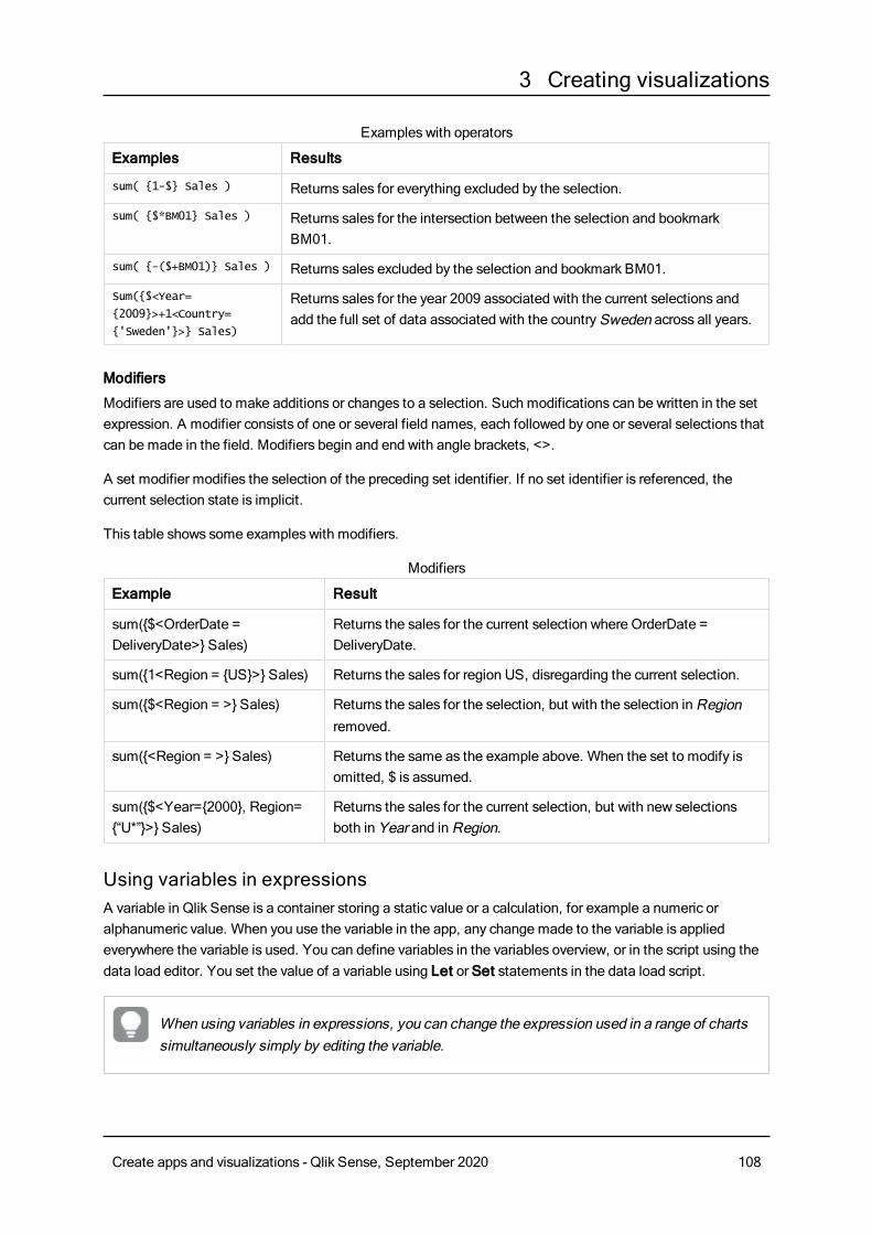
3 Creating visualizations
Examples Results
sum( {1-$} Sales ) Returns sales for everything excluded by the selection.
sum( {$*BM01} Sales ) Returns sales for the intersection between the selection and bookmarkBM01.
sum( {-($+BM01)} Sales ) Returns sales excluded by the selection and bookmark BM01.
Sum({$<Year=
{2009}>+1<Country=
{'Sweden'}>} Sales)
Returns sales for the year 2009 associated with the current selections andadd the full set of data associated with the countrySweden across all years.
Examples with operators
Modifiers
Modifiers are used to make additions or changes to a selection. Such modifications can be written in the setexpression. A modifier consists of one or several field names, each followed by one or several selections thatcan be made in the field. Modifiers begin and end with angle brackets, <>.
A set modifier modifies the selection of the preceding set identifier. If no set identifier is referenced, thecurrent selection state is implicit.
This table shows some examples with modifiers.
Example Result
sum({$<OrderDate =DeliveryDate>} Sales)
Returns the sales for the current selection where OrderDate =DeliveryDate.
sum({1<Region = {US}>} Sales) Returns the sales for region US, disregarding the current selection.
sum({$<Region = >} Sales) Returns the sales for the selection, but with the selection inRegionremoved.
sum({<Region = >} Sales) Returns the same as the example above. When the set to modify isomitted, $ is assumed.
sum({$<Year={2000}, Region={“U*”}>} Sales)
Returns the sales for the current selection, but with new selectionsboth in Year and inRegion.
Modifiers
Using variables in expressionsA variable in Qlik Sense is a container storing a static value or a calculation, for example a numeric oralphanumeric value. When you use the variable in the app, any change made to the variable is appliedeverywhere the variable is used. You can define variables in the variables overview, or in the script using thedata load editor. You set the value of a variable using Let or Set statements in the data load script.
When using variables in expressions, you can change the expression used in a range of chartssimultaneously simply by editing the variable.
Create apps and visualizations - Qlik Sense, September 2020 108
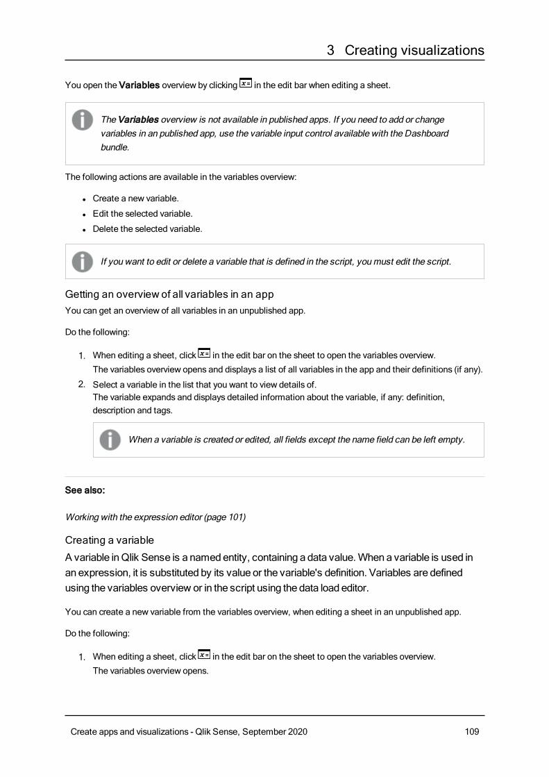
3 Creating visualizations
You open the Variables overview by clicking in the edit bar when editing a sheet.
The Variables overview is not available in published apps. If you need to add or changevariables in an published app, use the variable input control available with the Dashboardbundle.
The following actions are available in the variables overview:
l Create a new variable.
l Edit the selected variable.
l Delete the selected variable.
If you want to edit or delete a variable that is defined in the script, youmust edit the script.
Getting an overview of all variables in an appYou can get an overview of all variables in an unpublished app.
Do the following:
1. When editing a sheet, click in the edit bar on the sheet to open the variables overview.
The variables overview opens and displays a list of all variables in the app and their definitions (if any).
2. Select a variable in the list that you want to view details of.The variable expands and displays detailed information about the variable, if any: definition,description and tags.
When a variable is created or edited, all fields except the name field can be left empty.
See also:
Working with the expression editor (page 101)
Creating a variable
A variable inQlik Sense is a namedentity, containing a data value.Whena variable is used inan expression, it is substituted by its value or the variable's definition. Variables are definedusing the variables overview or in the script using the data load editor.
You can create a new variable from the variables overview, when editing a sheet in an unpublished app.
Do the following:
1. When editing a sheet, click in the edit bar on the sheet to open the variables overview.
The variables overview opens.
Create apps and visualizations - Qlik Sense, September 2020 109
3 Creating visualizations
2. ClickCreate new.The following input fields for the variable are displayed:
l Name (mandatory)
l Definition
l Description
l Tags
Press Esc or click if you want to cancel creating the new variable. If all input fields are empty, you
can also cancel by clicking outside the new variable section in the variables overview or by clickingoutside the variables overview window.
3. Type a name for the variable (mandatory). Use the following guidelines when choosing a name:
l You cannot change the name once you have created the variable.
l Use a letter as the first character, do not use a number or a symbol.
l It is not recommended to name a variable identically to a field or a function in Qlik Sense.For more information, seeHow names are interpreted (page 112).
l Some characters have specific uses in Qlik Sense expressions, therefore do not use thefollowing characters when naming a variable: $ ( ) [ ] "
l The namemust be unique. You are not allowed to name a variable identically to a reservedvariable or a system variable. These variables are not listed in the variables overview, but if youare not allowed to use a certain name, even though you cannot find a duplicate in the variablesoverview, a reserved variable or a system variable already has this name.
l A long name is not recommended. If a variable's name is too long, the name cannot be fullydisplayed in the variables overview.
4. Create a definition for the variable (optional). You can enter the expression editor by clicking .
For more information, seeWorking with the expression editor (page 101).
Example:
Set the variable's value to today's date, presented as a number: Num(Today())
5. Type a description for the variable (optional).
6. Add tags by typing and click or press Enter (optional).
7. Save the variable by clicking . You can also save by clicking outside the new variable's section in
the variables overview or by clicking outside the variables overview window.The variable is added to the top of the list and marked withNew.
The new variable is created.
Editing a variable
A variable inQlik Sense is a namedentity, containing a data value.Whena variable is used inan expression, it is substituted by its value or the variable's definition.Variables are definedusing the variables overview or in the script using the data load editor.
You can choose to edit a variable from the variables overview, when editing a sheet in an unpublished app.
Create apps and visualizations - Qlik Sense, September 2020 110
3 Creating visualizations
Do the following:
1. When editing a sheet, click in the edit bar on the sheet to open the variables overview.
The variables overview opens.
If you want to edit a variable that is defined in the script, you can either edit in the script,using the data load editor, or delete it from the script and then edit it in the variablesoverview.
2. From the list, select a variable that you want to edit and click .
The variable expands and displays the following:
l Definition (if any)
l Description (if any)
l Tags (if any)
3. Edit the variable as desired:
l You can open the expression editor and create the definition by clicking .
For more information, seeWorking with the expression editor (page 101).
l Cancel editing the variable, by pressing Esc.
If you click the variable is deleted.
l Add new tags by typing and and click or press Enter. Remove tags by clicking .
4. Save the changes by clicking . You can also save by clicking outside the variable's section in the
variables overview or by clicking outside the variables overview window.
The variable is updated.
Deleting a variable
You candelete variables, from anunpublished app, by deleting them from the variablesoverview.
Do the following:
1. When editing a sheet, click in the edit bar on the sheet to open the variables overview.
The variables overview opens.
2. Select the variable you want to delete.
If you want to delete a variable that is defined in the script, youmust edit the script. Ifyou remove a variable from the script and reload the data, the variable stays in the app.If you want to fully remove the variable from the app, youmust also delete the variablefrom the variables overview.
Create apps and visualizations - Qlik Sense, September 2020 111
3 Creating visualizations
The details of the variable are displayed.
Deleting a variable cannot be undone.
3. Click .
A confirmation message is displayed, asking if you are sure you want to delete the variable.
4. ClickOK.
The variable is deleted.
Examples of using a variable in an expressionA variable in Qlik Sense is a named entity, containing a data value. When a variable is used in an expression,it is substituted by its value or the variable's definition.
Example:
The variable x contains the text string Sum(Sales).
In a chart, you define the expression $(x)/12. The effect is exactly the same as having the chart expressionSum(Sales)/12.
However, if you change the value of the variable x to for example Sum(Budget), the data in the chart areimmediately recalculated with the expression interpreted asSum(Budget)/12.
When using variables in expressions, you can change the expression used in a range of chartssimultaneously simply by editing the variable.
How names are interpreted
It is not recommended to name a variable identically to a field or a function in Qlik Sense. But if you do, youmust know how to use them in an expression.
Example:
XXX is a field, a variable and a function. XXX will be interpreted as one of them depending on how youcreate the expression.
Expression XXX interpreted as
$(XXX) variable
Count(XXX) field
XXX() function
Examples of how names areinterpreted
Create apps and visualizations - Qlik Sense, September 2020 112
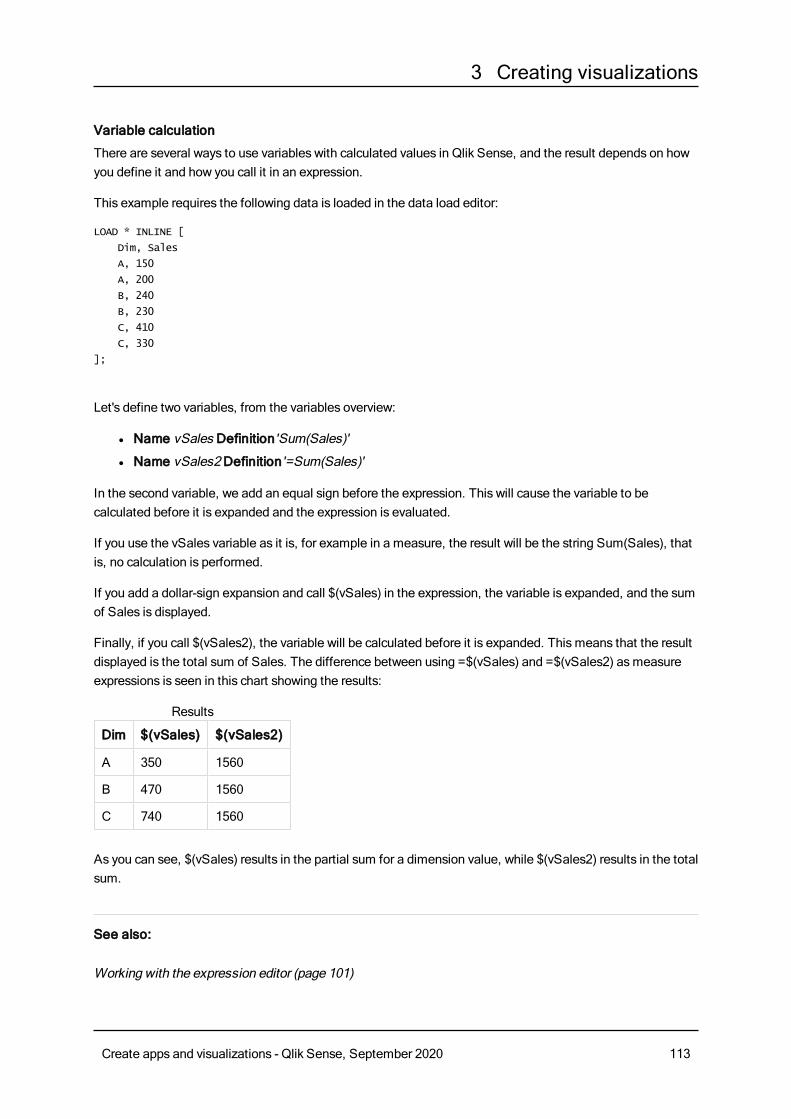
3 Creating visualizations
Variable calculation
There are several ways to use variables with calculated values in Qlik Sense, and the result depends on howyou define it and how you call it in an expression.
This example requires the following data is loaded in the data load editor:
LOAD * INLINE [
Dim, Sales
A, 150
A, 200
B, 240
B, 230
C, 410
C, 330
];
Let's define two variables, from the variables overview:
l Name vSales Definition'Sum(Sales)'
l Name vSales2 Definition'=Sum(Sales)'
In the second variable, we add an equal sign before the expression. This will cause the variable to becalculated before it is expanded and the expression is evaluated.
If you use the vSales variable as it is, for example in a measure, the result will be the string Sum(Sales), thatis, no calculation is performed.
If you add a dollar-sign expansion and call $(vSales) in the expression, the variable is expanded, and the sumof Sales is displayed.
Finally, if you call $(vSales2), the variable will be calculated before it is expanded. This means that the resultdisplayed is the total sum of Sales. The difference between using =$(vSales) and =$(vSales2) asmeasureexpressions is seen in this chart showing the results:
Dim $(vSales) $(vSales2)
A 350 1560
B 470 1560
C 740 1560
Results
As you can see, $(vSales) results in the partial sum for a dimension value, while $(vSales2) results in the totalsum.
See also:
Working with the expression editor (page 101)
Create apps and visualizations - Qlik Sense, September 2020 113
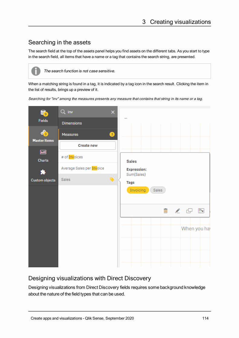
3 Creating visualizations
Searching in the assetsThe search field at the top of the assets panel helps you find assets on the different tabs. As you start to typein the search field, all items that have a name or a tag that contains the search string, are presented.
The search function is not case sensitive.
When a matching string is found in a tag, it is indicated by a tag icon in the search result. Clicking the item inthe list of results, brings up a preview of it.
Searching for "inv" among the measures presents any measure that contains that string in its name or a tag.
Designing visualizations with Direct DiscoveryDesigning visualizations from Direct Discovery fields requires somebackground knowledgeabout the nature of the field types that can beused.
Create apps and visualizations - Qlik Sense, September 2020 114
3 Creating visualizations
Direct Discovery fields in visualizations
DIMENSIONl The Direct Discovery DIMENSION field type can be used in the same way as any other dimension.
MEASUREl A Direct Discovery MEASURE must be aggregated with one of the common functions before it can beused in a visualization.
l A regular field that is dropped onto a sheet becomes a filter pane, but not a DirectDiscovery MEASURE as it must be aggregated first.
DETAILThe Direct Discovery DETAIL field type can only be used in tables, and not in combination with a measure.
When creating a table using a Direct Discovery DETAIL field, and the number of rows beingretrieved exceeds a value defined in the load script (by default, 1000 rows), youmay see awarningmessage and the table may appear to be invalid. Tomake the table work normally, trymaking selections in the app to reduce the data set.
This functionality is not available in all editions of Qlik Sense.
3.5 When to use what type of visualizationA good visualization clearly presents relationships amongmany values, and lets you analyzedata at a glance. Qlik Sense offers a range of visualizations and charts. Each chart excels atvisualizing data in different ways for different purposes. You should select your charts bydecidingwhat youwant to see from the data in your charts.
If you are unsure of what visualizations to use, Qlik Sense can offer recommendations. For more information,see Creating visualizations using chart suggestions (page 486).
The following lists the purposes for viewing data and the chart type recommended to achieve that purpose:
Viewing comparisonsComparison charts are used to compare values against each other. They show the differences in values, suchas the difference between categories, or how values are changing over time.
Questions that might be answered by comparison charts include:
l What product has the highest total sales this year?
l How have product sales risen or fallen over the last 24 months?
Create apps and visualizations - Qlik Sense, September 2020 115
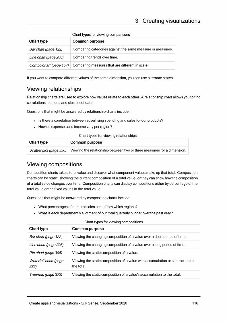
3 Creating visualizations
Chart type Common purpose
Bar chart (page 122) Comparing categories against the samemeasure or measures.
Line chart (page 206) Comparing trends over time.
Combo chart (page 157) Comparing measures that are different in scale.
Chart types for viewing comparisons
If you want to compare different values of the same dimension, you can use alternate states.
Viewing relationshipsRelationship charts are used to explore how values relate to each other. A relationship chart allows you to findcorrelations, outliers, and clusters of data.
Questions that might be answered by relationship charts include:
l Is there a correlation between advertising spending and sales for our products?
l How do expenses and income vary per region?
Chart type Common purpose
Scatter plot (page 330) Viewing the relationship between two or three measures for a dimension.
Chart types for viewing relationships
Viewing compositionsComposition charts take a total value and discover what component valuesmake up that total. Compositioncharts can be static, showing the current composition of a total value, or they can show how the compositionof a total value changes over time. Composition charts can display compositions either by percentage of thetotal value or the fixed values in the total value.
Questions that might be answered by composition charts include:
l What percentages of our total sales come from which regions?
l What is each department's allotment of our total quarterly budget over the past year?
Chart type Common purpose
Bar chart (page 122) Viewing the changing composition of a value over a short period of time.
Line chart (page 206) Viewing the changing composition of a value over a long period of time.
Pie chart (page 304) Viewing the static composition of a value.
Waterfall chart (page383)
Viewing the static composition of a value with accumulation or subtraction tothe total.
Treemap (page 372) Viewing the static composition of a value's accumulation to the total.
Chart types for viewing compositions
Create apps and visualizations - Qlik Sense, September 2020 116
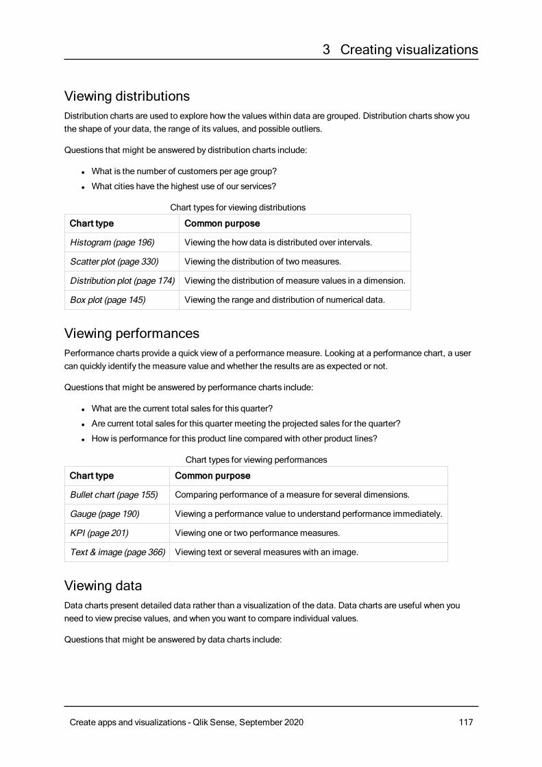
3 Creating visualizations
Viewing distributionsDistribution charts are used to explore how the values within data are grouped. Distribution charts show youthe shape of your data, the range of its values, and possible outliers.
Questions that might be answered by distribution charts include:
l What is the number of customers per age group?
l What cities have the highest use of our services?
Chart type Common purpose
Histogram (page 196) Viewing the how data is distributed over intervals.
Scatter plot (page 330) Viewing the distribution of two measures.
Distribution plot (page 174) Viewing the distribution of measure values in a dimension.
Box plot (page 145) Viewing the range and distribution of numerical data.
Chart types for viewing distributions
Viewing performancesPerformance charts provide a quick view of a performance measure. Looking at a performance chart, a usercan quickly identify the measure value and whether the results are as expected or not.
Questions that might be answered by performance charts include:
l What are the current total sales for this quarter?
l Are current total sales for this quarter meeting the projected sales for the quarter?
l How is performance for this product line compared with other product lines?
Chart type Common purpose
Bullet chart (page 155) Comparing performance of a measure for several dimensions.
Gauge (page 190) Viewing a performance value to understand performance immediately.
KPI (page 201) Viewing one or two performance measures.
Text & image (page 366) Viewing text or several measures with an image.
Chart types for viewing performances
Viewing dataData charts present detailed data rather than a visualization of the data. Data charts are useful when youneed to view precise values, and when you want to compare individual values.
Questions that might be answered by data charts include:
Create apps and visualizations - Qlik Sense, September 2020 117
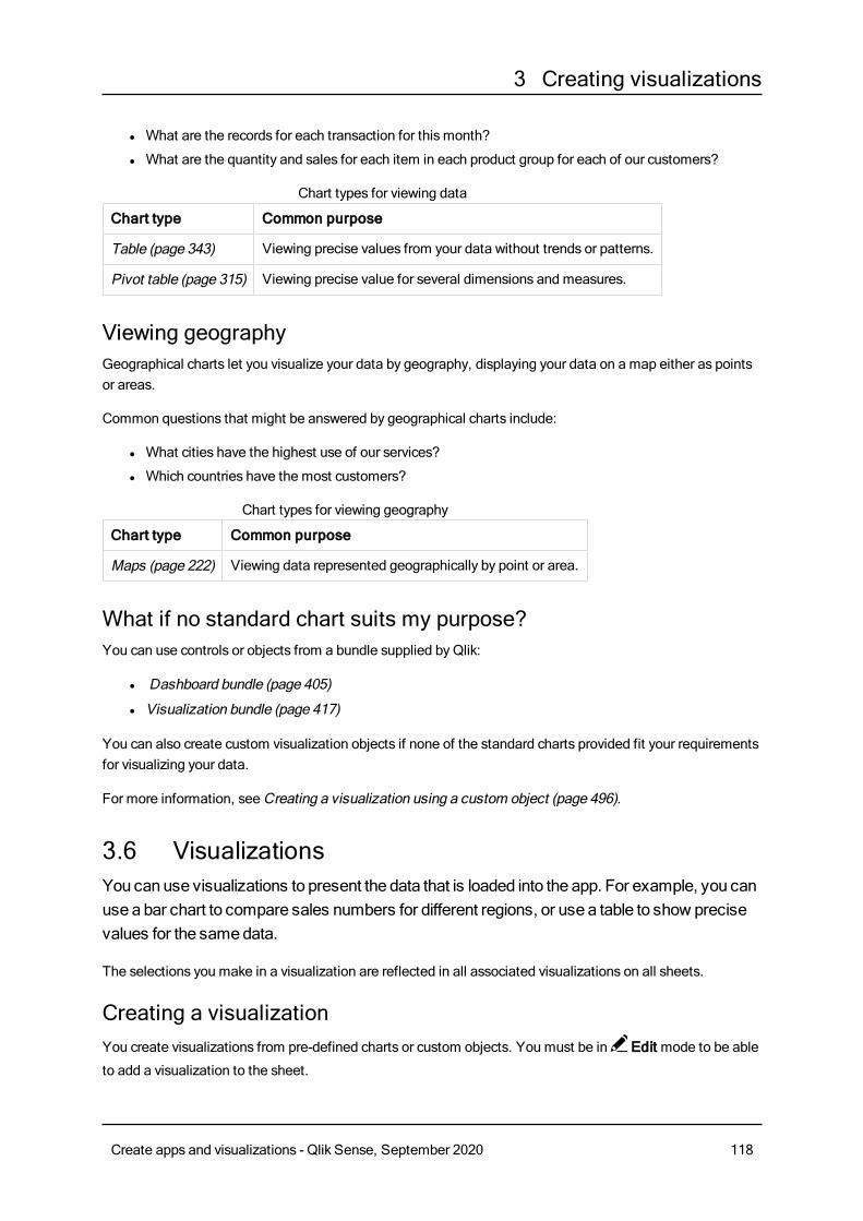
3 Creating visualizations
l What are the records for each transaction for this month?
l What are the quantity and sales for each item in each product group for each of our customers?
Chart type Common purpose
Table (page 343) Viewing precise values from your data without trends or patterns.
Pivot table (page 315) Viewing precise value for several dimensions and measures.
Chart types for viewing data
Viewing geographyGeographical charts let you visualize your data by geography, displaying your data on a map either as pointsor areas.
Common questions that might be answered by geographical charts include:
l What cities have the highest use of our services?
l Which countries have the most customers?
Chart type Common purpose
Maps (page 222) Viewing data represented geographically by point or area.
Chart types for viewing geography
What if no standard chart suits my purpose?You can use controls or objects from a bundle supplied byQlik:
l Dashboard bundle (page 405)
l Visualization bundle (page 417)
You can also create custom visualization objects if none of the standard charts provided fit your requirementsfor visualizing your data.
For more information, seeCreating a visualization using a custom object (page 496).
3.6 VisualizationsYou canuse visualizations to present the data that is loaded into the app. For example, you canuse a bar chart to compare sales numbers for different regions, or use a table to show precisevalues for the samedata.
The selections you make in a visualization are reflected in all associated visualizations on all sheets.
Creating a visualizationYou create visualizations from pre-defined charts or custom objects. You must be in Edit mode to be able
to add a visualization to the sheet.
Create apps and visualizations - Qlik Sense, September 2020 118
3 Creating visualizations
1. Drag the visualization from the assets panel onto the sheet, or double-click the visualization.
2. Add dimensions and measures to the visualization. The number of dimensions and measures that arerequired depends on which visualization you selected.Dimensions determine how the data in a visualization is grouped. For example: total sales per countryor number of products per supplier. For more information, seeDimensions (page 61).Measures are calculations used in visualizations, typically represented on the y-axis of a bar chart or acolumn in a table. Measures are created from an expression composed of aggregation functions, suchasSum orMax, combined with one or several fields. For more information, seeMeasures (page 64).
3. Adjust the presentation, for example sorting, coloring, or labeling.
You can convert from one visualization type to another by dragging a new chart to a visualization on a sheet.
For other methods of creating a visualization, seeCreating and editing visualizations (page 474).
Reusing a visualizationIf you have created a visualization that you want to reuse in other sheets of the app, you can save it as amaster visualization. You can only create master visualizations in an unpublished app. When the app ispublished, all users can add the visualization to their own sheets, but not modify it.
Right-click on a visualization and select Add to master items to save it as amaster
visualization.
You can find master visualizations under in the assets panel.
Which visualizations are available?There are two basic types of visualizations available in the assets panel.
l Charts illustrate the data with visual elements like bars, lines, or points.
l Text-based visualizations presents data in text form, for example, tables or filters.
There are dashboard objects available in the assets panel.
The best choice of chart type depends on the purpose of the visualization.
If the pre-defined visualizations does not fill your purpose, you can use a visualization extension or a widget.
You find them in the assets panel under .
Chart Icon Description
Bar chart The bar chart displays a bar for each dimensionvalue. The bar length corresponds to its numericalmeasure value.
Charts
Create apps and visualizations - Qlik Sense, September 2020 119
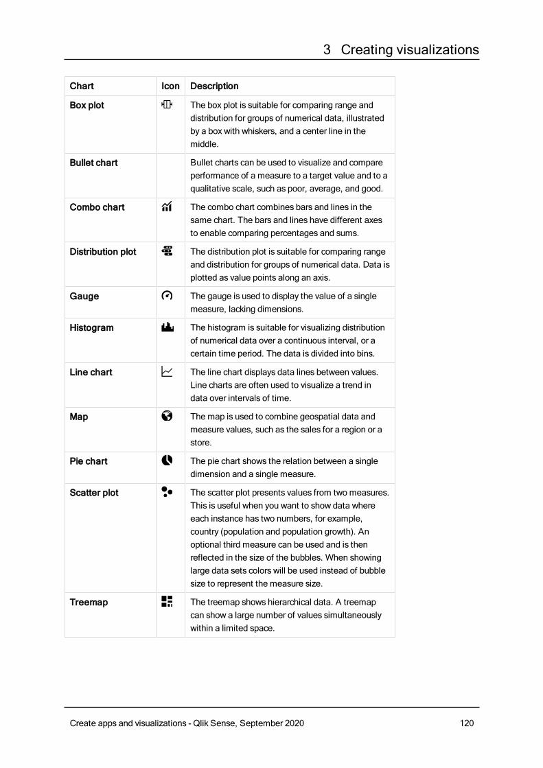
3 Creating visualizations
Chart Icon Description
Box plot The box plot is suitable for comparing range anddistribution for groups of numerical data, illustratedby a box with whiskers, and a center line in themiddle.
Bullet chart Bullet charts can be used to visualize and compareperformance of a measure to a target value and to aqualitative scale, such as poor, average, and good.
Combo chart The combo chart combines bars and lines in thesame chart. The bars and lines have different axesto enable comparing percentages and sums.
Distribution plot The distribution plot is suitable for comparing rangeand distribution for groups of numerical data. Data isplotted as value points along an axis.
Gauge The gauge is used to display the value of a singlemeasure, lacking dimensions.
Histogram The histogram is suitable for visualizing distributionof numerical data over a continuous interval, or acertain time period. The data is divided into bins.
Line chart The line chart displays data lines between values.Line charts are often used to visualize a trend indata over intervals of time.
Map The map is used to combine geospatial data andmeasure values, such as the sales for a region or astore.
Pie chart The pie chart shows the relation between a singledimension and a single measure.
Scatter plot The scatter plot presents values from two measures.This is useful when you want to show data whereeach instance has two numbers, for example,country (population and population growth). Anoptional third measure can be used and is thenreflected in the size of the bubbles. When showinglarge data sets colors will be used instead of bubblesize to represent the measure size.
Treemap The treemap shows hierarchical data. A treemapcan show a large number of values simultaneouslywithin a limited space.
Create apps and visualizations - Qlik Sense, September 2020 120
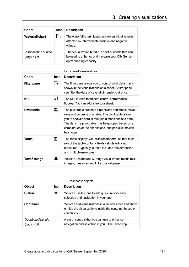
3 Creating visualizations
Chart Icon Description
Waterfall chart The waterfall chart illustrates how an initial value isaffected by intermediate positive and negativevalues.
Visualization bundle(page 417)
The Visualization bundle is a set of charts that canbe used to enhance and increase your Qlik Senseapp's charting capacity.
Chart Icon Description
Filter pane The filter pane allows you to control what data that isshown in the visualizations on a sheet. A filter panecan filter the data of several dimensions at once.
KPI The KPI is used to present central performancefigures. You can add a link to a sheet.
Pivot table The pivot table presents dimensions and measures asrows and columns of a table. The pivot table allowsyou to analyze data in multiple dimensions at a time.The data in a pivot table may be grouped based on acombination of the dimensions, and partial sums canbe shown.
Table The table displays values in record form, so that eachrow of the table contains fields calculated usingmeasures. Typically, a table includes one dimensionand multiple measures.
Text & image You can use the text & image visualization to add text,images, measures and links to a webpage.
Text-based visualizations
Object Icon Description
Button You can use buttons to add quick links for easyselection and navigation in your app.
Container You can add visualizations in a limited space and showor hide the visualizations inside the container based onconditions.
Dashboard bundle(page 405)
A set of controls that you can use to enhancenavigation and selection in your Qlik Sense app.
Dashboard objects
Create apps and visualizations - Qlik Sense, September 2020 121
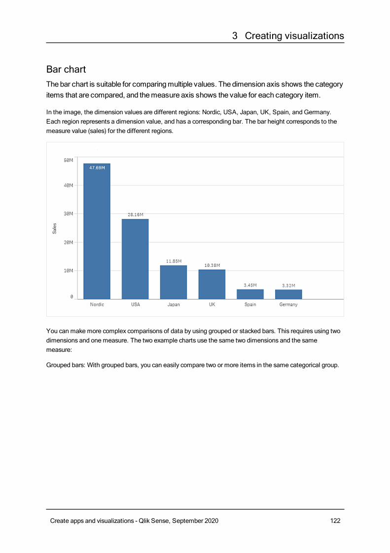
3 Creating visualizations
Bar chartThebar chart is suitable for comparingmultiple values. The dimension axis shows the categoryitems that are compared, and themeasure axis shows the value for each category item.
In the image, the dimension values are different regions: Nordic, USA, Japan, UK, Spain, and Germany.Each region represents a dimension value, and has a corresponding bar. The bar height corresponds to themeasure value (sales) for the different regions.
You can make more complex comparisons of data by using grouped or stacked bars. This requires using twodimensions and one measure. The two example charts use the same two dimensions and the samemeasure:
Grouped bars: With grouped bars, you can easily compare two or more items in the same categorical group.
Create apps and visualizations - Qlik Sense, September 2020 122
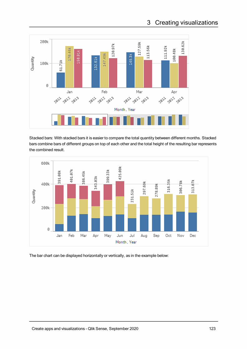
3 Creating visualizations
Stacked bars: With stacked bars it is easier to compare the total quantity between different months. Stackedbars combine bars of different groups on top of each other and the total height of the resulting bar representsthe combined result.
The bar chart can be displayed horizontally or vertically, as in the example below:
Create apps and visualizations - Qlik Sense, September 2020 123
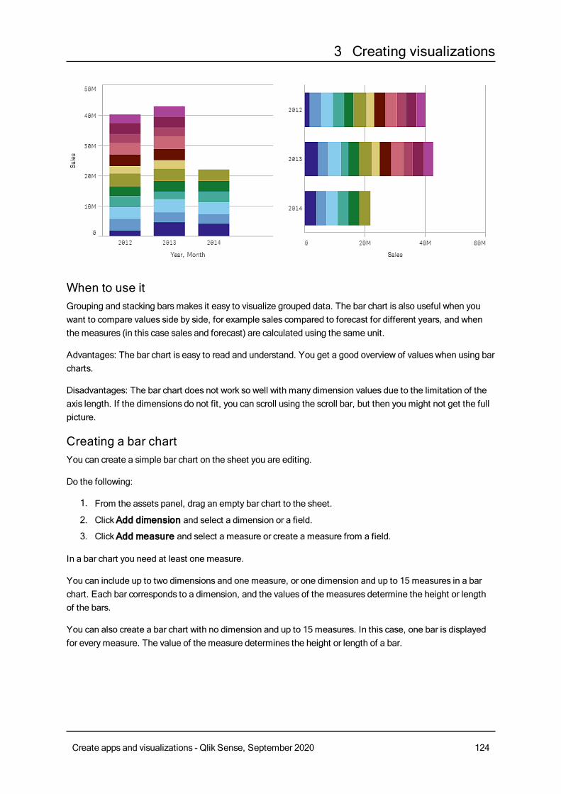
3 Creating visualizations
When to use itGrouping and stacking barsmakes it easy to visualize grouped data. The bar chart is also useful when youwant to compare values side by side, for example sales compared to forecast for different years, and whenthe measures (in this case sales and forecast) are calculated using the same unit.
Advantages: The bar chart is easy to read and understand. You get a good overview of values when using barcharts.
Disadvantages: The bar chart does not work so well with many dimension values due to the limitation of theaxis length. If the dimensions do not fit, you can scroll using the scroll bar, but then you might not get the fullpicture.
Creating a bar chartYou can create a simple bar chart on the sheet you are editing.
Do the following:
1. From the assets panel, drag an empty bar chart to the sheet.
2. ClickAdd dimension and select a dimension or a field.
3. ClickAdd measure and select a measure or create a measure from a field.
In a bar chart you need at least one measure.
You can include up to two dimensions and one measure, or one dimension and up to 15 measures in a barchart. Each bar corresponds to a dimension, and the values of the measures determine the height or lengthof the bars.
You can also create a bar chart with no dimension and up to 15 measures. In this case, one bar is displayedfor everymeasure. The value of the measure determines the height or length of a bar.
Create apps and visualizations - Qlik Sense, September 2020 124
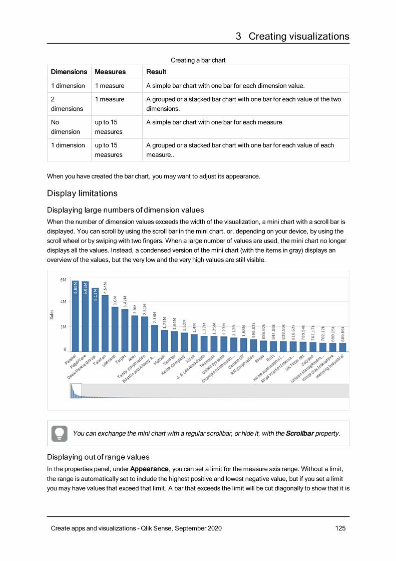
3 Creating visualizations
Dimensions Measures Result
1 dimension 1 measure A simple bar chart with one bar for each dimension value.
2dimensions
1 measure A grouped or a stacked bar chart with one bar for each value of the twodimensions.
Nodimension
up to 15measures
A simple bar chart with one bar for each measure.
1 dimension up to 15measures
A grouped or a stacked bar chart with one bar for each value of eachmeasure..
Creating a bar chart
When you have created the bar chart, you may want to adjust its appearance.
Display limitations
Displaying large numbers of dimension valuesWhen the number of dimension values exceeds the width of the visualization, a mini chart with a scroll bar isdisplayed. You can scroll by using the scroll bar in the mini chart, or, depending on your device, by using thescroll wheel or by swiping with two fingers. When a large number of values are used, the mini chart no longerdisplays all the values. Instead, a condensed version of the mini chart (with the items in gray) displays anoverview of the values, but the very low and the very high values are still visible.
You can exchange themini chart with a regular scrollbar, or hide it, with the Scrollbar property.
Displaying out of range valuesIn the properties panel, under Appearance, you can set a limit for the measure axis range. Without a limit,the range is automatically set to include the highest positive and lowest negative value, but if you set a limityou may have values that exceed that limit. A bar that exceeds the limit will be cut diagonally to show that it is
Create apps and visualizations - Qlik Sense, September 2020 125
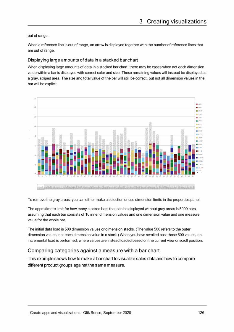
3 Creating visualizations
out of range.
When a reference line is out of range, an arrow is displayed together with the number of reference lines thatare out of range.
Displaying large amounts of data in a stacked bar chartWhen displaying large amounts of data in a stacked bar chart, there may be cases when not each dimensionvalue within a bar is displayed with correct color and size. These remaining values will instead be displayed asa gray, striped area. The size and total value of the bar will still be correct, but not all dimension values in thebar will be explicit.
To remove the gray areas, you can either make a selection or use dimension limits in the properties panel.
The approximate limit for howmany stacked bars that can be displayed without gray areas is 5000 bars,assuming that each bar consists of 10 inner dimension values and one dimension value and one measurevalue for the whole bar.
The initial data load is 500 dimension values or dimension stacks. (The value 500 refers to the outerdimension values, not each dimension value in a stack.) When you have scrolled past those 500 values, anincremental load is performed, where values are instead loaded based on the current view or scroll position.
Comparing categories against a measure with a bar chartThis example shows how tomakeabar chart to visualize sales data and how to comparedifferent product groups against the samemeasure.
Create apps and visualizations - Qlik Sense, September 2020 126
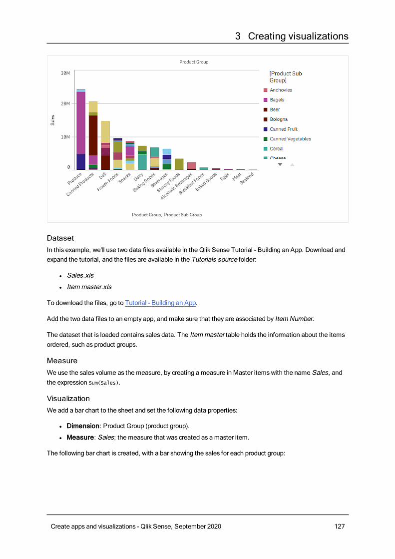
3 Creating visualizations
DatasetIn this example, we'll use two data files available in the Qlik Sense Tutorial - Building an App. Download andexpand the tutorial, and the files are available in the Tutorials source folder:
l Sales.xls
l Itemmaster.xls
To download the files, go to Tutorial - Building an App.
Add the two data files to an empty app, and make sure that they are associated by Item Number.
The dataset that is loaded contains sales data. The Itemmaster table holds the information about the itemsordered, such as product groups.
MeasureWe use the sales volume as the measure, by creating a measure in Master itemswith the name Sales, andthe expression Sum(Sales).
VisualizationWe add a bar chart to the sheet and set the following data properties:
l Dimension: Product Group (product group).
l Measure: Sales; the measure that was created as a master item.
The following bar chart is created, with a bar showing the sales for each product group:
Create apps and visualizations - Qlik Sense, September 2020 127
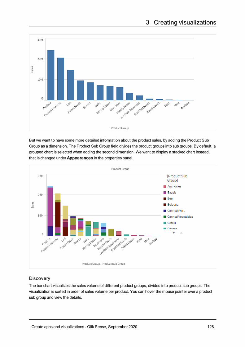
3 Creating visualizations
But we want to have somemore detailed information about the product sales, by adding the Product SubGroup as a dimension. The Product Sub Group field divides the product groups into sub groups. By default, agrouped chart is selected when adding the second dimension. We want to display a stacked chart instead,that is changed under Appearances in the properties panel.
DiscoveryThe bar chart visualizes the sales volume of different product groups, divided into product sub groups. Thevisualization is sorted in order of sales volume per product. You can hover the mouse pointer over a productsub group and view the details.
Create apps and visualizations - Qlik Sense, September 2020 128
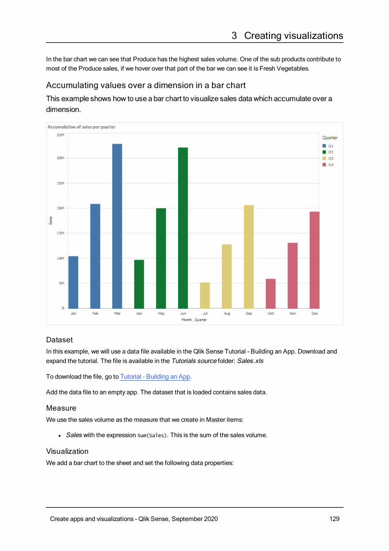
3 Creating visualizations
In the bar chart we can see that Produce has the highest sales volume. One of the sub products contribute tomost of the Produce sales, if we hover over that part of the bar we can see it is Fresh Vegetables.
Accumulating values over a dimension in a bar chartThis example shows how to use a bar chart to visualize sales datawhich accumulate over adimension.
DatasetIn this example, we will use a data file available in the Qlik Sense Tutorial - Building an App. Download andexpand the tutorial. The file is available in the Tutorials source folder: Sales.xls
To download the file, go to Tutorial - Building an App.
Add the data file to an empty app. The dataset that is loaded contains sales data.
MeasureWe use the sales volume as the measure that we create in Master items:
l Sales with the expression Sum(Sales). This is the sum of the sales volume.
VisualizationWe add a bar chart to the sheet and set the following data properties:
Create apps and visualizations - Qlik Sense, September 2020 129
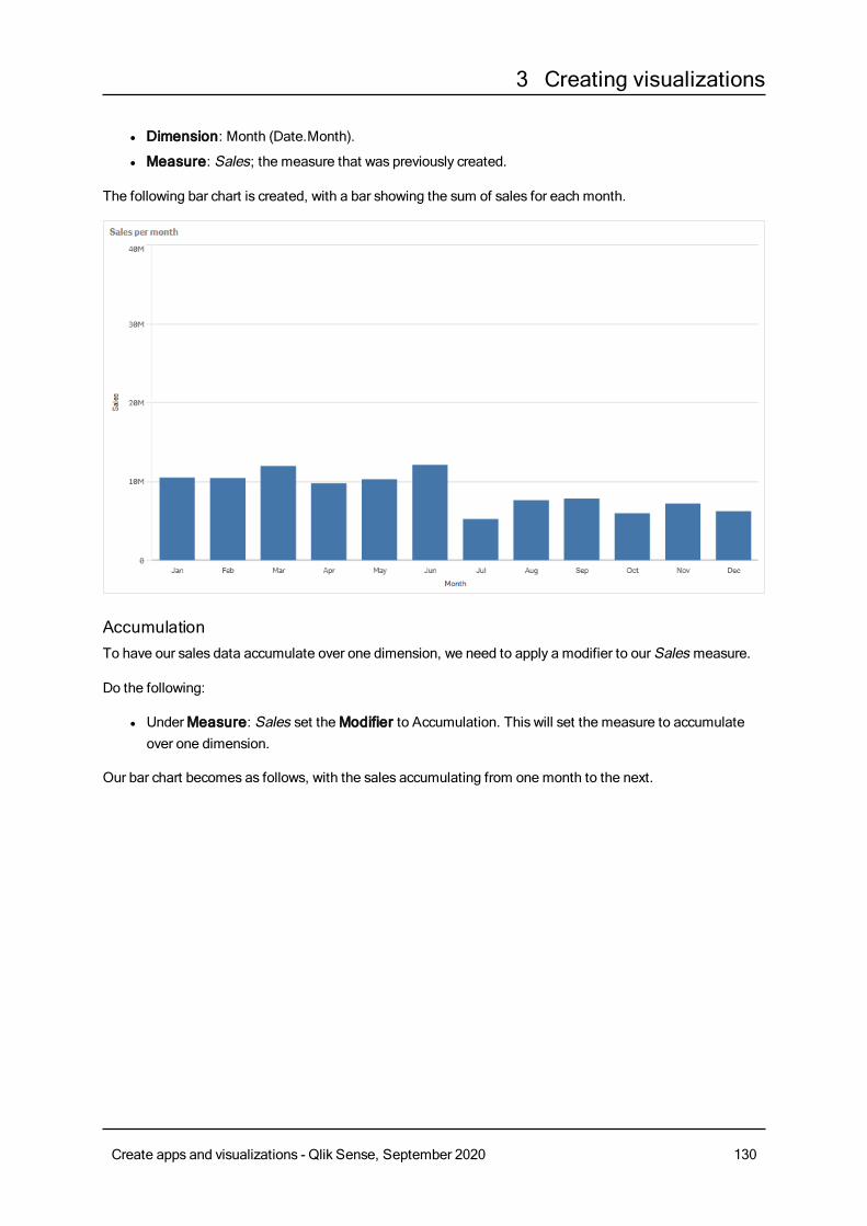
3 Creating visualizations
l Dimension: Month (Date.Month).
l Measure: Sales; the measure that was previously created.
The following bar chart is created, with a bar showing the sum of sales for each month.
AccumulationTo have our sales data accumulate over one dimension, we need to apply a modifier to our Sales measure.
Do the following:
l UnderMeasure: Sales set theModifier to Accumulation. This will set the measure to accumulateover one dimension.
Our bar chart becomes as follows, with the sales accumulating from one month to the next.
Create apps and visualizations - Qlik Sense, September 2020 130
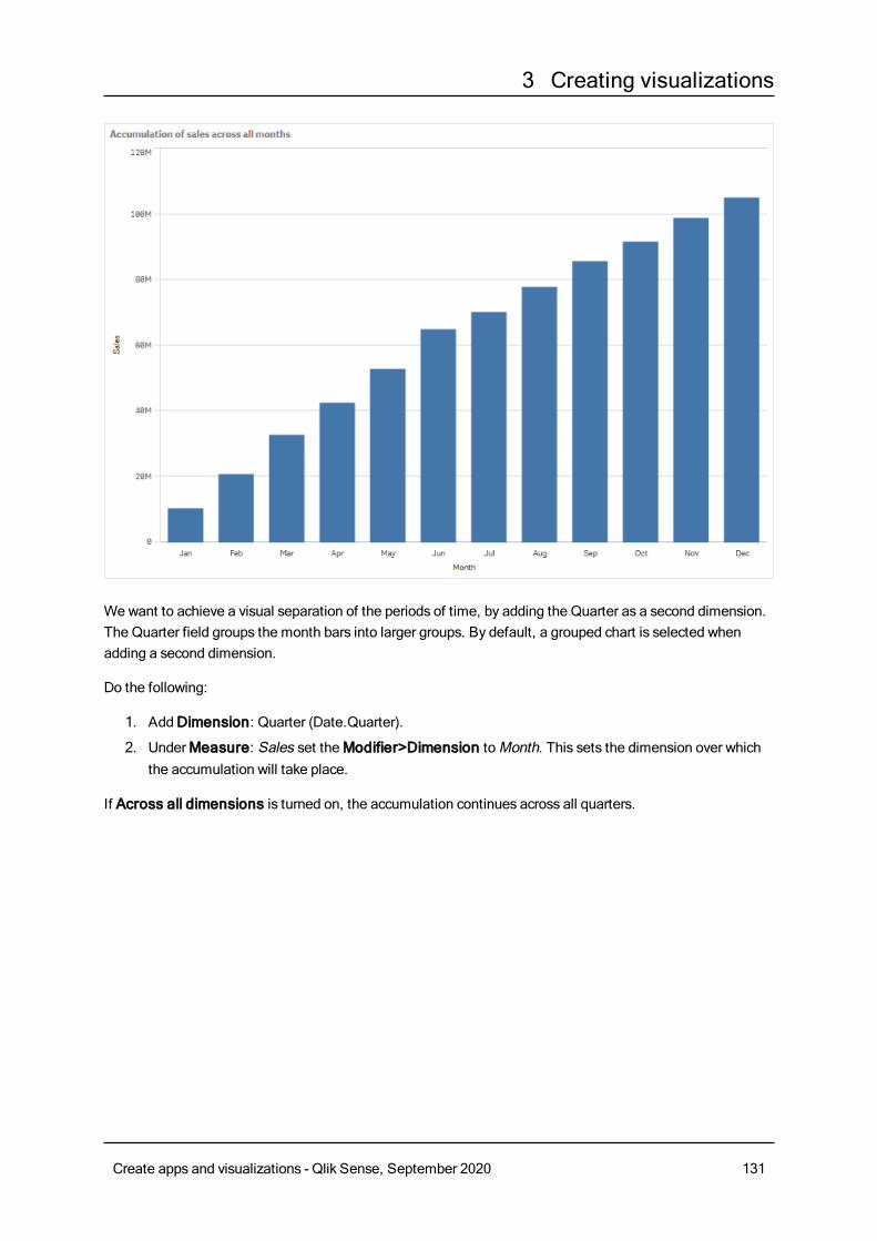
3 Creating visualizations
Wewant to achieve a visual separation of the periods of time, by adding the Quarter as a second dimension.The Quarter field groups the month bars into larger groups. By default, a grouped chart is selected whenadding a second dimension.
Do the following:
1. AddDimension: Quarter (Date.Quarter).
2. UnderMeasure: Sales set theModifier>Dimension toMonth. This sets the dimension over whichthe accumulation will take place.
If Across all dimensions is turned on, the accumulation continues across all quarters.
Create apps and visualizations - Qlik Sense, September 2020 131
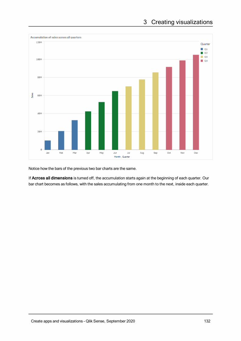
3 Creating visualizations
Notice how the bars of the previous two bar charts are the same.
If Across all dimensions is turned off, the accumulation starts again at the beginning of each quarter. Ourbar chart becomes as follows, with the sales accumulating from one month to the next, inside each quarter.
Create apps and visualizations - Qlik Sense, September 2020 132
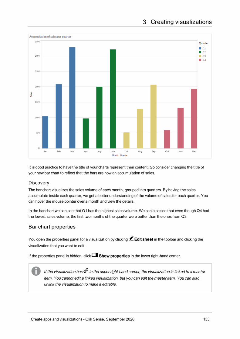
3 Creating visualizations
It is good practice to have the title of your charts represent their content. So consider changing the title ofyour new bar chart to reflect that the bars are now an accumulation of sales.
DiscoveryThe bar chart visualizes the sales volume of each month, grouped into quarters. By having the salesaccumulate inside each quarter, we get a better understanding of the volume of sales for each quarter. Youcan hover the mouse pointer over a month and view the details.
In the bar chart we can see that Q1 has the highest sales volume. We can also see that even though Q4 hadthe lowest sales volume, the first two months of the quarter were better than the ones from Q3.
Bar chart properties
You open the properties panel for a visualization by clicking Edit sheet in the toolbar and clicking the
visualization that you want to edit.
If the properties panel is hidden, click Show properties in the lower right-hand corner.
If the visualization has in the upper right-hand corner, the visualization is linked to amaster
item. You cannot edit a linked visualization, but you can edit themaster item. You can alsounlink the visualization tomake it editable.
Create apps and visualizations - Qlik Sense, September 2020 133
3 Creating visualizations
Some of the settings in the properties panel are only available under certain circumstances, forexample, when you usemore than one dimension or measure, or when you select an optionthat makes other options available.
DataClickAdd to add a dimension or a measure.
Dimensions
On theData tab, underDimensions, clickAdd to open a list of availableDimensions and Fields. Selectthe dimension or field that you want to use.
You can also click to create a dimension in the expression editor. To be able to edit a dimension that is
linked to a master item, you must first unlink the dimension. Another way to create a dimension is to type theexpression directly in the text box. Expressions added in this waymust begin with an equals sign (=). Here isan example with a calculated dimension:
=If (Week < 14, Week, 'Sales')
If Add is missing, you cannot add more dimensions.
l <Dimension name>: Click the dimension name to open the dimension settings.
If you want to delete the dimension, right-click the dimension and select in the dialog. Alternatively,
click the dimension and click .
l Dimension: Only displayed for master items. To be able to edit a dimension that is linked to amaster item, you must first unlink the dimension.
l Field: If you have added a field from Fields in the assets panel, the field name is automatically
displayed. Click to open the expression editor.
l Label: Enter a label for the dimension. If you have added a field from Fields in the assetspanel, the field name is automatically displayed.
l Includenull values: When selected, the measure values of all null dimensions aresummarized and presented as one dimension item in a visualization. All null values aredisplayed as gaps or dashes (-).
l Limitation: Limits the number of displayed values. When you set a limitation, the onlydimensions displayed are those where the measure value meets the limitation criterion:
l No limitation: The default value.
l Fixed number: Select to display the top or bottom values. Set the number of values.
You can also use an expression to set the number. Click to open the expression
editor.
l Exact value: Use the operators and set the exact limit value. You can also use an
expression to set the number. Click to open the expression editor.
l Relative value: Use the operators and set the relative limit value in percent. You can
Create apps and visualizations - Qlik Sense, September 2020 134
3 Creating visualizations
also use an expression to set the number. Click to open the expression editor.
l Calculated on measure: <measure>: Shown when you make a limitation to thenumber of displayed dimension values. The dimensions whose measure value meet thecriterion are displayed.
l Show others: When selected, the last value in the visualization (colored gray), summarizes allthe remaining values. When some kind of limitation is set (Fixed number, Exact value, orRelative number), the value counts as 1 in that setting. If, for example, Exact value is usedand set to 10, the tenth value isOthers.
l Other label: Enter a label for the summarized values (when Show others is selected). You
can also use an expression as a label. Click to open the expression editor.
l Master item: You can create a master dimension based on the dimension expression by clickingCreate new.
l Add alternative: Alternative dimensions and measures are dimensions and measures that are addedto a visualization, but are not displayed until a user chooses to switch which dimensions and measuresare being displayed during visual exploration.
You can drag the dimensions to set the order in which they are displayed in the visualization. Use the drag
bars (o ) to rearrange the order.
You can drag a field fromMeasures toDimensions to change how it is used. Moving a measure toDimensions removes its aggregation. You cannot drag a master measure toDimensions. You can onlydrag a measure toDimensions if its expression is simple.
Measures
On theData tab, underMeasures, clickAdd to open a list of available measures. Select the measure thatyou want to add to the visualization. If you select a field, you are automatically presented with some commonaggregation functions that you can choose between for the measure.
If no measure is available, you need to create one. You can enter the expression directly in the text box, or
click to create a measure in the expression editor.
To be able to edit a measure that is linked to a master item, you must first unlink the measure.
If Add is missing, you cannot add more measures.
l <Measure name>: Click the measure to open the measure settings.
If you want to delete the measure, long-touch/right-click the measure and select in the dialog.
Alternatively, click the measure and click .
l Expression: Click to open the expression editor.The existing expression is displayed by
default.
l Modifier: Selects a modifier for the measure. Options areNone, Accumulation, Movingaverage, Difference, andRelative numbers.
l Accumulation: Only displayed when Accumulation has been selected as a modifier.It allows you to accumulate values of your measure over one or two dimensions.
Create apps and visualizations - Qlik Sense, September 2020 135
3 Creating visualizations
The following options are available:
l Dimension: Selects the dimension on which the accumulation will take place. Ifthe accumulation is made acrossmultiple dimensions, this will be the firstdimension.
l Across all dimensions: Continues accumulation across all availabledimensions.
l Range: Select whether the accumulation will happen on the Full range, or aCustom range of the dimension.
l Steps: Only displayed whenRange is set toCustom. The number of steps inthe dimension which form an accumulation range. Only zero and positiveintegers are accepted.
l Show excluded values: Include excluded values in the accumulation.
l Output expression: Shows the expression used by the modifier.
l Moving average: Only displayed whenMoving average has been selected as amodifier. It allows you to accumulate values of your measure over one or twodimensions.
The following options are available:
l Dimension: Selects the dimension on which the moving average will takeplace. If the moving average is made acrossmultiple dimensions, this will be thefirst dimension.
l Across all dimensions: Continuesmoving average across all availabledimensions.
l Range: Select whether the moving average will happen on the Full range, or aCustom range of the dimension.
l Steps: Only displayed whenRange is set toCustom. The number of steps inthe dimension which form a moving average range. Only zero and positiveintegers are accepted.
l Show excluded values: Include excluded values in the moving average.
l Output expression: Shows the expression used by the modifier.
l Difference: Only displayed whenDifference has been selected as a modifier. Itallows you to calculate the difference between consecutive values of a measure overone or two dimensions.
The following options are available:
l Dimension: Selects the dimension on which the difference will take place. If thedifference is made acrossmultiple dimensions, this will be the first dimension.
l Across all dimensions: Continues difference across all available dimensions.
l Show excluded values: Include excluded values in the difference.
l Output expression: Shows the expression used by the modifier.
l Relative numbers: Only displayed whenRelative numbers has been selected as amodifier.It allows you to calculate percentages relative to a specific selection, relative to
Create apps and visualizations - Qlik Sense, September 2020 136
3 Creating visualizations
the total, or relative to a field value. The modifier can be calculated over one or twodimensions.
The following options are available:
l Selection scope: Sets whether the relative numbers are calculated based onthe current selection or a specific field value. You can also disregard the currentselection.
l Dimensional scope: Sets whether the relative numbers are calculated basedon a dimension. You can choose to have the modifier respect all availabledimensions, respect a specific dimension if there are two, or to disregard thedimensions.
l Output expression: Shows the expression used by the modifier.
l Label: Enter a label for the measure. Measures not saved inMaster items are by defaultdisplayed with the expression as label.
l Measure: Only displayed for master items. To be able to edit a measure that is linked to amaster item, you must first unlink the measure.
l Number formatting: Different options for formatting the measure values. If you want tochange the number format at app level, and not just for a single measure, it is better to do thatin the regional settings, that is, in the SET statements at the beginning of the script in the dataload editor.
The following number formats are available:
l Auto: Qlik Sense automatically sets a number formatting based on the source data.To represent numeric abbreviations, the international SI units are used, such as k(thousand), M (million), and G (billion).
l Number: By default, the formatting is set to Simple, and you can select the formattingfrom the options in the drop-down list. Click the button to change toCustomformatting, and use the Format pattern box to change the format pattern.
Examples:
l # ##0 describes the number as an integer with a thousands separator. In thisexample " " is used as a thousands separator.
l ###0 describes the number as an integer without a thousands separator.
l 0000 describes the number as an integer with at least four digits. For example,the number 123 will be shown as 0123.
l 0.000 describes the number with three decimals. In this example "." is used as adecimal separator.
If you add the percent sign (%) to the format pattern, the measure values areautomatically multiplied by 100.
l Money: By default, the format pattern used for money is the same as set up in theoperating system. Use the Format pattern box to change the format pattern.
l Date: By default, the formatting is set to Simple, and you can select the formattingfrom the options in the drop-down list. Click the button to change toCustomformatting, and use the Format pattern box to change the format pattern.
Create apps and visualizations - Qlik Sense, September 2020 137
3 Creating visualizations
l Duration: By default, the format pattern used for duration is the same as set up in theoperating system. Duration can be formatted as days, or as a combination of days,hours, minutes, seconds and fractions of seconds. Use the Format pattern box tochange the format pattern.
l Custom: By default, the format pattern used for custom is the same as set up in theoperating system. Use the Format pattern boxes to change the format pattern.
l Measure expression: The format pattern is determined by the measure expression.Use this option to display custom number formatting for a measure in a visualization.Limitations:Only works with visualizations that accept measures.Cannot be used with a box plot.Does not affect the number formatting of the axis.
l Add trend line: Trend lines are lines used to show trends over time.
l Label: Enter a label for the trend line. Click to open the expression editor.
l Type. Set the type of the trend line. The following types are available:
l Average
l Linear
l Second degree polynomial
l Third degree polynomial
l Fourth degree polynomial
l Exponential
l Logarithmic
l Power
l Colors: Set toCustom to change the color of the trend line.
l Dashed: Choose between dashed or continuous line style.
l Master item: You can create a master measure based on the measure expression by clickingCreatenew.
l Add alternative: Alternative dimensions and measures are dimensions and measures that are addedto a visualization, but are not displayed until a user chooses to switch which dimensions and measuresare being displayed during visual exploration.
You can drag the measures to set the order in which they are displayed in the visualization. Use the drag bars
(o ) to rearrange the order.
You can drag a field from Dimensions toMeasures to change how it is used. Moving a dimension toMeasures assigns it an aggregation. You cannot drag a master dimension toMeasures.
SortingDrag the dimensions and measures to set the sorting priority order. The numbers show the order.
Dimensions and measures can also be sorted internally:
Create apps and visualizations - Qlik Sense, September 2020 138
3 Creating visualizations
Click the dimension or measure name to open the settings and click the sorting button to switch toCustomsorting. The following list shows the internal sorting priority order and sorting options. The sorting is eitherAscending orDescending.
l Sort by expression: Enter an expression to sort by. Only available for dimensions.
l Sort numerically
l Sort alphabetically
Additionally, you can sort by load order by switching toCustom and leaving all sorting options unselected.
If you have set a custom order for a field, that custom order will override any selected internal sort order inSorting.
Add-onsl Data handling:
l Include zero values: When unselected, measures that have the value ‘0’ are not included inthe presentation. If there is more than one measure value, all the measure valuesmust havethe value ‘0’ to be excluded from the presentation.Calculation condition: Specify an expression in this text field to set a condition that needs tobe fulfilled (true) for the object to be displayed. The value may be entered as a calculatedformula. For example: count(distinct Team)<3. If the condition is not fulfilled, the message orexpression entered inDisplayed message is displayed.
l A calculation condition is useful when a chart or table is very big and makes the visualizationslow to respond. A calculation condition can then help so that for example an object does notshow until the user has filtered the data to a more manageable level by applying selections.
l Reference lines: Add reference line: Click to add a new reference line.
l Show condition:Sets a condition that needs to be fulfilled for the reference line to appear.
Click to open the expression editor.
l Label: Enter a label for the reference line.
l Show label: Select to show the reference line label.
l Color: In the color picker, select the color of the reference line and the label.
l Reference line expression: Enter a value or an expression for the reference line. Click to
open the expression editor.
l Show value: Select to show the value of the reference line.
l Line type: You can choose between solid and dashed line types.
l Colored background: Adds the selected color as a background around the label text.
l : Click to remove the reference line.
l Dimension reference lines: Add reference line: Click to add a new dimensional reference line.
l Show condition:Sets a condition that needs to be fulfilled for the dimensional reference line
to appear. Click to open the expression editor.
l Label: Enter a label for the dimensional reference line.
l Show label: Select to show the dimensional reference line label.
Create apps and visualizations - Qlik Sense, September 2020 139
3 Creating visualizations
l Color: In the color picker, select the color of the dimensional reference line and the label.
l Reference line expression: Enter a value or an expression for the dimensional reference
line. Click to open the expression editor.
l Show value: Select to show the value of the dimensional reference line.
l Line type: You can choose between solid and dashed line types.
l Colored background: Adds the selected color as a background around the label text.
l : Click to remove the dimensional reference line.
Appearance
General
l Show titles: Select to enable or disable titles, subtitles, and footnotes in the chart.Enter Title, Subtitle, and Footnote. By default, the string is interpreted as a text string. However,you can also use the text field for an expression, or a combination of text and expression. An equalssign (=), at the beginning of a string shows that it contains an expression.Click if you want to create an expression by using the expression editor.
Titles are displayed on a single line. If you inject line breaks they will be ignored.
Example:
Assume that the following string is used, including quotation marks: 'Sales: ' & Sum(Sales).By default, the string is interpreted as a text string and is displayed as presented in the example. But ifyou begin the string with an equals sign: (='Sales: ' & Sum(Sales)), the string is interpreted as anexpression instead. The output is then Sales: <value of expression>, where <value of expression>is the calculated value.
l Disable hover menu: Select to disable the hover menu in the visualization.
l Show details: Set to Show if you want to allow users to be able to choose to view details, such asdescriptions, measures, and dimensions.
Alternate states
l State: Set the state to apply to the visualization. You can select:
l Any alternate state defined inMaster items.
l <inherited>, in which case the state defined for the sheet is used.
l <default state>, which represents the state where no alternate state is applied.
Presentation
When you have at least two dimensions or two measures, you can present the dimensions or measuresgrouped together or stacked on top of each other.
Select vertical or horizontal orientation of the visualization.
Create apps and visualizations - Qlik Sense, September 2020 140
3 Creating visualizations
l Scroll alignment: Set the position of the chart scrollbar. By default the scroll alignment is set toStart.
l Scrollbar: Set the type of scrollbar to display. There are three settings:
l Mini chart: Show aminiature of the chart.
l Bar: Show a regular scrollbar.
l None: There is no scrollbar, but you can still scroll in the visualization.
l Grid line spacing: Select the spacing of the grid lines. The Auto setting isMedium.
l Value labels: Value labels: By default, Off. With the Auto setting, the value labels are displayedwhen there is enough space.You can select to showSegment labels, Total labels, or both.
You can change the styling of the bars by clicking on Styling.
l Outline width: Select if the bars should have an outline, and what the width of the outline should be.Default setting isNone.
l Outline color: In the color picker, select the color of the outline. This option is not available if Outlinewidth is set toNone.
l Bar width: Set the bar width. This option is not available when using a continuous axis.
l Reset all: Resets all style editor properties to their default values.
Colors and legends
l Colors: Select how the chart values are colored. There are two settings:
l Auto: Colors the chart values using default settings.
l Custom: Manually select the method of coloring your values in the chart. The followingmethods are available:
l Single color: Color the chart using a single color (by default blue). Use the color pickerto change the dimension color.
l Use library colors: Option available when a master dimension or mastermeasure used in the visualization has a color assigned to it. You can select touse the master item colors or to disable the master item colors. In cases where avisualization has both a master dimension and a master measure that havecolors assigned to them, you can select which to use in the visualization.
l Multicolored: Option when more than one measure is used.By default, 12 colors are used for the measures. The colors are reused when there aremore than 12 measuresvalues.When selected, the following settings are available:
l Use library colors: Option available when a master dimension or mastermeasure used in the visualization has a color assigned to it. You can select touse the master item colors or to disable the master item colors. In cases where avisualization has both a master dimension and a master measure that havecolors assigned to them, you can select which to use in the visualization.
l Color scheme: Select 12 colors or 100 colors to be used for the different
Create apps and visualizations - Qlik Sense, September 2020 141
3 Creating visualizations
values. The 12 colors can all be distinguished by people with color visiondeficiency, but not all of the 100 colors.
l By dimension: Color the chart by dimension values. By default, 12 colors are used forthe dimensions. The colors are reused when there are more than 12 dimension values.When selected, the following settings are available:
l Select dimension: Enter a field or expression containing the values to colorobjects in this chart.
l Library colors: Select whether to use the master dimension color or to disablethe master dimension color. Option available only when a master dimensionused in the visualization has a color assigned to it.
l Persistent colors: Select to have colors remain the same between selectionstates.
l Color scheme: Select 12 colors or 100 colors to be used for the differentvalues. The 12 colors can all be distinguished by people with color visiondeficiency, but not all of the 100 colors.
l By measure:
l Select measure: Select the measure to use to color your chart.
l Library colors: Select whether to use the master measure color or to disablethe master measure color. Option available only when a master measure used inthe visualization has a color assigned to it.
l Label: Enter text or an expression for the measure that displays in the legend.
l Number formatting: You can set the format of the field or expression valuesThe following number formats are available:
l Auto: Qlik Sense automatically sets a number formatting based on thesource data.To represent numeric abbreviations, the international SI units are used,such as k (thousand), M (million), and G (billion).
l Number: By default, the formatting is set to Simple, and you can selectthe formatting from the options in the drop-down list. Click the button tochange toCustom formatting, and use the Format pattern box tochange the format pattern.
Examples:
l # ##0 describes the number as an integer with a thousandsseparator. In this example " " is used as a thousands separator.
l ###0 describes the number as an integer without a thousandsseparator.
l 0000 describes the number as an integer with at least four digits.For example, the number 123 will be shown as 0123.
l 0.000 describes the number with three decimals. In this example"." is used as a decimal separator.
Create apps and visualizations - Qlik Sense, September 2020 142
3 Creating visualizations
If you add the percent sign (%) to the format pattern, the measure valuesare automatically multiplied by 100.
l Money: By default, the format pattern used for money is the same as setup in the operating system. Use the Format pattern box to change theformat pattern.
l Date: By default, the formatting is set to Simple, and you can select theformatting from the options in the drop-down list. Click the button tochange toCustom formatting, and use the Format pattern box tochange the format pattern.
l Duration: By default, the format pattern used for duration is the same asset up in the operating system. Duration can be formatted as days, or asa combination of days, hours, minutes, seconds and fractions ofseconds. Use the Format pattern box to change the format pattern.
l Custom: By default, the format pattern used for custom is the same asset up in the operating system. Use the Format pattern boxes to changethe format pattern.
l Decimal separator: Set the decimal separator.
l Thousands separator: Set the thousands separator.
l Format pattern: Set the number format pattern.
l Reset pattern: Click to reset to default pattern.
l Measure expression: The format pattern is determined by themeasure expression. Use this option to display custom numberformatting for a measure in a visualization.
l Color scheme: Select a color scheme from the following options:
l Sequential gradient: The transition between the different color groupsis made using different shades of colors. High measure values havedarker hues.
l Sequential classes: The transition between the different color groups ismade using distinctly different colors.
l Diverging gradient: Used when working with data that is ordered fromlow to high, for instance, to show the relationship between different areason a chart. Low and high values have dark colors, mid-range colors arelight.
l Diverging classes: Can be seen as two sequential classes combined,with the mid-range shared. The two extremes, high and low, areemphasized with dark colors with contrasting hues, and the mid-rangecritical values are emphasized with light colors.
l Reverse colors: When selected, the color scheme is reversed.
Create apps and visualizations - Qlik Sense, September 2020 143
3 Creating visualizations
l Range: Define the range of values used to color bymeasure or by expression.
l Auto: The color range is set by the measure or expression values.
l Custom: When custom is selected, you can set theMin andMax valuesfor the color range.
l By expression: Color the chart using an expression to define colors for values.Supported color formats are: RGB, ARGB, and HSL.
l Expression: Enter the expression that you want to use. Click to open the
expression editor.
l The expression is a color code: Selected by default. In most cases, it is bestto keep this setting. When the selection is cleared, the expression evaluates to anumber, which in turn is plotted against one of the chart gradients.For more information, seeColoring a visualization (page 511)When the coloring is bymeasure or by expression, you can set the color range(Min andMax values). By setting the color range, the colors remain constantthroughout selections and paging. When using color by expression, the optionThe expression is a color code must be cleared before you can set the colorrange.
l Show legend: Not available when Single color is selected. By default set toOff. The legend isdisplayed if there is enough space. The placement can be changed in the Legend position setting.
l Legend position: Select where to display the legend.
l Show legend title: When selected, the legend title is displayed.
X-axis
l <Dimension>
l Continuous: Set toCustom to be able to show a continuous axis by selectingUsecontinuous scale. Use continuous scale is only available for dimensions with numericvalues. You cannot change sorting when you use a continuous scale.
l Show mini chart: You can select if you want to display the mini chart below the chart. Thisoption is only available when you use a continuous scale.
l Labels and title: Select what to display of labels and title.
l Label orientation: Select how to display the labels.
l Position: Select where to display the dimension axis.
l Number of bars: Set the upper limit to the number of visible bars.
l Auto: The number of visible bars is determined by the number of dimensions andmeasures used.
l Max: The number of visible bars is set to maximum.
l Custom: When custom is selected, you can directly set the upper limit to the number of
visible bars usingMaximum number, or by entering an expression. Click to open
the expression editor.
Create apps and visualizations - Qlik Sense, September 2020 144
3 Creating visualizations
Y-axis
l <Measure>
l Labels and title: Select what to display of labels and title.
l Position: Select where to display the measure axis.
l Scale: Set the spacing of the measure axis scale.
l Range: Select to set the min value, the max value, or both. The min value cannot be largerthan the max value. You can use expressions for the values.
Tooltip
l Tooltip: Set toCustom to be able to add measures as tooltips. Any added measures will bedisplayed as additional tooltips over the bars.
l Hide basic rows: Hides the rows of the tooltip that show basic information. If a custom tooltip has nomeasures and a title and description, Hide basic rows will also hide dimension values as well.
l Add measure: Adds a measure to be shown as a tooltip. You can add a measure from a field using
From a field. You can also use an expression to add a measure. Click to open the expression
editor. The existing expression is displayed by default. You can add a title and description to thetooltip. You can change the label of the tooltip using Label as well as its formatting usingNumberformatting.
Box plotThebox plot is suitable for comparing range anddistribution for groups of numerical data,illustrated by a box withwhiskers, and a center line in themiddle. Thewhiskers represent highand low reference values for excluding outlier values.
You can define the box start and end points, and whiskers ranges with a few different presets, or define yourown settings using expressions.
1. First whisker
2. Box start
3. Center line
4. Box end
5. Last whisker
You can hover over a box to display a popup showing the respective values of the box plotelements.
Create apps and visualizations - Qlik Sense, September 2020 145
3 Creating visualizations
When to use itThe box plot is suitable for comparing range and distribution for groups of numerical data.
Advantages: The box plot organizes large amounts of data, and visualizes outlier values.
Disadvantages: The box plot is not relevant for detailed analysis of the data as it deals with a summary of thedata distribution.
Creating a box plotYou can create a box plot on the sheet you are editing.
In a box plot you need to use one or two dimensions, and one measure. If you use a single dimension you willreceive a single box visualization. If you use two dimensions, you will get one box for each value of thesecond, or outer, dimension.
You cannot use calculated dimensions in a box plot.
Do the following:
1. From the assets panel, drag an empty box plot to the sheet.
2. Add the first dimension.This is the inner dimension, which defines a box.
3. Add a second dimension.This is the outer dimension, which defines the boxes shown on the dimension axis.
4. ClickAdd measure and create a measure from a field. The measure does not have to contain anaggregation.
When you have created the box plot, you may want to adjust its appearance and other settings in theproperties panel. By default, the Standard (Tukey) preset is used
Changing the definition of the box plotYou can use one of the three presets, found under Box plot elements in the properties panel, to define yourbox plot.
l Standard (Tukey)This preset is based on the original box plot definition by J. Tukey. The center line represents themedian (second quartile), and the box start and end points represent the first and third quartiles.Whisker length can be set to 1, 1.5 or 2 inter-quartile ranges. An inter-quartile range represents thedifference between the first and third quartiles.
l Percentile-basedThis preset is also defined with the box start and end points representing the first and third quartiles,and the center line representing the median, but the whisker length is adjusted by setting a percentilebased whisker position.
l Standard deviation
Create apps and visualizations - Qlik Sense, September 2020 146
3 Creating visualizations
This preset is based on standard deviations, with the center line representing the average value, andthe box start and end points representing one standard deviation variance. You can set the whiskerlength to a multiple of standard deviations.
You can also define a custom box plot where you set the value of each box plot element using an expression.
Visualizing range and distribution of numerical data with a box plotThis example shows how tomakeabox plot to visualize range anddistribution of numericaldata using daily temperaturemeasurements from Qlik DataMarket.
DatasetIn this example, we'll use weather data loaded from theWeather for more than 2500 cities worldwide datasource in Qlik DataMarket. The dataset is based on the following selections in Qlik DataMarket:
l Location: Sweden > Gällivare Airport, Kiruna Airport, Kramfors Sollefteå Airport, Luleå Airport,Ostersund Froson, Skellefteå Airport, Umeå Airport, Örnsköldsvik Airport
l Date: All time
l Measurement: Average of the 24 hourly temperature observations in degrees Celsius
The dataset that is loaded contains a daily average temperature measurement from a number of weatherstations in the north of Sweden during the time period of 2010 to 2017.
MeasureWe use the average temperature measurement in the dataset as the measure, by creating a .measure inMaster itemswith the name Temperature degrees Celsius, and the expression Avg([Average of the 24
hourly temperature observations in degrees Celsius]).
VisualizationWe add a box plot to the sheet and set the following data properties:
Create apps and visualizations - Qlik Sense, September 2020 147
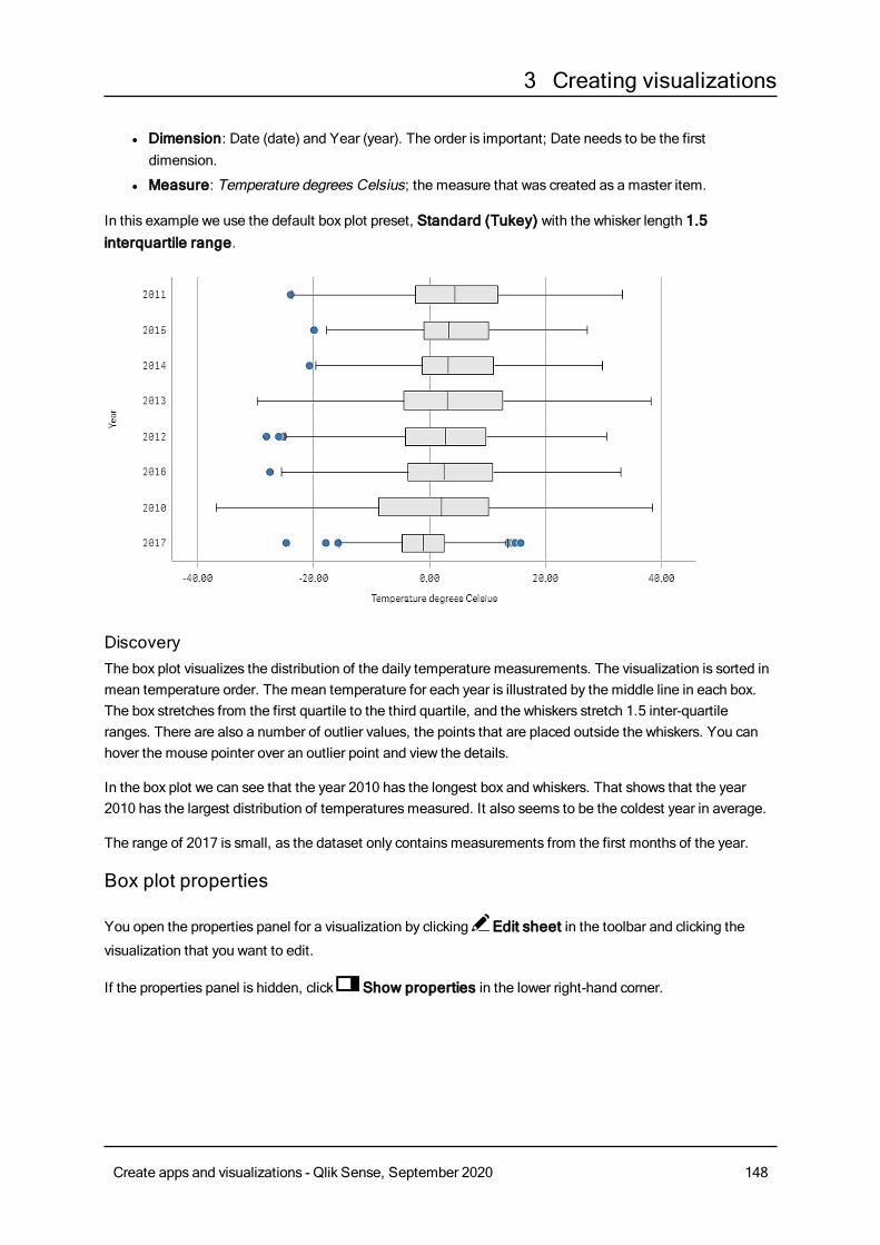
3 Creating visualizations
l Dimension: Date (date) and Year (year). The order is important; Date needs to be the firstdimension.
l Measure: Temperature degrees Celsius; the measure that was created as a master item.
In this example we use the default box plot preset, Standard (Tukey) with the whisker length 1.5interquartile range.
DiscoveryThe box plot visualizes the distribution of the daily temperature measurements. The visualization is sorted inmean temperature order. The mean temperature for each year is illustrated by the middle line in each box.The box stretches from the first quartile to the third quartile, and the whiskers stretch 1.5 inter-quartileranges. There are also a number of outlier values, the points that are placed outside the whiskers. You canhover the mouse pointer over an outlier point and view the details.
In the box plot we can see that the year 2010 has the longest box and whiskers. That shows that the year2010 has the largest distribution of temperaturesmeasured. It also seems to be the coldest year in average.
The range of 2017 is small, as the dataset only containsmeasurements from the first months of the year.
Box plot properties
You open the properties panel for a visualization by clicking Edit sheet in the toolbar and clicking the
visualization that you want to edit.
If the properties panel is hidden, click Show properties in the lower right-hand corner.
Create apps and visualizations - Qlik Sense, September 2020 148
3 Creating visualizations
If the visualization has in the upper right-hand corner, the visualization is linked to amaster
item. You cannot edit a linked visualization, but you can edit themaster item. You can alsounlink the visualization tomake it editable.
Some of the settings in the properties panel are only available under certain circumstances, forexample, when you usemore than one dimension or measure, or when you select an optionthat makes other options available.
DataClickAdd to add a dimension or a measure.
Dimensions
On theData tab, underDimensions, clickAdd to open a list of availableDimensions and Fields. Selectthe dimension or field that you want to use.
You can also click to create a dimension in the expression editor. To be able to edit a dimension that is
linked to a master item, you must first unlink the dimension. Another way to create a dimension is to type theexpression directly in the text box. Expressions added in this waymust begin with an equals sign (=). Here isan example with a calculated dimension:
=If (Week < 14, Week, 'Sales')
If Add is dimmed, you cannot add more dimensions.
It is not possible to put limitations on the inner dimension of a box plot.
l <Dimension name>: Click the dimension name to open the dimension settings.
If you want to delete the dimension, right-click the dimension and select in the dialog. Alternatively,
click the dimension and click .
o Dimension: Only displayed for master items. To be able to edit a dimension that is linked to amaster item, you must first unlink the dimension.
o Field: If you have added a field from Fields in the assets panel, the field name is automatically
displayed. Click to open the expression editor.
o Label: Enter a label for the dimension. If you have added a field from Fields in the assetspanel, the field name is automatically displayed.
o Includenull values: When selected, the measure values of all null dimensions aresummarized and presented as one dimension item in a visualization. All null values aredisplayed as gaps or dashes (-).
o Master item: You can create a master dimension based on the dimension expression byclickingCreate new.
Create apps and visualizations - Qlik Sense, September 2020 149
3 Creating visualizations
You can also click to create a dimension in the expression editor. To be able to edit a
dimension that is linked to a master item, you must first unlink the dimension. Another way tocreate a dimension is to type the expression directly in the text box. Expressions added in thiswaymust begin with an equals sign (=). Here is an example with a calculated dimension:
l Add alternative: Alternative dimensions and measures are dimensions and measures that are addedto a visualization, but are not displayed until a user chooses to switch which dimensions and measuresare being displayed during visual exploration.
You cannot use calculated dimensions in a box plot.
You can drag the dimensions to set the order in which they are displayed in the visualization. Use the drag
bars (o ) to rearrange the order.
You can drag a field fromMeasures toDimensions to change how it is used. Moving a measure toDimensions removes its aggregation. You cannot drag a master measure toDimensions. You can onlydrag a measure toDimensions if its expression is simple.
Measures
On theData tab, underMeasures, clickAdd to open a list of available measures. Select the measure thatyou want to add to the visualization. If you select a field, you are automatically presented with some commonaggregation functions that you can choose between for the measure.
If no measure is available, you need to create one. You can enter the expression directly in the text box, or
click to create a measure in the expression editor.
To be able to edit a measure that is linked to a master item, you must first unlink the measure.
If Add is dimmed, you cannot add more measures.
l <Measure name>: Click the measure to open the measure settings.
If you want to delete the measure, long-touch/right-click the measure and select in the dialog.
Alternatively, click the measure and click .
o Expression: Click to open the expression editor.The existing expression is displayed by
default.o Label: Enter a label for the measure. Measures not saved inMaster items are by default
displayed with the expression as label.o Measure: Only displayed for master items. To be able to edit a measure that is linked to a
master item, you must first unlink the measure.o Number formatting: Different options for formatting the measure values. If you want to
change the number format at app level, and not just for a single measure, it is better to do thatin the regional settings, that is, in the SET statements at the beginning of the script in the dataload editor.
The following number formats are available:
Create apps and visualizations - Qlik Sense, September 2020 150
3 Creating visualizations
n Auto: Qlik Sense automatically sets a number formatting based on the source data.To represent numeric abbreviations, the international SI units are used, such as k(thousand), M (million), and G (billion).
n Number: By default, the formatting is set to Simple, and you can select the formattingfrom the options in the drop-down list. Click the button to change toCustomformatting, and use the Format pattern box to change the format pattern.
Examples:
l # ##0 describes the number as an integer with a thousands separator. In thisexample " " is used as a thousands separator.
l ###0 describes the number as an integer without a thousands separator.
l 0000 describes the number as an integer with at least four digits. For example,the number 123 will be shown as 0123.
l 0.000 describes the number with three decimals. In this example "." is used as adecimal separator.
If you add the percent sign (%) to the format pattern, the measure values areautomatically multiplied by 100.
n Money: By default, the format pattern used for money is the same as set up in theoperating system. Use the Format pattern box to change the format pattern.
n Date: By default, the formatting is set to Simple, and you can select the formattingfrom the options in the drop-down list. Click the button to change toCustomformatting, and use the Format pattern box to change the format pattern.
n Duration: By default, the format pattern used for duration is the same as set up in theoperating system. Duration can be formatted as days, or as a combination of days,hours, minutes, seconds and fractions of seconds. Use the Format pattern box tochange the format pattern.
n Custom: By default, the format pattern used for custom is the same as set up in theoperating system. Use the Format pattern boxes to change the format pattern.
l Decimal separator: Set the decimal separator.
l Thousands separator: Set the thousands separator.
l Format pattern: Set the number format pattern.
l Reset pattern: Click to reset to default pattern.
n Measure expression: The format pattern is determined by the measure expression.Use this option to display custom number formatting for a measure in a visualization.Limitations:Only works with visualizations that accept measures.Cannot be used with a box plot.Does not affect the number formatting of the axis.
o Bars/Line/Marker: You can choose to add a measure as bars, as a line, or asmarkers.For lines and markers, you can use the Primary axis to the left or the Secondary axis to theright.For markers you can choose between several different shapes.
Create apps and visualizations - Qlik Sense, September 2020 151
3 Creating visualizations
o Fill marker: Select to displaymarkers filled.
l Master item: You can create a master measure based on the measure expression by clickingCreatenew.
l Add alternative: Alternative dimensions and measures are dimensions and measures that are addedto a visualization, but are not displayed until a user chooses to switch which dimensions and measuresare being displayed during visual exploration.
You can drag the measures to set the order in which they are displayed in the visualization. Use the drag bars
(o ) to rearrange the order.
You can drag a field from Dimensions toMeasures to change how it is used. Moving a dimension toMeasures assigns it an aggregation. You cannot drag a master dimension toMeasures.
Box plot elementsl <Use presets>: If you set this toOn you can select one of the available presets that define theelements of the box plot: Standard (Tukey), Percentile-based or Standard deviation.If you set toOff you need to define all elements using custom expressions.
l Standard (Tukey): This preset is based on the original box plot definition by J. Tukey.The center line represents the median (second quartile), and the box start and endpoints represent the first and third quartiles.You can set the length of the whiskers withWhisker length: 1 inter-quartile range ,1.5 inter-quartile range or 2 inter-quartile ranges.1 inter-quartile range represents the length of the box, that is, the difference betweenthe first and third quartiles.
l Percentile-based: This preset is also defined with the box start and end pointsrepresenting the first and third quartiles, and the center line representing the median,but the whisker length is adjusted by setting a percentile basedWhisker position:Min/max.This setting sets the whisker start and end points to the minimum and maximumvalues: 1st/99th percentile, 5th/95th percentile or 10th/90th percentile.
l Standard deviation: This preset is based on standard deviations, with the center linerepresenting the average value, and the box start and end points representing onestandard deviation variance. You can set the whisker length to a multiple of standarddeviations: One standard deviation, Two standard deviations or Three standarddeviations.
l Include outliers: You can select to display outlier values, that is, values on either sideof the whiskers.
l Custom boxplot element settings: If you set Use presets toOff you can define allelements using a custom expression and label. Expressions are prefilled with theexpressions used to define the elements in the most recently used preset.Center line: Name and ExpressionBox edges: Box start name, Box start expression, Box end name or Box endexpression
Create apps and visualizations - Qlik Sense, September 2020 152
3 Creating visualizations
Whiskers:First whisker name, First whisker expression , Last whisker name orLast whisker expression
SortingIf you set Sorting toCustom, you can sort the box plot by a custom expression, or by the second dimensionof the chart in numerical or alphabetical order. The sorting is either Ascending orDescending.
l Sort by expression: Select which element to sort by (First whisker, Box start, Center line, Boxend or Last whisker).
l Sort numerically: Enable this to sort numerically by the second dimension of the chart. If you changethe second dimension, the chart will be sorted by the new dimension.
l Sort alphabetically: Enable this to sort alphabetically by the second dimension of the chart. If youchange the second dimension, the chart will be sorted by the new dimension.
You can also customize the sort expression. Do the following:
1. Click to unlink the sort expression.
2. Edit the sort expression.
You can sort by load order by switching toCustom and leaving all sorting options unselected.
If you have set a custom order for a field, that custom order will override any selected internal sort order inSorting.
Add-onsl Data handling:Calculation condition: Specify an expression in this text field to set a condition that needs to befulfilled (true) for the object to be displayed. The value may be entered as a calculated formula. Forexample: count(distinct Team)<3. If the condition is not fulfilled, the message or expression enteredinDisplayed message is displayed.A calculation condition is useful when a chart or table is very big and makes the visualization slow torespond. A calculation condition can then help so that for example an object does not show until theuser has filtered the data to a more manageable level by applying selections.
l Reference lines:o Add reference line: Click to add a new reference line.
o Show: When selected, the reference line is displayed.
o Label: Enter a label for the reference line.o Color: In the color picker, select the color of the reference line and the label.
o Reference line expression: Enter a value or an expression for the reference line. Click to
open the expression editor.
o : Click to remove the reference line.
Create apps and visualizations - Qlik Sense, September 2020 153
3 Creating visualizations
Appearance
General
l Show titles: Select to enable or disable titles, subtitles, and footnotes in the chart.Enter Title, Subtitle, and Footnote. By default, the string is interpreted as a text string. However,you can also use the text field for an expression, or a combination of text and expression. An equalssign (=), at the beginning of a string shows that it contains an expression.Click if you want to create an expression by using the expression editor.
Titles are displayed on a single line. If you inject line breaks they will be ignored.
Example:
Assume that the following string is used, including quotation marks: 'Sales: ' & Sum(Sales).By default, the string is interpreted as a text string and is displayed as presented in the example. But ifyou begin the string with an equals sign: (='Sales: ' & Sum(Sales)), the string is interpreted as anexpression instead. The output is then Sales: <value of expression>, where <value of expression>is the calculated value.
l Disable hover menu: Select to disable the hover menu in the visualization.
l Show details: Set to Show if you want to allow users to be able to choose to view details, such asdescriptions, measures, and dimensions.
Alternate states
State: Set the state to apply to the visualization. You can select:
l Any alternate state defined inMaster items.
l <inherited>, in which case the state defined for the sheet is used.
l <default state>, which represents the state where no alternate state is applied.
Presentation
You can set the orientation to be Vertical orHorizontal.
l Show whisker ticks: Enable this to display vertical lines at the end of each whisker.
l Gridline spacing: Set this toCustom if you want to customize the horizontal gridlines. You canchoose between: No lines, Medium, andNarrow.
Colors
l Colors: You only need to select Custom if you want to change the settings. The Auto settings arebased on the visualization used and the number of dimensions and measures, that is, the settings arenot fixed, but are dependent on the data input.
o Single color: A single color (by default blue) is used for all items in the chart. In visualizationsthat do not benefit from multiple colors (bar charts with one dimension and scatter plots),single color is the default setting. Use the color picker to change the dimension color.
Create apps and visualizations - Qlik Sense, September 2020 154
3 Creating visualizations
o By expression : You can use coloring by expression to accentuate certain values. Supportedformats: RGB, ARGB, and HSL.
o Expression: Enter the expression that you want to use. Click to open the expression
editor.
X-axis
l <Measure>o Labels and title: Select what to display of labels and title.o Label orientation: Select how to display the labels.
o Position: Select where to display the measure axis.
Y-axis
l <Dimension>o Labels and title: Select what to display of labels and title.o Position: Select where to display the dimension axis.o Scale: Set the spacing of the dimension axis scale.o Range: Select to set the min value, the max value, or both. The min value cannot be larger
than the max value. You can use expressions for the values.
Bullet chartThebullet chart (Bullet chart) displays a gaugewith extendedoptions. Bullet charts can beused to visualize and compare performance of ameasure to a target value and to a qualitativescale, such as poor, average, and good.
In a bullet chart you need one measure, which determines the length of the bar.
You can also add a dimension. This will show one gauge for every dimension value. If you do not define adimension, the chart will show a single gauge.
Example:
A bullet chart showing sales performance for each value of the dimension (quarter)
Create apps and visualizations - Qlik Sense, September 2020 155
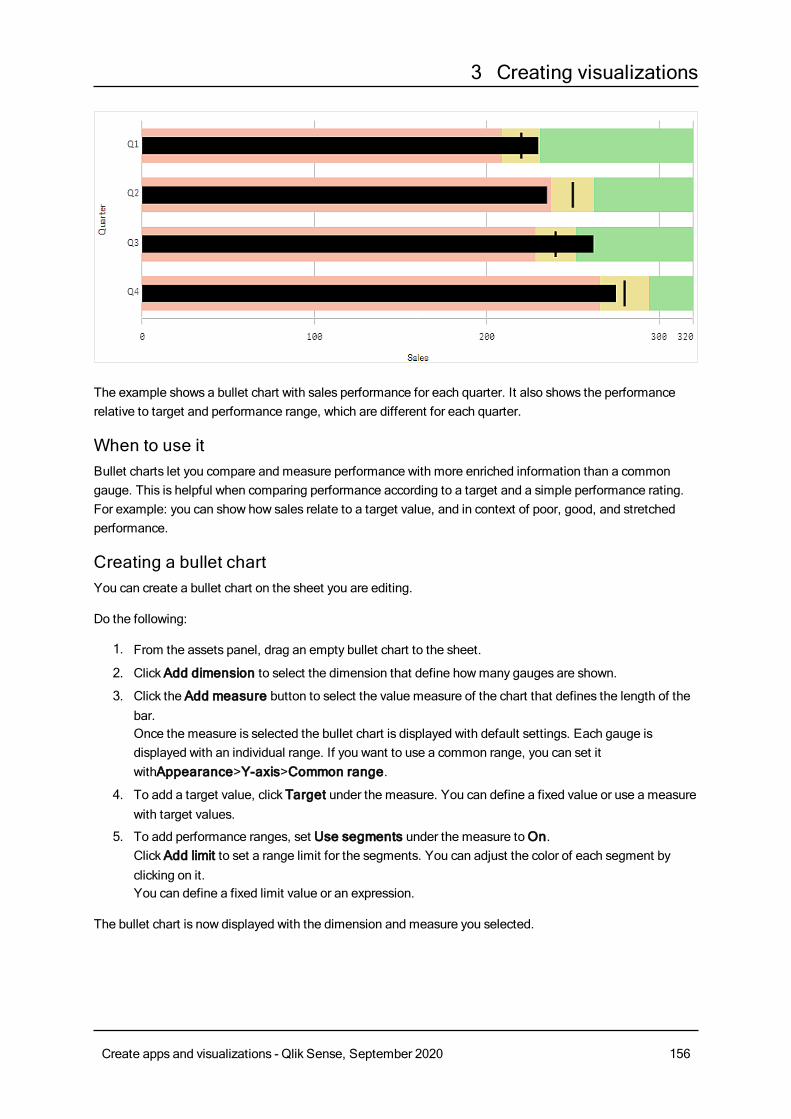
3 Creating visualizations
The example shows a bullet chart with sales performance for each quarter. It also shows the performancerelative to target and performance range, which are different for each quarter.
When to use itBullet charts let you compare and measure performance with more enriched information than a commongauge. This is helpful when comparing performance according to a target and a simple performance rating.For example: you can show how sales relate to a target value, and in context of poor, good, and stretchedperformance.
Creating a bullet chartYou can create a bullet chart on the sheet you are editing.
Do the following:
1. From the assets panel, drag an empty bullet chart to the sheet.
2. ClickAdd dimension to select the dimension that define howmany gauges are shown.
3. Click the Add measure button to select the value measure of the chart that defines the length of thebar.Once the measure is selected the bullet chart is displayed with default settings. Each gauge isdisplayed with an individual range. If you want to use a common range, you can set itwithAppearance>Y-axis>Common range.
4. To add a target value, click Target under the measure. You can define a fixed value or use a measurewith target values.
5. To add performance ranges, set Use segments under the measure toOn.ClickAdd limit to set a range limit for the segments. You can adjust the color of each segment byclicking on it.You can define a fixed limit value or an expression.
The bullet chart is now displayed with the dimension and measure you selected.
Create apps and visualizations - Qlik Sense, September 2020 156
3 Creating visualizations
Setting a target valueYou can add a target value which is displayed as a marker line. If the measure contains sales numbers, thiscould be budgeted sales for example.
You can define a fixed value or use a measure with target values.
Setting performance rangesTo add performance ranges, set Use segments under the measure toOn.
You need to add the limits for the ranges you want to use for showing indicators with Add limit. You can set alimit value in three ways.
l Use the slider.
l Type a value in the text box.
l Set an expression that returns the limit value.
Changing the color schemeYou can change color scheme of the value bar and the target by setting Appearance > Colors > Colors toCustom. You can set single colors or use an expression.
It's a good idea to use a bar color that is visually dominant to the range colors.
When you have added the limits, you can select the color and the symbol of the indicator for each definedrange.
Setting the scale of the axisIf you use a dimension to show several gauges, you can select how to show the scale of the axis withAppearance>Y-axis>Common range.
l If you want each dimension gauge to use the same scale, enableCommon range. If the rangemeasure depends on the dimension value, the range bars will have different lengths.This is useful when you want to be able to compare the actual values.You can also set a common axis for all gauges with Appearance>Y-axis>Common range.
l If you want each range bar to be equally long, disableCommon range.This is useful when you want to be able to compare the relative performance of each dimension value.
Combo chartThe combo chart is suitable for comparing two sets ofmeasure values that are usually hard tocompare because of the differences in scale. It is basically a bar chart combinedwith a linechart.
Create apps and visualizations - Qlik Sense, September 2020 157
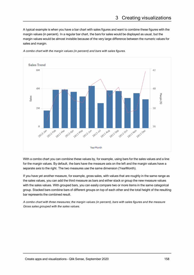
3 Creating visualizations
A typical example is when you have a bar chart with sales figures and want to combine these figures with themargin values (in percent). In a regular bar chart, the bars for sales would be displayed as usual, but themargin values would be almost invisible because of the very large difference between the numeric values forsales and margin.
A combo chart with the margin values (in percent) and bars with sales figures.
With a combo chart you can combine these values by, for example, using bars for the sales values and a linefor the margin values. By default, the bars have the measure axis on the left and the margin values have aseparate axis to the right. The two measures use the same dimension (YearMonth).
If you have yet another measure, for example, gross sales, with values that are roughly in the same range asthe sales values, you can add the third measure as bars and either stack or group the newmeasure valueswith the sales values. With grouped bars, you can easily compare two or more items in the same categoricalgroup. Stacked bars combine bars of different groups on top of each other and the total height of the resultingbar represents the combined result.
A combo chart with three measures; the margin values (in percent), bars with sales figures and the measureGross sales grouped with the sales values.
Create apps and visualizations - Qlik Sense, September 2020 158
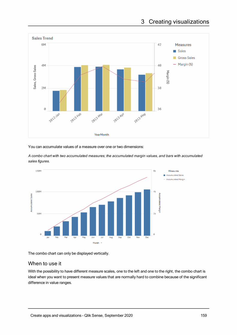
3 Creating visualizations
You can accumulate values of a measure over one or two dimensions:
A combo chart with two accumulated measures; the accumulated margin values, and bars with accumulatedsales figures.
The combo chart can only be displayed vertically.
When to use itWith the possibility to have different measure scales, one to the left and one to the right, the combo chart isideal when you want to present measure values that are normally hard to combine because of the significantdifference in value ranges.
Create apps and visualizations - Qlik Sense, September 2020 159
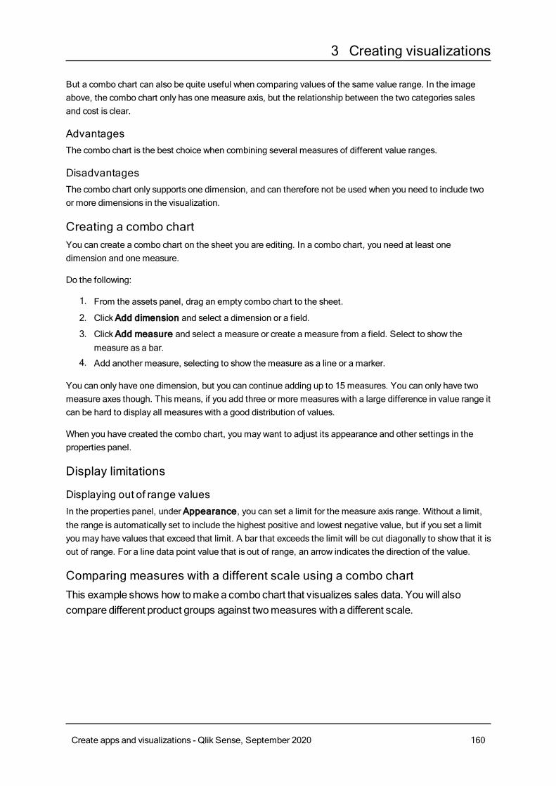
3 Creating visualizations
But a combo chart can also be quite useful when comparing values of the same value range. In the imageabove, the combo chart only has one measure axis, but the relationship between the two categories salesand cost is clear.
AdvantagesThe combo chart is the best choice when combining several measures of different value ranges.
DisadvantagesThe combo chart only supports one dimension, and can therefore not be used when you need to include twoor more dimensions in the visualization.
Creating a combo chartYou can create a combo chart on the sheet you are editing. In a combo chart, you need at least onedimension and one measure.
Do the following:
1. From the assets panel, drag an empty combo chart to the sheet.
2. ClickAdd dimension and select a dimension or a field.
3. ClickAdd measure and select a measure or create a measure from a field. Select to show themeasure as a bar.
4. Add another measure, selecting to show the measure as a line or a marker.
You can only have one dimension, but you can continue adding up to 15 measures. You can only have twomeasure axes though. This means, if you add three or more measures with a large difference in value range itcan be hard to display all measures with a good distribution of values.
When you have created the combo chart, you may want to adjust its appearance and other settings in theproperties panel.
Display limitations
Displaying out of range valuesIn the properties panel, under Appearance, you can set a limit for the measure axis range. Without a limit,the range is automatically set to include the highest positive and lowest negative value, but if you set a limityou may have values that exceed that limit. A bar that exceeds the limit will be cut diagonally to show that it isout of range. For a line data point value that is out of range, an arrow indicates the direction of the value.
Comparing measures with a different scale using a combo chartThis example shows how tomakea combo chart that visualizes sales data. Youwill alsocompare different product groups against twomeasures with a different scale.
Create apps and visualizations - Qlik Sense, September 2020 160
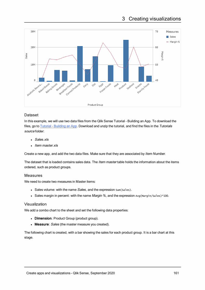
3 Creating visualizations
DatasetIn this example, we will use two data files from the Qlik Sense Tutorial - Building an App. To download thefiles, go to Tutorial - Building an App. Download and unzip the tutorial, and find the files in the Tutorialssource folder:
l Sales.xls
l Itemmaster.xls
Create a new app, and add the two data files. Make sure that they are associated by Item Number.
The dataset that is loaded contains sales data. The Itemmaster table holds the information about the itemsordered, such as product groups.
MeasuresWe need to create two measures in Master items:
l Sales volume: with the name Sales, and the expression Sum(Sales).
l Salesmargin in percent: with the nameMargin%, and the expression Avg(Margin/Sales)*100.
VisualizationWe add a combo chart to the sheet and set the following data properties:
l Dimension: Product Group (product group).
l Measure: Sales (the master measure you created).
The following chart is created, with a bar showing the sales for each product group. It is a bar chart at thisstage.
Create apps and visualizations - Qlik Sense, September 2020 161
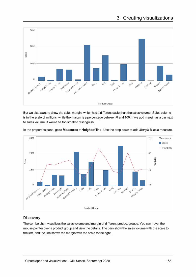
3 Creating visualizations
But we also want to show the salesmargin, which has a different scale than the sales volume. Sales volumeis in the scale of millions, while the margin is a percentage between 0 and 100. If we add margin as a bar nextto sales volume, it would be too small to distinguish.
In the properties pane, go toMeasures > Height of line. Use the drop down to addMargin% as a measure.
DiscoveryThe combo chart visualizes the sales volume and margin of different product groups. You can hover themouse pointer over a product group and view the details. The bars show the sales volume with the scale tothe left, and the line shows the margin with the scale to the right.
Create apps and visualizations - Qlik Sense, September 2020 162
3 Creating visualizations
In the chart we can see that Produce and Canned Products have the highest sales volumes. Both groupshave a lower margin than most other product groups.
Some product groups with low sales volume, like Eggs and Seafood, have a significantly higher margin.
Combo chart properties
You open the properties panel for a visualization by clicking Edit sheet in the toolbar and clicking the
visualization that you want to edit.
If the properties panel is hidden, click Show properties in the lower right-hand corner.
If the visualization has in the upper right-hand corner, the visualization is linked to amaster
item. You cannot edit a linked visualization, but you can edit themaster item. You can alsounlink the visualization tomake it editable.
Some of the settings in the properties panel are only available under certain circumstances, forexample, when you use at least one line or when you have twomeasures.
DataClickAdd to add a dimension or a measure.
Dimensions
On theData tab, underDimensions, clickAdd to open a list of availableDimensions and Fields. Selectthe dimension or field that you want to use.
You can also click to create a dimension in the expression editor. To be able to edit a dimension that is
linked to a master item, you must first unlink the dimension. Another way to create a dimension is to type theexpression directly in the text box. Expressions added in this waymust begin with an equals sign (=). Here isan example with a calculated dimension:
=If (Week < 14, Week, 'Sales')
If Add is dimmed, you cannot add more dimensions.
l <Dimension name>: Click the dimension name to open the dimension settings.
If you want to delete the dimension, right-click the dimension and select in the dialog. Alternatively,
click the dimension and click .
l Dimension: Only displayed for master items. To be able to edit a dimension that is linked to amaster item, you must first unlink the dimension.
l Field: If you have added a field from Fields in the assets panel, the field name is automatically
displayed. Click to open the expression editor.
Create apps and visualizations - Qlik Sense, September 2020 163
3 Creating visualizations
l Label: Enter a label for the dimension. If you have added a field from Fields in the assetspanel, the field name is automatically displayed.
l Includenull values: When selected, the measure values of all null dimensions aresummarized and presented as one dimension item in a visualization. All null values aredisplayed as gaps or dashes (-).
l Limitation: Limits the number of displayed values. When you set a limitation, the onlydimensions displayed are those where the measure value meets the limitation criterion:
l No limitation: The default value.
l Fixed number: Select to display the top or bottom values. Set the number of values.
You can also use an expression to set the number. Click to open the expression
editor.
l Exact value: Use the operators and set the exact limit value. You can also use an
expression to set the number. Click to open the expression editor.
l Relative value: Use the operators and set the relative limit value in percent. You can
also use an expression to set the number. Click to open the expression editor.
l Calculated on measure: <measure>: Shown when you make a limitation to thenumber of displayed dimension values. The dimensions whose measure value meet thecriterion are displayed.
l Show others: When selected, the last value in the visualization (colored gray), summarizes allthe remaining values. When some kind of limitation is set (Fixed number, Exact value, orRelative number), the value counts as 1 in that setting. If, for example, Exact value is usedand set to 10, the tenth value isOthers.This option is not available in box plot dimensions.
l Other label: Enter a label for the summarized values (when Show others is selected). You
can also use an expression as a label. Click to open the expression editor.
l Master item: You can create a master dimension based on the dimension expression byclickingCreate new.
l Add alternative: Alternative dimensions and measures are dimensions and measures that are addedto a visualization, but are not displayed until a user chooses to switch which dimensions and measuresare being displayed during visual exploration.
You can drag the dimensions to set the order in which they are displayed in the visualization. Use the drag
bars (o ) to rearrange the order.
You can drag a field fromMeasures toDimensions to change how it is used. Moving a measure toDimensions removes its aggregation. You cannot drag a master measure toDimensions. You can onlydrag a measure toDimensions if its expression is simple.
Measures
On theData tab, underMeasures, clickAdd to open a list of available measures. Select the measure thatyou want to add to the visualization. If you select a field, you are automatically presented with some commonaggregation functions that you can choose between for the measure.
Create apps and visualizations - Qlik Sense, September 2020 164
3 Creating visualizations
If no measure is available, you need to create one. You can enter the expression directly in the text box, or
click to create a measure in the expression editor.
To be able to edit a measure that is linked to a master item, you must first unlink the measure.
If Add is dimmed, you cannot add more measures.
l <Measure name>: Click the measure to open the measure settings.
If you want to delete the measure, long-touch/right-click the measure and select in the dialog.
Alternatively, click the measure and click .
l Expression: Click to open the expression editor.The existing expression is displayed by
default.
l Modifier: Selects a modifier for the measure. Options areNone, Accumulation, Movingaverage, Difference, andRelative numbers.
l Accumulation: Only displayed when Accumulation has been selected as a modifier.It allows you to accumulate values of your measure over one or two dimensions.
The following options are available:
l Dimension: Selects the dimension on which the accumulation will take place. Ifthe accumulation is made acrossmultiple dimensions, this will be the firstdimension.
l Across all dimensions: Continues accumulation across all availabledimensions.
l Range: Select whether the accumulation will happen on the Full range, or aCustom range of the dimension.
l Steps: Only displayed whenRange is set toCustom. The number of steps inthe dimension which form an accumulation range. Only zero and positiveintegers are accepted.
l Show excluded values: Include excluded values in the accumulation.
l Output expression: Shows the expression used by the modifier.
l Moving average: Only displayed whenMoving average has been selected as amodifier. It allows you to accumulate values of your measure over one or twodimensions.
The following options are available:
l Dimension: Selects the dimension on which the moving average will takeplace. If the moving average is made acrossmultiple dimensions, this will be thefirst dimension.
l Across all dimensions: Continuesmoving average across all availabledimensions.
l Range: Select whether the moving average will happen on the Full range, or aCustom range of the dimension.
Create apps and visualizations - Qlik Sense, September 2020 165
3 Creating visualizations
l Steps: Only displayed whenRange is set toCustom. The number of steps inthe dimension which form a moving average range. Only zero and positiveintegers are accepted.
l Show excluded values: Include excluded values in the moving average.
l Output expression: Shows the expression used by the modifier.
l Difference: Only displayed whenDifference has been selected as a modifier. Itallows you to calculate the difference between consecutive values of a measure overone or two dimensions.
The following options are available:
l Dimension: Selects the dimension on which the difference will take place. If thedifference is made acrossmultiple dimensions, this will be the first dimension.
l Across all dimensions: Continues difference across all available dimensions.
l Show excluded values: Include excluded values in the difference.
l Output expression: Shows the expression used by the modifier.
l Relative numbers: Only displayed whenRelative numbers has been selected as amodifier. It allows you to calculate percentages relative to a specific selection, relativeto the total, or relative to a field value. The modifier can be calculated over one or twodimensions.
The following options are available:
l Selection scope: Sets whether the relative numbers are calculated based onthe current selection or a specific field value. You can also disregard the currentselection.
l Dimensional scope: Sets whether the relative numbers are calculated basedon a dimension. You can choose to have the modifier respect all availabledimensions, respect a specific dimension if there are two, or to disregard thedimensions.
l Output expression: Shows the expression used by the modifier.
l Label: Enter a label for the measure. Measures not saved inMaster items are by defaultdisplayed with the expression as label.
l Measure: Only displayed for master items. To be able to edit a measure that is linked to amaster item, you must first unlink the measure.
l Number formatting: Different options for formatting the measure values. If you want tochange the number format at app level, and not just for a single measure, it is better to do thatin the regional settings, that is, in the SET statements at the beginning of the script in the dataload editor.
The following number formats are available:
l Auto: Qlik Sense automatically sets a number formatting based on the source data.To represent numeric abbreviations, the international SI units are used, such as k(thousand), M (million), and G (billion).
l Number: By default, the formatting is set to Simple, and you can select the formattingfrom the options in the drop-down list. Click the button to change toCustom
Create apps and visualizations - Qlik Sense, September 2020 166
3 Creating visualizations
formatting, and use the Format pattern box to change the format pattern.
Examples:
l # ##0 describes the number as an integer with a thousands separator. In thisexample " " is used as a thousands separator.
l ###0 describes the number as an integer without a thousands separator.
l 0000 describes the number as an integer with at least four digits. For example,the number 123 will be shown as 0123.
l 0.000 describes the number with three decimals. In this example "." is used as adecimal separator.
If you add the percent sign (%) to the format pattern, the measure values areautomatically multiplied by 100.
l Money: By default, the format pattern used for money is the same as set up in theoperating system. Use the Format pattern box to change the format pattern.
l Date: By default, the formatting is set to Simple, and you can select the formattingfrom the options in the drop-down list. Click the button to change toCustomformatting, and use the Format pattern box to change the format pattern.
l Duration: By default, the format pattern used for duration is the same as set up in theoperating system. Duration can be formatted as days, or as a combination of days,hours, minutes, seconds and fractions of seconds. Use the Format pattern box tochange the format pattern.
l Custom: By default, the format pattern used for custom is the same as set up in theoperating system. Use the Format pattern boxes to change the format pattern.
l Measure expression: The format pattern is determined by the measure expression.Use this option to display custom number formatting for a measure in a visualization.Limitations:Only works with visualizations that accept measures.Cannot be used with a box plot.Does not affect the number formatting of the axis.
l Label: Enter a label for the measure. Measures not saved inMaster items are by defaultdisplayed with the expression as label.
l Measure: Only displayed for master items. To be able to edit a measure that is linked to amaster item, you must first unlink the measure.
l Number formatting: Different options for formatting the measure values. If you want tochange the number format at app level, and not just for a single measure, it is better to do thatin the regional settings, that is, in the SET statements at the beginning of the script in the dataload editor.
The following number formats are available:
l Auto: Qlik Sense automatically sets a number formatting based on the source data.To represent numeric abbreviations, the international SI units are used, such as k(thousand), M (million), and G (billion).
Create apps and visualizations - Qlik Sense, September 2020 167
3 Creating visualizations
l Number: By default, the formatting is set to Simple, and you can select the formattingfrom the options in the drop-down list. Click the button to change toCustomformatting, and use the Format pattern box to change the format pattern.
Examples:
l # ##0 describes the number as an integer with a thousands separator. In thisexample " " is used as a thousands separator.
l ###0 describes the number as an integer without a thousands separator.
l 0000 describes the number as an integer with at least four digits. For example,the number 123 will be shown as 0123.
l 0.000 describes the number with three decimals. In this example "." is used as adecimal separator.
If you add the percent sign (%) to the format pattern, the measure values areautomatically multiplied by 100.
l Money: By default, the format pattern used for money is the same as set up in theoperating system. Use the Format pattern box to change the format pattern.
l Date: By default, the formatting is set to Simple, and you can select the formattingfrom the options in the drop-down list. Click the button to change toCustomformatting, and use the Format pattern box to change the format pattern.
l Duration: By default, the format pattern used for duration is the same as set up in theoperating system. Duration can be formatted as days, or as a combination of days,hours, minutes, seconds and fractions of seconds. Use the Format pattern box tochange the format pattern.
l Custom: By default, the format pattern used for custom is the same as set up in theoperating system. Use the Format pattern boxes to change the format pattern.
l Measure expression: The format pattern is determined by the measure expression.Use this option to display custom number formatting for a measure in a visualization.Limitations:Only works with visualizations that accept measures.Cannot be used with a box plot.Does not affect the number formatting of the axis.
l Label: Enter a label for the measure. Measures not saved inMaster items are by defaultdisplayed with the expression as label.
l Measure: Only displayed for master items. To be able to edit a measure that is linked to amaster item, you must first unlink the measure.
l Number formatting: Different options for formatting the measure values. If you want tochange the number format at app level, and not just for a single measure, it is better to do thatin the regional settings, that is, in the SET statements at the beginning of the script in the dataload editor.
The following number formats are available:
Create apps and visualizations - Qlik Sense, September 2020 168

3 Creating visualizations
l Auto: Qlik Sense automatically sets a number formatting based on the source data.To represent numeric abbreviations, the international SI units are used, such as k(thousand), M (million), and G (billion).
l Number: By default, the formatting is set to Simple, and you can select the formattingfrom the options in the drop-down list. Click the button to change toCustomformatting, and use the Format pattern box to change the format pattern.
Examples:
l # ##0 describes the number as an integer with a thousands separator. In thisexample " " is used as a thousands separator.
l ###0 describes the number as an integer without a thousands separator.
l 0000 describes the number as an integer with at least four digits. For example,the number 123 will be shown as 0123.
l 0.000 describes the number with three decimals. In this example "." is used as adecimal separator.
If you add the percent sign (%) to the format pattern, the measure values areautomatically multiplied by 100.
l Money: By default, the format pattern used for money is the same as set up in theoperating system. Use the Format pattern box to change the format pattern.
l Date: By default, the formatting is set to Simple, and you can select the formattingfrom the options in the drop-down list. Click the button to change toCustomformatting, and use the Format pattern box to change the format pattern.
l Duration: By default, the format pattern used for duration is the same as set up in theoperating system. Duration can be formatted as days, or as a combination of days,hours, minutes, seconds and fractions of seconds. Use the Format pattern box tochange the format pattern.
l Custom: By default, the format pattern used for custom is the same as set up in theoperating system. Use the Format pattern boxes to change the format pattern.
l Decimal separator: Set the decimal separator.
l Thousands separator: Set the thousands separator.
l Format pattern: Set the number format pattern.
l Reset pattern: Click to reset to default pattern.
l Measure expression: The format pattern is determined by the measure expression.Use this option to display custom number formatting for a measure in a visualization.Limitations:Only works with visualizations that accept measures.Cannot be used with a box plot.Does not affect the number formatting of the axis.
l Bars/Line/Marker: You can choose to add a measure as bars, as a line, or asmarkers.For lines and markers, you can use the Primary axis to the left or the Secondary axis to theright.For markers you can choose between several different shapes.
Create apps and visualizations - Qlik Sense, September 2020 169
3 Creating visualizations
l Fill marker: Select to displaymarkers filled.
l Master item: You can create a master measure based on the measure expression by clickingCreate new.
l Add alternative: Alternative dimensions and measures are dimensions and measures that are addedto a visualization, but are not displayed until a user chooses to switch which dimensions and measuresare being displayed during visual exploration.
You can drag the measures to set the order in which they are displayed in the visualization. Use the drag bars
(o ) to rearrange the order.
You can drag a field from Dimensions toMeasures to change how it is used. Moving a dimension toMeasures assigns it an aggregation. You cannot drag a master dimension toMeasures.
SortingDrag the dimensions and measures to set the sorting priority order. The numbers show the order.
Dimensions and measures can also be sorted internally:
Click the dimension or measure name to open the settings and click the sorting button to switch toCustomsorting. The following list shows the internal sorting priority order and sorting options. The sorting is eitherAscending orDescending.
l Sort by expression: Enter an expression to sort by. Only available for dimensions.
l Sort numerically
l Sort alphabetically
Additionally, you can sort by load order by switching toCustom and leaving all sorting options unselected.
If you have set a custom order for a field, that custom order will override any selected internal sort order inSorting.
Add-onsl Data handling:
l Calculation condition: Specify an expression in this text field to set a condition that needs tobe fulfilled (true) for the object to be displayed. The value may be entered as a calculatedformula. For example: count(distinct Team)<3. If the condition is not fulfilled, the message orexpression entered inDisplayed message is displayed.A calculation condition is useful when a chart or table is very big and makes the visualizationslow to respond. A calculation condition can then help so that for example an object does notshow until the user has filtered the data to a more manageable level by applying selections.
l Include zero values: When unselected, measures that have the value ‘0’ are not included inthe presentation. If there is more than one measure value, all the measure valuesmust havethe value ‘0’ to be excluded from the presentation.
Create apps and visualizations - Qlik Sense, September 2020 170
3 Creating visualizations
Appearance
General
l Show titles: Select to enable or disable titles, subtitles, and footnotes in the chart.Enter Title, Subtitle, and Footnote. By default, the string is interpreted as a text string. However,you can also use the text field for an expression, or a combination of text and expression. An equalssign (=), at the beginning of a string shows that it contains an expression.Click if you want to create an expression by using the expression editor.
Titles are displayed on a single line. If you inject line breaks they will be ignored.
Example:
Assume that the following string is used, including quotation marks: 'Sales: ' & Sum(Sales).By default, the string is interpreted as a text string and is displayed as presented in the example. But ifyou begin the string with an equals sign: (='Sales: ' & Sum(Sales)), the string is interpreted as anexpression instead. The output is then Sales: <value of expression>, where <value of expression>is the calculated value.
l Disable hover menu: Select to disable the hover menu in the visualization.
l Show details: Set to Show if you want to allow users to be able to choose to view details, such asdescriptions, measures, and dimensions.
Alternate states
l State: Set the state to apply to the visualization. You can select:
l Any alternate state defined inMaster items.
l <inherited>, in which case the state defined for the sheet is used.
l <default state>, which represents the state where no alternate state is applied.
Presentation
When you have at least two dimensions or two measures, you can present the dimensions or measuresgrouped together or stacked on top of each other.
Select vertical or horizontal orientation of the visualization.
l Scroll alignment: Set the position of the chart scroll bar. By default the scroll alignment is set toStart.
l Grid line spacing: Select the spacing of the grid lines. The Auto setting isMedium.
l Value labels: By default, Off. With the Auto setting, the value labels are displayed when there isenough space.
Value labels are available for Bars and Lines, but they are not available for Marker.
Create apps and visualizations - Qlik Sense, September 2020 171
3 Creating visualizations
Colors and legends
l Colors: Select how the chart values are colored. There are two settings:
l Auto: Color settings are based on the visualization used and the number of dimensions andmeasures, that is, the settings are not fixed, but are dependent on the data input.
l Custom: Manually select the method of coloring your values in the chart. The followingmethods are available:
l Single color: A single color (by default blue) is used for all items in the chart. Invisualizations that do not benefit from multiple colors (bar charts with one dimensionand scatter plots), single color is the default setting. Use the color picker to change thedimension color.
l Use library colors: Option available when a master dimension or mastermeasure used in the visualization has a color assigned to it. You can select touse the master item colors or to disable the master item colors. In cases where avisualization has both a master dimension and a master measure that havecolors assigned to them, you can select which to use in the visualization.
l Multicolored: Option when more than one measure is used.By default, 12 colors are used for the dimensions. The colors are reused when there aremore than 12 dimension values.
l Use library colors: Option available when a master dimension or mastermeasure used in the visualization has a color assigned to it. You can select touse the master item colors or to disable the master item colors. In cases where avisualization has both a master dimension and a master measure that havecolors assigned to them, you can select which to use in the visualization.
l Color scheme: Select 12 colors or 100 colors to be used for the differentvalues. The 12 colors can all be distinguished by people with color visiondeficiency, but not all of the 100 colors.
l By dimension: By default, 12 colors are used for the dimensions. The colors arereused when there are more than 12 dimension values. When selected, the followingsettings are available:
l Select dimension: Enter a field or expression containing the values to colorobjects in this chart.
l Library colors: Select whether to use the master dimension color or to disablethe master dimension color. Option available only when a master dimensionused in the visualization has a color assigned to it.
l Persistent colors: When selected, colors are persistent between selectionstates. Only available when using one dimension and the setting By dimensionorMulticolored.
l Color scheme: Select 12 colors or 100 colors to be used for the differentvalues. The 12 colors can all be distinguished by people with color visiondeficiency, but not all of the 100 colors.
l By measure: By default, Sequential gradient is selected. The higher the measurevalue, the darker the color.
Create apps and visualizations - Qlik Sense, September 2020 172
3 Creating visualizations
l Select measure: Select the measure to use to color your chart.
l Library colors: Select whether to use the master measure color or to disablethe master measure color. Option available only when a master measure used inthe visualization has a color assigned to it.
l Color scheme: Select a color scheme from the following options:
l Sequential gradient: The transition between the different color groupsis made using different shades of colors. High measure values havedarker hues.
l Sequential classes: The transition between the different color groups ismade using distinctly different colors.
l Diverging gradient: Used when working with data that is ordered fromlow to high, for instance, to show the relationship between different areason a chart. Low and high values have dark colors, mid-range colors arelight.
l Diverging classes: Can be seen as two sequential classes combined,with the mid-range shared. The two extremes, high and low, areemphasized with dark colors with contrasting hues, and the mid-rangecritical values are emphasized with light colors.
l Reverse colors: When selected, the color scheme is reversed.
l By expression: Color the chart using an expression to define colors for values.Supported color formats are: RGB, ARGB, and HSL.
l Expression: Enter the expression that you want to use. Click to open the
expression editor.
l The expression is a color code: Selected by default. In most cases, it is bestto keep this setting. When the selection is cleared, the expression evaluates to anumber, which in turn is plotted against one of the chart gradients.For more information, seeColoring a visualization (page 511)When the coloring is bymeasure or by expression, you can set the color range(Min andMax values). By setting the color range, the colors remain constantthroughout selections and paging. When using color by expression, the optionThe expression is a color code must be cleared before you can set the colorrange.
l Range: When the coloring is bymeasure or by expression, you can set the colorrange (Min andMax values). By setting the color range, the colors remainconstant throughout selections and paging. When using color by expression, theoption The expression is a color code must be cleared before you can set thecolor range.
l Show legend: Not available when Single color is selected. By default set toOff. The legend isdisplayed if there is enough space. The placement can be changed in the Legend position setting.
l Legend position: Select where to display the legend.
l Show legend title: When selected, the legend title is displayed.
Create apps and visualizations - Qlik Sense, September 2020 173
3 Creating visualizations
X-axis
l <Dimension>
l Continuous: Set toCustom to be able to show a continuous axis by selectingUsecontinuous scale. Use continuous scale is only available for dimensions with numericvalues. You cannot change sorting when you use a continuous scale.
l Show mini chart: You can select if you want to display the mini chart below the chart. Thisoption is only available when you use a continuous scale.
l Labels and title: Select what to display of labels and title.
l Label orientation: Select how to display the labels.
l Position: Select where to display the dimension axis.
Y-axis
l <Measure>
l Labels and title: Select what to display of labels and title.
l Position: Select where to display the measure axis.
l Scale: Set the spacing of the measure axis scale.
l Range: Select to set the min value, the max value, or both. The min value cannot be largerthan the max value. You can use expressions for the values.
Tooltip
l Tooltip: Set toCustom to be able to add measures as tooltips. Any added measures will bedisplayed as additional tooltips over the bars.
l Hide basic rows: Hides the rows of the tooltip that show basic information. If a custom tooltip has nomeasures and a title and description, Hide basic rows will also hide dimension values as well.
l Add measure: Adds a measure to be shown as a tooltip. You can add a measure from a field using
From a field. You can also use an expression to add a measure. Click to open the expression
editor. The existing expression is displayed by default. You can add a title and description to thetooltip. You can change the label of the tooltip using Label as well as its formatting usingNumberformatting.
Distribution plotThedistribution plot is suitable for comparing range anddistribution for groups of numericaldata. Data is plotted as value points along anaxis.
You can choose to display only the value points to see the distribution of values, a bounding box to see therange of values, or a combination of both as shown here:
Create apps and visualizations - Qlik Sense, September 2020 174
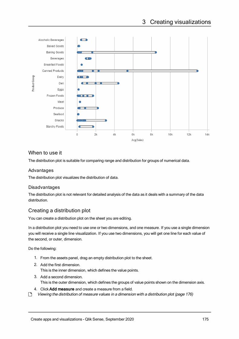
3 Creating visualizations
When to use itThe distribution plot is suitable for comparing range and distribution for groups of numerical data.
AdvantagesThe distribution plot visualizes the distribution of data.
DisadvantagesThe distribution plot is not relevant for detailed analysis of the data as it deals with a summary of the datadistribution.
Creating a distribution plotYou can create a distribution plot on the sheet you are editing.
In a distribution plot you need to use one or two dimensions, and one measure. If you use a single dimensionyou will receive a single line visualization. If you use two dimensions, you will get one line for each value ofthe second, or outer, dimension.
Do the following:
1. From the assets panel, drag an empty distribution plot to the sheet.
2. Add the first dimension.This is the inner dimension, which defines the value points.
3. Add a second dimension.This is the outer dimension, which defines the groups of value points shown on the dimension axis.
4. ClickAdd measure and create a measure from a field.p Viewing the distribution of measure values in a dimension with a distribution plot (page 176)
Create apps and visualizations - Qlik Sense, September 2020 175
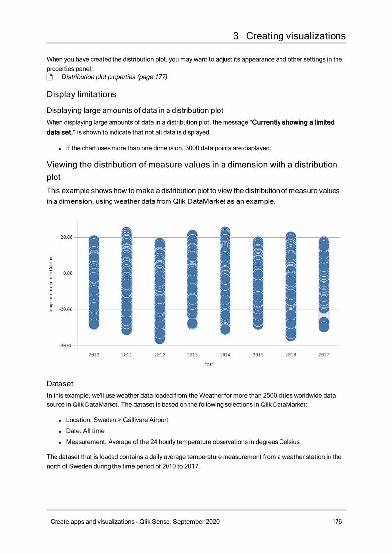
3 Creating visualizations
When you have created the distribution plot, you may want to adjust its appearance and other settings in theproperties panel.p Distribution plot properties (page 177)
Display limitations
Displaying large amounts of data in a distribution plotWhen displaying large amounts of data in a distribution plot, the message "Currently showing a limiteddata set." is shown to indicate that not all data is displayed.
l If the chart usesmore than one dimension, 3000 data points are displayed.
Viewing the distribution of measure values in a dimension with a distributionplotThis example shows how tomakeadistribution plot to view the distribution ofmeasure valuesin a dimension, usingweather data from Qlik DataMarket as an example.
DatasetIn this example, we'll use weather data loaded from theWeather for more than 2500 cities worldwide datasource in Qlik DataMarket. The dataset is based on the following selections in Qlik DataMarket:
l Location: Sweden > Gällivare Airport
l Date: All time
l Measurement: Average of the 24 hourly temperature observations in degrees Celsius
The dataset that is loaded contains a daily average temperature measurement from a weather station in thenorth of Sweden during the time period of 2010 to 2017.
Create apps and visualizations - Qlik Sense, September 2020 176
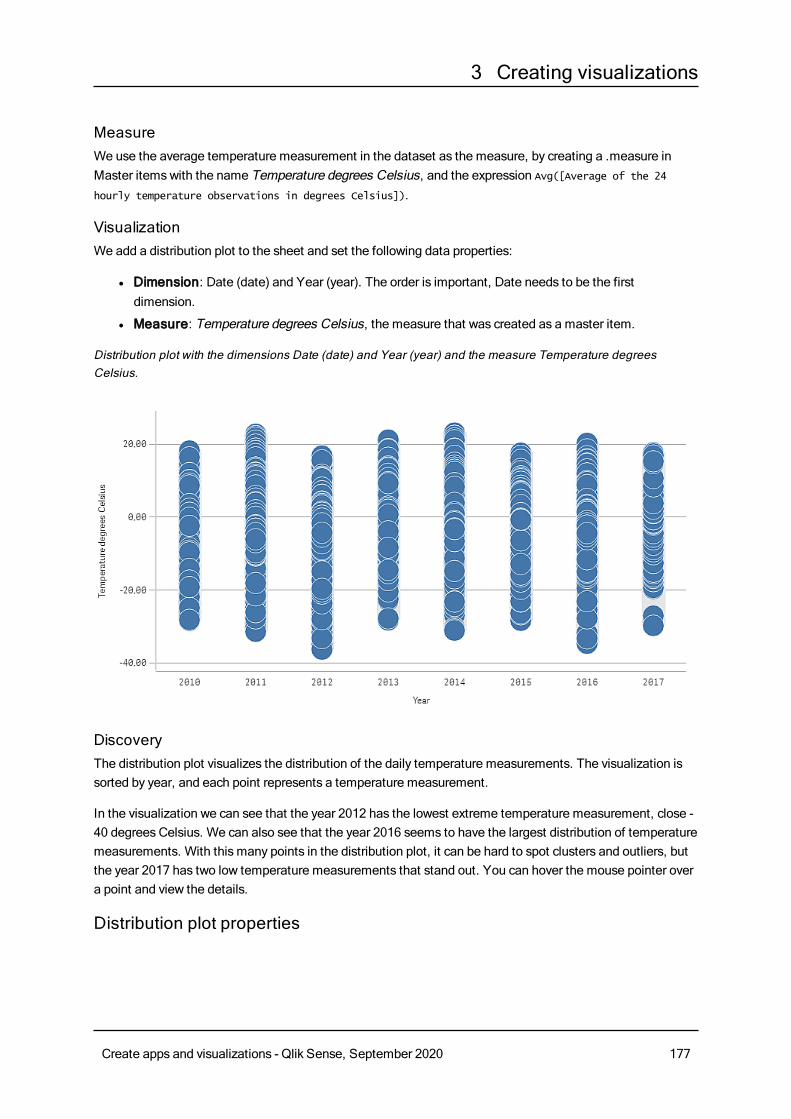
3 Creating visualizations
MeasureWe use the average temperature measurement in the dataset as the measure, by creating a .measure inMaster itemswith the name Temperature degrees Celsius, and the expression Avg([Average of the 24
hourly temperature observations in degrees Celsius]).
VisualizationWe add a distribution plot to the sheet and set the following data properties:
l Dimension: Date (date) and Year (year). The order is important, Date needs to be the firstdimension.
l Measure: Temperature degrees Celsius, the measure that was created as a master item.
Distribution plot with the dimensions Date (date) and Year (year) and the measure Temperature degreesCelsius.
DiscoveryThe distribution plot visualizes the distribution of the daily temperature measurements. The visualization issorted by year, and each point represents a temperature measurement.
In the visualization we can see that the year 2012 has the lowest extreme temperature measurement, close -40 degrees Celsius. We can also see that the year 2016 seems to have the largest distribution of temperaturemeasurements. With this many points in the distribution plot, it can be hard to spot clusters and outliers, butthe year 2017 has two low temperature measurements that stand out. You can hover the mouse pointer overa point and view the details.
Distribution plot properties
Create apps and visualizations - Qlik Sense, September 2020 177

3 Creating visualizations
You open the properties panel for a visualization by clicking Edit sheet in the toolbar and clicking the
visualization that you want to edit.
If the properties panel is hidden, click Show properties in the lower right-hand corner.
If the visualization has in the upper right-hand corner, the visualization is linked to amaster
item. You cannot edit a linked visualization, but you can edit themaster item. You can alsounlink the visualization tomake it editable.
Some of the settings in the properties panel are only available under certain circumstances, forexample, when you usemore than one dimension or measure, or when you select an optionthat makes other options available.
DataClickAdd to add a dimension or a measure.
Dimensions
On theData tab, underDimensions, clickAdd to open a list of availableDimensions and Fields. Selectthe dimension or field that you want to use.
You can also click to create a dimension in the expression editor. To be able to edit a dimension that is
linked to a master item, you must first unlink the dimension. Another way to create a dimension is to type theexpression directly in the text box. Expressions added in this waymust begin with an equals sign (=). Here isan example with a calculated dimension:
=If (Week < 14, Week, 'Sales')
If Add is dimmed, you cannot add more dimensions.
l <Dimension name>: Click the dimension name to open the dimension settings.
If you want to delete the dimension, right-click the dimension and select in the dialog. Alternatively,
click the dimension and click .
l Dimension: Only displayed for master items. To be able to edit a dimension that is linked to amaster item, you must first unlink the dimension.
l Field: If you have added a field from Fields in the assets panel, the field name is automatically
displayed. Click to open the expression editor.
l Label: Enter a label for the dimension. If you have added a field from Fields in the assetspanel, the field name is automatically displayed.
l Includenull values: When selected, the measure values of all null dimensions aresummarized and presented as one dimension item in a visualization. All null values aredisplayed as gaps or dashes (-).
Create apps and visualizations - Qlik Sense, September 2020 178
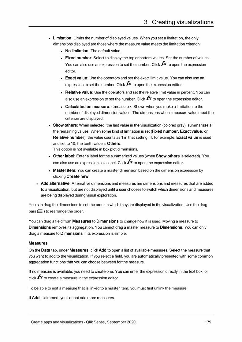
3 Creating visualizations
l Limitation: Limits the number of displayed values. When you set a limitation, the onlydimensions displayed are those where the measure value meets the limitation criterion:
l No limitation: The default value.
l Fixed number: Select to display the top or bottom values. Set the number of values.
You can also use an expression to set the number. Click to open the expression
editor.
l Exact value: Use the operators and set the exact limit value. You can also use an
expression to set the number. Click to open the expression editor.
l Relative value: Use the operators and set the relative limit value in percent. You can
also use an expression to set the number. Click to open the expression editor.
l Calculated on measure: <measure>: Shown when you make a limitation to thenumber of displayed dimension values. The dimensions whose measure value meet thecriterion are displayed.
l Show others: When selected, the last value in the visualization (colored gray), summarizes allthe remaining values. When some kind of limitation is set (Fixed number, Exact value, orRelative number), the value counts as 1 in that setting. If, for example, Exact value is usedand set to 10, the tenth value isOthers.This option is not available in box plot dimensions.
l Other label: Enter a label for the summarized values (when Show others is selected). You
can also use an expression as a label. Click to open the expression editor.
l Master item: You can create a master dimension based on the dimension expression byclickingCreate new.
l Add alternative: Alternative dimensions and measures are dimensions and measures that are addedto a visualization, but are not displayed until a user chooses to switch which dimensions and measuresare being displayed during visual exploration.
You can drag the dimensions to set the order in which they are displayed in the visualization. Use the drag
bars (o ) to rearrange the order.
You can drag a field fromMeasures toDimensions to change how it is used. Moving a measure toDimensions removes its aggregation. You cannot drag a master measure toDimensions. You can onlydrag a measure toDimensions if its expression is simple.
Measures
On theData tab, underMeasures, clickAdd to open a list of available measures. Select the measure thatyou want to add to the visualization. If you select a field, you are automatically presented with some commonaggregation functions that you can choose between for the measure.
If no measure is available, you need to create one. You can enter the expression directly in the text box, or
click to create a measure in the expression editor.
To be able to edit a measure that is linked to a master item, you must first unlink the measure.
If Add is dimmed, you cannot add more measures.
Create apps and visualizations - Qlik Sense, September 2020 179
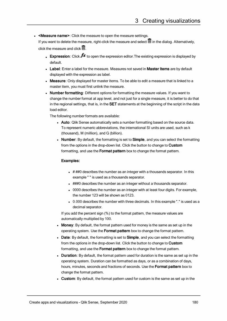
3 Creating visualizations
l <Measure name>: Click the measure to open the measure settings.
If you want to delete the measure, right-click the measure and select in the dialog. Alternatively,
click the measure and click .
l Expression: Click to open the expression editor.The existing expression is displayed by
default.
l Label: Enter a label for the measure. Measures not saved inMaster items are by defaultdisplayed with the expression as label.
l Measure: Only displayed for master items. To be able to edit a measure that is linked to amaster item, you must first unlink the measure.
l Number formatting: Different options for formatting the measure values. If you want tochange the number format at app level, and not just for a single measure, it is better to do thatin the regional settings, that is, in the SET statements at the beginning of the script in the dataload editor.
The following number formats are available:
l Auto: Qlik Sense automatically sets a number formatting based on the source data.To represent numeric abbreviations, the international SI units are used, such as k(thousand), M (million), and G (billion).
l Number: By default, the formatting is set to Simple, and you can select the formattingfrom the options in the drop-down list. Click the button to change toCustomformatting, and use the Format pattern box to change the format pattern.
Examples:
l # ##0 describes the number as an integer with a thousands separator. In thisexample " " is used as a thousands separator.
l ###0 describes the number as an integer without a thousands separator.
l 0000 describes the number as an integer with at least four digits. For example,the number 123 will be shown as 0123.
l 0.000 describes the number with three decimals. In this example "." is used as adecimal separator.
If you add the percent sign (%) to the format pattern, the measure values areautomatically multiplied by 100.
l Money: By default, the format pattern used for money is the same as set up in theoperating system. Use the Format pattern box to change the format pattern.
l Date: By default, the formatting is set to Simple, and you can select the formattingfrom the options in the drop-down list. Click the button to change toCustomformatting, and use the Format pattern box to change the format pattern.
l Duration: By default, the format pattern used for duration is the same as set up in theoperating system. Duration can be formatted as days, or as a combination of days,hours, minutes, seconds and fractions of seconds. Use the Format pattern box tochange the format pattern.
l Custom: By default, the format pattern used for custom is the same as set up in the
Create apps and visualizations - Qlik Sense, September 2020 180
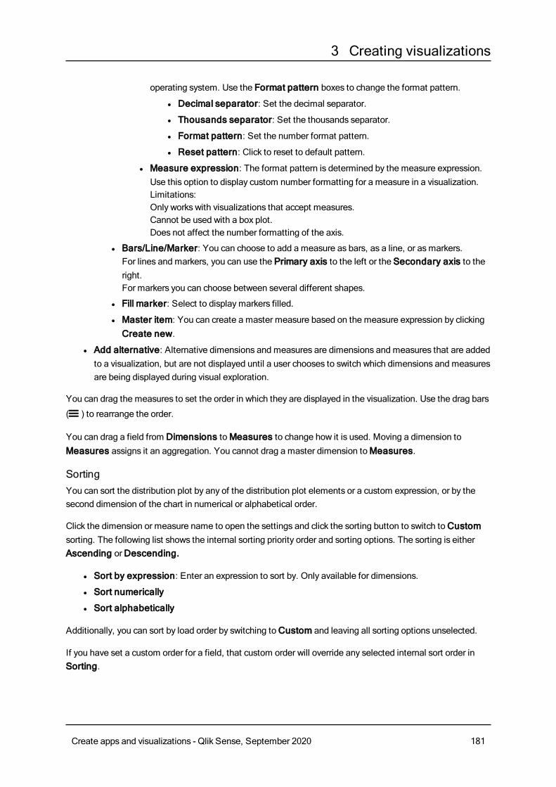
3 Creating visualizations
operating system. Use the Format pattern boxes to change the format pattern.
l Decimal separator: Set the decimal separator.
l Thousands separator: Set the thousands separator.
l Format pattern: Set the number format pattern.
l Reset pattern: Click to reset to default pattern.
l Measure expression: The format pattern is determined by the measure expression.Use this option to display custom number formatting for a measure in a visualization.Limitations:Only works with visualizations that accept measures.Cannot be used with a box plot.Does not affect the number formatting of the axis.
l Bars/Line/Marker: You can choose to add a measure as bars, as a line, or asmarkers.For lines and markers, you can use the Primary axis to the left or the Secondary axis to theright.For markers you can choose between several different shapes.
l Fill marker: Select to displaymarkers filled.
l Master item: You can create a master measure based on the measure expression by clickingCreate new.
l Add alternative: Alternative dimensions and measures are dimensions and measures that are addedto a visualization, but are not displayed until a user chooses to switch which dimensions and measuresare being displayed during visual exploration.
You can drag the measures to set the order in which they are displayed in the visualization. Use the drag bars
(o ) to rearrange the order.
You can drag a field from Dimensions toMeasures to change how it is used. Moving a dimension toMeasures assigns it an aggregation. You cannot drag a master dimension toMeasures.
SortingYou can sort the distribution plot by any of the distribution plot elements or a custom expression, or by thesecond dimension of the chart in numerical or alphabetical order.
Click the dimension or measure name to open the settings and click the sorting button to switch toCustomsorting. The following list shows the internal sorting priority order and sorting options. The sorting is eitherAscending orDescending.
l Sort by expression: Enter an expression to sort by. Only available for dimensions.
l Sort numerically
l Sort alphabetically
Additionally, you can sort by load order by switching toCustom and leaving all sorting options unselected.
If you have set a custom order for a field, that custom order will override any selected internal sort order inSorting.
Create apps and visualizations - Qlik Sense, September 2020 181
3 Creating visualizations
Add-onsl Data handling:
l Include zero values: When unselected, measures that have the value ‘0’ are not included inthe presentation. If there is more than one measure value, all the measure valuesmust havethe value ‘0’ to be excluded from the presentation.
l Calculation condition: Specify an expression in this text field to set a condition that needs tobe fulfilled (true) for the object to be displayed. The value may be entered as a calculatedformula. For example: count(distinct Team)<3. If the condition is not fulfilled, the message orexpression entered inDisplayed message is displayed.A calculation condition is useful when a chart or table is very big and makes the visualizationslow to respond. A calculation condition can then help so that for example an object does notshow until the user has filtered the data to a more manageable level by applying selections.
l Reference lines:
l Add reference line: Click to add a new reference line.
l Show: When selected, the reference line is displayed.
l Label: Enter a label for the reference line.
l Color: In the color picker, select the color of the reference line and the label.
l Reference line expression: Enter a value or an expression for the reference line. Click to
open the expression editor.
l : Click to remove the reference line.
Appearance
General
l Show titles: On by default in all visualizations except filter panes, KPIs, and text & imagevisualizations.Enter Title, Subtitle, and Footnote. By default, the string is interpreted as a text string. However,you can also use the text field for an expression, or a combination of text and expression. An equalssign (=), at the beginning of a string shows that it contains an expression.Click if you want to create an expression by using the expression editor.
Titles are displayed on a single line. If you inject line breaks they will be ignored.
Example:
Assume that the following string is used, including quotation marks: 'Sales: ' & Sum(Sales).By default, the string is interpreted as a text string and is displayed as presented in the example. But ifyou begin the string with an equals sign: (='Sales: ' & Sum(Sales)), the string is interpreted as anexpression instead. The output is then Sales: <value of expression>, where <value of expression>is the calculated value.
l Disable hover menu: Select to disable the hover menu in the visualization.
Create apps and visualizations - Qlik Sense, September 2020 182
3 Creating visualizations
l Show details: Set to Show if you want to allow users to be able to choose to view details, such asdescriptions, measures, and dimensions.
Alternate states
l State: Set the state to apply to the visualization. You can select:
l Any alternate state defined inMaster items.
l <inherited>, in which case the state defined for the sheet is used.
l <default state>, which represents the state where no alternate state is applied.
Presentation
You can set the orientation to be Vertical orHorizontal.
You can present the distribution plot in three ways:
l Points and background - this option displays a bounding box showing the range of the values, andvalue points.
l Points only - this option displays value points only.
l Background only - this option displays a bounding box showing the range of the values only.
l Gridline spacing: Set this toCustom if you want to customize the horizontal gridlines. You canchoose between: No lines ,Medium orNarrow.
l Bubble size: You can adjust the size of the bubbles that illustrate the value points.
l Jitter points: You can use this option to jitter several overlapping value points. This moves some ofthe points slightly to create a larger footprint that shows that there are more than one value behind thepoint.
Colors and legends
You can set the presentation colors of the distribution plot. You only need to select Custom if you want tochange the settings.
Custom: Manually select the method of coloring your values in the chart. The following methods areavailable:
l Single color: A single color (by default blue) is used for all items in the chart.
l By dimension: By default, 12 colors are used for the dimensions. The colors are reused when thereare more than 12 dimension values. When selected, the following settings are available:
l Persistent colors: When selected, colors are persistent between selection states.
l Color scheme: Select 12 colors or 100 colors to be used for the different values. The 12colors can all be distinguished by people with color vision deficiency, but not all of the 100colors.
l By expression: Color the chart using an expression to define colors for values. Supported colorformats are: RGB, ARGB, and HSL.
l Expression: Enter the expression that you want to use. Click to open the expression
editor.
l The expression is a color code: Selected by default. In most cases, it is best to keep thissetting. When the selection is cleared, the expression evaluates to a number, which in turn is
Create apps and visualizations - Qlik Sense, September 2020 183
3 Creating visualizations
plotted against one of the chart gradients.For more information, seeColoring a visualization (page 511)
l Range: When the coloring is bymeasure or by expression, you can set the color range (MinandMax values). By setting the color range, the colors remain constant throughout selectionsand paging. When using color by expression, the option The expression is a color codemust be cleared before you can set the color range.
l Show legend: Not available when Single color is selected. By default set to Auto. The legend isdisplayed if there is enough space. The placement can be changed in the Legend position setting.
l Legend position: Select where to display the legend.
l Show legend title: When selected, the legend title is displayed.
X-axis
l <Measure>
l Labels and title: Select what to display of labels and title.
l Position: Select where to display the measure axis.
l Scale: Set the spacing of the measure axis scale.
l Range: Select to set the min value, the max value, or both. The min value cannot be largerthan the max value. You can use expressions for the values.
Y-axis
l <Dimension>
l Labels and title: Select what to display of labels and title.
l Position: Select where to display the dimension axis.
Filter paneYou canadda filter pane to control what data that is shown in the visualizations on a sheet. Afilter pane can filter the data of several dimensions at once.
For example, if you have a chart of sales over time, you can use a filter pane to limit the data in the chart toonly show sales from a selected time period, from certain product categories, and from a certain region.
When a dimension is added, it is placed to the right of the previous dimensions, or below, depending on theavailable space. As long as there is space enough, the dimensions are displayed as expanded lists. If there isnot enough space, the dimensions that were added first are turned into filter panes.
Selections have been made in the dimensions Year, Quarter, and Week.
Create apps and visualizations - Qlik Sense, September 2020 184
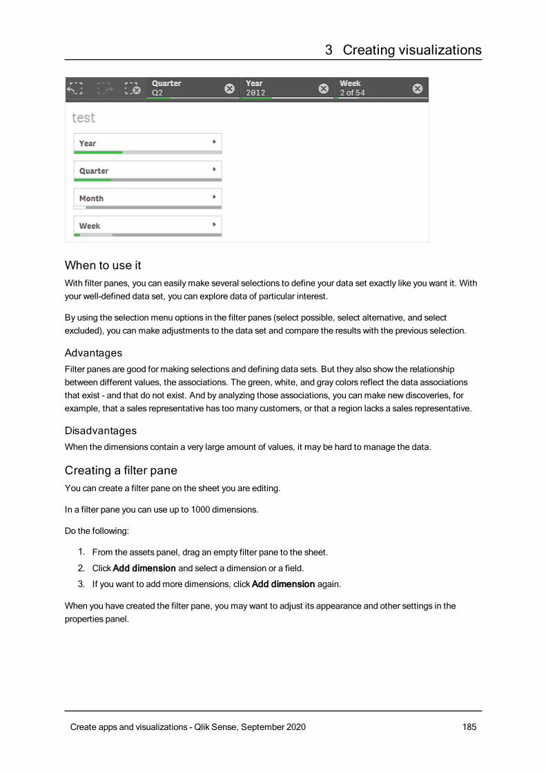
3 Creating visualizations
When to use itWith filter panes, you can easily make several selections to define your data set exactly like you want it. Withyour well-defined data set, you can explore data of particular interest.
By using the selection menu options in the filter panes (select possible, select alternative, and selectexcluded), you can make adjustments to the data set and compare the results with the previous selection.
AdvantagesFilter panes are good for making selections and defining data sets. But they also show the relationshipbetween different values, the associations. The green, white, and gray colors reflect the data associationsthat exist - and that do not exist. And by analyzing those associations, you can make new discoveries, forexample, that a sales representative has too many customers, or that a region lacks a sales representative.
DisadvantagesWhen the dimensions contain a very large amount of values, it may be hard to manage the data.
Creating a filter paneYou can create a filter pane on the sheet you are editing.
In a filter pane you can use up to 1000 dimensions.
Do the following:
1. From the assets panel, drag an empty filter pane to the sheet.
2. ClickAdd dimension and select a dimension or a field.
3. If you want to add more dimensions, clickAdd dimension again.
When you have created the filter pane, you may want to adjust its appearance and other settings in theproperties panel.
Create apps and visualizations - Qlik Sense, September 2020 185
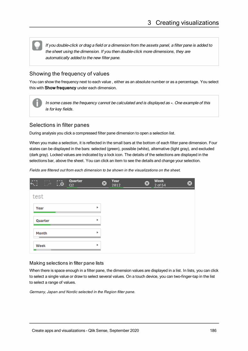
3 Creating visualizations
If you double-click or drag a field or a dimension from the assets panel, a filter pane is added tothe sheet using the dimension. If you then double-click more dimensions, they areautomatically added to the new filter pane.
Showing the frequency of valuesYou can show the frequency next to each value , either as an absolute number or as a percentage. You selectthis with Show frequency under each dimension.
In some cases the frequency cannot be calculated and is displayed as -. One example of thisis for key fields.
Selections in filter panesDuring analysis you click a compressed filter pane dimension to open a selection list.
When you make a selection, it is reflected in the small bars at the bottom of each filter pane dimension. Fourstates can be displayed in the bars: selected (green), possible (white), alternative (light gray), and excluded(dark gray). Locked values are indicated by a lock icon. The details of the selections are displayed in theselections bar, above the sheet. You can click an item to see the details and change your selection.
Fields are filtered out from each dimension to be shown in the visualizations on the sheet.
Making selections in filter pane listsWhen there is space enough in a filter pane, the dimension values are displayed in a list. In lists, you can clickto select a single value or draw to select several values. On a touch device, you can two-finger-tap in the listto select a range of values.
Germany, Japan and Nordic selected in the Region filter pane.
Create apps and visualizations - Qlik Sense, September 2020 186
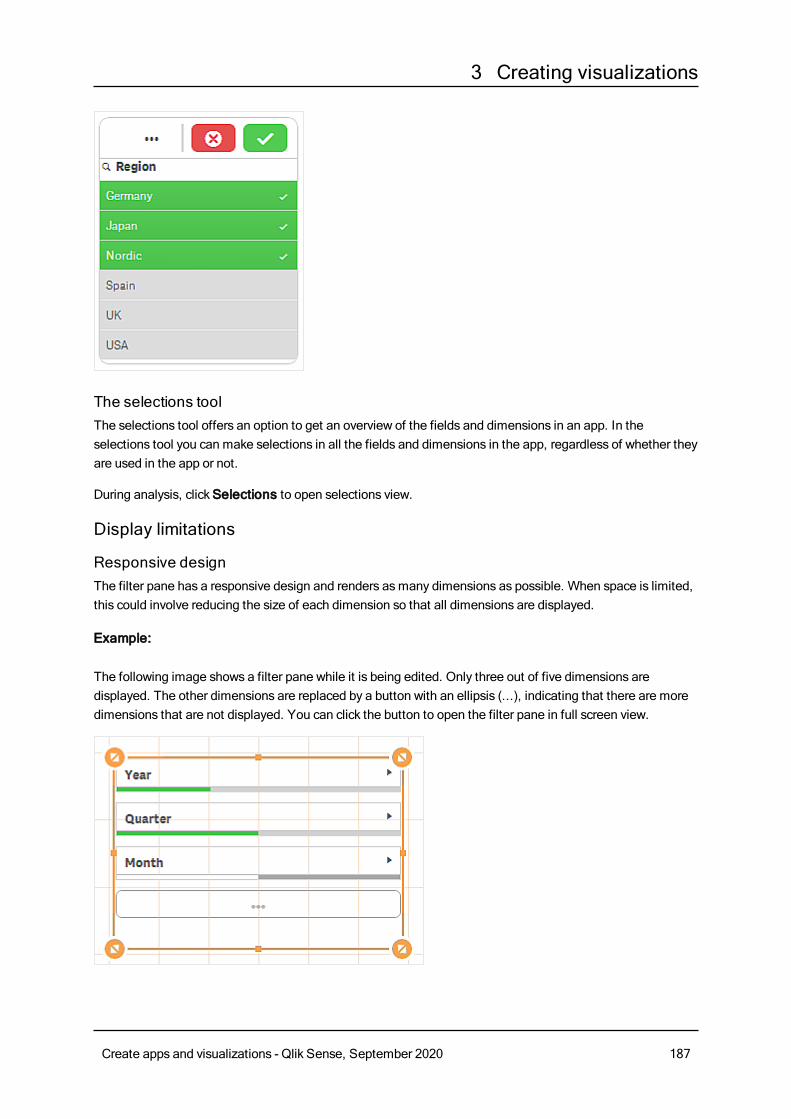
3 Creating visualizations
The selections toolThe selections tool offers an option to get an overview of the fields and dimensions in an app. In theselections tool you can make selections in all the fields and dimensions in the app, regardless of whether theyare used in the app or not.
During analysis, clickSelections to open selections view.
Display limitations
Responsive designThe filter pane has a responsive design and renders asmany dimensions as possible. When space is limited,this could involve reducing the size of each dimension so that all dimensions are displayed.
Example:
The following image shows a filter pane while it is being edited. Only three out of five dimensions aredisplayed. The other dimensions are replaced by a button with an ellipsis (...), indicating that there are moredimensions that are not displayed. You can click the button to open the filter pane in full screen view.
Create apps and visualizations - Qlik Sense, September 2020 187
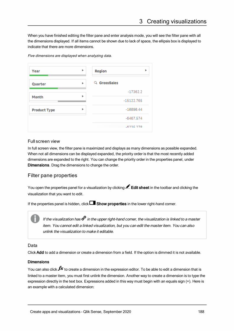
3 Creating visualizations
When you have finished editing the filter pane and enter analysis mode, you will see the filter pane with allthe dimensions displayed. If all items cannot be shown due to lack of space, the ellipsis box is displayed toindicate that there are more dimensions.
Five dimensions are displayed when analyzing data.
Full screen viewIn full screen view, the filter pane is maximized and displays asmany dimensions as possible expanded.When not all dimensions can be displayed expanded, the priority order is that the most recently addeddimensions are expanded to the right. You can change the priority order in the properties panel, underDimensions. Drag the dimensions to change the order.
Filter pane properties
You open the properties panel for a visualization by clicking Edit sheet in the toolbar and clicking the
visualization that you want to edit.
If the properties panel is hidden, click Show properties in the lower right-hand corner.
If the visualization has in the upper right-hand corner, the visualization is linked to amaster
item. You cannot edit a linked visualization, but you can edit themaster item. You can alsounlink the visualization tomake it editable.
DataClickAdd to add a dimension or create a dimension from a field. If the option is dimmed it is not available.
Dimensions
You can also click to create a dimension in the expression editor. To be able to edit a dimension that is
linked to a master item, you must first unlink the dimension. Another way to create a dimension is to type theexpression directly in the text box. Expressions added in this waymust begin with an equals sign (=). Here isan example with a calculated dimension:
Create apps and visualizations - Qlik Sense, September 2020 188
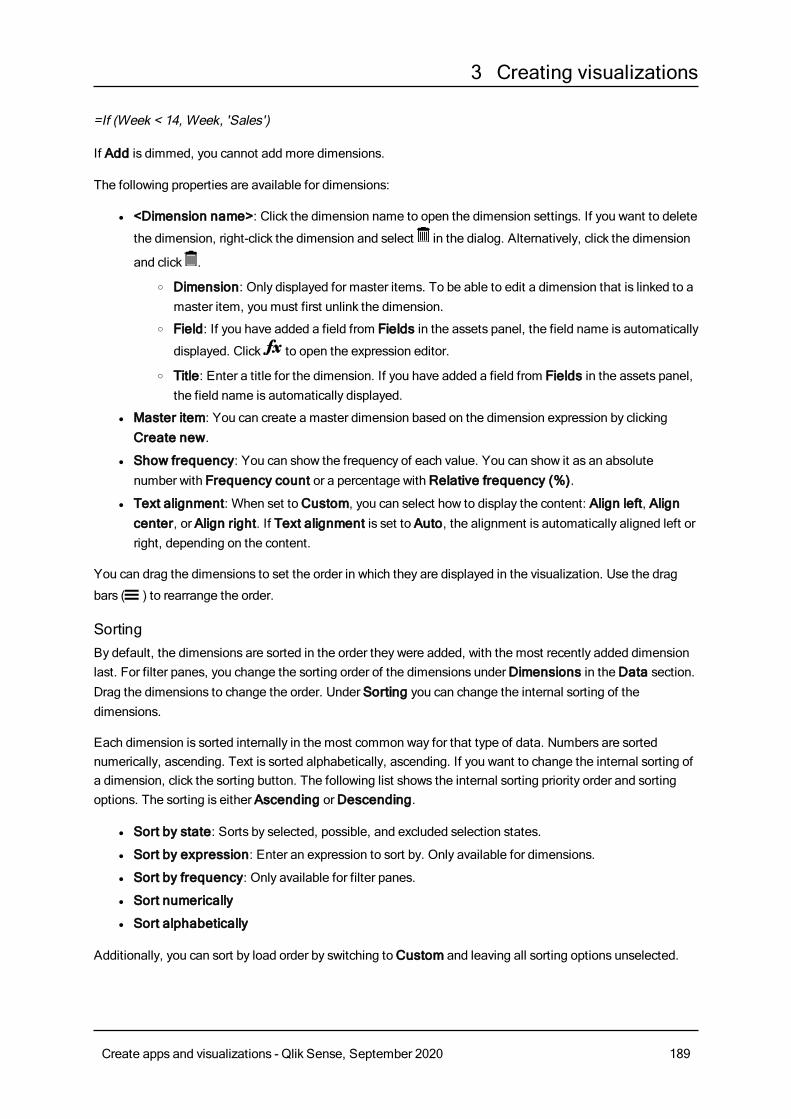
3 Creating visualizations
=If (Week < 14, Week, 'Sales')
If Add is dimmed, you cannot add more dimensions.
The following properties are available for dimensions:
l <Dimension name>: Click the dimension name to open the dimension settings. If you want to delete
the dimension, right-click the dimension and select in the dialog. Alternatively, click the dimension
and click .
o Dimension: Only displayed for master items. To be able to edit a dimension that is linked to amaster item, you must first unlink the dimension.
o Field: If you have added a field from Fields in the assets panel, the field name is automatically
displayed. Click to open the expression editor.
o Title: Enter a title for the dimension. If you have added a field from Fields in the assets panel,the field name is automatically displayed.
l Master item: You can create a master dimension based on the dimension expression by clickingCreate new.
l Show frequency: You can show the frequency of each value. You can show it as an absolutenumber with Frequency count or a percentage withRelative frequency (%).
l Text alignment: When set toCustom, you can select how to display the content: Align left, Aligncenter, or Align right. If Text alignment is set to Auto, the alignment is automatically aligned left orright, depending on the content.
You can drag the dimensions to set the order in which they are displayed in the visualization. Use the drag
bars (o ) to rearrange the order.
SortingBy default, the dimensions are sorted in the order they were added, with the most recently added dimensionlast. For filter panes, you change the sorting order of the dimensions underDimensions in theData section.Drag the dimensions to change the order. Under Sorting you can change the internal sorting of thedimensions.
Each dimension is sorted internally in the most common way for that type of data. Numbers are sortednumerically, ascending. Text is sorted alphabetically, ascending. If you want to change the internal sorting ofa dimension, click the sorting button. The following list shows the internal sorting priority order and sortingoptions. The sorting is either Ascending orDescending.
l Sort by state: Sorts by selected, possible, and excluded selection states.
l Sort by expression: Enter an expression to sort by. Only available for dimensions.
l Sort by frequency: Only available for filter panes.
l Sort numerically
l Sort alphabetically
Additionally, you can sort by load order by switching toCustom and leaving all sorting options unselected.
Create apps and visualizations - Qlik Sense, September 2020 189
3 Creating visualizations
If you have set a custom order for a field, that custom order will override any selected internal sort order inSorting.
Appearance
General
l Show titles: On by default in all visualizations except filter panes, KPIs, and text & imagevisualizations.Enter Title, Subtitle, and Footnote. By default, the string is interpreted as a text string. However,you can also use the text field for an expression, or a combination of text and expression. An equalssign (=), at the beginning of a string shows that it contains an expression.Click if you want to create an expression by using the expression editor.
Titles are displayed on a single line. If you inject line breaks they will be ignored.
Example:
Assume that the following string is used, including quotation marks: 'Sales: ' & Sum(Sales).By default, the string is interpreted as a text string and is displayed as presented in the example. But ifyou begin the string with an equals sign: (='Sales: ' & Sum(Sales)), the string is interpreted as anexpression instead. The output is then Sales: <value of expression>, where <value of expression>is the calculated value.
l Disable hover menu: Select to disable the hover menu in the visualization.
l Show details: Set to Show if you want to allow users to be able to choose to view details, such asdescriptions, measures, and dimensions.
Alternate states
State: Set the state to apply to the visualization. You can select:
l Any alternate state defined inMaster items.
l <inherited>, in which case the state defined for the sheet is used.
l <default state>, which represents the state where no alternate state is applied.
GaugeThegauge shows a singlemeasure value and visualizes how to interpret that value.
Create apps and visualizations - Qlik Sense, September 2020 190
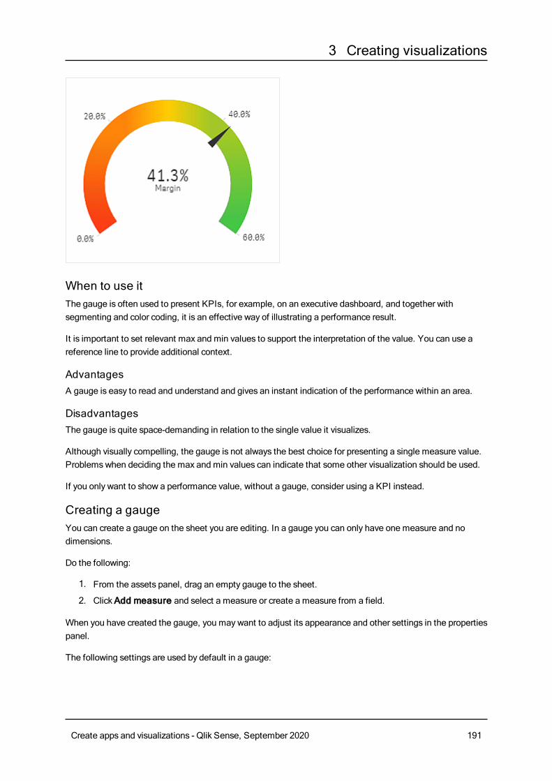
3 Creating visualizations
When to use itThe gauge is often used to present KPIs, for example, on an executive dashboard, and together withsegmenting and color coding, it is an effective way of illustrating a performance result.
It is important to set relevant max and min values to support the interpretation of the value. You can use areference line to provide additional context.
AdvantagesA gauge is easy to read and understand and gives an instant indication of the performance within an area.
DisadvantagesThe gauge is quite space-demanding in relation to the single value it visualizes.
Although visually compelling, the gauge is not always the best choice for presenting a single measure value.Problemswhen deciding the max and min values can indicate that some other visualization should be used.
If you only want to show a performance value, without a gauge, consider using a KPI instead.
Creating a gaugeYou can create a gauge on the sheet you are editing. In a gauge you can only have one measure and nodimensions.
Do the following:
1. From the assets panel, drag an empty gauge to the sheet.
2. ClickAdd measure and select a measure or create a measure from a field.
When you have created the gauge, you may want to adjust its appearance and other settings in the propertiespanel.
The following settings are used by default in a gauge:
Create apps and visualizations - Qlik Sense, September 2020 191
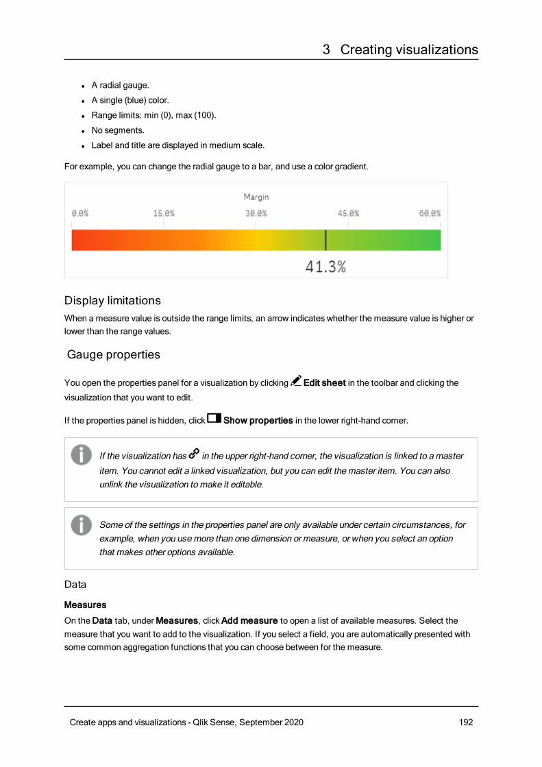
3 Creating visualizations
l A radial gauge.
l A single (blue) color.
l Range limits: min (0), max (100).
l No segments.
l Label and title are displayed in medium scale.
For example, you can change the radial gauge to a bar, and use a color gradient.
Display limitationsWhen a measure value is outside the range limits, an arrow indicates whether the measure value is higher orlower than the range values.
Gauge properties
You open the properties panel for a visualization by clicking Edit sheet in the toolbar and clicking the
visualization that you want to edit.
If the properties panel is hidden, click Show properties in the lower right-hand corner.
If the visualization has in the upper right-hand corner, the visualization is linked to amaster
item. You cannot edit a linked visualization, but you can edit themaster item. You can alsounlink the visualization tomake it editable.
Some of the settings in the properties panel are only available under certain circumstances, forexample, when you usemore than one dimension or measure, or when you select an optionthat makes other options available.
Data
Measures
On theData tab, underMeasures, clickAdd measure to open a list of available measures. Select themeasure that you want to add to the visualization. If you select a field, you are automatically presented withsome common aggregation functions that you can choose between for the measure.
Create apps and visualizations - Qlik Sense, September 2020 192
3 Creating visualizations
If no measure is available, you need to create one. You can enter the expression directly in the text box, or
click to create a measure in the expression editor.
To be able to edit a measure that is linked to a master item, you must first unlink the measure.
If Add measure is dimmed, you cannot add more measures.
The following properties are available for measures:
l <Measure name>:
l Measure: Only displayed for master items. To be able to edit a measure that is linked to amaster item, you must first unlink the measure.
l Expression: Click to open the expression editor. The existing expression is displayed by
default.
l Label: Enter a label for the measure. Measures not saved inMaster items are by defaultdisplayed with the expression as label.
l Number formatting: Different options for formatting the measure values. If you want tochange the number format at app level, and not just for a single measure, it is better to do thatin the regional settings, that is, in the SET statements at the beginning of the script in the dataload editor.The following number formats are available:
l Auto: Qlik Sense automatically sets a number formatting based on the source data.To represent numeric abbreviations, the international SI units are used, such as k(thousand), M (million), and G (billion).
l Number: By default, the formatting is set to Simple, and you can select the formattingfrom the options in the drop-down list. Click the button to change toCustomformatting, and use the Format pattern box to change the format pattern.
Examples:
l # ##0 describes the number as an integer with a thousands separator. In thisexample " " is used as a thousands separator.
l ###0 describes the number as an integer without a thousands separator.
l 0000 describes the number as an integer with at least four digits. For example,the number 123 will be shown as 0123.
l 0.000 describes the number with three decimals. In this example "." is used as adecimal separator.
If you add the percent sign (%) to the format pattern, the measure values areautomatically multiplied by 100.
l Money: By default, the format pattern used for money is the same as set up in theoperating system. Use the Format pattern box to change the format pattern.
l Date: By default, the formatting is set to Simple, and you can select the formattingfrom the options in the drop-down list. Click the button to change toCustomformatting, and use the Format pattern box to change the format pattern.
Create apps and visualizations - Qlik Sense, September 2020 193
3 Creating visualizations
l Duration: By default, the format pattern used for duration is the same as set up in theoperating system. Duration can be formatted as days, or as a combination of days,hours, minutes, seconds and fractions of seconds. Use the Format pattern box tochange the format pattern.
l Custom: By default, the format pattern used for custom is the same as set up in theoperating system. Use the Format pattern boxes to change the format pattern.
l Decimal separator: Set the decimal separator.
l Thousands separator: Set the thousands separator.
l Format pattern: Set the number format pattern.
l Reset pattern: Click to reset to default pattern.
l Measure expression: The format pattern is determined by the measure expression.Use this option to display custom number formatting for a measure in a visualization.Limitations:
l Only works with visualizations that accept measures.
l Does not affect the number formatting of the axis.
l Master item: You can create a master measure based on the measure expression by clickingCreatenew.
Add-onsl Data handling: Calculation condition: Specify an expression in this text field to set a condition thatneeds to be fulfilled (true) for the object to be displayed. The value may be entered as a calculatedformula. For example: count(distinct Team)<3. If the condition is not fulfilled, the message orexpression entered inDisplayed message is displayed.A calculation condition is useful when a chart or table is very big and makes the visualization slow torespond. A calculation condition can then help so that for example an object does not show until theuser has filtered the data to a more manageable level by applying selections.
l Reference lines: Add reference line: Click to add a new reference line.
l Show: When selected, the reference line is displayed.
l Label: Enter a label for the reference line.
l Color: In the color picker, select the color of the reference line and the label.
l Reference line expression: Enter a value or an expression for the reference line. Click to
open the expression editor.
l : Click to remove the reference line.
Appearance
General
l Show titles: Select to enable or disable titles, subtitles, and footnotes in the chart.Enter Title, Subtitle, and Footnote. By default, the string is interpreted as a text string. However,you can also use the text field for an expression, or a combination of text and expression. An equalssign (=), at the beginning of a string shows that it contains an expression.Click if you want to create an expression by using the expression editor.
Create apps and visualizations - Qlik Sense, September 2020 194
3 Creating visualizations
Titles are displayed on a single line. If you inject line breaks they will be ignored.
Example:
Assume that the following string is used, including quotation marks: 'Sales: ' & Sum(Sales).By default, the string is interpreted as a text string and is displayed as presented in the example. But ifyou begin the string with an equals sign: (='Sales: ' & Sum(Sales)), the string is interpreted as anexpression instead. The output is then Sales: <value of expression>, where <value of expression>is the calculated value.
l Disable hover menu: Select to disable the hover menu in the visualization.
l Show details: Set to Show if you want to allow users to be able to choose to view details, such asdescriptions, measures, and dimensions.
Alternate states
l State: Set the state to apply to the visualization. You can select:
l Any alternate state defined inMaster items.
l <inherited>, in which case the state defined for the sheet is used.
l <default state>, which represents the state where no alternate state is applied.
Presentation
l Range limits
l Min: Set the minimum value for the gauge. Click3 if you want to create an expression.
l Max: Set the maximum value for the gauge. Click3 if you want to create an expression.
l Radial/Bar.Select to display the gauge as a radial or as a bar.
l Select vertical or horizontal orientation of the visualization. Only available for bar gauges.
l Use segments: When not selected, a single color (by default blue) is used to illustrate thevalue. When selected, you can divide the gauge into segments with different colors. Whensegments are used, a pointer marks the value.ClickAdd limit to add a segment to the gauge. Use the slider or type an expression to set the
limit. Click to create an expression. You can add several segments. Click the segment to
change colors.
l Remove limit: Click to remove the selected limit.
l Gradient: Select to use different shades of colors in the transition between the segments.
l Use library: Option when a master measure used in the visualization has a color assigned toit. You can select to use the master measure colors or to disable the master measure color.This option is not available if Use segments is enabled.
Measure axis
l Labels and title: Select what to display of labels and title.
l Scale: Set the spacing of the measure axis scale.
Create apps and visualizations - Qlik Sense, September 2020 195
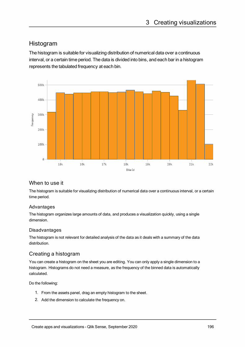
3 Creating visualizations
HistogramThehistogram is suitable for visualizing distribution of numerical data over a continuousinterval, or a certain timeperiod. The data is divided into bins, and each bar in a histogramrepresents the tabulated frequency at each bin.
When to use itThe histogram is suitable for visualizing distribution of numerical data over a continuous interval, or a certaintime period.
AdvantagesThe histogram organizes large amounts of data, and produces a visualization quickly, using a singledimension.
DisadvantagesThe histogram is not relevant for detailed analysis of the data as it deals with a summary of the datadistribution.
Creating a histogramYou can create a histogram on the sheet you are editing. You can only apply a single dimension to ahistogram. Histograms do not need a measure, as the frequency of the binned data is automaticallycalculated.
Do the following:
1. From the assets panel, drag an empty histogram to the sheet.
2. Add the dimension to calculate the frequency on.
Create apps and visualizations - Qlik Sense, September 2020 196
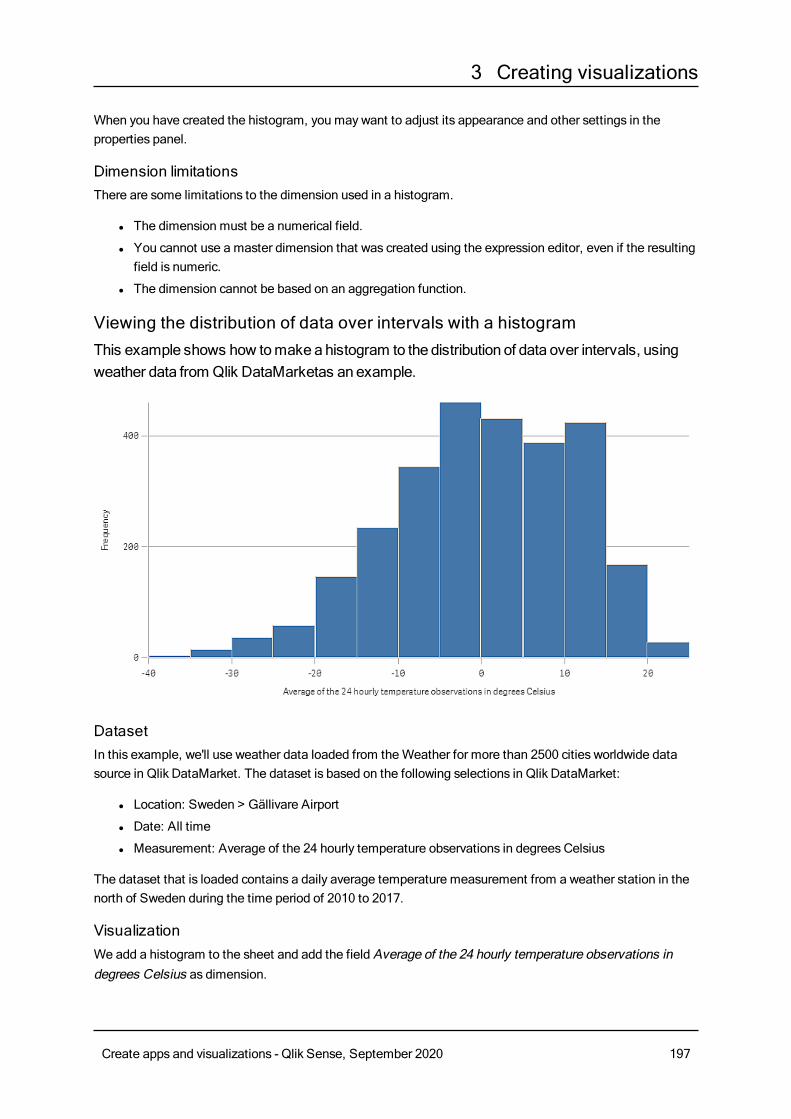
3 Creating visualizations
When you have created the histogram, you maywant to adjust its appearance and other settings in theproperties panel.
Dimension limitationsThere are some limitations to the dimension used in a histogram.
l The dimension must be a numerical field.
l You cannot use a master dimension that was created using the expression editor, even if the resultingfield is numeric.
l The dimension cannot be based on an aggregation function.
Viewing the distribution of data over intervals with a histogramThis example shows how tomakeahistogram to the distribution of data over intervals, usingweather data from Qlik DataMarketas an example.
DatasetIn this example, we'll use weather data loaded from theWeather for more than 2500 cities worldwide datasource in Qlik DataMarket. The dataset is based on the following selections in Qlik DataMarket:
l Location: Sweden > Gällivare Airport
l Date: All time
l Measurement: Average of the 24 hourly temperature observations in degrees Celsius
The dataset that is loaded contains a daily average temperature measurement from a weather station in thenorth of Sweden during the time period of 2010 to 2017.
VisualizationWe add a histogram to the sheet and add the field Average of the 24 hourly temperature observations indegrees Celsius as dimension.
Create apps and visualizations - Qlik Sense, September 2020 197
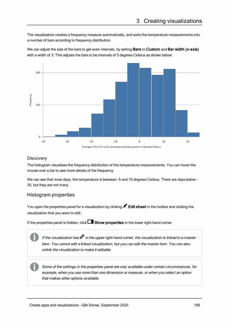
3 Creating visualizations
The visualization creates a frequencymeasure automatically, and sorts the temperature measurements intoa number of bars according to frequency distribution.
We can adjust the size of the bars to get even intervals, by setting Bars toCustom and Bar width (x-axis)with a width of 5. This adjusts the bars to be intervals of 5 degrees Celsius as shown below:
DiscoveryThe histogram visualizes the frequency distribution of the temperature measurements. You can hover themouse over a bar to see more details of the frequency.
We can see that most days, the temperature is between -5 and 15 degrees Celsius. There are days below -30, but they are not many.
Histogram properties
You open the properties panel for a visualization by clicking Edit sheet in the toolbar and clicking the
visualization that you want to edit.
If the properties panel is hidden, click Show properties in the lower right-hand corner.
If the visualization has in the upper right-hand corner, the visualization is linked to amaster
item. You cannot edit a linked visualization, but you can edit themaster item. You can alsounlink the visualization tomake it editable.
Some of the settings in the properties panel are only available under certain circumstances, forexample, when you usemore than one dimension or measure, or when you select an optionthat makes other options available.
Create apps and visualizations - Qlik Sense, September 2020 198
3 Creating visualizations
DataClickAdd to add a field.
Fields
On theData tab, under Fields, clickAdd to open a list of available Fields. Select the field that you want touse.
You can also click to create a field in the expression editor. Another way to create a field is to type the
expression directly in the text box. Expressions added in this waymust begin with an equals sign (=). Here isan example with a calculated field:
=If (Week < 14, Week, 'Sales')
If Add is dimmed, you cannot add more fields.
l <Field name>Field: Click the field name to open the field settings.
If you want to delete the field, long-touch/right-click the field and select in the dialog. Alternatively,
click the field and click .
l Field: If you have added a field from Fields in the assets panel, the field name is automatically
displayed. Click to open the expression editor.
l Label: Enter a label for the field.
l Include null values: When selected, the measure values of all null dimensions aresummarized and presented as one dimension item in a visualization. All null values aredisplayed as gaps or dashes (-).
l Master item: You can create a master dimension based on the field expression by clickingCreatenew.
l Add alternative: Alternative fields are fields that are added to a visualization, but are not displayeduntil a user chooses to switch which fields are being displayed during visual exploration.
Histogram settingsl Bars: You can set Bars to Auto orCustom:Auto divides the data into the optimal number of bars based on the current data selection. You do notneed to make any other settings. The calculation is based on Sturge's formula.Custom lets you define how to divide the data into bars.
l Number of bars: Set Maximum number to the number of bars you want to divide the data into.
l Bar width (x-axis): SetWidth to define howwide each bar is. This is based on the values on the x-axis.You can offset the bars by changing theOffset setting.
Example:
If you setWidth to 2 and keep the default Offset setting 0, your barsmay be defined 0 to 2, 2 to 4, 4
Create apps and visualizations - Qlik Sense, September 2020 199
3 Creating visualizations
to 6, and so on. If you changeOffset to 1, the bars are defined -1 to 1, 1 to 3, 3 to 5, and so on.
l Count distinct values only: Select this to exclude duplicate values.
Add-onsl Data handling: Include zero values: When unselected, measures that have the value ‘0’ are notincluded in the presentation. If there is more than one measure value, all the measure valuesmusthave the value ‘0’ to be excluded from the presentation.
l Calculation condition: Specify an expression in this text field to set a condition that needs tobe fulfilled (true) for the object to be displayed. The value may be entered as a calculatedformula. For example: count(distinct Team)<3. If the condition is not fulfilled, the message orexpression entered inDisplayed message is displayed.
A calculation condition is useful when a chart or table is very big and makes thevisualization slow to respond. A calculation condition can then help so that for examplean object does not show until the user has filtered the data to a more manageable levelby applying selections.
l Reference lines: Add reference line: Click to add a new reference line.
l Show: When selected, the reference line is displayed.
l Label: Enter a label for the reference line.
l Color: In the color picker, select the color of the reference line and the label.
l Reference line expression: Enter a value or an expression for the reference line. Click to
open the expression editor.
l : Click to remove the reference line.
Appearance
General
l Show titles: On by default in all visualizations except filter panes, KPIs, and text & imagevisualizations.Enter Title, Subtitle, and Footnote. By default, the string is interpreted as a text string. However,you can also use the text field for an expression, or a combination of text and expression. An equalssign (=), at the beginning of a string shows that it contains an expression.Click if you want to create an expression by using the expression editor.
Titles are displayed on a single line. If you inject line breaks they will be ignored.
Example:
Assume that the following string is used, including quotation marks: 'Sales: ' & Sum(Sales).By default, the string is interpreted as a text string and is displayed as presented in the example. But ifyou begin the string with an equals sign: (='Sales: ' & Sum(Sales)), the string is interpreted as anexpression instead. The output is then Sales: <value of expression>, where <value of expression>is the calculated value.
Create apps and visualizations - Qlik Sense, September 2020 200
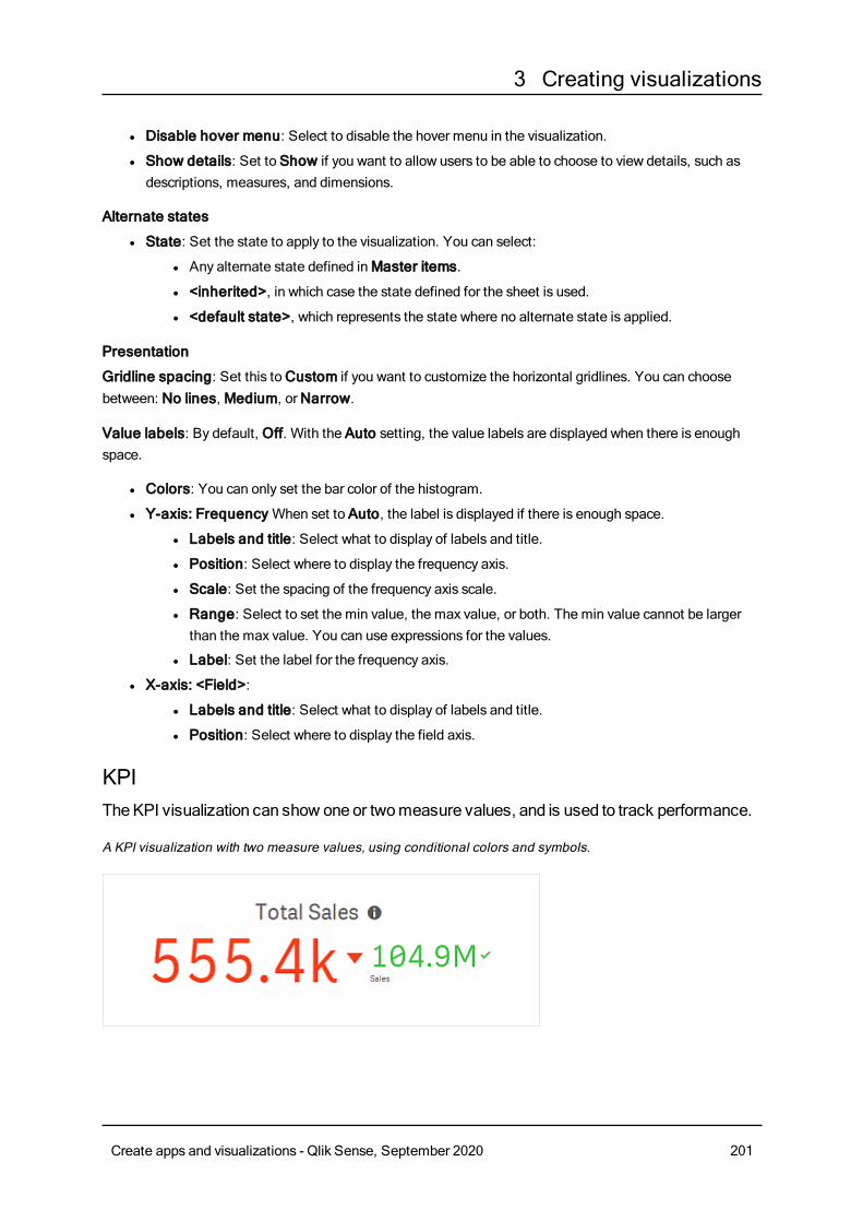
3 Creating visualizations
l Disable hover menu: Select to disable the hover menu in the visualization.
l Show details: Set to Show if you want to allow users to be able to choose to view details, such asdescriptions, measures, and dimensions.
Alternate states
l State: Set the state to apply to the visualization. You can select:
l Any alternate state defined inMaster items.
l <inherited>, in which case the state defined for the sheet is used.
l <default state>, which represents the state where no alternate state is applied.
Presentation
Gridline spacing: Set this toCustom if you want to customize the horizontal gridlines. You can choosebetween: No lines, Medium, orNarrow.
Value labels: By default, Off. With the Auto setting, the value labels are displayed when there is enoughspace.
l Colors: You can only set the bar color of the histogram.
l Y-axis: FrequencyWhen set to Auto, the label is displayed if there is enough space.
l Labels and title: Select what to display of labels and title.
l Position: Select where to display the frequency axis.
l Scale: Set the spacing of the frequency axis scale.
l Range: Select to set the min value, the max value, or both. The min value cannot be largerthan the max value. You can use expressions for the values.
l Label: Set the label for the frequency axis.
l X-axis: <Field>:
l Labels and title: Select what to display of labels and title.
l Position: Select where to display the field axis.
KPITheKPI visualization can show oneor twomeasure values, and is used to track performance.
A KPI visualization with two measure values, using conditional colors and symbols.
Create apps and visualizations - Qlik Sense, September 2020 201
3 Creating visualizations
When to use itUse KPIs to get an overview of performance values that are central to an organization. Use color coding andsymbols to indicate how the figures relate to the expected results.
AdvantagesKPIs give a quick understanding of the performance within an area.
DisadvantagesThe KPI is somewhat limited when it comes to graphical components. You can use symbols to help illustratethe performance, but if you want a more conspicuous component, consider using a gauge.
Creating a KPIYou can create a KPI visualization on the sheet you are editing.
Do the following:
1. From the assets panel, drag an empty KPI chart to the sheet.
2. ClickAdd measure and select a measure or create a measure from a field.
In a KPI visualization, you can have one or two measures and no dimensions. With two measures, thesecond value automatically becomes a complementary value and is shown with a smaller font size. You caneasily switch their order by dragging the measures in the properties panel underMeasures.
When you have created the KPI visualization, you may want to adjust its appearance and other settings in theproperties panel.
The following settings are used by default in a KPI visualization:
l Centered alignment.
l Black text color.
l Responsive layout behavior.
l Medium font size.
l No titles.
l Measure label displayed.
l Conditional colors and symbols are turned off.
l No link to sheet.
If you double-click or drag ameasure from the assets panel, a KPI visualization is added on thesheet using themeasure.
Using conditional colors and symbolsWhen you use conditional colors for your KPI visualization, you have the option to use symbols to bedisplayed next to your measure value. Additionally, you can use the following options:
Create apps and visualizations - Qlik Sense, September 2020 202
3 Creating visualizations
l Set range limits.
l Add limits to create subsections with different colors to indicate performance, for example, good(green), below expectations (yellow), or critical (red).
l Add symbols to the values.
l Use gradient coloring between color sections.
You can use expressions to set the limits. All these settings are done in the properties panel that is displayedon the right-hand side of the windowwhen editing a sheet.
Linking to another sheetYou can link from the KPI visualization to a sheet in the app. When making data analysis and clicking thevisualization, you can click a second time to go to a predefined sheet. The sheet is opened in a new tab.
When hovering over] , the name of the sheet is displayed. The icon is only displayed when Show title isselected, under Presentation.
KPI properties
You open the properties panel for a visualization by clicking Edit sheet in the toolbar and clicking the
visualization that you want to edit.
If the properties panel is hidden, click Show properties in the lower right-hand corner.
If the visualization has in the upper right-hand corner, the visualization is linked to amaster
item. You cannot edit a linked visualization, but you can edit themaster item. You can alsounlink the visualization tomake it editable.
Some of the settings in the properties panel are only available under certain circumstances, forexample, when you usemore than one dimension or measure, or when you select an optionthat makes other options available.
DataClickAdd to add a measure.
Measures
On theData tab, underMeasures, clickAdd to open a list of available measures. Select the measure thatyou want to add to the visualization. If you select a field, you are automatically presented with some commonaggregation functions that you can choose between for the measure. Pie charts require a measure for Angle,but optionally a measure can be added forRadius, which determines the radius of each slice of the pie chart.
If no measure is available, you need to create one. You can enter the expression directly in the text box, or
click to create a measure in the expression editor.
To be able to edit a measure that is linked to a master item, you must first unlink the measure.
Create apps and visualizations - Qlik Sense, September 2020 203
3 Creating visualizations
If Add measure is dimmed, you cannot add more measures.
The following properties are available for measures:
l <Measure name>:
l Expression: Click to open the expression editor. The existing expression is displayed by
default.
l Label: Enter a label for the measure. Measures not saved inMaster items are by defaultdisplayed with the expression as label.
l Measure: Only displayed for master items. To be able to edit a measure that is linked to amaster item, you must first unlink the measure.
l Number formatting: Different options for formatting the measure values. If you want tochange the number format at app level, and not just for a single measure, it is better to do thatin the regional settings, that is, in the SET statements at the beginning of the script in the dataload editor.The following number formats are available:
l Auto: Qlik Sense automatically sets a number formatting based on the source data.To represent numeric abbreviations, the international SI units are used, such as k(thousand), M (million), and G (billion).
l Number: By default, the formatting is set to Simple, and you can select the formattingfrom the options in the drop-down list. Click the button to change toCustomformatting, and use the Format pattern box to change the format pattern.
Examples:
l # ##0 describes the number as an integer with a thousands separator. In thisexample " " is used as a thousands separator.
l ###0 describes the number as an integer without a thousands separator.
l 0000 describes the number as an integer with at least four digits. For example,the number 123 will be shown as 0123.
l 0.000 describes the number with three decimals. In this example "." is used as adecimal separator.
If you add the percent sign (%) to the format pattern, the measure values areautomatically multiplied by 100.
l Money: By default, the format pattern used for money is the same as set up in theoperating system. Use the Format pattern box to change the format pattern.
l Date: By default, the formatting is set to Simple, and you can select the formattingfrom the options in the drop-down list. Click the button to change toCustomformatting, and use the Format pattern box to change the format pattern.
l Duration: By default, the format pattern used for duration is the same as set up in theoperating system. Duration can be formatted as days, or as a combination of days,hours, minutes, seconds and fractions of seconds. Use the Format pattern box tochange the format pattern.
Create apps and visualizations - Qlik Sense, September 2020 204
3 Creating visualizations
l Custom: By default, the format pattern used for custom is the same as set up in theoperating system. Use the Format pattern boxes to change the format pattern.
l Decimal separator: Set the decimal separator.
l Thousands separator: Set the thousands separator.
l Format pattern: Set the number format pattern.
l Reset pattern: Click to reset to default pattern.
l Measure expression: The format pattern is determined by the measure expression.Use this option to display custom number formatting for a measure in a visualization.
l Master item: You can create a master measure based on the measure expression by clickingCreatenew.
Add-onsl Data handling: Calculation condition: Specify an expression in this text field to set a condition thatneeds to be fulfilled (true) for the object to be displayed. The value may be entered as a calculatedformula. For example: count(distinct Team)<3. If the condition is not fulfilled, the message orexpression entered inDisplayed message is displayed.A calculation condition is useful when a chart or table is very big and makes the visualization slow torespond. A calculation condition can then help so that for example an object does not show until theuser has filtered the data to a more manageable level by applying selections.
Appearance
General
l Show titles: Select to enable or disable titles, subtitles, and footnotes in the chart.Enter Title, Subtitle, and Footnote. By default, the string is interpreted as a text string. However,you can also use the text field for an expression, or a combination of text and expression. An equalssign (=), at the beginning of a string shows that it contains an expression.Click if you want to create an expression by using the expression editor.
Titles are displayed on a single line. If you inject line breaks they will be ignored.
Example:
Assume that the following string is used, including quotation marks: 'Sales: ' & Sum(Sales).By default, the string is interpreted as a text string and is displayed as presented in the example. But ifyou begin the string with an equals sign: (='Sales: ' & Sum(Sales)), the string is interpreted as anexpression instead. The output is then Sales: <value of expression>, where <value of expression>is the calculated value.
l Disable hover menu: Select to disable the hover menu in the visualization.
l Show details: Set to Show if you want to allow users to be able to choose to view details, such asdescriptions, measures, and dimensions.
Create apps and visualizations - Qlik Sense, September 2020 205
3 Creating visualizations
Alternate states
State: Set the state to apply to the visualization. You can select:
l Any alternate state defined inMaster items.
l <inherited>, in which case the state defined for the sheet is used.
l <default state>, which represents the state where no alternate state is applied.
Presentation
l Show title: On by default. When selected, the measure title is displayed above the KPI value.
l Alignment: Set the alignment of the KPI value and the title.
l Layout behavior: Sets the layout mode for the font. Options are: Fixed in which the font size isindependent of the box size and the length of the text, Fluid in which the font size adapts to the size ofthe box, andResponsive in which the font size adapts to the size of the box and the length of text.
l Font size: Set the relative font size of the measure value. When the chart is resized, the font sizemight adjust to fit the chart depending on the setting of Layout behavior.
l Link to sheet: Off by default. When turnedOn, you can link from the KPI to any sheet in the app.Select the sheet in the list. You can also select if the linked sheet opens in a new tab.
Colors
l Conditional colors: When used, you can add range limits and use different colors and symbols forthe different sections.
l Add limit: Use the slider to set the limit. You can add several sections. Click the section to changecolor.
You can use an expression as a limit. Click3 if you want to create an expression.
l Gradient: Select to use different shades of colors in the transition between the sections.
l Remove limit : Click to remove the selected limit. If no limit is selected, the most recently added
limit is removed.
Line chartThe line chart is used to show trends over time. The dimension is always on the x-axis, and themeasures are always on the y-axis.
Create apps and visualizations - Qlik Sense, September 2020 206
3 Creating visualizations
Your data set must consist of at least two data points to draw a line. A data set with a single value isdisplayed as a point.
If you have a data set where data is missing for a certain month, you have the following options for showingthe missing values:
l As gaps
l As connections
l As zeros
When a month is not present at all in the data source, it is also excluded from the presentation.
You can accumulate values of a measure over one or two dimensions:
Create apps and visualizations - Qlik Sense, September 2020 207
3 Creating visualizations
When to use itThe line chart is primarily suitable when you want to visualize trends and movements over time, where thedimension values are evenly spaced, such asmonths, quarters, or fiscal years.
AdvantagesThe line chart is easy to understand and gives an instant perception of trends.
DisadvantagesUsing more than a few lines in a line chart makes the line chart cluttered and hard to interpret. For thisreason, avoid using more than two or three measures.
Creating a line chartYou can create a line chart on the sheet you are editing.
Do the following:
1. From the assets panel, drag an empty line chart to the sheet.
2. ClickAdd dimension and select a dimension or a field.
3. ClickAdd measure and select a measure or create a measure from a field.
When you have created the line chart, you may want to adjust its appearance and other settings in theproperties panel.
In a line chart you need at least one dimension and one measure.
You can include up to two dimensions and one measure, or one dimension and up to 15 measures in a linechart.
Dimensions Measures Result
1 dimension 1 measure A simple line chart with a single line.
2dimensions
1 measure A line chart with the first dimension on the X-axis, and a line for each valueof the second dimension.
1 dimension up to 15measures
A line chart with one line for each measure.
Creating a line chart
Display limitations
Displaying large numbers of dimension valuesWhen the number of dimension values exceeds the width of the visualization, a mini chart with a scroll bar isdisplayed. You can scroll by using the scroll bar in the mini chart, or, depending on your device, by using thescroll wheel or by swiping with two fingers. When a large number of values are used, the mini chart no longerdisplays all the values. Instead, a condensed version of the mini chart (with the items in gray) displays anoverview of the values, but the very low and the very high values are still visible.
Line chart with a mini chart, since the dimension values exceeds the width of the visualization.
Create apps and visualizations - Qlik Sense, September 2020 208
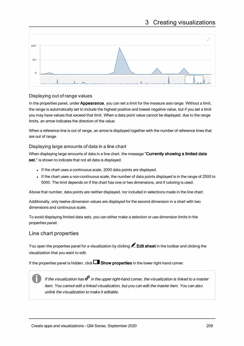
3 Creating visualizations
Displaying out of range valuesIn the properties panel, under Appearance, you can set a limit for the measure axis range. Without a limit,the range is automatically set to include the highest positive and lowest negative value, but if you set a limityou may have values that exceed that limit. When a data point value cannot be displayed, due to the rangelimits, an arrow indicates the direction of the value.
When a reference line is out of range, an arrow is displayed together with the number of reference lines thatare out of range.
Displaying large amounts of data in a line chartWhen displaying large amounts of data in a line chart, the message "Currently showing a limited dataset." is shown to indicate that not all data is displayed.
l If the chart uses a continuous scale, 2000 data points are displayed.
l If the chart uses a non-continuous scale, the number of data points displayed is in the range of 2500 to5000. The limit depends on if the chart has one or two dimensions, and if coloring is used.
Above that number, data points are neither displayed, nor included in selectionsmade in the line chart.
Additionally, only twelve dimension values are displayed for the second dimension in a chart with twodimensions and continuous scale.
To avoid displaying limited data sets, you can either make a selection or use dimension limits in theproperties panel.
Line chart properties
You open the properties panel for a visualization by clicking Edit sheet in the toolbar and clicking the
visualization that you want to edit.
If the properties panel is hidden, click Show properties in the lower right-hand corner.
If the visualization has in the upper right-hand corner, the visualization is linked to amaster
item. You cannot edit a linked visualization, but you can edit themaster item. You can alsounlink the visualization tomake it editable.
Create apps and visualizations - Qlik Sense, September 2020 209

3 Creating visualizations
Some of the settings in the properties panel are only available under certain circumstances, forexample, when you usemore than one dimension or measure, or when you select an optionthat makes other options available.
DataClickAdd to add a dimension or a measure.
Dimensions
On theData tab, underDimensions, clickAdd to open a list of availableDimensions and Fields. Selectthe dimension or field that you want to use.
You can also click to create a dimension in the expression editor. To be able to edit a dimension that is
linked to a master item, you must first unlink the dimension. Another way to create a dimension is to type theexpression directly in the text box. Expressions added in this waymust begin with an equals sign (=). Here isan example with a calculated dimension:
=If (Week < 14, Week, 'Sales')
If Add is dimmed, you cannot add more dimensions.
l <Dimension name>: Click the dimension name to open the dimension settings.
If you want to delete the dimension, right-click the dimension and select in the dialog. Alternatively,
click the dimension and click .
l Dimension: Only displayed for master items. To be able to edit a dimension that is linked to amaster item, you must first unlink the dimension.
l Field: If you have added a field from Fields in the assets panel, the field name is automatically
displayed. Click to open the expression editor.
l Label: Enter a label for the dimension. If you have added a field from Fields in the assetspanel, the field name is automatically displayed.
l Includenull values: When selected, the measure values of all null dimensions aresummarized and presented as one dimension item in a visualization. All null values aredisplayed as gaps or dashes (-).
l Limitation: Limits the number of displayed values. When you set a limitation, the onlydimensions displayed are those where the measure value meets the limitation criterion:
l No limitation: The default value.
l Fixed number: Select to display the top or bottom values. Set the number of values.
You can also use an expression to set the number. Click to open the expression
editor.
l Exact value: Use the operators and set the exact limit value. You can also use an
expression to set the number. Click to open the expression editor.
l Relative value: Use the operators and set the relative limit value in percent. You can
Create apps and visualizations - Qlik Sense, September 2020 210
3 Creating visualizations
also use an expression to set the number. Click to open the expression editor.
l Calculated on measure: <measure>: Shown when you make a limitation to thenumber of displayed dimension values. The dimensions whose measure value meet thecriterion are displayed.
l Show others: When selected, the last value in the visualization (colored gray), summarizes allthe remaining values. When some kind of limitation is set (Fixed number, Exact value, orRelative number), the value counts as 1 in that setting. If, for example, Exact value is usedand set to 10, the tenth value isOthers.
l Other label: Enter a label for the summarized values (when Show others is selected). You
can also use an expression as a label. Click to open the expression editor.
l Master item: You can create a master dimension based on the dimension expression by clickingCreate new.
l Add alternative: Alternative dimensions and measures are dimensions and measures that are addedto a visualization, but are not displayed until a user chooses to switch which dimensions and measuresare being displayed during visual exploration.
You can drag the dimensions to set the order in which they are displayed in the visualization. Use the drag
bars (o ) to rearrange the order.
You can drag a field fromMeasures toDimensions to change how it is used. Moving a measure toDimensions removes its aggregation. You cannot drag a master measure toDimensions. You can onlydrag a measure toDimensions if its expression is simple.
Measures
l <Measure name>: Click the measure to open the measure settings.
If you want to delete the measure, long-touch/right-click the measure and select in the dialog.
Alternatively, click the measure and click .
l Expression: Click to open the expression editor.The existing expression is displayed by
default.
l Modifier: Selects a modifier for the measure. Options areNone, Accumulation, Movingaverage, Difference, andRelative numbers.
l Accumulation: Only displayed when Accumulation has been selected as a modifier.It allows you to accumulate values of your measure over one or two dimensions.
The following options are available:
l Dimension: Selects the dimension on which the accumulation will take place. Ifthe accumulation is made acrossmultiple dimensions, this will be the firstdimension.
l Across all dimensions: Continues accumulation across all availabledimensions.
l Range: Select whether the accumulation will happen on the Full range, or aCustom range of the dimension.
Create apps and visualizations - Qlik Sense, September 2020 211
3 Creating visualizations
l Steps: Only displayed whenRange is set toCustom. The number of steps inthe dimension which form an accumulation range. Only zero and positiveintegers are accepted.
l Show excluded values: Include excluded values in the accumulation.
l Output expression: Shows the expression used by the modifier.
l Moving average: Only displayed whenMoving average has been selected as amodifier. It allows you to accumulate values of your measure over one or twodimensions.
The following options are available:
l Dimension: Selects the dimension on which the moving average will takeplace. If the moving average is made acrossmultiple dimensions, this will be thefirst dimension.
l Across all dimensions: Continuesmoving average across all availabledimensions.
l Range: Select whether the moving average will happen on the Full range, or aCustom range of the dimension.
l Steps: Only displayed whenRange is set toCustom. The number of steps inthe dimension which form a moving average range. Only zero and positiveintegers are accepted.
l Show excluded values: Include excluded values in the moving average.
l Output expression: Shows the expression used by the modifier.
l Difference: Only displayed whenDifference has been selected as a modifier. Itallows you to calculate the difference between consecutive values of a measure overone or two dimensions.
The following options are available:
l Dimension: Selects the dimension on which the difference will take place. If thedifference is made acrossmultiple dimensions, this will be the first dimension.
l Across all dimensions: Continues difference across all available dimensions.
l Show excluded values: Include excluded values in the difference.
l Output expression: Shows the expression used by the modifier.
l Relative numbers: Only displayed whenRelative numbers has been selected as amodifier.It allows you to calculate percentages relative to a specific selection, relative tothe total, or relative to a field value. The modifier can be calculated over one or twodimensions.
The following options are available:
l Selection scope: Sets whether the relative numbers are calculated based onthe current selection or a specific field value. You can also disregard the currentselection.
Create apps and visualizations - Qlik Sense, September 2020 212
3 Creating visualizations
l Dimensional scope: Sets whether the relative numbers are calculated basedon a dimension. You can choose to have the modifier respect all availabledimensions, respect a specific dimension if there are two, or to disregard thedimensions.
l Output expression: Shows the expression used by the modifier.
l Label: Enter a label for the measure. Measures not saved inMaster items are by defaultdisplayed with the expression as label.
l Measure: Only displayed for master items. To be able to edit a measure that is linked to amaster item, you must first unlink the measure.
l Number formatting: Different options for formatting the measure values. If you want tochange the number format at app level, and not just for a single measure, it is better to do thatin the regional settings, that is, in the SET statements at the beginning of the script in the dataload editor.The following number formats are available:
l Auto: Qlik Sense automatically sets a number formatting based on the source data.To represent numeric abbreviations, the international SI units are used, such as k(thousand), M (million), and G (billion).
l Number: By default, the formatting is set to Simple, and you can select the formattingfrom the options in the drop-down list. Click the button to change toCustomformatting, and use the Format pattern box to change the format pattern.
Examples:
l # ##0 describes the number as an integer with a thousands separator. In thisexample " " is used as a thousands separator.
l ###0 describes the number as an integer without a thousands separator.
l 0000 describes the number as an integer with at least four digits. For example,the number 123 will be shown as 0123.
l 0.000 describes the number with three decimals. In this example "." is used as adecimal separator.
If you add the percent sign (%) to the format pattern, the measure values areautomatically multiplied by 100.
l Money: By default, the format pattern used for money is the same as set up in theoperating system. Use the Format pattern box to change the format pattern.
l Date: By default, the formatting is set to Simple, and you can select the formattingfrom the options in the drop-down list. Click the button to change toCustomformatting, and use the Format pattern box to change the format pattern.
l Duration: By default, the format pattern used for duration is the same as set up in theoperating system. Duration can be formatted as days, or as a combination of days,hours, minutes, seconds and fractions of seconds. Use the Format pattern box tochange the format pattern.
l Custom: By default, the format pattern used for custom is the same as set up in theoperating system. Use the Format pattern boxes to change the format pattern.
Create apps and visualizations - Qlik Sense, September 2020 213
3 Creating visualizations
l Measure expression: The format pattern is determined by the measure expression.Use this option to display custom number formatting for a measure in a visualization.Limitations:Only works with visualizations that accept measures.Cannot be used with a box plot.Does not affect the number formatting of the axis.
l Label: Enter a label for the measure. Measures not saved inMaster items are by defaultdisplayed with the expression as label.
l Measure: Only displayed for master items. To be able to edit a measure that is linked to amaster item, you must first unlink the measure.
l Number formatting: Different options for formatting the measure values. If you want tochange the number format at app level, and not just for a single measure, it is better to do thatin the regional settings, that is, in the SET statements at the beginning of the script in the dataload editor.The following number formats are available:
l Auto: Qlik Sense automatically sets a number formatting based on the source data.To represent numeric abbreviations, the international SI units are used, such as k(thousand), M (million), and G (billion).
l Number: By default, the formatting is set to Simple, and you can select the formattingfrom the options in the drop-down list. Click the button to change toCustomformatting, and use the Format pattern box to change the format pattern.
Examples:
l # ##0 describes the number as an integer with a thousands separator. In thisexample " " is used as a thousands separator.
l ###0 describes the number as an integer without a thousands separator.
l 0000 describes the number as an integer with at least four digits. For example,the number 123 will be shown as 0123.
l 0.000 describes the number with three decimals. In this example "." is used as adecimal separator.
If you add the percent sign (%) to the format pattern, the measure values areautomatically multiplied by 100.
l Money: By default, the format pattern used for money is the same as set up in theoperating system. Use the Format pattern box to change the format pattern.
l Date: By default, the formatting is set to Simple, and you can select the formattingfrom the options in the drop-down list. Click the button to change toCustomformatting, and use the Format pattern box to change the format pattern.
l Duration: By default, the format pattern used for duration is the same as set up in theoperating system. Duration can be formatted as days, or as a combination of days,hours, minutes, seconds and fractions of seconds. Use the Format pattern box tochange the format pattern.
Create apps and visualizations - Qlik Sense, September 2020 214

3 Creating visualizations
l Custom: By default, the format pattern used for custom is the same as set up in theoperating system. Use the Format pattern boxes to change the format pattern.
l Measure expression: The format pattern is determined by the measure expression.Use this option to display custom number formatting for a measure in a visualization.Limitations:Only works with visualizations that accept measures.Cannot be used with a box plot.Does not affect the number formatting of the axis.
l Add trend line: Trend lines are lines used to show trends over time.
l Label: Enter a label for the trend line. Click to open the expression editor.
l Type. Set the type of the trend line. The following types are available:
l Average
l Linear
l Second degree polynomial
l Third degree polynomial
l Fourth degree polynomial
l Exponential
l Logarithmic
l Power
l Colors: Set toCustom to change the color of the trend line.
l Dashed: Choose between dashed or continuous line style.
l Master item: You can create a master measure based on the measure expression by clickingCreate new.
l Add alternative: Alternative dimensions and measures are dimensions and measures that are addedto a visualization, but are not displayed until a user chooses to switch which dimensions and measuresare being displayed during visual exploration.
You can drag the measures to set the order in which they are displayed in the visualization. Use the drag bars
(o ) to rearrange the order.
You can drag a field from Dimensions toMeasures to change how it is used. Moving a dimension toMeasures assigns it an aggregation. You cannot drag a master dimension toMeasures.
SortingDrag the dimensions and measures to set the sorting priority order. The numbers show the order.
Dimensions and measures can also be sorted internally:
Click the dimension or measure name to open the settings and click the sorting button to switch toCustomsorting. The following list shows the internal sorting priority order and sorting options. The sorting is eitherAscending orDescending.
l Sort by expression: Enter an expression to sort by. Only available for dimensions.
l Sort numerically
Create apps and visualizations - Qlik Sense, September 2020 215
3 Creating visualizations
l Sort alphabetically
Additionally, you can sort by load order by switching toCustom and leaving all sorting options unselected.
If you have set a custom order for a field, that custom order will override any selected internal sort order inSorting.
Add-onsl Data handling:
l Include zero values: When unselected, measures that have the value ‘0’ are not included inthe presentation. If there is more than one measure value, all the measure valuesmust havethe value ‘0’ to be excluded from the presentation.Calculation condition: Specify an expression in this text field to set a condition that needs tobe fulfilled (true) for the object to be displayed. The value may be entered as a calculatedformula. For example: count(distinct Team)<3. If the condition is not fulfilled, the message orexpression entered inDisplayed message is displayed.
l A calculation condition is useful when a chart or table is very big and makes the visualizationslow to respond. A calculation condition can then help so that for example an object does notshow until the user has filtered the data to a more manageable level by applying selections.
l Reference lines: Add reference line: Click to add a new reference line.
l Show condition:Sets a condition that needs to be fulfilled for the reference line to appear.
Click to open the expression editor.
l Label: Enter a label for the reference line.
l Show label: Select to show the reference line label.
l Color: In the color picker, select the color of the reference line and the label.
l Reference line expression: Enter a value or an expression for the reference line. Click to
open the expression editor.
l Show value: Select to show the value of the reference line.
l Line type: You can choose between solid and dashed line types.
l Colored background: Adds the selected color as a background around the label text.
l : Click to remove the reference line.
l Dimension reference lines: Add reference line: Click to add a new dimensional reference line.
l Show condition:Sets a condition that needs to be fulfilled for the dimensional reference line
to appear. Click to open the expression editor.
l Label: Enter a label for the dimensional reference line.
l Show label: Select to show the dimensional reference line label.
l Color: In the color picker, select the color of the dimensional reference line and the label.
l Reference line expression: Enter a value or an expression for the dimensional reference
line. Click to open the expression editor.
l Show value: Select to show the value of the dimensional reference line.
Create apps and visualizations - Qlik Sense, September 2020 216
3 Creating visualizations
l Line type: You can choose between solid and dashed line types.
l Colored background: Adds the selected color as a background around the label text.
l : Click to remove the dimensional reference line.
Appearance
General
l Show titles: Select to enable or disable titles, subtitles, and footnotes in the chart.Enter Title, Subtitle, and Footnote. By default, the string is interpreted as a text string. However,you can also use the text field for an expression, or a combination of text and expression. An equalssign (=), at the beginning of a string shows that it contains an expression.Click if you want to create an expression by using the expression editor.
Titles are displayed on a single line. If you inject line breaks they will be ignored.
Example:
Assume that the following string is used, including quotation marks: 'Sales: ' & Sum(Sales).By default, the string is interpreted as a text string and is displayed as presented in the example. But ifyou begin the string with an equals sign: (='Sales: ' & Sum(Sales)), the string is interpreted as anexpression instead. The output is then Sales: <value of expression>, where <value of expression>is the calculated value.
l Disable hover menu: Select to disable the hover menu in the visualization.
l Show details: Set to Show if you want to allow users to be able to choose to view details, such asdescriptions, measures, and dimensions.
Alternate states
l State: Set the state to apply to the visualization. You can select:
l Any alternate state defined inMaster items.
l <inherited>, in which case the state defined for the sheet is used.
l <default state>, which represents the state where no alternate state is applied.
Presentation
l Styling: Change the styling of the lines. The following options are available:
l Data point size: Adjust the slider to set the size of data points.
l Line thickness: Adjust the solider to set the thickness of the lines.
l Line type: Set the line asDashed or Solid.
l Line curve: Set the curvature of the line as Linear orMonotone.
l Line/Area: Select to display the chart as a line or as an area.
l Vertical/Horizontal: Select a vertical or horizontal orientation for the chart.
l Scrollbar: Set the type of scrollbar to display. There are three settings:
Create apps and visualizations - Qlik Sense, September 2020 217
3 Creating visualizations
l Mini chart: Show aminiature of the chart.
l Bar: Show a regular scrollbar.
l None: There is no scrollbar, but you can still scroll in the visualization.
l Scroll alignment: Set the position of the chart scrollbar. By default the scroll alignment is set toStart.
l Stacked area: When selected, the different areas are displayed on top of each other. Only availablewith Area style.
l Stack positive and negative values separately: Only available with Area style.
l Missing valuesSet how to showmissing values.
l Show as gaps: The line has a gap, which represents the missing value.
l Show as connections: The line connects the values that exist on either side of the missingvalue. If the missing value is first or last, no line is drawn.
l Show as zeros: The line is drawn to zero and from there to the next existing value. If themissing value is first or last, no line is drawn.
l Show data points: When selected, the data points are displayed. Value labels: By default, Off.With the Auto setting, the value labels are displayed when there is enough space.
l Grid line spacing: Select the spacing of the grid lines. The Auto setting isMedium.
Colors and legends
l Colors: Select how the chart values are colored. There are two settings:
l Auto: Colors the chart values using default settings.
l Custom: Manually select the method of coloring your values in the chart. The followingmethods are available:
l Single color: Color the chart using a single color (by default blue). Use the color pickerto change the dimension color.
l Use library colors: Option available when a master dimension or mastermeasure used in the visualization has a color assigned to it. You can select touse the master item colors or to disable the master item colors. In cases where avisualization has both a master dimension and a master measure that havecolors assigned to them, you can select which to use in the visualization.
l Multicolored: Option when more than one measure is used.By default, 12 colors are used for the dimensions. The colors are reused when there aremore than 12 dimension values.
l Use library colors: Option available when a master dimension or mastermeasure used in the visualization has a color assigned to it. You can select touse the master item colors or to disable the master item colors. In cases where avisualization has both a master dimension and a master measure that havecolors assigned to them, you can select which to use in the visualization.
l Color scheme: Select 12 colors or 100 colors to be used for the differentvalues. The 12 colors can all be distinguished by people with color visiondeficiency, but not all of the 100 colors.
Create apps and visualizations - Qlik Sense, September 2020 218
3 Creating visualizations
l By dimension: Color the chart by dimension values. By default, 12 colors are used forthe dimensions. The colors are reused when there are more than 12 dimension values.When selected, the following settings are available:
l Select dimension: Enter a field or expression containing the values to colorobjects in this chart.
l Library colors: Select whether to use the master dimension color or to disablethe master dimension color. Option available only when a master dimensionused in the visualization has a color assigned to it.
l Persistent colors: Select to have colors remain the same between selectionstates.
l Color scheme: Select 12 colors or 100 colors to be used for the differentvalues. The 12 colors can all be distinguished by people with color visiondeficiency, but not all of the 100 colors.
l By measure:
l Select measure: Select the measure to use to color your chart.
l Library colors: Select whether to use the master measure color or to disablethe master measure color. Option available only when a master measure used inthe visualization has assigned colors.
l Label: Enter text or an expression for the measure that displays in the legend.
l Number formatting: You can set the format of the field or expression valuesThe following number formats are available:
l Auto: Qlik Sense automatically sets a number formatting based on thesource data.To represent numeric abbreviations, the international SI units are used,such as k (thousand), M (million), and G (billion).
l Number: By default, the formatting is set to Simple, and you can selectthe formatting from the options in the drop-down list. Click the button tochange toCustom formatting, and use the Format pattern box tochange the format pattern.
Examples:
l # ##0 describes the number as an integer with a thousandsseparator. In this example " " is used as a thousands separator.
l ###0 describes the number as an integer without a thousandsseparator.
l 0000 describes the number as an integer with at least four digits.For example, the number 123 will be shown as 0123.
l 0.000 describes the number with three decimals. In this example"." is used as a decimal separator.
If you add the percent sign (%) to the format pattern, the measure valuesare automatically multiplied by 100.
Create apps and visualizations - Qlik Sense, September 2020 219
3 Creating visualizations
l Money: By default, the format pattern used for money is the same as setup in the operating system. Use the Format pattern box to change theformat pattern.
l Date: By default, the formatting is set to Simple, and you can select theformatting from the options in the drop-down list. Click the button tochange toCustom formatting, and use the Format pattern box tochange the format pattern.
l Duration: By default, the format pattern used for duration is the same asset up in the operating system. Duration can be formatted as days, or asa combination of days, hours, minutes, seconds and fractions ofseconds. Use the Format pattern box to change the format pattern.
l Custom: By default, the format pattern used for custom is the same asset up in the operating system. Use the Format pattern boxes to changethe format pattern.
l Decimal separator: Set the decimal separator.
l Thousands separator: Set the thousands separator.
l Format pattern: Set the number format pattern.
l Reset pattern: Click to reset to default pattern.
l Measure expression: The format pattern is determined by themeasure expression. Use this option to display custom numberformatting for a measure in a visualization.
l Color scheme: Select a color scheme from the following options:
l Sequential gradient: The transition between the different color groupsis made using different shades of colors. High measure values havedarker hues.
l Sequential classes: The transition between the different color groups ismade using distinctly different colors.
l Diverging gradient: Used when working with data that is ordered fromlow to high, for instance, to show the relationship between different areason a chart. Low and high values have dark colors, mid-range colors arelight.
l Diverging classes: Can be seen as two sequential classes combined,with the mid-range shared. The two extremes, high and low, areemphasized with dark colors with contrasting hues, and the mid-rangecritical values are emphasized with light colors.
l Reverse colors: When selected, the color scheme is reversed.
l Range: Define the range of values used to color bymeasure or by expression.
l Auto: The color range is set by the measure or expression values.
l Custom: When custom is selected, you can set theMin andMax valuesfor the color range.
l By expression: Color the chart using an expression to define colors for values.Supported color formats are: RGB, ARGB, and HSL.
Create apps and visualizations - Qlik Sense, September 2020 220
3 Creating visualizations
l Expression: Enter the expression that you want to use. Click to open the
expression editor.
l The expression is a color code: Selected by default. In most cases, it is bestto keep this setting. When the selection is cleared, the expression evaluates to anumber, which in turn is plotted against one of the chart gradients.For more information, seeColoring a visualization (page 511)When the coloring is bymeasure or by expression, you can set the color range(Min andMax values). By setting the color range, the colors remain constantthroughout selections and paging. When using color by expression, the optionThe expression is a color code must be cleared before you can set the colorrange.
l Show legend: Not available when Single color is selected. By default set toOff. The legendis displayed if there is enough space. The placement can be changed in the Legend positionsetting.
l Legend position: Select where to display the legend.
l Show legend title: When selected, the legend title is displayed.
X-axis / Y-axis
The properties for x-axis and y-axis depend whether or not the axis is displaying a dimension or measure.
l <Dimension>
l Continuous: Set toCustom to be able to show a continuous axis by selectingUsecontinuous scale. Use continuous scale is only available for dimensions with numericvalues. You cannot change sorting when you use a continuous scale.
l Labels and title: Select what to display of labels and title.
l Label orientation: Select how to display the labels.
l Position: Select where to display the dimension axis.
l Number of axis values: Set the maximum number of values on the axis.
l <Measure>
l Labels and title: Select what to display of labels and title.
l Position: Select where to display the measure axis.
l Scale: Set the spacing of the measure axis scale.
l Range: Select to set the min value, the max value, or both. The min value cannot be largerthan the max value. You can use expressions for the values.
l Logarithmic: When selected, a logarithmic scale is used for the measure values. To be able touse a logarithmic scale, the valuesmust be all positive or all negative.
Tooltip
l Tooltip: Set toCustom to be able to add measures as tooltips. Any added measures will bedisplayed as additional tooltips over the bars.
l Hide basic rows: Hides the rows of the tooltip that show basic information. If a custom tooltip has nomeasures and a title and description, Hide basic rows will also hide dimension values as well.
Create apps and visualizations - Qlik Sense, September 2020 221

3 Creating visualizations
l Add measure: Adds a measure to be shown as a tooltip. You can add a measure from a field using
From a field. You can also use an expression to add a measure. Click to open the expression
editor. The existing expression is displayed by default. You can add a title and description to thetooltip. You can change the label of the tooltip using Label as well as its formatting usingNumberformatting.
MapsMaps enable you to view your data geographically.
Maps have many ways to present your data. You can add multiple layers to your map to display differenttypes of information on the samemap. You can set a custom scope for locations so that if two locations havethe same name, you display the locations and their data correctly. You can use drill-down dimensions tocreate a hierarchy of geographic areas for selection. You can limit the pan of a map to a specific view andscope of the map, such as a region of interest, out of which users cannot pan or zoom out. You can addcustom base maps to your map and use non-WGS-84 coordinates.
Map with density layer displaying number of global volcanic eruptions.
When to use mapsYou can use a map to show the geographical distribution of offices, stores, and other sites of businessinterest. You can visualize not only locations but also sales values and other measures and display the valuedifferences by bubble size or color.
AdvantagesThe map is a versatile visualization that efficiently presents the geographical distribution of key values relatedto location or area.
DisadvantagesWith a large number of values, it may be hard to get a good overview. Valuesmay be placed on top of eachother and not visible until zoomed in.
Create apps and visualizations - Qlik Sense, September 2020 222
3 Creating visualizations
Base mapThe base map provides the background for the data contained in your layers. You can select your base mapinMap settings. Qlik Sense has four default base maps:
l Default: An OpenStreetMap-based map.
l Pale: A paler version of the Default map.
l Satellite: A satellite image map.
l None: No base map.
Additionally, custom base maps can be added using background layers to add your own custom base maps.For example, you could add the floor plan of an airport or office as a custom base map.
LayersLayers contain visualized dimension and measure data that is displayed over your map. You can stack layerson top of each other. You can also control at what zoom levels different layers appear in or have layers thatappear only if other values in a drill-down dimension are selected. This enables you to create different levelsof detail as you make selections and zoom in and out of areas of interest on your map. The following layersare available:
l Point layer: A point layer overlays individual locations on a map, representing them with shapes.Point layers (page 227)
l Area layer: An area layer presents areas on your map, such as countries or states. With polygongeometry loaded into a field, it can present any custom area.Area layers (page 228)
l Line layer: A line layer enables you to display lines between points on your map.Line layers (page 229)
l Density layer: A density layer enables you to visualize the density of points in an area using a colorramp.Density layers (page 230)
l Chart layer: A chart layer enables you to display small pie charts or bar charts over locations in yourmap.Chart layers (page 231)
l Background layer: Background layers enable you to display a custom base map for your mapvisualization.Background layers (page 232)
Layers that use drill-down dimensions can be used to create drill-down layers. Drill-down layers enable you todrill-down different hierarchical dimensions in a single layer or in multiple layers. You could, for example,switch between area and point layers as selections are made. For more information, seeDrill-down layers(page 236). For an example map that uses drill-down dimensions and layers, seeControlling visible mapdata with drill-down layers (page 252).
Create apps and visualizations - Qlik Sense, September 2020 223
3 Creating visualizations
Location data for map layersMaps support several ways for determining locations in a layer. You can use the dimension added to thelayer. You can alternatively specify fields containing location data for the layer, if the layer dimension doesnot contain geographic data. In the Location properties, you can specify additional parameters for thelocation field, such as adding additional fields that include country or administrative area information. Forexample, if you have a field containing custom area geometries and a field containing the names of thecustom areas, you can set the name field as the dimension and then set the area geometry field as thelocation field in Location in the map properties.
Locations can be either geometries or names of locations such as names of countries, regions, cities, postalcodes etc. Layer locations can be defined using fields that contain names and codes. Qlik Sense can identifythe following types of locations:
l Continent names
l Country names
l ISO alpha 2 country codes
l ISO alpha 3 country codes
l First-order administrative area names, such as a state or province names
l Second-order administrative area names
l Third-order administrative area names
l Fourth-order administrative area names
l Postal codes or ZIP Codes
l City, village, or other populated place names
l IATA airport codes
l ICAO airport codes
Availability of locations may vary by country. If the named location is not available, usecoordinate or area data for the location.
Qlik Sense uses map and location data obtained from recognized field leaders who useacceptedmethodologies and best practices in marking borders and naming countries withintheir mappings. Qlik Sense provides flexibility to enable users to integrate their own, separatebackgroundmaps. If the standardmaps do not fit, Qlik Sense offers the option to loadcustomer provided backgroundmaps, borders, and areas.
Geometries can either be added at load time by the data preparation service or loaded from geographicsources such as KML. Point layers also support latitudes and longitudes in separate fields. For area layers,areas can be defined using geometries from a geographic data source such as KML files. Line layers supportthe same point data as point layers. Line layers also support strings with line geometries inGeoJSONLineString or MultiLineString formats.
Create apps and visualizations - Qlik Sense, September 2020 224
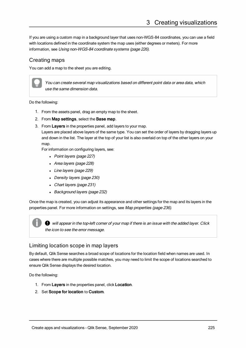
3 Creating visualizations
If you are using a custom map in a background layer that uses non-WGS-84 coordinates, you can use a fieldwith locations defined in the coordinate system the map uses (either degrees or meters). For moreinformation, seeUsing non-WGS-84 coordinate systems (page 226).
Creating mapsYou can add a map to the sheet you are editing.
You can create several map visualizations based on different point data or area data, whichuse the same dimension data.
Do the following:
1. From the assets panel, drag an emptymap to the sheet.
2. FromMap settings, select the Base map.
3. From Layers in the properties panel, add layers to your map.Layers are placed above layers of the same type. You can set the order of layers by dragging layers upand down in the list. The layer at the top of your list is also overlaid on top of the other layers on yourmap.For information on configuring layers, see:
l Point layers (page 227)
l Area layers (page 228)
l Line layers (page 229)
l Density layers (page 230)
l Chart layers (page 231)
l Background layers (page 232)
Once the map is created, you can adjust its appearance and other settings for the map and its layers in theproperties panel. For more information on settings, seeMap properties (page 236).
∞ will appear in the top-left corner of your map if there is an issue with the added layer. Clickthe icon to see the error message.
Limiting location scope in map layersBy default, Qlik Sense searches a broad scope of locations for the location field when names are used. Incases where there are multiple possible matches, you may need to limit the scope of locations searched toensure Qlik Sense displays the desired location.
Do the following:
1. From Layers in the properties panel, click Location.
2. Set Scope for location toCustom.
Create apps and visualizations - Qlik Sense, September 2020 225
3 Creating visualizations
3. After Location type, select the type of data contained in the field or expression selected as Locationfield.
4. Optionally, afterCountry, enter a field, expression, or text indicating the country the locations in theLocation field are located.
5. Optionally, after Administrative area (Level 1), enter a field, expression, or text indicating the first-level administrative area the locations in the Location field are located.
6. Optionally, after Administrative area (Level 2), enter a field, expression, or text indicating thesecond-level administrative area the locations in the Location field are located.
Limiting panning in your mapYou can limit the panning settings in your map to keep the view in your map limited to a set area, such as aspecific region of interest. When you limit the panning in a map, you lock the map to the current view. Themap will not zoom out further than the current view. You cannot pan the map beyond the limits of the currentview. If you zoom in, you can pan, but you are limited by the boundaries of the pan limit.
Do the following:
1. From the properties panel, clickAppearance.
2. In Presentation, set Limit pan navigation toCustom.
3. Set your map to the view you want to which you want to limit the pan.
4. ClickSet pan limit.
You can toggle the set pan limit on and off with Limit pan navigation. You can clear the saved pan limit byclickingClear pan limit.
Using non-WGS-84 coordinate systemsIf you have data and a background map in a projection other thanWGS-84, you should set the base map toNone, add your background map as a background layer, and then set your projection to use undefineddegrees or meters depending on the unit of length used in your base map.
When using non-WGS-84 coordinates, you must use geometries loaded into a field. Location names cannotbe used.
Do the following:
1. From the properties panel, clickMap settings.
2. In Base map, select Empty (undefined degrees) or Empty (undefined meters).
3. Select Background layer.
4. AfterURL, enter the URL to a slippymap server.For example, http://a.tile.opencyclemap.org/cycle/${z}/${x}/${y}.png .
5. After Attribution, enter the attribution string for the map.For example, © <a href='http://www.opencyclemap.org/' target='_blank'>OpenCycleMap</a>. Map data © <a href='http://www.openstreetmap.org/copyright'target='_blank'>OpenStreetMap</a> contributors.
6. From Layers, clickAdd layer.
Create apps and visualizations - Qlik Sense, September 2020 226
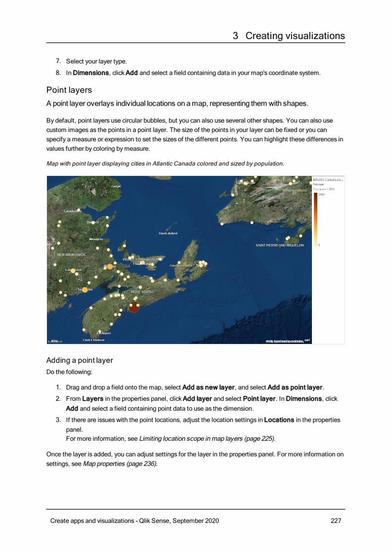
3 Creating visualizations
7. Select your layer type.
8. InDimensions, clickAdd and select a field containing data in your map's coordinate system.
Point layersA point layer overlays individual locations on amap, representing them with shapes.
By default, point layers use circular bubbles, but you can also use several other shapes. You can also usecustom images as the points in a point layer. The size of the points in your layer can be fixed or you canspecify a measure or expression to set the sizes of the different points. You can highlight these differences invalues further by coloring bymeasure.
Map with point layer displaying cities in Atlantic Canada colored and sized by population.
Adding a point layerDo the following:
1. Drag and drop a field onto the map, select Add as new layer, and select Add as point layer.
2. From Layers in the properties panel, clickAdd layer and select Point layer. InDimensions, clickAdd and select a field containing point data to use as the dimension.
3. If there are issues with the point locations, adjust the location settings in Locations in the propertiespanel.For more information, see Limiting location scope inmap layers (page 225).
Once the layer is added, you can adjust settings for the layer in the properties panel. For more information onsettings, seeMap properties (page 236).
Create apps and visualizations - Qlik Sense, September 2020 227
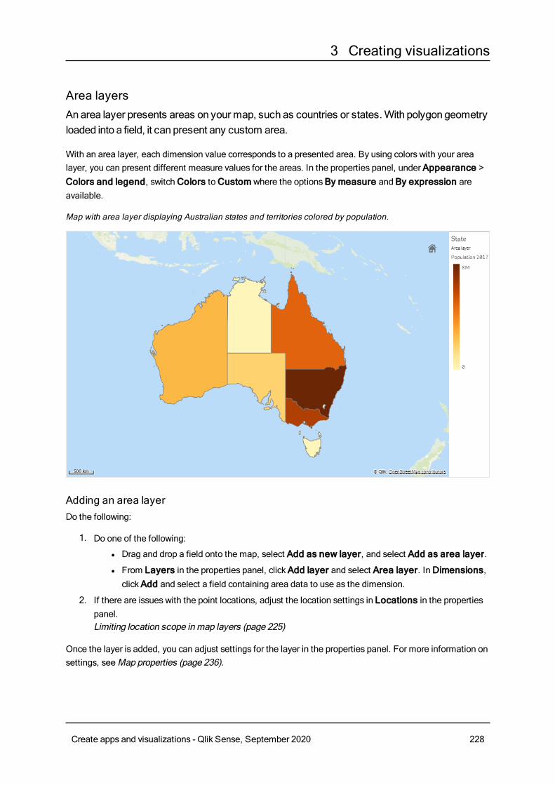
3 Creating visualizations
Area layersAnarea layer presents areas on your map, such as countries or states.With polygon geometryloaded into a field, it can present any custom area.
With an area layer, each dimension value corresponds to a presented area. By using colors with your arealayer, you can present different measure values for the areas. In the properties panel, under Appearance >Colors and legend, switchColors toCustom where the optionsBy measure and By expression areavailable.
Map with area layer displaying Australian states and territories colored by population.
Adding an area layerDo the following:
1. Do one of the following:
l Drag and drop a field onto the map, select Add as new layer, and select Add as area layer.
l From Layers in the properties panel, clickAdd layer and select Area layer. InDimensions,clickAdd and select a field containing area data to use as the dimension.
2. If there are issues with the point locations, adjust the location settings in Locations in the propertiespanel.Limiting location scope inmap layers (page 225)
Once the layer is added, you can adjust settings for the layer in the properties panel. For more information onsettings, seeMap properties (page 236).
Create apps and visualizations - Qlik Sense, September 2020 228
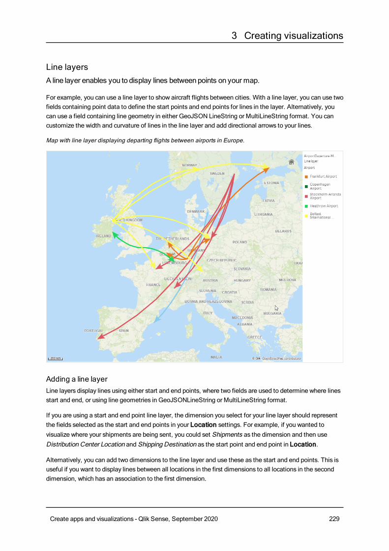
3 Creating visualizations
Line layersA line layer enables you to display lines betweenpoints on your map.
For example, you can use a line layer to show aircraft flights between cities. With a line layer, you can use twofields containing point data to define the start points and end points for lines in the layer. Alternatively, youcan use a field containing line geometry in either GeoJSON LineString or MultiLineString format. You cancustomize the width and curvature of lines in the line layer and add directional arrows to your lines.
Map with line layer displaying departing flights between airports in Europe.
Adding a line layerLine layers display lines using either start and end points, where two fields are used to determine where linesstart and end, or using line geometries in GeoJSONLineString or MultiLineString format.
If you are using a start and end point line layer, the dimension you select for your line layer should representthe fields selected as the start and end points in your Location settings. For example, if you wanted tovisualize where your shipments are being sent, you could set Shipments as the dimension and then useDistribution Center Location and Shipping Destination as the start point and end point in Location.
Alternatively, you can add two dimensions to the line layer and use these as the start and end points. This isuseful if you want to display lines between all locations in the first dimensions to all locations in the seconddimension, which has an association to the first dimension.
Create apps and visualizations - Qlik Sense, September 2020 229
3 Creating visualizations
Adding a line layer with start and end points
Do the following:
1. Do one of the following:
l Drag and drop a field containing start point data onto the map, select Add as new layer, andselect Add as line layer.
l From Layers in the properties panel, clickAdd layer and select Line layer. InDimensions,clickAdd and select a field to use as the dimension.
2. If your dimension contains start point data, add a field containing end point data. Do one of thefollowing:
l Drag and drop a field containing end point data onto the map, select Use in <layer name>,and select Add <field name> as a second dimension.
l InData, clickAdd and select a field containing end point data.
3. If your dimension does not contain start or end point data, in Location, add the fields containing thestart point data and end point data as location fields.
4. If there are issues with the start and end point locations, adjust the location settings in Location in theproperties panel.Line layers using start point field and end point fields each have separate location settings inLocation.For more information, see Limiting location scope inmap layers (page 225).
Once the layer is added, you can adjust settings for the layer in the properties panel. For more information onsettings, seeMap properties (page 236).
Adding a line layer with line geometries
Do the following:
1. Do one of the following:
l Drag and drop a field containing line geometries onto the map, select Add as new layer, andselect Add as line layer.
l From Layers in the properties panel, clickAdd layer and select Line layer. InDimensions,clickAdd and select a field to use as the dimension.
2. In Location, select Line geometry and then select a field in Line geometry field.By default, your dimension is selected as the Line geometry field.
Once the layer is added, you can adjust settings for the layer in the properties panel. For more information onsettings, seeMap properties (page 236).
Density layersA density layer enables you to visualize the density of points in an area using a color ramp.
Each point influences a circular area, with the highest influence at the center and declining towards its outerperimeter. You can specify the influence radius of the points, change its color and scale it to suit yourvisualization. Density layers can be used to show hotspots of activity, population densities and more.
Create apps and visualizations - Qlik Sense, September 2020 230
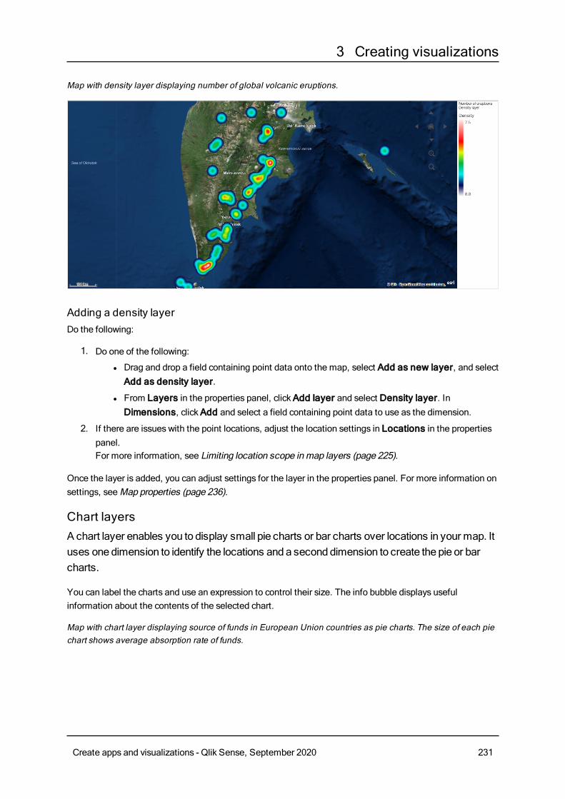
3 Creating visualizations
Map with density layer displaying number of global volcanic eruptions.
Adding a density layerDo the following:
1. Do one of the following:
l Drag and drop a field containing point data onto the map, select Add as new layer, and selectAdd as density layer.
l From Layers in the properties panel, clickAdd layer and select Density layer. InDimensions, clickAdd and select a field containing point data to use as the dimension.
2. If there are issues with the point locations, adjust the location settings in Locations in the propertiespanel.For more information, see Limiting location scope inmap layers (page 225).
Once the layer is added, you can adjust settings for the layer in the properties panel. For more information onsettings, seeMap properties (page 236).
Chart layersA chart layer enables you to display small pie charts or bar charts over locations in your map. Ituses onedimension to identify the locations and a seconddimension to create the pie or barcharts.
You can label the charts and use an expression to control their size. The info bubble displays usefulinformation about the contents of the selected chart.
Map with chart layer displaying source of funds in European Union countries as pie charts. The size of each piechart shows average absorption rate of funds.
Create apps and visualizations - Qlik Sense, September 2020 231
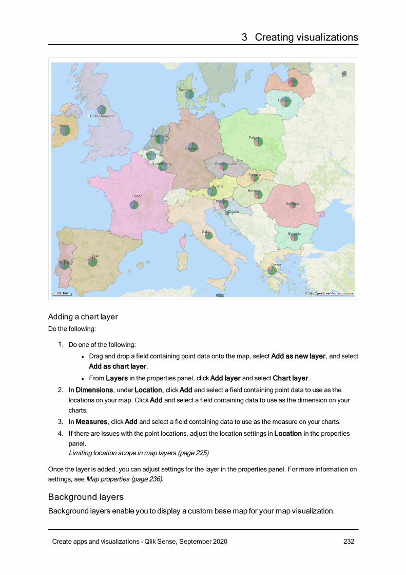
3 Creating visualizations
Adding a chart layerDo the following:
1. Do one of the following:
l Drag and drop a field containing point data onto the map, select Add as new layer, and selectAdd as chart layer.
l From Layers in the properties panel, clickAdd layer and select Chart layer.
2. InDimensions, under Location, clickAdd and select a field containing point data to use as thelocations on your map. ClickAdd and select a field containing data to use as the dimension on yourcharts.
3. InMeasures, clickAdd and select a field containing data to use as the measure on your charts.
4. If there are issues with the point locations, adjust the location settings in Location in the propertiespanel.Limiting location scope inmap layers (page 225)
Once the layer is added, you can adjust settings for the layer in the properties panel. For more information onsettings, seeMap properties (page 236).
Background layersBackground layers enable you to display a custom basemap for your map visualization.
Create apps and visualizations - Qlik Sense, September 2020 232
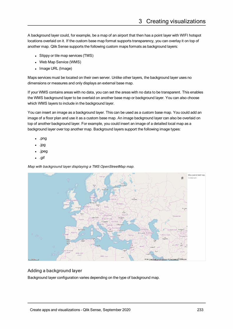
3 Creating visualizations
A background layer could, for example, be a map of an airport that then has a point layer with WIFI hotspotlocations overlaid on it. If the custom base map format supports transparency, you can overlay it on top ofanother map. Qlik Sense supports the following custom maps formats as background layers:
l Slippy or tile map services (TMS)
l WebMap Service (WMS)
l Image URL (Image)
Maps servicesmust be located on their own server. Unlike other layers, the background layer uses nodimensions or measures and only displays an external base map.
If your WMS contains areas with no data, you can set the areas with no data to be transparent. This enablestheWMS background layer to be overlaid on another base map or background layer. You can also choosewhichWMS layers to include in the background layer.
You can insert an image as a background layer. This can be used as a custom base map. You could add animage of a floor plan and use it as a custom base map. An image background layer can also be overlaid ontop of another background layer. For example, you could insert an image of a detailed local map as abackground layer over top another map. Background layers support the following image types:
l .png
l .jpg
l .jpeg
l .gif
Map with background layer displaying a TMS OpenStreetMap map.
Adding a background layerBackground layer configuration varies depending on the type of background map.
Create apps and visualizations - Qlik Sense, September 2020 233
3 Creating visualizations
Adding a TMS background layerDo the following:
1. From Layers in the properties panel, clickAdd layer.
2. Select Background layer.
3. After Format, select TMS.
4. AfterURL, enter the URL to a tile or slippymap server.For example, http://a.tile.opencyclemap.org/cycle/${z}/${x}/${y}.png.
5. After Attribution, enter the attribution string for the map.For example, © <a href='http://www.opencyclemap.org/' target='_blank'>OpenCycleMap</a>. Map data © <a href='http://www.openstreetmap.org/copyright'target='_blank'>OpenStreetMap</a> contributors.
Once the layer is added, you can adjust settings for the layer in the properties panel. For more information onsettings, seeMap properties (page 236).
Adding a WMS background layerDo the following:
1. From Layers in the properties panel, clickAdd layer.
2. Select Background layer.
3. Under Format, selectWMS.
4. ClickWMS setup.
5. UnderWMS server URL, enter theURL.
6. Under Version, select theWMS version.
7. Click Load WMS.
If the load fails, select Via server (CORS) to try loading using the Qlik GeoAnalyticsserver and click Load WMS.
8. AfterCRS, enter the coordinate reference system used by theWMS map.
9. Select Transparent to generate map images that are transparent where there is not data.
This is not supported by all WMS.
10. Under Image format, select theWMS image format.
11. Under Layers, select the map layers that yourWMS server supports.
12. ClickSave.
13. After Attribution, enter the attribution string for the map.
Create apps and visualizations - Qlik Sense, September 2020 234
3 Creating visualizations
For example, © <a href='http://www.opencyclemap.org/' target='_blank'>OpenCycleMap</a>. Map data © <a href='http://www.openstreetmap.org/copyright'target='_blank'>OpenStreetMap</a> contributors.
Once the layer is added, you can adjust settings for the layer in the properties panel. For more information onsettings, seeMap properties (page 236).
Adding an image background layerImages can be used as a custom base map, such as for floor plans. When using an image background layeras a custom base map, set Base map inMap settings toNone. Select Undefined meters orUndefineddegrees as the projection. The location data for your other layersmust use same coordinate system as thisbackground layer.
When you add an image background layer for a smaller geographic area as a custom basemap, add a layer containing data, such as a point layer, at the same time. This lets themapautomatically zoom in to the position of your image background layer.
The lowest unit in the scale bar is 10meters. If this measurement is too large for your image,you can disable the scale bar in Presentation and then proportionally adjust up your image inthe background layer to the scale you want. Scale the location data you want to use in otherlayers as well.
Do the following:
1. From Layers in the properties panel, clickAdd layer.
2. Select Background layer.
3. Under Format, select Image.
4. AfterURL, enter the URL of the image.
5. Position your image by entering the coordinates for the top left and bottom right corners of the image.Coordinatesmust be in the same coordinate type as was selected in Projection.
If you are unsure of the coordinates in your image background layer, enable Showdebug info. This will display the coordinates for the current center of your map.
6. After Attribution, enter the attribution string for the image.For example, © <a href='http://www.opencyclemap.org/' target='_blank'>OpenCycleMap</a>. Map data © <a href='http://www.openstreetmap.org/copyright'target='_blank'>OpenStreetMap</a> contributors.
Create apps and visualizations - Qlik Sense, September 2020 235
3 Creating visualizations
Once the layer is added, you can adjust settings for the layer in the properties panel. For image backgroundlayers being used as custom base maps, it is recommended that you change the Limit zoom levels andLimit pan navigation settings to set the focus on your custom map. For more information on settings, seeMap properties (page 236).
Drill-down layersWhen creating amap that has multiple points of data located in awide geographical area, youcan use drill-downdimensions to display your layers in a selection hierarchy.
This enables you to use different layers at different levels within your map, ensuring only the most relevantinformation is being displayed.
As you make selections in a drill-down layer, the dimension used for locations changes to the next dimensionin the drill-down dimension. The drill-down happens across layers that use the same drill-down dimension. Ifyou have an area and point layer that use the same drill-down dimension, you can set which layer displayswith which dimension from the drill-down dimension.
If selections cause the current drill-down dimension field to have only one possible value, thenext field in the list is used instead.
Drill-down dimensions used for drill-down layers should have the fields in order of highest geographical areato smallest geographical area.
For information on creating drill-down dimensions, seeCreating a drill-down dimension (page 77).
Do the following:
1. From Layers in the properties panel, clickAdd layer.
2. Select Point layer, Area layer, Line layer, Density layer, orChart layer.
3. ClickDimensions, clickAdd and select your drill-down dimension.
4. In your layer, clickOptions.
5. Click Layer display.
6. After Visible drill-down levels, select which dimensions to display in the layer.
Map properties
You open the properties panel for a visualization by clicking Edit sheet in the toolbar and clicking the
visualization that you want to edit.
If the properties panel is hidden, click Show properties in the lower right-hand corner.
If the visualization has in the upper right-hand corner, the visualization is linked to amaster
item. You cannot edit a linked visualization, but you can edit themaster item. You can alsounlink the visualization tomake it editable.
Create apps and visualizations - Qlik Sense, September 2020 236
3 Creating visualizations
Some of the settings in the properties panel are only available under certain circumstances, forexample, when you usemore than one dimension or measure, or when you select an optionthat makes other options available.
Common properties
Map settings
l Base map: Select the base map for the map chart. The following options are available:o Default: Use an OpenStreetMap-based map.o Pale: Use a paler version of theDefault map.o Satellite: Use a satellite image map.o None: Use no map for the base map. This selection should be used if a background layer is
going to be added to the map. None uses the background color from the current theme or thevalue defined formapChart.backgroundColor in the current theme.
l Projection: Set the projection the map uses for locations and define what kind of coordinates themap uses. Each base map supports a set of projections. The following projections are available:
o Mercator: Display the map using Mercator projection. Mercator projections requirescoordinates useWGS-84.Available withDefault, Pale, Satellite, andNone base maps.
o Adaptive: Display the map in an adaptive projection that does not exaggerate the areas closeto the poles asmuch when zoomed out.Available withDefault and Pale base maps.
o Undefined degrees: Display the map using coordinates in a degree-based coordinatesystem. If you are using a custom base map with custom coordinates that use degrees, selectthis option.All settings in Location except Location field are not compatible with this projection.Available withNone.
o Undefined meters: Display the map using coordinates in a degree-based coordinate system.If you are using a custom base map with custom coordinates that use meters, select thisoption.All settings in Location except Location field are not compatible with this projection.Available withNone.
l Map language: Set the language for labels on the map.o Auto: Use English labels (where available) when the map view is zoomed out and local
language labels when zoomed in.o Local: Use labels in the local language for the displayed country or region where available.
English: Use English labels where available.
l Map units: Set the units of measure for the map. The following options are available:o Metrico Imperial
Create apps and visualizations - Qlik Sense, September 2020 237
3 Creating visualizations
l Selection method: Sets how users can select multiple values on the map while holding down theShift key:
o None: Disable multiselect in the map using the Shift key and clicking and dragging the cursor.o Circle with distance: Select by dragging from a center point and out in a circle. The circle
measures and presents the radius of the circle.o Lasso: Select by drawing the perimeter of an area.
l Auto-zoom: Set whether the map zooms to a selected locations when the selection changes.
l Set default view: Set the current view of the map as the default view of the map when the app isopened.
Appearance
General
l Show titles: Select to enable or disable titles, subtitles, and footnotes in the map.Enter Title, Subtitle, and Footnote. By default, the string is interpreted as a text string. However,you can also use the text field for an expression, or a combination of text and expression. An equalssign (=), at the beginning of a string shows that it contains an expression.Click if you want to create an expression by using the expression editor.
Titles are displayed on a single line. If you inject line breaks they will be ignored.
Example:
Assume that the following string is used, including quotation marks: 'Sales: ' & Sum(Sales).By default, the string is interpreted as a text string and is displayed as presented in the example. But ifyou begin the string with an equals sign: (='Sales: ' & Sum(Sales)), the string is interpreted as anexpression instead. The output is then Sales: <value of expression>, where <value of expression>is the calculated value.
l Disable hover menu: Select to disable the hover menu in the visualization.
Alternate states
State: Set the state to apply to the visualization. You can select:
l Any alternate state defined inMaster items.
l <inherited>, in which case the state defined for the sheet is used.
l <default state>, which represents the state where no alternate state is applied.
Legend
l Show legend: Show or hide the legend for all layers.
l Legend position: Set the position of the legend relative to the map.
Create apps and visualizations - Qlik Sense, September 2020 238
3 Creating visualizations
Presentation
l Navigation: Show navigation controls on top of map with buttons for panning, zooming, andreturning to original position.
l Location finder: Show the location button on the map. The location button adds a pin to the mapwith the user's location when clicked. The user must choose to allow location sharing.Location finder is not supported with
o Downloading visualizationso Storytelling.
l Scale bar: Select to show a scale bar for your map.
l Limit zoom levels: Set the zoom limits in the map.If set toNo, the map can be zoomed in and out to the predefined limits in the base map.If set toCustom, the slider can be used to set limits:
o Set the zoom out limit by adjusting the left side of the slider.o Set the zoom in limit by adjusting the right side of the slider.
l Limit pan navigation: Set limits on the vertical and horizontal movement of the map view, as well aslimiting the zoom of the map. .If set toNo, there are no pan limits.If set toCustom, you set the pan limit to the current view of the map by clicking Set pan limit. Whena pan limit is set, users cannot move the map view outside the bounds of the current view or zoom outpast the current zoom level.
l Debug info: Display resolution, scale, zoom level, and coordinates for the center of the displayedarea.
Layer properties
Data (Point layer, area layer, line layer, and density layer)
l Dimensionso Field: The field or expression selected as the dimension for the layer. The dimension usually
defines the locations on the layer, although you can change the field that defines locations inthe Location properties settings.
o Label: Enter a label for the dimension. If you have added a field from Fields in the assetspanel, the field name is automatically displayed.
o Include null values: Select to include null values in the map. By default, this is selected.
Data (Chart layer)
l Dimensionso Field: The field or expression selected as the dimension for the layer. The first dimension
usually defines the locations on the layer, although you can change the field that defineslocations in the Location properties settings. The second dimension defines the dimension onthe charts of the layer.
o Label: Enter a label for the dimension. If you have added a field from Fields in the assetspanel, the field name is automatically displayed.
Create apps and visualizations - Qlik Sense, September 2020 239
3 Creating visualizations
o Include null values: Select to include null values in the map. By default, this is selected.o Limitation: Limits the number of displayed values. When you set a limitation, the only
dimensions displayed are those where the measure value meets the limitation criterion:
n No limitation: The default value.
n Fixed number: Select to display the top or bottom values. Set the number of values.
You can also use an expression to set the number. Click to open the expression
editor.
n Exact value: Use the operators and set the exact limit value. You can also use an
expression to set the number. Click to open the expression editor.
n Relative value: Use the operators and set the relative limit value in percent. You can
also use an expression to set the number. Click to open the expression editor.
n Calculated on measure: <measure>: Shown when you make a limitation to thenumber of displayed dimension values. The dimensions whose measure value meet thecriterion are displayed.
o Show others: When selected, the last value in the visualization (colored gray), summarizes allthe remaining values. When some kind of limitation is set (Fixed number, Exact value, orRelative number), the value counts as 1 in that setting. If, for example, Exact value is usedand set to 10, the tenth value isOthers.
o Others label: Enter a label for the summarized values (when Show others is selected). Youcan also use an expression as a label.
l Measures
l Expression: The field or expression selected as the measure for the charts on the layer.
l Label: Enter a label for the measure. If you have added a field from Fields in the assetspanel, the field name is automatically displayed.
l Number formatting: Select to include null values in the map. By default, this is selected.
Data (Background layer)
l Label: Set the name of the background layer in the map.
l Format: The format of the service to which the background layer is connecting. The following formatsare supported:
o TMSo WMSo Image: Background layers support the following image types:
n .png
n .jpg
n .jpeg
n .gif
l URL: (TMS and image only)o TMS: Enter the URL to a slippy or tile map server. You can use ${z}, ${x}, ${y} in the URL to
select the correct tile. For example, http://tile.openstreetmap.org/${z}/${x}/${y}.png. You can
Create apps and visualizations - Qlik Sense, September 2020 240
3 Creating visualizations
also use Bing Maps $(quadkey) in the URL to select the correct tile. You can use expressionsbetween the curly brackets in the URL when defining ${z}, ${x}, ${y}, or ${quadkey}.TheURL is an expression and if theURL changes, the background data is reloaded.The map server must produce tiles in the same projection type as is set for the map inProjection inMap settings to display layer data correctly.
o Image: Enter the URL to the image.
l Attribution: Enter the attribution string for the map set inURL. HTML-style escaped characters, suchas ©, and HTML links, (<a> elements with href attributes) are allowed.
l Advanced options: (TMS only) Enables additional configuration options for TMS format maps. Thefollowing settings are available:
o Tile size pixels: Set the width and height of map tiles in pixels.o Tile width: Set the tile width at level 0 (maximum zoom out) in the base map. The geographic
unit is the one used by the base map.
Formost basemaps, the internal coordinate system uses Mercator with width inmeters, even if the external coordinate system uses WGS-84 format degrees.
o Tile height: : Set the tile height at level 0 (maximum zoom out) in the base map. Thegeographic unit is the one used by the base map.
Formost basemaps, the internal coordinate system uses Mercator with height inmeters, even if the external coordinate system uses WGS-84 format degrees.
o Origin X: The origin of tiles in the x-axis. This field uses the same unit as Tile height. All tilesto the left of this origin use a negative value.
o Origin Y: The origin of tiles in the y-axis. This field uses the same unit as Tile width. All titlesto above this origin use a negative value.
If ${-y} is used in the URL, the y-axis is reversed and all tiles below this value willhave a negative value.
l WMS Setup: (WMS only) Click to set up theWMS format background layer.
o WMS server URL: Enter the URL to theWMS server.
o Version: Select theWMS version. Qlik Sense supports:
n 1.1.0
n 1.1.1
n 1.3.0o Via server (CORS): Select this option if Qlik Sense fails to load information after you click
Load WMS. If a browser does not allow loading data from another site, the Qlik GeoAnalyticsserver can load the capabilities information instead, enabling cross-origin resource sharing(CORS).
Create apps and visualizations - Qlik Sense, September 2020 241
3 Creating visualizations
o CRS: Select the coordinate reference system used by theWMS map.
o Transparent: Select to make areas in theWMS map that have no data as transparent. Thisenables theWMS map can be overlaid another base map.
Support for transparency depends on yourWMS.
o Layers: Select theWMS layers to display in the map chart. The available layers depend onyour sourceWMS map.
l Image position: (Image only) Set the coordinates of the image in the background layer.o Top left corner: Enter the coordinates for the location of the top left corner of the image.o Bottom right corner: Enter the coordinates for the location of the bottom right corner of the
image.
Sorting (Point layer, area layer, density layer, and chart layer)
Click the dimension name to open the settings and click the sorting button to switch toCustom sorting.Sorting determines the order map locations are added. For example, if you have three overlapping points in alayer, sorting determines which point is on top. Sorting also determines which locations are displayed in alayer if you limit the number of visible map objects withMax visible objects. The sorting is eitherAscending orDescending. The following sorting options are available:
l Sort by expression: Enter an expression to sort by.
l Sort numerically
l Sort alphabetically
Additionally, you can sort by load order by switching toCustom and leaving all sorting options unselected.
If you have set a custom order for a field, that custom order will override any selected internal sort order inSorting.
Location
l (Line layer only) Set what kind of data you are using for your lines.o Start & end point: Select to use two fields to set the start and end points. When selected,
separate sections are added in Location for the start point and end point location settings.o Line geometry: Select to use GeoJSONLineString or MultiLineString format line geometry
from a field. When selected, all other location settings are replaced with Line geometry field.
l Latitude and Longitude fields: (Point, Line ,Density, and Chart layers only) Select to use separatelatitude and longitude fields.If selected, Location field is replaced with the following fields:
o Latitude: (Point, Line ,Density, and Chart layers only) Enter the field or expression containinglatitude data.
o Longitude: (Point, Line ,Density, and Chart layers only) Enter the field or expressioncontaining longitude data.
l Location field: Enter the field or expression containing the locations to use in this layer. The field can
Create apps and visualizations - Qlik Sense, September 2020 242
3 Creating visualizations
contain geometries or the names of locations such as countries, cities, or postal codes.
If there aremultiple locations associated with dimension values, you should set acustom scope for locations or use an expression that contains qualifiers.
l Scope for locations: Set the scope of locations names the map chart uses to look for valuescontained in Location field. This improves accuracy when the name of a location is not globallyunique or if you want one location per dimension value.
o Auto: Set the scope of locations to all any type of locations.o Custom: Set the scope of locations to a custom set of locations.
n Location type: Select the type of locations contained in Location field:
l Auto: Any type of location.
l Continent: Continent names.
l Country: Country names.
l Country code (ISO 2): ISO alpha 2 country codes.
l Country code (ISO 3): ISO alpha 3 country codes.
l Administrative area (Level 1): First-level administrative area names. such asa state or province names.
l Administrative area (Level 2): Second-level administrative area names.
l Administrative area (Level 3): Third order administrative area names.
l Administrative area (Level 4): Fourth order administrative area names.
l Postal code/ZIP Code: Postal codes or ZIP Codes.
l City, place: City, village, or other populated place names.
l Airport code (IATA): IATA airport codes.
l Airport code (ICAO): ICAO airport codes.
n Country: Enter a field or expression containing country names or country codes for thelocations in Location field.
n Administrative area (Level 1): Enter a field or expression containing first-orderadministrative area names or codes for the locations in Location field.
n Administrative area (Level 2): Enter a field or expression containing second-orderadministrative area names or codes for locations. in Location field.
Size & Shape (Point layer)
l Size by: Enter a field or expression to control the size of the symbol. The minimum and maximumvalues in the data are mapped to the minimum and maximum sizes of the field in <Symbol> sizerange, unless theRange is set toCustom. You can set the format of the field or expression valuesinNumber formatting.The following number formats are available:
o Auto: Qlik Sense automatically sets a number formatting based on the source data.To represent numeric abbreviations, the international SI units are used, such as k (thousand),M (million), and G (billion).
Create apps and visualizations - Qlik Sense, September 2020 243
3 Creating visualizations
o Number: By default, the formatting is set to Simple, and you can select the formatting fromthe options in the drop-down list. Click the button to change toCustom formatting, and usethe Format pattern box to change the format pattern.
Examples:
n # ##0 describes the number as an integer with a thousands separator. In this example "" is used as a thousands separator.
n ###0 describes the number as an integer without a thousands separator.
n 0000 describes the number as an integer with at least four digits. For example, thenumber 123 will be shown as 0123.
n 0.000 describes the number with three decimals. In this example "." is used as adecimal separator.
If you add the percent sign (%) to the format pattern, the measure values are automaticallymultiplied by 100.
o Money: By default, the format pattern used for money is the same as set up in the operatingsystem. Use the Format pattern box to change the format pattern.
o Date: By default, the formatting is set to Simple, and you can select the formatting from theoptions in the drop-down list. Click the button to change toCustom formatting, and use theFormat pattern box to change the format pattern.
o Duration: By default, the format pattern used for duration is the same as set up in theoperating system. Duration can be formatted as days, or as a combination of days, hours,minutes, seconds and fractions of seconds. Use the Format pattern box to change the formatpattern.
o Custom: By default, the format pattern used for custom is the same as set up in the operatingsystem. Use the Format pattern boxes to change the format pattern.
l Decimal separator: Set the decimal separator.
l Thousands separator: Set the thousands separator.
l Format pattern: Set the number format pattern.
l Reset pattern: Click to reset to default pattern.o Measure expression: The format pattern is determined by the measure expression. Use this
option to display custom number formatting for a measure in a visualization.
l Label: Set a label for the Size by property.
l <Symbol> size range: Set a minimum and maximum size range limit for the selected symbol foryour point layer.
l Range: Set the value limits for the size range.o Auto: The symbol size range maps to the minimum and maximum value of the Size by field.o Custom: The symbol size range maps to the minimum and maximum values set inMinimum
size value andMaximum size value. Values exceeding the minimum and maximum valueswill use the same settings as the minimum and maximum values.
Create apps and visualizations - Qlik Sense, September 2020 244
3 Creating visualizations
l Shape: Select the shape for your point layer. The following shapes are available:o Bubbleo Triangleo Squareo Pentagono Hexagono Image
l Image: (Image shape only) Click to open the media library where you can select an image. To
remove the image, click .
l Image rotation: (Image shape only) Enter the degree of rotation. You can enter a numeric value forthe degrees of rotation. You can also use an expression to set the degree of rotation for the image.
Size & Shape (Chart layer)
l Pie charto Size by: Enter a field or expression to control the size of the pie charts. The minimum and
maximum values in the data are mapped to the minimum and maximum sizes of the piecharts, unless theRange is set toCustom. You can set the format of the field or expressionvalues inNumber formatting.The following number formats are available:
n Auto: Qlik Sense automatically sets a number formatting based on the source data.To represent numeric abbreviations, the international SI units are used, such as k(thousand), M (million), and G (billion).
n Number: By default, the formatting is set to Simple, and you can select the formattingfrom the options in the drop-down list. Click the button to change toCustomformatting, and use the Format pattern box to change the format pattern.
Examples:
l # ##0 describes the number as an integer with a thousands separator. In thisexample " " is used as a thousands separator.
l ###0 describes the number as an integer without a thousands separator.
l 0000 describes the number as an integer with at least four digits. For example,the number 123 will be shown as 0123.
l 0.000 describes the number with three decimals. In this example "." is used as adecimal separator.
If you add the percent sign (%) to the format pattern, the measure values areautomatically multiplied by 100.
n Money: By default, the format pattern used for money is the same as set up in theoperating system. Use the Format pattern box to change the format pattern.
Create apps and visualizations - Qlik Sense, September 2020 245
3 Creating visualizations
n Date: By default, the formatting is set to Simple, and you can select the formattingfrom the options in the drop-down list. Click the button to change toCustomformatting, and use the Format pattern box to change the format pattern.
n Duration: By default, the format pattern used for duration is the same as set up in theoperating system. Duration can be formatted as days, or as a combination of days,hours, minutes, seconds and fractions of seconds. Use the Format pattern box tochange the format pattern.
n Custom: By default, the format pattern used for custom is the same as set up in theoperating system. Use the Format pattern boxes to change the format pattern.
l Decimal separator: Set the decimal separator.
l Thousands separator: Set the thousands separator.
l Format pattern: Set the number format pattern.
l Reset pattern: Click to reset to default pattern.
n Measure expression: The format pattern is determined by the measure expression.Use this option to display custom number formatting for a measure in a visualization.
o Label: Set a label for the Size by property.o Pie chart size range: Set a minimum and maximum size range limit for the pie charts for
your chart layer.o Range: Set the value limits for the size range.
l Auto: The size range maps to the minimum and maximum value of the Size by field.
l Custom: The size range maps to the minimum and maximum values set inMinimumsize value andMaximum size value. Values exceeding the minimum and maximumvalues will use the same settings as the minimum and maximum values.
l Bar charto Height: Set a height size for the bar charts for your chart layer.o Width: Set a width size for the bar charts for your chart layer.
Width & Style (Line layer only)
l Width by: Enter a field or expression to control the width of the lines. The minimum and maximumvalues in the data are mapped to the minimum and maximum sizes of the field in Line size widthrange, unless theRange is set toCustom. You can set the format of the field or expression valuesinNumber formatting.The following number formats are available:
o Auto: Qlik Sense automatically sets a number formatting based on the source data.To represent numeric abbreviations, the international SI units are used, such as k (thousand),M (million), and G (billion).
o Number: By default, the formatting is set to Simple, and you can select the formatting fromthe options in the drop-down list. Click the button to change toCustom formatting, and usethe Format pattern box to change the format pattern.
Create apps and visualizations - Qlik Sense, September 2020 246
3 Creating visualizations
Examples:
n # ##0 describes the number as an integer with a thousands separator. In this example "" is used as a thousands separator.
n ###0 describes the number as an integer without a thousands separator.
n 0000 describes the number as an integer with at least four digits. For example, thenumber 123 will be shown as 0123.
n 0.000 describes the number with three decimals. In this example "." is used as adecimal separator.
If you add the percent sign (%) to the format pattern, the measure values are automaticallymultiplied by 100.
o Money: By default, the format pattern used for money is the same as set up in the operatingsystem. Use the Format pattern box to change the format pattern.
o Date: By default, the formatting is set to Simple, and you can select the formatting from theoptions in the drop-down list. Click the button to change toCustom formatting, and use theFormat pattern box to change the format pattern.
o Duration: By default, the format pattern used for duration is the same as set up in theoperating system. Duration can be formatted as days, or as a combination of days, hours,minutes, seconds and fractions of seconds. Use the Format pattern box to change the formatpattern.
o Custom: By default, the format pattern used for custom is the same as set up in the operatingsystem. Use the Format pattern boxes to change the format pattern.
n Decimal separator: Set the decimal separator.
n Thousands separator: Set the thousands separator.
n Format pattern: Set the number format pattern.
n Reset pattern: Click to reset to default pattern.o Measure expression: The format pattern is determined by the measure expression. Use this
option to display custom number formatting for a measure in a visualization.
l Label: Set a label for theWidth by property.
l Line size width range: If you are usingWidth by, set the minimum and maximum width of the lines.
l Line width: Set the width of the lines.
l Range: Set the value limits for line width.
n Auto: The line width range maps to the minimum and maximum value of theWidth by field.
n Custom: The line width range maps to the minimum and maximum values set inMinimumline value andMaximum line value. Values exceeding the minimum and maximum valueswill use the same settings as the minimum and maximum values.
l Line curve: Set the curvature of the lines in your line layer.
l Arrow: Set the style of the arrows for your lines. The following options are available:
n None: No arrow is added to your line.
n Forward: An arrow is added in the direction of the last point of the line.
Create apps and visualizations - Qlik Sense, September 2020 247
3 Creating visualizations
n Backward: An arrow is added in the direction of the first point of the line.
n Both: Arrows are added facing both the first and last point of the line.
l Arrow position: Set the position of the arrow in the line.
Weight & Radius (Density layer only)
l Weight by: Enter a field or expression to control howmuch each point contributes to the density. Thedefault weight value is 1.
l Label: Set a label for theWeight by property.
l Influence radius: Set the radius of the circular area that each point influences. The unit of measurefor the radius is set byRadius unit.
l Radius unit: Set the unit of measure for the radius of influence. The following options are available:o Pixels: Screen pixels.o Meters: Map meters.o Feet: Map feet.
Colors (Point layer, area layer, line layer, and chart layer)
l Colors: Select how the map values are colored. There are two settings:
o Auto: Colors the map values using default settings.o Custom: Manually select the method of coloring your values in the map. The following
methods are available
n Single color: Color the map using a single color (by default blue). When selected, thefollowing settings are available:
l Color: Select the color to use for objects in the layer.
l Outline color: Select the outline color for objects in the layer.
n By dimension: Color the map by dimension values. By default, 12 colors are used forthe dimensions. The colors are reused when there are more than 12 dimension values.When selected, the following settings are available:
l Select dimension: Enter a field or expression containing the values to colorobjects in this layer.
l Library colors: Select whether to use the master dimension color or to disablethe master dimension color. Option available only when a master dimensionused in the visualization has a color assigned to it.
l Persistent colors: Select to have colors remain the same between selectionstates.
l Color scheme: Select 12 colors or 100 colors to be used for the differentvalues. The 12 colors can all be distinguished by people with color visiondeficiency, but not all of the 100 colors.
n By measure:
l Select measure: Select the measure to use to color your layer.
l Label: Enter text or an expression for the measure that displays in the legend.
l Number formatting: You can set the format of the field or expression values
Create apps and visualizations - Qlik Sense, September 2020 248
3 Creating visualizations
The following number formats are available:o Auto: Qlik Sense automatically sets a number formatting based on the
source data.To represent numeric abbreviations, the international SI units are used,such as k (thousand), M (million), and G (billion).
o Number: By default, the formatting is set to Simple, and you can selectthe formatting from the options in the drop-down list. Click the button tochange toCustom formatting, and use the Format pattern box tochange the format pattern.
Examples:
n # ##0 describes the number as an integer with a thousandsseparator. In this example " " is used as a thousands separator.
n ###0 describes the number as an integer without a thousandsseparator.
n 0000 describes the number as an integer with at least four digits.For example, the number 123 will be shown as 0123.
n 0.000 describes the number with three decimals. In this example"." is used as a decimal separator.
If you add the percent sign (%) to the format pattern, the measure valuesare automatically multiplied by 100.
o Money: By default, the format pattern used for money is the same as setup in the operating system. Use the Format pattern box to change theformat pattern.
o Date: By default, the formatting is set to Simple, and you can select theformatting from the options in the drop-down list. Click the button tochange toCustom formatting, and use the Format pattern box tochange the format pattern.
o Duration: By default, the format pattern used for duration is the same asset up in the operating system. Duration can be formatted as days, or asa combination of days, hours, minutes, seconds and fractions ofseconds. Use the Format pattern box to change the format pattern.
o Custom: By default, the format pattern used for custom is the same asset up in the operating system. Use the Format pattern boxes to changethe format pattern.
n Decimal separator: Set the decimal separator.
n Thousands separator: Set the thousands separator.
n Format pattern: Set the number format pattern.
n Reset pattern: Click to reset to default pattern.
Create apps and visualizations - Qlik Sense, September 2020 249
3 Creating visualizations
o Measure expression: The format pattern is determined by themeasure expression. Use this option to display custom numberformatting for a measure in a visualization.
l Color scheme: Select a color scheme from the following options:
o Sequential gradient: The transition between the different color groupsis made using different shades of colors. High measure values havedarker hues.
o Sequential classes: The transition between the different color groups ismade using distinctly different colors.
o Diverging gradient: Used when working with data that is ordered fromlow to high, for instance, to show the relationship between different areason a map. Low and high values have dark colors, mid-range colors arelight.
o Diverging classes: Can be seen as two sequential classes combined,with the mid-range shared. The two extremes, high and low, areemphasized with dark colors with contrasting hues, and the mid-rangecritical values are emphasized with light colors.
l Reverse colors: When selected, the color scheme is reversed.
l Range: Define the range of values used to color bymeasure or by expression.o Auto: The color range is set by the measure or expression values.o Custom: When custom is selected, you can set theMin andMax values
for the color range.
n By expression: Color the map using an expression to define colors for values.Supported color formats are: RGB, ARGB, and HSL.
o Expression: Enter the expression that you want to use. Click to open the
expression editor.o The expression is a color code: Selected by default. In most cases, it is best
to keep this setting. When the selection is cleared, the expression evaluates to anumber, which in turn is plotted against one of the chart gradients.When the coloring is bymeasure or by expression, you can set the color range(Min andMax values). By setting the color range, the colors remain constantthroughout selections and paging. When using color by expression, the optionThe expression is a color code must be cleared before you can set the colorrange.
l Outline color: Select the color for the outline of the shapes in the map.
l Outline opacity: (Point, chart, and area layers only) Set how opaque the outline of shapes inthe map is.
l Opacity: Set how opaque the layer is over the base map.
Create apps and visualizations - Qlik Sense, September 2020 250
3 Creating visualizations
Colors (Density layer)
l Segment Colors: Select how the influence area of the points is colored. There are two settings:
o Auto: Colors the influence area using default settings.o Custom: Manually select the method of coloring the influence area in the map.
n Add limit: Adds a segment to the gauge. Use the slider or type an expression to set the
limit of the segment. Click to open the expression editor. You can add several
segments. Click the segment to change colors.
l Gradient: Select to use different shades of colors in the transition between thesegments.
n Remove limit: Click to remove the selected limit.
l Range: Define the range of values used to color the influence area. There are two settings:o Auto: Sets the range of values using default settings.o Custom: Manually select the range of values coloring the influence area.
n Min: Set the minimum value for the range. Click if you want to create an
expression.
n Max: Set the maximum value for the range. Click if you want to create an
expression.
l Opacity: Set how opaque the layer is over the base map.
Options
Generall Show legend: Display a legend if there is enough space on the map. You can set a size for thelegend or let Qlik Sense automatically determine the size. The placement can be changed usingLegend position.
l Show size legend: (Point, line, and chart layers only) Display a legend for point, line, or chart size.
l Show tooltip: (Point, area, chart, and line layers only) Display a tooltip over the displayed locations ina layer with the location's value.
l Max visible objects: (Point, area, density, chart, and line layers only) Set the maximum locations todisplay in the layer. The maximum number of values in a map layer is 50,000. By default, map layersdisplay a maximum of 4,000 values for point layers and 1,000 for other layers.
l Show label: (Point, area, chart, and line layers only) Set whether to include a text label with thelayer's locations on your map.
o Labels: Set the label for the locations in this layer.o Label position: Set the position of the label relative to the location.o Show in zoom levels: Set the label to be visible at all zoom levels or at a select range of
zoom levels.
l Disable selections: If this option is selected, users cannot select data from this layer in the map.
Create apps and visualizations - Qlik Sense, September 2020 251
3 Creating visualizations
Layer displayl Show layer: Select to show or hide layer.
l Exclude from autozoom: Select to exclude this layer when the map visualization is determining theautomatic zoom level based on the data in the map.
l Show in zoom levels: Set the layer to be visible at all zoom levels or at a select range of zoomlevels.
l Visible drill-down levels: Set which dimensions in the drill-down are displayed with this layer.
l Calculation condition: Specify an expression in this text field to set a condition that needs to befulfilled (true) for the object to be displayed. The value may be entered as a calculated formula. Forexample: count(distinct Team)<3. If the condition is not fulfilled, the message or expression enteredinDisplayed message is displayed.A calculation condition is useful when a chart or table is very big and makes the visualization slow torespond. A calculation condition can then help so that for example an object does not show until theuser has filtered the data to a more manageable level by applying selections.
l Hide calculation message: Select to hide the message or expression entered inDisplayedmessage.
Tooltip (Point layer, area layer, line layer, and chart layer)l Tooltip: Set toCustom to be able to add measures as tooltips. Any added measures will bedisplayed as additional tooltips. Set toOff to hide tooltips from the layer.
l Hide basic rows: Hides the rows of the tooltip that show basic information. If a custom tooltip has nomeasures and a title and description, Hide basic rows will also hide dimension values as well.
l Add measure: Adds a measure to be shown as a tooltip. You can add a measure from a field using
From a field. You can also use an expression to add a measure. Click to open the expression
editor. The existing expression is displayed by default. You can add a title and description to thetooltip. You can change the label of the tooltip using Label as well as its formatting usingNumberformatting.
Presentation (Background layer)l Opacity: Set how opaque the layer is over the other layers.
Controlling visible map data with drill-down layersThis examplewill show youhow to build amapwith a top-level area layer that drills down intowith twopoint layers.
When creating a map that hasmultiple points of data located in a wide geographical area, you can use drill-down dimensions to display your layers in a hierarchy. As usersmake selections in a layer, the dimensiondisplayed in the layer changes to the next dimension in the drill-down dimension. This enables you to usedisplay data at different selection levels within your map, ensuring only the most relevant information is beingdisplayed.
Create apps and visualizations - Qlik Sense, September 2020 252
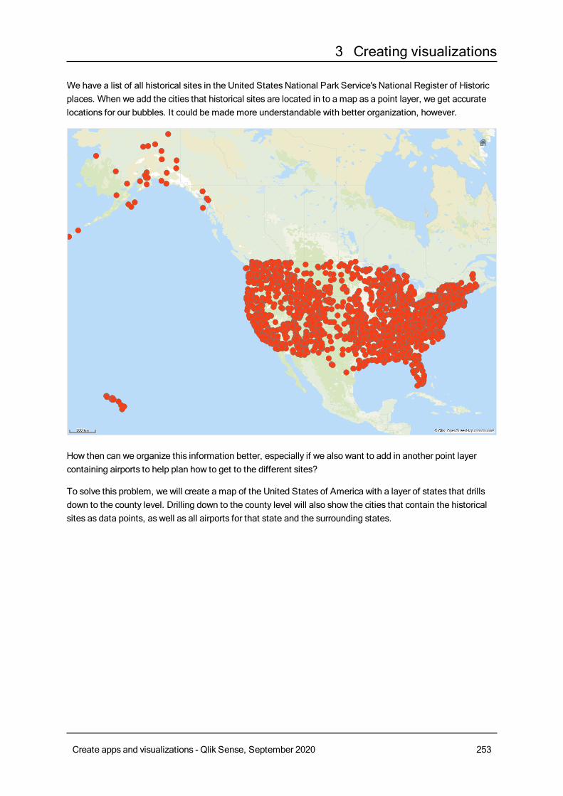
3 Creating visualizations
We have a list of all historical sites in the United States National Park Service's National Register of Historicplaces. When we add the cities that historical sites are located in to a map as a point layer, we get accuratelocations for our bubbles. It could be made more understandable with better organization, however.
How then can we organize this information better, especially if we also want to add in another point layercontaining airports to help plan how to get to the different sites?
To solve this problem, we will create a map of the United States of America with a layer of states that drillsdown to the county level. Drilling down to the county level will also show the cities that contain the historicalsites as data points, as well as all airports for that state and the surrounding states.
Create apps and visualizations - Qlik Sense, September 2020 253
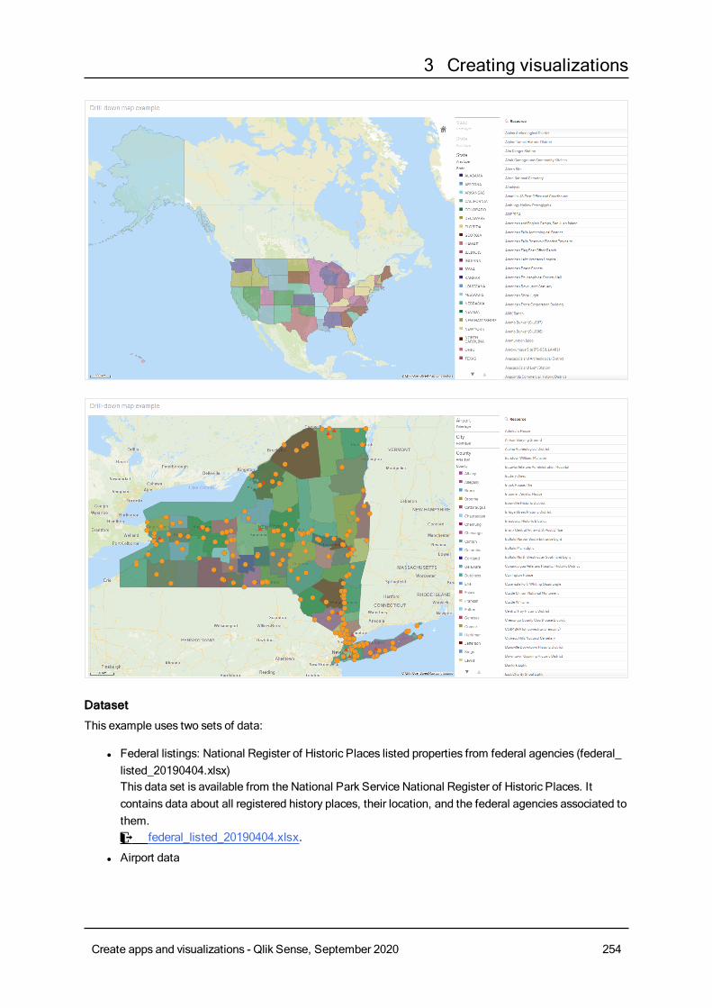
3 Creating visualizations
Dataset
This example uses two sets of data:
l Federal listings: National Register of Historic Places listed properties from federal agencies (federal_listed_20190404.xlsx)This data set is available from the National Park Service National Register of Historic Places. Itcontains data about all registered history places, their location, and the federal agencies associated tothem.≤ federal_listed_20190404.xlsx.
l Airport data
Create apps and visualizations - Qlik Sense, September 2020 254
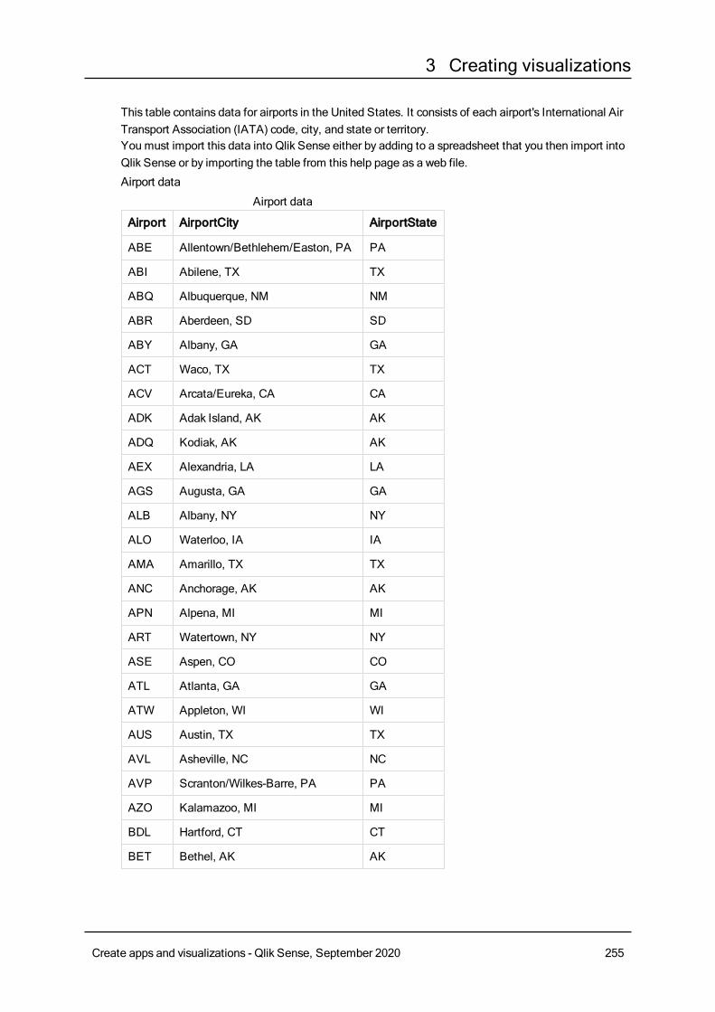
3 Creating visualizations
This table contains data for airports in the United States. It consists of each airport's International AirTransport Association (IATA) code, city, and state or territory.You must import this data into Qlik Sense either by adding to a spreadsheet that you then import intoQlik Sense or by importing the table from this help page as a web file.
Airport data
Airport AirportCity AirportState
ABE Allentown/Bethlehem/Easton, PA PA
ABI Abilene, TX TX
ABQ Albuquerque, NM NM
ABR Aberdeen, SD SD
ABY Albany, GA GA
ACT Waco, TX TX
ACV Arcata/Eureka, CA CA
ADK Adak Island, AK AK
ADQ Kodiak, AK AK
AEX Alexandria, LA LA
AGS Augusta, GA GA
ALB Albany, NY NY
ALO Waterloo, IA IA
AMA Amarillo, TX TX
ANC Anchorage, AK AK
APN Alpena, MI MI
ART Watertown, NY NY
ASE Aspen, CO CO
ATL Atlanta, GA GA
ATW Appleton, WI WI
AUS Austin, TX TX
AVL Asheville, NC NC
AVP Scranton/Wilkes-Barre, PA PA
AZO Kalamazoo, MI MI
BDL Hartford, CT CT
BET Bethel, AK AK
Airport data
Create apps and visualizations - Qlik Sense, September 2020 255
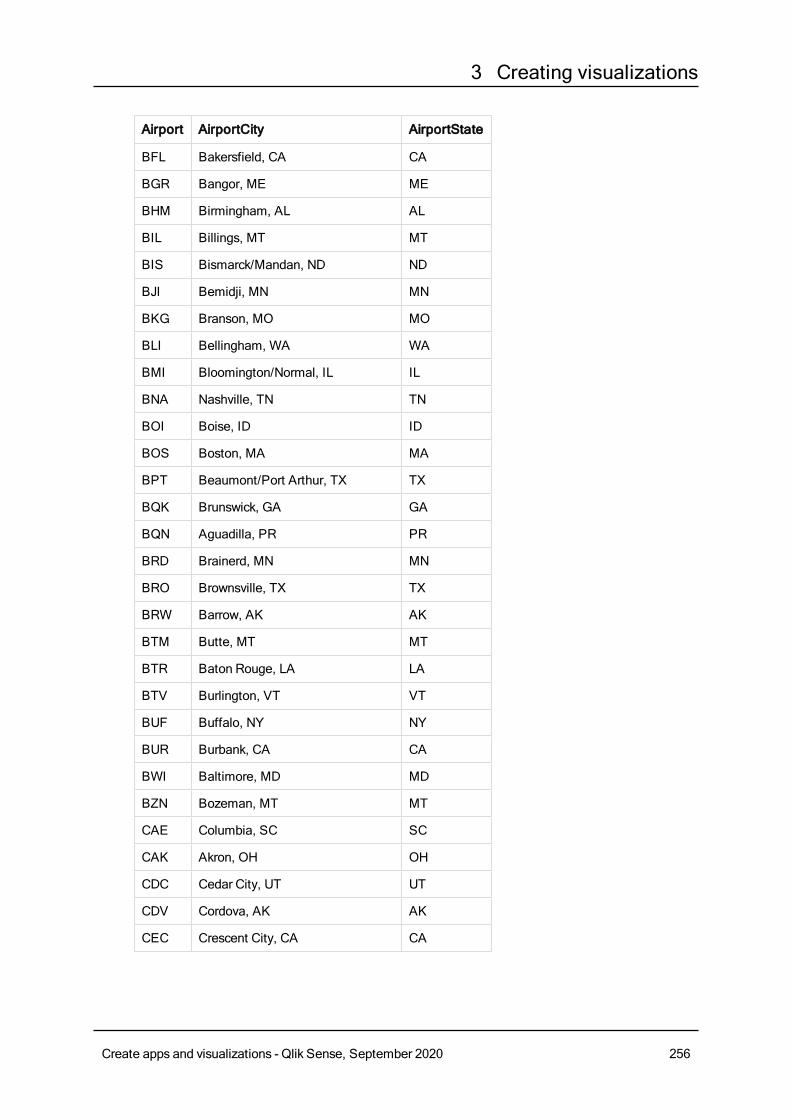
3 Creating visualizations
Airport AirportCity AirportState
BFL Bakersfield, CA CA
BGR Bangor, ME ME
BHM Birmingham, AL AL
BIL Billings, MT MT
BIS Bismarck/Mandan, ND ND
BJI Bemidji, MN MN
BKG Branson, MO MO
BLI Bellingham, WA WA
BMI Bloomington/Normal, IL IL
BNA Nashville, TN TN
BOI Boise, ID ID
BOS Boston, MA MA
BPT Beaumont/Port Arthur, TX TX
BQK Brunswick, GA GA
BQN Aguadilla, PR PR
BRD Brainerd, MN MN
BRO Brownsville, TX TX
BRW Barrow, AK AK
BTM Butte, MT MT
BTR Baton Rouge, LA LA
BTV Burlington, VT VT
BUF Buffalo, NY NY
BUR Burbank, CA CA
BWI Baltimore, MD MD
BZN Bozeman, MT MT
CAE Columbia, SC SC
CAK Akron, OH OH
CDC Cedar City, UT UT
CDV Cordova, AK AK
CEC Crescent City, CA CA
Create apps and visualizations - Qlik Sense, September 2020 256

3 Creating visualizations
Airport AirportCity AirportState
CHA Chattanooga, TN TN
CHO Charlottesville, VA VA
CHS Charleston, SC SC
CIC Chico, CA CA
CID Cedar Rapids/Iowa City, IA IA
CLD Carlsbad, CA CA
CLE Cleveland, OH OH
CLL College Station/Bryan, TX TX
CLT Charlotte, NC NC
CMH Columbus, OH OH
CMI Champaign/Urbana, IL IL
CMX Hancock/Houghton, MI MI
COD Cody, WY WY
COS Colorado Springs, CO CO
COU Columbia, MO MO
CPR Casper, WY WY
CRP Corpus Christi, TX TX
CRW Charleston/Dunbar, WV WV
CSG Columbus, GA GA
CWA Mosinee, WI WI
CVG Cincinnati, OH KY
DAB Daytona Beach, FL FL
DAL Dallas, TX TX
DAY Dayton, OH OH
DBQ Dubuque, IA IA
DCA Washington, DC VA
DEN Denver, CO CO
DFW Dallas/Fort Worth, TX TX
DHN Dothan, AL AL
DIK Dickinson, ND ND
Create apps and visualizations - Qlik Sense, September 2020 257
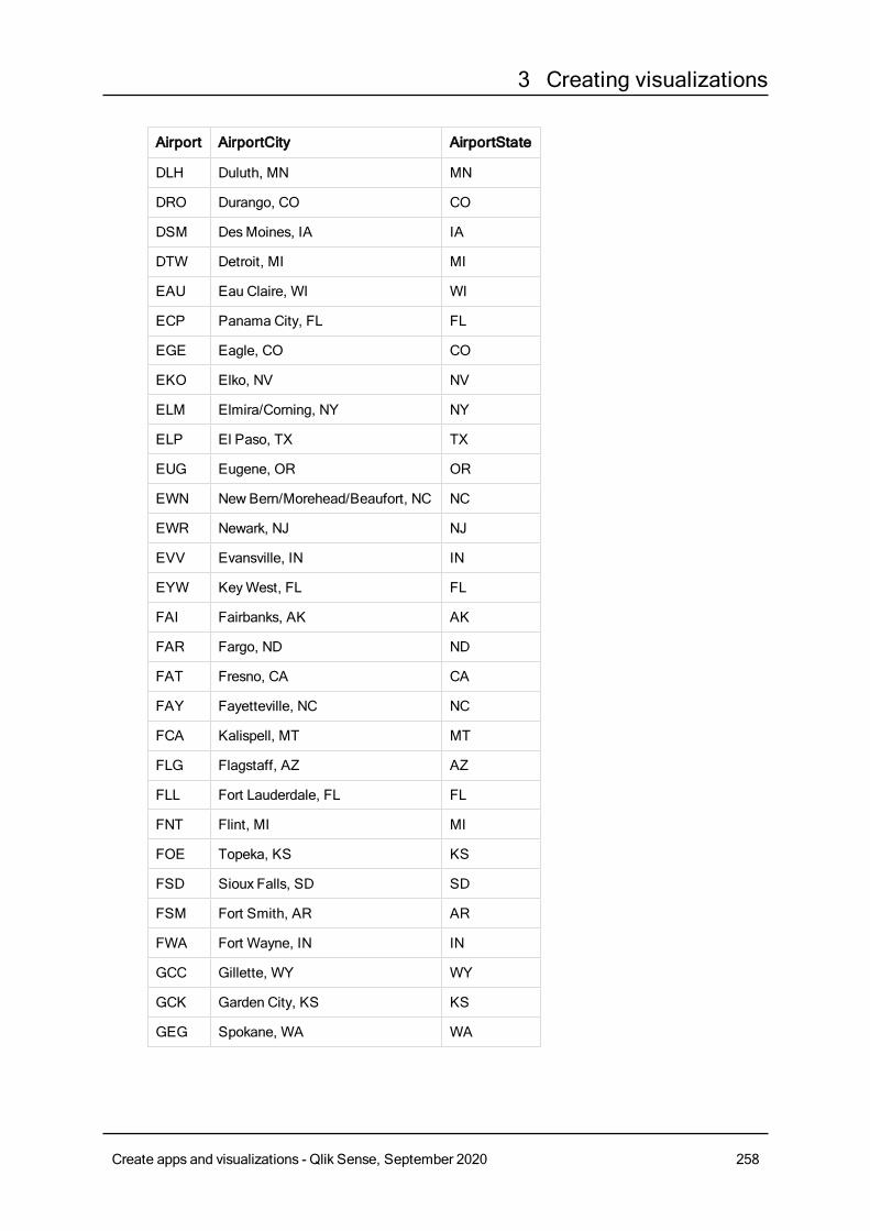
3 Creating visualizations
Airport AirportCity AirportState
DLH Duluth, MN MN
DRO Durango, CO CO
DSM DesMoines, IA IA
DTW Detroit, MI MI
EAU Eau Claire, WI WI
ECP Panama City, FL FL
EGE Eagle, CO CO
EKO Elko, NV NV
ELM Elmira/Corning, NY NY
ELP El Paso, TX TX
EUG Eugene, OR OR
EWN NewBern/Morehead/Beaufort, NC NC
EWR Newark, NJ NJ
EVV Evansville, IN IN
EYW KeyWest, FL FL
FAI Fairbanks, AK AK
FAR Fargo, ND ND
FAT Fresno, CA CA
FAY Fayetteville, NC NC
FCA Kalispell, MT MT
FLG Flagstaff, AZ AZ
FLL Fort Lauderdale, FL FL
FNT Flint, MI MI
FOE Topeka, KS KS
FSD Sioux Falls, SD SD
FSM Fort Smith, AR AR
FWA Fort Wayne, IN IN
GCC Gillette, WY WY
GCK Garden City, KS KS
GEG Spokane, WA WA
Create apps and visualizations - Qlik Sense, September 2020 258
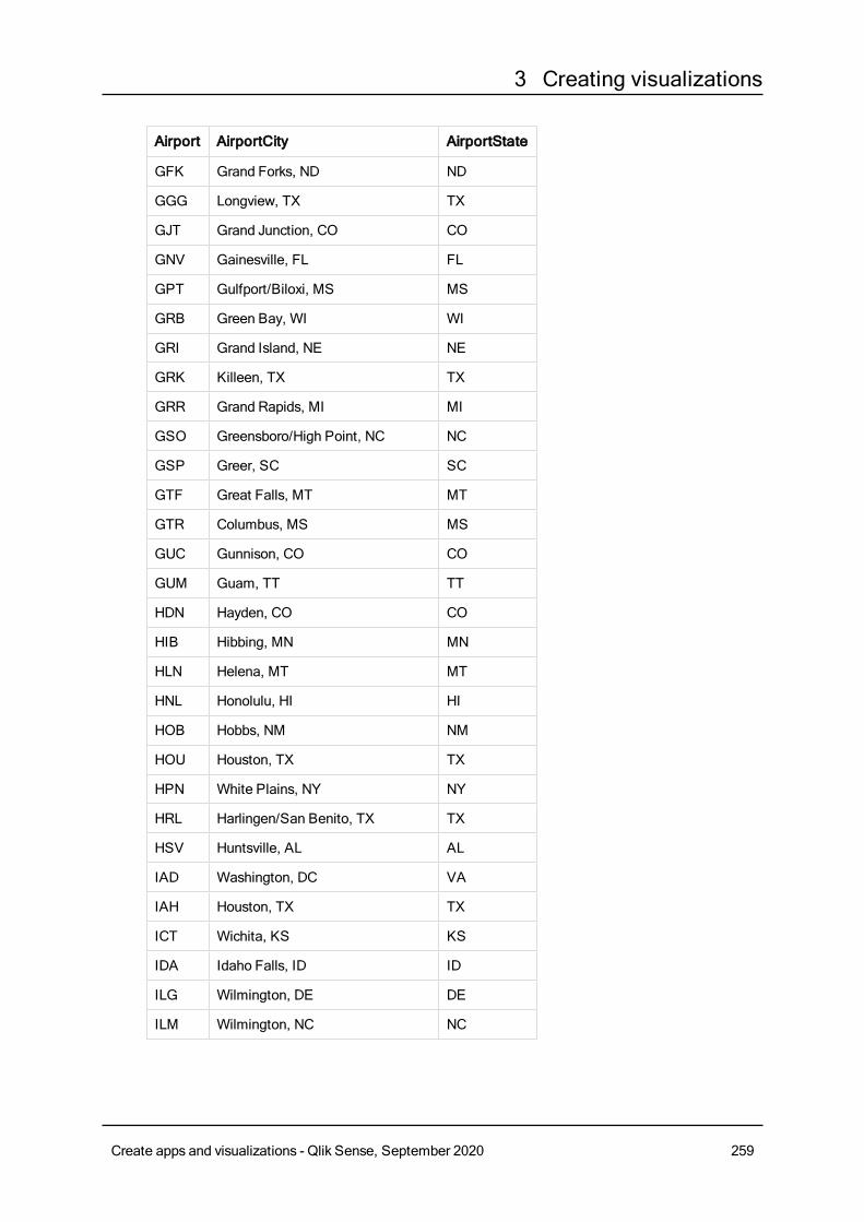
3 Creating visualizations
Airport AirportCity AirportState
GFK Grand Forks, ND ND
GGG Longview, TX TX
GJT Grand Junction, CO CO
GNV Gainesville, FL FL
GPT Gulfport/Biloxi, MS MS
GRB Green Bay, WI WI
GRI Grand Island, NE NE
GRK Killeen, TX TX
GRR Grand Rapids, MI MI
GSO Greensboro/High Point, NC NC
GSP Greer, SC SC
GTF Great Falls, MT MT
GTR Columbus, MS MS
GUC Gunnison, CO CO
GUM Guam, TT TT
HDN Hayden, CO CO
HIB Hibbing, MN MN
HLN Helena, MT MT
HNL Honolulu, HI HI
HOB Hobbs, NM NM
HOU Houston, TX TX
HPN White Plains, NY NY
HRL Harlingen/San Benito, TX TX
HSV Huntsville, AL AL
IAD Washington, DC VA
IAH Houston, TX TX
ICT Wichita, KS KS
IDA Idaho Falls, ID ID
ILG Wilmington, DE DE
ILM Wilmington, NC NC
Create apps and visualizations - Qlik Sense, September 2020 259
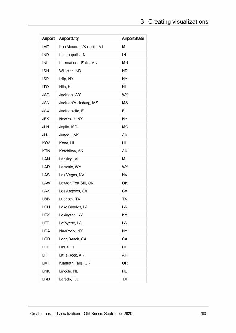
3 Creating visualizations
Airport AirportCity AirportState
IMT Iron Mountain/Kingsfd, MI MI
IND Indianapolis, IN IN
INL International Falls, MN MN
ISN Williston, ND ND
ISP Islip, NY NY
ITO Hilo, HI HI
JAC Jackson, WY WY
JAN Jackson/Vicksburg, MS MS
JAX Jacksonville, FL FL
JFK New York, NY NY
JLN Joplin, MO MO
JNU Juneau, AK AK
KOA Kona, HI HI
KTN Ketchikan, AK AK
LAN Lansing, MI MI
LAR Laramie, WY WY
LAS Las Vegas, NV NV
LAW Lawton/Fort Sill, OK OK
LAX Los Angeles, CA CA
LBB Lubbock, TX TX
LCH Lake Charles, LA LA
LEX Lexington, KY KY
LFT Lafayette, LA LA
LGA New York, NY NY
LGB Long Beach, CA CA
LIH Lihue, HI HI
LIT Little Rock, AR AR
LMT Klamath Falls, OR OR
LNK Lincoln, NE NE
LRD Laredo, TX TX
Create apps and visualizations - Qlik Sense, September 2020 260
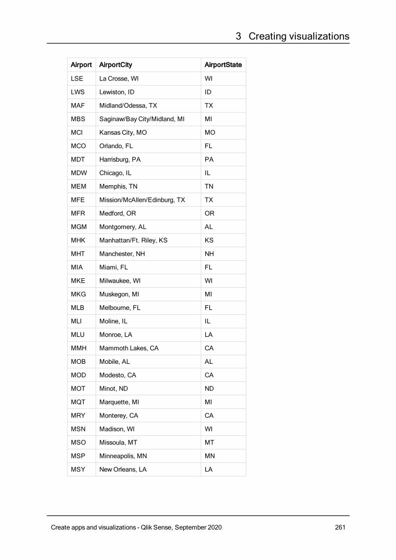
3 Creating visualizations
Airport AirportCity AirportState
LSE La Crosse, WI WI
LWS Lewiston, ID ID
MAF Midland/Odessa, TX TX
MBS Saginaw/Bay City/Midland, MI MI
MCI Kansas City, MO MO
MCO Orlando, FL FL
MDT Harrisburg, PA PA
MDW Chicago, IL IL
MEM Memphis, TN TN
MFE Mission/McAllen/Edinburg, TX TX
MFR Medford, OR OR
MGM Montgomery, AL AL
MHK Manhattan/Ft. Riley, KS KS
MHT Manchester, NH NH
MIA Miami, FL FL
MKE Milwaukee, WI WI
MKG Muskegon, MI MI
MLB Melbourne, FL FL
MLI Moline, IL IL
MLU Monroe, LA LA
MMH Mammoth Lakes, CA CA
MOB Mobile, AL AL
MOD Modesto, CA CA
MOT Minot, ND ND
MQT Marquette, MI MI
MRY Monterey, CA CA
MSN Madison, WI WI
MSO Missoula, MT MT
MSP Minneapolis, MN MN
MSY NewOrleans, LA LA
Create apps and visualizations - Qlik Sense, September 2020 261
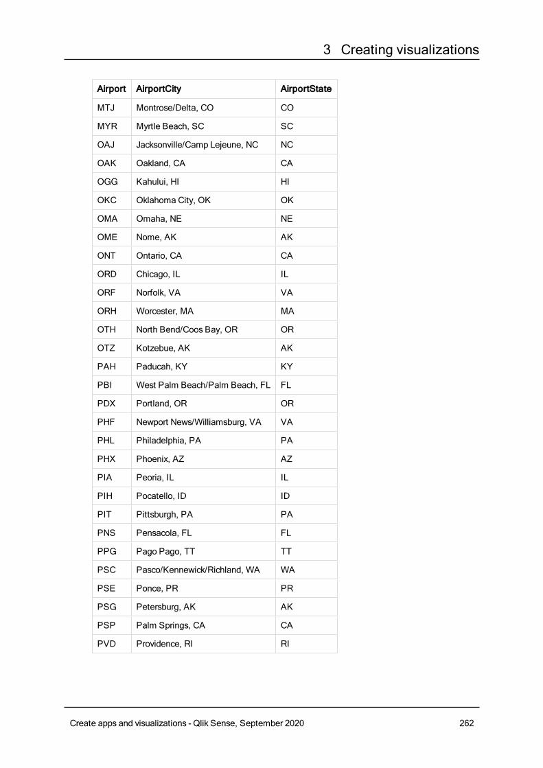
3 Creating visualizations
Airport AirportCity AirportState
MTJ Montrose/Delta, CO CO
MYR Myrtle Beach, SC SC
OAJ Jacksonville/Camp Lejeune, NC NC
OAK Oakland, CA CA
OGG Kahului, HI HI
OKC Oklahoma City, OK OK
OMA Omaha, NE NE
OME Nome, AK AK
ONT Ontario, CA CA
ORD Chicago, IL IL
ORF Norfolk, VA VA
ORH Worcester, MA MA
OTH North Bend/Coos Bay, OR OR
OTZ Kotzebue, AK AK
PAH Paducah, KY KY
PBI West Palm Beach/Palm Beach, FL FL
PDX Portland, OR OR
PHF Newport News/Williamsburg, VA VA
PHL Philadelphia, PA PA
PHX Phoenix, AZ AZ
PIA Peoria, IL IL
PIH Pocatello, ID ID
PIT Pittsburgh, PA PA
PNS Pensacola, FL FL
PPG Pago Pago, TT TT
PSC Pasco/Kennewick/Richland, WA WA
PSE Ponce, PR PR
PSG Petersburg, AK AK
PSP Palm Springs, CA CA
PVD Providence, RI RI
Create apps and visualizations - Qlik Sense, September 2020 262
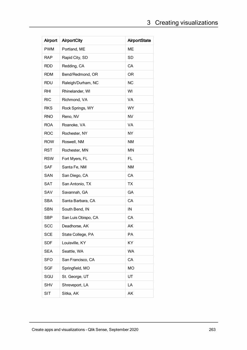
3 Creating visualizations
Airport AirportCity AirportState
PWM Portland, ME ME
RAP Rapid City, SD SD
RDD Redding, CA CA
RDM Bend/Redmond, OR OR
RDU Raleigh/Durham, NC NC
RHI Rhinelander, WI WI
RIC Richmond, VA VA
RKS Rock Springs, WY WY
RNO Reno, NV NV
ROA Roanoke, VA VA
ROC Rochester, NY NY
ROW Roswell, NM NM
RST Rochester, MN MN
RSW Fort Myers, FL FL
SAF Santa Fe, NM NM
SAN San Diego, CA CA
SAT San Antonio, TX TX
SAV Savannah, GA GA
SBA Santa Barbara, CA CA
SBN South Bend, IN IN
SBP San Luis Obispo, CA CA
SCC Deadhorse, AK AK
SCE State College, PA PA
SDF Louisville, KY KY
SEA Seattle, WA WA
SFO San Francisco, CA CA
SGF Springfield, MO MO
SGU St. George, UT UT
SHV Shreveport, LA LA
SIT Sitka, AK AK
Create apps and visualizations - Qlik Sense, September 2020 263
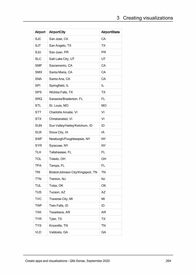
3 Creating visualizations
Airport AirportCity AirportState
SJC San Jose, CA CA
SJT San Angelo, TX TX
SJU San Juan, PR PR
SLC Salt Lake City, UT UT
SMF Sacramento, CA CA
SMX Santa Maria, CA CA
SNA Santa Ana, CA CA
SPI Springfield, IL IL
SPS Wichita Falls, TX TX
SRQ Sarasota/Bradenton, FL FL
STL St. Louis, MO MO
STT Charlotte Amalie, VI VI
STX Christiansted, VI VI
SUN Sun Valley/Hailey/Ketchum, ID ID
SUX Sioux City, IA IA
SWF Newburgh/Poughkeepsie, NY NY
SYR Syracuse, NY NY
TLH Tallahassee, FL FL
TOL Toledo, OH OH
TPA Tampa, FL FL
TRI Bristol/Johnson City/Kingsport, TN TN
TTN Trenton, NJ NJ
TUL Tulsa, OK OK
TUS Tucson, AZ AZ
TVC Traverse City, MI MI
TWF Twin Falls, ID ID
TXK Texarkana, AR AR
TYR Tyler, TX TX
TYS Knoxville, TN TN
VLD Valdosta, GA GA
Create apps and visualizations - Qlik Sense, September 2020 264
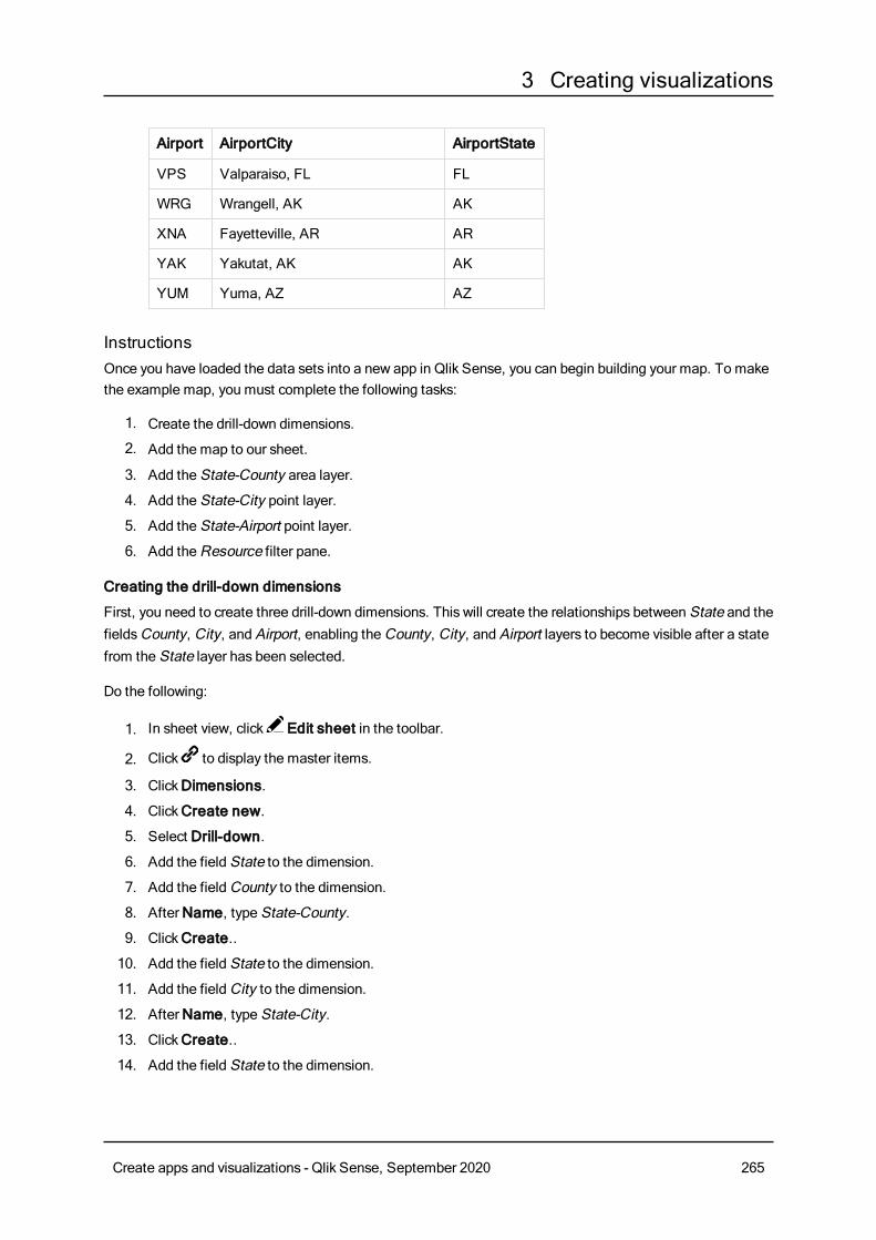
3 Creating visualizations
Airport AirportCity AirportState
VPS Valparaiso, FL FL
WRG Wrangell, AK AK
XNA Fayetteville, AR AR
YAK Yakutat, AK AK
YUM Yuma, AZ AZ
InstructionsOnce you have loaded the data sets into a new app in Qlik Sense, you can begin building your map. To makethe example map, you must complete the following tasks:
1. Create the drill-down dimensions.
2. Add the map to our sheet.
3. Add the State-County area layer.
4. Add the State-City point layer.
5. Add the State-Airport point layer.
6. Add theResource filter pane.
Creating the drill-down dimensions
First, you need to create three drill-down dimensions. This will create the relationships between State and thefieldsCounty, City, and Airport, enabling theCounty, City, and Airport layers to become visible after a statefrom the State layer has been selected.
Do the following:
1. In sheet view, click Edit sheet in the toolbar.
2. Click to display the master items.
3. ClickDimensions.
4. ClickCreate new.
5. Select Drill-down.
6. Add the field State to the dimension.
7. Add the fieldCounty to the dimension.
8. AfterName, type State-County.
9. ClickCreate..
10. Add the field State to the dimension.
11. Add the fieldCity to the dimension.
12. AfterName, type State-City.
13. ClickCreate..
14. Add the field State to the dimension.
Create apps and visualizations - Qlik Sense, September 2020 265
3 Creating visualizations
15. Add the field Airport to the dimension.
16. AfterName, type State-Airport.
17. ClickCreate..
18. Click Done editing.
Adding the map to the sheet
The next step is to add a map to your sheet..
Do the following:
1. In sheet view, click Edit sheet in the toolbar.
2. From the assets panel, drag an emptymap to the sheet.
Adding the State-County area layer
The first layer you add is an area layer to which you add the dimension State-County. In addition, you set thecountry as 'USA' to ensure we map to the state of Georgia rather than the nation of Georgia.
Do the following:
1. From Layers in the properties panel, clickAdd layer.
2. Select Area layer.
3. InDimensions, clickAdd and select State-County.
4. Click Location.
5. Set Scope for locations toCustom.
6. AfterCountry, enter 'USA'.
7. After Administrative area (Level 1), select State.
8. ClickColors.
9. Set Colors toCustom, select By dimension, and select 100 colors.
10. Select Persistent colors.
11. Adjust theOpacity slider to half opacity.
12. Click Done editing.
Adding the State-City point layer
The next layer you add is a point layer. You add State-City as the dimension and then set the country as'USA' and then set State as the first-level administrative area, as some counties cities in different stateshave the same names.
Do the following:
1. From Layers in the properties panel, clickAdd layer.
2. Select Area layer.
3. InDimensions, clickAdd and select State-City.
4. Click Location.
Create apps and visualizations - Qlik Sense, September 2020 266
3 Creating visualizations
5. Set Scope for locations toCustom.
6. AfterCountry, enter 'USA'.
7. After Administrative area (Level 1), select State.
8. ClickColors.
9. Set Colors toCustom, select Single color, and select a color.
10. ClickOptions.
11. In Layer display, set Visible drill-down levels toCustom.
12. Clear State.
13. Click Done editing.
Adding the State-Airport point layer
The final layer you add to the map is a point layer to which you add the State-Airport field as the dimension.Qlik Sense recognizes IATA codes for placement, ensuring the airports are located in their actual positionrather than just in their city.
Do the following:
1. From Layers in the properties panel, clickAdd layer.
2. Select Area layer.
3. InDimensions, clickAdd and select State-Airport.
4. Click Location.
5. Set Scope for locations toCustom.
6. AfterCountry, enter 'USA'.
7. After Administrative area (Level 1), select State.
8. ClickSize & Shape.
9. From Shape, select Triangle.
10. ClickColors.
11. Set Colors toCustom, select Single color, and select a color.
12. ClickOptions.
13. In Layer display, set Visible drill-down levels toCustom.
14. Clear State.
15. Click Done editing.
Add the Resource filter pane
Finally, you can optionally add a filter pane containing the fieldResource. This provides you with a list of theavailable historical sites as you make selections within your map.
Do the following:
1. In the assets panel, drag and drop a filter pane into the sheet.
2. ClickAdd dimension.
3. Add a filter pane containing the fieldResource.
Create apps and visualizations - Qlik Sense, September 2020 267
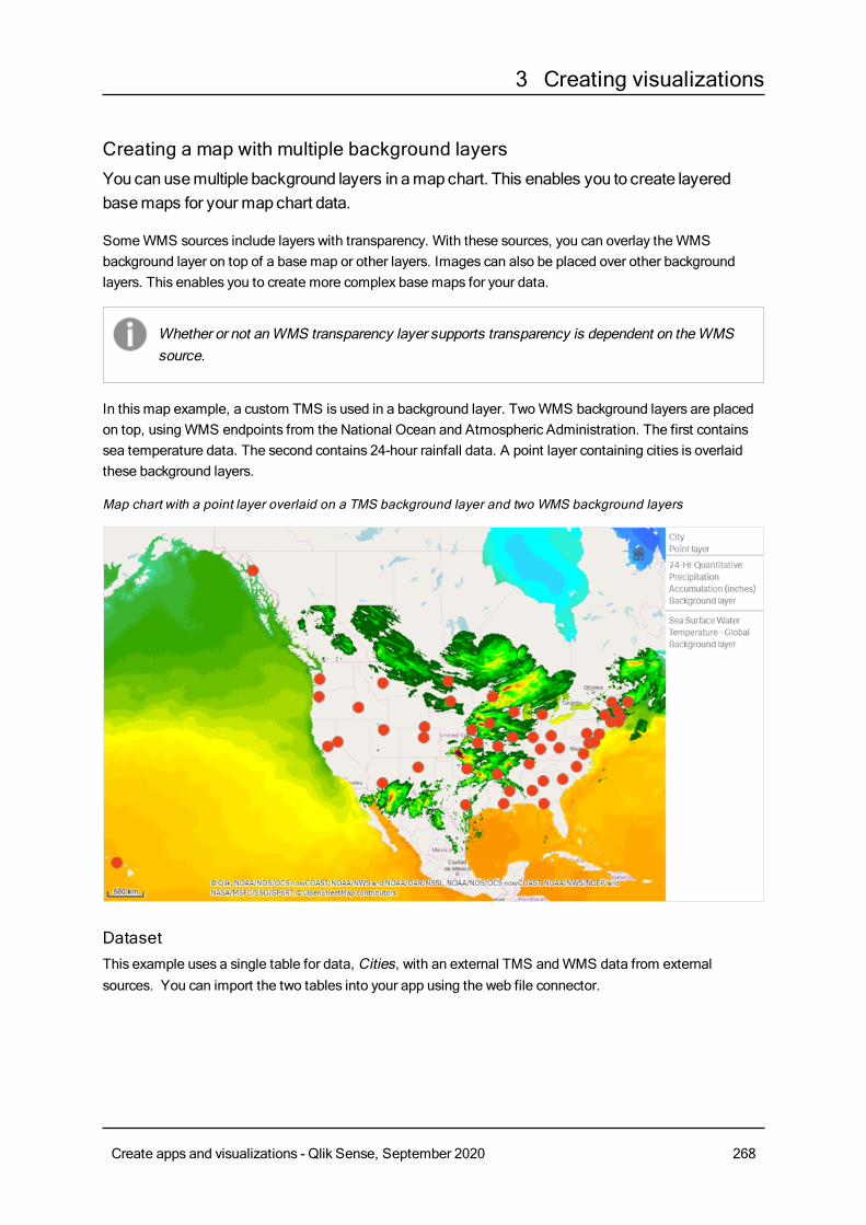
3 Creating visualizations
Creating a map with multiple background layersYou canusemultiple background layers in amap chart. This enables you to create layeredbasemaps for your map chart data.
SomeWMS sources include layers with transparency. With these sources, you can overlay theWMSbackground layer on top of a base map or other layers. Images can also be placed over other backgroundlayers. This enables you to create more complex base maps for your data.
Whether or not anWMS transparency layer supports transparency is dependent on theWMSsource.
In this map example, a custom TMS is used in a background layer. TwoWMS background layers are placedon top, usingWMS endpoints from the National Ocean and Atmospheric Administration. The first containssea temperature data. The second contains 24-hour rainfall data. A point layer containing cities is overlaidthese background layers.
Map chart with a point layer overlaid on a TMS background layer and two WMS background layers
DatasetThis example uses a single table for data, Cities, with an external TMS andWMS data from externalsources. You can import the two tables into your app using the web file connector.
Create apps and visualizations - Qlik Sense, September 2020 268
3 Creating visualizations
Cities
Cities
Albany, New York
Annapolis, Maryland
Atlanta, Georgia
Augusta, Maine
Austin, Texas
Baton Rouge, Louisiana
Bismarck, North Dakota
Boise, Idaho
Boston, Massachusetts
Carson City, Nevada
Charleston, West Virginia
Cheyenne, Wyoming
Columbia, South Carolina
Columbus, Ohio
Concord, NewHampshire
Denver, Colorado
DesMoines, Iowa
Dover, Delaware
Frankfort, Kentucky
Harrisburg, Pennsylvania
Hartford, Connecticut
Helena, Montana
Honolulu, Hawaii
Indianapolis, Indiana
Jackson, Mississippi
Jefferson City, Missouri
Juneau, Alaska
Lansing, Michigan
Cities
Create apps and visualizations - Qlik Sense, September 2020 269
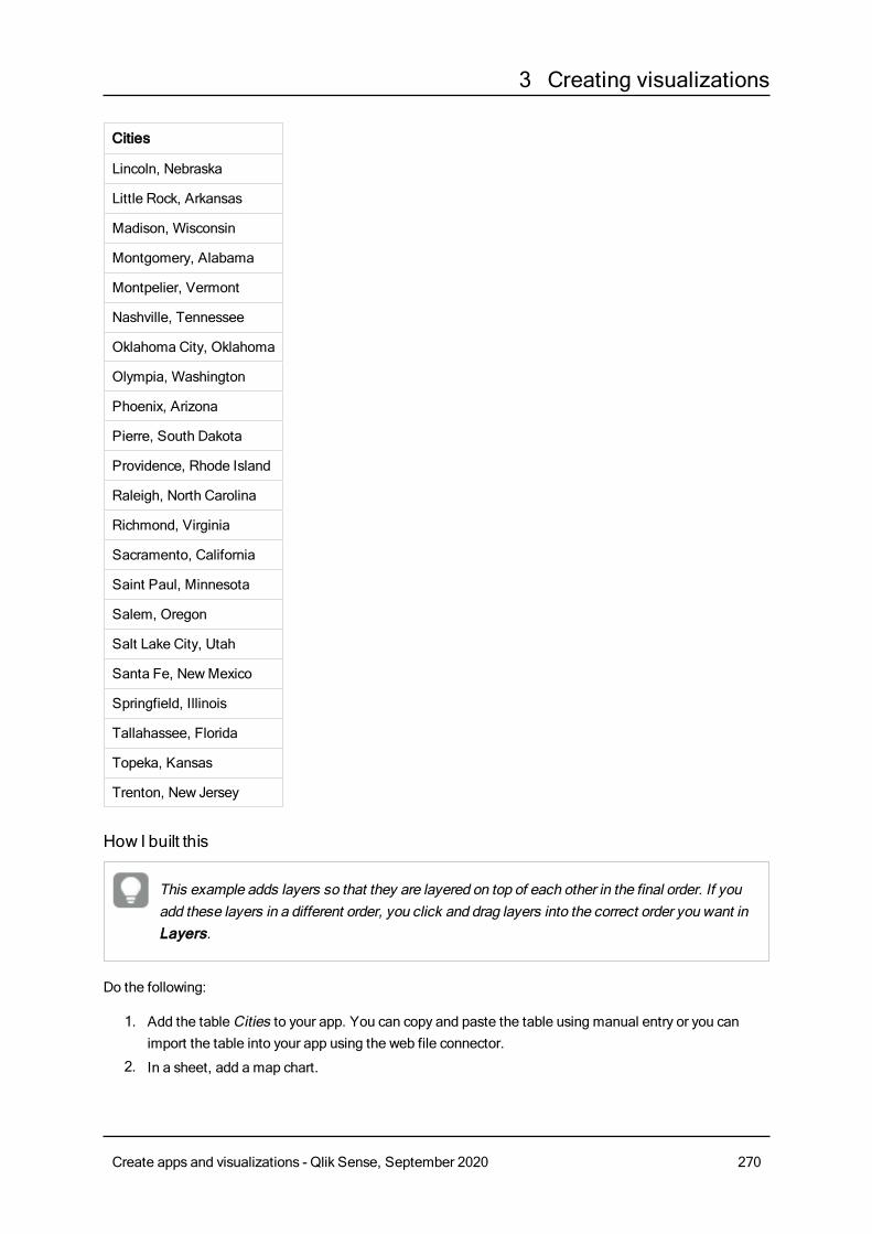
3 Creating visualizations
Cities
Lincoln, Nebraska
Little Rock, Arkansas
Madison, Wisconsin
Montgomery, Alabama
Montpelier, Vermont
Nashville, Tennessee
Oklahoma City, Oklahoma
Olympia, Washington
Phoenix, Arizona
Pierre, South Dakota
Providence, Rhode Island
Raleigh, North Carolina
Richmond, Virginia
Sacramento, California
Saint Paul, Minnesota
Salem, Oregon
Salt Lake City, Utah
Santa Fe, NewMexico
Springfield, Illinois
Tallahassee, Florida
Topeka, Kansas
Trenton, New Jersey
How I built this
This example adds layers so that they are layered on top of each other in the final order. If youadd these layers in a different order, you click and drag layers into the correct order you want inLayers.
Do the following:
1. Add the tableCities to your app. You can copy and paste the table using manual entry or you canimport the table into your app using the web file connector.
2. In a sheet, add a map chart.
Create apps and visualizations - Qlik Sense, September 2020 270
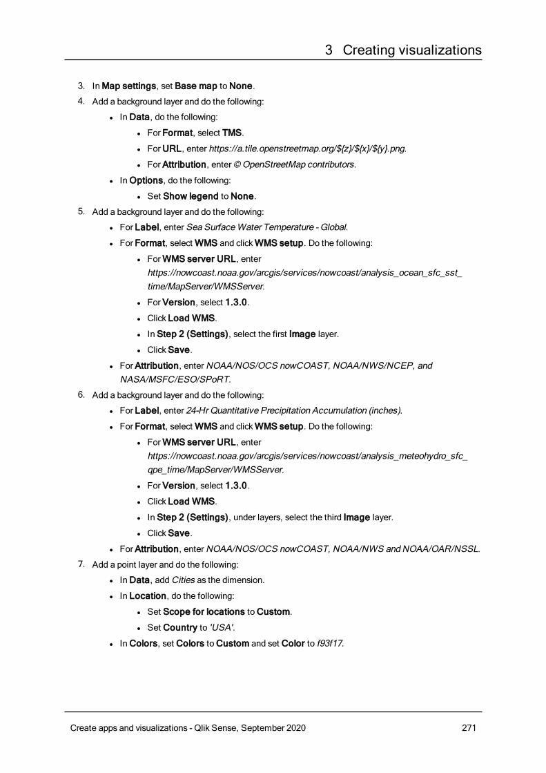
3 Creating visualizations
3. InMap settings, set Base map toNone.
4. Add a background layer and do the following:
l InData, do the following:
l For Format, select TMS.
l ForURL, enter https://a.tile.openstreetmap.org/${z}/${x}/${y}.png.
l For Attribution, enter© OpenStreetMap contributors.
l In Options, do the following:
l Set Show legend toNone.
5. Add a background layer and do the following:
l For Label, enter Sea SurfaceWater Temperature - Global.
l For Format, selectWMS and clickWMS setup. Do the following:
l ForWMS server URL, enterhttps://nowcoast.noaa.gov/arcgis/services/nowcoast/analysis_ocean_sfc_sst_time/MapServer/WMSServer.
l For Version, select 1.3.0.
l Click Load WMS.
l In Step 2 (Settings), select the first Image layer.
l ClickSave.
l For Attribution, enterNOAA/NOS/OCS nowCOAST, NOAA/NWS/NCEP, andNASA/MSFC/ESO/SPoRT.
6. Add a background layer and do the following:
l For Label, enter 24-Hr Quantitative Precipitation Accumulation (inches).
l For Format, selectWMS and clickWMS setup. Do the following:
l ForWMS server URL, enterhttps://nowcoast.noaa.gov/arcgis/services/nowcoast/analysis_meteohydro_sfc_qpe_time/MapServer/WMSServer.
l For Version, select 1.3.0.
l Click Load WMS.
l In Step 2 (Settings), under layers, select the third Image layer.
l ClickSave.
l For Attribution, enterNOAA/NOS/OCS nowCOAST, NOAA/NWS andNOAA/OAR/NSSL.
7. Add a point layer and do the following:
l InData, addCities as the dimension.
l In Location, do the following:
l Set Scope for locations toCustom.
l Set Country to 'USA'.
l InColors, set Colors toCustom and set Color to f93f17.
Create apps and visualizations - Qlik Sense, September 2020 271
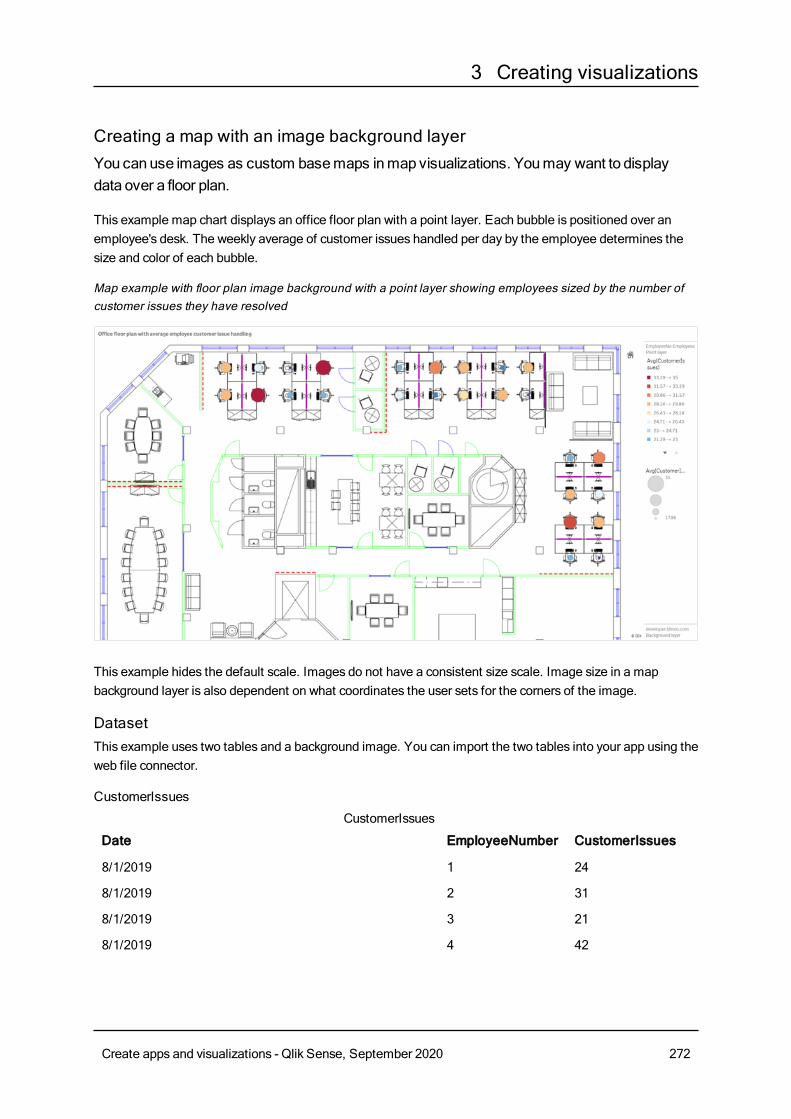
3 Creating visualizations
Creating a map with an image background layerYou canuse images as custom basemaps inmap visualizations. Youmay want to displaydata over a floor plan.
This example map chart displays an office floor plan with a point layer. Each bubble is positioned over anemployee's desk. The weekly average of customer issues handled per day by the employee determines thesize and color of each bubble.
Map example with floor plan image background with a point layer showing employees sized by the number ofcustomer issues they have resolved
This example hides the default scale. Images do not have a consistent size scale. Image size in a mapbackground layer is also dependent on what coordinates the user sets for the corners of the image.
DatasetThis example uses two tables and a background image. You can import the two tables into your app using theweb file connector.
CustomerIssues
Date EmployeeNumber CustomerIssues
8/1/2019 1 24
8/1/2019 2 31
8/1/2019 3 21
8/1/2019 4 42
CustomerIssues
Create apps and visualizations - Qlik Sense, September 2020 272
3 Creating visualizations
Date EmployeeNumber CustomerIssues
8/1/2019 5 24
8/1/2019 6 40
8/1/2019 7 40
8/1/2019 8 19
8/1/2019 9 23
8/1/2019 10 47
8/1/2019 11 38
8/1/2019 12 21
8/1/2019 13 22
8/1/2019 14 15
8/1/2019 15 30
8/1/2019 16 46
8/1/2019 17 41
8/1/2019 18 31
8/1/2019 19 50
8/1/2019 20 27
8/1/2019 21 35
8/1/2019 22 38
8/1/2019 23 37
8/1/2019 24 31
8/1/2019 25 13
8/1/2019 26 11
8/2/2019 1 35
8/2/2019 2 31
8/2/2019 3 33
8/2/2019 4 14
8/2/2019 5 24
8/2/2019 6 33
8/2/2019 7 40
8/2/2019 8 14
8/2/2019 9 44
Create apps and visualizations - Qlik Sense, September 2020 273
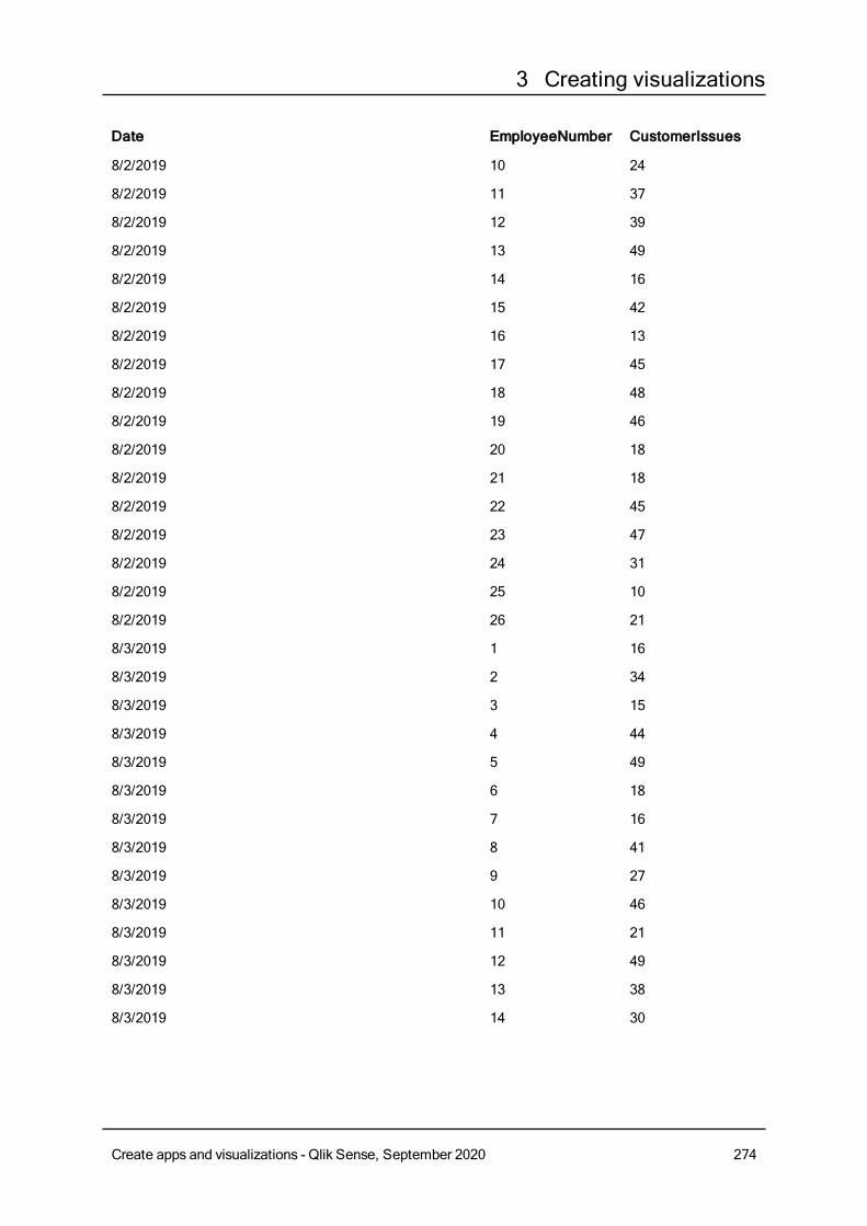
3 Creating visualizations
Date EmployeeNumber CustomerIssues
8/2/2019 10 24
8/2/2019 11 37
8/2/2019 12 39
8/2/2019 13 49
8/2/2019 14 16
8/2/2019 15 42
8/2/2019 16 13
8/2/2019 17 45
8/2/2019 18 48
8/2/2019 19 46
8/2/2019 20 18
8/2/2019 21 18
8/2/2019 22 45
8/2/2019 23 47
8/2/2019 24 31
8/2/2019 25 10
8/2/2019 26 21
8/3/2019 1 16
8/3/2019 2 34
8/3/2019 3 15
8/3/2019 4 44
8/3/2019 5 49
8/3/2019 6 18
8/3/2019 7 16
8/3/2019 8 41
8/3/2019 9 27
8/3/2019 10 46
8/3/2019 11 21
8/3/2019 12 49
8/3/2019 13 38
8/3/2019 14 30
Create apps and visualizations - Qlik Sense, September 2020 274

3 Creating visualizations
Date EmployeeNumber CustomerIssues
8/3/2019 15 48
8/3/2019 16 17
8/3/2019 17 42
8/3/2019 18 48
8/3/2019 19 44
8/3/2019 20 44
8/3/2019 21 12
8/3/2019 22 44
8/3/2019 23 17
8/3/2019 24 24
8/3/2019 25 25
8/3/2019 26 33
8/4/2019 1 20
8/4/2019 2 45
8/4/2019 3 32
8/4/2019 4 37
8/4/2019 5 32
8/4/2019 6 50
8/4/2019 7 41
8/4/2019 8 14
8/4/2019 9 37
8/4/2019 10 39
8/4/2019 11 28
8/4/2019 12 35
8/4/2019 13 24
8/4/2019 14 19
8/4/2019 15 25
8/4/2019 16 26
8/4/2019 17 23
8/4/2019 18 45
8/4/2019 19 48
Create apps and visualizations - Qlik Sense, September 2020 275
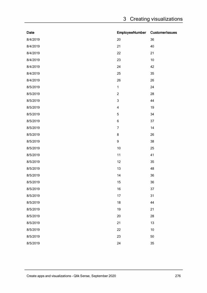
3 Creating visualizations
Date EmployeeNumber CustomerIssues
8/4/2019 20 36
8/4/2019 21 40
8/4/2019 22 21
8/4/2019 23 10
8/4/2019 24 42
8/4/2019 25 35
8/4/2019 26 26
8/5/2019 1 24
8/5/2019 2 28
8/5/2019 3 44
8/5/2019 4 19
8/5/2019 5 34
8/5/2019 6 37
8/5/2019 7 14
8/5/2019 8 26
8/5/2019 9 38
8/5/2019 10 25
8/5/2019 11 41
8/5/2019 12 35
8/5/2019 13 48
8/5/2019 14 36
8/5/2019 15 36
8/5/2019 16 37
8/5/2019 17 31
8/5/2019 18 44
8/5/2019 19 21
8/5/2019 20 28
8/5/2019 21 13
8/5/2019 22 10
8/5/2019 23 50
8/5/2019 24 35
Create apps and visualizations - Qlik Sense, September 2020 276
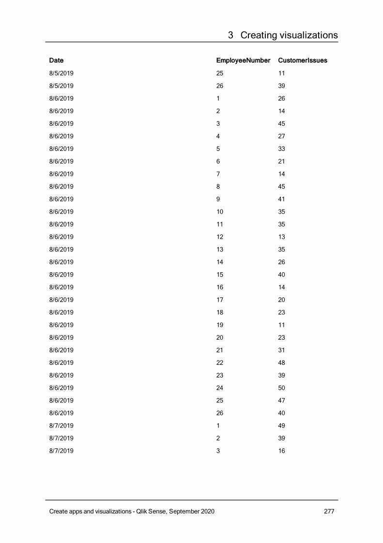
3 Creating visualizations
Date EmployeeNumber CustomerIssues
8/5/2019 25 11
8/5/2019 26 39
8/6/2019 1 26
8/6/2019 2 14
8/6/2019 3 45
8/6/2019 4 27
8/6/2019 5 33
8/6/2019 6 21
8/6/2019 7 14
8/6/2019 8 45
8/6/2019 9 41
8/6/2019 10 35
8/6/2019 11 35
8/6/2019 12 13
8/6/2019 13 35
8/6/2019 14 26
8/6/2019 15 40
8/6/2019 16 14
8/6/2019 17 20
8/6/2019 18 23
8/6/2019 19 11
8/6/2019 20 23
8/6/2019 21 31
8/6/2019 22 48
8/6/2019 23 39
8/6/2019 24 50
8/6/2019 25 47
8/6/2019 26 40
8/7/2019 1 49
8/7/2019 2 39
8/7/2019 3 16
Create apps and visualizations - Qlik Sense, September 2020 277
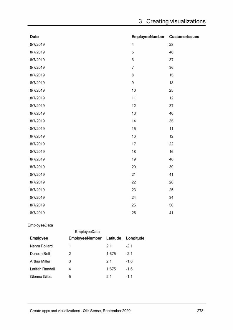
3 Creating visualizations
Date EmployeeNumber CustomerIssues
8/7/2019 4 28
8/7/2019 5 46
8/7/2019 6 37
8/7/2019 7 36
8/7/2019 8 15
8/7/2019 9 18
8/7/2019 10 25
8/7/2019 11 12
8/7/2019 12 37
8/7/2019 13 40
8/7/2019 14 35
8/7/2019 15 11
8/7/2019 16 12
8/7/2019 17 22
8/7/2019 18 16
8/7/2019 19 46
8/7/2019 20 39
8/7/2019 21 41
8/7/2019 22 26
8/7/2019 23 25
8/7/2019 24 34
8/7/2019 25 50
8/7/2019 26 41
EmployeeData
Employee EmployeeNumber Latitude Longitude
Nehru Pollard 1 2.1 -2.1
Duncan Bell 2 1.675 -2.1
Arthur Miller 3 2.1 -1.6
Latifah Randall 4 1.675 -1.6
Glenna Giles 5 2.1 -1.1
EmployeeData
Create apps and visualizations - Qlik Sense, September 2020 278
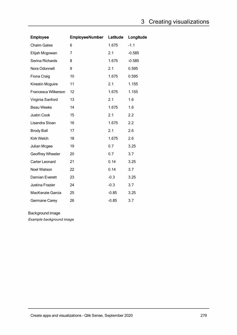
3 Creating visualizations
Employee EmployeeNumber Latitude Longitude
Chaim Gates 6 1.675 -1.1
Elijah Mcgowan 7 2.1 -0.585
Serina Richards 8 1.675 -0.585
Nora Odonnell 9 2.1 0.595
Fiona Craig 10 1.675 0.595
Kirestin Mcguire 11 2.1 1.155
FrancescaWilkerson 12 1.675 1.155
Virginia Sanford 13 2.1 1.6
BeauWeeks 14 1.675 1.6
Justin Cook 15 2.1 2.2
Lisandra Sloan 16 1.675 2.2
Brody Ball 17 2.1 2.6
KirkWelch 18 1.675 2.6
Julian Mcgee 19 0.7 3.25
GeoffreyWheeler 20 0.7 3.7
Carter Leonard 21 0.14 3.25
Noel Watson 22 0.14 3.7
Damian Everett 23 -0.3 3.25
Justina Frazier 24 -0.3 3.7
MacKenzie Garcia 25 -0.85 3.25
Germane Carey 26 -0.85 3.7
Background imageExample background image
Create apps and visualizations - Qlik Sense, September 2020 279
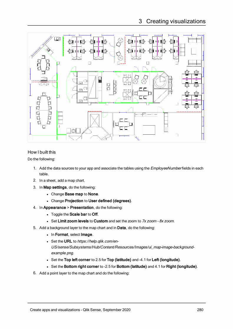
3 Creating visualizations
How I built thisDo the following:
1. Add the data sources to your app and associate the tables using the EmployeeNumber fields in eachtable.
2. In a sheet, add a map chart.
3. InMap settings, do the following:
l Change Base map toNone.
l Change Projection toUser defined (degrees).
4. In Appearance > Presentation, do the following:
l Toggle the Scale bar toOff.
l Set Limit zoom levels toCustom and set the zoom to 7x zoom - 8x zoom.
5. Add a background layer to the map chart and inData, do the following:
l In Format, select Image.
l Set theURL to https://help.qlik.com/en-US/sense/Subsystems/Hub/Content/Resources/Images/ui_map-image-background-example.png.
l Set the Top left corner to 2.5 for Top (latitude) and -4.1 for Left (longitude).
l Set the Bottom right corner to -2.5 for Bottom (latitude) and 4.1 forRight (longitude).
6. Add a point layer to the map chart and do the following:
Create apps and visualizations - Qlik Sense, September 2020 280
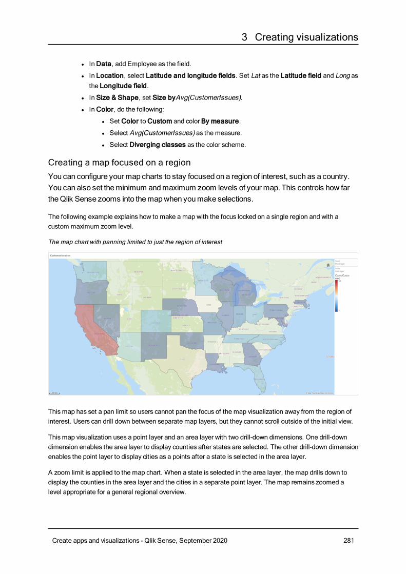
3 Creating visualizations
l InData, add Employee as the field.
l In Location, select Latitude and longitude fields. Set Lat as the Latitude field and Long asthe Longitude field.
l In Size & Shape, set Size byAvg(CustomerIssues).
l InColor, do the following:
l Set Color toCustom and color By measure.
l Select Avg(CustomerIssues) as the measure.
l Select Diverging classes as the color scheme.
Creating a map focused on a regionYou can configure your map charts to stay focused ona region of interest, such as a country.You can also set theminimum andmaximum zoom levels of your map. This controls how fartheQlik Sense zooms into themapwhen youmake selections.
The following example explains how to make a map with the focus locked on a single region and with acustom maximum zoom level.
The map chart with panning limited to just the region of interest
Thismap has set a pan limit so users cannot pan the focus of the map visualization away from the region ofinterest. Users can drill down between separate map layers, but they cannot scroll outside of the initial view.
This map visualization uses a point layer and an area layer with two drill-down dimensions. One drill-downdimension enables the area layer to display counties after states are selected. The other drill-down dimensionenables the point layer to display cities as a points after a state is selected in the area layer.
A zoom limit is applied to the map chart. When a state is selected in the area layer, the map drills down todisplay the counties in the area layer and the cities in a separate point layer. The map remains zoomed alevel appropriate for a general regional overview.
Create apps and visualizations - Qlik Sense, September 2020 281
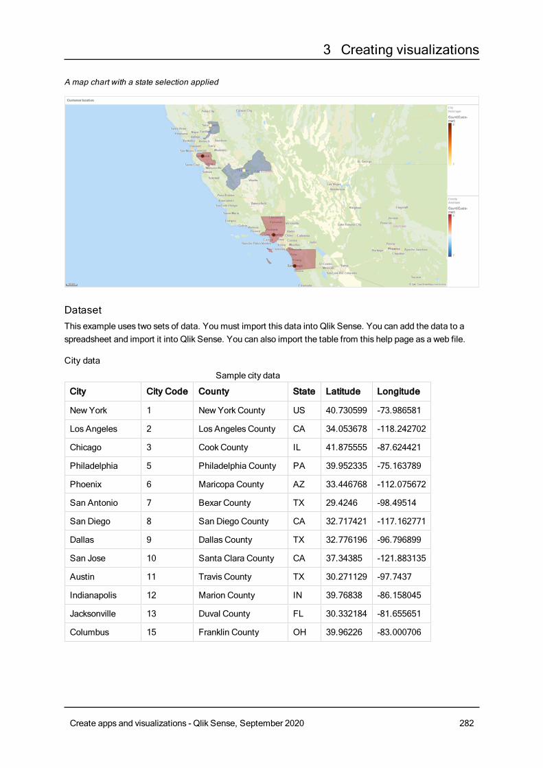
3 Creating visualizations
A map chart with a state selection applied
DatasetThis example uses two sets of data. You must import this data into Qlik Sense. You can add the data to aspreadsheet and import it into Qlik Sense. You can also import the table from this help page as a web file.
City data
City City Code County State Latitude Longitude
NewYork 1 New York County US 40.730599 -73.986581
Los Angeles 2 Los Angeles County CA 34.053678 -118.242702
Chicago 3 Cook County IL 41.875555 -87.624421
Philadelphia 5 Philadelphia County PA 39.952335 -75.163789
Phoenix 6 Maricopa County AZ 33.446768 -112.075672
San Antonio 7 Bexar County TX 29.4246 -98.49514
San Diego 8 San Diego County CA 32.717421 -117.162771
Dallas 9 Dallas County TX 32.776196 -96.796899
San Jose 10 Santa Clara County CA 37.34385 -121.883135
Austin 11 Travis County TX 30.271129 -97.7437
Indianapolis 12 Marion County IN 39.76838 -86.158045
Jacksonville 13 Duval County FL 30.332184 -81.655651
Columbus 15 Franklin County OH 39.96226 -83.000706
Sample city data
Create apps and visualizations - Qlik Sense, September 2020 282
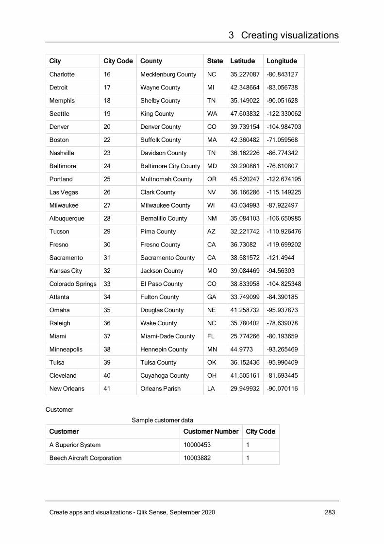
3 Creating visualizations
City City Code County State Latitude Longitude
Charlotte 16 Mecklenburg County NC 35.227087 -80.843127
Detroit 17 Wayne County MI 42.348664 -83.056738
Memphis 18 Shelby County TN 35.149022 -90.051628
Seattle 19 King County WA 47.603832 -122.330062
Denver 20 Denver County CO 39.739154 -104.984703
Boston 22 Suffolk County MA 42.360482 -71.059568
Nashville 23 Davidson County TN 36.162226 -86.774342
Baltimore 24 Baltimore City County MD 39.290861 -76.610807
Portland 25 Multnomah County OR 45.520247 -122.674195
Las Vegas 26 Clark County NV 36.166286 -115.149225
Milwaukee 27 Milwaukee County WI 43.034993 -87.922497
Albuquerque 28 Bernalillo County NM 35.084103 -106.650985
Tucson 29 Pima County AZ 32.221742 -110.926476
Fresno 30 Fresno County CA 36.73082 -119.699202
Sacramento 31 Sacramento County CA 38.581572 -121.4944
Kansas City 32 Jackson County MO 39.084469 -94.56303
Colorado Springs 33 El Paso County CO 38.833958 -104.825348
Atlanta 34 Fulton County GA 33.749099 -84.390185
Omaha 35 Douglas County NE 41.258732 -95.937873
Raleigh 36 Wake County NC 35.780402 -78.639078
Miami 37 Miami-Dade County FL 25.774266 -80.193659
Minneapolis 38 Hennepin County MN 44.9773 -93.265469
Tulsa 39 Tulsa County OK 36.152436 -95.990409
Cleveland 40 Cuyahoga County OH 41.505161 -81.693445
NewOrleans 41 Orleans Parish LA 29.949932 -90.070116
Customer
Customer Customer Number City Code
A Superior System 10000453 1
Beech Aircraft Corporation 10003882 1
Sample customer data
Create apps and visualizations - Qlik Sense, September 2020 283
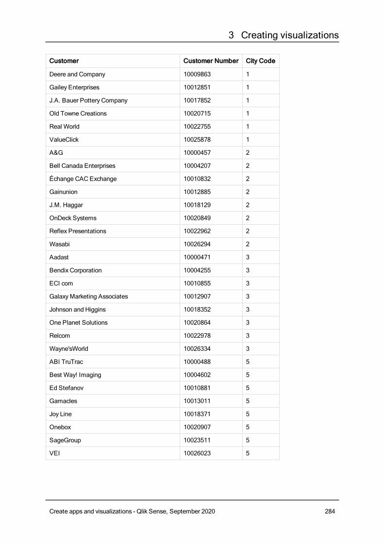
3 Creating visualizations
Customer Customer Number City Code
Deere and Company 10009863 1
Gailey Enterprises 10012851 1
J.A. Bauer Pottery Company 10017852 1
Old Towne Creations 10020715 1
Real World 10022755 1
ValueClick 10025878 1
A&G 10000457 2
Bell Canada Enterprises 10004207 2
Échange CACExchange 10010832 2
Gainunion 10012885 2
J.M. Haggar 10018129 2
OnDeck Systems 10020849 2
Reflex Presentations 10022962 2
Wasabi 10026294 2
Aadast 10000471 3
Bendix Corporation 10004255 3
ECI com 10010855 3
GalaxyMarketing Associates 10012907 3
Johnson and Higgins 10018352 3
One Planet Solutions 10020864 3
Relcom 10022978 3
Wayne'sWorld 10026334 3
ABI TruTrac 10000488 5
Best Way! Imaging 10004602 5
Ed Stefanov 10010881 5
Gamacles 10013011 5
Joy Line 10018371 5
Onebox 10020907 5
SageGroup 10023511 5
VEI 10026023 5
Create apps and visualizations - Qlik Sense, September 2020 284
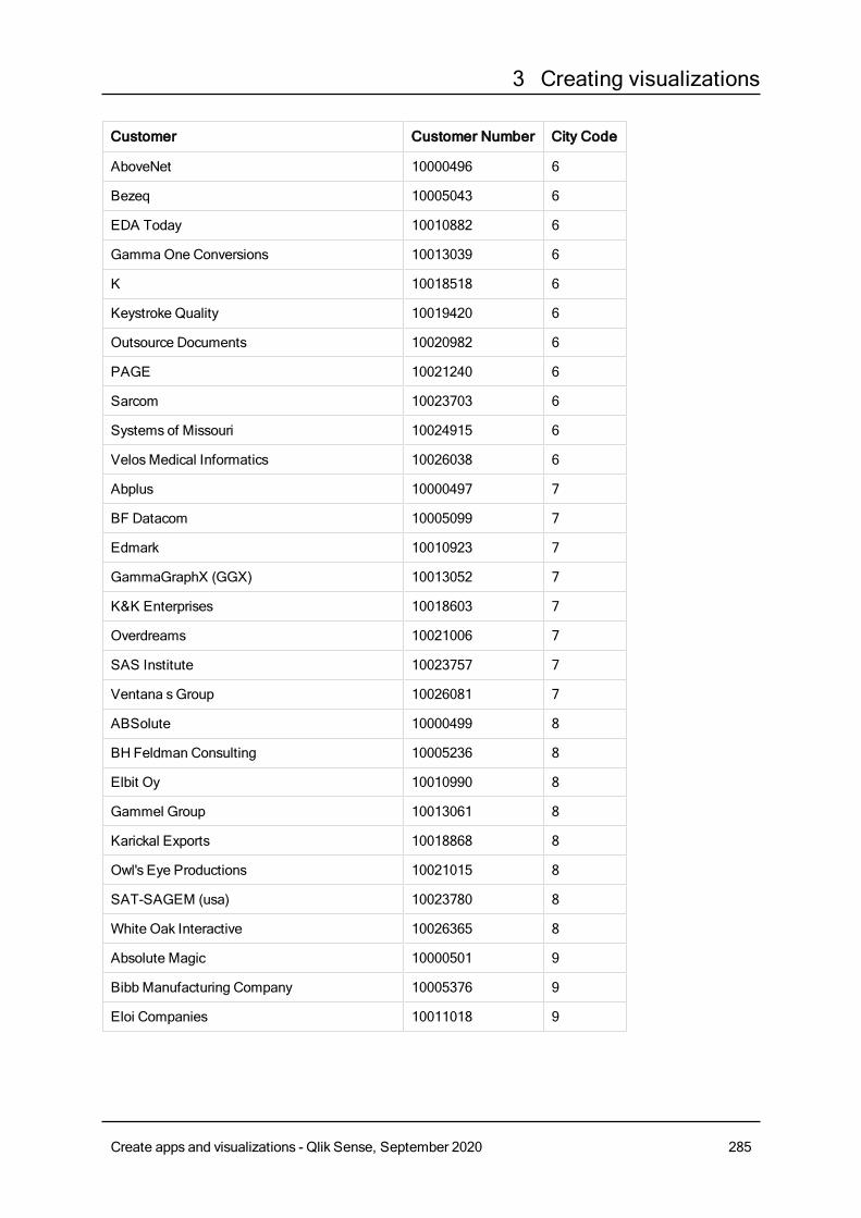
3 Creating visualizations
Customer Customer Number City Code
AboveNet 10000496 6
Bezeq 10005043 6
EDA Today 10010882 6
GammaOne Conversions 10013039 6
K 10018518 6
Keystroke Quality 10019420 6
Outsource Documents 10020982 6
PAGE 10021240 6
Sarcom 10023703 6
Systems of Missouri 10024915 6
VelosMedical Informatics 10026038 6
Abplus 10000497 7
BF Datacom 10005099 7
Edmark 10010923 7
GammaGraphX (GGX) 10013052 7
K&K Enterprises 10018603 7
Overdreams 10021006 7
SAS Institute 10023757 7
Ventana sGroup 10026081 7
ABSolute 10000499 8
BH Feldman Consulting 10005236 8
Elbit Oy 10010990 8
Gammel Group 10013061 8
Karickal Exports 10018868 8
Owl's Eye Productions 10021015 8
SAT-SAGEM (usa) 10023780 8
White Oak Interactive 10026365 8
Absolute Magic 10000501 9
Bibb Manufacturing Company 10005376 9
Eloi Companies 10011018 9
Create apps and visualizations - Qlik Sense, September 2020 285
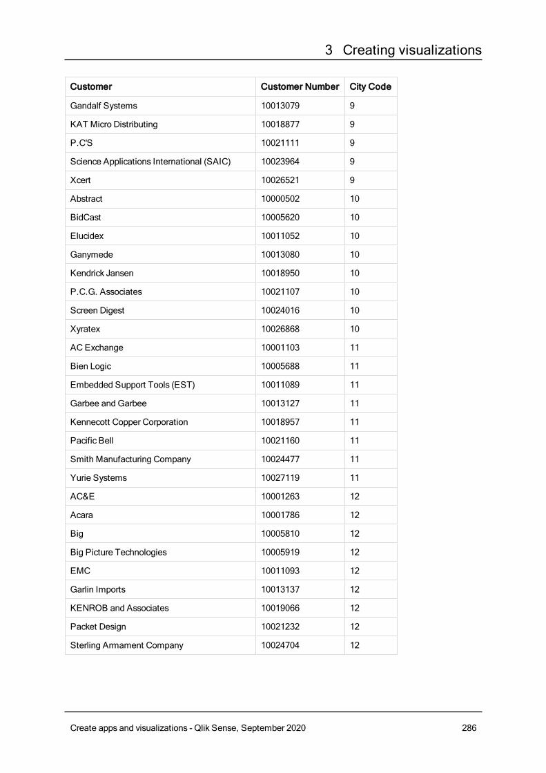
3 Creating visualizations
Customer Customer Number City Code
Gandalf Systems 10013079 9
KAT Micro Distributing 10018877 9
P.C'S 10021111 9
Science Applications International (SAIC) 10023964 9
Xcert 10026521 9
Abstract 10000502 10
BidCast 10005620 10
Elucidex 10011052 10
Ganymede 10013080 10
Kendrick Jansen 10018950 10
P.C.G. Associates 10021107 10
Screen Digest 10024016 10
Xyratex 10026868 10
AC Exchange 10001103 11
Bien Logic 10005688 11
Embedded Support Tools (EST) 10011089 11
Garbee and Garbee 10013127 11
Kennecott Copper Corporation 10018957 11
Pacific Bell 10021160 11
Smith Manufacturing Company 10024477 11
Yurie Systems 10027119 11
AC&E 10001263 12
Acara 10001786 12
Big 10005810 12
Big Picture Technologies 10005919 12
EMC 10011093 12
Garlin Imports 10013137 12
KENROB and Associates 10019066 12
Packet Design 10021232 12
Sterling Armament Company 10024704 12
Create apps and visualizations - Qlik Sense, September 2020 286
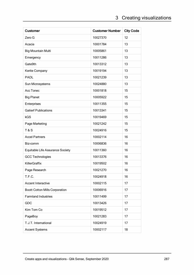
3 Creating visualizations
Customer Customer Number City Code
Zero G 10027370 12
Acacia 10001784 13
Big Mountain Multi 10005861 13
Emergency 10011286 13
Gate9th 10013312 13
Kerite Company 10019194 13
PADL 10021239 13
Sun Microsystems 10024880 13
Acc Tonec 10001818 15
Big Planet 10005922 15
Enterprises 10011355 15
Gatierf Publications 10013341 15
kGS 10019469 15
Page Marketing 10021242 15
T & S 10024916 15
Accel Partners 10002114 16
Biz-comm 10006836 16
Equitable Life Assurance Society 10011360 16
GCC Technologies 10013376 16
KillerGraffix 10019502 16
Page Research 10021270 16
T.F.C. 10024918 16
Accent Interactive 10002115 17
Boott Cotton Mills Corporation 10006916 17
Farmland Industries 10011499 17
GDC 10013426 17
Kim Tom Co 10019512 17
PageBoy 10021283 17
T.J.T. International 10024919 17
Accent Systems 10002117 18
Create apps and visualizations - Qlik Sense, September 2020 287
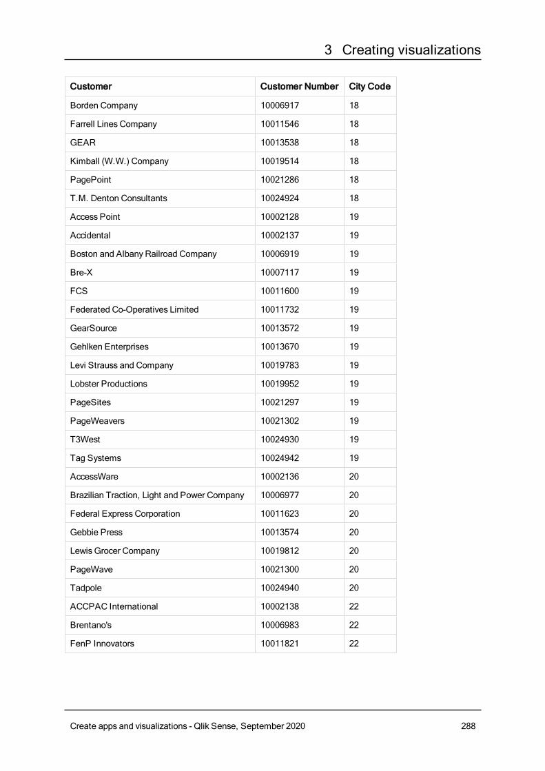
3 Creating visualizations
Customer Customer Number City Code
Borden Company 10006917 18
Farrell Lines Company 10011546 18
GEAR 10013538 18
Kimball (W.W.) Company 10019514 18
PagePoint 10021286 18
T.M. Denton Consultants 10024924 18
Access Point 10002128 19
Accidental 10002137 19
Boston and Albany Railroad Company 10006919 19
Bre-X 10007117 19
FCS 10011600 19
Federated Co-Operatives Limited 10011732 19
GearSource 10013572 19
Gehlken Enterprises 10013670 19
Levi Strauss and Company 10019783 19
Lobster Productions 10019952 19
PageSites 10021297 19
PageWeavers 10021302 19
T3West 10024930 19
Tag Systems 10024942 19
AccessWare 10002136 20
Brazilian Traction, Light and Power Company 10006977 20
Federal Express Corporation 10011623 20
Gebbie Press 10013574 20
Lewis Grocer Company 10019812 20
PageWave 10021300 20
Tadpole 10024940 20
ACCPAC International 10002138 22
Brentano's 10006983 22
FenP Innovators 10011821 22
Create apps and visualizations - Qlik Sense, September 2020 288
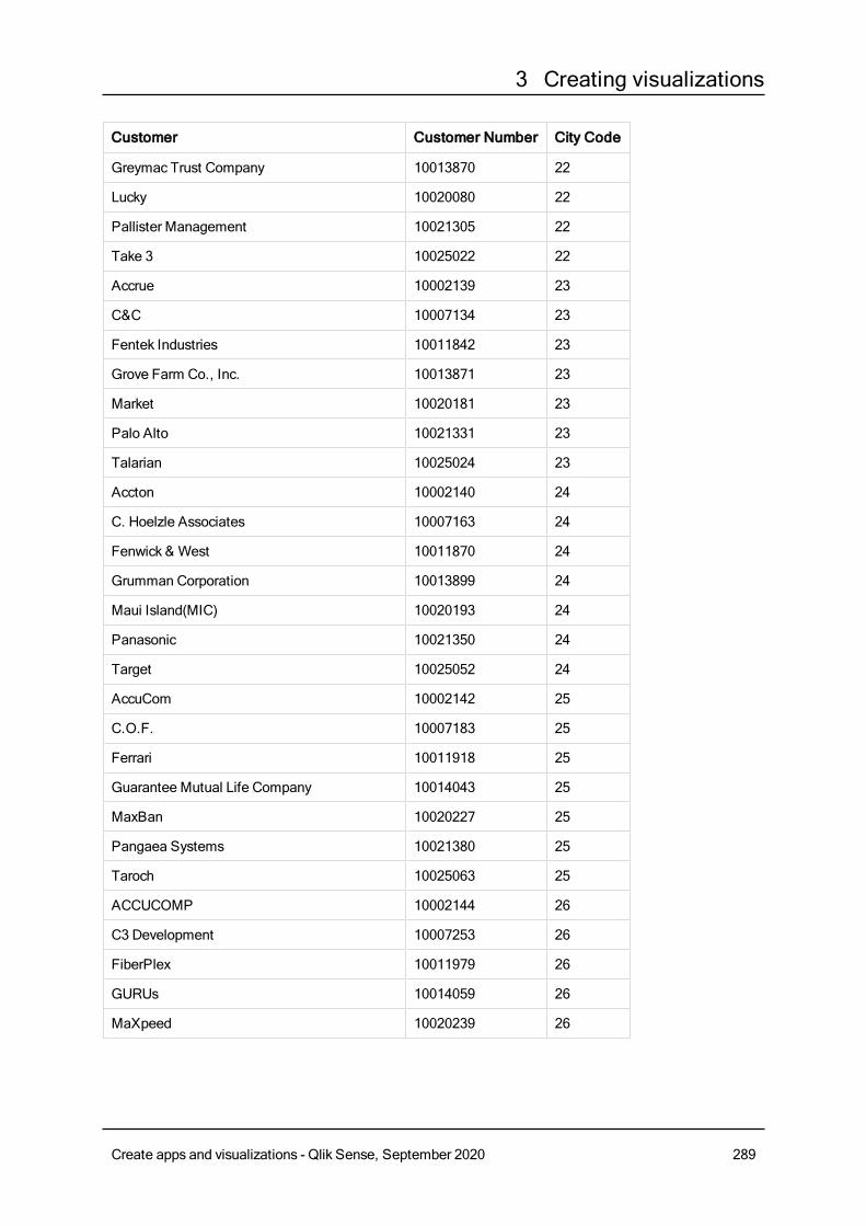
3 Creating visualizations
Customer Customer Number City Code
Greymac Trust Company 10013870 22
Lucky 10020080 22
Pallister Management 10021305 22
Take 3 10025022 22
Accrue 10002139 23
C&C 10007134 23
Fentek Industries 10011842 23
Grove Farm Co., Inc. 10013871 23
Market 10020181 23
Palo Alto 10021331 23
Talarian 10025024 23
Accton 10002140 24
C. Hoelzle Associates 10007163 24
Fenwick & West 10011870 24
Grumman Corporation 10013899 24
Maui Island(MIC) 10020193 24
Panasonic 10021350 24
Target 10025052 24
AccuCom 10002142 25
C.O.F. 10007183 25
Ferrari 10011918 25
Guarantee Mutual Life Company 10014043 25
MaxBan 10020227 25
Pangaea Systems 10021380 25
Taroch 10025063 25
ACCUCOMP 10002144 26
C3 Development 10007253 26
FiberPlex 10011979 26
GURUs 10014059 26
MaXpeed 10020239 26
Create apps and visualizations - Qlik Sense, September 2020 289
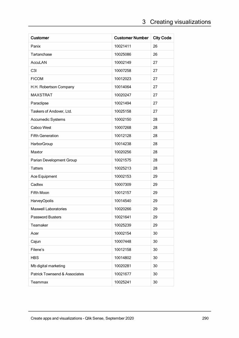
3 Creating visualizations
Customer Customer Number City Code
Panix 10021411 26
Tartanchase 10025086 26
AccuLAN 10002149 27
C3I 10007258 27
FICOM 10012023 27
H.H. Robertson Company 10014064 27
MAXSTRAT 10020247 27
Paraclipse 10021494 27
Taskers of Andover, Ltd. 10025158 27
Accumedic Systems 10002150 28
CabcoWest 10007268 28
Fifth Generation 10012128 28
HarborGroup 10014238 28
Maxtor 10020256 28
Parian Development Group 10021575 28
Tatters 10025213 28
Ace Equipment 10002153 29
Cadtex 10007309 29
Fifth Moon 10012157 29
HarveyOpolis 10014540 29
Maxwell Laboratories 10020266 29
Password Busters 10021641 29
Teamaker 10025239 29
Acer 10002154 30
Cajun 10007448 30
Filene’s 10012158 30
HBS 10014802 30
Mb digital marketing 10020281 30
Patrick Townsend & Associates 10021677 30
Teammax 10025241 30
Create apps and visualizations - Qlik Sense, September 2020 290
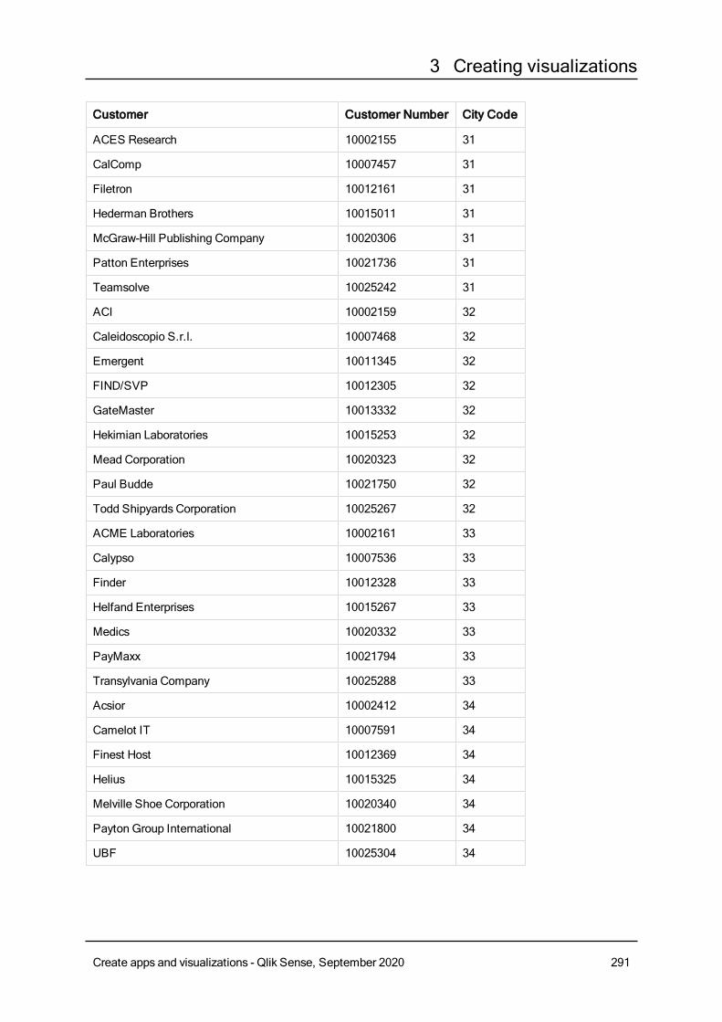
3 Creating visualizations
Customer Customer Number City Code
ACES Research 10002155 31
CalComp 10007457 31
Filetron 10012161 31
Hederman Brothers 10015011 31
McGraw-Hill Publishing Company 10020306 31
Patton Enterprises 10021736 31
Teamsolve 10025242 31
ACI 10002159 32
Caleidoscopio S.r.l. 10007468 32
Emergent 10011345 32
FIND/SVP 10012305 32
GateMaster 10013332 32
Hekimian Laboratories 10015253 32
Mead Corporation 10020323 32
Paul Budde 10021750 32
Todd Shipyards Corporation 10025267 32
ACME Laboratories 10002161 33
Calypso 10007536 33
Finder 10012328 33
Helfand Enterprises 10015267 33
Medics 10020332 33
PayMaxx 10021794 33
Transylvania Company 10025288 33
Acsior 10002412 34
Camelot IT 10007591 34
Finest Host 10012369 34
Helius 10015325 34
Melville Shoe Corporation 10020340 34
Payton Group International 10021800 34
UBF 10025304 34
Create apps and visualizations - Qlik Sense, September 2020 291
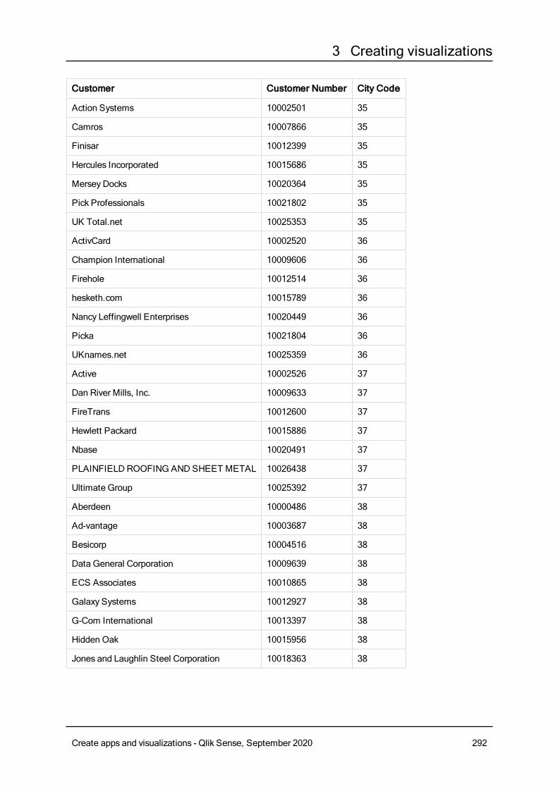
3 Creating visualizations
Customer Customer Number City Code
Action Systems 10002501 35
Camros 10007866 35
Finisar 10012399 35
Hercules Incorporated 10015686 35
Mersey Docks 10020364 35
Pick Professionals 10021802 35
UK Total.net 10025353 35
ActivCard 10002520 36
Champion International 10009606 36
Firehole 10012514 36
hesketh.com 10015789 36
Nancy Leffingwell Enterprises 10020449 36
Picka 10021804 36
UKnames.net 10025359 36
Active 10002526 37
Dan River Mills, Inc. 10009633 37
FireTrans 10012600 37
Hewlett Packard 10015886 37
Nbase 10020491 37
PLAINFIELDROOFING ANDSHEET METAL 10026438 37
Ultimate Group 10025392 37
Aberdeen 10000486 38
Ad-vantage 10003687 38
Besicorp 10004516 38
Data General Corporation 10009639 38
ECS Associates 10010865 38
Galaxy Systems 10012927 38
G-Com International 10013397 38
Hidden Oak 10015956 38
Jones and Laughlin Steel Corporation 10018363 38
Create apps and visualizations - Qlik Sense, September 2020 292
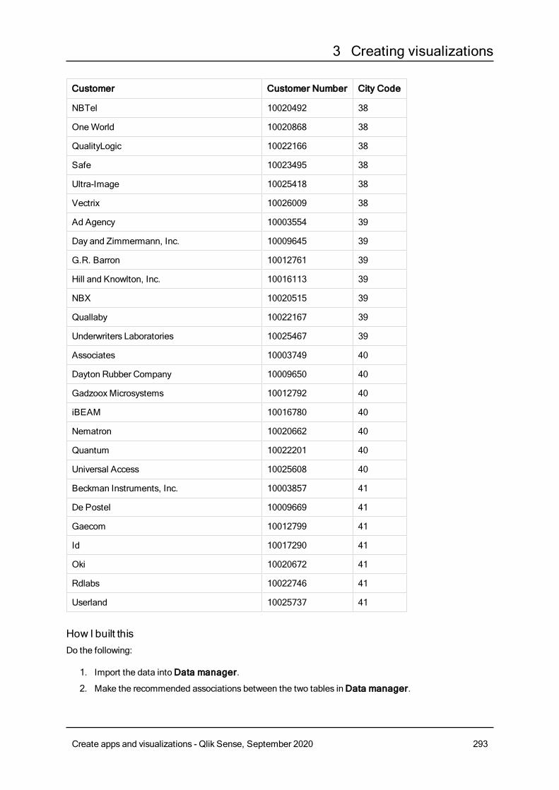
3 Creating visualizations
Customer Customer Number City Code
NBTel 10020492 38
OneWorld 10020868 38
QualityLogic 10022166 38
Safe 10023495 38
Ultra-Image 10025418 38
Vectrix 10026009 38
Ad Agency 10003554 39
Day and Zimmermann, Inc. 10009645 39
G.R. Barron 10012761 39
Hill and Knowlton, Inc. 10016113 39
NBX 10020515 39
Quallaby 10022167 39
Underwriters Laboratories 10025467 39
Associates 10003749 40
Dayton Rubber Company 10009650 40
GadzooxMicrosystems 10012792 40
iBEAM 10016780 40
Nematron 10020662 40
Quantum 10022201 40
Universal Access 10025608 40
Beckman Instruments, Inc. 10003857 41
De Postel 10009669 41
Gaecom 10012799 41
Id 10017290 41
Oki 10020672 41
Rdlabs 10022746 41
Userland 10025737 41
How I built thisDo the following:
1. Import the data intoData manager.
2. Make the recommended associations between the two tables inData manager.
Create apps and visualizations - Qlik Sense, September 2020 293
3 Creating visualizations
3. Create two drill-down dimensions, one of State andCounty and one of State andCity.
4. Add a map and in Presentation, set aCustom zoom level with a maximum zoom of 7x zoom.
5. Add a point layer with State -City as the dimension. Set the following properties:
l In Location, set the scope toCustom and enter 'USA' inCountry.
l In Size & Shape, set Size by toCount(Distinct(Customer)).
l InColors, color bymeasure usingCount(Distinct(Customer)).
l InOptions>Layer display, set Visible drill-down levels toCustom and select City.
6. Add an area layer with State-County as the dimension. Set the following properties:
l In Location, set the scope toCustom, enter 'USA' in Country, and State in Administrativearea (Level 1).
l InColors, color bymeasure usingCount(Distinct(Customer)) and set theOpacity slider to40%.
7. Center the region in the map and then set Limit pan navigation toCustom and clickSet pan limit.
Mekko chartThemekko chart is suitable for comparing groups, while being able to compare category itemscontainedwithin these groups. The dimension axis shows the groups, while themeasure axisshows the normalized percentage value for each category item. The size of each group showsits value.
In this image, the dimensional groups represent different yearly quarters. The width of each quarter showsthe normalized percentage value of the sum of sales, for that quarter. Each quarter is divided in severalproduct categories, such as Produce, Canned Products, and Frozen Foods. The height of each productcategory corresponds to the normalized percentage value of the sum of sales of that product category, withinthat quarter. This allows you to easily compare between product categories inside a specific quarter, andbetween different quarters.
Create apps and visualizations - Qlik Sense, September 2020 294
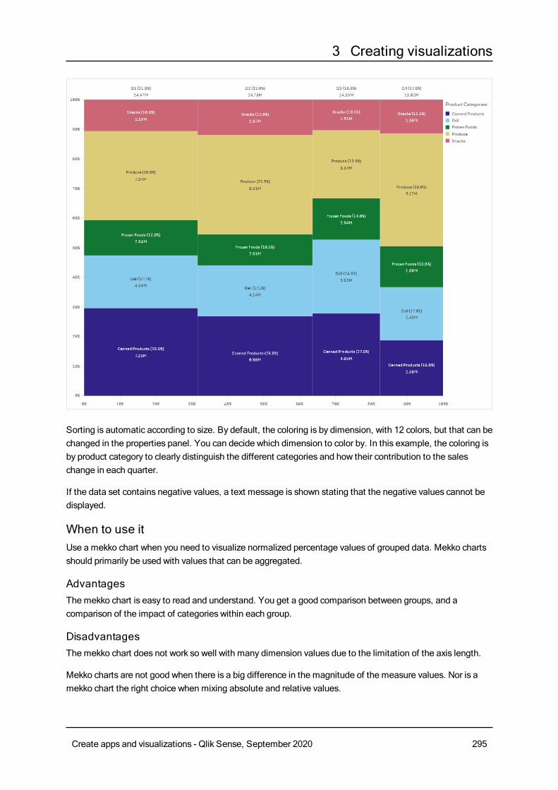
3 Creating visualizations
Sorting is automatic according to size. By default, the coloring is by dimension, with 12 colors, but that can bechanged in the properties panel. You can decide which dimension to color by. In this example, the coloring isby product category to clearly distinguish the different categories and how their contribution to the saleschange in each quarter.
If the data set contains negative values, a text message is shown stating that the negative values cannot bedisplayed.
When to use itUse a mekko chart when you need to visualize normalized percentage values of grouped data. Mekko chartsshould primarily be used with values that can be aggregated.
AdvantagesThe mekko chart is easy to read and understand. You get a good comparison between groups, and acomparison of the impact of categories within each group.
DisadvantagesThe mekko chart does not work so well with many dimension values due to the limitation of the axis length.
Mekko charts are not good when there is a big difference in the magnitude of the measure values. Nor is amekko chart the right choice when mixing absolute and relative values.
Create apps and visualizations - Qlik Sense, September 2020 295
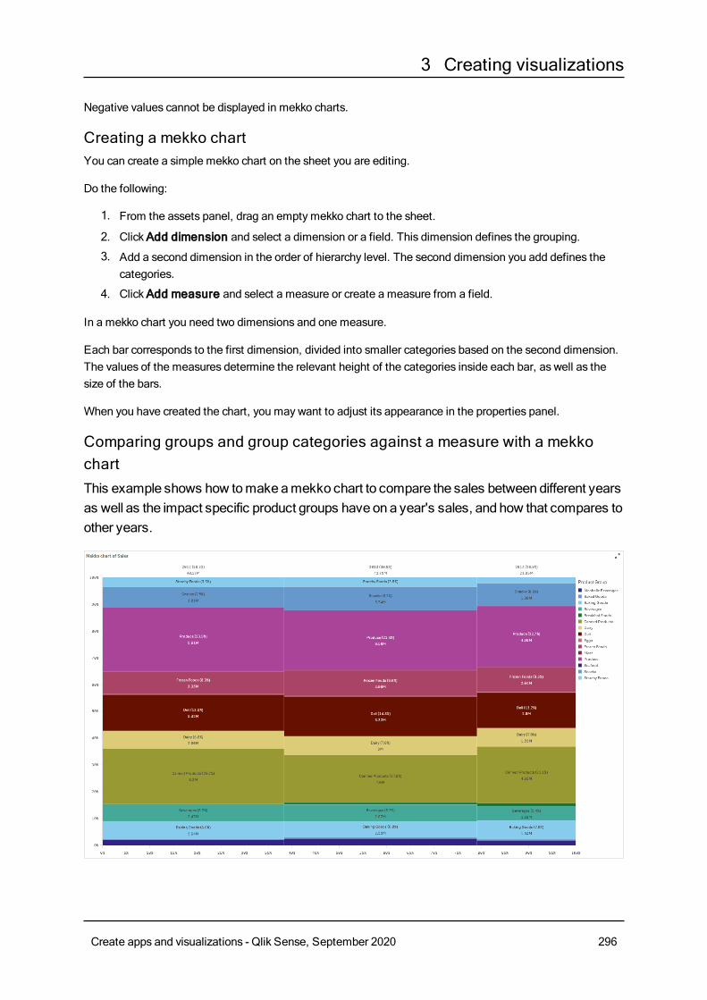
3 Creating visualizations
Negative values cannot be displayed in mekko charts.
Creating a mekko chartYou can create a simple mekko chart on the sheet you are editing.
Do the following:
1. From the assets panel, drag an emptymekko chart to the sheet.
2. ClickAdd dimension and select a dimension or a field. This dimension defines the grouping.
3. Add a second dimension in the order of hierarchy level. The second dimension you add defines thecategories.
4. ClickAdd measure and select a measure or create a measure from a field.
In a mekko chart you need two dimensions and one measure.
Each bar corresponds to the first dimension, divided into smaller categories based on the second dimension.The values of the measures determine the relevant height of the categories inside each bar, as well as thesize of the bars.
When you have created the chart, you may want to adjust its appearance in the properties panel.
Comparing groups and group categories against a measure with a mekkochartThis example shows how tomakeamekko chart to compare the sales betweendifferent yearsas well as the impact specific product groups have ona year's sales, and how that compares toother years.
Create apps and visualizations - Qlik Sense, September 2020 296
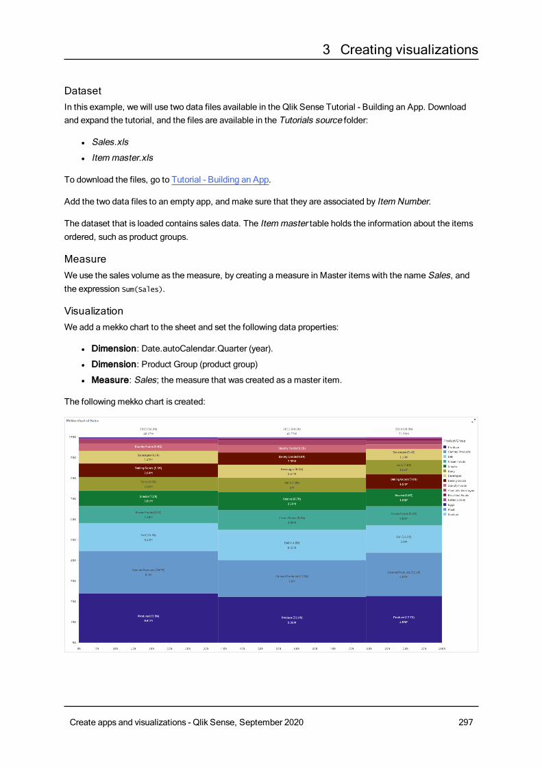
3 Creating visualizations
DatasetIn this example, we will use two data files available in the Qlik Sense Tutorial - Building an App. Downloadand expand the tutorial, and the files are available in the Tutorials source folder:
l Sales.xls
l Itemmaster.xls
To download the files, go to Tutorial - Building an App.
Add the two data files to an empty app, and make sure that they are associated by Item Number.
The dataset that is loaded contains sales data. The Itemmaster table holds the information about the itemsordered, such as product groups.
MeasureWe use the sales volume as the measure, by creating a measure in Master itemswith the name Sales, andthe expression Sum(Sales).
VisualizationWe add a mekko chart to the sheet and set the following data properties:
l Dimension: Date.autoCalendar.Quarter (year).
l Dimension: Product Group (product group)
l Measure: Sales; the measure that was created as a master item.
The following mekko chart is created:
Create apps and visualizations - Qlik Sense, September 2020 297
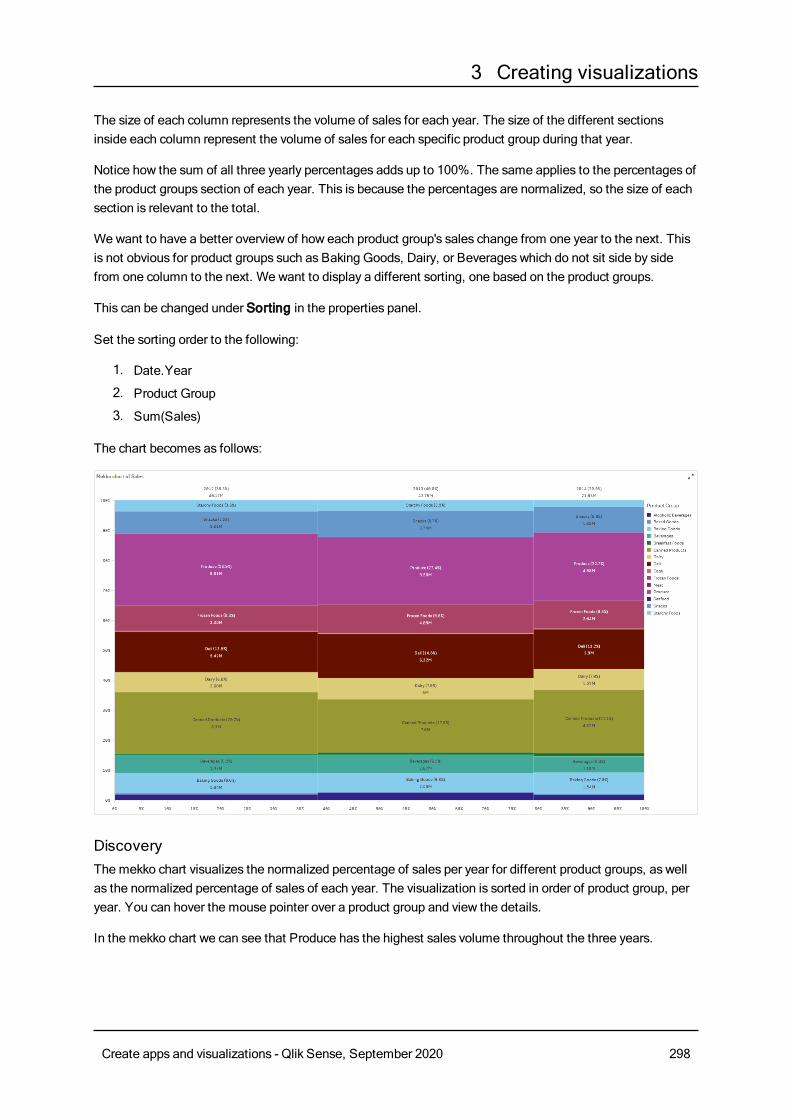
3 Creating visualizations
The size of each column represents the volume of sales for each year. The size of the different sectionsinside each column represent the volume of sales for each specific product group during that year.
Notice how the sum of all three yearly percentages adds up to 100%. The same applies to the percentages ofthe product groups section of each year. This is because the percentages are normalized, so the size of eachsection is relevant to the total.
We want to have a better overview of how each product group's sales change from one year to the next. Thisis not obvious for product groups such as Baking Goods, Dairy, or Beverages which do not sit side by sidefrom one column to the next. We want to display a different sorting, one based on the product groups.
This can be changed under Sorting in the properties panel.
Set the sorting order to the following:
1. Date.Year
2. Product Group
3. Sum(Sales)
The chart becomes as follows:
DiscoveryThe mekko chart visualizes the normalized percentage of sales per year for different product groups, as wellas the normalized percentage of sales of each year. The visualization is sorted in order of product group, peryear. You can hover the mouse pointer over a product group and view the details.
In the mekko chart we can see that Produce has the highest sales volume throughout the three years.
Create apps and visualizations - Qlik Sense, September 2020 298
3 Creating visualizations
Mekko chart propertiesYou can change the layout and formatting ofmekko charts.
You open the properties panel for a visualization by clicking Edit sheet in the toolbar and clicking the
visualization that you want to edit.
If the properties panel is hidden, click Show properties in the lower right-hand corner.
If the visualization has in the upper right-hand corner, the visualization is linked to amaster
item. You cannot edit a linked visualization, but you can edit themaster item. You can alsounlink the visualization tomake it editable.
Some of the settings in the properties panel are only available under certain circumstances, forexample, when you usemore than one dimension or measure, or when you select an optionthat makes other options available.
DataClickAdd to add a dimension or a measure.
Dimensions
On theData tab, underDimensions, clickAdd to open a list of availableDimensions and Fields. Selectthe dimension or field that you want to use.
You can also click to create a dimension in the expression editor. To be able to edit a dimension that is
linked to a master item, you must first unlink the dimension. Another way to create a dimension is to type theexpression directly in the text box. Expressions added in this waymust begin with an equals sign (=). Here isan example with a calculated dimension:
=If (Week < 14, Week, 'Sales')
If Add is missing, you cannot add more dimensions.
l <Dimension name>: Click the dimension name to open the dimension settings.
If you want to delete the dimension, right-click the dimension and select in the dialog. Alternatively,
click the dimension and click .
o Dimension: Only displayed for master items. To be able to edit a dimension that is linked to amaster item, you must first unlink the dimension.
o Field: If you have added a field from Fields in the assets panel, the field name is automatically
displayed. Click to open the expression editor.
o Label: Enter a label for the dimension. If you have added a field from Fields in the assetspanel, the field name is automatically displayed.
Create apps and visualizations - Qlik Sense, September 2020 299
3 Creating visualizations
o Includenull values: When selected, the measure values of all null dimensions aresummarized and presented as one dimension item in a visualization. All null values aredisplayed as gaps or dashes (-).
o Limitation: Limits the number of displayed values. When you set a limitation, the onlydimensions displayed are those where the measure value meets the limitation criterion:
n No limitation: The default value.
n Fixed number: Select to display the top or bottom values. Set the number of values.
You can also use an expression to set the number. Click to open the expression
editor.
n Exact value: Use the operators and set the exact limit value. You can also use an
expression to set the number. Click to open the expression editor.
n Relative value: Use the operators and set the relative limit value in percent. You can
also use an expression to set the number. Click to open the expression editor.
n Calculated on measure: <measure>: Shown when you make a limitation to thenumber of displayed dimension values. The dimensions whose measure value meet thecriterion are displayed.
o Show others: When selected, the last value in the visualization (colored gray), summarizes allthe remaining values. When some kind of limitation is set (Fixed number, Exact value, orRelative number), the value counts as 1 in that setting. If, for example, Exact value is usedand set to 10, the tenth value isOthers.
o Other label: Enter a label for the summarized values (when Show others is selected). You
can also use an expression as a label. Click to open the expression editor.
You can drag the dimensions to set the order in which they are displayed in the visualization. Use the drag
bars (o ) to rearrange the order.
Measures
On theData tab, underMeasures, clickAdd to open a list of available measures. Select the measure thatyou want to add to the visualization. If you select a field, you are automatically presented with some commonaggregation functions that you can choose between for the measure.
If no measure is available, you need to create one. You can enter the expression directly in the text box, or
click to create a measure in the expression editor.
To be able to edit a measure that is linked to a master item, you must first unlink the measure.
If Add is missing, you cannot add more measures.
l <Measure name>: Click the measure to open the measure settings.
If you want to delete the measure, long-touch/right-click the measure and select in the dialog.
Alternatively, click the measure and click .
o Expression: Click to open the expression editor.The existing expression is displayed by
default.
Create apps and visualizations - Qlik Sense, September 2020 300
3 Creating visualizations
o Label: Enter a label for the measure. Measures not saved inMaster items are by defaultdisplayed with the expression as label.
o Measure: Only displayed for master items. To be able to edit a measure that is linked to amaster item, you must first unlink the measure.
o Number formatting: Different options for formatting the measure values. If you want tochange the number format at app level, and not just for a single measure, it is better to do thatin the regional settings, that is, in the SET statements at the beginning of the script in the dataload editor.
The following number formats are available:
n Auto: Qlik Sense automatically sets a number formatting based on the source data.To represent numeric abbreviations, the international SI units are used, such as k(thousand), M (million), and G (billion).
n Number: By default, the formatting is set to Simple, and you can select the formattingfrom the options in the drop-down list. Click the button to change toCustomformatting, and use the Format pattern box to change the format pattern.
Examples:
l # ##0 describes the number as an integer with a thousands separator. In thisexample " " is used as a thousands separator.
l ###0 describes the number as an integer without a thousands separator.
l 0000 describes the number as an integer with at least four digits. For example,the number 123 will be shown as 0123.
l 0.000 describes the number with three decimals. In this example "." is used as adecimal separator.
If you add the percent sign (%) to the format pattern, the measure values areautomatically multiplied by 100.
n Money: By default, the format pattern used for money is the same as set up in theoperating system. Use the Format pattern box to change the format pattern.
n Date: By default, the formatting is set to Simple, and you can select the formattingfrom the options in the drop-down list. Click the button to change toCustomformatting, and use the Format pattern box to change the format pattern.
n Duration: By default, the format pattern used for duration is the same as set up in theoperating system. Duration can be formatted as days, or as a combination of days,hours, minutes, seconds and fractions of seconds. Use the Format pattern box tochange the format pattern.
n Custom: By default, the format pattern used for custom is the same as set up in theoperating system. Use the Format pattern boxes to change the format pattern.
n Measure expression: The format pattern is determined by the measure expression.Use this option to display custom number formatting for a measure in a visualization.Limitations:Only works with visualizations that accept measures.
Create apps and visualizations - Qlik Sense, September 2020 301
3 Creating visualizations
Cannot be used with a box plot.Does not affect the number formatting of the axis.
l Master item: You can create a master measure based on the measure expression by clickingCreatenew.
You can drag the measures to set the order in which they are displayed in the visualization. Use the drag bars
(o ) to rearrange the order.
You can drag a field from Dimensions toMeasures to change how it is used. Moving a dimension toMeasures assigns it an aggregation. You cannot drag a master dimension toMeasures.
SortingDrag the dimensions and measures to set the sorting priority order. The numbers show the order.
Dimensions and measures can also be sorted internally:
Click the dimension or measure name to open the settings and click the sorting button to switch toCustomsorting. The following list shows the internal sorting priority order and sorting options. The sorting is eitherAscending orDescending.
l Sort by expression: Enter an expression to sort by. Only available for dimensions.
l Sort numerically
l Sort alphabetically
Additionally, you can sort by load order by switching toCustom and leaving all sorting options unselected.
If you have set a custom order for a field, that custom order will override any selected internal sort order inSorting.
Add-onsData handling:
l Calculation condition: Specify an expression in this text field to set a condition that needs to befulfilled (true) for the object to be displayed. The value may be entered as a calculated formula. Forexample: count(distinct Team)<3. If the condition is not fulfilled, the message or expression enteredinDisplayed message is displayed.
l A calculation condition is useful when a chart or table is very big and makes the visualization slow torespond. A calculation condition can then help so that for example an object does not show until theuser has filtered the data to a more manageable level by applying selections.
Appearance
General
l Show titles: Select to enable or disable titles, subtitles, and footnotes in the chart.Enter Title, Subtitle, and Footnote. By default, the string is interpreted as a text string. However,you can also use the text field for an expression, or a combination of text and expression. An equalssign (=), at the beginning of a string shows that it contains an expression.
Create apps and visualizations - Qlik Sense, September 2020 302
3 Creating visualizations
Click if you want to create an expression by using the expression editor.
Titles are displayed on a single line. If you inject line breaks they will be ignored.
Example:
Assume that the following string is used, including quotation marks: 'Sales: ' & Sum(Sales).By default, the string is interpreted as a text string and is displayed as presented in the example. But ifyou begin the string with an equals sign: (='Sales: ' & Sum(Sales)), the string is interpreted as anexpression instead. The output is then Sales: <value of expression>, where <value of expression>is the calculated value.
l Disable hover menu: Select to disable the hover menu in the visualization.
l Show details: Set to Show if you want to allow users to be able to choose to view details, such asdescriptions, measures, and dimensions.
Alternate states
State: Set the state to apply to the visualization. You can select:
l Any alternate state defined inMaster items.
l <inherited>, in which case the state defined for the sheet is used.
l <default state>, which represents the state where no alternate state is applied.
Colors and legends
l Colors: Select how the chart values are colored. There are two settings:
o Auto: Colors the chart values using default settings.o Custom: Manually select the method of coloring your values in the chart. The following
methods are available:
n By dimension: Color the chart by dimension values. By default, 12 colors are used forthe dimensions. The colors are reused when there are more than 12 dimension values.When selected, the following settings are available:
l Select dimension: Enter a field or expression containing the values to colorobjects in this chart.
l Persistent colors: Select to have colors remain the same between selectionstates.
l Color scheme: Select 12 colors or 100 colors to be used for the differentvalues. The 12 colors can all be distinguished by people with color visiondeficiency, but not all of the 100 colors.
l Show legend: By default set toOff. The legend is displayed if there is enough space. The placementcan be changed in the Legend position setting.
l Show legend title: When selected, the legend title is displayed.
Create apps and visualizations - Qlik Sense, September 2020 303
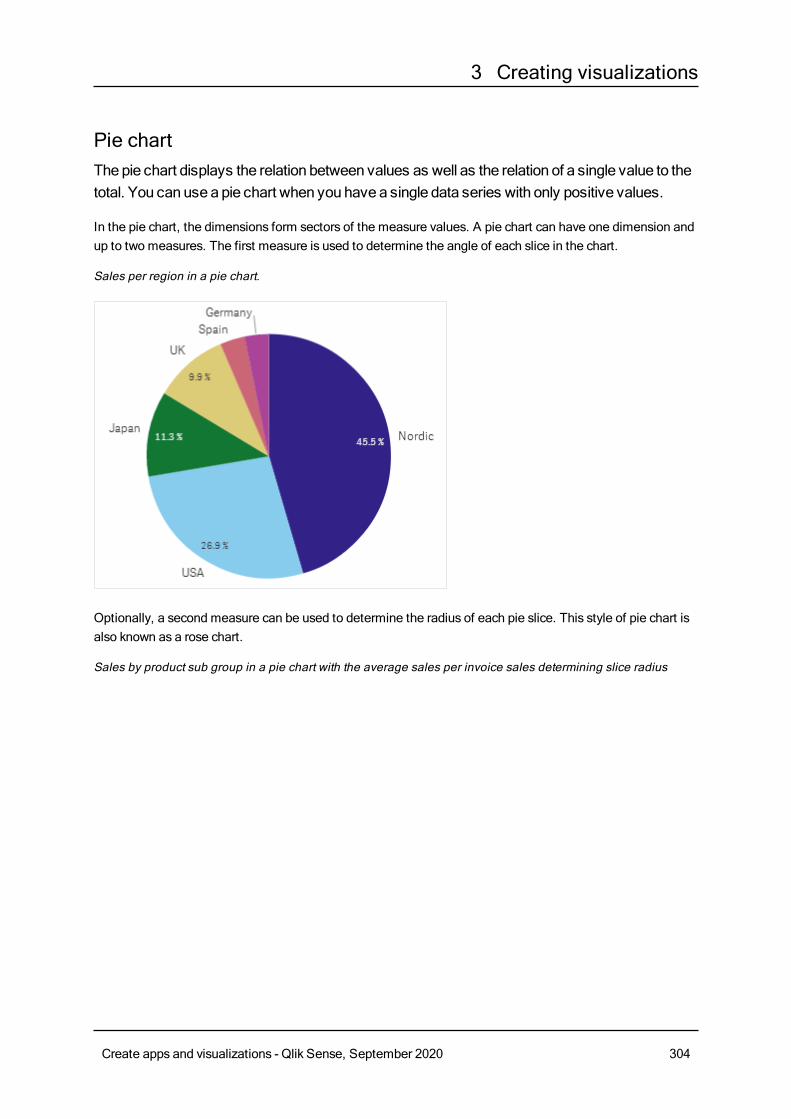
3 Creating visualizations
Pie chartThepie chart displays the relation between values as well as the relation of a single value to thetotal. You can use a pie chart when you have a single data series with only positive values.
In the pie chart, the dimensions form sectors of the measure values. A pie chart can have one dimension andup to two measures. The first measure is used to determine the angle of each slice in the chart.
Sales per region in a pie chart.
Optionally, a second measure can be used to determine the radius of each pie slice. This style of pie chart isalso known as a rose chart.
Sales by product sub group in a pie chart with the average sales per invoice sales determining slice radius
Create apps and visualizations - Qlik Sense, September 2020 304
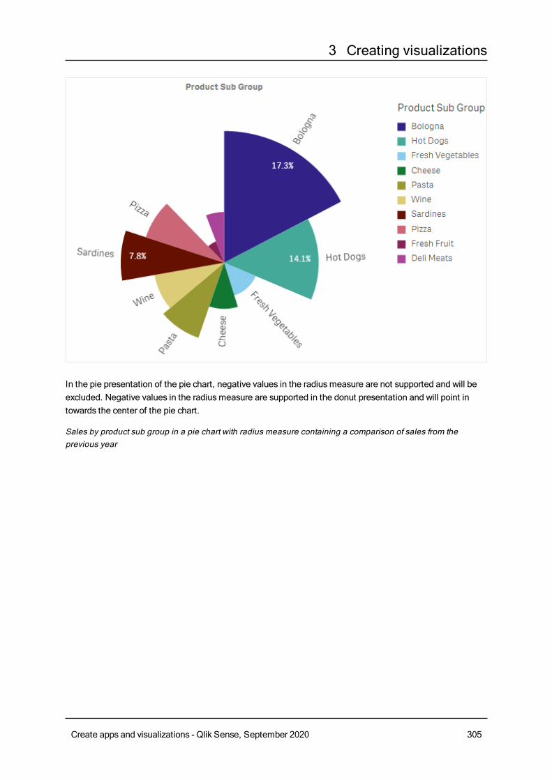
3 Creating visualizations
In the pie presentation of the pie chart, negative values in the radiusmeasure are not supported and will beexcluded. Negative values in the radiusmeasure are supported in the donut presentation and will point intowards the center of the pie chart.
Sales by product sub group in a pie chart with radius measure containing a comparison of sales from theprevious year
Create apps and visualizations - Qlik Sense, September 2020 305
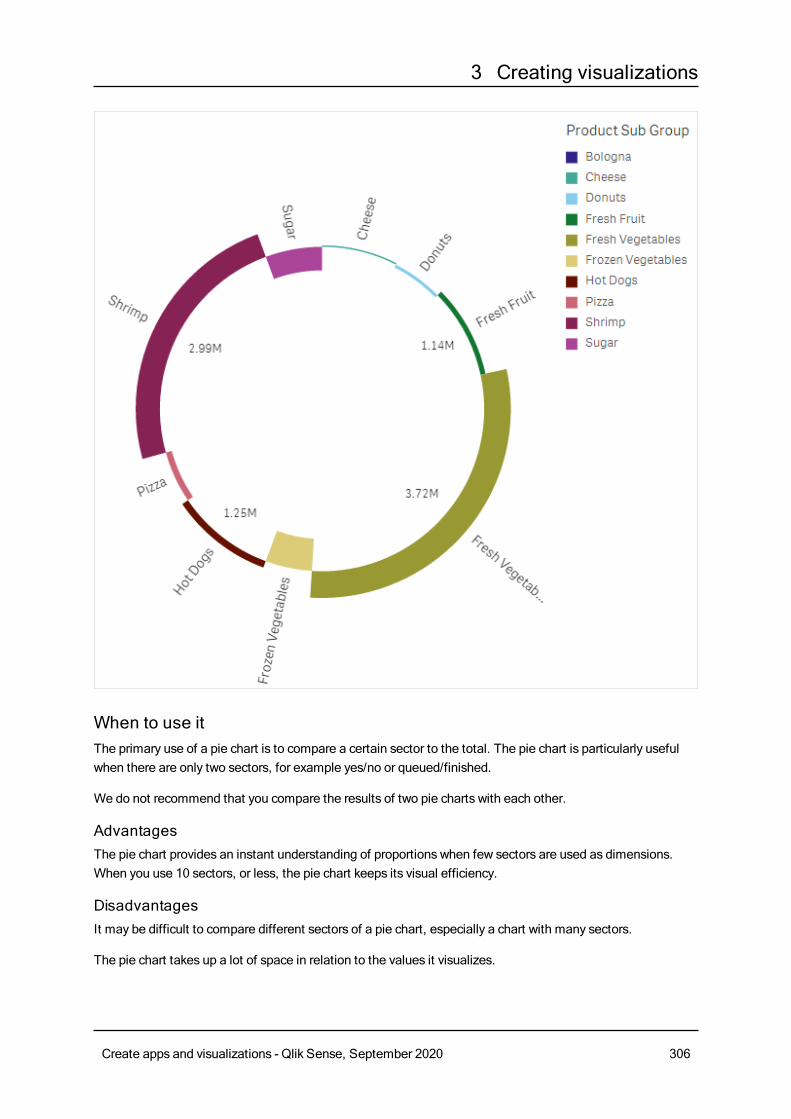
3 Creating visualizations
When to use itThe primary use of a pie chart is to compare a certain sector to the total. The pie chart is particularly usefulwhen there are only two sectors, for example yes/no or queued/finished.
We do not recommend that you compare the results of two pie charts with each other.
AdvantagesThe pie chart provides an instant understanding of proportions when few sectors are used as dimensions.When you use 10 sectors, or less, the pie chart keeps its visual efficiency.
DisadvantagesIt may be difficult to compare different sectors of a pie chart, especially a chart with many sectors.
The pie chart takes up a lot of space in relation to the values it visualizes.
Create apps and visualizations - Qlik Sense, September 2020 306
3 Creating visualizations
Creating a pie chartYou can create a pie chart on the sheet you are editing.
Do the following:
1. From the assets panel, drag an empty pie chart to the sheet.
2. ClickAdd dimension and select a dimension or a field.
3. ClickAdd measure and select a measure or create a measure from a field.
The following settings are used by default in a pie chart:
l The top 10 sectors are presented in descending size order, clockwise.
l Colors are presented by dimension.
l Value labels are presented in percent.
After you have created the pie chart, you may want to add a radiusmeasure or adjust its appearance andother settings in the properties panel.
Pie chart properties
You open the properties panel for a visualization by clicking Edit sheet in the toolbar and clicking the
visualization that you want to edit.
If the properties panel is hidden, click Show properties in the lower right-hand corner.
If the visualization has in the upper right-hand corner, the visualization is linked to amaster
item. You cannot edit a linked visualization, but you can edit themaster item. You can alsounlink the visualization tomake it editable.
Some of the settings in the properties panel are only available under certain circumstances, forexample, when you usemore than one dimension or measure, or when you select an optionthat makes other options available.
DataClickAdd to add a dimension or a measure.
You can drag a field fromMeasures toDimensions to change how it is used. Moving a measure toDimensions removes its aggregation. You cannot drag a master measure toDimensions. You can onlydrag a measure toDimensions if its expression is simple.
Dimensions
On theData tab, underDimensions, clickAdd to open a list of availableDimensions and Fields. Selectthe dimension or field that you want to use.
Create apps and visualizations - Qlik Sense, September 2020 307
3 Creating visualizations
You can also click to create a dimension in the expression editor. To be able to edit a dimension that is
linked to a master item, you must first unlink the dimension. Another way to create a dimension is to type theexpression directly in the text box. Expressions added in this waymust begin with an equals sign (=). Here isan example with a calculated dimension:
=If (Week < 14, Week, 'Sales')
If Add is dimmed, you cannot add more dimensions.
The following properties are available for dimensions:
l <Dimension name>: Click the dimension name to open the dimension settings. If you want to delete
the dimension, right-click the dimension and select in the dialog. Alternatively, click the dimension
and click .
l Field: If you have added a field from Fields in the assets panel, the field name is automatically
displayed. Click to open the expression editor.
l Label: Enter a label for the dimension. If you have added a field from Fields in the assetspanel, the field name is automatically displayed.
l Dimension: Only displayed for master items. To be able to edit a dimension that is linked to amaster item, you must first unlink the dimension.
l Includenull values: When selected, the measure values of all null dimensions aresummarized and presented as one dimension item in a visualization. All null values aredisplayed as gaps or dashes (-).
l Limitation: Limits the number of displayed values. When you set a limitation, the onlydimensions displayed are those where the measure value meets the limitation criterion:
l No limitation: The default value.
l Fixed number: Select to display the top or bottom values. Set the number of values.
You can also use an expression to set the number. Click to open the expression
editor.
l Exact value: Use the operators and set the exact limit value. You can also use an
expression to set the number. Click to open the expression editor.
l Relative value: Use the operators and set the relative limit value in percent. You can
also use an expression to set the number. Click to open the expression editor.
l Calculated on measure: <measure>: Shown when you make a limitation to thenumber of displayed dimension values. The dimensions whose measure value meet thecriterion are displayed.
l Show others: When selected, the last value in the visualization (colored gray), summarizes allthe remaining values. When some kind of limitation is set (Fixed number, Exact value, orRelative number), the value counts as 1 in that setting. If, for example, Exact value is usedand set to 10, the tenth value isOthers.
l Other label: Enter a label for the summarized values (when Show others is selected).
You can also use an expression as a label. Click to open the expression editor.
Create apps and visualizations - Qlik Sense, September 2020 308
3 Creating visualizations
l Master item: You can create a master dimension based on the dimension expression by clickingCreate new.
l Add alternative: Alternative dimensions and measures are dimensions and measures that are addedto a visualization, but are not displayed until a user chooses to switch which dimensions and measuresare being displayed during visual exploration.
Measures
On theData tab, underMeasures, clickAdd to open a list of available measures. Select the measure thatyou want to add to the visualization. If you select a field, you are automatically presented with some commonaggregation functions that you can choose between for the measure. Pie charts require a measure for Angle,but optionally a measure can be added forRadius, which determines the radius of each slice of the pie chart.
If no measure is available, you need to create one. You can enter the expression directly in the text box, or
click to create a measure in the expression editor.
To be able to edit a measure that is linked to a master item, you must first unlink the measure.
If Add is dimmed, you cannot add more measures.
You can drag a field from Dimensions toMeasures to change how it is used. Moving a dimension toMeasures assigns it an aggregation. You cannot drag a master dimension toMeasures.
The following properties are available for measures:
l <Measure name>:
o Expression: Click to open the expression editor. The existing expression is displayed by
default.o Label: Enter a label for the measure. Measures not saved inMaster items are by default
displayed with the expression as label.o Measure: Only displayed for master items. To be able to edit a measure that is linked to a
master item, you must first unlink the measure.o Number formatting: Different options for formatting the measure values. If you want to
change the number format at app level, and not just for a single measure, it is better to do thatin the regional settings, that is, in the SET statements at the beginning of the script in the dataload editor.The following number formats are available:
n Auto: Qlik Sense automatically sets a number formatting based on the source data.To represent numeric abbreviations, the international SI units are used, such as k(thousand), M (million), and G (billion).
n Number: By default, the formatting is set to Simple, and you can select the formattingfrom the options in the drop-down list. Click the button to change toCustomformatting, and use the Format pattern box to change the format pattern.
Create apps and visualizations - Qlik Sense, September 2020 309
3 Creating visualizations
Examples:
l # ##0 describes the number as an integer with a thousands separator. In thisexample " " is used as a thousands separator.
l ###0 describes the number as an integer without a thousands separator.
l 0000 describes the number as an integer with at least four digits. For example,the number 123 will be shown as 0123.
l 0.000 describes the number with three decimals. In this example "." is used as adecimal separator.
If you add the percent sign (%) to the format pattern, the measure values areautomatically multiplied by 100.
n Money: By default, the format pattern used for money is the same as set up in theoperating system. Use the Format pattern box to change the format pattern.
n Date: By default, the formatting is set to Simple, and you can select the formattingfrom the options in the drop-down list. Click the button to change toCustomformatting, and use the Format pattern box to change the format pattern.
n Duration: By default, the format pattern used for duration is the same as set up in theoperating system. Duration can be formatted as days, or as a combination of days,hours, minutes, seconds and fractions of seconds. Use the Format pattern box tochange the format pattern.
n Custom: By default, the format pattern used for custom is the same as set up in theoperating system. Use the Format pattern boxes to change the format pattern.
l Decimal separator: Set the decimal separator.
l Thousands separator: Set the thousands separator.
l Format pattern: Set the number format pattern.
l Reset pattern: Click to reset to default pattern.
n Measure expression: The format pattern is determined by the measure expression.Use this option to display custom number formatting for a measure in a visualization.
l Master item: You can create a master measure based on the measure expression by clickingCreatenew.
l Add alternative: Alternative dimensions and measures are dimensions and measures that are addedto a visualization, but are not displayed until a user chooses to switch which dimensions and measuresare being displayed during visual exploration.
SortingDrag the dimension and measure to set the sorting priority order. The numbers show the order.
The dimension and measure can be sorted internally.
Click the dimension or measure name to open the settings and click the sorting button to switch toCustomsorting. The following list shows the internal sorting priority order and sorting options:
Create apps and visualizations - Qlik Sense, September 2020 310
3 Creating visualizations
l Sort by expression: Enter an expression to sort by. Only available for dimensions.
l Sort numerically
l Sort alphabetically
The sorting is either Ascending orDescending.
Additionally, you can sort by load order by switching toCustom and leaving all sorting options unselected.
If you have set a custom order for a field, that custom order will override any selected internal sort order inSorting.
Add-onsl Data handling: Calculation condition: Specify an expression in this text field to set a condition thatneeds to be fulfilled (true) for the object to be displayed. The value may be entered as a calculatedformula. For example: count(distinct Team)<3. If the condition is not fulfilled, the message orexpression entered inDisplayed message is displayed.A calculation condition is useful when a chart or table is very big and makes the visualization slow torespond. A calculation condition can then help so that for example an object does not show until theuser has filtered the data to a more manageable level by applying selections.
Appearance
General
l Show titles: Select to enable or disable titles, subtitles, and footnotes in the chart.Enter Title, Subtitle, and Footnote. By default, the string is interpreted as a text string. However,you can also use the text field for an expression, or a combination of text and expression. An equalssign (=), at the beginning of a string shows that it contains an expression.Click if you want to create an expression by using the expression editor.
Titles are displayed on a single line. If you inject line breaks they will be ignored.
Example:
Assume that the following string is used, including quotation marks: 'Sales: ' & Sum(Sales).By default, the string is interpreted as a text string and is displayed as presented in the example. But ifyou begin the string with an equals sign: (='Sales: ' & Sum(Sales)), the string is interpreted as anexpression instead. The output is then Sales: <value of expression>, where <value of expression>is the calculated value.
l Disable hover menu: Select to disable the hover menu in the visualization.
l Show details: Set to Show if you want to allow users to be able to choose to view details, such asdescriptions, measures, and dimensions.
Alternate states
State: Set the state to apply to the visualization. You can select:
Create apps and visualizations - Qlik Sense, September 2020 311
3 Creating visualizations
l Any alternate state defined inMaster items.
l <inherited>, in which case the state defined for the sheet is used.
l <default state>, which represents the state where no alternate state is applied.
Presentation
l Pie/Donut: Select to present the chart as a pie or as a donut.
l Dimension label: When set to Auto, the label is displayed if there is enough space.
l Value labels:o Auto: The measure values are displayed as a percentage of the whole.o Custom: Select how to display the measure values.
n None: No measure values are displayed.
n Share: The measure values are displayed as a percentage of the whole (defaultsetting).
n Values: The regular measure values are displayed.
l Label measure: Select whether to use the values from the Angle measure ortheRadius measure.
You can change the styling of the pie chart by clicking on Styling.
l Outline width: Select if the pie chart slices should have an outline, and what the width of the outlineshould be. Default setting isNone.
l Outline color: In the color picker, select the color of the outline. This option is not available if Outlinewidth is set toNone.
l Corner radius: Set the roundness of the corners of the slices.
l Inner radius: Set the inner radius of the chart when it is presented as a donut. This option is onlyavailable whenDonut has been selected.
l Reset all: Resets all style editor properties to their default values.
Colors and legends
l Colors: Select how the chart values are colored. There are two settings:
o Auto: Colors the chart values using default settings.o Custom: Manually select the method of coloring your values in the chart. The following
methods are available:
n Single color: Color the chart using a single color (by default blue). Use the color pickerto change the dimension color.
l Use library colors: Option available when a master dimension or mastermeasure used in the visualization has a color assigned to it. You can select touse the master item colors or to disable the master item colors. In cases where avisualization has both a master dimension and a master measure that havecolors assigned to them, you can select which to use in the visualization.
n By dimension: Color the chart by dimension values. By default, 12 colors are used forthe dimensions. The colors are reused when there are more than 12 dimension values.
Create apps and visualizations - Qlik Sense, September 2020 312
3 Creating visualizations
When selected, the following settings are available:
l Select dimension: Enter a field or expression containing the values to colorobjects in this chart.
l Library colors: Select whether to use the master dimension color or to disablethe master dimension color. Option available only when a master dimensionused in the visualization has a color assigned to it.
l Persistent colors: Select to have colors remain the same between selectionstates.
l Color scheme: Select 12 colors or 100 colors to be used for the differentvalues. The 12 colors can all be distinguished by people with color visiondeficiency, but not all of the 100 colors.
n By measure:
l Select measure: Select the measure to use to color your chart.
l Label: Enter text or an expression for the measure that displays in the legend.
l Number formatting: You can set the format of the field or expression valuesThe following number formats are available:
o Auto: Qlik Sense automatically sets a number formatting based on thesource data.To represent numeric abbreviations, the international SI units are used,such as k (thousand), M (million), and G (billion).
o Number: By default, the formatting is set to Simple, and you can selectthe formatting from the options in the drop-down list. Click the button tochange toCustom formatting, and use the Format pattern box tochange the format pattern.
Examples:
n # ##0 describes the number as an integer with a thousandsseparator. In this example " " is used as a thousands separator.
n ###0 describes the number as an integer without a thousandsseparator.
n 0000 describes the number as an integer with at least four digits.For example, the number 123 will be shown as 0123.
n 0.000 describes the number with three decimals. In this example"." is used as a decimal separator.
If you add the percent sign (%) to the format pattern, the measure valuesare automatically multiplied by 100.
o Money: By default, the format pattern used for money is the same as setup in the operating system. Use the Format pattern box to change theformat pattern.
o Date: By default, the formatting is set to Simple, and you can select theformatting from the options in the drop-down list. Click the button to
Create apps and visualizations - Qlik Sense, September 2020 313
3 Creating visualizations
change toCustom formatting, and use the Format pattern box tochange the format pattern.
o Duration: By default, the format pattern used for duration is the same asset up in the operating system. Duration can be formatted as days, or asa combination of days, hours, minutes, seconds and fractions ofseconds. Use the Format pattern box to change the format pattern.
o Custom: By default, the format pattern used for custom is the same asset up in the operating system. Use the Format pattern boxes to changethe format pattern.
n Decimal separator: Set the decimal separator.
n Thousands separator: Set the thousands separator.
n Format pattern: Set the number format pattern.
n Reset pattern: Click to reset to default pattern.o Measure expression: The format pattern is determined by the
measure expression. Use this option to display custom numberformatting for a measure in a visualization.
l Color scheme: Select a color scheme from the following options:
o Sequential gradient: The transition between the different color groupsis made using different shades of colors. High measure values havedarker hues.
o Sequential classes: The transition between the different color groups ismade using distinctly different colors.
o Diverging gradient: Used when working with data that is ordered fromlow to high, for instance, to show the relationship between different areason a chart. Low and high values have dark colors, mid-range colors arelight.
o Diverging classes: Can be seen as two sequential classes combined,with the mid-range shared. The two extremes, high and low, areemphasized with dark colors with contrasting hues, and the mid-rangecritical values are emphasized with light colors.
l Reverse colors: When selected, the color scheme is reversed.
l Range: Define the range of values used to color bymeasure or by expression.o Auto: The color range is set by the measure or expression values.o Custom: When custom is selected, you can set theMin andMax values
for the color range.
n By expression: Color the chart using an expression to define colors for values.Supported color formats are: RGB, ARGB, and HSL.
l Expression: Enter the expression that you want to use. Click to open the
expression editor.
l The expression is a color code: Selected by default. In most cases, it is bestto keep this setting. When the selection is cleared, the expression evaluates to a
Create apps and visualizations - Qlik Sense, September 2020 314
3 Creating visualizations
number, which in turn is plotted against one of the chart gradients.For more information, seeColoring a visualization (page 511)When the coloring is bymeasure or by expression, you can set the color range(Min andMax values). By setting the color range, the colors remain constantthroughout selections and paging. When using color by expression, the optionThe expression is a color code must be cleared before you can set the colorrange.
l Show legend: Not available when Single color is selected. By default set toOff. The legend isdisplayed if there is enough space. The placement can be changed in the Legend position setting.
l Legend position: Select where to display the legend.
l Show legend title: When selected, the legend title is displayed.
Tooltip
l Tooltip: Set toCustom to be able to add measures as tooltips. Any added measures will bedisplayed as additional tooltips over the bars.
l Hide basic rows: Hides the rows of the tooltip that show basic information. If a custom tooltip has nomeasures and a title and description, Hide basic rows will also hide dimension values as well.
l Add measure: Adds a measure to be shown as a tooltip. You can add a measure from a field using
From a field. You can also use an expression to add a measure. Click to open the expression
editor. The existing expression is displayed by default. You can add a title and description to thetooltip. You can change the label of the tooltip using Label as well as its formatting usingNumberformatting.
Pivot tableThepivot table presents dimensions andmeasures as rows and columns in a table. In a pivottable you can analyze data by multiplemeasures and inmultiple dimensions at the same time.
You can rearrange measures and dimensions by pivoting rows and columns.
When to use itThe pivot table is useful when you want to include several dimensions or measures in a single table, and thenwant to reorganize them to see different subtotals.
AdvantagesThe pivot table is very powerful when you want to analyze multiple dimensions and measures at once, andthen reorganize them to get a different perspective on your data. You can expand the rows you are interestedin while keeping the rows in the rest of the table collapsed.
DisadvantagesThe pivot table may seem a bit complicated, and does not give insights at a glance.
Creating a pivot tableYou can create a new pivot table on the sheet you are editing.
Create apps and visualizations - Qlik Sense, September 2020 315
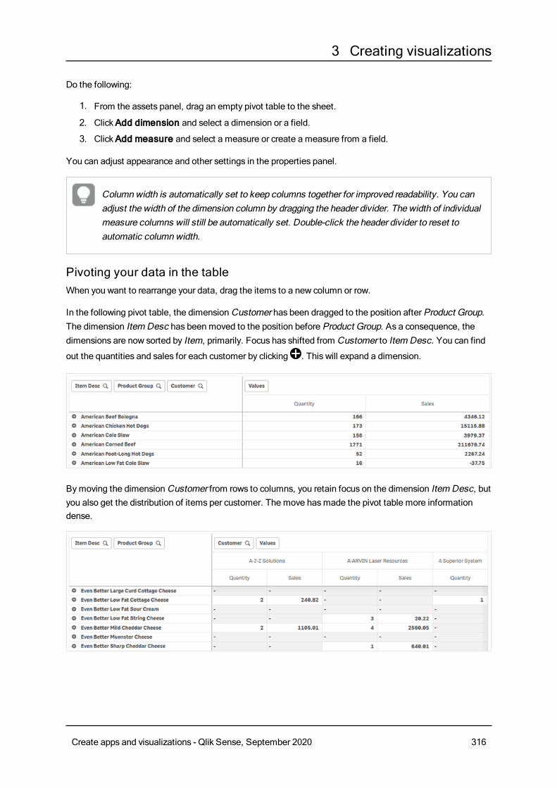
3 Creating visualizations
Do the following:
1. From the assets panel, drag an empty pivot table to the sheet.
2. ClickAdd dimension and select a dimension or a field.
3. ClickAdd measure and select a measure or create a measure from a field.
You can adjust appearance and other settings in the properties panel.
Columnwidth is automatically set to keep columns together for improved readability. You canadjust the width of the dimension column by dragging the header divider. The width of individualmeasure columns will still be automatically set. Double-click the header divider to reset toautomatic columnwidth.
Pivoting your data in the tableWhen you want to rearrange your data, drag the items to a new column or row.
In the following pivot table, the dimensionCustomer has been dragged to the position after Product Group.The dimension Item Desc has been moved to the position before Product Group. As a consequence, thedimensions are now sorted by Item, primarily. Focus has shifted from Customer to Item Desc. You can find
out the quantities and sales for each customer by clicking . This will expand a dimension.
Bymoving the dimensionCustomer from rows to columns, you retain focus on the dimension Item Desc, butyou also get the distribution of items per customer. The move hasmade the pivot table more informationdense.
Create apps and visualizations - Qlik Sense, September 2020 316
3 Creating visualizations
Measure groupingAs you may have noticed, Quantity and Sales are not presented as separate measures in the top columnrow. Next to the dimensionCustomer, you find an item called Values. When you use more than onemeasure, they are automatically grouped together forming a measure group, Values. This group can beadded to the rows section or the columns section. The measure group cannot be edited or selected in thetable. You cannot split up the measure item and use one measure as a row and another as a column.
Pivoting your data in the properties panelIn the properties panel, you can add measures and dimensions to the pivot table, and also pivot rows orcolumns.
DataIn the data pane, you can add dimensions and measures. You can move items between rows and columns.You can also change item order inside rows or columns. When you use more than one measure, they aregrouped and a Values item is created.
Create apps and visualizations - Qlik Sense, September 2020 317
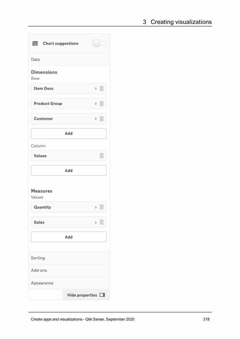
3 Creating visualizations
Create apps and visualizations - Qlik Sense, September 2020 318
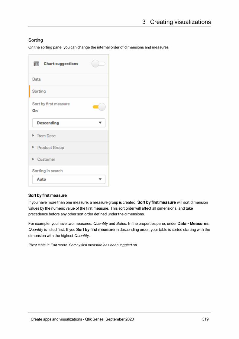
3 Creating visualizations
SortingOn the sorting pane, you can change the internal order of dimensions and measures.
Sort by first measure
If you have more than one measure, a measure group is created. Sort by first measure will sort dimensionvalues by the numeric value of the first measure. This sort order will affect all dimensions, and takeprecedence before any other sort order defined under the dimensions.
For example, you have two measures: Quantity and Sales. In the properties pane, underData> Measures,Quantity is listed first. If you Sort by first measure in descending order, your table is sorted starting with thedimension with the highest Quantity.
Pivot table in Edit mode. Sort by first measure has been toggled on.
Create apps and visualizations - Qlik Sense, September 2020 319
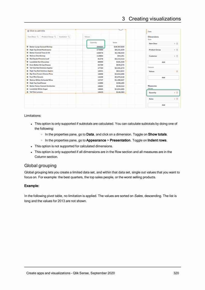
3 Creating visualizations
Limitations:
l This option is only supported if subtotals are calculated. You can calculate subtotals by doing one ofthe following:
o In the properties pane, go toData, and click on a dimension. Toggle on Show totals.o In the properties pane, go to Appearance > Presentation. Toggle on Indent rows.
l This option is not supported for calculated dimensions.
l This option is only supported if all dimensions are in the Row section and all measures are in theColumn section.
Global groupingGlobal grouping lets you create a limited data set, and within that data set, single out values that you want tofocus on. For example: the best quarters, the top sales people, or the worst selling products.
Example:
In the following pivot table, no limitation is applied. The values are sorted on Sales, descending. The list islong and the values for 2013 are not shown.
Create apps and visualizations - Qlik Sense, September 2020 320
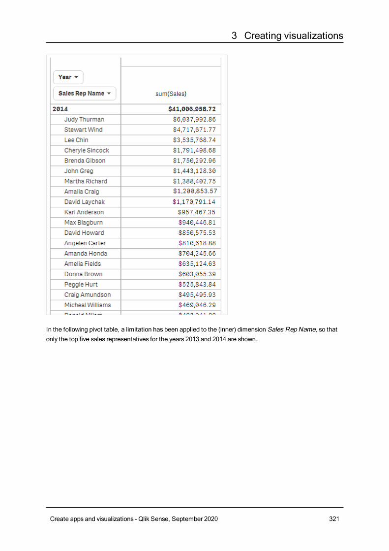
3 Creating visualizations
In the following pivot table, a limitation has been applied to the (inner) dimension Sales Rep Name, so thatonly the top five sales representatives for the years 2013 and 2014 are shown.
Create apps and visualizations - Qlik Sense, September 2020 321
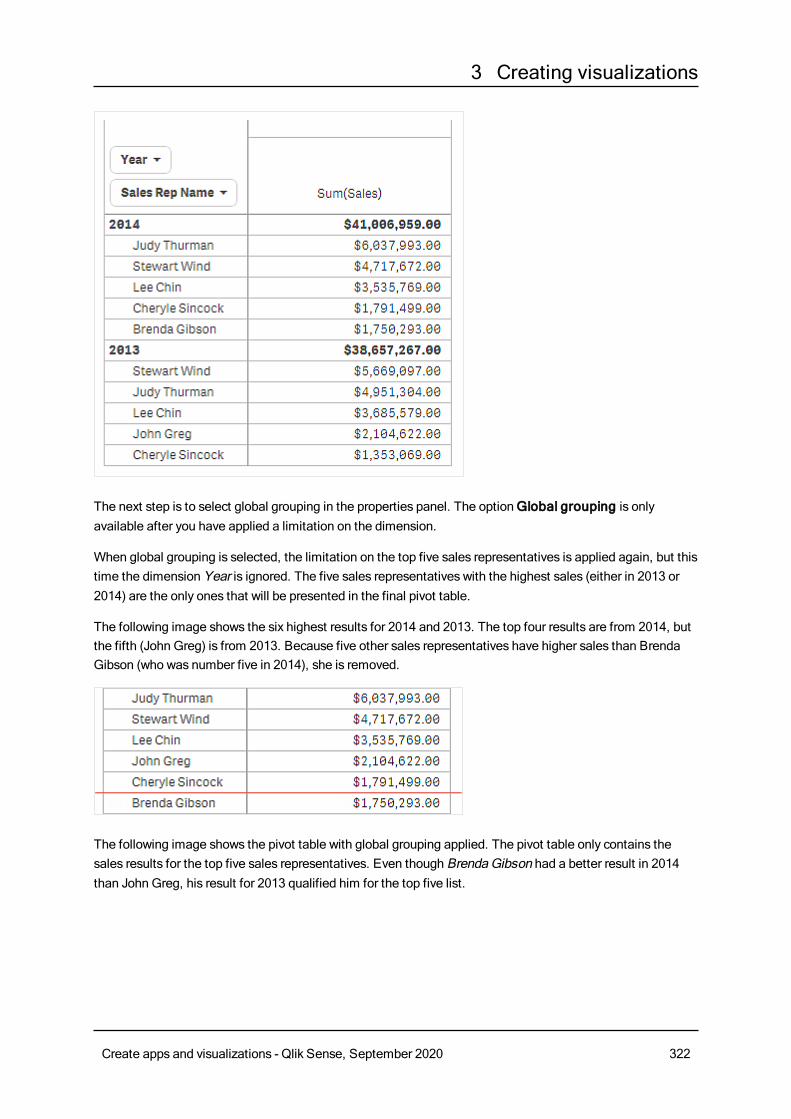
3 Creating visualizations
The next step is to select global grouping in the properties panel. The optionGlobal grouping is onlyavailable after you have applied a limitation on the dimension.
When global grouping is selected, the limitation on the top five sales representatives is applied again, but thistime the dimension Year is ignored. The five sales representatives with the highest sales (either in 2013 or2014) are the only ones that will be presented in the final pivot table.
The following image shows the six highest results for 2014 and 2013. The top four results are from 2014, butthe fifth (John Greg) is from 2013. Because five other sales representatives have higher sales than BrendaGibson (who was number five in 2014), she is removed.
The following image shows the pivot table with global grouping applied. The pivot table only contains thesales results for the top five sales representatives. Even though BrendaGibson had a better result in 2014than John Greg, his result for 2013 qualified him for the top five list.
Create apps and visualizations - Qlik Sense, September 2020 322
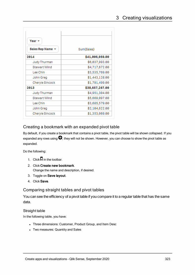
3 Creating visualizations
Creating a bookmark with an expanded pivot tableBy default, if you create a bookmark that contains a pivot table, the pivot table will be shown collapsed. If you
expanded any rows using , they will not be shown. However, you can choose to show the pivot table as
expanded.
Do the following:
1. Click in the toolbar.
2. ClickCreate new bookmark.Change the name and description, if desired.
3. Toggle on Save layout.
4. ClickSave.
Comparing straight tables and pivot tablesYou can see the efficiency of a pivot table if you compare it to a regular table that has the samedata.
Straight tableIn the following table, you have:
l Three dimensions: Customer, Product Group, and Item Desc
l Twomeasures: Quantity and Sales
Create apps and visualizations - Qlik Sense, September 2020 323
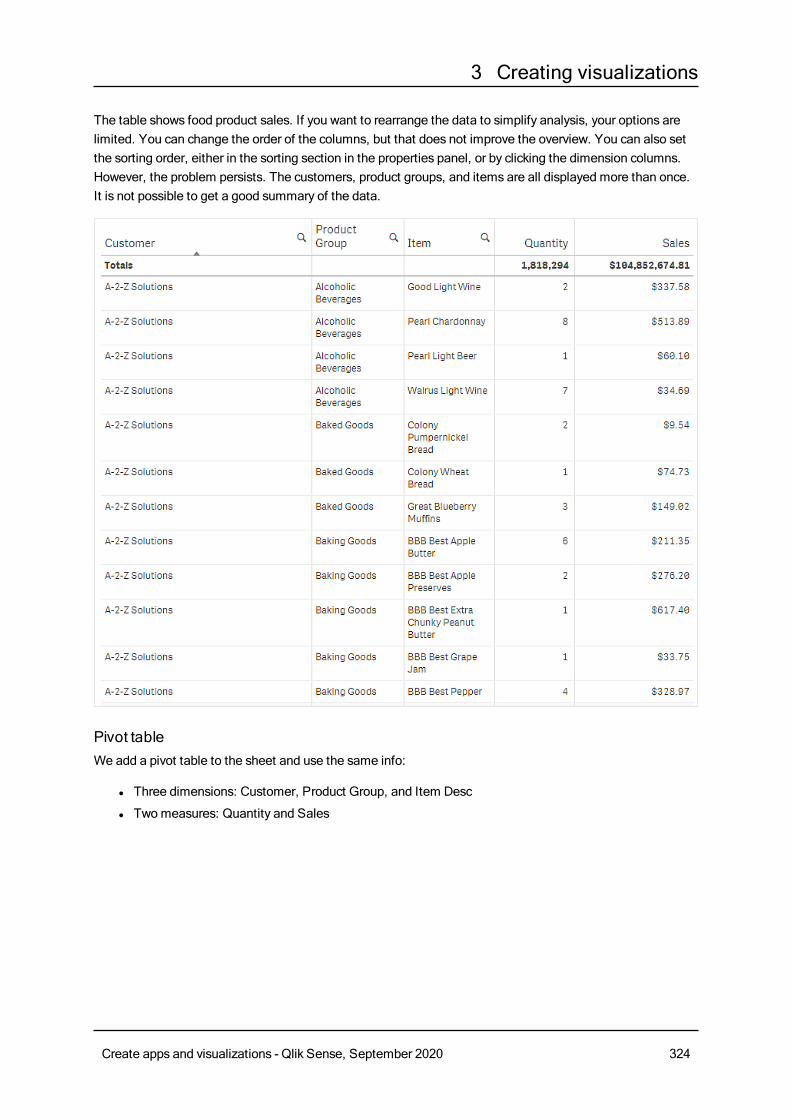
3 Creating visualizations
The table shows food product sales. If you want to rearrange the data to simplify analysis, your options arelimited. You can change the order of the columns, but that does not improve the overview. You can also setthe sorting order, either in the sorting section in the properties panel, or by clicking the dimension columns.However, the problem persists. The customers, product groups, and items are all displayed more than once.It is not possible to get a good summary of the data.
Pivot tableWe add a pivot table to the sheet and use the same info:
l Three dimensions: Customer, Product Group, and Item Desc
l Twomeasures: Quantity and Sales
Create apps and visualizations - Qlik Sense, September 2020 324
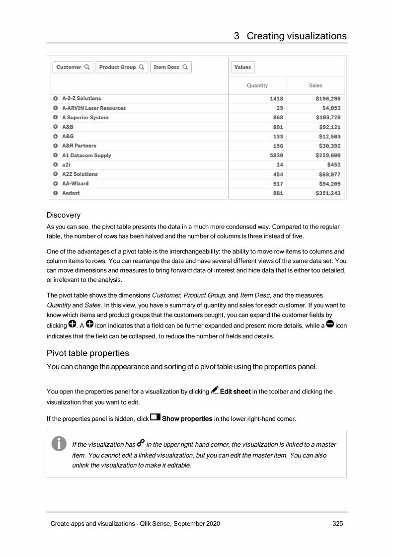
3 Creating visualizations
DiscoveryAs you can see, the pivot table presents the data in a much more condensed way. Compared to the regulartable, the number of rows has been halved and the number of columns is three instead of five.
One of the advantages of a pivot table is the interchangeability: the ability to move row items to columns andcolumn items to rows. You can rearrange the data and have several different views of the same data set. Youcan move dimensions and measures to bring forward data of interest and hide data that is either too detailed,or irrelevant to the analysis.
The pivot table shows the dimensionsCustomer, Product Group, and Item Desc, and the measuresQuantity and Sales. In this view, you have a summary of quantity and sales for each customer. If you want toknowwhich items and product groups that the customers bought, you can expand the customer fields by
clicking . A icon indicates that a field can be further expanded and present more details, while a icon
indicates that the field can be collapsed, to reduce the number of fields and details.
Pivot table propertiesYou can change the appearance and sorting of a pivot table using the properties panel.
You open the properties panel for a visualization by clicking Edit sheet in the toolbar and clicking the
visualization that you want to edit.
If the properties panel is hidden, click Show properties in the lower right-hand corner.
If the visualization has in the upper right-hand corner, the visualization is linked to amaster
item. You cannot edit a linked visualization, but you can edit themaster item. You can alsounlink the visualization tomake it editable.
Create apps and visualizations - Qlik Sense, September 2020 325
3 Creating visualizations
Some of the settings in the properties panel are only available under certain circumstances, forexample, when you usemore than one dimension or measure, or when you select an optionthat makes other options available.
Data
Dimensions
l <Dimension name>: Click the dimension name to open the dimension settings.
If you want to delete the dimension, right-click the dimension and select in the dialog. Alternatively,
click the dimension and click .
o Dimension: Only displayed for master items. To be able to edit a dimension that is linked to amaster item, you must first unlink the dimension.
o Field: If you have added a field from Fields in the assets panel, the field name is automatically
displayed. Click to open the expression editor.
o Label: Enter a label for the dimension. If you have added a field from Fields in the assetspanel, the field name is automatically displayed.
o Includenull values: When selected, the measure values of all null dimensions aresummarized and presented as one dimension item in a visualization. All null values aredisplayed as gaps or dashes (-).
o Limitation: Limits the number of displayed values. When you set a limitation, the onlydimensions displayed are those where the measure value meets the limitation criterion:
n No limitation: The default value.
n Fixed number: Select to display the top or bottom values. Set the number of values.
You can also use an expression to set the number. Click to open the expression
editor.
n Exact value: Use the operators and set the exact limit value. You can also use an
expression to set the number. Click to open the expression editor.
n Relative value: Use the operators and set the relative limit value in percent. You can
also use an expression to set the number. Click to open the expression editor.
n Calculated on measure: <measure>: Shown when you make a limitation to thenumber of displayed dimension values. The dimensions whose measure value meet thecriterion are displayed.
o Show column if: You can show or hide a column depending on if a condition is true or false.The column is shown only if the expression in this field is evaluated as true. If this field isempty, the column is always shown. You can use this to require a field selection beforecalculating and showing large amounts of data.
o Background color expression: Enter an expression for the background color. The text colorautomatically changes to white when a dark background color is used.
o Text color expression: Enter an expression for the text color. If you use the same expressionas in the background color, the text will not be visible.
Create apps and visualizations - Qlik Sense, September 2020 326
3 Creating visualizations
o Show others: When selected, the last value in the visualization (colored gray), summarizes allthe remaining values. When some kind of limitation is set (Fixed number, Exact value, orRelative number), the value counts as 1 in that setting. If, for example, Exact value is usedand set to 10, the tenth value isOthers.
o Other label: Enter a label for the summarized values (when Show others is selected). You
can also use an expression as a label. Click to open the expression editor.
n Add: ClickAdd to open a list of availableDimensions and Fields. Select thedimension or field that you want to use.
You can also click to create a dimension in the expression editor. To be able to edit
a dimension that is linked to a master item, you must first unlink the dimension.o Global grouping: If a limitation is set, you can use global grouping.o Show totals: Adds a top row in the pivot table showing the total value of the underlying rows.
Show totals is not available for dimensions (except the first one) when Indent rows isselected in the Appearance property.
o Totals label: Enter a label for the totals row.o Text alignment: When set toCustom, you can select how to display the content: Left,
Center, orRight. If Text alignment is set to Auto, the alignment is automatically aligned,depending on the content.
o Master item: You can create a master dimension based on the dimension expression byclickingCreate new.
You can drag a field fromMeasures toDimensions to change how it is used. Moving a measure toDimensions removes its aggregation. You cannot drag a master measure toDimensions. You can onlydrag a measure toDimensions if its expression is simple.
Measure
l <Measure name>: Click the measure to open the measure settings.
If you want to delete the measure, right-click the measure and select in the dialog. Alternatively,
click the measure and click .
o Expression: Click to open the expression editor.The existing expression is displayed by
default.o Label: Enter a label for the measure. Measures not saved inMaster items are by default
displayed with the expression as label.o Measure: Only displayed for master items. To be able to edit a measure that is linked to a
master item, you must first unlink the measure.o Number formatting: Different options for formatting the measure values. If you want to
change the number format at app level, and not just for a single measure, it is better to do thatin the regional settings, that is, in the SET statements at the beginning of the script in the dataload editor.
The following number formats are available:
Create apps and visualizations - Qlik Sense, September 2020 327
3 Creating visualizations
n Auto: Qlik Sense automatically sets a number formatting based on the source data.To represent numeric abbreviations, the international SI units are used, such as k(thousand), M (million), and G (billion).
n Number: By default, the formatting is set to Simple, and you can select the formattingfrom the options in the drop-down list. Click the button to change toCustomformatting, and use the Format pattern box to change the format pattern.
Examples:
l # ##0 describes the number as an integer with a thousands separator. In thisexample " " is used as a thousands separator.
l ###0 describes the number as an integer without a thousands separator.
l 0000 describes the number as an integer with at least four digits. For example,the number 123 will be shown as 0123.
l 0.000 describes the number with three decimals. In this example "." is used as adecimal separator.
If you add the percent sign (%) to the format pattern, the measure values areautomatically multiplied by 100.
n Money: By default, the format pattern used for money is the same as set up in theoperating system. Use the Format pattern box to change the format pattern.
n Date: By default, the formatting is set to Simple, and you can select the formattingfrom the options in the drop-down list. Click the button to change toCustomformatting, and use the Format pattern box to change the format pattern.
n Duration: By default, the format pattern used for duration is the same as set up in theoperating system. Duration can be formatted as days, or as a combination of days,hours, minutes, seconds and fractions of seconds. Use the Format pattern box tochange the format pattern.
n Custom: By default, the format pattern used for custom is the same as set up in theoperating system. Use the Format pattern boxes to change the format pattern.
l Decimal separator: Set the decimal separator.
l Thousands separator: Set the thousands separator.
l Format pattern: Set the number format pattern.
l Reset pattern: Click to reset to default pattern.
n Measure expression: The format pattern is determined by the measure expression.Use this option to display custom number formatting for a measure in a visualization.Limitations:
l Only works with visualizations that accept measures.
l Cannot be used with a box plot.
l Does not affect the number formatting of the axis.o Show column if: You can show or hide a column depending on if a condition is true or false.
The column is shown only if the expression in this field is evaluated as true. If this field isempty, the column is always shown.
Create apps and visualizations - Qlik Sense, September 2020 328
3 Creating visualizations
o Background color expression: Enter an expression for the background color. The text colorautomatically changes to white when a dark background color is used.
o Text color expression: Enter an expression for the text color. If you use the same expressionas in the background color, the text will not be visible.
o Text alignment: When set toCustom, you can select how to display the content: Align left orAlign right. If Text alignment is set to Auto, the alignment is automatically aligned left orright, depending on the content.
o Master item: You can create a master measure based on the measure expression by clickingCreate new.
You can drag a field from Dimensions toMeasures to change how it is used. Moving a dimension toMeasures assigns it an aggregation. You cannot drag a master dimension toMeasures.
SortingThe Sort by first measure toggle will sort dimension values by the numeric value of the first measure. Thissort order will affect all dimensions, and take precedence before any other sort order defined under thedimensions. See: Pivot table (page 315).
Drag the dimensions and measures to set the sorting priority order. The numbers show the order.
Dimensions and measures can also be sorted internally:
Click the dimension or measure to expand sorting options. Toggle Sorting to switch toCustom sorting. Thefollowing list shows the internal sorting priority order and sorting options. The sorting is either Ascending orDescending.
l Sort by expression: Enter an expression to sort by. Only available for dimensions.
l Sort numerically
l Sort alphabetically
Additionally, you can sort by load order by switching toCustom and leaving all sorting options unselected.
If you have set a custom order for a field, that custom order will override any selected internal sort order inSorting.
Add-onsData handling:
l Include zero values: When unselected, measures that have the value ‘0’ are not included in thepresentation. If there is more than one measure value, all the measure valuesmust have the value ‘0’to be excluded from the presentation.
l Calculation condition: Specify an expression in this text field to set a condition that needs to befulfilled (true) for the object to be displayed. The value may be entered as a calculated formula. Forexample: count(distinct Team)<3. If the condition is not fulfilled, the message or expression enteredinDisplayed message is displayed.
Create apps and visualizations - Qlik Sense, September 2020 329
3 Creating visualizations
A calculation condition is useful when a chart or table is very big and makes the visualization slow torespond. A calculation condition can then help so that for example an object does not show until theuser has filtered the data to a more manageable level by applying selections.
Appearance
General
l Show titles: Select to enable or disable titles, subtitles, and footnotes in the chart.Enter Title, Subtitle, and Footnote. By default, the string is interpreted as a text string. However,you can also use the text field for an expression, or a combination of text and expression. An equalssign (=), at the beginning of a string shows that it contains an expression.Click if you want to create an expression with the expression editor.
Titles are displayed on a single line. If you inject line breaks they will be ignored.
Example:
Assume that the following string is used, including quotation marks: 'Sales: ' & Sum(Sales).By default, the string is interpreted as a text string and is displayed as presented in the example. But ifyou begin the string with an equals sign: (='Sales: ' & Sum(Sales)), the string is interpreted as anexpression instead. The output is then Sales: <value of expression>, where <value of expression>is the calculated value.
l Disable hover menu: Select to disable the hover menu in the visualization.
l Show details: Set to Show if you want to allow users to be able to choose to view details, such asdescriptions, measures, and dimensions.
Alternate states
State: Set the state to apply to the visualization. You can select:
l Any alternate state defined inMaster items.
l <inherited>, in which case the state defined for the sheet is used.
l <default state>, which represents the state where no alternate state is applied.
Presentation
l Styling: Customize the styling of the pivottable, overriding the app theme. You can add custom header and content font sizes and colors. Youcan set rows to be highlighted when hovered over and set colors for the row and font. You can also setthe size of the scrollbar.
l Fully expanded: When selected, all values in the pivot table are displayed.
l Indent rows: When selected, an indentation is added to the beginning of each row.
Scatter plotThe scatter plot presents pairs of values from twoor threemeasures.
Create apps and visualizations - Qlik Sense, September 2020 330
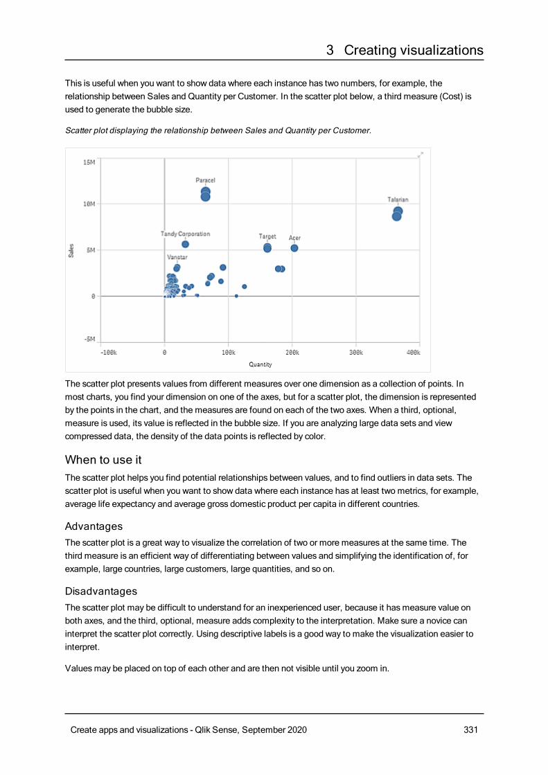
3 Creating visualizations
This is useful when you want to show data where each instance has two numbers, for example, therelationship between Sales and Quantity per Customer. In the scatter plot below, a third measure (Cost) isused to generate the bubble size.
Scatter plot displaying the relationship between Sales and Quantity per Customer.
The scatter plot presents values from different measures over one dimension as a collection of points. Inmost charts, you find your dimension on one of the axes, but for a scatter plot, the dimension is representedby the points in the chart, and the measures are found on each of the two axes. When a third, optional,measure is used, its value is reflected in the bubble size. If you are analyzing large data sets and viewcompressed data, the density of the data points is reflected by color.
When to use itThe scatter plot helps you find potential relationships between values, and to find outliers in data sets. Thescatter plot is useful when you want to show data where each instance has at least two metrics, for example,average life expectancy and average gross domestic product per capita in different countries.
AdvantagesThe scatter plot is a great way to visualize the correlation of two or more measures at the same time. Thethird measure is an efficient way of differentiating between values and simplifying the identification of, forexample, large countries, large customers, large quantities, and so on.
DisadvantagesThe scatter plot may be difficult to understand for an inexperienced user, because it hasmeasure value onboth axes, and the third, optional, measure adds complexity to the interpretation. Make sure a novice caninterpret the scatter plot correctly. Using descriptive labels is a good way to make the visualization easier tointerpret.
Valuesmay be placed on top of each other and are then not visible until you zoom in.
Create apps and visualizations - Qlik Sense, September 2020 331
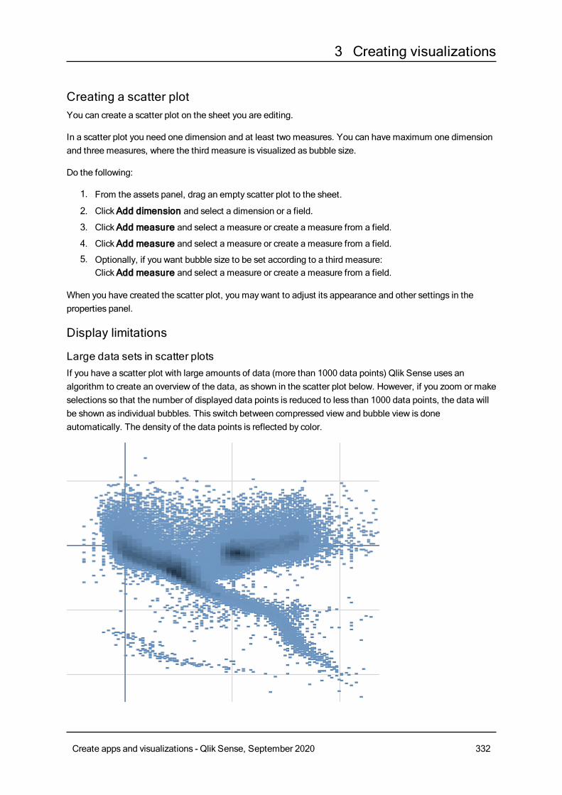
3 Creating visualizations
Creating a scatter plotYou can create a scatter plot on the sheet you are editing.
In a scatter plot you need one dimension and at least two measures. You can have maximum one dimensionand three measures, where the third measure is visualized as bubble size.
Do the following:
1. From the assets panel, drag an empty scatter plot to the sheet.
2. ClickAdd dimension and select a dimension or a field.
3. ClickAdd measure and select a measure or create a measure from a field.
4. ClickAdd measure and select a measure or create a measure from a field.
5. Optionally, if you want bubble size to be set according to a third measure:ClickAdd measure and select a measure or create a measure from a field.
When you have created the scatter plot, you may want to adjust its appearance and other settings in theproperties panel.
Display limitations
Large data sets in scatter plotsIf you have a scatter plot with large amounts of data (more than 1000 data points) Qlik Sense uses analgorithm to create an overview of the data, as shown in the scatter plot below. However, if you zoom or makeselections so that the number of displayed data points is reduced to less than 1000 data points, the data willbe shown as individual bubbles. This switch between compressed view and bubble view is doneautomatically. The density of the data points is reflected by color.
Create apps and visualizations - Qlik Sense, September 2020 332
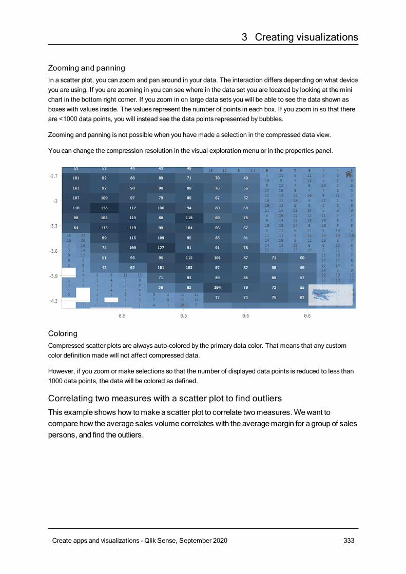
3 Creating visualizations
Zooming and panningIn a scatter plot, you can zoom and pan around in your data. The interaction differs depending on what deviceyou are using. If you are zooming in you can see where in the data set you are located by looking at the minichart in the bottom right corner. If you zoom in on large data sets you will be able to see the data shown asboxes with values inside. The values represent the number of points in each box. If you zoom in so that thereare <1000 data points, you will instead see the data points represented by bubbles.
Zooming and panning is not possible when you have made a selection in the compressed data view.
You can change the compression resolution in the visual exploration menu or in the properties panel.
ColoringCompressed scatter plots are always auto-colored by the primary data color. That means that any customcolor definition made will not affect compressed data.
However, if you zoom or make selections so that the number of displayed data points is reduced to less than1000 data points, the data will be colored as defined.
Correlating two measures with a scatter plot to find outliersThis example shows how tomakea scatter plot to correlate twomeasures.Wewant tocompare how the average sales volume correlates with the averagemargin for a group of salespersons, and find the outliers.
Create apps and visualizations - Qlik Sense, September 2020 333
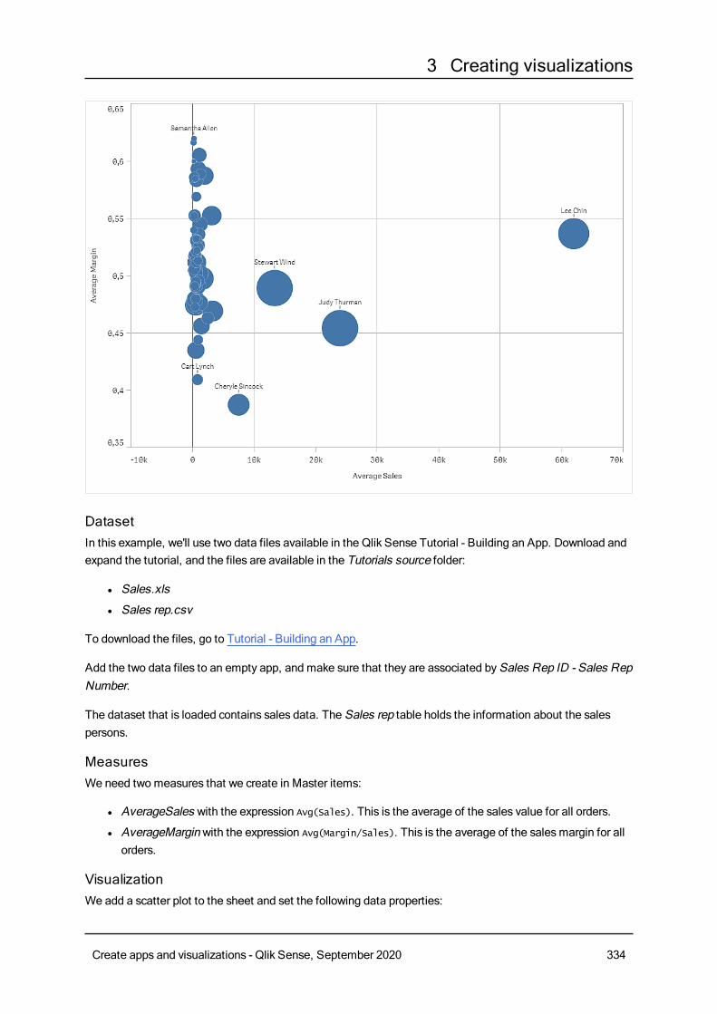
3 Creating visualizations
DatasetIn this example, we'll use two data files available in the Qlik Sense Tutorial - Building an App. Download andexpand the tutorial, and the files are available in the Tutorials source folder:
l Sales.xls
l Sales rep.csv
To download the files, go to Tutorial - Building an App.
Add the two data files to an empty app, and make sure that they are associated bySales Rep ID - Sales RepNumber.
The dataset that is loaded contains sales data. The Sales rep table holds the information about the salespersons.
MeasuresWe need two measures that we create in Master items:
l AverageSales with the expression Avg(Sales). This is the average of the sales value for all orders.
l AverageMarginwith the expression Avg(Margin/Sales). This is the average of the salesmargin for allorders.
VisualizationWe add a scatter plot to the sheet and set the following data properties:
Create apps and visualizations - Qlik Sense, September 2020 334
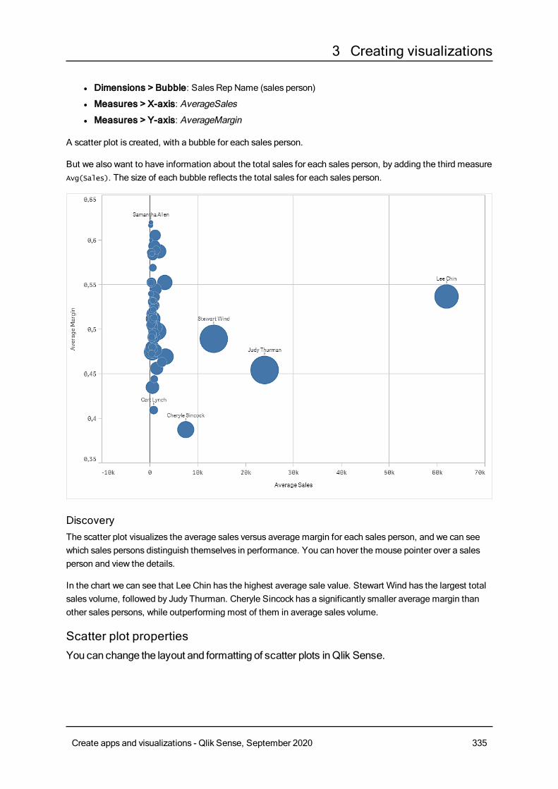
3 Creating visualizations
l Dimensions > Bubble: Sales Rep Name (sales person)
l Measures > X-axis: AverageSales
l Measures > Y-axis: AverageMargin
A scatter plot is created, with a bubble for each sales person.
But we also want to have information about the total sales for each sales person, by adding the third measureAvg(Sales). The size of each bubble reflects the total sales for each sales person.
DiscoveryThe scatter plot visualizes the average sales versus average margin for each sales person, and we can seewhich sales persons distinguish themselves in performance. You can hover the mouse pointer over a salesperson and view the details.
In the chart we can see that Lee Chin has the highest average sale value. Stewart Wind has the largest totalsales volume, followed by Judy Thurman. Cheryle Sincock has a significantly smaller average margin thanother sales persons, while outperforming most of them in average sales volume.
Scatter plot propertiesYou can change the layout and formatting of scatter plots inQlik Sense.
Create apps and visualizations - Qlik Sense, September 2020 335
3 Creating visualizations
You open the properties panel for a visualization by clicking Edit sheet in the toolbar and clicking the
visualization that you want to edit.
If the properties panel is hidden, click Show properties in the lower right-hand corner.
If the visualization has in the upper right-hand corner, the visualization is linked to amaster
item. You cannot edit a linked visualization, but you can edit themaster item. You can alsounlink the visualization tomake it editable.
Some of the settings in the properties panel are only available under certain circumstances, forexample, when you usemore than one dimension or measure, or when you select an optionthat makes other options available.
DataClickAdd to add a dimension or a measure.
Dimensions
On theData tab, underDimensions, clickAdd to open a list of availableDimensions and Fields. Selectthe dimension or field that you want to use.
You can also click to create a dimension in the expression editor. To be able to edit a dimension that is
linked to a master item, you must first unlink the dimension. Another way to create a dimension is to type theexpression directly in the text box. Expressions added in this waymust begin with an equals sign (=). Here isan example with a calculated dimension:
=If (Week < 14, Week, 'Sales')
If Add is dimmed, you cannot add more dimensions.
l <Dimension name>: Click the dimension name to open the dimension settings.
If you want to delete the dimension, right-click the dimension and select in the dialog. Alternatively,
click the dimension and click .
o Dimension: Only displayed for master items. To be able to edit a dimension that is linked to amaster item, you must first unlink the dimension.
o Field: If you have added a field from Fields in the assets panel, the field name is automatically
displayed. Click to open the expression editor.
o Label: Enter a label for the dimension. If you have added a field from Fields in the assetspanel, the field name is automatically displayed.
o Includenull values: When selected, the measure values of all null dimensions aresummarized and presented as one dimension item in a visualization. All null values aredisplayed as gaps or dashes (-).
Create apps and visualizations - Qlik Sense, September 2020 336
3 Creating visualizations
o Limitation: Limits the number of displayed values. When you set a limitation, the onlydimensions displayed are those where the measure value meets the limitation criterion:
n No limitation: The default value.
n Fixed number: Select to display the top or bottom values. Set the number of values.
You can also use an expression to set the number. Click to open the expression
editor.
n Exact value: Use the operators and set the exact limit value. You can also use an
expression to set the number. Click to open the expression editor.
n Relative value: Use the operators and set the relative limit value in percent. You can
also use an expression to set the number. Click to open the expression editor.
n Calculated on measure: <measure>: Shown when you make a limitation to thenumber of displayed dimension values. The dimensions whose measure value meet thecriterion are displayed.
o Show others: When selected, the last value in the visualization (colored gray), summarizes allthe remaining values. When some kind of limitation is set (Fixed number, Exact value, orRelative number), the value counts as 1 in that setting. If, for example, Exact value is usedand set to 10, the tenth value isOthers.This option is not available in box plot dimensions.
o Other label: Enter a label for the summarized values (when Show others is selected). You
can also use an expression as a label. Click to open the expression editor.
l Master item: You can create a master dimension based on the dimension expression by clickingCreate new.
l Add alternative: Alternative dimensions and measures are dimensions and measures that are addedto a visualization, but are not displayed until a user chooses to switch which dimensions and measuresare being displayed during visual exploration.
You can drag a field fromMeasures toDimensions to change how it is used. Moving a measure toDimensions removes its aggregation. You cannot drag a master measure toDimensions. You can onlydrag a measure toDimensions if its expression is simple.
Measures
On theData tab, underMeasures, clickAdd to open a list of available measures. Select the measure thatyou want to add to the visualization. If you select a field, you are automatically presented with some commonaggregation functions that you can choose between for the measure.
If no measure is available, you need to create one. You can enter the expression directly in the text box, or
click to create a measure in the expression editor.
To be able to edit a measure that is linked to a master item, you must first unlink the measure.
If Add is dimmed, you cannot add more measures.
Create apps and visualizations - Qlik Sense, September 2020 337
3 Creating visualizations
l <Measure name>:
o Expression: Click to open the expression editor. The existing expression is displayed by
default.o Label: Enter a label for the measure. Measures not saved inMaster items are by default
displayed with the expression as label.o Measure: Only displayed for master items. To be able to edit a measure that is linked to a
master item, you must first unlink the measure.oo Number formatting: Different options for formatting the measure values. If you want to
change the number format at app level, and not just for a single measure, it is better to do thatin the regional settings, that is, in the SET statements at the beginning of the script in the dataload editor.
The following number formats are available:
n Auto: Qlik Sense automatically sets a number formatting based on the source data.To represent numeric abbreviations, the international SI units are used, such as k(thousand), M (million), and G (billion).
n Number: By default, the formatting is set to Simple, and you can select the formattingfrom the options in the drop-down list. Click the button to change toCustomformatting, and use the Format pattern box to change the format pattern.
Examples:
l # ##0 describes the number as an integer with a thousands separator. In thisexample " " is used as a thousands separator.
l ###0 describes the number as an integer without a thousands separator.
l 0000 describes the number as an integer with at least four digits. For example,the number 123 will be shown as 0123.
l 0.000 describes the number with three decimals. In this example "." is used as adecimal separator.
If you add the percent sign (%) to the format pattern, the measure values areautomatically multiplied by 100.
n Money: By default, the format pattern used for money is the same as set up in theoperating system. Use the Format pattern box to change the format pattern.
n Date: By default, the formatting is set to Simple, and you can select the formattingfrom the options in the drop-down list. Click the button to change toCustomformatting, and use the Format pattern box to change the format pattern.
n Duration: By default, the format pattern used for duration is the same as set up in theoperating system. Duration can be formatted as days, or as a combination of days,hours, minutes, seconds and fractions of seconds. Use the Format pattern box tochange the format pattern.
Create apps and visualizations - Qlik Sense, September 2020 338
3 Creating visualizations
n Custom: By default, the format pattern used for custom is the same as set up in theoperating system. Use the Format pattern boxes to change the format pattern.
l Decimal separator: Set the decimal separator.
l Thousands separator: Set the thousands separator.
l Format pattern: Set the number format pattern.
l Reset pattern: Click to reset to default pattern.
n Measure expression: The format pattern is determined by the measure expression.Use this option to display custom number formatting for a measure in a visualization.Limitations:Only works with visualizations that accept measures.Does not affect the number formatting of the axis.
l Master item: You can create a master measure based on the measure expression by clickingCreatenew.
l Add alternative: Alternative dimensions and measures are dimensions and measures that are addedto a visualization, but are not displayed until a user chooses to switch which dimensions and measuresare being displayed during visual exploration.
You can drag a field from Dimensions toMeasures to change how it is used. Moving a dimension toMeasures assigns it an aggregation. You cannot drag a master dimension toMeasures.
Add-onsX-axis reference lines:
l Add reference line: Click to add a new reference line.
l Show: When selected, the reference line is displayed.
l Label: Enter a label for the reference line.
l Color: In the color picker, select the color of the reference line and the label.
l Reference line expression: Enter a value or an expression for the reference line. Click to open
the expression editor.
l Delete: Click to remove the reference line.
Y-axis reference lines:
l Add reference line: Click to add a new reference line.
l Show: When selected, the reference line is displayed.
l Label: Enter a label for the reference line.
l Color: In the color picker, select the color of the reference line and the label.
l Reference line expression: Enter a value or an expression for the reference line. Click to open
the expression editor.
l Delete: Click to remove the reference line.
Create apps and visualizations - Qlik Sense, September 2020 339
3 Creating visualizations
Data handling:
l Include zero values: When unselected, measures that have the value ‘0’ are not included in thepresentation. If there is more than one measure value, all the measure valuesmust have the value ‘0’to be excluded from the presentation.
l Calculation condition: Specify an expression in this text field to set a condition that needs to befulfilled (true) for the object to be displayed. The value may be entered as a calculated formula. Forexample: count(distinct Team)<3. If the condition is not fulfilled, the message or expression enteredinDisplayed message is displayed.A calculation condition is useful when a chart or table is very big and makes the visualization slow torespond. A calculation condition can then help so that for example an object does not show until theuser has filtered the data to a more manageable level by applying selections.
Appearance
General
l Show titles: On by default in all visualizations except filter panes, KPIs, and text & imagevisualizations.Enter Title, Subtitle, and Footnote. By default, the string is interpreted as a text string. However,you can also use the text field for an expression, or a combination of text and expression. An equalssign (=), at the beginning of a string shows that it contains an expression.Click if you want to create an expression by using the expression editor.
Titles are displayed on a single line. If you inject line breaks they will be ignored.
Example:
Assume that the following string is used, including quotation marks: 'Sales: ' & Sum(Sales).By default, the string is interpreted as a text string and is displayed as presented in the example. But ifyou begin the string with an equals sign: (='Sales: ' & Sum(Sales)), the string is interpreted as anexpression instead. The output is then Sales: <value of expression>, where <value of expression>is the calculated value.
l Disable hover menu: Select to disable the hover menu in the visualization.
l Show details: Set to Show if you want to allow users to be able to choose to view details, such asdescriptions, measures, and dimensions.
Alternate states
State: Set the state to apply to the visualization. You can select:
l Any alternate state defined inMaster items.
l <inherited>, in which case the state defined for the sheet is used.
l <default state>, which represents the state where no alternate state is applied.
Create apps and visualizations - Qlik Sense, September 2020 340
3 Creating visualizations
Presentation
l Navigation: By default, off. When set to Auto, the navigation tool is displayed, with options to panand zoom.
l Bubble size: Set the size of the data point bubbles.For a scatter plot with two measures, this sets the uniform size of all bubbles.For a scatter plot with three measures, this sets the scale of the bubble sizes. In a scatter plot withthree measures, the third measure controls the size of each bubble.
l Labels: Select what labels to display, you have three options:o Auto: The number of labels displayed varies with the size of the visualizationo All: All labels are displayed. This option may cause labels to overlap.o None: No labels are displayed.
l Compression resolution: Set the resolution for compressed data. Only available for large data sets(>1000 data points).
l Grid line spacing: Select the spacing of the grid lines. The Auto setting isMedium.
Colors and legends
You can set the presentation colors of the distribution plot. You only need to select Custom if you want tochange the settings.
l Colors: Select how the chart values are colored. There are two settings:
o Auto: Colors the chart values using default settings.o Custom: Manually select the method of coloring your values in the chart. The following
methods are available:
n Single color: Color the chart using a single color (by default blue). Use the color pickerto change the dimension color.
l Use library colors: Option available when a master dimension used in thevisualization has a color assigned to it. You can select to use the masterdimension color or to disable the master dimension color.
n By dimension: Color the chart by dimension values. By default, 12 colors are used forthe dimensions. The colors are reused when there are more than 12 dimension values.When selected, the following settings are available:
l Select dimension: Enter a field or expression containing the values to colorobjects in this chart.
l Library colors: Select whether to use the master dimension color or to disablethe master dimension color. Option available only when a master dimensionused in the visualization has a color assigned to it.
l Persistent colors: Select to have colors remain the same between selectionstates.
l Color scheme: Select 12 colors or 100 colors to be used for the differentvalues. The 12 colors can all be distinguished by people with color visiondeficiency, but not all of the 100 colors.
Create apps and visualizations - Qlik Sense, September 2020 341

3 Creating visualizations
n By measure:
l Select measure: Select the measure to use to color your chart.
l Library colors: Select whether to use the master measure color or to disablethe master measure color. Option available only when a master measure used inthe visualization has assigned colors.
l Label: Enter text or an expression for the measure that displays in the legend.
l Color scheme: Select a color scheme from the following options:
o Sequential gradient: The transition between the different color groupsis made using different shades of colors. High measure values havedarker hues.
o Sequential classes: The transition between the different color groups ismade using distinctly different colors.
o Diverging gradient: Used when working with data that is ordered fromlow to high, for instance, to show the relationship between different areason a chart. Low and high values have dark colors, mid-range colors arelight.
o Diverging classes: Can be seen as two sequential classes combined,with the mid-range shared. The two extremes, high and low, areemphasized with dark colors with contrasting hues, and the mid-rangecritical values are emphasized with light colors.
l Reverse colors: When selected, the color scheme is reversed.
l Range: Define the range of values used to color bymeasure or by expression.o Auto: The color range is set by the measure or expression values.o Custom: When custom is selected, you can set theMin andMax values
for the color range.
n By expression: Color the chart using an expression to define colors for values.Supported color formats are: RGB, ARGB, and HSL.
l Expression: Enter the expression that you want to use. Click to open the
expression editor.
l The expression is a color code: Selected by default. In most cases, it is bestto keep this setting. When the selection is cleared, the expression evaluates to anumber, which in turn is plotted against one of the chart gradients.For more information, seeColoring a visualization (page 511)When the coloring is bymeasure or by expression, you can set the color range(Min andMax values). By setting the color range, the colors remain constantthroughout selections and paging. When using color by expression, the optionThe expression is a color code must be cleared before you can set the colorrange.
l Show legend: Not available when Single color is selected. By default set toOff. The legend isdisplayed if there is enough space. The placement can be changed in the Legend position setting.
l Legend position: Select where to display the legend.
l Show legend title: When selected, the legend title is displayed.
Create apps and visualizations - Qlik Sense, September 2020 342
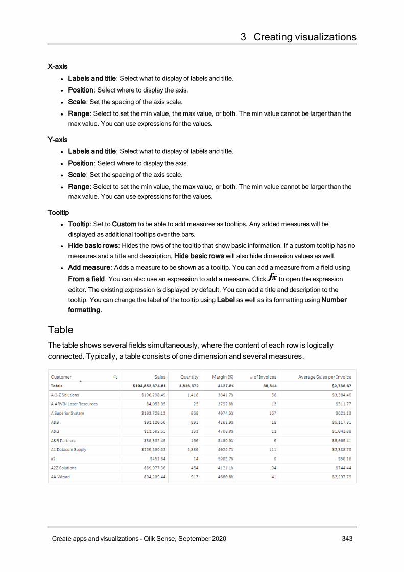
3 Creating visualizations
X-axis
l Labels and title: Select what to display of labels and title.
l Position: Select where to display the axis.
l Scale: Set the spacing of the axis scale.
l Range: Select to set the min value, the max value, or both. The min value cannot be larger than themax value. You can use expressions for the values.
Y-axis
l Labels and title: Select what to display of labels and title.
l Position: Select where to display the axis.
l Scale: Set the spacing of the axis scale.
l Range: Select to set the min value, the max value, or both. The min value cannot be larger than themax value. You can use expressions for the values.
Tooltip
l Tooltip: Set toCustom to be able to add measures as tooltips. Any added measures will bedisplayed as additional tooltips over the bars.
l Hide basic rows: Hides the rows of the tooltip that show basic information. If a custom tooltip has nomeasures and a title and description, Hide basic rows will also hide dimension values as well.
l Add measure: Adds a measure to be shown as a tooltip. You can add a measure from a field using
From a field. You can also use an expression to add a measure. Click to open the expression
editor. The existing expression is displayed by default. You can add a title and description to thetooltip. You can change the label of the tooltip using Label as well as its formatting usingNumberformatting.
TableThe table shows several fields simultaneously, where the content of each row is logicallyconnected. Typically, a table consists of one dimension and severalmeasures.
Create apps and visualizations - Qlik Sense, September 2020 343
3 Creating visualizations
You only make selections in the dimension columns. All dimension columns have a search icon in the
header.
When to use itUse a table, when you want to view detailed data and precise values rather than visualizations of values.Tables are good when you want to compare individual values. Drill-down group dimensions are very efficientin tables. Within a limited space, you can drill down to the next level of detail and analyze the updatedmeasure values.
AdvantagesYou can filter and sort the table in different ways. Many values can be included in a table, and when you drilldown in a table, you make good use of a limited space of the sheet. A table is excellent when you want to seeexact values rather than trends or patterns.
DisadvantagesIf the table containsmany values, it is difficult to get an overview of how values are related. It is also hard toidentify an irregularity within the table.
Creating a tableYou can create a new table on the sheet you are editing.
Do the following:
1. From the assets panel, drag an empty table to the sheet.
2. ClickAdd dimension and select a dimension or a field.
3. ClickAdd measure and select a measure or create a measure from a field.
When you have created the table, you may want to adjust its appearance and other settings in the propertiespanel.
Columnwidth is automatically set to keep columns together for improved readability. You canadjust the width of a column by dragging the header divider. Double-click the header divider toreset to the default width.
Aligning dataIf Text alignment is set to Auto, column data is aligned according to data type: text values are left-alignedand number values, including date related values, are right-aligned. If you set it toCustom, you can align thedata to the left, center, or right.
Sorting the tableYou can adjust the sorting of the table in several ways:
l Column sorting: adjust the order of the dimensions and measures from left to right
l Row sorting: adjust the sorting priority order of the rows
Create apps and visualizations - Qlik Sense, September 2020 344
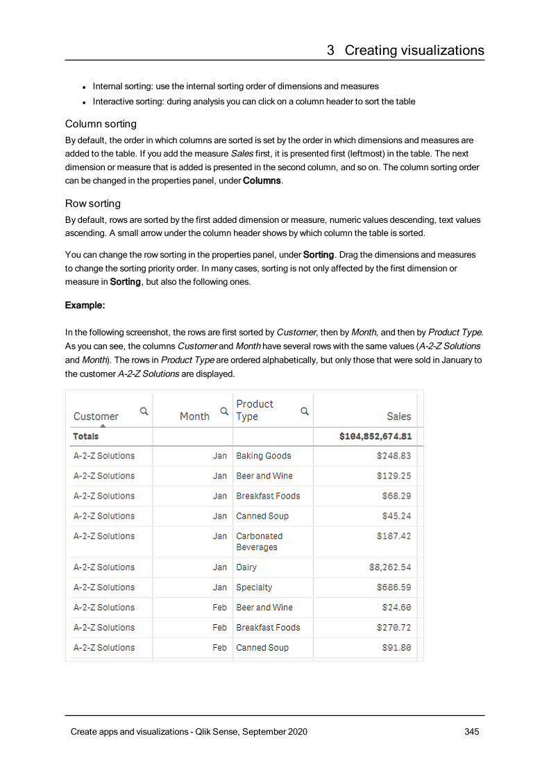
3 Creating visualizations
l Internal sorting: use the internal sorting order of dimensions and measures
l Interactive sorting: during analysis you can click on a column header to sort the table
Column sortingBy default, the order in which columns are sorted is set by the order in which dimensions and measures areadded to the table. If you add the measure Sales first, it is presented first (leftmost) in the table. The nextdimension or measure that is added is presented in the second column, and so on. The column sorting ordercan be changed in the properties panel, underColumns.
Row sortingBy default, rows are sorted by the first added dimension or measure, numeric values descending, text valuesascending. A small arrow under the column header shows by which column the table is sorted.
You can change the row sorting in the properties panel, under Sorting. Drag the dimensions and measuresto change the sorting priority order. In many cases, sorting is not only affected by the first dimension ormeasure in Sorting, but also the following ones.
Example:
In the following screenshot, the rows are first sorted byCustomer, then byMonth, and then byProduct Type.As you can see, the columnsCustomer andMonth have several rows with the same values (A-2-Z SolutionsandMonth). The rows in Product Type are ordered alphabetically, but only those that were sold in January tothe customer A-2-Z Solutions are displayed.
Create apps and visualizations - Qlik Sense, September 2020 345
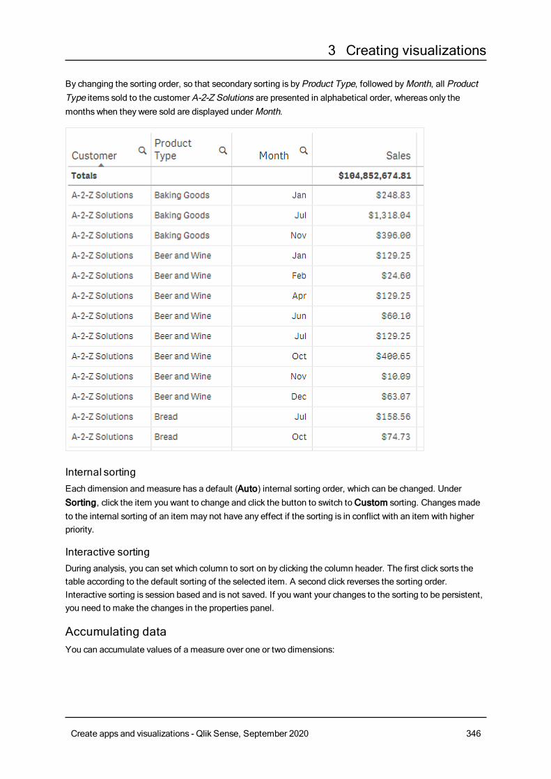
3 Creating visualizations
By changing the sorting order, so that secondary sorting is byProduct Type, followed byMonth, all ProductType items sold to the customer A-2-Z Solutions are presented in alphabetical order, whereas only themonths when they were sold are displayed underMonth.
Internal sortingEach dimension and measure has a default (Auto) internal sorting order, which can be changed. UnderSorting, click the item you want to change and click the button to switch toCustom sorting. Changesmadeto the internal sorting of an item may not have any effect if the sorting is in conflict with an item with higherpriority.
Interactive sortingDuring analysis, you can set which column to sort on by clicking the column header. The first click sorts thetable according to the default sorting of the selected item. A second click reverses the sorting order.Interactive sorting is session based and is not saved. If you want your changes to the sorting to be persistent,you need to make the changes in the properties panel.
Accumulating dataYou can accumulate values of a measure over one or two dimensions:
Create apps and visualizations - Qlik Sense, September 2020 346
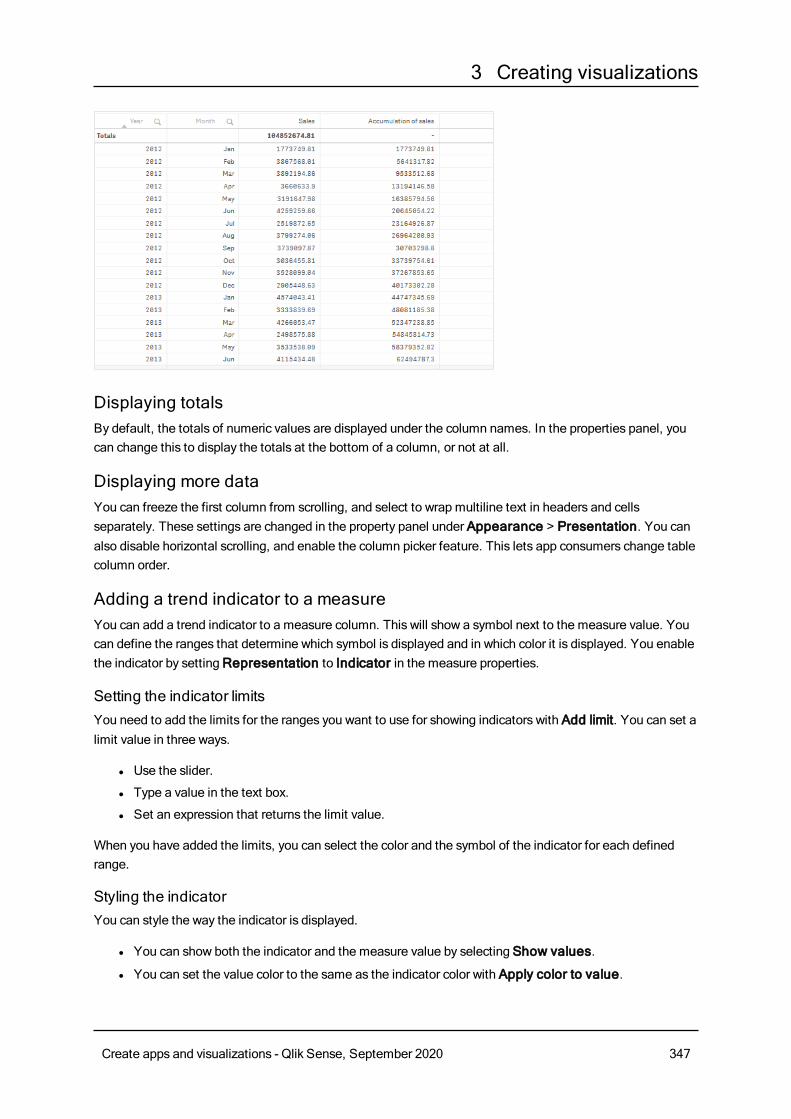
3 Creating visualizations
Displaying totalsBy default, the totals of numeric values are displayed under the column names. In the properties panel, youcan change this to display the totals at the bottom of a column, or not at all.
Displaying more dataYou can freeze the first column from scrolling, and select to wrap multiline text in headers and cellsseparately. These settings are changed in the property panel under Appearance > Presentation. You canalso disable horizontal scrolling, and enable the column picker feature. This lets app consumers change tablecolumn order.
Adding a trend indicator to a measureYou can add a trend indicator to a measure column. This will show a symbol next to the measure value. Youcan define the ranges that determine which symbol is displayed and in which color it is displayed. You enablethe indicator by settingRepresentation to Indicator in the measure properties.
Setting the indicator limitsYou need to add the limits for the ranges you want to use for showing indicators with Add limit. You can set alimit value in three ways.
l Use the slider.
l Type a value in the text box.
l Set an expression that returns the limit value.
When you have added the limits, you can select the color and the symbol of the indicator for each definedrange.
Styling the indicatorYou can style the way the indicator is displayed.
l You can show both the indicator and the measure value by selecting Show values.
l You can set the value color to the same as the indicator color with Apply color to value.
Create apps and visualizations - Qlik Sense, September 2020 347
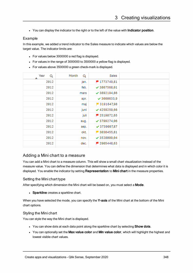
3 Creating visualizations
l You can display the indicator to the right or to the left of the value with Indicator position.
ExampleIn this example, we added a trend indicator to the Salesmeasure to indicate which values are below thetarget value. The indicator limits are:
l For values below 3000000 a red flag is displayed.
l For values in the range of 3000000 to 3500000 a yellow flag is displayed.
l For values above 3500000 a green check-mark is displayed.
Adding a Mini chart to a measureYou can add a Mini chart to a measure column. This will show a small chart visualization instead of themeasure value. You can define the dimension that determines what data is displayed and in which color it isdisplayed. You enable the indicator by settingRepresentation toMini chart in the measure properties.
Setting the Mini chart typeAfter specifying which dimension the Mini chart will be based on, you must select aMode.
l Sparkline creates a sparkline chart.
When you have selected the mode, you can specify the Y-axis of the Mini chart at the bottom of the Minichart options.
Styling the Mini chartYou can style the way the Mini chart is displayed.
l You can show dots at each data point along the sparkline chart by selecting Show dots.
l You can optionally set theMax value color andMin value color, which will highlight the highest andlowest visible chart values.
Create apps and visualizations - Qlik Sense, September 2020 348
3 Creating visualizations
l You can optionally set theHighlight first andHighlight last colors, which will highlight the first andlast visible chart values.
Display limitations
Number of rows and columnsIn a table, you can have millions of rows and virtually any number of columns with dimensions and measures.But because huge tables are impractical and hard to manage, the limit for what is practical is far less than thetheoretical maximum. In most cases, it is desirable to see all the columns without scrolling horizontally.
Tables with content ofmixed sizesIn a table you can have both columns where the content fits on one row within the cell, and columnscontaining wrapped multiline text. In some cases you will see a shift in alignment and number of rows whenthe multiline column is scrolled in and out of view. When the view only contains content that fits on one row,the table will adjust and show all content on single line rows, which meansmore rows are displayed.
We recommend that you disable multiline text wrapping in these cases to avoid confusion for the user.
Searching in tablesIn a table, you can search the dimension columns, andmake selections in the resulting list.
Do the following:
1. Click in the dimension column that you want to search in.
A selection popup is displayed with a list of all values of the field. This includes values that areexcluded by selections. Excluded values are dark gray.
2. Type your search string.While you type, the list is filtered to only displaymatching items.
3. Make a selection by clicking or drawing.
4. Confirm your selection.
You can confirm the selection of all matching items by pressing Enter.
The new selection is active and reflected in all associated visualizations.
You can remove the search string by clicking or pressing Esc. The search string is always
removed when you press Enter.
Selections in tablesYou canmake selections in a table by clicking or drawing in the dimension columns.
Measure values cannot be selected. When you make a selection, it is always the dimension values that youselect. You can only make selections in one column at a time.
Table with three selected fields in the dimension Customer.
Create apps and visualizations - Qlik Sense, September 2020 349
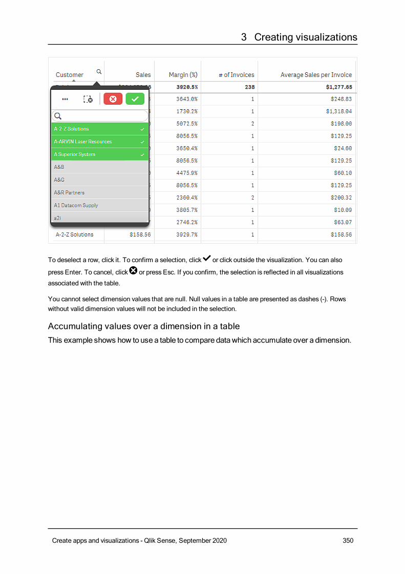
3 Creating visualizations
To deselect a row, click it. To confirm a selection, click or click outside the visualization. You can also
press Enter. To cancel, click or press Esc. If you confirm, the selection is reflected in all visualizations
associated with the table.
You cannot select dimension values that are null. Null values in a table are presented as dashes (-). Rowswithout valid dimension values will not be included in the selection.
Accumulating values over a dimension in a tableThis example shows how to use a table to compare datawhich accumulate over a dimension.
Create apps and visualizations - Qlik Sense, September 2020 350
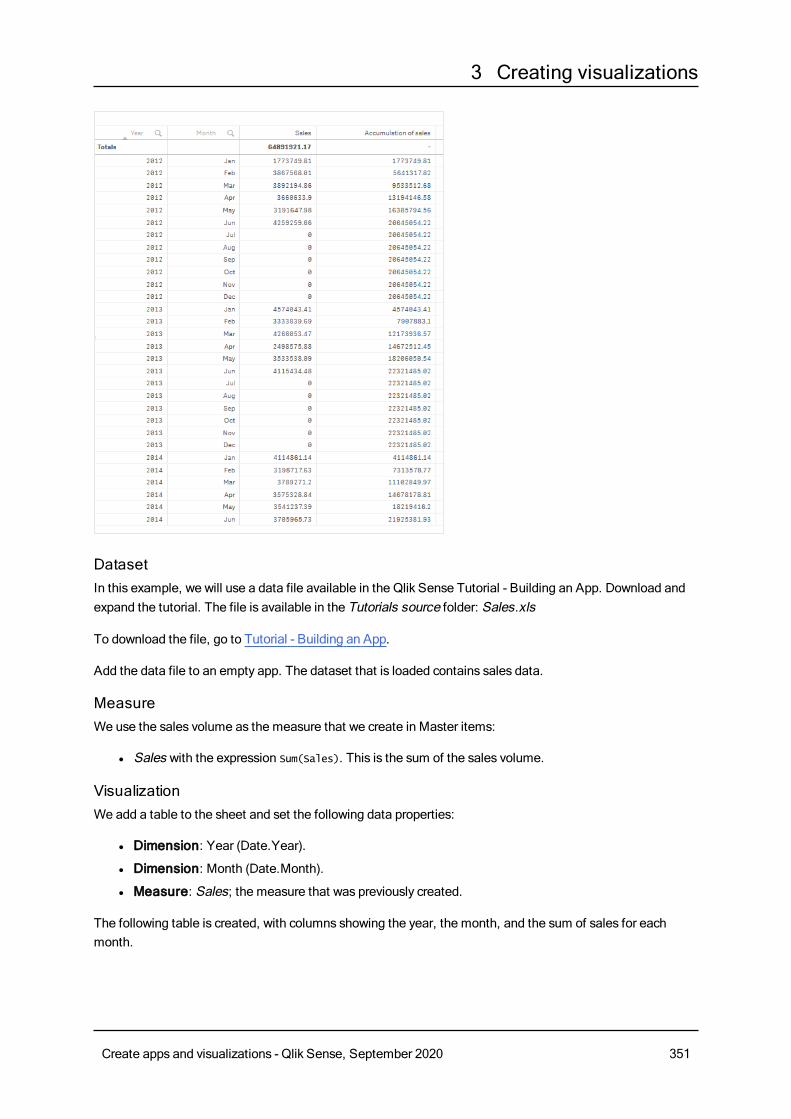
3 Creating visualizations
DatasetIn this example, we will use a data file available in the Qlik Sense Tutorial - Building an App. Download andexpand the tutorial. The file is available in the Tutorials source folder: Sales.xls
To download the file, go to Tutorial - Building an App.
Add the data file to an empty app. The dataset that is loaded contains sales data.
MeasureWe use the sales volume as the measure that we create in Master items:
l Sales with the expression Sum(Sales). This is the sum of the sales volume.
VisualizationWe add a table to the sheet and set the following data properties:
l Dimension: Year (Date.Year).
l Dimension: Month (Date.Month).
l Measure: Sales; the measure that was previously created.
The following table is created, with columns showing the year, the month, and the sum of sales for eachmonth.
Create apps and visualizations - Qlik Sense, September 2020 351
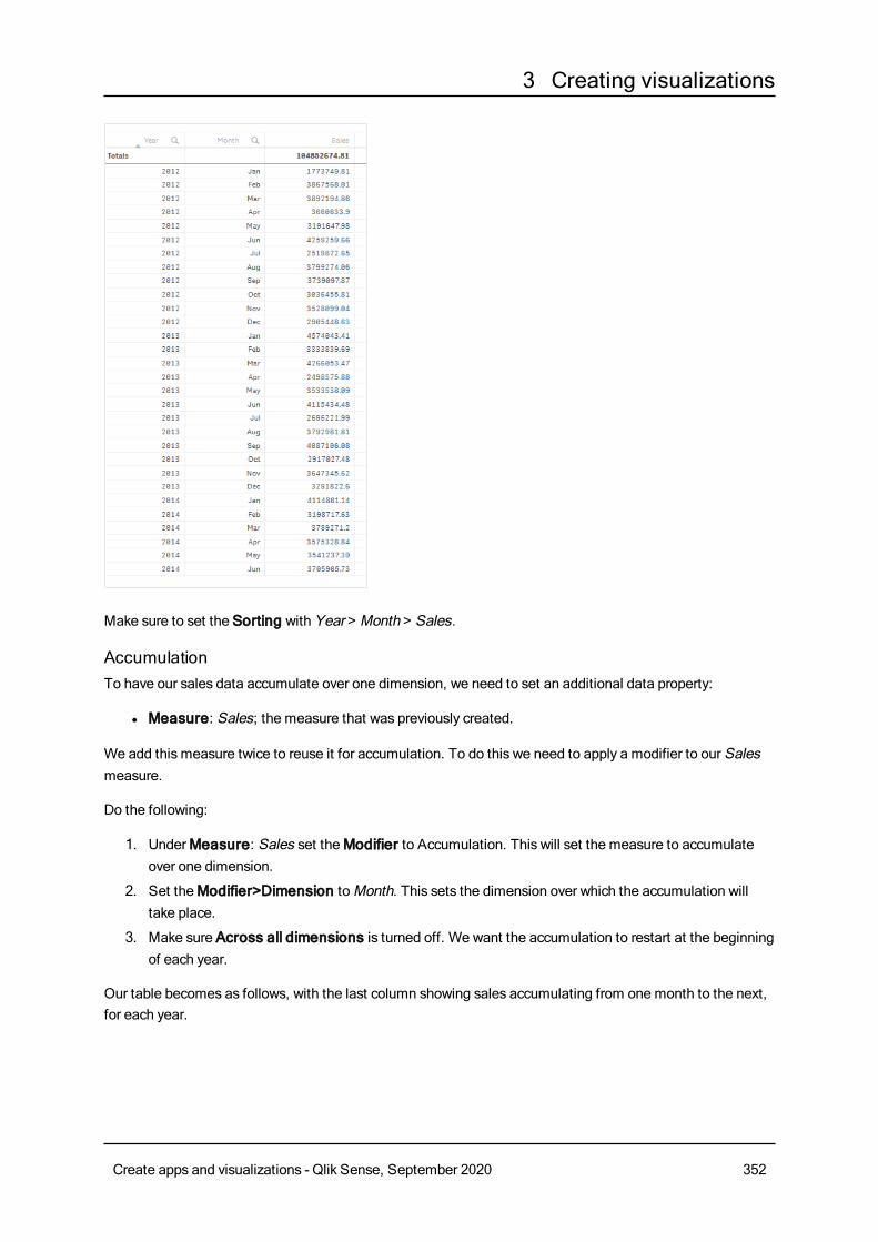
3 Creating visualizations
Make sure to set the Sorting with Year > Month > Sales.
AccumulationTo have our sales data accumulate over one dimension, we need to set an additional data property:
l Measure: Sales; the measure that was previously created.
We add this measure twice to reuse it for accumulation. To do this we need to apply a modifier to our Salesmeasure.
Do the following:
1. UnderMeasure: Sales set theModifier to Accumulation. This will set the measure to accumulateover one dimension.
2. Set theModifier>Dimension toMonth. This sets the dimension over which the accumulation willtake place.
3. Make sure Across all dimensions is turned off. We want the accumulation to restart at the beginningof each year.
Our table becomes as follows, with the last column showing sales accumulating from one month to the next,for each year.
Create apps and visualizations - Qlik Sense, September 2020 352
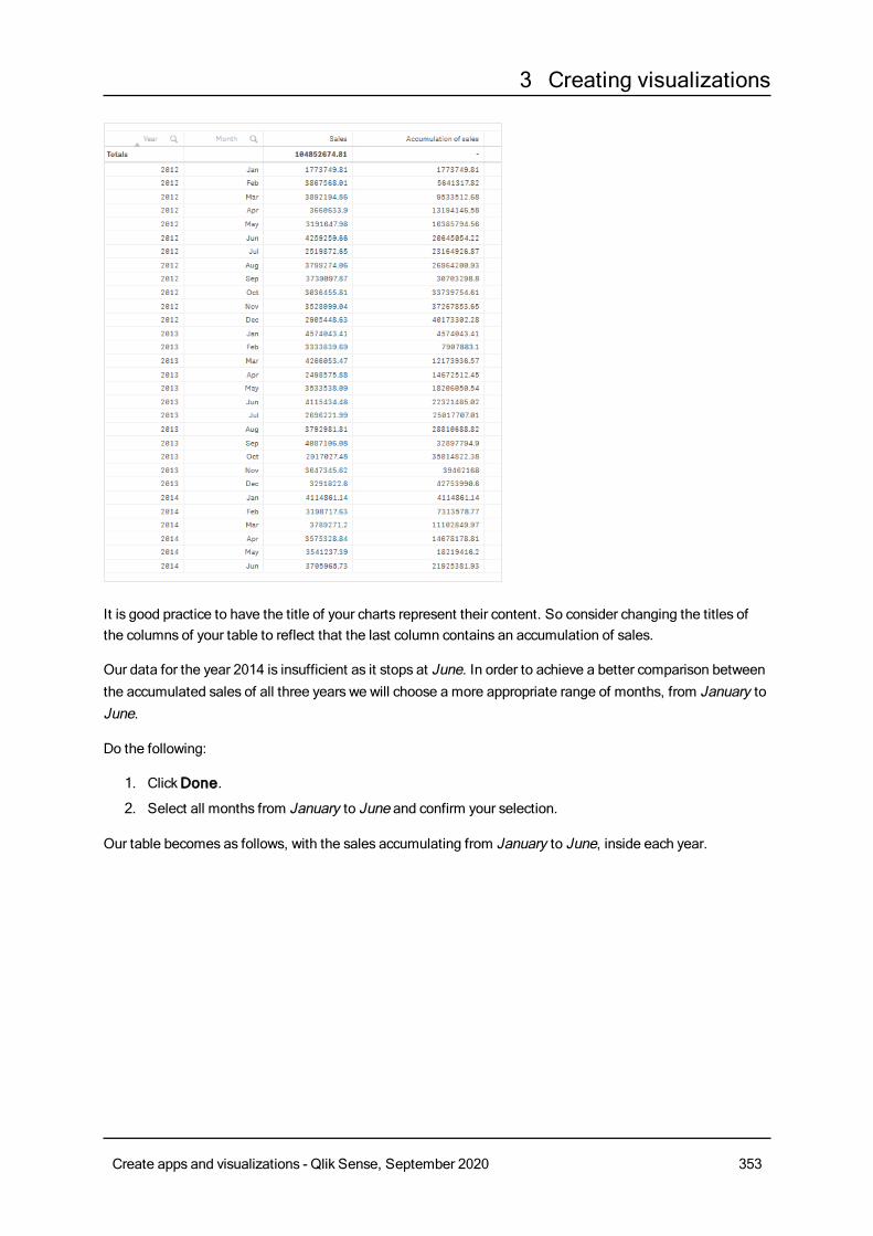
3 Creating visualizations
It is good practice to have the title of your charts represent their content. So consider changing the titles ofthe columns of your table to reflect that the last column contains an accumulation of sales.
Our data for the year 2014 is insufficient as it stops at June. In order to achieve a better comparison betweenthe accumulated sales of all three years we will choose a more appropriate range of months, from January toJune.
Do the following:
1. ClickDone.
2. Select all months from January to June and confirm your selection.
Our table becomes as follows, with the sales accumulating from January to June, inside each year.
Create apps and visualizations - Qlik Sense, September 2020 353
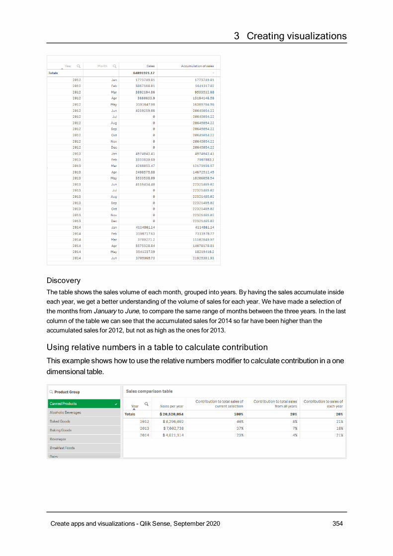
3 Creating visualizations
DiscoveryThe table shows the sales volume of each month, grouped into years. By having the sales accumulate insideeach year, we get a better understanding of the volume of sales for each year. We have made a selection ofthe months from January to June, to compare the same range of months between the three years. In the lastcolumn of the table we can see that the accumulated sales for 2014 so far have been higher than theaccumulated sales for 2012, but not as high as the ones for 2013.
Using relative numbers in a table to calculate contributionThis example shows how to use the relative numbers modifier to calculate contribution in a onedimensional table.
Create apps and visualizations - Qlik Sense, September 2020 354
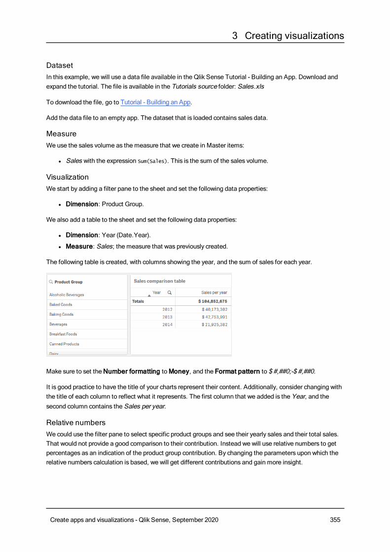
3 Creating visualizations
DatasetIn this example, we will use a data file available in the Qlik Sense Tutorial - Building an App. Download andexpand the tutorial. The file is available in the Tutorials source folder: Sales.xls
To download the file, go to Tutorial - Building an App.
Add the data file to an empty app. The dataset that is loaded contains sales data.
MeasureWe use the sales volume as the measure that we create in Master items:
l Sales with the expression Sum(Sales). This is the sum of the sales volume.
VisualizationWe start by adding a filter pane to the sheet and set the following data properties:
l Dimension: Product Group.
We also add a table to the sheet and set the following data properties:
l Dimension: Year (Date.Year).
l Measure: Sales; the measure that was previously created.
The following table is created, with columns showing the year, and the sum of sales for each year.
Make sure to set theNumber formatting toMoney, and the Format pattern to $ #,##0;-$ #,##0.
It is good practice to have the title of your charts represent their content. Additionally, consider changing withthe title of each column to reflect what it represents. The first column that we added is the Year, and thesecond column contains the Sales per year.
Relative numbersWe could use the filter pane to select specific product groups and see their yearly sales and their total sales.That would not provide a good comparison to their contribution. Instead we will use relative numbers to getpercentages as an indication of the product group contribution. By changing the parameters upon which therelative numbers calculation is based, we will get different contributions and gain more insight.
Create apps and visualizations - Qlik Sense, September 2020 355
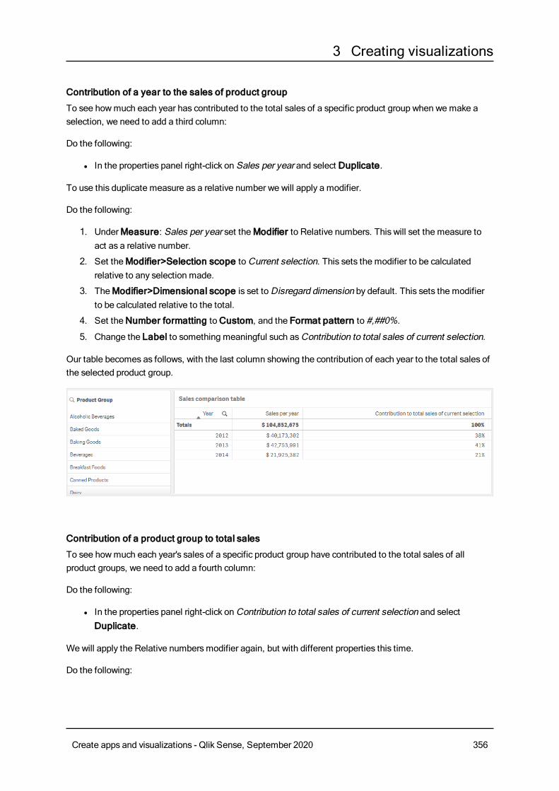
3 Creating visualizations
Contribution of a year to the sales of product group
To see howmuch each year has contributed to the total sales of a specific product group when wemake aselection, we need to add a third column:
Do the following:
l In the properties panel right-click on Sales per year and select Duplicate.
To use this duplicate measure as a relative number we will apply a modifier.
Do the following:
1. UnderMeasure: Sales per year set theModifier to Relative numbers. This will set the measure toact as a relative number.
2. Set theModifier>Selection scope toCurrent selection. This sets the modifier to be calculatedrelative to any selection made.
3. TheModifier>Dimensional scope is set toDisregard dimension by default. This sets the modifierto be calculated relative to the total.
4. Set theNumber formatting toCustom, and the Format pattern to #,##0%.
5. Change the Label to something meaningful such asContribution to total sales of current selection.
Our table becomes as follows, with the last column showing the contribution of each year to the total sales ofthe selected product group.
Contribution of a product group to total sales
To see howmuch each year's sales of a specific product group have contributed to the total sales of allproduct groups, we need to add a fourth column:
Do the following:
l In the properties panel right-click onContribution to total sales of current selection and selectDuplicate.
We will apply the Relative numbersmodifier again, but with different properties this time.
Do the following:
Create apps and visualizations - Qlik Sense, September 2020 356
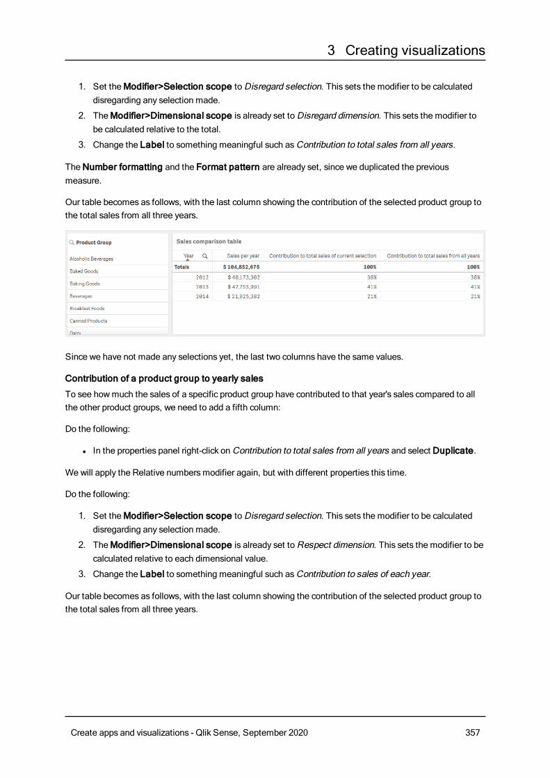
3 Creating visualizations
1. Set theModifier>Selection scope toDisregard selection. This sets the modifier to be calculateddisregarding any selection made.
2. TheModifier>Dimensional scope is already set toDisregard dimension. This sets the modifier tobe calculated relative to the total.
3. Change the Label to something meaningful such asContribution to total sales from all years.
TheNumber formatting and the Format pattern are already set, since we duplicated the previousmeasure.
Our table becomes as follows, with the last column showing the contribution of the selected product group tothe total sales from all three years.
Since we have not made any selections yet, the last two columns have the same values.
Contribution of a product group to yearly sales
To see howmuch the sales of a specific product group have contributed to that year's sales compared to allthe other product groups, we need to add a fifth column:
Do the following:
l In the properties panel right-click onContribution to total sales from all years and select Duplicate.
We will apply the Relative numbersmodifier again, but with different properties this time.
Do the following:
1. Set theModifier>Selection scope toDisregard selection. This sets the modifier to be calculateddisregarding any selection made.
2. TheModifier>Dimensional scope is already set toRespect dimension. This sets the modifier to becalculated relative to each dimensional value.
3. Change the Label to something meaningful such asContribution to sales of each year.
Our table becomes as follows, with the last column showing the contribution of the selected product group tothe total sales from all three years.
Create apps and visualizations - Qlik Sense, September 2020 357
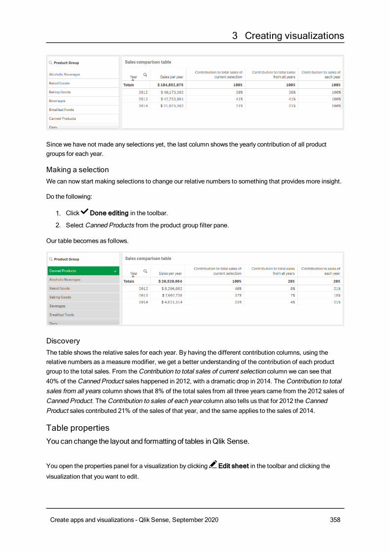
3 Creating visualizations
Since we have not made any selections yet, the last column shows the yearly contribution of all productgroups for each year.
Making a selectionWe can now start making selections to change our relative numbers to something that providesmore insight.
Do the following:
1. Click Done editing in the toolbar.
2. Select Canned Products from the product group filter pane.
Our table becomes as follows.
DiscoveryThe table shows the relative sales for each year. By having the different contribution columns, using therelative numbers as a measure modifier, we get a better understanding of the contribution of each productgroup to the total sales. From theContribution to total sales of current selection column we can see that40% of theCanned Product sales happened in 2012, with a dramatic drop in 2014. TheContribution to totalsales from all years column shows that 8% of the total sales from all three years came from the 2012 sales ofCanned Product. TheContribution to sales of each year column also tells us that for 2012 theCannedProduct sales contributed 21% of the sales of that year, and the same applies to the sales of 2014.
Table propertiesYou can change the layout and formatting of tables inQlik Sense.
You open the properties panel for a visualization by clicking Edit sheet in the toolbar and clicking the
visualization that you want to edit.
Create apps and visualizations - Qlik Sense, September 2020 358
3 Creating visualizations
If the properties panel is hidden, click Show properties in the lower right-hand corner.
If the visualization has in the upper right-hand corner, the visualization is linked to amaster
item. You cannot edit a linked visualization, but you can edit themaster item. You can alsounlink the visualization tomake it editable.
Some of the settings in the properties panel are only available under certain circumstances, forexample, when you usemore than one dimension or measure, or when you select an optionthat makes other options available.
DataClickAdd column to add a dimension or a measure. Options that are dimmed are not available.
Columns
In the table, the dimensions and measures are presented together under the headingColumns.
Dimension settingsOn theData tab, clickAdd column and select Dimension to open a list of availableDimensions andFields. Select the dimension or field that you want to use.
A dimension can either be selected from the list of already existingDimensions, or created from the list ofavailable Fields.
To edit a dimension that is stored as a master item, you must first unlink the dimension from the master item.
l <Dimension name>: Click the dimension name to open the dimension settings. If you want to delete
the dimension, right-click the dimension and select in the dialog. Alternatively, click the dimension
and click .
o Field: If you have added a field from Fields in the assets panel, the field name is automatically
displayed. Click to open the expression editor.
o Label: Enter a label for the dimension. If you have added a field from Fields in the assetspanel, the field name is automatically displayed.
o Dimension: Only displayed for master items. To be able to edit a dimension that is linked to amaster item, you must first unlink the dimension.
o Include null values: When selected, the measure values of all null dimensions aresummarized and presented as one dimension item in a visualization. All null values aredisplayed as gaps or dashes (-).
o Limitation: Limits the number of displayed values. When you set a limitation, the onlydimensions displayed are those where the measure value meets the limitation criterion.
n No limitation: The default value.
n Fixed number: Select to display the top or bottom values. Set the number of values.
Create apps and visualizations - Qlik Sense, September 2020 359
3 Creating visualizations
You can also use an expression to set the number. Click to open the expression
editor.
n Exact value: Use the operators and set the exact limit value. You can also use an
expression to set the number. Click to open the expression editor.
n Relative value: Use the operators and set the relative limit value in percent. You can
also use an expression to set the number. Click to open the expression editor.
n Calculated on measure <measure>: Shown when you make a limitation to thenumber of displayed dimension values. The dimensions whose measure value meet thecriterion are displayed.
o Show column if: You can show or hide a column depending on if a condition is true or false.The column is shown only if the expression in this field is evaluated as true. If this field isempty, the column is always shown.You can use this to require a field selection before calculating and showing large amounts ofdata.
o Background color expression: Enter an expression for the background color. The text colorautomatically changes to white when a dark background color is used.
o Text color expression: Enter an expression for the text color. If you use the same expressionas in the background color, the text will not be visible.
o Text alignment: When set toCustom, you can select how to display the content: Align left,Align center, or Align right. If Text alignment is set to Auto, the alignment is automaticallyaligned left or right, depending on the content.
o Representation: When set to Text, all values are displayed as static text. When set to Link,field values that contain a URL are displayed as clickable links. Clickable links open a newbrowser tab.
n Link setting: Select the type of link displayed, either Add link or Add URL. When youset a link setting, only the corresponding option will be displayed.
l Link label: Enter an expression for the link content. Links will be displayed and
ordered by the link URL. Click to open the expression editor.
l Link URL: Enter an expression for the link content. Links will be displayed and
ordered by the link destination label. Click to open the expression editor.
o Show others: When selected, the last value in the visualization (colored gray), summarizes allthe remaining values. When some kind of limitation is set (Fixed number, Exact value, orRelative number), the value counts as 1 in that setting. If, for example, Exact value is usedand set to 10, the tenth value isOthers.
n Others label: Enter a label for the summarized values (when Show others is
selected). You can also use an expression as a label. Click to open the expression
editor.
l Master item: You can create a master dimension based on the dimension expression by clickingCreate new.
You can drag a field fromMeasures toDimensions to change how it is used. Moving a measure to
Create apps and visualizations - Qlik Sense, September 2020 360
3 Creating visualizations
Dimensions removes its aggregation. You cannot drag a master measure toDimensions. You can onlydrag a measure toDimensions if its expression is simple.
Measure settingsOn theData tab, clickAdd column and select Measure to open a list of available measures. Select themeasure that you want to use. If you select a field, you are automatically presented with some commonaggregation functions that you can choose between for the measure.
To edit a measure that is stored as a master item, you must first unlink the measure from the master item.
l <Measure name>: Click the measure to open the measure settings. If you want to delete the
measure, clickDelete .
o Expression: Click to open the expression editor. The existing expression is displayed by
default.o Modifier: Selects a modifier for the measure. Options areNone, Accumulation, Moving
average, Difference, andRelative numbers.
n Accumulation: Only displayed when Accumulation has been selected as a modifier.It allows you to accumulate values of your measure over one or two dimensions.
The following options are available:
l Dimension: Selects the dimension on which the accumulation will take place. Ifthe accumulation is made acrossmultiple dimensions, this will be the firstdimension.
l Across all dimensions: Continues accumulation across all availabledimensions.
l Range: Select whether the accumulation will happen on the Full range, or aCustom range of the dimension.
l Steps: Only displayed whenRange is set toCustom. The number of steps inthe dimension which form an accumulation range. Only zero and positiveintegers are accepted.
l Show excluded values: Include excluded values in the accumulation.
l Output expression: Shows the expression used by the modifier.
n Moving average: Only displayed whenMoving average has been selected as amodifier. It allows you to accumulate values of your measure over one or twodimensions.
The following options are available:
l Dimension: Selects the dimension on which the moving average will takeplace. If the moving average is made acrossmultiple dimensions, this will be thefirst dimension.
l Across all dimensions: Continuesmoving average across all availabledimensions.
l Range: Select whether the moving average will happen on the Full range, or aCustom range of the dimension.
Create apps and visualizations - Qlik Sense, September 2020 361
3 Creating visualizations
l Steps: Only displayed whenRange is set toCustom. The number of steps inthe dimension which form a moving average range. Only zero and positiveintegers are accepted.
l Show excluded values: Include excluded values in the moving average.
l Output expression: Shows the expression used by the modifier.
n Difference: Only displayed whenDifference has been selected as a modifier. Itallows you to calculate the difference between consecutive values of a measure overone or two dimensions.
The following options are available:
l Dimension: Selects the dimension on which the difference will take place. If thedifference is made acrossmultiple dimensions, this will be the first dimension.
l Across all dimensions: Continues difference across all available dimensions.
l Show excluded values: Include excluded values in the difference.
l Output expression: Shows the expression used by the modifier.
n Relative numbers: Only displayed whenRelative numbers has been selected as amodifier. It allows you to calculate percentages relative to a specific selection, relativeto the total, or relative to a field value. The modifier can be calculated over one or twodimensions.
The following options are available:
l Selection scope: Sets whether the relative numbers are calculated based onthe current selection or a specific field value. You can also disregard the currentselection.
l Dimensional scope: Sets whether the relative numbers are calculated basedon a dimension. You can choose to have the modifier respect all availabledimensions, respect a specific dimension if there are two, or to disregard thedimensions.
l Output expression: Shows the expression used by the modifier.
l Label: Enter a label for the measure. Measures not saved inMaster items are by default displayedwith the expression as label.
l Measure: Only displayed for master items. To be able to edit a measure that is linked to a masteritem, you must first unlink the measure.
l Number formatting: Different options for formatting the measure values. If you want to change thenumber format at app level, and not just for a single measure, it is better to do that in the regionalsettings, that is, in the SET statements at the beginning of the script in the data load editor.
The following number formats are available:o Auto: Qlik Sense automatically sets a number formatting based on the source data.
To represent numeric abbreviations, the international SI units are used, such as k (thousand),M (million), and G (billion).
o Number: By default, the formatting is set to Simple, and you can select the formatting fromthe options in the drop-down list. Click the button to change toCustom formatting, and usethe Format pattern box to change the format pattern.
Create apps and visualizations - Qlik Sense, September 2020 362
3 Creating visualizations
Examples:
n # ##0 describes the number as an integer with a thousands separator. In this example "" is used as a thousands separator.
n ###0 describes the number as an integer without a thousands separator.
n 0000 describes the number as an integer with at least four digits. For example, thenumber 123 will be shown as 0123.
n 0.000 describes the number with three decimals. In this example "." is used as adecimal separator.
If you add the percent sign (%) to the format pattern, the measure values are automaticallymultiplied by 100.
o Money: By default, the format pattern used for money is the same as set up in the operatingsystem. Use the Format pattern box to change the format pattern.
o Date: By default, the formatting is set to Simple, and you can select the formatting from theoptions in the drop-down list. Click the button to change toCustom formatting, and use theFormat pattern box to change the format pattern.
o Duration: By default, the format pattern used for duration is the same as set up in theoperating system. Duration can be formatted as days, or as a combination of days, hours,minutes, seconds and fractions of seconds. Use the Format pattern box to change the formatpattern.
o Custom: By default, the format pattern used for custom is the same as set up in the operatingsystem. Use the Format pattern boxes to change the format pattern.
o Measure expression: The format pattern is determined by the measure expression. Use thisoption to display custom number formatting for a measure in a visualization.Limitations:Only works with visualizations that accept measures.Cannot be used with a box plot.Does not affect the number formatting of the axis.
l Show column if: You can show or hide a column depending on if a condition is true or false.The column is shown only if the expression in this field is evaluated as true. If this field is empty, thecolumn is always shown.
l Background color expression: Enter an expression for the background color. The text colorautomatically changes to white when a dark background color is used.
l Text color expression: Enter an expression for the text color. If you use the same expression as inthe background color, the text will not be visible.For more information, seeColoring a visualization (page 511).
l Text alignment: When set toCustom, you can select how to display the content: Align left or Alignright. If Text alignment is set to Auto, the alignment is automatically aligned left or right, dependingon the content.
l Totals function: Select which aggregation function you want to use for the Totals row in the table. IfTotals function is set to Auto, it will use the same function that is used in the measure expression.You can set the position of the Totals row under Presentation.
Create apps and visualizations - Qlik Sense, September 2020 363
3 Creating visualizations
l Representation: You can select to show a value (Text) or an indicator (Indicator) or a Mini chart(Mini chart).The following properties are available if you select Indicator:
o Add limit: Add indicator limits.o Gradient: Set the indicator color as a gradient according to the limit colors.o Show values: Show both the value and the indicator.
o Apply color to value: Apply the indicator color to the value. This is only available when Showvalues is selected.
o Indicator position: Select which side of the value to display the indicator. This is onlyavailable when Show values is selected.
The following properties are available if you select Mini chart:o Select dimension: Select a dimension for the Mini chart.o Mode: Select a visualization mode for the Mini chart. Currently, onlySparkline is available.o Colors: Set optional colors for the Sparkline Mini chart lines and for maximum value,
minimum value, first value, and last value indicators.o Show dots: Adds dots to each data point on the Sparkline Mini chart.o Y-axis: Select what value to use for the Y-axis of the Sparkline Mini chart
l Master item: You can create a master measure based on the measure expression by clickingCreatenew.
You can drag a field from Dimensions toMeasures to change how it is used. Moving a dimension toMeasures assigns it an aggregation. You cannot drag a master dimension toMeasures.
SortingDrag the dimensions and measures to set the sorting priority order. The numbers show the order.
Dimensions and measures can also be sorted internally:
Click the dimension or measure name to open the settings and click the sorting button to switch toCustomsorting. The following list shows the internal sorting priority order and sorting options. The sorting is eitherAscending orDescending.
l Sort by expression: Enter an expression to sort by. Only available for dimensions.
l Sort numerically
l Sort alphabetically
Additionally, you can sort by load order by switching toCustom and leaving all sorting options unselected.
If you have set a custom order for a field, that custom order will override any selected internal sort order inSorting.
Create apps and visualizations - Qlik Sense, September 2020 364
3 Creating visualizations
Add-onsl Data handling:
l Include zero values: When unselected, measures that have the value ‘0’ are not included inthe presentation. If there is more than one measure value, all the measure valuesmust havethe value ‘0’ to be excluded from the presentation.
l Calculation condition: Specify an expression in this text field to set a condition that needs tobe fulfilled (true) for the object to be displayed. The value may be entered as a calculatedformula. For example: count(distinct Team)<3. If the condition is not fulfilled, the message orexpression entered inDisplayed message is displayed.A calculation condition is useful when a chart or table is very big and makes the visualizationslow to respond. A calculation condition can then help so that for example an object does notshow until the user has filtered the data to a more manageable level by applying selections.
Appearance
General
l Show titles: On by default in all visualizations except filter panes, KPIs, and text & imagevisualizations.Enter Title, Subtitle, and Footnote. By default, the string is interpreted as a text string. However,you can also use the text field for an expression, or a combination of text and expression. An equalssign (=), at the beginning of a string shows that it contains an expression.Click3 if you want to create an expression by using the expression editor.
Titles are displayed on a single line. If you inject line breaks they will be ignored.
Example:
Assume that the following string is used, including quotation marks: 'Sales: ' & Sum(Sales).By default, the string is interpreted as a text string and is displayed as presented in the example. But ifyou begin the string with an equals sign: (='Sales: ' & Sum(Sales)), the string is interpreted as anexpression instead. The output is then Sales: <value of expression>, where <value of expression>is the calculated value.
l Disable hover menu: Select to disable the hover menu in the visualization.
l Show details: Set to Show if you want to allow users to be able to choose to view details, such asdescriptions, measures, and dimensions.
Alternate states
State: Set the state to apply to the visualization. You can select:
l Any alternate state defined inMaster items.
l <inherited>, in which case the state defined for the sheet is used.
l <default state>, which represents the state where no alternate state is applied.
Create apps and visualizations - Qlik Sense, September 2020 365
3 Creating visualizations
Presentation
l Styling: Customize the styling of the table, overriding the app theme. You can add custom headerand content font sizes and colors. You can set rows to be highlighted when hovered over and setcolors for the row and font. You can also set the size of the scrollbar.
l Totals: o Auto: The totals (the result of the expression), are automatically included at the top of the
table.o Custom: Select whether to display the totals and where to display them, at the top or bottom.
l Totals label: Set the label for the totals row. You can also use an expression as a label.
l Horizontal scrolling: Use the drop down to choose between:o Scroll: Enable horizontal scrolling. Use the toggle to freeze the first column when scrolling.o Column picker: Enable column picker feature. App consumers can change column order in
the table.
l Multiline text wrapping: Enable or disable multiline text wrapping in headers and cells separately.
Text & imageThe text & image visualization complements other visualizations by offering options to add text,images, hyperlinks, andmeasures.
You can format and color the text and align the paragraphs. The background image has sizing andpositioning options. You can also set the responsive behavior for text and images.
When to use itThe text & image visualization is intended for presentation purposes, and does not support selections.However, the measures in the text & image visualization are updated when selections are made. Sometypical uses:
l Use it on the first sheet of an app for essential information.
l Display a company image, or use a background image together with formatted text and measurevalues to present figures in a compelling way.
l Link to sites with additional information.
l Use the responsive behavior to ensure that the visualization renders well on all devices.
AdvantagesThe text & image visualization contrasts with the other visualizations. You have many options for making thetext & image visualization stand out next to more regular charts.
DisadvantagesYou are limited to a fewmeasure values and rather short texts, otherwise the text & image visualization willbe cluttered.
Creating a text & imageYou can create a text & image visualization on the sheet you are editing.
Create apps and visualizations - Qlik Sense, September 2020 366
3 Creating visualizations
Do the following:
1. From the assets panel, drag an empty text & image chart to the sheet.
2. Click the text & image chart to open the editing toolbar.
3. Add and format text, images, hyperlinks or measures to the text & image chart.
If you double-click a text & image chart in the assets panel, it is added to the sheetimmediately.
Editing a text & imageIn the text & image visualization you can add and format text, images, measures, and links in various ways.
When you are editing a sheet and the text & image visualization does not have focus, you need to click twiceto open the editing toolbar. In the editing toolbar, you can format text properties such as color, size, and style,and also align the text. Additionally, you have options for adding links and images.
Creating a linkYou can mark a text section and use it for a link.
If you do not add a prefix, http:// is added automatically, assuming that you are adding a web address.
Do the following:
1. Select the text section that you want to use for the link.
2. Click in the editing toolbar to open the link dialog.
3. Enter the web address that you want to link to.
4. Click .
Removing a linkYou can remove a link from a text section.
Do the following:
1. Click the link so that the cursor is somewhere inside it.
2. Click in the editing toolbar to open the link dialog.
3. Click .
The link is removed, but not the text.
Adding an imageYou can add an image through the editing toolbar. You can use one of the default images, or an image ofyour own.
Do the following:
Create apps and visualizations - Qlik Sense, September 2020 367
3 Creating visualizations
1. Click in the editing toolbar.
TheMedia library opens.The following formats are supported: .png, .jpg, .jpeg, and .gif.For Qlik Sense: You can upload images to the In app folder in the media library. You need to use theQlik Management Console to upload images to the default folder.For Qlik Sense Desktop: You can place images in the following folder on your computer:C:\Users\<user>\Documents\Qlik\Sense\Content\Default. Images will be available in the defaultfolder in the media library. When moving an app between installations, the images that you use in theapp are saved in the qvf file together with the app. When you open the app in a new location, theimages will be in the In app folder in the media library for the app.
2. Click on a folder in the media library, for example In app orDefault.
3. Select the image that you want to add.
4. Click Insert.
Alternatively, long-touch/right-click the image file you want to add and select Insert.
In the properties panel, you can add a background image, which, for example, can be usedwhen you want to insert text in the image. The images added through the editing toolbar are notbackground images.
Adding a measureYou can add a measure in the following ways:
l By dragging a field from the assets panel and adding it as a measure.
l By dragging a measure fromMaster items.
l By adding a measure (existing or new) from the properties panel.
When you are editing the measure, it is displayed as a token, which can be styled and moved around in thevisualization. You can also apply number formatting to it. When you leave the editor, the measure value isdisplayed . Values that cannot be aggregated are shown as a hyphen (-).
Deleting a measureYou can delete a measure in the following ways:
l Place the cursor before the token and press Delete.
l Place the cursor after the token and press Backspace.
l In the properties panel, right-click the measure and select Delete in the dialog.
l In the properties panel, click the measure and clickDelete .
Text & image propertiesYou can change the layout and formatting of text and images inQlik Sense.
Create apps and visualizations - Qlik Sense, September 2020 368
3 Creating visualizations
You open the properties panel for a visualization by clicking Edit sheet in the toolbar and clicking the
visualization that you want to edit.
If the properties panel is hidden, click Show properties in the lower right-hand corner.
If the visualization has in the upper right-hand corner, the visualization is linked to amaster
item. You cannot edit a linked visualization, but you can edit themaster item. You can alsounlink the visualization tomake it editable.
Some of the settings in the properties panel are only available under certain circumstances, forexample, when you usemore than one dimension or measure, or when you select an optionthat makes other options available.
DataClickAdd measure and select a measure or create a measure from a field.
Measure
On theData tab, underMeasures, clickAdd measure to open a list of available measures. Select themeasure that you want to add to the visualization. If you select a field, you are automatically presented withsome common aggregation functions that you can choose between for the measure.
If no measure is available, you need to create one. You can enter the expression directly in the text box, or
click to create a measure in the expression editor.
To be able to edit a measure that is linked to a master item, you must first unlink the measure.
If Add measure is dimmed, you cannot add more measures.
l <Measure name>: Click the measure to open the measure settings.
If you want to delete the measure, long-touch/right-click the measure and select in the dialog.
Alternatively, click the measure and click .
o Expression: Click to open the expression editor.The existing expression is displayed by
default.o Label: Enter a label for the measure. Measures not saved inMaster items are by default
displayed with the expression as label.o Measure: Only displayed for master items. To be able to edit a measure that is linked to a
master item, you must first unlink the measure.o Number formatting: Different options for formatting the measure values. If you want to
change the number format at app level, and not just for a single measure, it is better to do thatin the regional settings, that is, in the SET statements at the beginning of the script in the dataload editor.
The following number formats are available:
Create apps and visualizations - Qlik Sense, September 2020 369
3 Creating visualizations
l Auto: Qlik Sense automatically sets a number formatting based on the source data.To represent numeric abbreviations, the international SI units are used, such as k(thousand), M (million), and G (billion).
l Number: By default, the formatting is set to Simple, and you can select the formattingfrom the options in the drop-down list. Click the button to change toCustomformatting, and use the Format pattern box to change the format pattern.
Examples:
n # ##0 describes the number as an integer with a thousands separator. In thisexample " " is used as a thousands separator.
n ###0 describes the number as an integer without a thousands separator.
n 0000 describes the number as an integer with at least four digits. For example,the number 123 will be shown as 0123.
n 0.000 describes the number with three decimals. In this example "." is used as adecimal separator.
If you add the percent sign (%) to the format pattern, the measure values areautomatically multiplied by 100.
l Money: By default, the format pattern used for money is the same as set up in theoperating system. Use the Format pattern box to change the format pattern.
l Date: By default, the formatting is set to Simple, and you can select the formattingfrom the options in the drop-down list. Click the button to change toCustomformatting, and use the Format pattern box to change the format pattern.
l Duration: By default, the format pattern used for duration is the same as set up in theoperating system. Duration can be formatted as days, or as a combination of days,hours, minutes, seconds and fractions of seconds. Use the Format pattern box tochange the format pattern.
l Custom: By default, the format pattern used for custom is the same as set up in theoperating system. Use the Format pattern boxes to change the format pattern.
l Measure expression: The format pattern is determined by the measure expression.Use this option to display custom number formatting for a measure in a visualization.Limitations:Only works with visualizations that accept measures.Cannot be used with a box plot.Does not affect the number formatting of the axis.
o Decimal separator: Set the decimal separator.o Thousands separator: Set the thousands separator.o Format pattern: Set the number format pattern.
l Master item: You can create a master measure based on the measure expression by clickingCreatenew.
Create apps and visualizations - Qlik Sense, September 2020 370
3 Creating visualizations
Appearance
General
l Show titles: Select to enable or disable titles, subtitles, and footnotes in the chart.Enter Title, Subtitle, and Footnote. By default, the string is interpreted as a text string. However,you can also use the text field for an expression, or a combination of text and expression. An equalssign (=), at the beginning of a string shows that it contains an expression.Click if you want to create an expression by using the expression editor.
Titles are displayed on a single line. If you inject line breaks they will be ignored.
Example:
Assume that the following string is used, including quotation marks: 'Sales: ' & Sum(Sales).By default, the string is interpreted as a text string and is displayed as presented in the example. But ifyou begin the string with an equals sign: (='Sales: ' & Sum(Sales)), the string is interpreted as anexpression instead. The output is then Sales: <value of expression>, where <value of expression>is the calculated value.
l Disable hover menu: Select to disable the hover menu in the visualization.
l Show details: Set to Show if you want to allow users to be able to choose to view details, such asdescriptions, measures, and dimensions.
Alternate states
State: Set the state to apply to the visualization. You can select:
l Any alternate state defined inMaster items.
l <inherited>, in which case the state defined for the sheet is used.
l <default state>, which represents the state where no alternate state is applied.
Presentation
In the list, set whether text and images should have a responsive behavior. When responsive behavior isselected, the size of text and images are adjusted to the size of the visualization area. However, they do notexpand beyond their normal size.
Background image
Use background image: Off by default. Click the button to enable selection or removal of a backgroundimage. You can only have one background image at a time.
l Image: Click to open the media library where you can select a background image. To remove the
background image, click .
l Sizing: Set the sizing of the image. With the Auto setting, the image does not scale when the text &image visualization is resized.
l Position: Select the position of the image.
Create apps and visualizations - Qlik Sense, September 2020 371
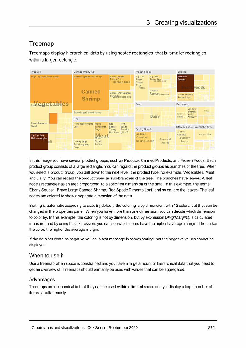
3 Creating visualizations
TreemapTreemaps display hierarchical data by using nested rectangles, that is, smaller rectangleswithin a larger rectangle.
In this image you have several product groups, such as Produce, Canned Products, and Frozen Foods. Eachproduct group consists of a large rectangle. You can regard the product groups as branches of the tree. Whenyou select a product group, you drill down to the next level, the product type, for example, Vegetables, Meat,and Dairy. You can regard the product types as sub-branches of the tree. The branches have leaves. A leafnode's rectangle has an area proportional to a specified dimension of the data. In this example, the itemsEbony Squash, Bravo Large Canned Shrimp, Red Spade Pimento Loaf, and so on, are the leaves. The leafnodes are colored to show a separate dimension of the data.
Sorting is automatic according to size. By default, the coloring is by dimension, with 12 colors, but that can bechanged in the properties panel. When you have more than one dimension, you can decide which dimensionto color by. In this example, the coloring is not by dimension, but by expression (Avg(Margin)), a calculatedmeasure, and by using this expression, you can see which items have the highest average margin. The darkerthe color, the higher the average margin.
If the data set contains negative values, a text message is shown stating that the negative values cannot bedisplayed.
When to use itUse a treemap when space is constrained and you have a large amount of hierarchical data that you need toget an overview of. Treemaps should primarily be used with values that can be aggregated.
AdvantagesTreemaps are economical in that they can be used within a limited space and yet display a large number ofitems simultaneously.
Create apps and visualizations - Qlik Sense, September 2020 372
3 Creating visualizations
When there is a correlation between color and size in the tree structure, you are able to see patterns thatwould be difficult to spot in other ways, for example, when a certain color is particularly relevant.
DisadvantagesTreemaps are not good when there is a big difference in the magnitude of the measure values. Nor is atreemap the right choice when mixing absolute and relative values.
Negative values cannot be displayed in treemaps.
Creating a treemapYou can create a treemap on the sheet you are editing.
Do the following:
1. From the assets panel, drag an empty treemap to the sheet.
2. ClickAdd dimension and select a dimension or a field. This should be the highest level in thehierarchy. It will be displayed as the main group in the chart.
3. ClickAdd measure and select a measure or create a measure from a field. The measure will definethe size of a rectangle.
4. Add more dimensions in the order of hierarchy level . The last dimension you add defines therectangles. The other dimensions define the grouping of the rectangles.
In a treemap you need at least one dimension and one measure, but to make full use of the treemap it ispreferable to have two or three dimensions. You can only have one measure, but up to 15 dimensions. We donot recommend using more than three dimensions as the treemap may become unmanageable.
When you have created the treemap, you may want to adjust its appearance and other settings in theproperties panel.
Display limitationsWhen displaying large amounts of data in a treemap , there may be cases when not each dimension valuewithin a rectangle is displayed with correct color and size. These remaining values will instead be displayed asa gray, striped area. The size and total value of the rectangle will still be correct, but not all dimension valuesin the rectangle will be explicit.
To remove the gray areas, you can either make a selection or use dimension limits in the properties panel.
Displaying hierarchical data with a treemapThis example shows how tomakea treemap to view hierarchical data. You can display a largenumber of values in limited space anddetect patterns that could be hard to spot with othercharts.
Wewill look at sales numbers for different products which are categorized in four levels.
l Product group
l Product sub group
l Product item
Create apps and visualizations - Qlik Sense, September 2020 373
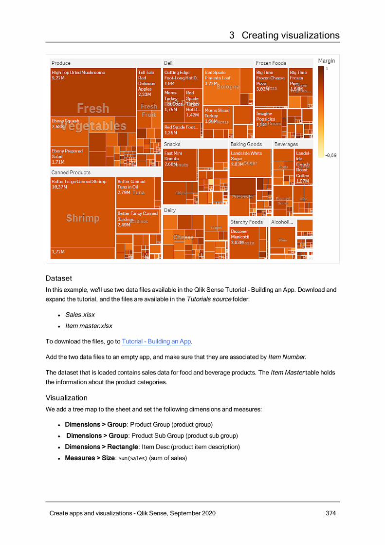
3 Creating visualizations
DatasetIn this example, we'll use two data files available in the Qlik Sense Tutorial - Building an App. Download andexpand the tutorial, and the files are available in the Tutorials source folder:
l Sales.xlsx
l Itemmaster.xlsx
To download the files, go to Tutorial - Building an App.
Add the two data files to an empty app, and make sure that they are associated by Item Number.
The dataset that is loaded contains sales data for food and beverage products. The ItemMaster table holdsthe information about the product categories.
VisualizationWe add a tree map to the sheet and set the following dimensions and measures:
l Dimensions > Group: Product Group (product group)
l Dimensions > Group: Product Sub Group (product sub group)
l Dimensions > Rectangle: Item Desc (product item description)
l Measures > Size: Sum(Sales) (sum of sales)
Create apps and visualizations - Qlik Sense, September 2020 374
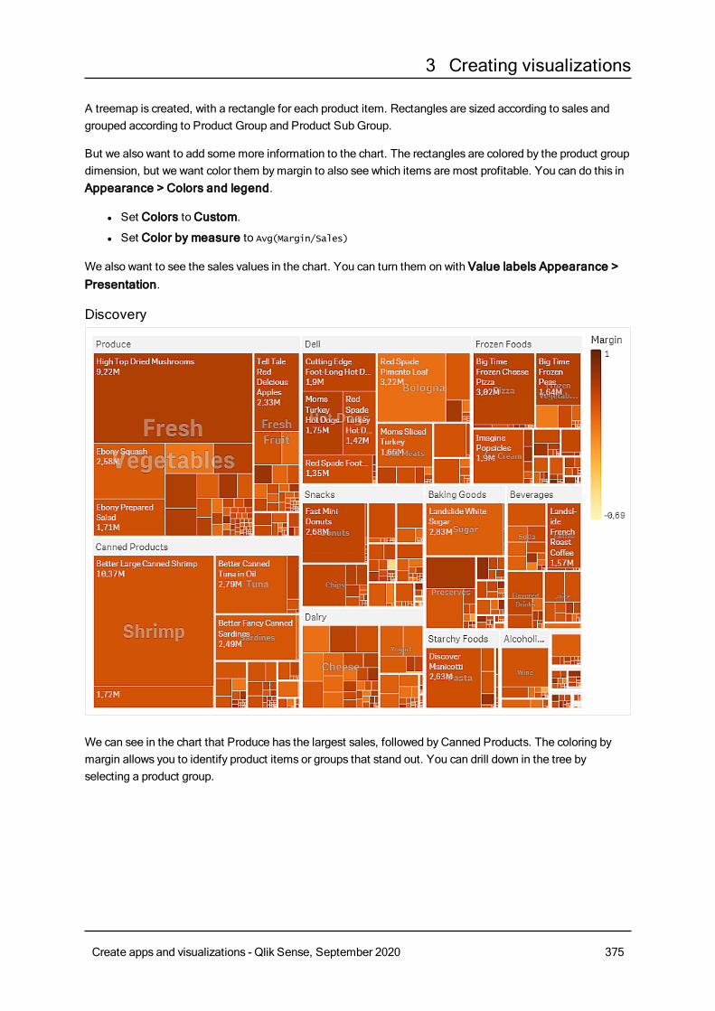
3 Creating visualizations
A treemap is created, with a rectangle for each product item. Rectangles are sized according to sales andgrouped according to Product Group and Product Sub Group.
But we also want to add somemore information to the chart. The rectangles are colored by the product groupdimension, but we want color them bymargin to also see which items are most profitable. You can do this inAppearance > Colors and legend.
l Set Colors toCustom.
l Set Color by measure to Avg(Margin/Sales)
We also want to see the sales values in the chart. You can turn them on with Value labels Appearance >Presentation.
Discovery
We can see in the chart that Produce has the largest sales, followed by Canned Products. The coloring bymargin allows you to identify product items or groups that stand out. You can drill down in the tree byselecting a product group.
Create apps and visualizations - Qlik Sense, September 2020 375
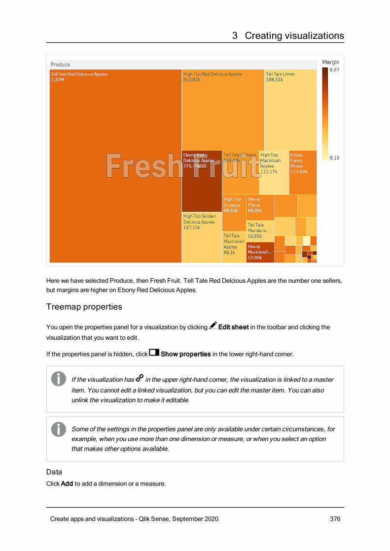
3 Creating visualizations
Here we have selected Produce, then Fresh Fruit. Tell Tale Red Delcious Apples are the number one sellers,but margins are higher on Ebony Red Delicious Apples.
Treemap properties
You open the properties panel for a visualization by clicking Edit sheet in the toolbar and clicking the
visualization that you want to edit.
If the properties panel is hidden, click Show properties in the lower right-hand corner.
If the visualization has in the upper right-hand corner, the visualization is linked to amaster
item. You cannot edit a linked visualization, but you can edit themaster item. You can alsounlink the visualization tomake it editable.
Some of the settings in the properties panel are only available under certain circumstances, forexample, when you usemore than one dimension or measure, or when you select an optionthat makes other options available.
DataClickAdd to add a dimension or a measure.
Create apps and visualizations - Qlik Sense, September 2020 376
3 Creating visualizations
Dimensions
On theData tab, underDimensions, clickAdd to open a list of availableDimensions and Fields. Selectthe dimension or field that you want to use.
You can also click to create a dimension in the expression editor. To be able to edit a dimension that is
linked to a master item, you must first unlink the dimension. Another way to create a dimension is to type theexpression directly in the text box. Expressions added in this waymust begin with an equals sign (=). Here isan example with a calculated dimension:
=If (Week < 14, Week, 'Sales')
If Add is dimmed, you cannot add more dimensions.
l <Dimension name>: Click the dimension name to open the dimension settings.
If you want to delete the dimension, right-click the dimension and select in the dialog. Alternatively,
click the dimension and click .
l Dimension: Only displayed for master items. To be able to edit a dimension that is linked to amaster item, you must first unlink the dimension.
l Field: If you have added a field from Fields in the assets panel, the field name is automatically
displayed. Click to open the expression editor.
l Label: Enter a label for the dimension. If you have added a field from Fields in the assetspanel, the field name is automatically displayed.
l Includenull values: When selected, the measure values of all null dimensions aresummarized and presented as one dimension item in a visualization. All null values aredisplayed as gaps or dashes (-).
l Limitation: Limits the number of displayed values. When you set a limitation, the onlydimensions displayed are those where the measure value meets the limitation criterion:
l No limitation: The default value.
l Fixed number: Select to display the top or bottom values. Set the number of values.
You can also use an expression to set the number. Click to open the expression
editor.
l Exact value: Use the operators and set the exact limit value. You can also use an
expression to set the number. Click to open the expression editor.
l Relative value: Use the operators and set the relative limit value in percent. You can
also use an expression to set the number. Click to open the expression editor.
l Calculated on measure: <measure>: Shown when you make a limitation to thenumber of displayed dimension values. The dimensions whose measure value meet thecriterion are displayed.
l Show others: When selected, the last value in the visualization (colored gray), summarizes allthe remaining values. When some kind of limitation is set (Fixed number, Exact value, orRelative number), the value counts as 1 in that setting. If, for example, Exact value is usedand set to 10, the tenth value isOthers.
Create apps and visualizations - Qlik Sense, September 2020 377
3 Creating visualizations
l Other label: Enter a label for the summarized values (when Show others is selected). You
can also use an expression as a label. Click to open the expression editor.
l Master item: You can create a master dimension based on the dimension expression by clickingCreate new.
l Add alternative: Alternative dimensions and measures are dimensions and measures that are addedto a visualization, but are not displayed until a user chooses to switch which dimensions and measuresare being displayed during visual exploration.
You can drag the dimensions to set the order in which they are displayed in the visualization. Use the drag
bars (o ) to rearrange the order.
You can drag a field fromMeasures toDimensions to change how it is used. Moving a measure toDimensions removes its aggregation. You cannot drag a master measure toDimensions. You can onlydrag a measure toDimensions if its expression is simple.
Measures
On theData tab, underMeasures, clickAdd to open a list of available measures. Select the measure thatyou want to add to the visualization. If you select a field, you are automatically presented with some commonaggregation functions that you can choose between for the measure.
If no measure is available, you need to create one. You can enter the expression directly in the text box, or
click to create a measure in the expression editor.
To be able to edit a measure that is linked to a master item, you must first unlink the measure.
If Add is dimmed, you cannot add more measures.
l <Measure name>: Click the measure to open the measure settings.
If you want to delete the measure, long-touch/right-click the measure and select in the dialog.
Alternatively, click the measure and click .
l Expression: Click to open the expression editor.The existing expression is displayed by
default.
l Label: Enter a label for the measure. Measures not saved inMaster items are by defaultdisplayed with the expression as label.
l Measure: Only displayed for master items. To be able to edit a measure that is linked to amaster item, you must first unlink the measure.
ll Number formatting: Different options for formatting the measure values. If you want tochange the number format at app level, and not just for a single measure, it is better to do thatin the regional settings, that is, in the SET statements at the beginning of the script in the dataload editor.
The following number formats are available:
l Auto: Qlik Sense automatically sets a number formatting based on the source data.To represent numeric abbreviations, the international SI units are used, such as k(thousand), M (million), and G (billion).
Create apps and visualizations - Qlik Sense, September 2020 378
3 Creating visualizations
l Number: By default, the formatting is set to Simple, and you can select the formattingfrom the options in the drop-down list. Click the button to change toCustomformatting, and use the Format pattern box to change the format pattern.
Examples:
l # ##0 describes the number as an integer with a thousands separator. In thisexample " " is used as a thousands separator.
l ###0 describes the number as an integer without a thousands separator.
l 0000 describes the number as an integer with at least four digits. For example,the number 123 will be shown as 0123.
l 0.000 describes the number with three decimals. In this example "." is used as adecimal separator.
If you add the percent sign (%) to the format pattern, the measure values areautomatically multiplied by 100.
l Money: By default, the format pattern used for money is the same as set up in theoperating system. Use the Format pattern box to change the format pattern.
l Date: By default, the formatting is set to Simple, and you can select the formattingfrom the options in the drop-down list. Click the button to change toCustomformatting, and use the Format pattern box to change the format pattern.
l Duration: By default, the format pattern used for duration is the same as set up in theoperating system. Duration can be formatted as days, or as a combination of days,hours, minutes, seconds and fractions of seconds. Use the Format pattern box tochange the format pattern.
l Custom: By default, the format pattern used for custom is the same as set up in theoperating system. Use the Format pattern boxes to change the format pattern.
l Decimal separator: Set the decimal separator.
l Thousands separator: Set the thousands separator.
l Format pattern: Set the number format pattern.
l Reset pattern: Click to reset to default pattern.
l Measure expression: The format pattern is determined by the measure expression.Use this option to display custom number formatting for a measure in a visualization.Limitations:Only works with visualizations that accept measures.Cannot be used with a box plot.Does not affect the number formatting of the axis.
l Master item: You can create a master measure based on the measure expression by clickingCreatenew.
l Add alternative: Alternative dimensions and measures are dimensions and measures that are addedto a visualization, but are not displayed until a user chooses to switch which dimensions and measuresare being displayed during visual exploration.
You can drag a field from Dimensions toMeasures to change how it is used. Moving a dimension to
Create apps and visualizations - Qlik Sense, September 2020 379
3 Creating visualizations
Measures assigns it an aggregation. You cannot drag a master dimension toMeasures.
SortingThe sorting is done automatically bymeasure size.
Add-onsl Data handling:
l Include zero values: When unselected, measures that have the value ‘0’ are not included inthe presentation. If there is more than one measure value, all the measure valuesmust havethe value ‘0’ to be excluded from the presentation.
l Calculation condition: Specify an expression in this text field to set a condition that needs tobe fulfilled (true) for the object to be displayed. The value may be entered as a calculatedformula. For example: count(distinct Team)<3. If the condition is not fulfilled, the message orexpression entered inDisplayed message is displayed.A calculation condition is useful when a chart or table is very big and makes the visualizationslow to respond. A calculation condition can then help so that for example an object does notshow until the user has filtered the data to a more manageable level by applying selections.
Appearance
General
l Show titles: Select to enable or disable titles, subtitles, and footnotes in the chart.Enter Title, Subtitle, and Footnote. By default, the string is interpreted as a text string. However,you can also use the text field for an expression, or a combination of text and expression. An equalssign (=), at the beginning of a string shows that it contains an expression.Click if you want to create an expression by using the expression editor.
Titles are displayed on a single line. If you inject line breaks they will be ignored.
Example:
Assume that the following string is used, including quotation marks: 'Sales: ' & Sum(Sales).By default, the string is interpreted as a text string and is displayed as presented in the example. But ifyou begin the string with an equals sign: (='Sales: ' & Sum(Sales)), the string is interpreted as anexpression instead. The output is then Sales: <value of expression>, where <value of expression>is the calculated value.
l Disable hover menu: Select to disable the hover menu in the visualization.
l Show details: Set to Show if you want to allow users to be able to choose to view details, such asdescriptions, measures, and dimensions.
Alternate states
l State: Set the state to apply to the visualization. You can select:
l Any alternate state defined inMaster items.
Create apps and visualizations - Qlik Sense, September 2020 380
3 Creating visualizations
l <inherited>, in which case the state defined for the sheet is used.
l <default state>, which represents the state where no alternate state is applied.
Presentation
l Headers and labels:With the Auto setting, the display varies with the size of the treemap. Verysmall treemaps have no headers or leaf labels. Small treemaps have overlay labels and no leaf labels.Large treemaps have headers and (some) leaf labels. With theCustom option you can make settingsfor headers and leaf labels:
l Headers: When set toOff, you can either useOverlay labels, or no labels at all, by settingOverlay labels toOff.
l Leaf labels: With the Auto setting the leaf labels are displayed if there is enough space.
l Value labels: Set this toOff if you want to hide value labels on bars. With the Auto setting,the value labels are displayed if there is enough space.
Colors and legends
l Colors: Select how the chart values are colored. There are two settings:
l Auto: Colors the chart values using default settings.
l Custom: Manually select the method of coloring your values in the chart. The followingmethods are available:
l Single color: Color the chart using a single color (by default blue). Use the color pickerto change the dimension color.
l Use library colors: Option available when a master dimension or mastermeasure used in the visualization has a color assigned to it. You can select touse the master item colors or to disable the master item colors. In cases where avisualization has both a master dimension and a master measure that havecolors assigned to them, you can select which to use in the visualization.
l By dimension: Color the chart by dimension values. By default, 12 colors are used forthe dimensions. The colors are reused when there are more than 12 dimension values.When selected, the following settings are available:
l Select dimension: Enter a field or expression containing the values to colorobjects in this chart.
l Library colors: Select whether to use the master dimension color or to disablethe master dimension color. Option available only when a master dimensionused in the visualization has a color assigned to it.
l Persistent colors: Select to have colors remain the same between selectionstates.
l Color scheme: Select 12 colors or 100 colors to be used for the differentvalues. The 12 colors can all be distinguished by people with color visiondeficiency, but not all of the 100 colors.
Create apps and visualizations - Qlik Sense, September 2020 381
3 Creating visualizations
l By measure:
l Select measure: Select the measure to use to color your chart.
l Library colors: Select whether to use the master measure colors or to disablethe master measure colors. Option available only when a master measure usedin the visualization has colors assigned to it.
l Label: Enter text or an expression for the measure that displays in the legend.
l Color scheme: Select a color scheme from the following options:
l Sequential gradient: The transition between the different color groupsis made using different shades of colors. High measure values havedarker hues.
l Sequential classes: The transition between the different color groups ismade using distinctly different colors.
l Diverging gradient: Used when working with data that is ordered fromlow to high, for instance, to show the relationship between different areason a chart. Low and high values have dark colors, mid-range colors arelight.
l Diverging classes: Can be seen as two sequential classes combined,with the mid-range shared. The two extremes, high and low, areemphasized with dark colors with contrasting hues, and the mid-rangecritical values are emphasized with light colors.
l Reverse colors: When selected, the color scheme is reversed.
l Range: Define the range of values used to color bymeasure or by expression.
l Auto: The color range is set by the measure or expression values.
l Custom: When custom is selected, you can set theMin andMax valuesfor the color range.
l By expression: Color the chart using an expression to define colors for values.Supported color formats are: RGB, ARGB, and HSL.
l Expression: Enter the expression that you want to use. Click to open the
expression editor.
l The expression is a color code: Selected by default. In most cases, it is bestto keep this setting. When the selection is cleared, the expression evaluates to anumber, which in turn is plotted against one of the chart gradients.For more information, seeColoring a visualization (page 511)When the coloring is bymeasure or by expression, you can set the color range(Min andMax values). By setting the color range, the colors remain constantthroughout selections and paging. When using color by expression, the optionThe expression is a color code must be cleared before you can set the colorrange.
l Show legend: Not available when Single color is selected. By default set toOff. The legend isdisplayed if there is enough space. The placement can be changed in the Legend position setting.
l Legend position: Select where to display the legend.
l Show legend title: When selected, the legend title is displayed.
Create apps and visualizations - Qlik Sense, September 2020 382
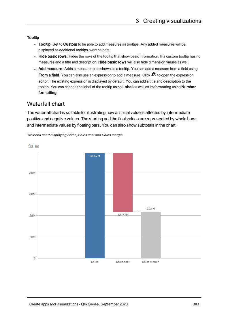
3 Creating visualizations
Tooltip
l Tooltip: Set toCustom to be able to add measures as tooltips. Any added measures will bedisplayed as additional tooltips over the bars.
l Hide basic rows: Hides the rows of the tooltip that show basic information. If a custom tooltip has nomeasures and a title and description, Hide basic rows will also hide dimension values as well.
l Add measure: Adds a measure to be shown as a tooltip. You can add a measure from a field using
From a field. You can also use an expression to add a measure. Click to open the expression
editor. The existing expression is displayed by default. You can add a title and description to thetooltip. You can change the label of the tooltip using Label as well as its formatting usingNumberformatting.
Waterfall chartThewaterfall chart is suitable for illustrating how an initial value is affected by intermediatepositive and negative values. The starting and the final values are represented by whole bars,and intermediate values by floating bars. You can also show subtotals in the chart.
Waterfall chart displaying Sales, Sales cost and Sales margin.
Create apps and visualizations - Qlik Sense, September 2020 383
3 Creating visualizations
When to use itThe waterfall chart is suitable for illustrating how an initial value is affected by intermediate positive andnegative values. One example of this is an income statement, when you want to show the positive andnegative contributions of different accounts.
AdvantagesThe waterfall chart provides a quick understanding of the transition of a value.
DisadvantagesThe waterfall chart is not relevant for detailed analysis of the data as you can't make selections in the chart orexpand the data.
Creating a waterfall chartYou can create a waterfall chart on the sheet you are editing.
In a waterfall chart you need to use one measure for each bar in the chart. The order of the measures definesthe order of the bars in the chart. For each measure, you need to define how it affects the previous value.
Do the following:
1. From the assets panel, drag an empty waterfall chart to the sheet.
2. Add the first measure.This is the first bar of the chart. By default, it will use the measure operation Add, and show a positivevalue.
3. Add a second measure.This is the second bar of the chart. If you want to show this measure as a negative contribution,changeMeasure operation to Subtract.
4. Continue to add measures, settingMeasure operation to Add or Subtract depending on how youwant them to contribute.
5. Add subtotals. There are two ways of adding subtotal bars to the chart:
l If you have a data field containing subtotal data, add a measure with the subtotal data andselect Subtotals asMeasure operation.
l If you don't have a data field containing subtotal data, you can add an automatically calculatedsubtotal by selecting the Subtotals check box of the measure before where you want thesubtotal bar.
When you have created the waterfall chart, you may want to adjust its appearance and other settings in theproperties panel.
Defining yourmeasuresYou can use theMeasure operation option of each measure to set how it affects the previous value.
l AddThe measure value adds to the previous bar. If this is the first measure, a whole bar is shown startingat 0.
Create apps and visualizations - Qlik Sense, September 2020 384
3 Creating visualizations
l SubtractThe measure value subtracts from the previous bar.
If the data already contains a negative sign, the result of subtraction will be a positivechange.
l SubtotalsThe measure value is considered a subtotal.
If you do not have sub-totals as a field, you can add subtotals automatically by enablingSubtotals in themeasure before you want the subtotal.
In the waterfall chart shown above, the first bar, Sales, is defined asAdd. The second bar, Sales cost, isdefined asSubtract, and the third bar, Salesmargin, is defined asSubtotals.
Visualizing positive and negative contributions to the result with a waterfallchartThis example shows how tomakeawaterfall chart to visualize how positive and negativevalues contribute to the final result.
Wewant to see the positive contributions to CO2 in the atmosphere, such as oil or gas, in relation to negativefactors, such as land sink.
Create apps and visualizations - Qlik Sense, September 2020 385
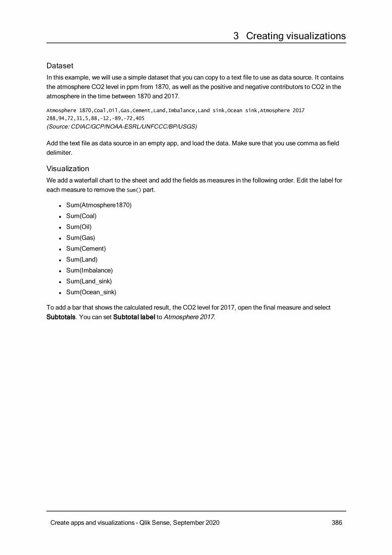
3 Creating visualizations
DatasetIn this example, we will use a simple dataset that you can copy to a text file to use as data source. It containsthe atmosphere CO2 level in ppm from 1870, as well as the positive and negative contributors to CO2 in theatmosphere in the time between 1870 and 2017.
Atmosphere 1870,Coal,Oil,Gas,Cement,Land,Imbalance,Land sink,Ocean sink,Atmosphere 2017
288,94,72,31,5,88,-12,-89,-72,405
(Source: CDIAC/GCP/NOAA-ESRL/UNFCCC/BP/USGS)
Add the text file as data source in an empty app, and load the data. Make sure that you use comma as fielddelimiter.
VisualizationWe add a waterfall chart to the sheet and add the fields asmeasures in the following order. Edit the label foreach measure to remove the Sum() part.
l Sum(Atmosphere1870)
l Sum(Coal)
l Sum(Oil)
l Sum(Gas)
l Sum(Cement)
l Sum(Land)
l Sum(Imbalance)
l Sum(Land_sink)
l Sum(Ocean_sink)
To add a bar that shows the calculated result, the CO2 level for 2017, open the final measure and selectSubtotals. You can set Subtotal label to Atmosphere 2017.
Create apps and visualizations - Qlik Sense, September 2020 386
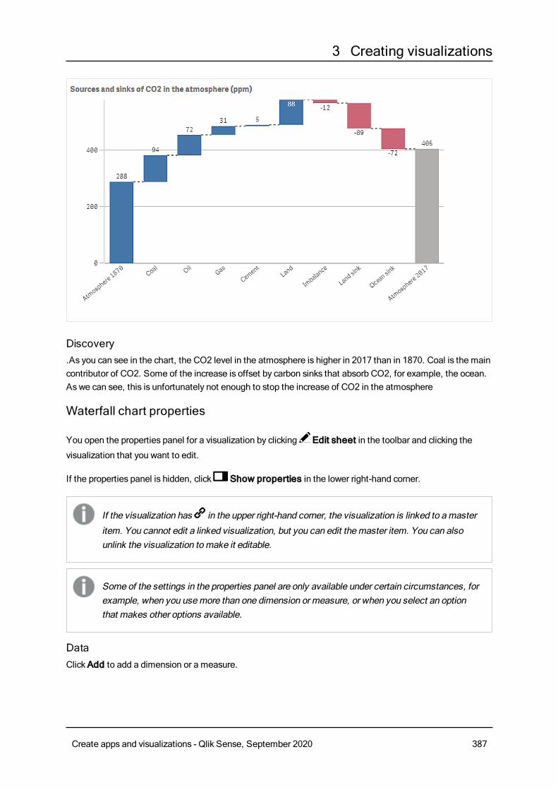
3 Creating visualizations
Discovery.As you can see in the chart, the CO2 level in the atmosphere is higher in 2017 than in 1870. Coal is the maincontributor of CO2. Some of the increase is offset by carbon sinks that absorb CO2, for example, the ocean.As we can see, this is unfortunately not enough to stop the increase of CO2 in the atmosphere
Waterfall chart properties
You open the properties panel for a visualization by clicking Edit sheet in the toolbar and clicking the
visualization that you want to edit.
If the properties panel is hidden, click Show properties in the lower right-hand corner.
If the visualization has in the upper right-hand corner, the visualization is linked to amaster
item. You cannot edit a linked visualization, but you can edit themaster item. You can alsounlink the visualization tomake it editable.
Some of the settings in the properties panel are only available under certain circumstances, forexample, when you usemore than one dimension or measure, or when you select an optionthat makes other options available.
DataClickAdd to add a dimension or a measure.
Create apps and visualizations - Qlik Sense, September 2020 387
3 Creating visualizations
On theData tab, underMeasures, clickAdd to open a list of available measures. Select the measure thatyou want to add to the visualization. If you select a field, you are automatically presented with some commonaggregation functions that you can choose between for the measure.
If no measure is available, you need to create one. You can enter the expression directly in the text box, or
click to create a measure in the expression editor.
To be able to edit a measure that is linked to a master item, you must first unlink the measure.
If Add is dimmed, you cannot add more measures.
Measures
l <Measure name>: Click the measure to open the measure settings.
If you want to delete the measure, long-touch/right-click the measure and select in the dialog.
Alternatively, click the measure and click .
l Expression: Click to open the expression editor.The existing expression is displayed by
default.
l Label: Enter a label for the measure. Measures not saved inMaster items are by defaultdisplayed with the expression as label.
l Measure: Only displayed for master items. To be able to edit a measure that is linked to amaster item, you must first unlink the measure.
l Measure operation: Select how to use the measure in the chart:
l Add: The measure value is added.
l Subtract: The measure value is subtracted.
l Subtotals: The measure value is treated as a subtotal value of the last measures usingthe samemeasure operation.
l Subtotals: Select Subtotals to add an automatically calculated subtotal measure based onthe result of all previousmeasure operations.
l Subtotal label: Enter a label for the automatically calculated subtotal measure.
l Master item: You can create a master measure based on the measure expression by clickingCreatenew.
You can drag the measures to set the order in which they are displayed in the visualization. Use the drag bars
(o ) to rearrange the order.
Number formattingl Number formatting: Different options for formatting the measure values. If you want to change thenumber format at app level, and not just for a single measure, it is better to do that in the regionalsettings, that is, in the SET statements at the beginning of the script in the data load editor.The following number formats are available:
l Auto: Qlik Sense automatically sets a number formatting based on the source data.To represent numeric abbreviations, the international SI units are used, such as k (thousand),M (million), and G (billion).
l Number: By default, the formatting is set to Simple, and you can select the formatting from
Create apps and visualizations - Qlik Sense, September 2020 388
3 Creating visualizations
the options in the drop-down list. Click the button to change toCustom formatting, and usethe Format pattern box to change the format pattern.
Examples:
l # ##0 describes the number as an integer with a thousands separator. In this example "" is used as a thousands separator.
l ###0 describes the number as an integer without a thousands separator.
l 0000 describes the number as an integer with at least four digits. For example, thenumber 123 will be shown as 0123.
l 0.000 describes the number with three decimals. In this example "." is used as adecimal separator.
If you add the percent sign (%) to the format pattern, the measure values are automaticallymultiplied by 100.
l Money: By default, the format pattern used for money is the same as set up in the operatingsystem. Use the Format pattern box to change the format pattern.
l Date: By default, the formatting is set to Simple, and you can select the formatting from theoptions in the drop-down list. Click the button to change toCustom formatting, and use theFormat pattern box to change the format pattern.
l Duration: By default, the format pattern used for duration is the same as set up in theoperating system. Duration can be formatted as days, or as a combination of days, hours,minutes, seconds and fractions of seconds. Use the Format pattern box to change the formatpattern.
l Custom: By default, the format pattern used for custom is the same as set up in the operatingsystem. Use the Format pattern boxes to change the format pattern.
l Decimal separator: Set the decimal separator.
l Thousands separator: Set the thousands separator.
l Format pattern: Set the number format pattern.
l Reset pattern: Click to reset to default pattern.
l Measure expression: The format pattern is determined by the measure expression. Use thisoption to display custom number formatting for a measure in a visualization.Limitations:Only works with visualizations that accept measures.Cannot be used with a box plot.Does not affect the number formatting of the axis.
Add-onsl Data handling:
l Calculation condition: Specify an expression in this text field to set a condition that needs tobe fulfilled (true) for the object to be displayed. The value may be entered as a calculatedformula. For example: count(distinct Team)<3. If the condition is not fulfilled, the message orexpression entered inDisplayed message is displayed.
Create apps and visualizations - Qlik Sense, September 2020 389
3 Creating visualizations
A calculation condition is useful when a chart or table is very big and makes the visualizationslow to respond. A calculation condition can then help so that for example an object does notshow until the user has filtered the data to a more manageable level by applying selections.
l Reference lines: Add reference line: Click to add a new reference line.
l Show: When selected, the reference line is displayed.
l Label: Enter a label for the reference line.
l Color: In the color picker, select the color of the reference line and the label.
l Reference line expression: Enter a value or an expression for the reference line. Click to
open the expression editor.
l : Click to remove the reference line.
Appearance
General
l Show titles: Select to enable or disable titles, subtitles, and footnotes in the chart.Enter Title, Subtitle, and Footnote. By default, the string is interpreted as a text string. However,you can also use the text field for an expression, or a combination of text and expression. An equalssign (=), at the beginning of a string shows that it contains an expression.Click if you want to create an expression by using the expression editor.
Titles are displayed on a single line. If you inject line breaks they will be ignored.
Example:
Assume that the following string is used, including quotation marks: 'Sales: ' & Sum(Sales).By default, the string is interpreted as a text string and is displayed as presented in the example. But ifyou begin the string with an equals sign: (='Sales: ' & Sum(Sales)), the string is interpreted as anexpression instead. The output is then Sales: <value of expression>, where <value of expression>is the calculated value.
l Disable hover menu: Select to disable the hover menu in the visualization.
l Show details: Set to Show if you want to allow users to be able to choose to view details, such asdescriptions, measures, and dimensions.
Alternate states
l State: Set the state to apply to the visualization. You can select:
l Any alternate state defined inMaster items.
l <inherited>, in which case the state defined for the sheet is used.
l <default state>, which represents the state where no alternate state is applied.
Presentation
l Gridline spacing: Set this toCustom if you want to customize the horizontal gridlines. You canchoose between: No lines, Medium orNarrow.
Create apps and visualizations - Qlik Sense, September 2020 390
3 Creating visualizations
l Value labels: Set this toOff if you want to hide value labels on bars.
Colors and legend
l Colors: You can set the presentation color for the different measure operations: Positive valuecolor, Negative value color or Subtotal color
l Show Legend: Set to Auto to show a legend of the measure operations. You can set the position ofthe legend with Legend position:
l Auto: The legend is automatically positioned where there is available space.
l Right
l Bottom
l Left
l Top
Y-axis
l Labels: Select if you want to show labels on the Y-axis.
l Position: Select where to display the dimension axis.
l Scale: Select howmany lines you want to show on the Y-axis. Narrow showsmany lines, andWideshows few lines.
l Range: Select to set the min value, the max value, or both. The min value cannot be larger than themax value. You can use expressions for the values.
X-axis
l Labels: Select if you want to show labels on the X-axis.
l Label orientation: Select orientation of the labels.
l Position: Select where to display the measure axis.
ButtonYou canuse buttons to add quick links for easy selection and navigation in your app.
When to use itThe button is useful when you want to assist the user of the app with predefined selections or selectioncontrols. You can also add navigation links to other sheets, stories or websites.
Creating a buttonYou can create a button on the sheet you are editing. This shows how to create a button that makes aselection and then navigates to another sheet. It is also possible to create a button that just performs theaction, or that navigates.
Do the following:
1. From the assets panel, drag a Button object to the sheet.
2. ClickAdd action under Actions in the properties panel.
3. Select the action you want to use.
Create apps and visualizations - Qlik Sense, September 2020 391
3 Creating visualizations
For some actions you need to provide details for the action. For example, for the Select values in afield action, you need to select a field, and which value to select in the field.
4. Select which navigation option to use underNavigation. You can navigate to another sheet, a storyor a website.
5. Set the label of the button in Label underGeneral in the properties panel.
You will now have a button that makes a data selection and then navigates to the place in the app youselected.
Setting the actionYou can add one or more actions to be performed when the button is clicked. For some actions you need toprovide details for the action.
The actions are performed in the order they are listed under Actions. You can change the order of an actionby dragging it.
You do not have to add an action if you just want the button to perform navigation.
Apply bookmarkYou can apply the selection that is defined in a bookmark that you choose.
Clear all selectionsYou can clear all selections in the app. You can optionally overwrite locked selections.
Clear selections in other fieldsYou can clear selections from all fields except the one you specify. You can optionally overwrite lockedselections.
Move forwards in your selectionsYou can move one step forwards in your selection history.
Move backwards in your selectionsYou can move one step backwards in your selection history.
Clear selections in fieldYou can clear all selections from a field that you specify.
Lock all selectionsYou can lock all selections in the app.
Lock a specific fieldYou can lock selections in a field that you specify.
Unlock all selectionsYou can unlock all selections in the app.
Create apps and visualizations - Qlik Sense, September 2020 392
3 Creating visualizations
Unlock a specific fieldYou can unlock selections in a field that you specify.
Select all values in a fieldYou can select all values in a field that you specify. You can optionally overwrite locked selections.
Select values in a fieldYou can select a list of values in a field that you specify. Separate the values to select with a semi colon. Youcan optionally overwrite locked selections.
It is not possible to use fields with date, timestamp, or money data type.
Select values matching search criteriaYou can select all values that match the search results from a search criteria that you specify. You need tospecify the search criteria as a string. You can optionally overwrite locked selections.
l If you want to use an expression, you need to enclose it in single quotes, for example, ='=Sum([SalesAmount]) > 200000'.
l If you want to search for a partial string, you need to use wild cards (*, ?,^). If you do not use wildcards, only strings that match exactly are selected.
Select alternativesSelect all alternative values in a field that you specify. You can optionally overwrite locked selections.
Select excludedSelect all excluded values in a field that you specify. You can optionally overwrite locked selections.
Select possible values in a fieldSelect all possible values in a field that you specify. You can optionally overwrite locked selections.
Toggle field selectionYou can set the button to toggle between the current selection, and a selection that adds selections definedby a search string. You can use wild cards in the search string. If you want to define a list of values you needto use the format (A|B), where A and B are values to select.
Set variable valueYou can assign a value to a variable.
NavigationYou can choose to navigate to another sheet, a story, or a website when the button is clicked. You do nothave to specify an action if you want to create a simple navigation button.
Navigation is not supported in stories.
Create apps and visualizations - Qlik Sense, September 2020 393
3 Creating visualizations
Navigating to a specific sheetIf you want to navigate to a specific sheet, you need to state the sheet ID. You can find the ID of a sheet inthe URL of the browser with the sheet open. The sheet ID follows after /sheet/ followed by /.
Example: Sheet URL
qlik.com/sense/app/8f8ffa0e-3fde-48a5-a127-59645923a1fc/sheet/7300b241-f221-43db-bb8b-
8c8cc1887531/state/analysis
The ID of the sheet is 7300b241-f221-43db-bb8b-8c8cc1887531 in this example.
Styling the buttonYou have a number of styling options available under Appearance.
l You can set the label text underGeneral.
l You can set the size, color and style of the font under Font styling.
l You can set the background to a color or an image under Background.If you use a background image, you have options to size and position the image.
l You can add an icon to the button under Icon.
l You can adjust the border of the button under Borders.You can set the corner radius and the width of the border.You can also set the color of the border, either a single color or with an expression.
Disabling and enabling the buttonYou can set a calculation condition to enable the chart under Enable chart. If the condition is evaluated to 0,the button is disabled.
Converting from the Button for navigation in the Dashboard bundleYou can convert an existing Button for navigation control into a button. There are some limitations whenyou do the conversion.
l The navigation option to switch to edit mode (Switch to edit mode) is not supported.
l The action to select a value and then lock the field (Select a value and lock field) is not supported.This will be converted into two consecutive actions, Select values in a field and Lock a specificfield.
ContainerThe container is an object that lets you add visualizations in a limited space. You can also showor hide the visualizations inside the container based on conditions.
Create apps and visualizations - Qlik Sense, September 2020 394
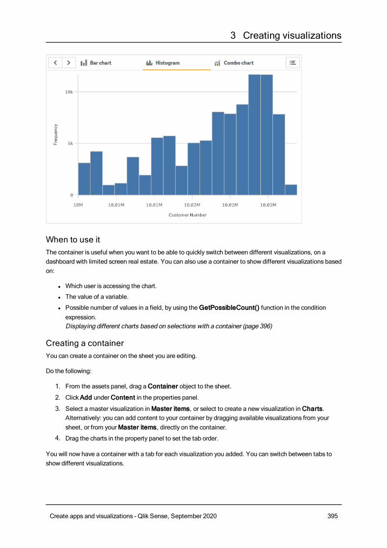
3 Creating visualizations
When to use itThe container is useful when you want to be able to quickly switch between different visualizations, on adashboard with limited screen real estate. You can also use a container to show different visualizations basedon:
l Which user is accessing the chart.
l The value of a variable.
l Possible number of values in a field, by using theGetPossibleCount() function in the conditionexpression.Displaying different charts based on selections with a container (page 396)
Creating a containerYou can create a container on the sheet you are editing.
Do the following:
1. From the assets panel, drag aContainer object to the sheet.
2. ClickAdd underContent in the properties panel.
3. Select a master visualization inMaster items, or select to create a new visualization inCharts.Alternatively: you can add content to your container by dragging available visualizations from yoursheet, or from yourMaster items, directly on the container.
4. Drag the charts in the property panel to set the tab order.
You will now have a container with a tab for each visualization you added. You can switch between tabs toshow different visualizations.
Create apps and visualizations - Qlik Sense, September 2020 395
3 Creating visualizations
Adding show conditionsYou can add show conditions on the tabs you have created.
Do the following:
1. Click on the chart you want to add a show condition to, underContent in the property panel.
2. Add a show condition for the chart in Show condition. Typically you would use an If() function.
3. Add another show condition to a different chart.The charts will now be shown or hidden depending on the result of the conditions you added. If thecondition of a chart results in True, it is shown, and if it is False, it is hidden.
Display limitationsl You cannot use a master visualization that contains a container inside another container.
l It is not possible to add the samemaster visualization twice on a container.
l Tab selection is remembered when navigating between sheets or refreshing the browser only for thesame session only.
l It is not possible to create a chart inside a container by dropping measures or dimensions on thecontainer.
Displaying different charts based on selections with a containerThis example shows how to display different chart content based onuser selections using acontainer.
l When a single product group is selected a chart for product sub groups is displayed.
l Whenmore than one product group is selected a chart for product groups is displayed.
DatasetIn this example, we will use two data files from the Qlik Sense Tutorial - Building an App. To download thefiles, go to Tutorial - Building an App. Download and unzip the tutorial, and find the files in the Tutorialssource folder:
l Sales.xls
l Itemmaster.xls
Create a new app, and add the two data files. Make sure that they are associated by Item Number.
The dataset that is loaded contains sales data. The Itemmaster table holds the information about the itemsordered, such as product groups.
MeasuresWe need to create two measures in Master items:
l Sales volume: with the name Sales, and the expression Sum(Sales).
l Salesmargin in percent: with the nameMargin%, and the expression Avg(Margin/Sales)*100.
Create apps and visualizations - Qlik Sense, September 2020 396
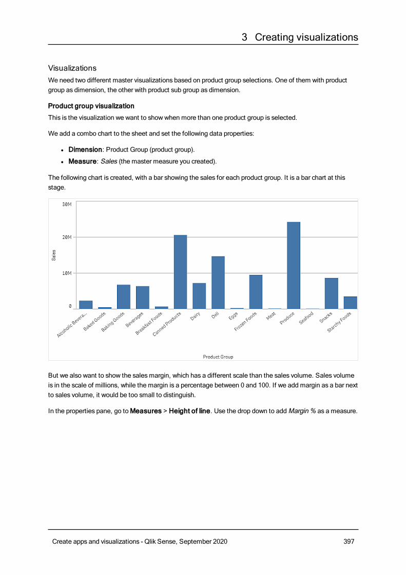
3 Creating visualizations
VisualizationsWe need two different master visualizations based on product group selections. One of them with productgroup as dimension, the other with product sub group as dimension.
Product group visualization
This is the visualization we want to showwhen more than one product group is selected.
We add a combo chart to the sheet and set the following data properties:
l Dimension: Product Group (product group).
l Measure: Sales (the master measure you created).
The following chart is created, with a bar showing the sales for each product group. It is a bar chart at thisstage.
But we also want to show the salesmargin, which has a different scale than the sales volume. Sales volumeis in the scale of millions, while the margin is a percentage between 0 and 100. If we add margin as a bar nextto sales volume, it would be too small to distinguish.
In the properties pane, go toMeasures > Height of line. Use the drop down to addMargin% as a measure.
Create apps and visualizations - Qlik Sense, September 2020 397
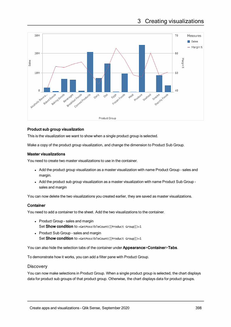
3 Creating visualizations
Product sub group visualization
This is the visualization we want to showwhen a single product group is selected.
Make a copy of the product group visualization, and change the dimension to Product Sub Group.
Master visualizations
You need to create two master visualizations to use in the container.
l Add the product group visualization as a master visualization with name Product Group - sales andmargin.
l Add the product sub group visualization as a master visualization with name Product Sub Group -sales and margin
You can now delete the two visualizations you created earlier, they are saved asmaster visualizations.
Container
You need to add a container to the sheet. Add the two visualizations to the container.
l Product Group - sales and marginSet Show condition to =GetPossibleCount([Product Group])>1
l Product Sub Group - sales and marginSet Show condition to =GetPossibleCount([Product Group])=1
You can also hide the selection tabs of the container under Appearance>Container>Tabs.
To demonstrate how it works, you can add a filter pane with Product Group.
DiscoveryYou can nowmake selections in Product Group. When a single product group is selected, the chart displaysdata for product sub groups of that product group. Otherwise, the chart displays data for product groups.
Create apps and visualizations - Qlik Sense, September 2020 398
3 Creating visualizations
Container properties
You open the properties panel for a container by clicking Edit sheet in the toolbar and clicking the
container that you want to edit.
If the properties panel is hidden, clickShow properties in the lower right-hand corner to open it.
If the container has in the upper right-hand corner, the container is linked to amaster item.
You cannot edit a linked container, but you can edit themaster item. You can also unlink thecontainer to make it editable.
Some of the settings in the properties panel are only available under certain circumstances, forexample, when you usemore than one dimension or measure, or when you select an optionthat makes other options available.
ContentClickAdd to add a chart to the container. If the container hasmore than one charts, you can drag the chartsto set the tab order.
You can edit each chart underContent:
l Label: Change how the label of the chart appears on the tab.
l Show condition: Add a show condition for the chart. Typically you would use an If() function
l Edit properties: Allows you to edit the properties of the chart inside the container.
l Delete Deletes the chart from the container.
Appearance
General
l Show titles: Select to enable or disable titles, subtitles, and footnotes in the container.Enter Title, Subtitle, and Footnote. By default, the string is interpreted as a text string. However,you can also use the text field for an expression, or a combination of text and expression. An equalssign (=), at the beginning of a string shows that it contains an expression.Click if you want to create an expression by using the expression editor.
Titles are displayed on a single line. If you inject line breaks they will be ignored.
Example:
Assume that the following string is used, including quotation marks: 'Sales: ' & Sum(Sales).
Create apps and visualizations - Qlik Sense, September 2020 399
3 Creating visualizations
By default, the string is interpreted as a text string and is displayed as presented in the example. But ifyou begin the string with an equals sign: (='Sales: ' & Sum(Sales)), the string is interpreted as anexpression instead. The output is then Sales: <value of expression>, where <value of expression>is the calculated value.
l Show details: Set to Show if you want to allow users to be able to choose to view details, such asdescriptions, measures, and dimensions.
Alternate states
State: Set the state to apply to the visualization. You can select:
l Any alternate state defined inMaster items.
l <inherited>, in which case the state defined for the sheet is used.
l <default state>, which represents the state where no alternate state is applied.
Container
l Tabs: Set whether each chart in the container appears in a tab. If set toOff only the top chart willappear. By default, set toOn.
l Menu: Set whether a menu button appears when there is not enough space for all tabs. By default,set to Auto.
l Navigation arrows: Set whether navigation arrows appear when there is not enough space for alltabs. By default, set to Auto.
l Show icons: By default, Off. With theOn setting, chart icons are displayed on each tab.
Properties
Borders:
l Auto: Default setting. Container will or will not have a border depending on app theme settings.
l Border: Container will have a border.
l No border: Container will not have a border.
Reference linesA reference line is a line intersecting the chart area from agiven point on themeasure axis.
You can use a reference line to indicate a certain level of chart data. The reference line is only drawn if it fallswithin the current range of the measure axis. You can have several reference lines in the same chart.
Bar chart Top 5 customers with a reference line at 5M.
Create apps and visualizations - Qlik Sense, September 2020 400
3 Creating visualizations
Reference lines are available in the following visualization types:
l Bar chart
l Box plot
l Distribution plot
l Gauge
l Histogram
l Line chart
l Scatter plot
l Waterfall chart
Reference line expressionYou can either set the reference line expression to an absolute numeric value, or enter an arbitrary numericexpression.
Dimensional reference linesYou can also add reference lines along the dimension axis. Both continuous and discrete axes are supported.It is possible to enter text values for discrete dimensional axes, and numerical values or expressions forcontinuous axes. On a time axis it is possible to enter an expression that gives a time-based result like a dateor a month.
Line chart average sales per month, with a reference line at 3.5k and a dimensional reference line inSeptember.
Create apps and visualizations - Qlik Sense, September 2020 401
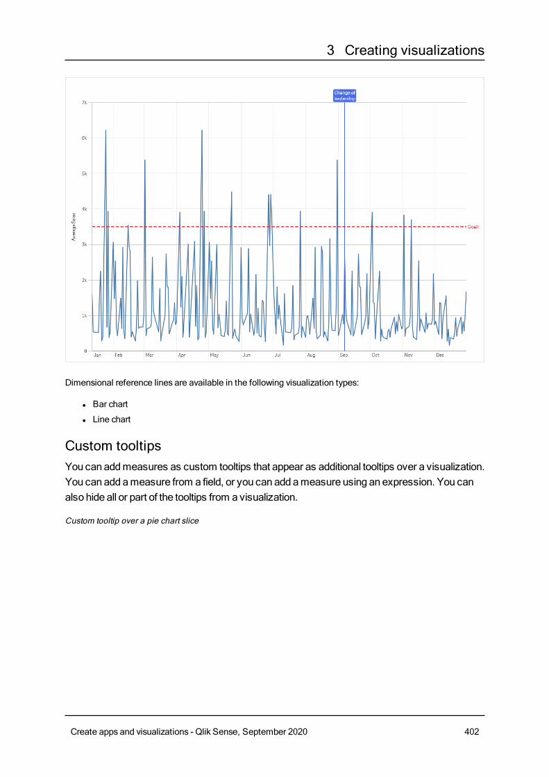
3 Creating visualizations
Dimensional reference lines are available in the following visualization types:
l Bar chart
l Line chart
Custom tooltipsYou canaddmeasures as custom tooltips that appear as additional tooltips over a visualization.You can addameasure from a field, or you can addameasure using an expression. You canalso hide all or part of the tooltips from a visualization.
Custom tooltip over a pie chart slice
Create apps and visualizations - Qlik Sense, September 2020 402
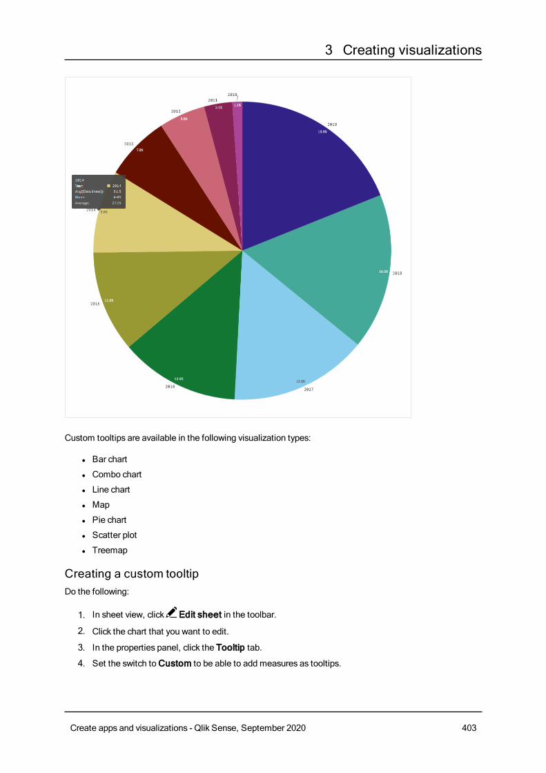
3 Creating visualizations
Custom tooltips are available in the following visualization types:
l Bar chart
l Combo chart
l Line chart
l Map
l Pie chart
l Scatter plot
l Treemap
Creating a custom tooltipDo the following:
1. In sheet view, click Edit sheet in the toolbar.
2. Click the chart that you want to edit.
3. In the properties panel, click the Tooltip tab.
4. Set the switch toCustom to be able to add measures as tooltips.
Create apps and visualizations - Qlik Sense, September 2020 403
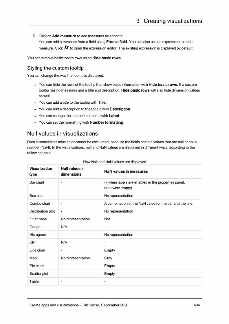
3 Creating visualizations
5. Click on Add measure to add measures as a tooltip.You can add a measure from a field using From a field. You can also use an expression to add a
measure. Click to open the expression editor. The existing expression is displayed by default.
You can remove basic tooltip rows usingHide basic rows.
Styling the custom tooltipYou can change the way the tooltip is displayed.
l You can hide the rows of the tooltip that show basic information withHide basic rows. If a customtooltip has no measures and a title and description, Hide basic rows will also hide dimension valuesas well.
l You can add a title to the tooltip with Title.
l You can add a description to the tooltip withDescription.
l You can change the label of the tooltip with Label.
l You can set the formatting withNumber formatting.
Null values in visualizationsData is sometimesmissing or cannot be calculated, because the fields contain values that are null or not anumber (NaN). In the visualizations, null and NaN values are displayed in different ways, according to thefollowing table.
Visualizationtype
Null values indimensions
NaN values in measures
Bar chart – – ( when labels are enabled in the properties panel,otherwise empty)
Box plot – No representation
Combo chart – A combination of the NaN value for the bar and the line.
Distribution plot – No representation
Filter pane No representation N/A
Gauge N/A –
Histogram – No representation
KPI N/A –
Line chart – Empty
Map No representation Gray
Pie chart – Empty
Scatter plot – Empty
Table – –
HowNull and NaN values are displayed
Create apps and visualizations - Qlik Sense, September 2020 404
3 Creating visualizations
Visualizationtype
Null values indimensions
NaN values in measures
Text & image N/A –
Treemap – Empty
Dashboard bundleDashboard bundle is a set of controls that you can use to enhance navigation and selection inyour Qlik Sense app. The controls are optional. You donot have to install or enable them to useQlik Sense.
Enabling Dashboard bundleYou can install the Dashboard bundle when you install Qlik Sense. If you need to adjust your installation, see:Modifying an object bundles installation.
Dashboard bundle controlsDashboard controls are in the asset panel underCustom objects.
The following controls are included:
l Animator (page 407)You can animate changes in your visualizations over a period of time.
l Date range picker (page 408)You can select a single date or a range of dates from a calendar.
l On-Demand reporting control (page 410)You can add a button that creates a Qlik NPrinting report using the current selections in the app.
l Share button control (page 414)You can add a button to generate a link to share so other can see what you see.
l Variable input control (page 415)You can set the value of a variable.
TheOn-Demand reporting control is not available in SaaS editions of Qlik Sense.TheOn-Demand reporting control is not available in Qlik Sense Enterprise on Kubernetes.
Deprecated controlsThese controls have been deprecated by the addition of a native control. Existing instances of these controlswill still function, but new ones cannot be added. We recommend that you replace deprecated controls withthe native control.
Show/hide containerDeprecated byContainer.
Create apps and visualizations - Qlik Sense, September 2020 405
3 Creating visualizations
If you need to configure existing instances of this control, please refer to the last version of the help beforedeprecation.
Tabbed containerDeprecated byContainer.
If you need to configure existing instances of this control, please refer to the last version of the help beforedeprecation.
Navigation buttonDeprecated byButton.
If you need to configure existing instances of this control, please refer to the last version of the help beforedeprecation.
LimitationsWhen you use objects from Dashboard bundle there are some limitations compared to built-in controls. Thefollowing limitations are valid for all controls from Dashboard bundle:
l The user interface of the visualization is not localized to the language that Qlik Sense is using.
l Right-to-left reading order is not currently supported.
l Accessibility features are not currently supported.
l It is not possible to edit objects from an object bundle supplied byQlik with Dev Hub.
The following tables showwhich additional features are supported, or not supported, for all bundled objects.Some capabilities are generally supported (Y), with some exceptions (N), as described in the capabilitysupport tables. In some cases the capability is not applicable to an object (N/A)
l PrintingPrinting a visualization made in an object .
l Qlik NPrintingThere is anOn-Demand reporting control (page 410). However, visualizationsmade in some objectscannot be used in Qlik NPrinting reports.
l DownloadDownloading as image, PDF, or Excel.
l StorytellingUsing a snapshot of a visualization created with an object in a story.
l Alternate states
l Qlik Sense Mobile offline
l Qlik Sense Mobile
l Mashups
Create apps and visualizations - Qlik Sense, September 2020 406
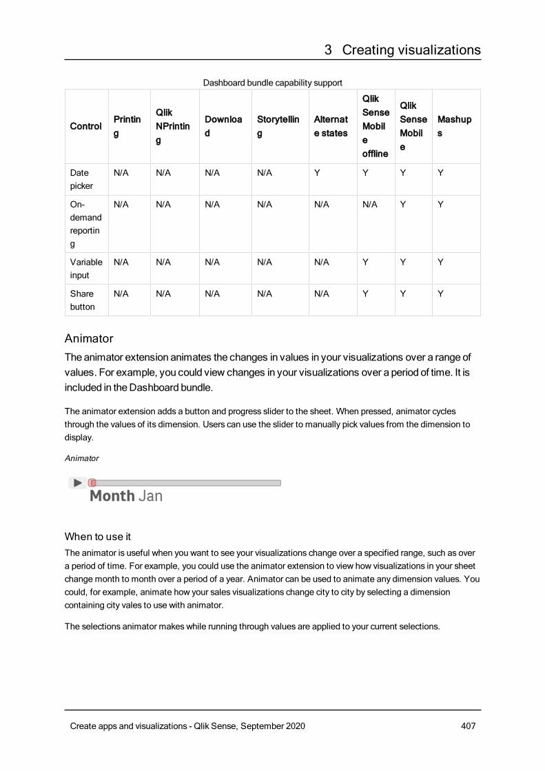
3 Creating visualizations
ControlPrinting
QlikNPrinting
Download
Storytelling
Alternate states
QlikSenseMobileoffline
QlikSenseMobile
Mashups
Datepicker
N/A N/A N/A N/A Y Y Y Y
On-demandreporting
N/A N/A N/A N/A N/A N/A Y Y
Variableinput
N/A N/A N/A N/A N/A Y Y Y
Sharebutton
N/A N/A N/A N/A N/A Y Y Y
Dashboard bundle capability support
AnimatorTheanimator extension animates the changes in values in your visualizations over a range ofvalues. For example, you could view changes in your visualizations over a period of time. It isincluded in theDashboard bundle.
The animator extension adds a button and progress slider to the sheet. When pressed, animator cyclesthrough the values of its dimension. Users can use the slider to manually pick values from the dimension todisplay.
Animator
When to use itThe animator is useful when you want to see your visualizations change over a specified range, such as overa period of time. For example, you could use the animator extension to view how visualizations in your sheetchange month to month over a period of a year. Animator can be used to animate any dimension values. Youcould, for example, animate how your sales visualizations change city to city by selecting a dimensioncontaining city vales to use with animator.
The selections animator makes while running through values are applied to your current selections.
Create apps and visualizations - Qlik Sense, September 2020 407
3 Creating visualizations
Creating animatorsYou can create an animator on the sheet you are editing. The dimension you select to use with animatorcontains the range of values you want animated. By default, every value in the dimension will be used as astep. You can customize the number of steps used in the animation as well as how quickly animator movesbetween steps. Animator runs through dimension values by the order in Sorting.
Do the following:
1. From the assets panel, underCustom objects > Dashboard bundle, drag an Animator object tothe sheet.
2. Select a field to add as the dimension.
Once you have created the animator, you may want to adjust its animation options and other settings.
Setting animator optionsAnimator options are set in Animator Options in the Properties pane.
You can control how fast an animator transitions between values in the selected dimension in TimeBetween Steps. Time Between Steps requires values be set in milliseconds.
It is not recommended to set Time Between Steps lower than 300milliseconds.
You can set the total steps the animator runs through in Total Steps. The animator will divide the total stepsevenly across the dimension values. For example, if there are 10 values in the time dimension selected andTotal Steps is set to 5, animator will go to values 2, 4, 6, 8, 10). If Total Steps is set to 0, the animator willuse every value.
If you want the animation to show the total building over time for your selected values, select Aggregate.When Aggregate is selected, each step is aggregated to the previous step.
By default, the animator will run through steps in a loop. You can control this with the Loop option.
You can control whether or not the dimension and current value displays in the animator as it runs with ShowDimension Label and Show Dimension Value.
LimitationsAnimator has the following limitations:
l Animator does not support drill-down dimensions as the dimension.
l Animator does not support animating trellis charts.
Date range pickerThedate range picker (Date picker) lets you select a single date or a range of dates from acalendar. It is included inDashboard bundle.
Create apps and visualizations - Qlik Sense, September 2020 408
3 Creating visualizations
l In single date mode, you select from a simple calendar.
l In date interval mode, you can select a range from the calendar, or any of the predefined ranges thatare available.
When to use itThe date range picker is useful when you have one or more date fields that you need to use to filter yourselections. Unlike a filter pane, a date range picker will only display date fields.
Creating a date range pickerYou can create a date range picker on the sheet you are editing.
Do the following:
1. From the assets panel, underCustom objects > Dashboard bundle drag aDate picker object tothe sheet.
2. Select the date field to use as filter inDate field.The list contains only fields that are recognized as a date field by Qlik Sense.
If you want to use a timestamp field, you need to convert it to a date. Use theexpression =date(floor(myTimeStamp_Field)) instead of myTimeStamp_Field.
3. Select if you want to be able to pick a single date or a date interval in Single date / interval.Date interval lets you pick a range of dates.Single date lets you pick a single date only.
When you have created the date range picker, you may want to adjust its appearance and other settings.
Setting the available date rangeYou can set the range of dates available to pick by setting the option Advanced setup toOn. You can useexpressions or explicit date values. The expressions used below refer to a field namedDateField.
l Set the first date of the calendar withMin date.Default value is =Min( {1} [DateField]). This expression returns the first date inDateField in the fulldata set.
l Set the last date of the calendar withMax date.Default value is =Max( {1} [DateField]). This expression returns the last date inDateField in the fulldata set.
l Set the date to showwhen the date range picker is opened with Start date.Default value is =Min([DateField]). This expression returns the first date inDateField in the currentselection.
Setting locale of the calendarYou can set the locale of the calendar to get local names for days and months. Change the setting LocaleunderCalendar Settings > Language and labels to the two-letter code of the locale you want to use. Forexample, you can change the default value of en for English to de for German.
Create apps and visualizations - Qlik Sense, September 2020 409
3 Creating visualizations
Customizing text labelsYou can customize the text labels that are shown when the date range picker is used.
You change the text prompt shown when the date range picker is minimized with the settingDefault TextunderCalendar Settings > Language and labels. The default setting is 'Select date range'.
In date interval mode there are a number of predefined ranges available to pick if Show predefined rangesis set toOn. You can customize the text labels for the predefined range selections with the settings underCalendar Settings > Predefined ranges:
l Custom Range represents the option where you select a date interval freely from the calendar.Default value is Range.
l Today represents the date value of today. Default value is Today.
l Yesterday represents the date value of yesterday. Default value is Yesterday.
l Last $ days represents the two options for showing the last 7 or 30 days. $ is replaced by 7 or 30 inthe string. Default value is Last $ days.
l This Month represents the current month. Default value is This Month.
l Last Month represents the current month. Default value is Last Month.
LimitationsFor information about general limitations, see Limitations (page 406).
On-Demand reporting controlTheOn-Demand reporting control adds a button to createQlik NPrinting reports on demand. Itis included inDashboard bundle.
Requirementsl Qlik NPrinting Server (June 2017 or later) with a Qlik NPrinting app that is connected to the QlikSense app that you are designing. This Qlik NPrinting app contains your report templates.
l Qlik Sense June 2019 or later.
l All users generating On-Demand reports need to be added as users in Qlik NPrinting, with a securityrole that supports running On-Demand reports.
l Usersmust be logged into Qlik Sense via NTML (Windows) authentication in order to generate reportsor create reporting buttons.
When to use itThe On-Demand reporting control is useful when you want the user to be able to print predefined QlikNPrinting reports within Qlik Sense, using their selections in the app as a filter.
Installing the Dashboard bundleYou can install the Dashboard bundle when you install Qlik Sense.
You can add or remove object bundles from your Qlik Sense deployment at anymoment. If you have a multi-node installation, object bundles are installed on the central node.
Create apps and visualizations - Qlik Sense, September 2020 410
3 Creating visualizations
You can see which extensions are installed in your deployment by checking the Extensionssection in the Qlik Management Console (QMC).
Do the following:
1. InControl Panel, open Programs and Features.
2. In the list of programs, double-click the object bundle that you want to modify.
3. The Object Bundle SetupWizard opens. ClickNext.
4. Select Change.
5. On theCustom setup screen, click on the bundle icon to select how to modify the bundle installation:
o If the bundle is installed, select Entire feature will be unavailable to uninstall it.o If the bundle is not installed, select Entire feature will be installed on local hard drive to
install it.
Then, clickNext.
6. ClickChange.
7. When the setup modification is complete, a message invites you to manually restart the Qlik SenseRepository Service.
8. Click Finish to close the Object Bundle SetupWizard.
9. Manually restart the Qlik Sense Repository Service to make the changes effective.
You can verify that the changes have been correctly applied by checking the Extensions section in the QMC.
Adding a server as a trusted originIf you are creating On-Demand reports in Qlik Sense or a QlikViewWeb Server hosted QlikViewAccessPoint, you must add these servers as a trusted origin in Qlik NPrinting web console.
For each server path used to access the Qlik NPrinting web console, you must add a trusted origin. Forexample, if your server can be accessed through a local domain, a shortened host, or fully qualified URLs, atrusted origin must be added for each of those server paths.
How you enter the server paths in the Address field of the trusted origin depends on your securityconfiguration.
Configuration 1: SSL security not setup with Qlik NPrinting web console
A trusted origin is required for each server path used to log onto the Qlik NPrinting web console. For example,if your server is qlikserver1 and has an IP address of 192.168.0.101, you would add the following trustedorigins:
l http://qlikserver1
l http://qlikserver1.domain.local
l http://192.168.0.101
Create apps and visualizations - Qlik Sense, September 2020 411
3 Creating visualizations
Configuration 2: SSL security setup with Qlik NPrinting web console and third-party
A trusted origin is required for each server path used to log onto the Qlik NPrinting web console. URLsmust use HTTPS. For example, if your server is qlikserver1 and has an IP address of 192.168.0.101, youwould add the following trusted origins:
l https://qlikserver1
l https://qlikserver1.domain.local
l https://192.168.0.101
Adding a trusted origin
Do the following:
1. In Qlik NPrinting, clickAdmin > Settings.
2. ClickOn-Demand Settings.
3. ClickAdd trusted origin.
4. AfterName, enter a name for the trusted origin.
5. AfterDescription, enter a description for the trusted origin.
6. After Address, enter the URL for the QlikView Server.The URL must be the base URL (scheme and host) only. For example, http://qlikserver1 rather thanhttp://qlikserver1/qlikview/index.htm.
7. ClickCreate.
Configuring On-Demand settings on Qlik NPrinting ServerYou must configure these settings on your Qlik NPrinting Server:
l You must have a connection to a QlikView Server or a Qlik Sense server.QlikView Server and QlikView Cluster connections are supported with On-Demand. Local connectionsare not supported. See: Creating connections.
l If you are connecting to a QlikView Server or Cluster with a QlikView Server Extranet License, thefollowing optionsmust be enabled when configuring the connection:
o Connection requires authenticationo Apply user section access for reports
l You must enable your Qlik NPrinting reports for On-Demand.
l You can limit On-Demand report creation through security roles. See: Role based security.
On-Demand is compatible with Chrome, Firefox, and Explorer. It will not run in Microsoft Edge,because the certificates will not download.
Enabling Qlik NPrinting reports for On-Demand creationQlik NPrinting reports must be manually enabled for On-Demand creation. Reports must be assigned to theQlikView document or Qlik Sense app with which you want to generate On-Demand reports. On-Demandcreation can be enabled during the creation of a new report.
Create apps and visualizations - Qlik Sense, September 2020 412
3 Creating visualizations
Do the following:
1. In Qlik NPrinting web console, clickReports.
2. Open a report or create a new report.
3. Select an app from the App drop-down list is connected to the QlikView document or Qlik Sense appfor which you want to generate a report.
On-Demand requests only work with reports based on a single connection. MultiDocreports are not supported.
4. Select the Enable On-Demand check box.
5. ClickSave.
The report template is now available.
Creating an On-Demand reporting buttonYou can create an On-Demand reporting button on the sheet you are editing.
Do the following:
1. From the assets panel, underCustom objects > Dashboard bundle dragOn-demand reportingto the sheet.
2. In the property panel, underNPrinting Connection > NPrinting server URL, set the serverconnection. The URLmust end with /.For example: https://<server name>:4993/
3. UnderNPrinting App, select the Qlik NPrinting app that contains the report template.
4. UnderNPrinting connection, select the Qlik NPrinting connection.As the default, the list only showsQlik NPrinting connections to the Qlik Sense app you are workingin. You can use the App/Connection filter toggle to display connections not associated with thecurrent Qlik Sense app.
5. UnderReport Configuration > Choose Report, select the report you want to connect to the button.
6. InDefault Export Format, select a default export format.
7. Under Appearances > Button Label, set the button label. For example: Generate report.
You have now created an On-Demand reporting button.
Generating a reportYou can generate a report that is filtered according to the current selections in the Qlik Sense app. You needto be in analysis mode.
You can only filter on fields that are included in the Qlik NPrinting report template, or the reportwill fail. It is not possible to filter on selections using an expression.
Do the following:
Create apps and visualizations - Qlik Sense, September 2020 413
3 Creating visualizations
1. Click on the button that you created.The Export dialog opens.
2. There are two buttons to choose from:
a. Quick Report: generates a single report with the default output format.
b. New Report: choose from a list of reports that have been made available to you. You can alsochoose the output format.
3. When the report is generated a download button is activated. Click theDownload button to downloadthe report.
LimitationsFor information about general limitations, see Limitations (page 406).
l If the Qlik NPrinting report template contains a filter, it is not possible to make conflicting selections inthe Qlik Sense app, or the report will fail.
l When you use the On-Demand reporting control in a mashup, you need to useWindowsauthentication. Header authentication is not supported.Additionally, if the mashup containsmultiple apps, you can only use the app where on-demandoriginates from to filter on-demand reports.
Share button controlTheShare button (Share button) is a control that lets you addabutton to generate a link to thecurrent sheet.When you follow the link all selections aremaintained. It is included in theDashboard bundle.
When to use itThe share button is useful when you want others to see this sheet as you see it.
Creating a share buttonYou can create a share button on the sheet you are editing.
Do the following:
1. From the assets panel, underCustom objects > Dashboard bundle drag a Share button object tothe sheet.
2. ClickCopy from textbox under Export settings > Output method in the property panel. The buttondisplays with the text Generate Link and an empty textbox next to it.
3. Click theDone button to stop editing the sheet.
4. Click the button you created. A link is generated and displayed in the textbox next to the share button.
5. Copy and share the link with those you wish to share with. You can share the generated link throughthree output methods:
l Copy to Clipboard
l Create New Email with link
l A textbox.
Create apps and visualizations - Qlik Sense, September 2020 414
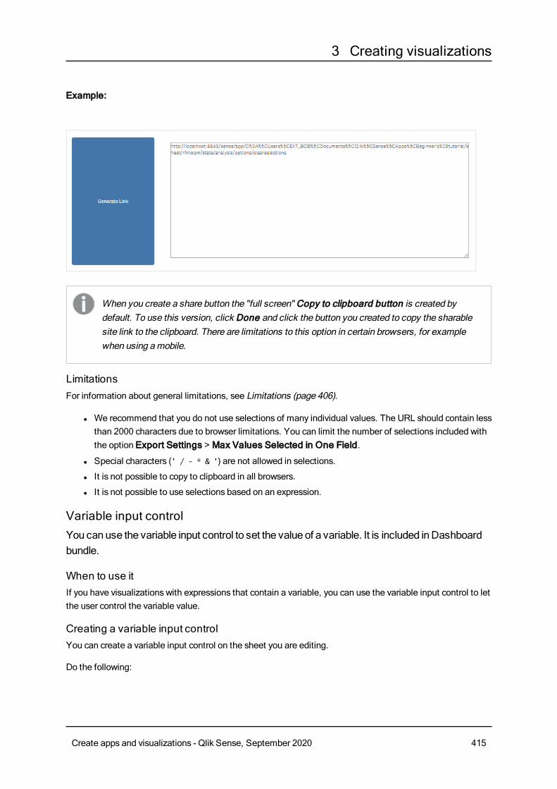
3 Creating visualizations
Example:
When you create a share button the "full screen" Copy to clipboard button is created bydefault. To use this version, click Done and click the button you created to copy the sharablesite link to the clipboard. There are limitations to this option in certain browsers, for examplewhen using amobile.
LimitationsFor information about general limitations, see Limitations (page 406).
l We recommend that you do not use selections of many individual values. The URL should contain lessthan 2000 characters due to browser limitations. You can limit the number of selections included withthe option Export Settings > Max Values Selected in One Field.
l Special characters (' / - * & ') are not allowed in selections.
l It is not possible to copy to clipboard in all browsers.
l It is not possible to use selections based on an expression.
Variable input controlYou canuse the variable input control to set the value of a variable. It is included inDashboardbundle.
When to use itIf you have visualizations with expressions that contain a variable, you can use the variable input control to letthe user control the variable value.
Creating a variable input controlYou can create a variable input control on the sheet you are editing.
Do the following:
Create apps and visualizations - Qlik Sense, September 2020 415
3 Creating visualizations
1. From the assets panel, underCustom objects > Dashboard bundle drag a Variable input objectto the sheet.
2. Select the variable to use inName under Appearance > Variable in the property panel.
3. Select how you want to input data in Show as:
l Buttons lets you add a number of buttons with one button for each defined variable value.You can select how to display the buttons inDisplay, select Row to show them in a horizontalrow orColumn to show them in a vertical column.You can define the buttons in two different ways, fixed (Fixed) or (dynamic)Dynamic with theFixed or dynamic values setting under Values.If you select to use fixed values, you need to add each button with Add Alternative and definea value (Value) and a label (Label) for each button.If you use dynamic values, you define the buttons with a string inDynamic values.Use | toseparate buttons, and ~ to separate value from label. For example,'Germany~GER|France~FRA' will create two buttons labelled GER and FRA. The first willchange the variable value to Germany, and the second changes the value to France. You donot need to specify labels if you want to use values as labels.
l Drop down adds a drop down with one item for each defined variable value.You can define the items in two different ways, fixed (Fixed) or (dynamic)Dynamic with theFixed or dynamic values setting under Values.If you select to use fixed values, you need to add each item with Add Alternative and define avalue (Value) and a label (Label) for each item.If you use dynamic values, you define the itemswith a string inDynamic values.Use | toseparate items, and ~ to separate value from label. For example,'Germany~GER|France~FRA' will create two items labelled GER and FRA. The first willchange the variable value to Germany, and the second changes the value to France. You donot need to specify labels if you want to use values as labels.
l Input box provides a simple input box that will update the variable value.
l Slider creates a slider that updates the variable value. You define the minimum setting withMin and the maximum setting withMax under Values. You can also set the step to use withStep. If you select Slider label, the selected value is displayed when you drag the slider.The variable value is updated when you stop dragging the slider, but you can select Updateon drag if you want the variable value to be updated while you drag. This can be useful whenyou want visualizations based on the variable to update dynamically when dragging the slider.Use this option with caution, as the constant redrawing of charts can be annoying.
LimitationsFor information about general limitations, see Limitations (page 406).
l The slider label can only display numeric values. This means, if the value is a date the numeric valueof the date is displayed. If the value is a percentage value, the percentage character is not displayed.
Create apps and visualizations - Qlik Sense, September 2020 416
3 Creating visualizations
Visualization bundleVisualizations are an importantmeans of conveying information frommassive data. TheVisualization bundle is a set of charts that can be used to enhance and increase your QlikSense app's charting capacity. The charts are optional. You donot have to install or enablethem to useQlik Sense.
Enabling Visualization bundleYou can install the Visualization bundle when you install Qlik Sense. If you need to adjust your installation,see: Modifying an object bundles installation.
Visualization bundle chartsVisualization bundle charts are in the asset panel underCustom objects.
The following charts are included:
l Bar & area chart (page 419)Create bar charts and area charts and enhance them with transitions and connectors.
l Bullet chart (page 422)A bullet chart is a gauge that can also show a target marker and a qualitative range to showperformance.
l Funnel chart (page 425)A funnel chart is a visual representation of the connected stages of a linear process.
l Heatmap chart (page 431)A chart that displays comparative data and with the values represented as colors.
l Multi KPI chart (page 436)A chart that shows KPI for multiple dimension values to quickly understand and track performance.
l Network chart (page 446)Creates a cluster diagram representing a graphical chart of a computer network.
l P&L pivot chart (page 454)Creates a pivot table that you can style, for example for profit and loss reporting.
l Radar chart (page 458)Creates a two-dimensional chart using radial axes to show the scoring of a measure in one dimensionor another.
l Sankey chart (page 462)A flow chart diagram chart visually emphasizing major transfers or flows within defined systemboundaries.
l Trellis container (page 465)Creates a trellis chart based on a master visualization.
l Variance waterfall chart (page 468)Shows the variance between two measures over the different values of a dimension.
l Word cloud chart (page 470)A cloud chart of words with their size based on measure value.
Create apps and visualizations - Qlik Sense, September 2020 417
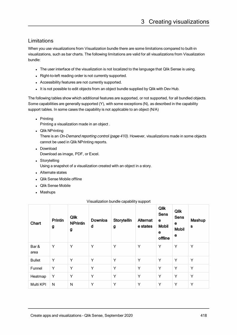
3 Creating visualizations
LimitationsWhen you use visualizations from Visualization bundle there are some limitations compared to built-invisualizations, such as bar charts. The following limitations are valid for all visualizations from Visualizationbundle:
l The user interface of the visualization is not localized to the language that Qlik Sense is using.
l Right-to-left reading order is not currently supported.
l Accessibility features are not currently supported.
l It is not possible to edit objects from an object bundle supplied byQlik with Dev Hub.
The following tables showwhich additional features are supported, or not supported, for all bundled objects.Some capabilities are generally supported (Y), with some exceptions (N), as described in the capabilitysupport tables. In some cases the capability is not applicable to an object (N/A)
l PrintingPrinting a visualization made in an object .
l Qlik NPrintingThere is anOn-Demand reporting control (page 410). However, visualizationsmade in some objectscannot be used in Qlik NPrinting reports.
l DownloadDownload as image, PDF, or Excel.
l StorytellingUsing a snapshot of a visualization created with an object in a story.
l Alternate states
l Qlik Sense Mobile offline
l Qlik Sense Mobile
l Mashups
ChartPrinting
QlikNPrinting
Download
Storytelling
Alternate states
QlikSenseMobileoffline
QlikSenseMobile
Mashups
Bar &area
Y Y Y Y Y Y Y Y
Bullet Y Y Y Y Y Y Y Y
Funnel Y Y Y Y Y Y Y Y
Heatmap Y Y Y Y Y Y Y Y
Multi KPI N N Y Y Y Y Y Y
Visualization bundle capability support
Create apps and visualizations - Qlik Sense, September 2020 418
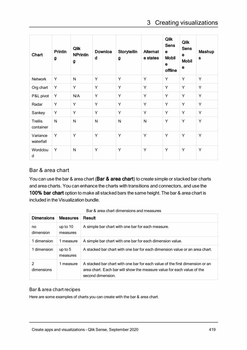
3 Creating visualizations
ChartPrinting
QlikNPrinting
Download
Storytelling
Alternate states
QlikSenseMobileoffline
QlikSenseMobile
Mashups
Network Y N Y Y Y Y Y Y
Org chart Y Y Y Y Y Y Y Y
P&L pivot Y N/A Y Y Y Y Y Y
Radar Y Y Y Y Y Y Y Y
Sankey Y Y Y Y Y Y Y Y
Trelliscontainer
N N N N N Y Y Y
Variancewaterfall
Y Y Y Y Y Y Y Y
Wordcloud
Y N Y Y Y Y Y Y
Bar & area chartYou canuse the bar & area chart (Bar & area chart) to create simple or stacked bar chartsand area charts. You can enhance the charts with transitions and connectors, and use the100% bar chart option tomakeall stacked bars the sameheight. The bar & area chart isincluded in theVisualization bundle.
Dimensions Measures Result
nodimension
up to 10measures
A simple bar chart with one bar for each measure.
1 dimension 1 measure A simple bar chart with one bar for each dimension value.
1 dimension up to 5measures
A stacked bar chart with one bar for each dimension value or an area chart.
2dimensions
1 measure A stacked bar chart with one bar for each value of the first dimension or anarea chart. Each bar will show the measure value for each value of thesecond dimension.
Bar & area chart dimensions and measures
Bar & area chart recipesHere are some examples of charts you can create with the bar & area chart.
Create apps and visualizations - Qlik Sense, September 2020 419
3 Creating visualizations
100% stacked bar chart
This example creates a stacked bar chart where each bar is the same height. You can use this to compare thebar segments relative to each other, but not in absolute values.
You need a chart with two dimensions and one measure. Set the following properties:
l Appearance > Presentation > 100% bars = 100% bars
l Appearance > Presentation > Grid height relative to max bar = 1
l Appearance > Colors and Legend >Single Colors = Multi-color
We can add connectors to the chart. Set the following additional properties:
l Appearance > Presentation > Show bar connectors = Bars with connectors
l Appearance > Presentation > Bar spacing = 0.5
l Appearance > Presentation > Outer bar spacing = 0
Create apps and visualizations - Qlik Sense, September 2020 420
3 Creating visualizations
Area chart
This example creates an area chart. You can use the same data set as in the previous examples. Set thefollowing properties:
l Appearance > Presentation > 100% bars = Not 100%
l Appearance > Presentation > Grid height relative to max bar = 1.1
l Appearance > Presentation > Show bar connectors = Bars with connectors
l Appearance > Presentation > Bar spacing = 1
l Appearance > Presentation > Outer bar spacing = 0
Just like the stacked bar chart, you can make a 100% area chart by changing the following properties:
l Appearance > Presentation > 100% bars = 100% bars
l Appearance > Presentation > Grid height relative to max bar = 1
Changing the appearance of the chartYou can customize the appearance of your chart.
Create apps and visualizations - Qlik Sense, September 2020 421
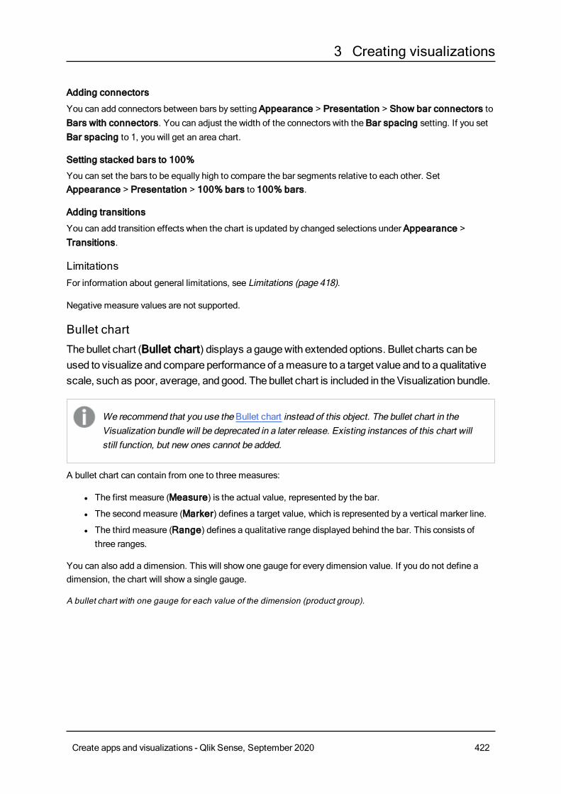
3 Creating visualizations
Adding connectors
You can add connectors between bars by setting Appearance > Presentation > Show bar connectors toBars with connectors. You can adjust the width of the connectors with the Bar spacing setting. If you setBar spacing to 1, you will get an area chart.
Setting stacked bars to 100%
You can set the bars to be equally high to compare the bar segments relative to each other. SetAppearance > Presentation > 100% bars to 100% bars.
Adding transitions
You can add transition effects when the chart is updated by changed selections under Appearance >Transitions.
LimitationsFor information about general limitations, see Limitations (page 418).
Negative measure values are not supported.
Bullet chartThebullet chart (Bullet chart) displays a gaugewith extendedoptions. Bullet charts can beused to visualize and compare performance of ameasure to a target value and to a qualitativescale, such as poor, average, and good. The bullet chart is included in theVisualization bundle.
We recommend that you use the Bullet chart instead of this object. The bullet chart in theVisualization bundle will be deprecated in a later release. Existing instances of this chart willstill function, but new ones cannot be added.
A bullet chart can contain from one to three measures:
l The first measure (Measure) is the actual value, represented by the bar.
l The second measure (Marker) defines a target value, which is represented by a vertical marker line.
l The third measure (Range) defines a qualitative range displayed behind the bar. This consists ofthree ranges.
You can also add a dimension. This will show one gauge for every dimension value. If you do not define adimension, the chart will show a single gauge.
A bullet chart with one gauge for each value of the dimension (product group).
Create apps and visualizations - Qlik Sense, September 2020 422
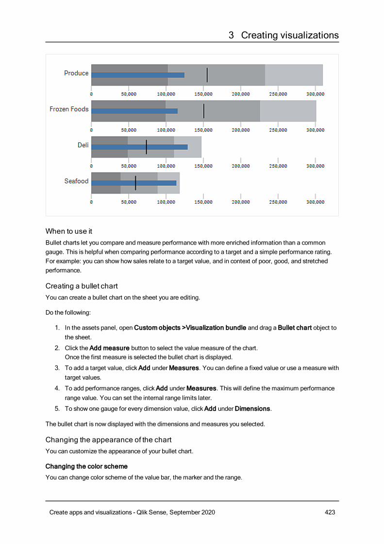
3 Creating visualizations
When to use itBullet charts let you compare and measure performance with more enriched information than a commongauge. This is helpful when comparing performance according to a target and a simple performance rating.For example: you can show how sales relate to a target value, and in context of poor, good, and stretchedperformance.
Creating a bullet chartYou can create a bullet chart on the sheet you are editing.
Do the following:
1. In the assets panel, openCustom objects >Visualization bundle and drag a Bullet chart object tothe sheet.
2. Click the Add measure button to select the value measure of the chart.Once the first measure is selected the bullet chart is displayed.
3. To add a target value, clickAdd underMeasures. You can define a fixed value or use a measure withtarget values.
4. To add performance ranges, clickAdd underMeasures. This will define the maximum performancerange value. You can set the internal range limits later.
5. To show one gauge for every dimension value, clickAdd underDimensions.
The bullet chart is now displayed with the dimensions and measures you selected.
Changing the appearance of the chartYou can customize the appearance of your bullet chart.
Changing the color scheme
You can change color scheme of the value bar, the marker and the range.
Create apps and visualizations - Qlik Sense, September 2020 423
3 Creating visualizations
Do the following:
l Set value bar color in Appearance > Measure bar > Change bar color in the property panel.
l Set marker color in Appearance > Marker > Change marker color in the property panel.
l Set range color in Appearance > Range > Change range color in the property panel. The coloryou select is used for the highest range. The two lower ranges are displayed in darker shades of thatcolor.
It's a good idea to select a light range color to avoid poor contrast between the ranges.You should alsomake sure that the range color is less visually dominant than the valuebar.
Changing the range limits
You can also customize the limits of the ranges under Appearance > Range in the properties panel. Thefull range is defined by the value of the third measure of the chart.
l Set middle range (%) defines the upper limit of the middle range.
l Set lower range (%) defines the upper limit of the lower range.
Changing the scale of the axis
If you use a dimension to show several gauges, you can select how to show the scale of the axis with Axis >Consistent for all axis dimension values.
l If you want each dimension gauge to use the same scale, enable this option. If the range measuredepends on the dimension value, the range bars will have different lengths. This is useful when youwant to be able to compare the actual values.
l If you want each range bar to be equally long, disable this option.
Example:
In this example, Consistent for all axis dimension values is disabled. This makes it easier to compare therelative performance of each product group.
A bullet chart with Consistent for all axis dimension values disabled.
Create apps and visualizations - Qlik Sense, September 2020 424
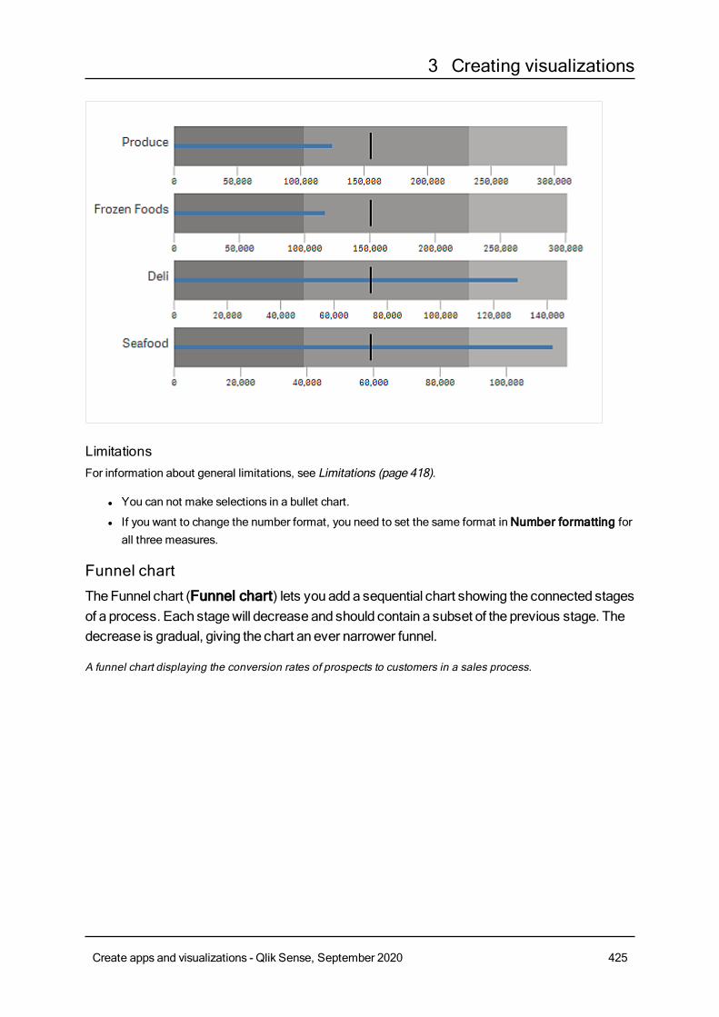
3 Creating visualizations
LimitationsFor information about general limitations, see Limitations (page 418).
l You can not make selections in a bullet chart.
l If you want to change the number format, you need to set the same format inNumber formatting forall three measures.
Funnel chartTheFunnel chart (Funnel chart) lets you adda sequential chart showing the connected stagesof a process. Each stagewill decrease and should contain a subset of the previous stage. Thedecrease is gradual, giving the chart an ever narrower funnel.
A funnel chart displaying the conversion rates of prospects to customers in a sales process.
Create apps and visualizations - Qlik Sense, September 2020 425
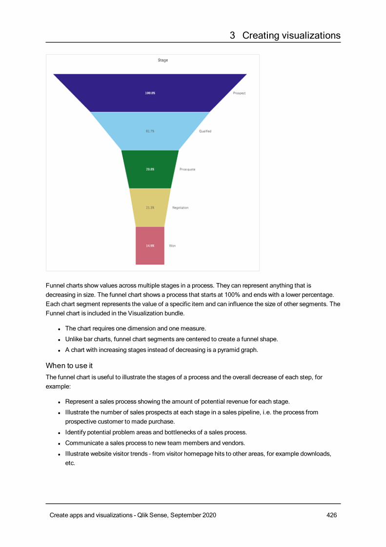
3 Creating visualizations
Funnel charts show values acrossmultiple stages in a process. They can represent anything that isdecreasing in size. The funnel chart shows a process that starts at 100% and ends with a lower percentage.Each chart segment represents the value of a specific item and can influence the size of other segments. TheFunnel chart is included in the Visualization bundle.
l The chart requires one dimension and one measure.
l Unlike bar charts, funnel chart segments are centered to create a funnel shape.
l A chart with increasing stages instead of decreasing is a pyramid graph.
When to use itThe funnel chart is useful to illustrate the stages of a process and the overall decrease of each step, forexample:
l Represent a sales process showing the amount of potential revenue for each stage.
l Illustrate the number of sales prospects at each stage in a sales pipeline, i.e. the process fromprospective customer to made purchase.
l Identify potential problem areas and bottlenecks of a sales process.
l Communicate a sales process to new team members and vendors.
l Illustrate website visitor trends – from visitor homepage hits to other areas, for example downloads,etc.
Create apps and visualizations - Qlik Sense, September 2020 426
3 Creating visualizations
l Show order fulfillment with initiated orders at the top, followed by for example, orders in delivery,delivered, canceled and returned.
l Showing the flow of information from top secret to unclassified.
l Representing knowledge areas from general knowledge to expert knowledge.
Creating a funnel chartYou can create a funnel chart on the sheet you are editing.
l The dimension decides how it should be grouped in segments. By default, dimension values aredisplayed in descending order bymeasure value.
l The measure is the value that decides the size of each segment.
Do the following:
1. In the assets panel, openCustom objects > Visualization bundle and drag a Funnel chart objectto the sheet.
2. Click the top Add dimension button and select the target dimension (usually target market) of thechart.
3. Click the Add measure button to select the measure (what is to be measured) of the chart. Oncedimensions (dimension label) and measure (value label) have been selected the funnel chart displaysautomatically (in color) in the chart field.
4. ClickDone to revert to the main display field.
5. Click applicable region underRegion. The chart field will update displaying chosen parameters anddetails.
Dimension, measure and region details will continue to display in the chart field even when reverting to Editmode.
Changing the appearance of the chartYou can customize your chart with one or more features.
Funnel mode
You can set the shape of the funnel with Appearance > Presentation > Funnel Mode.
AreaThe area of each item is proportionate to the measure. Only the height of the individual segment is affected -not the overall chart or contents.
Create apps and visualizations - Qlik Sense, September 2020 427
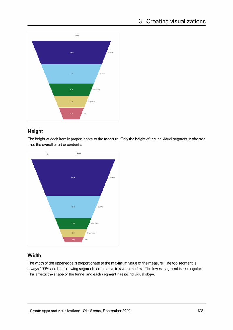
3 Creating visualizations
HeightThe height of each item is proportionate to the measure. Only the height of the individual segment is affected- not the overall chart or contents.
WidthThe width of the upper edge is proportionate to the maximum value of the measure. The top segment isalways 100% and the following segments are relative in size to the first. The lowest segment is rectangular.This affects the shape of the funnel and each segment has its individual slope.
Create apps and visualizations - Qlik Sense, September 2020 428
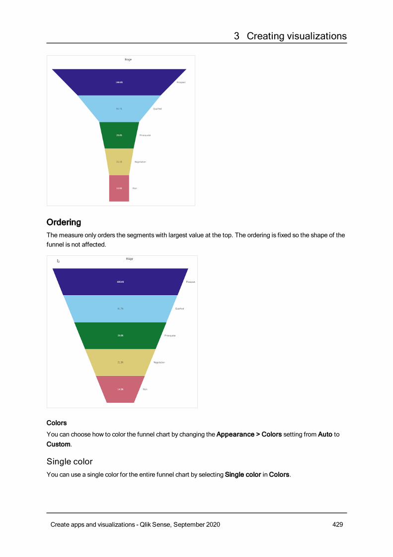
3 Creating visualizations
OrderingThe measure only orders the segments with largest value at the top. The ordering is fixed so the shape of thefunnel is not affected.
Colors
You can choose how to color the funnel chart by changing the Appearance > Colors setting from Auto toCustom.
Single colorYou can use a single color for the entire funnel chart by selecting Single color inColors.
Create apps and visualizations - Qlik Sense, September 2020 429
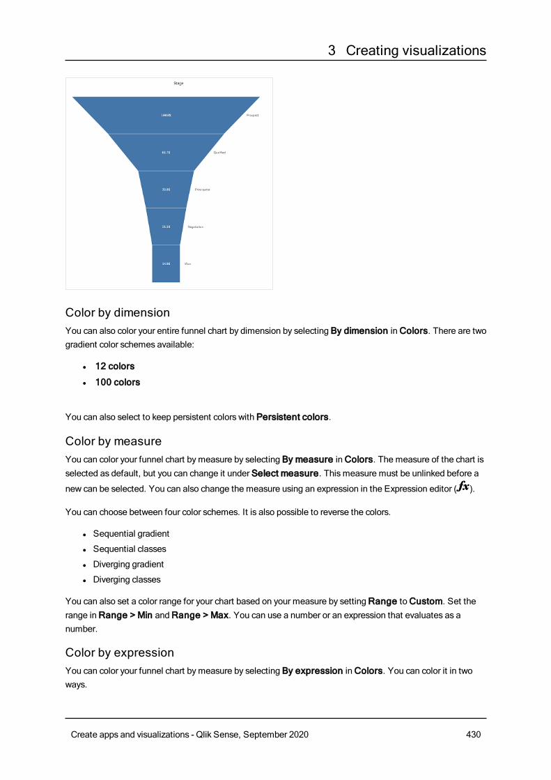
3 Creating visualizations
Color by dimensionYou can also color your entire funnel chart by dimension by selecting By dimension inColors. There are twogradient color schemes available:
l 12 colors
l 100 colors
You can also select to keep persistent colors with Persistent colors.
Color by measureYou can color your funnel chart bymeasure by selecting By measure inColors. The measure of the chart isselected as default, but you can change it under Select measure. This measure must be unlinked before a
new can be selected. You can also change the measure using an expression in the Expression editor ( ).
You can choose between four color schemes. It is also possible to reverse the colors.
l Sequential gradient
l Sequential classes
l Diverging gradient
l Diverging classes
You can also set a color range for your chart based on your measure by settingRange toCustom. Set therange inRange > Min andRange > Max. You can use a number or an expression that evaluates as anumber.
Color by expressionYou can color your funnel chart bymeasure by selecting By expression inColors. You can color it in twoways.
Create apps and visualizations - Qlik Sense, September 2020 430
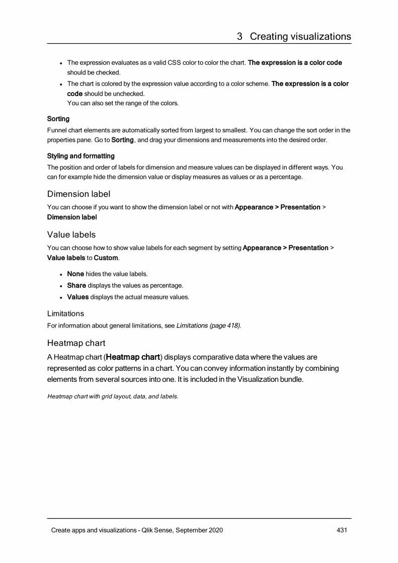
3 Creating visualizations
l The expression evaluates as a valid CSS color to color the chart. The expression is a color codeshould be checked.
l The chart is colored by the expression value according to a color scheme. The expression is a colorcode should be unchecked.You can also set the range of the colors.
Sorting
Funnel chart elements are automatically sorted from largest to smallest. You can change the sort order in theproperties pane. Go to Sorting, and drag your dimensions and measurements into the desired order.
Styling and formatting
The position and order of labels for dimension and measure values can be displayed in different ways. Youcan for example hide the dimension value or displaymeasures as values or as a percentage.
Dimension labelYou can choose if you want to show the dimension label or not with Appearance > Presentation >Dimension label
Value labelsYou can choose how to show value labels for each segment by setting Appearance > Presentation >Value labels toCustom.
l None hides the value labels.
l Share displays the values as percentage.
l Values displays the actual measure values.
LimitationsFor information about general limitations, see Limitations (page 418).
Heatmap chartAHeatmap chart (Heatmap chart) displays comparative datawhere the values arerepresented as color patterns in a chart. You can convey information instantly by combiningelements from several sources into one. It is included in theVisualization bundle.
Heatmap chart with grid layout, data, and labels.
Create apps and visualizations - Qlik Sense, September 2020 431
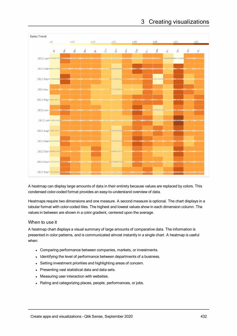
3 Creating visualizations
A heatmap can display large amounts of data in their entirety because values are replaced by colors. Thiscondensed color-coded format provides an easy-to-understand overview of data.
Heatmaps require two dimensions and one measure. A second measure is optional. The chart displays in atabular format with color-coded tiles. The highest and lowest values show in each dimension column. Thevalues in between are shown in a color gradient, centered upon the average.
When to use itA heatmap chart displays a visual summary of large amounts of comparative data. The information ispresented in color patterns, and is communicated almost instantly in a single chart. A heatmap is usefulwhen:
l Comparing performance between companies, markets, or investments.
l Identifying the level of performance between departments of a business.
l Setting investment priorities and highlighting areas of concern.
l Presenting vast statistical data and data sets.
l Measuring user interaction with websites.
l Rating and categorizing places, people, performances, or jobs.
Create apps and visualizations - Qlik Sense, September 2020 432
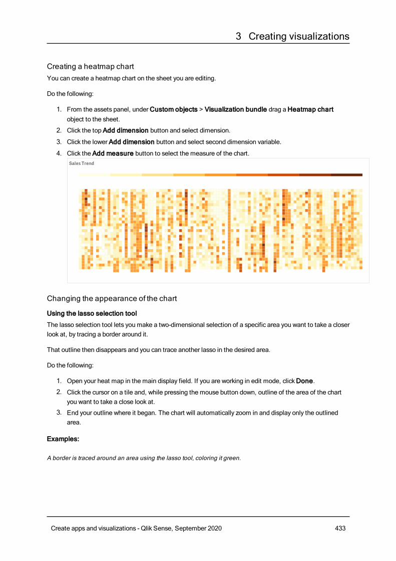
3 Creating visualizations
Creating a heatmap chartYou can create a heatmap chart on the sheet you are editing.
Do the following:
1. From the assets panel, underCustom objects > Visualization bundle drag aHeatmap chartobject to the sheet.
2. Click the top Add dimension button and select dimension.
3. Click the lower Add dimension button and select second dimension variable.
4. Click the Add measure button to select the measure of the chart.
Changing the appearance of the chart
Using the lasso selection tool
The lasso selection tool lets you make a two-dimensional selection of a specific area you want to take a closerlook at, by tracing a border around it.
That outline then disappears and you can trace another lasso in the desired area.
Do the following:
1. Open your heat map in the main display field. If you are working in edit mode, clickDone.
2. Click the cursor on a tile and, while pressing the mouse button down, outline of the area of the chartyou want to take a close look at.
3. End your outline where it began. The chart will automatically zoom in and display only the outlinedarea.
Examples:
A border is traced around an area using the lasso tool, coloring it green.
Create apps and visualizations - Qlik Sense, September 2020 433
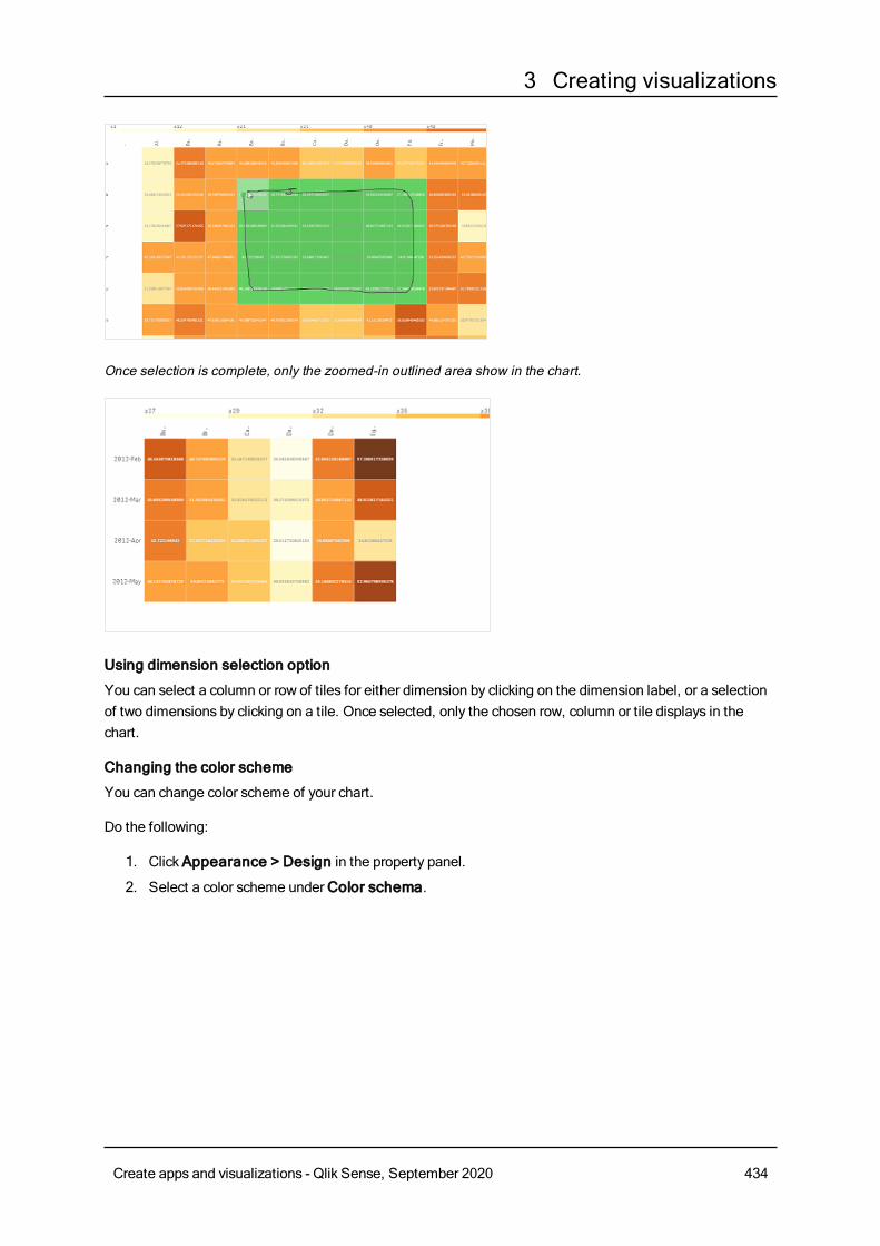
3 Creating visualizations
Once selection is complete, only the zoomed-in outlined area show in the chart.
Using dimension selection option
You can select a column or row of tiles for either dimension by clicking on the dimension label, or a selectionof two dimensions by clicking on a tile. Once selected, only the chosen row, column or tile displays in thechart.
Changing the color scheme
You can change color scheme of your chart.
Do the following:
1. ClickAppearance > Design in the property panel.
2. Select a color scheme underColor schema.
Create apps and visualizations - Qlik Sense, September 2020 434
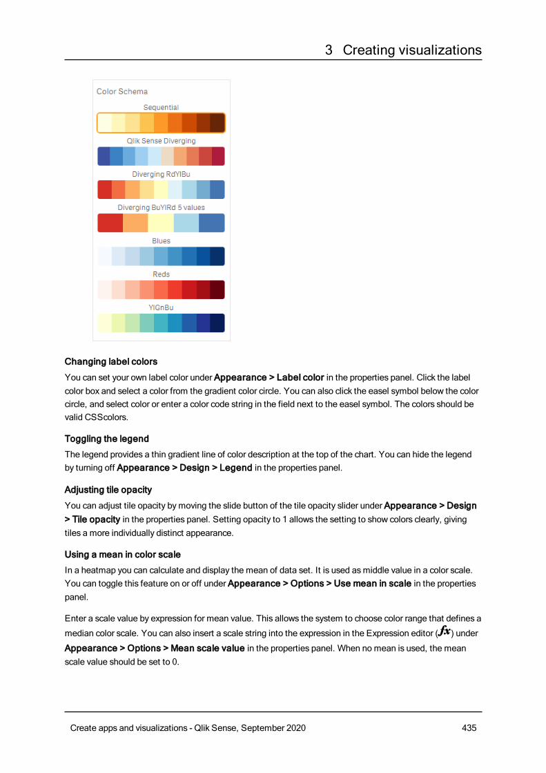
3 Creating visualizations
Changing label colors
You can set your own label color under Appearance > Label color in the properties panel. Click the labelcolor box and select a color from the gradient color circle. You can also click the easel symbol below the colorcircle, and select color or enter a color code string in the field next to the easel symbol. The colors should bevalid CSScolors.
Toggling the legend
The legend provides a thin gradient line of color description at the top of the chart. You can hide the legendby turning off Appearance > Design > Legend in the properties panel.
Adjusting tile opacity
You can adjust tile opacity bymoving the slide button of the tile opacity slider under Appearance > Design> Tile opacity in the properties panel. Setting opacity to 1 allows the setting to show colors clearly, givingtiles a more individually distinct appearance.
Using a mean in color scale
In a heatmap you can calculate and display the mean of data set. It is used asmiddle value in a color scale.You can toggle this feature on or off under Appearance > Options > Use mean in scale in the propertiespanel.
Enter a scale value by expression for mean value. This allows the system to choose color range that defines a
median color scale. You can also insert a scale string into the expression in the Expression editor ( ) under
Appearance > Options > Mean scale value in the properties panel. When no mean is used, the meanscale value should be set to 0.
Create apps and visualizations - Qlik Sense, September 2020 435
3 Creating visualizations
Setting a fixed scale
You can set minimum, maximum,and mean values to define a fixed color scale independent from a data set.To do this, move the Fixed scales slide button to the right under Appearance > Options > Fixed scale inthe properties panel. Then enter a minimum value underMin scale value, a maximum value underMaxscale value, and a mean value underMean scale value. You can also insert a scale string into the
expression in the Expression editor ( ).
Toggling titles
This option hides the name of the heatmap chart. ClickAppearance > General in the properties panel, andtoggle the Show titles slide button.
Changing label sizes on chart axes
You can also customize the size of the labels on both the y-axis and the x-axis of the chart. ClickAppearance in the properties panel, and enter the label size you want under Y-axis label size and underX-axis label size.
Setting minimum horizontal size
You can set a minimum size of how the chart displays horizontally with Appearance > Options > Minimumhorizontal size in the properties panel. You can also insert a string into the expression in the Expression
editor ( ).
LimitationsFor information about general limitations, see Limitations (page 418).
Multi KPI chartTheMulti KPI chart (Multi KPI) is a visualization that allows you to showmultipleKPI valuesfor different dimension values. The values can be individually customized using variousconditional formatting settings. This enables an easy view and tracking of goals. It is included intheVisualization bundle.
l The chart shows KPIs using measures and one dimension.
l Up to 15 measures and 80 values can display simultaneously.
l All KPI values can be grouped or displayed individually.
l Each value can be independently customized using for example, colors, icons, labels, font sizes,alignments, styles, links to different sheets, etc.
l The chart supports adding graphics, embedding objects into a chart and to displaymeasuresinfographically.
When to use itThe multi KPI chart is useful when you want to easily view, understand and track the performance of yourgoals. It is also helpful when you want to customize individual KPI values using conditional formatting. Youcan link KPIs to separate sheet and insert objects to represent information or data.
Create apps and visualizations - Qlik Sense, September 2020 436
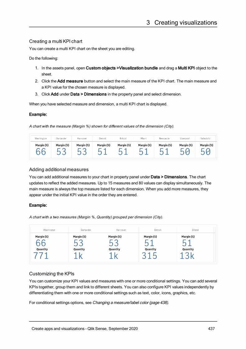
3 Creating visualizations
Creating a multi KPI chartYou can create a multi KPI chart on the sheet you are editing.
Do the following:
1. In the assets panel, openCustom objects >Visualization bundle and drag aMulti KPI object to thesheet.
2. Click the Add measure button and select the main measure of the KPI chart. The main measure anda KPI value for the chosen measure is displayed.
3. ClickAdd underData > Dimensions in the property panel and select dimension.
When you have selected measure and dimension, a multi KPI chart is displayed.
Example:
A chart with the measure (Margin %) shown for different values of the dimension (City).
Adding additionalmeasuresYou can add additional measures to your chart in property panel underData > Dimensions. The chartupdates to reflect the added measures. Up to 15 measures and 80 values can display simultaneously. Themain measure is always the top measure listed for each dimension. When you add more measures, theyappear under the initial KPI value in the order they are entered.
Example:
A chart with a two measures (Margin %, Quantity) grouped per dimension (City).
Customizing the KPIsYou can customize your KPI values and measures with one or more conditional settings. You can add severalKPIs together, group them and link to different sheets. You can also configure KPI values independently bydifferentiating them with one or more conditional settings such as text, color, icons, graphics, etc.
For conditional settings options, seeChanging ameasure/label color (page 438).
Create apps and visualizations - Qlik Sense, September 2020 437
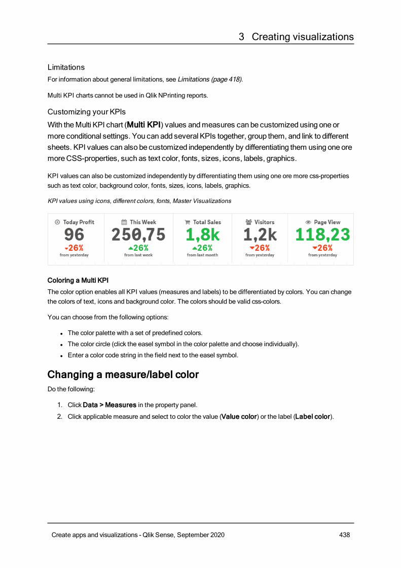
3 Creating visualizations
LimitationsFor information about general limitations, see Limitations (page 418).
Multi KPI charts cannot be used in Qlik NPrinting reports.
Customizing your KPIs
With theMulti KPI chart (Multi KPI) values andmeasures can be customized using oneormore conditional settings. You can add several KPIs together, group them, and link to differentsheets. KPI values can also be customized independently by differentiating them using oneoremoreCSS-properties, such as text color, fonts, sizes, icons, labels, graphics.
KPI values can also be customized independently by differentiating them using one ore more css-propertiessuch as text color, background color, fonts, sizes, icons, labels, graphics.
KPI values using icons, different colors, fonts, Master Visualizations
Coloring a Multi KPI
The color option enables all KPI values (measures and labels) to be differentiated by colors. You can changethe colors of text, icons and background color. The colors should be valid css-colors.
You can choose from the following options:
l The color palette with a set of predefined colors.
l The color circle (click the easel symbol in the color palette and choose individually).
l Enter a color code string in the field next to the easel symbol.
Changing a measure/label colorDo the following:
1. ClickData > Measures in the property panel.
2. Click applicable measure and select to color the value (Value color) or the label (Label color).
Create apps and visualizations - Qlik Sense, September 2020 438
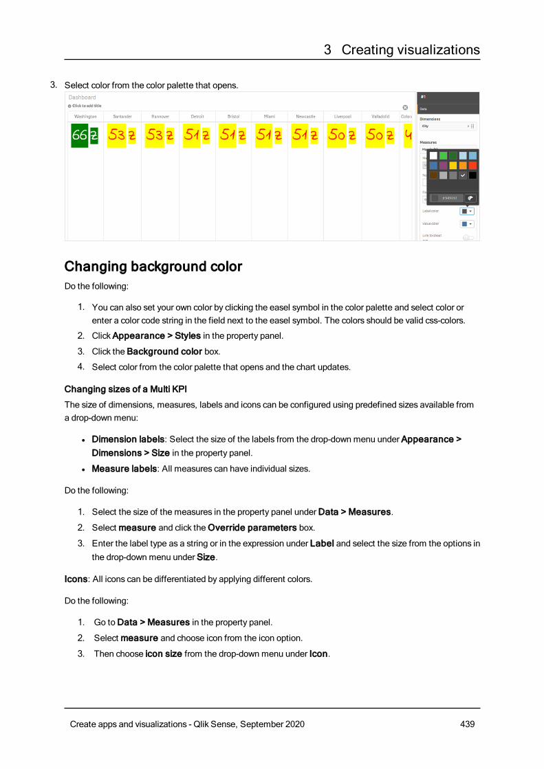
3 Creating visualizations
3. Select color from the color palette that opens.
Changing background colorDo the following:
1. You can also set your own color by clicking the easel symbol in the color palette and select color orenter a color code string in the field next to the easel symbol. The colors should be valid css-colors.
2. ClickAppearance > Styles in the property panel.
3. Click the Background color box.
4. Select color from the color palette that opens and the chart updates.
Changing sizes of a Multi KPI
The size of dimensions, measures, labels and icons can be configured using predefined sizes available froma drop-downmenu:
l Dimension labels: Select the size of the labels from the drop-downmenu under Appearance >Dimensions > Size in the property panel.
l Measure labels: All measures can have individual sizes.
Do the following:
1. Select the size of the measures in the property panel underData > Measures.
2. Select measure and click theOverride parameters box.
3. Enter the label type as a string or in the expression under Label and select the size from the options inthe drop-downmenu under Size.
Icons: All icons can be differentiated by applying different colors.
Do the following:
1. Go toData > Measures in the property panel.
2. Select measure and choose icon from the icon option.
3. Then choose icon size from the drop-downmenu under Icon.
Create apps and visualizations - Qlik Sense, September 2020 439
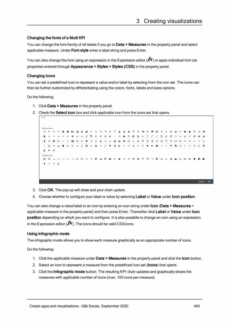
3 Creating visualizations
Changing the fonts of a Multi KPI
You can change the font-family of all labels if you go toData > Measures in the property panel and selectapplicable measure. Under Font style enter a label string and press Enter.
You can also change the font using an expression in the Expression editor ( ) or apply individual font css
properties entered through Appearance > Styles > Styles (CSS) in the property panel.
Changing icons
You can set a predefined icon to represent a value and/or label by selecting from the icon set. The icons canthen be further customized by differentiating using the colors, fonts, labels and sizes options.
Do the following:
1. ClickData > Measures in the property panel.
2. Check the Select icon box and click applicable icon from the icons set that opens.
3. ClickOK. The pop-up will close and your chart update.
4. Choose whether to configure your label or value by selecting Label or Value under Icon position.
You can also change a value/label to an icon by entering an icon string under Icon (Data > Measures >applicable measure in the property panel) and then press Enter. Thereafter click Label or Value under Iconposition depending on which you want to configure. It is also possible to change an icon using an expression
in the Expression editor ( ). The icons should be valid CSSicons.
Using infographic mode
The infographic mode allows you to show each measure graphically as an appropriate number of icons.
Do the following:
1. Click the applicable measure underData > Measures in the property panel and click the Icon button.
2. Select an icon to represent a measure from the predefined icon set (Icons) that opens.
3. Click the Infographic mode button. The resulting KPI chart updates and graphically shows themeasures with applicable number of icons (max. 100 icons per measure).
Create apps and visualizations - Qlik Sense, September 2020 440
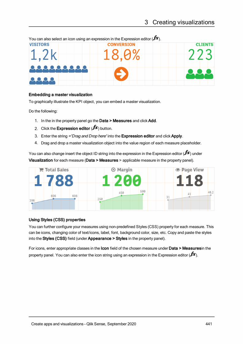
3 Creating visualizations
You can also select an icon using an expression in the Expression editor ( ).
Embedding a master visualization
To graphically illustrate the KPI object, you can embed a master visualization.
Do the following:
1. In the in the property panel go theData > Measures and clickAdd.
2. Click the Expression editor ( ) button.
3. Enter the string ='Drag and Drop here' into the Expression editor and clickApply.
4. Drag and drop a master visualization object into the value region of each measure placeholder.
You can also change insert the object ID string into the expression in the Expression editor ( ) under
Visualization for each measure (Data > Measures > applicable measure in the property panel).
Using Styles (CSS) properties
You can further configure your measures using non-predefined Styles (CSS) property for each measure. Thiscan be icons, changing color of text/icons, label, font, background color, size, etc. Copy and paste the stylesinto the Styles (CSS) field (under Appearance > Styles in the property panel).
For icons, enter appropriate classes in the Icon field of the chosen measure underData > Measuresin the
property panel. You can also enter the icon string using an expression in the Expression editor ( ).
Create apps and visualizations - Qlik Sense, September 2020 441
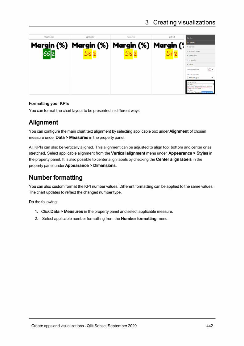
3 Creating visualizations
Formatting your KPIs
You can format the chart layout to be presented in different ways.
AlignmentYou can configure the main chart text alignment by selecting applicable box under Alignment of chosenmeasure underData > Measures in the property panel.
All KPIs can also be vertically aligned. This alignment can be adjusted to align top, bottom and center or asstretched. Select applicable alignment from the Vertical alignment menu under Appearance > Styles inthe property panel. It is also possible to center align labels by checking theCenter align labels in theproperty panel under Appearance > Dimensions.
Number formattingYou can also custom format the KPI number values. Different formatting can be applied to the same values.The chart updates to reflect the changed number type.
Do the following:
1. ClickData > Measures in the property panel and select applicable measure.
2. Select applicable number formatting from theNumber formatting menu.
Create apps and visualizations - Qlik Sense, September 2020 442
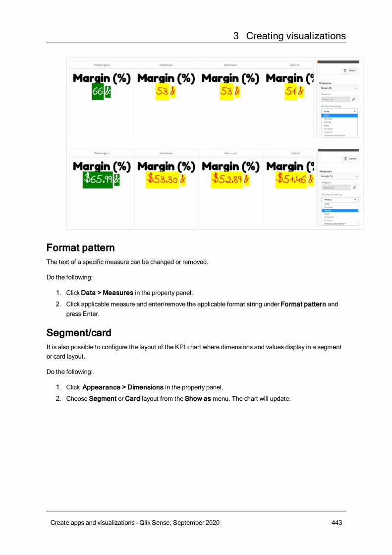
3 Creating visualizations
Format patternThe text of a specific measure can be changed or removed.
Do the following:
1. ClickData > Measures in the property panel.
2. Click applicable measure and enter/remove the applicable format string under Format pattern andpress Enter.
Segment/cardIt is also possible to configure the layout of the KPI chart where dimensions and values display in a segmentor card layout.
Do the following:
1. Click Appearance > Dimensions in the property panel.
2. Choose Segment orCard layout from the Show as menu. The chart will update.
Create apps and visualizations - Qlik Sense, September 2020 443
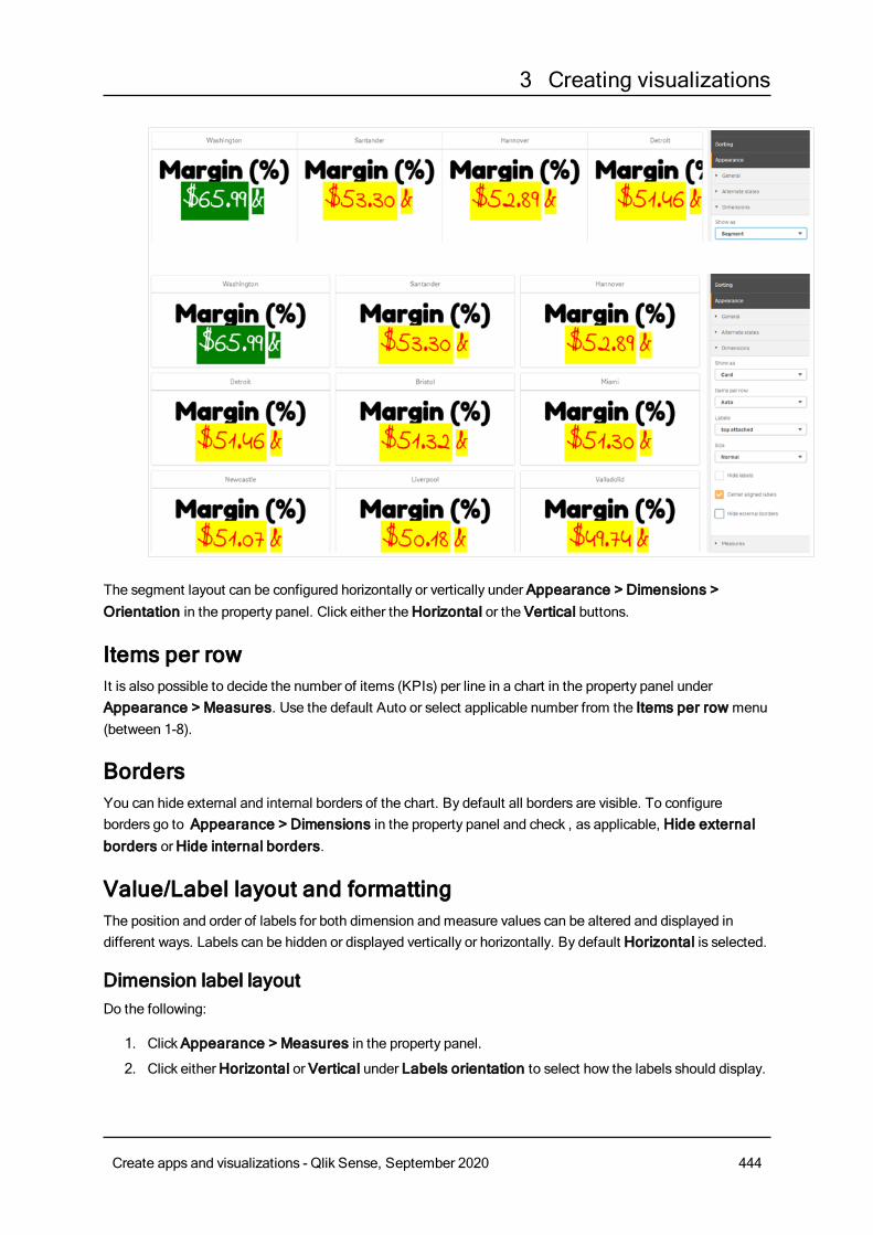
3 Creating visualizations
The segment layout can be configured horizontally or vertically under Appearance > Dimensions >Orientation in the property panel. Click either theHorizontal or the Vertical buttons.
Items per rowIt is also possible to decide the number of items (KPIs) per line in a chart in the property panel underAppearance > Measures. Use the default Auto or select applicable number from the Items per row menu(between 1-8).
BordersYou can hide external and internal borders of the chart. By default all borders are visible. To configureborders go to Appearance > Dimensions in the property panel and check , as applicable, Hide externalborders orHide internal borders.
Value/Label layout and formattingThe position and order of labels for both dimension and measure values can be altered and displayed indifferent ways. Labels can be hidden or displayed vertically or horizontally. By default Horizontal is selected.
Dimension label layoutDo the following:
1. ClickAppearance > Measures in the property panel.
2. Click eitherHorizontal or Vertical under Labels orientation to select how the labels should display.
Create apps and visualizations - Qlik Sense, September 2020 444
3 Creating visualizations
Measure value layout Measure value layout can be set in two different ways.
Do the following:
1. Existing parameters:
a. ClickAppearance > Measures in the property panel.
b. Click eitherHorizontal or Vertical under Labels orientation to select how the labels shoulddisplay.
2. New parameters:
a. ClickData > Measures in the property panel.
b. Click applicable measure and check theOverride parameters box.
c. Enter the label string under Label and press Enter.
Label order You can also adjust the order in which measure value labels appear.
Do the following:
1. ClickAppearance> Measures in the property panel.
2. Click either Label, Value or Value, Label under Labels orientation to select how the labels shoulddisplay.
Icon orderYou can decide where to show icons - before or after a value. In the property panel under Appearance >Measures go to Icon order and click either the Icon, Value or Value, Icon buttons to select which displaysfirst in the chart.
Hide Labelsl Measure labels: This option hides the measure label of each KPI. To hide the labels clickData >Measures in the property panel and select applicable measure. Then check theHide labels box.
l Dimension labels: This option hides the dimension label of each KPI. To hide the labels clickAppearance > Dimensions in the property panel. Then check theHide labels box.
Hide ValuesThis option hides the value for each KPI. To hide the value, clickData > Measures in the property panel.Then check theHide values box.
Group KPI valuesAll KPI values can be grouped or displayed individually per measure. Go to theData> Measures in theproperty panel. Choose applicable measure and check theGroup by dimension box.
Create apps and visualizations - Qlik Sense, September 2020 445
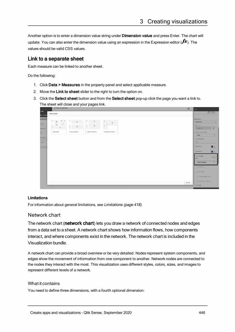
3 Creating visualizations
Another option is to enter a dimension value string underDimension value and press Enter. The chart will
update. You can also enter the dimension value using an expression in the Expression editor ( ). The
values should be valid CSS values.
Link to a separate sheetEach measure can be linked to another sheet.
Do the following:
1. ClickData > Measures in the property panel and select applicable measure.
2. Move the Link to sheet slider to the right to turn the option on.
3. Click the Select sheet button and from the Select sheet pop-up click the page you want a link to.The sheet will close and your pages link.
Limitations
For information about general limitations, see Limitations (page 418).
Network chartThenetwork chart (network chart) lets you draw anetwork of connected nodes andedgesfrom adata set to a sheet. A network chart shows how information flows, how componentsinteract, andwhere components exist in the network. The network chart is included in theVisualization bundle.
A network chart can provide a broad overview or be very detailed. Nodes represent system components, andedges show the movement of information from one component to another. Network nodes are connected tothe nodes they interact with the most. This visualization uses different styles, colors, sizes, and images torepresent different levels of a network.
What it containsYou need to define three dimensions, with a fourth optional dimension:
Create apps and visualizations - Qlik Sense, September 2020 446
3 Creating visualizations
l Node identifier: This dimension controls which nodes are presented in the chart.
l Node label: This dimension sets the label of each node.
l Node parent: This dimension sets the parent of a node, and controls the relationships betweennodes. It needs to contain the value of the node identifier of the parent to connect to.
l Node group (optional): You can use this dimension to group nodes. All nodes in the same group willhave the same color.
You can use up to three measures to enhance the diagram. All measures are optional, but you need to addthem in the following order:
1. Tooltip: You can set a measure value that is displayed in a tooltip when hovering over a node.
2. Node size: You can set the size of the node according to a measure.
3. Edge size: You can set the width of the lines between nodes according to a measure.
You need to add a tooltip before you can set node size. You can set edge size after adding atooltip and node size.
When to use itNetwork chart diagrams can illustrate computer or telecommunications networks. They show the componentsof a network and how they interact. For example, a group of connected computers, printers, modems, hubs,and routers. This type of chart is helpful when:
l Planning the structure of a network.
l Coordinating updates to an existing network.
l Reporting and troubleshooting network problems .
l Keeping track of components.
l Documenting detailed network documentation.
Formatting your dataA network chart requires data that is structured consistently according to a network data model where eachrecord can have multiple parents and children. Each record needs to contain at least:
l A field that identifies the node, the node identifier. Node identifier valuesmust be integer values,starting from 0 and in sequential order.
l A field with the name of the node.
l A field that defines the parent node. This value needs to be the node identifier of another node. If thisfield is empty, and no other record refers to this node, a disconnected node is created.
It is also possible to use a hierarchical datamodel where each node has a single parent. Thiswill create a tree-shaped chart.
Here is some example data that you can save in a text editor and load in a new app. You need to load bothexample files. The example shows passenger flows between different airports.
Create apps and visualizations - Qlik Sense, September 2020 447
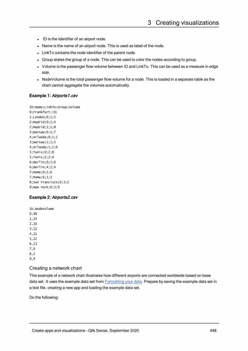
3 Creating visualizations
l ID is the identifier of an airport node.
l Name is the name of an airport node. This is used as label of the node.
l LinkTo contains the node identifier of the parent node.
l Group states the group of a node. This can be used to color the nodes according to group.
l Volume is the passenger flow volume between ID and LinkTo. This can be used as a measure in edgesize.
l NodeVolume is the total passenger flow volume for a node. This is loaded in a separate table as thechart cannot aggregate the volumes automatically.
Example 1: Airports1.csv
ID;Name;LinkTo;Group;Volume
0;Frankfurt;;0;
1;London;0;1;5
2;Madrid;0;1;4
2;Madrid;1;1;8
3;Warsaw;0;1;7
4;Arlanda;0;1;1
3;Warsaw;1;1;5
4;Arlanda;1;1;6
5;Tunis;0;2;8
5;Tunis;2;2;4
6;Berlin;0;1;6
6;Berlin;4;1;4
7;Rome;0;1;6
7;Rome;6;1;3
8;San Francisco;0;3;2
9;New York;0;3;9
Example 2: Airports2.csv
ID,NodeVolume
0,48
1,24
2,16
3,12
4,11
5,12
6,13
7,9
8,2
9,9
Creating a network chartThis example of a network chart illustrates how different airports are connected worldwide based on basedata set. It uses the example data set from Formatting your data. Prepare by saving the example data set ina text file, creating a new app and loading the example data set.
Do the following:
Create apps and visualizations - Qlik Sense, September 2020 448
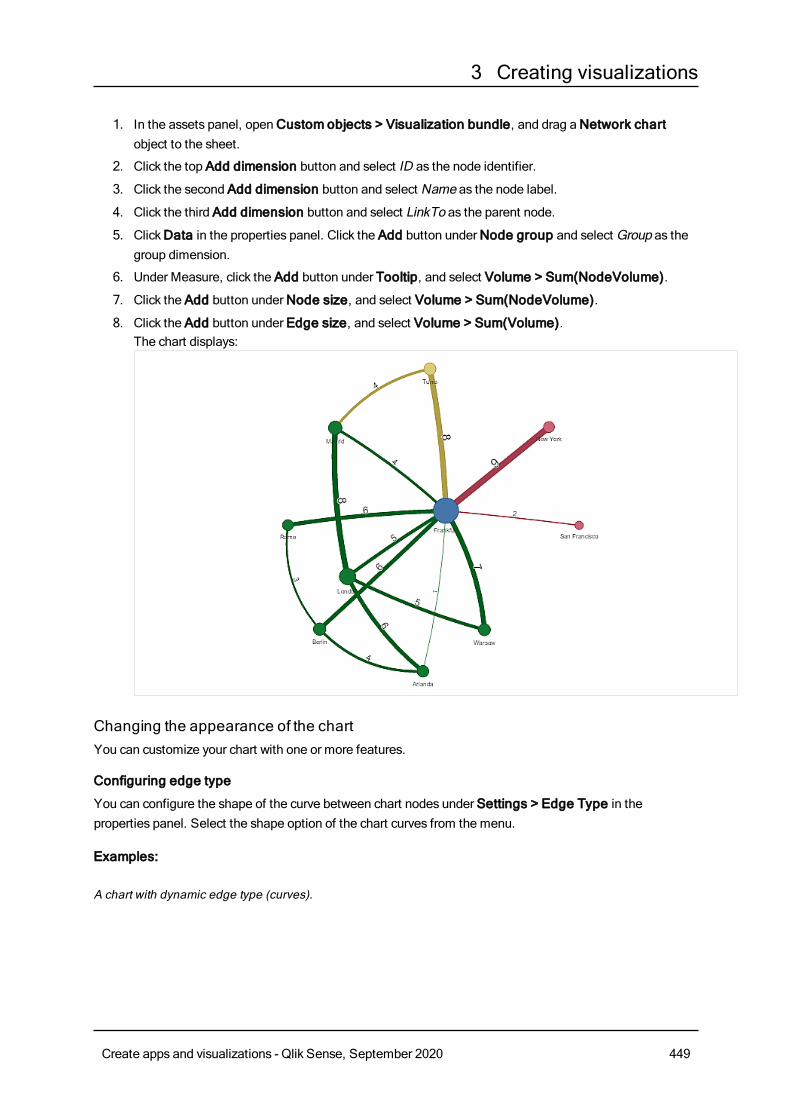
3 Creating visualizations
1. In the assets panel, openCustom objects > Visualization bundle, and drag aNetwork chartobject to the sheet.
2. Click the top Add dimension button and select ID as the node identifier.
3. Click the second Add dimension button and select Name as the node label.
4. Click the third Add dimension button and select LinkTo as the parent node.
5. ClickData in the properties panel. Click the Add button underNode group and select Group as thegroup dimension.
6. Under Measure, click the Add button under Tooltip, and select Volume > Sum(NodeVolume).
7. Click the Add button underNode size, and select Volume > Sum(NodeVolume).
8. Click the Add button under Edge size, and select Volume > Sum(Volume).The chart displays:
Changing the appearance of the chartYou can customize your chart with one or more features.
Configuring edge type
You can configure the shape of the curve between chart nodes under Settings > Edge Type in theproperties panel. Select the shape option of the chart curves from the menu.
Examples:
A chart with dynamic edge type (curves).
Create apps and visualizations - Qlik Sense, September 2020 449
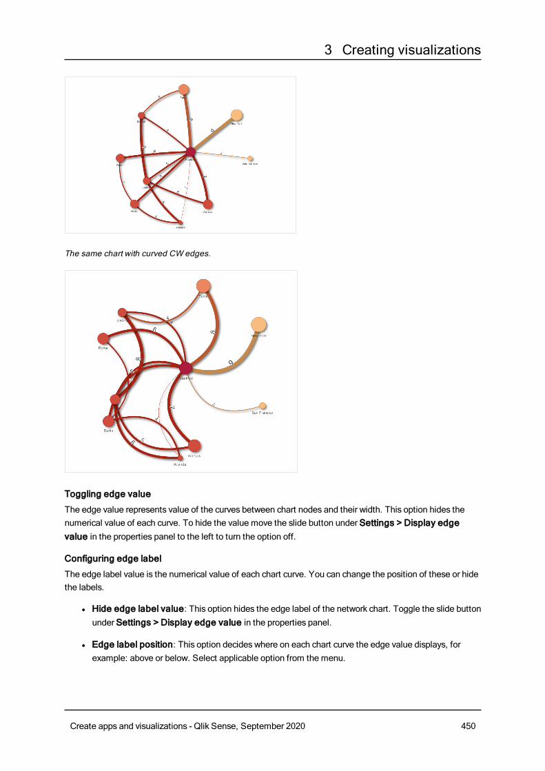
3 Creating visualizations
The same chart with curved CW edges.
Toggling edge value
The edge value represents value of the curves between chart nodes and their width. This option hides thenumerical value of each curve. To hide the value move the slide button under Settings > Display edgevalue in the properties panel to the left to turn the option off.
Configuring edge label
The edge label value is the numerical value of each chart curve. You can change the position of these or hidethe labels.
l Hide edge label value: This option hides the edge label of the network chart. Toggle the slide buttonunder Settings > Display edge value in the properties panel.
l Edge label position: This option decides where on each chart curve the edge value displays, forexample: above or below. Select applicable option from the menu.
Create apps and visualizations - Qlik Sense, September 2020 450
3 Creating visualizations
Configuring node shape
You can customize the shape of the nodes, for example: dot, square, diamond, or triangle. Go to Settings >Node shape in the properties panel, and select the node shape from the menu.
Toggling shadow option
This option lets you turn off the shadow effects behind chart curves and nodes (used to highlight background).Toggle the slide button under Settings > Display shadow in the properties panel.
Sorting
Sorting is set to Auto with the system choosing the sorting order as the default (under Sorting > chosendimension or measure in the properties panel) for all dimensions and measures. You can change themindividually by expression.
Do the following:
1. Open the dimension or measure menu under Sorting in the properties panel.
2. Move Sorting slide button to the left to turn the option from Auto to Custom.
3. Click the Sort by expression check box.
4. Enter an order string under Expression and press Enter. You can also change the color using an
expression in the Expression editor ( ).
5. Choose start order by selecting Ascending orDescending for the menu below.
Number formatting
It is possible to format the measure value. Different formatting can be applied to the same value, forexample: money, data,or duration. The chart updates to reflect the changed number type.
Do the following:
1. ClickData > Measures in the properties panel and click chosen measure.
2. Select applicable number formatting form theNumber formatting menu.
3. Enter details in the panel fields. These display when choosing an option other than Auto when toconfiguring the chart.
LimitationsFor information about general limitations, see Limitations (page 418).
Network chart visualizations cannot be used in Qlik NPrinting reports.
Org chartYou canuse the org chart (Org chart) to create organization charts from datawith a treestructure. You can navigate through the hierarchy by expanding and collapsing the tree. The orgchart is included in theVisualization bundle.
You need to use a data set with two dimensions that define the tree structure.
Create apps and visualizations - Qlik Sense, September 2020 451
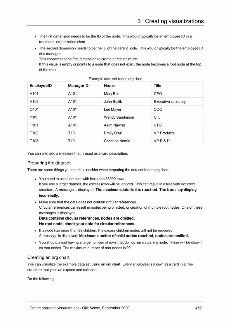
3 Creating visualizations
l The first dimension needs to be the ID of the node. This would typically be an employee ID in atraditional organization chart.
l The second dimension needs to be the ID of the parent node. This would typically be the employee IDof a manager.This connects to the first dimension to create a tree structure.If this value is empty or points to a node that does not exist, the node becomes a root node at the topof the tree.
EmployeeID ManagerID Name Title
A101 A101 Mary Bell CEO
A102 A101 John Bialik Executive secretary
O101 A101 Lee Mayer COO
I101 A101 Wendy Sanderson CIO
T101 A101 Asim Nawrat CTO
T102 T101 Emily Diaz VP Products
T103 T101 Christine Nemic VP R & D
Example data set for an org chart
You can also add a measure that is used as a card description.
Preparing the datasetThere are some things you need to consider when preparing the dataset for an org chart.
l You need to use a dataset with less than 33000 rows.If you use a larger dataset, the excess rows will be ignored. This can result in a tree with incorrectstructure. A message is displayed: The maximum data limit is reached. The tree may displayincorrectly.
l Make sure that the data does not contain circular references.Circular references can result in nodes being omitted, or creation of multiple root nodes. One of thesemessages is displayed:Data contains circular references, nodes are omitted.No root node, check your data for circular references.
l If a node hasmore than 99 children, the excess children nodes will not be rendered.A message is displayed: Maximum number of child nodes reached, nodes are omitted.
l You should avoid having a large number of rows that do not have a parent node. These will be shownas root nodes. The maximum number of root nodes is 99.
Creating an org chartYou can visualize the example data set using an org chart. Every employee is shown as a card in a treestructure that you can expand and collapse.
Do the following:
Create apps and visualizations - Qlik Sense, September 2020 452
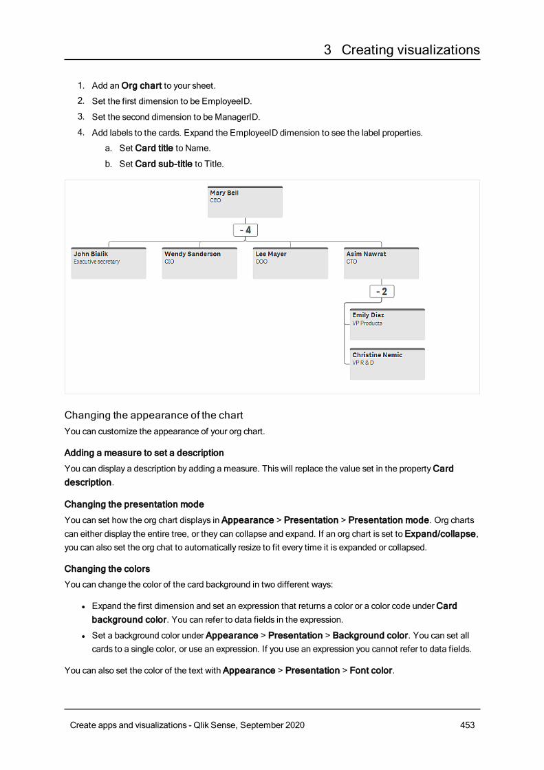
3 Creating visualizations
1. Add anOrg chart to your sheet.
2. Set the first dimension to be EmployeeID.
3. Set the second dimension to be ManagerID.
4. Add labels to the cards. Expand the EmployeeID dimension to see the label properties.
a. Set Card title to Name.
b. Set Card sub-title to Title.
Changing the appearance of the chartYou can customize the appearance of your org chart.
Adding a measure to set a description
You can display a description by adding a measure. This will replace the value set in the propertyCarddescription.
Changing the presentation mode
You can set how the org chart displays in Appearance > Presentation > Presentation mode. Org chartscan either display the entire tree, or they can collapse and expand. If an org chart is set to Expand/collapse,you can also set the org chat to automatically resize to fit every time it is expanded or collapsed.
Changing the colors
You can change the color of the card background in two different ways:
l Expand the first dimension and set an expression that returns a color or a color code underCardbackground color. You can refer to data fields in the expression.
l Set a background color under Appearance > Presentation > Background color. You can set allcards to a single color, or use an expression. If you use an expression you cannot refer to data fields.
You can also set the color of the text with Appearance > Presentation > Font color.
Create apps and visualizations - Qlik Sense, September 2020 453
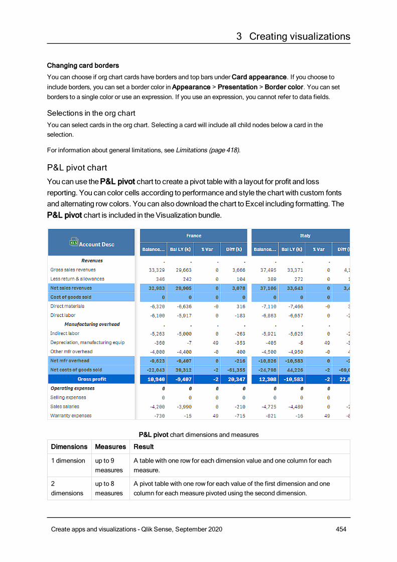
3 Creating visualizations
Changing card borders
You can choose if org chart cards have borders and top bars underCard appearance. If you choose toinclude borders, you can set a border color in Appearance > Presentation > Border color. You can setborders to a single color or use an expression. If you use an expression, you cannot refer to data fields.
Selections in the org chartYou can select cards in the org chart. Selecting a card will include all child nodes below a card in theselection.
For information about general limitations, see Limitations (page 418).
P&L pivot chartYou canuse theP&L pivot chart to create a pivot tablewith a layout for profit and lossreporting. You can color cells according to performance and style the chart with custom fontsand alternating row colors. You can also download the chart to Excel including formatting. TheP&L pivot chart is included in theVisualization bundle.
Dimensions Measures Result
1 dimension up to 9measures
A table with one row for each dimension value and one column for eachmeasure.
2dimensions
up to 8measures
A pivot table with one row for each value of the first dimension and onecolumn for each measure pivoted using the second dimension.
P&L pivot chart dimensions and measures
Create apps and visualizations - Qlik Sense, September 2020 454
3 Creating visualizations
Coloring cells to show performanceYou can color cells to show performance according to a scale of Poor, Fair andGood. All rows and columnsare colored by default, but you can choose which columns and rows to color if you want to.
Do the following:
1. Make sure that Enabled is set toOn under Appearance > Color by condition.
2. Select which rows to color by performance.Set Color all rows by condition to Specified rows.Add rows to color by name (dimension value) with Add row to color.
3. Select which measures to color by performance.Set Color all measures to Specified measures.Add a list of measures by number inMeasure indices with the first measure of the chart numberedzero. Separate the measures with a comma.
Example: Color the first, third, and fifth measure.
0,2,4
4. Set performance limits and colors.You can set the range limits for Poor and Fair.
l All cells with a value lower than the Poor range limit are displayed with the background colorand text color set for Poor.
l All cells with a value lower than the Fair range limit, but higher than Poor, are displayed withthe background color and text color set for Fair. You should set the Fair range limit higher thanPoor.
l All other cells are displayed with the background color and text color set forGood.
Styling the chart using a style templateYou can create a layout for the chart, for example to show a profit and loss report, using a style template.
You need to be able to add and load a CSV file to the app.
Do the following:
1. Create a style template as a CSV file. Use the style template format described below.
2. Load the style template to your app as one field. When you add the file, do not use semicolon as fieldseparator, each row should be loaded as one field.
3. Set Style template field under Appearance > Table format to the name of the template field youadded.
You can load several style templates in your app, and change the layout with Style template field.
Style template format
The style template is created as a comma separated text file (CSV) using UTF-8 encoding.
Create apps and visualizations - Qlik Sense, September 2020 455
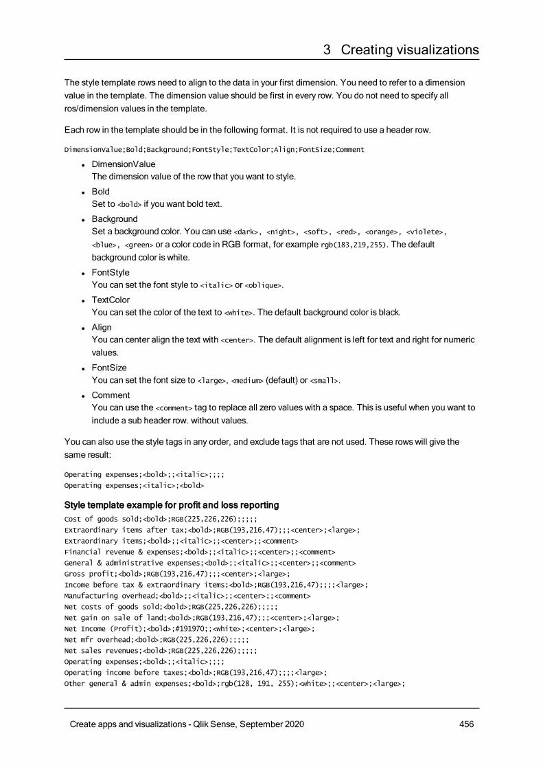
3 Creating visualizations
The style template rows need to align to the data in your first dimension. You need to refer to a dimensionvalue in the template. The dimension value should be first in every row. You do not need to specify allros/dimension values in the template.
Each row in the template should be in the following format. It is not required to use a header row.
DimensionValue;Bold;Background;FontStyle;TextColor;Align;FontSize;Comment
l DimensionValueThe dimension value of the row that you want to style.
l BoldSet to <bold> if you want bold text.
l BackgroundSet a background color. You can use <dark>, <night>, <soft>, <red>, <orange>, <violete>,
<blue>, <green> or a color code in RGB format, for example rgb(183,219,255). The defaultbackground color is white.
l FontStyleYou can set the font style to <italic> or <oblique>.
l TextColorYou can set the color of the text to <white>. The default background color is black.
l AlignYou can center align the text with <center>. The default alignment is left for text and right for numericvalues.
l FontSizeYou can set the font size to <large>, <medium> (default) or <small>.
l CommentYou can use the <comment> tag to replace all zero values with a space. This is useful when you want toinclude a sub header row. without values.
You can also use the style tags in any order, and exclude tags that are not used. These rows will give thesame result:
Operating expenses;<bold>;;<italic>;;;;
Operating expenses;<italic>;<bold>
Style template example for profit and loss reportingCost of goods sold;<bold>;RGB(225,226,226);;;;;
Extraordinary items after tax;<bold>;RGB(193,216,47);;;<center>;<large>;
Extraordinary items;<bold>;;<italic>;;<center>;;<comment>
Financial revenue & expenses;<bold>;;<italic>;;<center>;;<comment>
General & administrative expenses;<bold>;;<italic>;;<center>;;<comment>
Gross profit;<bold>;RGB(193,216,47);;;<center>;<large>;
Income before tax & extraordinary items;<bold>;RGB(193,216,47);;;;<large>;
Manufacturing overhead;<bold>;;<italic>;;<center>;;<comment>
Net costs of goods sold;<bold>;RGB(225,226,226);;;;;
Net gain on sale of land;<bold>;RGB(193,216,47);;;<center>;<large>;
Net Income (Profit);<bold>;#191970;;<white>;<center>;<large>;
Net mfr overhead;<bold>;RGB(225,226,226);;;;;
Net sales revenues;<bold>;RGB(225,226,226);;;;;
Operating expenses;<bold>;;<italic>;;;;
Operating income before taxes;<bold>;RGB(193,216,47);;;;<large>;
Other general & admin expenses;<bold>;rgb(128, 191, 255);<white>;;<center>;<large>;
Create apps and visualizations - Qlik Sense, September 2020 456
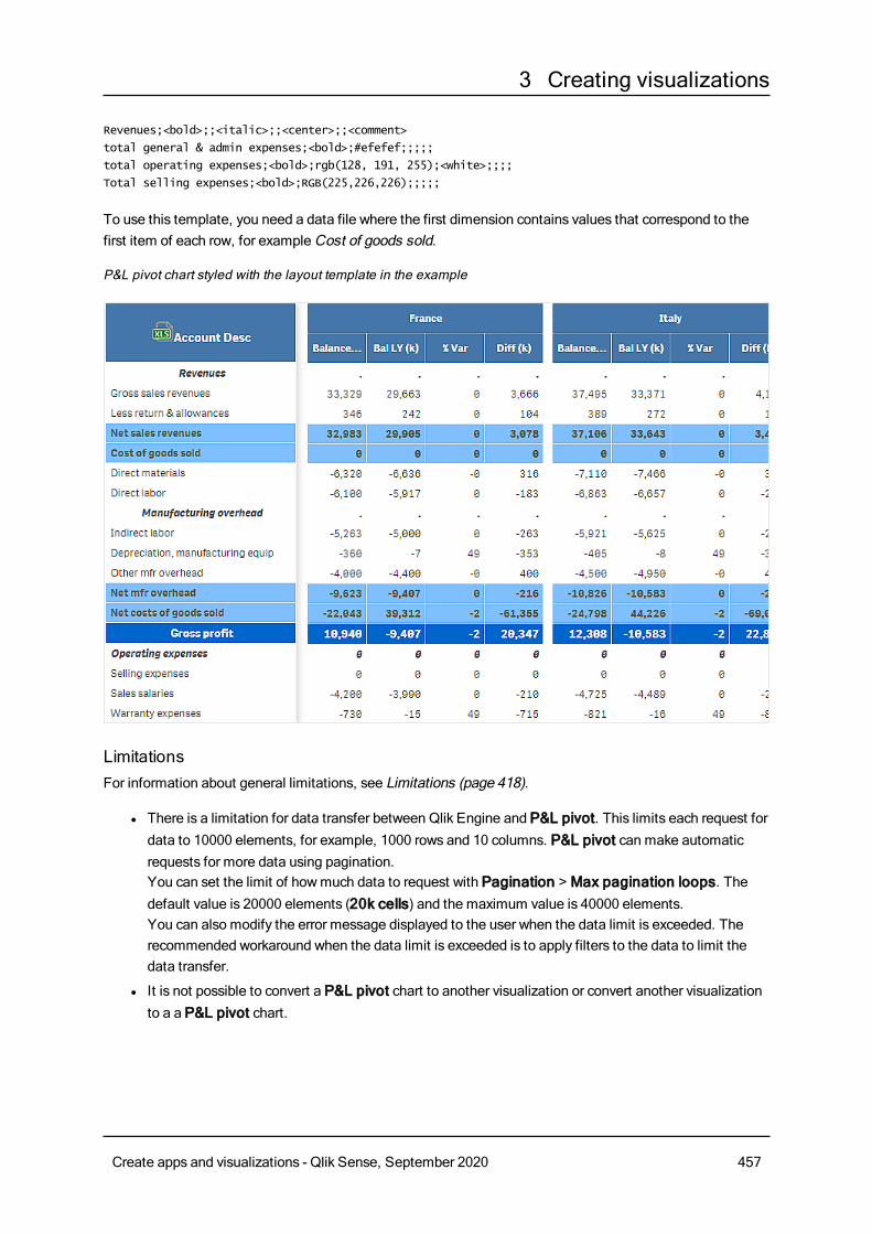
3 Creating visualizations
Revenues;<bold>;;<italic>;;<center>;;<comment>
total general & admin expenses;<bold>;#efefef;;;;;
total operating expenses;<bold>;rgb(128, 191, 255);<white>;;;;
Total selling expenses;<bold>;RGB(225,226,226);;;;;
To use this template, you need a data file where the first dimension contains values that correspond to thefirst item of each row, for exampleCost of goods sold.
P&L pivot chart styled with the layout template in the example
LimitationsFor information about general limitations, see Limitations (page 418).
l There is a limitation for data transfer between Qlik Engine and P&L pivot. This limits each request fordata to 10000 elements, for example, 1000 rows and 10 columns. P&L pivot can make automaticrequests for more data using pagination.You can set the limit of howmuch data to request with Pagination > Max pagination loops. Thedefault value is 20000 elements (20k cells) and the maximum value is 40000 elements.You can also modify the error message displayed to the user when the data limit is exceeded. Therecommended workaround when the data limit is exceeded is to apply filters to the data to limit thedata transfer.
l It is not possible to convert a P&L pivot chart to another visualization or convert another visualizationto a a P&L pivot chart.
Create apps and visualizations - Qlik Sense, September 2020 457
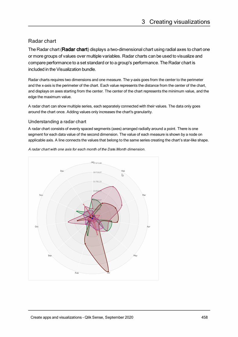
3 Creating visualizations
Radar chartTheRadar chart (Radar chart) displays a two-dimensional chart using radial axes to chart oneor more groups of values over multiple variables. Radar charts can beused to visualize andcompare performance to a set standard or to a group's performance. TheRadar chart isincluded in theVisualization bundle.
Radar charts requires two dimensions and one measure. The y-axis goes from the center to the perimeterand the x-axis is the perimeter of the chart. Each value represents the distance from the center of the chart,and displays on axes starting from the center. The center of the chart represents the minimum value, and theedge the maximum value.
A radar chart can showmultiple series, each separately connected with their values. The data only goesaround the chart once. Adding values only increases the chart's granularity.
Understanding a radar chartA radar chart consists of evenly spaced segments (axes) arranged radially around a point. There is onesegment for each data value of the second dimension. The value of each measure is shown by a node onapplicable axis. A line connects the values that belong to the same series creating the chart’s star-like shape.
A radar chart with one axis for each month of the Date.Month dimension.
Create apps and visualizations - Qlik Sense, September 2020 458
3 Creating visualizations
When to use itRadar charts let you compare and measure data with an arbitrary number of variables. This is helpful whencomparing something's features or performance over several metrics. For example: before buying acomputer, you can compare different computers across several features, such asmemory storage,processing, and screen size. A radar chart is also useful when:
l Measuring quality improvements and performance.
l Comparing allocated amount versus actual spending in an organization.
l Identifying outliers, commonality, and clusters of data with similar values and features.
l Charting an athlete's strengths and weaknesses.
l Comparing results of small-to-moderate-sized multivariate data sets.
Creating a radar chartYou can create a radar chart on the sheet you are editing.
Do the following:
1. In the assets panel, openCustom objects >Visualization bundle and drag aRadar chart object tothe sheet.
2. Click the top Add dimension button and select the first dimension category to be measured (x-axis).
3. Click the second Add dimension button to select the second dimension (y-axis).
4. Click the Add measure button to select the measure of the chart.
Once dimensions and measure have been selected the radar chart displays automatically (in color) in thechart field.
A radar chart with two dimensions and one measure.
Create apps and visualizations - Qlik Sense, September 2020 459
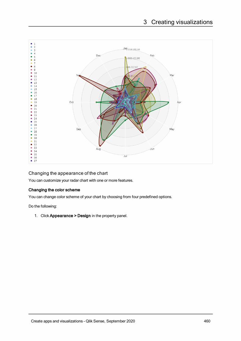
3 Creating visualizations
Changing the appearance of the chartYou can customize your radar chart with one or more features.
Changing the color scheme
You can change color scheme of your chart by choosing from four predefined options.
Do the following:
1. ClickAppearance > Design in the property panel.
Create apps and visualizations - Qlik Sense, September 2020 460
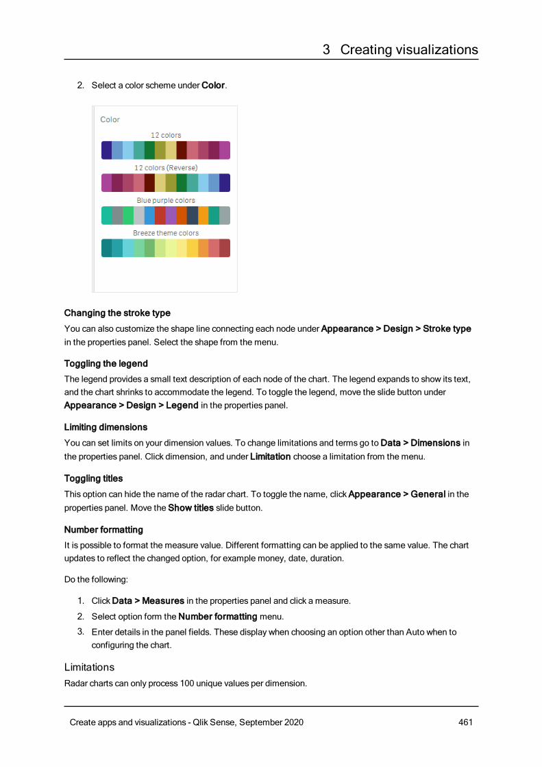
3 Creating visualizations
2. Select a color scheme underColor.
Changing the stroke type
You can also customize the shape line connecting each node under Appearance > Design > Stroke typein the properties panel. Select the shape from the menu.
Toggling the legend
The legend provides a small text description of each node of the chart. The legend expands to show its text,and the chart shrinks to accommodate the legend. To toggle the legend, move the slide button underAppearance > Design > Legend in the properties panel.
Limiting dimensions
You can set limits on your dimension values. To change limitations and terms go toData > Dimensions inthe properties panel. Click dimension, and under Limitation choose a limitation from the menu.
Toggling titles
This option can hide the name of the radar chart. To toggle the name, clickAppearance > General in theproperties panel. Move the Show titles slide button.
Number formatting
It is possible to format the measure value. Different formatting can be applied to the same value. The chartupdates to reflect the changed option, for example money, date, duration.
Do the following:
1. ClickData > Measures in the properties panel and click a measure.
2. Select option form theNumber formatting menu.
3. Enter details in the panel fields. These display when choosing an option other than Auto when toconfiguring the chart.
LimitationsRadar charts can only process 100 unique values per dimension.
Create apps and visualizations - Qlik Sense, September 2020 461
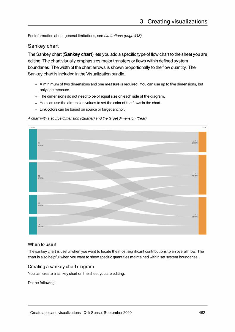
3 Creating visualizations
For information about general limitations, see Limitations (page 418).
Sankey chartTheSankey chart (Sankey chart) lets you adda specific type of flow chart to the sheet you areediting. The chart visually emphasizes major transfers or flows within defined systemboundaries. Thewidth of the chart arrows is shownproportionally to the flow quantity. TheSankey chart is included in theVisualization bundle.
l A minimum of two dimensions and one measure is required. You can use up to five dimensions, butonly one measure.
l The dimensions do not need to be of equal size on each side of the diagram.
l You can use the dimension values to set the color of the flows in the chart.
l Link colors can be based on source or target anchor.
A chart with a source dimension (Quarter) and the target dimension (Year).
When to use itThe sankey chart is useful when you want to locate the most significant contributions to an overall flow. Thechart is also helpful when you want to show specific quantitiesmaintained within set system boundaries.
Creating a sankey chart diagramYou can create a sankey chart on the sheet you are editing.
Do the following:
Create apps and visualizations - Qlik Sense, September 2020 462
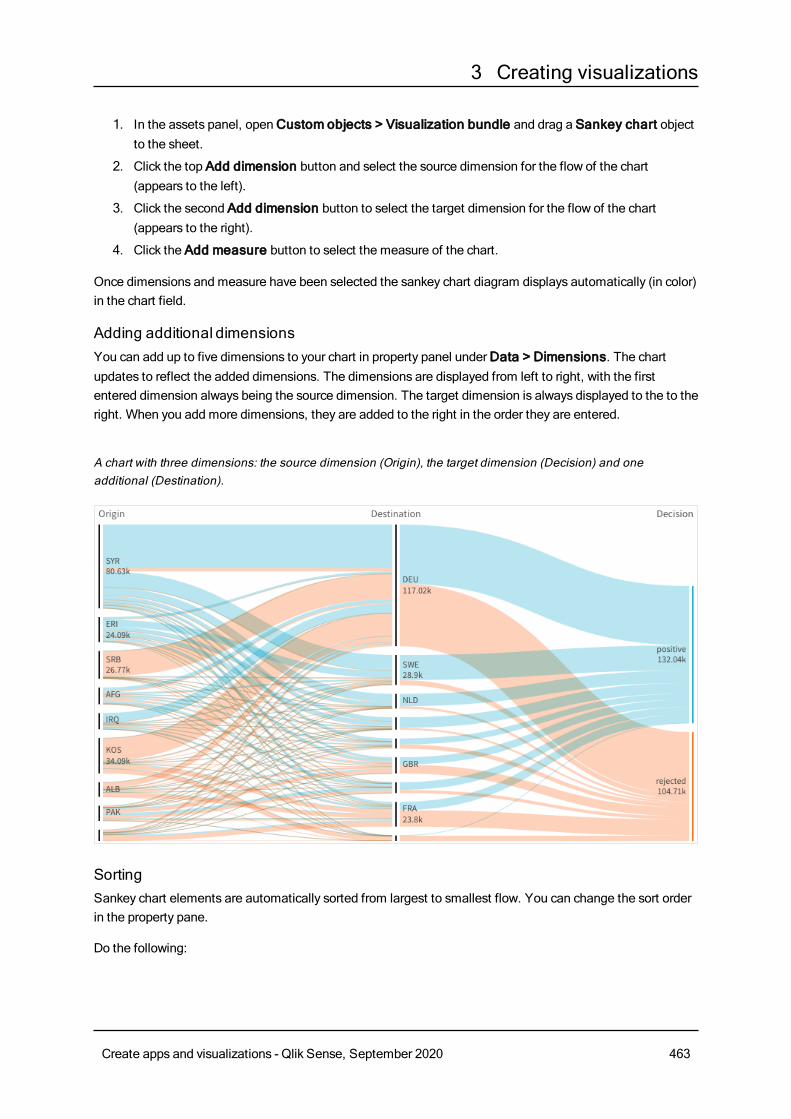
3 Creating visualizations
1. In the assets panel, openCustom objects > Visualization bundle and drag a Sankey chart objectto the sheet.
2. Click the top Add dimension button and select the source dimension for the flow of the chart(appears to the left).
3. Click the second Add dimension button to select the target dimension for the flow of the chart(appears to the right).
4. Click the Add measure button to select the measure of the chart.
Once dimensions and measure have been selected the sankey chart diagram displays automatically (in color)in the chart field.
Adding additional dimensionsYou can add up to five dimensions to your chart in property panel underData > Dimensions. The chartupdates to reflect the added dimensions. The dimensions are displayed from left to right, with the firstentered dimension always being the source dimension. The target dimension is always displayed to the to theright. When you add more dimensions, they are added to the right in the order they are entered.
A chart with three dimensions: the source dimension (Origin), the target dimension (Decision) and oneadditional (Destination).
SortingSankey chart elements are automatically sorted from largest to smallest flow. You can change the sort orderin the property pane.
Do the following:
Create apps and visualizations - Qlik Sense, September 2020 463
3 Creating visualizations
1. ClickSorting under Appearance in the property panel.
2. Toggle Sorting from Auto toCustom.
3. You can toggle Sort numerically:
l Toggle on: Sort numerically byAscending orDescending.
l Toggle off: Drag your dimensions and measurements into the desired order.
Changing the appearance of the chartYou can customize your chart with one or more features. Your chart automatically updates.
Link colors
The colors of chart links are based on either the source or target anchors. To apply the source or target anchorcolor to chart links either use the string ='SOURCE' or ='TARGET'. You can also select a separate color byentering a color code string. The color should be a valid CSS color.
Do the following:
1. ClickPresentation under Appearance in the property panel.
2. Enter the applicable string under Link color.
3. Press Enter and the chart updates.
You can also change the link colors using an expression in the Expression editor ( ). It is also possible to
color a link that has its intensity based on the Margin % of the dimension values it represents.
Example:
Enter the string =rgb(round(Avg ([Margin %])*255), 100, 100)where Margin % is a value between 0-1 andthe link will display as red in the chart.
Link opacity
You can adjust link opacity bymoving the slide button of the link opacity slider under Appearance > Linkopacity in the property panel. Also, setting opacity to 1 (furthest right) allows the setting to drop a shadow,giving links a more individually distinct appearance.
Node colors
You can change the node colors of each dimension value. The color should be a valid CSScolor.
Do the following:
1. Select applicable dimension underData > Dimensions in the property panel.
2. Enter the color code string under Node color and press Enter. The chart will update.For example: To use the color Aqua (#00ffff) set the color code string to ='#00ffff'. You can also set
Create apps and visualizations - Qlik Sense, September 2020 464
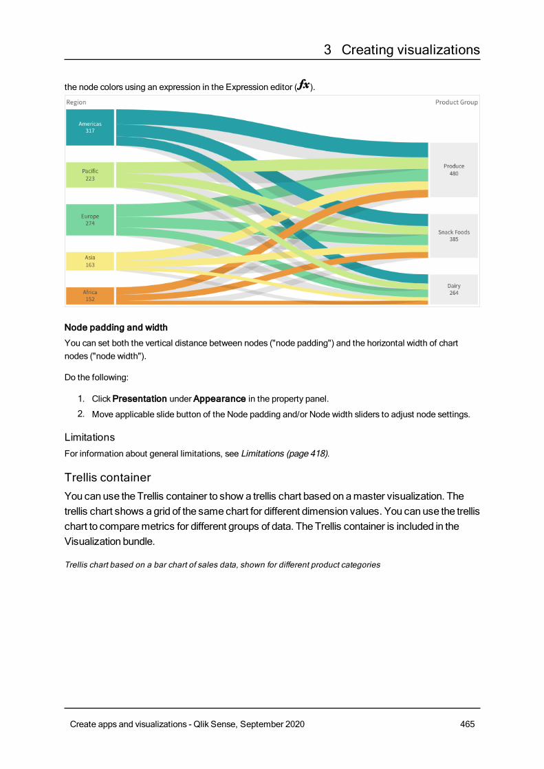
3 Creating visualizations
the node colors using an expression in the Expression editor ( ).
Node padding and width
You can set both the vertical distance between nodes ("node padding") and the horizontal width of chartnodes ("node width").
Do the following:
1. ClickPresentation under Appearance in the property panel.
2. Move applicable slide button of the Node padding and/or Node width sliders to adjust node settings.
LimitationsFor information about general limitations, see Limitations (page 418).
Trellis containerYou canuse theTrellis container to show a trellis chart based onamaster visualization. Thetrellis chart shows agrid of the samechart for different dimension values. You can use the trellischart to comparemetrics for different groups of data. TheTrellis container is included in theVisualization bundle.
Trellis chart based on a bar chart of sales data, shown for different product categories
Create apps and visualizations - Qlik Sense, September 2020 465
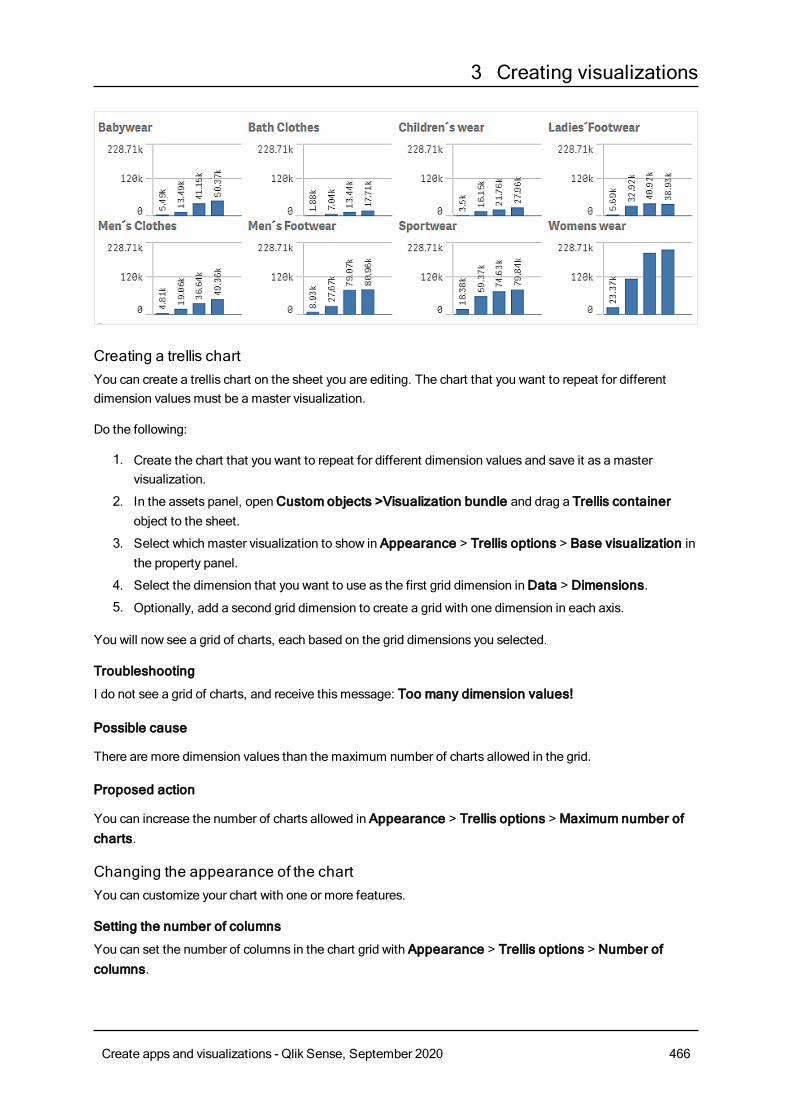
3 Creating visualizations
Creating a trellis chartYou can create a trellis chart on the sheet you are editing. The chart that you want to repeat for differentdimension valuesmust be a master visualization.
Do the following:
1. Create the chart that you want to repeat for different dimension values and save it as a mastervisualization.
2. In the assets panel, openCustom objects >Visualization bundle and drag a Trellis containerobject to the sheet.
3. Select which master visualization to show in Appearance > Trellis options > Base visualization inthe property panel.
4. Select the dimension that you want to use as the first grid dimension inData > Dimensions.
5. Optionally, add a second grid dimension to create a grid with one dimension in each axis.
You will now see a grid of charts, each based on the grid dimensions you selected.
Troubleshooting
I do not see a grid of charts, and receive this message: Too many dimension values!
Possible cause
There are more dimension values than the maximum number of charts allowed in the grid.
Proposed action
You can increase the number of charts allowed in Appearance > Trellis options > Maximum number ofcharts.
Changing the appearance of the chartYou can customize your chart with one or more features.
Setting the number of columns
You can set the number of columns in the chart grid with Appearance > Trellis options > Number ofcolumns.
Create apps and visualizations - Qlik Sense, September 2020 466
3 Creating visualizations
Setting the y-axis range of charts
You can select which y-axis range to show for the charts in the trellis chart with Appearance > Trellisoptions > Auto range.
l On will show the same range for all charts. This is the best option if you want to compare valuesbetween different charts.
l Off will show an optimized range for each chart.
Show border
You can show a border for the trellis chart with Appearance > Trellis options > Border. You can adjustwidth, color and style. It is also possible to define a custom border.
Slide mode
You can view the charts in slide mode instead of a grid by setting Appearance > Trellis options > Slidemode toOn. In slide mode, you view one chart at a time. You can scroll between the charts.
Best practices for creating the master visualizationHere are some tips for creating a master visualization that will work well in a trellis chart:
l Show the title in the master visualization. In the trellis chart, the title is replaced with the griddimension value of each chart.
l If you use expressions: create a label to hide the set expression.
l If you are using a combo chart: use only one axis, and set the minimum and maximum of the y-axis.
l If you are using a box plot: set the minimum and maximum of the y-axis.
l If you are using a scatter plot: set the x-axis.
l If you are using a map: use advanced mode, and set the layer color and title.
Using advanced modeYou can use advanced mode to specify where to insert set analysis and dimension values in the mastervisualization. Activate it by setting Appearance > Trellis options > Advanced mode toOn.
You can use the following placeholders in formulas in the master visualization. They will be replaced in thetrellis chart by the corresponding values:
Placeholder Replaced by value
$(vDim) Dimension Name
$(vDimValue) Dimension Value
$(vDimSet) [Dimension Name]={'Dimension Value'}
$(vDimSetFull) {<[Dimension Name]={'Dimension Value'}>}
Advanced mode value replacements in a trellis chart
LimitationsFor information about general limitations, see Limitations (page 418).
Create apps and visualizations - Qlik Sense, September 2020 467
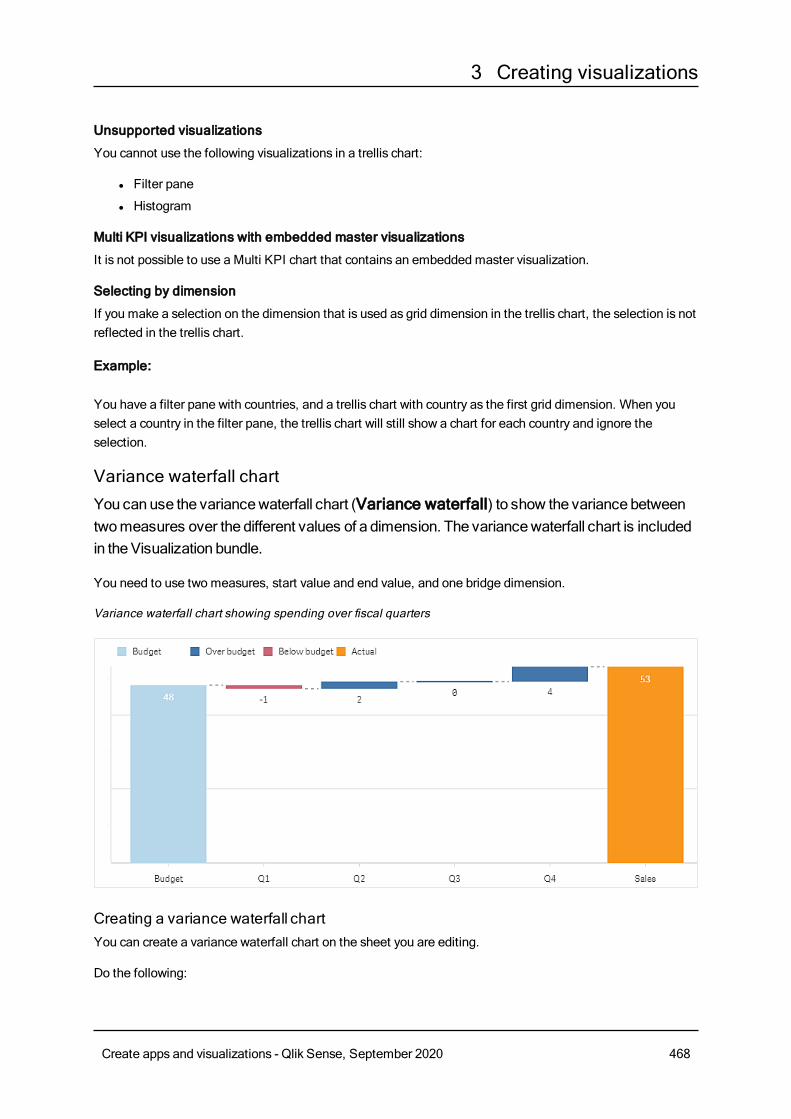
3 Creating visualizations
Unsupported visualizations
You cannot use the following visualizations in a trellis chart:
l Filter pane
l Histogram
Multi KPI visualizations with embedded master visualizations
It is not possible to use a Multi KPI chart that contains an embedded master visualization.
Selecting by dimension
If you make a selection on the dimension that is used as grid dimension in the trellis chart, the selection is notreflected in the trellis chart.
Example:
You have a filter pane with countries, and a trellis chart with country as the first grid dimension. When youselect a country in the filter pane, the trellis chart will still show a chart for each country and ignore theselection.
Variance waterfall chartYou canuse the variancewaterfall chart (Variance waterfall) to show the variance betweentwomeasures over the different values of a dimension. The variancewaterfall chart is includedin theVisualization bundle.
You need to use two measures, start value and end value, and one bridge dimension.
Variance waterfall chart showing spending over fiscal quarters
Creating a variance waterfall chartYou can create a variance waterfall chart on the sheet you are editing.
Do the following:
Create apps and visualizations - Qlik Sense, September 2020 468
3 Creating visualizations
1. In the assets panel, openCustom objects >Visualization bundle and drag a Variance waterfallobject to the sheet.
2. Click the Add dimension button to select the bridge dimension.
3. Click the first Add measure button to select the measure to use as start value.
4. Click the second Add measure button to select the measure to use as end value.
The variance waterfall chart is now displayed with one bar for the start value measure and one bar for the endvalue measure. Between the measure bars you will see the variance for each value of the bridge dimension.
Changing the appearance of the chartYou can customize the appearance of your chart.
Labels
You can turn off value labels by setting Appearance > Presentation > Value labels toOff.
Legend
You can customize the legend labels by setting Appearance > Presentation > Labels toCustom. Youcan set a custom text for the following legend labels:
l Start value (Start value)
l End value (End value)
l Positive variance (Positive label)
l Negative variance (Negative label)
You can also hide the legend by setting Appearance > Colors and legend > Show legend toOff orchange the position of the legend with Appearance > Colors and legend > Legend position.
Example of a variance waterfall chartIn this simple example we will show how quarterly sales numbers contribute to sales compared to budget.
Dataset
The dataset we use contains sales numbers and budgeted sales for each quarter. You can paste it into a textfile and load it in Qlik Sense.
Quarter,Sales,Budget
Q1,9,10
Q2,14,12
Q3,12,12
Q4,18,14
Visualization
You can now create a variance waterfall chart.
l Add Quarter as dimension.
l Add Sum(Budget) as the first measure.
l Add Sum(Sales) as the second measure.
Create apps and visualizations - Qlik Sense, September 2020 469
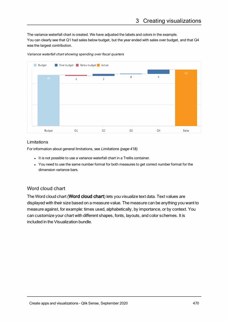
3 Creating visualizations
The variance waterfall chart is created. We have adjusted the labels and colors in the example.You can clearly see that Q1 had sales below budget, but the year ended with sales over budget, and that Q4was the largest contribution.
Variance waterfall chart showing spending over fiscal quarters
LimitationsFor information about general limitations, see Limitations (page 418).
l It is not possible to use a variance waterfall chart in a Trellis container.
l You need to use the same number format for both measures to get correct number format for thedimension variance bars.
Word cloud chartTheWord cloud chart (Word cloud chart) lets you visualize text data. Text values aredisplayedwith their size based onameasure value. Themeasure can beanything youwant tomeasure against, for example: times used, alphabetically, by importance, or by context. Youcan customize your chart with different shapes, fonts, layouts, and color schemes. It isincluded in theVisualization bundle.
Create apps and visualizations - Qlik Sense, September 2020 470
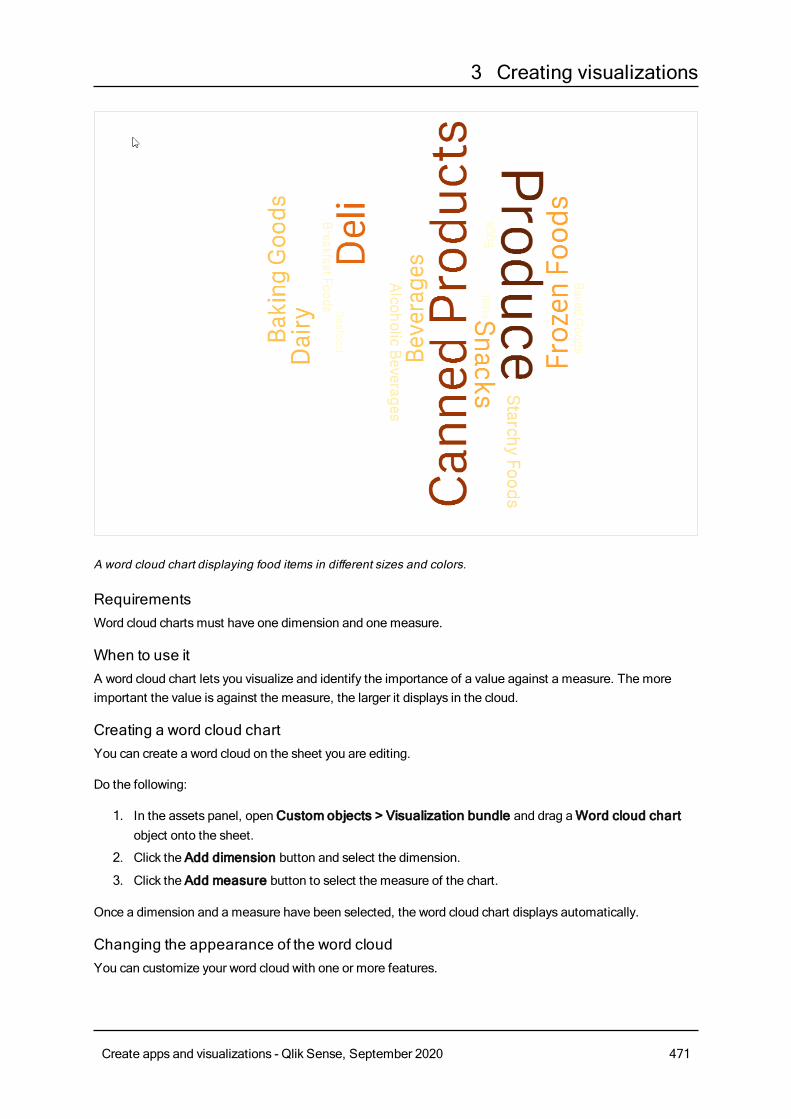
3 Creating visualizations
A word cloud chart displaying food items in different sizes and colors.
RequirementsWord cloud charts must have one dimension and one measure.
When to use itA word cloud chart lets you visualize and identify the importance of a value against a measure. The moreimportant the value is against the measure, the larger it displays in the cloud.
Creating a word cloud chartYou can create a word cloud on the sheet you are editing.
Do the following:
1. In the assets panel, openCustom objects > Visualization bundle and drag aWord cloud chartobject onto the sheet.
2. Click the Add dimension button and select the dimension.
3. Click the Add measure button to select the measure of the chart.
Once a dimension and a measure have been selected, the word cloud chart displays automatically.
Changing the appearance of the word cloudYou can customize your word cloud with one or more features.
Create apps and visualizations - Qlik Sense, September 2020 471
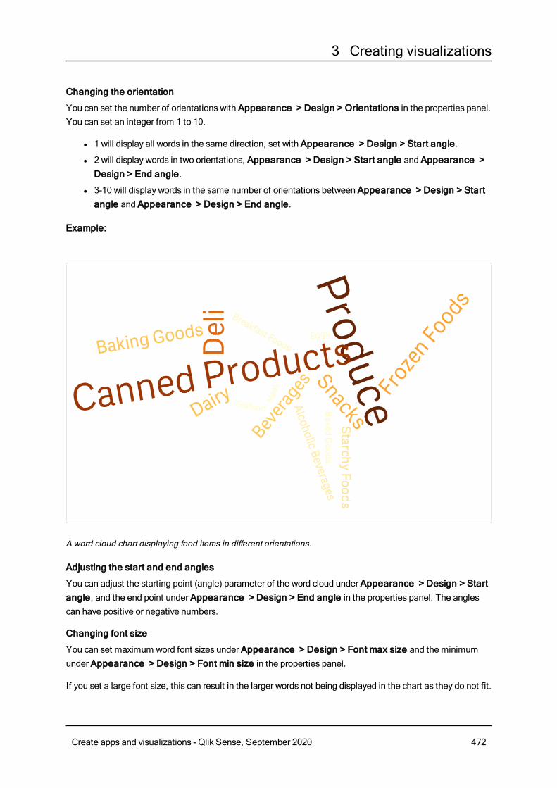
3 Creating visualizations
Changing the orientation
You can set the number of orientations with Appearance > Design > Orientations in the properties panel.You can set an integer from 1 to 10.
l 1 will display all words in the same direction, set with Appearance > Design > Start angle.
l 2 will display words in two orientations, Appearance > Design > Start angle and Appearance >Design > End angle.
l 3-10 will display words in the same number of orientations between Appearance > Design > Startangle and Appearance > Design > End angle.
Example:
A word cloud chart displaying food items in different orientations.
Adjusting the start and end angles
You can adjust the starting point (angle) parameter of the word cloud under Appearance > Design > Startangle, and the end point under Appearance > Design > End angle in the properties panel. The anglescan have positive or negative numbers.
Changing font size
You can set maximum word font sizes under Appearance > Design > Font max size and the minimumunder Appearance > Design > Font min size in the properties panel.
If you set a large font size, this can result in the larger words not being displayed in the chart as they do not fit.
Create apps and visualizations - Qlik Sense, September 2020 472
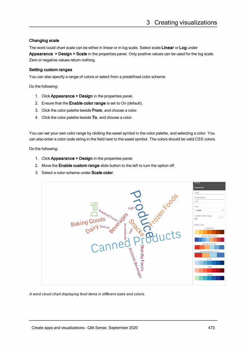
3 Creating visualizations
Changing scale
The word could chart scale can be either in linear or in log scale. Select scale Linear or Log underAppearance > Design > Scale in the properties panel. Only positive values can be used for the log scale.Zero or negative values return nothing.
Setting custom ranges
You can also specify a range of colors or select from a predefined color scheme.
Do the following:
1. ClickAppearance > Design in the properties panel.
2. Ensure that the Enable color range is set to On (default).
3. Click the color palette beside From, and choose a color.
4. Click the color palette beside To, and choose a color.
You can set your own color range by clicking the easel symbol in the color palette, and selecting a color. Youcan also enter a color code string in the field next to the easel symbol. The colors should be valid CSS colors.
Do the following:
1. ClickAppearance > Design in the properties panel.
2. Move the Enable custom range slide button to the left to turn the option off.
3. Select a color scheme under Scale color.
A word cloud chart displaying food items in different sizes and colors.
Create apps and visualizations - Qlik Sense, September 2020 473
3 Creating visualizations
Formatting numbers
It is possible to format the measure value. Different formatting can be applied to the same value, for exampleasmoney, date, duration. The chart updates to reflect the changed number type.
Do the following:
1. ClickData > Measures in the properties panel and click a measure.
2. Select applicable number formatting form theNumber formatting menu.
3. Enter details in the panel fields. These display when choosing an option other than Auto when furtherconfiguring the chart.
LimitationsFor information about general limitations, see Limitations (page 418).
l The word cloud chart can handle maximum of 100 words per entry.
l Words that take up more space than the chart are not displayed. You can adjust the font size to showmore values, but we do not recommend that you use fields with long text values.
l Word cloud charts cannot be used in Qlik NPrinting reports.
3.7 Creating and editing visualizationsYou create visualizations from predefined charts, fields, or custom objects. Once added to yoursheet, you can edit and refine your visualizations. Youmust be inEditmode to be able to add oredit visualizations.
Creating visualizationsYou create visualizations by dragging the chosen type of visualization onto the sheet from the assets paneland configuring its properties settings. For instructions on creating specific types of visualizations, see thatvisualization type in Visualizations (page 118).
Do the following:
1. Drag the visualization from the assets panel onto the sheet, or double-click the visualization.
2. Add dimensions and measures to the visualization.You can add dimensions and measures using the buttons on the visualization. Or you can drag a fieldfrom the Fields tab of the assets panel, and then selectt to use it as a dimension or measure. Thenumber of dimensions and measures that are required depends on which visualization you selected.
3. Adjust the presentation: for example sorting, coloring, or labeling.For more information, seeChanging the appearance of a visualization (page 504).
You can also add a visualization by copying visualizations. This is useful if you want to useexisting visualization settings in another visualization type. For more information, see Copyinga visualization from an existing visualization (page 497)
Create apps and visualizations - Qlik Sense, September 2020 474
3 Creating visualizations
Custom objects are added in a similar manner. You start creating a visualization by dragging a visualizationextension or a widget onto the sheet. For more information, seeCreating a visualization using a customobject (page 496).
You can use containers to save space on your dashboard, by quickly switching between tabs with differentvisualizations.
The types of data you have in your tables and fields impacts whether they can be used as dimensions ormeasures.
l Dimensions determine how the data in a visualization is grouped. For example: total sales per countryor number of products per supplier. For more information, seeDimensions (page 61).
l Measures are calculations used in visualizations, typically represented on the y-axis of a bar chart or acolumn in a table. Measures are created from an expression composed of aggregation functions, suchasSum orMax, combined with one or several fields. For more information, seeMeasures (page 64).
Creating visualizations with assistanceQlik Sense offers two methods of creating visualizations with assistance.
l You can use Insights to let Qlik Sense generate a selection of visualizations by analyzing your data.You can then choose to add these visualizations to your sheets.
l You can also create visualizations using chart suggestions by dragging a field onto the sheet from theassets panel and then dragging additional fields that you want in the visualization onto the first field.Qlik Sense then creates a suggested visualization based on the fields selected for the visualization.For more information, seeCreating visualizations using chart suggestions (page 486).
Editing visualizationsAfter creating a visualization, you may want to make adjustments to improve how it conveys information tousers. For example, you can change the data used, or adjust the appearance of the visualization. You canadd more dimensions or measures for further depth of information, or remove some to improve clarity, anddeclutter a visualization
The data in a visualization can be changed. For example, you might correct an invalid dimension or measure,or unlink a measure from amaster measure so you can modify it without changing the master measure. Formore information, seeChanging the data of a visualization (page 499).
The appearance of a visualization can be edited to improve design and enhance understanding. There are anumber of different ways you can adjust the appearance of your visualizations:
l Colors: Coloring is one of the best ways to highlight values in your visualizations. Qlik Sense providesa range of different coloring options.For example, you can assign specific colors to the distinct values in a master dimension to ensure thatthose values use the same colors across all your visualizations.For more information, seeColoring a visualization (page 511).
l Sorting: The sorting of your dimensions and measures helps ensure that content is presented in alogical and understandable manner.For more information, seeChange the sorting of a visualization (page 508).
Create apps and visualizations - Qlik Sense, September 2020 475
3 Creating visualizations
l Titles and labels: Titles and labels can be changed for clarity and detail.For example, in a pie chart showing sales by region, you could add an expression providing the totalsales sum.For more information, seeChanging the appearance of a visualization (page 504).
l Presentation: Different visualizations have different options that can be adjusted to enhance thedisplay of data.For example, you can set bars in a bar chart to display as grouped or stacked, as well as vertically orhorizontally.For more information, seeChanging the appearance of a visualization (page 504).
You can convert a visualization into another visualization type, and preserve your settings. For moreinformation, seeConverting a visualization to another kind of visualization (page 531).
You edit visualization properties in the properties panel.
Do the following:
1. Click Edit sheet in the toolbar.
The properties panel for the sheet opens to the right. (If it is hidden, clickShow properties in the
lower right-hand corner.)
2. Click the visualization that you want to edit.The properties panel now shows the properties of the visualization.
3. Make your changes in the properties panel.
4. Click Done editing in the toolbar.
Best practices for designing visualizations
Decluttering your appsToo much information in an app makes it difficult to see what is important. Today’s modern user interfacestyle is a cleaner, simpler, flatter style of design. A simplified design subtly guides the reader and allows themto stay focused.
Less is moreUsers often try to include too much information in one app. Line charts with several measures can beconfusing and difficult to interpret. Try creating several smaller visualizations to spread this information outonto the page. It also allows the reader to efficiently compare and contrast visualizations that are side-by-side. You can also use alternative dimensions and measures to allow the reader to quickly switch betweenmeasures without overcrowding a visualization. For more information, seeChanging the data of avisualization (page 499).
There are number of different ways you can improve the aesthetics and functionality of your app. Dependingon your audience and what data you want to highlight, the way you design your visualization may have aserious impact on the reader's interpretation of the data.
Create apps and visualizations - Qlik Sense, September 2020 476
3 Creating visualizations
Know your limitsConsumers of your visualizationsmay be working with limited screen space or resolution. Qlik Sense usesresponsive design to address these limitations. However, if screen space or resolution is too limited, certaindesign accommodations are necessary. These can include:
l A subset of data being displayed in bar charts and line charts. When the number of dimension valuesexceeds the width of the visualization, a mini chart with a scroll bar is displayed.
l Collapsed menus for selecting data filters. When the number of dimension values exceeds the spaceavailable for the filter pane, the menu is collapsed. App consumers have to click on the dimensionname in the title of the filter pane to open a new pane. They can then make their selections in the newpane. Additionally, when there is limited space, dimension namesmay appear as ellipses in filterpane titles. App consumers have to click on the ellipses to view the name of the filter pane.
l Truncated names in chart legends. Names that are too long for the space available for dimensionsand measures are truncated. An ellipses is added to the end of truncated name. App consumers canhover their mouse pointer over the truncated name to view the complete name.
l Missing legends, labels and titles.
App consumers can expand visualizations to address some of these issues. However, we recommend thatyou test your apps on devices where the appsmay be consumed. You can also use various tools to test, suchas responsive design mode in Firefox (Ctrl + Shift + M). If necessary, you can move visualizations to newsheets, reduce the amount of data shown in visualizations, and so on.
Color accessibilityThe spectrum of colors is narrower for people who have color-based visual impairment. Theymay interpretyour visualization differently than you intended.
For example, some people see the colors red and green more as yellow or brown. This form of red-greencolor vision deficiency is the most common. This is worth noting since red often carries a negativeconnotation in data visualizations, especially in finance.
A red or green KPI status can be confusing. You can use shapes with colors as performance indicators tomake your designsmore accessible. For example, use a red empty circle to denote bad, a green full circle forgood, and a triangle as a warning symbol that only appears when a KPI status is at an unacceptable level.
Lines, bars, and pie slices can be difficult to distinguish when the colors are distorted.
For more information, seeChanging the appearance of a visualization (page 504).
Filter and icon placementFilers and icons are an essential part of data visualization, but it can be difficult to knowwhere to place themor how to sort them. You can often anticipate where the user will begin to read based on a few well-established design principles.
Left placementSeveral popular websites use left-side navigation tiles and filters. This is due to the fact that many languagesread from left to right. As a result, the left-side of the screen is where these readers lookmost frequently.Users who are scanning for content tend to gravitate toward the left side of the screen. The farther to the right
Create apps and visualizations - Qlik Sense, September 2020 477
3 Creating visualizations
objects are, the less users will look at them. If all your filters and icons are stacked vertically on the left, itgives them equal weight.
Alternately, with languages where text is written right to left, the opposite of this is true. This should be keptin mind if your apps are translated into these languages.
Top placementAnother common placement option for icons and filters is along the top of an app. By not placing filters oricons on the left it givesmore space for larger visualizations with distracting menus. When filters and iconsare placed above visualizations they are also seen as separate from the content below. This can help showthe reader that you are prioritizing the filters or icon. If all your filters and icons are side-by-side at the top, theone furthest to the left carriesmore weight and is prioritized by the reader.
For more information, see Structuring an app using sheets (page 9).
Information hierarchySometimes you want your reader to prioritize certain visualizations over others. You can show hierarchy ofinformation by using a few key design best practices. For example, you can use different sizes to emphasizesome visualizations. Larger information is seen asmore important: by increasing the font or chart size, youcan show the reader where to look first.
Page placement also plays a part in information hierarchy. The information at the top of a page is perceivedasmore important than information at the bottom of the page because it is read first. Information on the firstpage is perceived asmore important than information on the last page.
Adding context to KPIsKPIs are a great way to communicate some of the big ideas inside your app. However, KPI values do notprovide any context to the numbers and calculations that are happening behind the scenes. A green light nextto a KPI does not tell the reader if the goal was barely achieved, or if you greatly surpassed it.
To help bring context to your KPIs, include supporting information next to the value in smaller text. Forexample, you can compare the current KPI value with the value from the previous year. You can also add asmall bar chart without axes or values to provide information about the current trend.
For more information, see KPI properties (page 203).
Avoid the pitfalls of data visualizationTo experience the benefits of data visualizations you must avoid the pitfalls. Here are some common ones:
Color abuseDo not overdo colors. Be aware that the wrong color in the wrong place might cause confusion rather thanclarity. Also, the same color maymean different things in different parts of the world.
Misuse of pie chartsAvoid having pie charts side by side to compare. Try not to squeeze too much information into them.
Create apps and visualizations - Qlik Sense, September 2020 478
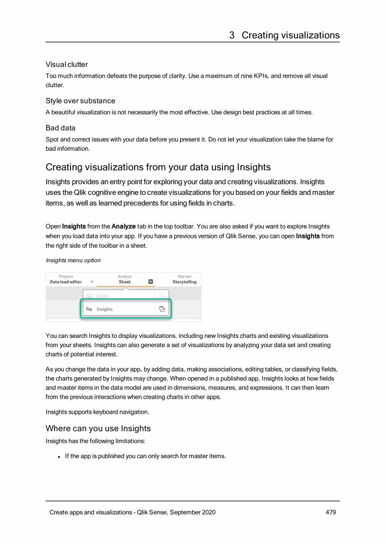
3 Creating visualizations
Visual clutterToo much information defeats the purpose of clarity. Use a maximum of nine KPIs, and remove all visualclutter.
Style over substanceA beautiful visualization is not necessarily the most effective. Use design best practices at all times.
Bad dataSpot and correct issues with your data before you present it. Do not let your visualization take the blame forbad information.
Creating visualizations from your data using InsightsInsights provides an entry point for exploring your data and creating visualizations. Insightsuses theQlik cognitive engine to create visualizations for you based on your fields andmasteritems, as well as learned precedents for using fields in charts.
Open Insights from the Analyze tab in the top toolbar. You are also asked if you want to explore Insightswhen you load data into your app. If you have a previous version of Qlik Sense, you can open Insights fromthe right side of the toolbar in a sheet.
Insights menu option
You can search Insights to display visualizations, including new Insights charts and existing visualizationsfrom your sheets. Insights can also generate a set of visualizations by analyzing your data set and creatingcharts of potential interest.
As you change the data in your app, by adding data, making associations, editing tables, or classifying fields,the charts generated by Insights may change. When opened in a published app, Insights looks at how fieldsand master items in the data model are used in dimensions, measures, and expressions. It can then learnfrom the previous interactions when creating charts in other apps.
Insights supports keyboard navigation.
Where can you use InsightsInsights has the following limitations:
l If the app is published you can only search for master items.
Create apps and visualizations - Qlik Sense, September 2020 479
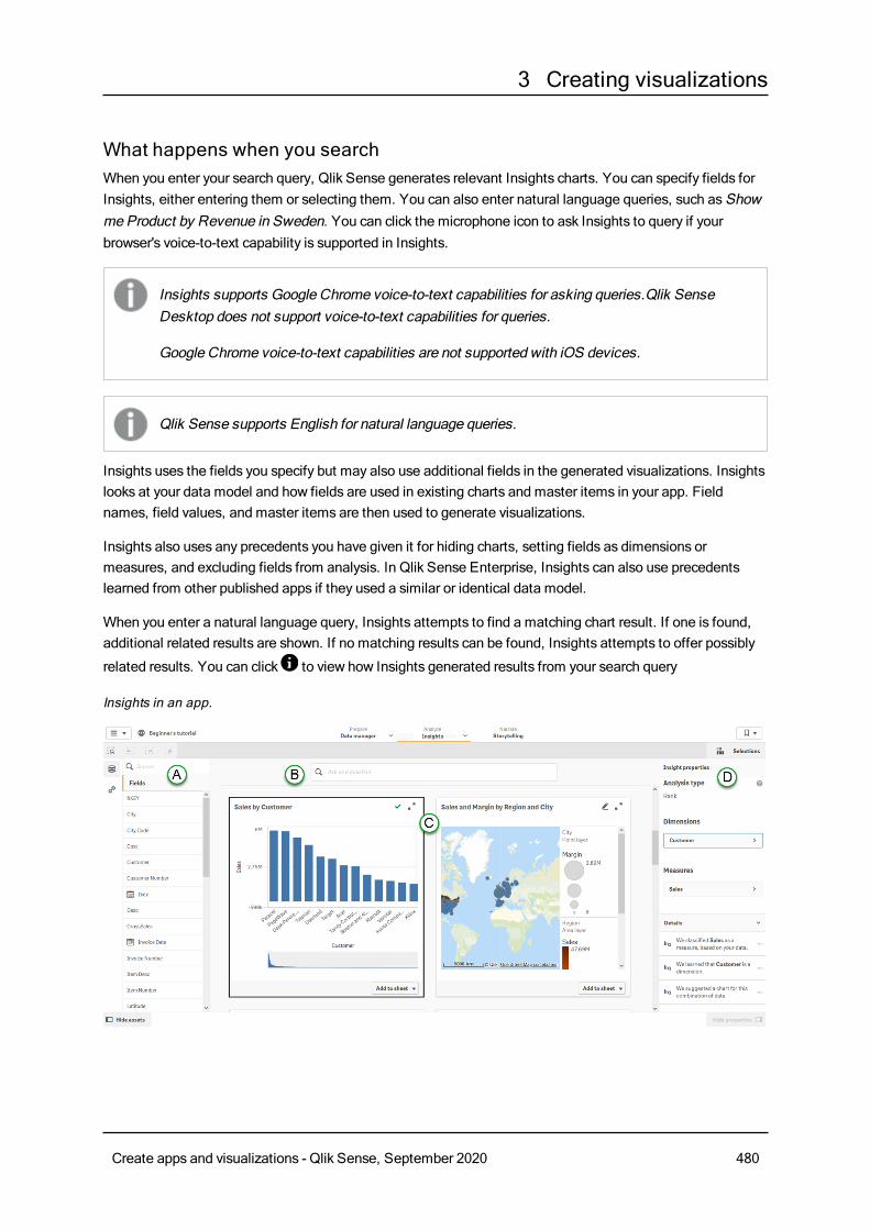
3 Creating visualizations
What happens when you searchWhen you enter your search query, Qlik Sense generates relevant Insights charts. You can specify fields forInsights, either entering them or selecting them. You can also enter natural language queries, such asShowmeProduct by Revenue in Sweden. You can click the microphone icon to ask Insights to query if yourbrowser's voice-to-text capability is supported in Insights.
Insights supports Google Chrome voice-to-text capabilities for asking queries.Qlik SenseDesktop does not support voice-to-text capabilities for queries.
Google Chrome voice-to-text capabilities are not supported with iOS devices.
Qlik Sense supports English for natural language queries.
Insights uses the fields you specify but may also use additional fields in the generated visualizations. Insightslooks at your data model and how fields are used in existing charts and master items in your app. Fieldnames, field values, and master items are then used to generate visualizations.
Insights also uses any precedents you have given it for hiding charts, setting fields as dimensions ormeasures, and excluding fields from analysis. In Qlik Sense Enterprise, Insights can also use precedentslearned from other published apps if they used a similar or identical data model.
When you enter a natural language query, Insights attempts to find a matching chart result. If one is found,additional related results are shown. If no matching results can be found, Insights attempts to offer possibly
related results. You can click to view how Insights generated results from your search query
Insights in an app.
Create apps and visualizations - Qlik Sense, September 2020 480
3 Creating visualizations
A: Fields and master itemsThese are the available assets (fields and master items) for creating Insights charts. You can access fields by
clicking and master items by clicking .
B: Insights search fieldEnter field and master item names to search for charts using those fields. If you used a natural language
query, you can click to view the filters generated from your query.
C: Insights chartsThese are the Insights charts created by Insights. Insights indicates the number of results and breaks themdown into howmany results are found, howmany charts already exist in your sheets, and howmany chartsare newly generated byInsights.
Insights charts can be added to existing sheets or to new sheets in your app. An Insights chart can also bedownloaded as an image, PDF, or as an Excel spreadsheet containing the data used in that chart.
You can expand a chart by selecting it or clickings .
If an Insights chart is new, you can add it to your sheets. If the chart exists already, you can click the sheetname at the bottom of the chart to go to that page.
If you do not like an Insights chart, you can hide it so it will no longer be included in future results. You canview hidden charts and restore them if you change your mind.
Selecting a chart expands the chart and enables you to make selections in it. Selections apply to all displayedInsights charts. Selectionsmade in charts from your sheets are kept when you open Insights. Selections donot affect the charts created by Insights.
D: Properties panelThe properties panel contains options for editing Insights charts and changing the precedents you have set inthe Insights chart.
InGeneral properties, you can view and edit your hidden and learned charts and the precedents you haveset for generating insights.
In Insight properties, you can edit an Insights chart and view the detail of the Insights chart. You can see
the Analysis type used to create the chart. Click to learn more about the analysis type used. You can
change the fields used asDimensions or asMeasures, as well as the aggregation used. UnderDetails,you can view why the chart wasmade and change precedents learned from the chart.
Using natural language in search queriesYou can phrase your search query using natural language, Show meSales for example.
Natural language queries need to reference field names or synonyms for field names in your data model.
You can tag master itemswith synonyms using tags on your master items. Use the format alt:<term> insynonym tags. For example, alt:cities. For more information, see Taggingmaster items (page 95).
Create apps and visualizations - Qlik Sense, September 2020 481
3 Creating visualizations
Natural language queries support three kinds of filters:
l Time: A unit of time or date. For example, Show me 2019 Sales.
l Category: A value from one of the dimensions. For example, Show meSales by Product for Sweden.
l Measure: A value or values from ameasure. For example, Show meSales for Sweden by Productunder 1K.
You can phrase your search queries for facts, comparisons, and rankings. Facts are statements such asWhataremy sales, or Show expenses over time for 2019. You can ask for a comparison by adding vs or compareto your query. For example, Compare sales to expenses over time.
For more information about natural language queries, seeQlik Sense Natural LanguageQuery features.
If you receive the following error message: "Unable to generate insights - Please try againlater," youmight not meet the CPU requirements for Insights.
Check the System requirements for Qlik Sense Enterprise and contact your Qlik administrator.
Editing Insights chartsYou can edit Insights charts by selecting an Insights chart, clicking , and changing properties in the Insight
properties panel.
You can change the insight chart's type by selectingChart type and selecting another type of chart.
You can change the fields used asDimensions or asMeasures, as well as the aggregation used. If a charthasmultiple measures or dimensions, you can drag them to reorder them. If you specified filters in a naturallanguage query, you can modify them as well. You can add dimensions and measures from Insights charts asmaster items.
If you edit a chart, Insights can learn from your preferences in that chart if you add it to a sheet or if you clickLearn after closing the editor. Precedents set by a user only apply to that user's instance of Insights.
UnderDetails, you can see information about why the chart was generated and precedents Insights haslearned from a chart. By selecting details, you can change or reject them. You can set fields as dimensions ormeasure. You can also exclude fields from future analysis.
Hiding Insights chartsWhen you generate Insights charts, you can hide charts that you do not want to be offered again. To hide a
chart, you can right-click on the chart and select Hide. You can also hide charts from theDetails section
of Insight properties by selectingWe suggested a chart for this combination of data and clickingHidethis chart.
You can view the charts hidden from your current search query inGeneral properties.
Managing precedents in Insights chartsThe precedents you have set in Insights can be viewed inGeneral properties.
Create apps and visualizations - Qlik Sense, September 2020 482
3 Creating visualizations
Hidden charts contains charts you have hidden from queries. You can click to show the chart again in
queries.
Learned charts contains charts you liked from query results. You can delete learned charts by clicking .
Your defined preferences shows all the preferences Insights has learned. You can delete preferences by
clicking .
You can clear all hidden charts, learned charts, and precedents by clickingClear all.
Creating visualizations with Insights
Charts you add to the sheet from Insights continue to show as generated until the app isrefreshed.
Do the following:
1. In your app, click Insights in the Analyze drop-downmenu.
2. To generate charts based on an analysis of your data, clickGenerate insights.
3. To generate charts based on specific data, type or ask a query.
Qlik Sense supports English for natural language queries. Insights supports GoogleChrome voice-to-text capabilities for queries. Qlik Sense Desktop does not supportvoice-to-text capabilities for queries. Google Chrome voice-to-text capabilities are notsupported with iOS devices.
Alternatively, select which fields and master items you want to use in Insights charts. Select the datafrom the list of available assets or search for them by name in the search field.
4. To add an Insights chart to your app, do one of the following:
l To add a chart to your current sheet, clickAdd to sheet.
l To add a chart to a specific sheet, clickS and select the sheet
l To add the chart to a new sheet, clickS and select Create new sheet.
Creating master items from Insights chartsDo the following:
1. In Insights, select an Insights chart and click .
2. In Insight properties, click a dimension or measure and clickAdd new.
3. In theCreate new dimensions orCreate new measures dialog, clickCreate.
Create apps and visualizations - Qlik Sense, September 2020 483
3 Creating visualizations
Disabling Insights in an appInsights can be disabled in an app by adding a variable and then refreshing the app. Disabling Insights on apublished app in Qlik Sense Enterprise or an app in a cloud hub prevents the Precedents Service fromlearning precedents from the app. By disabling Insights, the service will no longer learn the aggregations,dimensions, and measures used with that data model for use in apps with a similar data model.
Do the following:
1. In the sheet edit mode, in the assets panel, click .
2. ClickCreate new.
3. InName, typeDISABLE_INSIGHTS.
4. InDefinition, type any value.
5. ClickClose.
6. Refresh the app.
Precedent based learning for Insights in cloud hubsInsights can analyze an app to see how fields are used to create charts. TheQlik PrecedentsService analyzes apps whenever Insights is opened in the app.
The service examines the use of data fields and master items in the app. This teaches Insights precedents formaking aggregations, dimensions, and measures for the data model of the app.
App analysis does not examine the data in fields, only the data tables and field names and how they areused. Precedents learned are only applied to the app from which the precedents were learned.
For an app in a shared space, precedents learned from the app are shared amongst users. Precedentslearned from users are not shared and are unique to each cloud hub user with access to the app.
You can disable Insights in an app if you do not want Insights to learn precedents from that app. For a sharedapp, if one user disables Insights, it is disabled for all app users.
Insight Advisor analysis typesInsight Advisor provides results using awide range of analysis types. These analysis typesprovide best practice visualizations whengenerating insights.
Different analysis types are used depending on the inputs of the query and the characteristics of your data.The following table describes the analysis types. Not all conditions for each analysis type are listed. The Qlikcognitive engine determines the best analysis type for your query depending on the available data.
Analysistype
Description Dimensions Measures Charts
Fact Specific aggregated totals. - 1-2 KPI
Analysis types
Create apps and visualizations - Qlik Sense, September 2020 484
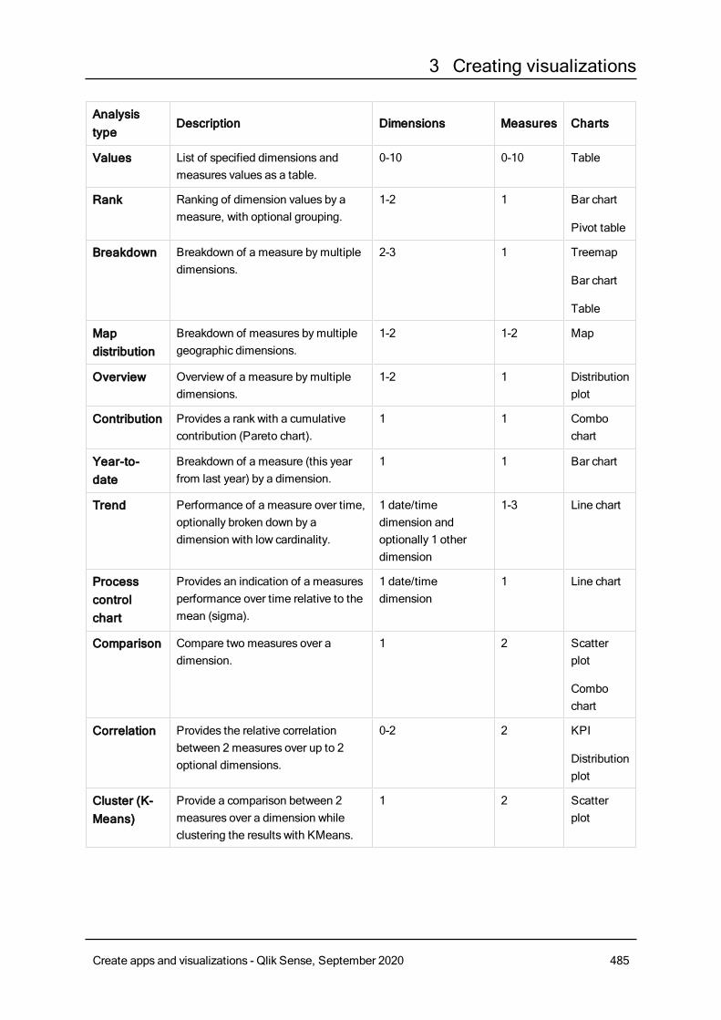
3 Creating visualizations
Analysistype
Description Dimensions Measures Charts
Values List of specified dimensions andmeasures values as a table.
0-10 0-10 Table
Rank Ranking of dimension values by ameasure, with optional grouping.
1-2 1 Bar chart
Pivot table
Breakdown Breakdown of a measure bymultipledimensions.
2-3 1 Treemap
Bar chart
Table
Mapdistribution
Breakdown of measures bymultiplegeographic dimensions.
1-2 1-2 Map
Overview Overview of a measure bymultipledimensions.
1-2 1 Distributionplot
Contribution Provides a rank with a cumulativecontribution (Pareto chart).
1 1 Combochart
Year-to-date
Breakdown of a measure (this yearfrom last year) by a dimension.
1 1 Bar chart
Trend Performance of a measure over time,optionally broken down by adimension with low cardinality.
1 date/timedimension andoptionally 1 otherdimension
1-3 Line chart
Processcontrolchart
Provides an indication of a measuresperformance over time relative to themean (sigma).
1 date/timedimension
1 Line chart
Comparison Compare two measures over adimension.
1 2 Scatterplot
Combochart
Correlation Provides the relative correlationbetween 2 measures over up to 2optional dimensions.
0-2 2 KPI
Distributionplot
Cluster (K-Means)
Provide a comparison between 2measures over a dimension whileclustering the results with KMeans.
1 2 Scatterplot
Create apps and visualizations - Qlik Sense, September 2020 485
3 Creating visualizations
Creating visualizations using chart suggestionsQlik Sense offers awide range of visualizations to usewith your data. Deciding on the correctchart type can be challengingwhen creating your first Qlik Sense app.
Chart suggestions enable you to select data fields and let Qlik Sense choose the dimensions, measures, andvisualization types. As you add or remove fields, the suggested visualization adjusts itself based on yourchanges. You can customize a suggested visualization with a focused set of properties.
If you started a visualization, enablingChart suggestions will change your visualization to a suggestedvisualization.
If you enable Chart suggestions and then disable them, you will lose changes made to yourvisualization. You can restore your old visualization by undoing the changes. However, if younavigate away from Sheet view ormake changes in the assets panel, you will not be able toundo and restore your visualization.
Creating a new visualization using chart suggestionsDo the following:
1. Click Edit sheet in the toolbar.The assets panel opens on the left-hand side.
2. From Fields, drag and drop a field into your sheet.Fields suggested as dimensions are added as tables or histograms. Fields suggested asmeasures areadded as KPIs.To add fields as filter panes hold the shift key when you drag and drop the field.
3. Add additional fields by doing one of the following:
l Drag and drop a field onto the visualization created from the first field, or on Suggest on theright-hand side.Qlik Sense determines if the field should be used as a dimension or as a measure, and whichmeasure aggregation to use.
l ClickAdd on the properties panel and select a field.
l Drag and drop a field onDrop item here underDimensions orMeasures.
The visualization will change as fields are added to it.
4. Optionally, remove unwanted fields.
5. Click Done.
Changing an existing visualization using chart suggestionsYou change an existing visualization by adding fields or removing unwanted fields. EnablingChartsuggestions in the properties panel on the right-hand side changes the selected visualization to a chartsuggestion based on the fields of the visualization. You can change the suggestionsmade byQlik Sense. Forexample you can:
Create apps and visualizations - Qlik Sense, September 2020 486
3 Creating visualizations
l Drag fields betweenDimensions andMeasures to change how a field is used. Moving a field toDimensions removes its aggregation. Moving a field toMeasures assigns it an aggregation.
l Choose a different aggregation for a field used as a measure. Your aggregation choice will be usedwhenever you use this field as a measure, whileChart suggestions is enabled.
l UseChange chart type to choose a different type of chart from the one suggested.
Adjusting the settings when using chart suggestionsYou can adjust the settings in the properties panel forData and Appearance. The properties panel forvisualizations created with chart suggestions contains a focused set of properties settings. DisablingChartsuggestions brings back access to all available properties. For descriptions of the available fields see thevisualization properties topics in Visualizations (page 118).
Limitations when using chart suggestionsl You cannot enableChart suggestions for a master visualization.
l You cannot enableChart suggestions for filter panes, histograms or maps.
l Charts withChart suggestions enabled are not supported in Qlik NPrinting reports. To includecharts created using chart suggestions in Qlik NPrinting reports, disableChart suggestions.
l You can only change the aggregation of a measure when its label is the default label.
l You cannot drag a master dimension toMeasures. You cannot drag a master measure toDimensions.
l You can only drag a field fromMeasures toDimensions if its expression is simple. For moreinformation on how to use expressions in visualizations seeUsing expressions in visualizations(page 100).
Guidelines for visualizations, fields, and namingThere are certain conventions and limitations you need to be aware of whenworkingwithQlikSense. For example: themaximum number of characters to use in names, descriptions, andexpressions, as well as characters reserved for use by Qlik Sense only.
Max number of visualizationsThe maximum number of visualizations there can be on a sheet is limited to the number of cells on a sheet:288 (24x12). The maximum practical number will be less than this because of the limited use forvisualizations that are made up of only 1 cell.
Upper limits on name lengthsThe following limits apply to the number of characters that can be used in various situations in Qlik Sense:
Situation Upper limit
Names (title, dimension, footnote...) Max 255 characters.
Upper limits on name lengths
Create apps and visualizations - Qlik Sense, September 2020 487
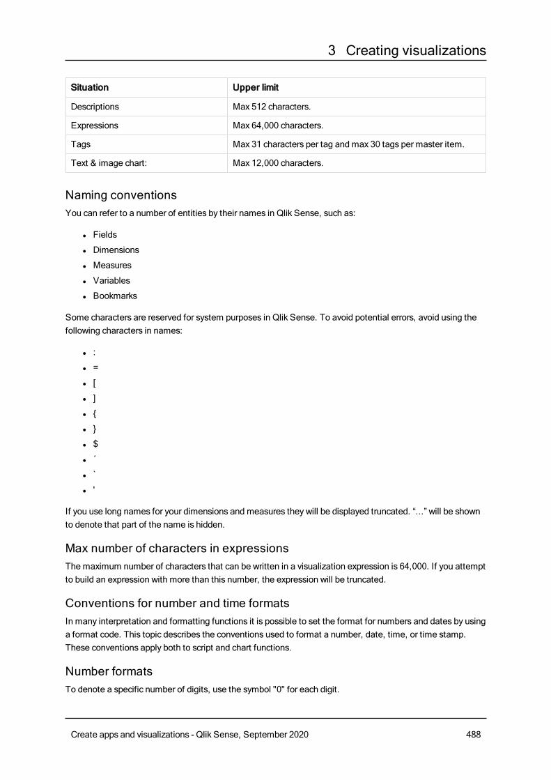
3 Creating visualizations
Situation Upper limit
Descriptions Max 512 characters.
Expressions Max 64,000 characters.
Tags Max 31 characters per tag and max 30 tags per master item.
Text & image chart: Max 12,000 characters.
Naming conventionsYou can refer to a number of entities by their names in Qlik Sense, such as:
l Fields
l Dimensions
l Measures
l Variables
l Bookmarks
Some characters are reserved for system purposes in Qlik Sense. To avoid potential errors, avoid using thefollowing characters in names:
l :
l =
l [
l ]
l {
l }
l $
l ´
l `
l '
If you use long names for your dimensions and measures they will be displayed truncated. “...” will be shownto denote that part of the name is hidden.
Max number of characters in expressionsThe maximum number of characters that can be written in a visualization expression is 64,000. If you attemptto build an expression with more than this number, the expression will be truncated.
Conventions for number and time formatsIn many interpretation and formatting functions it is possible to set the format for numbers and dates by usinga format code. This topic describes the conventions used to format a number, date, time, or time stamp.These conventions apply both to script and chart functions.
Number formatsTo denote a specific number of digits, use the symbol "0" for each digit.
Create apps and visualizations - Qlik Sense, September 2020 488
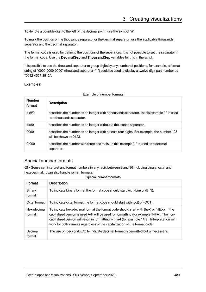
3 Creating visualizations
To denote a possible digit to the left of the decimal point, use the symbol "#".
To mark the position of the thousands separator or the decimal separator, use the applicable thousandsseparator and the decimal separator.
The format code is used for defining the positions of the separators. It is not possible to set the separator inthe format code. Use theDecimalSep and ThousandSep variables for this in the script.
It is possible to use the thousand separator to group digits by any number of positions, for example, a formatstring of "0000-0000-0000" (thousand separator="-") could be used to display a twelve-digit part number as"0012-4567-8912".
Examples:
Numberformat
Description
# ##0 describes the number as an integer with a thousands separator. In this example " " is usedas a thousands separator.
###0 describes the number as an integer without a thousands separator.
0000 describes the number as an integer with at least four digits. For example, the number 123will be shown as 0123.
0.000 describes the number with three decimals. In this example "." is used as a decimalseparator.
Example of number formats
Special number formatsQlik Sense can interpret and format numbers in any radix between 2 and 36 including binary, octal andhexadecimal. It can also handle roman formats.
Format Description
Binaryformat
To indicate binary format the format code should start with (bin) or (BIN).
Octal format To indicate octal format the format code should start with (oct) or (OCT).
Hexadecimalformat
To indicate hexadecimal format the format code should start with (hex) or (HEX). If thecapitalized version is used A-F will be used for formatting (for example 14FA). The non-capitalized version will result in formatting with a-f (for example 14fa). Interpretation willwork for both variants regardless of the capitalization of the format code.
Decimalformat
The use of (dec) or (DEC) to indicate decimal format is permitted but unnecessary.
Special number formats
Create apps and visualizations - Qlik Sense, September 2020 489
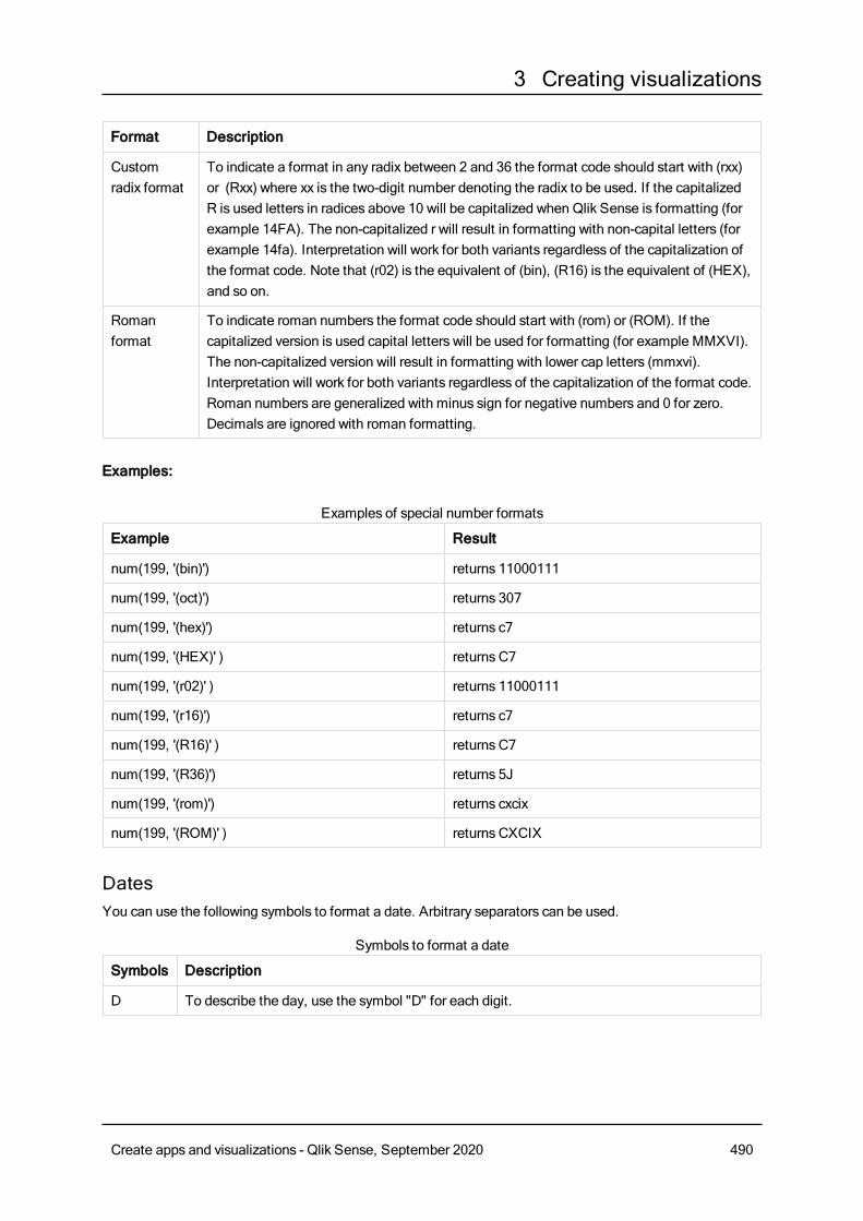
3 Creating visualizations
Format Description
Customradix format
To indicate a format in any radix between 2 and 36 the format code should start with (rxx)or (Rxx) where xx is the two-digit number denoting the radix to be used. If the capitalizedR is used letters in radices above 10 will be capitalized when Qlik Sense is formatting (forexample 14FA). The non-capitalized r will result in formatting with non-capital letters (forexample 14fa). Interpretation will work for both variants regardless of the capitalization ofthe format code. Note that (r02) is the equivalent of (bin), (R16) is the equivalent of (HEX),and so on.
Romanformat
To indicate roman numbers the format code should start with (rom) or (ROM). If thecapitalized version is used capital letters will be used for formatting (for example MMXVI).The non-capitalized version will result in formatting with lower cap letters (mmxvi).Interpretation will work for both variants regardless of the capitalization of the format code.Roman numbers are generalized with minus sign for negative numbers and 0 for zero.Decimals are ignored with roman formatting.
Examples:
Example Result
num(199, '(bin)') returns 11000111
num(199, '(oct)') returns 307
num(199, '(hex)') returns c7
num(199, '(HEX)' ) returns C7
num(199, '(r02)' ) returns 11000111
num(199, '(r16)') returns c7
num(199, '(R16)' ) returns C7
num(199, '(R36)') returns 5J
num(199, '(rom)') returns cxcix
num(199, '(ROM)' ) returns CXCIX
Examples of special number formats
DatesYou can use the following symbols to format a date. Arbitrary separators can be used.
Symbols Description
D To describe the day, use the symbol "D" for each digit.
Symbols to format a date
Create apps and visualizations - Qlik Sense, September 2020 490
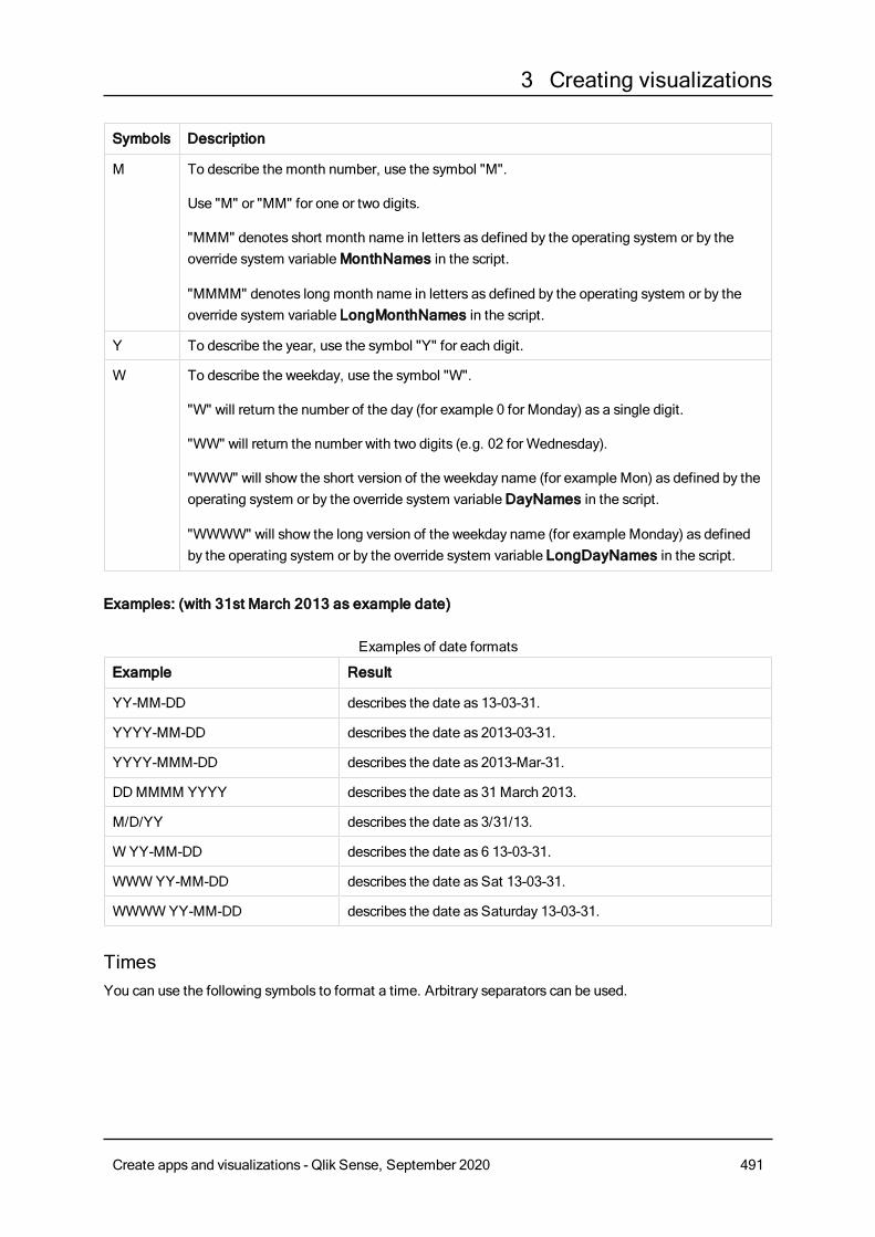
3 Creating visualizations
Symbols Description
M To describe the month number, use the symbol "M".
Use "M" or "MM" for one or two digits.
"MMM" denotes short month name in letters as defined by the operating system or by theoverride system variableMonthNames in the script.
"MMMM" denotes long month name in letters as defined by the operating system or by theoverride system variable LongMonthNames in the script.
Y To describe the year, use the symbol "Y" for each digit.
W To describe the weekday, use the symbol "W".
"W" will return the number of the day (for example 0 for Monday) as a single digit.
"WW" will return the number with two digits (e.g. 02 for Wednesday).
"WWW" will show the short version of the weekday name (for example Mon) as defined by theoperating system or by the override system variableDayNames in the script.
"WWWW" will show the long version of the weekday name (for example Monday) as definedby the operating system or by the override system variable LongDayNames in the script.
Examples: (with 31st March 2013 as example date)
Example Result
YY-MM-DD describes the date as 13-03-31.
YYYY-MM-DD describes the date as 2013-03-31.
YYYY-MMM-DD describes the date as 2013-Mar-31.
DDMMMM YYYY describes the date as 31 March 2013.
M/D/YY describes the date as 3/31/13.
W YY-MM-DD describes the date as 6 13-03-31.
WWWYY-MM-DD describes the date as Sat 13-03-31.
WWWWYY-MM-DD describes the date as Saturday 13-03-31.
Examples of date formats
TimesYou can use the following symbols to format a time. Arbitrary separators can be used.
Create apps and visualizations - Qlik Sense, September 2020 491
3 Creating visualizations
Symbols Description
h To describe the hours, use the symbol "h" for each digit.
m To describe the minutes, use the symbol "m" for each digit.
s To describe the seconds, use the symbol "s" for each digit.
f To describe the fractions of a second, use the symbol "f" for each digit.
tt To describe the time in AM/PM format, use the symbol "tt" after the time.
Symbols to format a time
Examples: (with 18.30 as example time):
Example Result
hh:mm describes the time as 18:30
hh.mm.ss.ff describes the time as 18.30.00.00
hh:mm:tt describes the time as 06:30:pm
Examples of time formats
Time stampsThe same notation as that of dates and times above is used in time stamps.
Examples: (with 31th March 2013 18.30 as example time stamp):
Example Result
YY-MM-DD hh:mm describes the time stamp as 13-03-31 18:30.
M/D/Y hh.mm.ss.ffff describes the time stamp as 3/31/13 18.30.00.0000.
Examples of time stamp formats
Using system fields in a visualizationYou can use system fields in a visualization. System fields are created byQlik Sense when the data loadscript is generated, and include information about the fields and tables in the loaded data. A system fieldbegins with "$", and you need to reference it by typing the field name including the "$" manually. You can usea system field to create a dimension either as a master item or from the properties panel.
Preview of a dimension based on a system field .
Create apps and visualizations - Qlik Sense, September 2020 492
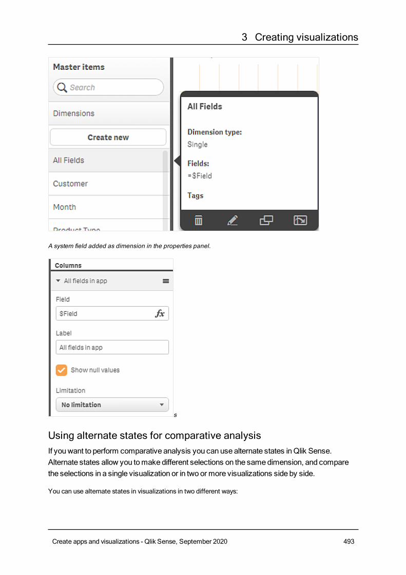
3 Creating visualizations
A system field added as dimension in the properties panel.
s
Using alternate states for comparative analysisIf youwant to perform comparative analysis you can use alternate states inQlik Sense.Alternate states allow you tomakedifferent selections on the samedimension, and comparethe selections in a single visualization or in two or more visualizations side by side.
You can use alternate states in visualizations in two different ways:
Create apps and visualizations - Qlik Sense, September 2020 493
3 Creating visualizations
l Applying a state to the visualization. This connects the selection of the visualization to the selection ofthe state.
l Using states in the set expression of a measure. This is useful to compare measure values of differentstates.
Creating alternate statesYou can create a new alternate state under Alternate states inMaster items:
1. Select Create new.
2. Provide a name for the new state. There are some naming limitations:
l Do not use $, 0, or 1 as a state name.
l Do not use a state name starting with $ or $_ followed by a number, for example, $3.
l Do not use a state name already used as a bookmark name.
You have now created a new alternate state that you can use to perform comparative analysis. Typically youwould want to create another new state to compare the two states.
Applying alternate states to sheets and visualizationsYou can apply a state to a visualization, or a sheet. If you apply a state to a sheet, all visualizations on thesheet inherit the state unless you apply another state to a specific visualization. When you apply a state to avisualization, it reflects the selectionsmade in the state. Any selections you make will be applied to the stateand be reflected in other visualizations that have the same state applied.
The easiest way to apply an alternate state is dropping it on a sheet or a visualization, and then selectingApply state.
You can also apply an alternate state with the State setting in the property panel:
l For a sheet, you find the setting under Alternate states.
l For a visualization, you find the setting under Appearance > Alternate states.
You can select:
l Any alternate state defined inMaster items.
l <inherited>, in which case the state defined for the sheet is used.
l <default state>, which represents the state where no alternate state is applied.
Using alternate states in visualizationsBesides applying a state to a visualization you can also use alternate states in the set expression of ameasure. This is useful when you want to compare measure values for different dimension selections side byside.
You can set the alternate state as an identifier in the set expression. If you want to use the measure Sum
(Sales) in your visualization, for example a bar chart, with a state calledGroup1 you use the followingexpression asmeasure:
Sum({Group1}Sales)
Create apps and visualizations - Qlik Sense, September 2020 494
3 Creating visualizations
To compare with a different state calledGroup2, you can create another measure with the expression Sum
({Group2}Sales).
The bar chart will now show sales for the selection inGroup1 side by side with sales forGroup2.
Getting information about the selection of an alternate stateYou can see the selections of different states in the selections bar.
You may also want to be able to use information about which, and howmany selections are made in aalternate state in labels or titles of visualizations. You can use the following chart functions with the state_name parameter to return selections associated with the specified state name:
l GetCurrentSelections() to return all current selections.
l GetFieldSelections() to return current selections of a field.
l GetSelectedCount() to return the number of selected values in a field.
Expanding variables in alternate statesYou can specify which state to use when expanding a variable. Changes in a specific state do not affectvariable values that are expanded in another state. If you do not specify a state, the variable is expanded inthe default state.
Example:
If you have a state named MyState, and a variable named vMyVar:
l $(vMyVar) expands the variable in the default state.
l $({MyState} vMyVar) expands the variable in the MyState state.
LimitationsIt is not possible to add visualizations to master items if you have set the state of the visualization to anyother value than <inherited>.
Comparative analysis exampleIn this example we want to be able to compare the sales numbers of product lines for different selections ofsales regions. We want to select the regions we compare dynamically, either as single regions or acombination of regions.
Dataset and appIf you want to follow this example, you need to download the Qlik Sense Tutorial - Building an App to get thedataset. If you have completed the tutorial you can use the app you created. Otherwise you need to create anapp, add all six data files in the Tutorials source folder, and associate them using automaticrecommendations in the data manager.
Tutorial - Building an App
Create alternate statesFor this example we need two alternate states. InMaster items > Alternate states:
Create apps and visualizations - Qlik Sense, September 2020 495
3 Creating visualizations
1. Create a new state calledGroup 1.
2. Create a new state calledGroup 2.
You have now created the two alternate states we need in this example.
Create filter panes for selection1. Add a filter pane with the fieldRegion.
2. Edit the label of the filter pane to say =StateName(). This is to make it easier to tell them apart, as thestate is not indicated in the filter pane. The StateName() function returns the state that is applied tothe function.
3. Drop the stateGroup 1 on the filter pane and select Apply state.
4. Add another filter pane with the fieldRegion.
5. Edit the label of the second filter pane to say =StateName().
6. Drop the stateGroup 2 on the second filter pane and select Apply state.
You have now created the two filter panes that are used to control the selections of each of the two states.When you make a selection in theGroup 1 filter pane, the same selection is applied to the stateGroup 1which is reflected in all visualizations connected to that state.
Create a bar chart for analysis1. Create a master item measure with nameGroup1Sales.
Set Expression to Sum({[Group 1]}[Sales]).This expression sums the sales for all selections in theGroup 1 state.Set Label expression to 'Sales '&GetCurrentSelections(chr(13)&chr(10), '=', ',' ,9,'Group 1').We use a label expression to be able to show the current selection of the state as a label in the chart,instead of the default label.
2. Create another master item measure with nameGroup2Sales.Set Expression to Sum({[Group 2]}[Sales]).Set Label expression to 'Sales '&GetCurrentSelections(chr(13)&chr(10), '=', ',' ,9,'Group 2').
3. Add a bar chart to the sheet.
4. Set the Product Line field as dimension.
5. Add the measuresGroup1Sales andGroup2Sales.
You have now created a bar chart that shows the sales by product line for the two groups of regions selectedin the filter panes. When you make a new selection in one of the filter panes, the corresponding measurevalue changes according to the new selection.
DiscoveryYou can nowmake selections inGroup 1 andGroup 2, and see the results of the selected combinations ofregions in the bar chart.
Creating a visualization using a custom objectYou canenhance your apps with custom-objects.
Custom objects that are available are:
Create apps and visualizations - Qlik Sense, September 2020 496
3 Creating visualizations
l visualization extensions
l widgets
l object bundles supplied byQlik:o Dashboard bundle (page 405)o Visualization bundle (page 417)
You can find custom objects in the assets panel under Custom objects when you are editing a sheet.
You can build your own visualization extensions and widgets in the Dev Hub.≤ For the Dev Hub, seeDev Hub .
Adding a custom object to the sheetYou start creating a visualization by dragging a visualization extension or a widget onto a sheet.
Do the following:
1. Click Edit sheet in the toolbar.
2. Click in the panel on the left-hand side to expand custom objects.
3. Drag a visualization extension or a widget onto the sheet.You can drop it in an empty location on the sheet, split the area of an existing visualization into two, orreplace an existing visualization.
If you double-click a custom object, it is added to the sheet immediately.
4. Change the required settings for the custom object in the properties panel. The required settings aredefined by the extension developer, this can be dimensions, measures, or other settings.
You now have a complete visualization that you can start using while exploring the data in the app.
Copying a visualization from an existing visualizationYou can copy a visualization:
l Within the same sheet
l Between sheets in the same app
l Between sheets belonging to different apps.
For a copied visualization to work in a different app, the same dimensions andmeasures haveto be a part of the target app as well.
Do the following:
1. While editing a sheet, click on the item you want to copy.The item is highlighted.
2. On the edit bar, click .
Create apps and visualizations - Qlik Sense, September 2020 497
3 Creating visualizations
3. To insert the item on another sheet, navigate to the sheet via the sheet navigator.
4. Click to paste the item.
The copied item is added to the sheet.
Depending on what situation you are in, different things will happen when you paste the copiedvisualization on a sheet:
l If a visualization is selected, then the selected visualization will be replaced.
l If no visualization is selected, then the pasted visualization will be placed in the largestempty space.
l If there is no empty space, then the largest visualization on the sheet will be split in halfto make space for the pasted visualization.
Creating time-aware chartsTime-aware charts are visualizations that use a continuous scale to provide a complete and accurate view oftime-based data. That is, when you enable continuous scaling on the x-axis in a chart with date fields, datapoints are separated from each other by a distance relative to their associated time. As well, the axis labelsare evenly separated whether or not there is data for that point and the chart view is compressed to avoidscrolling.
Continuous scale is supported for line charts, bar charts, and combo charts.
A continuous scale is most commonly used with date fields such as:
l Second
l Minute
l Hour
l Week
l Month
l YearMonth
l Quarter
l YearQuarter
l Year
l Date
l Timestamp
Adding a continuous scaleDo the following:
Create apps and visualizations - Qlik Sense, September 2020 498
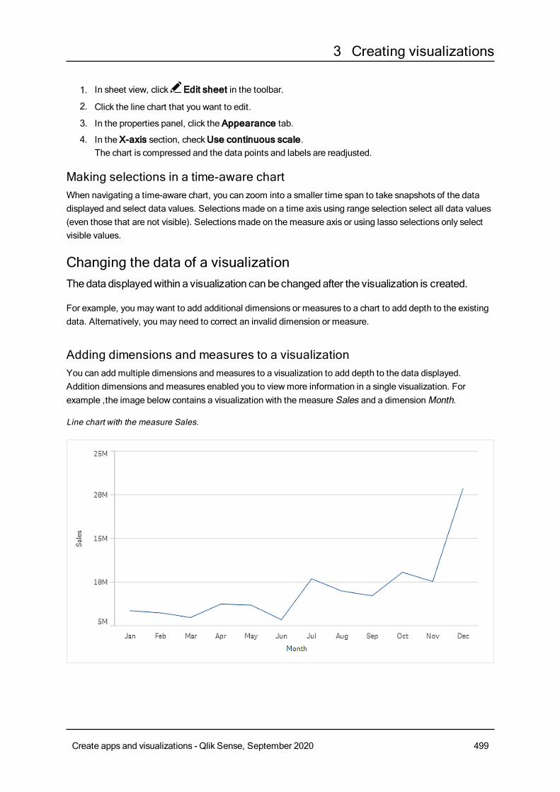
3 Creating visualizations
1. In sheet view, click Edit sheet in the toolbar.
2. Click the line chart that you want to edit.
3. In the properties panel, click the Appearance tab.
4. In the X-axis section, checkUse continuous scale.The chart is compressed and the data points and labels are readjusted.
Making selections in a time-aware chartWhen navigating a time-aware chart, you can zoom into a smaller time span to take snapshots of the datadisplayed and select data values. Selectionsmade on a time axis using range selection select all data values(even those that are not visible). Selectionsmade on the measure axis or using lasso selections only selectvisible values.
Changing the data of a visualizationThedata displayedwithin a visualization can be changedafter the visualization is created.
For example, you may want to add additional dimensions or measures to a chart to add depth to the existingdata. Alternatively, you may need to correct an invalid dimension or measure.
Adding dimensions and measures to a visualizationYou can add multiple dimensions and measures to a visualization to add depth to the data displayed.Addition dimensions and measures enabled you to viewmore information in a single visualization. Forexample ,the image below contains a visualization with the measure Sales and a dimensionMonth.
Line chart with the measure Sales.
Create apps and visualizations - Qlik Sense, September 2020 499
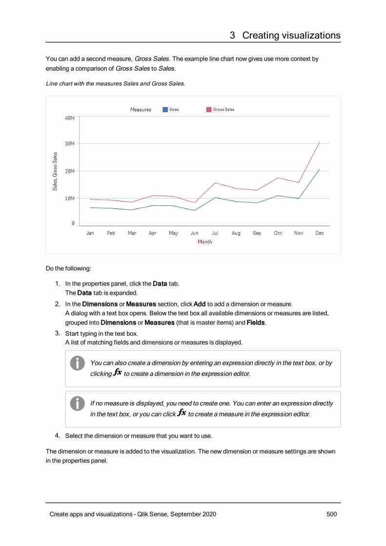
3 Creating visualizations
You can add a second measure, Gross Sales. The example line chart now gives use more context byenabling a comparison of Gross Sales to Sales.
Line chart with the measures Sales and Gross Sales.
Do the following:
1. In the properties panel, click theData tab.TheData tab is expanded.
2. In theDimensions orMeasures section, clickAdd to add a dimension or measure.A dialog with a text box opens. Below the text box all available dimensions or measures are listed,grouped intoDimensions orMeasures (that is master items) and Fields.
3. Start typing in the text box.A list of matching fields and dimensions or measures is displayed.
You can also create a dimension by entering an expression directly in the text box, or by
clicking to create a dimension in the expression editor.
If nomeasure is displayed, you need to create one. You can enter an expression directly
in the text box, or you can click to create ameasure in the expression editor.
4. Select the dimension or measure that you want to use.
The dimension or measure is added to the visualization. The new dimension or measure settings are shownin the properties panel.
Create apps and visualizations - Qlik Sense, September 2020 500
3 Creating visualizations
Adding alternative dimensions and measures to a visualizationAlternative dimensions and measures are dimensions and measures that are added to a visualization, but arenot displayed until a user chooses to switch which dimensions and measures are being displayed duringvisual exploration. You can toggle which of your dimensions and measure are displayed using the explorationmenu of a visualization.
You can add alternative dimensions andmeasure to all chart types but changing alternativedimension andmeasures in the visualization can only be done in bar, line and combo charts.Only alternative dimensions can be changed in the pie charts visualization and only alternativemeasures in scatter plots.
Alternative dimensions and measures enable you conserve space on your sheets. Rather than make multiplesimilar visualizations of the same type, you can use alternative dimensions and measure with a singlevisualization. You can then switch between the displayed dimensions and measures. For example, if youwanted to see total sales by product category and total sales by product subcategory, you could add productcategory as a dimension and product subcategory as an alternate dimension in the same visualization.
Alternative dimensions and measure enable you to have more dimensions and measures associated to avisualization that the display limit. Many visualizations have limitations on howmany dimensions andmeasures that can be displayed at the same time. A line chart with two or more measures can only have onedimension, and a line chart with two dimensions can only have one measure. Alternative dimensions andmeasures enable you to exceed that limit.
Alternative dimensions and measures can be added like normal dimensions and measures in the propertiespane. You can also drag dimensions and measures in theData section of the properties panel into theAlternative dimensions or Alternative measures section.
Do the following:
1. In the properties panel, click theData tab.TheData tab is expanded.
2. In theDimensions orMeasures section, clickAdd alternative.A dialog with a text box opens. Below the text box all available dimensions or measures are listed,grouped intoDimensions orMeasures (that is master items) and Fields.
3. Start typing in the text box.A list of matching fields and dimensions or measures is displayed.
You can also create a dimension by entering an expression directly in the text box, or by
clicking to create a dimension in the expression editor.
If nomeasure is displayed, you need to create one. You can enter an expression directly
in the text box, or you can click to create ameasure in the expression editor.
Create apps and visualizations - Qlik Sense, September 2020 501
3 Creating visualizations
4. Select the dimension or measure that you want to use.
The alternate dimension or measure is added to the visualization.
Editing data in a visualizationYou can edit and adjust the data in a visualization. You may need to edit an existing dimension or measure toadjust it to create a stronger visualization or correct an invalid dimension or measure. You may also want toedit a master item in a visualization to change the master item across all visualizations.
Invalid dimensions and measuresDimensions and measures are invalid when the associated expression cannot be interpreted byQlik Sense.
If you create an invalid dimension or edit an existing one so that it becomes invalid, the dimension ispresented in the properties panel as dimmed with a red hue and the text Invalid dimension to indicate thatthe dimension is invalid. If you use an invalid dimension in a visualization, the visualization cannot bedisplayed.
If you create an invalid measure or edit an existing one so that it becomes invalid, the Expression text boxunderMeasures in the properties panel is presented with a red border to indicate that the measure is invalid.
Editing a dimensionYou can edit dimensions in the properties panel. If you want to edit a master item, you must first unlink thedimension from the master item. In the properties panel, click the dimension that you want toedit. Dimensions have the following properties:
l Field: Start typing the field name to display a list of matching fields to choose from. You can also click
to open the expression editor, where you can create a calculated dimension.
l Label: Enter a name for the dimension.
l Include null values: When this is checked, the visualization will include the null values of thedimension, presented as a gap or a dash, depending on the type of visualization. For example, if youhave sales figures but do not have any information about what company the figures belong to, thefigures will be added to the measure value for the null value dimension.
l Limitation: You can limit the number of dimension values that are displayed.
l Show others: When you have set a limitation for the number of dimension values displayed, youhave an option to summarize the measure values for the remaining dimensions by selecting Showothers.
Editing a measureYou can edit measures in the properties panel. If you want to edit a master item, you must first unlink themeasure from the master item. In the properties panel, click the measure that you want to edit. Measureshave the following properties:
l Expression: Enter the expression. You can also click to open and use the expression editor.
l Label: Enter a name for the measure. The label is not automatically updated when you makechanges in Expression.
Create apps and visualizations - Qlik Sense, September 2020 502
3 Creating visualizations
l Number formatting: Set the number formatting for the measure values. The optionsNumber andDate offer custom formatting options for defining your own format pattern.
Editing master items
Dimensions and measures that are linked to a master item are displayed with a in the properties panel. If
you want to edit a linked dimension or measure, you have two options: either updating the master item in theassets panel, or unlinking the item and making the changes in the properties panel. An update of the masteritem is reflected in all linked items.
Even if linked items cannot be edited in the properties panel, you still have a few settings that can be edited.These are related to the presentation of the items.
A visualization that is linked to a master item is displayed with a on the sheet. You can edit a linked
visualization, either by editing the master item or by unlinking the visualization. The unlinked visualization isindependent of the master item and can be edited, but it can still contain dimensions or measures that arelinked to master items.
Deleting dimensions and measuresIn the properties panel, you can delete a dimension or measure. Long-touch or right-click the dimension or
measure and select Delete in the dialog. Alternatively, click the dimension or measure and clickDelete . If
you delete an instance of a master item, the master item is still available in the assets panel.
You can undo a deletion by clicking . Changing which sheet you are viewing will prevent you
from undoing your deletion.
Unlinking from a master itemIf you want to make changes to a dimension or measure that is linked to a master dimension or mastermeasure, you must first unlink it from the master item. The dimension or measure in your visualization is thenindependent with no connection to the master item in the assets panel.
Unlinking from the properties panelA linked dimension or measure that is used in a visualization can be unlinked from the properties panel.
Do the following:
1. Click Edit sheet.The properties panel opens on the right-hand side.
2. Select the visualization on the sheet.The properties for the selected visualization are displayed in the properties panel.
3. UnderData, locate and click the dimension or measure.
A linked dimension or measure is indicated by the symbol .
4. Click .
Create apps and visualizations - Qlik Sense, September 2020 503
3 Creating visualizations
A dialog is displayed that you are about to unlink from amaster item.
5. ClickOK.
The dimension or measure used in the visualization can now be edited and the changes will not affect anyother dimensions or measures.
You can only unlink from a single dimension, not to a drill-down dimension.
Changing the appearance of a visualizationTheAppearance section in the properties panel offers several options to set andmodify theappearance of a visualization.
Many of the settings have Auto options that support an optimal presentation of the visualization, taking intoaccount the number of dimensions and measures and the type of data used. Normally, you do not need tochange these settings, unless you have a special reason for doing so, for example, when space is verylimited.
Appearance can be affected by the sorting of the dimensions and measures.
GeneralShow titles: On by default in all visualizations except filter panes and text & image visualizations. Filterpanes have the name of each dimension, and in most cases do not need any additional title. The text &image visualization includes an editing toolbar with many options to format the text, and therefore the titlefield can be used for other purposes.
Title, Subtitle, and Footnote: Apart from the obvious use of title, subtitle, and footnote as text fields, youcan use these fields to also display an expression, which provides additional information that complementsthe measure in the visualization. You could, for example, show the totals in the title field, so that the totals ofthe selected values are always available.
Example:
In the following image, the total sales are calculated and used in the title. When a selection is made, the totalsales are updated accordingly.
Create apps and visualizations - Qlik Sense, September 2020 504
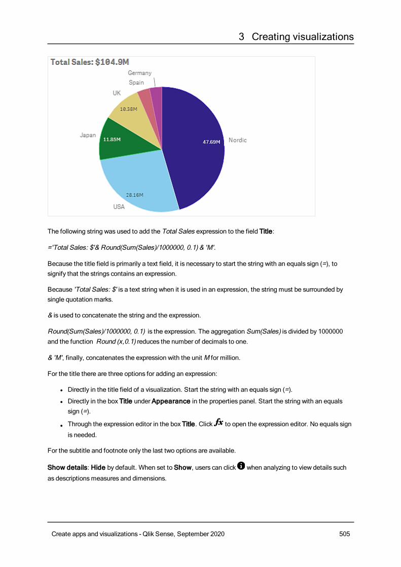
3 Creating visualizations
The following string was used to add the Total Sales expression to the field Title:
='Total Sales: $'& Round(Sum(Sales)/1000000, 0.1) & 'M'.
Because the title field is primarily a text field, it is necessary to start the string with an equals sign (=), tosignify that the strings contains an expression.
Because 'Total Sales: $' is a text string when it is used in an expression, the string must be surrounded bysingle quotation marks.
& is used to concatenate the string and the expression.
Round(Sum(Sales)/1000000, 0.1) is the expression. The aggregation Sum(Sales) is divided by 1000000and the function Round (x,0.1) reduces the number of decimals to one.
& 'M', finally, concatenates the expression with the unit M for million.
For the title there are three options for adding an expression:
l Directly in the title field of a visualization. Start the string with an equals sign (=).
l Directly in the box Title under Appearance in the properties panel. Start the string with an equalssign (=).
l Through the expression editor in the box Title. Click to open the expression editor. No equals sign
is needed.
For the subtitle and footnote only the last two options are available.
Show details: Hide by default. When set to Show, users can click when analyzing to view details such
as descriptionsmeasures and dimensions.
Create apps and visualizations - Qlik Sense, September 2020 505
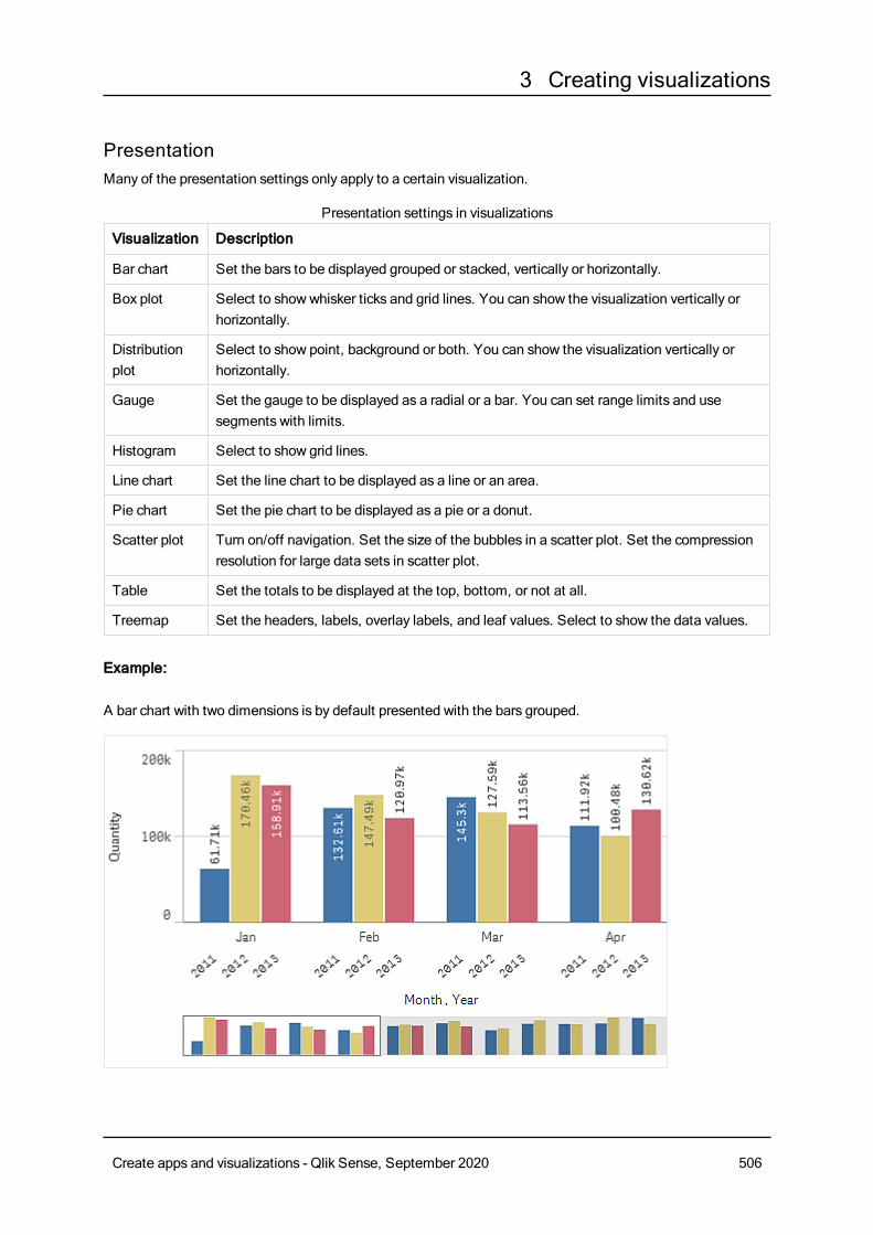
3 Creating visualizations
PresentationMany of the presentation settings only apply to a certain visualization.
Visualization Description
Bar chart Set the bars to be displayed grouped or stacked, vertically or horizontally.
Box plot Select to showwhisker ticks and grid lines. You can show the visualization vertically orhorizontally.
Distributionplot
Select to show point, background or both. You can show the visualization vertically orhorizontally.
Gauge Set the gauge to be displayed as a radial or a bar. You can set range limits and usesegments with limits.
Histogram Select to show grid lines.
Line chart Set the line chart to be displayed as a line or an area.
Pie chart Set the pie chart to be displayed as a pie or a donut.
Scatter plot Turn on/off navigation. Set the size of the bubbles in a scatter plot. Set the compressionresolution for large data sets in scatter plot.
Table Set the totals to be displayed at the top, bottom, or not at all.
Treemap Set the headers, labels, overlay labels, and leaf values. Select to show the data values.
Presentation settings in visualizations
Example:
A bar chart with two dimensions is by default presented with the bars grouped.
Create apps and visualizations - Qlik Sense, September 2020 506
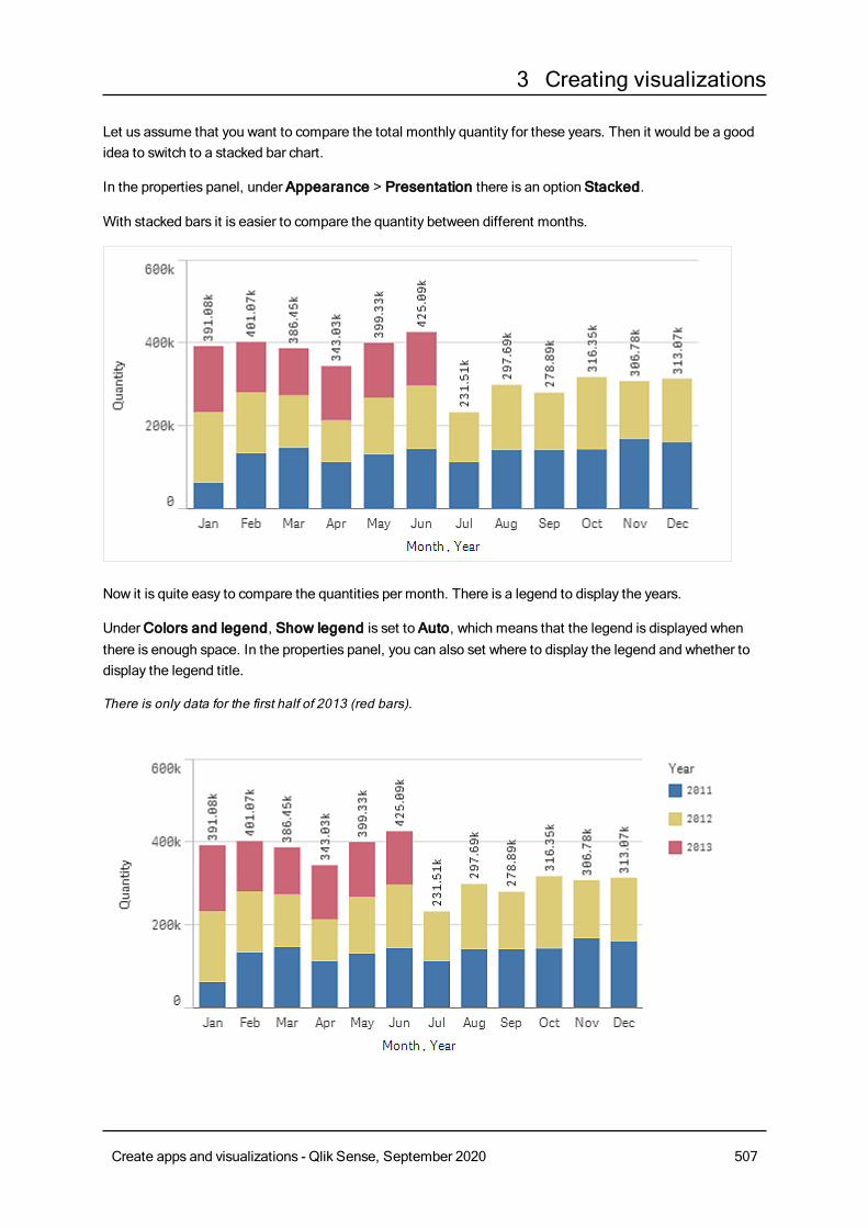
3 Creating visualizations
Let us assume that you want to compare the total monthly quantity for these years. Then it would be a goodidea to switch to a stacked bar chart.
In the properties panel, under Appearance > Presentation there is an option Stacked.
With stacked bars it is easier to compare the quantity between different months.
Now it is quite easy to compare the quantities per month. There is a legend to display the years.
UnderColors and legend, Show legend is set to Auto, which means that the legend is displayed whenthere is enough space. In the properties panel, you can also set where to display the legend and whether todisplay the legend title.
There is only data for the first half of 2013 (red bars).
Create apps and visualizations - Qlik Sense, September 2020 507
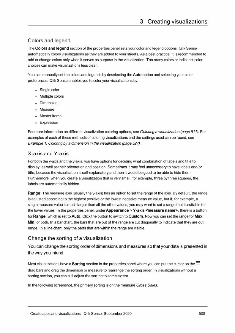
3 Creating visualizations
Colors and legendTheColors and legend section of the properties panel sets your color and legend options. Qlik Senseautomatically colors visualizations as they are added to your sheets. As a best practice, it is recommended toadd or change colors only when it serves as purpose in the visualization. Too many colors or indistinct colorchoices can make visualizations less clear.
You can manually set the colors and legends by deselecting the Auto option and selecting your colorpreferences. Qlik Sense enables you to color your visualizations by:
l Single color
l Multiple colors
l Dimension
l Measure
l Master items
l Expression
For more information on different visualization coloring options, seeColoring a visualization (page 511). Forexamples of each of these methods of coloring visualizations and the settings used can be found, seeExample 1: Coloring by a dimension in the visualization (page 527).
X-axis and Y-axisFor both the y-axis and the y-axis, you have options for deciding what combination of labels and title todisplay, as well as their orientation and position. Sometimes it may feel unnecessary to have labels and/ortitle, because the visualization is self-explanatory and then it would be good to be able to hide them.Furthermore, when you create a visualization that is very small, for example, three by three squares, thelabels are automatically hidden.
Range: The measure axis (usually the y-axis) has an option to set the range of the axis. By default, the rangeis adjusted according to the highest positive or the lowest negative measure value, but if, for example, asingle measure value is much larger than all the other values, you may want to set a range that is suitable forthe lower values. In the properties panel, under Appearance > Y-axis <measure name>, there is a buttonforRange, which is set to Auto. Click the button to switch toCustom. Now you can set the range forMax,Min, or both. In a bar chart, the bars that are out of the range are cut diagonally to indicate that they are outrange. In a line chart, only the parts that are within the range are visible.
Change the sorting of a visualizationYou can change the sorting order of dimensions andmeasures so that your data is presented intheway you intend.
Most visualizations have a Sorting section in the properties panel where you can put the cursor on the
drag bars and drag the dimension or measure to rearrange the sorting order. In visualizations without asorting section, you can still adjust the sorting to some extent.
In the following screenshot, the primary sorting is on the measureGross Sales.
Create apps and visualizations - Qlik Sense, September 2020 508
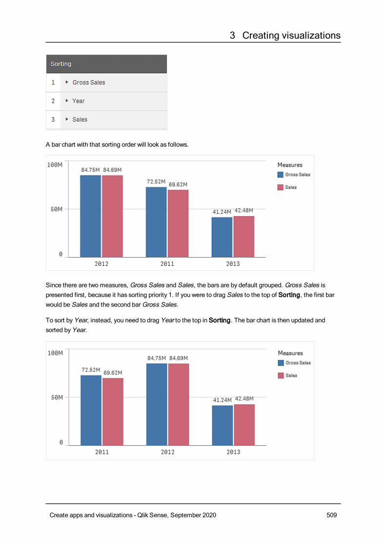
3 Creating visualizations
A bar chart with that sorting order will look as follows.
Since there are two measures, Gross Sales and Sales, the bars are by default grouped. Gross Sales ispresented first, because it has sorting priority 1. If you were to drag Sales to the top of Sorting, the first barwould be Sales and the second barGross Sales.
To sort byYear, instead, you need to drag Year to the top in Sorting. The bar chart is then updated andsorted byYear.
Create apps and visualizations - Qlik Sense, September 2020 509
3 Creating visualizations
In bar charts with multiple dimensions, sorting is locked to the first dimension. This dimensionis what groups and stacks are based on, and sorting on a different dimension or ameasurewould break up these groups in an undesirable way. If you still want to sort by themeasurevalue, try using the option Sort by expression on the first dimension under Sorting.
Sorting in the dimensions and measures sectionsAlthough it is primarily under Sorting that you set the sorting order, you can also adjust the order in theproperties panel sectionData underDimensions andMeasures. InDimensions you can change thepriority order between the different dimensions by dragging them, and, likewise, inMeasures, you can drag
the measures to change the sorting order. Put the cursor on the drag bars and drag the dimension or
measure to rearrange the order. Changes are reflected in the visualization.
Internal sortingApart from setting the sorting order between dimensions and measures, you can also set the internal sortingorder, under Sorting.
Click the dimension or measure name to open the settings and click the sorting button to switch toCustomsorting. The following table shows the internal sorting priority order and sorting options. The sorting is eitherAscending orDescending.
Sorting options:
l Sort by expression (Enter an expression to sort by. Only available for dimensions.)
l Sort numerically
l Sort alphabetically
Additionally, you can sort by load order by switching toCustom and leaving all sorting options unselected.
If you have set a custom order for a field, that custom order will override any selected internal sort order inSorting.
Default sortingBy default, the dimensions and measures are sorted in the order they were added, with the most recentlyadded item last. Each dimension is sorted internally in the most common way for that type of data. Numbersare sorted numerically, ascending. Text is sorted alphabetically, ascending.
Visualization Description
Bar chart By default, a bar chart with one measure and one dimension is presented with verticalbars sorted descending on the measure.
When a dimension has less than 10 values, the sorting is by dimension, alphabetically.
Default sorting in visualizations
Create apps and visualizations - Qlik Sense, September 2020 510
3 Creating visualizations
Visualization Description
Box plot By default, a box plot is sorted by the center line. You can also sort by first whisker, boxstart, box end or last whisker.
Combo chart Sorted by the first item added, either the dimension or the measure.
Distributionplot
By default, a distribution plot is sorted by the outer dimension.
Filter pane By default, data in filter panes is presented ascending.
Gauge A gauge only uses a single measure value, the first one underMeasures.
Histogram The histogram does not have any sorting section.
KPI By default, the first added measure becomes the main value.
Line chart By default, a line chart is sorted by the dimension.
Map A map layer can only have one dimension. Sorting is used to determine the order pointsor areas are added to the map.
Pie chart A pie chart uses one measure and one dimension. By default, a pie chart is sorted by themeasure in descending order.
Scatter plot The scatter plot does not have any sorting section, but the order of the measures decideswhere they are used. The first measure is used on the x-axis, the second measure is usedon the y-axis, and the third (optional) measure is used for the bubble size (it is used to setthe color on large data sets) in the scatter plot. You can only have one dimension in ascatter plot.
Table By default, the column presents the dimensions and measures in the order they wereadded.
Sorting order of rows: By default, the table is sorted in ascending order by the firstdimension or measure under Sorting. You can temporarily change the sorting by clickingthe header of the row you want to sort on. One click - ascending order, two clicks -descending order.
Text & image The text & image visualization does not have any sorting section, but you can drag themeasure tokens in the visualization to change the order.
Treemap The treemap does not have any sorting section. The sorting is automatically bymeasuresize.
Coloring a visualizationQlik Sense automatically colors visualizations as they are added to your sheets. You canmanually set the colors in your visualizations tomeet your requirements or preferences.
Color options for most visualizations are set in the properties panel, in Appearance > Colors and legend.By selectingCustom, you can manually apply colors to your visualizations using the following methods:
Create apps and visualizations - Qlik Sense, September 2020 511
3 Creating visualizations
l Color by single color
l Color bymultiple colors
l Color by dimensionDimension fields can also be dragged and dropped from the assets panel onto a visualization to colorthe visualization by dimension (if supported by the visualization type).
l Color bymeasureMeasure fields can also be dragged and dropped from the assets panel onto a visualization to colorthe visualization bymeasure (if supported by the visualization type).
l Color by expression
Tables and pivot tables can only be colored by expression. Options for coloring tables and pivot tables arefound in the properties panel inData.
If you want to keep colors consistent for dimensions or measures between different visualizations, you canassign specific colors to master items in your library. Most visualizations will use any colors assigned tomaster items automatically. In cases where a visualization uses both a master dimension and a mastermeasure with assigned colors, the color assigned to the master dimension is used by default. You can selectwhich master item color to use or disable master item colors entirely.
For more information, see Assigning colors to master items (page 87).
You can also assign colors to individual master dimension values to ensure the colors of different values areconsistent across visualizations.
For more information, see Assigning colors to master dimension values (page 90).
To keep visualizations clear when you manually set colors, you should select colors for accessibility and onlyuse different colors when they serve a purpose.
Color by single colorWhen you color by single color, one color is used for all objects in the chart. Coloring by a single color is bestused for visualizations, such as bar or line charts, with a single dimension and measure.
If you have a master dimension or master measure that has a color assigned to it, you can color thevisualization by that single color. In cases where a visualization uses both a master dimension and a mastermeasure with assigned colors, the color assigned to the master dimension is used by default. You can selectwhich master item color to use or disable master item colors entirely.
The following options are available when Single color is selected from Colors in Appearance > Colorsand legend:
Create apps and visualizations - Qlik Sense, September 2020 512
3 Creating visualizations
UI item Description
Uselibrarycolors
Select to use master item colors. In cases where a visualization has both a master dimensionand a master measure that have colors assigned to them, you can select which to use in thevisualization.
This option is available when a master dimension or master measure used in the visualizationhas a color assigned to it.
Color Select a color using the color picker. You can select a color from the default palette, enter a hexvalue for a color, or select a color from a color wheel.
Options for color by single color
Color by multiple colorsWhen you have multiple measures in a visualization, you can select Multicolor to color each measure with adifferent color. Qlik Sense offers a 12 color and a 100 color palette to apply to the visualization. By default,12 colors is selected as the color scheme dimensions.
If you are using master measures in your visualization, you can also choose to use them in your visualization.When a visualization is colored bymaster measures, master measures will use their assigned colors and anyother measures are assigned colors from the 12 colors scheme.
The following options are available whenMulticolor is selected from Colors in Appearance > Colors andlegend:
UI item Description
Uselibrarycolors
Select to use master item colors. In cases where a visualization has both a master dimensionand a master measure that have colors assigned to them, you can select which to use in thevisualization.
This option is available when a master dimension or master measure used in the visualizationhas a color assigned to it.
Colorscheme
Select the color scheme used in the visualization. The following schemes are available:
12 colors: The colors are reused when there are more than 12 values. The 12 colors in thiscolor scheme can all be distinguished by people with a color vision deficiency.
100 colors: The colors are reused when there are more than 100 values. Not all of the 100colors can be distinguished by people with a color vision deficiency.
Options for color bymultiple colors
Color by dimensionWhen you color a visualization by a dimension, all values in the visualization are colored by the correspondingvalues in the dimension field selected. By default, the visualization is colored by the primary dimension of thevisualization, but you can select other dimensions. Qlik Sense offers a 12 color and a 100 color palette. Bydefault, 12 colors is set as the palette for color by dimensions.
Create apps and visualizations - Qlik Sense, September 2020 513
3 Creating visualizations
If you are using a master dimension, you can color the visualization using the colors assigned to the distinctvalues of that dimension.
Coloring by dimension is useful when you want to keep track of related information in your visualizations,such as coloring multiple charts by the dimension of Region to clearly see the values related to each region ineach chart.
The following options are available when By dimension is selected from Colors in Appearance > Colorsand legend:
UI item Description
SelectDimension
Select the dimension used to color this visualization with this field. By default, if you have
already selected a dimension for the visualization, it is set with that dimension. Click to
select a different dimension. You can enter an expression by clicking to open the
expression editor
Persistentcolors
When selected, colors persist between selection states. If cleared, colors will be changedand reassigned for different dimension values as selections are made in the visualization.
Colorscheme
Select the color scheme used in the visualization. The following schemes are available:
12 colors: The colors are reused when there are more than 12 values. The 12 colors in thiscolor scheme can all be distinguished by people with color vision deficiency.
100 colors: The colors are reused when there are more than 100 values. Not all of the 100colors can be distinguished by people with color vision deficiency.
Librarycolors
Select to use master dimension color values.
This option is available when a master dimension is used in the visualization.
Options for color by dimension
Color by measureWhen you color a visualization by a measure, all values in the visualization are colored by a gradient or classbased on the values in the selected measure. By default, the visualization is colored by the primarymeasureof the visualization, but you can select another measure. There are four available color schemes.
Coloring bymeasure is useful when you want to clearly see objects colored by their corresponding measurevalue.
The following options are available when By measure is selected from Colors in Appearance > Colorsand legend:
Create apps and visualizations - Qlik Sense, September 2020 514
3 Creating visualizations
UI item Description
SelectMeasure
Select the measure used to color this visualization. By default, if a measure has been added
to the visualization, that measure is selected. Click to select a measure. You can enter an
expression by clicking to open the expression editor
Colorscheme
Select the color scheme used in the visualization. The following schemes are available:
Sequential gradient: The transition between the different color groups is made usingdifferent shades of colors. High measure values have darker hues.
Sequential classes: The transition between the different color groups is made usingdistinctly different colors.
Diverging gradient: Used when working with data that is ordered from low to high, forinstance, to show the relationship between different areas on a map. Low and high valueshave dark colors, mid-range colors are light.
Diverging classes: Can be seen as two sequential classes combined, with the mid-rangeshared. The two extremes, high and low, are emphasized with dark colors with contrastinghues, and the mid-range critical values are emphasized with light colors.
Reversecolors
Select this option to switch which colors are used for low values and which colors are used forhigh values in the selected color scheme.
Range Set the measure value ranges used to color the visualization. When set to Auto, Qlik Sensecreates ranges based on the detected minimum and maximum values.
When set toCustom, Qlik Sense automatically creates ranges based on user-definedminimum and maximum values. You must enter values or expressions that calculate those
values in the fieldsMin andMax. You can enter an expression by clicking to open the
expression editor
Options for color bymeasure
Color by expressionColoring by expression applies colors to a visualization based on a user-defined expression. This enables youto use expressions to define both the colors used and the values upon which the colors are applied in avisualization. You could, for example, use an expression to set conditional colors in a chart.
The following options are available when By expression is selected from Colors in Appearance > Colorsand legend:
UI item Description
Expression Enter an expression by clicking to open the expression editor.
For more information, see Examples (page 518).
Options for color by expression
Create apps and visualizations - Qlik Sense, September 2020 515
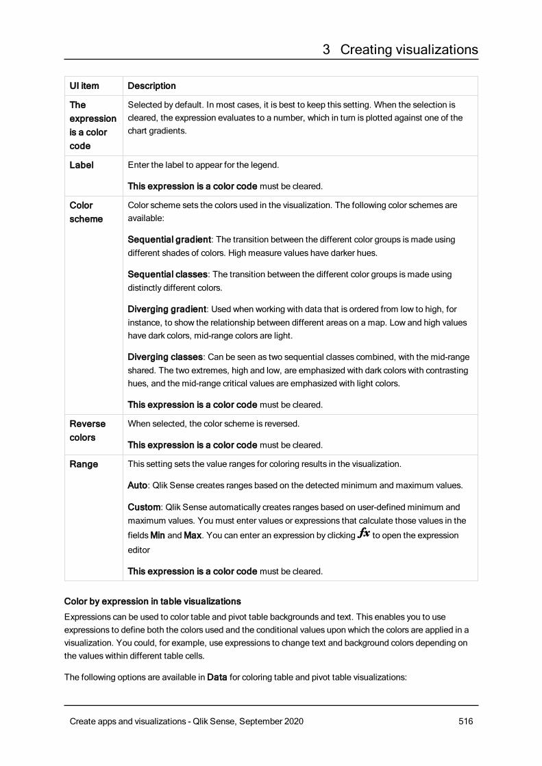
3 Creating visualizations
UI item Description
Theexpressionis a colorcode
Selected by default. In most cases, it is best to keep this setting. When the selection iscleared, the expression evaluates to a number, which in turn is plotted against one of thechart gradients.
Label Enter the label to appear for the legend.
This expression is a color code must be cleared.
Colorscheme
Color scheme sets the colors used in the visualization. The following color schemes areavailable:
Sequential gradient: The transition between the different color groups is made usingdifferent shades of colors. High measure values have darker hues.
Sequential classes: The transition between the different color groups is made usingdistinctly different colors.
Diverging gradient: Used when working with data that is ordered from low to high, forinstance, to show the relationship between different areas on a map. Low and high valueshave dark colors, mid-range colors are light.
Diverging classes: Can be seen as two sequential classes combined, with the mid-rangeshared. The two extremes, high and low, are emphasized with dark colors with contrastinghues, and the mid-range critical values are emphasized with light colors.
This expression is a color code must be cleared.
Reversecolors
When selected, the color scheme is reversed.
This expression is a color code must be cleared.
Range This setting sets the value ranges for coloring results in the visualization.
Auto: Qlik Sense creates ranges based on the detected minimum and maximum values.
Custom: Qlik Sense automatically creates ranges based on user-defined minimum andmaximum values. You must enter values or expressions that calculate those values in the
fieldsMin andMax. You can enter an expression by clicking to open the expression
editor
This expression is a color code must be cleared.
Color by expression in table visualizations
Expressions can be used to color table and pivot table backgrounds and text. This enables you to useexpressions to define both the colors used and the conditional values upon which the colors are applied in avisualization. You could, for example, use expressions to change text and background colors depending onthe values within different table cells.
The following options are available inData for coloring table and pivot table visualizations:
Create apps and visualizations - Qlik Sense, September 2020 516
3 Creating visualizations
UI item Description
Backgroundcolorexpression
Enter an expression by clicking to open the expression editor. The text color
automatically changes to white when a dark background color is used.
For more information, see Examples (page 518).
Text colorexpression
Enter an expression by clicking to open the expression editor. If you use the same
expression as in the background color, the text will not be visible.
For more information, see Examples (page 518).
Options for coloring table and pivot table visualizations
Color by expression
Coloring by expression sets colors using a user-defined expression.When coloring byexpression, you can define bothwhat colors to use andwhich values to use them with, enablingmore control over how colors are used in the visualization.
For example, you might highlight values of particular interest, or differentiate between values within differentvalue ranges. Coloring by expression can also be used to color a visualization by values not included within avisualization, such as coloring products and the sum of their monthly sales by the country of origin for theproduct.
When you select to color By expression, you can chose to either use the expression as a color code or todefine howBy measure color options are applied to the visualization using an expression.
The following visualizations support color by expression:
l Bar chart
l Combo chart
l Line chart
l Map
l Pie chart
l Pivot table
l Scatter plot
l Table
l Treemap
Legend selection is not available in a visualization when coloring by expression. Visualizationsthat are colored by expression with a color code do not support legends.
Create apps and visualizations - Qlik Sense, September 2020 517
3 Creating visualizations
Coloring by expression as a color code
By default, if you choose to color by expression, The expression is a color code is enabled. If you have thisoption selected, your expression must include a color code in a supported expression format to define thecolors to use. Using this method provides you with manual control over visualization colors as well as theconditions for the colors being used in a visualization. With tables and pivot tables, you can use expressionsto define the background color and the text color of columns.
When coloring by expression, objects in visualizations are colored gray if the expressioncontains errors or if objects in the visualization havemultiple colors they could be assigned inthe expression.
ExamplesHere are a few examples to showwhat you can do with expressions by color.
Example: Coloring by random color range
argb(255,rand()*255,rand()*255,rand()*255)
This example uses ARGB color. It starts with alpha value that sets full opacity, and then uses the rand()function to generate random values for the red, green, and blue colors, creating a random color.
Example: Coloring by single measure value
if(sum([Budget Amount]) > 1000000, 'cornflowerblue', magenta())
In this example, there is a condition. If sum([Budget Amount]) is greater than 1 million, the correspondingmeasure values will be colored 'cornflowerblue', otherwise they will be colored magenta.
'cornflowerblue' is the color keyword for the color rgb(100, 149, 227).
magenta() is the Qlik Sense color function that generates a magenta color.
Example: Coloring by single measure value using an aggregated expression
if(avg(Value) > avg(Total aggr(avg(Value), Name)), Blue(), Brown())
In this example, there is a condition. If the avg(Value) value is greater than the aggregated avg(Value) valueof the entire table, then the corresponding measure value is colored blue. If the avg(Value) value is less thanthe aggregated avg(Value) value of the entire table, then the corresponding measure value is colored brown.
Example: Coloring by multiple measure values
if(Sum(Sales) > 3000000, 'green', if(Sum(Sales) > 2000000, 'yellow', if(Sum(Sales) > 1000000, 'orange',red())))
Create apps and visualizations - Qlik Sense, September 2020 518
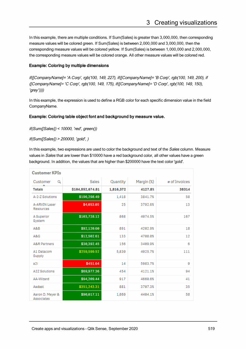
3 Creating visualizations
In this example, there are multiple conditions. If Sum(Sales) is greater than 3,000,000, then correspondingmeasure values will be colored green. If Sum(Sales) is between 2,000,000 and 3,000,000, then thecorresponding measure values will be colored yellow. If Sum(Sales) is between 1,000,000 and 2,000,000,the corresponding measure values will be colored orange. All other measure values will be colored red.
Example: Coloring by multiple dimensions
if([CompanyName]= 'A Corp', rgb(100, 149, 227), if([CompanyName]= 'B Corp', rgb(100, 149, 200), if([CompanyName]= 'C Corp', rgb(100, 149, 175), if([CompanyName]= 'D Corp', rgb(100, 149, 150),'grey'))))
In this example, the expression is used to define a RGB color for each specific dimension value in the fieldCompanyName.
Example: Coloring table object font and background by measure value.
if(Sum([Sales]) < 10000, 'red', green())
if(Sum([Sales]) > 200000, 'gold', )
In this example, two expressions are used to color the background and text of the Sales column. Measurevalues in Sales that are lower than $10000 have a red background color, all other values have a greenbackground. In addition, the values that are higher than $200000 have the text color 'gold'.
Create apps and visualizations - Qlik Sense, September 2020 519
3 Creating visualizations
Coloring by expression without a color code
You can color by expression without a color by disabling The expression is a color code when you enablecoloring by expression. In this method of coloring, the expression is used to evaluate to a numeric value thatis plotted against a By measure chart gradient, treating the expression like a measure when coloring bymeasure.
When coloring by expression, objects in visualizations are colored gray if the expressioncontains errors or if objects in the visualization havemultiple colors they could be assigned inthe expression.
Example:
100*Sum([Sales Margin Amount])/Sum([Sales Amount])
In this example, charts would have By measure color gradients applied to them based on the profit marginpercentile calculated in the expression.
Supported expression formats
The following formats are supported when you create your expressions.
RGBWith RGB colors you enter an integer value between 0 and 255 (or an expression that evaluates to such avalue) for each of the colors red, green, and blue. The resulting color is produced by adding the three colorstogether.
Example:
rgb(0,0,255)
This example generates the color blue. Many of the RGB colors have a corresponding keyword in plain textthat can be used instead of the RGB code. If you use 'blue' as expression, you would get exactly the samecolor. Hexadecimal numbers are also supported, and the color blue has the string '#0000ff'.
ARGBThe ARGB color model has the same support as the RGB color model, but extends it with an additional alphavalue to set the opacity of a color.
Example:
argb(125,0,0,255)
The first value (125), sets the alpha value. The value 0 generates full transparency and the value 255 fullopacity.
Create apps and visualizations - Qlik Sense, September 2020 520
3 Creating visualizations
HSLIn HSL, the color is defined by a hue value, a saturation value, and a luminosity value. You use valuesbetween 0 and 1. Hue is represented as an angle of the color circle (that is, the rainbow represented in acircle). Saturation is full with the value 1 and a shade of gray with the value 0. Lightness with the value 1 iswhite, and black with the value 0. The value 0.5 is commonly used.
Example:
hsl(0,0.5,0.5)
This example generates a red color with medium saturation and lightness.
Color keywordsQlik Sense supportsW3C recommended color keywords. With color keywords, specific colors are defined bya name which corresponds to a RGB hex value. Enter the color name in the expression to use the color.
Use the following links to find out more about W3C color keywords:≤ http://www.w3.org/TR/CSS21/syndata.html#value-def-color≤ https://developer.mozilla.org/en-US/docs/Web/CSS/color_value
Example:
'cornflowerblue'
This example generates a blue color with the hex value of #6495ed and a RGB value of (100, 149, 237).
Qlik Sense color functionsThe following color functions can be used in expressions when coloring by expression.
l black()
l darkgray()
l lightgray()
l white()
l blue()
l lightblue()
l green()
l lightgreen()
l cyan()
l lightcyan()
l red()
l lightred()
l magenta()
l lightmagenta()
Create apps and visualizations - Qlik Sense, September 2020 521
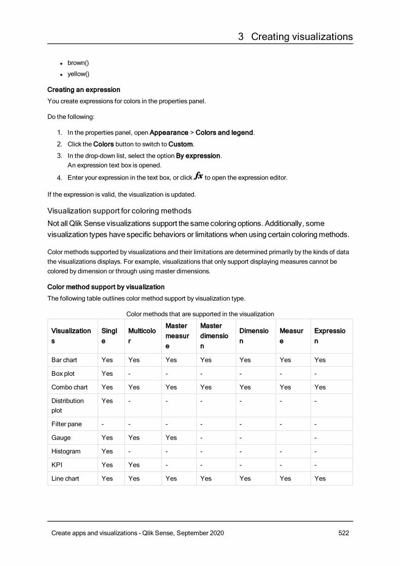
3 Creating visualizations
l brown()
l yellow()
Creating an expression
You create expressions for colors in the properties panel.
Do the following:
1. In the properties panel, open Appearance > Colors and legend.
2. Click theColors button to switch toCustom.
3. In the drop-down list, select the option By expression.An expression text box is opened.
4. Enter your expression in the text box, or click to open the expression editor.
If the expression is valid, the visualization is updated.
Visualization support for coloring methods
Not all Qlik Sense visualizations support the samecoloring options. Additionally, somevisualization types have specific behaviors or limitations whenusing certain coloringmethods.
Color methods supported by visualizations and their limitations are determined primarily by the kinds of datathe visualizations displays. For example, visualizations that only support displaying measures cannot becolored by dimension or through using master dimensions.
Color method support by visualization
The following table outlines color method support by visualization type.
Visualizations
Single
Multicolor
Mastermeasure
Masterdimension
Dimension
Measure
Expression
Bar chart Yes Yes Yes Yes Yes Yes Yes
Box plot Yes - - - - - -
Combo chart Yes Yes Yes Yes Yes Yes Yes
Distributionplot
Yes - - - - - -
Filter pane - - - - - - -
Gauge Yes Yes Yes - - -
Histogram Yes - - - - - -
KPI Yes Yes - - - - -
Line chart Yes Yes Yes Yes Yes Yes Yes
Color methods that are supported in the visualization
Create apps and visualizations - Qlik Sense, September 2020 522
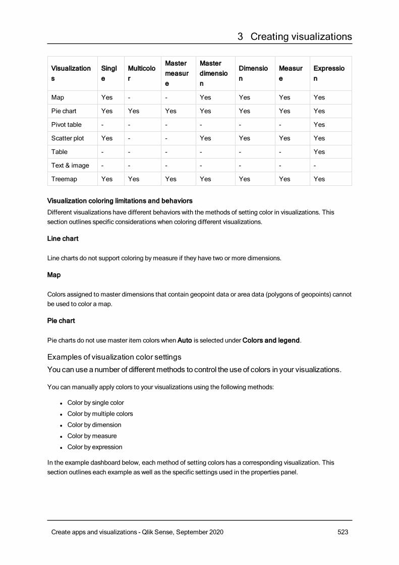
3 Creating visualizations
Visualizations
Single
Multicolor
Mastermeasure
Masterdimension
Dimension
Measure
Expression
Map Yes - - Yes Yes Yes Yes
Pie chart Yes Yes Yes Yes Yes Yes Yes
Pivot table - - - - - - Yes
Scatter plot Yes - - Yes Yes Yes Yes
Table - - - - - - Yes
Text & image - - - - - - -
Treemap Yes Yes Yes Yes Yes Yes Yes
Visualization coloring limitations and behaviors
Different visualizations have different behaviors with the methods of setting color in visualizations. Thissection outlines specific considerations when coloring different visualizations.
Line chart
Line charts do not support coloring bymeasure if they have two or more dimensions.
Map
Colors assigned to master dimensions that contain geopoint data or area data (polygons of geopoints) cannotbe used to color a map.
Pie chart
Pie charts do not use master item colors when Auto is selected underColors and legend.
Examples of visualization color settings
You canuse a number of differentmethods to control the use of colors in your visualizations.
You can manually apply colors to your visualizations using the following methods:
l Color by single color
l Color bymultiple colors
l Color by dimension
l Color bymeasure
l Color by expression
In the example dashboard below, each method of setting colors has a corresponding visualization. Thissection outlines each example as well as the specific settings used in the properties panel.
Create apps and visualizations - Qlik Sense, September 2020 523
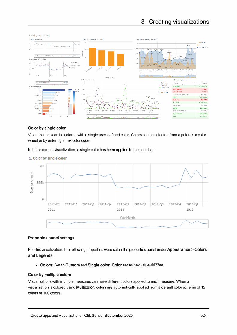
3 Creating visualizations
Color by single color
Visualizations can be colored with a single user-defined color. Colors can be selected from a palette or colorwheel or by entering a hex color code.
In this example visualization, a single color has been applied to the line chart.
Properties panel settings
For this visualization, the following properties were set in the properties panel under Appearance > Colorsand Legends:
l Colors: Set toCustom and Single color. Color set as hex value 4477aa.
Color by multiple colors
Visualizations with multiple measures can have different colors applied to each measure. When avisualization is colored usingMulticolor, colors are automatically applied from a default color scheme of 12colors or 100 colors.
Create apps and visualizations - Qlik Sense, September 2020 524
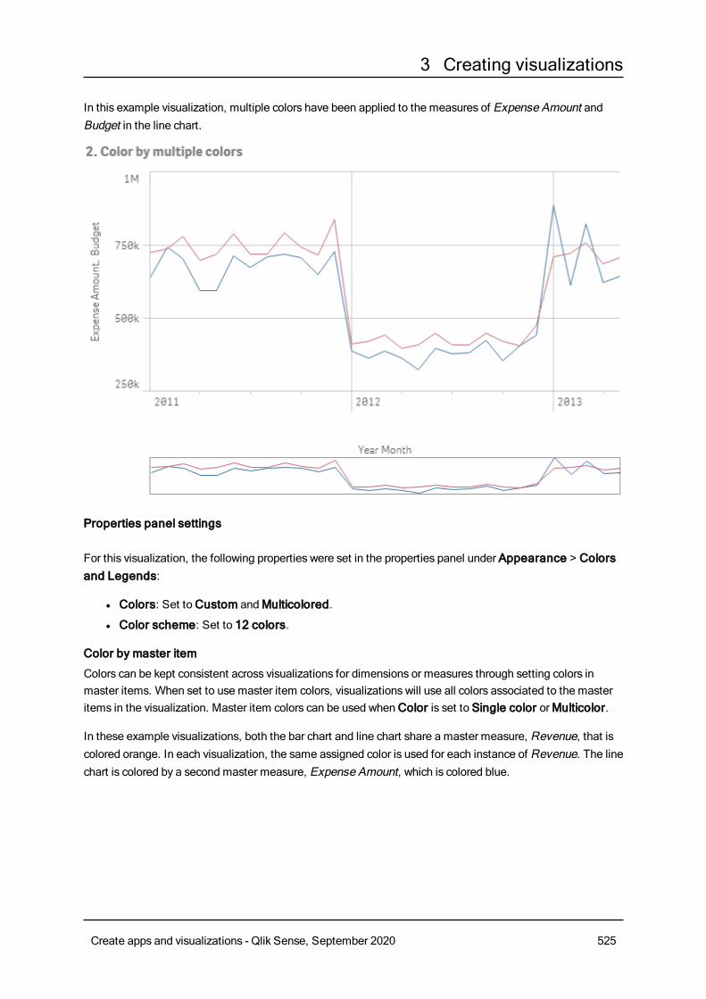
3 Creating visualizations
In this example visualization, multiple colors have been applied to the measures of Expense Amount andBudget in the line chart.
Properties panel settings
For this visualization, the following properties were set in the properties panel under Appearance > Colorsand Legends:
l Colors: Set toCustom andMulticolored.
l Color scheme: Set to 12 colors.
Color by master item
Colors can be kept consistent across visualizations for dimensions or measures through setting colors inmaster items. When set to use master item colors, visualizations will use all colors associated to the masteritems in the visualization. Master item colors can be used whenColor is set to Single color orMulticolor.
In these example visualizations, both the bar chart and line chart share a master measure, Revenue, that iscolored orange. In each visualization, the same assigned color is used for each instance of Revenue. The linechart is colored by a second master measure, Expense Amount, which is colored blue.
Create apps and visualizations - Qlik Sense, September 2020 525
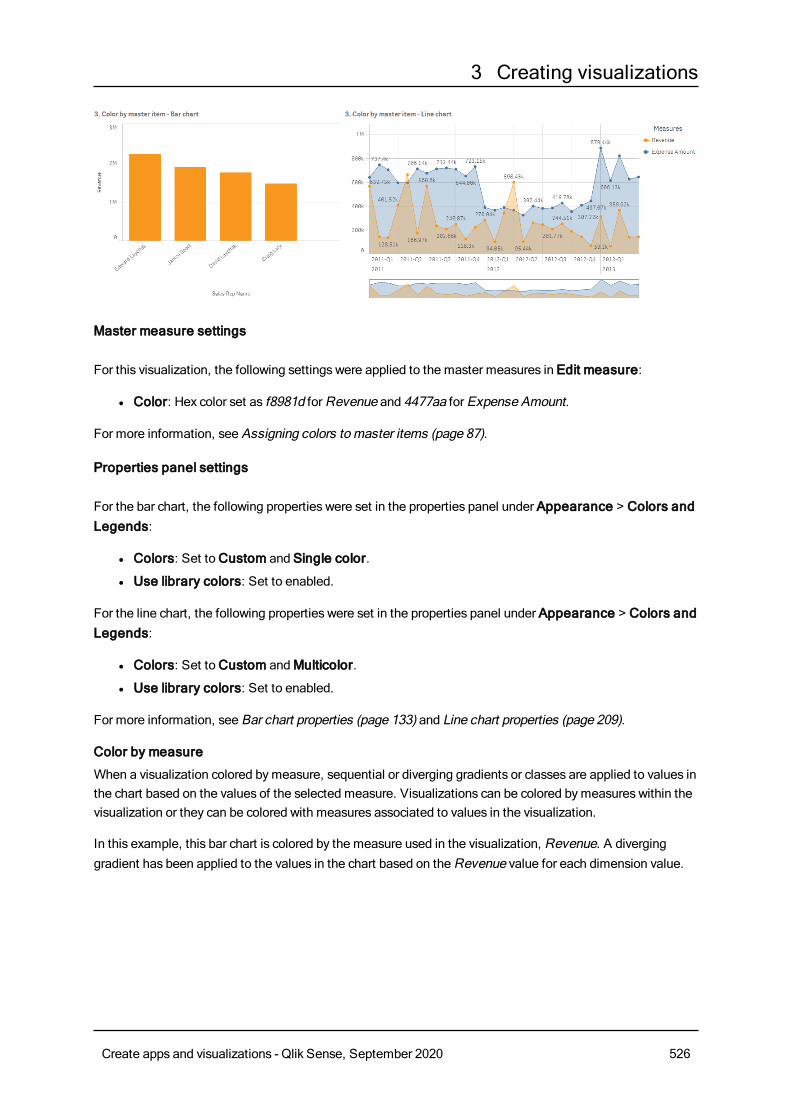
3 Creating visualizations
Master measure settings
For this visualization, the following settings were applied to the master measures in Edit measure:
l Color: Hex color set as f8981d forRevenue and 4477aa for Expense Amount.
For more information, see Assigning colors to master items (page 87).
Properties panel settings
For the bar chart, the following properties were set in the properties panel under Appearance > Colors andLegends:
l Colors: Set toCustom and Single color.
l Use library colors: Set to enabled.
For the line chart, the following properties were set in the properties panel under Appearance > Colors andLegends:
l Colors: Set toCustom andMulticolor.
l Use library colors: Set to enabled.
For more information, see Bar chart properties (page 133) and Line chart properties (page 209).
Color by measure
When a visualization colored bymeasure, sequential or diverging gradients or classes are applied to values inthe chart based on the values of the selected measure. Visualizations can be colored bymeasures within thevisualization or they can be colored with measures associated to values in the visualization.
In this example, this bar chart is colored by the measure used in the visualization, Revenue. A diverginggradient has been applied to the values in the chart based on theRevenue value for each dimension value.
Create apps and visualizations - Qlik Sense, September 2020 526
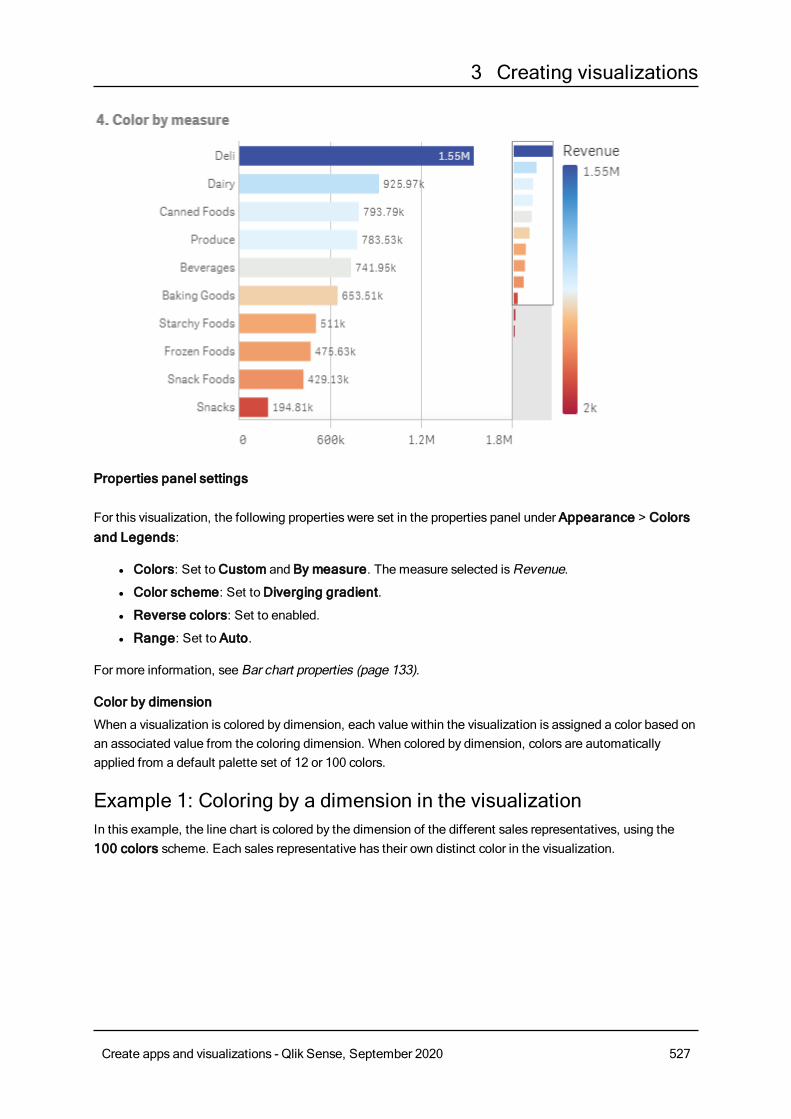
3 Creating visualizations
Properties panel settings
For this visualization, the following properties were set in the properties panel under Appearance > Colorsand Legends:
l Colors: Set toCustom and By measure. The measure selected isRevenue.
l Color scheme: Set toDiverging gradient.
l Reverse colors: Set to enabled.
l Range: Set to Auto.
For more information, see Bar chart properties (page 133).
Color by dimension
When a visualization is colored by dimension, each value within the visualization is assigned a color based onan associated value from the coloring dimension. When colored by dimension, colors are automaticallyapplied from a default palette set of 12 or 100 colors.
Example 1: Coloring by a dimension in the visualizationIn this example, the line chart is colored by the dimension of the different sales representatives, using the100 colors scheme. Each sales representative has their own distinct color in the visualization.
Create apps and visualizations - Qlik Sense, September 2020 527
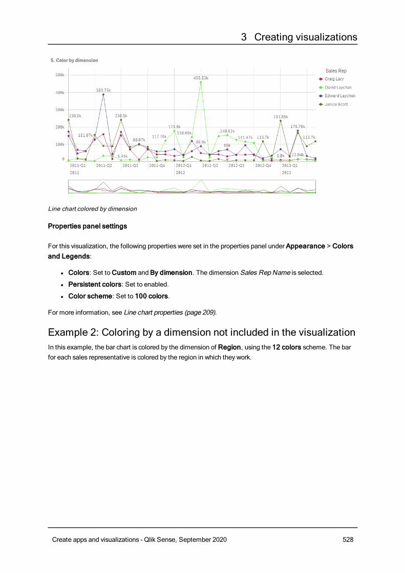
3 Creating visualizations
Line chart colored by dimension
Properties panel settings
For this visualization, the following properties were set in the properties panel under Appearance > Colorsand Legends:
l Colors: Set toCustom and By dimension. The dimension Sales Rep Name is selected.
l Persistent colors: Set to enabled.
l Color scheme: Set to 100 colors.
For more information, see Line chart properties (page 209).
Example 2: Coloring by a dimension not included in the visualizationIn this example, the bar chart is colored by the dimension of Region, using the 12 colors scheme. The barfor each sales representative is colored by the region in which they work.
Create apps and visualizations - Qlik Sense, September 2020 528
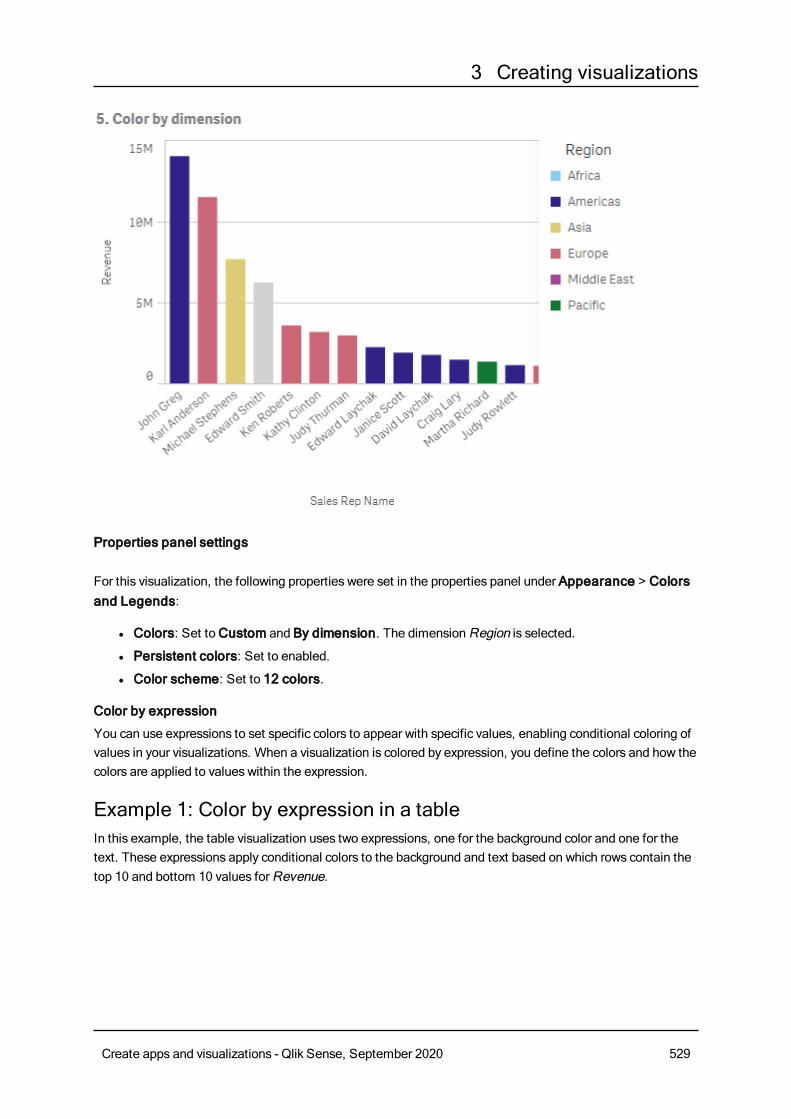
3 Creating visualizations
Properties panel settings
For this visualization, the following properties were set in the properties panel under Appearance > Colorsand Legends:
l Colors: Set toCustom and By dimension. The dimensionRegion is selected.
l Persistent colors: Set to enabled.
l Color scheme: Set to 12 colors.
Color by expression
You can use expressions to set specific colors to appear with specific values, enabling conditional coloring ofvalues in your visualizations. When a visualization is colored by expression, you define the colors and how thecolors are applied to values within the expression.
Example 1: Color by expression in a tableIn this example, the table visualization uses two expressions, one for the background color and one for thetext. These expressions apply conditional colors to the background and text based on which rows contain thetop 10 and bottom 10 values forRevenue.
Create apps and visualizations - Qlik Sense, September 2020 529
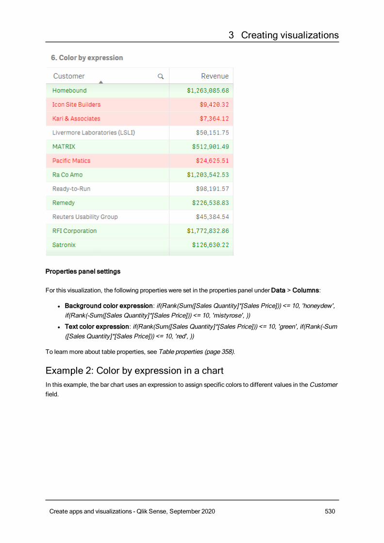
3 Creating visualizations
Properties panel settings
For this visualization, the following properties were set in the properties panel underData > Columns:
l Background color expression: if(Rank(Sum([Sales Quantity]*[Sales Price])) <= 10, 'honeydew',if(Rank(-Sum([Sales Quantity]*[Sales Price])) <= 10, 'mistyrose', ))
l Text color expression: if(Rank(Sum([Sales Quantity]*[Sales Price])) <= 10, 'green', if(Rank(-Sum([Sales Quantity]*[Sales Price])) <= 10, 'red', ))
To learn more about table properties, see Table properties (page 358).
Example 2: Color by expression in a chartIn this example, the bar chart uses an expression to assign specific colors to different values in the Customerfield.
Create apps and visualizations - Qlik Sense, September 2020 530
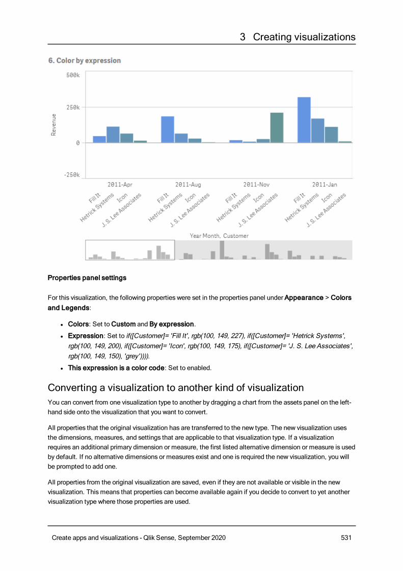
3 Creating visualizations
Properties panel settings
For this visualization, the following properties were set in the properties panel under Appearance > Colorsand Legends:
l Colors: Set toCustom and By expression.
l Expression: Set to if([Customer]= 'Fill It', rgb(100, 149, 227), if([Customer]= 'Hetrick Systems',rgb(100, 149, 200), if([Customer]= 'Icon', rgb(100, 149, 175), if([Customer]= 'J. S. Lee Associates',rgb(100, 149, 150), 'grey')))).
l This expression is a color code: Set to enabled.
Converting a visualization to another kind of visualizationYou can convert from one visualization type to another by dragging a chart from the assets panel on the left-hand side onto the visualization that you want to convert.
All properties that the original visualization has are transferred to the new type. The new visualization usesthe dimensions, measures, and settings that are applicable to that visualization type. If a visualizationrequires an additional primary dimension or measure, the first listed alternative dimension or measure is usedby default. If no alternative dimensions or measures exist and one is required the new visualization, you willbe prompted to add one.
All properties from the original visualization are saved, even if they are not available or visible in the newvisualization. This means that properties can become available again if you decide to convert to yet anothervisualization type where those properties are used.
Create apps and visualizations - Qlik Sense, September 2020 531
3 Creating visualizations
Do the following:
1. While editing a sheet, drag a new chart from the assets panel onto the visualization that you want toconvert.The shortcut menu opens.
2. Select the conversion option.
The new visualization is displayed, using the data from the original visualization.
When you convert to a new visualization type, some of the settings from the originalvisualizationmay not be optimal for the new visualization, for example, the sorting order.Therefore, youmay need tomake some changes in the properties panel, so that the newvisualization is displayed as you want.
You cannot convert to or from amap or a text & image visualization, nor can you convert amaster visualization.
Embedding a visualization or a sheet in a web pageYou can integrateQlik Sense visualizations or sheets into an iframe element on awebpagewiththeSingle IntegrationAPI. This could for example be awebpageon your intranet. You selectwhich visualization or sheet to embed, andmake somesettings to customize selections,interaction and appearance. Then you can copy the iframe code containing theURLof the objectand add it to your webpage.
The embedded object will be subject to the same access rules as the original object and app. This means thatanyone who wants to view the embedded object must have:
l Access to Qlik Sense.
l Access to the app. If the app is unpublished (inMy work), you are the only one with access.
l Access to the sheet. If the sheet is unpublished (inMy sheets) in a published app, you are the onlyone with access.
l Access to any bookmark used for selection. Private bookmarks will be applied for you, but not foranyone else.
l Same access to the data used in the selection as you, if section access is used to restrict data access.
Embedding a sheetYou can embed a sheet in your web page.
Do the following:
1. ClickEmbed sheet in the global menu.
2. Customize selections, appearance and interaction options for the embedded sheet.
Create apps and visualizations - Qlik Sense, September 2020 532
3 Creating visualizations
3. ClickOpen preview in new tab to see a preview of the embedded sheet.
4. ClickCopy.
You now have the iframe code of the sheet in your clipboard, ready to add to your web page.
Embedding a visualizationYou can embed a visualization in your web page.
Do the following:
1. Right-click on the visualization or click the hover menu .
2. Select Share. Then choose Embed link.
3. Customize selections, appearance and interaction options for the embedded visualization.
4. ClickOpen preview in new tab to see a preview of the embedded visualization.
5. ClickCopy.
You now have the iframe code of the visualization in your clipboard, ready to add to your web page.
Setting appearance and interactionYou can customize how you can interact with the embedded object.
l Allow interactionYou can select if you want the user to be able to interact with the embedded object.
l Enable context menuYou can select if you want the context menu to be available when the embedded object is right-clicked.
l LanguageYou can select which language to use in menus for the embedded object.
l ThemeYou can select which theme to use for the embedded object.
Selections in the embedded objectYou can choose if the user can make selections in the embedded object, and which selection state to show inthe embedded object.
l Use current selectionsYou can select to use the current selections in the app.
l Show selections barYou can select to show the selections bar above the sheet.
l Clear app selections on refreshYou can select to clear all selectionsmade in the app when the object is rendered.
l Apply bookmarkYou can select to apply a bookmark and use the selections defined in the bookmark.
When the page containing the embedded object is rendered, the initial selection state is defined by the orderof execution and your settings.
Create apps and visualizations - Qlik Sense, September 2020 533
3 Creating visualizations
1. Clear app selections on refresh
2. Apply bookmark
3. Use current selections
When you make selections in the embedded object, they will be replicated in the app. If you select Clear appselections on refresh, for example, and use the embedded object, selections are cleared in the app.
You can useOpen preview in new tab to preview the embedded object, and interact withoutaffecting selections in the app.
Limitations of embedded objectsl Embed sheet and Embed chart features are not available on devices with a small screen.
l The URL is limited to 2083 characters due to browser limitations. If your URL is too long, this is mostlikely due to a large number of individual selections.
You can create a bookmark with the same set of selections, and apply the bookmark.This will create a shorter URL.
3.8 Troubleshooting - Creating visualizationsThis section describes problems that can occur when creating visualizations in Qlik Sense.
I cannot find the fields in the assets panelI can findCharts andMaster items in the assets panel, but not Fields.
Possible cause
You are working with a published app. Some content is not available in the assets panel in a published app.
My chart is not sorted correctlyI set my chart to sort automatically on the dimension, but the results are not sorted correctly.
Possible cause
The dimension is an expression with a result that has a different data type than the data fields used in theexpression.
Proposed action
Change sorting of the dimension toCustom, and select a sorting option that matches the result of theexpression. For example, if your expression concatenates two fields to a string, like Month(salesDate)&'/'&Day
(salesdate), select to sort alphabetically.
Create apps and visualizations - Qlik Sense, September 2020 534
3 Creating visualizations
My calendar measures display incorrect aggregations invisualizationsWhen I use my calendar measures in visualizations, I see incorrect aggregation results. For example,calendar measures created from identical fields and aggregations but different time rangesmay displayidentical totals.
Possible cause
The table containing the aggregated field is not associated to the table containing the date field, preventingaccurate aggregation of the field by the selected time ranges.
Proposed action
Create an association between the table containing the aggregated field and the table containing the datefield. If there is no association possible, inData manager, add a table that includes a date field that has anassociation to the table containing the aggregated field.
There are no time ranges to select in Create calendar measuresWhen I have a date field selected in theCreate calendar measures dialog try to create calendar measuresfrom a field, there are no time ranges to select in theCreate calendar measures dialog.
Possible cause
The selected date field does not have the correct time flags to work with calendar measures. If you have novalid date fields, you cannot create calendar measures. If you have at least one valid date field, all date fieldswill be available inDate field. However, only those with the correct time flags set in autoCalendar enable theselection of time ranges from the Time Range drop-down list.
Proposed action
Select a date field that uses autoCalendar. If you are unsure which calendar is associated to your date field,date fields in the Field section of the Assets panel display which calendar it uses when clicked.
My date field selected for calendar measures does not use thecorrect calendarI have two calendars to which I have manually added time flags. My time flags have the same names asthose in autoCalendar, making both qualified for use with calendar measures. However, only one of mycalendars has the same definition for the time flags as autoCalendar. I have a date field associated to bothcalendars . When I try to create calendar measures using that date field, the calendar with the correct namesbut different definitions than autoCalendar is used.
Possible cause
In cases where a date field is associated to multiple calendars and each calendar has the correctly namedtime flags set in it, calendar measures uses the first qualified calendars defined in your data load script.
Create apps and visualizations - Qlik Sense, September 2020 535
3 Creating visualizations
Proposed action
Move the script section containing the calendar you want to use with calendar measures before otherqualified calendars in your data load script.
I cannot edit a variable valueI cannot edit a variable that is listed in the variables overview.
Possible cause
The variable is defined in the script.
Proposed action
Edit the variable in the script, using the data load editor, or delete the variable from the script, using the dataload editor, to make the variable editable from the variables overview.
For more information, see Editing a variable (page 110)
You cannot rename a variable.
The map is placing the locations in my location field incorrectlyWhen I add a location field to a layer in mymap, the locations do not display in the correct places.
Possible cause
The map does not have enough context to locate the locations in your field. This can happen when a locationin the field shares a name with a number of other possible locations on the map.
Proposed action
Set Scope for Location in your layer toCustom and enter additional information. Alternatively, qualify yourlocation field using an expression that contains additional fields with relevant geographic information. If yourlocation field contained cities and you hadCountry and State fields, you could use [City]&','&[State]&','&
[Country].
No map is displayedI am using Qlik Geoanalytics server, the background map is not displayed.
Possible cause
Your browser cannot access qlikcloud.com or your firewall settings or proxies prevent the use of JavaScriptfrom qlikcloud.com. .
Proposed action
Visit the status page from your browser.
Create apps and visualizations - Qlik Sense, September 2020 536
3 Creating visualizations
If your browser cannot access qlikcloud.com contact your system administrator for assistance.
If the page prints "ok" then your browser can access qlikcloud.com. Make sure that JavaScript fromqlikcloud.com is allowed.
Do the following:
l Add https://*.qlikcloud.com as a trusted site. (recommended)
l Enable JavaScript from untrusted sites. (not recommended)
Error message: The data contains invalid geometries that could notbe shown on the map. Review your data for errors and try again.I loaded geoshapes from a KML file to Qlik Sense. When I try to add the field to mymap, an error messagetells me that my data contains invalid geometries that could not be shown on the map.
Possible cause
There is an error in your geometries that is preventing Qlik Sense from displaying them on the map or yourgeometry data may be in an invalid format.
Proposed action
Review your geometry data for errors and try again.
Error message: The following locations could not be found:<locations>. Review the values in your data and try again.I added my location field to mymap and I received an error messaging telling me locations in my locationfield could not be found.
Possible cause
Qlik Sense could not find the location. There may be a spelling error in the name or the location is notavailable in the Qlik Sense location database.
Proposed action
Review the values in your data for errors and try adding the field again. If a location cannot be found, you canalternatively manually add it using coordinates for points or geoshapes for areas.
Error message: The following locations could not be located:<locations>. Review the values in your data and try again.I added a location field to my layer and I received an error message telling me that certain locations in mylocation field could not be located.
Create apps and visualizations - Qlik Sense, September 2020 537
3 Creating visualizations
Possible cause
Qlik Sense could not find the location. There may be a spelling error in the name or the location is notavailable in the Qlik Sense location database.
Proposed action
Review the values in your data for errors and try adding the field again. If a location cannot be found, you canalternatively manually add it using coordinates for points or geoshapes for areas.
Error message: The following locations had more than one result:<locations>. Set a custom scope to clarify which locations todisplay.I added a location field to my layer and I received an error message telling me that certain locations in myfield had more than one possible result on the map.
Possible cause
One or more locations in your location field are ambiguous, with multiple possible locations on your map.
Proposed action
Set Scope for Location in your layer toCustom and enter additional information. Alternatively, qualify yourlocation field using an expression that contains additional fields with relevant geographic information. If yourlocation field contained cities, you , such as: [City]&','&[County]&','&[State].
Error message: Some lines could not be shown because of invaliddata in the width expression. Review your data for errors and tryagain.I entered a field or expression to control the width of the lines on mymap and I received an error messagetelling me that certain lines have invalid data.
Possible cause
There is an error in your width expression that is preventing Qlik Sense from displaying specific lines on themap.
Proposed action
Your expression may contain non-numeric values. Review your data for errors and try again.
Create apps and visualizations - Qlik Sense, September 2020 538
3 Creating visualizations
Error message: Some density points could no be shown because ofinvalid data in the weight expression. Review your data for errorsand try again.I entered a field or expression to control the density of the points on mymap and I received an error messagetelling me that certain densities have invalid data.
Possible cause
There is an error in your weight expression that is preventing Qlik Sense from displaying specific densities onthe map.
Proposed action
Your expression may contain non-numeric values. Review your data for errors and try again.
I added an image background layer and cannot see my imageI added an image background layer to mymap visualization, but I cannot see it on the map.
Possible cause
Depending on the projection of your map and the scale of the image, the map may be too zoomed out to seethe image.
Proposed actionDo one of the following:
l InMap settings, enable Auto-zoom. Add a layer containing location data that would put it over thesame area as your image background layer.
l In Presentation, enable Show debug info. The map now includes coordinates for the center of thedisplayed area.
Create apps and visualizations - Qlik Sense, September 2020 539