acucobol-gt - micro focus
TRANSCRIPT
User Interface Programming
ACUCOBOL-GT®
Version 8.1.3
Micro Focus9920 Pacific Heights Blvd
San Diego, CA 92121858.795.1900
© Copyright Micro Focus (IP) Ltd. 1998-2010. All rights reserved.
Acucorp, ACUCOBOL-GT, Acu4GL, AcuBench, AcuConnect, AcuServer, AcuSQL, AcuXDBC, extend, and “The new face of COBOL” are registered trademarks or registered service marks of Micro Focus. “COBOL Virtual Machine” is a trademark of Micro Focus. Acu4GL is protected by U.S. patent 5,640,550, and AcuXDBC is protected by U.S. patent 5,826,076.
Microsoft and Windows are registered trademarks of Microsoft Corporation in the United States and/or other countries. UNIX is a registered trademark of the Open Group in the United States and other countries. Solaris is a trademark of Sun Microsystems, Inc., in the United States and other countries. Other brand and product names are trademarks or registered trademarks of their respective holders.
E-01-UI-100501-ACUCOBOL-GT-8.1.3
Contents
Chapter 1: Introduction1.1 Overview of User Interface Features ............................................................................... 1-21.2 Developing Programs for Graphical Systems.................................................................. 1-7
1.2.1 Event-driven Environments ................................................................................... 1-71.2.2 Configuration and Programming Support ............................................................. 1-71.2.3 Index to Related Topics ....................................................................................... 1-101.2.4 GUI Development With Third-party Kits and Tools........................................... 1-11
1.3 Windowing Concepts..................................................................................................... 1-111.4 ACUCOBOL-GT Window Types ................................................................................. 1-151.5 Creating Portable User Interfaces .................................................................................. 1-16
1.5.1 Incompatibilities Between Graphical and Character Systems............................. 1-171.5.2 Strategies for Supporting Multiple Systems ........................................................ 1-19
1.5.2.1 Dual interface, dual code........................................................................... 1-201.5.2.2 Single interface, single code...................................................................... 1-211.5.2.3 Dual interface, single code ........................................................................ 1-221.5.2.4 Selecting the right approach ...................................................................... 1-221.5.2.5 Determining which UI is running.............................................................. 1-23
1.5.3 Tips for Solving Cross-Platform Interface Problems .......................................... 1-241.5.3.1 Establishing the initial window ................................................................. 1-241.5.3.2 Tips for building single-interface programs .............................................. 1-261.5.3.3 Tips for building dual-interface programs................................................. 1-27
1.6 GUI Development Project Issues................................................................................... 1-291.6.1 Extent of the Interface Changes........................................................................... 1-291.6.2 Suitability of the Current UI to Conversion ........................................................ 1-301.6.3 Recommendations................................................................................................ 1-311.6.4 Conversion Wizard .............................................................................................. 1-31
1.7 Sample Programs ........................................................................................................... 1-32
Chapter 2: Floating Windows2.1 Overview of Floating Windows....................................................................................... 2-22.2 Relationship Between Floating Windows and Subwindows ........................................... 2-32.3 Active and Current Windows .......................................................................................... 2-42.4 Parent and Child Windows .............................................................................................. 2-52.5 Creating, Inquiring, Modifying, and Destroying Windows............................................. 2-62.6 Menus and Floating Windows ......................................................................................... 2-8
Contents-ii
Chapter 3: Graphical Controls3.1 Overview of Graphical Controls ......................................................................................3-2
3.1.1 Visual Styles and Differences Among Operating Systems ...................................3-53.2 Control Types, Handles, and IDs .....................................................................................3-53.3 Interaction Between Controls and Windows ...................................................................3-63.4 Creating, Modifying, Inquiring, and Destroying Controls...............................................3-73.5 The Character Coordinate Phrases .................................................................................3-103.6 Controls and the Mouse .................................................................................................3-113.7 Bitmap Buttons ..............................................................................................................3-12
3.7.1 Drawing the Image...............................................................................................3-133.7.2 Loading Bitmaps..................................................................................................3-153.7.3 Creating the Button ..............................................................................................3-163.7.4 Pop-up Hints ........................................................................................................3-193.7.5 Portability.............................................................................................................3-19
3.8 Paged List Boxes............................................................................................................3-203.8.1 Creating a Paged List Box ...................................................................................3-213.8.2 Adding Records to a Paged List Box...................................................................3-223.8.3 Other List Box Operations ...................................................................................3-23
3.8.3.1 Scroll Bars in Text-mode Environments ...................................................3-233.8.4 Paged List Box Event Handling...........................................................................3-233.8.5 Paged List Box Example......................................................................................3-27
3.9 Paged Grids ....................................................................................................................3-33
Chapter 4: Supporting Concepts and Related Issues4.1 Handles.............................................................................................................................4-24.2 Events...............................................................................................................................4-34.3 Graphical vs. Textual Modes ...........................................................................................4-44.4 Styles and Special Properties ...........................................................................................4-54.5 Methods............................................................................................................................4-7
4.5.1 ActiveX Example...................................................................................................4-84.5.2 .NET Example .....................................................................................................4-10
4.6 Coordinates ....................................................................................................................4-114.6.1 Coordinate Handling............................................................................................4-114.6.2 Coordinate Space Problems .................................................................................4-124.6.3 Coordinate Space Solutions .................................................................................4-12
4.7 Fonts...............................................................................................................................4-154.8 Layout Managers............................................................................................................4-16
4.8.1 Working with Layout Managers ..........................................................................4-174.8.1.1 Attaching a layout manager to a window ..................................................4-18
Contents-iii
4.8.2 Setting LAYOUT-DATA .................................................................................... 4-184.8.3 Minimum and Maximum Control Dimensions ................................................... 4-184.8.4 The Resize Layout Manager................................................................................ 4-20
4.8.4.1 Resize manager LAYOUT-DATA values................................................. 4-21
Chapter 5: Control Types Reference5.1 The Components of a Control.......................................................................................... 5-2
5.1.1 Type ....................................................................................................................... 5-35.1.2 Handle.................................................................................................................... 5-45.1.3 Properties ............................................................................................................... 5-4
5.1.3.1 Common properties ..................................................................................... 5-55.1.3.2 Special properties ........................................................................................ 5-6
5.1.4 Control Components Diagram............................................................................... 5-75.2 Global Styles.................................................................................................................... 5-85.3 ActiveX.......................................................................................................................... 5-11
5.3.1 Common Properties ............................................................................................. 5-125.3.2 Special Properties ................................................................................................ 5-135.3.3 Events .................................................................................................................. 5-16
5.4 Bar.................................................................................................................................. 5-175.4.1 Common Properties ............................................................................................. 5-185.4.2 Special Properties ................................................................................................ 5-195.4.3 Events .................................................................................................................. 5-22
5.5 Bitmap............................................................................................................................ 5-225.5.1 Common Properties ............................................................................................. 5-225.5.2 Special Properties ................................................................................................ 5-235.5.3 Events ................................................................................................................. 5-27
5.6 Check Box...................................................................................................................... 5-275.6.1 Common Properties ............................................................................................. 5-275.6.2 Special Properties ................................................................................................ 5-315.6.3 Events .................................................................................................................. 5-315.6.4 Examples.............................................................................................................. 5-32
5.7 Combo Box .................................................................................................................... 5-325.7.1 Common Properties ............................................................................................. 5-335.7.2 Special Properties ................................................................................................ 5-355.7.3 Events .................................................................................................................. 5-365.7.4 Using Special Keys.............................................................................................. 5-375.7.5 Examples.............................................................................................................. 5-37
5.8 Date Entry ...................................................................................................................... 5-385.8.1 Common Properties ............................................................................................. 5-395.8.2 Special Properties ................................................................................................ 5-43
Contents-iv
5.8.3 Examples..............................................................................................................5-455.9 Entry Field......................................................................................................................5-46
5.9.1 Common Properties .............................................................................................5-475.9.2 Special Properties ................................................................................................5-565.9.3 Events...................................................................................................................5-615.9.4 Using Special Keys ..............................................................................................5-615.9.5 Examples..............................................................................................................5-62
5.10 Frame ...........................................................................................................................5-635.10.1 Common Properties ...........................................................................................5-635.10.2 Special Properties ..............................................................................................5-675.10.3 Events.................................................................................................................5-695.10.4 Examples............................................................................................................5-69
5.11 Grid ..............................................................................................................................5-705.11.1 Common Properties ...........................................................................................5-745.11.2 Special Properties ..............................................................................................5-785.11.3 Events...............................................................................................................5-107
5.12 Label...........................................................................................................................5-1085.12.1 Common Properties ........................................................................................5-1085.12.2 Special Properties ............................................................................................5-1105.12.3 Events...............................................................................................................5-1115.12.4 Examples..........................................................................................................5-111
5.13 List Box......................................................................................................................5-1125.13.1 Common Properties .........................................................................................5-1125.13.2 Special Properties ............................................................................................5-1165.13.3 Events...............................................................................................................5-1235.13.4 Using Special Keys ..........................................................................................5-1235.13.5 Examples..........................................................................................................5-123
5.14 .NET...........................................................................................................................5-1245.14.1 Common Properties .........................................................................................5-1245.14.2 Special Properties ............................................................................................5-1255.14.3 Events...............................................................................................................5-126
5.15 Push Button ................................................................................................................5-1265.15.1 Common Properties .........................................................................................5-1275.15.2 Special Properties ............................................................................................5-1325.15.3 Events...............................................................................................................5-1335.15.4 Examples..........................................................................................................5-133
5.16 Radio Button ..............................................................................................................5-1345.16.1 Common Properties .........................................................................................5-1345.16.2 Special Properties ............................................................................................5-1385.16.3 Events...............................................................................................................5-140
Contents-v
5.16.4 Examples.......................................................................................................... 5-1405.17 Scroll Bar ................................................................................................................... 5-141
5.17.1 Common Properties ........................................................................................ 5-1425.17.2 Special Properties ........................................................................................... 5-1445.17.3 Events .............................................................................................................. 5-144
5.18 Status Bar ................................................................................................................... 5-1455.18.1 Common Properties ........................................................................................ 5-1465.18.2 Special Properties ............................................................................................ 5-1475.18.3 Events .............................................................................................................. 5-152
5.19 Tab ............................................................................................................................. 5-1535.19.1 Common Properties ........................................................................................ 5-1555.19.2 Special Properties ........................................................................................... 5-1575.19.3 Events .............................................................................................................. 5-1595.19.4 Programming Tips ........................................................................................... 5-159
5.20 Tree View .................................................................................................................. 5-1625.20.1 Common Properties ......................................................................................... 5-1665.20.2 Special Properties ............................................................................................ 5-1695.20.3 Events .............................................................................................................. 5-174
5.21 Web Browser ............................................................................................................. 5-1755.21.1 Common Properties ......................................................................................... 5-1765.21.2 Special Properties ............................................................................................ 5-1785.21.3 Other Properties ............................................................................................... 5-1805.21.4 Events .............................................................................................................. 5-181
Chapter 6: Events Reference6.1 Overview of Events ......................................................................................................... 6-26.2 Window Events................................................................................................................ 6-36.3 Control Events ................................................................................................................. 6-56.4 Menu Events .................................................................................................................. 6-24
Chapter 7: Using the Mouse7.1 Mouse Properties ............................................................................................................. 7-27.2 Mouse Action Ownership in Graphical Environments.................................................... 7-37.3 How Mouse Actions Are Handled................................................................................... 7-4
7.3.1 Mouse Exception Processing................................................................................. 7-57.3.2 Assigning Results to Mouse Actions..................................................................... 7-67.3.3 Unmasking Mouse Actions.................................................................................... 7-6
7.4 Automatic Mouse Handling............................................................................................. 7-87.5 Screen Section Behavior ................................................................................................ 7-10
Contents-vi
7.6 W$MOUSE Library Routine .........................................................................................7-12
Chapter 8: Menu Bars and Pop-up Menus8.1 Menus Overview .............................................................................................................8-28.2 Generic Menu Handler.....................................................................................................8-2
8.2.1 Static Menu Bars....................................................................................................8-38.2.2 Pop-up Menu Bars .................................................................................................8-38.2.3 Submenus...............................................................................................................8-4
8.3 Graphical Menu Facilities ................................................................................................8-48.4 Overview of Menu Handling ...........................................................................................8-5
8.4.1 Properties of Menu Entries ....................................................................................8-58.5 Creating Menus—the Shortcut ........................................................................................8-6
8.5.1 Using genmenu ......................................................................................................8-68.6 Menu Activation and Use ..............................................................................................8-12
8.6.1 Defining Menu Keys............................................................................................8-138.7 Menu Input .....................................................................................................................8-14
8.7.1 Function Key Handling........................................................................................8-158.7.2 Menu Selection Limits.........................................................................................8-15
8.8 Changing Menu Results .................................................................................................8-158.9 Common Menu Operations ............................................................................................8-16
8.9.1 Disabling Menu Items..........................................................................................8-168.9.2 Checking Menu Items ..........................................................................................8-178.9.3 Disabling an Entire Menu ....................................................................................8-178.9.4 Menu Configuration With the Generic Menu Handler ........................................8-18
8.10 Pop-up Menus ..............................................................................................................8-188.11 Menu Handling: Sample Code.....................................................................................8-208.12 System Menu “Close” Handling Under Windows.......................................................8-228.13 Portability Concerns.....................................................................................................8-238.14 Menu Bar Sample Programs ........................................................................................8-24
Chapter 9: Color Mapping9.1 Overview of Color Choices..............................................................................................9-2
9.1.1 Simplified Mapping Approach ..............................................................................9-39.1.2 Controlling the Color Mapping..............................................................................9-4
9.2 COLOR_MODEL Settings ..............................................................................................9-59.2.1 COLOR_MODEL Settings 1 and 2 .......................................................................9-69.2.2 COLOR_MODEL Settings 3 and 4 .......................................................................9-89.2.3 COLOR_MODEL Settings 5 and 6 .......................................................................9-99.2.4 COLOR_MODEL Settings 7 and 8 .....................................................................9-10

Contents-vii
9.2.5 COLOR_MODEL Settings 9 and 10................................................................... 9-119.3 COLOR_TABLE Settings ............................................................................................. 9-129.4 Additional Color Configuration Variables .................................................................... 9-15
9.4.1 Step 1: Assign Initial Colors................................................................................ 9-169.4.2 Step 2: Assign Initial Attributes .......................................................................... 9-169.4.3 Step 3: Transform Colors..................................................................................... 9-189.4.4 Step 4: Transform Intensities............................................................................... 9-18
9.5 ActiveX Color Settings .................................................................................................. 9-209.6 Miscellaneous Options Under Windows and Windows NT.......................................... 9-21
9.6.1 Background Brush Color ..................................................................................... 9-219.6.2 Drawing 3-D Lines .............................................................................................. 9-22
Chapter 10: Help Automation10.1 Introduction.................................................................................................................. 10-210.2 HELP-ID...................................................................................................................... 10-210.3 Help Modes.................................................................................................................. 10-310.4 The Help Processor ...................................................................................................... 10-410.5 Windows Help ............................................................................................................. 10-5
10.5.1 Mapping Context IDs ........................................................................................ 10-6
Chapter 11: Tips and Hints11.1 Regarding Windows .................................................................................................... 11-211.2 Regarding Controls ...................................................................................................... 11-411.3 Regarding Fonts ........................................................................................................... 11-711.4 Regarding Configuration Variables ............................................................................. 11-711.5 Regarding Debugging .................................................................................................. 11-9
Chapter 12: UI Terminology
Index

Contents-viii
1
IntroductionKey Topics
Overview of User Interface Features..................................................... 1-2Developing Programs for Graphical Systems....................................... 1-7Windowing Concepts ............................................................................ 1-11ACUCOBOL-GT Window Types......................................................... 1-15Creating Portable User Interfaces ....................................................... 1-16GUI Development Project Issues ......................................................... 1-29Sample Programs ................................................................................. 1-32
1-2 Introduction
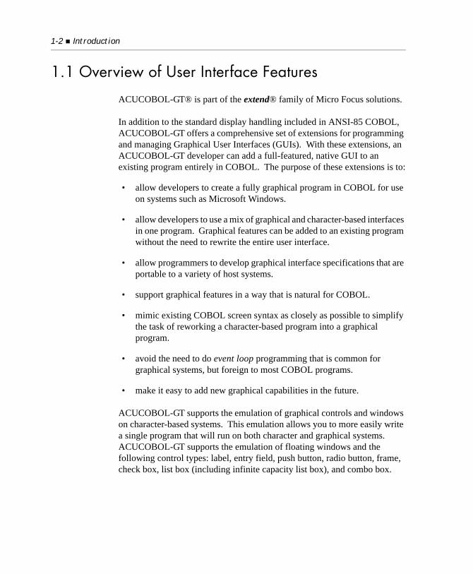
1.1 Overview of User Interface Features
ACUCOBOL-GT® is part of the extend® family of Micro Focus solutions.
In addition to the standard display handling included in ANSI-85 COBOL, ACUCOBOL-GT offers a comprehensive set of extensions for programming and managing Graphical User Interfaces (GUIs). With these extensions, an ACUCOBOL-GT developer can add a full-featured, native GUI to an existing program entirely in COBOL. The purpose of these extensions is to:
• allow developers to create a fully graphical program in COBOL for use on systems such as Microsoft Windows.
• allow developers to use a mix of graphical and character-based interfaces in one program. Graphical features can be added to an existing program without the need to rewrite the entire user interface.
• allow programmers to develop graphical interface specifications that are portable to a variety of host systems.
• support graphical features in a way that is natural for COBOL.
• mimic existing COBOL screen syntax as closely as possible to simplify the task of reworking a character-based program into a graphical program.
• avoid the need to do event loop programming that is common for graphical systems, but foreign to most COBOL programs.
• make it easy to add new graphical capabilities in the future.
ACUCOBOL-GT supports the emulation of graphical controls and windows on character-based systems. This emulation allows you to more easily write a single program that will run on both character and graphical systems. ACUCOBOL-GT supports the emulation of floating windows and the following control types: label, entry field, push button, radio button, frame, check box, list box (including infinite capacity list box), and combo box.
Overview of User Interface Features 1-3
You can also use ACUCOBOL-GT’s traditional text-oriented mechanisms for creating your user interface, such as the textual forms of the ACCEPT and DISPLAY verbs, and Format 1 of the Screen Section. In addition, you can use the Screen Section extensions to define and process both character-based and graphical user interface screens.
Unless otherwise indicated, the references to “Windows” in this manual denote the following 32-bit versions of the Windows operating systems: Windows Vista, Windows XP, Windows NT 4.0 or later, Windows 2000, Windows 2003; and the following 64-bit versions of the Windows operating system: Windows Server 2003 and 2008 x64, Vista x64. In those instances where it is necessary to make a distinction among the individual versions of those operating systems, we refer to them by their specific version numbers (“Windows 2000,” “Windows NT 4.0,” etc.).
Generally, ACUCOBOL-GT GUI supports include:
• syntax extensions for creating native floating windows, toolbars, and controls (such as buttons, entry fields, and labels)
• the ability to create and manage menu bars with pull-down submenus
• configuration variables for customizing windows, importing icons, and mapping colors
• many host specific features such as message boxes and context-sensitive help
Specifically, ACUCOBOL-GT’s GUI programming supports include:
• native floating (moveable) windows, including:
• modal and modeless window types
• default and custom window size and position
• dynamically resizeable windows
• configurable borders
• programmable title bar
• optional system menu
1-4 Introduction
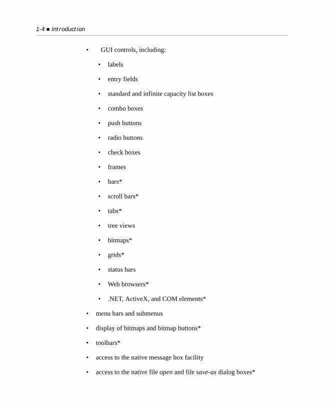
• GUI controls, including:
• labels
• entry fields
• standard and infinite capacity list boxes
• combo boxes
• push buttons
• radio buttons
• check boxes
• frames
• bars*
• scroll bars*
• tabs*
• tree views
• bitmaps*
• grids*
• status bars
• Web browsers*
• .NET, ActiveX, and COM elements*
• menu bars and submenus
• display of bitmaps and bitmap buttons*
• toolbars*
• access to the native message box facility
• access to the native file open and file save-as dialog boxes*
Overview of User Interface Features 1-5
• access to the native help facility and support for context sensitive help
• specialized mouse handling
• font selection and handling
• custom colors
• the ability to play “.WAV” audio files on Microsoft Windows systems with sound capabilities
Note: Items marked with an “*” are not supported in text-mode environments.
ACUCOBOL-GT runtime supports include:
• full object code compatibility
• the creation and runtime management of native floating windows and graphical controls on Microsoft Windows and Windows NT
• automatic text-mode emulation of floating windows and most graphical controls, except bars, scroll bars, tabs, animated bitmaps, bitmap buttons, and toolbars
• automatic mouse support
• automatic menu bar handling
• extensive color mapping facilities
• access to the Windows print spooler
• automatic multi-tasking support
• network compatibility
• access to all memory available under Windows
1-6 Introduction
Floating windows and graphical controls
ACUCOBOL-GT supports a class of windows called floating windows. When run under a graphical environment, floating windows correspond to the graphical windows that are native to the host environment. Floating windows pop up over their parent window and can be repositioned by the user with the mouse or system menu (if present). Floating windows are fully described in Chapter 2, “Chapter 2: Floating Windows.”
ACUCOBOL-GT also supports the creation, display, and manipulation of graphical controls. (Graphical controls are listed above in this section.) Toolbars can also be created and attached to floating windows. A toolbar can host any type of control, but is usually populated with push buttons, check boxes, and radio buttons. To simplify the programming of graphical controls, ACUCOBOL-GT provides a consistent method for their specification and handling. For a complete description of graphical controls, see Chapter 3, “Chapter 3: Graphical Controls.”
Automatic GUI runtime support
Many GUI capabilities are provided automatically by the runtime. To take advantage of these features, you don’t have to change your COBOL code, and you don’t have to recompile your program. You simply use the object code generated with your ACUCOBOL-GT compiler, and execute it with a runtime for Windows. When you do this your program automatically gains:
• a native, moveable, main application window.
• basic mouse support. Users can point and click to move the cursor, and can highlight a string of characters and replace the string by typing a new one.
• customizable colors, titles, window sizes, window placement, and program icons (tailored with runtime configuration variables).
• access to the system’s print spooler, so that several files may be queued for printing.
• the ability to run more than one application at the same time.
Developing Programs for Graphical Systems 1-7
1.2 Developing Programs for Graphical Systems
The following sections discuss issues of importance to developers who are building systems for graphical environments.
1.2.1 Event-driven Environments
Most GUI environments are event-driven. Unlike traditional operating environments in which a program prompts for input and the user responds, the event-driven environment turns the relationship around. Actions are initiated by the user or system, and it’s the job of the program to listen for and respond to events (events include mouse movements, menu selections, data entry, etc.).
To support this, event-driven programs have an event loop that waits for and handles events. Including an event loop in a COBOL program usually requires significant changes to existing code. However, in ACUCOBOL-GT the runtime implements the event loop and manages nearly all events for the application. There is no need for the COBOL program to include an event loop. This greatly simplifies programming for event-driven environments and preserves the traditional procedural structure of the application. Events which must be handled by the application are passed through to the program along with any necessary data. The application is typically programmed to handle these events in the same way that it handles the press of a function key. Events and event handling are described in section 4.2, “Events,” and in Chapter 6, “Chapter 6: Events Reference.”
1.2.2 Configuration and Programming Support
ACUCOBOL-GT provides many configuration variables and runtime library routines to tailor the environment and to help take advantage of host-specific capabilities. Configuration variables are documented in Book 4, Appendix H. Library routines are documented in Appendix I. Windows-specific information is documented in A Guide to Interoperating with ACUCOBOL-GT as is information on working with transaction processing and message queueing systems on IBM and other hosts.
1-8 Introduction
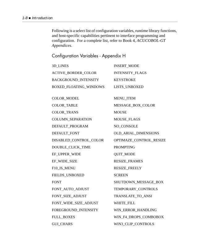
Following is a select list of configuration variables, runtime library functions, and host-specific capabilities pertinent to interface programming and configuration. For a complete list, refer to Book 4, ACUCOBOL-GT Appendices.
Configuration Variables - Appendix H
3D_LINES INSERT_MODE
ACTIVE_BORDER_COLOR INTENSITY_FLAGS
BACKGROUND_INTENSITY KEYSTROKE
BOXED_FLOATING_WINDOWS LISTS_UNBOXED
COLOR_MODEL MENU_ITEM
COLOR_TABLE MESSAGE_BOX_COLOR
COLOR_TRANS MOUSE
COLUMN_SEPARATION MOUSE_FLAGS
DEFAULT_PROGRAM NO_CONSOLE
DEFAULT_FONT OLD_ARIAL_DIMENSIONS
DISABLED_CONTROL_COLOR OPTIMAZE_CONTROL_RESIZE
DOUBLE_CLICK_TIME PROMPTING
EF_UPPER_WIDE QUIT_MODE
EF_WIDE_SIZE RESIZE_FRAMES
F10_IS_MENU RESIZE_FREELY
FIELDS_UNBOXED SCREEN
FONT SHUTDOWN_MESSAGE_BOX
FONT_AUTO_ADJUST TEMPORARY_CONTROLS
FONT_SIZE_ADJUST TRANSLATE_TO_ANSI
FONT_WIDE_SIZE_ADJUST WHITE_FILL
FOREGROUND_INTENSITY WIN_ERROR_HANDLING
FULL_BOXES WIN_F4_DROPS_COMBOBOX
GUI_CHARS WIN3_CLIP_CONTROLS
Developing Programs for Graphical Systems 1-9
Library Routines - Appendix I
Windows-Specific Information - A Guide to Interoperating with ACUCOBOL-GT
HINTS_OFF WIN3_EF_PADDED
HINTS_ON WIN3_GRID
HOT_KEY WIN32_3D
ICON WINDOW_TITLE
INACTIVE_BORDER_COLOR WINPRINT_NAMES_ONLY
C$EXCEPINFO W$FONT
C$GETEVENTDATA W$MENU
C$GETEVENTPARAM W$MOUSE
C$OPENSAVEBOX W$PALETTE
C$RESOURCE WIN$PLAYSOUND
C$RUN WIN$PRINTER
C$SETEVENTDATA W$TEXTSIZE
C$SETEVENTPARAM WIN$VERSION
W$BITMAP W$WINHELP
Message Boxes
Keyboard Differences
Hardware and Error Handling
Special Characteristics of 32-bit Windows
Calling DLLs
1-10 Introduction
1.2.3 Index to Related Topics
Following is a select index to related topics documented in Book 1, User’s Guide, Book 3, Reference Manual, and Book 4, Appendices. Consult each book’s Table of Contents for a complete listing of topics. The entries below are given with their manual name and section number. Note that User’s Guide is abbreviated “UG”, Reference Manual is abbreviated “RF”, and Appendices is abbreviated “AP”.
Related topics
Other major topics
ACCEPT verb RF 6.6
ActiveX and COM Programming
UG 6.10
Configuration Variables AP H
DISPLAY verb RF 6.6
Display interface UG 4.4
Host-specific information AP M
Library routines AP I
Screen Section UG 6.5, RF 5.8
SPECIAL-NAMES paragraph RF 4.1.3
ACUCOBOL-GT product overview
UG 1.1
C subroutines, using AP C
Compiler, using UG 2.1
Debugger, using UG 3.1
Multithreading UG 6.7
Runtime, using UG 2.2
Working-Storage Section RF 5.5
Windowing Concepts 1-11
1.2.4 GUI Development With Third-party Kits and Tools
To add graphical features not currently supported by ACUCOBOL-GT, you can use one of the system development kits offered by operating system vendors. For example, the Windows Software Development Kit (SDK) from Microsoft supports extensions to applications running under Windows. Using the SDK, you can build C routines that provide extra features, and then call the C routines from your COBOL application. ACUCOBOL-GT is fully compatible with the Microsoft Windows SDK, so the two are readily integrated.
1.3 Windowing Concepts
The following basic window concepts form the foundation for GUI programming and ACUCOBOL-GT window support.
The screen
The screen is the physical display area of the monitor.
The virtual screen
The virtual screen is a non-physical display area allocated to the application by the operating system (or the ACUCOBOL-GT runtime). It is called virtual because not all of the allocated area need be displayed on the physical
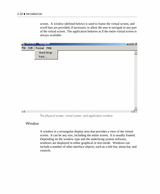
1-12 Introduction
screen. A window (defined below) is used to frame the virtual screen, and scroll bars are provided, if necessary, to allow the user to navigate to any part of the virtual screen. The application behaves as if the entire virtual screen is always available.
The physical screen, virtual screen, and application window
Window
A window is a rectangular display area that provides a view of the virtual screen. It can be any size, including the entire screen. It is usually framed. Depending on the window type and the underlying system software, windows are displayed in either graphical or text-mode. Windows can include a number of other interface objects, such as a title bar, menu bar, and controls.
Windowing Concepts 1-13
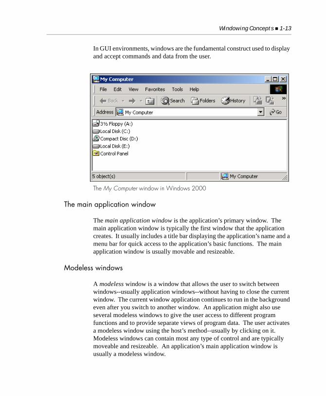
In GUI environments, windows are the fundamental construct used to display and accept commands and data from the user.
The My Computer window in Windows 2000
The main application window
The main application window is the application’s primary window. The main application window is typically the first window that the application creates. It usually includes a title bar displaying the application’s name and a menu bar for quick access to the application’s basic functions. The main application window is usually movable and resizeable.
Modeless windows
A modeless window is a window that allows the user to switch between windows--usually application windows--without having to close the current window. The current window application continues to run in the background even after you switch to another window. An application might also use several modeless windows to give the user access to different program functions and to provide separate views of program data. The user activates a modeless window using the host’s method--usually by clicking on it. Modeless windows can contain most any type of control and are typically moveable and resizeable. An application’s main application window is usually a modeless window.
1-14 Introduction
Modal windows
A modal window is a window that the user must respond to and close before the application will continue. Dialog boxes are typically modal windows. Modal windows may include buttons, entry boxes, and other controls that the user manipulates to provide input and to confirm or cancel an action. Modal windows are usually moveable but not resizeable.
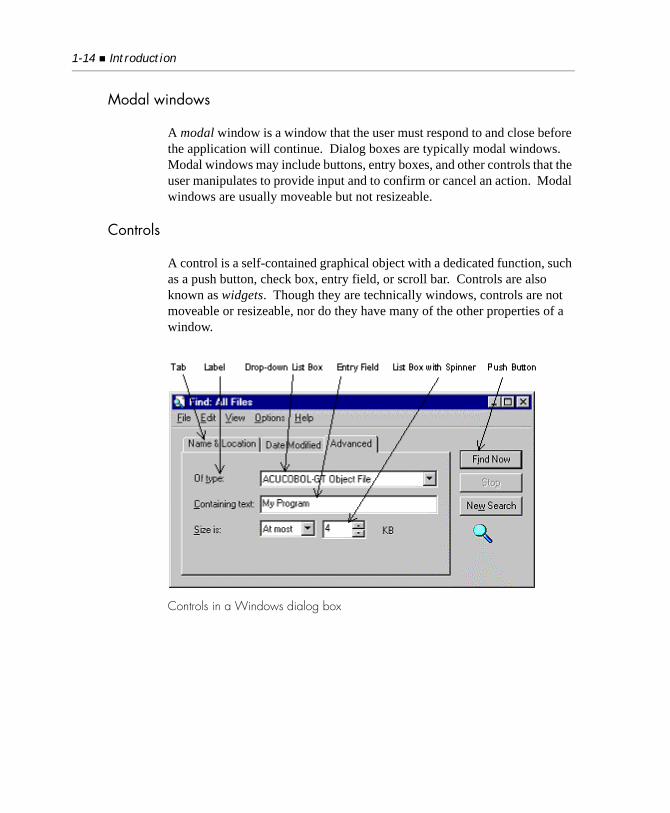
Controls
A control is a self-contained graphical object with a dedicated function, such as a push button, check box, entry field, or scroll bar. Controls are also known as widgets. Though they are technically windows, controls are not moveable or resizeable, nor do they have many of the other properties of a window.
Controls in a Windows dialog box
ACUCOBOL-GT Window Types 1-15
1.4 ACUCOBOL-GT Window Types
ACUCOBOL-GT includes two fundamental window types: floating windows and subwindows (sometimes referred to as pop-up windows in prior versions). Each window type is discussed briefly below. Floating windows are discussed in detail in Chapter 2.
ACUCOBOL-GT also supports many types of controls (technically a type of window). Controls are discussed in detail in Chapter 3.
Floating windows
A floating window is the ACUCOBOL-GT window type that creates a host-based, pop-up window. When your application executes in a graphical environment, such as Microsoft Windows, floating windows are created as native pop-up windows, managed by the host operating system and the ACUCOBOL-GT runtime.
Floating windows must be used when you want to include graphical controls, such as buttons, entry boxes, and scroll bars. ACUCOBOL-GT supports two types of floating windows: modal and modeless. Floating windows are discussed in detail in Chapter 2.
Floating windows are positioned and displayed on the virtual screen (see section 1.3, “Windowing Concepts.”). The virtual screen is intrinsic to all applications that use floating or subwindows. The virtual screen size can be set with the SCREEN SIZE runtime configuration variable and changed during program execution with the MODIFY Statement in section 6.6 in Book 3, Reference Manual. The default virtual screen size is 25 rows by 80 columns.
Independent windows
An independent window is similar to a floating window, except that independent windows do not belong to parent windows; independent windows are controlled independently. This subject is discussed in more detail in Chapter 2.
1-16 Introduction
Subwindows
Subwindow is the name given to ACUCOBOL-GT text-mode windows created with the DISPLAY WINDOW or DISPLAY SUBWINDOW statement. Prior to Version 3.0 these windows were simply referred to as windows.
Subwindows are always text-mode windows and are not compatible with graphical controls. However, subwindows can be mixed with floating windows, so long as the subwindows do not display on top of graphical controls. When an overlay occurs, due to the workings of the underlying host system, control objects are improperly displayed on top of the text-mode subwindow. For a discussion of textual and graphical modes, see section 4.3, “Graphical vs. Textual Modes.”
You can easily convert subwindows to floating windows by changing the DISPLAY WINDOW statement to a DISPLAY FLOATING WINDOW statement. However, subwindows that simply define a screen region, that are not bordered, or are not pop-up in nature, do not lend themselves to conversion to floating windows.
1.5 Creating Portable User Interfaces
ACUCOBOL-GT allows you to run programs on a wide variety of host systems. Because of its machine-independent object code, many programmers use ACUCOBOL-GT to write programs that will run under several different host systems. However, it can be challenging to write a program that looks good and functions well under both character-based systems and graphical systems because of the vastly different nature of these systems. This is especially true if you include graphical controls in your programs.
There are two main ways to approach this dilemma:
• You could take into consideration all of the differences between graphical and character-based systems and design your user interface accordingly. You could develop one interface, one set of source code to handle all situations; you could develop two interfaces, but maintain them in a single set of source code; or you could develop two separate
Creating Portable User Interfaces 1-17
programs altogether (one for graphical systems and one for character-based systems). Sections 1.5.1 through 1.5.3 discuss various strategies for writing programs that are intended to run under both graphical and character systems. Because many developers use ACUCOBOL-GT to convert existing character-based programs into graphical programs, these sections adopt the point of view that you are doing such a conversion. However, most of the comments apply to writing new programs as well.
1.5.1 Incompatibilities Between Graphical and Character Systems
Ideally, you could simply modify your program to use graphical features, and that program would then run perfectly under both graphical and character systems. However, this is usually not the case. The key problems arise in the different physical traits associated with graphical and character systems. Let’s examine some of the primary differences.
For character systems, you can generally assume that you have a screen area of 24 or 25 lines by 80 columns. While you can occasionally find larger screens (e.g., many Xterm configurations), designing your programs for 24 by 80 will guarantee nearly universal compatibility. (Some programmers use 25 lines instead because this is the number of lines normally provided on IBM PC compatibles, as well as many common terminals. The discussion below uses 24 lines because it is traditionally the most portable value. If you use 25 lines instead, the discussion still applies, but the problems that arise during the conversion to a graphical system are more obvious.)
The display characteristics of graphical systems are harder to analyze. Looking at current Microsoft Windows systems, they are usually configured with one of these screen resolutions: 640 x 480, 800 x 600, or 1024 x 768. You can find other sizes too, but these account for the vast majority. Now, translate these values into character cells to see how they compare with character systems. The FIXED-FONT used by ACUCOBOL-GT is usually designed to be 8 pixels wide by 15 pixels high. On a 640 x 480 screen, this gives exactly 80 characters across (assuming the window borders are placed off of the screen) and 42 characters high (in practice, somewhat less because
1-18 Introduction
of space used by the window’s title and menu). This size works fine with a 24 x 80 layout, and so simply running a character-based program under Windows works fine.
However, problems arise when you convert that character-based program to use graphical controls. Consider what happens when you convert text-based data entry fields into ENTRY-FIELD controls. Typically, entry fields are boxed (have a border around them) in order to match the normal look of a Windows application, and they usually display using the DEFAULT-FONT (a proportional font). The DEFAULT-FONT is normally 13 pixels high by 7 pixels wide. Making the entry fields boxed adds 50% to their height, with the result that they are 20 pixels high. This gives exactly 24 lines on a 640 x 480 screen, but only if you omit all of the window borders, the title and menu, and assuming that you do not include any spacing between the entry fields. If you want to add a 3-D look to the entry fields, you need at least another 3 pixels, making 24 lines approximately 552 pixels high (again, ignoring the window title, etc.). In practice, you will usually want to be able to see the window’s title, and its menu and toolbar (if any). This adds approximately 20 to 40 pixels depending on how many elements are present. As a result of these conditions, you cannot assume that you have 24 lines available on a 640 x 480 system when you include graphical controls.
Note: Switching to the DEFAULT-FONT actually gains horizontal space: it is only 7 pixels wide instead of the 8 used by the FIXED-FONT. In reality, even more space is gained because DEFAULT-FONT is a proportional font. Most strings of lower-case letters occupy much less space than 7 pixels per character (upper-case strings, on the other hand, occupy much more space).
Thus, the first major problem can be summarized as follows:
Creating Portable User Interfaces 1-19
For a given screen resolution, a graphical screen is effectively shorter and wider than the equivalent character-based screen.
Differences in the physical dimensions of controls also cause problems in placing them. Consider entry fields again. On a character-based system, entry fields are one line tall. On a graphical system, they are 1.5 lines tall. ACUCOBOL-GT has a feature to account for this difference, but there are also problems in horizontal positioning that are harder to account for. For example, two radio buttons placed side-by-side might look great on a graphical screen, but they may overlap when displayed on a character screen. This happens because of the effects of shifting from a proportionally sized font to a fixed-size font.
Now consider a FRAME control. On a graphical system, the frame is drawn around the area that it occupies (except for the top line, which is adjusted to account for the frame’s title). On a character system, the frame is drawn in the middle of the character cells forming the edge of the frame, because that is the best positioning that a character system can perform. A frame that is two lines high on a graphical system has enough space inside it to hold one line of text. On a character system, a two line high frame has no space inside it to hold anything.
Thus the second major problem is:
Controls occupy different amounts of space in character and graphical sys-tems.
The following sections discuss various approaches to managing these issues. While there is no single solution to all the cases, ACUCOBOL-GT offers a variety of ways to handle these problems.
1.5.2 Strategies for Supporting Multiple Systems
Selecting the best approach to supporting both graphical and character systems is very important and well worth the time invested. In general terms, there are three possible approaches to this problem. You can use ACUCOBOL-GT with any of these approaches. These approaches can be summarized as follows:
• Dual interface, dual code

1-20 Introduction
This approach uses separate programs for graphical and character systems.
• Single interface, single code
This approach uses one program with a single user interface that runs under both graphical and character systems.
• Dual interface, single code
This approach uses one program that includes two user interface implementations, one for graphical systems and one for character systems.
Each of these approaches has advantages and difficulties. The following sections consider the major issues.
1.5.2.1 Dual interface, dual code
This approach is in many ways the most obvious and straightforward. It is also the approach used most often by other programming systems: simply write different programs for the graphical and character systems. The big advantage of this approach is that you can customize the code for the characteristics of the host system as much as you want. Additionally, you incur no overhead for having to include code that is not used for a particular system. Finally, when you are programming you don’t have to think about two systems at the same time. Development time for any one system is shortened and testing is easier. These are all significant advantages.
Unfortunately, there are also many significant disadvantages. You have to write two programs instead of one. And, you must maintain two programs. Because there are two programs, you are likely to encounter twice as many bugs. Also, the time required to develop the set of programs is most likely greater than required by the other approaches.
Here are some cases where this approach offers significant advantages:
1. If you are in the process of retiring or freezing a character-based application, then you can simply use that application as the starting point for its graphical incarnation and leave the character version in its original form in an archive for future maintenance. In this scenario, you do not
Creating Portable User Interfaces 1-21
expect to do much more work on the character version, so spending a lot of effort in maintaining a single piece of source code is probably not worth what you gain.
2. If you intend to have sizable functional differences between a character-based application and its graphical sibling, then it might not make sense to try to have a single program cover both cases. In this case, you really do have two different programs, with some overlap in their functionality. The overlapping portions could be maintained as a separate library of source that is shared by both systems.
In general, if you view the character-based application as having a limited future, then this approach generally makes the most sense. The other two approaches are more attractive if you plan on maintaining and enhancing the character-based application in the future.
1.5.2.2 Single interface, single code
This approach relies on ACUCOBOL-GT’s ability to run the same program on any machine. With this approach, you write a single program that has a single user interface that runs on all machines. The big advantage of this approach is that you need to write and maintain only one program. The disadvantages are that you will have to work harder to get a program that looks good on all systems, and you are limited to only those features that are available on both graphical and character-based systems. Generally, this means developing a simpler user interface for the graphical system than you might otherwise choose. If you presently have a character-based user interface and do not plan to add graphical controls, then this approach is straightforward to pursue and is the obvious choice.
The biggest challenge to this approach is developing code that works well under both systems. This generally means a lot of back-and-forth development under Windows and a character-based system to ensure that the results look good and work well. Fortunately, AcuBench® provides a built-in facility for testing both character and GUI interfaces under Windows. Alternatively, you can use the Windows Console runtime to perform initial character-based testing.
1-22 Introduction
This approach generally accommodates graphical single-line labels and entry fields. Getting labels and entry fields to look right on both types of systems is fairly easy. Incorporating other graphical elements tends to be harder and should be done sparingly.
ACUCOBOL-GT does not yet support all control types on character-based systems. In particular, bars, scroll bars, bitmaps, and tabs are not supported, so you need to avoid these when using this approach. Support for these controls may be included in a future version.
1.5.2.3 Dual interface, single code
With this approach, you write a single program that includes two user interfaces: one for character systems and one for graphical systems. The two user interfaces gather the same data, but in a fashion that is customized for the host system. After the data is collected, the remainder of the program is the same between the two systems.
This approach combines some of the advantages and disadvantages of the other two approaches. On the positive side, there is only one set of source to maintain. There is less programming than the dual code approach, but you aren’t forced into the simplified user interface typically required by the single interface approach. You can customize the user interface to take advantage of features found on a graphical system without making the character-based version unmanageable.
The biggest disadvantage is that you must write two user interfaces. While this is less work than writing two separate programs, it is still a significant amount of work. In addition, you must test the user interface code more thoroughly than with the single interface approach, because only half of the interface code is exercised on any one type of system.
1.5.2.4 Selecting the right approach
Each of these approaches has its merits. One thing to remember is that you can mix the approaches. Mixing approaches can be quite useful in a large project. Imagine a standard accounting package. In it, you might use the dual code method to handle the main menu of the package. For example, the graphical version might display a nice graphic and use the system’s menu bar to initiate the subsidiary applications. The character version might instead
Creating Portable User Interfaces 1-23
display the menu as the main contents of the opening screen since it can’t show a graphical image. Parts of the application that perform maintenance of minor files (such as shipping codes and user passwords) or entry of report parameters, might use the single interface approach because the screens are simple. Finally the key transaction entry screens (such as an order entry screen) might use the dual interface, single code approach to ensure that the screens work well for the respective systems while also ensuring that the entered data is handled the same way by both systems.
You can even mix approaches inside a single program, or even a single screen. You might have most of a screen use the single interface approach, while a small portion of it is customized by using the dual interface technique.
You do not need any special tools to use the dual interface, dual code approach (although a good source-code control system always helps). For the two single code approaches, ACUCOBOL-GT has special features to simplify use of the single interface and dual interface methods. The next section discusses these features and when you might use them.
1.5.2.5 Determining which UI is running
To determine whether the user interface to your program is running through the Windows runtime, or the thin client, you can add ACCEPT TERMINAL-ABILITIES FROM TERMINAL-INFO to your program. (TERMINAL-ABILITIES is defined in the sample/def/acucobol.def copybook.) The TERMINAL-NAME field that is returned contains a short descriptive name of the terminal type being used. If the Windows runtime or thin client is being used, the TERMINAL-NAME contains the string “Windows”.
If you are maintaining separate screen sections for these environments, this could be useful for determining which screen section or routine to use at any given moment. For example, you might include the following code in your program:
accept TERMINAL-ABILITIES from TERMINAL-INFO If terminal-name = Windows display screen1a
terminal-name is defined as an 03 data-item under the 01 TERMINAL-ABILITIES.
1-24 Introduction
The IS-REMOTE field is set to “true” if the program is running with thin client. When IS-REMOTE is “true”, CLIENT-MACHINE-NAME is set to the name of the client that is running thin client, plus a hyphen (“-”) and the hex value of the client process ID. For example: techxp-2ef1
1.5.3 Tips for Solving Cross-Platform Interface Problems
This section describes how to use selected features of ACUCOBOL-GT to solve common problems encountered when developing programs to run on both character and graphical systems.
1.5.3.1 Establishing the initial window
One of the most important things that you can do when implementing a user interface that includes graphical controls is establish the program’s main application window correctly. By default, ACUCOBOL-GT will construct a main application window for you. However, this window is designed to run traditional, text-based COBOL programs and not programs with graphical controls. The runtime does this so that it can run older ACUCOBOL programs unchanged. If you plan to use graphical controls, it is very important that you do not use the default window. Instead you should explicitly create your window. There are two reasons why this is so important:
1. It gives you an opportunity to account for the height difference between character-based entry fields and graphical entry fields. How to do this is described below.
2. It ensures that your program will look right when run under various Windows machines using different resolutions. If you use the default, you risk having your program look wrong when run under some Windows configurations. The reason for this is that the standard fonts used at higher resolutions are often not the ones supplied by Microsoft. Instead, they come from the video card manufacturer. Sometimes, the relative proportions of the standard fonts are changed from those seen in the Microsoft fonts.
Creating Portable User Interfaces 1-25
Since the runtime’s default window uses the FIXED-FONT to measure lines and columns, but your controls usually use some other font (such as the DEFAULT-FONT) to determine their size, a change in proportion between these two fonts causes the screen to change. This can result in overlapping controls and other problems. This is not a bug, but an effect of the changing environment. By establishing your initial window correctly, you can use the same font to position controls as you use to size the controls. Then, regardless of the size of this font, your whole application will scale itself proportionally and look fine.
Format 12 of the DISPLAY verb is used to create the main application window. See DISPLAY Statement in section 6.6 in Book 3, Reference Manual, for the rules that govern its use. See section 4.6 of this book for a more detailed discussion of coordinate space issues. Here are a few suggestions for handling the most common situations for graphical programs:
1. Use “DISPLAY STANDARD GRAPHICAL WINDOW”. The GRAPHICAL phrase ensures that the default font used for controls is also used to determine lines and columns in the window.
2. If boxed entry fields are going to be a major element of the window, then use the following statement:
DISPLAY STANDARD GRAPHICAL WINDOW, CELL SIZE = ENTRY-FIELD FONT, SEPARATE
3. You can substitute OVERLAPPED for SEPARATE if you prefer. This statement also works well if vertically stacked push buttons are a major component of the screen (push buttons require about 1.5 lines each, just like boxed entry fields).
4. If you plan to use a font other than DEFAULT-FONT as your primary font, name it as the CONTROL FONT. For example:
77 LARGE-FONT USAGE HANDLE OF FONT.
ACCEPT LARGE-FONT FROM STANDARD OBJECT “LARGE-FONT”DISPLAY STANDARD GRAPHICAL WINDOW CONTROL FONT IS LARGE-FONT CELL SIZE = ENTRY-FIELD FONT, SEPARATE
1-26 Introduction
There are many other options you can add to the DISPLAY STANDARD WINDOW statement, including the ability to set the window’s size. The preceding suggestions just cover the basics of establishing the measuring font.
If you follow suggestion number two above, then you should find that you can place labels and entry fields on whole line numbers and have them show up nicely spaced under both character and graphical systems. Because the line height is determined by the height of a boxed entry field, each line is exactly big enough to hold one entire entry field. This solves the problem where entry fields are 50% taller on graphical systems than they are on character systems.
An alternative solution is to avoid using boxes with entry fields on graphical systems. You can do this very easily by using the FIELDS_UNBOXED configuration option. However, while this solution is very easy, it has two problems. One is that the results look a little out of place under Windows, where boxed fields are the norm. The other problem is that unboxed entry fields are used so infrequently under Windows that the underlying Windows code is not well exercised. Occasionally you will see slightly odd behavior with unboxed entry fields under Windows (for example, leaving a stray pixel turned on when it should be erased during editing).
1.5.3.2 Tips for building single-interface programs
Here are some ideas for simplifying the task of supporting a single user interface on both character and graphical systems:
1. If you plan to use the bar, scroll bar, tab, or bitmap controls for your graphical programs, make sure you program alternatives for the character-based systems (in other words, build a dual-interface program for these elements).
2. Make sure you establish a sensible cell size as described in the previous section. This is the only way you can hope to have a single set of coordinates describe screens that look good under both character and graphical systems.
Creating Portable User Interfaces 1-27
3. Provide plenty of space between elements on the same line. Items that appear to be nicely separated on a graphical system may well overlap under a character-based system. This occurs because the labels and control titles are narrower on a graphical system because of the nature of the proportional font used.
4. If you use frames, design them on the graphical system. The runtime automatically grows frames as needed on character-based systems to surround the contained controls.
5. In general, try to keep the screens simple. The more complex they are, the harder it is to achieve a nice look under both types of systems.
6. Try to use a single size font under the graphical system. The character system has only one size, so you can get more uniform results if you do the same under graphical systems.
7. For cases where you cannot get a nice look under both systems using a single set of coordinates, use the CLINE, CCOL, CSIZE and CLINES options. These allow you to specify alternate coordinates and dimensions for character-based systems. This lets you customize the placement of screen elements for both graphical and character systems, giving you finer control. For more information about these phrases, see section 3.5, “The Character Coordinate Phrases.”
1.5.3.3 Tips for building dual-interface programs
The key to building dual-interface programs is being able to determine which kind of system you are using. ACUCOBOL-GT provides two methods to accomplish this:
1. You can determine whether you are running under a character or graphical system by using the ACCEPT FROM TERMINAL-INFO verb. The HAS-GRAPHICAL-INTERFACE field is “true” when the host system is graphical; otherwise, it is “false”. You can also use the WIN$VERSION library routine to get more detailed information about the Windows host operating system (see Book 4, Appendix I).
2. In the Screen Section, you can automate the detection of character and graphical systems with the CHARACTER and GRAPHICAL reserved word labels to indicate entries that apply to only one system (see section 4.3 of this book).
1-28 Introduction
You have a great deal of flexibility in how you implement dual interface programs. On one extreme, you can have completely separate interfaces for character and graphical systems. On the other, you can have a uniform interface with only minor differences between them. Here are some ideas to consider:
1. If you are happy with your existing character interface, you may want to leave it alone and simply develop a new graphical interface. You could either start from scratch, or use your existing character interface as a starting point. If you decide to have completely separate interfaces, then you should start by isolating your character interface into one branch of an IF statement that tests HAS-GRAPHICAL-INTERFACE. You then develop the graphical interface in the other branch. Exactly the best way to do this depends on the structure of your code.
2. If your existing character interface does not use the Screen Section, consider using the Screen Section for the graphical interface. While using the Screen Section is not required, it is easier because it automates all of the mouse handling and transfer of control between screen fields.
3. If you do use the Screen Section for your character interface, you can use the CHARACTER and GRAPHICAL reserved word labels to do customization. You could do this either globally, by creating separate level 01 screen items for each system, or individually on selected fields. Note that you may have two screen items with the same name, as long as one is a CHARACTER item and the other is a GRAPHICAL item. This allows you to have a single set of interface code in the Procedure Division while still coding different screens.
4. Consider employing some of the tips from the single-interface model. The more similar your two interfaces are, the easier they are to maintain.

GUI Development Project Issues 1-29
1.6 GUI Development Project Issues
For many COBOL programmers, graphical user interfaces, GUI environments, and GUI programming are new territory. Enhancing or adding a graphical user interface to an existing COBOL program raises many questions and issues. Before you begin, we recommend that you thoroughly consider the following basic questions:
1. To what extent will the program’s interface change?
2. How suitable is the current interface to conversion?
3. What resources are needed for the project?
1.6.1 Extent of the Interface Changes
There is no simple formula for defining a good specification for a modernized user interface. The special needs of your application, the demands of your marketplace, and the resources of your business will combine to define a practical GUI specification. In this process we recommend that you explore the full range of options available to you, from the small, selective upgrade, to a full reimplementation project.
We recommend that you consider a phased upgrade approach to spread the cost and risk of changing the user interface (UI) over a longer period of time. Remember that ACUCOBOL-GT can support a mix of graphic and character-based screens. The phased approach gives you more time to learn GUI technology in general, and ACUCOBOL-GT GUI support in particular.
Don’t forget to develop a test plan. Any significant changes to the UI will require careful testing. You may want some end users to help with testing and evaluation. Be sure to include your test plan in the project schedule and staffing estimates.
1-30 Introduction
1.6.2 Suitability of the Current UI to Conversion
A careful study of your application’s existing user interface implementation can make a huge difference in ensuring the success of your project and holding down costs. When it comes to modernizing the user interface, some programs are better suited and less costly to update than others. Here are some qualities to consider:
• The easiest applications to convert tend to be those that already use the Screen Section.
• The most difficult programs to convert tend to be those in which the user interface code is dispersed throughout the program, i.e., programs that do not use the Screen Section, or do not organize screen processing code into separate procedures. If your application fits that description and you are going to undertake a large GUI upgrade project, it is nearly certain that it will be more efficient to implement your new user interface with the Screen Section. Also consider that Screen Section code is much easier to maintain over the life of the application than is distributed UI DISPLAY and ACCEPT code. A large enhancement project presents a good opportunity to move to the Screen Section.
• However, if you’re doing a small enhancement project that is confined to a small portion of your code, using individual DISPLAY statements to create and process your screen elements might be reasonable.
• Programs that already include a menu bar, the old-style character-based pop-up windows (subwindows), and support for the mouse, are well on their way to a modern user interface. These elements are easy to upgrade and enhance to take advantage of ACUCOBOL-GT GUI support. Note, however, that just because an application already includes this functionality does not mean that there won’t be substantial work in adding floating windows and controls.
• Evaluate your existing, character-based user interface screens for translatability into the graphical model. Many text-mode screens make dense use of the screen. In contrast, graphical screens tend to be more open, having more white space and fewer fields. Also, graphical objects tend to take up more space on the screen than their equivalent text-mode objects (mostly caused by the boxes used to frame controls). It may require a lot of work to reformulate your character screens into

GUI Development Project Issues 1-31
attractive, functional graphical screens. This problem is just as challenging for applications that already make use of pop-up windows and menu bars as for those that don’t.
1.6.3 Recommendations
• Implement your GUI in the Screen Section.
• To control the size and cost of your project, execute it in phases.
• If suitable, allow a mix of character-based and GUI screens (i.e., add new graphical screens and retain some of your existing text-mode screens).
• Redesign your screens to make them less crowded and more consistent with the established look of the GUI environment.
• Whenever possible, use AcuBench to design and prototype screens quickly.
• Formulate a test plan and allocate time to execute it.
1.6.4 Conversion Wizard
In an effort to reduce the amount of work required to convert a traditional text-based application into one that uses a graphical user interface, Acucorp has developed a screen conversion tool known as the Character-to-GUI Wizard. The tool works by watching a running character application and, at a specified point, constructing an equivalent graphical screen. This screen is then automatically imported into the AcuBench Screen Designer where you can make modifications to it as desired. AcuBench then produces a Screen Section description of the graphical screen that you can integrate back into your original program. Because it requires the AcuBench Screen Designer, the Character-to-GUI Wizard is only available on Windows platforms.
The Character-to-GUI Wizard is designed to work with any character screen that you have created using ACUCOBOL-GT syntax. This allows it to work with most existing character-based programs. Note that the wizard works with programs using either of ACUCOBOL-GT’s two main screen handling techniques: the Screen Section and inline ACCEPT/DISPLAY statements.
1-32 Introduction
Although the wizard uses a variety of heuristics to decide how to convert the code, these do not always produce the desired result, and some rework in the Screen Designer should be expected. For usage information on the Character-to-GUI Wizard, please refer to the AcuBench User’s Guide.
1.7 Sample Programs
The ACUCOBOL-GT release materials include many sample programs and their source code. Many of these programs demonstrate ACUCOBOL-GT’s GUI capabilities. We recommend that you study the source code for these programs to gain a better understanding of how ACUCOBOL-GT GUI objects are programmed. You will find these programs and their source code in the “sample” subdirectory of your ACUCOBOL-GT installation.
Included among the sample programs is a program called message. This program provides basic message-box support on any host. The message program calls the host operating system’s message box handler when one is available. Otherwise the runtime provides a simulated, character-based message box. See the comments in the program source for additional details.

2
Floating WindowsKey Topics
Overview of Floating Windows .............................................................. 2-2Relationship Between Floating Windows and Subwindows................ 2-3Active and Current Windows................................................................. 2-4Parent and Child Windows .................................................................... 2-5Creating, Inquiring, Modifying, and Destroying Windows................. 2-6Menus and Floating Windows............................................................... 2-8
2-2 Floating Windows
2.1 Overview of Floating Windows
ACUCOBOL-GT includes a class of graphical windows called floating windows. When run under a graphical environment, floating windows correspond to the graphical windows that are native to the host environment. On character-based systems, floating windows are emulated with text-mode elements and are managed directly by the ACUCOBOL-GT runtime system.
Note: Independent windows are similar to floating windows. The following characteristics also apply to independent windows unless otherwise noted.
The primary characteristics of a floating window are:
1. It is either modal or modeless (see below).
2. It pops up over its parent window (usually the main application window) and is always displayed over the parent window wherever they intersect.
3. It can be moved independently of the parent window and is able to leave the area described by the parent window. The user can move it directly with the mouse, without any program interaction.
4. It belongs to the parent window. If the parent window is minimized, it is too. (Independent windows do not belong to parent windows; independent windows are considered siblings of parent windows. They can be minimized or maximized without controlling the parent window.)
5. It may have a system menu associated with it that allows the user to select some basic operations on the window, such as moving or closing it.
The main application window is treated as a special-case floating window that has no parent window.
Relationship Between Floating Windows and Subwindows 2-3
Note: Since ACUCOBOL-GT Version 3.0, the traditional, non-moving, text-based windows originally introduced in ACUCOBOL-85 were renamed subwindows, to avoid confusion with floating windows. However, the word WINDOW can still be used with the DISPLAY WINDOW and CLOSE WINDOW verbs, providing backward compatibility.
Floating windows may be either modal or modeless. A modal window is a window that the user cannot leave until it is dealt with and closed. When a modal window is active, all other windows are disabled.
A modeless window is one that allows the user to switch among windows while allowing each modeless window to remain open and available. When a modeless window is active, the user can activate another window using the host system’s techniques for doing so (for example, by clicking on the window with the mouse).
The names “modal” and “modeless” are derived from the idea that a modal window enters a new mode in the program (for example, selecting a file to open), while a modeless window does not (since the user can continue working on tasks in other windows).
Floating windows are modal by default. The MODAL phrase may be included as commentary. Inclusion of the MODELESS phrase makes a window modeless.
2.2 Relationship Between Floating Windows and Subwindows
In graphical environments, every floating window has an implicit subwindow (and can have more than one if you create pop-up subwindows). This implicit subwindow is a region of the floating window. It cannot exist outside of the floating window, cannot cross the border of the floating window, and cannot be moved independent of the floating window. In essence, it is a viewing region in the active floating window.
2-4 Floating Windows
Therefore, under graphical systems, the application always has two active windows: its active floating window and its implicit subwindow. When you create a new floating window, it starts off with a default subwindow that covers its entire interior (client area). You do not display directly to the floating window, but instead to its subwindow. A subwindow’s coordinates (and thus the program’s coordinates) are always relative to the floating window it belongs to.
If you close a floating window, any subwindows associated with it are also destroyed.
2.3 Active and Current Windows
A floating window may be active. The active window is the window that the user’s input goes to (also referred to as the window that has focus). This active window is usually highlighted in some way. For example, under Microsoft Windows NT, the active window is shown in the color scheme defined in the Appearance tab of the Display Properties dialog box.
A floating window may also be current. The current window is the window that the application uses whenever it does not explicitly refer to a window (essentially, it is the default window). The current window is the window that output is directed to. The current window is usually the same as the active window, but it need not be. For example, if the application wants to display some text in an inactive window, it would make that window the current window and display text to it. Note that changing the current window does not affect the input focus of the active window.
You can use the UPON phrase of the DISPLAY statement to temporarily change the current window. You can also use the SET verb to change the current window. For more information about the UPON Phrase, see section 6.4.9, Book 3, Reference Manual. For a complete description of the SET Statement, see section 6.6, Book 3, Reference Manual.
Any time you execute an ACCEPT verb that retrieves input from the user, the first thing that happens is that the runtime makes the active window current. This ensures that the program is referring to the same window that the user is using to enter data.
Parent and Child Windows 2-5
When a floating window is first created, it is made both the active and current window. When a window is destroyed, the first applicable rule applies:
1. If the destroyed window was active, its parent window is made both current and active.
2. If the destroyed window was current, then its parent window is made current.
3. Otherwise, the current and active windows remain unchanged.
Except for the main application window, all windows have a parent window.
2.4 Parent and Child Windows
Except for the main application window, each floating window has a parent window. The parent of a window is typically the current window at the time the new window is created. For example, if the application starts off by creating two floating windows in a row, the parent of the first window will be the main application window, while the parent of the second window will be the first window.
The converse of a parent window is a child window. If window A is window B’s parent, then window B is window A’s child.
Windows are considered siblings if they have the same parent.
A floating window always displays over its parent wherever they intersect on the screen. This is true even when the parent window is the current window. An active window will always display over any of its siblings.
If you destroy a floating window, all of its children are also destroyed.
2-6 Floating Windows
2.5 Creating, Inquiring, Modifying, and Destroying Windows
You create a floating window with the DISPLAY FLOATING WINDOW statement. This statement constructs the specified window and returns a handle to it. A window created with the above statement is modal by default (the MODAL phrase can be added as commentary). To create a modeless window, you can add the MODELESS phrase. Note that managing multiple modeless windows is greatly simplified by associating a separate thread with each modeless window. See section 6.8, “Multiple Execution Threads,” in Book 1, ACUCOBOL-GT User’s Guide.
The program’s initial window, or main application window, is created either automatically, via the runtime, or programmatically via the DISPLAY INITIAL WINDOW statement. If the first DISPLAY statement is not a DISPLAY INITIAL WINDOW (or DISPLAY STANDARD WINDOW statement), the runtime automatically creates the initial window. The main application window is always a modeless window.
Because floating windows can be moved and, optionally, resized, their position and size are dynamic. To retrieve the current position and size of a floating window, you use the INQUIRE verb. INQUIRE returns information for the current window or the window identified by the specified handle.
To programmatically reposition or change the size or title of a window, you use the MODIFY verb. The MODIFY statement applies the specified values to the window identified by the handle or, if omitted, the current floating window.
Windows have a property called “ACTION” that can be used in DISPLAY and MODIFY statements. The ACTION property allows you to programmatically maximize, minimize, or restore a window. To use ACTION, assign it one of the following values (these names are found in “acugui.def”):
ACTION-MAXIMIZE
Maximizes the window. It has the same effect as if the user clicked the “maximize” button. Allowed only for windows that have RESIZABLE or AUTO-RESIZE specified or implied for them. In
Creating, Inquiring, Modifying, and Destroying Windows 2-7
windows with RESIZABLE specified, when ACTION-MAXIMIZE causes the window to change size, an NTF-RESIZED event occurs. (This event does not occur, however, if AUTO-RESIZE is specified.)
ACTION-MINIMIZE
Minimizes the window. It has the same effect as if the user clicked the “minimize” button. Allowed only for windows that have RESIZABLE or AUTO-RESIZE specified or implied for them.
ACTION-RESTORE
If the window is currently maximized or minimized, restores the window to its previous size and position; otherwise, it has no effect. It has the same effect as if the user selected Restore from the menu. Allowed only for windows that can be maximized or minimized. In windows with RESIZABLE specified, and when ACTION-MAXIMIZE has caused the window to change size, an NTF-RESIZED event occurs when ACTION-RESTORE is used. (This event does not occur, however, if AUTO-RESIZE is specified.)
If you assign an ACTION value that is not allowed, there is no effect other than to trigger the ON EXCEPTION phrase of the MODIFY statement (if present). Note that you can use the ACTION phrase to create a window that is initially maximized or minimized.
You destroy a floating window with either the CLOSE WINDOW statement or DESTROY verb. You specify the handle of the window you want to destroy. Both verbs behave identically when acting on floating windows. You cannot destroy the main application window. It is closed automatically when the application terminates.
For a complete description of each of the above verbs, see Section 6.6 in Book 3, Reference Manual. For detailed information regarding creating and managing floating windows via the Screen Section, see Section 5.9, Book 3, Reference Manual.

2-8 Floating Windows
2.6 Menus and Floating Windows
You can create and attach a menu bar to any floating window. The menu bar is created and maintained with the methods described in section 8.1, “Menus Overview.” Note that when a floating window is created, its menu, if present, is the only menu available as long as that floating window is the active window. Menus in other windows are disabled.
The library routine W$MENU is used to create and control the menu bar. When you call W$MENU, and the routine has to resolve which window to apply its actions to, it assumes the current window. With the following operations, you can specify a particular window by passing the target window’s handle as a parameter in the position noted below.
WMENU-SHOW --3rd parameter
WMENU-GET-HANDLE --2nd parameter
If you have a floating window displayed, and you want to update the menu in the main application window, you must specify the handle of the main application window in the call to WMENU-SHOW. For example: DISPLAY INITIAL WINDOW, HANDLE MAIN-WINDOWPERFORM BUILD-MAIN-MENUCALL “W$MENU” USING WMENU-SHOW, MENU-HANDLE . .DISPLAY FLOATING WINDOW ... . .PERFORM CHANGE-MAIN-MENUCALL “W$MENU” USING WMENU-SHOW, MENU-HANDLE, MAIN-WINDOW
Note: Microsoft Windows does not display menus correctly in floating windows that have thick borders (i.e., BOXED floating windows). As a matter of style, Windows applications never display menus in windows with this border type (this style is normally used for dialog boxes). If you want to put a menu in a floating window, you must not use the BOXED style when you create the window. For an example of a floating window with a menu, see the ACUCOBOL-GT debugger screen.
3
Graphical ControlsKey Topics
Overview of Graphical Controls ............................................................ 3-2Control Types, Handles, and IDs ........................................................... 3-5Interaction Between Controls and Windows ........................................ 3-6Creating, Modifying, Inquiring, and Destroying Controls.................. 3-7The Character Coordinate Phrases ..................................................... 3-10Controls and the Mouse ........................................................................ 3-11Bitmap Buttons ...................................................................................... 3-12Paged List Boxes.................................................................................... 3-20Paged Grids........................................................................................... 3-33
3-2 Graphical Controls
3.1 Overview of Graphical Controls
ACUCOBOL-GT allows you to create, display, and process graphical controls. Graphical controls are also commonly called graphical objects or widgets. Some examples of common graphical controls include push buttons, list boxes, radio buttons, check boxes, and entry fields (text entry boxes). ACUCOBOL-GT provides a consistent method for specifying and handling graphical controls. Several common control types are supported. Future versions of ACUCOBOL-GT may incorporate additional control types.
Graphical controls have several important components:
1. Each control has an underlying type, such as push button or check box (this is also called the control’s class). For a list of control types, see section 3.2, “Control Types, Handles, and IDs.”
2. Each control has a handle that uniquely distinguishes the control. Handles are also discussed in section 3.2.
3. Each control has a set of common properties defined for it. These common properties are described in Section 6.4.9 of Book 3, Reference Manual. If a common property is handled uniquely by a control type, that special handling is described in Chapter 5, “Chapter 5: Control Types Reference,” in this book.
Common properties that apply to virtually all controls include:
location Each control has a screen location. The location is given as row and column coordinates that specify the position of the upper left-hand corner of the control on the screen. The character coordinate phrases CLINE and CCOL can be used to specify an alternate control location for use on a non-graphical system.
Overview of Graphical Controls 3-3
size Controls have size information. The size information is given as width and height. The exact meaning of the width and height depends on the control type. Some control types have a predefined size (in one or both dimensions). The character coordinate phrases CSIZE and CLINES can be used to specify an alternate control size for use on a non-graphical system. Controls can also be given minimum and maximum size specifications. This is useful if you want to change the size of a control when the window changes size. Layout managers frequently use this information (see section 4.8, “Layout Managers”).
titles Controls can have titles. This usually appears as a text label attached to the control. Examples include the text on a push button or the text beside a check box. Some controls, such as entry fields, do not use titles.
value A control also has a value. The value of a control is the user-modifiable portion of that control. For an entry field, this is the text entered into the box. For check boxes, the value is whether the box is checked or not. Some controls, such as push buttons, do not have values. The exact range of values allowed is determined by the control type.
color Controls have color. Both foreground and background colors apply. The exact meaning of the color information depends on the control type. Some controls or host systems may limit the choice of colors.
font Most controls have a font that is used when text is displayed in conjunction with the control.
event lists For any control that generates events, you can create an event list that specifies for that control the types of events that must be received or filtered out.
3-4 Graphical Controls
Note: Styles do not take a value. They are either applied (on), or not applied (off).
Some styles apply to all controls. However, each control has its own additional styles (see the table titled Styles Table, in section 5.1, “The Components of a Control.”). Each style is described in Chapter 5, “Chapter 5: Control Types Reference.”
Certain operating system styles or themes have an effect on the appearance of controls. See Section 3.1.1 for details on how ACUCOBOL-GT applications behave when certain styles are in effect.
There are also common properties that determine whether a control is displayed (VISIBLE), whether a control will respond to the user (ENABLED), or whether a control has a key letter that the user can use to activate the control with the keyboard (KEY).
4. In addition to the common properties, each control defines its own set of special properties. These special properties give the control a special attribute or capability. Special properties are specified with the “PROPERTY” and “Property-Name” phrases of the “DISPLAY Control-Type” statement (see Section 6.4.9 of Book 3, Reference Manual). For a list of each control’s special properties, see the entry for that control type in Chapter 5, “Chapter 5: Control Types Reference.”
5. ActiveX and .NET controls define their own set of methods. Methods (or object methods) specify the functions that the control provides. They are invoked using the MODIFY verb, and they can take any number of parameters or no parameters. ActiveX controls can also take optional parameters (i.e., parameters that can be omitted). Refer to section 4.5 of this book for more information.
styles Controls also have style properties. Style properties typically affect the visual presentation of the control. For example, a push button may be assigned the DEFAULT style, which causes the push button to be drawn with a thick border to indicate that it is the default action.

Control Types, Handles, and IDs 3-5
Rather than using a unique syntax to define each control type, ACUCOBOL-GT provides a generic method for specifying a control’s characteristics. The programmer then selects the attributes that are applicable to each desired control.
3.1.1 Visual Styles and Differences Among Operating Systems
Controls can have different visual styling or themes on certain Windows operating systems such as XP and Vista. By default, ACUCOBOL-GT applications will not automatically employ the latest styling that is set on the workstation (via the Windows Control Panel Display options). You can change this default behavior and automatically have visual styling applied by setting the WIN32_NATIVECTLS runtime configuration variable to “TRUE”. You can also affect certain control styling through the runtime configuration variable WIN32_3D. These variables are described in the ACUCOBOL-GT Appendices Guide, Appendix H.
A control’s internal behavior may be different with various operating systems. In Windows systems, some configuration variables have no effect on the control’s behavior. On the other hand, in character-based systems, controls are defined using the runtime’s configuration file and editing capabilities. For example, the following configuration file entry causes Function Key 7 to erase the contents of an entry field under UNIX, but not under Windows:
KEYSTROKE Edit=Erase-field k7
3.2 Control Types, Handles, and IDs
Each control belongs to a particular type. The compiler knows the following type names:
ACTIVE-X BAR
BITMAP CHECK-BOX
COMBO-BOX DATE-ENTRY
ENTRY-FIELD FRAME
3-6 Graphical Controls
Control type names are reserved by the compiler.
When you create a control, a handle to the control is also created. This handle is a COBOL data item that uniquely identifies the control to the system. The handle values are generated dynamically by the system at runtime and cannot be controlled by the programmer.
In order to provide a constant name for the control that is the same between runs, you can optionally assign an ID to the control. The ID is a programmer-assigned number. Anytime the runtime returns information about a control, it includes both its handle and its ID. Since the handle can change from run to run, examining the ID can be more convenient. A control’s ID is the only effective way to distinguish controls in a Screen Section, because those controls’ handles are hidden from the programmer.
3.3 Interaction Between Controls and Windows
A control always belongs to a particular floating window and cannot be displayed outside that window (however, some controls, such as combo boxes, can temporarily pop up information outside of the floating window). Like all screen elements, controls are positioned relative to the current subwindow. When you destroy a floating window, all controls that belong to that window are also destroyed.
Controls and pop-up subwindows do not interact well on some systems. The reason for this is that graphical controls are native elements of the host system, while subwindows are a text-only construct created by the ACUCOBOL-GT runtime system. Because the host graphical system is not aware of ACUCOBOL-GT subwindows, the system unwittingly displays
GRID LABEL
LIST-BOX .NET
PUSH-BUTTON RADIO-BUTTON
SCROLL-BAR STATUS-BAR
TAB TREE-VIEW
WEB-BROWSER
Creating, Modifying, Inquiring, and Destroying Controls 3-7
controls over subwindows. Unfortunately, such host systems do not have support for a construct similar to ACUCOBOL-GT’s subwindows, so the subwindows must be managed directly by the runtime system.
To avoid problems, you should not use controls in any location that may intersect with a subwindow. If you are upgrading an existing program to use controls, you should start by converting any subwindows to floating windows. Floating windows interact correctly with controls, and have the added benefit of having generally better functionality (for example, the user can move them with the mouse).
Windows that have the AUTO-RESIZE or RESIZABLE attribute may be dynamically resized by the user. Unless the program specifically handles it, the size and position of the controls in the window remain unchanged. If the window also has the CONTROLS-UNCROPPED attribute, controls that had been invisible or partially invisible because they were positioned on or outside the visible bounds of the windows, may become visible. If the user tabs to a control outside of the visible area, the runtime will scroll the window in order to make that control visible. To make it easier for programmers to resize and reposition controls in a resizeable window, ACUCOBOL-GT provides a layout manager facility. A layout manager is a piece of software that manages the size and placement of controls in a particular window. For more about layout managers, see section 4.8, “Layout Managers.”
3.4 Creating, Modifying, Inquiring, and Destroying Controls
Create
You create graphical controls with the DISPLAY statement. You can either specify the control’s characteristics directly in the DISPLAY statement, or you can refer to a Screen Section entry that defines one or more controls. If you do not use the Screen Section, then the DISPLAY verb returns a handle to the new control. For Screen Section controls, the runtime automatically creates and stores the handle for you.
3-8 Graphical Controls
Note: You create non-graphical COM controls (that are not ActiveX) and non-graphical .NET controls with the CREATE statement.
Modify
Use the MODIFY verb to set properties and invoke methods of a control. The MODIFY verb takes a control’s home position (upper left corner), its handle, or the name of an elementary Screen Section item, as its first parameter. Only the properties of the control that are specified in the MODIFY statement are updated.
In addition, you can use the DISPLAY statement to update the properties of a control specified in the Screen Section. When a DISPLAY statement is used, the runtime compares the control’s current specification with its original specification in the Screen Section and changes any aspects that are different. For example, if you want to change the value of a control, simply change the VALUE data item referenced in the Screen Section and DISPLAY that Screen Section entry. Note that this applies mainly to common properties and styles like SIZE, POSITION, and VISIBLE. To change the special properties defined by (or specific to) an ActiveX control, you must use the MODIFY verb.
Inquire
You can use the INQUIRE verb to get information about a control, including its value, without having to activate the control. The INQUIRE verb is used to retrieve a control’s current title, value, and other control-specific properties. See the entry for INQUIRE in section 6.6 of Book 3, Reference Manual.
Destroy
Use the DESTROY verb to destroy a control. The DESTROY verb takes a control’s home position (upper left corner), its handle, or the name of an elementary Screen Section item, as its first parameter. Note that the runtime automatically destroys controls associated with a floating window when the floating window is destroyed.
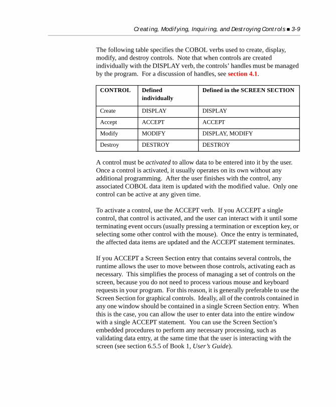
Creating, Modifying, Inquiring, and Destroying Controls 3-9
The following table specifies the COBOL verbs used to create, display, modify, and destroy controls. Note that when controls are created individually with the DISPLAY verb, the controls’ handles must be managed by the program. For a discussion of handles, see section 4.1.
A control must be activated to allow data to be entered into it by the user. Once a control is activated, it usually operates on its own without any additional programming. After the user finishes with the control, any associated COBOL data item is updated with the modified value. Only one control can be active at any given time.
To activate a control, use the ACCEPT verb. If you ACCEPT a single control, that control is activated, and the user can interact with it until some terminating event occurs (usually pressing a termination or exception key, or selecting some other control with the mouse). Once the entry is terminated, the affected data items are updated and the ACCEPT statement terminates.
If you ACCEPT a Screen Section entry that contains several controls, the runtime allows the user to move between those controls, activating each as necessary. This simplifies the process of managing a set of controls on the screen, because you do not need to process various mouse and keyboard requests in your program. For this reason, it is generally preferable to use the Screen Section for graphical controls. Ideally, all of the controls contained in any one window should be contained in a single Screen Section entry. When this is the case, you can allow the user to enter data into the entire window with a single ACCEPT statement. You can use the Screen Section’s embedded procedures to perform any necessary processing, such as validating data entry, at the same time that the user is interacting with the screen (see section 6.5.5 of Book 1, User’s Guide).
CONTROL Defined individually
Defined in the SCREEN SECTION
Create DISPLAY DISPLAY
Accept ACCEPT ACCEPT
Modify MODIFY DISPLAY, MODIFY
Destroy DESTROY DESTROY
3-10 Graphical Controls
3.5 The Character Coordinate Phrases
In contexts where you can specify LINE, COL, SIZE, or LINES for a control, you may additionally specify CLINE, CCOL, CSIZE, and CLINES (respectively). These phrases let you specify alternate coordinates and dimensions for controls when they are displayed on text-mode systems. The CLINE, CCOL, CSIZE, and CLINES phrases are collectively called the character coordinate phrases. They behave in all ways like their corresponding counterparts, except that they are applied only when the program executes in a text-mode environment.
Because of the physical differences between graphical and non-graphical systems, getting a single screen description to look good on both types of systems is challenging. Sometimes, the best way to account for these physical differences is to use alternate coordinates or dimensions for some screen elements. The CLINE, CCOL, CSIZE, and CLINES phrases allow you to do this easily.
You specify the character coordinate phrases in exactly the same fashion as their regular counterparts (i.e., CLINE is similar to LINE, CCOL to COL, etc.). All of the syntax supported by one phrase works in the corresponding phrase. For example, a Screen Section item that has a twin set of column offsets is:03 entry-field, col + 2, ccol + 1, ...
When run on a graphical host system, the character coordinate phrases have no effect (although in some contexts the values are evaluated, so any relevant table indexes should be set to legal values to prevent access violations). When run on a character-based host, the character coordinate phrases substitute for their graphical counterparts. For example, if you specify both LINE and CLINE for a control, the CLINE specification is used as the line number on a character-based system. Omitting a character coordinate phrase causes the regular counterpart to be used instead. This means that you need to specify character coordinate phrases only for those aspects of the control that must be different between graphical and character-based hosts.
Controls and the Mouse 3-11
If you specify the CELLS option in either the SIZE or CSIZE phrase, then you must use the CELLS option in both phrases. The same rule applies to the CELLS option of the LINES and CLINES phrases. This rule is necessary because the CELLS option asserts a particular style attribute for the control, and styles work the same under both graphical and character-based systems.
3.6 Controls and the Mouse
Controls are implemented as small child windows. These windows do not look like normal application windows. Instead, they define a rectangular region of the application window that holds the control. In this sense, they are similar to subwindows. The difference is that these child windows are maintained by the host graphical system.
In the general model for graphical user interfaces, the system directs events to the window where the event occurred. This window owns the event. The effect of this is most noticeable when you examine what happens when controls interact with the mouse. As the mouse moves across the application screen, the various windows that the pointer passes over each receive the appropriate events. If you look at an application screen that has several controls, the application window receives those mouse events that occur when the pointer is in the application window, but not over any of the controls. When the mouse pointer is over a control, that control receives the mouse events.
This means that the setting of the runtime configuration variable MOUSE_FLAGS affects the behavior of the mouse only when it is not over a control. When the mouse is over a control, that control does its own mouse processing.
If you need to process the mouse while it is over a control, there are two options:
1. You can capture the mouse using the CAPTURE-MOUSE option of the W$MOUSE library routine. When the mouse is captured, all mouse events are directed to the current application window, even those that occur outside of the window altogether. It is advisable to capture the mouse only for short periods of time, because capturing the mouse
3-12 Graphical Controls
prevents all other applications from using the mouse. Normally you capture the mouse to handle a user-initiated action such as dragging a screen object from one location to another.
2. You can disable the control. Disabled controls cannot receive input, so any associated mouse actions are directed to the owning application instead. To disable a control, use the ENABLED phrase of the Screen Section, DISPLAY, or MODIFY statements. For more about the ENABLED phrase, see section 6.4.9, Book 3, Reference Manual.
Note: It is rare that your program would need to manage the mouse directly. In most cases, controls manage their own mouse messages without any intervention by the program.
3.7 Bitmap Buttons
This section describes how to create bitmap buttons. A bitmap button is a push button, check box, or radio button that looks like a push button, but with a picture on its face instead of the usual text. Bitmap buttons are frequently grouped together to form a toolbar. A bitmap button that is a check box or radio button appears to be depressed when it has a non-zero value (is selected, or “on”). It appears to be raised when its value is zero (is not selected, or “off”).
Creating a bitmap button is a multi-step process. It helps to be familiar with programming regular push buttons before you attempt to program a bitmap button. To create a bitmap button you must complete the following steps:
1. Create the bitmap image with a paint application.
2. Update your program to load the bitmap into memory.
3. Update your program to create the button and specify the bitmap image to apply to the button.
These steps are detailed in the sections that follow.
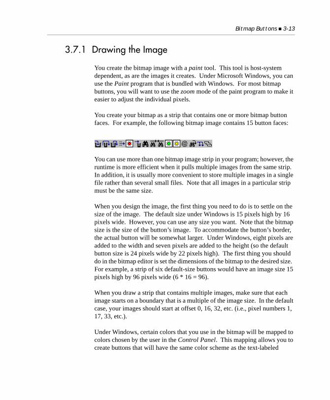
Bitmap Buttons 3-13
3.7.1 Drawing the Image
You create the bitmap image with a paint tool. This tool is host-system dependent, as are the images it creates. Under Microsoft Windows, you can use the Paint program that is bundled with Windows. For most bitmap buttons, you will want to use the zoom mode of the paint program to make it easier to adjust the individual pixels.
You create your bitmap as a strip that contains one or more bitmap button faces. For example, the following bitmap image contains 15 button faces:
You can use more than one bitmap image strip in your program; however, the runtime is more efficient when it pulls multiple images from the same strip. In addition, it is usually more convenient to store multiple images in a single file rather than several small files. Note that all images in a particular strip must be the same size.
When you design the image, the first thing you need to do is to settle on the size of the image. The default size under Windows is 15 pixels high by 16 pixels wide. However, you can use any size you want. Note that the bitmap size is the size of the button’s image. To accommodate the button’s border, the actual button will be somewhat larger. Under Windows, eight pixels are added to the width and seven pixels are added to the height (so the default button size is 24 pixels wide by 22 pixels high). The first thing you should do in the bitmap editor is set the dimensions of the bitmap to the desired size. For example, a strip of six default-size buttons would have an image size 15 pixels high by 96 pixels wide (6 * 16 = 96).
When you draw a strip that contains multiple images, make sure that each image starts on a boundary that is a multiple of the image size. In the default case, your images should start at offset 0, 16, 32, etc. (i.e., pixel numbers 1, 17, 33, etc.).
Under Windows, certain colors that you use in the bitmap will be mapped to colors chosen by the user in the Control Panel. This mapping allows you to create buttons that will have the same color scheme as the text-labeled
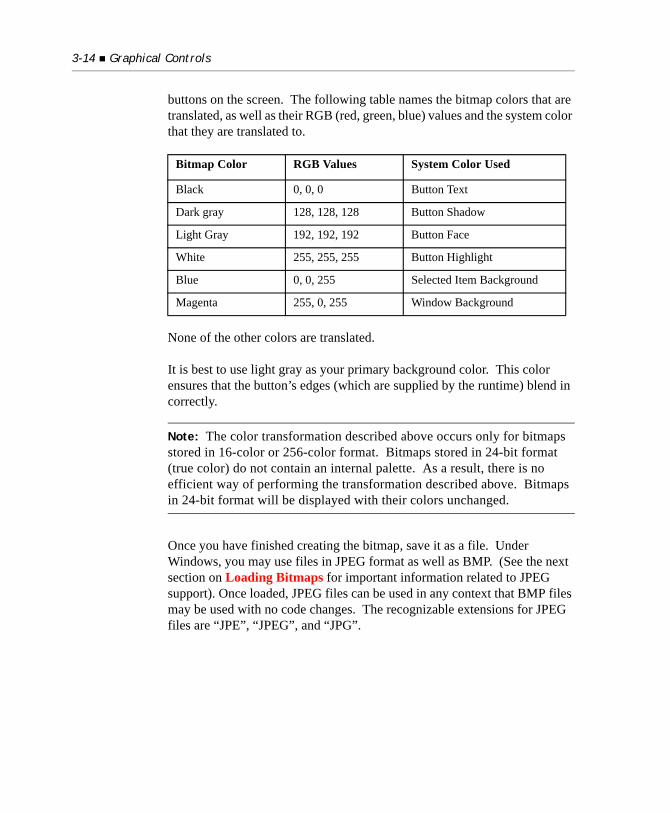
3-14 Graphical Controls
buttons on the screen. The following table names the bitmap colors that are translated, as well as their RGB (red, green, blue) values and the system color that they are translated to.
None of the other colors are translated.
It is best to use light gray as your primary background color. This color ensures that the button’s edges (which are supplied by the runtime) blend in correctly.
Note: The color transformation described above occurs only for bitmaps stored in 16-color or 256-color format. Bitmaps stored in 24-bit format (true color) do not contain an internal palette. As a result, there is no efficient way of performing the transformation described above. Bitmaps in 24-bit format will be displayed with their colors unchanged.
Once you have finished creating the bitmap, save it as a file. Under Windows, you may use files in JPEG format as well as BMP. (See the next section on Loading Bitmaps for important information related to JPEG support). Once loaded, JPEG files can be used in any context that BMP files may be used with no code changes. The recognizable extensions for JPEG files are “JPE”, “JPEG”, and “JPG”.
Bitmap Color RGB Values System Color Used
Black 0, 0, 0 Button Text
Dark gray 128, 128, 128 Button Shadow
Light Gray 192, 192, 192 Button Face
White 255, 255, 255 Button Highlight
Blue 0, 0, 255 Selected Item Background
Magenta 255, 0, 255 Window Background
Bitmap Buttons 3-15
3.7.2 Loading Bitmaps
In your program, you must load bitmap images (BMP or JPG) from disk into memory before they can be displayed as buttons. To load a bitmap, you must use the WBITMAP-LOAD operation of the W$BITMAP library routine. The call looks like this:CALL "W$BITMAP" USING WBITMAP-LOAD, filename GIVING bitmap-handle
where filename is a literal or data item that holds the name of the bitmap file to load, and bitmap-handle is a PIC 9(9) COMP-4 data item. This call opens the filename file, loads the bitmap into memory and closes the file. If the operation is successful, bitmap-handle will contain a positive value. If bitmap-handle is zero or negative, an error occurred. See Book 4, Appendix I, for a complete description of W$BITMAP, including all error values returned by it.
Note: In order to use JPEG files, you must have the file “ajpg32.dll” installed in the same directory as the runtime. Only 32-bit runtimes support JPEG format images. If you need JPEG support on 64-bit Windows, run the 32-bit runtime or the Thin Client. You can also run the Thin Client with the 64-bit runtime.
If you have multiple bitmap files, you need to load each before you can use the images they contain. Make certain to store the returned handles in different data items.
W$BITMAP searches for resources before it searches for disk files. For example, the “tour.cbl” sample program contains the following lines: COPY RESOURCE "gtanima.bmp".
CALL "W$BITMAP" USING WBITMAP-LOAD, "gtanima.bmp" GIVING GT-BITMAP
The bitmap loaded is the resource specified in the COPY RESOURCE statement, because the referenced file name is the same as the resource name. Replacing the COPY RESOURCE statement with COPY RESOURCE "mybmps/gtanima.bmp"
3-16 Graphical Controls
produces the same results (assuming “mybmps/gtanima.bmp” existed at compile time) because resource names are not stored with directory information. Note that CALL "W$BITMAP" USING WBITMAP-LOAD, "mybmps/gtanima.bmp" . . .
also loads the resource “gtanima.bmp”, because W$BITMAP looks for a resource first, stripping directory information as part of the lookup. If no resource is found, W$BITMAP loads the file in the specified directory.
You can include JPEG files as a resource in your COBOL programs with the COPY RESOURCE statement or by using “cblutil”, in exactly the same manner as BMP files. cblutil “-info” will identify JPEG resources contained within an object library.
Note: A resource name with a hyphen (“MY-FILE”) is considered equivalent to the same resource name given with an underscore (“MY_FILE”).
When you are done with an image and have destroyed all the buttons that reference that image, you can remove it from memory with the WBITMAP-DESTROY operation. Do not destroy an image that is referenced by an existing button; the results are unpredictable.
3.7.3 Creating the Button
After you have loaded the bitmaps, you can create the buttons. Bitmap buttons are created in the same manner as regular push buttons (see the “DISPLAY Control-Type” statement in section 6.6, Book 3, Reference Manual). You turn a push button, check box, or radio button into a bitmap button by using the following styles and special properties:
BITMAP (style, required)
This style informs the system that the button should be drawn as a bitmap button instead of a regular button. You must have this style set when the button is created, and you cannot change this style after the button is created.
Bitmap Buttons 3-17
BITMAP-NUMBER (numeric, special property, required)
This property identifies which image in the bitmap strip will be used for this button. The first image in the strip is number “1”, the second number “2”, and so on. If this value is set to zero, a blank button is displayed. If this number is a negative value, or higher than the number of images in the strip, the results are unpredictable. If a bitmap strip contains only one image, you should specify the number “1”. Note that you can change which bitmap appears on a button by changing this value.
BITMAP-HANDLE (numeric, special property, optional)
This property identifies which bitmap strip to use for the button. If you do not specify a bitmap handle, then the last bitmap loaded is used. If you specify a handle, the handle must hold a value returned by W$BITMAP when the bitmap was loaded. You can change bitmap strips after a button has been created by changing this value.
You may optionally use the following styles to affect the appearance of the buttons:
FRAMED (style, optional)
This style requests that a frame be drawn around the button. Typically the frame is a thin black line. Note that not all systems support frames, in which case the request is ignored. By default, buttons are framed under Windows NT/Windows 2000.
UNFRAMED (style, optional)
This style requests that the button be drawn without a frame. Not all systems support unframed buttons; on these systems the request is ignored. By default, buttons are not framed under Windows 98.
SQUARE (style, optional)
This style is used only with framed bitmap buttons. It forces the button to have square corners. Without this style, the button will have slightly rounded corners. Not all systems support square buttons; on these systems the request is ignored.
The following Screen Section entry describes two default size bitmap push buttons: 01 SCREEN-1. 03 PUSH-BUTTON, ROW 1, COL 2,
3-18 Graphical Controls
BITMAP, BITMAP-NUMBER = 1. 03 PUSH-BUTTON, OVERLAP-LEFT, BITMAP, BITMAP-NUMBER = 2.
Specifying the OVERLAP-LEFT style (see section 5.2, “Global Styles,” in Chapter 5.) on the second button causes the two buttons to share a border if they are framed. Note that this example assumes that you want to pull images from the last bitmap loaded in your program.
Here is a more complete example that could be used with the six bitmaps shown earlier in this section. It creates six bitmap buttons. The first two buttons are push buttons, the third is a check box, and the final three are radio buttons. The styles and properties used are appropriate for grouping the buttons into a toolbar. Note that the “toolbar.cbl” sample program does this. * Screen Section01 TOOLS-1.
03 PUSH-BUTTON, COL 2, BITMAP, BITMAP-NUMBER = 1, EXCEPTION-VALUE = 101.
03 PUSH-BUTTON, OVERLAP-LEFT, BITMAP, BITMAP-NUMBER = 2, EXCEPTION-VALUE = 102.
03 CHECK-BOX, COL + 2, BITMAP, BITMAP-NUMBER = 3, NOTIFY, EXCEPTION-VALUE = 103.
03 RADIO-BUTTON, COL + 2, BITMAP, BITMAP-NUMBER = 4, NOTIFY, EXCEPTION-VALUE = 104.
03 RADIO-BUTTON, OVERLAP-LEFT, BITMAP, BITMAP-NUMBER = 5, NOTIFY, EXCEPTION-VALUE = 105.
03 RADIO-BUTTON, OVERLAP-LEFT, BITMAP, BITMAP-NUMBER = 6, NOTIFY, EXCEPTION-VALUE = 106.
Bitmap Buttons 3-19
3.7.4 Pop-up Hints
Bitmap buttons allow you to pack several controls into a small screen area. This makes them particularly useful in the construction of toolbars. However, a toolbar can be a problem for the novice or occasional application user, because these users may not remember what functions the buttons perform. Due to their small size, these buttons do not always clearly indicate their purpose.
To aid these users, the runtime supports pop-up hints. A pop-up hint is a piece of text that pops up in its own window when the user places the mouse over a bitmap button for a predefined period of time. The text describes the function of the button. After some time has elapsed, the pop-up window disappears. Under Microsoft Windows, pop-up hints are also called tool tips.
To give a bitmap button a pop-up hint, simply assign the button a title. The title does not appear on the button. Instead, the runtime uses it as the pop-up hint. The hint will pop up automatically whenever the mouse is placed over the button and remains over the button for at least three-quarters of a second. The hint will automatically disappear after about four seconds. The hint will also disappear if you move the mouse away from the button, use the button, or start typing. Once a hint has been shown for a particular button, it will not be redisplayed as long as the mouse remains over that button. This prevents the hint from popping up annoyingly when the user uses the same button repeatedly.
Pop-up hints are displayed in a system-dependent color and font. Under Windows 98, the colors used are chosen by the user in the Control Panel for “Tooltips.” SMALL-FONT is used to display the hint.
You can control various aspects of how hints work with the HINTS_ON and HINTS_OFF runtime configuration variables described in Book 4, Appendix H.
3.7.5 Portability
Bitmap buttons cannot be supported on non-graphical systems. Under such systems, an attempt to create a bitmap button will fail, returning a handle with the value NULL. If you intend to run programs with bitmap buttons on
3-20 Graphical Controls
character-based systems, you should arrange your program so that it can run effectively without the bitmap buttons, or substitute regular push buttons for the bitmap buttons when running on character-based systems.
Bitmaps are highly host-system dependent. You should be prepared to recreate or convert your bitmaps when moving to other graphical systems.
3.8 Paged List Boxes
The standard list-box control provides a convenient way for a program to implement a look-up facility for a group of items. It is also tempting to extend this type of use into a method for locating records in a data file. Unfortunately, this doesn’t work well when there are too many records in the file. The programmer runs into two main problems:
1. The standard list box has a limited capacity (64K bytes), usually less than 2000 items.
2. It takes too long to load the list box with the entire set of items.
Also, if the number of items is very large, the user may have a difficult time locating a particular item. There are two reasons for this:
1. The resolution of the scroll bar’s slider is too coarse.
2. The search mechanism is too primitive (single-character match on the first byte of the record).
The paged list box is a variation of the standard list box that solves all of these problems. A paged list box works by managing only a limited number of records at a time. When it needs more records, it requests them from the controlling program. Paged list boxes are intended to be used in conjunction with a large, ordered data source, typically records stored in an indexed file.
Compared to a standard list box, a paged list box has the following advantages:
• There are no capacity limitations. Since the paged list box stores only a small number of items at once, capacity is not an issue.
Paged List Boxes 3-21
• Load time is minimized. The list box displays as soon as it receives enough items to fill its visible portion.
• There is an enhanced search facility. A paged list box can search for items based on full text strings instead of single characters. When the paged list box is active, the user can simply begin typing a string of text. A search box pops up, displaying the entered characters and the list box scrolls to the first entry that matches the string. You determine (with the SORT-ORDER property) whether the search is case-sensitive or not.
• Memory requirements are minimal. Because it stores only a few items at once, a paged list box can be less of a drain on memory than a standard list box.
The primary disadvantage of a paged list box is that it’s more complicated to program. Also, it’s not well suited to handling unordered data.
The rest of this section details the basics of programming paged list boxes.
3.8.1 Creating a Paged List Box
To create a paged list box, you simply add the style word “PAGED” to the standard list box definition. Unlike some style attributes that can be applied to the list box after it’s created, the paged property must be specified in the original definition that creates the list box. You cannot change this property after the list box is created. Other styles and properties associated with list boxes can be used normally. Note, however, that a paged list box will always be UNSORTED regardless of what you specify. Therefore, you must supply data to the paged list box in the sort-order that is needed.
The following Screen Section fragment shows how a typical paged list box might be declared. This declaration appears in the larger examples found later in this section, as well. This example illustrates the use of a paged list box to present records contained in a “keywords” file. 78 lines-per-page value 12. 77 list-1-data pic x(30).
01 list-1, list-box using list-1-data, line 3, column 10, size 30, lines lines-per-page,
3-22 Graphical Controls
paged, 3-d, exception procedure is list-1-handler.
In the preceding example, the level 78 item lines-per-page defines the number of lines contained in the list box. In the sections that follow, this size is referred to as a page. The level 78 makes the examples that follow easier to read. Also, note the declaration of an EXCEPTION PROCEDURE for the list box. This is typical for paged list boxes that are defined in the Screen Section. The EXCEPTION PROCEDURE will handle requests from the list box when more data is needed.
3.8.2 Adding Records to a Paged List Box
A record is added to a paged list box in the same way that a record is added to a standard list box: by assigning the record to the ITEM-TO-ADD property. Most of the time, you will add records to the end of the list box (exception: you will need to add to the top of the list when responding to scroll-up requests from the user). You can, however, add records anywhere in the list, by using the INSERTION-INDEX property. Remember that paged list boxes are always unsorted, so you must add records in a fashion that preserves the sort-order of the full set of records.
An important and unusual feature of the paged list box is that it never contains more items than are needed to display one page (i.e., they contain only what is shown on the screen). Whenever you add a record that would cause the list to grow larger than one page, the list box automatically deletes a record. If you add a record to the beginning of the list, the last record in the list is deleted (causing the box to appear to scroll upward). Inserting an item into any other position in the list causes the first record to be deleted (causing the box to appear to scroll downward if you are adding to the end). This automatic deletion is a coding convenience that frees you from having to worry about the list box growing larger than a complete page of data.
The following example adds one item to the end of the current list’s contents:modify list-1, item-to-add = keyword-word
Alternatively, this example shows how to add an item to the top of the list:modify list-1, insertion-index = 1, item-to-add = keyword-word
Paged List Boxes 3-23
Remember that control properties are set in the order specified in the statement. In the preceding example, the INSERTION-INDEX phrase must appear before the ITEM-TO-ADD phrase in order to get the intended result.
3.8.3 Other List Box Operations
Paged list boxes include a mechanism that allows the user to enter a search string. Any time a paged list box is active, the user can enter a sequence of characters (the search string). The list box automatically pops up a search box (entry field) displaying the search string. Each character entered generates an NTF-PL-SEARCH event. The program should be programmed to respond to the NTF-PL-SEARCH event, displaying the first entry in the data source that matches the search string. For an example of NTF-PL-SEARCH support, see the code example included at the end of section 3.8.5, “Paged List Box Example.”
Other aspects of a standard list box apply equally to a paged list box. For example, the currently selected item is the box’s VALUE. You can specify the NOTIFY-DBLCLICK property to detect when the user double-clicks on an item. You can empty the list with the RESET-LIST property, or use the MASS-UPDATE property to speed changing the box’s contents. See section 5.13, “List Box,” for a complete description of list box properties and operations.
3.8.3.1 Scroll Bars in Text-mode Environments
A runtime variable called "PAGED_LIST_SCROLL_BAR" enables you to control the appearance of a scroll bar on paged list box controls in text-mode environments. Refer to the ACUCOBOL-GT Appendix manual, PAGED_LIST_SCROLL_BAR configuration variable, for details on this variable’s settings.
3.8.4 Paged List Box Event Handling
The largest and most demanding issue regarding paged list boxes is the additional required event handling. Whenever a paged list box needs more data, it generates an event. The program must detect these events and
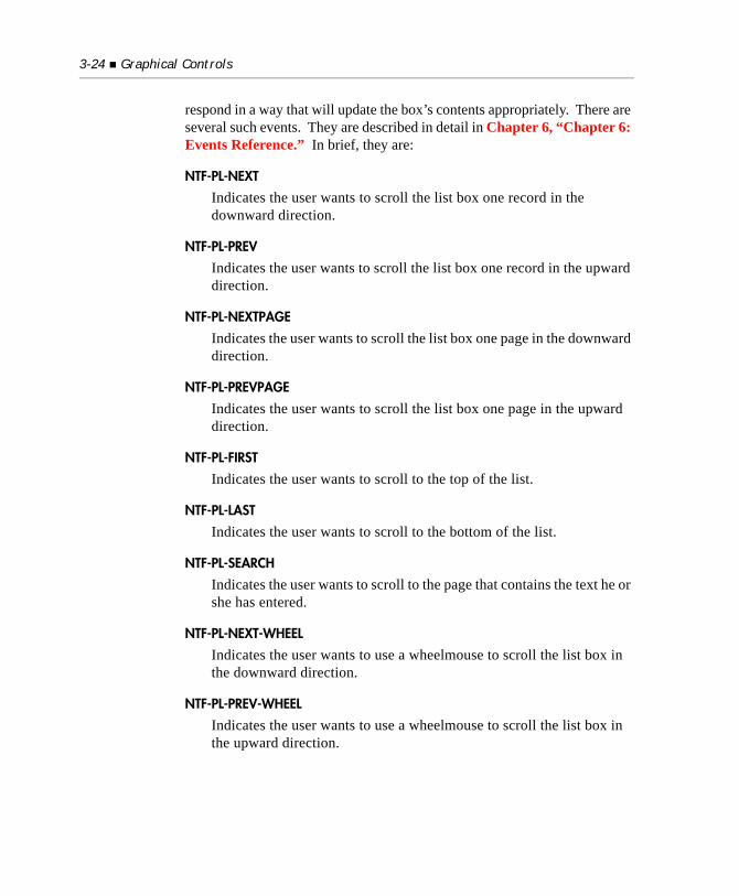
3-24 Graphical Controls
respond in a way that will update the box’s contents appropriately. There are several such events. They are described in detail in Chapter 6, “Chapter 6: Events Reference.” In brief, they are:
NTF-PL-NEXT
Indicates the user wants to scroll the list box one record in the downward direction.
NTF-PL-PREV
Indicates the user wants to scroll the list box one record in the upward direction.
NTF-PL-NEXTPAGE
Indicates the user wants to scroll the list box one page in the downward direction.
NTF-PL-PREVPAGE
Indicates the user wants to scroll the list box one page in the upward direction.
NTF-PL-FIRST
Indicates the user wants to scroll to the top of the list.
NTF-PL-LAST
Indicates the user wants to scroll to the bottom of the list.
NTF-PL-SEARCH
Indicates the user wants to scroll to the page that contains the text he or she has entered.
NTF-PL-NEXT-WHEEL
Indicates the user wants to use a wheelmouse to scroll the list box in the downward direction.
NTF-PL-PREV-WHEEL
Indicates the user wants to use a wheelmouse to scroll the list box in the upward direction.
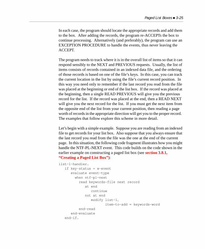
Paged List Boxes 3-25
In each case, the program should locate the appropriate records and add them to the box. After adding the records, the program re-ACCEPTs the box to continue processing. Alternatively (and preferably), the program can use an EXCEPTION PROCEDURE to handle the events, thus never leaving the ACCEPT.
The program needs to track where it is in the overall list of items so that it can respond sensibly to the NEXT and PREVIOUS requests. Usually, the list of items consists of records contained in an indexed data file, and the ordering of those records is based on one of the file’s keys. In this case, you can track the current location in the list by using the file’s current record position. In this way you need only to remember if the last record you read from the file was placed at the beginning or end of the list box. If the record was placed at the beginning, then a single READ PREVIOUS will give you the previous record for the list. If the record was placed at the end, then a READ NEXT will give you the next record for the list. If you must get the next item from the opposite end of the list from your current position, then reading a page worth of records in the appropriate direction will get you to the proper record. The examples that follow explore this scheme in more detail.
Let’s begin with a simple example. Suppose you are reading from an indexed file to get records for your list box. Also suppose that you always ensure that the last record you read from the file was the one at the end of the current page. In this situation, the following code fragment illustrates how you might handle the NTF-PL-NEXT event. This code builds on the code shown in the earlier example on constructing a paged list box (see section 3.8.1, “Creating a Paged List Box”):list-1-handler. if key-status = w-event evaluate event-type when ntf-pl-next read keywords-file next record at end continue not at end modify list-1, item-to-add = keywords-word end-read end-evaluate end-if.
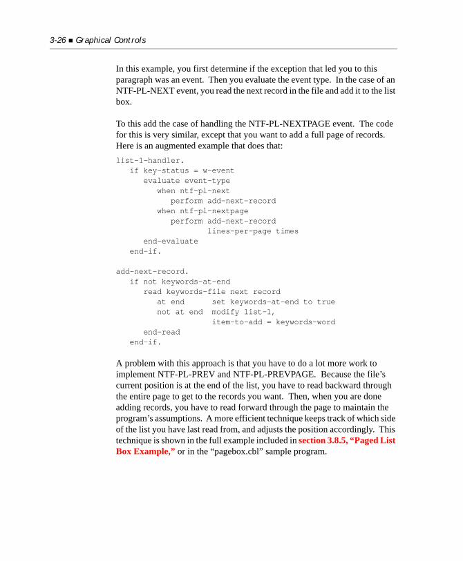
3-26 Graphical Controls
In this example, you first determine if the exception that led you to this paragraph was an event. Then you evaluate the event type. In the case of an NTF-PL-NEXT event, you read the next record in the file and add it to the list box.
To this add the case of handling the NTF-PL-NEXTPAGE event. The code for this is very similar, except that you want to add a full page of records. Here is an augmented example that does that:list-1-handler. if key-status = w-event evaluate event-type when ntf-pl-next perform add-next-record when ntf-pl-nextpage perform add-next-record lines-per-page times end-evaluate end-if.
add-next-record. if not keywords-at-end read keywords-file next record at end set keywords-at-end to true not at end modify list-1, item-to-add = keywords-word end-read end-if.
A problem with this approach is that you have to do a lot more work to implement NTF-PL-PREV and NTF-PL-PREVPAGE. Because the file’s current position is at the end of the list, you have to read backward through the entire page to get to the records you want. Then, when you are done adding records, you have to read forward through the page to maintain the program’s assumptions. A more efficient technique keeps track of which side of the list you have last read from, and adjusts the position accordingly. This technique is shown in the full example included in section 3.8.5, “Paged List Box Example,” or in the “pagebox.cbl” sample program.
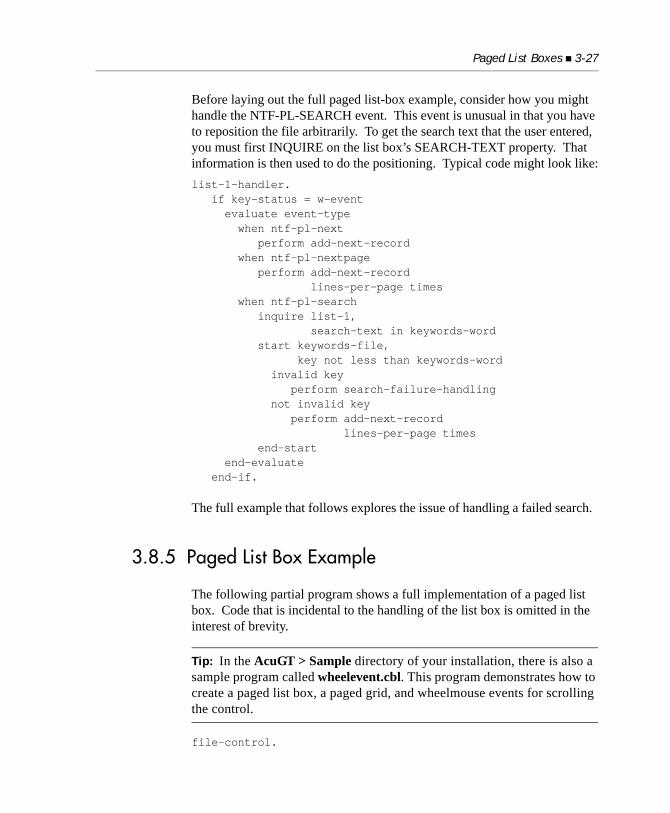
Paged List Boxes 3-27
Before laying out the full paged list-box example, consider how you might handle the NTF-PL-SEARCH event. This event is unusual in that you have to reposition the file arbitrarily. To get the search text that the user entered, you must first INQUIRE on the list box’s SEARCH-TEXT property. That information is then used to do the positioning. Typical code might look like:list-1-handler. if key-status = w-event evaluate event-type when ntf-pl-next perform add-next-record when ntf-pl-nextpage perform add-next-record lines-per-page times when ntf-pl-search inquire list-1, search-text in keywords-word start keywords-file, key not less than keywords-word invalid key perform search-failure-handling not invalid key perform add-next-record lines-per-page times end-start end-evaluate end-if.
The full example that follows explores the issue of handling a failed search.
3.8.5 Paged List Box Example
The following partial program shows a full implementation of a paged list box. Code that is incidental to the handling of the list box is omitted in the interest of brevity.
Tip: In the AcuGT > Sample directory of your installation, there is also a sample program called wheelevent.cbl. This program demonstrates how to create a paged list box, a paged grid, and wheelmouse events for scrolling the control.
file-control.
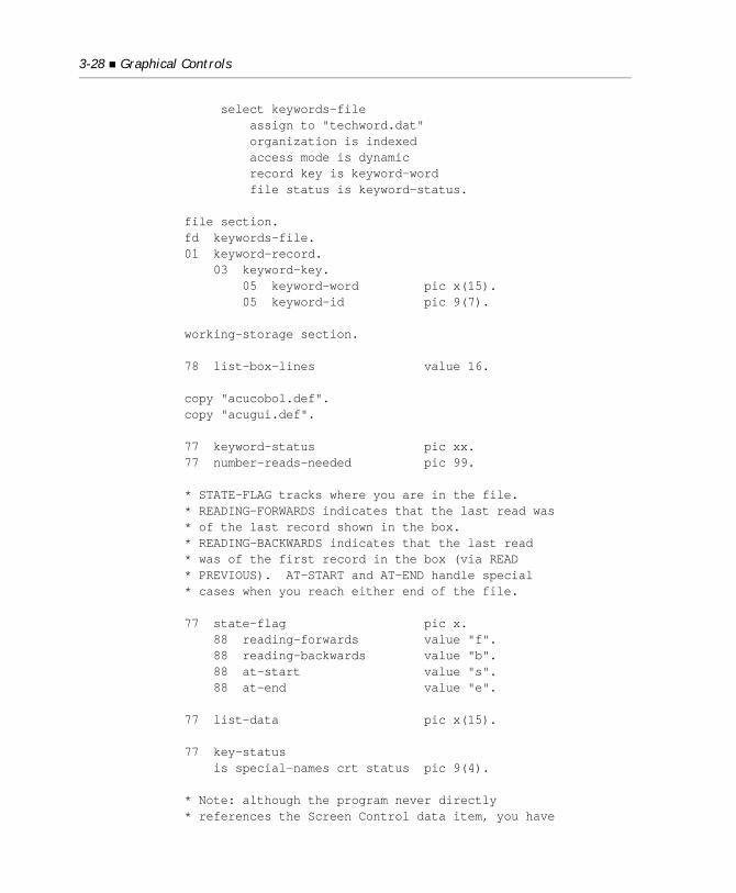
3-28 Graphical Controls
select keywords-file assign to "techword.dat" organization is indexed access mode is dynamic record key is keyword-word file status is keyword-status.
file section.fd keywords-file.01 keyword-record. 03 keyword-key. 05 keyword-word pic x(15). 05 keyword-id pic 9(7).
working-storage section.
78 list-box-lines value 16.
copy "acucobol.def".copy "acugui.def".
77 keyword-status pic xx.77 number-reads-needed pic 99.
* STATE-FLAG tracks where you are in the file. * READING-FORWARDS indicates that the last read was * of the last record shown in the box. * READING-BACKWARDS indicates that the last read * was of the first record in the box (via READ * PREVIOUS). AT-START and AT-END handle special * cases when you reach either end of the file.
77 state-flag pic x. 88 reading-forwards value "f". 88 reading-backwards value "b". 88 at-start value "s". 88 at-end value "e".
77 list-data pic x(15).
77 key-status is special-names crt status pic 9(4).
* Note: although the program never directly * references the Screen Control data item, you have
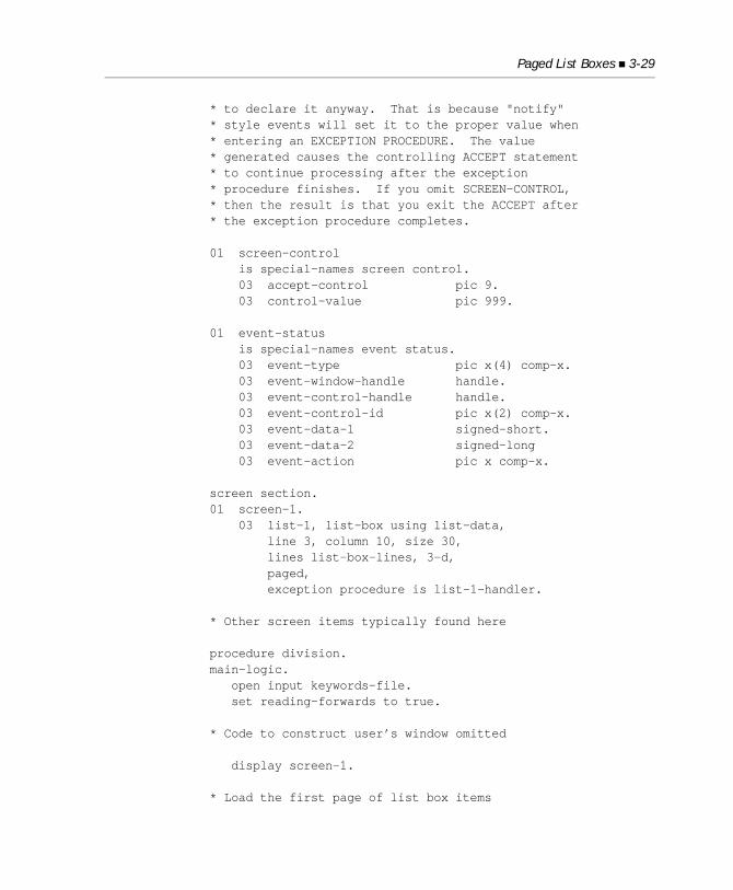
Paged List Boxes 3-29
* to declare it anyway. That is because "notify"* style events will set it to the proper value when * entering an EXCEPTION PROCEDURE. The value * generated causes the controlling ACCEPT statement * to continue processing after the exception * procedure finishes. If you omit SCREEN-CONTROL, * then the result is that you exit the ACCEPT after * the exception procedure completes.
01 screen-control is special-names screen control. 03 accept-control pic 9. 03 control-value pic 999.
01 event-status is special-names event status. 03 event-type pic x(4) comp-x. 03 event-window-handle handle. 03 event-control-handle handle. 03 event-control-id pic x(2) comp-x. 03 event-data-1 signed-short. 03 event-data-2 signed-long 03 event-action pic x comp-x.
screen section.01 screen-1. 03 list-1, list-box using list-data, line 3, column 10, size 30, lines list-box-lines, 3-d, paged, exception procedure is list-1-handler.
* Other screen items typically found here
procedure division.main-logic. open input keywords-file. set reading-forwards to true.
* Code to construct user’s window omitted
display screen-1.
* Load the first page of list box items
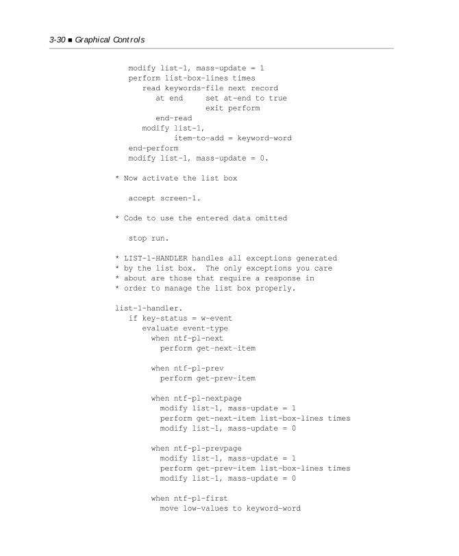
3-30 Graphical Controls
modify list-1, mass-update = 1 perform list-box-lines times read keywords-file next record at end set at-end to true exit perform end-read modify list-1, item-to-add = keyword-word end-perform modify list-1, mass-update = 0.
* Now activate the list box
accept screen-1.
* Code to use the entered data omitted
stop run.
* LIST-1-HANDLER handles all exceptions generated * by the list box. The only exceptions you care * about are those that require a response in * order to manage the list box properly.
list-1-handler. if key-status = w-event evaluate event-type when ntf-pl-next perform get-next-item
when ntf-pl-prev perform get-prev-item
when ntf-pl-nextpage modify list-1, mass-update = 1 perform get-next-item list-box-lines times modify list-1, mass-update = 0
when ntf-pl-prevpage modify list-1, mass-update = 1 perform get-prev-item list-box-lines times modify list-1, mass-update = 0
when ntf-pl-first move low-values to keyword-word
Paged List Boxes 3-31
start keywords-file, key not < keyword-word invalid key exit paragraph end-start set reading-forwards to true modify list-1, mass-update = 1 modify list-1, reset-list = 1 perform get-next-item list-box-lines times modify list-1, mass-update = 0
when ntf-pl-last move high-values to keyword-word start keywords-file, key not > keyword-word invalid key exit paragraph end-start set reading-backwards to true modify list-1, mass-update = 1 modify list-1, reset-list = 1 perform get-prev-item list-box-lines times modify list-1, mass-update = 0
* In the search logic, if you get too close to the * end of the file, you simply act as if you wanted to * find the last full page. Do this by setting the * event type to NTF-PL-LAST and re-evaluating.
when ntf-pl-search inquire list-1, search-text in keyword-word start keywords-file, key not < keyword-word invalid key move ntf-pl-last to event-type go to list-1-handler end-start set reading-forwards to true modify list-1, mass-update = 1 perform get-next-item list-box-lines times if at-end move ntf-pl-last to event-type go to list-1-handler end-if modify list-1, mass-update = 0 end-evaluate
3-32 Graphical Controls
end-if.
* GET-NEXT-ITEM handles all cases where you read * forwards through the file. It adjusts for the * four possible states you could be in and then * retrieves the next record. This record is added* to the end of the list box. In some cases, you * have to traverse over the page of records * currently displayed (because you are switching * direction).
get-next-item. evaluate true when at-start move low-values to keyword-word start keywords-file, key not < keyword-word invalid key exit paragraph end-start add 1 to list-box-lines giving number-reads-needed when at-end exit paragraph when reading-backwards move list-box-lines to number-reads-needed when reading-forwards move 1 to number-reads-needed end-evaluate
perform number-reads-needed times read keywords-file next record at end set at-end to true exit paragraph end-read end-perform
modify list-1, item-to-add = keyword-word
set reading-forwards to true.
* GET-PREV-ITEM is the converse of GET-NEXT-ITEM. * It retrieves the previous record in the list and * adds it to the top of the list box. The code is * structured identically to GET-NEXT-ITEM.
Paged Grids 3-33
get-prev-item. evaluate true when at-end move high-values to keyword-word start keywords-file, key not > keyword-word invalid key exit paragraph end-start add 1 to list-box-lines giving number-reads-needed when at-start exit paragraph when reading-forwards move list-box-lines to number-reads-needed when reading-backwards move 1 to number-reads-needed end-evaluate
perform number-reads-needed times read keywords-file previous record at end set at-start to true exit paragraph end-readend-perform
modify list-1 insertion-index = 1 item-to-add = keyword-word
set reading-backwards to true.
3.9 Paged Grids
A grid is a matrix of data fields. Each element of this matrix, called a “cell,” can hold either text or a bitmap, or both. Grids are organized into rows, columns, and records. In a grid, a “row” is a grouping of cells that appear on one line in the control. A “record” is one or more rows that are treated as a logical unit. By default, a record occupies one row in a grid, but a record may also “wrap around” to the next row when it passes the right edge of the grid. A “column” identifies a particular cell in a record.
3-34 Graphical Controls
A grid’s capacity is limited by available memory. Sometimes, however, you may want to view many records via a grid control. This could pose a problem when you are using normal grids. Just loading all the records into the grid could take an excessive amount of time. To remedy this problem, you may want to use a “paged” grid.
When you are using the PAGED style in a grid, the grid holds only as many records as can be viewed on the screen. This is called a “page” of data. The vertical scroll bar found in a normal grid is replaced by four buttons. These buttons respond to requests to get the next record, the previous record, the next page, or the previous page. (Note that you can also apply wheelmouse events to PAGED styled grids.) When the user clicks one of these buttons, the grid sends a message to the program asking for the appropriate data depending on which button was clicked. This data typically comes from an indexed file. The expected program logic is to do one or more READ NEXT or READ PREVIOUS statements to retrieve the data.
Note: By default, if a user switches focus by clicking any of the buttons used to scroll a paged grid, a CMD-GOTO event is not generated. To modify this behavior, set the GRID_BUTTONS_CAUSE_GOTO configuration variable to “1” (on, true, yes), as described in Book 4, Appendix H.
Paged grids are conceptually similar to paged list boxes. Programmers familiar with paged list boxes, however, may notice some differences in programming paged grids. These differences were designed to make programming the grid’s paging logic easier. The noticeable differences are:
• The program’s structure is simplified because event procedures, instead of responses to various exception values, are coded into the paging logic.
• Less coding is required, because there is no need to write any code for Next Page and Previous Page actions. You may still opt to write additional code if you want to define actions other than the response normally expected from Next Page and Previous Page operations.
• Coding the response to the First Page and Last Page requests are simpler.
• Satisfying Next Record and Previous Record requests are easier because the grid control can tell you how many records will have to be read (in the proper direction) in response to these requests.
Paged Grids 3-35
Furthermore, paged grids communicate requests for more data through events such as:MSG-PAGED-NEXTMSG-PAGED-PREVMSG-PAGED-NEXTPAGEMSG-PAGED-PREVPAGEMSG-PAGED-FIRSTMSG-PAGED-LASTMSG-PAGED-NEXT-WHEELMSG-PAGED-PREV-WHEEL
Paged grids never hold more data than they can display on the screen. When you are adding a record at the end of a full page, the control deletes the topmost non-heading record. This causes the grid’s contents to scroll upward. When you are adding a record to any other position, the last record in the grid is deleted. This causes all records after the one being added to scroll downward.
Note: The current cell is not changed when the grid is paged. In other words, if the grid’s cursor is at row 2, column 3, it will be at row 2, column 3 after the user clicks the “next record” button. This will effectively move the cursor to a new record, even though its physical location has not changed. Unlike other forms of cursor movement, this does not generate any additional events. If you are performing special actions when the cursor enters a new cell (for example, displaying related information outside of the grid), then you should perform the appropriate actions in response to paging events as well as cursor-movement events.
Tip: The paged grid feature is demonstrated in two AcuBench sample project located in the Support > Examples and Utilities area of the Micro Focus Web site. To download these projects, go to: http://supportline.microfocus.com/examplesandutilities/index.asp. Select Acucorp samples > Graphical User Interfaces > GridTXTViewer.zip and pagedgrid.zip.
3-36 Graphical Controls
Tip: In the AcuGT > Sample directory of your installation, there is also a sample program called wheelevent.cbl. This program demonstrates how to create a paged list box, a paged grid, and wheelmouse events for scrolling the control.
Example 1 IDENTIFICATION DIVISION. PROGRAM-ID. PagedGrid. AUTHOR. Bob Cavanagh. ENVIRONMENT DIVISION. INPUT-OUTPUT SECTION. FILE-CONTROL. SELECT Samplegrid ASSIGN TO DISK "samplegrid.dat" ORGANIZATION IS INDEXED ACCESS MODE IS DYNAMIC FILE STATUS IS samplegrid-status RECORD KEY IS samplegridkey ALTERNATE RECORD KEY IS samplealtkey = last-name, first-name.
DATA DIVISION. FILE SECTION. FD Samplegrid. 01 samplegrid-record. 05 samplegridkey. 10 first-name PIC X(20). 10 last-name PIC X(20). 05 samplegrid-extension PIC X(4). 05 samplegrid-department PIC X(15). 05 manager-flag PIC 9. 05 samplegrid-email PIC X(15). 05 samplegrid-home-phone PIC X(15).* WORKING-STORAGE SECTION. 78 EVENT-ACTION-FAIL VALUE 4. 78 MSG-CLOSE VALUE 16415. 78 MSG-PAGED-NEXT VALUE 16419. 78 MSG-PAGED-PREV VALUE 16420. 78 MSG-PAGED-FIRST VALUE 16423. 78 MSG-PAGED-LAST VALUE 16424. 78 ACTION-FIRST-PAGE VALUE 10.
Paged Grids 3-37
* 01 EVENT-STATUS IS SPECIAL-NAMES EVENT STATUS. 03 EVENT-TYPE PIC X(4) COMP-X. 03 EVENT-WINDOW-HANDLE HANDLE OF WINDOW. 03 EVENT-CONTROL-HANDLE HANDLE. 03 EVENT-CONTROL-ID PIC XX COMP-X. 03 EVENT-DATA-1 SIGNED-SHORT. 03 EVENT-DATA-2 SIGNED-LONG. 03 EVENT-ACTION PIC X COMP-X.* 01 SCREEN-CONTROL IS SPECIAL-NAMES SCREEN CONTROL. 03 ACCEPT-CONTROL PIC 9. 03 CONTROL-VALUE PIC 999. 03 CONTROL-HANDLE HANDLE. 03 CONTROL-ID PIC XX COMP-X.* 77 Key-Status IS SPECIAL-NAMES CRT STATUS PIC 9(4) VALUE 0. 88 Exit-Pushed VALUE 27. 88 Message-Received VALUE 95. 88 Event-Occurred VALUE 96. 88 Screen-No-Input-Field VALUE 97.* 77 samplegrid-status PIC X(2). 88 Valid-Samplegrid VALUE "00" THRU "09".
77 Form1-Handle HANDLE OF WINDOW. 77 Arial24B HANDLE OF FONT.* 01 GRID-COLUMN-HEADINGS. 05 FILLER PIC X(20) VALUE "FIRST NAME". 05 FILLER PIC X(20) VALUE "LAST NAME". 05 FILLER PIC X(4) VALUE "EXT". 05 FILLER PIC X(15) VALUE "DEPT.". 05 FILLER PIC X(15) VALUE "E-MAIL". 05 FILLER PIC X(15) VALUE "HOME PHONE". * 01 GRID-DATA. 03 GRID-KEY. 05 GRID-FIRST-NAME PIC X(20). 05 GRID-LAST-NAME PIC X(20). 03 GRID-EXTENSION PIC X(4). 03 GRID-DEPARTMENT PIC X(15). 03 GRID-EMAIL PIC X(15).
3-38 Graphical Controls
03 GRID-HOME-PHONE PIC X(15).* SCREEN SECTION. 01 PgGridSample. 03 Scr-Grid, Grid, COL 4.70, LINE 6.00, LINES 26.00 CELLS, SIZE 55.30 CELLS, ADJUSTABLE-COLUMNS, 3-D, COLOR IS 258, COLUMN-HEADINGS, DATA-COLUMNS (1, 21, 41, 45, 60, 75), DISPLAY-COLUMNS (1, 25, 49, 57, 76, 95), ALIGNMENT ("C", "C", "C", "C", "C", "C"), DATA-TYPES ("X(20)", "X(20)", "X(4)", "X(15)", "X(15)", "X(15)"), SEPARATION (5, 5, 5, 5, 5, 5), COLUMN-DIVIDERS (1, 1, 1, 1, 1, 1), CURSOR-COLOR 2, CURSOR-FRAME-WIDTH 3, DIVIDER-COLOR 1, HEADING-COLOR 257, HEADING-DIVIDER-COLOR 1, HSCROLL, ID IS 1, NUM-ROWS 20, PAGED, RECORD-DATA Grid-Data, RECORD-TO-ADD Grid-Data, ROW-DIVIDERS 1, TILED-HEADINGS, USE-TAB, VPADDING 80, VIRTUAL-WIDTH 112, EVENT PROCEDURE Grid-Events.* PROCEDURE DIVISION. DECLARATIVES. I-O-ERROR SECTION. USE AFTER STANDARD ERROR PROCEDURE ON I-O. 0200-DECL. EXIT. END DECLARATIVES.* Acu-Main-Logic. OPEN I-O SAMPLEGRID. PERFORM Acu-PgGridSample-Scrn. PERFORM Load-Grid. PERFORM Acu-PgGridSample-Proc. CLOSE SAMPLEGRID. STOP RUN. . Load-Grid. MOVE GRID-COLUMN-HEADINGS TO GRID-DATA.
MODIFY SCR-GRID INSERTION-INDEX = 1 RECORD-TO-ADD=GRID-DATA.
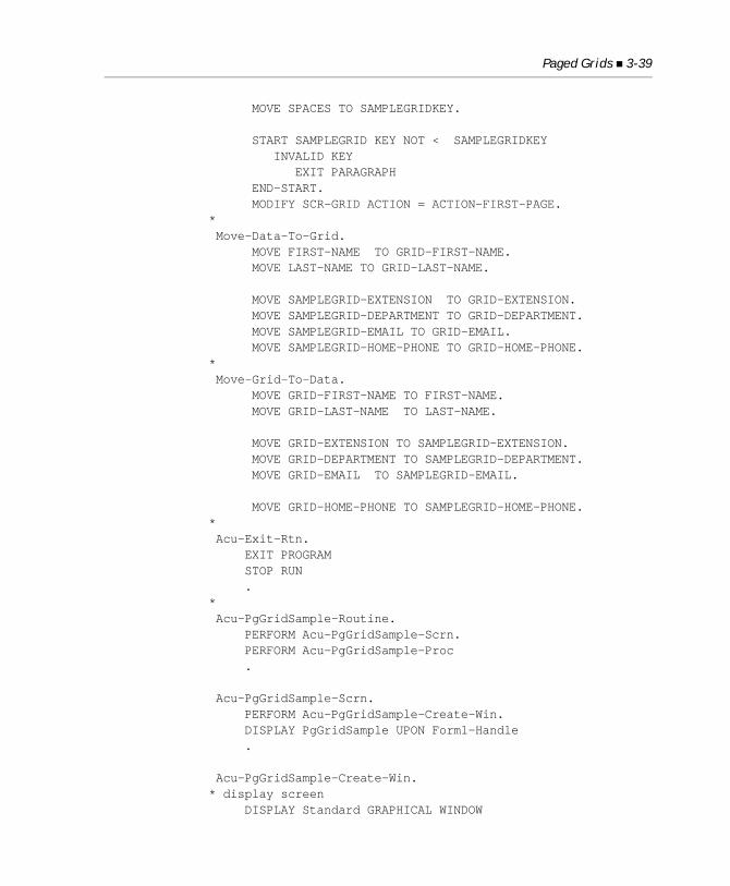
Paged Grids 3-39
MOVE SPACES TO SAMPLEGRIDKEY.
START SAMPLEGRID KEY NOT < SAMPLEGRIDKEY INVALID KEY EXIT PARAGRAPH END-START. MODIFY SCR-GRID ACTION = ACTION-FIRST-PAGE.* Move-Data-To-Grid. MOVE FIRST-NAME TO GRID-FIRST-NAME. MOVE LAST-NAME TO GRID-LAST-NAME.
MOVE SAMPLEGRID-EXTENSION TO GRID-EXTENSION. MOVE SAMPLEGRID-DEPARTMENT TO GRID-DEPARTMENT. MOVE SAMPLEGRID-EMAIL TO GRID-EMAIL. MOVE SAMPLEGRID-HOME-PHONE TO GRID-HOME-PHONE.* Move-Grid-To-Data. MOVE GRID-FIRST-NAME TO FIRST-NAME. MOVE GRID-LAST-NAME TO LAST-NAME.
MOVE GRID-EXTENSION TO SAMPLEGRID-EXTENSION. MOVE GRID-DEPARTMENT TO SAMPLEGRID-DEPARTMENT. MOVE GRID-EMAIL TO SAMPLEGRID-EMAIL.
MOVE GRID-HOME-PHONE TO SAMPLEGRID-HOME-PHONE.* Acu-Exit-Rtn. EXIT PROGRAM STOP RUN .* Acu-PgGridSample-Routine. PERFORM Acu-PgGridSample-Scrn. PERFORM Acu-PgGridSample-Proc .
Acu-PgGridSample-Scrn. PERFORM Acu-PgGridSample-Create-Win. DISPLAY PgGridSample UPON Form1-Handle .
Acu-PgGridSample-Create-Win.* display screen DISPLAY Standard GRAPHICAL WINDOW

3-40 Graphical Controls
LINES 38.00, SIZE 64.00, CELL HEIGHT 10, CELL WIDTH 10, AUTO-RESIZE, COLOR IS 65793, ERASE, LABEL-OFFSET 0, LINK TO THREAD, MODELESS, NO SCROLL, WITH SYSTEM MENU, TITLE "Paged Grid Sample", TITLE-BAR, NO WRAP, EVENT PROCEDURE Form1-Event-Proc, HANDLE IS Form1-Handle.* DISPLAY PgGridSample UPON Form1-Handle .
* PgGridSample Acu-PgGridSample-Proc. PERFORM UNTIL Exit-Pushed ACCEPT PgGridSample ON EXCEPTION PERFORM Acu-PgGridSample-Evaluate-Func END-ACCEPT END-PERFORM DESTROY Form1-Handle INITIALIZE Key-Status .
* PgGridSample Acu-PgGridSample-Evaluate-Func.* avoid changing focus MOVE 1 TO Accept-Control . Form1-Event-Proc.* EVALUATE Event-Type WHEN Msg-Close PERFORM Acu-Exit-Rtn END-EVALUATE .
Grid-Events.* EVALUATE Event-Type WHEN Msg-Paged-First PERFORM Scr-Grid-Ev-Msg-Paged-First WHEN Msg-Paged-Last PERFORM Scr-Grid-Ev-Msg-Paged-Last WHEN Msg-Paged-Next PERFORM Scr-Grid-Ev-Msg-Paged-Next WHEN Msg-Paged-Prev PERFORM Scr-Grid-Ev-Msg-Paged-Prev
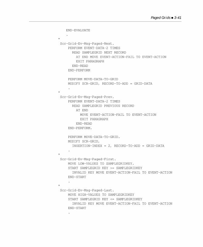
Paged Grids 3-41
END-EVALUATE .* Scr-Grid-Ev-Msg-Paged-Next. PERFORM EVENT-DATA-2 TIMES READ SAMPLEGRID NEXT RECORD AT END MOVE EVENT-ACTION-FAIL TO EVENT-ACTION EXIT PARAGRAPH END-READ END-PERFORM
PERFORM MOVE-DATA-TO-GRID MODIFY SCR-GRID, RECORD-TO-ADD = GRID-DATA .* Scr-Grid-Ev-Msg-Paged-Prev. PERFORM EVENT-DATA-2 TIMES READ SAMPLEGRID PREVIOUS RECORD AT END MOVE EVENT-ACTION-FAIL TO EVENT-ACTION EXIT PARAGRAPH END-READ END-PERFORM.
PERFORM MOVE-DATA-TO-GRID. MODIFY SCR-GRID, INSERTION-INDEX = 2, RECORD-TO-ADD = GRID-DATA .* Scr-Grid-Ev-Msg-Paged-First. MOVE LOW-VALUES TO SAMPLEGRIDKEY. START SAMPLEGRID KEY >= SAMPLEGRIDKEY INVALID KEY MOVE EVENT-ACTION-FAIL TO EVENT-ACTION END-START .* Scr-Grid-Ev-Msg-Paged-Last. MOVE HIGH-VALUES TO SAMPLEGRIDKEY START SAMPLEGRID KEY <= SAMPLEGRIDKEY INVALID KEY MOVE EVENT-ACTION-FAIL TO EVENT-ACTION END-START .
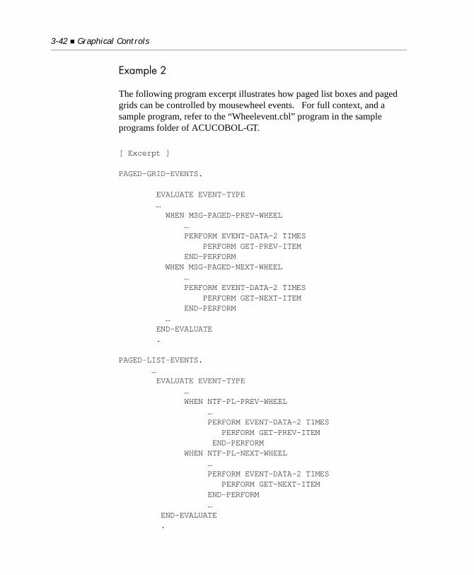
3-42 Graphical Controls
Example 2
The following program excerpt illustrates how paged list boxes and paged grids can be controlled by mousewheel events. For full context, and a sample program, refer to the “Wheelevent.cbl” program in the sample programs folder of ACUCOBOL-GT. [ Excerpt ]
PAGED-GRID-EVENTS.
EVALUATE EVENT-TYPE … WHEN MSG-PAGED-PREV-WHEEL … PERFORM EVENT-DATA-2 TIMES PERFORM GET-PREV-ITEM END-PERFORM WHEN MSG-PAGED-NEXT-WHEEL … PERFORM EVENT-DATA-2 TIMES PERFORM GET-NEXT-ITEM END-PERFORM … END-EVALUATE . PAGED-LIST-EVENTS. … EVALUATE EVENT-TYPE … WHEN NTF-PL-PREV-WHEEL … PERFORM EVENT-DATA-2 TIMES PERFORM GET-PREV-ITEM END-PERFORM WHEN NTF-PL-NEXT-WHEEL … PERFORM EVENT-DATA-2 TIMES PERFORM GET-NEXT-ITEM END-PERFORM … END-EVALUATE .

Paged Grids 3-43

3-44 Graphical Controls
4
Supporting Concepts and Related IssuesKey Topics
Handles ..................................................................................................... 4-2Events ....................................................................................................... 4-3Graphical vs. Textual Modes .................................................................. 4-4Styles and Special Properties.................................................................. 4-5Methods .................................................................................................... 4-7Coordinates ............................................................................................ 4-11Fonts ....................................................................................................... 4-15Layout Managers.................................................................................. 4-16
4-2 Supporting Concepts and Related Issues
4.1 Handles
Normally, when you create a graphical object, the runtime system generates a unique value to identify that object, and stores that value in the program’s specified handle. You make future references to that object by naming its handle. Most of the graphically oriented features of ACUCOBOL-GT make use of handles. A handle is a COBOL data item. Internally, a handle is simply a number. The COBOL program uses handles to identify various graphical items.
Note: In addition to all the graphical controls and user-interface-type objects (e.g., window, font), a handle can be applied to a thread within a program.
If you have worked with ACUCOBOL-GT’s text-based subwindows (textual, pop-up windows), you are already familiar with the use of handles. The POP-UP AREA phrase of the DISPLAY WINDOW verb names a PIC X(10) data item that holds the handle of the created window. When you want to remove the window, you use that data item in the CLOSE WINDOW verb. The data item tells the system which window to close.
There is a data type, called USAGE IS HANDLE, that you use when you want to declare a handle for a data item. The syntax for it is as follows:USAGE IS HANDLE OF type
You can use this data type with or without specifying a type of handle, but there are certain benefits if you do specify it. The primary benefit, for handles of controls, is that the proper style and property names are known by the compiler and can be used. Consider the difference in this example:
77 h-1 handle.77 h-2 handle of entry-field.
then,modify h-2, max-text = 15. ( legal )modify h-1, max-text = 15. ( compile error )
Another significant benefit to typed handles is that the compiler can check that they are being used in proper contexts.
Events 4-3
The runtime system can tell when a handle is no longer valid. If you make reference to an invalid handle (for example, a handle to an object you have destroyed), the requested operation is simply ignored.
When you make use of graphical objects in the Screen Section, the runtime system automatically creates and manages the associated handles for you. In this case you do not explicitly use handles when referring to graphical objects.
For more information about handles and the USAGE IS clause, see Section 5.7.1.8, “USAGE clause” in Book 3, Reference Manual.
4.2 Events
In graphical systems, events communicate actions taken by the user and various graphical objects. For example, if the user types a key, the system may generate several events to denote that fact: a key pressed event, a character typed event, and a key released event. A push button might generate a button pushed event when the user activates it. Much of graphical programming involves detecting and handling events.
Event programming is foreign to most COBOL programs. In order to simplify the programming of graphical systems, ACUCOBOL-GT handles most events internally. The runtime either performs the appropriate action, or converts the event into a form more recognizable to a traditional COBOL program. For example, you can create your push buttons so that button pushed events are treated as if a particular function key was pressed.
Certain events must be handled by the program, however. In ACUCOBOL-GT, there are very few of these, but they are important. Events that must be acted upon by the COBOL program are called terminating events. The name comes from the fact that their occurrence causes any active ACCEPT statement to terminate, so that the COBOL program can handle the event.
4-4 Supporting Concepts and Related Issues
When a terminating event occurs, any active ACCEPT statement terminates and returns an exception value of “96”. In the file “acugui.def,” you will find a level 78 for this value, called W-EVENT. When you set up a situation where a terminating event could occur, you must be ready to handle this exception value.
When a terminating event occurs, the runtime fills in the new EVENT STATUS data item (event-status) with information about the event. The EVENT STATUS data item is declared in SPECIAL-NAMES. This data item identifies which event occurred, which window it occurred in, which control it applies to (if any), and any additional information your program might need. For details on the EVENT STATUS data item, see section 4.2.3, Book 3, Reference Manual.
If desired, for any control that generates events you can specify a list of event types that that control either must receive or not receive (filter out). To create such a list, you use the EVENT-LIST, AX-EVENT-LIST, and EXCLUDE-EVENT-LIST Common Properties. These are described in section 6.4.9, “Common Screen Options,” of Book 3.
For a description of the events that can be returned by the runtime, see Chapter 6, “Chapter 6: Events Reference.”
Note: There is a special control style called SELF-ACT that can be assigned to push buttons, radio buttons, and check boxes. This style simplifies the handling of button events. If you also assign an exception value to the button, it will act just like the equivalent function key. For more about the SELF-ACT style see the description in section 5.15, “Push Button.”
4.3 Graphical vs. Textual Modes
As previously discussed, ACUCOBOL-GT marries two diverse technologies: text-only displays and graphical displays.
When we talk about an ACCEPT or DISPLAY statement, the term textual refers to the forms of these verbs that handle text-based elements. Specifically, textual refers to Format 1 of both verbs, plus any referenced
Styles and Special Properties 4-5
Format 1 Screen Section items. The term graphical refers to the forms of these verbs that handle controls. Specifically, this includes Format 14 of the DISPLAY verb, Format 7 of the ACCEPT verb, and Format 2 of any referenced Screen Section items. Note that a LABEL control (which is a block of text) is considered a graphical element, not a textual display.
When thinking about the textual display, you may find that it helps to think of it as a rigid grid of character cells. Each cell in the grid holds one character, and the cell’s size and location is fixed. This simulates the nature of text-only monitors. In this mode, you can display five characters starting at column “1” and expect the fifth character to be placed in column “5”.
The graphical display is then layered on top of the textual display. The graphical display is not rigid. You can place elements anywhere on the screen, not just in the fixed character cells. In this mode, displaying a label of five characters starting at column “1” will not necessarily place the fifth character in column “5” (because the label’s font may be variable-pitch). For a more detailed discussion of screen coordinates, their manipulation, and use, see section 4.6 in this chapter.
Two COBOL reserved words are available to mark Screen Section entries for use in the graphical or textual environment. These reserved words are: “GRAPHICAL” and “CHARACTER”. These markings have the effect of restricting the display of the elements nested within them. The elements contained in a GRAPHICAL Screen Section entry are displayed only when the program is run on a graphical system. The contents of a CHARACTER Screen Section entry are displayed only when the program is run on a character-based system. When the program attempts to execute a marked entry on a system of the opposite type, that entry is ignored (for an extended description of these labels and their use, see Section 5.9 of Book 3, Reference Manual).
4.4 Styles and Special Properties
ACUCOBOL-GT utilizes a special type of COBOL identifier that is context-sensitive. These are the style and special property names of controls. Each type of control has a set of styles and special properties that apply to it. If these names were reserved words in COBOL, there would be many new reserved words, making it likely that existing programs would
4-6 Supporting Concepts and Related Issues
have to be changed to be compiled with ACUCOBOL-GT. Because more styles and special properties are expected in future versions, this proliferation of reserved words would create an ever-increasing problem.
To address this issue, ACUCOBOL-GT does not reserve the style and special property names in the usual manner. Instead, the compiler reserves them only when in the context of acting on a control of the proper type. For example, when you are defining an entry-field control in the Screen Section, the style and special property names associated with entry fields are reserved. At other times, they are not. This allows you to declare variables and paragraphs with the same names as long as you do not try to refer to those items in a context where the reserved meaning would apply.
Style and special property names are reserved in the following four cases:
1. When defining a Screen Section entry for a control;
2. In the scope of a DISPLAY statement that creates a control;
3. In the scope of a MODIFY statement that changes a control;
4. In the scope of an INQUIRE statement that references a control.
At all other times, the style and special property names are not reserved.
Since the compiler reserves only names that are appropriate for a particular type of control, it can recognize those names only when it knows what type of control is being acted on. If the control class is generic (variable), then the compiler cannot determine which set of names to reserve, so it does not reserve any of them. This leads to cases where the compiler cannot resolve seemingly correct code.
For example, MAX-TEXT is a special property name associated with entry fields. The following code appears to be correct, but will not compile:77 FIELD-1 USAGE HANDLE.
MODIFY FIELD-1, MAX-TEXT = 15.
In the above example, the compiler does not recognize MAX-TEXT as a meaningful word because it does not know that FIELD-1 is an entry field. In order for this code to compile, you would have to change it to read:
Methods 4-7
77 FIELD-1 USAGE HANDLE OF ENTRY-FIELD.
MODIFY FIELD-1, MAX-TEXT = 15.
By declaring FIELD-1 as a handle to an entry field, you alert the compiler to use the style and special property names associated with entry fields whenever it is referenced.
Note: Sometimes you might need to use generic handles in your code when you don’t know at compile-time what kind of control will be needed during program execution. In these cases, you can always use the alternative form of specifying styles and special properties. In this form, you include the word “STYLE” or “PROPERTY” followed by the numeric value associated with the style or special property (the value can be a literal or stored in a variable). Level 78 declarations for the style and special property names can be found in the file “controls.def”.
For example, the level 78 name that corresponds to MAX-TEXT is EFP-MAX-TEXT (“EFP” is short for Entry Field Property). The following code is another way of coding the preceding example:77 FIELD-1 USAGE HANDLE.
MODIFY FIELD-1, PROPERTY EFP-MAX-TEXT = 15.
In most cases, you will probably use the style and special property names known by the compiler. However, the advantage of using the values provided in “controls.def” is that you can assign them to variables that need to be set dynamically (at run time).
4.5 Methods
The following section pertains to ActiveX and .NET controls.
All ACUCOBOL-GT controls have properties and styles. In addition to properties and styles, ActiveX and .NET controls have a concept known as “methods.” In ActiveX and .NET, methods (also known as object methods)
4-8 Supporting Concepts and Related Issues
specify the functions that the control provides. To invoke (call) a method, you use the MODIFY verb in much the same way that you set a property or style.
Note: Unlike common properties and styles, you cannot use the DISPLAY statement to set a special property or invoke a method of an ActiveX or .NET control defined in the Screen Section. You must use the MODIFY verb.
Both ActiveX and .NET methods can take any number of parameters or no parameters. ActiveX controls can also take optional parameters (i.e., parameters that can be omitted). You specify the parameters in COBOL by enclosing them in parentheses. With ActiveX controls, the optional parameters are always last. If a method takes only one parameter, the parentheses may be omitted. If a method takes no parameters, you must use empty parentheses (“( )”).
Note that ActiveX and .NET properties and methods should always be prepended with an “@” sign in case they clash with COBOL reserved words or ACUCOBOL-GT graphical control property and style names. “@” identifies the relationship of the name to ActiveX or .NET.
4.5.1 ActiveX Example
Consider the ActiveX control, “Microsoft Rich Textbox Control 6.0”. Here is an excerpt from its COPY file, created with the AXDEFGEN utility. (See Chapter 4 of A Guide to Interoperating with ACUCOBOL-GT for more information on AXDEFGEN):... * LoadSave constants. * LoadSaveConstants CLASS @LoadSaveConstants CLSID, 9FAEAB20-894B-11CE-9576-0020AF039CA3 NAME, “LoadSaveConstants” * long rtfRTF ENUMERATOR, @rtfRtf, 0 * long rtfText ENUMERATOR, @rtfText, 1
Methods 4-9
... * Microsoft Rich Textbox Control 6.0 *** Primary Interface *** * RichTextBox CLASS @RichTextBox CLSID, 3B7C8860-D78F-101B-B9B5-04021C009402 NAME, “RichTextBox”... * LoadFile * Loads an .RTF or text file into a RichTextBox control. METHOD, 37, @LoadFile, “BSTR bstrFilename”, “VARIANT vFileType” OPTIONAL 1...
The LoadFile method takes two parameters: “bstrFilename” and “vFileType”. “vFileType” is an OPTIONAL parameter. “bstrFileName” is a BSTR type, and “vFileType” is a VARIANT type. To invoke this method from COBOL, you use the MODIFY verb:MODIFY RICH-TEXT-BOX-1 LoadFile (“myfile.rtf”, rtfRtf).
The ACUCOBOL-GT runtime automatically converts the parameters to the appropriate type and invokes the method. The LoadFile method does not have a return value. If the method had a return value that was not “void”, it would be converted and moved to the item specified in the GIVING clause of the MODIFY statement.
The syntax is as if LoadFile is a property whose value is its parameter list. For example, the following is also valid:MODIFY RICH-TEXT-BOX-1 PROPERTY 37 = (“myfile.rtf”, rtfRtf).
Note that 37 is the “property” number of LoadFile. The equals sign is optional. Commas in the parameter list are optional. The parameters may be arithmetic expressions.
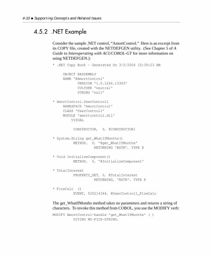
4-10 Supporting Concepts and Related Issues
4.5.2 .NET Example
Consider the sample .NET control, “AmortControl.” Here is an excerpt from its COPY file, created with the NETDEFGEN utility. (See Chapter 5 of A Guide to Interoperating with ACUCOBOL-GT for more information on using NETDEFGEN.): * .NET Copy Book - Generated On 3/5/2004 10:39:23 AM
OBJECT @ASSEMBLY NAME "@AmortControl" VERSION "1.0.1266.13363" CULTURE "neutral" STRONG "null"
* AmortControl.UserControl1 NAMESPACE "AmortControl" CLASS "UserControl1" MODULE "amortcontrol.dll" VISUAL
CONSTRUCTOR, 0, @CONSTRUCTOR1
* System.String get_WhatIfMonths() METHOD, 0, "@get_WhatIfMonths" RETURNING "BSTR", TYPE 8
* Void InitializeComponent() METHOD, 0, "@InitializeComponent"
* TotalInterest PROPERTY_GET, 0, @TotalInterest RETURNING, "BSTR", TYPE 8
* FireCalc () EVENT, 520214344, @UserControl1_FireCalc
The get_WhatIfMonths method takes no parameters and returns a string of characters. To invoke this method from COBOL, you use the MODIFY verb: MODIFY AmortControl-handle "get_WhatIfMonths" ( ) GIVING MY-PICX-STRING.
Coordinates 4-11
The method has a return value that is converted and moved to the item specified in the GIVING clause of the MODIFY statement. To get the property TotalInterest:INQUIRE ctl-handle TotalInterest IN TOT-INTEREST.
4.6 Coordinates
This section describes how display elements are located on the screen.
4.6.1 Coordinate Handling
ACUCOBOL-GT uses line and column positions to specify the location of graphical objects. There are two reasons for this:
1. The line and column notation is already familiar to COBOL programmers.
2. Retaining this notation makes translating text-based applications into graphical applications much easier.
Because graphical objects are not constrained to whole line and column locations, you may use non-integer values when specifying a line or column position. For example, “LINE 1.5” is a point that is midway between the top of line 1 and the top of line 2. Unless otherwise specified, the line/column position of a graphical object refers to the upper-left pixel of the smallest bounding rectangle that encloses the object.
Recall that the runtime treats the screen as two layers: a text-based character layer with a graphical-object layer on top (section 4.3, “Graphical vs. Textual Modes”). So that the runtime can execute text-only applications properly, the line and column positions refer to the grid of characters in the text layer. Thus, the font used by the text layer defines the size of a line and column. We call a single character location in the text layer a cell. The height of the cell is the height of one line, and the width of the cell is the width of one column.
4-12 Supporting Concepts and Related Issues
4.6.2 Coordinate Space Problems
The biggest difficulty with the handling of coordinates is that the text-based font used on the text layer may be an inappropriate size for use in locating graphical objects. There are a couple of reasons for this. One is that the text-layer font must be a fixed-pitch font, while the font used by graphical objects is usually variable-pitch. Frequently this means that the two fonts will be different sizes. The second problem is that some common graphical controls (e.g., entry fields) are surrounded by a box, which makes the control much larger than its font would otherwise suggest.
For example, under Windows 98 on a VGA display, the height of the usual text-layer font is 15 pixels. The height of the font normally used for entry fields is 13 pixels. The height of a boxed entry field is 50% larger than its font, so a boxed entry field is 13 * 1.5 (round up) = 20 pixels high. This means that each boxed entry field is 20 / 15 = 1.33 lines high.
While you are free to specify any coordinates needed to produce the look you want, working largely with non-integer values is difficult and reduces portability. It also makes converting text-based programs much harder, because the text-based coordinates may not be the correct ones for the corresponding graphical objects.
4.6.3 Coordinate Space Solutions
Ideally, you want the majority of your positioning coordinates to be integer values. This is easier to work with and improves portability. While you will undoubtedly encounter cases where you need to use non-integer coordinates, their use should be minimized.
The simplest solution is to use the same font for your graphical objects as you use in the text layer. Then, if you also use unboxed entry fields, you have eliminated both trouble points. The problem with this solution is that it looks wrong when compared to other graphical programs; the font is fixed-pitch and the boxes are missing.
A more sophisticated solution is to change the way that coordinates are measured. If you can set the coordinate space so that your controls fall on integral coordinates, the problem is solved. ACUCOBOL-GT provides a
Coordinates 4-13
way to do this. When you create a window (including the main application window), you can set its cell size with the CELL phrase of the DISPLAY WINDOW verb. When you do this, you specify your own line and column sizes. The phrase allows you to have the runtime measure a graphical object and set the coordinate space appropriately. Typically, you would measure an entry field with the font you want to use and have the runtime lay out the screen accordingly. For details on the CELL phrase, see the DISPLAY FLOATING WINDOW verb in Book 3, Reference Manual.
Note: When you change the coordinate space, you affect both the text and graphical layers. Because of this, you have some restrictions if you are going to use the text layer. In particular, you may not make a cell smaller than a character, nor may you make it wider than a character (it can be taller).
Here are some general guidelines to apply when deciding how to set up your coordinate space:
1. If you plan to mix graphical objects with classical textual displays, use the default cell size that is the size of the text-layer font. In this case, the overriding consideration is the placement of the text in cells. The graphical objects will have to be specified with whatever coordinates work. You should try to keep the number of graphical objects to a minimum, or consider converting to an entirely graphical screen if you want to mix in a large number of graphical elements.
2. If you anticipate using entry fields heavily (as would be typical in a conversion of a text-based application), you should set up the coordinate space based on the size of an entry field. This makes the placement of label/entry-field pairs very easy. Note that the CELL phrase allows you to specify OVERLAPPED (vertically adjacent entry fields share a common border) or SEPARATE (a little space placed between entry fields). You can choose whichever style you think looks better. Here is an example CELL phrase:
CELL SIZE = ENTRY-FIELD FONT MY-FONT, SEPARATE
3. If you will be using a mix of graphical objects, but only a few entry fields, you should base the coordinate space on the size of a label. This lets you measure with the correct font, but ignores the overhead associated with entry fields. This setting is closest to what other

4-14 Supporting Concepts and Related Issues
graphical-design systems use (typically, these use a coordinate cell size that is some fraction of the size of the system’s font). A typical CELL phrase would be:
CELL SIZE = LABEL FONT MY-FONT
Another way to get the same result is to use the GRAPHICAL phrase with the DISPLAY WINDOW verb. For example:
DISPLAY STANDARD GRAPHICAL WINDOW
4. If you want to compute exact pixel coordinates (for very specialized displays), you should use a cell height and width of “10”. Then each tenth of a cell (“.1”) corresponds to one pixel.
Note: You should not use “1” as the cell height and width because this produces a text-layer memory map that is too large. Applications that use “1” as a measure are not portable to non-graphical systems.
5. Finally, it is possible to set up your graphical control sizes based entirely on the pixel count. You can specify the ‘x’ and ‘y’ coordinates, LINES, and SIZE of a control in pixels. This method allows you to always have your positioning coordinates as integer values, which is nice when you need absolute positioning. You gain better control of your screen layouts, and screens based on different cell sizes can easily be accommodated by the screen designer.
A sample DISPLAY statement would look like this:
DISPLAY PUSH-BUTTON LINE 300 PIXEL(S) COL 225 PIXEL(S) LINES 30 PIXEL(S) SIZE 120 PIXEL(S).
Note: Pixel coordinates are relative to the size of the target window. Lowest legal value is ‘1’, and the highest legal value is equal to the largest resolution covered by the target window. If that value is exceeded, the property defaults to the closest legal value.
It is important to set your coordinate space early in your work. If you lay out screens and then change the coordinate system, all of your previously designed screens will have to be reworked.
Fonts 4-15
Because of the fundamental differences in the coordinate systems of character and graphical systems, ACUCOBOL-GT provides two sets of statement phrases with which to specify control size and positioning. For a discussion of these phrases, see section 3.5, “The Character Coordinate Phrases.”
4.7 Fonts
On graphical systems, you are not limited to only one font. ACUCOBOL-GT provides general support for access to most fonts known to the system.
In ACUCOBOL-GT, fonts are represented in your program by handles (for more about handles, see section 4.1, “Handles”). Once created, a font handle indirectly refers to all the information the system needs to manage that particular font. When you want to specify a particular font in your program, you use its handle.
In ACUCOBOL-GT, you have access to most of the systems add-on fonts (TrueType), as well as several predefined fonts. The set of predefined fonts is used because they are guaranteed to be available on all Windows systems. These fonts correspond to the various Windows system fonts that are accessed with the GetStockObject API function.
Font handles are created in two ways: with the W$FONT library routine, and with the ACCEPT FROM STANDARD OBJECT verb. The ACCEPT FROM STANDARD OBJECT verb provides access to the system predefined fonts only. See section 6.6 of Book 3, Reference Manual, for a description of the ACCEPT Statement and a list of the available fonts.
The W$FONT library routine provides access to most of the fonts known to the system, including TrueType fonts. W$FONT provides three primary functions.
1. It returns a handle to the font on the system that either exactly or most closely matches a font description.
2. Given a font handle, it returns a complete description of the font’s characteristics.
4-16 Supporting Concepts and Related Issues
3. It creates and presents to the user a font selection dialog box, returning a description of the font that the user selected.
For a complete description of W$FONT see Book 4, Appendix I.
Note: Fonts occupy memory. If you no longer need a font, you can free the memory used by that font with the DESTROY Statement. The runtime automatically destroys all fonts when it exits.
4.8 Layout Managers
ACUCOBOL-GT includes a layout manager facility that can be applied to help manage some of the tricky aspects of a screen’s layout. A layout manager is a specialized piece of software that is attached to a window and that manages the placement and size of controls in that window. Individual layout managers have their own rules regarding how controls are sized and placed.
By default, a window does not have a layout manager attached to it. For such windows, controls are sized and placed according to their normal properties (e.g. LINE, COLUMN, SIZE, and LINES). When a layout manager is attached to a window, the layout manager determines the size and placement of controls, although it is free to use the normal properties to help make decisions. A control can provide additional information about itself, including special size and placement parameters, to the layout manager through the LAYOUT-DATA property. The precise meaning of LAYOUT-DATA varies from layout manager to layout manager.
Layout managers operate whenever a new control is placed in the window or the window is resized.
Currently, ACUCOBOL-GT supports only a single type of layout manager. This manager is called the resize manager. The resize manager does not attempt to layout controls as they are being placed. Rather, it automatically resizes and repositions controls whenever the associated window is resized. Controls use LAYOUT-DATA to tell the resize manager which automatic actions should be applied to them.
Layout Managers 4-17
To use a layout manager, the program must:
• make a copy of the layout manager and attach it to a window
• set the LAYOUT-DATA property on the desired controls
These steps, and a description of four control properties that can be used to constrain a control’s dimensions, are described in the following sections.
4.8.1 Working with Layout Managers
Layout managers are created and referenced through a handle data item of type LAYOUT-MANAGER. To create a copy of a layout manager you simply declare a data item of type LAYOUT-MANAGER. For example:77 MY-LAYOUT HANDLE OF LAYOUT-MANAGER.
The declaration of a layout manager handle may include automatic initialization, in the same fashion as font handles. You can name any of the standard layout managers after the word “LAYOUT-MANAGER”. Currently, there is only one standard layout manager, LM-RESIZE, the resize manager. For example:77 MY-LAYOUT HANDLE OF LAYOUT-MANAGER, LM-RESIZE.
Like all handles, a layout manager consumes memory while allocated. You free this memory with the DESTROY verb. For example:DESTROY MY-LAYOUT
You get a layout manager handle by using the statement ACCEPT FROM STANDARD OBJECT. For example:ACCEPT MY-LAYOUT FROM STANDARD OBJECT “LM-RESIZE”
You do not need to do this if you use the initialization option mentioned above. The layout manager returned by ACCEPT FROM STANDARD OBJECT is a copy of the standard manager. Therefore, you should destroy it when you are done with it. Destroying it will not affect other copies.
4-18 Supporting Concepts and Related Issues
4.8.1.1 Attaching a layout manager to a window
To be useful, a layout manager must be attached to a window. To attach a layout manager to a window, you use the standard window property LAYOUT-MANAGER. You can do this when you create the window or by modifying the window. For example:DISPLAY STANDARD GRAPHICAL WINDOW, BACKGROUND-LOW, LAYOUT-MANAGER = MY-LAYOUT.
A layout manager records data within itself about the window and controls it is managing. Therefore, you should attach a layout manager to only one window. If you want to use the same layout manager for a second window, you should create a second copy of the layout manager.
Once attached to a window, a layout manager begins operating.
4.8.2 Setting LAYOUT-DATA
All controls have a standard property called LAYOUT-DATA. Layout managers optionally use this data to help determine how to lay out the control. Each manager imposes its own interpretation on the meaning of this data.
LAYOUT-DATA is a numeric standard property. It can be set when you create or modify the control. It can also be inquired.
The LAYOUT-DATA values for the resize manager are described in section 4.8.4.1.
4.8.3 Minimum and Maximum Control Dimensions
All controls have four properties that can be used to describe their minimum and maximum allowed dimensions. Layout managers can use these properties to determine how to size a control. The properties are:
MIN-HEIGHT The control’s minimum height.
MAX-HEIGHT The control’s maximum height.
Layout Managers 4-19
Each of these properties take a numeric value using the same units as the control’s SIZE (width) and LINES (height) properties. Each property has a default value of zero. A value of zero for MAX-HEIGHT and MAX-WIDTH means “no maximum.”
A layout manager uses these values to limit how much it will modify a control’s dimensions. A particular layout manager is free to interpret these values to suit its purposes. The resize manager will treat them as absolute limits.
For example, when creating a multiline entry field, you might want to limit its vertical dimension to have both a minimum and maximum height. One implementation might look like this:DISPLAY ENTRY-FIELD, MULTILINE LINE 5, COL 10 SIZE 50 CELLS, LINES 10 CELLS MIN-HEIGHT = 1.5 MAX-HEIGHT = 20
In this example, the layout manager will not change the height of the entry field to be less than 1.5 cells or more than 20 cells.
The four properties apply to all controls. Like all property names, they are not reserved words. Therefore, you may use these words as user-defined names anywhere in your program where property names are not allowed (i.e., outside of the Screen Section and the scope of DISPLAY, MODIFY, and INQUIRE statements).
Typically, you would start out by leaving the properties at their default values. The default values do not constrain the control’s dimensions. Then, to address a particular layout problem, you would set one or more of the properties to resolve the problem. For example, you may want to set a minimum height for a control if the user can resize the window such that the unconstrained control is reduced to a height of zero. Or, you may want to limit an entry field to show no more than the total of lines of data it allows.
MIN-WIDTH The control’s minimum width.
MAX-WIDTH The control’s maximum width.
4-20 Supporting Concepts and Related Issues
4.8.4 The Resize Layout Manager
The resize layout manager is designed to assist with the process of handling resizable windows (a resizable window is a floating window created with the RESIZABLE phrase; see DISPLAY FLOATING WINDOW in section 6.6 of Book 3). It implements some basic rules that automate what happens to controls when a window changes size. While the resize manager only handles some fairly simple cases, the cases are common ones. This frees the programmer to concentrate on more complex cases.
The standard object name of the resize manager is LM-RESIZE.
What the resize manager does affects only controls that have non-zero LAYOUT-DATA. Thus, by default, the resize manager has no effect on a window. If you want the resize manager to act on a control, then you assign that control a LAYOUT-DATA value that indicates the kind of action you want it to take. LAYOUT-DATA values are defined in the next section.
When the resize manager is first attached to a window, it does two things:
1. It automatically applies the CONTROLS-UNCROPPED style to the window. This is necessary for the resize manager to function properly.
2. It records the current dimensions of the window. These are called the design dimensions. The resize manager uses the design dimensions when deciding how to size and position controls.
The essential concept with the resize manager is that the size of the window when it is attached is the natural or design size of the window. It assumes that all controls placed on the window look right when placed on a window of this size.
For example, if you design a screen that looks good on a 25 x 80 window, then you should attach the resize manager to that window when it is 25 x 80. You normally accomplish this by creating the window that size and attaching the resize manager at the same time. For example: DISPLAY STANDARD GRAPHICAL WINDOW BACKGROUND-LOW LINES 25, SIZE 80 LAYOUT-MANAGER = LAYOUT-1
Layout Managers 4-21
Once attached, the resize manager takes effect anytime the window is resized or a control is added to the window. The resize manager acts on any control that has a non-zero LAYOUT-DATA value. The exact value determines what actions the resize manager takes. The resize manager assumes that it has complete control over the size and placement of controls that have LAYOUT-DATA. After such a control has been displayed, the program should not modify it in a way that changes its size or position (that is the job of the resize manager). Doing so may result in improper resizing or repositioning by the resize manager.
Note that a Screen Section control that is subject to the resize manager has its design values set when the control is created.
There is a COPY file that can be helpful when working with the resize manager. It contains a pre-declared layout manager handle (called “LM-RESIZE”) and constants for the most common combinations of LAYOUT-DATA settings. This COPY library is called “lmresize.def”.
Tip: The resize layout manager facility is demonstrated in an AcuBench sample project located in the Support area of the Micro Focus Web site. To download the program, go to: http://supportline.microfocus.com/examplesandutilities/index.asp. Select Acucorp Samples > Graphical User Interface > layoutmgr.zip.
Note: .NET controls cannot be managed by the resize layout manager.
4.8.4.1 Resize manager LAYOUT-DATA values
For the resize manager, a control’s LAYOUT-DATA property may be a combination of any of the following values. To combine values, simply add them together. The names of the values come from the “lmresize.def” file.
RLM-RESIZE-X (value 1)
This causes the control to be resized horizontally by an amount equal to the width of the current window width minus its design width. This causes the control to grow and shrink horizontally as the window changes width. This is frequently useful if you have a control such as a grid or a multi-line entry field in the middle of the window whose area you want to increase as the user grows the window.
4-22 Supporting Concepts and Related Issues
RLM-MOVE-X (value 2)
This causes the control to reposition itself horizontally by an amount equal to the difference of the current window width and its design width. This is useful when you have a control that you want to keep near the right edge of the window.
RLM-NO-MIN-X (value 4)
Without this, the resize manager will not reposition or resize a control horizontally to be less than its design values. This prevents the control from disappearing or colliding with other controls if the user makes the window too small. Instead, the control will extend off the edge of the window if the window is too small. Specifying this value relaxes this rule and the control is allowed to become smaller than its design size or move to the left of its design position. When you use this, you may want to use the MIN-SIZE window property to limit how narrow the user can make the window.
RLM-RESIZE-Y (value 16)
Similar to RLM-RESIZE-X, but it affects the vertical size of the control. Only those controls whose height is specified in CELLS or PIXELS are affected. Use this when you want to add more lines to a control such as a grid or list box when the user grows the window. This setting has undefined effects when used for a control whose height does not use CELLS or PIXELS. This may become defined in a future version, so you should avoid specifying this for controls that do not use CELLS or PIXELS.
RLM-MOVE-Y (value 32)
Similar to RLM-MOVE-X, except it affects the vertical position of the control. This is useful when you want a control to stay near the bottom edge of the window.
RLM-NO-MIN-Y (value 64)
Same as RLM-NO-MIN-X, except that it affects the vertical aspect of the control instead of the horizontal aspect.
The following are also found in “lmresize.def”. These are not unique values, but useful combinations of the preceding values.
Layout Managers 4-23
RLM-RESIZE-X-ANY
Combines RLM-RESIZE-X and RLM-NO-MIN-X. This combination allows for arbitrary resizing of the control horizontally.
RLM-MOVE-X-ANY
Combines RLM-MOVE-X and RLM-NO-MIN-X. This combination allows for arbitrary repositioning of the control horizontally.
RLM-RESIZE-Y-ANY
Combines RLM-RESIZE-Y and RLM-NO-MIN-Y. This combination allows for arbitrary resizing of the control vertically.
RLM-MOVE-Y-ANY
Combines RLM-MOVE-Y and RLM-NO-MIN-Y. This combination allows for arbitrary repositioning of the control vertically.
RLM-RESIZE-BOTH
Combines RLM-RESIZE-X and RLM-RESIZE-Y. This combination allows for the control to resize itself in both dimensions as the window is resized.
RLM-RESIZE-BOTH-ANY
Combines RLM-RESIZE-X-ANY and RLM-RESIZE-Y-ANY. This combination allows the control to resize itself in both dimensions and without a minimum size.
RLM-MOVE-BOTH
Combines RLM-MOVE-X and RLM-MOVE-Y. This combination keeps a control near the lower right corner of the window.
RLM-MOVE-BOTH-ANY
Combines RLM-MOVE-X-ANY and RLM-MOVE-Y-ANY. This combination keeps a control near the lower right corner of the window, with no minimum position.
There are other useful combinations, but these are the most common ones.

5
Control Types ReferenceKey Topics
The Components of a Control ................................................................ 5-2Global Styles............................................................................................. 5-8
Control Types:ActiveX ................................................................................................... 5-11Bar .......................................................................................................... 5-17Bitmap .................................................................................................... 5-23Check Box .............................................................................................. 5-28Combo Box............................................................................................. 5-34Date Entry .............................................................................................. 5-39Entry Field ............................................................................................. 5-48Frame...................................................................................................... 5-66Grid......................................................................................................... 5-73Label ..................................................................................................... 5-113List Box................................................................................................. 5-117.NET...................................................................................................... 5-130Push Button.......................................................................................... 5-132Radio Button ........................................................................................ 5-140Scroll Bar ............................................................................................. 5-148Status Bar ............................................................................................. 5-152Tab ........................................................................................................ 5-160Tree View.............................................................................................. 5-170Web Browser....................................................................................... 5-184
5-2 Control Types Reference
5.1 The Components of a Control
This chapter begins with a detailed look at the components of ACUCOBOL-GT’s graphical controls. Included is a description of the common and special properties of each control, along with the global style properties that are valid for all control types. The chapter concludes with reference entries for each control type.
To work efficiently with graphical controls, you need to be thoroughly familiar with the components of controls and their organization.
In most instances, controls are simple to create and manage. In some cases they are complex. In addition to the information in this chapter, information pertaining to controls is located in the following chapters and sections:
Chapter 3, “Chapter 3: Graphical Controls”
This chapter provides an overview of controls and how they fit into the graphical environment. In addition, the chapter describes the use of the alternate character coordinate phrases, the creation and use of bitmap buttons, and the general use of paged list boxes and paged grids.
Chapter 4, section 4.4, “Styles and Special Properties”
This section describes how the compiler recognizes style and special property names based on the context in which they appear.
Book 3, (Reference Manual), Chapter 5, section 5.8, “Screen Section.”
This section describes the Screen Section syntax used to create controls.
Book 3, (Reference Manual), Chapter 6, section 6.4.9, “Common Screen Options.”
This chapter describes options that are common to Screen Section entries and the ACCEPT, DISPLAY, and MODIFY verbs. Included in this set are the phrases used to specify a control’s common properties.
The Components of a Control 5-3
Book 3, (Reference Manual), Chapter 6, Section 6.6, DISPLAY control-type-name
This section describes how the Format 14 DISPLAY Control-Type statement is used to create controls.
The remainder of this section focuses on control components, particularly their properties. At the end of this section you will find the “Common Properties Table,” “Styles Table,” and “Special Properties Table.” These tables provide a quick reference to control types and their properties.
Components
All controls have the following components:
• a Type
• a Handle
• a set of Properties
5.1.1 Type
The compiler recognizes the following control types:ACTIVEXBARBITMAPCHECK-BOXCOMBO-BOXDATE-ENTRYENTRY-FIELDFRAMEGRIDLABELLIST-BOX.NETPUSH-BUTTONRADIO-BUTTON
5-4 Control Types Reference
SCROLL-BARSTATUS-BARTABTREE-VIEWWEB-BROWSER
Control type names are reserved by the compiler.
5.1.2 Handle
When a control is created, a handle to the control is also created. This handle is a COBOL data item. Its value uniquely identifies the control to the system. Handle values are generated dynamically at runtime and cannot be controlled by the programmer.
Note: If you want to assign a constant name to a control (a name that remains the same between runs), you can assign an ID to the control. Anytime the runtime returns information about a control, it includes both its handle and its ID. Because the handle can change from run to run, examining the ID can be more convenient. Note that using IDs is the only effective way to distinguish controls in the Screen Section, because those controls’ handles are hidden from the programmer.
5.1.3 Properties
All components of a control, excluding the type and handle, are properties. Control properties are classified into two groups: common properties—those that apply to all types of controls—and special properties—those that are specific to a single type of control. Note, however, that some common properties have a special meaning (or no meaning) for some control types. In addition, some special properties are used by more than one control type. For example, the special properties that apply to bitmap buttons are used by push button, radio button, and check box controls.
The Components of a Control 5-5
Note: If a control property takes a text value, when the value is sent to the control the runtime automatically strips trailing spaces and low-values from the value.
5.1.3.1 Common properties
Common properties that apply to virtually all controls include: location, size, title, value, color/intensity, font, style, visibility, usability (enabled/disabled), ID, key, and event list.
The function and syntax of each common property is described in Section 6.4.9, “Common Screen Options” in Book 3, Reference Manual. Any further qualification of a common property for a specific control type is described in this chapter in the section that describes that control type.
Style
STYLE is a common property. The STYLE property holds a numeric value. This value is the sum of the numeric values of the individual styles that have been applied to a particular control. Styles affect the appearance or behavior of a control. For example, some of the styles that apply to a radio button include: BITMAP, FRAMED, and NOTIFY. Individual styles have a predefined numeric value (assigned in the file “controls.def”) and do not take any other value. A style can be applied or not applied. If the style is indicated in a statement, it is applied to the control; if it is absent, it is not applied. Most styles apply to only a certain type of control, although a few are common to all controls.
There are two ways to specify a style for a control.
1. Include the style name in the statement that creates the control.
2. Add the style’s numeric value to any other style values that apply, and include the sum value in the STYLE IS style-flags phrase, where style-flags is the sum value.
Including the style name in the statement that creates the control is the usual method for specifying a style. The collection of style names included in the statement (such as “BITMAP” and “NOTIFY”) instructs the compiler to
5-6 Control Types Reference
build the appropriate STYLE property value (the STYLE property is technically the method by which all styles are stored in the runtime system). However, there is an important restriction: the compiler understands style names only when it knows what kind of control is being built. If you specify a control that has a variable (undefined) type, then you must specify styles with the “STYLE IS style-flags” phrase. In this case, you construct the STYLE property value by adding together the appropriate style numbers. Each style has a corresponding numeric value, and the STYLE property holds the sum of the specified styles. For example, if the numbers corresponding to BITMAP and NOTIFY were “1” and “4” respectively, then the phrase “STYLE IS 5” would specify those two styles. Each style’s identifying number can be found in the file “controls.def” (they are level 78 items).
You can use the MODIFY statement to change a style value after a control has been created. However, in many cases the behavior of Windows, limits in the 32-bit Windows API, or restrictions in the ACUCOBOL-GT runtime, prevent a style change from taking effect. Exactly which styles can be effectively changed for each control is not known and is, therefore, not documented. When a style is known to be modifiable or not modifiable, that information is documented with the style. We recommend, however, that you test the behavior of your application in the target environment to confirm that style changes are handled in the way that you expect.
5.1.3.2 Special properties
Each control defines its own set of special properties. Special properties are used to give a control a special attribute or capability. For example, an entry field can have the special properties MAX-TEXT, MAX-LINES, and CURSOR.
Special properties are specified with the PROPERTY and Property-Name phrases of the DISPLAY control-type-name described in section 6.6, Book 3, Reference Manual, or in a Format 2 Screen Section entry. Note that the PROPERTY reserved word always refers to a special property.
All special properties require a value. For example MAX-TEXT takes a numeric value that specifies the maximum number of characters that can be entered in the field.
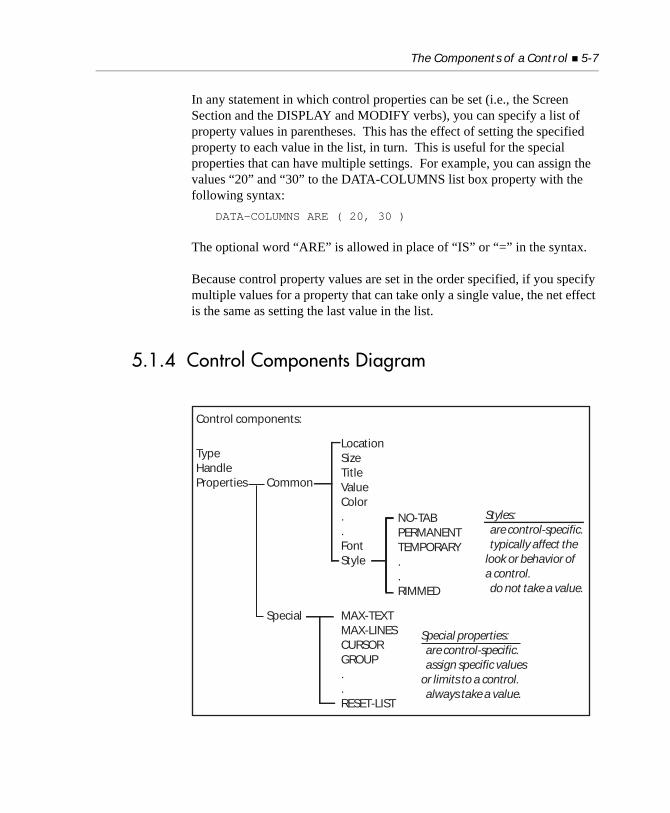
The Components of a Control 5-7
In any statement in which control properties can be set (i.e., the Screen Section and the DISPLAY and MODIFY verbs), you can specify a list of property values in parentheses. This has the effect of setting the specified property to each value in the list, in turn. This is useful for the special properties that can have multiple settings. For example, you can assign the values “20” and “30” to the DATA-COLUMNS list box property with the following syntax:
DATA-COLUMNS ARE ( 20, 30 )
The optional word “ARE” is allowed in place of “IS” or “=” in the syntax.
Because control property values are set in the order specified, if you specify multiple values for a property that can take only a single value, the net effect is the same as setting the last value in the list.
5.1.4 Control Components Diagram
Control components:
TypeHandleProperties Common
Special
LocationSizeTitleValueColor..FontStyle
MAX-TEXTMAX-LINESCURSORGROUP..RESET-LIST
NO-TABPERMANENTTEMPORARY..RIMMED
Styles:· are control-specific.· typically affect thelook or behavior ofa control.· do not take a value.
Special properties:· are control-specific.· assign specific valuesor limits to a control.· always take a value.
5-8 Control Types Reference
5.2 Global Styles
There are several styles that apply to all controls. These styles include:
NO-TAB
This style causes a Tab (or Shift-Tab) key press to skip the control. Normally, while the program is performing a Screen Section ACCEPT, when the user presses Tab or Shift-Tab, the next or previous element in the Screen Section is activated. Specify NO-TAB on controls that you want skipped when these keys are used. This style affects any key with the following editing actions: Default-Next, Erase-Next, Next, Numeric-Next, and Previous. When the program responds to key presses that invoke the above editing actions, it does not activate any control that has the NO-TAB style.
PERMANENT
A permanent control is one that can be destroyed only by the DESTROY verb, or by destroying the window containing the control. By default, controls are permanent. A control can be made temporary using the TEMPORARY_CONTROLS runtime configuration variable.
Permanent controls are more efficient than temporary controls (see TEMPORARY below). The PERMANENT style is applied to a control when it is created and does not change during the life of that control, even if the control’s style is modified.
TEMPORARY
A temporary control self-destructs when its home location is overwritten by another control or by textual output. Temporary controls can also be destroyed in the same manner as permanent controls. A temporary control self-destructs in the following circumstances:
a. Another control is created in the exact same location.
The runtime maintains location information to the nearest 100th of a character cell. If the newly created control is placed in the same row and column as a temporary control (or less than one one-hundredth of a cell away), it destroys the temporary control.
Global Styles 5-9
Note that moving a control on top of a temporary control does not destroy the control (the runtime assumes that the temporary control is about to be moved, also. This occasionally happens with Screen Section updates when several items are of variable size). Only a newly created control can destroy a temporary control.
b. Textual output is placed in the same character cell as the temporary cell’s home location.
Note: BLANK SCREEN destroys all temporary controls in a window.
The temporary style is applied when a control is first created and does not change during the life of the control. If you attempt to apply both the PERMANENT and TEMPORARY style to a control, the PERMANENT style is used.
A control can also be made temporary using the TEMPORARY_CONTROLS runtime configuration variable.
HEIGHT-IN-CELLS
Normally, the height of a control is expressed in control units. Each control defines its own meaning for these units. Typically, a control that is n units high will be exactly big enough to hold n lines of text. This allows you to specify the size of a control in logical terms without having to know its exact physical representation on the screen. The HEIGHT-IN-CELLS style overrides this behavior. Instead of using control units, you specify the height of the control exactly, using the cell size of the owning window as the base unit. Thus, a height of one (1) would cause the control to be exactly one row tall.
This option is especially useful in sizing frame control objects. The style allows you to specify the frame’s exact dimensions without having to know anything about the frame’s title font. You can also specify this style with the CELLS option of the LINES phrase. For example:
LINES = 15 CELLS.
This style is not intended for use in combination with a control’s default height. Default heights are based on control units and when based on character cells do not typically produce useful results.
5-10 Control Types Reference
WIDTH-IN-CELLS
This option is analogous to HEIGHT-IN-CELLS, except that it affects the width of a control. This style is particularly useful when you want to center a label over a region of the screen. By specifying the label’s width in cells, and using the CENTER label style, you can easily do the centering without knowing anything about the label’s font. For example, if you have a window that is 40 columns wide, and you want to center a title in it, you could use:
DISPLAY LABEL MY-TITLE, COLUMN 10, SIZE 20 CELLS, CENTER
Assuming that the title fits in 20 cells, this works for any title in any font.
OVERLAP-LEFT
This style causes the control to be shifted a small amount to the left from its specified position. The amount is equal to the width of the control’s border. This shifting occurs when the control is created or moved. If the control does not have a border, no shifting occurs.
The purpose of this style is to simplify placing several similar controls in a row. For example, if you have a series of adjacent push buttons, the normal appearance would be to draw each push button exactly touching each other. This causes a double border to appear between the push buttons. By shifting each one slightly to the left, you can have the borders overlap and achieve a more uniform appearance with a single border between the buttons. Most applications that have adjacent push buttons do this. You can create the same effect by manually positioning the controls with overlapping borders, but using this style is easier and more portable because you don’t need to know exactly how wide the borders are.
OVERLAP-TOP
This style is similar to the OVERLAP-LEFT style (see above), except that in this case the control is shifted slightly upward. The amount of the shift is determined by the height of the control’s border. This style is useful when you want to create a series of controls that appear to be adjacent to one another in a single column.
ActiveX 5-11
Note: A way to achieve a similar effect with entry fields is to use the OVERLAPPED option on the CELL SIZE phrase of the DISPLAY FLOATING WINDOW verb. This method is usually easier to employ than the OVERLAP-TOP style applied to each individual field, because it applies to the whole window.
5.3 ActiveX
There are two ways to add ActiveX controls to your ACUCOBOL-GT program:
1. Using the AcuBench Screen Designer. This method is the easiest, but it limits you to only graphical controls. It involves adding the control to the Component Toolbox, drawing it onto the Screen Designer screen form, modifying properties if desired, then generating code. This method is described in detail in the AcuBench User’s Guide.
2. Using the ACUCOBOL-GT utility, AXDEFGEN. This method requires some manual program modification, but it provides the flexibility of adding any type of control or COM object to your program, even non-graphical controls like a spell checker or automation server (like Microsoft Word, Excel, or Internet Explorer). This method involves running AXDEFGEN, adding new COPY files to the project, modifying a few sections of code, and compiling. This method is discussed in detail below.
ACUCOBOL-GT defines a control type named “ACTIVE-X” that it uses internally whenever you CREATE, MODIFY, INQUIRE, or DESTROY an ActiveX control.
In the vast majority of cases, you will not use the ACTIVE-X control type directly. Instead, you will specify the name of the specific ActiveX control type. This name can be determined by looking at the “***Primary Interface***” section in the COPY file generated by AXDEFGEN.
Note: With some noted exceptions, the following documentation applies even when you specify the name of a specific ActiveX control type.
5-12 Control Types Reference
5.3.1 Common Properties
This section lists some of the common properties for ActiveX controls. For more information regarding ActiveX properties, see Chapter 4 of A Guide to Interoperating with ACUCOBOL-GT, and Chapter 15, “Screen Designer Controls” in the AcuBench User’s Guide.
TITLE
ActiveX controls associate the TITLE property with the “Window Text.” The effect is dependent on the specific control type.
VALUE
ActiveX controls do not use values.
LINES/SIZE
The LINES and SIZE values describe the area occupied by the ActiveX control, using the ActiveX control’s font to determine the dimensions of the width and height. Note that the control’s font is otherwise ignored by the ActiveX control.
COLOR
ActiveX controls ignore any colors specified. The actual colors used are control-dependent.
AX-EVENT-LIST, EXCLUDE-EVENT-LIST
AX-EVENT-LIST is an exclusive list of ActiveX events that are either sent to or withheld (blocked) from the program, depending on the value of EXCLUDE-EVENT-LIST. See section 6.4.9, “Common Screen Options,” in Book 3.
ActiveX 5-13
STYLES
USE-RETURN
The “Return” (or “Enter”) key typically terminates entry. If you specify the USE-RETURN style, the “Return” key is instead used by the ActiveX control when it is active. For example, if the ActiveX control is a text editor or if it offers a command prompt, the USE-RETURN style would allow the user to start a new line by pressing “Return.” Without this style, pressing “Return” would terminate input.
USE-TAB
The Tab key is typically used to move between fields or controls. If you specify the USE-TAB style, the Tab is instead used by the ActiveX control, when the control is active. This allows the user to enter a tab into the ActiveX control, but prevents the user from using the Tab key to leave the control.
USE-ALT
The user can normally activate a control by typing its key letter in combination with some other special key. Under Microsoft Windows, key letters are typed in conjunction with the Alt key. If you specify the USE-ALT style, the Alt key is instead used by the ActiveX control when it is active. This allows the user to enter an Alt key combination into the ActiveX control, but prevents the user from using an Alt key combination to activate another control.
5.3.2 Special Properties
CLSID (alphanumeric)
This special property is provided for advanced programming tasks that require a generic interface to ActiveX controls. You may create, modify, inquire and destroy an ActiveX control using the ACTIVE-X control type, but with certain restrictions. The compiler will not recognize symbolic property, method, or event names provided by the ActiveX control. You must specify properties and methods by their dispatch identifier (“dispid”) using the PROPERTY phrase, and you must identify events by their dispatch identifier in your event
5-14 Control Types Reference
procedure. ACTIVE-X controls are identified by a globally unique identifier called a “class id” (CLSID). In order to create an instance of an ACTIVE-X control, you must provide this class id. Set CLSID to the class id of the control when you create the control (either in the screen section definition or in the DISPLAY statement).
LICENSE-KEY (alphanumeric)
Some ActiveX controls are licensed for run time via a license key that is provided to you by the distributor of the control. This license key is a text string provided by the control vendor. When you set the LICENSE-KEY property to the value of the license key, you cause the license key to be embedded in your COBOL program. Then, when the COBOL program is run, the license key is passed to the ActiveX control for verification.
Note: It is not necessary to specify a LICENSE-KEY for any of the Microsoft controls included on the ACUCOBOL-GT installation CD. If you use one of these controls in your program, the runtime applies the license key for you automatically. For a discussion of these controls, see Chapter 4 of A Guide to Interoperating with ACUCOBOL-GT.
Getting the license key value and setting the LICENSE-KEY property is simple using AcuBench. It is recommended that you use AcuBench to get the license key value even if you don’t use AcuBench to create your screens. In AcuBench, when you place an ActiveX control on a screen form in the Screen Designer, the LICENSE-KEY property is automatically set to the license key value (if the vendor provided a value when the control was acquired and installed). If you use the AcuBench Screen Designer to create your screens and generate code, there is nothing more to do.
If you do not use AcuBench to create your screens, simply locate the entry for the LICENSE-KEY property in the control’s Property window, and copy and assign that value to LICENSE-KEY in the Screen Section definition or DISPLAY statement of your program. For example, you might include a LICENSE-KEY property like this one:
LICENSE-KEY "C1P0009-XPJ439-01MQ7-2223".
ActiveX 5-15
Please note that if the license key is WideChar (WCHAR) (Doublebyte) such as “0x0067 0x01a2 0x00dd 0x0134 0x0167,” you must use the STRING verb to put the license into a pic x variable, otherwise the embedded NULLs may cause the key to be truncated or even empty. To use a key such as this, you should declare a variable like this:
77 mLicenseKey PIC X(128).
(Note that any size will do as long as it is wide enough to hold all the characters as specified in the license plus two final NULLs.)
You should then set the variable’s value. For example:
INITIALIZE mLicenseKey REPLACING ALPHANUMERIC BY LOW-VALUES.STRING x"00" x"67" x"01" x"a2" x"00" x"dd" x"01" x"34" x"01" x"67" delimited by size into mLicenseKey.
You can then invoke the ActiveX component through SCREEN SECTION or PROCEDURE DIVISION using the DISPLAY verb providing the following property:
LICENSE-KEY mLicenseKey.
The default value of LICENSE-KEY is “ ”.
INITIAL-STATE (multiple parameters)
Use INITIAL-STATE in conjunction with the C$RESOURCE library routine to establish the ActiveX control’s initial state.
{ INITIAL-STATE } { Is } ( resource-handle, resource-name ) { Are } { = }
where
“resource-handle” is a HANDLE OF RESOURCE;
“resource-name” is a literal or data-item.
General Rules
1. “resource-handle” must be the handle of an open resource file. It is obtained by calling the C$RESOURCE library routine.
2. “resource-name” must be the name of a resource item in the resource file whose handle is specified in “resource-handle”.
5-16 Control Types Reference
3. INITIAL-STATE is only set once per control instance. After a program creates an ActiveX control only the first DISPLAY or MODIFY that specifies INITIAL-STATE will set it.
4. INITIAL-STATE failure raises one of the following exceptions:
Example77 RES-HANDLE USAGE HANDLE OF RESOURCE
CALL "C$RESOURCE" USING CRESOURCE-LOAD, "PROGRAM1.RES" GIVING RES-HANDLE.
To set the ActiveX control’s initial state:DISPLAY Calendar LINE 4 COLUMN 6 LINES 10 SIZE 40 INITIAL-STATE (RES-HANDLE, "CALENDAR-1-INITIAL-STATE") HANDLE IN CALENDAR-1.
or in the screen section:03 CALENDAR-1 Calendar LINE 4 COLUMN 6 LINES 10 SIZE 40 INITIAL-STATE (RES-HANDLE, "CALENDAR-1-INITIAL-STATE").
“CALENDAR-1-INITIAL-STATE” is the name of a resource in “PROGRAM1.RES”. Its binary value is the initial state of the CALENDAR-1 ActiveX control. Note that each program that contains ActiveX controls generally has its own resource file.
5.3.3 EventsCMD-GOTOCMD-HELPMSG-VALIDATEMSG-AX-EVENT
ACU-E-INITIALSTATE Error reading resource item from resource file
ACU-E-INVALIDHANDLE Invalid control handle
ACU-E-UNEXPECTED Unexpected error

Bar 5-17
5.4 Bar
The BAR control draws a line on the screen. The line can be either horizontal or vertical, and can be any width. Several options allow you to produce special effects such as double lines and raised or engraved lines. Additional options allow lines to be joined together to form rectilinear objects and shapes.
The bar control is available for both character-based systems and graphical environments. However, on character-based systems, the DOTTED, DASHED, and DOT-DASH styles are not supported. The following special properties are also not supported on character systems: WIDTH, COLORS, SHADING, POSITION-SHIFT, TRAILING-SHIFT, and LEADING-SHIFT.
In a graphical environment, the bar control covers any portion of text that occupies the same space as the bar. In a character-based environment, the bar does not cover the text, and it is displayed as a broken line.
Bar controls are drawn in the order created. This can be important when you are overlapping bars to create junctions.
Graphical: text Character: text
5-18 Control Types Reference
5.4.1 Common Properties
The set of bar common properties includes:
TITLE
A bar does not have a title.
VALUE
A bar does not have a value.
SIZE
The SIZE and LINES values of a bar are measured in window cells. One of the SIZE or LINES phrases must be zero (or unspecified). If LINES is zero, the bar is horizontal. If SIZE is zero, the bar is vertical. Setting SIZE and LINES to non-zero values has an undefined effect.
COLOR
A bar uses only the foreground color. The foreground color is the color of the entire bar. See the COLORS property for other options.
STYLES
DOTTED
This style creates a dotted line instead of a solid line. It is a valid style only when the bar’s width is one. The COLORS and SHADING properties (see below) are ignored when this style is specified. The line is drawn with the control’s foreground color. This style is not available on character-based systems.
DASHED
This style creates a dashed line instead of a solid line. It is valid only when the bar’s width is one. The COLORS and SHADING properties (see below) are ignored when this style is specified. The line is drawn with the control’s foreground color. This style is not available on character-based systems.

Bar 5-19
DOT-DASH
This style creates a line that alternates dots and dashes. It is valid only when the bar’s width is one. The COLORS and SHADING properties (see below) are ignored when this style is specified. The line is drawn with the control’s foreground color. This style is not available on character-based systems.
5.4.2 Special Properties
WIDTH (numeric)
This property specifies the width (thickness) of the bar. Normally, bars are 1 pixel wide. You can set the width to any number of pixels. For example, “WIDTH = 5” creates a bar that is 5 pixels wide. This special property is not available on character-based systems.
COLORS (numeric)
This property allows you to set the color of an individual pixel row or column in the bar. The COLORS property can be set multiple times. The first value assigned describes the color of the topmost pixel row in a horizontal bar, or the left-most pixel column in a vertical bar. The second setting describes the next pixel row or column, and so on. The value must be the absolute color number you want to use, ignoring any high or low intensity settings for the bar. Usually, you would specify all of the desired colors at once by enclosing the values in parentheses. For example, to create a black double line that is three pixels wide, with a bright-white interior, you would specify the following:
DISPLAY BAR, WIDTH = 3, COLORS = ( 1, 16, 1 ), . . .
Any pixel rows or columns that are not specified by the COLORS property are given the bar’s foreground color. You can reset the COLORS property to an empty list by assigning a value of “999” or higher. This special property is not available on character-based systems.
5-20 Control Types Reference
SHADING (numeric)
Allows you to vary the color of individual pixel rows or columns. This works similarly to the COLORS property, but instead of specifying a color, you specify a number that indicates how you would like to adjust the color. The possible values are as follows:
In the preceding table, “normal color” refers to the color the pixel row or column would otherwise have (as determined by the control’s foreground color or the COLORS property). Color shading (value “1” and “-1”) only works for colors in the default palette and the colors generated by the USER-GRAY, USER-WHITE, and USER-COLORS window options. If you place other colors into the palette, the shading options have no effect.
You can use shading to simplify the process of creating a 3-D line. For example, to create a thin gray engraved line, you might use
DISPLAY BAR, COLOR WHITE, LOW, WIDTH = 2, SHADING = ( -1, 1 )
To produce a raised line, simply reverse the shading order:
SHADING = ( 1, -1 )
This special property is not available on character-based systems.
POSITION-SHIFT (numeric)
This property specifies an adjustment to the bar’s position. Positive values move the bar down (for horizontal bars) or to the right (for vertical bars) by the specified number of pixels. Negative values shift the bar upward or leftward instead. The purpose of this property is to simplify manual positioning of a bar when cell measurements are inconvenient. One use is to aid in joining two thick bars to make a corner. For example, to make the lower right half of a box that is 5 cells high and 10 cells wide with a 3-pixel border, you could use:
DISPLAY BAR, WIDTH = 3, LINE 1, COL 11, LINES 5
2 Use color 16 (typically bright white)
1 Brighten the normal color
0 Leave the normal color unchanged
-1 Darken the normal color
-2 Use color 1 (typically black)
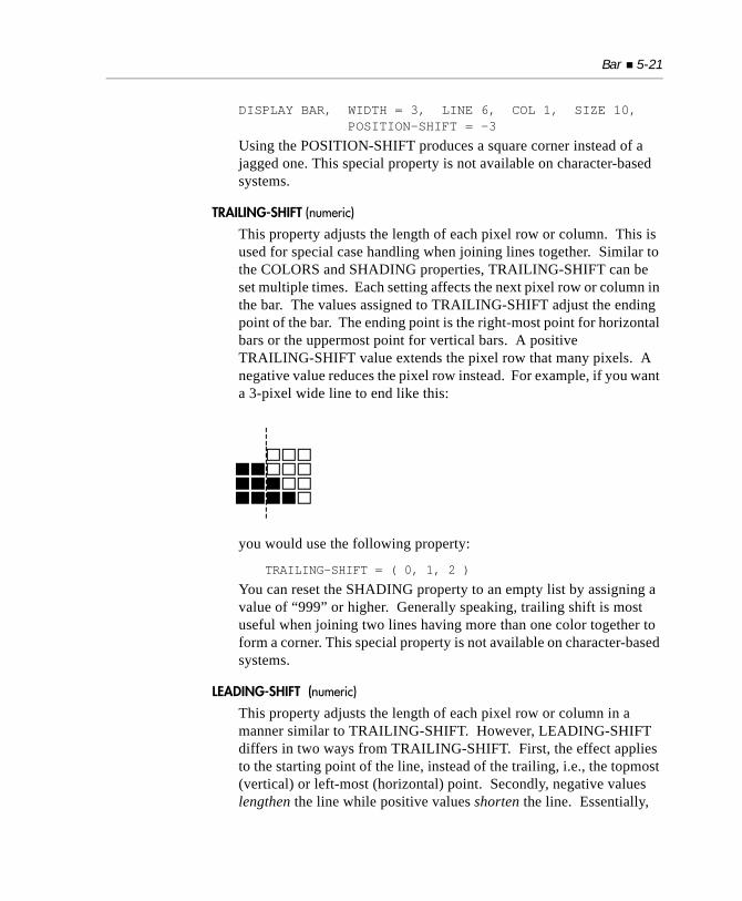
Bar 5-21
DISPLAY BAR, WIDTH = 3, LINE 6, COL 1, SIZE 10, POSITION-SHIFT = -3
Using the POSITION-SHIFT produces a square corner instead of a jagged one. This special property is not available on character-based systems.
TRAILING-SHIFT (numeric)
This property adjusts the length of each pixel row or column. This is used for special case handling when joining lines together. Similar to the COLORS and SHADING properties, TRAILING-SHIFT can be set multiple times. Each setting affects the next pixel row or column in the bar. The values assigned to TRAILING-SHIFT adjust the ending point of the bar. The ending point is the right-most point for horizontal bars or the uppermost point for vertical bars. A positive TRAILING-SHIFT value extends the pixel row that many pixels. A negative value reduces the pixel row instead. For example, if you want a 3-pixel wide line to end like this:
you would use the following property:
TRAILING-SHIFT = ( 0, 1, 2 )
You can reset the SHADING property to an empty list by assigning a value of “999” or higher. Generally speaking, trailing shift is most useful when joining two lines having more than one color together to form a corner. This special property is not available on character-based systems.
LEADING-SHIFT (numeric)
This property adjusts the length of each pixel row or column in a manner similar to TRAILING-SHIFT. However, LEADING-SHIFT differs in two ways from TRAILING-SHIFT. First, the effect applies to the starting point of the line, instead of the trailing, i.e., the topmost (vertical) or left-most (horizontal) point. Secondly, negative values lengthen the line while positive values shorten the line. Essentially,
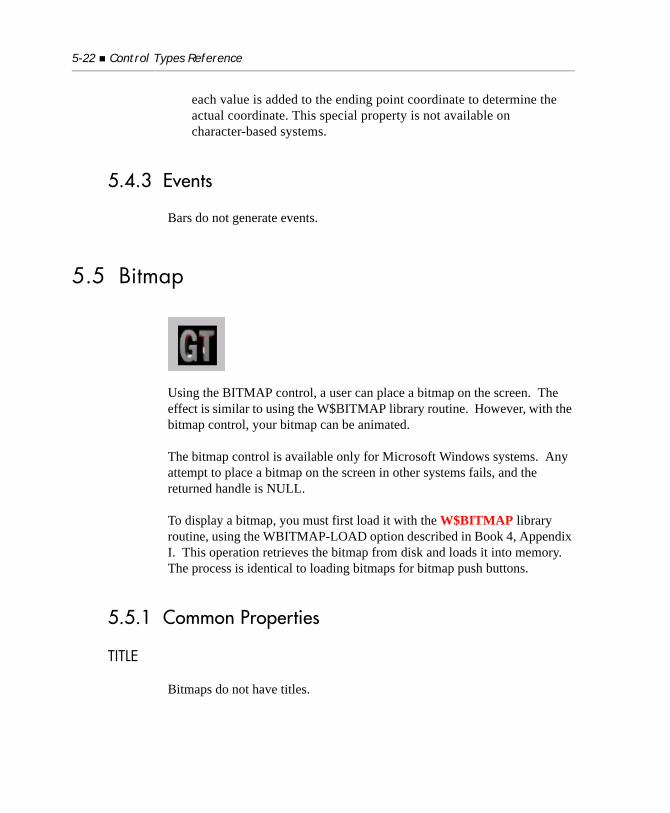
5-22 Control Types Reference
each value is added to the ending point coordinate to determine the actual coordinate. This special property is not available on character-based systems.
5.4.3 Events
Bars do not generate events.
5.5 Bitmap
Using the BITMAP control, a user can place a bitmap on the screen. The effect is similar to using the W$BITMAP library routine. However, with the bitmap control, your bitmap can be animated.
The bitmap control is available only for Microsoft Windows systems. Any attempt to place a bitmap on the screen in other systems fails, and the returned handle is NULL.
To display a bitmap, you must first load it with the W$BITMAP library routine, using the WBITMAP-LOAD option described in Book 4, Appendix I. This operation retrieves the bitmap from disk and loads it into memory. The process is identical to loading bitmaps for bitmap push buttons.
5.5.1 Common Properties
TITLE
Bitmaps do not have titles.
Bitmap 5-23
VALUE
A bitmap does not have a value.
SIZE
SIZE and LINES are measured in pixels. The specified number of pixels are displayed, starting from the upper left-hand corner of the bitmap (for an exception to this, see the BITMAP-NUMBER special property below). If SIZE and LINES are not specified, then the entire bitmap is used.
COLOR
This property is ignored. The bitmap is displayed using the colors encoded in the image.
5.5.2 Special Properties
BITMAP-HANDLE (numeric)
This property indicates the bitmap to display. The value must correspond to the bitmap handle returned by the WBITMAP-LOAD option of W$BITMAP. If this value is omitted, the control uses the bitmap most recently loaded by W$BITMAP.
BITMAP-NUMBER (numeric)
Use this property to display an image from a bitmap strip. A bitmap strip is a series of images of equal width that are strung together horizontally in a single bitmap file. The value of this property is the number of the image in the strip, beginning on the left with “1”. You can identify a particular image if you specify the width of the logical image with the SIZE phrase and the number of the image with the BITMAP-NUMBER property. The default value for this property is “1”.
BITMAP-NUMBER is updated by the runtime to reflect the current image shown when an animated bitmap is displayed. You can retrieve this value with the INQUIRE verb.
5-24 Control Types Reference
BITMAP-RAW-HEIGHT
This property may not be invoked before the property BITMAP-HANDLE has been set to a valid bitmap loaded with WBITMAP-LOAD. The value returned is the image height in device-independent pixels.
The value is read only, any attempt to MODIFY will fail. The receiving variable should take into account a possible image size of 5 digits (PIC 9(5)). The receiving datatype typically is an integer, but any numeric value is accepted.
BITMAP-RAW-WIDTH
This property may not be invoked before the property BITMAP-HANDLE has been set to a valid bitmap loaded with WBITMAP-LOAD. The value returned is the image width in device-independent pixels. The value is read only, any attempt to MODIFY will fail. The receiving variable should take into account a possible image size of 5 digits (PIC 9(5)). The receiving datatype typically is an integer, but any numeric value is accepted.
BITMAP-SCALE
This property is used to enable resizing of bitmaps. If not set, or set to its default value of “0”, the bitmap cannot be resized. This means if the size of the interior of the image is smaller than the image, the image is cut to fit. If the interior is larger than the image size, the image size does not increase to fill the interior.
If set to “1”, the bitmap will scale up or down to fit the interior given, and no cutting of the bitmap occurs.
When setting this property, you must set it prior to setting the property BITMAP-HANDLE to have any effect. For example:
SCREEN SECTION.01 TEMPLATE-SCREEN. 03 bmp BITMAP BITMAP-SCALE 1 BITMAP-HANDLE GT-BITMAP SIZE 100 pixels LINES 200 pixels LINE 1 COL 1.
Bitmap 5-25
With this new property, if you perform a MODIFY statement such as
MODIFY bmp SIZE = 200 LINES = 400.
the bitmap is resized accordingly and automatically. Note that you are not limited to specifying pixel units; you may specify any legal display unit.
Important considerations:
To keep the image from becoming blurred in the resizing process, do not scale up or down in just one direction. For example, if you have an image that is 200x300, increase or decrease the width and height, not just one or the other.
If you enter an invalid resizing value for either the width or height, the invalid entry will be ignored and the previous width or height value will be used.
Resizing images is based on the image size, not the interior size. With multiple resizes, you always will be resizing based on the original image size, not the last resizing that you performed. This is done to maintain the best image quality, as resizing a resized image can degrade image quality.
Currently, only 24-bit colors are supported. If your bitmap is not 24 bit, you can use Microsoft paint to store the bitmap as 24 bit.
We recommend that jpeg files be used whenever possible, as they appear to give the best resizing capability.
BITMAP-START, BITMAP-END (both numeric)
These properties are used when you want to animate a bitmap. Like BITMAP-NUMBER, the value of BITMAP-START is the number of a particular image in a bitmap strip, specifically, the first one to use during animation. Animation runs sequentially in the strip from BITMAP-START to BITMAP-END, looping back to BITMAP-START. If BITMAP-START is not set smaller than BITMAP-END, the control sets BITMAP-START equal to BITMAP-END. The default value for each property is “1”.
5-26 Control Types Reference
BITMAP-TIMER (numeric)
This property is used for bitmap animation. Its value is the amount of time each bitmap image is displayed during animation, in hundredths of seconds. When this property is set to “0”, the bitmap is not animated. Setting the property to a negative value has an undefined effect.
TRANSPARENT-COLOR (numeric)
Use this property to designate “transparent regions” in a bitmap. This is done by reserving one of the colors in the bitmap as the “transparent” color. Any points in the bitmap that contain this color will not be displayed when the bitmap is drawn, allowing the background to show through. This can be useful if you want to integrate a logo onto a screen in a way that accommodates the user’s choice of desktop colors.
To designate a transparent region, choose one color in the bitmap to be the “transparent” color. Then, set the TRANSPARENT-COLOR property to the RGB color value of this color. The RGB color value is computed by the following formula:
(red * 65536) + (green * 256) + blue
where red, green, and blue are values between 0 and 255. You can use a hexadecimal numeric literal to express this value since each component of the color occupies one byte in a binary value. For example, the following literal expresses an orange color with red at 255, green at 128, and blue at 0:
78 orange value x#FF8000.
The first byte (x ‘FF’) is the red value, the second byte (x‘80’) is the green value, and the last byte (x‘00’) is the blue value.
If you set TRANSPARENT-COLOR to “-1” (the default), then the transparency property is turned off and all colors display normally.
Setting TRANSPARENT-COLOR to the hex value “x#1000000” will automatically specify the pixel in the upper-left corner of a bitmap as the “transparent” color. (This is the level 78 constant “BM-CORNER-COLOR” in “acugui.def”.) You do not need to know the exact color of that pixel to use this value.
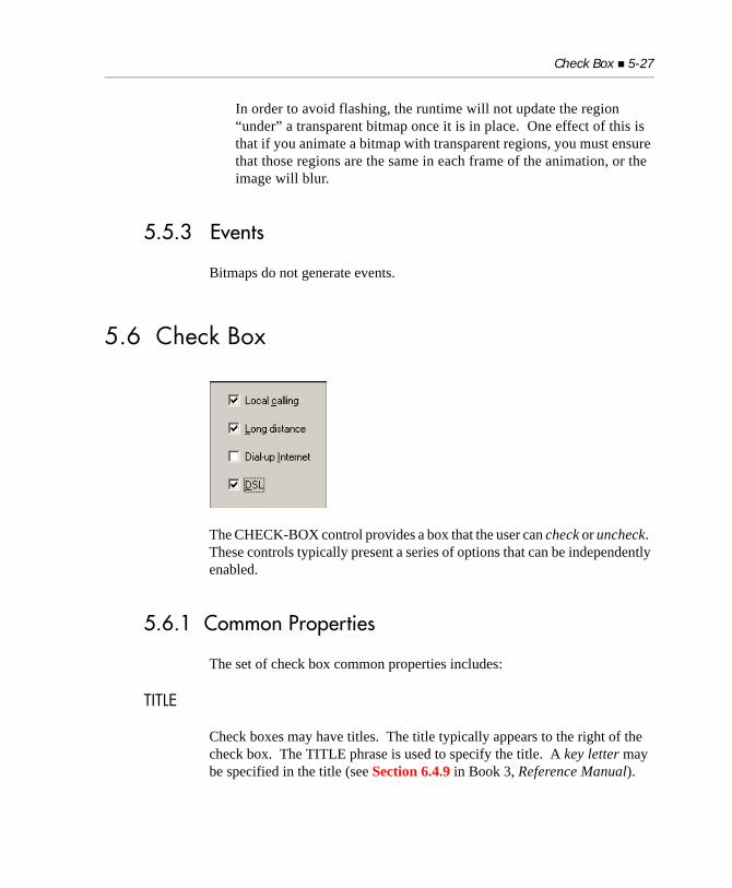
Check Box 5-27
In order to avoid flashing, the runtime will not update the region “under” a transparent bitmap once it is in place. One effect of this is that if you animate a bitmap with transparent regions, you must ensure that those regions are the same in each frame of the animation, or the image will blur.
5.5.3 Events
Bitmaps do not generate events.
5.6 Check Box
The CHECK-BOX control provides a box that the user can check or uncheck. These controls typically present a series of options that can be independently enabled.
5.6.1 Common Properties
The set of check box common properties includes:
TITLE
Check boxes may have titles. The title typically appears to the right of the check box. The TITLE phrase is used to specify the title. A key letter may be specified in the title (see Section 6.4.9 in Book 3, Reference Manual).
5-28 Control Types Reference
VALUE
Check boxes have numeric values. A value of “0” indicates the absence of a check mark. A value of “1” indicates the presence of a check mark.
SIZE
The LINES and SIZE values describe the size of the check box’s title area. The LINES value specifies the number of lines tall the title area will be. The SIZE value specifies the width of the title area, using the width of the “0” (zero) character as the base unit. Added to the title area is overhead needed for the actual check box. This usually adds several character positions to the width, and may affect the height if the check box is taller than the title’s font.
When the program executes on a non-graphical system, the values specified in the CLINES and CSIZE phrases, if present, replace the values specified by the LINES and SIZE phrases.
LINES has a default value of “1”. The default value of SIZE is computed by measuring the length of the title using the check box’s font and dividing by the width of the “0” (zero) character. Thus, the default width of a check box exactly occupies the space its text takes up on the screen.
When the BITMAP style is used, the LINES and SIZE values have a different meaning. The values are the number of pixels in the height and width of the bitmap image (see section 3.8.1, “Creating a Paged List Box,” for details). If omitted, the default values depend on the host system. Under Microsoft Windows, the default LINES value is “15” and the default SIZE value is “16”. These correspond to the size of buttons typically found on a toolbar.
COLOR
Check boxes use both the foreground and background colors specified. If either is omitted, the corresponding color of the check box’s owning subwindow is used.
Bitmap check boxes do not use the specified colors. Instead the colors are derived from the bitmap and the system defaults for push buttons.
Check Box 5-29
EVENT-LIST, EXCLUDE-EVENT-LIST
EVENT-LIST is an exclusive list of events that are either sent to or withheld (blocked) from the program depending on the value of EXCLUDE-EVENT-LIST. See section 6.4.9, “Common Screen Options,” in Book 3.
STYLES
BITMAP
This style causes the check box to be drawn with a bitmap instead of its normal appearance. See section 3.8, “Paged List Boxes,” for a complete description.
FRAMED
This style is used only with bitmap buttons. It requests that a thin frame be drawn around the button. Typically this appears as a thin black line. Not all systems support frames, in which case the request is ignored. By default, buttons are framed under Windows NT/Windows 2000.
UNFRAMED
This style is used only with bitmap buttons. It requests that the button be drawn without a frame. Not all systems support unframed buttons, in which case the request is ignored. By default, buttons are not framed under Windows 98.
SQUARE
This style is used only with framed bitmap buttons. It forces the button to have square corners. Without this style, the button will have slightly rounded corners.
SELF-ACT
This style creates a self-activating check box. A SELF-ACT check box behaves in the same way as a SELF-ACT push button (see the Push Button section above for details). Self-activating check boxes return control to the previously active control or window when they are clicked. Typically, you will want to use the NOTIFY style (below) in conjunction with SELF-ACT, so that your program is informed whenever the check box is clicked.
5-30 Control Types Reference
NOTIFY
This style tells the runtime to generate a CMD-CLICKED event whenever the value of the check box is changed by the user. This allows your program to respond immediately to the change. In essence, the check box acts like a combination check box and push button. Without the NOTIFY style, the check box remains active after it has been changed (exception: see SELF-ACT above).
LEFT-TEXT
Check boxes with this style display their text to the left of the box instead of to the right. Note that if you use this style and try to vertically align several check boxes, the boxes may not align vertically. This is because the default behavior of the runtime is to place the right edge of the check box at the minimum distance needed from its left edge to accommodate the control’s text. This results in the boxes being placed in different columns depending on the text of each control. Supplying a uniform width using the SIZE property overrides this behavior.
FLAT
On Windows systems, this style creates a check box without visible borders. On non-Windows systems, this style has no effect.
MULTILINE
This style causes the check box to have a multi-line title. When the MULTILINE style is applied, the check box’s title text is automatically word wrapped to fit the check box’s size. You can force a line break in the text by embedding an ASCII line feed character (h“0A”). The MULTILINE style is ignored in character-based environments.
VTOP
This style causes the title text to be vertically aligned with the top of the control’s area. By default, the title text is vertically aligned to the center of the control’s area.
Check Box 5-31
5.6.2 Special Properties
BITMAP-NUMBER (numeric)
This property identifies the particular bitmap image to use with the check box (see section 3.8, “Paged List Boxes,” for details). If you explicitly name this property when creating the control, the BITMAP style is automatically applied by the compiler. Note that this does not occur if you use the PROPERTY phrase to specify this property (by giving its identifying number).
BITMAP-HANDLE (handle)
This property identifies the bitmap image strip to use with the check box. See section 3.8, “Paged List Boxes,” for details.
TERMINATION-VALUE (numeric)
This property works in a manner identical to the push button property of the same name (see “Special Properties” paragraph for the push button control in section 5.15). This property is used only when the NOTIFY style is also used. The compiler applies the NOTIFY style automatically if this property is named when the control is created. Note that the NOTIFY style is not automatically applied if you use the PROPERTY phrase to specify this property (by giving its identifying number).
EXCEPTION-VALUE (numeric)
This property works in a manner identical to the push button property of the same name. This property is used only when the NOTIFY style is also used. The compiler will apply the NOTIFY style automatically if you explicitly name this property when you create the control. Note that the NOTIFY style is not automatically applied if you use the PROPERTY phrase to specify this property (by giving its identifying number).
5.6.3 EventsCMD-CLICKEDCMD-GOTOCMD-HELPMSG-VALIDATE
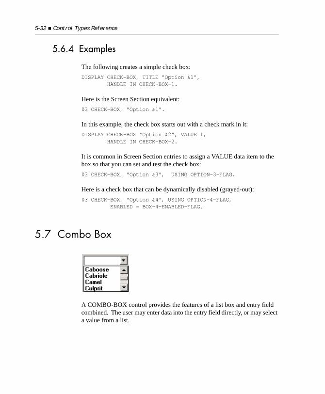
5-32 Control Types Reference
5.6.4 Examples
The following creates a simple check box:DISPLAY CHECK-BOX, TITLE "Option &1", HANDLE IN CHECK-BOX-1.
Here is the Screen Section equivalent:03 CHECK-BOX, "Option &1".
In this example, the check box starts out with a check mark in it:DISPLAY CHECK-BOX "Option &2", VALUE 1, HANDLE IN CHECK-BOX-2.
It is common in Screen Section entries to assign a VALUE data item to the box so that you can set and test the check box:03 CHECK-BOX, "Option &3", USING OPTION-3-FLAG.
Here is a check box that can be dynamically disabled (grayed-out):03 CHECK-BOX, "Option &4", USING OPTION-4-FLAG, ENABLED = BOX-4-ENABLED-FLAG.
5.7 Combo Box
A COMBO-BOX control provides the features of a list box and entry field combined. The user may enter data into the entry field directly, or may select a value from a list.
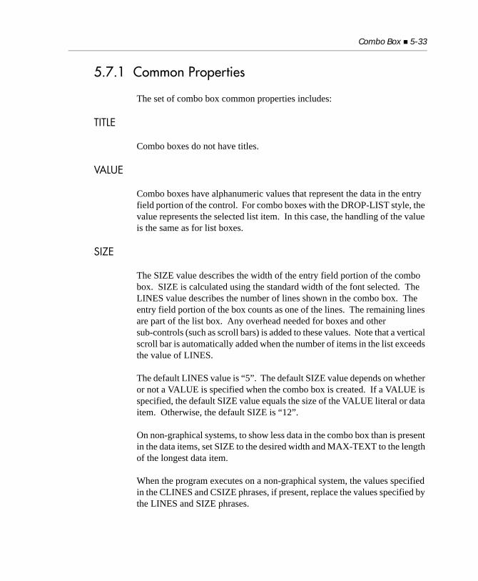
Combo Box 5-33
5.7.1 Common Properties
The set of combo box common properties includes:
TITLE
Combo boxes do not have titles.
VALUE
Combo boxes have alphanumeric values that represent the data in the entry field portion of the control. For combo boxes with the DROP-LIST style, the value represents the selected list item. In this case, the handling of the value is the same as for list boxes.
SIZE
The SIZE value describes the width of the entry field portion of the combo box. SIZE is calculated using the standard width of the font selected. The LINES value describes the number of lines shown in the combo box. The entry field portion of the box counts as one of the lines. The remaining lines are part of the list box. Any overhead needed for boxes and other sub-controls (such as scroll bars) is added to these values. Note that a vertical scroll bar is automatically added when the number of items in the list exceeds the value of LINES.
The default LINES value is “5”. The default SIZE value depends on whether or not a VALUE is specified when the combo box is created. If a VALUE is specified, the default SIZE value equals the size of the VALUE literal or data item. Otherwise, the default SIZE is “12”.
On non-graphical systems, to show less data in the combo box than is present in the data items, set SIZE to the desired width and MAX-TEXT to the length of the longest data item.
When the program executes on a non-graphical system, the values specified in the CLINES and CSIZE phrases, if present, replace the values specified by the LINES and SIZE phrases.
5-34 Control Types Reference
COLOR
Any foreground and background colors specified in the program are used. If the background color is not specified, the owning subwindow’s background color is used. If the foreground color is not specified, a system-default color is used. Note that color handling in combo boxes is tricky, because there are several components that make up a control. You will not be able to control all of the colors shown using just foreground and background colors. For this reason, we suggest using the default colors.
EVENT-LIST, EXCLUDE-EVENT-LIST
EVENT-LIST is an exclusive list of events that are either sent to or withheld (blocked) from the program depending on the value of EXCLUDE-EVENT-LIST. See Section 6.4.9, “Common Screen Options,” in Book 3.
STYLES
DROP-DOWN
This style indicates that the list portion of the control is normally hidden. To see the list, the user pushes a button shown beside the entry field portion, causing it to drop down from the entry field. This is the default style.
STATIC-LIST
This style causes the list to be permanently displayed on the screen.
DROP-LIST
This style is similar to the DROP-DOWN style, except that the entry field is replaced by a static display of the currently selected list item.
UNSORTED
This style is the same as the list box style of the same name.
3-D
This style behaves identically to the 3-D entry field style of the same name.
LOWER
This style converts all the text in the box to lower-case.
Combo Box 5-35
UPPER
This style converts all the text in the box to upper-case.
NOTIFY-DBLCLICK
This style causes the combo box to generate CMD-DBLCLICK events. Normally, double-clicking on an item in the combo box has no special effect. If you specify this style, double-clicking on an item will generate a CMD-DBLCLICK event. This will usually terminate the current ACCEPT statement and allow your program to act on the selection immediately. You can also use an embedded EXCEPTION PROCEDURE in the Screen Section to perform immediate processing. Note that this style is generally useful only for STATIC-LIST style boxes, because the other types of combo boxes close their drop-down list as soon as the user clicks on an item (effectively preventing the ability to perform a double-click). See also the TERMINATION-VALUE and EXCEPTION-VALUE properties, below, for related topics.
NOTIFY-SELCHANGE
This style causes the combo box to generate NTF-SELCHANGE events. Normally, selecting an item in the combo box has no special effect. If you specify this style, a selection change will generate an NTF-SELCHANGE event. This allows your program to act immediately on the new selection.
5.7.2 Special Properties
MAX-TEXT (numeric)
This property is the same as the entry field property of the same name.
ITEM-TO-ADD (alphanumeric)
This property is the same as the list box property of the same name.
MASS-UPDATE (numeric)
This property behaves the same as the list box property of the same name.
RESET-LIST (numeric)
This property is the same as the list box property of the same name.

5-36 Control Types Reference
ITEM-TO-DELETE (numeric)
This property is the same as the LIST BOX property of the same name.
INSERTION-INDEX (numeric)
This property is the same as the list box property of the same name.
TERMINATION-VALUE (numeric)
This property produces the same behavior as the TERMINATION-VALUE push button property, except that it acts on the CMD-DBLCLICK event instead of the CMD-CLICKED event. This property is used only when the NOTIFY-DBLCLICK style is also used. The compiler applies the NOTIFY-DBLCLICK style automatically if this property is explicitly named when the control is initially created. Note that this does not occur if you use the PROPERTY phrase to supply the property value (by giving its identifying number).
EXCEPTION-VALUE (numeric)
This property produces the same behavior as the push button property of the same name, except that it acts on the CMD-DBLCLICK event instead of the CMD-CLICKED event. This property is used only when the NOTIFY-DBLCLICK style is also used. The compiler applies the NOTIFY-DBLCLICK style automatically if this property is explicitly named when the control is initially created. Note that this does not occur if you use the PROPERTY phrase to supply the property value (by giving its identifying number).
5.7.3 EventsCMD-DBLCLICKCMD-GOTOCMD-HELPMSG-VALIDATENTF-SELCHANGE
Combo Box 5-37
5.7.4 Using Special Keys
When a combo box has the input focus, the Home and End keys position the cursor at the beginning or end of a line of text. The Page-Up and Page-Down keys can be used to scroll the combo box. Setting KEYSTROKE configuration entries does not affect these actions.
5.7.5 Examples
The first example creates a drop-down combo box (the default style) that contains a one-line entry field and a four-line list box (total of five lines):
DISPLAY COMBO-BOX, LINES 5, HANDLE IN COMBO-BOX-1.
Here is the Screen Section equivalent. This definition also specifies a data item in which the combo box choice will be stored:
03 COMBO-BOX-1, COMBO-BOX, TO COMBO-BOX-DATA, LINES 5.
Here is an example of code that adds 10 items to the combo box:PERFORM VARYING IDX FROM 1 BY 1 UNTIL IDX > 10 MODIFY BOX-1, ITEM-TO-ADD = BOX-DATA( IDX )END-PERFORM.
The following combo box does not use a drop-down list (the list is always displayed):
03 COMBO-BOX, USING BOX-DATA, STATIC-LIST, LINE 5, COLUMN 40, SIZE 20, LINES 8.
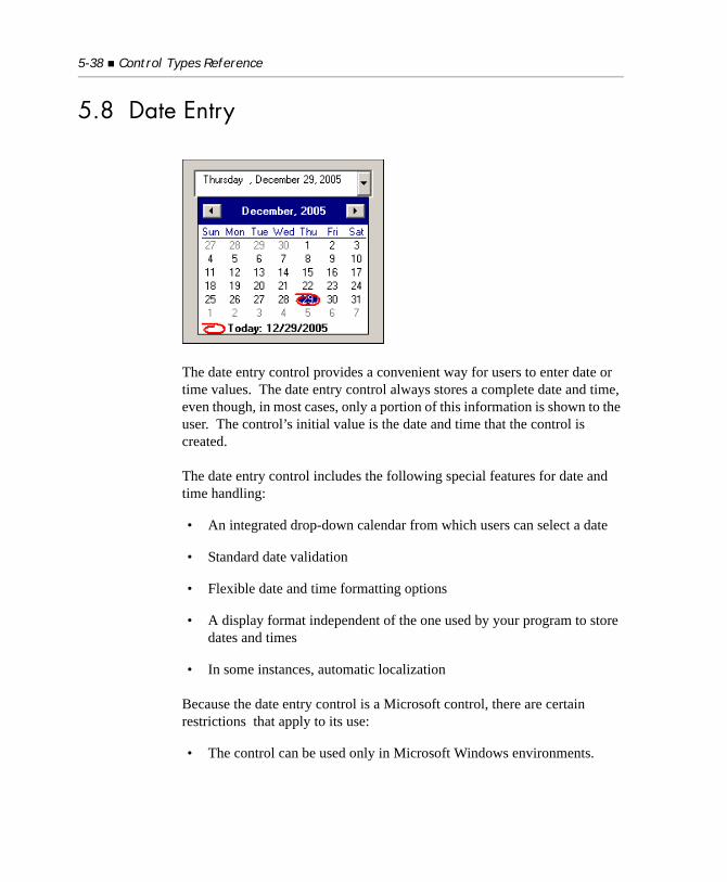
5-38 Control Types Reference
5.8 Date Entry
The date entry control provides a convenient way for users to enter date or time values. The date entry control always stores a complete date and time, even though, in most cases, only a portion of this information is shown to the user. The control’s initial value is the date and time that the control is created.
The date entry control includes the following special features for date and time handling:
• An integrated drop-down calendar from which users can select a date
• Standard date validation
• Flexible date and time formatting options
• A display format independent of the one used by your program to store dates and times
• In some instances, automatic localization
Because the date entry control is a Microsoft control, there are certain restrictions that apply to its use:
• The control can be used only in Microsoft Windows environments.
Date Entry 5-39
• Users of Windows NT 4.0 must have Internet Explorer 3.0 or later installed on their system. This restriction does not apply to later versions of the Windows NT operating system.
• The earliest date supported is January 1, 1752.
• There is no way to change the color of the control. The control always uses the current system colors.
• The control has a 3-D border. This can be changed only on Windows XP systems, which allow you to add an application manifest for the control. Information about application manifests and Windows XP is available from Microsoft.
• Because the date entry control has an intrinsic 3-D appearance, screens containing this control look best if you use the WIN32_3D configuration option for your other 3-D. This creates a consistent appearance.
• The date entry control does not have an “autoterminate” capability, so the user must use the arrow keys or separator keys (such as “/” or “-”) to move between the various fields of a date or time entry.
5.8.1 Common Properties
TITLE
Date entry controls do not use the TITLE property.
VALUE
The date entry control stores a value that is a complete date and time. The format of this value as seen by your program varies depending on the VALUE-FORMAT property. The initial value for the control is the date and time the control is created.
Although the value of the control is alphanumeric, usual practice is to treat the value as if it were numeric, setting and retrieving its value using numeric variables. The runtime and the control perform any necessary conversions.
5-40 Control Types Reference
The control does not usually allow invalid date or time values. This can be circumvented with the SHOW-NONE style, described below.
SIZE
Date entry controls determine height using a combination of font height plus overhead of roughly 50 percent for the box and 3-D effect. The default LINES setting is “1”.
Date entry controls calculate width by multiplying the SIZE setting by the standard width of the font and then adding overhead for the box, 3-D effect, and calendar drop-down button. In most cases, you will get good results by setting the SIZE roughly equal to the number of characters in the formatted display. The default SIZE value is “8”.
Note that a date entry control automatically makes small adjustments to its specified size and position in order to better align with other ACUCOBOL-GT controls that use the 3-D format.
COLOR
Date entry controls ignore any specified color settings. The actual colors displayed are chosen by end-users in the Windows Control Panel. This may result in an unusual appearance if a date entry control is added to a screen that uses custom colors. The limitation is inherent to the underlying control.
EVENT-LIST, EXCLUDE-EVENT-LIST
EVENT-LIST is an exclusive list of events that are either sent to or withheld (blocked) from the program depending on the value of EXCLUDE-EVENT-LIST. See Section 6.4.9, “Common Screen Options,” in Book 3.
Date Entry 5-41
STYLES
CENTURY-DATE
This style uses nearly the same format as the SHORT-DATE style, but the year portion always appears as four digits, even if the user has specified a two-digit format in the Windows Control Panel. Users must have Internet Explorer 5.0 or later installed to use this style successfully.
LONG-DATE
This style causes the date entry control to display a localized long date format. The exact format of the long date depends on settings specified by the user in the Windows Control Panel. In the United States, a common long date format is “Monday, February 16, 2004”.
NO-F4
By default, the date entry control lets users open the calendar using the “F4” key. This style prevents the control from using this shortcut, reserving this key for your program’s use. Note that the “Alt+Down Arrow” key combination also opens the calendar.
NO-UPDOWN
By default, the date entry control lets users scroll through the valid values for each portion of the date or time using the up and down arrow keys. This style disables these functions, reserving the arrow keys for your program’s use. Note that users can still scroll through values in the date entry control using the “+” and “-” keys on the numeric keypad.
NOTIFY-CHANGE
This style causes the date entry control to generate an NTF-CHANGED event each time the user changes the displayed date or time. If this style is not specified, the program is only informed of a new value in the control when the user leaves the field or performs a terminating event (like pressing a function key).
RIGHT-ALIGN
This style causes the drop-down calendar to be roughly aligned with the right edge of the date entry control. By default, the calendar is aligned with the left edge of the control.
5-42 Control Types Reference
SHORT-DATE
This style causes the date entry control to display a localized short date format. The exact format of the short date depends on settings specified by the user in the Windows Control Panel. In the United States, a common short date format is “02/16/2004”.
If no other format is specified, the control will default to the SHORT-DATE format.
SHOW-NONE
This style adds a check box to the date entry control. When the check box is selected, the control contains a valid date and/or time. When the check box is unselected, the control behaves as if it had no value, returning all zeroes instead of a date, or all nines instead of a time.
If you have created a date entry control with the SHOW-NONE style, you can programatically cause the check-box to be unselected and the value to appear grayed out by setting a date of zero or a time of all nines. Likewise, by setting a valid date or time, you can cause the check-box to appear selected and the value to appear normally.
To create a date entry control that uses the SHOW-NONE style and starts with no date or no time, for example, you could use one of the following statements:
DISPLAY DATE-ENTRY, SHOW-NONE, VALUE ZERODISPLAY DATE-ENTRY, SHOW-NONE, VALUE 999999
Note that the “999999” in the second example assumes the default “HHMMSS” time format.
SPINNER
By default, a date entry control displays the date with a button used to open a drop-down calendar. When you specify this style, that button is replaced with small up and down arrows that can be used to modify each portion of the date without referring to the calendar.
The spinner arrows appear by default when the date entry control displays a time format.
TIME
This style causes the control to show a localized time format. The exact format depends on settings specified by the user in the Windows Control Panel. “10:35 AM” is a typical format.
Date Entry 5-43
If this style is set when the control is created, the VALUE-FORMAT property is given the default value “DAVF-HHMMSS”. See the description of the VALUE-FORMAT special property for more information.
5.8.2 Special Properties
CALENDAR-FONT (handle)
Set this property to the handle of the font that you would like to use in the drop-down calendar. If no value is specified, the calendar uses the same font as the rest of the control.
DISPLAY-FORMAT (alphanumeric)
This property gives you the ability to display a custom date and time format. When this property is set, its value takes precedence over any SHORT-DATE, CENTURY-DATE, LONG-DATE, or TIME settings that have been specified.
This property takes a string combining coded fields and quoted literals as its value. The literals are displayed exactly as specified and are set off by single quotation marks “ ' ”. The coded fields are replaced as shown in the following table.
d Numeric day of the month, no leading zeros
dd Numeric day of the month, with leading zeros
ddd Three-letter abbreviation for the day of the week
dddd Full name of the day of the week
M Numeric month, no leading zeros
MM Numeric month, with leading zeros
MMM Three-letter abbreviation for the month
MMMM Full name of the month
y Last two digits of the year, without leading zeros if less than 10
yy Last two digits of the year
yyyy All four digits of the year
h Hours without leading zeros (12-hour clock)
5-44 Control Types Reference
For example, the format string “dd'-'MMM'-'yyyy” would create output like “16-Feb-2004”.
VALUE-FORMAT (numeric)
This property defines how the date entry control exchanges data with your program. It establishes the format of the control’s value. The default VALUE-FORMAT corresponds to the date/time style, as follows:
The following formats, defined in “acugui.def”, are available:
DAVF-YYYYMMDD (value 0): The control’s value is expressed as an eight-digit number. The first four digits are the year, followed by two digits for the month and two digits for the day. This is the default format, unless the TIME style was specified when the control was created.
DAVF-YYMMDD (value 1): The control’s value is expressed as a six-digit number. The first two digits are the year, followed by month and day.
hh Hours with leading zeros (12-hour clock)
H Hours without leading zeros (24-hour clock)
HH Hours with leading zeros (24-hour clock)
m Minutes without leading zeros
mm Minutes with leading zeros
s Seconds without leading zeros
ss Seconds with leading zeros
t One-character time-marker string (for example, “a” and “p”)
tt Multi-character time-marker string (for example, “AM” and “PM”)
SHORT_DATE DAVF_YYMMDD
CENTURY_DATE DAVF_YYYYMMDD
LONG_DATE DAVF_YYYYMMDD
TIME DAVF_HHMMSS

Date Entry 5-45
DAVF-HHMMSShh (value 2): The control’s value is expressed as an eight-digit, 24-hour time value, including hundredths of a second. The first two digits are the hour, then minutes, seconds, and hundredths. Note that even though the date entry control cannot display hundredths of a second, it will nonetheless hold the value.
DAVF-HHMMSS (value 3): The control’s value is expressed as a six-digit, 24-hour time value. The first two digits are the hour, followed by minutes and seconds. This is the default format when the TIME style is specified when the control is created.
DAVF-YYYYMMDDHHMMSShh (value 4): The control’s full date and time is expressed as a sixteen-digit value. This combines the DAVF-YYYYMMDD and DAVF-HHMMSShh formats, and is the only format that contains both date and time information.
5.8.3 Examples
This first example builds a simple date entry control.DISPLAY DATE-ENTRY, VALUE date-val-1.
Since no size or format information is provided, the control will be one line high and eight characters wide, and show the date in the default SHORT-DATE format.
Here is the equivalent Screen Section entry, with the addition of the LONG-DATE style:03 DATE-ENTRY, LONG-DATE, VALUE DATE-VAL-1.
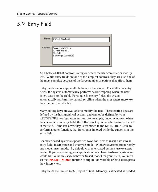
5-46 Control Types Reference
5.9 Entry Field
An ENTRY-FIELD control is a region where the user can enter or modify text. While entry fields are one of the simplest controls, they are also one of the most complex because of the large number of options that affect them.
Entry fields can occupy multiple lines on the screen. For multi-line entry fields, the system automatically performs word wrapping when the user enters data into the field. For single-line entry fields, the system automatically performs horizontal scrolling when the user enters more text than the field can display.
Many editing keys are available to modify the text. These editing keys are defined by the host graphical system, and cannot be defined by your KEYSTROKE configuration entries. For example, under Windows, when the cursor is in an entry field, the left-arrow key moves the cursor to the left in the field. If the left-arrow key is redefined in the KEYSTROKE file to perform another function, that function is ignored while the cursor is in the entry field.
Character-based systems support two ways for users to insert data into an entry field: insert mode and overtype mode. Windows systems support only one mode: insert mode. By default, character-based systems use overtype mode. If you are running your application on a character-based system and would like Windows-style behavior (insert mode) for your users, you must set the INSERT_MODE runtime configuration variable or have users press the <Insert> key.
Entry fields are limited to 32K bytes of text. Memory is allocated as needed.
Entry Field 5-47
The set of the entry field control properties includes:
5.9.1 Common Properties
TITLE
Entry fields do not use titles.
VALUE
Entry fields take a numeric or alphanumeric value.
Conversion between the alphanumeric and numeric forms occurs automatically if you specify a numeric value. This allows you to use numeric data items with entry fields. When you use a numeric data item as an entry field’s value, the runtime prevents the user from entering non-numeric data.
Note: Under Windows, you may encounter a peculiar behavior that looks like a bug but is actually a limitation of the Windows systems. If your entry field is formatted for numeric value and you paste non-numeric data into it from the clipboard, the runtime has no way of checking and verifying that the data is of a correct format, and as a result, the entry field will be allowed to contain invalid data.
MULTIPLE
You may use the “VALUE IS MULTIPLE value” option with multi-line entry fields. The value data item should be a one-dimensional table with no subscript specified. The effect of the MULTIPLE phrase is to match each line of the entry field to occurrences in the table. The first line is matched to the first occurrence in the table, the second line with the second occurrence, and so on. Occurrences that are larger than the number of lines in the entry field are set to spaces when the entry field is accepted. The MULTIPLE option makes it easy to process a large multi-line entry field in COBOL.
There is one important issue to consider when you use the MULTIPLE value option. The runtime does not provide a way to limit the amount of text the user can enter on a single line. Thus, the user could enter more text than a
5-48 Control Types Reference
single occurrence of the value data item can hold. Normally, to prevent the user from entering extra data, you might set the width of the entry field to be the same as the size of the value data item. However, this does not always work, because entry fields typically use a proportionally spaced font. Some characters are smaller than others, and the user can thus enter more of those characters than the width of the entry field might suggest.
There are two possible ways of addressing this issue. One option is to use a fixed-width font with the entry field. Then the width of the field matches the number of characters that the user can enter. The other option is to use a value data item that is larger than the width of the entry field. You will need to experiment to find appropriate sizes. You might try a value data item that is 20% larger than the entry field.
This issue is not normally a problem for single-line entry fields: the MAX-TEXT property (see below) prevents the user from entering too much data.
Finally, note that you can have a multiple-line entry field without using the MULTIPLE value phrase. In this case, the entire contents of the entry field are returned as a single string. Any carriage returns that the user enters directly are kept as part of the string. Carriage returns implied by word-wrapping are discarded.
SIZE
Entry fields determine their height by multiplying the LINES value by the height of the entry field’s font. If the entry field is also boxed (the default), then the space required for the box is added to the height.
Entry fields determine their width by multiplying the SIZE value by the standard or wide font measure as described below. If the entry field is also boxed, the space required for the box is added to the width. Entry fields have a minimum width of at least one character.
When the program executes on a non-graphical system, the values specified in the CLINES and CSIZE phrases, if present, replace the values specified by the LINES and SIZE phrases.
Entry Field 5-49
The default LINES value is “1”. The default SIZE value depends on whether or not a VALUE is specified when the field is created. If a VALUE is specified, the default SIZE equals the size of the VALUE literal or data item. Otherwise, the default SIZE is “8”.
Setting the entry field’s width
Most controls, including entry fields, base their width on the width of the “0” (zero) character in the control’s font. This usually works well because in most fonts, the “0” character is slightly wider than the average character. This means that the field is optimally sized for numeric data, and nearly optimally sized for alphanumeric data (actually it is slightly oversized, which is preferable because the user can enter data that is wider than average). In cases where the user enters very wide data, the entry field will scroll horizontally to fit all the data.
However, there are a few cases where this rule does not produce the best results. To handle these cases, several special sizing rules apply to entry fields.
The most pronounced problem arises when the input includes a lot of upper-case data. Upper-case characters are quite a lot wider than the average character (“0”), so when there are many upper-case characters they often do not fit in the space allotted by the normal rule. Therefore, additional rules handle two cases: (a) upper-case-only fields, and (b) small fields. Small fields require special handling because they tend to be coded fields (which are usually shown in upper-case). Also, scrolling in small fields feels odd to most users while scrolling in large fields is familiar.
To do a better job with these cases, the runtime employs a second font measurement. The second measure averages the width of the “0” (zero) character with the width of the maximum-width character in the font. This value is approximately the size of the average upper-case character in most fonts. We call this measurement the wide font measure. The size of the “0” character is known as the standard font measure.
When the runtime constructs an entry field, the first applicable rule from the list below is used to determine the entry field’s physical size. Overhead for the entry field’s box, if present, is added to this width.
5-50 Control Types Reference
1. An entry field is never allowed to be smaller than the size of the maximum width character. This ensures that at least one character of data is visible in the field.
2. If the field has the NUMERIC style, then its SIZE is multiplied by the standard font measure (i.e., numeric fields are normal).
3. If the field has the UPPER style, and the configuration variable EF-UPPER-WIDE is non-zero, then its SIZE is multiplied by the wide font measure (i.e., upper-case fields are wide).
4. If the field’s SIZE is less than or equal to the value of the configuration variable EF-WIDE-SIZE, then its SIZE is multiplied by the wide font measure (i.e., small fields are wide).
5. Otherwise, its SIZE is multiplied by the standard font measure (i.e., everything else is normal).
The default setting of EF-UPPER-WIDE is “1” (“on”). The default setting of EF-WIDE-SIZE is “5”.
Tips
1. If your users will primarily enter upper-case characters in your application, you can set EF-WIDE-SIZE to a large value (for example “1000”) to ensure that all of your non-numeric fields allow enough space for upper-case entry.
2. If you want to ensure that the standard measure is always applied, set both EF-WIDE-SIZE and EF-UPPER-WIDE to zero.
3. If your upper-case fields are still too narrow (because, for example, you tend to use upper-case “W” frequently), you can increase the entry field’s size further with the FONT-WIDE-SIZE-ADJUST configuration variable.
For a detailed description of the FONT-SIZE-ADJUST and FONT-WIDE-SIZE-ADJUST configuration variables, see Book 4, Appendices, Appendix H.
Entry Field 5-51
COLOR
Entry fields will use any specified foreground or background color. If either color is omitted, then that color uses a system-dependent default value. On most systems, the default foreground is black and the default background is white. Under Microsoft Windows, the default values are determined by the settings defined by the user in the Control Panel (usually black on bright-white). These system-dependent default colors are not transformed or mapped by the runtime’s color-handling configuration options.
EVENT-LIST, EXCLUDE-EVENT-LIST
EVENT-LIST is an exclusive list of events that are either sent to or withheld (blocked) from the program depending on the value of EXCLUDE-EVENT-LIST. See Section 6.4.9, “Common Screen Options,” in Book 3.
STYLES
NUMERIC
This style causes the entry field to accept only numeric data. The NUMERIC style is applied automatically to any entry field that has a numeric or numeric-edited VALUE specified for it before it is created. As a result, you do not normally need to specify this style explicitly. Use this style when creating an entry field that does not have an initial value, but which needs to be restricted to accepting only numeric data.
NO-BOX
On most host graphical systems, entry fields are boxed (on character-based systems, they are not). The NO-BOX style prevents the box from being shown. Generally speaking, boxed entry fields are preferred stylistically, but you may need to omit the box in order to conserve screen space.
BOXED
On graphical systems, this style causes a box to be drawn around the entry field (the default). You can use the BOXED style to override the FIELDS_UNBOXED configuration variable for individual entry fields.
5-52 Control Types Reference
3-D
This style causes the entry field to appear inscribed into the surface of the screen. This looks similar to the LOWERED frame style (see “Frames” in section 5.10, below). The runtime uses the background color of the floating window to determine how to draw the frame. The background color is set when the window is created and each time the window is erased. This color must be one of the low-intensity standard colors, except for black (color numbers 2-7). Any other background color will prevent the 3-D effect from displaying. Only boxed entry fields will display 3-D effects.
LEFT
This style causes the value to be shown left-justified in the entry field (the default). Changing this style after the control has been created has no effect.
RIGHT
This style causes the value to be shown right-justified in the entry field. This style implies that the entry field is MULTILINE. Changing this style after the control has been created has no effect.
CENTER, CENTERED
This style is supported only in Windows. It centers the text in the entry field. This style is allowed on other systems, but it has no effect. Changing this style after the control has been created has no effect.
MULTILINE
This style indicates that the field can display and accept more than one line of text. An entry field created with a LINES setting of two (2) or more automatically has this style applied to it, unless the CELLS phrase is also used or implied. For this reason, you usually will not need to specify this style explicitly.
Note: An entry field created with the CELLS phrase following the “LINES value” phrase has the single-line style applied to it by default.
Entry Field 5-53
VSCROLL
This style allows the user to scroll the contents of the entry field vertically. Without this style, the user may not enter more lines of text than the entry field can hold. With this style, the field will scroll as needed to allow the user to enter multiple lines of text. This style automatically implies the MULTILINE style.
VSCROLL-BAR
This style is identical to the VSCROLL style, with the addition that a vertical scroll bar is placed to the side of the entry field. The size of the entry field is extended to include the space needed by the scroll bar.
USE-RETURN
The Enter (or “Return”) key typically terminates entry. If you specify the USE-RETURN style, the Enter key is instead used to start a new line within the entry field, when the field is active. Without this style, pressing Enter (normally) terminates input.
USE-TAB
The Tab key is typically used to move between fields. If you specify the USE-TAB style, the user can enter a tab within the entry field when the field is active. This prevents the user from using the Tab key to leave the field.
LOWER
This style converts all keyboard entry to lower-case for this field. This style can be changed to UPPER with the MODIFY statement after the control has been created.
UPPER
This style converts all keyboard entry to upper-case for this field. This style can be changed to LOWER with the MODIFY statement after the control has been created.
NO-AUTOSEL
Normally, when an entry field is activated, all of its current contents are selected and highlighted (exception: if the field is activated by the mouse, this does not occur). This allows users to replace the entire contents of the field by simply typing in a new value (they can edit the current contents by using editing keys, or keep the current value by
5-54 Control Types Reference
terminating the field). The NO-AUTOSEL style prevents the automatic selection from occurring. This is most commonly used on large multi-line entry fields.
READ-ONLY
This style prevents the user from typing or editing data in the entry field. In nearly all other respects, the entry field behaves normally. As of Version 8.1, read-only entry fields were changed to conform to standard Windows behavior in that the background color is always gray (regardless of the COBOL program's Color setting). If you need the ability to change the color of read-only entry fields, set the runtime configuration variable "ECN_3699" to "0".
SECURE
This style prevents the characters that are entered into the field from being displayed on the screen. In place of each character, an “*” is displayed. This style is normally used with fields that take a password. This style is not available with MULTILINE entry fields.
SPINNER (Available only for Windows-based systems.)
This style attaches up and down arrow buttons to the right side of the entry field. When the user clicks on the up arrow, your program receives a MSG-SPIN-UP event. Clicking on the down arrow generates a MSG-SPIN-DOWN event. Your program would normally respond to these events by incrementing or decrementing the entry field’s value. Refer to the AUTO-SPIN style for simplified handling.
Note: The SPINNER style may be used only with a single-line entry field. It is ignored if you specify MULTILINE, or if you have an entry field that has more than two lines. In addition, a technical limitation of Windows prevents spinners from being used by entry fields with RIGHT or CENTER justification. This limitation stems from the fact that Windows requires a multiline entry field to use these styles (even if the entry field shows only one line). Windows interprets the up and down arrows as vertical scrolling messages to this “multiline” field.
Using the SPINNER with a 3-D entry field produces a look significantly different when you use the WIN32-3D configuration option.
Entry Field 5-55
AUTO-SPIN
Similar to the SPINNER style, AUTO-SPIN provides a more simplified way of handling spinners by automatically updating the value of the entry field. When the user clicks the up arrow, the control’s value is incremented by one. The down arrow decrements the value by one. The entry field uses the properties MIN-VAL and MAX-VAL to set the allowed range of values. When the user modifies the entry field’s value, the AUTO-SPIN style interprets the current value as an integer and sets the resulting value as an integer. This could have non-obvious results if the field contains something other than an integer when the arrows are clicked. The AUTO-SPIN is only available to entry fields that are left justified.
Entry fields with the AUTO-SPIN style still generate MSG-SPIN-UP and MSG-SPIN-DOWN events. This occurs before the value is changed. If your program sets EVENT-ACTION to EVENT-ACTION-FAIL in response to these events, AUTO-SPIN does not change the value of the entry field. This allows you to do additional range checking; you can also substitute a different value by setting the entry field’s value directly in response to the event.
Note: The behavior of an entry field control with the SPINNER, MIN-VAL, and MAX-VAL properties is determined by its event procedure, which processes messages from the spinner arrows. If your COBOL program does not use an event procedure, the behavior is as follows:When the user enters a value that is outside the permitted range and then uses the spinner arrows to increase or decrease it, the value of the field is incremented or decremented as required. Then if the value is below MIN-VAL, it is set equal to MIN-VAL, and if the value is above MAX-VAL, it is set equal to MAX-VAL.
AUTO
This style causes the entry field to terminate as soon as it is filled by the user. A field is considered filled when the number of characters it contains equals its MAX-TEXT setting (see below). You may also use the words “AUTOTERMINATE” and “AUTO-SKIP” as synonyms for AUTO. This provides compatibility with text-mode COBOL.
5-56 Control Types Reference
NOTIFY-CHANGE
This style causes the entry field to generate NTF-CHANGED events. An NTF-CHANGED event is generated whenever the user changes the value of the entry field. Use this style when you need to track character-by-character changes to an entry field. Note that if you use this style with AUTO, the auto-termination status will take precedence over the NTF-CHANGED event (i.e., when the user fills the field, the field will auto-terminate instead of generating an NTF-CHANGED event).
5.9.2 Special Properties
MAX-TEXT (numeric)
This property limits the maximum number of characters that can be entered by the user into the field. This includes any characters generated by entering a return in a multi-line field. If the user attempts to enter more characters than allowed, the system’s bell sounds. By default, this property is set to the field’s SIZE setting (rounded up to the next whole integer) multiplied by the LINES setting (truncated to the next lower integer). For a single-line field, if you use the default MAX-TEXT and SIZE settings, the user will not be able to enter more characters than the field’s VALUE data item can hold. The default MAX-TEXT setting is made when the control is created. After that, the setting changes only if you explicitly change it.
If MAX-TEXT is set to zero, the only limits placed on keyboard input are those imposed by the host system.
To make a single-line entry field that scrolls horizontally, you would typically make the SIZE smaller than the size of the VALUE data item, and then set MAX-TEXT to be the size of the VALUE data item. See below for an example.
MAX-LINES (numeric)
This property limits the total number of lines that the user can enter in a multi-line entry field. If the user tries to enter more lines, a message box displays that informs the user that the box has too many lines. When it is set to “0” (the default), the MAX-LINES setting is ignored.

Entry Field 5-57
Note: Regardless of how many lines are set or where in the Entry Field the text is added, the control will accept no more than the number of characters that keeps the total character count equal to the value set in the MAX_TEXT property. This is standard behavior in a Windows edit box.
CURSOR (numeric)
This property provides a way to position the cursor within the entry field when the field is activated. You must use CURSOR in conjunction with NO-AUTOSEL; otherwise, the default selection logic will automatically reposition the cursor to the end of the field.
Note: When CURSOR equals “0”, the cursor is automatically positioned by the host system. If CURSOR has a positive value, the cursor is positioned at that character position (starting at “1”). For example, if you assign CURSOR to “3”, the cursor is placed at the third character (either on the third character or between the second and third characters, depending on the appearance of the cursor).
Note: If you use the CURSOR property in a multiline entry field, it will control the cursor position by counting the characters in the entry field without regard to lines. Significantly, internal control characters are also counted, which often makes it difficult to use the CURSOR property effectively in a multiline entry field.
When CURSOR equals “-1”, all of the text in the entry field is selected and the cursor is positioned to the end of the selection.
Ordinarily, this property is not needed. However, one example where you might want to use it is in combination with the NOTIFY-CHANGE style. As the user fills in the field, your program acts on each keystroke. If you change the value of the field in response, the system returns the cursor to column one of the field. Use CURSOR to reposition the cursor to the point where the user was typing, or to some other position in the field.
5-58 Control Types Reference
Note: If you use the CURSOR property in a Screen Section entry, you should set it to “0” after you use it. If you leave it at a non-zero value, the cursor will be repositioned to that value each time you DISPLAY that Screen Section item.
CURSOR-COL (numeric)
This property controls and reports the cursor position in a multiline entry field. Inquiring on CURSOR-COL returns the column number (starting at 1) of the cursor. CURSOR-COL is often used interdependently with the CURSOR-ROW property to determine the exact position of the cursor with respect to the lines and columns of a multiline entry field. For that reason, the two properties are discussed together under the CURSOR-ROW paragraph (below).
CURSOR-ROW (numeric)
This property controls and reports the cursor position in a multiline entry field. Inquiring on CURSOR-ROW returns the line number (starting at 1) of the cursor.
Setting CURSOR-ROW alone has no immediate effect. However, when you set CURSOR-COL, the values of CURSOR-ROW and CURSOR-COL will be taken together to place the cursor at the specified line and column. Thus you should always set CURSOR-ROW before CURSOR-COL if you want to place the cursor at a particular line and column.
If CURSOR-ROW specifies a value =0, the cursor will be placed at the beginning of the entry field. If CURSOR-ROW specifies a line number beyond the end of the text, the cursor will be placed at the end of the text. If CURSOR-ROW is valid and CURSOR-COL specifies a value =0, the cursor will be placed in column 1 of the specified line. If CURSOR-ROW is valid and CURSOR-COL specifies a value greater than the number of characters in the line, the cursor will be placed at the end of the text in that line.
Note: In a single-line entry field, CURSOR-ROW is ignored when set, and it always returns “1” when inquired. CURSOR-COL behaves identically to the CURSOR property in a single-line entry field.
Entry Field 5-59
ACTION (numeric)
When set to a non-zero value, initiates a specific operation in the entry field. The meaningful values are as follows:
See the COPY library “acugui.def” for the value names. Actions are supported only under Windows. Specifying these actions under other systems has no effect. Specifying a value other than one listed here has no effect.
See the SET statement for a technique to automate the generation of actions by other screen elements (such as push buttons or menu items).
MIN-VAL (numeric)
This property sets the lower bound for the range of numeric values the user may enter into the entry field. The user may enter numeric values between MIN-VAL and MAX-VAL (inclusive). This property also sets the lower bound for the range of values used by the AUTO-SPIN style. The value of MIN-VAL must be an integer in the range of -2147483647 to 2147483647. If both MIN-VAL and MAX-VAL are set to the default (zero), no range checking is performed.
When the user enters a value that is out of range and shifts the input focus away from the text box of the entry field control (i.e, clicks the spinner or attempts to leave the control altogether), the entry field displays a message box informing the user of the error. The default error message reads “Please enter a value between min-val and max-val”. You can change this with the TEXT configuration variable.
ACTION-CUT Cuts the current selection to the clipboard
ACTION-COPY Copies the current selection to the clipboard
ACTION-PASTE Pastes the clipboard contents into the entry field at the cursor location. If any text is selected, it is replaced by the paste operation. Text pasted in excess of the field’s capacity is truncated.
ACTION-DELETE Deletes the current selection
ACTION-UNDO Undoes the last change
5-60 Control Types Reference
MAX-VAL (numeric)
This property sets the upper bound for the range of numeric values that the user may enter into the entry field. Along with MIN-VAL, this property is used for range validation; it is also used in conjunction with the AUTO-SPIN style. See MIN-VAL for additional information.
SELECTION-TEXT (alphanumeric)
This property replaces the text currently selected in the control with the value assigned to SELECTION-TEXT. If no text is currently selected, the value is inserted at the current cursor location. When inquired, this property returns the text currently selected, or spaces if nothing is selected. Note that you can determine the exact text that is selected by using the LENGTH option when inquiring on SELECTION-TEXT. The following example displays a message box with the currently selected text in quotes:
77 SEL-TEXT PIC X(100).77 SEL-LEN PIC 9(3).
INQUIRE ENTRY-FIELD-1, SELECTION-TEXT IN SEL-TEXT, LENGTH IN SEL-LENIF SEL-LEN = ZERO DISPLAY MESSAGE BOX, "Nothing selected"ELSE DISPLAY MESSAGE BOX, QUOTE, SEL-TEXT(1 : SEL-LEN), QUOTEEND-IF
If the selection spans multiple lines, any “soft” returns added internally by the control to manage word-wrapping are omitted from the returned value. Any “hard” returns (those inserted by the user via the <Enter> or <Return> key) are represented by the two-character sequence h”0D” h”0A” (carriage-return, line-feed).
Note: You generally should not place SELECTION-TEXT in the Screen Section. If you do, every time you do a DISPLAY of that screen item, the current value of SELECTION-TEXT replaces the currently selected text.
Entry Field 5-61
AUTO-DECIMAL (numeric)
This property enables you to specify a minimum number of digits right of the decimal point required for the automatic termination of the entry field. When used as a property, the number of decimals should be given like this:
AUTO-DECIMAL 2
This will auto-terminate the entry field once you have entered two decimals.
When AUTO-DECIMAL is used as a property, the phrase “AUTO/AUTOTERMINATE” is implied.
Note: There is a configuration variable, AUTO-DECIMAL, which, when set to a non-zero value, performs the same function as the AUTO-DECIMAL property. This variable is described in detail in Book 4, Appendix H.
5.9.3 EventsCMD-GOTOCMD-HELPMSG-SPIN-UPMSG-SPIN-DOWNMSG-VALIDATENTF-CHANGED
5.9.4 Using Special Keys
When an entry field has the input focus, the Home and End keys position the cursor at the beginning or end of a line of text. The Page-Up and Page-Down keys can be used to scroll a multi-line entry field. Setting KEYSTROKE configuration entries does not affect these actions.
5-62 Control Types Reference
5.9.5 Examples
This first example builds a simple entry field:DISPLAY ENTRY-FIELD, HANDLE IN ENTRY-1.
Since no size information is provided, and no VALUE is specified, this field will be one line high and eight characters wide.
In the next example, the entry field gets its initial contents and determines its width from the VALUE data item:DISPLAY ENTRY-FIELD, VALUE DATA-1, HANDLE IN ENTRY-1.
Here is the equivalent Screen Section entry, with the addition of the LOWER style:03 ENTRY-FIELD, USING DATA-1, LOWER.
You could also use the word VALUE instead of USING.
This next Screen Section entry describes an entry field that is roughly 10 characters wide on the screen but which can take up to 30 characters via horizontal scrolling:03 ENTRY-FIELD USING PIC-X-30-ITEM, SIZE 10, MAX-TEXT = 30.
Here is a Screen Section item (along with the relevant Working-Storage items) that creates a 5-line entry box with a vertical scroll bar:
(Working-Storage)01 DATA-TABLE-1, OCCURS 15 TIMES PIC X(40).
(Screen Section)03 ENTRY-FIELD, VALUE MULTIPLE DATA-TABLE-1, LINES 5, SIZE 30, MAX-LINES = 15, VSCROLL-BAR, NO-AUTOSEL.
The above entry field will be 5 lines tall on the screen, but allow for 15 lines of text. Notice that DATA-TABLE-1 is “PIC X(40)” while the SIZE of the entry field is “30”. This provides extra space in DATA-TABLE-1 to allow
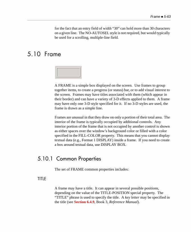
Frame 5-63
for the fact that an entry field of width “30” can hold more than 30 characters on a given line. The NO-AUTOSEL style is not required, but would typically be used for a scrolling, multiple-line field.
5.10 Frame
A FRAME is a simple box displayed on the screen. Use frames to group together items, to create a progress (or status) bar, or to add visual interest to the screen. Frames may have titles associated with them (which appear in their border) and can have a variety of 3-D effects applied to them. A frame may have only one 3-D style specified for it. If no 3-D styles are used, the frame is drawn as a simple line.
Frames are unusual in that they draw on only a portion of their total area. The interior of the frame is typically occupied by additional controls. Any interior portion of the frame that is not occupied by another control is shown as either spaces over the window’s background color or filled with a color specified in the FILL-COLOR property. This means that you cannot display textual data (e.g., Format 1 DISPLAY) inside a frame. If you need to create a box around textual data, use DISPLAY BOX.
5.10.1 Common Properties
The set of FRAME common properties includes:
TITLE
A frame may have a title. It can appear in several possible positions, depending on the value of the TITLE-POSITION special property. The “TITLE” phrase is used to specify the title. A key letter may be specified in the title (see Section 6.4.9, Book 3, Reference Manual).
5-64 Control Types Reference
VALUE
Frames do not have values.
SIZE
The LINES and SIZE values describe the area occupied by the frame, using the frame’s font to determine the dimensions of the row and column. The frame is drawn immediately inside the described area, except that the top or bottom line of the frame is moved by half the height of the title font (even if no title is specified). This allows the title, if any, to appear centered vertically in the frame’s upper or lower line, depending on the value of the TITLE-POSITION special property. However, if the FULL-HEIGHT style (described below) is specified, the frame’s title will descend from the top of the frame instead of being centered vertically. The default LINES value is “5”. The default SIZE value is “12”.
When the program executes on a non-graphical system, the values specified in the CLINES and CSIZE phrases, if present, replace the values specified by the LINES and SIZE phrases.
COLOR
For the default style, the foreground color is used when the frame is drawn. The background color is not used. However, for the various 3-D styles, the background color is the primary color used, and the foreground color is not used. Normally, you want the background color to match the surrounding area when drawing a 3-D effect. Frames use the current window colors as the default foreground and background colors.
Note: If you are using the WIN32_NATIVECTLS runtime variable to automatically enable XP or Vista control styles, and have frames with labels, see the COLOR property of Section 5.12.1, “Label: Common Properties” for information on how the labels may display.
Frame 5-65
STYLES
HEAVY
This style causes the frame to be thicker or more pronounced than normal. The exact effect depends on the other styles used.
VERY-HEAVY
This style creates a very heavy line or 3-D effect. Most of the 3-D effects degrade somewhat when used with this style. However, you should use this style whenever you use the ALTERNATE style.
ALTERNATE
This style creates an alternate look. To get the alternate look, you must also specify either the HEAVY or VERY-HEAVY styles.
The default (NORMAL) style, when combined with the ALTERNATE and VERY-HEAVY styles, produces a double-line frame. The runtime accomplishes this by filling the middle pixel of the 3-pixel frame with the background color.
The effect of ALTERNATE on the RAISED, LOWERED, ENGRAVED, and RIMMED styles is described below under their respective entries. All styles can be previewed on screen with the FRAMES sample program.
RAISED
This is one of the four 3-D styles. The raised style causes the interior of the frame to appear as if raised above the surface of the screen. We suggest that you do not use a title with this style, because the title tends to reduce the 3-D effect.
When combined with the ALTERNATE and VERY-HEAVY styles, RAISED creates a frame that appears to have a raised area with a slight rim around it.
Tip: Be careful when using this style that you don’t make a frame that looks like a push button.
5-66 Control Types Reference
LOWERED
This is one of the four 3-D styles. This style causes the interior of the frame to appear to be lower than the surface of the screen. We recommend against using a title with this style, because the title tends to spoil the 3-D effect.
When it is combined with the ALTERNATE and HEAVY (or VERY-HEAVY) styles, LOWERED creates a frame that has a dark border around the interior of the lowered region.
ENGRAVED
This is one of the four 3-D styles. This style causes the frame to appear lower than the surface of the screen, while the interior of the frame appears to be level with the surface.
When combined with the ALTERNATE and VERY-HEAVY styles, the engraved area of the frame appears to be accentuated and deeper. When ENGRAVED is used with the ALTERNATE and HEAVY styles, the middle pixel of the 3-pixel frame is painted black instead of the background color. This makes the framed region look like a separate piece of the screen.
RIMMED
This is one of the four 3-D styles. This style causes the frame to appear to be raised above the surface of the screen, while the interior of the frame appears to be level with the surface.
When combined with the ALTERNATE and VERY-HEAVY styles, the rim appears to be taller than usual.
FULL-HEIGHT
This style causes the top line of a frame to appear at the exact row position specified. In this case, the frame’s title descends from the top of the frame instead of being centered vertically. Use in conjunction with TITLE-POSITION to adjust the frame title’s location.
To see how the different frame styles appear on your system, compile and run the sample program “frames.cbl”.
Frame 5-67
5.10.2 Special Properties
HIGH-COLOR (numeric)
In order to draw the 3-D effects, the runtime requires three related colors: the background color, and lighter and darker versions of that color. The HIGH-COLOR property specifies the color number of the brighter color. The LOW-COLOR property specifies the color number of the darker color. If either of these values is zero, the runtime will attempt to find default values. The runtime knows how to find colors for the low-intensity versions of blue, green, cyan, red, magenta, brown, and white (out of the default palette). If the background color is not one of these colors, and either the HIGH-COLOR or LOW-COLOR is zero (0), the 3-D effect will be ignored.
LOW-COLOR (numeric)
This property supplies the color number of the darker version of the background color used to draw the 3-D styles. See HIGH-COLOR above for a complete description.
FILL-COLOR (numeric)
This property establishes a color that fills a frame’s interior. The color values range from 1 to 16. A value of “0” (the default) indicates that the frame should have no fill color. The color acts like a background color in terms of how color modification settings affect it. (Note that the control’s background intensity setting can also affect this color.) For a borderless colored area, make the frame’s color and the fill color the same.
The specified fill color is used in the borders of the RAISED and ENGRAVED styles, but not in the borders of the other 3-D styles. Note that the frame’s title establishes its own background color, which is visible only if it is not the same as the fill color. We recommend that you do not insert titles on filled frames. (An exception is interior titles; see the TITLE-POSITION property below.)
FILL-PERCENT (numeric)
This property allows you to fill a portion of a frame with the fill color. The property’s value is the percentage of the frame filled, from 0 to 100. If the frame is taller than it is wide (in base units), then the fill color is applied from the bottom of the frame up to the specified percentage. Otherwise, the frame is filled with the indicated
5-68 Control Types Reference
percentage of fill color from left to right. You can use this property to create a progress (or status) bar. The default value for this property is “100”.
FILL-COLOR2 (numeric)
This property has the same range of values (1 - 16) as FILL-COLOR but is used only if the value of FILL-PERCENT is less than “100”. The color specified by this property is applied to the part of the frame that is not filled by FILL-COLOR. If the value of FILL-COLOR2 is “0” (the default), then no color is applied to the part of the frame not already filled by FILL-COLOR.
TITLE-POSITION (numeric)
This property determines the position of the frame’s title, as follows:
1 Top left
2 Top center
3 Top right
4 Bottom left
5 Bottom center
6 Bottom right
7 Centered vertically and horizontally
Unless the FULL-HEIGHT style (described above) is in effect, a TITLE-POSITION value of “1”, “2”, or “3” places the top of the frame half a character lower than the specified position. A TITLE-POSITION value of “4”, “5”, or “6” places the bottom of the frame half a character higher than the specified position. With values 1 - 6, the frame’s title appears centered with respect to the frame’s border.
TITLE-POSITION value “7” does not adjust the border position as described above, nor does it have a background color. As a result, it can be used with FILL-COLOR and FILL-PERCENT.
Frame 5-69
5.10.3 Events
Frames do not generate events.
5.10.4 Examples
The following creates a simple frame:DISPLAY FRAME, LINES 7, SIZE 30.
Here is a frame with a title specified in the Screen Section:03 FRAME, "Options", SIZE 15, LINES 7.
Here is a frame that has the visual effect of having a dramatically raised surface:
03 FRAME, LINE 4, COL 15, LINES 5, SIZE 25, RAISED, HEAVY.
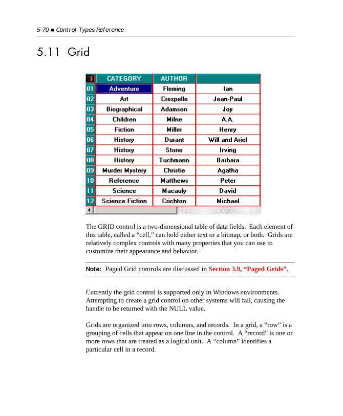
5-70 Control Types Reference
5.11 Grid
The GRID control is a two-dimensional table of data fields. Each element of this table, called a “cell,” can hold either text or a bitmap, or both. Grids are relatively complex controls with many properties that you can use to customize their appearance and behavior.
Note: Paged Grid controls are discussed in Section 3.9, “Paged Grids”.
Currently the grid control is supported only in Windows environments. Attempting to create a grid control on other systems will fail, causing the handle to be returned with the NULL value.
Grids are organized into rows, columns, and records. In a grid, a “row” is a grouping of cells that appear on one line in the control. A “record” is one or more rows that are treated as a logical unit. A “column” identifies a particular cell in a record.
Grid 5-71
By default, a record occupies one row in a grid, but you can arrange for a record to “wrap around” to the next row when it passes the right edge of the grid. When this occurs, a record will occupy more than one row in the grid. You might want to construct a grid like this when you want to see many fields in a data record at once. Alternatively, you can have the grid use scroll bars or wheelmouse events to access cells past the right edge of the control. Column, row, and record numbers all start at “1”.
Grids come in two different formats: with horizontal scrolling and without. When you opt for horizontal scrolling, each record may occupy only one row in the grid. Grids with horizontal scrolling appear much like a spreadsheet. Without horizontal scrolling, a record may occupy more than one row. In either case, vertical scroll bars appear automatically when needed (providing you allow them with the VSCROLL style).
A grid’s capacity is limited by available memory. The grid uses a sparse storage technique in which records with no data have no memory allocated for them. A grid may not have more than 99 columns. There are no other practical limits (2 giga records (2,147,483,647 records) and 2 GB text per record). A single cell may contain no more than 32766 bytes of text.
The grid operates in two different modes: navigate mode and entry mode. While it is in navigate mode, the arrow keys move the cursor around the grid. This is the default mode. The grid shifts to entry mode when the user starts to modify data. In this mode, the arrow keys are used to edit the current cell’s data. When the user finishes a cell, the grid returns to navigate mode.
The exact set of keys understood by the grid depends on the host system. Under Windows, the following keys are used in navigate mode:
Up/Down Arrow moves cursor to the same column in the previous/next record
Left/Right Arrow moves cursor to the previous/next column in the record
Tab (with USE-TAB) moves cursor right, wrapping to next record when at last cell in record
Backtab (with USE-TAB) moves cursor left, wrapping to the previous record when at the first cell in record
Home moves to first column in record
5-72 Control Types Reference
When in entry mode, the user types into an entry field control. All of the editing keys usable by an entry field are usable here. The user leaves entry mode by typing Enter or Tab/Backtab, or by clicking on another cell with the mouse. The special property FINISH-REASON can be used to ascertain why the user left entry mode.
Clicking a mouse on a cell moves the cursor to that cell. Double-clicking on a cell shifts to entry mode.
Grids can have row and column headers. Use the ROW-HEADINGS style to establish row headers and the COLUMN-HEADINGS style to make column headers. Headers are normal cells with certain special traits as follows:
1. Headers are always visible, regardless of how the user scrolls the grid.
2. The cursor does not move into a header cell.
3. The special properties HEADING-COLOR, HEADING-FONT and HEADING-DIVIDER-COLOR apply only to header cells. The style TILED-HEADINGS applies only to header cells.
4. The events MSG-HEADING-CLICKED, MSG-HEADING-DBLCLICK, and MSG-HEADING-DRAGGED apply only to header cells.
Ctl-Home moves to first column of first record
End moves to last column in record
Ctl-End moves to first column in last record
Page Up/Down moves cursor up/down one page
Enter shifts to entry mode for the current cell; highlights contents for editing
Shift-Enter moves cursor to the first column of the next record
Any printable character shifts to entry mode for the current cell; overwrites contents with character
Grid 5-73
Otherwise, headers are normal cells. When you use column headers, record “1” becomes the column headers. When you use row headers, column “1” of each record supplies the row headers.
The grid control can have different colors and fonts assigned to each cell. For convenience, there are several ways this can be done. For example, you can set the color for the grid as a whole, for a particular row or column, or for a particular cell (in addition to other techniques). For a particular cell, there could be several colors or fonts specified for it. The grid picks the color or font to use by applying a priority list. The first item in the list that provides the color or font is the one that is used. For colors, this is determined independently for foreground and background colors.
For colors, the list of priorities is as follows (highest applying first):
• CURSOR-COLOR
• DRAG-COLOR
• REGION-COLOR
• CELL-COLOR
• HEADING-COLOR
• ROW-COLOR
• COLUMN-COLOR
• ROW-COLOR-PATTERN
• Grid’s overall color
For fonts, the following priority list is used:
• CELL-FONT
• HEADING-FONT
• ROW-FONT
• COLUMN-FONT
5-74 Control Types Reference
• Grid’s overall font
Currently, the grid control is available only under Windows.
5.11.1 Common Properties
TITLE
Grids do not have titles.
VALUE
A grid does not have a (single) value. You can set or inquire the contents of each cell using the CELL-DATA property described below. You can also retrieve an entire record at once with the RECORD-DATA property described below.
SIZE
The SIZE of a grid is the number of characters across that you want to be visible in the grid. This is measured using the grid’s default font. The LINES of a grid is the number of rows you want to be visible. Note that this is not the same as the number of records in the case where a record occupies more than one row. Normally, you should ensure that the LINES setting of a grid is an even multiple of the number of rows per record.
Space is added as needed to accommodate the grid’s scroll bars and any border or grid lines.
COLOR
Grids will use any specified foreground or background color. If either color is omitted, then that color uses a system-dependent default value. Under Microsoft Windows, the default values are determined by the settings defined by the user in the Control Panel (usually black on bright-white). Note that the grid’s “color” is its default color. You can override this default for a specific row, column, or cell using various special properties (see ROW-COLOR, COLUMN-COLOR, CELL-COLOR, CURSOR-COLOR, HEADING-COLOR and ROW-COLOR-PATTERN below). The grid uses
Grid 5-75
a priority rule for determining which color to use when several are specified for a cell (for example, a cell that has a ROW-COLOR and a different COLUMN-COLOR specified for it). This is discussed in detail in the introduction to the grid above.
EVENT-LIST, EXCLUDE-EVENT-LIST
EVENT-LIST is an exclusive list of events that are either sent to or withheld (blocked) from the program depending on the value of EXCLUDE-EVENT-LIST. See Section 6.4.9, “Common Screen Options,” in Book 3.
STYLES
3-D
Displays 3-D shading around the border of the control.
ADJUSTABLE-COLUMNS
Allows the user to change the size of the columns by dragging the column dividers with the mouse. The grid must have only one row per record for this style to have any effect. When the grid has column headers, the user will be able to change the column widths only by dragging the header dividers (this is to reduce the likelihood of the user’s accidentally changing a column’s width when just clicking on a cell). If the grid does not have column headers, then the user can drag any part of the divider.
The minimum column size is “1”. The maximum is the visible portion of the grid. If the grid allows for horizontal scrolling, then the VIRTUAL-WIDTH property will change as the user changes column sizes. When the user changes a column size, your program will be informed via a MSG-COL-WIDTH-CHANGED message. Because grids use integer character widths for measuring columns, the user will not be able to place the column divider at just any pixel location. The grid will adjust the location given by the user to the nearest character position.
5-76 Control Types Reference
Note: Single column grids are not adjustable (the column already occupies all of the grid’s display space). If a single column grid has the ADJUSTABLE-COLUMNS property, the column may appear to be adjustable, but when the user releases the mouse after dragging to change the width, the column will return to its original width.
BOXED
Displays a border around the grid. If neither BOXED nor NO-BOX is specified, then the default is machine-dependent. Under Windows, a box is displayed.
CENTERED-HEADINGS
Draws column headings centered, regardless of the alignment of the rest of the column. If this is not specified, then the column headings match the alignment of the corresponding column. Note that the alignment of row headings is specified as the first entry in the ALIGNMENT property, so there is no need for any special row heading alignment styles.
COLUMN-HEADINGS
Causes the first record to be treated as column headers. See the discussion on headers above for details.
HSCROLL
Specifies a horizontally scrolling grid. A grid with this style may not specify more than one row per record (see DISPLAY-COLUMNS below).
NO-BOX
Causes the grid to display without a surrounding border. See BOXED.
NO-CELL-DRAG
Prevents the user from dragging a cell in a grid control. You can configure NO-CELL-DRAG style to be the default setting for grid controls by setting the "GRID_NO_CELL_DRAG" configuration variable to “1” (on, true, yes). The default value is “0” (off, false, no) and will enable the user to drag a cell in a grid control.

Grid 5-77
PAGED
Makes the grid a “paged” grid. Paged grids are typically used when the number of records in the grid is too many for a normal grid. When you set this style for a grid that contains data, records above the first visible record and records after the last visible record are deleted. See section 3.9 for a complete description of paged grids.
ROW-HEADINGS
Treats the first column of each record as a row header. Note that this is typically useful only when you have one record per row. See the discussion on headers above for more details.
TILED-HEADINGS
Draws the headings with some shading that causes the headings to look like tiles. This gives a light 3-D look to the grid. This style is effective only if the background color for the heading cells is low-intensity and not black. This looks best if you set the heading’s background color to low-intensity white (i.e., gray) and set the heading’s divider color to black. Using the constants found in the COPY library “acucobol.def”, you can most easily specify this with:
HEADING-COLOR = BCKGRND-WHITE, HEADING-DIVIDER-COLOR = BLACK
USE-TAB
Causes the grid to use the Tab and Backtab keys as navigation keys within the grid. Without this style, the Tab and Backtab keys move between the grid and other controls in the grid’s window.
VSCROLL
Specifies a vertical scroll bar for the grid. Grids without vertical scroll bars may still contain more records than seen on the screen, and the user can still reach these records using the keyboard. The usual reason for creating a grid without a vertical scroll bar is if you are going to limit the number of records to an amount that fits on the screen (see NUM-ROWS below).
5-78 Control Types Reference
5.11.2 Special Properties
ACTION (alphanumeric)
Used only with paged grids, this property causes the grid to invoke its paging logic in one of several ways. This simplifies the task of filling the grid with its initial data. After creating a grid, you would typically assign one of the following values to ACTION to load the initial page of data that the user will see. The values of the following are level 78 data names found in “acugui.def”:
ACTION-FIRST-PAGE (value 10): Generates the grid’s MSG-PAGED-FIRST event. This fills the grid with the first page of data from the data source.
ACTION-LAST-PAGE (value 11): Generates the grid’s MSG-PAGED-LAST event. This fills the grid with the last page of data from the data source.
ACTION-CURRENT-PAGE (value 12): Empties the grid of any data except for column headers and generates the grid’s MSG-PAGED-NEXTPAGE event. If you position a data file using the START statement before performing this action, the grid will fill the page of data starting with the record selected by the START.
ACTION-PREVIOUS-PAGE (value 14): Generates the grid’s MSG-PAGED-PREVPAGE event. This fills the grid with the previous page of data from the data source.
ACTION-PREVIOUS (value 15): Generates the grid’s MSG-PAGED-PREV event. This scrolls up to show the record before the first record of the grid’s current data.
ACTION-NEXT (value 16): Generates the grid’s MSG-PAGED-NEXT event. This scrolls down to show the next record after the last record of the grid’s current data.
ACTION-NEXT-PAGE (value 17): Generates the grid’s MSG-PAGED-NEXTPAGE event. This fills the grid with the next page of data from the data source.

Grid 5-79
ACTION-HIDE-DRAG
Removes the DRAG-COLOR. See the description of the DRAG-COLOR property below.
ALIGNMENT (alphanumeric)
Describes the alignment of each column in the grid. Each time you set this property, you describe the alignment for the next column in the grid, starting with the first. Setting this property to spaces clears the previously specified alignments. Valid values are as follows (case does not matter):
• “L” = left justified
• “R” = right justified
• “C” = centered
• “U” = unaligned
Unaligned data is displayed in the cell “as is.” Otherwise, leading and trailing spaces are removed from the data, and it is justified as specified. The default for unspecified columns is “unaligned.”
The following example sets various alignments for a three-column grid:
ALIGNMENT = ( "L", "R", "C" )
BITMAP (numeric)
Places a bitmap in the cell identified by the X and Y properties. This should be set to the handle of a bitmap loaded in memory (using the WBITMAP-LOAD option of W$BITMAP). If it is set to zero, then any existing bitmap is removed. You may place a bitmap in the same cell as text. The bitmap is concatenated to the text (with a small separation), and the whole unit is aligned as specified by the ALIGNMENT property. When the user performs text entry in the cell, the bitmap is hidden until the entry is complete. The same bitmap may be placed in more than one cell. You should not destroy the bitmap handle while any cells contain the bitmap.
5-80 Control Types Reference
BITMAP-NUMBER (numeric)
Identifies a particular image when you specify a bitmap strip as the BITMAP for a cell. The first image in the strip is number “1”, the second is number “2”, and so on. Images in a bitmap strip must be uniform width, as specified by BITMAP-WIDTH. The cell affected is identified by the X and Y properties. The default value is “1”.
BITMAP-TRAILING (numeric)
When set to “1”, this property indicates that the bitmap should follow the text in the cell. When it is set to zero (the default), the bitmap precedes the text. Other values have undefined effects. The cell affected is identified by the X and Y properties.
BITMAP-WIDTH (numeric)
Identifies the width, in pixels, of the bitmap identified by BITMAP. If the width is not set, then the entire bitmap is used. Used in conjunction with BITMAP-NUMBER to select an image out of a bitmap strip. The cell affected is identified by the X and Y properties.
CELL-COLOR (numeric)
Sets the color for the cell identified by the X and Y properties. The color value specified uses the COLOR phrase values for both foreground and background colors. The foreground and background intensity of the grid is ignored—the value is treated as the final color value. See COLOR above for related information.
CELL-DATA (alphanumeric)
When set, replaces the text data at the cell identified by the X and Y properties with the specified value. When inquired, returns the text data at that cell.
CELL-FONT (numeric)
Sets the font for the cell identified by the X and Y properties. This should be set to a valid font handle.
CELL-PROTECTION (numeric)
Protects the individual cell identified by the X and Y properties from being changed by the user. Set this property to “1” to protect a cell or “0” to allow the cell to be changed. If the cell is protected, the user can visit the cell, but not modify its contents. The appearance of the cell does not automatically change when the cell is protected.
Grid 5-81
COLUMN-COLOR (numeric)
Sets the color for the entire column identified by the X property. The color value specified uses the COLOR phrase values for both foreground and background colors. The foreground and background intensity of the grid is ignored—the value is treated as the final color value. For example, to set column three’s color to dark blue (2) on bright white (512), you could do the following:
MODIFY GRID-1, X = 3, COLUMN-COLOR = 514
You should be sure to set the X property before setting COLUMN-COLOR. See COLOR above for related information.
COLUMN-DIVIDERS (numeric)
Sets the width, in pixels, of the column dividers. Each time you set this property, you describe the width of the next column’s trailing separator, starting with the first column. Setting this property to “-1” clears the previously specified values. Unspecified columns use a system-dependent default value. On graphical systems, the default divider is one pixel wide. On character systems, the default divider is omitted (zero pixels wide).
COLUMN-FONT (numeric)
Sets the font to use for the column identified by the X property. This should be set to a valid font handle.
COLUMN-PROTECTION (numeric)
Protects the entire column identified by the X property from being changed by the user. If this property is set to “1”, the column is protected; if the property is set to “0”, the column is not protected. The appearance of the column does not change when the column is protected.
CURSOR-COLOR (numeric)
Sets the color for the cell containing the cursor. The color value specified uses the COLOR phrase values for both foreground and background colors. The foreground and background intensity of the grid is ignored—the value is treated as the final color value. Note that the cursor is normally hidden when the grid loses the focus. This causes the cell containing the cursor to revert to its normal color. The default cursor color is “0”. See COLOR and CURSOR-FRAME-WIDTH for related information.
5-82 Control Types Reference
CURSOR-FRAME-WIDTH (numeric)
Determines how the cursor should display in the grid. When this is set to a positive value, the cursor displays a frame that many pixels thick around the cursor’s cell. The frame extends partially into the cell and partially outside the cell. When this property is set to a negative value, a light dotted line is drawn around the cell’s contents. The absolute value of this property is the number of blank pixels between the cell’s border and the dotted line. When it is set to zero, no cursor frame is drawn. The default value is “3”.
CURSOR-X (numeric)
Identifies the column where the cursor is located. Setting this property moves the cursor. Inquiring this property returns the cursor’s location. Note that you may MODIFY this property during a MSG-VALIDATE event to direct where the cursor should go after the user finishes an entry into a cell. However, you should do this only if you are not also forcing the user to stay in entry mode on the current cell. If you move the cursor in response to other events while the user is in entry mode, the results can be confusing.
CURSOR-Y (numeric)
Identifies the record where the cursor is located. Setting this property moves the cursor. Inquiring this property returns the cursor’s location. See CURSOR-X for additional comments.
DATA-COLUMNS (numeric)
This property describes where each column begins in records added to the grid (see RECORD-TO-ADD). Columns are defined by character positions in the raw data, with the first character being position “1”. For example, the following data item:
01 LIST-DATA. 03 NAME PIC X(20). 03 PHONE-NUMBER PIC X(15). 03 STATE PIC X(2).
would normally be displayed in three columns, one at position “1” (NAME), one at position “21” (PHONE-NUMBER), and one at position “36” (STATE). Each time you set DATA-COLUMNS to a positive value, a new column is created at that position. Setting DATA-COLUMNS to zero clears all the existing column definitions.
Grid 5-83
Note that there is always a column at position “1”, so setting position “1” is not required. An example DATA-COLUMNS setting that would match the LIST-DATA group item would be:
DATA-COLUMNS = (21, 36)
You can also specify DATA-COLUMNS using the RECORD-POSITION construct. This is discussed in detail in Chapter 5.2.5 of the Reference Manual.
DATA-TYPES (alphanumeric)
Describes various entry characteristics of each column. Each time you set this property, you describe the data type for the next column in the grid, starting with the first. Setting this property to spaces clears the previously specified data types.
A data type specification contains two components. The first is a single character that describes the set of legal characters that the user may type in this column. The set of possible values is:
Character Description Characters Allowed
“X” Alphanumeric All characters
“U” Uppercase alphanumeric All characters — automatically converted to uppercase
“L” Lowercase alphanumeric All characters — automatically converted to lowercase
“9” Number Digits, local decimal point, sign, space
“Z” Edited number Digits, sign, period, comma, local currency symbol, “$”, “*”, “/”, “%”, space
“I” Integer Digits, sign, space
“P” Positive integer Digits, space
“D” Date Digits, “/”, hyphen
“E” European Date Digits, “/”, hyphen, period
5-84 Control Types Reference
You may specify the data type character in either upper or lower case. After the data type character, you may specify the maximum number of characters that may be entered in this column. This value is specified in parentheses. Two values have special meanings: “0” indicates that the maximum characters is set equal to the size of the column, and “-1” indicates no limit other than those imposed by the internals of the grid (i.e., 32766 characters). When a cell may contain more text than it can display, the cell scrolls horizontally in a fashion similar to entry fields.
You may omit either part of the specification. If the data type part is omitted, it defaults to “X” (all characters allowed). If the size is omitted, it defaults to “0” (match the size of the column). These defaults also apply to columns for which DATA-TYPES has not been specified.
For example, to specify that a column should allow 30 uppercase characters, specify “U(30)”. To create a column that allows only digits for the width of the column, use “P(0)”, or just “P”.
Note: The data type character only limits which characters the user can enter into the column. The grid itself does not further validate or format the entered data. To do so, you should respond to the MSG-FINISH-ENTRY event. The grid’s character filtering is intended only to provide the first stage of validation by allowing only characters that are appropriate for certain types of data.
DISPLAY-COLUMNS (numeric)
This property describes the number of columns and their location in the grid. The first column always displays in column “1”. Additional columns display at the locations set by DISPLAY-COLUMNS. Columns are measured with the standard font. Each time you set DISPLAY-COLUMNS to a positive value, a new display column is defined. Setting DISPLAY-COLUMNS to “0” clears all of the columns (except column 1). Usually, you set DISPLAY-COLUMNS in a list, like this:
DISPLAY-COLUMNS = (1, 21, 35)
This example sets three columns, one starting at column “1”, the next starting at column “21” and the last starting at column “35”. The last column extends to the end of the grid (but see VIRTUAL-WIDTH below).
Grid 5-85
The maximum number of columns you can set is 30. Any columns over 30 will be ignored by the runtime and will not display.
In a grid without horizontal scrolling specified (see HSCROLL above), you can have a record occupy multiple rows in a grid. To do this, restart numbering columns at “1” after setting the first row’s columns. For example, the following describes a grid with records that span two rows, with three columns on the first row and two columns in the second:
DISPLAY-COLUMNS = (1, 21, 35, 1, 21)
On the screen, one record of this grid would look something like this:
column 1 column 2 column 3
column 4 column 5
You can also use columns to hide data. A column set beyond the right side of the grid is not visible on the screen. You can use this behavior to store information in the grid that your program needs to associate with records, but that you do not want to be seen by the user. One potential use for this feature is to store a file record’s primary key value in the hidden column so that you can retrieve the full record easily when the user selects an item in the grid.
DIVIDER-COLOR (numeric)
Sets the color of the dividers for the grid. Set this to the color number of the desired color (e.g. “1” for black, “9” for dark gray). The color ignores the grid’s foreground and background intensity—it is treated as the final color value. When this property is set to zero (the default), a system-specific divider color is used. This color depends on the background color for the grid.
DRAG-COLOR (numeric)
Sets the highlight color that’s applied to the rectangular area defined when the user clicks and drags the mouse. DRAG-COLOR value greater than zero defines a color to be applied using the COLOR phrase values.
DRAG-COLOR is used for the same purpose as REGION-COLOR (see the description of the REGION-COLOR property below for details). You should use DRAG-COLOR instead of
5-86 Control Types Reference
REGION-COLOR when you want to allow users to highlight a block of cells by clicking and dragging the mouse (REGION-COLOR has poor performance in applications that run with the ACUCOBOL-GT Thin Client).
DRAG-COLOR is applied when the user begins a click-and-drag operation.
DRAG-COLOR is removed when one of the following actions occur:
• The cursor is moved to a new cell after an MSG-END-DRAG event is generated
• A heading is clicked
• An MSG-BEGIN-ENTRY event is generated
• The property ACTION is set to ACTION-HIDE-DRAG (level 78 found in “acugui.def”)
The DRAG-COLOR is hidden when the grid does not have focus.
If DRAG-COLOR is specified for a grid that has a menu defined for it, the right-click of the mouse inside the drag region brings up the menu. This allows the user to select a menu item intended specifically for a marked region of the grid. The runtime determines whether or not a grid has a menu immediately after the event MSG-GRID-RBUTTON-DOWN completes.
DRAG-COLOR has a color priority above REGION-COLOR but below CURSOR-COLOR.
END-COLOR (numeric)
Controls the color of the grid in the area past the end of the last column or the end of the last row. In some cases, a blank area is visible. If this property is set to zero (the default), this area is filled with the “button face” color configured for the host machine (this is set in the Control Panel under Windows). If it is set to a non-zero value, this value represents the exact ACUCOBOL-GT color to use. These values range from “1” (black) to “16” (bright white).
Grid 5-87
ENTRY-REASON (alphanumeric)
This property records the user’s action that caused the grid to shift to entry mode. It is set immediately before the MSG-BEGIN-ENTRY event is generated, and it is retained until overwritten by another MSG-BEGIN-ENTRY event or until the grid is destroyed.
The encoding is a single PIC X character as follows:
ENTRY-REASON can be only inquired. Setting it has no effect. You may inquire on ENTRY-REASON during a MSG-BEGIN-ENTRY event to determine what caused the current entry to start. Note that you can then prohibit entry if you desire by moving EVENT-ACTION-FAIL to EVENT-ACTION and returning from the event procedure.
FILE-POS (numeric)
This property is used only for paged grids. The value of FILE-POS is the grid’s record number that matches the current file position in the corresponding data file. It is used to simplify the paging logic in your program. FILE-POS computes the number of records that need to be read in order to find the record needed by the grid. The grid uses this value when generating MSG-PAGED-NEXT or MSG-PAGED-PREV events.
The FILE-POS value will often be either the last visible record in the grid or the first non-heading record visible. To illustrate, suppose that you have a four-line grid with no headings. When you are moving forward through the file, FILE-POS will usually be “4”, matching the last record added to the grid. If the user clicks on the “Next Record” button, the MSG-PAGED-NEXT event will indicate that only one
x“00” A X“00” (binary 0, ASCII null) value indicates that the user double-clicked on the cell
x“0D” A X“0D” (binary 13, ASCII carriage-return) value indicates that the user pressed the <Enter> key
x“18” A X"18" (binary 24, ASCII delete key) value indicates that the user pressed the Delete key"
Otherwise Any other value is the key that the user pressed. For example, if the user started typing “John,” then the letter “J” is returned by ENTRY-REASON.
5-88 Control Types Reference
READ NEXT is needed to retrieve the appropriate record. However, if the user clicks the “Previous Record” button, then the MSG-PAGED-PREV event will indicate that four READ PREVIOUS statements are needed to get the desired record. In this case, FILE-POS will change to “1”, indicating that only one READ PREVIOUS is needed to get another “previous” record while four READ NEXT statements are needed to get the “next” record.
In addition, FILE-POS has three special values that are level 78 data names defined in “acugui.def”. These values are listed below:
The grid automatically manages the FILE-POS, using the following rules:
a. When a record is added to the grid in the topmost non-heading position, FILE-POS is set to that position.
b. When a record is added to the grid or past the last grid record, FILE-POS is set to that position.
c. If you set EVENT-ACTION-FAIL in response to a MSG-PAGED-NEXT event, FILE-POS is set to PAGED-AT-END.
PAGED-AT-START(value 2147418113)
When FILE-POS is set to this value, the grid will not generate MSG-PAGED-PREV and MSG-PAGED-PREVPAGE events.
PAGED-AT-END(value 2147418114)
When FILE-POS is set to this value, the grid will not generate MSG-PAGED-NEXT and MSG-PAGED-NEXTPAGE events.
PAGED-EMPTY(value 2147418115)
When FILE-POS is set to PAGED-EMPTY, it will not generate MSG-PAGED-NEXT, MSG-PAGED-NEXTPAGE, MSG-PAGE-PREV and MSG-PAGED-PREVPAGE. Since it is possible that other users will add records to the file (that could be seen by re-reading it), this value will still generate MSG-PAGED-FIRST and MSG-PAGED-LAST events.
Grid 5-89
d. If you set EVENT-ACTION-FAIL in response to a MSG-PAGED-PREV event, FILE-POS is set to PAGED-AT-START.
e. If you set EVENT-ACTION-FAIL in response to a MSG-PAGED-FIRST or MSG-PAGED-LAST event, FILE-POS is set to PAGED-EMPTY.
f. If a MSG-PAGED-FIRST event sets EVENT-ACTION (this is the default), FILE-POS is set to PAGED-AT-START.
g. If a MSG-PAGED-LAST event sets EVENT-ACTION, FILE-POS is set to PAGED-AT-END.
h. If you reset the grid, FILE-POS is set to PAGED-EMPTY. Adding records to the grid will change this value.
The automatic handling provided here will correctly handle grids whose data is coming from an indexed data file if you move the file’s record pointer only in response to grid events (and only as required by those events). In cases where you move the file’s record pointer independent of a grid request, you will need to do one of the following:
a. Modify FILE-POS to reflect the actual record position. You may use FILE-POS numbers outside of the range of available grid records if needed. For example, if you position the file pointer one record before the first record in the grid, set FILE-POS to “0”. Set FILE-POS to “1” to point to the first record in the grid, “0” to point to the record before that, “-1” to point to two records before it, and so on. You can also use numbers larger than the last grid record to indicate a position beyond the end of the grid.
b. Reposition the current file pointer to match the FILE-POS value. You can do this by reading the appropriate record from the data file again. Note that a START may not be good enough. START positions the file pointer so that the next READ NEXT or READ PREVIOUS returns the selected record. It may not return the record positioned at either side of that record.
c. Ignore the positioning information passed into the MSG-PAGED-NEXT and MSG-PAGED-PREV events, and the positioning information supplied by the grid control. Supply your own positioning logic. In this case, FILE-POS may be incorrect, but FILE-POS is irrelevant at this point because you are not using
5-90 Control Types Reference
it. If you ignore the value of FILE-POS, you must decide whether or not you will use the at-end or at-start feature of FILE-POS. If you do not wish to use this feature, then do not set EVENT-ACTION-FAIL in MSG-PAGED-NEXT and MSG-PAGED-PREV events.
Any of the techniques mentioned above will work. Note, however, that FILE-POS may be difficult to compute with the first technique because it is often hard to tell how far apart two records are in an indexed file.
FINISH-REASON (signed integer)
This property tracks the reason why the grid user left entry mode and entered navigation mode. Its value is set by the control immediately before generation of a MSG-FINISH-ENTRY or a MSG-CANCEL-ENTRY event. It can be inquired by the event procedure for those events to determine why the user is leaving the field she or he was entering. FINISH-REASON is normally only inquired.
FINISH-REASON is a signed, integer property. It is set by the control to a termination or exception value, or one of several preset values. The preset values are described below along with the name of a corresponding level 78 data item. These items are found in the COPY library “acugui.def”.
-1 GRFR-BLANK-PAST-END This is a special case where the entry was finished by the user but canceled by the grid control because the user entered spaces into a blank row past the end of the grid. Instead of “growing” the grid in this case, the grid rejects the user’s entry.
-2 GRFR-TERMINATING The grid control is terminating in response to some external event. A typical reason for this would be if the user clicked on another control or window.
-3 GRFR-CELL-CLICKED The user clicked on another cell in the grid.
Grid 5-91
Any other value indicates that the control received a termination or exception value and FINISH-REASON is the value received. For example, under the default keyboard configuration, if the user pressed function key F1, FINISH-REASON is set to “1”. However, when the user’s action corresponds to a preset value, the preset value takes precedence because the control directly processes those keys. For example, if you configure the Tab key to return a termination value of “9”, the control will still use a value of “-7” (GRFR-TAB-KEY) when the user presses the Tab key.
HEADING-COLOR (signed integer)
Sets the color for header cells (both column and row headers). The color value specified uses the COLOR phrase values for both foreground and background colors. The foreground and background intensity of the grid is ignored—the value is treated as the final color value. See COLOR above for related information.
HEADING-DIVIDER-COLOR (numeric)
Sets the color to use for drawing row and column dividers in the headings. Set this to the color number of the desired color. The color ignores the grid’s foreground and background intensity—it is treated as the final color value. Accepted values range from “1” (black) to “16” (bright white). When this property is set to zero (the default), the dividers in the headings are drawn using the same color as the dividers in the rest of the grid.
HEADING-FONT (numeric)
Sets the font to use for row and column headings. This should be set to a valid font handle. Note that HEADING-FONT takes precedence over ROW-FONT and COLUMN-FONT, but not CELL-FONT.
-4 GRFR-NAVIGATION-KEY The user pressed a navigation key, such as an up or down arrow. This is not generated for the Tab key because that key is sometimes a navigation key and sometimes not.
-5 GRFR-ESCAPE-KEY The user pressed the Escape key.
-6 GRFR-ENTER-KEY The user pressed the Enter key.
-7 GRFR-TAB-KEY The user pressed the Tab key.
5-92 Control Types Reference
HIDDEN-DATA (alphanumeric)
Allows the program to store data that is not displayed in a cell. A cell can contain both displayed data (see CELL-DATA) and hidden data. Hidden data is limited to 255 bytes per cell. Hidden data may be any format, including non-printing characters.
Note: As with all properties that take a text value, when the value of HIDDEN-DATA is stored, the runtime automatically strips trailing spaces and low-values.
HSCROLL-POS (numeric)
This property controls the current scrolling position of the horizontal scroll bar, specifying the column number of the left-most column currently visible in the grid. When row-headings are used, HSCROLL-POS specifies the column number that would appear in column one of the grid if there were no headings.
Note that scrolling is limited to the normal scrolling range. If you specify a value larger than the highest allowed value, the latter value is used. If you specify a value less than “1”, you will receive undefined results. If the grid does not allow scrolling in the specified dimension, setting the property has no effect.
INSERT-ROWS (numeric)
When set to a positive value, this property inserts that many blank records. These are added immediately before the record identified by INSERTION-INDEX. See INSERTION-INDEX.
INSERTION-INDEX (numeric)
Setting this property to a positive value affects the location of records added via RECORD-TO-ADD. When it is set to zero (the default), records are added to the end of the grid. When INSERTION-INDEX is positive, records are added immediately before the corresponding item instead. For example, setting this to “1” causes the record to be inserted as the first record of the list. When you finish adding the next record, INSERTION-INDEX automatically resets itself to a value of zero.
Grid 5-93
In statements that allow for multiple properties, the properties are set in the order specified. Therefore, you can set both INSERTION-INDEX and RECORD-TO-ADD in the same statement, providing you specify INSERTION-INDEX first. For example, the following statement will add a new record to the top of a grid:
MODIFY GRID-1,INSERTION-INDEX = 1,RECORD-TO-ADD = GRID-DATA-1
When you are inserting a record, the following properties are also affected: ROW-COLOR, ROW-FONT, CELL-COLOR, CELL-FONT. If these are specified for a record past the insertion point, then they will be moved “down” one record. For example, if you have ROW-COLOR specified for record “5”, and you insert record “3”, then the ROW-COLOR will move to record “6”. This causes row and cell properties to follow their data.
LAST-ROW (numeric)
When inquired, returns the record number of the last non-blank record in the grid. Row headings are ignored in determining if a record is blank. If the grid contains no non-blank records, LAST-ROW returns zero.
MASS-UPDATE (numeric)
When set to a non-zero value, this property inhibits most (but not all) updates to the screen by the control. This allows you to make multiple changes to the grid faster, and with a smoother screen appearance. When set to zero (the default), changes made to the grid are reflected on the screen. Note that the act of setting this property to zero causes the grid to repaint.
NUM-COL-HEADINGS (numeric)
This property determines the number of rows that will be treated as column headings. When it is set to zero, the grid columns will not have headings. When it is set to a positive value, this value will correspond to the number of rows that will be treated as column headings. For example, if you set the value of this property to “2”, the first two records in the grid will be headings. Headings are always visible and can be colored differently from the body of the grid. Specifying more column headers than rows visible in the grid has undefined effects.
5-94 Control Types Reference
This property effectively supersedes the COLUMN-HEADINGS style. If you specify COLUMN-HEADINGS, then a NUM-COL-HEADINGS value of “0” is treated as if it were “1”. The COLUMN-HEADINGS style has no effect when NUM-COL-HEADINGS is set greater than zero. This rule provides backwards compatibility with COLUMN-HEADINGS while still allowing for a multi-row column header.
NUM-ROWS (numeric)
Determines the total number of records in the grid. When this property is set to a positive value, the grid allows for exactly NUM-ROWS records. When it is set to zero (the default), the grid extends to the last record that has data defined for it. When it is set to “-1”, the grid extends to one record past the last record that has data defined for it. This provides a blank record at the end of the grid in which the user can add new data. In the case of “0” and “-1”, the grid will grow as needed when more records are added.
NUM-ROW-HEADINGS (numeric)
This property determines the number of columns that will be treated as row headings. When it is set to zero, the grid rows will not have headings. When it is set to a positive value, this value will correspond to the number of columns that will be treated as row headings. For example, if you set the value of this property to “2”, the first two records in the grid will be headings. Headings are always visible and can be colored differently from the body of the grid. Specifying more row headers than columns visible in the grid has undefined effects.
This property effectively supersedes the ROW-HEADINGS style. If you specify ROW-HEADINGS, then a NUM-ROW-HEADINGS value of “0” is treated as if it were “1”. The ROW-HEADINGS style has no effect when NUM-ROW-HEADINGS is set greater than zero. This rule provides backwards compatibility with ROW-HEADINGS while still allowing for a multi-column row header. (create, modify, inquire)
RECORD-DATA (alphanumeric)
When set, replaces an entire record of text in the grid at once. You must set DATA-COLUMNS beforehand to denote where each column’s data starts. You must also set the “Y” property to indicate which row you want to overwrite. If you specify a row that is past the
Grid 5-95
current end of the grid, the effect is the same as adding a new record at that point. Otherwise, the row’s existing record is overwritten with the new one.
When inquired, RECORD-DATA returns the data contained in the row identified by property “Y”. This data is formatted according to DATA-COLUMNS. If the requested row does not exist, the returned value will be entirely spaces.
RECORD-TO-ADD (alphanumeric)
Adds an entire record of text to the grid at once. You must set DATA-COLUMNS beforehand to denote where each column’s data starts. The record is usually added at the end of the grid, but you can change this by using INSERTION-INDEX. Note that the new record is added to the grid - it does not overwrite any existing data. Also note that RECORD-TO-ADD will not add an empty record. See CELL-DATA for a way to add individual cells to a grid. See INSERT-ROWS for a way to insert empty records.
RECORD-TO-DELETE (numeric)
Deletes an entire record from the grid. The value of this property is the record number to delete. To enable a user to choose a specific record to delete, identify the specified record by using the cursor -x and cursor-y grid properties.
For example, you could create a push-button labeled “Delete” that when pressed deletes the record in which the cursor resides. You do this by defining and coding an event paragraph for the delete push-button similar to this:
delete-record. INQUIRE grid-1, cursor-x IN grid-x, cursor-y IN grid-y. MODIFY grid-1, RECORD-TO-DELETE grid-y.
In this example, regardless of the column (cursor-x) that the cursor is in, the row specified by cursor-y will be deleted.
Deleting a record affects not only data, but also ROW-COLOR, ROW-FONT, CELL-COLOR and CELL-FONT. If any of these are specified for records following the one deleted, they are moved “up” one record. This causes them to follow their current data. So, for example, if record “5” has a ROW-COLOR specified for it, and you delete record “3”, then the ROW-COLOR will now apply to record “4”.
5-96 Control Types Reference
REGION-COLOR (numeric)
Sets the color for the region bounded by the rows START-Y and Y and the columns START-X and X (inclusive). When you set REGION-COLOR, any previous region color is removed and a new region set. The boundaries of the region are set when REGION-COLOR is set. Subsequent changes to X, START-X, Y or START-Y have no effect on the region until the next time that REGION-COLOR is set.
Region color is normally used to highlight an area being marked by the user while dragging the mouse. To do this, usually all you need to do is set REGION-COLOR to the desired color in response to a MSG-GOTO-CELL-DRAG event. Note that when this event is generated, START-X, X, START-Y and Y all have sensible values in them, and they usually do not need to be set by your program.
Note: REGION-COLOR produces counter-intuitive results when you are displaying more than one row per record. It should be avoided in this case.
RESET-GRID (numeric)
When set to a non-zero value, empties the grid of data. In addition, any ROW-FONT, ROW-COLOR, CELL-FONT and CELL-COLOR settings are cleared. The cursor is positioned at the home cell (the home cell is the uppermost, left-most, non-heading cell) and the grid is scrolled to the home position. RESET-GRID is a one-time action. Note that this clears the headings as well as the body of the grid. Also note that both text and bitmap data are cleared.
ROW-COLOR (numeric)
Sets the color for the entire record identified by the Y property. The color value specified uses the COLOR phrase values for both foreground and background colors. The foreground and background intensity of the grid are ignored—the value is treated as the final color value. Note that although the property is called “ROW-COLOR”, it actually refers to a full record, not just a row. See COLOR above for related information.

Grid 5-97
ROW-COLOR-PATTERN (numeric)
Establishes a repeating color pattern to apply to the rows in the grid. The first time you set this property, the specified color is applied to the top row of the grid. The next setting is applied to the second row, and so on. The pattern established then repeats throughout the grid’s visible rows. The color value specified uses the COLOR phrase values for both foreground and background colors. The foreground and background intensity of the grid are ignored—the value is treated as the final color value. Note that the color pattern is fixed to the visible rows in the grid independently from the current vertical scroll position. Scrolling through the grid does not change the visible aspects of the color pattern. This prevents a “jittery” display while the user scrolls vertically.
This example sets a two-row pattern where the first row will be background white (512) and the second will be background yellow (480). In both cases, the foreground is unspecified (zero added to the value) and will come from some other source:
ROW-COLOR-PATTERN = ( 512, 480 )
See COLOR above for related information.
ROW-DIVIDERS (numeric)
This property establishes the width (in pixels) of the row dividers. Each time you set this property to a nonnegative value, you set the width of the divider for one row of a record. The first setting applies to the first row, the second to the second row, and so on. The pattern established for one record repeats throughout the grid. You can clear the list of divider settings by assigning a value of “-1”. Unspecified dividers use a system-dependent default width. The default divider is one pixel wide.
Assuming two rows per record, the following example would create a pattern where records were divided from each other by a two-pixel border, and the two rows within the record were divided by a one-pixel border:
ROW-DIVIDERS = (1, 2)
ROW-FONT (numeric)
Sets the font for the record identified by the Y property. This should be set to a valid font handle. Note that ROW-FONT refers to the font used for an entire record, not just a row.
5-98 Control Types Reference
ROW-PROTECTION (numeric)
Protects the entire row identified by the Y property from being changed by the user. Set the property to “1” to protect the row, or to “0” to unprotect the row. The appearance of the row does not change when the row is protected. Note that like other row properties, the setting affects an entire record, not just the physical row.
SEARCH-OPTIONS (alphanumeric)
This property controls how searches are performed in the grid.
Note: The grid’s search facility does not contain a user interface. You must supply one if you want to give the user a search function. One typical interface is a pop-up dialog box where the user can set the search text and options desired. Another typical interface is an entry field in the same window as the grid, with a “Find” button beside the entry field.
The SEARCH-OPTIONS property should be assigned from a structure with the following layout:
01 GRID-SEARCH-OPTIONS. 03 GRID-SEARCH-DIRECTION PIC 9. 88 GRID-SEARCH-FORWARDS VALUE ZERO, FALSE 1.
03 GRID-SEARCH-WRAP-FLAG PIC 9. 88 GRID-SEARCH-WRAP VALUE ZERO, FALSE 1.
03 GRID-SEARCH-CASE-FLAG PIC 9. 88 GRID-SEARCH-IGNORE-CASE VALUE ZERO, FALSE 1.
03 GRID-SEARCH-MATCH-FLAG PIC 9. 88 GRID-SEARCH-MATCH-ANY VALUE ZERO. 88 GRID-SEARCH-MATCH-LEADING VALUE 1. 88 GRID-SEARCH-MATCH-ALL VALUE 2.
03 GRID-SEARCH-LOCATION-FLAG PIC 9. 88 GRID-SEARCH-VISIBLE VALUE ZERO. 88 GRID-SEARCH-HIDDEN VALUE 1. 88 GRID-SEARCH-ALL-DATA VALUE 2.
Grid 5-99
03 GRID-SEARCH-SKIP-FLAG PIC 9. 88 GRID-SEARCH-SKIP-CURRENT VALUE ZERO, FALSE 1.
03 GRID-SEARCH-CURSOR-FLAG PIC 9. 88 GRID-SEARCH-MOVES-CURSOR VALUE ZERO, FALSE 1.
03 GRID-SEARCH-COLUMN PIC 9(5). 88 GRID-SEARCH-ALL-COLUMNS VALUE ZERO.
A copy of this structure can be found in the copy library “acugui.def”. It contains the default value settings for all the grid search parameters. Use the COPY statement in the Working Storage section to include this structure with its default values in your program.
To set the SEARCH-OPTIONS property, specify the name of the data structure described above in the screen description entry for the grid or via the “modify” statement. The example below uses the “modify” statement to assign the property:
MODIFY GRID-1SEARCH-OPTIONS = GRID-SEARCH-OPTIONS
To set new search values for a grid, start by using the “inquire” statement to find out what the current values are (they may have been modified previously). Next, set the desired values to the chosen search parameters with the “set” statement, and finally, “modify” the grid to apply the new values.
The following sample shows how to change the values for two of the search parameters and apply the new search options to the grid.
INQUIRE grid-1, SEARCH-OPTIONS IN GRID-SEARCH-OPTIONSSET (option-1) TO TRUESET (option-2) TO TRUEMODIFY grid-1, SEARCH-OPTIONS = GRID-SEARCH-OPTIONS
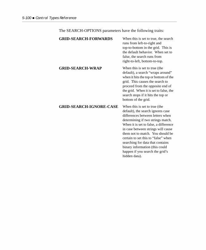
5-100 Control Types Reference
The SEARCH-OPTIONS parameters have the following traits:
GRID-SEARCH-FORWARDS When this is set to true, the search runs from left-to-right and top-to-bottom in the grid. This is the default behavior. When set to false, the search runs from right-to-left, bottom-to-top.
GRID-SEARCH-WRAP When this is set to true (the default), a search “wraps around” when it hits the top or bottom of the grid. This causes the search to proceed from the opposite end of the grid. When it is set to false, the search stops if it hits the top or bottom of the grid.
GRID-SEARCH-IGNORE-CASE When this is set to true (the default), the search ignores case differences between letters when determining if two strings match. When it is set to false, a difference in case between strings will cause them not to match. You should be certain to set this to “false” when searching for data that contains binary information (this could happen if you search the grid’s hidden data).
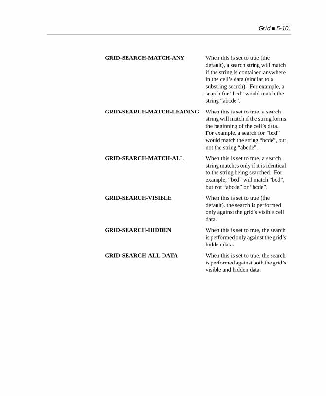
Grid 5-101
GRID-SEARCH-MATCH-ANY When this is set to true (the default), a search string will match if the string is contained anywhere in the cell’s data (similar to a substring search). For example, a search for “bcd” would match the string “abcde”.
GRID-SEARCH-MATCH-LEADING When this is set to true, a search string will match if the string forms the beginning of the cell’s data. For example, a search for “bcd” would match the string “bcde”, but not the string “abcde”.
GRID-SEARCH-MATCH-ALL When this is set to true, a search string matches only if it is identical to the string being searched. For example, “bcd” will match “bcd”, but not “abcde” or “bcde”.
GRID-SEARCH-VISIBLE When this is set to true (the default), the search is performed only against the grid’s visible cell data.
GRID-SEARCH-HIDDEN When this is set to true, the search is performed only against the grid’s hidden data.
GRID-SEARCH-ALL-DATA When this is set to true, the search is performed against both the grid’s visible and hidden data.
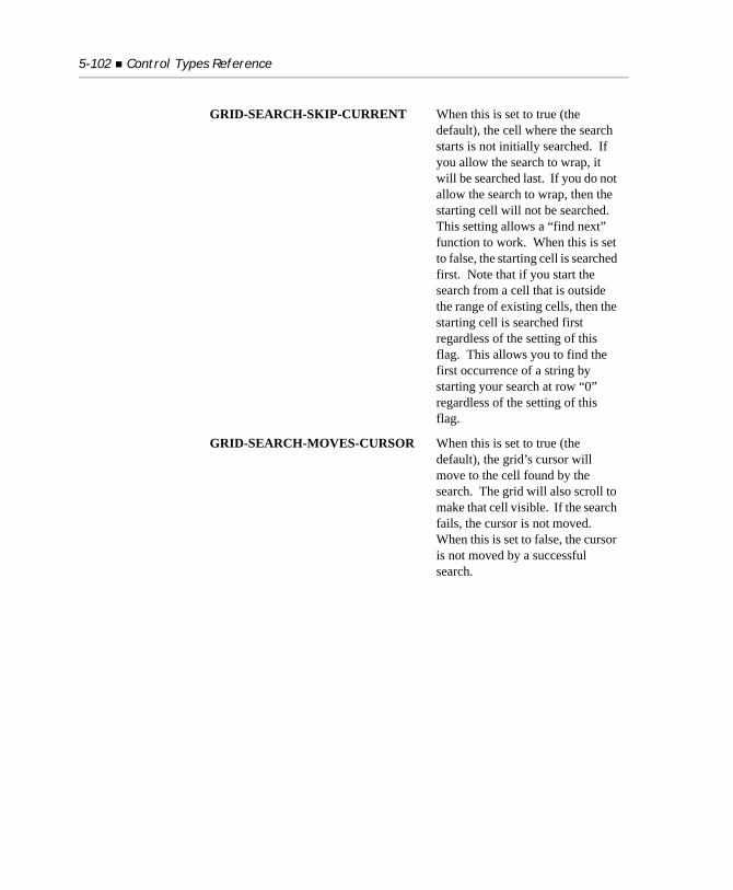
5-102 Control Types Reference
GRID-SEARCH-SKIP-CURRENT When this is set to true (the default), the cell where the search starts is not initially searched. If you allow the search to wrap, it will be searched last. If you do not allow the search to wrap, then the starting cell will not be searched. This setting allows a “find next” function to work. When this is set to false, the starting cell is searched first. Note that if you start the search from a cell that is outside the range of existing cells, then the starting cell is searched first regardless of the setting of this flag. This allows you to find the first occurrence of a string by starting your search at row “0” regardless of the setting of this flag.
GRID-SEARCH-MOVES-CURSOR When this is set to true (the default), the grid’s cursor will move to the cell found by the search. The grid will also scroll to make that cell visible. If the search fails, the cursor is not moved. When this is set to false, the cursor is not moved by a successful search.
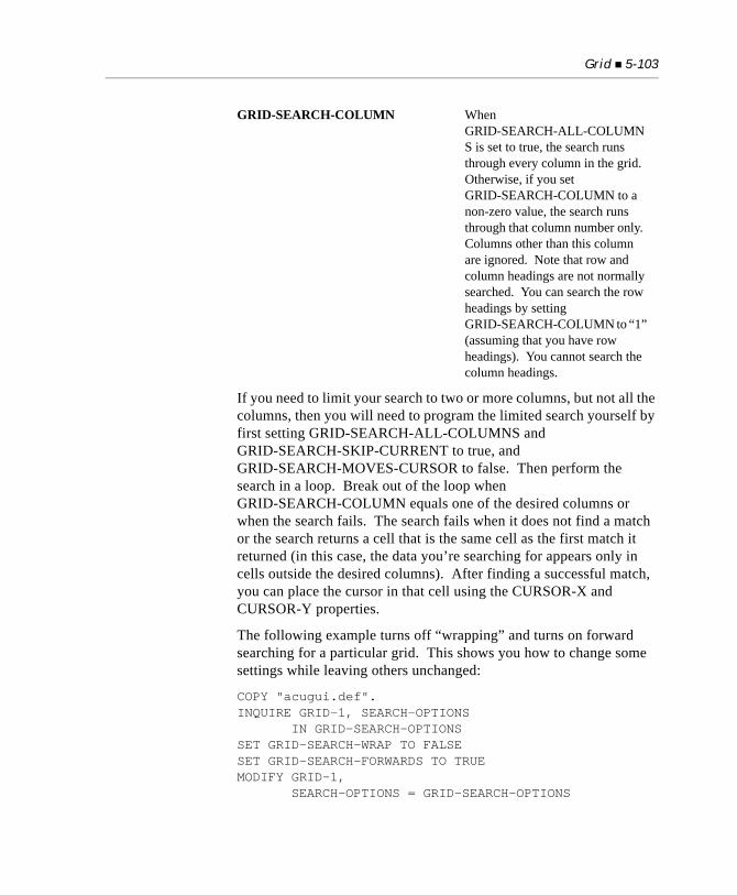
Grid 5-103
If you need to limit your search to two or more columns, but not all the columns, then you will need to program the limited search yourself by first setting GRID-SEARCH-ALL-COLUMNS and GRID-SEARCH-SKIP-CURRENT to true, and GRID-SEARCH-MOVES-CURSOR to false. Then perform the search in a loop. Break out of the loop when GRID-SEARCH-COLUMN equals one of the desired columns or when the search fails. The search fails when it does not find a match or the search returns a cell that is the same cell as the first match it returned (in this case, the data you’re searching for appears only in cells outside the desired columns). After finding a successful match, you can place the cursor in that cell using the CURSOR-X and CURSOR-Y properties.
The following example turns off “wrapping” and turns on forward searching for a particular grid. This shows you how to change some settings while leaving others unchanged:
COPY "acugui.def".INQUIRE GRID-1, SEARCH-OPTIONS IN GRID-SEARCH-OPTIONSSET GRID-SEARCH-WRAP TO FALSESET GRID-SEARCH-FORWARDS TO TRUEMODIFY GRID-1, SEARCH-OPTIONS = GRID-SEARCH-OPTIONS
GRID-SEARCH-COLUMN When GRID-SEARCH-ALL-COLUMNS is set to true, the search runs through every column in the grid. Otherwise, if you set GRID-SEARCH-COLUMN to a non-zero value, the search runs through that column number only. Columns other than this column are ignored. Note that row and column headings are not normally searched. You can search the row headings by setting GRID-SEARCH-COLUMN to “1” (assuming that you have row headings). You cannot search the column headings.
5-104 Control Types Reference
The default settings are the same as the settings you get by moving ZEROS to the GRID-SEARCH-OPTIONS data structure.
SEARCH-TEXT (alphanumeric)
When you assign this property, the grid initiates a search using the current search options. The program looks for the value assigned to this property. The search starts in the cell identified by the X and Y properties unless overridden by the GRID-SEARCH-SKIP-CURRENT described under SEARCH-OPTIONS above. If the search is successful, then X and Y are updated to reflect the cell found. The return value of this property is the status of the search:
If X and Y identify a cell outside of the range of cells, then the starting cell is determined as if the search “wrapped” from the logical (X,Y) location. For example, if the starting point is a cell past the right-most cell, a forward search starts at the first cell of the next row. You can use this to force a search of the entire grid by starting a forward search at row “0”, or a backward search from a row that is past the end of the grid’s data.
The following sample code searches a grid for the word “science”, starting at the cell where the cursor is currently located:
INQUIRE GRID-1, CURSOR-X IN CUR-COL, CURSOR-Y IN CUR-ROWMODIFY GRID-1 (CUR-ROW, CUR-COL) SEARCH-TEXT = "science" GIVING RESULT-1IF RESULT-1 > GRDSRCH-NOT-FOUND DISPLAY MESSAGE BOX "Search succeeded".
GRDSRCH-NOT-FOUND
(value 0)
No matching data found
GRDSRCH-FOUND
(value 1)
Search succeeded
GRDSRCH-WRAPPED
(value 2)
Search succeeded but had to wrap
Grid 5-105
The grid’s search facility does not contain a user interface. You must supply one if you want to give the user a search function. One typical interface is a pop-up dialog box where the user can set the search text and options desired. Another typical interface is an entry field in the same window as the grid, with a “Find” button beside the entry field.
SEPARATION (numeric)
Describes the amount of white space that should be preserved at the end of each column. This space appears between the end of the data and the beginning of the next column. The column divider, if any, appears in the region. This space is expressed as tenths of the standard font width. For example, a value of “5” indicates a half-character width.
Each time you set this property, you set the separation amount for the next column in the grid, starting with the first. Setting this property to “-1” clears the previously specified separation amounts. The default separation used for unspecified columns is set by the COLUMN-SEPARATION configuration variable. This defaults to “5”.
START-X (numeric)
The START-X property is used in conjunction with the START-Y, X, and Y properties to define a rectangular region in the grid. This region is used when you are setting REGION-COLOR. START-X holds a column number. The region colored by REGION-COLOR starts at START-X and extends through X.
START-Y (numeric)
See START-X and REGION-COLOR for a description of this property.
VIRTUAL-WIDTH (numeric)
Sets the overall logical width of the grid. This is used only with grids that have horizontal scrolling. This value is expressed in characters (measured using the standard font width). If not specified, then the grid extends to 10 characters past the last DISPLAY-COLUMN specified (making the last column 10 characters wide). You can create hidden columns by setting this value smaller than some of your columns’ starting points.
5-106 Control Types Reference
VPADDING (numeric)
Sets the amount of vertical white space in each row. This value is the percentage of the grid’s font height to apply as extra white space (i.e., separation between the cell’s data and the cell’s row dividers). The default setting is “50”. Note that this produces a look similar to a series of entry fields (because the normal entry field is 50% taller than its font). On character systems, the VPADDING value is not used.
Note: The Windows implementation of the grid control uses the standard “edit” (entry field) control to do its data entry (it creates the edit control when the grid shifts to “entry mode”). The Windows edit control has technical limitations with regards to vertical spacing. These limitations depend on the alignment of the field (left justified fields have fewer limitations). Setting VPADDING to less than “50” can result in odd behavior. If you set VPADDING to less than “50,” be sure to check that the grid behaves the way you want on your target platforms.
VSCROLL-POS (numeric)
This property controls the current scrolling position of the vertical scroll bar, specifying the first visible row of the grid’s scrollable region.
Note that scrolling is limited to the normal scrolling range. If you specify a value larger than the highest allowed value, the latter value is used. If you specify a value less than “1”, you will receive undefined results. If the grid does not allow scrolling in the specified dimension, setting the property has no effect.
X (numeric)
The X property holds a column number. It is used by several other properties when they need to know which column to act on. For example, the COLUMN-COLOR property sets the color for the column identified by the X property. Column numbers start at “1”. Remember that properties are set in the order specified in a statement. You should be certain to set the X property before setting another property that refers to it.
Grid 5-107
Y (numeric)
The Y property is similar to the X property, except that it holds a record number instead of a column number.
5.11.3 Events
Grid controls can generate the following events:CMD-GOTOCMD-HELPMSG-VALIDATEMSG-BEGIN-ENTRYMSG-FINISH-ENTRYMSG-CANCEL-ENTRYMSG-GOTO-CELLMSG-GOTO-CELL-MOUSEMSG-GOTO-CELL-DRAGMSG-BEGIN-DRAGMSG-END-DRAGMSG-BITMAP-CLICKEDMSG-BITMAP-DBLCLICKMSG-HEADING-CLICKEDMSG-HEADING-DBLCLICKMSG-HEADING-DRAGGEDMSG-BEGIN-HEADING-DRAGMSG-END-HEADING-DRAGMSG-COL-WIDTH-CHANGEDMSG-INIT-MENUMSG-MENU-INPUTMSG-END-MENUMSG-GRID-RBUTTON-UPMSG-GRID-RBUTTON-DOWNMSG-PAGED-FIRSTMSG-PAGED-LASTMSG-PAGED-NEXTMSG-PAGED-NEXTPAGEMSG-PAGED-PREVMSG-PAGED-PREVPAGE
5-108 Control Types Reference
MSG-PAGED-NEXT-WHEELMSG-PAGED-PREV-WHEEL
5.12 Label
The LABEL control type displays a simple string of text. Labels cannot take any input from the user and, thus, cannot be activated. Use labels to describe entry fields, or for any other situation where you need to display simple text.
Labels may occupy multiple lines. When a label is displayed on multiple lines, it will use word-wrapping if possible so that words are not broken across lines.
The set of LABEL properties includes:
5.12.1 Common Properties
TITLE
Labels can take titles. The text of the title is the text displayed on the screen. The “TITLE” phrase is used to specify a title. A key letter may be specified in the title (see the entry for “TITLE Phrase” in Section 6.4.9 of Book 3, Reference Manual).
VALUE
Labels cannot be activated and do not take values.
Label 5-109
SIZE
Labels define their height by multiplying the LINES value by the height of the label’s font (including any interline spacing). For example, a LINES value of “1” indicates one line of text. Labels define their width by multiplying the SIZE value by the width of the “0” (zero) character of the label’s font.
When the program executes on a non-graphical system, the values specified in the CLINES and CSIZE phrases, if present, replace the values specified by the LINES and SIZE phrases.
The default value of LINES is “1”. The default value of SIZE is computed by measuring the length of the label’s title using the label’s font and dividing by the width of the “0” character. Thus, the default width of a label exactly occupies the space its text takes up on the screen.
To get a multi-line label, set the LINES value to the number of lines wanted and the SIZE value to the desired width. SIZE specifies the width that each line of the label will occupy.
COLOR
Labels use both the foreground and background colors specified. If either is omitted, the corresponding color of the label’s owning subwindow is used.
If you are using the WIN32_NATIVECTLS runtime variable to automatically enable Windows XP or Vista control styles, label background colors may exhibit a darker background when residing on frames or tab frames. This is because XP and Vista label controls have a different background color than frames or tab frames. Making labels have the TRANSPARENT property resolves this issue.
STYLES
LEFT
This alignment style causes the label’s text to be left-aligned in its region. By default, the label text is not justified.
5-110 Control Types Reference
When LEFT, RIGHT, or CENTER is specified at the time the label is created, the label’s text is stripped of leading and trailing spaces before the default size is computed.
RIGHT
This style causes the label’s text to be right-aligned in its region. This will appear no differently from LEFT if the SIZE of the label does not provide any extra space for the label’s text.
CENTER, CENTERED
This style causes the label’s text to be centered in its region. This will appear no differently from LEFT if the SIZE of the label does not provide any extra space for the label’s text.
NO-KEY-LETTER
This style suppresses the interpretation of “&” as a key prefix. This is useful in cases where you are assigning user-entered data to a label and want to allow values that include the ampersand (“&”) character (such as “AT&T”).
TRANSPARENT
This style makes a label’s background invisible, so that anything underneath the label shows through. TRANSPARENT is useful if you want to display a label that blends into a background having more than one color. It is also useful when labels appear on frames or tab frames and you are using the WIN32_NATIVECTLS runtime variable to automatically enable XP or Vista control styles. In this case (due to Microsoft design of these controls) the label may have a darker background than the frame. Making the label transparent resolves this issue.
5.12.2 Special Properties
LABEL-OFFSET (numeric)
Labels are frequently placed to the left of boxed entry fields. Boxed entry fields are typically taller than their labels. This can create an alignment task, because labels and entry fields placed at the same row coordinate will not line up properly (the top of the label will match the top of the entry field’s box instead of lining up with the field’s center). The LABEL-OFFSET property enables you to adjust for this by
Label 5-111
moving the label down the screen slightly. The value of LABEL-OFFSET specifies the amount to move the label. Its units are hundredths of rows. The default value is machine-dependent. For Windows, it is “20” (i.e., 0.20 rows).
LABEL-OFFSET is ignored when the control’s coordinates are specified in pixels (i.e., absolute coordinates).
Note: You can globally affect the default value with the FIELDS-UNBOXED configuration entry.
5.12.3 Events
Labels do not generate events.
5.12.4 Examples
The following creates a simple anonymous label. The label is anonymous because the statement doesn’t store the label’s handle and there is no way to refer to it later in the program.DISPLAY LABEL "Customer No:", LINE 2, COLUMN 5.
The equivalent in the Screen Section would be:03 LABEL "Customer No:", LINE 2, COLUMN 5.
The following creates a three-line label:DISPLAY LABEL, TITLE MY-LARGE-TEXT SIZE 15, LINES 3.
These Screen Section entries produce a set of labels that are all right-aligned:03 LABEL "Date Entered:", SIZE 20, RIGHT.03 LABEL "Date Modified:", LINE + 1, SIZE 20, RIGHT.03 LABEL "Date Closed:", LINE + 1, SIZE 20, RIGHT.
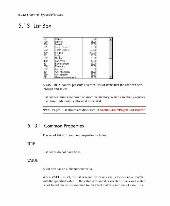
5-112 Control Types Reference
5.13 List Box
A LIST-BOX control presents a vertical list of items that the user can scroll through and select.
List box text limits are based on machine memory, which essentially equates to no limit. Memory is allocated as needed.
Note: Paged List Boxes are discussed in Section 3.8, “Paged List Boxes”
5.13.1 Common Properties
The set of list box common properties includes:
TITLE
List boxes do not have titles.
VALUE
A list box has an alphanumeric value.
When VALUE is set, the list is searched for an exact, case-sensitive match with the specified value. If the value is found, it is selected. If an exact match is not found, the list is searched for an exact match regardless of case. If a
List Box 5-113
match is still not found, the list is searched again, this time for the first string that contains the passed VALUE as a leading substring, regardless of case. For example, if your list contains:Capital BuildingCapital-inc, unit 2Capital-Inc
and VALUE is set to “Capital-Inc”, the third item is selected. If VALUE is set to “CAP”, the first item is selected.
On termination of a list box entry, the value is the currently selected list item, or spaces if no item is selected.
SIZE
The LINES setting specifies the number of lines of text that are visible in the list box. The SIZE setting determines the maximum width of the text area as a multiple of the width of the “0” (zero) character of the list box’s font. Any overhead needed for the box itself, or any scroll bars, is added to the height and width. The list box handler does not allow partial lines of text to be displayed, so the height of the list box may be reduced accordingly.
When the program executes on a non-graphical system, the values specified in the CLINES and CSIZE phrases, if present, replace the values specified by the LINES and SIZE phrases.
The default LINES value is “5”. The default SIZE value is “12”.
Note: The scroll bar is hidden if the list of items is small enough to be shown on the screen. If this happens, the list box may appear wider than specified as some systems add the space devoted to the scroll bar into the text area. When enough items are added to the list to require a scroll bar, the text space is reduced and the scroll bar displayed. If using the WIN32_NATIVECTLS runtime variable, drop-down list behavior changes. A Windows XP style list automatically expands downward to show up to 30 items at a time, regardless of whether or not it temporally overlaps a control beneath it. A scroll bar will not appear unless there are more than 30 items.
5-114 Control Types Reference
COLOR
List boxes will use any specified foreground or background color. If either color is omitted, then that color uses a system-dependent default value. On most systems, the default foreground is black and the default background is white. Under Microsoft Windows, the default values are determined by the user’s choices in the Control Panel (usually black on bright-white). These system-dependent default colors are not transformed or mapped by the runtime’s color-handling configuration options.
EVENT-LIST, EXCLUDE-EVENT-LIST
EVENT-LIST is an exclusive list of events that are either sent to or withheld (blocked) from the program depending on the value of EXCLUDE-EVENT-LIST. See Section 6.4.9, “Common Screen Options,” in Book 3.
STYLES
UNSORTED
Normally the items in the list are automatically sorted alphanumerically. Alternatively, the UNSORTED style causes the list to be shown in the order in which the items are added.
LOWER
This style converts all the text in the box to lower-case.
UPPER
This style converts all the text in the box to upper-case.
PAGED
This style specifies that the list box is to be a paged list box. Paged list boxes are typically used when the number of items in the list is too large for a standard list box. See section 3.8, “Paged List Boxes,” for a complete description of paged list boxes and an introduction to how they’re programmed.
NO-BOX
This style removes the box that normally displays around the listed items.
List Box 5-115
BOXED
This style indicates that a box should be placed around a list box. It is the default for graphical versions of ACUCOBOL-GT. For character-based versions, the default depends on the configuration variable LISTS_UNBOXED.
3-D
This style behaves identically to the 3-D entry field style of the same name.
NOTIFY-DBLCLICK
This style causes the list box to generate CMD-DBLCLICK events. Normally, double-clicking on an item in the list box has no special effect. If you specify this style, double-clicking on an item will generate a CMD-DBLCLICK event. This will usually terminate the current ACCEPT statement and allow your program to act on the selection immediately. You can also use an associated EXCEPTION PROCEDURE in the Screen Section to perform immediate processing. See also the TERMINATION-VALUE and EXCEPTION-VALUE properties below for related information.
NOTIFY-SELCHANGE
This style causes the list box to generate NTF-SELCHANGE events. Normally, selecting an item in the list box has no special effect. If you specify this style, a selection change will generate an NTF-SELCHANGE event. This allows your program to act immediately on the new selection.
NO-SEARCH
This style affects only paged list boxes. It inhibits the box’s built-in search facility. If this style is in effect, the user can move around in the paged list box with the arrow buttons and keyboard keys, but cannot bring up the search box.
5-116 Control Types Reference
5.13.2 Special Properties
ITEM-TO-ADD (alphanumeric)
This property provides a way of adding items to the list box. Any time you create or modify a list box, the ITEM-TO-ADD property is examined. If it is not spaces, then its value is added to the items in the list box. The examples below demonstrate how to use this property to initially populate a list box.
RESET-LIST (numeric)
This property allows you to empty a list. If this property is “0”, it is ignored. If it is non-zero, then all the items in the list are deleted.
MASS-UPDATE (numeric)
This property improves the efficiency of making large content changes to the list box.
Normally, the runtime immediately repaints a list box when the program adds or removes an item from the box. If you are making several changes in a row, this process can be slow. To improve performance, set the MASS-UPDATE property to “1”. While set to “1”, MASS-UPDATE inhibits repainting of the box due to changes in the box contents. To repaint after you have finished your changes, set MASS-UPDATE to zero (“0”).
For example, this code could be used to initially populate the contents of a list box:
MODIFY LIST-BOX-1, MASS-UPDATE = 1PERFORM VARYING IDX FROM 1 BY 1 UNTIL IDX > LIST-BOX-SIZE MODIFY LIST-BOX-1, ITEM-TO-ADD = LIST-BOX-ITEM( IDX )END-PERFORMMODIFY LIST-BOX-1, MASS-UPDATE = 0
In this example, the list box will not be repainted until the last MODIFY statement executes.
List Box 5-117
ITEM-TO-DELETE (numeric)
Setting this property to a non-zero value deletes the corresponding item in the list box. The first item in the list is item number “1” and each item is numbered sequentially thereafter. Deleting a non-existent item has no effect.
INSERTION-INDEX (numeric)
Setting this property to a positive value affects the location of the next item added to the list box. When it is set to zero (the default), items are added in sort-order, or to the end of the box if the list box has the UNSORTED style. When INSERTION-INDEX is positive, the next item added is placed immediately before the corresponding item instead. For example, setting this to “1” causes the next item to be inserted at the top of the list. You can place an item at the end of the list by specifying an index one greater than the number of items in the list. When you finish adding the next item, INSERTION-INDEX automatically resets itself to a value of zero.
In statements that allow for multiple properties, the properties are set in the order specified. Therefore, you can set both INSERTION-INDEX and ITEM-TO-ADD in the same statement, providing you specify INSERTION-INDEX first. For example, the following statement will add a new item to the top of a list box:
MODIFY LIST-BOX-1, INSERTION-INDEX = 1, ITEM-TO-ADD = "New top item"
SEARCH-TEXT (alphanumeric)
This property is used only in conjunction with paged list boxes. SEARCH-TEXT returns the current value of the user-supplied search text. Normally, this property is used in an INQUIRE statement when you implement a response to the NTF-PL-SEARCH event (which indicates that the user wants to search for a particular text string in the list box). See section 3.8, “Paged List Boxes,” for a complete description and code example.
DATA-COLUMNS (numeric)
This property describes where each column begins in the data added to the list. Columns are defined by character positions in the raw data, with the first character being position “1”. For example, the following data item:
5-118 Control Types Reference
01 LIST-DATA. 03 NAME PIC X(20). 03 PHONE-NUMBER PIC X(15). 03 STATE PIC X(2).
would normally be displayed in three columns, one at position “1” (NAME), one at position “21” (PHONE-NUMBER), and one at position “36” (STATE). Each time you set DATA-COLUMNS to a positive value, a new column is created at that position. Setting DATA-COLUMNS to zero clears all the existing column definitions. Note that there is always a column at position “1”, so setting position “1” has no useful effect.
Typically, you specify DATA-COLUMNS by enclosing a list of columns in parentheses. This causes the compiler to generate code to set each column in turn. For example, a setting that would match the preceding example would be:
DATA-COLUMNS = ( 21, 36 )
This can also be specified with the RECORD-POSITION construct. The data item is referenced by a numeric literal whose value corresponds to the location of the data item within the record. (This construct is covered in detail in Section 5.2.5 of the Reference Manual.) For example, the above example would be:
DATA-COLUMNS = ( record-position of PHONE-NUMBER, record-position of STATE )
You must also specify DISPLAY-COLUMNS to get the columns to display correctly. If you don’t, the results are undefined.
DISPLAY-COLUMNS (numeric)
This property describes where each DATA-COLUMN will display in the list box. The first column always displays in column “1”. Additional columns display at the locations set by DISPLAY-COLUMNS. Columns are measured with the standard font measure (i.e., the width of the character “0” in the list box’s font). Each time you set DISPLAY-COLUMNS to a positive value, a new display column is defined. Setting DISPLAY-COLUMNS to “0” clears all of the columns (except column 1).
List Box 5-119
If you are using a proportionally spaced font, you should provide enough space in each column to allow for wider-than-average data. You will also want to provide some white space between columns. To continue the example given under DATA-COLUMNS above, you might code the following:
DATA-COLUMNS = ( 21, 36 )DISPLAY-COLUMNS = ( 31, 51 )
In this example, the first column, which is 30 characters wide in the display, accommodates a 20-character data source, and the second column, which is 20 characters wide, accommodates a 15-character data source.
The maximum number of columns you can set is 30. Any columns over 30 will be ignored by the runtime and will not display.
Data contained in a column cannot overflow the allocated space. If the data is too large to be fully displayed, the data is truncated. Therefore, you should always set your columns wide enough to hold the largest data item.
Note: You can also use columns to hide data. A column set beyond the right side of the list box is not visible on the screen. You can use this behavior to store information in the list box that your program needs to associate with list items, but that you do not want to be seen by the user. One potential use for this feature is to store a file record’s primary key value in the hidden column so that you can retrieve the full record easily when the user selects an item in the list.
ALIGNMENT (alphanumeric)
This property specifies the alignment of data in each column. Like DATA-COLUMNS and DISPLAY-COLUMNS, each time you assign this property, you affect a new column. Allowed values are “L” for left alignment, “R” for right alignment, “C” for centered alignment, and “U” for unaligned. Equivalent lower-case values are also allowed, as are any words that start with the appropriate letters (thus, you can spell out “left”, “right”, and “center” if you want). For example, to establish a left-aligned column followed by two right-aligned columns, you would use:
5-120 Control Types Reference
ALIGNMENT = ( "L", "R", "R" )
To empty the alignment list (to establish new alignments, for example) assign an alignment value of space (“ “). Left alignment differs from unaligned in that leading spaces are removed from left-aligned data, but not from unaligned data. Any column that does not have an alignment specified for it is unaligned.
SEPARATION (numeric)
This property establishes a blank region at the end of each column. This has the effect of creating a uniform separation space between each column and prevents data from visually running together. When data is too large to fit in the allocated space, the data is truncated to the column width minus the separation space.
Like DATA-COLUMNS, each time you assign a value to this property, you set the separation amount for a new column. The separation is expressed in 10ths of characters. For example, to establish a half-character separation, use a value of “5”. On character-based systems, the separation is rounded down to the nearest whole character. The blank region specified appears at the end of the column. Data is never displayed in the separation region, it is truncated if need be. Also, the separation region defines the edge from which right and center justification are computed. To reset the separation list for a box, assign the value “-1”. Unspecified columns use a default separation value. This value is set by the configuration variable COLUMN-SEPARATION.
DIVIDERS (numeric)
When set, this property causes divider bars to be displayed between columns. Like DATA-COLUMNS, each time you assign a value to this property, you establish the divider for a new column. The value assigned is the width of the divider, in pixels. A width of zero means that there will be no divider. The divider appears after the column, immediately before the beginning of the next column (there is a small space between the divider and the next column’s text). To reset the list of dividers, assign a value of “-1”. The divider’s color is the shadow color of the list box (usually dark gray or black).
List Box 5-121
SELECTION-INDEX (numeric)
This property, when set, causes the list box selection to change to the indicated item. Items are numbered sequentially from the top of the list box, starting at “1”. Setting this value to “-1” clears any selection. Values beyond the number of list box items are undefined.
When queried, this property returns the item number of the current selection, or “-1” if no item is selected.
Using SELECTION-INDEX to change the list box focus causes a faint dotted-line box to appear around the selected item on graphical systems. On character-based systems, the text cursor is displayed at the end of the selected item. The end user presses the space bar to choose the item.
THUMB-POSITION (numeric)
This property, when set, causes the list box to display the line number of the item on top of the list box, scrolling the latter if necessary. Items are numbered sequentially from the top of the list, starting at “1”. Setting THUMB-POSITION to a value greater than the actual number of lines in the list box or to a value less than “1” has no effect.
When queried, this property returns the line number of the item currently displayed on top of the list box.
QUERY-INDEX (numeric)
This property is used only in conjunction with the ITEM-VALUE property described below. This property determines which list box item to return information about. Items are numbered sequentially from the top of the list box, starting at “1”.
ITEM-VALUE (alphanumeric)
This property, when queried, returns the value of a list box item. The item returned is determined by the current value of QUERY-INDEX (see above). If QUERY-INDEX does not correspond to a valid item, then nothing is returned.
For example, to determine the value of the first item in a list box, perform the following statements:
MODIFY LIST-BOX-1, QUERY-INDEX = 1INQUIRE LIST-BOX-1, ITEM-VALUE IN MY-ITEM

5-122 Control Types Reference
TERMINATION-VALUE (numeric)
This property produces the same behavior as the TERMINATION-VALUE push button property, except that it acts on the CMD-DBLCLICK event instead of the CMD-CLICKED event. This property is used only when the NOTIFY-DBLCLICK style is also used. The compiler applies the NOTIFY-DBLCLICK style automatically if this property is explicitly named when the control is initially created. Note that this does not occur if you use the PROPERTY phrase to supply the property value (by giving its identifying number).
EXCEPTION-VALUE (numeric)
This property produces the same behavior as the push button property of the same name, except that it acts on the CMD-DBLCLICK event instead of the CMD-CLICKED event. This property is used only when the NOTIFY-DBLCLICK style is also used. The compiler applies the NOTIFY-DBLCLICK style automatically if this property is named when the control is initially created. Note that this does not occur if you use the PROPERTY phrase to supply the property value (by giving its identifying number).
SORT-ORDER (numeric)
This property applies to paged list boxes only. It determines whether the case of the data items will be considered as the user searches for a data item. It can take one of four values:
0 PL-SORT-DEFAULT Use the default sort order. (Same as value 3.)
1 PL-SORT-NONE Every character the user types results in a notification to the COBOL program.
2 PL-SORT-NATIVE The paged list is searched and case is considered. If the item that the user has entered is on the current page, it is selected.
3 PL-SORT-NATIVE-IGNORE-CASE The paged list is searched and case is not considered. If the item that the user has entered is on the current page, it is selected.
List Box 5-123
Note: If the style is set to UPPER or LOWER, and “SORT-ORDER = 2”, characters will be made UPPER or LOWER case as they are entered in the search box, negating the attempt to do a case-sensitive search.
5.13.3 EventsCMD-DBLCLICKCMD-GOTOCMD-HELPMSG-VALIDATENTF-SELCHANGE
For paged list box:NTF-PL-FIRSTNTF-PL-LASTNTF-PL-NEXTNTF-PL-PREVNTF-PL-NEXTPAGENTF-PL-PREVPAGENTF-PL-NEXT-WHEELNTF-PL-PREV-WHEELNTF-PL-SEARCH
5.13.4 Using Special Keys
When list box has the input focus, the Page-Up and Page-Down keys can be used to scroll the list box. Setting KEYSTROKE configuration entries does not affect these actions.
5.13.5 Examples
This example creates a list box and fills it with the contents of a table:DISPLAY LIST-BOX, LINES 5, SIZE 30, HANDLE IN
5-124 Control Types Reference
BOX-1.PERFORM VARYING IDX FROM 1 BY 1 UNTIL IDX > TABLE-SIZE MODIFY BOX-1, ITEM-TO-ADD = TABLE-ITEM( IDX )END-PERFORM.
The following Screen Section entry and accompanying code perform the same actions:03 LIST-1, LIST-BOX, LINES 5, SIZE 30, VALUE SELECTED-ITEM, ITEM-TO-ADD = ADD-ITEM.PERFORM VARYING IDX FROM 1 BY 1 UNTIL IDX > TABLE-SIZE MOVE TABLE-ITEM( IDX ) TO ADD-ITEM DISPLAY LIST-1END-PERFORM.MOVE SPACES TO ADD-ITEM.
The first time through this loop, the list box is created (if it has not already been created). Subsequent iterations of the loop modify the existing list box. Note the move of spaces to ADD-ITEM at the end. This ensures that future DISPLAYs of LIST-1 (or its parent group item) do not accidentally add another item to the list box.
5.14 .NET
ACUCOBOL-GT defines a control type named “.NET” that it uses internally whenever you CREATE, MODIFY, INQUIRE, or DESTROY a .NET control.
You use a utility called netdefgen to generate a COBOL COPY file that defines the control’s methods and properties. For information about adding a .NET control to your program, please refer to Chapter 5 in A Guide to Interoperating with ACUCOBOL-GT.
5.14.1 Common Properties
This section lists some of the common properties for .NET graphical controls.
.NET 5-125
LINES/SIZE
The LINES and SIZE values describe the area occupied by the .NET control, using the default font to determine the dimensions of the width and height. If size and lines are omitted, the control’s default design size is used.
LINE/COL
The LINE and COL values describe the left corner position of the control on the screen. LINE defines the y-axis and COL defines x-axis.
AX-EVENT-LIST, EXCLUDE-EVENT-LIST
AX-EVENT-LIST is an exclusive list of .NET events that are either sent to or withheld (blocked) from the program depending on the value of EXCLUDE-EVENT-LIST. See Section 6.4.9, “Common Screen Options,” in Book 3.
5.14.2 Special Properties
FILE-PATH (alphanumeric)
When a .NET control does not reside in the Global Assembly Cache (GAC) or in the directory where the ACUCOBOL-GT runtime resides, you must use the FILE-PATH parameter to disclose the location of the control. The parameter value is a file name or a file path and file name of an XML file containing the .NET assembly information.
In the example below, Assembly, Module, StrongName, Version, and Culture are from the assembly COPY file that was generated by the NETDEFGEN utility. FilePath is the full path name of the control.
<?xml version="1.0" encoding="utf-8" ?><FILESPEC> <Assembly>AmortControl</Assembly> <Module>amortcontrol.dll</Module> <StrongName /> <Version>1.0.1242.11216</Version> <Culture>neutral</Culture> <FilePath>E:\AmortControl\bin\Debug\AmortControl.dll </FilePath></FILESPEC>
5-126 Control Types Reference
Note that FilePath could also be a UNC or URI notation, like \HostName\bin\Debug\AmortControl.dll or file://HostName//bin/Debug/AmortControl.dll.
5.14.3 Events MSG-NET-EVENT
A MSG-NET-EVENT occurs when a .NET control has fired an event. EVENT-DATA-2 contains the control’s event type. When a .NET event type is referenced in your program, the name must be preceded with an “@” character.
An example of event handling code might look like:USERCONTROL-EVENTS. EVALUATE EVENT-TYPE WHEN MSG-NET-EVENT EVALUATE EVENT-DATA-2 WHEN @UserControl1_FireCalc PERFORM display-update END-EVALUATE END-EVALUATE.
5.15 Push Button
A PUSH-BUTTON control is a region of the screen that the user can push (click or select) to cause something to happen. Under most graphical systems, push buttons appear to be raised up from the surface of the screen. Push buttons do not have values. Instead, they generate events whenever they are pushed. To simplify programming, you can assign termination or exception values to push buttons so that they act like function keys or other terminating keys when used. See the STYLES and PROPERTIES sections that follow for information on how this works.
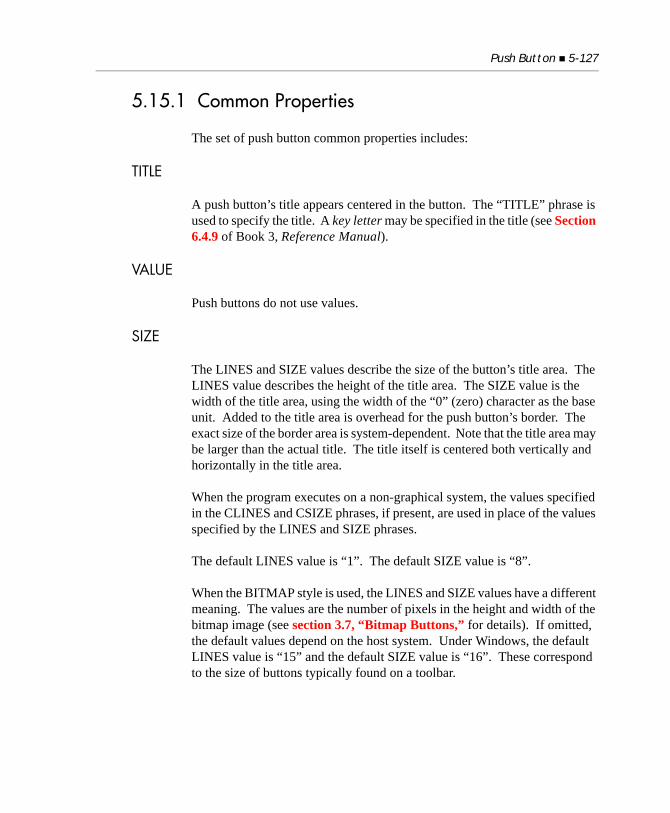
Push Button 5-127
5.15.1 Common Properties
The set of push button common properties includes:
TITLE
A push button’s title appears centered in the button. The “TITLE” phrase is used to specify the title. A key letter may be specified in the title (see Section 6.4.9 of Book 3, Reference Manual).
VALUE
Push buttons do not use values.
SIZE
The LINES and SIZE values describe the size of the button’s title area. The LINES value describes the height of the title area. The SIZE value is the width of the title area, using the width of the “0” (zero) character as the base unit. Added to the title area is overhead for the push button’s border. The exact size of the border area is system-dependent. Note that the title area may be larger than the actual title. The title itself is centered both vertically and horizontally in the title area.
When the program executes on a non-graphical system, the values specified in the CLINES and CSIZE phrases, if present, are used in place of the values specified by the LINES and SIZE phrases.
The default LINES value is “1”. The default SIZE value is “8”.
When the BITMAP style is used, the LINES and SIZE values have a different meaning. The values are the number of pixels in the height and width of the bitmap image (see section 3.7, “Bitmap Buttons,” for details). If omitted, the default values depend on the host system. Under Windows, the default LINES value is “15” and the default SIZE value is “16”. These correspond to the size of buttons typically found on a toolbar.
5-128 Control Types Reference
COLOR
Push buttons ignore any colors specified. The actual colors used are system-dependent. Under Windows, the user selects the colors in the Control Panel.
EVENT-LIST, EXCLUDE-EVENT-LIST
EVENT-LIST is an exclusive list of events that are either sent to or withheld (blocked) from the program depending on the value of EXCLUDE-EVENT-LIST. See Section 6.4.9, “Common Screen Options,” in Book 3.
STYLES
DEFAULT-BUTTON
This style indicates that this button is the default push button. The user can push (activate) the default button by typing a termination key that has a termination code of “13”. Under the default runtime configuration, this is the “Return” (or “Enter”) key. When this occurs, the runtime generates a button pushed event instead of the normal termination event. This ensures that the program treats the “Return” key and the default push button in the same manner (since they both generate the same event). See the TERMINATION-VALUE property described below for related information.
Push buttons with the DEFAULT-BUTTON style are typically displayed differently by the host system. Under Microsoft Windows, default push buttons have a thicker border. Only one button should have the DEFAULT-BUTTON style at any one time. If more than one button has the DEFAULT-BUTTON style, the meaning is ambiguous. Note that the DEFAULT-BUTTON style is implied by the OK-BUTTON style.
ESCAPE-BUTTON
Similar to the DEFAULT-BUTTON style, this style indicates that the push button corresponds to the “Escape” key. The user can push this button by typing a key that has an exception value of “27” (i.e., the “Escape” key in the default configuration). When this occurs, the runtime generates a button pushed event instead of the normal exception event. This ensures that your program handles the “Escape”
Push Button 5-129
key and the escape button in the same manner. Note that only one enabled button should have the ESCAPE-BUTTON style at any one time. See the EXCEPTION-VALUE property below for related information.
NO-AUTO-DEFAULT
Normally, when a push button is activated, it becomes the default push button. The runtime accomplishes this by giving the DEFAULT-BUTTON style to the activated push button and removing it from any other push button in the same floating window. This allows the user to type the “Return” key to push the active button. If you specify NO-AUTO-DEFAULT, then this behavior is not applied when this button is made active. The default push button, if any, remains unchanged.
SELF-ACT
Normally, when the user clicks on a button with the mouse, the mouse requests that it be activated by sending a CMD-GOTO event to your program (see Chapter 6, “Chapter 6: Events Reference”). After being activated, the button can then return that it has been pushed. Buttons with the SELF-ACT style are self-activated instead. This means that they do not send the CMD-GOTO event to your program when clicked. Instead they activate themselves and then send the appropriate button pushed termination status to the program. If you also assign an exception value to the button, it will act just like the equivalent function key. For example, the following statement fragment builds a push button that behaves just like function key 1 (usually marked “F1”).
DISPLAY PUSH-BUTTON, SELF-ACT, EXCEPTION-VALUE=1
Self-activating buttons behave differently in some additional, subtle, ways. Normally, if the user down-clicks on a push button and then moves the mouse away before releasing the button, the push button remains active (shown in Windows by a thicker border around the button). But the button is not clicked. Self-activating buttons do not remain active. Instead, they re-activate the previous control. This is done because self-activating controls don’t tell the program about the down-click event. To ensure that the program and screen states are consistent, the previous control is re-activated. Also, self-activating buttons do not automatically become the default push button when clicked on with the mouse.
5-130 Control Types Reference
Generally speaking, there is rarely a need to use this style for push buttons defined in a group within the Screen Section. The Screen Section handler performs all the button activation needed when the group is accepted. The SELF-ACT style is mostly useful when you define individual push buttons using the DISPLAY verb (or as elementary Screen Section items) and you do not want to program the activation of those buttons. A common use would be to add push buttons to an existing application where the push buttons will perform the same operation as some function key. In this case, you can simply create the push button with the SELF-ACT style and an exception value that is the same as the function key. Usually, no other coding is needed because the button will perform all of its own activation and simulate the function key when it is clicked.
Note: The SELF-ACT style performs automatic activation only when the user clicks on the button with the mouse or uses its key letter. You must still program your own activation if you want the user to be able to visit the button in some other fashion (for example, by using the “Tab” key to move to the button).Also note that this style makes the button self-activating, but not any associated Screen Section entry. This means that any BEFORE or AFTER procedures named in an associated Screen Section entry will not automatically execute when the button is clicked. They will function only when you ACCEPT the Screen Section entry in your program.
OK-BUTTON
This style is used only when the button is created. It has the effect of changing several of the button’s default values. It is equivalent to specifying the following:
TITLE "OK"DEFAULT-BUTTONTERMINATION-VALUE = 13
You may override the TITLE and TERMINATION-VALUE settings by providing your own. The net effect of the OK-BUTTON style is that it provides a convenient way of creating a typical “OK” button.
Push Button 5-131
CANCEL-BUTTON
This style is similar to the OK-BUTTON style, but it produces a Cancel button instead. It is equivalent to specifying the following defaults when the button is created:
TITLE "Cancel"ESCAPE-BUTTONEXCEPTION-VALUE = 27
You may override the TITLE and EXCEPTION-VALUE defaults by providing your own.
BITMAP
This style causes the push button to be drawn using a bitmap instead of its default appearance. See section 3.7, “Bitmap Buttons,” for a complete description.
FRAMED
This style is used only with bitmap buttons. It requests that a thin frame be drawn around the button. Typically this appears as a thin black line. Not all systems support frames, in which case the request is ignored. By default, buttons are framed under Windows NT/Windows 2000.
UNFRAMED
This style is used only with bitmap buttons. It requests that the button be drawn without a frame. Not all systems support unframed buttons, in which case the request is ignored. By default, buttons are not framed under Windows 98.
SQUARE
This style is used only with framed bitmap buttons. It forces the button to have square corners. Without this style, the button will have slightly rounded corners.
FLAT
On Windows systems, this style creates a button without visible borders. On non-Windows systems, this style has no effect.
5-132 Control Types Reference
MULTILINE
This style causes the push button to have a multi-line title. When the MULTILINE style is applied, the push button’s title text is automatically word wrapped to fit the push button’s size. You can force a line break in the text by embedding an ASCII line feed character (h“0A”). The MULTILINE style is ignored in character-based environments.
5.15.2 Special Properties
BITMAP-NUMBER (numeric)
This property identifies a particular bitmap image to use as the push button. See section 3.7, “Bitmap Buttons,” for details. If you explicitly name this property when creating a control, the BITMAP style is automatically applied by the compiler. Note that this does not occur if you use the PROPERTY phrase to specify this property by giving its identifying number.
BITMAP-HANDLE (handle)
This property identifies the bitmap image strip to use with the push button.
TERMINATION-VALUE (numeric)
This property modifies the way that a push button communicates to your program when it has been pushed. Normally, a push button will generate a CMD-CLICKED event. If you provide a non-zero TERMINATION-VALUE, the push button will generate a termination condition with the specified value instead. This makes the push button act like a keyboard termination key. Most existing COBOL programs are already coded to handle termination keys, so this is easier for the COBOL program to work with.
Note: If you assign the DEFAULT-BUTTON style and a TERMINATION-VALUE property of “13”, then the effects of typing the “Return” key may seem rather odd. The DEFAULT-BUTTON style converts the “Return” key’s termination event into a button pushed event. The TERMINATION-VALUE property then changes the button pushed event into a termination event with a value of “13”. The net effect is the same as if neither the style nor property had been
Push Button 5-133
used. The reason for this lengthy route is to ensure that the button and “Return” key are handled identically, and to provide options for programming push button handling, such as the setting of TERMINATION-VALUE.
EXCEPTION-VALUE (numeric)
This property works in a fashion that is identical to the TERMINATION-VALUE property, except that it converts button pushed events into exception events (instead of termination events). If a button has both a TERMINATION-VALUE and an EXCEPTION-VALUE specified, the EXCEPTION-VALUE takes precedence.
5.15.3 EventsCMD-CLICKEDCMD-GOTOCMD-HELPMSG-VALIDATE
5.15.4 Examples
The first example creates a simple push button with an ID of “100”. The key letter of the push button is “H”.DISPLAY PUSH-BUTTON, "&Help", ID 100, HANDLE IN BUTTON-1
This next example creates a very tall push button:DISPLAY PUSH-BUTTON, TITLE "Tall", LINES 3, HANDLE IN BUTTON-2
The following Screen Section entry creates an “OK” button:03 PUSH-BUTTON OK-BUTTON, LINE 10, COLUMN 20.
This last example creates a default push button that generates a termination value of “200”:03 PUSH-BUTTON "&Find", DEFAULT-BUTTON,
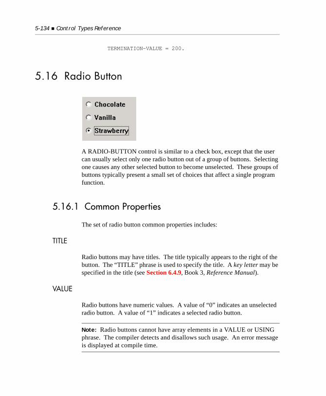
5-134 Control Types Reference
TERMINATION-VALUE = 200.
5.16 Radio Button
A RADIO-BUTTON control is similar to a check box, except that the user can usually select only one radio button out of a group of buttons. Selecting one causes any other selected button to become unselected. These groups of buttons typically present a small set of choices that affect a single program function.
5.16.1 Common Properties
The set of radio button common properties includes:
TITLE
Radio buttons may have titles. The title typically appears to the right of the button. The “TITLE” phrase is used to specify the title. A key letter may be specified in the title (see Section 6.4.9, Book 3, Reference Manual).
VALUE
Radio buttons have numeric values. A value of “0” indicates an unselected radio button. A value of “1” indicates a selected radio button.
Note: Radio buttons cannot have array elements in a VALUE or USING phrase. The compiler detects and disallows such usage. An error message is displayed at compile time.
Radio Button 5-135
SIZE
The LINES and SIZE values describe the size of the radio button’s title area. The LINES value describes the height of the title area, in lines. The SIZE value specifies the width of the title area, using the width of the “0” (zero) character as the base unit. Added to the title area is the overhead needed for the actual button. This usually adds several character positions to the width and may affect the height if the button is taller than the title’s font.
When the program executes on a non-graphical system, the values specified in the CLINES and CSIZE phrases, if present, replace the values specified by the LINES and SIZE phrases.
The default value of LINES is “1”. The default value of SIZE is computed by measuring the length of the title using the button’s font and dividing by the width of the “0” character. Thus, the default width of a radio button exactly occupies the space its text takes up on the screen.
When used with the BITMAP style, the LINES and SIZE values have a different meaning. The values are the number of pixels in the height and width of the bitmap image (see section 3.7, “Bitmap Buttons,” for details). If omitted, the default values depend on the host system. Under Microsoft Windows, the default LINES value is “15” and the default SIZE value is “16”. These values correspond to the size of buttons typically found on a toolbar.
COLOR
Radio buttons use both the foreground and background colors specified. If either is omitted, the corresponding color of the button’s owning subwindow is used.
Bitmap radio buttons do not use the specified colors. Instead, the colors are derived from the bitmap and the system defaults for push buttons.
EVENT-LIST, EXCLUDE-EVENT-LIST
EVENT-LIST is an exclusive list of events that are either sent to or withheld (blocked) from the program depending on the value of EXCLUDE-EVENT-LIST. See section 6.4.9, “Common Screen Options,” in Book 3.
5-136 Control Types Reference
STYLES
BITMAP
This style causes the radio button to be drawn with a bitmap instead of its usual appearance. See section 3.7 for a complete description.
FRAMED
This style is used only with bitmap buttons. It requests that a thin frame be drawn around the button. Typically this appears as a thin black line. Not all systems support frames, in which case the request is ignored. By default, buttons are framed under Windows NT/Windows 2000.
UNFRAMED
This style is used only with bitmap buttons. It requests that the button be drawn without a frame. Not all systems support unframed buttons, in which case the request is ignored. By default, buttons are not framed under Windows 98.
SQUARE
This style is used only with framed bitmap buttons. It forces the button to have square corners. Without this style, the button will have slightly rounded corners.
SELF-ACT
This style creates a self-activating radio button. The behavior of the SELF-ACT radio button is the same as that of the SELF-ACT push button (see section 5.15). Self-activating radio buttons return control to the previously active control or window when they are clicked. Usually, you will want to use the NOTIFY style in conjunction with SELF-ACT so that your program is informed whenever the radio button is clicked.
NOTIFY
This style tells the runtime to generate a CMD-CLICKED event whenever the value of the radio button is changed by the user. This allows your program to respond immediately to the change. In essence, the radio button will now act like a combination radio button and push button. Without the NOTIFY style, the radio button remains active after it has been changed (exception: see SELF-ACT above).
Radio Button 5-137
NO-GROUP-TAB
Normally, radio buttons that belong to a button group treat the “Tab” and “Backtab” keys in a special fashion. Any time a radio button has a non-zero GROUP special property, it acts as if it also has the NO-TAB style unless it is the group leader. The group leader is the radio button that is currently “on,” or the first radio button in the group if they are all “off.” The effect is that when you tab to a radio button group, control passes to the button that is on, or to the first button in the group if none is on. Note that the NO-GROUP-TAB style suppresses this special handling.
LEFT-TEXT
Radio buttons with this style display their text to the left of the box instead of to the right. Note that if you use this style and try to vertically align several radio buttons, the buttons may not align vertically. This is because the default behavior of the runtime is to place the right edge of the button at the minimum distance needed from its left edge to accommodate the control’s text. This results in the buttons being placed in different columns depending on the text of each control. Supplying a uniform width using the SIZE property overrides this behavior.
FLAT
On Windows systems, this style creates a radio button without visible borders. On non-Windows systems, this style has no effect.
MULTILINE
This style causes the radio button to have a multi-line title. When the MULTILINE style is applied, the radio button’s title text is automatically word wrapped to fit the radio button’s size. You can force a line break in the text by embedding an ASCII line feed character (h“0A”). The MULTILINE style is ignored in character-based environments.
VTOP
This style causes the title text to be vertically aligned with the top of the control’s area. By default, the title text is vertically aligned to the center of the control’s area.
5-138 Control Types Reference
5.16.2 Special Properties
BITMAP-NUMBER (numeric)
This property identifies a particular bitmap image to use with the radio button (see section 3.8 for details). If you explicitly name this property when creating a control, the BITMAP style is automatically applied by the compiler. Note that this does not occur if you use the PROPERTY phrase to specify this property (by giving its identifying number).
BITMAP-HANDLE (handle)
This property identifies the bitmap image strip to use with the radio button. See section 3.8 for details.
TERMINATION-VALUE (numeric)
This property works in a manner identical to the TERMINATION-VALUE push button property. This property is used only when the NOTIFY style is also used. The compiler applies the NOTIFY style automatically if you explicitly name this property when creating a control. Note that the NOTIFY style is not automatically applied if you use the PROPERTY phrase to specify this property (by giving its identifying number).
EXCEPTION-VALUE (numeric)
This property works in a manner identical to the push button property of the same name. This property is used only when the NOTIFY style is also used. The compiler applies the NOTIFY style automatically if you explicitly name this property when creating a control. Note that the NOTIFY style is not automatically applied if you use the PROPERTY phrase to specify this property (by giving its identifying number).
GROUP (numeric)
Radio buttons usually operate in groups of related buttons. Normally, only one button of the group may be selected. When a button is selected, all other buttons of the same group are unselected. The GROUP property describes which buttons belong together. In any one floating window, all radio buttons with the same non-zero GROUP property value are treated as a single group. The runtime will ensure that only one button in a group is selected at any one time.

Radio Button 5-139
The default GROUP value is “1”. If all radio buttons on the same floating window retain the default value, they will be treated as a single group.
Radio buttons with a GROUP value of “0” do not perform any checks to ensure that only one button is selected. These buttons behave much like check boxes; each one may be independently selected.
GROUP-VALUE (numeric)
This property simplifies the process of managing a group of radio buttons. Normally, the program must determine which button in a group is selected by examining the value of each button. The button with a value of “1” is the selected button. The GROUP-VALUE property is used to turn the value checking process into a single operation. You assign each radio button in a group a distinct GROUP-VALUE number. This links each button with its corresponding GROUP-VALUE. In this way, you can determine which button is selected by assigning all of the buttons in the group the same VALUE data item. The data item will hold the GROUP-VALUE number of the selected radio button.
Technically, this works as follows. For any radio button with a non-zero GROUP-VALUE property, a selected button will update its VALUE data item only during an ACCEPT. A selected button will return its GROUP-VALUE property as its VALUE. During a DISPLAY, a radio button will be selected only if its VALUE matches its GROUP-VALUE. Any other VALUE will be treated as a VALUE of zero.
Use this by assigning distinct GROUP-VALUE numbers to each button in a group, and by assigning all the buttons to the same VALUE data item. Then you can select a button by moving the button’s GROUP-VALUE number to the VALUE data item and updating all the buttons. On input, you can determine which button is currently selected by simply examining the VALUE data item. It will contain the GROUP-VALUE number of the selected button.
The default value for GROUP-VALUE is zero, which disables the GROUP-VALUE mechanism.
5-140 Control Types Reference
5.16.3 EventsCMD-CLICKEDCMD-GOTOCMD-HELPMSG-VALIDATE
5.16.4 Examples
The following creates a simple radio button:DISPLAY RADIO-BUTTON, "&Left Align",HANDLE IN RADIO-BUTTON-1.
Frequently, you will want to create several radio buttons, each offering the user a different option. Here is a Screen Section entry that specifies three buttons:01 ALIGNMENT-CHOICES. 03 RADIO-BUTTON, "&Left", USING ALIGN-CHOICE GROUP-VALUE 1. 03 RADIO-BUTTON, "&Right", USING ALIGN-CHOICE LINE + 1.5 GROUP-VALUE 2. 03 RADIO-BUTTON, "&Center", USING ALIGN-CHOICE LINE + 1.5 GROUP-VALUE 3.
In the preceding example, ALIGN-CHOICE is set to “1”, “2”, or “3” depending on which radio button is selected.
Here are the same buttons as they might appear in a toolbar. These buttons are bitmap buttons. Also, instead of storing their value, they simply notify the COBOL program when they have been pressed (via the EXCEPTION-VALUE). Like most toolbar buttons, they are self activating. This frees the COBOL program from having to explicitly ACCEPT the toolbar buttons. 01 TOOLBAR-CHOICES. 03 RADIO-BUTTON, "Left", NOTIFY, SELF-ACT BITMAP-NUMBER 1, EXCEPTION-VALUE 1.
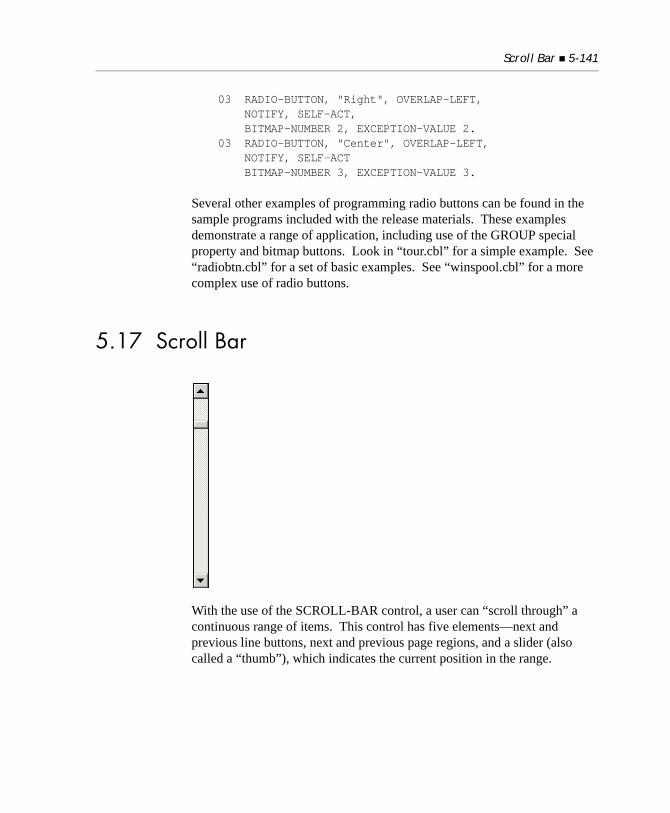
Scroll Bar 5-141
03 RADIO-BUTTON, "Right", OVERLAP-LEFT, NOTIFY, SELF-ACT, BITMAP-NUMBER 2, EXCEPTION-VALUE 2. 03 RADIO-BUTTON, "Center", OVERLAP-LEFT, NOTIFY, SELF-ACT BITMAP-NUMBER 3, EXCEPTION-VALUE 3.
Several other examples of programming radio buttons can be found in the sample programs included with the release materials. These examples demonstrate a range of application, including use of the GROUP special property and bitmap buttons. Look in “tour.cbl” for a simple example. See “radiobtn.cbl” for a set of basic examples. See “winspool.cbl” for a more complex use of radio buttons.
5.17 Scroll Bar
With the use of the SCROLL-BAR control, a user can “scroll through” a continuous range of items. This control has five elements—next and previous line buttons, next and previous page regions, and a slider (also called a “thumb”), which indicates the current position in the range.
5-142 Control Types Reference
Scroll bars are available both for character-based and Microsoft Windows systems. For character-based systems, you may choose to display the various parts of the scroll bar with the GO-GUI-MAP and GF-GUI-MAP termcap functions. You may also do this with theGUI_CHARS configuration variable.
When a user clicks on a scroll bar, a message is sent to the scroll bar’s event procedure, which updates the screen according to the new scroll position. (For a detailed description of these events, see Chapter 6, “Chapter 6: Events Reference.” Scroll bars do not generate terminating events, so any ACCEPT statement remains active while the user adjusts the scroll bar. The scroll bar does not automatically update its own value when the user modifies it. You should respond to each message by setting the scroll bar’s value to the new position. Otherwise, the scroll bar will return to its previous setting after the user finishes.
The ACUCOBOL-GT runtime supports the use of a mouse wheel with the scroll bar control in all versions of Windows that support the wheelmouse. In general, this means Windows 98 and those new versions thereafter. Support applies only to vertical scroll bars. The Windows operating system supports mouse wheel rotation through the WM_MOUSEWHEEL message. The runtime intercepts the WM_MOUSEWHEEL events and translates them into WM_VSCROLL messages, which are then handled as conventional mouse button clicks on a scroll bar. By default, a single WM_MOUSEWHEEL event is translated into three WM_VSCROLL messages. The application user can configure this number to suit their preference through the Mouse Properties sheet in Control Panel.
5.17.1 Common Properties
TITLE
Scroll bars do not have titles.
Scroll Bar 5-143
VALUE
A scroll bar has an integer value, which represents the slider’s position in the control. The range of values is set by the properties MIN-VAL, MAX-VAL, and PAGE-SIZE. Setting the value outside of the legal range has an undefined effect.
SIZE
SIZE and LINES describe the area of the scroll bar in window cells. If SIZE is omitted, then the width of a vertical scroll bar is the standard width of the host system’s scroll bar. A horizontal scroll bar extends to the right edge of the window when the scroll bar is created. If LINES is omitted, then the system makes corresponding calculations—a horizontal scroll bar is standard height, and a vertical scroll bar extends to the bottom edge.
COLOR
Scroll bars always use the system’s colors.
EVENT-LIST, EXCLUDE-EVENT-LIST
EVENT-LIST is an exclusive list of events that are either sent to or withheld (blocked) from the program depending on the value of EXCLUDE-EVENT-LIST. See Section 6.4.9, “Common Screen Options,” in Book 3.
STYLES
HORIZONTAL
This style creates a horizontal scroll bar. Without this style, the scroll bar is vertical.
TRACK-THUMB
This style causes the scroll bar to generate MSG-SB-THUMBTRACK messages while the slider is moved by the user. Without this style, the messages are suppressed. Use this style if you want to update the screen while the user is moving the slider (as opposed to immediately after a new slider position is selected).
5-144 Control Types Reference
To minimize network traffic and optimize performance, MSG-SB-THUMBTRACK events are generated differently for thin client applications. With thin client applications, when the slider is moved by the user, a single MSG-SB-THUMBTRACK message is sent immediately before the MSG-SB-THUMB message and the scroll bar is automatically updated.
5.17.2 Special Properties
MIN-VAL (numeric)
This property sets the lowest value of the range of legal scroll bar values. The default value is “0” (zero).
MAX-VAL (numeric)
This property sets the highest value of the range of legal scroll bar values. The default value is “100”. MAX-VAL may not be greater than 65536. Setting a larger range has an undefined effect. See PAGE-SIZE below for additional information.
PAGE-SIZE (numeric)
This property describes the number of elements that appear on a “page” of data. For example, if you scroll through a series of lines and 20 lines fit in the window, then the page size is “20”. With a 32-bit runtime, this property determines the size of the slider relative to the scroll bar. If PAGE-SIZE is set to “0” (the default), then the system uses a default slider size. PAGE-SIZE also reduces the range of values that the scroll bar can take. The effective range is MIN-VAL to MAX-VAL minus PAGE-SIZE.
5.17.3 EventsCMD-HELPMSG-VALIDATEMSG-SB-NEXTMSG-SB-PREVMSG-SB-NEXTPAGE
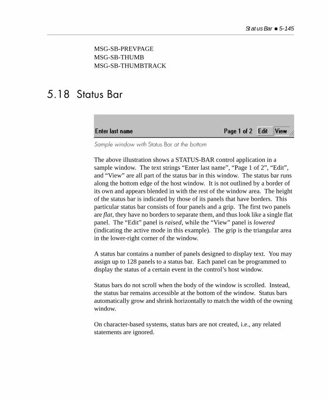
Status Bar 5-145
MSG-SB-PREVPAGEMSG-SB-THUMBMSG-SB-THUMBTRACK
5.18 Status Bar
Sample window with Status Bar at the bottom
The above illustration shows a STATUS-BAR control application in a sample window. The text strings “Enter last name”, “Page 1 of 2”, “Edit”, and “View” are all part of the status bar in this window. The status bar runs along the bottom edge of the host window. It is not outlined by a border of its own and appears blended in with the rest of the window area. The height of the status bar is indicated by those of its panels that have borders. This particular status bar consists of four panels and a grip. The first two panels are flat, they have no borders to separate them, and thus look like a single flat panel. The “Edit” panel is raised, while the “View” panel is lowered (indicating the active mode in this example). The grip is the triangular area in the lower-right corner of the window.
A status bar contains a number of panels designed to display text. You may assign up to 128 panels to a status bar. Each panel can be programmed to display the status of a certain event in the control’s host window.
Status bars do not scroll when the body of the window is scrolled. Instead, the status bar remains accessible at the bottom of the window. Status bars automatically grow and shrink horizontally to match the width of the owning window.
On character-based systems, status bars are not created, i.e., any related statements are ignored.
5-146 Control Types Reference
5.18.1 Common Properties
TITLE
The status bar does not have TITLE for a property, but you may use the phrase “TITLE” in the same way as you would use “PANEL-TEXT” and thus accomplish a de facto title of the status bar. Consider the following usage:
DISPLAY STATUS-BAR "This is the title panel".
orDISPLAY STATUS-BAR TITLE "This is the title panel".
Both of the above are equivalent to the complete statement:DISPLAY STATUS-BAR PANEL-WIDTHS -1 PANEL-STYLE 0 PANEL-TEXT "This is the title panel".
Your “title” will then be in PANEL-INDEX 1.
VALUE
Status bars have no value.
SIZE
Status bars have no size; their width always spans the width of the host window, and their height depends on the window font, always accommodating only one line of text.
COLOR
Status bars do not use colors; the colors of the status bar’s host window are used.
Status Bar 5-147
STYLES
GRIP
If specified, the GRIP option allows you to include in the lower-right corner of the window a triangular area in which you can click-and-drag to resize the entire window. So the grip affects the entire window, although it is a status bar style.
GRIP applies only to resizable windows. When it is specified, any resizing of a window using the grip triggers the same event as would resizing the window in a conventional way. If you specify grip in a non-resizable window, it is ignored.
5.18.2 Special Properties
PANEL-WIDTHS (numeric)
You may specify this property’s value with an integer data item or literal. PANEL-WIDTHS allows you to specify:
a. How many panels the status bar should hold: You may use an array to specify all the panels on one line, and the number of items in the array determines how many panels are created on the status bar; and
b. The width of each panel on the status bar. Each number on the array specifies the width of its corresponding panel in characters.
So if you specify your status bar using the following array:
DISPLAY STATUS-BAR PANEL-WIDTHS (50, 20, 20) [ ... ].
you are setting up a status bar with three panels, the first 50 characters wide, the other two at 20 characters each.
If you set PANEL-WIDTHS = 0, you create a status bar with one panel extending across its entire width and no text.
If you set PANEL-WIDTHS to a single positive non-zero number greater than the width of the entire status bar (as defined by the width of the host window), the panel gets sized down to fit in the host window and the text is truncated.
5-148 Control Types Reference
If you have a status bar composed of several panels, and you specify particular widths for each of them, for example:
DISPLAY STATUS-BAR PANEL-WIDTHS (25, 25, 25, 25)
and this status bar is displayed in a window that is dynamic, when that window shrinks below the size specified by PANEL-WIDTHS, all the panels are reset to an average size small enough so that all panels fit in the window, say “20, 20, 20, 20”.
If you do not want the all of the panels truncated, set the width of the last panel to “-1”, for example:
DISPLAY STATUS-BAR PANEL-WIDTHS (25, 25, 25, -1)
This will cause the last panel to be sized to whatever space is left available on the window after the first panels have been accommodated. Based on our example if the window was sized to 80 columns, the panels would be “25, 25, 25, 5”
The widths of panels with no PANEL-WIDTHS specified will be automatically calculated based on the total available width of the status bar divided by the number of panels, as specified through the use of PANEL-STYLE, PANEL-TEXT, or PANEL-INDEX.
When you modify PANEL-WIDTHS, the panel is not visually updated until the text is applied. This means that a MODIFY using PANEL-WIDTHS and no PANEL-TEXT will never be displayed. Conversely, any MODIFY statement without PANEL-WIDTHS reflects the changes immediately.
To erase the contents of a status bar, use:
MODIFY statusbar-handle PANEL-WIDTHS 0.
This removes all the panels and sets up the status bar with one panel extending across its entire width. After this operation, you have one panel with the style of previous panel 1 and no text.
Status Bar 5-149
PANEL-STYLE (numeric)
Allows you to specify the preferred style of the actual panel. You may specify the value with an integer data item or literal. Valid values are:
• Flat (“0”) — the panel has the same height as the rest of the window, with no visual borders. This style is generally used to present information as a guide, displaying different text to inform the user about the status of the program or the cursor’s location on the screen, or prompt for action or data entry into a field. It may also be used to indicate a condition that is temporarily disabled.
• Lowered (“1”) — the panel appears sunken in the host window. This style is generally used to indicate that an option is active, for instance, the “numlock” is on or the “insert” mode is active.
• Raised (“2”) — the panel appears raised in the host window. This style is generally used to indicate that an option is deactivated (“capslock” off, etc.).
You must apply the PANEL-STYLE before you apply the PANEL-TEXT, in order to have the text displayed properly.
The default is “0” (zero).
PANEL-TEXT (alphanumeric)
Can be specified with a data item or a literal. It allows you to specify the text content of a panel. The property pays attention to the current setting of the TRANSLATE-TO-ANSI environment configuration variable. The text may not exceed 255 characters, else the right-most text is automatically truncated. If the text exceeds the size of the panel, the visibility is the same as in any native Windows control, that is, the left-most text is visible.
PANEL-INDEX (numeric)
An integer data item or literal. It allows you to specify which panel you want to work with. General number range is from 1 to 128. If you specify an index number that is larger than the current number of panels but lower than 128, the status bar attempts to provide the additional panels up to the index number specified. The new panels all have the same width, as determined by the width of the status bar minus the width of the existing panels and divided by the number of
5-150 Control Types Reference
additional panels to be generated. The additional panels inherit their style from the first existing panel. If the first panel does not exist, the default style “0” (zero) applies.
SELF-ACT (no parameters)
To have a panel in the status bar act like a push button without additional coding, apply this style to the control. You will also have to constrain your panel styles to either lowered (1) or raised (2). A click on a panel will then toggle the panel between the two styles.
Example:
01 ScreenDemo. 03 AUTO-PANEL STATUS-BAR PANEL-WIDTHS (10, 10, 10, -1) PANEL-STYLE (1, 2, 1, 2) PANEL-TEXT ("Pan 1", "Pan 2", "Pan 3", "Pan 4") SELF-ACT.
Note that this will not automatically provide your code with any information, but you could inquire the panel for its current style and use that as a switch for further execution.
Example:
77 MySecondPanelIsSetToStyle PIC 9. ... DISPLAY ScreenDemo. ACCEPT ScreenDemo. INQUIREAUTO-PANEL PANEL-INDEX(2) IN MySecondPanelIsSetToStyle.
Note that SELF-ACT is related to the CMD-CLICKED event. SELF-ACT turns off the CMD-CLICKED event.
Note: The raised and lowered panels do not work with XP Visual styles (WIN32_NATIVECTLS runtime configuration variable).
Array and index modes
There are two modes of specifying the special properties of a status bar:
Status Bar 5-151
1. Array mode, where you specify each property once, in an array, for all the panels:
PANEL-WIDTHS ( width-1, width-2, width-3, ... )PANEL-STYLE ( style-1, style-2, style-3, ... )PANEL-TEXT ( text-1, text-2, text-3, ... )
or
2. Index mode, where you define each panel separately, property by property, assigning an index number to each panel. However, the total number of panels must be defined before any panel style or text is defined. Therefore, you must specify all of the PANEL-WIDTHS first, as in:
PANEL-WIDTHS width-1PANEL-WIDTHS width-2PANEL-INDEX id-1PANEL-STYLE style-1PANEL-TEXT text-1PANEL-INDEX id-2PANEL-STYLE style-2PANEL-TEXT text-2
It is generally recommended that you not mix array mode and index mode; however, you can specify PANEL-WIDTHS in array mode, followed by index mode for the remaining properties. For example:
DISPLAY STATUS-BAR PANEL-WIDTHS ( 10, 10, 10 ) PANEL-INDEX 1 PANEL-STYLE 0 PANEL-TEXT "Text one" PANEL-INDEX 2 PANEL-STYLE 1 PANEL-TEXT "Text two" PANEL-INDEX 3 PANEL-STYLE 2 PANEL-TEXT "Text three".
Sequence order
The Special Properties of the status bar control are reflective of the demands of the underlying Windows API. Two rules apply in the case when you specify a multi-panel status bar:
5-152 Control Types Reference
• The text is the last item processed before the display is performed. If you do not set the number of panels before you specify the text, the status bar is forced into single panel configuration.
• The style of a panel is set in accordance with whatever is active at the moment. Thus, if you set the style after the text, it has no effect.
You should, therefore, observe this specific sequence of properties when DISPLAYing or MODIFYing a status bar:
1. PANEL-WIDTHS, followed by the array;
2. PANEL-STYLE, followed by the array;
3. PANEL-TEXT, followed by the array;
4. GRIP.
So the syntax will look like this:DISPLAY STATUS-BAR PANEL-WIDTHS ( 5, 10, 20 ) PANEL-STYLE ( 0, 2, 2 ) PANEL-TEXT ( "Panel 1", "Panel 2", "Panel 3" ) GRIP.
5.18.3 Events
CMD-CLICKED
If a status bar does not have the SELF-ACT style applied, it will generate the CMD-CLICKED when a mouse is clicked on it. To capture the event, the status bar instance must have an EVENT PROCEDURE assigned.
The event will return two items:
EVENT-DATA-1: The current style of the panel clicked.
EVENT-DATA-2: The index of the panel clicked.
Example: 01 ScreenDemo. 03 MANUAL-PANEL STATUS-BAR PANEL-WIDTHS (10, 10, 10, -1)
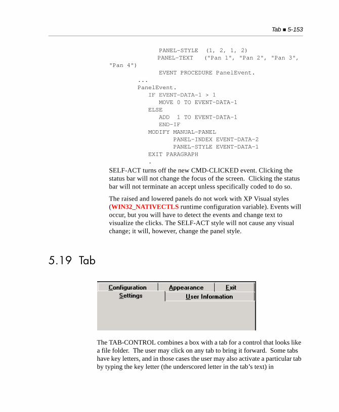
Tab 5-153
PANEL-STYLE (1, 2, 1, 2) PANEL-TEXT ("Pan 1", "Pan 2", "Pan 3", "Pan 4") EVENT PROCEDURE PanelEvent. ... PanelEvent. IF EVENT-DATA-1 > 1 MOVE 0 TO EVENT-DATA-1 ELSE ADD 1 TO EVENT-DATA-1 END-IF MODIFY MANUAL-PANEL PANEL-INDEX EVENT-DATA-2 PANEL-STYLE EVENT-DATA-1 EXIT PARAGRAPH .
SELF-ACT turns off the new CMD-CLICKED event. Clicking the status bar will not change the focus of the screen. Clicking the status bar will not terminate an accept unless specifically coded to do so.
The raised and lowered panels do not work with XP Visual styles (WIN32_NATIVECTLS runtime configuration variable). Events will occur, but you will have to detect the events and change text to visualize the clicks. The SELF-ACT style will not cause any visual change; it will, however, change the panel style.
5.19 Tab
The TAB-CONTROL combines a box with a tab for a control that looks like a file folder. The user may click on any tab to bring it forward. Some tabs have key letters, and in those cases the user may also activate a particular tab by typing the key letter (the underscored letter in the tab’s text) in
5-154 Control Types Reference
conjunction with the “Alt” key. You may define a tab’s key letter by placing an “&” in front of the intended key letter in the tab’s text. This appears as an underscored letter when the tab is displayed. For example,DISPLAY TAB-CONTROL, TAB-TO-ADD = ("Tab&1", "Tab&2")
creates a control with two tabs. The first tab has a key letter of “1” and the second tab has a key letter of “2”.
The program typically places different screen elements in the box depending on the tab selected.
The tab control can be used by any application that displays its screens on a 32-bit Windows system, including applications deployed with thin client technology. Any attempt to create a tab control on other systems fails and the returned handle is NULL.
When a user clicks on a tab, the program is informed of the new selection and the tab’s appearance is updated. (The behavioral distinction between tabs and push buttons is that a tab responds immediately when clicked, and a push button responds with the “clicked” event only when the mouse button is released.)
You may allow the user to activate the tabs with the keyboard by accepting the tab control as you would any other control (but you need not do so if you want to provide only a mouse interface). During the keyboard operation of the tab controls in Windows applications, the following logic is used by the runtime to process the arrow keys:
Left Arrow keys are processed by Windows if the first item in the tab control is not active. If the first item in the tab is active, then the runtime processes the left arrow in the usual way (depending on the value of KEYSTROKE entries).
Right Arrow keys are processed by Windows if the last item in the tab control is not active. If the last item in the tab control is active, then the runtime processes the right arrow in the usual way.
If the tab is a multiline tab, then up and down arrows are processed by Windows instead of the runtime. “Processed by Windows” in this context means that Windows decides which tab is selected next as the active tab, and the runtime has no control over that decision.
Tab 5-155
It is important to define the elements of the tab control in a particular order in the Screen Section to ensure that the runtime displays the control properly. The preferred method is to use separate Screen Section groups to define the contents of each tab page. See “Tab: Programming Tips” at the end of this section for details.
5.19.1 Common Properties
TITLE
Tabs do not have titles.
VALUE
A tab control has a numeric value, which represents the currently selected tab. Selecting a value outside of the range of existing tabs has an undefined effect.
SIZE
SIZE and LINES describe the area occupied by the tab control, using the tab’s font to determine the dimensions of the row and column. The area described includes the row(s) occupied by the tabs as well as the box.
COLOR
Tab controls are always displayed using the push button colors selected by the user in the Windows control panel.
Note: If you are using the WIN32_NATIVECTLS runtime variable to automatically enable XP or Vista control styles and have frames with labels, see the COLOR property of Section 5.12.1, “Label: Common Properties” for information on how the labels may display.
5-156 Control Types Reference
EVENT-LIST, EXCLUDE-EVENT-LIST
EVENT-LIST is an exclusive list of events that are either sent to or withheld (blocked) from the program depending on the value of EXCLUDE-EVENT-LIST. See Section 6.4.9, “Common Screen Options,” in Book 3.
STYLES
MULTILINE
If the tabs do not all fit on one line, this style allows them to occupy as many lines as needed. If this style is not used, then the system adds a scroll bar so the user can scroll to the hidden tabs.
BUTTONS
This style produces a tab control with a different appearance. These tabs look like push buttons (the box is not shown), but they act much like a group of radio buttons.
FIXED-WIDTH
This style causes each tab to occupy the same amount of space. Without this style, each tab is individually sized. Note that setting this style can cause an odd appearance on multiline tabs.
VERTICAL
When this style is used, tabs are displayed vertically along the left edge of the control. This style automatically implies the MULITLINE style.
Note that with this style, you cannot use the “&” character in a tab’s text to assign a keyboard shortcut. Also note that if you use the WIN32_NATIVECTLS runtime variable for invoking XP control styles, the contents may not render correctly or at all. This is because Windows XP native controls itself does not support this style.
Because some fonts are not displayed properly after being rotated, we recommend using a TrueType font with vertical tabs. You can use the W$FONT library routine to retrieve a TrueType font.
BOTTOM
This style causes tabs to appear on the bottom edge of the control instead of the top. If the VERTICAL style is also specified, then tabs appear on the right edge of the control instead of the left.
Tab 5-157
FLAT-BUTTONS
This style is similar to the BUTTONS style, but the button-style tabs appear flat, with no border, rather than having a 3-D appearance. Note: this style is only valid when the tabs are positioned at the top of the control. If the BOTTOM style is used, and FLAT-BUTTONS is also selected, the control will default to the BUTTONS style.
NO-DIVIDERS
This style is used only with the FLAT-BUTTONS style. When specified, no dividers are drawn between the button-style tabs.
HOT-TRACK
When this style is used, a tab’s text is highlighted when the mouse hovers over it. Note that the degree of highlighting is determined by Windows and is often fairly subtle.
NO-FOCUS
Users cannot give focus to the tab control when this style is used.
5.19.2 Special Properties
TAB-TO-ADD (alphanumeric)
Assigning a value to this property adds a new tab to the control. The value is the text of the tab. You may add several tabs at once by using parentheses, as shown in the following example:
MODIFY TAB-1, TAB-TO-ADD = ( "TAB 1", "TAB 2", "TAB 3" )
This example adds three tabs in the order listed. Inquiring from this property has no effect.
TAB-TO-DELETE (numeric)
Assigning a non-zero value to this property removes the correspondingly numbered tab. Inquiring from this property has no effect.
RESET-TABS (numeric)
Assigning a non-zero value to this property removes all existing tabs from the control. Inquiring from this property has no effect.
5-158 Control Types Reference
BITMAP-HANDLE (numeric)
This property allows images from a bitmap file to be placed on individual tabs. The images are displayed before the text of each tab. Before a bitmap image can be placed on a tab, you must load the bitmap file into memory by calling the library routine W$BITMAP with the WBITMAP-LOAD option. The routine returns a handle that is referred to by this property of the tab control.
The bitmap file loaded into memory is treated as a bitmap strip — a series of images of equal width that are laid out side-by-side in a single bitmap. The images are numbered sequentially starting at “1”. By default, each tab in the control displays the image whose number is the same as the tab’s ordinal number when the tab was defined. If you take the following code as an example,
MODIFY TAB-1, TAB-TO-ADD = ( "TAB 1", "TAB 2", "TAB 3" )
then by default, TAB1 will show image “1”, TAB2 will show image “2”, and TAB3 will show image “3”. You may change the default handling of the assignment of these images with the BITMAP-NUMBER property. See BITMAP-NUMBER and BITMAP-WIDTH for additional information.
BITMAP-WIDTH (numeric)
This property sets the width of the images in the bitmap strip described by BITMAP-HANDLE. If this property is not set, the images default to 16-pixels wide. Set this property to match the actual width of the images that make up the bitmap strip to get the look that you desire for the tabs.
BITMAP-NUMBER (numeric)
This property identifies which bitmap image will be displayed for each tab. To use this property, set the value of BITMAP-NUMBER to the number of the image in the bitmap strip.
This property is additive. The first time you set the BITMAP-NUMBER, the image identified with the bitmap number will be displayed on the first tab; the second time you set this property, the image identified will be displayed on the second tab, and so on. The additive behavior of this property may be overridden in one of three ways:
a. You may assign a value of “1” to this property.
Tab 5-159
b. You may empty the tab control through RESET-TABS.
c. You may specify a new list by keying in the bitmap numbers in parentheses, as shown in the example below.
The following Screen Section entry creates a tab control with three tabs, and places image numbers 3, 5 and 7 on those tabs:
03 TAB-CONTROL TAB-TO-ADD = ("Tab 1", "Tab 2", "Tab 3") BITMAP-NUMBER = (3, 5, 7)
If you omit the BITMAP-NUMBER, the bitmap images are assigned in ordinal number by default. In other words, the following definition:
03 TAB-CONTROL TAB-TO-ADD = ("Tab 1", "Tab 2", "Tab 3")
has the same meaning as:
03 TAB-CONTROL TAB-TO-ADD = ("Tab 1", "Tab 2", "Tab 3") BITMAP-NUMBER = (1, 2, 3)
When no value is set for this property, the default behavior is to automatically put bitmap number 1 on the first tab, bitmap number 2 on the second tab, and so on.
5.19.3 EventsCMD-HELPCMD-TABCHANGEDMSG-VALIDATE
5.19.4 Programming Tips
The preferred method of programming the tab control involves defining separate level 01 items in the Screen Section for every individual tab page and using a series DISPLAY statements, in a specific order, to display the control. The following syntax sample demonstrates this technique. 01 TAB-FORM. 03 MY-TAB, TAB-CONTROL COL 10 PIXELS LINE 10 PIXELS
5-160 Control Types Reference
LINES 200 PIXELS SIZE 200 PIXELS TAB-TO-ADD IS ("Page 1", "Page 2", "Page 3") EVENT PROCEDURE TAB-EVENT VALUE WS-ACTIVE-PAGE.01 TAB-PAGE-1. 03 LABEL COL 30 PIXELS LINE 50 PIXELS TITLE "This is page 1" LEFT.01 TAB-PAGE-2. 03 LABEL COL 30 PIXELS LINE 50 PIXELS TITLE "This is page 2" LEFT.01 TAB-PAGE-3. 03 LABEL COL 30 PIXELS LINE 50 PIXELS TITLE "This is page 3" LEFT.
The Procedure Division syntax uses successive DISPLAY statements to create the control. In the following example, the first DISPLAY statement creates a standard graphical window as a canvas for the tab control (Fig. 1). The second DISPLAY statement adds TAB-FORM, defined as a separate level 01 item in the Screen Section (Fig. 2). Note that TAB-FORM can be defined in the same group item with other controls for the same window. The third DISPLAY statement adds the content of the first tab, TAB-PAGE-1, defined as another separate level 01 item in the Screen Section (Fig. 3). DISPLAY STANDARD GRAPHICAL WINDOW SCREEN LINE 1 SCREEN COLUMN 1 LINES 17 SIZE 37 CONTROL FONT IS WS-DISPLAY-FONT AUTO-MINIMIZE BACKGROUND-LOW MODELESS NO SCROLL WITH SYSTEM MENU TITLE "Tab control demo"
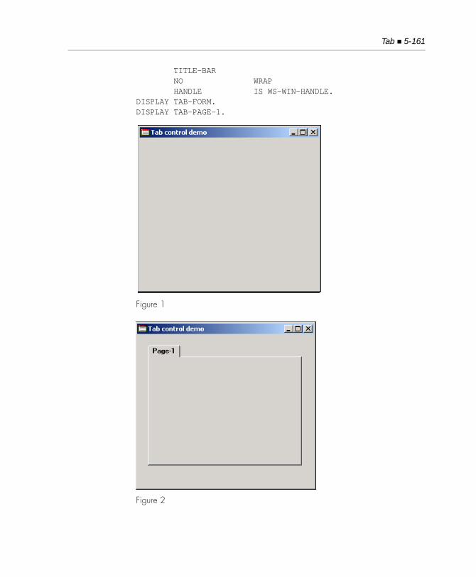
Tab 5-161
TITLE-BAR NO WRAP HANDLE IS WS-WIN-HANDLE.DISPLAY TAB-FORM.DISPLAY TAB-PAGE-1.
Figure 1
Figure 2
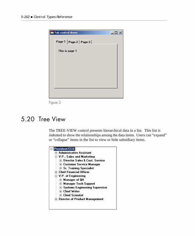
5-162 Control Types Reference
Figure 3
5.20 Tree View
The TREE-VIEW control presents hierarchical data in a list. This list is indented to show the relationships among the data items. Users can “expand” or “collapse” items in the list to view or hide subsidiary items.
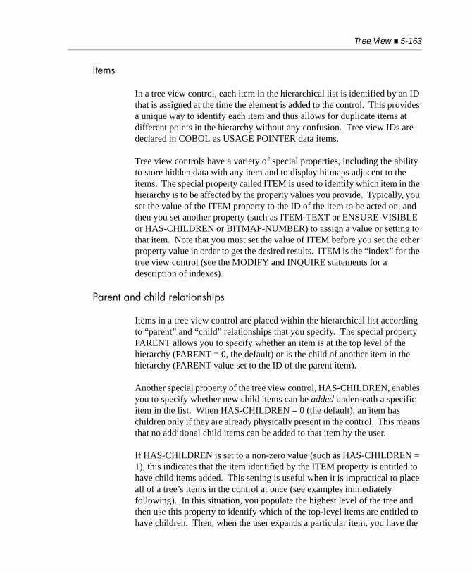
Tree View 5-163
Items
In a tree view control, each item in the hierarchical list is identified by an ID that is assigned at the time the element is added to the control. This provides a unique way to identify each item and thus allows for duplicate items at different points in the hierarchy without any confusion. Tree view IDs are declared in COBOL as USAGE POINTER data items.
Tree view controls have a variety of special properties, including the ability to store hidden data with any item and to display bitmaps adjacent to the items. The special property called ITEM is used to identify which item in the hierarchy is to be affected by the property values you provide. Typically, you set the value of the ITEM property to the ID of the item to be acted on, and then you set another property (such as ITEM-TEXT or ENSURE-VISIBLE or HAS-CHILDREN or BITMAP-NUMBER) to assign a value or setting to that item. Note that you must set the value of ITEM before you set the other property value in order to get the desired results. ITEM is the “index” for the tree view control (see the MODIFY and INQUIRE statements for a description of indexes).
Parent and child relationships
Items in a tree view control are placed within the hierarchical list according to “parent” and “child” relationships that you specify. The special property PARENT allows you to specify whether an item is at the top level of the hierarchy (PARENT = 0, the default) or is the child of another item in the hierarchy (PARENT value set to the ID of the parent item).
Another special property of the tree view control, HAS-CHILDREN, enables you to specify whether new child items can be added underneath a specific item in the list. When HAS-CHILDREN = 0 (the default), an item has children only if they are already physically present in the control. This means that no additional child items can be added to that item by the user.
If HAS-CHILDREN is set to a non-zero value (such as HAS-CHILDREN = 1), this indicates that the item identified by the ITEM property is entitled to have child items added. This setting is useful when it is impractical to place all of a tree’s items in the control at once (see examples immediately following). In this situation, you populate the highest level of the tree and then use this property to identify which of the top-level items are entitled to have children. Then, when the user expands a particular item, you have the
5-164 Control Types Reference
program respond to the MSG-TV-EXPANDING event by adding the appropriate child items to the control. The HAS-CHILDREN property tells the control which items can be expanded.
Adding child items
In many cases, it is impractical to fully load a tree view with all of the items it logically contains. For example, if you want to represent every file on a local disk drive in its directory hierarchy, a tree view is a natural way to do this. However, it could take a long time to populate this tree: every file on the entire drive would have to be located. One way to solve this problem is to populate only the top level of the tree at first, and then populate only those sub-levels that the user visits.
In order to do this, you have to tell the tree view whether an item is entitled to have children when you add the item to the control. If you did not do this, the control would not allow the user to expand that item. You establish the ability to add children to an item by setting the property HAS-CHILDREN to “1” when you add the parent item. For example:MODIFY TV-1, ITEM-TO-ADD = "Parent Item" GIVING PARENT-1, HAS-CHILDREN = 1
This informs the control that the item has children, even though the children are not physically present in the control.
There are two approaches you can take when managing the children of a particular item. You can add them the first time the parent item expands, and then leave them in the control, or you can add them as the parent expands and delete them when the parent collapses.
Adding child items once
The first approach is to add child items the first time the parent is expanded and then leave them in the control. To code this, respond to the MSG-TV-EXPANDING message by seeing if there are any children of the parent item. If not, then add them at this point. A typical event procedure for this would look like this:TREE-VIEW-EVENT-1. EVALUATE EVENT-TYPE WHEN MSG-TV-EXPANDING
Tree View 5-165
IF EVENT-DATA-1 = TVFLAG-EXPAND |Item expanding MODIFY TV-1( EVENT-DATA-2 ), NEXT-ITEM = TVNI-CHILD GIVING ITEM-1 IF ITEM-1 = NULL |No children PERFORM ADD-CHILDREN END-IF END-IF END-EVALUATE
The paragraph ADD-CHILDREN would do the work needed to add the child items. In this example, EVENT-DATA-1 contains a flag that describes whether the parent item is being expanded or collapsed, and EVENT-DATA-2 contains the ID of the parent item. See the description of the event MSG-TV-EXPANDING for details.
Adding child items on each expansion
The second approach is to add child items each time the parent expands and then remove them when the parent collapses. The code for adding the items is slightly easier because you do not have to guard against adding multiple times. However, you have additional code to handle the removal of the child items. A typical event procedure for this approach looks like this:TREE-VIEW-EVENT-1.
EVALUATE EVENT-TYPE WHEN MSG-TV-EXPANDING IF EVENT-DATA-1 = TVFLAG-EXPAND PERFORM ADD-CHILDREN END-IF
WHEN MSG-TV-EXPANDED IF EVENT-DATA-1 = TVFLAG-COLLAPSE MODIFY TV-1, ITEM-TO-EMPTY = EVENT-DATA-2 END-IF
Note: It is important that you add the children in response to the MSG-TV-EXPANDING event and remove them in response to the MSG-TV-EXPANDED event. Any other approach can confuse the control and produce odd results.
5-166 Control Types Reference
Navigating a tree view with the keyboard
Typically, users use a mouse to interact with a tree view control. However, users can also use the keyboard to accomplish many actions.
The down arrow key selects the next visible item in the tree (i.e. moves the selection down one row).
The up arrow key selects the previous visible item in the tree (i.e. moves the selection up one row).
If the current item is collapsed (i.e. has a plus sign to its left):
• The right arrow key expands the item
• The left arrow key selects the parent item
If the current item is expanded (i.e. has a minus sign to its left):
• The right arrow key selects the first child item
• The left arrow key collapses the item
If the current item has no children:
• The right arrow key has no affect
• The left arrow key selects the parent item
The page up (PgUp) and page down (PgDn) keys select items one page minus one item away from the current item.
5.20.1 Common Properties
TITLE
Tree view controls do not have titles.
Tree View 5-167
VALUE
A tree view’s value is the ID of the currently selected item. When you set the VALUE, the corresponding item is selected (or the selection is removed if there is no corresponding item). When you retrieve the VALUE, the result is the ID of the current selection, or NULL if nothing is selected.
SIZE
SIZE and LINES describe the area occupied by the tree view control, using the control’s font to determine the dimensions of a row and column. Additional space is added for the scroll bar (which is hidden when it is not needed). The default height of a tree view is 5 lines; the default width is 12 columns. For character-based systems, the size and appearance of the tree view control depends on the configuration variables TREE-TAB-SIZE and TREE-ROOT-SPACE.
COLOR
Tree views use any specified foreground or background color. If either color is omitted, then that color uses a system-dependent default value. Under Microsoft Windows, the default values are determined by the user’s choices in the Control Panel (usually black on bright white). These system-dependent default colors are not transformed or mapped by the runtime’s color-handling configuration options.
EVENT-LIST, EXCLUDE-EVENT-LIST
EVENT-LIST is an exclusive list of events that are either sent to or withheld (blocked) from the program depending on the value of EXCLUDE-EVENT-LIST. See Section 6.4.9, “Common Screen Options,” in Book 3.
STYLES
3-D
Adds 3-D decoration around the border of the control. Effective only on boxed tree views.
5-168 Control Types Reference
BOXED
Indicates that a box should be placed around a tree view. This is the default.
BUTTONS
Places small buttons to the left of each item that the user can click to expand or collapse the item in addition to double-clicking the item. The buttons show a “+” if the item can be expanded, or a “-” if it can be collapsed. Items with no subsidiary items do not get a button. Also, buttons are placed on the top level items only if you also specify the SHOW-LINES and LINES-AT-ROOT styles. (Note: some versions of Windows are known to have a bug that prevents the buttons from displaying correctly if you do not also specify the SHOW-LINES style.)
LINES-AT-ROOT
Allows the SHOW-LINES and BUTTONS styles to apply to top level items. Note that the runtime configuration variable TREE_ROOT_SPACE can control the number of screen columns between the left edge of the Tree-View control and the root level text.
NO-BOX
This style removes the box that normally displays around the control.
SHOW-LINES
Causes faint lines to be drawn between the items to help clarify their nesting relationship. Lines are not drawn between top level items unless you also specify the LINES-AT-ROOT style.
SHOW-SEL-ALWAYS
When this style is applied, the control always shows the current selection, even when it does not have the focus. The default is to hide the selection when the control does not have the focus.
Tip: There are two runtme configuration variables that affect Tree View controls. The TREE_ROOT_SPACE and TREE_TAB_SIZE described in Appendix H.
Tree View 5-169
5.20.2 Special Properties
BITMAP-HANDLE (numeric)
Identifies the handle of a loaded bitmap, so that images from that bitmap can be shown in items in the tree view. You obtain the bitmap handle by calling the library routine W$BITMAP with the WBITMAP-LOAD option. The bitmap is treated as a bitmap strip — a series of fixed-width images laid out side-by-side in a single bitmap. The images are numbered sequentially, starting at “1”. Note that you have only one bitmap strip for the entire control, although you can select individual images out of this strip for each item. See BITMAP-NUMBER.
BITMAP-NUMBER (numeric)
Identifies the bitmap image that will be displayed for the item identified by ITEM. If you do not specify a bitmap number for a particular item, that item will use bitmap number “1”. Note that you can show different bitmaps for expanded or collapsed items by changing an item’s BITMAP-NUMBER in response to the MSG-TV-EXPANDING event.
BITMAP-WIDTH (numeric)
Sets the width of the images in the bitmap strip described by BITMAP-HANDLE. If not set, then the images default to 16-pixels wide. You should set this to match the actual width of the images that make up the bitmap strip.
ENSURE-VISIBLE (numeric)
When set to a valid item ID, ensures that that item is visible in the control. This may expand collapsed items and may cause scrolling.
EXPAND (numeric)
Programmatically expands or collapses the item identified by the ITEM property. If you set EXPAND to TVFLAG-EXPAND, the item is expanded. To collapse the item, set EXPAND to TVFLAG-COLLAPSE. These constants are defined in “acugui.def”. Set to zero when you want no action to occur.

5-170 Control Types Reference
HIDDEN-DATA (alphanumeric)
Allows the program to store data that is not displayed in an item. Hidden data is limited to 255 bytes per item. Hidden data may be any format, including non-printing characters. This property acts on the item identified by the ITEM property.
Note: As with all properties that take a text value, when the value of HIDDEN-DATA is stored, the runtime automatically strips trailing spaces and low-values.
HAS-CHILDREN (numeric)
When set to a non-zero value, indicates that the item identified by ITEM has child items even if there are no child items in the control. When set to zero (the default), an item has children only if they are physically present in the control. This property is useful when it is impractical to place all of a tree’s items in the control all at once. In this approach, you do not place child items in the tree, but you mark which items have children via this property. Then, when the user expands a particular item, you have the program respond to the MSG-TV-EXPANDING event by adding the appropriate child items to the control. The HAS-CHILDREN property informs the control which items can be expanded.
ITEM (numeric)
This property is used in conjunction with other properties to identify which item to affect. Typically, you set ITEM to the ID of the item to act on and then set another property to perform the action. Note that you must set ITEM before the other property to get the desired results. ITEM is the “index” for the tree view control (see the MODIFY and INQUIRE statements for a description of indexes).
Note: The Windows API does not guard against invalid settings of this property. As a result, setting this property to a value that does not correspond to a valid item ID can result in a general protection fault under Windows.
Tree View 5-171
ITEM-TEXT (alphanumeric)
When set, changes the text of the item identified by ITEM to match the value assigned. When queried, returns the text of the item identified by ITEM.
ITEM-TO-ADD (alphanumeric)
Places a new item in the tree view control. The text assigned to ITEM-TO-ADD is placed as a new item in the control. Its position in the hierarchy is determined by the PARENT and PLACEMENT special properties. The return value from this property is the ID of the new item. If the new item is successfully added, the ITEM property is set to point to this item (this makes attaching a bitmap or hidden data to the item easier - see BITMAP-NUMBER and HIDDEN-DATA).
ITEM-TO-DELETE (numeric)
When set, deletes the item whose ID matches the assigned value. If you place this in the Screen Section, then set this value to NULL to ensure that you do not accidentally delete items.
ITEM-TO-EMPTY (numeric)
Deletes all child items of the item whose ID is assigned to this property. When set to NULL, has no effect.
NEXT-ITEM (numeric)
Setting this property returns a specific item ID. The new item found depends on the value used:
Value Item Found
TVNI-CHILD First child of the current ITEM
TVNI-FIRST-VISIBLE First item currently visible in control
TVNI-NEXT Next sibling of the current ITEM
TVNI-NEXT-VISIBLE Next visible item after ITEM
TVNI-PARENT Parent item of the current ITEM
TVNI-PREVIOUS Previous sibling of ITEM
TVNI-PREVIOUS-VISIBLE Previous visible item before ITEM
TVNI-ROOT Topmost item in the entire control
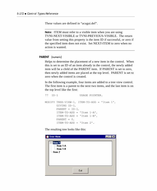
5-172 Control Types Reference
These values are defined in “acugui.def”.
Note: ITEM must refer to a visible item when you are using TVNI-NEXT-VISIBLE or TVNI-PREVIOUS-VISIBLE. The return value from setting this property is the item ID if successful, or zero if the specified item does not exist. Set NEXT-ITEM to zero when no action is wanted.
PARENT (numeric)
Helps to determine the placement of a new item in the control. When this is set to an ID of an item already in the control, the newly added item will be a child of the PARENT item. If PARENT is set to zero, then newly added items are placed at the top level. PARENT is set to zero when the control is created.
In the following example, four items are added to a tree view control. The first item is a parent to the next two items, and the last item is on the top level like the first:
77 ID-1 USAGE POINTER.
MODIFY TREE-VIEW-1, ITEM-TO-ADD = "Item 1", GIVING ID-1, PARENT = ID-1, ITEM-TO-ADD = "Item 1-A", ITEM-TO-ADD = "Item 1-B", PARENT = 0, ITEM-TO-ADD = "Item 2".
The resulting tree looks like this:
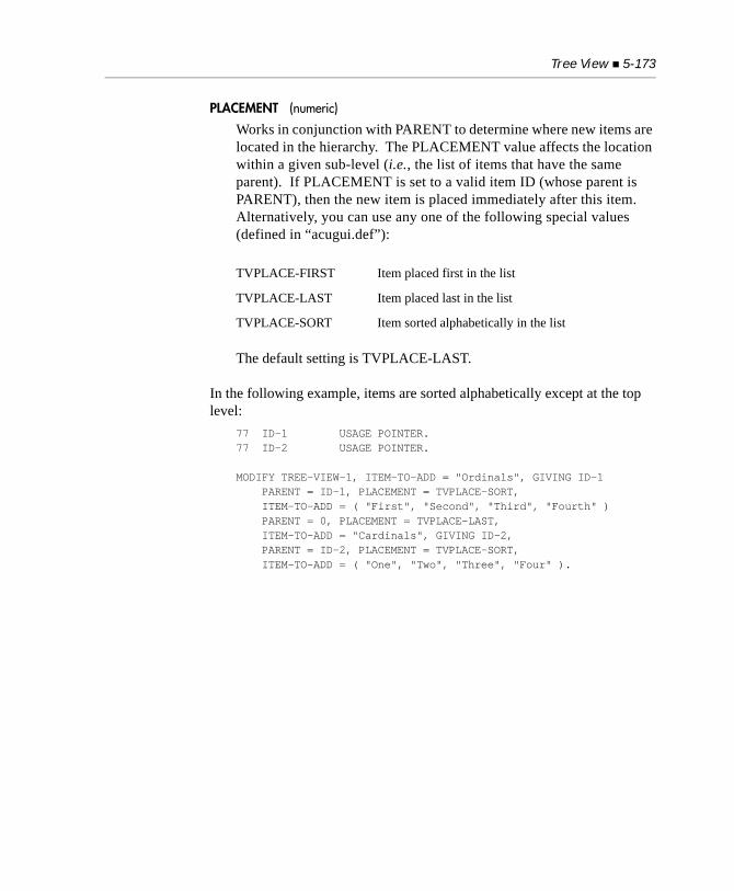
Tree View 5-173
PLACEMENT (numeric)
Works in conjunction with PARENT to determine where new items are located in the hierarchy. The PLACEMENT value affects the location within a given sub-level (i.e., the list of items that have the same parent). If PLACEMENT is set to a valid item ID (whose parent is PARENT), then the new item is placed immediately after this item. Alternatively, you can use any one of the following special values (defined in “acugui.def”):
The default setting is TVPLACE-LAST.
In the following example, items are sorted alphabetically except at the top level:
77 ID-1 USAGE POINTER.77 ID-2 USAGE POINTER.
MODIFY TREE-VIEW-1, ITEM-TO-ADD = "Ordinals", GIVING ID-1 PARENT = ID-1, PLACEMENT = TVPLACE-SORT, ITEM-TO-ADD = ( "First", "Second", "Third", "Fourth" ) PARENT = 0, PLACEMENT = TVPLACE-LAST, ITEM-TO-ADD = "Cardinals", GIVING ID-2, PARENT = ID-2, PLACEMENT = TVPLACE-SORT, ITEM-TO-ADD = ( "One", "Two", "Three", "Four" ).
TVPLACE-FIRST Item placed first in the list
TVPLACE-LAST Item placed last in the list
TVPLACE-SORT Item sorted alphabetically in the list
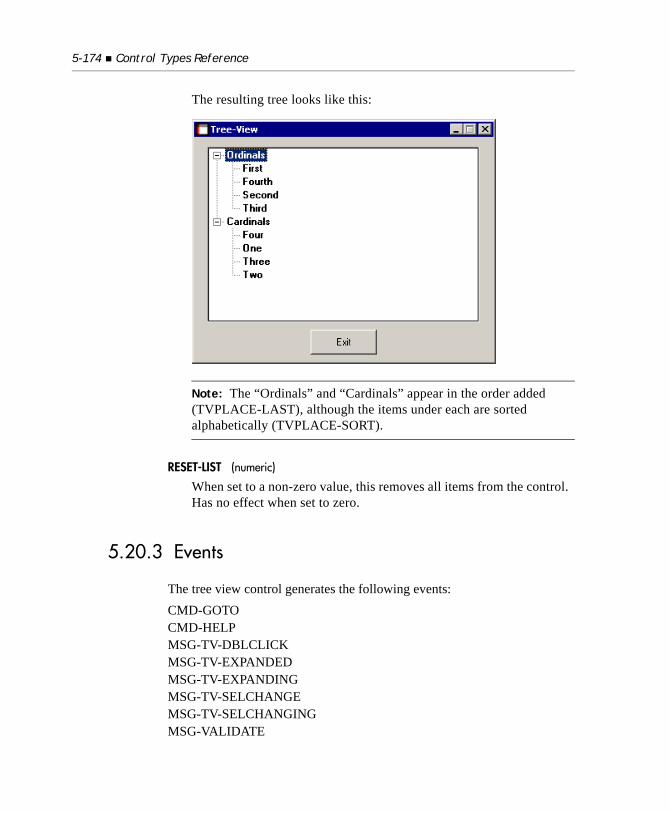
5-174 Control Types Reference
The resulting tree looks like this:
Note: The “Ordinals” and “Cardinals” appear in the order added (TVPLACE-LAST), although the items under each are sorted alphabetically (TVPLACE-SORT).
RESET-LIST (numeric)
When set to a non-zero value, this removes all items from the control. Has no effect when set to zero.
5.20.3 Events
The tree view control generates the following events:CMD-GOTOCMD-HELPMSG-TV-DBLCLICKMSG-TV-EXPANDEDMSG-TV-EXPANDINGMSG-TV-SELCHANGEMSG-TV-SELCHANGINGMSG-VALIDATE
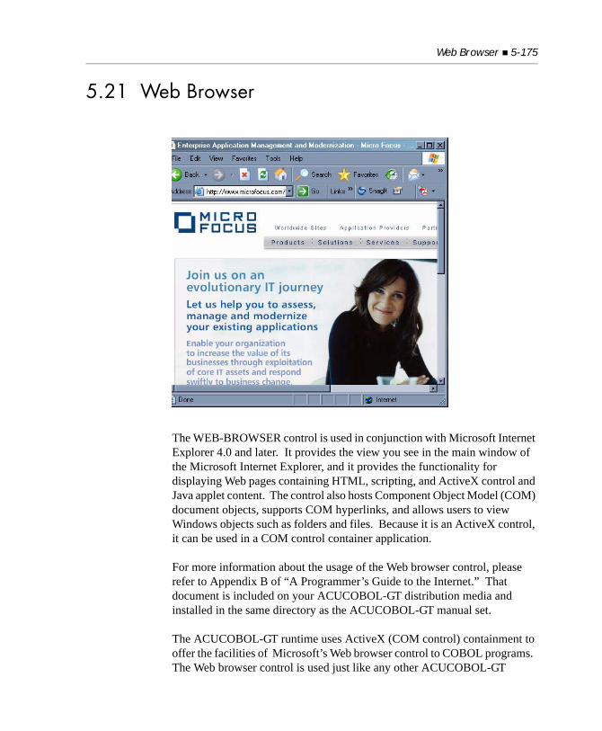
Web Browser 5-175
5.21 Web Browser
The WEB-BROWSER control is used in conjunction with Microsoft Internet Explorer 4.0 and later. It provides the view you see in the main window of the Microsoft Internet Explorer, and it provides the functionality for displaying Web pages containing HTML, scripting, and ActiveX control and Java applet content. The control also hosts Component Object Model (COM) document objects, supports COM hyperlinks, and allows users to view Windows objects such as folders and files. Because it is an ActiveX control, it can be used in a COM control container application.
For more information about the usage of the Web browser control, please refer to Appendix B of “A Programmer’s Guide to the Internet.” That document is included on your ACUCOBOL-GT distribution media and installed in the same directory as the ACUCOBOL-GT manual set.
The ACUCOBOL-GT runtime uses ActiveX (COM control) containment to offer the facilities of Microsoft’s Web browser control to COBOL programs. The Web browser control is used just like any other ACUCOBOL-GT
control. To create a Web browser control identified by the name BROWSER-1 and using the Working-Storage item URL-1 as its value, for example, you would add the following lines to a screen section item:03 BROWSER-1 WEB-BROWSER VALUE URL-1 COLUMN 5, LINE 5, SIZE 60, LINES 20.
or add the following procedure division code:DISPLAY WEB-BROWSER VALUE URL-1 COLUMN 5, LINE 5, SIZE 60, LINES 20 HANDLE IN BROWSER-1.
5.21.1 Common Properties
TITLE
The Web browser control does not use titles.
VALUE
The Web browser control takes an alphanumeric value, which is the URL.
SIZE
The Web browser control defines its height by multiplying the LINES value by cell size.
The Web browser control defines its width by multiplying the SIZE value by the standard or wide font measure as described below. If the Web browser control is also boxed, the space required for the box is added to the width. The Web browser control has a minimum width of at least one character.
COLOR
The Web browser control ignores any colors specified. The actual colors used are system-dependent. Under Windows, the user selects the colors in the Control Panel.
Web Browser 5-177
EVENT-LIST, EXCLUDE-EVENT-LIST
EVENT-LIST is an exclusive list of events that are either sent to or withheld (blocked) from the program depending on the value of EXCLUDE-EVENT-LIST. See Section 6.4.9, “Common Screen Options,” in Book 3.
Methods
Methods are implemented as properties in ACUCOBOL-GT. To invoke a method, you modify the control, setting the values of various properties that represent the method parameters. Then, usually in the same modify statement, you set a particular property that represents the method to invoke. Sometimes just setting the value of a control invokes a method.
Here is a table of the methods with their corresponding ACUCOBOL-GT Web browser control properties and descriptions:
To invoke the GoBack, GoForward, GoHome, GoSearch, Refresh, and StopBrowser methods, modify the control, setting the appropriate properties to “1”. To invoke the Navigate method, modify the control setting the VALUE property to the desired URL. For example, to invoke the GoBack method:
Method Control property Description
GoBack GO-BACK Navigates to the previous item in the history list.
GoForward GO-FORWARD Navigates to the next item in the history list.
GoHome GO-HOME Navigates to the current configured home or start page.
GoSearch GO-SEARCH Navigates to Microsoft’s web portal site.
Navigate VALUE Navigates to a resource identified by a URL or file path.
Refresh REFRESH Reloads the current page.
StopBrowser STOP-BROWSER Stops any pending navigation or download.
5-178 Control Types Reference
MODIFY BROWSER-1 GO-BACK=1.
To invoke the Navigate method:MODIFY BROWSER-1 VALUE="http://www.acucorp.com".
Alternatively, if you have defined the WEB-BROWSER control with value URL-1 in a screen section item called BROWSER-SCREEN:MOVE "http://www.acucorp.com" to URL-1.DISPLAY BROWSER-SCREEN.
These methods are invoked asynchronously. This means that the MODIFY verb may finish executing before the operation is complete. You may check the value of the BUSY property (see below) to determine whether the operation has completed.
5.21.2 Special Properties
CUSTOM-PRINT-TEMPLATE (alphanumeric)
Internet Explorer versions 5.5 and later give you precise control over the layout and contents of pages printed, print jobs, and the print preview user interface. This is accomplished using an HTML script file that you create called a “Custom Print Template.” Use the CUSTOM-PRINT-TEMPLATE property of ACUCOBOL-GT’s Web browser control to specify the name of your template file.
You may specify an absolute or relative path to the template file. Relative path names are relative to the current working directory. Under thin client, the path refers to a file on the server. The client downloads the file to its local cache directory and gives it a temporary name. If the file already exists in the cache directory, the client downloads a new copy only if the file on the server is a different size or has a later modification date than the file on the client.
You must set CUSTOM-PRINT-TEMPLATE before each print or print preview operation. Its value is cleared after the print or print preview operation completes.
See the Microsoft Developer Network for complete documentation of the format and use of custom print templates.
Web Browser 5-179
PRINT (numeric)
The PRINT and PRINT-NO-PROMPT properties let users print the contents of the page displayed via the Web browser control. Set PRINT=1 to display the “Print” dialog, allowing users to choose a printer, page range, number of copies, zoom level, and other options before starting a print job.
PRINT-NO-PROMPT (numeric)
Set PRINT-NO-PROMPT=1 to start a print job without displaying the “Print” dialog. Default settings are used unless CUSTOM-PRINT-TEMPLATE is specified. The thin client displays a security dialog to warn users about the risks of running scripts from untrusted servers.
PAGE-SETUP (numeric)
Set PAGE-SETUP=1 to display the “Page Setup” dialog, allowing users to change settings for margins, paper size, paper source, and layout prior to printing.
PRINT-PREVIEW (numeric)
Set PRINT-PREVIEW=1 to display the “Print Preview” window. You can customize the appearance and user interface in this window using the CUSTOM-PRINT-TEMPLATE property.
COPY-SELECTION (numeric)
Set COPY-SELECTION=1 to copy the current selection to the clipboard.
CLEAR-SELECTION (numeric)
Set CLEAR-SELECTION=1 to clear the current selection from the clipboard.
SAVE-AS (numeric)
Set SAVE-AS=1 to display the “Save As” dialog and allow the user to save a copy of the page displayed in the Web browser control to disk.
SAVE-AS-NO-PROMPT (alphanumeric)
The SAVE-AS-NO-PROMPT property uses the filename specified with the FILE-NAME property when a page is saved from the browser control. This was originally designed to bypass the “Save As” dialog

5-180 Control Types Reference
and save the Web page to disk without prompting the user. However, Microsoft has identified this as a security risk and later versions of Internet Explorer will always display the “Save As” dialog.
FILE-NAME (alphanumeric)
Set FILE-NAME to the path of a file to be used with the “Save As” operation. The value of the FILE-NAME property is cleared after the “Save As” operation is complete.
PROPERTIES (numeric)
Set PROPERTIES=1 to display the “Properties” dialog.
SELECT-ALL (numeric)
Set SELECT-ALL=1 to cause the entire contents of the HTML page, current frame, or entry field to be selected. What gets selected depends on which element of the Web page has the keyboard focus. If you click in an HTML form entry field, then SELECT-ALL=1 selects the value of that entry field only. If you click in an area of a frame outside of a form, SELECT-ALL=1 selects the entire frame. This behavior was designed by Microsoft and cannot be changed.
5.21.3 Other Properties
Here is a table of the properties with their corresponding ACUCOBOL-GT Web browser control properties and descriptions:
Property Control property Description
Busy BUSY Indicates whether a download or navigation is still in progress.
LocationName TITLE Name of the resource that the WEB-BROWSER control is currently displaying.
LocationURL VALUE URL of the resource that the WEB-BROWSER control is currently displaying.
Type TYPE Type of the current contained document object.

Web Browser 5-181
BUSY, LOCATION-NAME, and TYPE are read-only properties. Setting their values has no effect. As with all ACUCOBOL-GT control properties, you may use the INQUIRE verb to obtain a Web browser control’s properties. For example, to check whether a Web browser control has completed executing the last invoked method:
INQUIRE BROWSER-1 BUSY IN BROWSER-1-BUSY.IF BROWSER-1-BUSY = 1 ...END-IF
To get the URL that the browser is currently displaying:INQUIRE BROWSER-1 VALUE IN URL-1.
Alternatively, if you have defined the control with value URL-1 in a screen section item, the LocationURL is automatically moved to URL-1 when an event or exception occurs or the ACCEPT terminates.
5.21.4 Events
The WEB-BROWSER control generates the following events:MSG-WB-BEFORE-NAVIGATEMSG-WB-DOWNLOAD-BEGINMSG-WB-DOWNLOAD-COMPLETEMSG-WB-NAVIGATE-COMPLETEMSG-WB-PROGRESS-CHANGEMSG-WB-STATUS-TEXT-CHANGEMSG-WB-TITLE-CHANGE

5-182 Control Types Reference
6
Events ReferenceKey Topics
Overview of Events.................................................................................. 6-2Window Events ........................................................................................ 6-3Control Events ......................................................................................... 6-5Menu Events ......................................................................................... 6-25
6-2 Events Reference
6.1 Overview of Events
This chapter describes the events that can be generated when you are using graphical windows and controls in an event-driven environment.
Events are categorized into command events, notify events, and messages. Generally speaking, command events correspond to actions taken by the user that the program needs to act on (for example, closing a window or pushing a button). Notify events generally correspond to informational events that the program may not have to act on. Messages pass information to a screen control’s event procedure. This division is somewhat arbitrary, but corresponds to the most common situations.
When a command or notify event occurs, the runtime system assigns a value to the EVENT STATUS data item and then terminates the current ACCEPT with an exception value of “96”. Note that the termination occurs even if the particular ACCEPT statement does not normally allow exceptions. The program should examine the EVENT STATUS data item to determine what happened.
Messages are different from other events, because they do not terminate the current ACCEPT. Messages are sent only to a control’s event procedure. (See section 5.9.6, Book 3, Reference Manual, for a detailed discussion of event procedures.)
The EVENT STATUS phrase is described in section 4.2.3, Book 3, Reference Manual. The EVENT STATUS data item should be defined as follows: 01 EVENT-STATUS. 03 EVENT-TYPE PIC X(4) COMP-X. 03 EVENT-WINDOW-HANDLE USAGE HANDLE OF WINDOW. 03 EVENT-CONTROL-HANDLE USAGE HANDLE. 03 EVENT-CONTROL-ID PIC XX COMP-X. 03 EVENT-DATA-1 USAGE SIGNED-SHORT. 03 EVENT-DATA-2 USAGE SIGNED-LONG. 03 EVENT-ACTION PIC X COMP-X.
A copy of this data item appears in the COPY file “crtvars.def”.
In the Screen Section, notification events are treated slightly differently from command events. Normally, when an event triggers an EXCEPTION procedure, the ACCEPT-CONTROL field of the SCREEN CONTROL status
Window Events 6-3
item is initialized to “0”. This causes the ACCEPT statement to terminate after the EXCEPTION procedure completes. You can cause the ACCEPT statement to continue processing fields by moving alternate values to the ACCEPT-CONTROL data item. When a notification event triggers an EXCEPTION procedure, the ACCEPT-CONTROL field is initialized to “1” instead. This causes the ACCEPT statement to continue processing the current field when the EXCEPTION procedure terminates. This is done as a convenience. Most notification events can be handled entirely within the EXCEPTION procedure and should not terminate ACCEPT processing. If you need to terminate the controlling ACCEPT, simply move a “0” to ACCEPT-CONTROL inside the EXCEPTION procedure.
Event values can be found in the file “acugui.def”. The names given in the next section are the level 78 data items found in that file.
6.2 Window Events
The EVENT-CONTROL-HANDLE and EVENT-CONTROL-ID values will always be zero (NULL) when a window event occurs. The values returned are stored as signed integers and may return negative values.
Note: Command events begin with the prefix “CMD”. Notification events start with “NTF”, and messages begin with “MSG”.
CMD-CLOSE (value 1)
This event indicates that the user has selected the close option from the active window’s system menu. The application should respond by hiding or destroying the window. The EVENT-WINDOW-HANDLE data item will contain the handle of the window that the user wants to close. The EVENT-DATA-1 and EVENT-DATA-2 values are not used. Note that floating windows always return the exception CMD-CLOSE. Also note that the runtime configuration variable QUIT-MODE affects only the main application window. All other windows in the application return the event CMD-CLOSE when the close button is clicked.
6-4 Events Reference
CMD-ACTIVATE (value 6)
This event occurs when a window is activated by the user, but only if the previously active window belongs to the same program (i.e., the user switches windows within the program, and does not transfer control from another program). The normal response is to ACCEPT something in the newly active window, making it the active window from the program’s point of view. If you use either the LINK or BIND TO THREAD options when creating the window, then the runtime can automatically handle this event. The EVENT-DATA-1 and EVENT-DATA-2 values are not used. Threads are discussed in detail in Section 6.8 of Book 1, ACUCOBOL-GT User’s Guide.
NTF-RESIZED (value 4114)
This event occurs when a resizeable window that does not have AUTO-RESIZE specified is resized by the user. The application typically reconstructs the screen in response. EVENT-DATA-1 contains the new height and EVENT-DATA-2 contains the new width, both measured in hundredths of cells (e.g., an 80-column wide screen is expressed as “8000”). Alternatively, after the ACCEPT terminates, you can use a format 2 INQUIRE statement to obtain the window’s dimensions and other information (see INQUIRE Statement in section 6.6, “Procedure Division,” of Book 3, Reference Manual).
The resize layout manager can simplify the task of resizing controls in a window that has been resized. See Section 4.8, “Layout Managers,” for more information.
MSG-CLOSE (value 16415)
This event occurs when the user clicks on the window’s close box, selects “Close” from the window’s system menu, or types the host system’s key sequence to close the application (Alt-F4 for Windows).
MSG-CLOSE provides a single point where you can test for the close operation. This event will be followed by the normal close sequence for the window. Handling of the initial window is dictated by the current setting of the QUIT-MODE configuration variable. This may also result in the generation of a CMD-CLOSE event for the other windows. If you set EVENT-ACTION to EVENT-ACTION-FAIL in response to this event, the close operation is inhibited.
Control Events 6-5
6.3 Control Events
Note: For any ACUCOBOL-GT, ActiveX, or .NET graphical control in your program, you can specify a list of event types to either send to or withhold from the program. This mechanism can be helpful in improving application performance by eliminating the processing of events that are not required. For details, see the entry for EVENT-LIST in Section 6.4.9, “Common Screen Options,” of Book 3.
The following events are associated with controls:
CMD-CLICKED (value 4)
This event occurs for push button, check box, and radio button controls, even if NOTIFY is not specified. Specifying NOTIFY makes this a terminating event for check boxes and radio buttons. CMD-CLICKED is always a terminating event for push buttons. The EVENT-DATA-1 and EVENT-DATA-2 values are not used.
CMD-DBLCLICK (value 5)
Indicates that the user has double-clicked on an item in a list-box or combo-box (returning this event), and that the box does not have a TERMINATION-VALUE or EXCEPTION-VALUE associated with it. This will occur only if the application requests it via the NOTIFY-DBLCLICK list-box and combo-box styles. EVENT-DATA-1 is the index of the selected item in the list (starting at “1”). EVENT-DATA-2 is not used.
CMD-GOTO (value 3)
Indicates that the user wants to activate the control that generated the event. This happens when the user clicks on an inactive control with the mouse or types the control’s key letter. The application should perform a normal ACCEPT of that control in response. (Failing to ACCEPT a control in response to a CMD-GOTO event for that control is generally not good programming practice, because it prevents the control from behaving normally.) The EVENT-DATA-1 and EVENT-DATA-2 values are not used. Note that the event is not generated if you are ACCEPTing a Screen Section item and the user selects different controls in that screen. The Screen Section handler automatically performs the necessary activation.
6-6 Events Reference
The CMD-GOTO event is handled specially in the Screen Section with regard to embedded procedures. This event causes a control’s AFTER procedure to execute, instead of its EXCEPTION procedure. We assume that moving between fields with the mouse is a normal event and that field validation and clean-up (normally located in AFTER procedures) should be executed.
CMD-HELP (value 8)
This event occurs when help is requested for the control described in EVENT-CONTROL-HANDLE. The control’s help ID is in EVENT-DATA-2 (this value is zero if the control does not have a help ID). Because this event is handled by the runtime, it is not a terminating event in your program. However, you can detect this event in the control’s event procedure. You can also handle this event in the event procedure itself and prevent the runtime’s automatic handling by setting the EVENT-ACTION-CONTINUE element of the EVENT-STATUS data item. For a detailed description of EVENT-ACTION-CONTINUE and other elements of the EVENT-STATUS data item, see Section 4.2.3, Book 3, Reference Manual.
CMD-TABCHANGED (value 7)
This event occurs when the user selects a new tab from a TAB control. The value of the selected tab is in EVENT-DATA-1. Unlike most events, this one performs any validation specified in the ACCEPT, and the current field’s AFTER procedure is executed rather than its EXCEPTION procedure. This event ensures that the user cannot use the TAB control to leave a form when it contains invalid data. EVENT-DATA-2 is not used.
MSG-AX-EVENT (value 16436)
This event occurs when an ActiveX control or COM object has “fired” an event. EVENT-DATA-2 contains the ActiveX control’s or COM object’s event ID. This is a numeric identifier that matches an EVENT phrase in the description of the class that generates the event. The ID may be positive or negative.
For ActiveX, two pairs of library routines, C$GETEVENTDATA / C$SETEVENTDATA and C$GETEVENTPARAM / C$SETEVENTPARAM are used to get and set event parameters for
Control Events 6-7
the current event. For COM, you must use the C$GETEVENTDATA/C$SETEVENTDATA routines to get and set event parameters. These library routines are described in Appendix I, Book 4, Appendices.
MSG-BEGIN-DRAG (value 16406)
This is generated when the user begins dragging the mouse in a grid control while holding down the left-button. This is generated only for non-header cells. This is generated immediately before the first corresponding MSG-GOTO-CELL-DRAG event. EVENT-DATA-1 contains the column number of the cell where the user began dragging the mouse, and EVENT-DATA-2 contains the row number of that cell. The properties X and Y are set to match these values for the duration of this event. The properties START-X and START-Y are also set to match these values (note that unlike “X” and “Y,” these settings are retained after this event finishes).
MSG-BEGIN-ENTRY (value 16392)
This event occurs when the user starts modifying a cell in a grid control. EVENT-DATA-1 contains the column number of the cell, and EVENT-DATA-2 contains its record number. For convenience, the properties X and Y are set to the cursor’s cell for the duration of this event (i.e., they are set to the cursor’s location at entry to the event procedure and restored to their prior values at exit). This allows you to get a “before” image of the cell easily by simply doing an INQUIRE on CELL-DATA.
You can prevent the entry from occurring by setting EVENT-ACTION to EVENT-ACTION-FAIL.
MSG-BITMAP-CLICKED (value 16400)
This event occurs when the user left-clicks on a bitmap contained in a grid control. EVENT-DATA-1 contains the column number of the cell clicked, and EVENT-DATA-2 contains the record number of that cell. For convenience, the properties X and Y are set to match these values for the duration of the event.
If you set EVENT-ACTION to EVENT-ACTION-FAIL, the normal action of left-clicking in a cell is prevented (i.e., the cursor is not moved to that cell).
6-8 Events Reference
MSG-BITMAP-DBLCLICK (value 16401)
This event occurs when the user double-clicks on a bitmap contained in a grid control. EVENT-DATA-1 contains the column number of the cell double-clicked, and EVENT-DATA-2 contains the record number of that cell. For convenience, the properties X and Y are set to match these values for the duration of the event.
If you set EVENT-ACTION to EVENT-ACTION-FAIL, the normal action of double-clicking in a cell is prevented (i.e., the grid does not shift to entry mode for the cell).
MSG-BEGIN-HEADING-DRAG (value 16408)
This is generated when the user begins dragging the mouse in a grid control while holding down the left-button. This is generated only for header cells. This is generated immediately before the first corresponding MSG-HEADING-DRAGGED event. EVENT-DATA-1 contains the column number of the cell where the user began dragging the mouse, and EVENT-DATA-2 contains the row number of that cell. The properties X and Y are set to match these values for the duration of this event. The properties START-X and START-Y are also set to match these values (note that unlike “X” and “Y”, these settings are retained after this event finishes).
MSG-CANCEL-ENTRY (value 16394)
This event occurs when the user leaves entry mode in a grid control by typing the “cancel” key (under Windows, this is the Escape key). The contents of the cell are restored to the cell’s contents prior to the start of the entry. EVENT-DATA-1 contains the column number of the cell, and EVENT-DATA-2 contains its record number. For convenience, the properties X and Y are set to the cursor’s cell for the duration of this event. This event also occurs in the special case where the user enters spaces (or nothing) into a cell that is in a record past the end of the last record added to the grid. This is to prevent variable-length grids (i.e. NUM-ROWS of “-1”) from expanding when the user enters empty data.
Control Events 6-9
MSG-COL-WIDTH-CHANGED (value 16410)
This occurs when the user changes the width of a column in a grid control. For this to occur, the grid must have the ADJUSTABLE-COLUMNS style and must have only one row per record. EVENT-DATA-1 contains the column number being changed. EVENT-DATA-2 contains the new width (in characters).
MSG-END-DRAG (value 16407)
This event indicates that the user has released the mouse button after dragging the mouse during a normal (non-header) drag operation in a grid control. EVENT-DATA-1 contains the column number of the cell where the user finished dragging the mouse. EVENT-DATA-2 contains that cell’s row number. The properties X and Y are set to match these values for the duration of this event.
MSG-END-HEADING-DRAG (value 16409)
This event indicates that the user has released the mouse button after dragging the mouse during a header drag operation in a grid control. EVENT-DATA-1 contains the column number of the cell where the user finished dragging the mouse. EVENT-DATA-2 contains that cell’s row number. The properties X and Y are set to match these values for the duration of this event.
MSG-FINISH-ENTRY (value 16393)
This event occurs when the user finishes editing a cell in a grid control. You can use this opportunity to validate the cell’s contents and do any reformatting of the data. EVENT-DATA-1 contains the column number of the cell, and EVENT-DATA-2 contains its record number. For convenience, the properties X and Y are set to the cursor’s cell for the duration of this event. This allows you to retrieve the entered data by simply performing an INQUIRE on CELL-DATA. To reformat the entered data, INQUIRE on CELL-DATA, perform the desired formatting, and MODIFY CELL-DATA with the reformatted data. Note that if you INQUIRE directly into a numeric or numeric-edited data item, you get automatic conversion similar to MOVE WITH CONVERSION (with simple truncation on overflow). For more sophisticated testing and reformatting, INQUIRE into an alphanumeric item and examine the data directly.
6-10 Events Reference
You can force the user to stay in entry mode on the current cell by setting EVENT-ACTION to EVENT-ACTION-FAIL. This is what you should usually do if the user enters invalid data.
Note: Like all controls that can be activated, grids generate the MSG-VALIDATE event. However, this occurs only when the user attempts to leave the grid entirely. This is not usually very useful, so it is best to do validation in response to MSG-FINISH-ENTRY.
MSG-GOTO-CELL (value 16395)
This is generated any time the user moves the cursor to a new grid control cell using the keyboard. EVENT-DATA-1 contains the column number of the cell being moved to, and EVENT-DATA-2 contains the record number of that cell. For convenience, the properties X and Y are set to match these values for the duration of the event. You can determine which cell the user is moving from by inquiring CURSOR-X and CURSOR-Y.
You can prevent the user from entering the cell by setting EVENT-ACTION to EVENT-ACTION-FAIL. If you do this, the cursor remains in its previous cell. You can direct the cursor to a different cell by setting EVENT-ACTION to EVENT-ACTION-FAIL and then modifying CURSOR-X and CURSOR-Y directly.
MSG-GOTO-CELL-DRAG (value 16404)
This is generated when the user moves the mouse into a new grid control cell while holding the left-button down. This event occurs only if the user clicks in a non-header cell first. Clicking outside of the grid and then dragging the mouse over the grid has no effect. Clicking in a header cell and then dragging the mouse over the grid generates MSG-HEADING-DRAGGED events instead.
Like most grid events, EVENT-DATA-1 contains the column number of the cell being moved to, and EVENT-DATA-2 contains the record number of that cell. For convenience, the properties X and Y are set to match these values for the duration of the event.
The default action taken for this event is to scroll the grid (if needed) and then place the cursor in the dragged-to cell. You can prevent the cursor from being moved by setting EVENT-ACTION to EVENT-ACTION-FAIL (the grid is scrolled regardless).
Control Events 6-11
This event can be disabled by setting the style NO-CELL-DRAG, or by setting the runtime configuration file variable GRID_NO_CELL_DRAG.
MSG-GOTO-CELL-MOUSE (value 16396)
This is generated any time the user moves the cursor to a grid control cell using the mouse. This event is similar to MSG-GOTO-CELL, which generates a message when the cursor is moved via the keyboard. One reason you may want to know whether the user is moving to the cell via the mouse or the keyboard is if you are preventing the user from visiting a particular cell. You may want to leave the cursor in its original location if the user clicks on the cell with the mouse. But if the user types a key, you may want to skip over the field (you can tell which direction to skip by looking at the cell the user is starting from). This event differs from MSG-GOTO-CELL because a message is generated by MSG-GOTO-CELL-MOUSE even when the user clicks in the grid control cell that contains the cursor.
For details about the handling of this event, see MSG-GOTO-CELL.
Note: The behavior of this event changed with Version 5.2. For more information, see “Changes Affecting Version 5.1” in Book 4, Appendix C.
MSG-GRID-RBUTTON-DOWN (value 16426)
This event occurs in the grid control when the user depresses the right mouse button. EVENT-DATA-1 is set to the column number of the cell being clicked, EVENT-DATA-2 is set to the row number. If the grid is right-clicked outside of any cells, these values are set to zero. The grid properties X and Y are set to these same values for the duration of this event. If you respond to this event by setting EVENT-ACTION to EVENT-ACTION-COMPLETE, no further processing of this event occurs. Otherwise, the grid acts as if the user pressed the left mouse button.
6-12 Events Reference
MSG-GRID-RBUTTON-UP (value 16427)
This event occurs when the user releases the right mouse button. The event behaves in the same manner as the MSG-GRID-RBUTTON-DOWN event described above. Once this event finishes processing, any pop-up menu associated with the grid is displayed normally.
One way you can use this event is to select an appropriate pop-up menu depending on the cell clicked. For example, you may want different pop-up menus for the headings and the body of the grid. You can examine the cell clicked in this event and set the appropriate pop-up menu for the control. The selected menu appears after the event has finished.
MSG-HEADING-CLICKED (value 16402)
This event occurs when the user left-clicks on a row or column header in a grid control. EVENT-DATA-1 contains the column number of the cell clicked, and EVENT-DATA-2 contains the record number of that cell (one of these will be “1”). For convenience, the properties X and Y are set to match these values for the duration of the event.
MSG-HEADING-DBLCLICK (value 16403)
This event occurs when the user double-clicks on a row or column header in a grid control. EVENT-DATA-1 contains the column number of the cell double-clicked, and EVENT-DATA-2 contains the record number of that cell (one of these will be “1”). For convenience, the properties X and Y are set to match these values for the duration of the event.
MSG-HEADING-DRAGGED (value 16405)
This event occurs when the user moves the mouse into a grid control header cell while holding the left-button down. This event is generated only when the user first clicks in a header cell. If the user clicks in a header, and then drags the mouse over a non-header cell, MSG-HEADING-DRAGGED is generated and the closest header cell is used. These rules allow the user to be a bit “sloppy” when dragging the mouse.
EVENT-DATA-1 contains the column number of the cell dragged-to, and EVENT-DATA-2 contains the row number (one of these will be “1”). For convenience, the properties X and Y are set to match these values for the duration of the event.
Control Events 6-13
MSG-NET-EVENT (value 16437)
This event occurs when a .NET control has fired an event. EVENT-DATA-2 contains the .NET control’s event type. A library routine, C$GETNETEVENTDATA, is used to get the event parameters for the current event. This routine is described in Book 4, Appendix I.
MSG-PAGED-FIRST (value 16423)
This event occurs for grids with the PAGED style. It indicates that the user has clicked on the “First Page” button (the same button as the “Previous Record” button with the Shift key held down). The runtime responds to this event by positioning the record pointer at the beginning of the data source. Assuming that the data source is an indexed file, a START statement sets the record pointer so that a READ NEXT would retrieve the first record in the file. If you set EVENT-ACTION to EVENT-ACTION-NORMAL (this is the default), the following occurs after this event has finished:
a. the control is emptied of data, except for any column headers; and
b. the control generates a page worth of MSG-PAGED-NEXT events to fill up the first page of data.
If you opted to fill up the first page itself in response to this event, set EVENT-ACTION to EVENT-ACTION-COMPLETE to inform the grid that it should not generate the MSG-PAGED-NEXT events to fill the first page. If you cannot start at the beginning of the file (because the file is empty), set EVENT-ACTION to EVENT-ACTION-FAIL.
MSG-PAGED-LAST (value 16424)
This event occurs for grids with the PAGED style. It indicates that the user has clicked on the “Last Page” button (the “Next Record” button with the Shift key held down). This works in the same manner as the MSG-PAGED-FIRST event described above. You position the data source so that a MSG-PAGED-PREV event would retrieve the last record, and the grid handles the rest. See MSG-PAGED-FIRST and MSG-PAGED-PREV.
MSG-PAGED-NEXT (value 16419)
This event occurs for grids with the PAGED style. It indicates that the user has clicked on the “Next Record” button. The expected response from the runtime is to supply the next record after the end of the grid’s
6-14 Events Reference
current data. To do this, add a new record at the end of the grid (using RECORD-TO-ADD). If the data is from an indexed file, the value of EVENT-DATA-2 is the number of READ NEXTs you need to perform to get to the appropriate record. This value is controlled by the property FILE-POS. See the discussion on the FILE-POS property under the grid control for details on how this works. If you cannot supply the next record (because you have reached the end of the file), respond by setting EVENT-ACTION to EVENT-ACTION-FAIL. When you do this, you receive no more MSG-PAGED-NEXT events.
MSG-PAGED-NEXTPAGE (value 16421)
This event occurs for grids with the PAGED style. It indicates that the user has clicked on the “Next Page” button. If you do not define a specific action when this event occurs, the grid implements the logic itself by generating a page worth of MSG-PAGED-NEXT events. This is done with the MASS-UPDATE internally set to a non-zero value.
If you want to supply the logic by adding code to handle this event, set EVENT-ACTION to EVENT-ACTION-COMPLETE. This action-status informs the grid that it should not generate the MSG-PAGED-NEXT events because the “Next Page” has already been handled.
MSG-PAGED-NEXT-WHEEL (value16439)
This event occurs when the user scrolls a wheelmouse downward or away from the computer screen. The expected behavior from the runtime is to scroll the grid downwards, that is, to fill in items from the bottom of the grid. The following EVENT-DATA information applies to these wheelmouse events: MSG-PAGED-NEXT-WHEEL, MSG-PAGED-PREV-WHEEL, NTF-PL-NEXT-WHEEL, NTF-PL-PREV-WHEEL.
Note: These events require Windows 98 or NT 4.0 or later (a requirement by Microsoft).
EVENT-DATA 1 value indicates if one or more of the virtual keys have been pressed (activated) at the time the scroll took place, for example, scrolling while pressing a key.
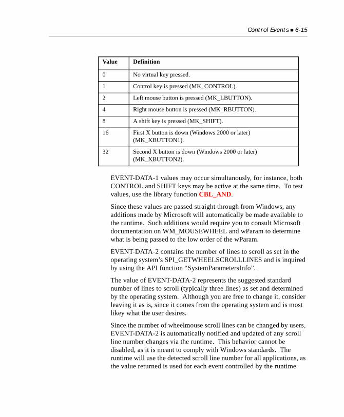
Control Events 6-15
EVENT-DATA-1 values may occur simultanously, for instance, both CONTROL and SHIFT keys may be active at the same time. To test values, use the library function CBL_AND.
Since these values are passed straight through from Windows, any additions made by Microsoft will automatically be made available to the runtime. Such additions would require you to consult Microsoft documentation on WM_MOUSEWHEEL and wParam to determine what is being passed to the low order of the wParam.
EVENT-DATA-2 contains the number of lines to scroll as set in the operating system’s SPI_GETWHEELSCROLLLINES and is inquired by using the API function “SystemParametersInfo”.
The value of EVENT-DATA-2 represents the suggested standard number of lines to scroll (typically three lines) as set and determined by the operating system. Although you are free to change it, consider leaving it as is, since it comes from the operating system and is most likey what the user desires.
Since the number of wheelmouse scroll lines can be changed by users, EVENT-DATA-2 is automatically notified and updated of any scroll line number changes via the runtime. This behavior cannot be disabled, as it is meant to comply with Windows standards. The runtime will use the detected scroll line number for all applications, as the value returned is used for each event controlled by the runtime.
Value Definition
0 No virtual key pressed.
1 Control key is pressed (MK_CONTROL).
2 Left mouse button is pressed (MK_LBUTTON).
4 Right mouse button is pressed (MK_RBUTTON).
8 A shift key is pressed (MK_SHIFT).
16 First X button is down (Windows 2000 or later) (MK_XBUTTON1).
32 Second X button is down (Windows 2000 or later) (MK_XBUTTON2).
6-16 Events Reference
Be aware that not only can users configure the number of lines to scroll, they can also change to scrolling a page at a time. If this is the case, EVENT-DATA-2 will return the following value:
78 WHEEL-PAGESCROLL VALUE -1.
You should test EVENT-DATA-2 against this value, and if matching, scroll a page rather than lines.
Tip: A sample program called wheelevent.cbl is included in the AcuGT > samples directory of your installation. The program shows how to code a paged list box and wheelmouse events.
MSG-PAGED-PREV (value 16420)
This event occurs for grids with the PAGED style. It indicates that the user has clicked the “Previous Record” button. The expected response from the runtime is to supply the record before the first record of the grid’s current data. To do this, add a new record at the start of the grid (using RECORD-TO-ADD to add the record and INSERTION-INDEX to position the record before the first row of data, and making sure that the record is not inserted before any column headings in the grid). If the data is from an indexed file, the value in EVENT-DATA-2 is the number of READ PREVIOUS statements you need to perform to get to the appropriate record. This value is controlled by the property FILE-POS. See the discussion about the FILE-POS property under grid control. If you cannot supply the record (because you have reached the beginning of the file), respond by setting EVENT-ACTION to EVENT-ACTION-FAIL. When you do this, you will receive no more MSG-PAGED-PREV events.
MSG-PAGED-PREVPAGE (value 16422)
This event occurs for grids with the PAGED style. It indicates that the user has clicked the “Previous Page” button. This works in the same manner as the MSG-PAGED-NEXTPAGE event described above. Although this event may be ignored, you may want to supply a specific action in response to this event. See MSG-PAGED-NEXTPAGE for details.
Control Events 6-17
MSG-PAGED-PREV-WHEEL (value 16438)
This event occurs when the user scrolls a wheelmouse upward or towards the computer screen. The expected behavior from the runtime is to scroll the grid upwards, that is, to fill in items from the top of the grid. EVENT-DATA-1 indicates if any virtual keys have been pressed at the same time as the scroll, and EVENT-DATA-2 indicates the number of lines that should be scrolled on each wheelmouse event.
Refer to MSG-PAGED-NEXT-WHEEL (value16439) in this section for details.
MSG-SB-NEXT (value 16385)
This event occurs when the user clicks on the down/right button in a scroll bar. When this message is sent to the scroll bar’s event procedure, the program should respond by setting the control’s new position. EVENT-DATA-1 and EVENT-DATA-2 are not used.
MSG-SB-NEXTPAGE (value 16387)
This event occurs when the user clicks on the down/right page region in a scroll bar. When this message is sent to the scroll bar’s event procedure, the program responds by setting the control’s new position. EVENT-DATA-1 and EVENT-DATA-2 are not used.
MSG-SB-PREV (value 16386)
This event occurs when the user clicks on the up/left button in a scroll bar. When this message is sent to the scroll bar’s event procedure, the program responds by setting the control’s new position. EVENT-DATA-1 and EVENT-DATA-2 are not used.
MSG-SB-PREVPAGE (value 16388)
This event occurs when the user clicks on the up/left page region in a scroll bar. When this message is sent to the scroll bar’s event procedure, the program responds by setting the control’s new position. EVENT-DATA-1 and EVENT-DATA-2 are not used.
MSG-SB-THUMB (value 16389)
This event occurs when the user repositions the scroll bar’s slider, or “thumb.” When this message is sent to the scroll bar’s event procedure, the program responds by setting the control’s new position to the value in EVENT-DATA-2. EVENT-DATA-1 is not used.
6-18 Events Reference
MSG-SB-THUMBTRACK (value 16390)
This event occurs when the user moves a scroll bar’s slider that has the TRACK-THUMB style. When this message is sent to the scroll bar’s event procedure, the program does not reset the control’s position in response. EVENT-DATA-2 contains the new position. EVENT-DATA-1 is not used. This scroll bar message is the only one that should not change the slider’s position.
MSG-SPIN-DOWN (value 16417) T
This event occurs when the user clicks the down arrow of an entry field with the SPINNER style. The program responds to MSG-SPIN-DOWN by decrementing the entry field by a specific value, not necessarily 1. Similar to the MSG-SPIN-UP event described above, if the entry field has the AUTO-SPIN style, you can set the EVENT-ACTION to EVENT-ACTION-FAIL to prevent the control from decrementing the value itself.
MSG-SPIN-UP (value 16416)
This event occurs when the user clicks the up arrow of an entry field with the SPINNER style. The program responds to this event by incrementing the value of the entry field. You are not limited to incrementing by one. You may increment the value of the field any way you want by inquiring the field’s current value and then modifying it to have the desired value.
If the entry field has the AUTO-SPIN style, you can set EVENT-ACTION to EVENT-ACTION-FAIL in response to MSG-SPIN-UP to prevent the control from incrementing the value itself.
MSG-TV-DBLCLICK (value 16428)
This event occurs when the user double-clicks an item in a Tree-View control that has no children. Items that have children expand or collapse when double-clicked. The ID of the item clicked is in EVENT-DATA-2.
You may set EVENT-ACTION to EVENT-ACTION-IGNORE to inhibit the control’s internal handling of a double-click event. You should do this if you wish to transfer control to a new window in response to the double-click. If your code creates a new window here but does not ignore the event, then the control’s internal handling can deactivate your new window.
Control Events 6-19
MSG-TV-EXPANDED (value 16414)
This event occurs when an item in a Tree View control has expanded or collapsed. The ID of the parent item is in EVENT-DATA-2. One of the following two flags is in EVENT-DATA-1:
MSG-TV-EXPANDING (value 16413)
This event occurs when an item in a Tree View control is about to expand or collapse. EVENT-DATA-1 and EVENT-DATA-2 are set in the same manner as for the event MSG-TV-EXPANDED. You can prevent the control from expanding or collapsing the item by setting EVENT-ACTION to EVENT-ACTION-FAIL. Note that the runtime will send both of these events in response to the user pressing the + or * keys. The difference is that these messages are sent regardless of whether the particular item is expanded already or not, whereas a mouse event will only cause the EXPAND messages to be sent if the item is not already expanded. This fact can cause problems in COBOL programs, so programmers should be aware of it.
The + and * keys will generate an EXPANDED message with EVENT-DATA-1 set to TVFLAG-EXPAND, while the - key will generate an EXPANDED message with EVENT-DATA-1 set to TVFLAG-COLLAPSE.
MSG-TV-SELCHANGE (value 16412)
This event occurs when the selection has changed in a Tree View control. The ID of the new item is contained in EVENT-DATA-2. EVENT-DATA-1 contains the cause of the change. It is one of the following values (found in “acugui.def”):
TVFLAG EXPAND Item expanded to show children
TVFLAG COLLAPSE Item collapsed to hide children
TVFLAG MOUSE New item selected with mouse
TVFLAG KEYBOARD New item selected with keyboard
TVFLAG PROGRAM Program changed selected item
6-20 Events Reference
MSG-TV-SELCHANGING (value 16411)
This event occurs when the selection in a Tree View control is about to change. EVENT-DATA-1 contains the reason for the change (see MSG-TV-SELCHANGE), and EVENT-DATA-2 contains the ID of the item that is about to be selected. You can prevent the selection from occurring by setting EVENT-ACTION to EVENT-ACTION-FAIL.
This event is generated much more often and in many more circumstances than may be anticipated. For example, the event is generated when the control goes active, even if the selection does not change. If the program is deployed with the thin client, the volume of these events can cause performance problems. The configuration variable TC_TV_SELCHANGING provides some control over the generation of these events in a thin client deployment. See the entry for TC_TV_SELCHANGING in Appendix H of Book 4.
MSG-VALIDATE (value 16391)
This event occurs immediately after the runtime performs intrinsic validation of a field at data entry (for example, the REQUIRED phrase). Specifically, an MSG-VALIDATE event is generated whenever an activatable control terminates and the termination is not the result of:
a. an event, except for CMD-GOTO, or CMD-TABCHANGED
b. a message, except “status 95”
c. an exception, except for those that also cause movement between fields in a Screen Section
When the above conditions are met, it is a good point in the program to perform other validation of a control’s data.
If the EVENT-ACTION element is set to EVENT-ACTION-CONTINUE (value 2), the control remains active so the user can correct any errors. Note that MSG-VALIDATE is not generated for controls with the SELF-ACT style, nor is it sent when the runtime does not normally perform validation (for example, in response to a function key). This message is generated for any control that is activated, even if it does not have a value. Because of the
Control Events 6-21
dynamic nature of graphical screens, a user can exit a screen without all the fields being validated; therefore, validation should also be performed after completion of data entry.
MSG-WB-BEFORE-NAVIGATE (value 16429)
Occurs when the WEB-BROWSER control is about to navigate to a new URL. The NAVIGATE-URL property is set to the new URL. If you set EVENT-ACTION to EVENT-ACTION-FAIL, navigate will be cancelled.
MSG-WB-DOWNLOAD-BEGIN (value 16431)
Occurs when a navigation operation is beginning, shortly after the BeforeNavigate event.
MSG-WB-DOWNLOAD-COMPLETE (value 16432)
Occurs when a navigation operation is finished.
MSG-WB-NAVIGATE-COMPLETE (value 16430)
Occurs after the browser has navigated to a new URL. The final URL is stored in the VALUE property.
MSG-WB-PROGRESS-CHANGE (value 16433)
Occurs when the progress of a download is updated. The PROGRESS property is set to the current progress value. The MAX-PROGRESS property is set to maximum progress value
MSG-WB-STATUS-TEXT-CHANGE (value 16434)
Occurs when the status bar text has changed. The STATUS-TEXT property is set to the new status text.
MSG-WB-TITLE-CHANGE (value 16435)
Occurs when the title of a document in the WEB-BROWSER control becomes available or changes. The TITLE property is set to the new title
NTF-CHANGED (value 4100)
Indicates that the value of an entry field may have been changed by the user. This occurs only for entry fields that have the NOTIFY-CHANGE style. EVENT-DATA-1 is the current position of the cursor in the entry field (starting at “1”). EVENT-DATA-2 is not used.
6-22 Events Reference
NTF-PL-FIRST (value 4105)
This event is generated only by list boxes with the PAGED style. It indicates that the user wants to scroll to the top of the list. The normal response is to add the first “n” records to the list where “n” is the number of lines the list box can show. EVENT-DATA-1 and EVENT-DATA-2 are not used.
NTF-PL-LAST (value 4106)
This event is generated only by list boxes with the PAGED style. It indicates that the user wants to scroll to the bottom of the list. The normal response is to add the last “n” records to the list where “n” is the number of lines the list box can show. EVENT-DATA-1 and EVENT-DATA-2 are not used.
NTF-PL-NEXT (value 4101)
This event is generated only by list boxes with the PAGED style. It indicates that the user wants to scroll the list box one record in the downward direction. The normal response to this message is to add the next record in the list to the list box. EVENT-DATA-1 and EVENT-DATA-2 are not used.
NTF-PL-NEXTPAGE (value 4103)
This event is generated only by list boxes with the PAGED style. It indicates that the user wants to scroll the list box one page in the downward direction. The normal response is to add the next “n” records to the list box where “n” is the number of lines the list box can show. EVENT-DATA-1 and EVENT-DATA-2 are not used.
NTF-PL-NEXT-WHEEL (value 4109)
This event occurs when the user scrolls a wheelmouse away from the computer screen. The expected behavior from the runtime is to scroll the LIST upwards, that is, to fill in items from the top of the list. EVENT-DATA-1 indicates if any virtual keys have been pressed at the same time as the scroll, and EVENT-DATA-2 indicates the number of lines that should be scrolled on each wheelmouse event. Refer to MSG-PAGED-NEXT-WHEEL (value16439) in this section for details.
Control Events 6-23
NTF-PL-PREV (value 4102)
This event is generated only by list boxes with the PAGED style. It indicates that the user wants to scroll the list box one record in the upward direction. The normal response to this message is to add the previous record in the list to the top of the list box. EVENT-DATA-1 and EVENT-DATA-2 are not used.
NTF-PL-PREV-WHEEL (value 4108)
This event occurs when the user scrolls a wheelmouse towards the computer screen. The expected behavior from the runtime is to scroll the list upwards, that is, to fill in items from the top of the list. EVENT-DATA-1 indicates if any virtual keys have been pressed at the same time as the scroll, and EVENT-DATA-2 indicates the number of lines that should be scrolled on each wheelmouse event. Refer to MSG-PAGED-NEXT-WHEEL (value16439) in this section for details.
NTF-PL-PREVPAGE (value 4104)
This event is generated only by list boxes with the PAGED style. It indicates that the user wants to scroll the list box one page in the upward direction. The normal response is to add the previous “n” records to the top of the list box, where “n” is the number of lines the list box can show. EVENT-DATA-1 and EVENT-DATA-2 are not used.
NTF-PL-SEARCH (value 4107)
This event is generated only by list boxes with the PAGED style. It indicates that the user wants to scroll to the page that contains the text he or she has entered. The normal response is to locate the closest matching record and then to add a page of records to the list box, starting with the record found. EVENT-DATA-1 contains the length of the search text. EVENT-DATA-2 is not used. To determine the search text entered, use the INQUIRE verb on the SEARCH-TEXT property of the list box.
NTF-SELCHANGE (value 4099)
Indicates that the user has selected a new item in a list box or in the list-box of a combo-box. This will only occur if the application requests it via the NOTIFY-SELCHANGE list-box and combo-box styles. EVENT-DATA-1 is the index of the selected item in the list (starting at “1”). EVENT-DATA-2 is not used.
6-24 Events Reference
6.4 Menu Events
The following events are associated with pop-up menus that are tied to a control. You can detect pop-up menu selections directly in a control’s event procedure. The following messages are generated as the user goes through the process of selecting a pop-up menu item:
MSG-INIT-MENU (value 16398)
This event occurs immediately prior to the display of a control’s pop-up menu. EVENT-DATA-2 contains the control’s menu handle. The control’s event procedure can use this event to update any state information in the menu, such as enabling/disabling items or setting/removing check marks. If the event procedure sets EVENT-ACTION to EVENT-ACTION-FAIL, or sets the control’s menu handle to NULL, then the menu is not displayed. In this case, any host-defined built-in menu for the control class will display instead (e.g., Windows Cut/Copy/Paste/Undo menu associated with entry fields). If there is no host-defined menu, then no menu is shown.
MSG-INIT-MENU applies to windows in the same manner that it does for controls. When a window’s pop-up menu is about to appear, you can pass the information that came with this event to the window’s event procedure to update the menu’s state before the menu is shown. You can also prevent the menu from being seen by setting EVENT-ACTION to EVENT-ACTION-FAIL.
MSG-MENU-INPUT (value 16397)
This event occurs when the user has activated a control’s pop-up menu and selected an item on the menu. For windows, the information from this message event is passed to a window’s event procedure when the user does any of the following:
a. selects an item from the window’s pop-up menu bar,
b. selects an item from the window’s pop-up menu,
c. selects an item from a pop-up menu owned by a control contained in the window, and that control’s event procedure did not stop further processing of the menu selection, or
Menu Events 6-25
d. selects the “Close” option from the initial window’s system menu (or clicks the “Close” button), and you have set the configuration option QUIT-MODE to a positive value. This configuration option causes the runtime to treat the close operation as if it were an item on the initial window’s menu bar.
EVENT-DATA-2 contains the menu item’s ID. Setting EVENT-ACTION to EVENT-ACTION-CONTINUE prevents further processing of the menu selection. Otherwise, the menu selection is treated as a normal menu selection from the menu bar (i.e., it terminates the ACCEPT with an exception value equal to the menu item’s ID).
MSG-END-MENU (value 16399)
This event occurs when the pop-up menu of either a control or a window has been removed from the screen. EVENT-DATA-2 contains the control’s (or window’s) menu handle. The only normal reason for processing this event would be to undo some effect created in response to MSG-INIT-MENU.

7
Using the MouseKey Topics
Mouse Properties ..................................................................................... 7-2Mouse Action Ownership in Graphical Environments ....................... 7-3How Mouse Actions Are Handled.......................................................... 7-4Automatic Mouse Handling.................................................................... 7-8Screen Section Behavior ....................................................................... 7-10W$MOUSE Library Routine .............................................................. 7-12
7-2 Using the Mouse
7.1 Mouse Properties
This chapter describes how to activate and use a mouse with your COBOL applications.
ACUCOBOL-GT offers mouse support for both character-based and graphical environments. (Currently, Windows environments are supported. Limited mouse support is provided for X terminals if you are using a curses-compatible mouse. Support for character-based UNIX terminals with ANSI mouse support is also available, but limited. Support for other host systems may be added in the future, when their support software becomes available.)
For many applications, ACUCOBOL-GT can provide automatic mouse handling that simplifies the amount of programming you must do to use the mouse effectively.
This chapter describes which mouse features are automatic when you run your program with the ACUCOBOL-GT runtime. It also explains how to add other mouse controls — in your COBOL program and your COBOL configuration file — if you want them.
Note: In character-based environments, the mouse pointer is invisible by default. To make use of the mouse, you’ll need to enable it, as described in Section 7.6. Under graphical environments, such as Windows, the mouse is always enabled.
A mouse is a device that allows the user to position a pointer on the screen. A mouse has the following properties:
• The mouse pointer can be positioned anywhere on the physical screen. (Note that this can include regions outside of your application window in a graphical environment.)
• Under graphical environments, the mouse pointer can have a variety of shapes. The default shape is typically an arrow. On character-based systems, the mouse pointer is a square in reverse-video.
Mouse Action Ownership in Graphical Environments 7-3
• The mouse itself has from one to three buttons on it. These buttons may be either “up” or “down.” We say that a mouse button has been “clicked” if it has been pushed down and then quickly released. Also, a button may be “double-clicked” (clicked twice in quick succession). (Note that “up” and “down” are states; “clicking” and “double-clicking” are transient actions.)
• The buttons are referred to as the “left,” “right,” and “middle” buttons. A mouse with two buttons has only “left” and “right” buttons; a one-button mouse has only a “left” button. Left-handed users typically exchange the meanings of the left and right buttons, but this is handled outside of the application — your program refers to the primary mouse button as the “left” button regardless of the actual button used.
• Some mouses, in addition to the buttons, have a wheel. The mouse wheel can be used to scroll a window, just like a scroll bar. In the Windows environment, in the Mouse Properties applet of the Control Panel, the user can configure mouse wheel action so that each click (or notch) of the mouse wheel is equivalent to a certain number of mouse button clicks on the scroll bar.
• The mouse pointer is independent from the program’s text cursor. Typically, an application lets the user position the text cursor on the screen by positioning the mouse pointer at the desired location and clicking the left button.
7.2 Mouse Action Ownership in Graphical Environments
In graphical environments such as Windows, several applications may be running at the same time. How is the activity of moving the mouse pointer or clicking a mouse button communicated to the correct application?
Mouse actions are first communicated directly to the environment. The environment then determines which application receives a message about the mouse activity.

7-4 Using the Mouse
Almost always, the basic rule is that whichever application window is topmost and is sitting directly under the mouse pointer receives the current mouse message.
The graphical environment makes this determination on its own, which means that an ACUCOBOL-GT application is not aware of mouse actions that happen outside its application window. Conversely, mouse actions occurring within an ACUCOBOL-GT application window are not known to other applications that might be running at the same time.
The one exception to the basic rule of “who receives the mouse message” is that you can “capture” the mouse in your program by a subroutine call. If you “capture” the mouse, your program receives all mouse messages, no matter where they occur on the physical screen, until you “release” the mouse. (This option is typically used for situations where the user is marking or dragging some object on the screen. You can “capture” the mouse so that you can control the situation even if the user accidentally moves the mouse outside your application window. The specifics of mouse capturing are discussed later in this chapter.)
7.3 How Mouse Actions Are Handled
ACUCOBOL-GT treats each mouse action like a unique function key that the program can act on. Each (unmasked) mouse action returns an exception value to the program. By examining the exception value, your program can determine which action just occurred.
Because it would be very disruptive to your program to return exception codes every time the user moved the mouse, the mouse actions can be “masked” (ignored). By default, all mouse actions are masked (except those that are managed by automatic mouse handling). So, your program is not interrupted by any mouse action. You can enable some or all of the mouse actions in any combination by setting the COBOL configuration variable “MOUSE-FLAGS”, described in section 7.3.3. This allows you to program only for those mouse actions that you care about.
After your program becomes aware of a mouse action, you’ll need additional information, such as the location of the mouse. ACUCOBOL-GT provides a utility library routine called “W$MOUSE” that allows you to determine the
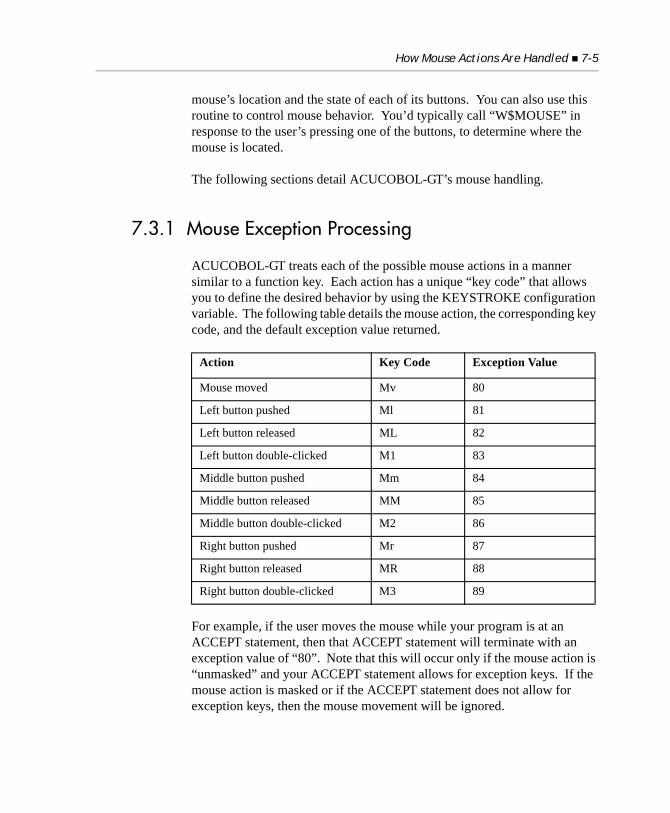
How Mouse Actions Are Handled 7-5
mouse’s location and the state of each of its buttons. You can also use this routine to control mouse behavior. You’d typically call “W$MOUSE” in response to the user’s pressing one of the buttons, to determine where the mouse is located.
The following sections detail ACUCOBOL-GT’s mouse handling.
7.3.1 Mouse Exception Processing
ACUCOBOL-GT treats each of the possible mouse actions in a manner similar to a function key. Each action has a unique “key code” that allows you to define the desired behavior by using the KEYSTROKE configuration variable. The following table details the mouse action, the corresponding key code, and the default exception value returned.
For example, if the user moves the mouse while your program is at an ACCEPT statement, then that ACCEPT statement will terminate with an exception value of “80”. Note that this will occur only if the mouse action is “unmasked” and your ACCEPT statement allows for exception keys. If the mouse action is masked or if the ACCEPT statement does not allow for exception keys, then the mouse movement will be ignored.
Action Key Code Exception Value
Mouse moved Mv 80
Left button pushed Ml 81
Left button released ML 82
Left button double-clicked M1 83
Middle button pushed Mm 84
Middle button released MM 85
Middle button double-clicked M2 86
Right button pushed Mr 87
Right button released MR 88
Right button double-clicked M3 89
7-6 Using the Mouse
7.3.2 Assigning Results to Mouse Actions
You may assign different values or results to the mouse actions by using the KEYSTROKE configuration variable. (This variable is described in detail in ACUCOBOL-GT User’s Guide, Chapter 4, Section 4.3.2.2.)
For example, to cause the right button to delete the current character, use the following configuration entry:
KEYSTROKE Edit=Delete Mr
The “Edit=Delete” phrase indicates the desired action; the “Mr” phrase is the key code associated with the user’s pressing the right mouse button. You may also accomplish the same thing in COBOL by using the SET ENVIRONMENT verb:
SET ENVIRONMENT “KEYSTROKE” TO “Edit=Delete Mr”
7.3.3 Unmasking Mouse Actions
Normally, you don’t want every mouse action to return an exception value to your program. For example, you usually don’t need to know that the user moved the mouse. Having to program for that case for each ACCEPT statement would be very tedious. For this reason, ACUCOBOL-GT allows you to mask out (ignore) some or all of the mouse actions in any combination. By default, all of the mouse actions are masked — you must enable the actions that you want to use.
You control which mouse actions you want to handle by setting the value of the configuration variable “MOUSE-FLAGS”. The value you set is actually one or more values added together.
Each numeric value shown in the table below also has a descriptive name (such as arrow-left-down). Note that these descriptive names come from the file “acugui.def”. If you use these descriptive names in your program, add this statement to the Working-Storage section of your program:copy “acugui.def”
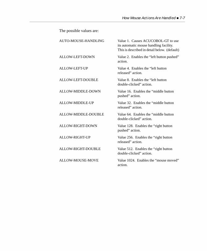
How Mouse Actions Are Handled 7-7
The possible values are:
AUTO-MOUSE-HANDLING Value 1. Causes ACUCOBOL-GT to use its automatic mouse handling facility. This is described in detail below. (default)
ALLOW-LEFT-DOWN Value 2. Enables the “left button pushed” action.
ALLOW-LEFT-UP Value 4. Enables the “left button released” action.
ALLOW-LEFT-DOUBLE Value 8. Enables the “left button double-clicked” action.
ALLOW-MIDDLE-DOWN Value 16. Enables the “middle button pushed” action.
ALLOW-MIDDLE-UP Value 32. Enables the “middle button released” action.
ALLOW-MIDDLE-DOUBLE Value 64. Enables the “middle button double-clicked” action.
ALLOW-RIGHT-DOWN Value 128. Enables the “right button pushed” action.
ALLOW-RIGHT-UP Value 256. Enables the “right button released” action.
ALLOW-RIGHT-DOUBLE Value 512. Enables the “right button double-clicked” action.
ALLOW-MOUSE-MOVE Value 1024. Enables the “mouse moved” action.
7-8 Using the Mouse
For example, if you wanted to act on the user’s pressing either the left or right buttons, you could do the following in COBOL:
ADD ALLOW-LEFT-DOWN, ALLOW-RIGHT-DOWN GIVING MOUSE-SETTINGSET ENVIRONMENT “MOUSE-FLAGS” TO MOUSE-SETTING
You may also set the MOUSE-FLAGS variable directly in the COBOL configuration file. The following entry in the configuration file would produce the same results as the example shown above:
MOUSE-FLAGS 130
See the list above for the numeric values associated with each setting.
The default setting of MOUSE-FLAGS is “1” (AUTO-MOUSE-HANDLING).
7.4 Automatic Mouse Handling
The setting of the MOUSE-FLAGS configuration variable determines whether or not automatic mouse handling is used (see the preceding section). By default, this is turned on.
ALWAYS-ARROW-CURSOR Value 2048. Forces the mouse pointer always to be the default arrow shape when you are using automatic mouse handling. If this is not set, then the shape of the mouse pointer varies depending on various configuration options. This is described in detail below.
ALLOW-ALL-SCREEN-ACTIONS Value 16384. This causes all enabled mouse actions that occur within your application’s window to be acted upon. If this is not set, then only mouse actions that occur within the current ACUCOBOL-GT window are acted upon. (The current ACUCOBOL-GT window is a window created by your program with the DISPLAY WINDOW verb.)
Automatic Mouse Handling 7-9
Automatic mouse handling requires no changes to the COBOL program. It causes the runtime to interpret any mouse actions that occur within a field that’s being entered by an ACCEPT statement. The runtime processes the mouse actions; your application doesn’t have to do anything. Your application doesn’t even have to be aware that a mouse action has occurred.
The user is able to do the following with the mouse:
• Move the cursor to any position within the current field by moving the mouse to that location and pressing the left button. The cursor will move to that location.
• Select a set of characters by moving the mouse to a location in the field, pressing the left button, and then dragging the mouse to a new location and releasing the button. The selected characters will be shown in reverse video. The next character that the user types will replace the selected characters. Also, if the user types any key associated with the “Delete” action, the selected characters will be deleted.
• When the application is ACCEPTing a Screen Section item that includes several fields, jump to another field by moving the mouse to that field and pressing the left button.
Note: Automatic mouse support takes precedence over other settings. That means that if a mouse action can be handled by automatic support, it will be. If automatic support cannot handle the action, and you have unmasked the action, then your program dictates how it’s handled.
In graphical environments, the mouse pointer can assume different shapes. Whenever the mouse cursor is placed anywhere within the current field, it is shown as an “I-Bar”. This is a vertical bar that’s typically used to indicate that the cursor will be positioned at a particular character if you press the left button. If you desire, you may change this by using the “MOUSE” configuration variable described below or by setting the ALWAYS-ARROW-CURSOR option in MOUSE-FLAGS (see section 7.3.3 for a description of ALWAYS-ARROW-CURSOR).
7-10 Using the Mouse
7.5 Screen Section Behavior
When the user selects a field in the Screen Section, the exact behavior depends on the field’s underlying type. You can control the behavior of the mouse with regard to each field type with the MOUSE configuration variable. This variable takes as its arguments one of the field-type names, an equals sign, and then two keywords separated by a comma, as shown:
field-type name=keyword, keyword
Depending on where you are setting the MOUSE variable, there are three methods of setting its configuration.
If you want to implement this variable in a configuration file, the variable can be set without using the equals sign. For example:
MOUSE-NUMERIC-SHAPE Bar
If you are setting the variable as part of your environment in Windows, the variable would look this:
SET MOUSE-NUMERIC-SHAPE=Bar
If you are setting the variable in your program using COBOL syntax, the variable would look like this:
SET ENVIRONMENT “MOUSE-NUMERIC-SHAPE” TO “Bar”
For more information, see the entry titled “MOUSE*” in Book 4, Appendix H.
Field-type name
The runtime distinguishes between three classes of fields: numeric, numeric-edited, and all others. These are referred to respectively as NUMERIC, EDITED, and ALPHA.
First keyword
The first keyword defines how the field is selected when the user presses the left button. It can be one of the following:
Screen Section Behavior 7-11
NONE Indicates that this type of field may not be selected with the mouse. When this keyword is used, then the second keyword (which defines the mouse’s shape) is ignored. The mouse will adopt the shape used for areas of the screen that are not part of any field.
FIELD Indicates that pressing the left button anywhere in the field will cause the cursor to be positioned at the beginning of the field.
CHARACTER Indicates that pressing the left button in the field will position the cursor at the character pointed to by the mouse. If this is past the last non-prompt character in the field, the cursor will be placed just after the last non-prompt character.
Second keyword
The second keyword is used only for graphical environments. It indicates the shape that the mouse pointer should take while in the field. It can be one of the following:
In graphical environments such as Windows, you may also define the shape that the mouse will take when it is used in the current field. Because the action of the mouse is the same for all field types once they become the current field, the mouse shape is the same for all three types. You set the desired shape using the “CURRENT” keyword in the MOUSE configuration variable. This is followed by an equals sign and the desired shape. The default shape is the BAR shape.
The default configuration is as follows:
ARROW The mouse pointer appears in the default arrow shape.
BAR The mouse appears as a vertical bar. This is the “I-Bar” shape typically used to indicate that the mouse can be positioned at a particular character.
CROSS The mouse pointer appears as cross-hairs.
MOUSE Alpha=Character, Bar
MOUSE Numeric=Field, Arrow
7-12 Using the Mouse
Note: You may place multiple entries on the “MOUSE” configuration line, but you are not required to do so.
The following configuration variables can also be used to set the behavior of the mouse:
With these variables, you need to set the first and second keywords separately. For example, to change the defaults shown above for a numeric field, you would enter:
MOUSE_NUMERIC_SELECT = characterMOUSE_NUMERIC_SHAPE = bar
The REQUIRED phrase is used in the Screen Section to ensure that a user cannot bypass required fields by jumping to the last field with the mouse.
7.6 W$MOUSE Library Routine
The runtime system contains a library routine called “W$MOUSE” that you can use to control the behavior of the mouse. You use this routine with the CALL statement in your COBOL program.
See the W$MOUSE entry in Appendix I for details on using this routine.
MOUSE Edited=Field, Arrow
MOUSE Current=Bar
To set field selection: To set cursor shape:
MOUSE_ALPHA_SELECT MOUSE_ALPHA_SHAPE
MOUSE_EDITED_SELECT MOUSE_EDITED_SHAPE
MOUSE_NUMERIC_SELECT MOUSE_NUMERIC_SHAPE
MOUSE_CURRENT_SHAPE
8
Menu Bars and Pop-up MenusKey Topics
Menus Overview ...................................................................................... 8-2Generic Menu Handler ........................................................................... 8-2Graphical Menu Facilities ...................................................................... 8-4Overview of Menu Handling .................................................................. 8-5Creating Menus—the Shortcut ............................................................. 8-6Menu Activation and Use ..................................................................... 8-13Menu Input ............................................................................................ 8-15Changing Menu Results........................................................................ 8-16Common Menu Operations .................................................................. 8-17Pop-up Menus ........................................................................................ 8-19Menu Handling: Sample Code ............................................................. 8-21System Menu “Close” Handling Under Windows ............................. 8-23Portability Concerns ............................................................................. 8-24Menu Bar Sample Programs ............................................................... 8-25
8-2 Menu Bars and Pop-up Menus
8.1 Menus Overview
ACUCOBOL-GT offers significant support for a variety of application menus.
Menu Bars
ACUCOBOL-GT supports a fully integrated menu bar facility. This allows you to display a main menu across the top of the screen, with optional pull-down submenus. Each menu item acts much like a function key, returning an exception value to your program. You decide how you want your program to respond to each exception value.
An individual menu item can be disabled when it’s not appropriate for a user to choose that item. At your option, a menu item can be marked to indicate that it has been selected. Submenus can be divided into sections with separator bars. Shortcut keys can be assigned to menu options and displayed next to menu text.
You control when a menu bar is displayed. You can remove a main menu whenever you like, and replace it with a different one.
Pop-up Menus
ACUCOBOL-GT also supports pop-up menus for Windows environments. Pop-up menus appear over the application in a vertical orientation while the user is selecting an item, and then they disappear from the screen. Each window and control can have its own pop-up menu. A single pop-up menu can also be shared by several windows and controls. You can invoke a pop-up menu from your program, and you can also arrange for a right mouse-click to invoke a pop-up menu that is tied to a window or control.
8.2 Generic Menu Handler
The menu facility uses the host system’s menu handler if one exists; otherwise, it uses ACUCOBOL-GT’s own generic menu handler. The generic menu handler accommodates character-based systems and gives you a large measure of control over the appearance of the menu and its submenus.
Generic Menu Handler 8-3
Of the host systems currently supported, only Windows and Windows NT have their own menu handlers. This chapter describes the generic menu handler provided with ACUCOBOL-GT, and notes how the Windows menu handlers differ from it.
The generic menu handler displays the main menu bar horizontally along the top of the screen. The main menu bar can take one of two forms: static or pop-up.
8.2.1 Static Menu Bars
A static menu bar occupies the top line of the screen and is visible to the user even when it’s not being accessed. The top line of the screen is unavailable to your program while a static menu is displayed.
The second line of the screen becomes line “1” to your program. Thus, the effective screen height is reduced by one line when you display a static menu bar.
When you initially display a static menu bar, the screen is scrolled down one line to make room for it. If this causes your current window to extend past the bottom edge of the screen, the window is truncated at the bottom edge.
When you remove a static menu bar, the screen is scrolled up one line so that line “1” of your program is on the top edge of the screen. If your current window extends to the bottom edge of the screen, it has one line added to it, so that it still extends to the bottom edge after the move.
8.2.2 Pop-up Menu Bars
A pop-up menu bar is one that is not normally visible. Instead, it pops up over the top line of the screen when the user activates it. The advantage of using a pop-up menu bar is that you have the full screen available to your program. The disadvantage is that the user cannot see the menu bar unless it has been activated (popped up). Pop-up menu bars are often used on character-based systems to conserve space.

8-4 Menu Bars and Pop-up Menus
You specify which type of menu bar you want by calling W$MENU with the WMENU-SET-CONFIGURATION parameter. (W$MENU is described in Appendix I of the ACUCOBOL-GT Appendices manual). Then, when the menu bar is displayed with the WMENU-SHOW parameter, your preferred menu bar type is used.
8.2.3 Submenus
No matter which type of main menu you use, submenus pop down from the menu bar. You may also nest submenus, up to a total of five levels (including the main menu). The ACUCOBOL-GT menu handler supports main menu bars that are one line high, and submenus that have one column. You should avoid creating menus that would exceed these limits.
8.3 Graphical Menu Facilities
If you’re running in a graphical environment such as Windows, your program controls the general layout and contents of the menu. The environment controls the look of the menu and handles most of the user’s interaction with it.
Windows and Windows NT menu bars are static in that they display continually until your program removes them. They are shown horizontally along the top edge of your application’s window. They exist outside of your program’s screen — you don’t need to allow space for the menu bar when creating your application. A menu can contain submenus that pull down vertically when the user selects them. The submenus may contain further submenus, which Windows handles as pop-up menus.
Overview of Menu Handling 8-5
8.4 Overview of Menu Handling
A menu consists of a list of menu entries. Each entry consists of a text label and a numeric ID. The label is displayed on the screen. The ID value does not appear. It’s an internal value that uniquely identifies each menu entry. When the user selects a menu entry, your program typically receives its ID value.
Any menu entry may optionally lead to another menu, called a submenu. When the user selects an entry that leads to a submenu, the submenu pops up and the user continues with the selection process. The display and removal of submenus is handled automatically by the system. Submenus may contain additional submenus.
8.4.1 Properties of Menu Entries
Menu entries can have these additional properties:
• Any menu entry can be disabled. When disabled, the menu entry appears differently to the user. Under Windows and Windows NT, it’s shown in gray text instead of black text. The generic menu handler lets you pick the color or attribute that distinguishes disabled items. The user is not allowed to select a disabled item.
• Entries on submenus can also be checked. This means that a small mark is shown next to the menu’s label. This is usually used to indicate that the corresponding program option is enabled. Under Windows, the mark is a check mark. With the generic menu handler, you can choose the mark; by default it’s an asterisk.
• Finally, a submenu entry may have a specialized label that generates a horizontal bar (called a separator). Separators may not be selected by the user, nor may they be checked or disabled. Separators are usually used to group related menu entries.
Your program interacts with the menu subsystem with two techniques.
1. You construct menus and control them with the W$MENU library routine.
8-6 Menu Bars and Pop-up Menus
2. You receive input from a menu bar via the ACCEPT statement.
The following sections explain how to create and display a menu using a utility program provided with ACUCOBOL-GT and discuss how your program receives input from a menu.
8.5 Creating Menus—the Shortcut
You create menu bars and pop-up menus by using the W$MENU library routine. The process of creating a large menu can be time-consuming, so ACUCOBOL-GT includes a utility program to simplify this task. This utility is called genmenu. It’s a COBOL program provided in source form.
The utility genmenu takes a simple text file that describes one or more menus and generates COBOL source code that can create these menus. You can then include this generated source file in your program by using the COPY statement.
8.5.1 Using genmenu
To use genmenu:
1. Compile “genmenu.cbl”.
2. Create a text file that describes your menu(s).
3. Run genmenu on that text file to create a file of COBOL code. (Used later in Step 5.)
4. Include the COPY file “acugui.def” somewhere in your Working-Storage section.
5. Name the generated COBOL file (from Step 2) in a COPY statement in your Procedure Division.
6. Build the menu: use one PERFORM statement in your application to cause each menu to be built.
7. Display the menu: CALL W$MENU to cause one menu to be displayed.
Creating Menus—the Shortcut 8-7
These steps are described in detail below.
Step One
To compile genmenu: ccbl -x -o genmenu genmenu.cbl
Note: If you usually use a suffix on your COBOL object files, you should add that suffix to the command line.
Step Two
The input to genmenu consists of a normal text file that you create using your editor. This file contains the descriptions of one or more menus. You may place blank lines freely in this file as well as comment lines that start with either “*” or “#” in column one. You may use either upper case or lower case when creating menu files.
Each line in a menu file consists of one or more fields. Fields are separated from each other by spaces. You may also use commas and tabs as field separators. Initial spaces in a line are ignored. Here’s a small example:MENU main-menu “&File”, 0, submenu “&New”, 101 “&Open”, 103, disabled “Save &As...”, 104 separator “E&xit”, 105 end-menu
You start a menu by placing the word “MENU” (for a menu bar) or “POPUP” (for a pop-up menu) on a line followed by a menu name. A menu name may be up to 20 characters long and must be formed like a COBOL identifier (it will be used to build a COBOL paragraph name). The menu name does not appear in the generated menu bar.
Following the “MENU” or “POPUP” line, you enter one line for each menu entry that belongs to that menu. You end a menu by one of the following:
• ending the file (no more lines),
8-8 Menu Bars and Pop-up Menus
• starting another menu with another “MENU” or “POPUP” line,
• placing the word “END-MENU” or “END-POPUP” on a line by itself (these words are treated as synonyms).
Each item in a menu needs both a label (the text that appears on screen) and a numeric ID. So, each menu entry consists of the menu label (in quotes) followed by its ID value. Use lower and upper case in the label so that it appears exactly as you want it to appear on the menu. The ID value may either be a number or the name of a level 78 that you will define in the final program. It should be greater than zero and less than or equal to 4095 (exception: it may be zero for submenus or separators).
When you’re typing the label, place an “&” character in front of the letter that will be the entry’s key letter. The user can access that menu entry quickly by typing the key letter at the keyboard. The key letter will appear underlined when the menu is displayed (unless you’ve specified some other appearance—see section 8.9.4). Under the Windows environment, the user must press <Alt> and then type the key letter to make a menu choice with a key letter. (Menu options can also be selected with the mouse, if one is available and enabled. See Chapter 7.)
Note: If you don’t select a key letter, no underline will appear and the first letter of the label will be used as its key letter. If two or more key letters are the same, when the user types that key letter, the system will advance to the next menu item with the chosen key letter and then wait for the user to press “Enter.” If you are programming for future delivery on more than one operating system, be aware that key letters may be handled slightly differently on different systems. See also section 8.13, “Portability Concerns.”
Indicating a shortcut key in the label
A shortcut key is a keyboard key that you have designated in your program to perform the same action as a menu item. You must create a programmatic association between the menu item and the key. One easy way to do this is to make the menu item’s ID value the same as the exception value of the keystroke.
Creating Menus—the Shortcut 8-9
You may display the shortcut key’s text next to the menu item in your menu if you want. To specify the shortcut key’s text, place it immediately after the characters “\t” in the item’s label. For example, if you want to create a menu item that has the text “Exit” and you want to display the shortcut key text “Ctl-X” next to it, you would specify “Exit\tCtl-X” as the item’s label. You might think of “\t” as specifying a “tab” character that separates the two columns when they are displayed in the menu. If you need to include “\t” in your menu label, specify “\\t” to prevent it from being interpreted as a shortcut key indicator.
Menu flags
After an entry’s ID, you may optionally enter up to three flags. These flags are these words:
Separators
Finally, you may enter a separator menu item by using the word “SEPARATOR” (without quotes) in place of the menu’s label and then optionally listing a menu ID for it (if you omit the ID value, it will be treated as zero).
For example, the following menu file would describe one menu that consists of two items, each one of which has a submenu:MENU main-menu “&File”, 0, submenu “&New”, 101 “&Open”, 102 “&Save”, 103
CHECKED The menu entry starts with a check mark placed by it (enabled).
DISABLED The menu entry starts disabled.
SUBMENU The menu entry leads to a submenu. Subsequent menu entries refer to items that will be placed in that submenu. You complete a submenu by placing the word “END-MENU” on a line by itself. After completing a submenu, resume listing menu entries that appear on the parent menu.
8-10 Menu Bars and Pop-up Menus
“Save &As...”, 104 separator “E&xit”, 105 end-menu “&Options”, 0, submenu “&Save Settings on Exit”, 201, checked “&Password Protect”, 202, checked “Confirm Deletions”, 203 end-menu
Note: The blank lines and the indenting are not required, but make the menu file easier to read.
Step Three
When your text file is complete, you can use genmenu to create the COBOL source code that builds the menu. Use the following command:
RUNCBL genmenu menu-file copy-file
where menu-file is the name of your text file that describes the menu and copy-file is the name of the file that will hold the generated source code. You may omit copy-file, or both menu-file and copy-file. If you do, genmenu will prompt you for these names. Note that because genmenu is a COBOL program, it will use any FILE-PREFIX and FILE-SUFFIX variables that you have set in your configuration file.
Under graphical systems, genmenu will pause when it is done and will give you an opportunity to view its output. Press <Enter> to continue. If you are running genmenu from a batch file or a makefile and do not want to see the output on a graphical system, specify “-1” on the command line. On a character-based system, genmenu is designed to run as a quiet utility that has no screen output.
If genmenu detects any errors, it will display them, along with the line number of menu-file that caused the problem. Otherwise, it will simply place the generated source code in copy-file.
Creating Menus—the Shortcut 8-11
Step Four
Somewhere in your Working-Storage section, include the line:COPY “acugui.def”
Step Five
Somewhere in the Procedure Division of your application, include the line: COPY “copy-file”
Step Six
The COPY file created by genmenu will contain a paragraph called “BUILD-MENU-NAME” where MENU-NAME is replaced by the name you gave in the “MENU” line of your text file. This paragraph contains all the code necessary to produce the menu you described in your file. If you have more than one menu in your text file, then the COPY file will have a paragraph for each of these menus.
You execute each one of these paragraphs with a PERFORM statement. For example:
PERFORM BUILD-MAIN-MENU.
When the PERFORM returns, it will have set the data item “MENU-HANDLE” to a value that uniquely identifies the created menu. MENU-HANDLE is declared in “acugui.def” as a numeric data item.
If MENU-HANDLE is set to zero, then it indicates that an error has occurred in the creation of the menu. This is typically due to the system’s running out of memory. Otherwise, “MENU-HANDLE” contains a valid identifying value. This value is called the menu’s handle.
If you plan to use more than one menu, move MENU-HANDLE to another variable so that you don’t lose the menu’s unique identifier when you PERFORM the code that constructs the other menus. The variable you use must be declared as PIC S9(9) COMP-4.
For example:MOVE MENU-HANDLE TO FILE-MENU-HANDLE.
8-12 Menu Bars and Pop-up Menus
Step Seven
To display a menu in your application, be sure that MENU-HANDLE does not have a zero value (zero indicates an error). Then:
CALL “W$MENU” USING WMENU-SHOW, MENU-HANDLE
The variables in this call are declared in “acugui.def”. This call will cause your menu to be displayed to the user. The user may immediately begin entering menu commands.
In the following code fragment, two menus are created and, if the build is successful, the main menu is displayed:
PERFORM BUILD-MAIN-MENU.MOVE MENU-HANDLE TO MAIN-HANDLE.PERFORM BUILD-MAIL-SYSTEM-MENU.MOVE MENU-HANDLE TO MAIL-SYSTEM-HANDLE.
IF MAIN-HANDLE NOT = ZERO CALL “W$MENU” USING WMENU-SHOW, MAIN-HANDLE.
8.6 Menu Activation and Use
Under graphical environments such as Windows, once a menu is displayed the user can start selecting items from that menu. The mouse is typically used to make selections. (Under Windows, you can also select an item by pressing the <Alt> key or the <F10> key, and then the succession of key letters that form a path to the desired item.)
Note: By convention, the F10 key is used by Windows to activate program menus. This action is controlled automatically by the program. The configuration variable “F10_IS_MENU” allows you to set the runtime to handle the F10 key as a user defined key. The default setting of F10-IS-MENU is “1” (on, true, yes). When you change the setting to “0” (off, false, no) you inhibit the menu activation capability.
Menu Activation and Use 8-13
On character-based environments, the user may activate the current menu by any of the following methods:
1. The user may type a menu key. This is a key that is defined by your program to activate menus. You may define as many menu keys as you want. By default, there are no menu keys; your program must define them. Menu key definition is described in the next section.
2. For static menus, the user can click on the menu bar with the mouse. This assumes that the runtime contains mouse support.
3. On terminals with an ANSI-style mouse (like xterm), the user can press <Alt> to activate the menu and then type a menu item’s key letter to select the corresponding item.
Note: The only technique that is guaranteed to work for all machines is the menu key technique. Because of this, you should ensure that either your program or your COBOL configuration file defines one or more menu keys if you create a menu.
8.6.1 Defining Menu Keys
To define a menu key in a character-based environment, assign the edit-action “Menu” to a key with the KEYSTROKE variable in your COBOL configuration file. For example, to make the <F1> key a menu key, place this line into your configuration file:
KEYSTROKE Edit=Menu k1
Keys and their key codes (such as k1) are listed in Section 4.3.2.3 of Book 1, ACUCOBOL-GT User’s Guide.
You can also define a menu key within your program with SET ENVIRONMENT. For example,
SET ENVIRONMENT “KEYSTROKE”TO “Edit=Menu k1”
Note: <F10> is the menu activation key for Windows environments. This cannot be modified.

8-14 Menu Bars and Pop-up Menus
Once a menu is active, the user can:
• use the arrow keys to move the highlight
• select an item with the Spacebar or the Return key
• jump to an item and select it by typing its key letter
• use the Escape key, along with any program-defined menu keys, to cancel a menu or a submenu
8.7 Menu Input
Menu selections are handled by the ACCEPT statement. Generally speaking, a menu selection acts much like a function key. Each menu item causes an ACCEPT statement to terminate, returning an exception value equal to the item’s ID.
For example, suppose the menu has this definition:menu main-menu “&File”, 0, submenu “&New”, 101 “&Open”, 102 “&Save”, 103 “Save &As...”, 104 separator “E&xit”, 105 end-menu
“&Options”, 0, submenu “&Save Settings on Exit”, 201, checked “&Password Protect”, 202, checked “&Confirm Deletions”, 203 end-menu
If the user selected the “New” menu item, then any executing ACCEPT statement would terminate with an exception status of “101”.
Changing Menu Results 8-15
Note: Only ACCEPT statements that allow exception keys will terminate with a menu selection. If the ACCEPT statement does not allow exceptions, any menu selections will be ignored.
8.7.1 Function Key Handling
An existing application that uses function keys can readily be upgraded to use menu bars. To create a menu item that behaves exactly the same as a particular function key, give that menu item an ID that is the same as the function key’s exception value.
8.7.2 Menu Selection Limits
The runtime system holds only one menu selection in its buffer at any time. Subsequent menu selections overwrite the one being held. For example, if the user selects “Quit” from the menu and then selects “Print” before the program processes the “Quit” selection, then the program will receive only the “Print” selection.
8.8 Changing Menu Results
The default action of a menu item is to return an exception value equal to the item’s ID. You can change the default action of a particular item by using the MENU-ITEM configuration variable.
Use MENU-ITEM in exactly the same fashion as the KEYSTROKE variable, except that the last entry on the line is the menu’s ID, not the key code. For example, to cause a menu item whose ID is “200” to act the same as the Delete key, use the following:
MENU-ITEM Edit=Delete 200
Alternately, you could cause menu item “200” to call the “notepad” sample program by using:
MENU-ITEM Hot-Key=“notepad” 200
8-16 Menu Bars and Pop-up Menus
You can program these entries in COBOL by using the SET ENVIRONMENT verb. For example,
SET ENVIRONMENT “MENU-ITEM” TO “Edit=Delete 200”
8.9 Common Menu Operations
After you have a menu constructed and in use, there are several common operations you may want to perform. These are accomplished with the W$MENU library routine. This section describes only these frequently used operations.
See the entry for W$MENU in ACUCOBOL-GT Appendices manual, Appendix I, for details on using this routine.
The routine takes one or more parameters, which are always passed BY REFERENCE (the default in COBOL). The first parameter is always an operation code. This code defines what the routine will do. The remaining parameters depend on the operation selected. The operation codes are defined in the COPY file “acugui.def”, which by default is located at: ...\AcuGT\sample\def.
8.9.1 Disabling Menu Items
Your program may want to enable or disable individual menu entries dynamically. To do this, call W$MENU passing the WMENU-ENABLE or WMENU-DISABLE operation code. Follow this with the handle of the owning menu and the ID of the particular entry you want to change.
For example, to disable menu item “101”, use:CALL “W$MENU” USING WMENU-DISABLE, MENU-HANDLE, 101
If you enable or disable a menu item on the top level of the menu, you must use the WMENU-SHOW operation to make your change visible. This allows you to modify several top level items at once before re-displaying the menu.
Common Menu Operations 8-17
For example, you might have:CALL “W$MENU” USING WMENU-ENABLE, MENU-HANDLE, 101CALL “W$MENU” USING WMENU-DISABLE,MENU-HANDLE, 102CALL “W$MENU” USING WMENU-SHOW, MENU-HANDLE
8.9.2 Checking Menu Items
To place or remove a check mark from a menu item, use the WMENU-CHECK or WMENU-UNCHECK operation code. Follow this by the menu’s handle and the ID of the item you want to modify.
For example, to place a check mark beside the menu item “10”, use the following code:
CALL “W$MENU” USING WMENU-CHECK,MENU-HANDLE, 10
Placing check marks on top-level menu items has no effect.
8.9.3 Disabling an Entire Menu
You may want to prevent the user from having access to the menu during certain parts of your program. To do so, call W$MENU using the WMENU-BLOCK operation code. When you want to re-enable access, call W$MENU using WMENU-UNBLOCK.
Normally, you will want to do this when you must have some specific information from the user that you need in order to continue. By disabling the menu, you will prevent the user from trying to initiate a different operation that your program is not prepared to handle.
For example, if the user has selected “Open” from the menu, you may want to disable the menu until you have retrieved the name of the file to open. This could be coded like this:
CALL “W$MENU” USING WMENU-BLOCKPERFORM GET-FILE-NAME-FROM-USER
8-18 Menu Bars and Pop-up Menus
CALL “W$MENU” USING WMENU-UNBLOCK
8.9.4 Menu Configuration With the Generic Menu Handler
The ACUCOBOL-GT generic menu handler allows you to configure several aspects of its look and feel. This is done with get/set configuration operations of the W$MENU library routine. See the entry for W$MENU in ACUCOBOL-GT Appendices manual, Appendix I, for details on using this routine.
8.10 Pop-up Menus
Pop-up menus can be created on Windows environments. Pop-up menus appear over the application in a vertical orientation while the user is selecting an item, and then they disappear from the screen. You can programmatically invoke a pop-up menu. In addition, you can arrange for a right mouse-click to automatically invoke a pop-up menu tied to a window or a control. Each window and control can have its own pop-up menu. In addition, you can share a single menu between several windows and controls.
To create a pop-up menu, use the “W$MENU” routine with the WMENU-NEW-POPUP operation. This operation works just like WMENU-NEW, except that the resulting menu is a pop-up menu instead of a menu bar. Once created, pop-up menus are acted upon just like menu bars. Adding, changing, and deleting items is done in the same manner as for a menu bar, as is enabling or disabling items. If you want to add a sub-menu to a pop-up menu, you can use either a menu bar or another pop-up menu as the submenu.
To invoke a pop-up menu directly, use the WMENU-POPUP operation of “W$MENU”. The first operand is the handle of the menu you want to pop up. The menu is placed at the location of the mouse unless you specify two additional parameters, which are the absolute screen location (first row, then column). The screen location is expressed in pixels, with (1, 1) being the upper left-hand corner of the screen. This operation displays the menu, gets the user’s selection (if any), and then removes the menu from the screen. The
Pop-up Menus 8-19
menu selection is placed into the runtime’s input stream for future processing by an ACCEPT statement. This will appear to the ACCEPT statement just like a menu selection off of the menu bar.
You can automate the handling of pop-up menus by associating them with windows and controls. Each window and control can have its own pop-up menu associated with it. To do so, simply specify the menu handle in the POP-UP MENU phrase when you create the window or control. You can also add, change, or remove the pop-up menu later with the MODIFY statement.
When a window or control has a pop-up menu associated with it, the runtime will automatically display and handle this menu when the user clicks the right mouse button on the owning window or control. Your program will simply receive the menu selection in the input stream as if it came from the menu bar.
You can also detect pop-up menu selections directly in a control’s event procedure. The following messages are generated as the user goes through the process of selecting a pop-up menu item:
MSG-INIT-MENU
Occurs immediately prior to the display of a control’s pop-up menu. EVENT-DATA-2 contains the control’s menu handle. The control’s event procedure can use this event to update any state information in the menu, such as enabling/disabling items or setting/removing check marks. If the event procedure sets EVENT-ACTION to EVENT-ACTION-FAIL, or sets the control’s menu handle to NULL, then the menu is not displayed. In this case, any host-defined built-in menu for the control class will display instead (e.g., Windows Cut/Copy/Paste/Undo menu associated with entry fields). If there is no host-defined menu, then no menu is shown.
MSG-MENU-INPUT
Occurs when the user has activated a control’s pop-up menu and selected an item on the menu. EVENT-DATA-2 contains the menu item’s ID. Setting EVENT-ACTION to EVENT-ACTION-CONTINUE prevents further processing of the menu selection. Otherwise, the menu selection is treated as a normal menu selection from the menu bar (i.e., it terminates the ACCEPT with an exception value equal to the menu item’s ID).
8-20 Menu Bars and Pop-up Menus
MSG-END-MENU
Occurs when a control’s pop-up menu has been removed from the screen. EVENT-DATA-2 contains the control’s menu handle. The only normal reason for processing this event would be to undo some effect created in response to MSG-INIT-MENU.
Using MSG-MENU-INPUT, you can handle all of a control’s pop-up menu items directly in the control’s event procedure, without terminating any controlling ACCEPT statement.
8.11 Menu Handling: Sample Code
The following code fragment constructs a menu that consists of two submenus and displays it, first saving any existing menu. 78 ID-NEW VALUE 101.78 ID-OPEN VALUE 102.78 ID-SAVE VALUE 103.78 ID-SAVE-AS VALUE 104.78 ID-EXIT VALUE 105.78 ID-SAVE-SET VALUE 201.78 ID-PASSWORD VALUE 202.
77 OLD-MENU PIC S9(9) COMP-4.77 MAIN-MENU PIC S9(9) COMP-4.77 SUBMENU PIC S9(9) COMP-4.
BUILD-MENU.* Create two empty menus and save their menu handles
CALL “W$MENU” USING WMENU-NEW. MOVE RETURN-CODE TO MAIN-MENU.
CALL “W$MENU” USING WMENU-NEW. MOVE RETURN-CODE TO SUBMENU.
IF MAIN-MENU = ZERO OR SUBMENU = ZERO GO TO BUILD-MENU-EXIT.
* Build “File” submenu
CALL “W$MENU” USING WMENU-ADD, SUBMENU, 0, 0,
Menu Handling: Sample Code 8-21
“&New”, ID-NEW. CALL “W$MENU” USING WMENU-ADD, SUBMENU, 0, 0, “&Open...”,ID-OPEN. CALL “W$MENU” USING WMENU-ADD, SUBMENU, 0, W-DISABLED, “&Save”, ID-SAVE. CALL “W$MENU” USING WMENU-ADD, SUBMENU, 0, W-DISABLED, “Save &As...”, ID-SAVE-AS. CALL “W$MENU” USING WMENU-ADD, SUBMENU, 0, W-SEPARATOR. CALL “W$MENU” USING WMENU-ADD, SUBMENU, 0, 0, “E&xit”, ID-EXIT.
* Attach “File” submenu to main menu
CALL “W$MENU” USING WMENU-ADD, MAIN-MENU, 0, 0, “&File”, 0, SUBMENU.
* When finished with the “File” submenu, make another * submenu and populate it.
CALL “W$MENU” USING WMENU-NEW. MOVE RETURN-CODE TO SUBMENU. IF SUBMENU = ZERO GO TO BUILD-MENU-EXIT.
CALL “W$MENU” USING WMENU-ADD, SUBMENU, 0, W-CHECKED, “&Save Settings on Exit”, ID-SAVE-SET. CALL “W$MENU” USING WMENU-ADD, SUBMENU, 0, 0, “&Password Protect”, ID-PASSWORD.
* Attach “Options” submenu
CALL “W$MENU” USING WMENU-ADD, MAIN-MENU, 0, 0, “&Options”, 0, SUBMENU.
* Save current menu and display new one.
CALL “W$MENU” USING WMENU-GET-MENU. MOVE RETURN-CODE TO OLD-MENU.
CALL “W$MENU” USING WMENU-SHOW, MAIN-MENU.
Further on in the program, you may want to remove the check mark on the “Save Settings on Exit” menu item. The following line of code would do that:
8-22 Menu Bars and Pop-up Menus
CALL “W$MENU” USING WMENU-CHECK, ID-SAVE-SET, W-UNCHECKED.
When it came time to remove this menu and restore the old one, you could use the following code: CALL “W$MENU” USING WMENU-SHOW, OLD-MENU. CALL “W$MENU” USING WMENU-DESTROY, MAIN-MENU.
8.12 System Menu “Close” Handling Under Windows
The Windows system menu has a “Close” item. Normally, if the user selects this entry, the runtime system performs a normal shut down. The “Close” option can be controlled with the QUIT_MODE configuration variable or permanently disabled when the window is created with the NO-CLOSE phrase.
A QUIT_MODE setting of zero or less is handled directly by the runtime system, as described in Book 4, Appendix H. A positive QUIT_MODE setting allows your program to manage the close action instead. When a positive value is used, the “Close” item becomes a standard menu item with an ID equal to the value of QUIT-MODE. You may then handle the “Close” item just like any other menu item.
For example, if you set QUIT_MODE to “100”, your program will receive exception value 100 when the user selects the “Close” item. If you wanted to call a special shutdown program when the user selects “Close”, you can assign the “Close” action to a hot-key program. For example:
MENU-ITEM Hot-Key=“shutdown” 100
In this example, the program “shutdown” might pop up a small window to confirm that the user wants to exit and, if so, execute a STOP RUN.
When the NO-CLOSE phrase is specified in a Format 11 or 12 DISPLAY WINDOW statement, the window’s “Close” menu option is permanently disabled. The option can be applied only when the window is created and its
Portability Concerns 8-23
effects cannot be reversed. The NO-CLOSE option takes precedence over other settings, including the setting of the QUIT_MODE configuration variable.
8.13 Portability Concerns
The ACUCOBOL-GT runtime supports menu handling. If the host system has its own menu system (such as Windows), then the runtime’s menu handler calls the system’s menu handler. If the system does not have its own menu handler (such as systems that use character-based terminals), then the runtime supplies its own menu handling.
This implementation causes the look-and-feel of the menus to differ from system to system. This is an advantage in that you can program for a single menu handler while getting a native look-and-feel on each host system. However, some host menuing systems may not support all features identically. The more you know about possible differences in the hosts’ menu handlers, the more informed your programming decisions can be. Here are some issues to be aware of while programming:
1. How the user selects key letters will vary from system to system. The appearance of the key letter in the menu may vary from system to system. In Windows, it appears underlined. In the runtime’s own handler, the appearance is configurable.
2. If no key letter is supplied, then the implied key letter is system-dependent. Under Windows, Windows NT, and the runtime system, the first letter of the text acts as the key letter. Other systems may use some other rule or may not supply any key letter.
3. The method by which the user activates the menu is system-dependent. If you want to use the same method on all systems, define one or more menu keys in your program. See section 8.6, “Menu Activation and Use.”
4. Some systems may limit the number of items that appear in the top-level menu. Under the runtime system’s own menu handler, the top level is limited to the number of items that can be displayed in one line. Also, a submenu may not have more items than fit in a single column (minus the top line).
8-24 Menu Bars and Pop-up Menus
5. If you plan to run the same program under both graphical and character-based systems, remember that the menu bar will occupy space on the terminal. Under graphical systems such as Windows, the menu bar is placed outside of the application’s virtual screen. On a character-based screen, the menu bar resides on the top line, thus removing one line from the application.
ACUCOBOL-GT’s Terminal Manager adjusts all the coordinates as needed, but your program will have one less line to work with. Note, however, that you can configure the menu bar to pop up over the top line of the application when the menu is requested by the user. This will result in the full screen being available to your application, although the menu bar will be visible only when the user requests it.
6. Pop-up menus (which appear in a vertical orientation over the application window and disappear after the user makes a selection) are currently available only under Windows systems. They may be added to other systems in future releases.
8.14 Menu Bar Sample Programs
Two sample COBOL programs called menubar and menubar2 are included on the media sent to you from Micro Focus. We do not recommend either of these routines for use with the current version of the compiler, but we provide them for upward compatibility at sites that have used previous versions of our compiler.
Earlier versions of the compiler came with the sample program menubar that demonstrates how to implement a two-dimensional menu bar in COBOL. The only difference between the menubar program on your media and the original program is that it has been enhanced to support the mouse.
Also included is a variation of the menubar program. This is called menubar2. This variation uses the W$MENU routine to implement its menus. The result is that the menu is implemented by the host if you are running on a graphical system such as Windows. If you desire, you may replace menubar with menubar2. This allows you to convert applications
Menu Bar Sample Programs 8-25
that use menubar to start using graphical menus quickly. menubar2 cannot substitute for all uses of menubar. See the comments in menubar2 for restrictions.
Although these routines are included for compatibility with previous versions of the compiler, we recommend that you avoid using menubar and menubar2 where possible. When you use these programs, the user can select menu items only when the program asks for them. This is the program-driven model of a menu system. Normally, with a graphical user interface, the menus are always active and items can be selected at any time. This is the user-driven menu model. Generally speaking, your users will expect to be able to use the menu at any time. You should try to provide this where possible by using the newest menu features in the compiler.

9
Color MappingKey Topics
Overview of Color Choices ..................................................................... 9-2COLOR_MODEL Settings..................................................................... 9-5COLOR_TABLE Settings .................................................................... 9-12ActiveX Color Settings.......................................................................... 9-20Miscellaneous Options Under Windows and Windows NT.............. 9-21
9-2 Color Mapping
9.1 Overview of Color Choices
This chapter explains what to do if you want your background and foreground color choices to look appropriate in both character-based and graphical environments. The information applies to both black-and-white and multi-color screens.
Many programs written for graphical environments use a white or gray background. This is not the norm for character-based programs. Because of this, chances are good that a character-based application will look out of place when it’s run under a graphical environment (such as Microsoft Windows).
You may want to consider using COBOL configuration variables to map your color scheme to a scheme that’s more appropriate for a graphical environment. The COBOL program can then remain the same in both types of environments.
With its default settings, ACUCOBOL-GT will display your application using the colors your application specifies. This means your application will look the same whether it’s running under a character-based or graphical operating system.
If you want your application to look the same under both types of systems, then you don’t need to do any color mapping.
However, when an application is moved from a character-based environment to a graphical environment, many developers choose to adjust the color scheme. They do this in order to match the style of other applications running in the graphical environment. This is especially true if the applications normally use a black background, which would seem out of place in many graphical environments.
You can choose to:
• change your COBOL code to adjust the colors directly in each environment.
• make use of any end-user color controls that exist in your application.
Overview of Color Choices 9-3
• use one or more ACUCOBOL-GT configuration variables to effect a color remapping. These variables enable you to make global color changes quickly and also give you control over fine details. No changes are needed to the COBOL program itself.
Although ACUCOBOL-GT contains several runtime configuration variables that simplify the mapping of your colors, two in particular are of note. COLOR_MODEL and COLOR_TABLE combine the effects of several variables to give you high-level control over color combinations. The other variables, described in section 9.4, permit additional fine-tuning.
COLOR_MODEL affects colors in a global way (for example: exchange foreground and background colors). COLOR_TABLE affects specific color combinations (transform a red foreground on a black background into white on blue).
So if you decide to change any of your colors using configuration variables, you would typically start by adjusting the COLOR_MODEL setting to establish a global color scheme for your program. Then you’d adjust specific colors, if necessary, with the COLOR_TABLE setting.
Using these two variables, you’ll probably be able to adjust your application to assume a graphical look with little or no COBOL coding.
Note: On a monochrome monitor the runtime will display colors as various shades of gray, unless you’ve set the COBOL configuration variable MONOCHROME to a non-zero value. In that case, the runtime will use only black and white.
9.1.1 Simplified Mapping Approach
The easiest way to start with configuration variables is to try the various COLOR_MODEL settings described in this chapter (see, also, the entry for COLOR_MODEL in Appendix H, Book 4, Appendices). If your application is entirely black and white, then try all the odd-numbered settings (they affect black and white only), and select the one you like best.
9-4 Color Mapping
If your program makes use of color, first decide whether or not you like the color portions as they exist in your program. If you do, then try the odd-numbered settings to change the black and white portions. If you want to modify your colored portions, then try the even-numbered settings.
Note: Automatic transformations of programs that use color usually produce at least one odd-looking color combination. So select a COLOR_MODEL setting that comes close to what you want, and then make specific adjustments using the COLOR_TABLE variable described in this chapter (see, also, the entry for COLOR_TABLE in Appendix H, Book 4, Appendices).
9.1.2 Controlling the Color Mapping
A different approach to color adjustment is to use the COLOR_TABLE facility to do all of your customization. With this approach, you don’t use the COLOR_MODEL setting at all. Instead, you map each foreground-background combination that you use to the desired new combination.
This is usually more work than using the COLOR_MODEL setting, because you must select each color combination individually. However, this approach is straightforward and gives you total control over the colors selected.
The ACUCOBOL-GT debugger uses this technique. When you enter the debugger screen, it saves the current color table and then creates a new one that maps the usual debugger colors to colors more appropriate for a graphical environment. When the debugger restores your application’s screen, it also restores your color table.
In the next few sections we discuss COLOR_MODEL and COLOR_TABLE. It’s likely that you can achieve the effects you want with these two variables alone. If you discover that you need additional fine-tuning, see section 9.4 for more color configuration variables.
COLOR_MODEL Settings 9-5
9.2 COLOR_MODEL Settings
The runtime builds color models by using combinations of settings for these three configuration variables:
• COLOR_TRANS
• INTENSITY_FLAGS
• BACKGROUND_INTENSITY
These variables are fully described in Appendix H, Book 4, Appendices.
We’ve combined a few settings of these variables to form ten color models that will suit most situations. For example, COLOR_MODEL “1” is equivalent to this combination: COLOR_TRANS “5”, INTENSITY_FLAGS “34”, and BACKGROUND_INTENSITY “1”.
You can adjust the settings of the three variables individually, whether you use a color model or not. Note that the most recent setting takes precedence.
Use the COLOR_MODEL setting to perform uniform changes to your program’s color scheme. These changes are represented by rules that act on your colors. An example of a rule is “exchange the foreground and background colors”. You use the COLOR_MODEL setting to change your color scheme in a global way.
There are eleven color models, numbered from “0” to “10”. Each of the models performs a particular set of changes.
There are so many possible color schemes, and so many personal preferences, that it’s impossible to predict which color model will look best for your application. We summarize the general effects of each model in this chapter, to help you narrow your choices. Even so, the quickest way to pick the most suitable model is probably to try each one. To do this, add the line:
COLOR_MODEL 0
to your COBOL configuration file, and then run your program in the Windows environment. Observe the results. Then edit the configuration file to specify color model “1” and run again. You’ll quickly see which model produces the results you want.
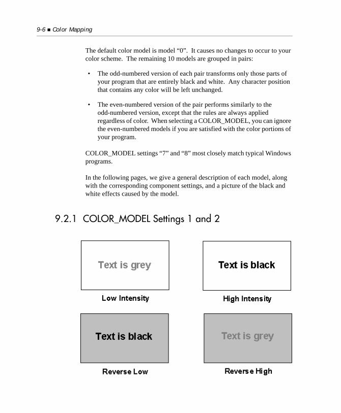
9-6 Color Mapping
The default color model is model “0”. It causes no changes to occur to your color scheme. The remaining 10 models are grouped in pairs:
• The odd-numbered version of each pair transforms only those parts of your program that are entirely black and white. Any character position that contains any color will be left unchanged.
• The even-numbered version of the pair performs similarly to the odd-numbered version, except that the rules are always applied regardless of color. When selecting a COLOR_MODEL, you can ignore the even-numbered models if you are satisfied with the color portions of your program.
COLOR_MODEL settings “7” and “8” most closely match typical Windows programs.
In the following pages, we give a general description of each model, along with the corresponding component settings, and a picture of the black and white effects caused by the model.
9.2.1 COLOR_MODEL Settings 1 and 2
COLOR_MODEL Settings 9-7
COLOR_MODEL settings “1” and “2” cause the default background to be white.
A character’s intensity is shown in the foreground, but switched so that high and low intensity are exchanged. This results in the default low intensity being shown as gray-on-white, while high intensity appears as black-on-white. The result is that high-intensity stands out more than low-intensity.
Reverse-video appears as black-on-gray. If you use reverse-video boxed windows, then these are good settings if you also want to use the 3-D-LINES variable to give your borders a three-dimensional effect (described later in this chapter).
Equivalent settings
COLOR_MODEL “1” is equivalent to COLOR_TRANS “5”, INTENSITY_FLAGS “34”, and BACKGROUND_INTENSITY “1”.
COLOR_MODEL “2” is equivalent to COLOR_TRANS “4”, INTENSITY_FLAGS “34”, and BACKGROUND_INTENSITY “1”. (See Book 4, Appendix H, for details.)
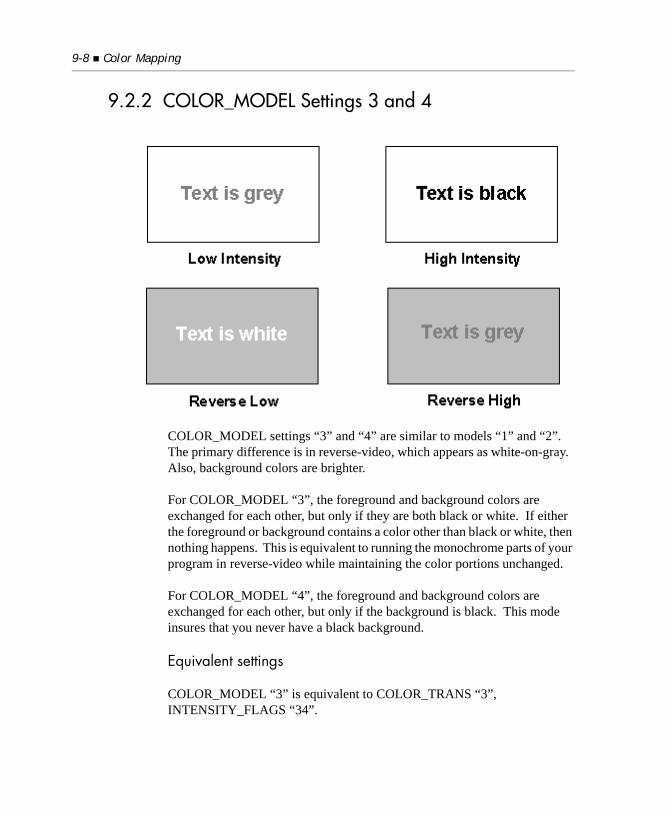
9-8 Color Mapping
9.2.2 COLOR_MODEL Settings 3 and 4
COLOR_MODEL settings “3” and “4” are similar to models “1” and “2”. The primary difference is in reverse-video, which appears as white-on-gray. Also, background colors are brighter.
For COLOR_MODEL “3”, the foreground and background colors are exchanged for each other, but only if they are both black or white. If either the foreground or background contains a color other than black or white, then nothing happens. This is equivalent to running the monochrome parts of your program in reverse-video while maintaining the color portions unchanged.
For COLOR_MODEL “4”, the foreground and background colors are exchanged for each other, but only if the background is black. This mode insures that you never have a black background.
Equivalent settings
COLOR_MODEL “3” is equivalent to COLOR_TRANS “3”, INTENSITY_FLAGS “34”.
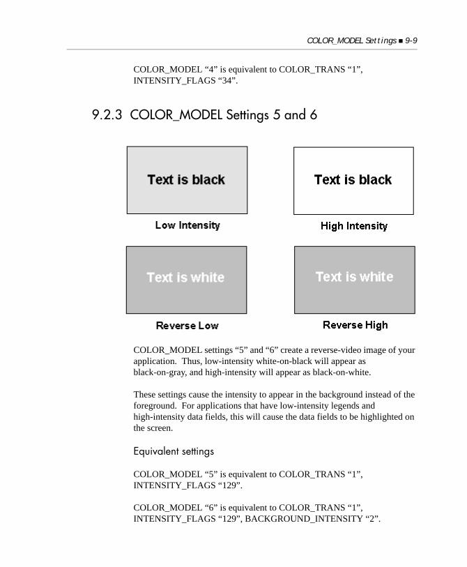
COLOR_MODEL Settings 9-9
COLOR_MODEL “4” is equivalent to COLOR_TRANS “1”, INTENSITY_FLAGS “34”.
9.2.3 COLOR_MODEL Settings 5 and 6
COLOR_MODEL settings “5” and “6” create a reverse-video image of your application. Thus, low-intensity white-on-black will appear as black-on-gray, and high-intensity will appear as black-on-white.
These settings cause the intensity to appear in the background instead of the foreground. For applications that have low-intensity legends and high-intensity data fields, this will cause the data fields to be highlighted on the screen.
Equivalent settings
COLOR_MODEL “5” is equivalent to COLOR_TRANS “1”, INTENSITY_FLAGS “129”.
COLOR_MODEL “6” is equivalent to COLOR_TRANS “1”, INTENSITY_FLAGS “129”, BACKGROUND_INTENSITY “2”.
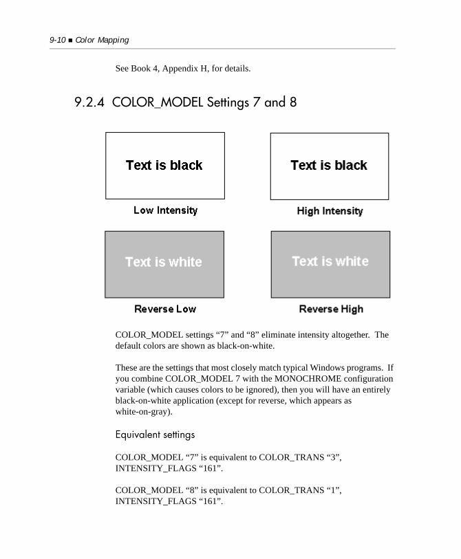
9-10 Color Mapping
See Book 4, Appendix H, for details.
9.2.4 COLOR_MODEL Settings 7 and 8
COLOR_MODEL settings “7” and “8” eliminate intensity altogether. The default colors are shown as black-on-white.
These are the settings that most closely match typical Windows programs. If you combine COLOR_MODEL 7 with the MONOCHROME configuration variable (which causes colors to be ignored), then you will have an entirely black-on-white application (except for reverse, which appears as white-on-gray).
Equivalent settings
COLOR_MODEL “7” is equivalent to COLOR_TRANS “3”, INTENSITY_FLAGS “161”.
COLOR_MODEL “8” is equivalent to COLOR_TRANS “1”, INTENSITY_FLAGS “161”.
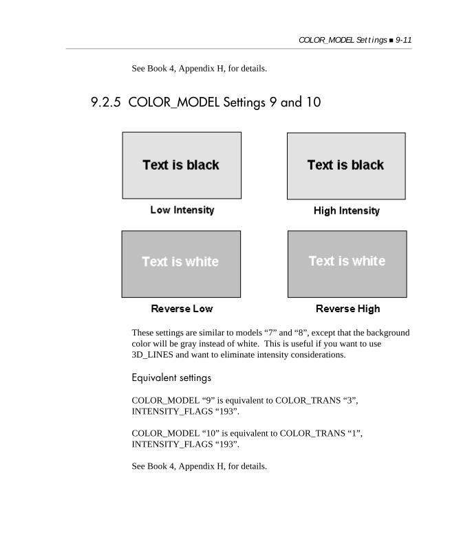
COLOR_MODEL Settings 9-11
See Book 4, Appendix H, for details.
9.2.5 COLOR_MODEL Settings 9 and 10
These settings are similar to models “7” and “8”, except that the background color will be gray instead of white. This is useful if you want to use 3D_LINES and want to eliminate intensity considerations.
Equivalent settings
COLOR_MODEL “9” is equivalent to COLOR_TRANS “3”, INTENSITY_FLAGS “193”.
COLOR_MODEL “10” is equivalent to COLOR_TRANS “1”, INTENSITY_FLAGS “193”.
See Book 4, Appendix H, for details.
9-12 Color Mapping
9.3 COLOR_TABLE Settings
The COLOR_TABLE setting describes a set of specific changes to make to your color scheme. Instead of acting on all the colors uniformly, the COLOR_TABLE causes transformations of individual color combinations. For example, a COLOR_TABLE entry might cause a red foreground on a black background to be translated to a white foreground on a blue background.
There are four values that need to be set: the foreground and background colors (assigned numbers from 1 to 8) and the foreground and background intensity (high or low). These are the basic color values, without any intensity indicator:
For the color table, we combine intensity and color into a single variable by adding “8” to the color value if high-intensity applies. These are the possible values for foreground and background settings:
Color Color value
Black 1
Blue 2
Green 3
Cyan 4
Red 5
Magenta 6
Brown 7
White 8
Color Color value
low-intensity Black 1
low-intensity Blue 2
low-intensity Green 3
low-intensity Cyan 4
low-intensity Red 5
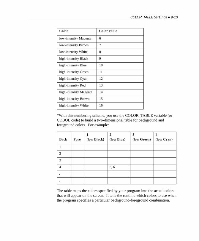
COLOR_TABLE Settings 9-13
*With this numbering scheme, you use the COLOR_TABLE variable (or COBOL code) to build a two-dimensional table for background and foreground colors. For example:
The table maps the colors specified by your program into the actual colors that will appear on the screen. It tells the runtime which colors to use when the program specifies a particular background-foreground combination.
low-intensity Magenta 6
low-intensity Brown 7
low-intensity White 8
high-intensity Black 9
high-intensity Blue 10
high-intensity Green 11
high-intensity Cyan 12
high-intensity Red 13
high-intensity Magenta 14
high-intensity Brown 15
high-intensity White 16
Back Fore1(low Black)
2(low Blue)
3(low Green)
4(low Cyan)
1
2
3
4 3, 6
.
.
Color Color value
9-14 Color Mapping
For example, if the table carried the equivalent of “3, 6” in row 4, column 2, this would mean that a low-intensity Cyan background (row 4) with a low-intensity Blue foreground (column 2) should be mapped to a background of low-intensity Green (3) with a foreground of low-intensity Magenta (6). The value found in each cell in the table represents the final colors to be used.
The values in the table are not actually stored as numbered pairs. They are stored as 8-bit numbers, as described later in this section.
Initially, the table is arranged so that no transformations take place. You use the configuration setting COLOR_TABLE to change entries in the table.
Follow the word “COLOR_TABLE” with the original foreground and background numbers, separated by a comma. Follow these by an equals sign, and then the new foreground and background numbers, again separated by a comma.
For example, to transform the color combination of foreground 5 on background 2 to foreground 13 on background 2, you would use:COLOR_TABLE 5, 2 = 13, 2
The color table may also be accessed directly by a COBOL program. It has the following definition:01 w-default-COLOR-TABLE is external. 03 occurs 16 times indexed by background-color. 05 final-color occurs 16 times indexed by foreground-color pic x comp-x.
Each table value is an 8-bit number where the low-order four bits indicate the desired foreground color and the high-order four bits are the background color. Because four bits result in a range of “0” to “15”, the colors are stored as one less than their actual value of “1” to “16”. Mathematically, the colors are determined by:
Foreground = N(mod 16) + 1
Background = (N/16) + 1
where “N” is the 8-bit value found in the table.
Additional Color Configuration Variables 9-15
For example, suppose we wanted to transform a background color of 5 and a foreground color of 14 to be the colors represented by the variables “back” and “fore”. The following COMPUTE statement does this, and can serve as a template when you want to accomplish a similar color transformation:compute final-color(5, 14) = (back - 1) * 16 + (fore - 1).
If you want to access the color table directly in your code, simply substitute your variable names and color numbers in the sample code shown above.
You can also make COLOR_TABLE settings from inside of COBOL by using SET ENVIRONMENT. Using the external table allows you to inquire about current COLOR_TABLE values and allows you to quickly change several values at once (for example, by processing an entire row in a loop).
9.4 Additional Color Configuration Variables
This section describes four additional configuration variables that can be used to determine how colors are displayed.
You need to read this section only if you want to understand the exact effects of the various COLOR_MODEL settings or want to experiment with its component settings. For most sites, COLOR_MODEL and COLOR_TABLE will be adequate for color control.
This section describes the following four configuration variables:
• COLOR_TRANS
• INTENSITY_FLAGS
• BACKGROUND_INTENSITY
• FOREGROUND_INTENSITY
For each character position on the screen, ACUCOBOL-GT assigns four values: the foreground color, the background color, the foreground intensity, and the background intensity. Your COBOL application may directly control three of these attributes with various ACCEPT and DISPLAY options. The
9-16 Color Mapping
attributes you control are the foreground and background colors, and the foreground intensity. You do not have direct control of the background intensity from the ACCEPT or DISPLAY verbs.
When the runtime system displays screen data, it performs a series of steps to transform the colors and intensities specified by your program, to the actual colors and intensities shown. You can use a variety of configuration options to affect these transformations. By doing so, you can alter the appearance of your program without changing any of the program’s code.
In order to explain the available configuration options, we will walk through the steps taken by the runtime system. At each point where an option can affect the results, that option is described.
9.4.1 Step 1: Assign Initial Colors
The runtime assigns the initial foreground and background colors as specified by your program. If you use the REVERSE option, the foreground and background colors are exchanged for each other. If the output device is monochrome, then the colors are transformed to black or white at this point.
There are no configuration options that affect this step, except for the MONOCHROME option, which forces the colors to be set to black or white, as if the output device is monochrome. To enable this option, set it to a non-zero value.
9.4.2 Step 2: Assign Initial Attributes
The runtime selects a background intensity. Because your program does not control this, the runtime relies solely on configuration options to do this. If you do not set any options, the runtime uses a default intensity based on your hardware and operating environment.
You may choose your own intensity by using the BACKGROUND_INTENSITY configuration variable. It can be set to one of the values “0”, “1” or “2”.
• When it’s set to “0”, the runtime uses the default intensity.
Additional Color Configuration Variables 9-17
• When it’s set to “1”, the runtime uses low-intensity.
• When it’s set to “2”, the runtime uses high-intensity.
There are two important exceptions:
• The first is that the runtime always assigns low-intensity to the background if the background color is black. Using high-intensity would cause the background to be dark gray, which tends to make the screen look muddy.
• The second exception is that many devices do not support a background intensity independent from the foreground intensity (most terminals, for example). If this is the case, the runtime uses a convention of declaring the background intensity to be low-intensity.
After setting the initial background intensity, the runtime selects the initial foreground intensity. If your program specifies an intensity, then that is the intensity used.
If your program uses the default intensity, then the setting of the configuration option FOREGROUND_INTENSITY determines the intensity:
• If it is set to “1”, then the runtime uses low-intensity.
• Setting it to “2” causes the runtime to use high-intensity.
• If it is set to “0”, then the runtime uses the default intensity for the output device.
If your program specifies a default intensity, the runtime will never assign high-intensity if the foreground is black. As with the background, we do this to prevent a washed-out appearance. There’s one exception to this rule. The runtime will assign high-intensity to a black foreground if the output device does not support independent background intensities. In this case, the device will typically show the background in high-intensity and keep the foreground black. Note that if your program explicitly sets high-intensity, then that will be used regardless of the foreground color.
9-18 Color Mapping
9.4.3 Step 3: Transform Colors
The configuration variable COLOR_TRANS (described in Appendix H) determines how the initial colors are transformed. It may be set to any of these values:
Generally speaking, you could use the COLOR_TRANS variable as a starting point in converting an application to appear more natural under a graphical environment such as Windows. Note that if your application is entirely black-and-white, the first three COLOR_TRANS options are essentially identical.
9.4.4 Step 4: Transform Intensities
Once the colors have been transformed, the runtime system transforms the foreground and background intensities according to the setting of INTENSITY_FLAGS. This option consists of a series of values added
0 By default, COLOR_TRANS is set to “0”, which causes no transformation.
1 This mode causes the foreground and background colors to be exchanged for each other. This is equivalent to running the entire program in reverse-video.
2 This causes white to be exchanged for black and black to be exchanged for white. The foreground and background colors are transformed independently. For example, a green foreground on a black background would turn into a green foreground on a white background. This setting usually has the effect of transforming a black background into white while maintaining the general color scheme of the application.
3 The foreground and background colors are exchanged for each other, but only if they are both black or white. If either the foreground or background contains a color other than black or white, then nothing happens. This is equivalent to running the monochrome parts of your program in reverse-video while maintaining the color portions unchanged.
4 The foreground and background colors are exchanged for each other, but only if the background is black. This mode insures that you never have a black background.
5 If the colors are foreground white and background black, they are exchanged for each other. Otherwise, nothing happens.
Additional Color Configuration Variables 9-19
together. Except as noted below, these options take effect only if the colors were in some way affected by Step 3 above. In other words, intensity transfer is ignored if Step 3 didn’t change your program’s colors. The runtime does this to preserve the parts of your program that you left alone in Step 3. The assumption is that you have programmed those parts to behave the way you want.
You may set INTENSITY_FLAGS to a combination of the following values by adding the values together:
These transformations are performed in the order listed above.
1 This option exchanges the foreground and background intensities for each other. This is useful if you are swapping a black background into the foreground and want to assign the foreground’s intensity to the background.
2 Causes the foreground intensity to be inverted. That is, if the foreground is high-intensity, it becomes low-intensity. Otherwise, it becomes high-intensity. This is useful if you are transforming the background to white and the foreground to black. Setting this will cause your low-intensity foreground to be shown as gray while your high-intensity item will show as black.
4 Forces the foreground to high-intensity. This will not be applied to a black foreground.
8 Forces the foreground to low-intensity. This may not be used if “4” is used.
16 Causes the “4” or “8” setting to be used even if the COLOR_TRANS setting had no effect. This is an override switch that you can use to cause all foreground intensities to be set to high or low.
32 Forces the background to high-intensity. This will not be applied to a black background.
64 Forces the background to low-intensity. This may not be used if “32” is used.
128 Forces the background to high-intensity, but only if it is black. This may be used in conjunction with setting “32” or “64” for special effects.
256 Causes the “32”, “64”, or “128” setting to be used even if the COLOR_TRANS setting had no effect.
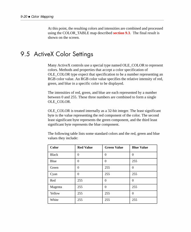
9-20 Color Mapping
At this point, the resulting colors and intensities are combined and processed using the COLOR_TABLE map described section 9.3. The final result is shown on the screen.
9.5 ActiveX Color Settings
Many ActiveX controls use a special type named OLE_COLOR to represent colors. Methods and properties that accept a color specification of OLE_COLOR type expect that specification to be a number representing an RGB color value. An RGB color value specifies the relative intensity of red, green, and blue in a specific color to be displayed.
The intensities of red, green, and blue are each represented by a number between 0 and 255. These three numbers are combined to form a single OLE_COLOR.
OLE_COLOR is treated internally as a 32-bit integer. The least significant byte is the value representing the red component of the color. The second least significant byte represents the green component, and the third least significant byte represents the blue component.
The following table lists some standard colors and the red, green and blue values they include:
Color Red Value Green Value Blue Value
Black 0 0 0
Blue 0 0 255
Green 0 255 0
Cyan 0 255 255
Red 255 0 0
Magenta 255 0 255
Yellow 255 255 0
White 255 255 255
Miscellaneous Options Under Windows and Windows NT 9-21
To construct an OLE_COLOR from the red, green, and blue numbers, use the following formula:OLE_COLOR = red + (green * 256) + (blue * 65536)
or using hexadecimal literals:OLE_COLOR = red + (green * x#100) + (blue * x#10000)
As a convenience, eight standard colors have been defined in ACTIVEX.DEF.*Standard OLE_COLOR Values:78 OLE-BLACK VALUE X#00000078 OLE-BLUE VALUE X#0000FF78 OLE-GREEN VALUE X#00FF0078 OLE-CYAN VALUE X#00FFFF78 OLE-RED VALUE X#FF000078 OLE-MAGENTA VALUE X#FF00FF78 OLE-YELLOW VALUE X#FFFF0078 OLE-WHITE VALUE X#FFFFFF
9.6 Miscellaneous Options Under Windows and Windows NT
The following sections describe options available for Windows and Windows NT systems.
9.6.1 Background Brush Color
The Windows and Windows NT environments use a background brush when they resize a window. By default, the background brush color for ACUCOBOL-GT is black. If you have arranged your default background to be white, you will see a black flash when you resize the window. This does not affect the final appearance of the window, but is briefly noticeable while the window is being redrawn.
9-22 Color Mapping
If you desire, you can set the configuration variable WHITE_FILL to “1” to cause ACUCOBOL-GT’s background brush to be set to white instead. Doing this will also cause the initial screen that ACUCOBOL-GT paints to be white instead of black.
Note: This variable must be set in the configuration file to be effective. Modifying this variable with the SET ENVIRONMENT verb has no effect.
9.6.2 Drawing 3-D Lines
In the Windows environment, you may set the configuration variable 3D_LINES to “1” to cause the runtime to display lines and boxes with 3-D shading. This makes the lines appear to be inscribed into the surface of the screen. Only black lines on a non-black background are shown with shading. Other lines are displayed normally.
The set of colors available to ACUCOBOL-GT significantly impacts how effective the shading will be. Normally, the shading is most effective when the background is low-intensity white. The other low-intensity colors are next best.
The shading is only marginally effective with a high-intensity background. For this reason, the 3D_LINES setting is not used when a high-intensity background is drawn. Note that, by default, ACUCOBOL-GT shows background colors in high-intensity, so you will need to use at least one other configuration variable to arrange for a low-intensity background color. For example, the BACKGROUND_INTENSITY variable described in Book 4, Appendix H, could be set to “1” to force a low-intensity background.
Under Windows and Windows NT, you may freely change the way lines are displayed in COBOL by using the SET ENVIRONMENT verb to set 3D_LINES, prior to displaying a line or a box.
• Setting it to “1” gives you the 3-D effect.
• Setting it to zero gives you normal lines.
Miscellaneous Options Under Windows and Windows NT 9-23
The runtime remembers which lines are drawn with 3-D, so you do not need to keep track of this yourself. Note, however, that if you attach a 3-D line to a non-3-D line, the intersection will use the 3D_LINES setting currently in effect.

10
Help AutomationKey Topics
Introduction ........................................................................................... 10-2HELP-ID ................................................................................................ 10-2Help Modes ............................................................................................ 10-3The Help Processor ............................................................................... 10-4Windows Help....................................................................................... 10-5
10-2 Help Automation
10.1 Introduction
Help automation is the name given to the set of constructs and methods included in ACUCOBOL-GT to support context-sensitive help in your application. Many applications provide on-line help information in a way that is sensitive to the application’s context. Context-sensitive help responds to a particular screen or control that the user clicks on or otherwise identifies.
Help automation is the mechanism that takes care of informing the help processor that help is needed for a particular item or context. The help processor is a program or subroutine that performs the task of delivering the help content to the user.
In ACUCOBOL-GT, the help automation mechanism consists of:
• a HELP-ID that identifies context-sensitive elements in the program.
• two help modes with corresponding exception values that give the user two methods for initiating context-sensitive help.
• automated runtime support for detecting and passing requests for context-sensitive help to the help processor.
10.2 HELP-ID
Help automation support is based on the concept of a help ID. A help ID is a special integer value assigned to a control. When a help request is sent to the help processor, the help ID of the associated control is sent as a parameter.
Typically, each control is assigned a unique value. This allows the help processor to uniquely respond to each control. To create help that responds to the window, rather than an individual control within it, you can give all of the controls within a window the same help ID. Or you can mix the two approaches by giving some individual controls unique help IDs, while the remaining controls get a shared help ID. Because help IDs are associated with controls, you cannot use help automation with character-based (textual) ACCEPT fields.
Help Modes 10-3
Whether the control is defined in the Screen Section or in a DISPLAY statement, help IDs are assigned with the HELP-ID phrase. You can easily assign a screen-wide help ID to a window by specifying a HELP-ID for the top-level group item in the Screen Section description. You can override the screen-wide ID for a specific control by including the HELP-ID phrase in that control’s definition.
10.3 Help Modes
After setting up the help IDs, you’ll need to decide which help modes to use and how each mode will be presented to the user. The help mode describes the user interface method that the user uses to initiate a context-sensitive help request. The runtime supports two help modes: item help and help cursor.
The item help mode uses a predefined key or button to send an immediate request for help for the active control or screen. When the user clicks on the item help button or presses the item help key, the help ID of the active control is immediately passed to the help processor.
The help cursor mode uses a predefined key (distinct from the item help key) to initiate a special mode for selecting the item for which information is wanted. Pressing the help cursor key or button usually changes the cursor to a question mark that the user positions over the screen item in question and then clicks. The mouse pointer then reverts to normal and the help information for that item is displayed. Should the user click on an object that doesn’t have a help ID, the cursor reverts to normal and nothing else happens.
To make the help modes work, you must assign each mode an exception value. This is done with the Format 13 SET statement. After the exception values are assigned, any control, menu item, or key that produces the specified exception value will produce the associated help action. For example, the Microsoft Windows design guidelines recommend that “F1” produce help for the active item (item help), and that “Shift F1” produce a help cursor. To implement those guidelines, you would use the following statement (assuming the default keyboard configuration):SET EXCEPTION VALUES 1 TO ITEM-HELP, 11 TO HELP-CURSOR.
10-4 Help Automation
The preceding statement reflects the fact that in the default keyboard configuration “F1” produces an exception value of “1”, while “Shift F1” produces an exception value of “11”.
After the exception values are assigned, you can create menu items or push buttons that produce item help or help cursor by assigning those items an exception value of “1” or “11”. It is important that item help and help cursor push buttons be self activating (SELF-ACT style). If they are not, the effect is that clicking on them will transfer control to the button. This is annoying in the case of help cursor, and useless in the case of item help (the help request would always pass the help ID of the help button).
10.4 The Help Processor
The last step in setting up help automation is to define the name of the help processor program. Note that the help processor’s entry point is always a COBOL program. The program can be the help processor itself, or a shell to some other help processor, such as Windows Help. The help processor is named by the value of the configuration variable HELP_PROGRAM. If HELP_PROGRAM is undefined, the runtime uses the name “AcuHelp”.
Calls to the help processor are handled by the runtime using the normal CALL mechanism. Regardless of the outcome of the CALL, when the CALL to the help processor completes, the runtime returns to the current control and continues normal operation.
The help processor is passed only one parameter, the EVENT STATUS data item. It contains the CMD-HELP event that generated the CALL. The CMD-HELP event contains all of the information needed to process the help request: the control’s handle, its ID, its help ID (in EVENT-DATA-2) and the handle of its owning window. In the case of HELP-CURSOR, you can get the coordinates of the mouse when it was clicked on the control by calling “W$MOUSE” with GET-MOUSE-STATUS before you do any ACCEPTs. Note that the position returned is relative to the control’s owning window.
Windows Help 10-5
10.5 Windows Help
If your target platform is Windows, the obvious help processor to use is Windows Help. You can access Windows Help through the “$WINHELP” library routine (described in Book 4, Appendix I). Note however, that $WINHELP is not supported in Microsoft Windows Vista. “$WINHELP” takes an “OP-CODE” parameter that indicates the operation to perform. These codes are defined in the COPY library “winhelp.def”. For context-sensitive help, the two most useful op-codes are HELP-CONTEXT (value 1) and HELP-CONTEXTPOPUP (value 8). In both cases, a context ID is passed as the last parameter to “$WINHELP”. Typically, you would use the control’s help ID as the context ID.
$WINHELP’s HELP-CONTEXT operation starts Windows Help in a separate window and positions the user at the topic identified by the context ID. The user is then free to navigate through the help text at will. The HELP-CONTEXTPOPUP operation causes Windows Help to pop-up a small window over the application that contains the topic identified by the context ID. The window is removed as soon as the user types a key or clicks the mouse.
Preparing your application to use Windows Help requires several steps.
In order to use Windows Help you must have a Windows compatible help compiler to produce your help files. ACUCOBOL-GT does not come with a help compiler and does not include documentation on the construction of help files. A help compiler is included with most Microsoft language products. Third-party help compilers are also available. If this is your first effort to interface to Windows Help, be sure to carefully read the documentation that comes with your Windows help compiler.
The help compiler takes two files as input: the help text source and the help project file. It produces “.HLP” format help files that are used by Windows Help. The help text source is a rich-text format (“.RTF”) file that contains a marked-up form of the help text. The markings describe the various sections of the help file, their look, and how they are cross-referenced. The help project file (“.HPJ”) is a text file that contains project-specific instructions to the help compiler. For information about how to create and use these files, refer to your help compiler documentation.
10-6 Help Automation
10.5.1 Mapping Context IDs
Due to an inconsistency in the representation of the context ID value between the Windows Help program and the WinHelp API function, some special work is required. In Windows Help, context IDs are strings. These strings are placed in the help source as footnotes using the “#” character as the footnote symbol. However, the Windows Help API function (WinHelp) does not accept a string for the context ID parameter. Instead, it requires a number. Fortunately, there is a simple mechanism for translating numbers into context IDs. This is done in the “[MAP]” section of the help project (.HPJ) file. In the MAP section, you should include entries that map the context string to a context number, like this:#define ContextIdName ContextNumber
For example, if you had a section called “Help_CustName” in your help file, and you wanted to assign the corresponding ID value 1000, you would use:#define Help_CustName 1000
In your COBOL program, you could then assign a HELP-ID of “1000” to your customer name entry field to provide a context link to the appropriate section in the help file.
Because mapping names to numbers on a large scale is prone to error, ACUCOBOL-GT provides a mechanism to simplify the process. We suggest the following approach:
1. Create a COPY library for each of your help files. Each COPY library should contain all of the context IDs for its associated help file. Typically, one help file services all the programs in an application, but it’s possible to organize help files differently.
2. Whenever you need a new context ID, add a level 78 to the COPY library. The name should be the same as the section name in the help file. Assign a unique number to the entry. You can either number context IDs sequentially, or you can devise your own scheme. To add an entry for the customer name example above, you would add the following line:
78 Help-CustName VALUE 1000.
Windows Help 10-7
Note: Context names are not case-sensitive in either COBOL or the help file.
3. In your COBOL program, include the COPY library and use its level 78 names as HELP-IDs. For example, this statement could be used in a Screen Section entry:
ENTRY-FIELD USING CUSTOMER-NAME, HELP-ID = Help-CustName
4. In your help file text (“.RTF” file), create a section with the same name as the level 78 entry, followed by its associated help text. When creating section names, be aware that any hyphens in a COBOL name will be converted to underscores in the help file. Therefore, in the preceding example, you would add a section called “Help_CustName” to your help file.
5. Compile the program source with the “-defines” switch to create a file containing “#defines” that correspond to your level 78s. For example, if the COPY library created in step (1) is called “applhelp.def”, you would use:
ccbl -defines applhelp.def
By default, this creates the file “applhelp.h” that contains one “#define” for each level 78 in “applhelp.def”. Note that any hyphens in the level 78 names are converted to underscores in the corresponding “#define”. This occurs because the “#defines” can be used in C programs as well as with help files, and hyphens are not allowed in C names (they are allowed in COBOL and the help file).
6. In your help project file (“.HPJ”), include a “[MAP]” section and add an “#include” statement that references the “.h” file created in step (5). For example:
[MAP]#include <applhelp.h>
Your help files are now ready for the help compiler. Use your help compiler to create an “.HLP” file from your help text source and help project files.
10-8 Help Automation
For a complete working example, see the help demonstration program included with the Windows versions of ACUCOBOL-GT. The example program and its related files can be found in the “sample\help” subdirectory of your ACUCOBOL-GT installation.
11
Tips and HintsKey Topics
Regarding Windows .............................................................................. 11-2Regarding Controls ............................................................................... 11-4Regarding Fonts .................................................................................... 11-7Regarding Configuration Variables..................................................... 11-7Regarding Debugging .......................................................................... 11-9
11-2 Tips and Hints
11.1 Regarding Windows
Question: When I click the mouse outside the area of my floating window, the runtime doesn’t return any event to my program. Why?
Answer: This is normal behavior under Windows. Windows delivers the mouse message to the top-most window where the mouse is located. If the mouse isn’t clicked within the floating window, it never receives any indication that a mouse event occurred. The only way to receive such events is to capture the mouse, but that prevents the mouse from being used by any other application. Ordinarily, the mouse should be captured only when the user is marking or dragging some object on the screen.
Question: How can I trap the CMD-CLOSE event when the user closes the application by selecting the “Close” option of the System Menu? I need to be able to close files and perform an orderly shutdown.
Answer: Look at the QUIT-MODE runtime configuration variable. QUIT_MODE allows you to handle this event in a program-defined way, or in a variety of pre-defined ways. See Appendix H of Book 4, Appendices.
Question: I don’t see any references to Dialog Boxes. How do I build one? I
Answer: Under ACUCOBOL-GT, a Dialog Box is simply a floating window. You can specify many options when creating the window, but the basic Dialog Box is declared with:
DISPLAY FLOATING WINDOW, LINES height, SIZE width, BOXED, HANDLE IN handle-data-item
Common additions include a TITLE and SYSTEM MENU. You can then populate the Dialog Box with “DISPLAY control-type” statements. Or a better alternative is to define a Screen Section group item that describes all the Dialog Box contents and then just DISPLAY that group item.
Question: Which of the Windows Common Dialog Boxes can I create directly from ACUCOBOL-GT?
Answer: Five are available via ACUCOBOL-GT library routines. The ChooseColor dialog box can be found in W$PALETTE. The PrintDialog setup box is available in WIN$PRINTER. The file Open and Save-as dialogs are
Regarding Windows 11-3
available in C$OPENSAVEBOX. W$FONT has the ChooseFont dialog box. Other Windows Common Dialogs are not directly available, though they can be accessed indirectly through C.
Question: How do I handle a dialog box that doesn’t have any entry fields, for example a dialog box with only push buttons?
Answer: All controls are handled in the same general fashion. This means that you can ACCEPT a push button just as you do an entry field. Push buttons are a little strange in that they don’t have values, but they do provide a termination value, just as regular fields. The following is sample code for a simple dialog box that prompts for verification before terminating the application. The line and column numbers may need to be adjusted to improve appearance.
*Screen section01 shutdown-screen. 03 label “This will end your application”, line 2, column 3. 03 push-button, ok-button, line 4, column 10. 03 push-button, cancel-button, column 20.
*Procedure Divisiondisplay floating window, size 30, lines 5, title “Application Shutdown”, handle in shutdown-window.
display shutdown-screen.perform, with test after, until key-status = 13 or 27 accept shutdown-screen on exception key-status continue end-acceptend perform.
destroy shutdown-window.
if key-status = 13 perform shutdown-windows.
11-4 Tips and Hints
Question: I’d like to minimize my COBOL application when I switch tasks, but a child window is open, and I can’t access the minimize button of the main application window. Why?
Answer: The child window is a modal window. As long as a modal window is open, you cannot get to any other application window. To minimize the application, you must first close all child windows. If the current window were a modeless window, you could switch to a different window without closing the first one. ACUCOBOL-GT Version 3.2 and later supports the creation of modeless windows.
Question: I want to create a toolbar large enough to host bitmap buttons that are 36 pixels square. How do I do that?
Answer: All you need to do to is to create a toolbar window that is tall enough to handle 36 pixels (or any height you want). When you create the bitmap buttons, be sure to specify the exact size of your buttons. For example, to handle 36 pixel square bitmap buttons, try creating a toolbar four lines high. Remember, you can use fractional line values to create a toolbar that is exactly the height you want. For more about toolbars and bitmap buttons see the “DISPLAY TOOLBAR” statement in section 6.6 of Book 3, Reference Manual, and section 3.7, “Bitmap Buttons” in Book 2, User Interface Programming.
11.2 Regarding Controls
Question: I have a window in which I’ve placed a number of SELF-ACT style radio buttons. When one of those buttons is clicked, I see the button flash but the previous control remains selected. What’s going on?
Answer: What you’re seeing is correct, if confusing, behavior. Self-activating buttons have two traits: they don’t generate CMD-GOTO events, and once the user is finished with them they reactivate the previously active control. In this case, clicking on the radio button turns it on and also “completes” the use, causing control to be returned to the previously selected radio button, turning off the button that was clicked. All this happens in a flash. The bottom line is, don’t make radio buttons self-activating if you plan to ACCEPT them directly.
Regarding Controls 11-5
Question: I have defined a TERMINATION-VALUE (or EXCEPTION-VALUE) for my push button. When I click on it, I get a status “96” instead of the value I have assigned. Is this a bug?
Answer: What you are seeing is correct behavior. When you click on a push button with the mouse, two actions take place. First, when you press the mouse button down, the push button requests that the program activate it. It does this by generating a CMD-GOTO event, which is the status “96” that you are seeing. After it gains control, it waits for you to release the mouse button. At this point, the push button generates the termination or exception value that you have assigned to it. Although we talk about “pushing” a button, in reality, it is the act of releasing the button that is important. You can see this by running any Windows application and pushing a button down with the mouse. As long as you hold the mouse button down, nothing happens other than the push button appearing depressed and gaining the input focus. Once you release the mouse button, the program action associated with the push button takes place.
If you are using push buttons in a Screen Section entry, you usually don’t see the CMD-GOTO events because the Screen Section handler responds to these events for you (although you can detect them in AFTER procedures and EVENT procedures). When you are managing the activation of controls directly in your program, then it is your responsibility to detect these events and activate the appropriate controls.
Another possibility is to use the SELF-ACT style of push button. This style tells the button to automatically activate itself when pushed. It does not generate CMD-GOTO events.
Question: I asked for a FRAME that was 20 characters wide. When I use the WIN3-GRID option, I can see that it is nowhere near that size. What’s happening?
Answer: Frames, like other controls, are normally measured in terms of their font. In the case of a frame, the font is the frame’s title font (even if the frame is not given a title, it still has a title font). A frame of size “20” is a frame that is 20 title-font-characters wide. What the WIN3-GRID option shows you is the size of each character cell in the window. A window’s character cell is normally the same as the size of its text font. If the window’s text font and the frame’s title font are not the same, then a frame of size “20” will not occupy 20 character cells.

11-6 Tips and Hints
You can address this issue in one of four ways:
1. You can use the CELLS option when specifying the frame’s size (e.g., “SIZE 20 CELLS”). This causes the frame to be measured using the window’s cell size;
2. You can change the dimensions of the window’s cell size to match the frame’s title font (by using the CELL SIZE phrase when you create the window);
3. You can make the frame’s font and the window’s text font the same; or,
4. You can use the PIXELS option when specifying the frame’s size (e.g., “SIZE 200 PIXELS”). This causes the frame to be measured using the screen’s pixel size, and the resulting frame’s size is unrelated to either the frame’s title font or the window’s text font.
Question: How many items can I put in a standard list box or combo box?
Answer: List box text limits are based on machine memory, which essentially equates to no limit.
A paged list box can handle an unlimited number of items. See section 3.8.
Question: When the runtime is putting data into a standard list box or combo box defined in the Screen Section, the last data item gets repeated. How do I prevent this?
Answer: You need to move spaces to your ITEM-TO-ADD data item after you have finished filling the list box or combo box. Otherwise, the last data item it contains will be added to the box every time you DISPLAY that Screen Section box, or any of its parent group items.
Question: When I use a property in a MODIFY statement, I get the compiler error “Undefined data item: property-name”. I know the property is the right one. Why do I get an error?
Answer: The handle that you are specifying in the MODIFY statement is a generic handle (that is, “USAGE HANDLE” instead of “USAGE HANDLE OF type”). The compiler does not recognize style and property names when you reference a generic handle, because it does not know which set of names to use. To rectify this problem, declare the handle as a handle to the appropriate control type.
Regarding Fonts 11-7
ACCEPT FROM SCREEN doesn’t return anything!
ACCEPT FROM SCREEN returns classical text-based fields, but not controls or the contents of controls (including entry fields). In other words, it reads the terminal emulator plane of the screen, but not the graphical plane. To determine the current contents of a control, use the INQUIRE verb.
11.3 Regarding Fonts
Question: How can I select one of my system’s custom fonts?
Answer: Use the W$FONT library routine. See Book 4, Appendix I.
11.4 Regarding Configuration Variables
Question: In the programs I developed with Version 2.3 and 2.4, I used the configuration variable MOUSE-FLAGS to detect certain mouse events. After updating my screens to include graphical controls, I notice that the double-clicked events that I used to get in my entry fields are no longer generated. What’s going on?
Answer: MOUSE-FLAGS does not detect any event that takes place over a control. Mouse events that take place over a control are handled differently than mouse events that interact with text-based screen items. The mouse, when positioned over a control, is owned by the control. All mouse events that take place over the control are sent directly to and handled by the control. List box controls are the only controls that pass double-click events back to the program. To detect a double-click in a list box, check for CMD-DBLCLICK in EVENT-STATUS.
Question: In my configuration file I have a KEYSTROKE entry that defines carriage return (^M) to have both a termination and exception value of “13”. It also defines “edit=next” so that a carriage return also moves the cursor to the next
11-8 Tips and Hints
field. But when I have a screen that includes an “OK” button and a carriage return is pressed, the screen terminates and the cursor is not moved to the next field.
Answer: This is the correct behavior. Remember that the OK button style also implies the DEFAULT button style. The DEFAULT button style has the effect of acting as if it is pushed whenever a key with the value of “13” is pressed.
Question: A program running in UNIX with the configuration variable “KEYSTROKE EDIT=Next terminate=17 kr” and “KEYSTROKE EDIT=Previous terminate=17 kl” can return to the previous field or advance to the next field when the <left arrow> or <right arrow> keys are pressed, but when the program is running in Windows these keys do not work.
Answer: This is the correct behavior. When using controls, the host GUI determines the meaning of any editing keys in the control itself. For our own simulated GUI, we allow you to define the editing functions using the KEYSTROKE entries. For other systems (such as Windows), the host determines how keys are used. In the case of Windows, the left and right arrow keys move the cursor but do not act as terminators. While the runtime does allow you to configure which keys are terminating keys (even for Windows), it cannot force the host GUI into a mixed mode where a key is sometimes an editing key and sometimes a terminating key.
Question: With the KEYSTROKE configuration variable I redefine the menu activation key. The redefinition works fine under UNIX but doesn’t under Windows. Why?
Answer: Windows’ menu activation keys are not configurable. The only keys available are the ones defined by Microsoft. The menu activation key under Windows is F10.
Question: In many of my character-based applications I use BLINK to highlight some text. Why is it that when I run those applications under Windows, the text doesn’t blink?
Answer: BLINK isn’t supported under Windows.
Regarding Debugging 11-9
11.5 Regarding Debugging
Question: When I’m debugging and I can’t get to the System Menu, how can I set a break?
Answer: You can directly request a break to the debugger by typing Ctl-Break. The break will occur as soon as the current ACCEPT statement terminates. If the program is not currently processing an ACCEPT statement, the break will occur after the current statement terminates. This provides a method of dynamically breaking to the debugger when you cannot get to the system menu (for example, when you are in a floating window).

12
UI Terminologyactive window
The window that is receiving the user’s input. The window controlled by the user and associated with the current ACCEPT statement. Only one window can be active at a time. On most systems, the active window is visually highlighted. A window is made active by any of the following actions: (a) when it is created, (b) when the program does an ACCEPT of a control in the window, (c) by some forms of the Format 10 SET statement, and (d) when the user clicks on a modeless window. See also current window.
ActiveX
A component model originally developed by Microsoft to standardize the way that application components and services behave. Today, most component-based technologies are assigned the label “ActiveX”.
ActiveX control
An ActiveX control is an Component Object Model (COM) object that performs a well-defined function, usually involving a graphical user interface. ActiveX controls subscribe to the ActiveX component model originally developed by Microsoft. As such, they behave in a manner that developers can predict, they are reusable, and they are toolable. Pre-programmed controls (such as calendars, clocks, and gauges) are sold by third-party vendors along with the licensing rights to use them in your Windows application. By supporting ActiveX controls, ACUCOBOL-GT allows you to take advantage of existing software functionality, as well as create applications that conform to the Windows standard.
application window
See main application window
12-2 UI Terminology
bar
A control that draws a line on the screen.
bitmap
A control that allows you to place an animated bitmap on the screen.
border
The box forming the outermost edge of the window or control. Border types include thin, thick, and shadowed (3D border).
buttons
A class of controls used for yes/no, on/off choices (push button, radio button, check box).
character-based display
A video mode that displays only full characters such as those defined by the ASCII or EBCDIC character sets.
check box
A control having a box which the user clicks on to select an on or off state. An “X” or check-mark appears in the box when the item is selected.
child window
A window created by the currently active window (its parent). If the parent window is closed (destroyed), the child is also closed.
client area
The area of the window inside the borders, menu bar, toolbar, and title bar. synonym: display area
close box
See system menu.
combo box
An entry field with an attached list or drop-down list. The user can select an entry from the list, or directly enter a value. synonym: combination box
12-3
control
A graphical screen object with a dedicated input or output function, such as a push button, check box, or entry field. synonym: widget
control border
See border.
control type
A classification that specifies a control’s properties. Each control type has a set of common and special properties. synonym: control class
current window
The output window. The window currently being acted on by the program, usually the same as the active window (the window accepting input), but it can be different, temporarily, via use of the UPON phrase. See active window.
cursor
The insertion point in a text field. The cursor is typically shown as a blinking vertical bar (I-beam).
data entry field
See entry field.
desktop
The screen background on top of which windows and icons are displayed.
dialog box
A modal or modeless window used to supply information or elicit input. Frequently used to get user preferences and confirm program actions.
display area
See client area.
12-4 UI Terminology
document window
A type of window used by the application to support and manage multiple open documents, or multiple views of an open document (spreadsheet, picture, etc.). Not currently supported in ACUCOBOL-GT.
drop-down list box
A selection box with a drop-down list.
entry field
A boxed field into which text is entered. If present, the current entry is highlighted and the user can select, delete, or edit up to the maximum length of the field. synonym: entry box, text box, edit box
event
A transitory action, such as a mouse movement, menu selection, or data entry.
event-driven
A system in which programs respond to events (actions) initiated by the user or system.
floating window
A host-based, pop-up window that displays over its parent window. It can be moved independent of its parent.
frame
A box used to visually group items. A frame can have a label. In Microsoft Windows, frames are called group boxes. Frames can have a variety of border types: normal, heavy and various three dimensional effects.
Graphical User Interface System (GUI System)
An operating system or layer over the operating system that has as its principal feature the graphical display and control of the application user interface. The GUI system may provide other important operating system functions, but graphical representation and control is central. synonym: GUI Environment, Windowing System.
12-5
grid
A two-dimensional table of data fields. Each element of this table, called a “cell,” can hold either text or a bitmap, or both. Grids are relatively complex controls with many properties that you can use to customize their appearance and behavior.
group box
See frame.
hot spot
The area on or around a display object (text, button, icon, etc.) that is affected by a mouse action.
icon
A small bitmapped graphic image variously used to represent the application or as a button label.
initial window
See main application window.
label
A static text item. Labels are used to place text next to an entry field, or anywhere it is needed. synonym: static text
list box
An input field that displays a list of options for the user to choose from. The list box usually highlights the current selection.
main application window
The primary window of the application, usually including the application’s main menu bar and title bar displaying the application’s name.
menu bar
The labels usually located below the title bar that provide access to the application’s pull down menus. Standard menu bar items include the “File”, “Edit”, and “Help” menus.
12-6 UI Terminology
message box
A modal window used to display error and system messages. The message box may be supplied as a specialized service of the GUI system.
method
An ActiveX term. Methods (or object methods) specify the functions that an ActiveX control provides. They are invoked using the MODIFY verb, and they can take any number of parameters or no parameters. They can also take optional parameters (i.e., parameters that can be omitted) and can return values (with the GIVING phrase.
minimize/maximize buttons
Small buttons, usually located in the upper right corner of the window’s title bar (optional feature). When activated, these buttons reduce the window to an icon or enlarge the window to its largest supported size, respectively.
mnemonic keys
The underlined letter on menu entries which, when accessed with a special key combination from the keyboard, activates that menu item.
modal window
A window that, when active, prevents the user from activating any other window.
modeless window
A window that, when active, allows the user to activate another window via a system-dependent technique (for example, clicking on the window with the mouse).
multi-line entry field
A large entry field displayed as multiple lines. synonym: multi-line edit box
parent window
The current window when a new window is created. When the parent window is closed, all associated child windows are also closed. See child window.
12-7
pointer
The arrow (or other shape) that is moved by the mouse, trackball, joystick, etc. to navigate the screen.
pointing device
The mouse, trackball, stylist, or other device manipulated by the user to move the pointer and make selections on the screen.
pop-up menu
A menu which is displayed when the user positions the mouse over an object with a pop-up menu and clicks or activates the menu with the keyboard. The menu pops up over the current window.
pop-up window
Any window created by the program that pops up over the current window. Prior to Version 3.0, the term pop-up window was sometimes used to refer to windows created with the DISPLAY WINDOW statement (these windows are now known as subwindows). See also modal window and modeless window.
pull-down menu
The list of menu options displayed when an option on the main menu bar is activated by the pointer or keyboard. Menu options are displayed in a vertical list that may have horizontal dividers and links to submenus.
push button
A rectangular area with text or a graphic that describes the action performed by the button. synonym: command button
radio button
A set of two or more buttons used to present mutually exclusive options. When one button is selected, all other buttons are made to appear empty (like an old fashion car radio - when a button is pushed in the previously pushed button pops out). synonym: option button
screen
The entire video display space.
12-8 UI Terminology
scroll bar
A bar with a slider box and arrow boxes at each end. Scroll bars are attached to a window when the size of the data exceeds the window’s display area. A window can have vertical or horizontal scroll bars, or both.
selection box
See list box.
static text field
See label.
subwindow
The traditional ACUCOBOL-85, text-based pop-up window. The name subwindow was introduced in ACUCOBOL-GT Version 3.0.
system menu
An optional drop down menu, usually located in the left corner of the title bar, reserved for special control of the active window. The system menu usually includes options such as: Restore, Move, Size, Minimize, Maximize, Close, and Switch To. synonym: close box, control menu
tab
A control that combines a box with a tab, resulting in a screen element that looks like a file folder.
text box
See entry field.
thread
An execution path through your program.
title
The text label that is displayed in the window’s title bar. Also a common property of all control types.
12-9
title bar
The bar, usually at the top of the window, that includes a text label (title) and, optionally, a system menu (left corner) and minimize and maximize buttons (right corner).
toolbar
A row of icon buttons used to perform or initiate program tasks.
widget
A synonym for control.
window
The framed rectangular display space that typically includes a combination of interface devices such as menus, controls, and scroll bars.
window frame
The border around a window. See border.

Index
Symbols$WINHELP routine 10-5
Numerics3-D lines and boxes, displaying in Windows 9-223-D style
COMBO-BOX 5-36ENTRY-FIELD 5-54GRID 5-78LIST-BOX 5-120TREE-VIEW 5-176
3D_LINES configuration variable 9-22
AACCEPT
activating a control with 3-9floating windows, effect on 2-4font handle, getting with 4-15FROM SCREEN 11-7FROM STANDARD OBJECT 4-15using in a statement to select menus 8-15
ACCEPT-CONTROL field 6-2ACTION
ENTRY-FIELD special property 5-61GRID special property 5-82
ACTION-CURRENT-PAGE, GRID special property 5-83ACTION-FIRST-PAGE, GRID special property 5-83ACTION-HIDE-DRAG, GRID special property 5-83ACTION-LAST-PAGE, GRID special property 5-83
Index-2
ACTION-NEXT, GRID special property 5-83ACTION-NEXT-PAGE, GRID special property 5-83ACTION-PREVIOUS, GRID special property 5-83ACTION-PREVIOUS-PAGE, GRID special property 5-83active and current windows 2-4ACTIVE-X control
common properties 5-12COLOR 5-12SIZE 5-12TITLE 5-12VALUE 5-12
events 5-17special properties 5-14
CLSID 5-14INITIAL-STATE 5-15LICENSE-KEY 5-14
styles 5-13USE-ALT 5-13USE-RETURN 5-13USE-TAB 5-13
syntax 5-15ActiveX controls
color settings 9-20methods 4-7WideChar license keys 5-15
acugui.def 4-4ADJUSTABLE-COLUMNS, GRID style 5-79ALIGNMENT
GRID special property 5-84LIST-BOX special property 5-125
ALLOW-ALL-SCREEN-ACTIONS mouse action 7-8ALLOW-LEFT-DOUBLE mouse action 7-7ALLOW-LEFT-DOWN mouse action 7-7ALLOW-LEFT-UP mouse action 7-7ALLOW-MIDDLE-DOUBLE mouse action 7-7ALLOW-MIDDLE-DOWN mouse action 7-7ALLOW-MIDDLE-UP mouse action 7-7
Index-3
ALLOW-MOUSE-MOVE mouse action 7-7ALLOW-RIGHT-DOUBLE mouse action 7-7ALLOW-RIGHT-DOWN mouse action 7-7ALLOW-RIGHT-UP mouse action 7-7ALTERNATE, FRAME style 5-68ALWAYS-ARROW-CURSOR mouse action 7-8array mode, STATUS-BAR control 5-158AUTO, ENTRY-FIELD style 5-58AUTO_DECIMAL configuration variable 5-64AUTO-DECIMAL, ENTRY-FIELD special property 5-63automatic GUI runtime support 1-6automatic mouse handling 7-9AUTO-MOUSE-HANDLING mouse action 7-7AUTO-SPIN, ENTRY-FIELD style 5-57AXDEFGEN utility 4-8, 5-11
Bbackground brush 9-21background color, color mapping 9-2BACKGROUND_INTENSITY configuration variable 9-15, 9-16BAR control 5-17
common properties 5-18COLOR 5-18SIZE 5-18TITLE 5-18VALUE 5-18
events 5-22special properties 5-19
COLORS 5-20LEADING-SHIFT 5-22SHADING 5-20TRAILING-SHIFT 5-21WIDTH 5-19
styles 5-19DASHED 5-19
Index-4
DOT-DASH 5-19DOTTED 5-19
BITMAPbutton style 3-16CHECK-BOX style 5-30GRID special property 5-84PUSH-BUTTON style 5-137RADIO-BUTTON style 5-143
bitmap buttons 3-12color mapping 3-13creating in the Screen Section 3-17creating the button 3-16creating the image 3-13file format 3-14loading a bitmap 3-15pop-up hints 3-19
configuration variables 3-19portability issues 3-19removing an image 3-15size of image 3-13styles 3-16W$BITMAP library routine 3-15
BITMAP control 5-23common properties 5-23
COLOR 5-24SIZE 5-23TITLE 5-23VALUE 5-23
special propertiesBITMAP-END 5-26BITMAP-HANDLE 5-24BITMAP-NUMBER 5-24BITMAP-RAW-HEIGHT 5-25BITMAP-RAW-WIDTH 5-25BITMAP-SCALE 5-25BITMAP-START 5-26BITMAP-TIMER 5-27
Index-5
TRANSPARENT-COLOR 5-27BITMAP-END, BITMAP special property 5-26BITMAP-HANDLE
button special property 3-17CHECK-BOX special property 5-32PUSH-BUTTON special property 5-138RADIO-BUTTON special property 5-145TAB special property 5-165TREE-VIEW special property 5-177
BITMAP-HANDLE, BITMAP special property 5-24BITMAP-NUMBER
CHECK-BOX special property 5-32GRID special property 5-84PUSH-BUTTON special property 5-138RADIO-BUTTON special property 5-145TAB special property 5-166TREE-VIEW special property 5-178
BITMAP-NUMBER, BITMAP special property 5-24bitmapped graphics in Windows 3-15BITMAP-RAW-HEIGHT, BITMAP special property 5-25BITMAP-RAW-WIDTH, BITMAP special property 5-25BITMAP-SCALE, BITMAP special property 5-25BITMAP-START, BITMAP special property 5-26BITMAP-TIMER, BITMAP special property 5-27BITMAP-TRAILING, GRID special property 5-85BITMAP-WIDTH
GRID special property 5-85TAB special property 5-166TREE-VIEW special property 5-178
BLANK SCREEN 5-9BLINK phrase, not supported under Windows 11-8BOTTOM, TAB style 5-164BOXED
Grid styles 5-79BOXED style, incompatible with menus 2-8BOXED styles
ENTRY-FIELD 5-54
Index-6
LIST-BOX 5-120TREE-VIEW 5-176
browser, WEB-BROWSER control 5-184building a menu 8-12BUSY, WEB-BROWSER property 5-190BUTTONS styles
TAB 5-163TREE-VIEW 5-176
CCALENDAR-FONT, DATE-ENTRY special property 5-45CANCEL-BUTTON, PUSH-BUTTON style 5-137capturing the mouse 7-4carriage return doesn’t advance 11-8CCOL phrase, character coordinate phrase explained 3-10CELL phrase 4-13, 4-14CELL size, establishing in the main application window 1-24cell, defined 4-11CELL-COLOR, GRID special property 5-85CELL-DATA, GRID special property 5-85CELL-FONT, GRID special property 5-85CELL-PROTECTION, GRID special property 5-85CELLS phrase, used with the character coordinate phrases 3-10CENTER
ENTRY-FIELD style 5-55LABEL style 5-115
CENTERED-HEADINGS, GRID style 5-79CENTURY-DATE, DATE-ENTRY style 5-43character coordinate phrases 3-10CHARACTER, label in Screen Section 4-5character-based applications, differences from graphical 1-17Character-to-GUI Wizard 1-31check marks
adding and removing in menus dynamically 8-18on menus 8-5
Index-7
CHECK-BOX control 5-28bitmap button, introduced 3-12common properties 5-28
COLOR 5-30EVENT-LIST, EXCLUDE-EVENT-LIST 5-30SIZE 5-29TITLE 5-29VALUE 5-29
events 5-33examples 5-33special properties 5-32
BITMAP NUMBER 5-32BITMAP-HANDLE 5-32EXCEPTION-VALUE 5-33TERMINATION-VALUE 5-32
styles 5-30BITMAP 5-30FLAT 5-32FRAMED 5-30LEFT-TEXT 5-31NOTIFY 5-31SELF-ACT 5-31SQUARE 5-31UNFRAMED 5-31
child windows 2-5ChooseColor common dialog box 11-2CLEAR-SELECTION, WEB-BROWSER control special properties 5-189Close option, handling under Windows 8-23closing the main application window 11-2CLSID, ACTIVE-X special property 5-14CMD-ACTIVATE event 6-4CMD-CLICKED event 6-6CMD-CLOSE event 6-3CMD-DBLCLICK event 6-6CMD-GOTO event 6-6, 11-4, 11-5CMD-GOTO event, not generated for SELF-ACT buttons 5-135CMD-HELP event 6-7, 10-4
Index-8
CMD-TABCHANGED event 6-7COLOR
ACTIVE-X common property 5-12BAR common property 5-18BITMAP common property 5-24CHECK-BOX common property 5-30COMBO-BOX common property 5-35DATE-ENTRY common property 5-42ENTRY-FIELD common property 5-53FRAME common property 5-67GRID common property 5-78LABEL common property 5-114LIST-BOX common property 5-119PUSH-BUTTON common property 5-134RADIO-BUTTON common property 5-142SCROLL-BAR common property 5-150STATUS-BAR common property 5-153TAB common property 5-162TREE-VIEW common property 5-175WEB-BROWSER common property 5-185
colorconfiguration variables 9-15customization for graphical environments 9-4models, explained 9-5options under Windows and Windows NT 9-21setting, ActiveX 9-20
color mapping 9-2for a bitmap 3-13quick global color changes 9-3remapping with configuration variables 9-3
color valuesforeground and background settings 9-12list of 9-12numeric 9-12
COLOR_MODEL configuration variable 9-3, 9-15described 9-5settings 1 and 2 9-7
Index-9
settings 3 and 4 9-8settings 5 and 6 9-9settings 7 and 8 9-10settings 9 and 10 9-11
COLOR_TABLE configuration variable 9-3, 9-4settings 9-15specifying color changes 9-13
COLOR_TRANS configuration variable 9-15, 9-18COLORS, BAR special property 5-20COLUMN_SEPARATION configuration variable 5-110, 5-126COLUMN-COLOR, GRID special property 5-85COLUMN-DIVIDERS, GRID special property 5-86COLUMN-FONT, GRID special property 5-86COLUMN-HEADINGS, GRID style 5-80COLUMN-PROTECTION, GRID special property 5-86COMBO-BOX control 5-34
common properties 5-34COLOR 5-35SIZE 5-35TITLE 5-34VALUE 5-34
events 5-38examples 5-39last item inserted twice 11-6special keys 5-38special properties 5-37
EXCEPTION-VALUE 5-38INSERTION-INDEX 5-38ITEM-TO-ADD 5-37ITEM-TO-DELETE 5-37MASS-UPDATE 5-37MAX-TEXT 5-37RESET LIST 5-37TERMINATION-VALUE 5-38
styles 5-363-D 5-36DROP-DOWN 5-36
Index-10
DROP-LIST 5-36LOWER 5-36NOTIFY-DBLCLICK 5-37NOTIFY-SELCHANGE 5-37STATIC-LIST 5-36UNSORTED 5-36UPPER 5-36
command (CMD) events 6-2common properties of controls 3-2, 5-5configuration variables
AUTO_DECIMAL 5-64BACKGROUND_INTENSITY 9-15, 9-16COLOR_MODEL 9-3, 9-15COLOR_TABLE 9-3COLOR_TRANS 9-15, 9-18COLUMN_SEPARATION 5-110, 5-126EF_UPPER_WIDE 5-52EF_WIDE_SIZE 5-52F10_IS_MENU 8-13FIELDS_UNBOXED 5-54, 5-116FILE_PREFIX 8-10FILE_SUFFIX 8-10FONT_WIDE_SIZE_ADJUST 5-52FOREGROUND_INTENSITY 9-17GUI_CHARS 5-149HINTS_OFF 3-19HINTS_ON 3-19INSERT_MODE 5-48INTENSITY_FLAGS 9-15KEYSTROKE 5-38, 5-48, 5-64, 5-129, 7-5, 8-14, 11-7LISTS_UNBOXED 5-120MENU_ITEM 8-16MOUSE 7-10MOUSE_FLAGS 3-11, 7-6, 11-7QUIT_MODE 6-3, 6-4, 6-26, 8-23, 11-2specific to interface programming and configuration 1-8TEMPORARY_CONTROLS 5-8, 5-9
Index-11
TEXT 5-62tips and hints 11-7TREE_ROOT_SPACE 5-175, 5-176TREE_TAB_SIZE 5-175WIN32_3D 5-57
configuration variables, list ofWIN32_NATIVECTLS 5-118
configuration variables, questions 11-7context ID (Windows help) 10-6context-sensitive help 10-2control global styles 5-8
HEIGHT-IN-CELLS 5-9NO-TAB 5-8OVERLAP-LEFT 5-10OVERLAP-TOP 5-11PERMANENT 5-8TEMPORARY 5-8WIDTH-IN-CELLS 5-10
controlling mouse behavior 3-11, 7-4, 7-12controls
activating 3-9ACTIVE-X controls 5-11basic components of 3-2, 5-2CELL size, establishing in the main application window 1-24CELLS phrase 3-10
with character coordinate phrases 3-11common properties 5-5
introduced 3-2compatibility with subwindows 3-6components of 5-3constant ID 5-4creating 3-7entering data into 3-9events 6-5global styles for. See control global styleshandles 3-6, 5-4identifier (ID) 3-5
Index-12
LIST-BOX, PAGED. See controls, PAGED LIST-BOX controlmouse interaction with 3-11overview 3-2PAGED LIST-BOX control 3-20
adding records to 3-22code example 3-27event handling 3-23
PAGED LIST-BOX, search option 3-23positioning with character coordinate phrases 3-10properties 5-4removing 3-8size differences between graphical and text-mode systems 1-19special properties 5-6
specifying multiple values 5-7styles 5-5text mode, tips 1-26types of 3-5, 5-3visual styles 3-5
controls and windows, interaction between 3-6controls, listed
BAR control 5-17BITMAP control 5-23COMBO-BOX control 5-34DATE-ENTRY control 5-40ENTRY-FIELD control 5-48FRAME control 5-66GRID control 5-73LABEL control 5-113PAGED LIST-BOX control 3-20PUSH-BUTTON control 5-132RADIO-BUTTON control 5-140SCROLL-BAR control 5-149STATUS-BAR control 5-152TAB control 5-160TREE-VIEW control 5-170WEB-BROWSER control 5-184
controls.def 5-6
Index-13
conversion wizard, Character-to-GUI 1-31converting text-based applications 1-31
dealing with coordinates 4-11coordinate handling 4-11coordinate space problems 4-12coordinate space solutions 4-12coordinates to position controls 4-11COPY-SELECTION, WEB-BROWSER control special properties 5-188creating menu bars and pop-up menus 8-2cross platform interface problems 1-24CSIZE phrase, character coordinate phrase explained 3-10current window, defined 2-4CURSOR, ENTRY-FIELD special property 5-59cursor, position within field by mouse 7-11CURSOR-COL, ENTRY-FIELD special property 5-60CURSOR-COLOR, GRID special property 5-86CURSOR-FRAME-WIDTH, GRID special property 5-87CURSOR-ROW, ENTRY-FIELD special property 5-61CURSOR-X, GRID special property 5-87CURSOR-Y, GRID special property 5-87CUSTOM-PRINT-TEMPLATE, WEB-BROWSER control special properties 5-187
DDASHED, BAR style 5-19DATA-COLUMNS
GRID special property 5-87LIST-BOX special property 5-123
DATA-TYPES, GRID special property 5-88DATE-ENTRY control 5-40
common propertiesCOLOR 5-42SIZE 5-41TITLE 5-41VALUE 5-41
restrictions on use 5-40
Index-14
special propertiesCALENDAR-FONT 5-45DISPLAY-FORMAT 5-45VALUE-FORMAT 5-45, 5-46
styles 5-42CENTURY-DATE 5-43LONG-DATE 5-43NO-F4 5-43NOTIFY-CHANGE 5-43NO-UPDOWN 5-43RIGHT-ALIGN 5-43SHORT-DATE 5-44SHOW-NONE 5-44SPINNER 5-44TIME 5-44
debugger, setting a break point 11-9DEFAULT-BUTTON, PUSH-BUTTON style 5-134-defines compiler option 10-7determining which UI is running 1-23dialog box, Windows Common Dialogs 11-3dialog boxes, creating 11-2, 11-4disabling a menu item at creation 8-5disabling menus with the W$MENU routine 8-17, 8-18display themes 3-5DISPLAY-COLUMNS
GRID special property 5-89LIST-BOX special property 5-124
DISPLAY-FORMAT, DATE-ENTRY special property 5-45displaying a menu 8-13DIVIDER-COLOR, GRID special property 5-90DIVIDERS, LIST-BOX special property 5-126DOT-DASH, BAR style 5-19DOTTED, BAR style 5-19DRAG-COLOR, GRID special property 5-90DROP-DOWN, COMBO-BOX style 5-36DROP-LIST, COMBO-BOX style 5-36
Index-15
EEF_UPPER_WIDE configuration variable 5-52EF_WIDE_SIZE configuration variable 5-52END-COLOR, GRID special property 5-91ENGRAVED, FRAME style 5-69ENSURE-VISIBLE, TREE-VIEW special property 5-178ENTRY-FIELD control 5-48
common properties 5-49COLOR 5-53MULTIPLE 5-49SIZE 5-50TITLE 5-49VALUE 5-49
editing keys 5-48events 5-64examples 5-64KEYSTROKE definitions 5-48multiple lines 5-48, 5-55size limit 5-48sizing rules 5-50special keys 5-64special properties 5-58
ACTION 5-61AUTO-DECIMAL 5-63CURSOR 5-59CURSOR-COL 5-60CURSOR-ROW 5-61MAX-LINES 5-59MAX-TEXT 5-59MAX-VAL 5-62MIN-VAL 5-62SELECTION-TEXT 5-62
styles 5-533-D 5-54AUTO 5-58AUTO-SPIN 5-57
Index-16
BOXED 5-54CENTER 5-55LEFT 5-54LOWER 5-56MULTILINE 5-55NO-AUTOSEL 5-56NO-BOX 5-54NOTIFY-CHANGE 5-58NUMERIC 5-54READ-ONLY 5-56RIGHT 5-55SECURE 5-56SPINNER 5-57UPPER 5-56USE-RETURN 5-55USE-TAB 5-56VSCROLL 5-55VSCROLL-BAR 5-55
width of 5-51ENTRY-REASON, GRID special property 5-92ESCAPE-BUTTON, PUSH-BUTTON style 5-135event driven systems, described 1-7EVENT STATUS 4-4, 6-2, 10-4EVENT-LIST, EXCLUDE-EVENT-LIST
CHECK-BOX common properties 5-30events
ACTIVE-X controls 5-17BAR controls 5-22COMBO-BOX controls 5-38command
CMD-ACTIVATE 6-4CMD-CLICKED 6-6CMD-CLOSE 6-3CMD-DBLCLICK 6-6CMD-GOTO 6-6CMD-HELP 6-7CMD-TABCHANGED 6-7
Index-17
command (CMD)defined 6-2
control, listed 6-5described 4-3GRID controls 5-112menu, listed 6-25message
MSG-AX-EVENT 6-8MSG-BEGIN-DRAG 6-8MSG-BEGIN-ENTRY 6-8MSG-BEGIN-HEADING-DRAG 6-9MSG-BITMAP, CLICKED 6-9MSG-BITMAP-DBLCLICK 6-9MSG-CANCEL-ENTRY 6-9MSG-CLOSE 6-4MSG-COL-WIDTH-CHANGED 6-10MSG-END-DRAG 6-10MSG-END-HEADING-DRAG, 6-10MSG-END-MENU 6-26MSG-FINISH-ENTRY 6-10MSG-GOTO-CELL 6-11MSG-GOTO-CELL-DRAG 6-11MSG-GOTO-CELL-MOUSE 6-12MSG-GRID-RBUTTON-DOWN 6-12MSG-GRID-RBUTTON-UP 6-5, 6-13MSG-HEADING-CLICKED 6-13MSG-HEADING-DBLCLICK 6-13MSG-HEADING-DRAGGED 6-13MSG-INIT-MENU 6-25MSG-MENU-INPUT 6-25MSG-NET-EVENT 6-14MSG-PAGED-FIRST 6-14MSG-PAGED-LAST 6-14MSG-PAGED-NEXT 6-14MSG-PAGED-NEXTPAGE 6-15MSG-PAGED-PREV 6-17MSG-PAGED-PREVPAGE 6-17
Index-18
MSG-PAGED-PREV-WHEEL 6-18MSG-SB-NEXT 6-18MSG-SB-NEXTPAGE 6-18MSG-SB-PREV 6-18MSG-SB-PREVPAGE 6-18MSG-SB-THUMB 6-18MSG-SB-THUMBTRACK 6-19MSG-SPIN-DOWN 6-19MSG-SPIN-UP 6-19MSG-TV-DBLCLICK 6-19MSG-TV-EXPANDED 6-20MSG-TV-EXPANDING 6-20MSG-TV-SELCHANGE 6-20MSG-TV-SELCHANGING 6-21MSG-VALIDATE 6-21MSG-WB-BEFORE-NAVIGATE 6-22MSG-WB-DOWNLOAD-BEGIN 6-22MSG-WB-DOWNLOAD-COMPLETE 6-22MSG-WB-NAVIGATE-COMPLETE 6-22MSG-WB-PROGRESS-CHANGE 6-22MSG-WB-STATUS-TEXT-CHANGE 6-22MSG-WB-TITLE-CHANGE 6-22
messages (MSG)defined 6-2
mousenot returned as in Version 2.4 11-7not returned to program 11-2
notificationNTF-CHANGED 6-22NTF-PL-FIRST 6-23NTF-PL-LAST 6-23NTF-PL-NEXT 6-23NTF-PL-NEXTPAGE 6-23NTF-PL-PREV 6-24NTF-PL-PREVPAGE 6-24NTF-PL-SEARCH 6-24NTF-RESIZED 6-4

Index-19
NTF-SELCHANGE 6-24notification (NTF)
defined 6-2notify, defined 6-2overview 6-2RADIO-BUTTON controls 5-147Screen Section handling 6-2SCROLL-BAR controls 5-151STATUS-BAR controls 5-159TAB controls 5-167terminating, described 4-3TREE-VIEW controls 5-183WEB-BROWSER controls 5-190window 6-3
events messagedefined 6-2
EVENT-STATUSEVENT-CONTROL-HANDLE data item 6-3EVENT-CONTROL-ID data item 6-3EVENT-DATA-2 data item 10-4
examplesmenu handling 8-21W$MENU 8-21
exception keys, and menus 8-15EXCEPTION-VALUE
CHECK-BOX special property 5-33COMBO-BOX special property 5-38LIST-BOX special property 5-128PUSH-BUTTON special property 5-139RADIO-BUTTON special property 5-145
EXPAND, TREE-VIEW special property 5-178
FF10_IS_MENU configuration variable 8-13fields, excluding from mouse selection 7-10
Index-20
FIELDS_UNBOXED configuration variable 5-54, 5-116FILE_PREFIX configuration variable 8-10FILE_SUFFIX configuration variable 8-10FILE-NAME, WEB-BROWSER control special properties 5-189FILE-POS
GRID special property 5-92automatic management of 5-93independent grid management 5-94
PAGED-AT-END, GRID special property 5-93PAGED-AT-START, GRID special property 5-93PAGED-EMPTY, GRID special property 5-93
FILL-COLOR, FRAME special property 5-70FILL-COLOR2, FRAME special property 5-71FILL-PERCENT, FRAME special property 5-71FINISH-REASON, GRID special property 5-95FIXED-WIDTH, TAB style 5-163FLAT style
CHECK-BOX 5-32PUSH-BUTTON 5-138RADIO-BUTTON 5-144
FLAT-BUTTONS, TAB style 5-164floating windows 1-15
ACCEPT statement, effects of on 2-4ACTION 2-6active 2-4and graphical controls 1-6and subwindows, relationship 2-3attaching menu with W$MENU 2-8closing 2-7
effect on current and active status 2-5current 2-4defined 1-15getting the size and position of 2-6inquiries 2-6main application window, creating for optimal CELL size 1-24menu in 2-8modifying 2-6
Index-21
parent 2-5FONT_WIDE_SIZE_ADJUST configuration variable 5-52fonts
memory management of 4-16selecting with W$FONT 4-15support for 4-15
FOREGROUND_INTENSITY configuration variable 9-15, 9-17FRAME control
automatic sizing in text mode 1-27common properties 5-66
COLOR 5-67SIZE 5-67TITLE 5-66VALUE 5-67
events 5-72examples 5-72sizing problems 11-5special properties 5-69
FILL-COLOR 5-70FILL-COLOR2 5-71FILL-PERCENT 5-71HIGH-COLOR 5-70LOW-COLOR 5-70TITLE-POSITION 5-71
styles 5-67ALTERNATE 5-68ENGRAVED 5-69FULL-HEIGHT 5-69HEAVY 5-68LOWERED 5-69RAISED 5-68RIMMED 5-69VERY-HEAVY 5-68
FRAMEDBUTTON style 3-17
FRAMED styleCHECK-BOX 5-30
Index-22
PUSH-BUTTON 5-137RADIO-BUTTON 5-143
FULL-HEIGHT, FRAME style 5-69function keys
and menu bars 8-16handling 8-16
Ggeneric menu handler 8-2genmenu
compiling the utility 8-7executing 8-10
GetStockObject, Windows API function 4-15global styles of controls 5-8graphical and textual modes, mixed 4-4graphical user interface
development issues 1-29development strategies 1-19development with third party tools 1-11portability issues 1-16support, introduced 1-2
GRAPHICAL, label in Screen Section 4-5graphics, bitmapped in Windows 3-15GRID control 5-73
colors 5-76common properties 5-77
COLOR 5-78SIZE 5-77TITLE 5-77VALUE 5-77
entry mode 5-75events 5-112fonts 5-76movement in 5-74navigate mode 5-74
Index-23
paged 3-33row and column headers 5-75special properties 5-82
ACTION 5-82ALIGNMENT 5-84BITMAP 5-84BITMAP-NUMBER 5-84BITMAP-TRAILING 5-85BITMAP-WIDTH 5-85CELL-COLOR 5-85CELL-DATA 5-85CELL-FONT 5-85CELL-PROTECTION 5-82, 5-85COLUMN-COLOR 5-85COLUMN-DIVIDERS 5-86COLUMN-FONT 5-86COLUMN-PROTECTION 5-86CURSOR-COLOR 5-86CURSOR-FRAME-WIDTH 5-87CURSOR-X 5-87CURSOR-Y 5-87DATA-COLUMNS 5-87DATA-TYPES 5-88DISPLAY-COLUMNS 5-89DIVIDER-COLOR 5-90DRAG-COLOR 5-90END-COLOR 5-91ENTRY-REASON 5-92FILE-POS 5-92FILE-POS, automatic management 5-93FILE-POS, independent grid management 5-94FILE-POS, PAGED-AT-END 5-93FILE-POS, PAGED-AT-START 5-93FILE-POS, PAGED-EMPTY 5-93FINISH-REASON 5-95GRID-SEARCH-ALL-DATA 5-106GRID-SEARCH-COLUMN 5-108

Index-24
GRID-SEARCH-FORWARDS 5-105GRID-SEARCH-HIDDEN 5-106GRID-SEARCH-IGNORE-CASE 5-105GRID-SEARCH-MATCH-ALL 5-106GRID-SEARCH-MATCH-ANY 5-106GRID-SEARCH-MATCH-LEADING 5-106GRID-SEARCH-MOVES-CURSOR 5-107GRID-SEARCH-SKIP-CURRENT 5-107GRID-SEARCH-VISIBLE 5-106GRID-SEARCH-WRAP 5-105HEADING-COLOR 5-96HEADING-DIVIDER-COLOR 5-96HEADING-FONT 5-96HIDDEN-DATA 5-97HSCROLL-POS 5-97INSERTION-INDEX 5-97INSERT-ROWS 5-97LAST-ROW 5-98MASS-UPDATE 5-98NUM-COL-HEADINGS 5-98, 5-99NUM-ROWS 5-99RECORD-DATA 5-99RECORD-TO-ADD 5-100RECORD-TO-DELETE 5-100REGION-COLOR 5-101RESET-GRID 5-101ROW-COLOR 5-101ROW-COLOR-PATTERN 5-102ROW-DIVIDERS 5-102ROW-FONT 5-102ROW-PROTECTION 5-82, 5-103SEARCH-OPTIONS 5-103SEARCH-TEXT 5-109SEPARATION 5-110START-X 5-110START-Y 5-110VIRTUAL-WIDTH 5-110
Index-25
VPADDING 5-111VSCROLL-POS 5-111X 5-111Y 5-112
styles 5-783-D 5-78ACTION, ACTION-CURRENT-PAGE 5-83ACTION, ACTION-FIRST-PAGE 5-83ACTION, ACTION-LAST-PAGE 5-83ACTION, ACTION-NEXT 5-83ACTION, ACTION-NEXT-PAGE 5-83ACTION, ACTION-PREVIOUS 5-83ACTION, ACTION-PREVIOUS-PAGE 5-83ACTION-HIDE-DRAG 5-83ADJUSTABLE-COLUMNS 5-79BOXED 5-79CENTERED-HEADINGS 5-79COLUMN-HEADINGS 5-80HSCROLL 5-80NO-BOX 5-80NO-CELL-DRAG 5-80PAGED 5-80ROW-HEADINGS 5-80TILED-HEADINGS 5-80USE-TAB 5-81VSCROLL 5-81
GRIP, STATUS-BAR style 5-154GROUP, RADIO-BUTTON special property 5-146GROUP-VALUE, RADIO-BUTTON special property 5-146GUI_CHARS configuration variable 5-149
Hhandles 4-2
control 3-5defined 5-4
Index-26
invalid 4-3layout manager 4-17POP-UP AREA phrase 4-2
HAS-CHILDREN, TREE-VIEW special property 5-179HAS-GRAPHICAL-INTERFACE field 1-27HEADING-COLOR, GRID special property 5-96HEADING-DIVIDER-COLOR, GRID special property 5-96HEADING-FONT, GRID special property 5-96HEAVY, FRAME style 5-68HEIGHT-IN-CELLS global control style 5-9help automation 10-2help compiler 10-5help cursor mode 10-3help key exception value 10-3help modes 10-3help processor 10-2, 10-4help, interfacing to Windows help files 10-5HELP_PROGRAM configuration variable 10-4HELP-ID phrase 10-3HIDDEN-DATA
GRID special property 5-97TREE-VIEW special property 5-178
HIGH-COLOR, FRAME special property 5-70HINTS_OFF configuration variable 3-19HINTS_ON configuration variable 3-19HORIZONTAL, SCROLL-BAR style 5-150HOT-TRACK, TAB style 5-164HSCROLL, GRID style 5-80HSCROLL-POS, GRID special property 5-97
IID, of a control 3-6INITIAL-STATE, ACTIVE-X special property 5-15INSERT_MODE configuration variable 5-48INSERTION-INDEX
Index-27
COMBO-BOX special property 5-38GRID special property 5-97LIST-BOX special property 5-122with PAGED list boxes 3-22
INSERT-ROWS, GRID special property 5-97INTENSITY_FLAGS configuration variable 9-15INTENSITY-FLAGS 9-19interface programming, configuration variables 1-8interfacing Help to Windows facility 10-5invoking pop-up menus with the W$MENU routine 8-19item help mode 10-3ITEM, TREE-VIEW special property 5-179ITEM-NEXT, TREE-VIEW special property 5-179ITEM-TO-ADD
COMBO-BOX special property 5-37LIST-BOX special property 5-121TREE-VIEW special property 5-179
ITEM-TO-DELETECOMBO-BOX special property 5-37LIST-BOX special property 5-122TREE-VIEW special property 5-180
ITEM-TO-EMPTY, TREE-VIEW special property 5-180ITEM-VALUE, LIST-BOX special property 5-127
Kkey letter, specifying for a menu 8-8KEYSTROKE configuration variable 5-38, 5-48, 5-64, 5-129, 7-5, 8-14, 11-7
LLABEL control 5-113
common properties 5-113COLOR 5-114SIZE 5-114TITLE 5-113
Index-28
VALUE 5-113events 5-116examples 5-116multiple lines 5-113special properties 5-115
LABEL-OFFSET 5-115styles 5-114
CENTER 5-115LEFT 5-114NO-KEY-LETTER 5-115RIGHT 5-115TRANSPARENT 5-115
LABEL-OFFSET, LABEL special property 5-115LAST-ROW, GRID special property 5-98layout manager, sample program 4-21layout managers 4-16
handles to 4-17LAYOUT-DATA 4-18working with 4-17
LEADING-SHIFT, BAR special property 5-22LEFT
ENTRY-FIELD style 5-54LABEL style 5-114
LEFT-TEXTCHECK-BOX style 5-31RADIO-BUTTON style 5-144
library routines$WINHELP 10-5W$BITMAP 3-15W$FONT 4-15W$MENU 2-8, 8-17, 8-18, 8-19W$MOUSE 3-11, 7-4, 7-12
LICENSE-KEY, ACTIVE-X special property 5-14line drawing, BAR control 5-17lines, with 3-dimensional shading 9-22LINES-AT-ROOT, TREE-VIEW style 5-176LIST-BOX control 5-117
Index-29
common properties 5-117COLOR 5-119SIZE 5-118TITLE 5-117VALUE 5-118
events 5-128examples 5-129last item inserted twice 11-6PAGED
adding records to 3-22code example 3-27described 3-20event handling 3-23
size limit 5-117, 11-6special keys 5-129special properties 5-121
ALIGNMENT 5-125DATA-COLUMNS 5-123DISPLAY-COLUMNS 5-124DIVIDERS 5-126EXCEPTION-VALUE 5-128INSERTION-INDEX 5-122ITEM-TO-ADD 5-121ITEM-TO-DELETE 5-122ITEM-VALUE 5-127MASS-UPDATE 5-122QUERY-INDEX 5-127RESET-LIST 5-122SEARCH-TEXT 5-123SELECTION-INDEX 5-126SEPARATION 5-125SORT-ORDER 5-128TERMINATION-VALUE 5-127THUMB-POSITION 5-127
styles 5-1193-D 5-120BOXED 5-120
Index-30
LOWER 5-120NO-BOX 5-120NO-SEARCH 5-121NOTIFY-DBLCLICK 5-120NOTIFY-SELCHANGE 5-121PAGED 5-120UNSORTED 5-119UPPER 5-120
LISTS_UNBOXED configuration variable 5-120LM-RESIZE, resize layout manager 4-20LOCATION-NAME, WEB-BROWSER property 5-190LOCATION-URL, WEB-BROWSER property 5-190LONG-DATE, DATE-ENTRY style 5-43LOW-COLOR, FRAME special property 5-70LOWER
COMBO-BOX style 5-36ENTRY-FIELD style 5-56LIST-BOX style 5-120
LOWERED, FRAME style 5-69
Mmain application window
creating for optimal CELL size 1-24defined 1-11, 1-13minimizing 11-4performing an orderly shutdown 11-2
masking mouse actions 7-4MASS-UPDATE
COMBO-BOX special property 5-37GRID special property 5-98LIST-BOX special property 5-122
MAX-LINES, ENTRY-FIELD special property 5-59MAX-TEXT
COMBO-BOX special property 5-37ENTRY-FIELD special property 5-59
Index-31
MAX-VALENTRY-FIELD special property 5-62SCROLL-BAR special property 5-151
menu bars 8-2caution about sample programs 8-25pop-up 8-3static 8-3
menu itemschanging default action of 8-16disabling at creation 8-5, 8-9placing a check mark beside 8-5
MENU_ITEM configuration variable 8-16MENU-HANDLE field 8-12menus
ACCEPT statement and 8-15activation and use 8-13activation keys under Windows 11-8and exception keys 8-15and floating windows 2-8and portability concerns 8-24attaching to floating windows with W$MENU 2-8common operations of 8-17configuration with the generic menu handler 8-19creation, shortcut 8-6defining menu keys in 8-14displayed in floating windows 2-8events 6-25flags 8-9generic menu handler 8-2graphical facilities 8-4handles 8-12handling 8-5incompatible with BOXED style 2-8input 8-15pop-up 8-2, 8-19properties of entries 8-5selection limits 8-16

Index-32
separators 8-5, 8-10shortcut letters for users 8-9W$MENU
adding and removing check marks with 8-18disabling items with 8-17disabling with 8-18example using 8-21invoking pop-ups with 8-19
message (MSG) events 6-2message box 1-32methods 5-186
ActiveX and .NET 4-7minimizing the application window 11-4MIN-VAL
ENTRY-FIELD special property 5-62SCROLL-BAR special property 5-151
modal window 1-14, 2-3modeless window 1-13, 2-3monochrome monitor 9-3mouse
automatic handling of 7-8buttons 7-3capturing 7-4clicking 7-3controlling with W$MOUSE 3-11, 7-4, 7-12exception values 7-5excluding fields from selection 7-10handling, in Screen Section 7-9in character-based environments 7-2in graphical environments 7-3interaction with controls 3-11key code table 7-5managing 3-11mouse wheel 5-149, 7-3outside application window 7-4owned by which window 7-4pointer shape 7-9, 7-11

Index-33
properties 7-2unmasking 7-6using to position cursor 7-11
mouse actionsALLOW-ALL-SCREEN-ACTIONS 7-8ALLOW-LEFT-DOUBLE 7-7ALLOW-LEFT-DOWN 7-7ALLOW-LEFT-UP 7-7ALLOW-MIDDLE-DOUBLE 7-7ALLOW-MIDDLE-DOWN 7-7ALLOW-MIDDLE-UP 7-7ALLOW-MOUSE-MOVE 7-7ALLOW-RIGHT-DOUBLE 7-7ALLOW-RIGHT-DOWN 7-7ALLOW-RIGHT-UP 7-7ALWAYS-ARROW-CURSOR 7-8assigning values to 7-6AUTO-MOUSE-HANDLING 7-7handling 7-4ignoring 7-4masking 7-4with KEYSTROKE configuration variable 7-5
MOUSE configuration variable 7-10MOUSE_FLAGS configuration variable 3-11, 7-6, 11-7MSG-AX-EVENT event 6-8MSG-BEGIN-DRAG event 6-8MSG-BEGIN-ENTRY event 6-8MSG-BEGIN-HEADING-DRAG event 6-9MSG-BITMAP-CLICKED event 6-9MSG-BITMAP-DBLCLICK event 6-9MSG-CANCEL-ENTRY event 6-10MSG-CLOSE event 6-4MSG-COL-WIDTH-CHANGED event 6-10MSG-END-DRAG event 6-10MSG-END-HEADING-DRAG event 6-10MSG-END-MENU event 6-26MSG-FINISH-ENTRY event 6-11
Index-34
MSG-GOTO-CELL event 6-11MSG-GOTO-CELL-DRAG event 6-11MSG-GOTO-CELL-MOUSE event 6-12MSG-GRID-RBUTTON-DOWN event 6-12MSG-GRID-RBUTTON-UP event 6-5, 6-13MSG-HEADING-CLICKED event 6-13MSG-HEADING-DBLCLICK event 6-13MSG-HEADING-DRAGGED event 6-13MSG-INIT-MENU event 6-25MSG-MENU-INPUT event 6-25MSG-NET-EVENT event 6-14MSG-PAGED-FIRST event 6-14MSG-PAGED-LAST event 6-14MSG-PAGED-NEXT event 6-14MSG-PAGED-NEXTPAGE event 6-15MSG-PAGED-PREV event 6-17MSG-PAGED-PREVPAGE event 6-17MSG-PAGED-PREV-WHEEL event 6-18MSG-SB-NEXT event 6-18MSG-SB-NEXTPAGE event 6-18MSG-SB-PREV event 6-18MSG-SB-PREVPAGE event 6-18MSG-SB-THUMB event 6-18MSG-SB-THUMBTRACK event 6-19MSG-SPIN-DOWN event 6-19MSG-SPIN-UP event 6-19MSG-TV-DBLCLICK event 6-19MSG-TV-EXPANDED event 6-20MSG-TV-EXPANDING event 6-20MSG-TV-SELCHANGE event 6-20MSG-TV-SELCHANGING event 6-21MSG-VALIDATE event 6-21MSG-WB-BEFORE-NAVIGATE, WEB-BROWSER event 6-22MSG-WB-DOWNLOAD-BEGIN, WEB-BROWSER event 6-22MSG-WB-DOWNLOAD-COMPLETE, WEB-BROWSER event 6-22MSG-WB-NAVIGATE-COMPLETE, WEB-BROWSER event 6-22MSG-WB-PROGRESS-CHANGE, WEB-BROWSER event 6-22

Index-35
MSG-WB-STATUS-TEXT-CHANGE, WEB-BROWSER event 6-22MSG-WB-TITLE-CHANGE, WEB-BROWSER event 6-22multi-line ENTRY-FIELD 5-49MULTILINE style
ENTRY-FIELD 5-55TAB 5-163
MULTIPLE, ENTRY-FIELD common property 5-49
N.NET
control type 5-130common properties 5-130events 5-132special properties 5-131
controlsexample 4-10methods 4-7
MSG-NET-EVENT 6-14netdefgen utility 5-130NEXT-ITEM, TREE-VIEW special property 5-180NO-AUTO-DEFAULT, PUSH-BUTTON style 5-135NO-AUTOSEL, ENTRY-FIELD style 5-56NO-BOX
ENTRY-FIELD style 5-54GRID style 5-80LIST-BOX style 5-120TREE-VIEW style 5-176
NO-CELL-DRAG, GRID style 5-80NO-DIVIDERS, TAB style 5-164NO-F4, DATE-ENTRY style 5-43NO-FOCUS, TAB style 5-164NO-GROUP-TAB, RADIO-BUTTON style 5-144NO-KEY-LETTER, LABEL style 5-115NO-SEARCH, LIST-BOX style 5-121NO-TAB global control style 5-8

Index-36
notify (NTF) events 6-2NOTIFY style
CHECK-BOX 5-31RADIO-BUTTON 5-143
NOTIFY-CHANGE, DATE-ENTRY style 5-43NOTIFY-CHANGE, ENTRY-FIELD style 5-58NOTIFY-DBLCLICK 6-6
COMBO-BOX style 5-37LIST-BOX style 5-120
NOTIFY-SELCHANGECOMBO-BOX style 5-37LIST-BOX style 5-121
NO-UPDOWN, DATE-ENTRY style 5-43NTF-CHANGED event 6-22NTF-PL-FIRST event 6-23NTF-PL-LAST event 6-23NTF-PL-NEXT event 6-23NTF-PL-NEXTPAGE event 6-23NTF-PL-PREV event 6-24NTF-PL-PREVPAGE event 6-24NTF-PL-SEARCH event 6-24NTF-RESIZED event 6-4NTF-SEL-CHANGE event 6-24NUM-COL-HEADINGS, GRID special property 5-98, 5-99NUMERIC, ENTRY-FIELD style 5-54NUM-ROWS, GRID special property 5-99
Oobject methods (ActiveX and .NET) 4-7OK-BUTTON, PUSH-BUTTON style 5-137operating system, getting the type of 1-27OVERLAP-LEFT global control style 3-18, 5-10OVERLAP-TOP global control style 5-11
Index-37
PPAGED GRID style 3-33, 5-80PAGED LIST-BOX 5-120
adding records to 3-22code example 3-27creating 3-21described 3-20event handling 3-23
PAGE-SETUP, WEB-BROWSER control special properties 5-188PAGE-SIZE, SCROLL-BAR special property 5-151paint tool, creating bitmaps with 3-13PANEL-INDEX, STATUS-BAR special property 5-156PANEL-STYLE, STATUS-BAR special property 5-156PANEL-TEXT, STATUS-BAR special property 5-156PANEL-WIDTHS, STATUS-BAR special property 5-154parent and child relationships in a TREE-VIEW control 5-171parent window 2-5PARENT, TREE-VIEW special property 5-181PERFORM statement, to build menus 8-12PERMANENT global control style 5-8pixel coordinates for graphical controls 4-14PLACEMENT, TREE-VIEW special property 5-181pointer shape 7-11pop-up hints
configuration variables 3-19with bitmap buttons 3-19
pop-up menus 8-2, 8-19pop-up windows events for controls 6-25portability
of bitmap buttons 3-19user interface issues 1-16
portability and menus 8-24positioning controls in a window 4-11PRINT, WEB-BROWSER control special properties 5-188PrintDialog common dialog box 11-2PRINT-NO-PROMPT, WEB-BROWSER control special properties 5-188
Index-38
PRINT-PREVIEW, WEB-BROWSER control special properties 5-188properties
mouse 7-2of controls 5-4
PROPERTIES, WEB-BROWSER control special properties 5-189protecting fields from mouse selection 7-10PUSH-BUTTON control 5-132
bitmap button, introduced 3-12common properties 5-132
COLOR 5-134SIZE 5-133TITLE 5-133VALUE 5-133
events 5-139examples 5-140special properties 5-138
BITMAP-HANDLE 5-138BITMAP-NUMBER 5-138EXCEPTION-VALUE 5-139TERMINATION-VALUE 5-139
status 96 11-5styles 5-132, 5-134
BITMAP 5-137CANCEL-BUTTON 5-137DEFAULT-BUTTON 5-134ESCAPE-BUTTON 5-135FLAT 5-138FRAMED 5-137NO-AUTO-DEFAULT 5-135OK-BUTTON 5-137SELF-ACT 5-135SQUARE 5-138UNFRAMED 5-138
Index-39
QQUERY-INDEX, LIST-BOX special property 5-127QUIT_MODE configuration variable 6-3, 6-4, 6-26, 8-23, 11-2
handling close under Windows 8-23to perform an orderly shutdown 11-2
RRADIO-BUTTON control 5-140
bitmap button, introduced 3-12button won’t stay selected 11-4common properties 5-141
COLOR 5-142SIZE 5-141TITLE 5-141VALUE 5-141
events 5-147examples 5-147special properties 5-145
BITMAP-HANDLE 5-145BITMAP-NUMBER 5-145EXCEPTION-VALUE 5-145GROUP 5-146GROUP-VALUE 5-146TERMINATION-VALUE 5-145
styles 5-142BITMAP 5-143FLAT 5-144FRAMED 5-143LEFT-TEXT 5-144NO-GROUP-TAB 5-144NOTIFY 5-143SELF-ACT 5-143SQUARE 5-143UNFRAMED 5-143
RAISED, FRAME style 5-68
Index-40
READ-ONLY, ENTRY-FIELD style 5-56RECORD-DATA, GRID special property 5-99RECORD-TO-ADD, GRID special property 5-100RECORD-TO-DELETE, GRID special property 5-100REGION-COLOR, GRID special property 5-101RESET-GRID, GRID special property 5-101RESET-LIST
COMBO-BOX special property 5-37LIST-BOX special property 5-122TREE-VIEW special property 5-183
RESET-TABS, TAB special property 5-165resize layout manager 4-16, 4-20resize layout manager, sample program 4-21resource files
as used by W$BITMAP 3-15loading with W$BITMAP 3-15
RIGHTENTRY-FIELD style 5-55LABEL style 5-115
RIGHT-ALIGN, DATE-ENTRY style 5-43RIMMED, FRAME style 5-69ROW-COLOR, GRID special property 5-101ROW-COLOR-PATTERN, GRID special property 5-102ROW-DIVIDERS, GRID special property 5-102ROW-FONT, GRID special property 5-102ROW-HEADINGS, GRID style 5-80ROW-PROTECTION, GRID special property 5-103
Ssample programs, for user interfaces 1-32SAVE-AS, WEB-BROWSER control special properties 5-189SAVE-AS-NO-PROMPT, WEB-BROWSER control special properties 5-189screen 1-11Screen Section
and mouse behavior 7-10
Index-41
CHARACTER label 4-5GRAPHICAL label 4-5mouse handling in the 7-9
SCROLL-BAR control 5-149common properties 5-149
COLOR 5-150SIZE 5-150TITLE 5-149VALUE 5-150
events 5-151special properties 5-151
MAX-VAL 5-151MIN-VAL 5-151PAGE-SIZE 5-151
styles 5-150HORIZONTAL 5-150TRACK-THUMB 5-150
SDK, Microsoft Software Development Kit 1-11search box, component of a paged-list box 3-23SEARCH-OPTIONS, GRID special property 5-103SEARCH-TEXT
GRID special property 5-109LIST-BOX special property 5-123
SECURE, ENTRY-FIELD style 5-56SELECT-ALL, WEB-BROWSER control special properties 5-189selecting fonts 4-15SELECTION-INDEX, LIST-BOX special property 5-126SELECTION-TEXT, ENTRY-FIELD special property 5-62SELF-ACT 4-4
CHECK-BOX style 5-31PUSH-BUTTON style 5-135RADIO-BUTTON style 5-143, 11-4
SEPARATIONGRID special property 5-110LIST-BOX special property 5-125
separatorsin menus 8-5, 8-10
Index-42
setting, ActiveX color 9-20SHADING, BAR special property 5-20shape of mouse pointer 7-11shortcut key, menus 8-9SHORT-DATE, DATE-ENTRY style 5-44SHOW-LINES, TREE-VIEW style 5-176SHOW-NONE, DATE-ENTRY style 5-44SHOW-SEL-ALWAYS, TREE-VIEW style 5-177SIZE
ACTIVE-X common property 5-12BAR common property 5-18BITMAP common property 5-23CHECK-BOX common property 5-29COMBO-BOX common property 5-35DATE-ENTRY common property 5-41ENTRY-FIELD common property 5-50FRAME common property 5-67GRID common property 5-77LABEL common property 5-114LIST-BOX common property 5-118PUSH-BUTTON common property 5-133RADIO-BUTTON common property 5-141SCROLL-BAR common property 5-150STATUS-BAR common property 5-153TAB common property 5-162TREE-VIEW common property 5-175WEB-BROWSER common property 5-185
size differences between graphical and text-mode systems 1-19SORT-ORDER, LIST-BOX special property 5-128special properties
context-sensitive treatment 4-5of controls 5-6STATUS-BAR control 5-154TREE-VIEW control 5-177
SPINNER, DATE-ENTRY style 5-44SPINNER, ENTRY-FIELD style 5-57SQUARE style
Index-43
CHECK-BOX 5-31PUSH-BUTTON 5-138RADIO-BUTTON 5-143
standard font measures, defined 5-52START-X, GRID special property 5-110START-Y, GRID special property 5-110STATIC-LIST, COMBO-BOX style 5-36status 96 11-5STATUS-BAR control 5-152
common properties 5-153COLOR 5-153SIZE 5-153TITLE 5-153VALUE 5-153
events 5-159modes 5-157
array 5-158special properties 5-154
PANEL-INDEX 5-156PANEL-STYLE 5-156PANEL-TEXT 5-156PANEL-WIDTHS 5-154SELF-ACT 5-157
styles 5-154GRIP 5-154
stylesActiveX controls 5-13context-sensitive treatment 4-5global 5-8numbers, defined in controls.def 5-6of controls 5-5STATUS-BAR control 5-154TREE-VIEW control 5-176
submenus 8-4, 8-5subwindow 2-2
compatibility with controls 3-6defined 1-16
Index-44
syntax, for ACTIVE-X controls 5-15system events 6-2System Menu 2-2System Menu, Close handling under Windows 8-23
TTAB control 5-160
common properties 5-162COLOR 5-162SIZE 5-162TITLE 5-162VALUE 5-162
events 5-167programming note 5-162programming tips 5-167special properties 5-164
BITMAP-HANDLE 5-165BITMAP-NUMBER 5-166BITMAP-WIDTH 5-166RESET-TABS 5-165TAB-TO-ADD 5-164TAB-TO-DELETE 5-165
styles 5-163BOTTOM 5-164BUTTONS 5-163FIXED-WIDTH 5-163FLAT-BUTTONS 5-164HOT-TRACK 5-164MULTILINE 5-163NO-DIVIDERS 5-164NO-FOCUS 5-164VERTICAL 5-163
TAB-TO-ADD, TAB special property 5-164TAB-TO-DELETE, TAB special property 5-165TEMPORARY global control style 5-8
Index-45
TEMPORARY_CONTROLS configuration variable 5-8, 5-9terminal information 1-23terminating events, described 4-3TERMINATION-VALUE 11-5
CHECK-BOX special property 5-32COMBO-BOX special property 5-38LIST-BOX special property 5-127PUSH-BUTTON special property 5-139RADIO-BUTTON special property 5-145
TEXT configuration variable 5-62textual and graphical modes, mixed 4-4thin client
MSG-TV-SELCHANGING event 6-21TC_TV_SELCHANGING configuration variable 6-21
THUMB-POSITION, LIST-BOX special property 5-127TILED-HEADINGS, GRID style 5-80TIME, DATE-ENTRY style 5-44tips and hints regarding configuration variables 11-7TITLE
ACTIVE-X common property 5-12BAR common property 5-18BITMAP common property 5-23CHECK-BOX common property 5-29COMBO-BOX common property 5-34DATE-ENTRY common property 5-41ENTRY-FIELD common property 5-49FRAME common property 5-66GRID common property 5-77LABEL common property 5-113LIST-BOX common property 5-117PUSH-BUTTON common property 5-133RADIO-BUTTON common property 5-141SCROLL-BAR common property 5-149STATUS-BAR common property 5-153TAB common property 5-162TREE-VIEW common property 5-175WEB-BROWSER common property 5-185
Index-46
TITLE-POSITION, FRAME special property 5-71tool tips 3-19toolbar, with large buttons 11-4TRACK-THUMB, SCROLL-BAR style 5-150TRAILING-SHIFT, BAR special property 5-21TRANSPARENT, LABEL style 5-115TRANSPARENT-COLOR, BITMAP special property 5-27TREE_ROOT_SPACE configuration variable 5-175, 5-176TREE_TAB_SIZE configuration variable 5-175TREE-VIEW control 5-170
adding child items 5-172on each expansion 5-173once 5-173
common properties 5-175COLOR 5-175SIZE 5-175TITLE 5-175VALUE 5-175
events 5-183items in 5-171parent and child relationships 5-171special properties 5-177
BITMAP-HANDLE 5-177BITMAP-NUMBER 5-178BITMAP-WIDTH 5-178ENSURE-VISIBLE 5-178EXPAND 5-178HAS-CHILDREN 5-179HIDDEN-DATA 5-178ITEM 5-179ITEM-NEXT 5-179ITEM-TO-ADD 5-179ITEM-TO-DELETE 5-180ITEM-TO-EMPTY 5-180NEXT-ITEM 5-180PARENT 5-181PLACEMENT 5-181
Index-47
RESET-LIST 5-183styles 5-176
3-D 5-176BOXED 5-176BUTTONS 5-176LINES-AT-ROOT 5-176NO-BOX 5-176SHOW-LINES 5-176SHOW-SEL-ALWAYS 5-177
TrueType fonts, selecting 4-15TYPE, WEB-BROWSER property 5-190
UUNFRAMED
CHECK-BOX style 5-31UNFRAMED style 3-17
PUSH-BUTTON 5-138RADIO-BUTTON 5-143
UNICODE license keys, ActiveX controls 5-15unmasking the mouse 7-6UNSORTED style
COMBO-BOX 5-36LIST-BOX 5-119
updating a menu 2-8UPON phrase 2-4UPPER style
COMBO-BOX 5-36ENTRY-FIELD 5-56LIST-BOX 5-120
USAGE IS HANDLE data type 4-2USE-ALT, ACTIVE-X style 5-13user interface
configuration and programming support 1-8development strategies 1-19features 1-2
Index-48
related topics index 1-10sample programs 1-32
USE-RETURN styleACTIVE-X 5-13ENTRY-FIELD 5-55
USE-TAB styleACTIVE-X 5-13ENTRY-FIELD 5-56GRID 5-81
utilitiesAXDEFGEN 4-8, 5-11
VVALUE
ACTIVE-X common property 5-12BAR common property 5-18BITMAP common property 5-23CHECK-BOX common property 5-29COMBO-BOX common property 5-34DATE-ENTRY common property 5-41ENTRY-FIELD common property 5-49FRAME common property 5-67GRID common property 5-77LABEL common property 5-113LIST-BOX common property 5-118PUSH-BUTTON common property 5-133RADIO-BUTTON common property 5-141SCROLL-BAR common property 5-150STATUS-BAR common property 5-153TAB common property 5-162TREE-VIEW common property 5-175WEB-BROWSER common property 5-185
VALUE IS MULTIPLE value phrase 5-49VALUE-FORMAT, DATE-ENTRY special property 5-46VERTICAL, TAB style 5-163
Index-49
VERY-HEAVY, FRAME style 5-68virtual screen, defined 1-11VIRTUAL-WIDTH, GRID special property 5-110Vista styles 3-5visual styles 3-5VPADDING, GRID special property 5-111VSCROLL
ENTRY-FIELD style 5-55GRID style 5-81
VSCROLL-BAR, ENTRY-FIELD style 5-55VSCROLL-POS, GRID special property 5-111
WW$BITMAP routine
manipulating bitmaps 3-15WBITMAP-DESTROY operation 3-16WBITMAP-LOAD operation 3-15, 5-23, 5-165, 5-177
W$FONT routine, description 4-15W$MENU routine
attaching menus to floating windows 2-8checking menu items 8-18disabling entire menus 8-18disabling menu items 8-17pop-up menus 8-19
W$MOUSE routinedescription 7-4, 7-12
WEB-BROWSER control 5-184common properties 5-185
COLOR 5-185SIZE 5-185TITLE 5-185VALUE 5-185
events 5-190methods 5-186properties 5-190

Index-50
BUSY 5-190LOCATION-NAME 5-190LOCATION-URL 5-190TYPE 5-190
WEB-BROWSER control special properties 5-187CLEAR-SELECTION 5-189COPY-SELECTION 5-188CUSTOM-PRINT-TEMPLATE 5-187FILE-NAME 5-189PAGE-SETUP 5-188PRINT 5-188PRINT-NO-PROMPT 5-188PRINT-PREVIEW 5-188PROPERTIES 5-189SAVE-AS 5-189SAVE-AS-NO-PROMPT 5-189SELECT-ALL 5-189
wheel, mouse 7-3WHITE_FILL configuration variable 9-22wide font measure 5-52WideChar license keys, ActiveX controls 5-15WIDTH, BAR special property 5-19WIDTH-IN-CELLS global control style 5-10WIN32_3D configuration variable 5-57WIN32_NATIVECTLS configuration variable 5-118window
current 2-4defined 1-12events 6-3floating, attaching menus with W$MENU 2-8layout managers 4-16modal 2-2, 2-3modeless 2-2, 2-3types 1-15windowing concepts 1-11
Window events, listed 6-3Windows
Index-51
Common Dialog Boxes 11-2Help 10-6interface to Microsoft Help 10-5questions asked 11-2Software Development Kit 1-11
$WINHELP routine 10-5
XX, GRID special property 5-111XP visual styles 3-5
YY, GRID special property 5-112

Index-52