daniel whaley textual analysis. analysis one mojo magazine
TRANSCRIPT
Daniel WhaleyTextual Analysis
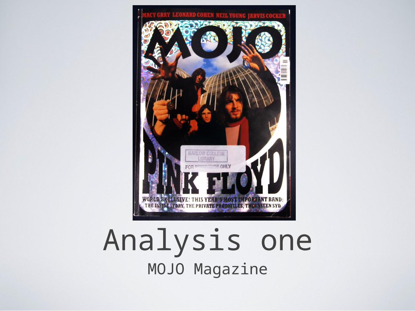
Analysis oneMOJO Magazine
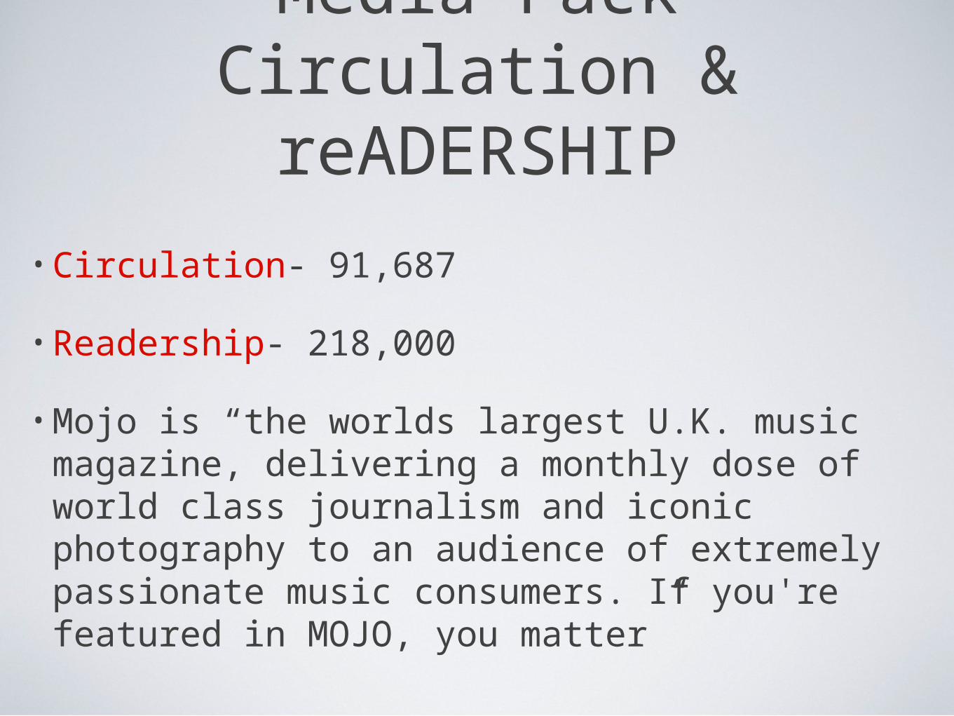
Media PackCirculation & reADERSHIP
• Circulation- 91,687
• Readership- 218,000
• Mojo is “the worlds largest U.K. music magazine, delivering a monthly dose of world class journalism and iconic photography to an audience of extremely passionate music consumers. If you're featured in MOJO, you matter”

Reader Profile
• The Mojo Reader- “John is 37, a passionate and discerning music fan, long time musician himself and dedicated record collector. With his high disposable income, John loves nothing more than sneaking off to the local independent record store to see whats in. John proudly invests in an extensive mixture of vinyl (classics and rarities) CD’s and carries a well stocked iPod that covers everything from nu-folk, Motown, to 60’s garage blues and psychedelia. Johns heros are Bowie and Jimmy Page, he has played guitar since his school days and gets together now and again for a jam with his music pals. A heavy gig goer, he also likes the more “boutique” festival experience, having begun to outgrow Glastonbury, he is now just as likely to head to a smaller scale shindig such as Latitude or Green Man festival.
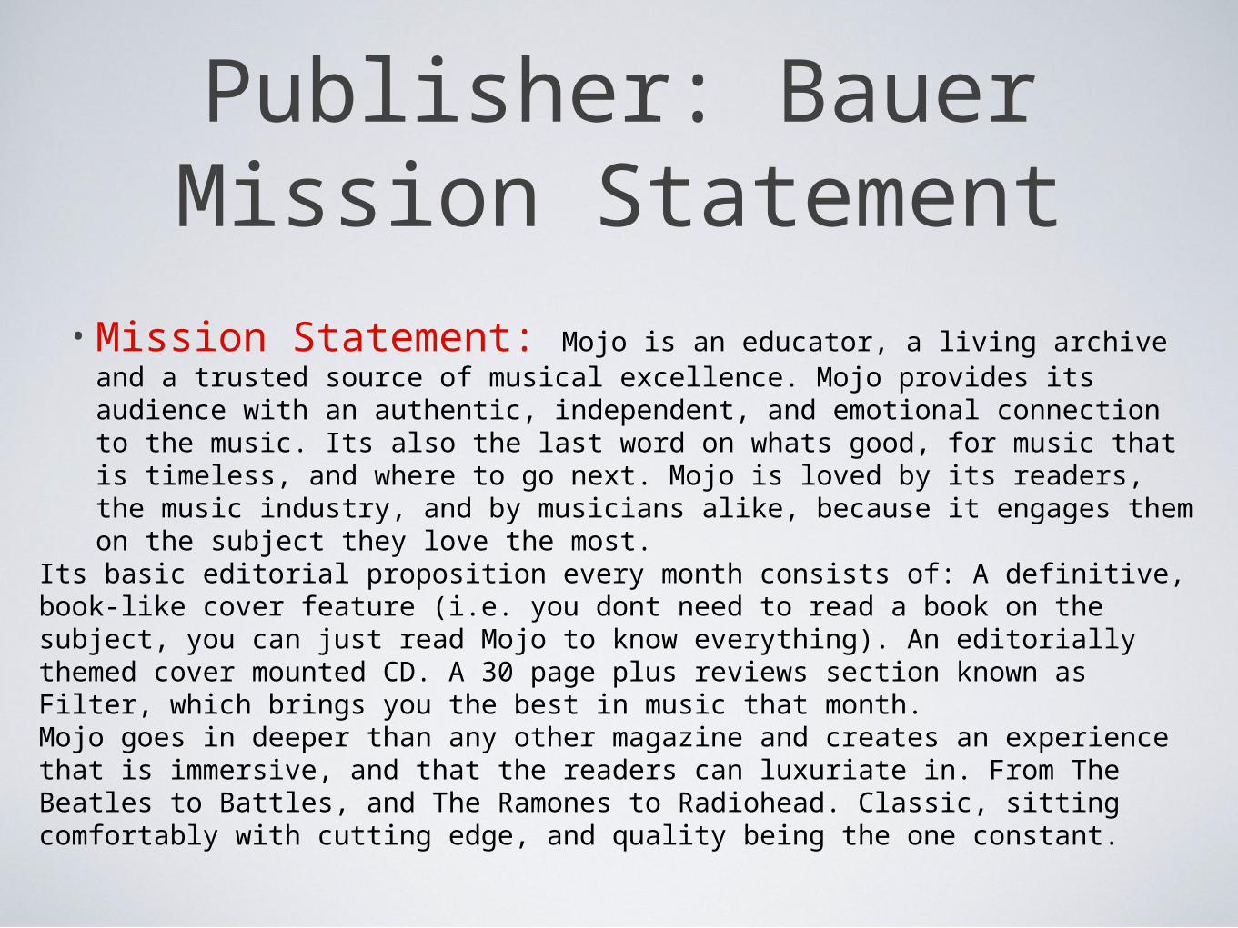
Publisher: Bauer Mission Statement
• Mission Statement: Mojo is an educator, a living archive and a trusted source of musical excellence. Mojo provides its audience with an authentic, independent, and emotional connection to the music. Its also the last word on whats good, for music that is timeless, and where to go next. Mojo is loved by its readers, the music industry, and by musicians alike, because it engages them on the subject they love the most.
Its basic editorial proposition every month consists of: A definitive, book-like cover feature (i.e. you dont need to read a book on the subject, you can just read Mojo to know everything). An editorially themed cover mounted CD. A 30 page plus reviews section known as Filter, which brings you the best in music that month.Mojo goes in deeper than any other magazine and creates an experience that is immersive, and that the readers can luxuriate in. From The Beatles to Battles, and The Ramones to Radiohead. Classic, sitting comfortably with cutting edge, and quality being the one constant.
Extra Information
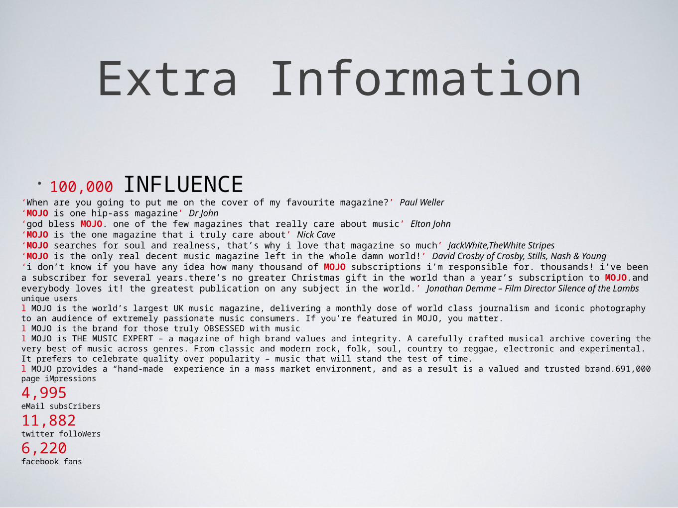
• 100,000 INFLUENCE‘When are you going to put me on the cover of my favourite magazine?’ Paul Weller‘MOJO is one hip-ass magazine’ Dr John‘god bless MOJO. one of the few magazines that really care about music’ Elton John‘MOJO is the one magazine that i truly care about’ Nick Cave‘MOJO searches for soul and realness, that’s why i love that magazine so much’ JackWhite,TheWhite Stripes‘MOJO is the only real decent music magazine left in the whole damn world!’ David Crosby of Crosby, Stills, Nash & Young‘i don’t know if you have any idea how many thousand of MOJO subscriptions i’m responsible for. thousands! i’ve been a subscriber for several years.there’s no greater Christmas gift in the world than a year’s subscription to MOJO.and everybody loves it! the greatest publication on any subject in the world.’ Jonathan Demme – Film Director Silence of the Lambs unique usersl MOJO is the world’s largest UK music magazine, delivering a monthly dose of world class journalism and iconic photography to an audience of extremely passionate music consumers. If you’re featured in MOJO, you matter.l MOJO is the brand for those truly OBSESSED with musicl MOJO is THE MUSIC EXPERT – a magazine of high brand values and integrity. A carefully crafted musical archive covering the very best of music across genres. From classic and modern rock, folk, soul, country to reggae, electronic and experimental. It prefers to celebrate quality over popularity – music that will stand the test of time.l MOJO provides a “hand-made” experience in a mass market environment, and as a result is a valued and trusted brand.691,000page iMpressions
4,995eMail subsCribers
11,882twitter folloWers
6,220facebook fans
mojoFront Cover Analysis
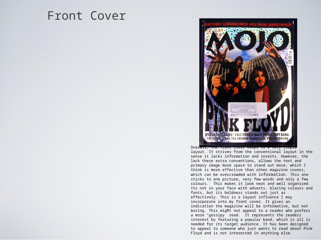
The front cover of this issue of Mojo features psychedelic classic rock band, Pink Floyd. The main image is of the band and bleeds over onto the text. This gives an effect that the band are leaping out of the magazine. This could suggest the magazine will interview the band and bring out their personality more.
The cover consists of one primary image. It strives from conventional magazines as it lacks inserts and cover line towers. However, this gives space to make the text font big and bold.
The Black and Silver colour scheme gives a more formal impression. The lack of complexities and information suggests a more intelligent read.
The strap line is situated conventionally at the top of the cover. However, with this magazine it is at the bottom. This is unconventional, but it means the main image is not spoiled, it remains bold and eye catching. In contrast to the black background, the font is coloured red, making it stand out more. Although in a smaller font than the title, its just as noticeable being the only piece coloured text on the page. The Title “Pink Floyd” arches inwards. This creates an effect like theres a whole in the magazine. It suggests that pink floyd (the subject band in the main image) are literally inside the magazine. The circular style of the image makes your eyes look around the band members as well as the text.
Written codes such as “the unseen Syd” suggests the magazine is going to reveal something about the bands singer which isn't well known. It is the last piece of text you read, but probably one of the most persuasive codes to get you to read on. In some ways its positioning is effective in persuading the reader to read more, although its not as eye catching as other aspects of the cover, its a cover line which the reader may remember.
The members of the band appear to be reaching out of the image, like they are reaching out to the audience. There faces are unconcealed making them instantly recognisable to their fans. The shot is a low angle mid shot of the band, which has been digitally manipulated so their hands bleed out of the main image, this makes them appear to be reaching out of the magazine. The shot is also been distorted using a “fisheye” to connote hallucination. The band are posed in a strange position, suggesting drug use and psychedelia also. Again, the shiny front cover can also be interoperated as being a hallucination.
The brand name MOJO, and the title Pink Floyd” are almost the same size in font. This suggests MOJO are as powerful as the band, that they are strongly linked and have a connection with them, when in reality they do not. It anchors Mojo to Pink Floyd. Like the strap line, the main cover line and title stand out from the background colour. The black font contrasts the shiny silver background, thus making it stand out further.Text is kept in unjoined serif capitols for quicker reading. Its font and boldness make the cover noticeable.
effectively. This is a layout influence I may incorporate into my front cover. It gives an indication the magazine will be informative, but not boring. This might not appeal to a reader who prefers a more “gossipy” read. It represents the readers interest by featuring a popular band, which is all is needed for its target audience. It has been designed to appeal to someone who just wants to read about Pink Floyd and is not interested in anything else.
Front Cover
Overall, the front cover keeps to a very simple layout. It strives from the conventional layout in the sense it lacks information and inserts. However, the lack these extra conventions, allows the text and primary image more space to stand out more, which I think is more effective than other magazine covers, which can be overcrowded with information. This one sticks to one picture, very few words and only a few colours. This makes it look neat and well organised. Its not in your face with adverts, blaring colours and fonts, but its boldness stands out just as effectively. This is a layout influence I may incorporate into my front cover. It gives an indication the magazine will be informative, but not boring. This might not appeal to a reader who prefers a more “gossipy” read. It represents the readers interest by featuring a popular band, which is all is needed for its target audience. It has been designed to appeal to someone who just wants to read about Pink Floyd and is not interested in anything else.
MOJOContents Page
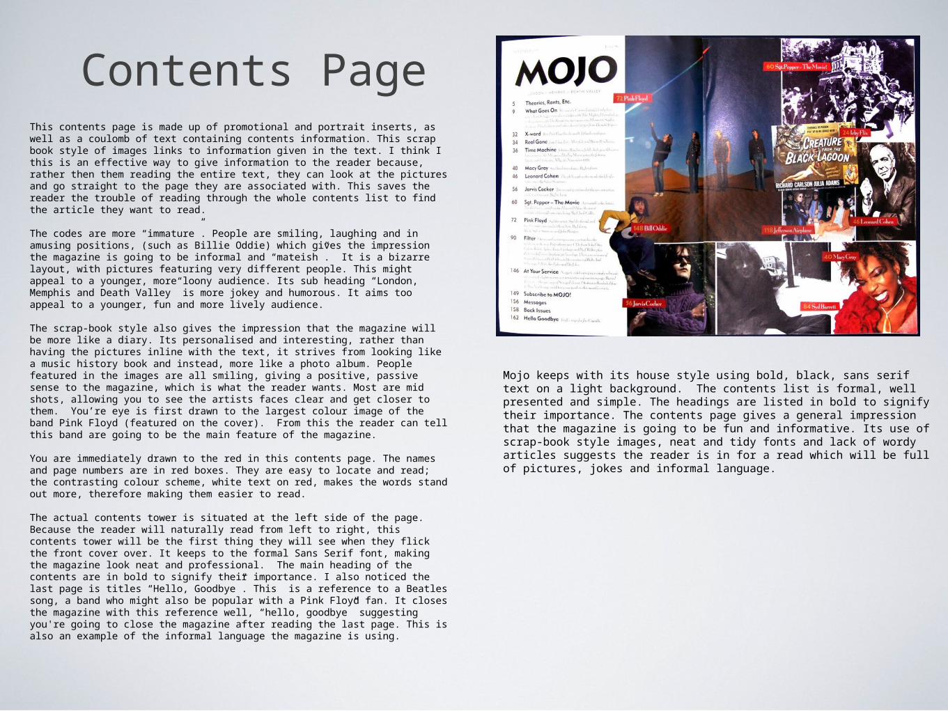
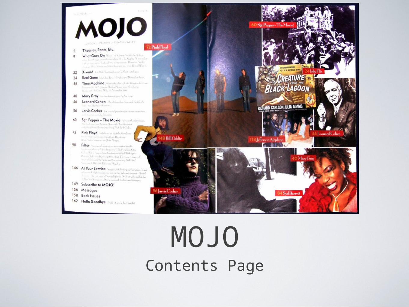
Contents PageThis contents page is made up of promotional and portrait inserts, as well as a coulomb of text containing contents information. This scrap book style of images links to information given in the text. I think I this is an effective way to give information to the reader because, rather then them reading the entire text, they can look at the pictures and go straight to the page they are associated with. This saves the reader the trouble of reading through the whole contents list to find the article they want to read.
The codes are more “immature”. People are smiling, laughing and in amusing positions, (such as Billie Oddie) which gives the impression the magazine is going to be informal and “mateish”. It is a bizarre layout, with pictures featuring very different people. This might appeal to a younger, more loony audience. Its sub heading “London, Memphis and Death Valley” is more jokey and humorous. It aims too appeal to a younger, fun and more lively audience.
The scrap-book style also gives the impression that the magazine will be more like a diary. Its personalised and interesting, rather than having the pictures inline with the text, it strives from looking like a music history book and instead, more like a photo album. People featured in the images are all smiling, giving a positive, passive sense to the magazine, which is what the reader wants. Most are mid shots, allowing you to see the artists faces clear and get closer to them. You’re eye is first drawn to the largest colour image of the band Pink Floyd (featured on the cover). From this the reader can tell this band are going to be the main feature of the magazine.
You are immediately drawn to the red in this contents page. The names and page numbers are in red boxes. They are easy to locate and read; the contrasting colour scheme, white text on red, makes the words stand out more, therefore making them easier to read.
The actual contents tower is situated at the left side of the page. Because the reader will naturally read from left to right, this contents tower will be the first thing they will see when they flick the front cover over. It keeps to the formal Sans Serif font, making the magazine look neat and professional. The main heading of the contents are in bold to signify their importance. I also noticed the last page is titles “Hello, Goodbye”. This is a reference to a Beatles song, a band who might also be popular with a Pink Floyd fan. It closes the magazine with this reference well, “hello, goodbye” suggesting you're going to close the magazine after reading the last page. This is also an example of the informal language the magazine is using.
Mojo keeps with its house style using bold, black, sans serif text on a light background. The contents list is formal, well presented and simple. The headings are listed in bold to signify their importance. The contents page gives a general impression that the magazine is going to be fun and informative. Its use of scrap-book style images, neat and tidy fonts and lack of wordy articles suggests the reader is in for a read which will be full of pictures, jokes and informal language.
MOJODouble Page Spread
Double Page Spread
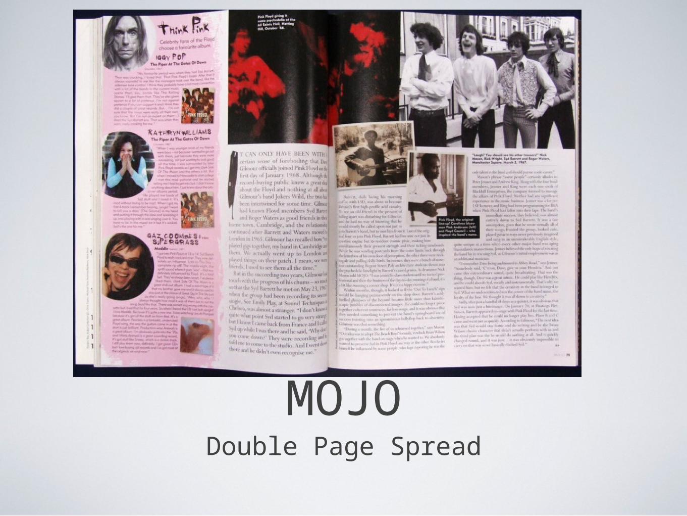
This is a double page spread from the Mojo magazine. It features around the same band as the front cover; “Pink Floyd”. The double page spread relates to the bands name in its colour scheme because a section of the text has been background coloured pink. This signifies this part of the double page spread as important. This section features celebrities giving their opinions on Pink Floyd Albums. The spread features inserts in a scrap-book style in the middle of the page. This is a similar layout as the images on the contents page, therefore keeping to the house style of the magazine.
The main image features the band back in 1960, in old suites and long hair. This image will be interesting to the reader because it represents the time period associated with their preferred style of music.
The majority of the shots are close ups, which show just the face of the celebrity. This could be used to help the reader see their expression and opinion about the band more clearly. The close ups show the celebrities smiling, suggesting they like the band. One picture has been digitally manipulated to have just red and black in its saturation. This “duo tone” effect suggests the hallucinogenic, drug like music pink floyd creates, similar to the front cover. Personally, although I think the connotations behind this image are clever, the picture doesn't look particularly good in the middle of the double page spread. Its too dark and you cannot see the bands faces clearly. I think this image could be more effective if it were brighter. However, it is one of the first images your eye is drawn too. The red and black contrast greatly, making the picture stand out. As it is situated at the top- middle the page and is also the largest image, it is the most eye catching. The other pictures are places diagonally across the page from this red and black picture. They descend and decrease in size. This makes your eye flow from the bigger picture, to the smaller ones of the man playing a guitar. Essentially, getting the reader to look across both pages. This coffee book style is vibrant, fun and alive, reflecting the target reader.
The Body Copy starts with a drop cap on the word “It”. The sentence then continues in capital letters before returning to a smaller font in normal capitals. The font style of the “I” looks as though its been painted into the text. This could connote the music pink floyd makes as being a work of art. This presentational writing technique draws the reader to read on because after they've read the more clearer, capitol font text , they are already captivated by the subject or story and will find themselves reading the whole article.
The main body ends with a conventional end blob. It represents an arrow, pointing towards the next page. This could encourage the reader to turn the page and continue reading the magazine.
It also incorporates conventional side bars, which relate to the main body and the inserts. The black box with white text is a sidebar which draws your focus from the text. This is because its been positioned in the middle of the page and differentiates the colour of the main text and background.
The article continues to use informal language, such as “Pink Floyd Giving it some psychedelia” to talk to its reader more like a mate, than a journalist, keeping the read friendly and informal
Overall, this double page spread has both strengths and weaknesses to its layout. The use of written codes, such as drop caps, font styles and capitols draw the reader to read on. The layout of pictures is effective in drawing the readers eye across the page. Close ups on celebrities help the reader get closer and understand their opinions on the band through more visible facial expression. And finally, house colour styles such as the use of pink, helps to tell the reader what band the article is focusing on. However, the spread is very wordy, which may put some readers off. Also one of the main pictures is too dark, some readers might not be able to decipher what the image is about, hence making it a waste of valuable space. I will make sure that my images are clear and bright for my magazine, but keep in mind an effective layout. The layout of the images in this double page spread is effective in drawing the readers eye across the page.
ANALYSIS TWOUNCUT Magazine
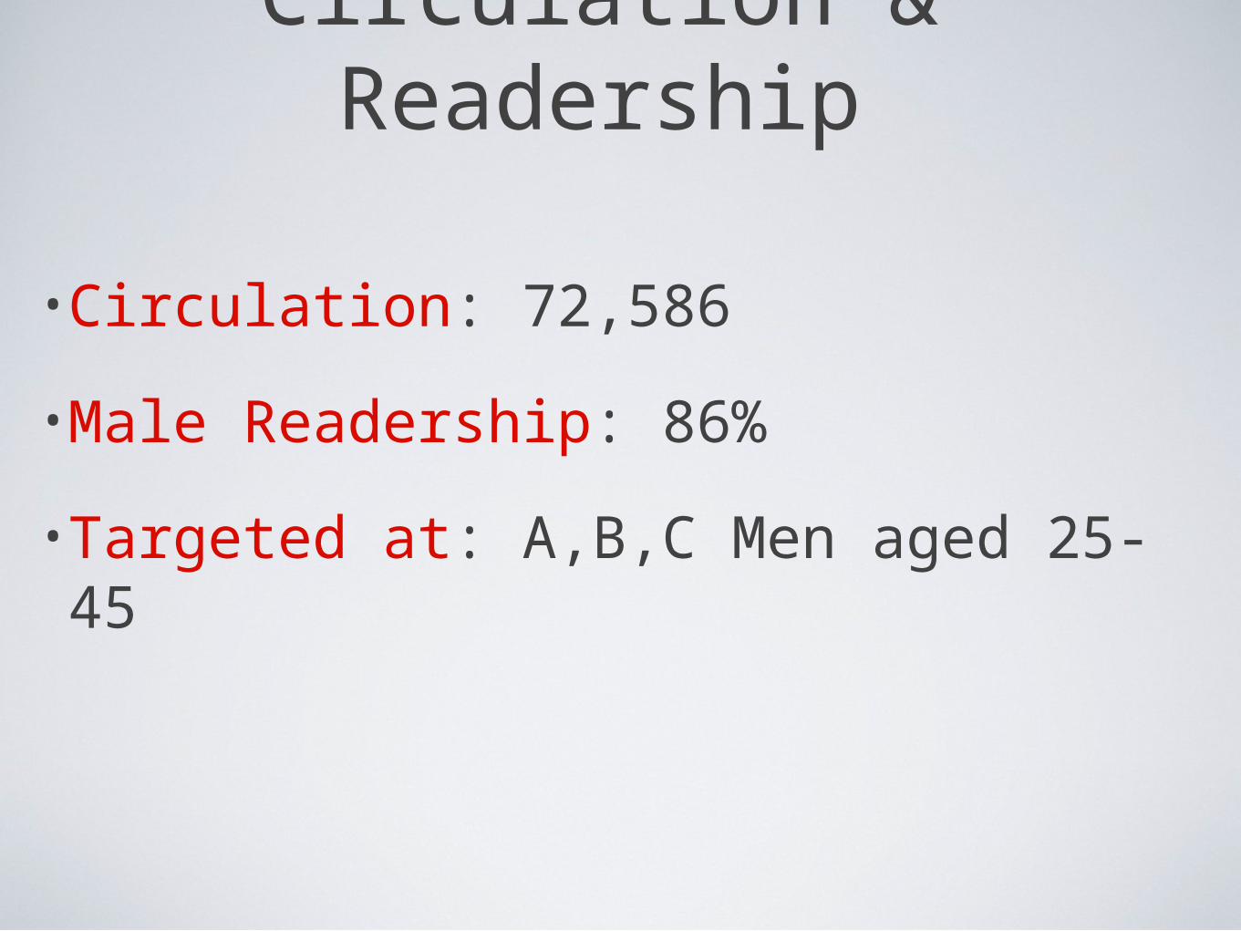
Circulation & Readership
•Circulation: 72,586
•Male Readership: 86%
•Targeted at: A,B,C Men aged 25-45
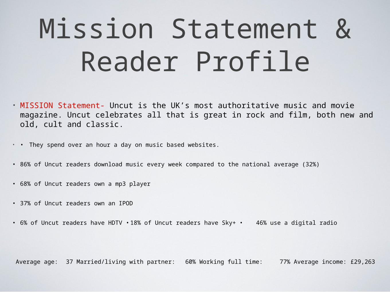
Mission Statement & Reader Profile
• MISSION Statement- Uncut is the UK’s most authoritative music and movie magazine. Uncut celebrates all that is great in rock and film, both new and old, cult and classic.
• • They spend over an hour a day on music based websites.
• 86% of Uncut readers download music every week compared to the national average (32%)
• 68% of Uncut readers own a mp3 player
• 37% of Uncut readers own an IPOD
• 6% of Uncut readers have HDTV • 18% of Uncut readers have Sky+ • 46% use a digital radio
Average age: 37 Married/living with partner: 60% Working full time: 77% Average income: £29,263
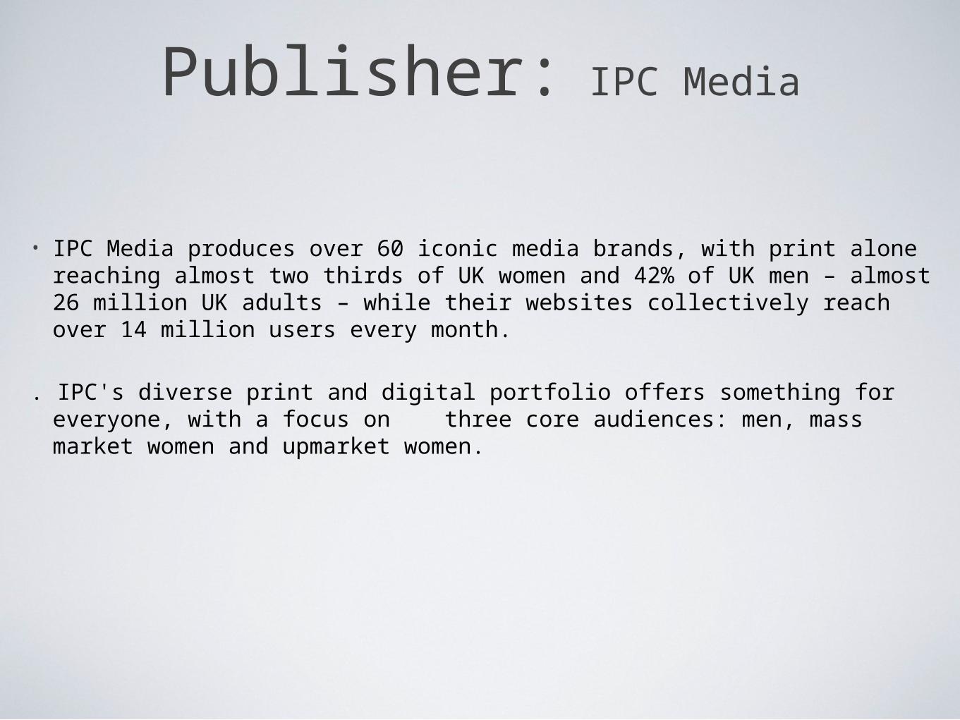
Publisher: IPC Media
• IPC Media produces over 60 iconic media brands, with print alone reaching almost two thirds of UK women and 42% of UK men – almost 26 million UK adults – while their websites collectively reach over 14 million users every month.
. IPC's diverse print and digital portfolio offers something for everyone, with a focus on three core audiences: men, mass market women and upmarket women.
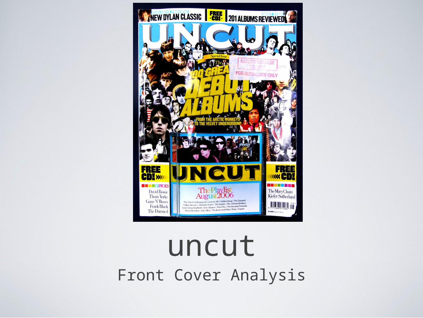
uncutFront Cover Analysis

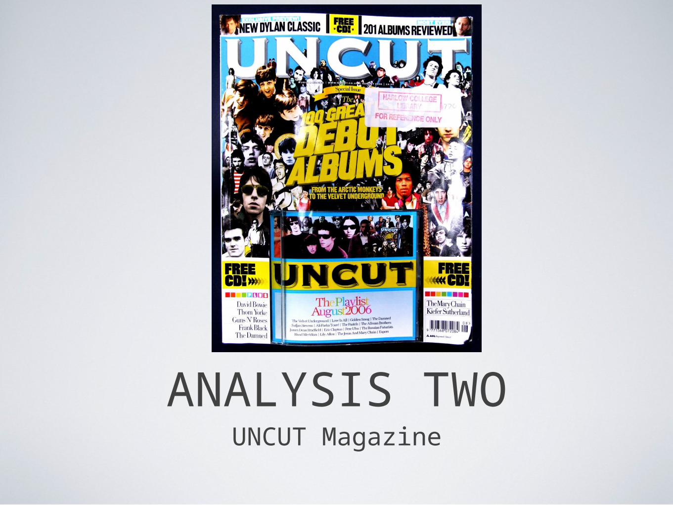
Front CoverThe music industry is under financial pressure. It cannot effectively respond to the new digital age. However, magazines continue to remain popular, as a mobile source of entertainment. For this reason, the magazine front cover must be visual picture full. It should have a non-linear storyline, allowing the reader to “dip” into the magazine for a few minuets. This cover promises hours of interesting “bits” for the reader to dip into. The title is across the full banner, and the name “UNCUT” is short. These are tow conventional aspects of a magazine cover. The name itself “UNCUT” suggests the magazine is offering raw, unedited information.
The main image, or collection of images features no one, key band. It looks almost like the Beatles Sergeant. Peppers Lonely Hearts album cover, which some people might relate to when they see this. The artists featured on this cover are very different, yet UNCUT has grouped them all together and are suggesting they are under one genre. This suggests the magazine is going to be varied and span to every side of rock music. It is its own advert, it promises excitement, pro mo puffs, pictures and coolers.
The slightly serif title promises a more weighty read. It offers a free piece of merchandise, a CD which is entitled “THE playlist August 2006”” This suggests the magazine are credible and authorial by stated “THE” playlist, like its he only one, and by reviewing, like they know whats best
.By incorporating many artists onto the front cover, uncut will be appealing to a larger audience. More people will be able to relate to the magazine; for example, some may see Jimi Hendrix and by the magazine because they listen to his music. Whereas someone else may like the Beatles, and buy it because they appear. This is a clever way of appealing to lots of different people. To help more popular artists stand out, their photos have been coloured and are larger in size, whereas less well known artists are in black and white. The Beatles and The Who have a huge fan base, so by using coloured images in contrast to black and white helps them to stand out more. Having more popular bands stand out over less popular artists, helps to reach a mass audience more effectively. Once the reader has found an artist they like on the cover, they may be encouraged to look for more and study the cover closer. If they do this, the magazine has effectively engaged and interested the reader.
The majority of these images lack yellow in their saturation. This helps to bright yellow text to stand out from the compiled mess of pictures and making it easier to read. You can tell that the house style of this magazine will stick to large, sans serif, bold font. Yellow is the most present colour, followed by black and white. I would expect the rest of the magazine to incorporate this colour scheme and this style of text throughout all its articles. The use of yellow connoted excitement and escape from dull society.
I like this layout, however it might be too complex and the reader may struggle to see whats going on in the cover. It may be too crowded with faces and the readers eye could be easily drawn to a more simple and bold magazine cover, such as the Mojo cover I presented.
UNCUTContents Page
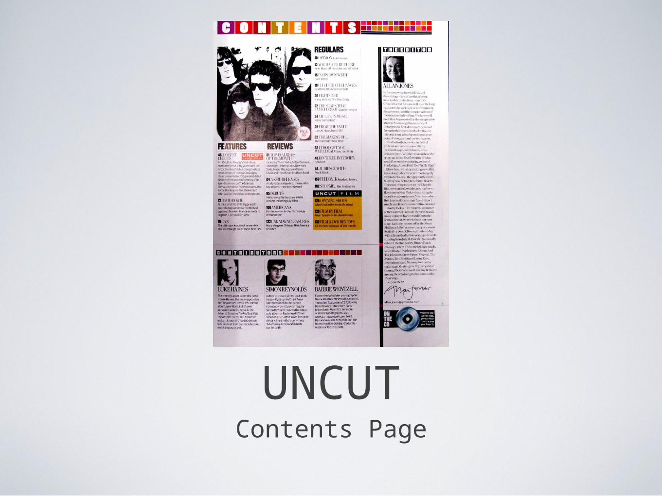
Contents PageHere is the contents page of the issue of UNCUT I have been analysing. unlike the contents page of MOJO, this one is much more formal. Its set out almost like a newspaper, and is pretending to be informative. Its images and text are black and white. This follows the black and white code, which gives the contents page a serious tone, pulls it together and makes it look informative and news worthy. The text is set out in columns, like articles in a news paper. There is coherence between the images, all looking black and white. The primary image features an old band, suggesting its trying to appeal to a target audience who are older.
It seems to be more dedicated to music, despite being a film and music magazine. The articles list “features, reviews and regulars” on music, and the film section is left a small and boxed in. However, it has been coloured yellow, to help it stand out and differ to the rest of the page.
The mosaic tile style is one of the only aspects of decoration on the page. The colours are muted and faded. This could reflect an older reader who is more mature and doesn't want to look at bright blaring colours. The colours could be described as “tasteful”tones of brighter colours..
It offers reviews for both old and modern bands, thus bridging the two. This suggests the magazine will be varied and diverse. The editorial, by Allen Jones is very long and takes up lots of space. This suggests that the editor has a lot to say, and knows 2what he’s talking about. Thus assuming the reader will not be put off or enjoys reading lots of words. His mode of address is in a formative manner, saying “we, our, ect” to bring the reader into his community. He talks to the reader on the same level as him, making the reader feel accepted and intelligent. This aspect comes under the uses and gratifications theory. The reader is interacting socially through music and is identifying with the magazine, and with Allen Jones.
The editors are all male, suggesting its more of a “blokes” magazine. Allen Jones has even sighed the editorial,to show his approval of the magazine and the authority which he has in it.
Overall, the contents page gives the impressions the magazine will be intellectual, informative and newsworthy. It is set out like a magazine with columns and black and white pictures to suggest it is factual and truthful. The magazine is aiming at an older target audience by featuring old bands, keeping colours and fancy decorations limited and by having a large quantity of words.
UNCUTDouble Page Spread
Double page spread
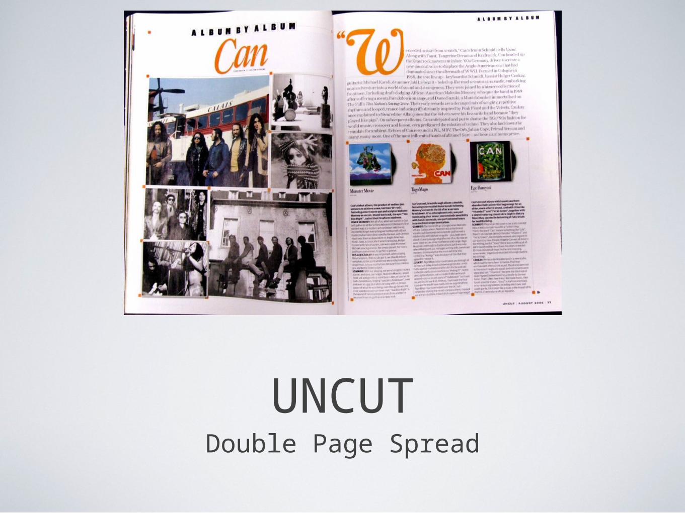
Here is the double page spread from the UNCUT magazine I have been analyzing. A huge proportion, almost 2/3s of the double page spread is dedicated to images. This makes the spread very visual. The images are of an old psychedelic rock band CAN. The pictures seem almost nostalgic in the sense the are laid out out in a scrap book style, with small orange squares that look like tape to stick the photographs down with. This gives the design a DIY dairy style and a personal attachment to the topic. The heading ‘Album by Album’ uses a cut-out font in line with the overall layout theme and suggests a comprehensive commentary about the band’s career and is essentially an ‘uncut’ report on the band. The use of orange font on both pages leads the eye fro one to the other, where the body text starts with a quote from one of the band members. This is an important way to signify credibility in the writing as it is based on an interview with the band. The writing mentions many diverse names and dates and influences, etc. as if the reader should know them. This is an important mode of address s it speaks up to the reader who will be pleasured by this positioning.
The images are of CAN being free spirits, experimenting with life, pulling strange poses, long hair and traveling in trams. They are wacky and unusual. The typical reader, who is probably too young to have listened to the band originally, will not be like this themselves. They will look at this magazine and escape into the world CAN are in and perhaps can share CAN’s lifestyle in a pleasurable for to be like them. The audience might use this article to gratify the need for escapism. This is why the pictures might seem nostalgic, or sentimental because they show a world and a type of music very different to that of today’s. It’s a place were the reader may become nostalgic, particularly if they are an older reader, who the magazine is targeted at. They represent a time when music was more experimental, less corporate and manufactured.
The layout, like the contents page, remains simple. It keeps with the house style of looking like a newspaper by writing in columns. This again, suggests the magazine has authority and is journalistic.
It is unconventional in that it doesn't make use of the corners. These are hotspots throughout the magazine because they are the first part of the page a reader will see, especially when flicking through.