cpsc 340: machine learning and data miningshafaei/homepage/courses/340s20/slides/l2.pdfdata mining:...
TRANSCRIPT

CPSC 340:Machine Learning and Data Mining
Data ExplorationSummer 2020
This lecture roughly follow:http://www-users.cs.umn.edu/~kumar/dmbook/dmslides/chap2_data.pdf
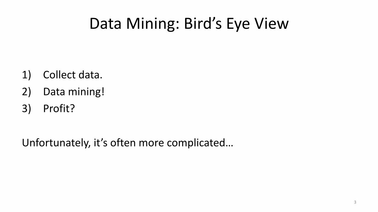
Data Mining: Bird’s Eye View
1) Collect data.2) Data mining!3) Profit?
Unfortunately, it’s often more complicated…
3
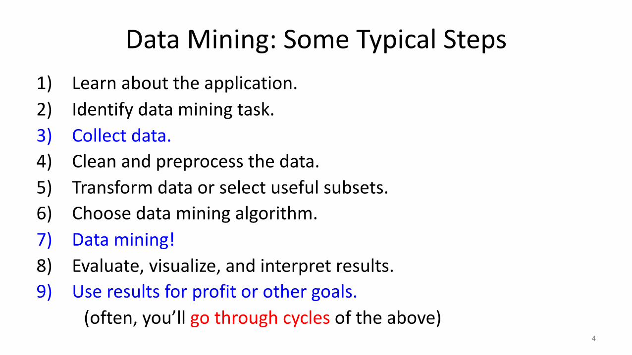
Data Mining: Some Typical Steps1) Learn about the application.2) Identify data mining task.3) Collect data.4) Clean and preprocess the data.5) Transform data or select useful subsets.6) Choose data mining algorithm.7) Data mining!8) Evaluate, visualize, and interpret results.9) Use results for profit or other goals.
(often, you’ll go through cycles of the above)4

Data Mining: Some Typical Steps1) Learn about the application.2) Identify data mining task.3) Collect data.4) Clean and preprocess the data.5) Transform data or select useful subsets.6) Choose data mining algorithm.7) Data mining!8) Evaluate, visualize, and interpret results.9) Use results for profit or other goals.
(often, you’ll go through cycles of the above)5

What is Data?• We’ll define data as a collection of examples, and their features.
• Each row is an “example”, each column is a “feature”.– Examples are also sometimes called “samples”.
Age Job? City Rating Income
23 Yes Van A 22,000.0023 Yes Bur BBB 21,000.0022 No Van CC 0.0025 Yes Sur AAA 57,000.0019 No Bur BB 13,500.0022 Yes Van A 20,000.0021 Yes Ric A 18,000.00
6

Types of Data• Categorical features come from an unordered set:– Binary: job?– Nominal: city.
• Numerical features come from ordered sets:– Discrete counts: age.– Ordinal: rating.– Continuous/real-valued: height.
7

Converting to Numerical Features• Often want a real-valued example representation:
• This is called a “1 of k” encoding.• We can now interpret examples as points in space:– E.g., first example is at (23,1,0,0,22000).
Age City Income
23 Van 22,000.0023 Bur 21,000.0022 Van 0.0025 Sur 57,000.0019 Bur 13,500.0022 Van 20,000.00
Age Van Bur Sur Income
23 1 0 0 22,000.0023 0 1 0 21,000.0022 1 0 0 0.0025 0 0 1 57,000.0019 0 1 0 13,500.0022 1 0 0 20,000.00
8

Approximating Text with Numerical Features• Bag of words replaces document by word counts:
• Ignores order, but often captures general theme.• You can compute a “distance” between documents.
The International Conference on Machine Learning (ICML) is the leading international academic conference in machine learning
ICML International Conference Machine Learning Leading Academic
1 2 2 2 2 1 1
9
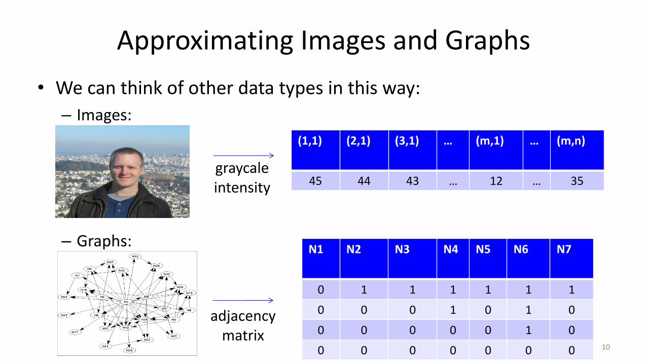
Approximating Images and Graphs• We can think of other data types in this way:– Images:
– Graphs:
(1,1) (2,1) (3,1) … (m,1) … (m,n)
45 44 43 … 12 … 35
N1 N2 N3 N4 N5 N6 N7
0 1 1 1 1 1 10 0 0 1 0 1 00 0 0 0 0 1 00 0 0 0 0 0 0
graycaleintensity
adjacency matrix
10

Data Cleaning• ML+DM typically assume ‘clean’ data.• Ways that data might not be ‘clean’:– Noise (e.g., distortion on phone).– Outliers (e.g., data entry or instrument error).– Missing values (no value available or not applicable)– Duplicated data (repetitions, or different storage formats).
• Any of these can lead to problems in analyses.– Want to fix these issues, if possible.– Some ML methods are robust to these.– Often, ML is the best way to detect/fix these.
11

The Question I Hate the Most…• How much data do we need?
• A difficult if not impossible question to answer.
• My usual answer: “more is better”.– With the warning: “as long as the quality doesn’t suffer”.
• Another popular answer: “ten times the number of features”.
12
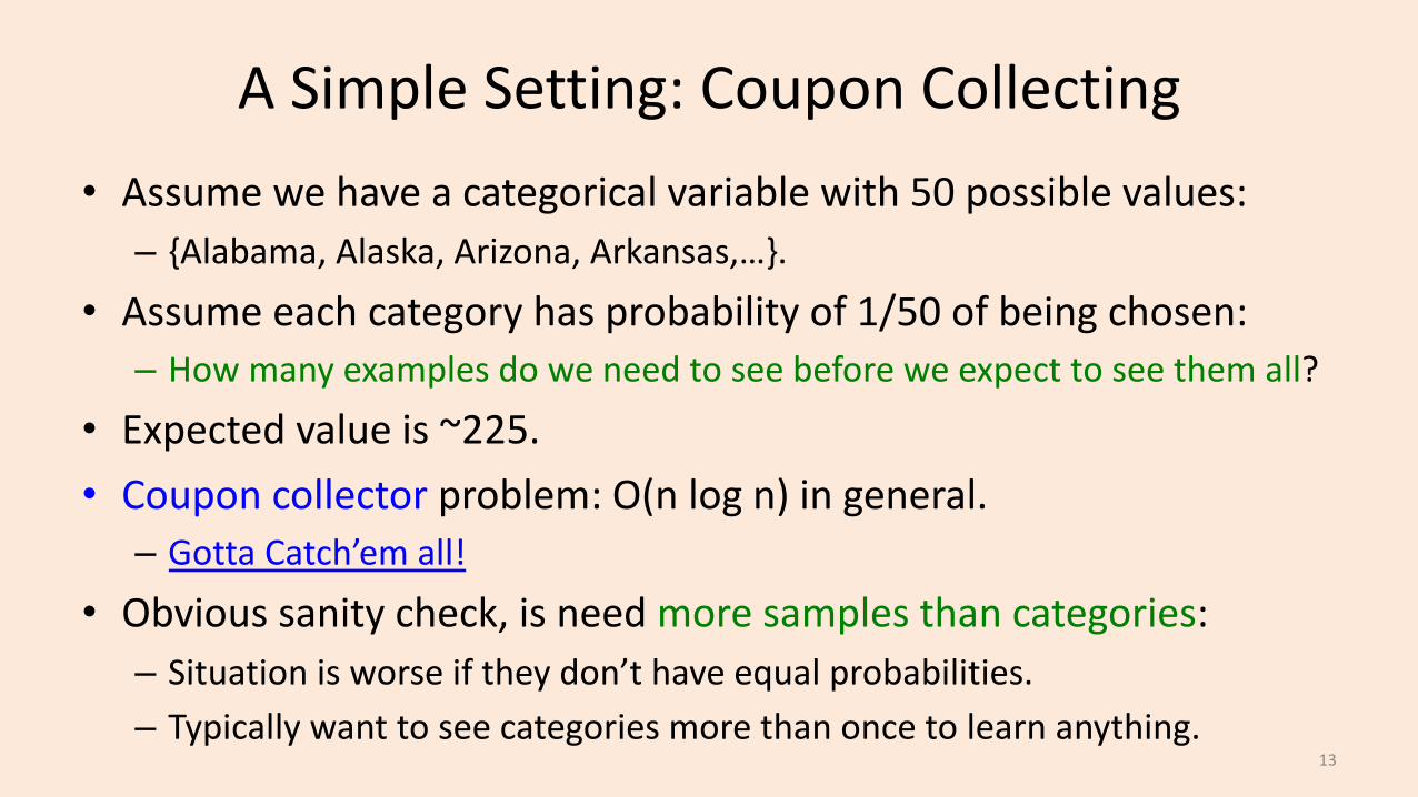
A Simple Setting: Coupon Collecting• Assume we have a categorical variable with 50 possible values:– {Alabama, Alaska, Arizona, Arkansas,…}.
• Assume each category has probability of 1/50 of being chosen:– How many examples do we need to see before we expect to see them all?
• Expected value is ~225.• Coupon collector problem: O(n log n) in general.– Gotta Catch’em all!
• Obvious sanity check, is need more samples than categories:– Situation is worse if they don’t have equal probabilities.– Typically want to see categories more than once to learn anything.
13

Feature Aggregation• Feature aggregation:– Combine features to form new features:
• Fewer province “coupons” to collect than city “coupons”.
BC AB
1 01 01 00 10 11 0
Van Bur Sur Edm Cal
1 0 0 0 00 1 0 0 01 0 0 0 00 0 0 1 00 0 0 0 10 0 1 0 0
14

Feature Selection• Feature Selection:– Remove features that are not relevant to the task.
– Student ID is probably not relevant.
SID: Age Job? City Rating Income
3457 23 Yes Van A 22,000.00
1247 23 Yes Bur BBB 21,000.00
6421 22 No Van CC 0.001235 25 Yes Sur AAA 57,000.00
8976 19 No Bur BB 13,500.00
2345 22 Yes Van A 20,000.00
15
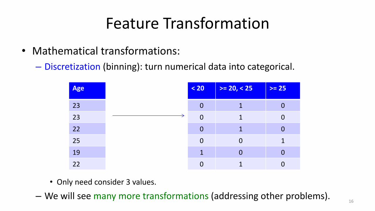
Feature Transformation• Mathematical transformations:– Discretization (binning): turn numerical data into categorical.
• Only need consider 3 values.
– We will see many more transformations (addressing other problems).
Age
232322251922
< 20 >= 20, < 25 >= 25
0 1 00 1 00 1 00 0 11 0 00 1 0
16

(pause)

Exploratory Data Analysis• You should always ‘look’ at the data first.
• But how do you ‘look’ at features and high-dimensional examples?– Summary statistics.– Visualization.– ML + DM (later in course).
18

Categorical Summary Statistics• Summary statistics for a categorical feature:– Frequencies of different classes.– Mode: category that occurs most often.– Quantiles: categories that occur more than t times.
Frequency: 13.3% of Canadian residents live in BC.Mode: Ontario has largest number of residents (38.5%)Quantile: 6 provinces have more than 1 million people.
19

Continuous Summary Statistics• Measures of location for continuous features:– Mean: average value.– Median: value such that half points are larger/smaller.– Quantiles: value such that ‘k’ fraction of points are larger.
• Measures of spread for continuous features:– Range: minimum and maximum values.– Variance: measures how far values are from mean.
• Square root of variance is “standard deviation”.
– Intequantile ranges: difference between quantiles.20

Continuous Summary Statistics• Data: [0 1 2 3 3 5 7 8 9 10 14 15 17 200]• Measures of location:–Mean(Data) = 21–Mode(Data) = 3–Median(Data) = 7.5– Quantile(Data,0.5) = 7.5– Quantile(Data,0.25) = 3– Quantile(Data,0.75) = 14
• Measures of spread:– Range(Data) = [0 200].– Std(Data) = 51.79– IQR(Data,.25,.75) = 11
• Notice that mean and std are more sensitive to extreme values (“outliers”).21
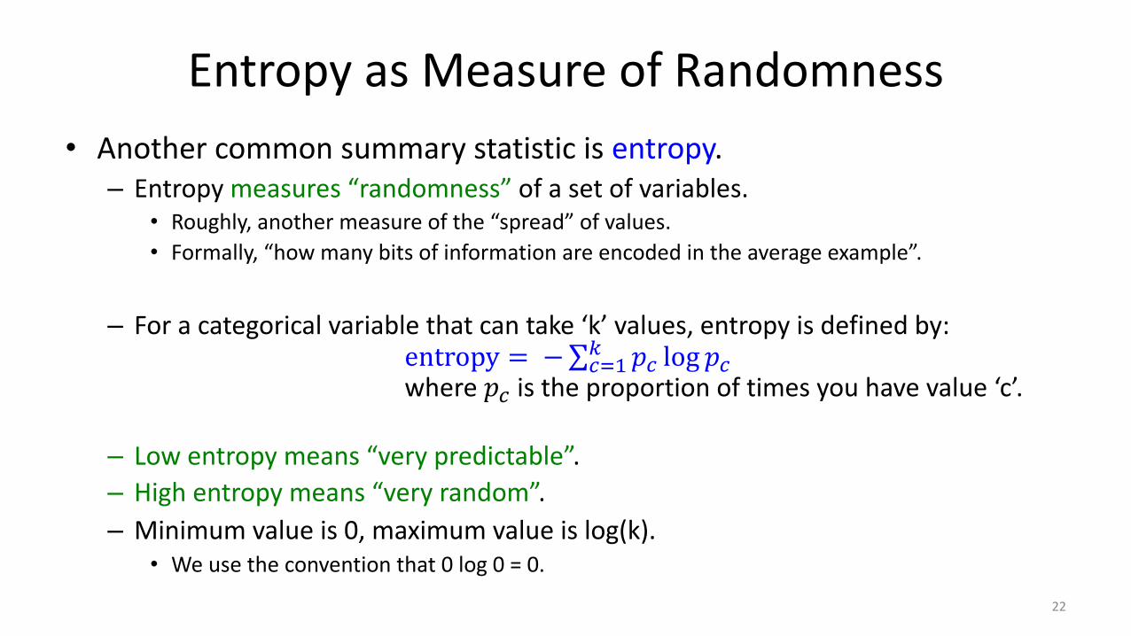
Entropy as Measure of Randomness• Another common summary statistic is entropy.– Entropy measures “randomness” of a set of variables.
• Roughly, another measure of the “spread” of values.• Formally, “how many bits of information are encoded in the average example”.
– For a categorical variable that can take ‘k’ values, entropy is defined by:entropy = −∑+,-. 𝑝+ log 𝑝+where 𝑝+ is the proportion of times you have value ‘c’.
– Low entropy means “very predictable”.– High entropy means “very random”.– Minimum value is 0, maximum value is log(k).
• We use the convention that 0 log 0 = 0.
22
Entropy as Measure of Randomness
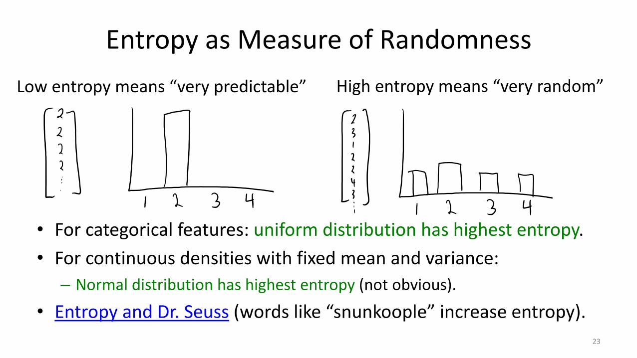
• For categorical features: uniform distribution has highest entropy.• For continuous densities with fixed mean and variance:– Normal distribution has highest entropy (not obvious).
• Entropy and Dr. Seuss (words like “snunkoople” increase entropy).
Low entropy means “very predictable” High entropy means “very random”
23
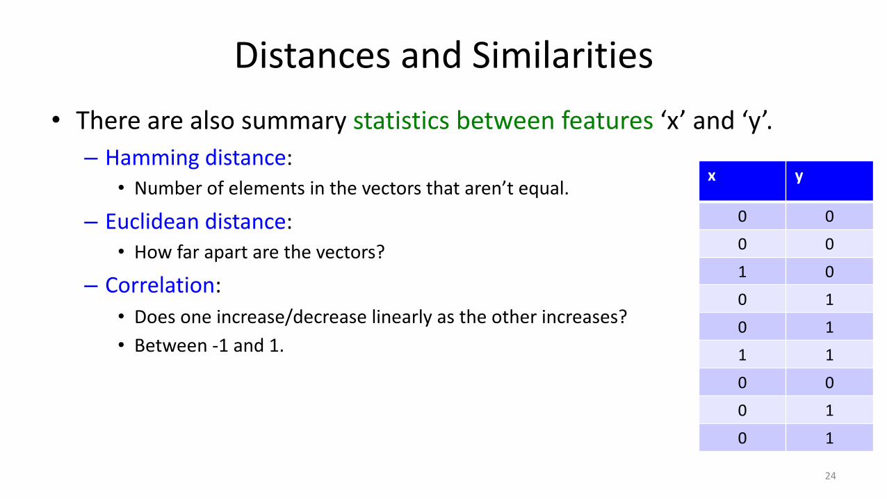
Distances and Similarities• There are also summary statistics between features ‘x’ and ‘y’.– Hamming distance:
• Number of elements in the vectors that aren’t equal.
– Euclidean distance:• How far apart are the vectors?
– Correlation:• Does one increase/decrease linearly as the other increases?• Between -1 and 1.
x y
0 00 01 00 10 11 10 00 10 1
24
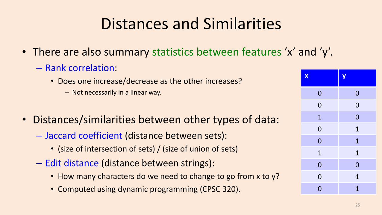
Distances and Similarities• There are also summary statistics between features ‘x’ and ‘y’.– Rank correlation:
• Does one increase/decrease as the other increases?– Not necessarily in a linear way.
• Distances/similarities between other types of data:– Jaccard coefficient (distance between sets):
• (size of intersection of sets) / (size of union of sets)
– Edit distance (distance between strings):• How many characters do we need to change to go from x to y?• Computed using dynamic programming (CPSC 320).
x y
0 00 01 00 10 11 10 00 10 1
25
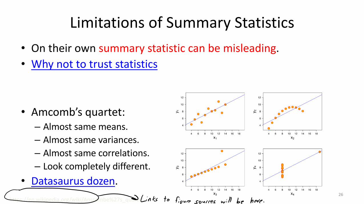
Limitations of Summary Statistics• On their own summary statistic can be misleading.• Why not to trust statistics
• Amcomb’s quartet:– Almost same means.– Almost same variances.– Almost same correlations.– Look completely different.
• Datasaurus dozen.https://en.wikipedia.org/wiki/Anscombe%27s_quartet
26

(pause)

Visualization• You can learn a lot from 2D plots of the data:– Patterns, trends, outliers, unusual patterns.
Lat Long Temp0 0 30.10 1 29.80 2 29.90 3 30.10 4 29.9… … …
vs.
https://en.wikipedia.org/wiki/Temperature28

Basic Plot• Visualize one variable as a function of another.
• Fun with plots.
http://notunlikeresearch.typepad.com/something-not-unlike-rese/2011/01/more-on-violent-rhetoric-media-violence-and-actual-violence.html
29

Histogram• Histograms display distribution of a variable.
http://www.statcrunch.com/5.0/viewresult.php?resid=102458130
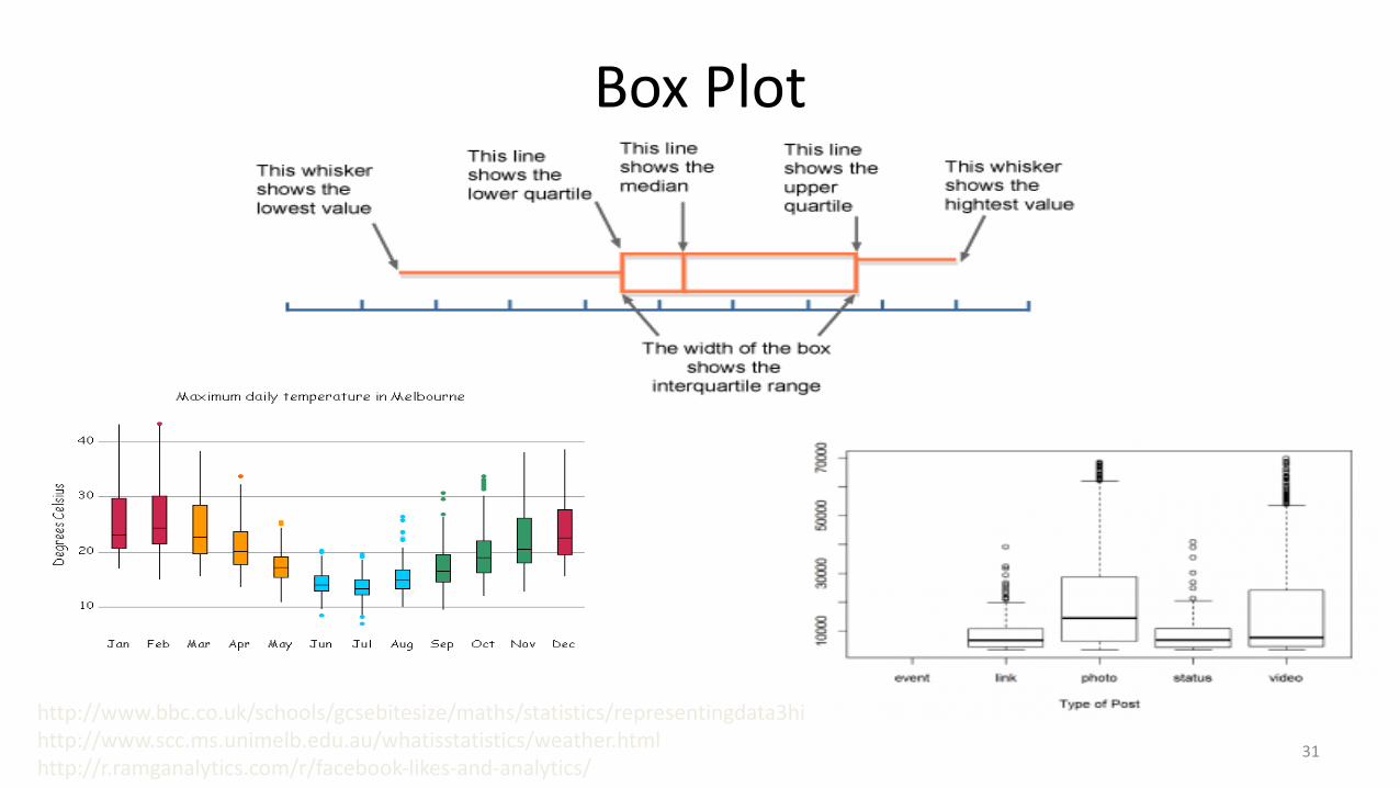
Box Plot
http://www.bbc.co.uk/schools/gcsebitesize/maths/statistics/representingdata3hirev6.shtmlhttp://www.scc.ms.unimelb.edu.au/whatisstatistics/weather.htmlhttp://r.ramganalytics.com/r/facebook-likes-and-analytics/
31

Box Plot• Photo from CTV Olympic coverage in 2010:
32

Matrix Plot• We can view (examples) x (features) data table as a picture:– “Matrix plot”.– May be able to see trends
in features.
33
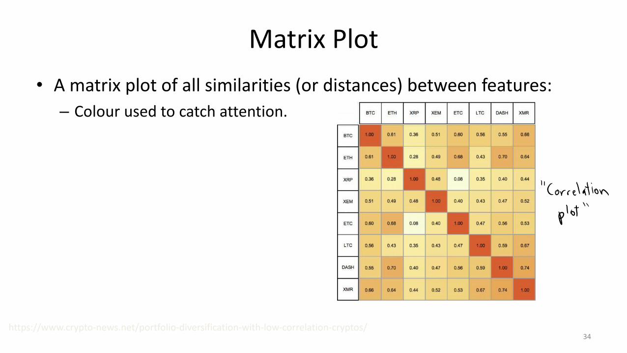
Matrix Plot• A matrix plot of all similarities (or distances) between features:– Colour used to catch attention.
https://www.crypto-news.net/portfolio-diversification-with-low-correlation-cryptos/34
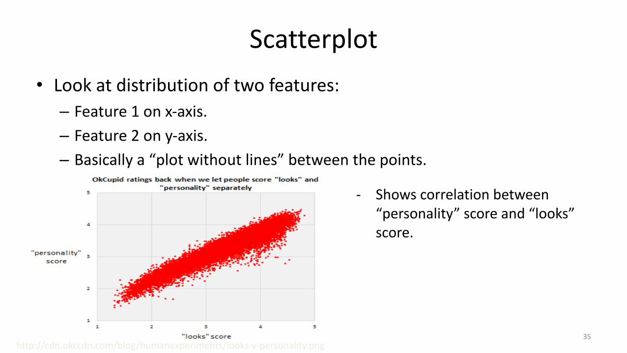
Scatterplot• Look at distribution of two features:– Feature 1 on x-axis.– Feature 2 on y-axis.– Basically a “plot without lines” between the points.
http://cdn.okccdn.com/blog/humanexperiments/looks-v-personality.png
- Shows correlation between “personality” score and “looks” score.
35
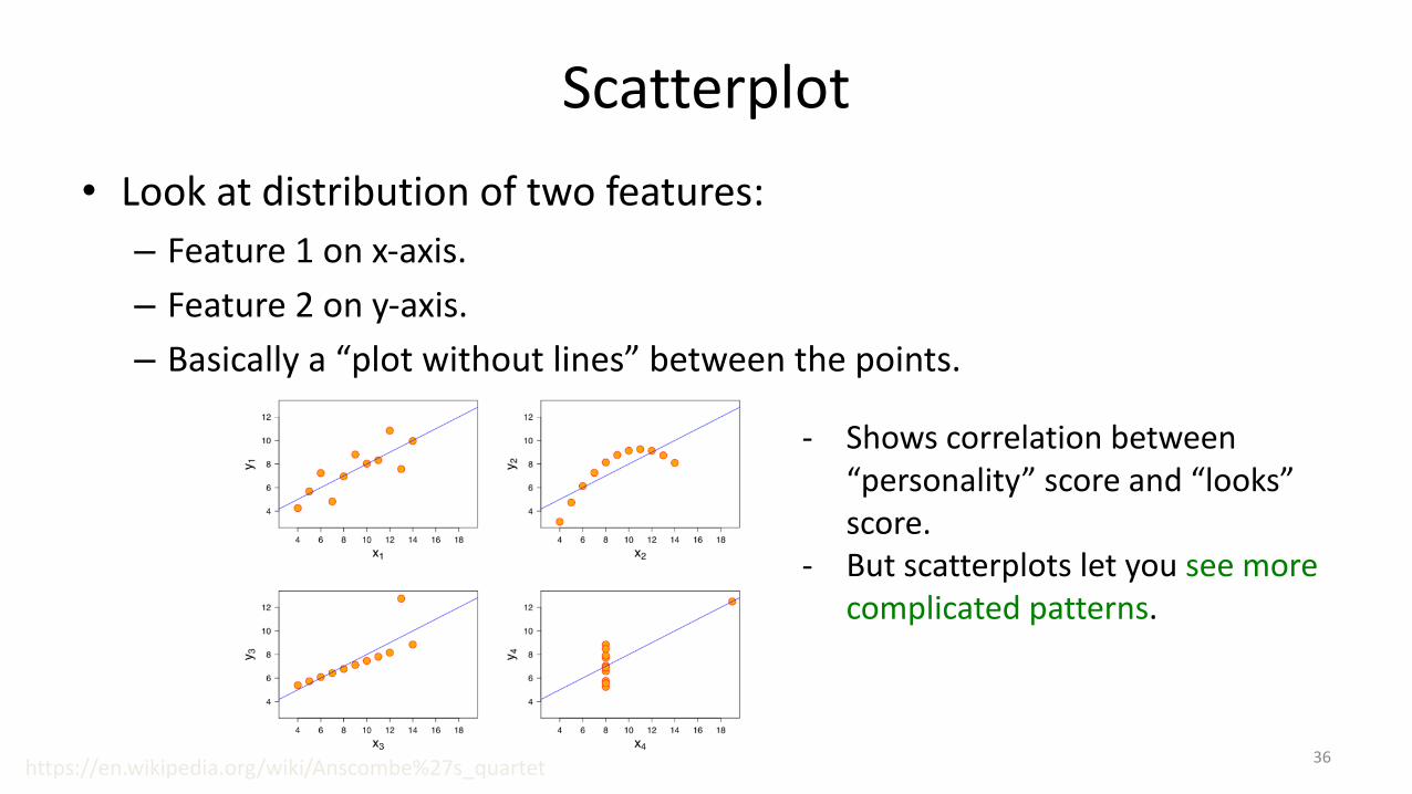
Scatterplot• Look at distribution of two features:– Feature 1 on x-axis.– Feature 2 on y-axis.– Basically a “plot without lines” between the points.
- Shows correlation between “personality” score and “looks” score.
- But scatterplots let you see more complicated patterns.
https://en.wikipedia.org/wiki/Anscombe%27s_quartet 36

Scatterplot Arrays• For multiple variables, can use scatterplot array.
• Colors can indicate a third categorical variable.https://en.wikipedia.org/wiki/Iris_flower_data_sethttp://www.ats.ucla.edu/stat/r/pages/layout.htm
37

• For multiple variables, can use scatterplot array.
• Colors can indicate a third categorical variable.
Scatterplot Arrays
https://en.wikipedia.org/wiki/Iris_flower_data_sethttp://www.ats.ucla.edu/stat/r/pages/layout.htm
38

Scatterplot Arrays• For multiple variables, can use scatterplot array.
• Colors can indicate a third categorical variable.https://en.wikipedia.org/wiki/Iris_flower_data_sethttp://www.ats.ucla.edu/stat/r/pages/layout.htm
39
“Why Not to Trust Plots”• We’ve seen how summary statistics can be mis-leading.• Note that plots can also be mis-leading, or can be used to mis-lead.
• Next slide: first example from UW’s excellent course:– “Calling Bullshit in the Age of Big Data”.
• A course on how to recognize when people are trying to mis-lead you with data.
– I recommend watching all the videos here:• https://www.youtube.com/watch?v=A2OtU5vlR0k&list=PLPnZfvKID1Sje5jWxt-
4CSZD7bUI4gSPS
– Recognizing BS not only useful for data analysis, but for daily life.40

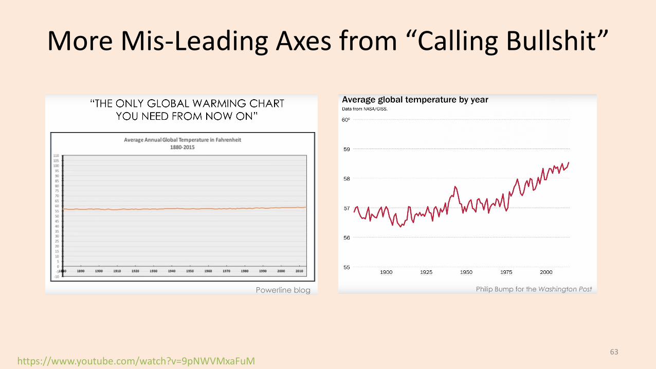
Mis-Leading Axes• This plot seems to show amazing recent growth:
• But notice y-axis starts at 100,000 (so ~40% of growth was earlier).• And it plots “total” users (which necessarily goes up).
https://www.youtube.com/watch?v=q94VJ3KToK841

Mis-Leading Axes• Plot of actual daily users (starting from 0) looks totally different:
• People can mis-lead to push agendas/stories:
https://www.youtube.com/watch?v=q94VJ3KToK842

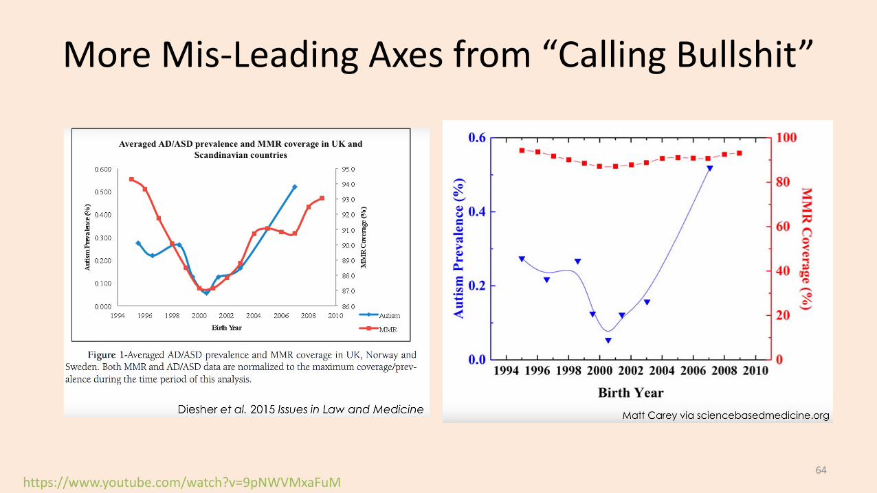
Mis-Leading Axes• We see “lack of appropriate axes” ALL THE TIME in the news:– “British research revealed that patients taking ibuprofen to treat arthritis
face a 24% increased risk of suffering a heart attack”• What is probability of heart attack if I you don’t take it? Is that big or small?• Actual numbers: less than 1 in 1000 “extra” heart attacks vs. baseline frequency.
– There is a risk, but “24%” is an exaggeration.
• “Health-scare stories often arise because their authors simply don’t understand numbers.”– Or it could be that they do understand, but media wants to “sensationalize” mundane news.
– Bonus slides: more “Calling Bullshit” course examples on “political” issues:• Global warming, vaccines, gun violence, taxes.
43
(pause)
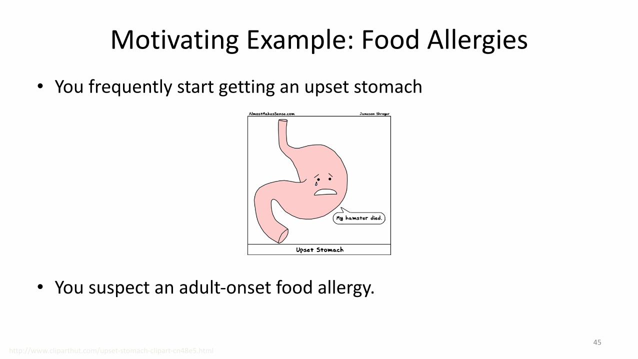
Motivating Example: Food Allergies• You frequently start getting an upset stomach
• You suspect an adult-onset food allergy.
http://www.cliparthut.com/upset-stomach-clipart-cn48e5.html45

Motivating Example: Food Allergies• To solve the mystery, you start a food journal:
• But it’s hard to find the pattern:– You can’t isolate and only eat one food at a time.– You may be allergic to more than one food.– The quantity matters: a small amount may be ok.– You may be allergic to specific interactions.
Egg Milk Fish Wheat Shellfish Peanuts … Sick?
0 0.7 0 0.3 0 0 1
0.3 0.7 0 0.6 0 0.01 1
0 0 0 0.8 0 0 0
0.3 0.7 1.2 0 0.10 0.01 1
0.3 0 1.2 0.3 0.10 0.01 1
46

Supervised Learning• We can formulate this as supervised learning:
• Input for an example (day of the week) is a set of features (quantities of food).• Output is a desired class label (whether or not we got sick).• Goal of supervised learning:
– Use data to find a model that outputs the right label based on the features.– Model predicts whether foods will make you sick (even with new combinations).
Egg Milk Fish Wheat Shellfish Peanuts …
0 0.7 0 0.3 0 0
0.3 0.7 0 0.6 0 0.01
0 0 0 0.8 0 0
0.3 0.7 1.2 0 0.10 0.01
0.3 0 1.2 0.3 0.10 0.01
Sick?
1
1
0
1
1
47

Supervised Learning• General supervised learning problem:– Take features of examples and corresponding labels as inputs.– Find a model that can accurately predict the labels of new examples.
• This is the most successful machine learning technique:– Spam filtering, optical character recognition, Microsoft Kinect, speech
recognition, classifying tumours, etc.
• We’ll first focus on categorical labels, which is called “classification”.– The model is a called a “classifier”.
48

Naïve Supervised Learning: “Predict Mode”
• A very naïve supervised learning method:– Count how many times each label occurred in the data (4 vs. 1 above).– Always predict the most common label, the “mode” (“sick” above).
• This ignores the features, so is only accurate if we only have 1 label.• We want to use the features, and there are MANY ways to do this.– Next time we’ll consider a classic way known as decision tree learning.
Egg Milk Fish Wheat Shellfish Peanuts …
0 0.7 0 0.3 0 0
0.3 0.7 0 0.6 0 0.01
0 0 0 0.8 0 0
0.3 0.7 1.2 0 0.10 0.01
0.3 0 1.2 0.3 0.10 0.01
Sick?
1
1
0
1
1
49
Summary• Typical data mining steps:
– Involves data collection, preprocessing, analysis, and evaluation.• Example-feature representation and categorical/numerical features.
– Transforming non-vector examples to vector representations.• Feature transformations:
– To address coupon collecting or simplify relationships between variables.• Exploring data:
– Summary statistics and data visualization.• Supervised learning:
– Using data to write a program based on input/output examples.
• Post-lecture bonus slides: other visualizations, parallel/distributed calculations.
• Next week: let’s start some machine learning…
50
Data Cleaning and the Duke Cancer Scandal• See the Duke cancer scandal:– http://www.nytimes.com/2011/07/08/health/research/08genes.html?_r=
2&hp
• Basic sanity checks for data cleanliness show problems in these (and many other) studies:– E.g., flipped labels, off-by-one mistakes, switched columns etc.– https://arxiv.org/pdf/1010.1092.pdf
51

Histogram• Histogram with grouping:
http://www.vox.com/2016/5/10/11608064/americans-cause-of-death52
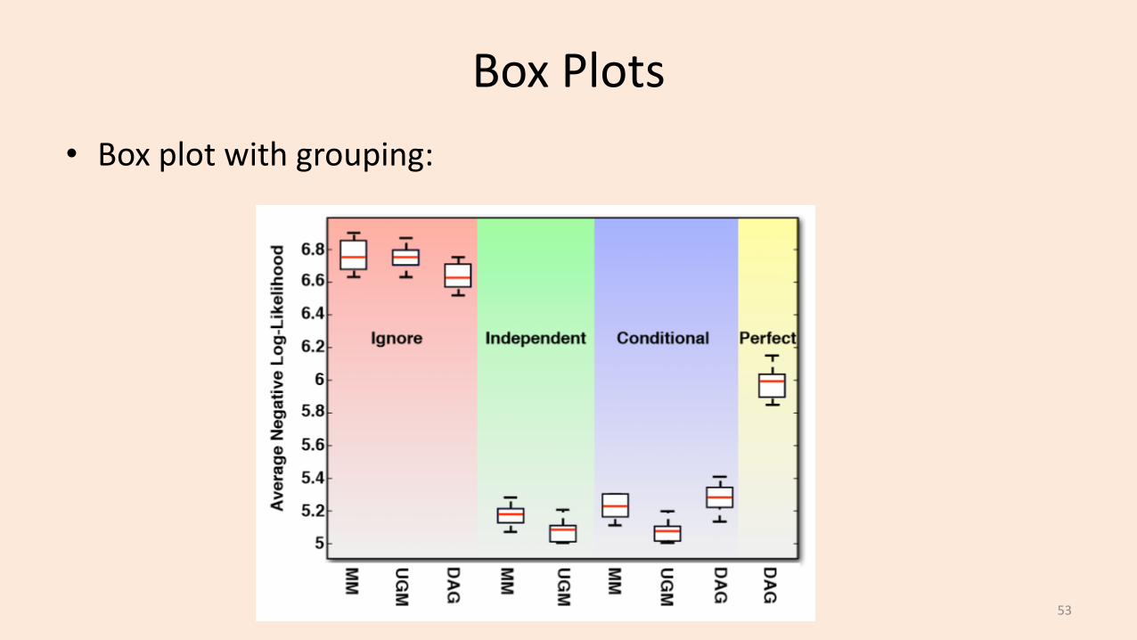
Box Plots• Box plot with grouping:
53
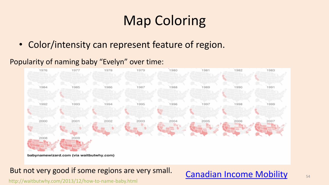
Map Coloring• Color/intensity can represent feature of region.
http://waitbutwhy.com/2013/12/how-to-name-baby.html
Popularity of naming baby “Evelyn” over time:
But not very good if some regions are very small. Canadian Income Mobility 54
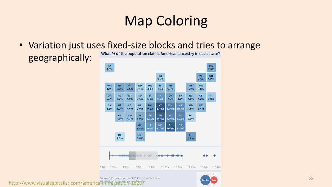
Map Coloring• Variation just uses fixed-size blocks and tries to arrange
geographically:
http://www.visualcapitalist.com/america-immigration-1820/55
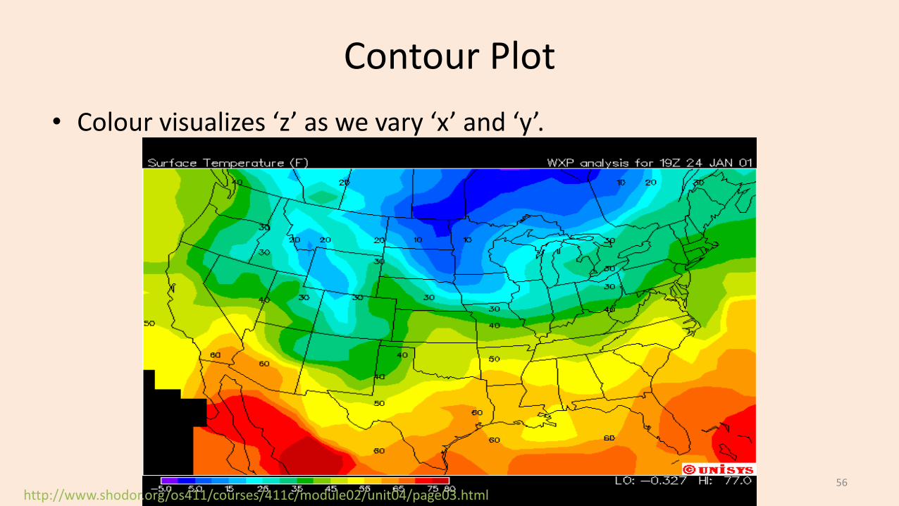
Contour Plot
http://www.shodor.org/os411/courses/411c/module02/unit04/page03.html
• Colour visualizes ‘z’ as we vary ‘x’ and ‘y’.
56
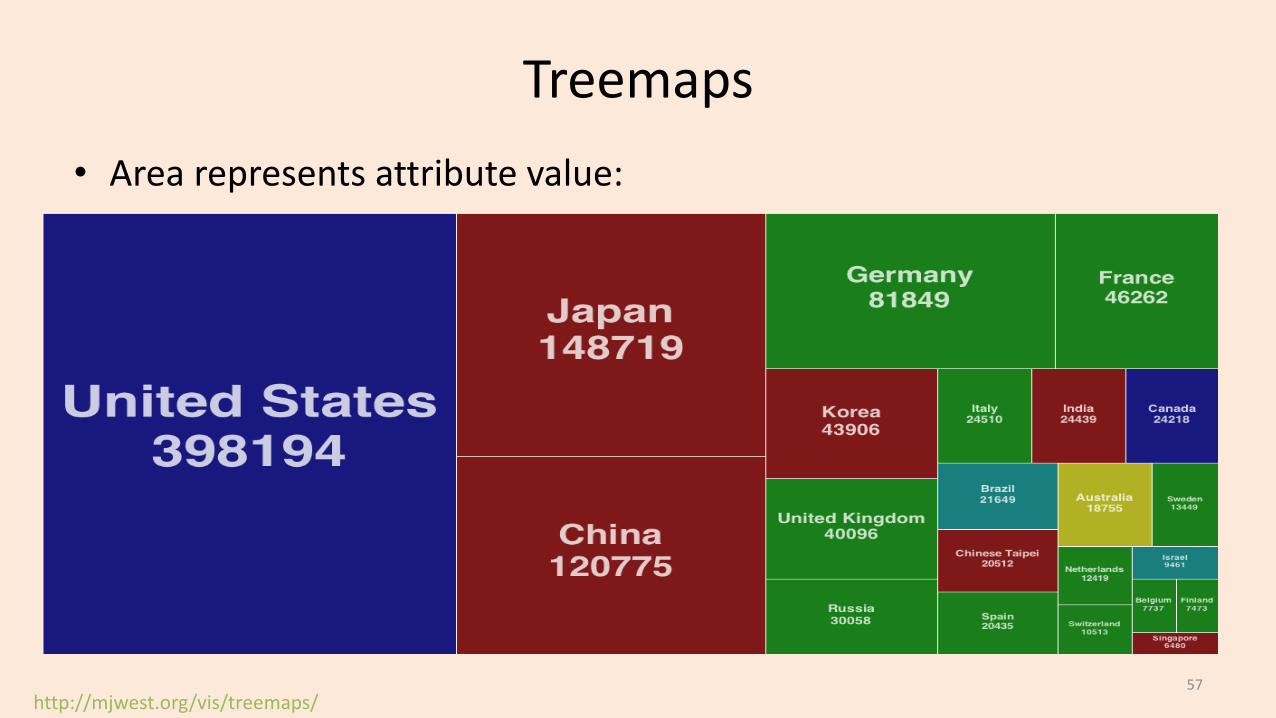
Treemaps
http://mjwest.org/vis/treemaps/
• Area represents attribute value:
57

Cartogram• Fancier version of treemaps:
http://www-personal.umich.edu/~mejn/cartograms/58

Stream Graph
http://waitbutwhy.com/2013/12/how-to-name-baby.html59
Stream Graph
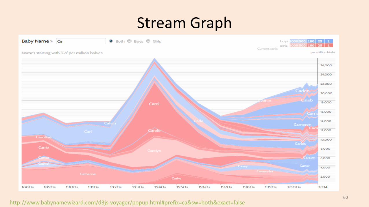
http://www.babynamewizard.com/d3js-voyager/popup.html#prefix=ca&sw=both&exact=false60

Stream Graph
http://www.vox.com/2016/5/10/11608064/americans-cause-of-death61
Videos and Interactive Visualizations• For data recorded over time, videos can be useful:– Map colouring over time.
• There are also lots of neat interactive visualization methods:– Sale date for most expensive paintings.– Global map of wind, weather, and oceans.– Many examples here.
62
More Mis-Leading Axes from “Calling Bullshit”
https://www.youtube.com/watch?v=9pNWVMxaFuM63
More Mis-Leading Axes from “Calling Bullshit”
https://www.youtube.com/watch?v=9pNWVMxaFuM64

More Mis-Leading Axes from “Calling Bullshit”
• Look at the histogram bin widths.
https://www.youtube.com/watch?v=zAg1wsYfwsM65

More Mis-Leading Axes from “Calling Bullshit”• Axis is upside down.• Looks like law makes murder go down,
but number of murders go up!
https://www.youtube.com/watch?v=9pNWVMxaFuM66

More Mis-Leading Axes from “Calling Bullshit”• Calling BS gives this as another example:
• Actual numbers don’t say much of anything:
• 39% vs. 35% (without sizes) doesn’t mean “down nearly 40 percent”. – Data can be used in mis-leading ways to “push agendas”.– Even by reputed sources.– Even if you agree with the message.
https://www.youtube.com/watch?v=-Mtmi8smpfo67

Hamming Distance vs. Jaccard Coefficient
A B
1 01 01 00 10 11 00 00 00 1
• These vectors agree in 2 positions.– Normalizing Hamming distance by vector length,
similarity is 2/9.
• If we’re really interested in predicting 1s,we could find set of 1s in both and compute Jaccard:– A -> {1,2,3,6}, B -> {4,5,9}– No intersection so Jaccard similarity is actually 0.
68
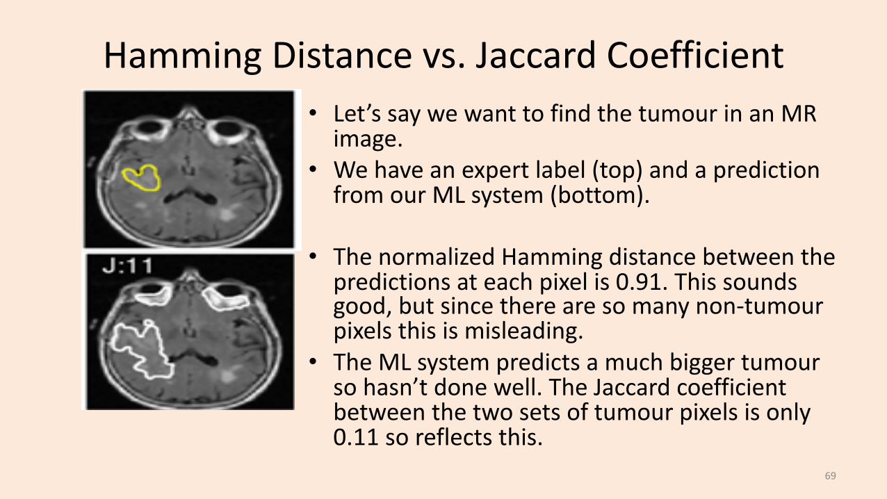
Hamming Distance vs. Jaccard Coefficient• Let’s say we want to find the tumour in an MR
image.• We have an expert label (top) and a prediction
from our ML system (bottom).
• The normalized Hamming distance between the predictions at each pixel is 0.91. This sounds good, but since there are so many non-tumourpixels this is misleading.
• The ML system predicts a much bigger tumourso hasn’t done well. The Jaccard coefficient between the two sets of tumour pixels is only 0.11 so reflects this.
69
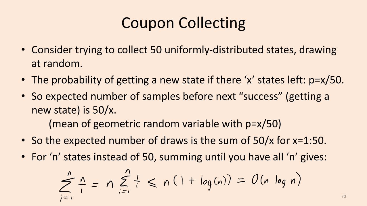
Coupon Collecting• Consider trying to collect 50 uniformly-distributed states, drawing
at random.• The probability of getting a new state if there ‘x’ states left: p=x/50.• So expected number of samples before next “success” (getting a
new state) is 50/x.(mean of geometric random variable with p=x/50)
• So the expected number of draws is the sum of 50/x for x=1:50.• For ‘n’ states instead of 50, summing until you have all ‘n’ gives:
70
Huge Datasets and Parallel/Distributed Computation
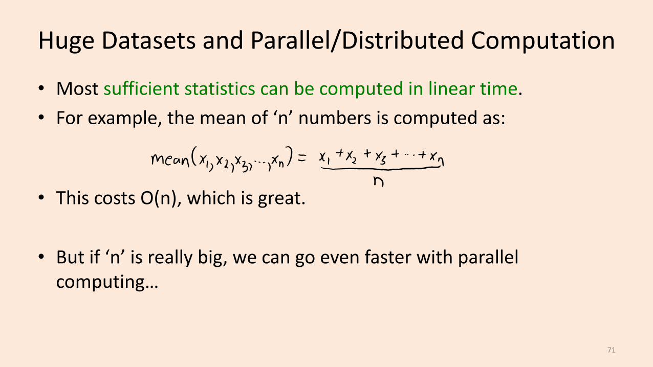
• Most sufficient statistics can be computed in linear time.• For example, the mean of ‘n’ numbers is computed as:
• This costs O(n), which is great.
• But if ‘n’ is really big, we can go even faster with parallel computing…
71

Huge Datasets and Parallel/Distributed Computation
• Computing the mean with multiple cores:– Each of the ‘c’ cores computes the sum of O(n/c) of the data:
72

Huge Datasets and Parallel/Distributed Computation
• Computing the mean with multiple cores:– Each of the ‘c’ cores computes the sum of O(n/c) of the data:– Add up the ‘c’ results from each core to get the mean.
73
Huge Datasets and Parallel/Distributed Computation
• Computing the mean with multiple cores:– Each of the ‘c’ cores computes the sum of O(n/c) of the data.– Add up the ‘c’ results from each core to get the mean.– Cost is only O(n/c + c), which can be much faster for large ‘n’.
• This assumes cores can access data in parallel (not always true).• Can reduce cost to O(n/c) by having cores write to same register.– But need to “lock” the register and might effectively cost O(n).
74

Huge Datasets and Parallel/Distributed Computation
• Sometimes ‘n’ is so big that data can’t fit on one computer.
• In this case the data might be distributed across ‘c’ machines:– Hopefully, each machine has O(n/c) of the data.
• We can solve the problem similar to the multi-core case:– “Map” step: each machine computes the sum of its data.– “Reduce” step: each machine communicates sum to a “master” computer,
which adds them together and divides by ‘n’.
75
Huge Datasets and Parallel/Distributed Computation
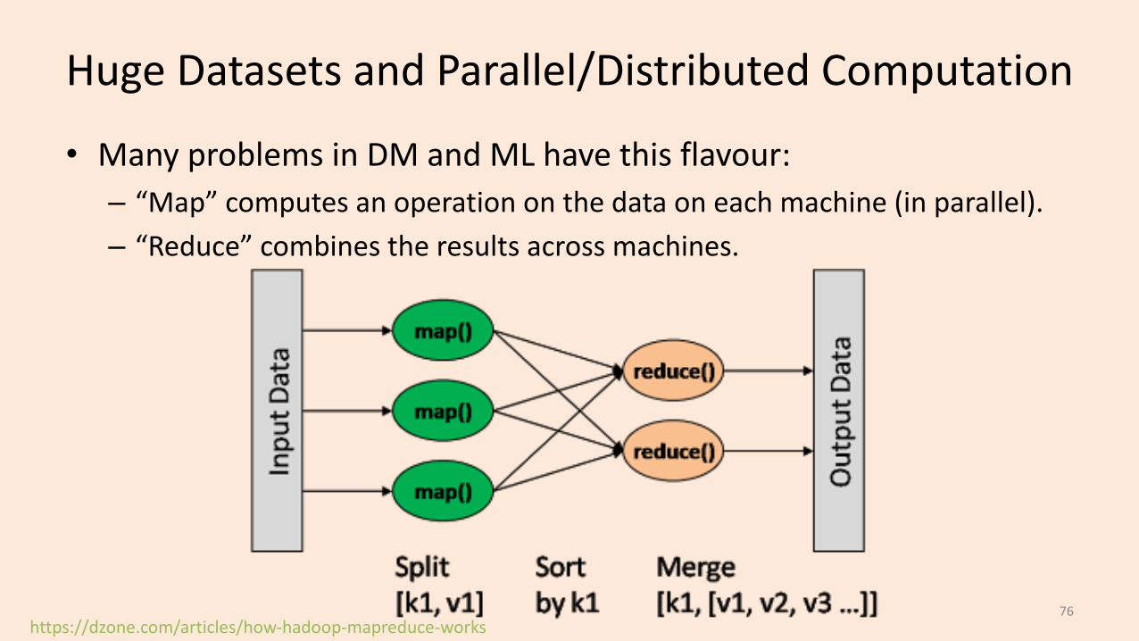
• Many problems in DM and ML have this flavour:– “Map” computes an operation on the data on each machine (in parallel).– “Reduce” combines the results across machines.
https://dzone.com/articles/how-hadoop-mapreduce-works76

Huge Datasets and Parallel/Distributed Computation
• Many problems in DM and ML have this flavour:– “Map” computes an operation on the data on each machine (in parallel).– “Reduce” combines the results across machines.– These are standard operations in parallel libraries like MPI.
• Can solve many problems almost ‘c’ times faster with ‘c’ computers.
• To make it up for the high cost communicating across machines:– Assumes that most of the computation is in the “map" step.– Often need to assume data is already on the computers at the start.
77
Huge Datasets and Parallel/Distributed Computation
• Another challenge with “Google-sized” datasets:– You may need so many computers to store the data,
that it’s inevitable that some computers are going to fail.
• Solution to this is a distributed file system.
• Two popular examples are Google’s MapReduce and Hadoop DFS:– Store data with redundancy (same data is stored in many places).
• And assume data isn’t changing too quickly.
– Have a strategy for restarting “map” operations on computers that fail.– Allows fast calculation of more-fancy things than sufficient statistics:
• Database queries and matrix multiplications. 78