brand guidelines - squarespacestatic1.squarespace.com/.../acumatica-brand-guidelines.pdf ·...
TRANSCRIPT
1Acumatica Brand Identity Guide - Jan 2014 1
Brand Guidelines
January 2014

2Acumatica Brand Identity Guide - Jan 2014 2
IntroOur Mission ................................................Brand Promise ...........................................Brand Values ..............................................Guide Importance ......................................
IdentityLogo ............................................................Logo Space .................................................Logo Colors .................................................Logo Misuses .............................................Color Palettes .............................................Gradient Use ...............................................
TypographyPrimary Typeface .......................................Secondary Typeface ....................................
ContentsGraphic ElementsGraphics ........................................................Iconography ..................................................Mark ..............................................................Photography .................................................Marketing Communications ........................
Verbal IdentityBrand Voice ...................................................Using Our Voice .............................................Key Messages ...............................................
4567
101112131415
1819
2223242526
293031

3Acumatica Brand Identity Guide - Jan 2014 3
Intro

4Acumatica Brand Identity Guide - Jan 2014 4
Intro
At Acumatica, we strive to provide excellence, community, integrity, and curiosity.Our MissionAt Acumatica, we will achieve our vision when we:• Inspire people to work smarter, with better tools.• Involve people to be part of the conversation.• Disrupt the industry with new ways of thinking and doing.• Re-imagine technology to give people the best experience.

5Acumatica Brand Identity Guide - Jan 2014 5
Brand Promise
We are here to make the perfect business management solution for you.
6Acumatica Brand Identity Guide - Jan 2014 6
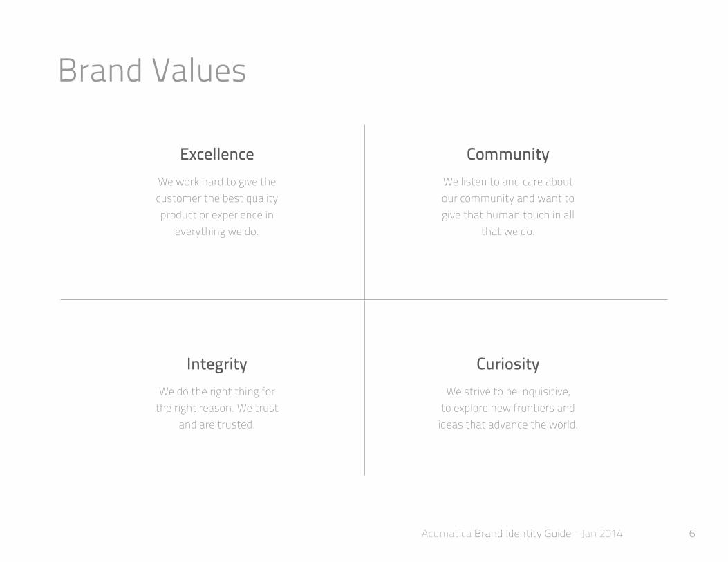
Brand Values
ExcellenceWe work hard to give the customer the best quality product or experience in
everything we do.
CommunityWe listen to and care about our community and want to give that human touch in all
that we do.
IntegrityWe do the right thing for
the right reason. We trustand are trusted.
CuriosityWe strive to be inquisitive,
to explore new frontiers and ideas that advance the world.
7Acumatica Brand Identity Guide - Jan 2014 7
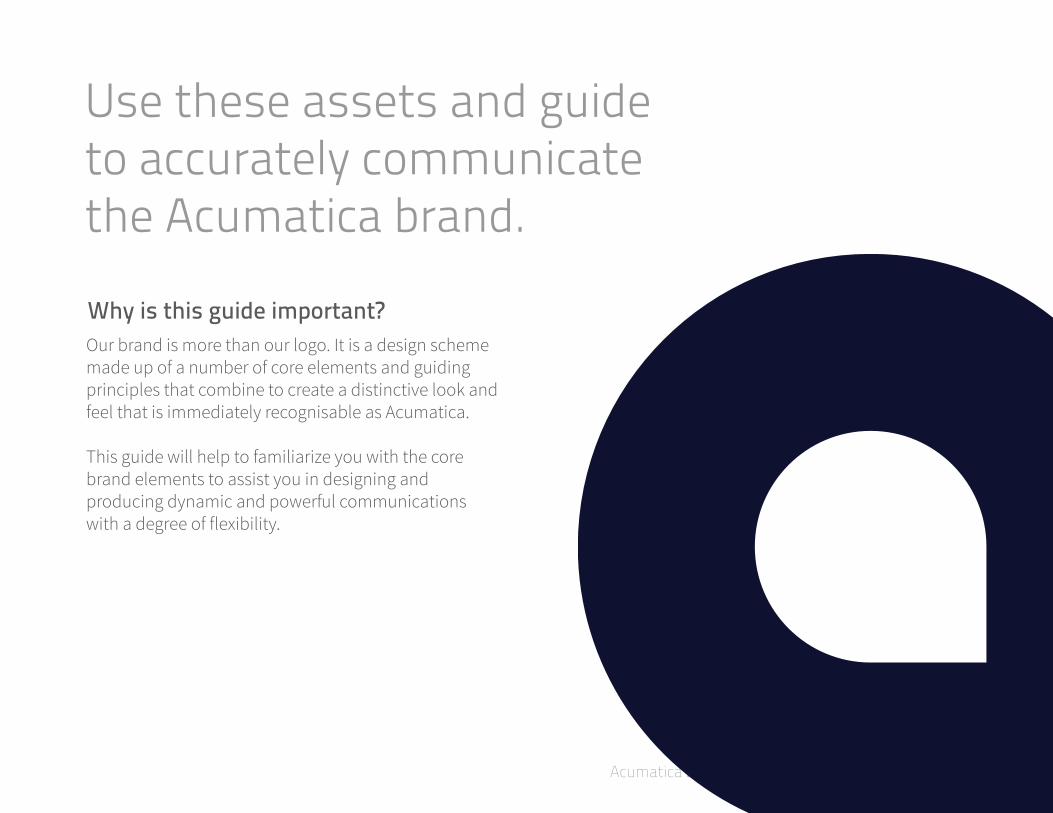
Use these assets and guide to accurately communicate the Acumatica brand.
Why is this guide important?Our brand is more than our logo. It is a design scheme made up of a number of core elements and guiding principles that combine to create a distinctive look and feel that is immediately recognisable as Acumatica.
This guide will help to familiarize you with the core brand elements to assist you in designing and producing dynamic and powerful communications with a degree of flexibility.

8Acumatica Brand Identity Guide - Jan 2014
Inspire people to work smarter, with better tools.

9Acumatica Brand Identity Guide - Jan 2014 9
Identity

10Acumatica Brand Identity Guide - Jan 2014 10
Logo
LogotypeMark
Logo
Our logo is the most visible element of our identity: a universal signature across all Acumatica communications.
It is a guarantee of quality that unites our product, partners, and marketing communications.
The logo is made up of two elements: the mark and the logotype. The logotype should never appear without the mark.
The following pages cover the correct usage to ensure the logo always looks its best.
11Acumatica Brand Identity Guide - Jan 2014 11
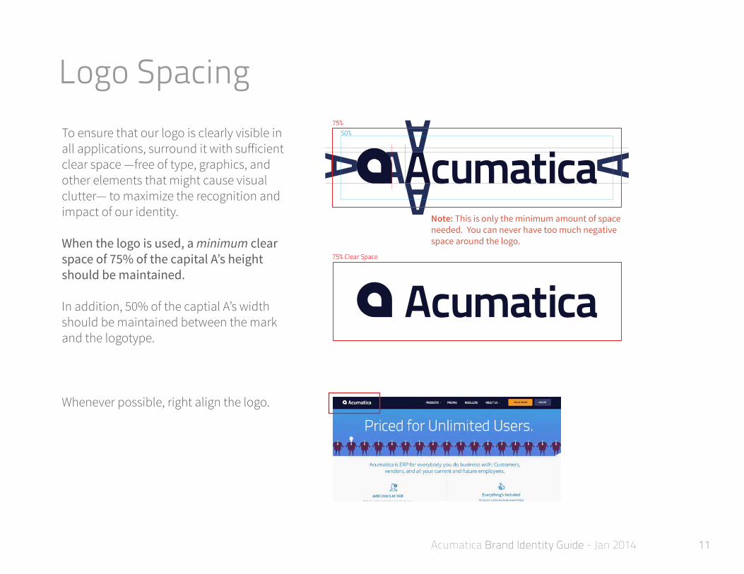
Logo Spacing75%
50%
75% Clear Space
75%50%
75% Clear Space
To ensure that our logo is clearly visible in all applications, surround it with sufficient clear space —free of type, graphics, and other elements that might cause visual clutter— to maximize the recognition and impact of our identity.
When the logo is used, a minimum clear space of 75% of the capital A’s height should be maintained.
In addition, 50% of the captial A’s width should be maintained between the mark and the logotype.
Whenever possible, right align the logo.
Note: This is only the minimum amount of space needed. You can never have too much negative space around the logo.

12Acumatica Brand Identity Guide - Jan 2014 12
Logo Colors
Oxford Blue logo on white background.
Gradient mark logo version on a dark background.
White logo on Oxford Blue background.
Gradient mark logo version on a white background.
When using our logo, contrast is important. Use Oxford Blue on light or white backgrounds and a white logo on dark backgrounds.
If necessary, the Mayan Indigo gradient version of the mark can be used. However, in these instances, the logotype should remain solid Oxford Blue or white.

13Acumatica Brand Identity Guide - Jan 2014 13
Logo MisusesTo maintain the integrity of the Acumatica logo, and to promote the consistency of the brand, it is important to use the logo as described in this guide.
The examples shown to the right illustrate possible misuses of the Acumatica logo that should be avoided.
Cloud ERP Management System
x
x
x
x
x
x
x
x
DON’T create a logo lockup with text.
DON’T stretch the logo.
DON’T change the proportions between the symbol and logotype.
DON’T mix colors from the palette.
DON’T rearrange the logo elements.
DON’T create a gradient logotype.
DON’T rotate the logo.
DON’T use non-approved colors.
Please DON’T:
14Acumatica Brand Identity Guide - Jan 2014 14
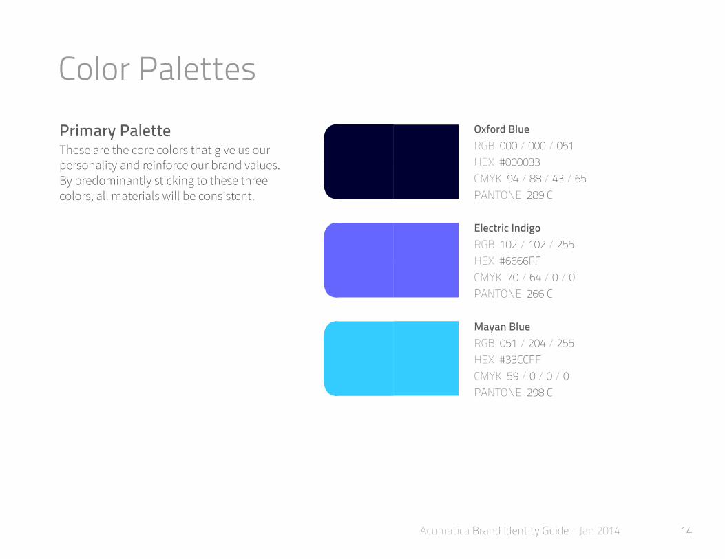
Color PalettesOxford BlueRGB 000 / 000 / 051HEX #000033CMYK 94 / 88 / 43 / 65PANTONE 289 C
Electric IndigoRGB 102 / 102 / 255HEX #6666FFCMYK 70 / 64 / 0 / 0PANTONE 266 C
Mayan BlueRGB 051 / 204 / 255HEX #33CCFFCMYK 59 / 0 / 0 / 0PANTONE 298 C
Primary PaletteThese are the core colors that give us our personality and reinforce our brand values. By predominantly sticking to these three colors, all materials will be consistent.

15Acumatica Brand Identity Guide - Jan 2014 15
Secondary PaletteThese colors can be used to support the primary color palette and to create varience when necessary. Never use the secondary colors on their own. They should only be used to compliment the core colors.
Atomic TangerineRGB 247 / 148 / 31HEX #F7941FCMYK 0 / 50 / 98 / 0PANTONE 715 C
Steel GreyRGB 209 / 209 / 212HEX #D1D1D4CMYK 17 / 13 / 12 / 0PANTONE 427 C
Mayan Indigo GradientTYPE LinearCOLORS Mayan Blueto Electric Indigo
Soft GreenRGB 222 / 255 / 210HEX #DEFFD2CMYK 13 / 0 / 23 / 0PANTONE 7485 C
Soft BlueRGB 212 / 238 / 253HEX #D4EEFDCMYK 16 / 0 / 0 / 0PANTONE 545 C
Color Palettes

16Acumatica Brand Identity Guide - Jan 2014 16
Gradient UseHere are some effective ways to use the Mayan Indigo Gradient to enhance the Acumatica brand:
• The gradient can be used effectively as a background color.
• It can be used with a 90% opacity over photography.
• The gradient can be used to provide signifigant negative space.

17Acumatica Brand Identity Guide - Jan 2014
Disrupt the industry with new ways of thinking and doing.

18Acumatica Brand Identity Guide - Jan 2014 18
Typography

19Acumatica Brand Identity Guide - Jan 2014 19
Typefaces
It is the voice of Acumatica and should be used thoughtfully as headlines, lead-ins, or other areas where there is small amounts of text that need to make an impact.
We recommmend a weight of 250 should be used in large headlines and a weight of 600 to be used for sub-heads, lead-ins, pull-outs, and quotes.
AaABCDEFGHIJKLMNOPQRSTUVWXYZabcdefghijklmnopqrstuvwxyz123456789 !@#$%^&*()=+
ABCDEFGHIJKLMNOPQRSTUVWXYZabcdefghijklmnopqrstuvwxyz123456789 !@#$%^&*()=+
Aa
Primary: Titillium
Titillium weight 250
Titillium weight 600
20Acumatica Brand Identity Guide - Jan 2014 20
Typefaces
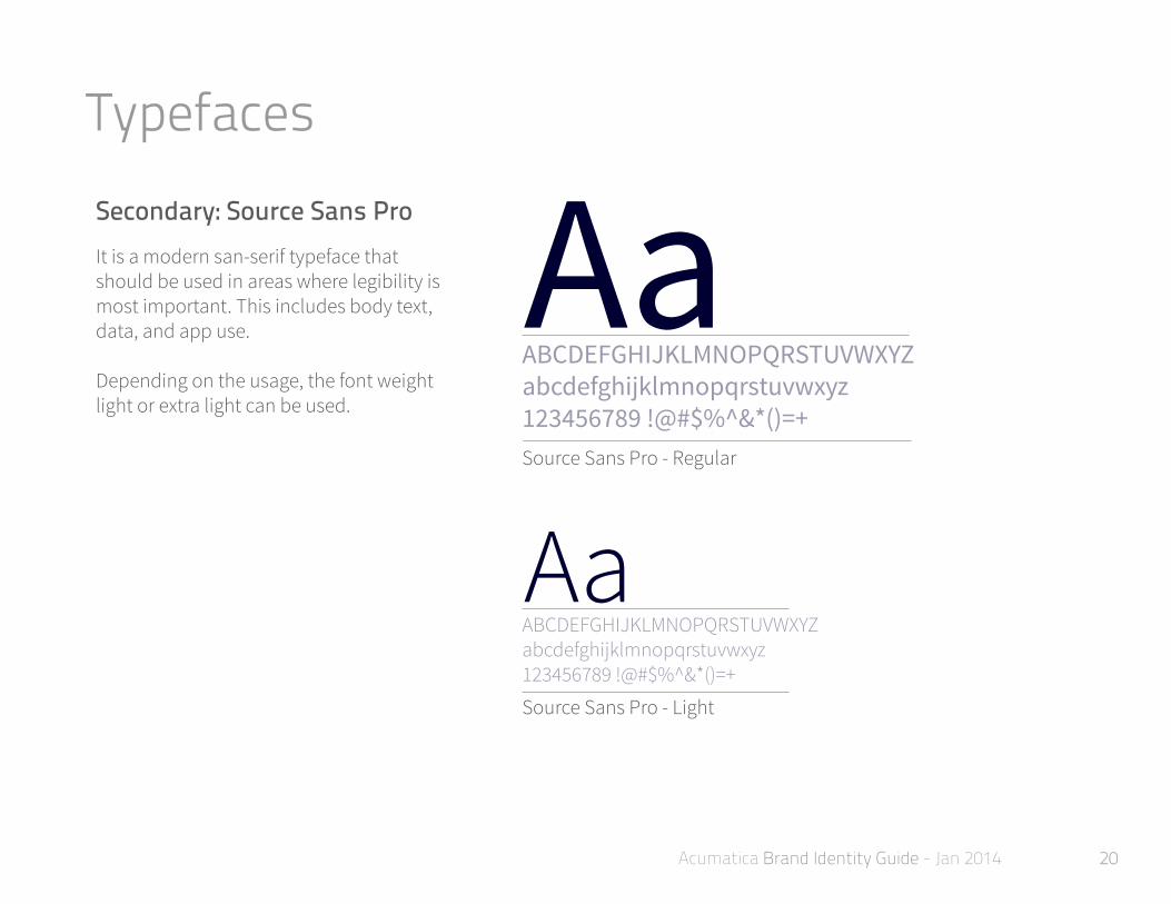
It is a modern san-serif typeface that should be used in areas where legibility is most important. This includes body text, data, and app use.
Depending on the usage, the font weight light or extra light can be used.
AaABCDEFGHIJKLMNOPQRSTUVWXYZabcdefghijklmnopqrstuvwxyz123456789 !@#$%^&*()=+
ABCDEFGHIJKLMNOPQRSTUVWXYZabcdefghijklmnopqrstuvwxyz123456789 !@#$%^&*()=+
Aa
Secondary: Source Sans Pro
Source Sans Pro - Regular
Source Sans Pro - Light

21Acumatica Brand Identity Guide - Jan 2014
Involve people to become a part of the conversation.

22Acumatica Brand Identity Guide - Jan 2014 22
Graphic Elements
23Acumatica Brand Identity Guide - Jan 2014 23
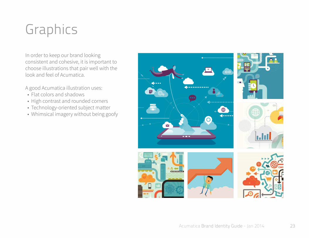
GraphicsIn order to keep our brand looking consistent and cohesive, it is important to choose illustrations that pair well with the look and feel of Acumatica.
A good Acumatica illustration uses: • Flat colors and shadows • High contrast and rounded corners • Technology-oriented subject matter • Whimsical imagery without being goofy
24Acumatica Brand Identity Guide - Jan 2014 24
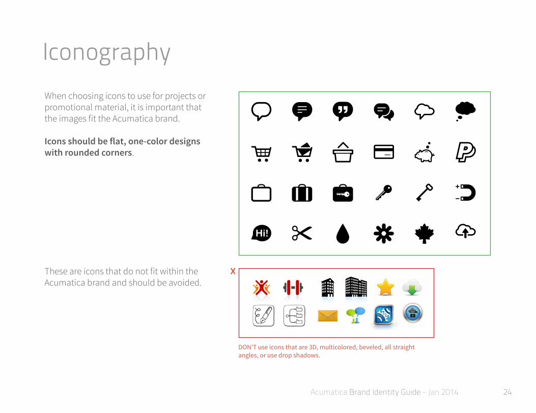
IconographyWhen choosing icons to use for projects or promotional material, it is important that the images fit the Acumatica brand.
Icons should be flat, one-color designs with rounded corners.
These are icons that do not fit within the Acumatica brand and should be avoided.
x
DON’T use icons that are 3D, multicolored, beveled, all straight angles, or use drop shadows.
25Acumatica Brand Identity Guide - Jan 2014 25
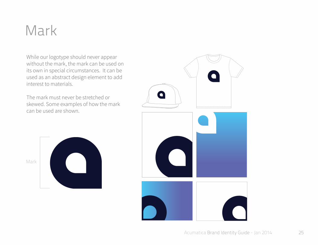
MarkWhile our logotype should never appear without the mark, the mark can be used on its own in special circumstances. It can be used as an abstract design element to add interest to materials.
The mark must never be stretched or skewed. Some examples of how the mark can be used are shown.
Mark

26Acumatica Brand Identity Guide - Jan 2014 26
PhotographyWhen adding photography within the Acumatica brand, it is important to choose photographs that illustrate what we are all about—technology, commerce, movement and endless possibilities.
It is important to make sure that the photographs are vibrant and clear—never pixelated or stretched.

27Acumatica Brand Identity Guide - Jan 2014 27
Marketing CommunicationAll of Acumatica’s marketing communication should respect the rules outlined in this guide.
Websites, print materials, and promotional materials should: • be clear, clean, and refined• be organized effeciently• have a sense of purpose

28Acumatica Brand Identity Guide - Jan 2014
Re-Imagine technology to give people the best experience.
29Acumatica Brand Identity Guide - Jan 2014 29
Verbal Identity

30Acumatica Brand Identity Guide - Jan 2014 30
Brand VoiceThis is our personality. The way we write, the things we say and do—all should use a consistent voice. We want everyone who follows us, reads us, interacts with us, to experience the same personality.
Acumatica’s voice
We’re passionate about making the perfect business management solution for our customers. To do this, we’ll use not only our expertise, but our collaborative people skills. We’ll create trust with our customers and be easy to approach so that people will want to work with us to solve their business challenges. To top it off, we’ll stand out by being smart and funny.
These attributes—expert, trusted, passionate, open and witty—make up our voice. Together, they describe the identity of a company that says: We are here to change the world of business.
EXPERT
TRUSTED
PASSIONATE
OPEN
WITTY

31Acumatica Brand Identity Guide - Jan 2014 31
Using Our Voice
Intelligent
Approachable
Witty
Honest
In our complex industry, we want to be informative and useful to our customers. We want them to want to hear from us, we tell them something they don’t know.
The world of business solutions is complicated enough as it is. We want to be the company people feel comfortable turning to for their business needs.
We want to stand out with a sense of humor that is intelligent and memorable.
We want to be trusted. We call it like it is. We mean what we say and we say what we mean. Openness begets openness.
Intelligent communication is:• Smart but not smarty pants• Informative but not boring• Simple but not simplistic
Approachable communication is:• Easy going but not lazy• Friendly but not insincere• Knowledgeable but not preachy
Witty communication is:• Funny but not rude• Intelligent but not pandering• Memorable but not negative
Honest communication is:• Candid but not harsh
Why It’s Important What It Sounds Like

32Acumatica Brand Identity Guide - Jan 2014 32
Key Message AreasUse these four key points to focus your message when you’re communicating to the public about Acumatica.
Our commitment to each of these principles is what makes us unique from other software companies.
Where the magic happens.
ExcellenceWe offer the best Cloud ERP
solution today.
InnovationWe challenge the ERP
status quo.
PartnershipWe will help you run your
business together.
InclusivenessWe embrace the diversity in
the world.

33Acumatica Brand Identity Guide - Jan 2014 33
Watch us change the world.