basics and beyond: displaying your data -...
TRANSCRIPT
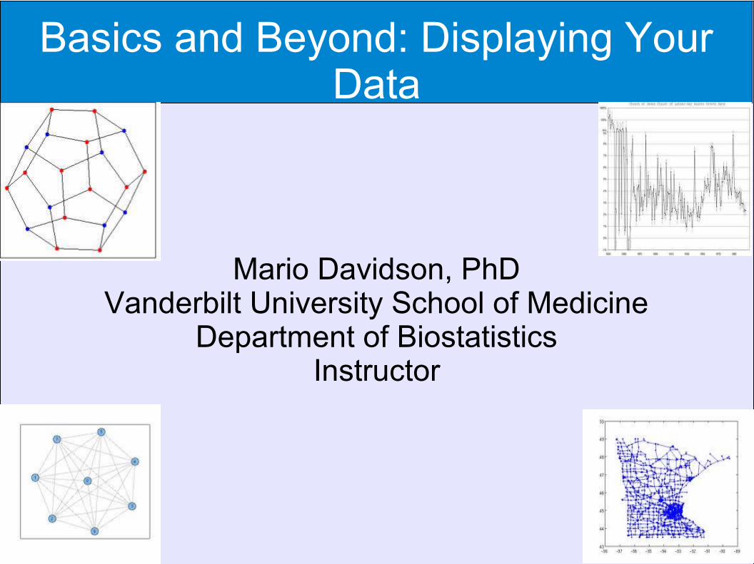
Basics and Beyond: Displaying Your Data
Mario Davidson, PhDVanderbilt University School of Medicine
Department of BiostatisticsInstructor
Objectives
1.Understand the types of data and levels of measurement
2.Understand how a Table 1 typically looks
3.Be able to interpret all of the basic graphs.
4.Know the type of displays that may be used dependent upon the type of data and level of measurement
5.Be introduced to less familiar displays of the data
Types of Data (Obj1)●Qualitative Data
● Consist of attributes, labels, or non-numerical entries.● If you can’t perform mathematical operations or order data,
it’s qualitative.● Ex: Colors in a box of crayons; names; county
●Quantitative Data● Consist of numerical measurements or counts.
● Ordering is a dead give away● Ex: BMI; age; numerical grade

Levels of Measurement (Obj1)
●Nominal● Qualitative● Categorized using names, qualities, or labels● Ex: Top 5 movies, jersey numbers, type of drug
●Ordinal● Quantitative or Qualitative● Can order● Differences between data are not meaningful.● Ex: Letter grade, Likert scale such as very dissatisfied to very satisfied
Levels of Measurement (Obj1)
●Interval Level of Measurement● Quantitative● Can order ● Can calculate meaningful differences● No Value that means “nothing/none.” A zero entry merely
represents a position on a scale (i.e. no inherent zero).● Ex: Time of day, temperature
●Ratio Level of Measurement● Quantitative● Can order● Can calculate meaningful differences● There’s a value that means “nothing/none.”● Ex: Age, weight, test score

Popular Displays

Description of Table 1 (Obj2) Typically summarizes baseline characteristics of the data. Compares statistics between groups May provide means, medians, confidence intervals,
percentiles, percentages, p-values, standard deviations, etc.
Summaries of all types of data (e.g. continuous, categorical, nominal, ordinal, interval, ratio) may be used.
Likert scale: Scale indicating degree of agreement (e.g. Rate the following statement: I have a had a difficult time focusing on my studies this semester: SD D N A SA

Example of a Table 1 (Obj2)
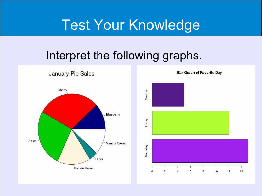
Test Your Knowledge
Interpret the following graphs.

Test Your Knowledge
Interpret the following graphs.
Cherry or Apple Pies sold the most in January. “Other” pies sold the least
Nearly 15 subjects chose Saturday as their favorite day. Sunday was the least chosen.
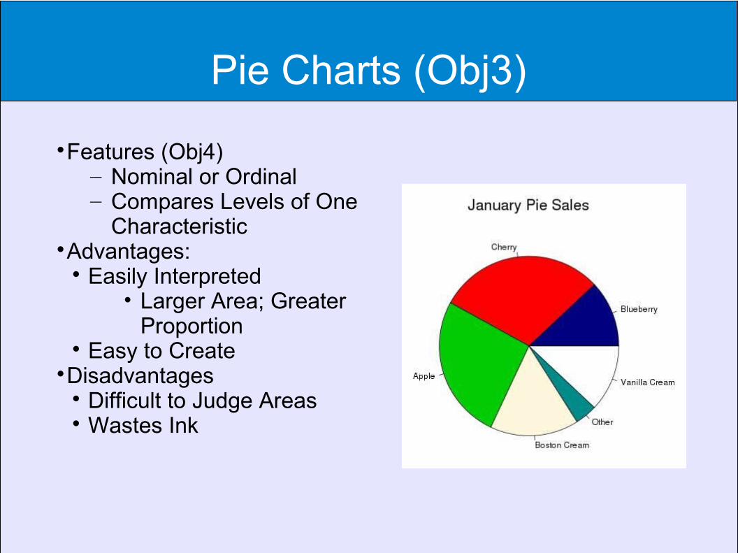
Pie Charts (Obj3)
Features (Obj4)– Nominal or Ordinal– Compares Levels of One
CharacteristicAdvantages:
Easily Interpreted • Larger Area; Greater
Proportion Easy to Create
Disadvantages Difficult to Judge Areas Wastes Ink
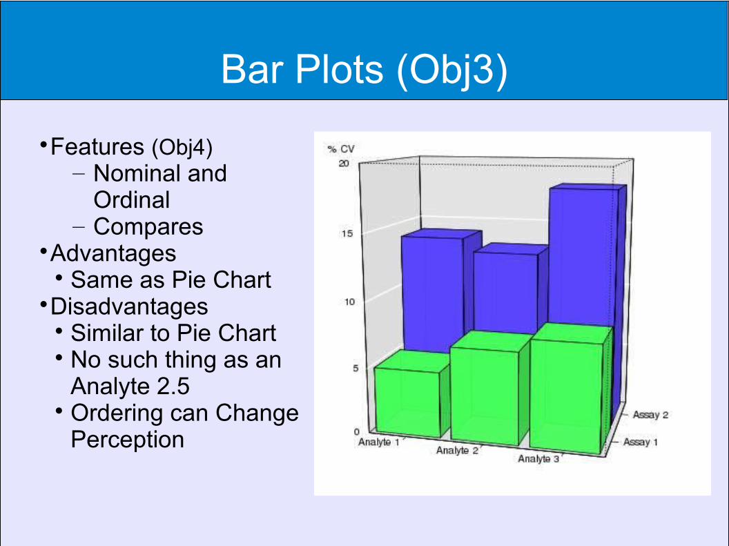
Bar Plots (Obj3)
Features (Obj4)– Nominal and
Ordinal – Compares
Advantages Same as Pie Chart
Disadvantages Similar to Pie Chart No such thing as an
Analyte 2.5 Ordering can Change
Perception
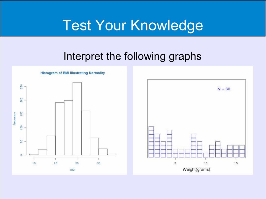
Test Your Knowledge
Interpret the following graphs
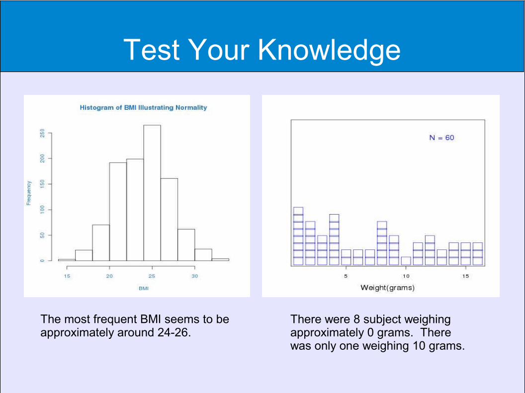
Test Your Knowledge
The most frequent BMI seems to be approximately around 24-26.
There were 8 subject weighing approximately 0 grams. There was only one weighing 10 grams.

Histograms (Obj3)
Features
– Shows Distribution
– Continuous
– One Characteristic (Obj4)
Advantages Easy to Interpret Easy to Produce
Disadvantages Size of Bins can Change
Perception Cannot Read Exact Values
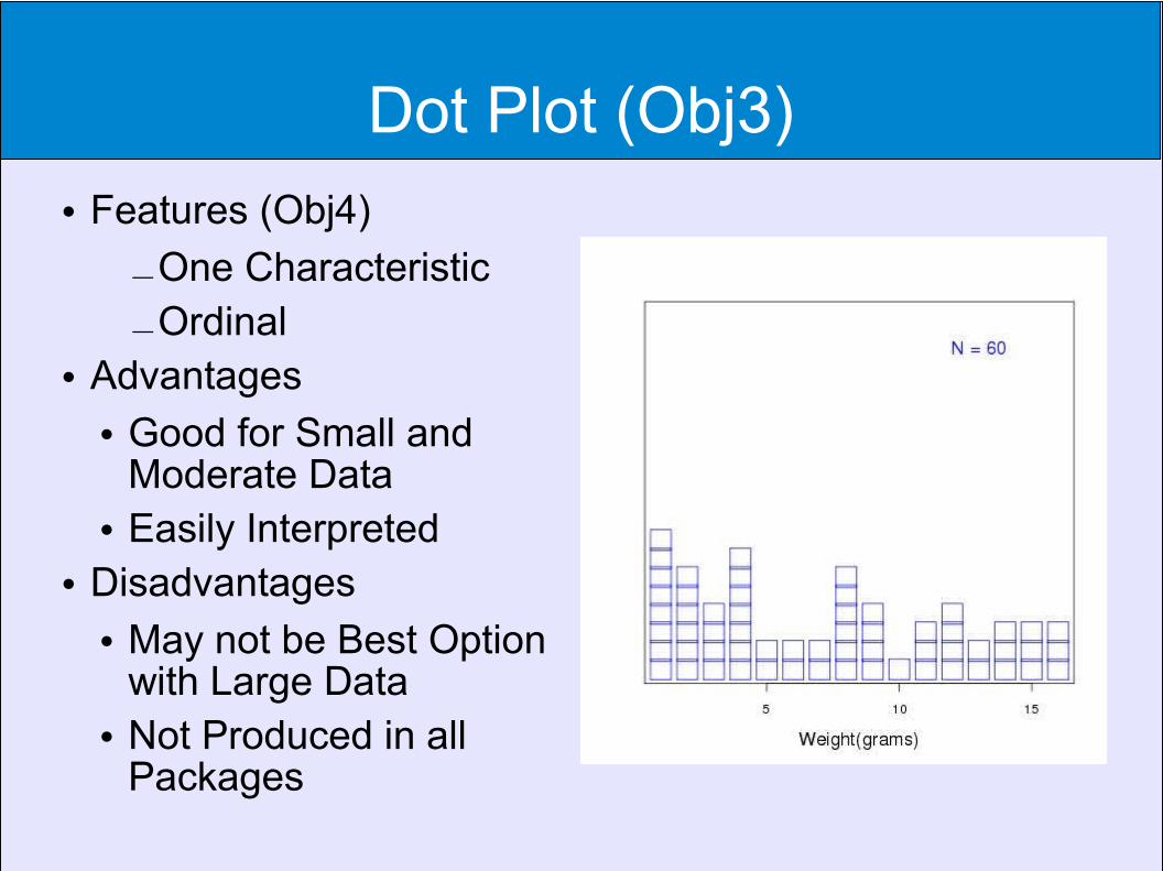
Dot Plot (Obj3) Features (Obj4)
–One Characteristic
–Ordinal Advantages
Good for Small and Moderate Data
Easily Interpreted Disadvantages
May not be Best Option with Large Data
Not Produced in all Packages
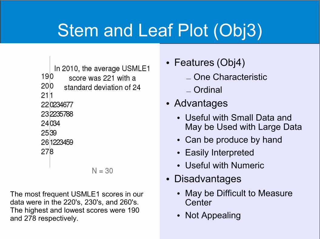
Stem and Leaf Plot (Obj3)
Features (Obj4)
– One Characteristic
– Ordinal Advantages
Useful with Small Data and May be Used with Large Data
Can be produce by hand Easily Interpreted Useful with Numeric
Disadvantages May be Difficult to Measure
Center Not Appealing
The most frequent USMLE1 scores in our data were in the 220's, 230's, and 260's. The highest and lowest scores were 190 and 278 respectively.
Test Your Knowledge
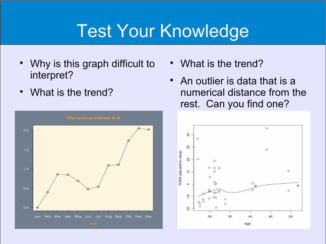
Why is this graph difficult to interpret?
What is the trend?
What is the trend?
An outlier is data that is a numerical distance from the rest. Can you find one?
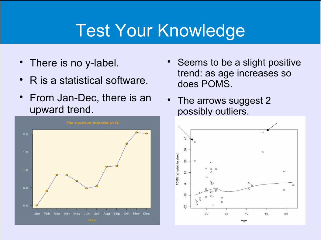
Test Your Knowledge
There is no y-label.
R is a statistical software.
From Jan-Dec, there is an upward trend.
Seems to be a slight positive trend: as age increases so does POMS.
The arrows suggest 2 possibly outliers.
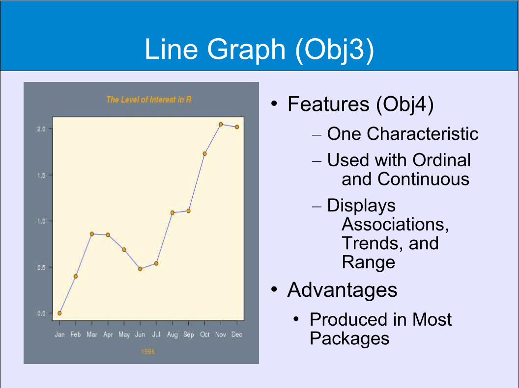
Line Graph (Obj3)
Features (Obj4)– One Characteristic
– Used with Ordinal and Continuous
– Displays Associations, Trends, and Range
Advantages Produced in Most
Packages

Line Graph with Rugplot
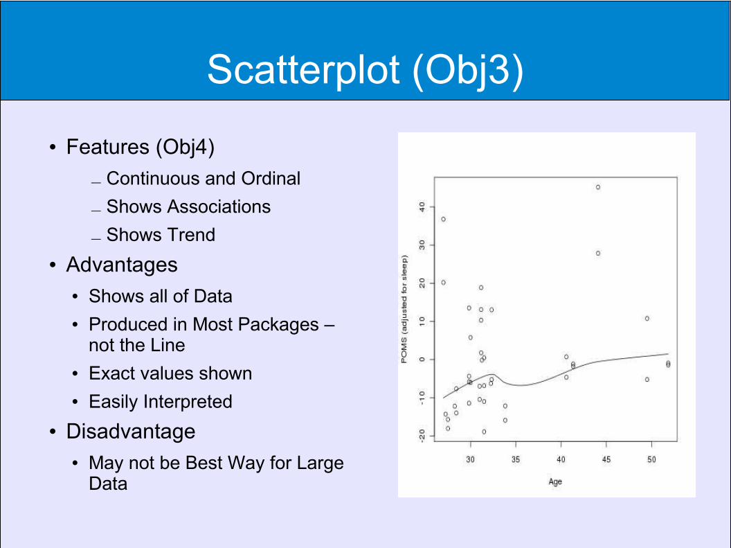
Scatterplot (Obj3)
Features (Obj4)
– Continuous and Ordinal
– Shows Associations
– Shows Trend
Advantages Shows all of Data Produced in Most Packages –
not the Line Exact values shown Easily Interpreted
Disadvantage May not be Best Way for Large
Data
Less Familiar Graphs
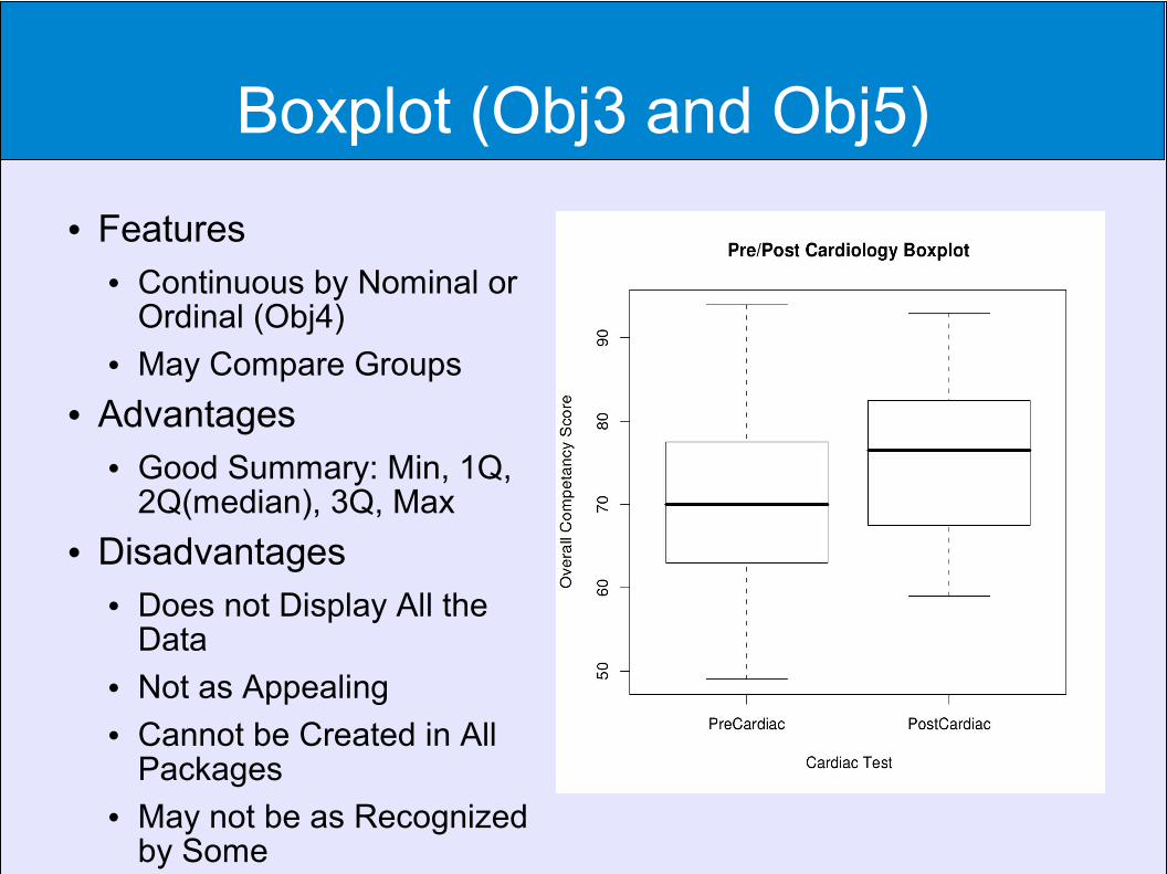
Boxplot (Obj3 and Obj5)
Features Continuous by Nominal or
Ordinal (Obj4) May Compare Groups
Advantages Good Summary: Min, 1Q,
2Q(median), 3Q, Max Disadvantages
Does not Display All the Data
Not as Appealing Cannot be Created in All
Packages May not be as Recognized
by Some

Boxplot
The median tooth length for orange juice at 1dose of Vitamin C was roughly 25 units.
The first quartile length for 1 dose of ascorbic acid was approx. 15.
As Vitamin C doses increase tooth length increases. Overall, it appears that those using orange juice had greater length given the same dose and excluding possibly a Vitamin C dose of two.
There was an outlier for the ascorbic acid at dose 1.
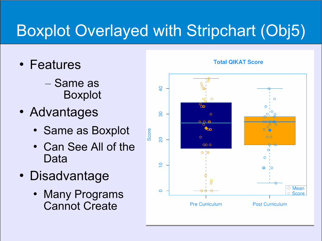
Boxplot Overlayed with Stripchart (Obj5)
Features– Same as
Boxplot Advantages
Same as Boxplot Can See All of the
Data Disadvantage
Many Programs Cannot Create
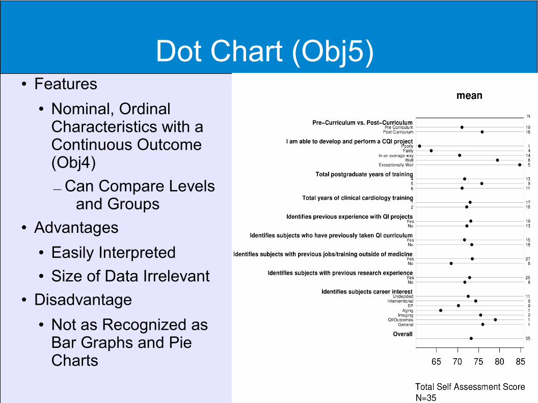
Dot Chart (Obj5) Features
Nominal, Ordinal Characteristics with a Continuous Outcome (Obj4)
–Can Compare Levels and Groups
Advantages Easily Interpreted Size of Data Irrelevant
Disadvantage Not as Recognized as
Bar Graphs and Pie Charts
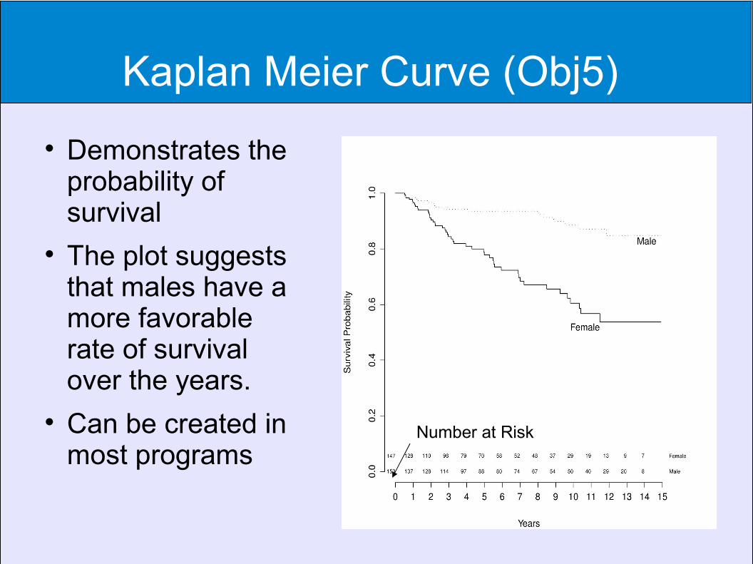
Kaplan Meier Curve (Obj5)
Demonstrates the probability of survival
The plot suggests that males have a more favorable rate of survival over the years.
Can be created in most programs
Number at Risk
Probably Even Less Familiar Graphs

Spaghetti Plot (Obj5)
●Alzheimer's Disease
●Verbal IQ – Words that could not be sounded out (e.g. Depot)
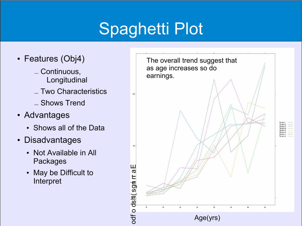
Spaghetti Plot
Features (Obj4)
– Continuous, Longitudinal
– Two Characteristics
– Shows Trend
Advantages Shows all of the Data
Disadvantages Not Available in All
Packages May be Difficult to
Interpret
Age(yrs)
Earnings(thsd of dollars)
The overall trend suggest that as age increases so do earnings.
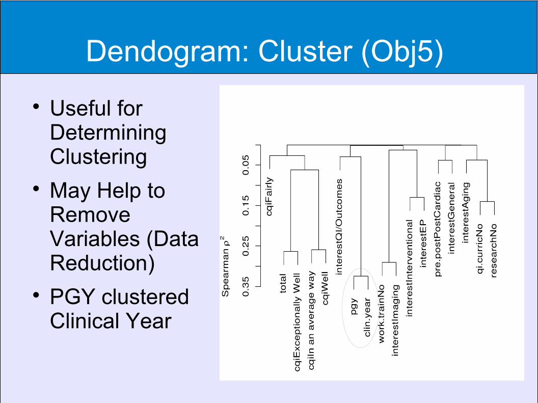
Dendogram: Cluster (Obj5)
Useful for Determining Clustering
May Help to Remove Variables (Data Reduction)
PGY clustered Clinical Year
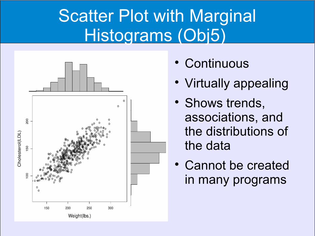
Scatter Plot with Marginal Histograms (Obj5)
Continuous Virtually appealing Shows trends,
associations, and the distributions of the data
Cannot be created in many programs
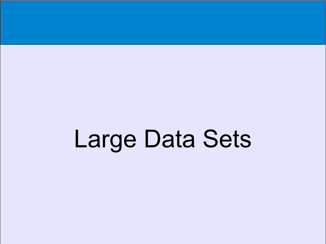
Large Data Sets
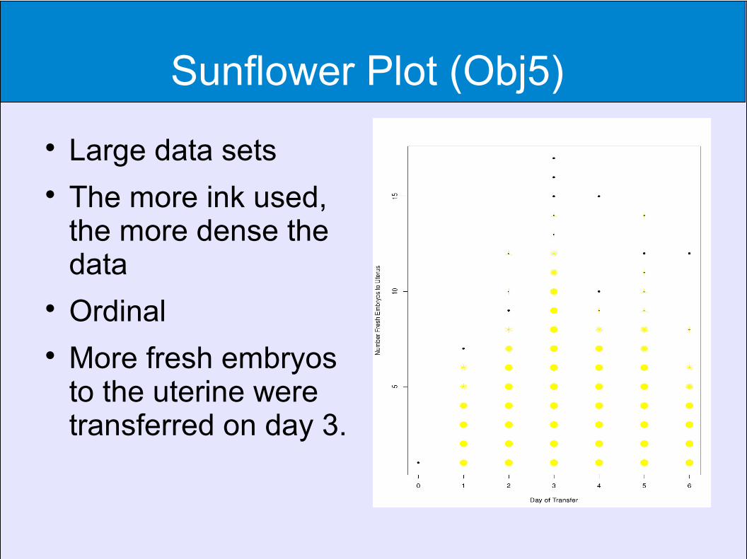
Sunflower Plot (Obj5)
Large data sets The more ink used,
the more dense the data
Ordinal More fresh embryos
to the uterine were transferred on day 3.

Heat Map (Obj5) ●Encephalitis●Red
● Proportion of Presence
●Green● Proportion of
Absence●White
● Missing●Light/Dark
● Intensity of Presence of Attribute

Heat Map Similar to the
Hexagon Plot Lightness or
Darkness Indicates Intensity
May not be Created in Some Programs
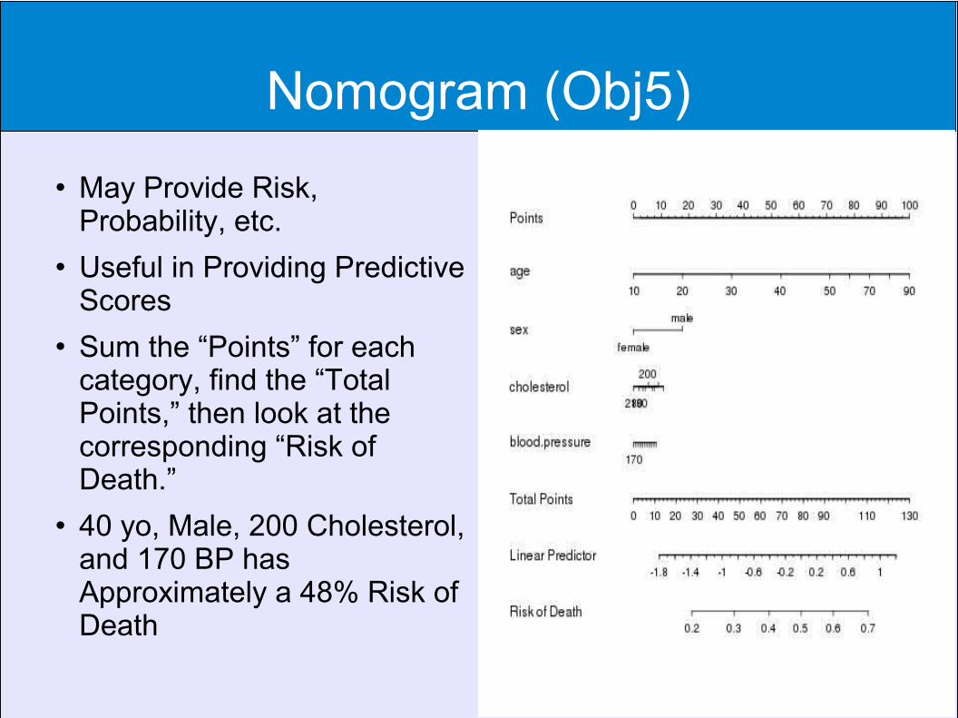
Nomogram (Obj5)
May Provide Risk, Probability, etc.
Useful in Providing Predictive Scores
Sum the “Points” for each category, find the “Total Points,” then look at the corresponding “Risk of Death.”
40 yo, Male, 200 Cholesterol, and 170 BP has Approximately a 48% Risk of Death
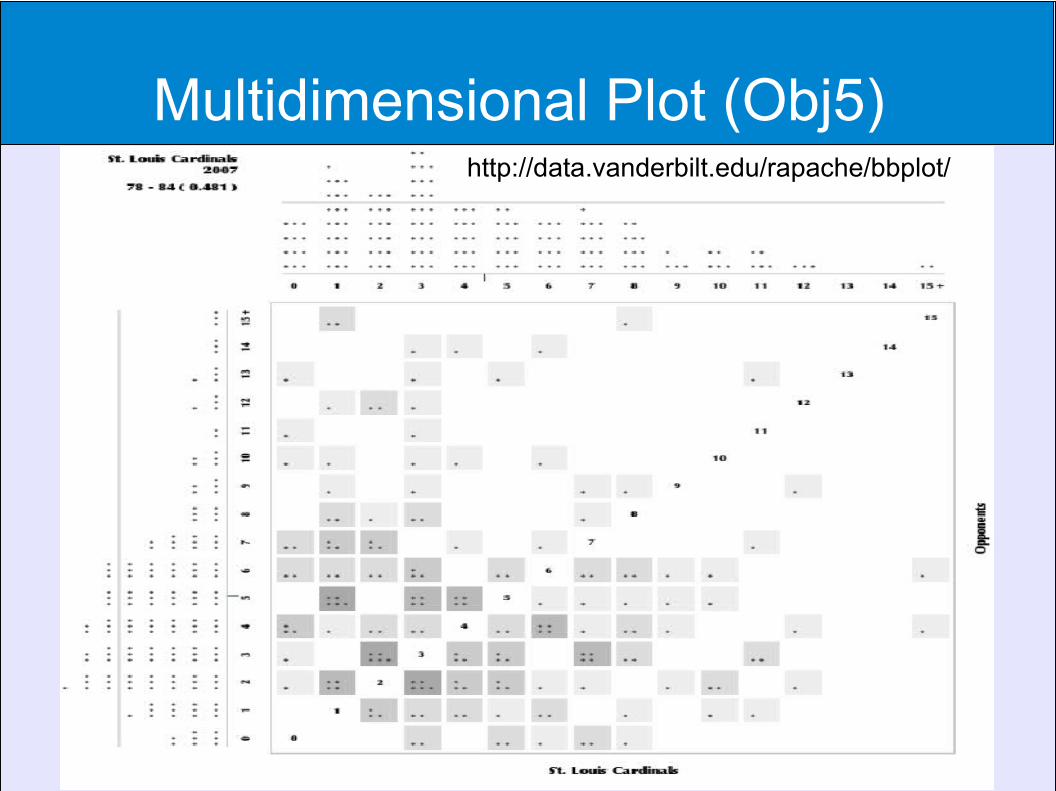
Multidimensional Plot (Obj5) http://data.vanderbilt.edu/rapache/bbplot/
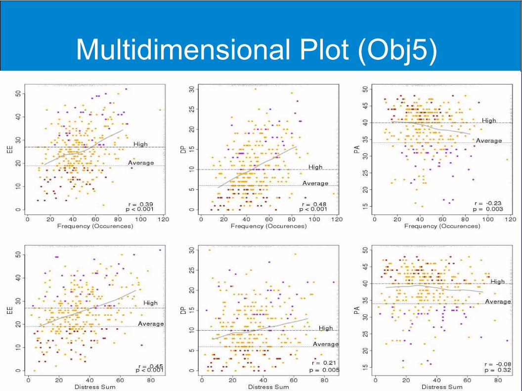
Multidimensional Plot (Obj5)
Conclusion
Always try to think of the best way to display your story (data).
Consider your target audience. When publishing, color may cost.
References
Hamid, et al. BMC Infectious Diseases 2010, 10:364. http://www.biomedcentral.com/1471-2334/10/364
Grober, E, Hall, CB, Lipton, RB, Zonderman, AB, Resnick, SM, and Kawas, C (2009). Memory impairment, executive dysfunction, and intellectual decline in preclinical Alzheimer's disease. Journal of the International Neuropsychological Society, 14(2), 266-278.
http://data.vanderbilt.edu/rapache/bbplot/