art direction for the web
TRANSCRIPT

Art Directionfor the Web
Andy ClarkeA Hardboiled Web Design shot

Published 2019 by Smashing Magazine GmbH, Freiburg, Germany.
On the web: https://stuffandnonsense.co.uk/books
Art director and designer: Andy Clarke Author portrait photographer: Al Power Cover illustrator: Natalie Smith Editor: Owen Gregory Technical editor: Rachel Andrew Typesetters: Alex Clarke and Markus Seyfferth
All rights reserved. No part of this publication may be reproduced or transmitted in any form
or by any means, electronic or mechanical, including photocopy, recording or any information
storage and retrieval system, without prior permission in writing from the publisher. I’ve tried
hard to find the copyright owner for every photograph used in this book. If I missed you, let me
know and I’ll be happy to add missing credits to a future edition.
ISBN: 978-3-945749-76-0

For Lemmy.
If you like to gamble, I tell you I’m your man. You win some, lose some, all the same to me.
The pleasure is to play, makes no difference what you say. I don’t share your greed, the only card I need is the Ace of Spades.
Ian Fraser ‘Lemmy’ Kilmister (1945–2015) Born to lose, lived to win.

1 What art direction means
Page 21
2 One hundred years of
art direction Page 41
3 Art-directing experiences
Page 56
4 Art direction and creative
teams Page 70
5 Principles of design
Page 95
6 Directing grids
Page 129
Contents

7 Directing type
Page 165
8 Directing pictures
Page 197
9 Developing layouts with
CSS Grid Page 225
10 Developing components
with Flexbox Page 253
11 Developing typography
Page 277
12 Developing with images
Page 306

6
Acknowledgements
To everyone at Smashing Magazine for their friendship and support through thick and thicker.
To the best editor in the business, Owen Gregory, for being Ronnie to my Reggie; and to Rachel Andrew for the technical editing of this book and everything she’s done for the web.
To my design hero Trent Walton for his foreword.
To Rachel Andrew (again), Jon Gold, Stephen Hay, Dan Mall, Mark Porter, David Sleight, and Rob Weychert for agreeing to be interviewed for this book and sharing their experiences.
To my favourite type foundry Dalton Maag. I made every design in this book using only their fabulous fonts.
To my friends; John Allsopp, Paul Boag, Ben Buchanan, Voltaire Carlos, Fiona Chan, Dan Davies, Brendan Dawes, Richard Eskins, Petra Gregorova, Scott Gruber, Jon Hicks, Leigh Hicks, Dylan Jones, Luci McCullough, Drew McLellan, Mandy Michael, Harry Roberts, Mike Sharp, Joe Spurling, Tim Shuttleworth, Jared Spool, and Jesse Yuen. And to Dr. Alex Clarke for typesetting this book and making me the proudest dad.
Finally, to my wife, Sue. 2019 is our 30th wedding anniversary. She famously threatened to hunt down and kill the next person who asked me to write a book, but without her smart thinking and encouragement, this one wouldn’t have been written.

7
About the author
Andy Clarke is a well-known designer, design consultant, and mentor. He’s been called plenty of things since he started working on the web. His ego likes terms such as “Ambassador for CSS,” “industry prophet,” and “inspiring,” but he’s most proud that Jeffrey Zeldman once called him a “triple-talented bastard.”
With his wife Sue, Andy founded Stuff & Nonsense1 in 1998, where they’ve helped companies around the world to improve their designs by providing consulting and design expertise.
Andy’s written several popular books on website design and develop-ment, including Hardboiled Web Design: Fifth Anniversary Edition (Smashing Magazine, 2015), Hardboiled Web Design (Five Simple Steps, 2010), and Transcending CSS: The Fine Art Of Web Design (New Riders, 2006). He’s a popular speaker, and gives talks about art direction and design all over the world.
Andy tweets as @malarkey2 and really, really loves gorillas.
1 https://stuffandnonsense.co.uk2 https://twitter.com/malarkey

8
About the reviewers
Rachel Andrew3 lives in Bristol, UK. She’s one half of web development company edgeofmyseat.com, the company behind Perch CMS. She’s also editor-in-chief of Smashing Magazine, an Invited Expert to the W3C on the CSS Working Group, and a Google Developer Expert. Her day-to-day work can include anything from product development to DevOps to CSS, and she regularly writes about all of them.
Owen Gregory4 is a professional editor, copy editor and proofreader based in Birmingham, UK. Owen has experience of working with small, independent, and digital publishers, from manuscript to print and digital editions. His particular expertise encompasses all aspects of front-end web design and development, and he’s worked with many well-known authors from the web industry.
3 https://rachelandrew.co.uk4 http://fullcreammilk.co.uk

9
What this book’s about
Art direction has been part of advertising and print design for over 100 years, but on the web art direction is rare and there have been few mean-ingful conversations about it. This might be because we’ve been fixated on designing digital products. It may be because we’ve been preoccupied with making websites responsive. It might simply be that many design-ers and developers were never taught about art direction. In this book I’m going to explain art direction, what it means, why it matters, and who can do it.
Art direction can help you improve engagement and encourage customer retention. It connects your brand with an audience, improves conversions and brings your customers’ journeys to life. In this book, I’m going to show you how. I’ll also explain how art direction can maintain brand val-ues and design principles by connecting touch points across marketing, product design, and websites
This book is for web designers and developers who want to understand art direction and how to make it work for digital products and websites. It’s for businesses that want to make designs which engage audiences, and for experienced art directors and designers who work in print, who need to understand how to take their talent to the web.
What I describe is as relevant to people who design websites running on platforms like Shopify or Squarespace, as for those who handcraft every aspect of a digital experience. It’s as appropriate for people who design complex and multifaceted digital products as for those who create web-sites to help market them.

10
I’ve written for developers who want to collaborate with designers more effectively by teaching design principles so they can implement designs on any platform, from template-driven systems like Wix or WordPress to handwritten code. The art direction principles I teach also apply as much to people who use libraries like Bootstrap as they do to those who start every project by defining a bespoke grid.
I’ve written for other writers too, people who want their words to be more than—as my friend Brendan Dawes5 once said—“filling for rectangles.”
I’ve written for people who lead marketing or product teams, or run businesses, and who want their stories to be more effective at communi-cating, persuading, and selling.
I also wrote Art Direction for the Web for me because, quite frankly, I’m weary of seeing websites that feel soulless and look identical to one another. I hope this book can help change that.
The content of this book is based on my twenty years’ experience of work-ing with clients, plus the expertise of the art directors and designers I interviewed. I learned an incredible amount from talking with them, and I hope that through this book you will too.
5 http://brendandawes.com
129Directing grids
Directing grids
G rids have a long and varied history in design, from the earliest books, through movements like constructivism and the Inter-national Typographic Style,70 right up to the present-day popu-
larity of grids in frameworks like Bootstrap and material design.
Layout systems
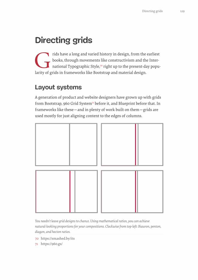
A generation of product and website designers have grown up with grids from Bootstrap, 960 Grid System71 before it, and Blueprint before that. In frameworks like these—and in plenty of work built on them—grids are used mostly for just aligning content to the edges of columns.
You needn’t leave grid designs to chance. Using mathematical ratios, you can achieve natural-looking proportions for your compositions. Clockwise from top-left: Biauron, penton, diagon, and hecton ratios.
70 https://smashed.by/its71 https://960.gs/

130 Chapter 6
When you use grids imaginatively, they do much, much more than align content. A grid brings cohesion to a composition. It helps people under-stand the stories you’re telling by suggesting hierarchies. Grids inform people what to read first, then next, and how much attention to give it.
They define the position of valuable information or a call to action. A thoughtfully chosen grid leads to a wealth of possibilities and any num-ber of exciting designs.
I’m going to teach you there’s more to grids than twelve or sixteen evenly sized columns. I’ll show you how varied layouts based on one, two, and multiple columns can be. I’ll explain how to use modular and compound grids, which are two or more grids on one page. Finally, I’ll demonstrate how to get incredible results from an off-the-shelf framework. Before I do that, I want to explain grid anatomy and terminology.
Grid anatomy
There are several components to a grid: columns, fields, flowlines, gutters, margins, modules, and spacial zones.
Every grid contains the same components. How you use them will depend on the goals for your design.

131Directing grids
Columns are perhaps the best-known grid components. They’re vertical. They can, but needn’t, be the same width. You can use as few or as many of them as you need. That choice will depend on your design goals.
Horizontal fields are known as rows in CSS Grid—when your writing mode is set to horizontal, top to bottom,—and in HTML table parlance. By default, they run left-to-right and perpendicular to columns. Their heights can be intrinsic—defined by the content inside them—or you can give them an explicit height.
Narrow, wide, one, two, or many, columns are often the first component you’ll learn.
The heights of horizontal fields are important when you’re creating hierarchical grids. More about them shortly.

132 Chapter 6
Flowlines divide space into horizontal sections. You can use them to guide someone from one content area to the next. When flowlines are solid and extend to the outer edges of the page, they make people pause before starting a new section. You can anchor blocks of content to either the bottom or top of a flowline using CSS Grid or Flexbox alignment.
Gutters are horizontal and vertical gaps between columns and fields. You can leave them empty or incorporate them into the size of elements on the grid. Gutter height and width can have an enormous impact on the clarity of your layouts. Make gutters too small, and you run the risk of making your copy dense and difficult to read. Too large and you might lose the visual connection between columns.
Flowlines aren’t always obvious, but they’re still important because they help define areas in your content.
In CSS Grid, gutters are gaps between columns and rows.

133Directing grids
Unlike CSS terminology—where every element has margins on all sides—grid margins are the spaces between the outer edges of your layout and the browser chrome, page, or screen. Don’t think these margins need to stay empty though, as they can be useful spaces for placing image captions and small text.
When you hear the term module, do you immediately think of a reusable atomic web design component? Grid modules are different. They’re indi-vidual units—most commonly rectangles or squares—which repeat hor-izontally and vertically. Modules can be any size: based on your content, the aspect ratios of images, and even advertising sizes.
In CSS Grid, spacial zones are called grid-template-areas. Whatever you choose to call them, they’re adjacent modules bound together to form larger areas.
Left: We don’t hear as much about modular grids for web design as we do column-based grids. I’d like to change that. Right: Spacial zones needn’t just make spaces for content; they help define an element’s size or shape too. When spacial zones overlap, designs can take on person-alities all their own.
You needn’t set the same margin on every side. A deeper margin at the top or bottom, or a wider one on the left or right, can make a big difference to the feel of your design.

134 Chapter 6
Grid types
When I teach design classes, I ask my students to draw what a grid means to them. Nine out of ten of them sketch columns, but it’s important to know that column-based designs are only one of several options.
Columns offer enormous possibilities, so it’s little wonder they’re so many peoples’ go-to grid components. You can use as few or as many columns as you need and you can make them any width. Not every column needs to be as wide as its siblings, you can bind columns together to form wider containers, and you can also leave columns empty.
SINGLE COLUMNS
A single column is the simplest form of grid. While its roots reach back to the design of early manuscripts, more recently it’s become a popular way to avoid the complexities of responsive layouts.
The width of one column will depend either on the length of its contents, or the browser, device, or page around it. There may also be times when you’ll choose an unnaturally narrow column plus extra-wide margins to create drama.
A single column, one-eighth of the available width of my layout.

135Directing grids
Often you’ll choose column widths which make your text comfortable to read. Not too narrow so jumping between lines becomes tiring; not too wide so finding the start of the next line is difficult. The ideal width—or measure—of a single column is something book designers have consid-ered for generations, so it’s not surprising that designs which are based on them look classical.
In this single-column design, running text holds around 75 characters per line, which is the upper limit for reading comfortably. I always adjust type size when column widths change, making text smaller in narrower columns and larger in wider ones.
TWIN COLUMNS
Grids with two symmetrical columns feel orderly. They can hold a tre-mendous amount of content without becoming overwhelming, especially when you set those columns within wide margins. If you have plenty of running text, twin-columns solidify it into blocks, giving your page visible structure.
This column of text is half the width of the page, whereas the less important image above it occupies only a quarter. This prevents the image from dominating my design.

136 Chapter 6
While twin-column grids might feel conser-vative, you can add playful touches, perhaps by pulling elements into margins or stag-gering the start of each column by padding its content.
I want this next design to feel more dynamic, so I pull the image left by the same width as gutters between columns. This creates a diag-onal that draws people towards where they should start reading.
UX designers are concerned with
making a product or website easy to
use, so make it obvious where you
want people to look and where to
start interacting or reading.
Whereas forcing content into columns suggests order, pulling and pushing elements outside them adds energy.
Adapting a twin-column layout to tiny screens is straight-forward. Just allowing the second column to drop under the first makes for an uninterrupted reading experience.
“

137Directing grids
To add drama to this symmet-rical, twin-column design, I pad the start of one column, then the end of the other.
TWO ASYMMETRICAL COLUMNS
While symmetry helps large amounts of running text feel approachable, an asymmetrical two-column grid—where one column is wider than the other—often works better when your content has more variety.
This arrangement is ideal when images and captions need to connect to the story. You might notice that to emphasise this connection, I aligned the top of the suitcase with the first line of my running text.
A little space makes a big difference to even the simplest designs.

138 Chapter 6
A larger column offers plenty of space to tell a longer story. A smaller one allows image captions or notes to sit alongside so they can support your narrative. A narrow column is also a fabulous place for supporting infor-mation: content which is different from, but still relevant to your story.
Whether you decide a narrow column should sit on the left or right will depend on your content. I place a large block of running text in the wider column on the right, then supporting information in its narrower sibling on the left.
Moving the narrow column to the right gives my design a very different feel. This difference is important because here the content in this narrow column is separate from the story.
MULTI-COLUMN GRIDS
Symmetrical multi-column grids have become a staple largely because twelve columns can be easily divided into thirds and quarters. In fact, they’re now so ubiquitous that starting a new design without sketching three or four columns can be hard.
I reinforce the distinction between content types by using a different, condensed typeface style in the narrow column. The box also has a subtly different background colour to emphasise this difference.

139Directing grids
Just because so many people choose multi-column grids doesn’t necessar-ily mean designs based on them need to be predictable. There are plenty of ways to make multi-column layouts look unpredictable. Above, this oversized image and three asymmetrical columns give the impression that the bulging suitcase is pushing my content apart. The layout then switches to three symmetrical columns under an invisible flowline.
This large image escapes the top of the page. This bleed, and the deep head margins contrast with the solid columns of text. I leave the first col-umn clear of text to allow the image to spread across two columns.
You should let columns inform your design, not dictate it. Allow content to break free when that tells your story more clearly.

140 Chapter 6
Remember, you needn’t fill every part of every column. Leaving columns empty can turn a highly structured layout into one which feels dynamic.
MULTI-COLUMN GRIDS AND FLOWLINES
On the web, you rarely know how tall someone’s window on your content will be. Tall columns of text can quickly grow beyond the viewport, which makes reading difficult. You need to think carefully about content struc-ture before setting long passages of running text in columns.
Flowlines separate a composition into sections, but they are also useful for ensuring that blocks of running text are more likely to fit within one screen. You can use images and text elements as flowlines to define these sections.
SYMMETRICAL LAYOUTS
When a design calls for two or more columns, you’ll need to decide whether to arrange them asymmetrically or symmetrically. This deci-sion will largely depend on the content you’re delivering and the com-plexity of your design. It will also depend on how you’d like someone to feel, because symmetry brings a calmness which makes someone feel comfortable.
Symmetrical layouts suit simpler designs with less varied content because symmetry makes it easier for someone to view your composition as a whole. That doesn’t mean every part of a layout must mirror another precisely. Deliberately misplacing some elements will make designs more compelling.
I place this larger standfirst paragraph diagonally opposite my headline to contrast it with the blocks of running text below.

141Directing grids
ASYMMETRICAL LAYOUTS
Asymmetry helps organise a wider variety of content in complex arrange-ments. It can also direct someone’s attention to specific areas in a page and help them make sense of your content. Asymmetrical layouts allow for a wide variety of sizes and shapes. Asymmetry brings energy to com-positions and makes them feel active.
Solid blocks of copy and images add visual weight and draw the eye. To make a design more interesting, alter contrast between larger, heavy elements and lighter, smaller ones.
This next design includes various types of content. There’s a headline, image, running text, plus two pieces of supporting information. I want the content hierarchy to be obvious, so I devote more space to running text and image, less to supporting information. I choose four columns and arrange them in an asymmetric 1|3|2|2 pattern, where each unit is an eighth of my layout.
These symmetrical columns feel ordered and serious. I emphasise page structure by sizing the image to span two of my four columns.

142 Chapter 6
These proportions work even better when I reorder those columns into a 3|1|2|2 pattern. Moving the vertical headline into the centre of this composition further separates the story from its supporting information.
By now, you could be wondering how good asymmetrical layouts look on smaller screens. Even in landscape orientation on a tablet’s screen,
It’s rare to see languages which use the Latin alphabet using vertical text on the web. When you do, the effect can be striking.
Running text occupies the widest column and gives enough visual weight to balance the large image which sets the tone for this story. In contrast, the supporting information occupies two narrower columns.
143Directing grids
There’s still room in this layout for a fabulous vertical headline. I resize it to match the
viewport height.
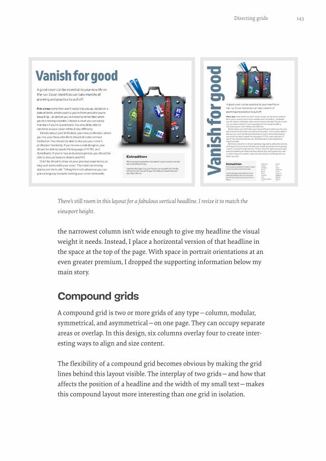
the narrowest column isn’t wide enough to give my headline the visual weight it needs. Instead, I place a horizontal version of that headline in the space at the top of the page. With space in portrait orientations at an even greater premium, I dropped the supporting information below my main story.
Compound grids
A compound grid is two or more grids of any type—column, modular, symmetrical, and asymmetrical—on one page. They can occupy separate areas or overlap. In this design, six columns overlay four to create inter-esting ways to align and size content.
The flexibility of a compound grid becomes obvious by making the grid lines behind this layout visible. The interplay of two grids—and how that affects the position of a headline and the width of my small text—makes this compound layout more interesting than one grid in isolation.

144 Chapter 6
A 6&4 compound grid, famously used as the basis for Karl Gerstner’s72 work on Capital magazine in the 1960s. This grid makes an incredible variety of compositions possible.
In this version of the same article, I split running text across two of the four columns, then move the supporting information to one of the nar-rower columns on the six-column grid.
72 https://smashed.by/gerstner
I align the headline to the start of a column on the six-column grid. The small text on the left also gets its width from one of those six columns.
145Directing grids
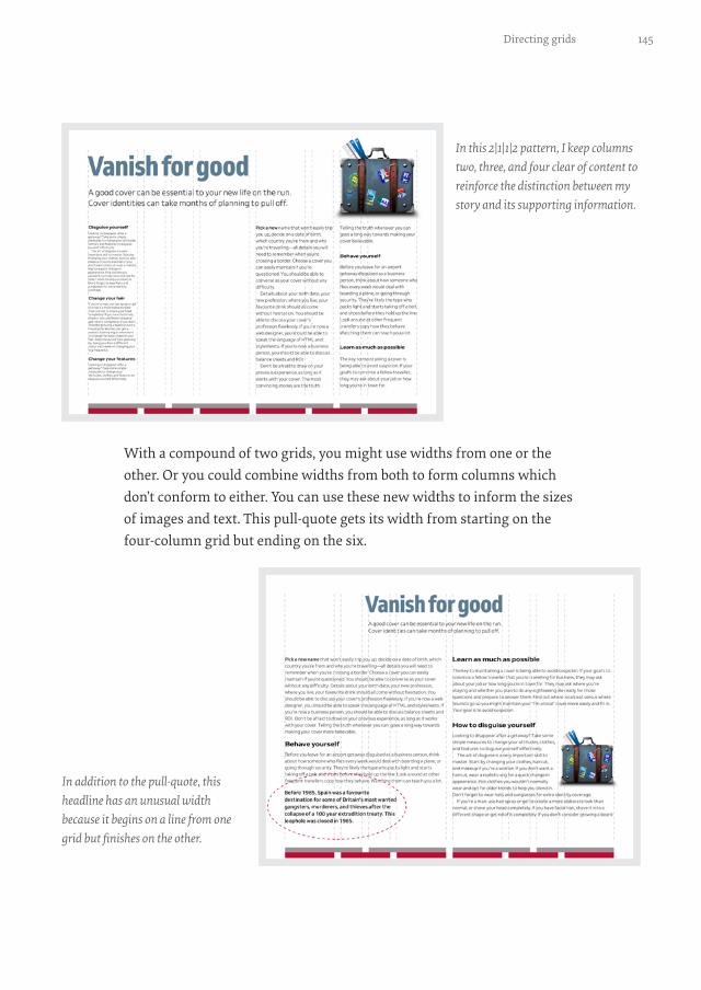
With a compound of two grids, you might use widths from one or the other. Or you could combine widths from both to form columns which don’t conform to either. You can use these new widths to inform the sizes of images and text. This pull-quote gets its width from starting on the four-column grid but ending on the six.
In this 2|1|1|2 pattern, I keep columns two, three, and four clear of content to reinforce the distinction between my story and its supporting information.
In addition to the pull-quote, this headline has an unusual width because it begins on a line from one grid but finishes on the other.

146 Chapter 6
Above, I set the running text in two out of four columns. However, when I place pull-quotes in the outer two columns, they feel disconnected from the story. I can improve this design by aligning the edges of these quotes to lines in the six-column grid so they feel part of the story.
These pull-quotes are the width of columns in the four-column grid.
You can afford to be creative when designing block and pull-quotes. I’ll teach you how later.

147Directing grids
Compound grids make informed decisions about the widths of images and captions easier. Below, these columns of running text derive their widths from the four-column grid, as does the banner image. On the other hand, I decided the width of this image caption should be the same as one column from the six.
Within a symmetrical design, small details such as image captions can make layouts feel more active.

148 Chapter 6
STACKED GRIDS
You can combine column grids with hierarchical and even modular grids. When pages contain two separate subjects or different types of content, stacking grids can be a great way to make that difference more obvious.
At the top of this next page is a story about creating a new identity after pulling off a robbery. Underneath there’s an altogether different story about why the Mini Cooper is your best choice for a getaway car. To leave someone in little doubt these stories are separate, use a different grid for each. I base the top story on a four-column grid, the bottom on a six.
Modular grids bring order to complex content and are a fabulous choice for the timeline of Mini models at the bottom of this stacked design. The modular timeline layout contrasts beautifully with the columns in the story above.
I make the difference between these two stories obvious by placing the second against a grey background. I also use paragraph spacing instead of first-line indentations.

149Directing grids
STACKING ON SMALL SCREENS
When people use small screens, you can’t rely on complex compositions. You’ll need to find other ways to make people notice differences between content types. The position of these two images emphasises the difference: for the first, the image bleeds off the right of the page; in the second, it bleeds off the left.
I also make the difference between these two stories more obvious by placing the first story on a grey background.
You might choose different typefaces, styles, or weights to emphasise different types of content. Varied alignments and spacing can also be incredibly effective.

150 Chapter 6
Modular grids
A module is a rectangular or square unit of any size. Modules repeat horizontally and vertically to form a modular grid. At first glance, modu-lar grids can seem complicated. However, they’re easy to work with, so it surprises me so few web designers use them. Modular grids are excellent for bringing order to large amounts of varied content and you can also use them to create visually appealing layouts when there’s very little con-tent. When you use modular grids thoughtfully they can fill your designs with energy.
In this next design, I bind several modules together to create three larger spacial zones. These define the position and shape of my content. The zones inform the size of headlines, images, and even the detached image caption which occupies a single module over on the right.
Because it contains fewer, more substantial, spacial zones, this next com-position (opposite top) feels altogether different. The smaller of two zones informs the position and size of a headline and standfirst combination. Whereas in the previous design I use a single module to determine the size of a caption, here that module provides dimensions for a small image.
My headline is right-aligned to emphasise the diagonal axis in this composition.

151Directing grids
As well as using modules to inform image proportions, you can also use them to determine the size of decorative text elements, including drop caps.
I make this headline small to prevent it from competing with the drop cap below.
The scale of this little image contrasts with my large block of running text.

152 Chapter 6
ADVERTISING SIZES
If a product or website relies on advertising, you might choose to base its module proportions on Interactive Advertising Bureau (IAB) unit dimen-sions so that ads integrate into your composition seamlessly.
A module can be any size, and I base this modular grid on a 300×250 IMU (Integrated marketing unit, medium rectangle).
Banner ads are sometimes a necessary evil, so I base the design of this modular grid on a 970×90 IMU (pushdown).

153Directing grids
ASPECT RATIOS
Large images needn’t always run horizontally across a page; portrait ori-entations can make a design look different and distinctive. I base this grid on a 16:9 aspect ratio, but this time stood the image upright by binding nine modules together to form a large, vertical spacial zone.
Even with an image so large, this modular grid still gives me the luxury of dividing my running text into two symmetrical columns.
Rotating this image gives the modular grid an extra boost of energy. I angle its bottom-right corner to point to where someone should start reading.
154 Chapter 6
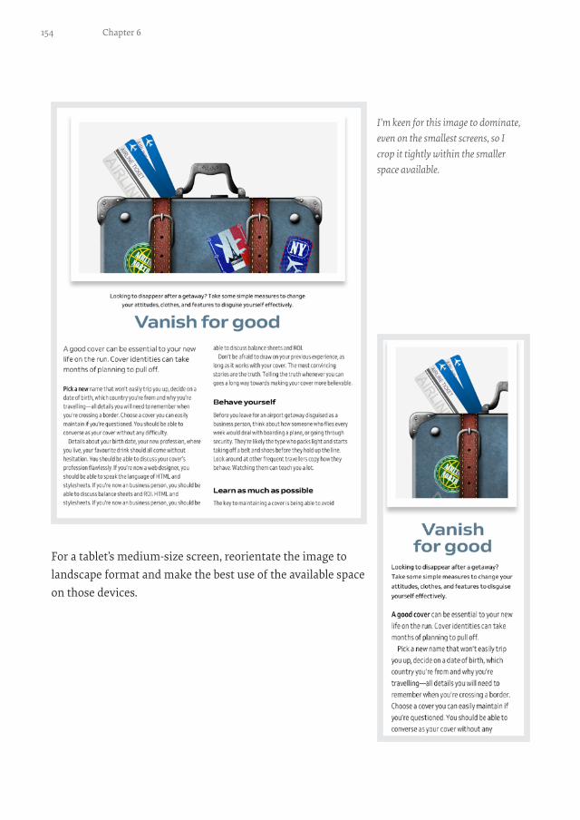
For a tablet’s medium-size screen, reorientate the image to landscape format and make the best use of the available space on those devices.
I’m keen for this image to dominate, even on the smallest screens, so I crop it tightly within the smaller space available.

155Directing grids
WHICH GRID TO SELECT
How do you choose the grid type which best suits the design you’re making? Some grids provide structure and they order content; others feel more organic. Sometimes a grid will be obvious, other times it will fade into the background. Images are occasionally more critical than text, and you may want to display them at large sizes for maximum impact. Your choice of grid will depend on all these factors and more, but in general:
• Single columns have a classical feel and are suitable for long passages of running text. Ideal for blog entries, news articles, and help text.
• Twin columns and multi-columns are the most flexible and best for helping people make sense of varied content. Perfect for digital products and stores.
• Modular grids are fabulous for making diverse designs with plenty of drama and energy. Useful for portfolio and product pages.
Frameworks needn’t mean boring
There’s no doubt that Bootstrap and many design frameworks like it are popular for getting a project started. Even if people don’t use Bootstrap’s .row and other classes, its twelve symmetrical columns are where many people begin.
When he wrote “Beyond The Boring: The Hunt For The Web’s Lost Soul”,73 Josh Johnson thought that frameworks mean we’ve “reached a stagnation point where unique layouts are a lost art.” But frameworks don’t make websites boring. Designers do.
If you want a framework-based design to be more interesting, start by simplifying its grid. You can easily streamline twelve narrow columns into six wider ones, which is good because I can’t think of many reasons to use all twelve.
73 https://smashed.by/beyondboring

156 Chapter 6
When you stop thinking of framework columns as alignment guides, you can start using them more imaginatively.
I find using fewer columns helps me focus on the whole composition. To create a feeling of rhythm in this framework-based design, I split two of my simplified columns to form a repeating 1|1|2|2 pattern.
Experiment with splitting, then recombining columns to create more compelling layouts.

157Directing grids
These narrow columns don’t contain content of their own. Instead, they augment the width of other columns and inform the size of images and captions. The sizes of this suitcase and image caption are informed by adding one narrower column to a wider one. The main content is one narrow column plus two wider ones.
Instead of using a deep head margin, I use white space to the right of my headline to provide a welcome relief from the solid columns of text below.
I keep one narrow column empty to add some much-needed white space to my design. I’ll teach you more about how to use margins in just a moment.
158 Chapter 6
Sometimes, all it takes to get a different feeling from an asymmetrical design is to flip the grid. In that last example, this forms a 2|2|1|1 repeating pattern that I use to size a pull-quote and make it stand apart from the columns of running text around it.
Diverse grids
When I described compound grids, I showed how the interplay between two or more grids can lead to interesting designs. This type of flexibility is essential because sometimes a design requires a layout that’s not possi-ble from a single category of grid.
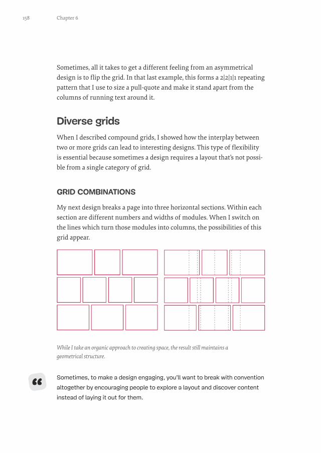
GRID COMBINATIONS
My next design breaks a page into three horizontal sections. Within each section are different numbers and widths of modules. When I switch on the lines which turn those modules into columns, the possibilities of this grid appear.
Sometimes, to make a design engaging, you’ll want to break with convention
altogether by encouraging people to explore a layout and discover content
instead of laying it out for them.
While I take an organic approach to creating space, the result still maintains a geometrical structure.
“

159Directing grids
My goal in this design is that no two blocks of content should be the same shape or size, but there should be a relationship between them. These content areas look randomly scattered even though their placement was deliberate.
I start this design with a five-column symmetrical grid, then layer a root -3 rectangle, the width of four of my columns. The next step is to dupli-cate that rectangle and place it diagonally opposite to create two overlap-ping rectangles. I then copy the first rectangle a third and final time and rotate it by 90 degrees.
These three intersecting rectangles create a variety of shapes and sizes and countless layout permutations.
These grid combinations suggest irregular positive and negative spaces in and around my content.

160 Chapter 6
Still a fan of Bootstrap’s columns? You can create diverse grids from that too.
Adjust the size of the root rectan-gles to match the width of eight of Bootstrap’s twelve columns and make spacial zones which feel balanced on its grid.
Reposition those root rectangles any-where on the grid to open up a wealth of new opportunities from Bootstrap and frameworks like it.

161Directing grids
ROTATING GRID COMPONENTS
When you want a design to have an off-kilter feel, rotate one or more ele-ments. I base this group of images on a modular grid derived from their 16:9 aspect ratio. Then I turn each image by a different number of degrees.
Try rotating one of two columns from a twin-column symmetrical grid to give you the perfect balance between order and playfulness.
Using images of various sizes and layering them on top of each other creates a sense of depth and gives your design a more realistic look.
162 Chapter 6
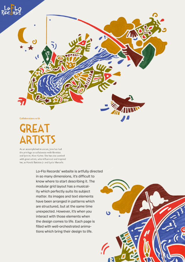
Lo-Flo Records’ website is artfully directed
in so many dimensions, it’s difficult to
know where to start describing it. The
modular grid layout has a musical-
ity which perfectly suits its subject
matter. Its images and text elements
have been arranged in patterns which
are structured, but at the same time
unexpected. However, it’s when you
interact with those elements when
the design comes to life. Each page is
filled with well-orchestrated anima-
tions which bring their design to life.

163Directing grids
Animations like these can quickly become
repetitive if they’re not carefully consid-
ered. On Lo-Flo Records, these subtle
enhancements move in a way which per-
fectly suits the company’s tagline, “Go
with the flow.” The changing geometric
shapes and even the use of sound
when hovering over a link all make
someone want to explore the website
with their ears as well as their eyes.
http://loflorecords.com

164 Chapter 6
When you want even more drama, a modular grid’s structure is ideal for rotation. This grid includes two spacial zones and a single module. I rotate the entire composition just enough to achieve a dramatic effect, without making reading too difficult.
Rotate columns just enough to get the effect you’re looking for, but not so much the rotation compromises the reading experience.
Rotating one or more elements, individually or as a group, is a fabulous way to make your layouts more distinctive, diverse and exciting.