analysis of music magazine front cover - 'mojo
TRANSCRIPT
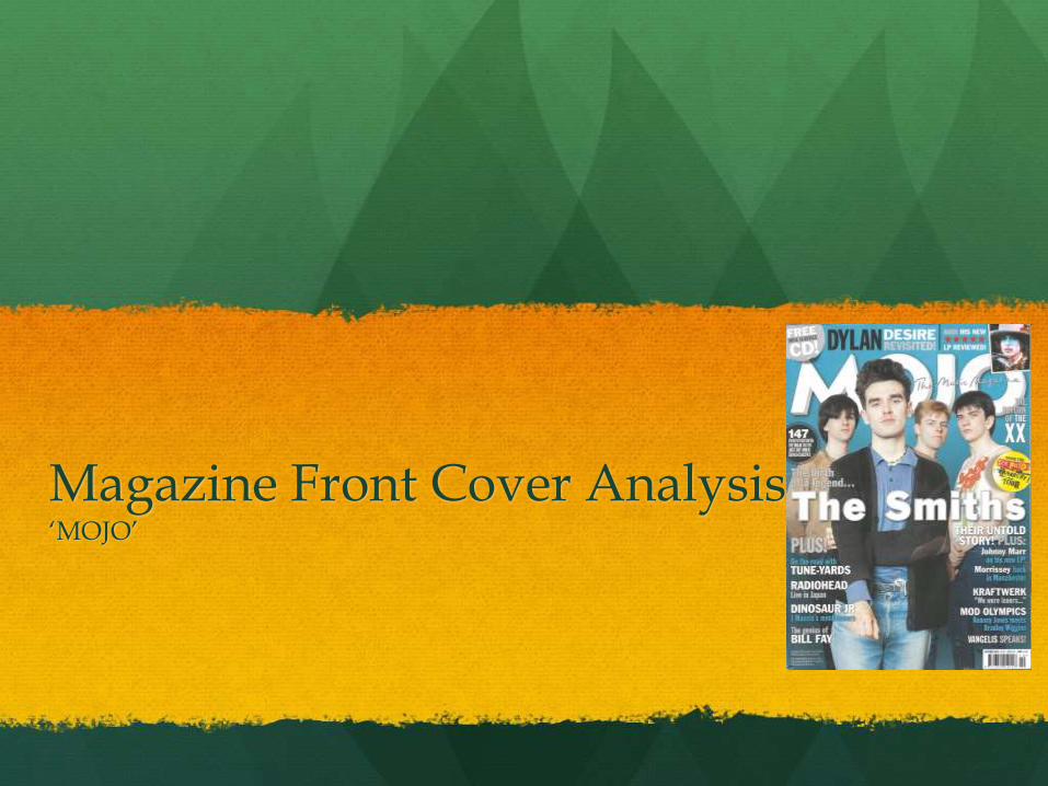
Magazine Front Cover Analysis‘MOJO’
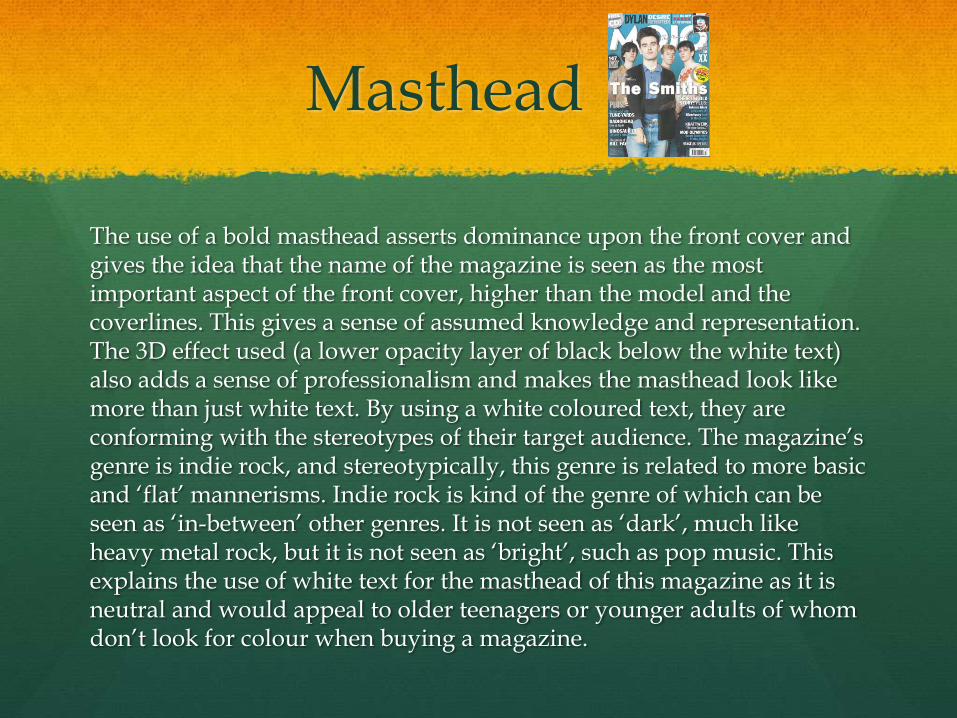
Masthead
The use of a bold masthead asserts dominance upon the front cover and gives the idea that the name of the magazine is seen as the most important aspect of the front cover, higher than the model and the coverlines. This gives a sense of assumed knowledge and representation. The 3D effect used (a lower opacity layer of black below the white text) also adds a sense of professionalism and makes the masthead look like more than just white text. By using a white coloured text, they are conforming with the stereotypes of their target audience. The magazine’s genre is indie rock, and stereotypically, this genre is related to more basic and ‘flat’ mannerisms. Indie rock is kind of the genre of which can be seen as ‘in-between’ other genres. It is not seen as ‘dark’, much like heavy metal rock, but it is not seen as ‘bright’, such as pop music. This explains the use of white text for the masthead of this magazine as it is neutral and would appeal to older teenagers or younger adults of whom don’t look for colour when buying a magazine.
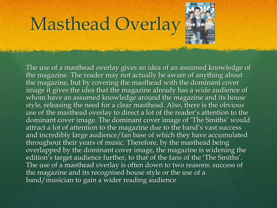
Masthead Overlay
The use of a masthead overlay gives an idea of an assumed knowledge of the magazine. The reader may not actually be aware of anything about the magazine, but by covering the masthead with the dominant cover image it gives the idea that the magazine already has a wide audience of whom have an assumed knowledge around the magazine and its house style, releasing the need for a clear masthead. Also, there is the obvious use of the masthead overlay to direct a lot of the reader’s attention to the dominant cover image. The dominant cover image of ‘The Smiths’ would attract a lot of attention to the magazine due to the band’s vast success and incredibly large audience/fan base of which they have accumulated throughout their years of music. Therefore, by the masthead being overlapped by the dominant cover image, the magazine is widening the edition’s target audience further, to that of the fans of the ‘The Smiths’. The use of a masthead overlay is often down to two reasons: success of the magazine and its recognised house style or the use of a band/musician to gain a wider reading audience
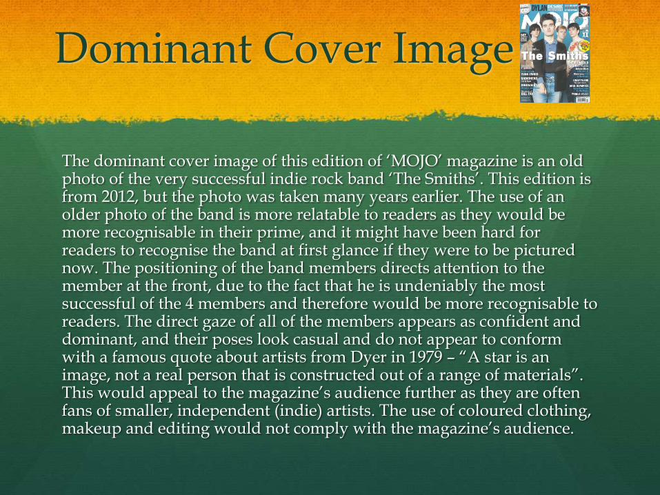
Dominant Cover Image
The dominant cover image of this edition of ‘MOJO’ magazine is an old photo of the very successful indie rock band ‘The Smiths’. This edition is from 2012, but the photo was taken many years earlier. The use of an older photo of the band is more relatable to readers as they would be more recognisable in their prime, and it might have been hard for readers to recognise the band at first glance if they were to be pictured now. The positioning of the band members directs attention to the member at the front, due to the fact that he is undeniably the most successful of the 4 members and therefore would be more recognisable to readers. The direct gaze of all of the members appears as confident and dominant, and their poses look casual and do not appear to conform with a famous quote about artists from Dyer in 1979 – “A star is an image, not a real person that is constructed out of a range of materials”. This would appeal to the magazine’s audience further as they are often fans of smaller, independent (indie) artists. The use of coloured clothing, makeup and editing would not comply with the magazine’s audience.
Secondary Images
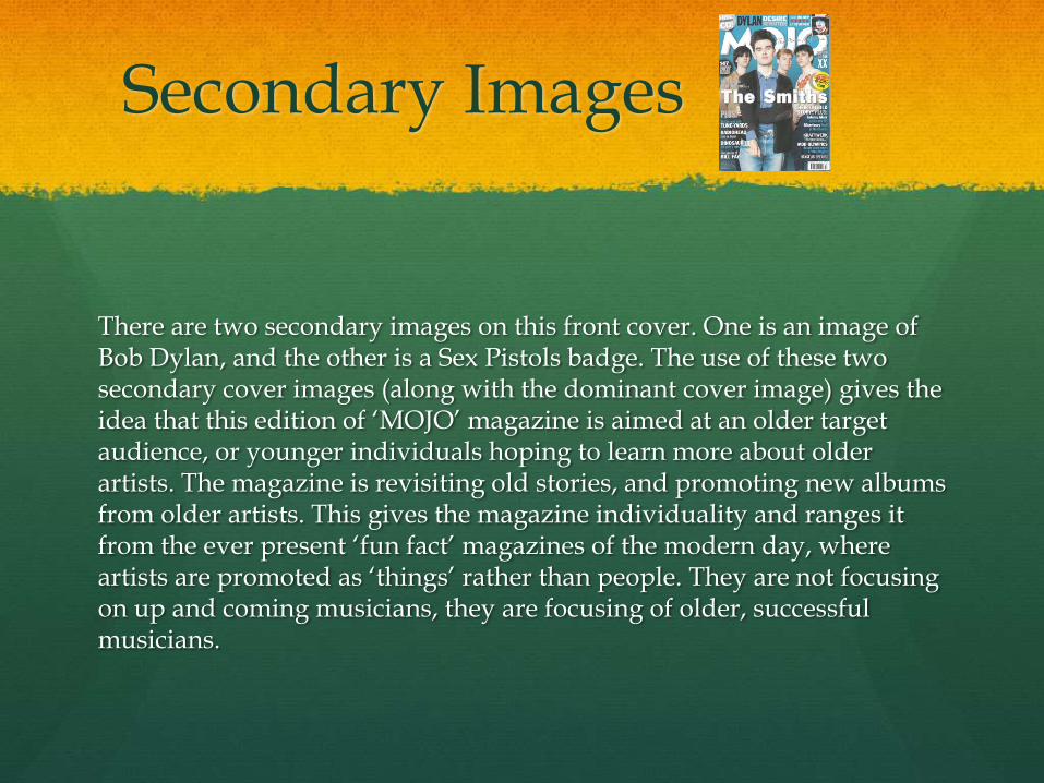
There are two secondary images on this front cover. One is an image of Bob Dylan, and the other is a Sex Pistols badge. The use of these two secondary cover images (along with the dominant cover image) gives the idea that this edition of ‘MOJO’ magazine is aimed at an older target audience, or younger individuals hoping to learn more about older artists. The magazine is revisiting old stories, and promoting new albums from older artists. This gives the magazine individuality and ranges it from the ever present ‘fun fact’ magazines of the modern day, where artists are promoted as ‘things’ rather than people. They are not focusing on up and coming musicians, they are focusing of older, successful musicians.
Lead Cover Line
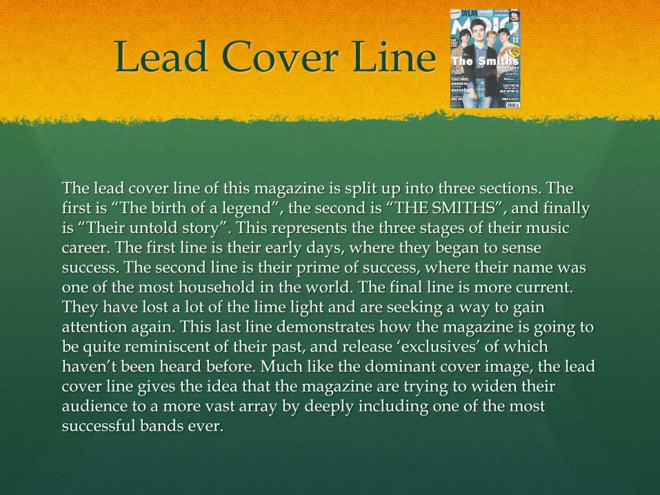
The lead cover line of this magazine is split up into three sections. The first is “The birth of a legend”, the second is “THE SMITHS”, and finally is “Their untold story”. This represents the three stages of their music career. The first line is their early days, where they began to sense success. The second line is their prime of success, where their name was one of the most household in the world. The final line is more current. They have lost a lot of the lime light and are seeking a way to gain attention again. This last line demonstrates how the magazine is going to be quite reminiscent of their past, and release ‘exclusives’ of which haven’t been heard before. Much like the dominant cover image, the lead cover line gives the idea that the magazine are trying to widen their audience to a more vast array by deeply including one of the most successful bands ever.
Secondary Cover Lines
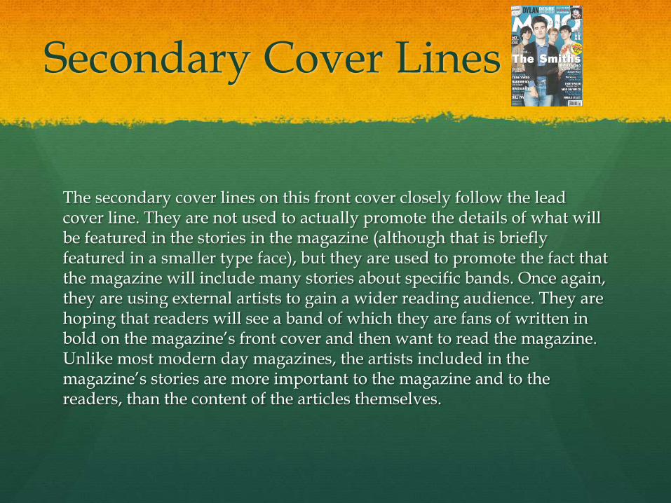
The secondary cover lines on this front cover closely follow the lead cover line. They are not used to actually promote the details of what will be featured in the stories in the magazine (although that is briefly featured in a smaller type face), but they are used to promote the fact that the magazine will include many stories about specific bands. Once again, they are using external artists to gain a wider reading audience. They are hoping that readers will see a band of which they are fans of written in bold on the magazine’s front cover and then want to read the magazine. Unlike most modern day magazines, the artists included in the magazine’s stories are more important to the magazine and to the readers, than the content of the articles themselves.
Flashes
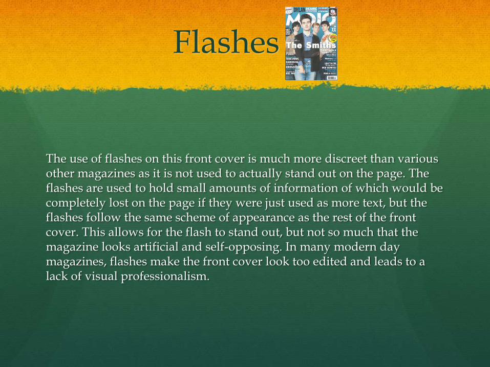
The use of flashes on this front cover is much more discreet than various other magazines as it is not used to actually stand out on the page. The flashes are used to hold small amounts of information of which would be completely lost on the page if they were just used as more text, but the flashes follow the same scheme of appearance as the rest of the front cover. This allows for the flash to stand out, but not so much that the magazine looks artificial and self-opposing. In many modern day magazines, flashes make the front cover look too edited and leads to a lack of visual professionalism.
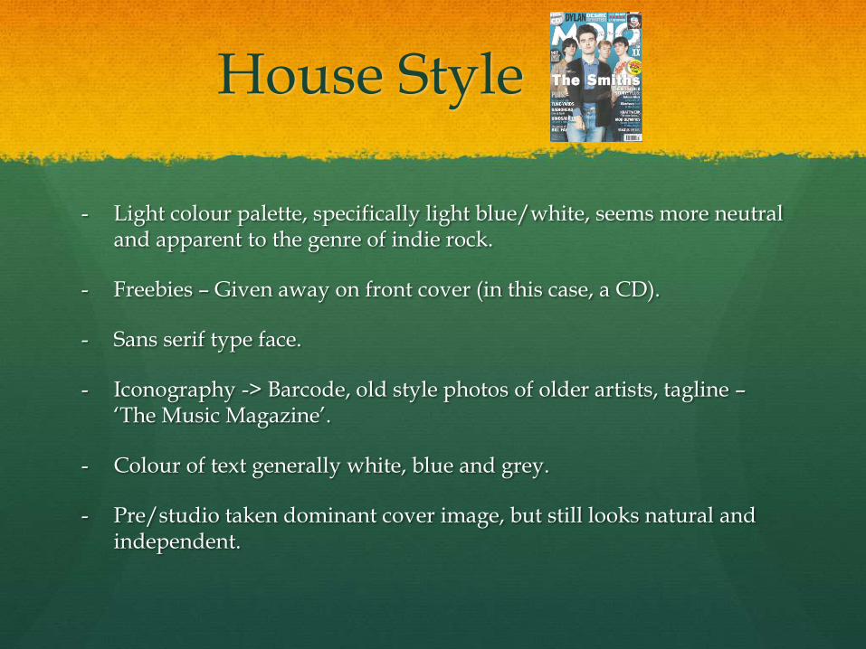
House Style
- Light colour palette, specifically light blue/white, seems more neutral and apparent to the genre of indie rock.
- Freebies – Given away on front cover (in this case, a CD).
- Sans serif type face.
- Iconography -> Barcode, old style photos of older artists, tagline –‘The Music Magazine’.
- Colour of text generally white, blue and grey.
- Pre/studio taken dominant cover image, but still looks natural and independent.