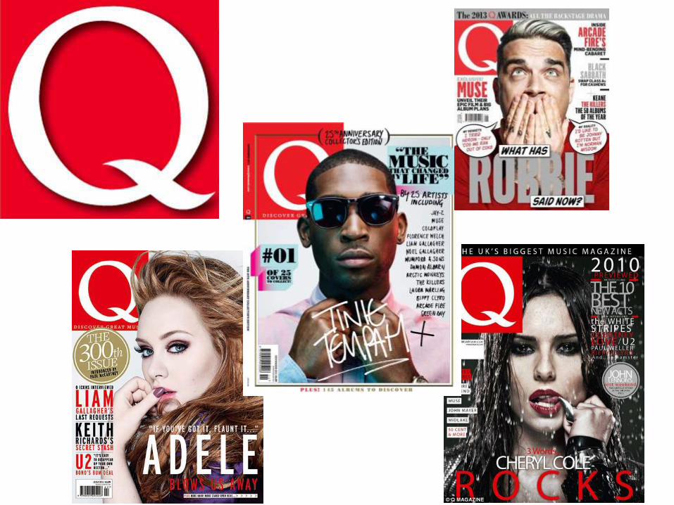
analysing magazines
TRANSCRIPT
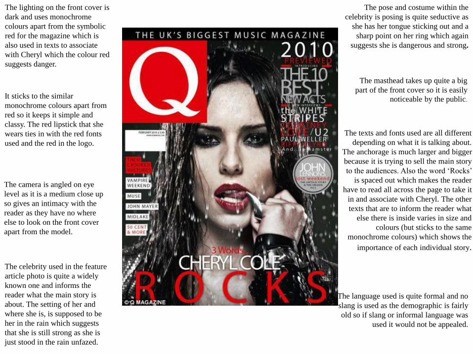
The lighting on the front cover is
dark and uses monochrome
colours apart from the symbolic
red for the magazine which is
also used in texts to associate
with Cheryl which the colour red
suggests danger.
It sticks to the similar
monochrome colours apart from
red so it keeps it simple and
classy. The red lipstick that she
wears ties in with the red fonts
used and the red in the logo.
The camera is angled on eye
level as it is a medium close up
so gives an intimacy with the
reader as they have no where
else to look on the front cover
apart from the model.
The masthead takes up quite a big
part of the front cover so it is easily
noticeable by the public.
The pose and costume within the
celebrity is posing is quite seductive as
she has her tongue sticking out and a
sharp point on her ring which again
suggests she is dangerous and strong.
The texts and fonts used are all different
depending on what it is talking about.
The anchorage is much larger and bigger
because it is trying to sell the main story
to the audiences. Also the word ‘Rocks’
is spaced out which makes the reader
have to read all across the page to take it
in and associate with Cheryl. The other
texts that are to inform the reader what
else there is inside varies in size and
colours (but sticks to the same
monochrome colours) which shows the
importance of each individual story.
The celebrity used in the feature
article photo is quite a widely
known one and informs the
reader what the main story is
about. The setting of her and
where she is, is supposed to be
her in the rain which suggests
that she is still strong as she is
just stood in the rain unfazed.
The language used is quite formal and no
slang is used as the demographic is fairly
old so if slang or informal language was
used it would not be appealed.
The fonts used make it clear and
simple to read again, by having this it
helps connect with the different age
ranges, males and females as it isn’t
anything specific. The colours used
which as mainly black, white and red
all work well with each other in
contrast to create an overall effect and
not to clash.
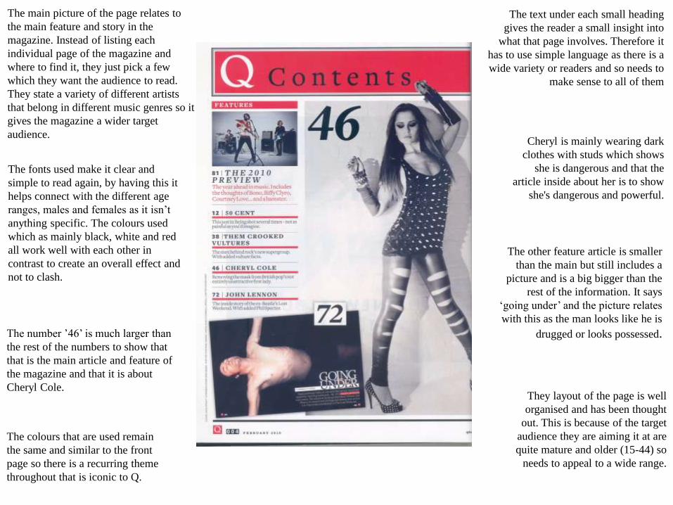
The main picture of the page relates to
the main feature and story in the
magazine. Instead of listing each
individual page of the magazine and
where to find it, they just pick a few
which they want the audience to read.
They state a variety of different artists
that belong in different music genres so it
gives the magazine a wider target
audience.
The colours that are used remain
the same and similar to the front
page so there is a recurring theme
throughout that is iconic to Q.
They layout of the page is well
organised and has been thought
out. This is because of the target
audience they are aiming it at are
quite mature and older (15-44) so
needs to appeal to a wide range.
The number ’46’ is much larger than
the rest of the numbers to show that
that is the main article and feature of
the magazine and that it is about
Cheryl Cole.
The other feature article is smaller
than the main but still includes a
picture and is a big bigger than the
rest of the information. It says
‘going under’ and the picture relates
with this as the man looks like he is
drugged or looks possessed.
Cheryl is mainly wearing dark
clothes with studs which shows
she is dangerous and that the
article inside about her is to show
she's dangerous and powerful.
The text under each small heading
gives the reader a small insight into
what that page involves. Therefore it
has to use simple language as there is a
wide variety or readers and so needs to
make sense to all of them
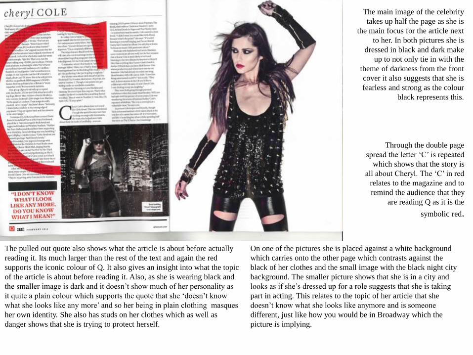
The pulled out quote also shows what the article is about before actually
reading it. Its much larger than the rest of the text and again the red
supports the iconic colour of Q. It also gives an insight into what the topic
of the article is about before reading it. Also, as she is wearing black and
the smaller image is dark and it doesn’t show much of her personality as
it quite a plain colour which supports the quote that she ‘doesn’t know
what she looks like any more’ and so her being in plain clothing masques
her own identity. She also has studs on her clothes which as well as
danger shows that she is trying to protect herself.
The main image of the celebrity
takes up half the page as she is
the main focus for the article next
to her. In both pictures she is
dressed in black and dark make
up to not only tie in with the
theme of darkness from the front
cover it also suggests that she is
fearless and strong as the colour
black represents this.
Through the double page
spread the letter ‘C’ is repeated
which shows that the story is
all about Cheryl. The ‘C’ in red
relates to the magazine and to
remind the audience that they
are reading Q as it is the
symbolic red.
On one of the pictures she is placed against a white background
which carries onto the other page which contrasts against the
black of her clothes and the small image with the black night city
background. The smaller picture shows that she is in a city and
looks as if she’s dressed up for a role suggests that she is taking
part in acting. This relates to the topic of her article that she
doesn’t know what she looks like anymore and is someone
different, just like how you would be in Broadway which the
picture is implying.

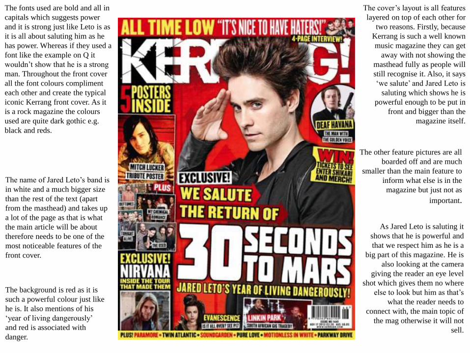
The fonts used are bold and all in
capitals which suggests power
and it is strong just like Leto is as
it is all about saluting him as he
has power. Whereas if they used a
font like the example on Q it
wouldn’t show that he is a strong
man. Throughout the front cover
all the font colours compliment
each other and create the typical
iconic Kerrang front cover. As it
is a rock magazine the colours
used are quite dark gothic e.g.
black and reds.
The other feature pictures are all
boarded off and are much
smaller than the main feature to
inform what else is in the
magazine but just not as
important.
The cover’s layout is all features
layered on top of each other for
two reasons. Firstly, because
Kerrang is such a well known
music magazine they can get
away with not showing the
masthead fully as people will
still recognise it. Also, it says
‘we salute’ and Jared Leto is
saluting which shows he is
powerful enough to be put in
front and bigger than the
magazine itself.
The name of Jared Leto’s band is
in white and a much bigger size
than the rest of the text (apart
from the masthead) and takes up
a lot of the page as that is what
the main article will be about
therefore needs to be one of the
most noticeable features of the
front cover.
The background is red as it is
such a powerful colour just like
he is. It also mentions of his
‘year of living dangerously’
and red is associated with
danger.
As Jared Leto is saluting it
shows that he is powerful and
that we respect him as he is a
big part of this magazine. He is
also looking at the camera
giving the reader an eye level
shot which gives them no where
else to look but him as that’s
what the reader needs to
connect with, the main topic of
the mag otherwise it will not
sell.
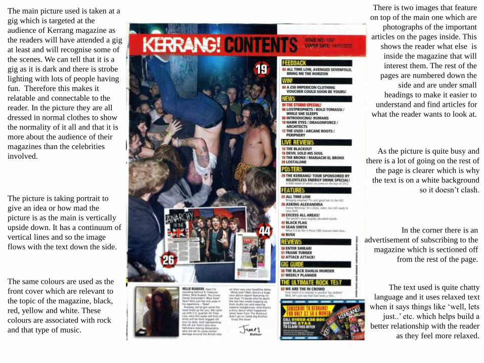
The main picture used is taken at a
gig which is targeted at the
audience of Kerrang magazine as
the readers will have attended a gig
at least and will recognise some of
the scenes. We can tell that it is a
gig as it is dark and there is strobe
lighting with lots of people having
fun. Therefore this makes it
relatable and connectable to the
reader. In the picture they are all
dressed in normal clothes to show
the normality of it all and that it is
more about the audience of their
magazines than the celebrities
involved.
The same colours are used as the
front cover which are relevant to
the topic of the magazine, black,
red, yellow and white. These
colours are associated with rock
and that type of music.
In the corner there is an
advertisement of subscribing to the
magazine which is sectioned off
from the rest of the page.
As the picture is quite busy and
there is a lot of going on the rest of
the page is clearer which is why
the text is on a white background
so it doesn’t clash. The picture is taking portrait to
give an idea or how mad the
picture is as the main is vertically
upside down. It has a continuum of
vertical lines and so the image
flows with the text down the side.
There is two images that feature
on top of the main one which are
photographs of the important
articles on the pages inside. This
shows the reader what else is
inside the magazine that will
interest them. The rest of the
pages are numbered down the
side and are under small
headings to make it easier to
understand and find articles for
what the reader wants to look at.
The text used is quite chatty
language and it uses relaxed text
when it says things like ‘well, lets
just..’ etc. which helps build a
better relationship with the reader
as they feel more relaxed.
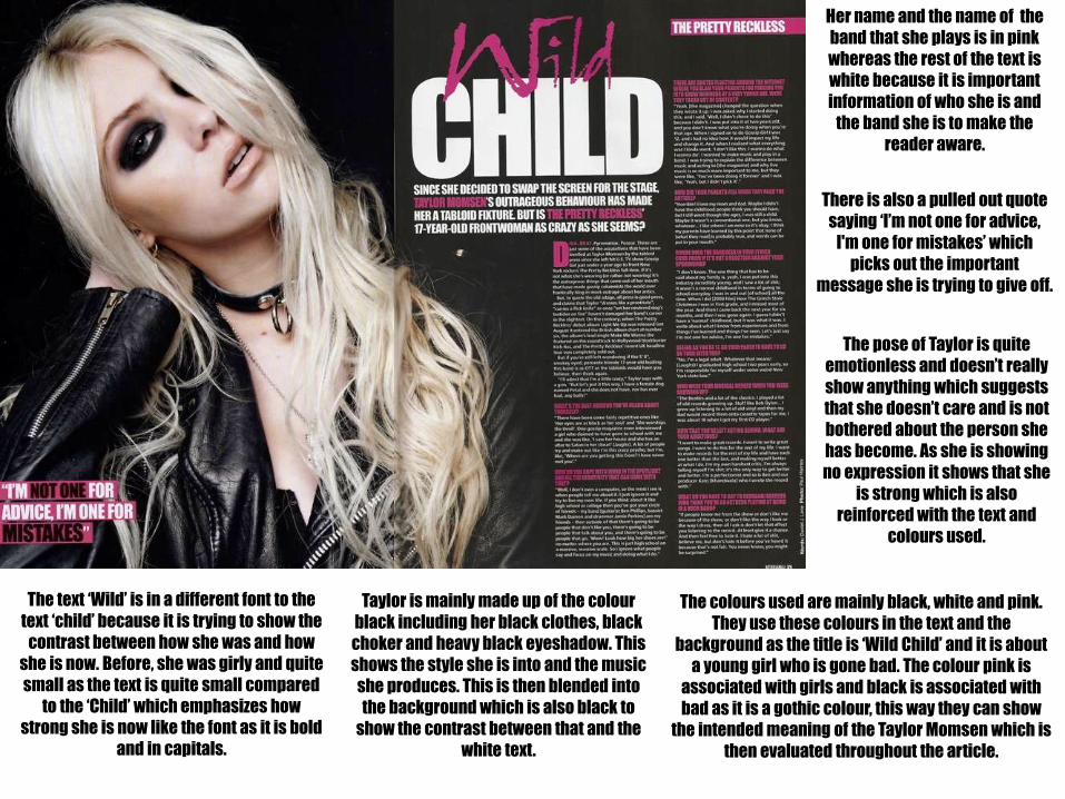
The text ‘Wild’ is in a different font to the
text ‘child’ because it is trying to show the
contrast between how she was and how
she is now. Before, she was girly and quite
small as the text is quite small compared
to the ‘Child’ which emphasizes how
strong she is now like the font as it is bold
and in capitals.
Her name and the name of the
band that she plays is in pink
whereas the rest of the text is
white because it is important
information of who she is and
the band she is to make the
reader aware.
The pose of Taylor is quite
emotionless and doesn’t really
show anything which suggests
that she doesn’t care and is not
bothered about the person she
has become. As she is showing
no expression it shows that she
is strong which is also
reinforced with the text and
colours used.
Taylor is mainly made up of the colour
black including her black clothes, black
choker and heavy black eyeshadow. This
shows the style she is into and the music
she produces. This is then blended into
the background which is also black to
show the contrast between that and the
white text.
The colours used are mainly black, white and pink.
They use these colours in the text and the
background as the title is ‘Wild Child’ and it is about
a young girl who is gone bad. The colour pink is
associated with girls and black is associated with
bad as it is a gothic colour, this way they can show
the intended meaning of the Taylor Momsen which is
then evaluated throughout the article.
There is also a pulled out quote
saying ‘I’m not one for advice,
I'm one for mistakes’ which
picks out the important
message she is trying to give off.
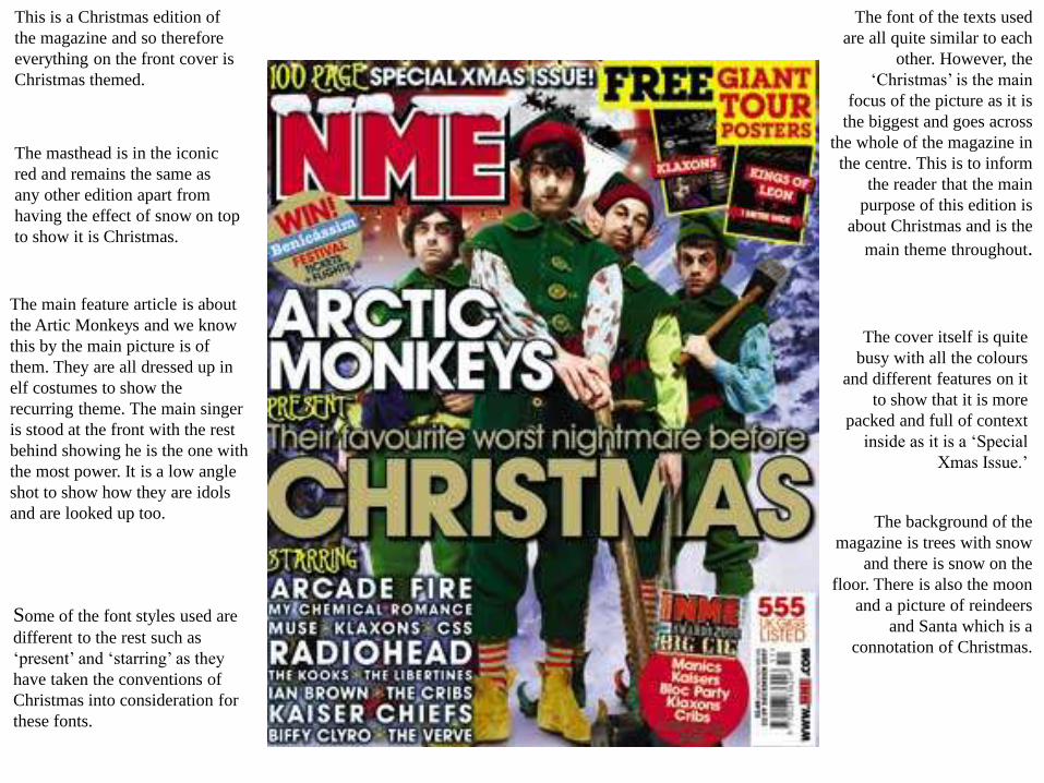
This is a Christmas edition of
the magazine and so therefore
everything on the front cover is
Christmas themed.
The masthead is in the iconic
red and remains the same as
any other edition apart from
having the effect of snow on top
to show it is Christmas.
The font of the texts used
are all quite similar to each
other. However, the
‘Christmas’ is the main
focus of the picture as it is
the biggest and goes across
the whole of the magazine in
the centre. This is to inform
the reader that the main
purpose of this edition is
about Christmas and is the
main theme throughout.
The main feature article is about
the Artic Monkeys and we know
this by the main picture is of
them. They are all dressed up in
elf costumes to show the
recurring theme. The main singer
is stood at the front with the rest
behind showing he is the one with
the most power. It is a low angle
shot to show how they are idols
and are looked up too.
The cover itself is quite
busy with all the colours
and different features on it
to show that it is more
packed and full of context
inside as it is a ‘Special
Xmas Issue.’
The background of the
magazine is trees with snow
and there is snow on the
floor. There is also the moon
and a picture of reindeers
and Santa which is a
connotation of Christmas.
Some of the font styles used are
different to the rest such as
‘present’ and ‘starring’ as they
have taken the conventions of
Christmas into consideration for
these fonts.
Down the left side there is a
‘band index’ which is separated
from the rest of the page and
informs the reader on where
they can find their favourite
bands in the magazine. These
are in red so they are easier to
see and notice on the page as
that is its main purpose.
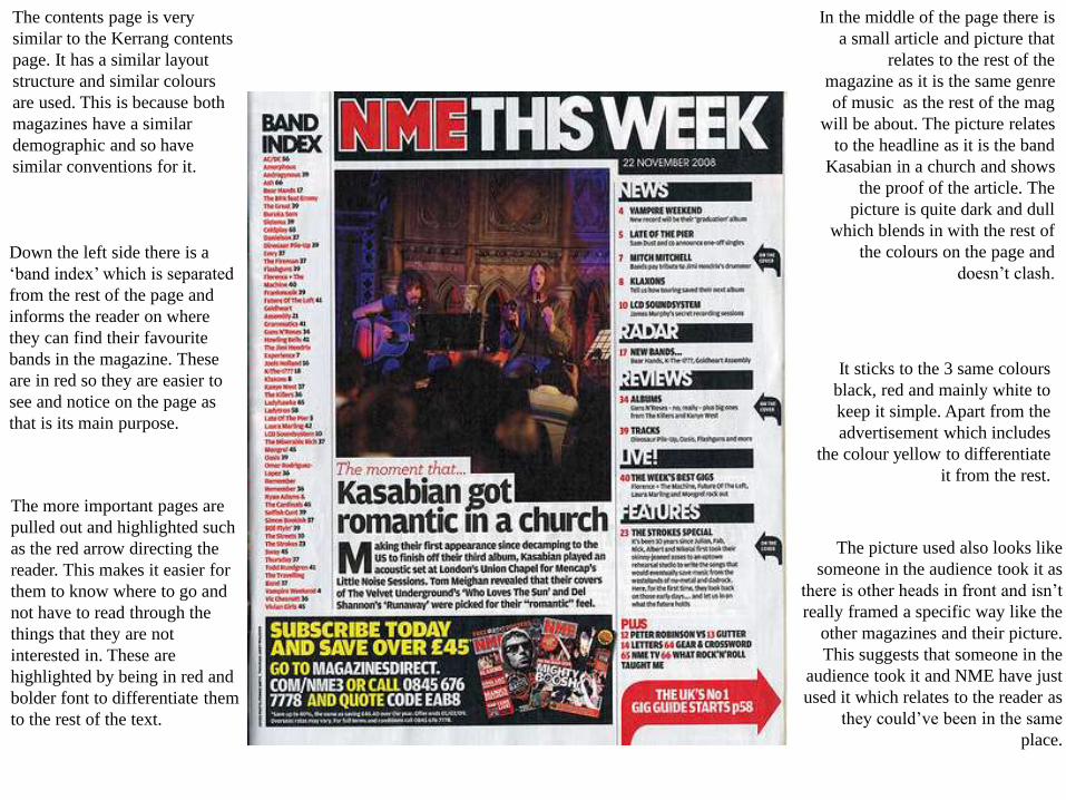
In the middle of the page there is
a small article and picture that
relates to the rest of the
magazine as it is the same genre
of music as the rest of the mag
will be about. The picture relates
to the headline as it is the band
Kasabian in a church and shows
the proof of the article. The
picture is quite dark and dull
which blends in with the rest of
the colours on the page and
doesn’t clash.
The contents page is very
similar to the Kerrang contents
page. It has a similar layout
structure and similar colours
are used. This is because both
magazines have a similar
demographic and so have
similar conventions for it.
It sticks to the 3 same colours
black, red and mainly white to
keep it simple. Apart from the
advertisement which includes
the colour yellow to differentiate
it from the rest.
The more important pages are
pulled out and highlighted such
as the red arrow directing the
reader. This makes it easier for
them to know where to go and
not have to read through the
things that they are not
interested in. These are
highlighted by being in red and
bolder font to differentiate them
to the rest of the text.
The picture used also looks like
someone in the audience took it as
there is other heads in front and isn’t
really framed a specific way like the
other magazines and their picture.
This suggests that someone in the
audience took it and NME have just
used it which relates to the reader as
they could’ve been in the same
place.
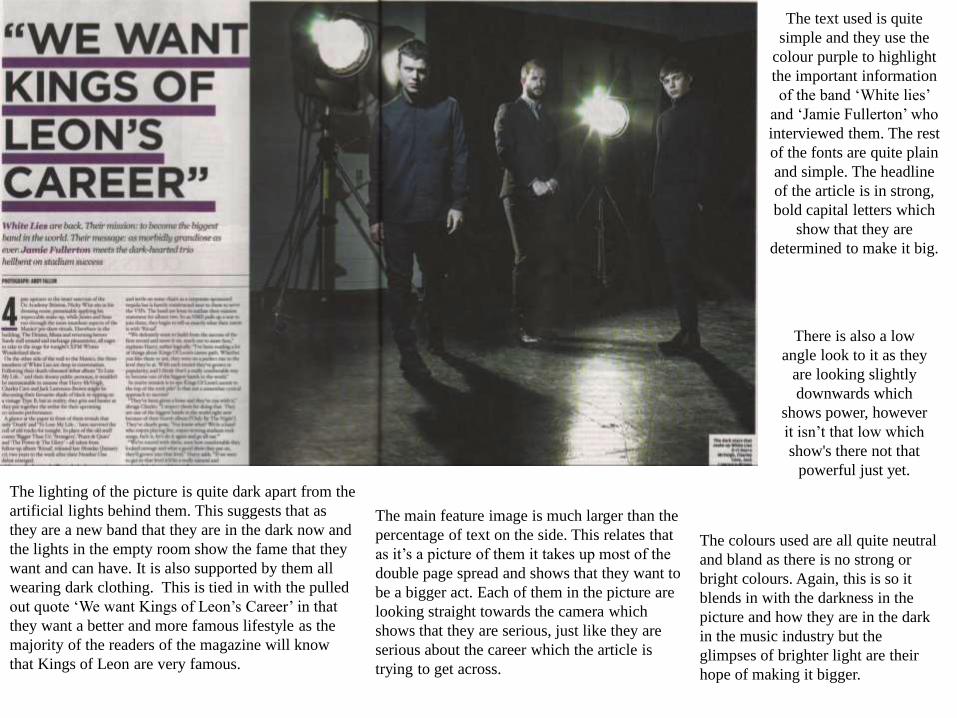
The lighting of the picture is quite dark apart from the
artificial lights behind them. This suggests that as
they are a new band that they are in the dark now and
the lights in the empty room show the fame that they
want and can have. It is also supported by them all
wearing dark clothing. This is tied in with the pulled
out quote ‘We want Kings of Leon’s Career’ in that
they want a better and more famous lifestyle as the
majority of the readers of the magazine will know
that Kings of Leon are very famous.
The main feature image is much larger than the
percentage of text on the side. This relates that
as it’s a picture of them it takes up most of the
double page spread and shows that they want to
be a bigger act. Each of them in the picture are
looking straight towards the camera which
shows that they are serious, just like they are
serious about the career which the article is
trying to get across.
The text used is quite
simple and they use the
colour purple to highlight
the important information
of the band ‘White lies’
and ‘Jamie Fullerton’ who
interviewed them. The rest
of the fonts are quite plain
and simple. The headline
of the article is in strong,
bold capital letters which
show that they are
determined to make it big.
The colours used are all quite neutral
and bland as there is no strong or
bright colours. Again, this is so it
blends in with the darkness in the
picture and how they are in the dark
in the music industry but the
glimpses of brighter light are their
hope of making it bigger.
There is also a low
angle look to it as they
are looking slightly
downwards which
shows power, however
it isn’t that low which
show's there not that
powerful just yet.